I have a long unstable history with Viseart, but the bottom line is that I own a lot of their eyeshadows and I continue to keep an eye out for new launches. Over the years, I kept curating my collection, only keeping the shades I felt were the most useful to me. When I was preparing to go overseas, I needed to evaluate which ones would have to stay behind, which is where the idea for this post originated.
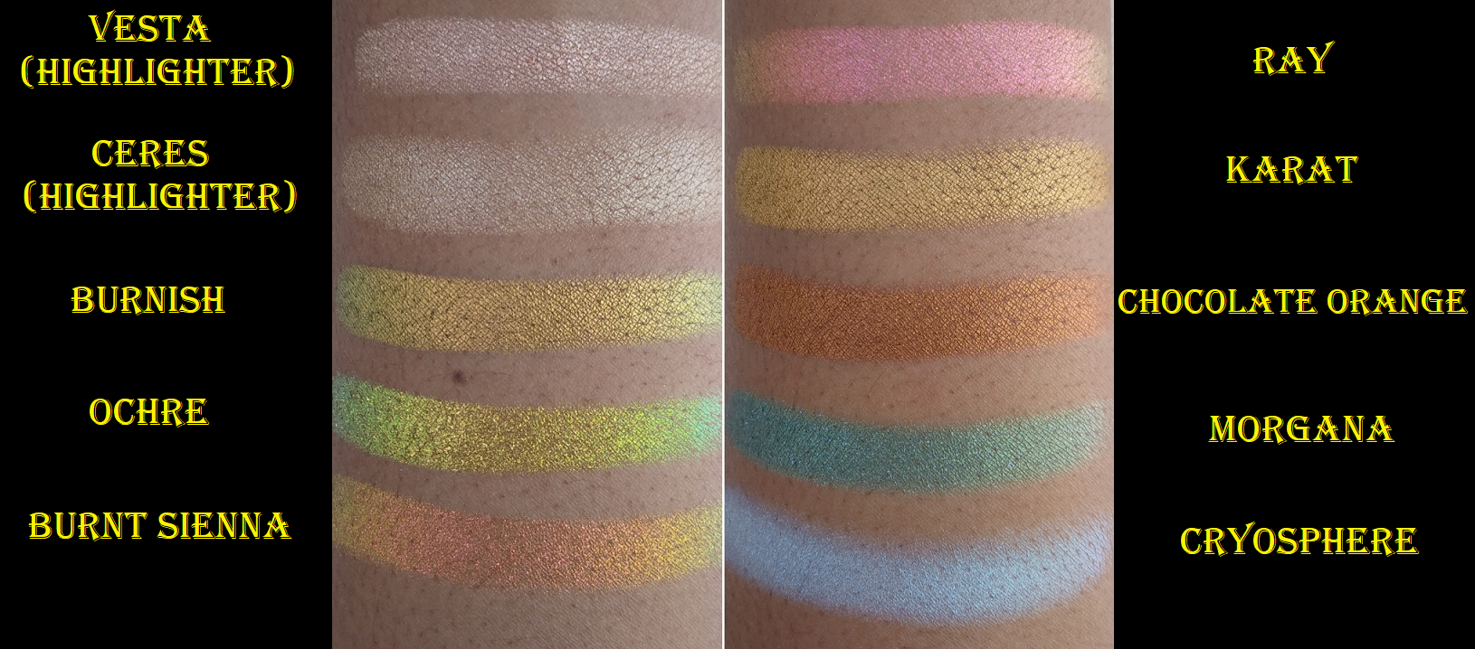
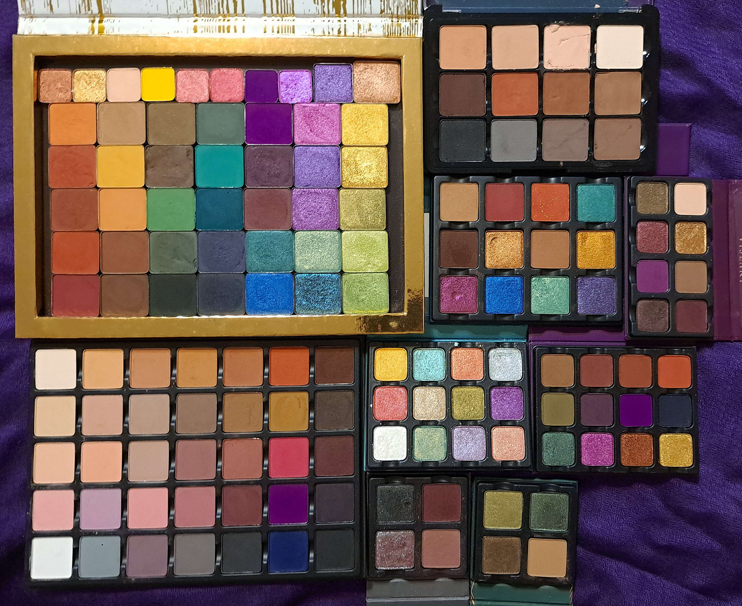
The eyeshadows in the top left gold rimmed palette are my older ones that are more fragile. I excluded them from the custom palette, in addition to the Neutral Mattes that already had several damaged shadows from when I depotted shades from the older packaging to the newer Slimpro empty palette.
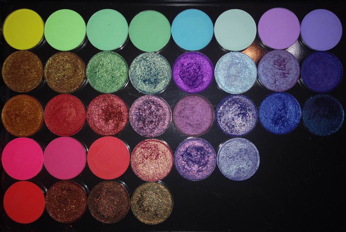
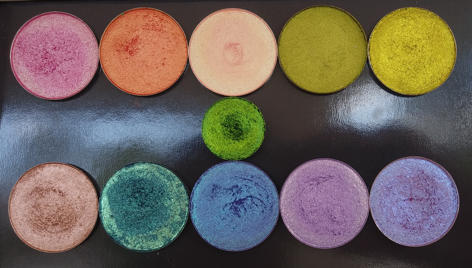
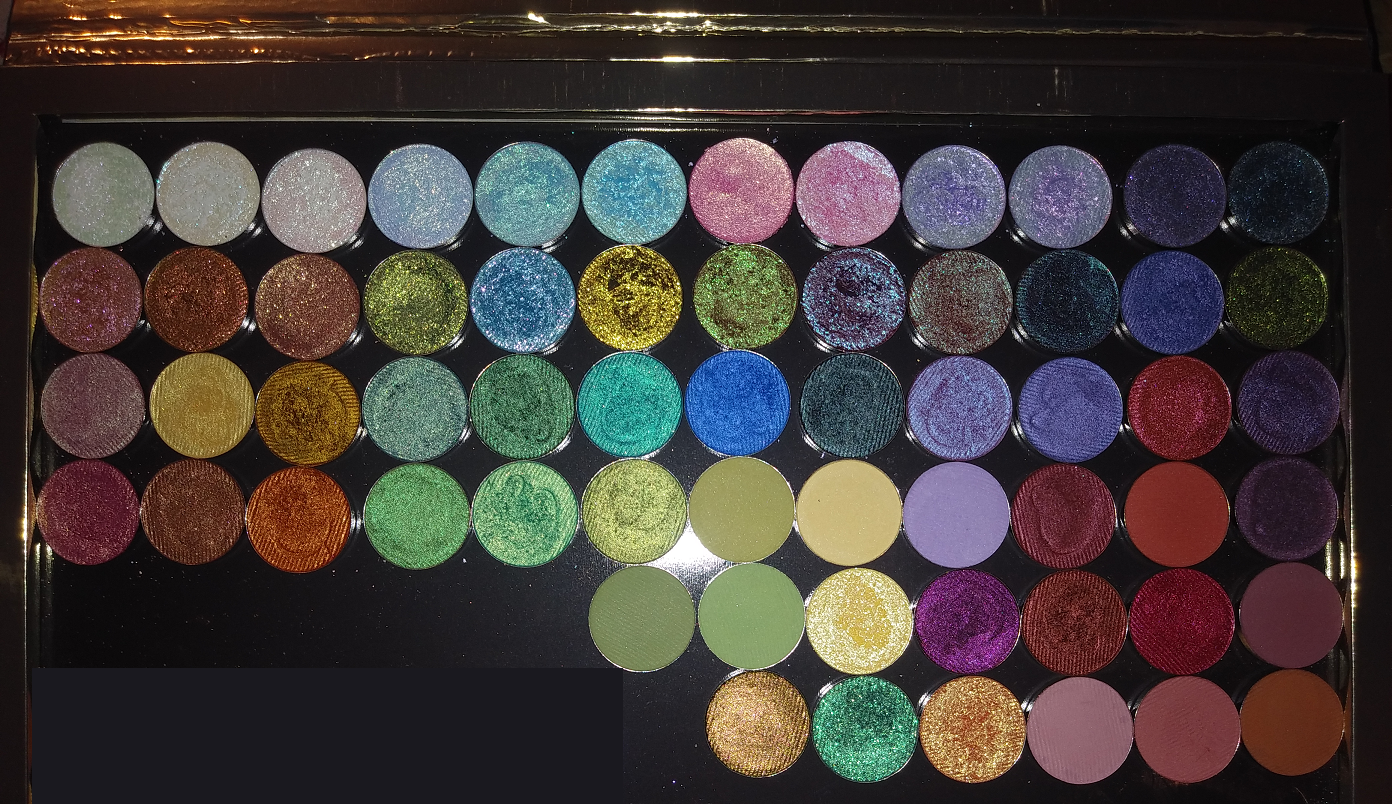
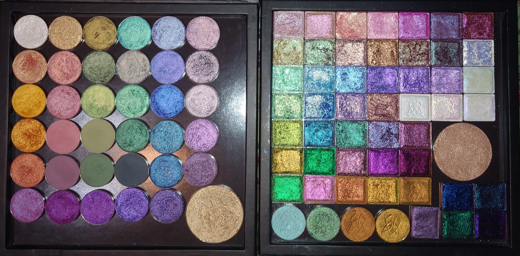
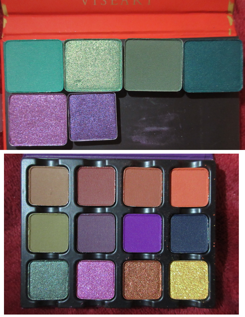
Below are the two custom palettes I curated. I couldn’t make just one because of the different pan sizes. Viseart currently has three eyeshadow pan sizes they sell.
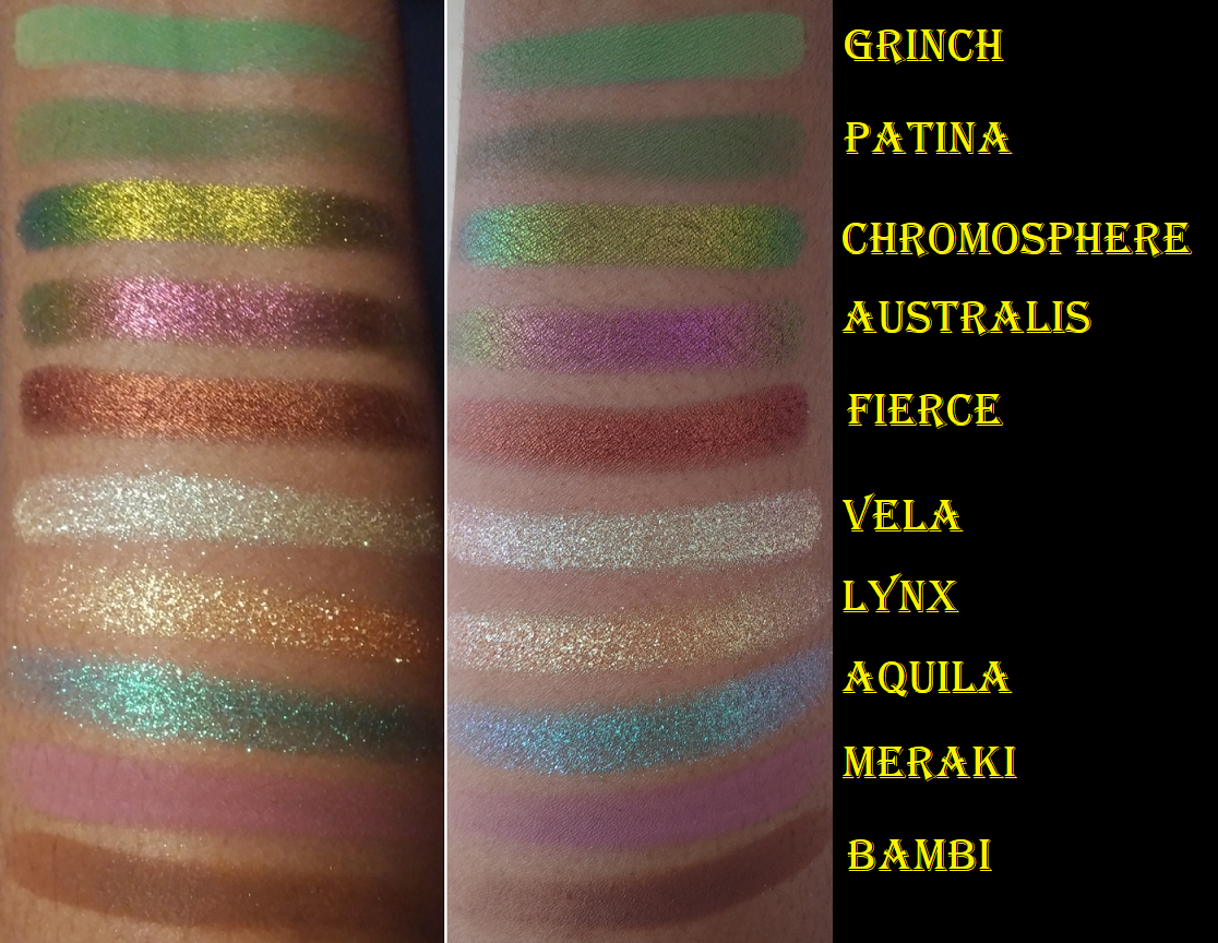
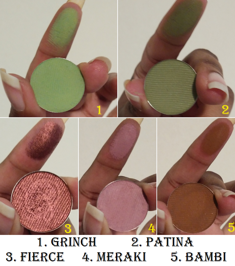
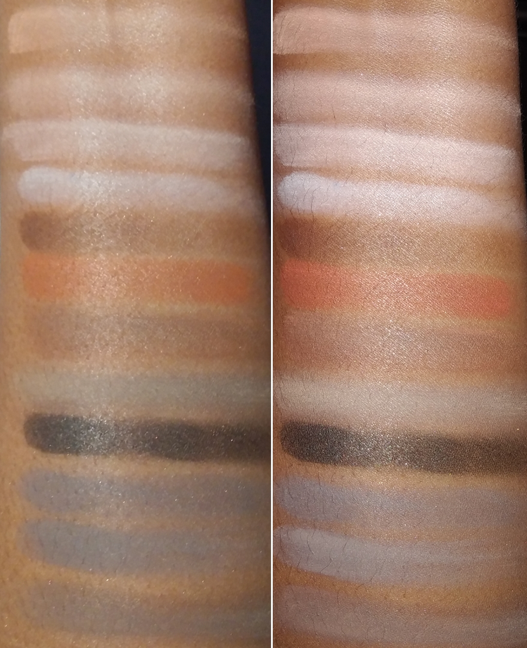
Viseart has a lot of nearly identical shades, and some colors don’t look the same on my skin as they do in the pan. So, I had to swatch everything and choose the ones I liked the most. The color story in the revised Grand Pro 1x palette looks very heavy on the midtone neutrals, but that’s because I realistically don’t use a lot of the lighter colors. If I have one or two, that’s generally enough. However, the nuances between those various browns and pinks were so nice I couldn’t decide between them and decided to just take them all.
Since I had to analyze my collection and think about the palettes they were part of, I’m in a better position to be able to rank them in their original forms, similarly to the way I discussed my Pat Mcgrath Palettes, Huda Beauty Palettes, and Oden’s Eye Palettes.
Omitted from the ranking portion are the individual eyeshadow singles I bought, since they came from palettes I didn’t own in their entirety.
Ranking List of All the Viseart Palettes I Ever Owned:
- Dark Mattes 04 (Original 12 Pan Large Version)
- Petits Fours Violetta
- Bijouxette Étendu
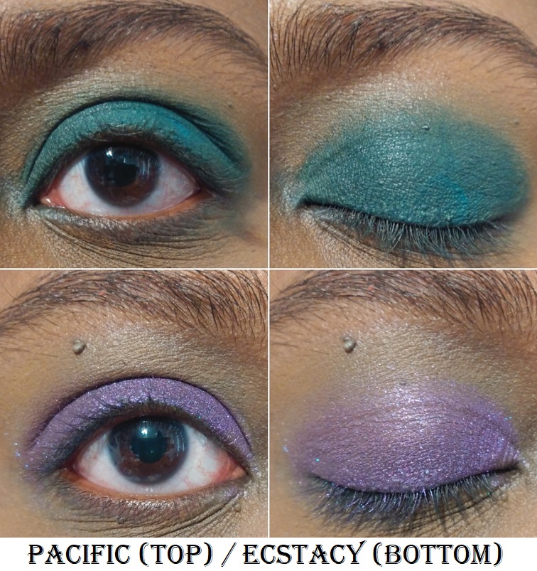
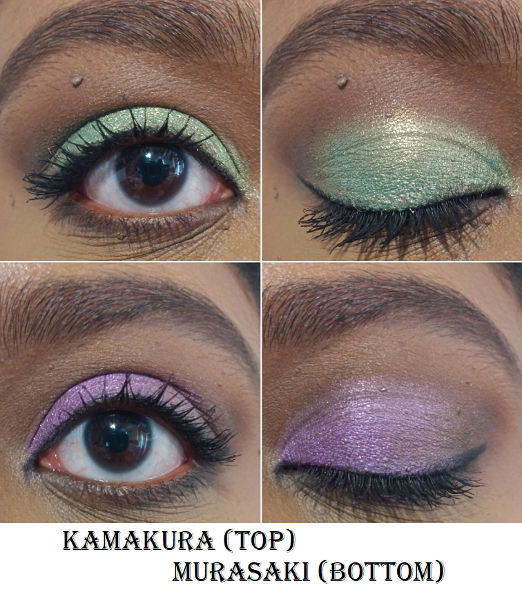
- Petit Pro London Étoile
- Petit Pro Soleil (Swatchfest)
- Petits Fours Peridot
- Petites Shimmers Coy
- Minx Theory II Palette
- Neutral Mattes 01 (12 Pan Large Version)
- Grande Pro 1x
- Warm Mattes 10 SlimPro (Swatchfest)
- Boheme Dream (Original 12 Pan Large Version) (Swatchfest)
- Dark Edit (Swatches) (Discussed)
Each of the thirteen above are linked to their previous reviews, swatches, or discussions.
Dark Mattes (purchased in January 2016)
This is my number one Viseart palette based on the original formulation and not the current Dark Mattes Slimpro palette. Viseart’s eyeshadow formula was always simplistic, but the original ingredient list used to include Octyldodecanol, Myristyl Lactate, and Isononyl Isononanoate, which are all emollients. I haven’t tried the current version of this palette, so I don’t know if it feels or performs in the same way. However, there was a period of time that I felt Viseart’s quality went down, so they’re not impervious to production issues. I think it would be a safe bet to guess that the original and new ones look and feel the same, but perform a little differently. It could still be good, but I don’t know from firsthand knowledge.
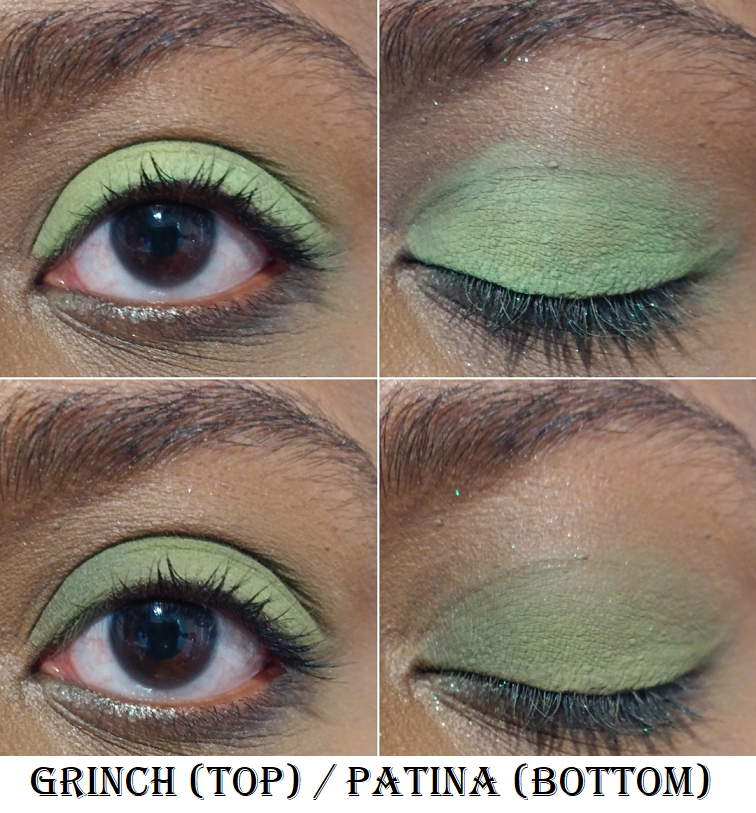
I loved this palette so much because of the gorgeous color story and insane blendability. It was my go-to Fall palette for so many years. The bottom row of blues and greens were a little less pigmented and took longer to blend, but overall it was a great palette.
After about five years, some of the shades eventually became hard to use (it’s only promised to be good for two years). I tried to replace it with the Dark Edit palette. Ironically, the Dark Edit is at the bottom of this list. Yikes! More on that later.
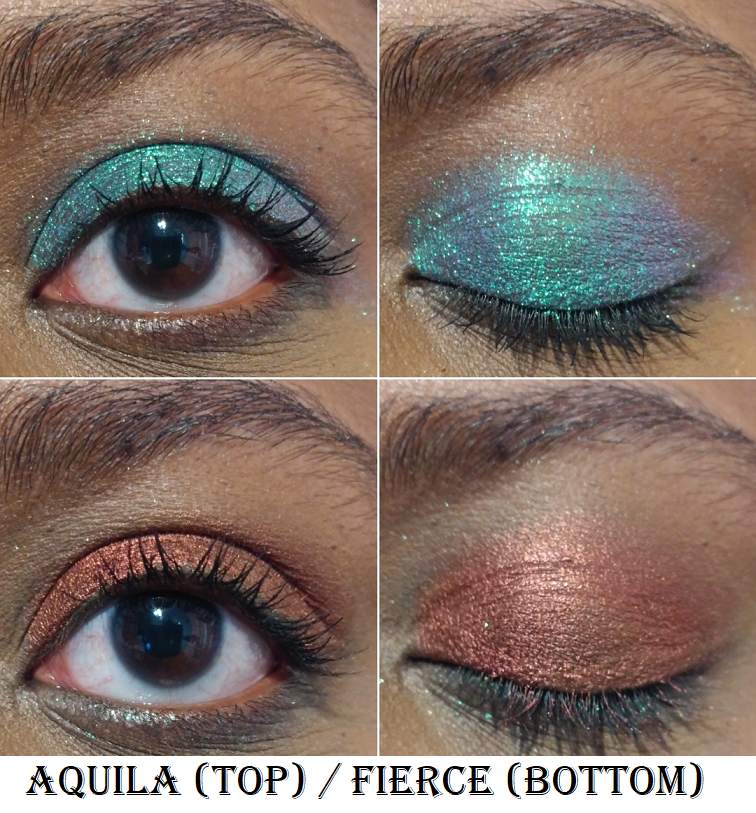
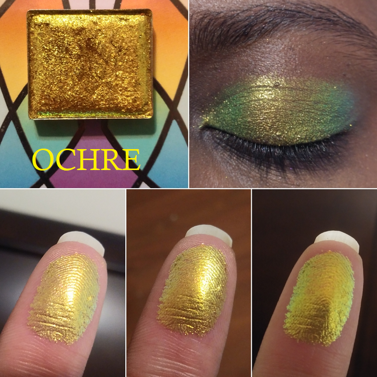
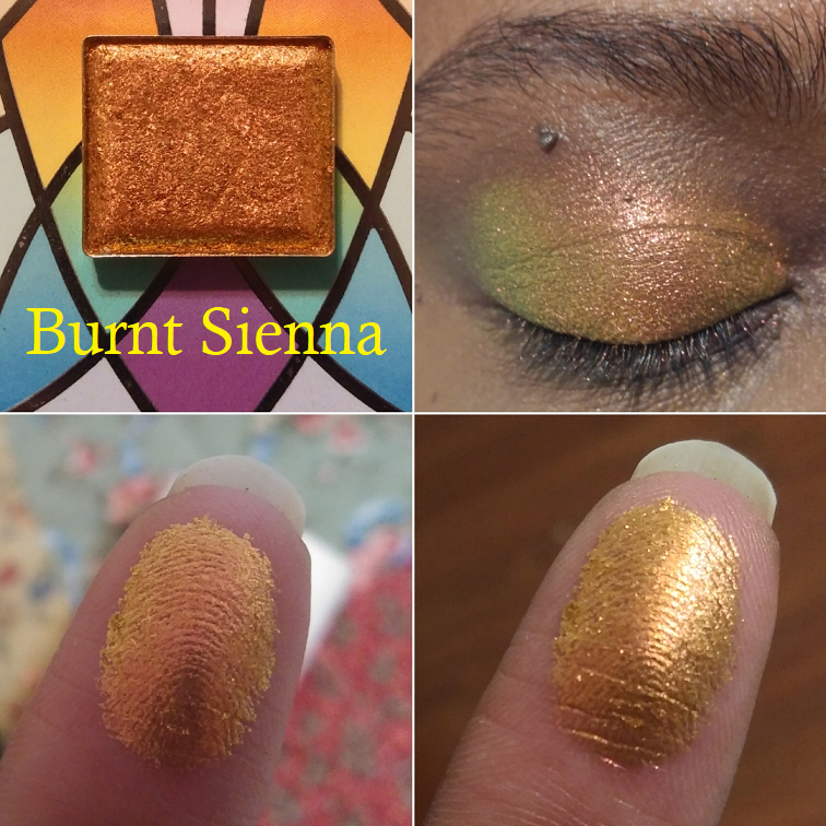
The remaining shades I still own from the original Dark Mattes were working extremely well before I left, particularly the oranges. Viseart’s orange shades set the bar that I compare to other brands. It’s similar to the way I consider Oden’s Eye an authority on greens.
Petit Fours – Violetta
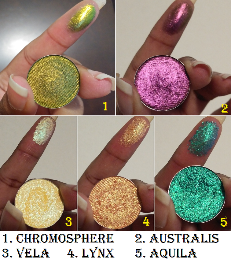
This is among Viseart’s relatively newer palettes. Whatever quality/production/formula issues they seemed to have between 2020 and 2021 (allegedly) might have been over with by the time this was produced. To me, this is the most interesting color story the brand has released, or at least among the quads. For starters, it has a duochrome which is not a common feature among the brand’s palettes. Seeing the shade Verrerie next to all the other shimmers in my custom palette, one can see that the finish of it is different and it’s evident how much it stands out from the pack. Viseart also tends to love including brow bone shades and other light eyeshadows. For the ratio to be this high of dark colors is another uncommon, but very welcome, attribute. This selection of colors allows the user to truly be able to take a look from daytime to nighttime. It can go from relatively light and ethereal to deep and dramatic. Each shade is distinctly different, yet they all pair well together. It was a holiday release that gives me Christmas vibes reimagined without the use of straightforward reds or greens.
In terms of performance, it’s their best shimmers yet. There’s no creasing, fading, or any other kind of longevity issue. The only reason this isn’t in the number one spot is because it’s the newer of the two. It hasn’t stood the test of time like the Dark Mattes palette, and there is less variety purely because of there being less shades. If you’ll allow me some leeway, we can consider this quad tied for first.
The best part is the fact that what’s available online right now should still be the same quality as the one I own.
Bijouxette Étendu
This was another unusual release because of how colorful it is, and not being filled with a ton of light shades. There was a time when I loved having a neutral matte crease and outer corner paired with a shimmery lid shade. This palette is perfect for that style. Creating looks within the same color family is possible, but I think the second best style option is to go for pairing multiple colorful shades together. I love the combinations I showcased in my initial review for Bijouxette. Back then, I called it a jewel-toned rainbow palette, but I want to add that it also has a tropical flair.
The mattes are very pigmented, but blend and layer well. They’re buildable and long lasting around the eyes. The shimmer finishes are a mix of the semi-toned down ones Viseart is known for, combined with ones that are more impactful and intense like in Violetta. However, the level of smoothness makes these shimmers the best Viseart has done (out of the ones I’ve tried), tied with the Violetta shimmers. I’ve always been impressed that they are smooth without having a dimethicone slip to them that other creamy/buttery formulas often have, which means I don’t have to deal with creasing.
This palette is a little bolder than what I reach for most often, but it’s one I have no regrets buying and I’m still happy I purchased it.
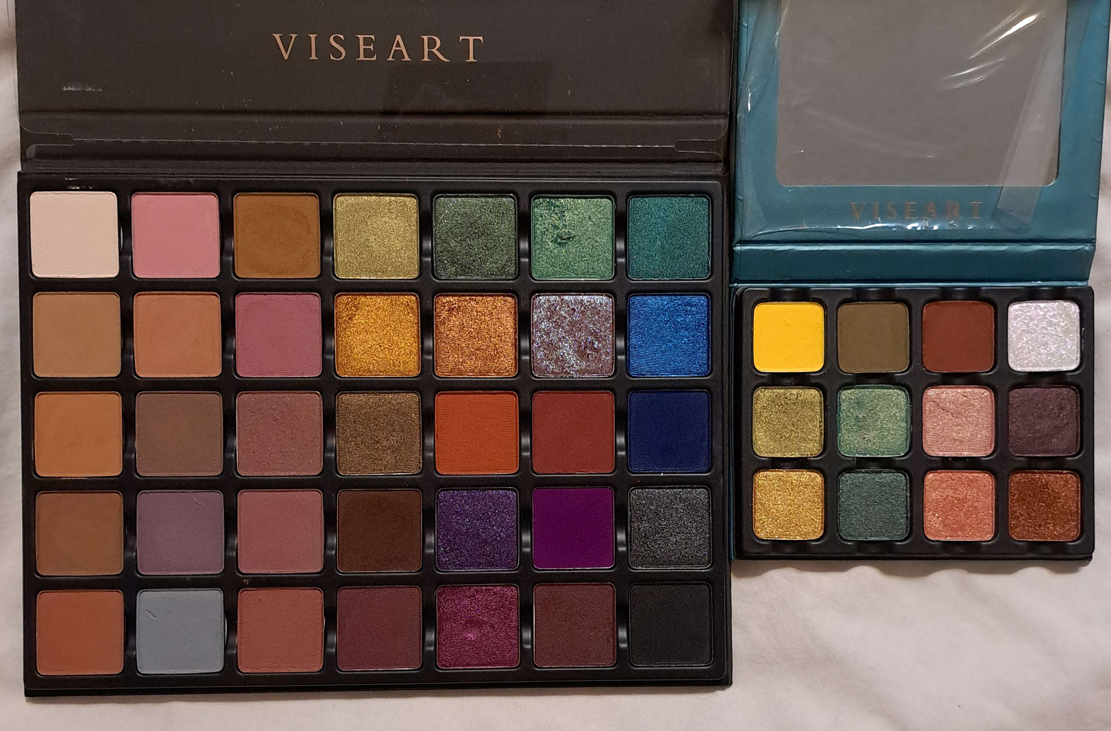
Petit Pro: London Étoile
This is very much my type of color story, and the quality is great (though Brixton takes more effort to blend than the other mattes), so this was bound to be rated highly. It has a range of depths among the neutrals and sophisticated colorful shades. It doesn’t offer a ton of variety, but enough to keep things interesting. The colors in here can be duped by other shades in other palettes from Viseart, but it was nice to have it all curated in one place. This is why I didn’t include the shades in the small custom palette. I would rather bring the whole thing, in the pre-arranged colors, during the next wave of products I return with from the US. When I’m in a very specific mood fighting between my desire for something demure, but still wanting my eyes to be the star of my makeup look, this is when I want to use this palette the most.
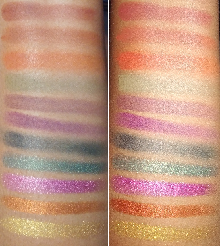
Petit Pro: Soleil
The purple shade in this palette is a little rougher to the touch, drier, and takes a bit of blending, but it’s a pretty color. The thing is, Viseart has made so many shades that look identical to it or near enough to duping itself, that it’s not as special. While the shimmers were a little more unique to Viseart at the time it was released, I also have similar colors from other palettes of theirs. That just leaves the cream matte (very replaceable) called Patile and bold yellow called Pastis, which is hard to build up adequately on my eyes. Although this was a likeable palette at the time that I originally owned it, I don’t think it’s as interesting anymore, beyond being a handy supplemental palette for travel. The options give strong sunrise and sunset vibes, making me think even more about vacations when I look at the color story. In terms of quality, it’s quite good with the exception of the two laborious mattes.
Petit Fours: Peridot
I like the colors in this palette, but the matte barely shows on my eyes and the deep green doesn’t provide enough depth for me. So, I don’t think this is as successful as a quad. As a supplemental palette though, this has been more useful. At the time, this was a very good option, but I can name plenty of other green palettes by now that have more to offer. Even though the quality of this one is very good, other brands have matched theirs with the added benefit of other ingredients in their formula that make them feel smoother, softer, or creamier to the touch. This makes other brands’ shimmers a more pleasant experience since I tend to apply those with my fingers. For that reason, I feel that this palette should actually rank lower, but the quality prevents me from being able to do that.
Petites Shimmers Coy
I was so enamored by this color story because it represents the shimmering nature of fish scales, colorful koi fish, and whimsical spring time. These eyeshadows are thinner and sheerer than the brand’s usual shimmer shades, making them well suited for producing a watercolor effect on the eyes (which is not my usual preference) or like toppers because the sparkle level was turned up a notch on some of the shades. They are so beautiful to look at that I forgot the most important thing about a palette is to choose one with colors I would actually wear on my face. Nearly all of them are light colors, I’m not interested in the cool toned shades, and I have to spray them to get the opacity level I’m used to. Plus, there are no true mattes. This palette really isn’t for me, which is why it’s lower. However, the great quality is undeniable and the eyeshadows work in the way they were intended, and can even be used in other ways for those willing to put in the effort. So, this palette doesn’t deserve to be anywhere near the bottom.
Theory II Palette- Minx
I’ve shocked and surprised myself in numerous ways regarding this palette. For starters, I could have sworn I reviewed it, but I can’t find details of it anywhere. What I had instead was a review of Natasha Denona’s large 5 pan (#4), which was extremely similar to Viseart’s Minx. I purchased Minx a month after that review and felt that the quality was even better than Natasha’s. So, in 2017 I decided to sell my ND quint on Mercari (my first sale on the app). In those days, these palettes had too simple of a color story for my tastes and I didn’t need two near identical palettes. I still ended up selling Minx a month after selling Natasha’s. However, I have to say that based on my preferences now, I would have appreciated these colors a lot more today. The brand made it so simple for consumers and professionals alike giving a light, medium, and dark shade plus corresponding shimmers. This was still during the time when Viseart’s eyeshadow quality was so good. The blend and ability to layer the colors together was great. Viseart’s shimmer level was more in line with my past, as a former lover of satins, but they were still pigmented and nice. They reminded me of the shimmers from Melt Cosmetics. In fact, both brands are notoriously not complimented on their shimmers. However, whether I like them or not varies from palette to palette. This was a better palette than I’ve given the brand credit for in the past.
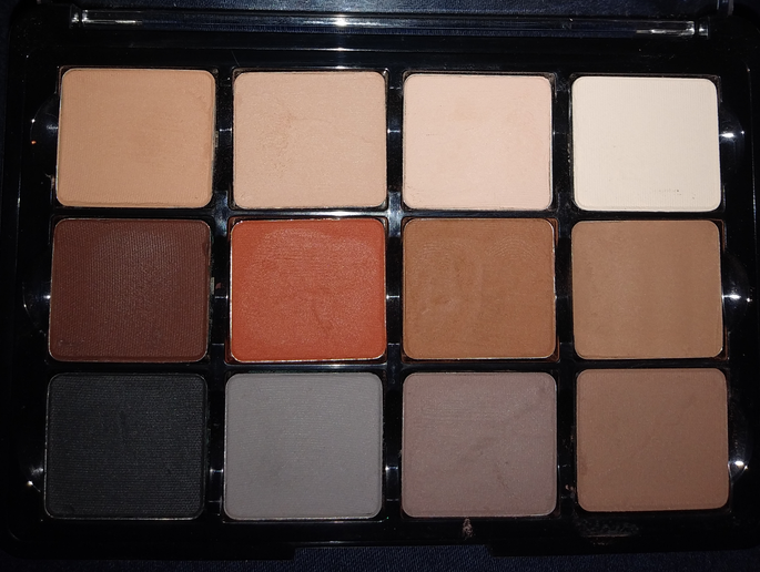
Neutral Mattes 01
This is where the rankings start to get really tricky. I purchased this from Boxycharm in the original square packaging, but I can’t confirm if it was made in the current formula or if it was the last of older stock. I don’t know if I’m remembering correctly that the Viseart shadows still had a packaging change within the square shapes before they were replaced by the SlimPro palettes. In any case, the quality is actually very good, so I’m going to guess it was in the original formula. My biggest gripe with this palette is that the colors look way too similar on my skin. The first row looked like white, two off-whites, and cream. The middle row had a brown that didn’t look as deep on me as it looked in the pan, an orange, an ashier brown that looked similar to the deep one, and another brown that swatched cool toned grey with a splash of brown. The final row had black, blue-grey, regular grey, and another brown grey that had more grey in it. This was supposed to be my ultimate neutral palette. Had the eyeshadows looked true to color on my skin, it would have been. However, this palette could be boiled down to five colors: a light color, brown, orange, grey, and black. I always used the same shades, so the remaining seven were pointless to have. The only reason this palette is still in my collection in its entirety is because they’re too fragile in their depotted state to be sold. Objectively, on people with different skin tones, perhaps this palette is true to color. In that case, I can see why it’s Viseart’s best selling palette of all time. It even looks normal on the dark arm photo on their website. However, this palette was too repetitive to be considered worth the price, had I paid full price for it.
Grande Pro 1x
The quality in this palette is inconsistent. I went extremely in-depth with the positives and the negatives in my original review. The short version is that many of the darker shades were stiffer and harder to blend. The light and mid-toned colors were thinner and worked better, but needed to be built up a bit. Columns 3-5 were perfect. The vibrant eyeshadows were the toughest to use and driest feeling, with the exception of the orange (Pumpkin). It’s no surprise because the brand really nails oranges. The performance being all over the place is why I couldn’t rank this higher. I appreciate that I get more variety in this palette than the Neutral Mattes and I can essentially replicate those colors by using the shades in this one. However, the better performance is why Neutral Mattes is higher.
Warm Mattes 10 SlimPro
I didn’t have this palette long enough to review it or even take a photo. I kept six shades and sold the remainder in a custom palette. I don’t know what I was thinking when I got it. It seemed like a good idea in theory because I like warm shades, but it was just too repetitive for how the colors looked on my skin. It was in the current formula and still good quality, but not as useful as I hoped. The Neutral Mattes had various depths from light to dark. In this palette, the darker options didn’t go as deep as I needed. Considering I could also recreate some of those looks from Warm Mattes using Grande Pro 1x colors, and at similar quality for those particular shades, this had to drop lower in the rankings.
Boheme Dream
I kept seven and sold five of the eyeshadows from this palette. It wasn’t a surprise though. The pinks, silver, and light blue were never of interest to me, which is why I held off on buying the palette for so long. So, I intentionally purchased it on sale with the plan to recoup some money by selling the ones (in unused condition) that I didn’t want. I had no issues with the quality of these eyeshadows. The reason this ranks lower is because the overall color story was less cohesive and more of a supplemental palette. In addition, the Viseart older shimmers are decent but make the palette even more lacking for me with the absence of mattes. Even though I kept one more shadow from this palette than the Warm Mattes, I think the matte formula is more impressive compared to many other brands than their shimmers are to other brands. So, by default, it took position number 12 on the list.
Dark Edit
The same issues I had from Grande Pro 1x regarding blending the dark shades and showing patchiness on camera rather than real life were happening with this palette too. The purples and black matte specifically were so annoying to try and look non-patchy, smooth, and stay adhered to my eye area, that it put me off buying Viseart palettes for a very long time. It is overall the worst performing palette from them I own, and the only one I would say is actually objectively bad. There’s something wrong with the way my batch was formulated. There were more duds than good ones. The bottom row of shimmers were the only ones I could call great or good. It’s such a shame because I think this selection of colors is even better than the Dark Mattes because it gets rid of the blues I didn’t use often and had the benefit of including shimmers, so I could make a complete look. However, I knew immediately when I made this post that Dark Edit would be at the very bottom.
That’s the end of this ranking! I hope it’s been helpful, though it’s admittedly tricky recommending things from Viseart when the old and new eyeshadow ingredients are not the same. Their eyeshadows are not one of my top 5 favorites anymore, but I’m still interested in seeing what they release and I continue to be curious about their launches.
For those interested, but wary about the quality, I recommend trying to catch one of Viseart’s sales. Sometimes they have select palettes up to 60% off, though a 40% discount applies to more palettes during their sales. It’s how I ended up with so many from the brand.
Thank you for reading!
-Lili ❤