
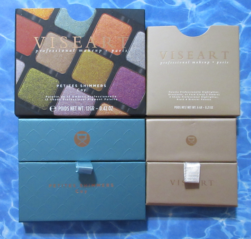
I intend to make this a quick review of the two latest additions to my Viseart collection. I bought the blush duo during last year’s After-Christmas sale via Beautylish, but I’ve only had the mini Coy palette for two weeks.
Viseart Petites Shimmers Palette in Coy
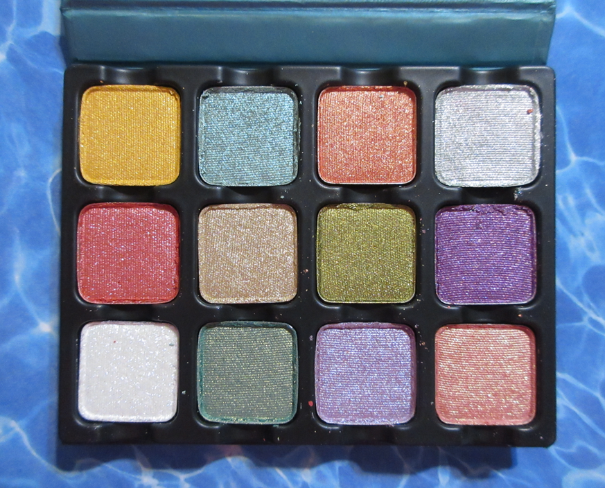
I’ve wanted the full-size Coy since 2019, but because it consists of all shimmers and in pastel and light duochromatic shades that I wouldn’t wear often, I knew this would be a purely supplemental palette for me.
Two years ago, I purchased my favorite individual eye shadows from Coy, Murasaki and Kamakura, as a compromise for being unable to justify spending $80 for a palette I would always feel like I had to pair with another palette in order to use it.
So, I was thrilled when the brand finally released it in the Petites form!
I’ve reviewed Viseart’s shimmers in the past, and the list of their links can be found here, but these are a bit different because of how they’re thinner and more sheer. They have more pigment than toppers, but they seem to have been created for adding a veil of color over other shades. They can be built up to appear more opaque by spraying them and packing them on, which I tend to do since I’m not as into the watercolor eyeshadow look.
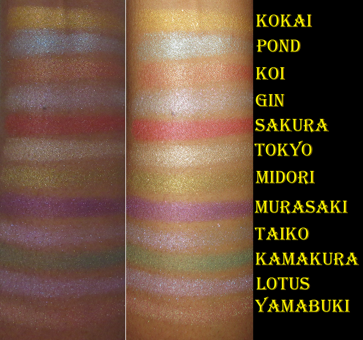
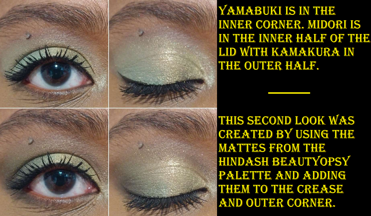
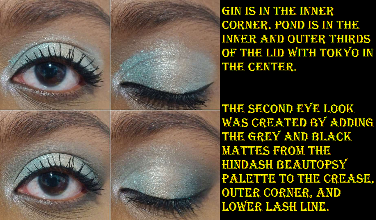
Viseart’s shimmers are famously intended for soft looks with their satin textures, muted colors, and low-sparkle level. So, whenever they deviate from that, my interest is piqued. These are still quite soft, with some shades tamer than others, but there’s extra glimmer to Pond (like an aqua blue mixed with seafoam green), Gin (duochrome cool silver-purple), Taiko (iridescent purple), Lotus (lavender with slight blue-purple shimmer), and Yamabuki (duochrome coral base with gold-green shimmer).
As I mentioned before, I already owned Murasaki (medium-dark purple with lighter purple shimmer) and Kamakura (medium green base with yellow/gold shimmer) as singles, but the other favorites I always wanted were Yamabuki, Midori (light yellow-green), and Lotus. Unfortunately for me, the base color on my eyes hardly shows in Yamabuki and all that can really be seen is the shimmery goldish green tinge. I wish it looked more like the color in the pan on my lids, so that was a disappointment. It’s essentially yet another highlighting type of shadow for me, as if Gin, Tokyo (light tan-beige), Taiko, and technically Midori and Lotus, weren’t enough. Midori has a stronger yellow tinge to it than green, which I wish was the reverse, but it’s still pretty. Lotus is the one that was exactly as I expected, which made me happy. However, it’s a shade I own plenty of in my collection, so I’m glad I didn’t buy it as a single. In fact, it was a good thing I didn’t buy any of the rest as singles because I think I’ll be reaching for these even less than I thought. I’m thrilled to finally have them all in a more affordable form, but if I’m being honest with myself, they don’t suit my particular eyeshadow style. That being said, I have no intentions of decluttering this palette anytime soon.
Regarding longevity, I’ve had no issues with these lasting other than the tiniest bit of creasing over MAC Paint Pot, but no issues over the Gerard Cosmetics Clean Canvas or Coloured Raine Paint Base primers.
The quality of this palette is good, so I do recommend it, but only for those that like toned down textures of eyeshadows and lightly colored shimmers that are bright in tone but don’t really “pop.” Those that like thin watercolor effect shimmers and like that they’re on the sheer side.
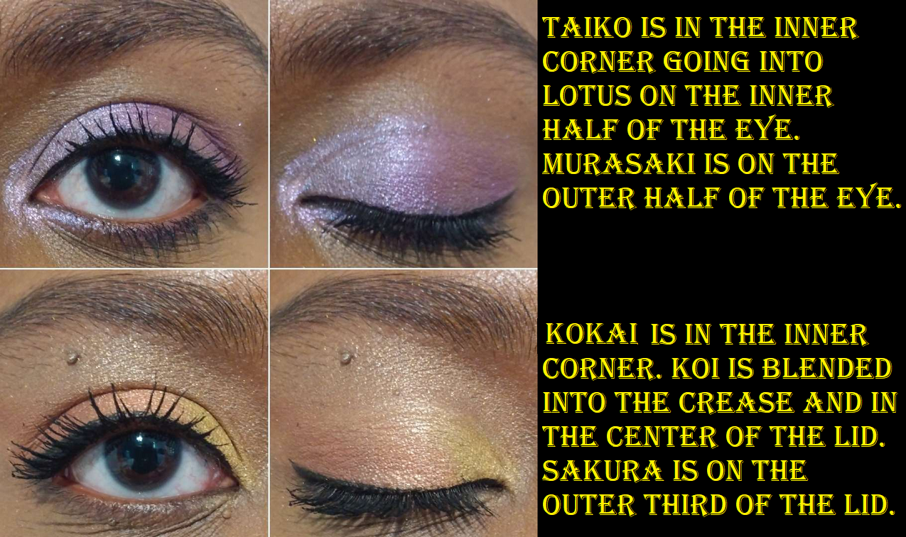
I did all these eye looks very quickly and wasn’t going for precision. Also, since the Isamaya Industrial 2.0 Collection just released, it’s only natural for it to be on my mind. The palette in that collection has some shades that remind me of these. This might be a tamer and easier to use alternative for those that don’t want to spend so much on that one. They are definitely not dupes, but I get spring vibes from both of them, which is ironic since they have seemingly opposite themes. One is a mix of mythology and nature, especially water themed, with “crystalline” finishes, while the other revolves around manufacturing and is a, “softer, subtler take on heavy metal.” To be fair, metals are a natural element too.
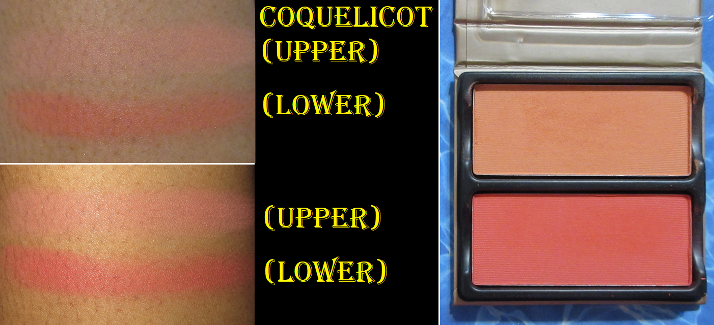
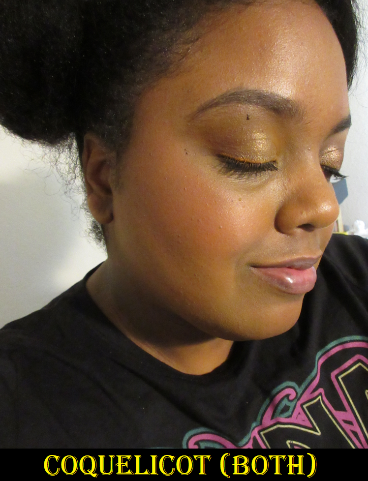
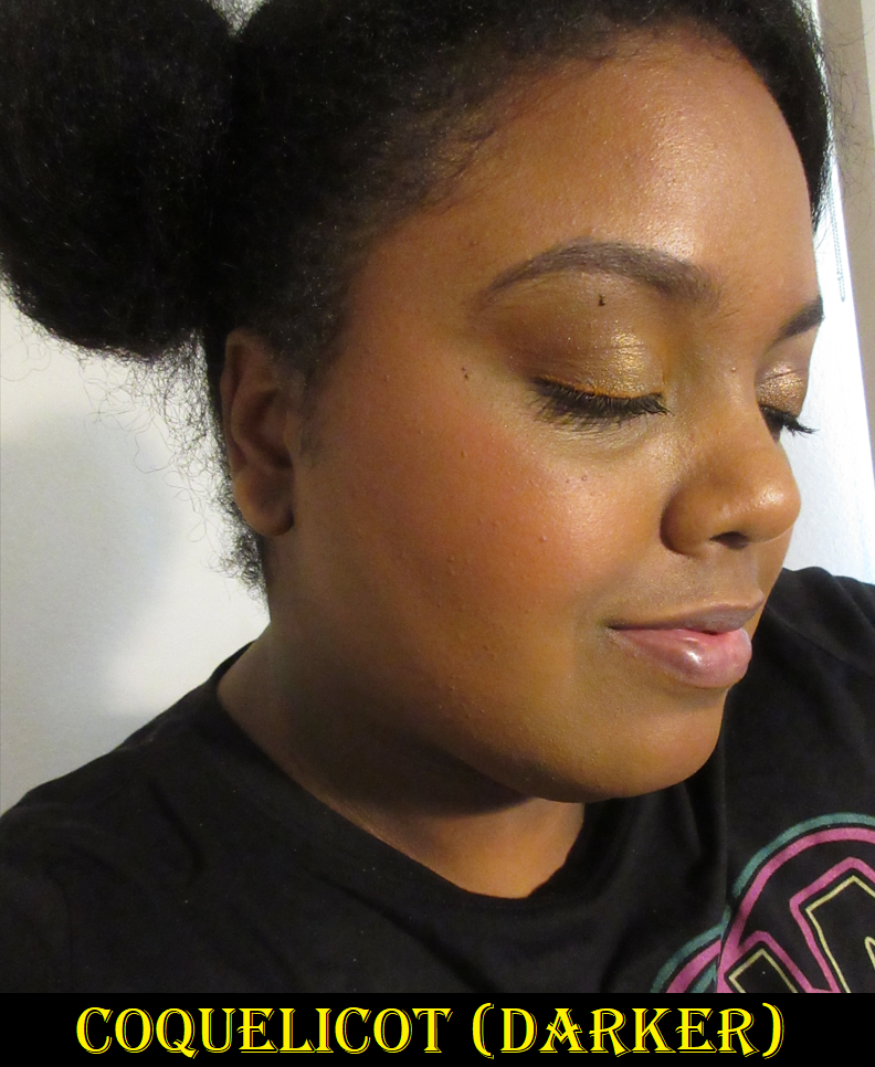
Viseart Blush Duo in Coquelicot
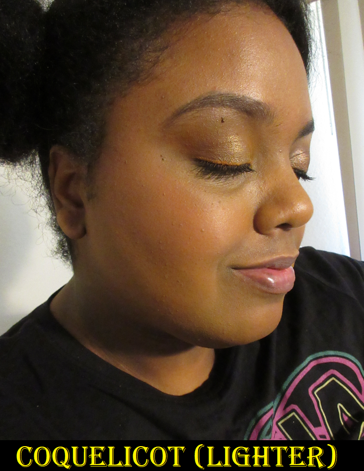
I like duos because of the ability to have essentially three shades in one: the first color, second color, and the third shade that results in combining them both. I’ve used this product less times than one would expect, considering I’ve owned it for over half a year. This is because of my preferences in blush finishes, shades, and texture. Plain matte blushes, the ones with no sheen whatsoever, have been the least favored type for me for at least a year now. I like soft matte, demi or semi mattes, and satins, but purely matte is a harder sell. However, it’s certainly not impossible for me to like them. Tarte and MAC are brands that come to mind that make mattes that aren’t flat. Thankfully, this one from Viseart doesn’t look flat, but also doesn’t look flattering either until it settles and combines with the oils in my skin. Knowing this, I try to help it along by prepping my dry skin with hydrating skincare before putting on my makeup, or at least applying a facial oil to my cheek area prior to adding foundation and then blush. This was the case in the demonstration photos with me wearing the blushes.
The texture of the powder is dry to the touch, but it at least doesn’t make my skin look drier, even without the extra skin prep. This makes it more successful than the reformulated Sephora Colorful Blushes I reviewed a few weeks ago. Since we’re on the topic of duos, if you’re looking for a fantastic quality blush duo in a soft matte finish, I highly recommend the Sephora ones discussed in that post too!
The blush shades from Viseart are colorful ones with no natural skin-flush colors in the line. Coquelicot has pretty colors. I don’t think I could have chosen a duo that suited my preference better than this one out of the six choices available, but I always end up mixing both shades together. When I wear the lightest one alone, I can built it up, but it’s a little more faint than I like. I instantly pine for something with more of a pop. Ironically, when I wear the darker one alone, it’s so pigmented, vibrant, and intense that I always feel like it’s too much and that I have to mix it with something else to tone it down. I used a light hand with it in my photo example below, though. In order to pick up less product, it makes sense to switch to my squirrel hair brushes, but most of those that I own are fully round and/or much bigger than those rectangular pans. It’s a little annoying searching through my limited options fitting that criteria for a brush shape that fits nicely and coats the bristles evenly without needing to dip into the blush multiple times or getting some of the lighter shade mixed in too.
While the perfect pairing is having these two together, I lose some of the benefits of having a blush duo when a single medium toned peachy-coral shade would suffice too. This is of course a “me” problem since plenty of other people can get enjoyment out of wearing each one by itself. I am happy though that Viseart’s blushes don’t contain the white base that can make a shade like the lighter one appear ashy on those with melanin-rich skin. It’s pigmented enough that I can still use it, though I have to spend a little time building it up. The second color takes time blending and applying slowly, as to not overdo it, which I easily can.
These blend decently and last all day without fading. I’ve grown to like them a little more than when I first got them, and part of that had to do with using the skin hydration trick and always wearing them mixed. At the non-sale $30 price for two blushes, I think it’s fair. I’ve paid that price for single blushes. It’s not my favorite formula, but I like it enough that it made me interested in the concept of Viseart’s new Fleurette Face Palettes. The option of combining a quad and blush duo in one magnetic/customizable package for $40 is a pretty great deal. The one I have my eye on for the blushes though, Bisous, looks quite similar to Coquelicot. When I contacted Beautylish customer service to ask if they are the same, the rep couldn’t confirm, but acknowledged they look similar enough that they might look the same on the skin even if they were technically different shades. Perhaps I should have contacted Viseart instead, but I need all the help I can get to remember I’m supposed to be on a low-buy and this answer gives me enough reason to pass on getting it.
So that’s everything for today! Thank you for reading!
-Lili ❤
