Sydney Grace Palettes, Cream Eyeshadows, and Singles Haul

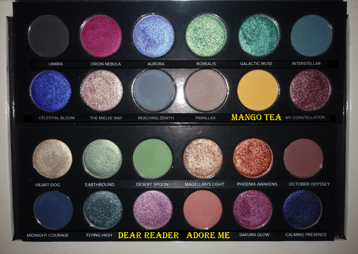
I’m posting at a slightly earlier time than usual because in one hour, Sydney Grace’s annual week-long Christmas in July event will begin! Everything in this haul was purchased last Black Friday, but that was because I skipped last year’s Christmas in July sale. The discounts look even better this year, so I wanted to show some of the unreviewed products from the brand that I haven’t featured yet in case anyone is interested in seeing them. My initial Sydney Grace review with a ton of eyeshadows can be found here, as well as the Temptalia collab here.

This event is typically the one time of year I make a purchase. I checked that everything in this post is still available, with the exception of the Sweet Indulgence Palette that launched during the previous sale and was on clearance by the time Black Friday rolled around. This year’s launches will be the Love’s Journey palette, Heaven on Earth palette, and Raspberry Kiss palette. If I decide to shop the sale, it will most likely be Day 2 where all palettes (including Love’s Journey, but I don’t think Heaven on Earth or Raspberry Kiss), cream shadows, and more are 40% off.

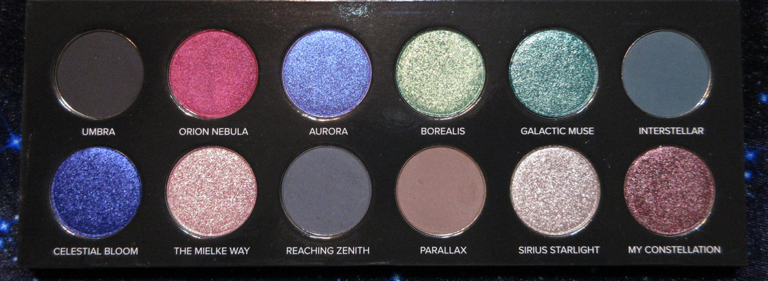
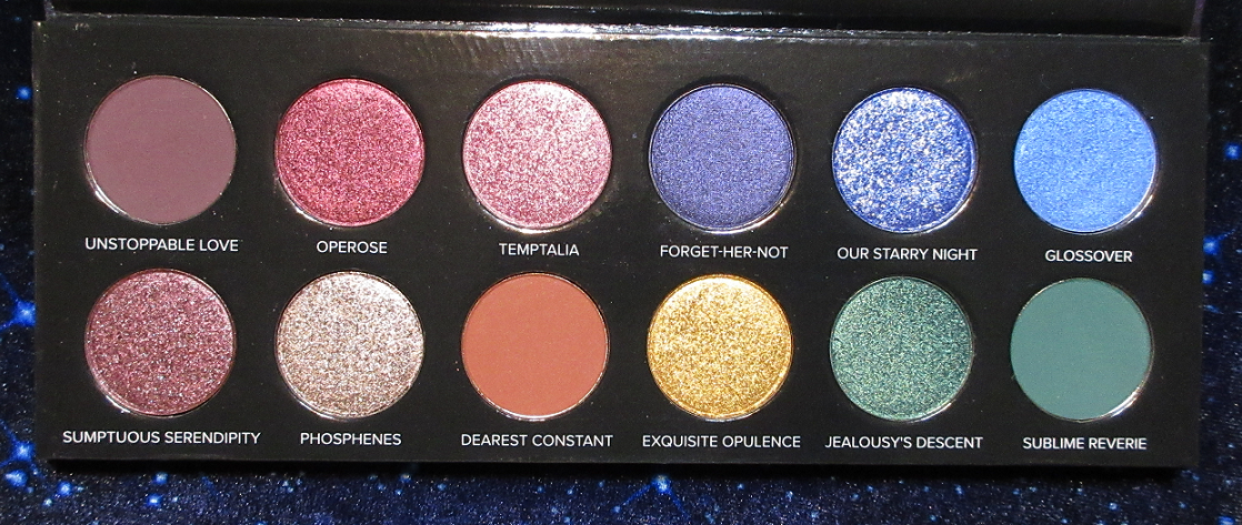
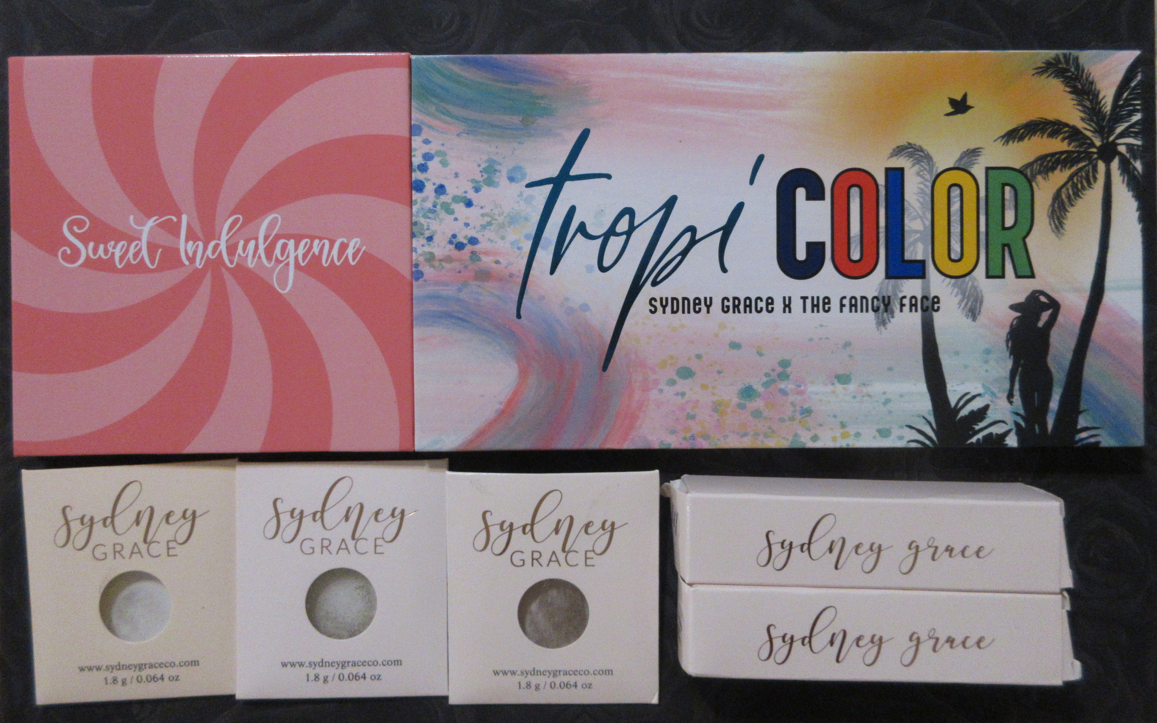
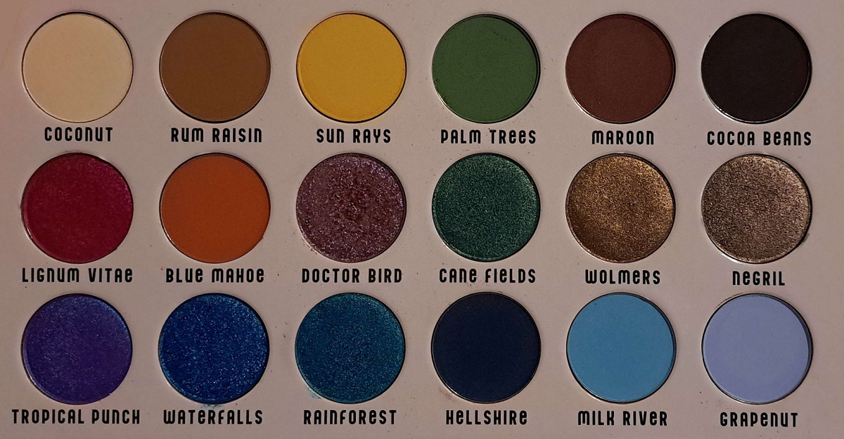
Tropicolor by The Fancy Face Eye Shadow Palette

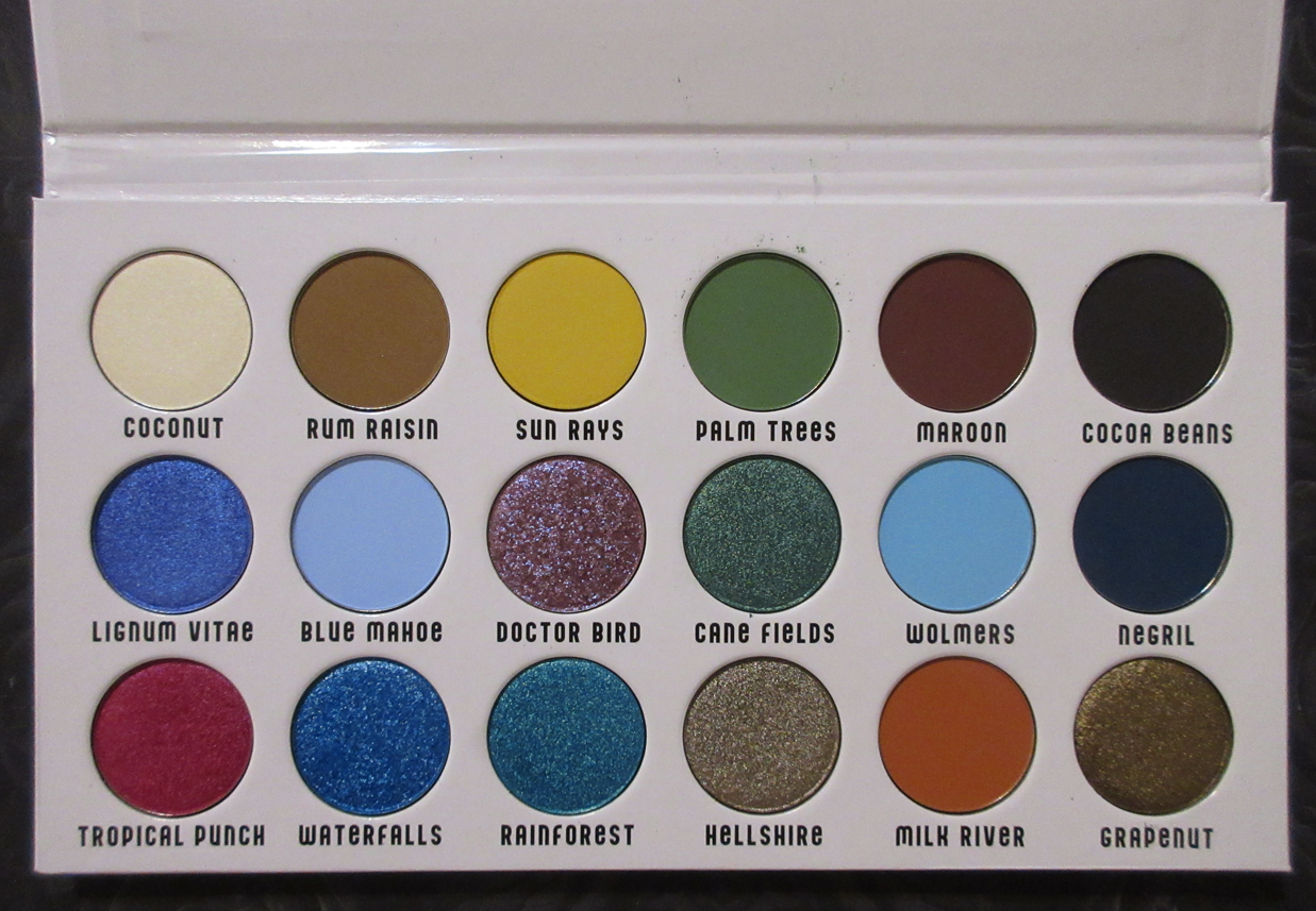
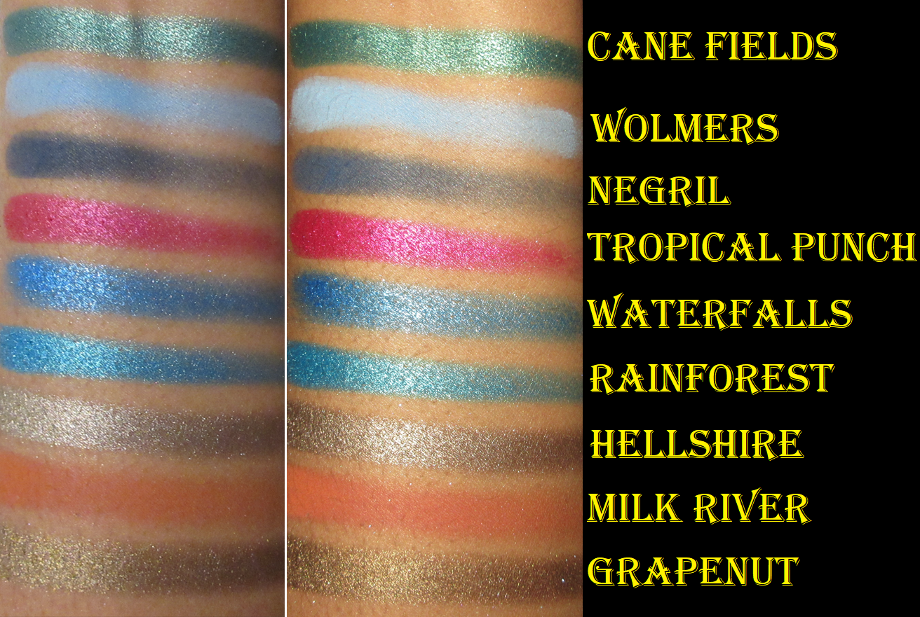
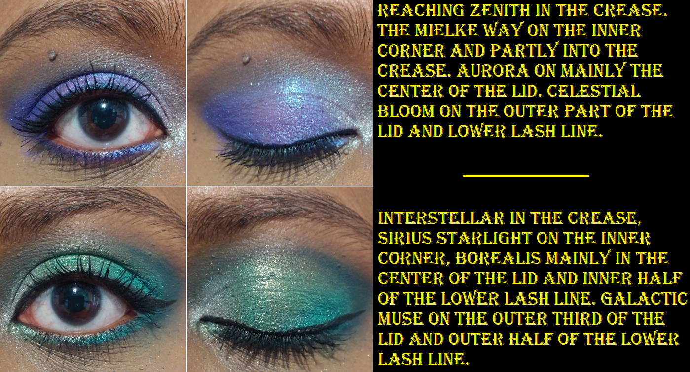
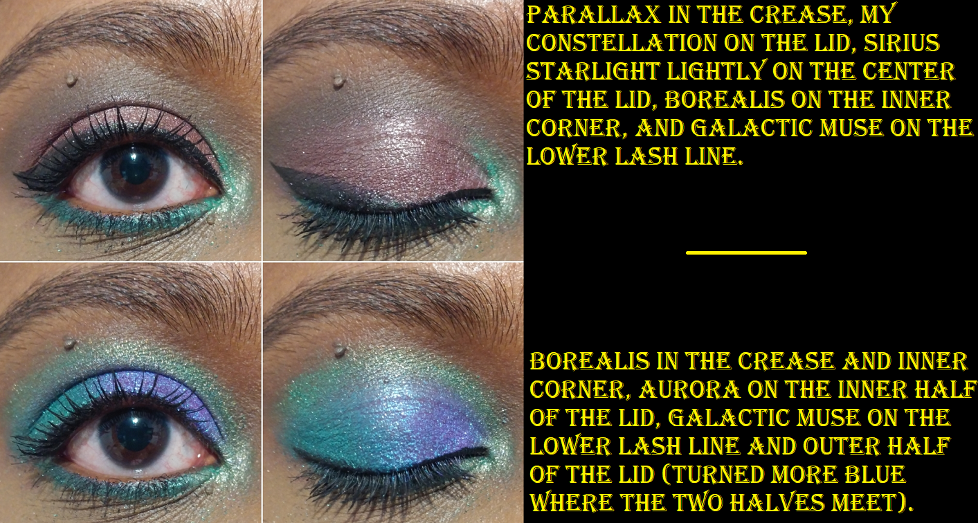
Tina is one of my favorite YouTubers, so I wanted to support her collab like I did when she worked with Oden’s Eye, but this palette is very blue heavy and I’m still in a weird like/dislike relationship with blue eyeshadow. For this reason, even though I’ve had the palette since November 2022, I didn’t start using it until June 2023. Whenever I opened it up, my eyes were instantly directed to those blues and I’d get the urge to use a different palette instead. Since I knew the Christmas in July sale was coming up though, I decided to just push through and start playing. I initially felt like I had no idea how to use these colors together, besides monochrome color schemes, but every time after that was easy! My favorite shades in this palette are surprisingly the warm neutrals and unsurprisingly Doctor Bird and Lignum Vitae.

This palette has all the features I love about Sydney Grace eyeshadows. The mattes are pigmented and apply opaquely while still being very blendable. The satins are smooth and opaque as well. The binding in the shimmers are such that they adhere to the lid without getting a bunch of fallout specks everywhere. They don’t require me to wet my brush. They are pigmented with medium shimmer reflectivity, and opaque. They apply smoothly to the lid without leaning on a bunch of slip ingredients (the “cones”) to make it easy to spread. I love the tactile feeling of dimethicone in products, but the higher the percentage of it and the other -cones, the easier they are to crease on me. These eyeshadows work well on me with all my typical primers: Gerard Cosmetics Clean Canvas, Coloured Raine Paint Base, MAC Paint Pot, and Urban Decay Primer Potion. However, I have to be careful not to have an excess of the Paint Pot on my lids or else the shadows will move out of the crease. Too much wetness from an eye base will mess with the longevity.

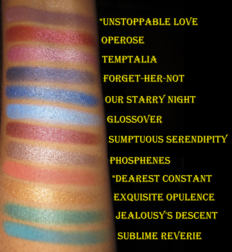
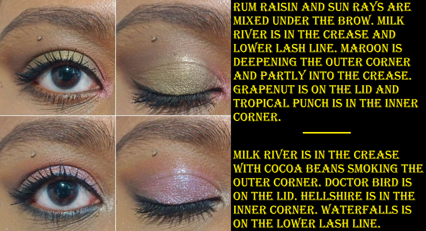
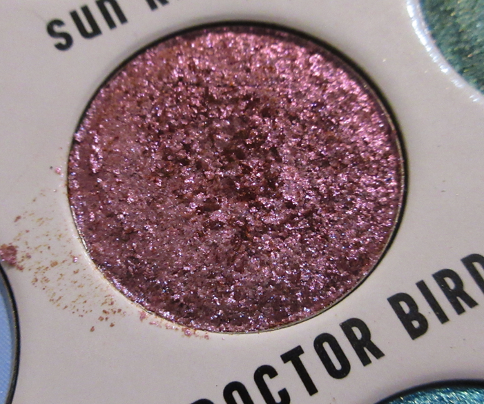
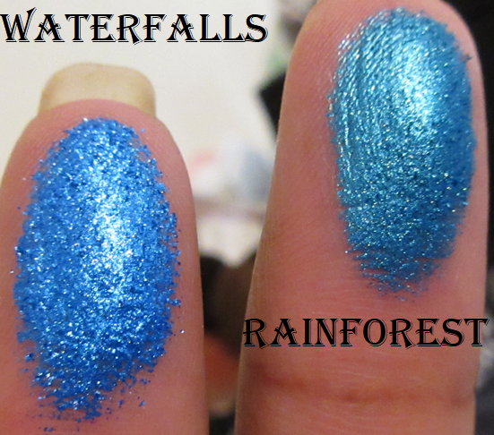
Some other things to know is that Doctor Bird is a bit flaky, but not enough to cause shimmer fallout on the eyes once it’s finished being smoothed onto the lid. I still don’t need to apply this shade damp. The reason the texture is like this is because it’s a chromatic shadow and Sydney Grace’s pressed multichrome formula is the flakiest of the brands I’ve tried. So, it makes sense that this shade would have a bit of that texture. Waterfalls is chunkier than the others, but again, it’s just a tactile thing and doesn’t effect performance.

Cocoa Beans is a deep rich brown that is more on the buildable side than the other mattes, specifically for being able to control the depth it provides. I’m actually quite impressed!

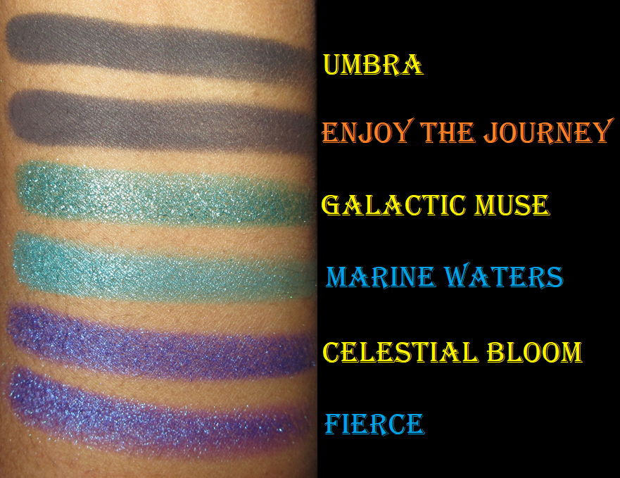
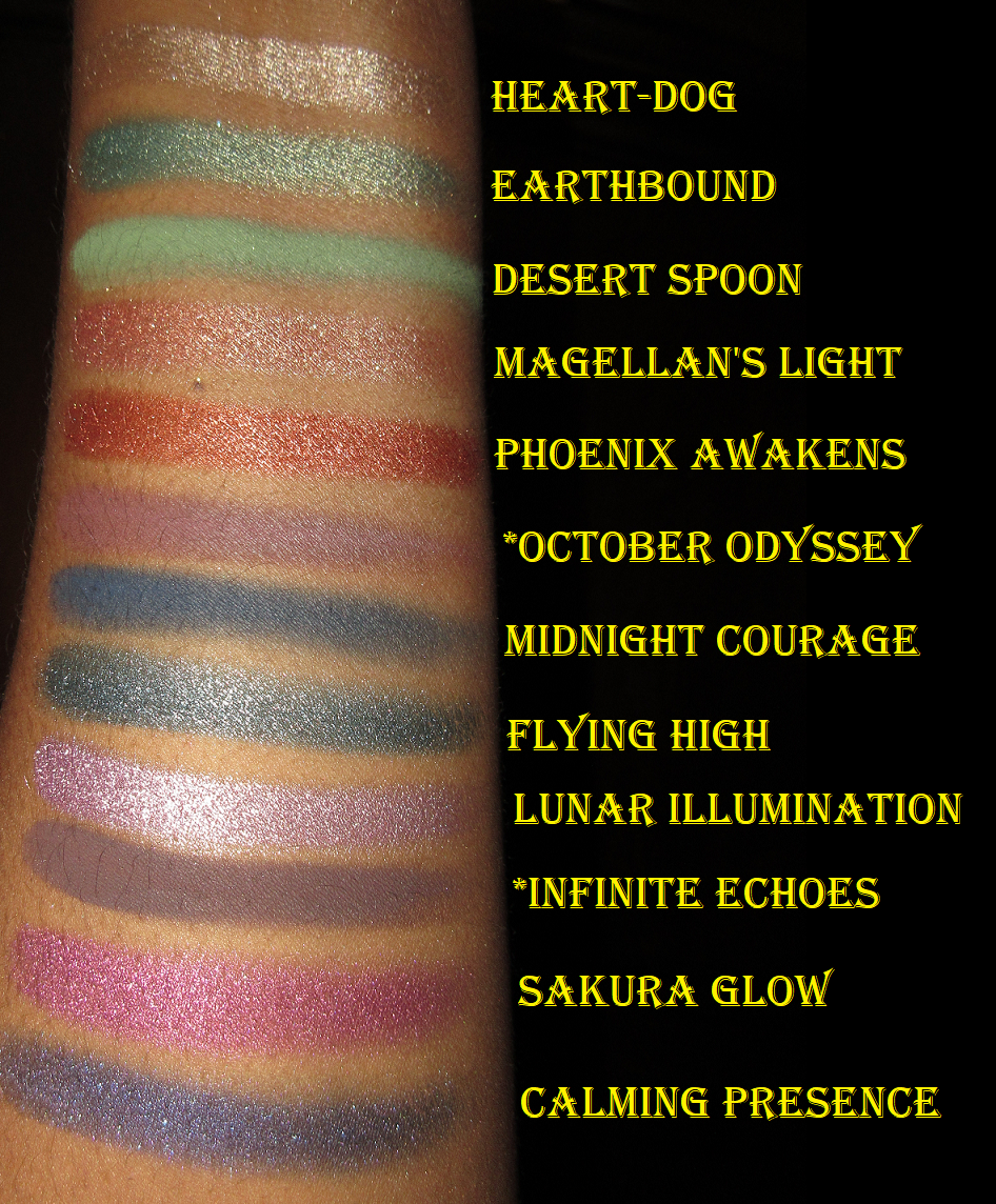
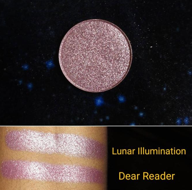
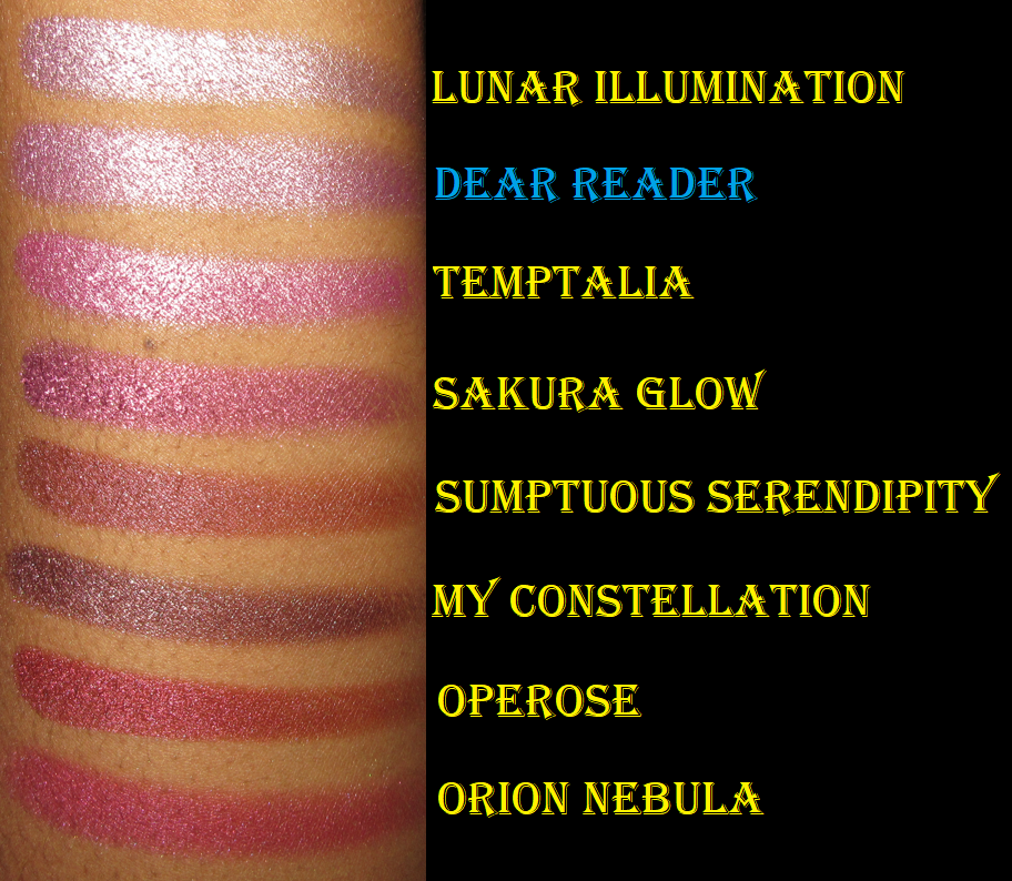
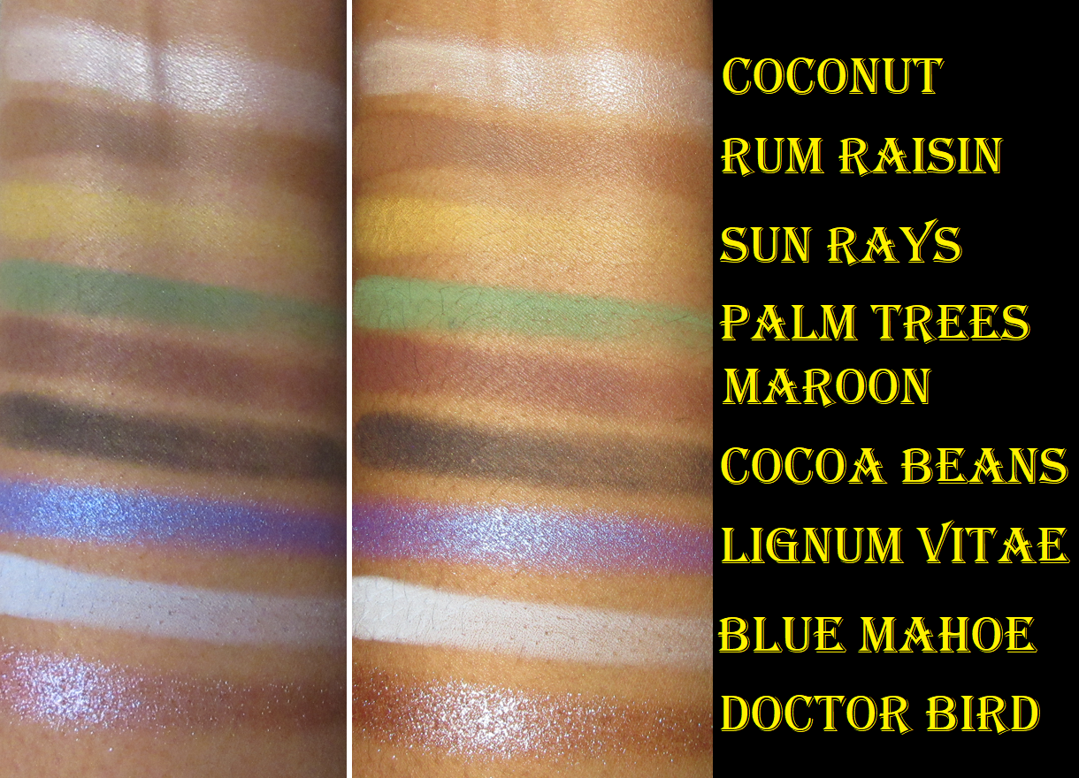
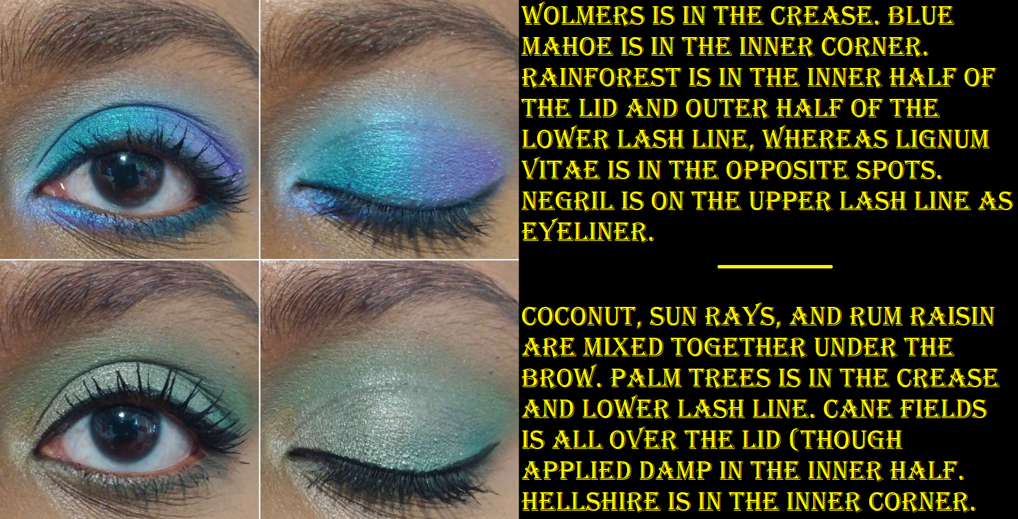
In my swatches, it’s admittedly hard to see the tone difference between Waterfalls and Rainforest, so I included the photo below.

Besides the blues, the only other aspect of the palette that isn’t my preference is Cane Fields being such a blue leaning green. I love yellow leaning, straightforward greens, and even bluish greens if they’re deep enough. However, I understand that because of all the blues in the palette it makes sense to want to have greens that’ll merge the cool shades with the warmer ones.

If you’re like me and love most of the color story, but are a little put off by the arrangement, remember that these pans are removable. I rearranged mine by booting the blues to the bottom row and now I feel a lot more excited when I open the palette! I could also just put these in my giant palette with my other depotted Sydney Grace eyeshadow singles or switch out some of the shades for other Sydney Grace singles, but rearranging them was enough of a change for me. Now, I’m able to see the beauty of it.
I put the shade names on label stickers on the bottom of the pans, so I can always put them back in their proper places.

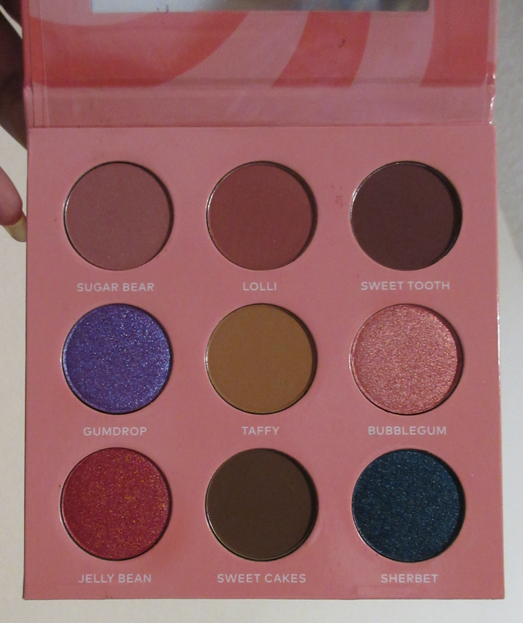
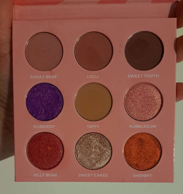
Sweet Indulgence 9 Pan Palette

This palette released around the same time as Colourpop’s Ticket to Dreamland. I decided that between the two, I’d rather have Sydney Grace’s formula, so I was glad I eventually got my hands on this since that palette was discontinued by Colourpop as well.

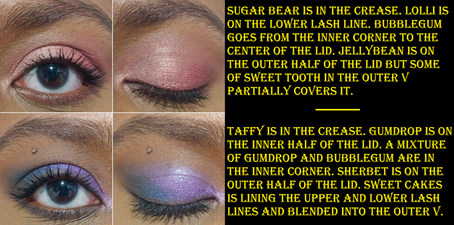
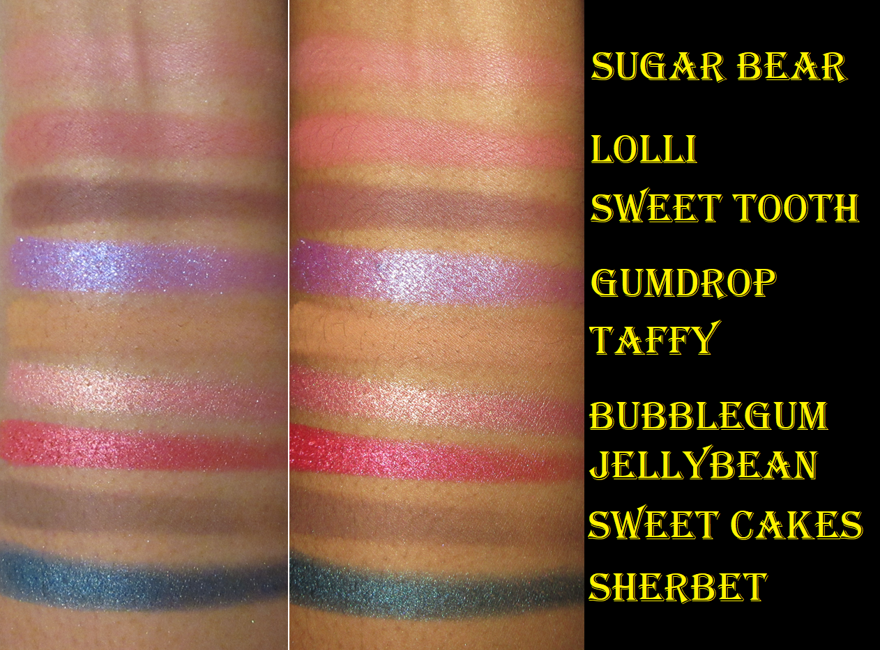
I have to be in a very particular mood to want to wear pinks, and these in here are pretty! Gumdrop is quite the attention grabber, but definitely not a unique shade, and Sherbet is objectively a beautiful tone, but I don’t want to use it with any of the shades in this palette. I like Sweet Cakes, but I don’t need a second deepening shade with Sweet Tooth in there, so I replaced those shades with Deliverer (purple), Lost Princess (red-orange), and Turtledoves (champagne). Now, it has a candy and creamsicle vibe going on!

Even though this palette is discontinued, there are tons of single shadows still available from Sydney Grace that are similar enough to create a dupe version.

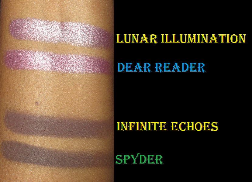
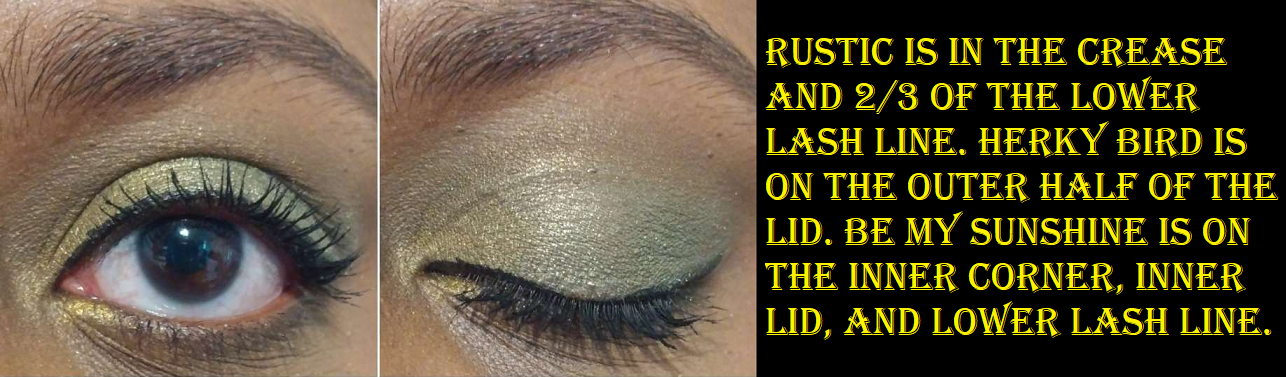
Individual Eyeshadows in Be the Sunshine, Herky Bird, and Rustic

The label on my eyeshadow pan says, “Be My Sunshine,” but the website name is “Be the Sunshine.” In my order confirmation email, the item has both names.

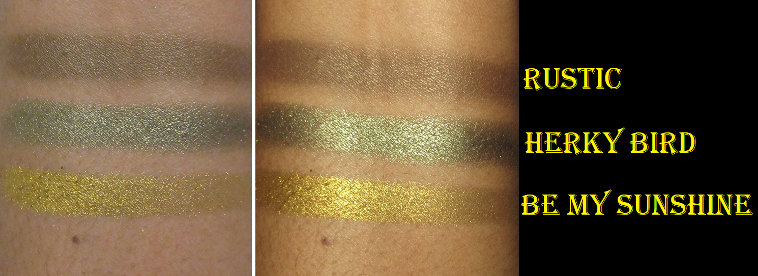
I didn’t intend to purchase coordinating eyeshadow singles. At the time, I just wanted eyeshadows that weren’t repeats in my collection and could feed more of my green obsession. It was a happy accident! I love these shadows together and they perform exactly as I’d expect from this brand. There’s nothing else really to say other than Rustic is a satin/shimmer and the other two are pressed pigment shimmers. So, I’m able to use Rustic almost like a matte and it doesn’t crease on me.

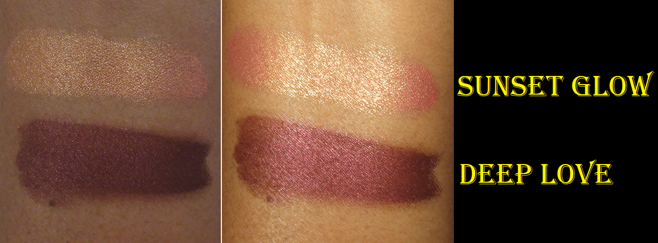
Cream Shadows in Sunset Glow and Deep Love

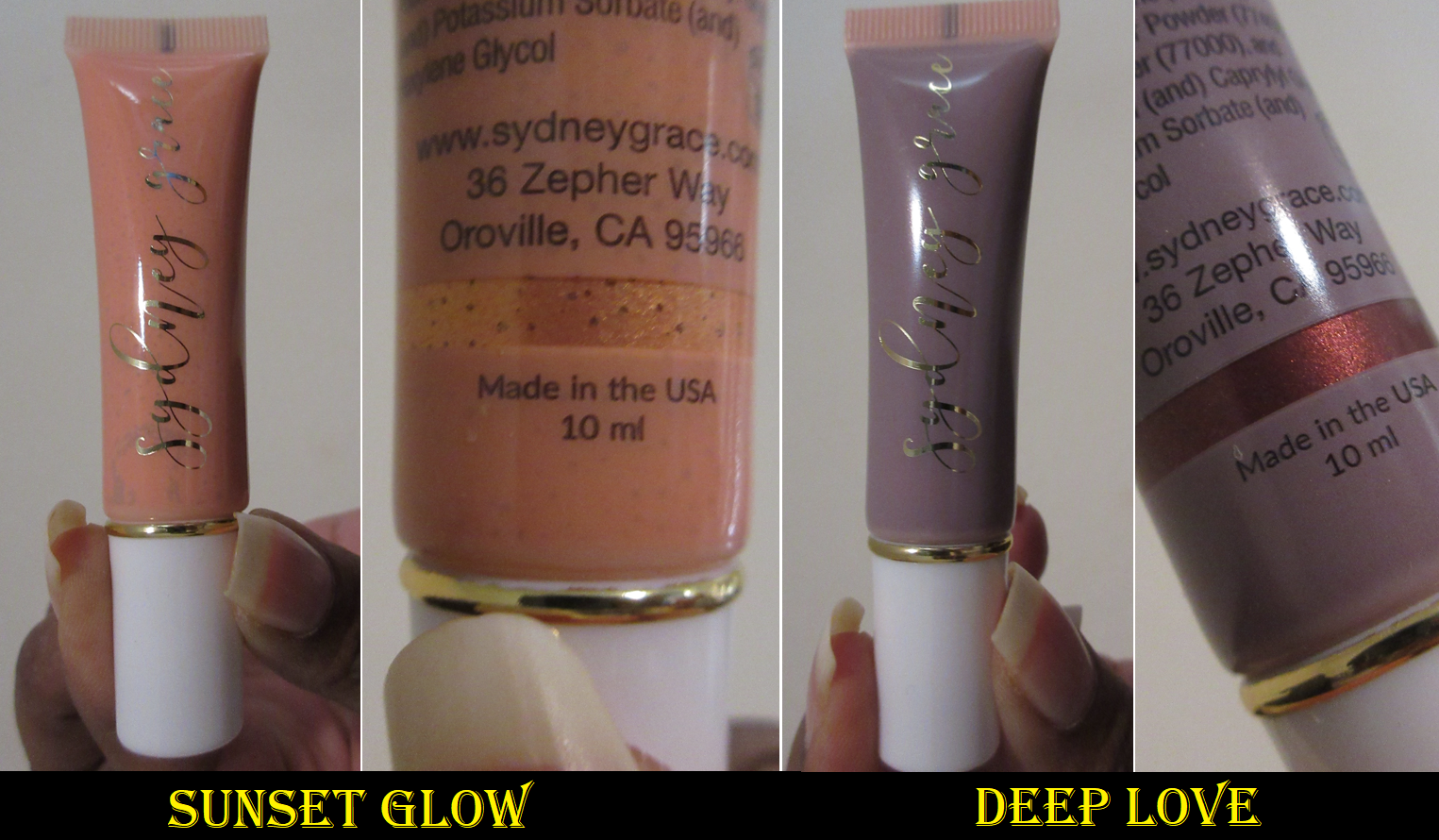
I previously only used Sydney Grace’s multichrome cream shadow. Once the texture got worse, over time, I really didn’t like it. So, I didn’t dive further into the line. However, for the multichromes specifically, they changed the tube size a few years ago and increased the shelf life. Since I’ve heard nothing but great things about the cream shadows overall, I decided to give them another try.

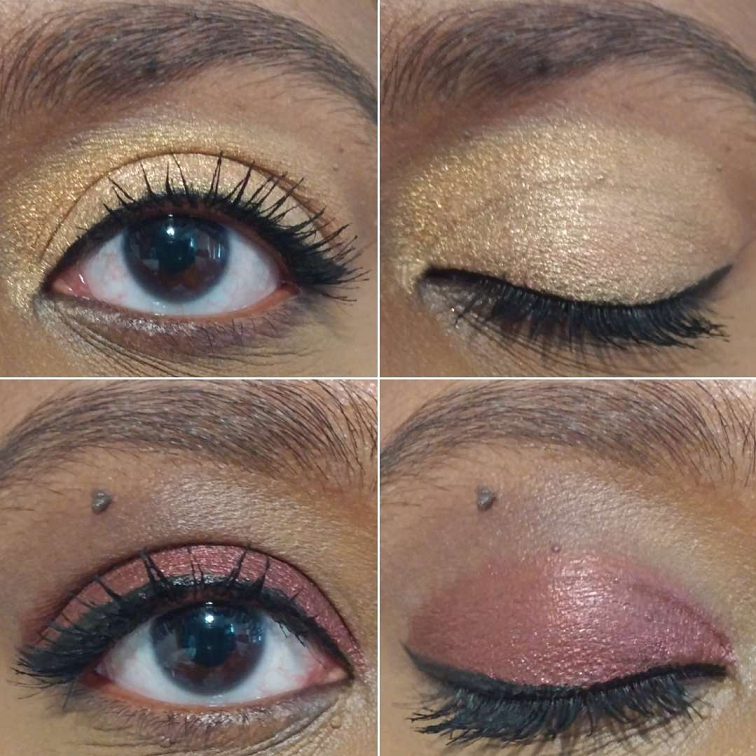
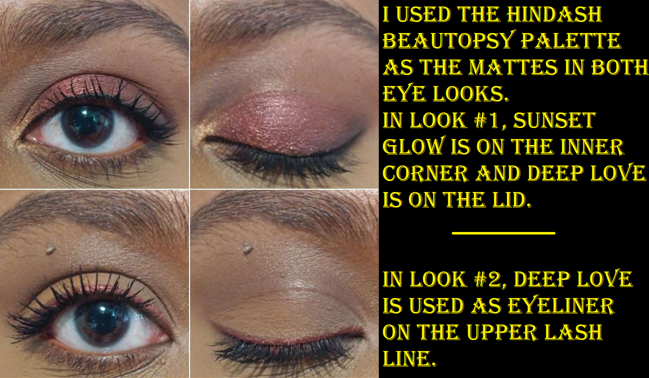
How I use them is to pour some out onto the back of my hand and take a flat concealer brush to spread them onto my lids with more precision than, say, my fingers. If I’m using both colors, I try to let the first dry before adding the second. I also try not to blink too much if using one as an all-over-lid shade so that it doesn’t get bald spots or patches while drying. If it does lose opacity in a spot, the brand recommends rubbing them. I have found it easy to just add a little back on to the spot in question. These layer nicely and I don’t get any cracking of the eyeshadow and mine don’t add extra texture. They blend well into each other and still look great on top of powder eyeshadow. I can even add powder shadows back on top without it looking strange.

In addition to lid shades, these work nicely as liners. These are fairly lightweight, even more than the Melt Gel Liners. They’re not waterproof, but they hold on very well and don’t fade on me. The shine dulls down a little towards the end of the day, but they have quite a long wear time. If I didn’t love the ease of using powder shadows so much, I would absolutely purchase additional colors from Sydney Grace. So, I recommend them to cream eyeshadow lovers.

That’s everything for today! I hope it has been helpful!

-Lili

Sydney Grace x Temptalia Collection

Today I’ll be reviewing the full trio of Deep palettes in the collection, as well as the single eyeshadow called Dear Reader. I will also swatch the best comparisons I have between the shades Temptalia chose to the other 103 Sydney Grace shadows I own, previously swatched here.
I purchased this collection on launch day, so this is definitely not a first impression review.

Each palette consists of multiple types of finishes and textures: mattes, metallics, shimmers, duochromes, creamy shades, stiffer packed colors, grittier shadows, etc. Regardless of these differences, they are all highly pigmented shadows. Sydney Grace products always give great color payoff, but I find that these are even more intensely pigmented. Good eyeshadows will have staying power on the lid, but these looked practically the same from the start of the day to the end of the day. There’s no fading or dulling down of the shine.

There is a bit of a tradeoff though regarding the boost in pigment. The mattes give me saturated color right away, but it can look patchy initially if I don’t give a little extra blending time. It isn’t significantly more time, but it was enough to make me notice, particularly with the deeper shades like Interstellar, Sublime Reverie, Midnight Courage, and Umbra. Those blue-green mattes especially give me more kickup in the pan despite my efforts to be gentle and pick up a small amount at a time. With the shimmers, one may want to do the eyes first before the face because I get fallout during the application process, though there isn’t too much extra fallout throughout the day (at least not unless I happen to rub my eyes more than usual).

Quintessence Palette

Quintessence has my favorite color story of the three and it’s the one I knew I absolutely had to get. Ironically, I had the most difficult time creating looks I liked that weren’t monochromatic, so I sought inspiration from Temptalia’s website. For swatches, eye looks, details of the shades, etc. there is no better resource than Christine herself, so I will link the blog here and recommend giving it a look if you need additional help and information.

The last two looks were the ones I attempted to recreate (but tweak the tiniest bit) from Temptalia.

A color guide to the swatches is that yellow font = Temptalia collection, orange = the Chase Your Dreams palette, blue = individually sold eyeshadow, and green = the Tiny Marvels palette.

This palette had a few similarities (pictured above), but Temptalia mentioned that the shade called The Greatest Gift is the one she specifically wanted to keep as is, but make it more intense and shimmery.

I initially wrote off the comparison of The Greatest Gift and The Mielke Way when I was seeking dupes because the silvery shimmer in The Mielke Way gives it a completely different look. I’m not the biggest fan of icy shades, so I prefer having just the gold shimmer with the raspberry base over the added metallic sparkle. This highlights an important aspect though, which is that there are other shades from Sydney Grace’s line that I decided not to post as similarities because the intensity of the shimmer in the Temptalia collection gave it a different effect. Or if the shadows shared the same base color, the shimmer additions were different enough justify having both in my collection. I also estimate I probably have less than half of the Sydney Grace singles (at least before many were discontinued) so there may be other shades that are close. However, I don’t think many have the exact undertone or as much sparkle. I believe Temptalia owns the full collection of Sydney Grace eyeshadows, so she probably made sure that hers were different enough as well.

On the Horizon Palette

The outer packaging for this palette was too beautiful to skip. I knew instantly (and I did end up doing it) that I was going to transfer all of the Quintessence shades into this packaging so I’d have my favorite color story in my favorite palette artwork. Between the three palettes, the On The Horizon color story was the one I didn’t like and felt like I could skip. So, imagine my surprise when I ended up loving every look I’ve created with this! It opened my eyes to new color combo possibilities.

These colors are a little more subdued, but Temptalia described the intention for these to be almost like neutrals with a twist. And because I mentioned these are not the kind of shades I typically go for, it makes sense that I was unable to find similarities in my collection. I did compare it to the Dear Reader shade that was part of the collection but sold as a single because her followers seemed to love it in the sneak peek of it, but Lunar Illumination was already chosen in its place as a better compliment to the other shades in the palette.

I actually put Dear Reader with the OTH shades and moved Lunar Illumination into my custom palette with the rest of my Sydney Grace collection. I prefer it too!

Radiant Reflection Palette

Radiant Reflection reminds me so much of the Coloured Raine Cheers to the Beauty Palette because both of them possessed shades I tend to like, but the tones weren’t as appealing as I imagined once I saw them in person. I love greens, but not quite like those in Radiant Reflection. I like golds and blue-purples, but not quite like the ones in this either. Then the other shades in the palette were similar to others shadows I already have many times over in my eyeshadow collection, and not just among Sydney Grace shades. So, I ended up selling this palette. I knew I wouldn’t reach for it again because that’s exactly what happened to my Cheers to the Beauty palette which I depotted and sold most of the shades from it. I don’t regret buying Radiant Reflection because I needed to be certain I didn’t want it, as odd as that sounds. The Our Starry Night shade was so unique, Dearest Constant deep version is my type of orange eyeshadow, and Forget-Her-Not had me curious to see it in person. Once that happened, I could put the curiosity to rest.

Final Thoughts

I do feel like this trio of palettes all have similar sort of shades, but I still couldn’t talk myself into getting Quintessence only. I fell into the trap of wanting to possess all my favorite shades from the Temptalia collection and envisioning how I could mix and match the palettes with my other Sydney Grace singles. Funny enough, I only swapped three shades: Mango Tea for Sirius Starlight (placeholder and not a solidified decision), Dear Reader for Lunar Illumination, and Adore Me for Infinite Echoes (Deep). That last swap actually makes the palette more similar to the light version of On the Horizon!

Speaking of the light version, I find it amusing that my gripe with most eyeshadow palettes is when they have a disproportionate amount of light shades and mid-tone neutrals. When I used these palettes exclusively, which is how I prefer to do the testing process, I found myself actually wishing for a light matte to blend out edges and a medium brown. Temptalia intentionally left out brow bone and transition shades because it’s unlikely that anyone purchasing her palettes would not already have plenty of those types of shadows in their collection. So, in a normal situation this wouldn’t really be a problem except for those who like to have every palette being a complete palette.

As much as I think I don’t want palettes that are very similar in color story, I found myself not wanting to make any major changes to them, or even wanting to switch these around. I’m very satisfied with Quintessence and On The Horizon. The minor inconveniences for using the palettes, such as fallout and spending a little more time on my eye makeup, are fine with me because I know I will be able to make very impactful looks with phenomenal longevity. $40 per palette is a fair price, but the fact that I was able to use a promo code on top of the bundle discount made this all very reasonably priced. These palettes were even eligible for Sydney Grace’s sale/discount offerings during their annual Christmas in July sale. While I don’t recommend getting all of them purely for the sake of having a complete collection, I think they’re great quality and do recommend picking the one(s) that really speak to you.

Thank you for reading! I hope it has been helpful!

-Lili

*Disclosure: When it comes to collabs or creations from influencers or other public figures, I always disclose any affiliations I may or may not have with them. In this situation, I have no personal or public ties to Temptalia, but I am a frequent peruser of her blog. I consider her an invaluable resource within the beauty community as her dupes and comparisons feature on her blog has impacted a lot of my purchasing decisions as well as her reviews, which mostly tend to align with my own opinions. I respect her as a blogger, but I don’t know much about her specifically.