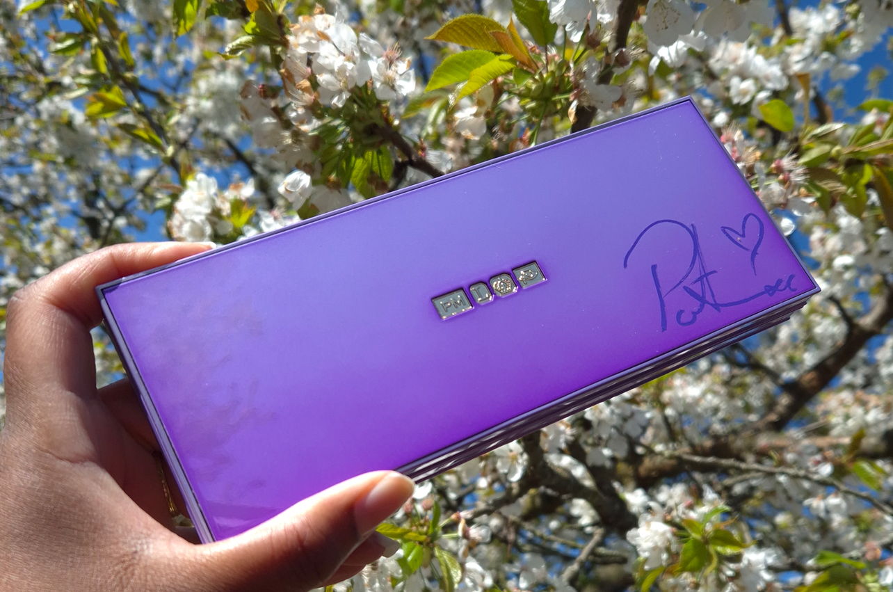
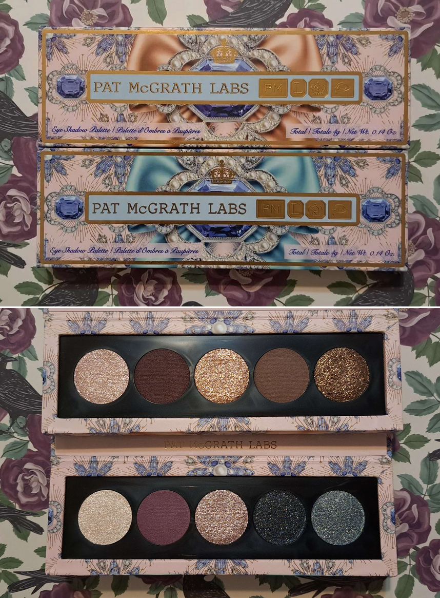
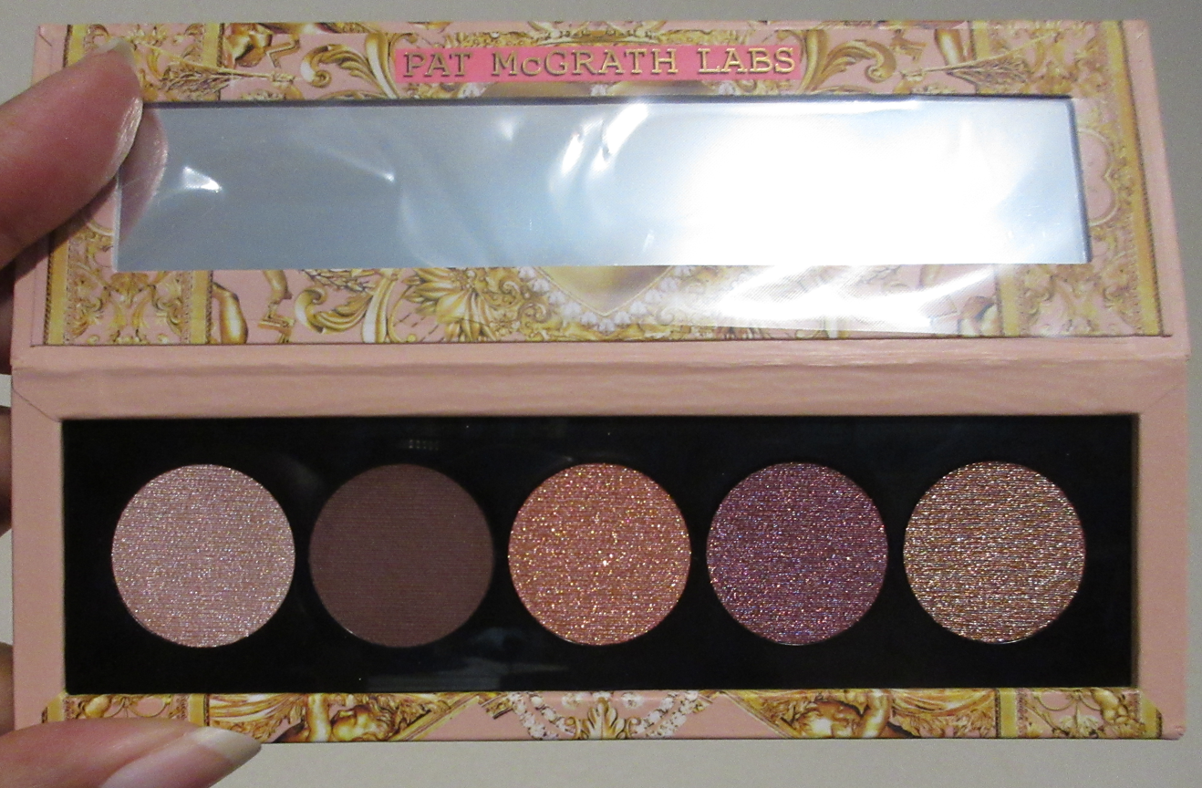
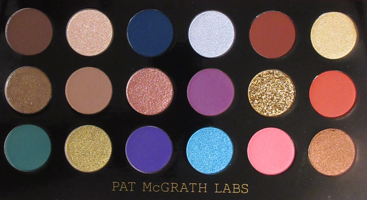
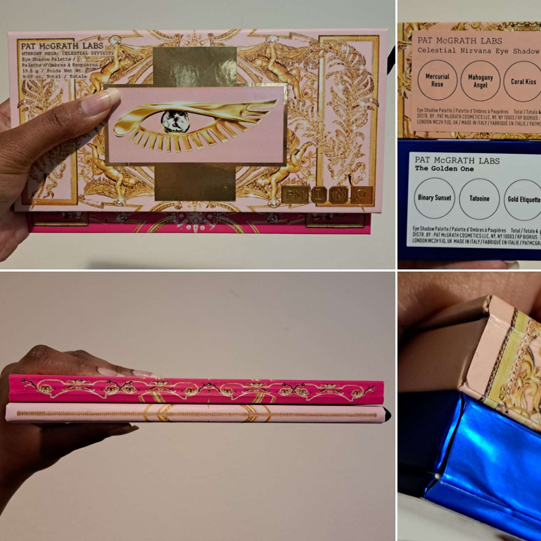
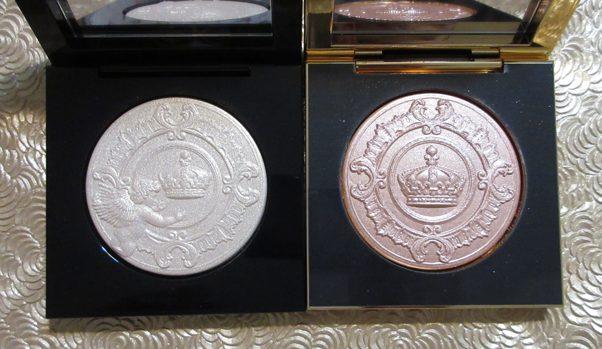
This palette is my first Pat Mcgrath purchase in the year 2025, and also the first thing I’ve bought from the brand in the past fifteen months. I usually encourage everyone to wait for a sale when it comes to expensive makeup, but once PML says something is limited edition, I don’t take chances. Prior to getting this palette, my most precious Pat Mcgrath item (and one of the most precious makeup items in my entire makeup collection) was the Divine Rose II palette in the limited edition pink chrome packaging. This limited edition lavender palette with Dame Pat Mcgrath’s signature on it is priceless to me!
For those wondering how I got a signed copy, there was no announcement from the brand ahead of time. I logged into their website prior to the palette launch time and saw that it was already available to purchase. There was a box on the product page with a check mark indicating that I was opting in for the chance to win a signed palette. Later, I noticed that box was actually edited to clarify that the first 100 people buying the Lavender case (not the permanent black version) would be getting it. I had already assumed it would come down to whoever checked out first, so I completed my purchase even though the discount code didn’t work prior to 8:00 am EST. I didn’t notice until later that my palette was purchased at the US equivalent price, but it rose 9 Euros the very next day. So, I didn’t bother contacting customer service as I had already technically gotten a deal. It was also the next day that I received an email confirming I was one of the lucky ones!
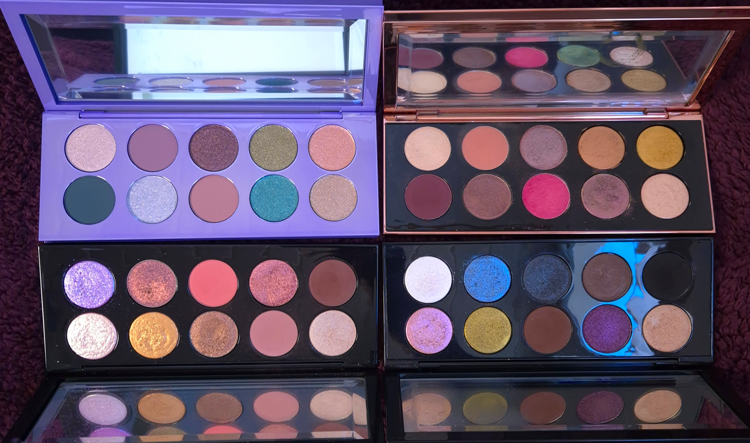
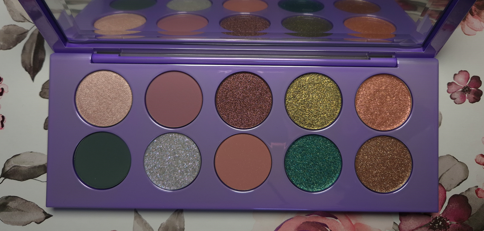
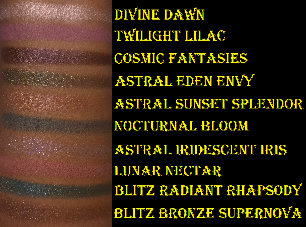
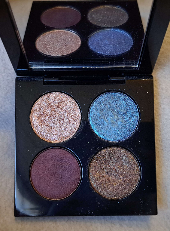
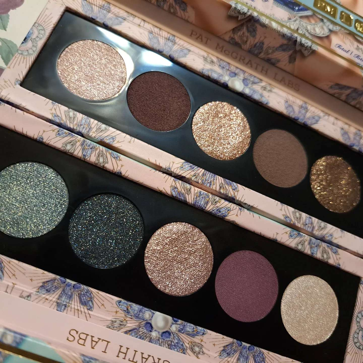
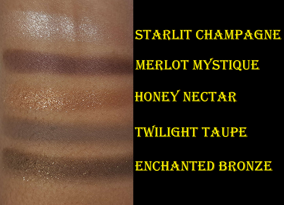
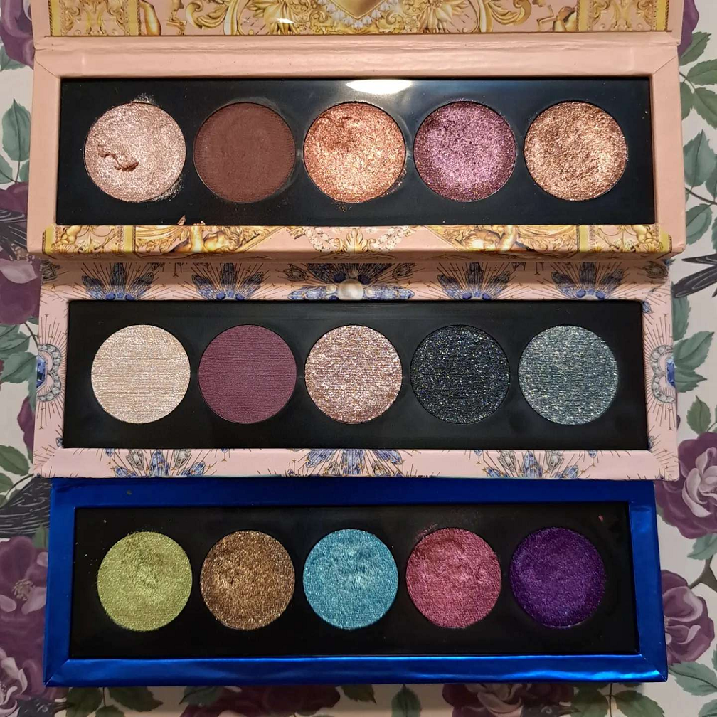
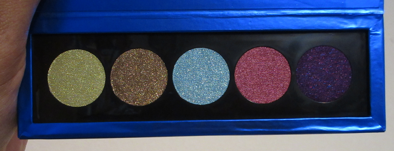
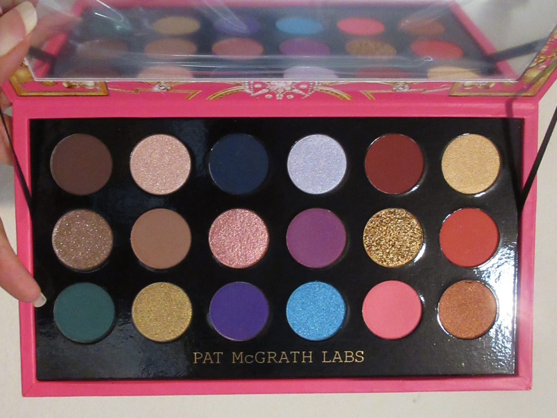
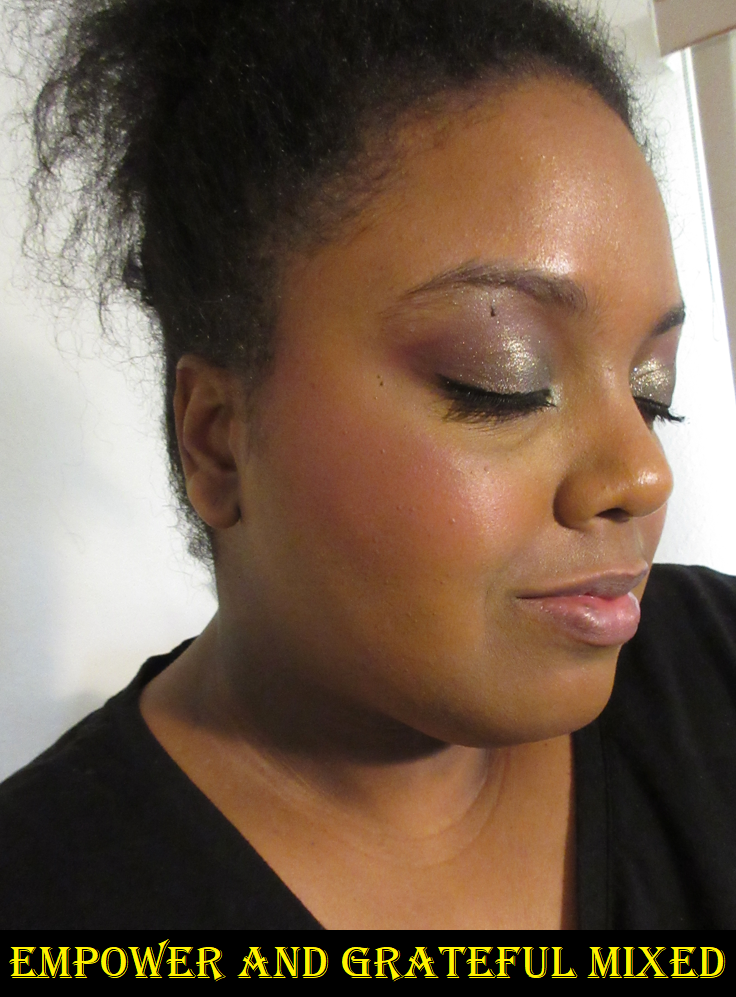
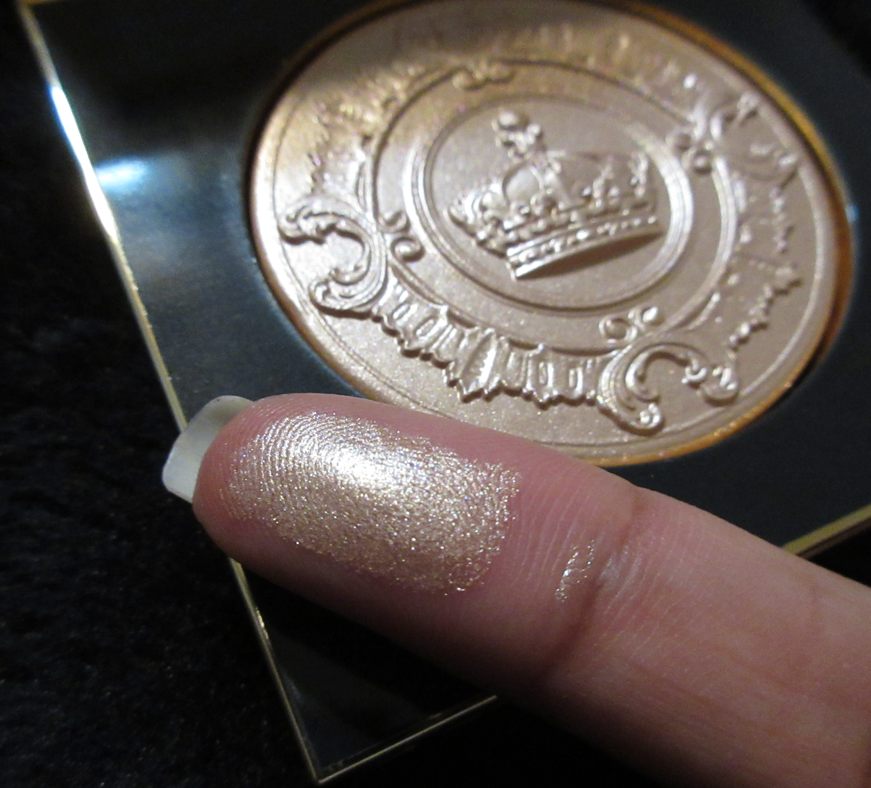
What I found appealing about this palette is the colorful nature, the inclusion of greens, and there technically being less pinks and golds (a peach, a pink-mauve, and a black-based yellow is admittedly not that far off).
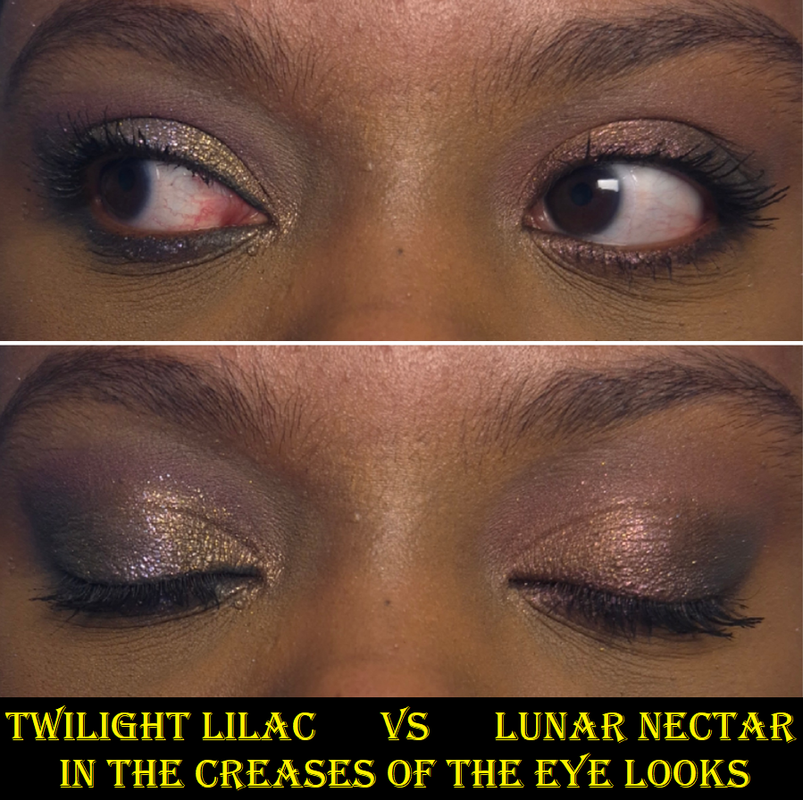
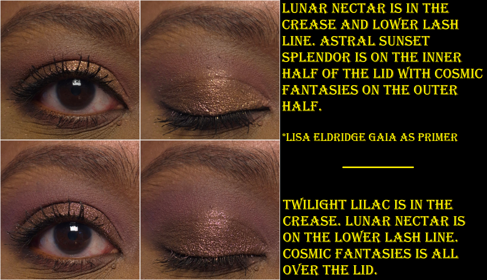
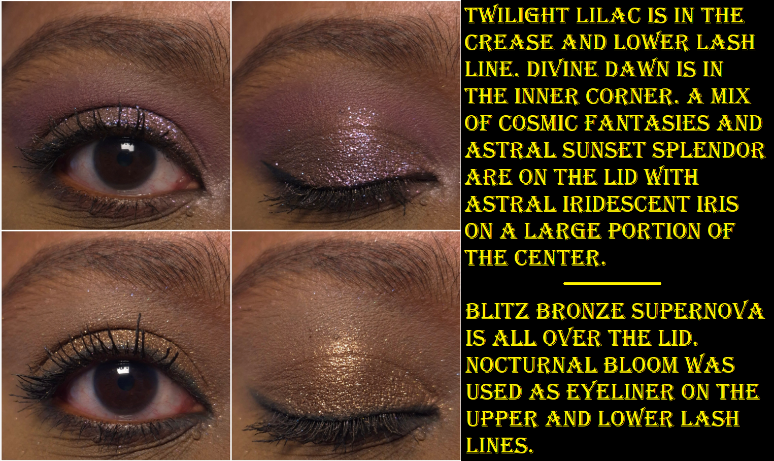
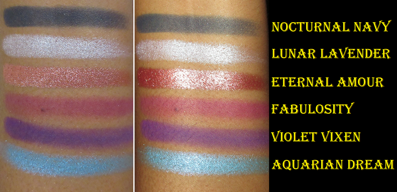
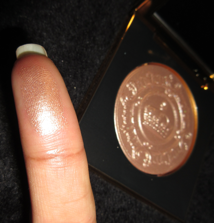
Although I’m very happy to have this palette, and I’m happy that PML gave us a palette different enough for me to justify finally buying another Mothership, I do have a few critiques about the colors chosen. For instance, there are only three mattes. Technically, Lunar Nectar is one of those sequin/matte-with-glitter-specks eyeshadows that look fully matte on the eyes because the glitter gets dusted away while blending. I hate that type of eyeshadow, but I can put that feeling aside. What I have an issue with is how similar Lunar Nectar and Twilight Lilac are. At least they are distinct enough that I can tell them apart on my eyes (when used separately), but orchids and mauves being in the same color family means one of them would be good enough alone to pair with the purple-pink shimmers in this palette. I don’t see why having both was necessary.
That being said, the quality of both of these shadows are nice. They feel a touch silkier than the mattes in my older Mothership palettes, making them slightly closer feeling to the Natasha Denona mattes (but thankfully not that far, as I still prefer Pat’s to Natasha’s). Even though they’re both pigmented, I find myself having to build up more layers to get Lunar Nectar to show on my eyes to the same level as Twilight Lilac.
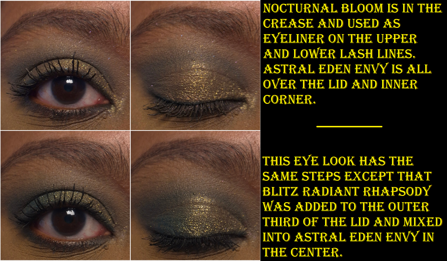
My second color issue is that so many of us have been begging for greens, but putting Nocturnal Bloom and Blitz Radiant Rhapsody together in the same palette is like including a duplicate despite them having different finishes. When I use Nocturnal Bloom as an eyeliner on top of Blitz Radiant Rhapsody or using it in the crease with the shimmery green on the lid, it looks like I used one single eyeshadow instead of two. There’s not enough definition and distinction between them when used together in a look. I believe that Nocturnal Bloom is the more useful of the two. It serves as the deepening and smokey element in the palette. It can be used as liner. The blendability and smoothness is on par with the other mattes, which is great considering what a disaster of a shade that deep green called Altered State was from the Mega Mthrshp Celestial Nirvana palette. This shade layers well on top of the mattes and shimmers equally. Both Blitz Radiant Rhapsody and Astral Eden Envy are a little thicker than the other shimmers in the palette and seem to have stronger adhesion, which requires a little more work to get those two shades to merge seamlessly into any other shimmer. Particularly with the former, I have to pack on additional layers and mix with my fingers to create an even and well blended gradient of one shimmer going into Blitz Radiant Rhapsody. Plus, cool greens are less loved by me than other tones of greens. So, I wouldn’t have minded having a green multichrome (like a green-purple-blue or green-yellow-gold to match the theme) or a different toned deep green as a replacement eyeshadow. Even a light spring matte green or matte chartreuse would have been welcome to me.
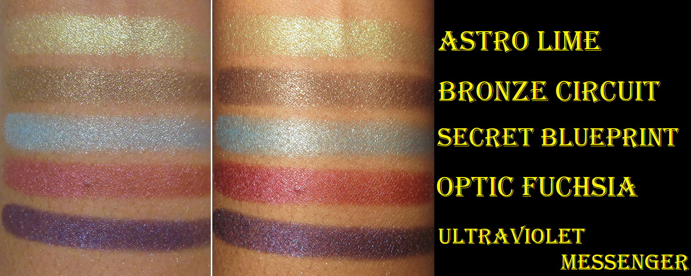
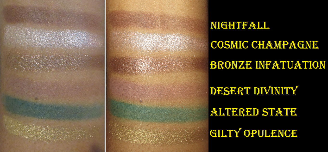
I find it interesting that Astral Eden Envy looks so yellow in the pan, but it looks like an antique olive on my arm, while being gold (or at least golden-olive) on my eyes. I was concerned that it would be too similar to Pat’s iconic shade Gigabyte, but thankfully they are different.
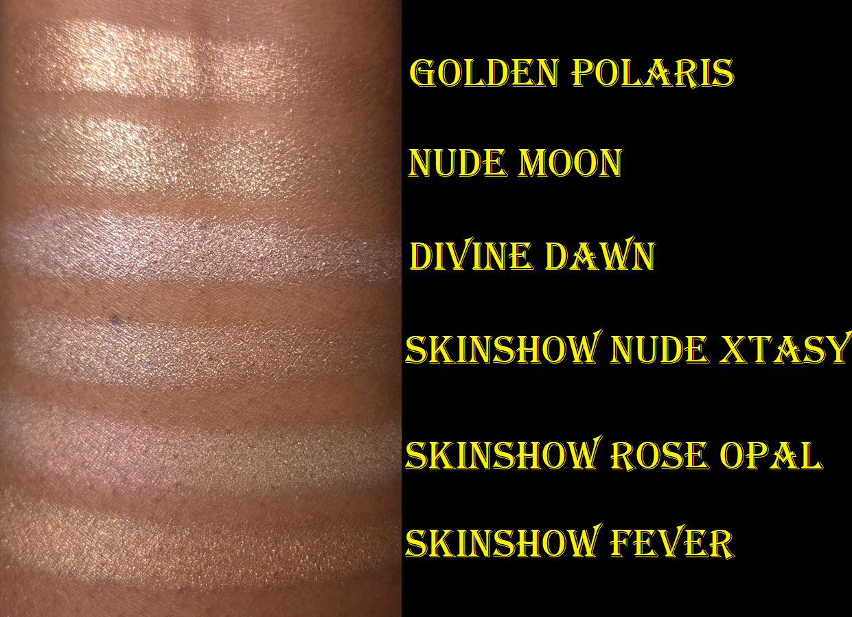
Divine Dawn fills the position of Pat’s typical Skinshow type of shadows that are most often used in the inner corner, to highlight the center of the lid, or brighten under the brown arch. Even though this kind of shade is typically on the thicker and squishier side, Divine Dawn feels even thicker and grips the skin more, making it less easy to spread as smoothly as the Skinshow shades of the past.
If eyeshadow is going to disappear on me, it’s most likely going to happen to my inner corners, so perhaps this slight change of formula is a good thing. For my own personal use though, I can’t recall ever having an issue with longevity when using PML eyeshadows including in my inner corners. So, I would have preferred for this shadow to be a little creamier. Also, this looks like a pale cream in the pan, but it’s more of a silvery pink-purple on my eyes.
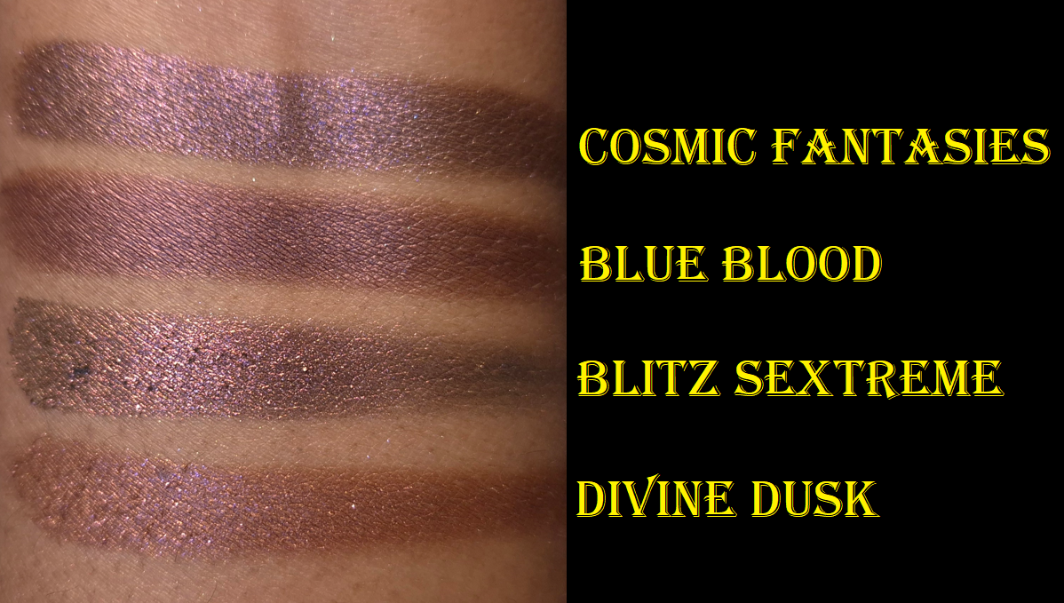
Cosmic Fantasies is quite possibly my favorite eyeshadow in this palette, which I never saw coming. It’s a beautiful reddish purple with a dark base and no chunky glitter particles. It is a smooth metallic with enough binder that I can use it as an eyeliner without worrying about fallout. It layers easily with the other shadows and is the only other deepening shade in the palette. At the same time, the shine is just enough that I can use this eyeshadow solo and it doesn’t feel like a smokey shade on my skintone, even though it pairs well with those kind of looks. This doesn’t feel super unique because there are similar shades to this in some of my other palettes from the brand, but Cosmic Fantasies has the tone, depth, and finish to help it stand out.
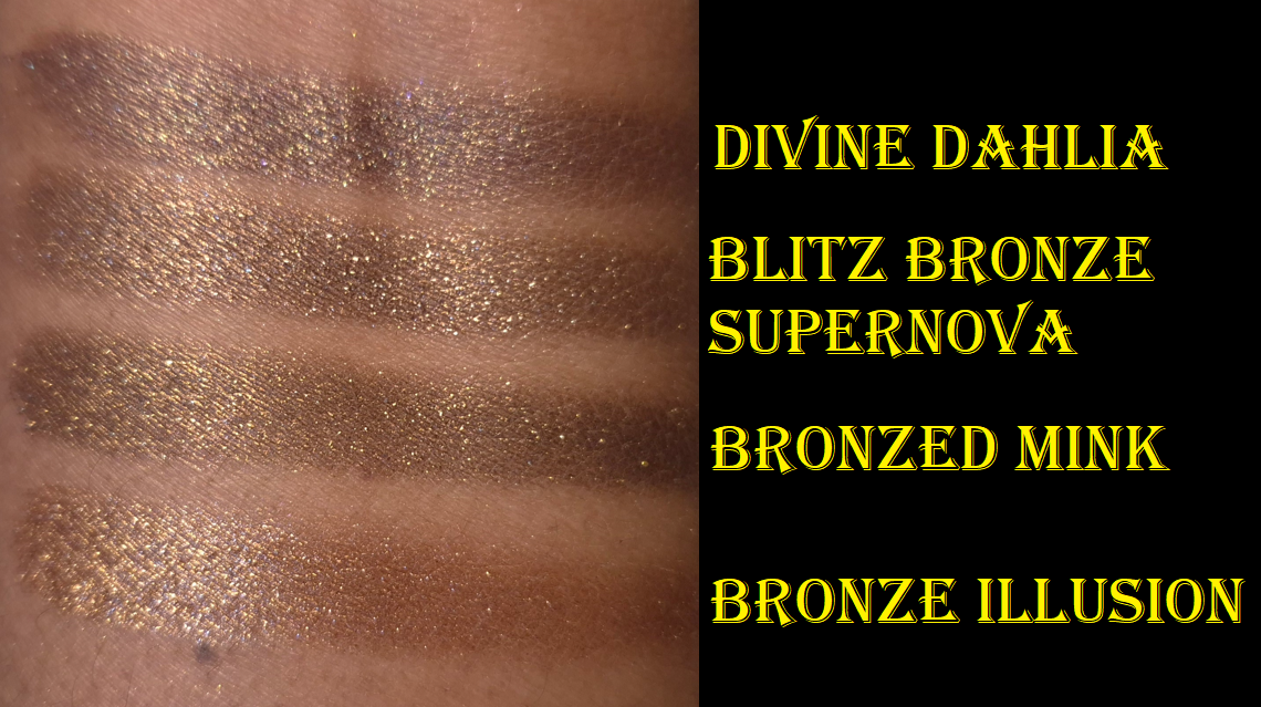
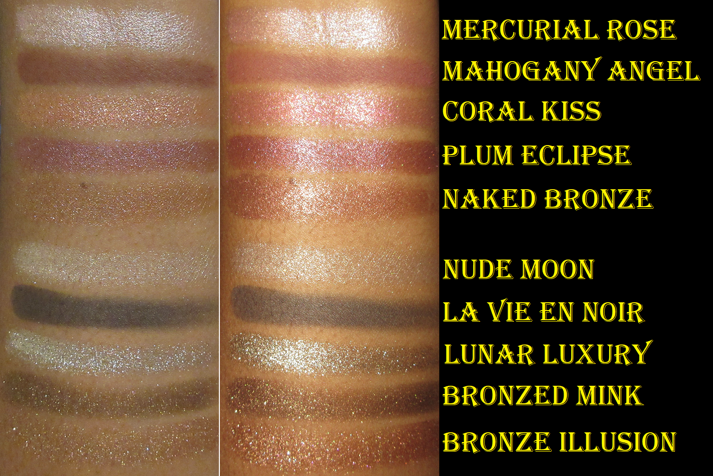
Blitz Bronze Supernova is the most neutral shade in the palette, but it’s far from boring. This shadow is super sparkly with a mix of different shimmer particle sizes. In order to make it look smoother and to minimize the fallout, I apply it with a damp brush. Although it doesn’t surpass my two ultimate PML browns (Divine Dahlia and Bronzed Mink), it’s still a very pretty color and a great addition for the lighter eye looks.
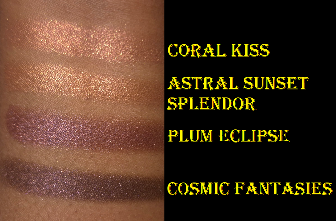
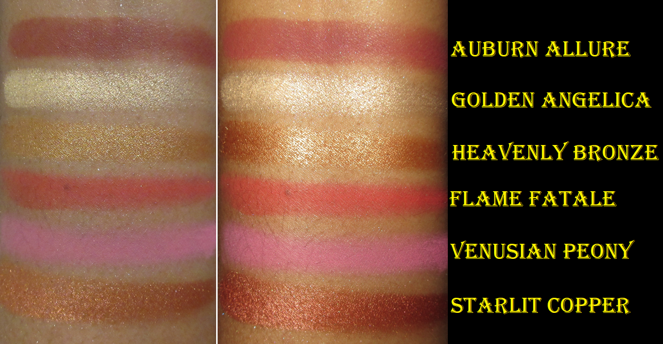
While I have some misgivings about some of the shade choices, I think all of them are pretty. However, when it comes to the one that is actually the hardest for me to incorporate into my eyeshadows looks, it has been Astral Sunset Splendor. By the time I started working on the first draft of this post, I’d done 15 eye looks (some of them repeated on different days). Six of them involved using this peachy shade and three times I had to cover it up with another shadow because I didn’t like how it turned out. It pairs very well with Cosmic Fantasies, but it’s such a thin shadow that it gets overpowered by some of the more pigmented shimmers. Three failed attempts really isn’t a lot compared to the number of shades I could still try it with, plus with eyeshadows outside of the Petalmorphosis palette, so it’s possible I could like this color a lot more in other scenarios. I just typically prefer fully opaque eyeshadows, so this is currently more of an inner corner kind of shade for me when I apply it damp to control fallout. I think the shade Coral Kiss from the Nude Allure 5-pan palette is a much more interesting eyeshadow, and it’s not even an Astral!
The star of this palette that adds the most drama and color impact is Astral Iridescent Iris. This is a topper kind of shadow that looks silvery lilac in the pan, but pops to a brighter cool purple and silver on the eyes. The texture of this is closest to how the “special” shades in the Mothership palettes usually feel, which is to say on the drier side and a gritty-flaky kind of feel to them that will absolutely have fallout unless applied damp or over a glitter glue. I’ve dipped my finger into the pan at least six times, and I worry that it could be starting to hardpan. It feels like it’s starting to compact or compress itself into the pan, but so far I am not having issues picking up the product. This is something I will continue to monitor and will update if it becomes a problem.
Overall, I think the quality of this eyeshadow palette is great. I’ve had no issues with creasing or longevity. I have no patchy issues and most of the shades are super easy to blend (the worst performing ones are simply “easy” instead of “super easy”).
I know there is a huge debate going on about the “special baked formula” that the brand abandoned in Mothership X and onward. While it is likely that the process of making those four pan-less eyeshadows in that particular Italian formula might have contributed to the higher cost of the palette, I was never a fan of the texture and consistency of those eyeshadows. I loved the effect, but did not enjoy the dryness or fallout. The effect of these new Astral and Blitz formulas feel similar to the OG, but with more binders that make them easier to use. Some people, like me, prefer that. Others swear this new version isn’t as impactful and are willing to put in the extra effort to work with the OG eyeshadows we’ve been accustomed to over the course of seven years.
I think the OG lovers have some valid points in wanting there to be “special shades” in every palette, especially with price increases, but I don’t think the Motherships need to have baked shades in order to fulfill that wish. Ultra shifty multichromes are some of the most expensive pigments to make into an eyeshadow and having some in Motherships should at least satisfy the ones that want to feel their expensive palette isn’t expensive just for the packaging alone. This is coming from someone who refused to buy the beautiful Decadence palette because it contained solely metallic shades. In comparison, I think Petalmorphosis formulas are at least more expensive than Decadence. But for anyone who feels the Motherships are only worth buying if there are baked shades, then by all means don’t buy Petalmorphosis. Vote with your dollars! It’s odd to see Influencers and other Enthusiasts with the same complaint about three or more PML palettes while continuing to buy every single one. Then of course the brand won’t change course if they’re still making money off these “inferior” palettes! No judgements to anyone who wants to buy them all as a fan or collector. I’m just saying hurting a brand’s wallet has more impact than hurting their feelings. Influencers who talk about losing their love for PML while still buying all the products are sending mixed messages to their audience. In my opinion, giving a brand no attention is worse than talking badly about them. “All press is good press,” is a saying for a reason.
Two of the most interesting and contrasting viewpoints on the topic have been by the YouTube channel Alexis and Christina (I believe formerly known under the handle Lipstick Lesbians) and Mariam A also on YouTube.
I did a Pat Mcgrath Palette Ranking post last year and if I were to include Petalmorphosis among the rankings, it would probably be at #5, just barely above Nude Allure purely because this palette has additional shade options. I would also move Huetopian Dream to 7th place, just under Nude Allure as #6, because over the course of time, I missed having that palette more than the other two quints.
Pat Mcgrath Labs is one of my most loved makeup brands. I have been quite critical about certain decisions they’ve made, and therefore skipped many releases, but I haven’t given up on them just yet. I was worried when nothing interested me from them in all of 2024, but I’m hopeful this is just the start of exciting launches in 2025.
Thank you for reading. I hope this has been helpful and that you didn’t mind my unfiltered opinions!
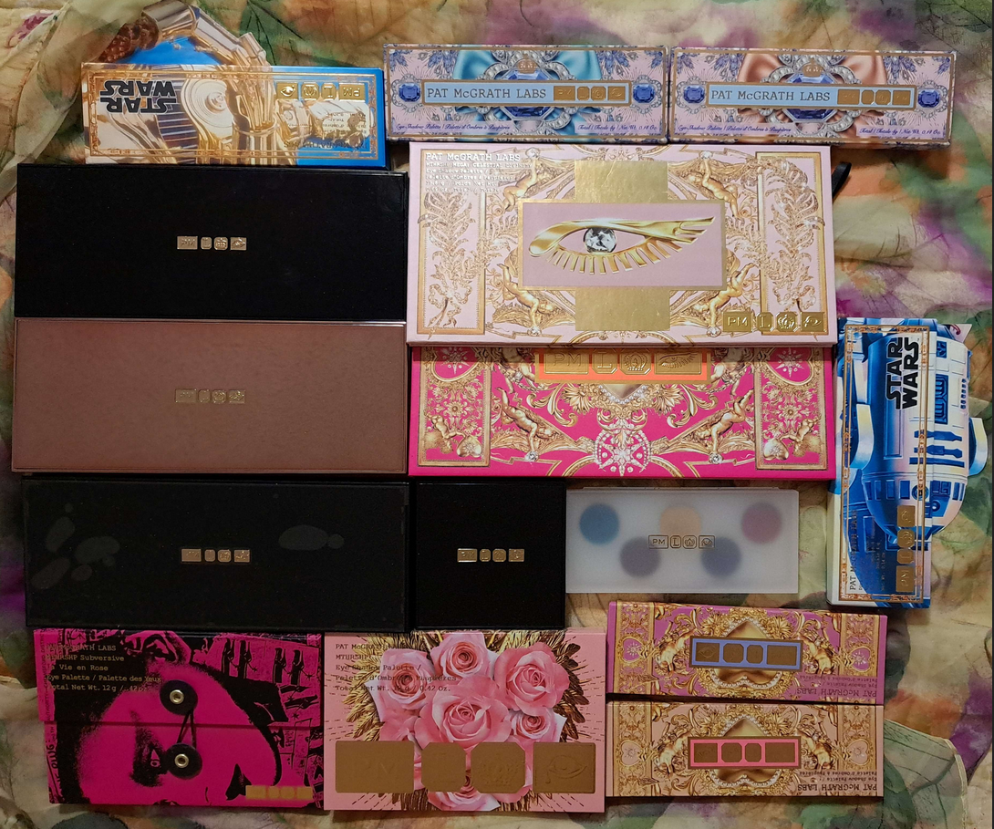
I buy a lot of eyeshadows from Pat Mcgrath, but they don’t always stay in my collection. When I recently had to choose which palettes to bring with me during the first wave of me moving overseas, and which products would have to wait until another time, I still ended up leaving some of the higher ranking palettes behind purely because of the brick-heavy packaging.
Today, I thought it would be fun to discuss where I would place all the quads and palettes I once owned if they competed head to head!
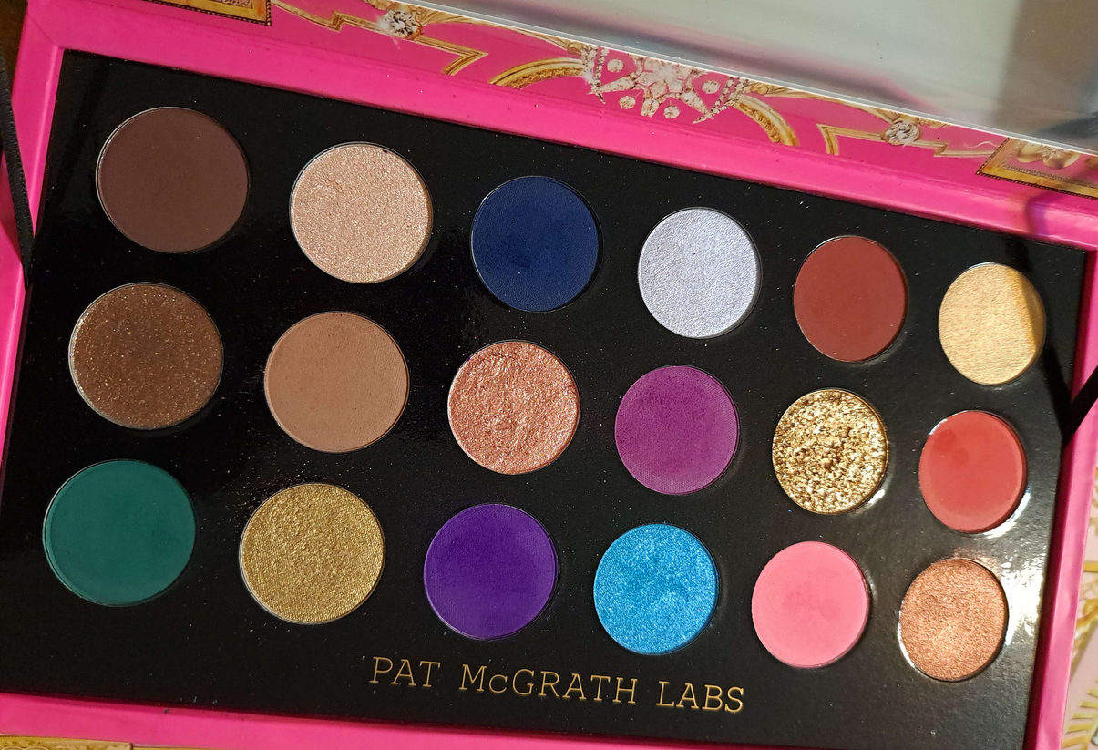
The Disappointments (Ranks 19-16): MTHRSHP Velvet Liaison, Mthrshp Mega Celestial Nirvana, MTHRSHP Rose Decadence, and Pat Mcgrath x Star Wars MTHRSHP Dark Galaxy
It’s strange to consider Velvet Liaison the lowest ranking palette because the quality is actually good. From my subjective perspective though, nothing else could be lower because this is the only PML palette I never had enough interest in to review, didn’t feel the need to bring it with me to the US, and haven’t felt compelled to use now that I’m back in Germany.
It being an all-matte palette instantly makes it a supplemental palette that doesn’t stand on its own. I always need a shimmer in my eye looks. The shades also don’t go together for me in a way that I would be satisfied with using on its own. The lightest color is also quite stark looking on the eyes but fades from my inner corner (where I’ve used it) fairly fast.
These mattes are smooth, blendable, and pigmented enough if I use the deep brown in everything, but I just can’t be excited by the color story. I bought this because it was deeply discounted and I didn’t have many palettes while I was on vacation, so shipping it to me made sense. The overall launch of the three palettes just wasn’t exciting either though. So, even though I think it’s better quality than the next palette, I’m rating it lower.
It’s weird to say, but I was feeling guilty about not buying Celestial Nirvana considering how much I’ve gone on and on about wishing the brand would make more colorful palettes (and especially including a green). The thing is though, I meant for the Motherships and MTHRSHPS. The Mega MTHRSHPS are a good deal for the customer for shade variety, but the bulky packaging makes me never want to reach for them, especially since this is even heavier than the first one they released. There also seems to be a difference sometimes in quality between the brand’s palettes made in Italy versus the US. I eventually bought this because swatches I saw looked so nice and it was deeply discounted at the time, but this doesn’t live up to the brand’s normal quality which makes the cost not as great of a deal. As I mentioned in my review, these are super pigmented (minus the neutral mattes), the mattes are more difficult than usual to blend (especially the purples), and the green I wanted so much was a complete dud. When I return to the US, I’m considering depotting some of the shimmers and decluttering the rest of the palette. It just isn’t worth bringing over or even trying to sell to be honest. At least, not when there are sixteen other palettes I liked more than this one.
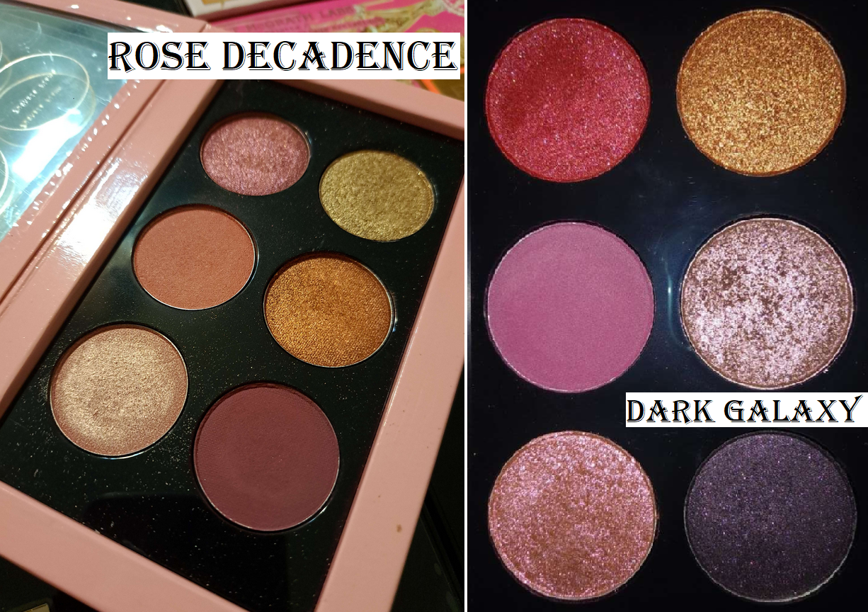
Rose Decadence is a pretty color story, but I just couldn’t be excited by it. This was released during a time before the brand had any blushes, so the ability to use the lighter matte as a blush color was the main selling point. If I had been able to get a decent enough return on the purchasing price, I would have sold it, but the resale value on this palette was very low. That’s the main reason I still had it, plus the guilt that I never gave it enough of a chance. The quality was good. I just wasn’t interested in pink at the time and the beautiful rose packaging on the outside was a big selling point, along with the price. This was also during the time when the brand didn’t have as many sales so I couldn’t buy the pricier palettes.
Dark Galaxy was the opposite. The resale value was high, but I kept it around for a long time because of the limited edition factor. The colors were pretty, but just not the kind of looks I was interested in making. When I realized though that the quality of Pat’s eyeshadows do diminish over time, I tried to sell it while the quality was still good so that someone else could at least get more enjoyment out of it than I could. Sometimes the collector side of me feels a twinge of regret, but I know I made the right decision getting rid of a palette I just wasn’t ever going to use again.
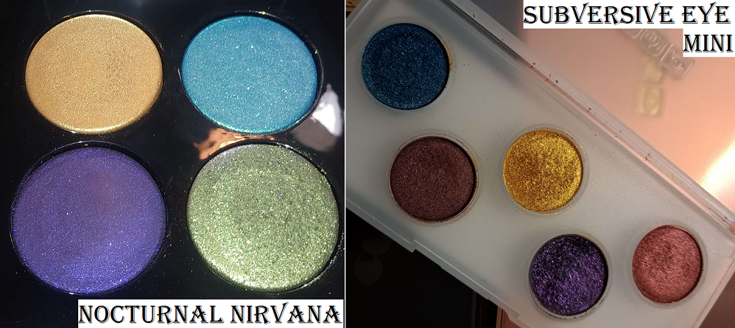
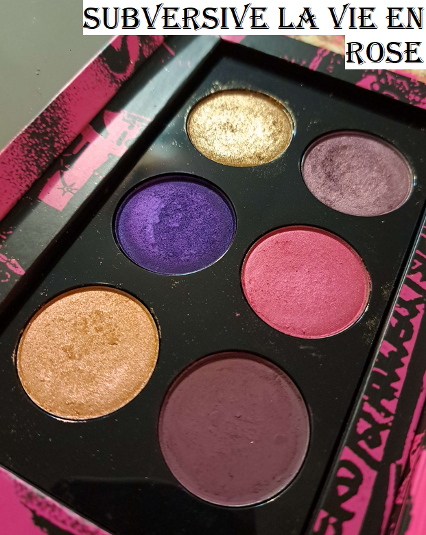
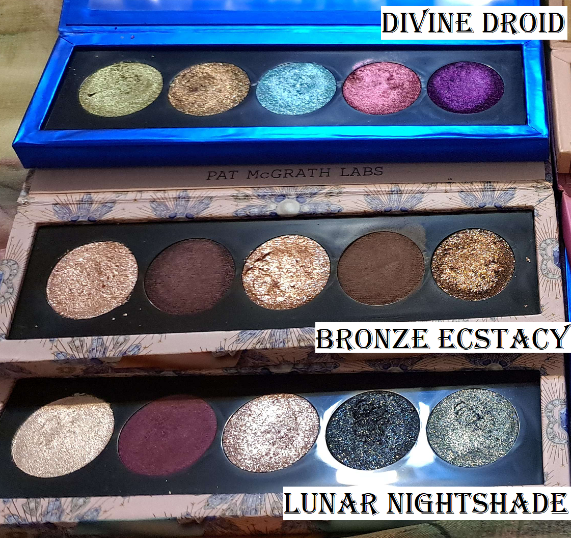
Like, But Will Never Use (Ranks 15-11): Blitz Astral Quad – Nocturnal Nirvana, Pat Mcgrath Labs x Star Wars (5 pan) – Divine Droid, Mini Eye Ecstasy: Subversive, MTHRSHP Subversive La Vie En Rose, Bijoux Brilliance (5 pan) – Lunar Nightshade
Nocturnal Nirvana was difficult for me to decide to sell. I loved the green in here, as well as the purple color, but the purple shade dried out and became hard-panned. It became impossible to use that shade, the yellow-gold was a bit boring of a color in the time period that I was getting even more interested in yellow and gold shifting multichromes, and I never wear aqua blue eyeshaows. It did not seem worth keeping an entire quad in that heavy packaging for just one eyeshadow. Plus, I knew I could use the funds to purchase a different quad instead, so I stopped regretting it. To date, that purple is the only baked eyeshadow from the brand that worsened in quality like that.
I said I would depot the mini plastic palette, but I never did. I said I wanted to get more use out of those shades, but I never did. I still stand by the quality and acknowledge the beauty of those colors, but the lack of mattes really kept me from reaching for it and the clear packaging both deterred me from wanting to use it while preventing me from having the willpower to destroy it to try and get those pans out. Getting this small palette at the reduced price of $14 was still much better than if I had purchased the full size Mothership Decadence palette. So, I don’t have as many regrets about how this palette got cast aside. Also, I’m not sure why this was called Mini Subversive instead of Decadence considering the shades are from the Decadence palette and don’t resemble the Subversive range at all.
Speaking of the Subversive range, this palette I actually got a decent amount of use from. The colors weren’t perfect for me since I’m not interested in light purples or vibrant pinks, but I was obsessed with that rich luminous purple! Plus, the other shades were nice too. It’s unfortunate that the time when I was starting to get the most use out of La Vie En Rose was also when the quality was starting to deteriorate. The shades started applying patchy, especially my beloved purple shadow, so that’s the main reason I stopped using it. The reason this palette ranks in 12th place, for something I used to love so much, is mainly because the quality didn’t last as long as some of my other products from the brand that I had for even longer. Plus, the color story isn’t as versatile.
Of all the new 5-pan palettes from PML, Divine Droid is my least favorite because of the lack of mattes, the aqua blue, shades of green and red I don’t wear as often as other shades of those colors, and the quality being slightly lower than the rest (as discussed in my review). Having it is like having a weaker version of Nocturnal Nirvana, but at a better price-point. So, it gets 14th place.
Lunar Nightshade looked so unique in promo photos, but it’s debatable whether this is better or worse than Kaleidos’ Futurism III Astro Pink. Just like that palette, as much as I was fascinated by the color combination, I rarely wear a look that that on my eyes. I don’t have complaints about the quality. It just ranks lower than the rest because of how much more I prefer the other four that I own.
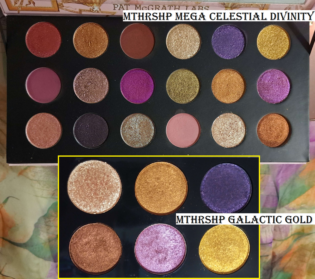
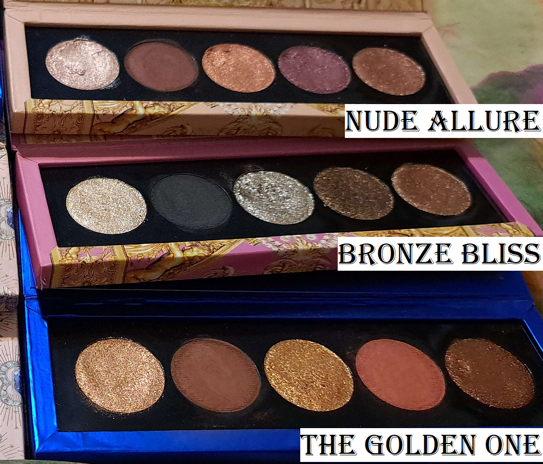
Like, But Don’t Use Enough (Ranks 10-5): Pat Mcgrath x Star Wars MTHRSHP Galactic Gold, Mega MTHRSHP Celestial Divinity, Mothership IX – Huetopian Dream, Pat Mcgrath Labs x Star Wars Eye (5 pan) – The Golden One, Bijoux Brilliance (5 pan) – Bronze Ecstasy, Celestial Nirvana (5 pan) – Nude Allure
Unlike Dark Galaxy, I really wrestled with the decision to sell Galactic Gold. I loved every shade except the dark purple, but it was a matter of me being distracted by my other palettes that I didn’t reach for it enough. I could tell the quality was starting to go the way of the other six-pans, but I was so reluctant to let go of it. Even when Celestial Divinity was released with the same shades (but smaller) of both palettes, it still took me a while to have the heart to declutter it. As a collector, I still felt a sense of regret on and off for the next few years until very recently when the brand re-released the Star Wars palettes “from the Vault,” and instantly the coveted aspect of having a limited edition never-to-be-released-again product was gone. I’m finally free of regrets now that it isn’t as special from the collector standpoint!
The reason this had to at least rank number 10 is the fact that I still don’t use those shades in the Celestial Divinity palette, yet I was so overwhelmed by nostalgia that I almost bought the Vault palette! Remembering the times I did create looks I loved from this palette had that strong of a hold on me! The reason it’s not higher though is the fact that I use other palettes more and the quality of this one started to drop.
As for Celestial Divinity, the fact that it includes shadows from both Star Wars collab palettes, plus six unique shades in which two of them I really liked, is why it had to rate higher. If the quality of this palette is still good, it will come back to Germany with me in the second wave of products.
Huetopian Dream is a hard one to rate because I find the left six shades to be so boring, but they’re admittedly very pretty on the eyes. It’s better than the previous pink palettes because I have some really stunning golds and a non-baked multichrome to work with. It’s lower down on the list because of the high cost for colors that are repetitive for the brand, having only three baked shades (the ones that add to the palette cost) instead of four, and having two shades that tend to crease on me as I mentioned in my review. It’s still fairly new in my collection, so my thoughts could change up or down on this one.
Now, we’re getting to the palettes I actually brought with me to Germany because I couldn’t be without them!
Of the 5-pan small palettes, the Golden One’s color story is not very exciting, but I’m still obsessed with the non-shimmers in this one. They’re such a fascinating texture and looks nice on the eyes, plus golds will always be pretty to me (albeit at times boring). Needing to pair this with something that gives me more depth is why it doesn’t rank higher. Based on the colors alone, Huetopian Dream is technically more exciting. The reason this is above it is because it has less flaws.
Bronze Ecstasy gives me several depth options, plus has this stunning bronze shade that I find super appealing. The lack of variety of the colors is why it doesn’t rate higher, and that bronze that I love can be troublesome as I discussed in my review, but I haven’t used this palette enough, so there’s room for me to rate it higher as I continue to use it this year. I know I’ll get more use out of this palette than The Golden One in the long run.
Surprisingly, Nude Allure is not my usual type of color story, but every look with the palette is so pretty that I could not rank it any lower than 5th place! The sparkle colors in these eyeshadows make them so much more nuanced than a typical peach, pink, or purple. The addition of that matte ensures that I can do complete looks with this palette as well. It’s so good. I definitely want to use it more in 2024.
Most Precious (Rank 4): Mothership VIII – Divine Rose II
This is the only palette in my top 7 that I didn’t bring with me. I wanted to bring it desperately, but for one thing, it’s just too heavy. I could only make space for one of the big Mothership palettes, so this had to stay behind. Plus, this was my first time using a Relavel case in my suitcase, and I didn’t know if I would have any makeup packaging casualties on the trip, so I didn’t want to take the risk that this palette could end up damaged. Part of what makes this palette so precious and in a category of its own is the limited edition mirror pink packaging. The brand hasn’t released something like this since, so the exclusive aspect and inability to replace it (only in the standard packaging) bumps up the value for me.
I’ve used the pinks in here as blush before. I like the Sextraterrestrial multichrome in here so much that I didn’t feel the need to buy the Clionadh equivalent for years! That’s really saying something!
This isn’t my favorite color story from the brand, but I like enough of the shades that I continually want to use it. It’s literally only because I’m so scared of ruining the packaging that I don’t reach for it more. You better believe this is at the top of the list for things I’m planning to bring back with me next time!
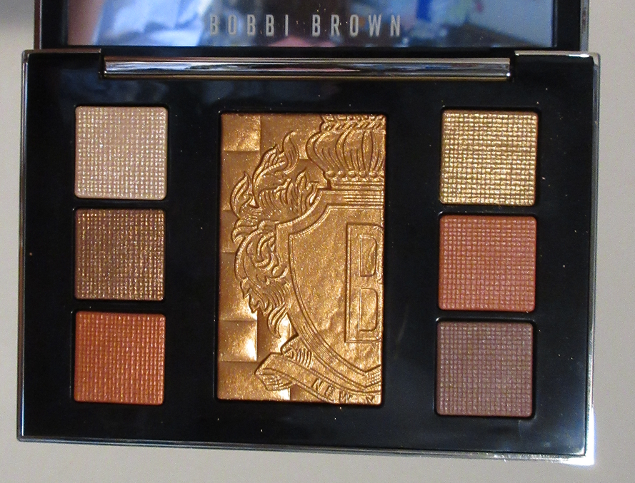
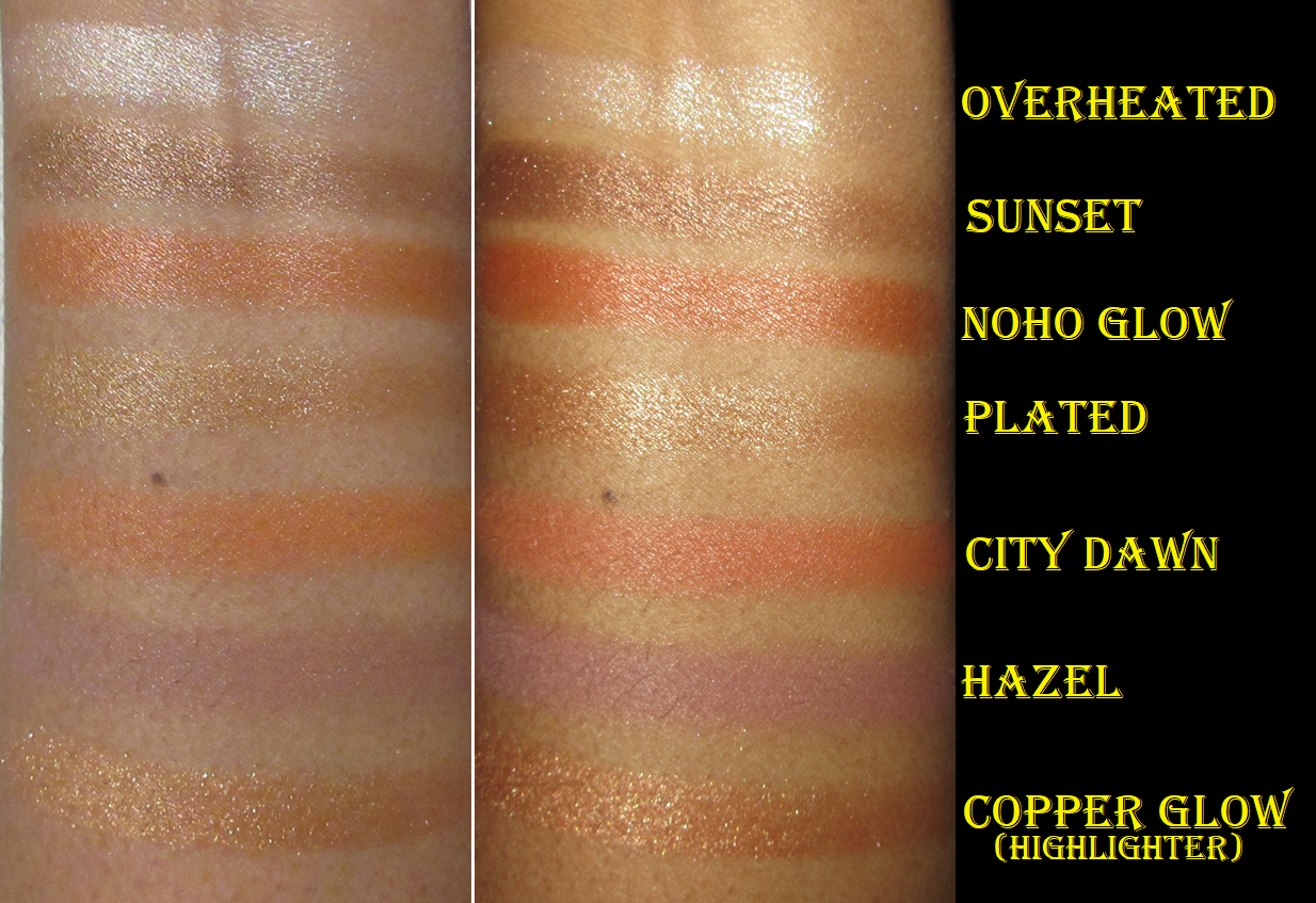
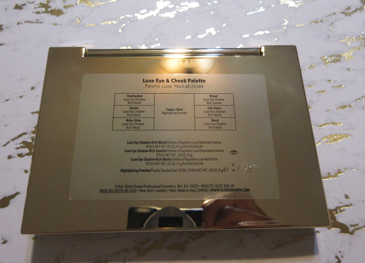
Must Haves (Rank 3-1): Luxe Quad – Interstellar Icon, Celestial Nirvana (5 pan) – Bronze Bliss, and Mothership III – Subversive
This was the toughest category to rank because I love Interstellar Icon, but I don’t use it enough. I absolutely love Bronze Bliss, but it’s not a universally exciting color story. I technically have stronger emotional ties to Divine Rose II than Subversive, but getting more use out of Mothership III has been on my mind the most out of everything. In terms of color variety, quality, and packaging, Subversive has it all. I think it’s the best and most well-rounded of all the Pat Mcgrath palettes I own. That’s why I ultimately decided it deserves the top spot.
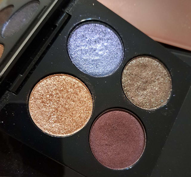
Interstellar Icon is the quad I purchased with the money I made from selling Nocturnal Nirvana. I’m not much of a blue lover, except for use on my lower lash line, so that’s a slight negative against it. The Blue Blood color is the same as from Decadence and the mini I own, so I used to reach for the mini to use that in my eye looks and keep this one as new as possible until the quality inevitably drops and this becomes the “fresher” one. Now that I don’t have that palette with me, I’ve started using this pan of it again. Divine Dahlia is my favorite shade in the quad and the reason I typically reach for this. Even though I feel like I don’t use this a ton, it’s technically still one of my most used Pat Mcgrath palettes. Also, when I think about favorite eyeshadows from Pat Mcgrath, this quad always springs to mind.
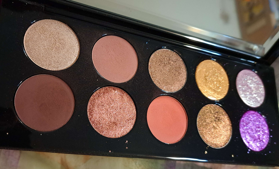
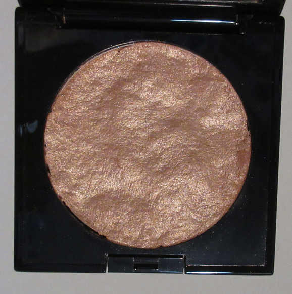
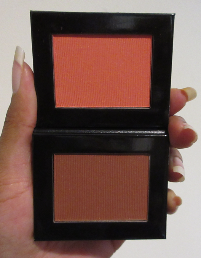
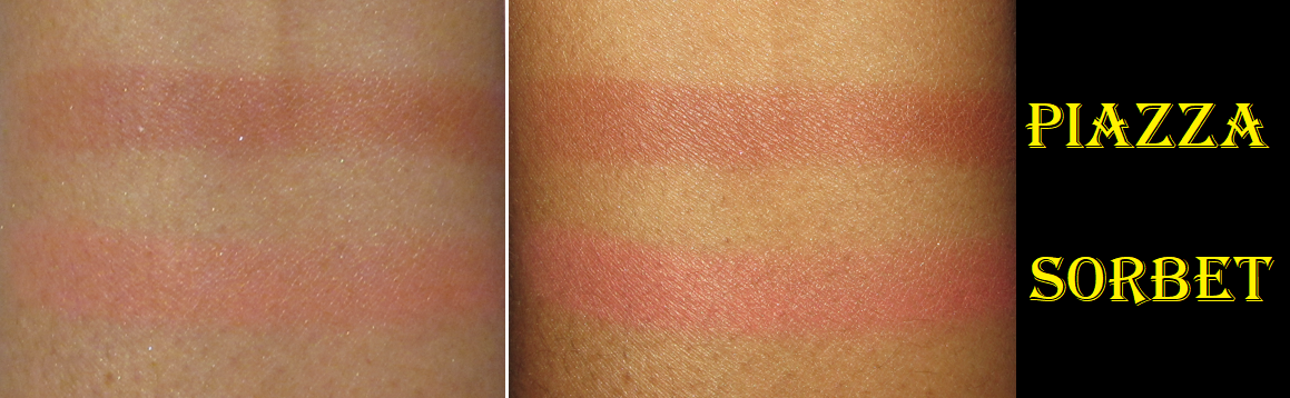
Bronze Blissis my favorite of the 5-pans and literally what kicked off my love of this new eyeshadow formula from the brand. The silver color in the center is one of the most stunning silvers I’ve seen, but it’s a little messy to use since it’s so much wetter than the other shadows. The black and two bronze shades are what keeps me coming back to this palette or constantly thinking about it when I want to create a neutral glam eye look.
Last, but not least, is Subversive III. I can technically make eye looks from this palette without needing to reach for anything else because it gives me light options, deeper options, colorful shades, and neutrals. For that reason, it’s one of Pat’s most well balanced color stories (and certainly of the ones I own). The way I do makeup, I still miss having a medium toned brown, but for that I just reach into my Hindash Beautopsy palette.
As one of the big older Mothership palettes, it has those special shades in the final quadrant that most of the brand’s fans love. This, plus the lux packaging, makes it closer to being worth the price. As great as it is, I still think it’s only worth it at 30% off or greater. Eyeshadow formulations have come a long way in the past decade, so for those interested in the palette for its actual quality, it’s hard to justify such a steep price. For those that don’t mind the upcharge for the packaging, multichromes, the eyeshadows being made in Italy, and other extra costs, the pricing makes sense for such easy to blend eyeshadows and refined look to them on the eyes. Despite how old my palette is (not as old as the originals since I didn’t buy it until years after it first released), the performance is still there.
RECAP OF RANKING FROM FAVORITE TO LEAST FAVORITE:
1. Mothership III – Subversive
2. Celestial Nirvana (5 pan) – Bronze Bliss
3. Luxe Quad – Interstellar Icon
4. Mothership VIII – Divine Rose II
5. Celestial Nirvana (5 pan) – Nude Allure
6. Bijoux Brilliance (5 pan) – Bronze Ecstasy
7. Pat Mcgrath Labs x Star Wars Eye (5 pan) – The Golden One
8. Mothership IX – Huetopian Dream
9. Mega MTHRSHP Celestial Divinity
10. Pat Mcgrath x Star Wars MTHRSHP Galactic Gold
11. Bijoux Brilliance (5 pan) – Lunar Nightshade
12. MTHRSHP Subversive La Vie En Rose
13. Mini Eye Ecstasy: Subversive
14. Pat Mcgrath Labs x Star Wars (5 pan) – Divine Droid
15. Blitz Astral Quad – Nocturnal Nirvana
16. Pat Mcgrath x Star Wars MTHRSHP Dark Galaxy
17. MTHRSHP Rose Decadence
18. MegaMTHRSHP Celestial Nirvana
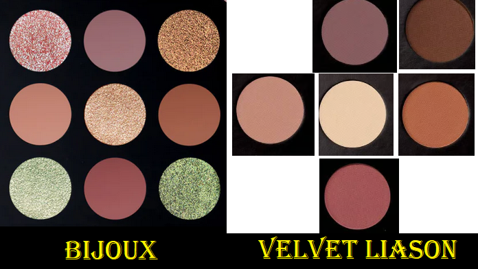
19. MTHRSHP Velvet Liaison
Over time, for various reasons, my love of the Pat Mcgrath Labs brand has dropped a bit. However, the love of my top ranking products from them hasn’t dwindled. They make good products and their launches are something I still always pay attention to. I’m still plenty interested in what they have next, even though I buy things from them at a slower pace now.
That’s all for today! I hope to see you next week!
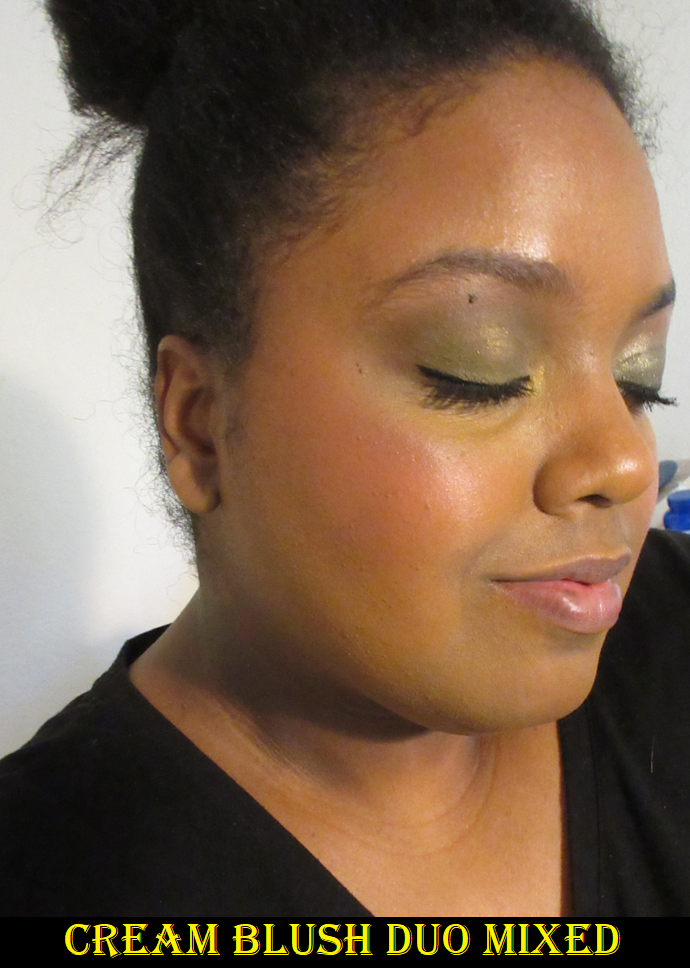
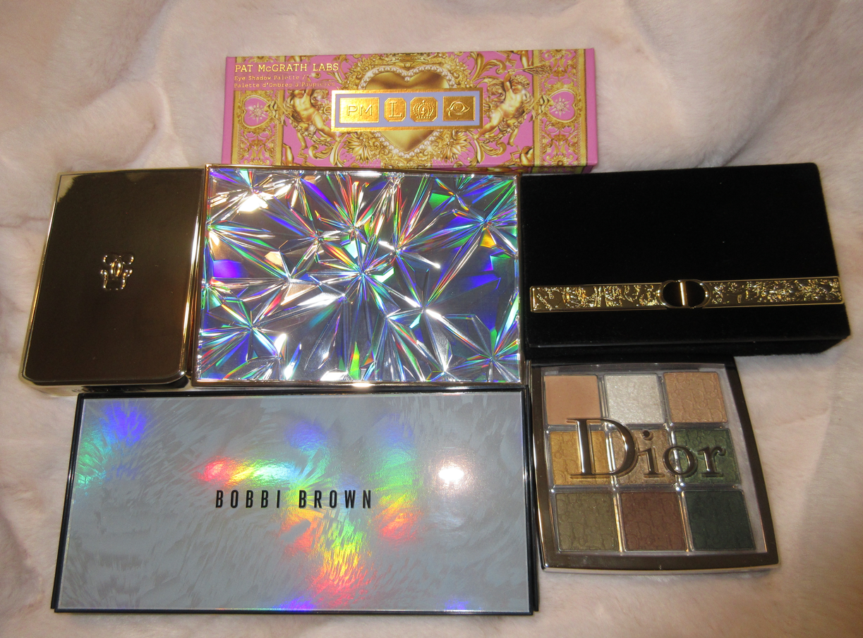
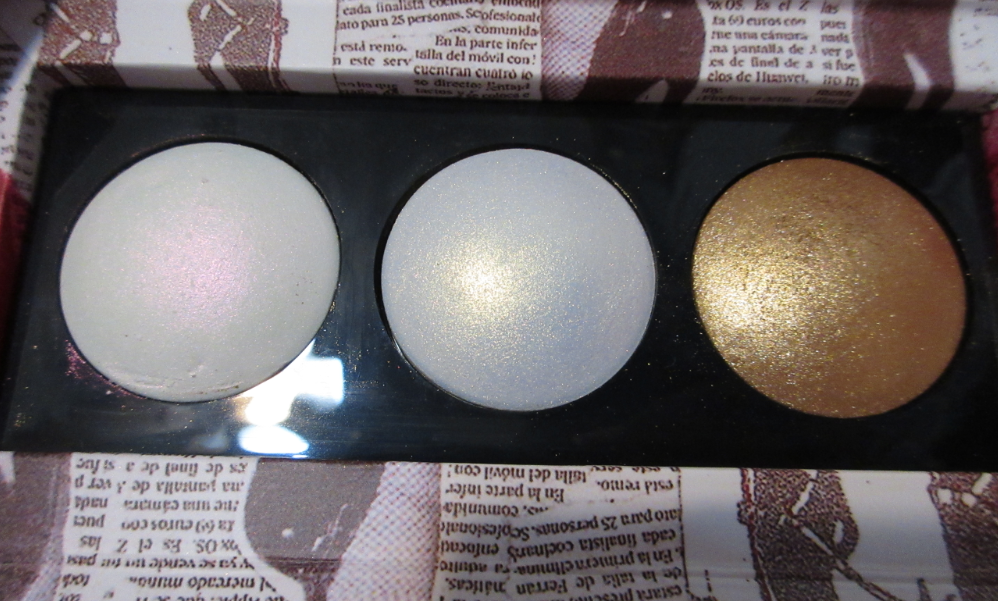
I purchased the Duo 003 Bundle to save some money since I knew with certainty I wouldn’t be able to stick with just one quint. Eventually, I would buy at least one more. I nearly always enjoy my PML purchases, so as soon as I fall in love with the parts of collections I buy, I’m always tempted to get more. However, I’m upholding some restraint with this collection. Buying two quints was the correct decision for me, but this might be all I get this year.
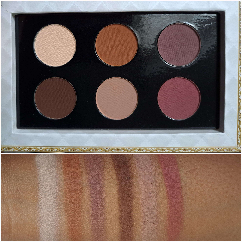
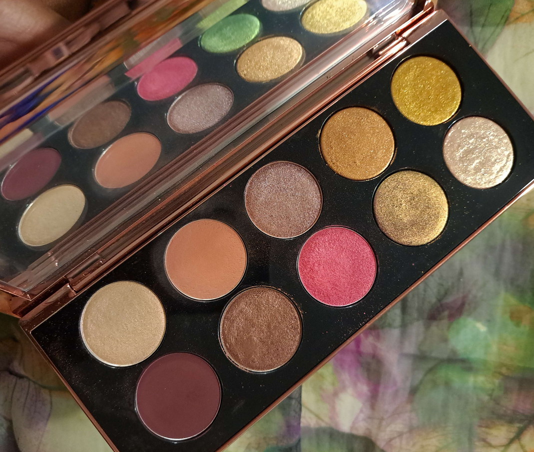
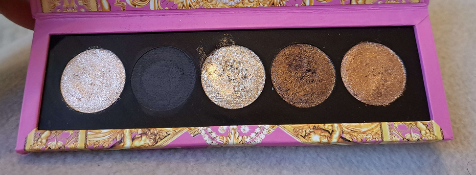
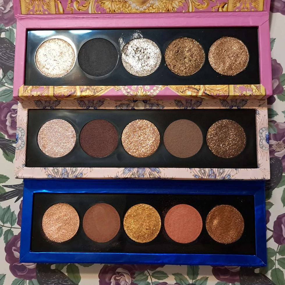
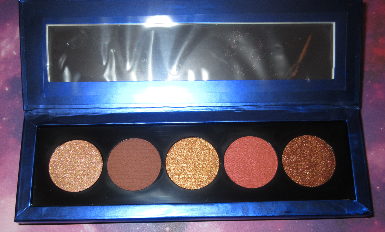
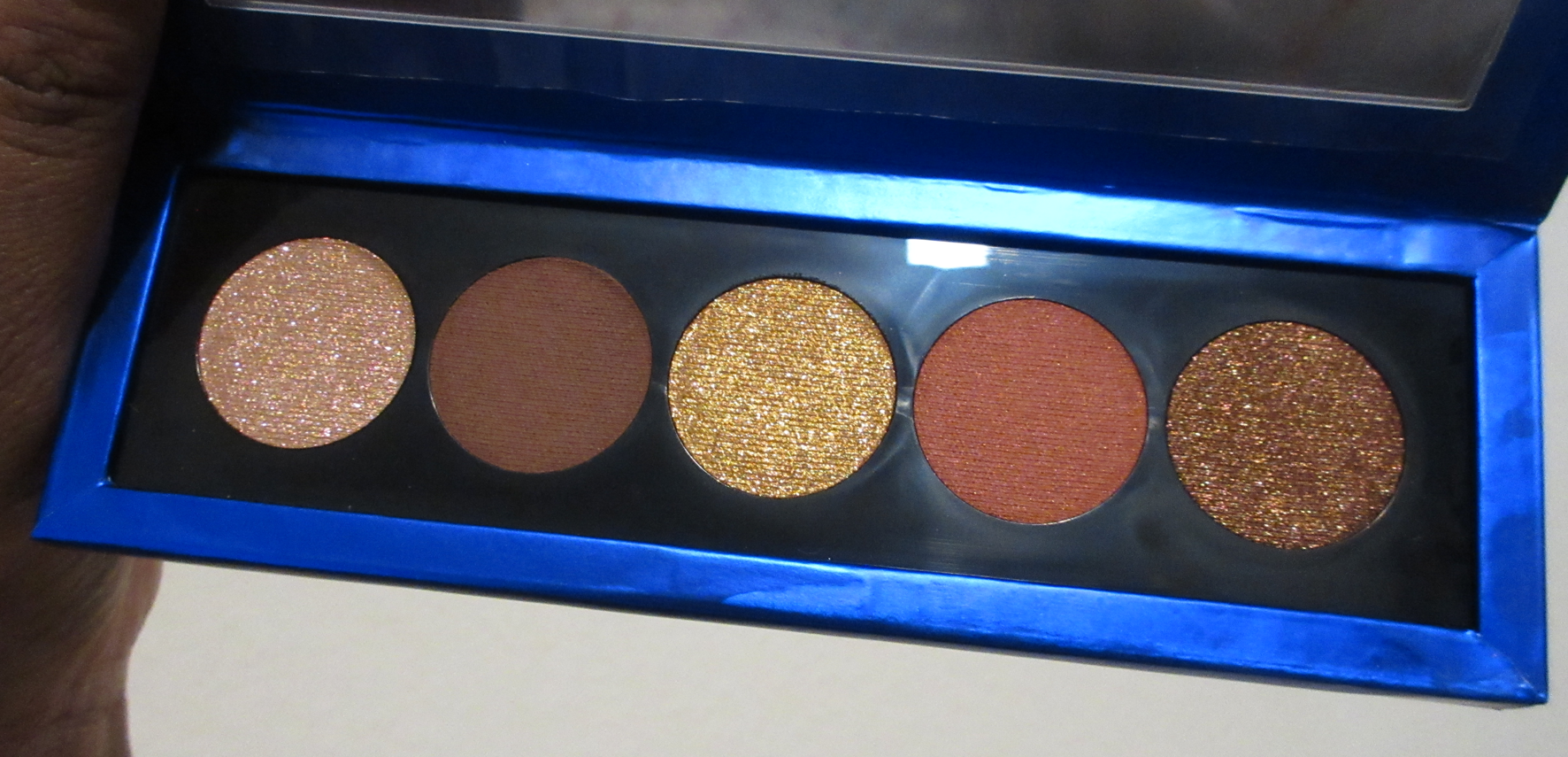
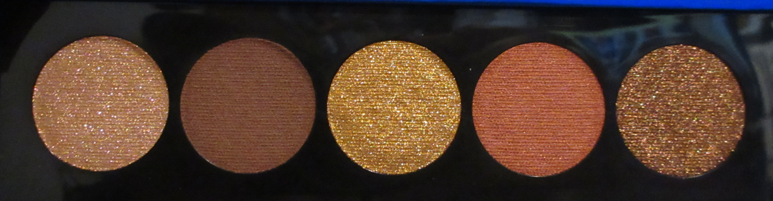
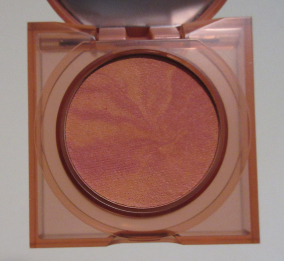
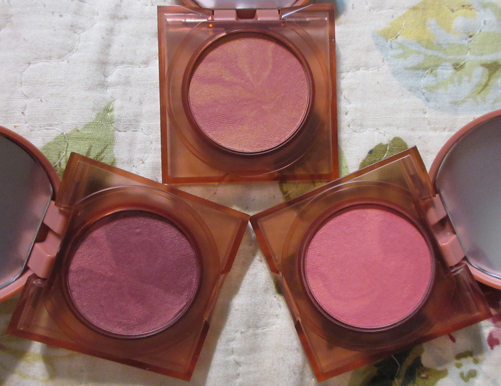
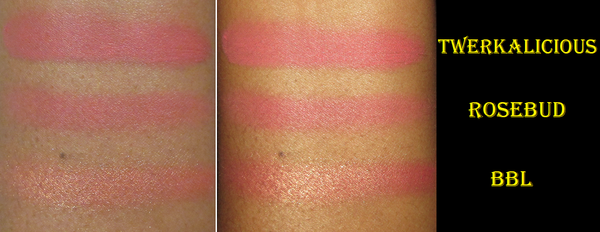
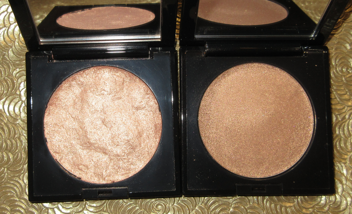
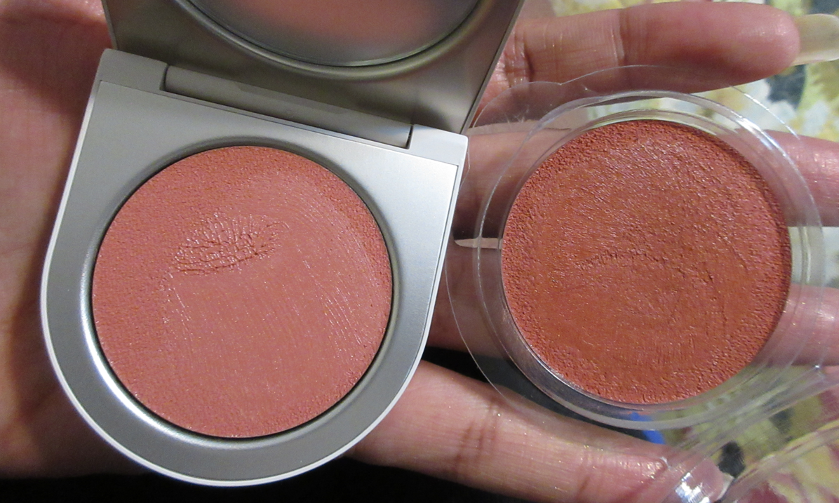
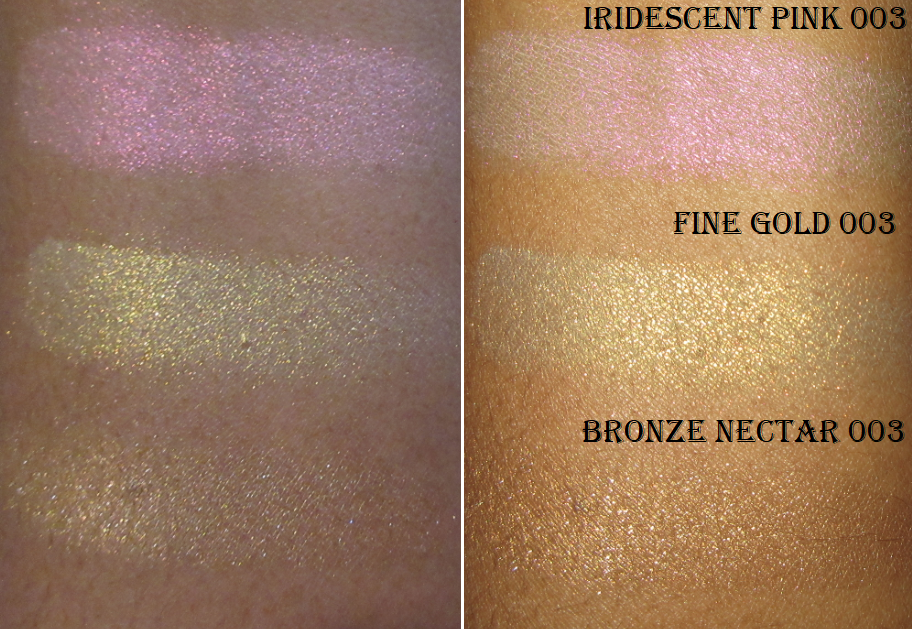
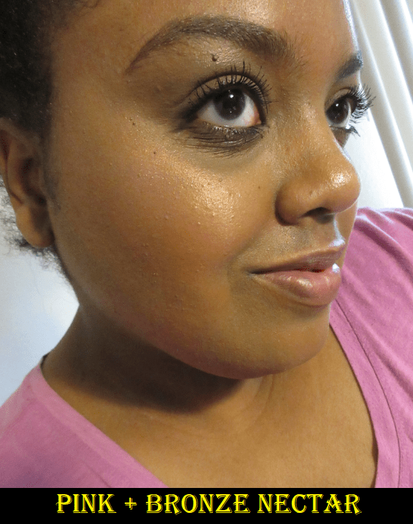
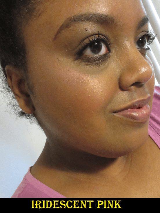
Bijoux Brilliance Eyeshadow Palette in Bronze Ecstasy and Lunar Nightshade
The quality of these are just what I would expect from the brand. The satins are stunning, the shimmers are beautiful, these are pigmented yet easy to blend, and among the shimmers there are various textures. The shades in the middle of both palettes are the wettest to the touch. As for Enchanted Bronze and Noir Nebula, they both have this very strange texture that smooths onto the lids nicely, and the base color is opaque, but the sparkles within those two are larger in particle size and not all that tightly grouped together. It nearly gives a scattered effect on the eye. Those two are also easier to get sparkle fallout, so I apply them precisely and carefully as the last step of the eye looks. I also tend to wet my brush since it makes me feel like they stick better that way, though it might not be necessary. My technique with those less easy shimmers is to apply them with my finger first, dampen a brush to pack on another layer to get the amount of sparkles I want, and then add one more final layer with my finger.
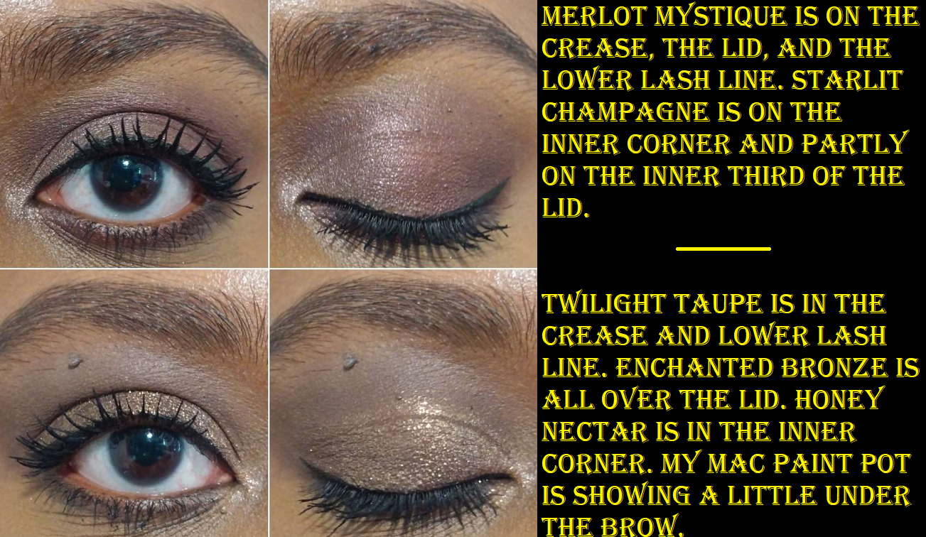
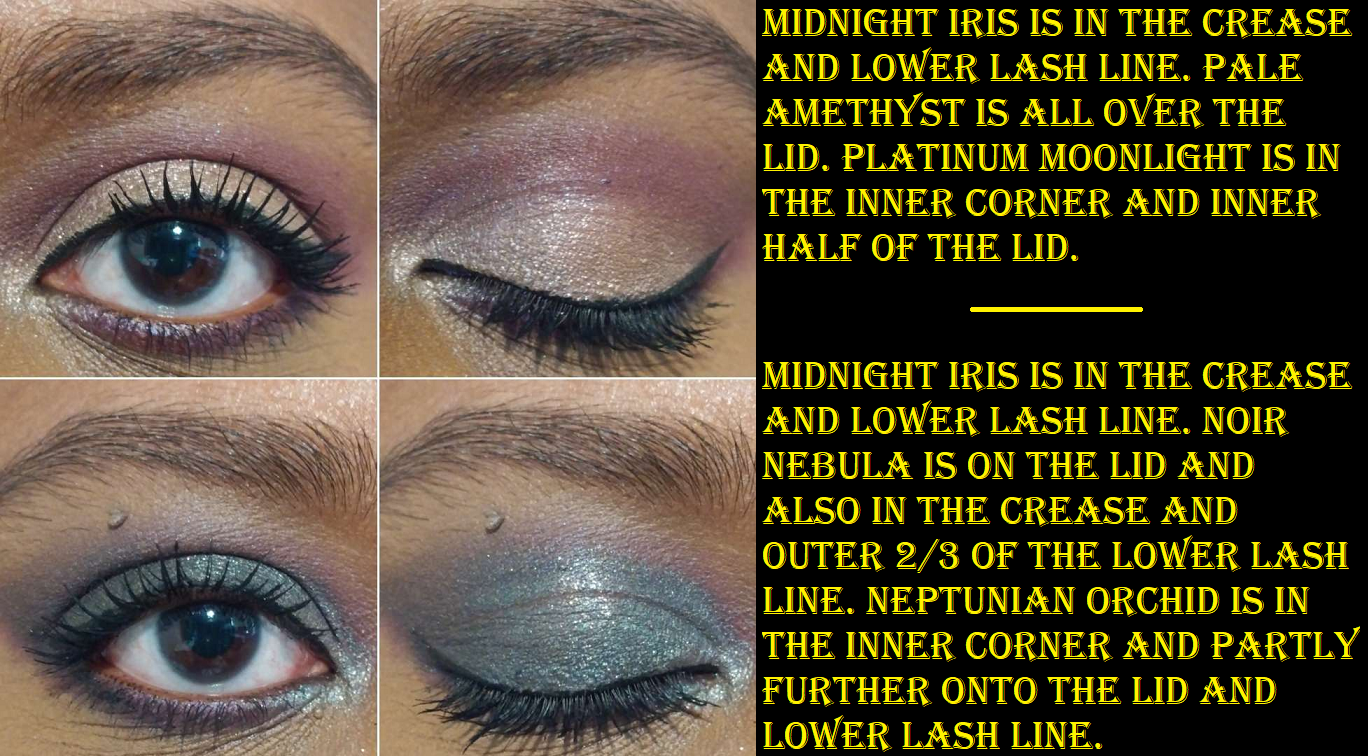
Merlot Mystique is a gorgeous plum-brown that reminds me of the darkest shade in Tom Ford’s Honeymoon quad. When I apply that to my crease, it loses some of the purple tone, so I basically blend those edges to my satisfaction and then add a little more of that shade on top to get the true color to show. The same goes for Midnight Iris that can just look like a deep purple, but adding a little back on at the end will show the vibrancy of that particular color.
I don’t get any creasing using these with the Gerard Cosmetics Clean Canvas or MAC Paint Pot, but I have gotten a tiny bit with the Coloured Raine eyeshadow base. The longevity is good since I don’t see them fading or dimming in their shine on the eyes.
I feel satisfied that the two quints I added to my collection are different enough from the rest to have been worth it, but I don’t think I’d have been excited enough over the other two color stories in the Bijoux Brilliance Collection. They’re pretty, but wouldn’t stand out as unique. Plus, I haven’t gotten as much use out of these as I’d like to, so adding four at one time would have been overwhelming.
After someone pointed out the similarities of the color stories between Lunar Nightshade and Kaleidos’ Futurism III Astro Pink, it feels less unique than I thought. However, I don’t regret getting it. And even though I don’t see myself coming up with a variety of different looks using Bronze Ecstasy, I’m very pleased with those staple looks I do end up creating. That one is actually my favorite of the two!
The brand’s 5-pan palettes seem to be an easy way to add more varieties of colors to their offerings, so I look forward to seeing more of these in the future. This is especially the case because as much as I love PML mattes, I love the matte/satin-matte hybrid formula that has thus far been exclusive to the quints.
HOLIDAY COLLECTION DISCUSSION
The most tempting products for me were the two MTHRSHP Bijoux Brilliance face palettes consisting of two blushes and 9 eyeshadows in each. These are great for people who haven’t purchased much from the brand, especially prior releases, which is why it would ultimately be a bad buy for me. Starstruck Splendour has both blushes that are too light for me (plus one is a repeat anyway). Jeweled Temptation has a new shade that’s too light, plus the famous Paradise Venus which I owned as a single before gifting it to my sister, but got it again in the Divine Blush + Glow Cheek Palette from last year, and it’s the darker shade within the Paradise Glow duo blush that I still own. My excuse for keeping the duo is for travel, but by right, I should find a new home for it. Even if I chose to do that, I’d still end up with two Paradise Venus pans left if I bought Jeweled Temptation. I was watching a discussion video when someone mentioned Jeweled Tempation’s color story looks like the MTHRSHP Mega Celestial Divinity Palette and I couldn’t unsee it. They’re not exact dupes, but it’s too similar for me to justify getting it even at a discounted price considering the blush situation.
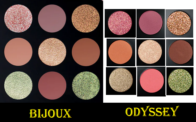
That same person also mentioned that Starstruck Splendour looks like Celestial Odyssey, which I did not purchase during the holiday season it was released. However, I own the six pan palette Velvet Liason (I left it in Germany), which comparing those promo pic colors to the Velvet Liason promo pic shades, the vibes are similar there too. So, I am ultimately skipping both products, even when they go on sale.
Next most interesting for me were the quints, but I bought the two that appealed to me most. I was actually set on also buying Bordeaux Bliss until I thought about all the pink and purple toned shades I have, and the fact that the nearly-cream-to-powder mattes were the stars of the show for me in the quints initially and Bordeaux Bliss only has shimmers. Sunset Romance is also pretty, but too pink and too neutral to avoid feeling repetitive for me.
The Divine Blush + Bronze + Glow Trio in Supernova Siren was nearly as tempting, specifically for the highlighter. I usually stick to golds, dark champagnes, and light bronzes, but a warm peachy-pink highlighter with golden shimmer can sometimes peak my interest. However, I already own the Burnished Honey bronzer (along with two other bronzer shades). I’d be willing to sell my individual one in order to not have two in my collection, but Burnished Honey isn’t even my favorite of the bronzer shades. I might have done that if it was Bronze Divinity instead. In photos, the new Midnight Orchid blush looks too vibrant of a fuchsia shade for my taste. It looks within the same color family of Lovestruck, plus deeper, and I specifically have avoided buying Lovestruck because it’s not the type of blush color I enjoy seeing on myself. So, unless this is one of those times when the website photos don’t accurately show how the shade will look in person, that makes two cons against getting the trio. While it’s true that I sometimes will buy a whole face palette just for one shade, a highlighter is rarely special enough to be worth that. And as intrigued as I am by Solar Fantasy, it’s in the Divine Glow formula whereas I prefer the brand’s Skin Fetish: Ultra Glow formula. A non-sparkly non-glittery baked gelee is my absolute favorite from the brand, and unfortunately that has only been for the Divine Rose one. They’ve yet to release that kind in another shade and I’d prefer to wait however long it takes because that one still trumps the rest of the highlighters I own from Pat Mcgrath, even though the Divine Glow formula is still nice. It’s just not as special on the market. So, this is ultimately the one product I’m still waiting to see photos and videos posted online to decide if the blush is more my style and if the highlighter is still something I want. If yes to both, I’d only get it on a deep discount considering the risks of me liking it are slimmer than the potential disappointment. It may very well be that these two quints I reviewed end up being the only Pat Mcgrath Holiday items I buy.
I nearly forgot that new shades of the colorful mascaras are part of this collection too! I commend the brand for taking a risk on those, since I don’t think there’s a big market for that kind of makeup product, but it’s an easy pass for me.
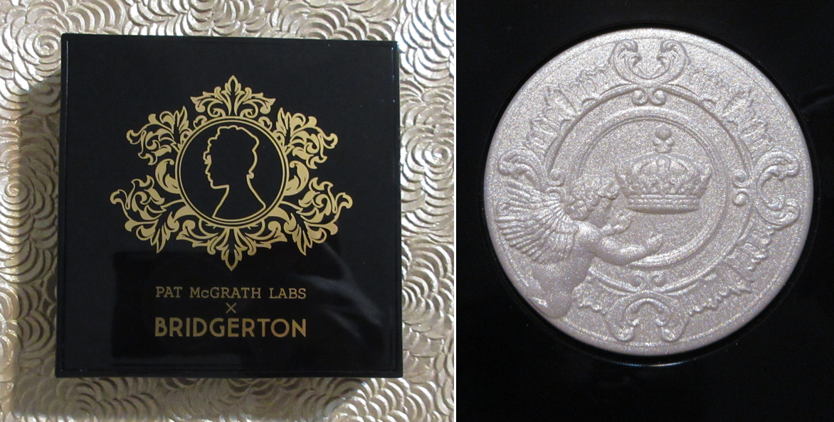
Also, I know it’s not just me thinking this collection and several past releases are all in the Bridgerton aesthetic. I can’t help but think that the collaboration didn’t sell as well as anticipated (which is backed up by the appearance of so many Bridgerton items at TJMaxx) and a lot of packaging and components intended to be extensions of the Bridgerton line have been passed off onto customers with different names pretending to be uniquely different collections. I like the bows and jewels patterns and designs, so I enjoy having these while the brand doesn’t have to take a loss by just excluding the Bridgerton label from the products. The only downside for me is the not-so-bold color stories, so I’m looking forward to when we’ll be able to move onto some fresh concepts and ideas.
Anyway, that’s everything for this week! Thank you for reading!
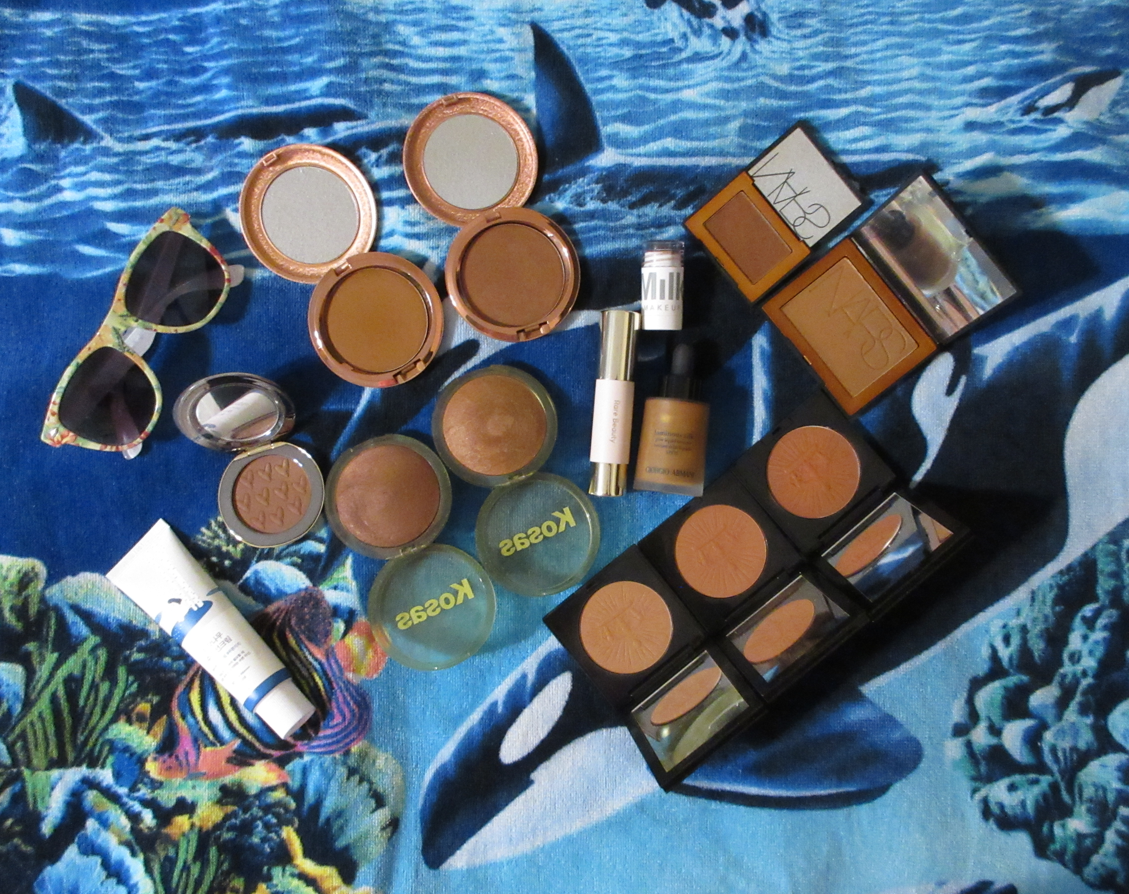
Not pictured, but will be reviewed, is the Hermès Bronzer and the bonus bronzers mentioned towards the end of this post.
In my Bronzer Ranking and Declutter post, I mentioned that I would review all the 2023 bronzer releases at least several months later because it wouldn’t be fair to compare them to the others without having tested them thoroughly. I believe I’ve spent enough time with them by now to review them properly, but I’m not ready to include them in an ultimate ranking list. Perhaps I’ll do that during summer 2024.
Included in this post are bronzers that launched, were reformulated/repackaged, or underwent a shade expansion this year.
In the demonstration photos (and whenever I review bronzers), I try to apply it nicely, but it still needs to be seen on camera, so I don’t blend it as much as I normally would. If I applied them as subtly as I would normally wear them in every day life, it would be difficult to see the difference between the bronzer and my natural skin tone. I wouldn’t normally apply bronzer in a way that lines can be seen, and would even apply a finishing powder on top to ensure it was seamlessly blended. Of course, I don’t use a finishing powder when the photos are for the blog since that would be an inaccurate representation of what the bronzer looks like on the skin. So, I always try to find a balance between blending it and ensuring it is visible.
*DISCLOSURE: Non-highlighted links in bold blue font (Example) are standard non-affiliate links. Links marked in bold black font with a light blue background (Example) are affiliate links. Affiliate links allow me to get a commission if purchases are made directly using my link. There is currently just one affiliate link in today’s post.
New Holy Grail?
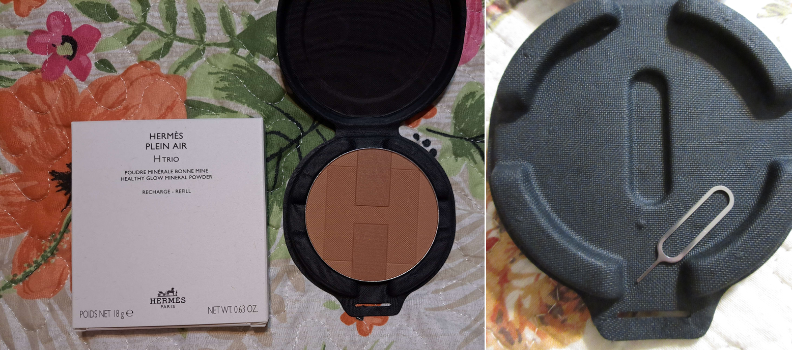
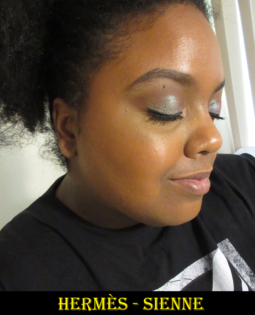
Hermès Plein Air H Trio Healthy Glow Mineral Powder in 04 Sienne (refill)
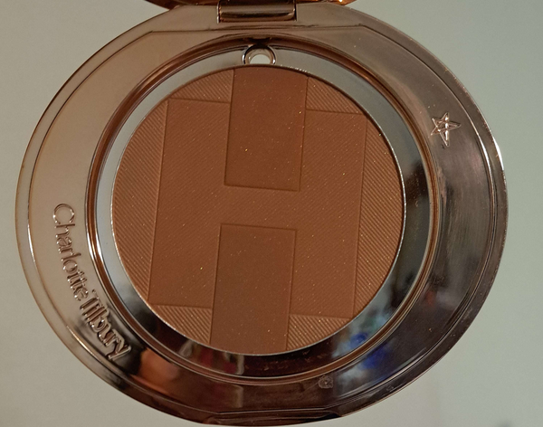
Packaging is one of the biggest reasons I sometimes make luxury purchases, but in this instance, the rave reviews of the Hermes formula was convincing enough for me to buy it. I purchased mine through Selfridges because the refill was significantly lower priced on their website than in the US. The refill pan is not magnetic, so I had to put metal stickers on the bottom in order to store it in my empty magnetic palette. The packaging it came in is durable, but I knew I’d be more likely to get use out of it if I kept it in my Z-palette of face products that has a clear lid, rather than the forgettable unicarton. The pan size is wider than nearly every bronzer I own (I have a wide Makeup Revolution compact, but the Hermes pan is too tall in height). So, even if I wanted to depot a compact so I could put this in there, I can only do that with the bronzer compact from Charlotte Tilbury (though it would have gaps around it), or settle for my custom empty palettes.
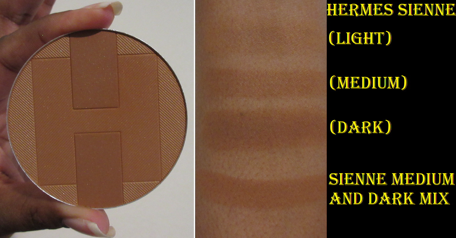
Each bronzer contains three different colors. It’s unrealistic to use them separately without them mixing at least a little, but the placement of the brush in the pan will determine the depth of color. For example, swirling the brush in a circle around the rim of the pan will get more of that lightest shade. Swiping up and down on the left half or right half, avoiding the darker blocks in the center, would get more of the medium color. Trying to get an even mix of all three colors makes it too light to bronze me properly, so what I do is swipe my brush back and forth vertically between the two darkest rectangles, and that turns out to be the perfect bronzing shade for me. I built it up in the photo below to show the the maximum depth I can get from it. So, if you’re close to my skin tone, know that Sienne is on the subtler side though it still works. I chose not to get Colorado, which from what I’ve seen in photos and reviews is a little darker, but seems to be more red-toned.
I don’t get kick up in the pan and the product picks up easily even with my most delicate natural hair brushes. It’s the most natural looking finish from a standard powder (by standard I mean not baked gelee or cream to powder) bronzer that I own. It’s the smoothest and most refined. It contains shimmer particles that aren’t visible as sparkles on the face, but just enough to add a realistic skin-like look instead of being purely matte. I have no longevity issues. I have zero blending issues, no matter which foundation I use, and regardless if it’s powder-set or not and whether it’s matte or dewy. It’s pretty much perfection. I have to build it up a little, but it’s a low-effort task to complete that takes almost no time at all.
My favorite brushes to use with it have been ones that aren’t too dense but aren’t too airy either, and sweeping style brushes like the Sonia G Jumbo Bronzer and Eihodo RE8-3 Makie Blush Brush.
I still need time to see if this bronzer will eventually get hard-pan with extended repeated use or any other changes, but thus far, it is my #1 powder bronzer. I should note that the difference in performance between this one and the Charlotte Tilbury powder bronzer, Victoria Beckham Bronzing Brick, and others that have crept their way higher on the list of “standard” powder formulas is so slim, it’s not going to be worth the price difference for the majority of people. To put it in different terms, if the Hermes bronzer scores a 9.8 out of 10, the Charlotte Tilbury scores 9.5 out of 10. At the US prices of $105 (or $67 refill) for Hermes versus $58 (or $41 refill) for CT, it seems simple to conclude Charlotte’s is the better deal. However, that’s really up to each individual to decide based on their own skin type and skin tone. I have no way of knowing how the Hermes bronzer will work on someone with a skin type other than dry. I know some people that don’t like the tones of the other bronzers in the line, and even find Sienne to be too orange based on their undertone. This purchase was worth it to me because of how well it suits me in every way, and I don’t have my perfect color in the CT powder formula specifically. Plus there are luxury lovers who might be perfectly content with paying premium prices for the designer name and the look of the packaging. I’m happy I bought the refill, but I understand why it wouldn’t sound worth it for everyone.
Almost a Three-way Tie: Pat Mcgrath, Nars, and MAC
These three bronzers are the reason this post took so long to complete. I had the hardest time deciding where I rated the formulas because they’re all blendable pigmented powdery mattes (ignoring the MAC radiant finish) that are long lasting and produce an airbrushed finish at similar price points. I felt compelled to review these three together, as they’re so similar, and I will point out the subtle differences along the way.
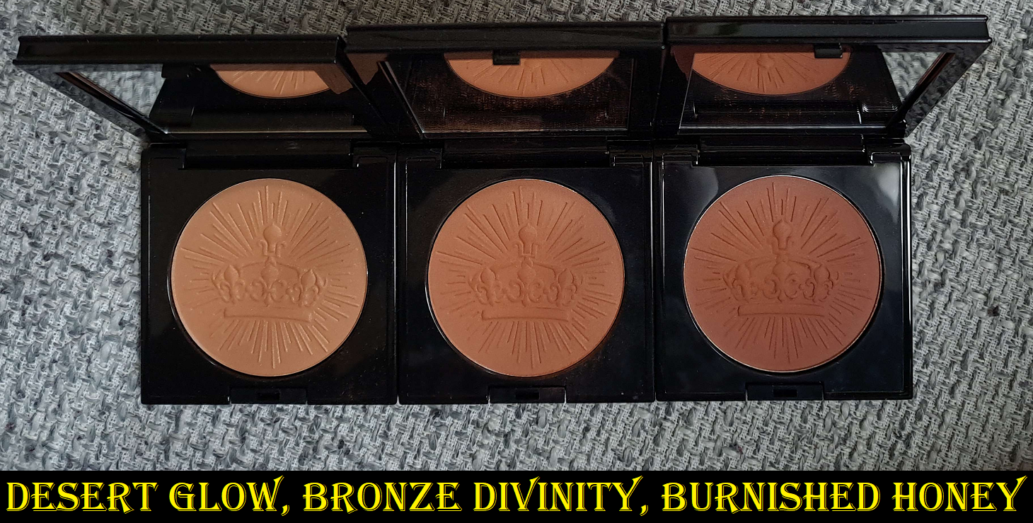
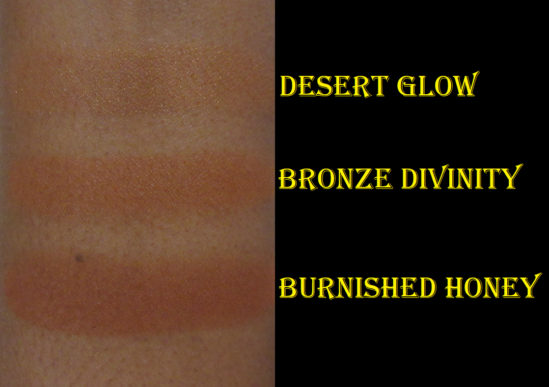
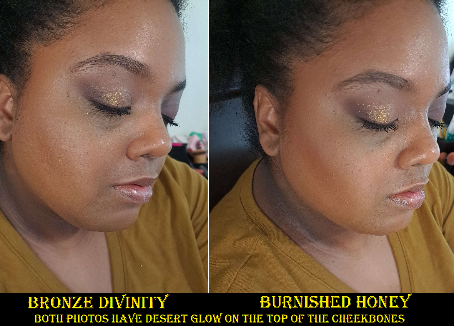
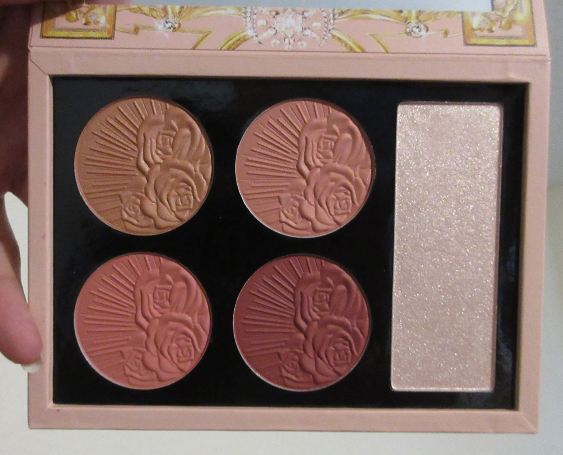
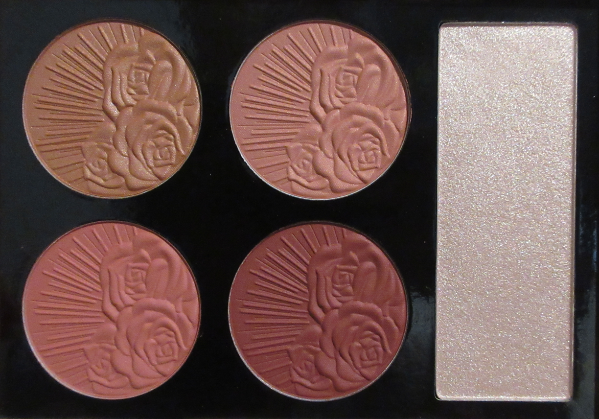
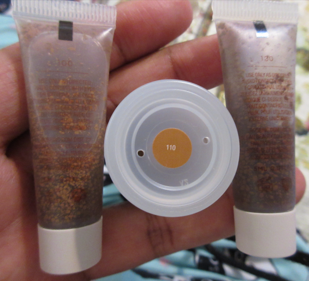
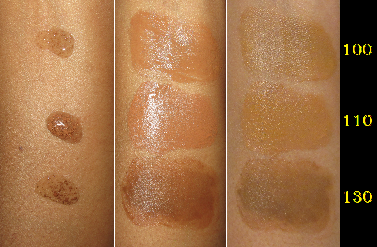
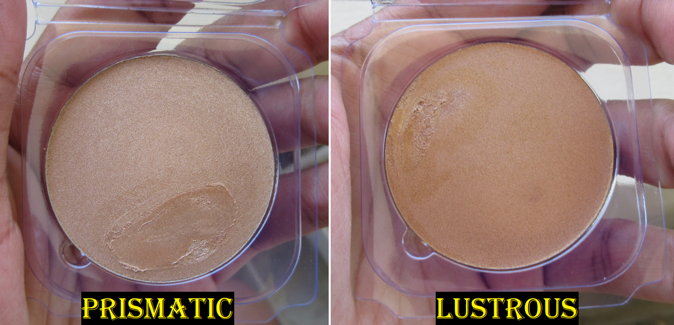
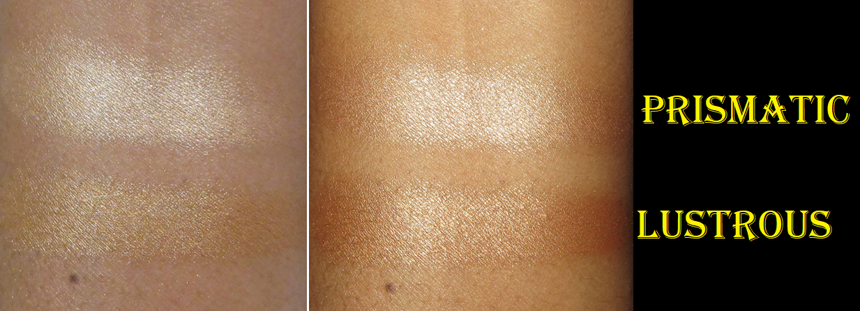
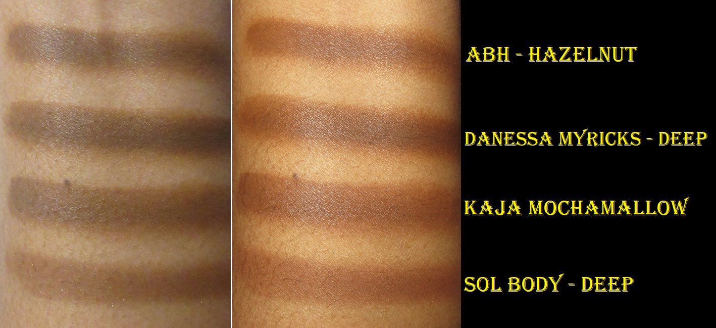
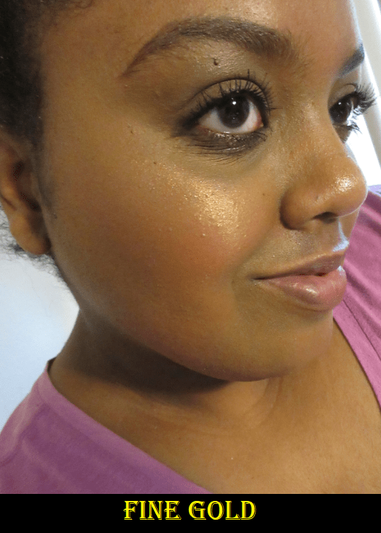
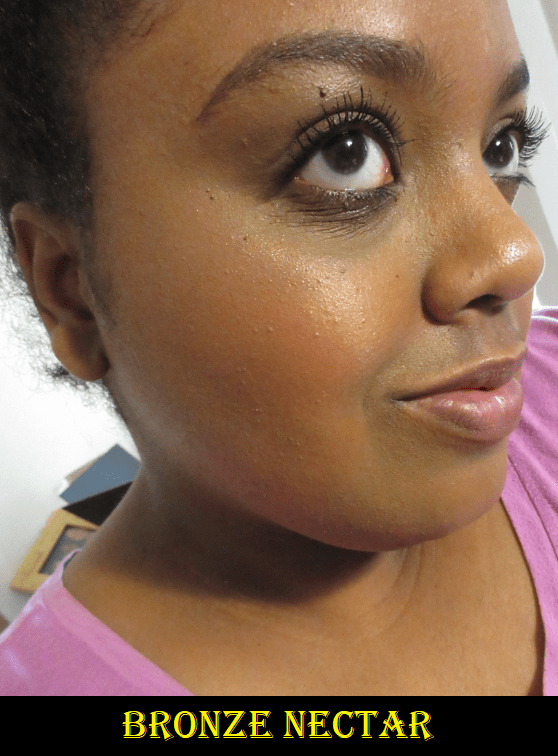
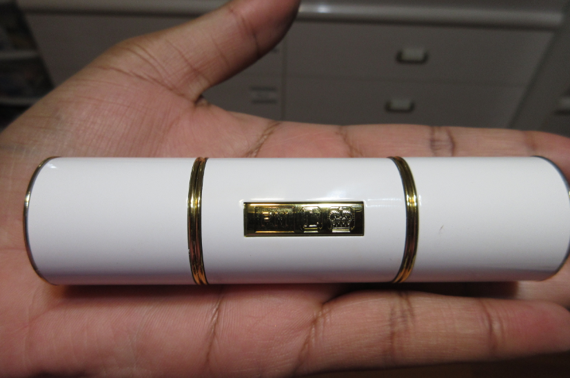
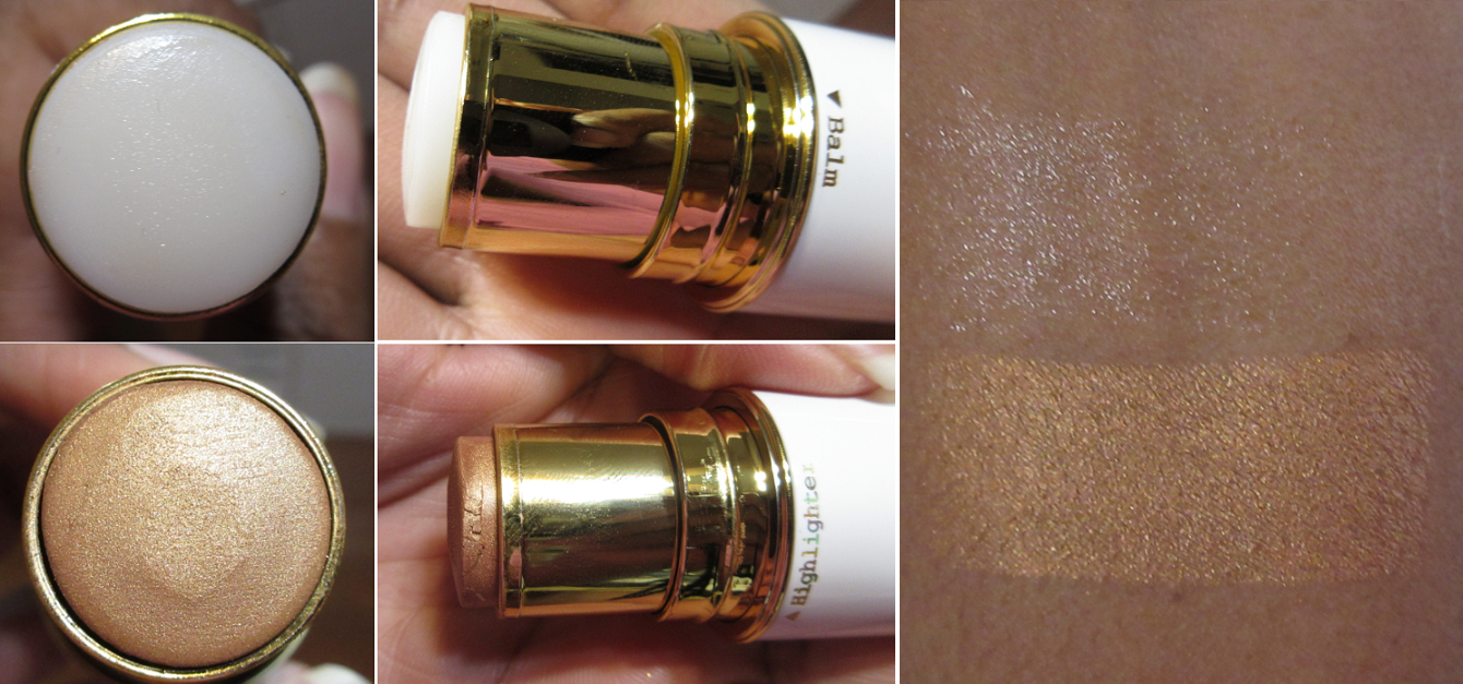
Pat McgrathLabs Skin Fetish: Divine Bronzers in Desert Glow, Bronze Divinity, and Burnished Honey
First, I have to apologize for the fact that I’ve worn the Pat Mcgrath bronzers plenty of times, and had these the longest out of all the new ones, yet I don’t have any photos wearing it that were taken with my main camera before it broke. I made a post on the home page about needing to switch to my cell phone camera now. I hope that this change will still be satisfactory to you.
I don’t have the PML Foundation, but based on their concealers I owned (MD22-24, with 23 being the correct depth), I should be shade 23 or 24 in the foundation. Thanks to the last minute shade suggestions added to the website before launch, I knew Bronze Divinity (MD22-27) was supposed to be my shade. Yet, I couldn’t stop myself from getting Desert Glow (M15 to MD22) and Burnished Honey (MD25-30). I should have stuck with my suggested one, but it’s hard to control myself when it comes to this brand. I’m at least glad I saved some money buying the 006 Duo and then getting Desert Glow later with a 25% off code.
Desert Glow was a little easier to see in spring, but this deep into summer, it’s very difficult to detect since it’s so close to my skin tone now. As for Burnished Honey, it’s still a bit deep and also more of a reddish-orange compared to the more solidly orange Bronze Divinity. Bronze Divinity can be built up more intensely and Burnished Honey can be applied more sheer than depicted in the photos below, so it’s really the undertone that makes a difference between them and why I prefer Bronze Divinity.
That being said, this is an extra warm line of eight bronzers. I love an orange leaning bronzer, but these are some of the strongest orange tones I have in my collection. Those that are the type that prefer cool toned or neutral bronzers might want to look elsewhere unless there’s a shade expansion for the range.
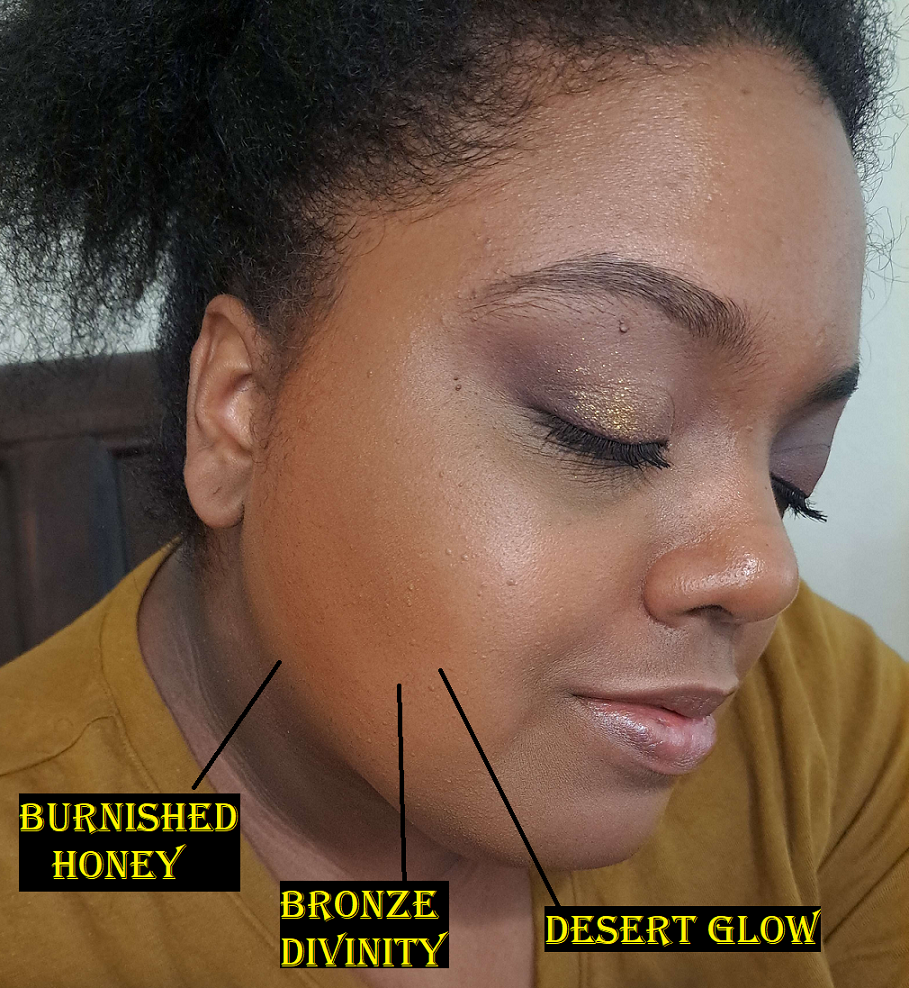
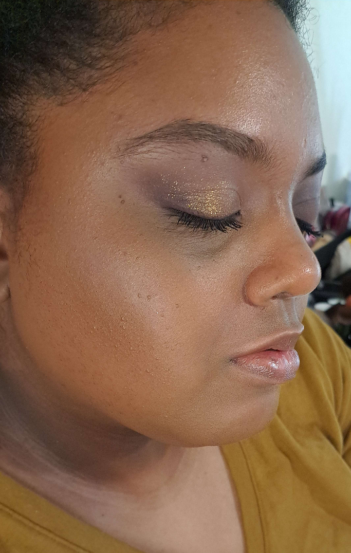
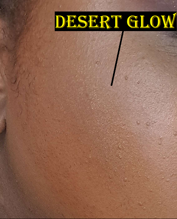
Desert Glow is the only one currently in the line with the pearl shimmer particles, compared to the rest that are semi-matte. Even in the summer, this shade is still useful to me to amp up the glow of Bronze Divinity when used on top of it. This is shown in the photo below where I have Bronze Divinity on the perimeter of my face from my forehead to under the cheek bones, but the cheek bone area is toned down in color from putting Desert Glow on top in that spot.
I’ve always thought the shimmer looked beautiful and refined on the skin, but at certain angles it looks like I used a highlighter as bronzer in photos captured with my cell phone. I’m a bit less happy knowing this now.
Regarding the formula, those that love Pat Mcgrath’s blushes will love this one since it feels pretty much the same, though perhaps slightly drier to the touch. The look on the skin, texture, finish, and performance are identical.
Sometimes I prefer the Nars bronzer over this one because the Nars powder feels softer, not just to the touch with my finger, but even when applied with the same brush it has a smoother glide across the face making it a slightly more pleasurable experience. Sometimes I prefer the one from Pat Mcgrath because I can apply Bronze Divinity in practically two swipes and not have to do more than a few additional swipes for blending because it’s a good tone match and the amount of pigment I want is achieved with such minimal effort.
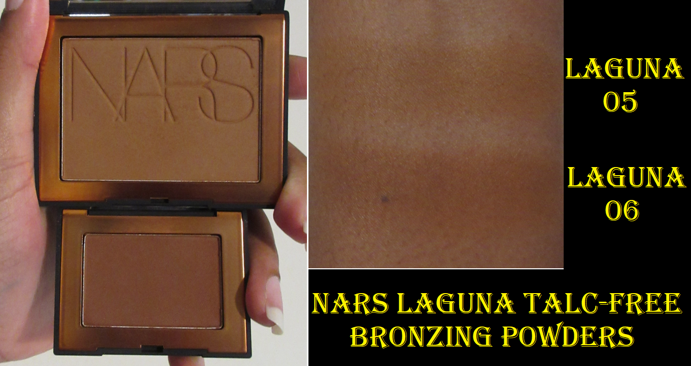
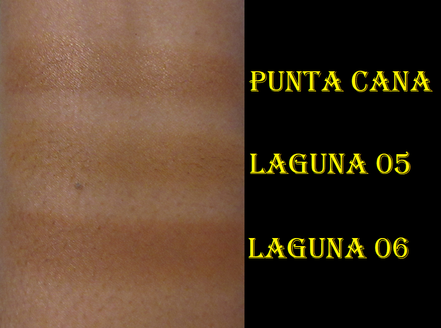
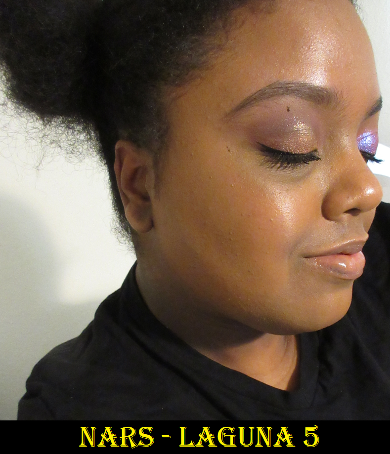
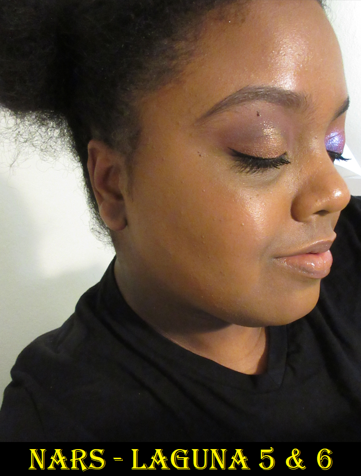
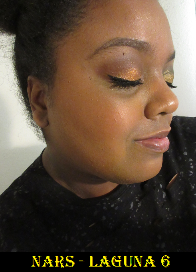
Nars Laguna Talc-Free Bronzing Powders in Laguna 05 (full-size) and 06 (mini)
This is a buildable formula, and not what I’d call sheer, but it is the sheerest of the three powder ones I’m comparing. This could be a great thing for those who are heavy handed with bronzer. Laguna 6 is the best suited of the nine options for me and looks deep and red in the pan, but because it’s such a lightweight powder, I have to build it up more than the lighter colored Bronze Divinity from PML. Laguna 5 is too close to my skin’s depth and undertone to create a bronzed look on its own. So, on a day that I’m feeling lazier, I use Laguna 6, but I love the tone I get from mixing 5 and 6 together. It’s just more effort and therefore sometimes I can’t be bothered.
For those curious how the new formulation compares to the previous ones from Nars, I have that review here, along with the Laguna Cream bronzer.
As mentioned in that review, I believe the new formula by Nars is just the tiniest bit better than their old one. Because the talc-free version only comes in a matte finish, I’m still holding onto my original one that contains shimmer.
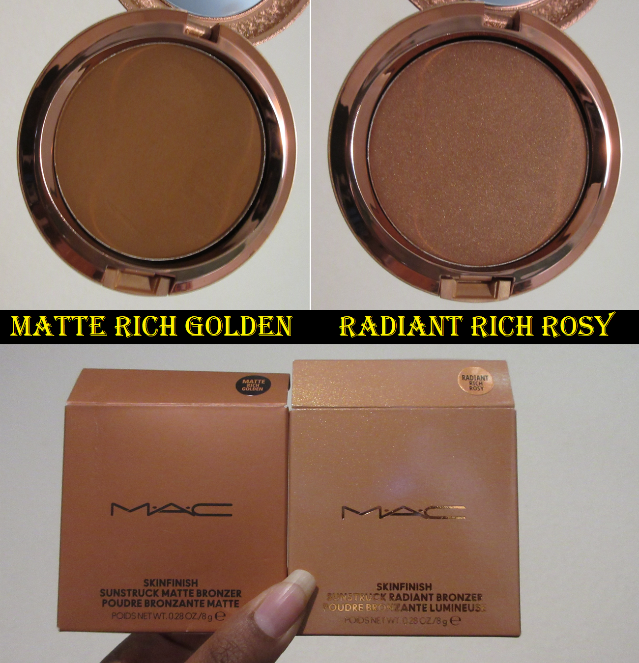
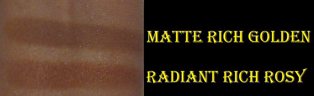
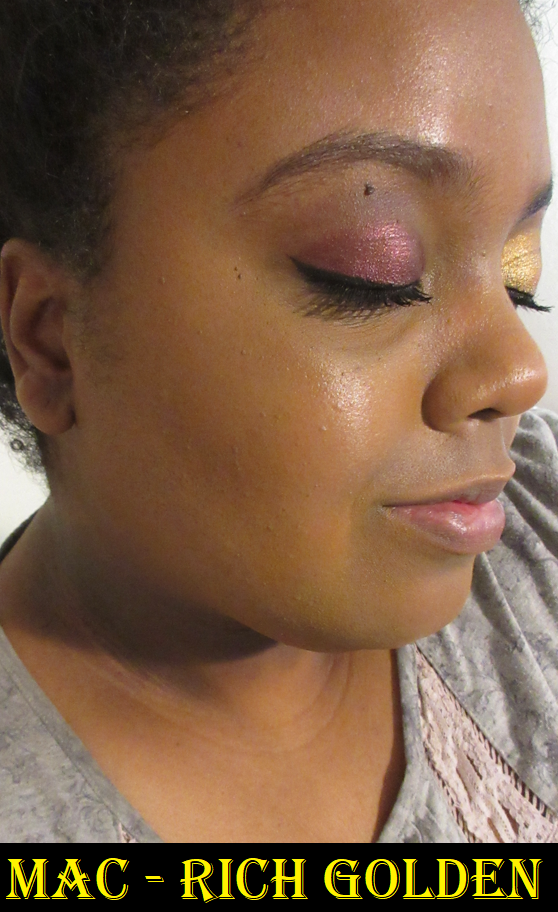
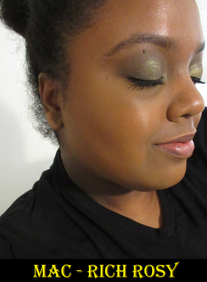
MAC Sunstruck Bronzers in Matte Rich Golden and Radiant Rich Rosy
These perform so well! They give slightly less color payoff than the ones from Pat Mcgrath, but still more than the bronzers from Nars. I love Rich Golden because it’s a deep golden yellow tone, which is not a common bronzer shade in my collection. I have an easier time finding olive than a dark yellow-brown. It’s only this year that I’ve made discoveries of any deep enough to work for me. Previously, my only options were orange, red, neutral brown (and I tried to stay away from cool toned ones). I also have a few more rosy options, though Rich Rosy is closer to orange-red than pink on me.
The difference between the matte and radiant formulas is similar to matte versus satin eyeshadows. Rich Golden has a thinner consistency that’s less compact in the pan, but not so powdery as to have kickup. Rich Rosy has some slip to it and seems to have more adhesion/binding properties. This makes the radiant formula take a little more effort to buff out. I prefer MAC’s matte bronzer compared to Nars for the color and near identical finish/performance. I prefer MAC’s radiant bronzer over the Kosas baked bronzers in the new yellow packaging, though I’m not a big fan of the tone of Rich Rosy. However, there is one gigantic flaw that drops this lower on the rankings and why I can’t recommend it. They stink.
I don’t remember the exact timeline, but essentially MAC released these bronzers online on March 19th. Then a few days later they were abruptly removed from all websites for about a month or so, but my order was still delivered. There was speculation that it was because there was something wrong with them, and some people said it was due to the smell either from having gone racid fast, contamination, or a harmful ingredient. However, if those were true, I don’t think they would have been made available again so quickly (unless it was batch specific and they identified which ones to not sell). I was in Germany when mine were delivered, so I had to wait until mid May to come home and smell them for myself. The first time I opened the compacts, I detected a faint smell in one, but it wasn’t that bad. Every time after that, I either could smell one or both very strongly, but then the smell would dissipate and had me wondering if I imagined things. Now, it’s at the point where the smell is quicker to identify but it does disappear in the air after the container has been opened for a while, but it reminds me of the Beanboozled Vomit flavored Jelly Bean. I wish I had an explanation as to how the smell comes and goes (sometimes the smell even temporarily transfers to my brushes), or what is causing it. At least the smell doesn’t linger from the powders when used on my face, but the mystery bothers me. Kosas bronzers have a frying oil smell due to the use of “clean” ingredients. MAC thus far hasn’t jumped on the clean beauty train for cosmetics, so I don’t know what their excuse is and I haven’t seen any official explanations for it online, nor them even addressing the fact that it was temporarily pulled from the website including all the various retailers of MAC products.
I’m still trying to decide what to do with mine. I’m very torn between liking the formulas, but being concerned about the smell. I would love to at least keep the packaging, since I like reusing them and swapping them with different products inside. However, I did see a comment online about it possibly being the components that smell and not the products, so that wouldn’t be the best solution.
The final thing I wanted to mention is that when I saw the packaging photos online, I hoped it was going to look like the Snowball Holiday 2017 packaging for the Whisper of Gilt highlighter. I see now that it’s a different pattern. Considering both bronzer finishes come in identical packaging, it would have been nice if they added a shiny varnish at least to the radiant ones.
Liquids Drops and Cream Sticks
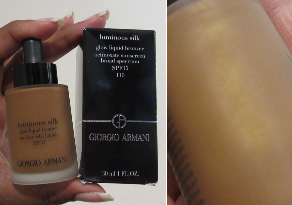
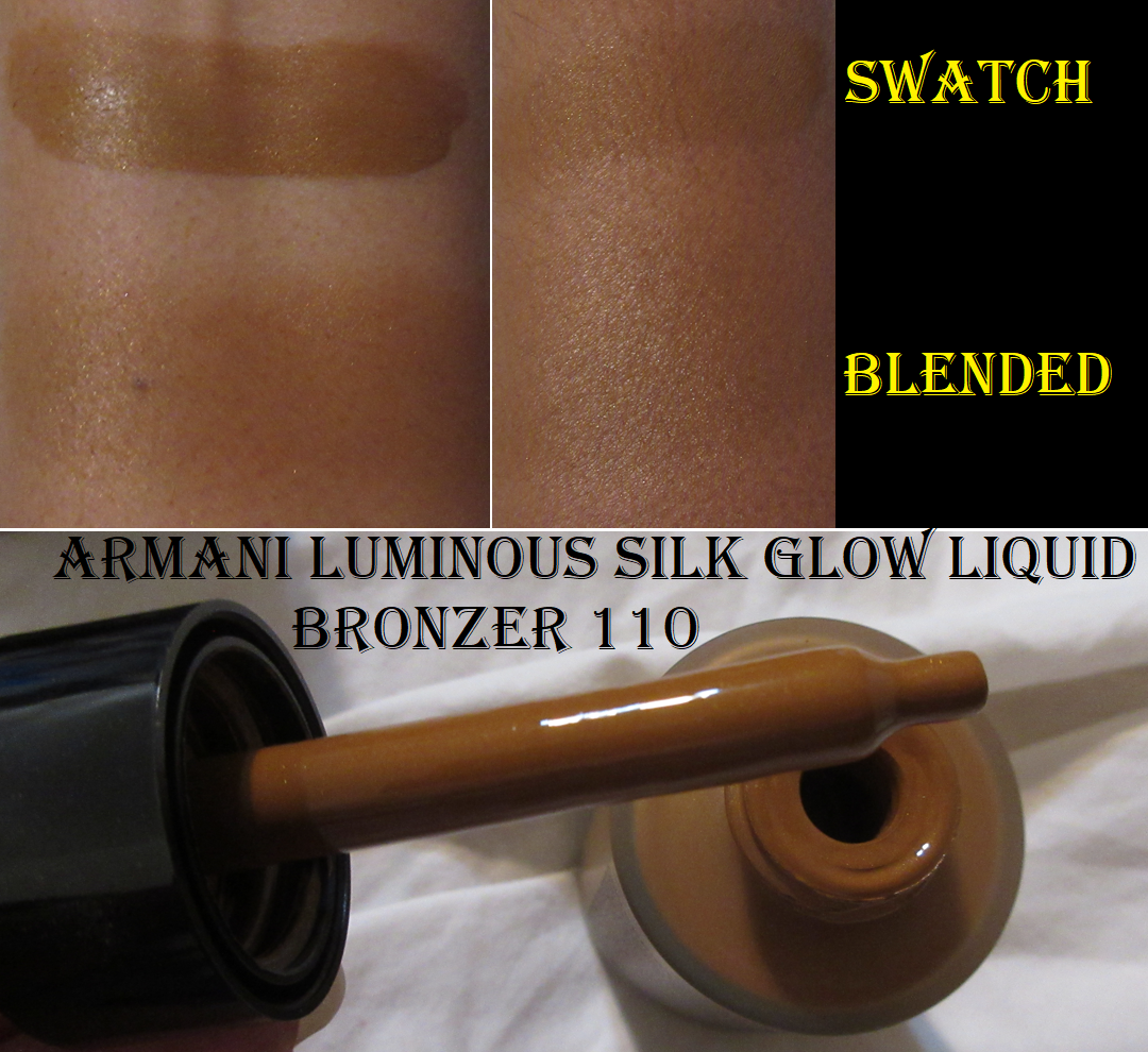
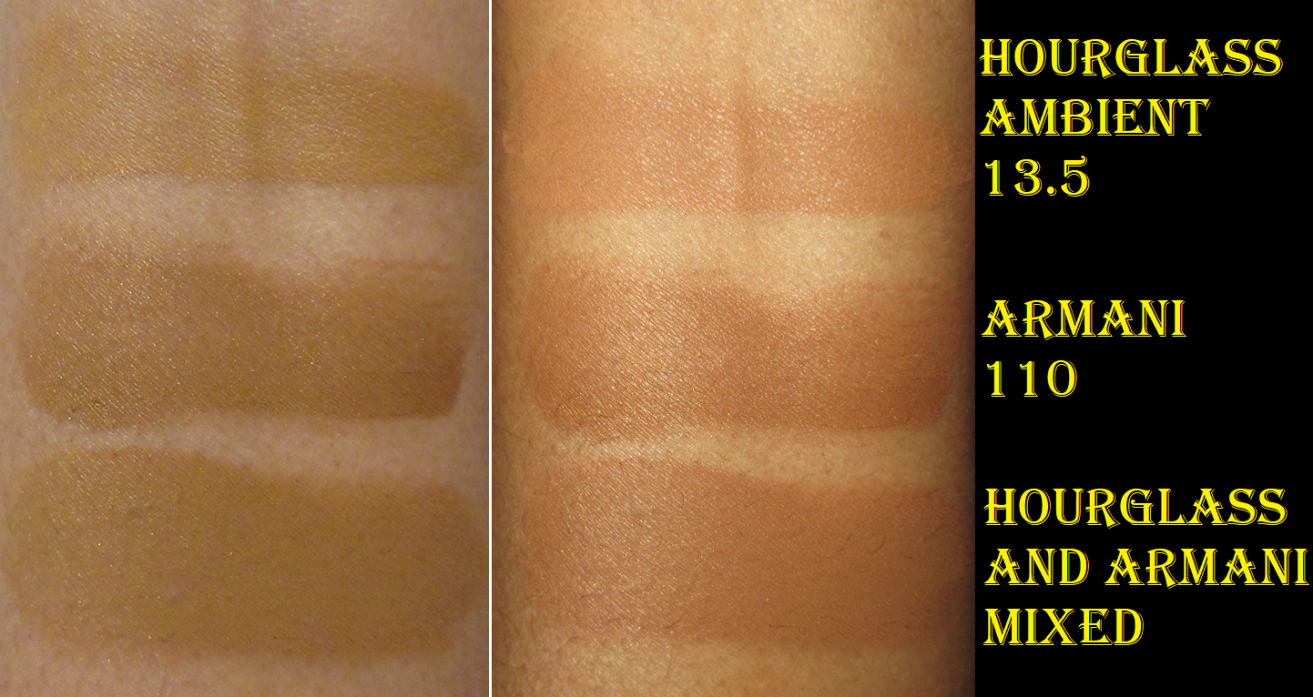
Armani Luminous Silk Glow Liquid Bronzer Drops in 110
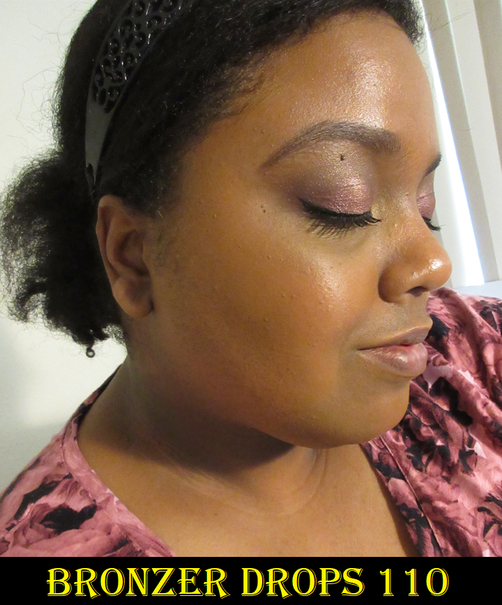
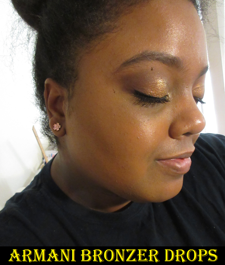
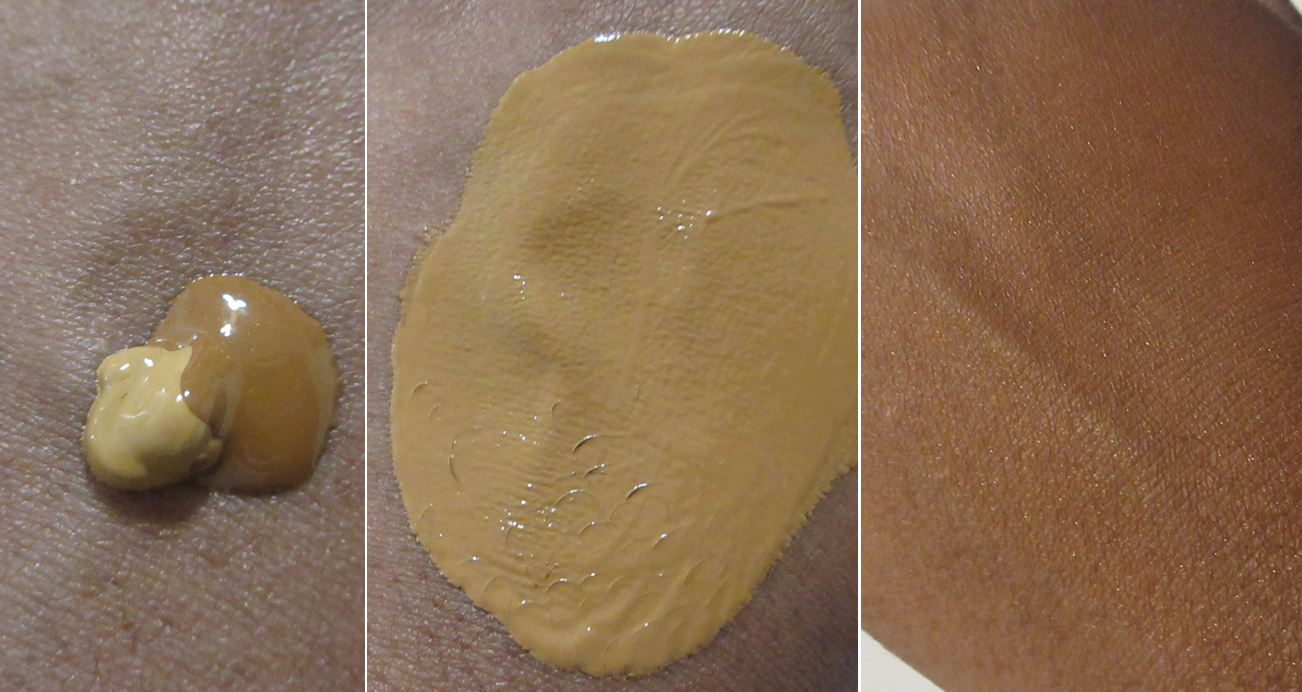
To recap the preview of info I mentioned about this bronzer already in the Armani Beauty post, I don’t think shade 110 will work that well for anyone who wears darker than Armani’s foundation shade 10 or 11. It barely shows on me once I blend it in. Sometimes this will randomly have a grey tone on my skin. I thought it was because I’d gotten darker, but I now am fairly certain it’s from the sunscreen in there if I forget to shake the bottle well enough before use. I also tend to pick up the excess product on the bore of the bottle with my Patrick Ta Contour Brush, which could have been improperly mixed if I pick it up from that spot instead of using the dropper.
The photos in the rose print shirt were taken May 18th and the black shirt photo was taken July 25th.
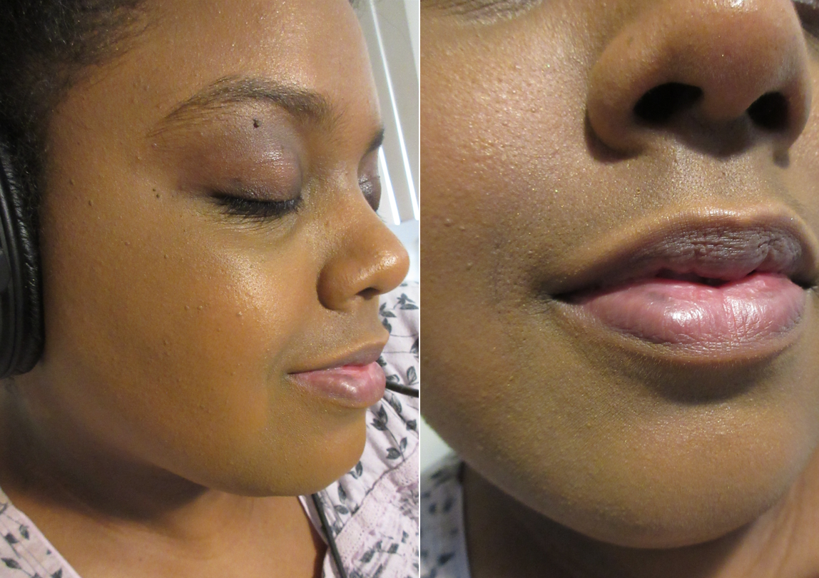
This product sheers out a lot when blended, so I have to essentially pack it on for it to still show by the time I’m finished applying blush and highlighter. It looks quite beautiful on the skin and sinks right in like an oil, but it has dimethicone and other “cones” that account for that slip and it being so easily spreadable. I expected a more glowy/dewy finish, but I think the brand was relying on some of the glow to come from the tiny gold micro shimmer. While the shimmer succeeds giving a pretty golden color to the face, it’s hard to see the shimmer unless you’re really close up to the skin. The sparkles are very obvious in direct light, so I’d rather it just not be there at all.
This formula lasts on my skin for a good portion of the day in most cases, and it dries down, but it isn’t transfer-proof. If I touch it, I see a lot of shimmer on my finger and a little bit of the base color. Setting it with powder changes nothing.
According to retail websites, this product “can be used all over the face for added warmth,” or mixed into moisturizer, sunscreen, or primer for a glowy base. I figured if it can be mixed into products and used all over the face, then surely it can be mixed into foundation. It looked so pretty at first, but then I looked closer and noticed all the tiny random sparkle particles all over my face. So, that was an absolute no-go. In the up close picture, there’s one right near the center of the underside of my nose, in the cheek area in and next to my pores (though camouflaged a little by the light illuminating my skin there), and a few diagonally between my nose and the deep smile line by my mouth.
I thought perhaps it would be possible to mix it into a foundation that’s too light in order to deepen it up slightly, but there’s so little pigment in this, that although it looked like it darkens at first, the moment it dries down, it basically returns to the same color it was originally, just slightly more warm-olive in tone. I tried to do this with a few other foundations and it didn’t matter. They all barely changed in color, even though I used a much bigger portion of bronzer than the single pump of foundation.
As a bronzer, I like this for minimal makeup days. For any other use, it just doesn’t work for me. Because it’s not very successful in living up to all the claims, and considering the price, this isn’t the Armani product I recommend to others.
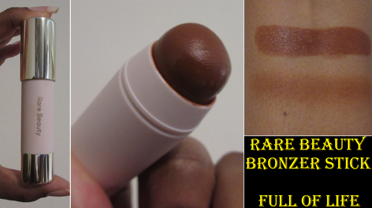
Rare Beauty Warm Wishes Effortless Bronzer Stick in Full of Life
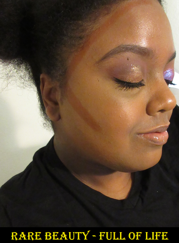
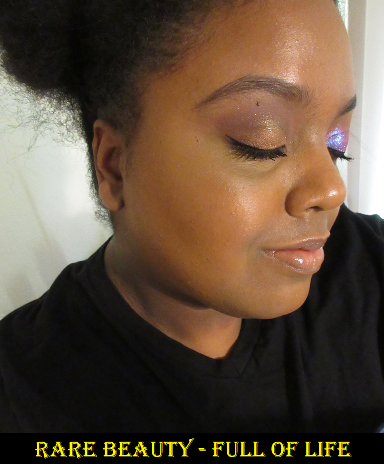
This is one of the most hyped up bronzers, but I usually hate stick products since they’re a firmer texture and tend to dry out faster than pot creams. It was a little easier to ignore the hype since the closest depth match for me was True Warmth, which looked way too red for my liking. After they extended the range and I saw Full of Life looking a lot more neutral by comparison and described as “deep bronze with golden undertones,” I bought it without hesitation. Imagine my surprise when I saw how warm this one was too! However, when I blend it out, it somehow matches me so well and I can easily get it to look even more natural and subtle when I use less than the amount pictured below. Unlike many stick products I’ve used in the past, this one isn’t stiff and practically melts as I glide it along my face. I typically draw a stroke that’s the length of my ear and blend that out dragging it slightly lower under my cheekbone. I also draw from the center of my forehead to about where my brow tail is and blend the rest of it out and connect it to the rest by the ear. I add a little more after blending if needed and it doesn’t disturb my makeup underneath. If I want it to last on my skin, I have to apply it a little more generously since my skin likes to absorb some of it. It makes me very happy though that even though the formula feels creamy, it fully sets on my skin and I don’t get an imprint on my finger when I touch it. This looks so natural, and I finish bronzing so quickly, that I now understand the hype. It’s well deserved. If my year late low-buy series has taught me anything though, it’s that cream products could take six or more months to start behaving differently, like a film forming on top or it drying out. So, I am curious to see if this continues to perform well as time goes on.
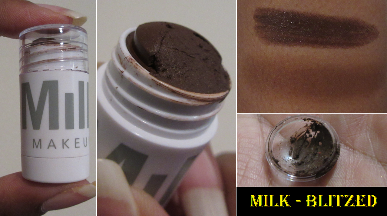
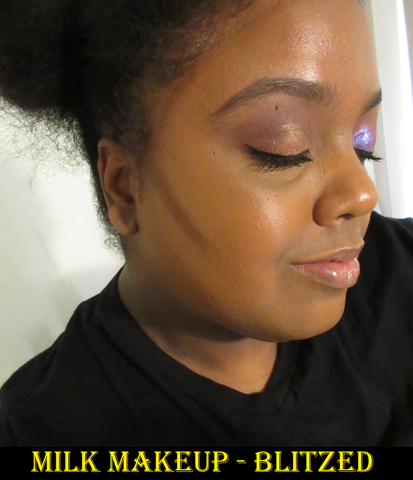
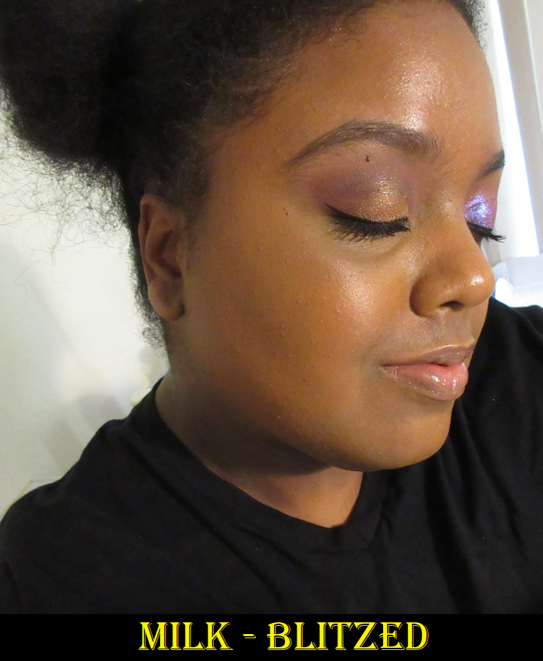
Milk Makeup Matte Bronzer Cream Stick in Blitzed
After unscrewing the cap, be careful removing the plastic dome off the stick portion. I saw a lot of creators break theirs in their videos, so I was trying to be careful removing mine, but a chunk still broke off since it was stuck too tightly to the plastic.
I had a feeling Blitzed would be too deep for me, but I wasn’t sure if Blaze would be too light. I can get Blitzed to work if I blend it out very well, and the amount used in the photo is about what I use per side, though maybe a little less in the cheekbone portion to start off with. It can easily get out of hand if I’m not careful.
This bronzer is the perfect example of the type of stick products I don’t like since it’s stiff, doesn’t blend as easily as traditional creams, and can be a little patchy looking at times. I like that it’s more of a neutral color by comparison to my shade from Rare Beauty, but I’m just not a fan of this formula.
Also, it’s a bit funny that I avoided buying this bronzer when the full-size used to be 1 oz / 28 g because I knew I’d never use it up and didn’t want it to go to waste. Then, they came out with minis that I believe were either $18 or $20 for 0.19 oz / 5.7g but they did not have my shade. Then when Blaze was available as a mini, I still felt the price per grams were so bad by comparison that I wanted to wait for a sale. Instead, I got the surprise that Milk decided to make the previous mini-size the new full-size, yet they did not adjust the price. It’s now $24 for 0.19 ounces. I don’t mind having less product, but to pass the cost onto the customer and not adjust the price accordingly for getting less product isn’t very cool in my books. Especially since Blitzed was released this year and only ever released in this tinier size. I waited years for a better price, so I figured I may as well keep waiting. Then there eventually came an opportune time to get it during a SpaceNK sale.
This was like THE bronzer stick before Rare Beauty came along. This was people’s holy grail bronzer for years, but considering the texture and the way it blends, I don’t see why. It has slightly more lasting power since the thicker and less emollient consistency keeps it from sliding off or moving, the way other cream bronzers can, though I don’t have this problem with Rare Beauty either.
The Better Butter Bronzer?
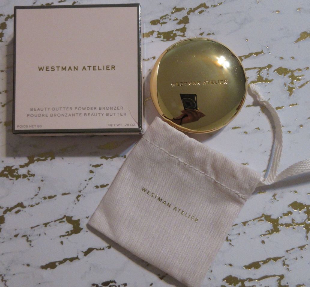
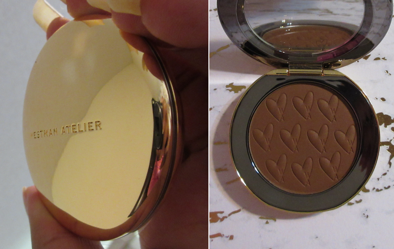
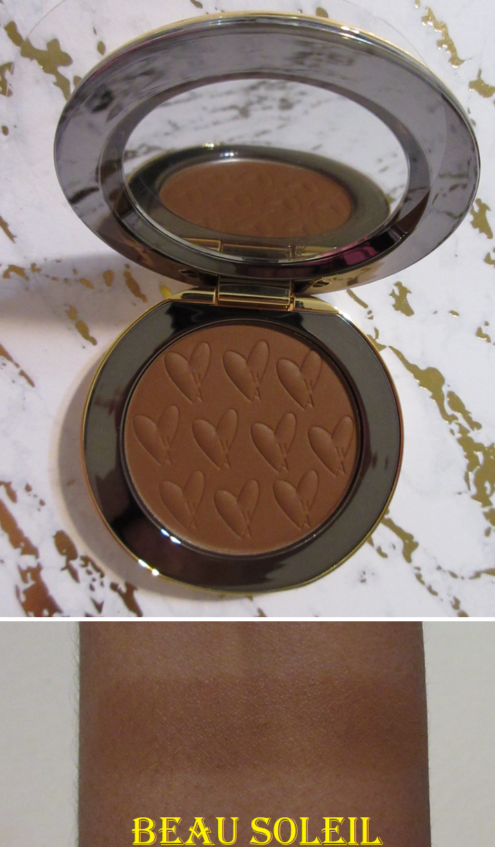
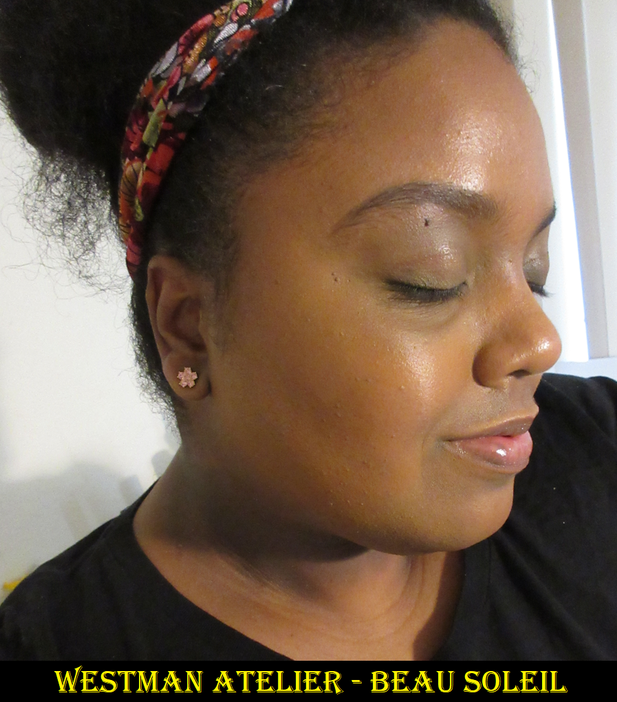
Westman Atelier Beauty Butter Powder Bronzer in Beau Soleil
Even though I purchased this during a Credo Beauty sale, it’s still the most expensive single bronzer in my collection (since the Hermes Bronzer was only the refill). I heard great things about the formula, but I was never interested until they added this deeper shade to the line.
The bronzer is small, but its packaging is so heavy! Between the weighted metal, shiny gold surface, and the dust pouch it came with, it feels very luxurious. I also like the cute heart pattern with the “W A” representing the brand’s initials on the product surface.
Beau Soleil is definitely not as deep or neutral as it looks in photos. It’s also not heavily pigmented, so I still have to build it up. I like the color, but it’s unfortunate that they don’t have a rich shade available for those with skin tones darker than mine. In fact, it’s a little difficult to see in my photos, but it’s at least present (still subtle) in person. I believe the original two bronzers launched over two years ago. I’m glad we got this one this year, but I hope there will be another shade expansion sooner than that.
The photo on the right was digitally adjusted to improve the color accuracy.
The texture is buttery, as the name implies, and smooth. Of course, because of the name I couldn’t help but think about the famous Physician’s Formula Butter Bronzer. I disliked that one immensely because it was overly shimmery for my taste, which is a shame since it had a nice texture. The Westman Atelier bronzer is actually matte. It has a sheen that isn’t in a shimmery way, but in a moisturized way. The best way I can describe the look is like when the skin’s natural oils show the tiniest sign of coming through a powdered face. It isn’t to the level of being glowy or shiny, but resembles slightly moisturized skin. Another way to describe it is the look of skin after spraying one’s face with MAC Fix+ once it dries back down. The bronzer looks great when I use my medium density brushes, but if I try to use something that’s lightly packed it can look uneven. Due to the nature of it having this texture, the pigment packs more heavily in some places if the brush bristles aren’t strong enough to move it smoothly across the skin efficiently enough. But all it takes is more time buffing, a slightly denser brush, or a more resilient bristle to smooth it out.
This product is up there with some of my more enjoyable bronzers like Nars, Mented, and Pat Mcgrath. I definitely think it’s good, but the bigger selling point is the packaging. If this bronzer was in MAC packaging instead, I’d have said this is way overpriced. However, I bought this specifically during a time when I wanted something that was undeniably in the luxury category with a formula that was at least “good.” So, I’m satisfied with what I got.
Reformulated or Just Repackaged?
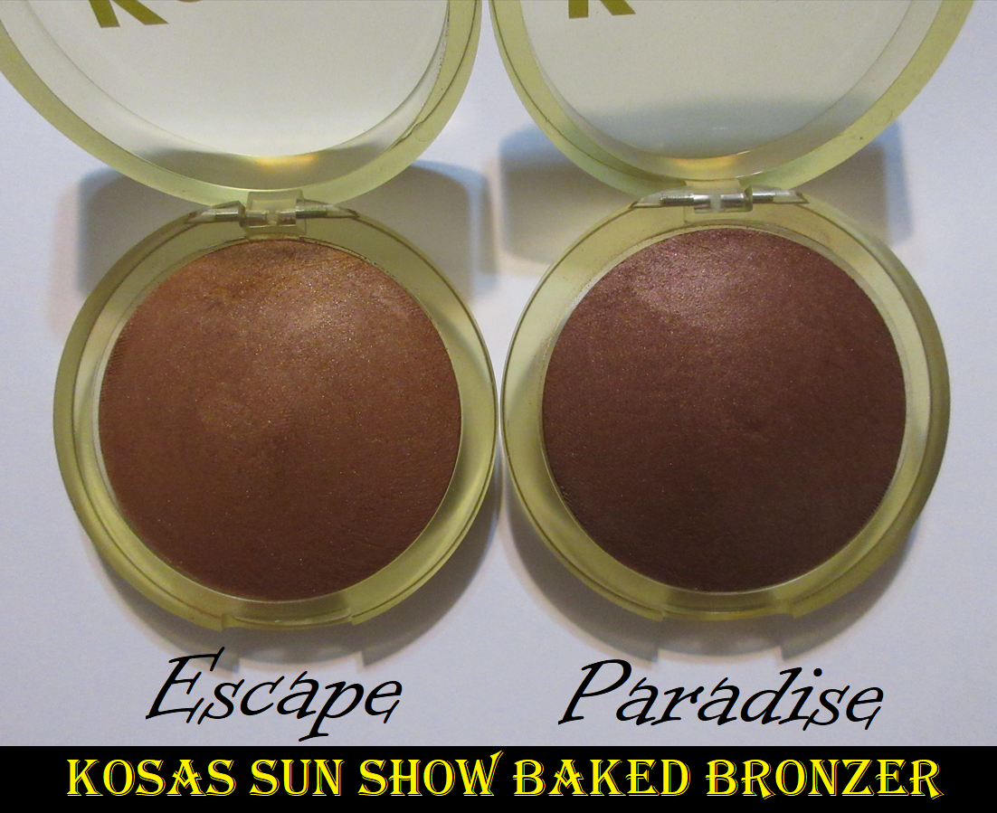
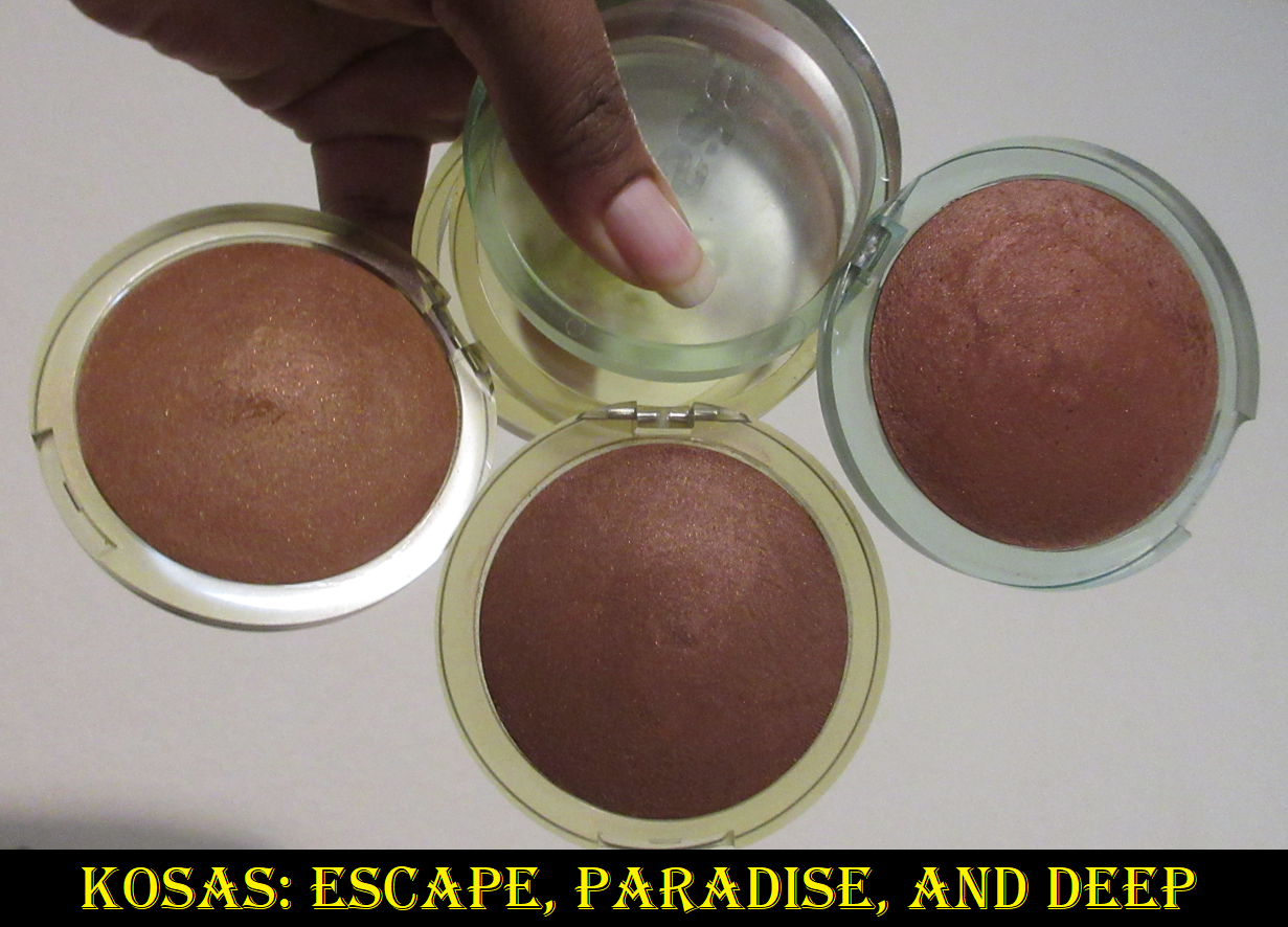
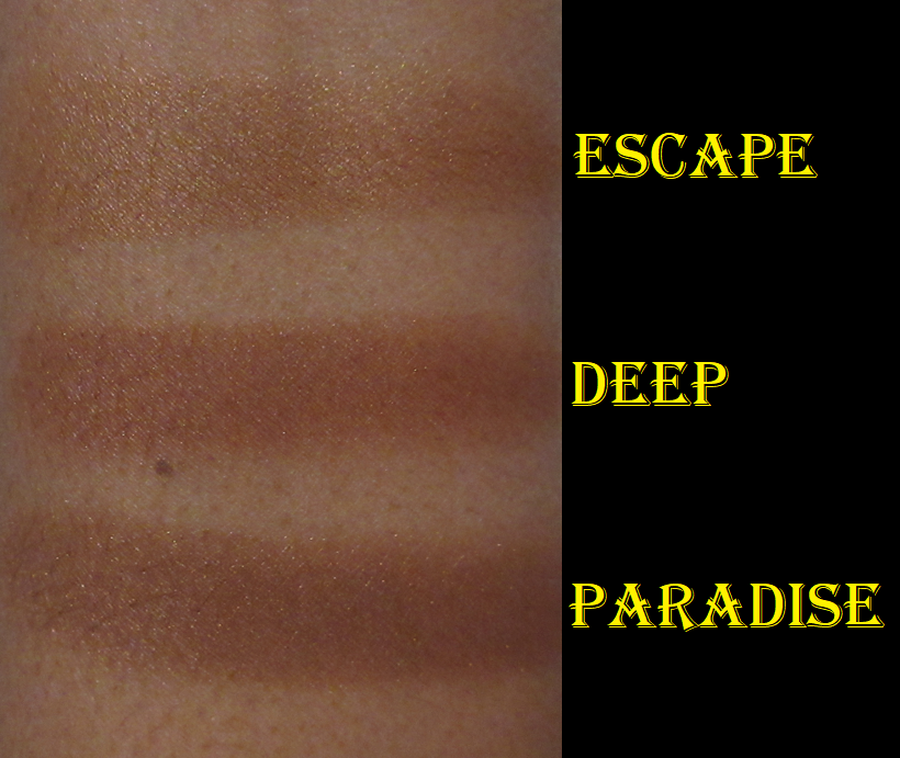
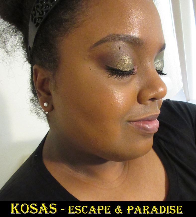
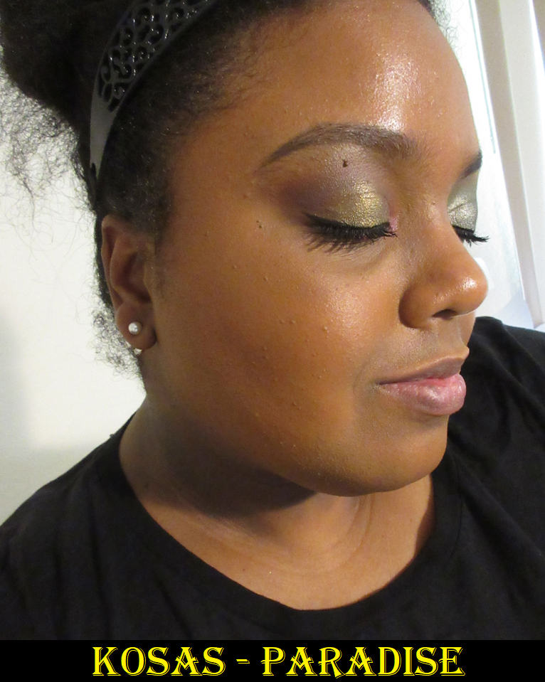
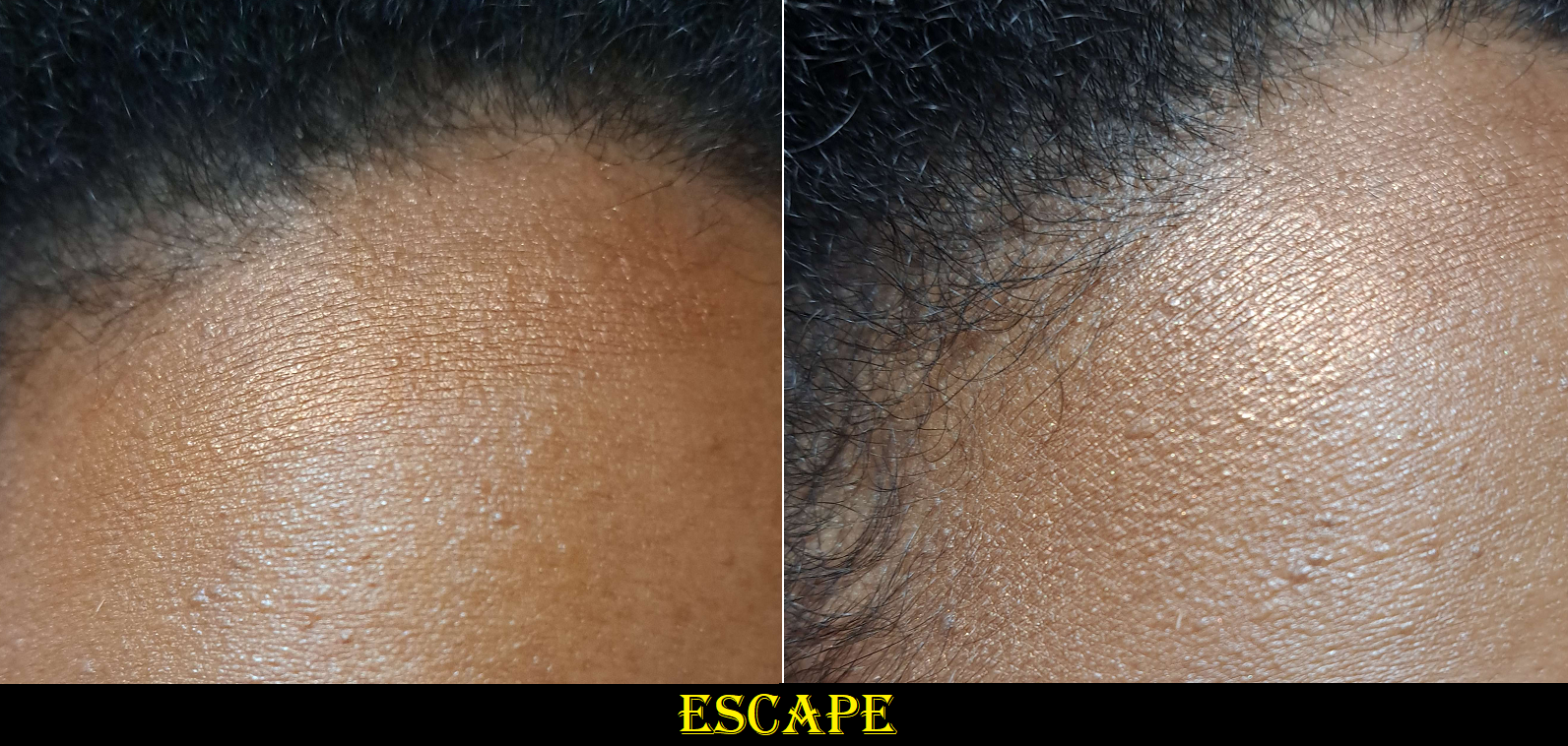
KosasSun Show Baked Bronzer in Escape and Paradise
The original Kosas bronzer was in my top 3 favorite formulas for many years, only recently dropping slightly lower because the shade became too dark for my liking, it had a smell that couldn’t be ignored, and the reputation keeps growing about the brand’s products going bad quickly (which made me question whether mine was still safe to use). Until recently, this bronzer was my #1 favorite in the shimmer finish category.
The brand posted on the product page, “new packaging…same formula,” but I believe there is something off about the shimmer. Every time I’ve compared the new ones to my old one, the new ones look like there’s way more shimmer and reflects more strongly. Escape and Paradise look borderline metallic in direct light. Perhaps it’s just something to do with the shimmer color with Deep and its orange base tone compared to the golden tone of Escape or the red tone of Paradise, but the bottom line is that I don’t like the finish of the new ones at all compared to the old one. It’s too much for me. It sounds wild to say considering I’m in my glowy cheek era for blushes, but I’m not usually a fan of metallic blushes either.
One of the other unfortunate things is that I’ve been wishing for Kosas to expand the line and make something slightly lighter than Deep, which was previously their darkest one. I was thrilled to see they added an even darker bronzer called Tropic and hoped that meant Paradise would be slightly lighter than Deep, but it’s slightly darker instead and in a less flattering undertone for me. Escape is less than a half shade darker than me and basically worked to add a golden glow, but not actually bronze me. However, it does seem to have gotten a little more orange several months after purchasing. My solution in the beginning was mixing the two new shades together, so I can’t say that didn’t effect the color Escape turned into now. Even though I have a workable color, the shine is a bit offputting. I spend quite a bit of time buffing the product in to try and get some of that shimmer off my face. At this point, I don’t know if I kept them because I genuinely liked them enough to not be worth returning, or if it’s the nostalgia and my desire to find a worthy replacement for Deep. It’s such a shame because the formula of the original truly is fantastic, beautiful, and I couldn’t recommend it enough to those who could get past the frying oil smell. The new ones don’t smell of it as strongly, but I can definitely still detect it. Perhaps it’s the Meadowfoam Seed Oil and/or Hydrogenated Vegetable Oil which are listed as the second and third ingredients.
So, after all this, Deep is still the best shade for me, but I can’t trust using it anymore because it’s so old and the brand doesn’t seem to like preservatives. So, I will make do with the two new ones for now. This could be something to take a chance on for those that love a super glowy bronzer, baked formulas, and “clean” makeup. It performs the same as the old one, which was so blendable and smooth. However, my personal disappointment keeps me from being able to recommend it.
BONUS REVIEWS
When it comes to the Vieve and Victoria Beckham duos, I forgot to include them in my previous bronzer ranking because they were in my face palette drawer and I also hadn’t decided which one I liked more. So, even though they aren’t 2023 releases, I thought I should try to include them in the bonus section. Also, kudos to both brands for making their duos refillable/replacable.
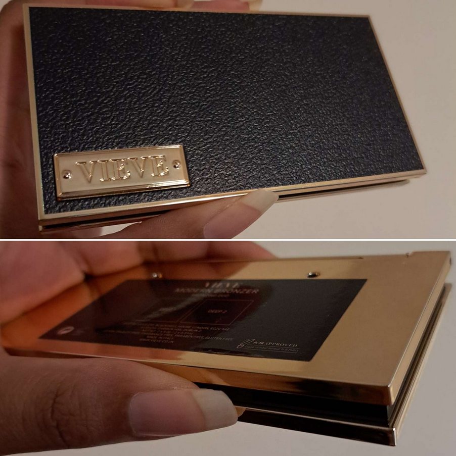
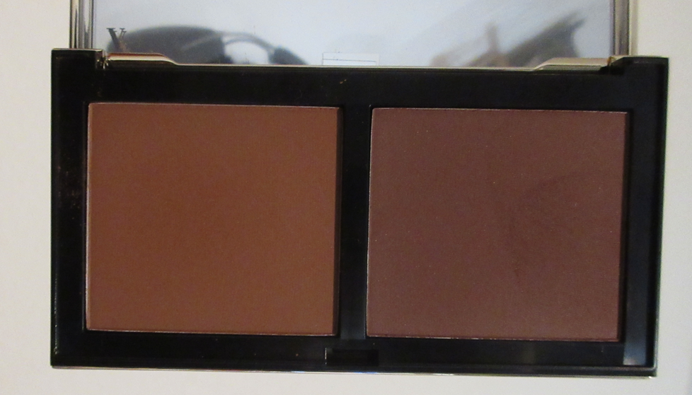
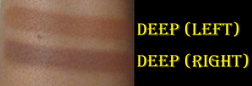
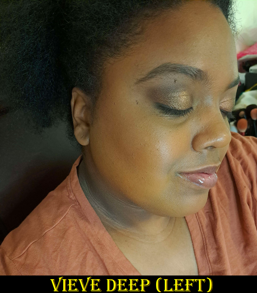
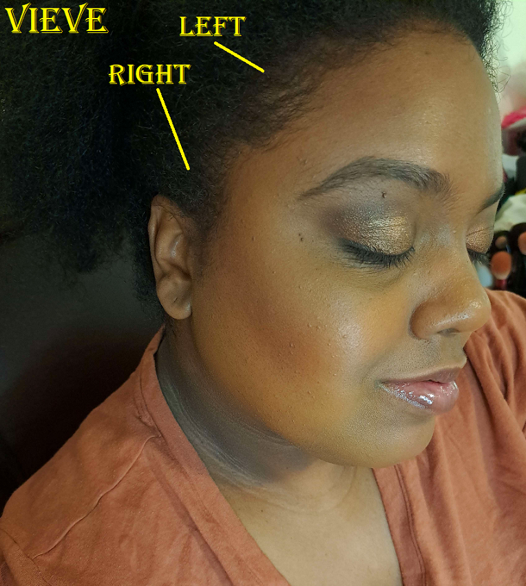
Vieve Modern Bronzer Duo in Deep
The left powder is intended to add warmth, while the right powder is for sculpting. The latter is a bit too deep, so I use the lighter shade in the duo almost exclusively. That one is my kind of color, though a little bit strong on the orange tone. The performance and texture reminds me of Charlotte’s bronzer, but not quite to that level of looking airbrushed. This is a buildable formula that I was surprised to see described as “satin” on the website, but I can agree it has a natural finish. I’m very pleased with this duo, but longevity is the only issue. If I’m wearing a dewy foundation or my skin has been properly primed and moisturized, the bronzer lasts. Sometimes it sticks a little too well and requires more blending time. Conversely, if my skin is on the dry side, it doesn’t cling to my skin as well and will come off in spots at some point in the day. This normally isn’t a problem for me except on minimal makeup days where I tend to skip a lot more steps in my routine.
I also have to note that I’m impressed with the packaging. It’s a lightweight plastic, but it still looks like an upgrade compared to the cardboard blush compacts. The extra bits of gold color on the back side and around the edges of the duo really help to elevate the packaging. However, I’m guessing the reason the blush compacts aren’t plastic is because they’re not refillable, unlike the powder bronzers.
These two photos were edited to improve color accuracy.
In the photo with both sides listed, I started to rub away the lighter one before I thought about how I could probably leave it there for comparison purposes. So, I labeled it mainly to indicate that what’s lingering is the Vieve bronzer on the left side of the duo and I did not apply the right one to both spots. The demonstration under the cheekbone was applied with the amount picked from a single tap into the powder with a brush and blended out a lot, which still looked dramatic enough to feel it wasn’t necessary to apply it to my forehead too.
A month or so ago, Vieve released cream bronzers. I’m curious about them, but I recently put myself on a cream product no-buy, so I guess I won’t be finding out what they’re like for a very long time.
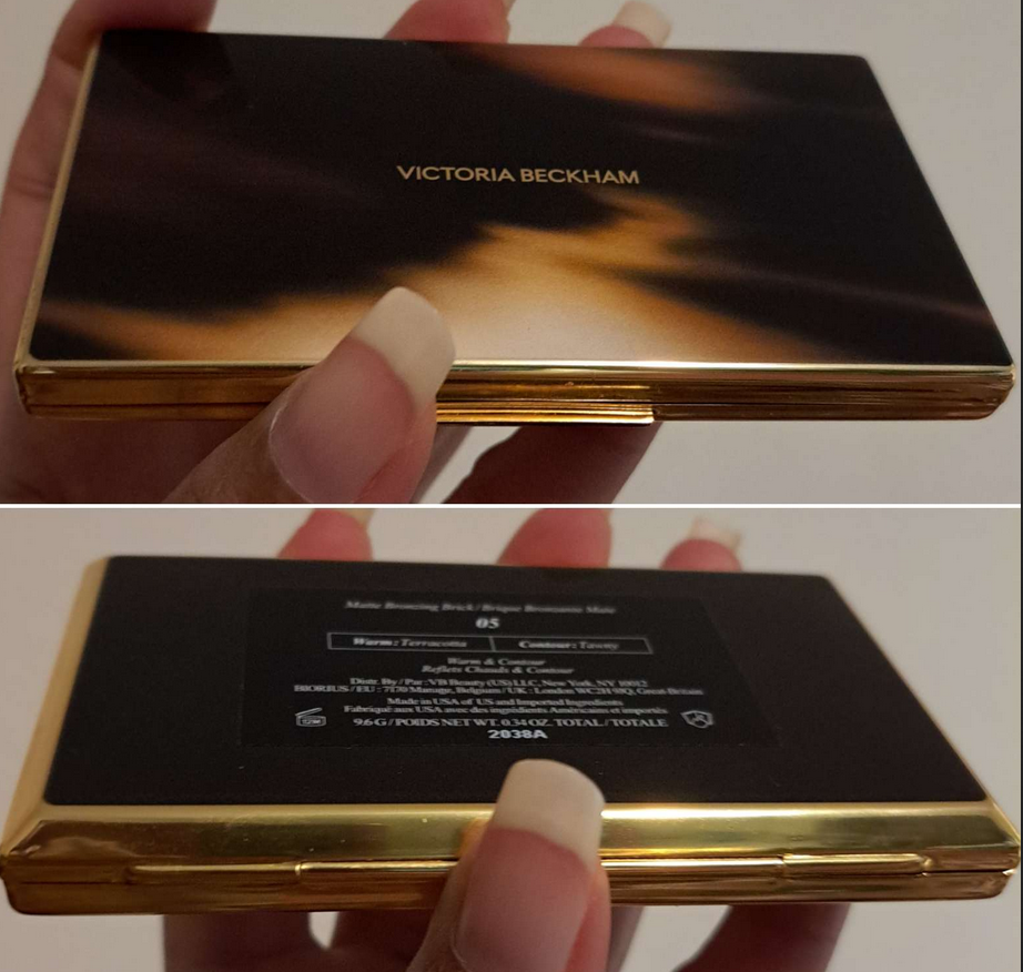
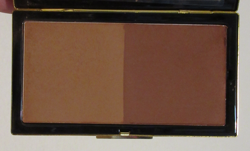
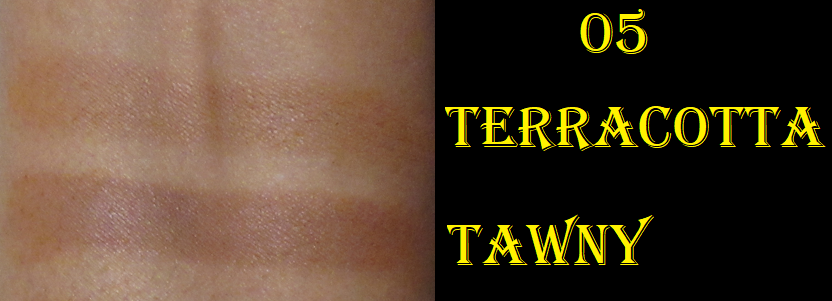
Victoria Beckham Matte Bronzing Brick in 05
I couldn’t figure out whether I should get 04 or 05, but I’m glad I chose the darkest one because this isn’t as deep as I anticipated. The lighter shade is a bit subtle for me and the darker one is a bit too red (even though that’s supposed to be the sculpting shade). So, once again, I end up mixing them both together to create a golden-orange color. And it ends up looking quite similar to the lighter shade from Vieve’s Deep duo.
Full disclosure is that I bought this from a third party seller in new/unused condition, so technically I can’t verify the authenticity of the product. I strongly believe it is authentic though based on how weighty the packaging is, the product performance, and all labeling including the box it came in, all compared to photos I’ve seen online. I am super impressed with the compact and it being as lux as I’ve heard described by others. This bronzer is similar to Vieve’s but the powder feels a little more fine, and it also gives me no issues blending or with longevity regardless of the condition of my skin. It’s the closest comparison I’ve found to Charlotte Tilbury’s powder bronzer with how airbrushed it looks on the face, the way it gets picked up with my brushes, and the texture of the powder. My one complaint is that certain spots look like hard-pan is starting to form. I assume it’s from the increased frequency that I’m using oil based products as primer. So, I wonder if people with oily skin will have a problem with hard-pan after extended use.
These two photos were digitally edited to improve color accuracy.
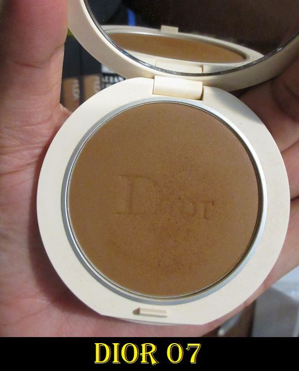
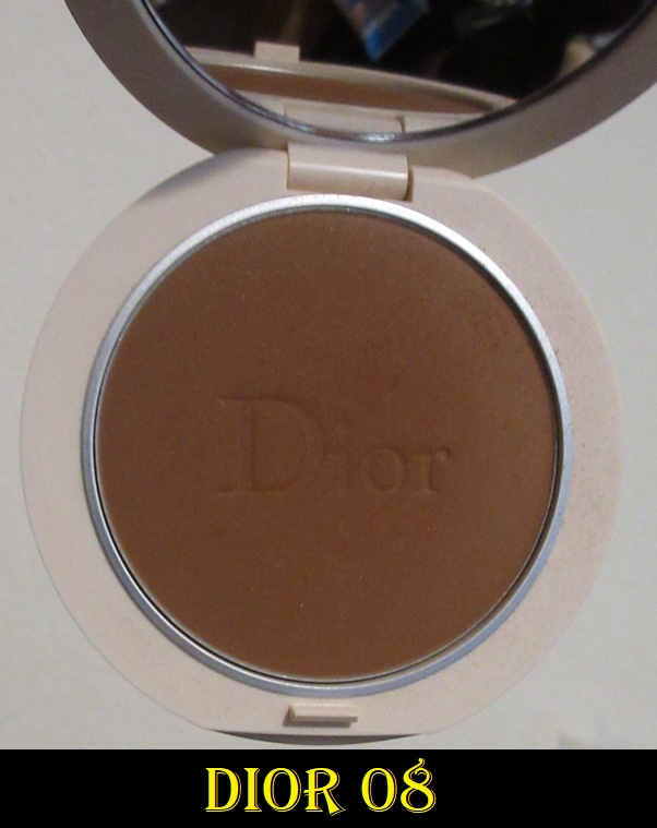
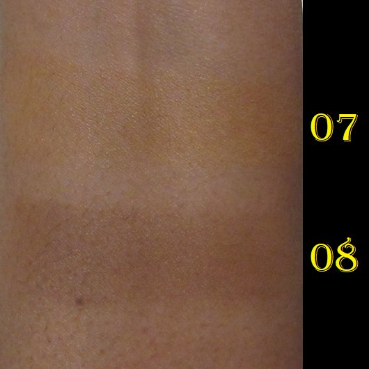
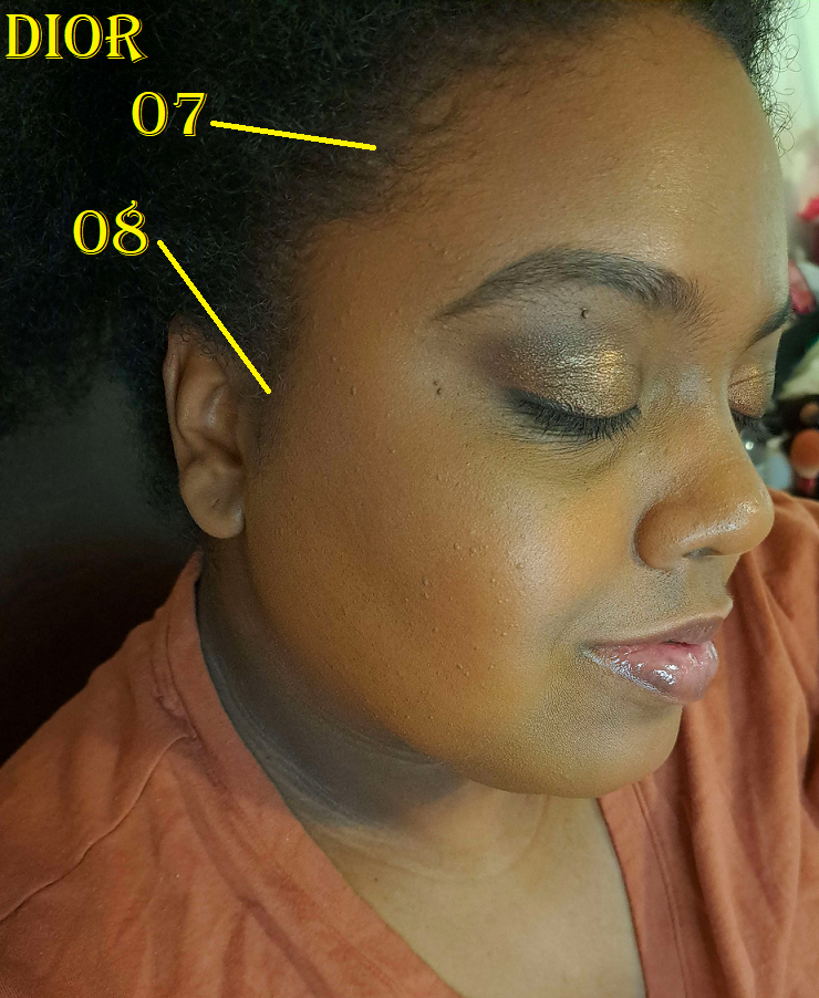
Dior Forever Natural Bronzer in 07 and 08
I put this in the bonus section because I got these from a third party seller and had no intention of reviewing them until I realized how high they ranked among my collection, and that I should share this information. Even though these aren’t new, a few shades from the line were re-released in new limited edition packaging this year. I preferred the look of the original quilt pattern ones and it occurred to me that Dior might reformulate them as they have for nearly everything else that’s a permanent product. So, I tried to get them while I had the chance, even though I was still uncertain if 07 was going to be too light and 08 too dark. As expected, 07 is so close to my skin tone that I could literally (and have a few times) use this as an all-over face powder. It matches my undertone so well, it’s a shame there isn’t an in-between shade that’s this color but just a shade or two deeper. As for 08, it’s darker than I prefer, but I just have to use it sparingly. It’s also a neutral color, which I don’t mind if I want to look like I got darker from the sun, but I don’t look bronzed without that warm undertone. It has a slight sculpting effect, so I like to use it almost the same way as Nars, but in reverse because 07 isn’t pigmented enough to lighten up 08 if 08 is underneath. I apply a liberal layer of 07 first and then a sheer amount of 08 so that I get the benefits of slightly deepening what I laid already down. This creates a pretty shading effect on the face.
This bronzer reminds me of the Nars ones, but even softer. I really like it, but not enough to pay full price. If I couldn’t have gotten it elsewhere and had to choose between Nars and Dior, I would feel Nars is more worth the price. The Dior bronzer comes in what I consider to be a cuter compact, but I’d rather pay a little more and just get Charlotte’s bronzer instead.
This photo was adjusted to improve color accuracy.
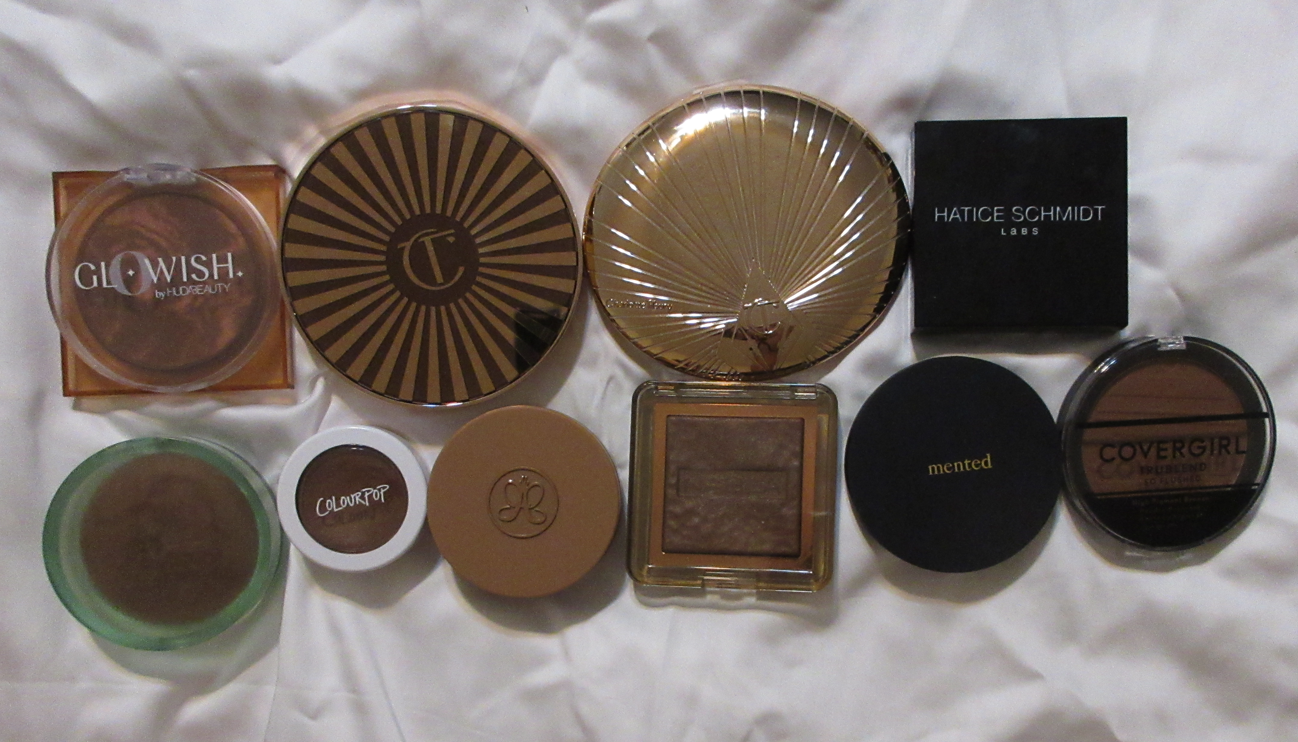
RANKING AMONG THE BRONZERS IN THIS POST
Hermès Plein Air Mineral Powder
Victoria Beckham Matte Bronzing Brick
Rare Beauty Bronzer Stick
Vieve Modern Bronzer Duo
Dior Forever Natural Bronzer
Westman Atelier Butter Powder Bronzer
Nars Laguna Talc-Free Bronzing Powders
Pat Mcgrath Divine Powder Bronzers
MAC Sunstruck Bronzer (Matte)
Armani Luminous Silk Bronzer Drops
MAC Sunstruck Bronzer (Radiant)
Kosas Baked Bronzer (Yellow Packaging)
Milk Makeup Matte Bronzer Stick
Although I feel it’s too soon for me to rank these with the rest of my collection, I can at least say with certainty that my first three here would make the top 10, knocking Nabla, Mented, and Covergirl lower. Four through eight here could potentially knock those three even lower.
It’s easy to say the Hermes is my top “standard” powder formula, GloWish is the top with a sheen (performs like a baked gelee but I have no idea what it technically is), and Charlotte makes my top cream formula. However, deciding between the three where they rank is too difficult to say with full confidence. The one from Victoria Beckham comes just after Charlotte’s Powder bronzer, (so basically fifth place). I mentioned in last week’s post that Colourpop’s bronzer would drop lower since it started to perform differently at the one year mark of opening it. I still don’t know what place that put’s Colourpop now, but I know that ABH’s cream bronzer moved above it. Between ABH and the Rare Beauty Stick, I cannot make a decision without seeing how Rare Beauty performs in the long term of at least one year too.
So, that is everything! While it’s true I technically have more bronzers in my collection if one counts my face palettes too, I just don’t use the bronzers in there enough for it to be fair to include them. The only ones I can think of that could significantly shake up this list is the Hourglass Ambient Lighting Finishing Powder I use as bronzer (Transcendent Light) and the Captivate bronzer from Sephora’s Microsmooth Multi-Tasking Baked Face Palette. Those two would be somewhere between 15-25, but that’s as far as I could narrow it down.
Thank you for reading! Again, apologies for needing to switch now to my cell phone camera. I’m still trying to figure out the settings, color, and lighting.
Pat Mcgrath Labs is one of my favorite brands. Even though I was trying to avoid buying her holiday collection and only one of the Star Wars quints, those 30-40% off discounts got me in the end! The things I’m reviewing today are the remaining unreviewed items from the brand that I purchased in 2022. Technically, there are also lip glosses I haven’t showcased, but those will be in a lip collection post in the future.
Regarding what people are calling “Sticker-Gate” and whether or not the brand can be considered luxury or not, I will reserve that discussion for the very end of this post.
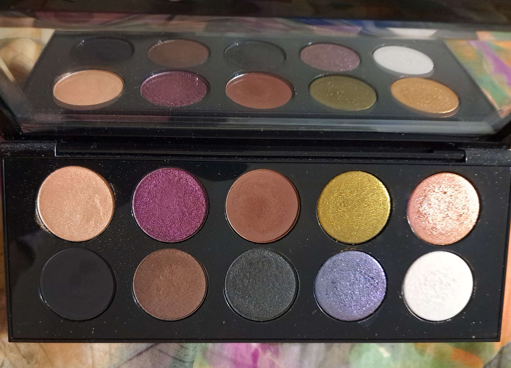
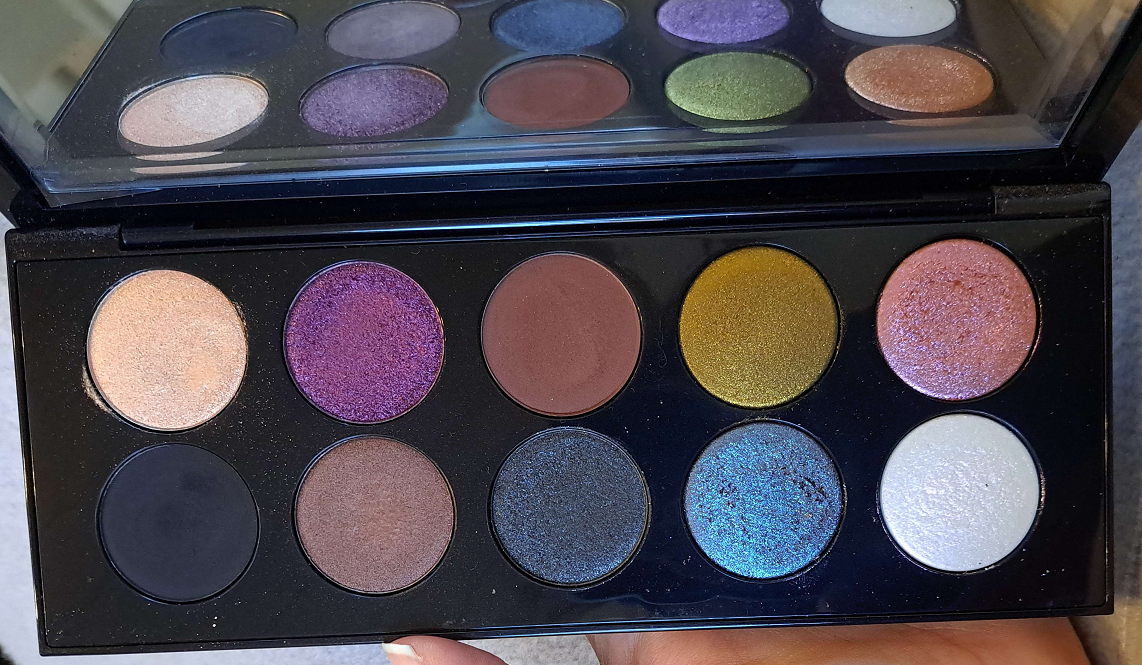
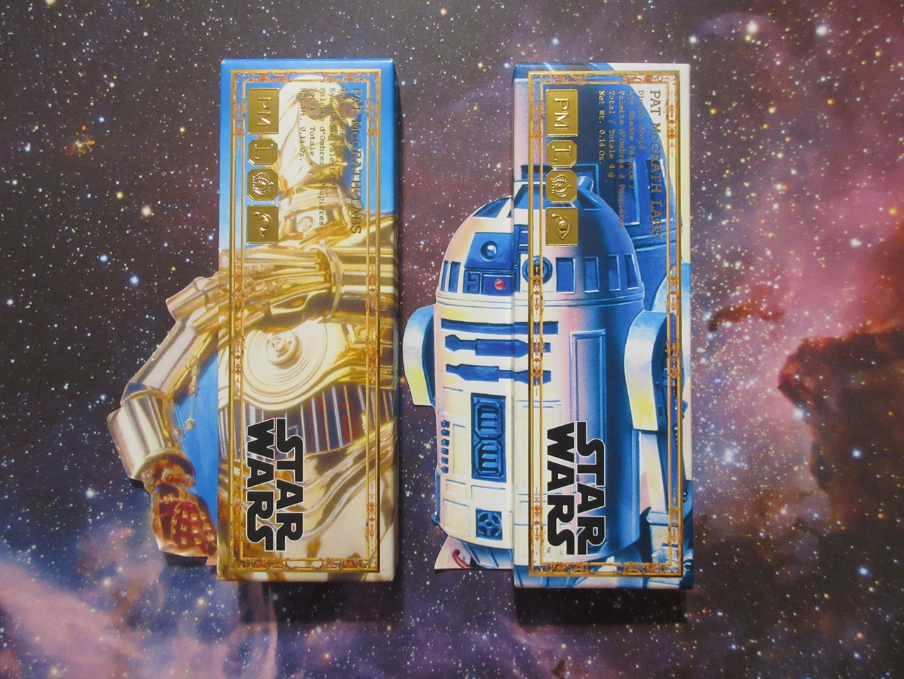
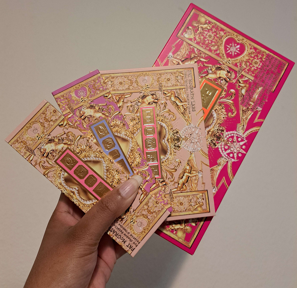
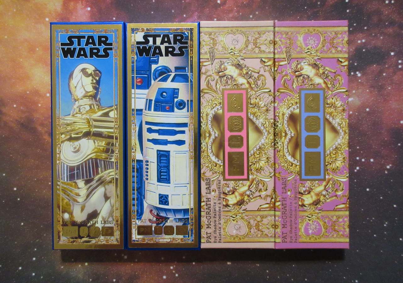
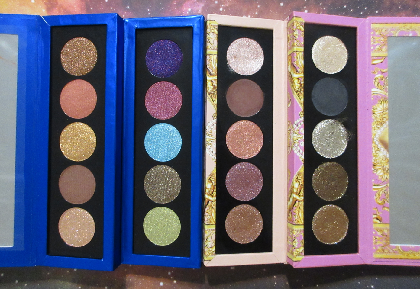
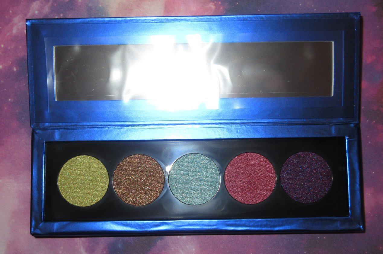
Pat Mcgrath Labs Eye Shadow Palettes in The Golden One, Divine Droid, and Nude Allure
I have 4 out of the 5 quints released from Pat Mcgrath. I specifically said in my review of Bronze Bliss that I didn’t want Nude Allure, but I saw additional photos that showed how the shadows actually look in person and the camera just doesn’t do them justice! So, now I own both of the holiday five pan palettes. The missing quint from the Star Wars collection is Sith Seduction which only one shade in that appealed to me until I realized it was darker than I wanted. So, I passed on that one. The completionist in me wanted to grab it anyway, but these five pan palettes are a hit with customers. I foresee the brand releasing a lot more of them in the future and it would be unrealistic for me to try and collect them all, especially if the color story isn’t to my taste. These four that I purchased are my types of shades.
Starting with the only palette that slightly disappointed me, Divine Droid, I can at least say the colors are beautiful. They look like they’re going to be as sparkly as the others in the pans, but Astro Lime, Optic Fuchsia, and Ultraviolet Messenger look slightly duller by comparisons on the eyes. Out of the reviews I’ve seen so far, I’ve observed that the highest praises for this specific palette come from Influencers that tend to wear mostly neutrals, and the strongest opinions against the palette are from Influencers who are used to indie brands’ shimmers and those who love truly vibrant colorful glittery shadows. These shades are bold and they are shimmery, but I think it comes down to the nature of colored shimmer versus reflective metallic sparkle that the colorful shades don’t have as much of as the others. The only other way I can think to explain it is that satins are shiny from a sheen and tiny shimmer particles, and Divine Droid eyeshadows look just like that, except that these shimmer particles are more apparent and textured. The shine level is the equivalent of an amped up satin. Secret Blueprint is an exception because there’s a lot of whitish-silvery sparkle, but I don’t like light blue shades and only use them when the look can benefit from having one. To get Secret Blueprint to stay bright on the eyes, I have to apply it damp. Bronze Circuit has some golden sparkle, but the color itself is less olive in person than I hoped. It’s still a pretty antique bronze-gold with a slight green tinge, but the shade doesn’t go far enough in the direction of green to be that unique.
Even though I wanted a little more from the first four shades, the true disappointment is Ultraviolet Messenger because it doesn’t blend as well and there’s barely any visible shine when it’s on the skin. By not blending well, I mean that it goes on harsh no matter how little product I use, so it requires blending, but it diffuses so easily that the magenta tone in the base starts to appear, which makes it look splotchy compared to the darker purple. I have to be extremely careful when blending it out and packing the color back on in places. It’s not so bad when I use Optic Fuchsia with it because the magenta just looks like an extension of that shade, but it’s more of an issue when I’m trying to use Ultraviolet Messenger right next to the green or blue. And despite being applied with a finger or wet, the shine doesn’t stay. It looks dull and matte on the eyes. This might make some people happy, considering we don’t have a matte in this palette and this shade could act as one or might just stay in the outer corner as a deepening shade only, but the part that made me the most excited for that purple was because it looked the most multi-colored in the pan. I wish that translated to the eyes.
The other downside to not having a proper matte is that these shimmers have so much slip to them that they’re prone to creasing without using the right products with them. In order from most effective to least effective anti-creasing abilities out of the primers I’ve tried with them are: Gerard Cosmetics Clean Canvas, Coloured Raine Paint Base, and then tied between the MAC Paint Pot and Makeup by Mario Master Eye Prep & Set if those last two are set very well with powder. Essentially, the drier the primer the better. However, even the best pairing of the primers isn’t good enough on me without having a matte in the crease to fill those lines. In some of my eye look demo photos, I skipped using the matte crease, but in practical daily usage I would always use a matte with these shades in the future.
Also, I no longer have the PML Nocturnal Nirvana Quad, but the lime green, blue, and purple shades from Divine Droid reminded me of that one. Sure enough, Dr. Ash on YouTube had the same thoughts and held them side by side in her video. Of course, the green in that palette is more multi-dimensional than this one. I don’t care for either blue shadow. As much as I was disappointed by Ultraviolet Messenger, it is easier to work with it than the purple in Nocturnal Nirvana. I sold that quad (and replaced it with the Interstellar Icon quad) purely because I wasn’t getting enough use out of it, and not because I disliked the shades. I’ve thought about that quad several times since it left my possession, so I don’t mind having something similar back in the form of Divine Droid.
We were given an actual satin in The Golden One palette, but I use Coral Blitz in place of a matte. The actual matte in that palette is Tatooine, which is a lighter brown than the one from Nude Allure. I had no intention of buying The Golden One until I realized it had that extra blendable matte formula unique to the five pan palettes so far from Pat Mcgrath, and because I was curious about Coral Blitz. As to be expected, I was thrilled with Tatooine, but the surprise hit for me was Coral Blitz. I don’t own a satin-shimmer in that tone. The closest thing I can recall is City Dawn, a “rich matte” from the Bobbi Brown Luxe Eye & Cheek Palette last holiday. This shade, with the peachy-coral and less orange tone, plus the tiny golden sparkles make it even prettier to me than the one from Bobbi Brown.
Binary Sunset is a little drier than the other shimmers whereas Cyborg Relations has extra slip to it, like Bronze Mink from Bronze Bliss. This palette isn’t as inspiring as Nude Allure or Bronze Bliss for me, but it has some great staple warm toned neutral options that will continue to benefit me as I use these palettes together.
Above is a photo comparing the three mattes (plus Coral Blitz) together, and it shows the depth differences between the browns as well. I would be thrilled for an all-matte 5 pan from Pat Mcgrath in this specific formula. If the brand includes one more brown that is lighter than Tatooine, I will feel they’ve reached their quota of neutrals and I will really be wanting more colorful mattes and/or satin-mattes. The allure of buying these quints specifically for the mattes won’t be as strong of a lure if it starts to feel repetitive. When it comes to the shimmers, I’m already feeling like we’ve hit the maximum amount of bronzes and golds needed. I also decided to compare a photo, this time below, of the most similar shades to each other from among the four palettes.
Font Color Guide: Yellow-Orange = The Golden One, Pink = Nude Allure, Brown = Bronze Bliss, and Blue = Divine Droid
If the brand can figure out how to make the colorful shimmers as sparkly and reflective on the eyes as the neutral metallic shimmers, I’d go even crazier for these palettes. For now though, after comparing the four, I’m feeling pretty satisfied with this bunch. It would take something really specific to my tastes to make me want to purchase more than these.
Coral Kiss and Mahogany Angel are the two main stars of this palette. Plum Eclipse comes in third, but it shares a similar issue with Ultraviolet Messenger from Divine Droid in that the gorgeous multi-colored sparkle doesn’t show as easily on the eyes. It still does a little and at least looks satin-like instead of matte, which is why I still like it. Coral Kiss doesn’t look as multi-colored as in the pan, but it does still look dynamic in person which is what counts the most to me. I love this shade and I love the first eye look demonstrated below. As for Mahogany Angel, it goes on the eyes darker than I expected, but I like that because I wanted a deepening shade that would work well with most eye looks. La Vie En Noir from Bronze Bliss has that blue leaning tinge that keeps me from using it as my deepening shade for most of my eye looks, though now that I think about it, it would probably pair well with the blue, purple, and green from Divine Droid.
Naked Bronze, to me, is like Coral Kiss without the extra oomph and vibrancy. It pales in comparison to that shade or even the other Bronzes from the other palettes because it is such a standard light bronze color. I’m sure others will like it more than me though since my style for most of 2022 was to wear neutrals with a twist. So far, this preference has carried into 2023 as well.
If I had to rank these from most liked to alright/fine, it would be: Bronze Bliss, Nude Allure, The Golden One, and Divine Droid. Bronze Bliss easily wins because it has the most of those metallic type shimmers which are what’s special about this new formula from the brand, in addition to the matte. Nude Allure comes second because of Coral Kiss and having an even more useful matte. The Golden One has the very special Coral Blitz, plus a matte, plus the gorgeous Cyborg Relations, but it is the least inspiring color story together in one palette which is what knocks it down from what could have been the second spot. Divine Droid is last because of there being no mattes, less reflective shimmer, and the stubborn purple.
These aren’t effortless shadows because of how easily they can actually overblend, the potential to crease, or the differences in textures causing a need to really spread and smooth out the shadows into each other. However, I really like these and am happy with my purchases. It’s one of those instances where I can say with confidence that I’m going to continue getting use out of these eyeshadows beyond this review.
MTHRSHP Mega: Celestial Nirvana
I swatched these from left to right going downward two columns at a time because I see these eyeshadows pairing nicely together in groups of six. So, the first set are the first two columns, the next set are column numbers 3-4, and the last are 5-6.
This palette has greens, purples, golds, and browns. This is very much my kind of color story, but that means it had to compete with the tons of other greens, purples, and neutrals in my collection. I heard mixed reviews about the quality of this palette, but it was honestly Altered State that continuously filled my thoughts. So many of us had been dying to get a matte green from the brand or just more greens from PML in general. They’ve released like fifty bronzes, golds, and pinks but like five greens. I actually think Pat Mcgrath hates the color green. Anyway, the old Lili was the type to buy a full palette just for one shade and I did not want to go back to that type of purchasing habit, but the brand had this on sale and after seeing Tina the Fancy Face’s in-store swatches, my resolve just melted away.
The palette was significantly heavier than I expected. I don’t know how Celestial Nirvana stacks up in weight compared to Celestial Odyssey because I skipped that Mega Palette, but it’s much heavier than the original Celestial Divinity. I like that feature because it feels more lux to me, but I also dislike it for being so large for storage and even handling every time I want to use it.
The majority of these shadows are extremely pigmented! I’ve gotten so used to creating eyeshadow looks with more softly pigmented shadows like the Lisa Eldridge Seamless Mattes and Velvets, Dior shadows, and Bobbi Brown Jadestone that I felt out of practice handling the level of pigmentation from every matte except Desert Divinity and Nightfall. I like that the brand gave softer options out of these shadows that perform like pressed pigments, but they’re almost too weak to hold their own in a palette with such bold other shades. Desert Divinity makes for a nice transition shadow, but it’s not the type that helps me blend the edges of the other colors very well. Nightfall is darker than Desert Divinity, but doesn’t give me as much depth in the outer corner as I prefer, which is why I have to lean on the brown tones within Auburn Allure to meet that line between the colorful red side and the slight lean towards brown. Auburn Allure is my best alternative if I don’t want to have to resort to the deeper yet more colorful options such as Nocturnal Navy or Violet Vixen. It was in times of searching for a neutral deepening option that I realized most of the shimmers are light and neutral (not my preference within a big palette) with Bronze Infatuation and Starlit Copper being the darkest ones that are medium depth level at best. Also, as dark as the mattes are, they deepen up even more on my eyes. Venusian Peony looks so light-medium pink in the pan, but turns medium-dark pink on my skin. The dark shades going darker (likely due to oily lids or too wet of a primer) isn’t as much of an issue for me as trying to keep the look light with the lighter shades, but it going darker than I expected.
I don’t think these mattes are as blendable as Pat’s usual formula. They’re still nice, and better than Urban Decay or Too Faced mattes for example, but not as easy to work with as I’ve gotten accustomed to for PML. Perhaps the quints have spoiled me in that regard. The truly troublesome shade is unfortunately Altered State that I was looking forward to the most. It has a tendency to stick in one place where I put it, no matter which primer I use with it and it goes on super intensely. Also, it has a blue tinge to it which I didn’t use to mind in the past, and I know that helps it to pair nicely with the blues in this palette, but I much prefer a yellow-leaning green. However, I can still make even that shadow work.
The shimmers are great. They’re fantastic. They’re impactful and just what I expect from the brand’s standard formula (not the “special” shades in the last two columns of Mothership palettes, multichromes, nor the quint shimmers). They don’t give me issues with creasing or fading, and there are no longevity issues.
In the green, blue, and purple eye look above, I attempted to tweak the look of the deep mattes by putting shimmers on top. It can be done, but it was such a long process because the mattes have to look perfectly blended underneath first. They are so intense and opaque that trying to blend them into each other just kept covering each other up rather than mixing. When I was adding the shimmers on top, which are also quite opaque, I noticed they were doing the same thing. Eventually, I was careful enough and applied the shimmer lightly enough between them to achieve the look I was going for.
For these reasons, I recommend this palette to those who love colorful shadows and are used to working with the kind that are pigmented and opaque. Even though this palette has neutral and softer options, this isn’t the type of product suited for those who just want to dip their toes into color. It’s intended for the full on color lovers. Also, as much as this price point makes sense for Pat Mcgrath, I personally wouldn’t have bought this for any less than a 40% discount because it’s not unique enough in shades or formula for me to be willing to spend a fortune on it. If this came out two years ago when we had far fewer high quality green and purple options, I’d have said this was worth the full price, but things have advanced and we’ve been flooded with options by now. There’s a lot of competition!
At the time I’m writing this, Sephora USA still has this palette available and on sale.
Divine Blush + Glow Cheek Palette in Nude Venus
When this palette went on sale, I bought it knowing full well that I had singles of Nude Venus, Paradise Venus, and Desert Orchid (in the form of the lighter half of the Paradise Glow blush duo) sitting in my blush drawer. I think we can all agree that someone who wants to use up their products shouldn’t buy a duplicate of them.
What I really bought this face palette for was the Sunset Nectar highlighter, Divine Rose III blush, and the convenience of having my favorite shades in one palette so I can take this traveling in lightweight durable packaging. I notoriously reach for blush singles over blush palettes, but that’s because pre-made blush palettes usually have shades I don’t like or can’t use, so I subconsciously make a mental note to skip it if I’m in a rush to put on makeup (which is almost every time). However, since this has all the ones I love, it’s more memorable and I do actually reach for it. By purchasing this palette, my original singles no longer served a purpose in my collection, so I gave Paradise Venus to my sister and Nude Venus to one of my best friends. I’m keeping Paradise Glow for now, but it may not survive my next declutter.
I have been enjoying possessing my favorite shades in an all-in-one palette that makes it so much easier (and less messy than dealing with kickup in multiple separate compacts) to dip into multiple pans at once to create tailored blush looks on my cheeks. In addition, I know exactly which product to grab for those shades, whereas the black lacquer packaging between the blushes, blush duos, and highlighters are identical and require me to read the backs of them all to tell, without having to open them, which shade is which.
I probably didn’t need to have Divine Rose III considering I already owned the other three blushes, plus Electric Bloom, as well as the Divine Rose II duo and Cosmic Coral duo. I’m still happy I got it though, because it’s giving me the effect I wanted from Nude Venus, but with more depth. Because Nude Venus has to be built up a lot to show on me, I always paired it with Paradise Venus and kept it concentrated on the apples of the cheeks. Now, I either use Divine Rose III on its own for a medium toned pink flush, or mixed with a combination of all the other blushes in the palette. To see additional blush photos with my review of the single blushes, they can be found here or my review of the blush duos can be found here. I haven’t noticed any quality differences between the individual blushes versus the ones in the face palette. They’re just as beautiful and long lasting as ever!
My favorite highlighter from Pat Mcgrath is still the Skin Fetish: Ultra Glow Highlighter in Divine Rose. It has the smoothest formula, gives the wet look I love that melts into the skin, and it doesn’t look glittery. Sunset Nectar is more similar to the permanent line of Skin Fetish: Divine Glow Highlighters, which have more apparent shimmer particles, but they still blend beautifully into the skin. I keep wishing for a Skin Fetish Ultra Glow Highlighter in a dark golden color without the slight pink tinge Divine Rose has. I didn’t expect Sunset Nectar to work for me because it is extremely light in the pan, but it somehow does! It looks powdery and stark pinkish-white on my skin when it first goes on, but when I blend it in and then pass my blush brush back over the edges around it, I think I can pull it off!
Below are different examples of lighting and days wearing these products. The first photo of the three is the Divine Rose III blush (no highlighter yet) under a ring light and wearing MAC foundation in NC47. The second photo is the same day with the same products, with the addition of MAC’s Sparkling Wine shade of highlighter, while under indoor light (with a little natural light peeking through the side). In the third photo I’m wearing the Sunset Nectar highlighter, plus a combination of Paradise Venus, Nude Venus, and Divine Rose III blushes. It’s under the same light as the second photo, but I have the Estee Lauder Futurist Foundation in 5W2 mixed with the Nars Light Reflecting Foundation in Macao mainly on the perimeter of my face.
We’ve reached the end of the review, and this is the point where I’d like to give my input on the recent “controversy” the brand has had over the Star Wars Collection, as well as the discussions around the brand devaluing itself between the frequent sales at significant discounts and the cheaper palette options and materials.
Starting with the Bantha in the room…As much as I love the Pat Mcgrath brand, it was certainly not a good idea to put Midnight Sun on sale for around $70+ until literally the day of the Star Wars launch of the same Midnight Sun palette for the full $128. It automatically sends the message to the customers that the Star Wars version isn’t worth the price and/or to wait for the Star Wars one to eventually go on sale for $70 as well. I was pretty shocked when I heard the news and watched the video going around because of what it signified for me about the brand going forward. Still, none of us can confirm with certainty that the Star Wars stickers were slapped on top of old unsellable palettes and put in Star Wars unicartons, the same way we can’t confirm that this year’s holiday specific lip products and mascaras had Star Wars stickers added to them after being removed from their original unicartons and put into Star Wars ones. Even if that’s exactly what they did, rather than viewing it as the brand trying to dupe people into buying an unpopular palette, I can see it from the perspective of the brand no longer keeping Midnight Sun on sale and putting it back at the original price with the bonus of a Star Wars sticker for free. I have been craving owning another special edition packaged palette from Pat Mcgrath, like if they took the Mothership unicarton artwork and found a way to get a high quality version of that print onto the palette, I would be thrilled. If it comes in the form of a sticker, I wouldn’t mind that either, so long as the sticker couldn’t just be peeled away. That’s where I think the brand really went wrong.
When I had packaging I didn’t like, I used Washi tape, stickers, and Mod Podge Dimensional Magic to create something I felt was beautiful. The way I did it, nothing is going to be lifting up or peeling off anytime soon. So, I don’t think Pat Mcgrath using stickers is as big of an issue as them placing many of them crooked (which cheapens the look) and not using a permanent adhesive. I don’t know if they had factory workers or machines applying those stickers, but if it was real people, I can see the benefit of making the stickers removable so they can attempt to fix extra crooked stickers on the palettes, but that’s a bit cheap to not use a stronger adhesive and be willing to toss out the imperfectly placed ones in order to ensure the customer won’t have the edges of the sticker lifting up within weeks or months of owning those palettes.
When I first saw the Star Wars Midnight Sun palette cover in photos, I actually thought it was a sticker with epoxy resin on top. Perhaps epoxy wouldn’t be clear enough (as it can turn yellow, although the vintage Star Wars image being yellow might have hid that), but at least then people would have an actual plastic feeling packaging that couldn’t be removed. This reminded me of the time when I was experimenting with Mod Podge versus Epoxy Stickers for jewelry when it came to cutting out images from Archie comic digests and turning them into pendants. I wasn’t very satisfied with either outcome so I abandoned the idea. However, that was due to a clarity issue. People who have the palettes in hand seem to think the stickers are pretty and are just disappointed by how easy they are to lift up or some people just don’t find stickers to be luxurious. The flat type of stickers I agree don’t look high end, but the raised ones are different in my eyes. Most people wouldn’t know how to make one themselves. The arts-and-crafts-loving side to me instantly started wondering if I could create my own covers for the PML palettes, but with how expensive they are, I don’t trust my skills enough to chance ruining it. However, I started thinking there might be people on Etsy working on making their own Mothership Stickers to sell. I think the brand could make bank creating their own palette sticker covers if they find a much stronger adhesive. I’d pay $15-$25 just for that because of how much of a sucker I am for pretty packaging. It’s a shame they ruined the concept because of how they went about “Sticker-Gate.”
I’ve seen some other complaints about the fact that we have stickers on top of the quints and them being cardboard. While that’s valid for people to feel that it’s not very luxurious, I feel the growing complaint about it is piggybacking off the Midnight Sun issue. We’ve had cardboard packaging for ages, starting with those six pan MTHRSHP palettes which I believe the brand released for the first time for holiday 2018 with the cumbersome envelope style flaps. The original six pan Star Wars palettes were the first time we got magnetic closure cardboard palettes in 2019. At some point (I believe 2020) we started seeing clear sticker labels on the bottoms of the packaging instead of the print being etched on. I remember being perturbed along with everyone else when the sticker on the first Mega Palette for holiday 2020 (Celestial Divinity) was crooked, but that was the point in which we all could have gotten off the hype train with the brand if we wanted. It’s as if people are just now noticing the printed paper edges of these palettes. It’s not new. The holiday quints from 2022 has stickers on them too, but they were the same pink background color as the palettes, so perhaps it wasn’t as obvious as the white ones from the Star Wars Collection. People are also pointing out the edges of the paper covering all of a sudden, but again, it’s only obvious because the paper is a shiny solid color without the busy pattern to distract from the fact that the holiday quints are folded and glued the same way.
I thought it was a bit funny that the holiday Mega palette for 2022 is larger and thicker than the first one. That extra weight ironically makes it feel more luxurious, but I haven’t seen anyone talk about that. Another funny thing is that the sticker on the back of my Star Wars quint was crooked and I was able to peel that off and affix it at least better than it was previously. It’s the kind of sticker that air bubbles are prone to form under without using something like a credit card to press it down evenly, but I was able to get the bubbles out with my fingers without one.
I think there is absolutely something that can be said about the downgrade of packaging between the Mothership palettes to the cardboard ones, plus the sticker labels. I think it’s absolutely valid to feel like it’s not luxury. I’d just like to point out that Natasha Denona doesn’t have labels etched on her palettes either. There are clear label stickers. Her things are a similar price point to Pat Mcgrath, and she has long been experimenting with more “affordable” options with the $69 midi palettes and $27 minis, yet I hardly hear a conversation about it being less of a high end brand for offering smaller and more wallet-friendly palettes. Also, for environmental reasons, an argument can be made about using cardboard versus plastic, though I think a lot of beauty collectors prefer the plastic (myself included to be honest, but I don’t turn up my nose at cardboard anymore). Charlotte Tilbury has sticker labels on the back as well. I see most of the complaints are about having stickers on the front, but I’ve also seen complaints about them being on the back instead of etched in, which is why I wanted to mention it because those same people never said a word about the other two brands I mentioned.
Everyone knows by now to not buy Pat Mcgrath at full price in most situations. However, if we’re going to accept that we’ll only buy the products at 20-40% off, we cannot expect to still get weighty plastic or metal bespoke type of packaging. It just doesn’t make financial sense for the brand. And the big Mothership palettes don’t usually go on sale for lower than $89. We can have a luxury line in the form of those larger palettes with the luxury packaging while still offering other price points like Natasha Denona has done or even Dior with their Backstage line. I’m at least glad they aren’t lowering their ingredient quality or “Going Full Urban Decay” by releasing a product and immediately putting it on sale for 50% off two weeks to two months later.
Materials aside, I understand why there’s a growing feeling that Pat Mcgrath Labs is losing its luxury feel when people have spotted the products at T.J. Maxx and when it feels like there have been discounts basically all year long with the sale announced and lasting what seems to be 2-4 weeks, a week break, and then the next one starts in an ongoing cycle. It does bug me sometimes when I purchase something and just a month later it goes on a deeper discount. I don’t have anything to say to rebut that feeling. It’s valid. What is also valid that I think are bigger reasons the brand doesn’t feel so luxurious is the ridiculous wait time between when the products launch and when it finally ships out. There are points where it felt like we all just paid for an unofficial pre-order because nothing ships out to anyone for weeks or the launches have been staggered out and only the palettes are available at one time and the blushes get launched a week or so later. Pat Mcgrath doesn’t have a reward program, so myself and others sometimes prefer to skip the guaranteed 10% off promo code at launch in favor of being able to purchase from Sephora using a gift card or to have the reward points accrue over there. Many times the product finally comes to Sephora by the time the warehouses PML uses starts to ship things out. Unhelpful or slow to respond customer service is another thing that makes the brand not feel like a luxury one. Items not being properly wrapped in the boxes and arriving broken is another. It has been my experience with them that if an item is known to break easily, they will send a new one with the acknowledgement that it’s possible the replacement will come broken again, but they will still ship it out anyway as a “one time courtesy.” Perhaps PML isn’t in the luxury category anymore, but they are still a high end brand in my eyes.
So, do I think Pat Mcgrath Labs is going downhill? It feels that way, but not necessarily. I think they’re cutting corners and have been cutting corners for several years now. I think they’ve set a precedent to wait for a sale. I think Sticker-Gate isn’t as big of an issue in itself, but is one example of a larger issue within the brand. I think plenty of people will closely scrutinize everything the brand does going forward, but the hype won’t die down. The issues the brand has are all able to be fixed and forgotten if that’s what they actually want to do. There will be exciting new launches to come. People, like me, will still try to wait for a sale, but also certain items will likely be bought at nearly full price. I also expect more repackaged products to be released. I’ve done my fair share of complaining about the issues within PML, but they’re still one of my favorite brands and I’m excited to see what’s next.
With today being Black Friday and holiday sales approaching, now is the time it’d be the most useful for me to get as many reviews out as possible. I’m constantly testing new products, but it takes ages for me to get closeups, swatches, demos, and the written portion of posts completed to my level of satisfaction. I’m allergic to posting first impressions, but I think it may be helpful to share photos of the new makeup I purchased that are just new shades of things I’ve already reviewed for this blog. The formulas of everything should be the same, and therefore the performances should be no different, with the exception of the first item I’m showcasing below.
Fenty Beauty Double Cheek’d Up: Freestyle Cream Blush Duo
The compact color is stunning! I bought this partly for the packaging, along with liking Fenty’s permanent cream blush formula that I reviewed here. Since “Freestyle” is still in the name of the duo, I expected the formula to be the same, but it’s a little more emollient and slightly less pigmented. Because Peony Droppa is on the lighter side, it takes an extra few layers to build it up on me, but Mali’booze just needs one additional layer to build up to the level of opacity I get from the original shades. I was pleasantly surprised that Peony Droppa showed up on me and actually looked nice despite being cool-toned (warmer blushes look better with my undertone). I’ve only used this duo twice so far and I prefer how they look when I use the darker blush all over my cheek and keep the lighter one on just the apples. Trying to wear them mixed was a little tricky trying to find the tonal balance I liked, so I think I’ll stick to either using Mali’booze alone or applying both in those specific zones on the cheeks.
The compact is much bigger than the standard cream blushes and each half of the duo is 3g, meaning each shade in the duo has the same amount of product as the full size single cream blushes. The cream duo compact has the same dimensions as the full size bronzers, highlighter duos, etc. I get two products in one for $34 instead of $44 if they were sold separately, however, I still prefer Strawberry Drip to both of these shades because I get the bright popping color without it clashing with my skin tone. So, in my case, I’d still be better off buying a single blush. I got the duo at a discount via Ulta, and my single blushes from Fenty are two and a half years old by now, so this is a good time to have a replacement.
I was planning to make a dedicated Fenty update post, so I have photos already wearing this one, but I thought it would be best to just include them here.
Fenty Beauty Sun Stalk’R Face + Eye Bronzer & Highlighter Palette
I bought this one from Mercari. I have reviewed the Mocha Mami shade of Sun Stalk’r Instant Warmth Bronzer as an update to one of my bronzer posts here. I barely used it because the shade was more red than I liked, particularly for a matte formula. I suspected one of the other colors could work, or that I could mix the deepest two in this palette together as a better match. It turns out I was correct, as Coco Naughty works on me, or I can mix that one with Thick Mint for extra intensity. I was so concerned with knowing my correct shade that I failed to consider the fact that the formula is good but not great. There wasn’t a need to try and find a better color if I was still going to reach for my Huda Beauty Glowish Bronzer, Charlotte Tilbury, Kosas, and Nars bronzers first.
I find it interesting how much the color Private Island blended into my arm. At some point I’m going to test if that shade can be used as an all over setting powder or to set my under eyes. If so, that would be a nice way to make this palette even more useful.
The Phat Glass highlighter was a little broken, but I pressed it back. Also, that shade is way too light for me, so I don’t wear it alone anyway. The Gold Card color is very beautiful and suits me really well. I can wear it alone or mix it with Phat Glass for a little extra brightness. I’ve also used it on the cheekbones and then added Phat Glass to a tiny portion of the highest point to really emphasize the structured look I want in that area. It’s nice to finally have a Fenty highlighter that matches my preferences in terms of the smaller shimmer particle size. All others I tried from Fenty had some aspect that’s usually a negative, such as being in stick form in the MatchStix, an unnatural color as a Killawatt, or ultra glittery like the Diamond bombs. Even the Chocolate Swiller Fenty Toast’d Swirl Bronze Shimmer Powder with its smooth texture has some larger particle size shimmer specks that makes it something I only want to use periodically.
LYS Beauty Higher Standard 3-Piece Cream Blush Set
Grateful looks so much like Confident in the pan, but when swatched, it looks more like Self Love instead. This mini trio is $20, making it a really great option for trying out additional shades from the brand. The retail price of the single blushes is $16 and each individual “mini” has about 2/3 the product of the full size. The packaging isn’t as lux with the clear lid, but that also makes it easier to figure out which shade I’m grabbing. I only tried these out once so far, and don’t have pictures of each blush included, but that one time using it was enough to know the formula of the minis is the same. It’s one of my absolute favorite cream blush formulas, if not the top favorite, and I’ve felt like this long before I joined the LYS ambassador program. I’m technically still one, but I haven’t done anything for the brand in nearly a year. More about that is detailed here. As for my first review of this cream blush formula, that can be found here. All three included in this set show up on me.
This is another one of those situations where I was so enamored with the look of the new shades that I forgot how I actually felt about the formula being “not particularly special,” mentioned here. I thought this was colorful enough to work on my skin tone, especially with how much richer it looked online, but it was very ashy the first time I tried it. I will have to try it again focusing on the deeper swirl to see if that helps, but I have my doubts. I bought this during Sephora’s previous VIB sale, but Huda’s official website has an even better deal going on.
Chantecaille Perfect Blur Finishing Powder in Med/Dark
In my powder declutter post discussing the original shade here, I mentioned that I wasn’t getting the same amazing results that had been hyped up in all the reviews I’d seen, so perhaps a darker shade would work better on me. I planned to sell the original and get a darker version. The first iteration of the Med/Dark shade was from Chantecaille’s Flower Power line, but I hated that packaging and that wasn’t nice enough to make up for me having to sell that gorgeous hummingbird packaging. I contacted Chantecaille during that time, and they told me they wouldn’t bring the new shade in that hummingbird packaging, but it would at least come in the larger size of their “pebble” compacts, like their philanthropy blushes. After that, the Dior Powder-No-Powder was released and I got so much more blurring from that than I ever did with the original shade and at half the price, so I decided to just give up on this powder. Then, as luck should have it, Space NK had it deeply discounted during their sale in June this year. With shipping included, I only paid $33 for it!
The Med/Dark shade is much better suited to me. It looked invisible on my inner arm, so there was no point trying to post a swatch of it here. Even with the photo uploaded to my computer, I had a guess as to where it was based on my skin looking slightly more matte, but I wasn’t confident enough to mark it. Getting that new shade did work out better for me than the original. I could see a little bit of blurring, but it was nowhere near as good on me as the Dior Powder-No-Powder. So, I still recommend that one over this (though the Dior one has a sheen and this powder does not). I’m just glad I didn’t spend a fortune on it to figure that out!
Tarte Amazonian Clay Blushes in Blissful and Natural Beauty
The Tarte blushes I owned were minis reviewed here. I really enjoyed them, so when Ulta had the full-size blushes on sale in September for $14 each, I couldn’t resist and bought several more. Since Exposed worked for me, I thought Seduce would be even better, but it doesn’t show on me at all. That one is out of my collection, so I couldn’t include it here. The tartelette blush in bloom Amazonian clay cheek palette didn’t work for me either, excluding the darkest shade, but it was too cool toned looking on me so that’s not in my collection anymore either. I’m glad Blissful and Natural Beauty worked out! Tarte’s Amazonian Clay Blushes have the issue of looking light in the pan but sometimes they work for me and sometimes they don’t, so I never know until I actually try them out.
One/Size Cheek Clapper 3D Blush Trio Palette in Phat Ass
I loved the Freaky Peach shade, reviewed here, and was always drawn to Phat Ass, but with how similar the cream and powder versions looked, I didn’t think it would be worth it to buy another trio from One/Size. However, I saw a good deal on Mercari and bought this. Unfortunately, the shimmer exploded in the package, so it took quite a while for me to repress it (not my best work) and clean off the cream which it had also gotten into despite the plastic flap. Unlike Freaky Peach where the shimmer blush was light enough for me to use as a highlighter, the BBL shade in this one is a bit too deep and pigmented in the base color for that. I can use this as an actual shimmer blush or blush topper though, the way it was intended. It’s the kind of shade that’s along the lines of a Nars Orgasm X, but I like this one better!
Pat McgrathSkin Fetish: Divine Glow Highlighter in Venus Nectar
Venus Nectar was another broken item I had to repair (dry pressing wasn’t an option with how broken it was). It’s on the pink side, but I love this formula from Pat Mcgrath. It’s a shame that I still can’t get the exact golden tone in this formula that I’m looking for with Bronze Mirage, reviewed here, being a bit deep for me. PML’s Ultra Glow Highlighter in the pink packaging still hasn’t been topped for me. Swatches of Venus Nectar and Bronze Mirage will be in the next section of PML highlighters lower down.
Pat Mcgrath x Bridgerton Skin Fetish: Sublime Skin Highlighter in Incandescent Gold 002
Don’t ask me why I bought a Bridgerton highlighter. I’m citing temporary insanity. I know I hate deep yellow highlighters (being scarred from Fenty’s Trophy Wife), so I opted for the other one instead because I heard it’s still gold but with a sheer base that’s technically supposed to work on the majority of skintones. The glitter level is my main issue with it, but I forgot that the highlighters in this particular formula, similar to my Lunar Nude highlighter (reviewed here), share this excessive sparkle feature. I only have this photo to show of it on my bare face. As much as I’d prefer not to show something like this, it’s all I’ve got at the moment.
As the swatches above show, the sparkle level and shimmer particle sizes are very different. I prefer the Divine Glow over the Sublime Skin, and I need to remember that in the future!
Rose INC Cream Blush Refillable Cheek & Lip in Wisteria
I’m sensing a pattern here. The pattern of trying to find the ultimate blush shade from every brand, despite how I feel about the formula. The Rose Inc blushes don’t dry down, as mentioned in my review here, so I have to be in a particular mood to wear them. I don’t know if I got confused while comparing the different shades on the Rose Inc website, but I could have sworn Wisteria looked darker in photos I saw. This shade does not work on me at all. It shows up, but is extremely ashy. I didn’t know it was going to be significantly lighter than Foxglove, which is already just a flush of color on my cheeks. In any case, I vow to myself that I will not buy another Rose Inc Cream Blush. Now, if they start making powder blushes, that will be another story.
Rose Inc Skin Enhance Luminous Tinted Serum in 100
In one of my Rose Inc orders, I got samples of additional foundation shades. Because of that, I was able to see that despite how much I loved the shade 110 (in that same review linked in the blush section), shade 100 is the better undertone match for me. So, I utilized Rose Inc’s fantastic Pre-Black Friday sale to get my better shade! I have to add though that I was shocked 100 is my shade considering the model photos on the website. Based on the model, 100 shouldn’t be for me at all. But it is!
Rose Inc Solar Radiance Hydrating Cream Highlighter in Prismatic and Lustrous
This is a bonus mention because I hadn’t shown these on the blog until now, and I don’t intend on including it in any other posts this year. I bought the two refills of the Rose Inc Cream highlighters because I wasn’t sure if this formula would be closer to the blushes or the bronzers. These fall somewhere in the middle. They don’t fully dry down like the bronzers, but they aren’t as emollient feeling on the skin as the blushes, but that may also be due to me needing less product to get the impact I want. Prismatic is too light for me and I don’t intend to keep it in my collection. Lustrous is the perfect shade for me though. I wasn’t sure if I should get it because it looks dark online and bronzes tend to be too deep on me, but this is a lot lighter in person and more golden leaning. I’ve only worn them a few times, but I still don’t know how I feel about this product. As of now, they don’t get a recommendation from me despite the color and wet look that I like. Towards the end of the night I notice more texture and I’m not sure if the product slightly picking up is user error yet or a formula issue.
Nars Blush in Dolce Vita
I saw a review somewhere that this blush would work on deeper skin, despite how light it appeared in other photos I had seen. It was so pretty that even though Nars blushes (reviewed here) don’t quite measure up to MAC blushes that I have no shortage of, I still wanted it. Sometimes when I see a Nars blush shade I don’t own, I think I should hold off on buying it because chances are high that it will end up in a palette with some other repromoted shades. But Ulta had another deal, so I went with it and have no regrets! I like it quite a lot!
Vieve Sunset Blush in Piazza
In my March purchases post, here, I said the blush formula was great quality and that I wanted the Piazza shade, but it was supposed to be too similar to others I already own in my collection. SpaceNK’s pre-Black Friday sale made me change my mind and I bought this, plus the bronzer I had been curious about since its launch. It takes a while to arrive from GB, so it only arrived a few days ago. I haven’t actually worn this shade yet or the bronzer on my face, but they all look like they’ll work for me. And I have no reason to think Piazza will not be great since I’ve enjoyed Sorbet so much.
Whew! That’s everything for today! I did way more talking than I expected, though this isn’t a typical Swatchfest.
I hope everyone had a great day yesterday and that this post will be helpful for all the sales going on! I tried to get this post out in a rush, so if there are typos or errors I missed, please excuse them! Thank you for reading!
I typically buy makeup that is in the mid to high-end range, as well as from small indie brands. Purchasing this many luxury eye shadow palettes (and so neutral-heavy no less) is very unusual for me. I can’t explain why the sudden interest, but here we are!
Pat Mcgrath Labs Celestial Nirvana Eye Shadow Palette in Bronze Bliss
The quint picture above shows how La Vie En Noir and Lunar Luxury will look on the eyes. The quint photo below shows how the shadows actually look in the pans.
I was intrigued when I read these were new formulas for the brand, and that was confirmed as soon as I saw and felt the eye shadows for the first time. La Vie En Noir, the only matte, is not creamy like Natasha Denona’s Cream Powder shadows, but it still has a creamier texture than Pat Mcgrath’s traditional mattes. The shadow is easy to pick up with a brush and finger, easy to smudge, and almost too easy to blend out. When blended, I can see the blue tinge in the shade. Some people will like that this isn’t a pure black shadow, but this feature will prevent me from being able to use this palette solo in the future. Although I technically don’t need a transition or crease shade, I prefer having a shadow there to add definition and block off the roundest portion of my eyes and get the defined almond shape I’m nearly always trying to achieve. I don’t mind using blue for that purpose with cool toned shades, but I’m not the biggest fan of using it with the palette’s two bronzes. If I want the deep black appearance La Vie En Noir can provide, the shadow has to be drawn on or nearly unblended, giving it more of a graphic lined look. If I’m not interested in something that harsh, I have to either accept that it’s going to look blue-black or I’ll need to reach for a supplemental palette.
The first three looks above, using the Bronze Bliss palette exclusively, demonstrate the various blended states of La Vie En Noir in the crease. The fourth look involving mattes outside of this palette where I can just use the blue-black exclusively in the outer corner, shows how it’s a lot less blue looking on the eyes when I use it as just an outer corner deepening shade, the way I prefer to use my darkest shadows. The photo demonstration below shows the process of that transformation.
It’s so tricky using this shade when very few strokes of buffing mean the difference between the shadow looking blended versus it looking faded to a borderline patchy level (and/or too blue).
Color aside, I’d be interested in trying out more mattes like this from the brand in this formula. The unbelievable spreading ability comes from that creamy element, but it’s not actually emollient where it will move on the eye or crease with normal eye movements. It’s only when I touch the shadow with my brush or finger that it comes off. It’s still a powder formula and fully dry to the touch on my eyes.
As for the shimmer formulas, these are definitely different from any other Pat Mcgrath shimmers I’ve experienced. Lunar Luxury is the wettest of them all, and feels the most like a cream shadow. It’s an intense silver, spreads far, and a lot of product gets picked up in one tap. So, I recommend starting with that one dip into the pan and slowly building up to the desired amount to avoid a thick application on the lids. Bronzed Mink and Bronze Illusion aren’t quite as wet, which makes them easier to apply since I don’t have to worry about them looking chunky on the eyes. They contain a nice amount of sparkle, but these can still be sprayed on the brush to really bring out that foiled nature (though a foiled texture comes with it). Nude Moon has the same consistency as the bronze shades, but it’s less metallic and closer to a traditional shimmer. It applies smoothly with my finger, but a lot of product still gets picked up onto my brush and I always have to apply one swipe to my eyes, wipe off my brush completely, and then spread what’s on my eyes with that clean brush so that it doesn’t add more product and can be smoothed out and not look so heavy. Although the shimmers don’t feel wet once they’re on my skin, they will transfer when touched and always transfer to my crease area in the places where my eyes are partly hooded. This is another reason I don’t like using La Vie En Noir as my crease shade, because the shimmers transfer onto it in a very obvious way. It makes it look like my shadows are creasing even though they aren’t. When I’m using mattes from other palettes with these shimmers, I don’t mind that they transfer higher.
Visually, the shimmers are stunning. Every formula in this palettes is interesting to work with and I like that there are warm and cool toned options for eye looks. This is very much a glam oriented palette and there’s certainly a place for that in my collection. Although it’s not a perfect solo palette for me, I think it’s a great product and I would love to buy more variations in the future (other than Nude Allure).
Guerlain Ombres G Eyeshadow Quad in 940 Royal Jungle
Guerlain had some colorful options in their new Ombres G line of eyeshadows, but I actually wanted a “basic” quad that I would be able to create looks from without needing to think too hard about coordinating the right colors together. I never heard that much praise regarding Guerlain’s eye shadows in the past, so I thought neutrals would be the safest bet since those shadows are easier to get right. This palette isn’t cheap at $85 USD at most retailers, but I got it for $62 via Selfridges. The conversion rate between USD and GBP has been in the favor of USD for a while now, so I’ve been utilizing my Selfridges Global Shipping to my best advantage.
I think I threw out the box*, but the shades are 1-4 in a clockwise motion on Guerlain’s website. It’s very confusing seeing the top right shade as an orange that’s darker than the shadow below it when in reality, the top right corner shadow is the lightest of them all.
*Update: I found the box. The numbers written on it are the same as depicted on the website.
Shades 1-3 have the same texture, which is similar to Tom Ford’s wet/dry formula, but drier. The Guerlain shadows are soft, but the shimmers add a little grit. #1 is a gorgeous chocolate brown metallic with a dark base plus red and bronze shimmer reflects. This is my favorite shade in the palette and the type of shadow I love to wear either all over the lid or as a smoky outer lid shade. #2 is a warm toned pale gold with a transparent base heavily packed with purple, pink, and gold micro shimmer. It is such a stunning topper type of shadow that my photos just can’t do justice in showing. It looks nothing like the deep golden orange depicted in the promo pictures, not just on my skin but in the compact as well. Because of that sheer base, it only works for me as a highlighting type of shade and wherever I want to amp up the sparkle level. Applying it damp is the way to go for more of an effect, but glitter glue is needed to make it look opaque and like an actual shadow, not just a topper. #3 is an orange-gold metallic. It’s very smooth and opaque, but it looks soft on the lids unless it’s applied damp or over glitter glue. Using these damp and dipping the wet brush back into the shadows will start to effect the way it looks in the compact in terms of creating an unflattering texture. I just wanted to mention that for people like me who actively try to keep their shadows looking new and don’t dip their brushes in the same spots over and over to try and “pan it.”
The wear time for these shadows is pretty good. They can look slightly worn at the end of the day, but it’s not that bad. Plus, I have a bit of trouble keeping the pale topper/shimmer lasting in my inner corner unless I apply glitter glue there. Essentially the shadows in that spot are susceptible to the frequent rubbing of my eyes in that spot.
In the third eye look, I had to use leftover concealer on my brush and sweep the edges of eyeshadow #4 to save time on blending.
#4 appears to be a baked eye shadow like the others, but it feels creamier to the touch. It’s like Guerlain’s version of a cream to powder formula. It looks nearly black in the quad, but it’s a dark espresso brown that applies in a sheer layer and takes quite the effort to get enough product onto the brush and fingers. Using my finger was the easiest application method, but it wasn’t the best experience. It darkens up the outer corners of my eyes, but it can take on a sooty appearance because of the lack of control since depositing the color off my finger and onto my eyes requires a bit of tugging. I think the formula of this fourth shadow is intended for makeup lovers that prefer to slowly build up their darker shades. That isn’t me, and though I had some critiques about the darkest shadow from the Pat Mcgrath Bronze Bliss palette, even that tricky one was easier to use than this because of it’s spreadability. This one smokes out, but at the cost of requiring friction. While using various brushes, I had the best results with dense brushes with sturdy bristles. This meant my dense synthetic or weasel/sable/kolinsky brushes in pencil, liner, and packing shapes. Wetting the brush minimally increases the opacity and still takes many passes to build up to the level that satisfies me. However, I still cannot make it intense. The problem isn’t about that first layer of color, which isn’t so bad to lay down, but after that first layer it’s tedious to build up to the depth I want. Every look with it is on the softer side. There’s a time and place for that kind of thing, so it’s not the end of the world, but it’s a bit of a letdown of a shadow. That first initial thin layer might be enough product for someone with a lighter skin tone, but I only get a sooty appearance if I don’t manage to pack more on with those brushes I mentioned. Then again, Theresa is Dead on YouTube still had a problem with #4. I couldn’t find her original first impressions video but I linked another one where she discussed it. Lastly, the shimmers all work fine with any primer I use, but #4 is harder to work with on one of my holy grail primers (MAC Paint Pot), perhaps due to the semi emollient nature of both.
For this pricey quad, I got two great shades, an okay/nice shade, and a troublesome shadow. If I paid full price, I think I would have had regrets considering all the fantastic other neutral and less expensive palettes out there. Weirdly enough, I’m still happy with this purchase despite it not being perfect. However, Guerlain would have to create the absolute perfect color story in order for me to want to purchase anymore from them. I like the packaging and some shadows are a hit, but it’s too expensive to have such limited options of four shadows with one being guaranteed to be hard to work with. Pat Mcgrath’s velvet matte, Nathasha Denona’s cream powder, and Tom Ford’s wet/dry formulas are all better than shade #4 from Guerlain.
Dior Écrin Couture Iconic Eye Makeup
I recently fell down the rabbit hole into the world of Dior Beauty and its devoted following, and there was so much to learn! I hadn’t paid attention to the fact that Dior has special sets with special holiday packaging that changes every year. This year’s stunning floral and constellation design is by Pietro Ruffo. In addition to the box for the Écrin Couture palette, I also got a gift bag with the same design when I made this purchase via Dior’s website.
This (and technically the Dior Backstage Palette I’ll discuss after) is the only eyeshadow palette from Dior that I own. I always wondered what the quality was like of the brand’s traditionally packaged quints, but since this five pan palette is a special holiday release, I’m not sure if this quality is the same, better, or worse. I still plan on finding out one day, if Dior ever creates my dream color story. After using this palette, I’m even more interested in purchasing Dior’s eyeshadows if/when another color selection of theirs grabs my attention.
I’ve been interested in neutrals lately, but in using this palette, I very quickly realized that this is too basic of a color selection even for me. The shimmers are not as sparkly or reflective as I prefer for lid shades, though I appreciate how finely sized the shimmer particles are. In fact, the Iridescent Gold in particular has so fine a golden sheen that I can and have actually used it as a face highlighter. It’s very texture-friendly and despite being light for me as a face highlighter, it can still work if I’m on a trip or some other situation where I don’t have my usual variety of highlighters with me. I definitely can’t use Rosy Beige on my cheeks, not just because it’s too pale for me, but also because the texture of the particles are more visible in that shade.
The lightest color option is quite icy in contrast, but even the gold when used on my actual eyelids looks like a very pale yellow, so both are best as eye highlighting shades. If the shimmers were more intense, how pale they are would still limit how I’d want to use them in my eye looks anyway. Also, the shimmers are so thin that applying them damp or with glitter primer doesn’t intensify them enough for me; helping them along just makes them usable.
I’ve been enjoying the mattes more. It’s hard for me to see them as special, but objectively they are special in the sense that they don’t give me any problems to use them at all. They’re smooth, soft, and blend well into each other. I can build up the intensity of the Bold Brown to the level that’s deep enough for my needs. That shade and the Brick Red one are nicely pigmented and show up right away. The lighter Brown is only a few shades darker than the color around my eyes, so it’s a good transition shadow.
There really isn’t much to say. I’m not excited by these eyeshadows and they’re not very inspiring, but I can still see the value in having wearable everyday colors in a dependable easy to use formula. This palette is useful for transitioning between daytime and nighttime looks. It’s great to have as a supplemental palette to form a basic eye and pair it with another palette or single shadow for a lid shade with some added spice. This is the kind of palette that could be enticing to someone who wanted the Hindash Beautopsy palette, but with a focus on quality best suited for the eyes rather than a focus on the whole face (plus Écrin having the added bonus of shimmers). To clarify, the shadow formulas within Beautopsy and this one are completely different, but they have similar colors and both are fantastic quality in their own ways with differing strengths.
I don’t know if this palette was worth me getting, but I do really like the velour box packaging that I intend to repurpose for jewelry or something else long after the shadows expire. So, the keepsake element could be appealing for some people beyond just the makeup. In addition, the whole experience of unwrapping such extravagant packaging could make this a special gift for someone who owns very few eyeshadow palettes, neutral lovers, color-shadow-phobes, or those who just love luxury makeup.
One final random note I wanted to add is that the starry box was too cute to get rid of, but taking this palette in and out of the box was a pain, so I decided to use the dust bag that the perfume samples arrived in as a dust bag for the palette instead.
Dior BACKSTAGE Eyeshadow Palette in 008 Khaki Neutrals
Now, this is my kind of palette! It’s filled with so many varieties of greens in the kind of tones that I love, in addition to golds and a gorgeous brown. I’ve seen some comments around social media despising the addition of a primer in here, but because I don’t own multiple backstage palettes, this isn’t redundant or wasted space for me. The primer works well with the shadows, but my only gripe with it is the fact that it doesn’t have enough coverage to give me a blank canvas around my eyes. When used in the proper amount (and not as thick as a swatch) it’s quite sheer and all the discoloration on my lids and crease area show through. That’s fine if I’m using highly pigmented shadows, but these soft tones of shadows don’t do the best at covering them up. So, I prefer to use my own primers with this palette, but I solely used the primer included for the first two eyeshadow demo photos. In the bottom two, I used the Coloured Raine primer in the color Wheat.
Regarding Dior’s descriptions of the different finishes of these shades, it’s a bit confusing. Primer being an eye shadow primer and Top Coat having a sheer base but being the most sparkly and reflective of them all are straightforward descriptions. Golden Tan and Warm Gold are satins and just look like they have a sheen in their pans, but that sheen is quite reflective and gives them more of the look of being soft shimmers. However, I can accept their definitions of them as satins. Warm Brown is the final satin listed, but unlike the other two, this shade doesn’t have a strong sheen to it. It’s almost matte. Pure Gold is a glitter and very similar in color to Golden Tan, except that Golden Tan is actually more reflective than Pure Gold, is more opaque, and ironically looks more golden because of the stronger sheen. Pure Gold’s base color is golden, but because the base is so sheer and the glitter is like a champagne, the shimmer overpowers it. So at certain angles, Pure Gold can look more champagne or more gold depending on the light. The very obvious glitter particles are why I accept this definition as a glitter. However, Khaki and Pine Green are the other two glitters listed in this palette. Pine Green does have dark green shimmer in it, but there’s so little visible sparkle that it may as well be matte. Even more matte than Pine Green is Khaki, which I can only see the gold sparkles in the pan. The sparkles just give a barely visible golden sheen and looks no more reflective than Warm Brown. I think of all the shade descriptions, Khaki should be considered a satin. There’s only one metallic listed, and that’s Emerald, which does have a metallic reflect to it. However, Emerald has a golden sheen and so much visible gold shimmer that it takes away the smooth nearly foiled nature I expect when I think of metals and it looks like it should be considered a glitter shadow.
So, despite what Dior lists, I consider Top Coat to be a glitter, Golden Tan, Warm Gold, Emerald and Pure Gold to be shimmers, and Khaki, Warm Brown and Pine Green to be satins. That’s why I use that bottom row of the palette in place of mattes in the crease because the shimmer in the pans have such little effect on the eyes.
I love the color scheme, but the one aspect that doesn’t make sense to me is the fact that Top Coat is such a cool toned icy sparkle shadow when it clashes with all the gold shimmer and golden sheen that’s in the majority of these shadows. It doesn’t look right when I try to use it as an inner corner highlight shade either, so I doubt I will use it again once this review is posted. Also, Pine Green is seriously pigmented and a little more powdery to the touch than the rest, so I recommend using a precise brush with that shade, though it does still blend easily.
These shadows don’t swatch the best, but they blend well on the eyes and have a soft, pretty, smoothing, and sophisticated look to them. They’re more pigmented than I expected and I like the satins and glitters in this palette more than the shimmers in Dior Écrin Couture. If I want a little more drama, applying these damp gives me even more of what I want. Overall, I’ve really been enjoying this palette and the fact that it’s so compact in size makes it the kind of palette I can see myself packing as an extra travel palette. I can use them with any primer. I have no issues with creasing or longevity either.
Although I didn’t purchase this from Selfridges, I noticed it is cheaper there at the current price of $41 instead of $49.
Bobbi Brown Jadestone Eye Shadow Palette
I bought this palette for 25% off during a “play to win a discount” event that brands sometimes do. I got free shipping as well for being part of Bobbi Brown’s reward program. Bronze Forest arrived broken, but I just pressed it back.
This palette is fantastic! I like it even more than the Dior Backstage Khaki Neutrals because I prioritize shimmers over satins and the shimmers in this palette are much more impactful, plus this has true mattes in it. This formula reminds me quite a lot of Lorac’s revamped PRO formula (Fairytale Forest in particular) with such buttery mattes and soft yet shiny shimmers. The shimmer particles are small in size, but nice and reflective. I also don’t have any issues with creasing or fading.
The mattes are buildable and blendable, but despite how pigmented Cream looks, it blended away and wouldn’t stick where I put it. So it left me with an ashy cast unless I mixed it with another shadow (like Champagne Quartz for my inner corner). As a brow highlighting shade, leaving a brightened cast wasn’t as much of an issue because it was so stark against my skin tone anyway. So, overall, I prefer to just avoid using that shade entirely and to use Buff instead as the matte highlighting eye shade.
Rich Caramel is essentially my skin tone and I love having a shade like that in here so I can make my eye area look natural again after using certain primers. For that reason, it’s among my favorite shades in the palette along with Bronze Forest and Jadestone. Electric City surprised me with how much brighter of a yellow tone in the gold that it has. Blonde also surprised me with how much darker of a taupe it looks when applied to my lids. It’s not dark enough to be a deepening shade on me, but it works as a transition shadow in the crease.
I forgot to mention that it’s not just Cream in the inner corner of the last demo photo, but a mixture of a bit of Champagne Quartz as well to make the shadow look purposefully added and not so ashy.
The brand calls all these shimmers metallic, but it’s only when they’re applied damp that I can see what they mean about that. For the price I paid, this was an absolute win. With Black Friday sales approaching, I recommend getting this palette for a deal if possible, for those who find these greens and neutrals appealing. The full price is a lot when I compare it to Lorac’s PRO prices and quality, but since I’m getting fantastic quality either way, I’m very happy to own this one. I have no regrets!
Bobbi Brown Luxe Eye & Cheek Palette in Copper Glow
This is the final palette in this review, but I purchased it even before Jadestone. I didn’t get as great of a deal at 15% off my first purchase from the brand’s website, but it still helped to soften the blow of that price tag. For the same price as Jadestone but with fewer individual products inside, I guess the dazzling outer packaging was a big factor into the cost. It admittedly reminds me of Smashbox’s Hoodwitch Collection highlighter, in particular, because they have the exact same feeling plastic around them and the raised plastic light refracting top. Both brands are under the Estee Lauder umbrella, so it’s possible the packaging was made by the same place. The main difference is the shapes of the textured top and the Bobbi Brown one being extremely holographic.
When I got my hands on this palette, I was surprised to see the reds look so orange on me and the matte brown, Hazel, gives me such little depth. It’s more of a rose-brown than the rich dark brown I expected and still feel this palette needs. Between Noho Glow and City Dawn, the former is a deeper orange with a hint of red while the latter is a medium toned warm orange. Despite me not minding the unexpected color, what throws me off is how similarly they look on my eyes, which makes them feel redundant in the palette despite them being two different finishes.
The stars of the show for me are the brownish-bronze shade called Sunset and the sparkly gold called Plated for the glittery impact it adds to eye looks.
Overheated is a little more interesting for an inner corner shade because it’s a pale gold that can go well with warm or cool looks, plus it has festive micro-fine green and red glitter that I only noticed upon close inspection within the palette. It just looks pale gold on the eyes though.
Just like with the Guerlain Quad, the makeup in this Luxe palette are baked shadows in a wet/dry formula. The shimmer and metallics are easy to pick up; they’re fine enough to use dry and to intensify when wet. The same goes for the red-orange matte, but Hazel is definitely less impactful when used dry. It doesn’t have the “deeply saturated shade intensity and clarity for dramatic payoff,” that is described on Bobbi Brown’s website. Using the non-mattes wet is easy, but with the matte shades I need to use only a tiny amount of liquid and spread it across the lid and/or crease in solid swipes or else it will dry strangely by literally looking like a discolored patch from thinning out the pigment and basically turning it into a watercolor shadow. Dampening Hazel doesn’t make it darker, but it does save time on needing to build it up in opacity and evenness.
As for the Copper Glow highlighter, it’s so smooth looking in the compact and gives me that wet look to my cheeks that I love. However, unlike the Bobbi Brown Highlighting powder I own with a similar texture, this one has additional larger size sparkles too. I’m a broken record about how I only want small particle sizes in my highlighters, but this is a bit of an exception. It’s not overly sparkly and there’s just enough twinkle to be the kind of highlighter I’d want to wear for festive occasions and even just for photos because it looks really nice on camera. In fact, in pictures it just catches the light and doesn’t show the dark cast that’s visible in person from the tone being a little too bronze-red for me. I can make it work in person if I pair it with the right blush.
Also, there is an Incandescent Glow version of this palette, which I do not own. However, I’ve heard the highlighter in that palette is extra glittery. Unlike Copper Glow, Incandescent Glow is a duochromatic highlighter, so perhaps the particles that make it a shifty pink to gold is responsible for it being sparkly, and perhaps even more sparkly than Copper Glow.
The brush I use makes a huge difference in the amount of product that gets picked up and the sparkle level. In the demonstration photos above, I used the Chikuhodo ZE-5 (silver fox hair) as a highlighting brush and it applied the amount I would normally want for a nice subtle, but not too subtle amount of product. In the photo on the right, I redid my eye makeup and cheek products (so the highlighter application isn’t two layers, just one) and I used my usual Bisyodo CH-HC (goat) which picked up and dispersed significantly more product. So, the tool will really make a difference in the intensity level. I haven’t applied this highlighter to damp skin, beyond the dewy level of my typical foundations, but I imagine this highlighter can get even more impactful.
I don’t give a grading scale because makeup is so subjective and my color preferences can even overshadow quality sometimes, but I will try to summarize how these rank compared to each other. In order of my most favorite to least favorite, it would be:
Bobbi Brown Jadestone
Dior Backstage Khaki Neutrals
Pat Mcgrath Bronze Bliss
Dior Écrin Couture
Guerlain Royal Jungle
Bobbi Brown Copper Glow.
The highest quality, easiest to use, and most well rounded palette is technically the Dior Écrin Couture, even though it’s not in the #1 spot. In terms of quality, the Bobbi Brown Jadestone should be in second place, but I love the color story in this palette the most so it’s my favorite. The Dior Backstage Khaki Neutrals comes next and is a great balance of quality, pigmentation, and color story, though it’s not a perfect palette with me not being thrilled to have the Top Coat shade and the Pine Green being a bit more powdery than the rest. I still ranked the Pat Mcgrath palette over the Dior Écrin Couture despite the tricky to use blue-black shadow and the transferring shimmers because of my love of the shimmer intensity on the lids, the tones of the bronzes, and the texture to the touch. Those two are the most polarizing to compare with one giving a very effortless, soft, and sophisticated glam look whereas the other bestows an intense, attention-grabbing, over-the-top glam look. The Guerlain palette ranked below the Pat Mcgrath palette because the issues with that deep brown shade is actually troublesome, not just tricky. Guerlain’s other shadows don’t have the transfer issues and are pretty hues too, but the amped up intensity from PML’s shadows is more important to me. Then, the last one on the list is Bobbi Brown Copper Glow because of the hassle with Hazel, the lack of variety with the color story despite having more shades to choose from than the Guerlain quad, and the shimmer/metallic intensity level.
I definitely love my top three of the six. Because of the packaging of the Dior Écrin Couture and my enjoyment of the non-mattes in the Guerlain quad, those are still going to stay in my collection. The only one that I’m unsure if I will keep for very long is the Bobbi Brown Copper Glow palette. It’s a decent product, but since I’m just one person that can only get a small percentage of use across my whole collection, being just “decent” means it’ll be on the chopping block during my next declutter.
That’s everything for today! Hopefully having six reviews in one post will make up for missing last Monday’s post. For those visiting my blog for the first time, be sure to click the follow button if you want to be notified of all future posts! My recovery is going really well, but as predicted, it’s going to be difficult for me to post on a consistent schedule for the rest of this year.
Thank you for reading!
-Lili ❤
DISCLOSURE: I haven’t posted one of these in a while, so just as a reminder, all products in this post were purchased by me. My opinions are my own and all links in this particular post are regular non-affiliated links. Any connections I have to brands and companies are detailed in the “About Me” section of my blog. Anything affiliated or sponsored in this blog and future posts will be clearly marked.
I admittedly have an excessive makeup collection for a single person. Though it may not seem like it considering all the newly released makeup I purchased in 2021, I actually made a bigger effort to talk myself out of getting makeup in categories I already had favorites of and didn’t need. Each product reviewed today were things I thought I successfully anti-hauled, but all it took was a sale for me to change my mind!
These purchases were all made in 2021, so my beauty resolutions for 2022 are still intact and going strong! If anything, this post is an example of why I had to come up with a better plan for this year.
Anastasia Beverly Hills Cream Bronzer in Hazelnut
This purchase I attribute to Angelica Nyqvist’s many videos talking about how fantastic this product is, including her end of 2021 favorites. I wish I could say I had the same experience, but I just find it to be okay at best. This cream is easy to blend out, to the point that I have to build it back up, but if I overblend while building it up, it starts to look patchy because it’s setting in spots at different times. On the opposite side of the issue, I try not to apply too much at once because the shade is a bit deep for me. The shade jump between Hazelnut and the next lighter shade, Caramel, is huge. Hazelnut was my only color option. So, perhaps if I had a better match that didn’t put me at risk of overblending, I might like it better. As it stands, I prefer the Danessa Myricks, Kaja, and Sol Body/Colourpop cream bronzer formulas above the one from ABH because those three all blend quickly and easily into a skin-like finish. They’re also just as deep, or in some cases deeper, than the ABH without the blending and building troubles.
I’ve used this about ten times, so it’s possible I could find another brush that works better with this bronzer other than the Sonia G Mini Base and Scott Barnes #65 Flawless Face Brush, but between using a sponge, brush, or finger, the end result looks similar for all of them. I’m cutting my losses and rather than figure out how to make this one work better, I can just use my no-fuss cream bronzers that I like instead.
Pat Mcgrath Labs Skin Fetish: Sublime Skin Highlighter in Lunar Nude
I couldn’t resist the gold packaging with that embossing, but I’m at least glad I waited for a sale. I told myself over and over that Lunar Nude would look too light for my skin tone, so I shouldn’t get it. I was half right. The shimmery reflective particles are light gold, but the base color is a copper color. It even looks copper or gold depending on the lighting of the room and the angle. The base tone helps it look a little more wearable on me, but it’s still lighter than I’d prefer in a highlighter.
I can see the shimmer particles on my face, which is also not my preference, but I also realized that certain brushes of mine pick up more of the sparkle than others. On the website, there was a note to pair this with the highlighting balm duo. When I used the balm and then applied Lunar Nude on top, it definitely helped to make the product melt into the skin and look super smooth and achieve that “wet look” that I enjoy. However, it really cranks up the intensity level and the fact that the highlighter is too light for me becomes way more obvious. Since I figured out how to use it to my preferences, I like the formula but not the actual shade. Ultimately though, I don’t think this is worth buying at full price except for collectors and luxury product lovers. For anyone looking for the best highlighter on the market for the best price, this isn’t it. Much better and more affordable options are out there. It’s “pretty good” at best. I personally prefer Pat Mcgrath’s Divine Rose highlighter. That one is listed as a “futuristic gel-powder formula” in the “Skin Fetish: Ultra Glow” line whereas Lunar Nude is a “luxe gel-powder formula” in the “Skin Fetish: Sublime Skin” line. It’s possible they are the same formula, but Lunar Nude leaves more sparkle on the skin, which is the biggest difference other than the color.
Pat Mcgrath LabsHighlighter Comparisons
Different lighting to reveal the color shift of the trio.
Of course, since making this purchase, Pat Mcgrath has released similar highlighters to Lunar Nude’s formula in the Bridgerton collection. I don’t believe either of those new colors would look nice on me. If PML releases a shade variation I like in this same formula with the same special packaging and same or similar embossing, I would most likely sell Lunar Nude and buy that one. As it stands, this one isn’t getting much use in my collection but I still don’t want to part with it without a superior replacement.
Smashbox Loves Becca Under Eye Brightener in Dark
Although Becca Cosmetics is no more, a few best selling products were resurrected through Smashbox. This decision is presumed to be made by their parent company Estee Lauder.
There were originally just two shades: light-medium (now called Fair/Light) and medium-deep. The Smashbox x Becca version has two more in the mix: Medium and Dark. It’s my understanding though, based on a YouTube video by All Beauty by Sarah, that the original medium-deep color is actually close in depth to the current Medium shade with the main difference being that the original had a stronger pink tone to it. The third darkest shade now is called Medium/Dark and is much darker than the original medium-deep. The final shade, and the one I picked up, is Dark. Based on the description and the shade in the pot, I expected Dark to be too dark for me. Technically, as this is supposed to brighten my under-eyes, I should have gotten Medium/Dark. However, I prefer for my under eyes to match the rest of my face rather than being brighter, so Dark works perfectly for that. It’s the best matching color-corrector type of product I have ever used because it has a slight orange tone to hide my dark circles, but there’s also enough brown to make it look natural. I try to avoid showing my skin discoloration as much as possible, but in this instance I felt it was necessary to show a demonstration photo below.
Cream products almost always move in my under-eye area, but what makes this one a little different is the very sticky texture. This product has gripping power similar to the Milk Hydro Grip Eye Primer, but stronger than that one. This makes it ideal for applying a concealer on top, even though based on the color match, I don’t find that to even be necessary. However, it will not set on its own, so I either have to apply a concealer that sets down like the Tarte Shape Tape or apply a setting powder to my under eyes (or both). If I apply the Smashbox x Becca corrector by itself, it will settle badly into creases. So, I need at least something on top to keep it from creasing and to continue looking smooth.
So, I have an answer to using this product to hide my dark circles and keep it looking as smooth as possible considering I have heavy lines under my eyes. This product would be perfect if it wasn’t for the transfer issue. No matter what products I apply on top of the corrector, it will lift off my under eyes if I accidentally touch it or if I try to wipe away shimmer eyeshadow fallout. So, despite being the perfect color match for me, this isn’t a holy grail product. I use it on days when I’m not planning to go anywhere and am just putting on makeup for Instagram and Blog photos. I am at least glad I’m still getting use out of it. This would work wonders for people who don’t touch their face or rub their eyes as much as I do, so I still recommend it, but I would be wary about potential issues. Also, I would use a dedicated brush specifically with this product because it’s a bit of a pain to use with my favorite concealer brushes the way it coats the hairs in its sticky texture.
Flower Beauty Jungle Lights Palette
The release of Flower Beauty’s Desert Lights palette didn’t take away the major hype surrounding the original Jungle Lights palette. That’s what ultimately caused me to finally want to try it out. I’ve also always been curious how it stacked up to the MAC Tempting Fate palette a lot of people were comparing it to.
In the photo above, in the “Flash Off” set of swatches, I put a yellow divider line to help show the differences between the Flower Beauty swatches on the left half and the MAC swatches on the right half. In the “Flash On” set of swatches, I did not put a divider in order to keep it from impeding on seeing how similar the two sets look next to each other in every shade except Amazon (which had no equivalent) and Jaguar.
The Flower Beauty Jungle Lights formula is as creamy as everyone says, except Paradise and Jaguar have less slip and feel a tad more gritty. I also like the sparkle and shine level of these shimmers, which clearly surpass that of the MAC Feast Your Eyes Palette from the Tempting Fate Collection.
They’re as nice as people say, and I appreciate the fact that they last fairly well on my eyes as long as I pack on enough color with my finger (which is the recommended application method) and am content with the colors fading a bit to a duller color by the end of the day.
I think it’s worth looking into, especially at the price point. $17.99 is great already, but between a sale and coupon codes at Ulta, I got this one for $8.68. I still would have thought it was worth it at full price.
One of the most fascinating aspects of this palette was when I came across a reddit post showing 47 different shade combinations that could be made using this palette depending on which shade was on the bottom layer and which one was on top. Of course, the differences aren’t as obvious on my skin tone, but there were enough combinations to leave me thoroughly impressed. I took photos of some of the most obvious color changes with comparisons to the individual shades on their own to make it easier to see the differences.
And then the photo below shows all the individual shades plus my favorite five new shade combinations.
Unfortunately, some of these shade mixtures don’t show as well on my eyes as they did in arm swatches. However, it’s still fun to play around with the combinations. It makes for a more versatile palette.
I wish there were some mattes included, but I could perhaps continue to get use out of this if I remember to pull it out in conjunction with some of my all or nearly all matte palettes.
Sigma Beauty Berry Glow Cheek Duo
I really thought this duo looked nice on my skin in person, but in photos, the blush looks very ashy. The fact that it’s cool toned does look a little off to my own eyes though. I’m torn.
I bought the duo for about 40% off during a Black Friday sale and thought it was an extra great price considering it came with a brush as well. The brush will be reviewed in an upcoming synthetic bristle brush post. Considering the ashy look of the blush on camera, I’m not sure if I’ll continue to use it. I guess as long as it still looks nice in person, and I could potentially mix it with a warmer blush, I still somewhat like it. However, considering I also had mixed feelings about the Cor-de-Rosa blush palette, I think this will be the last blush purchase I get from them. I do like the highlighter, as it’s quite smooth with a small shimmer particle size and it doesn’t look stark even though it’s such a pale highlighting shade. It comes off a little more champagne-gold in person even though it looks almost platinum on camera. I’m almost tempted to investigate Sigma’s Glowkissed Highlight Palette from last year, but I have a full highlighter palette already from Danessa Myricks that I just bought during Black Friday too. I certainly don’t need another.
Those who are fans of the Sigma blush and highlighter formula already will likely enjoy the quality of this duo as well. I will continue to give it a few more tries to solidify my own feelings on it, but it’s just “nice” in terms of quality in my opinion. It doesn’t quite reach the “great” territory.
That’s everything! Out of the five items, I wish I could have successfully anti-hauled the ABH Cream Bronzer, Sigma Duo, and this particular shade of PML highlighter, but I really expected to love them and wouldn’t have known otherwise without having bought them first to try out. I will certainly try harder to stick to my anti-hauls in the future. Thank you for reading!
This is an update to my post from September 2020 where I’ll be showing my newest shades of blushes I’ve already reviewed before and loved so much that I wasn’t content with having just one shade. I needed more!
KVD Everlasting Blush in Peony and Foxglove
I already talked about how much I liked the shades Poppy and Snapdragon in Part 1 to this post, so I surprised myself that I actually bought two more. I always suspected Foxglove could work for me and Peony looked borderline like I might be able to pull it off during winter or early spring when I’m usually at my lightest. I was shocked that they ended up looking as nice as they do! Those two shades were clearly not intended for someone with dark skin but they have enough pigmentation to make it show and not look ashy!
Peony is cool toned, but this kind of pink still somehow looks nice on me. After about 3-4 layers, it doesn’t show any stronger on my skin tone, but I like how it looks with even just 2-3 layers. Foxglove doesn’t show as strongly in the photo above, but that’s because it’s a more toned down dusty rose type of pink and I prefer not to build it up beyond two layers. While I would say I consider a very pigmented blush to show on me in 1-2 layers, the fact that these are so pale in the pans and swatches, but still show this much on me speaks volumes.
Of the four blushes, I think Foxglove is my new favorite.
Pat Mcgrath Labs Skin Fetish: Divine Powder Blush in Electric Bloom
I purchased this perhaps a month after the initial blush launch. I wanted so many shades from the collection that I told myself I was only allowed to have one more, so I went ahead and made it this vibrant coral shade. It’s the kind of color that is debatable whether I can pull it off or not, but always calls to me. If I had just waited a little longer, I would have seen that it was listed as a dupe for Colourpop’s Aloha Honey blush shade on Temptalia’s blog and therefore I didn’t need the almost identical blush color. To be fair, I haven’t used the Colourpop blush enough to say how it compares in terms of quality because I always reach for Electric Bloom over Aloha Honey.
Paradise Venus is still my favorite shade of the three I have from Pat Mcgrath.
LYS Beauty High Standard Clean Cream Blush in Inspire
I hope anyone who reads my blog regularly isn’t tired of me going on about how much I love this cream blush formula, but I feel it deserves to be gushed over. I always had plans to eventually get this beautiful coral-orange shade, but I wanted to wait until I made more progress in my overall cream blush collection. However, I had some store credit built up via the Ambassador program with the brand, so I decided to go ahead and cross that off my wish list! Half of this blush was paid for via credit and the other half was paid for out of my own pocket. For full details about my affiliation with LYS, please see my About Me page and scroll to the near bottom.
Inspire performs just as well as the others. I cannot decide which of the three is my favorite because I keep changing my mind every time I use a different shade!
Wayne Goss The Weightless Veil Blush Palette in Bright Poppy (Sunny and Golden Glow)
Unlike the other blushes I’ve listed, which are among my top favorites, I decided to try Bright Poppy because the colors are better suited for me than Vivid Azalea and I wanted an answer as to whether the blush shade would be insanely pigmented in this duo too. Sunny is not quite at the unbelievable pigment level of Shocking, but if I tap once into the blush with my Smashbox Buildable Cheek Brush, it’s enough to thoroughly cover my cheek. An additional half layer is the maximum amount I would want to use. Otherwise, my option would be to tone it back down using a finishing powder on top.
Sunny is pretty on the cheeks. Golden Glow is a nice highlighter formula that is very complimentary to my skin tone. I prefer to apply my blush and highlighter separately, but Wayne suggests that anyone who likes shimmery blush formulas could apply the highlighter to the entire cheek and then blend the blush on top of it. This technique worked for me with Vivid Azalea because the combination of the two shades turned the blush into a lighter color. I tried this with Bright Poppy and did not like it at all because the shimmer color and blush color don’t match. This means the particles in the highlighter stand out a lot more and I don’t like how contrasting it is. Whether I applied the highlighter to the bottom or the highlighter on top, the end result was the same.
Colourpop Super Shock Cheek in Matte, Satin, and Pearlized finishes.
Colourpop’s Super Shock Cheek line includes both blushes and highlighters, so I decided as a bonus to review all the ones I own here since I’m a huge fan of them. They have the benefit of looking and applying to the skin like creams, but without feeling heavy, sticky, or greasy on the skin like some cream blushes on the market can do.
In the Matte finish we have Over Dramatic, a “mid-tone pinky nude,” and Swift, a “rich deep warm brown” shade. Both are very close in color and practically look the same on my cheeks. Calling Swift a deep and rich shade is quite the exaggeration on Colourpop’s part. I have to build them up a lot in order for them to show in photos, but I bought these specific colors so I could have some brown leaning blushes, which aren’t as prevalent in my collection. Swift is from the Make It Black Collection when the brand partnered with Pull Up For Change. It’s a bit stiffer in consistency than Over Dramatic and because Swift is more of an orange-brown than pink-brown, it blends in with my skin a lot more. It’s on the borderline of blending in too much, considering it’s such a nude shade for me already. For that reason, I do prefer Over Dramatic because of my personal preferences.
I just have one Satin finish Super Shock Cheek and it’s in the shade Georgette which is described as a “bright apricot with a warm sheen.”
Georgette has the right amount of brightness that isn’t obnoxious. Also, I’ve always struggled to find orange tones of blush that look flattering on my skin tone. I tend to like the ones that lean more red or pink. This apricot shade is more on the yellow side, but I like it. So now, I think it’s just true oranges at the 50/50 split between yellow and red that I don’t enjoy as much. My quest to figure it out continues!
I have five shades in the Pearlized finish, starting with the two that came in the 2020 Lunar New Year set called the Lucky You Super Shock Cheek Duo.
I kept these unused for so long because of the pretty pattern in the Super Shocks. When I finally used them, I was a little disappointed that Drop of a Hat was too sheer to work as a blush for me. It’s better if I consider it a pink highlighter or blush topper. Goody Two Shu is pretty but a little sparkly, so I decided it wasn’t worth continuing to ruin the embossing. I just keep these as collector items now.
Voile is another Super Shock I stopped using. I kept trying to use it because the shade reminded me of Benefit’s Kiss of Rose and Charlotte Tilbury’s Walk of No Shame, which are both shimmery blushes I find to be beautiful. However, the shimmer level of Voile in person and the way the “copper sheen” sparkles on my cheeks is too much for me. It’s far more sparkly in person than it appears in the photo. I’ve realized that I prefer Colourpop’s matte and satin finishes for the blush shades. The only pearlized blush I enjoy is Cheerio and that’s because it seems to be a pearl-satin hybrid! Cheerio is a repromoted shade, which I bought from the Wine & Only Collection. The back label on my blush has “Pearlized” printed on it, but on Colourpop’s website it’s listed as a satin and it doesn’t have as many sparkles as the others in that formula. Or, perhaps I can’t see them if most of the sparkles match the color of the blush. What I see are some silver flecks.
I have to use a very small amount of Cheerio because it’s a deep shade. It’s easy to overapply and my specific blush arrived partly shriveled (which I pressed back into the pan). So, it’s a little drier than it should be and not as easy to spread evenly on my cheeks, but I can still make it work. Colourpop did send me a replacement, but I realized I preferred the cream blush from Natasha Denona’s Bloom Cheek palette a lot more, and that color is similar to this one, so I gave the replacement to my sister.
Lastly, we have my absolute favorite Colourpop Super Shock Cheek. It’s a “peachy gold” shade that I use for highlighting called Parasol.
It looks extra sparkly in the photo above because I used it over the Georgette blush which also has a sheen, but this highlighter is very smooth and wet looking. It blends into my skin very well and is the kind of tone I like for highlighting. I’ve used it quite a bit, even though it doesn’t look like it in the photo from the top down angle, but it actually has a dip in the center.
This concludes the post! I tried to keep it short since all of these (minus Colourpop) have been reviewed on this blog before.
Are there any blushes you have been loving at the moment? The blush and highlighter categories are the reason I haven’t been able to post Best of 2020 and Best of 2021 posts. I was constantly trying new products, loving the majority of them, and not able to use what I consider my favorites consistently enough to rank some over others. This year, I’m committed to getting a lot more use out of my older products. There are still plenty I haven’t even reviewed yet! I hope you’ll return to see the progress on that! Thank you for reading!
I posted several reviews of Pat Mcgrath’s eyeshadows, but today I wanted to showcase some of the other makeup items I own from the brand.
Pat Mcgrath Skin Fetish: Sublime Skin Highlighting Trio
I’ve had this trio for about a year, but I forgot to include it in my last PMG brand review. It’s not something I use very often because it includes two iridescent highlighters, which I do not wear outside of the home. Even though it’s not my style, I’m still happy to have it in the event that I want to add a surprise twist to my makeup look.
Iridescent Pink 003 has a strong red shift on my cheek, which looks surprisingly beautiful. I’ve found that when I mix that shade with Bronze Nectar 003, it turns into a peachier shade, which is even more wearable and looks great on my cheekbones.
Bronze Nectar on its own is is a traditional highlighter shade, but that doesn’t make it boring. It’s still a very pretty color. I thought I would like Fine Gold 003 more than Iridescent Pink, but the strong yellow shift doesn’t look as great on my skin as I had hoped. It’s still fairly nice, but just my least favorite of the three.
Pat Mcgrath Skin Fetish: Highlighter + Balm Duo
During PMG’s winter sale, I was able to get this for $29 on Black Friday (with an added promo code). The packaging is beautiful, but please note that if you buy this, it’s possible the highlighter portion may come broken/detached from the base and stuck into the cap.
I’ve had dual ended products before, so I knew to be careful not to twist when opening. This is a product/shipping defect and not user error. When I wrote to PMG about it, they sent me a replacement with the comment that, “Just keep in mind this can happen again, as sometimes with the temperature change this will occur.” I was still hoping to get one intact, but the replacement duo arrived exactly the same way where it was stuck in the cap. On the bright side, I was able to get both out in a solid piece by gently moving one with the tips of my fingers, and the other by smacking the flat side of the cap. Since I doubt I will use up even one of these, I gave the other to my sister. Pushing it back into the base has held well so far.
There are three shades available. The one I have is just called Bronze and it’s a slightly darker color than the Bronze Nectar shade from the highlighting trio. I like that the shimmer is also smoother because when it comes to highlighters, the finer the particles the better!
Although the Balm side can be worn on its own to give a dewy look, I prefer to use it on bare skin because it can remove foundation or concealer underneath it. Perhaps it only removes matte foundations because I don’t recall it removing my Nars Sheer Glow, but it has with the Nars Soft Matte Foundation and MUFE Matte Velvet Skin. For this reason, if I’m going to use the Balm over foundation, I either use the Bronze side on top of that or a different powder highlighter as an intensifier.
Both the Balm and Shimmer sides require a little heating up in order to glide better across the skin. A second or two of rubbing with the finger is enough for the balm, but the Bronze stick requires more warmth. So, I either rub for 5-10 seconds before applying the stick directly to my cheek or I apply some to the back of my hand and try to warm it up there before applying it to my cheek with my finger.
Pat Mcgrath FetishEyes MascaraMini
I only opened this mascara a month ago, but I think I had it sitting unused in my drawer for too long. It has a noticeable scent that I cannot tell if it’s perfume or has gone bad. The formula is also on the drier side, but I don’t know if that’s also an age issue. In good faith, I cannot say that my experience with this mascara is accurate to what is normally in a good tube. Two coats of this gives decent length but I think anyone can find better for cheaper. I do like the applicator and how it keeps lashes nice and separated.
Pat Mcgrath Dark Star MascaraMini
I also opened this mascara a month ago, but I purchased it four months ago, so this analysis should be accurate. It smells like a mascara should. The formula is a bit wet. Two coats gives the same length as the FetishEyes mascara with additional volume, but two coats is where it tends to clump up. I don’t know if this is due to the difference in formula or because the applicator is an hourglass shape instead. I usually have great luck with hourglass mascara wands. Even if this was clump-free, it didn’t impress me enough to think the full size is worth buying without a deep discount.
Mask Majorness 001
I have better protection masks, but when I saw this on the PMG website, I had to buy it! It’s a 50/50 cotton polyester blend mask with that pretty Divine Rose pattern and adjustable ear loops. It pokes out strangely at the sides when I wear it alone, and it doesn’t look any worse when I wear it on top of a disposable mask.
Pat Mcgrath is one of those brands that I’m always interested in, but the prices keep me from trying everything I want. I could bet money that by the time this post is up and ready to go, there will be something else I want from the brand.
That’s all for this week! Thank you for taking the time to read!
Also, on a personal note, I completed the doses of the COVID-19 Vaccine last month. I hope everyone remains safe during this still very dangerous time in our lives. Much love!