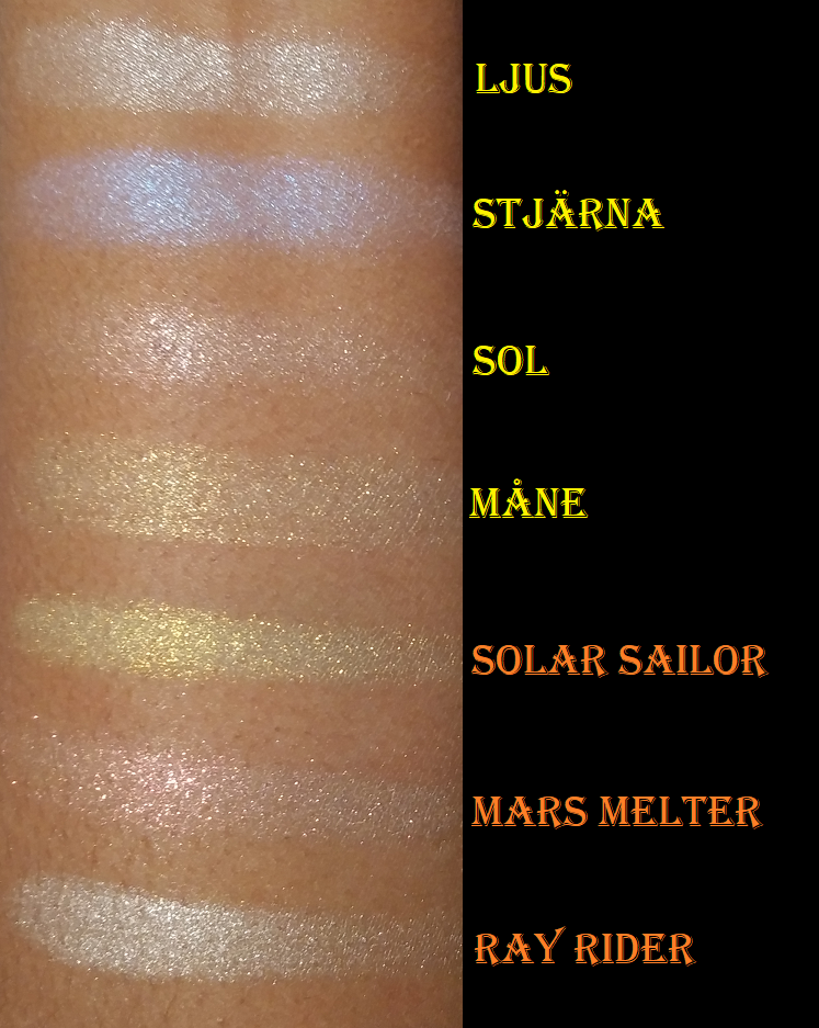
Not pictured above, but will be included in the rankings, is the Stone and Rock Palette.
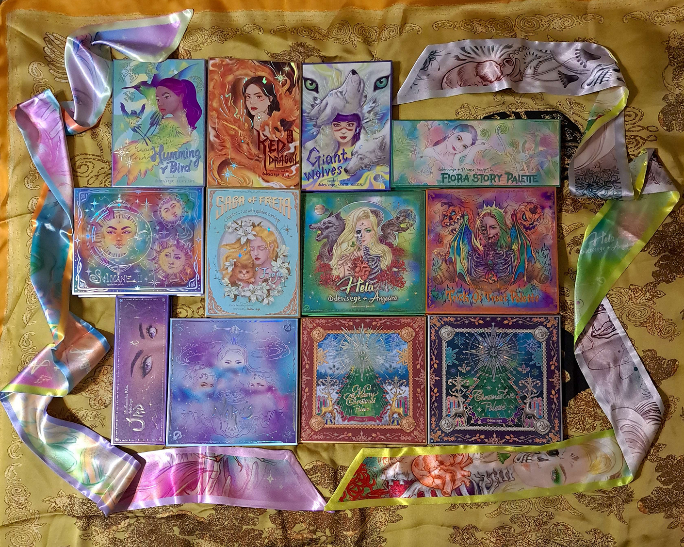
I unofficially started an eyeshadow ranking series for the brands whose palettes I own the most of in my collection. So far, I’ve done this with Pat Mcgrath Labs and Huda Beauty. Today, we’ll be doing it with one of my top ten favorite eyeshadow brands: Oden’s Eye.
From Best to “Worst” the ranking is as follows:
- Merry Christmas
- Red Dragon
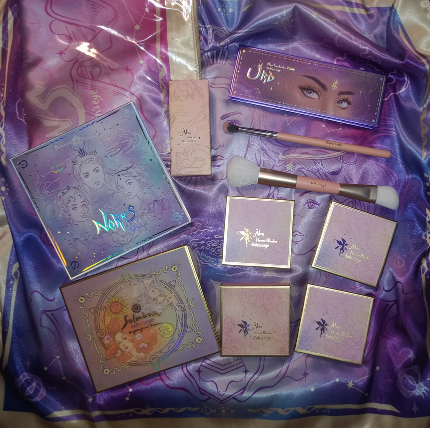
- Urd
- Christmas Eve
- Norn’s
- Hela
- Hummingbird
- Giant Wolves
- Flora Story
- Trick or Treat
- Stone and Rock
- Solmane II
- Cat’s Breath
Each of the thirteen above (excluding #11) are linked to their previous reviews. I did many eyeshadow looks already, so anyone looking for that kind of inspiration specifically can click there.
I’d also like to note that even though there has to be something that falls in the worst category, the quality of these palettes is so good that I don’t hate any of them. #13 is there purely for preference reasons, and if I had to assign a grade for #12 in the USA grading system, it would be within the B- range, which is still quite good.
Disclosure: I am not affiliated with this brand/company. All opinions are my own and every palette was purchased by me with my own money. The links in this specific post are regular non-affiliated ones.
Top Three
I mentioned in my October 2022 low buy series what my top four were, and my thoughts haven’t changed. For a while, numbers one and two were nearly tied, but by now I have solidified my opinion on how they rate for me.
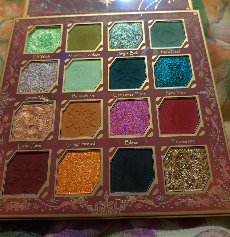
Merry Christmas Palette (Original Release Holiday 2022)
Because I typically use this palette in conjunction with Clionadh singles, I didn’t have many eye looks showcasing using this palette by itself, so I decided to add some here.
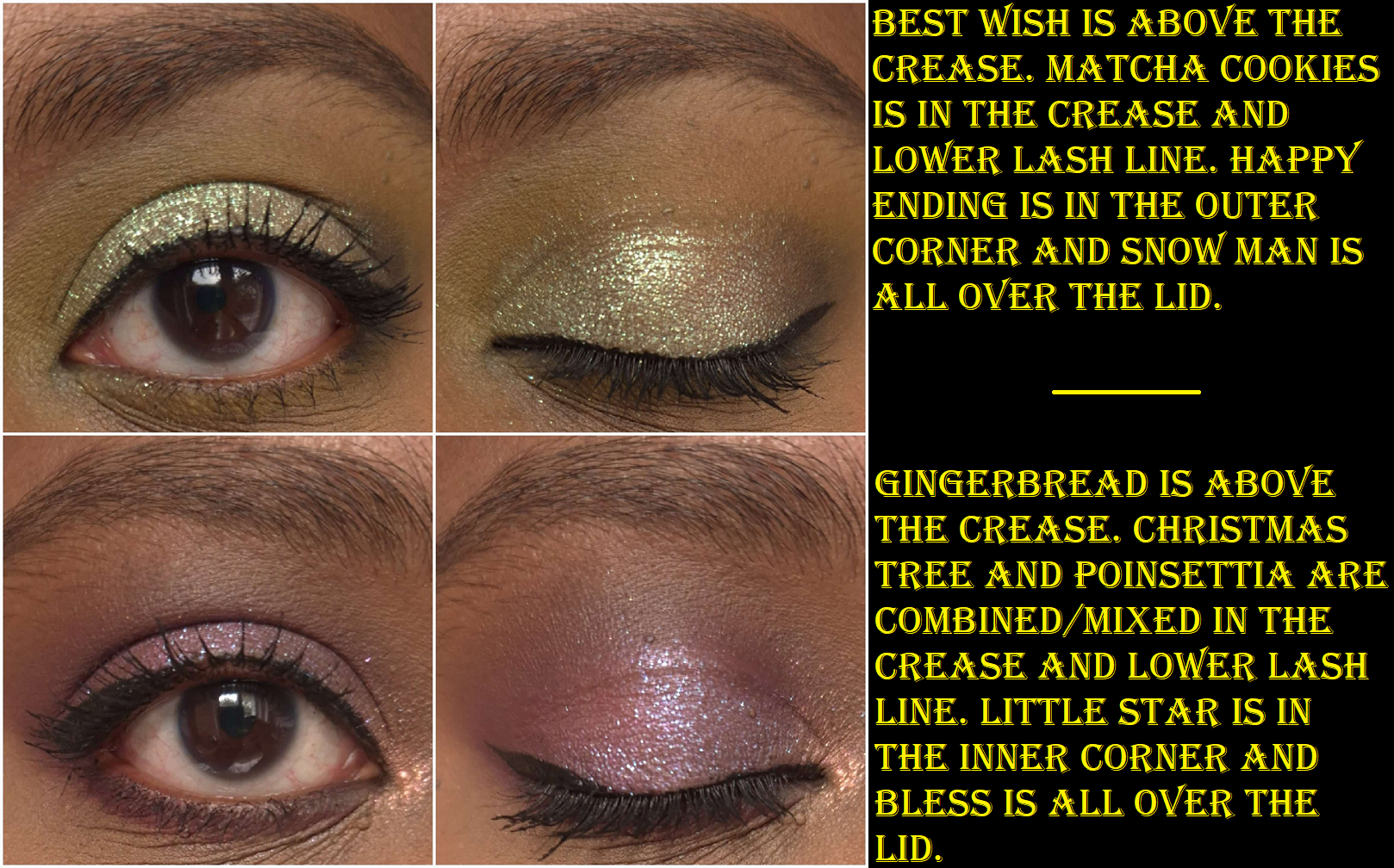
Looking at the state of my palette, it’s clear that I reach for specific shades mainly: the entire first row, Snow Man, Best Wish, Little Star, Gingerbread, Happy Ending, and Santa Star. The greens, duochromes, and neutrals in here allow me to create some of my all time favorite looks. Colors like Best Wish aren’t prevalent in my collection, so I have some unique options, and the palette layout’s color combinations inspire me. In addition, this is the brand’s best quality with no duds. The number of times the brand had to bring this and the Christmas Eve palette back is a testament to how good they are and why they’re so sought after.
In the purple eye look photo, you’ll notice I have a purple matte in the crease that I created using a blue and red shadow. That’s one of the things I love about Oden’s Eye, that their shadows are so blendable and layer well with each other, that I can do certain tricks to get even more use out of this palette. I really can’t stress enough how much this palette inspires me and how often I think about using it, even while testing other palettes and wishing I could incorporate some of the shades into whatever eye look I’m creating at the time.
I don’t think I ever want to have to rank my entire eyeshadow collection, but I know that if I did, this palette would place within the top ten. I don’t know where exactly it would fall on that list, but it would be somewhere among the cream of the crop!
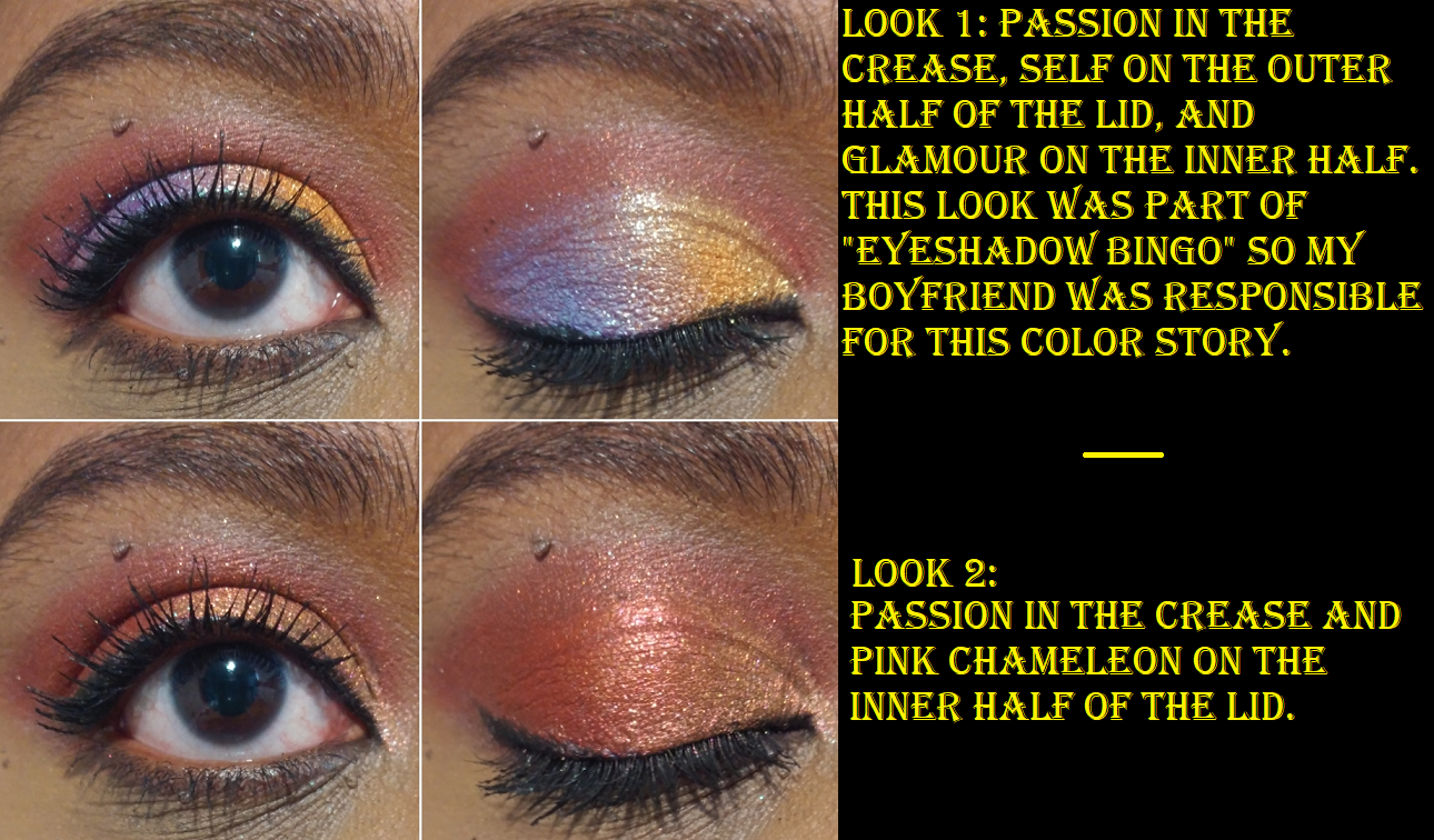
Red Dragon (Legendary Diversa Group 1 Round 1 w/Judy)
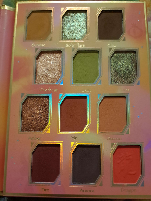
Considering the number of beautiful greens, neutrals, and specialness of the duochromes that make up this palette, it’s no surprise why this was such a close contender for first place. I don’t care so much for Fire or Dragon, but everything else is a color I continually reach into this palette for. I’m a colorful eyeshadow lover at heart, and this palette gives me soft and more toned down colors than the Merry Christmas palette, which is why it took second place. It’s my dream version of a neutral palette, but slightly less inspiring. I can name a lot of other neutral palettes (or neutral palettes with pops of color) that I love, so it’s the shimmers in particular that helps this one stand out from the pack. Solar Flare is a particularly stunning shadow, and I really like Luna as well.
The quality is once again top notch. It’s not a perfectly performing palette since Aurora is still hard to layer with the other shadows and if I don’t want the look to be too soft, it takes some time building up the mid-tone shades. However, softness is a preference thing which could make the palette closer to perfection for someone else than it was for me.
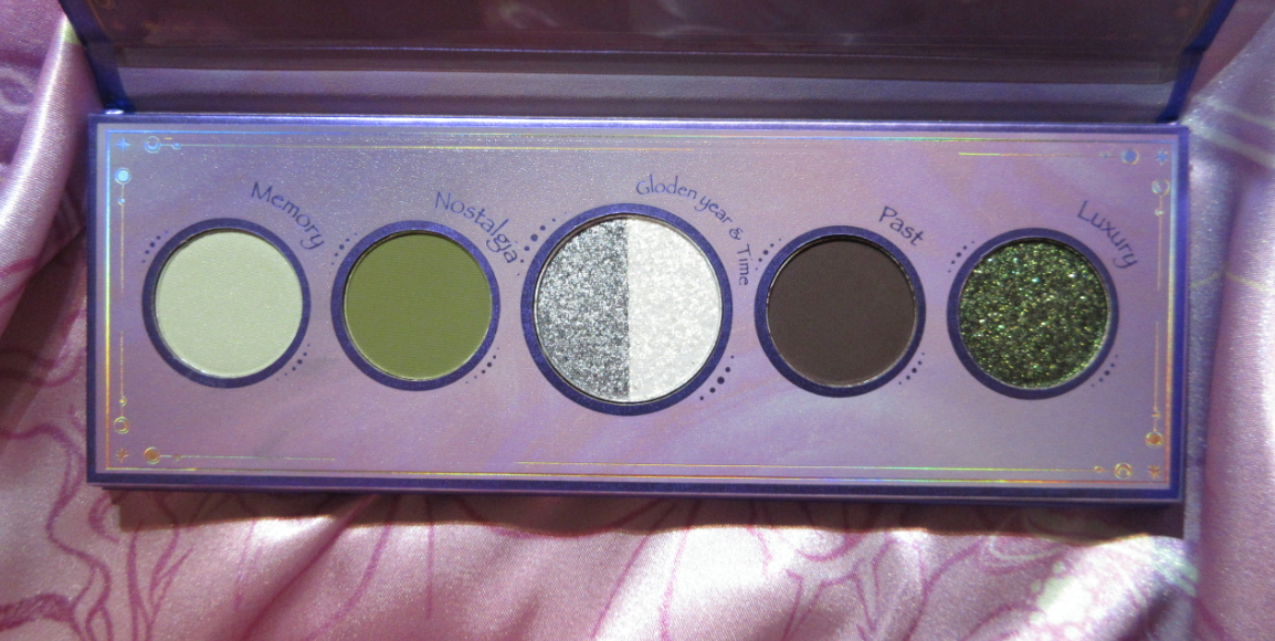
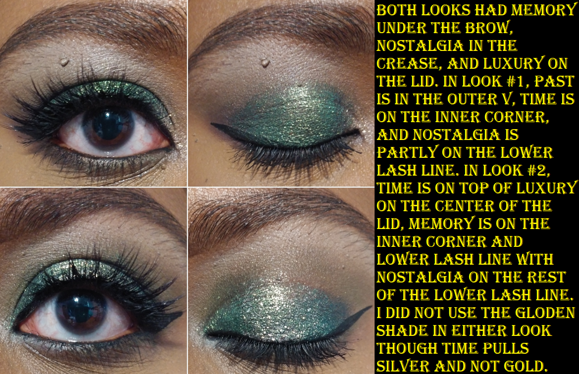
The Urd Mini Palette (Norn’s Collection)
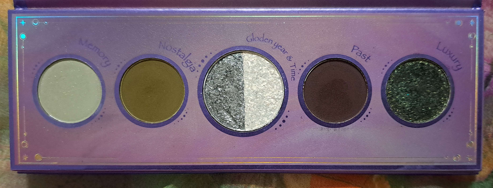
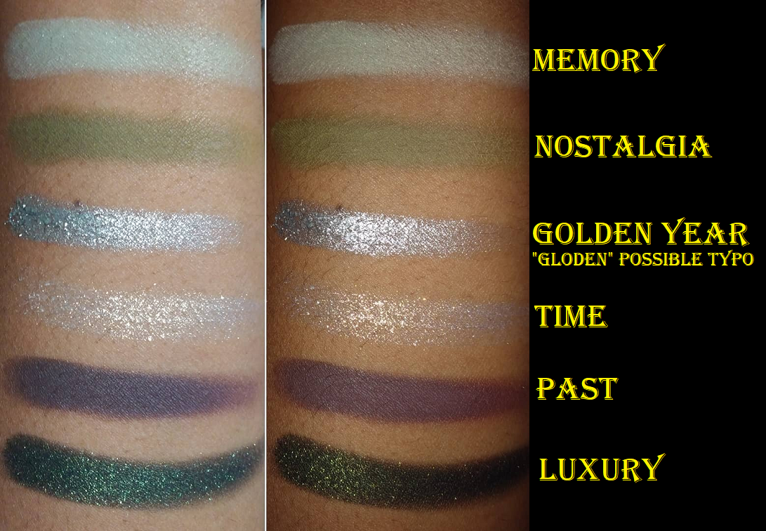
Following the theme, I love greens and I like having a neutral shade in the crease or to deepen up/add smokiness to the look (which is fulfilled by Past). This is why this palette is in third place. I love the shimmer level of Luxury and the tone of that dark green. Nostalgia is the kind of murky green I like, similar to Matcha Cookies in the Merry Christmas Palette and Jade from Red Dragon. I’m not usually one who likes pastels, but Memory works well. I rarely use the shades in the center, but they are additional options.
At one point, this was my most used Oden’s Eye palette that I enjoyed bringing along while traveling. This was my ultimate small mini green palette for years until it got upstaged by the Natasha Denona Mini Gold palette. Since I got Mini Gold, I rarely use Urd anymore.
Because I can technically get a similar look from the two previously discussed Oden’s Eye palettes, and those other ones have extra shade options, I had to rank them higher. Also, the quality of Urd is very good considering this is technically the brand’s “older” formula. Their newer formula is a bit softer and a touch easier to blend.
Christmas Eve (Original Release Holiday 2022)
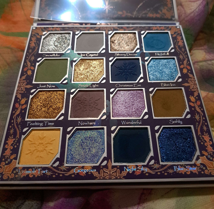
At first glance, this doesn’t look like the kind of palette I should like because of the number of cool toned shadows, especially the blues. However, something about the arrangement of the colors is very inspiring. It still has a green and some neutrals to appeal to me, but it also has those stunning golds and purples. This is the palette I think of in the rare instance that I actually want to incorporate some blue into my looks because I’m more likely to use deep blue or duochromatic ones, both of which this palette has to offer. When I feel like I’m wearing too much of the same look, I have this palette to break me out of that.
Again, the quality of this and the Merry Christmas palette have yet to be topped by any other Oden’s Eye palette. This is why, despite it not being my usual preference in colors, it deserves to be in the highest percentile for the quality. Because I use the Natasha Denona Mini Gold palette more than the Urd palette, it left room for Christmas Eve to be more used by now than Urd!
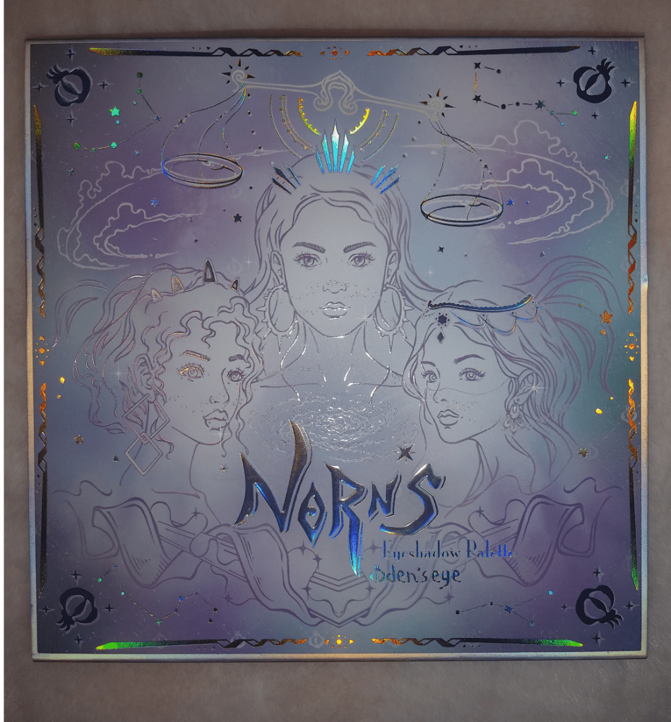
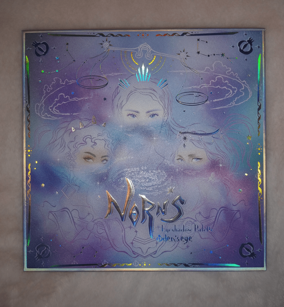
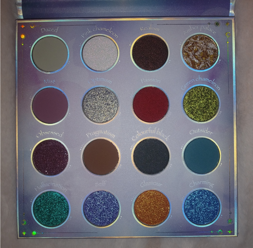
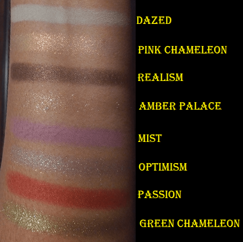
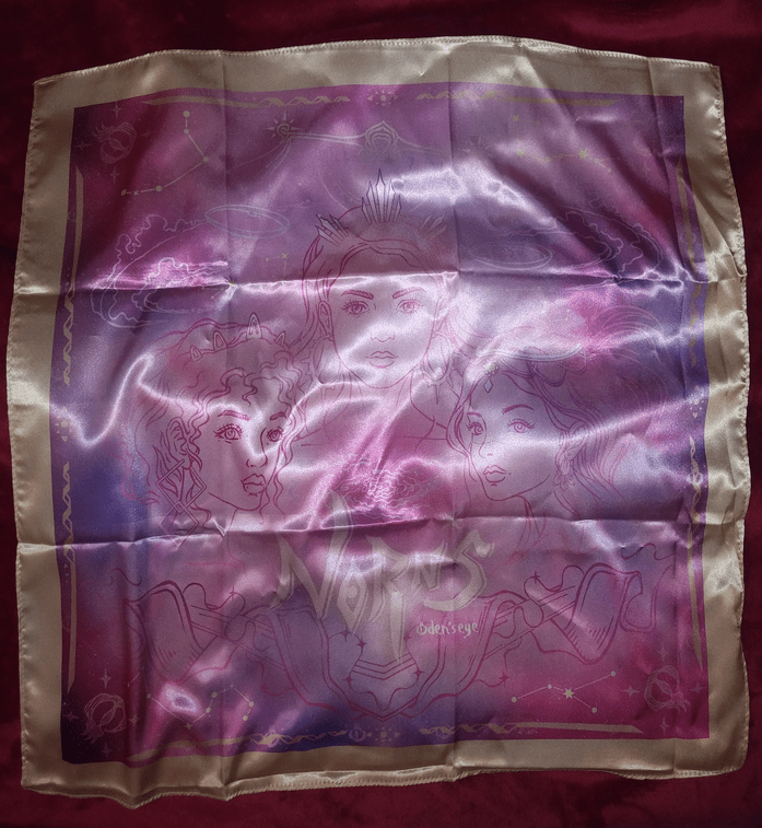
Norn’s (Norn’s Collection)
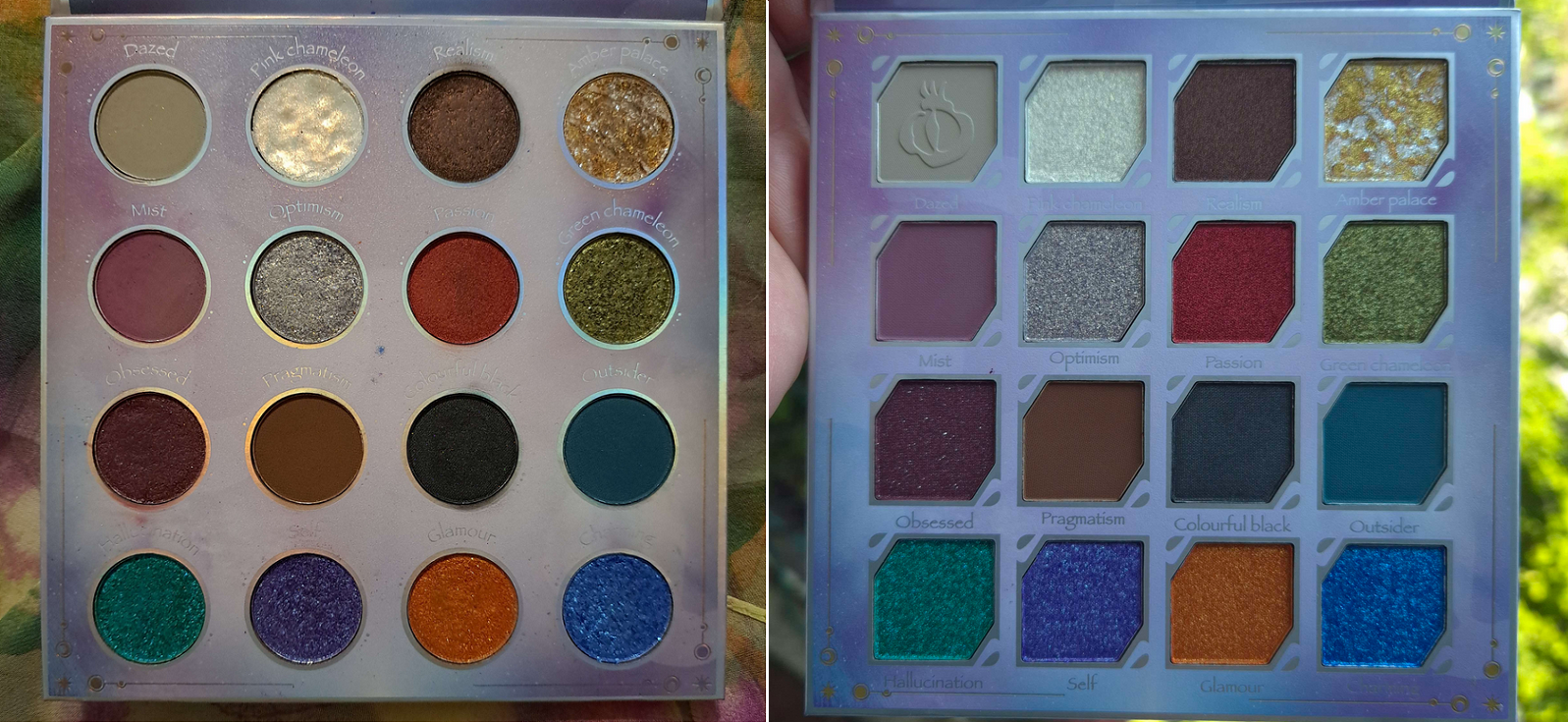
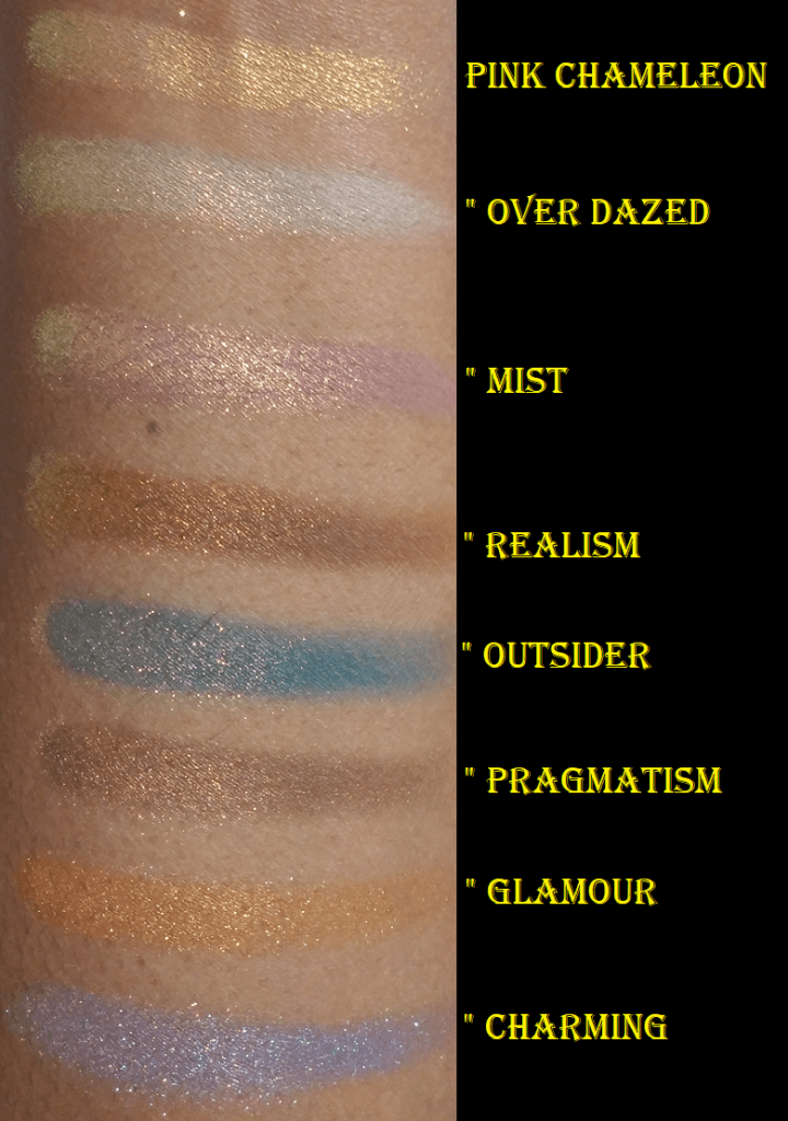
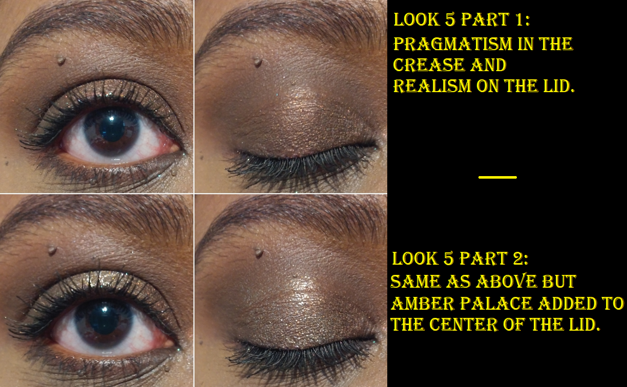
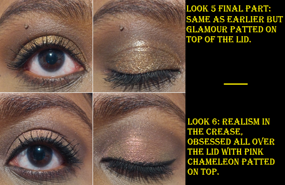
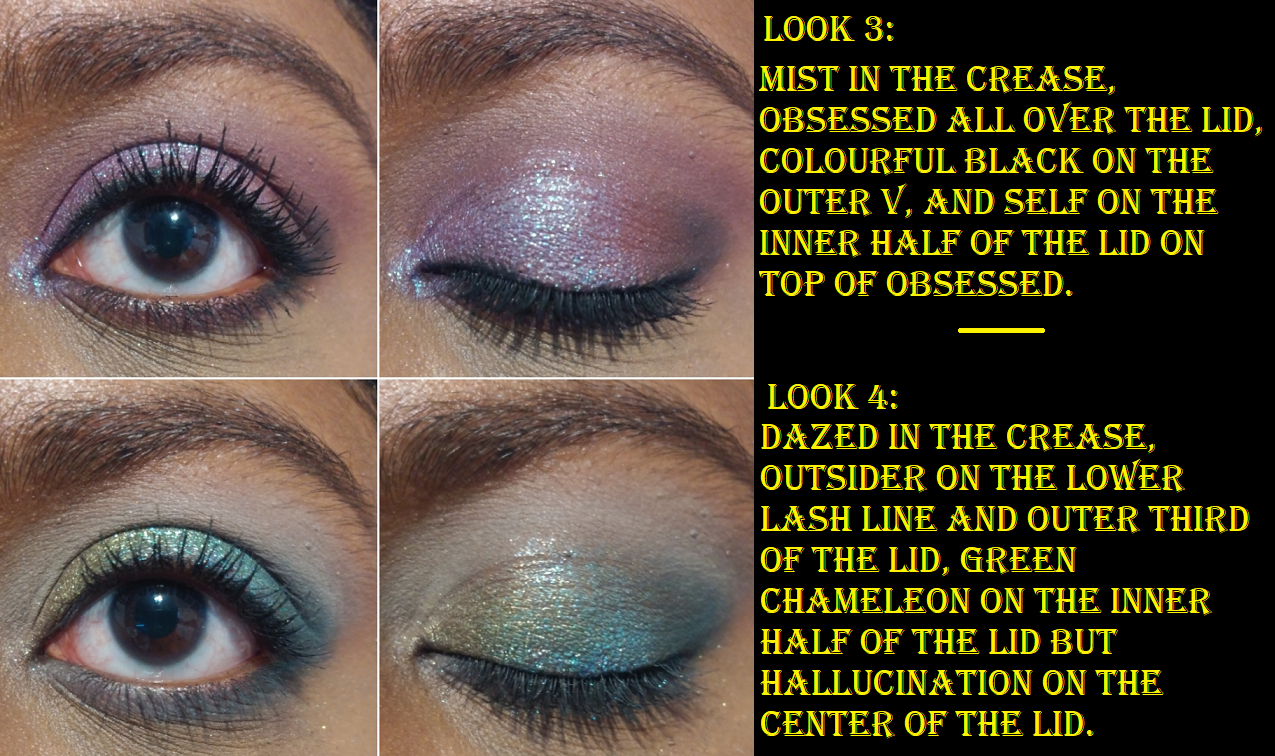
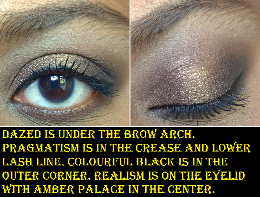
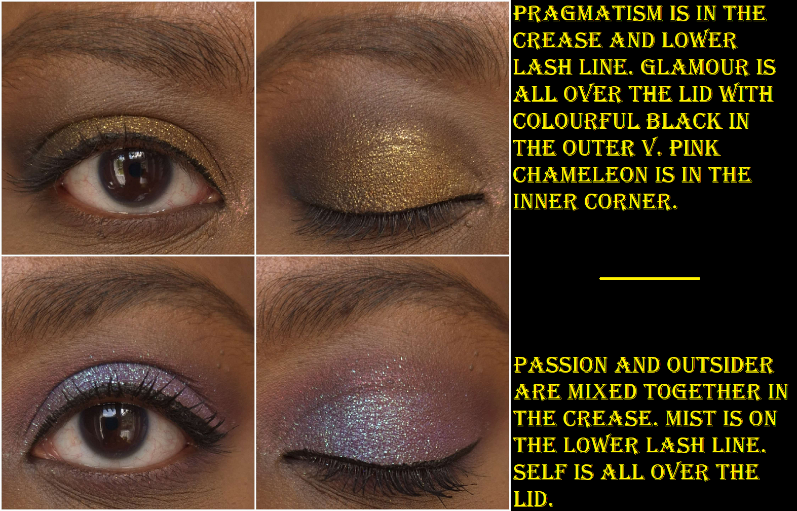
This is a bit nostalgic because it’s the color story that enticed me to try Oden’s Eye products in the first place. It’s no surprise that I like it considering the whole bottom row of duochromes, it having Pink Chameleon as a multichrome, there being greens, purples, and neutrals. It has so much of what I love, which is ironically a partial hindrance. It’s easy enough to mix colors with neutrals, but if I want to use two different color families or a two-tone look, these colors don’t all go together. I’ve done blue-purple looks and red-orange looks, which sound like they should work, but I didn’t like how they turned out. In addition, even though there are many colors I like, if I want to do a monochrome look there aren’t enough purples to complete it the way I would want it to look (unless I do some mixing like the photos seen below). For my green looks, I’m missing a midtone green shade. As sparkly and pretty as Amber Palace is, I’d prefer a smoother and less flaky gold shadow so I could use it in my inner corner. So, I love the colors and it’s a good quality palette, but it is a bit challenging to think up cohesive looks in the beginning. By now, I’ve used it enough times that I have my go-to looks for this palette.
Also, even though it doesn’t look the most used, it’s simply a matter of needing to test other palettes and being unable to use this more due to time restraints. This is not a palette I’ve ever forgotten and at least every few months I say to myself, “I should use Norn’s again.” For all these reasons, it had to rank highly.
I even bought the updated formula so I could have it here when I moved! That’s why I chose to do eye looks below in order to test the quality and make sure that I liked it as much as the old one, if not better. Thankfully, it is a little bit of an upgrade, though Outsider is still not the easiest to blend.
Hela (Oden’s Eye x Angelica Nyqvist Round 1)
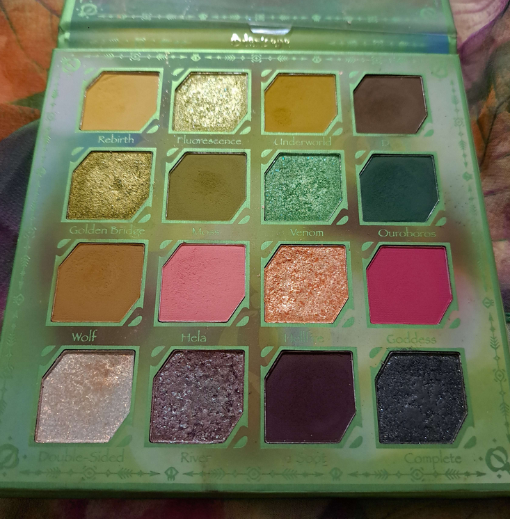
This palette has greens, but they lean a lot more yellow or blue toned than standard greens, which makes them less my preference. However, they’re still pretty. Goddess is a shade I rarely use, but in combination with the other shades, I’ve been able to make some really pretty looks. This color story makes me think partly outside the box and partly within my comfort zone, which I can at times appreciate. Angie intended for Hela to benefit both color and neutral lover’s alike, and I think she succeeded in that. It explains why this palette appeals to me so much, though I can get intimidated by the color story and sometimes don’t want to rise to the challenge in coming up with a look. The quality is fantastic, but because it’s 50/50 whether I want to use this palette or reach for another one instead, it’s place in the middle of the pack seems about right.
Hummingbird (Legendary Diversa Group 1 Round 1 w/Tina)
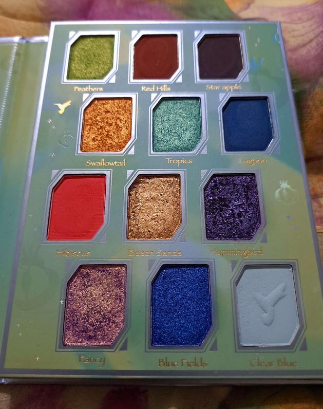
Visually, this palette stands out the most and is what I consider the “fun” one. It’s colorful and tropical with that beautiful multichrome called Fancy. I don’t choose this palette as often as the others because a fourth of these shades are blues, which I rarely use, and I don’t like how the Star Apple shade is formulated and looks on my eyes. It’s the only eyeshadow that is time consuming to blend, whereas all the other shades are really great quality. While I appreciate the vibrancy of the shadows, it’s hard for me to use this as a standalone palette. This is a major factor as to how I like it so much, and why I recall it so fondly in my memory, yet it still managed to rank at 7th place. I think a palette like this is useful to have in one’s collection, even as a companion palette. However, if I’m ranking things based on each palette’s own merits, I can’t position it any higher.
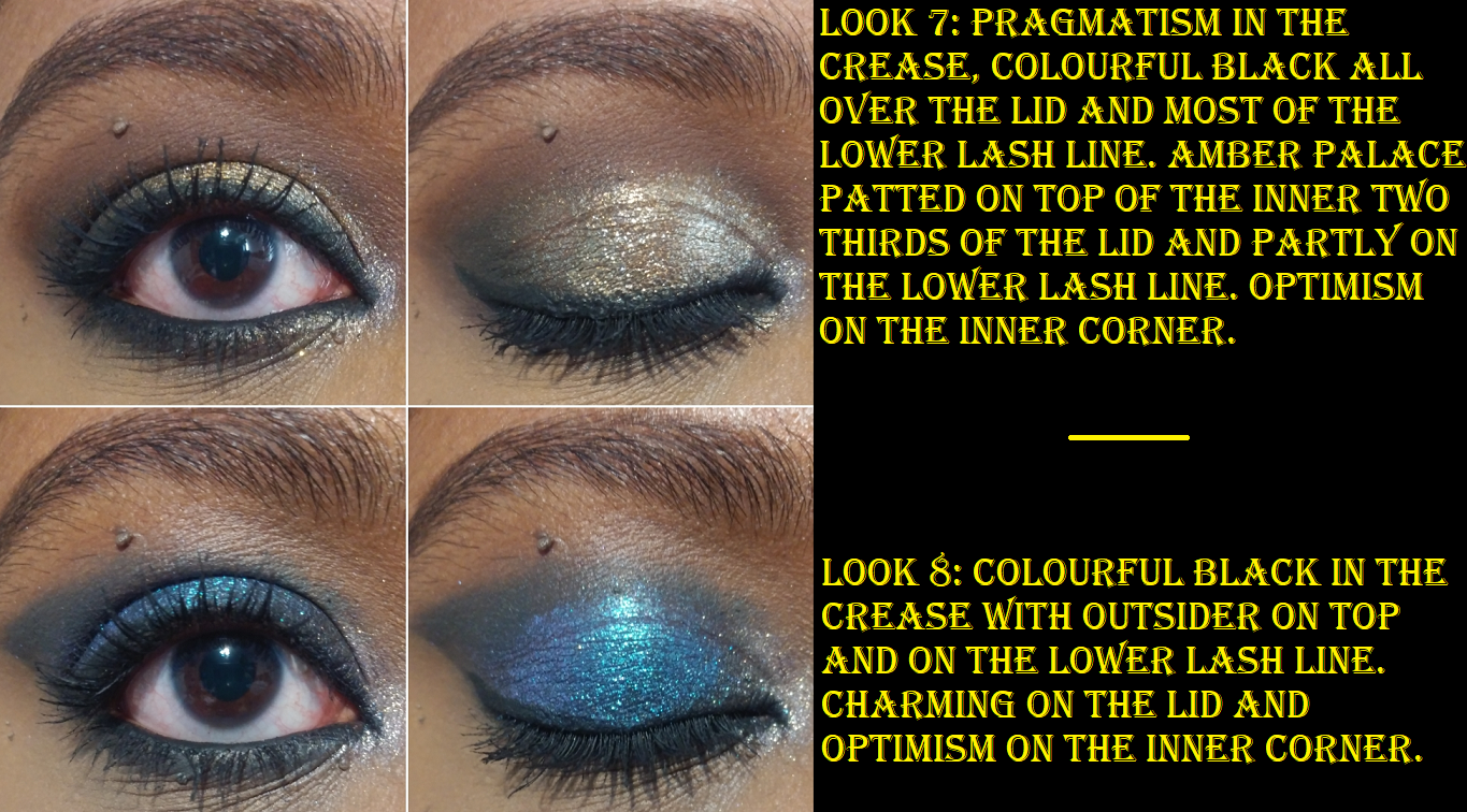
Giant Wolves (Legendary Diversa Group 1 Round 1 w/Annette)
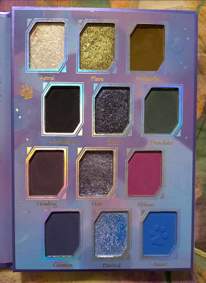
To this day, I still have mixed feelings about this palette. The quality is fantastic, minus Hati which was the shade that needed to be repressed because it was impossible to get product out of that pan. This color story is appealing to me visually, but not as much to actually use. I’ve been able to make interesting and pretty looks in the past, but they’re a bit edgier than I’m into now. The top row and Desolate are the main reasons I reach for this palette, but I just keep using Merry Christmas or Red Dragon’s greens instead and forget I also have green options in this one. If I want a bright pink, I reach for the Hela palette instead of Ablaze. I don’t want those blues in the bottom row and I have plenty of grungy greens like Antipode by now.
The first four shades in this palette are similar to what’s in the Stone and Rock palette, but I can at least say I’d choose to use Giant Wolves’ version over Stone and Rock. I still like Desolate more than Cheer, and Sköll is like a way more exciting version of Splendid as a deep plummy blue-purple duochrome rather than dark gunmetal.
So, although this palette is a little less unique, it’s still different enough to be worth keeping. I don’t think I’ll be getting much more use out of the palette, but I’m not ready to give up on it just yet.
Flora Story (Legendary Diversa Group 2 Round 1 w/Amanda)
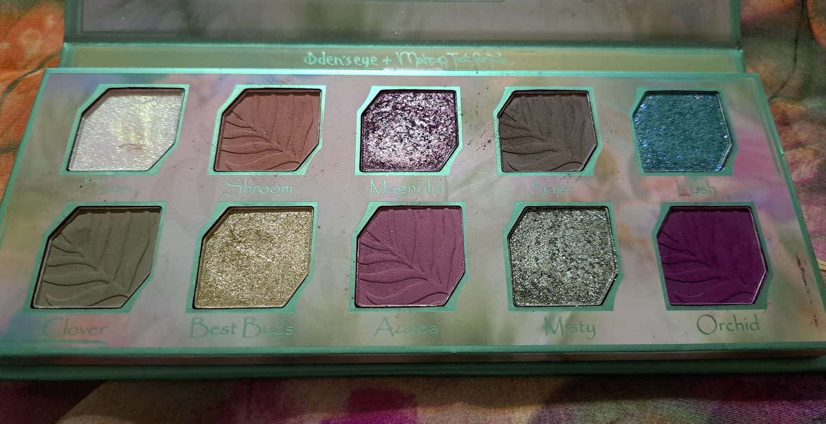
The eyeshadows in this palette feel a little different from the brands other eyeshadow formulas I’m used to, and this could be at the request of Amanda/MakeupJustForFun who Oden’s Eye collaborated with on this palette. I discussed this palette and each shade at great length in the original review. To sum it up, this palette is full of soft tones that are still pigmented. The textures are a bit different, the two matte greens look similar on my eyes, and Orchid isn’t formulated in the way that I’d like in terms of how it appears on the eyes.
As I started working on this blog draft, I realized that the eye looks I created in the Merry Christmas palette are just a warmer version of the looks I created for my Flora Story review. One of the things I praised this palette for in the past is that it added something different to my Oden’s Eye collection, but since I figured out how to recreate those looks, it dropped down to 9th place. I also would have said I’d keep reaching for this palette in the future, but I have my doubts now. I don’t think I’ll be bringing it back to Germany with me.
Trick or Treat (Oden’s Eye x Angelica Nyqvist Round 2)
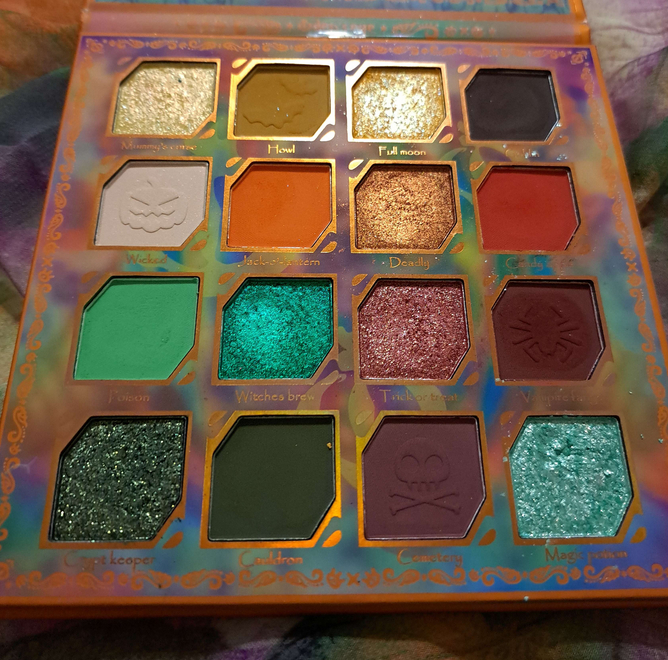
This is a nice performing palette, even better quality (in my opinion) than the Flora Story palette. The only reason it’s ranking this low is because the colors I like in here are close to some of the shades in the Merry Christmas palette, but in the tones I prefer less. Because I have the Merry Christmas palette in a color scheme more my style, I will reach for that over this one every single time which makes this almost pointless to have in my collection. Admittedly, I wanted it for the palette artwork on the cover, plus to support Angie after certain individuals were being unnecessarily mean rather than constructive about this holiday release. I won’t get into it here as I harped on it quite a bit in my original review. There are some pretty shades in here, but I’m more confused rather than inspired by this color story. Since I prefer the Merry Christmas palette, I don’t see myself using this again unless something happens to my Luxury shade from the Urd palette. Then Crypt Keeper could be a substitute.
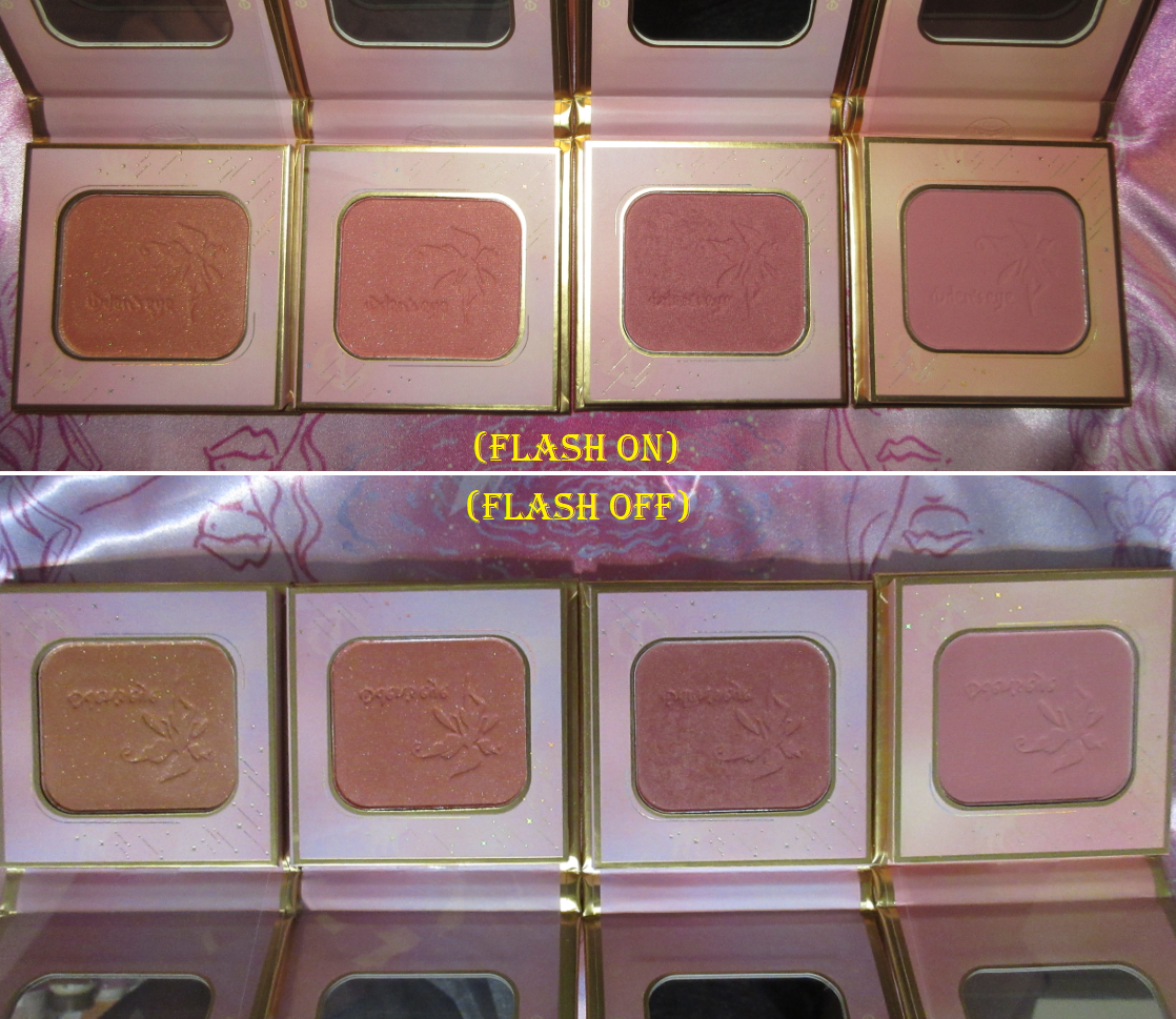
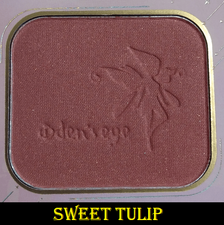
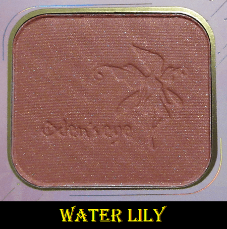
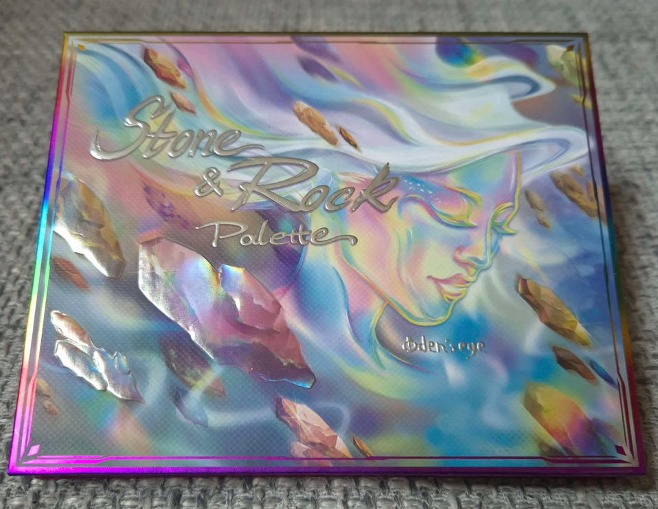
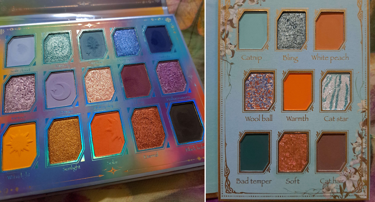
Stone and Rock Palette
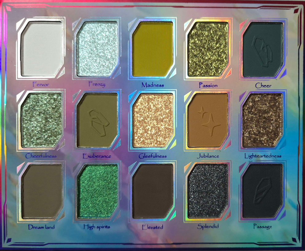
There are so many Oden’s Eye palettes with phenomenal greens in them, which is why I only allowed myself to purchase this one if it went on sale during Black Friday (which it did and so I had it shipped to Germany). I thought that this would become my go-to green palette, but once I saw how they looked on my skin, I realized these aren’t the tones of greens that I love.
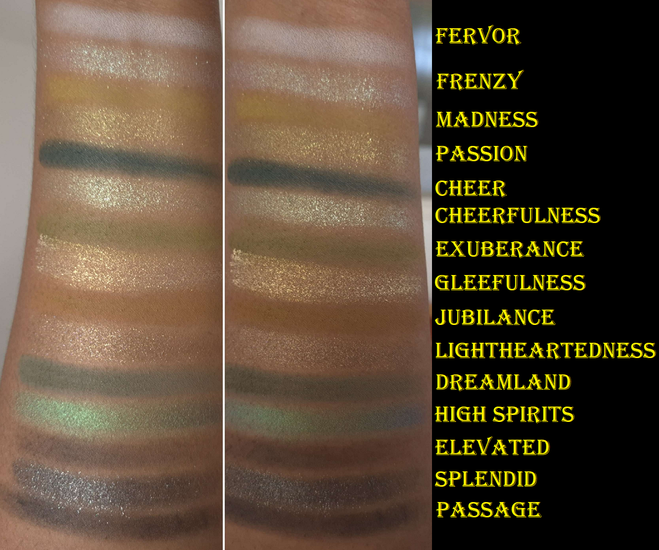
Madness, Exuberance, and High Spirits are right up my alley. I still have to build up Madness quite a bit for it to be visible though. Cheer, Dreamland, and Frenzy make a nice combination as they share a blue undertone, but as I mentioned countless times that isn’t my preference. Frenzy needed to be applied damp in order to get on my eyes smoothly, and Cheer is a dark blue-green that’s easy to blend unlike Outsider from the Norn’s palette. Jubilance is pretty, but blends in too much with my skin tone. Gleefulness is beautiful in tone, but it’s not my favorite to use because it’s so flaky (and strangely wet feeling in the pan compared to the other shimmers). Passion is slightly smoother, but still a little flaky. Cheerfulness looks light green in the pan, but the tone is more blue than I expected! It’s a smooth shimmer, but with some shimmer particles that are randomly bigger than the others. I didn’t need to apply Cheerfulness or Lightheartedness damp, nor High Spirits which was bound to be different since it’s a multichrome. High Spirits is truly smooth in texture and reminds me of Clionadh’s Jeweled Lite multichromes (based on photos online). Splendid is more like a traditional shimmer. It’s not as fine in shimmer as High Spirits, but it’s not flaky like most of the others.
All of these shimmers have the amount of sparkle I like, but the downside for me is that they’re sheer. I can see my skin from beneath them unless I put a matte shade on the lid first. I tend to not like shimmer topper eyeshadows, and though these aren’t technically “toppers,” they’re still less opaque than I want. I also don’t get a strong enough green tone in them, considering this is a green palette, unless I put High Spirits on top.
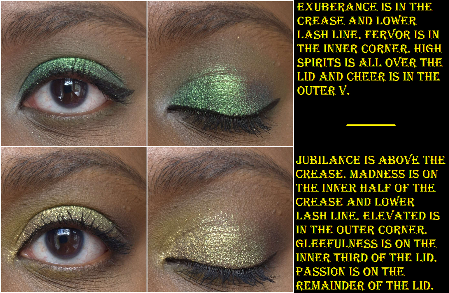
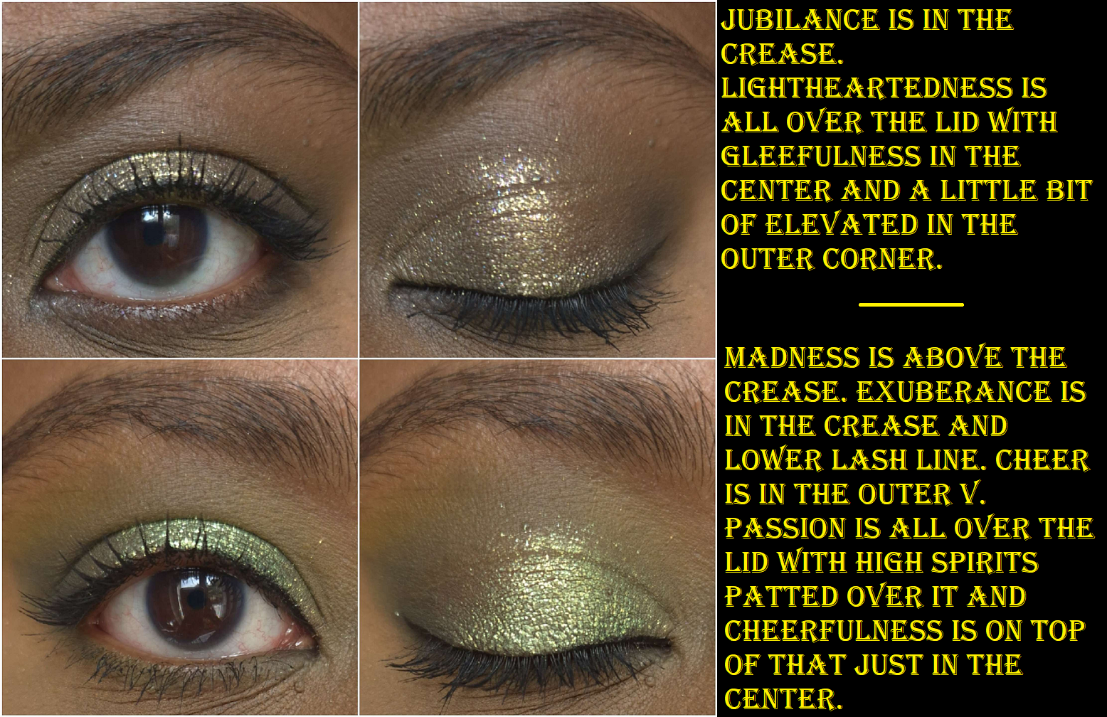
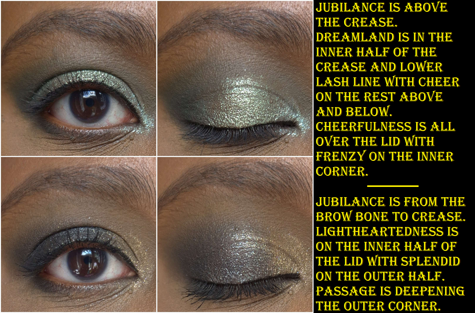
I like that there are neutrals in here and a gradient of options from light, medium, to dark. That makes it a cohesive palette. This palette leans more cool than warm, which is not my favorite choice, but I’m sure many people would love that aspect. Elevated works nicely as a deepening shade, which I prefer over Passage. Black shadows can be tricky to find a balance between making an impact, but being buildable so it doesn’t immediately overpower a look. Passage isn’t the best, but it’s not the worst either.
Since this palette is said to be “richly pigmented” but also can be “…soft and natural,” I’m going to assume the sheerer shimmers was an intentional choice and not a downgrade in quality. The overall performance is pretty good, but I couldn’t help feeling disappointed by my own mistake of not realizing this color story of greens is intended for cool toned green lovers and not me. Among my entire eyeshadow collection, this would probably fall in the middle. It’s only because there’s such tough competition among the Oden’s Eye offerings that it landed this far down.
The Bottom Two
Solmane II is an admittedly very pretty color story. The pastels work well for me, which isn’t easy to accomplish on those with dark skin. However, I’m still not the biggest fan of wearing blues on my eyes, so the entire first row is a miss for me. The darkest shades in this palette are a little harder to blend than the usual Oden’s Eye quality I’m used to, but they get a passing grade. I like warm purples rather than cool purples, so even the middle row isn’t my favorite. Ironically, the oranges are my favorite aspect of this palette. It’s ironic because Oden’s Eye tends to do too straightforward of oranges for my taste, without much nuance, yet this is the palette in which I think they did oranges better. So, because the quality is alright (rather than fantastic) and the color story isn’t fully my preference, this is why it’s nearly last in my collection. I still don’t think it’s a bad palette, and if someone wanted to buy it, I wouldn’t dissuade them. I’ve certainly had worse from other brands. This one just isn’t for me and I don’t plan to use it again.
Cat’s Breath is in the bottom because I just cannot get myself to use this palette! I’ve only done a few looks with it and didn’t even complete a wear test because I didn’t like how they turned out. We’ve got the blue, a pastel, light cool toned silvery shimmers, and a standard orange: all things I dislike for eyeshadow colors. White Peach and Cat Hair are the only two colors I like, but Cat Hair is a tone of brown that doesn’t show on my eyelids. So, I haven’t been motivated to give this a thorough testing despite owning it for well over a year by now. I just wanted it for the adorable art design. This palette is also in Oden’s Eye’s older formula. It’s discontinued, so I especially don’t feel a reason to properly test this palette. It’s a collection piece and nothing more, which is why I had to mark it last.
And that is the end of this ranking post! If I was forced to do some spring cleaning, I would keep everything in the top 8 and declutter the rest. Of those at the top, I still need to bring over Hela, Hummingbird, and Giant Wolves. If it wasn’t for the baggage weight limit, Hela at the very least would come with me in the move.
Thank you for reading!
-Lili ❤