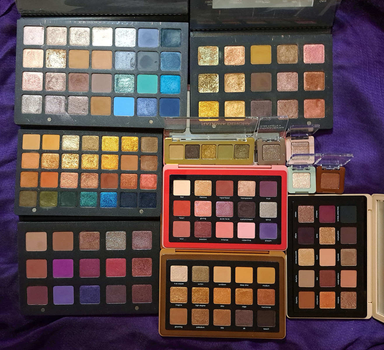
I took a long break from the Natasha Denona brand (since December 2022), but after purchasing the Yucca palette for half off, I wanted to continue my series of ranking all the eyeshadows from the brands whose palettes I own the most of in my collection. I’ve covered Pat Mcgrath Palettes, Huda Beauty Palettes, Oden’s Eye Palettes, and Viseart Palettes so far. Just like with Viseart, I’ve rearranged most of the palettes with removable eyeshadow pans. However, I’m familiar enough with them to be able to remember what they were like and rank them as they were originally intended.
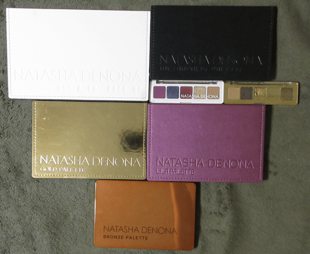
Ranking List of All the Natasha Denona Palettes I Ever Owned:
- Mini Gold Palette (also HERE)
- Metropolis Palette (also HERE)
- Glam Face Palette
- Gold Palette
- Bronze Palette
- My Dream Palette (cream to powders vs Lisa Eldridge HERE)
- Love Palette
- Yucca Palette
- Lila Palette
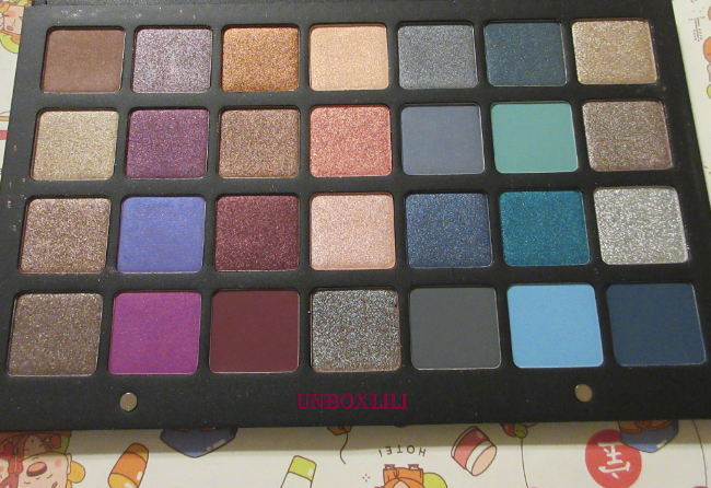
- 28 Purple Blue Palette (also HERE)
- Mini Lila Palette (also HERE)
- #04 5-pan Palette
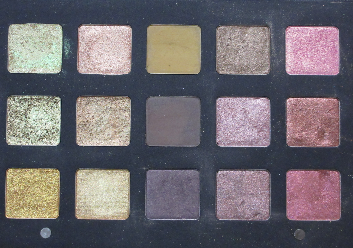
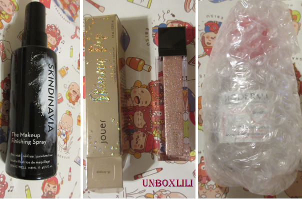
Before we get into the rankings, I wanted to show the eyeshadow singles I got as gift-with-purchase freebies I got from Sephora. I wish they weren’t glued down so I could put them in a custom magnetic palette to save some space when I moved. Because I couldn’t without using my Z-Potter, I left them behind.
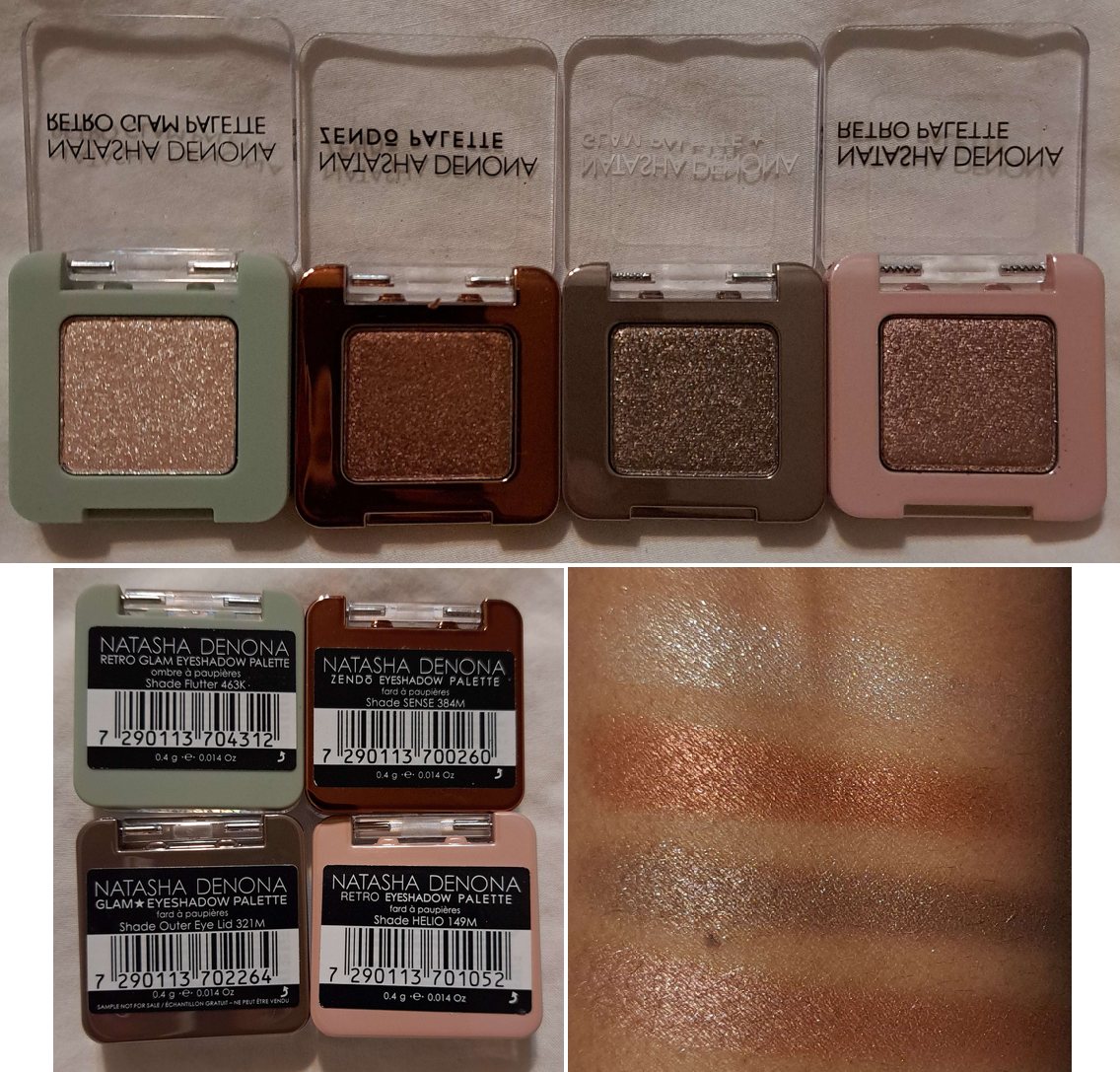
I didn’t own any of these shades already because they all come from palettes I was uninterested in buying.
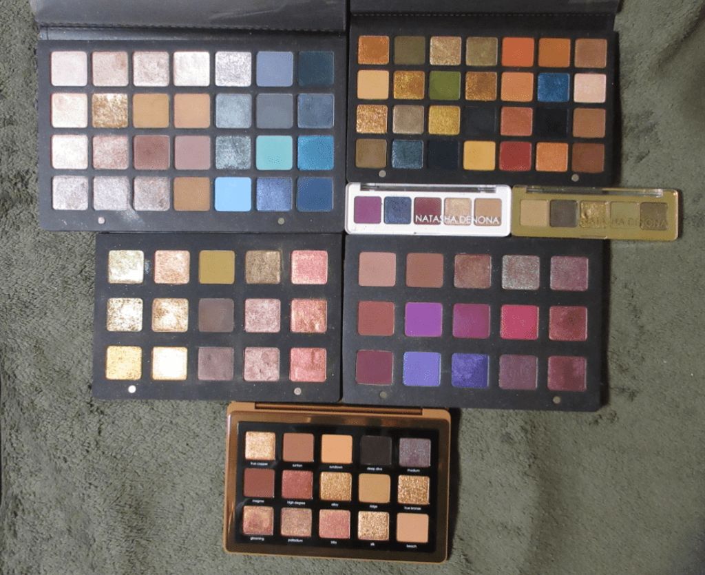
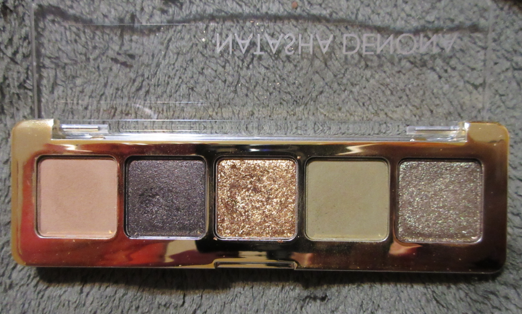
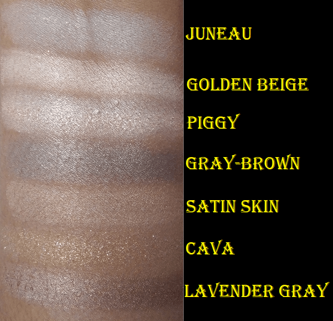
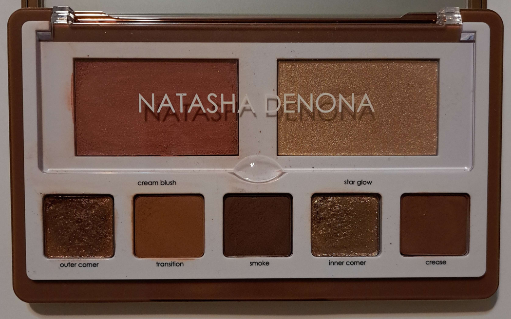
Mini Gold Palette
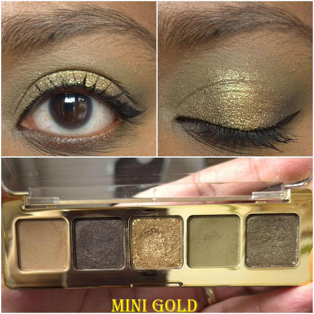
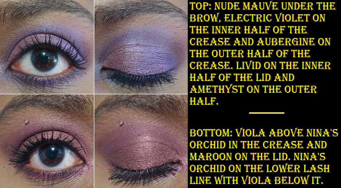
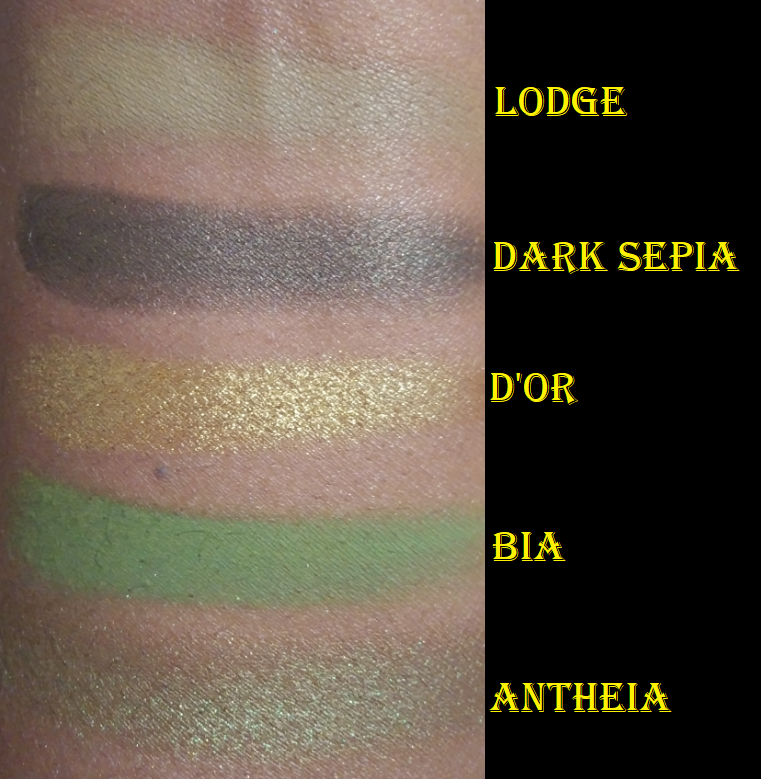
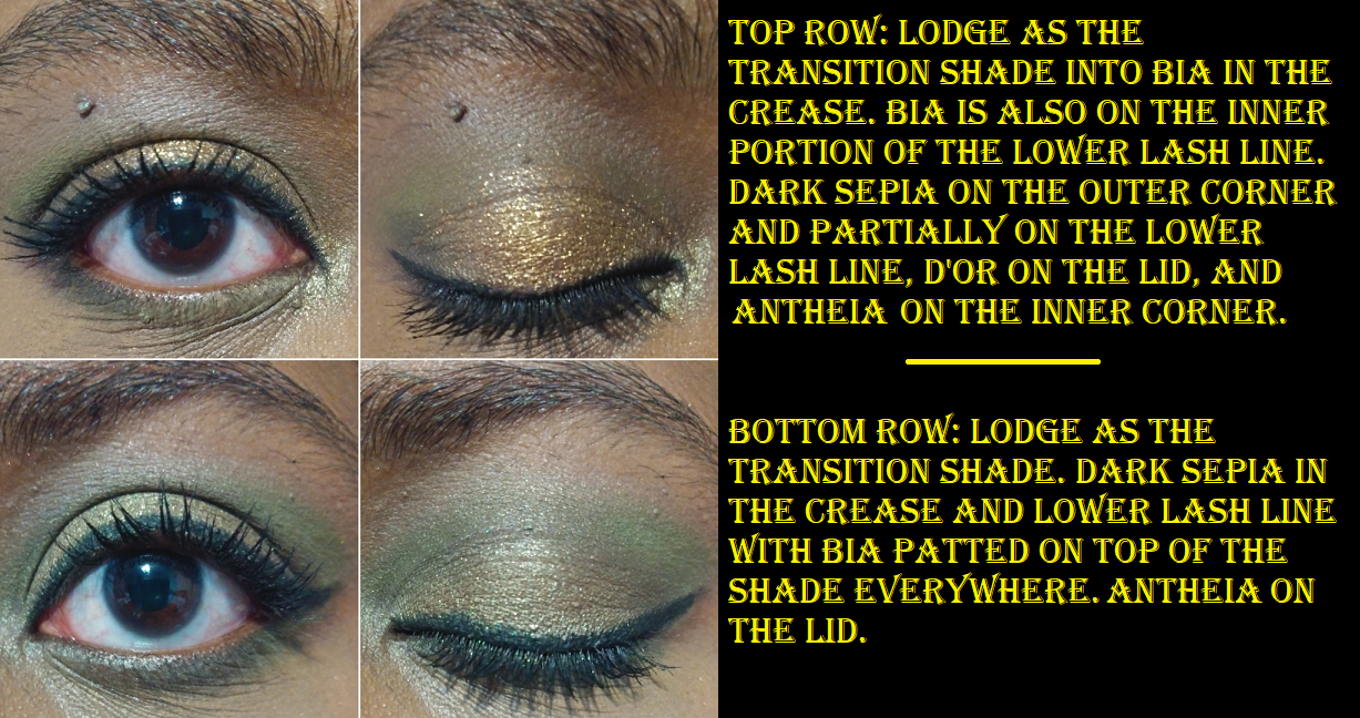
This is very much my type of color story! The beige shade doesn’t show very well on my skin tone, but I still use it along the brow bone. This palette is cohesive and the look I created in the photo above is my default combination for daytime. For night-time, I use a lot more of the deep brown. For so few shades in this small palette, I don’t feel limited by the available choices. They all still perform beautifully, even though this is five years old. The mattes blend well, Dark Sepia and Antheia are very smooth, and D’or pumps up the intensity from satin to sparkly when added to the look. I don’t need to apply any of them with a damp brush. The Natasha Denona formula has gone through its changes over the years, and the ones used in this palette is my favorite performing type from the brand. I also love that it’s small because it makes me feel like I could actually use this up one day. It doesn’t take up much space and is easy to travel with, which I have done several times. Other than making Lodge slightly lighter, the fact that I wouldn’t want to change this palette is why it’s number one!
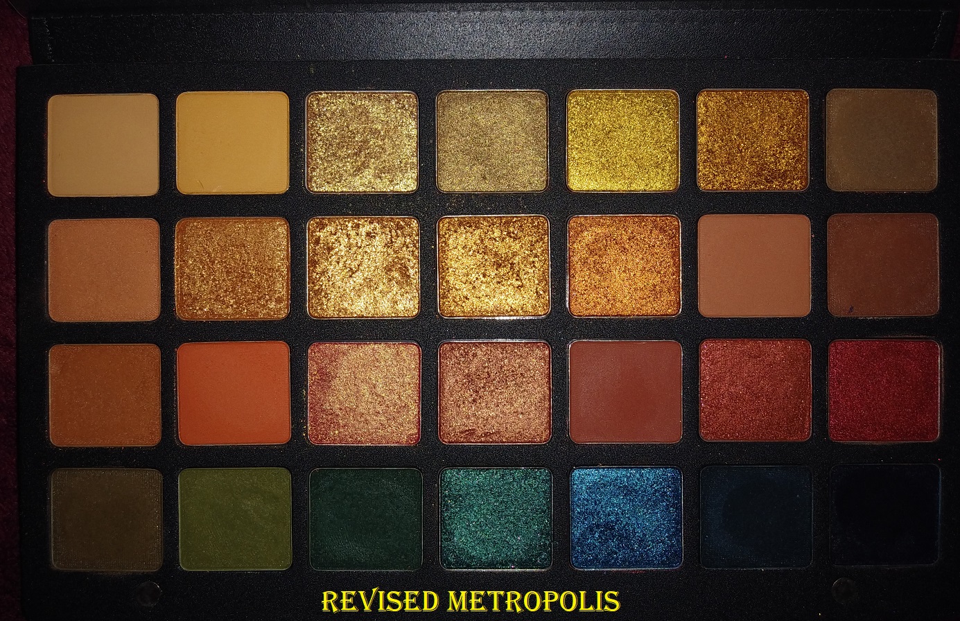
Metropolis Palette
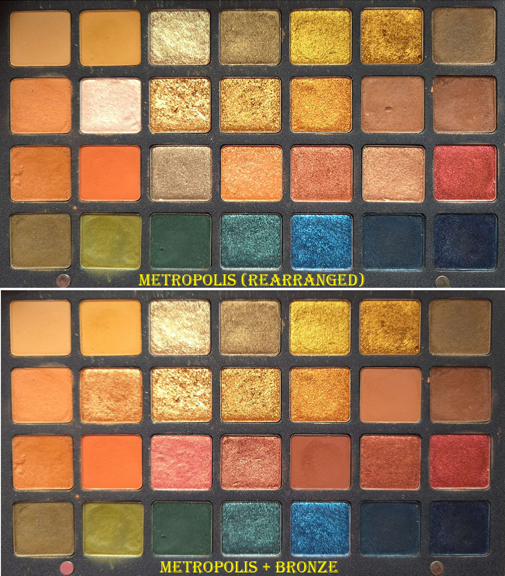
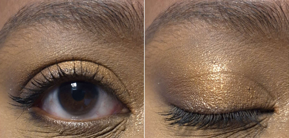
Other than Mini Gold, this is my next favorite color story from the brand. I have so many options, but I do end up with my favorite go-to looks as well. Although I replaced six of the shadows with ones from the Bronze palette, all that really did was give myself deeper orange and red shades. I essentially turned the Metropolis palette into something better suited for my skin tone.
This was the palette that ND seemed to have perfected the cream-to-powder shadows and my love for them really took off. They’re a few months short of five years old and still haven’t fully dried out. My lighter green and a brown shade require me to use my finger to get them out of the pan since they don’t pick up as well on most of my brushes, and one of the blues is nearly dry, but I still love this formula. I love the way it blends and looks on the eyes. It has a satin effect from sheen and not shimmer. The mattes and shimmers are perfect performers for my style. They’re pigmented, but still blendable. They’re smooth and nearly buttery feeling. They layer well on each other. The shimmers are impactful. They last all day. I don’t have creasing issues. To me, this is Natasha Denona’s best performing palette. The fact that I replaced some shades, and it doesn’t have something like Dark Sepia and Antheia (two of my all-time favorite colors from the brand), are the only reasons this ranks number 2. Realistically, it’s tied for the top spot.
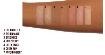
Glam Face Palette
Even though this isn’t strictly an eyeshadow palette, I had to include this in the rankings because I really enjoy these eyeshadows. The only reason I left this behind in the US, which I regret, is the fact that the pans are glued in so I couldn’t have the eyeshadows without the blush and highlighter. I don’t mind the blush, but I hate that highlighter, and I kept forgetting to use this because I didn’t keep this palette with the rest of my eyeshadows. If the eyeshadows were in their own separate palette, it would probably look as used as Mini Gold considering how much more often I’m reaching for neutral eyeshadows.
The formula of these is good, but different from Metropolis and Mini Gold. There are no cream to powders. The shimmers are intense, but slightly less smooth with larger size shimmer particles. They’ve got more slip, so I get a little bit of creasing, but not too much. The mattes are pigmented, but a little less easy to blend. They don’t require a lot of effort, just more than their best performing ones. The end result though is gorgeous, which is why I still consider this a favorite.
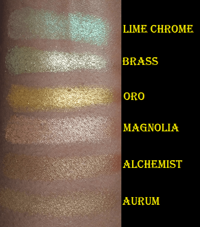
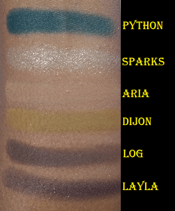
Gold Palette
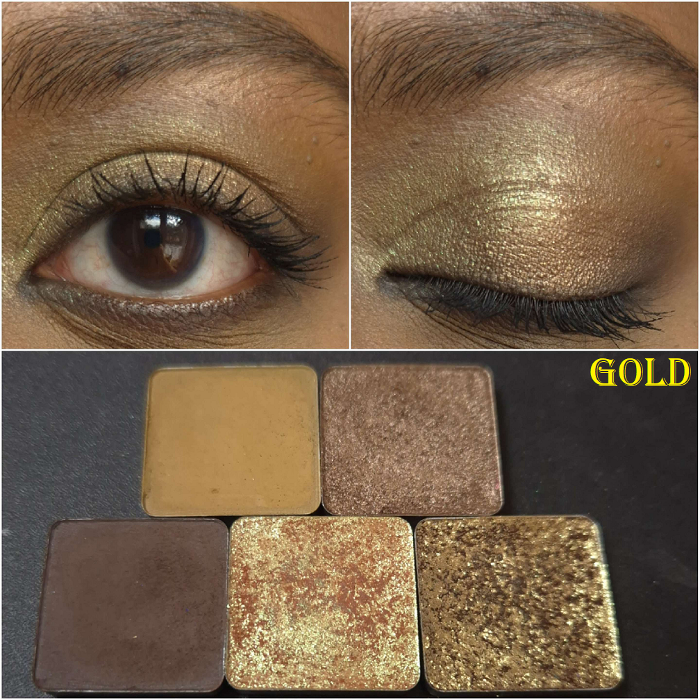
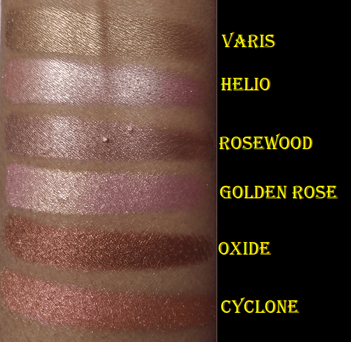
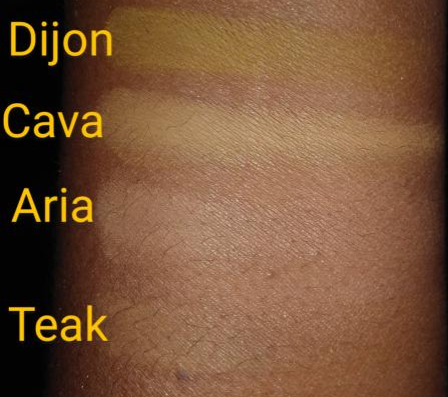
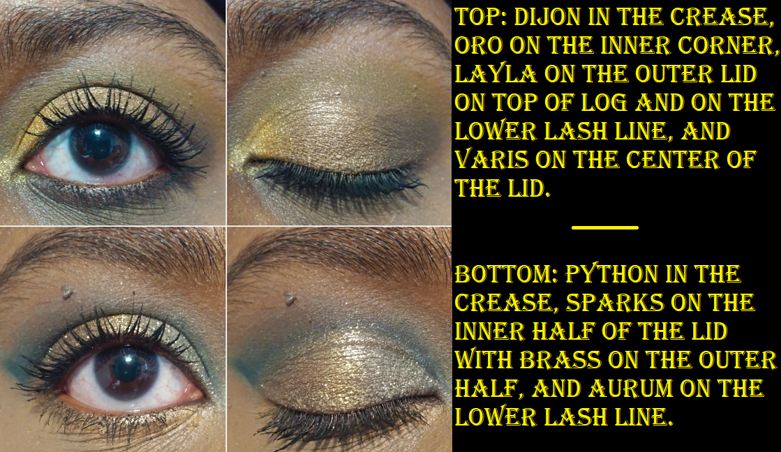
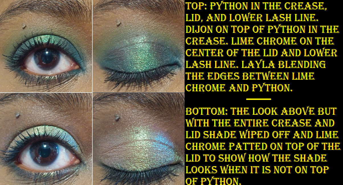
The shades I kept with me from the Gold palette are Dijon, Varis, Log, Lime Chrome, and Brass. I liked more colors from the Gold palette, but I had similar enough yellows, golds, and browns from other ND palettes that they felt less necessary to bring along. Lime Chrome is another of my absolute favorite shades from Natasha Denona, Log was used on my wedding day, plus Dijon and Varis are shadows I use at least once a month. So, it’s not surprising that I hold the Gold palette in high regard. The brand’s new Golden Palette is meant to replace this one and has 9 repeat shades, yet only Varis and Log out of the ones I saved are in there. I clearly didn’t mind going without the blues, but Lime Chrome was the single most important shade for me in that palette and it’s not in the new one. So, even if I hadn’t pumped the brakes on buying new things from the brand, I would have skipped getting it (even though it’s admittedly pretty to look at).
I believe Python, the deep blue, was the brand’s first creamy-matte or cream to powder eyeshadow. It still needed some work, as I felt it remained too wet. It didn’t blend as easily or smoothly either. The ones from Metropolis were such a step up.
The Gold Palette colors were a bit repetitive, but condensing it down to favorites made it worth having in my collection.
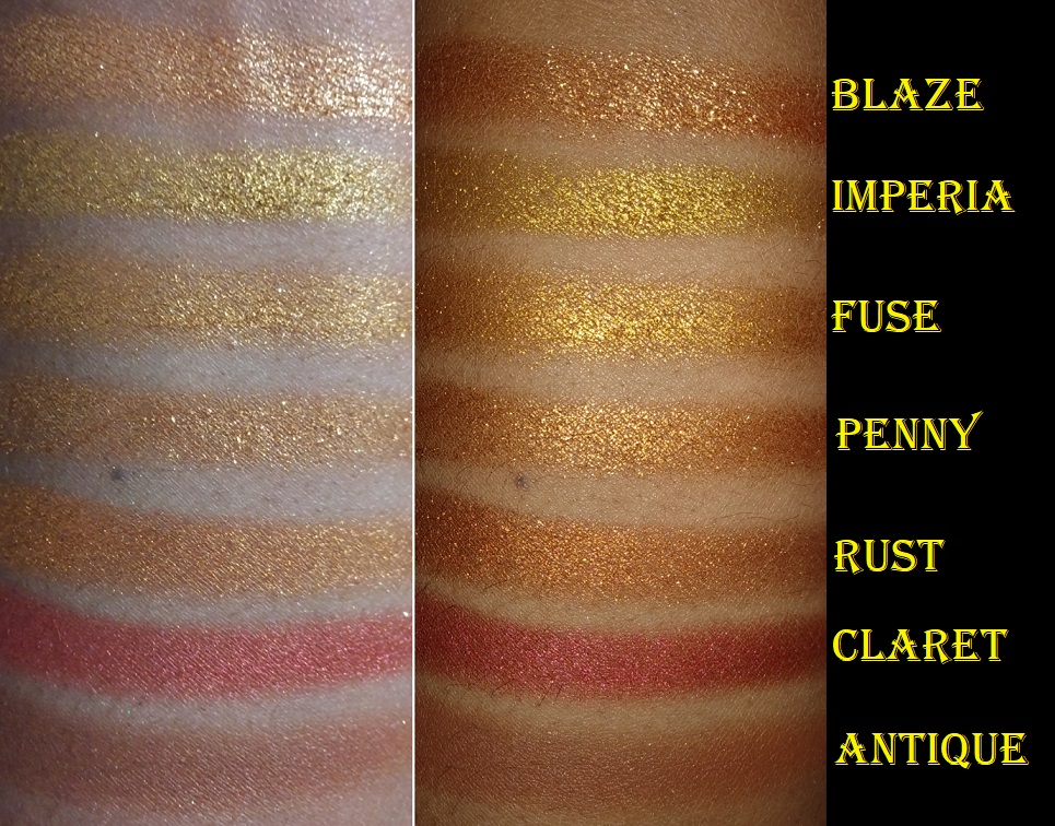
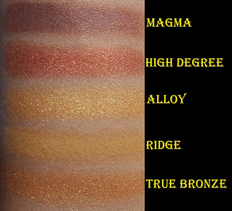
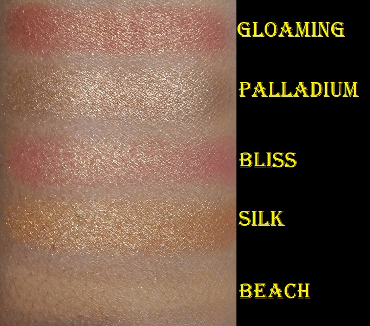
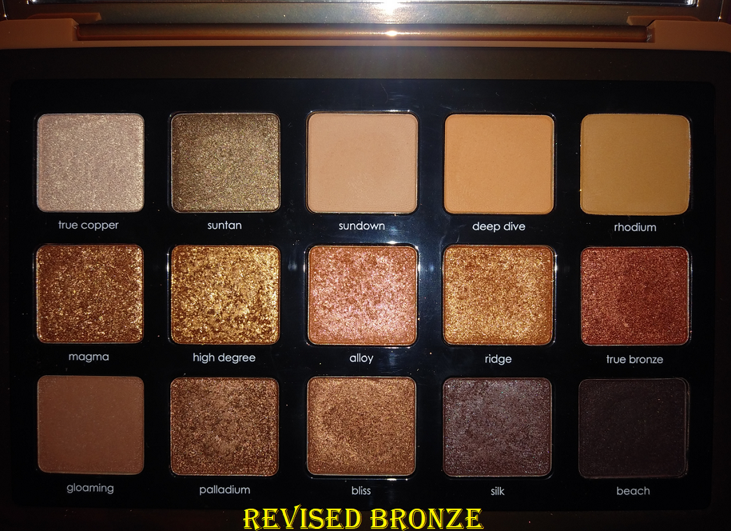
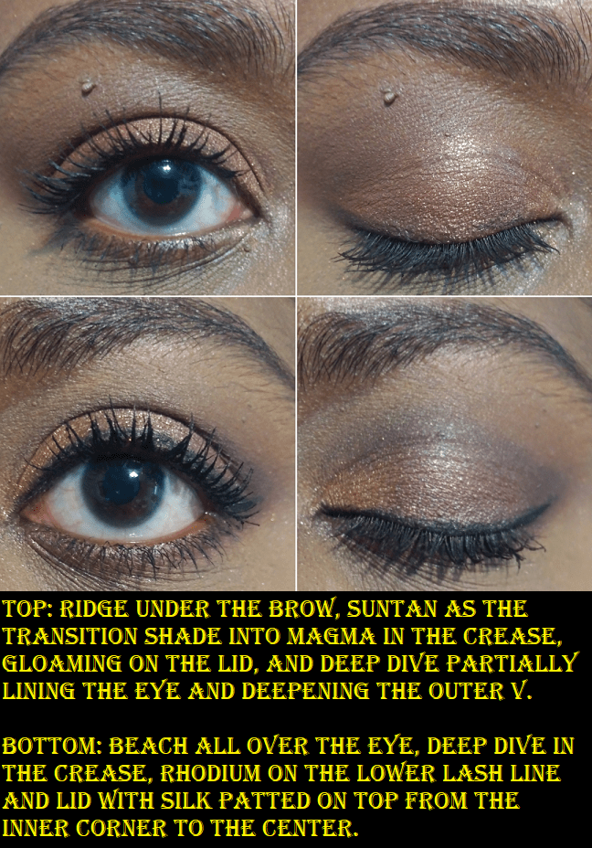
Bronze Palette
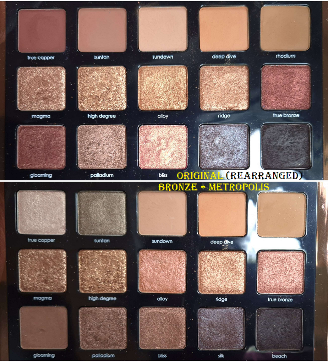
I was using this palette quite a bit, until I decided to swap around six shadows into the Metropolis palette. I feel like my changes still improved upon the Bronze palette, but it could have benefited from being condensed down. Unlike purples and greens which I could own plenty of in a single palette and be content with the various nuances, the subtleties of bronze and oranges and everything in-between couldn’t hold my attention. This palette is so visually appealing that I couldn’t bear to leave it behind, but I don’t love it enough to actually use it as often as I should.
The mattes are less creamy/buttery and more along the lines of smooth, soft, and powdery. I like the cream to powder, though the slight purplish color of it is an interesting choice. The shimmers are impactful, smooth, and opaque though, just how I like them. So, the quality overall isn’t perfect, but quite good.
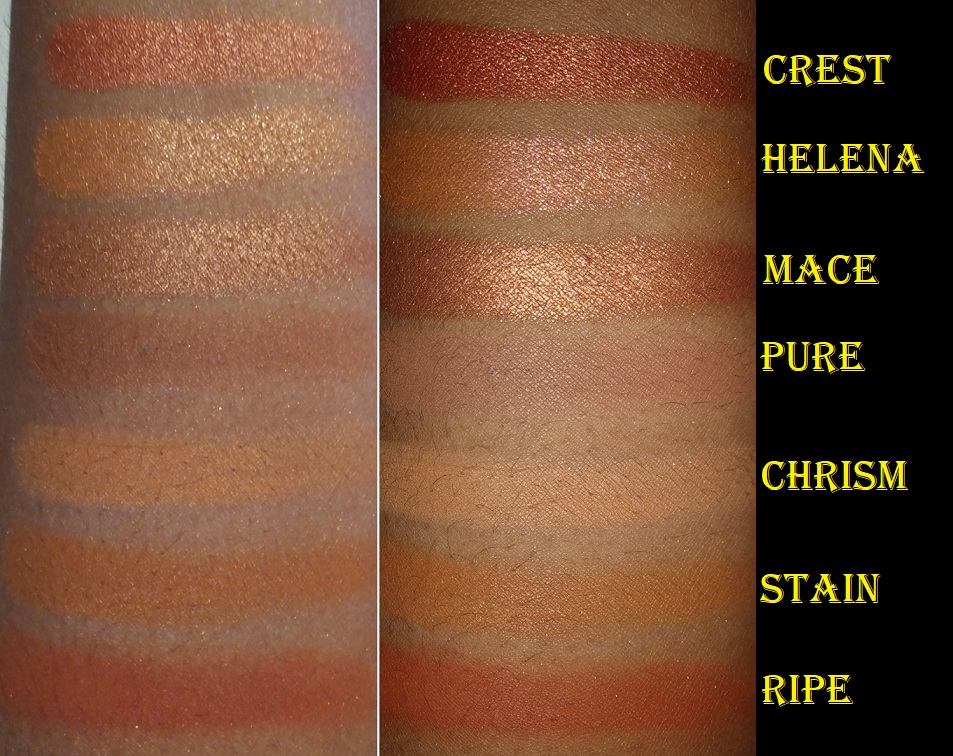
My Dream Palette
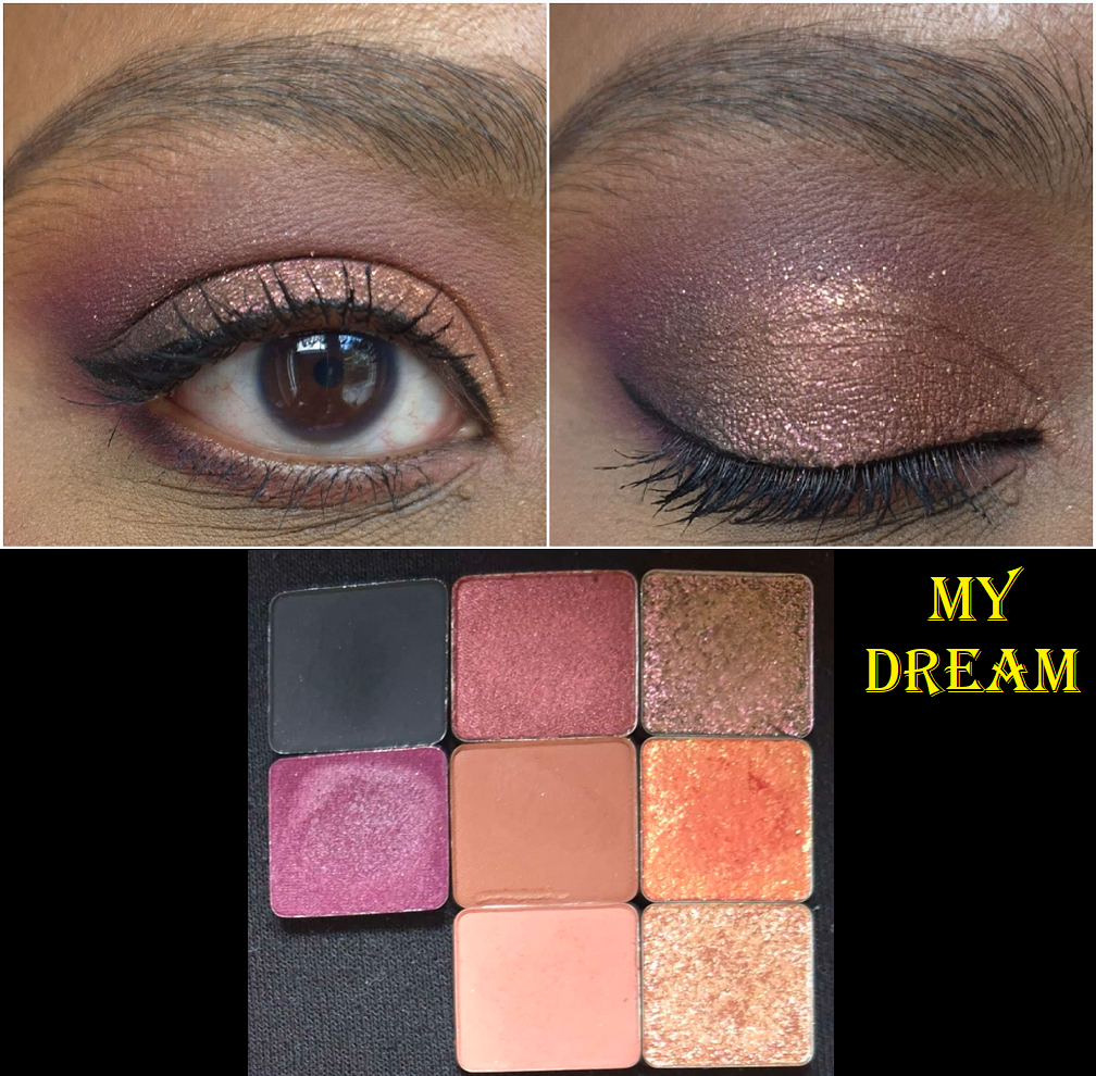
Shortly after I bought this palette, I went on my brand strike. So, I didn’t have the chance to review it. Considering I took 8 of the 15 shades with me, one could assume I really love this palette. However, I mostly just wanted to be able to continue testing the palette with shades I might actually reach for when doing my makeup.
What drew me to this palette in the first place were the additional cream to powders, the purple heavy color story, Vision as a multichrome, and Invention as the stunning fiery orange. I like having smoky options like Blackest Black and Familia, although I left Familia behind since I was taking Log. Some of the colors I abandoned were because even though they looked different in the pan, they looked too similar to each other on my skin. The mattes performed similarly to Bronze’s mattes (so good, but not the ultimate from ND), and the shimmers were either the same or in some cases even more sparkly. Vision is pretty, but doesn’t has as strong of a color shift as I’m used to from indie brands. Blackest Black takes a bit more effort to avoid overapplying or not sticking to the skin well enough and looking patchy. Invention also didn’t look the way on my eyes that I envisioned. This doesn’t count against it, but I have to point out that the misspelling of spontaneous as Spontaneuos is a bit comical.
The pros for this palette put it slightly ahead of Bronze, put the cons count slightly more against this palette as well. The overall performance is most important, and because of slightly more technical flaws, this palette got nudged out of the top five.
Love Palette
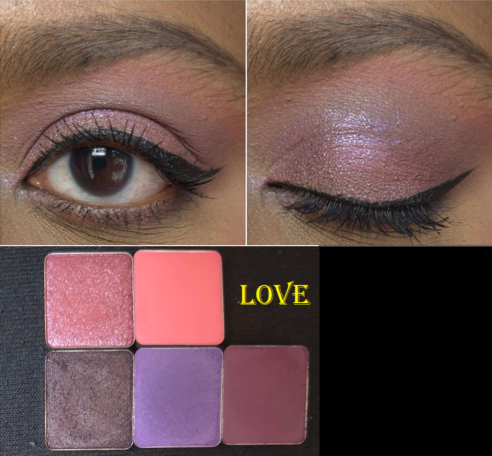
The palette has a cohesive color story, but I took my top favorite shades with me, and unfortunately that combination doesn’t look nice together all in one look. The cream to powder in this one is on the drier side now, which is interesting since it’s one of the second to last ND palettes I bought. It’s always been on the sheerer side, but getting product out is tougher now. The mattes feel similar to the ones from the Bronze palette. The shimmers are beautiful as always. Based on the amount of eyeshadows I saved and how much I liked the Love palette as a whole, I couldn’t put this palette any lower. However, I have a lot of pink and purple palettes I prefer over this one (from other brands). Some of those were custom palettes I made myself using individual eyeshadow singles from other brands. So, I couldn’t put this higher either. Considering how pink and red heavy this palette is, it’s shocking enough that I decided to place it above Natasha’s other purple palettes. Purples are among my favorite eyeshadow colors, but the quality differences were too big to overlook.
My disinterest in most pink palettes is the reason I am not planning to buy the Roxa palette. I would love to try the new matte formula in that one, but there are too many light shades and pinks for my taste. The palette would have to go on sale for nearly 50% off for it to be worth it for me to purchase (beyond financial reasons is the lack of space in my home and not wanting to be wasteful).
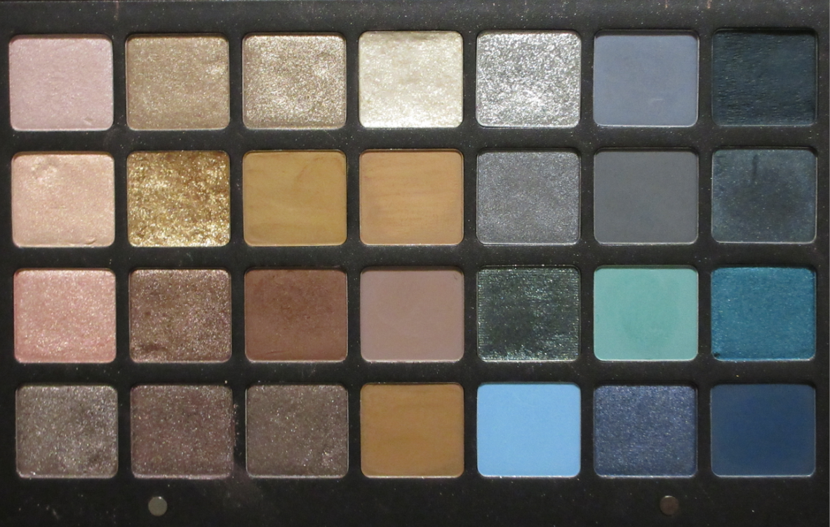
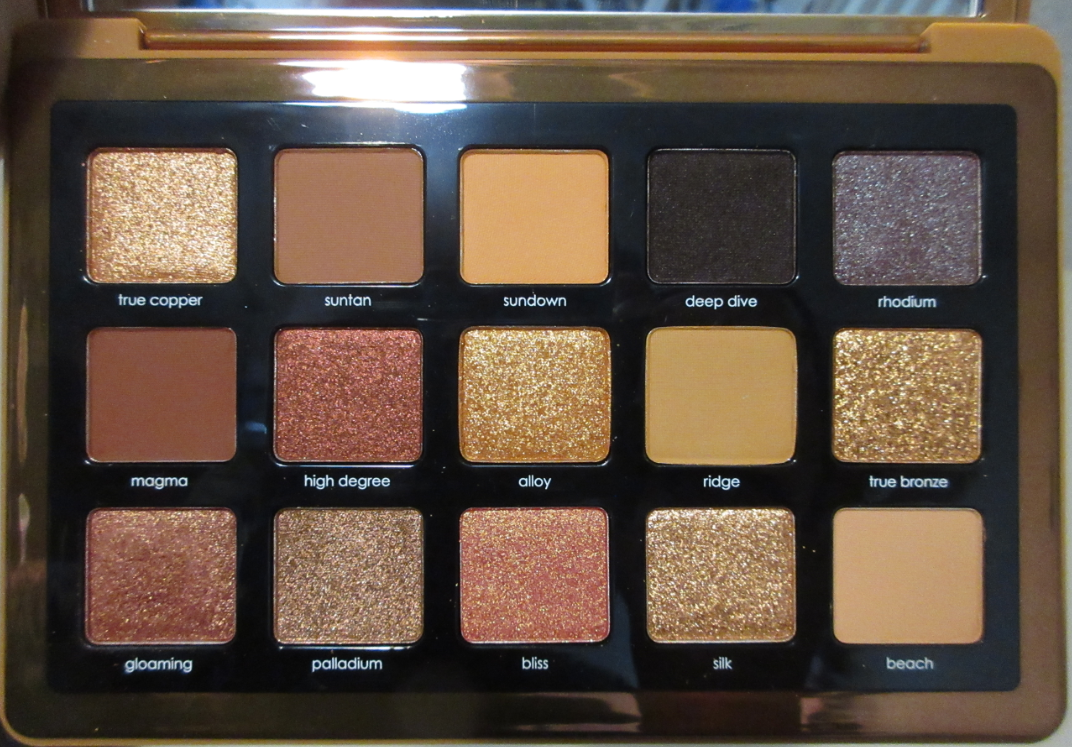
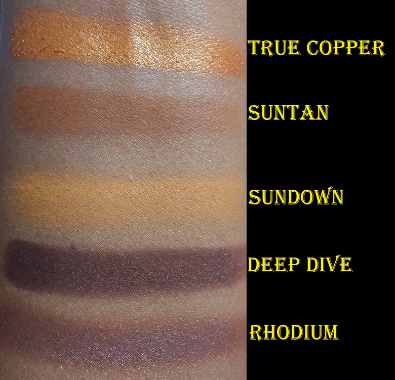
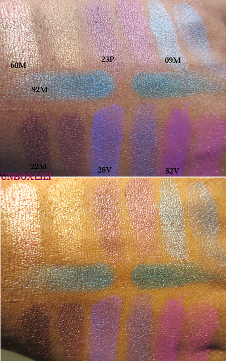
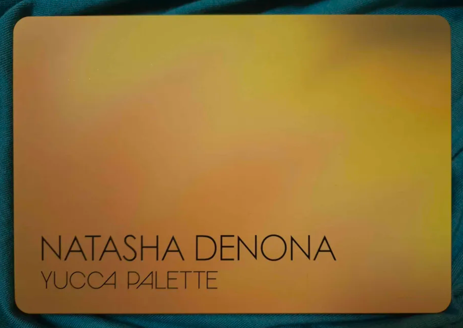
Yucca Palette
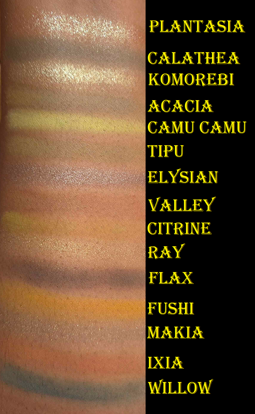
My first thought when I saw this palette was that the color story was pretty, but I didn’t need it since I still owned the Colored Raine Safari palette (which is honestly even prettier). I also said if I ever was to buy it, it should not be at full price since I was unsure how much this could bring to the table over Metropolis, which I assert has a better color story and formula, over this one.
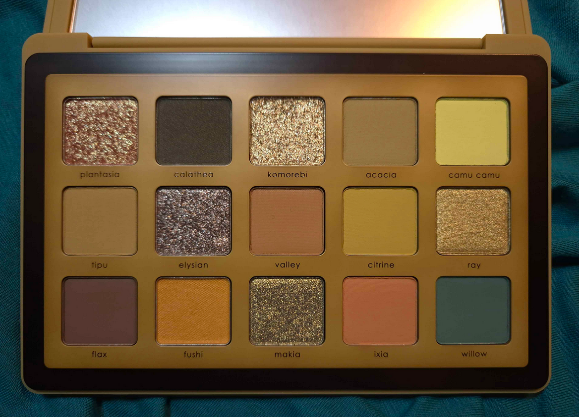
At some point the mattes from Natasha Denona strayed further away from the creamy ones I loved, to a silky drier one. It’s similar to the mattes in the Bronze, Love, and My Dream palettes except these don’t spread as easily. If we look back at my past posts, ND’s eyeshadows used to go on and on in a long pigmented opaque swatch. These mattes are still pigmented, but when I was trying to swatch them, they kept having gaps of no color. I had to swipe at least three times for all of them to get a complete line to show across my arm from left to right. Willow still looks terrible. The swatches don’t look that great in general even though I built them up a lot more than usual. Of course, swatches don’t tell the whole story, and it’s more important how the performance is on the eyes. Honestly, they blended fine, but it was far from effortless. They’re not bad, but something is just off in comparison to the quality from the brand I’m used to.
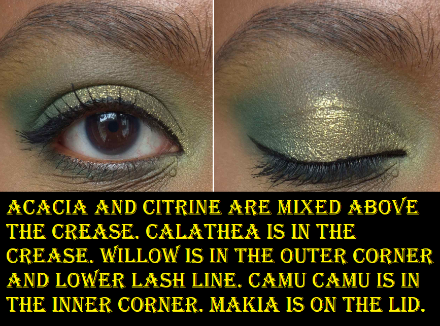
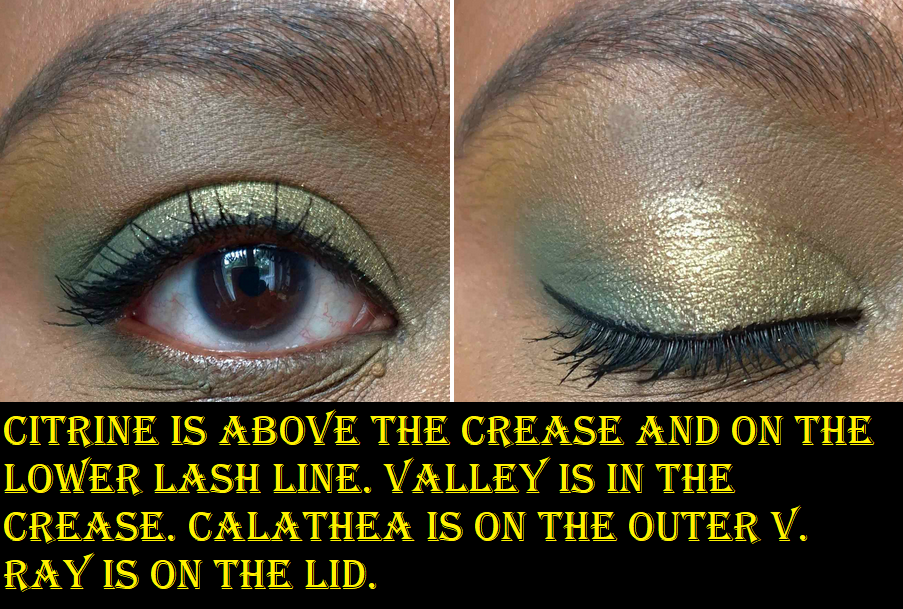
There are two cream-powder mattes in here. For some reason, Fushi is thicker in texture and Calathea has more slip. I prefer Fushi because it’s much easier to get the product onto my brush and smoothed onto my eyes. Calathea required more packing and effort. It’s also a different color on my skin than I expected by looking at it in the pan. I wanted a deeper and less muted shade, but I admittedly already have that in the Metropolis palette. So, I understand the brand wanting to offer something different.
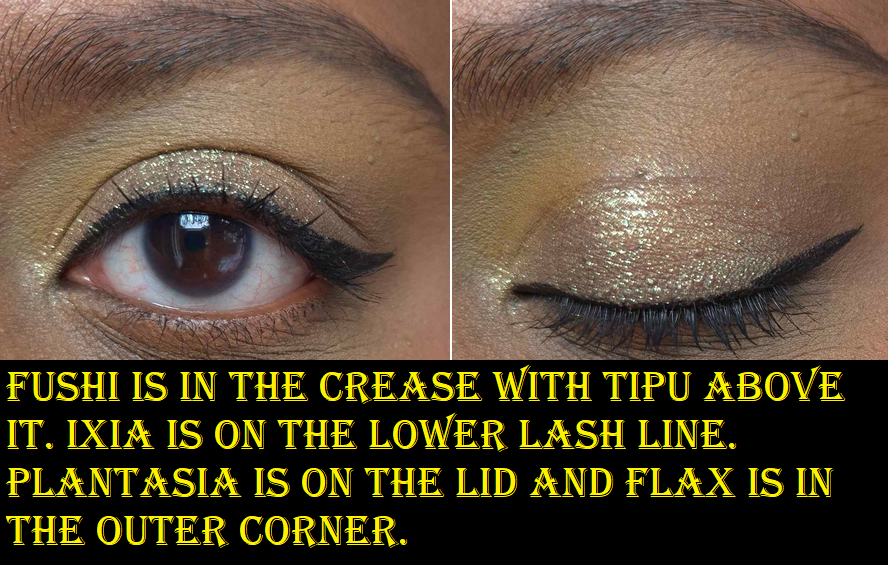
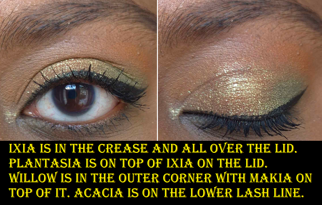
The shimmers are the best aspects of this palette, aside from Fushi. They give impact. They have sparkle to them. They don’t fade. They have minimal fallout and don’t require being applied dampened. However, I noticed that these are sheerer than I’m also used to. I can see my skin underneath, which makes them not look the same way as I envisioned. For example, Plantasia looks like an orange-reddish-bronze in the pan, but I see more golden-yellow on my lids. In order to get a warmer tone, I have to fake it by putting an orange matte underneath so that color is what shows instead of the brown of my skin. The same goes for Makia that I expected to be antique gold-olive, but looks more lemon-lime. For more green, I have to put a green shadow underneath. Those two were the shadows I was most excited to have, besides the cream-powder ones, so I was admittedly a bit disappointed.
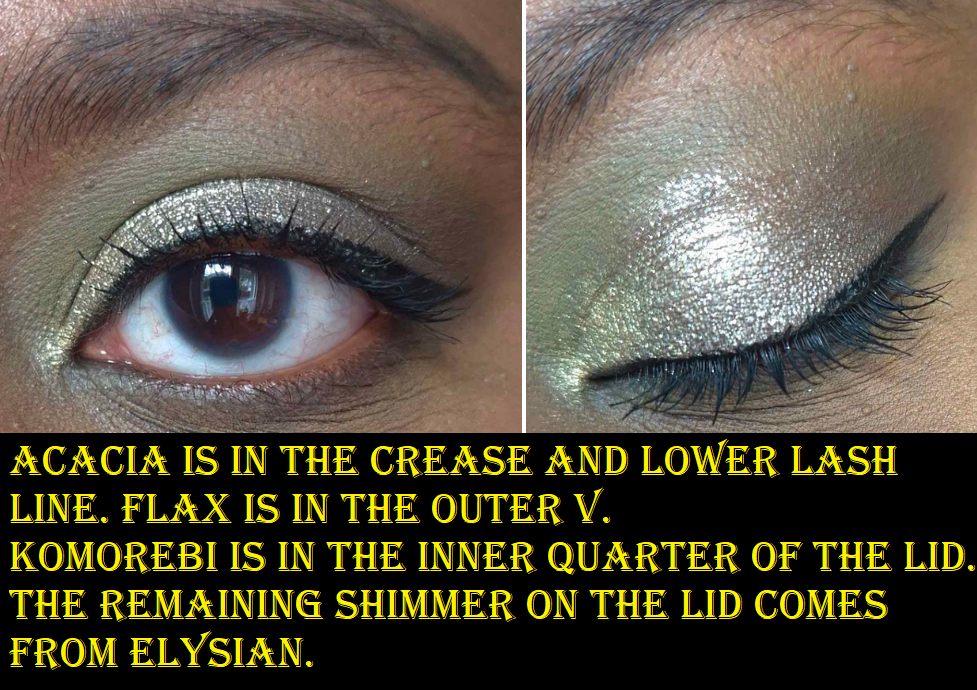
A surprise favorite ended up being Camu Camu for its near neon brightness. On the flip side, one of the biggest disappointments was Flax because it just isn’t deep enough to give me the depth level I require for my skin tone.
Despite this palette consisting of colors I typically enjoy, this ranked much lower because it’s as I feared. It doesn’t give me much different than I could get from Metropolis, plus the formula is less to my liking. It’s further away from my preference, which doesn’t make it necessarily a bad palette. Or at least, it wouldn’t be considered that bad if the blending time wasn’t longer.
I expect to continue using Ixia (it’s a wonderful orange), Fushi, Makia, Citrine, Camu Camu, Plantasia, and perhaps even Calathea. That’s slightly less than half of the palette, so the 24 Euros I paid via Selfridges is still alright with me.
Lila Palette
From this point and onward, I don’t have any of the palettes with me.
I thought for certain that this was going to be my most beloved palette. The shades on my skin didn’t look how I expected them to though, which is ultimately when I had the idea to swap some colors around. That unfortunately didn’t cause me to use this palette any more often because the matte quality was not as great back then. The older ND formula had some that blended quite well, some that were slow builders, and some that were straight up duds. They were rougher in texture too. The shimmers were more like satins because they weren’t as reflective as I prefer. I think this was more of a makeup artist driven formula than consumer-friendly one where shadows were easier to blend with color stories that were more intuitive for putting together.
This palette holds a place in my heart for nostalgic reasons and appealing to my purple lover side, but it wasn’t the brand’s best by far.
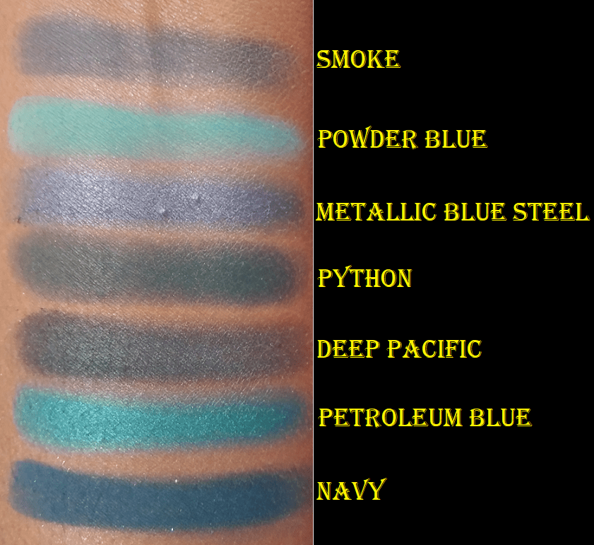
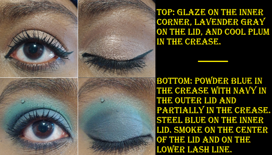
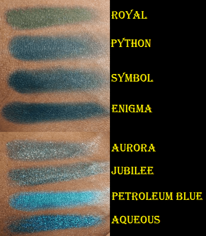
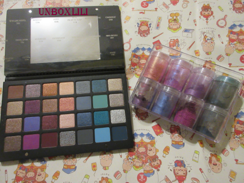
28 Purple Blue Palette
This palette is also nostalgic because I got it in one of Beautylish’s Lucky Bags. The euphoric feeling I got from taking the chance on spending a lot of money and “winning big” on such an expensive palette was quite the rush. The reality is that I’m really not a fan of blues, so this palette was half wasted on me.
Influencers really hyped up this palette when the brand first came to Sephora US, and it was very good at the time, but not $200+ good. The mattes had that stiffer formula I mentioned in the Lila section. They were pigmented and required some effort to blend, though they were still fairly good. The shimmers were crazy pigmented, but didn’t have the sparkle intensity I love. It wasn’t bad, just not to my preference. I basically turned this into the “discard” palette of all the larger pan Natasha Denona eyeshadows I would never use (mainly cool tones, blues, and unneeded browns). By the time I decided I should probably sell it or give it away, the shadow quality just wasn’t good enough. So, I only kept it for nostalgia reasons.
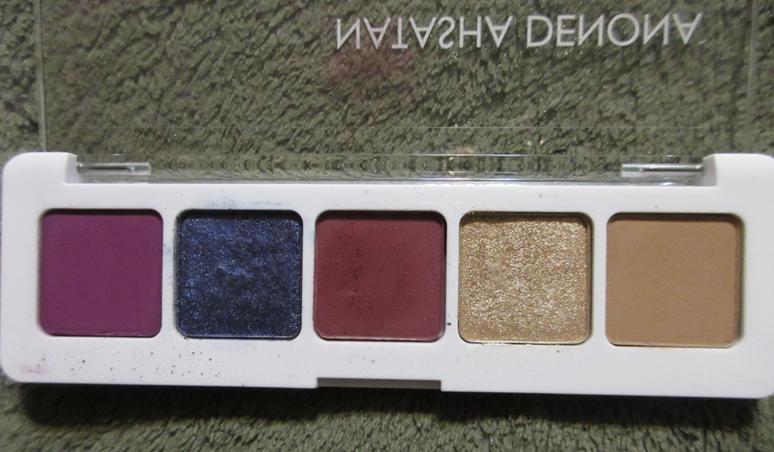
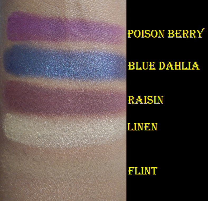
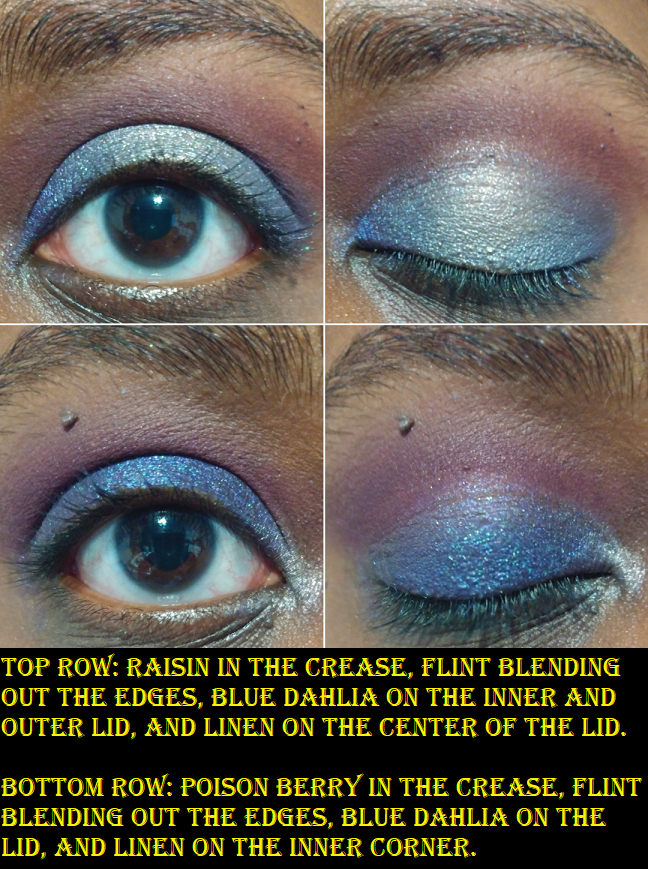
Mini Lila Palette
I got this in August 2018. It’s definitely one of the weakest performing ND palettes of all time compared to the rest of the brand’s eyeshadows. However, it was still a decent performing palette compared to everything on the market. Even when I felt like I outgrew the palette, I couldn’t fathom giving it up because of that Blue Dahlia shade, which was such an uncommon color at the time. I have to give this brand credit for having specific colors that stand out to the point that I know them by name. Even among my favorites out of my entire eyeshadow collection, I have some palettes I love for the quality and color combinations available. Some of my favorites I still reach for a Clionadh shadow to add something special on top. However, Natasha Denona’s brand does have some special shades within their palettes.
For quality reasons and the one direction this palette can take me, it’s nearly at the bottom of this ranking.
04 Five Pan Palette
This was my first ever Natasha Denona palette, back in February 2016. I don’t know how many people even remember when she used to put her large sized eyeshadows in these 5-pan palettes for nearly $50. This was so similar to Viseart’s Minx palette, but Viseart did it better which is why I ended up selling mine on Mercari. I basically just wanted to try the formula and see what the hype was about. The only matte shade in here was an absolute dud. In fact, it was supposed to be a satin like the others, but mine had not a single bit of shimmer in there and trying to get it on a brush and get it to not look patchy was too great a task. The other colors performed the way all her older shimmers did, which was nice, but not my cup of tea. I think the brand made a much smarter choice when they switched to minis. People could talk about crushed pearls and diamond powder all they wanted, but if the customer isn’t over the moon about the end result, the price tag still won’t be worth it.
So, that is every palette I owned from Natasha Denona ranked! The way it currently is today, I consider this brand a maker of one of my favorite formulas for both mattes (older formula and cream powder ones) and shimmers, which is not something I can say often about the brands I use. Metropolis and Mini Gold would for sure in the top 20 eyeshadow palettes in my collection (if a list were to exist) out of the several hundred I’ve owned.
Thank you for reading!
-Lili ❤