These are some of my newest purchases. I wanted to include them in my previous luxury post, but I didn’t want to rush through the testing process. So, I essentially split them into smaller parts. With the holidays approaching and my interest in luxury makeup still at an all time high, I’m sure there will be more to come.
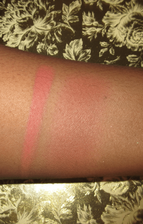
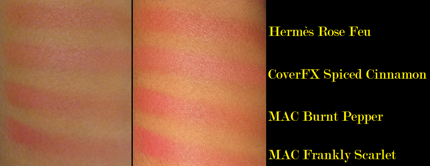
Givenchy Prisme Libre Loose Powder Blush in 6 Flanelle Rubis
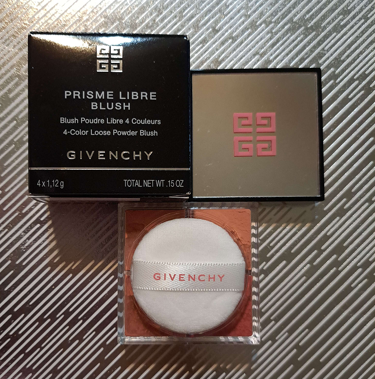
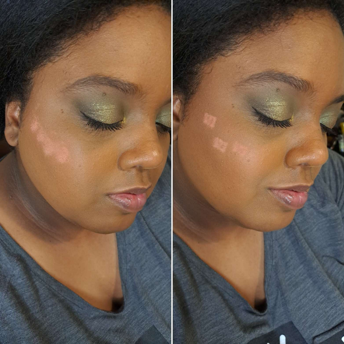
If I didn’t have experience with the Prisme Libre Setting/Finishing powder, I would never have gotten this because I would have assumed it would be too messy, but the tape method (controlling how many holes are open) works wonders. I still don’t see the benefit of having four different shades of face powder, but it’s quite enticing to have four blush options in one with the ability to custom mix shades. Suddenly the $43 price seems like a bargain if two or more of the four colors are appealing.
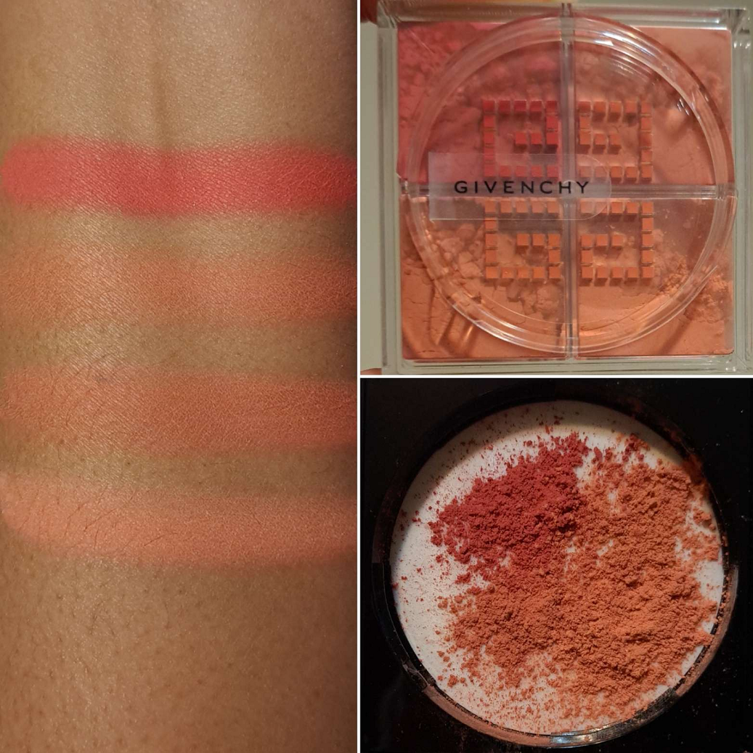
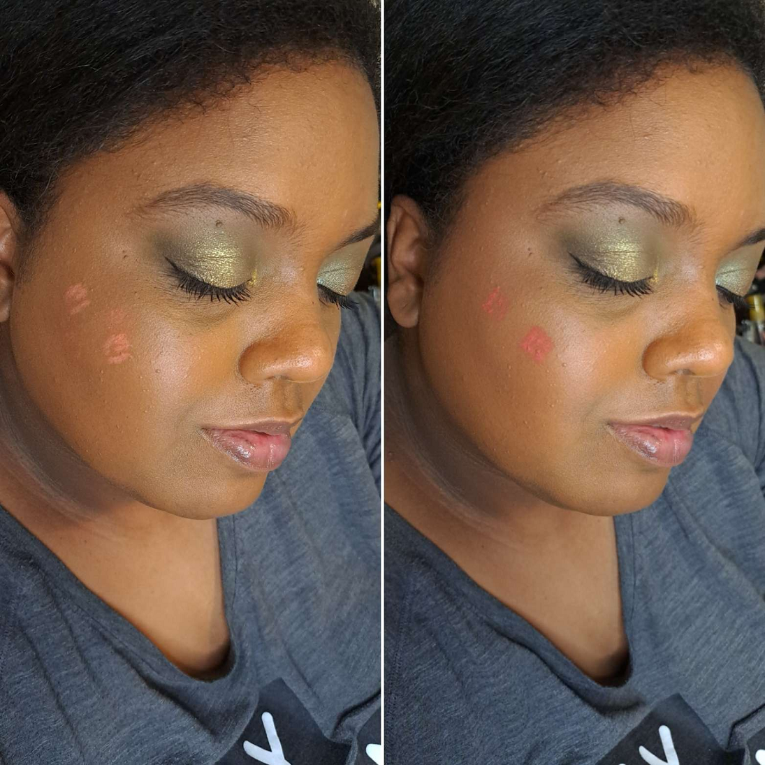
I purchased the deepest option from Givenchy, but I expected the two lightest ones not to work. I was pleasantly surprised that despite being so light on my skin, the color shows through as I blend them in, perhaps becoming one with my foundation in deepening the shade. I still have to build them up a bit, and the lightest one remains subtle, but the second-lightest is easier to see after just a couple of layers. The third darkest in depth just takes one well blended layer to be seen and is my favorite out of all of them. It’s like a dark coral-peach. The darkest looks quite beautiful if applied in a sheer layer as a flush of color, but this is the only one of the four that is stubborn to use. I don’t consider the need to build up a blush to be an issue, unless it adds a significant amount of time to my makeup routine. Additionally, needing to spend more time to blend because it grips wherever it first touches the skin, like this red one, is what I consider a flaw. I can get it to look smooth if I spend enough time buffing it, but I don’t like how much effort it takes. It even hinders my ability to enjoy using this blush with all the sifter holes open because I can literally see where the red powder looks patchy on my cheek and isn’t blending as easily with the other shades. So, to avoid all the extra work, I keep that one completely blocked. So, the ways I’ve been using this blush is with the third darkest shade by itself or the three blendable colors together.
Also, none of these fade on me. They last on my cheeks all day.
It’s my preference right now to wear shimmery (but not metallic) blushes or ones with a sheen. This blush is a bit more matte than I’d like, but it’s at least not flat matte, which is why I still like it. The quality of the powder is nice, but when it comes to blushes, there are a ton that I love. A lot of brands, including ones from the drugstore, can make a fantastic blush. So, the quality isn’t a good enough reason for me to add to my collection anymore. Being a good performer is a given, but now I also require pretty packaging and colors that fill me with excitement the moment I see them on my cheeks. I think the black lid with the mirror on top and pink Givenchy logo looks very nice. The shades are complimentary to my skin tone as well, so I’m happy to have it, but my other blushes are so good that this would still fall into the middle of the pack if I had to rank my collection. The custom mixing feature is what helps keep this worth the price and not regret buying it.
Lastly, I just wanted to add that the blushes are heavily perfumed and even stronger than my face powder. I don’t know if this is just a discrepancy between the full-size face powders or the newly produced mini face powders. I also can’t confirm if all the mini powders are like that or if it just happens to be mine. Fortunately, despite how strong it is when I initially apply the blush to my cheeks, I can’t smell it once I’m finished blending it in.
Also, this blush container is the same size as the mini of the powder.
Hourglass Veil Translucent Setting Powder – Talc Free in Translucent Deep
I feel quite lucky to have gotten this for less than full price when Sephora accidentally listed this and the other new shade on the website for $36 instead of $49. I prefer Hourglass’ finishing powders, but as far as setting powders go, I am still very happy with this.
As someone with dry skin who doesn’t use the same amount of powder as I see a lot of other people use on social media, I’m not a good resource for face powder recommendations for anyone who needs oil control to be tested. What I can say is that this powder succeeds in not making my dry skin look drier. I’m able to use this under my eyes without it darkening anything, like some powders do. It’s super finely milled. It’s smooth and blends right into the skin to mattify without looking powdery. The finish just looks like skin, it’s so natural looking.
This reminds me of the Laura Mercier Powder, but even more lightweight. I preferred Laura Mercier’s Medium-Deep version over their original translucent shade, but I used it knowing it would make me look slightly darker. This shade Deep from Hourglass is exactly the kind of color I wanted from Laura Mercier, but couldn’t get. It’s got the yellow tone, like Laura Mercier’s Honey, but it’s a better depth for me.
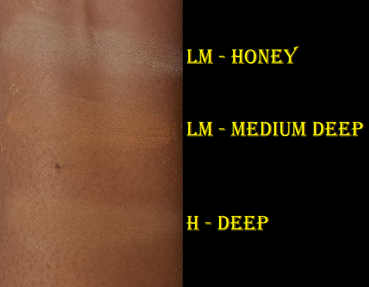
With that in mind, I think this one from Hourglass should have been called Medium-Deep, and hopefully they will release a fourth version that’s darker. Even though these powders are “translucent” they are still capable of leaving a cast if they are too far off from the wearer’s skintone. I’m not sure how well this will work on someone with a Deep-Dark skin tone several shades darker than mine.
I’m a little more hawk-eyed when it comes to what Hourglass does, because of their past shenanigans, but I give them props for expanding even this far. Their Deep is darker than Pat Mcgrath’s Deep that I really didn’t like anywhere besides my under eyes (just as the product name suggested).
I attempted to do a flashback test, but my current cell phone camera with flash just makes everything washed out. I couldn’t see a cast when I took a picture using my old cell phone camera with flash on, so I’m going to say that it passes, but I don’t know how it’ll be with flash photography from a professional camera.
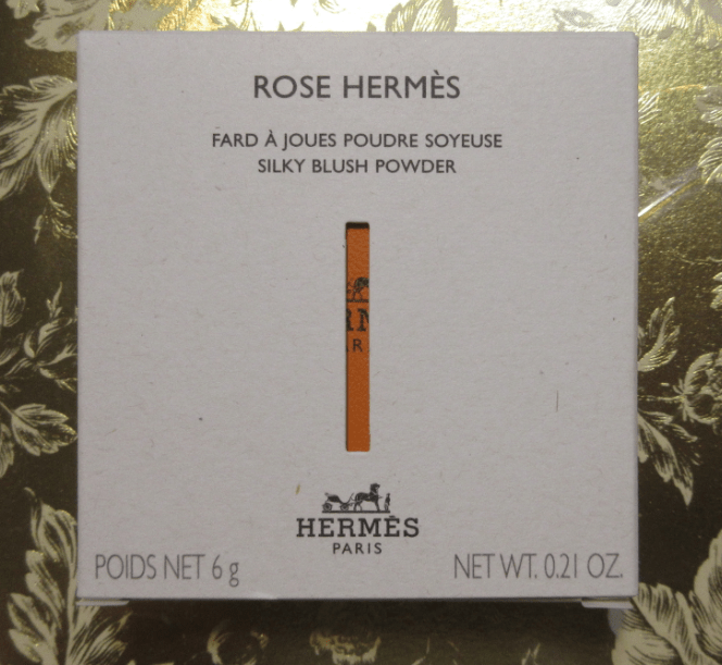
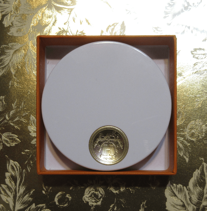
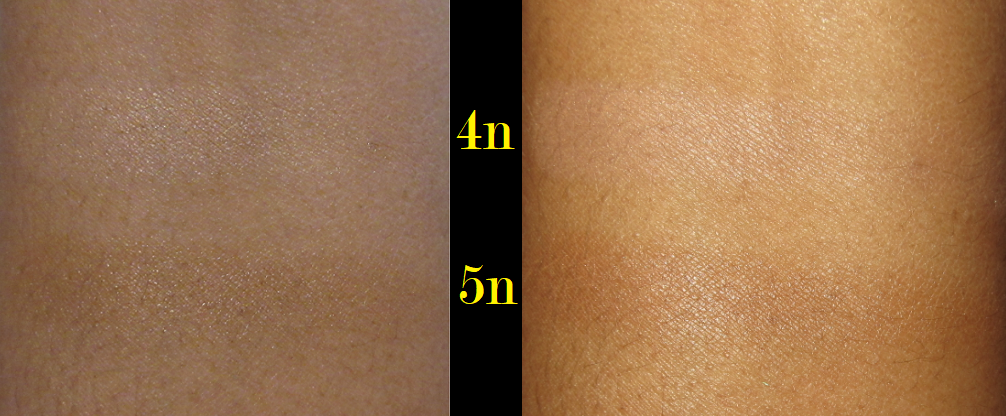
Gucci Eternite de Beaute Foundation in 410N (deluxe sample)
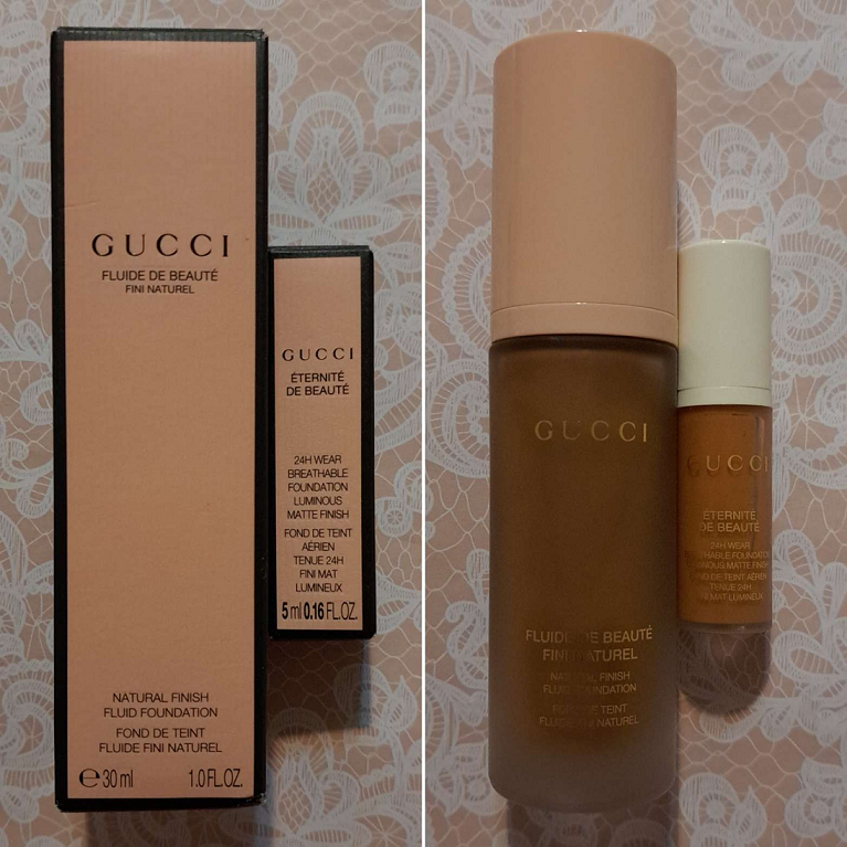
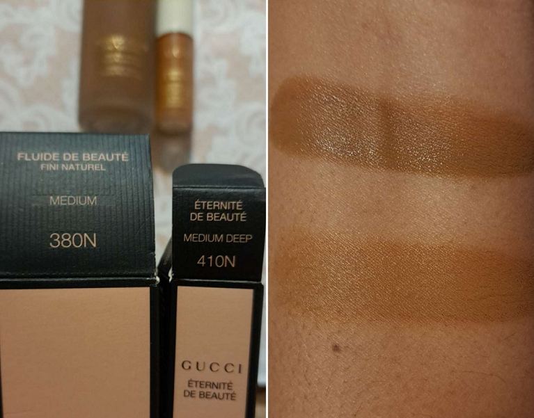
I have to start off stating the obvious that it’s quite strange that the shade I purchased in the original Gucci foundation has a smaller number and is listed as being in the medium category, yet the sample I got from Sephora of the new foundation is a higher number and described as medium-deep, yet it’s lighter than the original.
Selfridges had this on sale for $27 in January 2023, and I assumed the price was low because it just wasn’t selling well and was going to be discontinued to make room for the new line. However, the original arrived looking quite separated in the bottle and I can’t help but wonder if the formula went off and the color darkened considerably, and if this could be why it was marked down so low to get rid of it quickly. The first time I wore the original it transferred beyond anything I’d ever seen before. I could literally swipe it off my face and leave a completely bald spot without a drop of foundation lingering, like wiping food off one’s chin. I had no idea if mine was like this because it had turned, or if the original was supposed to perform this way. That’s why I never reviewed it, along with the fact that it was way too dark for me.
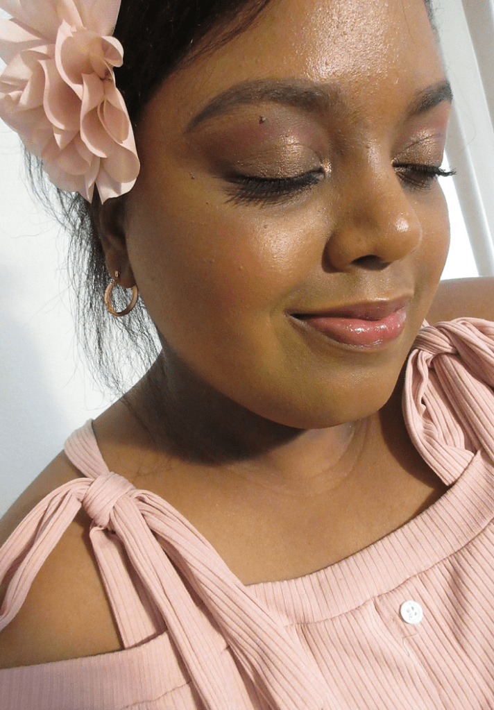
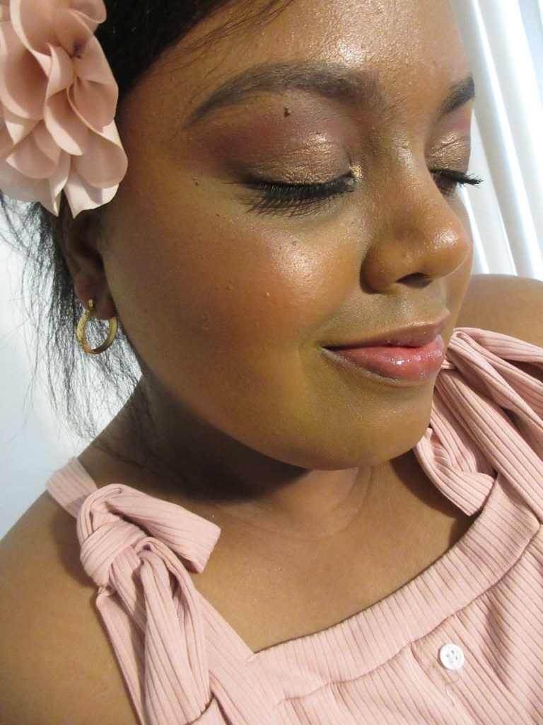
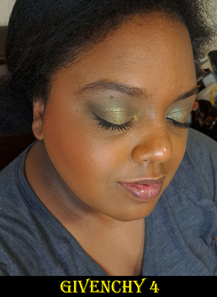
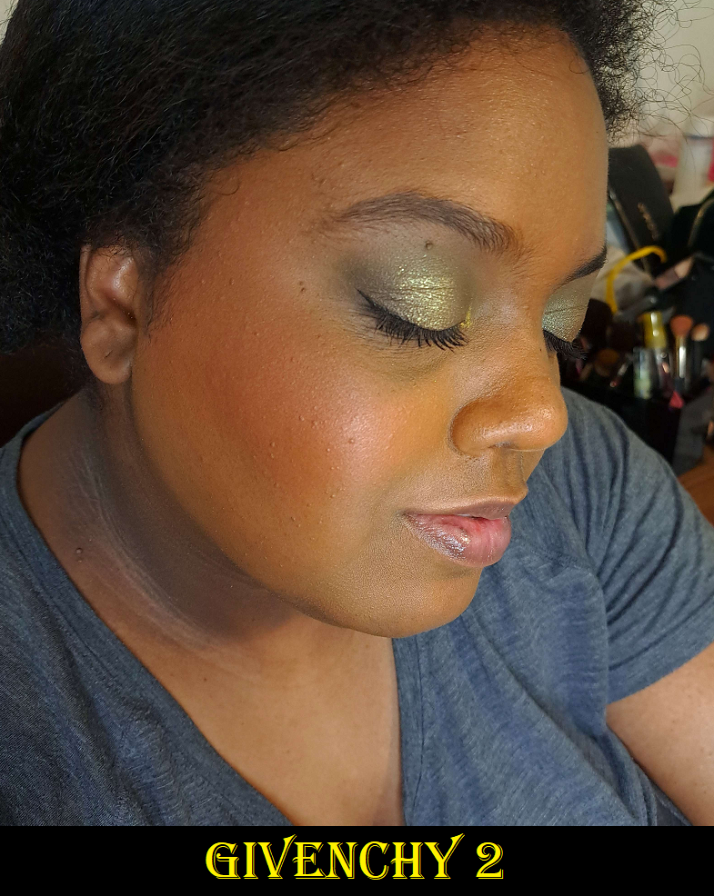
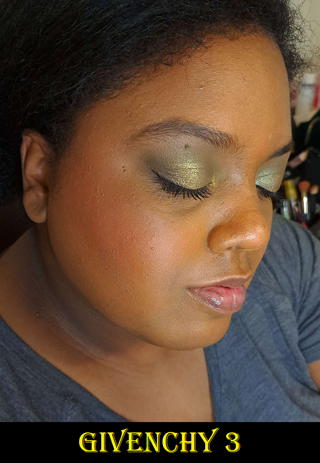
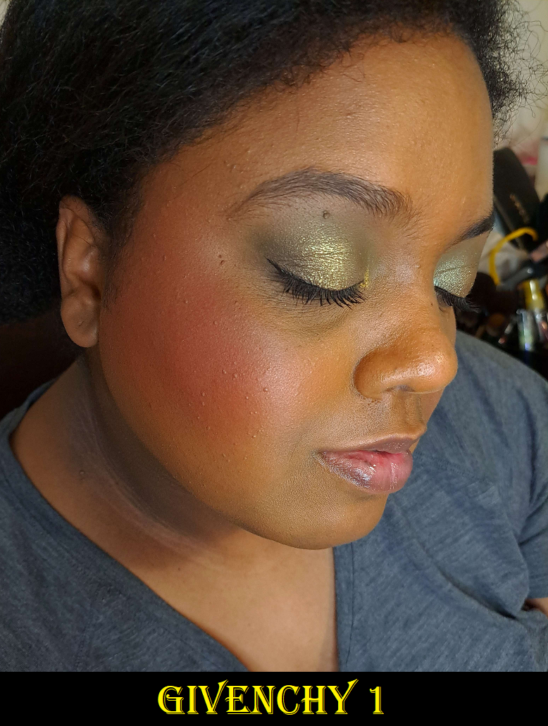
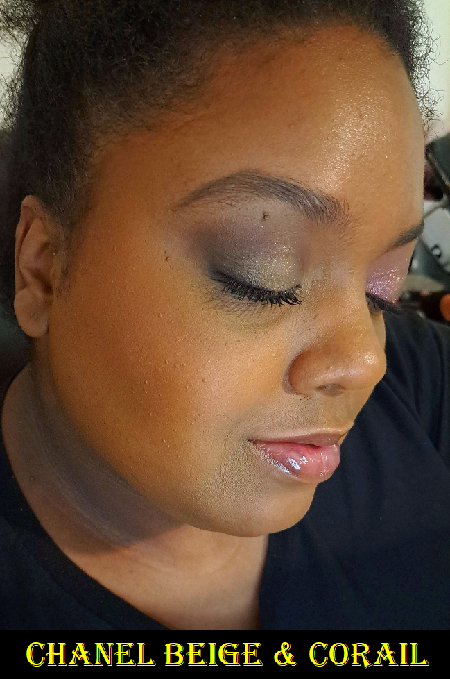
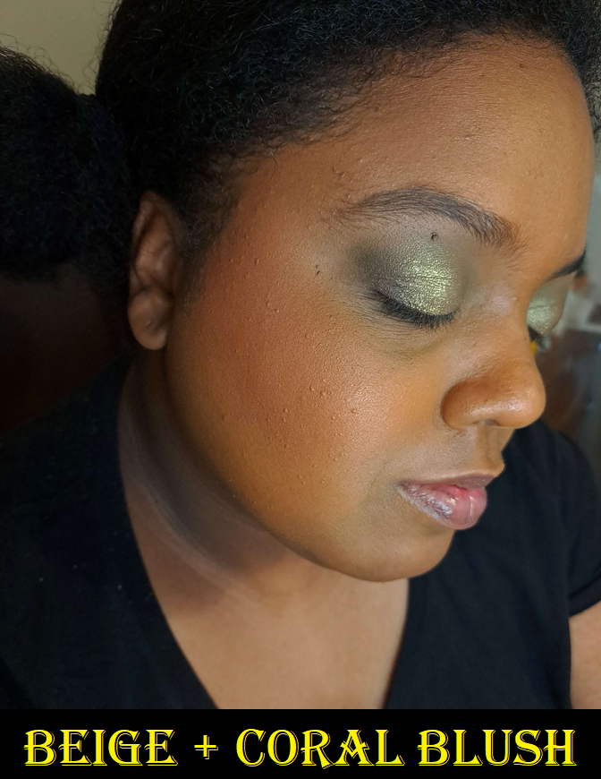
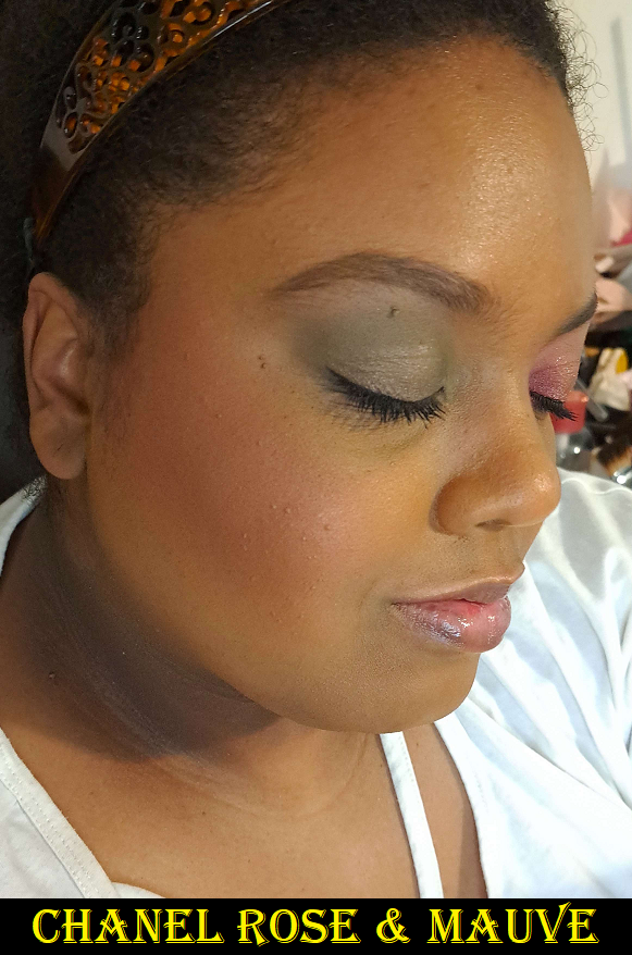
This new foundation is much nicer and is surprisingly close to my correct shade! I’d estimate it’s just one shade darker. At some point I’ll be caught in a position that I’ll forgot to reapply sunscreen, and this color will be spot on. Demonstrations of me wearing it are in the Givenchy and Chanel blush sections of this post. It’s described as, “luminous matte,” but I consider it a semi-matte or natural finish at most. I have foundations that make me look a lot more luminous, as seen in other pictures I’ve taken throughout this blog. The only time I get shiny is because of the Florida heat. Then, it just takes me dabbing away the moisture to look matte again. My natural oils coming through after many hours of wear only leads to the tiniest bit of glow, but still not to the level of my actual radiant type of foundations.
I get nearly full coverage with two pumps and it’s possible to build up to full, but it can look a little mask-like because it’s not a 100% shade match for me, so I prefer a less is more approach with this foundation. This is also not the kind of foundation I would set with powder, considering my skin type. It has a self setting quality to it anyway so that if I touch my face, I don’t see any foundation on my finger. This foundation feels a bit dry unless I wear moisturizing products with it, such as facial oil.
Overall, it looks pretty in the full-coverage and matte way. Since those aren’t my preference anymore, I can’t say for sure whether that impacts my memory of liking the Nars Soft Matte foundation way more than the one from Gucci since I wore them at different points in time. So, I guess take it with a grain of salt when I say I recommend the Nars, which is $20 lower in price, over the Gucci foundations. I just know that I won’t be buying the full size of the new one and the old one will be decluttered.
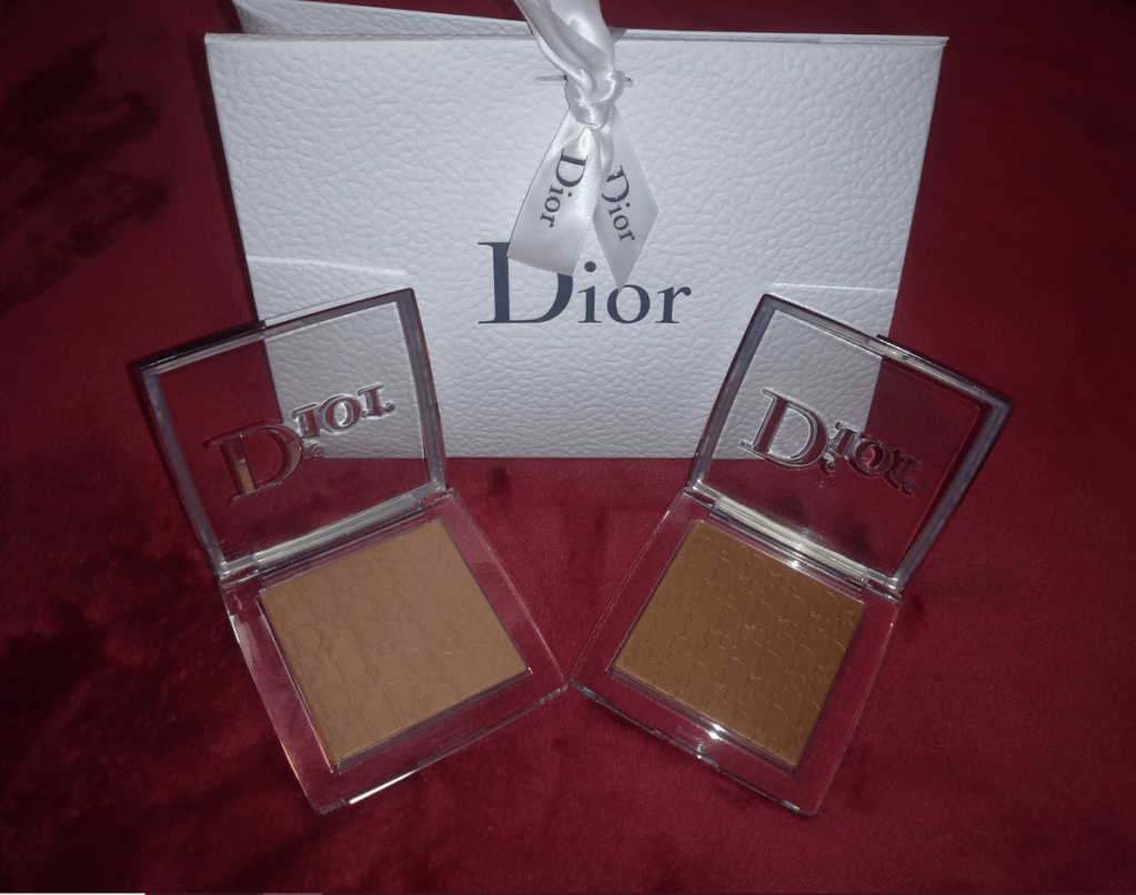
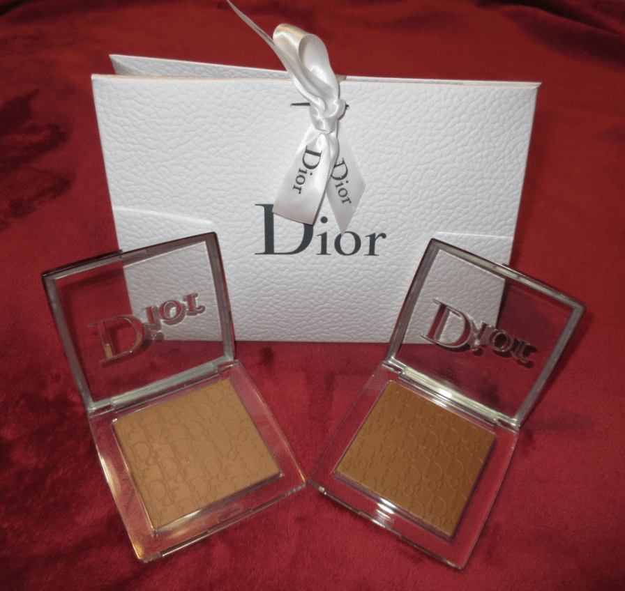
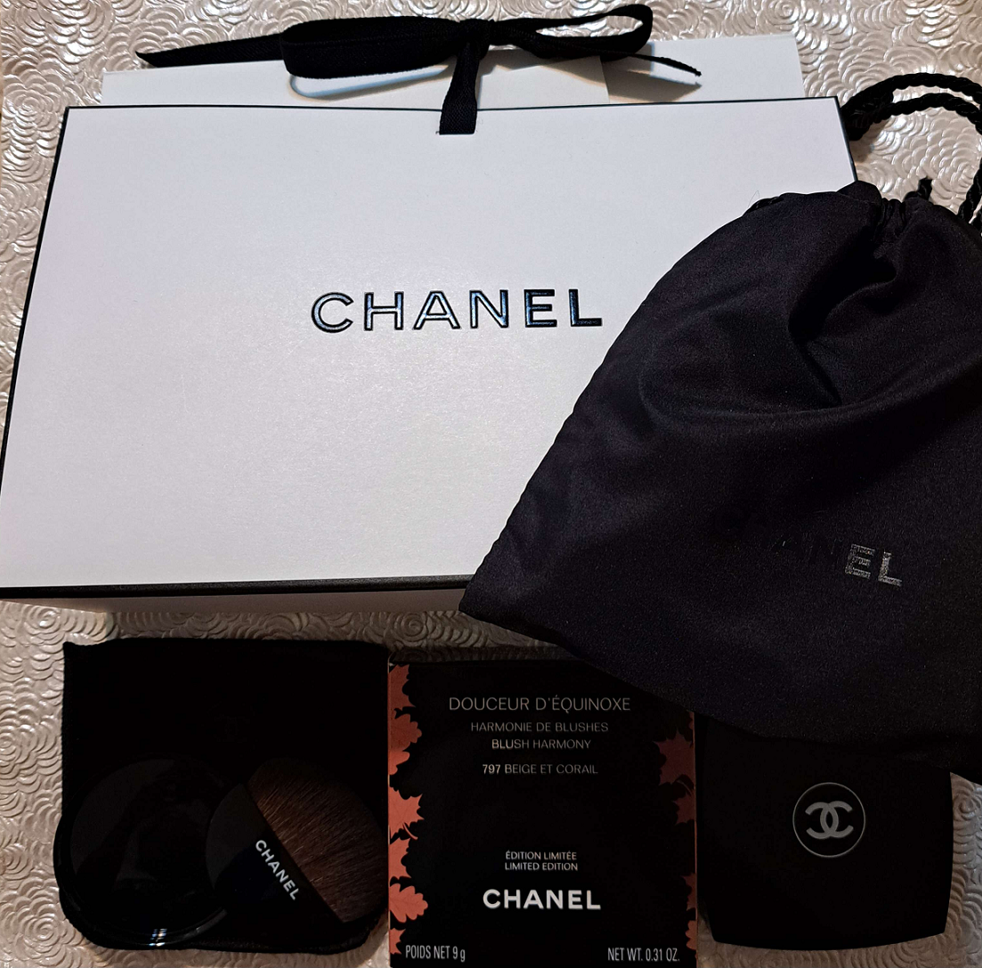
Chanel Excel Blush / Chanel Douceur D’Équinoxe Blush Harmony in 797 Beige & Corail and 798 Beige Rose & Mauve
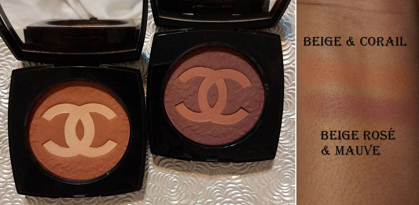
I spent hours agonizing over which of the two blush shades to purchase. Rose et Mauve was the more unique color offering from Chanel, but I knew a shade like Beige et Corail would be used way more often by me (provided it showed up). I tried to apply the lesson I learned from my post called Blushes So Good I Needed Another…or So I Thought. When it comes to buying more than one blush, whichever shade I love most is the one I’m going to use 9 times out of 10. So, I decided to go with Beige et Corail. After watching many videos and seeing a photo of Rose et Mauve on someone with a dark skintone, I started wanting that other shade even more. Ultimately, when it came back in stock on Chanel’s website, I took my chance and bought it before it sold out again.
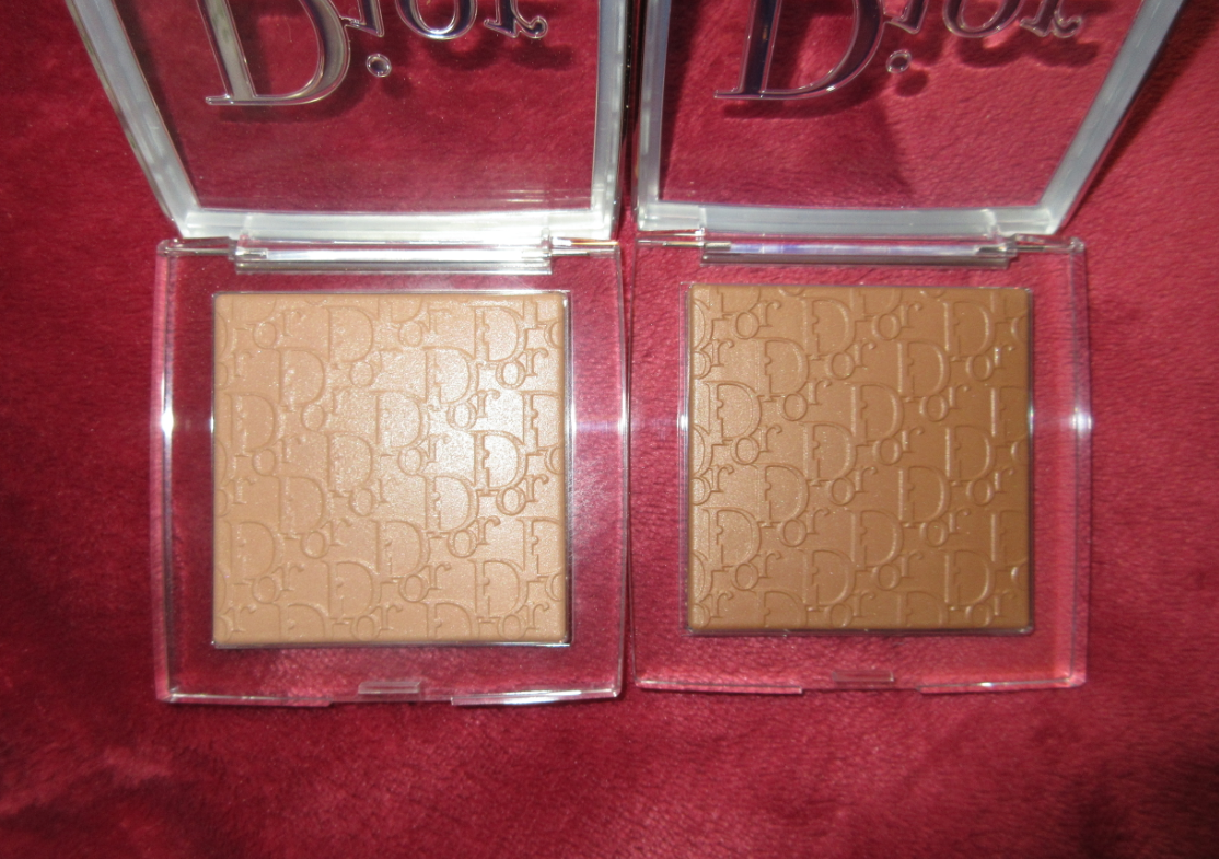
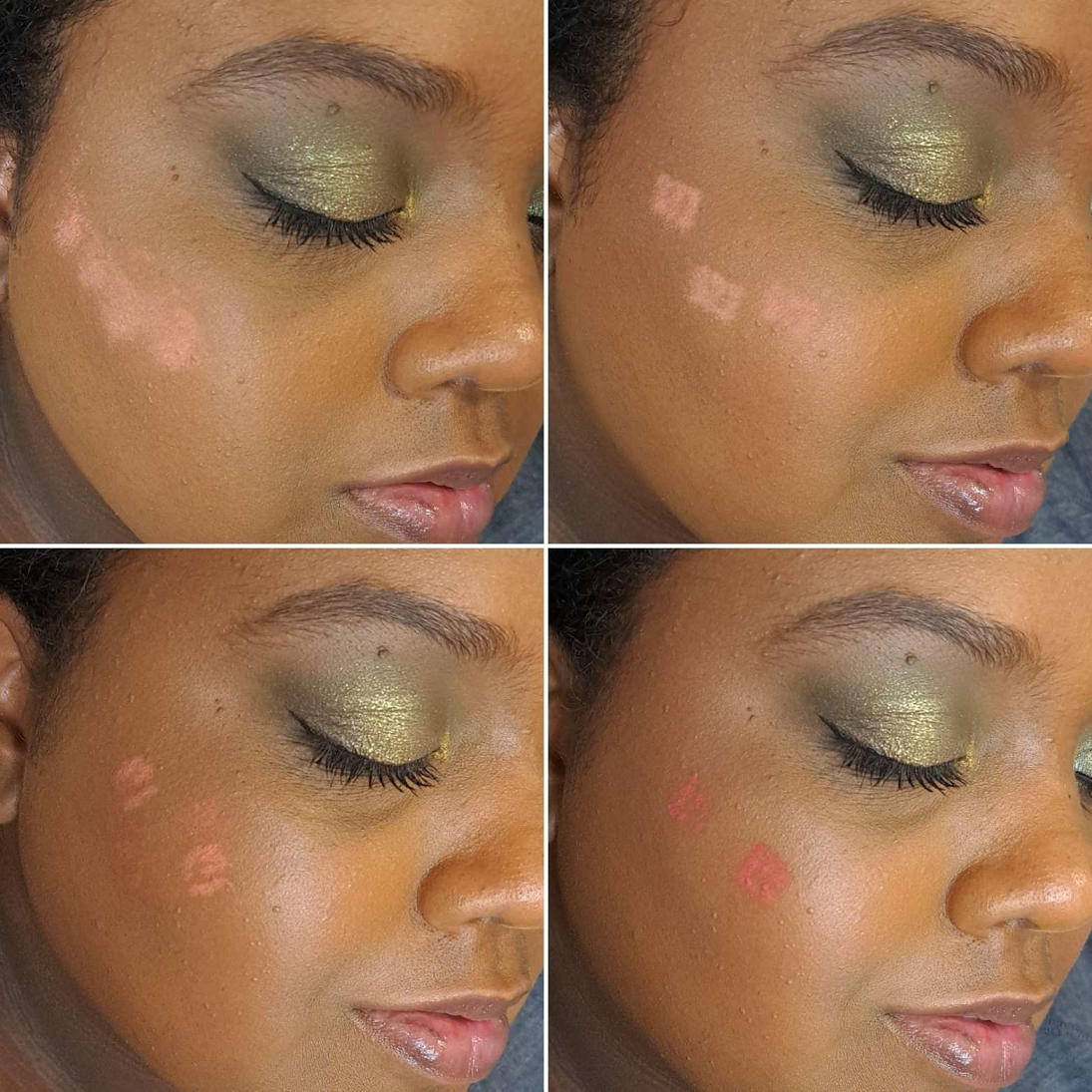
On the left is the blush and bronzer. On the right and below the blushes are worn on a face without bronzer in order to show them distinctly.
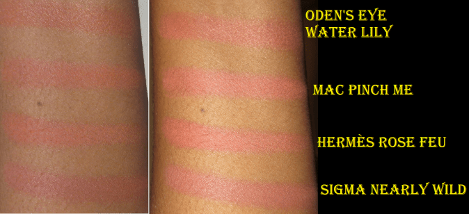
The Beige and Corail shade takes a lot of product to show up on me. Using my Sonia G Smooth Buffer brush, I have to swirl my brush in the compact (trying to focus pressure more on the outsides where the orange part is the most exposed) five times and apply that amount to the face in three layers in order to get the opacity I want. I can definitely see it in person, but the shade matches my foundation color too closely in photos. I’ve made so many attempts, but I cannot get any better than the two pictures I posted here. In photos, it just looks too much like a bronzer. However, how it looks in person is much more important to me, so on that front I’m happy with it. I can wear it all day with no fading. It has tiny micro shimmer that keeps it from looking flat matte. It’s just so pretty on the skin, so I’m glad I bought it. Also, considering how much swirling into the compact I need to do, I’m surprised to see how much of the leaf detail is still visible on the surface. They’re starting to wear down in some places, but I probably still have a ways to go before it’s gone, and those that don’t need to build up this blush as much will have it last even longer.
Rose and Mauve takes a single layer of three swirls into the compact to get a visible flush of color on my cheeks. I like that it’s more pigmented. It’s still a bit darker of a blush than my usual tastes, but I focus on picking up product mainly in the double C’s so that there’s more pink than plum on my cheeks. I think this is why I ended up surprisingly liking this blush. I like the look even more when I apply this lightly and add Beige Coral on top.
Essentially the combination gives a pinkier rosier flush. It’s similar to the combination I created when I mixed Fenty’s RiRi and Big Melons together, which is yet another mauve and orange-coral mashup. I tried taking a picture of them mixed, but it just looks like a slightly lighter application of Rose and Mauve in the photos.
I can’t believe I’m saying this, but I’m happy I bought them both!

That’s everything for today! Thank you for reading!
-Lili ❤