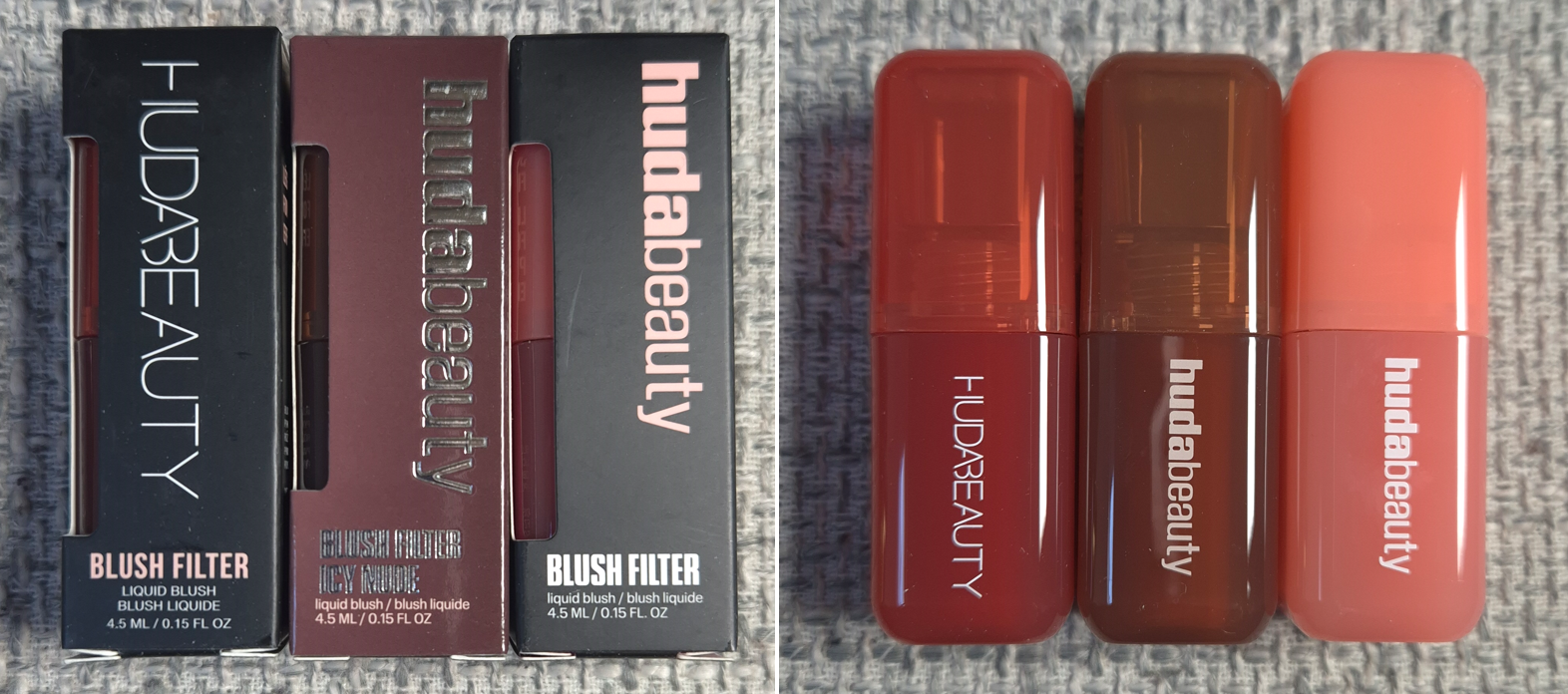
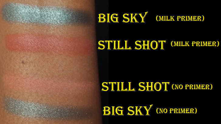
I have been on a no-buy for liquid and cream blushes since August 2023. The immense hype surrounding these Blush Filters had been steadily chipping away at my resolve. After eight months of resisting, I finally caved.
It’s convenient that the three shades I was most interested in buying were from the original launch, the Icy Nude Collection launch, and the newest “Blush Crush” or “Vibrant” Collection. I was able to see the changes that coincided with the brand revamping their logo and packaging. I was also curious if the formulas would be different between them, but they’re all the same from what I can tell.
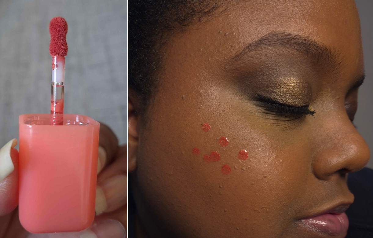
The first thing I noticed was the fruity candy smell. It smells delicious, but it is a bit strong in the initial few minutes that I have the container open, and as the blush dries on my cheeks. A thin controllable amount comes out of the stopper and with the small applicator.
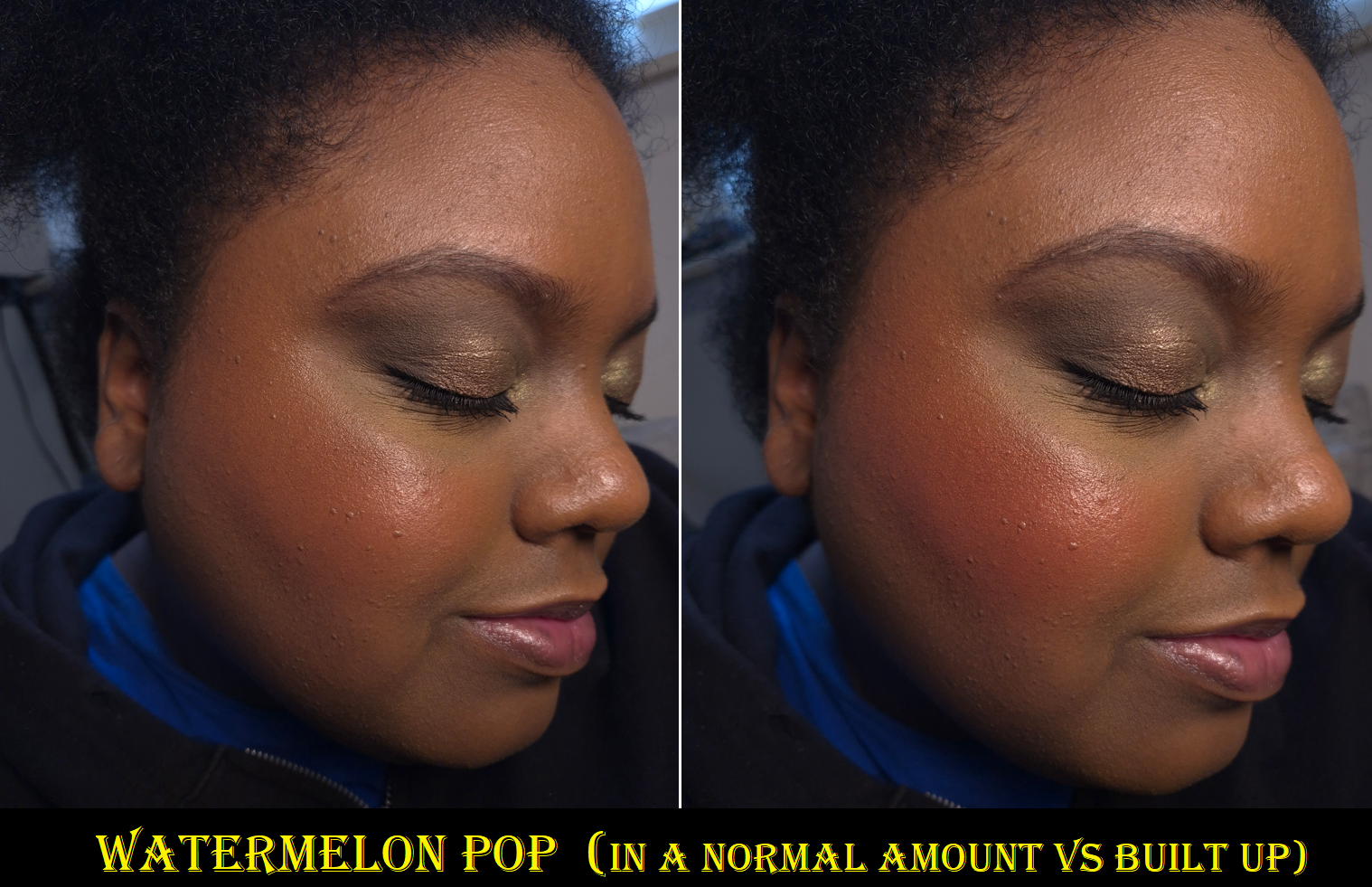
The Blush Filters are less pigmented than the liquid blushes from Rare Beauty and Juvia’s Place, but still a lot more pigmented than Glossier’s Cloud Paints. With the amount shown in the photo above, I get about 80% opacity, but these can be built up.
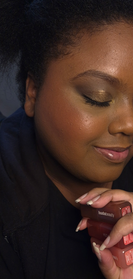
The blush doesn’t immediately set on the skin, but I still work on one cheek at a time because it doesn’t have an emollient consistency (nor gel-like or watery), so they don’t look like they’re spreading enough at first, but I just trust the process and keep moving my brush around and the blush does fully blend out and is streak-free. It doesn’t disturb makeup underneath either. Once it dries down, it’s fairly budge-proof and there’s no fading by the end of the day. I’ve been impressed by its hydrated look, even though it’s completely dry to the touch, but I think that can be attributed to the “micro pearls” in this product. When I first tried it, I thought my glowy toner combined with a hydrating skin tint was the reason it looked luminous, but when I looked very closely at the swatches, I could see a faint gold sheen in Watermelon Pop. It’s too difficult to see the individual particles within the other shades, and it’s something I can just barely see when light hits it. The radiance is subtle, but enough to keep my cheeks from looking matte and flat. It looks great on minimal makeup days, but even better when it blends into my foundation to melt into the skin, turning even the more vibrant colors into wearable shades.
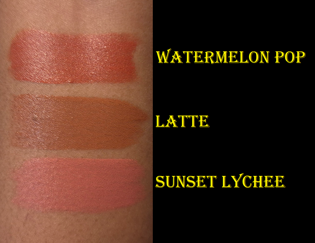
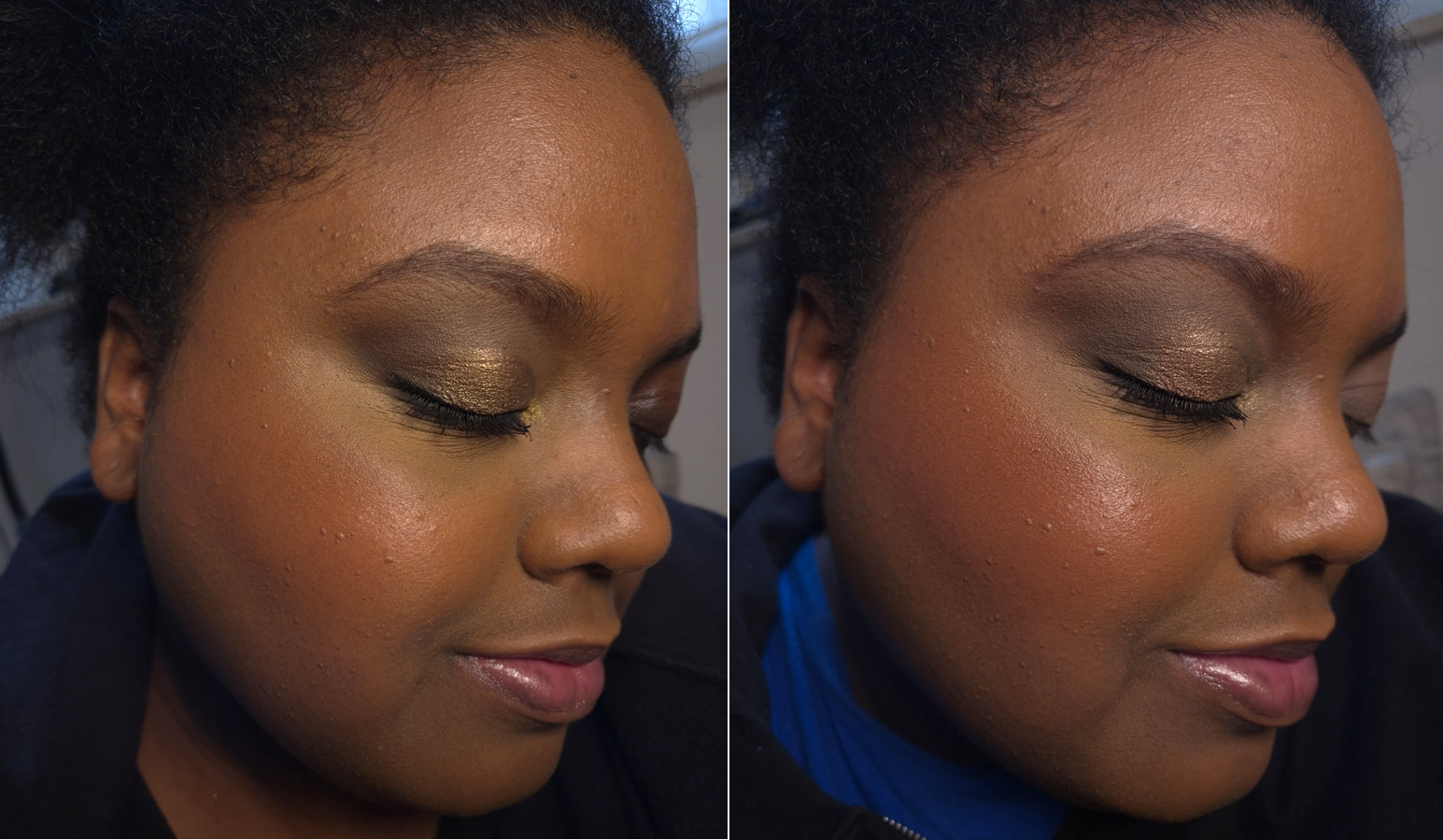
The glow combined with my lights actually made them look subtler in pictures than in person, so I built them up much heavier when I did a second round of photos. I don’t think my attempts made much of a difference, except with Watermelon Pop.
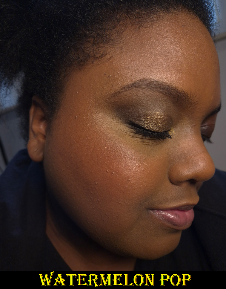
Watermelon Pop is a warm red that made me instantly think of the shade Love from Rare Beauty and Lily Love from Juvia’s Place. This isn’t a very unique color, but the warm golden micro shimmer makes me like this even more!
Latte is a medium reddish brown that looks redder on my cheeks than I expected, but it’s pretty and the kind of blush that’s right up my alley.
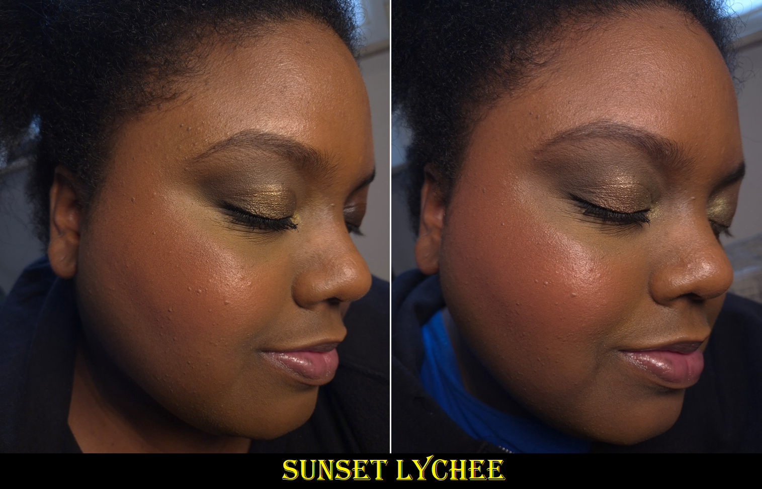
Sunset Lychee is described as a “Rosy Orange” and I’ve seen it look closer to orange on some people, but it is very much pink on me. It reminded me a bit of Rare Beauty’s Joy, but this one has more pink and less apricot.
These shades work out for me on their own, but they also layer well together.
I think this is a great product. Great products deserve to be raved about, but because there are plenty of fantastic liquid blushes out there that are blendable, set down, and are available in gorgeous colors, the Blush Filter’s level of hype seems to have been cultivated in part by very smart marketing.
I’ve always liked nice packaging, but now I’m even more aware of how non-luxury goods can still be very pleasing to look at and interact with. The Blush Filters’ rounded square shapes with their vibrant and semi-transparent packaging combined with the fruity-candy scent remind me of popsicles. There is also the collectable factor since each blush packaging matches the color on the inside. This makes the Blush Filter even more memorable and desirable. When there exist similarly performing blushes, packaging can make all the difference in choosing one brand over another. I have no regrets ordering these, even though I have reinstated my liquid and cream blush no-buy. The fact remains that I still don’t use them as much as powder blush no matter how amazing they are.
It’s a nice bonus that I got 30 Euros knocked off the price because of the reward points I accrued on my Huda Beauty website purchases over the past year. In that same order, I got samples of the #Fauxfilter Color Corrector, so I thought I would include swatches of those as well. My review of the full-size product can be found HERE.
The shade I own is Mango, which I like a lot. I have always gotten shades like Papaya in the past, and it works, but never 100% perfectly. Mango is essentially a pink-orange, which apparently suits me very well, but is a hair on the light side for me. At least, that’s what I thought until I had the idea to mix Mango and Papaya together, which I think looks the best out of all the options!
I still think it’s fantastic that Huda Beauty offers more nuanced shades of color correctors than I’ve seen from other brands. For instance, I don’t know anyone else who makes as dark of a pink as Lychee! Because of the effectiveness of Mango on me, I wondered if perhaps pink was a better corrector color shade and that brands just didn’t make any dark enough. It’s nice to confirm that Lychee doesn’t suit me. My correct corrector should be a fine line between pink and orange.
I should also point out that the demonstration photo of Cherry Blossom looks better than it actually should be. That was my mistake not cleaning my concealer brush well enough and the two colors mixed, so it doesn’t look as stark white as it should be (which is to say even paler on me than Pink Pomello). I couldn’t redo the photo because I didn’t have enough product left from the sample card.
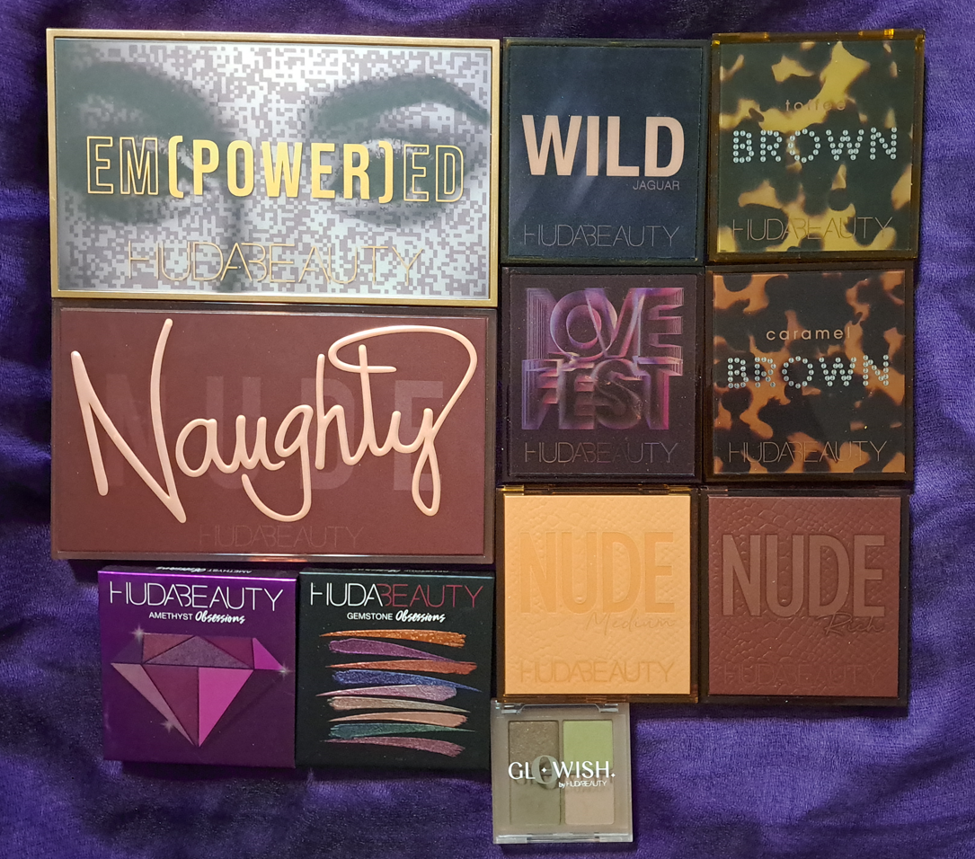
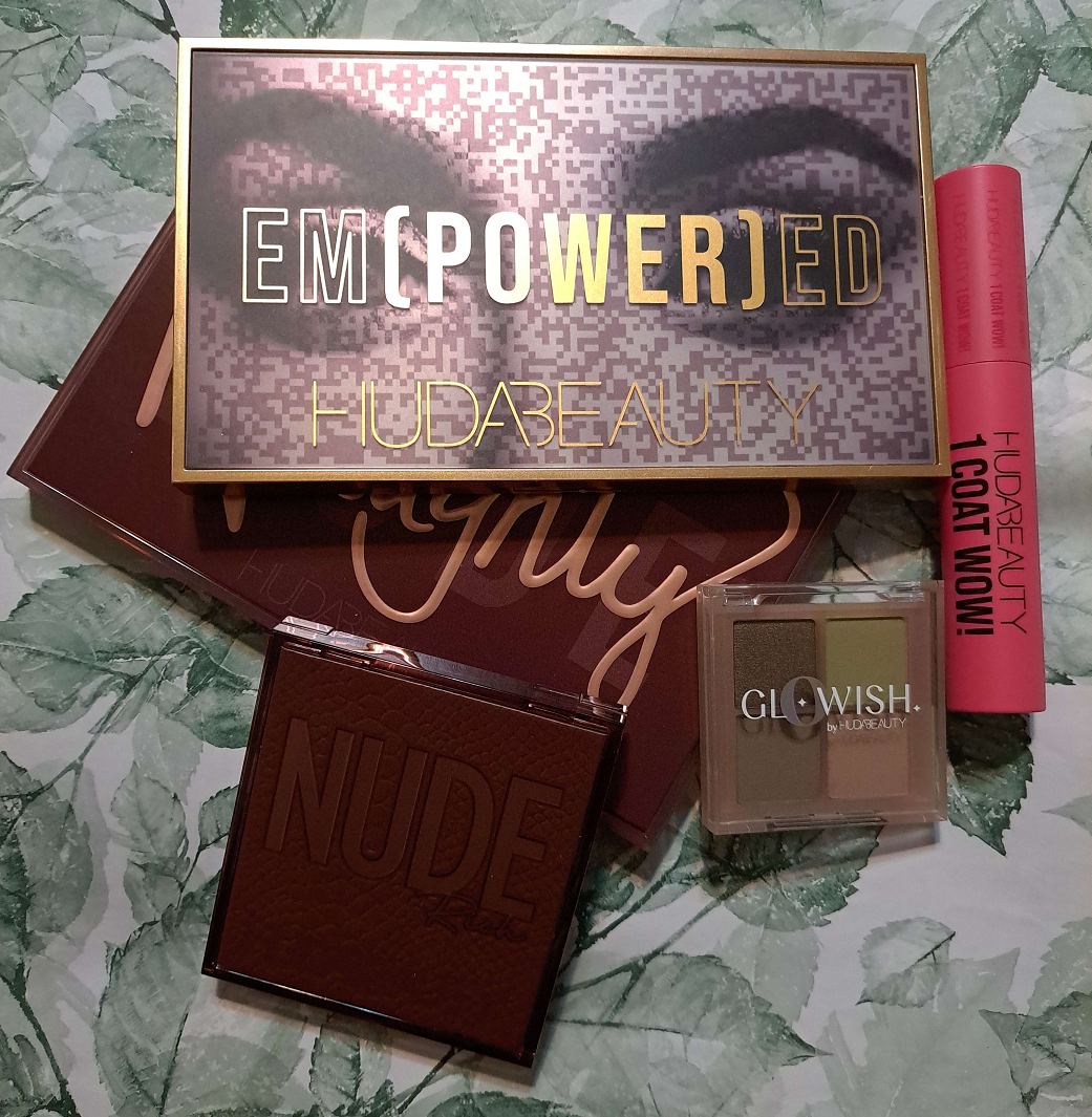
The full list of links to my various Huda Beauty reviews can be found HERE, but today I am also including mini reviews of the three palettes I purchased during the brand’s Pre-Black Friday sale for 2023. I’ll be sharing my initial impressions of the new additions to my collection. I would normally never include them so soon in a ranking post, but because my experience was so distinct, I don’t think my opinion on these will change with time.
Because the brand is having such deep discounts on the website, up to 80% off, I decided to post this early instead of my usual Mondays for anyone wanting to see additional opinions before making a purchase. For this reason, there will not be a post on Monday November 27th, but I hope to have another up the following Monday. There’s no guarantee as life is so chaotic right now (but in a good way)!
DISCLOSURE: Other than the Gemstone Obsessions palette that was gifted by Sephora and not Huda Beauty (and not even for PR reasons), I purchased everything else with my own money and I’m not an affiliate of the brand.
MY CURRENT HUDA BEAUTY PALETTE RANKING
Wild Obsessions Jaguar
Nude Obsessions Rich
Lovefest Obsessions
Naughty
Empowered
Nude Obsessions Medium
Brown Obsessions Toffee
Precious Stones Obsessions Amethyst
Brown Obsessions Caramel
Gemstone Obsessions
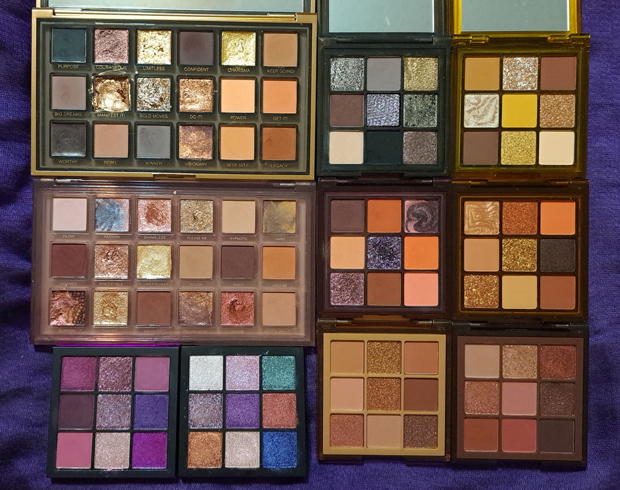
I wasn’t sure if I should include the Glowish quad since it’s technically from a separate Huda brand, but if I were to throw Moss into the rankings it would place at number 6 and everything else would be shifted down on the list. It doesn’t have impactful shimmers, but the performance is great. Because there are only four shades, I can only get two looks that I really like, whereas I can make at least a few more good ones with Naughty and Empowered despite all their flaws. So, if Moss was expanded into a 9-pan along the lines of the Nars Climax palette, there could have been potential for it to rank 4th place instead.
Jaguar reigns supreme because it’s the one I keep thinking about the most after reviewing it. It’s the one with a concise yet complete color story, and has great quality mattes and shimmers. Jaguar is specifically one I would love to get more use out of, but I’m constantly testing other palettes, so I can’t. However, I plan to change that in 2024. The Rich palette has the same great quality and a variety of depths to be able to make complete looks as well without needing to reach for other palettes. It’s like a mini of the Naughty palette without the unnecessary extras. Lovefest is like the other three, but shades 2 and 6 are too similar on me and although shade 3 is very eye-catching in the pan, it’s lower impact on the eyes than I want. So, it gets third place for being slightly more limited than the other two.
An eyeshadow looking more fun than it is useful is the theme of the two full size palettes I own from the brand. Naughty has exceptional mattes and beautiful shimmers, but some of the experimental textured shadows don’t quite work for me (like Slippery and Hard) and some of the matte and shimmer shades are a little too close to each other. This palette could have been edited down. For the same reason, Empowered is a bit lower because although the mattes are all fantastic, the right side has so many that look the same on my eyes because of my skin tone. We have more of those “innovative” formulas of shadows that work better than in the Naughty palette, but I didn’t necessarily want them in practical use. I go back and forth as to which of these two rank higher because I think Empowered is more successful with the formula and texture variety, but with the exception of the deep smokey look I can create from Empowered (that I can also get out of Jaguar), I think my eye looks with the Naughty palette turn out prettier. I ultimately decided for this list to choose the end result over performance.
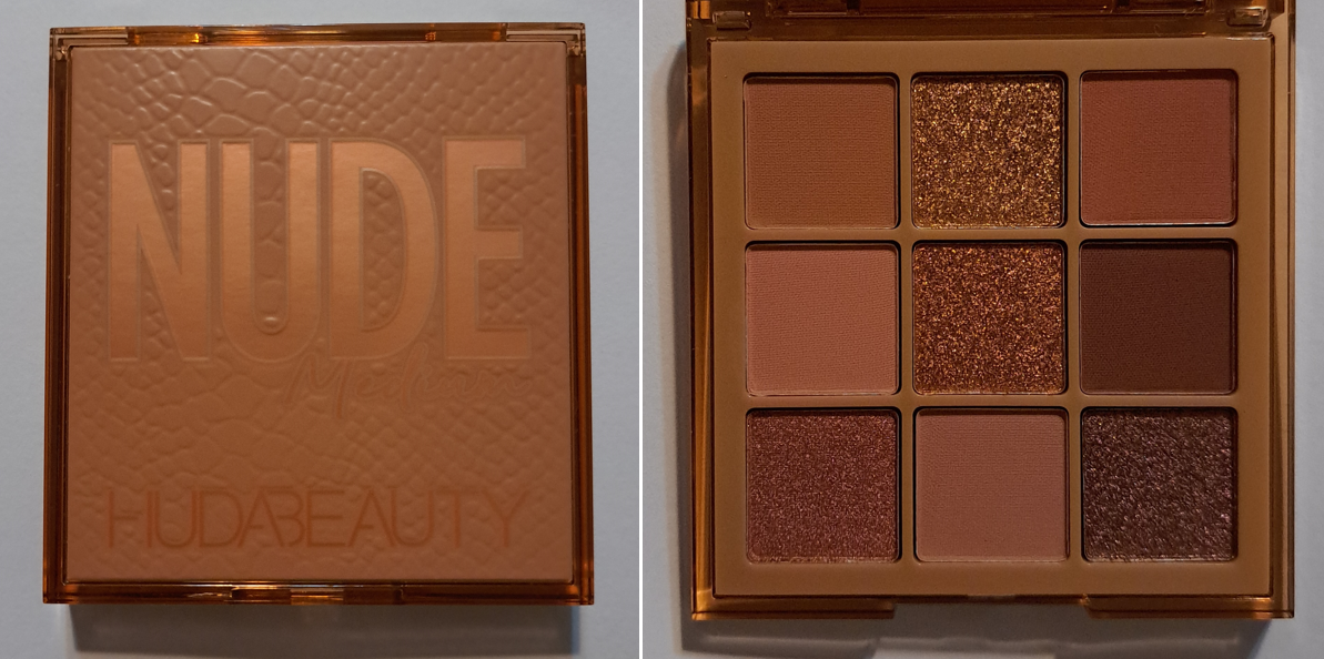
The Medium palette earns the next spot because there isn’t enough depth for me to be satisfied. I’d need to grab another palette to deepen the outer corner of my eye looks, as is my preference. I know it’s called a Medium palette and is filled with mainly medium toned shades, but the Rich palette had the full gamut of options, so this one could have had at least one deep one as well. I’ll save the rest of my thoughts in the review.
I loved the look of the Brown Obsessions Collection, but I didn’t hear the best reviews for them after they launched. Because they were priced at such a good deal, I was willing to risk getting them in the hopes that people were wrong and they’d be just like the other Obsessions palettes, but they’re not. I’ll write more about the issues with Toffee in the review section, but it places here because of one specifically problematic shade and the drop in quality from the rest. Amethyst sneaks in between the two I own because it has a beautiful color story and I loved it at the time, but the newer Obsessions palettes have even better quality mattes and my deepest shade is patchy. Plus, I’m not into those tones of mattes. I loved satins a lot more in the time period that I first had Amethyst, but they’re just not as interesting to me now. It’s the three shimmers in the center column that make this palette still a good one even though I’ve had it for five years. Caramel is brand new (at least in when I purchased it though I’ve no idea if I have a newer batch or old stock), but I have even more problems with it than Toffee so despite it being one of the most beautiful color stories Huda has created in my eyes, it pains me to have to put it so low. And ranking at the very bottom is Gemstone which I received for free from Sephora ages ago as a thank you gift for being part of their beauty community forum before they changed the website and archived a lot of those past posts. There’s a reason I never bought this palette myself because even though the colors are pretty on an individual level, it makes no sense put together except as a purely supplemental palette intended to be used with other palettes to make cohesive looks. The shimmers in here are more impactful than the satins and metallics in Amethyst, but those center shimmers in Amethyst still so greatly surpass the Gemstone ones that I had to put this at the very bottom. The lack of mattes solidified this decision.
If my ranking of Jaguar is any indication, I would say it’s probably safe to assume the quality of the palettes in the Wild Obsessions Collection is excellent, though I can’t confirm it personally as I just have one of the three. I kept saying I wanted to get the other two, but the color stories just aren’t perfect for me, especially with the too-similar-of-tones problem. So, even though I recommend them most, one would have to ask themselves how useful will these tones and colors and formulas actually be? The same goes for the Nude Obsessions line, though I only have two of the three. They’re great, but did I really need them? This becomes even more poignant when it comes to the larger palettes with their various textures, formulas, and finishes. How much someone loves it is less of a quality issue and depends entirely on their personal preferences. For instance, the cream liner shades in Empowered work fine and could be a base for the duochromes, but it’s not so good if I need something that’s fully transfer-proof or something that’s easier to glide onto the lids to line them. So the pros for one person could be a con for someone else.
Huda’s newest palette, Pretty Grunge, looks gorgeous. However, I know it’s not perfect for me either which is why I’m going to pass on it and try to be more conscious about the future additions to my collection that I make from this brand.
Huda Beauty Nude Obsessions Eyeshadow Palette in Medium
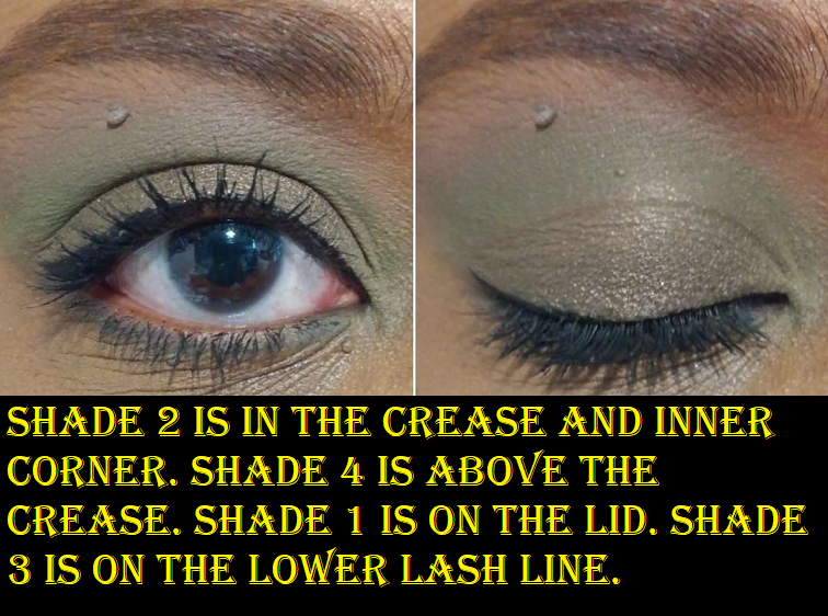
I took the palette photo at night, and for some reason the shadows look darker in the pan than they should, so the photo just above the swatches is a more accurate representation.
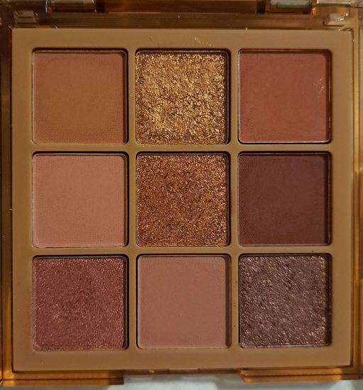
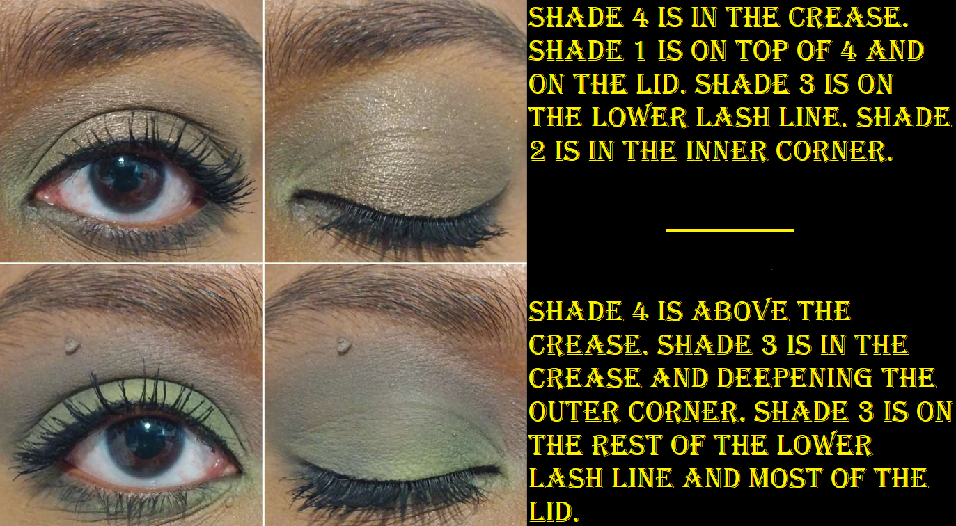
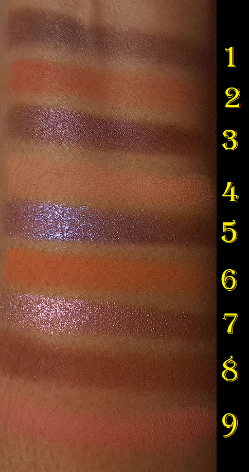
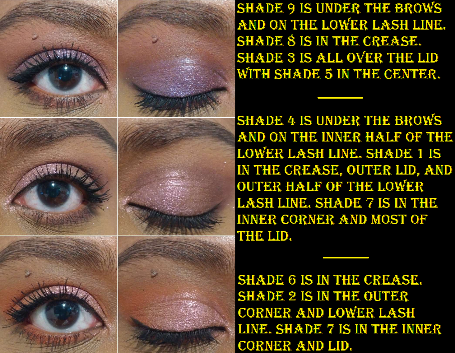
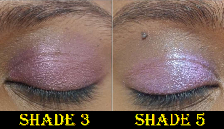
Medium is a mix of light and medium toned eyeshadows. Shade 6 is the darkest in the palette, but it isn’t dark enough to give me the depth level in the outer corner that I prefer, so that automatically makes this a supplemental palette for me.
Shade 1 is close to my skin tone so it doesn’t show up very well, but the tiniest bit darker Shade 3 is the one I’d need to reach for as the transition shadow. 4 and 8 are the same depth with Shade 4 being slightly warmer and peachier pink whereas Shade 8 is a cooler pink. The matte quality is nice, but my options are limited.
The shimmers are pretty and thankfully don’t give me any issues with longevity. Because Shades 2, 5, and 7 are in the same color family though, I’m not getting wildly different looks. So, the combination of similar mattes with shimmers that are close enough, it really cements the fact that there isn’t enough variety for me as a standalone palette. The quality of this palette is good, but is in the middle of the ranking list specifically for these reasons.
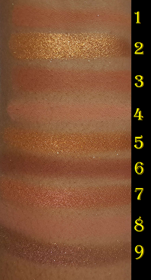
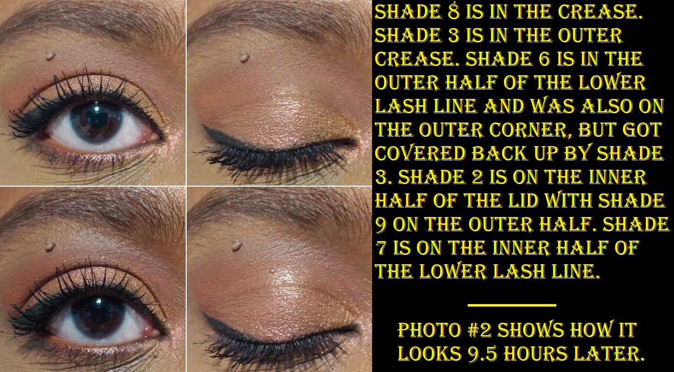
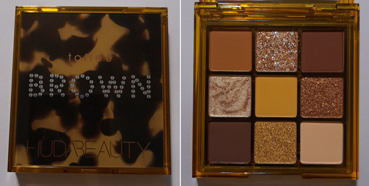
Huda Beauty Brown Obsessions Eyeshadow Palette in Toffee
I think gold shades and warm tone neutrals are pretty, so I couldn’t resist this palette any longer. Shades 1, 3, and 9 are similar matte quality to the other Obsessions palettes, but not quite the same level, and I’m not sure why that’s the case. They’re a little more dusty in texture, but they blend well enough not to bother me. I just notice the slight difference. The pigmentation level is the same for all except Shade 5 which had to be built up in multiple layers to last on my eyes. This is still a better performing yellow than some in my collection that are usually made too thin and dust away, or are mixed with too much white base, so I’m not unhappy with it. The only matte that gives me considerable trouble is Shade 7, which is patchy. I had to tap on quite a bit of product to get it to cover the bald spot and by the end of the night I still ended up with it looking strangely. Because I still have Shade 3 as a deepening option, I can forgive Shade 7 being a bit of a dud. I also give props for having distinctly different matte colors.
From just swatching the shimmers, I correctly guessed which ones were going to give me the issue where it moves out of my crease line. Shades 6 and 8 resemble the standard Huda metallic-shimmers to the naked eye, but they’re more emollient feeling than the others. To be fair, they didn’t move or crease as much as I expected, but there was still a little movement. The amount I had at the end of the night was tolerable to me. However, some palettes don’t have any shimmers that crease on me, nor patchy mattes, so that’s why this is so low on the ranking list.
Shade 4 has a fun pattern and feels like a stiffer version of a Super Shock shadow, but the more it’s rubbed, the harder it gets compacted into the pan. I can already tell this shade is going to be tough to pick up on a brush or even my fingers in the future. Shade 2 is dry feeling and has visually interesting patches of larger particle silvery/white sparkles called a “pearl flake texture” that adds more drama and shine to eye looks. It doesn’t swatch the best, but looks super pretty on the eyes.
Toffee is pretty and workable, but I don’t really recommend it. Perhaps the current sale price of $9.60 makes a different, but perhaps not.
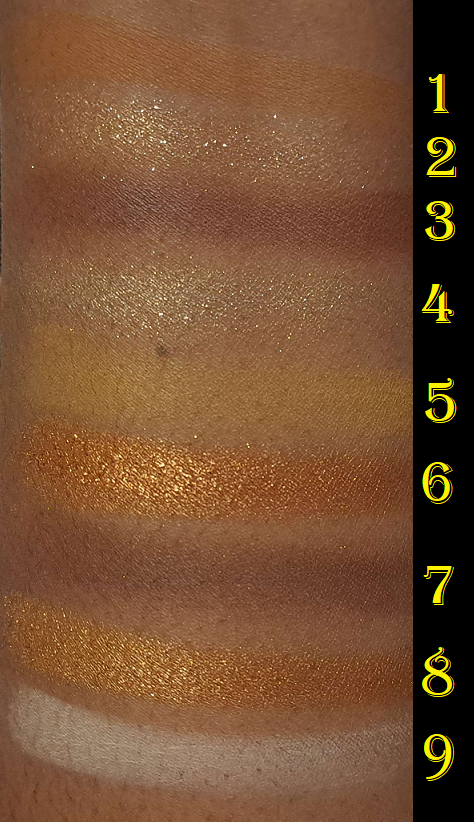
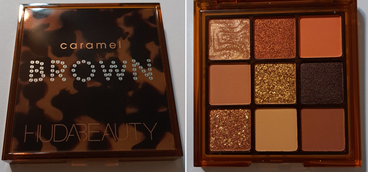
Huda Beauty Brown Obsessions Eyeshadow Palette in Caramel
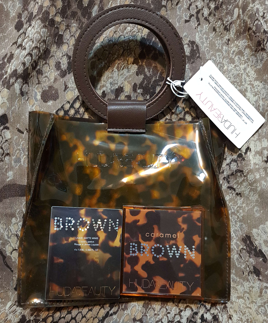
This actually came in a “Caramel Brown Obsessions Kit” which had the palette, four mini liquid lipsticks, and a bag for $13.50. I’m just going to focus on the palette in this review.
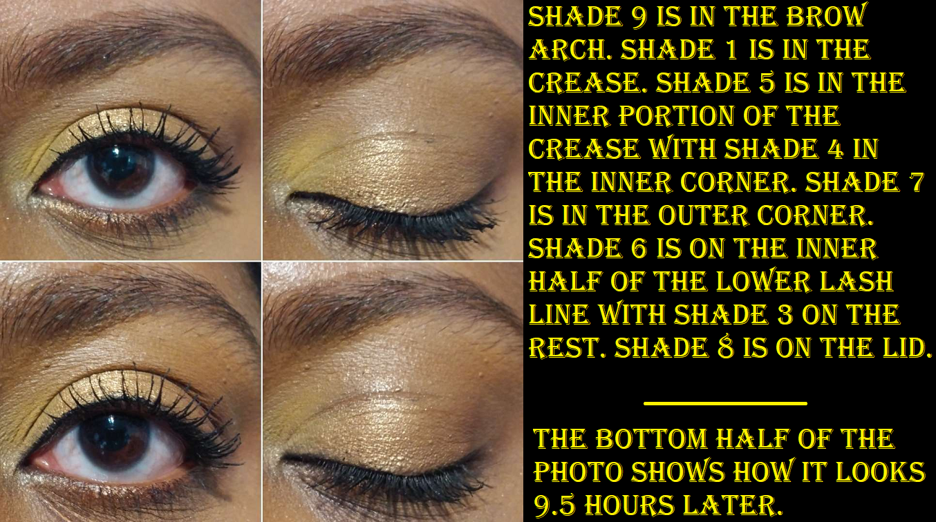
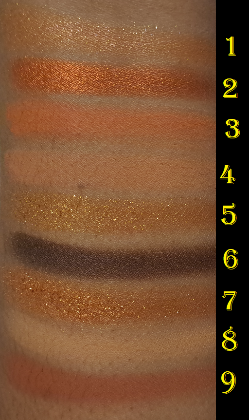
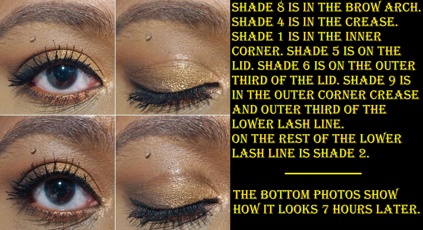
This color story is absolutely stunning! It’s such a shame that the quality of this one is the worst of any other Huda palettes I own. It’s still not the worst palette I’ve ever used, but it doesn’t live up to the expectations I have for the brand’s eyeshadows. It was already difficult to pick up Shade 1 from the very first time I used it and swatched it, so that doesn’t bode well for future usage. Shades 2 and 6 are the metallics, but Shade 6 is way wetter feeling than the rest and it’s so difficult to build up. It looks pigmented at first, but when I try to smooth it out to create the shape I want in the outer corner, it fades significantly to the point where there’s hardly enough color left. So, I had to keep building it up. Shade 5 looks flakier than the metallics, and looks like it should be a standard shimmer, but it’s as creamy as Shade 1 and hard pressed as well, though I’m able to get decent payoff for now and it’s just a matter of time. Shade 7 has that fascinating pearl flake texture, but for some reason is wetter than that same formula shadow from the Toffee palette. Of course, all this emollience leads to moving issues on my eyes. In the demonstration photo below, I showed what it looks like 7 hours later, but it was noticeably looking that bad already when I looked in the mirror 5 hours in. It didn’t get significantly worse and I’ve still had worse performances from other eyeshadows before, but this one really disappointed me.
Part of the issue is that the mattes, which can help keep the area dry despite my semi-oily lids/crease, is that these particular mattes in the Caramel palette are all thin and don’t build all that well. It took me quite a few extra swipes to get a decent swatch of the colors in the swatch photos. I would normally do no more than 2 swipes for swatches, but considering this is one of the few palettes with mattes that don’t all look the same on me, I wanted to make sure those colors could be seen properly. At least, how the colors should have looked on me if they were able to build up since they’re thinner with less pigment.
I should note that I used the same primer with all three of these palettes, but the only one that has zero longevity issues for me is the Nude Medium palette, which supports what I heard about the Brown Obsessions collection being unequal in quality to my favorites from the brand.
I love this color story so much that I considered even bringing it to Germany with me despite the performance. However, I thought about my Natasha Denona Bronze palette and Metropolis. Between those two, I could very easily recreate this look. So, I’m leaving it behind.
That’s everything for today! I hope this has been helpful and I wish you a Happy Thanksgiving (if you celebrate it), Black Friday, and Cyber Monday!
A few additional items discussed in this post are not pictured here.
Between Huda Beauty’s main brand and the side brands of Kayali and GloWish (I’m not fully sold on Wishful yet), I’m becoming more of a fan these past two years than ever before! Today, I will be discussing the remaining unreviewed products I own.
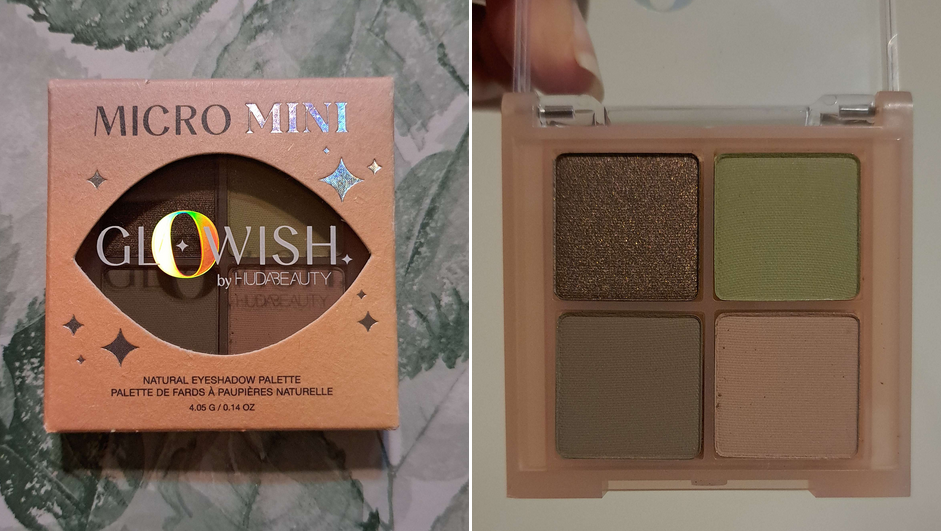
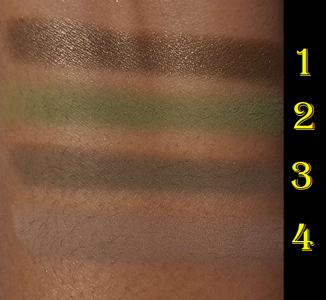
GloWish Micro Mini Natural Eyeshadow Palette in Moss
The Glowish quad is nice! It’s more pigmented than I expected, which is to say it’s the same Huda quality I’m used to. Unlike the 9-pans that are normally made in China, this quad was made in Italy like the bigger Huda palettes. So, that was interesting to see. A lot of people say the quality between the 9-pan and full size ones are different, but now that I have the Empowered and Naughty palettes to compare, I really don’t see a difference from the Obsessions palettes I own. Then again, I’ve only purchased the ones rated high in reviews.
The shimmer in the Glowish quad didn’t have the impact I usually prefer, but since it’s part of the Glowish line, I assume it’s not meant to be super attention-grabbing. That’s the only complaint I have. I don’t get creasing, I don’t have longevity issues, and the kickup isn’t that bad. I like this, but if I’m being perfectly honest with myself, Moss gives similar vibes to the Natasha Denona Mini Gold palette, but ND’s has way more interesting shimmers. To those that like muted earthy yet pigmented colors and like satins instead of shimmers, I recommend getting the GloWish quad. However, those that like a lot more sparkle with a quality that’s at least as good, plus even quicker to blend, I recommend spending the extra $6 to get the Natasha Denona Mini Gold, which has an fifth eyeshadow too.
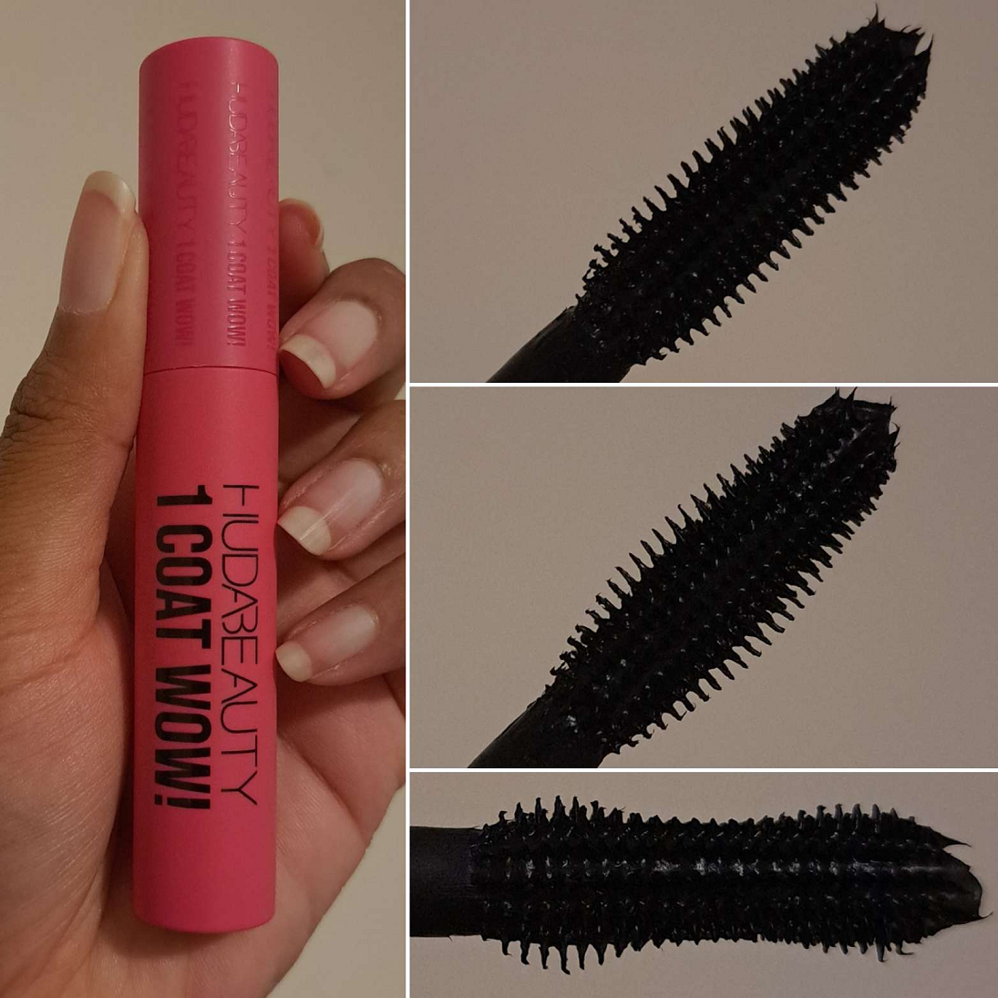
Huda Beauty 1 Coat WOW! Extra Volumizing and Lifting Mascara
An example of this mascara being worn is in the section with Glowish quad eye looks and the first two eye looks for the Naughty palette. For those curious, I’m using the COL-LAB mascara (in the pink writing not purple) in the last two eye looks showing the Naughty palette.
My version of one mascara coat is to pull the applicator out of the tube and apply the mascara to my lashes in repeated swipes until I’m satisfied with the length and volume, and without dipping back into the tube a second time. I start with the side of the wand that forms an hourglass shape, as that feels like I can get closer to the root of my lashes that way. I keep building up that single layer before turning the wand to the side that looks fully curved without an inward dip from brush base to brush tip. That side of it helps to comb out the lashes so they don’t look clumpy and/or remove visible clumps gathered on the tips. I prefer to stick to the single coat. Waiting for the mascara to dry and then applying a second layer only adds slightly more volume, but no additional length. I’m satisfied with the volume I get from one coat, so I don’t get extra value trying to build my lashes beyond the first coat.
I don’t get any smudging throughout the day, but I do get some flaking. The amount is acceptable to me, so I don’t count it as much of a negative. However, I have mascaras that give me the same results with less effort and don’t flake at all such as the MAC Megastack, COL-LAB mascara, and Essence Volume Stylist 18hr Lash Extension Mascara. So, this isn’t something I plan to repurchase. Also, this takes normal effort to remove with my Bioderma Micellar Water.
I should also note that I’ve used this mascara at least five times in a little under two weeks and the mascara consistency has gotten thicker. I have a much easier time getting volume, but the amount of clumps I have to remove from the tips of my lashes before it has time to dry is another annoying attribute that guarantees I won’t repurchase it.
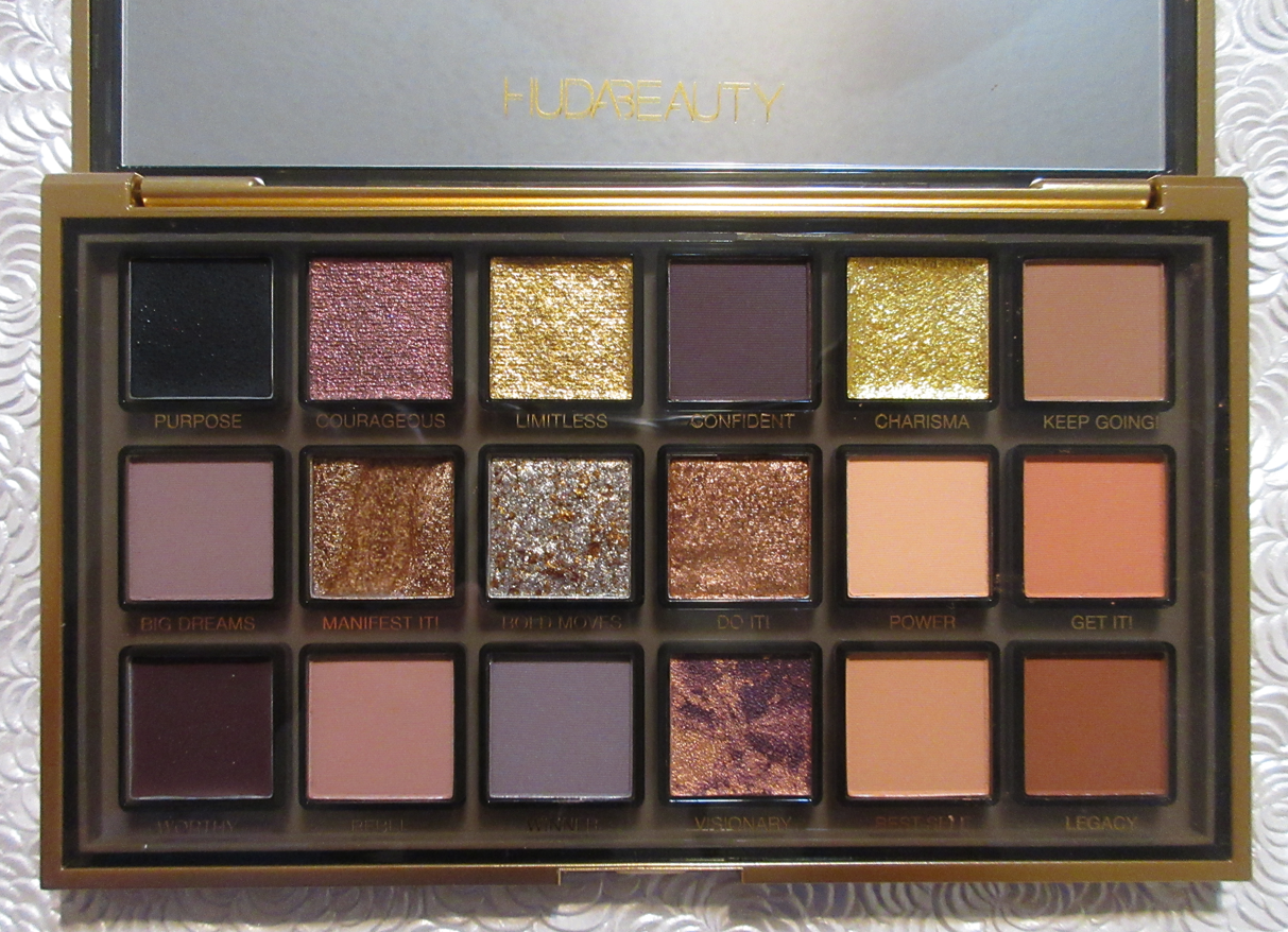
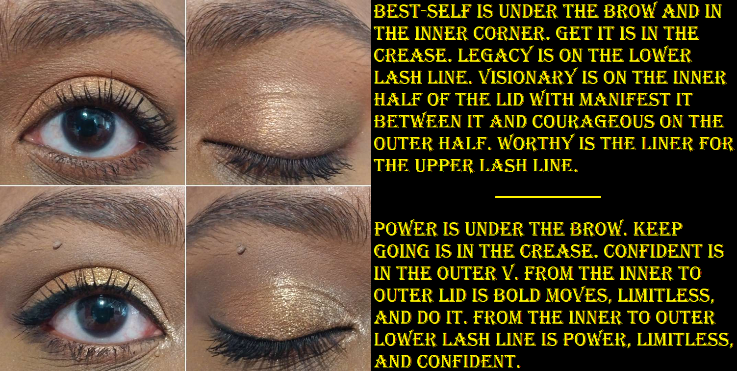
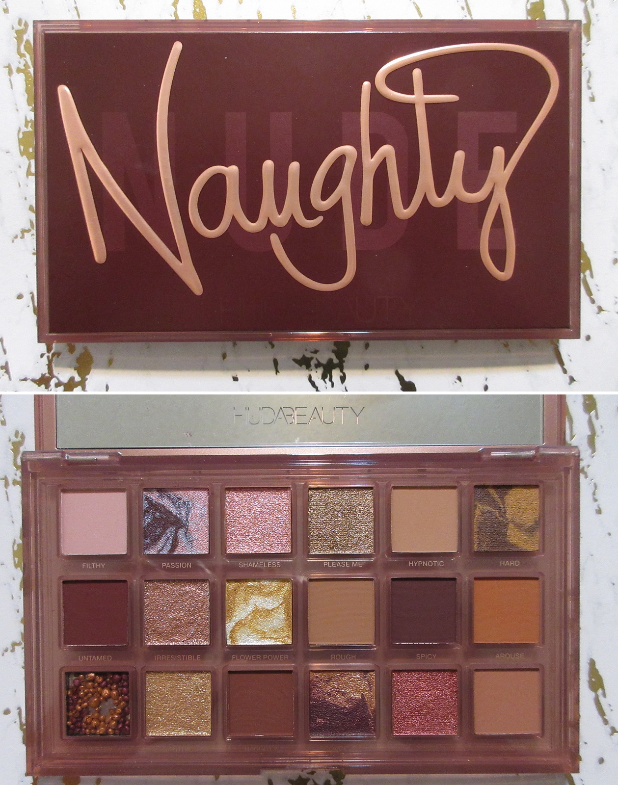
Huda Beauty Empowered Eyeshadow Palette
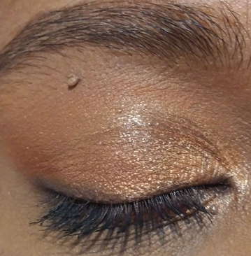
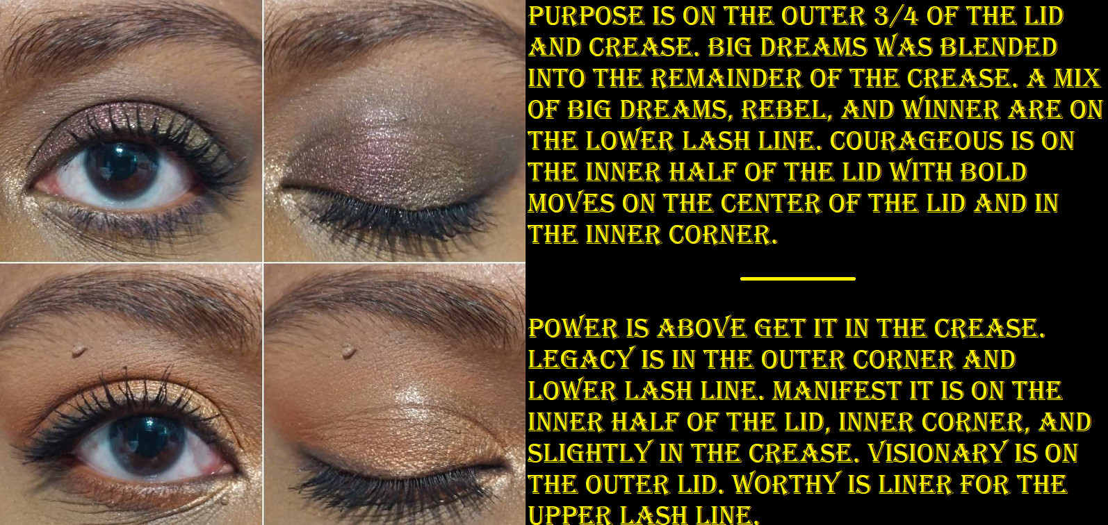
As I said in my Swatchfest #6 post that included this palette, but not a full review, Manifest It is that strange gel formula that Huda included in the Naughty palette, but the pigment is in cream form instead of the circular balls. I took a cosmetic spatula and recombined the clear hard waxy gel and pigment together to get an even coating of color. Unlike Slippery, I find that there’s enough pigment in my mixture to actually use Manifest It as a visible opaque eyeshadow and not just as a primer base. It looks fine on my eyes if I keep it away from any folds and lines, but if I put it in the inner corner or some of it strays from the lid and into the crease, it can look a bit textured and take some extra smoothing over with a flat brush or my finger, in addition to creasing and moving, leaving me with a bald patch in those spots. It looks passable for a few hours, but by mid-day the combination of eye movement and spots on my lids that product oil majorly exacerbate the creasing. So, I try to keep this shadow for use in areas of low movement and away from areas that show signs of “maturity.”
After two hours wearing Manifest It on the inner half of the eye compared to the worst of it by the end of the day.
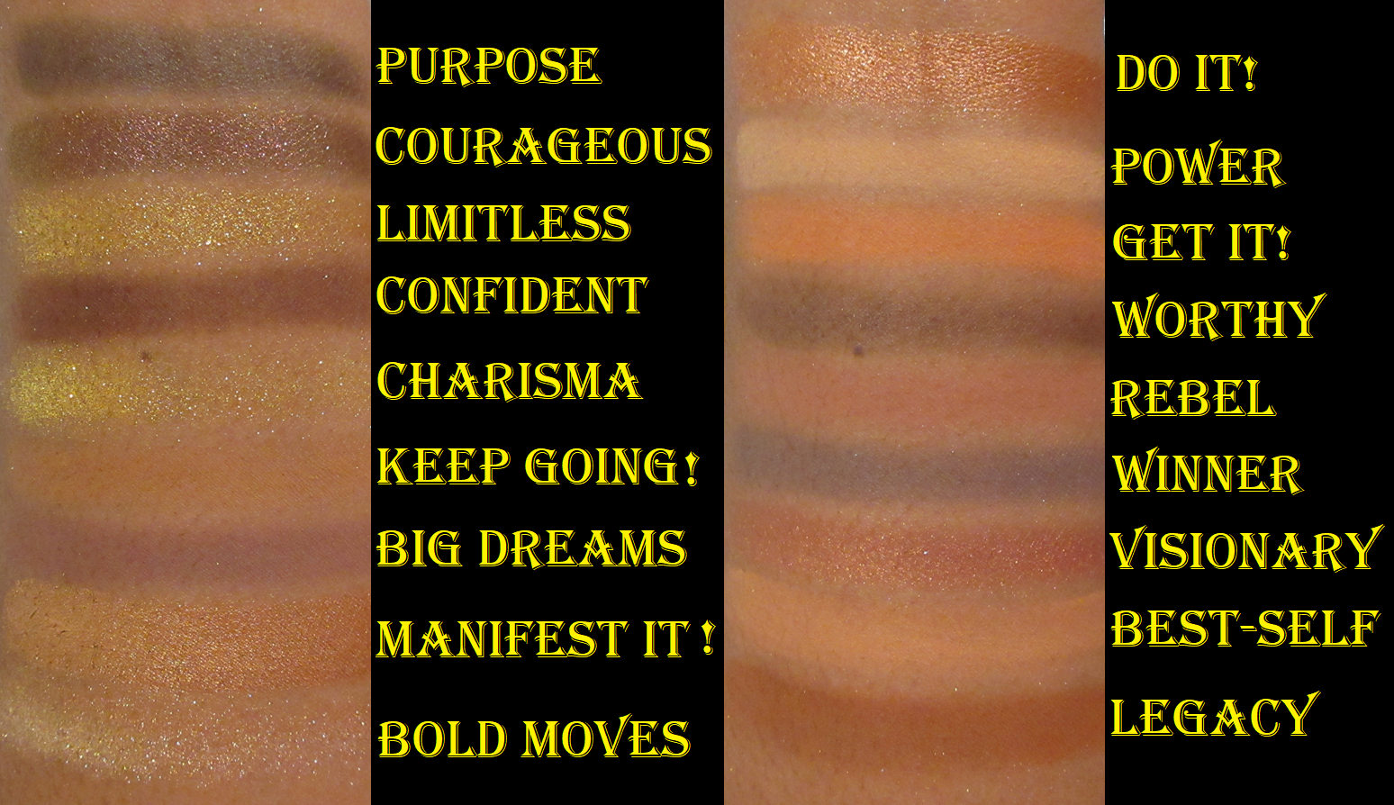
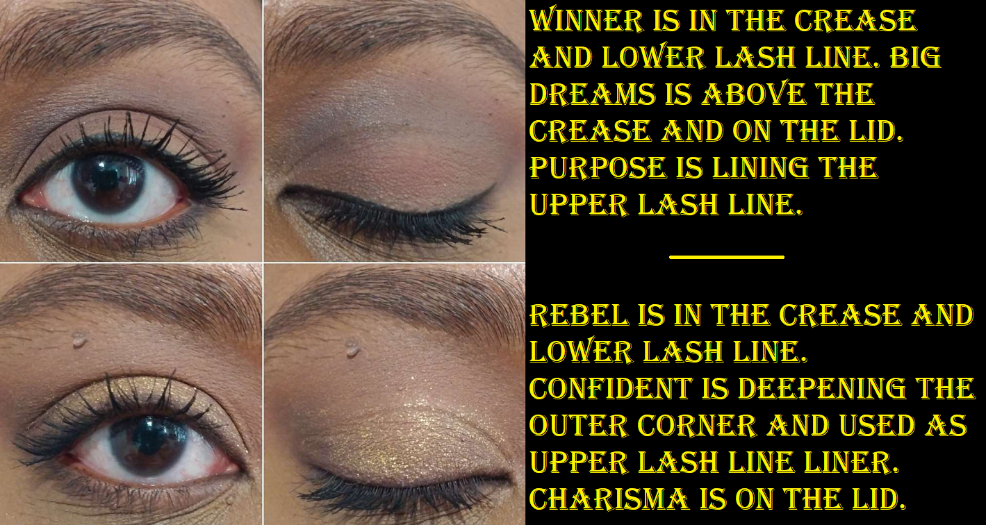
The standard powder mattes are all great. It’s the typical Huda Beauty type of mattes that are pigmented and easy to blend. My issue is just that these shades are too similar on my eyes, so I’m a bit limited in the variations of looks I can come up with. Big Dreams and Rebel end up looking the same. That’s also the case with Power and Best-Self. Get It is darker and brighter than those two, but if I use it in the same eye look it will overpower them and just look as though I applied Get It by itself. The three mattes that stand out the most are Winner, Confident, and Legacy. In the case of Winner, it has equal depth to Big Dream and Rebel, but the aspect that sets it apart from them is how cool toned it is.
We have two gel hybrid eyeliners that can be used as eyeliner, eyeshadow, and/or as an eye base. They aren’t waterproof or transfer-proof, since I can rub the spot where they are applied and get a faded imprint on my finger, but they at least don’t smear. They’re easy to pick up on a brush, but not as easy to get off the brush and smoothly onto the eyelids, especially with other shadows already built up on the lids. I don’t have much patience when it comes to passing over the lash line repeatedly, so it’s actually easier for me to use Confident as a liner instead of Worthy. Because Purpose is a richer color that takes less effort to build up, I don’t mind as much using that one as eyeliner. I like applying it to my eyes with my finger for a smokey look and to increase the intensity of a typical multichrome used on top of it. It does fade on me as the day goes on, as it’s not that rich of a black color, but it’s still visible enough for me to be satisfied with it being included in the palette.
Courageous is described as being “multichromatic” and has a slight shift that can be seen in the pan, but not as evident on my eyes. It also has its own black base, so using it with Purpose isn’t necessary. Even though it’s not very shifty, it’s still a pretty eyeshadow and great for smokey looks. It has a little too much slip to it, which is prone to creasing on my eyes, so I try to keep it out of lines and folds as well.
As for the golds, they’re both beautiful, reflective, and shimmery, but Limitless is extra flaky. So I prefer to use Charisma out of sheer ease of use, though they both have a scattered effect if not applied wet.
Visionary is similar to Provocative from the Naughty palette, but I prefer this color, tone, and fact that it feels smoother on the lids. I’ve had the Naughty palette a little longer, so perhaps I feel a slight difference because Visionary is newer. The mixture of swirled colors turns out to be very similar to how Do It looks, which is yet another reason I feel these shadows are repetitive. Besides the slight tone difference (bright copper versus brown-copper), Do It is shinier with visible shimmer whereas Visionary is smoother, so they have textural differences and one gets to choose which shimmer intensity one wants.
Bold Moves is an interesting mottled shadow combining “white gold and true gold metallic speckles.” Considering this is a mostly warm leaning neutral palette, but with some cool toned options, this kind of shimmer is a good bridge between them. It’s creamy and adheres to the lid nicely, but I apply it damp if I want to avoid a mess when applying it to the inner corners.
I bought this for $46 on Black Friday, so I’m glad I didn’t pay full price. It’s just a little too repetitive in color story and the shimmers are a little too creamy for my eyes, so I don’t think I’ll be using it very much. The quality is good, but there are so many factors that will determine whether these shades will work for someone or not.
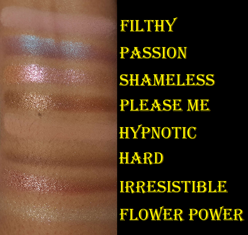
Huda Beauty Naughty Nude Eyeshadow Palette
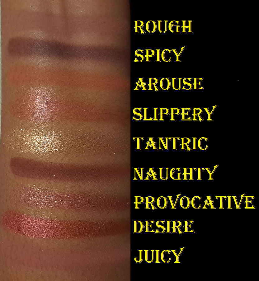
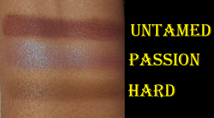
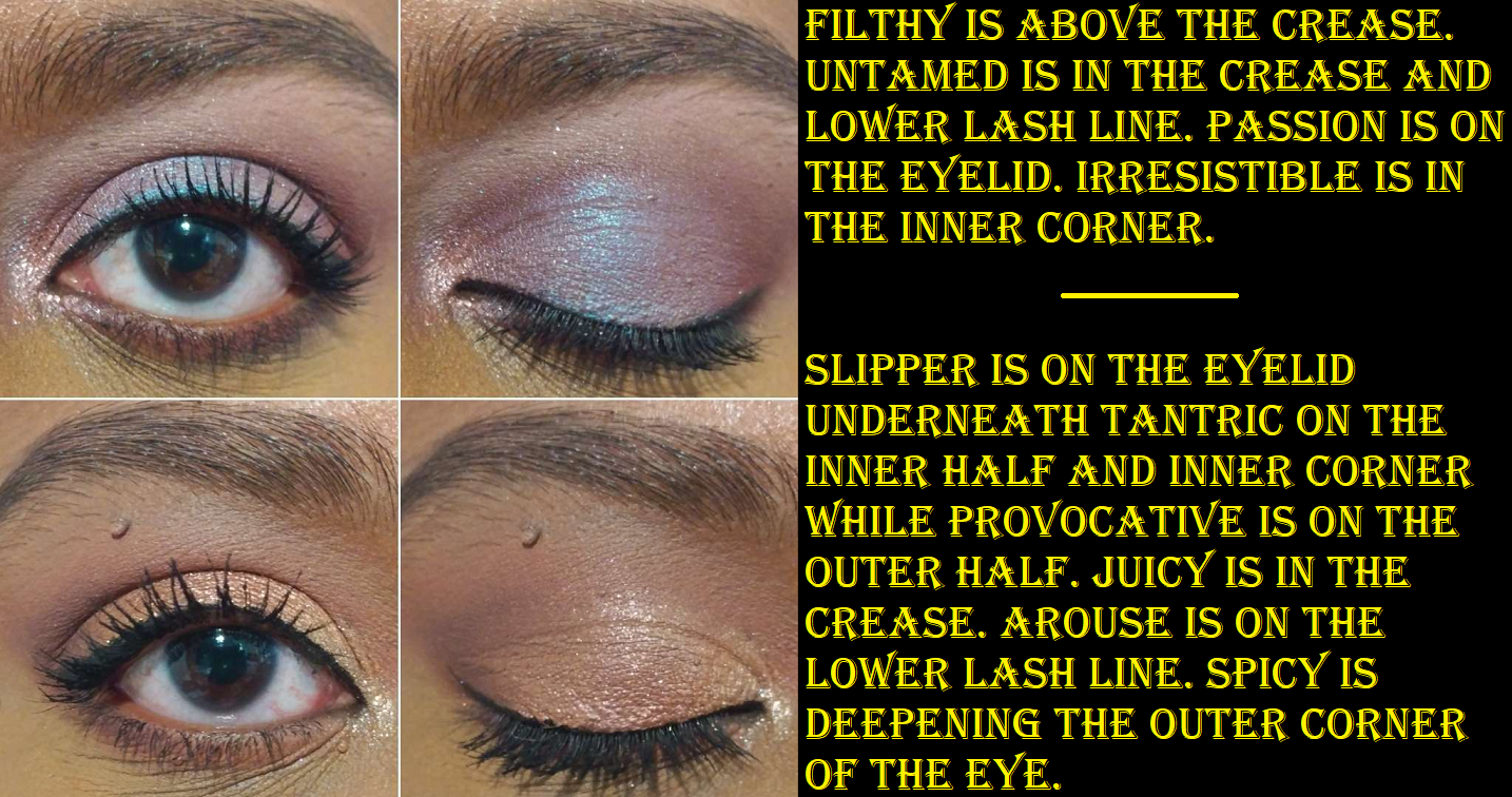
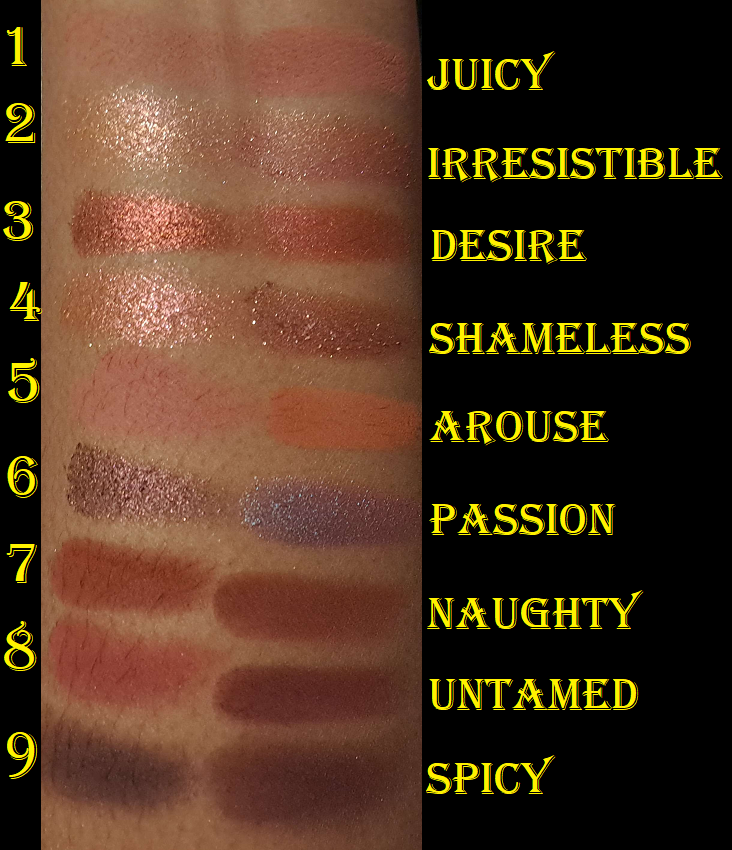
The last photo above has the swatch of Untamed because I accidentally skipped over it when I was doing swatches in order. I also re-swatched Passion and Hard because those shades needed to be mixed/rubbed together more thoroughly to show a solid color. It would have looked unflattering on the eyes to have random lighter and darker lines or patches on the eye if I just applied it like a duochrome.
I have to address the fact that Passion in this palette is like Astral Amethyst Moon in the Pat Mcgrath Huetopian Dream palette. It’s the surprise blue pop in a neutral palette. However, at least Passion is blue shimmer with a burgundy base, and that burgundy color works well with all the other pink and red-leaning shadows in this palette.
I had the Empowered palette first and dealt with Slippery the same way as Manifest It and the weird gel pigment bubble shadow in the Essence Coffee to Glow Palette; I used a cosmetic spatula to mix half of it together fully. It doesn’t turn into anything pigmented enough for me to wear on its own, but it does make a pretty good eyeshadow base for helping the shimmers stick to the eye.
Hard has a creamier feel to it than a standard matte, but it’s definitely still a powder that sets on the lid to a dry finish. The color it turns into basically just looks like my eyelid color. So, I haven’t found a use for it.
While I appreciate a pigmented and blendable product, the shade Untamed was so difficult to work with. It goes on the lid intensely immediately, even when I use a small amount. If I try to blend the edges, it fades to a dirty dark color that doesn’t show the burgundy tone anymore. It looks too harsh and unblended if I don’t at least try to smooth out the edge. Applying a lighter eyeshadow color on the edge tones it down far too much. Blending it out also wipes too much of it away. So, it’s extremely finicky trying to get the color to show true to how it looks in the pan, not be overblended (which takes 3-5 seconds to overblend) and lose color or look patchy, but also not look like a solid block of color. If I finally get it to look nice, adding a shade to my lid and it slightly traveling higher into the crease forces me to have to play the game all over again to try and fix it and avoid it looking patchy and messy. The time it usually takes me to finish an eye look is the amount of time I have to spend on just Untamed alone to make it look good. Thankfully, after dealing with Slippery and properly swirling together Passion, Hard, Flower Power, and Provocative, the only shadow left in this palette that gives me trouble is Untamed. Regarding the marble/swirl shades, the shimmers seemed the tiniest bit creamier than Hard which made them a little easier to mix evenly.
The five other shimmers are easy to apply, but Shameless, Flower Power, and Tantric are a bit flaky (though not to the extreme of the golds in the Empowered Palette) and I prefer to dampen my brush to apply them. I will get shimmer fallout if I don’t use something like a glitter primer or the Slippery shadow underneath to keep it in place. Dampening my brush works for getting it to adhere, but not for a full day. Another nice thing about these shimmers is that I don’t have to deal with creasing when I use them. As for the seven other mattes, they’re quite pigmented and blend nicely. It’s not as quick to use as Pat Mcgrath or Natasha Denona mattes, but these are still quite good.
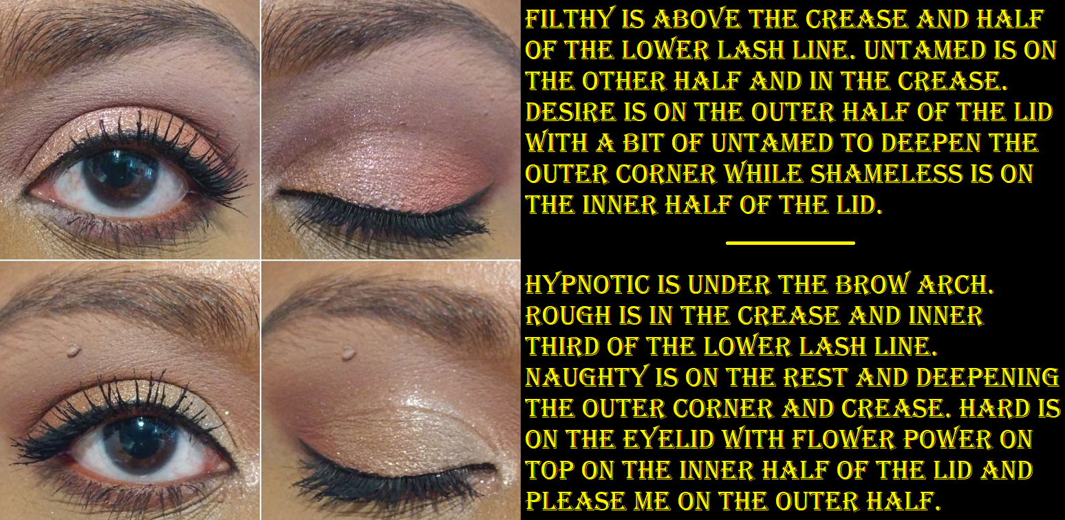
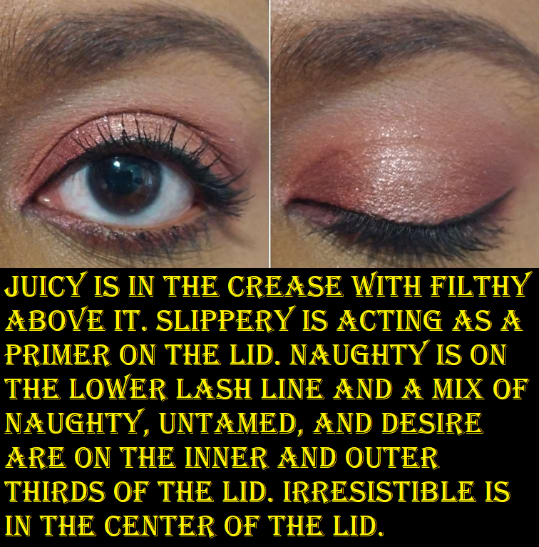
*I accidentally wrote Slipper instead of Slippery. Also, I intended to use Irresistible on its own in the inner corner, but as I continued to dip my brush into the pan to build up the shade in the inner corner, I got confused and started dipping into Shameless as well. So, it’s a combination of the two.
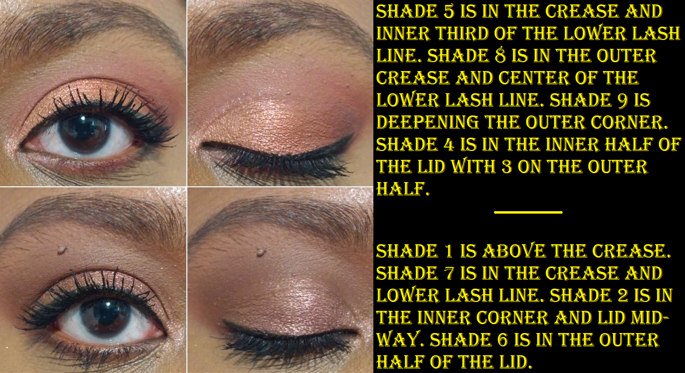
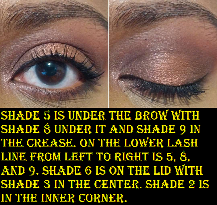
When this first launched, I was instantly drawn to the palette (admittedly the swirl patterns were a big part in that). What stopped me from getting it was my concern with it having too many similar looking shades. On my skin tone, this proved to be true. My second and fourth eye looks above used entirely different shadows, yet they look quite similar. Hard doesn’t show as a color on me. Hypnotic barely shows. Rough shows slightly more. Slippery may as well be a primer. Please Me, Provocative, and Irresistible look similar even in swatches, let alone on my eyes. I was surprised to see the opposite being true for the dark shades Untamed (mahogany red-brown), Naughty (warm neutral leaning brown), and Spicy (dark cool brown) that remain distinctly different as long as they aren’t used in one eye look. In a way, having paid $34 for this palette via Sephora makes up for it.
The other benefit to Naughty Nude is that there are various textures and finishes to experiment with, something I always admired about Huda palettes. However, because these shadows are organized in a way that isn’t as easy to distinguish between these similar colors, it takes extra time to plan out a look. This makes sense for a super colorful palette, but it’s a bit strange when I consider one of the benefits of a neutral palette is normally its easy of use.
This is a nice quality palette, but I’m glad I didn’t pay full price for it. For my preferences, I honestly wish I played with the Nude Obsessions Rich palette below so that I could have realized it’s like a condensed version of Naughty Nude, or at least similar enough. I had that one a whole month before purchasing Naughty Nude, but hadn’t used it beforehand.
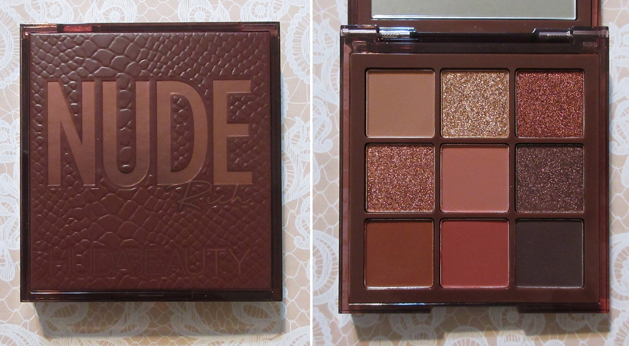
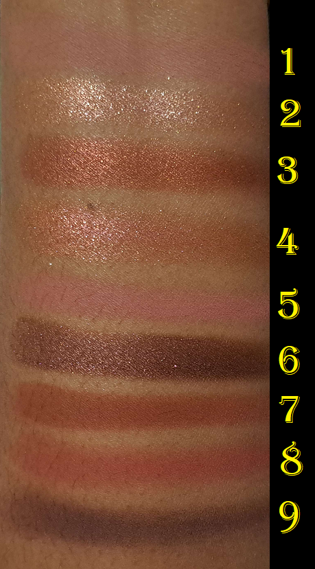
Huda Beauty Nude Obsessions Eyeshadow Palette in Rich
This is the oldest (in terms of release date) of the palettes I’m discussing today, but it’s my favorite of the bunch. The majority of the 9 colors are distinctly different from each other. The quality is just as good as the full size palettes, though perhaps slightly less pigmented. I don’t mind this though because there’s more control of the intensity of the eye look this way. Also, I think most of the shadows in the Rich palette are more shimmery and reflective, something I also like, and in shade tones I like even more than what’s offered in the Naughty palette.
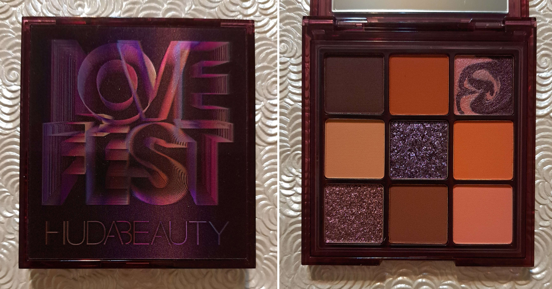
Huda Beauty Lovefest Obsessions Eyeshadow Palette
This was an unexpected addition to the post. Sephora had this and many other Obsessions palettes for half off during their Labor Day sale. It’s always the same song; several of the colors appealed to me, but I didn’t want to get it for full price because the orange shades looked too similar and I figured the two lightest mattes could look identical on my eyes. Plus, by now I certainly had all the warm toned shades (especially oranges, pinks, and browns) I could possibly want from the brand. However, I couldn’t resist that price.
I was correct that I can’t tell Shades 2 and 6 apart when I use them in the same eye look. Thankfully Shades 4 and 9 are different enough. The mattes perform just like my other Obsessions palettes. Shade 3 is a low impact shimmer that is smooth to the touch and basically looks like a satin on the eyes. Shade 5 is a pretty duochrome that brings the sparkle and drama that I want. Shade 7 is a medium pink that works to brighten the inner corner of my eyes, but also makes for a pretty lid shade. I’ve had this for the shortest amount of time out of all of these reviewed today, but so far so good!
Just as I was finishing this post, I remembered there are in fact a few extra items from the brand(s) I haven’t reviewed. From Wishful I have the Honey Whip Peptide Moisturizer that I’m waiting to open once I finish up one of my current moisturizers, a mini of the Thirst Trap Juice HA3 Peptide Serum that I used a few times and didn’t notice it doing anything, and a ton of samples of the Eye Lift & Contour 1% Bakuchiol & Peptide Serum which I still haven’t tried. There’s the GloWish Luminous Pressed Powder I stopped using and didn’t finish testing. I also have a deluxe sample of the Easy Bake Loose Baking & Setting Powder, but it’s in a color that’s too light for me. I could try to use it despite that, but I feel that it would throw off my ability to see the results properly. So, I don’t see myself reviewing any of those anytime soon. However, there are two things I intentionally skipped reviewing that I decided I will include.
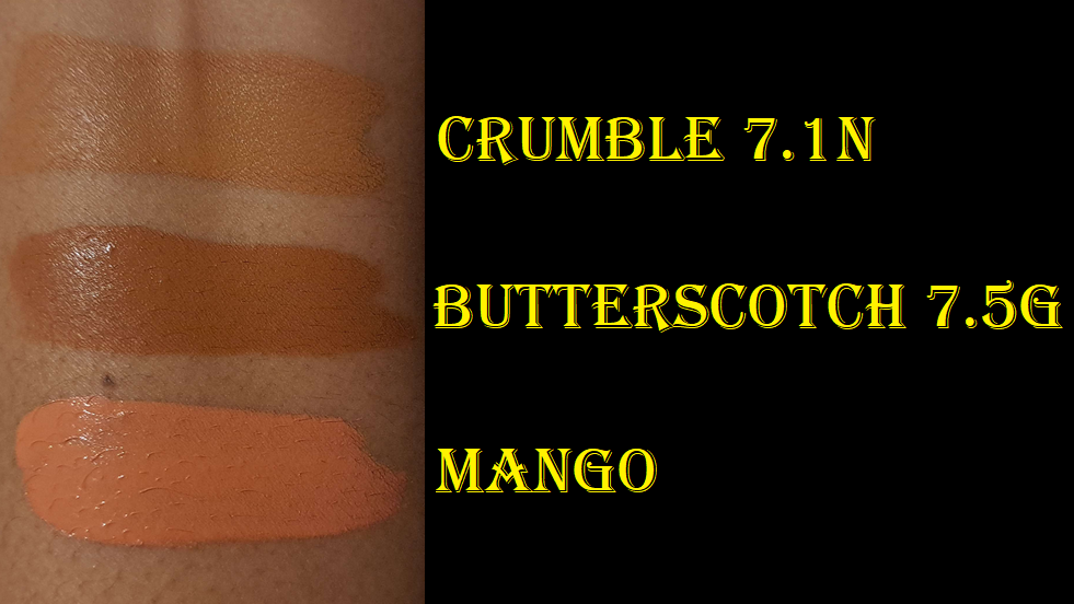
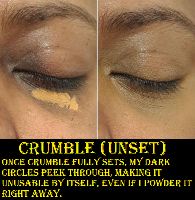
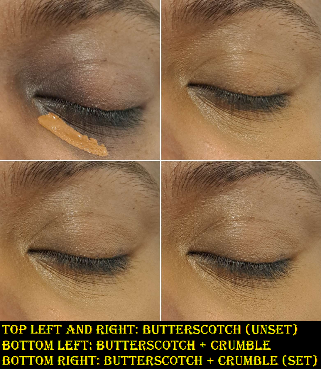
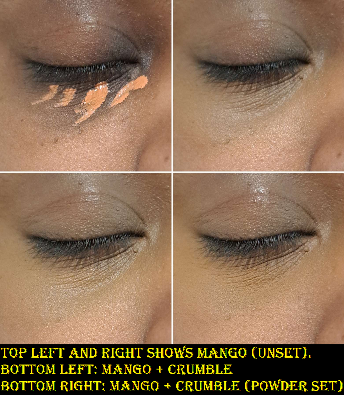
FauxFilter Luminous Matte Concealers in Crumble 7.1N and Butterscotch 7.5G and FauxFilter Color Corrector in Mango.
The reason I wasn’t intending to post about the concealers is because base products don’t excite me to review. It’s only when I find concealers comparable to my holy grail ones that I want to share my results with everyone. In addition, this is a bit of a regret purchase. I knew Crumble wasn’t full coverage enough to adequately conceal my extreme dark under eye circles and that it made my under eyes look about as dry as Tarte Shape Tape, but I purchased an additional shade anyway. I was more intent on trying to solve the mystery of how to make it work instead of asking myself if this was going to add something of value to my collection. Considering I can get more coverage from a single shade of the original Tarte Shape Tape (Deep) over buying Crumble and Butterscotch to mix with from Huda, it should have been obvious what I needed to do, but I somehow convinced myself finding the perfect color combination would make the Huda concealer magically suit me better.
Using the under-painting method, like with my Givenchy concealers, I’m able to get the coverage level I want, but at the expense of having a shade match that is darker than my cheek area. So, I don’t wear this combination on light makeup days that I plan to skip foundation. I typically match my foundation to my forehead which is darker than the lighter parts of my face, but lighter than my areas of hyperpigmentation. I either get this middle-ground depth that’s a combination of the various colors on my face, a slightly darker shade for summer, or a color that matches the lighter parts of my face that typically works after winter. So, I can use the combination of Crumble and Butterscotch with my middle-ground and summer foundations. The reason I took a break from using these concealers though is the fact that I can get similar coverage level to my combination of Givenchy concealers, with it looking and feeling less dry. The Huda concealers at least have the benefit of being long lasting, provided I pair it with the right powder and ensure that more is applied in the beginning if it starts fading within the first five minutes and any creases get smoothed out a second time before more powder is added. That process of keeping an eye on it in the beginning and making adjustments early on can get me a good ten hours of wear. If I don’t pay enough attention to my skin absorbing some of that product or not smoothing out those creases, it goes downhill quickly where I might only get six to seven hours where it’s significantly faded and looks awful. So, because of the dryness and mindfulness required, it’s taking a backseat until I finish up the ones from Givenchy.
As for the Huda Corrector, it made sense that if the concealers looked dry, the corrector should have the same finish, yet I bought it anyway. I was too intrigued by the Mango shade to skip it. Every brand of color corrector I’ve seen has a pink that’s too light for me to use and/or an orange that’s very deep and practically as dark as my under-painting shade. They’re also either so opaque that they don’t blend in with the rest of my skin or they’re so sheer that they don’t hide enough. This is the first corrector I’ve ever seen that’s deep peach/deep pink-orange with decent coverage and in liquid form. I’ve seen some cream ones that come close, but creams crease too much under my eyes. So, I’m able to use Crumble if I have this corrector under it. I even use Mango sometimes by itself and in other areas with discoloration. Of course, I still have the dry issue and needing to babysit it in the beginning, but because it camouflages well enough to my satisfaction, I continue to use this from time to time unlike the concealers.
Now, I consider us caught up on my Huda and sub-brands collection! If anyone wants a review of one of those specific items I mentioned that I own but don’t plan to post about, just let me know (via comments, email, or Instagram) and I’ll reconsider it.
That’s everything for today! Thank you for reading!
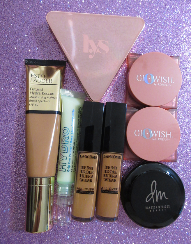
With the annual VIB sale starting soon for Rouge members, I wanted to post a quick review of the newest items I bought from Sephora that were mostly purchased during the Friends and Family sale last month. To anyone who doesn’t have Rouge status, and therefore wouldn’t get 20% off, I recommend waiting for sales directly from brand websites which tend to be discounted by at least 20%. I personally don’t think 10-15% is that much of a savings unless it’s from one of those rare brands that never put their products for sale or their shipping fees make purchasing from Sephora a better deal.
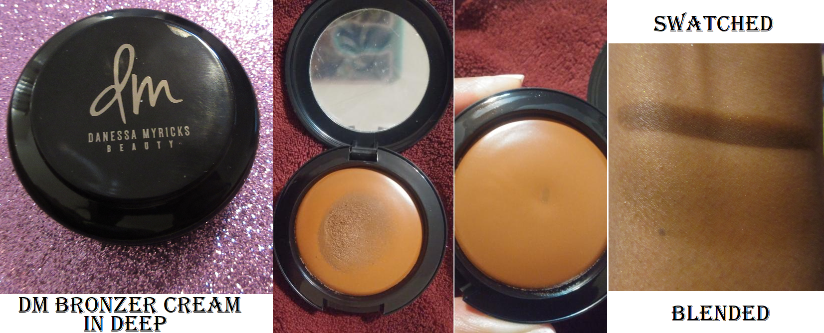
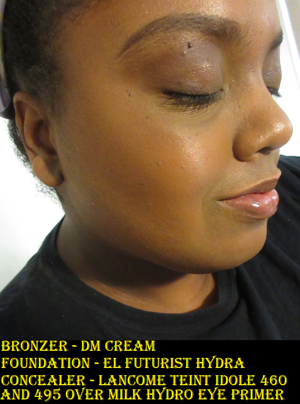
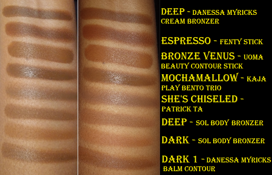
Danessa Myricks Beauty Power Cream Bronzer in Deep
I officially have a new favorite cream bronzer! Granted, I don’t have that many of them, but this takes the top spot. Formula-wise, I loved the ones from Colourpop/Sol Body but the tones didn’t look as nice when the products were sheered out on my face. This bronzer from Danessa Myricks is such a highly pigmented and smooth cream that melts into the skin. It reminds me of that Sol Body formula but in a tone that works for me and doesn’t have fragrance. Deep looks deceptively lighter in the pan. The true shade is the darker spot where my brush picked up the product in the photo above. If this bronzer wasn’t so blendable, this shade would be too dark for me. However, I just do a single tap into the product with my Sonia G Mini Base brush and I can cover most of my face with it because it spreads easily and I have some time to work with it before it sets. The spreadability is due to having a lot of emollient ingredients in this bronzer. When I first got it, I could even see liquid seeping around the edges of the compact, likely due to the heat while being shipped, but it doesn’t feel oily or greasy on the skin.
It sets to the point of being dry to the touch, even without being set with powder. It doesn’t come off on my finger if I just touch the spot where the bronzer is, but a tiny bit will show on my finger if I rub across it. Also, this is so pigmented that it has a bit of a staining effect on the skin, which definitely aids in longevity but requires more effort to remove from the face.
I didn’t fully blend the bronzer above so it would be more visible in the photo, but in actuality, this cream bronzer looks so natural on my skin! I’m wearing it in every photo in today’s post. I like it much more than the Danessa Myricks Balm Contour, which I have in the shade Deep 1. The Balm Contour is even warmer of a shade and looks like a bronzer rather than a contour, but it’s not as smooth in texture as the actual bronzer formula. I want to keep my cream bronzer and contours to a minimum, so that’s the reason I haven’t tried the Anastasia Beverly Hills Cream Bronzer, Saie Sun Melt Natural Cream Bronzer, or the Glossier Solar Paint Luminous Bronzer that I’ve heard are fantastic quality (well, the last one I just want out of curiosity). However, this one from Danessa has quelled the desire to get anymore…for now at least! I bought this during the Friends and Family sale, but it’s definitely worth full price.
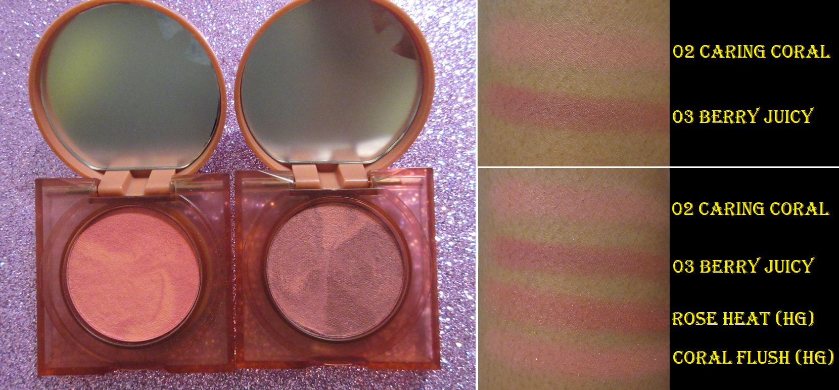
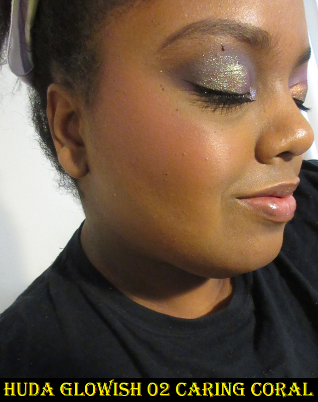
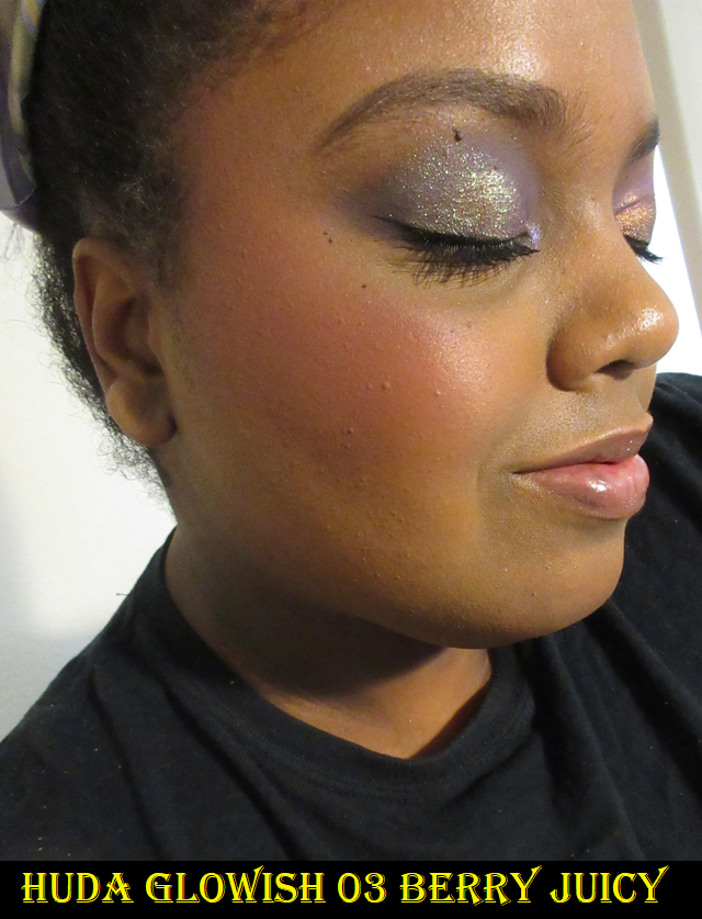
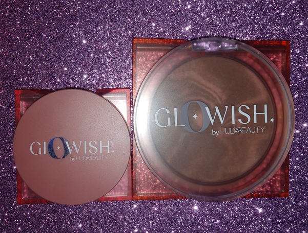
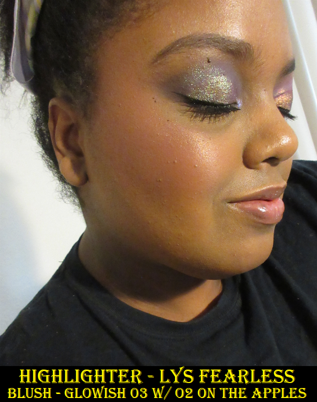
Huda Beauty GloWish Cheeky Vegan Blush Powder in 02 Caring Coral and 03 Berry Juicy
There are four shades total in the new blush line from GloWish. Caring Coral is a “mid tone rosy coral” best suited for up to tan skin, but since mid tone pinks are my preference, I wanted to try it anyway. Caring Coral is interesting because the darker pink swirl in the compact is definitely deep enough for my skin tone but the lighter swirl made my cheeks look visibly ashy when I tried it on my bare skin no matter how much I blended it. However, when applied over foundation, the swirls of colors mix better to create a more even shade that works for me. I was instantly reminded of Coral Flush from Hourglass and those two look quite similar in swatches. As much as I tend to avoid berry toned blushes, I saw several reviews where Berry Juicy actually had more of a brown-pink look to the skin if applied with a light hand. I can confirm that it looks very natural and more muted pink than berry-pink if I don’t build it up too much, so I’m shocked to say I prefer Berry Juicy on me! I also like the look of using Berry Juicy all over my cheek, but keeping Caring Coral contained to just the apple of my cheeks, as demonstrated in the highlighter portion of this post.
I’m wearing the same bronzer, foundation, and concealer in every face photo.
This formula is supposed to impart a “soft focus glow,” feel buttery on the skin, and last up to twelve hours. I haven’t worn these blushes for that long, but they do seem to be long-lasting. They didn’t fade when I tested them for up to nine hours. I don’t notice that much glow or radiance to these powders; they look satin-matte on my cheeks, or mostly matte. They feel similar in texture to the GloWish bronzers, though slightly less buttery or creamy. I also have to add that the GloWish bronzers impressed me so much and became part of my top three favorites in the powder bronzer category, whereas these blushes are nice but not particularly special. They’re alright for the price. Some customers may be unhappy with their tiny size compared to the bronzers, but I don’t mind because I doubt I would ever hit pan in them anyway. It also helps that I got this for 20% off, but the full price of $21 isn’t too bad in my opinion.
And speaking of the bronzers, if you haven’t tried those, I definitely recommend them! Sephora has a few of the bronzers available in mini sizes, which I assume will be the same sizes as the blushes since they are close to the same price at $19.
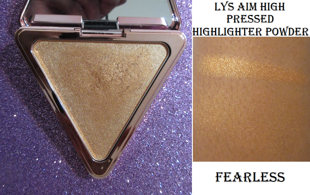
LYS Aim High Pressed Highlighter Powder in Fearless
I bought this with my own money from the LYS Beauty website before becoming an ambassador for the brand. I have more details about that in the “Full Disclosure and Affiliations” section of my About Me page if you’d like to know more, along with my link to the brand website (which I’m not sure if it still works in terms of generating a commission) and affiliate code (LYSUNBOXLILI which is no longer active).
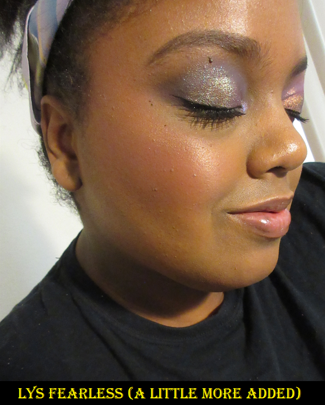
I normally go for a lighter shade of highlighter, like a champagne color, but I wanted something less common in my collection. That’s why I bought Fearless, a gorgeous bronze gold pressed powder highlighter. It’s close to my skin tone, so it looks more subtle despite how reflective and sparkly it actually is. I recommend this for someone who likes a strong highlighter, as the other two shades available are quite beautiful. However, it’s commonly known to those who frequently read my blog that I don’t like large glitter particles in highlighters. The smaller the better for me. The particles in this one aren’t so large that I wouldn’t use it, but I admittedly don’t wear it often and the visible shimmer keeps it from being among my favorites. I’ve been tempted to purchase the shade Brave to see if I would like it more, but the particle size keeps me away. It doesn’t look that way on camera but it’s something I see in person.
In addition to the pressed powder highlighters, LYS also released liquid highlighters and a highlighting serum, but I haven’t tried them. In my Glowing Skin post, I mentioned that I don’t use those kind of products enough to justify purchasing anymore in the future, which is why I’m sticking to powder highlighters from now on.
I decided to put my review of the highlighter here because it’s a new release from Sephora, but my actual recommendation for the Sephora sale are the cream blushes. LYS is pretty affordable already for a Sephora brand, but I’m always a proponent of consumers getting the best deals wherever they can. So, the sale is a great time to try the brand’s formula if you haven’t already. The cream blushes have not been surpassed yet in my eyes. I’ve been raving about them ever since I got them, and that was long before I had any connections to the brand.
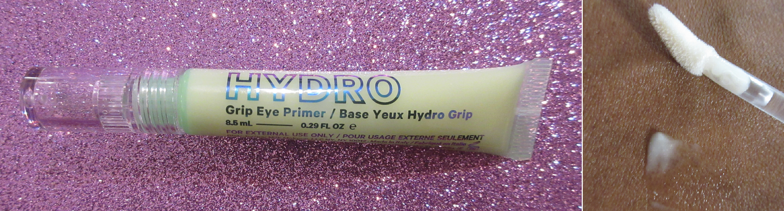
Milk Makeup Hydro Grip Eyeshadow and Concealer Primer
This primer is so tricky to use, but when I do it right, it’s such a game changer! I’ll just say right off the bat though that I hate it for eyeshadows. In order to get the best results, applying a thin even layer and smoothing it out with the finger is crucial. If it’s too thick, it won’t “dry.” I’m using quotes for the word dry because it’s not supposed to actually feel dry to the touch. When it “dries” it changes from an almost greasy feeling (which is strange for a gel looking texture) to a slightly tacky feeling. With a thin layer, this takes about five minutes to get to this point. If I’m impatient and try to apply shadows before it gets tacky it will just smear and move the eyeshadow around and look extremely patchy. If I didn’t blend out the primer with my finger to create an even layer, it will still smear and move because it would be too thick to dry down at all.
If I follow the instructions and do those steps above, in the best case scenario the shadows will grip to the primer and appear very intensely on the eyes. However, it grips so well that I cannot blend them out! So, if I’m going to use this on my eyes, I keep it concentrated to just the eyelid where I want my shimmer to stick. I haven’t tried this primer with that many different eyeshadow formulas, but in this demonstration using the Urban Decay Born to Run Palette, the primer did intensify the shimmers and mattes, but the matte shade darkened up a lot. The primer itself is clear, so the wet consistency caused this to happen, which some people will not like. I’m not sure if I like that aspect myself. Perhaps this doesn’t happen if I use even less product, but either way, I don’t like that I can’t blend the shadows, so I didn’t continue to try testing it.
What I absolutely love this primer for is to use with my concealers. I have intensely dark brown under eye circles and hyperpigmentation that require the fullest of full coverage concealers to camouflage the darkness. The best results I’ve ever had are from the original Tarte Shape Tape and/or mixing it with the Pat Mcgrath Concealer. Those two are full coverage and last the longest on my skin because I have a second issue of concealers usually getting absorbed into my skin so easily. With the MILK primer, I’ve been able to get full days of wear out of my concealers even though it’s only advertised to last for eight hours! Granted, by the end of the day it certainly doesn’t look fresh, but at least it’s still there! This product even makes concealers that didn’t work for me before to last longer! In order to achieve this, I once again have to apply a thin layer, smooth it out with my finger, wait at least five minutes for it to dry, and then dab/stamp/stipple the concealer over it with my Sonia G Jumbo Concealer brush. Swiping motions will disturb the primer. It needs to be patted on in order to last. I can actually feel the grip as I stamp it into place. I do not set my eye with powder, as that will eventually lead to the lines under my eyes looking even more dried out and emphasized as it wears throughout the day.
This primer touts ingredients like Hyaluronic Acid, Hemp-Derived Cannabis Seed Extract, Niacinamide, and Aloe Water for added moisturization and hydration. I don’t find this to be very hydrating to my under eyes. If anything, it looks just as dry or drier if I don’t prep my skin. I have found that doing my usual steps with the primer but then smoothing the tiniest bit of Laneige Cream Skin Refiner (Moisturizer/Toner) on top of it and letting it dry again before applying one of my concealers, other than Tarte Shape Tape, does make my under eyes look less dry. In my case, this need for an occlusive layer prevents moisture from being taken out of the lower layers of my skin and gives the Hyaluronic Acid something to draw on instead. That’s my best guess. Since the primer is supposed to be applied to clean skin, it’s implied that prepping the undereyes with a cream or something else may not allow the primer to work as effectively. The Laneige Refiner is the most lightweight moisturizing product I have, so it works well. I have not tried to use this primer though with eye creams.
I have seen quite a few negative reviews for this and I understand why. I had to play around with this for weeks to figure out how to get the amazing results that I have with this product. I think whether this product works for someone or not will depend on their skin type, the condition of their skin, if they’re using their regular skin care routine with it, if they’re allowing it to dry first for long enough, the application technique, etc. Now that I have the routine down, this product is absolutely worth it to me for the extra longevity benefits to my concealer. However, I can see how this wouldn’t be for everyone, especially if they want it exclusively as an eyeshadow primer. So, this may be a polarizing primer. This is another one of those products I’d happily pay full price for, but I did get it for 20% off during the Friends and Family sale.
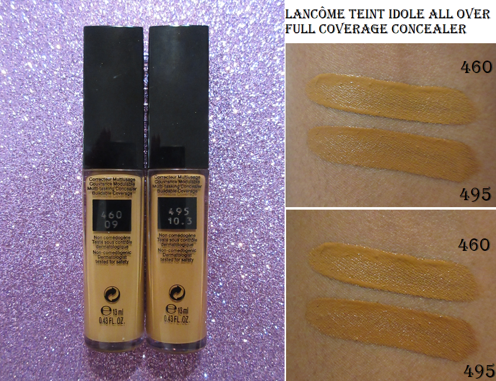
Lancôme Teint Idole Ultra Wear All Over Full Coverage Concealer in 460 and 495
I purchased each of these shades during sales on Lancome’s website ($17 and $20) thanks to Nikki here on the beauty blogosphere and BeautyDealsBFF on Instagram. 495 is darker than my usual concealer shades, but it’s still lighter than the darkness under my eyes. In addiction, it’s very orange toned which works as a sort of corrector color. I prefer concealers to match my skin tone, which is why I bought 460, the next shade down, but not a perfect match. I can wear 460 alone for a brightening effect, but the combination of the two shades is my favorite way to use them.
What I like about this formula is that it’s full coverage, but I’ve used it for weeks now and at best it lasts six hours or at worst my skin just absorbs it shortly after I complete my eyeshadow look unless I really pack it on. Some powders help with longevity but other powders don’t. I was on the verge of giving up and switching back to just using the Tarte and Pat Mcgrath concealers, but I tested it with the MILK Hydro Grip Eye Primer and it works wonders! With that primer, it lasts me all day and it’s less drying than Tarte Shape Tape. Once again though, I do not set it with powder when using it over the MILK primer as that can make it look dried out and emphasize the lines under my eyes. The combination of these two shades, plus the primer, is such an exciting discovery! As a standalone product, I’m not sure if I would recommend it to everyone across the board. There are too many variables when it comes to concealer to be able to say any is universally lovable.
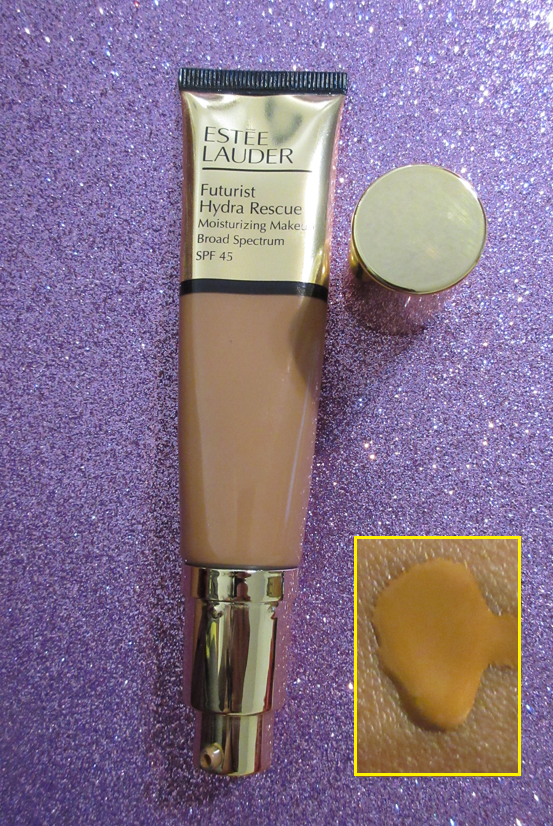
Estée Lauder Futurist Hydra Rescue Moisturizing Foundation SPF 45 in 5N2 Amber Honey
I used to be shade 6W in Double Wear, but when I had a sample card for this particular foundation, the 6W1 shade was way too dark for me. 5W1 was also way too light, so I thought my best hope would be 5N2. It’s the only shade between the two in depth.* When I first pump out the foundation, it looks fairly warm, but it does dry to a more neutral color on my skin. It’s not a perfect shade match but it’s close enough that I don’t feel uncomfortable wearing it in public.
*UPDATEAugust 30th, 2022: I’m not sure at what point it was added, but there is now a 5W2 shade!
The directions say to shake well, and that’s actually important considering it contains SPF. If I forget to shake and squeeze the tube, sometimes the color will look a bit off, either darker or lighter than it should. So, I make sure to give it a good mix before using it.
For a “moisturizing” foundation with a finish that’s supposed to be radiant, I don’t think it’s that radiant. I’d call it a natural finish, at least on my dry skin. This is more evident in the first photo in the bronzer section before I have any blushes or highlighters on my face. It would look a little more dewy if I built it up, but then it would feel heavier on my skin, so I prefer to use a light to medium amount. A sheer layer of this foundation provides medium coverage, which impresses me for something that feels so lightweight on the skin. When I wear it, I think my skin looks smooth and even, especially paired with some of my newer finishing powders. I’ve actually been using it more than the Nars Soft Matte Foundation, when I just named that one my new holy grail earlier this year. If this did give full coverage with a sheer amount and was a closer shade match to me, then it would be my absolute favorite. As it stands though, it’s in my top two in terms of formula! The only other negative is that it doesn’t like to stick in my problematic smile line and tends move away from that spot, even if I powder it down. I have to rely on concealer to maintain some coverage there.
I always try to mention if a product has fragrance. I do notice a pleasant skincare type of scent that reminds me of the Fresh Black Tea Instant Perfecting Mask when I first apply it. I actually like this smell because it’s not overpowering and is nostalgic for me. I checked the ingredients and fragrance is there, though almost at the bottom of the list.
I bought this during Ulta’s 21 Days of Beauty when it was 50% off at both Ulta and Sephora. I was always curious about this foundation because of how highly Mel Thompson spoke about it. My goodness, I miss Mel. May she rest in peace.
I think that’s where I’m going to end this post.
For anyone curious about what items I don’t need and am trying to talk myself out of getting during this sale…they would be the Patrick Ta Major Headlines Blush Palette, Smashbox x Becca Under Eye Brightening Corrector in Dark, Guerlain Meteorites in Gold Pearls, Beautyblender Bounce Radiant Skin Tint and Beautyblender Bounce Liquid Cream Blush in Flirty Rose. The fact that I don’t use my current Patrick Ta Blush Duo is why I’m talking myself out of the blush palette. The Estee Lauder Futurist Foundation is why I know I don’t need the Beautyblender Skin Tint (plus I already have two bottles of the regular Beautyblender Foundation). The Lancome 495 concealer shade is why I don’t need the Becca corrector. The new Hourglass powders are why I don’t need the Guerlain Meteorites and the Beautyblender blush is a cream, which I have too many of open currently in my collection. Plus, some of these items I foresee going on sale for more than 20% off in the future.
What products are you thinking of getting during the sale? Is there anything I’m talking myself out of buying that you actually hope I will review in the future? I’d love to know in the comment section. Thank you for reading!