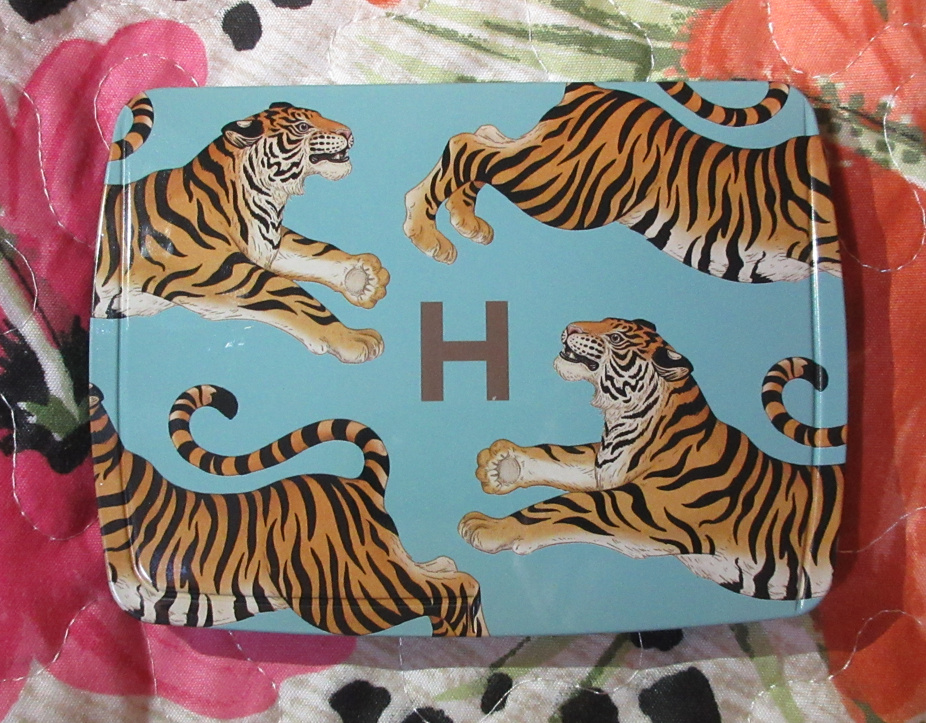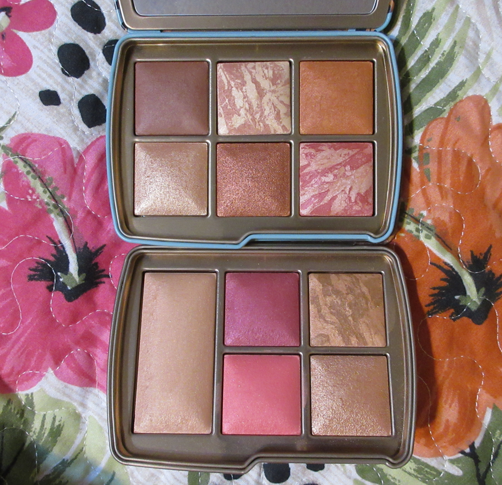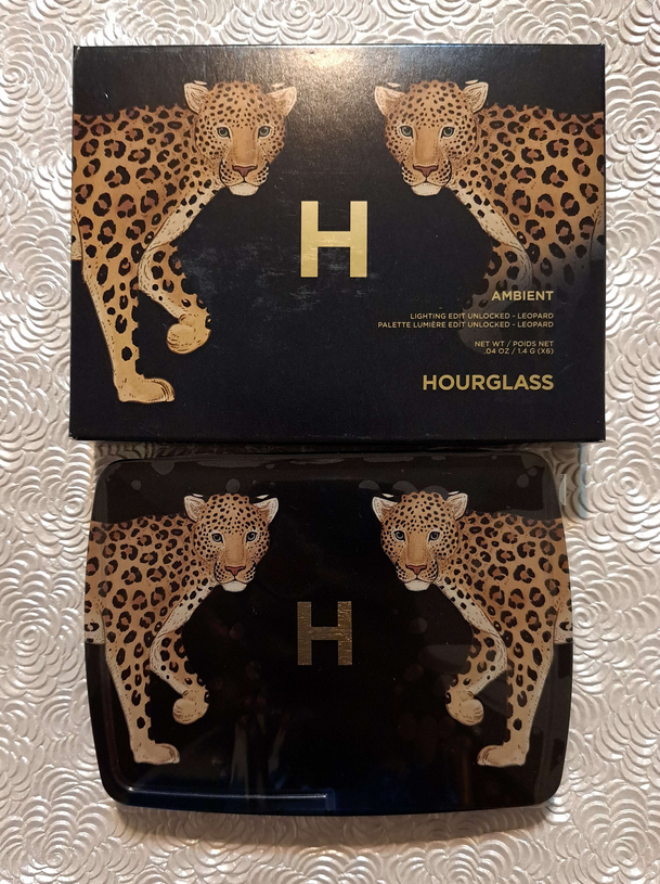
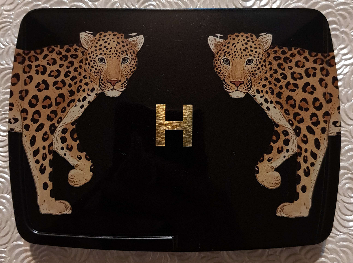
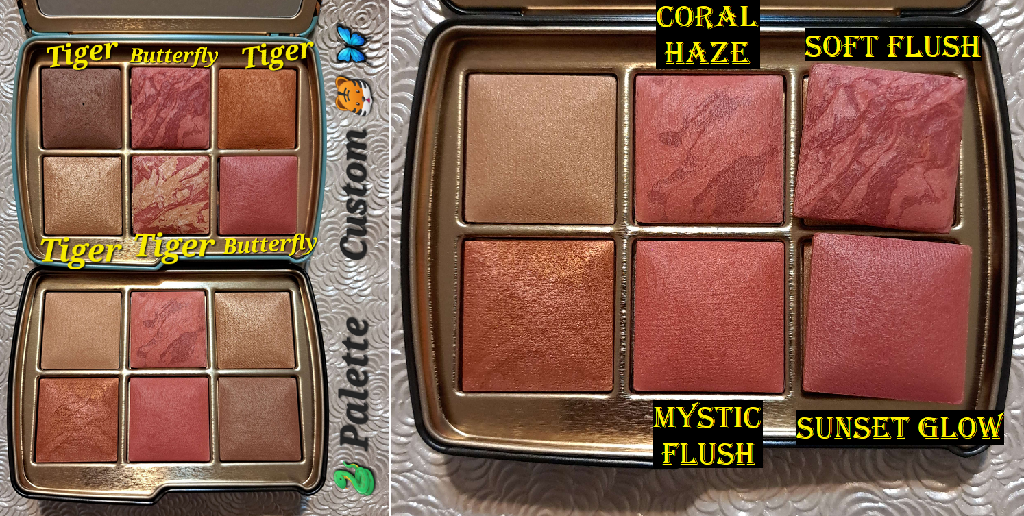
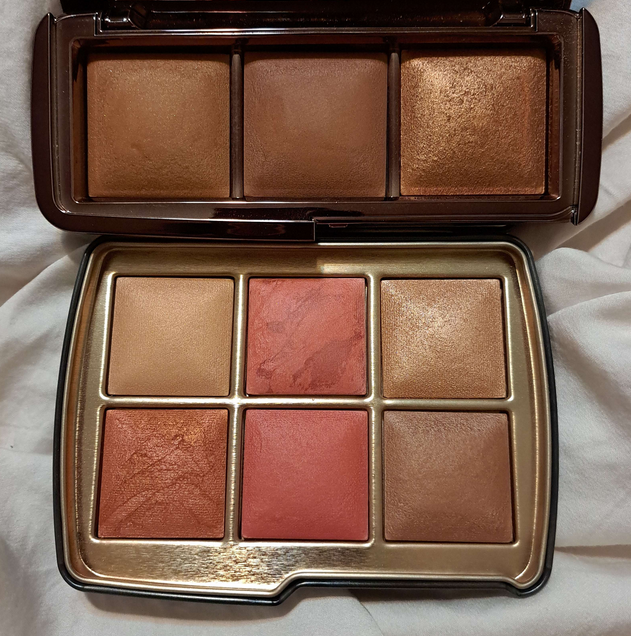
My palette from Hourglass has the Leopard design on the cover, but I chose the powders inside that were assigned by default to the Snake palette. It’s called “Color Palette 3” on the official website. Even though the chances were high that I could have gotten a better deal than 10% off if I purchased the palette elsewhere, I desperately wanted the Leopard packaging and could only get this customized version if I bought it directly from the brand. It was certainly a tough call between the Leopard or the website exclusive Owl packaging!

I’ve been reviewing these holiday palettes from Hourglass for a while now. My review of last year’s palette can be found HERE and the year prior to that can be found HERE.
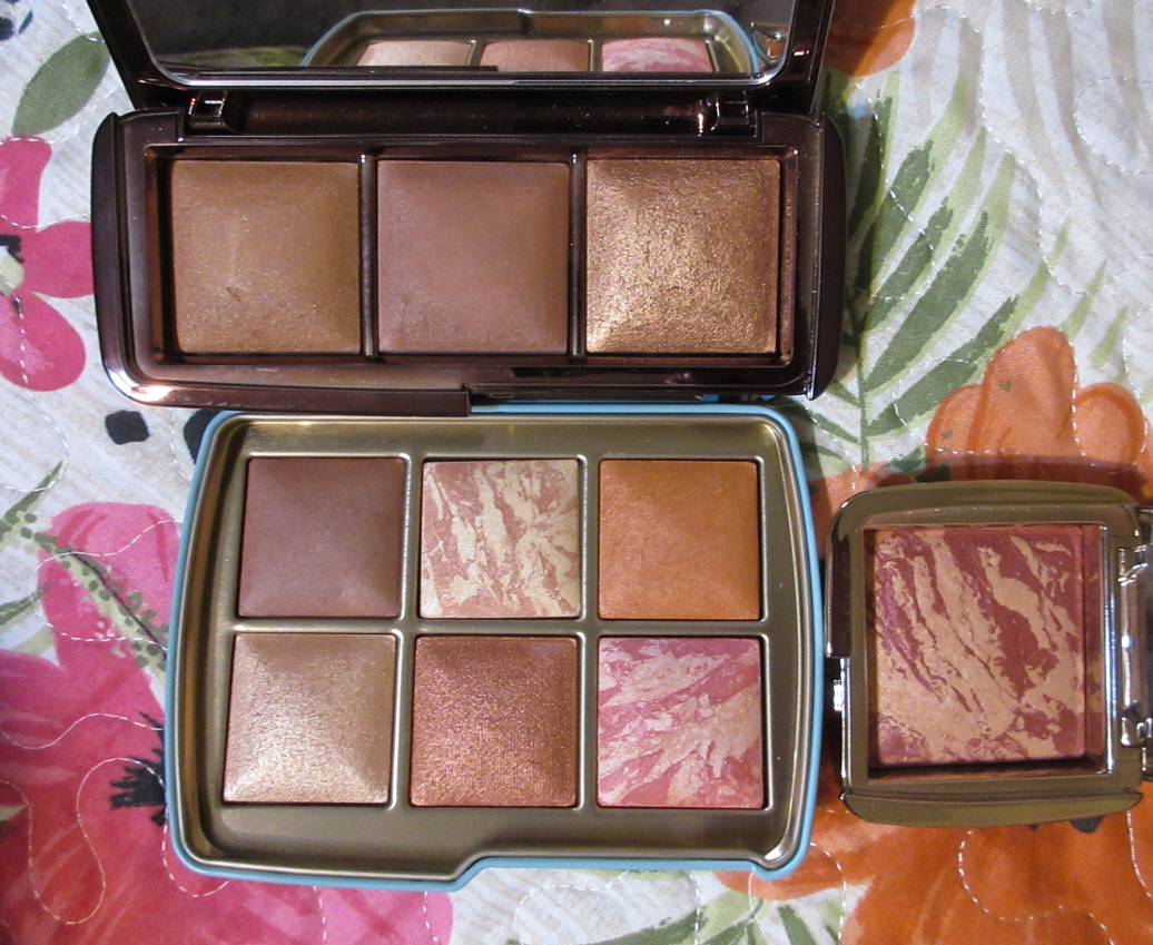
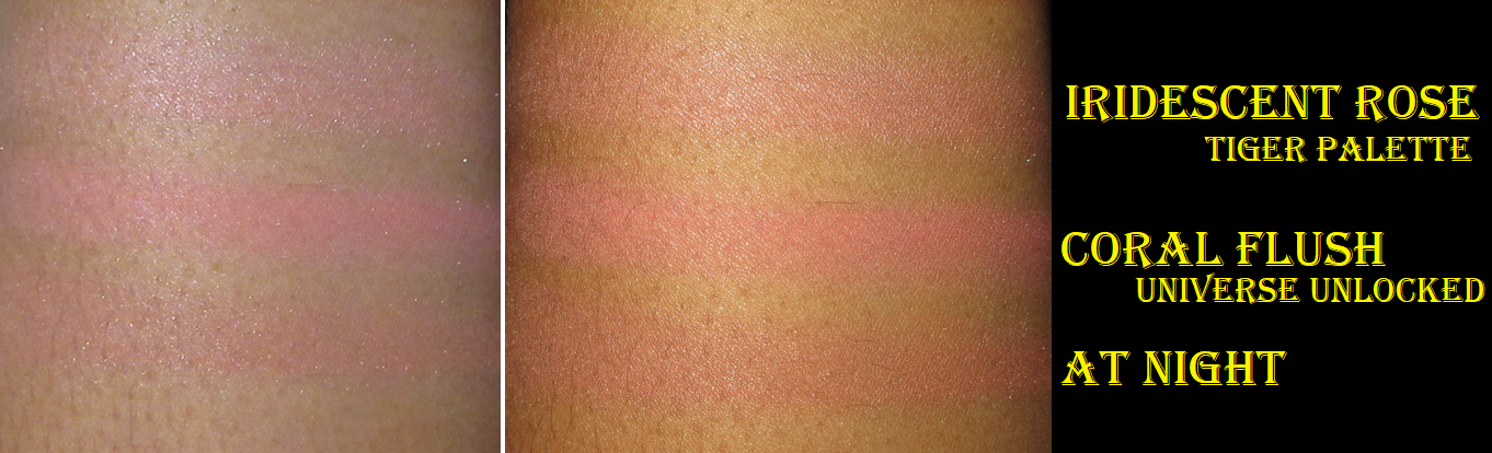
I also have the two blushes from last year’s Butterfly palette that are currently in my Tiger palette. I did quite the makeup transplanting project, as detailed HERE.
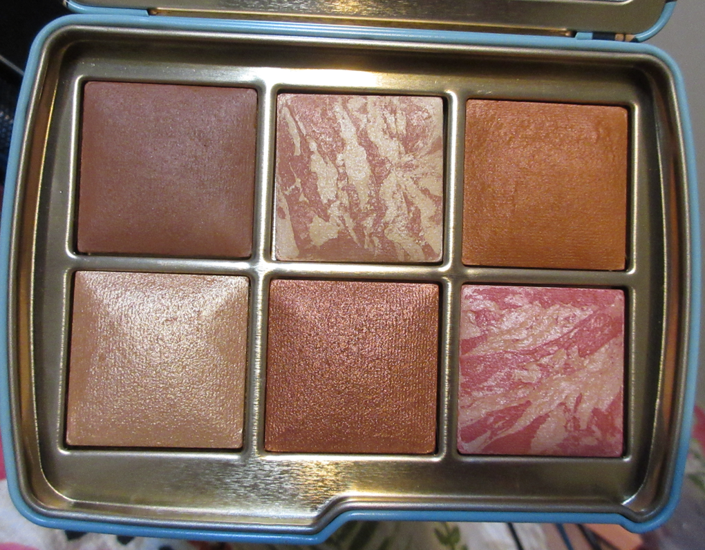
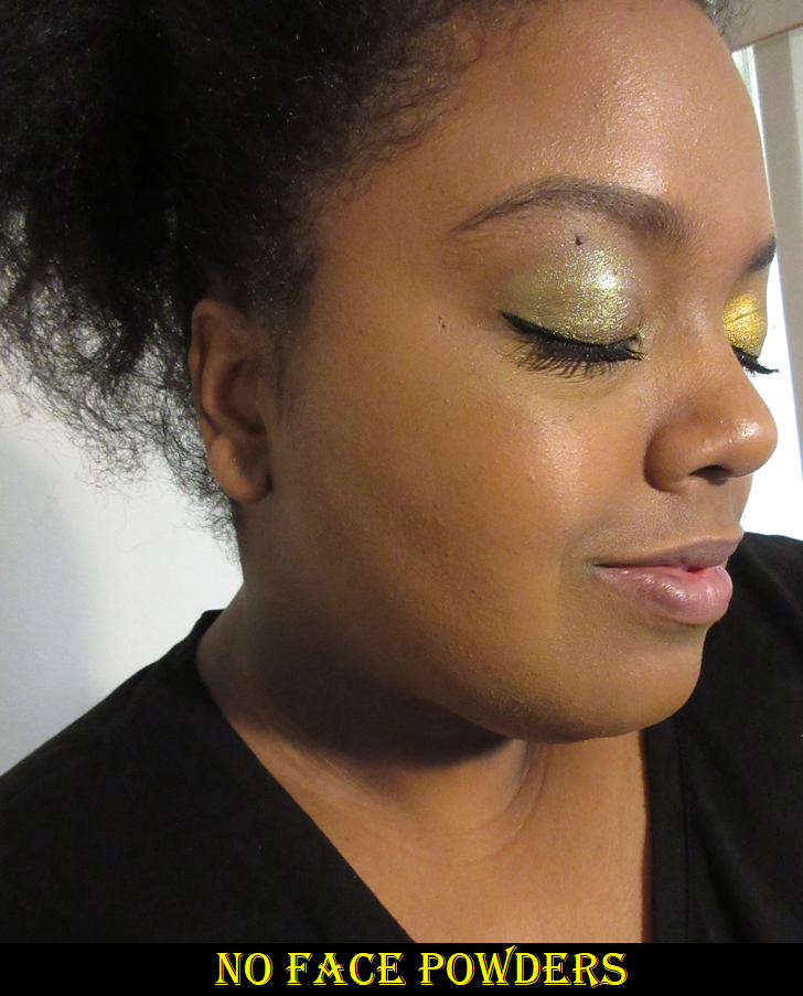
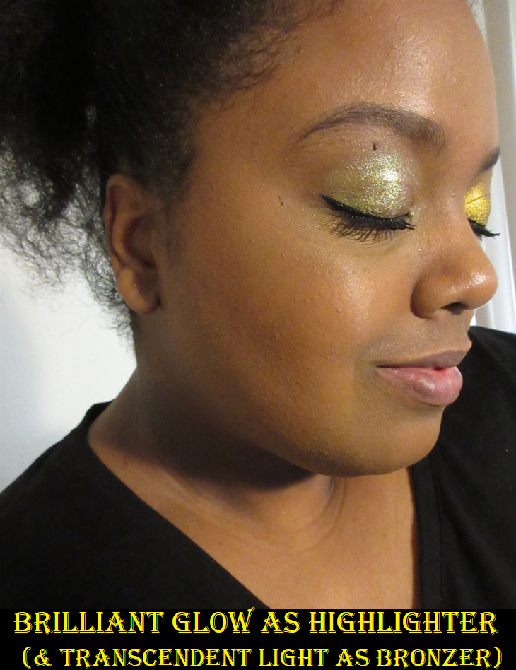
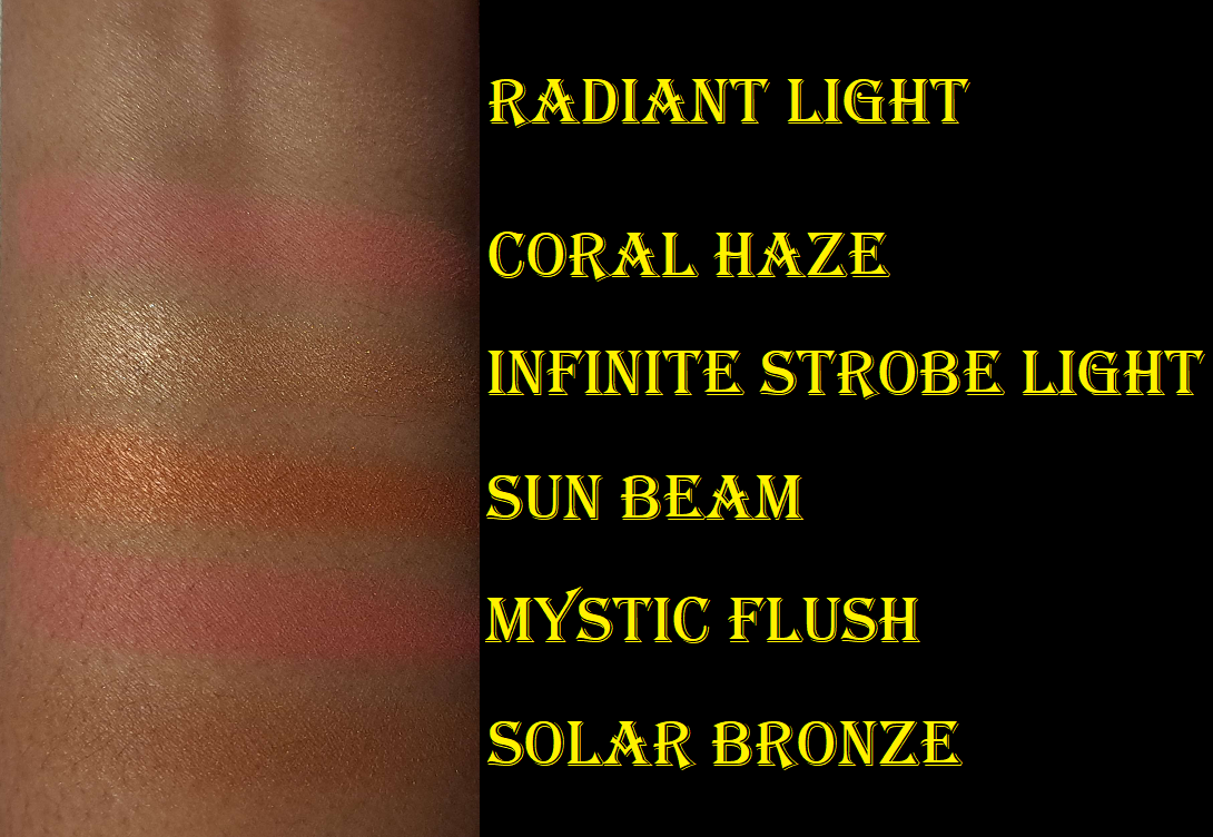
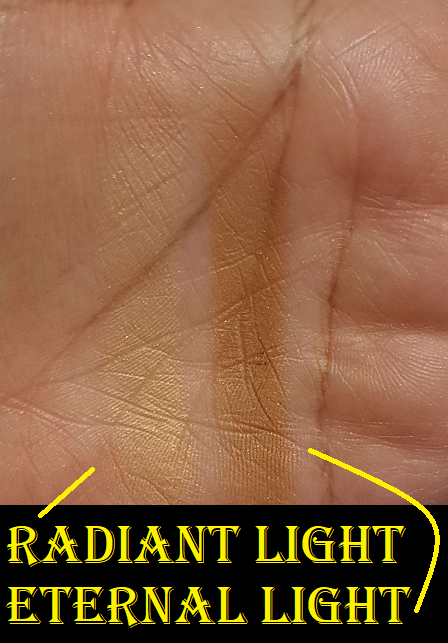
Radiant Light (finishing powder) – This is a permanent shade of powder from the brand, and I have it several times over in my collection. To summarize, it’s a light golden-beige that doesn’t lighten my foundation, but I also don’t notice any difference at all when I wear this besides mattifying the skin and depositing the occasional visible shimmer particles. I prefer to use other finishing powders that accomplish something I need like blurring, smoothing, or adding a healthy glow.
This option could have been worse. They could have chosen some of their much lighter finishing powders instead. At the same time, it could also have been better. One of my usual criticisms of Hourglass is their inability to commit to creating a face palette fully geared towards deep skin tones. Last year’s Elephant palette was clearly intended for those medium to tan, yet they still made Tiger spread a wider range of medium, tan, and dark at the expense of some of those shades not showing up on someone that much darker than me. Eternal Light is a darker option that has yet to be released in a travel size or edit palette form. However, since Radiant Light is technically the only repromoted shade in the Snake palette and I own both of the brand’s darker finishing powders in the Volume III trio form, I’m not going to hold it against them. They love their repeats and we’ve come to expect it. In addition, I think this palette is intended for tan to medium-deep complexions. From that perspective, having Radiant Light instead of Eternal Light makes more sense. I’ll elaborate more in the section with my final thoughts.
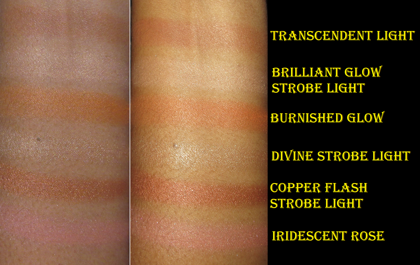
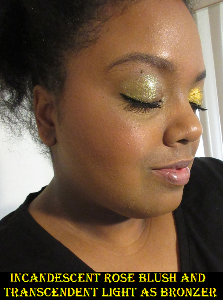
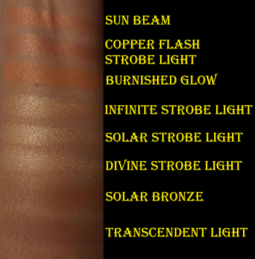
Solar Bronze (bronzer) – Even though I can use Transcendent Light as a bronzer, I have been long awaiting Hourglass making a true bronzer that will work for those with dark skin. I somewhat got my wish, but there isn’t much of a depth difference between that finishing powder and this bronzer. The main difference is the tone. Solar Bronze looks cool-toned in the palette next to such warm shades, but it’s definitely warmer in swatches and on my face. It’s subtle on my skin tone, but it can be built up a little. I am honestly thrilled with this shade. It’s such a good balance of being warm, without leaning too orange or red. As much as I love it, I know there are others darker than me who are disappointed that Transcendent Light wasn’t deep enough for them last year and this year’s bronzer option won’t work either. Although Hourglass dropped the ball in that regard, I have to acknowledge that they made three new bronzer shades this year with one in each palette. Their bronzers tend to be very warm, so I’ve heard some people are pleased that the bronzer in the Jellyfish palette is closer to neutral for those with light skin tones. That’s something that has been missing from the brand, so they focused on filling a void, but on the different end of the spectrum. And considering they didn’t put a bronzer in Butterfly last year, I give them credit for improving on that front.
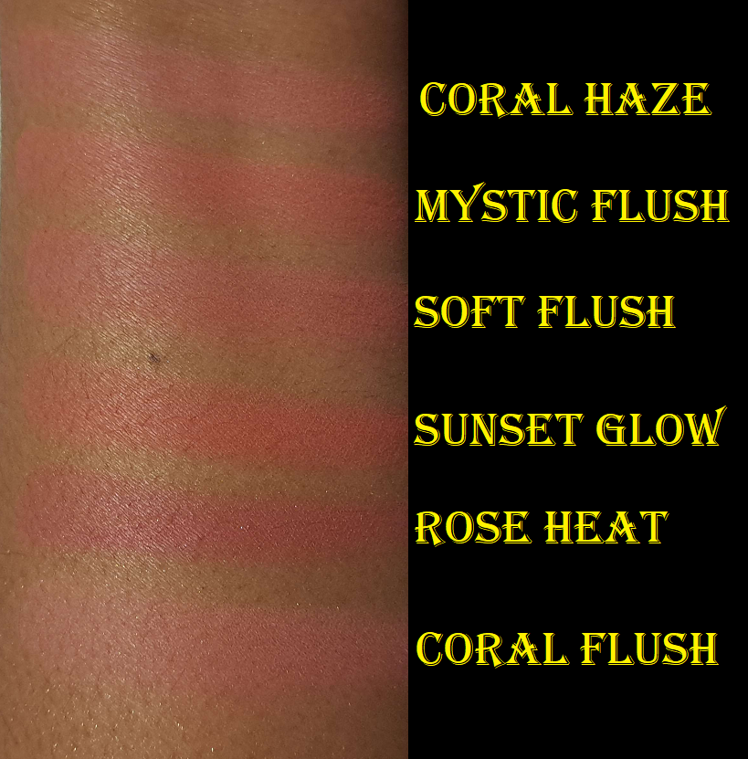
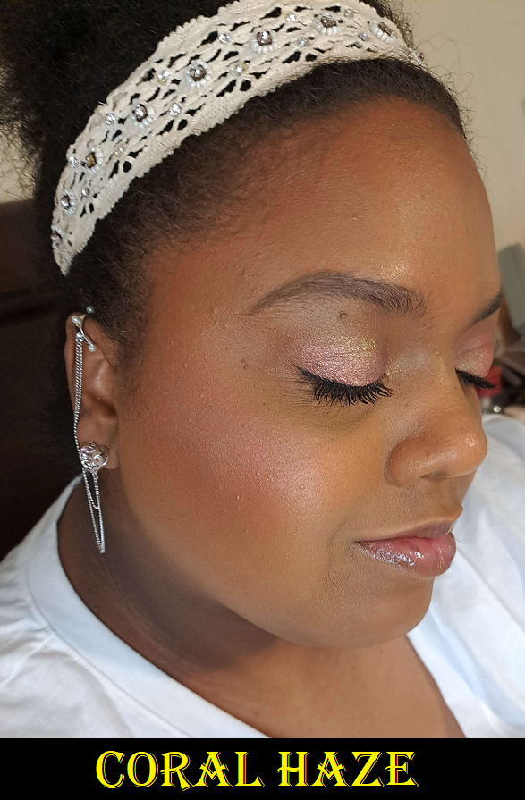
Coral Haze (blush) – This blush is less pigmented than Mystic Flush, but I’m not sure if that just happens to be because my blush tile has barely any of the darker swirl of color in it. Since it’s buildable, I can still get visible color on my cheeks (though it doesn’t show as well in my photo as it does in person). It’s cool toned, so it’s not my favorite kind of blush color, however, I do like it more than I expected. Whenever I start off with this color, I end up just throwing Mystic Flush and even sometimes Sun Beam on top. I like the combination of the blushes together on my cheeks.
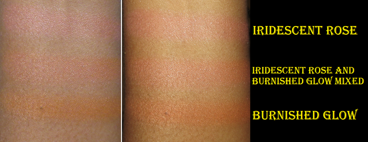
It’s similar to Soft Flush from the Butterfly palette, but slightly lighter and cooler. However, on my cheeks, it would be hard to spot the difference.
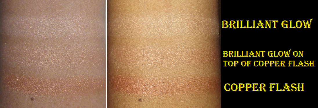
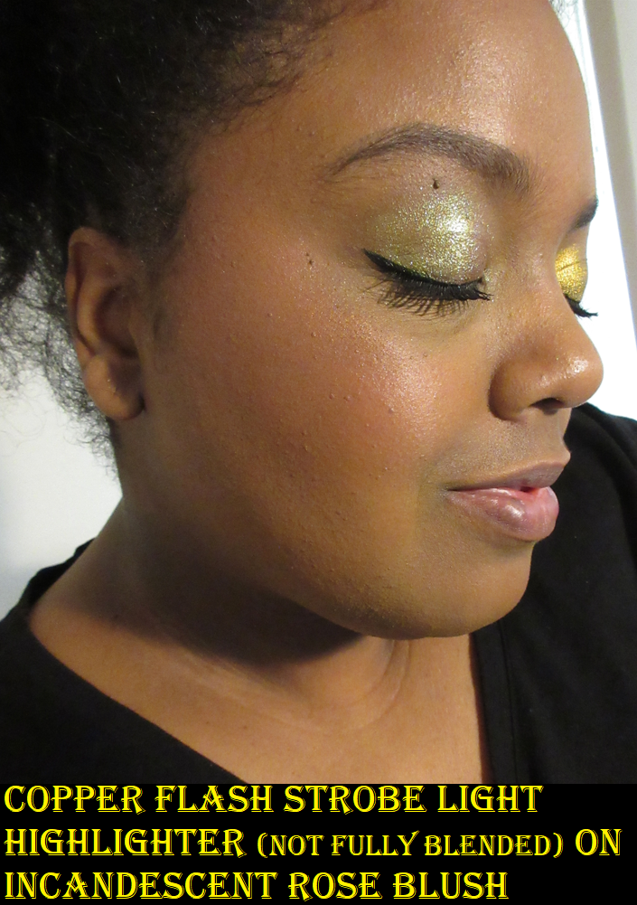
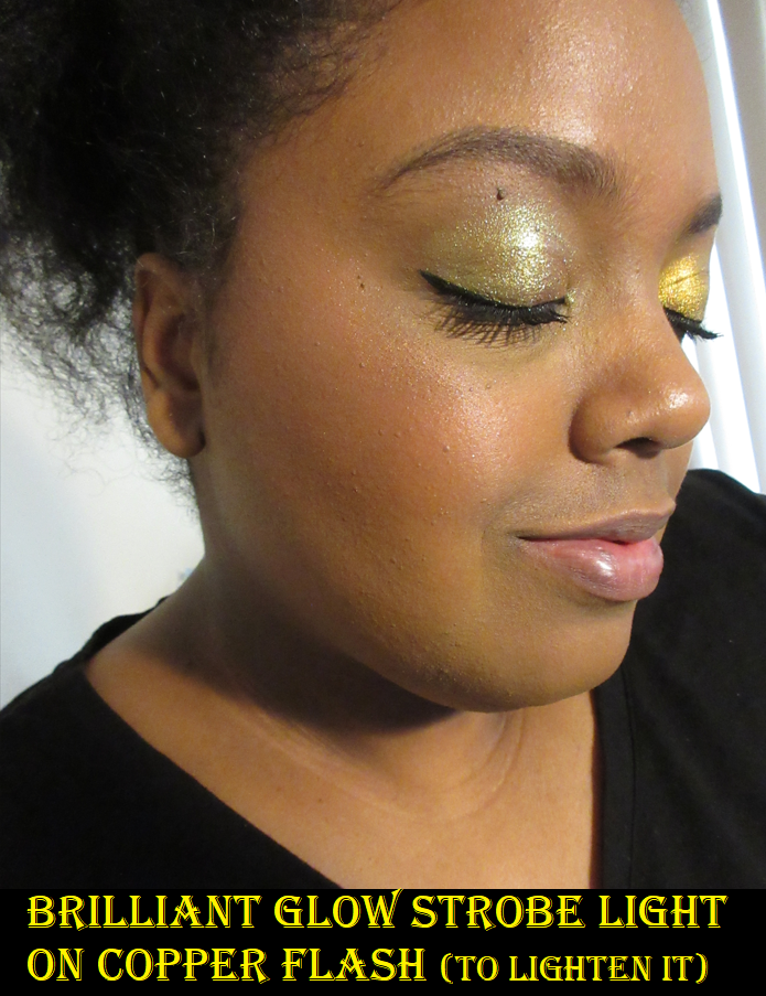
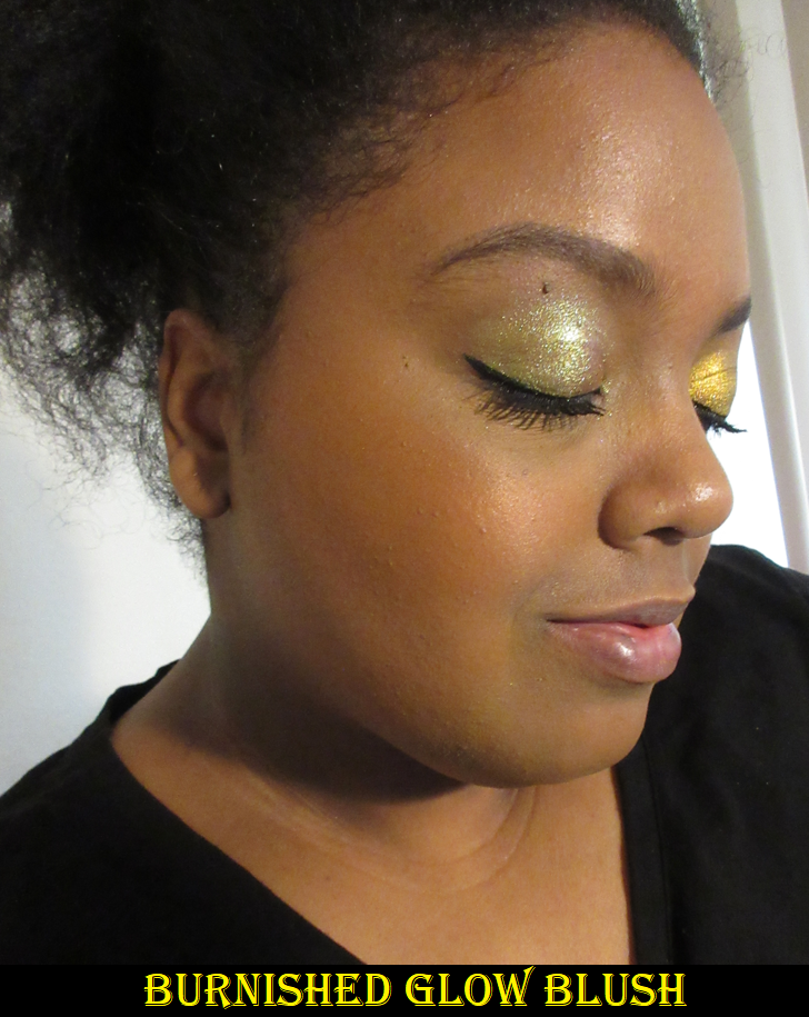
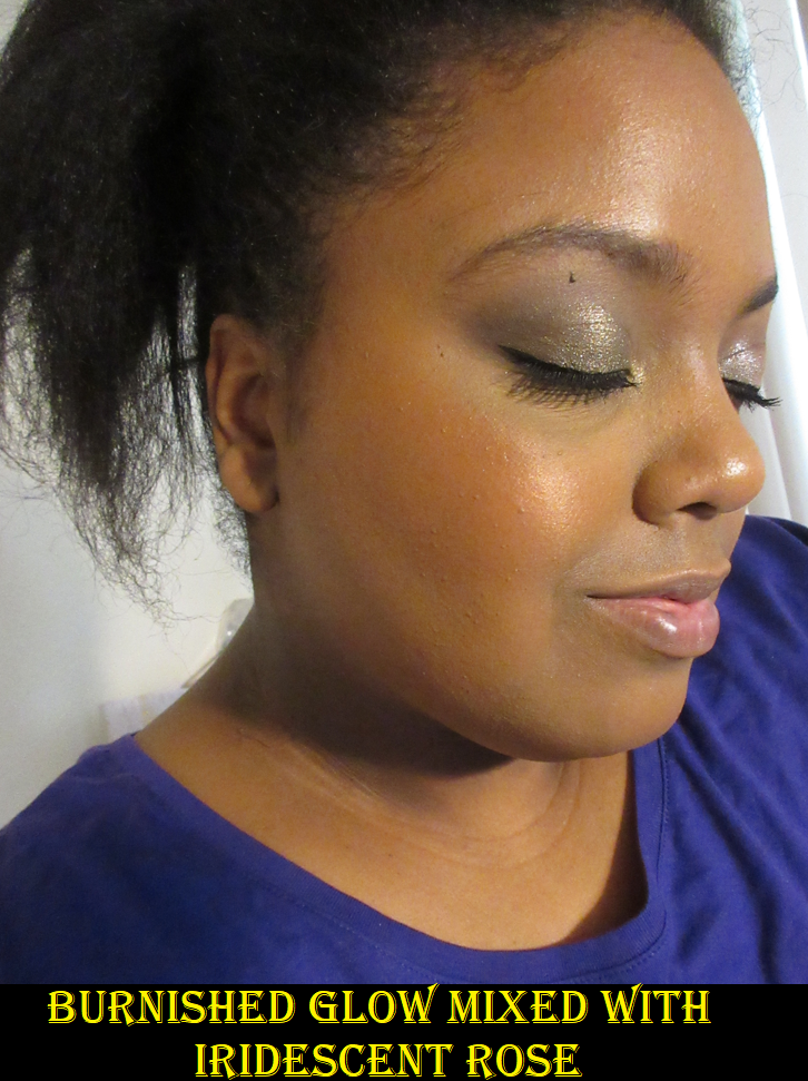
Sun Beam (blush) – In my review last year I wrote, “How fun would it be if Hourglass used their miscelare technique to mix two medium or darker colorful shades in a series of blushes instead of pale beige bases with a single color?” Looks like I got my wish again! Coral Haze is technically an example of that, along with Sun Beam no matter how close the swirled colors are in depth and tone. I love this color a lot more than Burnished Glow, which was too orange for my style to use alone. The texture of Sun Beam reminds me of the Copper Flash Strobe highlighter, even though this one is supposed to be a blush. It’s less reflective and more to my liking than Copper Flash Strobe, but it looks super metallic in my photos. I struggled to capture a photo that was bright enough to show the blush tone of Sun Beam and was unable to avoid the light directed at the cheeks from looking as reflective as a highlighter. This blush looks so much tamer and softer when I apply it to my bare skin, but for some reason, on my face with foundation, it looks more textured than usual. This happened on top of the Hourglass Ambient Glow Foundation (I’m wearing in today’s photos) and the Rose Inc Luminous Serum Foundation. Neither of these foundations are wet to the touch, and powdering doesn’t change things anyway. Based on the names, one could suspect the luminous foundations could be impacting the look of Sun Beam, but the foundations are more of a natural finish rather than glowy or dewy. With Sun Beam being closer to the strobe formula rather than the shimmer formula, I think it’s just a matter of it not being as flattering on texture and it looks better when used sparingly.
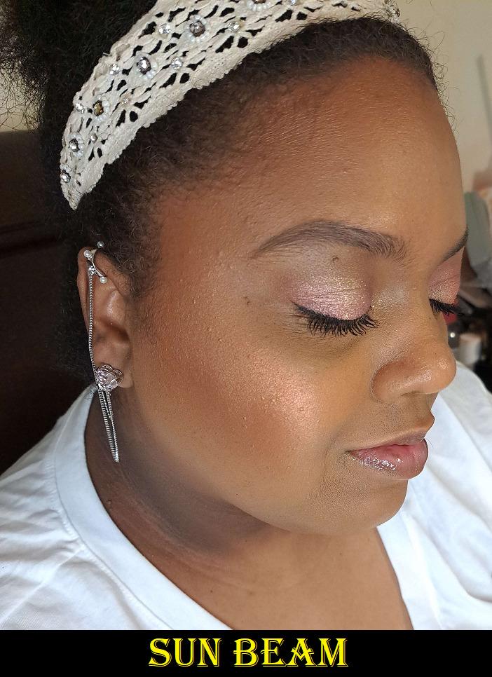
One more thing of note is that Hourglass lists Sun Beam and Coral Haze as normal Ambient Lighting Blushes, but for some reason Mystic Flush is listed as an Ambient Strobe Lighting Blush on their website. I’m guessing this was listed incorrectly and that Sun Beam is the actual strobe blush.
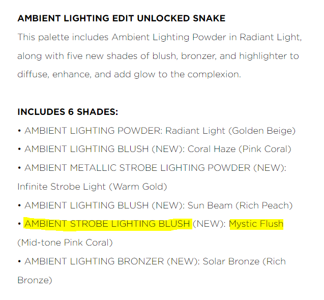
Mystic Flush (blush) – I love this color! It’s a warm pink, though not as warm as Sunset Glow from the Butterfly palette, and slightly more vibrant. It gives the exact type of pop I like from a blush, without being too loud of a color. I certainly can’t tell Sunset Glow apart from Mystic Flush if they’re applied normally on my face, but Mystic Flush is a bit more pigmented while being just as easy to blend. These two Snake blushes are so similar to the Butterfly palette blushes that I think it would feel to some people like having repeated shades. Of the four though, this is my favorite by a small margin. From Hourglass as a whole, At Night is my top favorite blush from the brand. There is still currently no mini or edit version of At Night, so I’m a bit surprised they chose to put two similar depth of pink blush shades in one palette instead. However, I will always give credit when the brand attempts to make something new rather than resorting to repeats. Considering I couldn’t decide which of the two Butterfly palette blushes I like more, I can understand others potentially having the same dilemma deciding between the Snake palette blushes regardless of how similar they are.
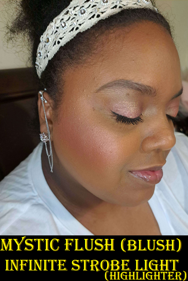
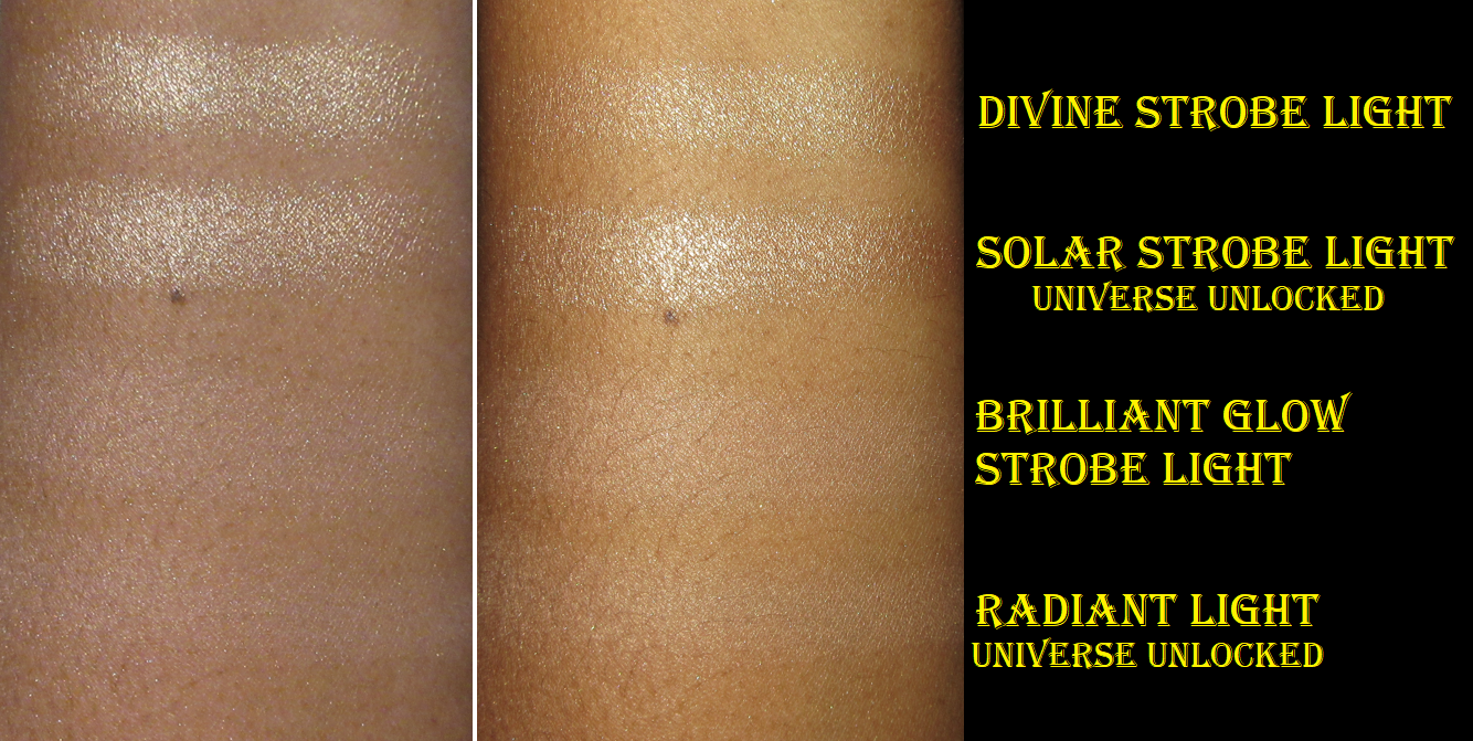
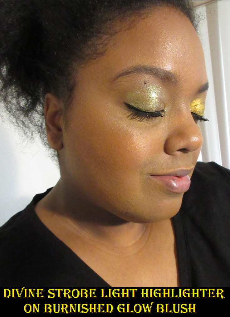
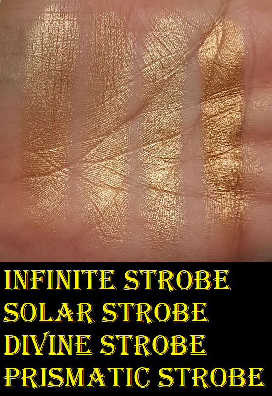
Infinite Strobe Light (strobe powder) – This is the darkest highlighter we’ve had in an Ambient Edit palette, but not by much. The true difference between them are their tones with Infinite Strobe Light being a golden color, Solar Strobe being yellow-gold, and Divine Strobe being a champagne shade. That makes Infinite Strobe Light the best highlighter color out of the edit palettes for me thus far, so they get some credit for the improvement. I am still waiting for the brand to make my perfect color though. There’s a big jump between Infinite Strobe Light and the deepest option available from the brand’s permanent highlighters, Prismatic Strobe Light. I don’t think it would be unreasonable to ask for a middle ground color, but until that day comes, I’ll be making use of Infinite Strobe Light.
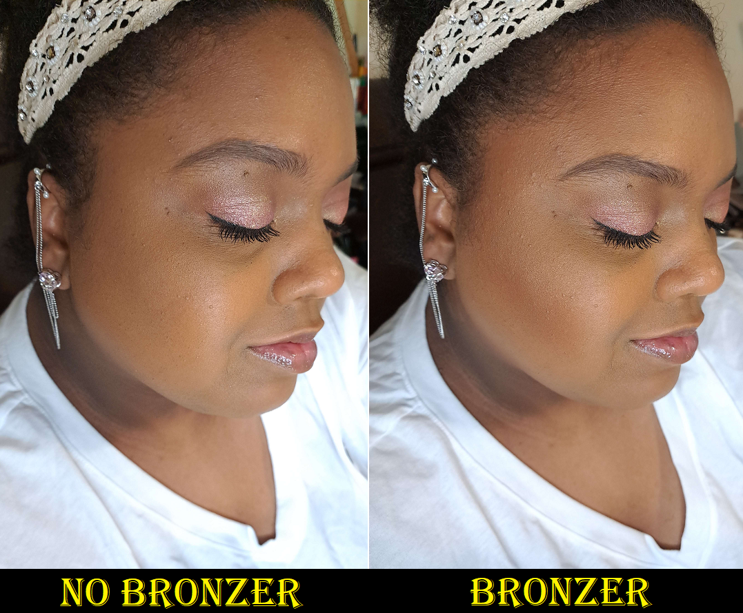
I consider the highlighter to have medium-high impact. It’s not ultra reflective, but I don’t like highlighters to have stronger intensity than this one, so I’m happy with it and I can always tone it down with the right brush and if I apply the strobe powder first before the blush.
Overall Thoughts
The Snake palette is probably as perfect of a single face palette as I will ever get from Hourglass. I got the warm bronzer I wanted, a usable finishing powder, two flattering and visible blushes, a more flattering version for me of last year’s copper blush/highlighter, and a darker highlighter than last year’s. I think they did a fantastic job making this palette suit me. Essentially, the issues I had with the Tiger palette that kept me from being able to actually love that one were addressed and applied to the Snake palette. It’s quite funny that my depotting efforts to improve upon the Tiger palette made it look similar to what Snake has by default.
This year’s palettes are a lot more clearly defined between Jellyfish being best for fair to light-medium skin tones, Leopard being intended for those in the medium range, and Snake being best suited for tan to medium-dark. I applaud this distinction, but that also means those with skin darker than mine have been left out again. They get my praise for finally making a great palette for me, but it shouldn’t stop at just me. Hourglass made the highest amount of new shades this year, but they chose to do it so close to what is already available and not as much effort went into filling the much larger voids in the range. For example, the highlighters and their gigantic jump from Infinite Strobe Light to Prismatic Strobe Light. The difference between Radiant Light finishing powder and Eternal Light is also enormous.
What does the brand focus on instead? Five of the six blushes in my comparison swatches look so similar that suddenly it’s clear why none of the new colors from the past three years have made it into the brand’s permanent collections. They can get away with nearly identical shades in an Ambient Edit palette, but I doubt even the most die-hard Hourglass fans would buy and keep all of those blushes if they were sold individually.
If the brand wants to stick to pink and coral tones (with the occasional orange) because that’s their aesthetic, so be it. If they aren’t set on those, I would love to see some dark brown leaning blushes too. Something along the lines of Chanel’s Brun Roussi Lumiere or MAC’s Coppertone or even Format. A terracotta like MAC’s Burnt Pepper would also be beautiful.
I really think Hourglass did better in a lot of areas, but my advice to the brand is to fill in the huge gaps of what’s missing in the range, not the minuscule gaps. Even if the palette would be too dark for me, I would love to see an Ambient edit palette for actual deep/rich skin tones. Tiger and Snake aren’t dark enough to fit into that category, so it would have to be several shades darker than those.
Of course, finding a way to make the palettes truly customizable to the point of choosing each individual shade would be the ultimate dream, but it will be great if they at least keep the new tradition of being able to select which pre-set colors go into which packaging.
My recommendation for Hourglass, if they want me to be forced to get one no matter what, would be to put an adorable panda on next year’s palette. Also, considering the rabbit/bunny is symbolic of the brand, it would make complete sense to have a rabbit cover, like the Riverine rabbit or some other endangered bunny or hare that would tie-in with the brand’s collaboration with the Nonhuman Rights Project.
Anyway, I eagerly await what next year will bring for Hourglass. I’d love to see other beautiful designs beyond the animal theme, but if they make a Panda, I am so done for! They’ll have my money again.
That’s all for today! Thank you for reading!
-Lili ❤
Edit: Currently there’s code UNLOCKEDVIP20 for 20% off the Hourglass website including these palettes. Credit to TheBeautySteal on Instagram.