I referred to the Beautopsy Palette as my “Star Product of 2021” in my 2021 Favorites post. What made it so special wasn’t just the customization factor of being able to tailor the eyeshadows. I loved that it was essentially a full face palette that I could use for blush, setting powder, contouring, etc. For those looking for an in-depth review on Beautopsy, please click here.
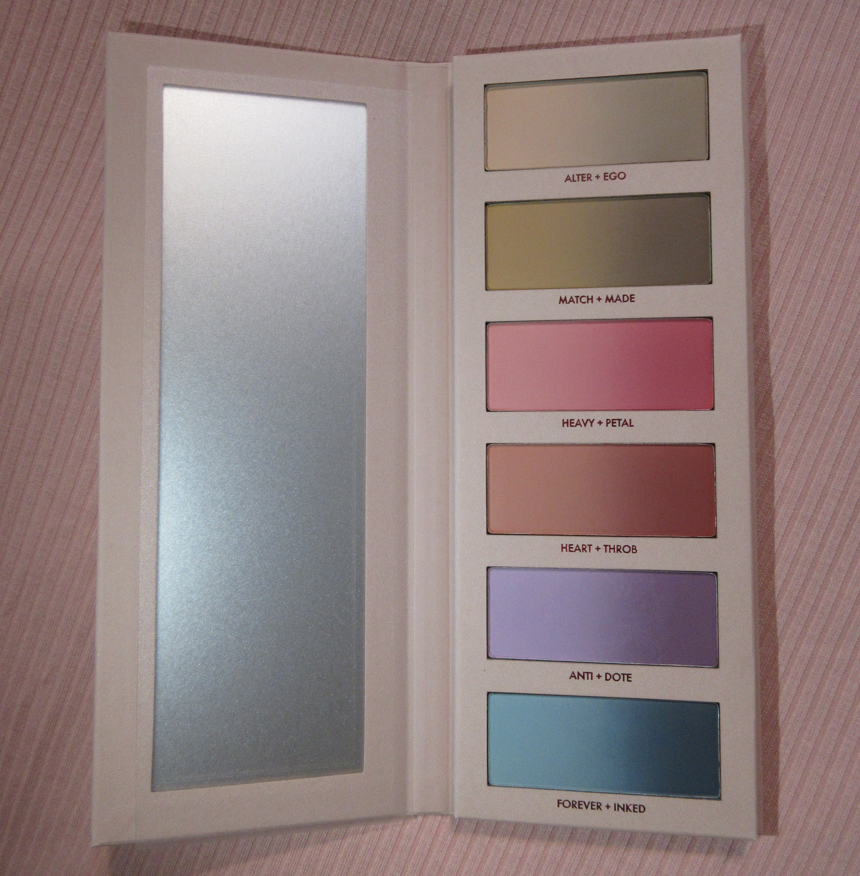
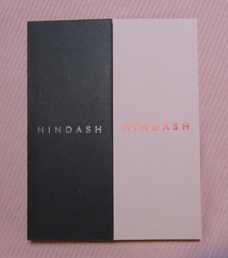
Monochromance has big shoes to fill. Today, I will share all the different ways I’ve tried to utilize this palette to its full potential. There are other items in the full Monochromance Collection, but I just stuck with the palette. Also, I purchased mine from Beautylish as it is no longer a Hindash website exclusive.
Non-Eyeshadow Eye Use
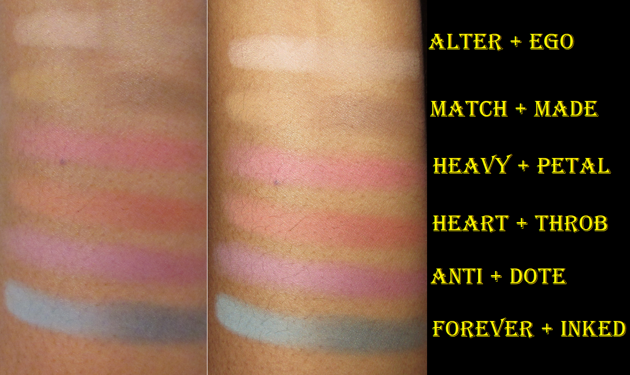
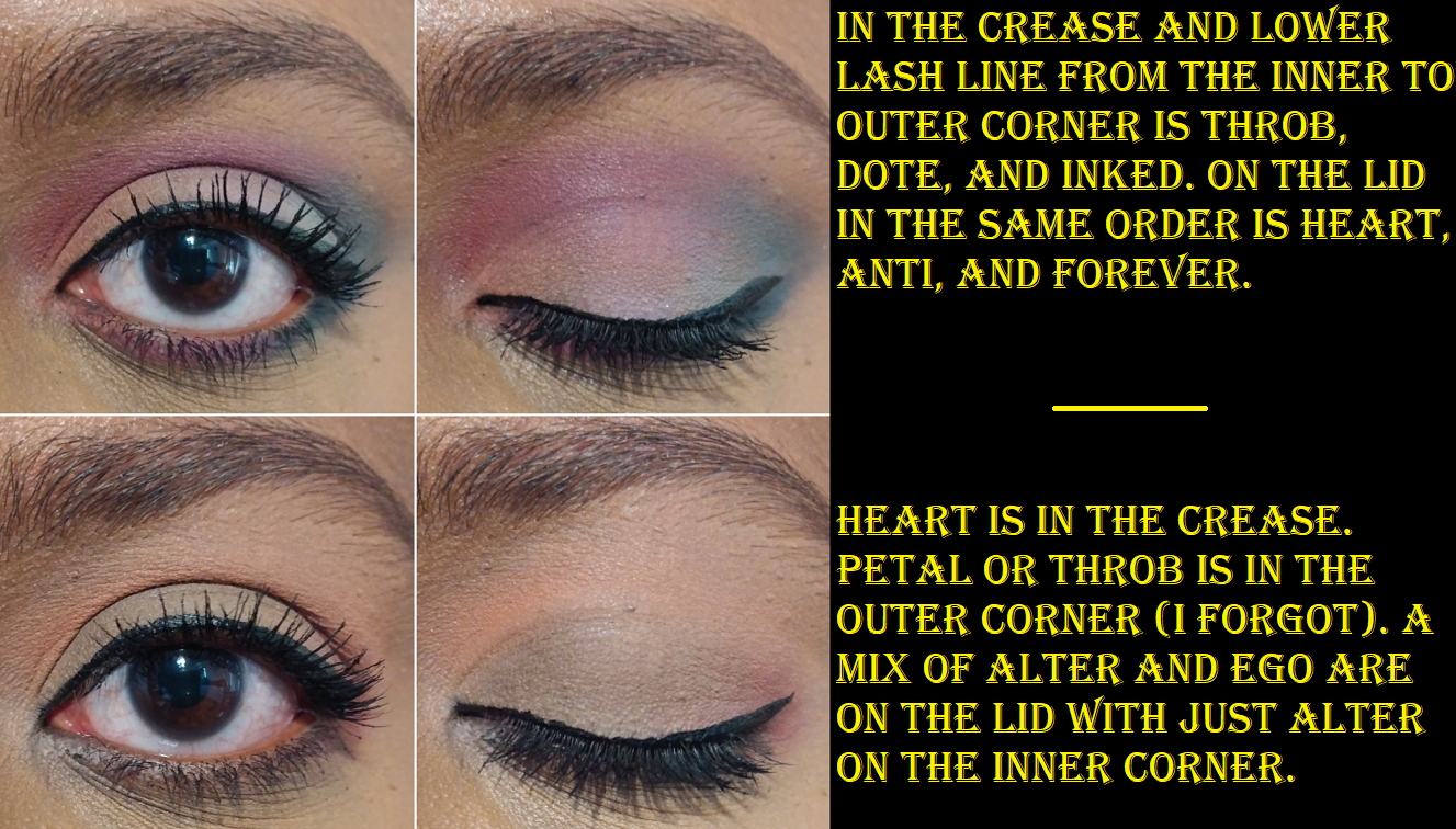
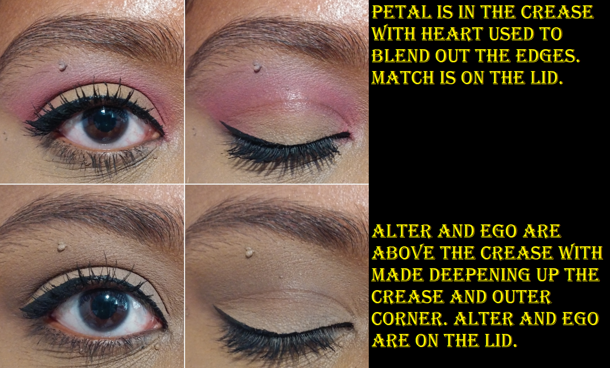
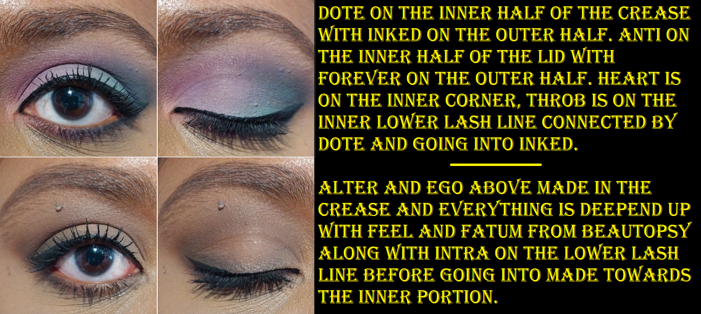
Shade-wise, I can use a mixture of Alter plus the middle spot between Match and Made to set my under eye concealer, but the effects don’t last as long or look as nice as a more traditional setting powder. This is quite the difference considering I get an almost blurred effect when I use Beautopsy’s Tan, Feel, and Paint for that purpose. I don’t have a natural brow shade in this, which I wouldn’t expect considering I only use dark-brown or nearly black shades for my brows. As for eyeliner, Made barely gives me enough depth to deepen the outer corner of my eyes so it would make for a poor eyeliner. My realistic liner options are Petal, Throb, Dote, and Inked.
Blushes
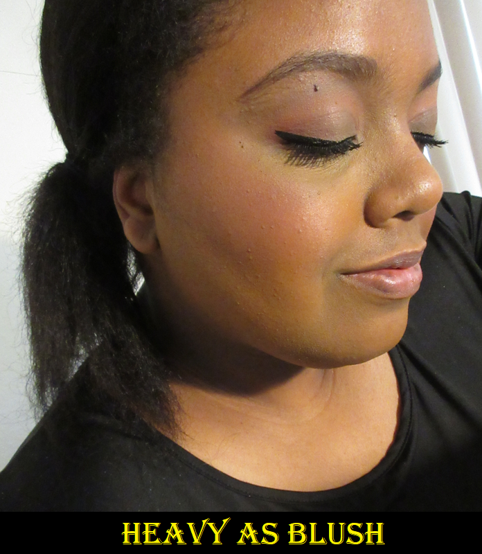
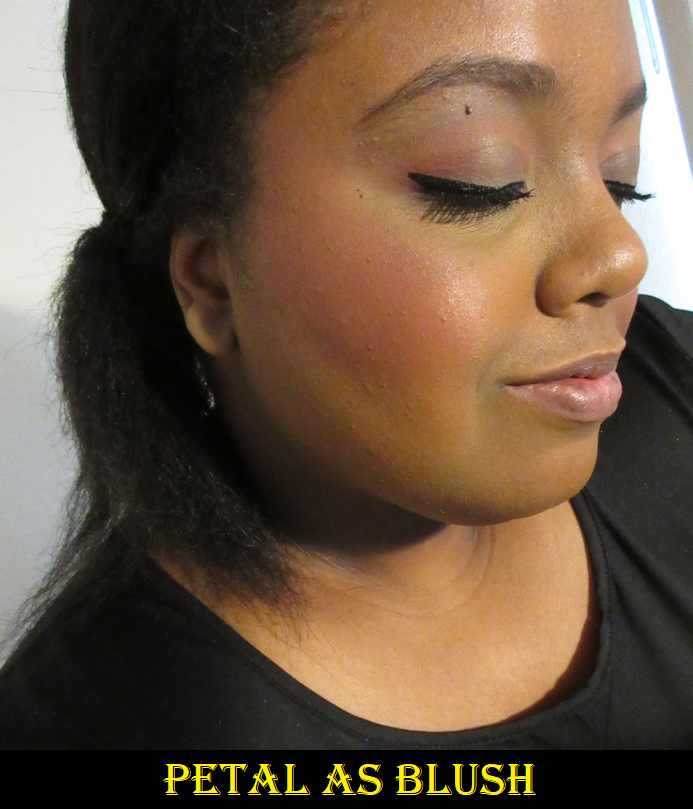
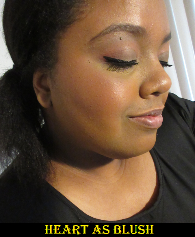
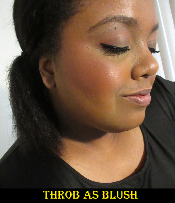
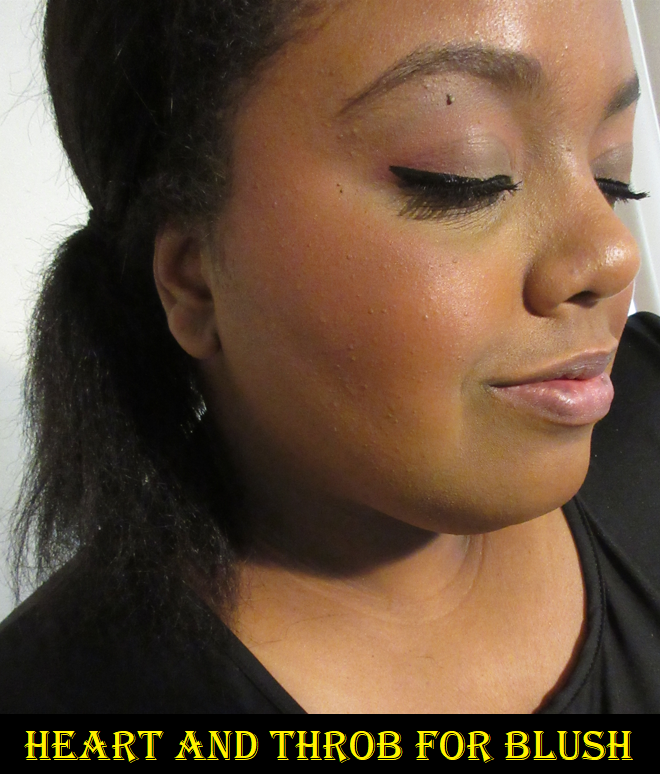
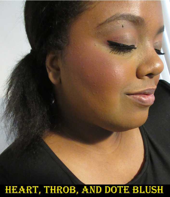
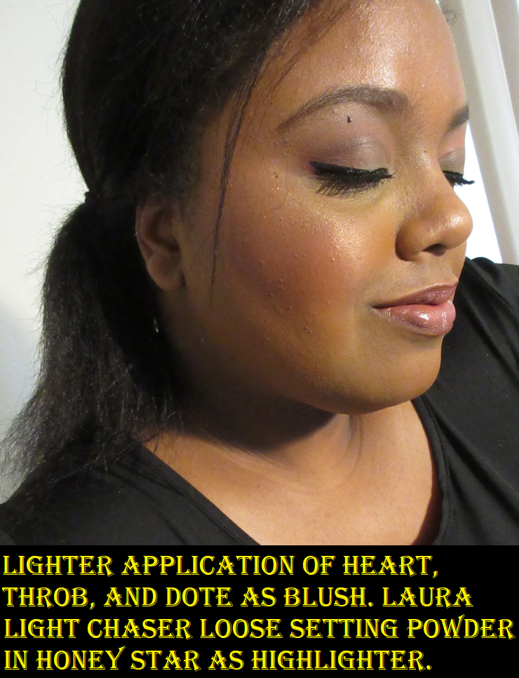
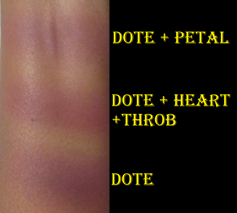
This is the main use I have for this palette. Petal and Throb are easily my favorites. I was surprised to see that Heavy still shows on my skin and doesn’t look ashy in my eyes. Heart is quite subtle but also pretty. I was the most curious to see how I could incorporate Anti, Dote, or some combination of those two with the other shades in order to create a slightly purple blush tone and even a mauve. Sometimes I’m successful at being able to pull off using a mix with the purple, but overall, I find that Dote is not easy to blend. In my experience, pigments using Manganese violet are difficult to formulate so that it blends well and smoothly on the skin. Dote has a tendency to stick in spots and look muddy when mixed with the other shades. It’s still prone to patchiness even when used alone. It’s a bit of a shame because it can look pretty sometimes, but it’s not a deal breaker regarding versatility of blush usage since I wouldn’t rock a purple cheek regularly anyway.
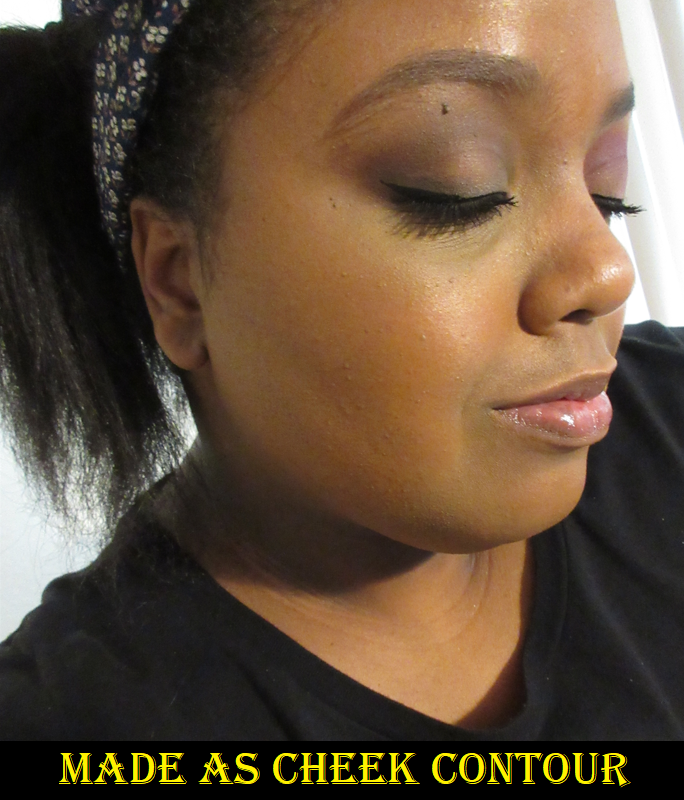
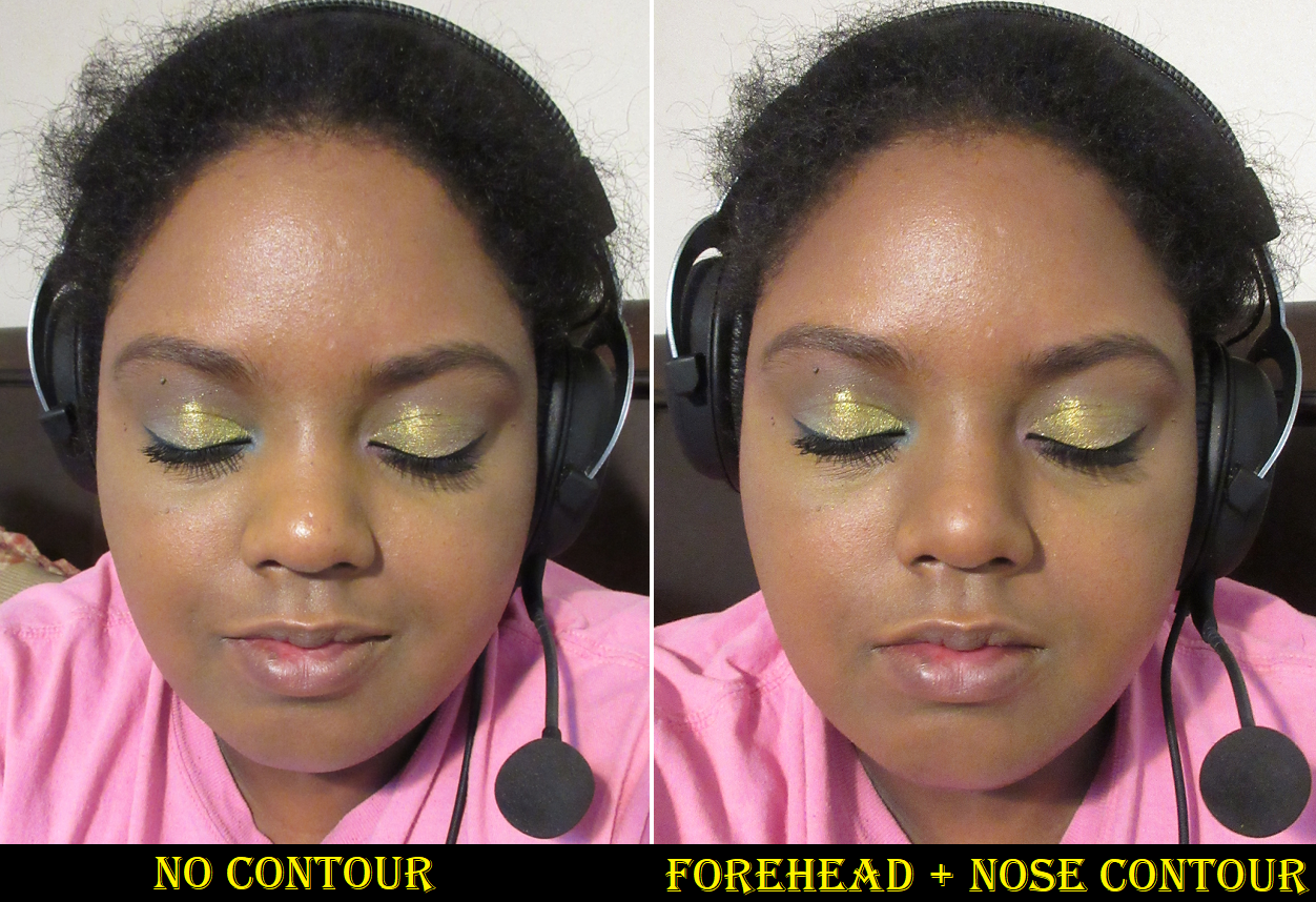
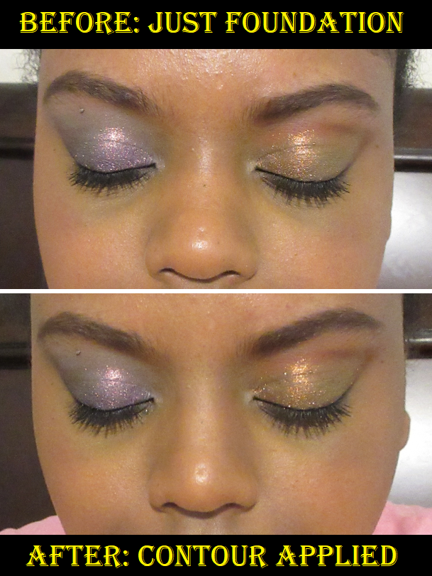
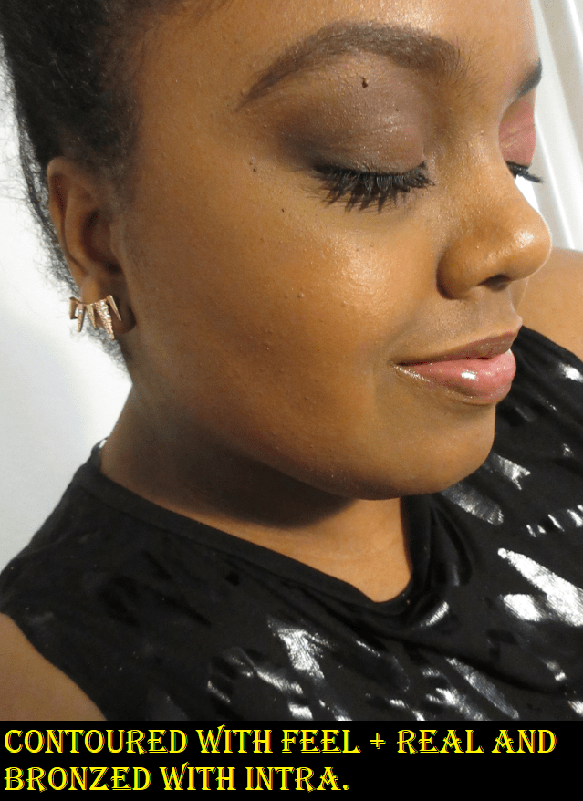
Contour and Bronzer
Hindash mentioned that Beautopsy wasn’t really created with bronzer purposes in mind, though I am able to get a nice reddish-bronze shade with it. When it comes to Monochromance, the overall color story leans cool, which means it’s not intended for bronzing either. I am able to use the shade Made for subtle contouring though. The middle ground between Match and Made actually creates the perfect contour color for me, even better than Feel and Real, but Match and Made aren’t as effortless to blend. They are fine on my eyes and under the cheekbones, but it sticks a bit on my nose which is the only place besides my eyelids that can get a little oily on my face. I wouldn’t even call it oil, rather dew, on my nose. So, if I have the time and patience to be willing to blend my contour, I reach for Monochromance, but most of the time I still dip back into Beautopsy.
Eyeshadows
Using Monochromance on my face is at least decent, but it’s nice at best. It doesn’t quite have the wow-factor, but I do like it. For use on the eyes though, it was incredibly frustrating the first few weeks! I should preface that I thought eyeshadow usage with Beautopsy wasn’t particularly special, so I bought Monochromance with the full intent to use it as mainly a face palette too. However, the performance on my eyes is terrible unless I use a fully dry primer. Using the MAC foundation stick or some kind of face product as primer worked extremely well with Beautopsy. It didn’t blend as well with my tried and true MAC Paint Pot, so I was prepared for that with this new palette. However, with Monochromance, both MAC products gave me creasing issues, issues with the shadows not appearing true to the pan color, patching off, sticking in places, difficulty blending, etc. I have never had an issue of a matte shadow creasing until this palette! Disappearing, sure, but creasing?
These examples are not even the worst of them, just the worst of what was left on my camera by the time I thought to include them in this post.
After trying other primers as well, I realized that I could only get decent results if I used a primer that fully dried down with no tackiness left behind. This means using something like the Anastasia Beverly Hills primer. I can also get away with using the Gerard Cosmetics Clean Canvas. Using a dry primer is the first step, but to get the shadows to apply pigmented on my lids and blend smoothly I have to put a layer of setting powder on top of that eye primer before applying the shadows. The downside is that my eyelids unsurprisingly do look dry, but since I would normally throw a shimmer shade on my lid, it would hide those issues.
As I mentioned before, Dote is the most difficult to work with on the eyes. Other than the lightest shades not showing up very well and my inability to get much depth from Made on my eyes, I don’t have as much of an issue creating eye looks with this palette as long as I use a drying primer that has been powder-set. While it’s true that these palettes from Hindash contain shadows that are hard pressed, it’s not an issue of being unable to get product onto my brushes. My favorite brush to use with this is the Sonia G Builder Pro, and I essentially dig into the palettes as though that brush is a chisel. I see how much product gets on the bristles; it’s just not as pigmented. The shades are softer colors overall, with the exception of Inked.
All the issues I had with Monochromance may be a “me” thing. My lids are oily, so perhaps that doesn’t mesh well with the formulation of these shades. The left halves of the pans lean pastel, which I also am prone to having issues with depending on the formula. What I can say though is that despite the website having both palettes listed as the exact same ingredients, there has to be a reason why Beautopsy still does not perform the same way as Monochromance. In that last eye photo above, I literally used Feel to cover up a bald spot left in the crease an hour after using Made there, and with Feel on top, it then remained covered for the rest of the day. Something is clearly different.
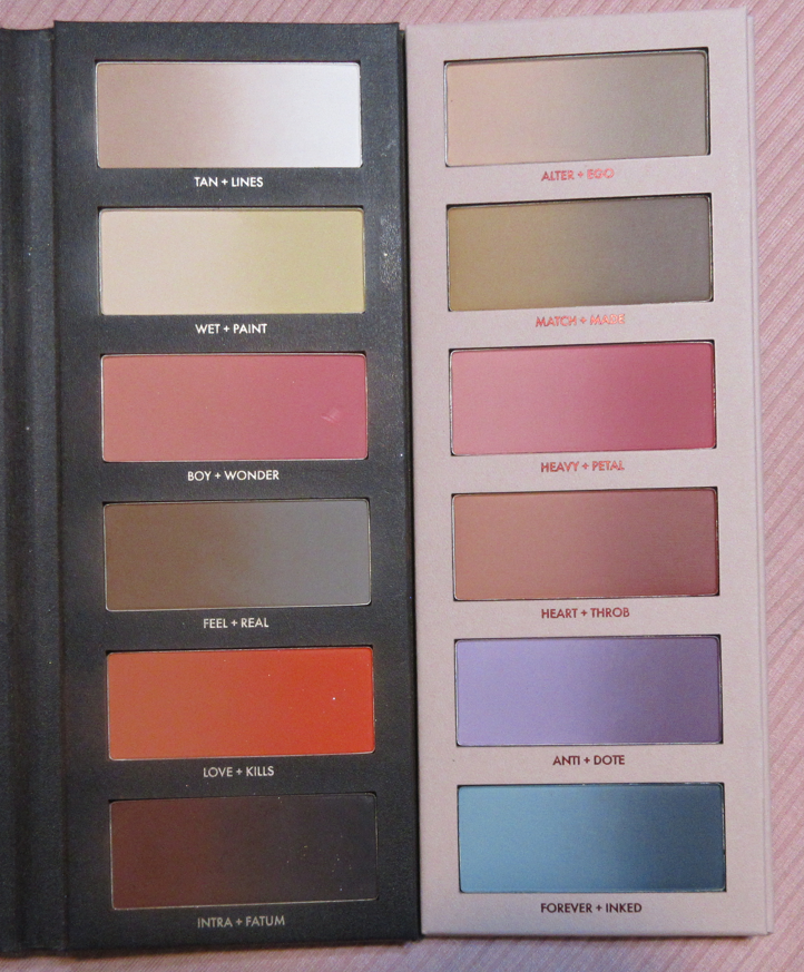
Beautopsy versus Monochromance Shade Comparisons
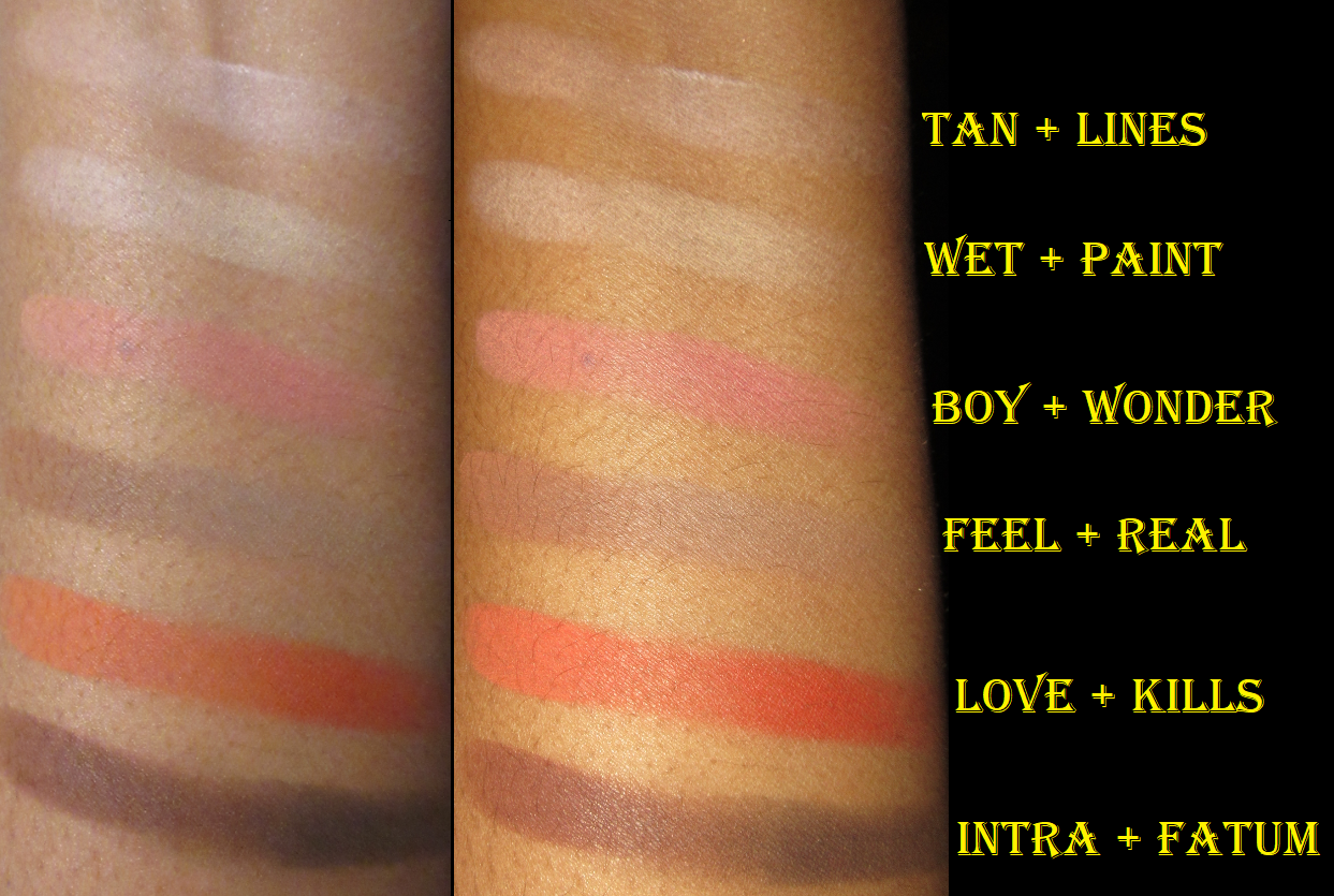
It’s obvious that Beautopsy has a more neutral color story and Monochromance is more colorful, but Tan Lines and Alter Ego essentially look the same on my eyes. Feel is neutral whereas Made is a more cool tone brown. The pinks in both palettes are essentially the same depth, but Beautopsy’s lean warmer than the Monochromance pinks.
I’ve been testing Monochromance for over a month, and I still can’t decide whether this palette is worth buying and/or worth the price. I like it, but if this left my collection today, I would only really miss the blushes. However, these wouldn’t even crack my top 20 favorite blushes and blush formulas, so it still wasn’t a necessary purchase other than to satisfy my curiosity on the quality and versatility this palette could provide.
If someone wants to know which one is worth getting, I would easily say Beautopsy. When it comes to recommending Monochromance though, I’m not quite sure.
Thank you for reading and I hope at the very least that my swatches, eye looks, and face application looks have been helpful.
The idea of having a product that I can customize my shade of powder, blush, bronzer, contour, eyeshadow, etc. all in one palette appeals to the wannabe minimalist in me. I call myself a wannabe because I enjoy having a large beauty collection while simultaneously being overwhelmed by the amount I possess. This is why I love the concept of face palettes, but it’s very uncommon for me to find one where the majority of the makeup in it suits my preferences and needs. I’m curious to see if I will continue to like this palette after prolonged use and continuously mixing shades, but so far I am impressed! There’s pretty much no kickup and if I get a lighter imprint on a deep shade, or vice versa, I can sweep it away with a brush and it’s good as new! Perhaps this is possible because I combine shades by tapping into each color I want; I don’t swirl in one and then swirl my brush into the other.
A palette like this can seem intimidating, and I was initially unsure if I would buy it for that reason. Some aspects were as tricky as I expected and some parts were easier than I thought, almost intuitive. For instance, using Beautopsy for blush is pretty straightforward. Boy, Wonder, Love, and Kills are four easy options for that. Overall, while I wouldn’t go as far as to say beginners wouldn’t like this, I think it would be most enjoyed and utilized by those with an intermediate skill level and above.
Brightening andSetting Powder
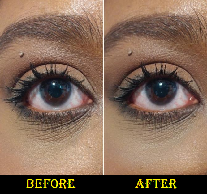
For setting under my eyes, I use the leftmost sides of Tan and Feel and rightmost side of Paint with my usual Real Techniques Setting Brush to create a pale yellow-brown. I was shocked when I realized it actually had a blurring effect and made my under-eyes look smoother! Certain concealers of mine don’t play well with powders, but so far the blurring has been a consistent feature to setting under my eyes with the light shades in the palette! The photo below shows what it did to my Tarte Shape Tape and Pat Mcgrath combo (which was not originally set with powder at all). The lines under my eyes are still there, but less pronounced.
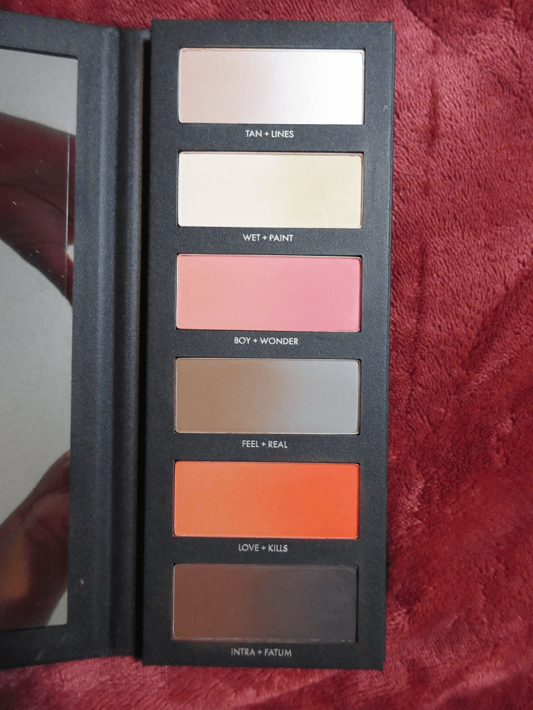
If I want to brighten my under eyes, and not just match my skin tone, I can use pretty much any of the four lightest shades without them looking stark because they blend with the concealer. Additionally, there isn’t much difference between them when applied to my skin. On a lighter skin tone, they are distinct enough, but on me they’re all essentially white with the tiniest differences in tone. That being said, they somehow don’t look ashy on me like other pale shades tend to do, but I still try to use the combinations I think make the most sense based on their color descriptions: Lines as a pure white, Tan as a soft tan, Wet as a beige shade, and Paint as a pale yellow.
While I could probably set my whole face with a mixture of Feel and Paint, I wouldn’t want to use a small brush for that task, and I have dry skin anyway, so I don’t always set my full face. Also, I can technically use this palette to brighten the high points of my face, but I love my shimmery highlighters and I would never be satisfied with using these matte powders to highlight anywhere other than the eye area. So, in a traveling situation, I would probably bring along a separate setting powder, plus my Kaja Play Bento Sculpting Trio for the subtle shimmer highlighter and to have extra variety. The Kaja Bento in Mochamallow was previously the only all-in-one face product I had where I loved and could use every color in it. Beautopsy now joins the ranks of the best suited face palettes in my collection.
Brow Powder and Eyeliner
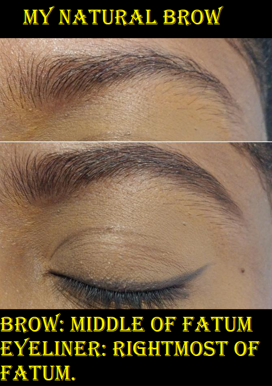
I’ve spoken before about how any dark eyeshadow can be used as eyeliner and for filling in the brows, so it didn’t surprise me how well Fatum worked for that purpose. I used the darkest part of Fatum as the liner. If I want to wear just a liner and no eyeshadow, this isn’t black enough for my preference. However, when I’m trying to deepen up eyeshadow looks, Fatum is dark enough for that, and quite lovely. Hindash mentioned that you can use Fix+ to transform any of these powders into liners, but I haven’t tried that. I like to use dark shades, but not black, to fill in my brows. The middle where Intra + Fatum meet is a shade that works for defining the eye, but was too warm of a brown for my liking. So, I switched to using the center of Fatum where it still has a little of the chocolate brown shade but is also dark enough to use in my brows. I messed up a little spot in the front and didn’t notice it in person, but of course the camera picked it up. I was a bit impatient, which is why my brow isn’t perfect, but it also brings up the point that brow pencils are so much faster for me. I know I wouldn’t use this again in my brows, purely for the time factor, but I’m glad I have the option.
For those who prefer a cool-toned dark brown or soft black for their brows, Fatum mixed with Real could probably do the trick. Real + Feel might look nice on blondes and maybe Feel and Love or Feel and Intra for those with red hair, but don’t quote me on that!
Blushes
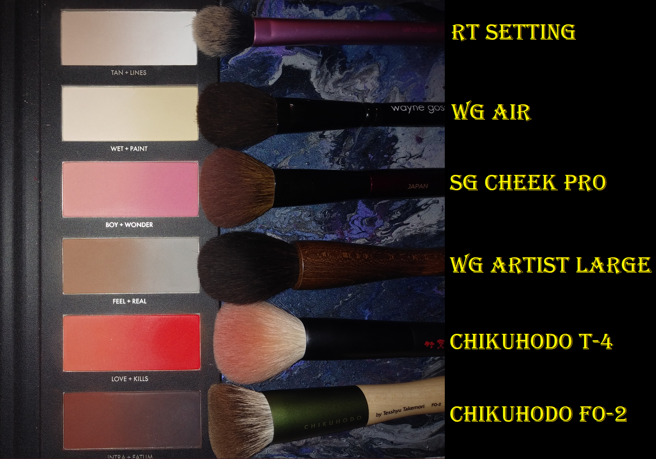
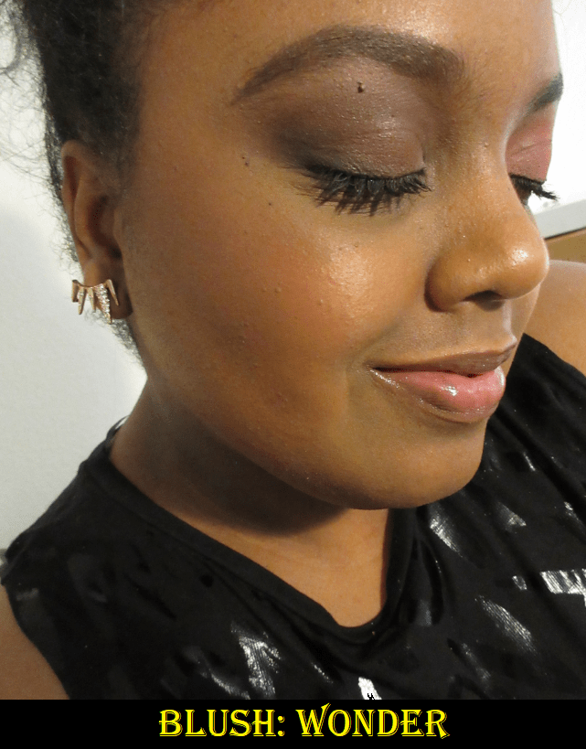
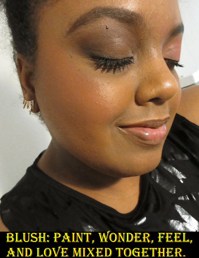
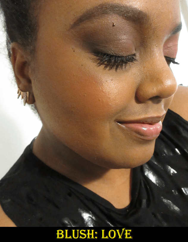
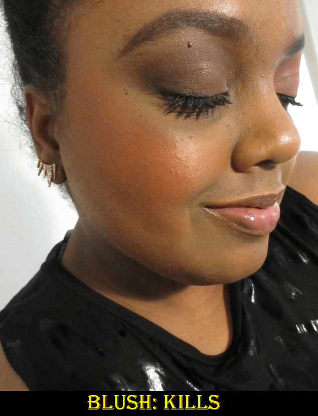
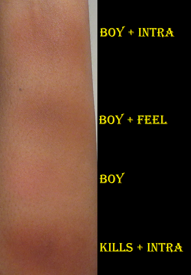
For blush, my favorite shades to use on their own are Wonder, which gives me a light but bright pink flush, and Love, which is a reddish-orange. Kills is a bit too deep for my preference to use alone, but I could always use it if I mix it with something lighter. Boy is a wearable peachy-pink for those with a lighter skin tone than mine. It shows on my skin, but I don’t think it’s as flattering on me as Wonder. If I want to give myself a peachy or coral look, I think of creating a different kind of orange with a little pink. So, I dip my brush mainly into Paint and Love with one extra tap of Wonder and buff it into my cheeks. If I want it a little less bright, I add some of the brown from Feel. I try not to mix more than two colors together because it tends not to look as nice on the skin, but this particular combo of 3-4 still works for me. I’ve enjoyed using my Sonia G Cheek Pro and Wayne Goss The Artist Brush – Large to apply blush, as they aren’t too big for these pan sizes.
The head sizes of my brushes compared to the size of the pans. It’s not a coincidence that my smallest face brushes were all made in Japan.
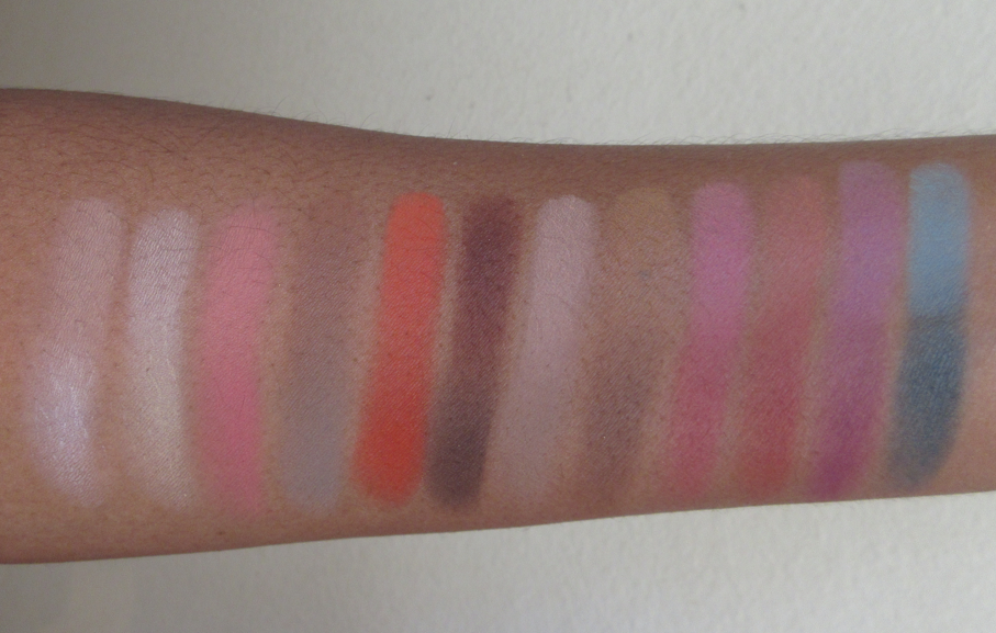
There are so many combination possibilities! I experimented with some on my arm to give more examples. I put them on my bare arm, but the blend would look much nicer on the face with primer and foundation under them.
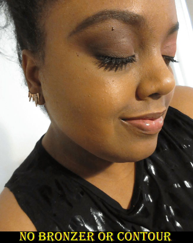
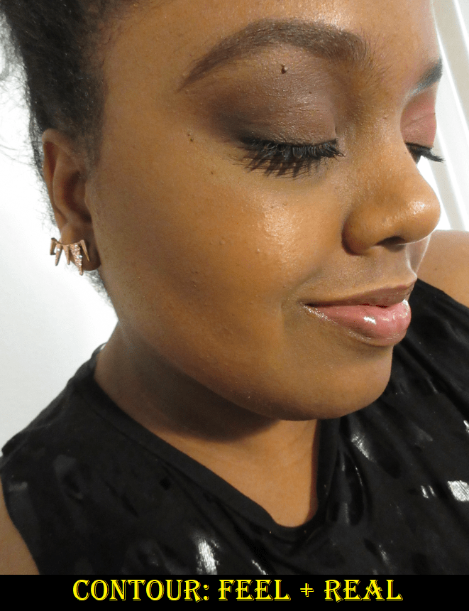
Contour and Bronzer
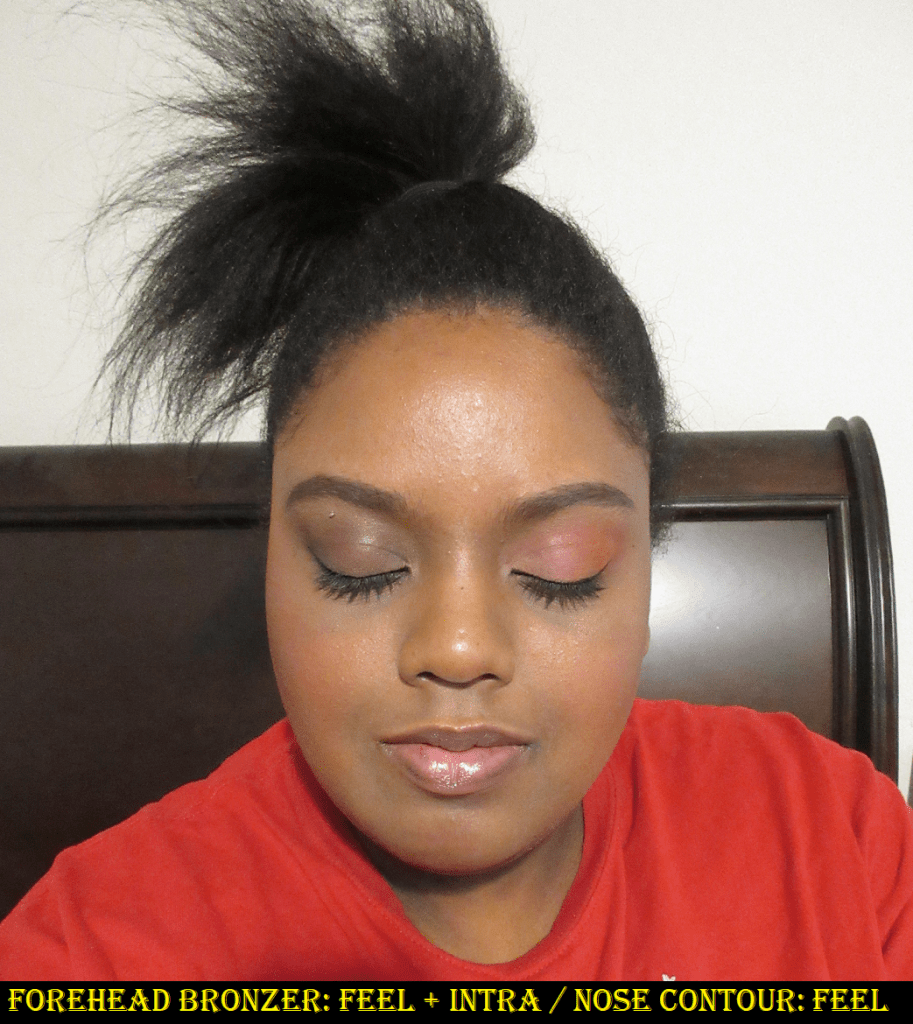
To contour my nose, I can use Feel on its own, but I prefer the look of Feel and Real together to create a proper shadow. I can use pretty much any small brush, but I’ve been liking the Scott Barnes Eye Winger #63 because the unique shape automatically creates a symmetrical line if I contour between the bridge of my nose and my brows. Most of the time I skip contouring my nose, but when I do, I like to keep it as subtle as possible and just add shadow where I need it. For instance, sometimes all I do is add contour powder on either side of the bridge of my nose, just in the middle where there’s no definition. In order to do that though, I definitely cannot use a warm/red toned contour powder, which is often what is available on the dark-deep end of contour shades. I need something cool yet not too dark, which has always been a challenge for me to find.
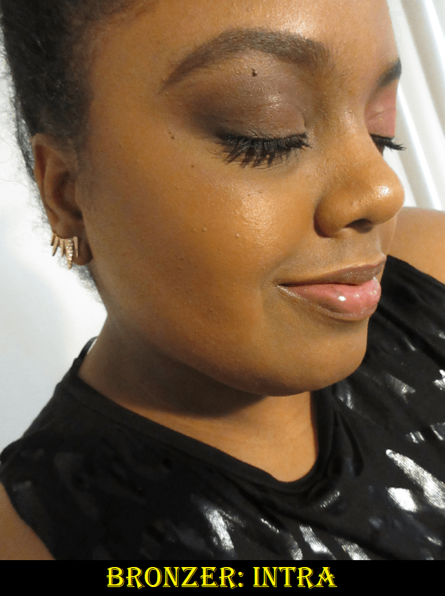
To contour the rest of my face, I tap my brush into the center where Feel and Real meet. I can use something with a flat top like the Chikuhodo Z-3, but I also prefer a brush with a tapered tip like the Wayne Goss Air Brush, Wayne Goss Artist Large, and Chikuhodo KZ-05. For bronzer, I use the leftmost sides of Intra and Feel. Sometimes I use just Intra. I’ve tried different brushes, but the Chikuhodo FO-2 is my favorite to bronze with this palette. Since I only use the leftmost sides of the powders for bronzing, I dip the right half of my brush into the powders (without getting anything on the left side), I can apply with that half of the brush and blend out with the half that didn’t get any product on it. It was a little funny to me when I discovered that the Beautopsy palette wasn’t created with bronzer as much in mind, since Hindash likes to use cream products for that purpose, yet I was able to find a bronzer combination that worked so well for me!
I’ve tested this palette over matte and dewy foundations. When I use them on matte foundations or bare skin, the blend of these powders on the face looks so good! On dewy products, it’s almost as if these don’t want to stick to the skin. It takes longer to blend and the end results looks okay, but not nearly as nice as it looks over a matte one.
Eyeshadows
I believe Beautopsy is foremost a palette for the eyes, and ironically, this is the one aspect that having only mattes as options isn’t entirely satisfactory to me. It has been quite a few years since I’ve created all matte eyeshadow looks on a regular basis. When doing an all matte look, there is no room to hide, nothing to cover up any mistakes or distract from poor blending the way shimmers can. It is a craft that looks so simple but requires immense skill to perfect. Plus, I just love putting a shimmer on my lids, so if I was on a trip, I would have to bring at least a small magnetic palette of shimmer eyeshadow singles with me. As much as I admire sultry smoky eyes, I mainly prefer to do colorful eyeshadow looks, or at least to have a neutral crease with a bright color on my lids. This is another reason I would want a supplemental palette. This also doesn’t give intense payoff right away, and this makes perfect sense for Hindash. As a makeup artist, he would want a product that builds up and blends well. When I say that this doesn’t fully line up to how I like to do my eye makeup, it’s not me saying the palette is bad. It’s just obviously suited for those with a different eyeshadow style than mine. In addition, the buildable nature that I don’t like as eyeshadows is what makes them so fantastic as face powders. Plus, the slow build issue I get is only when I try to use a regular eyeshadow primer underneath. If I use a complexion product as a base, I have no qualms with how long it takes, but more on that in a moment. Regarding the texture of the shadows, these remind me a bit of Viseart. However, Viseart shadows give a little more pigment per brush stroke, but the Beautopsy powders feel a little silkier. Zea Mays is the second ingredient in the Beautopsy palette, and it does have that cornstarch feeling to the touch, which could account for the added silkiness over Viseart’s shadows.
Preferences aside, my biggest challenge was finding the right base for these powders as eyeshadows. I absolutely hated using the Gerard Cosmetics Clean Canvas. I had to keep making alterations because it wasn’t blending the way I wanted and it took so incredibly long to get it in a state that I thought was presentable. I had to start over again several times. I didn’t have much luck with my tried and true MAC Paint Pot either because it was as though the shadows didn’t want to build on the eye and at one point I switched to my finger to try and pack it on. Usually I only have to do that with shimmers. I got better results when using the Urban Decay primer potion, but surprisingly the best results I’ve had were when I used concealers and foundations as bases! I discovered this first when I used the Tarte Shape Tape and then again when I used the Pat Mcgrath concealer, although that one creased badly when I left it unset for too long. I’ve been using the MAC Foundation Stick as an eyeshadow primer, so I wasn’t as surprised to see that the shadows blended well over it. However, out of all the bases I tried, the best results I’ve had were with the Dermablend Flawless Creator Foundation Drops. Those drops are basically a foundation and concealer hybrid. So, if you have this palette and you’re struggling to use these over eye primers, I recommend using a complexion product as primer instead. This discovery changed my opinion of these as eyeshadows for the better and I’ve enjoyed using them so much more!
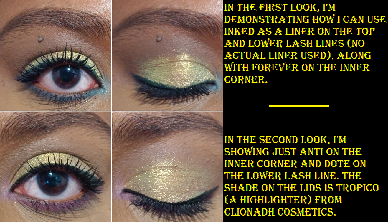
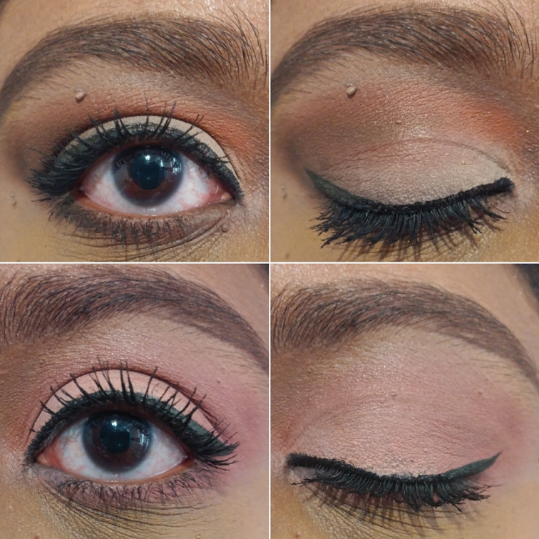
One issue I still haven’t resolved is that the shades in the top half of the palette disappear off my eye by the 5-6 hour point. It happened regardless of the base I used. The bottom half of greys, black, browns, and reds lasted 9-10 hours before I ended the wear test. Perhaps this is caused by a difference in how the lighter shades are formulated/the amount of pigment in them. That’s my best guess, although the shadows have the same ingredient list, excluding Love, which is listed separately.
I usually go into details about how I create a look and which shades I used in the eyeshadow portion of my reviews, but I mixed so many things that I lost track.
Looks 1 and 2 are both over the Gerard Cosmetics Clean Canvas.
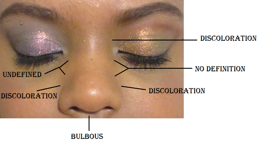
This look is over the Pat Mcgrath Concealer. It was my attempt to recreate what I was trying to do in Look #1. The shimmer in the bottom half of the photo is Sun Scorched from Terra Moons Cosmetics.
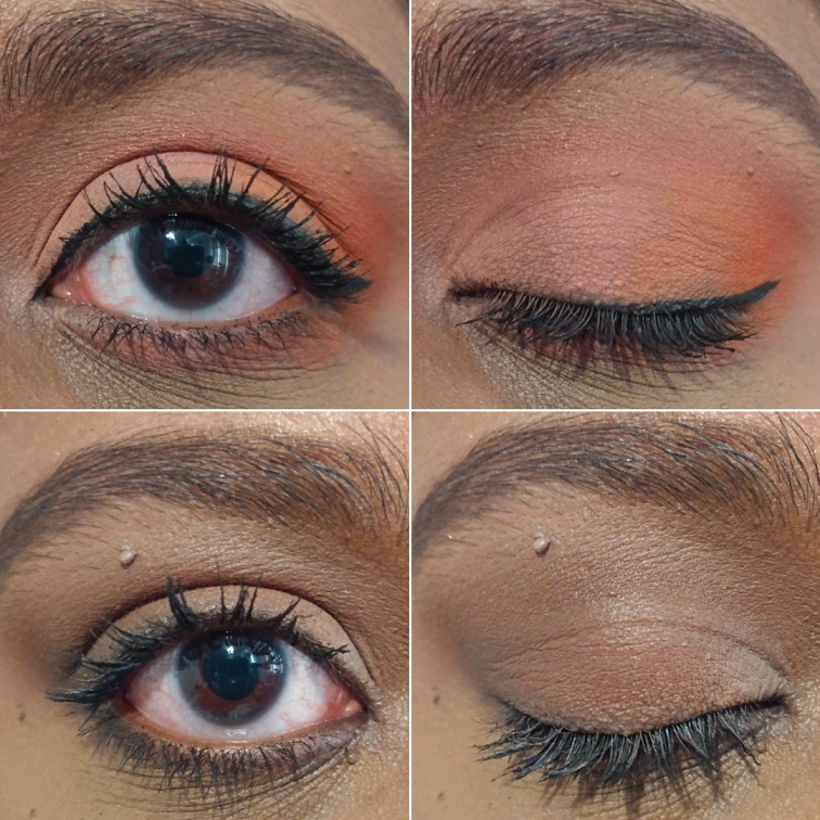
The peach-pink-orange-red ombre look is over the MAC Foundation Stick. The look below it is over a MAC Paint Pot.
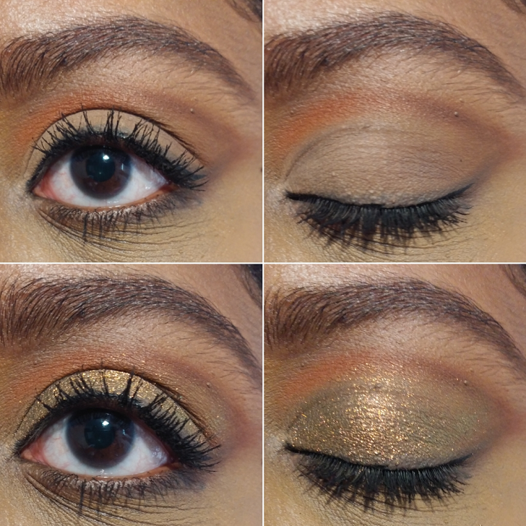
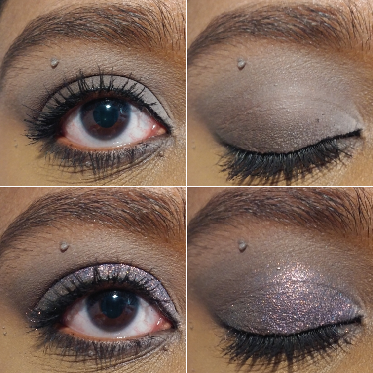
The grey look is over the Urban Decay primer potion. The shimmer on the lid in the bottom half of the photo is Helix Nebula from Terra Moons Cosmetics.
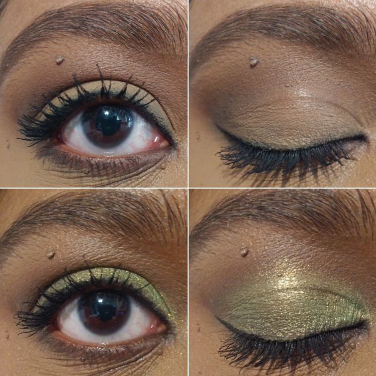
I used the Dermablend Flawless Creator Foundation Drops as the base. This shimmer on the lid is called Kamakura #10 from the Viseart Coy palette that I bought as a single shade. This green look was photographed many hours after I first applied it.
I have used eyeshadows as blushes and blushes as eyeshadows in the past. This palette is the first time I’ve ever preferred the secondary usage over the intended one. I was so surprised at how seamlessly these powders worked together as face products. These were not my first choice for eyeshadows until I found the right base, and now I very much like them too. They are of great quality and I foresee myself continuing to use the last 6 shades as the framework for my shimmer lid shadows.
Overall, the formula of these powders are truly special to be able to be as versatile as they are. In Hindash’s launch video, he said it took a couple of years to create this gradient palette. I tend to roll my eyes whenever influencers say that, but in this case I believe him. I can clearly see the labor of love that went into the Beautopsy Palette. I also say this from the perspective of someone who admittedly didn’t know who Hindash was until the release of this palette. I did a little research for the purpose of this review. I respect Hindash’s artistry and the way he and/or his team has been supporting smaller and larger creators equally, even liking my photo of his palette on Instagram. There still isn’t a parasocial relationship there, so I can say from a fully unbiased perspective that this is a great product and I do recommend it. It’s become for me more than just a cool and innovative release. For the past 6 weeks I’ve had it, I’ve used it for at least one purpose every single time I’ve put on my makeup, whether it was to add depth to an eyeshadow look, do a quick nose contour, to set a cream blush, etc. I store most of my makeup in drawers, but I’ve been keeping it in my train case which holds products I use the most often or am trying to pan, because I want the easy access. Whether the cost is worth it though depends on how often one would utilize something like this for the eyes, face, or both. There are several times I’ve owned something of fantastic quality, but for whatever reason it remained unused. So, that is something that has to be factored into the decision to purchase. I’m glad it worked out for me.
Does this palette interest you? Let me know what you think!