Glossier Brand Review

There are more shades of products that will be shown and discussed in this post than are represented in the photo above.

I consider Glossier to be one of those brands that cater to both Millennials and Gen Z, but they have this minimalist cool and youthful social media-loving aesthetic that feels unapproachable to me. The marketing just isn’t my vibe, yet I’m fascinated by it all the same.
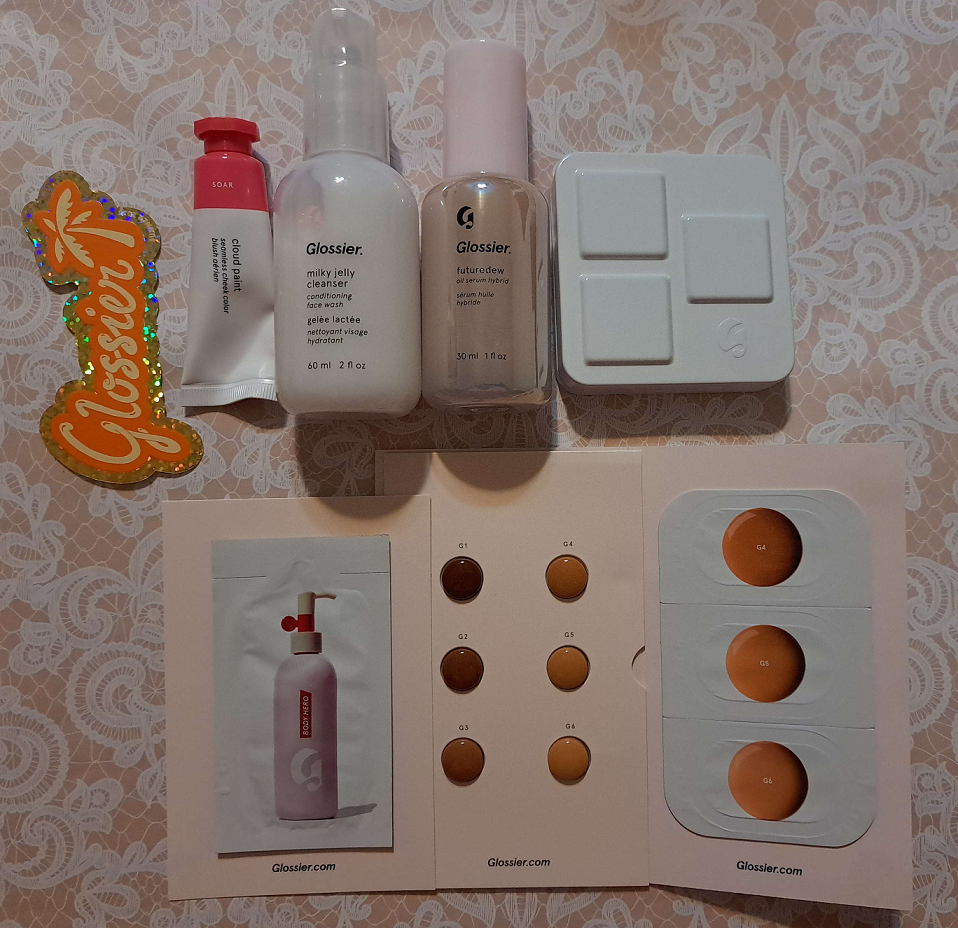
I’ve discussed the Cloud Paints and Solar Paints before, but this time I have one of the two newest full-size Cloud Paints to feature, plus the exclusive mini 2023 Holiday set, as well as the other Glossier products in my collection that haven’t been reviewed here until now. I’ve wanted to do a brand overview for years, but it’s taken so long to acquire enough products that suit my makeup preferences. So, here we go in 2024!
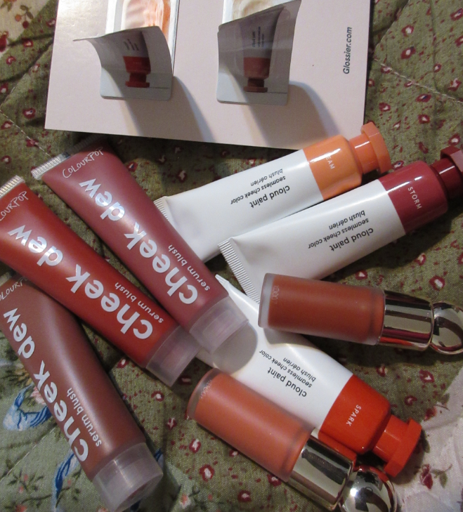
Cloud Paints

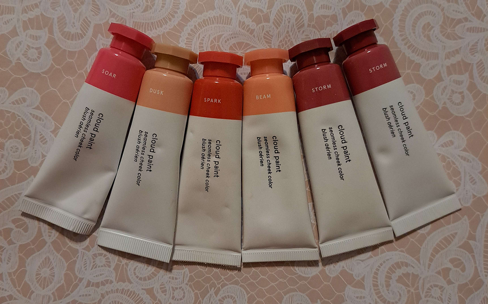
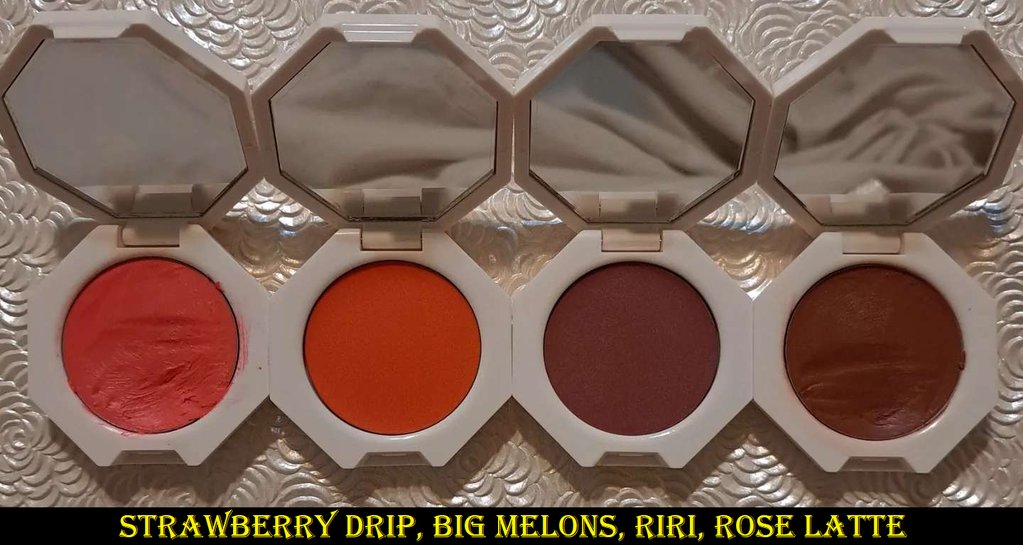
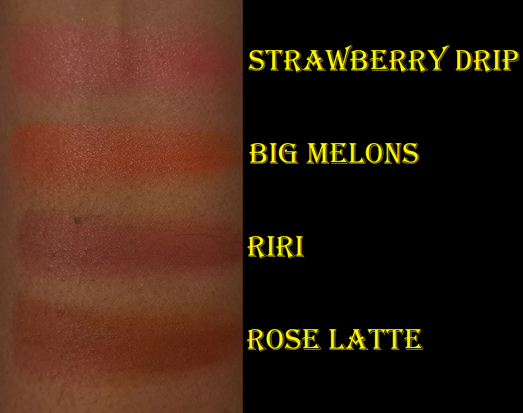
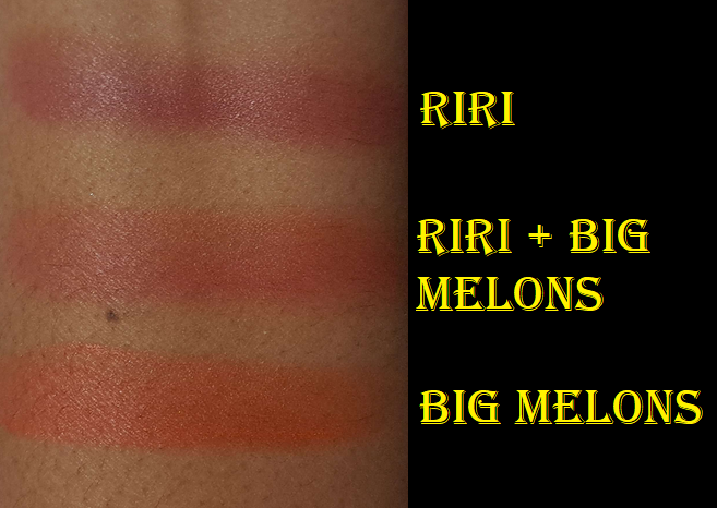
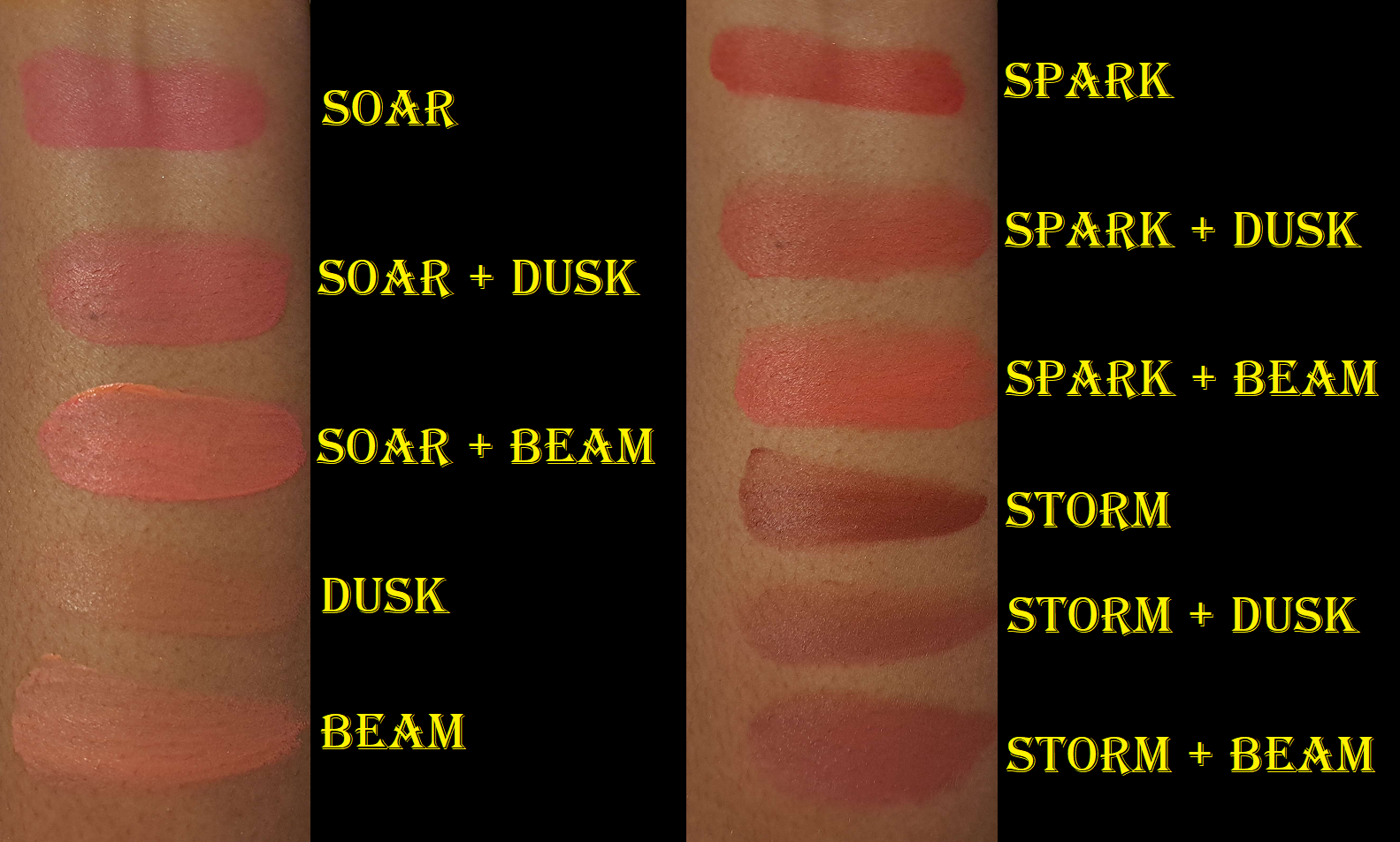
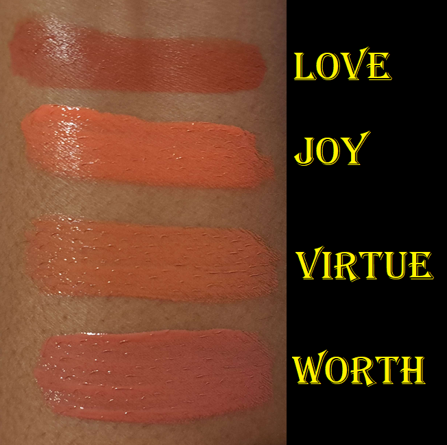
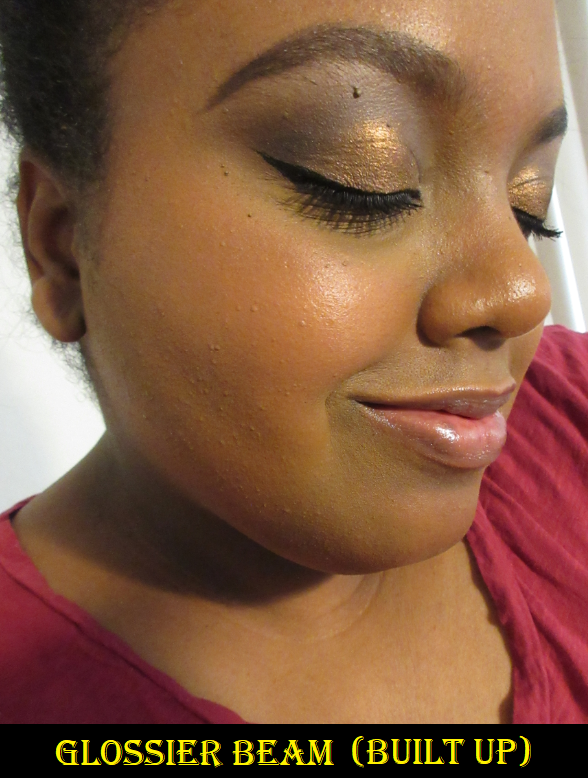
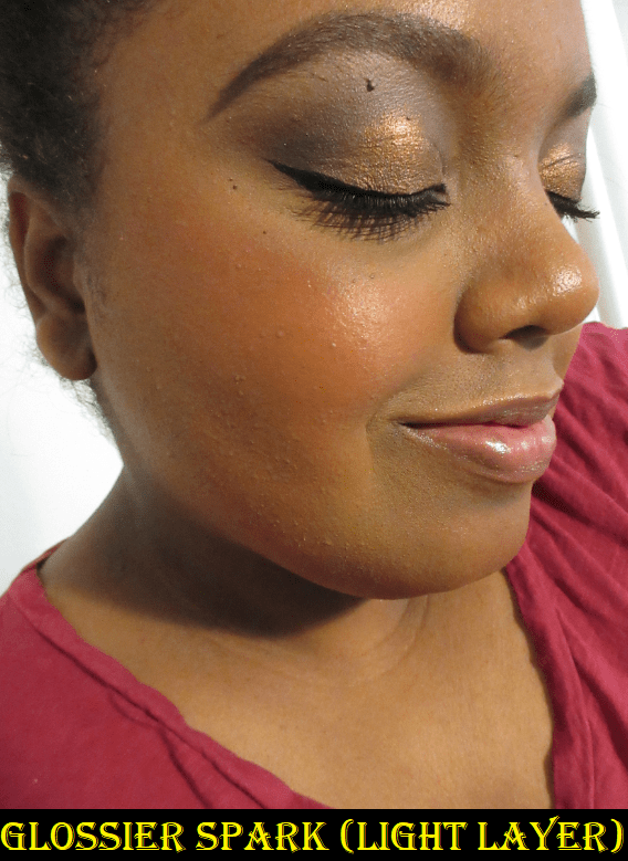
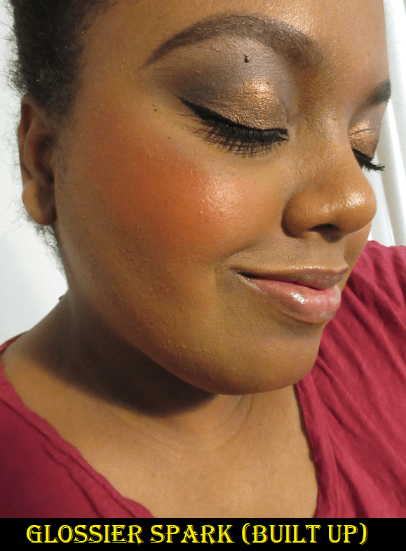
My collection of full-size ones I currently own are shown above. I am decluttering Spark, Beam, and my older tube of Storm because I’ve had them all for too long. The other three were purchased late last year.

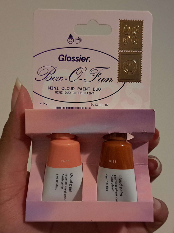
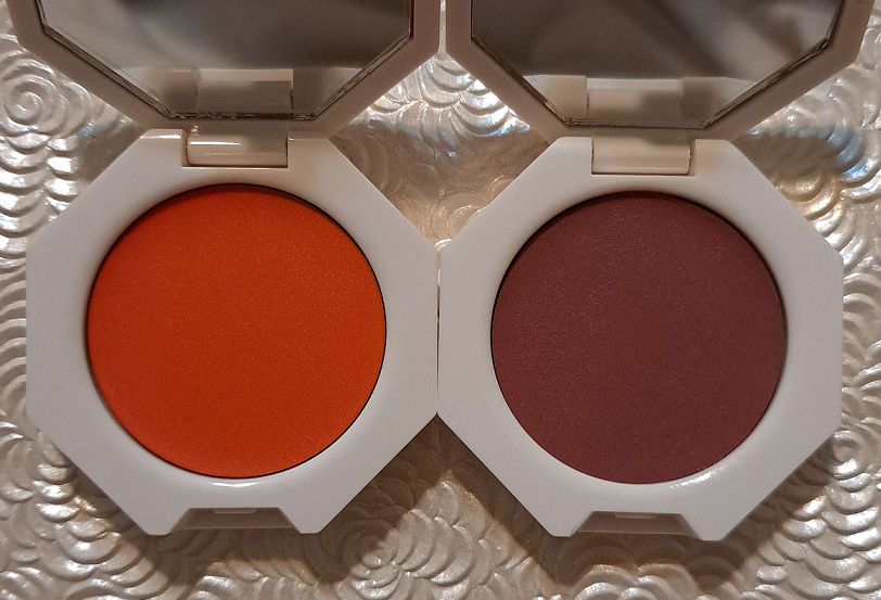
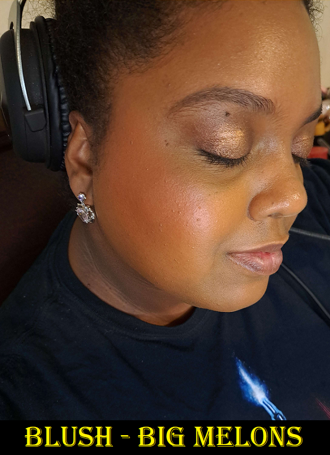
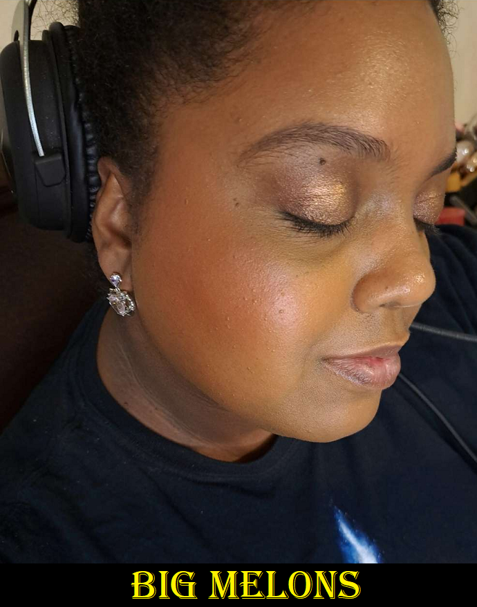
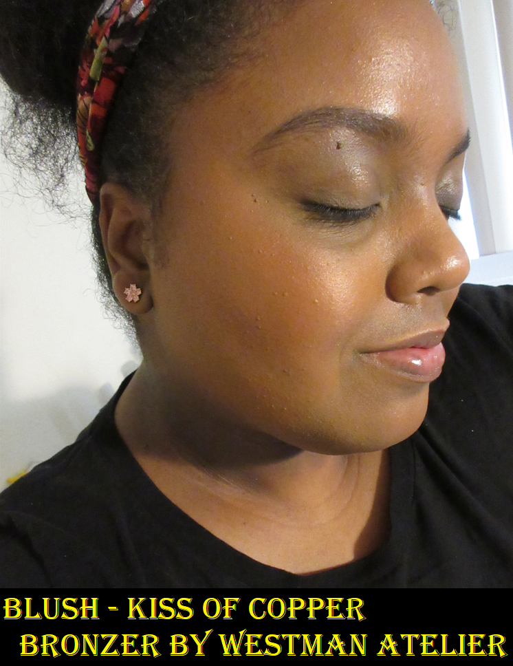
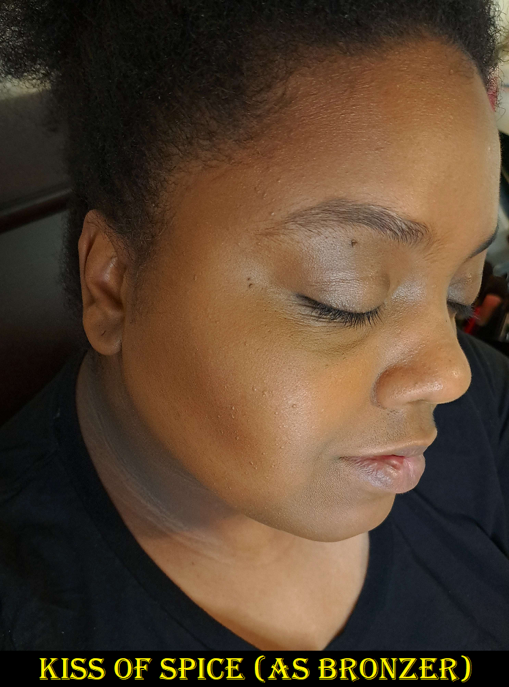
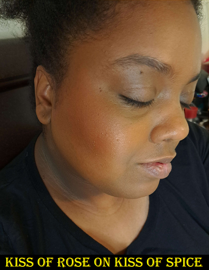
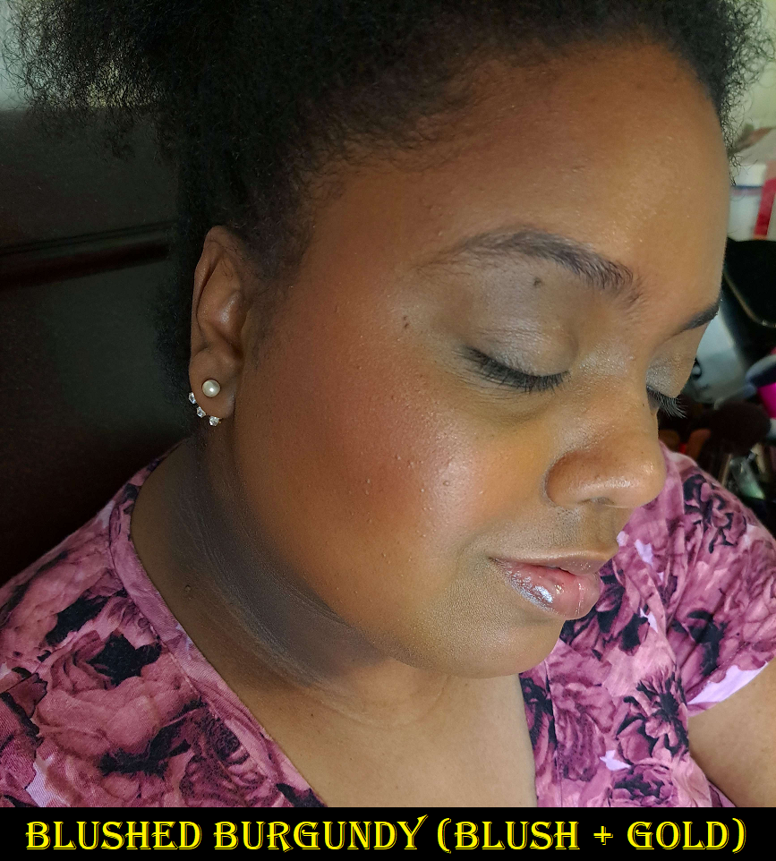
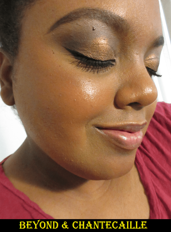
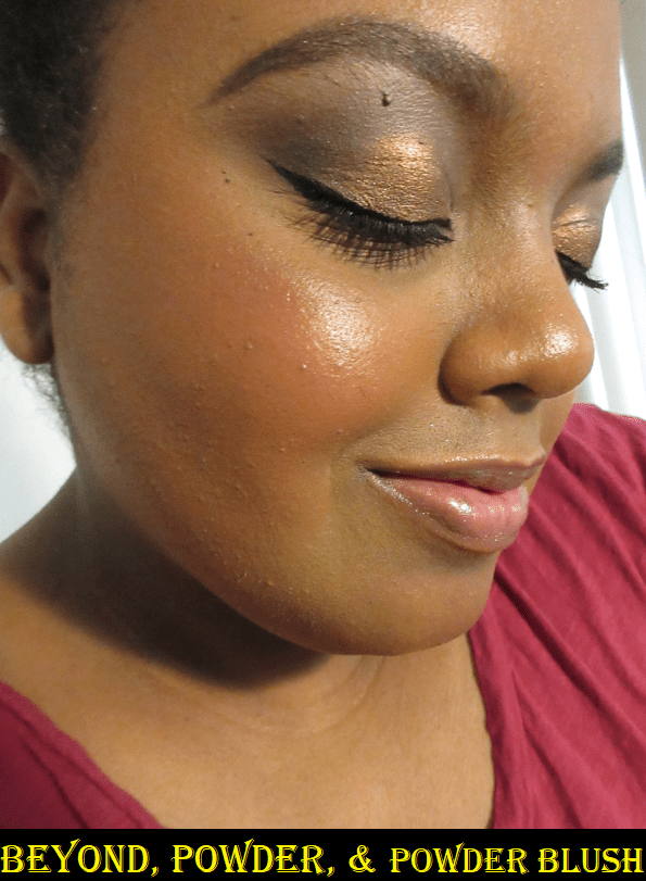
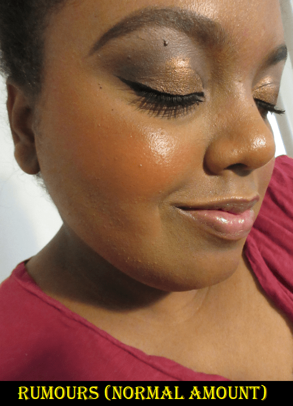
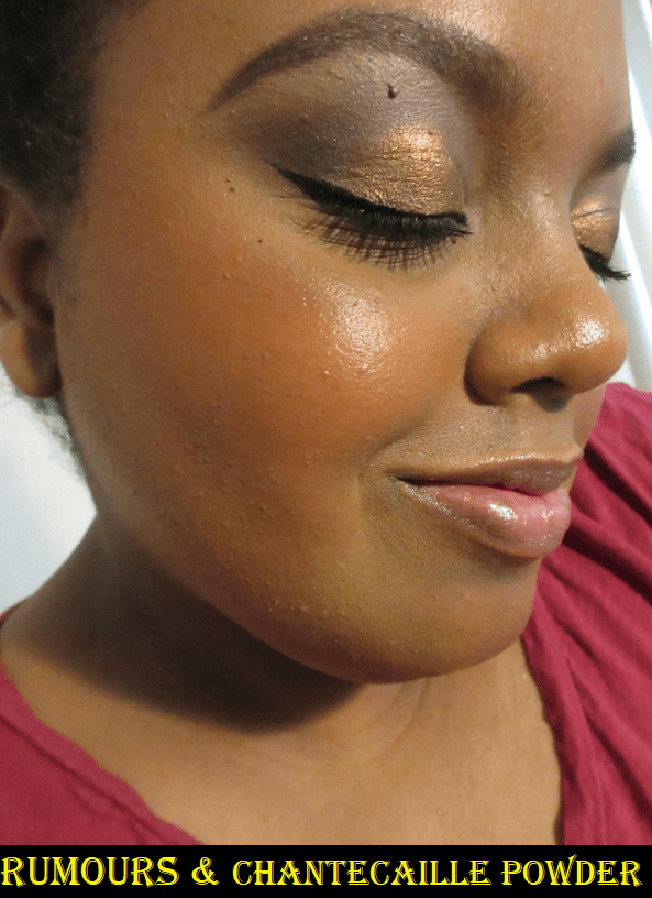
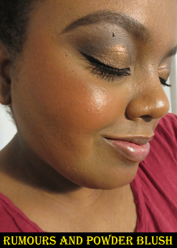
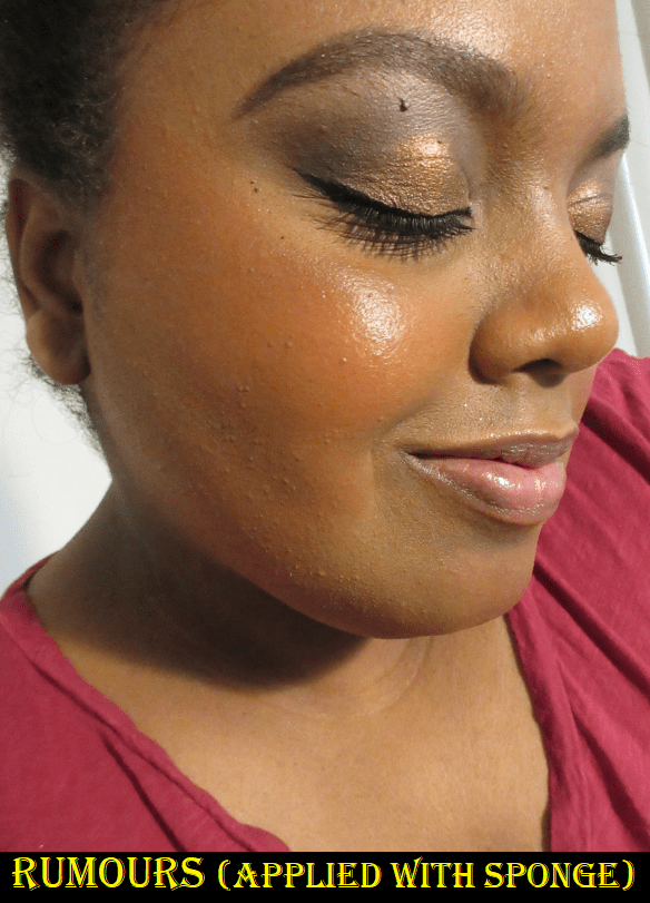
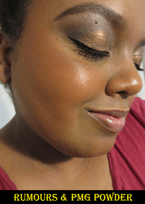
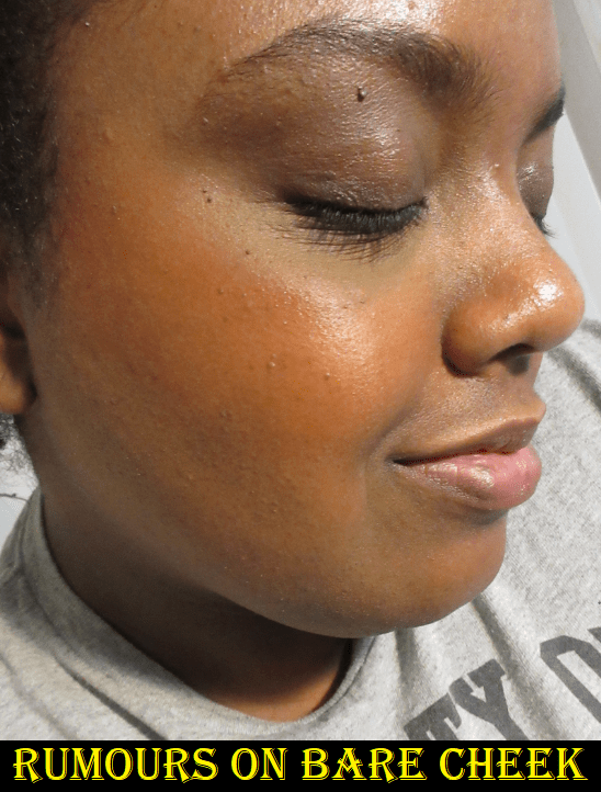
I was so excited for the shade Rise because reddish brown/terracotta type of shades are my favorites for a natural looking flush of color on my cheeks. The minis that came in the holiday set are significantly smaller, which I don’t mind because you don’t need a lot of product. The downside is that the opening is the same size as the full-size, and the pressure needed to squeeze product from the base of the tube makes too much product come out every time, which then wastes what is already so little product. Even when I’m being super careful, I sometimes run into the issue of blush still squirting out forcefully.

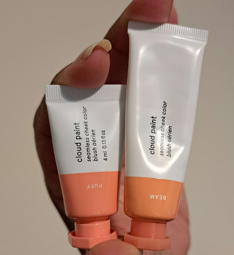
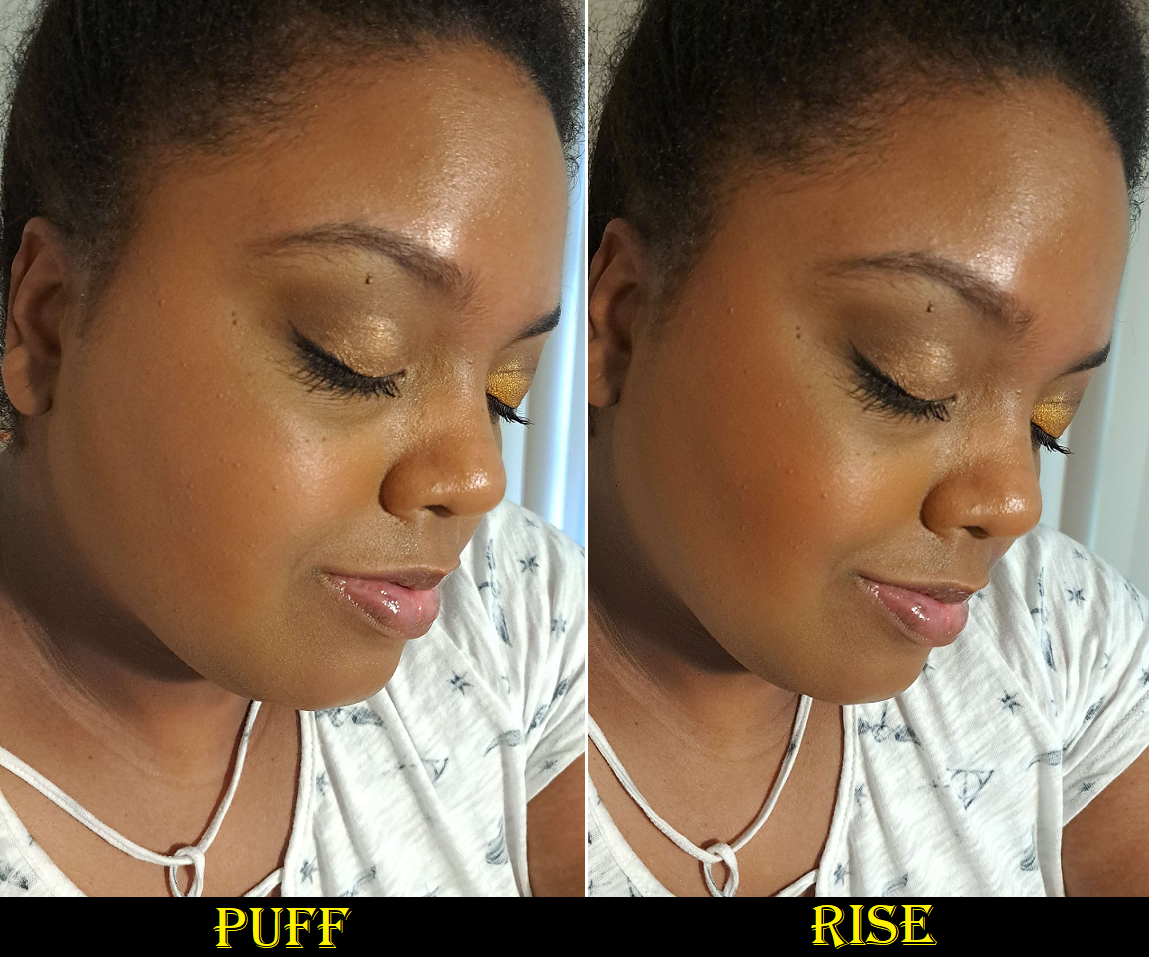
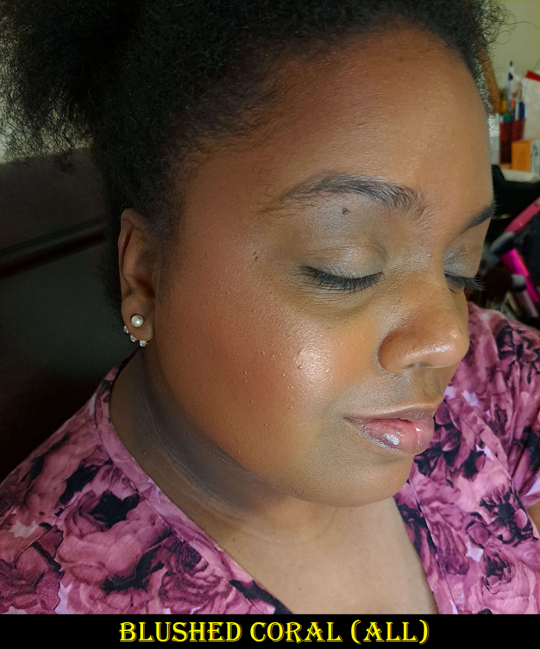
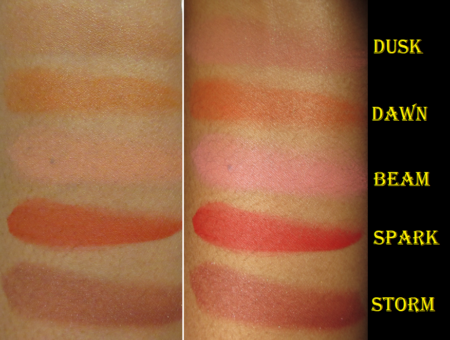
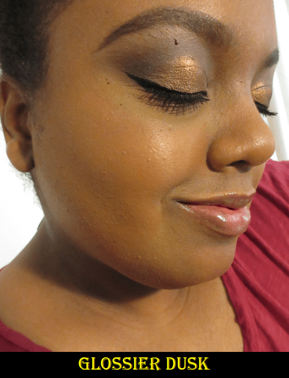
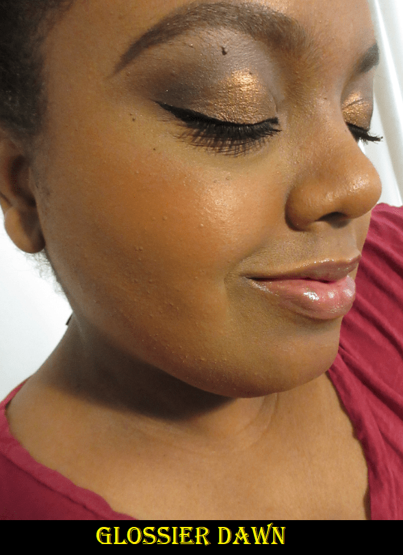
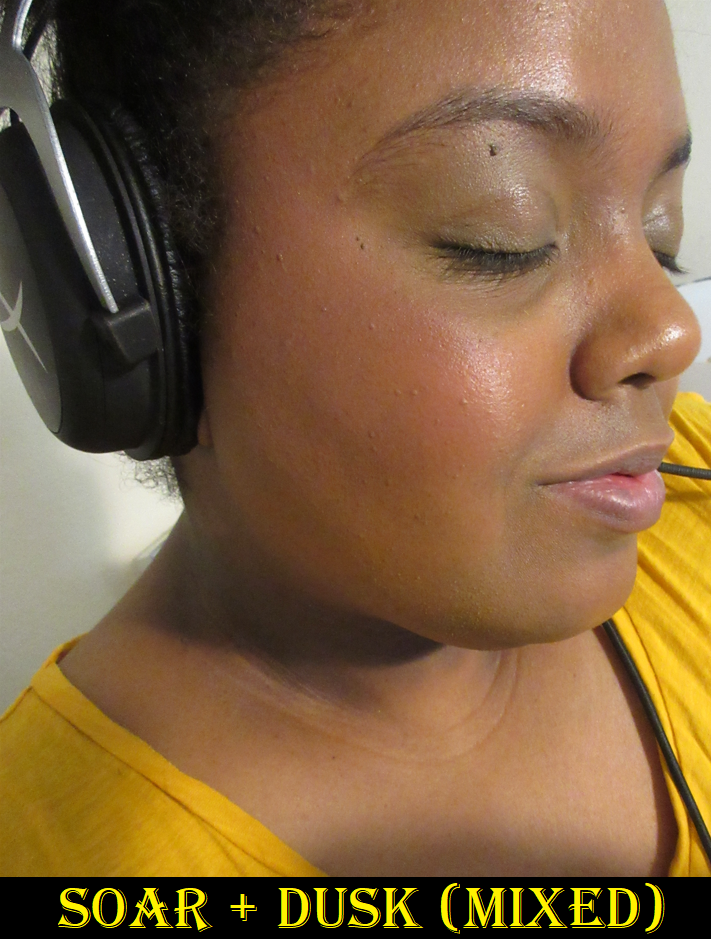
Puff doesn’t really show on my cheeks, but it makes for an interesting mixer shade, the way I used to use Beam and am now using Dusk. These types of shades alter the undertone, making them more to my liking or tones down the vibrancy.

Two weeks ago, the brand distinguished between Cloud Paint Blushes and their newly launched Cloud Paint Bronzers. I would be interested in trying them in the future because my only issue with the Solar Paints was the intense shimmer present. If the Cloud Paint Bronzers are identical to that formula (but shimmer-free), I’d like them. If they are slightly sheer like the blushes, I’m not as sure. However, I wonder if they could potentially mix well with the blushes in order to turn them into toned down nude or more neutral leaning colors.

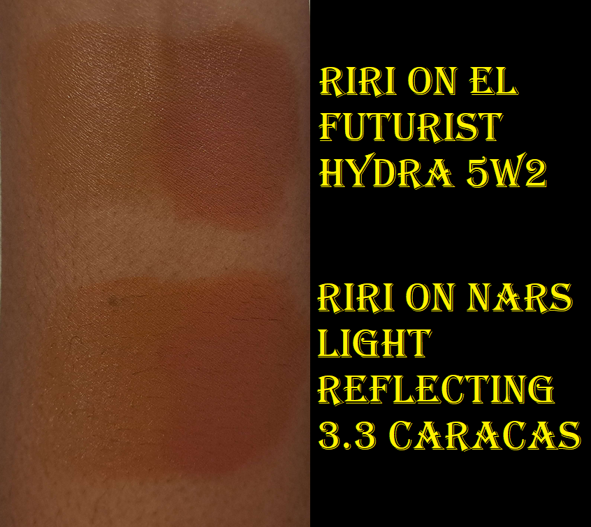
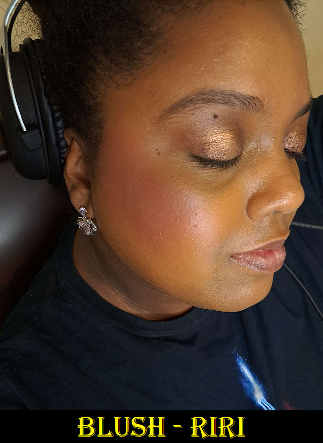
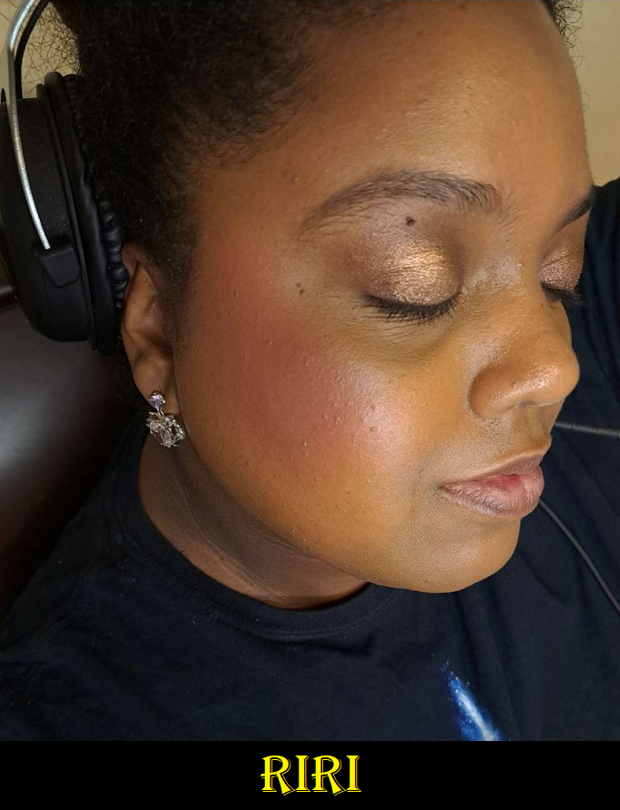
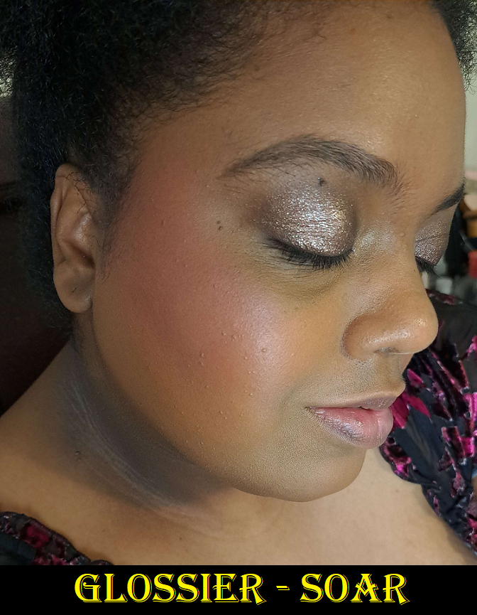
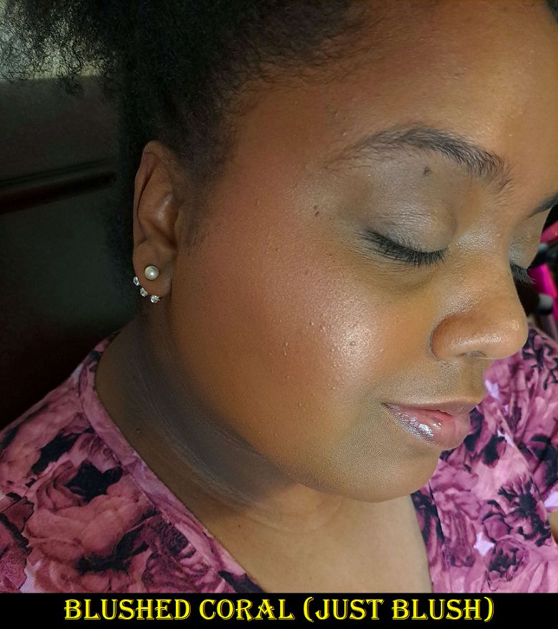
As for Soar, I literally forgot I reviewed this before HERE, but here we go again! I have a few more mixing examples over there.

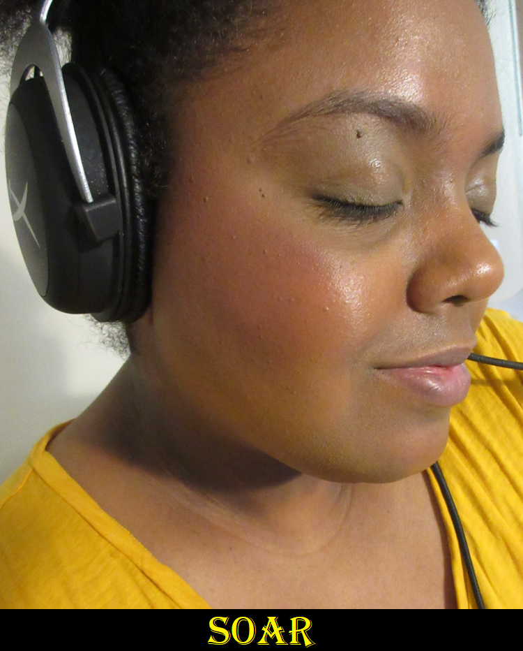
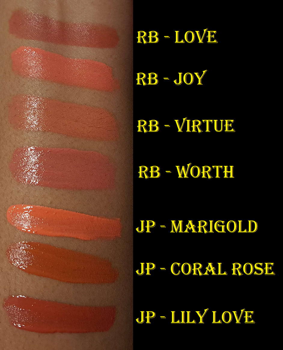
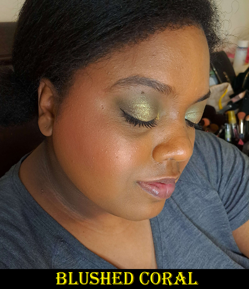
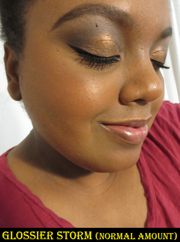
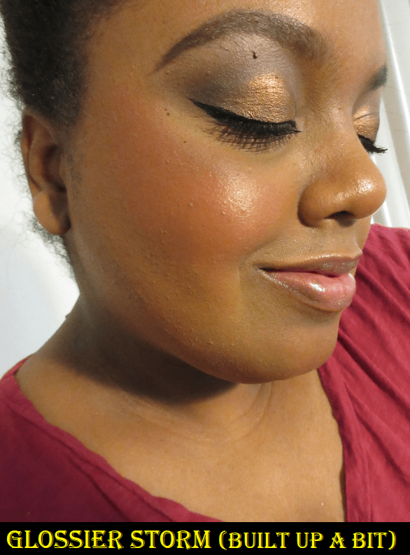
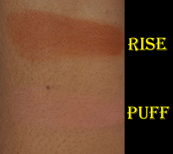
After using Soar, Puff, and Rise, I can confirm what I said in my original review about Storm (newest at the time) compared to the older shades: the new shades continue to be less pigmented. These colors are vibrant, but the ratio of gel to pigment of the newer shades makes it easier to have an even more natural look to the skin while not being overly natural to the point of having a watercolor serum-like effect. When I want lighter coverage or something to wear on low-makeup days, I reach for these. When I want something with a bit more pigment, I reach for the Rare Beauty ones, but even RB’s newer shades are less pigmented too.

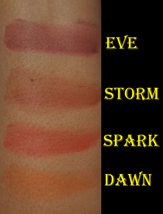
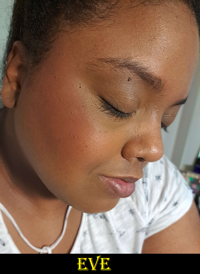
Glossier offers free samples with orders and this time I got the shade Eve which is a much deeper version of Storm. If I use it super sparingly, it can look quite pretty, but this type of hue on my skintone can also look a bit like a bruise. So, this isn’t a color I would buy, but figured I could show it anyway for anyone curious about that color.

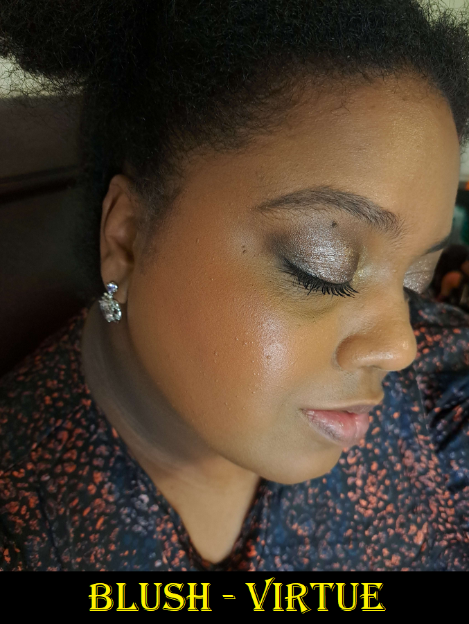
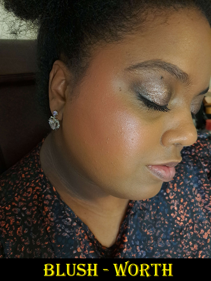
If these were the only liquid blushes in my collection, I’d have way more of the shades to be able to mix and match them. It’s one of my top two favorite liquid blush formulas because of the ease of blending, longevity on the skin, and how it dries down fully without a dewy or sticky feeling left on the skin. Because these aren’t the only liquid blushes in my collection, I didn’t go overboard on the shade repurchases. However, if I ever use up my tube of Rise, the chances are high that I would eventually buy it again.

Futuredew Oil Serum Hybrid

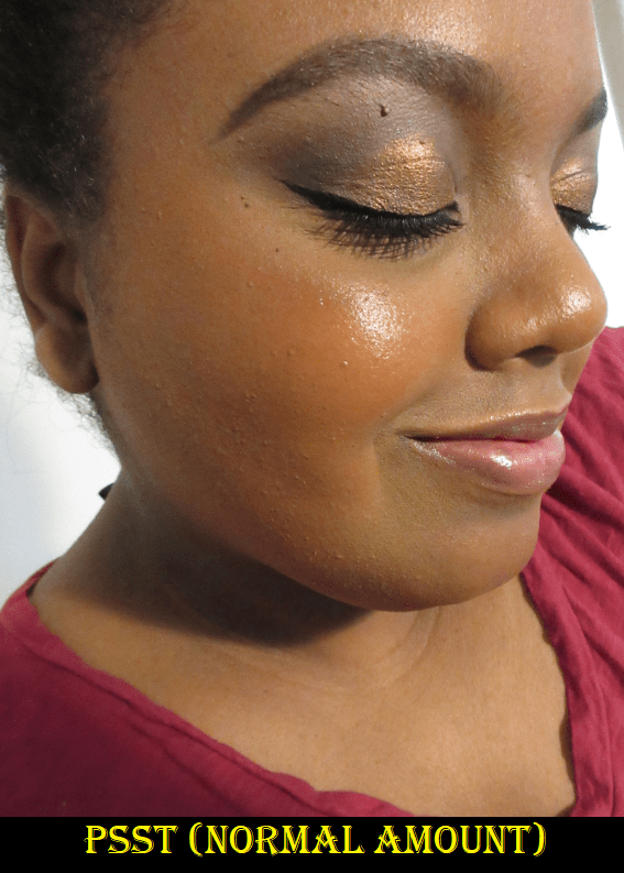
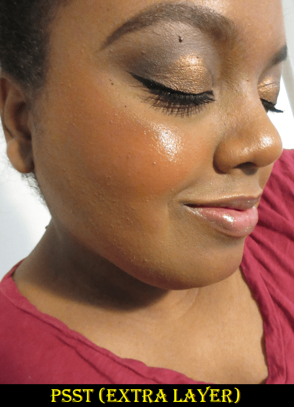
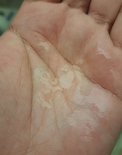
Glossier’s Futuredew is one of those hero products I’ve heard everyone talk about before, so I was excited to finally try it. It has an interesting herbal scent. Up close I can see the tiny sparkles or “light-reflecting minerals” within the pearly light-pink liquid, so I was hopeful. However, it doesn’t do much for the look of my skin or makeup if used in a normal amount. Perhaps my skin is just too dry because within a minute of being rubbed in, it’s practically all absorbed by my skin (as seen in my hand photo above) without leaving much of a dewy look behind. It can make ashy skin look normal, but it never makes me look dewy unless I slather enough layers of it on my skin. For daily use, I use the maximum amount that feels comfortable for me to tolerate because in large amounts (which is needed for the dewy look) it feels greasy and a bit heavy. While it’s true that I can load it up, it’s not practical for me to do that on a regular basis. However, I’m willing to do that for special occasions, and it was admittedly super helpful for my wedding, but more on that later.

I wasn’t about to take the whole heavy thick glass bottle with me in my luggage, as shiny and pretty as it is, so I put some in a tiny container to bring with me to keep testing. I tried prepping my skin well and applying the Futuredew and the results on my bare face were the same. A difference is only made by layering it up, so I don’t bother to use this for skin prep.

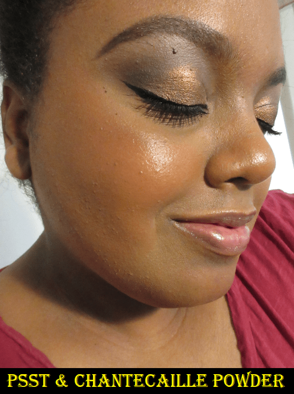
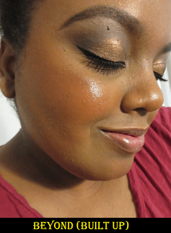
When trying to utilize this as a makeup primer, it doesn’t improve the longevity of my makeup. The results are normal. In addition, the tiniest bit of sheen that lingers visibly is completely hidden the moment I put on foundation. No luminosity shows through underneath unless I apply an ultra generous amount of product. Considering how my dry skin is behaving in German winter, where my natural oils still don’t come out even at the end of the day, loading up the product has been the answer to getting my foundations to at least have a natural look to it rather than matte. Under foundation, it was still impossible to look dewy, especially when I needed to lock-in my makeup with setting powders and sprays to prevent transfer and keep my face looking as fresh as possible in photos, but my foundation would have looked displeasing without it. As unimpressed as I was with how much product I needed to use to achieve the look I wanted (and technically still could not achieve fully), the Futuredew still ended up being helpful to me and saved the day.

I should note that the brand says using this product will cause the skin to be brighter and more glowy over time, but I’m not sure that I believe those claims. I will continue using the amount I brought with me and if I notice any improvement, I’ll update this post.

Milky Jelly Cleanser (Travel Size)

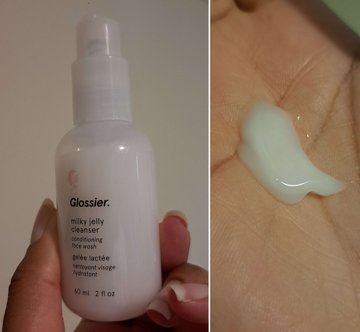
This is another product I was excited to try because it was hyped up for years as this luxurious type of cleanser, especially by popular influencers. I’m planning to include this in a cleanser post in the future, but my full thoughts on this product is that I don’t like it. It’s not milky or jelly-like in texture, only in looks. The “conditioning” part of the label better explains how it feels, which is like I’m rubbing lotion or hair conditioner on my face. I don’t know if there’s a term for it, but I’ve always been the type that gets unnerved by having anything oily feeling on my fingers and palms. I can tolerate putting on lotion if it’s the fast absorbing type that doesn’t leave a film or slippery layer on my body that I will continue feeling when skin touches skin for an extended period of time. I don’t mind those in-shower body lotions because they go on my body, but rubbing this milky jelly cleanser on my face just feels wrong because of my quirky sensory issue.
This might have been a feeling I could get used to over time, but this is advertised as being able to dissolve makeup even though it doesn’t! Or at least, my makeup is apparently too heavy duty for this cleanser to remove properly. Even on lighter makeup days, my skin never feels clean enough after washing my face with it, and it doesn’t pass the white towel test. If I wear heavier skincare like other facial oils, a thicker heavier face cream, and/or sunscreen, even those I don’t feel properly get removed from my face. If the brand wants to market this as a face conditioner, fine, but it’s not a good cleanser at all. A cleanser should be able to do the bare minimum and actually clean the face. There are better gentle cleansers out there.

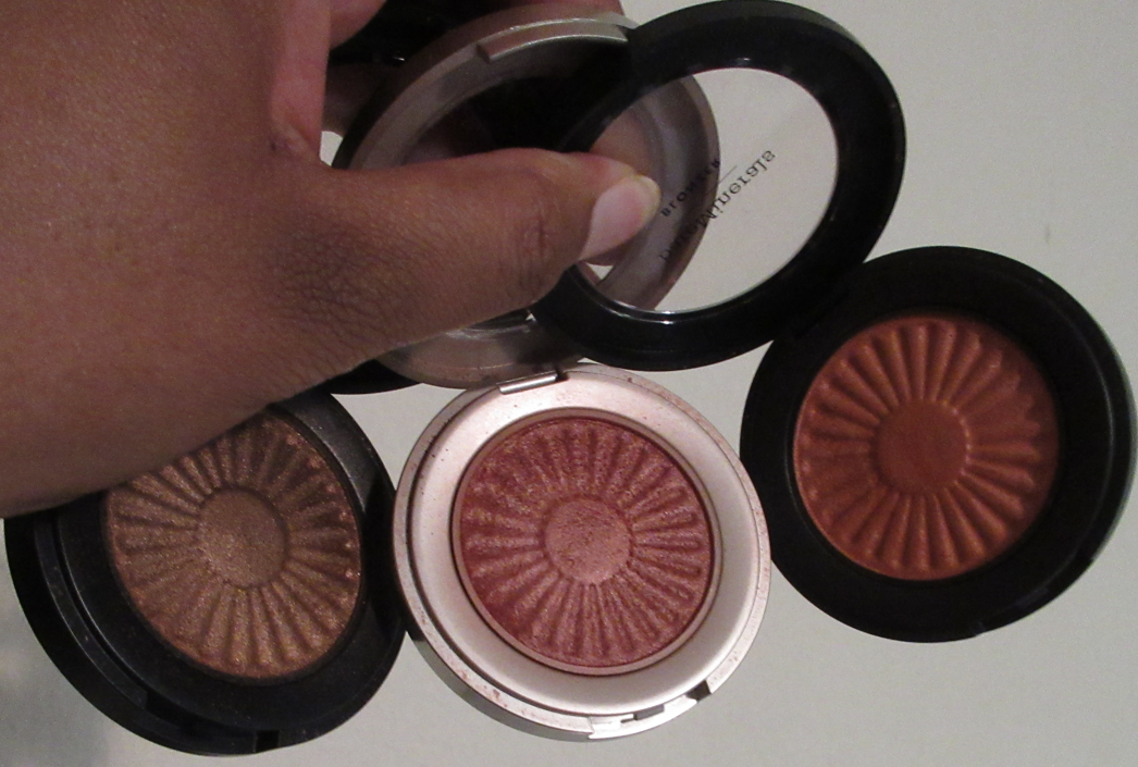
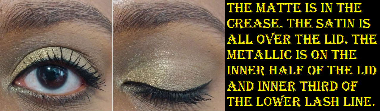
Monochromes Essential Eyeshadow Trio Palette in Prairie

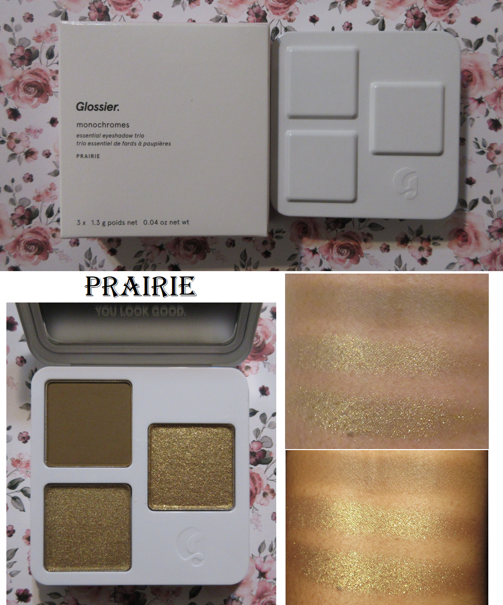
Oh, how I’ve waited so long for this to go on sale so I could justify buying it! I’ve certainly paid more for three eyeshadows, and even a single eyeshadow, but I wasn’t confident that I would like these, so I didn’t want to pay full price. The reviews were certainly mixed.

I am happy to report that I’m satisfied with the completed look. I got more pigment than I was expecting, which is a good thing in this situation. The matte blended nicely. The satin may as well have been a matte on my eyelids because there wasn’t much of a sheen. It looks very bland. The metallic didn’t have as much shine to it as I prefer, even after wetting my brush, but having it saved the look for me considering how much more I liked it instead of the satin. Also, I’m not sure why they call it a metallic when it’s more like a low impact shimmer. Then again, that description, though more accurate, probably wouldn’t help with sales.

The concept of this is certainly interesting for single shadow lovers to be able to have a potential favorite color in three different finishes all in one compact. That’s not me, so I was never going to be the target customer for this product. I was just curious about the quality, which is better than I expected, but the format just doesn’t suit my needs. It could be useful for me if each individual pan was customizable, so I could put a different color in place of that useless satin (for instance the Clay Matte, Teak Matte, Heather Metallic, or Rosin Metallic). Being stuck with a single trio that is only replaceable with another premade trio (and honestly wasted space that could have fit 4 eyeshadows if the logo wasn’t there) is very limiting.

For those that like minimal makeup and nothing too sparkly, I guess I could say this would be nice. However, it’s just so far removed from the type of makeup I like that I can’t help but feel there are so many other brands that do single eyeshadows better, trios, and quads and all for the same price or cheaper. I’d even recommend a little Natasha Denona mini 5 pan over this. ND’s quality is better. The closest equivalent I can think of is the Huda Beauty/GloWish Micro Mini Eyeshadow Palettes. Those are similar quality mattes (perhaps even slightly better) with soft shimmers that are only a little more impactful than the Glossier metallics, and in shades that can create a slightly more nuanced monochromatic look, all for $21 instead of $27 (or $22 for just the refill alone). Plus, I’ve seen the GloWish ones go on sale for half off (a better discount than I’ve ever seen from Glossier). The pan sizes are different, but the GloWish quad has 4.05 total grams (0.14 oz) of product versus Glossier’s 3.9 grams (0.12 oz).

Glossier Samples/First Impressions

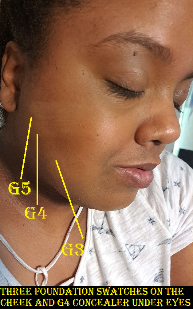
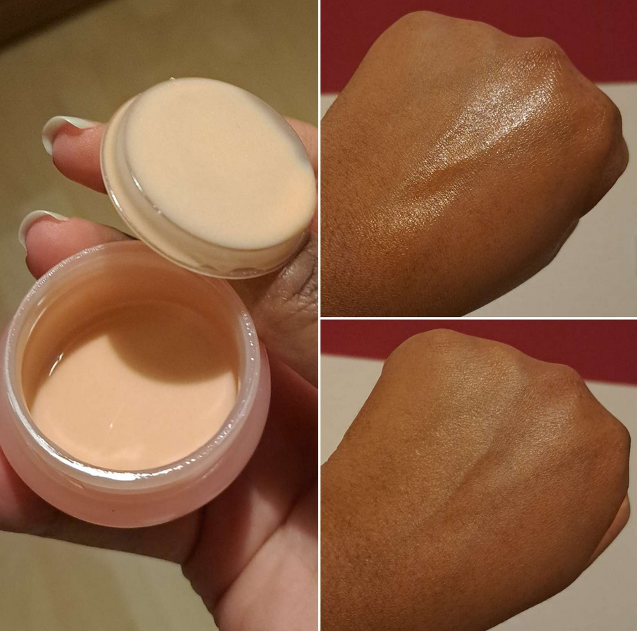
Perfecting Skin Tint G1-G6 (Sample)

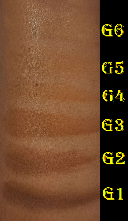
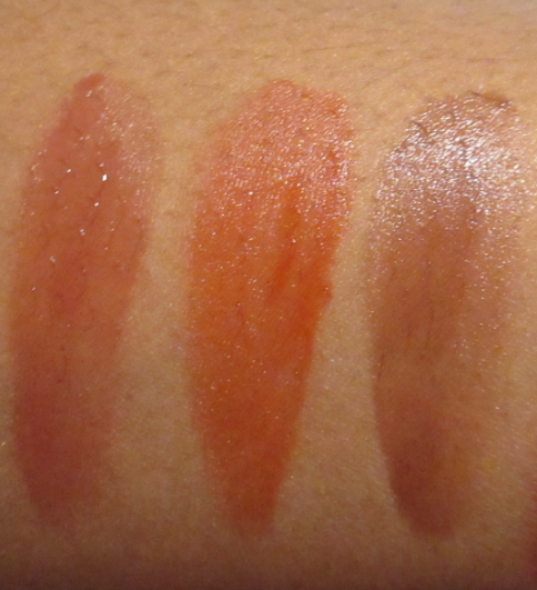
There wasn’t enough of the sample to do an actual wear test, so I wanted to just show off the shade range in swatches. G4 is my closest match, but it’s a half shade off. I would need to mix it with G3 to get something that matched my whole face and not just the lightest spots.

Stretch Concealer G1-G6 (Sample)

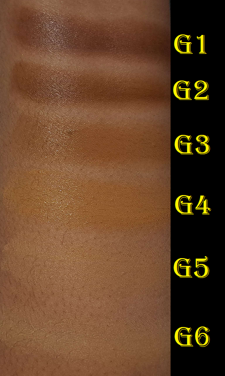
There was enough of the sample to do a wear test. This concealer is too creamy. As much as I would like a creamy concealer because my under eye area can be so dry sometimes, my eye area shape and lines require me to have a concealer that is flexible enough to stay put through movement (like Givenchy Prisme Libre) or to solidly lock into place (like Tarte Shape Tape). Creamy concealers move too much and crease on me horribly. That was unfortunately the situation with this one, which is a shame because I liked the coverage.

Stretch Foundation (Sample)

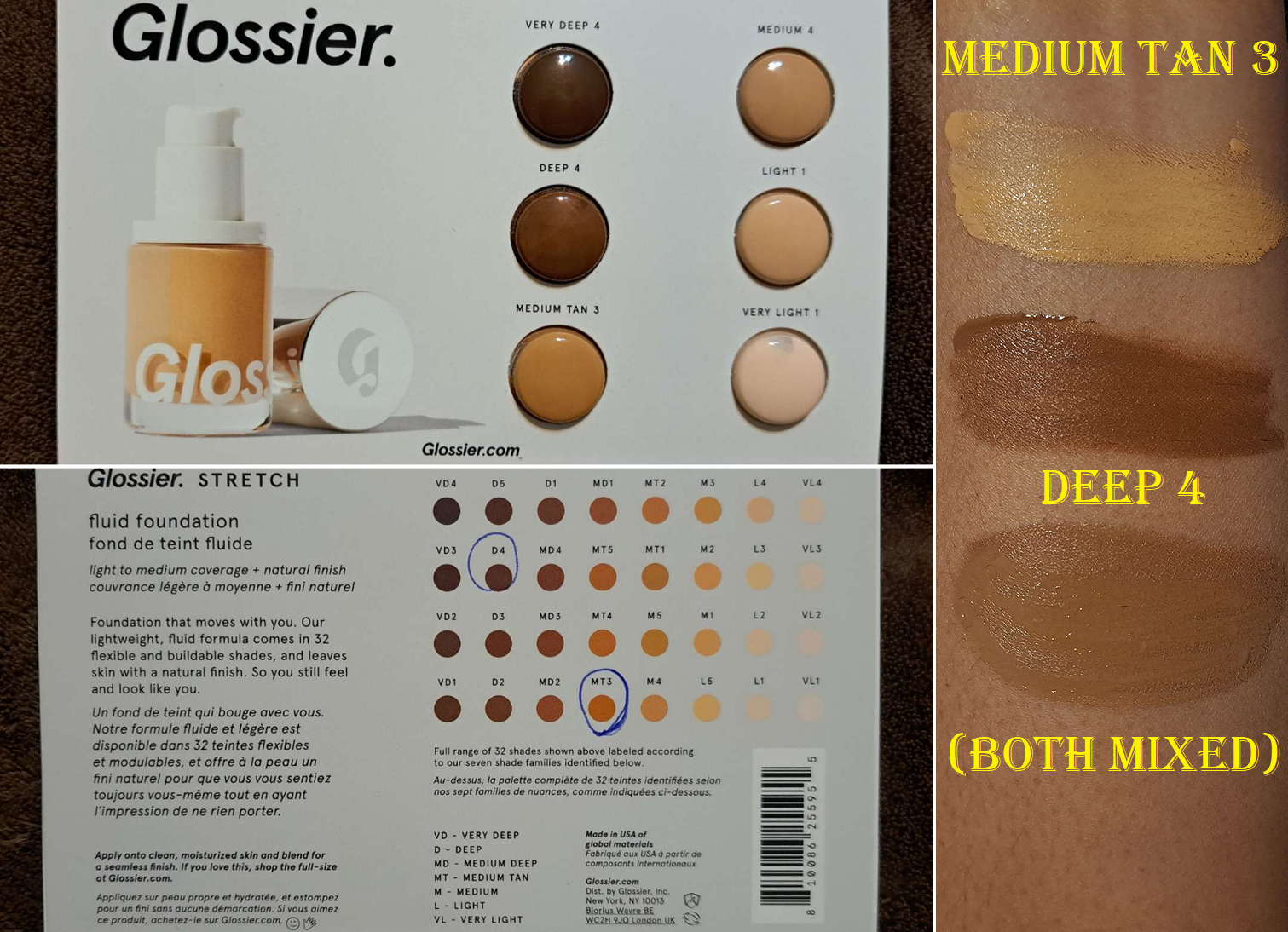
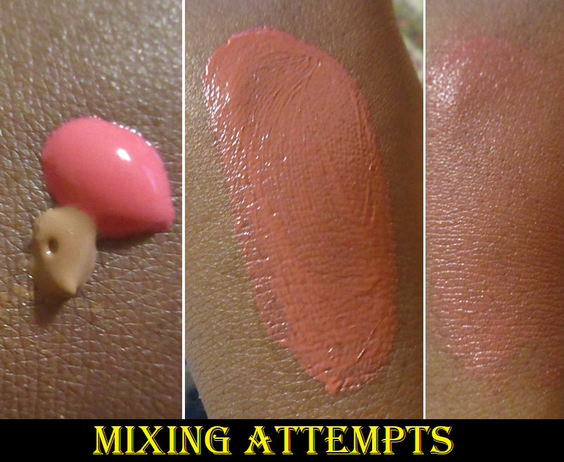
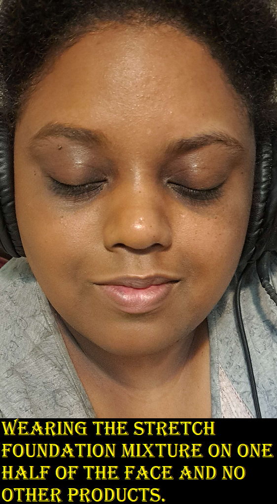
I can only guess that my shade would fall somewhere in the MD3 range. I did my best to mix the two closest ones in the sample card to create a custom shade for me. However, the mixture turned slightly grey from the two shades being too far apart in depth. I have a slightly grey tinge where I wore it in the photo below. It doesn’t look as bad in the photo, but it was quite obvious in person. So, I can’t really say how I liked this foundation in terms of looks. In terms of performance, that side of my face looked greasy at the end of the day. I like a little dew, but not that much. It felt nice on the skin, but it transfers more than the amount that’s acceptable to me. Perhaps powdering it would have changed things. I can’t say if I would recommend it or not based on the first impression. At the foundation’s price though, I’d rather spend a little more for my tried and true foundations instead. So, I won’t be buying this one.

Body Hero Oil Wash (Sample)

I mentioned in the cleanser section that I don’t mind in-shower body lotions. The ones I’ve used before don’t trigger my sensory issue. The same goes for this. I like how it instantly gets frothy and creamy when it hits water and gets rubbed onto the skin. It washes off easily and leaves my skin feeling clean and moisturized without a residue layer lingering on the skin. If I wasn’t such a Lush stan, I would consider buying a full-size bottle one day. It also has a nice light scent which makes for a great experience in the shower, though it doesn’t linger on my skin once I’m out. I should note that the scent of nearly all body washes don’t cling to my skin after I’ve dried off.

Another thing I noticed is that I was unable to see this product on the Glossier website until I changed my country settings to the US. I checked reddit and found out that as of at least 3 months ago, this product has been unavailable to those in the EU. I’m not sure why.

Anyway, that’s everything for today!

I continue to be intrigued by Glossier and its products. Thus far, the only ones that I can really stand behind are the Cloud Paints and Solar Paints (I admittedly decluttered my Solar Paint though), but I think I’ve given the brand a decent try and I will continue to keep my eye out for anything else they release in the hopes to find another gem like the Cloud Paints.

Thank you for checking out this review!

-Lili

Blushes So Good I Needed Another…or So I Thought

Today’s post is a slight twist on my series. Generally how it goes is that at one point I purchased a blush and loved it so much that I needed to get the same one in another shade! The first part can be found HERE as well as the second one HERE.
However, I’m not so sure buying the additional shades was a good idea for each of these new cases.

Fenty Beauty by Rihanna

Fenty Cheeks Out Freestyle Cream Blush in Big Melons and RiRi

My first time reviewing Fenty’s cream blushes was actually in Part 1 of this series.
These don’t have any extra special traits like an atypical cream texture, being transfer-proof, or being super blendable. However, I appreciate its dependable formula that’s pigmented yet buildable, and even easier to blend after it has been warmed up. It lasts all day. It doesn’t disturb my makeup underneath it. It’s not patchy. It mixes well with other cream blushes. My first two haven’t changed in texture, smell, or performance in over three years since I’ve had them even though they’re only marked to be good for 12 months after opening. Admittedly, my tendency to scrape out product instead of dipping directly into it might have played a part in minimizing exposure to things.
The other reason I loved these blushes is the shade variety, having my favorite tone of red-brown in blushes and also having a coral option, my other top favorite blush color.

My absolute favorite cream blush formulas (not counting putty or bouncy) are from LYS and One/Size. This is because I prefer having products that look creamy and skin-like but set down or have minimal transfer. The fact that these remain creamy feeling (though not sticky) on the cheeks and will leave color on my finger if I touch my cheek, is one of the drawbacks that keep me from using them on a more regular basis. Yet, for some reason, when Fenty released five new shades, I couldn’t resist getting a mauve and coral-orange to see if they would be new favorite colors as well.

In trying out the new shades, I discovered that as pretty as Big Melons looks, I still prefer Strawberry Drip a little more. I don’t always like pink corals, but I’ve realized that I tend to prefer them over orange corals. I’m still content enough to keep it. As for RiRi, I discovered that what foundation I’m wearing plays a huge role in whether or not I’ll like the color on my skin. When I wear it on top of a yellow toned foundation, such as Estee Lauder’s Hydra Futurist Foundation in 5W2, more of the purple tone stands out within this mauve color. It has an almost bruise-like look on my cheeks. When I wear it on top of a more golden/orange foundation, as is the case with the Nars Light Reflecting Foundation in 3.3 Caracas, RiRi looks like a deep pink, which I find to be a lot more flattering. Nars lists that foundation color as neutral, but their version of neutral for the medium-deep shades is more like a balance between yellow and red, hence orange.

My apologies for the first set of photos being a bit too warm/dark. One of my usual lights wasn’t on and I didn’t realize it made such a difference. When I retook the photos the next day, I didn’t realize those new ones had a slight green tinge (they look good on my cell phone screen but not on my laptop screen). So, I decided not to use those. Instead, this second batch of photos is my attempt to digitally correct the original ones.

I also noticed that when I mix RiRi and Big Melons together, it becomes a pretty pink shade. So, while I don’t think RiRi or Big Melons look as pretty on their own as Rose Latte or Strawberry Drip on their own, I’m very satisfied with the color the two turn into when combined.

I should also mention that I didn’t forget about the Fenty Double Cheek’d Up: Freestyle Cream Blush Duo, but I haven’t used it again after reviewing it. Those shades being less pigmented and more emollient made the formula just tricky enough to deter me from using it again. If I still don’t use it in the next three months, I’m going to be tempted to depot at least Peony Droppa and put Big Melons in there. That way, I’d have a reason to keep that gorgeous compact.

Glossier

Glossier Cloud Paint in Soar

In my previous review of the Cloud Paints, I included swatches and cheek photos of Dusk, Dawn, Beam, Spark, and Storm. When Soar was released, I thought about how my old Cloud Paints are getting past their time and that I should consider which ones I wanted to repurchase. I decided to get Dusk and Storm as bundle deals from Glossier’s website, along with Soar. Dusk was intended to be my replacement mixing shade, since I always felt it would have been better to mix with than Beam. As for choosing between Storm and Spark, it was a difficult decision, but it came down to me liking the deep rose color more than a straightforward red.

Soar turned out to be brighter than I expected, but just like Storm (previously the newest color before Soar and Wisp), it’s sheerer than the original launch shades. Even though it’s sheerer, I still sometimes mix Dusk into Soar to tone down the vividness, but using fully synthetic bristle brushes instead of my fusion ones or my fingers help me to not go overboard.

Soar applied as lightly as possible while still showing the color (left) and Soar applied heavier, but mixed with Dusk (right).

I used to go back and forth trying to decide which ones I liked more between the Glossier formula or Rare Beauty. I think my answer is solidly Rare Beauty because it’s more opaque in color while still being blendable. It’s far less common nowadays for me to do No-makeup makeup looks, which these are perfect for, so I don’t get much use out of the Cloud Paints compared to the Soft Pinch Liquid Blushes. Since I now know which one is my top liquid blush, I probably shouldn’t have purchased anymore Cloud Paints. However, they’re so pretty that I can’t really regret it.

Rare Beauty

Rare Beauty Soft Pinch Liquid Blush in Virtue and Worth

I’ve been craving more natural blush tones from Rare Beauty, so I thought for certain the two new shades would be an absolute hit with me. I was in another position where Joy and Love needed to be replaced and I had to decide if it was better to repurchase my old favorites or take a chance on the new ones. I didn’t want four full-size products considering I used Joy and Love quite a lot and still couldn’t even finish them up despite being minis. I’m sure they’re nearly empty, but recently they finally showed signs of being too old. So, I don’t want to put them on my face anymore.

Virtue was a risk whether the peachy-nude would show up on my skin tone. It does, but it’s definitely subtle. It’s still a little too beige in color to really suit me, so I don’t think I’ll be reaching for this very often except to mix with other brands’ liquid blushes.
Worth was the shade I was banking on liking the most. I typically mixed Joy and Love together, and I thought Worth would look like a combination of the two, but it’s not. Worth is more neutral as opposed to the warm pink I get when mixing the others. I still think it’s a pretty shade, but it’s not as complimentary on my skin tone by comparison.
I’ve mixed Virtue and Worth together before, but I prefer using Worth by itself instead.

Both of these new shades appear to be less pigmented. I use way more product with the new shades, and it’s not because they’re lighter colors. It shows up with the usual amount, but I add more because I have to build up the opacity.

I really should have stuck to my favorites and purchased a full size of Joy and Love instead of the new ones. In addition, months later I grew curious about Juvia’s Place blushes and purchased shades similar enough in my collection to replace them. The formulas aren’t the same, but the colors are pretty enough to satisfy me. The Rare Beauty ones are very pigmented, but much easier to use than the even more super pigmented Juvia’s Place liquid blushes. But, since I have those, I really shouldn’t replace Joy and Love at this point. Plus, I’ve been experimenting with combining Virtue and Worth with JP’s blushes and it has yielded some pretty results. So, I’m making these work, but in reality the best option would have been to not purchase any JP ones at all, nor the new Rare Beauty ones, and just repurchase my favorite two.

BareMinerals

BareMinerals Gen Nude Blonzer in Kiss of Spice and Kiss of Copper

Kiss of Rose is one of my holy grail blushes, so it was only natural I grew impatient wanting for a shade extension and eventually bought Kiss of Copper. Ironically, it was shortly after that when Kiss of Spice and Kiss of Mauve were announced. I didn’t think either of the new ones would work for me until I saw customer photos of Kiss of Spice looking way darker than the website photos. And strangely enough, after a few uses, mine darkened in the compact!

Left = Official Product Photo, Middle = After One Use, Right = After Three Uses

Mine is way darker than the website photos! I’ve seen pictures online where some people’s Kiss of Spice blonzers are near enough to the brand’s depiction, while others have compacts nearly as dark as mine. So, it seems like which Kiss of Spice one gets isn’t consistent. I didn’t have that problem with the other two shades I own. This color issue isn’t due to my skin tone because it still looks darker than the brand pictures on my palm in direct light, and it’s even darker when turned away from the light.

In any case, I was actually happy it was deep enough to work as a bronzer on me. I anticipated prior to receiving it that I might have to use it as a highlighter instead, but it’s too dark for that. As a blush, it also looks too dark and unflattering. So, I just use it as a bronzer, but unfortunately it tends to look patchy when used that way.

The more I thought about it, the more I wondered if the “patchiness” is merely another issue of the light hitting it and causing some parts to reflect lighter than other spots, hence making it look uneven in color and appear to be missing color in spots where the lighter gold is blending too well with my skin tone. Considering a person is typically in various types of lights throughout the day, it’s not good to have a product that looks unpredictably terrible in some situations, while not in others. I’ve been able to “cover up” the patchiest parts when paired with the other blushes. Perhaps it’s because they reflect differently. I’m not sure. All I know is that I’ve found a use for Kiss of Spice that I like, but I should have skipped that one. As for Kiss of Copper, it’s pretty, but I will reach for Kiss of Rose much more often since it was my favorite of the three original shades anyway. So, once I found my holy grail blush shade and formula, it didn’t make sense to try and find another given the size of my collection.

L’Oreal

L’Oreal 24H Fresh Wear Soft Matte Blush in Daring Rosewood and Fearless Coral

When I saw that L’Oreal released four Infallible blushes, I knew I instantly wanted these two shades. Fearless Coral sold out, but I did get my hands on Daring Rosewood first. I put it on and was so excited because the color looked exactly how I wanted. I looked at it initially and didn’t view myself again. When Fearless Coral became available, I put Daring Rosewood on again to make sure I liked the finish and the blend, so I felt confident ordering it. It wasn’t until I was removing my makeup at the end of the night that I wasn’t as happy with how my blush looked. It was so much darker and less pink. I thought perhaps it just reacted with something else new I was wearing, but it’s every time. Unfortunately, these blushes do darken up on my skin within ten minutes. In the case of Daring Rosewood, it goes from muted neutral pinky brown to mainly brown. With Fearless Coral, it deepens and looks more fuchsia in color. It made me think of those PH adjusting products, but the ingredients list Red Lake 28 instead of Red Lake 27. I can’t remember the other blush I owned that also was Red Lake 28 that I mistook for the PH adjusting type too. I’m not a fan of this level of brightness, but if I apply it lightly, it can look pretty.

Because Daring Rosewood is a tame color on me, I don’t have to worry about how much I apply or the fact that there’s a lot of kickup. As for Fearless Coral, even with one dip into the pan, my instinct is to panic because it looks so intense on my cheeks. I always have to remind myself to trust the process and just keep blending because it does blend out.

Longevity isn’t an issue with these. I like that they’re not the kind of mattes that make my skin look dry. My issue with them is still what happens very quickly after they sit on my skin and I only have myself to blame for not paying attention after the initial application. On the bright side, applying Daring Rosewood to my cheeks and then Fearless Coral on the apples gives me a pink that certainly shows up, but isn’t as intense overall by it being in a smaller area with a more neutral color around it. Sometimes I’m perfectly content to grab two blushes at a time to mix, but I will end up using it less often overall.

Bobbi Brown

Bobbi Brown Sculpted Glow Face Palette in Deep and Bobbi Brown Brightening Blush in Blushed Burgundy and Blushed Coral

I previewed Blushed Burgundy here, and really liked it, but I have to admit that the Sculpted Face Glow palette in Deep has a highlighter and blush in similar tones and depth to Blushed Burgundy. Plus, the highlighter is a repeat in my collection.

I don’t completely regret getting the face palette because that bronzer is so pretty on the skin, but Blushed Burgundy makes it feel nearly pointless to have. Between the two red shades, I like the slightly brighter tone on the skin that Blushed Burgundy has over the palette’s Spiced Terracotta. Plus the gold from the blush compact is shimmery without as much of the glitter specks that are in Copper Glow. Hopefully Bobbi Brown will release baked bronzers as singles so no one else has to buy a trio just to get it.

So, I’m happy with Blushed Burgundy, which I purchased first, but I’m less happy with the face trio. At least the packaging is pretty! Plus, Spiced Terracotta is still a color I don’t mind wearing, especially if I apply something brighter on the apples of the cheek with it.

I had forgotten how intense this builds, so it was my mistake overapplying the bronzer in the left photo, as well as the Blushed Burgundy demonstrations.

This final photo of Blushed Coral was added to the post on August 23rd. I managed to get a better representation of the blush (not wearing bronzer with it or the shimmery strips).

As for Blushed Coral, I bought it on sale and rightly assumed it would show up on me. Unfortunately, I couldn’t capture the true color on camera while worn on my face (just the swatch) because no matter what I tried, I could not get a clear picture without direct light, but the shimmer contained in Blushed Coral reflects strongly and does the disappearing act that happens in blushes like Nars Orgasm and plenty of other pinks with gold shimmer. The two above are the best I could get. Also, the shimmer strips in the compact are too light for me to use for highlighter purposes, but I knew that ahead of time. I only wanted to be able to use the coral color, which looks quite vivid and intense in person. I actually have to be careful not to go overboard.

So, the lesson here that I am continually trying to remember, is that if I already have a blush color I love, seeing more colors that I like, will never be able to compete. This concept, of a blush being so good I needed another, works in situations where the original was exciting and pretty, but had me wishing there were colors in the line that were even more tailored to my tastes.

That’s all for today. Have a great week!

-Lili

Glossier Cloud Paints vs Colourpop Serum Blushes

As of right now, the Cloud Paints, Cheek Dews, and Rare Beauty Soft Pinch Liquid Blushes (in the mini size I reviewed last year) are the only liquid blushes in my collection. I’ve heard great things about the Flower Beauty Blush Bomb Color Drops and Chantecaille Cheek Gelee Blushes, so when the Flower Beauty Drops went on sale a few days ago, I bought one. However, I am going on record to say I will not purchase anymore liquid blushes in 2021. Liquids and creams don’t last as long as powder products. I have so many cream blushes I enjoy and want to get a lot of use out of, so I shouldn’t add to that challenge by loading up on anymore liquid formulas either.

Glossier Cloud Paint Cream Blushes

These cost $18 each or $30 for a set of two, plus 10% off your first order on their website. The free shipping minimum (at least for the US) is $30. I have three of the eight shades: Beam, Spark, and Storm. In my order, I also received a sample card of the shades Dusk and Dawn. I bought the shade Beam as a peachy mixer to lighten Spark and Storm if I wanted, but after seeing the sample of the “brownish nude” Dusk, I wish I bought that as a mixer instead. I only had enough product in the samples to do one arm swatch and apply a small amount to my cheek. Dusk is lighter than my skin tone, and brown, so it just blended into my skin. There was only a hint of color to my cheek (in person) which surprised me that I could see anything at all for such a light shade. Dawn is described as a “sunny coral” that comes off more as an orange. It’s very pretty, though I’m not crazy about how orange blushes look on me, despite how many of them I’ve purchased over the years in an effort to find one I love. Beam gives a faint flush and looks prettier on camera than in person. It’s just a matter of it being too light, but that was intentional on my part. Just like with Dusk, I’m surprised it showed up at all.

Glossier’s makeup has a reputation of being low coverage and intended for people with amazing skin already: smooth, poreless, scarless, even skin tone, etc., so I was pleasantly surprised by the amount of pigment I got from these Cloud Paints. Spark is one of their newer shades and described as, “a bright poppy.” As with oranges, I’m a little particular when it comes to red blushes, but I do tend to like them more. I think it’s quite a pretty shade on me when I use a very small amount to create a slight flush of red.

Storm is a dark warm rose and the shade I was looking forward to the most. The consistency is a little different from Beam and Spark. It feels almost gel-like and less opaque, but I think that’s what allows this color to work for a very wide range of skin tones. It makes it easier for someone lighter than me to wear without over-applying and someone darker than me to be able to build it up.

I’m very happy with Storm and Spark. The other three shades in the line that I haven’t seen in person are Puff (light cool pink), Haze (deep fuschia), and Eve (rich mulberry). Based on what I’ve seen online, Haze and Eve are definitely dark skin friendly. The model shots on Glossier’s site are better than many other brands’ photos when it comes to depicting how the blushes would actually look on different skin tones.

Any method to apply these will look nice, but I prefer to use my fingers. I feel I have the most control over where the color goes and how it blends. I can really press it into my skin with my fingers. It looks beautiful on bare skin and over foundation. I like that they aren’t super dewy and set on their own without powder. I like the finish. I like that they are long-wearing (though I have dry skin and most makeup lasts on me). They have a period after opening of 18 months.

I can’t think of anything else to say about these except that I really like them and I absolutely recommend them!

Colourpop Cheek Dew Serum Blushes

These cost $7 each, but Colourpop offers a deal that 2 or more gets the price reduced to $6 each. I was able to use a discount code in my order but the percent off only applied to the other items in my cart and it didn’t stack with the serum blush deal. The free shipping minimum is $30 for US customers or $60 internationally. I have three of the nine available shades.

When I saw product swatches for this, I thought these were going to be terrible in terms of getting the color to stay on the cheeks and not move around. I believe my assessment was correct. These are certainly no dupes to the Glossier Cloud paints.

From left to right: Psst, Rumours, Beyond

Upon initial application, some spots will be stronger in color while other sections have patches that look like clear gel is on my cheeks. If I try to use tapping motions to blend the color evenly, it sheers out tremendously and I have to apply more. When I finally have enough product for the color to show, my cheeks are far dewier and glossier than I want. It doesn’t look natural, which is the point of having a product of this type. With so many layers, it takes hours to set, but it won’t completely dry down if it isn’t powdered.
Those with pale to medium skin tones may not have as much trouble with the darker shades because the end result of blending will likely still be pigmented to show on the skin in the amount that isn’t enough to show on me. Whoever can get away with using less product will have significantly less time to wait before it dries down to a non-sticky finish.

Rumours, “a vivid red orange,” is the shade with the most even coverage that doesn’t require nearly as much product as the other two. Beyond, “a muted deep rose,” is one of the darkest shades, but there’s less pigment in it than Rumours. Psst is “a warm mid-tone rose” that definitely shows up on my cheeks at first, but is so sheer that I have to apply so much for it to show. Not all mid-tone shades work for me, so I didn’t expect too much from Psst, but Rumours and Beyond are certainly dark enough that there shouldn’t be such an issue getting them to show. Rumours is like a sheerer Glossier Spark and Beyond is like a patchier sheerer version of Glossier’s Storm. I have found some ways for these to work, and I will discuss them here for anyone who still wants to buy these and try them out.

A “normal amount” for using Psst is two layers with my fingers. I will not get enough coverage if I use another application method. My pictures here don’t even showcase the extent of the glossiness on my skin. I’ve gone from being an all matte lover to loving natural/satin finishes to liking a little bit of dew. These are far too much for me, but these may be for you if you love the sheer glossy look. In order to tone down the gloss to the level that I’m comfortable with, I have to apply a powder on top of it. As seen above, doing this does diminish some of the already low pigment. When I applied the tiniest bit of powder over Psst, it was over a third heavy blush layer, which is pretty much the maximum color payoff I can achieve. It just doesn’t build up more than that.

I didn’t bother showing what a normal amount of Beyond looks like because it just looks like clear gloss due to the brown tinge matching too well to my skin tone. The built up photo had three heavy layers and I struggled the most to get this shade to not look so patchy. It’s surprisingly even more sheer than Psst and it looks way worse with a sponge and brush as opposed to using my fingers. It looks dramatically subtler after a light layer of powder. This is the kind of shade I would only use as a dewy base. In the last trio of photos, I applied the Oden’s Eye Sweet Tulip blush, which has a satin finish, over the top of it. I liked the end result despite the fact that the powder blush went on less intensely than it normally would over just primer and foundation.

Rumours has the most even coverage of the three. I could almost get away with one heavy layer with my fingers, but I used two light layers of product to avoid patchiness. This is the only shade I’d feel comfortable wearing with just powder on top and not layering with a powder blush over it. However, I still wanted to see how it would look with a matte blush on top. I chose Ofra’s Blushzer in Squad and even with it being matte and having a blur powder on top as well, my cheek still looks dewy. So, for anyone who wants to give a matte blush a more dewy finish, applying one of these serum blushes can do that. However, some powders will tone down the glow more than others.

Rumours still does not look great with a brush, but it’s the only one that looks acceptable with a sponge. I still think the finger application looks better.
Whenever I get a new blush, I always test it on bare skin first. In my “bare cheek” photo, I’m wearing a little concealer under my eyes and a little around my mouth, but I have no other product on my face. This is what Rumours looks like with a single light layer when it can actually dry own. Anything heavier than a light layer turns it just as glossy as it looks in the other photos. This shade is the only one that will show up with a thin layer. At first I thought it looked okay, but after seeing a comment (not directed at me) about how this blush looks like smeared ketchup, I couldn’t unsee it. Rumours does look a bit like ketchup on bare skin.

While I was successful in finding a way to make these work by either setting them with powder or using them as a base for powder blush, I don’t see a scenario when I would actually ever use these again. If I want a glowy blush, I’ll use one of my many shimmery blushes. If I want a cream base, I already have one in my Natasha Denona Bloom palette. I also have face gloss products such as the Danessa Myricks Dew Balm and Pat Mcgrath’s clear highlighting balm I could use as bases or to add shine to the cheeks too.

I was able to get three Cheek Dews for the price of a Cloud Paint, but I believe a single Cloud Paint is a better purchase. While the dew level is a preference thing, the way the color moves around while trying to blend and has gaps where my skin shows though is why I don’t think this is a good product and can’t recommend it. I’m not encouraging anyone to get this, but if you do, at least it won’t break the bank to throw one into your cart if you’re already making a Colourpop order. I can’t fault anyone for being curious about them, like I was, and maybe others will have more success than me.

Thank you for reading.

-Lili