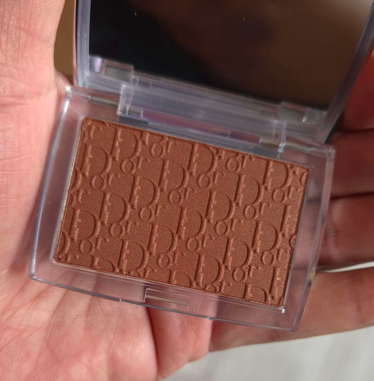
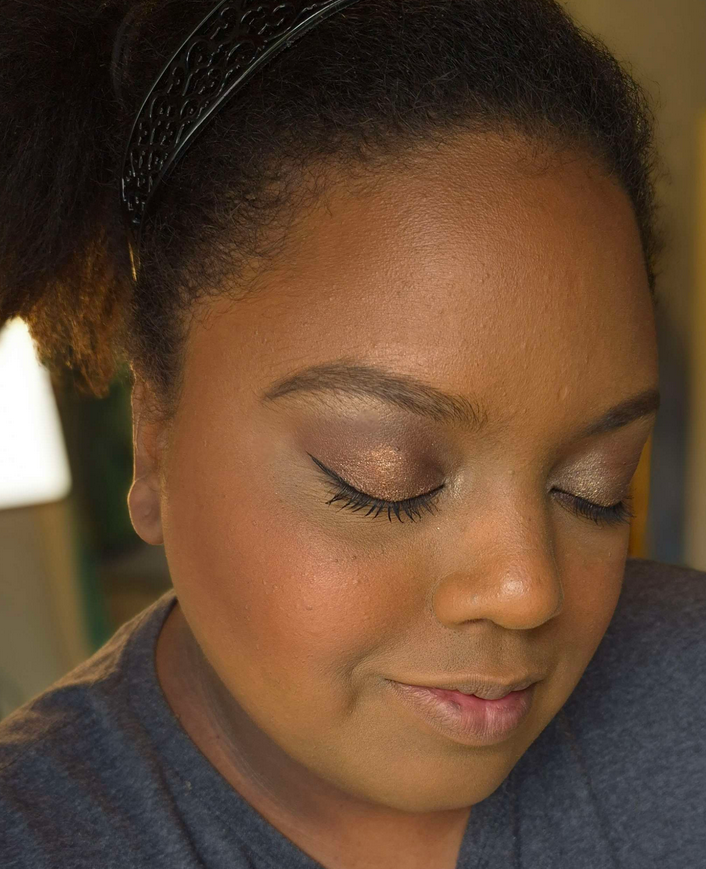
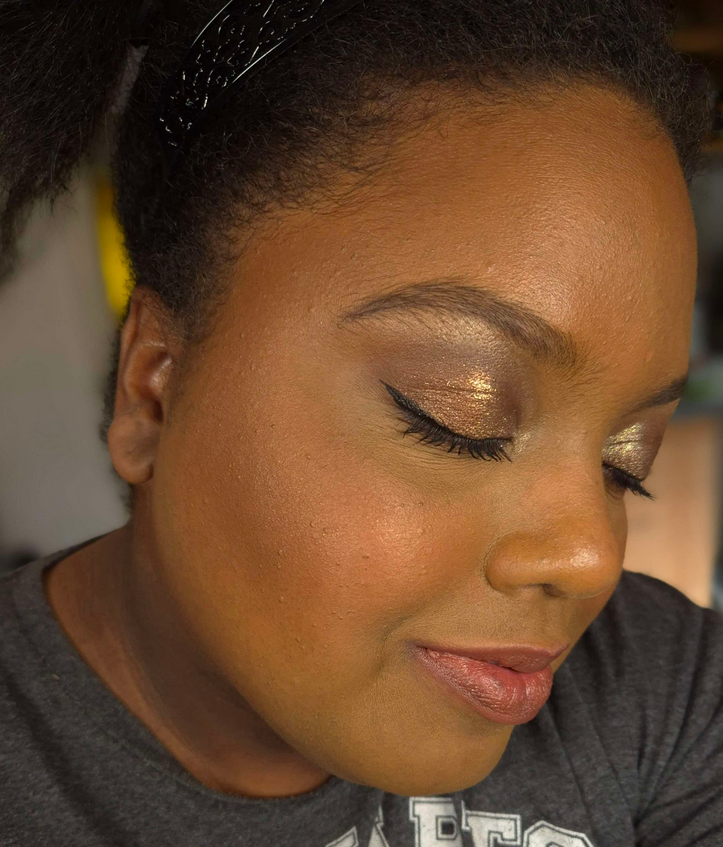
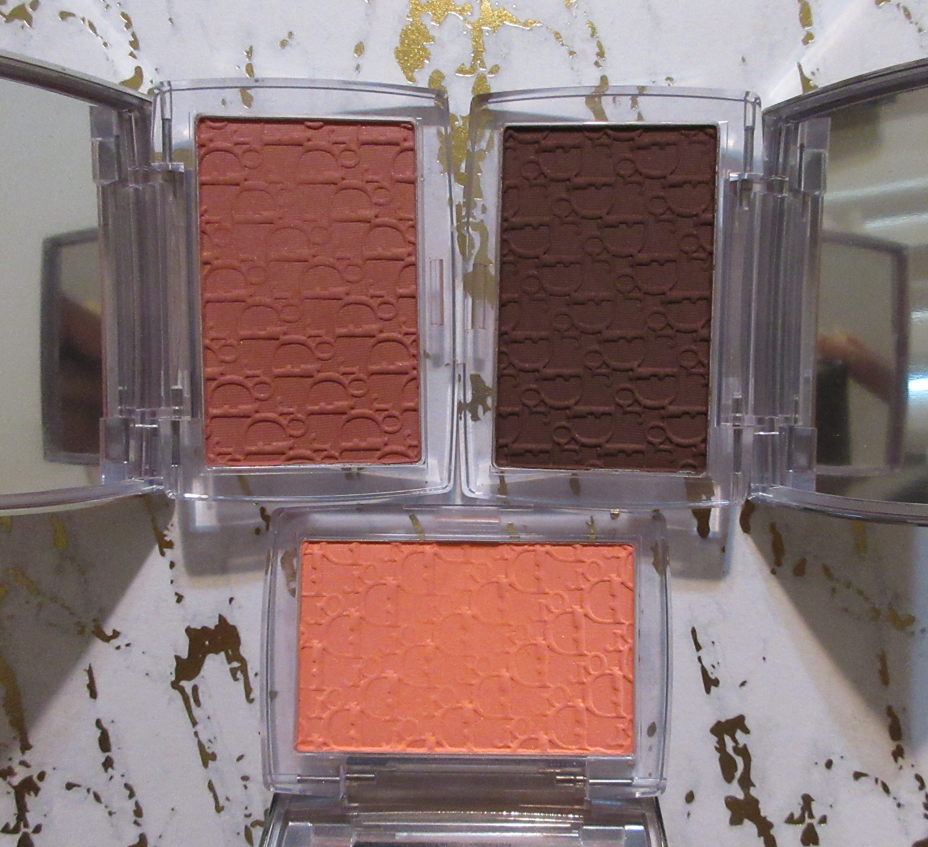
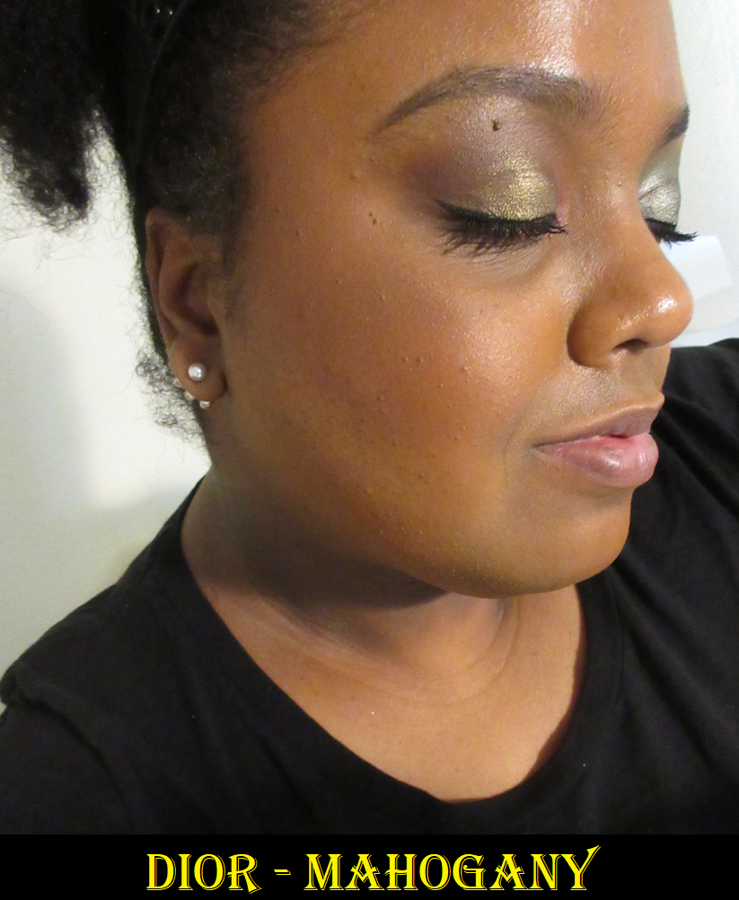
This is less of a review and more of a showcase for one of the three newest blush shades added to Dior’s Rosy Glow line. The color Rosewood shot to the top of my blush favorites and is the only one of the three I brought with me to Germany. The original Coral was too light for my taste, whereas Mahogany was too deep. This new Bronzed Glow shade is a lighter version of Mahogany and includes visible shimmer in the pan that not only makes this formula easier to pick up with a brush than the others, but also adds a subtle glow. The previously released shades were not flat matte, but didn’t have any shimmer that I could see. I would call Bronzed Glow the first actual satin blush. My review for the original Coral, plus Rosewood and Mahogany can be found HERE.
I didn’t pick up the new Coral shade because it doesn’t look, in my estimation, different enough from Cherry (which depending on one’s skintone, is like a deeper Rosewood). So, I stuck to buying Bronzed Glow from Dior’s website and it shipped to Germany from France. Bronzed Glow is a beautiful nude-brown red. Rosewood is still my favorite, but I’m thrilled to have this second shade. Also, this formula doesn’t swatch well, but looks beautiful on the face.
I know some people had issues with patchiness from the previous releases, but I think the added shimmer will help with that for more skin types. I personally find that as my skin is drier here than it was in Florida, the longevity of this shade is slightly shorter because there isn’t as much moisture to grip to even with liquid makeup and skincare on my face. However, it lasts long enough for me to be happy with it. I also commend Dior for finally being inclusive with this range. For once it was actually the tan and medium-dark range with less options since Berry and Mahogany came first. Now, there’s something for everyone.
I’m a little surprised by how many luxury products have tempted me this year. Then again, brands have been expanding their ranges, so I have products available to me now that I didn’t before.
Today’s post will be centered around some of the most exciting luxury makeup items that are newly part of my collection.
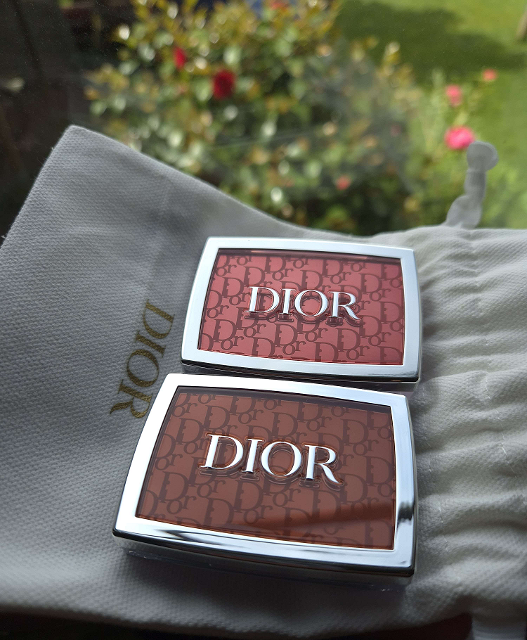
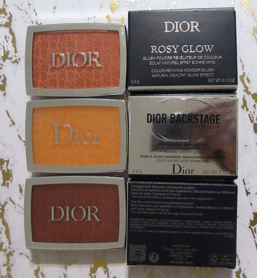
Dior Rosy Glow Blush in 012 Rosewood and 020 Mahogany
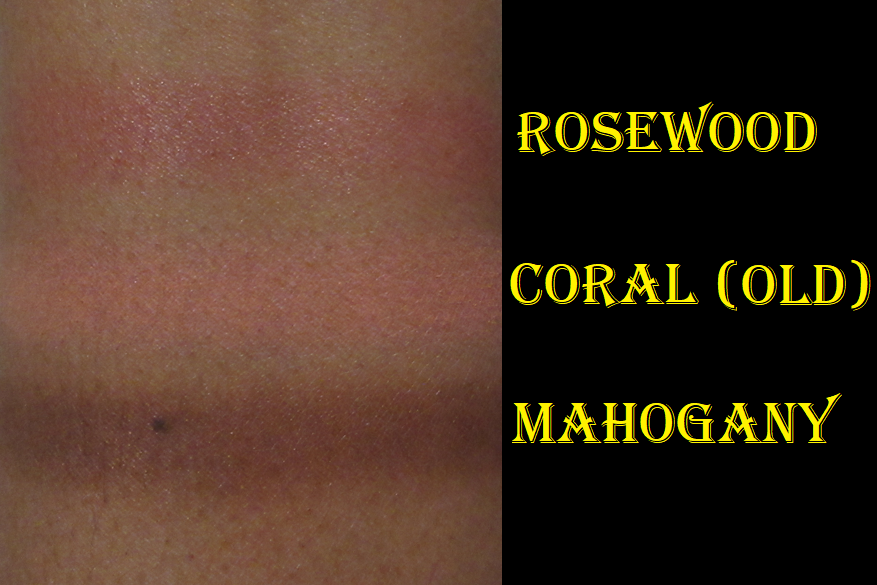
Dior reformulated their Backstage blushes, if they can even still be considered part of the “Backstage” line, since they removed that part of the official product name. I’ve seen photos on Instagram showing that the older formulation of Pink and Coral are darker than the new ones. I didn’t realize the old Coral could possibly work for me until it was already removed from every website. I even clicked lists I found online that supposedly had the older ones, but the links redirected to either the main page or to the new ones instead. So, the only way I could get the original coral was via third party sources. Since it’s not from an authorized retailer, there’s no way to know if it’s authentic, but I suspect it is compared to photos I’ve seen on Temptalia’s blog, for example. However, I’m only showing swatches and what it looks like demonstrated on my cheeks instead of factoring it into my official review. Today’s focus is on Rosewood and Mahogany that I purchased from Sephora and Selfridges respectively.
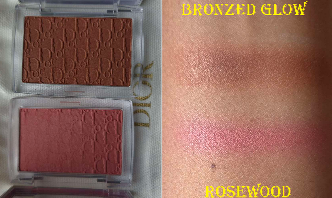
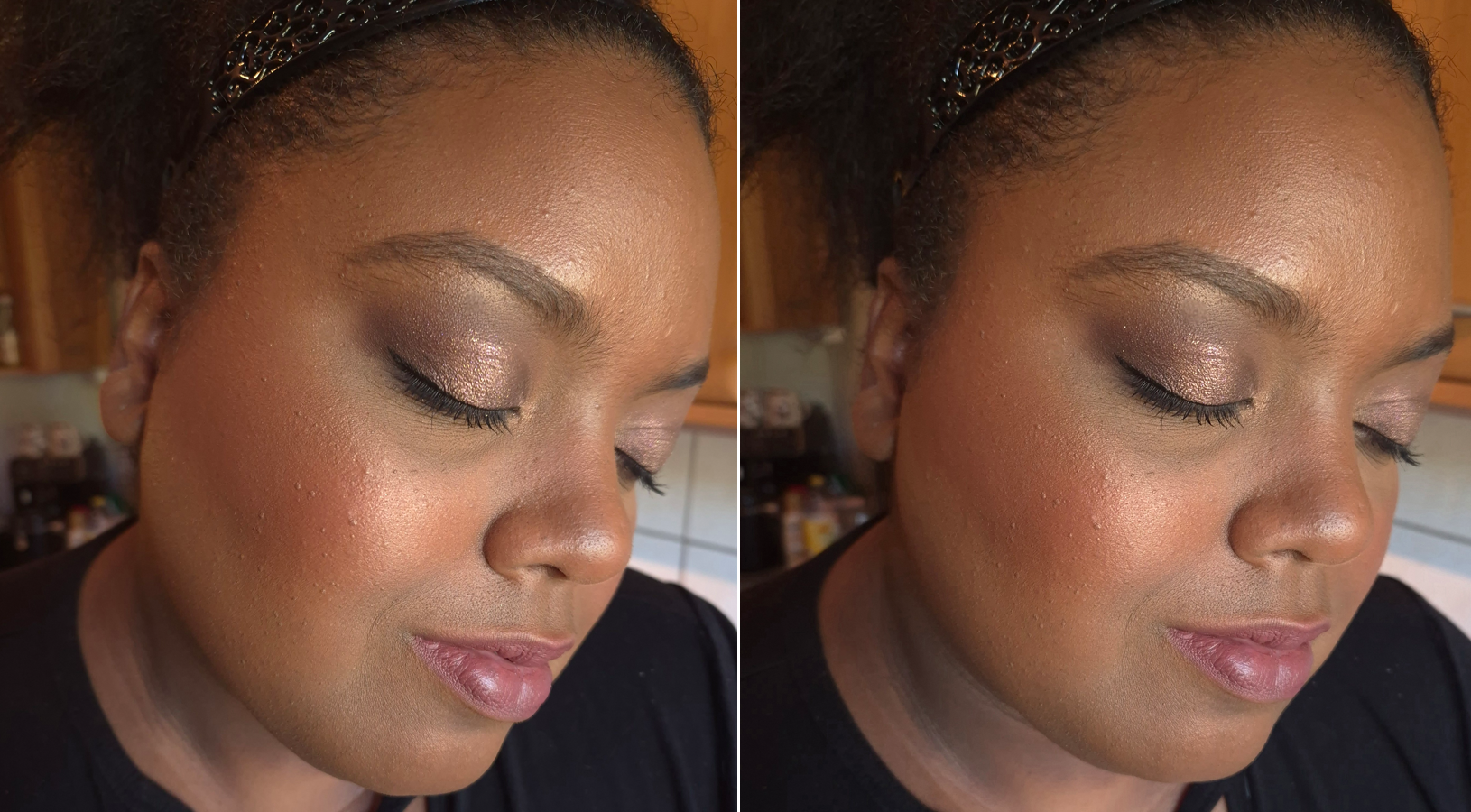
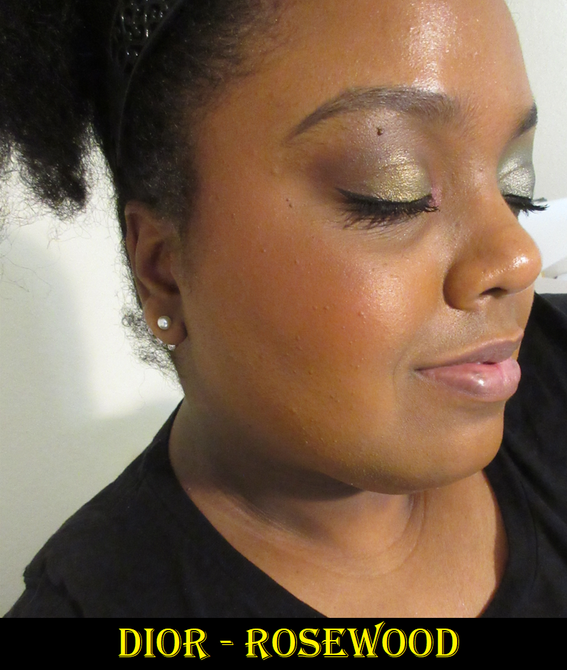
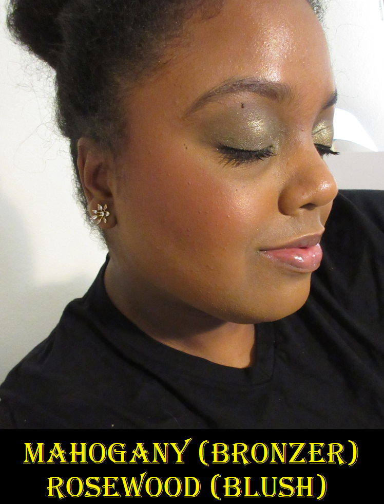
Rosewood is not only my favorite shade of the 4 additions to the range, it’s one of my favorite colors in my whole collection. I love how it looks on me! It’s not glowy due to shimmer. It just has a healthy sheen to it. It’s long lasting on my cheeks. In fact, I have to scrub vigorously at the end of the night because it nearly stains my skin. This might also be due to how much I have to use because Rosewood is such a subtle shade on me. I have to build it up a lot, but because it’s so blendable, it doesn’t take long to do it. My preference is using a goat hair brush with it because the powder is firmly pressed and that hair type picks it up easier.
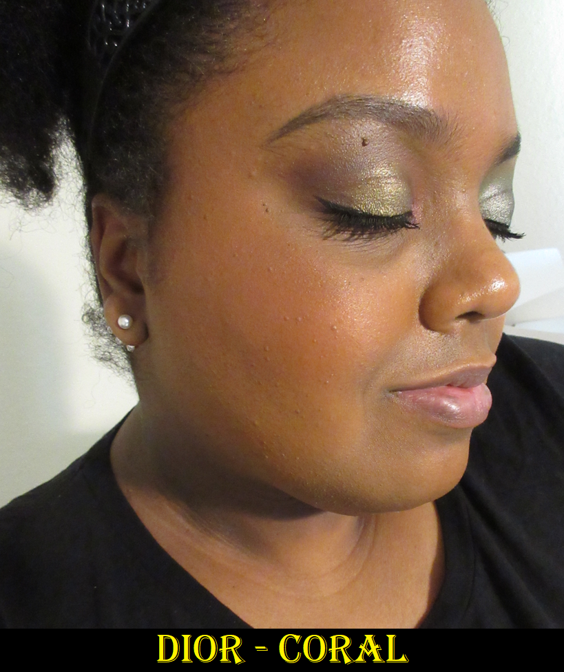
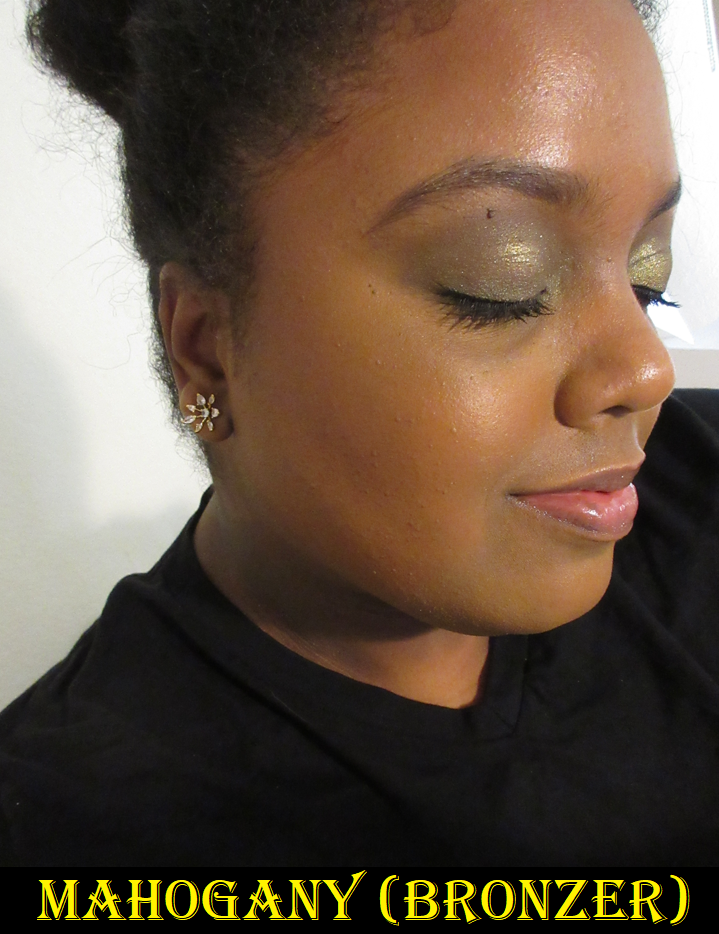
I watched a fair amount of videos on these blushes, and a few people said these were patchy. However, the only one I’ve visibly seen on camera look patchy on others is the same one I have the issue with: Mahogany. There’s a separation between the Red 27 dye and the deeply rich brown color. My squirrel hair brushes can’t pick up the blush well enough, nor my silver fox, but I can use my squirrel/goat mix ones with this. However, even when I do try to patiently use a squirrel brush and blend as sheer of a layer as possible while attempting to build it up, I will eventually start to get more brown than reddish-pink. The random build up of brown in places does not look good on my cheeks. The photos I selected below are the best looking ones of Mahogany on my skin. It’s a balance of showing it as sheer as possible for the color to still get captured by my camera.
There are some videos on YouTube showing how Mahogany looks applied as a normal blush, for example this one by Beauty and the Frizz, or this one by Julie P. And an example of using it with some foundation patted over the top is by The Hooded Lid.
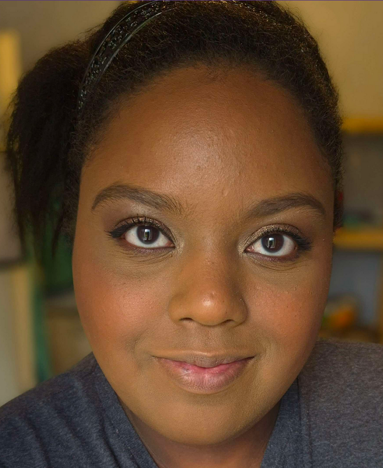
I’ve applied this over a powder-set base, an unset base, tried brushes with different hair types and synthetic fibers, and various brush shapes, but none of the changes made a difference. It still looks patchy on me and the tone of brown just doesn’t look flattering on my cheeks, potentially due to my undertone. The way that I can continue to use this, and really like it, is as a sculpting blush. I apply it to areas I would normally bronze, making sure to apply it lightly, before adding Rosewood to the main cheek area. I’ve really enjoyed this combination!
My love of Rosewood makes me even more tempted to try Cherry and Berry. I feel certain Berry would perform on me the way Mahogany does, plus I’m super picky about berry blushes. Cherry is gorgeous, but it reminds me of a brighter version of Rosewood from what I’ve seen on other people, and I have several vibrant shades like it in my collection such as Pat Mcgrath’s Electric Bloom, Colourpop x Hello Kitty Aloha Honey, Nars Exhibit A, MAC’s Loudspeaker or Frankly Scarlet, Patrick Ta’s She’s Vibrant, etc. Most of these I barely use, so it doesn’t make sense to buy it, even if I think the color is a beautiful one.
Based on my experience, I recommend them. However, it comes with the warning that there may be a press or formulation issue based on the inconsistencies being reported about patchiness regardless of the shade, and only for some people but not others.
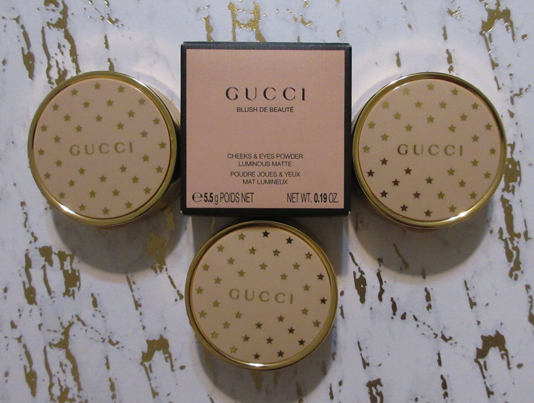
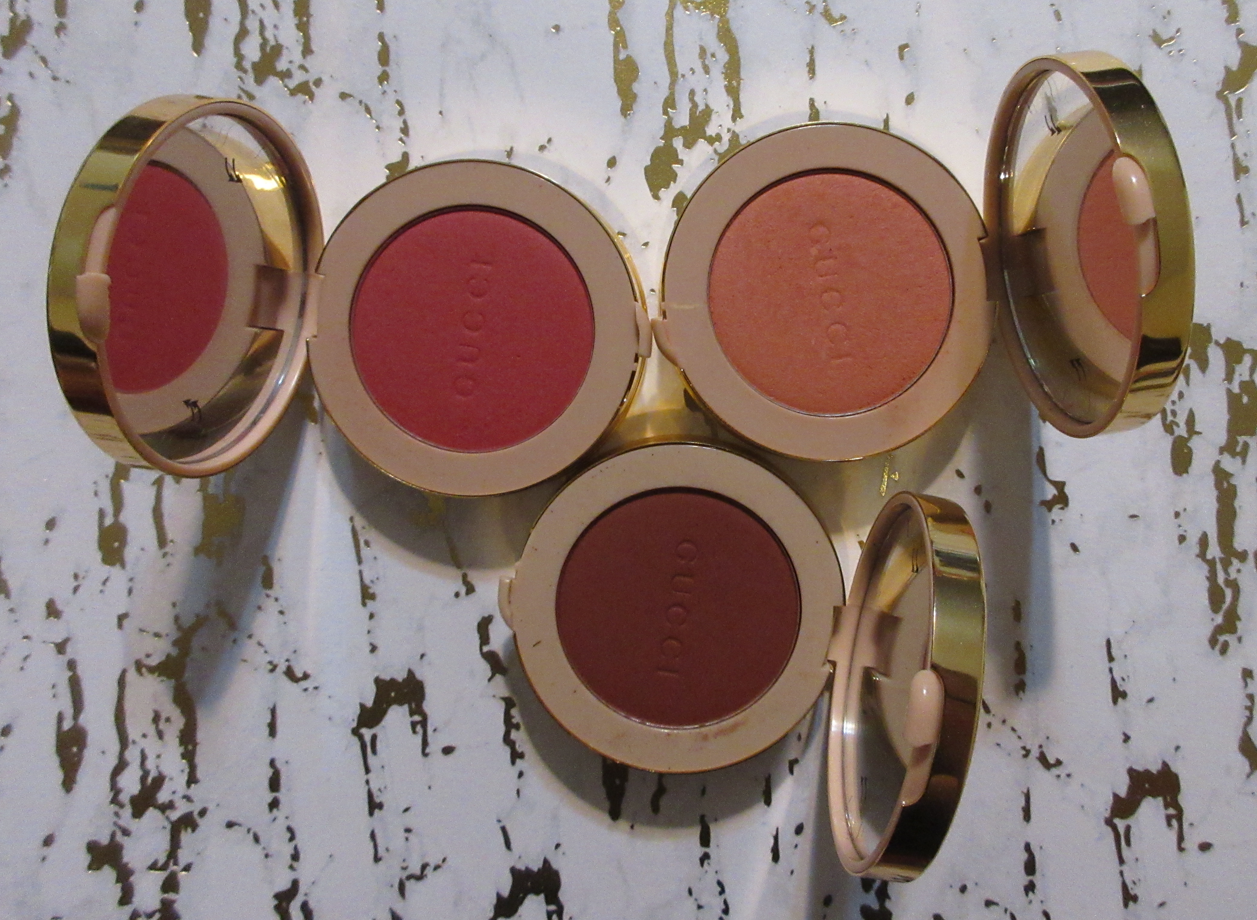
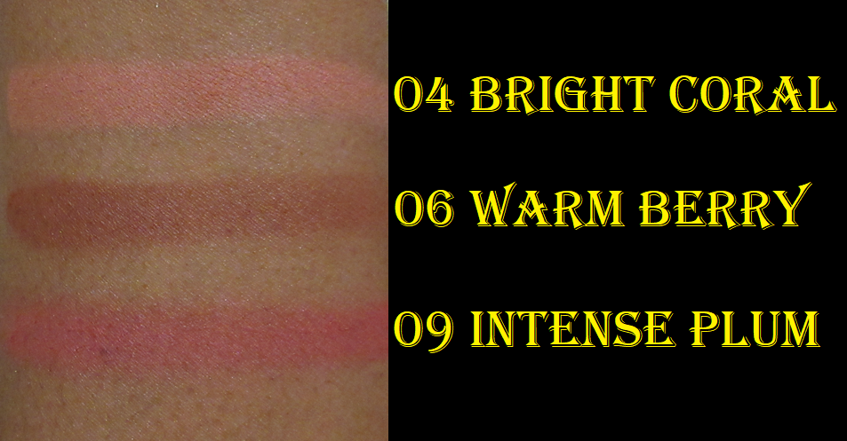
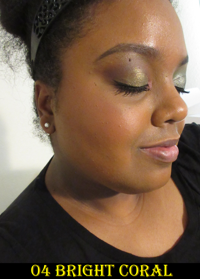
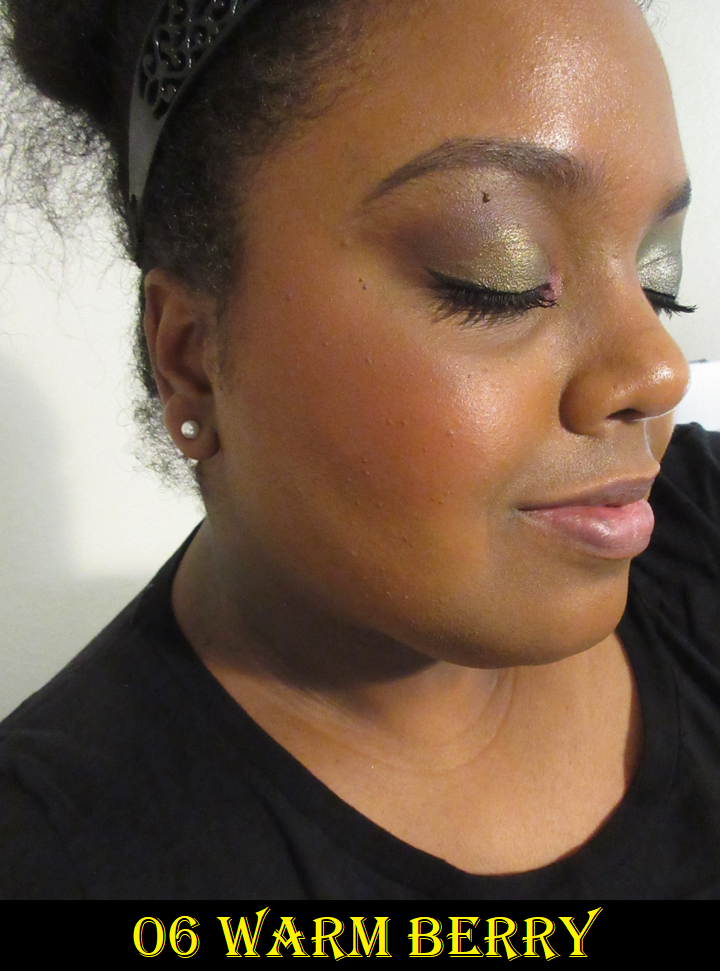
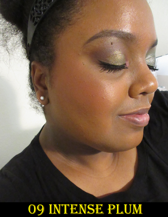
Gucci Luminous Matte Blush De Beauté in 09 Intense Plum
I’ve had mixed feelings about these blushes for a while now, as I mentioned in my review of the Armani Luminous Silk Glow Blushes and my comparison of those to these. So many people rave about them, but I feel no joy when I put them on. The closest I get to liking the color is with Warm Berry, but that shade is exceptionally pigmented. I have to be really light-handed or it looks overdone fast. Intense Plum also has a lot of pigment, but I take a small amount and really work it into my cheeks to make it look a little more natural. I still prefer the tone of Warm Berry, but the depth of the shade makes it harder to look as sheer as Intense Plum can.
I went back and forth deciding if Bright Coral would show up on me and whether it was worth the risk to buy. It’s very faint, and more visible in person, but I’m never satisfied using it alone unless I mix it with one or both of the other shades. In fact, I tend to apply this on top of the others to help tone them down. I’ll need to do a declutter eventually, and I haven’t decided if I’ll be keeping this one or potentially even removing two of them from my collection.
The formula is silky to the touch and goes on the skin smoothly with a soft satin sheen. It’s super quick to blend onto the cheeks if you like a bold look, but because of the pigmentation level of the deeper shades in the range, I have to be careful how much product I pick up and I do need to blend it out a bit. So, to get it as sheer looking on my cheeks as I want, it takes a little longer in my specific case. But the formula itself is quite blendable and long lasting on the skin. For some reason though, I’m just not as impressed with the end result on my cheeks as I feel I should be considering the price. I’m far more interested in keeping that beautiful packaging, which looks much cuter in person than the online photos. I take back every bad thing I’ve said about it being a clip art star pattern. It’s more luxurious than I expected.
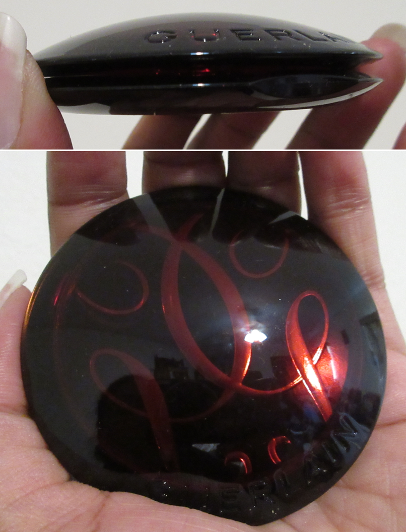
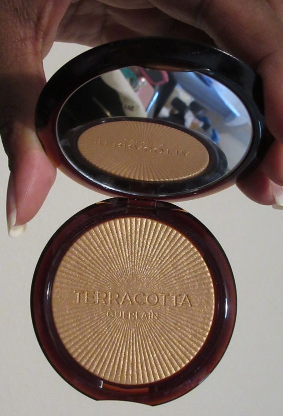
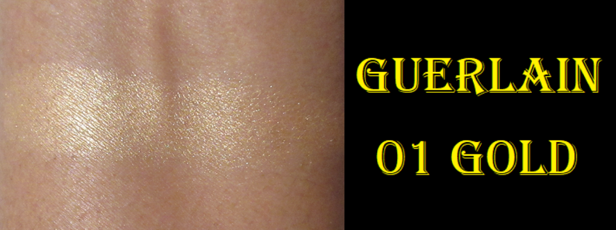
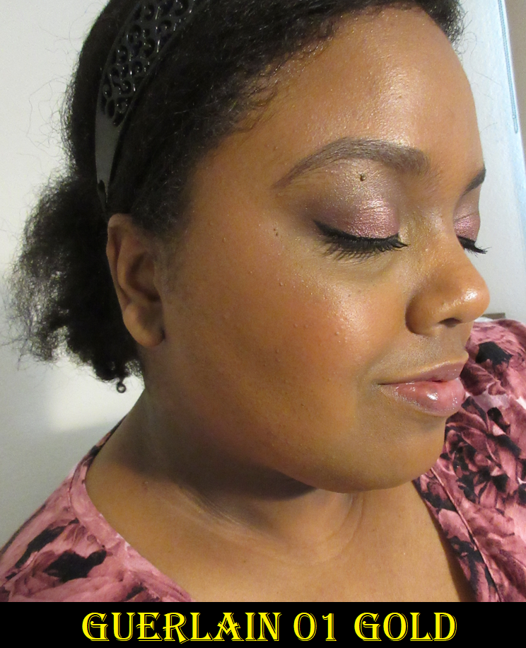
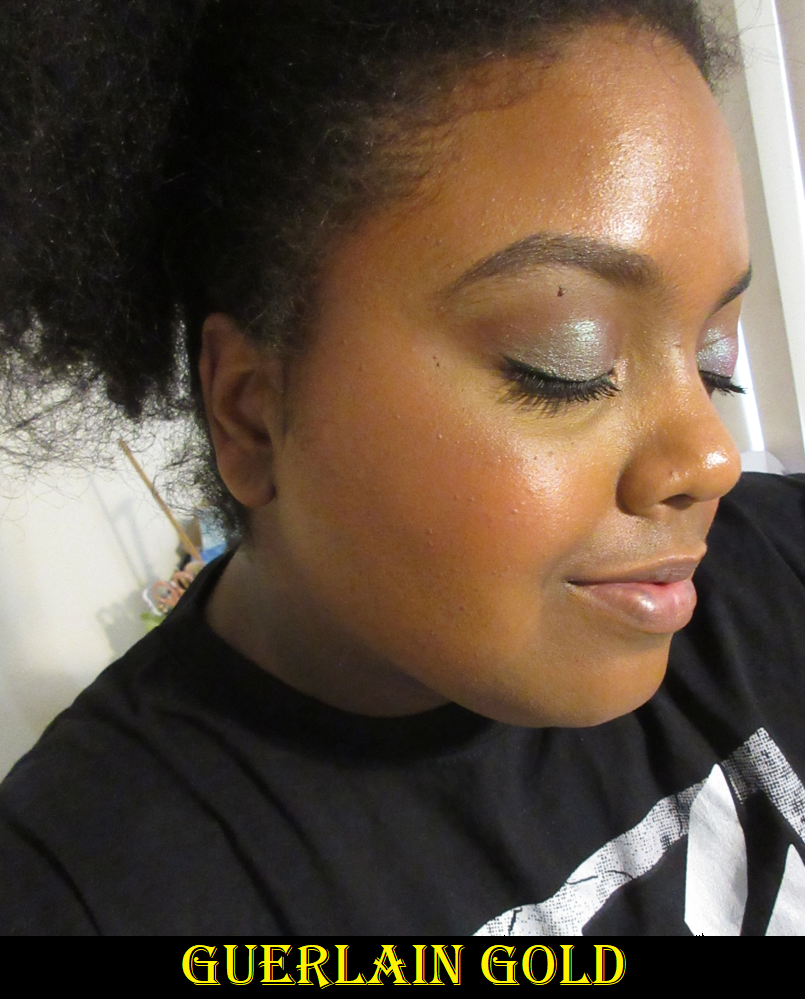
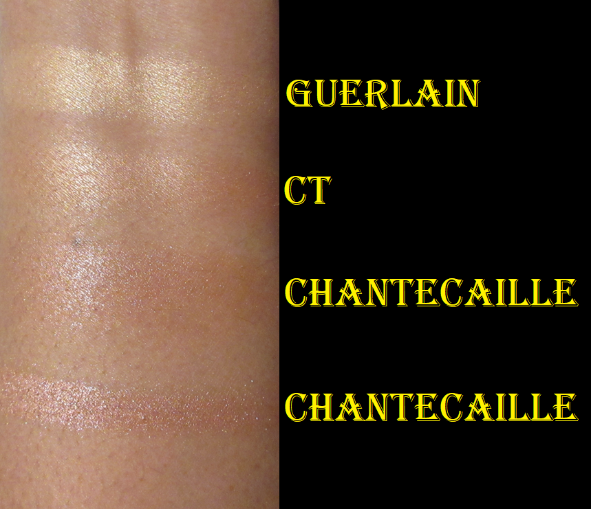
Guerlain Terracotta Luminizer Highlighter Powder in 01 Gold
Considering this comes in only two shades and this is labeled 01, I was a little concerned that it wouldn’t work for me, but it does! This contains, “Gemtone: Adapts to skin’s true tone for a natural finish,” according to the description on Sephora’s website. I have no idea how I could prove or disprove that claim, but I thought I’d mention it for those who aren’t anywhere near my skintone and might worry if this will be too dark or too light. This highlighter is very subtle and only really pops when applied on a dewier surface. This should be my type of highlighter, and I really expected this to be holy grail status, but I’m just not impressed enough considering the price. I hoped this would be my replacement for the 2015 Guerlain Meteorites I was obsessed with and used periodically for 6+ years until I decided it’s too old and put it in semi-retirement. However, the finish of it being less glowy than my Charlotte Tilbury highlighters while not being any more refined in terms of sparkle or particle size either, led me to not be as excited when I use it. I feel this way especially since it is on the lighter side for me and not a perfect undertone match. It’s good, but not fantastic. Even if this did come in the perfect color for me, there’s no guarantee it would raise my opinion of the formula considering PML’s Divine Rose highlighter is not a perfect match either, but I love how that one looks on me!
The packaging is pretty, but I’m not as excited by it as I expected either. When it comes to luxury makeup, the makeup at its best quality is usually still comparable to products from other brands, but the packaging helps make it worth that higher price. Because I think it’s nice but not amazing on the makeup and packaging fronts, this wasn’t worth buying. It’s strange to say I’m the most disappointed by this product out of the bunch in this review, but it’s because I had the highest of expectations for it only to be let down that it’s not at least as pretty on me as my old meteorites. My one tangible complaint that’s less about preferences is that as subtle as it looks in the beginning, the shine dulls down as the day progresses. So, I try to over-apply hoping it’ll last longer.
I honestly would have returned this if my time limit hadn’t run out. I ordered it during the VIB sale while away overseas and by the time I could actually see it in person, it took too long for me to make up my mind about it. I can at least take comfort in having gotten it on sale. I still think it’s a good product, but for the right person.
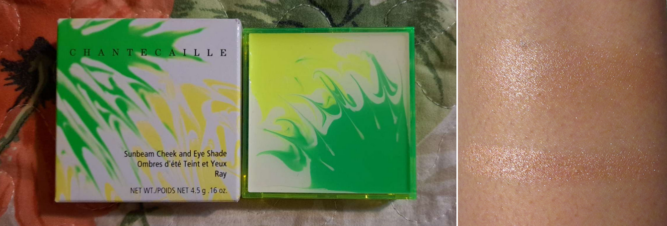
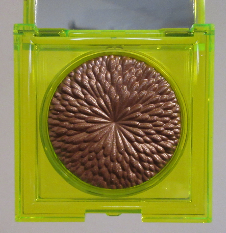
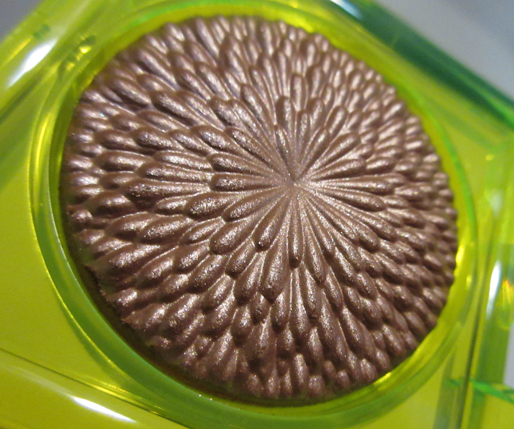
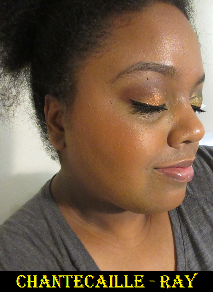
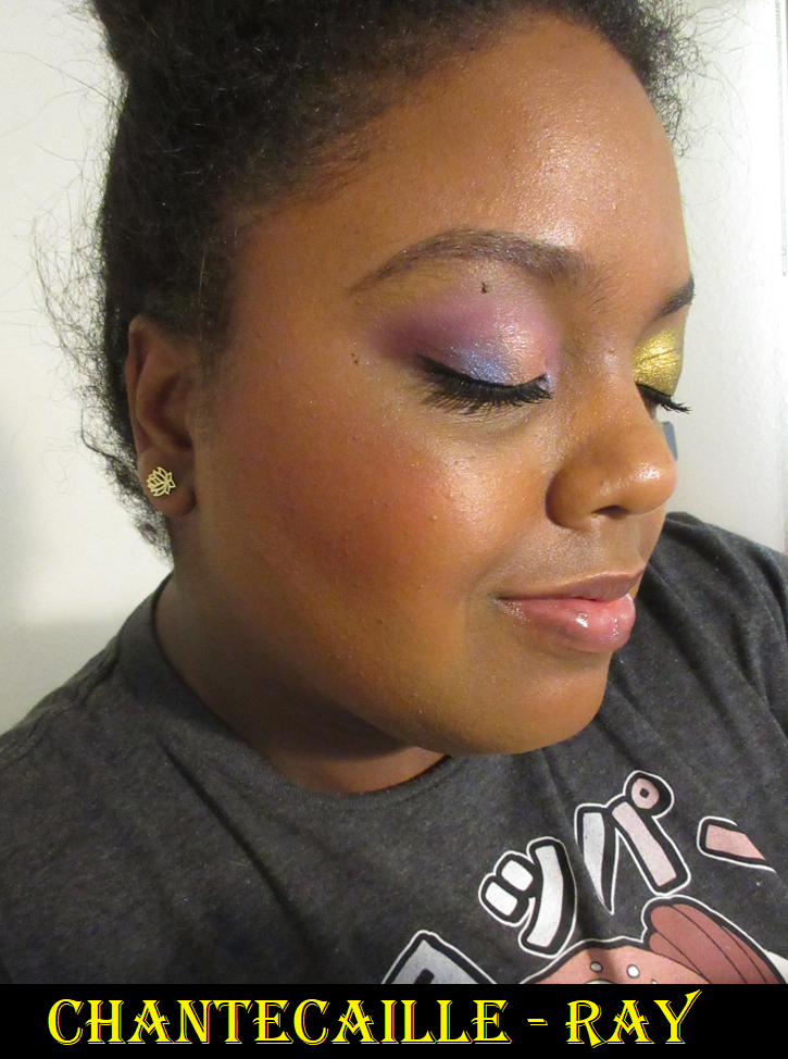
Chantecaille Sunbeam Cheek & Eye Shade in Ray
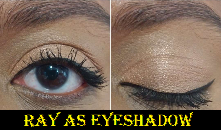
As it currently stands, this is the only product from Chantecaille that I love. The second best is the Blur Powder, which I like, but none of the rest of the Chantecaille products I’ve owned worked out. I was thrilled that the brand released such a deep highlighter, though they tried very hard to emphasize and market this as an eyeshadow. It looks a lot deeper on others, but when I use this on my eyes, I put it in the typical highlighter spots and not usually all over the lid, the way I have it in the photo below.
Besides the eyes, I’ve also seen those with light skin tones find use for this as a shimmery blush or even as a bronzer.
The shimmer size is small and it’s a gel-powder formula, which I tend to love. Ray is another subtle highlighter that looks more intense on dewy skin. At certain times of the year, this can be a bit dark for me because of that base color, especially if I build it up. However, I’m perfectly happy with how it looks when I use a small amount and buff it in a bit because I also have to watch out for the shimmer particles that are on the lighter side for me. That’s why the combination of both kind of balances out (the deep base with the light shimmer).
It’s a bit ironic that the Guerlain highlighter looks better on me in photos than the Chantecaille highlighter photos, but I promise it’s another story in person.
In the swatch photo, I included the golden stripe from Charlotte Tilbury’s Dream Light Pillow Talk Multi Glow Highlighter (3rd out of the 4 shades), because that’s an example of my perfect “natural” highlighting color in depth and tone. Guerlain’s is gold, whereas Charlotte’s is golden, and Chantecaille’s is reddish bronze with a yellow-champagne shimmer. The shade Ray, when sheered out, looks closer to Charlotte’s than Guerlain’s does, which is why I think the color suits me better than Guerlain’s.
Also, please don’t ask why I continue to buy highlighters if I already have a fantastic formula and my perfect shade via Charlotte Tilbury.
The packaging doesn’t exude luxury, but it’s fun! I love the bright neon green. I love that I can spot it immediately in my collection. I like the unique imprint on the powder (although it reminds me a bit of something not-so-pretty) and the small compact size is great. I had points on my account at SpaceNK, plus there was a sale, so I bought this for significantly less than the retail price. Considering all this, plus the color and performance, I’m way happier with this than the Guerlain highlighter. I have to admit though, that the full price would never have been worth it to me. Unless the packaging is plated with gold, $50 is my limit for highlighters.
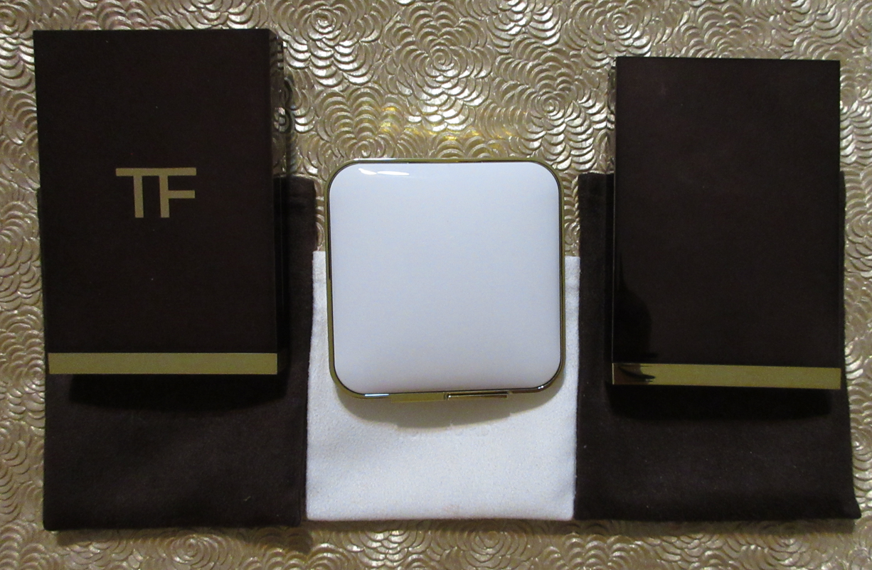
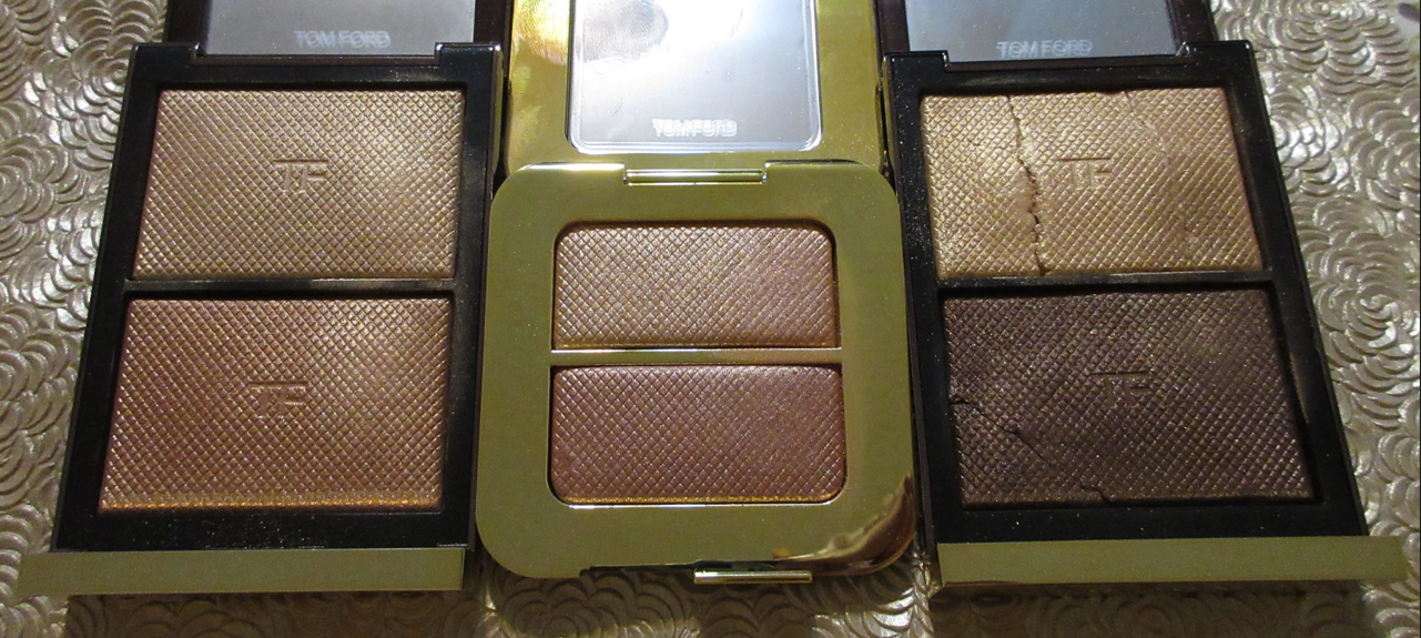
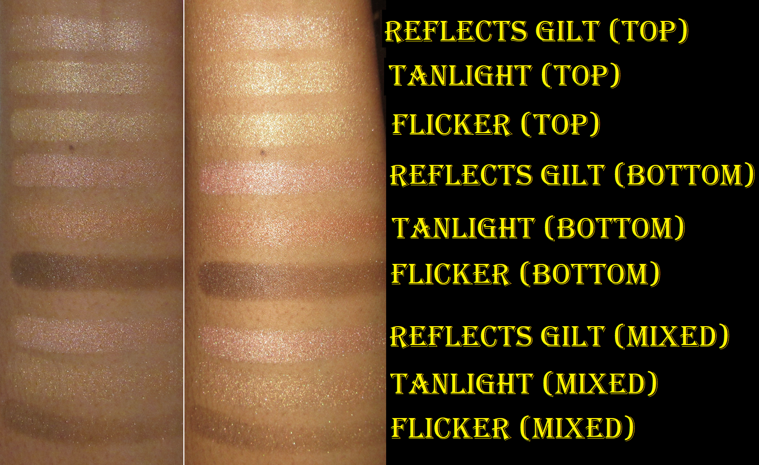
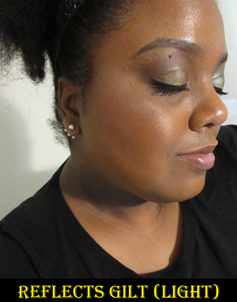
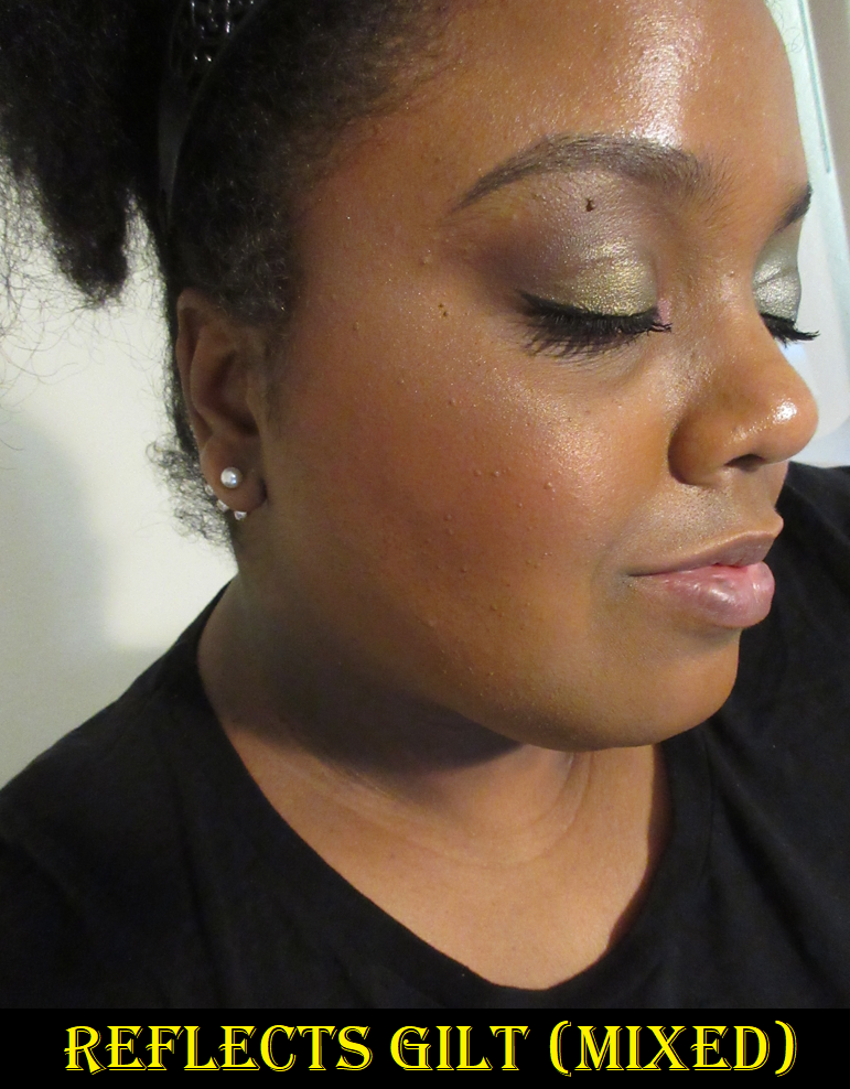
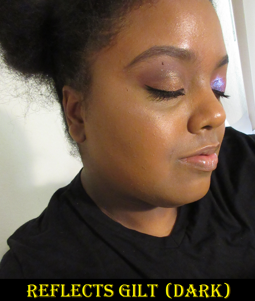
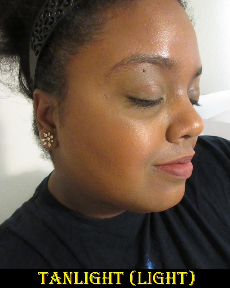
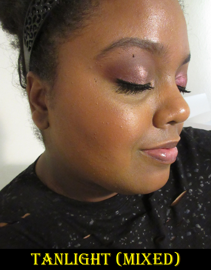
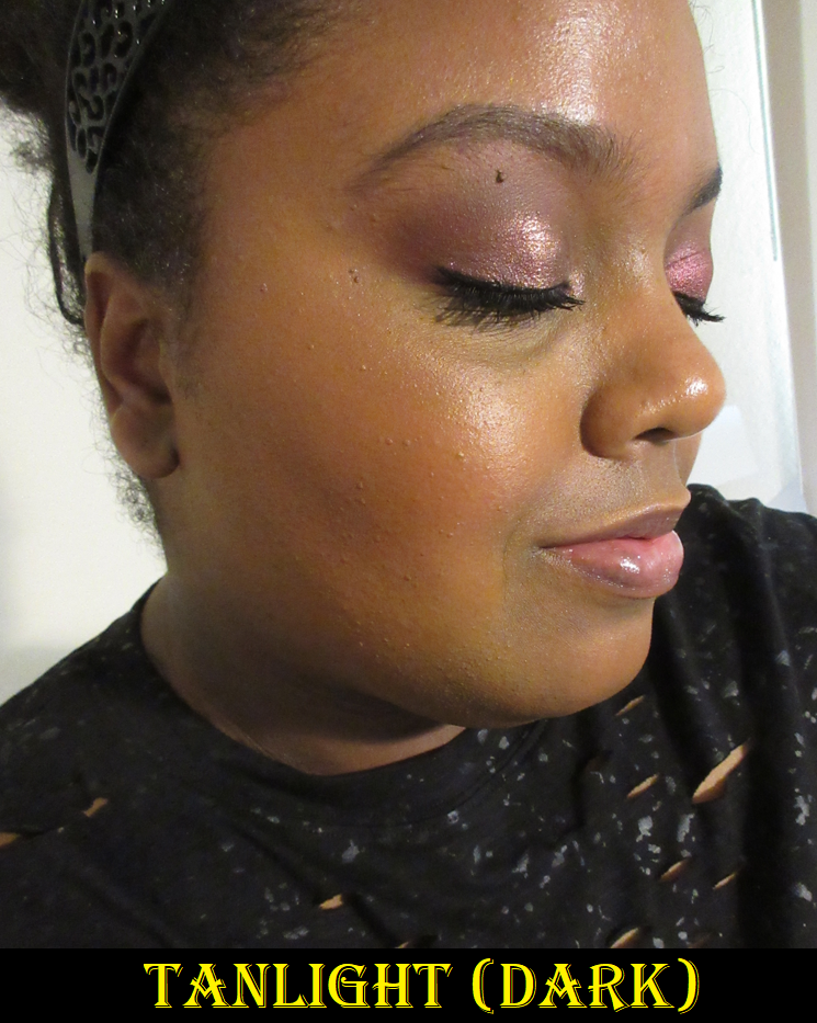
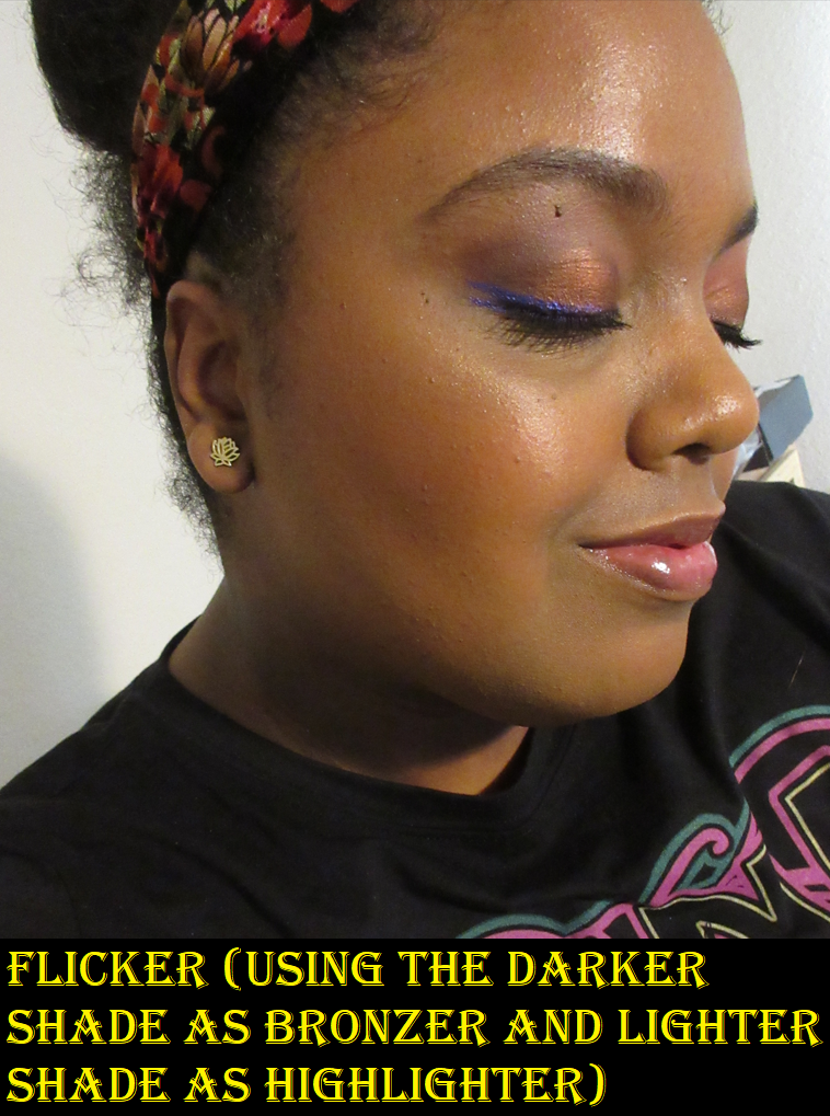
Tom Ford Highlighter Collection: Shade and Illuminate Highlighting Duo in Tanlight, Soleil Sheer Highlighting Duo in Reflects Gilt, and Skin Illuminating Powder Duo in Flicker
I purchased Tanlight from Nordstrom when it came out, Reflects Gilt from Beautylish during a sale, and Flicker from Mercari because it had already been discontinued. I saw a video where someone compared the Flicker shades to Tanlight and I didn’t even know it existed prior to that. Unfortunately, Flicker fell out off the plastic mesh/grid, so I smushed the pieces back in. Then it fell back out again and I glued them in. I don’t officially consider it part of this review and only included it for color comparison purposes in case anyone was wondering whether to get Tanlight if they already have Flicker. The top highlighters in both compacts are extremely similar, but Flicker has a stronger yellow tone. I think I like it by itself more than Tanlight’s lighter shade by itself, but the color of both highlighters in the Tanlight compact mixed together creates my perfect highlighter color. The advantage to the Flicker compact is that I could technically use the deeper shade as a glowy bronzer, but it’s so deep and sculpting that I have to be careful not to overdo it when I try to use it that way. Flicker is also so deep that mixing both together forms a color too dark to highlight with.
I’ve noticed no difference in the formula between either of the three products. They’re all very smooth on the skin, all impactful and reflective, all long lasting, and all gel-powder formulas. The new Shade and Illuminate duo compacts have the “TF” initials on the lid, but that’s about the only difference I’ve noticed in the packaging as well.
I don’t know if it’s just because the sparkles are easier to see with the lighter highlighters in the duos, but I could swear the lighter ones all have more shimmer in them than the darker ones.
As I mentioned before, Tanlight mixed is the best for me, followed by Flicker’s top shade, Tanlight’s bottom shade, Tanlight’s top shade, and Reflects Gilt’s bottom shade. Reflects Gilt is a bit too light for my preference, with the exception of the darker one which I’ve started to use exclusively when I open that compact.
The retail prices of these duos are the same as the individual highlighters from Chantecaille. This would normally never be worth full price (I did get Tanlight at a minor discount), but it’s technically two products in one. This complicates things. Unlike a blush that someone can wear in a multitude of shades and have them all look beautiful, there is only a small range of colors that I feel I can pull off when it comes to highlighters. However, it’s because Tanlight produces perfection and I can tailor how much I use of either one in the event that my face gets lighter or darker throughout the year, that’s what makes this worth it for me. As for Flicker and Reflects Gilt and only really wanting one shade within each duo, the deep discounts that I got them for makes me not have any regrets buying them, although I’m not sure if I’ll keep Reflects Gilt in my collection forever. I don’t really have a purpose for keeping it when Tanlight is just a better fit for me overall. The packaging is quite pretty though, so I almost want to keep it just for that.
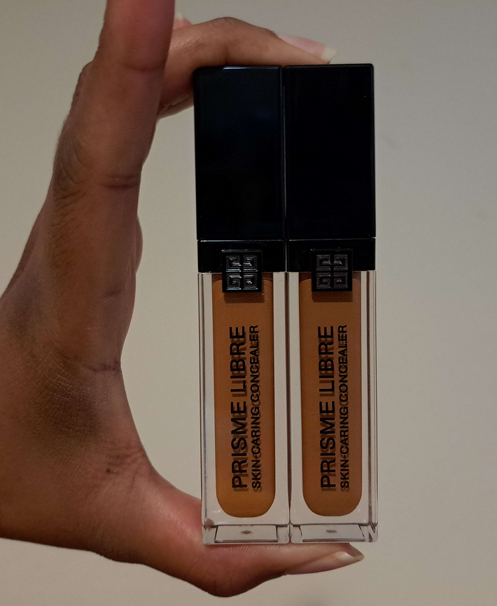
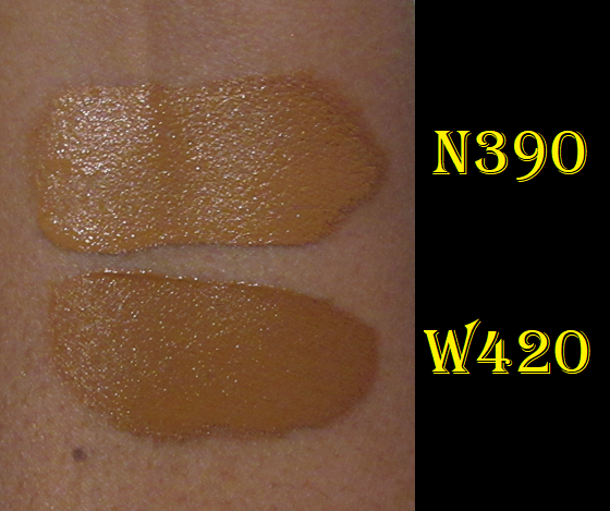
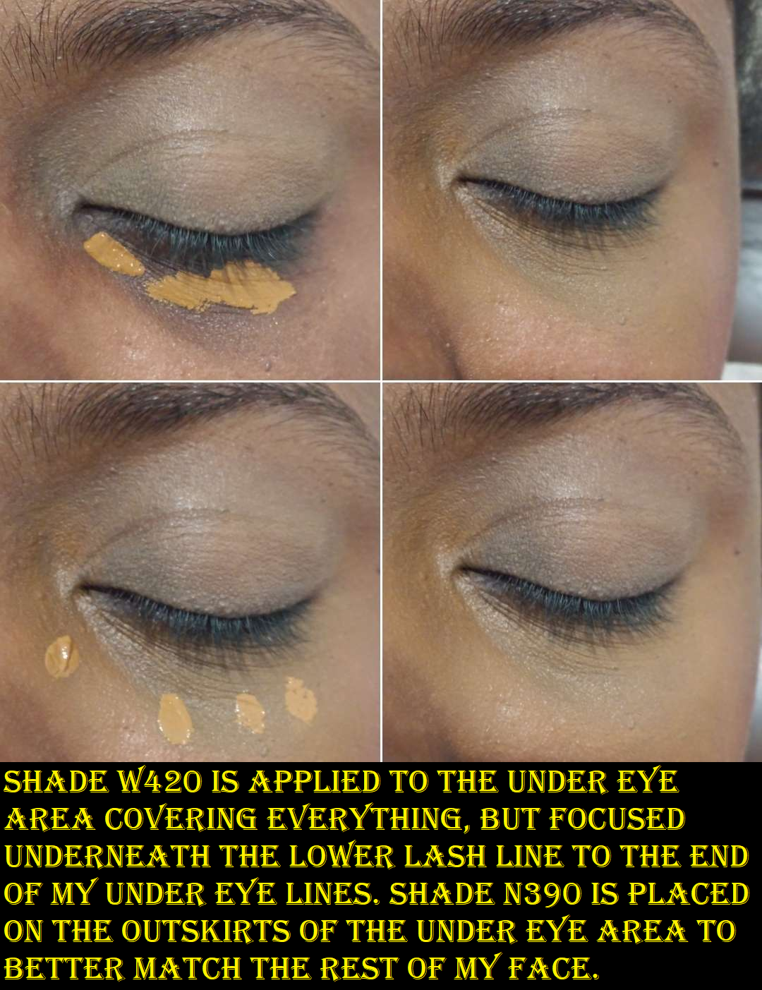
Givenchy Prisme Libre Skin-Caring 24H Hydrating Radiant Correcting Creamy Concealer in N390 and W420
This is a medium/buildable coverage concealer, instead of the complete full coverage ones that I normally stick to. What drew me to it was the hydrated look and the natural finish that wasn’t too radiant for my preference and wasn’t too creamy. Creamy concealers tend to crease on me beyond what I find an acceptable amount. This grips to my skin quite well and although it’s not as long lasting as my Tarte Shape Tape or KVD Good Apple, if I pair it with the right powder and use the right amount, it can get me through a short day’s wear with me feeling satisfied with how it looks at the end. If a concealer lasts 8 or more hours on me without being significantly faded or flat out gone, it’s a winner in my books.
Because it’s not full-coverage, I can’t wear my actual skintone shade over my dark circles because it shows underneath as a deep grey tinge. So, I have to utilize the under-painting technique in using a shade that’s deep enough to keep my dark circles and areas of skin discoloration from appearing grey when I apply the concealer. Then, to get it to match the rest of my face, I use my regular concealer color around the perimeter and blend them together. Because the combination isn’t a perfect undertone match, it still looks slightly off if I’m trying to have a minimal makeup day and skip foundation, but it looks perfectly natural on days I put foundation on. There are way more neutral shades in this line than warm tones, but I was determined to find a way to make it work for me.
Also, I’ve tried mixing this concealer with my other full coverage ones and the formulas just don’t mesh well. It fades faster or creases in a more obvious way. One time I tried using the Becca Under Eye Brightening Corrector with it, and that combo works well if Becca is kept away from the lines under my eyes. Lately, I’ve been enjoying using it over top of the Milk Hydro Grip Eye Primer (that I use for concealer and not eyeshadows), because it helps it last a little longer even if I don’t use the Givenchy powder with it.
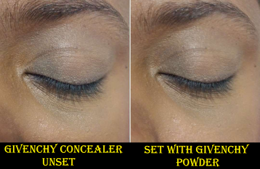
Initially, one of the bigger issues I had was figuring out the right amount of product to use. This was resolved once I bought that second shade and didn’t have to try and pack on a ton of product to get the coverage I needed. The second issue was that I could not wear this concealer without setting it, and once I set it, I lost all the hydration and radiance it provided. The end result to the look of my under eyes was no different than Tarte’s Shape Tape, but with lower coverage. So, I experimented with different powders and ultimately decided I should use this concealer with the brand’s own powder. Doing this gives it a natural-matte appearance, but at least it doesn’t look as dry as other powders. I’m a lot more pleased with this combination.
As much as I like this concealer, and have gotten used to the idea of needing two shades for most of my favorites anyway, the price and the coverage is why I think I will stick to repurchasing my Tarte and KVD concealers after the Givenchy ones are finished. I can snag my holy grails for 30-50% off at certain times of the year, but with Givenchy, I can get 20% off at the most. Needing to use a special powder with this adds to the full cost of having this concealer, so it’s a good product that is just too expensive for me to continue with. I will enjoy it in the meantime while I’ve got it.
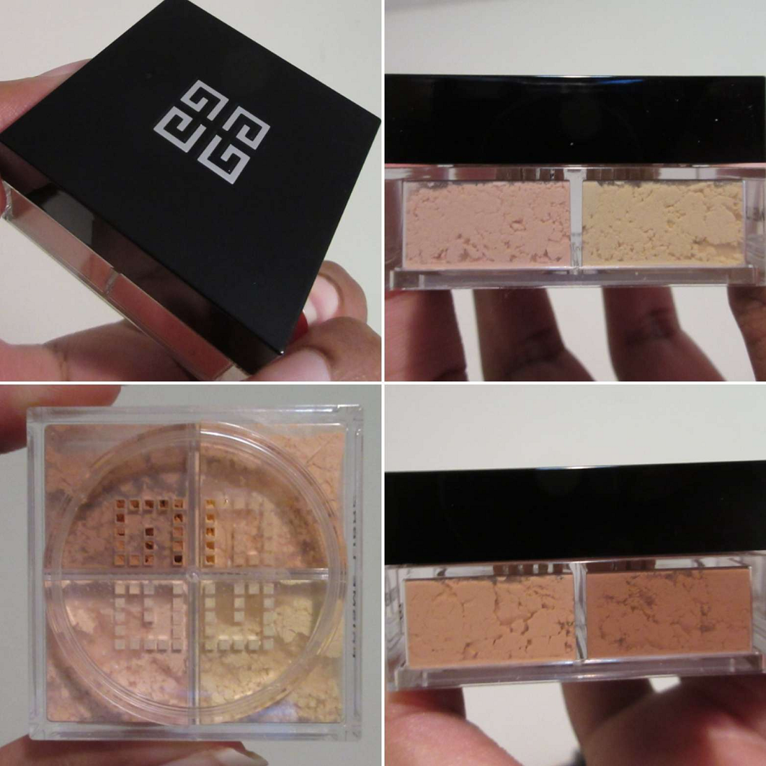
Givenchy Prisme Libre Loose Setting and Finishing Powder (Mini) in 5 Popeline Mimosa
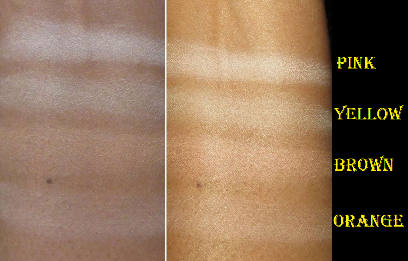
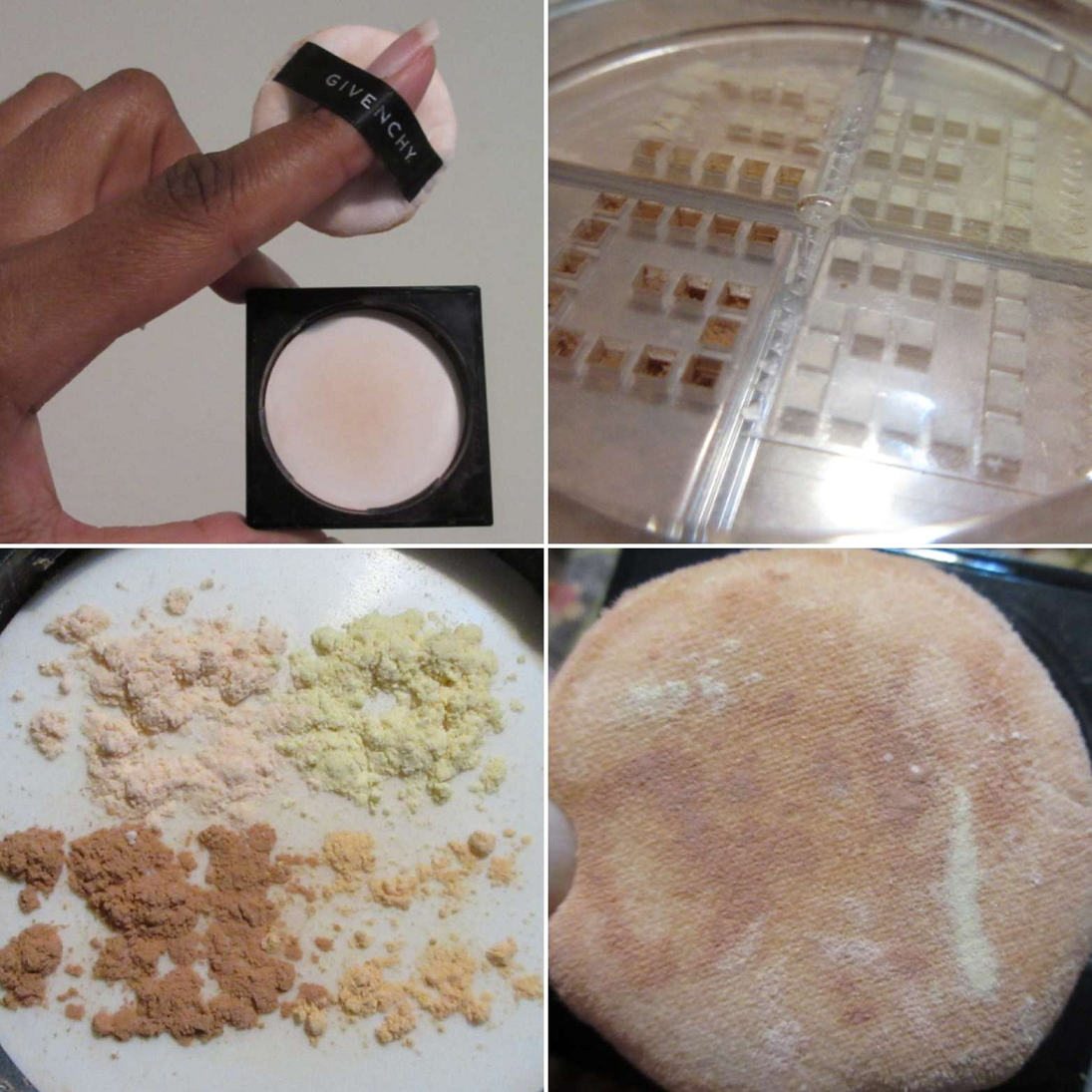
As these swatches reveal, shade 5 turned out to be lighter than I anticipated. Givenchy has one version that’s darker, but I didn’t want the dark pink color in there and 6 Flanelle Epicée didn’t come in a mini size. Since the website model that matches me the closest was wearing Popeline Mimosa, I thought it would be a slam dunk, but perhaps 6 would be better for me to be able to use all four colors mixed. Trying all four together with this powder makes my under eyes look too stark white. In any case, I have been making do by putting tape over the holes for the lightest two and partially over most of the orange so that I can have only a slight brightening effect for my under eyes. I use this powder exclusively for the concealer areas since I don’t need to set my whole face, considering my dry skin. For the sake of science, I tried my combination of 1 part brown powder and 1/3 part orange powder all over my face. It seems to have a small blurring effect. I thought I noticed that under my eyes, but it was nice to test it on a larger area and confirm it. The brown powder is also supposed to be the radiant one, so perhaps that’s why it is mattifying, but not dry looking. By “radiant” I assume they mean a tiny colorless sheen because I don’t see any shimmer whatsoever, though it does contain Synthetic Fluorphlogopite (synthetic mica).
Since I’m only using this powder for a small area, and I have others I use with other concealers, the mini is going to last me quite a while.
I never use the puffs that come with my products, but I tried this one out. Part of the problem is that the powder comes out in clumps and when I press the puff into the powder (which I pour into the cap) and try to tap around to mix it, the colors don’t mix evenly. I can see all the spots where the lighter powders touched my face. So, I just prefer to use a brush instead. I pat, swish, and mix them in the cap with the brush before using it. Even just using the brown and orange requires proper blending of the powder together on the brush. A bit of product gets wasted this way since so much comes out from all those holes, plus mixing them up in a way that partly disperses some in the air. At least it takes a bit of time for the average person to go through a powder anyway. I still haven’t used up a single one, even in mini sizes. I think that’s why I don’t really understand the appeal to having all these colored powders in one container. I don’t know why there isn’t a mechanism for opening and closing each of the sieves without me needing to put tape over them myself, unless this is something only in the full size jars? I don’t know why someone would need two color correcting options (Popeline Mimosa seems more like three). Shade 5 is listed as suiting those with “medium to deep skintones,” so when I use up all of the brown color, I’ll either try to give this to someone with a medium (or perhaps tan) skin tone who can use those lighter shades, or put it on Mercari. I don’t believe I’d repurchase this unless they decide to sell the brown color individually because I do like the finish of the powder and the blurring properties. However, loose powders are already a nuisance without factoring in being able to use 1/4 of the product in this container. I only really need this until I finish using the Givenchy concealers.
We’ve reached the end of this review!
Thank you for reading! I hope this has been helpful!