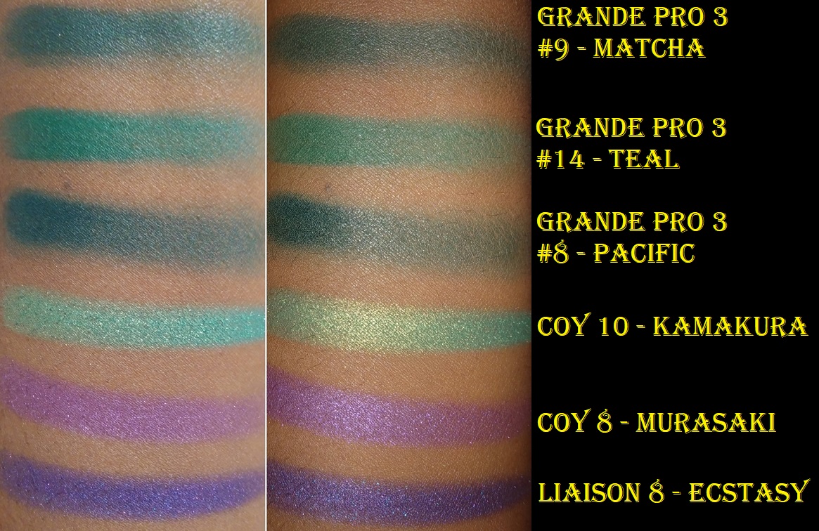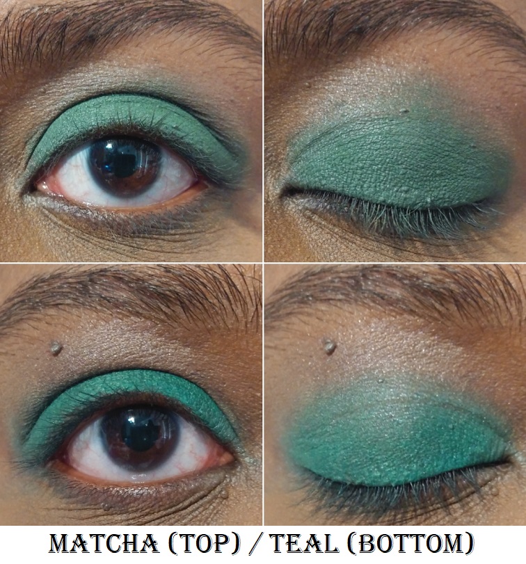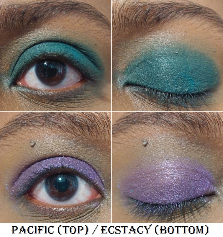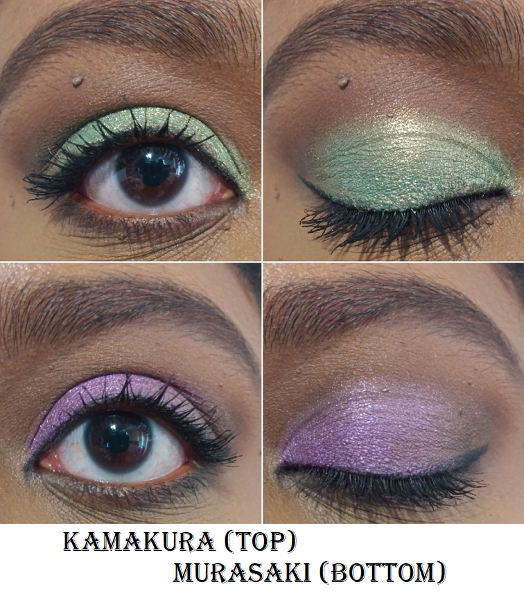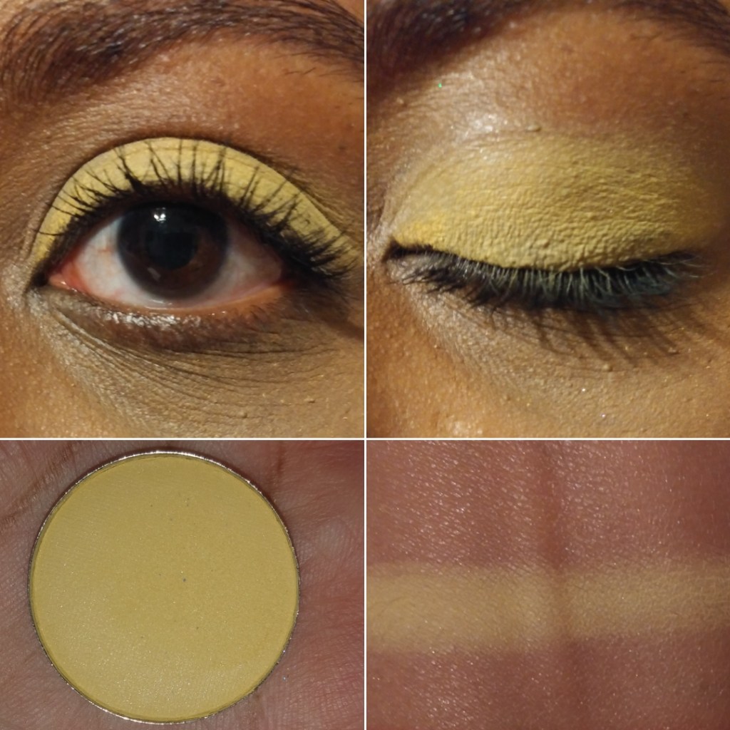
Clionadh Cosmetics
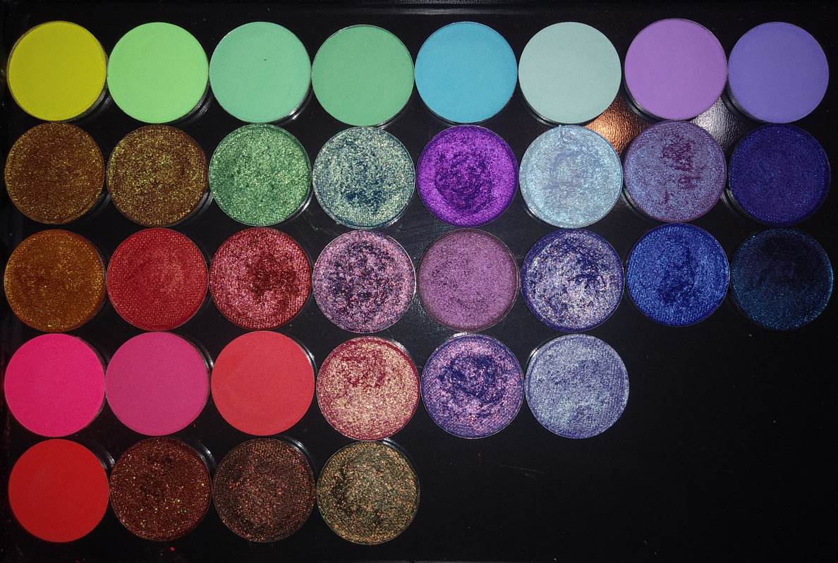
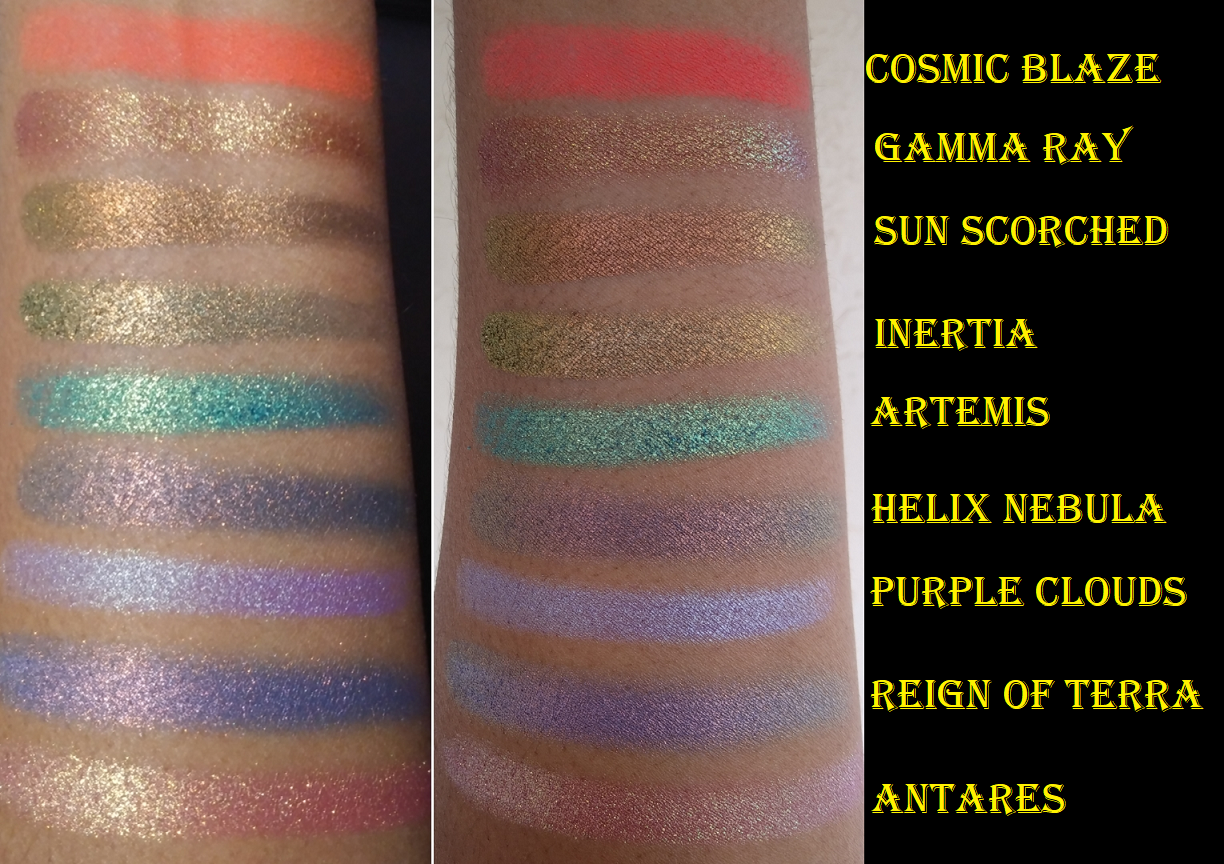
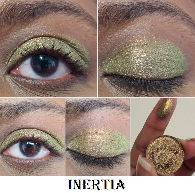
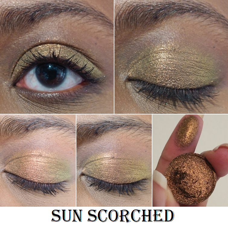
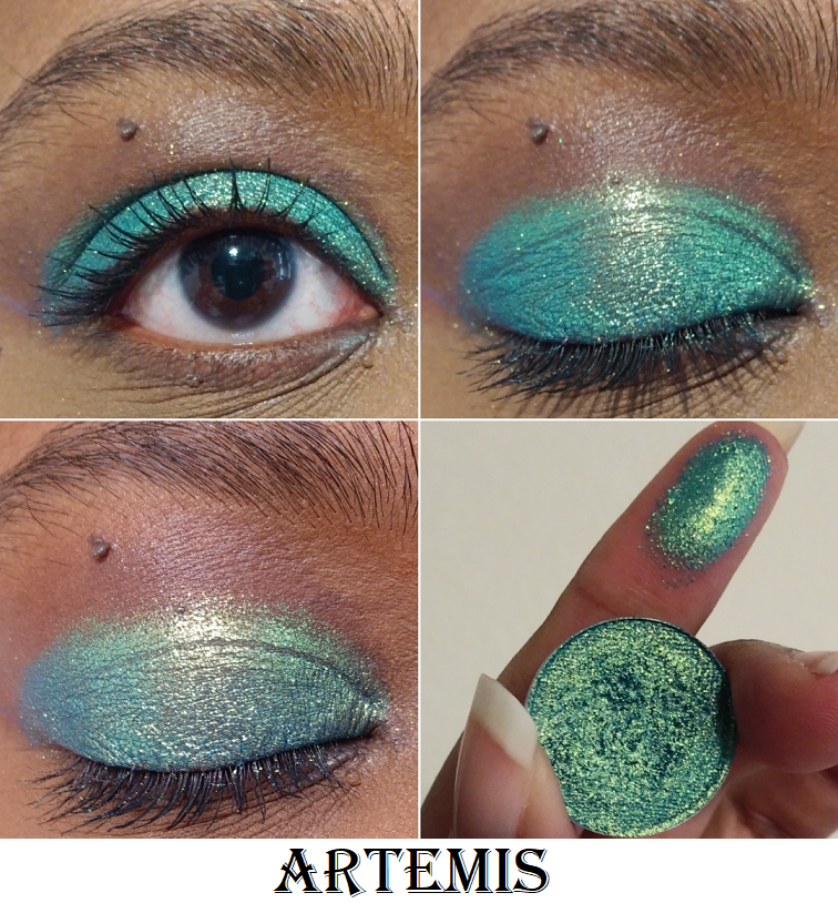
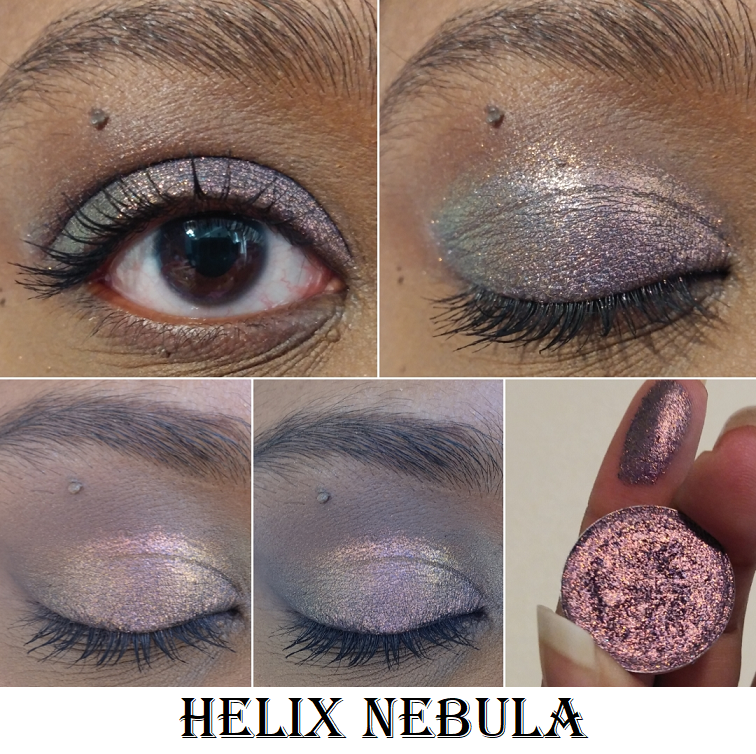
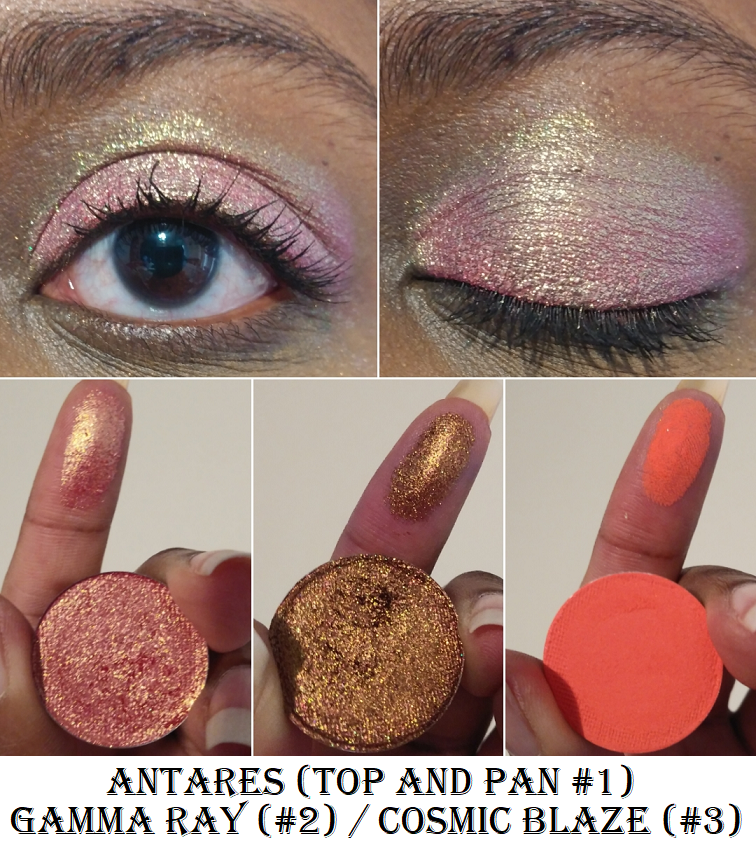
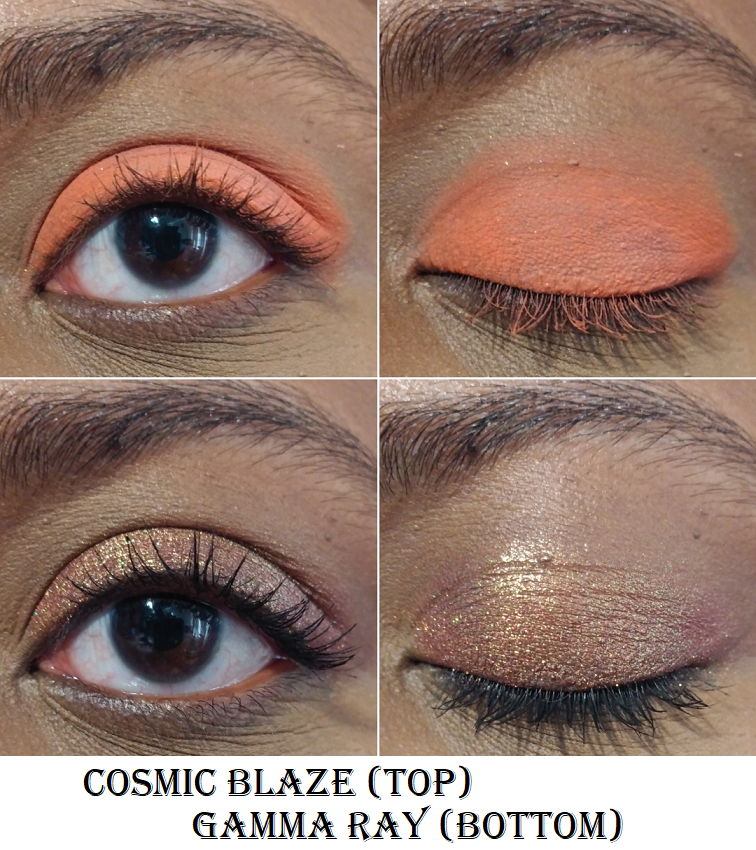
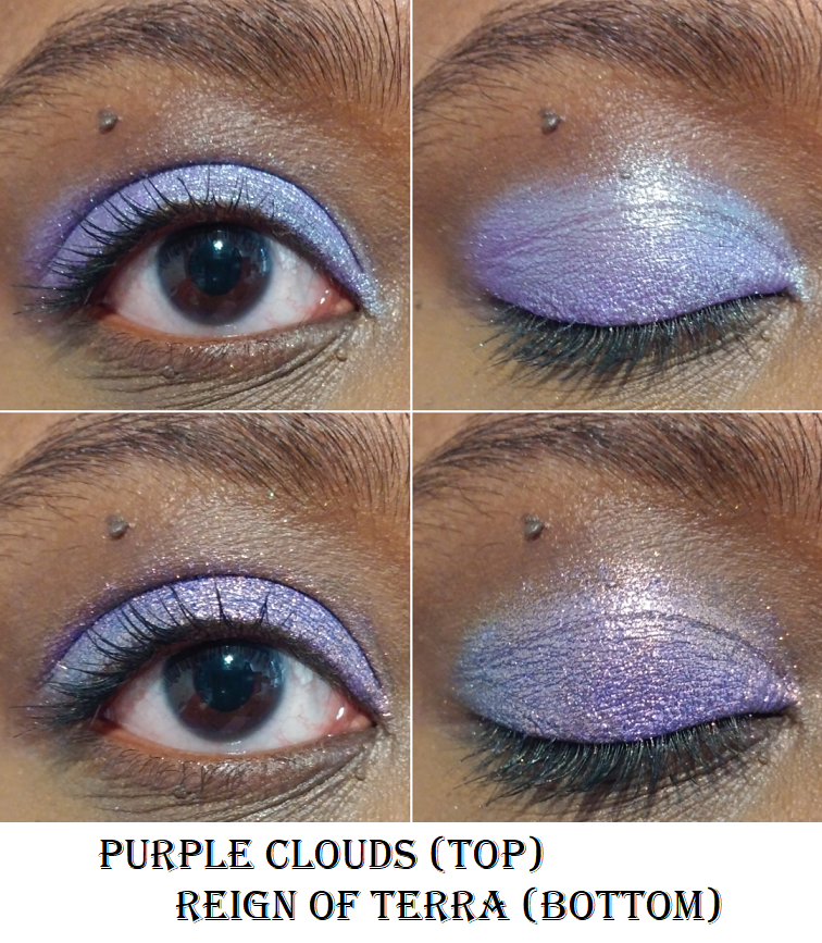
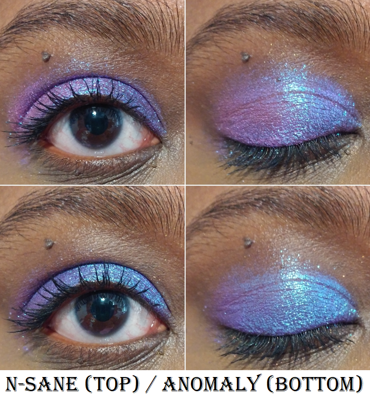
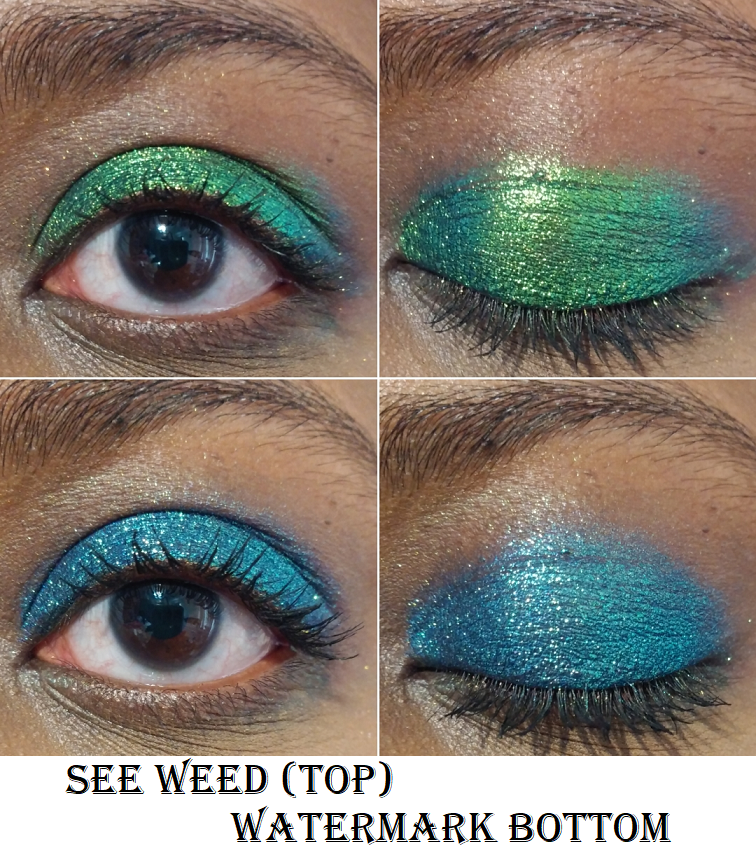
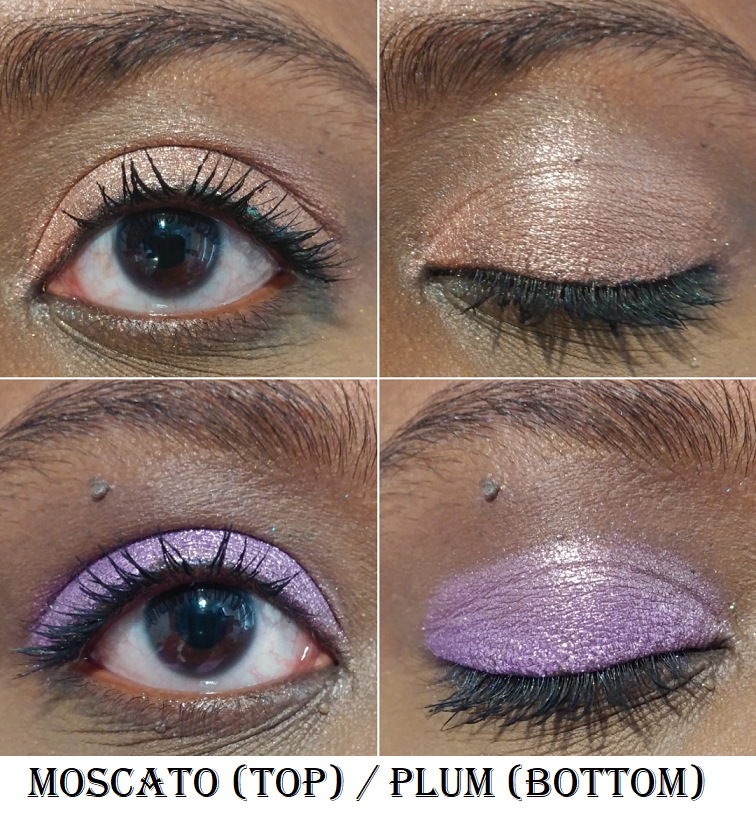
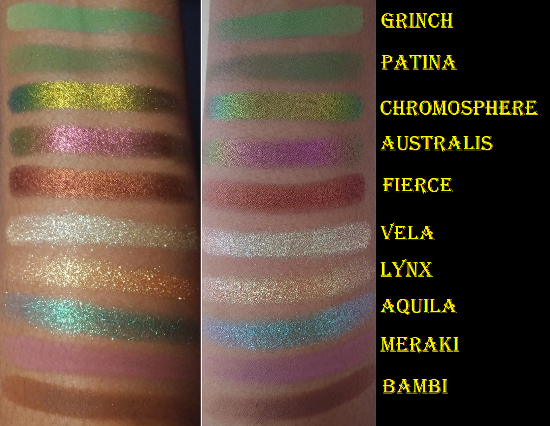
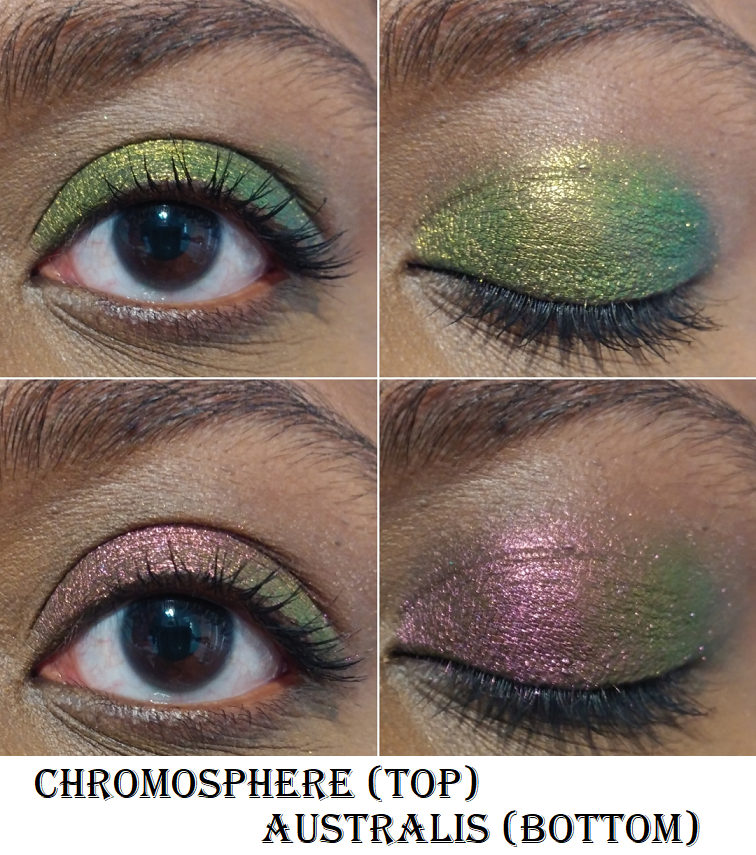
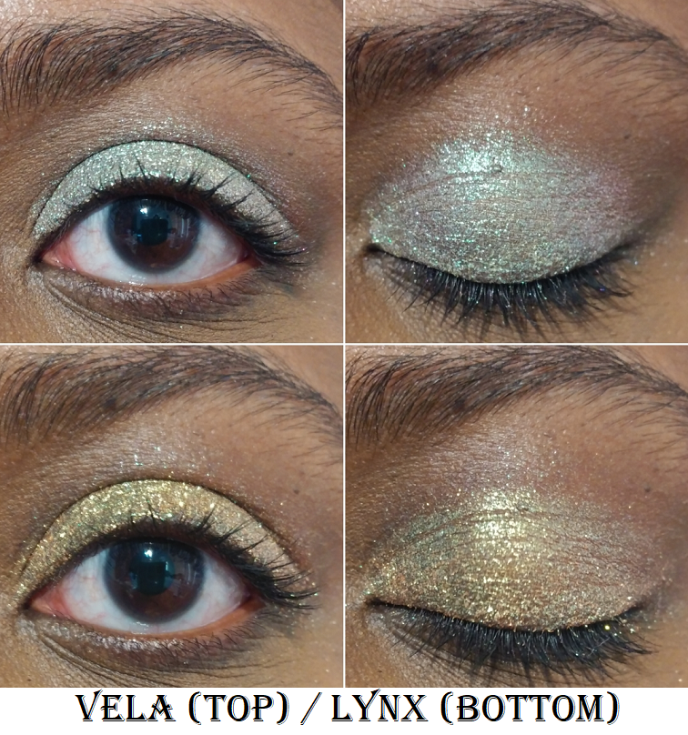
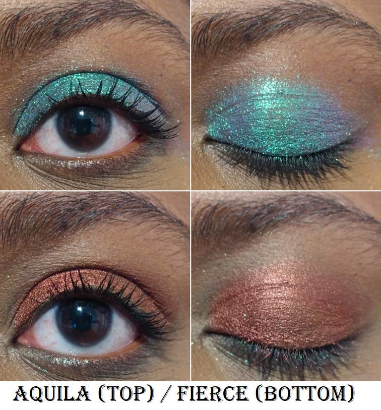
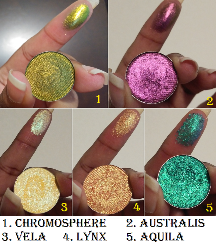
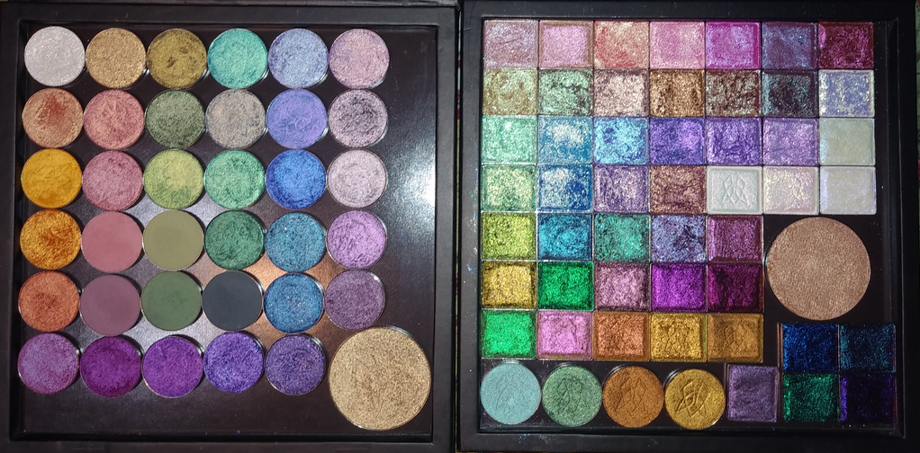
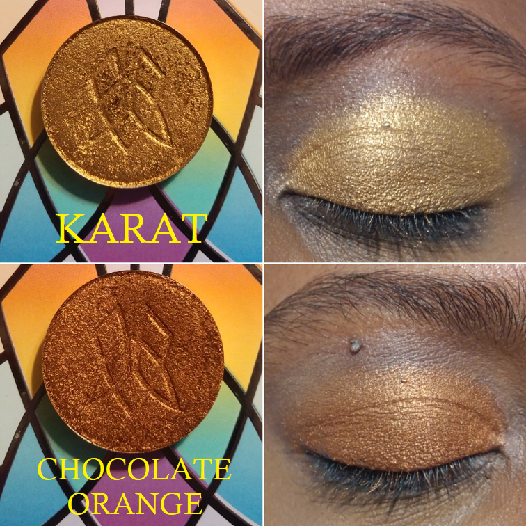
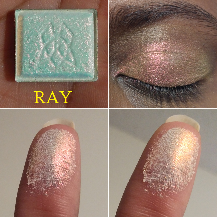
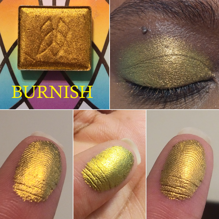
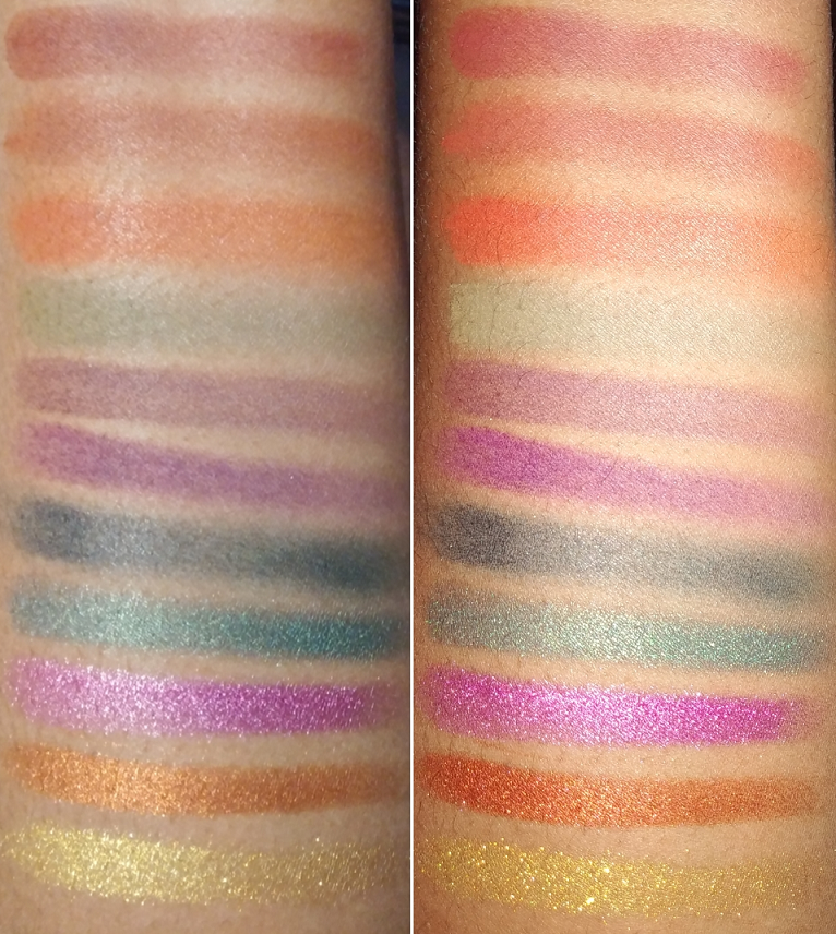
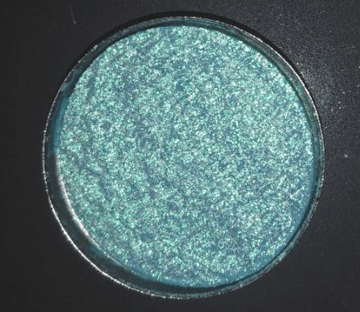
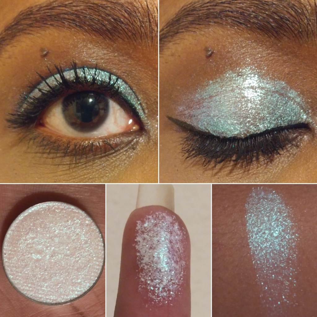
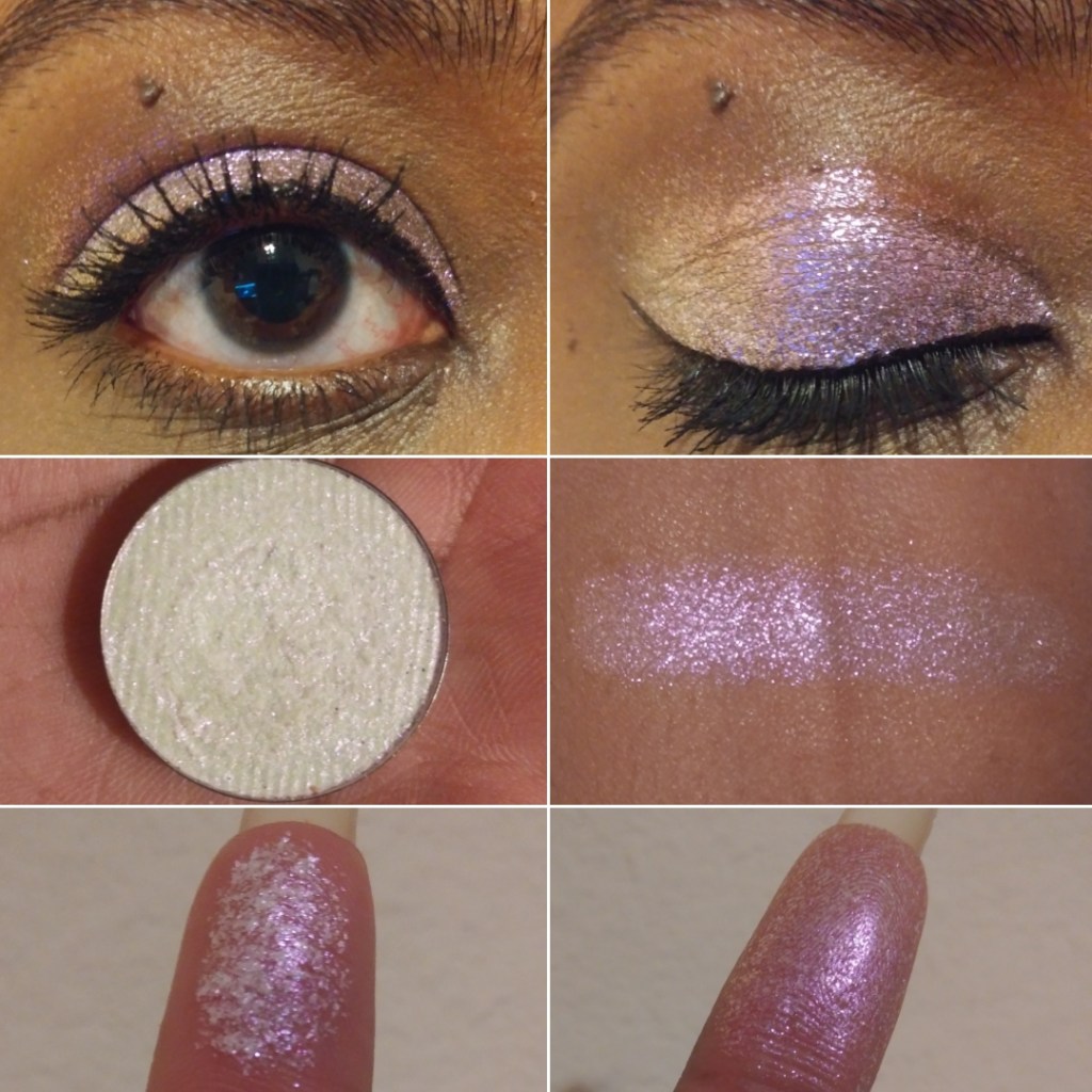
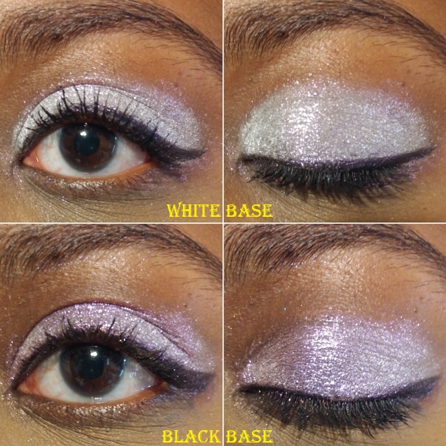
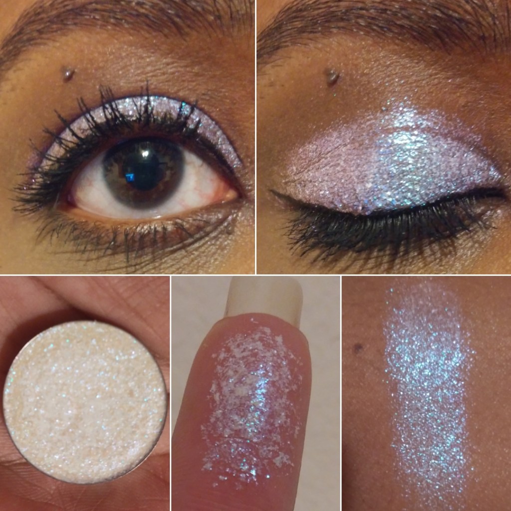
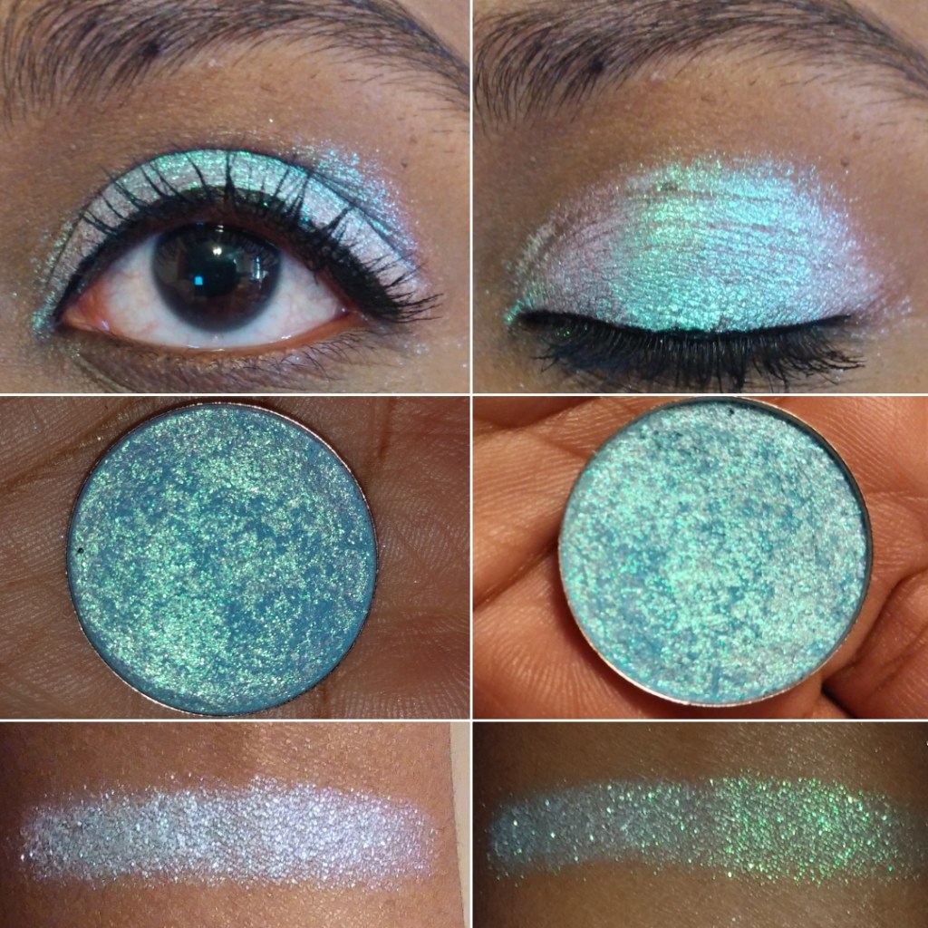
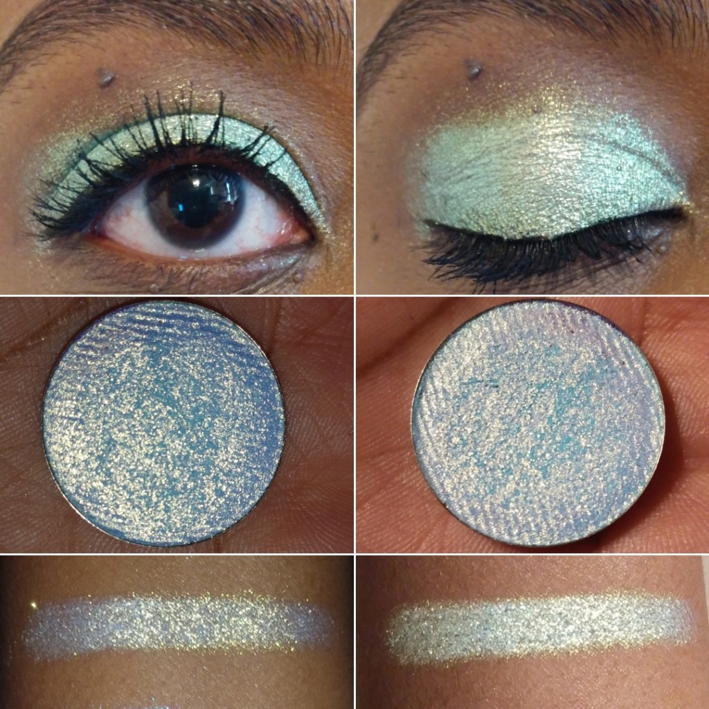
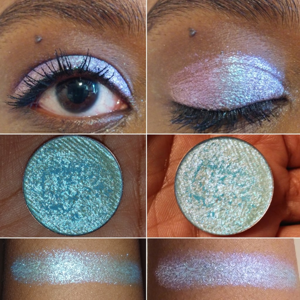
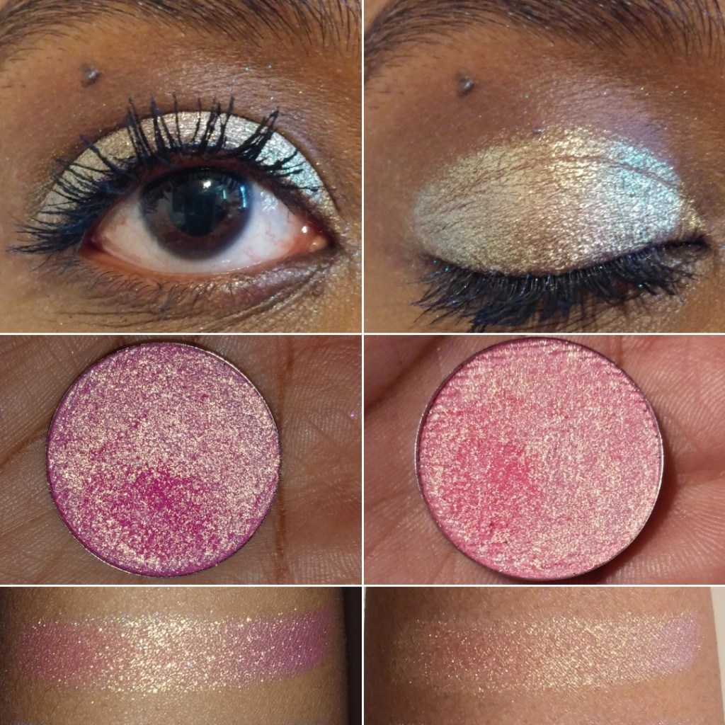
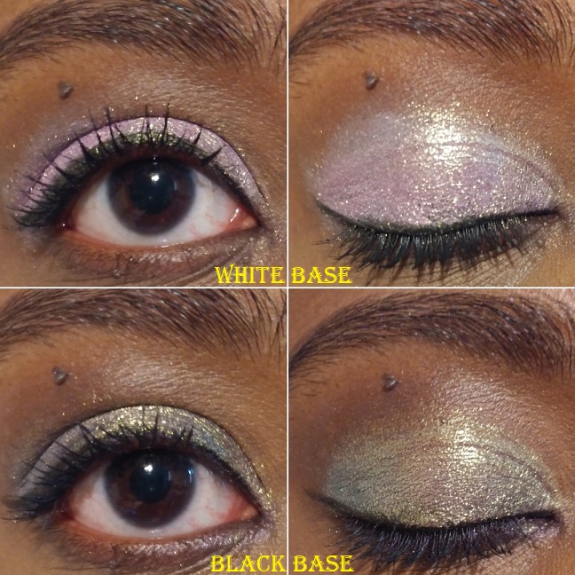
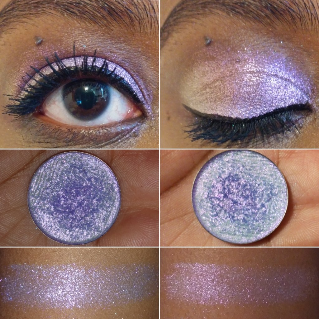
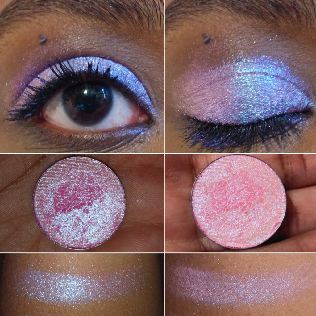
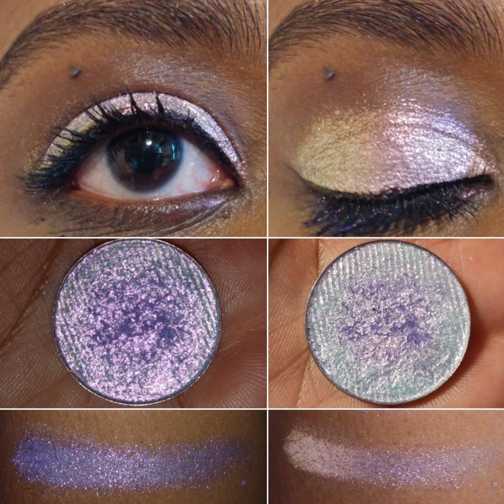
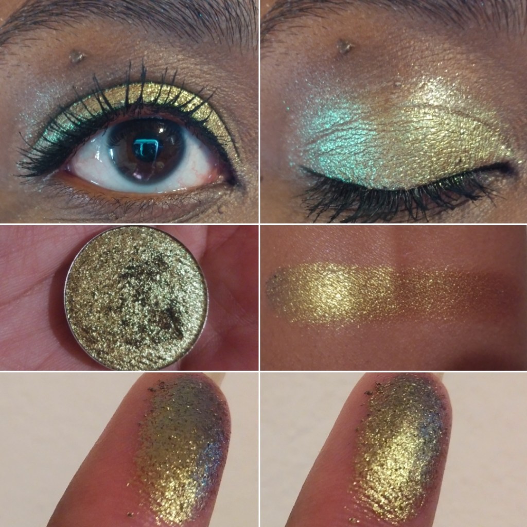
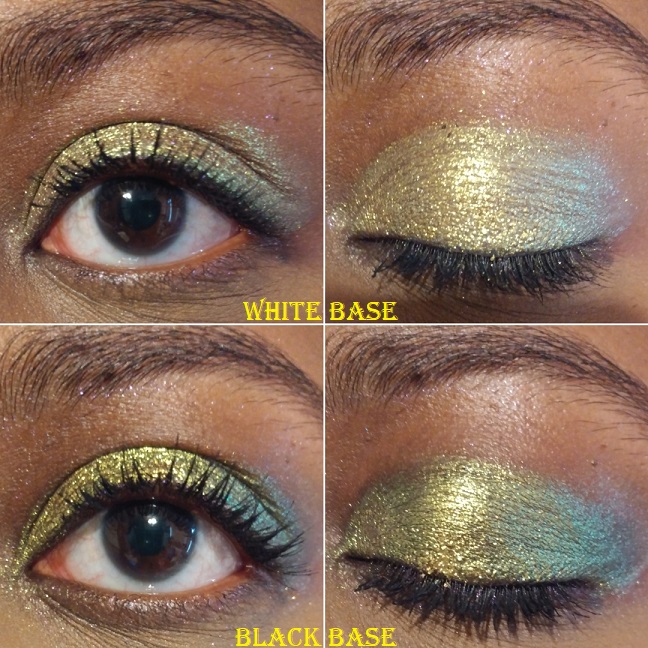
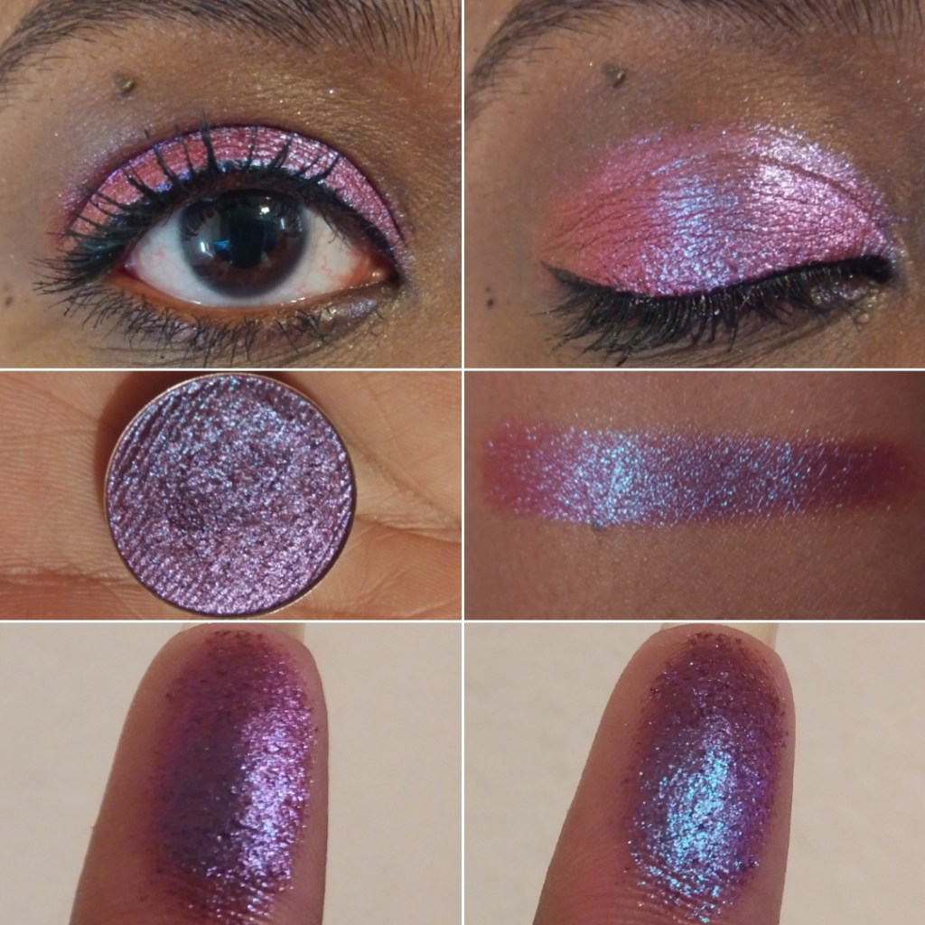
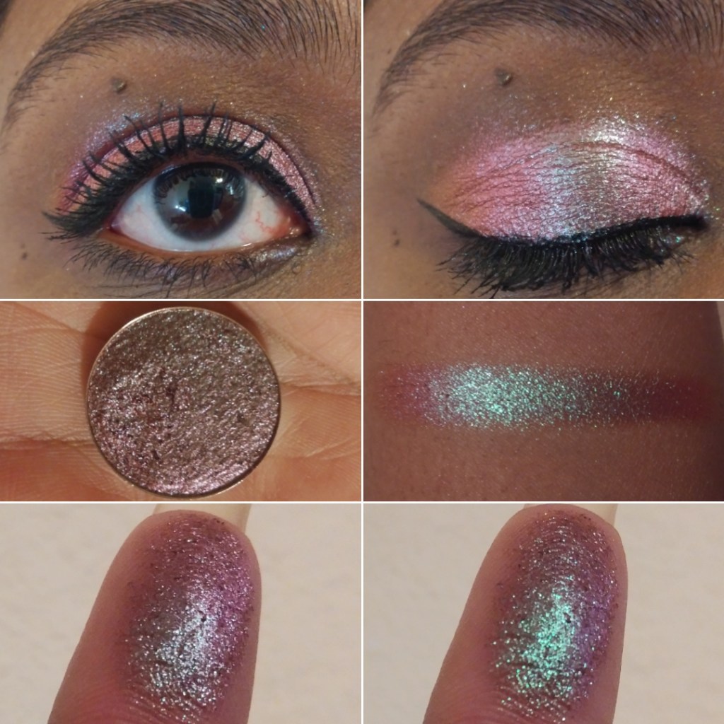
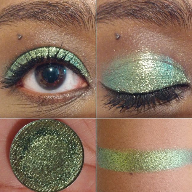
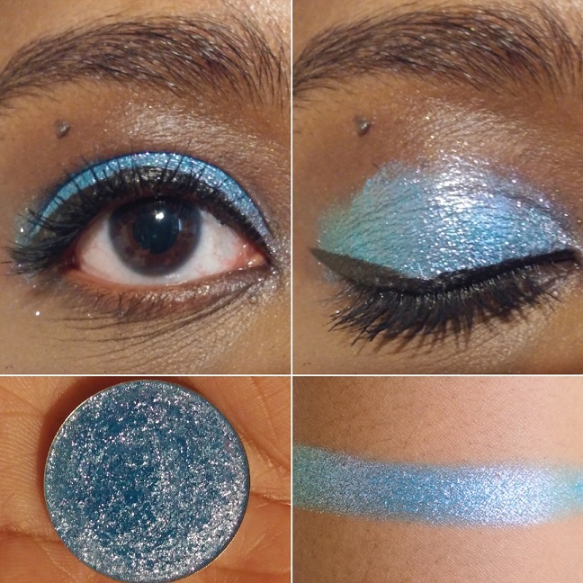
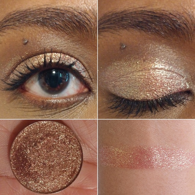
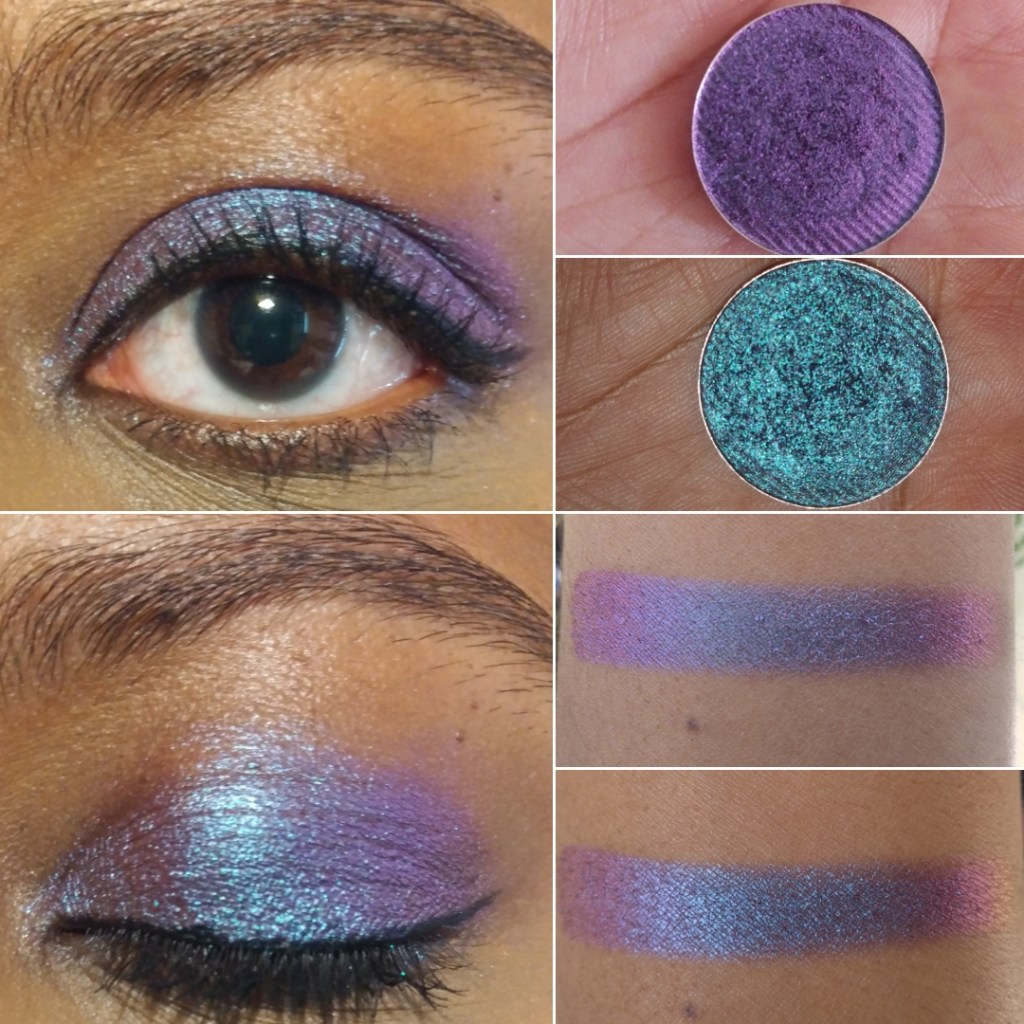
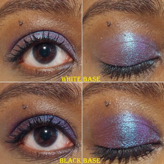
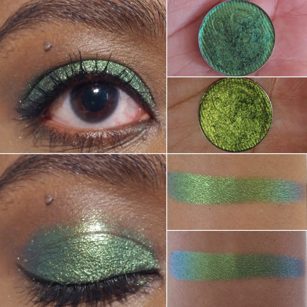
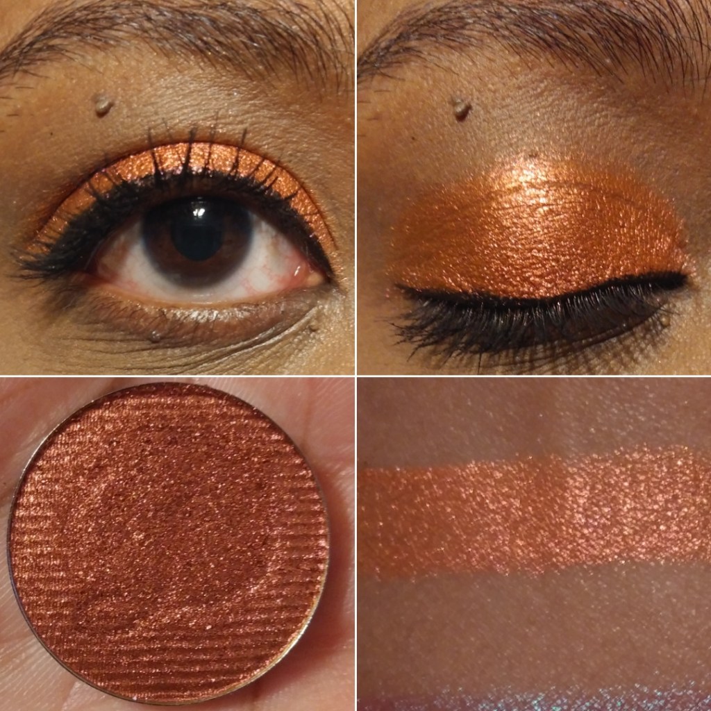
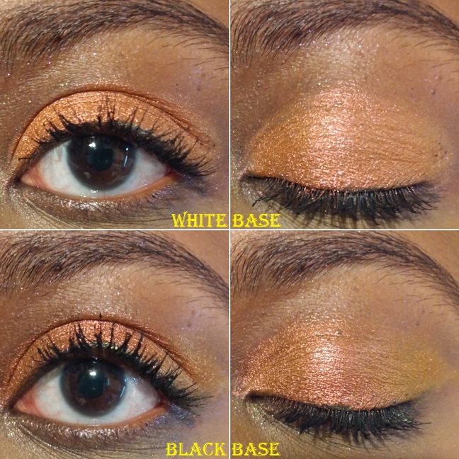
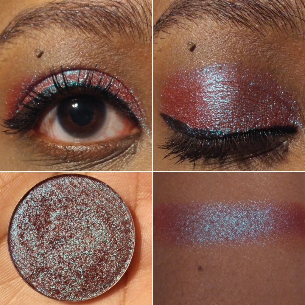
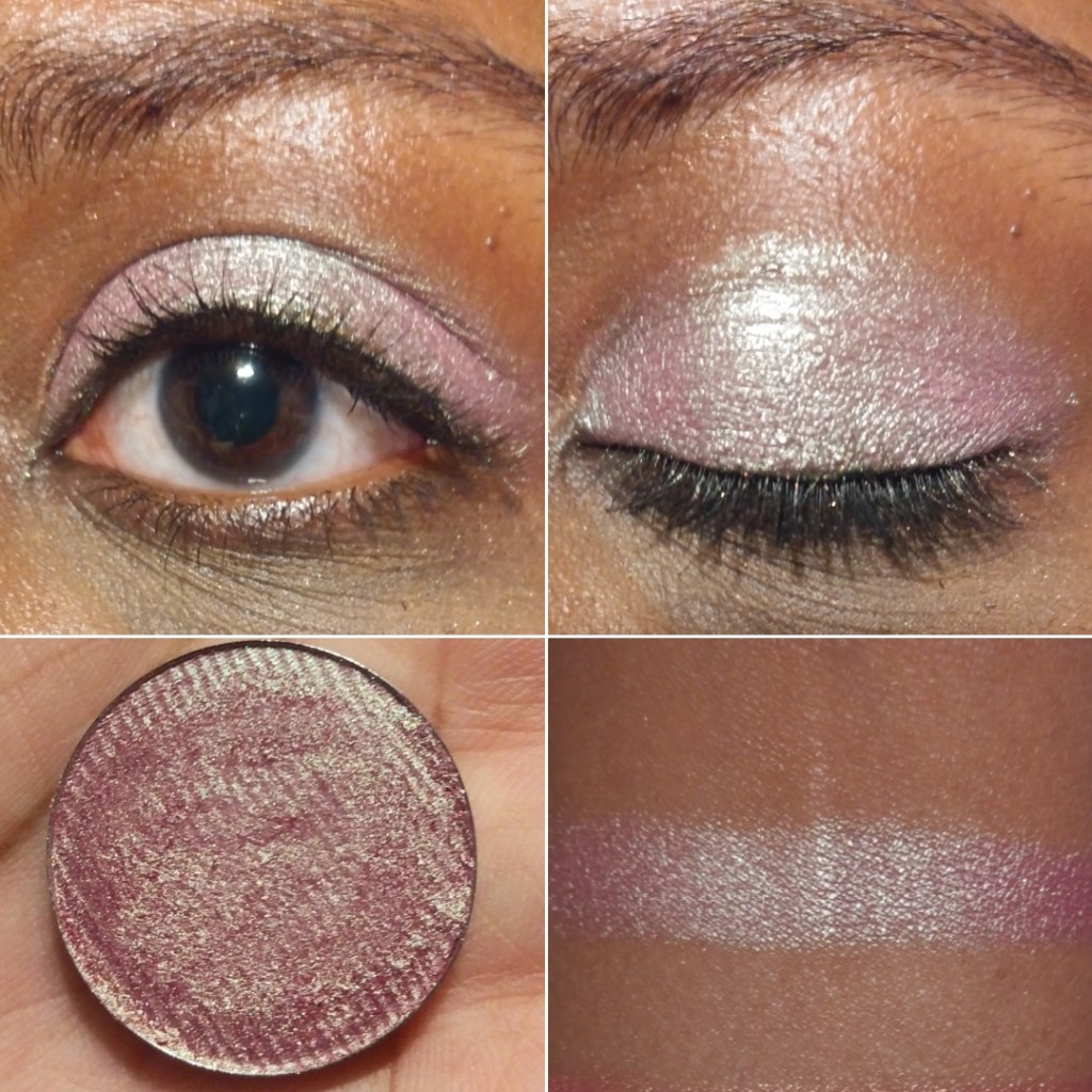
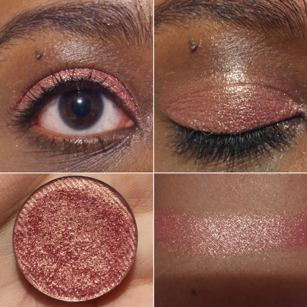
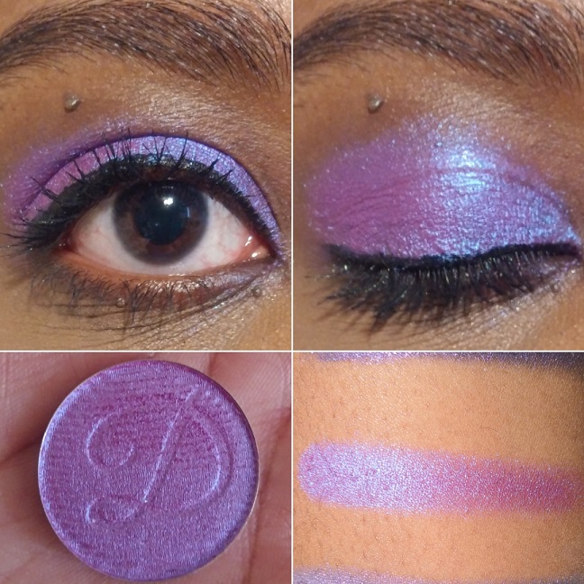
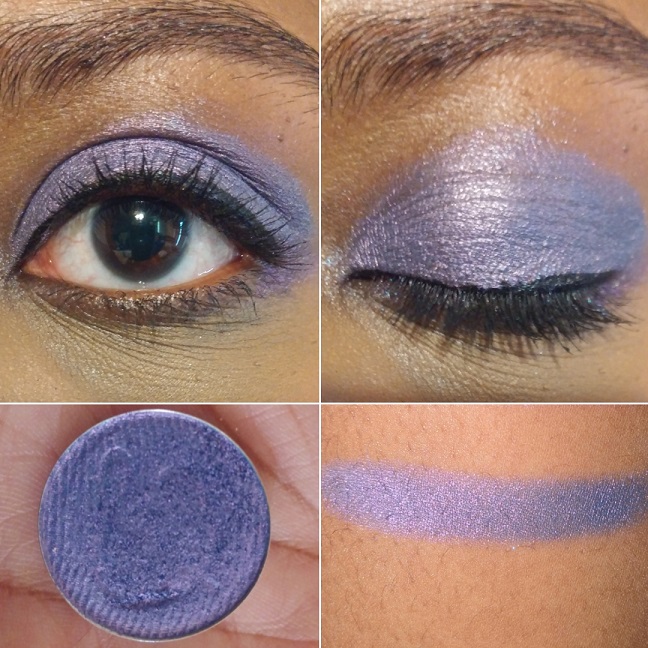
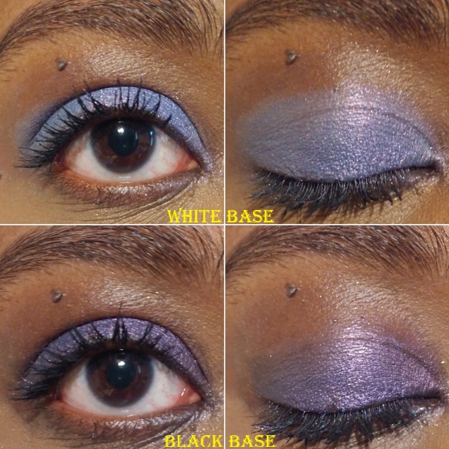
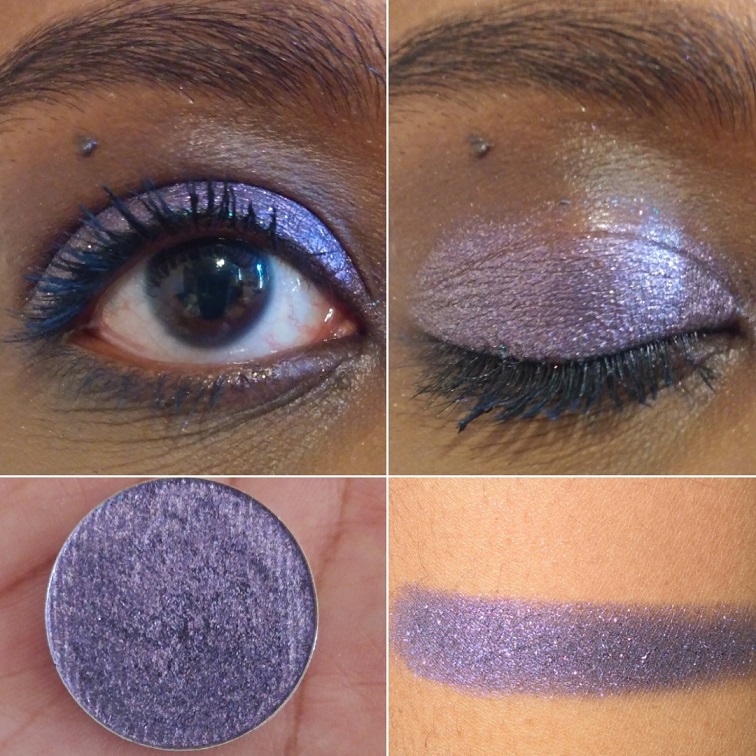
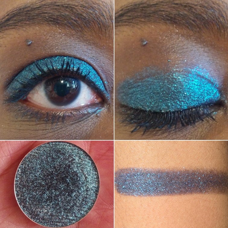
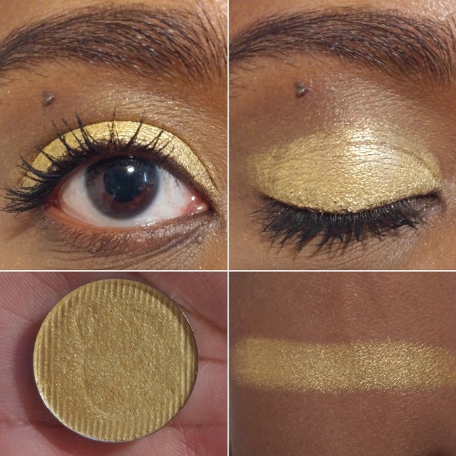
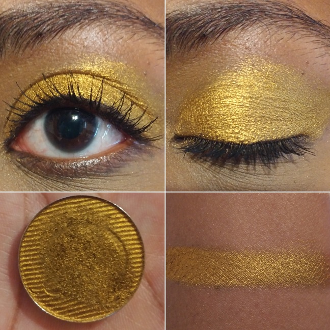
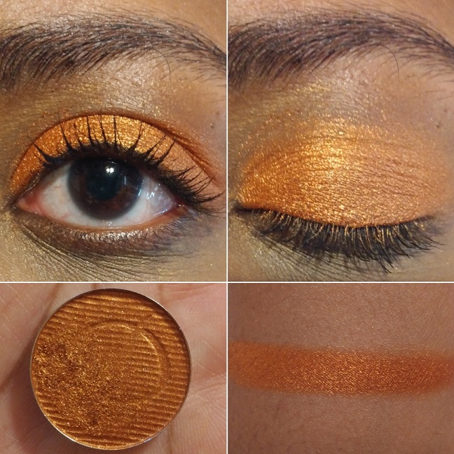
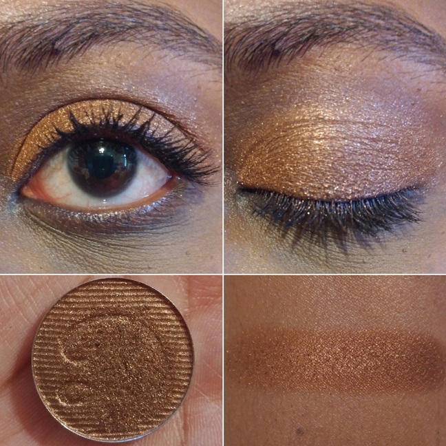
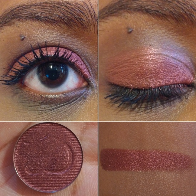
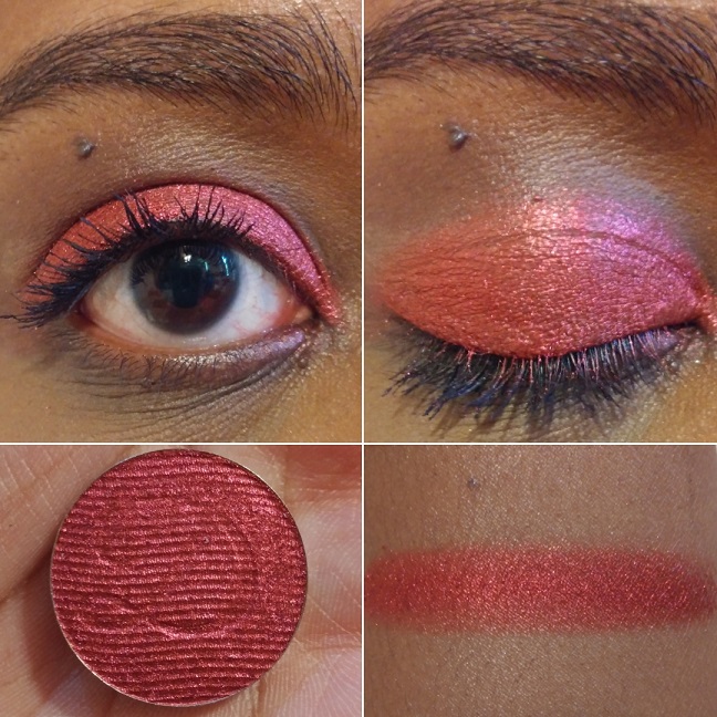
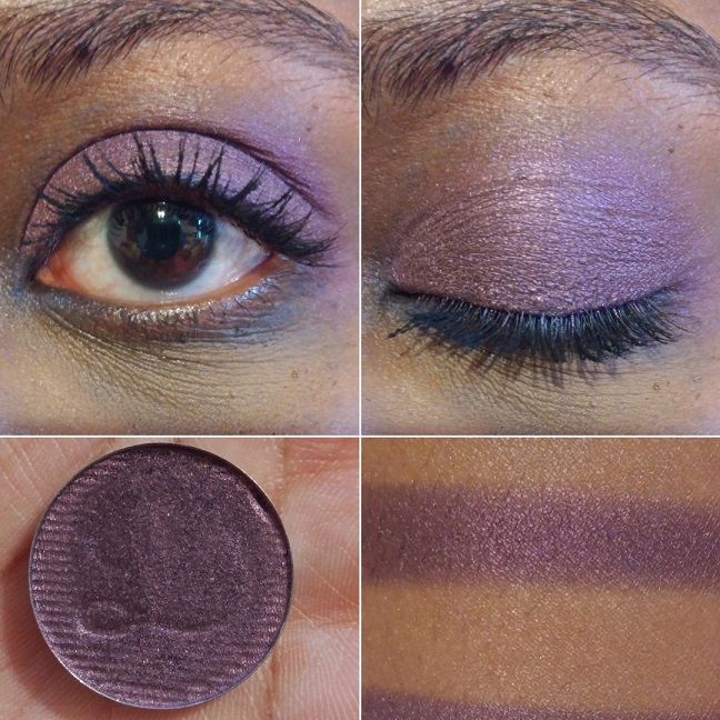
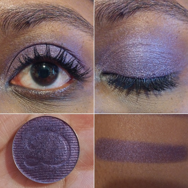
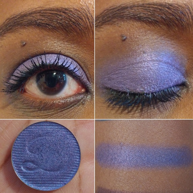
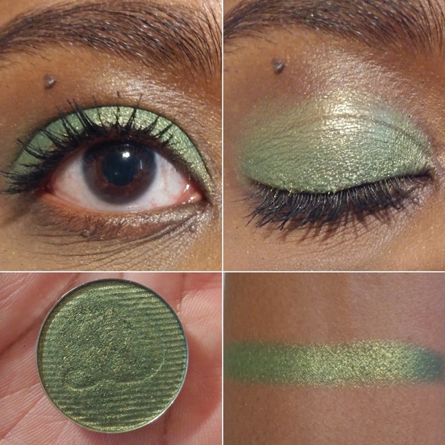
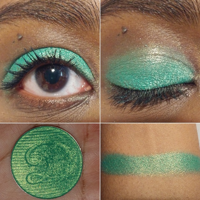
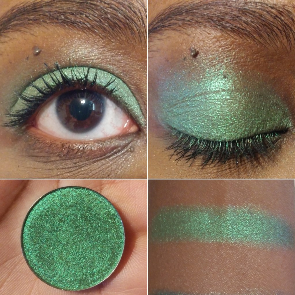
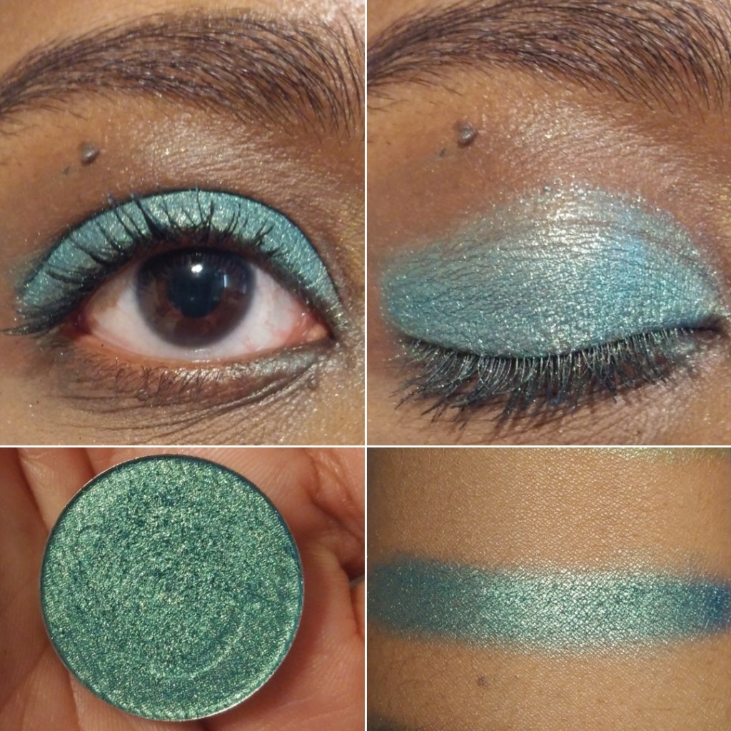
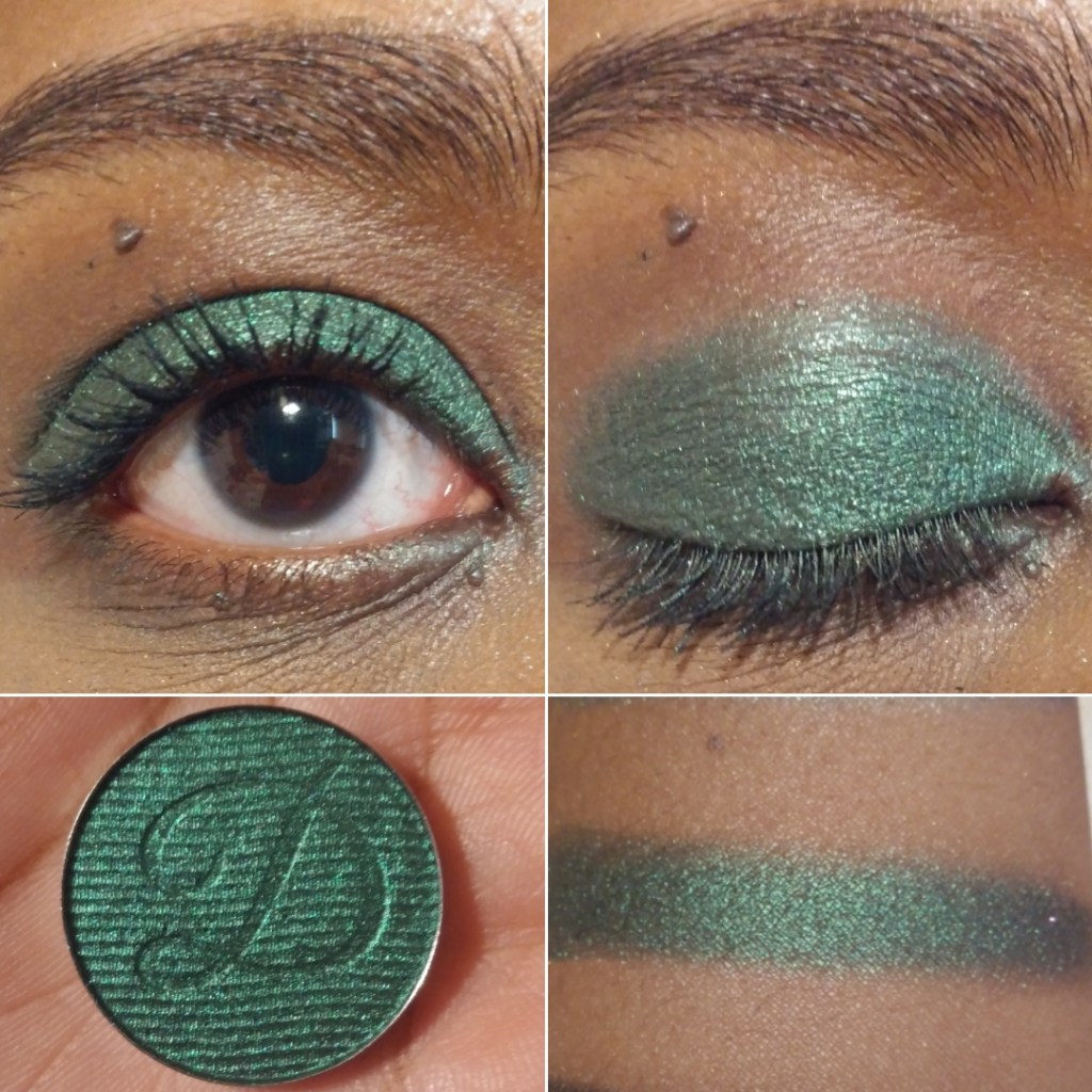
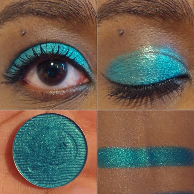
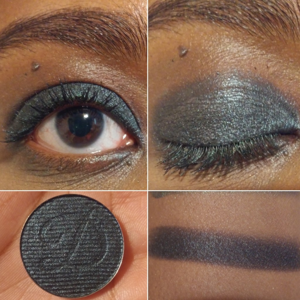
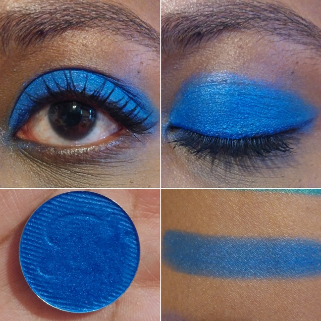
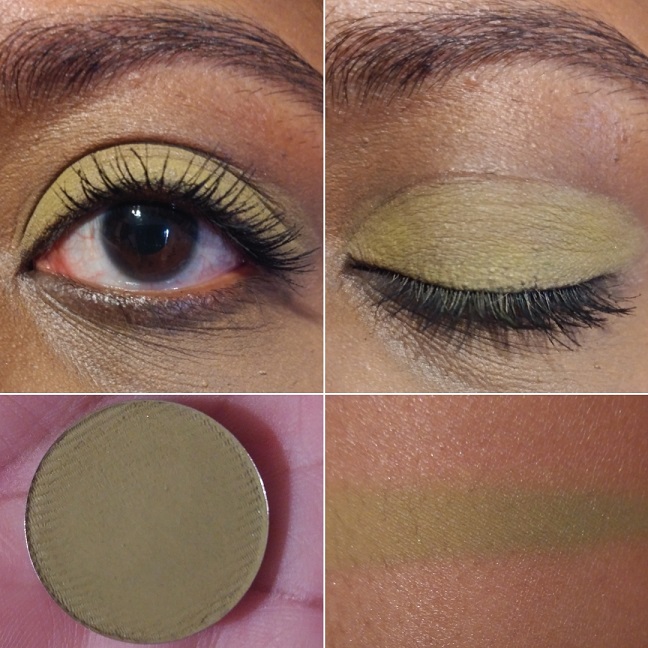
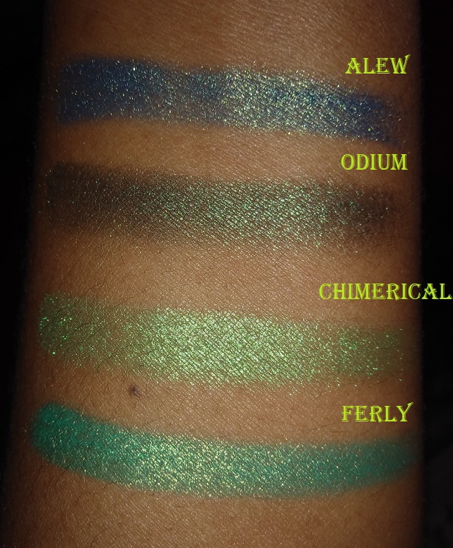
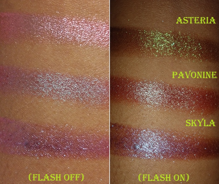
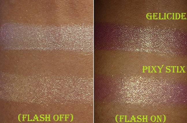
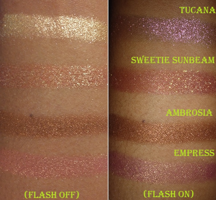
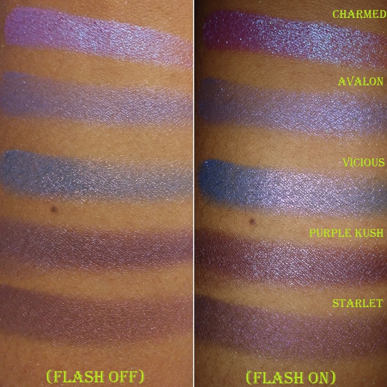
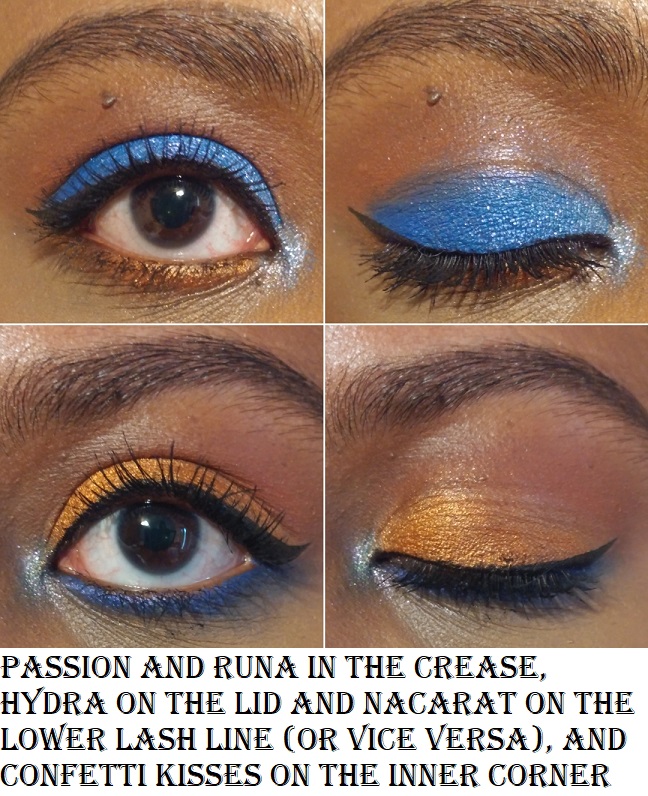
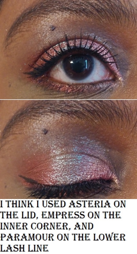
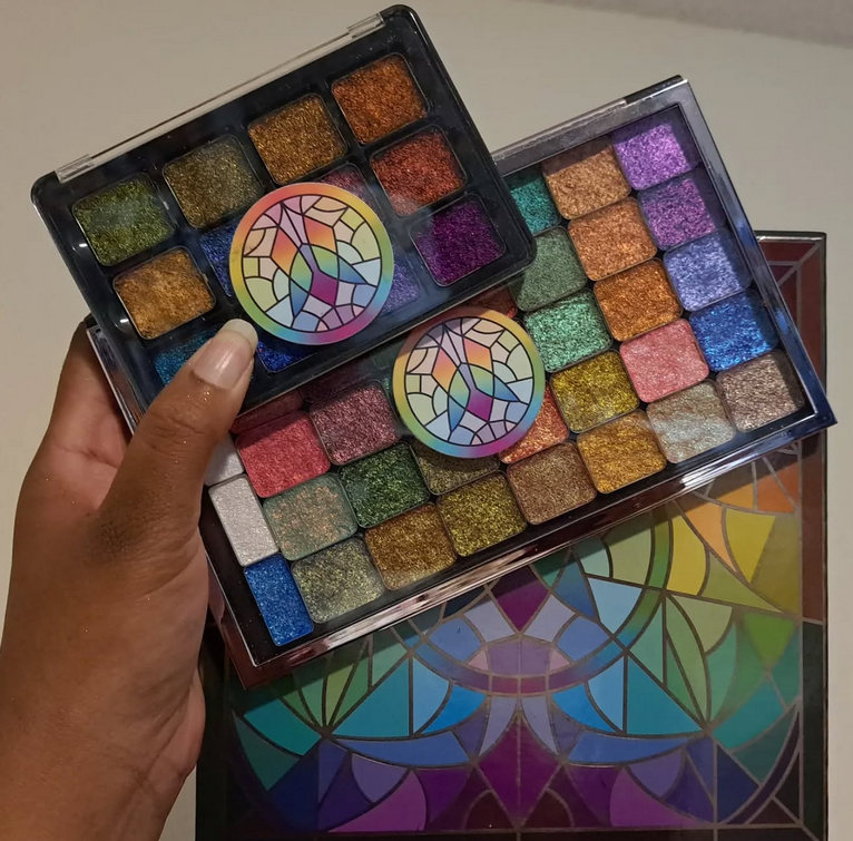
I’ve loved Clionadh Cosmetics eyeshadows from the moment I first tried them at the start of 2020. Their Stained Glass Collection is ever growing, and it’s their claim to fame for good reason. Other brands have eyeshadows that use some of the same pigments and have the same shifts, but I have yet to see anyone replicate the slick “mirror finish” of the Jeweled Multichromes. I was never a big fan of iridescent eyeshadows because of the way they can look dusty and dry on my skin tone, but Clionadh thought about those with more melanin and created the Deep Iridescent Multichromes with different colored bases (instead of white) to fix this problem. They created Glitter and Dimensional Multichromes for people that adore having maximum, but still eye safe, sparkle. Vibrant and Electric Multichromes are for true color lovers. Earth Vibrant Multichromes are for those that prefer muted tones, but still want easy-to-see color shifts. There are even combination types such as Glitter-Vibrants and Hybrids.
Clionadh has multichromes to suit everyone’s tastes.
As I mentioned before, the brands get their multichrome pigments from basically the same place, but Clionadh has perfected the art of combining them with various base colors to create a decent amount of eyeshadows that haven’t been duped. So, there are still some that are completely unique colors.
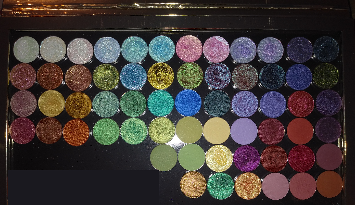
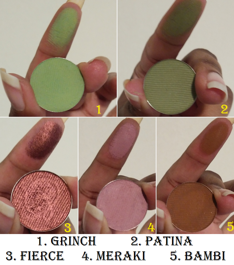
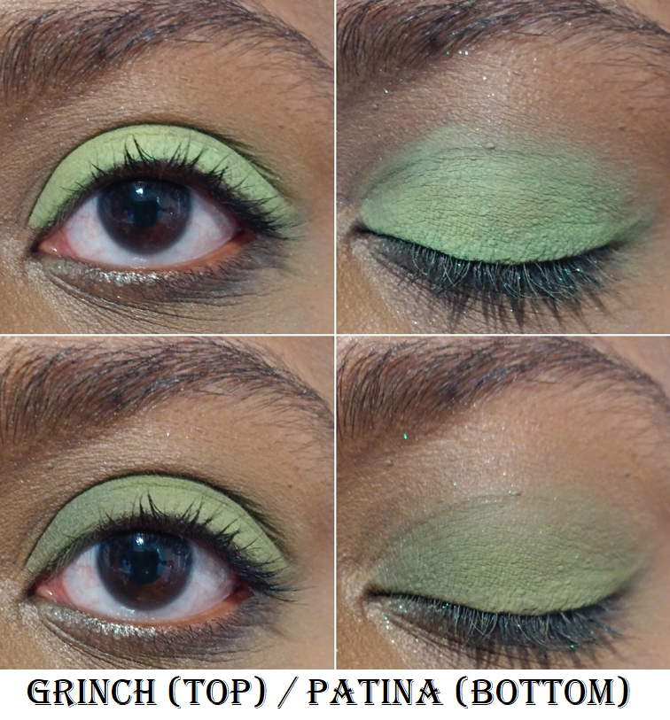
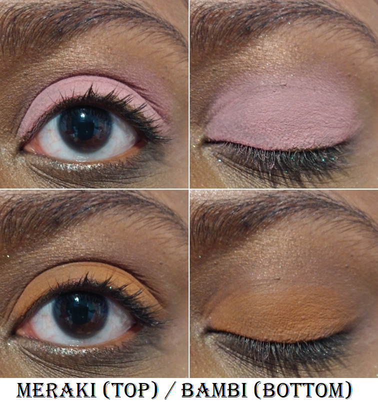
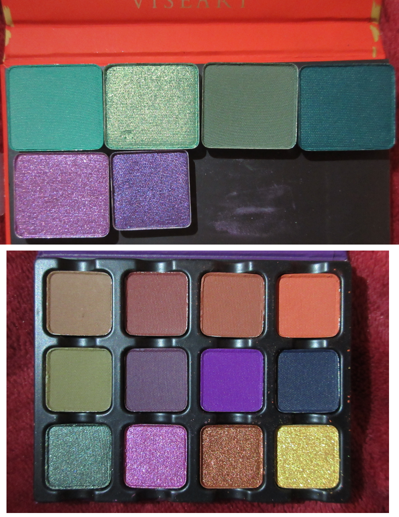
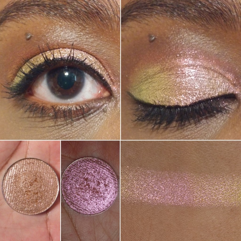
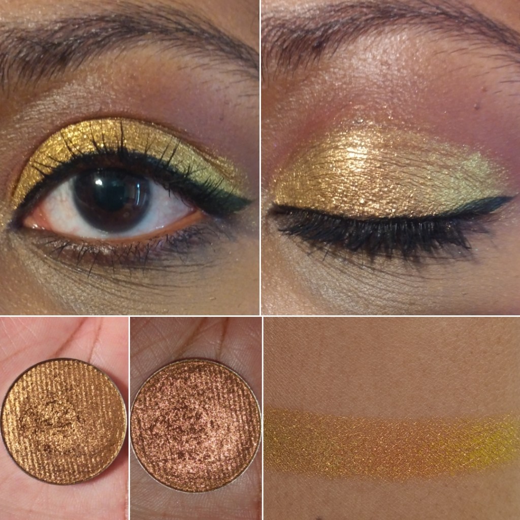
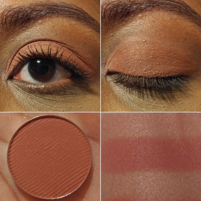
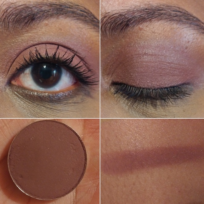
There are some duochromes within the Stained Glass line, but they also exist in the “standard circle” format, along with more traditional shimmer eyeshadows. These are less expensive and I find them to still be very nice quality. The mattes weren’t perfect, but I still like them when they used to be sold individually.
The only reason I haven’t talked about Clionadh as much within the last year is because of the difficulty I have in getting products in Germany. Their website doesn’t collect VAT/taxes/customs, so DHL (who did the final part of the delivery) demanded exact cash payment in person (which included the missing VAT plus their fee), without letting me know the amount in advance. If I want to know ahead of time, I would have to pay the $42 (36 Euro) shipping option on top of the VAT and extra fees, which I just haven’t felt was worth the added costs. I hope Clionadh will work out some kind of deal with Monolith EU again, as that would certainly make things easier for me!
I have some Clionadh eyeshadows that are getting close to turning six years old. Some of them don’t feel quite as smooth and creamy, but they still perform beautifully and haven’t gone bad yet. I’ve had eyeshadows that didn’t even last beyond a year (admittedly mostly vegan eyeshadow formulas like from KVD, Urban Decay, Coloured Raine’s different formula, etc).
So, that makes me happy considering how expensive Clionadh eyeshadows can be. If you take four of Clionadh’s most expensive eyeshadows, it would be slightly more expensive than many luxury brand quads (but justifiable in price considering they’d be all multichromes).
Clionadh has a relatively small team, and I respect the fact that they make their eyeshadows in-house in Canada.
Oden’s Eye
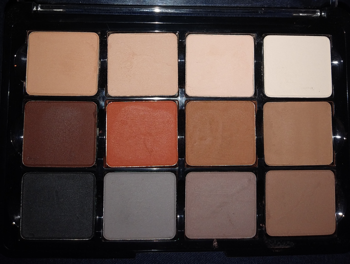
Oden’s Eye is a favorite because they have every type of powder finish eyeshadow I could want: multichromes, duochromes, sparkly shimmers, smooth metallics, pastels, and just lots of colors in interesting tones. The variety is great and the quality is mostly good. Some palettes are randomly not as good, and I can’t explain why. For instance, I like the colors in Makeup Just For Fun’s palette, but the shadows were more powdery and the shimmers are thinner. I can only guess it’s due to what the creator requested of the formula. Fantasy Cosmetica has shimmers and mattes on par with Odens Eye, but I get 1 or 2 duds from the 9-pan palettes I’ve tried, which isn’t the case for my top 5 Odens Eye palettes. So, Fantasy Cosmetica ranks lower for that reason.
These shadows are also more suited for color lovers, but Oden’s Eye tries to appeal to neutral and color lovers by giving softer and non-grungy options sometimes within the palettes.
It’s a Swedish brand, but their eyeshadows are made in the PRC.
Fantasy Cosmetica
This is the brand I have the least experience with, as I only started buying their palettes in 2024. However, I love the color offerings among all the palettes and their theming. Even when they make brown shades, there’s nothing basic about them. They have very interesting tones. The Fighter Palette is a dream for those that prefer glam style neutral eyeshadows. Pat Mcgrath fans would probably like them, but the quality isn’t quite as refined as PML’s. The big price difference puts that in perspective!
Some of their eyeshadows/pressed pigments are ultra vibrant. They’re all pigmented and opaque shadows. Most of them blend well. I usually have at least one troubleshade shade in every palette, but it’s rarely one of the shadows I was looking forward to using anyway.
This brand does cater mostly to color-lovers, and they’re known for their intense shimmers, but I even like some of their smoother satin shades too. They find a way to make the toned down shadows appealing for me.
I believe these eyeshadows are made in the PRC.
Devinah Cosmetics
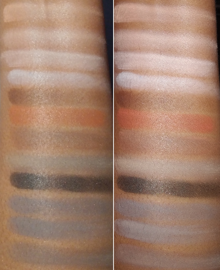
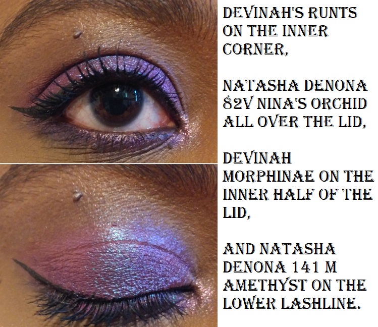
Devinah has my second favorite multichrome and duochrome formula, but their normal shimmers are just okay, which is why the brand doesn’t rank higher overall. Their mattes are also decent, but not the easiest to blend and use. In fact, they probably have the “worst” mattes of all the brands I’m mentioning in this post. However, they don’t make pre-made palettes, so customers can skip buying their mattes altogether.
I started purchasing from them in April 2020, and all but one eyeshadow (it’s a discontinued formula) is still in perfect condition. The performance, look, and feel of the shadows hasn’t changed. So, I can confirm mine have good preservatives in them!
It’s because of the fact that I had to acknowledge their multichromes and duochromes as coming second to Clionadh that I stopped buying from them in early 2022. However, to still maintain that number two spot is impressive. The custom palette I created with mostly Devinah shades has come with me on several trips and there are shades I’ve used in there even more frequently than Clionadh. So, if you live in the US and are dealing with the tariff situation, this could be a nice US-based brand to check out.
I don’t know if all of Devinah’s eyeshadows are made in-house, and if only some of their catalogue isn’t made in a lab, but I can confirm that at least the mattes are made by them.
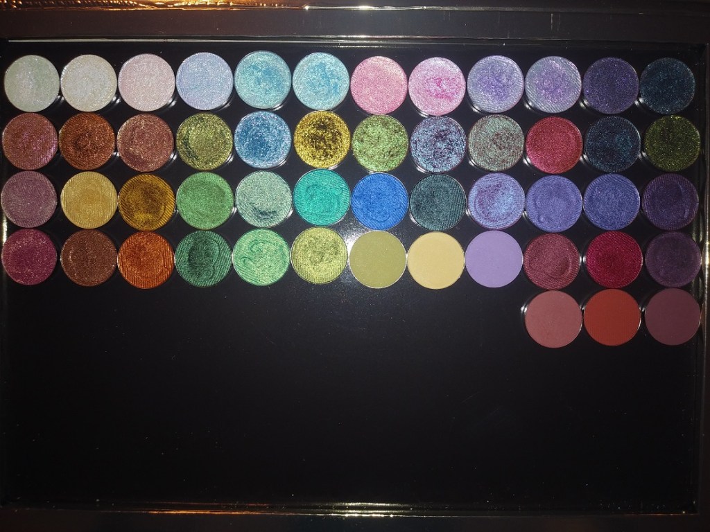
Sydney Grace
Sydney Grace isn’t really in the multichrome game with powder eyeshadows, but they have a gigantic selection of standard shimmer eyeshadows in unique tones. They have many colorful sparkling eyeshadows, but the brand puts a lot of focus on natural/neutral and more muted types of shades. They also have a lot of satins that appeal to fans of luxury eyeshadows who prefer a smoother texture-friendlier look, but just crave more pigment than most luxury eyeshadows provide.
The Sydney Grace eyeshadows are pigmented, opaque, and also thick. I like my finished eye looks with them, but I tend to prefer my even more blingy, shiny, and exciting eyeshadows from other brands. Also, their mattes are pretty good. They are almost on the same level as Odens Eye, but Sydney Grace’s best mattes are typically in boring colors I can get from any brand. So, I tend to not use them.
Sydney Grace eyeshadows are made in the USA. I’m fairly sure they made their own eyeshadows and formula in the early days. I don’t know whether they have continued to make them in-house.
I have three honorable mentions.
For starters, Melt Cosmetics is technically an indie brand, but I have seen their products available at different retailers and they seem to be a much bigger business, so I have a hard time putting them in the same category. Considering how many huge sales I’ve seen in the last three years, and the lack of interest from among beauty lovers, I honestly wonder how long they will stay in business. In any case, the brand’s mattes are in my top 10 favorites. I love the colors, tones, pigment level, layerability and blendability. The shimmers are okay at best. They have such a big issue with mold or things growing on other people’s palettes that I always feel uncomfortable recommending the palettes, even though mine have been fine.
The second honorable mention is Kaleidos. I haven’t tried many of their palettes, but I loved the mattes in Club Nebula and Futurism 1: Sci-Fi Green. The shimmers are nice, but not super special. I can’t include them on the list because I haven’t tried any of their “newer” eyeshadows in the quad format, and it’s only recently that they launched their first new products in the last two years. So, it’s been quite a few years in total since I’ve been interested in their eyeshadows.
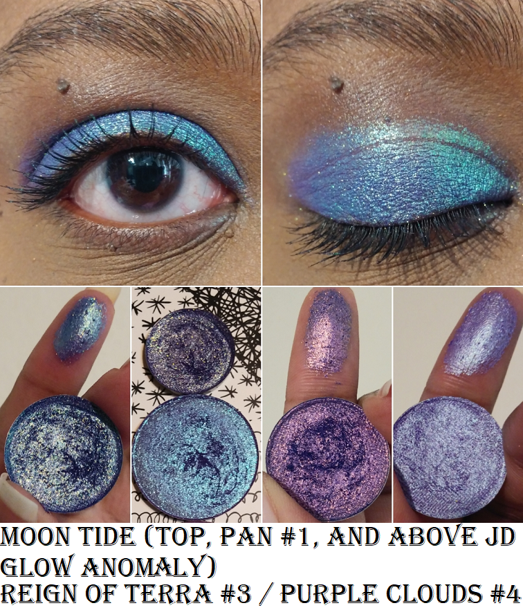
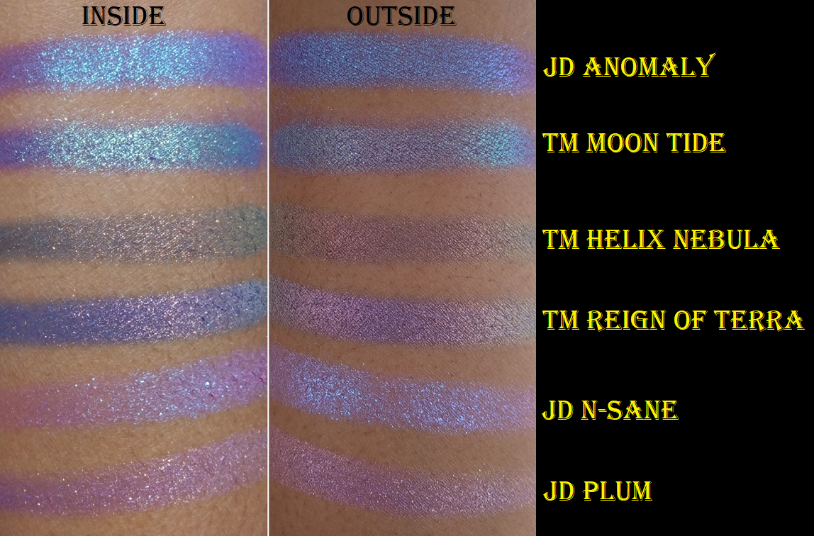
Terra Moons is an honorable mention mainly to address the fact that I’ve often said their multichromes are my third favorite formula. However, the normal shimmer and matte quality pulls them below being in my favorite indie brands. There is also the fact that I hardly use my Terra Moons shadows because I think to myself, “Why use these when I could use my Clionadh and Devinah?” So, I only use the shades I don’t have a close match for in the other brands, but then I think about how the eyeshadows made by the others are still good enough and I don’t need this unique one! The mattes I bought from Terra Moons are unique to my collection, but I wish the quality was better. So, I can’t call this brand a favorite if I don’t use them.
This isn’t an honorable mention, but I feel compelled to explain that I like Lethal Cosmetics a lot as a brand and I respect what they create. Their eyeshadow formula is a bit chunky. The multichromes are on the weaker side. The mattes are fine. I like the eyeshadows with uncommon tones, but I just don’t think about them often enough. I feel like I’ve moved on from their eyeshadow formulas.
So, this is my list! I hope this is helpful to fans of small independent businesses, and to anyone curious as to which brands to start with if you’re trying to move away from paying for mainstream eyeshadows.
This is one of the posts I’ve held as a backup. I have a lot going on in my personal life, plus with the holidays. So, this will likely be my last post of 2025. I wish you a happy holiday season and I hope to see you in the New Year!
-Lili ❤