
I don’t have any interesting tidbits to open this post with, so I’ll just get right into the review.
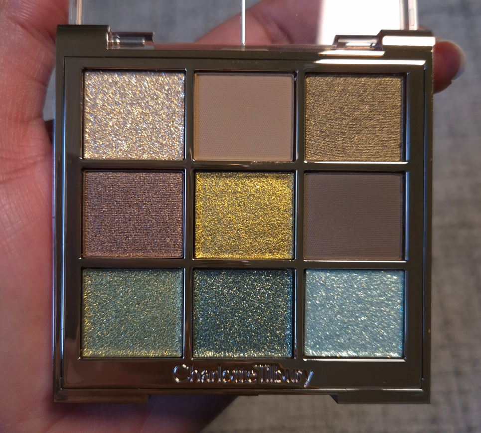
Charlotte’s Palette of Beautifying Eye Trends in Emerald Effect
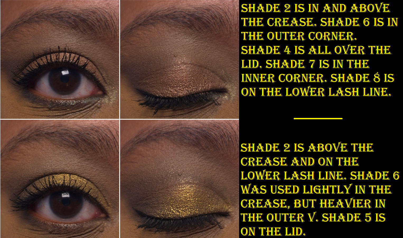
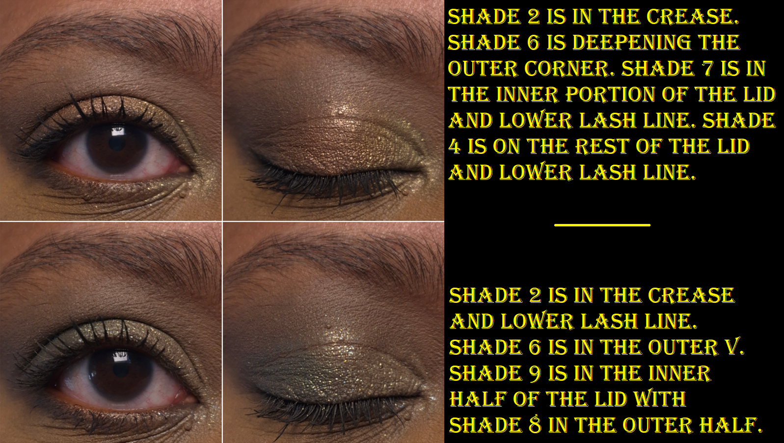
The first thing I noticed was that the Matte Silk eyeshadows feel like the mattes from Natasha Denona’s midi palettes (within the last couple of years). They are silky feeling rather than creamy. They are pigmented and blendable, but not my absolute favorite. They are great, but not superb. Shade 2 is a light beige brown that doesn’t show up strongly on me, but I can see it in my eye looks. Shade 6 is the depth creating neutral brown shade, which is dark enough to work, but I do wish it was a touch deeper. I used both of these eyeshadows together nearly every time I created a look with this palette, but now that the testing process is over, I’m going to use something else instead of Shade 6.
I’ve used these eyeshadows with concealers as bases and it works as long as there’s a thick enough matte powder layer in my crease before adding the shimmer. By “working,” I mean that the migration/creasing in my deepest line is at acceptable levels. However, my KVD Good Apple Concealer doesn’t play well with a lot of products and has more obvious issues with these eyeshadows than when I used the Natasha Denona Hy-Gen concealer as primer. I tend to blend excess concealer into the inner corner of my eyes, so even if I use a regular primer from my lids and upward, I still have to be careful about my concealer placement or else it could interfere with the eyeshadows. In general, I just recommend using a regular eye primer. These worked nicely with MAC Paint Pot and the Lisa Eldridge Silk Canvas as bases.
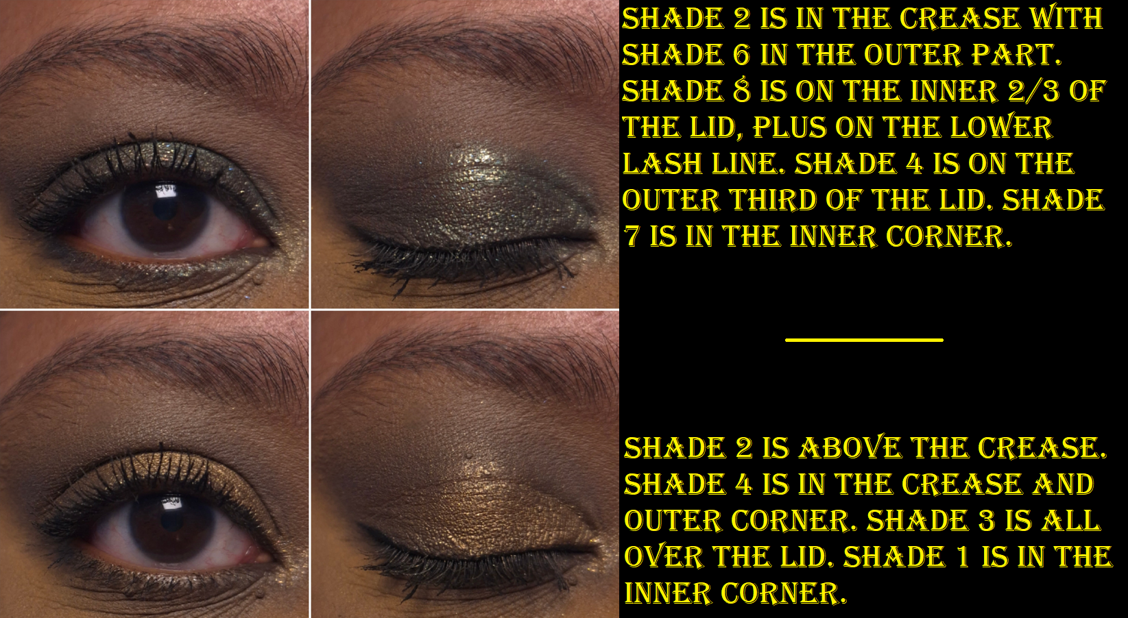
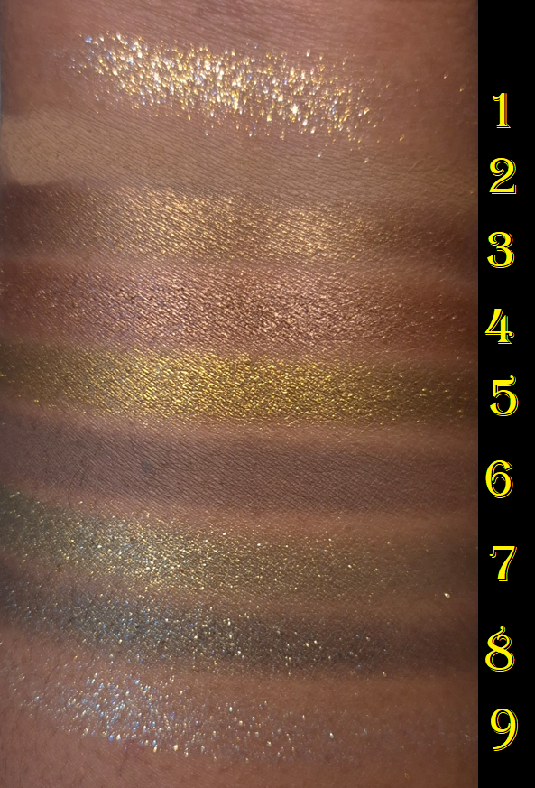
Shade 7 (spring yellow-toned green) and Shade 8 (dark blue-based green) are Crystal Pops. I wondered if they are supposed to be similar to the formula in the brand’s Pop Shot singles, but I don’t have those with me to confirm. Based on what I remember of them though, I think these don’t pop as much on the eye as the Pop Shots.
I had to redo three of these eye looks because the Crystal Pops did not want to show true to color in photos. I think it has to do with the type of shimmer used and how it reflected from my lights, combined with them not being fully opaque.
The Diamond Dimensions are softer pressed, flakier, and are basically sheerer toppers, so I expected to have a hard time seeing the blue tinge from Shade 9. Shade 1 looks white in the pan, but it has a gold reflect.
I can get stronger color payoff from the Crystal Pops and Diamond Dimensions if I apply them with a dampened brush, but I don’t do it to intensify the appearance of the sparkles. I am satisfied with the shimmery effect of all of them in their dry state. Also, the Diamond Dimension shadows remind me of the topper shade from Guerlain (#2 from Royal Jungle) because of the flaky glittery high shine nature to them, but Guerlain had it in a baked formula, which solidified it in a way that made it harder to pick up. I’d rather not have topper eyeshadows in palettes, but I at least prefer the way Charlotte Tilbury made these.
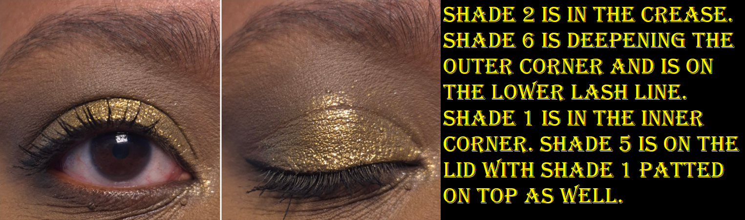
Shade 5 (antique gold/borderline chartreuse) is the Crystal Chrome which seems like a more opaque, smoother, wetter version of the Crystal Pop. Both eyeshadow types stand out on the eyes, but the Crystal Chrome achieves that effect without the large shimmer/glitter particles. This is the standout eyeshadow in the palette and it made me think of other shades similar to this that I have in my collection (photo below).
The light golden brown color called Shade 3 and chocolate brown Shade 4 are called Molten Satin. They feel like the Crystal Chrome, but with slightly less slip to them. From name alone, the Crystal Chrome is clearly intended to be more impactful as a shiny metallic. Although I usually prefer the wow factor of a great shimmer on my lids, if I’m in the mood for wearing brown, it’s usually because I’m going for a low-key look. Shade 3 is something I’d use in my inner corners or under the brow arch, and I prefer for shades used there to be smooth. So, I’m pleased with these being in the palette.
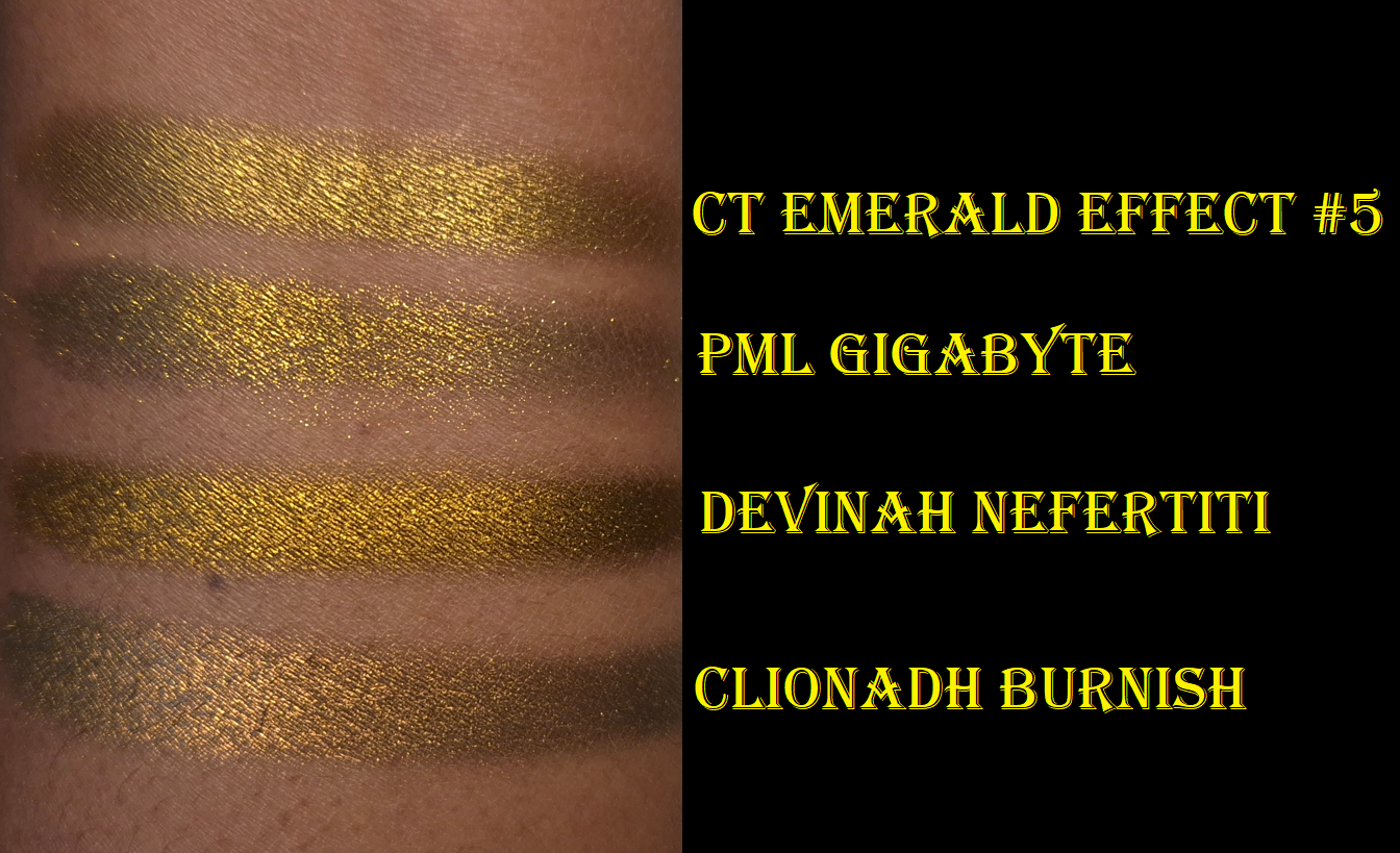
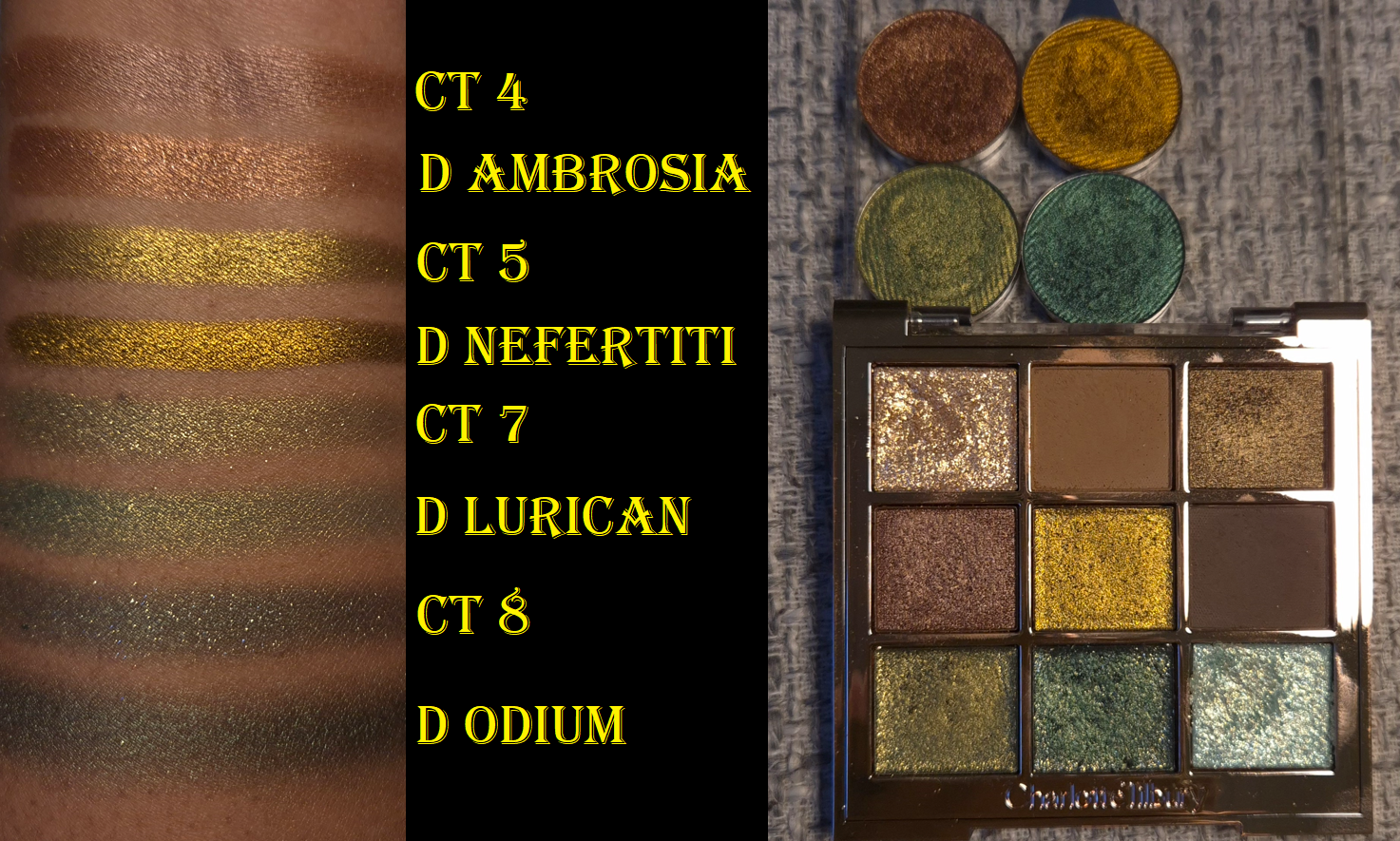
The most similar feel and finish of an eyeshadow to the Crystal Chrome comes from Devinah Cosmetics. Devinah’s is insanely smooth, but I believe it has a little bit of a darkened base to help it look more intense, plus it’s just overall more pigmented. That swatch went on so far for such little product. Nefertiti leans more golden-orange than Shade 5’s kind of antique gold. Pat Mcgrath’s Gigabyte is one of the baked special shades, so it is drier and flakier, so it looks less opaque unless applied damp or on a glitter primer. Clionadh’s Burnish is one of the Stained Glass Multichromes, so it has a dark base, is smooth, but has a slightly more shimmery finish. The fact that this shadow can even compete with indie ones proves to me that some of the high price tag went to the formula. I don’t think Charlotte Tilbury cheapened out on the formula, even if the brand reduced costs with the packaging.
I love greens, but I realized this palette has some similarities to some of the Devinah shadows I keep in one of my custom travel palettes. This is probably why I couldn’t let my desire for getting the Charlotte Tilbury palette go despite owning similar things. These are some of my favorite types of colors!
When I compare the swatches, I honestly do prefer Devinah’s over these. Shade 4 is the most different. Lurican is more pigmented and less sparkly. Odium is also far less shimmery, but since I would typically use this on the outer portion of the lid, I’d prefer for it to be this way. Devinah has discontinued some of their older shades (like Odium and Nefertiti), so I guess it’s a moot point. I just figured it would be interesting to compare because it’s not everyday when high end or luxury shimmers are even worthy of comparing their eyeshadows to ones from non-mainstream brands.
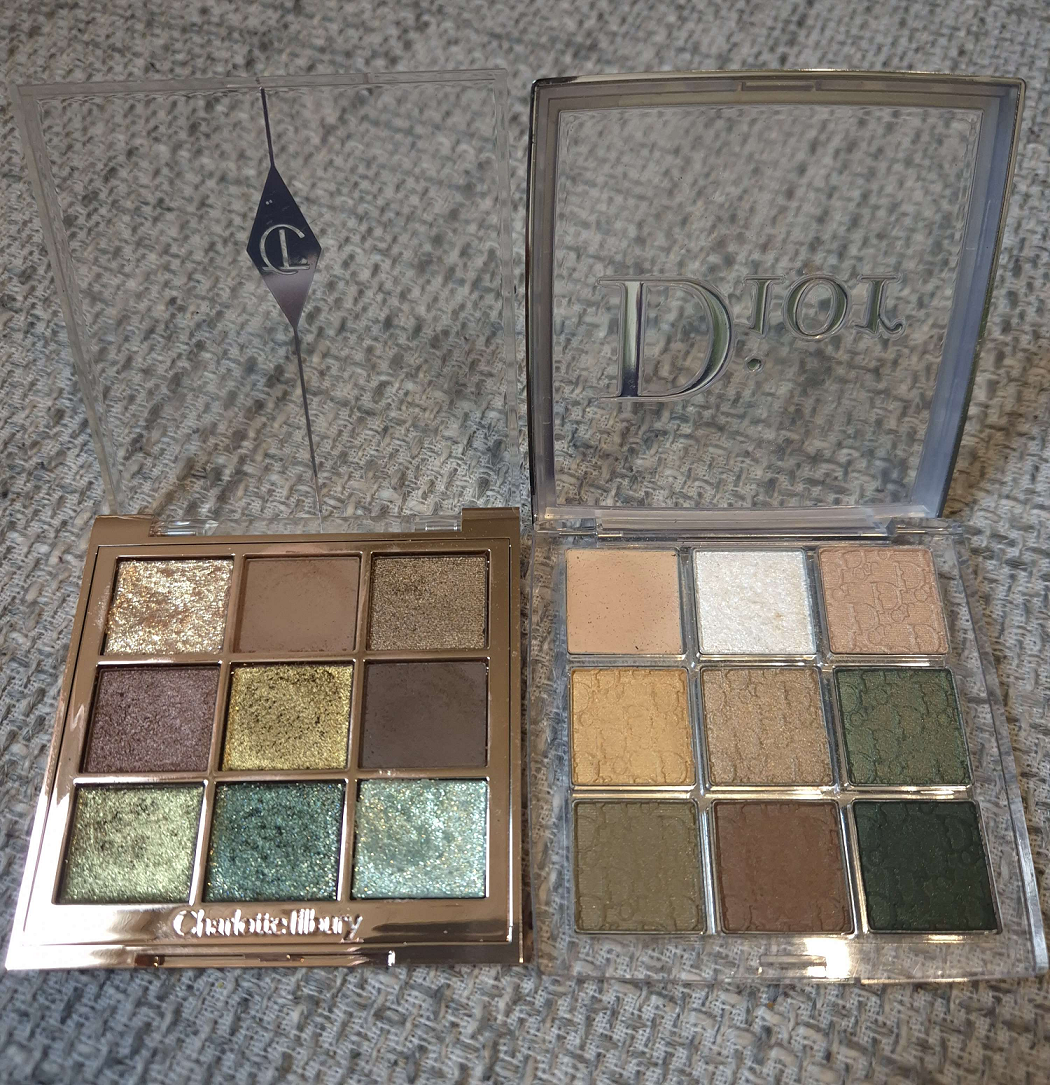
What is shown above is ultimately why I ended up buying this palette despite my best efforts to tell myself I didn’t need it. I already had the Dior Backstage 008 Khaki Neutrals palette that I hardly used after the review. There are way more interesting green palettes in my collection. The color variety still interested me, but these satins and “glitter” eyeshadows were just too subdued for me. I wanted so much more shine and impact. In trying to use the palette again, I realized Charlotte’s might be the version I wished for. The perfect combination for me in Emerald Effect would have been if the brand replaced the light green or the flaky pale blue with a light green matte shade like Shade 6 from Dior. Or, since the dark green shimmer from CT isn’t fully opaque, I’d have liked a dark green matte as well. Perhaps since I have both palettes with no intention of getting rid of either, I could just use them both together.
That’s all for today! Thank you for reading!
-Lili ❤
