Oden’s Eye + Angelica Hela Palette

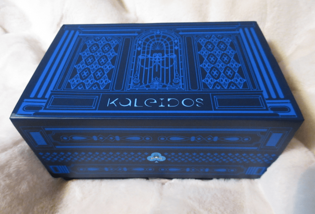
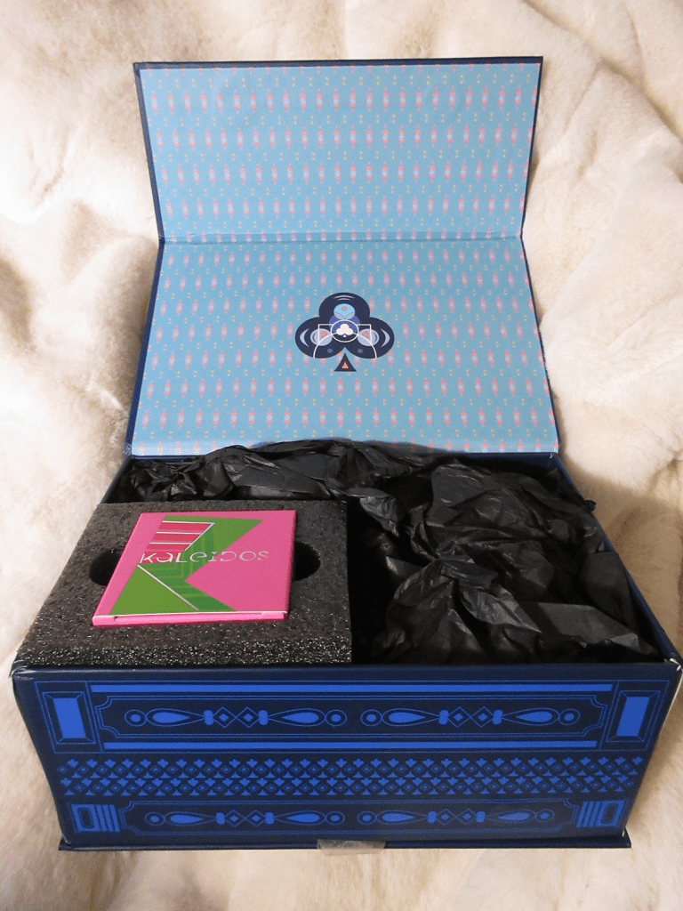
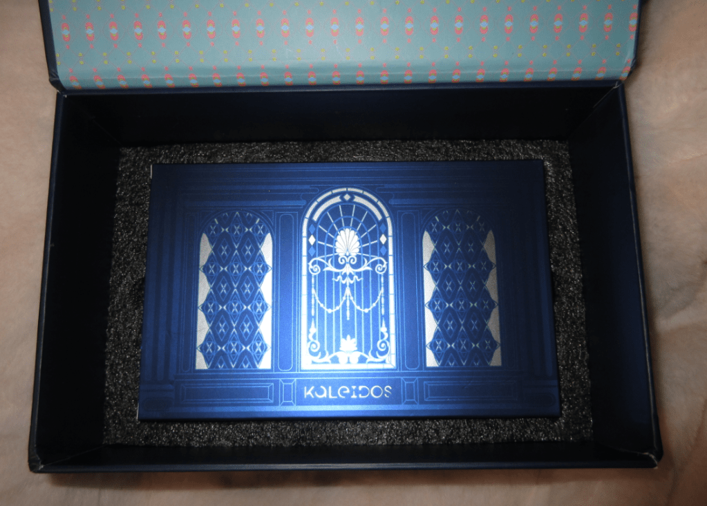
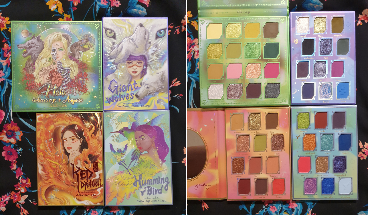
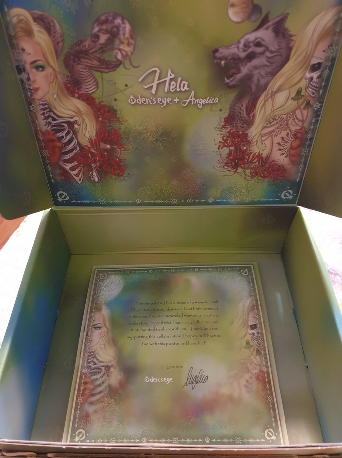
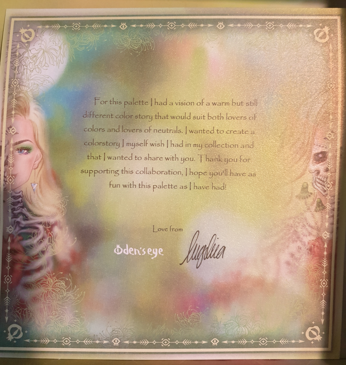
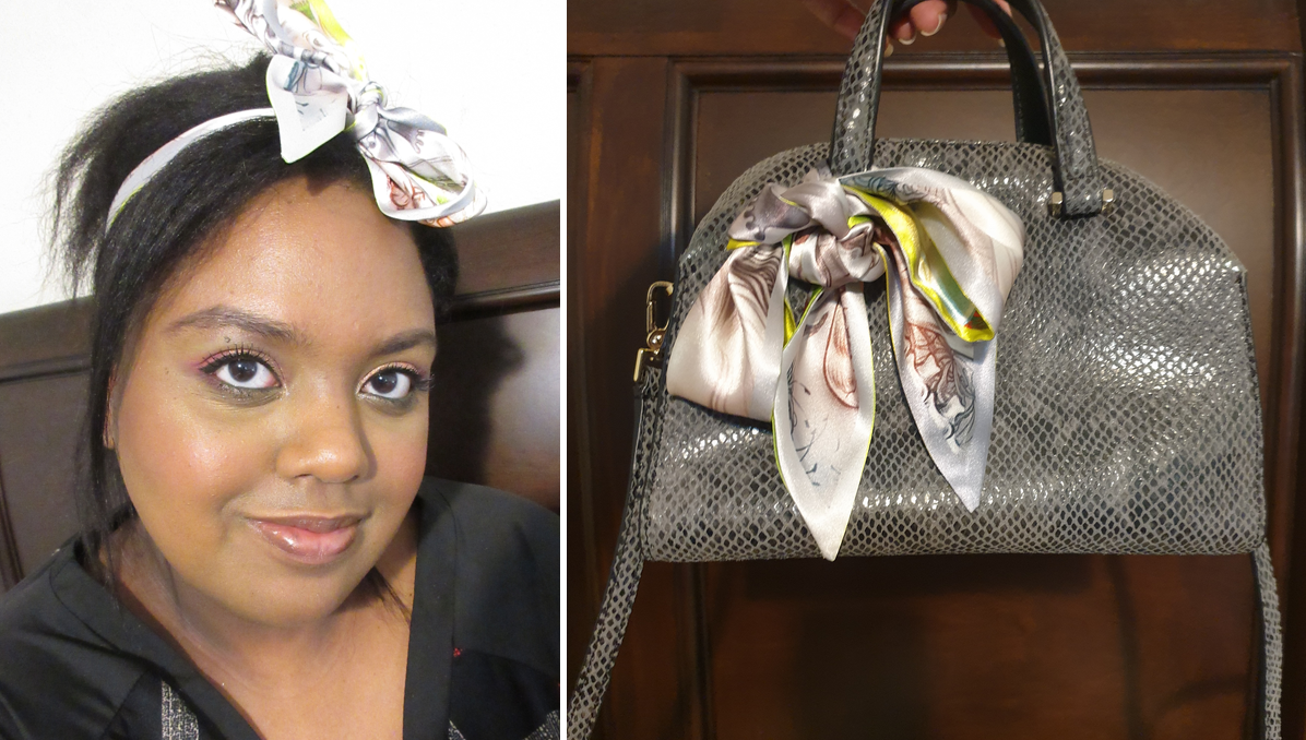
The collaboration palette between Angelica Nyqvist and Oden’s Eye is the newest addition to the Legendary Diversa Collection. Just like the previous release, all orders from this collection come in a box with the palette artwork printed on the inside. The free scarf idea was tweaked for this launch in the form of a reversible ribbon/Twilly, while supplies lasted.

This palette is currently sold out, but the restock is happening tomorrow: March 22nd 1:00 PM EST. I don’t know if the Hela box and/or Hela Twilly will be available again. Also, according to Angie, this may be the only restock.

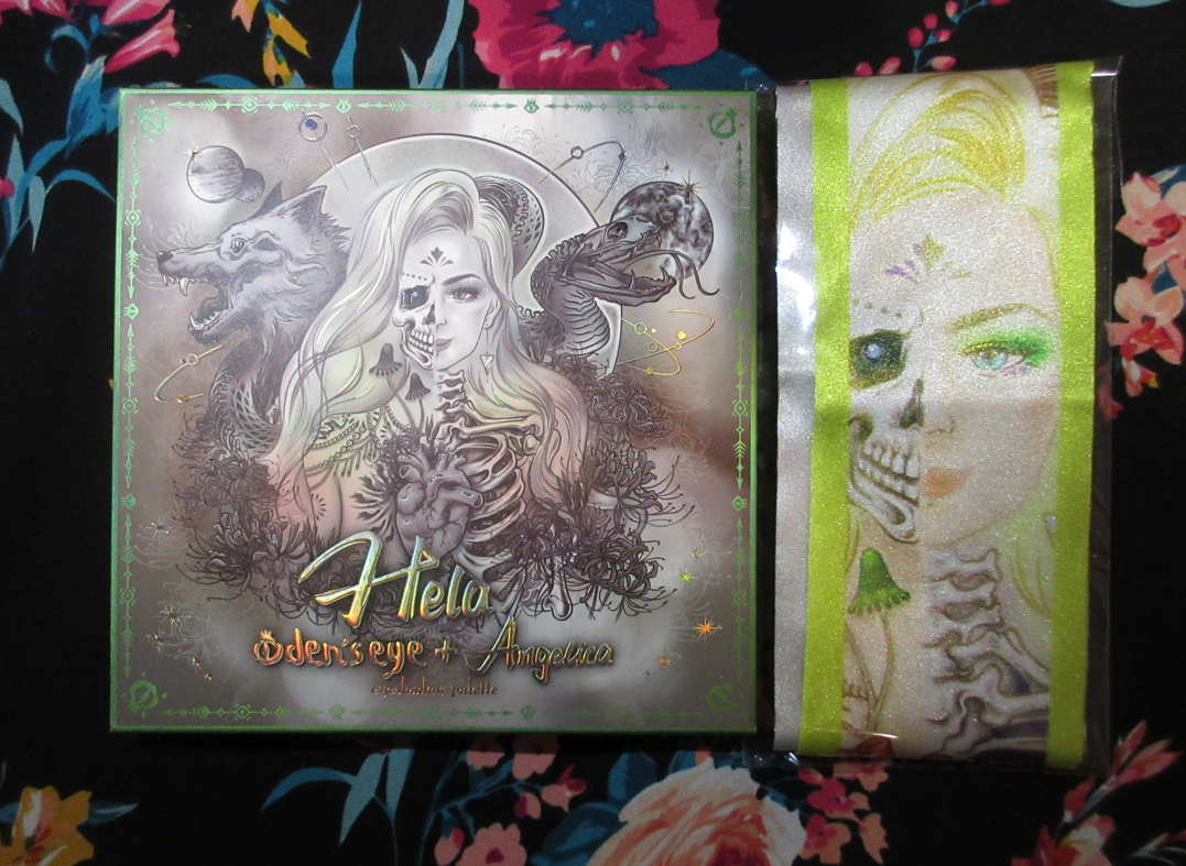
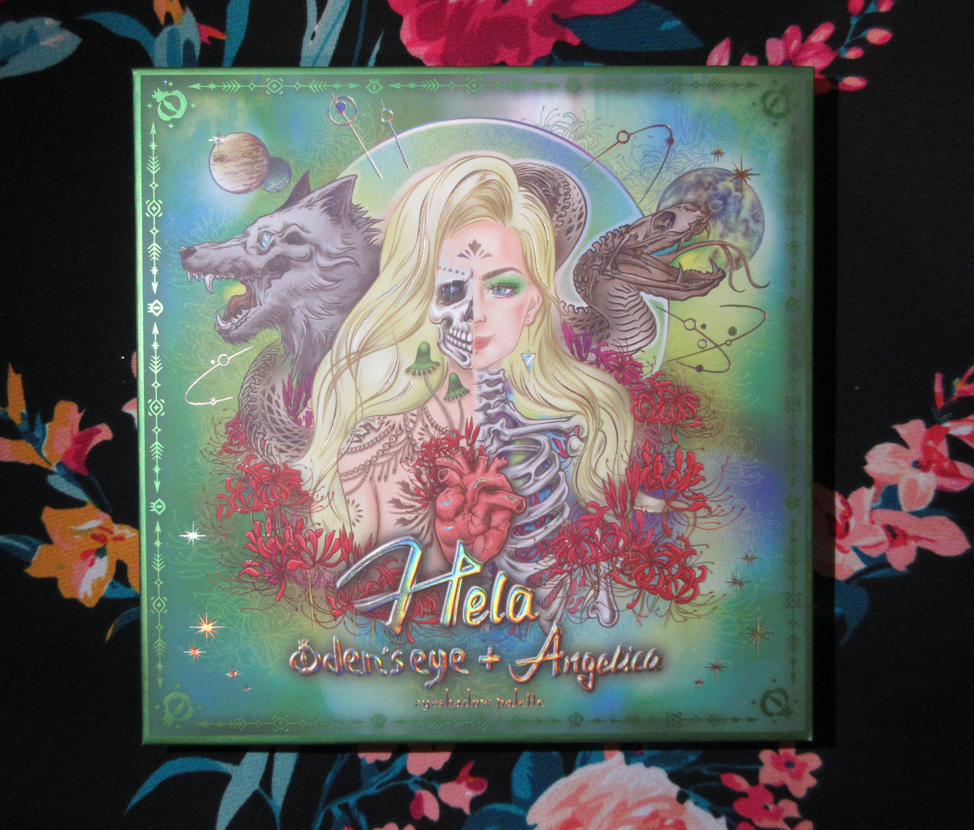
The outer sleeve that’s around the palette has a different color scheme than the actual cover. For that reason, I plan on keeping the sleeve too.

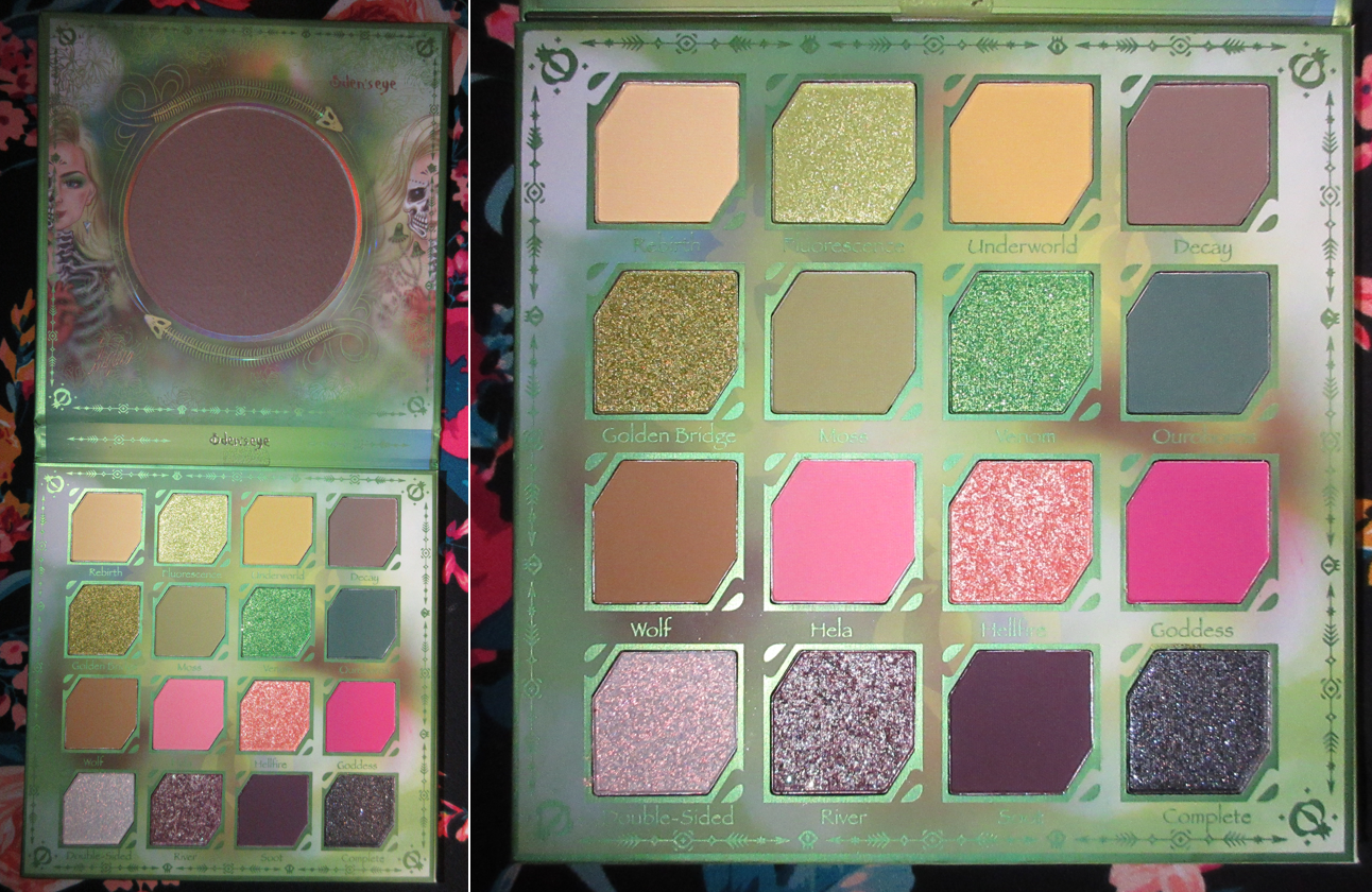
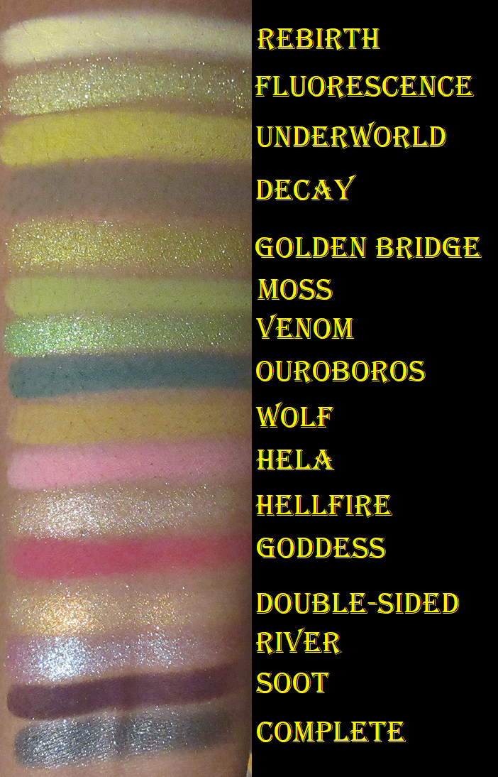
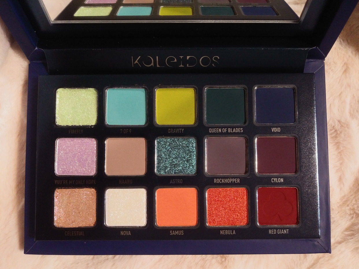
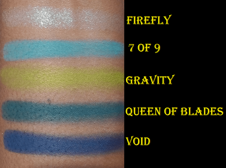
The eye shadows are the same Oden’s Eye quality I’m used to and enjoy. The mattes are very pigmented. Some are a little on the thin side, making them easier to blend and build up if needed. My issue with thinner matte formulas can be that they either dust away the longer I blend them, aren’t opaque and leave patches, or they practically disappear in areas where a wetter shimmer formula touches it. This wasn’t an issue for any shadow except the shade Underworld, which was fixed by just adding a bit more of the shadow back on top of the spot.

A lot of eyeshadow formulas either work better if applied in order working from lightest to darkest or darkest to lightest. With the Hela palette, it doesn’t matter which way I’ve used it. The lighter shades are pigmented enough that I can use them to blend out the edges of darker shadows, but not so pigmented as to ruin the depth I try to create. The darker shadows are also not so dark as to overpower the look.

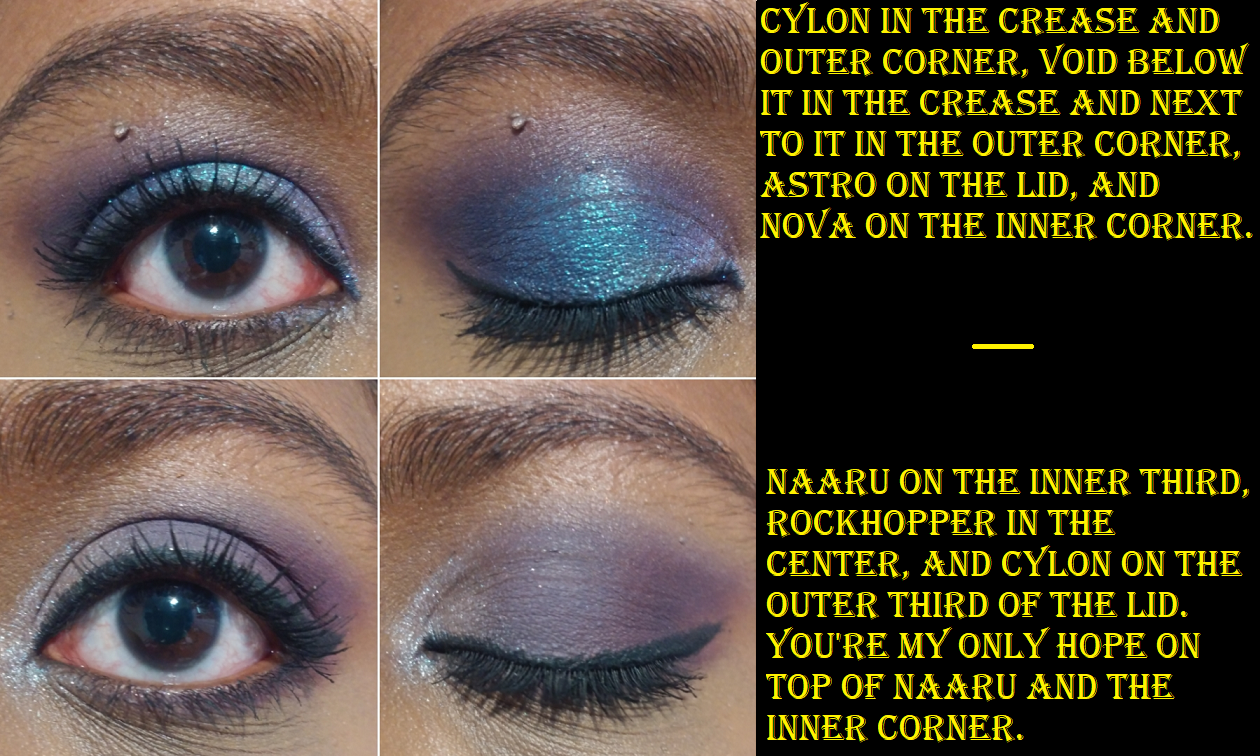
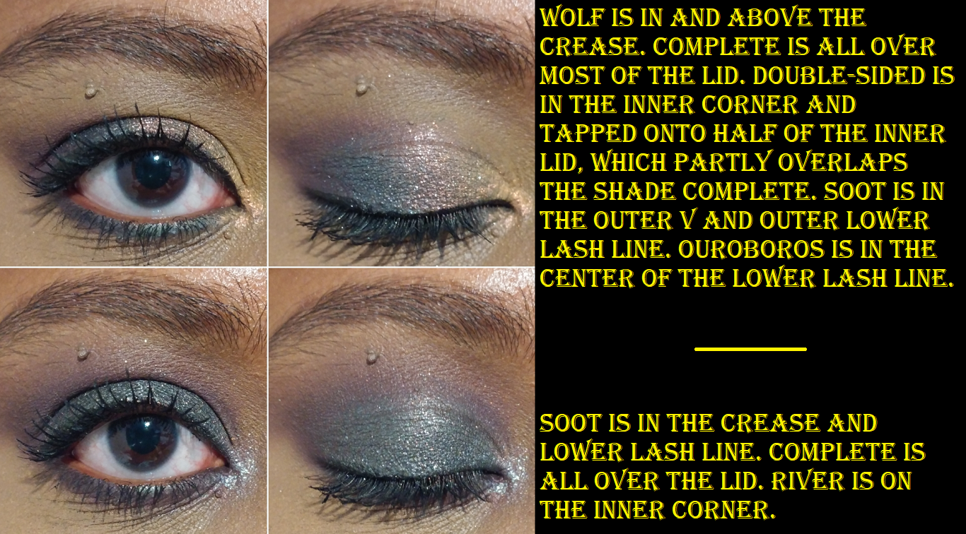
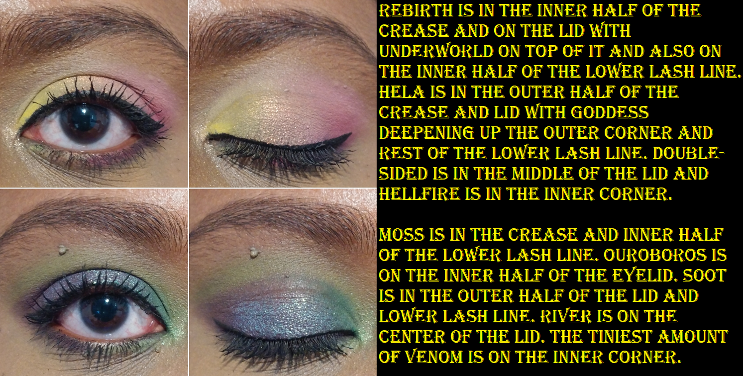
I expected Soot to be my most used shade and go-to shadow for deepening up the outer corner, but on my eyes the purple tone is very strong. The purple goes well with quite a few shades in the palette, but from my viewpoint, not as much as it would if it was a bit more of a neutral color. My partial solution for this is that I can use Decay on top to counteract the purple tone, but then it turns the whole thing into a dark grey.

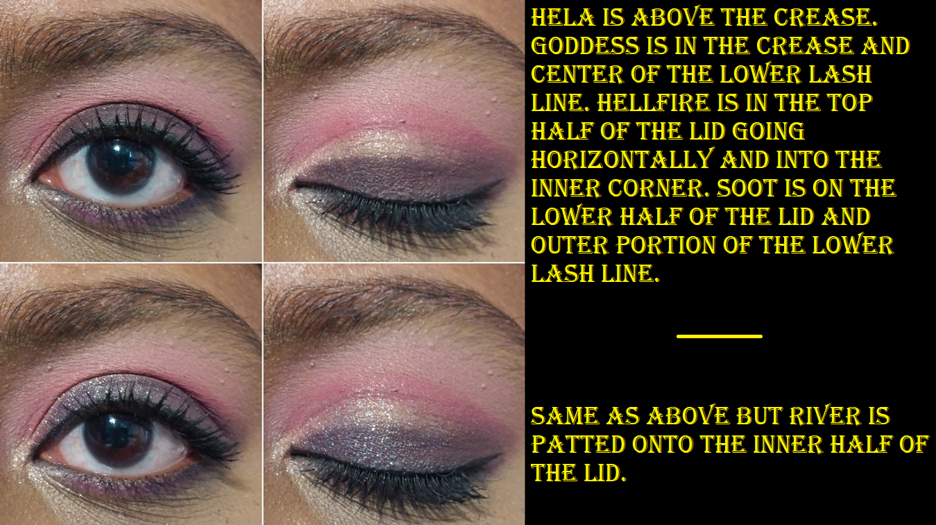
Hellfire and River are two topper-type of shadows in this palette. They both have bases, but those bases really don’t show through on their own and need to be applied on top of other shades to get the effect I’m looking for. For example, the gorgeous peachy look to Hellfire in the pan just looks like the palest pink, almost white eye shadow on me. So, I just use it now as an inner corner highlight shade. I also don’t get the purple tone out of River, as seen in the photo above in the pink/purple look where the only effect it had when patted on top of Hellfire and Soot was to darken them slightly and add some extra sparkle.

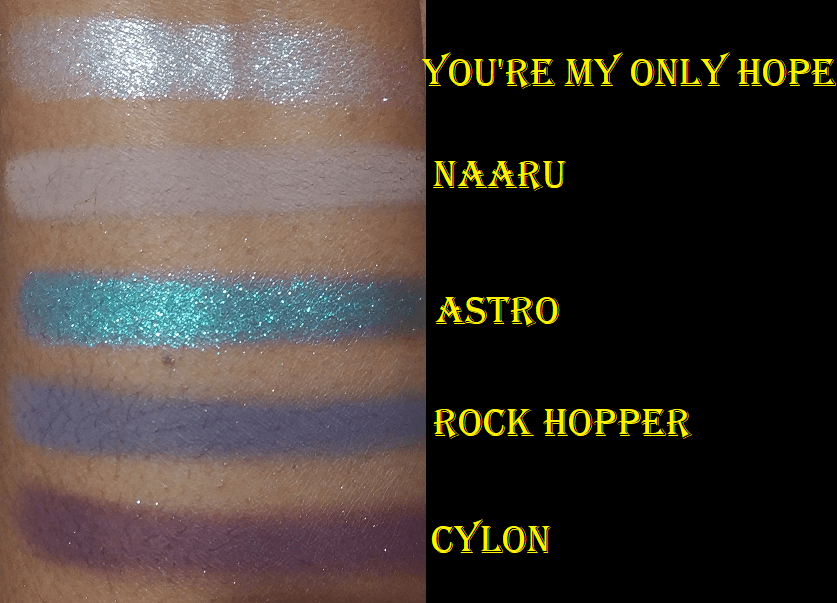
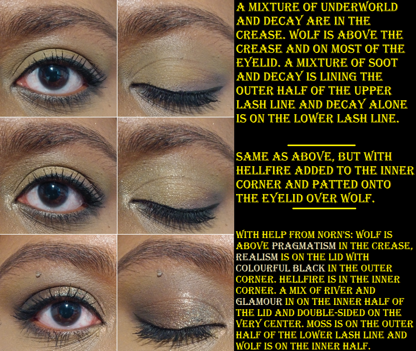
I don’t have the best luck with yellows, so I was shocked at how well these built up and lasted on my skin, especially Rebirth because using pastels on dark skin can often be unflattering. Rebirth isn’t the kind of shade I’d wear on its own, but it’s very complimentary to the other yellows and greens in this palette, so I’m surprised to say I like it! My two most frequently used mattes are Wolf as a transition shade and Ouroboros as a deepening shade for the yellow/greens/browns and as a colorful pop when used with the shadows in the bottom rows of the palette. Decay is intriguing because the first time I used it was on top of Wolf and that made the taupe/cool brown tone turn more of a dark grey color, which is not the kind of shade I like to wear. However, I noticed it should be deep enough to create depth for some lighter looks, so I decided to try it again. When Decay was applied on top of Underworld, that helped to bring more of the brown out of that shade. In Angelica’s launch video, she says she wanted a colorful palette that still had some neutral leaning options. I haven’t liked any of my attempts to get a neutral look out of this palette, so I always turn them into a more colorful look to salvage it. Perhaps this wouldn’t be the case for someone of a different complexion than me. This is not a complaint, as usually I have the reverse issue where partly neutral colorful shades (like reddish brown, grayish purple, etc) just look solidly neutral on me. So, it’s kind of refreshing, but also unfortunate that I’m going through a neutral loving phase at the moment. How ironic!
The best neutral look I’ve been able to create, and I think is just an okay look, is below. The first two pictures are with this palette alone, but the third is what I’d want from neutrals and I was able to create by combining Hela with the Norn’s palette.

Of all the yellows and greens, the only one that didn’t stand out for me was Fluorescence. Other than being an eyeshadow highlighting shade, I never have a purpose for this kind of color, but to each their own.

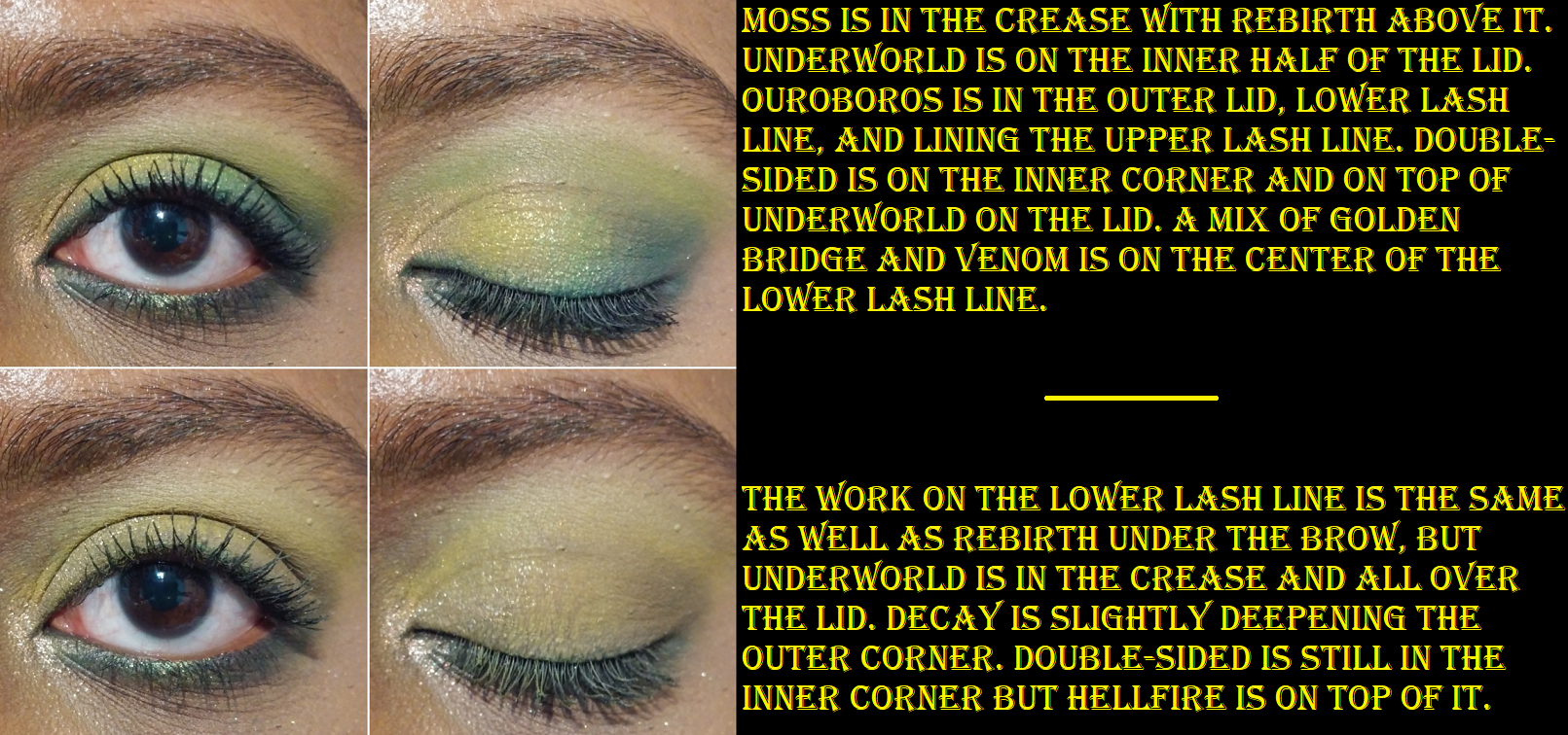
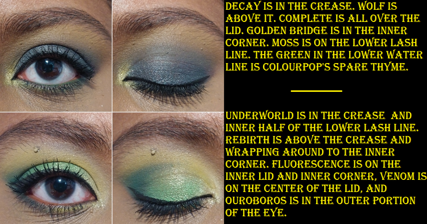
Golden Bridge is one of my favorite kinds of golden green shimmers. I actually tried not to use it too much in these eye looks because it’s such a go-to color for me. It’s the same with pairing Venom and Ouroboros together that is so instinctual for me. Because Venom is such a bright shade, I really wanted to use it on the center of the lower lash line, but it’s a bit thick and chunky for that spot and I had a difficult time smoothing it out. Perhaps I’ll need to apply it wet.

Moss is another really great shade. It’s a grungy green in the pan, but it’s a bit vibrant on my eyes, which I don’t mind. The way it looks is the tone I’m often drawn to as a transition color in my green eye looks.

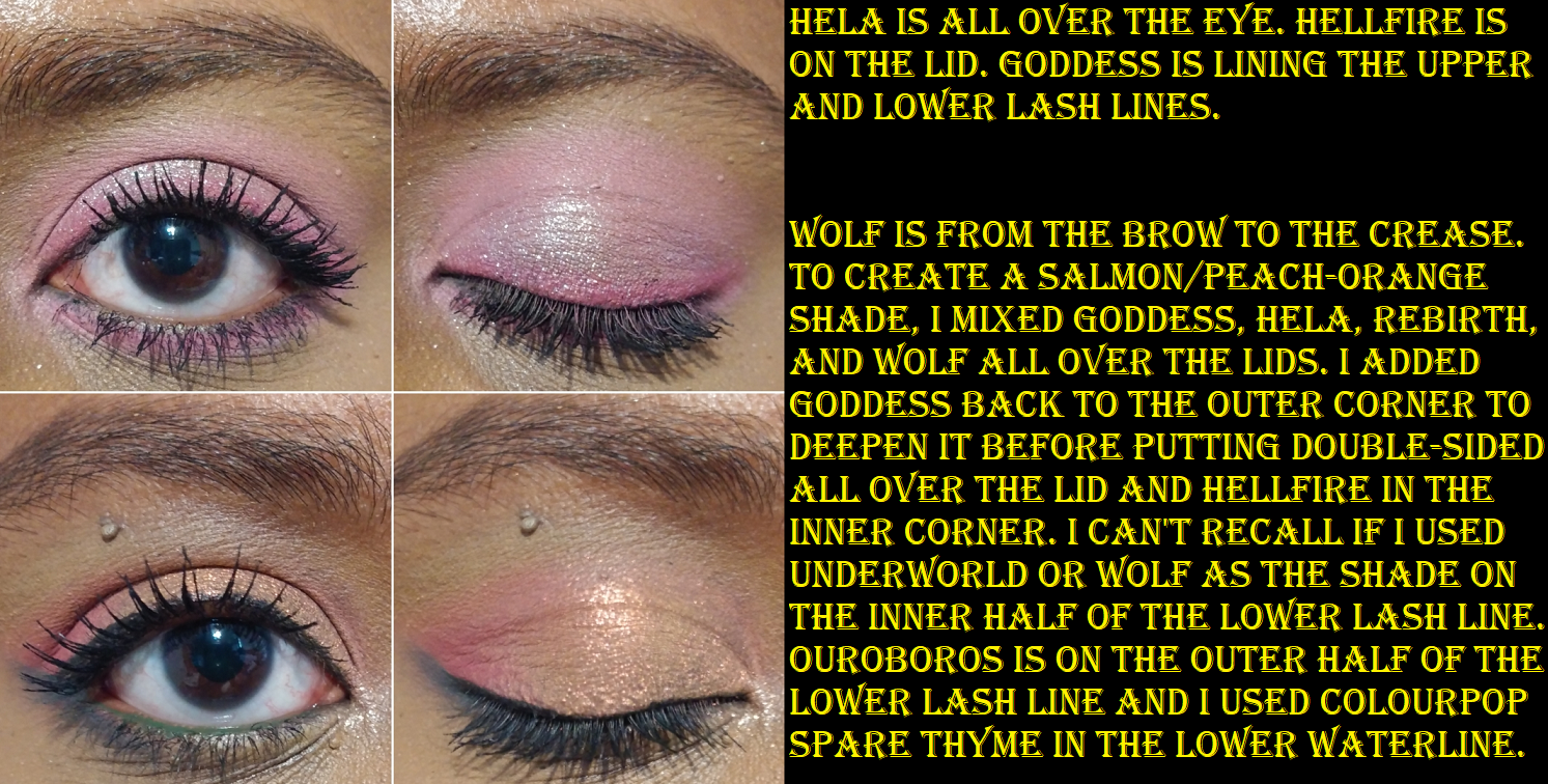
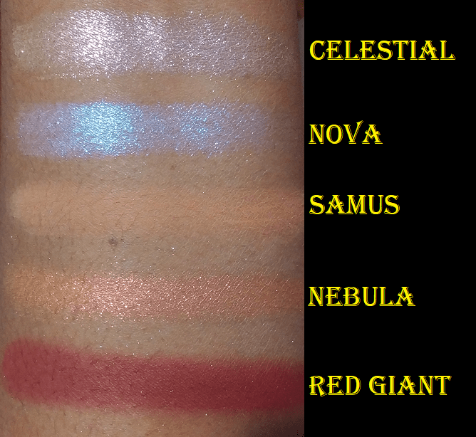
Double-Sided is like an orange-pink-green shifting shade, but the orange shift is strongest on my lids. It’s everything I wanted out of the shade Hellfire, but with the fun twist of being a multichrome. I discovered that if I mixed Goddess, Rebirth, and Wolf together, I could create a peachy-orange shade, which brings out more of the peach in Double-Sided when I apply that shadow on top of it. I add a bit of Hela too, just to soften up Goddess, but technically the color can be achieved without it.

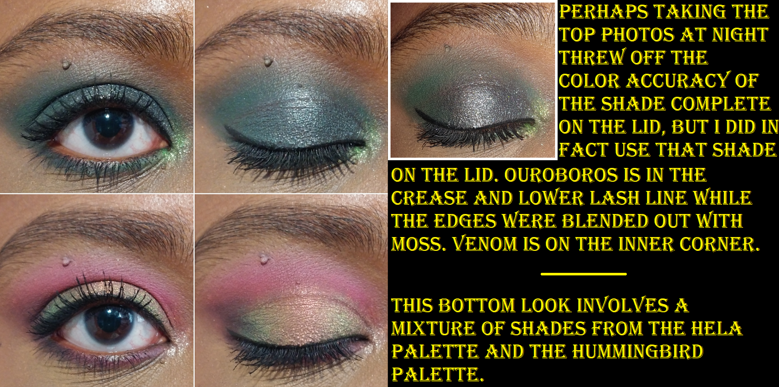
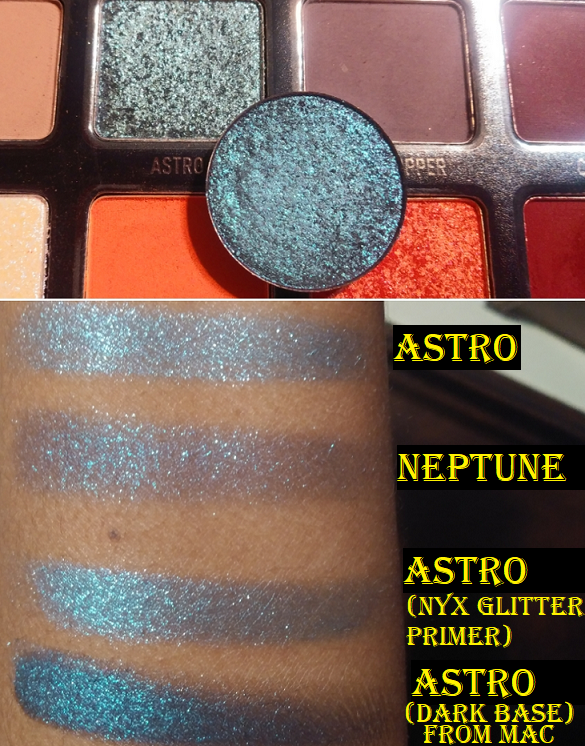
Complete is another fascinating shadow. In the photo above, I had to include a picture with flash on to show the black tones accurately when paired with Ouroboros. For some reason, those two together throw my camera off and make Complete look very teal. As seen in other eye looks with Complete, it still veers a bit blue, but is still very much a dark gunmetal-esque black. Oden’s Eye impressed me with the shade Colourful Black in the Norn’s Palette, and once again, they’ve impressed me with this one too. I keep wanting to use that shade in every eye look I do with this palette!

I have my own preferences when it comes to color stories, so is this the perfect one for me? No. Do I still enjoy this palette? Yes. Does it inspire me? Very much so! Angelica’s palettes push me outside of my comfort zone to think of new color pairings and combinations. I went from being an eyeshadow fanatic for most of my life to actually being a little less interested in palettes over the past twelve months. So, whenever one can give me the drive to want to be creative and play with eyeshadows, that is worth every penny.

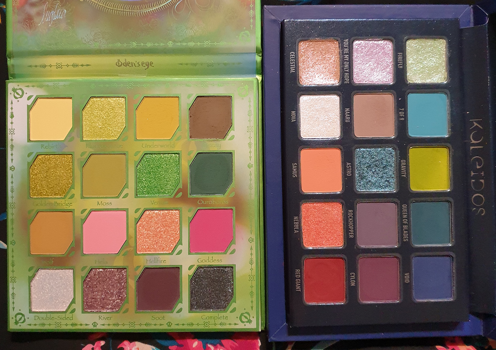
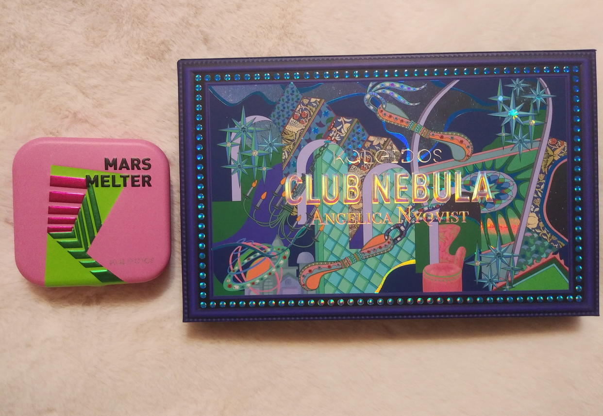
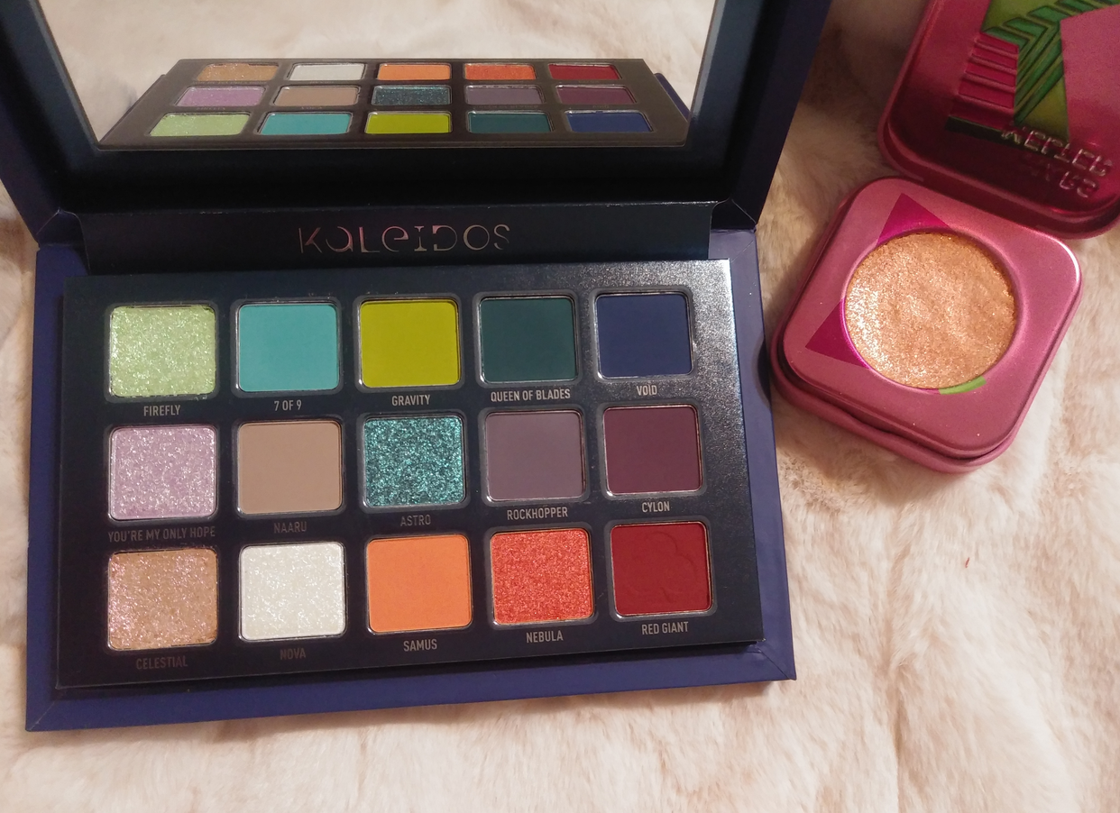
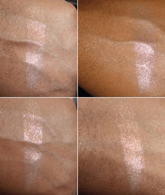
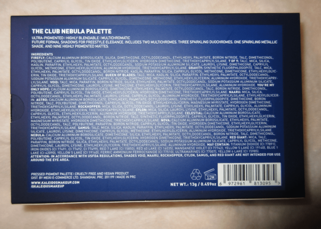
A comparison between Angie’s Oden’s Eye collab and her Kaleidos Club Nebula collab, for those wondering if they are different enough to purchase both (which the answer is yes)!

The Oden’s Eye palettes are part of my Shop My Stash for this month, so I’ve been enjoying combining shades from the Hela palette with each of the other Legendary Diversa palettes because they go so well together! I’m really happy to have made this purchase.

*UPDATE: Last minute eye looks! In the discussion with Nikki below, I realized my tendency to keep only using the top half or lower half of the palette, so here are two quick additional looks I created combining the two!

I believe that’s everything I wanted to discuss! I hope this has been helpful, especially for those considering purchasing the palette during tomorrow’s restock!
Thank you for reading!

-Lili

Kaleidos x Angelica Nyqvist Club Nebula Palette

Today, I’ll be reviewing the Club Nebula palette and showing the reformulated Mars Melter Highlighter.

The reason I’ll just be showing, but not reviewing, the highlighter is because mine was shattered. My usual method of repressing shimmer products is to use a little 91% isopropyl alcohol. While I don’t believe the integrity of the two eyeshadows from the palette were effected, I believe not dry-pressing the highlighter might have compromised the performance. The highlighters in this line are glittery, but they lay on the skin in a way that is right on the edge of my comfort zone. When I do a finger swatch, the highlight looks exactly the way I expect, but when I use a brush to apply this to my cheekbones, the way it picks up the product causes the shimmer particles to be too spread out and uneven. It looks like a glittery mess. Wet-pressing also caused it to shrink so flat. I imagine this highlighter wasn’t meant to be condensed/compressed in such a way. Because I think it would have performed better in its regular state, I feel I can’t properly review it. I could perhaps still find use for it as an eyeshadow topper, but I will not be using this as a highlighter.

If it was just the two shadows in the palette that were broken, I would have left it alone, since the breakage was contained within the pans and I could salvage those. However, the highlighter being broken as well bugged me considering the $10 shipping fee (increased from their previous $8 charge) and the 25 days it took to arrive after it departed Shanghai.
For anyone wondering about Kaleidos’ customer service, I received a reply within 24 hours. I was offered a reshipment or to receive a partial or full refund depending on which item(s) I decided not to replace. I hadn’t heard the best things about their customer service, so I was happy that my experience with them was actually pleasant and was resolved quickly. Although I wanted a pristine palette, I felt too guilty at the idea of getting a whole extra palette knowing there were people who still couldn’t get their hands on Club Nebula, even after the restock. After my wet-press mistake, I could have benefited from a new Mars Melter highlighter, but considering my usual view on glittery highlighters anyway, I thought it best to just opt out of the replacements for both.

The packaging was so elaborate and beautiful that I wanted to show how it came to me (the box was wrapped in an air pillow/cushion/pad/pouch roll for extra protection). I usually want smaller packaging for storage reasons, but for something this beautiful I would love to have it displayed after I complete my declutter series and hopefully have spare surface area.

The special custom shipper that is included with the order of this palette comes in the large and small size. I believe mine is the large, the one intended for the set with a deck of cards. The padding for the Space Age Highlighter (plus divider layer of foam and extra tissue paper) caused the highlighter to sit too high for the box and the lid had to be forced down and secured with tape in order to close. The magnets alone weren’t strong enough to keep the lid closed with the excess padding inside.

I think it was an accidental oversight on the part of whoever packed my order, as I suspect the added pressure to force the box to close (forcefully enough to cause the dents in the front corners of the box) is what caused the breakage.
Anyway, just a heads up to anyone ordering this palette with an additional item! Let’s proceed to the review!

Kaleidos Club Nebula Palette x Angelica Nyqvist

The swatches above were taken indoors with no flash on bare skin.

I’m very impressed with the quality of the packaging and the designs. It is stunning! I’m incredibly pleased with the smoothness and richness of the matte shades and how deep they go. After being disappointed by the Lunar Lavender mattes and questioning if Kaleidos’ quality was taking a dip, I was relieved to see the mattes in Club Nebula are fantastic. Because I love duochromes and multichromes, buying this palette should have been a no-brainer, but for some reason I wasn’t 100% sold on the color story. Honestly, I purchased this to avoid FOMO (fear of missing out). It was made very clear that this palette was limited edition. I preferred to have it and not use it, rather than skip it and regret it later. I am subscribed to Angelica and I’ve grown to really like and respect her. Of course I felt the tug and impulse to support her collab, but I don’t believe that factored into the FOMO because I know I already support her in other ways by watching her vids, allowing the ads on her videos to play in full, shopping through some of her affiliated links and codes, etc. One thing Angelica said in her launch video did play a factor in my decision to buy the palette. She said to give this color story a try and step outside our comfort zones. I felt that trying to dupe a palette like this wouldn’t be the same. I wanted to see for myself if I could be inspired by something that wasn’t entirely my style. Plus, I figured this many multichromes and duochromes in a palette for $45 was a steal! While I’m thrilled to have Nova and Nebula, and I think Firefly is quite pretty in certain angles, I was a bit let down by the other three.

The swatches above were taken outdoors with no flash on bare skin.

I appreciate the dark mattes, but pale shimmers tend to go unused in my collection. You’re My Only Hope is described as a lavender with a pale blue shift. The purple is so ridiculously hard to see on my skin tone regardless of indoor and outdoor lighting. I had a similar issue with the Lightyear shade from The Futurism III: Astro-Pink palette. Celestial is another one that I absolutely could not see any shift in while inside, no matter if I was under warm or cool light nor the angle in which I held my arm. So, I was surprised to see this one is considered a multichrome, “a radiant hot pink multichrome with decadent fuchsia and golden shifts.” The only way I could see a shift was while I was outside. If I want to wear a shade like this, but with a stronger shift, I’d rather reach for Blaze from Clionadh Cosmetics. Astro is another disappointing multichrome in the sense that the shift between royal blue, teal, and violet are too close in tone and it’s almost a lighter version of Neptune from the Futurism 3: Astro-Pink palette. The upside to this color is that it’s at least very pretty. I can still use it like a statement shimmer even without the shift. I can see the lighter and darker blue particles in the pan but that shift to violet does not show on my lids unless I’m outside.

Firefly has a beautiful mint green and fuchsia duochromatic sheen that is visible in person but harder to capture on camera. I’m at least happy that it’s noticeable at the right angles, unlike the previous three shades I mentioned. Nova is gorgeous! I would have expected this to be the multichrome because of how well it shows up, but this is, “a glistening amethyst blue sparkling duochrome topper with a warm violet shift.” Nebula is my favorite color in the palette, as “a rose-gold red sparkling duochrome with a molten copper shift.” It’s very unique to my collection. The closest shade I have to it is Clionadh’s Torch if Nebula had a darker red tone to it. Surprisingly, I actually prefer Nebula. In one of the looks posted below, you can see that in some lighting Nebula can look nearly as light as Samus. Speaking of Samus, that peachy orange is gorgeous! I have a hard time liking the way it looks when paired with other shades, so I actually prefer to just use this color solo blown out on my eye with some mascara and/or liner and leave it like that.

I mentioned how well the mattes blend, but I am particularly impressed with the four lightest ones because those type of shades are notoriously difficult to show on my skin tone. None of the mattes were patchy. They gave me zero issues when used over the MAC NC45 Foundation Stick as an eye primer, Gerard Cosmetics Clean Canvas, MAC Paint Pot, and Nyx Proof It primer. Naaru in particular is the kind of shade that never looks good on me because there usually isn’t enough pigment and it looks like an ashy gray instead. This shade actually looks on me the way it does in the pan, and for once it looks nice! I also like to blend the edges of darker shadows with Naaru. Gravity is easily the best performing matte lime/chartreuse eyeshadow I own! I have nothing negative to say about Queen of Blades, Void, Cylon, Rockhopper, and Red Giant. They’re top notch!
For the shimmers, I apply them wet or on top of Nyx Glitter Primer because as beautiful as they are, they need a little help to really pop on my eyes. I always want more pigmentation than topper shades provide, so those two methods help me achieve more of the look I want. It also helps to lay down a shadow underneath the topper shade first.

I mentioned in my Lethal Cosmetics Velvet Dusk palette review that I only recommend getting the palette if you like the colors as is and aren’t getting them for the multichrome aspect since they’re more like shiftless shimmers or duochromes at best. The shifts were weak in those. I’m going to say the same thing for the Club Nebula palette. Firefly, You’re My Only Hope, Astro, and Celestial have weaker shifts than even the Velvet Dusk shades. They may as well be regular shimmers, though the amount of sparkle in them still puts them above some mainstream brands’ shimmers. Nova and Nebula are true duochromes though. So, if someone doesn’t mind having topper shades or weak shifting shadows or if the duochrome and multichrome aspect isn’t a factor at all, I would easily recommend purchasing this palette. Angelica mentioned there may still be one final restock coming in the future, but beyond one probably depends on how high the demand is.
*After my post today I saw in a pinned comment on Angie’s latest video that the restock is in May.
**As of April 1st it was announced that the restock was moved up to April 14th.

As much as I wasn’t enthralled by the color story initially (despite being a lover of greens, purples, and oranges), the more I’ve used this palette, the happier I’ve become with my decision to buy it. As one can see from the amount of example looks I showed, I kept reaching for this palette and wanted to try different styles and shadow combos. I’m up to fourteen by now (though not all made the cut for this post)! I love when I can look at a palette and feel inspired to play.

Thank you for reading!

-Lili