Clé de Peau Beauté Holiday 2025 and Permanent Quads

For those only interested in the review, feel free to scroll further down to that specific section.

My History with Clé de Peau

In 2011, I was not interested in luxury makeup. In fact, makeup didn’t play as large of a role in my life until several years later. Despite that, it was still impossible to avoid hearing about how, “Kim Kardashian loves Clé de Peau’s concealer.” Mario Dedivanovic’s “triangle concealer technique” was the talk of the makeup, fashion, and celebrity gossip world.

Being the curious person I am, I did some research and was absolutely floored by the prices of everything. At that time, drugstore makeup was all I had experienced, and MAC was considered the crème de la crème among my circle of friends. We were all broke college kids and I didn’t dare look at the legacy brand makeup behind the beauty counters of our mall because they were so far out of my price range. I was shocked to discover brands like Clé de Peau existed with price-points surpassing even those!

Since Clé de Peau was the first non-designer luxury brand I’d ever heard of, the name stuck with me. It wasn’t until the end of 2013 that my makeup obsession began. I started dabbling into mid tier and prestige brands, but beauty subscription boxes are how I was able to try a lot more products in those days (and this is where the “Unbox” part of my blog name comes from as I used to make unboxing content). In 2015, I tried my first Cle de Peau product via the Choix subscription service. I had a small container of the brand’s translucent loose powder. I remember it working so beautifully, but I only used it on special occasions because I knew I would always have a hard time justifying spending over $100 on any single makeup item.
I have the majority of my YouTube videos listed as private, but I’ll make the Choix and Clé de Peau unboxing temporarily visible through the link for those who would like to see it HERE. Also, perhaps 1.5x or 2x speed for the video would be best.

In 2016, I received the Clé de Peau concealer brush and a tiny sample of the concealer in the shade Beige. This was thanks to the blogger nouveaucheap (who unfortunately passed away).

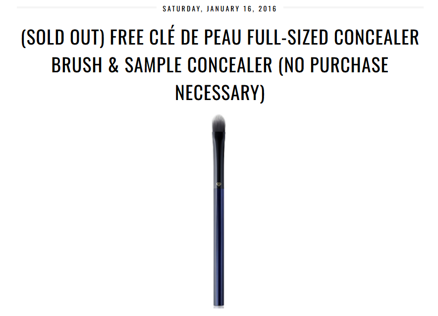
I’m not a fan of paddle shaped flat concealer brushes, so I rarely used this, and stored it in its original box as if it was a collector item. I guess it technically is one now because this style of brush has been discontinued. As for the concealer, it was too light, so I didn’t bother putting it on my face.

2019 was the year I finally started hearing about the Clé de Peau holiday launches. The packaging was always gorgeous, but it wasn’t until 2021 that I started pining after the Luminizing Face Enhancers.

The standard packaging for those highlighters was beautiful enough, but the limited edition ones were truly exquisite. Because the finish is glittery and the brand doesn’t make any in my shade anyway, I didn’t buy them. To clarify, pretty much every reviewer I have seen talk about the highlighters say they look smooth and have such fine shimmer particles that they don’t look glittery. However, what I see in their videos under their lights from my computer screen still looks too visible in my book. Apparently the double digit numbered luminizers are subtler than the triple digit ones, so 22 is the darkest one I could potentially try. Perhaps the luminizer would be like Guerlain Météorites (04 Amber) and surprise me, but I don’t want to spend a minimum of $70 on a refill to test it out. The only place I’m aware of that ships those refills to Germany is YesStyle, and not even on the official CPB website.

At some point the brand started releasing eyeshadow quads as part of the holiday collections, but the options didn’t appeal to me. To spend so much money on a color story I didn’t like would have been no different from buying it for the packaging alone.

In 2023, I started to get my hopes up because Clé de Peau launched a full permanent line of refillable quads. This meant that even if I didn’t like what was in the holiday cases, I could replace it with a more appealing color story. If I didn’t like the options in the permanent range, I could still wait for an expansion to the line and buy a prettier refill in the future.

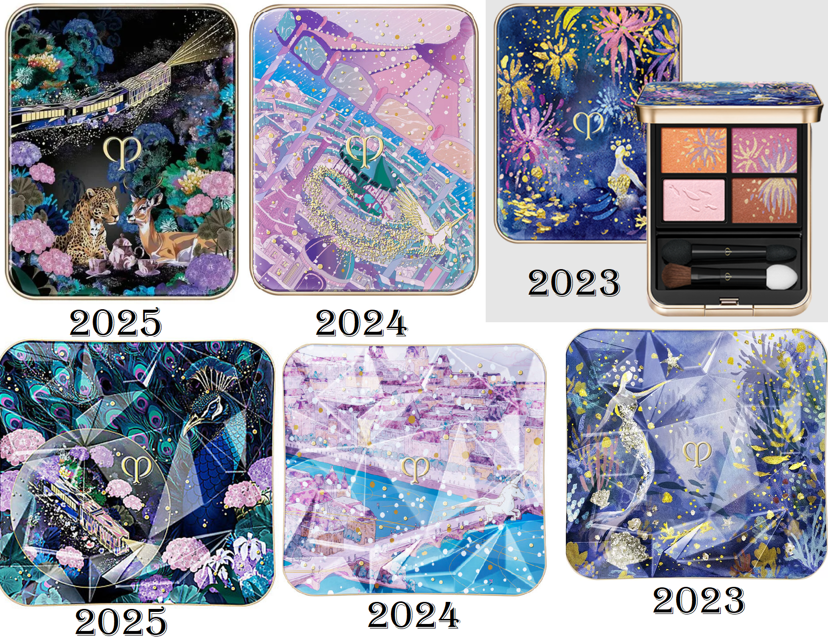
There was still an issue of the price. In 2023 and 2024, the products sold out before I could catch them on sale. Although customers can purchase eyeshadow refills and the standard case separately, CPB does not sell the limited edition cases on their own. $116 for a quad is still a threshold I’m not willing to cross. It pained me enough to buy the Chanel Boutons quad at full price.

This year, luck was on my side! Douglas started carrying Clé de Peau products, so I kept my eye out in the hopes that they would stock the holiday collection. They do, but the launch didn’t coincide with the timing of any discounts, and the items became unavailable after a few days. Although I was disappointed, this turned out to be a good thing because I remembered that Niche-Beauty also carries Clé de Peau. So, I was able to buy the quad at 20% off, in addition to using reward points. Sometimes this retailer offers 25% off promo codes, but I didn’t want to take my chances on it selling out, which it did a week later! I felt even more confident that I made the right call when I saw the quad return to the Douglas website for €13 higher than the price was before! So, I’m ecstatic to have this quad at a price that I’m at least able to swallow. It’s less than the Chanel Boutons quad, which I am still salty about paying full price for! Or as they say in Germany…

Holiday 2025 Review

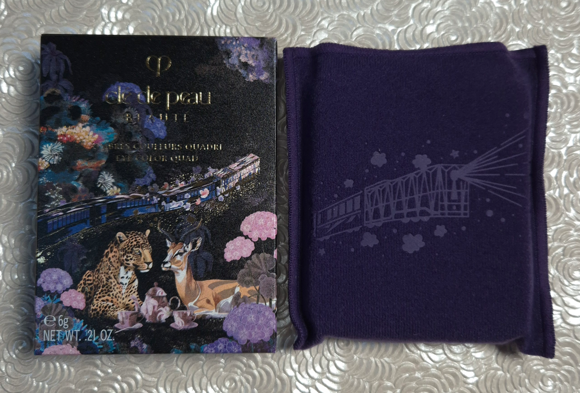
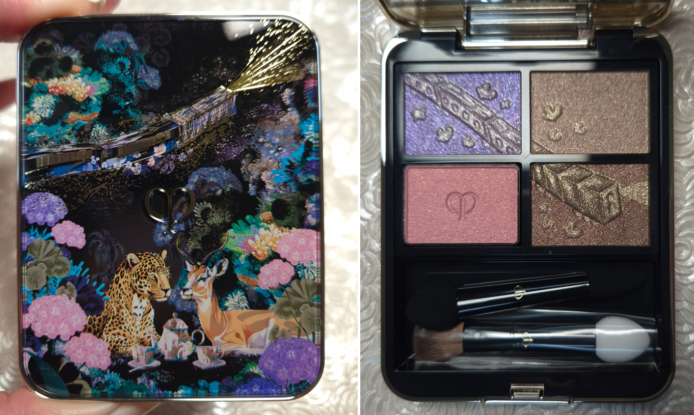
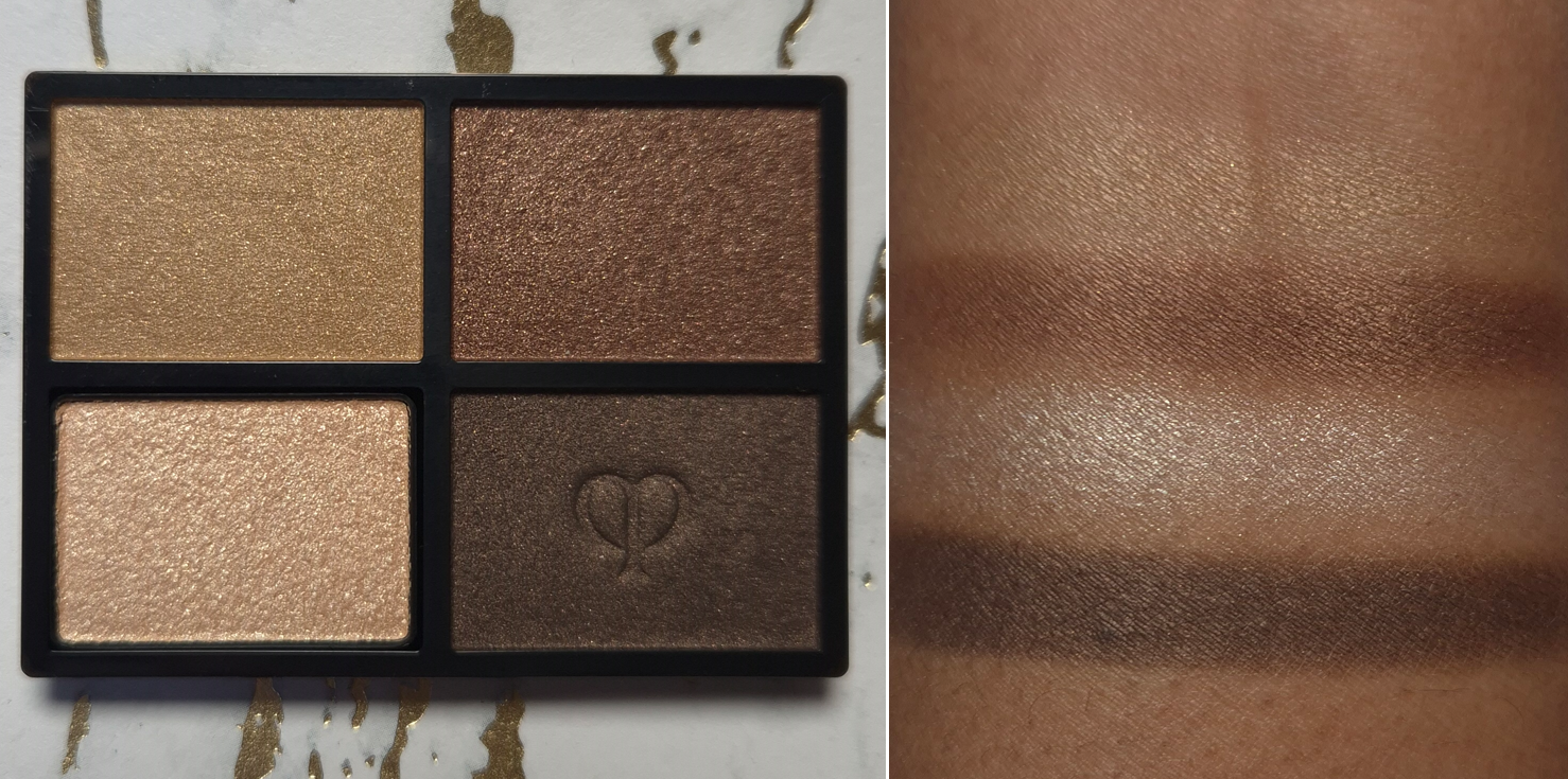
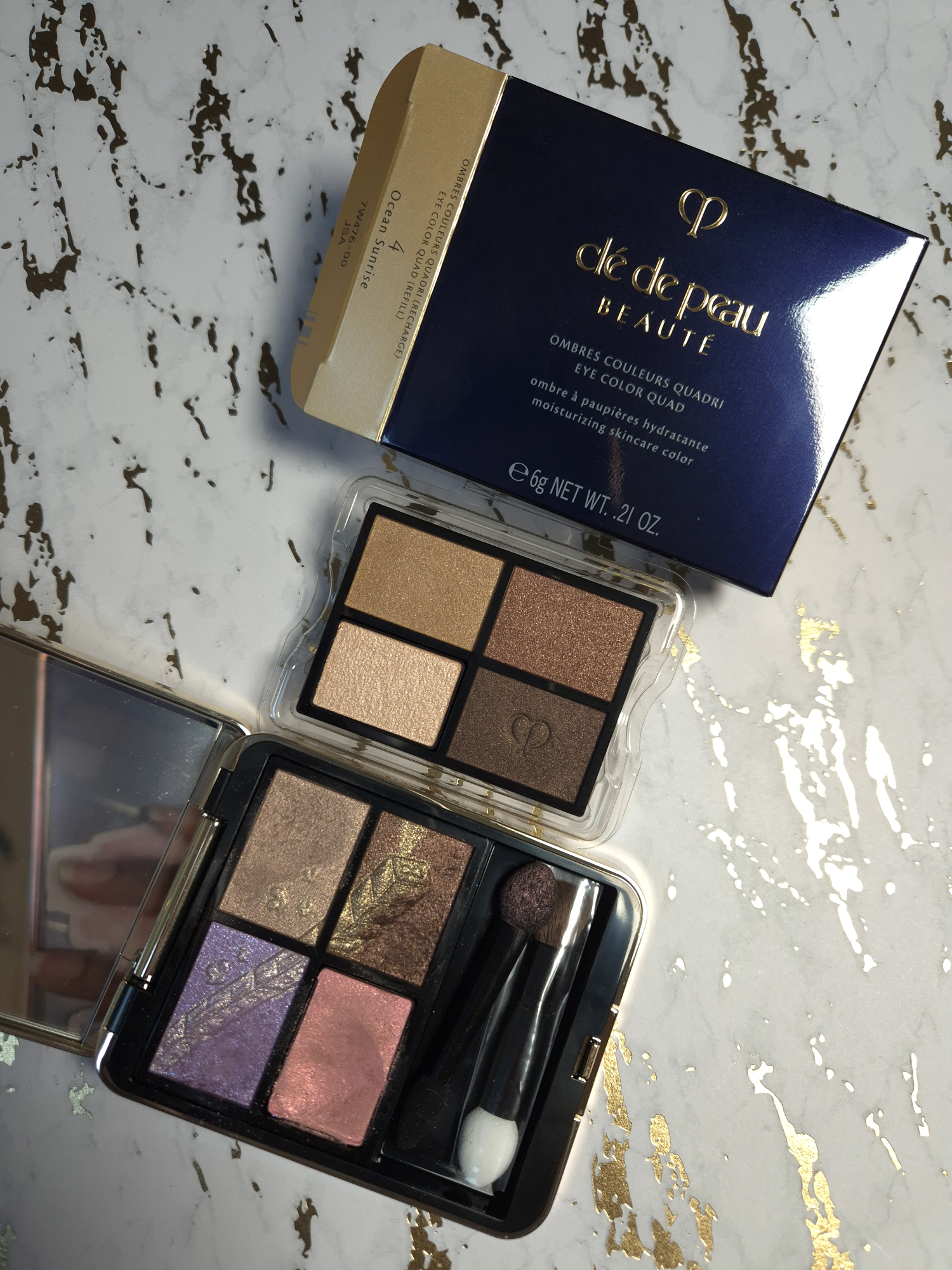
Clé de Peau Beauté Dreams Express Eye Color Quad in 504 Pastel Tea Safari

This isn’t a color story I would normally gravitate towards, but I saw some interesting eye looks on the website, especially on the model whose foundation shade could be in the NC46 range from MAC. I figured that as long as the brown shade was truly as dark as it appeared in photos, I could probably make these colors work together. So, checking the pigment level of these eyeshadows was the first thing I did.

Also, I am aware of the Asia-exclusive version of this holiday quad with the 505 Jeweled Horizons color story, but I prefer the one I bought.

I found this photo from a seller on Ebay, but I’ll also link a video by Serina.

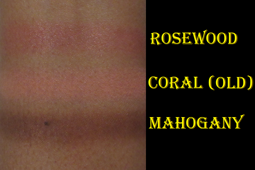
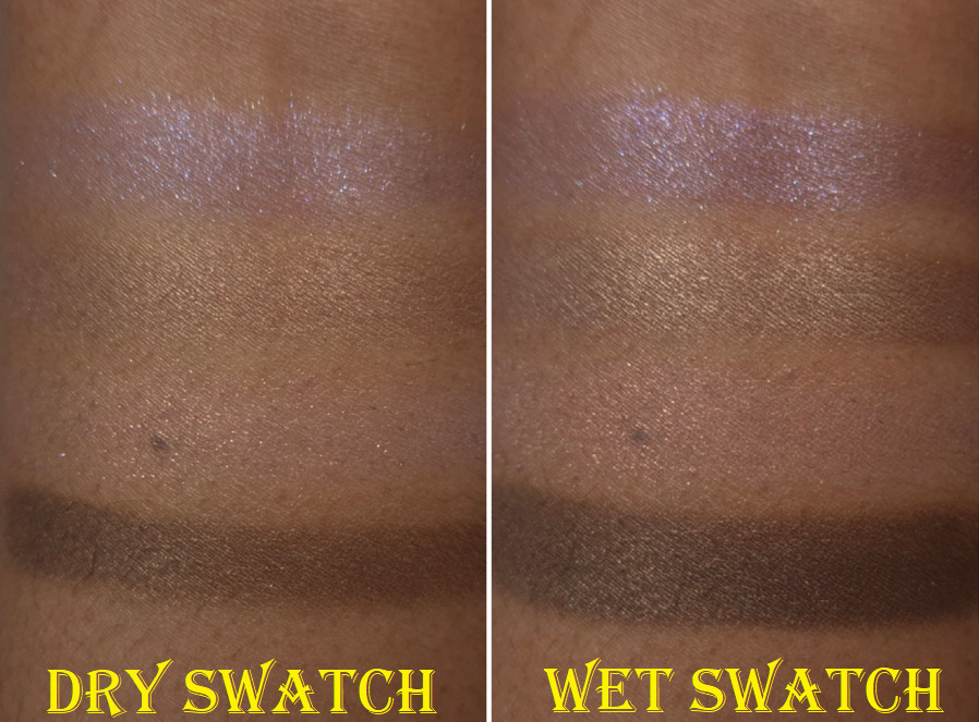
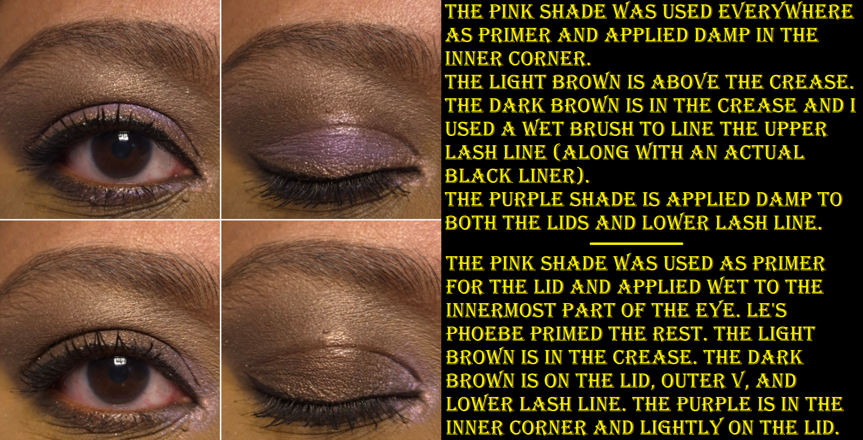
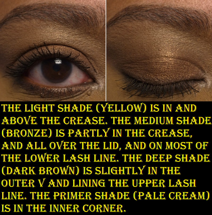
On dry skin with no primer (which is the condition I always swatch eyeshadows in), 3 of the 4 shades look as weak as I feared. Thankfully, there are two ways to get them to show up better. The first is to use the priming shade, always located in the bottom left corner of the Clé de Peau quads. The second way is to apply them damp, like I did in the right half of the photo above.

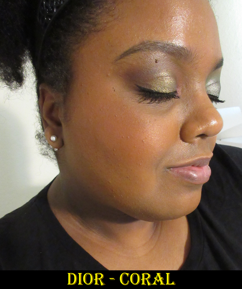
The brand refers to the pink color as “pink sparkle.” It’s easy to see those shimmer particles on my bare eyelids because there’s so much darkness underneath, but if I try to apply it on top of the other shades in the same way I use a highlighter to amp up the shimmer, it can barely be seen. The only way for me to use this as a topper, and get some impact, is to wet it.

When I use Pink Sparkle as a primer, as intended, I get more color payoff and shine from the other eyeshadows. This also makes the colors look more cool-toned though.

The texture of Pink Sparkle reminds me of Surratt’s duochrome formula within their Artistique Eyeshadow line because of how much creaminess it has. Pink Sparkle doesn’t have as much slip as a Colourpop Super Shock eyeshadow, but I can tell by touch alone that it’s a dimethicone-forward formula. I’ve been happy to see that it’s not emollient enough to cause the eyeshadows to crease. The other shades don’t crease either, even though they contain argan oil.

Some of my dark discoloration still shows underneath Pink Sparkle, and doesn’t get covered up enough if the eyeshadow on top is light, like the light brown shade. Putting my usual Lisa Eldridge base down first will cause Pink Sparkle to pill off. So, I found it best to either keep the two separate, having just Pink Sparkle priming the lid and the Lisa Eldridge product priming the area between the brow and crease, or to just put Pink Sparkle everywhere and apply the Lisa Eldridge product on top (instead of underneath). That adds the necessary coverage and doesn’t negatively impact the performance of the other eyeshadows.

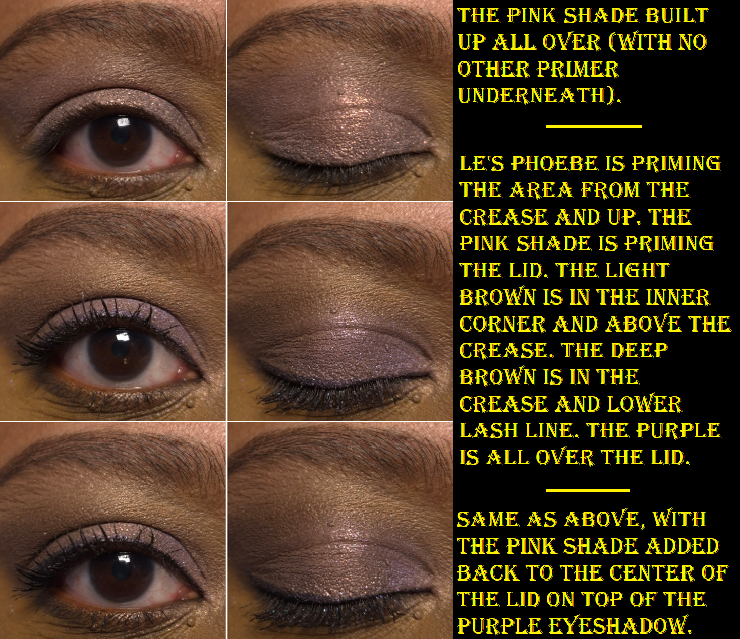
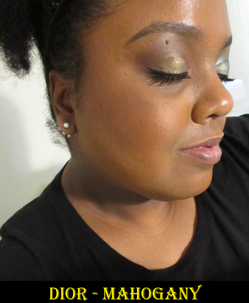
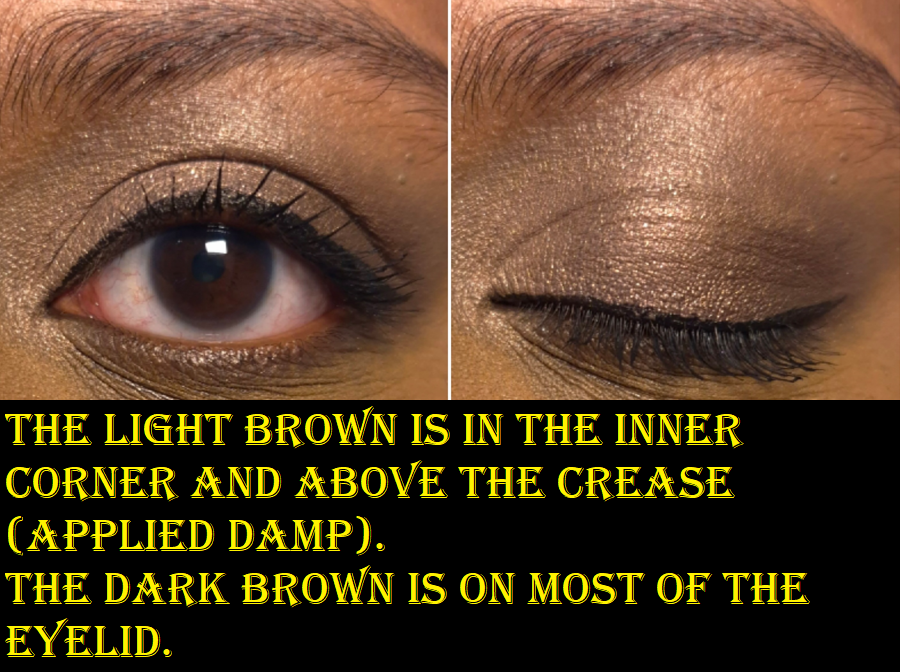
Even if I do wet the light brown eyeshadow, which is referred to as a “golden beige,” it’s too close to my skin tone to look vivid on me. I’m fine with this because it makes a perfectly good low-impact brightening shade and is a useful transition for the edge of the dark brown.

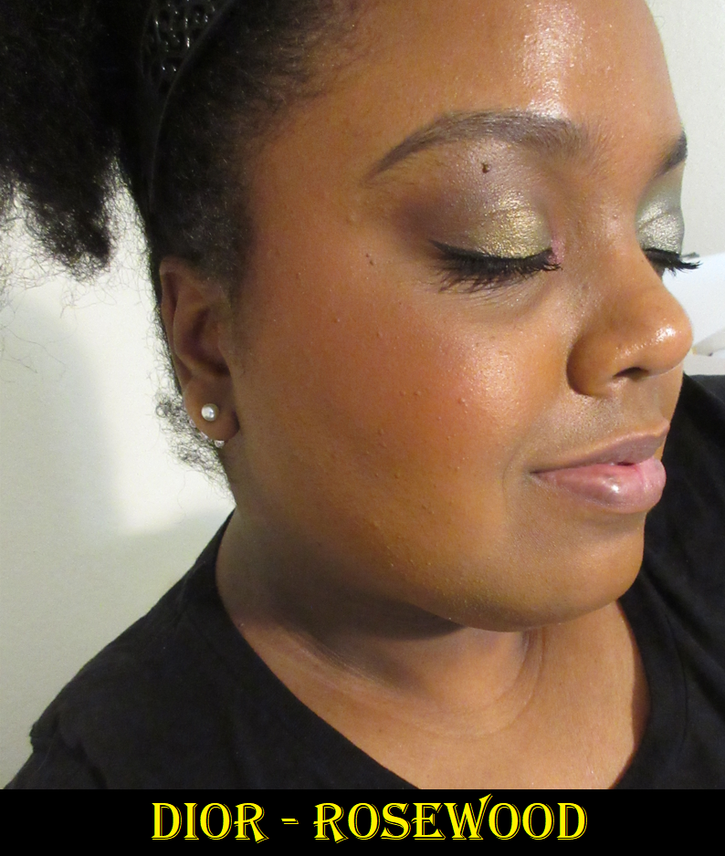
The darkest eyeshadow is called a “walnut brown,” and can create just enough depth for me to be satisfied. If I don’t use Pink Sparkle underneath, I’d say it leans neutral or just a touch warm at most. Pairing Golden Beige and Walnut Brown together makes for a simple, but pretty, eye look.

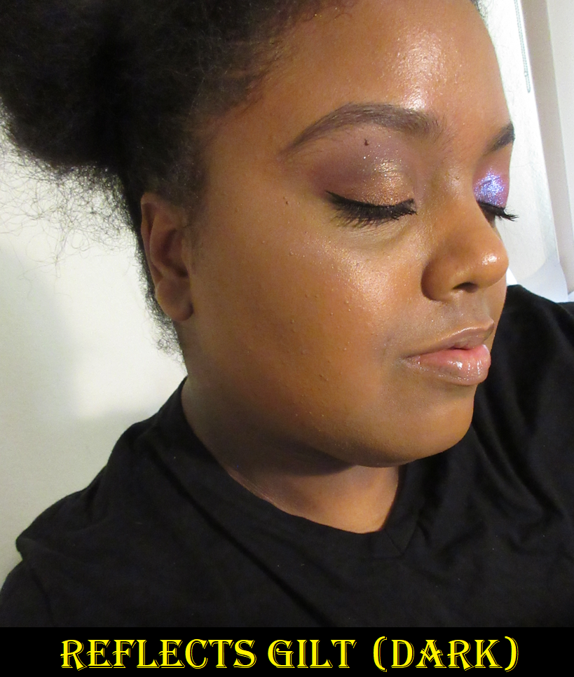
The purple eyeshadow is described as “lavender purple” and it’s what I rely on as the statement color. It pairs very well with the dark brown and pink shades in this palette. This isn’t my favorite tone of purple, but I think it looks quite nice!

The pigment level, texture, and performance of these eyeshadows remind me of Surratt and Suqqu eyeshadows. I linked my reviews for both, but I have additional Surratt eyeshadows (including a duochrome) that I haven’t posted about yet.

Surratt, Suqqu, and Clé de Peau eyeshadows are all made in Japan. One big difference, at least from Suqqu, is that I can lightly dampen Clé de Peau eyeshadows without it ruining the look of them in the pan or changing the texture. So, I can continue practicing my usual methods in intensifying these eyeshadows to the level that I prefer. This allows me to use this palette in a wider variety of looks than I believed I’d be able to get. I thought I would want to replace these eyeshadows with a different refill, but I like Pastel Tea Safari enough to want to keep it in this case! Between Surratt, Suqqu, and Clé de Peau, I like CPB’s eyeshadow formula the most.

These don’t produce a lot of kickup. They stick well enough to my eyes. Blending is no issue. Essentially, the quality is very nice. It’s just a matter of preference regarding buildable eyeshadows that don’t pack a punch right away (or at least not this year’s holiday quad without help). I consider these to be amped up satins, and the results I get from this quad is what a lot of luxury brands aim for.
Like a lot of luxury brands, these eyeshadows contain fragrance. I’d call it a mildly sweet and slightly floral soapy scent, which is faint enough that I don’t always notice it.

Because I tend to wear smoky and dramatic looks, intense sparkle, and very pigmented eyeshadows, paying the full €92 ($106) price for this quad or even €59 for the refill, will never be worth it to me. €59 EUR is around $67 USD, but Clé de Peau actually charges $78 for the refills on their US website. So, I don’t think I would buy more if I had to order them in the US. It’s not that the quality isn’t worth the price, but rather the price isn’t worth the amount of disuse I expect to have.
There are times when I’m in the mood for these kind of eyeshadows in their non-dampened form, but it’s so infrequent that I can’t justify getting them. If I will only use something occasionally, I want the cost to be lower too.

I wouldn’t put as much pressure on myself to “get my money’s worth” out of CPB quads if I could buy them at 25% off. So, this was my initial thought process regarding any new color stories in the future that may catch my eye. For a long time, I only found the 10 Sea Grass quad appealing, but those aren’t the tones of greens I love. Lately, 4 Ocean Sunrise has been on my mind. Merely one week before this post was set to be published, Niche-Beauty sent out 25% off codes via email. So, I ended up buying another quad.

It’s my birthday month! What can I say?

Lastly, considering my previous post, I feel compelled to mention that the packaging is gorgeous, but it is also lightweight. What makes this feel luxurious is the unicarton, the soft purple dust sleeve, large size push-click button, gold tone elements with concave sides and rounded edges, and the fantastically strange yet wonderful artwork on the lid.

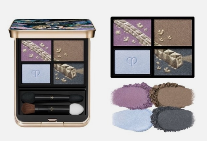
Clé de Peau Beauté Eye Color Quad (refill) in 4 Ocean Sunrise

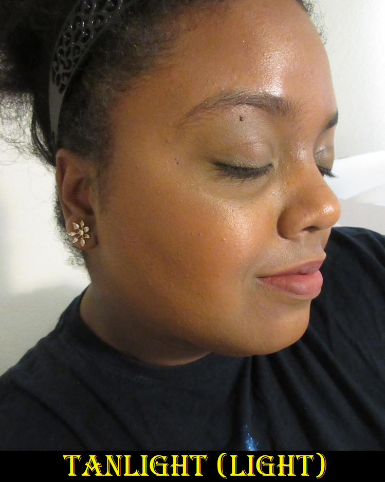
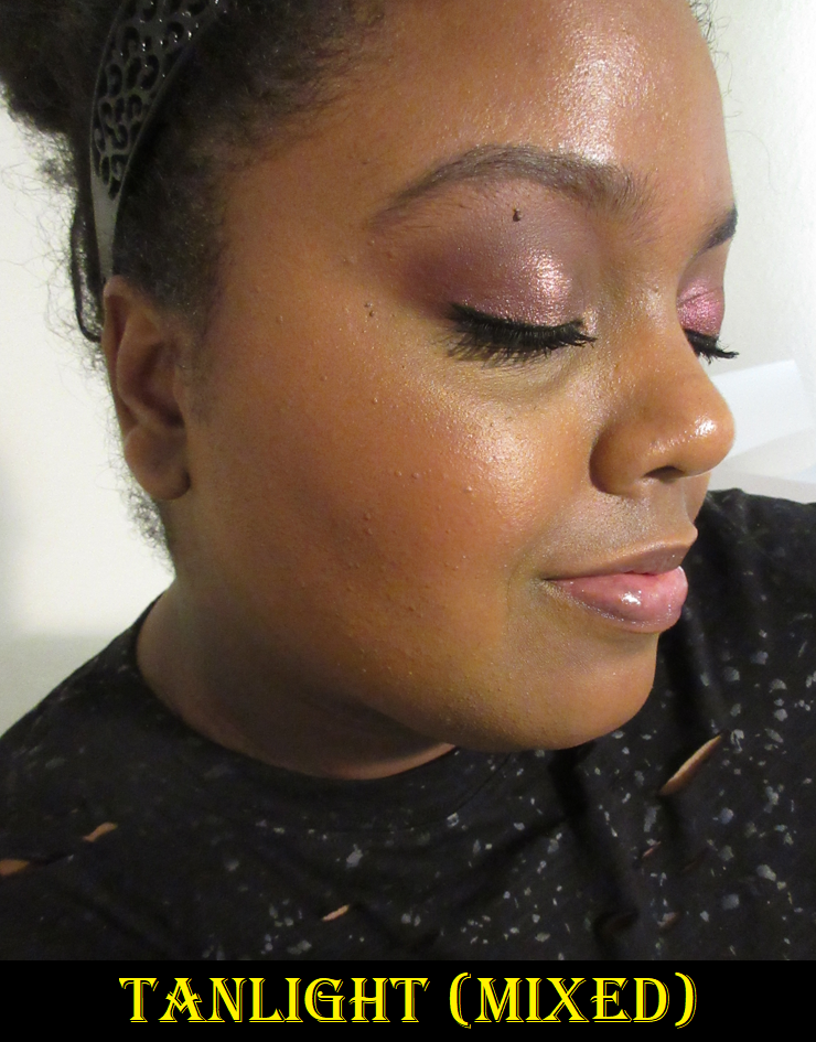
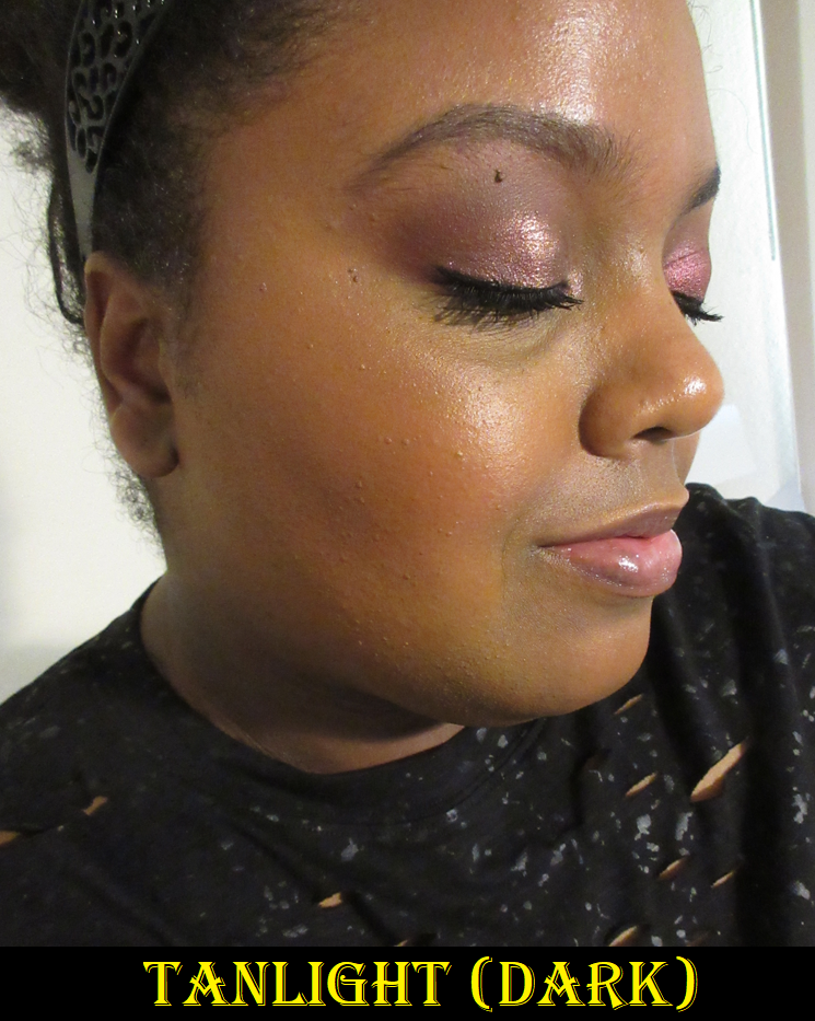
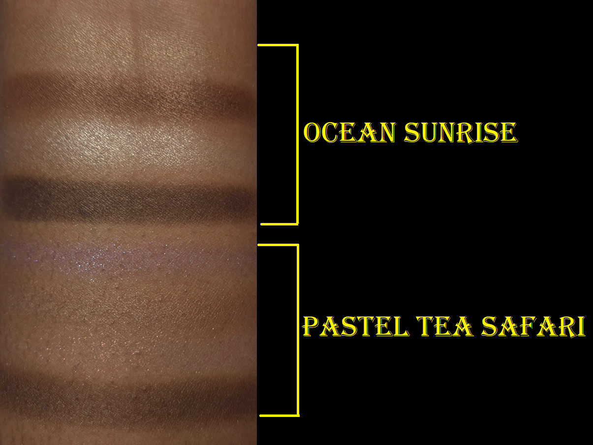
I get way more pigment with this quad than Pastel Tea Safari! The only eyeshadow that didn’t swatch as well is the first one, and it’s also the only shade that needed to be applied damp in the eye look below. The primer color is icy on me despite looking warm in the pan. It still has a pretty highlighting effect when applied dry, but I applied it wet in the eye look to create a stronger pop of brightness.

I’m pleased to see that the browns between both of my quads are not the same. The darkest color from Pastel Tea Safari looks like a combination of the two darkest shades in Ocean Sunrise.

For now, I intend to just keep the refill in the plastic holder and use it from there. Also, I intend to preserve the pattern in the holiday quad as long as possible by digging my brushes and fingers into specific spots (as seen in the pictures).

Since I bought the holiday quad and refill quad at a discount, I don’t have any regrets. However, I don’t think I can give a completely impartial opinion on whether this would be worth it to other people, considering this purchase has fulfilled a six-year desire to own a CPB holiday item and satisfied over fourteen years of curiosity about the brand. As a general rule though, I prefer not to spend over €50 for a quad that isn’t on my list of top 10 favorite brands’ eyeshadow formulas. That’s why getting a color story I liked, at that lower price, was good enough for me to be content with my purchases.

Blog Updates

If you’ve been visiting my blog for a while, you’re probably aware that I continued my second Project Pan into the remaining half of this year. Even though there are certain products I am trying to avoid buying, I have exceptions to every rule, particularly if it’s something I’ve been wanting for years. Some of the reasons I might have an exception is because the item finally restocked, I’ve been waiting for a color story that would suit me, the product was only sold in a region of the world I couldn’t access, the price was too high at the time, etc.

Based on the details in the history section, Cle de Peau clearly falls into this category of exceptions.

My idea for the “Wish Fulfillment” series is to separate my normal purchases from the products I’ve had on my makeup bucket list. These are products I’ve always wanted to buy, but couldn’t because of some circumstance.
Within the “Table Of Contents By Topics” bar of my blog, where one can select a category of posts from the drop down menu, I have added, “Wish Fullfillment/Makeup Bucket List,” so anyone can easily find the series.

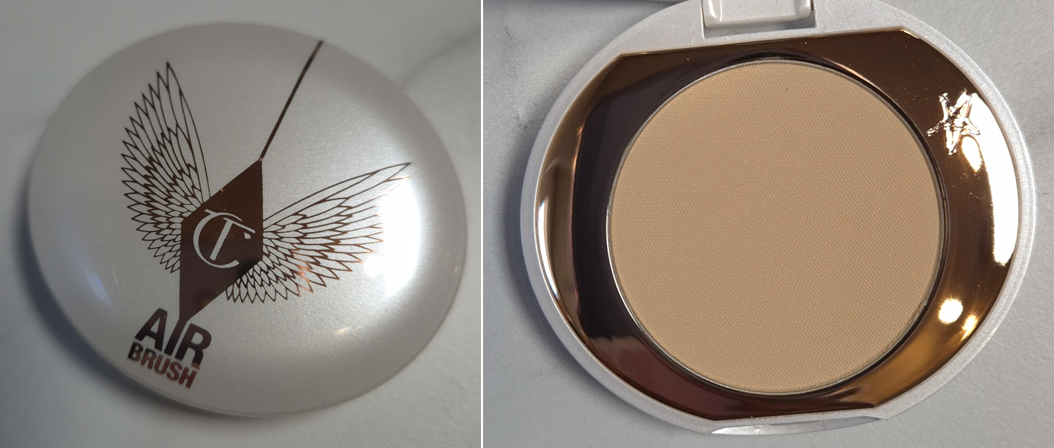
The first one I can think of that should be in this category is the Charlotte Tilbury Instant Look in a Palette. Others from the past have been added to the list.

That’s all for today! Thank you for reading and I hope this has been interesting and helpful!

-Lili

2025 Charlotte Tilbury Instant Look in a Palette

I’ve been using the Hollywood Instant Look in a Palette (in Dreamy, Bronzed Beauty) sporadically over the past two weeks, so I feel ready to share my thoughts.

Before we start the review, I’d like to highlight the fact that Charlotte Tilbury used to have annual face palette launches, but they were usually not deep-skin friendly. The photos below are of the three darkest palettes the brand created until this year. I didn’t end up buying the one on the left because of how light it looked on tan reviewers I saw on YouTube. I didn’t get the one in the middle because I feared none of the cheek products would work on my skintone, especially since I was darker in 2021. I didn’t buy the one on the right because I rarely reach for blush and highlighter palettes. A face palette doesn’t feel complete to me without at least a blush, bronzer, and highlighter together.

Photo Credit: CharlotteTilbury.com

In 2023 and 2024, the brand took a break from making larger face palettes, so I’ve been waiting at least six years to finally try one! That’s why, despite my pledge to quit buying face palettes, I made this exception.

I wanted to acknowledge this history because I have always been critical of Hourglass for their limited shade selections in Ambient Edit Palettes, yet I haven’t said nearly as much about the Charlotte Tilbury ones. I think it’s because as much hype as Charlotte Tilbury powder products get, it’s never to the level of Hourglass. So, I was far more disappointed when I could not use an Hourglass Palette vs one from Charlotte Tilbury.

Starting with the eyeshadows, the 1 Brighten shade is described as a warm tan with silver shimmer. On my skin tone, the tan color is only visible if I apply it wet (as seen in the photo above), and technically on top of a darker shadow. So, if I just tap it on top of my lids without dampening it, only the silver particles show in a scattered-effect-topper kind of way.

2 Enhance is described as warm copper with pink shimmer. As seen in the second pair of eye looks, it is difficult to tell the difference between the two shades on my lids. In real life, if I put Enhance on one eyelid and Brighten on the other, my eyes wouldn’t be closed long enough for anyone to be able to spot the difference. So, I can’t help but feel like I got a duplicate eyeshadow in this palette. I don’t mind having what amounts to one topper shade, but to have two out of three is a bit disappointing. That being said, they’re at least pretty. If I want a sparkly and slightly less scattered look, I reach for Enhance instead of Brighten. It is also true that I can get a slightly pinker look when I dampen this eyeshadow shade, or much pinker when I use the blushes on my eyes too.*

*If you’re concerned about whether or not the face products are considered eye safe, based on your government’s regulations, I recommend checking the official Charlotte Tilbury website and ingredient lists for information regarding that. I have not looked into this, and have tried them at my own risk.

Regarding fallout, applying the shimmer eyeshadows damp ensures that I don’t have too many particles under by eyes by the end of the day, especially if I also use the Nyx Glitter primer. Plus, I get the bonus of these methods intensifying the amount of sparkle that’s on my lids.

3 Smoke is described as a rich burgundy matte. It is indeed dark enough that I can be satisfied with creating eye looks using only this matte and one of the shimmers. I don’t like how rounded my natural eye shape is, so I prefer to use at least three eyeshadows to create a high contrast look with a sculpted outer corner in an almond shape that detracts attention from how rounded my upper lash line is.

I get decent pigment from this shade, though I still have to build it up a little to be satisfied. Layering and blending with it is fine, but not super quick. Basically, this isn’t an amazing eyeshadow quality, but it’s nice enough. I at least don’t have issues with patchiness. For those wondering, I use the Lisa Eldridge Liquid Silk Eyeshadow as my main eyeshadow base.

I have attempted to create eyeshadow looks using the bronzer and blushes as well, but they are not deep enough to give me the depth I require in my eye looks. I have to end up using Smoke or reaching for a different palette to finish the look.

So, if I include the brown bronzer as a blending out or softening shade, the face powder as a brightening shade, the raspberry-pink matte blush and shimmery glow blush as ways to intensify the pink elements of eye looks, the Smoke shade for dimension, and I use the two shimmers damp, I’m content enough with the variety of pink and purple eye looks I can create.

Moving on to the face products, I thought it was a good opportunity to show the differences between the Flawless Finish powder shades.

The swatches look quite stark and ashy, but all of these work for me under my eyes. In fact, Tan looks the best suited for me in the swatch, but I rarely use it on its own because it darkens the look of my under eye concealer if I’m using one that’s already a skin-tone shade.
My go-to combination has been to use a mixture of Medium and Tan together. When I’ve used Light Peach, it has been for its color-correcting elements, lightening a blush, or if I’m in a hurry and don’t feel like reaching for a different powder shade while I already have this palette open. This also applies to when I’m using the Soulmates Duo, which is where Light Peach (it may also be referred to as Flawless Peach) was first debuted by the brand.
It’s the same great quality I’m used to from the permanent line of face powders.

As for the Tan-Deep shade in the brightening formula, I bought a mini for color-correcting purposes once again. I have only used it once, so I don’t feel comfortable posting a full review. However, I wanted to at least demonstrate how it looks for anyone curious.

I have a bigger Charlotte Tilbury post I’ve been working on for a while, so if there is any information I need to update, I will post about it at that time. That post might not be ready until next year though. There are a lot of other reviews I’d like to complete first.

Next up to discuss is the bronzer. When I heard it was the shade Tan, I was a bit disappointed because that shade has never worked for me in the past. However, the one in this palette does faintly show up!

I wish I still had my older version of Tan to be able to compare it to the new one and see if there has been a slight color change. The reason I think it’s possible is because it’s stated on the website that this bronzer is actually a new powder formula. So, maybe the brand made this version the tiniest bit darker. Maybe it’s not actually darker, and is just easier to see because it’s a warmer tone of orange that stands out more on my skintone. The third possibility is that I might be lighter now than when I was in Florida, so I have no idea if the older powder version of Tan would work for me by now. The cream version of Tan has always worked though.

Shade match aside, I do believe there is a difference between the old powder bronzer and new one. My powder version of Deep is fairly old by now, so I don’t know if that could account for the new one feeling the tiniest bit softer and creamier, whereas the older one has a more powdery consistency. The older one had a beautiful airbrushed finish, which also accounted for a more obvious makeup look. The newer one has a more skin-like finish, which I would normally consider a great thing. However, I reach for Charlotte’s bronzer specifically when I want a slightly heavier glam look. The airbrushed blur is what made it stand out from most of my bronzer collection. As nice as this bronzer finish is now, it’s not as unique.

The reformulated version matches the quality of many of my high-end and luxury products, which makes it a great addition to this palette. The blendability is nice. I have no issues with longevity. So, I wouldn’t go out of my way to reach for a different bronzer if I’m already in the process of using this face palette. This difference might just effect whether I would buy an individual compact of the brand’s reformulated bronzer if they do end up launching them, considering it wouldn’t be giving me something different from what I already have from Hermes, the older Dior bronzer formula, etc.
Powdery airbrush type of bronzers I love are by Victoria Beckham, Gucci, Vieve, etc. It’s just that Charlotte’s ranked above all of them for this specific look. The new formula is still good, but I would want it when I’m in the mood for a different makeup style (like neutral or natural).

Moving onto blushes, I don’t think Charlotte Tilbury has expanded their permanent powder blush range since the addition of Pillow Talk Intense in 2020. There have been limited edition powder blushes, but it’s interesting that the brand’s focus for the past several years has been to extend the options of Beauty Wands and various cream formulas. The limited edition powder blush shades intended for those with medium, tan, and dark skin have been just different enough for me to justify owning them all. However, I can understand some of the frustrations I hear my fellow makeup lovers talk about regarding the options. People are ready for something distinctly different, and not just in liquid or cream form.

Blushes are still currently my favorite category of makeup, although eyeshadows are getting close to reclaiming their former position. So, these blushes were what I was the most excited to try. When I saw 6 Cheek Matte Blush in person, I was nervous because it reminded me of YSL’s Berry Bang that I got in August. However, I was very happy that I find Charlotte’s to be a prettier tone on me. It’s pigmented, soft, and buildable. To have a little more control of the matte blush and get it to have as light of a layer as it appears in the demonstration photos above, I used the Sonia G Soft Cheek Brush.

This blush lasts all day without fading. It also doesn’t look too matte for my dry skin, although I prefer to add a little of 7 Cheek Glow Blush on top to make my cheeks appear a bit more supple.

I was surprised to see that the Cheek Glow Blush is the only one not inside a pan. It feels like a gelee or slurry formula on top of plastic netting/mesh. Some products like this can be hard pressed, but this one is not. I have no issues getting enough product onto my brushes, but since it’s not as pigmented as the matte blush, I like to cut to the chase and use a brush that’s a bit denser and picks up more, like the Hakuhodo G6440.** One other brush I’ve been loving with it is the Bisyodo B-P-03 Perfect Fit Powder Brush.* I haven’t written an official review for it yet, but I want to share the fact that it lays down these blushes so well and it’s great to blend with. Despite being large, I can dip the lower angled portion of the brush onto the surface of the blushes, and then when I blend, there is a portion of the brush that doesn’t have product on there. So, I can diffuse the blush without packing on additional product in the process.

*DISCLOSURE: Every link (in this Bold Blue Font) is a regular non-affiliate link. The brush link (in this Bold Black Font With a Blue Background) is the only affiliate link in this post. This means I would get a commission from anyone who decides to make a purchase from CDJapan after clicking my link. Athough chances are slim that anyone who has used my links in the past will see this message in a post that isn’t dedicated specifically to Japanese Fude, I still want to show my thanks and appreciation. As someone with such a tiny blog, it’s still a shock to me whenever I see that someone has used my link, or even to just see the number of people who have clicked them. Thank you very much.

**Side Note: I feel compelled to point out that when I bought the Hakuhodo brush almost a year ago, it was listed at 19,000 YEN. Between Black Friday discounts and the shipping fee via shopping through Fude Bobo, I ended up spending a little less than that on the brush, and it still felt like quite the splurge for a brush of that size. Four months ago, Hakuhodo raised their prices again, so this brush costs 26,000 YEN now! As much as I love this brush, I cannot recommend Hakuhodo anymore at these prices.

Returning to the subject of the glowy blush, one downside is that it emphasizes texture a little bit. It’s not as intense or metallic looking as certain shades of the brand’s Blush Wands can appear, but it could still be too much for some people’s makeup preferences. Also, this blush shade shows up enough on me to consider it a usable standalone blush, but I find it more practical to regard it as a blush topper. It’s shiny enough to add glow like a highlighter, but the tone matches so well with the blush that I feel it doesn’t stands out enough or draws enough focus to my cheeks like a traditional highlighter would. So, I prefer to add the Cheek Glow Blush to the apples of my cheeks and/or the top of my cheekbones, but still apply a real highlighter on top to finish the look. Perhaps I would feel differently if my undertone wasn’t golden, since pink highlighters don’t pass for natural on me.

The YSL All Hours Couture Palette in Golden Oasis still feels new to me, so it’s natural to want to compare these two products. In USD, YSL’s face palette contains three blushes and three highlighters for $85. Charlotte’s face palette contains three eyeshadows, two blushes, one face powder and one bronzer for $69. The differences in Germany were much smaller as it’s €72 for YSL and €69 for the Charlotte Tilbury palette. I essentially liked half of the YSL palette, but would only really use two blushes (and I already owned one of those two). With the Charlotte Tilbury palette, I can use everything in multiple ways and I like all of the shades. I can finish a good portion of my makeup by whipping out this single palette. I like it more than the YSL and more than the Nars Hot Escape Cheek Palette. I still stand by my thoughts that the ones from YSL and Nars could be good in particular circumstances, and what I actually paid for them was a pretty good deal. This one just turned out to be even better.

I don’t believe it’s recency bias if I consider this to be among my most useful face palettes: Hindash Beautopsy, Sephora Microsmooth Multi-Tasking Baked Face Palette, Hourglass Ambient Edit Palettes, and now the Charlotte Tilbury Instant Look in a Palette. Considering the fact that I don’t like to use any of the others on the eyes, this palette has that edge. Hindash’s still has my best contour color, Sephora’s has a true highlighter, and Hourglass’ has a glowy bronzer option. So, I like and use these on different occasions. I believe the reason I would end up getting a lot of use out of the Charlotte Tilbury palette is for convenience. It’s just easy to have so many usable pretty products in one palette, which is the whole appeal of having a face palette in the first place.
I am glad that this one turned out to be such a good purchase!

That’s everything for this week. Thank you for reading!

-Lili

YSL Lippies: Candy Glaze, Loveshines, and Volupté

The YSL Rouge Volupté have been raved about for over a decade. I’ve always been a basic gloss kind of gal, so I couldn’t justify the $45 to try them out. When the Candy Glazes (Loveshine Candy Glaze Lip Gloss Stick) launched in 2023, there was a resurgence of interest for myself and other beauty lovers, but the price continued to hold me back. It wasn’t until I realized the brand’s website had these frequently on sale between $22-30 that I really started to pay attention. By then, they also had the High-Shine Caring Lipsticks (Lip Oil Stick) and Candy Glow Tinted Butter Balms (aka Sheer-Shine Colour & Care Lip Balms aka Candy Glow Lip Balms). All of them had “Loveshine” in the names and were used interchangeably on social media. The names themselves vary by country. I had no idea what the difference was between “candy glow” and “candy glaze” and which colors of components went with which formula. With such similarities, I was deeply confused and had to spend a lot of time researching. Today, I’m going to share my thoughts on the formulas and all the relevant information I can find. If anyone else was just as confused as me, I hope this post will help.

YSL Rouge Volupté Shine Oil-In-Stick Lipstick in 122 Burnt Zellige

To start with, this is the first YSL lip product I ever purchased. I was so happy when I bought this because it was on sale and has stunning packaging that I was able to personalize for only $5 extra. Seeing my name engraved on the lipstick makes it feel so much more special. I have another one (87 Rose Afrique) that was delivered to the US just before I left, so I haven’t seen that shade yet in person.

The main benefit to purchasing from the YSL-US website is the ability to engrave any lipstick from among their permanent ranges. On the YSL-DE site, I’ve been unable to find any engraving options and haven’t seen the same kind of discounts. Instead, all their retail partners frequently have sales on these lip products within the 25 Euro range. There are of course less shade options. Anyway, I purchased this warm red-brown color.

This lives up to the description of being an oil-in-stick. It’s not as shiny as a lip gloss, but it feels slightly more substantial than a pure form of lip oil. The color spreads nicely across the lips. It takes about two layers to get high-medium pigmentation. Going over the lips more than three times increases the frequency in which the product will spread to the outer edges of my lips and start to feel like too much was applied.
I don’t know if it’s just this color, but it has a light staining effect. I can get through a light meal where the emollient layer is gone, but slight color is left behind. However, this can’t last through a second meal without needing to be reapplied. This isn’t a long-wear type of product, but while it’s on my lips they feel nicely moisturized and fairly hydrated considering I have a lot of problems with lip care products that have an opposite effect if colorants are used. I definitely like this formula, but I don’t think these would be worth the full price if not for the brand name and luxury packaging. At the discounted price I paid though, I’m quite happy.

According to some sources, the Loveshine High-Shine Caring Lipsticks are just new packaging for the Rouge Voluptés, but according to YSL’s own website, it’s called an “upgraded” formula. I notice a difference and will discuss that in the next section.
I cannot find any Rouge Voluptés on their DE website (and they’re only available in select colors at retailers), but they are still being sold readily within the US. So, I don’t know for certain if the Rouge Voluptés are officially discontinued or how long it will take before they are gone for good.

I can keep my engraved cap long after the lipstick expires and put it on a newer YSL lipstick, but it would look a bit strange pairing a silver base and gold cap!

YSL Loveshine High-Shine Caring Lipstick in Limited Edition 209 Pink Desire, 122 Caramel Swirl, and 202 Peachy Glow

I already reviewed the glittery version of Pink Desire in my 2024 YSL Holiday post, so I will focus on the others. I have to say though that I noticed the limited edition Pink Desire feels balmier. The feeling of the limited edition version is the whole reason I wanted a more of these in wearable shades. I didn’t want to buy YSL’s Loveshine Balm because I heard of that one’s lack of pigmentation and the PH adjusting properties that I’m not interested in (though I will most likely try the formula next year in the limited edition ombre pastel pink and blue packaging that has been sneak peeked for at least four months). *

*Edit: I did buy it! Review for the Loveshine Balm is HERE.

Between Pink Desire and Caramel Swirl, the ingredients of the two shades are nearly identical, but the 5th and 6th ingredients swapped positions and the lower middle section has a few more in a different order. So, perhaps those minuscule changes still had an impact. The feeling of the limited edition version of Pink Desire would make it absolutely worth buying more (in different color options) if I could guarantee I’d get that same kind of texture/finish. Caramel Swirl feels more slippery. Peachy Glow feels like a true middle-ground because it’s balmier than Caramel Swirl, but feels oilier than the limited edition Pink Desire. I cannot account for why that is, considering the only ingredient differences I see between Caramel Swirl and Peachy Glow are the ones that effect the color. “Collector” Pink Desire is more different than Caramel Swirl and Peachy Glow are to each other, so I will go out on a limb and guess that if someone buys a Loveshine without shimmer specks it’s going to feel like the rest of the permanent range.

I will refer to this formula from now on as simply “Loveshine” because that seems to be what most people shorten the name to instead of High-Shine Caring Lipsticks or Lip Oil Sticks. Based on the permanent shades, Loveshines are moisturizing, but not equally as hydrating. It’s occlusive, forming a barrier keeping moisture on the surface, but I don’t feel like it conditions my lips over time as well as some colorful lippies I own from other brands. For example, I like Lisa Eldridge Lucents more for the color choices and way they feel on the lips. I also prefer the Lisa Eldridge Baume Embraces because they’re more lightweight, yet have a stronger grip on the surface of my lips. With the Loveshines, I get this needy sensation to keep rubbing my lips together. I can feel it and am aware of it all day, unlike the Rouge Volupté. The color sinks a bit into chapped spots, but since I spend so much time rubbing my lips, it smooths the color back out. The smell is lovely (candy-fruity) and I’m still pleased with this as a moisturizing product and adding color to the lips. As the day goes on, after the emollient layer eventually wears off and colorant is still lingering, that’s when my lips start to turn dry and look drier than when my day started. That might be a me thing and my problems with some pigments/dyes. However, this doesn’t happen with the Rouge Volupté and I own the same color for one of them!

When I bought Caramel Swirl, I thought the number for it sounded familiar, but I made the mistake of only checking for a duplicate name. Because my first one was called Burnt Zellige, I thought they would be different. Technically, if I really stare hard at the color on my lips and in swatches, Burnt Zellige has the tiniest bit more red in the red-brown with Caramel Swirl being slightly more pink-red-brown, but I highly doubt anyone would notice if I put one on one half of my lips and put the other on the other half. The tiniest difference in color is as small as what can occur between different batches of the same lipstick. I can see it, but I asked my husband and he could not. What type of lighting I’m under also plays a factor. So, I will acknowledge they’re the same shades in different formulas.

In essence, the differences I can detect between this Rouge Volupté and the same shade of Loveshine is that the Rouge Volupté is more pigmented (took 2 swipes in the photo above versus 3 swipes of the Loveshine), oilier and more hydrating, but that oil keeps it from lingering on the lips as well as the Loveshines. I also get a staining effect with the Rouge Volupté, but not with the Loveshine.

I have to address another part that is tricky regarding these lipsticks. The color in the tube isn’t necessarily the color one will end up with on the lips. Also, I’m not sure why 202 was named Peachy Glow when it’s not a peachy color. It looks like a nude pink on me and I’ve seen it look medium-dark cool mauve on other people. Neither of those shades match the pinky brown that it looks like in the tube. I feel catfished by a lipstick! Thankfully, it’s still pretty, though a bit pale on me. I don’t recommend purchasing these based on the tube color, but judging off swatches is a risk too!

I think this is a nice product and most people that love the Voluptés will love the Loveshines. I have such picky lips that if I wanted to use it as a “caring” treatment type of product, this wouldn’t be worth the price (unlike on other people with less lip sensitivities who would have zero issues with this). However, as a makeup product and just wanting to have something comfortable enough to wear in a pretty color and with packaging that feels luxurious and indulgent, this succeeds in that.

YSL Loveshine Candy Glaze Lip Gloss Stick in 14 Scenic Brown and 15 Showcasing Nude

Figuring out the differences between these lipsticks was confusing enough, but I also realized some shades exist in multiple formulas! There is a 14 Scenic Brown in this Candy Glaze, as well as a 207 Scenic Brown of the Loveshine Lip Oil Stick (High-Shine Caring Lipstick). So, if someone requests a YSL lippie in Scenic Brown for Christmas, a birthday, or some other event…be sure to find out which formula they prefer!

The Candy Glaze feels more like a gloss than a lipstick, so now I understand why it’s considered to have a jelly texture. It feels both moisturizing and decently hydrating. To me, this is like a thinner version of Fenty’s Gloss Bombs and I would even go as far as to say Fenty might have duped this with their Gloss Bomb Stix. Another similar product are the Nabla Beyond Jelly Sheer Lipsticks. The downside to both Fenty and Nabla’s lines is that there aren’t additional shades from them that I would want to buy over the single ones I currently own. I’d be interested in shade extensions for both.

This feels stickier and therefore has more grip on the lips than the Loveshine, but that’s not a bad thing. Among all glosses on the market, this is on the lower medium spectrum of stickiness. I can sometimes forget I’m wearing it because it doesn’t move around as much on the lips, but I’d still consider it medium-weight instead of lightweight. Multiple layers can build up a tiny bit more opacity, but I don’t recommend swiping too much on as it can then become heavier, thicker, stickier, and gather too much in the lip corners. This has a click mechanism for getting product up and back down. It’s meant to discourage anyone from rolling up the Candy Glaze in this soft formula too high and damaging it.

After doing swatches, I noticed Scenic Brown had a slight staining effect on the skin, but Showcasing Nude didn’t. I assume this is due to the colorant used and the darker shades in this formula will do it, but not all of them. It’s just interesting because I heard the Candy Glazes were supposed to have the most color payoff, but both of my shades look way sheerer than was represented in the many photos I saw online from the brand and beauty influencers. At the same time, if I build up the color specifically on the dark pigmented spots on my lips, it gets covered fairly well. So, I guess I don’t need it to be a more pigmented formula.

I’ve mentioned the difficulties being able to tell what the shades actually look like in person. There is yet another element of trouble, which is distinguishing between similarities among all the formulas. On me, Showcasing Nude and Peachy Glow look pretty similar. Showcasing Nude is paler, so I prefer the look of Peachy Glow on myself even though I prefer the Candy Glaze formula. With the numbering system being different, I haven’t been able to figure out an easy way to compare shades across formulas.

In playing around with different lip products in my collection, I found out that if I take a little bit of my Rabanne Lovebalm in Bloody Kiss and lightly press it onto my lips to get some of that deep color, then apply Showcasing Nude on top, the lip look becomes a wearable cool-leaning medium pink. It’s such a pretty combination!

My Candy Glazes have a scent, but it’s not as strong as the Loveshines or Rouge Volupté. I get the barest whiff of sweetness, but they don’t have as distinct of a fruity candy-like smell as the others. I bought them in October, so it can’t be due to being too old.

Of all the YSL lip products I tried, I like the Candy Glaze formula the most. However, I can’t ignore how much this reminds me of the Fenty Gloss Bomb Stix and those are 23 Euros ($25 USD) at full price versus a maximum discounted price of 26-29 Euros for the Candy Glaze.

Based on everything I’ve tried, I understand the hype for YSL Lip Products and do feel that it’s warranted. However, I recommend waiting for a sale. Perhaps 10 years ago these were more unique, but other brands are catching up and matching formulas. I’m thrilled that I’ve been able to find colored lip products that look beautiful and are also capable of nourishing my lips. However, I do have more options than just YSL. There is admittedly something about the packaging that is alluring enough to make me want to buy more. So, no judgements to anyone who buys these at full price (my limited edition one was full price). We’re still getting a quality product and I can’t say that I wouldn’t buy more in the future. One of the biggest deterrents though is that I don’t shop for makeup in person and even when I try to make sure I’m not getting the same colors within the same formula, it ends up nearly matching the color of another formula of YSL lippie. These are too expensive for me to want to keep getting duplicates!

That’s all for today! Consider clicking follow if you’d like to be emailed whenever a new post is out!

-Lili

Hermes Silky Blush Powder (Iridescent Version)

I reviewed the first launch of Hermès Blushes (found HERE) when the brand released only matte finishes. Then, during the Summer of 2023, they added three shimmery blushes to the Rose Hermès line. Considering I felt that the matte blushes were equal to, but did not surpass my favorites, I was unwilling to pay full price to try a new one.
All of my blush favorites are under $40, so the refill price of $48 was pushing my limit. I waited months for the refills to be released so that I could add a metal sticker to the bottom and pop it in a magnetic palette, but it took so long that I stopped checking for them by the end of 2023. Imagine my surprise when I stumbled upon it on the Selfridges website and saw it was finally available!

I have to admit that sometimes my inability to purchase something (sold out, limited edition, early teased product that won’t be released for months, only available in certain countries, etc.) intensifies my feeling of missing out. With enough time, I can reason with myself that I probably won’t love the item enough for it to be worth buying.
That logic didn’t work in this instance, but I am very lucky that the outcome was in my favor! I actually like this blush so much more than I expected and I feel like it’s at least more worth the high price than the matte ones!

Hermès Silky Blush Powder (refill) in 58 Rose Cuivré

The shade that I purchased is the deepest of the three shimmery blush options. The right half of the photo above shows that the base color is medium-dark. When the light hits the shimmer, the blush looks medium peachy-pink instead, depicting how much the shimmer can lighten the overall look of the blush. This is one of the reasons I wasn’t certain if this shade would be too light for me. Shimmery blushes can sometimes look too ashy or like a pure highlighter on me, regardless of how deep the base color is, such as Nars’ Orgasm X.

Upon swatching Rose Cuivré, I discovered that it looks similar to MAC’s blush shade in Pinch Me, which was also similar to the first Hermès Blush I bought called Rose Feu. At least, Pinch Me and Rose Feu looked similar when applied on bare skin. When applied over foundation, Rose Feu darkened and looked slightly more red and less of a deep pink.

One of the things that I’ve come to realize is that Hermès makes the silkiest and softest feeling pressed powder products. Their bronzer is still my number one favorite in my collection. The matte blush was very good, but on par with my other favorites. This iridescent formula though is the silkiest feeling shimmer blush I own. It’s even softer than the Gucci blushes. The particles are so finely milled. There are no large sparkle or glitter particles. Visually, it looks like the MAC Sheertone Blush formula, except so much softer and more refined. I can also use my softest blush brushes, such as my grey squirrel ones that don’t pick up as much product as goat, because it’s still able to grab a decent amount of product and it doesn’t require a dense brush to buff the blush smoothly into my cheeks. Lightly sweeping the product into my cheeks produces a beautifully blended result. It adheres well to my skin and lasts all day.

I skip wearing highlighter when I use this because the glow is easy to see. It gives a pearly effect, but thankfully does not look too silvery for me to wear. It’s right on that cusp of looking slightly cool, but still flattering on my warm undertone complexion. I could possibly still enjoy this blush if I was a few shades darker, but I don’t know if this is deep enough for someone in the deep-dark category or beyond.

The sheen from this is what I imagine it would look like if my beloved Dior Powder No-Powder was made into a blush formula. The textures are not the same, since the Dior powder is much harder pressed in comparison. It just has the slightly blurring quality and is one of the few other products I can think of that gives off a sheen that’s nearly pearly-looking, yet works for my skin tone. Considering the Dior powder has holy grail status with me and is my favorite finishing powder of all time, that’s high praise for the Hermès blush to conjure that image for me.
I figured this product would make a great blush topper, but as one can see in the swatch photo, the luminosity lessens considerably on top of another blush. I think it becomes an issue of too much pigment and not enough of the shimmer in the mixture. If I add more of Rose Cuivré on top, it turns too deep and intense. So, this blush looks better when used on its own.

When it comes to luxury goods, there are a lot more factors to consider than just the performance or quality as to whether it’s “worth the price.” As much as I am enamored by this blush and impressed by the quality because it’s the finest shimmer powder one I own, it’s not the absolute perfect color tone for me. I intend to get a lot of use out of it, just like with the brand’s bronzer, but I still have blush colors that are my favorites from other brands.
It was worth it to me to buy this refill, and I will probably even put this in the Hermès blush compact that currently houses Rose Feu when I get it back from the US. However, I still wouldn’t be able to justify the $84 for this. Good lord, did the price go up since last year? Weren’t they $77? Hermès being the luxury brand that it is, the price could be considered next to nothing for their regular customers. So, it’s all about perspective.

I hope this has been helpful to anyone still curious about this shade. Technically it has been out already for a long time, but at least now the refill option keeps the cost down for those more interested in the product itself. One final note is that this contains fragrance.

That’s all for today! Thank you for giving this review a read!

-Lili

Luxury Makeup Reviews

I’m a little surprised by how many luxury products have tempted me this year. Then again, brands have been expanding their ranges, so I have products available to me now that I didn’t before.

Today’s post will be centered around some of the most exciting luxury makeup items that are newly part of my collection.

Dior Rosy Glow Blush in 012 Rosewood and 020 Mahogany

Dior reformulated their Backstage blushes, if they can even still be considered part of the “Backstage” line, since they removed that part of the official product name. I’ve seen photos on Instagram showing that the older formulation of Pink and Coral are darker than the new ones. I didn’t realize the old Coral could possibly work for me until it was already removed from every website. I even clicked lists I found online that supposedly had the older ones, but the links redirected to either the main page or to the new ones instead. So, the only way I could get the original coral was via third party sources. Since it’s not from an authorized retailer, there’s no way to know if it’s authentic, but I suspect it is compared to photos I’ve seen on Temptalia’s blog, for example. However, I’m only showing swatches and what it looks like demonstrated on my cheeks instead of factoring it into my official review. Today’s focus is on Rosewood and Mahogany that I purchased from Sephora and Selfridges respectively.

Rosewood is not only my favorite shade of the 4 additions to the range, it’s one of my favorite colors in my whole collection. I love how it looks on me! It’s not glowy due to shimmer. It just has a healthy sheen to it. It’s long lasting on my cheeks. In fact, I have to scrub vigorously at the end of the night because it nearly stains my skin. This might also be due to how much I have to use because Rosewood is such a subtle shade on me. I have to build it up a lot, but because it’s so blendable, it doesn’t take long to do it. My preference is using a goat hair brush with it because the powder is firmly pressed and that hair type picks it up easier.

I watched a fair amount of videos on these blushes, and a few people said these were patchy. However, the only one I’ve visibly seen on camera look patchy on others is the same one I have the issue with: Mahogany. There’s a separation between the Red 27 dye and the deeply rich brown color. My squirrel hair brushes can’t pick up the blush well enough, nor my silver fox, but I can use my squirrel/goat mix ones with this. However, even when I do try to patiently use a squirrel brush and blend as sheer of a layer as possible while attempting to build it up, I will eventually start to get more brown than reddish-pink. The random build up of brown in places does not look good on my cheeks. The photos I selected below are the best looking ones of Mahogany on my skin. It’s a balance of showing it as sheer as possible for the color to still get captured by my camera.

There are some videos on YouTube showing how Mahogany looks applied as a normal blush, for example this one by Beauty and the Frizz, or this one by Julie P. And an example of using it with some foundation patted over the top is by The Hooded Lid.

I’ve applied this over a powder-set base, an unset base, tried brushes with different hair types and synthetic fibers, and various brush shapes, but none of the changes made a difference. It still looks patchy on me and the tone of brown just doesn’t look flattering on my cheeks, potentially due to my undertone.
The way that I can continue to use this, and really like it, is as a sculpting blush. I apply it to areas I would normally bronze, making sure to apply it lightly, before adding Rosewood to the main cheek area. I’ve really enjoyed this combination!

My love of Rosewood makes me even more tempted to try Cherry and Berry. I feel certain Berry would perform on me the way Mahogany does, plus I’m super picky about berry blushes. Cherry is gorgeous, but it reminds me of a brighter version of Rosewood from what I’ve seen on other people, and I have several vibrant shades like it in my collection such as Pat Mcgrath’s Electric Bloom, Colourpop x Hello Kitty Aloha Honey, Nars Exhibit A, MAC’s Loudspeaker or Frankly Scarlet, Patrick Ta’s She’s Vibrant, etc. Most of these I barely use, so it doesn’t make sense to buy it, even if I think the color is a beautiful one.

Based on my experience, I recommend them. However, it comes with the warning that there may be a press or formulation issue based on the inconsistencies being reported about patchiness regardless of the shade, and only for some people but not others.

Gucci Luminous Matte Blush De Beauté in 09 Intense Plum

I’ve had mixed feelings about these blushes for a while now, as I mentioned in my review of the Armani Luminous Silk Glow Blushes and my comparison of those to these. So many people rave about them, but I feel no joy when I put them on. The closest I get to liking the color is with Warm Berry, but that shade is exceptionally pigmented. I have to be really light-handed or it looks overdone fast. Intense Plum also has a lot of pigment, but I take a small amount and really work it into my cheeks to make it look a little more natural. I still prefer the tone of Warm Berry, but the depth of the shade makes it harder to look as sheer as Intense Plum can.

I went back and forth deciding if Bright Coral would show up on me and whether it was worth the risk to buy. It’s very faint, and more visible in person, but I’m never satisfied using it alone unless I mix it with one or both of the other shades. In fact, I tend to apply this on top of the others to help tone them down. I’ll need to do a declutter eventually, and I haven’t decided if I’ll be keeping this one or potentially even removing two of them from my collection.

The formula is silky to the touch and goes on the skin smoothly with a soft satin sheen. It’s super quick to blend onto the cheeks if you like a bold look, but because of the pigmentation level of the deeper shades in the range, I have to be careful how much product I pick up and I do need to blend it out a bit. So, to get it as sheer looking on my cheeks as I want, it takes a little longer in my specific case. But the formula itself is quite blendable and long lasting on the skin. For some reason though, I’m just not as impressed with the end result on my cheeks as I feel I should be considering the price. I’m far more interested in keeping that beautiful packaging, which looks much cuter in person than the online photos. I take back every bad thing I’ve said about it being a clip art star pattern. It’s more luxurious than I expected.

Guerlain Terracotta Luminizer Highlighter Powder in 01 Gold

Considering this comes in only two shades and this is labeled 01, I was a little concerned that it wouldn’t work for me, but it does! This contains, “Gemtone: Adapts to skin’s true tone for a natural finish,” according to the description on Sephora’s website. I have no idea how I could prove or disprove that claim, but I thought I’d mention it for those who aren’t anywhere near my skintone and might worry if this will be too dark or too light.
This highlighter is very subtle and only really pops when applied on a dewier surface. This should be my type of highlighter, and I really expected this to be holy grail status, but I’m just not impressed enough considering the price. I hoped this would be my replacement for the 2015 Guerlain Meteorites I was obsessed with and used periodically for 6+ years until I decided it’s too old and put it in semi-retirement. However, the finish of it being less glowy than my Charlotte Tilbury highlighters while not being any more refined in terms of sparkle or particle size either, led me to not be as excited when I use it. I feel this way especially since it is on the lighter side for me and not a perfect undertone match. It’s good, but not fantastic. Even if this did come in the perfect color for me, there’s no guarantee it would raise my opinion of the formula considering PML’s Divine Rose highlighter is not a perfect match either, but I love how that one looks on me!

The packaging is pretty, but I’m not as excited by it as I expected either. When it comes to luxury makeup, the makeup at its best quality is usually still comparable to products from other brands, but the packaging helps make it worth that higher price. Because I think it’s nice but not amazing on the makeup and packaging fronts, this wasn’t worth buying. It’s strange to say I’m the most disappointed by this product out of the bunch in this review, but it’s because I had the highest of expectations for it only to be let down that it’s not at least as pretty on me as my old meteorites. My one tangible complaint that’s less about preferences is that as subtle as it looks in the beginning, the shine dulls down as the day progresses. So, I try to over-apply hoping it’ll last longer.

I honestly would have returned this if my time limit hadn’t run out. I ordered it during the VIB sale while away overseas and by the time I could actually see it in person, it took too long for me to make up my mind about it. I can at least take comfort in having gotten it on sale. I still think it’s a good product, but for the right person.

Chantecaille Sunbeam Cheek & Eye Shade in Ray

As it currently stands, this is the only product from Chantecaille that I love. The second best is the Blur Powder, which I like, but none of the rest of the Chantecaille products I’ve owned worked out.
I was thrilled that the brand released such a deep highlighter, though they tried very hard to emphasize and market this as an eyeshadow. It looks a lot deeper on others, but when I use this on my eyes, I put it in the typical highlighter spots and not usually all over the lid, the way I have it in the photo below.

Besides the eyes, I’ve also seen those with light skin tones find use for this as a shimmery blush or even as a bronzer.

The shimmer size is small and it’s a gel-powder formula, which I tend to love. Ray is another subtle highlighter that looks more intense on dewy skin. At certain times of the year, this can be a bit dark for me because of that base color, especially if I build it up. However, I’m perfectly happy with how it looks when I use a small amount and buff it in a bit because I also have to watch out for the shimmer particles that are on the lighter side for me. That’s why the combination of both kind of balances out (the deep base with the light shimmer).

It’s a bit ironic that the Guerlain highlighter looks better on me in photos than the Chantecaille highlighter photos, but I promise it’s another story in person.

In the swatch photo, I included the golden stripe from Charlotte Tilbury’s Dream Light Pillow Talk Multi Glow Highlighter (3rd out of the 4 shades), because that’s an example of my perfect “natural” highlighting color in depth and tone. Guerlain’s is gold, whereas Charlotte’s is golden, and Chantecaille’s is reddish bronze with a yellow-champagne shimmer. The shade Ray, when sheered out, looks closer to Charlotte’s than Guerlain’s does, which is why I think the color suits me better than Guerlain’s.

Also, please don’t ask why I continue to buy highlighters if I already have a fantastic formula and my perfect shade via Charlotte Tilbury.

The packaging doesn’t exude luxury, but it’s fun! I love the bright neon green. I love that I can spot it immediately in my collection. I like the unique imprint on the powder (although it reminds me a bit of something not-so-pretty) and the small compact size is great. I had points on my account at SpaceNK, plus there was a sale, so I bought this for significantly less than the retail price. Considering all this, plus the color and performance, I’m way happier with this than the Guerlain highlighter. I have to admit though, that the full price would never have been worth it to me. Unless the packaging is plated with gold, $50 is my limit for highlighters.

Tom Ford Highlighter Collection: Shade and Illuminate Highlighting Duo in Tanlight, Soleil Sheer Highlighting Duo in Reflects Gilt, and Skin Illuminating Powder Duo in Flicker

I purchased Tanlight from Nordstrom when it came out, Reflects Gilt from Beautylish during a sale, and Flicker from Mercari because it had already been discontinued. I saw a video where someone compared the Flicker shades to Tanlight and I didn’t even know it existed prior to that. Unfortunately, Flicker fell out off the plastic mesh/grid, so I smushed the pieces back in. Then it fell back out again and I glued them in. I don’t officially consider it part of this review and only included it for color comparison purposes in case anyone was wondering whether to get Tanlight if they already have Flicker. The top highlighters in both compacts are extremely similar, but Flicker has a stronger yellow tone. I think I like it by itself more than Tanlight’s lighter shade by itself, but the color of both highlighters in the Tanlight compact mixed together creates my perfect highlighter color. The advantage to the Flicker compact is that I could technically use the deeper shade as a glowy bronzer, but it’s so deep and sculpting that I have to be careful not to overdo it when I try to use it that way. Flicker is also so deep that mixing both together forms a color too dark to highlight with.

I’ve noticed no difference in the formula between either of the three products. They’re all very smooth on the skin, all impactful and reflective, all long lasting, and all gel-powder formulas. The new Shade and Illuminate duo compacts have the “TF” initials on the lid, but that’s about the only difference I’ve noticed in the packaging as well.

I don’t know if it’s just because the sparkles are easier to see with the lighter highlighters in the duos, but I could swear the lighter ones all have more shimmer in them than the darker ones.

As I mentioned before, Tanlight mixed is the best for me, followed by Flicker’s top shade, Tanlight’s bottom shade, Tanlight’s top shade, and Reflects Gilt’s bottom shade.
Reflects Gilt is a bit too light for my preference, with the exception of the darker one which I’ve started to use exclusively when I open that compact.

The retail prices of these duos are the same as the individual highlighters from Chantecaille. This would normally never be worth full price (I did get Tanlight at a minor discount), but it’s technically two products in one. This complicates things. Unlike a blush that someone can wear in a multitude of shades and have them all look beautiful, there is only a small range of colors that I feel I can pull off when it comes to highlighters. However, it’s because Tanlight produces perfection and I can tailor how much I use of either one in the event that my face gets lighter or darker throughout the year, that’s what makes this worth it for me. As for Flicker and Reflects Gilt and only really wanting one shade within each duo, the deep discounts that I got them for makes me not have any regrets buying them, although I’m not sure if I’ll keep Reflects Gilt in my collection forever. I don’t really have a purpose for keeping it when Tanlight is just a better fit for me overall. The packaging is quite pretty though, so I almost want to keep it just for that.

Givenchy Prisme Libre Skin-Caring 24H Hydrating Radiant Correcting Creamy Concealer in N390 and W420

This is a medium/buildable coverage concealer, instead of the complete full coverage ones that I normally stick to. What drew me to it was the hydrated look and the natural finish that wasn’t too radiant for my preference and wasn’t too creamy. Creamy concealers tend to crease on me beyond what I find an acceptable amount. This grips to my skin quite well and although it’s not as long lasting as my Tarte Shape Tape or KVD Good Apple, if I pair it with the right powder and use the right amount, it can get me through a short day’s wear with me feeling satisfied with how it looks at the end. If a concealer lasts 8 or more hours on me without being significantly faded or flat out gone, it’s a winner in my books.

Because it’s not full-coverage, I can’t wear my actual skintone shade over my dark circles because it shows underneath as a deep grey tinge. So, I have to utilize the under-painting technique in using a shade that’s deep enough to keep my dark circles and areas of skin discoloration from appearing grey when I apply the concealer. Then, to get it to match the rest of my face, I use my regular concealer color around the perimeter and blend them together. Because the combination isn’t a perfect undertone match, it still looks slightly off if I’m trying to have a minimal makeup day and skip foundation, but it looks perfectly natural on days I put foundation on. There are way more neutral shades in this line than warm tones, but I was determined to find a way to make it work for me.

Also, I’ve tried mixing this concealer with my other full coverage ones and the formulas just don’t mesh well. It fades faster or creases in a more obvious way. One time I tried using the Becca Under Eye Brightening Corrector with it, and that combo works well if Becca is kept away from the lines under my eyes. Lately, I’ve been enjoying using it over top of the Milk Hydro Grip Eye Primer (that I use for concealer and not eyeshadows), because it helps it last a little longer even if I don’t use the Givenchy powder with it.

Initially, one of the bigger issues I had was figuring out the right amount of product to use. This was resolved once I bought that second shade and didn’t have to try and pack on a ton of product to get the coverage I needed. The second issue was that I could not wear this concealer without setting it, and once I set it, I lost all the hydration and radiance it provided. The end result to the look of my under eyes was no different than Tarte’s Shape Tape, but with lower coverage. So, I experimented with different powders and ultimately decided I should use this concealer with the brand’s own powder. Doing this gives it a natural-matte appearance, but at least it doesn’t look as dry as other powders. I’m a lot more pleased with this combination.

As much as I like this concealer, and have gotten used to the idea of needing two shades for most of my favorites anyway, the price and the coverage is why I think I will stick to repurchasing my Tarte and KVD concealers after the Givenchy ones are finished. I can snag my holy grails for 30-50% off at certain times of the year, but with Givenchy, I can get 20% off at the most. Needing to use a special powder with this adds to the full cost of having this concealer, so it’s a good product that is just too expensive for me to continue with. I will enjoy it in the meantime while I’ve got it.

Givenchy Prisme Libre Loose Setting and Finishing Powder (Mini) in 5 Popeline Mimosa

As these swatches reveal, shade 5 turned out to be lighter than I anticipated. Givenchy has one version that’s darker, but I didn’t want the dark pink color in there and 6 Flanelle Epicée didn’t come in a mini size. Since the website model that matches me the closest was wearing Popeline Mimosa, I thought it would be a slam dunk, but perhaps 6 would be better for me to be able to use all four colors mixed. Trying all four together with this powder makes my under eyes look too stark white. In any case, I have been making do by putting tape over the holes for the lightest two and partially over most of the orange so that I can have only a slight brightening effect for my under eyes. I use this powder exclusively for the concealer areas since I don’t need to set my whole face, considering my dry skin. For the sake of science, I tried my combination of 1 part brown powder and 1/3 part orange powder all over my face. It seems to have a small blurring effect. I thought I noticed that under my eyes, but it was nice to test it on a larger area and confirm it. The brown powder is also supposed to be the radiant one, so perhaps that’s why it is mattifying, but not dry looking. By “radiant” I assume they mean a tiny colorless sheen because I don’t see any shimmer whatsoever, though it does contain Synthetic Fluorphlogopite (synthetic mica).

Since I’m only using this powder for a small area, and I have others I use with other concealers, the mini is going to last me quite a while.

I never use the puffs that come with my products, but I tried this one out. Part of the problem is that the powder comes out in clumps and when I press the puff into the powder (which I pour into the cap) and try to tap around to mix it, the colors don’t mix evenly. I can see all the spots where the lighter powders touched my face. So, I just prefer to use a brush instead. I pat, swish, and mix them in the cap with the brush before using it. Even just using the brown and orange requires proper blending of the powder together on the brush. A bit of product gets wasted this way since so much comes out from all those holes, plus mixing them up in a way that partly disperses some in the air. At least it takes a bit of time for the average person to go through a powder anyway. I still haven’t used up a single one, even in mini sizes.
I think that’s why I don’t really understand the appeal to having all these colored powders in one container. I don’t know why there isn’t a mechanism for opening and closing each of the sieves without me needing to put tape over them myself, unless this is something only in the full size jars? I don’t know why someone would need two color correcting options (Popeline Mimosa seems more like three). Shade 5 is listed as suiting those with “medium to deep skintones,” so when I use up all of the brown color, I’ll either try to give this to someone with a medium (or perhaps tan) skin tone who can use those lighter shades, or put it on Mercari. I don’t believe I’d repurchase this unless they decide to sell the brown color individually because I do like the finish of the powder and the blurring properties. However, loose powders are already a nuisance without factoring in being able to use 1/4 of the product in this container. I only really need this until I finish using the Givenchy concealers.

We’ve reached the end of this review!

Thank you for reading! I hope this has been helpful!

-Lili