Is Weighty Makeup Automatically the Most Luxurious?

The D&G Blush, ABH Highlighter, VBB Lid Lustre, and PML Quad are not pictured here, but they will be discussed in this post.

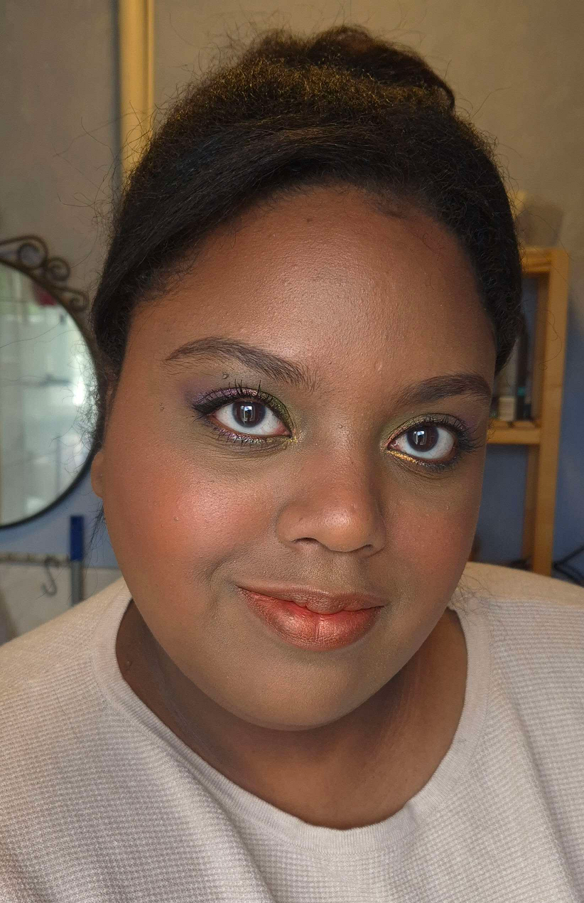
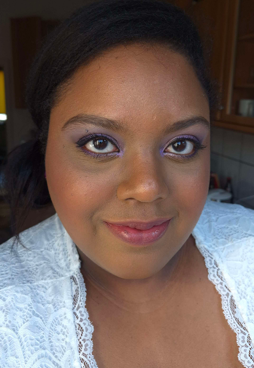
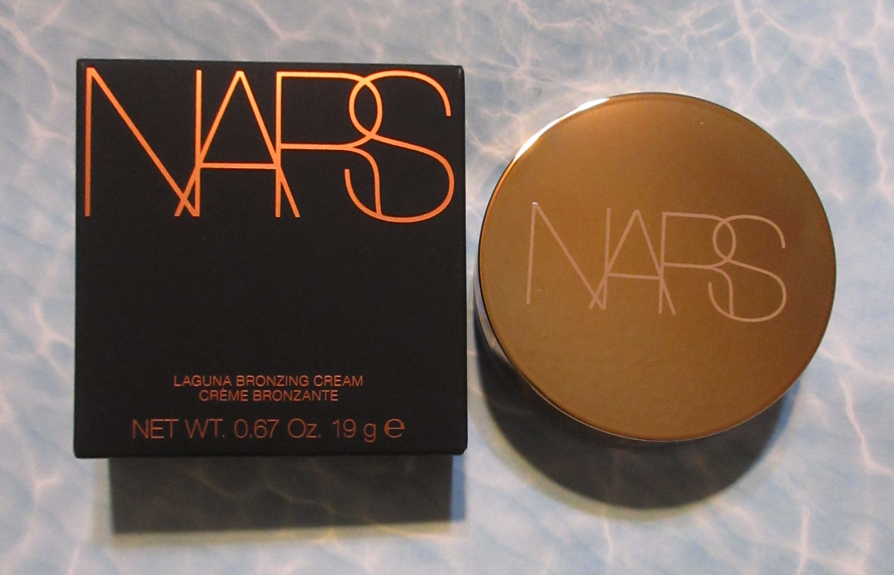
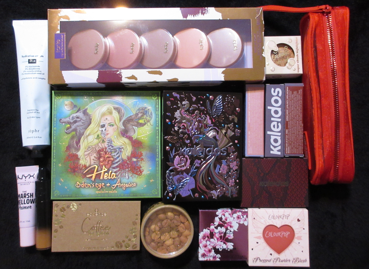
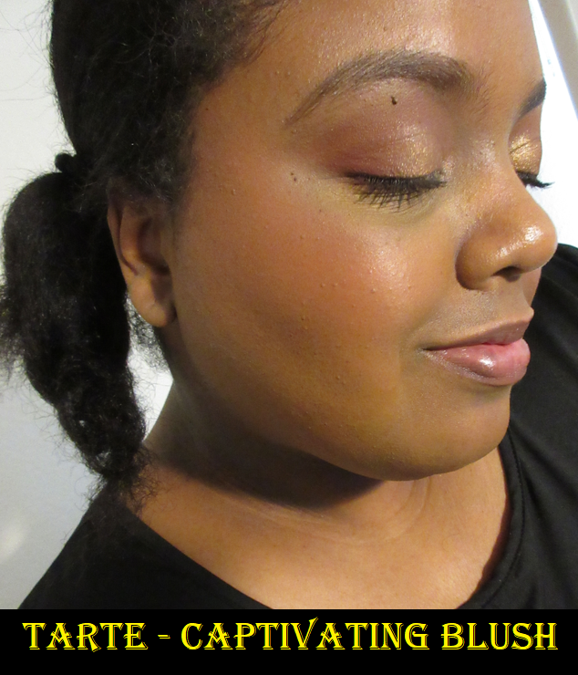
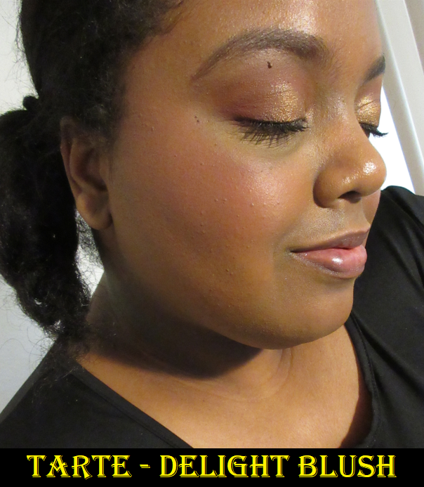
After the bombshell that was dropped regarding the Louis Vuitton Beauty line and their prices, I started to think about which items in my collection were the most expensive, which ones I thought had the prettiest packaging, if the prettiest was actually the most luxurious looking, and which ones had the most weight. I was surprised to discover that so few items fit into all of these categories.

I was happy to see the people I follow enjoying their La Beauté Louis Vuitton products, but some felt they needed to justify their reasons for making the purchase beyond just stating, “I wanted it, so I got it.” Across the board, customers who thought the items were or were not worth buying seemed to at least come to the consensus that the price (besides paying for the brand recognition), was largely due to the packaging. The lipstick components were said to be fully metal, along with the bespoke metal packaging of the eyeshadow quads. “You could hurt someone if you hit them with this,” was stated more than a few times by various people.

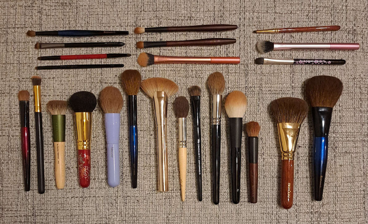
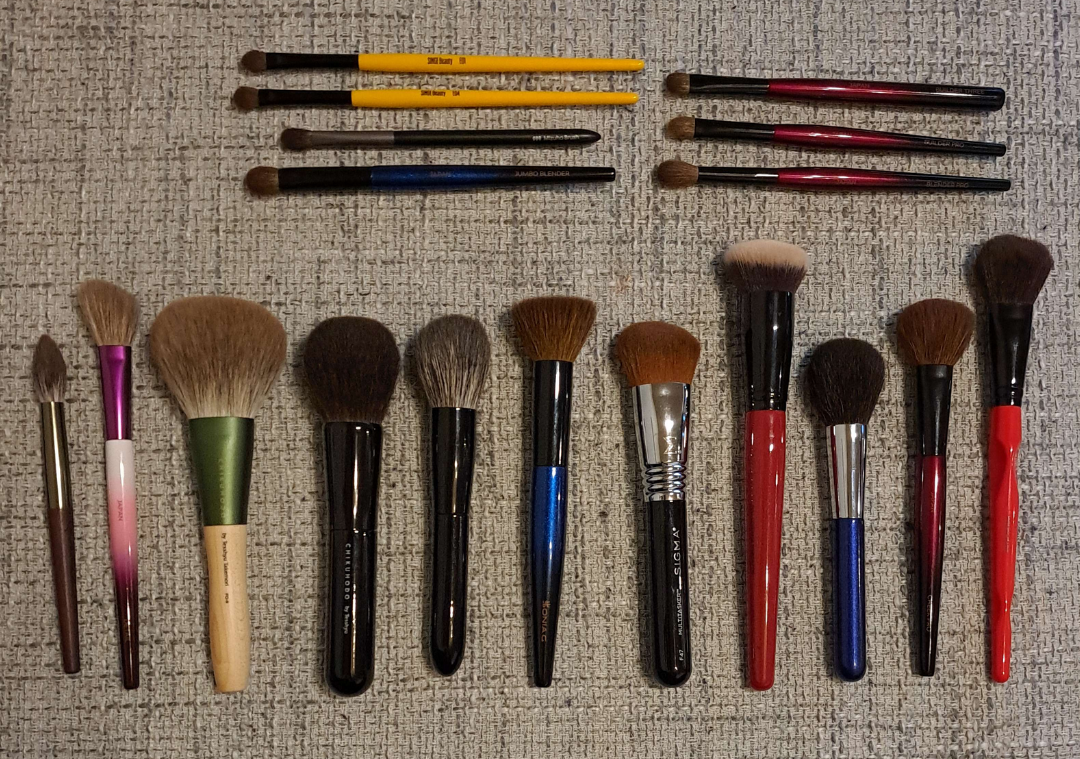
How a product looks and its weight are my top two criteria for feeling like the item I own is luxurious. Looks are subjective, but weight can be measured and precise. I started to think about the heaviest packaging in my collection (proportionate to its size dimensions) in order to answer the question…are these automatically the most lux?

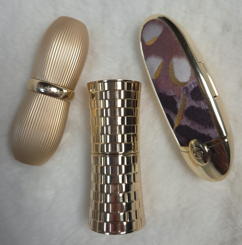
Lisa Eldridge Rouge Experience Refillable Lipstick (68 grams)

In order to highlight how great this packaging is, I need to do a deep dive into comparing it to another brand. Please, bear with me on this, especially if you’re a fan of LV. I don’t judge anyone on how they spend their money, and this is just me working out why I am perfectly satisfied with Lisa’s lipstick being the height of luxury for me.

Lisa Eldridge took great pride explaining in her launch video how her refills were mono material, made of 100% aluminum and could therefore be recycled without degrading once repurposed, unlike the vast majority of other brands’ refills that have mixed metal with plastic.

According to Google: “You cannot usually recycle a lipstick refill that has both plastic and metal components together, as most curbside recycling facilities cannot separate the mixed materials and are not equipped to handle small, complex items.”

There is plastic inside the forever case by Lisa Eldridge, as this has a click closure, but she wanted the actual refills to be sustainable.

I cannot compare the LV lipsticks from personal experience, but it is my understanding that the refills are all metal as well and come with plastic caps that can be removed when recycling. The lipstick cases have an aluminum shell and brass detailing, but the magnetic closure that is so satisfying to use (and adds to the weightiness of a product) keeps it from being recyclable as well.

Summarized from Okon Recycling: Recycling magnets is technically possible, but challenging as it involves disassembling the magnet and removing any non-magnetic materials. However, there are some magnets that cannot be recycled.

So, it sounds as if both LV and Lisa Eldridge have cases that aren’t realistic to recycle but have refills that are fully recyclable. The LV lipstick case has a lot of expensive details like the product names and logo being etched in, the monogram flower-shaped refill bottom, etc. Lisa Eldridge has her logo etched at the top of the cap, allows the customer to personalize the base of the case with their initials etched in (up to three letters), and the case shape had to be custom made as well. Perhaps some prefer the sleeker LV design while others appreciate the vintage inspiration of Lisa’s more.

LV’s Lipstick Case + Refill is $160 and the refill alone is $69.
Lisa Eldridge’s Lipstick Case + Refill is $63 (engraving price included) and the refill alone is $30.

Sure, LV’s refill costs the same amount as other high end and luxury lipsticks in their completed form, but considering the details I listed above, is the LV case really $100 better that other brands’ cases, particularly Lisa Eldridge?

It can’t come down to the actual lipstick formula, because that’s part of LV’s $69 refill price.

At the time that I bought the Lisa Eldridge lipstick, I felt it was incredibly expensive. It is still the most expensive lipstick in my collection, based on what I paid and not the retail price. I rationalized my purchase because of the sustainability aspect, all the custom elements, the personalized touch, and how heavy it felt.

Taking branding completely out of the equation and thinking about the components alone, I do feel like this product by Lisa Eldridge is among the most luxurious out there, and I am no longer gritting my teeth at the price.

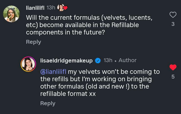
It would be nice if I liked the lipstick formula more, but there is some hope for me! I wrote a comment on Instagram that the brand responded to, and while the Velvet formula won’t be put in the refillable form, there might still be the possibility of the Lucents that I enjoy so much!

There are other things they’ve been “working on” that has taken years, such as making the empty eyeshadow palettes available for purchase alongside the eyeshadow singles, the return of the liquid blush in better packaging, etc. So, I’m prepared for this to take a while to happen.

If I can get the Luxuriously Lucent Lip Colours and/or Baume Embraces as refills, I will definitely get more use out of mine!

Olivia Palermo Beauty Eyeshadow Palette (226 grams) and Lipstick (79 grams)

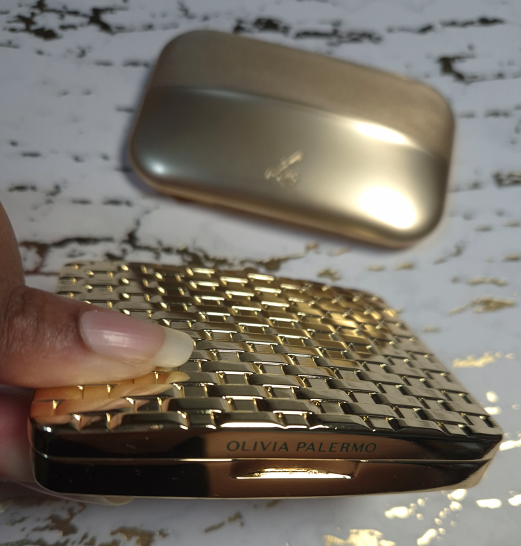
Whenever I think about heavy makeup packaging, the Olivia Palermo Eyeshadow Palette immediately comes to mind. I’ve had it for years, yet I’m still not sure how I feel about the pattern, and I’m not sure what it’s technically called (perhaps wicker, woven link, basket weave, oyster strap, etc.). It just makes me think of the types of patterns I’ve seen for watch straps, which isn’t too terribly off track. Apparently Olivia drew inspiration for the packaging, “by a vintage Art Deco bracelet she was given for her 21st birthday.”

The eyeshadow palette has a magnetic closure and mirror, which further increases the weight, on top of the fact that the packaging is metal.

Although I’m not sure if they could have created a different pattern that I would like more, I can say it’s at least cool, unique, and easily recognizable. Plain flat gold is always beautiful to me, but this packaging looks different from any other I’ve seen. Well, almost. As of a year ago, Hatice Schmidt released a refillable lipstick range called, “The Gift,” with a case inspired by jewelry and the pattern reminds me of a curb chain/Cuban link style. So, there are at least two jewelry inspired components from brands that I know of.

I bought the Olivia Palermo lipstick at the reduced price of €32 (originally €40) from Niche-Beauty, and the eyeshadow palette for $28 (originally $58). I’ve discussed how I procured the eyeshadow palette in a past review, but it was during the time that I started working on this post that I felt the compulsion to finally get the lipstick. I have checked in on the brand on and off over the years, waiting for them to release additional products. Earlier this year, I saw a notice on the official website that the beauty products would no longer be sold and that they were turning the website into an influencer style page (oliviapalermo.com now redirects to her affiliate shopmy page). I assumed that meant the brand was shutting down, especially since I’ve only heard two beauty reviewers reference the brand one time each within the last three years. However, I was shocked to see the products appear on the Douglas website in either August or September, and then I saw them at Niche-Beauty as well. I don’t know if Olivia has better sales in Europe, or Germany specifically. I’m not even sure if she still has products available elsewhere in the US.

I felt Lisa Eldridge’s lipstick deserved to be in the post, but Olivia Palermo’s lipstick is the only one in my collection that is heavier. OPB’s lipstick is less expensive, but it isn’t refillable and the central part of the lipstick component is made of plastic. The outer packaging is what makes this seem so fancy.

Regarding the eyeshadow palette, it definitely screams luxury. It isn’t something you want to carry around in your purse or travel with it. Olivia wanted the old Hollywood glamour look and feel to her products, so this is something that you would want to keep on a vanity.

This is by far my most luxurious palette, and though it doesn’t have some of the additional premium features of the LV Quads, it makes me feel a lot more content about my collection and avoid FOMO. If I want heavy eyeshadow packaging, I certainly have it with this product!

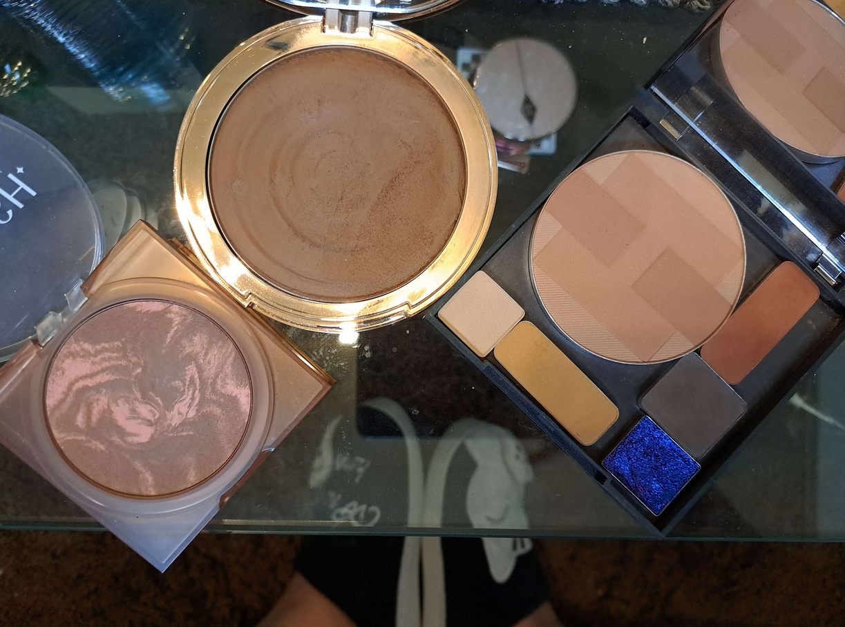
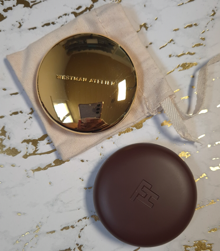
Westman Atelier Beauty Butter Powder Bronzer (112 grams)

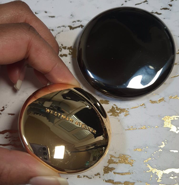
This is my golden pebble! It is tiny in size but mighty in weight!

Chantecaille is another brand with nicknamed “pebble” packaging, but theirs is plastic, thin, and it doesn’t feel substantial, even though they cost the same amount!

I bought my WA bronzer at 20% off, so the title of most expensive bronzer in my collection belongs to Hermes, even though I only bought the refill. Had I paid for the compact too, that wouldn’t have helped it to feel more luxurious than the Westman Atelier bronzer, considering Hermes’ thin plastic packaging.

This has a tiny mirror that I don’t use, and a magnetic closure. The brand has highlighters and face powders in this same style of packaging. I haven’t used their cream sticks or drops, but they don’t look as luxurious to me. The only other Westman Atelier packaging I have handled are the powder duos, which are certainly substantial and pretty to look at, but I don’t think it compares to this gold compact.

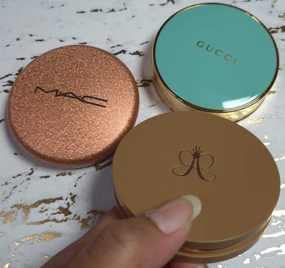
When it comes to the prettiest bronzer packaging, I think of Gucci’s and Charlotte Tilbury’s powder one, even though they are much lighter in terms of their size. However, I would never call something that’s a solid gold color ugly. So, it may as well be my most glamorous bronzer.

Fara Homidi Essential Bronzer Refillable Compact (106 grams)

This compact is about the same size and weight as the Westman Atelier Butter Bronzer. The amount of product from FH is 3.5 grams and the amount of product from WA is 8 grams. That is close enough to accounting for the 6 gram difference when I weighed the two products, which is why I’m still including it in this post.

Aesthetically, I find the Westman Atelier bronzer to be more appealing. Shiny things get me. However, I still think Fara’s is classy and pleasing to hold in the hand. Her other products come in red and blue packaging of the same weight. I don’t like the red, but the blue is very eye-catching. If the next product she releases is in purple or green packaging, it just might surpass WA’s as a favorite compact for bronzers.

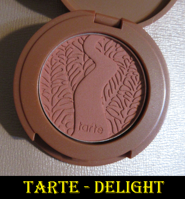
D&G Cheeks&Eyes Match Blush (91 grams)

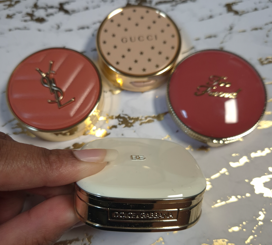
I have plenty of blush packaging that is bigger than this, and therefore heavier. However, for this small size, this is very heavy! Nothing really comes close to the weight, but I have to say that Gucci’s powder blush packaging is quite nice too, even if it’s lighter. Visually, I like Gucci’s more as well. In fact, I have a lot of blushes that aren’t luxurious feeling, but I love them anyway (such as YSL’s Make Me Blush Bold Blurring Blushes and Too Faced Cloud Crush Blushes).
So, this is one of the few categories where my heaviest blush might be the most luxurious, but it isn’t necessarily my favorite packaging. I do like it a lot though!

I have to add that this packaging feels like a mixture of plastic and metal components. I believe there’s something in the base of this compact adding weight artificially, especially since it doesn’t even have a magnetic closure. It has a push button instead.

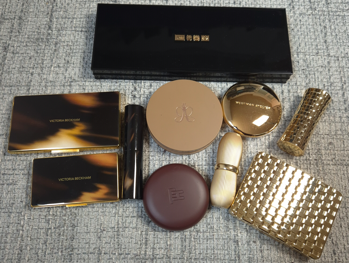
Victoria Beckham Beauty Products:
Matte Bronzing Brick (166 grams), Eye Wardrobe (116 grams), Cheeky Posh (37 grams), and Lid Lustre (41 grams)

Similar to Olivia Palermo Beauty, VBB has a certain aesthetic that they maintain across most of their products. I like the horn brown/tortoise pattern, and it can be fashionable, but I don’t automatically associate it with luxury because of how many cheap products I’ve seen made in tortoiseshell style. The gold colored trim helps to elevate the look of the packaging, but it is the weight and feel of these components that make them undoubtedly luxurious.

The Bronzing Duo and Eyeshadow Quad are among my heaviest based on size. The Cheeky Posh blush is small and doesn’t have that much extra weight, but I figure that’s because the component isn’t refillable like the other two. I’m including it because it has the same style of packaging as the others, and I still feel bougie when I handle it.

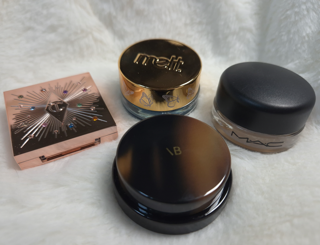
I rarely buy single eyeshadows, so I don’t have much to compare in terms of weight. The prettiest I own is probably the Charlotte Tilbury Hypnotizing Pop Shots, but those have lightweight plastic packaging and they are powders, which I don’t believe is fair to compare. It would be interesting to see how the glass packaging of Charlotte’s Eyes to Mesmerise stacks up, but I don’t own that.
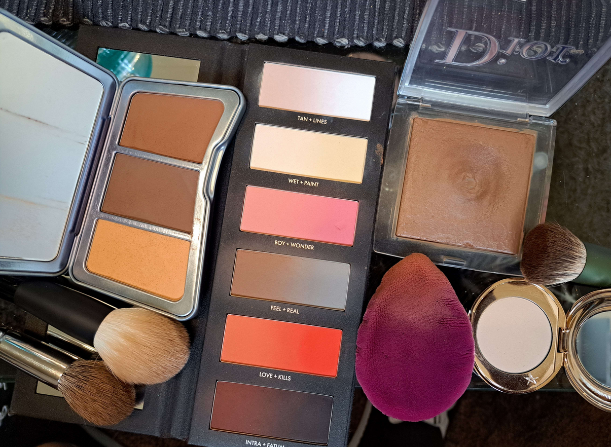
I no longer have the glass packaging of Maybelline’s 24 HR Color Tattoo, but the best I’ve got is Melt’s Gel Liner (47 grams) and a MAC Paint Pot (56 grams).
I like glass as a component material, but it’s not uncommon to find for eye products. The Lid Lustre packaging has an elevated look compared to MAC’s, for example. The Melt Cosmetics Gel Liner that has the gold lid and butterfly print around the rim with the glass base is prettier to me, while also being slightly heavier. However, the font for the brand logo makes it look less sophisticated. I don’t think eye related categories of makeup follow the trend of weight indicating how luxurious a product will look and feel.

One thing about VBB packaging that does take away from the experience is the issue with the closing mechanism. I heard this was a problem in the past, and I never had an issue with my Bronzing Brick, but my eyeshadow quad doesn’t always stay shut when I snap it closed. Sometimes it’s fine, but other times it likes to pop back open with the slightest touch. I haven’t heard about anyone else having an issue with the quads, so perhaps I’m unlucky in getting one of the few faulty ones.

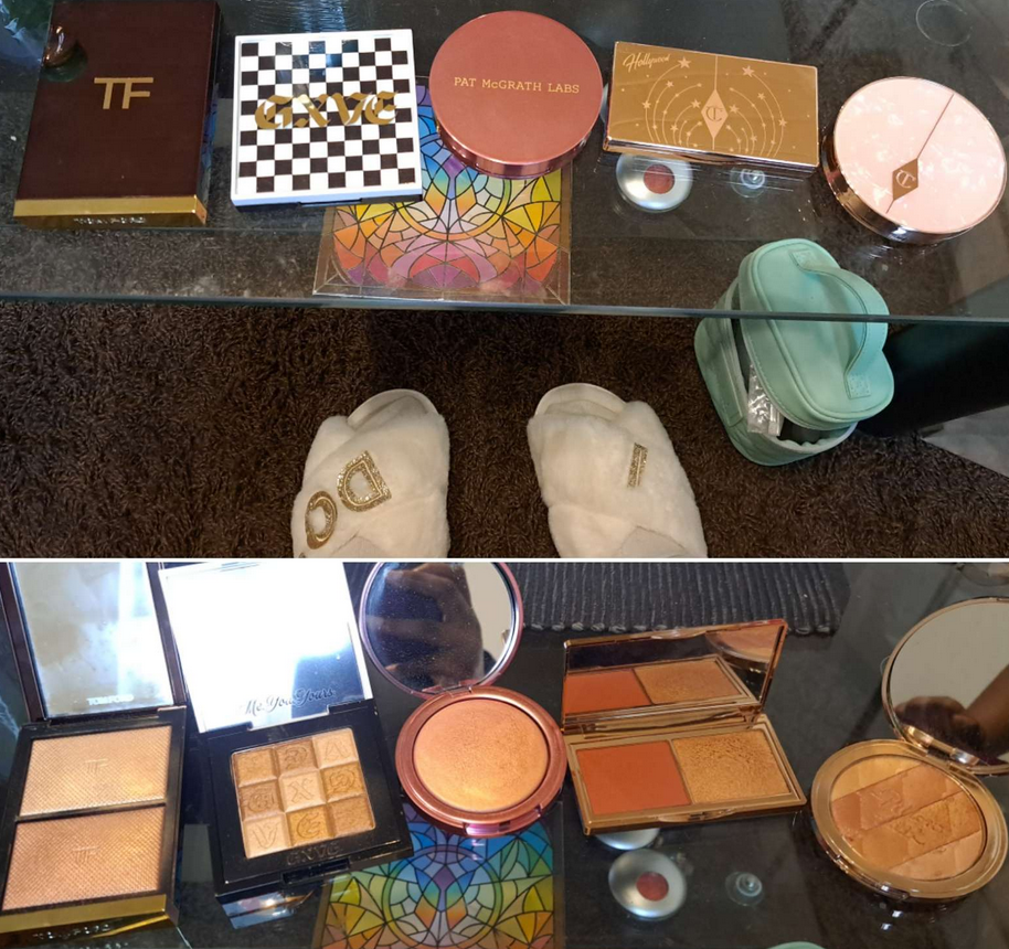
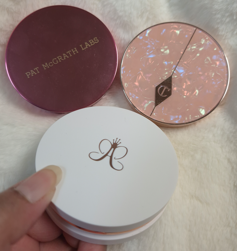
Pat Mcgrath Mothership Palettes (392 grams) and Eyeshadow Quads (122 grams)

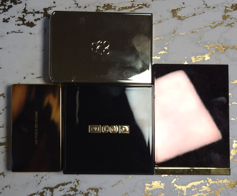
All the previous components I’ve discussed had metal or a mix of metal and plastic packaging. The Mothership Palettes are fully plastic, but they are quite hefty in weight. The palettes are big for only holding ten eyeshadows, but that black shiny lacquer with the gold bottom still look lux to me. My Victoria Beckham and Olivia Palermo palettes are the only ones I can recall from my collection that aren’t made of plastic or cardboard. In fact, the Victoria Beckham Eye Wardrobe quad is only six grams less than a Pat Mcgrath quad, but Victoria’s compact is almost half the size!
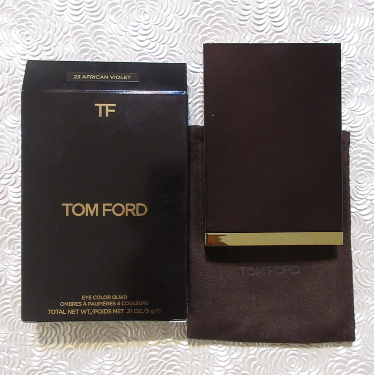
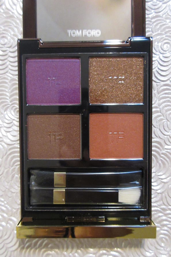
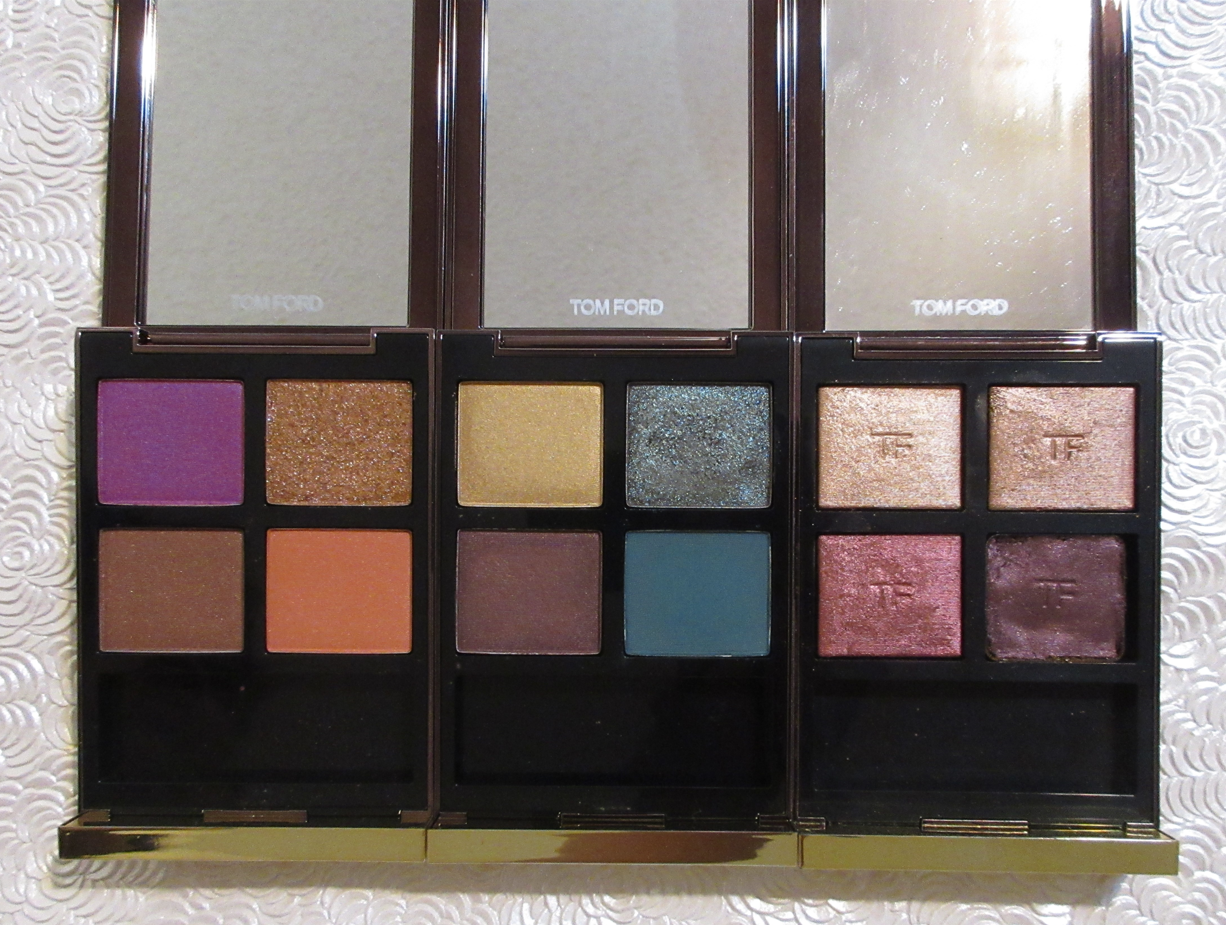
I still chose these PML products as the next heaviest in the luxury category, though I have to admit that I have some lightweight quads that look fancier because they are gold colored. For example, Tom Ford (the trim technically), Guerlain, YSL (trim), Prada (mixed gold and silver), Lisa Eldridge, etc.
I find it difficult to equate weight with luxury in the eyeshadow category because of how many bulky heavy palettes brands have released over the years. So many of Jeffrey Star’s earliest palettes, Plouise, and Glamlite’s Food palettes were huge. I also recall when Stila had the Luxe Eye Shadow Palette in Happy Hour, which was a similar weight and size to the Mothership Palettes, but I bought it for $36. I can’t remember what the full retail price was, but it cost nowhere near the same amount as a Mothership.

So, I’ve come to the conclusion that weight doesn’t automatically equate with luxury in this category either. However, because of how uncommon it is to find hefty quads and palettes that are reasonably sized (Olivia Palermo, Victoria Beckham, and Pat Mcgrath), the ones that are weighty feel extra special to me.

Beekman 1802 Milk Tint SPF 43 Tinted Primer Serum

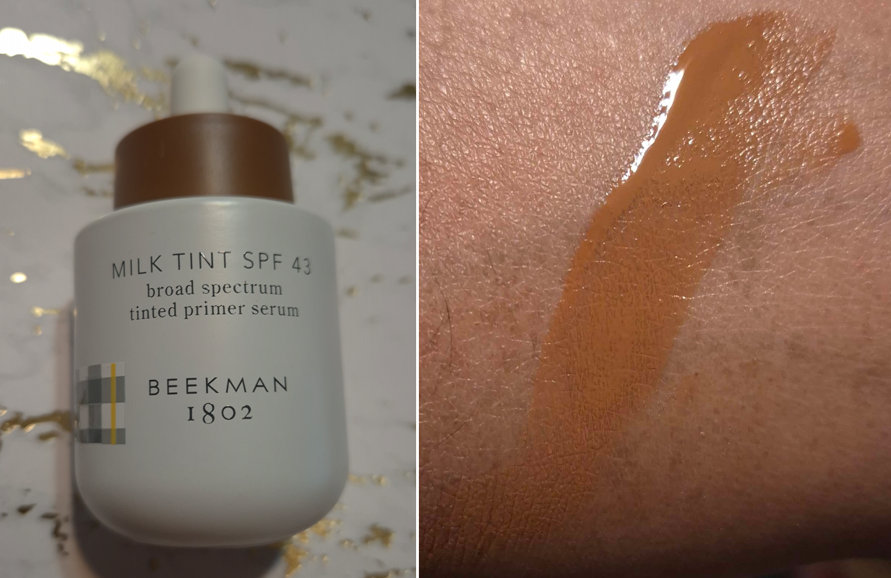
I didn’t want to include skincare, but this technically falls under the makeup umbrella. If I count it as a primer, it might be the heaviest I ever owned (even heavier than the glass bottle of Rituel de Fille Thorn Oil). Beekman’s looks like ceramic, but it’s colored glass.

I have to say “might be the heaviest,” because I don’t recall how it compares to the Guerlain L’Or Radiance Primer (now called the Guerlain Parure Gold 24K Radiance Primer), which is definitely the most luxurious looking primer I ever bought. The look of the Beekman product doesn’t appeal to me at all, but I was so impressed by how it felt in the hands. I had to leave it behind though because it was so heavy that I didn’t want to bring it back in my luggage.

If this counts as a skin tint, then it’s a lot less special. Plenty of brands make glass bottle complexion products. That’s why I didn’t include any true foundations or concealers in this post, because the prettiest bottles in my collection tend to look and weigh around the same.

When it comes to heavy primer packaging being the most luxurious, I have to say the Guerlain primer squashes that theory.

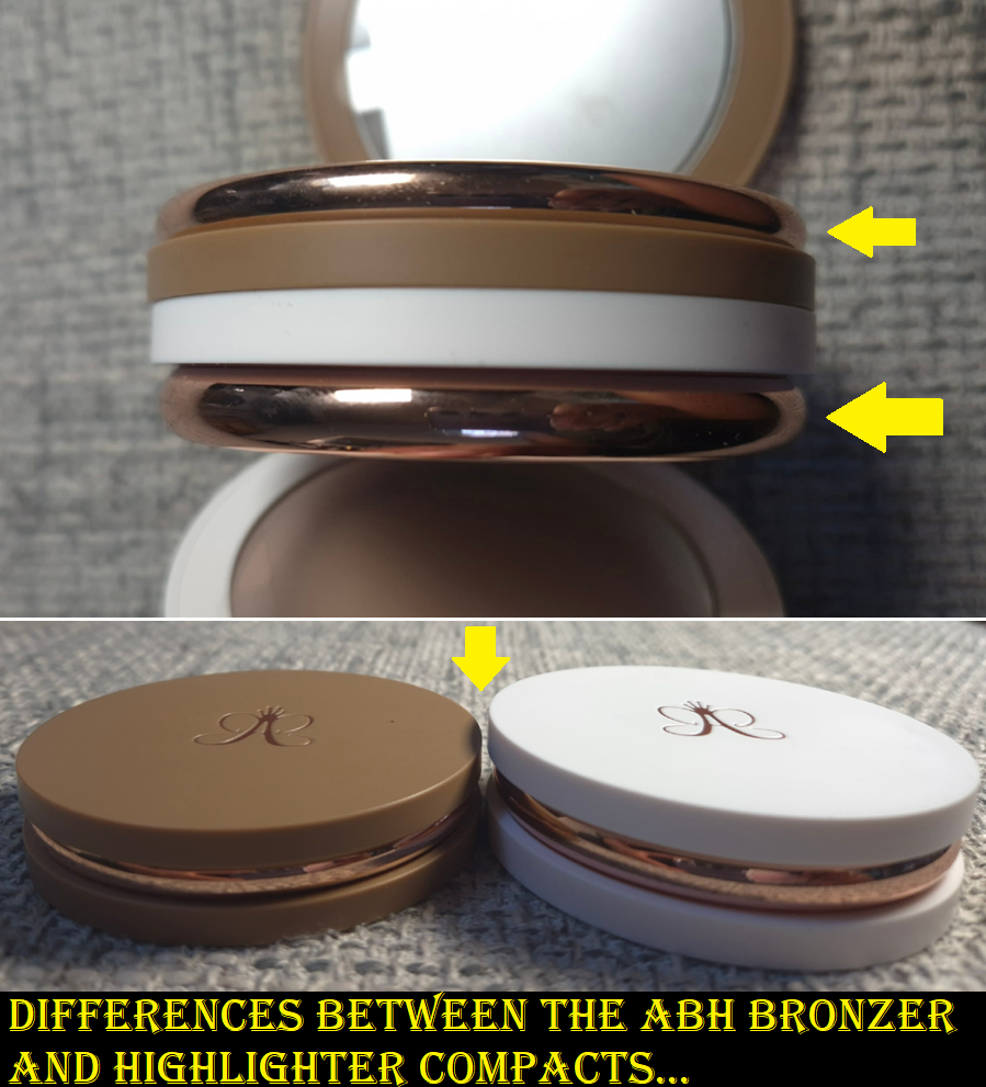
Anastasia Beverly Hills Smooth Blur Bronzer (112 grams) and Glow Seeker Highlighter (125 grams)

This bronzer is larger than the one from Westman Atelier, but it weighs the same. The reason I decided to include it anyway is because it’s still substantially heavier than the remaining bronzers in my collection. Plus, the highlighter component is a similar size and even weightier.
I cannot think of a single highlighter I own that comes in heavy packaging, other than this one.

I have noticed over the years that ABH has gradually been upgrading the packaging of most of their products. Their two most recent mascaras felt like either super heavy plastic or a mix of metal and plastic. The Smooth Blur Cream Contour Stick has a brushed gold colored metal cap and additional gold details. The Smooth Blur Matte Bronzer and Glow Seeker Highlighter have a magnetic closure and they feel quite substantial in the hand. I’m impressed with the packaging and find it to be quite pretty, but this is still another example of how weight doesn’t necessarily equate with a luxurious look. This packaging feels so much more substantial to hold and interact with than pretty much all others in the drugstore, mid-range, and high end categories. It feels like it should cost more than it does, and it looks appropriately high end to me, but not quite broaching luxury territory. I still think the Gucci Bronzer packaging tops it, despite it being lighter in weight, because it looks classier overall. As another example, MAC’s Sunstruck Bronzers look so beautiful, even though they are in lightweight compacts as well.

Final Thoughts

Based on my own personal collection, I’ve confirmed that in certain makeup categories, the most luxurious packaging is the heaviest. At the same time, I have many other products with a timeless and elegant look to them that are lightweight and made of plastic or other inexpensive materials. Essentially, the weight of a product enhances the luxury experience, but it does very little to elevate plain looking packaging. The best example of this is the Beekman 1802 Tint.

If I can get an Olivia Palermo palette that retails for $58 and feels ultra lux, but I can also buy a limited edition plastic Chanel quad for $86 and still feel like that’s luxurious as well, would that be considered silly? Should I be raising my expectations for all luxury brands?
At the beginning of this experiment, I would have said yes. However, I now see that if Chanel, Dior, Gucci, and other designer brands used higher quality materials, their products would likely fall in the LV Beaute range of prices (if not more). Some examples of that are the Chanel 31 Le Rouge lipsticks in the glass case, Dior Rouge Premier Lipsticks with the ceramic case and “formula infused with 24k gold,” along with the Guerlain Rouge G Exceptional Piece lines. There is only so much a person is willing to pay for a product from a luxury brand if the materials are the same as a mid-tier brand. So, that keeps designer brands from going overboard with their prices. There are also advantages to using lightweight materials, such as them being more convenient to take on-the-go for customers or makeup artists with large kits, sitting at attainable prices for aspirational shoppers, thinner packaging contributing to less waste of materials and sustainability efforts, etc.

So, when I really think about it, I wouldn’t be able to buy as many products in the luxury category if the components were more expensive to make or if they were made from higher quality materials. In fact, the majority of the products in this post were purchased with some kind of discount. Of course, I would love to have all my luxury goods in weighty packaging, but if that means I would have to accept those products being less likely to go on sale and/or accepting that the prices of them would double or triple, I am unwilling to do so.

The Dior Powder-no-Powder is one of my favorite makeup products of all time, yet the most I was willing to spend was €45 (essentially just paying full price) to get my name etched onto the compact. If I had the opportunity to buy it in a gold colored compact with a magnetic closure or some stunning limited edition pattern for €100, I don’t think I’d be willing to do that. This tells me that despite a product having a holy grail formula that is unable to be duped, I still have my limits. Some makeup will just never be worth it to me to buy, past a certain pricepoint, no matter what it’s made of. That means I cannot use the product’s weight, materials (including formula), or looks to justify a super high spend amount. However, I know that when a product gets hyped up, it can be much easier for me to consider crossing that price threshold if I can make a case for it being top tier from every other angle.
I bought one of the Chanel Boutons quads directly from Chanel because so many influencers were told by their SAs that the collection would be extremely limited, and I feared missing out. Less than one month after launch, I found the quads at multiple retailers for a minimum of 30% off.
FOMO works similarly to getting caught up in the hype of a product. I sometimes make purchasing decisions that I normally wouldn’t.

This is why I decided to make this post. I know there are others like me who enjoy luxury makeup and don’t have the biggest budget to work with. There are those who will be tempted by the exclusivity of a certain new beauty line and would normally not even consider getting anything at those prices, but the hype may be wearing down that resolve.
To those that want to be talked out of buying makeup at $100 or more…just remember that luxury makeup with fantastic formulas and high quality packaging can be found at a lower price. This post is full of examples of this. If one brand is out of your price range, you might be able to get similar products from another prestige brand. Other amazing and beautifully packaged products are just around the corner.

I hope this topic has been interesting, and even helpful.

Thanks for reading!

-Lili

Review of the Danessa Myricks Yummy Skin Line

This is technically a review of some of the Yummy Skin line.

I admire Danessa Myricks’ artistry and her dedication to her brand. Even when she comes out with a product that isn’t necessarily new to the market, there’s always an innovative twist to it. For this reason, her products have always either worked exceptionally for me or really didn’t suit my needs. This is why I’ll never be the first to review something by the brand and why I don’t have as many things to post about despite how closely I pay attention to their releases.

I’m sharing my thoughts about these products now, but the timeline of my purchases are as follows:
Yummy Skin Microfiber Velvet Sponge – June 18, 2023
Yummy Skin Moisture Repair Balm Serum – July 5, 2024
Infinite Chrome Pencil – July 5, 2024
Yummy Skin Lift & Flex Hydrating Concealer – July 10, 2024
Yummy Skin Serum Tint – November 8, 2024

Some of these items I’m still using today. Some of them, I had to redo the testing process because I forgot how they performed! Anyway, onto the reviews!

Yummy Skin Moisture Repair Balm Serum

The texture of this balm is like a firmer version of Vaseline. I despise having products that don’t set down to a dry touch on my face, but I was so desperate back then to find a product that would lock in moisture on my skin that I was willing to take the risk, at least when a sale rolled around.

Excluding the hottest days of summer last year, natural finish foundations looked matte on me and dewy ones looked satin due to my skin being drier than usual in a new climate. Using the tiniest amount of this balm, where barely any residue is left on the skin, results in foundations looking the proper finish they’re supposed to have. With my small amount, any foundation that sets without needing powder will still do that.

I saw the amount that Danessa Myricks uses, thanks to Instagram, and it’s way more than I use. When I try to use closer to the recommended amount of balm, my skin feels heavy at first, but I eventually get used to it. After adding foundation on top, my face looks like it has more than a natural finish, but it doesn’t get to dewy levels until somewhere between 3-5 hours of wear depending on the weather and how much sweating I’m doing. Once it gets to that dewy point, it makes my foundation much easier to transfer. It also won’t set to a fully dry finish on me, even in the beginning and even with powder on top.

I also continually have problems with my nose area and it making my foundation there look patchy or broken down. So, even on my driest skin days, I avoid applying it to this area.

If I apply more than a tiny amount, my foundation will eventually get oily looking and become easier to transfer. My makeup everywhere starts to break down around the six or seven hour mark.

The photo above is the only example I have of this. I’m sorry that it’s a washed out photo and that I didn’t want to take additional pictures. I did not want to deal with the transfer issue and heavy feeling again.

So, essentially, I like this product if I use it super sparingly in the high points of my face where I don’t mind having some glow. Starting to use milky toners again was actually the solution to my dry skin issue, and made it unnecessary for me to apply this all over. Now, I pretty much use this product more on the back of my hands than on my face!

I’d also like to mention that I find the packaging of this product very satisfying to interact with. I like the addition of the spatula at the top, the beautiful bronze lid with a semi transparent jar, and the balm color that reminds me of orange juice despite actually being colorless on the skin. It’s fragrance-free and smells like a mix of wax, oil, and petroleum. I normally don’t advocate for scents in my products, but I could have made an exception for this one considering how it smells.

Yummy Skin Serum Skin Tint in Shade 11 and Yummy Skin Lift & Flex Hydrating Concealer in Shade 13

As seen on the timeline, I purchased the concealer first. I chose number 13 because the model showcasing it looked closest to my skin tone. As it turns out, the depth is about right, but it’s quite orange. So, it doubles as a corrector and concealer for me. If this product worked as well as my other concealers under my eyes, I would have considered buying number 12. Unfortunately, it creases too much (moving out of my under eye lines) and disappears too quickly. My under eye area produces oil between some of the wrinkles, but is dry elsewhere. So, it’s a tough spot for a lot of concealers to handle. However, this product works perfectly fine on the rest of my face that’s smoother. So, I use it mostly around my mouth area and spots with darker discoloration. It’s nice that it has high coverage and that I’m still able to make use of it. A concealer that doesn’t work under my eyes doesn’t have much chance of being considered part of my favorites though by default.

Purish had a fantastic sale on Danessa Myricks products, so that’s why I finally gave the Serum Tint a try and chose my color based on the concealer match recommended by the brand. I’m very happy with Shade 11 and think it’s the best match. I consider it a golden color because it’s a good balance between yellow and orange. Even though I’m still a bit darker than usual, the coverage being light (or on the lighter side of medium if applied with a brush) allows for wiggle room. It’s called a Serum Tint, but it gives me similar coverage as Fenty’s Liquid Eaze Drops and almost as much as Nars Sheer Glow.
I like the nozzle because it makes it so easy to control how much or little I want to squeeze out. And even though the product is thick enough that when I draw lines across my face it doesn’t drip or move in the slightest, it’s not so thick as to feel heavy. The consistency feels like applying a skincare moisturizer.

I would call this a satin finish foundation on me as it’s not as glowy as I expected. It does look even better when I use a sparing amount of the Yummy Skin Balm with it, and it feels more hydrating than it looks outwardly. If I want my skin to look truly luminous, I just need to apply a very generous amount of my glowiest milky toners as part of my skin prep.

Overall, my skin looks smoother with the tint on. I like that it fully sets down without needing to be powdered and it doesn’t transfer much. The thickness of the tint can basically withstand the consistency of the balm. This lasts all day and I think it’s very skin-like.

I don’t know how effective the infused skincare ingredients are in the long-term, but I can agree with the hydration and moisturizing claims. This doesn’t have any fragrance and I like this packaging as much as the packaging of the Yummy Skin Balm. Besides the convenience of the squeeze tube and nozzle, the cap’s color and shape is aesthetically pleasing.

I’m very happy that this turned out to be a good purchase. Even though I got it on sale, I think it’s definitely worth buying at full price. It performs and feels like high-end and luxury foundations. I mentioned in my Project Pan post that I may end up adding this to the bunch after reviewing it. Since I kept it in my foundation rotation even after the testing phase, I think it’s safe to include it in there.

Yummy Skin Microfiber Velvet Sponge Dark Chocolate

I’m fairly certain I used this sponge once or twice when I first bought it, but then did not use it again until February of this year. Since sponges are intended to be thrown out every few months, is this still considered hygienic if I only used it a few times and then kept it in a bag away from dust and other elements for over a year and a half?
I don’t know, probably not, but I did this for science (and not wanting to buy another one)!

The sponge in dry form versus damp

This feels very firm in its dry form. It’s softer after being wet, but is still firmer than other sponges I’ve used. The microfibers make it feel slightly velvety, like applying my makeup with a cloth. However, it’s not the same as when I’ve used my Blendiful in the past. The end result is the same as with other sponges though, only differing in the way that I need to use this. With most sponges, I’m used to pouncing it all over my face and the sponge pushes the product in a wider, diffused, and partly diluted area. This sponge does a bit of diluting and soaking up of product, but if I apply foundation to my face first and tap this over it, it just spreads more dots wherever the sponge touches instead of spreading it out. When I use the Danessa Myricks Serum Tint, I usually draw lines on my face and use a brush to spread it around. As seen in the photo below, there are a bunch of lines on the bottom of the sponge were the lines just stayed on there and didn’t spread out.

So, the technique I have to use with this sponge is to spread foundation across my face with the flat edge and then tap it to blend after. If I still want to use the bottom, I have to do a drag and then bounce motion, not quite the same as a press and roll with other beautyblenders.

When it comes to cleaning this sponge, it takes much longer to dry and I can’t get it spotless, although the color makes that hard to see (which I like about it). I can only really tell that it has a stain when I run it under water.
Another benefit is that it’s more tear-resistant.

I go through brief phases trying to use sponges and it’s just not for me. The look and feel of this sponge is different from any other I’ve used, but the end result isn’t any different. So, I don’t feel the need to repurchase something like this. It’s a nice product, but I much prefer more affordable sponges, or the classic original beautyblender.

Infinite Chrome Pencil in Bronzite

Heart shaped swatch at different angles.

I have discussed this formula of pencil already, but this is the only additional one I have purchased since then. It’s waterproof, thin enough to be used precisely, and the strength of the shift depends on the shade. Bronzite is probably the hardest to see, as it has only ever looked bronze on my eyes.

This, at least, has more impact than the Golden Brown liner from Oden’s Eye. I also only paid 9 Euros for Bronzite on sale.
Black eyeliner is my go-to, so I don’t use this very often, but I don’t mind having it in my collection. It still gets used once every 2-3 months.


Everything I reviewed today are products I will continue to use until they go bad (excluding the sponge I’m tossing for being old). However, the only one I would consider repurchasing is the Yummy Skin Serum Tint. I like that one a lot. The rest are good, but able to be substituted by other makeup I own.

That’s all for today! Thank you for reading!

-Lili

Wedding Makeup Part 2: Example of Looks

The photo above demonstrates some of the various stages that I was testing different makeup products and practicing techniques in the weeks prior to the wedding. The very first example is what I would consider my typical amount of makeup, versus the last photo where I put in way more effort with a ton of extra steps that were necessary to create the look I envisioned for myself.

In Part 1, I explained which strategies I chose and showed the specific makeup products used. In Part 2, I’m going into greater detail listing the actual order of the steps I took. That includes all the details about the eyeshadows that I left out of the previous wedding post.
I will also include photos of alternative wedding/special occasion looks in both the cold winter theme, classic looks, and a few colorful ones now that we’re in spring.

The makeup artists were upfront about either not being available on the day of the wedding or not having their own products to match me. I was a bit nervous about having to do it on my own, considering I’m just a makeup enthusiast, but many loved ones reassured me that I knew my own face better than anyone else and they were confident I could pull it off. I hope that this post will be inspiring to anyone else in a similar situation where you have an important event coming up and aren’t sure where to start or would just like to see extra ideas.

My Wedding Makeup Step-By-Step

  • First, I applied skincare (and this would normally include sunscreen though I skipped it), allowing ample time for everything to absorb in the skin before moving onto applying primer(s).
  • I then applied color correctors to the spots I have discoloration, put on the liquid contour for my nose and under the cheeks, and added liquid blush. I left them only halfway blended since the foundation would go over everything anyway as part of the underpainting technique.
  • I made a mixture of foundation shades and applied it to the outer perimeter of my face. The lighter foundation color, I applied to the central zone of my face.
  • The eye primer came next before I filled in my brows with my brow pencil of choice.
  • I applied my skin tone shade of concealer to my under eyes and areas of discoloration. I applied a combination of my skin tone shade and a lighter color to my under eye area again, the bridge of my nose, center of my forehead, and chin. I use the lighter concealer color alone to highlight under my eyebrows.
  • After setting those concealer areas with powder, I did a first round of setting spray to lock those in.

In the photo series above, I saved my eye makeup for last, but I switched the order on the day of the wedding to do the eye makeup next in case I had a mishap with eyeliner, if mascara got on the lids, etc.

1. First, I applied Viseart’s Illusion shade from the Peridot quad under my brows on top of where I laid down the lighter concealer shade.

2. Then I applied Melt’s Rubbish shade from the Rust palette in the space under the Viseart shadow, but above the crease.

3. Next was Melt’s Rust shade from the same palette tightly in the crease, not going past the previous shade.

4. I lightly added Log from Natasha Denona’s Gold Palette, building up the outer corner and moving halfway inward. I chose this placement because of my particular eye shape.

5. I then built up the depth and smokey factor in the outer v area using Xtreme Black from Pat McGrath’s Mothership III: Subversive palette.

6. I smudged the Urban Decay 24/7 Glide on Pencil along the outer quarter of the lower lash line before using Deep Shade (actual name) from the same PML palette on the rest of the lower lash line.

7. I smoothed on the Nyx Glitter Primer to the empty space on my lids and applied Bronzed Mink from PML’s Bronze Bliss palette to the outer half of the lid, taking care to not cover up the dark shadows in the outer corner.

8. I added Divine Dahlia from PML’s Interstellar Icon Quad on top of Bronze Mink to tone down the warmth of that shade.

9. The next step was picking up Nude Moon from Bronze Bliss on my brush, spraying it with MAC Fix+ and applying it to the inner half of the lids.

10. I placed Skinshow Fever from Mothership III: Subversive in the inner corner, under the brow arch, and the inner third of the lower lash line for highlighting purposes.

11. For extra sparkle, I added Lunar Luxury damp from Bronze Bliss to the inner corner. I applied the waterproof eyeliner to my upper lash line, along with two coats of waterproof mascara to my upper lashes, but only one coat on my lower lashes. Had I used the Clionadh multichrome, I would have placed a small dot that was eyeliner width to the center of the upper lash line.

  • Going back to my base, I applied powder contour under the cheeks and along my jawline. I applied a cooler toned contour to my nose, and on top of the other contoured spots.
  • I applied bronzer along my forehead and slightly above the contour under my cheeks.
  • I used my face powder and the Beautyblender Puff to clean up a small section of my sculpting work without going too far in. Just about one inch inward from my ear.
  • I applied my intense highlighter to the tops of my cheekbones.
  • I applied the mixture of powder blushes to my cheeks.
  • I applied my more subtle highlighters to the top of my cheekbones again, bridge of my nose, above the brows, and any remaining product on the brush to my forehead and chin.
  • I used my blurring finishing powder in any areas that needed extra blending/blurring.
  • I lined my lips with the lip liner of choice, filled it in with liquid lipstick, and added a lighter lip product to the center of my lips. During trial sessions, I even added highlighter, but didn’t end up doing it on the wedding day.
  • I put the leftovers of foundation from my brush and applied it to the spots on my neck that would be seen.
  • I applied highlighter to my collarbones and shoulders.
  • Lastly, I finished up with a generous amount of setting spray to my face. Had I remembered, I would have sprayed my neck and the spots I applied body highlighter.

And that’s everything! It’s a lot of steps, but worth the time and effort for one of the most important days of my life!

Just as unexpected problems can arise on important days, unfortunately, nearly every day that I set aside free time has been a dark day. I’ve done my best to play around with artificial light, take photos during the brightest part of the day for natural light, and do some color adjusting with the photos, but I’m dealing with cloudy days constantly over here. Times like these, I miss Florida haha.

Recreation of my Wedding Makeup/Neutral Glam: Used all the products I still have on hand.
Photo Setup: (1) In front of an open window on a cloudy day. (2) In a room with warm light and a second cell phone’s flashlight was lit behind the camera. (3) In front of an open window with warm white bulbs overhead.

Here are the additional looks!

Frost Queen: Milky Hydro Grip Primer and Armani Luminous Silk Hydrating Primer, Armani Luminous Silk Foundation in 10, Hourglass Cosmetics Vanish Airbrush Concealer in Maple and Umber, Chantecaille Perfect Blur Powder in Med/Deep, r.e.m. Beauty Hypernova Satin Matte Bronzer in Cocoa-Nut, REM Beauty Highlighter Topper in Miss Mars, Hindash Beautopsy Palette (nose contour), Armani Neo Nude Melting Color Balm in 60 Warm Plum and Hourglass Ambient Light Blush in At Night, ELF Instant Lift Brow Pencil in Deep Brown, Stila Stay All Day Waterproof Liner, KVD Full Sleeve Mascara, Juvia’s Place Lip Liner in Brownie, Lisa Eldridge True Velvet Lip Color in Sorcery, Colourpop Hocus Pocus 2 So Glassy Lip in Boys Will Love Me, the eyeshadow shade Memory (Metallic) from the Tati Beauty Textured Neutrals Volume 1 palette, and shades Nowhere, Christmas Eve, and Snowflake from the Oden’s Eye Christmas Eve Palette.
Photo Setup: In front of an open window with a warm white bulb overhead on a partly sunny day, but near sundown.

Playful Pinks: Milk Hydro Grip Primer, Nars Light Reflecting Foundation in MD3.3 Caracas, KVD Good Apple Concealers, Huda Faux Filter Corrector in Mango, Nars Soft Matte Advanced Perfecting Powder in High Tide, GloWish Soft Radiance Bronzing Powder in 04 Deep Tan, Dior Backstage Powder No Powder, Hindash Beautopsy Palette (nose contour), Dior Rosy Glow Blush in 012 Rosewood and Nabla Skin Glazing in Lola, Pat Mcgrath Labs Skin Fetish: Ultra Glow Highlighter in Divine Rose, Suqqu Treatment Wrapping Lip in 05, Coloured Raine Lip Liner in Decadent, Benefit Precisely, My Brow Pencil in 05, KVD Full Sleeve Mascara, Stila Stay All Day Liquid Eyeliner, MAC Fix+, Melt’s eyeshadows from the Gemini II Palette with shades Bela, Sweetheart, Gemalas, and LX Queen, and the Rust palette with shade Antique. Devinah Cosmetics Eyeshadows in shades Empress, Pixy Stix, and Gelicide. Pat Mcgrath Labs’ eyeshadows from the Mothership III: Subversive palette in VR Pink and from the Celestial Nirvana 5 pan Palette in Nude Allure in the shades Mercurial Rose and Coral Kiss.
Photo Setup: In front of an open window on a less cloudy day, but during late afternoon hours and a warm white bulb overhead.

Chocolate-Gold Glam: Milk Hydro Grip Primer, Armani Luminous Silk Hydrating Primer, Hourglass Ambient Soft Glow Foundation in 13.5 and 14, L’Oréal Infallible Full Wear Waterproof Concealer in 415 Honey, Huda Beauty Easy Bake Loose Baking & Setting Powder in Blondie, Gxve Beauty Check My Glow Multi-Dimensional Illuminating Highlighter in Karat Country, Anastasia Beverly Hills Cream Bronzer in Terracotta, Dior Powder No Powder, Chanel Blush Lumiere Illuminating Blush Powder in Brun Roussi, ELF Instant Lift Brow Pencil in Deep Brown, MAC Macstack Mascara, One/Size Waterproof Liquid Eyeliner Pen, Palladio Waterproof Lip Pencil in Coffee, and Kaleidos Cloud Lab Lip Clay in Sienna. Hindash Beautopsy Palette (nose contour and no contouring anywhere else). Viseart’s Illusion shade from the Peridot Quad, Deep Shade (actual name) and Gigabyte from Pat Mcgrath Labs Mothership III: Subversive, Clionadh Cometics’ shade Lux, and Devinah Cosmetics’ shade Ambrosia.
Photo Setup: In front of an open window on a less cloudy day with a warm white bulb overhead.

Flower Garden: Haus Labs by Lady Gaga Triclone Skin Tech Foundation in 425 Medium Deep Neutral, Tatcha the Liquid Silk Canvas Fenty We’re Even Concealer in 410 W and 385W, Givenchy Prisme Libre Powder in 5 Popeline Mimosa, Dior Powder No Powder, Hindash Beautopsy Palette (nose contour), Victoria Beckham Matte Bronzing Brick 05 (regular contour), Gucci Bronzer in 04, MAC Glow Play Blush in Peaches N Dreams, Sephora Blush Duo in 02 Peach Blossom, Tom Ford Shade and Illuminate Highlighting Duo in Tanlight, Benefit Precisely, My Brow Pencil in 05, L’Oreal Telescopic Lift Macara, Stila Stay All Day Waterproof Liquid Eyeliner, Danessa Myricks Infinite Chrome Micropencil Eyeliners in Jade, Amethyst, and Lemon Quartz. Devinah Matte Eyeshadows in Courtney and Meraki, Clionadh Cosmetics Stained Glass Shadows in Mural, Patina, Quest, Noble, and Spire. Coloured Raine Lip Liner in Pine and Suqqu Sheer Matte Lipstick in 112.
Photo Setup: In front of an open window with the sun poking out randomly on and off from behind the mostly cloudy sky, and a warm white bulb overhead.

Spring Purples: Milk Hydro Grip Primer, Glossier Futuredew, Lisa Eldridge Seamless Skin Foundation in 27, KVD Good Apple Concealers, ELF Camo Color Corrector in Orange, Charlotte Tilbury Airbrush Flawless Finish in 2 and 3, Hermès Plein Air H Trio Healthy Glow Mineral Powder, Dior Backstage Powder No Powder, Hindash Beautopsy Palette (contour), ColourPop Pressed Powder Blush in Potted and Gucci Cheeks & Eyes Powder Luminous Matte in 06 Warm Berry, Hourglass Metallic Strobe Powder in Infinite Strobe Light, Lisa Eldridge Enhance and Define Lip Pencil in Sorcery and Lisa Eldridge Luxuriously Lucent Lip Colour in Painterly, Benefit Precisely, My Brow Pencil in 05, KVD Full Sleeve Mascara, Stila Stay All Day Liquid Eyeliner, Melt’s eyeshadows from the She’s In Parties Palette with shades Total Immortal and Last Caress. Clionadh Cosmetics Multichromes in shades UV and Tracery. Sydney Grace Eyeshadows in Dear Reader, Flannel, and Sovereign Reign.
Photo Setup: (1) In front of a window on a partly sunny day. (2) Same as the first, but from the opposite direction. (3) In front of an open window on partly sunny day and a warm white bulb overhead.

That’s all for today! Thank you for stopping by! I hope you’ll click to follow or bookmark this page to come visit again!

Also, I seem to be having an issue with WordPress. For some reason, images have a hard time loading for those viewing my blog within Germany. The customer service advisors were unhelpful and the only way that even I was able to get around loading issues was to use a VPN. If you live in the US or most other countries, it should be working fine. The issue, as far as I’m aware, is a DE issue for some reason.

-Lili

Wedding Makeup Part 1: What I Chose and Why

There were a lot of factors to consider when it came to doing my own wedding makeup. I scoured the internet for tips and tricks, but at times the answers were contradictory. I thought I had a good plan in the beginning, but as I practiced doing multiple looks, I realized I needed to make some changes along the way.

Today, we’ll cover the things that should be decided on in advance and what I ultimately chose to do. The conclusions I came to won’t be the same for everyone since it depends on each individual’s personal tastes, skin type, skin texture, skin tone, undertone, priorities, etc.

Although I was inspired to create this post with weddings in mind, this topic is for anyone with an upcoming special event/occasion where photographs will be taken. I was not in a position where I could afford to forget something and run to grab it at the last second, so hopefully these topics will help others avoid having to make last minute decisions and purchases too.

DISCLOSURE: All makeup products in this post were purchased by me with my own money. The only affiliate links in this post are for a few of the brushes mentioned towards the end. Non-highlighted links in bold blue font (Example) are standard non-affiliate links. Links marked in bold black font with a light blue background (Example) are affiliate links. This means that I would make a commission if purchases were made directly using my link. Whether you click to shop through them or not, I appreciate you visiting and I hope you find the information I’ve provided to be helpful!

Red – Titles/Topics, Purple – Products Used, Green – Additional Options to Consider

Deciding Between Looking Better in Person or Looking Better on Camera

We had a micro wedding (less than 25 people) and the majority of the guests were non-makeup wearers or neutral-color wearing minimalists. I was concerned with looking overly made up in person compared to the group, but also recognized that full coverage and full glam faces result in the most photogenic pictures. I would love to look as natural and fresh-faced as possible, but I think I look the prettiest with “a beat face,” so to speak. So, I decided that I ultimately would start researching ways to look best in photography since pictures last longer and can even serve to replace memories in the minds of those who see them. If it was possible, my plan was to still try and find a balance between the two goals. This balance involved using other techniques such as color-correcting so I could use less concealer and foundation to hide my skin discoloration, using underpainting techniques to have my sculpting attempts look as natural as possible and reduce the need for as much powder on the surface layer, using full-coverage makeup paired with brushes that apply less product so that I could build up to the minimum amount of makeup I needed in small layers instead of packing it on heavily all at once.

In the age of social media, it’s safe to assume the majority of people prioritize how makeup will look on camera versus how it looks in real life, as discussed on the Mixed Makeup YouTube Channel. However, this is still a question everyone has to ask themselves because the degree to which direction one leans will dictate how they have to proceed with the next steps.

After Choosing to Prioritize How One Looks on Camera…

When I do a full-face in the type of soft tones that are typical of bridal makeup, I don’t feel satisfied with my appearance. So, looking natural was less of an option for me. In addition, if I wanted things like blush to be seen on camera, I had to get comfortable packing on way more than usual because blush gets washed out so easily. As described by Kackie of Kackie Reviews Beauty, the key is applying makeup in a way to add more dimension that the camera can pick up even when pulled back. I had to practice applying more than usual, taking pictures, and then adding more and photographing that to learn how much would actually be needed on the day. Blush, highlighter, and eyeshadows were the things I had to work on amplifying dramatically in order to get photos I was satisfied with (at least on my own camera).

One of the first big decisions I had to make was deciding what finish I wanted for my skin. A matte base with strategically placed glow seems to be the consensus for what photographs the best. However, I did not anticipate the climate when I chose what products to bring with me when I moved overseas. The products that looked the best on camera for me in Florida were extra dry looking on me in Germany and I didn’t bring my dewier foundations because I have them in my darker summer shade. This led me to buy a new foundation (N°1 DE CHANEL Revitalizing Foundation), the only one that mimicked the appearance of natural oils peaking through my face, and it remained that way through the end of the night. It basically looked like a natural-finish foundation on my dry skin. I used the Glossier Futuredew, to ramp up the glow in typical places I highlight, the MILK Hydro Grip primer for hydration and lasting power, and the Benefit Porefessional Hydrating primer in my T-zone for a smoothing effect without a silicone texture. I have all three of these products in minis (and a travel container).

I did have the Nars Light Reflecting Foundation with me, but my research scared me away from using it. Since Nars is an artist brand, I always assumed their products looked fantastic on professional cameras, but I kept coming across warnings against using too many light reflecting products. Considering how dark it is in Germany, I knew the chances of flash being used was high, so I didn’t want to look crazy on other people’s cameras either (even though Nars’ foundation is supposed to be photo-friendly and produce no flashback, but I didn’t know if that would still be the case if paired with other light reflecting products). So, I didn’t use that one just to be safe. Skipping it turned out to be necessary because I tried using it in strategic spots and it still wasn’t luminous enough for my liking while not in Florida.
Lisa Eldridge was one example of someone who discussed light reflecting products in flash photography and Pete Coco Photography cautioned against using shimmers in studio settings, but I saw more mentions of light reflection from various articles and blogs.

For those curious, the top foundations I wanted to use if the climate was more like Florida would have been the Lisa Eldridge Seamless Skin Foundation or Hourglass Ambient Soft Glow Foundation (this one only starts to look good for me if oils break through and my skin is prepped for maximum hydration including using a facial oil). The Lisa Eldridge foundation is extremely similar looking to the Chanel one I opted for, but without as much luminosity.
I also own two lighter coverage products that make my skin look beautiful in person: the Fenty Eaze Drop Blurring Skin Tint in Shade 18 and the Rose Inc Skin Enhance Luminous Tinted Serum in Shade 100. I was looking for high coverage, but if I had to recommend another option it would be the one from Fenty. I normally dislike their foundations, but this newer one finally agrees with my dry skin. The Rose Inc one unfortunately can come off extra warm colored on camera. Sometimes I look orange in photos even though I don’t in person. It’s also random when it happens as well. I’m not sure if it’s some interaction with a specific product I might sometimes pair with it. So, that’s why I don’t recommend that one.

Deciding On the Color Scheme and Undertones of the Makeup

I had quite the dilemma trying to figure out what colors I wanted to use as a person with warm undertones who was planning to wear cool toned accessories and have blue and purple flowers in my bouquet. I like wearing eyeshadow that matches what I’m wearing in some way, whether it’s clothing, a purse, jewelry, etc but I never like how cool toned eyeshadows look on me as much as warmer ones. At the same time, I didn’t want the winter aesthetic I planned for my look to clash with my natural warmth and make me look extra warm by comparison. I did a test run using my go-to makeup and just switching to a cool toned blush, but I didn’t like the outcome. My second solution was to wear neutral makeup to bridge the two types of looks, but after doing another test run, I just didn’t feel my makeup was as pretty as it usually would be.

Experts say that although anyone can wear any color they want, we tend to find shades in our undertone to look prettiest on ourselves. For instance, Lisa Eldridge says it’s nice to match the wedding scheme/theme, but not if it’s against your coloring. Ultimately, I felt that if I didn’t wear the kind of shades that were natural for me, I would have regrets looking back at pictures thinking my everyday makeup looked somehow better than what I chose for my own wedding.

Many makeup artists recommend trying to look like an enhanced version of yourself, and not looking like someone else. This concept is what helped me solidify the decision to use warm tones, just ones that didn’t veer too far off from neutrals. This idea of trying to look like myself also had me wondering how I could possibly incorporate a pop of color into my look because that’s “me” too. Even when I’m on a nude colors kick, I still end up popping on a multichrome or some other colorful indie brand’s eyeshadow. Considering the wedding colors were blue, purple, and ivory/cream/whitish (we couldn’t really nail that one down), I thought it might be a good idea to add a blue-purple multichrome into the eye look. I really wanted for it to be one from Clionadh Cosmetics like Etched or Spire, since it’s my favorite brand, but the reason I love theirs is how intensely they stand out. In this situation, every technique and position I tried to place the multichrome was just too much.

Because all my other makeup was in natural tones, my eyes were instantly drawn to the spot with the multichrome and stole attention from the rest of the look. Eventually, I was recommend by someone on Instagram to try putting the tiniest dot in the center. This worked in low light in a very pretty way, but the second actual lights hit my eyes, it was still too much for what I wanted. Ultimately, as much as incorporating color into my looks is something I’m known for doing, I wanted something classic and timeless for my wedding. So, I decided to go back to the neutral glam idea for eyeshadows and using my slightly warm tones of makeup for everything else. My blush was still a mix of everything. I used a liquid blush and then ended up using powders on top further into the makeup process. For those curious, it was three shades from MAC: a whisper amount of Breath of Plum for a slight cool-toned wintery cheek look, a normal amount of Pinch Me as the main color and a natural looking pink on me, and the tiniest bit of Burnt Pepper to add a little more warmth that compliments my undertone and depth of my skin color.

The eyeshadows I ended up going with were mainly from Pat Mcgrath Labs. I intend to do a part 2 to this post, which I can hopefully complete and upload within a few weeks. In there, I’ll post more details on the step-by-step process.

Making Sure Base Techniques are Down Pat

After using my various primers, the next step for me was to color correct the areas of hyperpigmentation. Most of the time, I don’t bother with color correcting because I prefer to just lean on full coverage concealers for that job. However, I wanted to avoid my base makeup looking heavy, since I knew I would be putting more layers of product than usual.
I only had two options with me: the E.L.F. Camo Color Corrector in Orange and the Huda Beauty #Fauxfilter Color Corrector in Mango. Although I prefer Huda’s on a regular basis, the ELF one worked better with the KVD concealer, as well as me wanting more intense color-correcting from using a darker color.

I would normally recommend using a color-corrector under the eyes too for those who have intense dark circles like I do. In my particular case though, I already know the ELF formula creases/gathers like mad in areas with lines, which is why I only use it in smoother areas of my face. So, I had no choice but to skip that step on myself. For those that don’t have discoloration issues like I do, color-correcting is not a necessary step. The most coverage one can achieve using the least amount of products is better, so if you can skip it, then please skip it. Ultimately, even I would have skipped this step, but I tested out how my makeup looked with color correcting versus going without it and the results spoke for themselves. I decided it was a step worth doing because I wanted as close to a flawless base as possible.

Although I settled on a foundation, the color match wasn’t as spot-on as I hoped, considering it was a bit more orange rather than yellow/golden and just slightly darker. I had purchased shade BD121, so my only other option was to buy BD91 to mix with it. The brand makes shade BD111, but it’s exclusive to the Chanel website and was sold out. Thankfully, using a ratio of roughly 2 parts BD121 to 1 part BD91 gave me a better color match. At least, that’s the mixture I used on the outer perimeter of my face and then used BD91 by itself in the central part of my face for a more natural gradient of color. My foundation application did not come first immediately after priming and color correcting though.

The other technique I wanted to utilize was under-painting. I have a naturally round face, besides it being chubby. Trying to create a chiseled look is by nature going to be easier for those with a clearly visible bone structure. Although I still have slight indent in my cheek area, I have an undefined jawline made weaker by having a rounder face. There’s only so much one can do to make a believable contour on a face like mine. One of the most believable options, if done correctly, is underpainting: to do the contouring and highlighting as a cream or liquid step first before applying foundation on top (and following it up with powder products afterwards too). Funnily enough, I learned about this technique about ten years ago when under eye concealers weren’t full coverage enough for me. I don’t think it’s necessary to do a full-face of underpainting like you see in TikTok and around social media as a fad, only the specific areas that need extra help to again minimize product usage. So, I bought the darkest shade of the most affordable foundation I could get my hands on (that I knew would work well). This was the Sephora Best Skin Ever Foundation in 68N. I would have preferred for it to be cool-toned, but “cool” shades in the darkest colors tend to be red instead of blue-grey so I figured neutral would be good enough. I could have used a concealer as well, but considering how much I spent on those Chanel foundations (even though they were discounted), I wanted to save as much money as possible. I could have also tried to use an actual cream contour, but I figured using a foundation would look even more natural on the skin and potentially blend better as cream contours can sometimes be too emollient. The 68N shade worked well enough for my cheekbone and jaw area, but since my nose is a lot more yellow than brown, it looked a little more red in that spot that I like. So, I just had to apply the product even more sparingly and make sure to use more greys when I contoured with powder later.

Besides applying contour, I also used a Rare Beauty Soft Pinch Liquid Blush sample of Joy as an underlayer of blush to help ensure longevity for the whole day. Plus, this particular shade is bright without being overly vibrant, which tends to work well for me. Using this underneath wasn’t overkill when I used the MAC blushes later. In fact, I still had room to go heavier with my blush.

After the liquid blush is when I would apply my foundations. I think some people recommend doing highlighting with concealer (product several shades lighter to bring those areas forward and not the shimmery type of highlighter) underneath foundation, but the KVD Good Apple Concealer formula that I used can sometimes melt/fade away with other products. The foundation on top of this one would have been covered up too completely, so I applied the mixture after foundation. I could have tried to use a different concealer for underpainting, but I was running out of time and just wanted to stick to what I knew. I began practicing applying the makeup on an off nearly two months before the wedding (with more consistent daily testing in the final three weeks). It’s not useful to test out all new products at once, since it would be too hard to tell which products were interacting badly with others, or were only working well depending on what it was paired with. I could only test a few combinations at a time. So, even the two months wasn’t as much time as I thought. In retrospect, three months would have been ideal for me.

The theme of this sections is to make sure the base techniques are nailed. Part of that was my realization that in all the bridal makeup photos I liked, they really utilized highlighting for color in addition to the glow factor. However, I’ve never liked an overly brightened under eye on myself. When I was younger without so many lines to worry about drawing attention to, that was a different story. So, I had to think about what’s more natural for myself and my style rather than just sticking to the template of instructions on how most people do wedding makeup. I thought perhaps I could use my typical Tan 167 all over and apply my new Tan 161 (this specific shade was on sale which is why I chose this one for my highlight option) on top in strategic spots to highlight with, but I didn’t like the outcome. It was still too stark of a contrast for me to be comfortable with no matter how great it could have potentially looked on camera. What worked best for me was applying my near skin-tone shade 167 and then using a combination of 167 and 161 mixed together as the highlighting concealer color on top. The transition was more natural, which I ended up liking a lot better than using 161 alone (though I did use 161 alone to highlight my brow bone area). I then set my concealer with the Charlotte Tilbury Airbrush Flawless Finish Powder in either Medium (which I bought in the travel size) or a combination of Medium plus my usual shade in Tan. I tested out plenty of different powders and the one that worked the best to keep the KVD concealer creasing the least and not fading at the end of the night was this Charlotte Tilbury powder. The Huda Beauty Easy Bake Loose Powder was a close second since it worked so well with other concealers I was testing at the time (Fenty We’re Even Concealer and L’Oréal Infallible Full Wear Concealer). However, the results of the KVD and CT combo won out.

I would normally use the back of my hand as a spot to mix shades, but since I wanted to have leftover mixtures reserved on the side for touch-ups, I started to wish for a makeup mixing palette or plate. Since I didn’t bring any with me and didn’t want to buy one, I used the top lid of the Charlotte Tilbury Cream Bronzer compact (pictured in the foundation photo above). It has a surface that’s easy to wipe down with a makeup wipe or makeup eraser cloth. Also, when I mixed with my brushes, I got too much product on the bristles, so I started using the brush handle to mix shades and then wiped off the handle onto my microfiber cloth. That way, I’m able to pick up smaller amounts of product with the bristles and even switch to a smaller brush for spot applications where needed.

Securing the base is important, but so is recognizing whether the recommended techniques have to be tweaked to your specific preferences and what makes you the most comfortable. It’s okay if you hate contouring to skip doing it. It’s okay to go with a sheer coverage foundation and then just use concealer in areas that require more coverage. The most important thing to do is to practice techniques as much as possible before the wedding or special event if you’re doing your own makeup. Sometimes products don’t perform the way we remember them and the last thing you want is to discover that on an important day. You want to thoroughly test your full look in every step in order to make sure you can replicate the same results every time, in every type of lighting, and in every weather scenario.

To Bake or Not to Bake, Setting Spray vs Fix+

Continuing the theme of getting used to wearing more makeup that usual and utilizing techniques I normally don’t, I had to decide whether or not to utilize the baking technique. Since I already narrowed down my concealer, it was just a matter of doing a wear test all day to see if my makeup looked better with or without baking. As it turned out, with my products and my skin type, baking really wasn’t necessary, or at least not in the traditional sense of loading a ton of powder on and then dusting it away after five minutes or so. I ended up not even needing to powder my whole face since I was utilizing setting sprays too.

My process was applying my concealer to my under eyes and face area before using my normal brush to powder-set those spots. As the days were counting down to the wedding, I started to utilize more skincare such as using the Lisa Eldridge Skin Enhancing Treatment Cleanser as a mask, which made my skin more hydrated and strangely enough need more setting powder under my eyes. So, after setting my concealer I would wait until I noticed creasing before patting the creases back out with my Sonia G Jumbo Concealer Brush, and then using the Charlotte Tilbury powder with my Beautyblender Power Pocket Puff to lightly apply a thin layer in the areas I highlighted with the concealer mixture (skipping hyperpigmentation areas that didn’t need extra powder) and also slightly under my contour to sharpen those spots and “clean them up.” The puff still came in handy because some days during the trials it was even necessary to go as far as to spray the silicone side of the BB puff with setting spray, press that into the concealer creases, reapply a little more concealer, and then set it with powder using the velour side of the puff. This was during the trial days I started using different skincare that I should have been testing much earlier in the process. So, this is all I need in terms of baking, but those that have combo or oily skin will probably need to take additional steps to lock the makeup into place.
The puff also comes in handy while on-the-go. Instead of me needing a face powder brush and an under-eye powder setting brush (plus technically I could use other areas of the puff for other types of powder products), I just needed this on hand in the “Emergency Bride Kit” for touch-ups.

After I apply my liquid and cream layers, I set my face with setting spray, finish applying all my powder products, and then set my face again. I tested a few sprays before I moved, but the only one I brought with me was the One/Size On ‘Til Dawn Waterproof Setting Spray. I had the mini size and as I started testing, I got paranoid that I would end up using it all before the wedding and it’s not available for purchase in Germany. So, I ended up buying the Sephora Makeup Setting Spray for my trial runs. What I like more about the Sephora spray, besides the lower price, is that it’s unscented. The One/Size spray has a slightly floral, but not overwhelming smell.


I’ve tested both of the waterproof claims by splashing water on my face and have seen how the water rolls off my face without leaving streaks in my makeup. In terms of making things transfer-proof, that wasn’t the case with One/Size unless I just wasn’t using enough of it. The Sephora Spray only seemed to make my makeup transfer-proof that was in lighter layers and on lighter makeup days. It didn’t seem to work with a full face of everything. I haven’t tested the One/Size spray in the same scenario of a lighter makeup day, so perhaps they are equal. On my actual wedding day, I still stuck with using the One/Size product. We ended up doing a second day of photos, so the picture below shows what I looked like by the end of the night. On my wedding night, I got home at nearly 3 am, so I don’t have a photo for that. All things considered, I think it held up pretty well. It rained on the actual wedding day, but my makeup didn’t budge. I just transferred some of my nose contour onto my husband’s nose. I had to wipe it off him a few times, but it didn’t transfer any further after that.

I always use MAC Fix+ if I want to dampen my shimmer eyeshadows. It can make the face look hydrated, which is what I need, but sometimes it can cause makeup to not last quite as long and break down a little faster. So, I was too scared to use it on my face (nor did I have the time to test it with everything), so I just used it for my eyelid shades. At one point during my trials, I tested spritzing my highlighters with setting spray and my sample of Fix+ to see if I could intensify the look without leaving a stripe on my face. I ended up deciding to just skip that step as the Charlotte Tilbury Face Architect Glow Glide Highlighter worked well enough as a base highlighter. Others might prefer using a liquid highlighter, but powder products are always easier for me and I was planning to do a technical enough makeup application, so I’d accept easier options wherever possible. Throughout the practice days, I used some combination of multiple other highlighters shown below. On the actual day, I ended up sticking to just Charlotte Tilbury by adding the Pillow Talk Multi-Glow highlighter and I used the Tom Ford Shade and Illuminate Highlighting Duo on my shoulders and collarbone. Since I ended up wearing a faux fur shawl/stole and my hair was down, that final step ended up being pointless. It couldn’t be seen on my body. I also forgot to spray setting spray to those spots on my body afterwards, which could have potentially helped lock the highlighter into place.

Although I didn’t end up glowing as intensely as the models in the inspiration photos I procured from Google, seen below, I was still happy with my makeup choices. I applied highlighter to my brow arch, slightly above the brows on either side of the forehead, one specific spot on the bridge of my nose that I build up with contour and another spot lower down, and the tops of my cheekbones.

I mentioned earlier that I used the underpainting technique to contour. Then I used the powder contour in the Kaleidos Symphony Trio for more depth. It’s not grey toned enough to give an actual shadowed effect, so I added a mix of Feel + Real from my Hindash Beautopsy Palette to create the shadowing for my jawline, under the cheekbones, and nose contour. I didn’t use the Kaleidos powder on my nose, only Hindash’s product because I didn’t want it to be overkill in person.

When it came to bronzer, I was dead set on using the Hermès Plein Air H Trio Healthy Glow Mineral Powder because it’s the highest quality powder one that I own. However, in test photos I kept feeling like I was looking too warm toned. With a few days to spare, I tried some of my other top powders like the Glowish Soft Radiance Bronzer Powder, but that one was too red toned. Ultimately, the one best suited for my undertone is the Charlotte Tilbury Beautiful Skin Sun Kissed Glow Bronzer in Tan. Even though it’s a cream product, it went next to and slightly on top of my powder contour with no issues. This meant that my bronzer was going to be natural looking in person and likely too subtle to see much of it on camera, but it was a better alternative for me than having my face pull too orange.

I finished my face with my Dior Face & Body Powder No Powder. It blurs imperfections and helps blend the makeup seamlessly into each other. I didn’t use it all over my face, just in key areas that I wanted to touch up. If I had a sparkle-free version of Ambient Lighting Finishing Powder from Hourglass in my shade, I would have considered using that instead or in conjunction with the Dior product. Finishing powders can do wonders for a makeup look, but be sure to test in photos whether the sheen might or might not be too reflective for flash photography!

Waterproof Tests are Required

I’ve always hated waterproof mascaras because of what a pain they are to remove, but I was so certain I would need one for the wedding. I have plenty of favorite mascaras, but according to customer reviews I’ve seen online, apparently getting a waterproof version doesn’t mean it will perform as well as the normal formula. Some of the most beloved mid-range and high end mascaras have terrible reviews for their waterproof counterparts. So, I decided to try exploring the higher rated drugstore waterproof mascaras that I was familiar with in the original form. In my testing, the L’Oréal Voluminous Lash Paradise gave volume, but not as much length and was prone to clumping. The L’Oréal Bambi Eye Mascara gave length, but not much volume. I was debating whether or not to try using both, but it ended up not being necessary because I got the results I wanted from the Essence Lash Princess Waterproof Mascara.

Another alternative I considered was the KVD Beauty Full Sleeve Long + Defined Tubing Mascara. I love the length and volume of that one, and in theory tubing mascaras aren’t supposed to come off easily unless under warm water. While the KVD one seems to be harder to remove than other mascaras with regular temperature water, it can still be done. So, I didn’t want to risk a circumstance where I would have even the slightest chance of having my mascara come off. So, I stuck with using the Essence mascara.

When it comes to using eyeliner, I have a few that are supposed to be waterproof (Stila Stay All Day Liquid Liner and One/Size Point Made 24-hr Liquid Eyeliner pen), but they aren’t as effective when my eyelids get too oily. I’ve always had great results from Sephora’s waterproof liners, so I purchased the Sephora Collection Hot Line Brush Tip Waterproof Liquid Eyeliner. It definitely did the job. I didn’t end up crying, but there was a bit of rain and both the mascara and eyeliner held up completely all day and night.

For the tiny spot I wanted to smudge on my outer lower lash lines, I used the Urban Decay 24/7 Glide-on Eye Pencil. I don’t find them to be as waterproof as my other liners, but I can’t get the smudge effect with those, so this was my best option. One thing I should have considered was getting colorful eyeliners to put on my lower lash line instead of regular eyeshadows. It’s possible I could have still ended up with a mess if I had actually gotten teary-eyed. I lucked out, but that might be something to consider.

I’d like to note here that another option for waterproof eyeliners could be those false lashes eyeliner pens. I went back and forth debating whether or not I wanted to wear fake lashes for the wedding. They look amazing on camera, but they are an absolute nuisance for me to wear, especially for an extended period of time. My eye shape, with my super rounded upper lash line, doesn’t hold onto even extreme lash glues very well. Within an hour max, either the inner or outer corner will lift up. The majority of lashes are too short (in width) for my eyes because I need extra length to account for the higher degree angle of the rounded curve of my eye. If I want to rock a half-lash, I have to use 3/4 length lashes. Then, even if I put the eyelashes properly on my lash line, I can still see them in my field of vision. I still thought that if I practiced putting them on enough times, I could make them work. I also heard of the recommendation to cut the lashes into 3 pieces (also from Mixed Makeup) instead of 2. Since splitting them in half never worked for my eye shape, I was willing to give smaller ones a try. My lashes ended up looking like the Cynthia doll’s hairline from Rugrats!
Even when I tried to use the pieces just on the outer lash line, it was so hard to get them to look even since I don’t have perfectly symmetrical eyes. Plus, it’s my inner lashes that need the most help, but it would look just as strange if I had lashes there and nowhere else.

Ultimately, for all the hassle it would cause me on the wedding day, I decided to skip the false lashes. I figured I could just try to cheat the look with more coats of mascara and extending the eyeliner out a bit more. This trick worked well enough for my satisfaction. From all the trials though, I did figure out that the House of Lashes Lash & Dash Glue Liner pen makes for a tough to remove waterproof liner even without putting lashes on top of it.

Brow products are never exciting to me, so I almost forgot to mention that the brow product I used is the Benefit Precisely, My Brow Pencil Waterproof Eyebrow Definer in shade 5. Although I don’t recall if I’ve purposely tested the waterproof claims, I know from experience that I’ve never had my brows run or smudge when using this product, so I didn’t think twice about using it on the day.

The last waterproof or transfer-proof thing to consider is the lip product. I’m sure most spouses-to-be would be grateful not to have lipstick transfer onto them. However, I didn’t go that route because my lips were in too poor of condition, even with using masks. There are some great waterproof lip liners that I could have used to cover the entirety of my lips instead of opting for a liquid lipstick, but I decided I didn’t want to go that route either.

My lip combination was to use the Coloured Raine Botanical Collection Lip Liner in the shade Decadent. It’s darker than my natural lip line to give me a slight shaping effect. I consider it a transfer-resistant product, but it only claims to be long-wearing.
I then filled the insides with the Lisa Eldridge Velveteen Liquid Lip Colour in Muse. This isn’t like most liquid lipsticks that dry out the skin like crazy, but that also means it’s a low-transfer product rather than transfer-proof or even transfer-resistant. The brand claims it’s “smudge-proof and budge-proof,” but that hasn’t been my experience.
The final step for slight shine is from using my Nars Satin Lip Pencil in Rikugien. Unfortunately, it doesn’t last very long, but I wanted a little bit of shimmer and a slightly creamy look to the center of my lips. My husband hates lip gloss or any kind of sticky balmy product on my lips (which makes keeping them conditioned even more of an uphill battle). So, for his sake, I held off on using any gloss products until later in the night.

Many makeup artists commented that having some color and shine on the lips looks beautiful on camera. For that reason, I wanted to make sure I carried the Pat Mcgrath Lip Gloss in Bronze Temptation in my makeup touchup kit. On the second day of taking photos (because the weather was bad), I didn’t bother with the other products and just applied this gloss.

I chose the other three products because their tones of pink looked so complimentary with my blush. My PML lip gloss shade is a warm toned one, so that was something easy to carry with me to warm up the look if I wanted. The other lip product I considered swapping out instead of Lisa Eldridge’s was the Kaleidos Cloud Lab Lip Clay in Sienna. That shade went very well with my skin tone, but looked almost too natural. I wanted more of an impact since I don’t often wear colored lip products and usually stick to clear or slightly tinted glosses and balms. The Kaleidos product is also long-wearing and not completely transfer-proof.

Considering the amount of kissing throughout the day and night, the transfer onto my husband’s lips was minimal. It also helps that I was wearing pinks that weren’t ultra vibrant. Food was the culprit that removed most of my lip products.

Tools and Extra Makeup Helpers

I mentioned the MAC Fix+ as something I always have on hand, but another one is the Nyx Glitter Primer to help make my shimmer eyeshadows pop and better adhere to my lids. For any mistakes that need to be cleaned up, I have Q-tips, but for more precise spots I like to use these tiny fine point cotton buds from MyKitCo called the My Small ‘On Point’ Buds. I dip them in a little micellar water, which my tried and true is the Bioderma Sensibio H2O. These are the types of things that are easy to forget when getting ready, that is, until they’re needed.

For my touch-up bag, I kept my skin-tone matching concealer and brush, the BB puff, the travel size mini CT powder, and the lip gloss. I was also gifted a slim compact with a magnifying mirror. I didn’t end up doing any makeup touch ups at all on the wedding day, but it’s nice to have things on hand in case there is an accident. Other random products in my Emergency Bride Kit were bobby pins, safety pins, band-aids, ibuprofen and pain meds (in case my back decided to act up which thankfully weren’t needed), hand lotion because of the constant dryness on my knuckles in this weather and taking pictures up close of the rings, eye drops with a backup pair of contacts, and tissues.

The photo above shows all the brushes I used on the wedding photo days!

Sonia G Mini Booster – Used for darker eyeshadow shades on the outer corner. Needed a small size blender brush for precision and for it to be not too dense to build up the color slowly.
Mizuho MB123 – For applying the transition matte eyeshadows.
Smashbox Double-Ended Smudger Brush -Used to apply shadows to the lower lash line, smudging the UD liner with the rubber side, applying the shimmer highlight shades to the brow arch and inner corner.
Wayne Goss 08 – Applying concealer under the brows and to clean up any other spots around the eye makeup.
Sonia G T4 – Extra blending to the eye look with no product on the brush plus blending out the nose contour.
Sonia G T2 – Applying/stamping powder nose contour.
Real Techniques Brightening Concealer – Used on the first day used to apply highlighter on the collarbone and shoulders, but the next was was used to set my under eye concealer with powder.
Bisyodo B-ES-08 Eye Shadow – Was intended to apply the Clionadh multichrome.
Real Techniques Setting – My usual under eye setting powder brush.
MS-4 Mai Sakura Eyeshadow – Brush to apply shimmers to the lids prior to using my finger afterwards to build up eyeshadow in strategic spots.

Sonia G Jumbo Concealer – My holy grail concealer brush because it gets the most coverage by packing on a lot of product at once, but it can still smooth things out.
Amazon Brush? – Used to apply eyeshadow primer to the lids and touch up concealer in other places.
Chikuhodo FO-2 – Used to apply the Dior Powder No Powder.
Eihodo WP PC-1 PUFF Makie Powder Brush Goldfish – Used to stamp on foundation mainly on the outer perimeter and over under-painted creams and liquids. The denseness and surface area size help with quick blending if needed and also aid in giving maximum coverage from not soaking up as much product.
OdensEye Blush – Used to whip across the face the lighter shade of foundation. Functions like a stippling brush.
Sonia G Soft Cheek – Applied powder blushes lightly, which was needed since I was building up three shades.
Patrick Ta Contour – Applied the CT cream bronzer and is a holy grail product for sculpting around my face.
Bisyodo CH-HC – Used to apply highlighter to the face in a light non-concentrated way, but without being dispersed in too wide of an area.
Sephora Concealer Pro Concealer #71 – Used to apply liquid contour (the deep foundation shade) around the face. The angle of the brush was helpful, but technically many other brushes could have been used.
Eihodo Outlet 153 Highlighting/Blush – Used to apply the contour shades from the Hindash Beautopsy palette over the areas that already had the Kaleidos contour. Was very useful for it’s small size considering the shape of the Beautopsy pans.
Wayne Goss F3 – Used to lightly apply the Kaleidos Symphony Trio contour under the cheekbones and along the jawline.
Sonia G Mini Base Keyaki Version – Used to apply the Rare Beauty liquid blush for under-painting.
Bisyodo B-F-05 Perfect Fit – Intended to apply powder bronzer in a slightly concentrated amount under the cheekbones, but I used it instead to do slightly more blending to the contour areas.
Sonia G Jumbo Bronzer – Intended to apply a lighter application of powder bronzer around the forehead, though on the actual wedding day I changed plans and opted for a cream bronzer instead.

Using the correct tool for the job is extremely important. To make things easier, I started narrowing my collection down ahead of time so that I wouldn’t be wasting time digging around looking for specific brushes. I knew which one (or ones) I wanted for each specific type of makeup. This came from practicing those makeup looks as often as I did. The backup brushes I also had on hand, but didn’t end up using, are in the photo below.

Another very important tip is to make sure the brushes are clean or “clean enough” before the big day. Gunked up old product on brushes can effect the performance of the makeup. Things can be harder to blend, not be color accurate, not apply as smoothly or in the right amounts.


All this being said, and for all the effort and planning I did…the funny thing is that I don’t have up-close shots of my face! The photos below are the best I’ve been able to produce. We couldn’t get a professional photographer in time and a coworker of the family graciously offered to take pictures on her high quality camera for us. The pictures were often dark or on some setting I’m not sure what (I’m not very knowledgeable about photography myself). My focus was to apply makeup in a way that would stand out at far distances, and it’s a good thing I did because most of the pictures were taken from father back and the quality dips when trying to zoom in closer. I have some wedding photos that I ended up liking or loving after tweaking them a little, so I’m happy about that. However, I don’t have ones for blog usage that specifically showcase the makeup except the two below. Sorry about that! I had too much on my mind to really think about how the pictures would turn out after a while.

Like I mentioned in the eyeshadow section, I plan to post a Part 2 with step-by-step details on how I completed my wedding look. Over the next few weeks, I plan to create a few alternative makeup looks as well. I hoped to get it finished sooner, but I got bronchitis and was feeling sick for over a week. Then, I took two weeks off of blogging to finish the wedding planning. Unfortunately, we all got Covid immediately after that, which put me out for a while too. And now, since the beginning of March and for the next eight weeks I’m taking an intensive course so I can get A1 certification in German language, as is required for me to have in this moving process. So, my usual Monday postings will likely be interrupted again. I’ll be back as soon as I can!

-Lili

Glossier Brand Review

There are more shades of products that will be shown and discussed in this post than are represented in the photo above.

I consider Glossier to be one of those brands that cater to both Millennials and Gen Z, but they have this minimalist cool and youthful social media-loving aesthetic that feels unapproachable to me. The marketing just isn’t my vibe, yet I’m fascinated by it all the same.
I’ve discussed the Cloud Paints and Solar Paints before, but this time I have one of the two newest full-size Cloud Paints to feature, plus the exclusive mini 2023 Holiday set, as well as the other Glossier products in my collection that haven’t been reviewed here until now. I’ve wanted to do a brand overview for years, but it’s taken so long to acquire enough products that suit my makeup preferences. So, here we go in 2024!

Cloud Paints

My collection of full-size ones I currently own are shown above. I am decluttering Spark, Beam, and my older tube of Storm because I’ve had them all for too long. The other three were purchased late last year.

I was so excited for the shade Rise because reddish brown/terracotta type of shades are my favorites for a natural looking flush of color on my cheeks. The minis that came in the holiday set are significantly smaller, which I don’t mind because you don’t need a lot of product. The downside is that the opening is the same size as the full-size, and the pressure needed to squeeze product from the base of the tube makes too much product come out every time, which then wastes what is already so little product. Even when I’m being super careful, I sometimes run into the issue of blush still squirting out forcefully.

Puff doesn’t really show on my cheeks, but it makes for an interesting mixer shade, the way I used to use Beam and am now using Dusk. These types of shades alter the undertone, making them more to my liking or tones down the vibrancy.

Two weeks ago, the brand distinguished between Cloud Paint Blushes and their newly launched Cloud Paint Bronzers. I would be interested in trying them in the future because my only issue with the Solar Paints was the intense shimmer present. If the Cloud Paint Bronzers are identical to that formula (but shimmer-free), I’d like them. If they are slightly sheer like the blushes, I’m not as sure. However, I wonder if they could potentially mix well with the blushes in order to turn them into toned down nude or more neutral leaning colors.

As for Soar, I literally forgot I reviewed this before HERE, but here we go again! I have a few more mixing examples over there.

After using Soar, Puff, and Rise, I can confirm what I said in my original review about Storm (newest at the time) compared to the older shades: the new shades continue to be less pigmented. These colors are vibrant, but the ratio of gel to pigment of the newer shades makes it easier to have an even more natural look to the skin while not being overly natural to the point of having a watercolor serum-like effect. When I want lighter coverage or something to wear on low-makeup days, I reach for these. When I want something with a bit more pigment, I reach for the Rare Beauty ones, but even RB’s newer shades are less pigmented too.

Glossier offers free samples with orders and this time I got the shade Eve which is a much deeper version of Storm. If I use it super sparingly, it can look quite pretty, but this type of hue on my skintone can also look a bit like a bruise. So, this isn’t a color I would buy, but figured I could show it anyway for anyone curious about that color.

If these were the only liquid blushes in my collection, I’d have way more of the shades to be able to mix and match them. It’s one of my top two favorite liquid blush formulas because of the ease of blending, longevity on the skin, and how it dries down fully without a dewy or sticky feeling left on the skin. Because these aren’t the only liquid blushes in my collection, I didn’t go overboard on the shade repurchases. However, if I ever use up my tube of Rise, the chances are high that I would eventually buy it again.

Futuredew Oil Serum Hybrid

Glossier’s Futuredew is one of those hero products I’ve heard everyone talk about before, so I was excited to finally try it. It has an interesting herbal scent. Up close I can see the tiny sparkles or “light-reflecting minerals” within the pearly light-pink liquid, so I was hopeful. However, it doesn’t do much for the look of my skin or makeup if used in a normal amount. Perhaps my skin is just too dry because within a minute of being rubbed in, it’s practically all absorbed by my skin (as seen in my hand photo above) without leaving much of a dewy look behind. It can make ashy skin look normal, but it never makes me look dewy unless I slather enough layers of it on my skin. For daily use, I use the maximum amount that feels comfortable for me to tolerate because in large amounts (which is needed for the dewy look) it feels greasy and a bit heavy. While it’s true that I can load it up, it’s not practical for me to do that on a regular basis. However, I’m willing to do that for special occasions, and it was admittedly super helpful for my wedding, but more on that later.

I wasn’t about to take the whole heavy thick glass bottle with me in my luggage, as shiny and pretty as it is, so I put some in a tiny container to bring with me to keep testing. I tried prepping my skin well and applying the Futuredew and the results on my bare face were the same. A difference is only made by layering it up, so I don’t bother to use this for skin prep.

When trying to utilize this as a makeup primer, it doesn’t improve the longevity of my makeup. The results are normal. In addition, the tiniest bit of sheen that lingers visibly is completely hidden the moment I put on foundation. No luminosity shows through underneath unless I apply an ultra generous amount of product. Considering how my dry skin is behaving in German winter, where my natural oils still don’t come out even at the end of the day, loading up the product has been the answer to getting my foundations to at least have a natural look to it rather than matte. Under foundation, it was still impossible to look dewy, especially when I needed to lock-in my makeup with setting powders and sprays to prevent transfer and keep my face looking as fresh as possible in photos, but my foundation would have looked displeasing without it. As unimpressed as I was with how much product I needed to use to achieve the look I wanted (and technically still could not achieve fully), the Futuredew still ended up being helpful to me and saved the day.

I should note that the brand says using this product will cause the skin to be brighter and more glowy over time, but I’m not sure that I believe those claims. I will continue using the amount I brought with me and if I notice any improvement, I’ll update this post.

Milky Jelly Cleanser (Travel Size)

This is another product I was excited to try because it was hyped up for years as this luxurious type of cleanser, especially by popular influencers. I’m planning to include this in a cleanser post in the future, but my full thoughts on this product is that I don’t like it. It’s not milky or jelly-like in texture, only in looks. The “conditioning” part of the label better explains how it feels, which is like I’m rubbing lotion or hair conditioner on my face. I don’t know if there’s a term for it, but I’ve always been the type that gets unnerved by having anything oily feeling on my fingers and palms. I can tolerate putting on lotion if it’s the fast absorbing type that doesn’t leave a film or slippery layer on my body that I will continue feeling when skin touches skin for an extended period of time. I don’t mind those in-shower body lotions because they go on my body, but rubbing this milky jelly cleanser on my face just feels wrong because of my quirky sensory issue.
This might have been a feeling I could get used to over time, but this is advertised as being able to dissolve makeup even though it doesn’t! Or at least, my makeup is apparently too heavy duty for this cleanser to remove properly. Even on lighter makeup days, my skin never feels clean enough after washing my face with it, and it doesn’t pass the white towel test. If I wear heavier skincare like other facial oils, a thicker heavier face cream, and/or sunscreen, even those I don’t feel properly get removed from my face. If the brand wants to market this as a face conditioner, fine, but it’s not a good cleanser at all. A cleanser should be able to do the bare minimum and actually clean the face. There are better gentle cleansers out there.

Monochromes Essential Eyeshadow Trio Palette in Prairie

Oh, how I’ve waited so long for this to go on sale so I could justify buying it! I’ve certainly paid more for three eyeshadows, and even a single eyeshadow, but I wasn’t confident that I would like these, so I didn’t want to pay full price. The reviews were certainly mixed.

I am happy to report that I’m satisfied with the completed look. I got more pigment than I was expecting, which is a good thing in this situation. The matte blended nicely. The satin may as well have been a matte on my eyelids because there wasn’t much of a sheen. It looks very bland. The metallic didn’t have as much shine to it as I prefer, even after wetting my brush, but having it saved the look for me considering how much more I liked it instead of the satin. Also, I’m not sure why they call it a metallic when it’s more like a low impact shimmer. Then again, that description, though more accurate, probably wouldn’t help with sales.

The concept of this is certainly interesting for single shadow lovers to be able to have a potential favorite color in three different finishes all in one compact. That’s not me, so I was never going to be the target customer for this product. I was just curious about the quality, which is better than I expected, but the format just doesn’t suit my needs. It could be useful for me if each individual pan was customizable, so I could put a different color in place of that useless satin (for instance the Clay Matte, Teak Matte, Heather Metallic, or Rosin Metallic). Being stuck with a single trio that is only replaceable with another premade trio (and honestly wasted space that could have fit 4 eyeshadows if the logo wasn’t there) is very limiting.

For those that like minimal makeup and nothing too sparkly, I guess I could say this would be nice. However, it’s just so far removed from the type of makeup I like that I can’t help but feel there are so many other brands that do single eyeshadows better, trios, and quads and all for the same price or cheaper. I’d even recommend a little Natasha Denona mini 5 pan over this. ND’s quality is better. The closest equivalent I can think of is the Huda Beauty/GloWish Micro Mini Eyeshadow Palettes. Those are similar quality mattes (perhaps even slightly better) with soft shimmers that are only a little more impactful than the Glossier metallics, and in shades that can create a slightly more nuanced monochromatic look, all for $21 instead of $27 (or $22 for just the refill alone). Plus, I’ve seen the GloWish ones go on sale for half off (a better discount than I’ve ever seen from Glossier). The pan sizes are different, but the GloWish quad has 4.05 total grams (0.14 oz) of product versus Glossier’s 3.9 grams (0.12 oz).

Glossier Samples/First Impressions

Perfecting Skin Tint G1-G6 (Sample)

There wasn’t enough of the sample to do an actual wear test, so I wanted to just show off the shade range in swatches. G4 is my closest match, but it’s a half shade off. I would need to mix it with G3 to get something that matched my whole face and not just the lightest spots.

Stretch Concealer G1-G6 (Sample)

There was enough of the sample to do a wear test. This concealer is too creamy. As much as I would like a creamy concealer because my under eye area can be so dry sometimes, my eye area shape and lines require me to have a concealer that is flexible enough to stay put through movement (like Givenchy Prisme Libre) or to solidly lock into place (like Tarte Shape Tape). Creamy concealers move too much and crease on me horribly. That was unfortunately the situation with this one, which is a shame because I liked the coverage.

Stretch Foundation (Sample)

I can only guess that my shade would fall somewhere in the MD3 range. I did my best to mix the two closest ones in the sample card to create a custom shade for me. However, the mixture turned slightly grey from the two shades being too far apart in depth. I have a slightly grey tinge where I wore it in the photo below. It doesn’t look as bad in the photo, but it was quite obvious in person. So, I can’t really say how I liked this foundation in terms of looks. In terms of performance, that side of my face looked greasy at the end of the day. I like a little dew, but not that much. It felt nice on the skin, but it transfers more than the amount that’s acceptable to me. Perhaps powdering it would have changed things. I can’t say if I would recommend it or not based on the first impression. At the foundation’s price though, I’d rather spend a little more for my tried and true foundations instead. So, I won’t be buying this one.

Body Hero Oil Wash (Sample)

I mentioned in the cleanser section that I don’t mind in-shower body lotions. The ones I’ve used before don’t trigger my sensory issue. The same goes for this. I like how it instantly gets frothy and creamy when it hits water and gets rubbed onto the skin. It washes off easily and leaves my skin feeling clean and moisturized without a residue layer lingering on the skin. If I wasn’t such a Lush stan, I would consider buying a full-size bottle one day. It also has a nice light scent which makes for a great experience in the shower, though it doesn’t linger on my skin once I’m out. I should note that the scent of nearly all body washes don’t cling to my skin after I’ve dried off.

Another thing I noticed is that I was unable to see this product on the Glossier website until I changed my country settings to the US. I checked reddit and found out that as of at least 3 months ago, this product has been unavailable to those in the EU. I’m not sure why.

Anyway, that’s everything for today!

I continue to be intrigued by Glossier and its products. Thus far, the only ones that I can really stand behind are the Cloud Paints and Solar Paints (I admittedly decluttered my Solar Paint though), but I think I’ve given the brand a decent try and I will continue to keep my eye out for anything else they release in the hopes to find another gem like the Cloud Paints.

Thank you for checking out this review!

-Lili

Armani Beauty Luminous Silk Blushes, Foundation, and More

I’ll just start off by saying a review for the Luminous Silk Glow Liquid Bronzer in 110 is coming in my 2023 Bronzer review post. For those who are around my skin tone and hoping to know if shade 110 is going to work for you or not, I wouldn’t recommend it for anyone who wears darker than Armani’s foundation shade 10 or 11. The bronzer in 110 is the same depth as the foundation in 10 and only shows up on me because of the slightly warmer undertone compared to mine. As seen in the photo above with the bottles, it’s a warmer color rather than being darker than the foundation. This is especially important considering this product sheers out a lot when blended, so I have to essentially pack it on for it to still show by the time I’m finished applying blush and highlighter. Though I’m saving the full review for another post, I am wearing the bronzer in the blush demonstration photos. In those photos, I’m the slightest bit darker, so it’s taking on a slightly grey color from being too light.* The photo below of the bronzer was from three and a half weeks ago.

*UPDATE: July 6, 2023 – It did not continue to be grey in certain places on my skin, so I realized I might have been forgetting to shake the bottle thoroughly enough before each use. The grey might have been from the sunscreen in this.

The second purpose for the drops is supposed to be as a luminizer like the Charlotte Tilbury Hollywood Flawless Filter or those old school CoverFX drops or the Auric Glow Lust that can be added to foundation for a glowy look or even to deepen up one that might be too light. I haven’t begun testing it in those ways yet, but I will. This is the other reason I’m withholding the review because it’s incomplete at this time.

For those interested in the Neo Nude Color Melting Balms, I have reviews for them here and here.

Armani Luminous Silk Glow Blushes in 30 Offbeat, 60 Mystery, and 61 Desire

The Neo Nude Colour Melting Balm Blushes are different shades from the corresponding numbers for the Luminous Silk Glow Blushes. They are in the same color family, but there are no overlaps from what I can tell.

There seems to be no consensus regarding whether or not these blushes are special enough to warrant the price, especially in terms of price per grams. In comparison videos that I watched between these blushes and the Gucci ones when I was still debating which brand to buy, it was a 50/50 split between those who say the Gucci ones are better versus the Armani Luminous Silk Blushes. I didn’t think either one would be worth buying over the multitude of blushes I already own, but my curiosity won out, even in spite of the fact that the Armani powder blushes looked very patchy on camera in so many of the videos I watched, regardless of the fact that those reviewing them were observing a different experience in person. I know this can be the case depending on the type of shimmer included in a powder product and the way it reflects in the light, so I was willing to still buy it in the hopes that I would love using it in situations outside of being photographed. What ended up happening is that my camera captures it just fine, but perhaps the nuances between the various shades is hard to see.

I had low expectations when my blushes arrived, but I literally squealed with delight the first few times I tried these blushes because of how diffused and blurred they look on my cheeks. It’s a buildable formula, but shades 60 Mystery and 61 Desire are deep enough that I get the amount of color I want with barely any effort. Shade 30 Offbeat on me takes more time and layers to build up, but I like that the color deepens from apricot to a coral-orange hue when it gets blended and mixed into my foundation. It stays true to color, but harder to see, if I apply it on my bare skin on minimal makeup days.

The Gucci blushes swatch better and take almost no time to blend either, but I prefer the Armani because of the airier finish on the skin. The Gucci ones are silkier to the touch and go on the skin smoothly with a soft satin sheen, but they have a little more substance to them, though I wouldn’t go as far as to say they’re “heavy.” So, it’s not a difference of quality, but of preferences. The way it looks on my cheeks can be replicated by other blushes in my collection, albeit taking slightly longer to blend and not having the same texture/consistency, but they have the same look to them in the end. It’s a matter of the Gucci’s performance and experience (especially the cute and weighty packaging) being better, but the final look being dupable by MAC or Nars, for example. However, that’s not the case for me with the Armani ones. The longevity is the same for all of them though. They last all day without a bit of fading on my dry skin.

My only gripe is the lack of “glow” in the Armani Luminous Silk Glow Blushes. They all contain tiny shimmer particles, but the only one that looks radiant on the skin is shade 50 Euphoric, which is too light for me (and similar to the Nars Orgasm blush). The way that color looked on others in their videos was stunning. I would love for the brand to expand the range in creating at least one deep shimmer option. Since I don’t have access to shade 50, I can’t say how well it would perform as a blush topper layered over one of the other colors. A color like Euphoric could potentially work as a highlighter on dark skin tones, but I have enough golden-pink highlighters in top tier formulas (PML Divine Rose, Melt Genesis, etc) and am not willing to get it just for that.

One more thing I’d like to note before moving onto the next section is that I don’t think it’s necessary to purchase both shade 60 and 61. They look so similar on the cheeks with the main difference being that 61 is slightly brighter with a little more deep pink added. 60 is so pretty, but I think 61 looks more flattering on my skin tone. However, I like them both so much that I don’t have the heart to let go of 60. If it was possible to try them both prior to purchasing (61 is only available on the official Armani Beauty website in the US at the time I’m writing this, though I bought mine via Selfridges), I would have only went home with 61.

Armani Luminous Silk Foundation Customizable Set: Foundation in Shade 10, mini Luminous Silk Hydrating Primer, and mini Eyes to Kill Mascara

This is the link to the product page. It’s a normal non-affiliated link that I wanted to share since it’s easy to overlook it on the Sephora website. I wouldn’t want anyone to accidentally click the 0.6 oz mini foundation, priced at $45, and mistake it for the set for the same price that includes the 1.0 oz full size foundation plus two minis. The website incorrectly lists the foundation size as 4.45 oz in the set details, but it’s the standard one ounce/30 ml bottle).

And speaking of minis, I was able to get a deluxe foundation sample of shade 11 when I ordered the additional blush from the Armani Beauty website when they had 25% off. In swatches, it’s clear to see why shade 11 is described as deep olive versus shade 10 being deep golden, though I could have done a better job trying to shake/mix the shade 11 tube prior to taking pictures.

I get slightly more than medium coverage from the foundation with two pumps, but despite it being advertised as “medium buildable,” if I go over two pumps, the extra coverage makes it look borderline cakey. Plus, it’s not a lightweight formula. I am aware of it on my face throughout the day, especially if I didn’t prep my skin well enough. And despite the “glow” part of the name, it gives me more of a semi-matte finish, or natural at best if I prep my skin prior to makeup (like with the Rituel de Fille Thorn Oil) or use the Luminous Silk Glow Primer sample that came with this kit. Even though I have dry skin, my skin will eventually look glowy at some point in the day either from sweating in the Florida heat or my natural oils coming through. However, without heavy skin prep or primer, my face will look nearly matte for 6-8 hours. With some help, the foundation will have a natural finish from the start, but will still take at least 4 hours to go beyond that, but I never reach a “luminous” level. Adding a hydration spray or skincare mist does help it along.

I like this foundation, but it’s not one that I’ll use all the time since my preference is something with more dew or glow than this provides. I expect that the foundation would appear even more matte if I ever powdered my face while wearing it, which I have not, except to set my concealer.

Another thing to note about the hydrating primer is that I cannot see any sparkles with my naked eye. I only found out they were in there when I took a macro photo.
This primer feels nice on my skin and makes the foundation finish look slightly more hydrated, but I haven’t noticed anything else like increased wear time (not that I need more than 8-11 hours usually) and it’s not the level of luminosity that would make me purchase a full size. Maybe a travel size at best since I’m more impressed with how it feels on my skin than how it looks, but I wouldn’t get it while I have so many open primers.

The Armani Eyes to Kill mascara is one I’ve used as a sample many years ago and loved, but never bought the full size because I had always heard one of the L’Oreal (parent company of Armani Beauty) mascaras was supposed to have a nearly identical formula (I think the Telescopic one), and I told myself I should just get that one instead if I missed it enough. I think it’s a pretty mascara and doesn’t give me issues of flaking, clumping, etc. I get decent length, but I’m at the point where I like a bit more volume than I did in the past, plus a little extra length than this gives me with 2+ coats. So, I have several mascaras by now that I prefer.

That brings us to the end of this review! After purchasing so many Armani products, my interest in the brand has certainly grown. However, I don’t foresee myself getting additional older products from their current lines. I’m looking forward to discovering new releases if there’s anything else that will be a unique addition to my collection.

Thank you for you for checking out this blog post!

-Lili

Nars, Tom Ford, Alamar, and other May ’22 Purchases Reviewed

It’s officially one year since this monthly haul/low-buy series post should have been published. There are products I bought that should have been reviewed by now and are still relevant in my makeup collection. So, continuing with the series on and off as much as I can is something I wish to do. That brings us to our discussion for today! The photo above shows the products I bought this time last year that I will dive into, and add links to the reviews I did manage to post already.

Tom Ford Eyeshadow Quad in African Violet

I bought this from the Cosmetic Company Store website (Estee Lauder Brand Outlet), and the other Tom Ford quads I own were purchased from people who said they also bought it from a CCO. Of course, I have no way of verifying the validity of that, but I think they are legitimate based on how they look compared to the one I purchased last May.

I was planning to do a dedicated Tom Ford post, but scrapped the idea because I’m no longer enamored by the brand. The eyeshadow quality is nice, and in some cases extremely nice, but I would never say they’re worth full price. I remember a time when they used to be $80, but now they’re up to at least $90. I can’t even bring myself to pay the lower Selfridges price despite their quality being admittedly better than Guerlain’s and I’ve spent more on a Guerlain quad than these at under $40 each. But, it’s actually not the price that is the problem as much as the lack of shades. At least with a Pat Mcgrath product, which has formulas I like, I can pay a similar price and have many more color options with it.

The African Violet palette specifically appealed to me because it’s one of the most colorful available from Tom Ford. However, it’s not as smooth, shiny, or blendable as the Wet/Dry formula everyone raves about. The eyeshadows are long lasting, have decent color payoff, and don’t give me trouble with fallout or kickup, but there’s absolutely nothing special about them beyond their performance being good. I can name a ton of brands with well performing eyeshadows in palettes that cost less than half the price with at least double the shade options.

The other quads I own are Photosynthesex and Honeymoon (one shade in Honeymoon fell out and off the plastic grid, so I pressed it back into a spare eyeshadow pan and turned that empty well into a custom magnetic one so that I could continuously swap out any other brand’s eyeshadow that fits).

The quality of Photosynthesex is about the same as African Violet, but it contains a beautiful duochrome and I like the color story way more, so I get more use out of it. Honeymoon is the famed Wet/Dry formula which surpasses the others. It’s more special because of the shiny finish, the minimal effort needed to blend, the refined shimmer that don’t cause issues of creasing, and being flattering on textured eye areas. However, I still feel it’s worth half the retail price at the most. I understand the brand name and luxury packaging bumps up the price, but the sturdy yet basic plastic packaging doesn’t feel as special anymore considering the fun limited edition compact colors they release every so often. I believe the eyeshadows are a pricier formula than some others out there (even within the Estee Lauder owned brands), but I feel the markup is still too high. This is why I don’t foresee myself purchasing any additional Tom Ford quads unless I get it for a price that reflects what I think it’s worth and is in the preferred wet/dry finish. I’ve heard rave reviews about the newer cream formula, but I have not tried those. It’s typically the older quads that end up at the CCS/CCOs.

In addition, Tom Ford quads are incredibly repetitive in color stories and often contain similar shades that don’t look distinctly different enough on dark skin within the same quartet, let alone among the whole line. They’re also extremely neutral leaning. Give me some Wet/Dry greens and skip the brow bone shades, and they might just get another eyeshadow purchase out of me!

So, essentially what it comes down to is me thinking the eyeshadow quality from Tom Ford is good at the lowest and wonderful at best. I have no judgements to those who are fans of the quads. I get the appeal, even though I’m not their target customer. When it comes to luxury, everyone has their own ideas of what makes a product worth it to them versus something else. For me, having some Tom Ford highlighters was worth the splurge instead. I’ll have to review those at some point!

Haus Labs Casa Gaga Blush in Amarone – This was the first of the many blushes I ended up buying from the original Haus Labs collection before they rebranded away from Amazon. A review for it can be found HERE.

Charlotte Tilbury Pillow Talk Highlighter in Dream Light, Push Up Lashes mini mascara, and Beautiful Skin Sun-Kissed Glow Bronzer in 3 Tan – These items, plus newer releases from Charlotte Tilbury, have been reviewed HERE.

Nars Laguna Cream Bronzer in Laguna 04

I’ve discussed this product a bit in my other cream bronzer reviews, but I’ll pretend like I haven’t. Essentially, this bronzer is quite emollient, blends nicely, has a strong but pleasant beachy scent, and has the benefit of not forming a weird top layer after repeated use. The downside for me is purely the color. I don’t mind a red toned bronzer as long as it isn’t too red. This has the misfortune of being a little more red on my face than I want, plus being a deeper shade that will probably work better in the summer, but is a bit dark for me now. For those who don’t mind the cons that I listed, I do think it’s a nice quality cream bronzer, but it’s admittedly not in my top favorites. I prefer the Charlotte Tilbury one (even though it’s more expensive) and the one from Anastasia Beverly Hills.

Nars Bronzer Powder in Punta Cana

The photo below was taken in the time frame when I was at my lightest for the year, so this bronzer looks a bit deep in the picture, but normally this is a subtle, but not too subtle bronzer match for me. The depth and undertone (mix of red leaning base color plus gold shimmer) combines to a shade I like. However, despite the shimmer particles being barely noticeable in the pan, they reflect powerfully under daylight lights to the point where all you see is shine and it doesn’t even look like I’m wearing bronzer. For the longest time, I thought this shade was too light for me because of where I normally sit when I apply it and view myself in the mirror. I kept trying it every few months and when I could suddenly see it, I assumed it was because I was in my winter shade. It wasn’t until I happened to look in a different position and angle during one of the wear tests that I figured out what was happening. Once I made this discovery and could properly see how it looked on my skin in various situations, I started to enjoy this bronzer a lot more.
It’s ironic that now that I like it, it’s no longer available!

Nars discontinued their shimmery and matte Bronzing Powder lines in favor of the new, for 2023, Laguna Talc-Free Bronzing Powder. I purchased shades 5 and 6 of the new one recently and have yet to review them on this blog. I can say from a first impression standpoint that I slightly prefer the new ones. The original that I have looks quite pretty on the skin, but it wasn’t seamless blending. It stuck to the skin in places sometimes, but just the tiniest bit. I’m really nitpicking at this point because it’s still easy to blend, just not perfect. I still consider it a good bronzer. Oddly enough, I have more building up to do with the new bronzers because they’re slightly less pigmented. However, they haven’t stuck yet, are smoother gliding across the skin, and an airbrush effect can be achieved with them. It’s not as airbrushed as the Charlotte Tilbury powder one, but enough to at least make me think of it.

For those who already own the older bronzers, I don’t feel it’s worth getting the new ones if you’re satisfied with what you have, and especially if you already have the matte version. It’s not different enough from the previous formula, unless you’re the type of person trying to avoid talc in products. Since the new line contains no shimmers from what I can see, I’m going to continue using Punta Cana when I want a glowy bronzer. It was the darkest in the shimmer range and the base color is similar to Laguna 6, but the shimmer makes it appear a little lighter. That difference makes me feel like it still has a place in my collection. For those who don’t have a shade in the older range, this new one might have an option. Nars now offers minis in 5 of the 9 colors, so that helps in terms of being able to try one without breaking the bank.

Oh, and if you’re my shade twin, I recommend going with Laguna 06. I prefer mixing 05 and 06 together for the perfect color, but I can’t use Laguna 05 by itself because it’s practically my winter skin tone.

Sigma Beauty Bronzer in Deep and Highlighter in Golden Hour

I’ve tried the bronzer so many times and I really do not like it. It’s so hard to blend, and try to fix after it goes on patchy, and it ends up looking like a contour if I blend it in too much because it goes too deep. It looks gorgeously warm when unblended, but it seems like there’s some grey in the base color. It’s still workable, but other than forcing myself to keep using it on top of various foundations (it looks better on top of matte ones) and switching to different brushes, I just don’t want to use it again. In fact, I had to rescue it from the declutter pile when I forgot I was supposed to keep it until I had time to post this review.

As for the highlighter, I was much more pleased with that one. I like the depth and tone of the gold. I like the smooth look to it on the skin. It’s shimmery, but not overly so. It looks even better on top of dewy skin. It’s not in my top favorites considering I do have others that supersede the shine level/reflectivity, smoothness, and refinement of particle size. However, I still use it from time to time and think it’s a fairly nice product. I don’t recommend paying full price for it though. I think I got mine for 25% or 30% off and that’s about the maximum I would pay.

BPerfect Polar Vortex Highlighter in 32F

I haven’t reviewed this elsewhere, but I am unable to do so here either because Beauty Bay shipped this product in a box without bubble wrap or padding of any kind. The only shipping protection was literally one piece of paper, as seen in the photo below the demolished baked highlighter (two if the invoice paper counts). Every bit of it was covered in highlighter from the single open flap of the unicarton to the outside of the compact and all inside the box, above the plastic mirror protector, etc. I tried to re-press it into a spare empty highlighter pan from my DIY days, but because I used a liquid and didn’t dry-press it, it changed the texture completely. When I tried out the broken highlighter prior to pressing it back, it was insanely glittery (which is not my preference). The pressed version still has very visible particles on my face and is texture enhancing, even when I apply it on top of dewy skin to help melt it better onto the top of my cheekbones. So, I don’t feel it would be fair to consider this a review in this altered form, and it’s not something I want to keep anyway.

Suqqu Melting Powder Highlighter in 101 Kagerou (Limited Edition) and Melting Powder Blush in 06 Yuubae.
My review for these two can be found HERE. I’ve purchased several more items from Suqqu and had I known I would enjoy them so much, the Suqqu blushes would have been on my exceptions list for last year’s low-buy. I did manage to stop myself from purchasing every blush shade I wanted, so that counts for something, haha.

Urban Decay Mini Naked Your Way Eyeshadow Palette in Foxy

Once more, my strange aversion to using long rectangular shaped eyeshadow pans is in full effect with this palette. I’ve been able to create a few beautiful looks, but I stopped reaching for it shortly after the excitement of it being new wore off. I was drawn in by the greens, but these are lighter than I typically go for and cooler toned. I prefer the mini gold from Natasha Denona, Dior Backstage Khaki Neutrals, and ABH Nouveau palettes because they have some deeper options as well. Funky Town provides some depth, but I can’t get too dramatic with it on my skin tone.

The quality of these shades is a bit different for Urban Decay since adopting a vegan formula. I didn’t have issues blending the mattes, but they feel a little stiffer and are not as creamy to the touch. I guess all that really matters is how they perform, which is satisfactory enough for me. Foxy tends to disappear off my eyes though. If I want it to show up, I have to build it up a ton. Get Down is closer to a satin, whereas Hot Stuff and Disco are the true shimmers. The shimmers are impactful enough for me to use without feeling the need to wet my brush, but I get a lot of fallout under my eyes with Disco, so I tend to just dampen all of them. I sometimes even use glitter glue because I also have trouble periodically with the shimmers lasting on my eyes in the inner corner (my trouble spot because I tend to rub my eyes there). The shimmers are dryer than I recall from Urban Decay’s formula, and this probably adds to the issue with the inner corner, but it’s more important to me that the shimmers don’t crease on my eyes. So, I’m satisfied with them.

Overall, this is a nice palette. It’s not the most enjoyable experience in terms of textures, but the performance is there. It’s a small travel-friendly size, which I like. For the way I like to do makeup, I get about three different looks from this palette, which I find is a decent amount for so few shades.
I think this should really be in the $27 range, so I recommend waiting for a sale to try it out (I got mine discounted having purchased it from someone who got it in PR). Unlike all my other rectangular pan Urban Decay palettes that I declutter due to lack of use, I’m actually going to keep this one.

Viseart Haul: Viseart Grande Pro 1x, Petits Fours in Peridot, and Bijouxette ÉTENDU Palettes – These items and more from the brand have been reviewed already HERE.

Violet Voss Olive You and Wild Dahlia Palette

I purchased these two from a Boxycharm sale and did absolutely nothing with them for a full year. Since I own so many palettes in the Olive You Forever color story, I’m going to give it to my sister and not even swatch it so it can stay in new-ish condition. So, I don’t have a review for that one.

As for Wild Dahlia, so much time passed that I didn’t realize until I was doing swatches that it contained a beautiful duochrome! This palette offers quite an interesting shade selection. The mattes blend easily, are pigmented, and smooth. The shimmers are buttery, yet not the kind that causes an issue with creasing. I am so impressed! I do own one other mini Violet Voss palette that I depotted in the hopes that it would make me use the shadows more (and it had the opposite effect), so now I’m remembering how nice the quality was and I feel I’ve really been missing out on this experience!

The shimmers are decently impactful on their own, and applying them damp increases it slightly, but not enough to feel like it makes much difference. I also like that I had no issues with fallout either. I can easily recommend this one! The quality is fantastic. The shimmers are shinier in the Urban Decay Foxy palette, but I prefer the colors and tones of the shimmers in Wild Dahlia, plus the softness, blend, and color options of the mattes in this one too.

Melt Cosmetics Haul: Amor y Mariposas Pressed Pigment Palette, Monarca Blush Palette, and Gel Liners in Colibri and Estrella. My review for these items can be found HERE, and since I got such an amazing deal on it, I have no regrets! Even though I don’t use these a ton, I still very much love them.

Benefit Cosmetics Wanderful World Silky-Soft Powder Blush in Crystah, Terra, and Java
Crystah and Terra are in the shimmer formula and Java is the matte formula. I did not purchase anything in the satin formula because I was waiting for the delayed shade, Starlaa, to be released. I planned to review these blushes right away, but I had no idea it would take four months for that one to come out! In any case, I’ve been wanting mid-tone and deeper blush options from Benefit for so long that I just went overboard without thinking it through. My Beauty Resolutions were completely forgotten, or perhaps ignored, for this release. The review of them and even more shades can be found HERE.

Benefit Cosmetics Pore MINImizer Squad Primer Set

Aside from the fantastic price this was listed at via Asos, part of my motivation for buying this set was that I finished up a mini sample of the Hydrate primer and loved it enough to want another, but not a full-size, in addition to being curious about the Lite primer after Angelica Nyqvist raved about it so often, and I had no other setting sprays left in my collection.

I recall trying the original POREfessional primer many years ago, and liking the way it felt on my skin, but it left a cast that lightened the look of my foundation. I was nervous the Lite version would do the same, but it did not. The texture is very strange. It feels dry and chalky when it comes out, though it’s in a form soft enough to be rubbed in completely and smoothly. It’s less gel-like than typical silicone primers. It blurs my skin when I put it on, but with foundation on top of it, I don’t see the blurring effects anymore. Also, if rubbed into the skin excessively, it can pill up.
I don’t consider myself as having that great of an issue with the size of my pores, so I only really require that my primer help my foundation look smooth on top of it and perhaps increase the longevity. I think my makeup looks nice initially when I put it on, but I don’t think it helps past midday. Sephora lists this as being, “Best for Oily, Combo, Normal Skin,” so it’s not surprising that it’s not the best fit for me.

The Hydrate primer, as I mentioned already, is one that I loved. The color and consistency actually reminds me of the Glamglow Thirstymud Hydrating Mask. It feels soothing on my skin because of that added hydration. It’s easy to apply. I don’t know if it extends the wear of my makeup, but so far there haven’t been any foundations I’ve worn with it that I disliked. This one is actually best for, “Dry, Combo, Normal Skin,” and although I don’t notice any blurring at any point, I think it improves the finish of my foundation.

The Super Setter I’ve only used a few times. It has a nice sprayer. Most of it sprays lightly and evenly, but with every spritz I can feel some spots that are heavier, yet when I check the mirror there are never any visible droplets on my skin. This is great news because I’ve had that issue with a few setting sprays in the past. This spray doesn’t make my skin feel tight, nor cooling, or change the look of my makeup in any way. I honestly don’t notice any effect it’s having on my face, even with longevity. So, I won’t be repurchasing it.

Alamar Cosmetics

The two Disney collab products are sold out and discontinued. I strongly regret not posting this in time or in a separate review. I just could not make up my mind about them and kept forgetting the details of my wear tests when I kept trying them with several months gap between uses over the past year. The other highlighter is still available on the website.

Alamar Cosmetics x Disney Encanto Collection Blush and Highlighter in Hermosa Rosa and Flex Alert

The Encanto Blush is in the brand’s Colorete Powder Blush formula. Hermosa Rosa is a stunning shade. On bare skin it has issues with longevity. There was one instance that I applied a sheer layer and it faded within 20 minutes. I then built up the color heavily and it continued to fade, but I was left with a reasonable amount of blush on my cheeks by the end of the day. Over foundation, this isn’t as much of a problem, but I still need to put at least a medium amount of blush for it to last. Trying to keep it looking sheer doesn’t work for me. Aside from that, it’s so smooth looking on the skin and even in color and opacity. It blends well. I like this blush so much that I’ve considered purchasing more from the brand numerous times, but they’re all in palettes and I’m not drawn to the shades available. However, I continue to check the brand website a few times a year to see if they have additional shades I might like as much as this one.

The Encanto Highlighter is in the Sun Soaked Highlighter formula. This is the trickiest one for me to pinpoint how I feel about it because it depends on the time of year. When I’m at my darkest, this highlighter looks terrible on me because the color looks more stark against my skin and each individual particle is that much more apparent on my skin tone which makes it look excessively shimmery. When I’m lighter, I put my blush a bit higher on my cheekbones so the highlighter, when going on top of it, looks more natural. The pink tones with the gold shift match well over the coral color. It’s still borderline glittery looking, but it somehow just works. At least, it works on top of the Hermosa Rosa blush. I haven’t liked how it looks on top of other blushes. Color aside, it looks fairly smooth and lasts all day. And even though there is a lot of shimmer, it’s at about medium intensity because it doesn’t have the strongest reflect. I would recommend this only to someone who doesn’t mind a shimmery highlight while also not expecting it to be blinding.

Alamar Cosmetics Sun Soaked Highlighter in La Playa

I love a gold highlighter, but this one looks extra yellow next to certain blushes, so I’m not sure if this is the best color for me, even though it’s the right depth. This is one of those wet look type of highlighters and it’s less shimmery than Flex Alert, which I like. It has a semi-wet feel to it with some slip, similar to the Charlotte Tilbury Glow Glide Face Architect Highlighter formula, except that sometimes that smooth buttery texture adheres too strongly to one spot in a patch/clump. I have to go over it repeatedly to try and smooth it out when it happens. Essentially, this applies better with a more resilient bristle brush. It needs to be strong enough to move the product around evenly as it goes on the skin since it’s harder to blend out once it’s stuck. But once that initial layer is down, the highlighter can be built up stronger and more intensely. I included two photos above to show how it can be applied lightly on a natural finish foundation and a pink toned blush, or built up intensely especially on top of dewy foundation and an orange blush.

Despite how long I’ve had this highlighter, my praise of it goes up or down depending on the circumstances. On paper, this should be my ideal highlighter because of the way it looks like it melted into my skin (when having a shimmer clump isn’t an issue), it being more glowy than glittery, and it being a medium gold. However, because the formula isn’t perfect, it’s not on the list of my favorite highlighters. However, it’s still nice and I do like it…70% of the time.

Oden’s Eye Solmåne II Collection: Sunlight Love Blushers in W102 Peach Gleam, W103 Sienne Lustre and B103 Orange Sunny as well as the Gel Liner Pencils in 002 Orange and 012 Golden Brown.
The review for all of my Oden’s eye purchases can be found HERE. Liners were not allowed in my low-buy, but I was curious, did not own these colors, and wanted to hit the free shipping minimum which would have nearly cost the same amount. The blushes from Oden’s Eye are still in my top favorites, but I don’t use them as often as I anticipated because I have so many other favorite blushes that I need to spread the love among. Plus, I’m still using the original Oden’s Eye blushes, so when I want to reach for one, I split the choices between the new ones and old ones.

Colourpop x Winnie the Pooh Super Shock Cheeks in 100 Aker Wood and Mind Over Matter – They were reviewed HERE.

Sonia G Master Face Brush – This brush was reviewed in Fude 4. I saved $20 on it because of credit carried over from the Beautylish Gift Card sale. It would have been worth it despite my low-buy if I ended up loving the brush, but it was just okay.

CDJapan, Fude Japan, and Hakuhodo USA Haul: This month was the last time I could get Hakuhodo brushes before the price increase (up to 30% in most cases), so I placed Fude Japan and Hakuhodo USA orders for that. From CDJapan, I bought Eihodo outlet brushes, the Chikuhodo PS-2, and Mizuho brushes MB123 and MB125. The Mizuho brushes and Hakuhodo ones can be found in Fude 5. The rest are in Fude 4.

Coloured Raine Haul: Botanical Eyeshadow Palette, Cream Blushes in Copper Rose, Stiletto Rose, and Spicy and Eyeshadow Base in Wheat – These were reviewed HERE.

The Alamar products were the last ones that needed reviewing for the month of May from 2022! I hope this has been helpful and especially from a different perspective all this time later after hype for the products have died down. Thank you for reading!

-Lili

Reviewing Coloured Raine After a Two Year Break

From 2018 until 2020, Coloured Raine used to be my number one favorite brand for non-multichrome eyeshadows. What made me take a long break from buying their palettes was them discontinuing their eyeshadows to go full vegan.
I’ve had issues with some vegan formulas blending away to nothing, or being too hard to blend, and being patchy. Some of the ones that did perform decently didn’t have an acceptable preservation method (tying in with the “clean beauty” anti-parabens movement), so I’d get hardly a year before the performance of the shadows changed and/or went bad.
So, I was already skeptical about whether or not Coloured Raine’s new vegan formula could measure up to their old one. When they released their Juicy Boost Collection in August 2020, the reviews I watched with the demos were terrible! That was enough for me to want to steer clear of their eyeshadows until their 2022 Memorial Day sale in May. I figured that should be enough time for the brand to fix whatever formula issues they had, so I decided to give them another chance.

The formulas, textures, and how the makeup performs turned out to be different depending on the collection. In today’s post, I’ll be sharing my observations and experiences with these products. Just keep reading to find out which items I loved and which ones I should have avoided!

Coloured Raine Cream Blushes in Spicy (Original), Stiletto Rose and Copper Rose (Botanical Collection)

The first thing to know about these blushes is that despite them all sharing the description of “cream blush,” the original four that launched, which includes Spicy, are completely different from the two blushes from the Botanical Collection. The ingredient lists are different, along with the textures and pigmentation. The container of the originals are larger than the Botanical Blushes too!

Spicy has a waxy consistency that’s so tacky it lifts up when touched. It’s thicker and more opaque. Picking up a little is still too much, so I put it on the back of my hand and warm up a small section first before applying it to my cheeks with that finger in tapping motions and then a final light sweep of the finger across the cheeks to ensure it’s fully smoothe. A little product comes off underneath, but it’s so pigmented that it will cover up the missing spot anyway. A brush will pick up way too much, but it’s still possible to use by putting it on the back of the hand or a makeup palette first (or even tapping the excess off on a towel) to get a lighter even layer across the bristles before applying it to the cheeks. I still prefer fingers because I have more control that way and can also warm up the product.

The Botanical Blushes have a higher concentration of slip agents (various silicones) that feel a little more gel-like, but still like a softer wax once the heat of a finger melts that top layer. I keep my finger on top of a spot for several seconds before I start to rub to pick up the blush onto my finger and tap it onto the cheeks. It looks like it will be just as pigmented as the original line of blushes, but when blended, it sheers out a fair amount. So, it takes a few light layers to build up to my satisfaction. This product also lifts what’s underneath, but it still looks fine to me as a veil of color. In the spots with discoloration that lifts, I put concealer back on top of the discolored spot and pack a little more blush on top, and those additional layers help it to stay.
I can use a brush with these, but it doesn’t pick up as much product without warmth.

These blushes remain creamy on the face. If I’m wearing something like the Rose Inc Luminous Foundation Serum, that wetter products tend to set well on top of, and apply the Botanical blushes in a thin layer with a brush, it can mostly set down. However, for the amount of pigmentation I want that isn’t just a flush, it’s going to remain creamy feeling on the skin unless I set it with powder. Spicy will absolutely not set on its own, plus easily transfers, so I only wear it powder-set. Setting all three of them with powder only temporarily makes them feel dry but at least does take down the creaminess enough that it won’t feel sticky or tacky. Powder-setting also makes the Botanical Blushes more transfer-resistant, but when it comes to Spicy it will definitely still transfer when touched, just a little less. Setting with powder has the final benefit of toning down the intensity level of Spicy, and even Stiletto Rose if I go overboard with that color.

These blushes will last all day, even without powder, as long as they aren’t touched. However, it’s just my preference to set them with powder, especially with a powder blush on top to add some nuance to the shades.

The photos above demonstrate the blushes with different foundations and at different times of the year. The middle three with the dark blue shirt were under the lighting conditions of my ring light. The others were with indoor lighting and some natural light coming in from behind the window blinds.

Had I completed this review three months ago, I’d have said, “These blushes require a little more effort, but are nice enough that I may still reach for them from time to time.” However, I’ve been going through my cream and liquid blush collection a lot more lately, and in comparison, these rank so low on the list. They still aren’t bad products, but I have so many options that don’t pick up product underneath, don’t require warmth or having to baby the formula, or do any other extra steps. Plus, my other blushes are in far more interesting colors. I’ve realized that I don’t like standard crayola type of blush colors like a pure orange, pure red, or pure pink. I love reddish browns, terracottas, pinky-orange corals, pinkish-browns, etc. Those type of colors look more natural on me. I expected Spicy to be a reddish orange with some brown, but it’s actually a slightly yellow leaning orange that may as well just be “orange.” Copper Rose sounded like it would be a fun copper-pink, but most of its warmth just comes from being picked up and mixed with my foundation and concealer while being blended on my cheeks. It’s not a very unique pink by itself. Stiletto Rose is a very common rosy red, although it’s the prettiest to me of them all.
I always wore a combination of Stiletto Rose and Copper Rose (on the apples) together anyway, which is why I initially had a better impression of those blushes. However, if I view these as individual products, they’re not something I want in my collection anymore.

Coloured Raine Lip Liners in Pine (Secret Garden), The Bee’s Knees (Queen Bee), and Decadent (Botanical)

It was very difficult to tell the differences among the selection of lip liner shades on the website. I now realize it’s because the ones I wanted are so incredibly similar! Pine was the first one from Coloured Raine I tried and later bought a backup of because it’s the first shade I ever found that I can actually cover my full lip-line with and have it look normal. I have a very thick and pronounced lip line (Vermilion border) that is way lighter than my lips and surrounding mouth color. So, when I have used lip liners on my actual lip line (and not just the edge between the lip and lip line), it always emphasized that thickness and looked like I attempted to overline my lips because it sticks out, even when it’s still within the lines. The color is described as a “spiced brown” and I consider it like a caramel-pink-brown.

The Bee’s Knees is described as a “brick” color, but it looks more like a neutral brown to me on my arm. In fact, I looked at the website photos again comparing the other shade in the Queen Bee collection and The Buzz is supposed to be the neutral brown. I almost wondered if some got swapped in the manufacturing process because my lip pencil stick doesn’t have any red in it that I can see, like the ones below, and instead looks like the brown ones near it. However, on my actual lips I think I see some red tones after building up the color? Like maybe a splash? If so, it’s certainly not as red as I expected and less red than I’d expect from a brick color. When built up, it’s also darker than Pine. It’s pretty regardless.

The third and final lip liner shade is the darkest of the three and also the creamiest, which I find interesting since it’s the one that launched first. I’m guessing the brand decided to switch formulas after this collection, which is a very plausible theory based on a comparison of the ingredient lists. The other two glide across the lips nicely and aren’t too soft or too stiff, but I do prefer the feel of Decadent. This color is described as, “neutral brown with slightly cool undertones” and I can see that in the squiggle swatch. Also, the lip liners from the Botanical collection came with sharpeners at the bottom. The newer lip liners do not. Perhaps the brand didn’t feel it was necessary because of the formula differences.

I haven’t noticed any issues or differences with the longevity among them all. They suit my needs and because they’re all so similar in color, they all work for me and give me that ability to line my lips in a way that others I’ve tried haven’t. It’s very specific to me, but it’s a huge deal. In general, objectively, I still believe these are a nice comfortable long lasting product.

Coloured Raine Paint Base Eyeshadow Base in Wheat

I first tried this primer underneath the eyeshadows from the Coloured Raine Botanical Palette and was disappointed to see the shadows creased. After all, the eyeshadow primer is expected to work the best with the brand’s own eyeshadows, so that wasn’t a good sign for anything else I planned to use with it.
However, in using it with my well behaved and favorite eyeshadows, and then as an alternative primer for eyeshadows I was testing that didn’t perform as well with my MAC Paint Pot, I realized it actually wasn’t the fault of the Paint Base! I’ll get back to the Botanical Palette in the next section, but basically every palette I tried with the Paint Base performed better or at least equal to my other primers! It quickly became one of the primers I keep in rotation along with the Gerard Cosmetics Clean Canvas and MAC Paint Pot. In fact, I bought a backup of it during the brand’s Black Friday sale.

I really like the ABH eye primer, but it is quite drying. That one helps to combat the oils that produce on my eyelids, but that’s sometimes to the detriment of buildable type of eyeshadows being able to stick properly. This Coloured Raine primer is similar to the ABH primer, but is less drying, which makes it the better of both worlds between combating the oils but still ensuring the eyeshadows can adhere properly. It’s fantastic! Because I bought the shade Wheat, it matches the color of my eyelids better and isn’t so stark against my skin, but still helps the shadows to pop. As with most primers, a little goes a long way (though not as long as the ABH and Gerard Cosmetics ones which are even more pigmented and thicker in consistency). Wheat still provides a good amount of coverage over the discoloration on my eyelids.

It’s interesting that the brand touts the squalane and sodium hyaluronate because I would have expected that to not go well with oily prone lids and would produce too much moisture for me, but it works somehow! The Paint Base sets on my lids to a natural finish. Perhaps those ingredients are what keeps it from being as drying as the ABH one.

When I’m working with an eyeshadow formula that’s not very creamy with a rougher texture, this primer can take a little longer to blend the shadows on it, but it’s a minor difference in time. That’s the extent of the negatives I’ve found in using this primer throughout the year, which made it an almost entirely positive experience.

Coloured Raine Botanical Eyeshadow Palette

I mentioned in the Eye Base review section that despite it being from the same brand, the Coloured Raine eye primer and this palette worked fine, except that it could not keep the shimmers from retreating from the deep line I have on my lid/crease. I have since used this palette with all my tried and true primers, and none of them stop this from happening. The best results I get though is if I set the primer with powder first. Then I’m much less prone to movement and creasing, but it’s not foolproof.

Cream Gerbera barely shows despite packing it on. I don’t mind, as I’d prefer a shade that light to be subtle rather than stark. Iberis and Leonidas have a decent amount of pigment and all three are decently blendable, but that’s a little bit of a letdown in itself because I remember how rich in color and buttery feeling Coloured Raine’s mattes used to be before they got rid of their single shadows. These are fine but not particularly special. The same goes for the shimmers. They are pretty and shimmery enough for my taste, but the formula is so much thinner, less smooth, way less impactful, less pigmented, and not vibrant like their single shadows once were. I mean, Coloured Raine shimmers used to be S-tier. Being “just fine” is going to be hugely disappointing by comparison. The quality of this palette reminds me of Colourpop, which is mostly good, but it’s not even like the best of Colourpop’s formulas.

These types of colors and this overall color story is a lot softer compared to what the brand used to release. I commend them going outside of their comfort zones. However, it isn’t just the color selection and lack of color saturation that makes it slightly underwhelming for me. There are so many brands that make satin shadows and have palettes with soft colors that still somehow look elegant and beautiful on the eyes. The literal texture of the eyeshadows themselves are so soft and buildable. These shadows don’t have those same qualities. They aren’t made the same way.

I also thought it was quite strange that the colors I expected based on how they looked in the pan did not look the same on my skin. Iberis was much more red than plum. Leonidas was a truer orange instead of terracotta. Rose Gold also had a stronger red tone, like a burgundy, when I was expecting a shimmering plum. The colors are still pretty, but when other eyeshadows like from Oden’s Eye and Sydney Grace give me a visceral excited reaction to using their palettes, I don’t see why I would want to reach for this one that doesn’t spark joy. It’s a new year. Being a decent, nice, workable palette isn’t enough. On the bright side, this isn’t one of Coloured Raine’s newest palettes and I believe they’ve continued to work on their formulas since the next palette is one that I actually will be keeping in my collection.

I forgot to mention in the last look that a tiny spot of Primavera is in the center of the lower lash line too.

Coloured Raine Queen Bee Palette

Unlike the Botanical Eyeshadow Palette, this one does not have “Eyeshadow” in the name, which is because it contains pressed pigments. Considering my experience with the previous palette, I was so nervous that the bump up in intensity with the mattes would mean the shadows would perform worse, but that’s not the case. Honeycomb is actually very soft and smooth feeling. I absolutely love this color of orange. Beehave and Pollen in Love are a little rougher to the touch, but they pack on the lids well and blend fairly well. I’ve had a little trouble building Bee-Witched on the other shadows at times, but it just takes a little more effort to get the definition I want without overdoing it or having it look unblended. It’s definitely not my favorite black matte, but it’s workable.
Using Honeycomb and Beehave together in the same eye look can be a bit tricky because I get a lot more pigment from Beehave right off the bat and it can easily overshadow/overpower Honeycomb, so I have to be careful with its placement.

The two shimmers look like they would have the same texture, but they’re definitely not the same formula. Unbeelievable is a chunkier and flakier shimmer that gives me a lot of fallout. It’s a foil shadow, but even applying it damp doesn’t give me the smoothness I want. I don’t enjoy that shadow at all and won’t be using it again when I open this palette. It’s a shame because the color is so pretty.
On the other hand, Mind Your Beesness is an almost glowing green-gold duochrome with more slip to it so that it glides easier across the lids. Because the binding solution is better, I get less fallout with this one. Honeycomb, Mind Your Beesness, and Pollen in Love are the colors that make this palette memorable and make me excited whenever I use it. This is the one that gives me hope for even better palettes in Coloured Raine’s future.

Black liner was also added to the upper lash line of the last look.

The eyeshadow primer and lip liners are absolute wins for Coloured Raine. The blushes aren’t the best and I have mixed views on the palettes. Considering what I paid, it was worth it to me to give them a chance and figure out how I feel about what the brand produced in 2022. At this point in time, I have hope for them in 2023 and I am truly rooting for them. However, the competition among indie and mainstream brands alike is the toughest it’s ever been. I recognize that they’ve lowered their price point, but I’d rather spend more for better quality. For me to continue purchasing from them, their products have to be truly special or incredibly appealing to my tastes. I look forward to seeing what they’ll release this year and I hope others will still give them a try. I heard positive reviews about their Rebellious Nudes palette, so I feel they’re on the right track. Here’s hoping!

Thank you for reading and Happy New Year!

-Lili

My February Purchases Reviewed: KVD, Essence, Tarte, etc.

I wish it was possible to have reviews for my February purchases up quicker, but two of the orders were from international brands, which took nearly a month to arrive. I then needed adequate time to test out the makeup, but I was away from home quite a lot in the month of April. So, here we are now!

Some of these items have already been reviewed by now, so in order to give the unreviewed products their time to shine and not be repetitive, I will just add links that open a new tab to the locations of the previously discussed products.

KVD Beauty Good Apple Lightweight Full-Coverage Concealer in 167

This feels like old news by now since so many reviews have been released about this super hyped up concealer, but I may as well give my take on it too. This product, in terms of performance, has surpassed the identically priced and beloved Tarte Shape Tape Concealer! I have to use it in specific ways though in order to get it to last all day.

This product is full coverage but spreads very easily within the first half minute or so. The applicator feels lovely on the skin, but the amount it picks up is too much for my entire face, even when I scrape the excess product off the tip. With the scraped off amount, if I try to blend in the same spot, it still spreads outside of the brush zone, so I have to continue blending out the edges to get it to seamlessly fuse with my foundation, which can lead to it moving too far. How I minimize this is by applying a thin layer of concealer to the areas I need coverage, but I leave a little room on the edges and try to avoid my under eye lines. Then I wait at least 45 seconds to let it start to dry. Then I start blending and tap my brush onto the wettest parts that haven’t settled yet and use that to spread and cover all the blank spots. If I’ve lost some of the coverage by then, I dot the tiniest bit of extra product to those areas and smooth it out. This technique allows me to use the least amount of product, but prior to this, I learned it’s better to apply the concealer in two light layers rather than one heavy one. It also helps that I use the Sonia G Jumbo Concealer brush which doesn’t trap the product in its bristles or pick it back up off the face.

I don’t follow the inner and outer corner concealer application spots, the concealer triangle, or other shapes beauty gurus show because my dark circles and discoloration are unique and must be applied in the way that suits my face. I was in a bit of a rush when I took this picture, but that initial application doesn’t have to be perfect. The key is to cover most, but not all, of the undereye darkness and discoloration so that even less product will be able to settle into those lines later when I blend in the rest of the concealer. This is the method I use exclusively with the KVD Good Apple Concealer.

I’ve also been content with leaving my concealer as is and not setting it with powder, though without powder, I’d need a decent amount of product in order to keep it lasting all day. Denatured Alcohol is fairly high in this concealer, as the fifth ingredient. This probably helps with the quick dry down/partial self setting aspect, but it does concern me as someone with dry skin to have a drying ingredient in it. However, I decided I will continue using this concealer, at least until I’ve used it up because I like it so much. I love that it’s so lightweight but builds up to full coverage and looks a little more hydrating under my eyes than Shape Tape, even with the alcohol. It’s also longer lasting than Shape Tape. I think it’s important to prep my under eyes, but if I use a moisturizer (I don’t use eye creams anymore) with too many oils, it will break down my concealer quicker than usual. I’ve had better success using my primers/priming moisturizers like the Bobbi Brown Face Base, Tatcha Silk Canvas, Touch in Sol Pretty Filter Glassy Skin Balm, MILK Hydro Grip Eye Primer, etc. If I use something under my concealer, that’s when I make sure to set it with powder.

Regarding the color options, I recommend paying close attention to the swatches because some of the shades are randomly darker than the swatch above and below. Several shades are also essentially the same depth, but just have different undertones. When I was trying to figure out which one to get, it was quite confusing. If KVD created something between 173 and 177, that would be my ideal color provided it’s actually darker than 167 but lighter than 177. My current shade works under my eyes, but it’s too light for the hyperpigmentation around my mouth and gives a grey look when I cover it up. And for those who don’t know, I prefer having a concealer shade that matches my face, rather than being a few shades lighter. The dollops of product depicted for each shade are also much deeper than in reality, so I recommend going by the swatches or seeing these in store to be safe. My nearest Sephora never has anything new but both malls closest to me are closing, so I know that’s not possible for everyone to do.

For those curious, here are some swatches and shade comparisons. I only have a mini of the Deep Shape Tape right now, which I suspect is lighter than the full size, so I would say take that with a grain of salt, along with the Pat Mcgrath concealers which are nearly used up and also changing in consistency and should probably be tossed out. I typically mix PML’s 22 and 24 to get a better match and Lancome’s 460 and 495 to get a better match as well.

One thing to watch out for though is that after using it for a month, the color seemed a little darker than when I first got it. I think it’s due to repeated exposure to air. I will continue to monitor what happens with this concealer as time goes on and update this post if necessary.

Nyx Marshmellow Smoothing Primer (Mini)

I was always intrigued by the idea of this primer, but I held off buying it until I tried a sample of it and loved how it gave me what I wanted out of the Touch in Sol Pretty Filter Glassy Skin Balm, but with more of a shine to my skin. The sample I got was perfectly blended and mixed, but in my $8 mini, the oil and rest of the product is partly separated so much that it leaks out of the tube every time I open it. I know this is common in some products, but it’s quite the annoyance trying to apply it evenly to my face and not get too much oil in one spot. Before every use, I rotate between shaking the tube and massaging the packaging a few times to try and get them to mix back together.

This has a light marshmallow scent to it. There are quite a few claims on Ulta’s website like, “This primer smooths, softens, extends makeup wear for 16 hours, hydrates, soothes, evens tone, minimizes texture, blurs lines, adds a soft focus finish AND keeps makeup fresh.” After several wear tests, the longest being ten hours, I can only confirm the skin softening, minuscule amount of line blurring, and keeping makeup fresh. I hoped that the initial shine I got on my skin when first applied would continue throughout the day, which it does sometimes, but at other times this primer actually partially mattifies my skin. I would not have noticed if I hadn’t done several wear tests using the NYX primer only on one side of the face. Sometimes it goes on perfectly clear and at other times it leaves a slight white cast, which at least is undetectable once foundation is on top, but still it’s quite the strange phenomenon. The only explanation I have is the separation of the formula and me being unable to consistently mix it back together in the tube. So, on those matte days, I don’t know if my skin is actually being hydrated. It at least feels hydrated, so that’s a good thing for me.

I don’t wear makeup for long enough to know if it would last 16 hours and I have no idea what a “soft focus finish” from makeup would look like in real life, so I can’t confirm or disprove those claims either.
I still like this primer, but not enough to repurchase it unless I somehow start noticing the other supposed benefits like a more even tone, minimized texture, and an increase in the blurring power.

Essence Coffee to Glow Highlighter Beans

Calling this subtle wouldn’t be the right wording, but it gives more of a sheen or glow than a blinding reflect. It lasted a full eleven hours without fading during my longest wear test and with my best primer. The worst performance of it when combined with different base products left me with a very subtle sheen by the nine hour point. I’m quite shocked at how similar it actually is to the Guerlain meteorites in terms of performance, though it’s a little more toned down than those and the Guerlain is a little more friendly to texture.

It smelled like coffee when I first bought it, but a month later it smelled faintly like coffee but mostly like pencils. It’s the type of smell that is detectable when I put it on, but I can’t smell it after I finish blending it. According to Ulta and Essence’s websites though, these are somehow fragrance free. I skimmed several videos to see what others had to say about the beans, and theirs had a smell too, so I don’t know why this is the case if they aren’t supposed to be scented. Maybe it’s the foam or packaging itself that’s scented and not the makeup.

There are way less beans in the cup than I expected because there’s a foam layer that fills most of the space, as can be seen in my product photo far above. I don’t mind this since I’ve never gotten even a quarter of the way through a highlighter.

It is easier to get powder from the lid rather than trying to pick up product off the beans because I have occasionally gotten crumb size pieces between the bristles of the brush and when those fall to the floor it makes a mess. The beans stay mostly intact if I rub my brush over them, but they are not difficult to break. One shattered between my fingers when I tried to swatch each of the three colors against my arm and it got everywhere!

Considering I did not enjoy the Essence Pure Nude Highlighter Palette, I’m shocked how much better these are and how much more I like them. For those who like subtle highlighters and don’t mind scented makeup, I’d recommend trying these out if they’re still available. Also, those of a lighter skin tone can remove the darkest beans if there is a concern of this leaving a dark cast on the face. Conversely, those with a darker skin tone can remove the golden yellow beans if there is a concern of it being too stark, but I think it may be less of an issue for those on the deeper skin tone spectrum as can be seen here in this YouTuber’s video.

Essence Coffee to Glow Eyeshadow Palette

I should note that these two Essence products and the Nyx primer are all allowed in my low buy under the stipulation of “products that I intended to get last year but was prevented from doing so for one reason or another.” I tend to prefer colorful eyeshadow palettes, so the only reasons I wanted this palette were for the glossy and swirl shadows. I felt like it would somehow give me a taste of Huda Beauty’s Naughty Palette which has those types of shadows in it.

The #5 gloss shadow has a hard gel layer with all the pigment pearls at the very bottom, so I had to crush it down to the pan in order to get any color out of it. I expected it to just be a gimmick and it would certainly have been pointless wearing it on its own on my eyes if I hadn’t mixed it. It’s supposed to be a “universal eye shadow topper,” but that isn’t my makeup preference. Instead, I use this as a base primer and it greatly increases the longevity of the shimmers I apply on top, as I saw in an eleven hour wear test. I almost always get creasing on my eyes, and using the gel as a base does deepen the creases, but it also keeps my shimmers in place and prevents the transfer that I get from my lid to my crease when I use a regular eyeshadow primer.

With regular primers like the MAC Paint Pot and Gerard Cosmetics Clean Canvas, my eye looks using this palette are still fine past ten hours but the shimmers aren’t as intense. As for the mattes, I was impressed with the color payoff. They blend sufficiently. I just wish Essence included a deeper shade because I can’t get much depth out of shades #1 and #8 which are the two darkest colors in this palette.

I always use #3 to blend out the edges of the other mattes in the crease. For the inner corner, I use #2 or #6 but my favorite thing is to use them together for the inner corner highlight because #2 has the best reflect but it can be a bit dark depending on how much of the darker swirl is used, whereas #6 is lighter but not shinier. Those two shades don’t last as long on my eyes because I do touch my eyes frequently throughout the day and these are easily removed by touch, no matter what primer I use.

#4 is a nice metallic shade and both #4 and #6 feel like normal shimmers with some slip, but the #2 “bouncy swirl” shadow is quite creamy/wet feeling.

This palette is only $8 and is unscented. It was definitely worth me purchasing, even if it was purely for the fun of playing with some of these uncommon textures and formulas. The lightweight packaging feels like recycled cardboard and the palette is tiny and fits in the palm of my hand, but what it lacks in packaging quality, it makes up for with the eyeshadow formula.

Rephr Hydration Cream 1.0

I purchased this when rephr was offering a “set your own price” option where one could pay even as low as $0 to get it, plus the shipping cost. When I first used it, I applied way too much to my face and continued to get dewier throughout the day. In many subsequent uses, I learned that if I applied a smaller amount, it fully absorbs into my skin and is fully hydrated without leaving a trace of shine, which is fantastic for non-makeup days! I only like a little dew to my skin when I have a full face on; I don’t want to look shiny when I’m barefaced.
I’m also impressed by this formulation because it meets the requirements of my dry skin as a powerful moisturizer that is also lightweight. Rich/Heavy products tend to clog my skin. It’s not the easiest to find something that lets my skin breathe while also lasting all day.

Some highlights about the benefits of this moisturizer are that it’s fragrance and essential oil free, it’s made in Korea, it’s made of recyclable lightweight aluminum packaging, and it contains:

  • Niacinamide (5%)
  • Dimethicone (3%)
  • Glycerin (3%)
  • Centella Asiatica Complex (2%)
  • Meadowfoam Seed Oil (1%)
  • Panthenol (0.5%)
  • Algae Complex (2.0%)
  • Soybean Complex (1.5%)

Other lightweight moisturizers for my face that can do the job are the Innisfree Jeju Cherry Blossom Jelly Cream ($25 for 50ml), Round Lab Birch Juice Moisturizing Cream ($15-36 for 80ml), Laneige Water Bank Hydro Gel ($38 for 50ml), Saturday Skin Waterfall Glacier Water Cream ($39 for 50ml), etc. So, rephr is offering quite the deal at $26 (listed price) for 100ml. The only one of those I mentioned that I like better than this one is from Round Lab, though I believe the rephr cream may be more occlusive.

I’m terrible about keeping to a consistent skincare routine, so I can’t say how this product performs on a regular daily basis, but I’ve used it enough these past few months to be able to say that it’s great and hasn’t caused me any issues.

Colourpop Pressed Powder Blush in 4ever Yours – That review is here.

This is was the first official breech of my low buy this month. I’m not supposed to buy blushes unless it’s one of the brands on the exceptions list, which this is not. Considering how similar it is to the heart shaped blush I bought from Colourpop last year, I should have stuck to my guns and not gotten it.

Colourpop Super Shock Highlighter in Champagne BB

According to the rules of my low buy, I should not have gotten this either. It’s the classic case of wanting it because I like the formula, but I don’t need anymore, especially when I have them in shades I already like. My only defense was that I at least removed the other highlighter and three blushes I had out of my shopping cart, but I just ended up buying those anyway in March. Oops!

This shade looks a bit too dark for me in swatches, but when it’s diffused onto the skin, it looks like the perfect depth and still brightens the area due to the sparkle. It lasts on my cheeks all day and I can’t even regret this purchase because it’s great! Unfortunately, this particular Super Shock has already been discontinued.

Oden’s Eye x Angelica Hela Palette – The review is Here.

This fits in line with my two eye shadow palettes per month rule. I’m doing quite well with that so far!

Kaleidos Lip Clays (plus Smokey Nostalgia Tin Box) in Skinship, Cognac, and Bare – The review is Here for both the Lip Clays and Blush listed below.

I purchased the custom bundle which requires 4 lip products, but the fourth was a gift for a friend. So, I’m not counting that last one as part of my lip no-buy and my total is currently 3 lip products out of the allowed 5.

Kaleidos Smokey Nostalgia Blush in P03 Sanguine – The review is linked above.

This is another purchase that technically goes against my low-buy. Kaleidos isn’t on the exceptions list for blushes, but I have always wanted to try one from them and couldn’t due to the shades not being suited for my skin tone.

MAKE UP FOR EVER Electric Brushes Set

This set with tax came to $36 from Nordstrom. The original price was $69 and has a retail value of $150. It includes :

  • 106 Foundation Brush: a brush for applying and blending all kinds of foundation for an even result.
  • 124 Powder Kabuki Brush: a brush with a short and slender handle for ensuring smooth and even application of all powders to create a lightweight, flawless result.
  • 152 Highlighter Brush: a brush for easily and delicately highlighting your face and body with its soft fibers.
  • 228 Precision Shader Brush: a paddle-shaped, flexible brush for applying, blending and smudging all types of eye products quickly.
  • Brush case

Today’s review will be about the foundation, powder, and highlighter brushes, but I’m going to give someone the shader brush. I rarely like synthetic eye brushes, so it would be a waste for me to even bother trying it. In general, I prefer natural hair brushes, but I’ve always wanted to try these, just not at full price. It was still very early in my exploration of makeup when MUFE decided to make their brushes fully synthetic. Regarding my no buy/low buy, I’m unofficially on a makeup tool low buy. However, I didn’t set any restrictions in writing.

The Foundation brush, I had seen in action during a Rouge event many years ago when a MUFE representative did my makeup and I wanted it ever since. I typically don’t like paddle style brushes, but this one works just as well as I remembered. I get zero streaks using this brush. I’m able to apply and spread foundation easily and get around edges and small corners with ease as well. I have a background with painting ceramics, and painting on canvas is an occasional hobby, so I can’t be sure if that plays into why this brush is so easy for me to use, but it is.

This brush can also apply a crisp line for cream sculpting products, though the shape of the tip isn’t the best for blending, but I can still do it with this brush.
It costs $36 which ended up being the price I paid for the entire set. I personally think it’s worth $25 at most, but having this brush made the whole set worth it.

I find it so strange that this is listed as a Highlighter brush considering it’s bigger than my Smashbox Cream Cheek brush and many other blush brushes.

It applies far too much highlighter for my preference, so I consider this a blush brush instead. That being said, I’m not the biggest fan of this brush for that purpose either. There’s so much bristle for such a flimsy floppy splay that doesn’t feel like I have much control of the blend. It’s like it smears blush across the skin like a mop rather than buffing in the blush. When I use easy to blend and pigmented blushes, this brush works perfectly fine. However, with a sheerer blush or lower quality one, it takes forever since it’s lacking firmness and makes things look patchier. I figured if this is problematic with powders then maybe cream blushes will be better for this brush, but that’s not the case. It doesn’t allow me to fully work the cream products into my skin and it just sits on top of it. With even more emollient creams, it has the issue of spreading product too far out.

This retails for $37, which I don’t think it’s anywhere near worth that. If I had bought this #152 brush individually, I would have returned it. I don’t recommend this one.

The retail price for this one is $52! I can’t recall if I ever paid over $40 for a synthetic fiber brush, so it’s no surprise that I wouldn’t normally buy a brush like this. The handle on this one feels even sturdier than the others in the line.

It’s the most dense at the very center and looser packed around the edges. When I put this brush handle side up against my palm, it sinks in at like a centimeter before it forms what feels like a wall. It’s so solid that I can’t get the bristles to splay, it just stiffens. This does the same thing when I apply a powder to my face. If I grip the handle and use a normal amount of pressure to spread powder on my face, it feels incredibly firm to point that it offers very little movement and the bristles drag heavily across my skin.

The way I like to use it is holding it in a looser grip and just blending with the tips without applying pressure. This method still gives me a strong blend without feeling like I’m using the world’s densest brush or attempting to exfoliate my face. I’m not saying that these brushes are scratchy. The bristles on all of them are soft, just not the softest synthetic I’ve felt, especially when pressure is applied and it drags on the skin. These fibers actually remind me a bit of pony hair, but softer. Now that I know the trick to using this brush, I do like it and I’m happy it’s part of the set. It can’t compare to my natural hair powder brushes, but I use those for an airier and more blended finish. This brush is one that I’d use when I want to actually load on a thin solid layer, like with face powder, before blending it out.

Even though I’m not planning to use this brush, I wanted to show how it looks through the plastic. The retail price is $25.

I feel like I got an absolute steal on this brush set! Even though I don’t want to purchase anymore synthetic fiber brushes, I can’t regret buying these.

MAC Glow Play Cherry Blossom Blush in HD Cherry Tree – The review is Here.

Considering how many MAC blushes I own, this shouldn’t be on the exceptions list, but it is because I don’t have the willpower to cut off the brand that ranks number one with blushes for me. So this purchase is still allowed according to my Beauty Resolutions.

Tarte Amazonian Clay Best of Cheek Set (Holiday 2021)

This set went on sale for $22 on 2/22/22, so with tax it came to just under $24. I always wanted to try this formula of Tarte blushes because people have been raving about them since I started getting into makeup and they always said that despite the holiday items being notoriously lower quality, this formula from Tarte was always great. After trying these minis out for myself, I can understand why these are such beloved blushes! The longevity is insane. I’ve done several wear tests with the longest being eleven hours and by that point the blush still looked freshly applied!

I used the maximum amount of Exposed, a moderate to heavy application of Charmed, a heavy application of Captivating, a moderate amount of Delight, and a light to moderate amount of Fantasy on the cheeks. Charmed and Delight had more room for building up.

I bought this expecting to only be able to wear the darkest blush in the set and just test out the formula of the highlighter, so I was pleasantly surprised to see everything show up on me! Exposed is described as a “nude pink” and admittedly barely shows because the brown tones blend into my skin. The pink is what makes it visible, though it’s on that cusp of being too light for me, so I will probably find a new home for that shade.
Charmed is a limited edition “bright pink” that I consider a light-medium tone that works for me if I spend a little time really blending it into my skin. The one that I’m actually shocked that I can wear because it’s even lighter than Charmed is the “bright peach” shade called Captivating. It looks crazy at first, but it warms up as I blend it in. I love the look of peach blushes, but they are usually ashy on me, which is why I go for corals as my closest equivalent of peach. It excites me to no end to have found one of the rare peach shades that I can pull off!
The last blush is another limited edition shade called Delight. It’s a “deep rose” that’s a cross between Exposed and Charmed, but darker. It’s the most natural looking of the shades on my cheeks and it’s the only one I don’t have to build up for depth of tone reasons and not pigmentation reasons. All of these blushes have a good amount of pigment.
As for the highlighter, the limited edition “rose gold” shade Fantasy is too light for me. Beyond the shade match, the way it reflects in the light emphasizes texture in a way that other highlighters I’ve used that are even lighter than this one don’t do. I don’t have enough experience with Tarte Highlighters to be able to say if this is indicative of their formulas, but I have an upcoming review where I tried another one that I liked much better and did not have the reflect and textural problem. That one went on smoothly, whereas this one sticks in places and takes a bit of blending in, so I think it’s just an issue with this particular highlighter.

So, in this set of five travel size products, I intend to continue using three of them. That makes the usable items worth $8 each in my eyes based on what I paid, plus the knowledge I gained in learning that I really like the Amazonian Clay blush formula! Each compact contains 1.5 grams of product, so the three I’m keeping equals 4.5 grams that I paid $24 to have. A full size blush from tarte is 5.6 grams for $29.
For these reasons, it made the set worth it, but I wouldn’t have felt the same way if I paid the $39 full price. Tarte lists this as being a $75 value, but there’s a combined product weight of 7.5 grams, which means the set should actually cost $38.84.

This is why I always recommend waiting for Tarte’s holiday items to go on sale. Then it has a chance of actually being worth buying if the products are not 100% suited for someone.

We’ve now reached the end of the post! I had so many products to review, which I expected would slow down my purchases for March, but it did not! It worked in the beginning of March but halfway through the month things got a bit crazy. I would estimate that post won’t be ready until August. I hope you’ll visit my blog again soon! And if you missed January’s purchases, they can be found here.

-Lili

My Eye and Face Primer Collection and Declutter

I have tried my best to post consistently every week for a year, and in order to do that, I have to work on posts in advance and have them scheduled and ready to go each Monday. In doing so, I sometimes run into issues where I say I’m not going to buy something but end up getting it by the time that post is due. Or I just need one more item to review, but the shipment was delayed and I have to postpone it. Sometimes I’m further ahead and sometimes I’m further behind than anticipated.
In this case, I forgot to swatch some of these primers and take close up photos before decluttering.

Below is what the collection looked like at the start of 2020, though I couldn’t find one of my MAC Paint Pots at the time and took the photo anyway. I also have the deluxe sample of the Tatcha liquid primer in the photo and forgot to include the larger Mini Size that I also have. Lastly, the MAC NC45 Foundation Stick I skipped reviewing in my foundation declutter will be included here as an eye base.

EYE PRIMERS

There are only a few categories of makeup that I use up enough that I have to replace them. Eye primers are one of them, though it’s rare to go through an entire tube or jar before the textural changes (drying up or oil separating) force me to replace them. When I do run out of products, I tend to replace them with something new, but this is one category that I have made repurchases of my favorites.

Also, my tube of Nars Smudge Proof Eyeshadow Base is not pictured above because it has the same rubberized packaging as other Nars Products and it became so sticky and gross to look at that I didn’t want to show it. I threw it out, but the tube was pretty much empty anyway. I like that it was clear-white (though they have tinted versions) and it did the job well enough, but I have others I like more and for a lower price.

MAC NC45 Foundation Stick

I got the idea to use this as an eyeshadow primer when I was looking into the Make Up by Mario Master Eye Prep and Set in Deep. The ingredients between the two products are so similar but I knew I could get the Stick from MAC for significantly cheaper. This was Mario’s most universally liked product from his initial launch, so I was curious. Is it possible he intended for it to be similar to the MAC stick? Personally, I think so considering his Master Metal Manipulator liquid may as well be Mehron Mixing Liquid.

I don’t have the Mario one to compare with, but this MAC stick works beautifully! I find that if I leave it unset, I can get a very pigmented application of product right away, but it takes a bit longer to blend. Because it’s easier, I just prefer to lightly set it with powder first and then I have no issues with blending. I’ve used concealer before as an eye base and I was never really a fan of that, so I’m surprised this works. The Paint Pot is creamier and more opaque than the foundation stick. However, the foundation stick doesn’t need to be fully opaque considering the shadows will cover the skin there anyway. If I just want to cover the pigmentation spots on my eyes with a liner and mascara, I can layer the stick enough to give me the coverage to do it. It’s important to note that this does not crease until too much product is packed on the eyelid.
While it’s usually cheaper to purchase an eyeshadow primer, if anyone has their perfect foundation match in MAC, it would save you from having to buy two separate products!

MAC Paint Pot in Groundwork, Layin’ Low, and Rubenesque

In the last year or two, Groundwork became my favorite eyeshadow base. It deposits enough color to easily conceal my hyperpigmentation without altering the tone of the eyeshadow that gets applied on top. One of the issues I had with concealers as primers, for example, is I felt it altered the shade color. I recall there being one time that the Groundwork color made the eyeshadow darker, but I can’t remember which eyeshadow formula it was. I believe it was a pastel shade. That’s why, to be safe, I figured I should probably go with the Layin’ Low shade next. However, I’ve only used it a few times because I’m trying to use up the rest of Groundwork first. Rubenesque is a beautiful shimmery shade that does brighten up shadows applied on top of it and it’s such a beautiful shimmer shade on its own that I prefer to just use it as an inner corner eye brightener or like a cream shadow. As beautiful as this color is, I’ve had it far too long. By the end of 2021, I will only have Layin’ Low, unless I cave on my primer no-buy and order some of the new limited edition Paint Pot colors MAC released this year.

Gerard Cosmetics Clean Canvas in White and Cocoa

This primer is really hyped among some of the “smaller” creators in the beauty community. I bought the White shade as a replacement for my Nyx Milk Jumbo Stick and ABH primer. At the same time, I purchased Cocoa because I wanted to get a shade closer to my skin tone and in case I wanted to mix it with White to create a custom color. Cocoa is such a close match to my skintone that I’ve actually used it as concealer and it works amazingly well for that purpose! I prefer how it looks without powder though under the eyes. As a concealer, it isn’t full coverage, but it conceals enough that I could see myself continuing to use it that way.

As an eye primer, these are quite nice as well. The ultimate test was using the white shade with my notoriously troublesome Nomad Cosmetics Toyko palette. It couldn’t make the palest shades work, nor did it make me like the shades I originally struggled with, but this primer helped them perform the best of all the ones I tried. I could actually blend the shadows and layer them with each other! That really impressed me. I need to use these bases with more eyeshadow formulas though because it seems that although I can blend the shadows easily and it can make more subdued shadows pop, this also has the reverse effect and can actually dull some of my shadows. I believe this happens when drier eyeshadow formulas are used on top of this base because this product isn’t very tacky or emollient, so there’s less for the shadow to stick to. I will need to continue testing this out. So far though, this seems like the type of primer that will be amazing with some formulas, but not all of them.

Anastasia Beverly Hills Deluxe Sample Eye Primer

I love how bright the shadows look with this on. It definitely helps eyeshadows that are harder to see on darker skin tones to pop and also with pastels. For an every day kind of primer, I wish this came in other shades because I look crazy if I leave any area where this is applied without putting an eyeshadow on top of it. Meaning, applying this isn’t just cancelling discoloration on my lids. It’s very much a shade to cut the crease with. A little goes a long way. The absolute tiniest amount is needed to cover the eyelid and crease. Also, unlike regular primers where I can seamlessly join shades where it is and isn’t primed, there is a clear demarcation between where the primer stops and my bare eyelid begins. Even if I try to blend the edges to the thinnest layer, it still shows a major difference. That’s why this is better for lining and cutting the crease. Also, I wish this primer didn’t emphasize the texture of my eyelids and make them look so dry. While some shadows stick to this just fine, certain eyeshadow formulas have a harder time adhering to this as a base. So, for this reason I both like and dislike this product. When I finish using up this sample, I will not be purchasing it.

Urban Decay Primer Potion

This specific tube was part of a gift set from a friend and is only five months old, but the first eyeshadow primer I ever bought was the Urban Decay Primer Potion. I used it for quite a while until discovering the Too Faced primer, which I felt worked a little better for me. In using this tube again, I see why I liked it but certain eyeshadow formulas don’t work as well with this one, whereas I rarely have to worry about an incompatibility between primer and shadow when I use the MAC Paint Pot. I still intend to use this tube until it’s completely done. Despite being in such a large tube, I feel like I’ve used up a significant amount already. One very important thing to remember when using this, if you have a darker skin tone, is that this doesn’t dry completely clear. It has a beige tinge that will effect how the eyeshadow looks on top of it if it isn’t spread in a thin even layer. If there are any areas when applying that is thicker than the rest, be sure to blend that part out or else color deposited on that spot will show up lighter than the rest of the eye.

Nyx Glitter Primer

Too Faced Glitter Glue Eye Shadow Primer is highly praised. I’ve only used samples of it, but I think the Nyx Glitter Primer is an amazing and affordable alternative that works just as well. It is a must-have when it comes to using flakier shimmers and multichromes. Of course, anyone who has visited my blog before knows my stance on glitter and that I have not used this with loose glitters. I apologize if that’s something you were hoping to know. I suppose this would be great to use with loose glitters considering that’s the intended purpose of this primer. This primer dries clear and since it’s incredibly sticky, I do not recommend using natural hair brushes with this. Honestly, I have used some of my Sonia G brushes with it, and while my brushes are still fine, it does risk the bristles being stiff and breaking off. I have noticed a slight prickly feeling with my Builder Three Brush that wasn’t there when I got it, which is probably due to a snapped bristle. This is why I don’t condone it, even though I’m guilty of doing it myself. Synthetic is safer, or allow the glue to dry down to a slightly tacky consistency and finger pat a light layer of shimmer onto the lid with the finger first before using a brush after (that way less wet primer gets on the bristles).

Nyx Pigment Primer

My tube is very old and partially dried out, so I won’t be using this on my eyes to test further, even though I only used it a few times. The reason I bought it is because I was using Nyx’s Loose pigments and wanted something that would work well with them. I also thought this would be nice to use with my pressed pigment shadows. I honestly did not see any special results when using this, which is why I quickly returned to my usual go-to primers instead.

Nyx Proof It Waterproof Eyeshadow Base

The waterproof claims are legit! I put a Viseart shadow on top of this primer, ran it under a faucet, and when I rubbed the swatch with my finger it stayed put! It basically takes an extreme amount of rubbing with a cloth to get it to start wearing down, but it removes fairly easily with my Bioderma Micellar water. When you place a shadow on top of this, it goes on very pigmented and true to color! Despite being so stuck into place where I can literally feel when my brush drags across this primer, I can still get a decent enough blend. I tried this against the UD Primer Potion with the Club Nebula palette, and I was surprised that I liked the Nyx side better! Although the UD side was more emollient, that didn’t make it easier to blend. Also, the lightly tacky base caused the shadow to show better because the colors deepened up slightly, whereas the Nyx primer could get good color payoff without changing the shade.

Nyx Jumbo Eye Pencil in Milk and Black Bean

I still don’t know what these pencils are really intended for. Nyx describes them as an eyeshadow and eyeliner all in one. The first of these pencils I ever purchased was Cottage Cheese because it was a little darker than the Milk shade and I thought it would go better in my waterline the way I’d seen Beauty Gurus use Milk. I thought it was the shimmer in the product that made it look awful on me, so I purchased Milk next. I realized it was too bright of a white and my eyes looked very unnatural with it on. Plus, the pencil was way too large to apply directly to my water line. I used a thin pencil brush, which was more precise, but the formula never dried down and wouldn’t stay put on my eyes. I started using Milk as an eyeshadow base instead to brighten up eyeshadows or help pastels show better on me, but the fact that it wouldn’t set on my lids became problematic with certain eyeshadow formulas. I somehow convinced myself it would be a great idea to purchase Black Bean as a dark base for multichromes. While I did prefer it to the other shades, I just did not like the consistency and finish of the product. So, I threw them away. I wish I remembered to take shots of them swatched before I tossed them.

Too Faced Shadow Insurance

I’ve owned many sample sizes and full size tubes of this primer, in addition to the discontinued Lemon Drop shade. The consistency and performance reminds me of a slightly less emollient Urban Decay primer potion. The fact that I kept getting these in gift sets is why I originally stopped purchasing the one from Urban Decay. This was my eye primer of choice until I started using the MAC Paint Pots. I don’t have a swatch of this because the tube was nearly empty, so I threw it out after taking the primer group photo.

Face Primers

I previously owned one color correcting primer from Make Up For Ever. I used it almost exclusively under my eyes. It was very sheer, but it gave that extra bit of help to conceal my dark under eye circles. I liked it, but not enough to repurchase it once it was too old to use.

Make Up For Ever Ultra HD Skin Booster Serum Deluxe Sample

Although it has serum in the name, it’s marketed as a skin prep for makeup. It has hyaluronic acid to hydrate the skin and it does say to use this before a primer. I have used it on its own and there’s no difference between this and a moisturizer as a primer. When combined with another primer on top, I don’t see any added benefits either. This primer is very similar in texture to the Too Faced Hangover, but the one thing I didn’t like about the Too Faced one is how quickly the coconut scent turns and hence why it isn’t shown in my initial stash photo.

Sisley Paris Double Tenseur Sample

This gel primer has the consistency of a serum. It is nice and lightweight. I’m happy I received this sample in my Beautylish order because I’ve always been curious as to why the full size bottle costs $200. After using this three times so far, I still don’t know why it’s so expensive. There are many positive skincare ingredients in this product that are supposed to tone, firm, and lift the skin after four weeks of use. I’ll never be able to see results like that from a sample, if it even works at all. I’d like to think that skincare benefits aside, I would notice my makeup lasting longer or looking smoother or something special. My makeup always looked nice with it on, but I haven’t seen anything extraordinary.

Milk Hydro Grip Primer Deluxe Sample

I despised this primer initially because the first few pumps were incredibly sticky. Everything was harder to blend on top. Perhaps this was just due to the sample bottle because the rest of the time I’ve used it, I no longer had that problem and began to enjoy it more with every use. This adds a slight dewy finish that is a little noticeable even with a matte foundation, but not enough to make it truly glowy. I believe this does extend the wear of my makeup, as products do seem to grip more to the primer and appear more full coverage on the skin. This deluxe sample that I have is almost finished and I’ve debated whether to buy the mini, but I don’t believe I will. I still have plenty of other primers to go through and between the Tatcha and Milk, I still prefer the Tatcha. I will keep this until I use it up.

Guerlain L’Or 24K Gold Radiance Concentrate Base / Hydrating Primer

This is the most expensive primer I own in the full size. When I visibly watched Tati Westbrook’s skin lift in a video when she wore this, I was sold. Well, I at least waited until a VIB sale from Sephora and then I purchased it. In the beginning, I really did think this was essentially contouring my face wherever I put it. I honestly don’t know if it was a placebo effect or not. I continued to see results until I started gaining weight. Naturally, I blamed my weight gain for why the product no longer worked. I told myself, “There’s too much skin to snatch!” Perhaps it just lost its efficacy as it had been around the year mark that I questioned if it was still working.
The product description does claim to have hydrating and tightening effects. Perhaps the alcohol in the primer made my skin feel tighter and I imagined my skin looked tighter too. I don’t know. I’d like to think what I saw was accurate over the course of that year that I regularly used it. At the same time, I remember how confident I felt when I used it, and that fact already made this product worth the price tag.
The texture is similar to the YSL Touche Eclat Blur Face Primer in that it feels like a gel and also comes in a version with flecks of gold. I had the YSL as a mini and I remember liking the Guerlain much better because of the firming element and how the Guerlain sunk into my skin better. These brands say the gold flakes add luminosity but that element is just a gimmick and an excuse to bump up the price. There is no evidence that gold as an ingredient helps the skin and whenever I get some of the flakes on my face, it looks accidental and not intentional. It’s the kind that someone would walk up to you and say, “Hey you have a speck of something on your face!” It does have a knack of showing up in photos too. There are many times in the past that I had to retake pictures because it looked like I had some glitter fallout on my face and it didn’t look cute.
The other thing I didn’t like about this is that it contains fragrance. The perfume smell is okay and fades quickly, but I wish it wasn’t present at all. My bottle smells even more strongly of perfume, which is an indication that mine is too old. Even though I’m no longer using it, I’m keeping it on my vanity because it’s admittedly so pretty with the glass bottle and gold elements.

As a primer for makeup, this worked well with every product I’ve ever put on top of it. I rarely wore makeup longer than 8 hours, so I can at least say everything I wore over it lasted at least to this point. The texture left on the skin didn’t make for the smoothest application process though, but it always looked nice in the end. I can’t say for sure whether it’s worth the price, as that comes down to the individual’s needs and if someone would get the same results I did.

Bobbi Brown Vitamin Enriched Face Base Deluxe Sample

I’ve heard this primer raved about almost as much as the Tatcha Silk Canvas. While it does help my skin to feel moisturized, I don’t see any additional benefits in terms of wearing it under my makeup. To be fair, the product description only promises it, “hydrates, softens, and cushions skin…and fends off environmental damage.” I also didn’t realize, until I checked Sephora’s website, that this product is recommended for normal, combo, and oily skin. Perhaps I’m failing to see what makes this special because my skin type is dry-normal (leaning more dry), but my personal experience with this product is that it’s just okay. I would never spend over $30 for the full size, yet this retails for $62 at 1.7 oz/ 50 mL.

Tarte Timeless Smoothing Primer

This is another Tati Westbrook recommendation, although, by the time Tarte sold this in the mini size it was said by Tati that the formula was already different. I tended to love 75-80% of her recommendations, so I had high expectations that this primer failed to live up to. For one, it didn’t do anything for my makeup. It gave me the same results I would have had if I applied foundation to my bare face. I don’t like the texture of it either. It’s difficult to smooth onto my skin (warming it up by rubbing it in my hands doesn’t help) and will pill up if I have too many moisturizing ingredients on my face. I didn’t like it with my initial first uses and now that I’ve had this for a long time and tried it again recently, my opinion hasn’t changed. I’m not keeping this. This has a little bit of a lemon scent.

ELF Poreless Putty Primer

In my ELF review, I mentioned that I liked using this in the smoother areas of my face and that I would continue to use it. Honestly, I haven’t. I’ve been working on finishing my MILK Hydro Grip Primer and Tatcha ones (which look nice no matter where I put them), so I haven’t had the desire or chance to use this much. I still stick to my belief that this is a decent primer. I do feel it helps my makeup stay put longer, but it doesn’t have the added benefits of making my skin look smoother or looking nice over fine lines, so it’s not on my list of favorites.

Tatcha Silk Canvas Mini in Original and Liquid forms

Deluxe Sample of 5g versus the 10g Mini

What I love about the liquid form is that it has all the benefits I loved from the Hourglass Veil Mineral Primer but without the white cast. This one is a white liquid as well, but it melts fully into the skin to leave no trace of white behind. My foundation and blush looks so much smoother when I apply them over this primer. The Silk Canvas in the jar form performs the same way, but it takes a little more effort to smooth it and absorb into my skin. I’ve continued to use this up, but I put it exclusively under my eyes to add extra hydration and help my concealer look a bit smoother. Also, this had a light non-overpowering lemon scent that I can smell when I hold it up to my nose, but it doesn’t linger once it’s on my skin.

Cover FX Illuminating Primer Base Deluxe Sample

I have no idea how long ago I got this sample because I believe this is a discontinued product. This looks shiny when I first put it on my skin but as I rub it in, the shine disappears and I’m left with a barely detectable shine that disappears when foundation is put on top of it. Since it’s probably old and doesn’t work well enough anyway, I’m tossing it.

MAC Strobe Cream Deluxe Mini in Pinklite

I have this sample in the original shade. Although I’ve never been a fan of pink highlighters, the pink isn’t very strong on my skin. This is the kind of product I’d wear on no-makeup days to just add a bit of luminosity to my face. As a primer, it has more of a shine than the CoverFx primer I mentioned earlier, but it dulls down quite a bit with foundation over it. This is unlike the Charlotte Tilbury Hollywood Flawless Filter which I can wear under foundation and still have a glow to my skin. This product can also be used as a liquid highlighter, not just as a primer, so adding it back on top of my skin looks nice and works too. It doesn’t disturb my liquid foundation too much, but I did try it once over powder and it definitely lifted my foundation off that time. I’m tossing this tube but I have another more recent sample. I may or may not continue to use this because my skin does look very smooth with this as a primer, but I don’t think I like this enough to buy a full size bottle. I’m happy with the Charlotte Tilbury Hollywood Flawless Filter as my glowy base primer and liquid highlighter.

Becca Backlight Priming Filter Base Deluxe Sample

While this does give a mild glow to the skin, it emphasizes texture a bit when used on its own. When under foundation, the glow is even more minimal and by the end of the day, my skin actually looked dry. I got this in either a subscription box or mini set. While mine is currently too old and should be thrown away, I used it on two other occasions when it was still new and I wasn’t impressed. I held onto it so I could give it another chance in the future, but time didn’t change my mind.

Becca Skin Love Brighten and Blur Primer

The texture of this primer is what I imagine a liquid version of the Tarte Timeless Smoothing Primer would be like, but better. I didn’t notice any blurring or brightening, but it made a smooth base for my foundation to glide on top of it. I was expecting at least a glow, considering the “brightening” claim, but my skin just looked matte. I’m not impressed with how my skin looks until I put other glowy products on top of it. It still doesn’t look its best until a few hours later when a little oil begins to show. I will continue to use up this sample, but I don’t think it does enough to make me want the full size. Unfortunately, Becca Cosmetics will shut down in September 2021, so I’d rather not get used to their primer anyway.

Laura Mercier Pure Canvas Blurring Primer

This primer is more liquid-like than the Becca Skin Love, but when it’s rubbed into the skin, this reminds me even more of the Tarte primer than the Becca! It starts to pill on itself the more it’s rubbed into the skin, so I’m careful with how much rubbing I do to get the product to stay on my face. This primer is mattifying. Other than that, I don’t see any special results when I use this, blurring or otherwise. I don’t want to let this go to waste, but I’m also unwilling to keep using it, so it’s being decluttered.

Smashbox Original Photo Finish Primer

This reminds me of the Too Faced Primed and Poreless Pure (discontinued). It’s a standard silicone primer. There are plenty like this on the market and if your skin works well with silicone primers, this is pretty much guaranteed to work too. I purchased a mini of this once but between subscription boxes and free gift with purchases, I’ve never had to buy another of these again. In fact, I tend to save these minis and samples for one of my best friends who loves this primer. This was a holy grail pairing with the Make Up For Ever Ultra HD foundation I used to use. This always kept my foundation in place and while it’s one of those dependable products that are great to have, I prefer to use primers with additional benefits. I gave this unopened tube to my friend, so I don’t have photos of what it looks like swatched but there isn’t much to see anyway. It’s clear and goes onto the skin perfectly clear as well.

Good Molecules Silicone-free Priming Moisturizer Travel Size

Although I have dry skin, I cannot have too heavy or too many moisturizers on my face or else I will start to get pimples. This product definitely moisturizes my skin and isn’t totally lightweight, but it isn’t a thick cream either. It’s basically right in the middle and enough that I wouldn’t apply an additional moisturizer to my skin if I was going to use this. I would apply this to my bare skin (plus sunscreen) before putting my makeup on. Besides the Bobbi Brown Base, the only other skincare-like primer I’ve used before is the Embryolisse Lait-Creme Concentre, which was much thicker than this. The Good Molecules primer is very smoothing and hydrating. The skin looks moisturized without adding dewiness. Although this has a silicone alternative, I don’t believe this helps extend the wear of my makeup the way a typical primer would, so I recommend using a setting powder or setting spray with this if you need your makeup to last a full day.

End Results

I intended to have a section for primer foil samples, but I have no idea where I put them, as they’re not in my usual sample spots. In any case, these photos show how the declutter ended.

Although I kept the Layin’ Low and Groundwork Paint Pots (and got rid of Rubenesque), I estimate that I will have used up the entire jar of Groundwork in a month or two. My Urban Decay primer also feels like it’s half empty and the ABH sample is almost finished as well. So, I’ll have even fewer by the end of this year.

Because it’s so easy to get a free sample or mini of primers, I don’t foresee myself getting a new full size one anytime soon. It will still take a while to get through the samples I’m keeping (though the Sisley and Milk only have a few uses left), and I’m holding onto the L’Or because of the bottle. So, realistically, I expect to run out of primers by the end of the year and I will likely buy another travel size/mini Tatcha liquid silk canvas to use in addition to the samples I feel will likely accumulate again.

Primers aren’t super exciting, but I hope this has managed to be a useful post!

-Lili