Oh boy! I can’t start this review without talking about the insanity of this launch. There was so much traffic to the website that it went down even before the starting time (4:00 pm Central European Time). There were continuous 500-504 Gateway errors. US shoppers had the option to try their luck with the retailer Camera Ready Cosmetics, but the rest of the world only had the official Lethal Cosmetics website to be able to purchase from. After about 40 minutes, the brand announced on Instagram that they would need time to fix things and for everyone to try again at 5:30 pm CET. They specifically mentioned they would hold the stock back so that even if someone was able to get on the site, they wouldn’t be able to purchase until the appointed time as to make it fair for the ones who got off the website. It was clear they needed less people overloading the servers. The website was still giving the same errors until 5:36 pm, which is when the queue page appeared for me.
I took a screenshot, but the numbers were counting down so quickly that I couldn’t capture my true number in line (a little over 2000), but it did say 55 minutes and took close to that long to get on the main website. I added things to my cart, but the checkout process was constantly producing those same gateway errors again. The saving grace was that I didn’t need to go back in the queue or add things to my cart again. Refreshing over and over eventually got me back to the checkout page at the points where I last left off.
The most confusing part of this process was when I finally returned to the PayPal page and clicked to submit the order, it started loading, and then brought me to the error message again. I had a moment of hope when I could hear my cell phone buzz and saw I had the PayPal confirmation notification and email confirmation from Lethal Cosmetics. Just to be even more certain, I continued to refresh the page in the hopes that I could get back on the website and check the order status through my account information. However, when it finally loaded, it said the items sold out in my cart. My cart had been emptied though, so I added everything back to the cart and noticed that this time the Appa Bag was listed as “preorder.” I checked my confirmation email, but it didn’t have a preorder description. So, I think I may have been one of the very last people to get the remaining stock! Lethal Cosmetics set the limit of 3 of the same type of item per person, so I had added a second bag to my order so I could gift one to my sister-in-law. I wanted the Appa Cosmetics Bag because it’s adorable, but my Schwägerin is an actual fan of the show and she was thrilled to have it! Her toddler was instantly attached to it as well and started filling it with toys.
Thankfully, anyone unable to get this collection was able to pre-order for what is estimated to be a July/August shipment.
It took 2 hours and 40 minutes for me to complete my order. I nearly missed getting the items I wanted as non-preorder. My order took over two weeks to get shipped and delivered.
Let’s see if it was worth it!
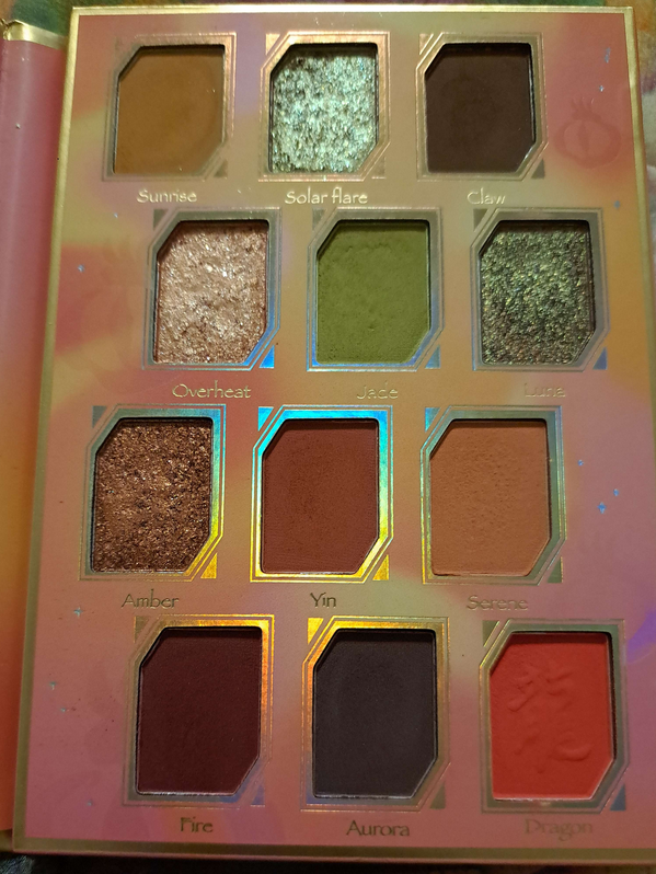
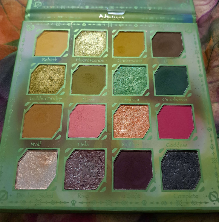
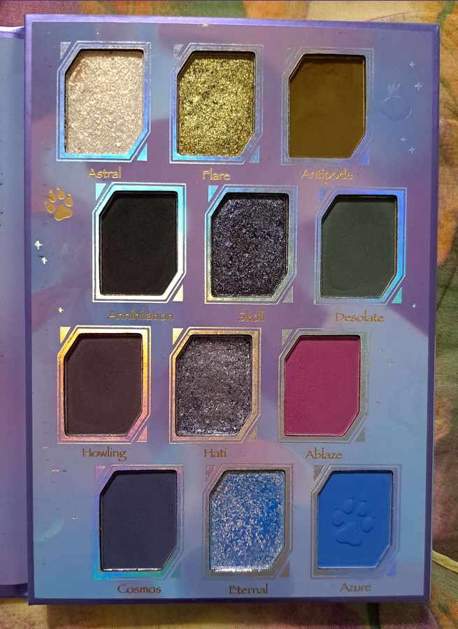
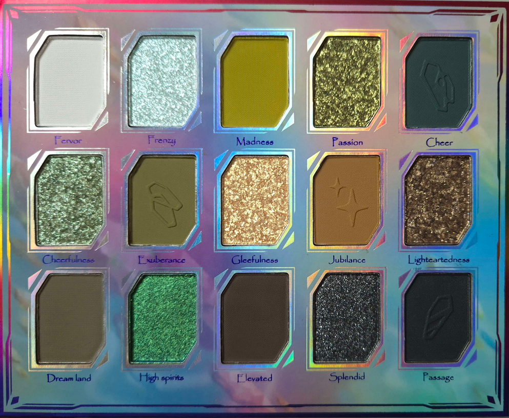
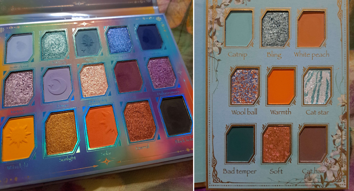
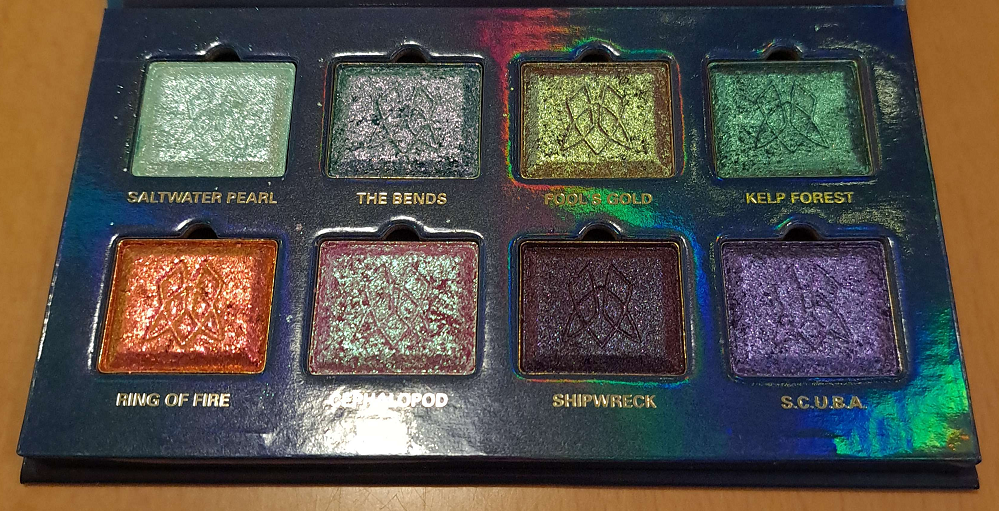
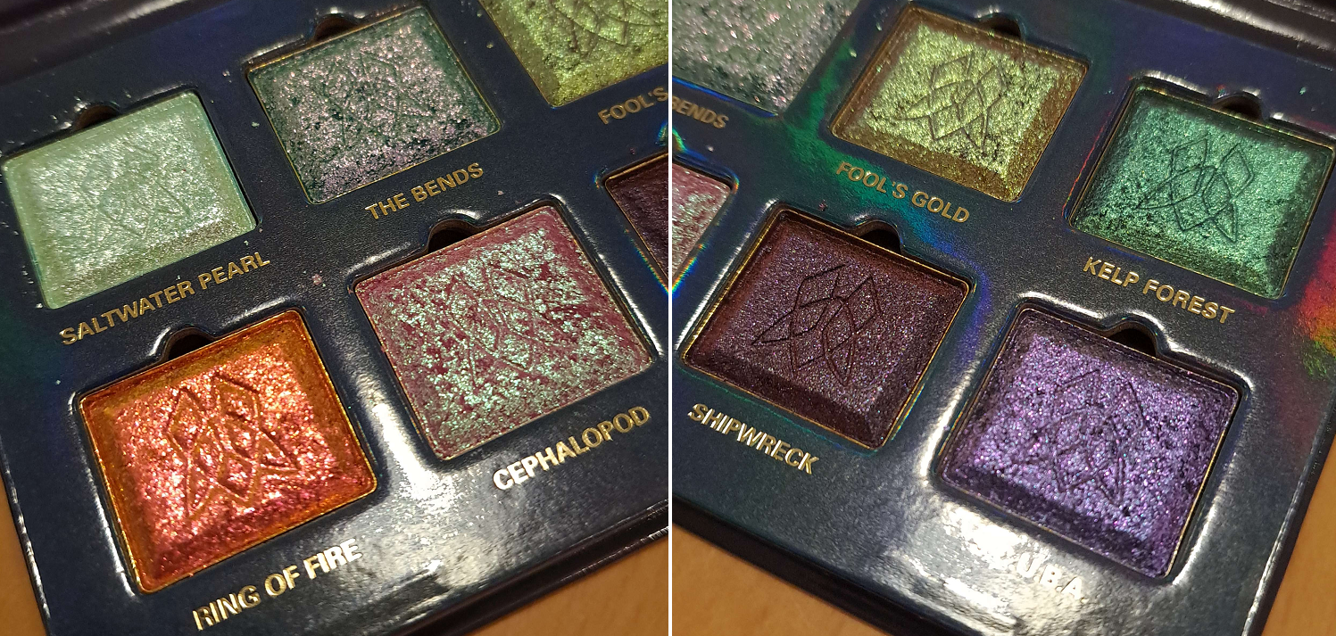
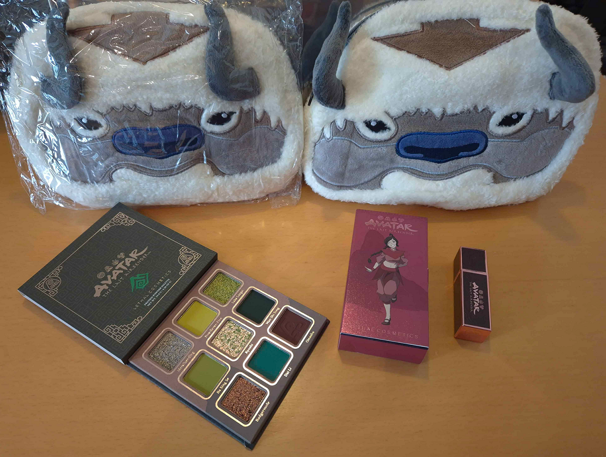
Earth Palette

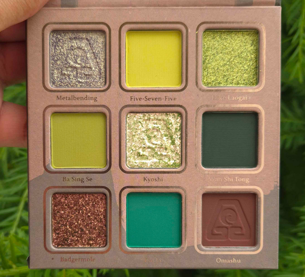
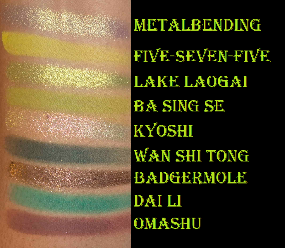
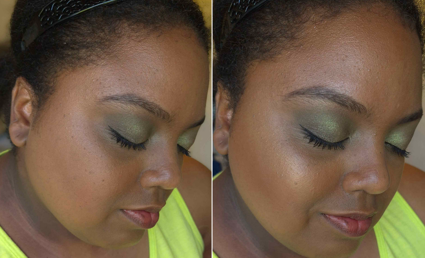
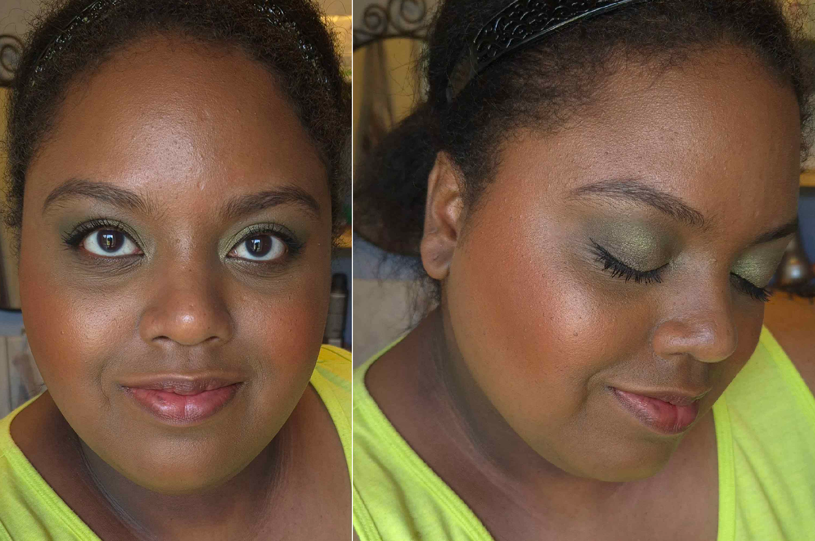
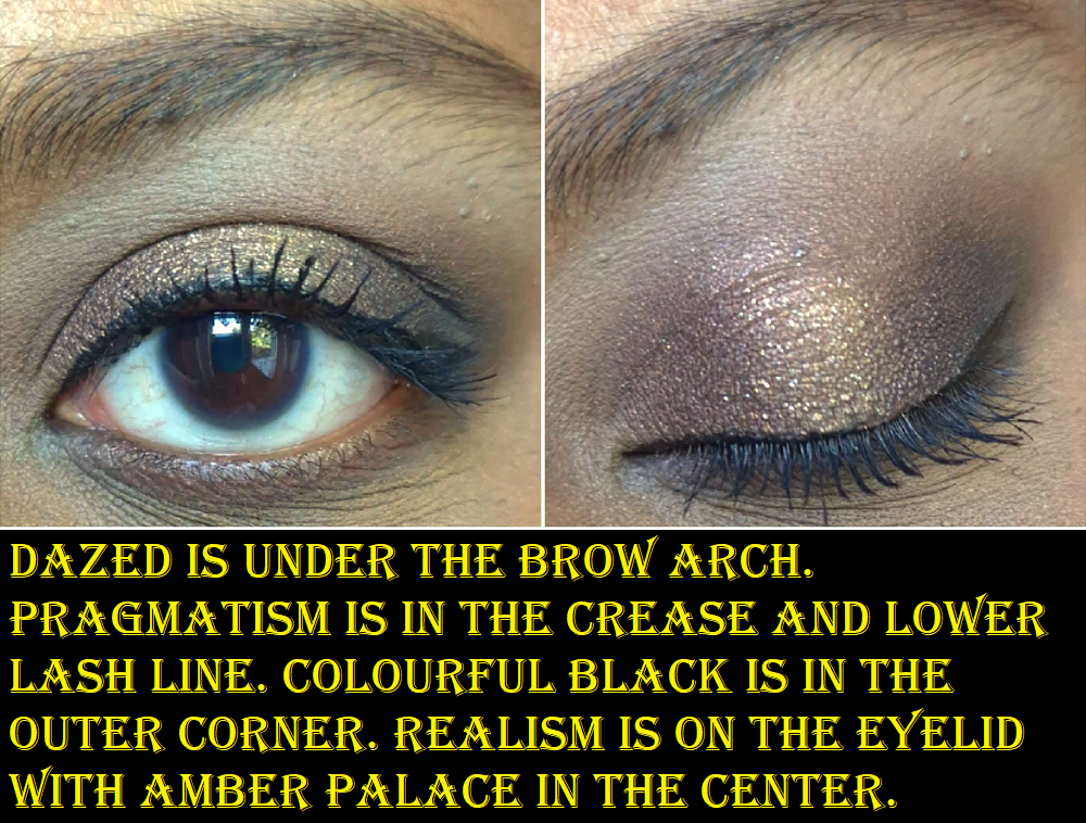
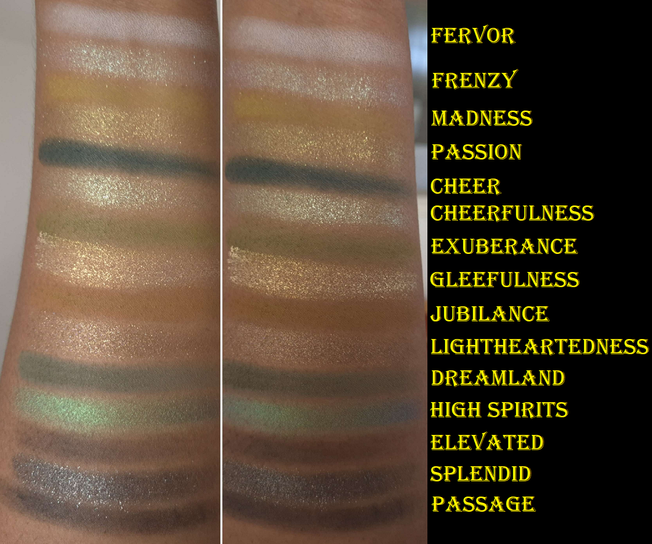
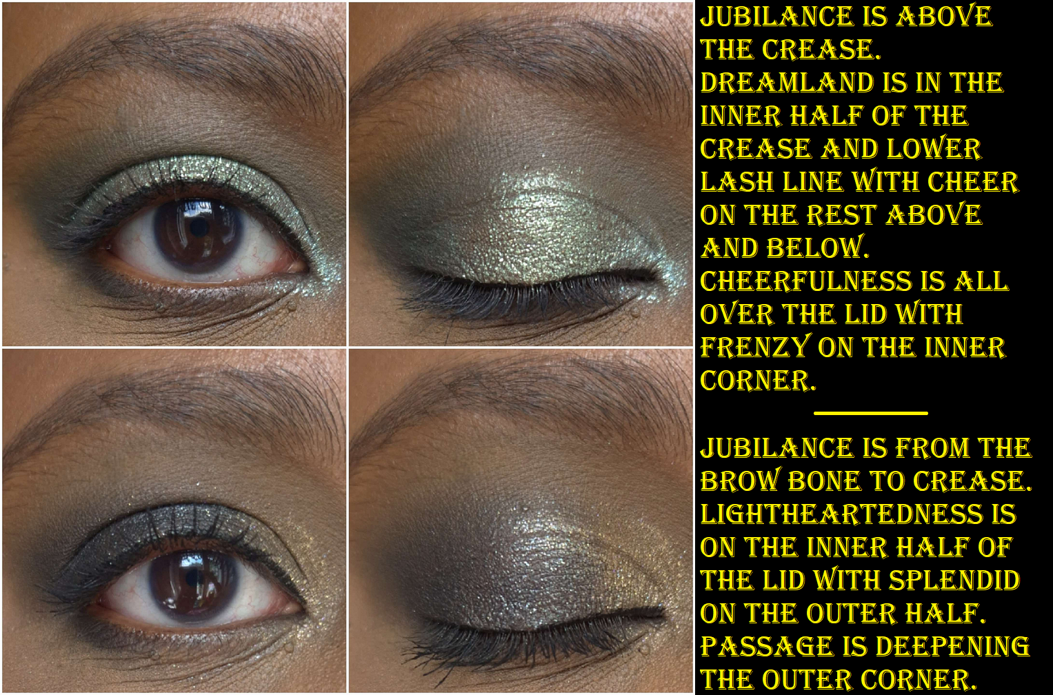
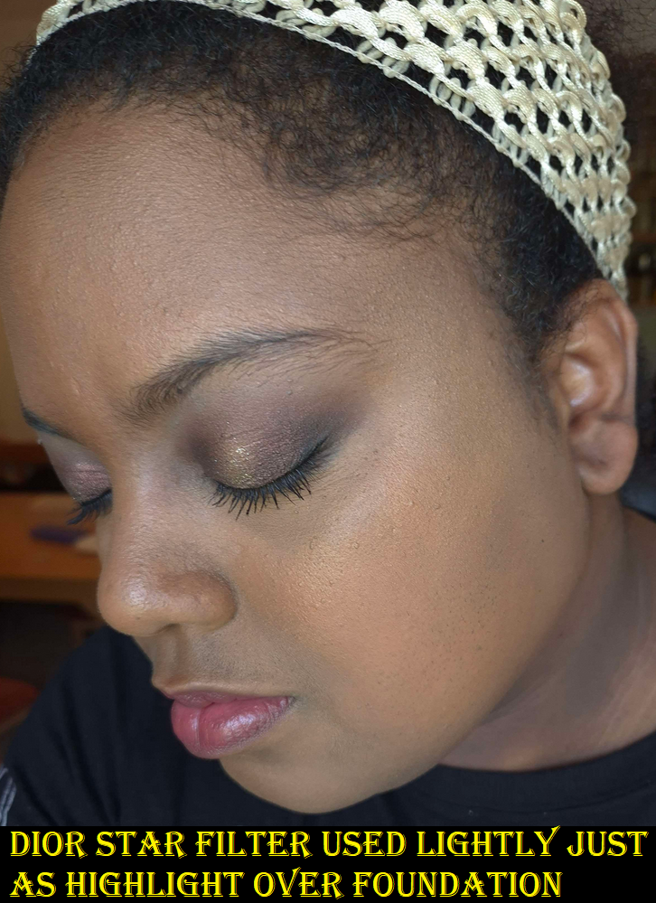
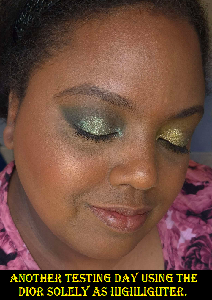
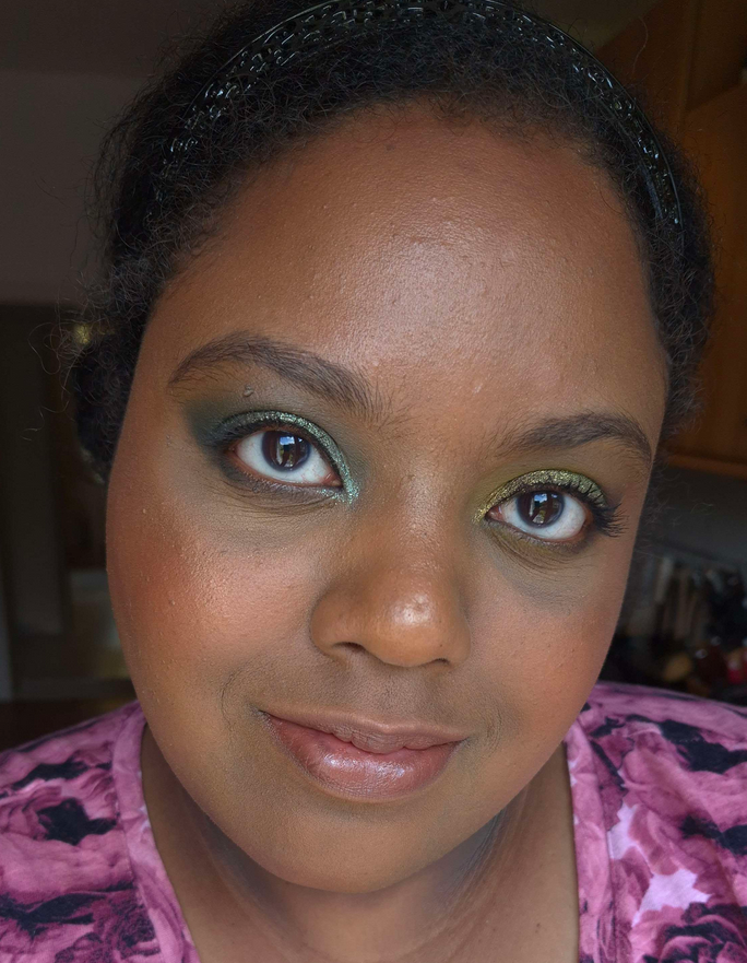
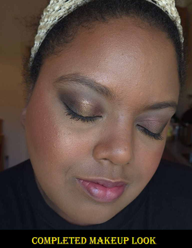
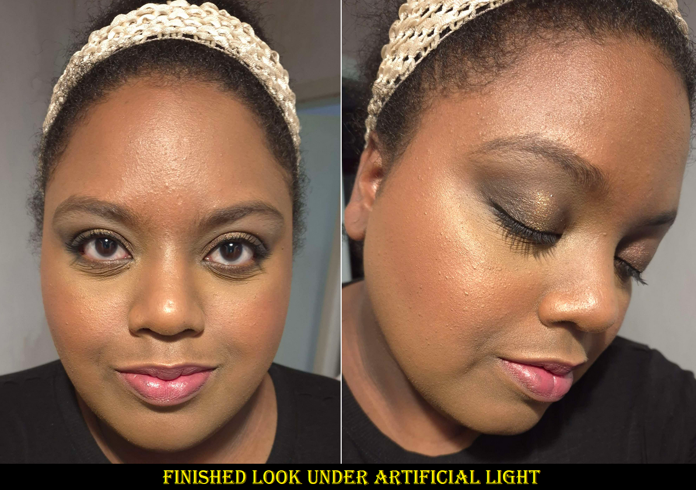
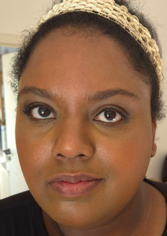
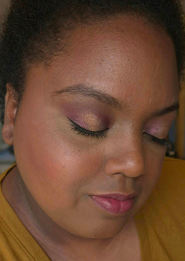
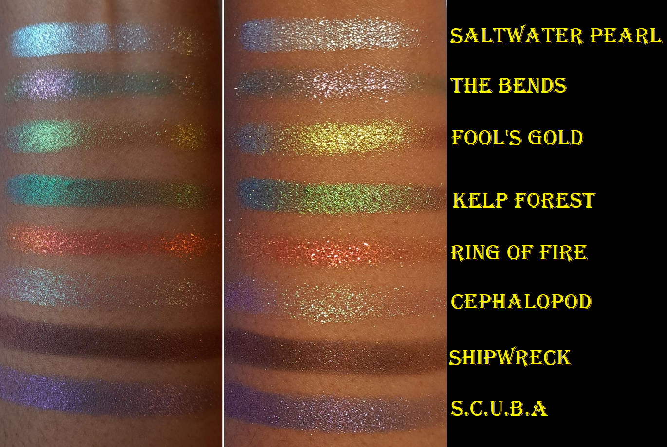
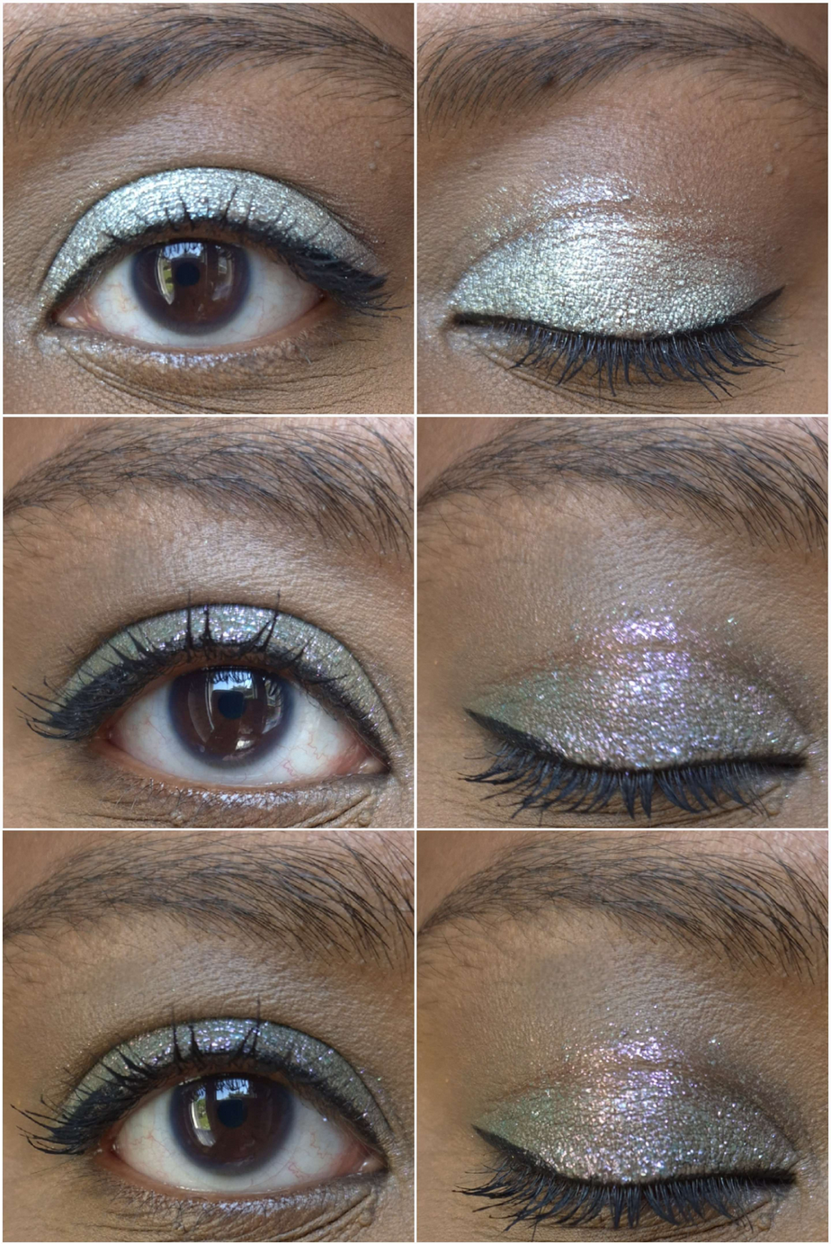
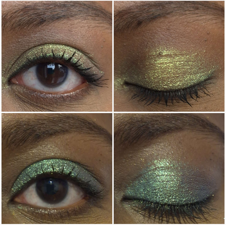
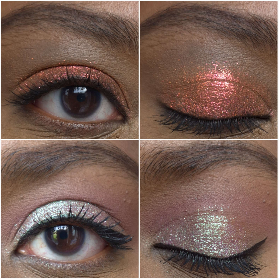
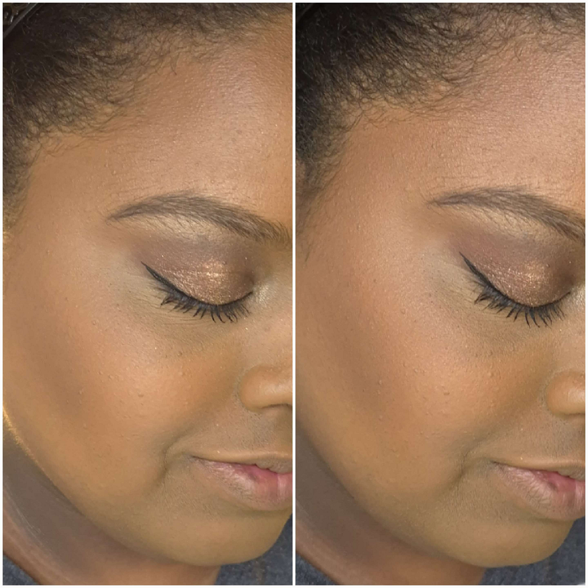
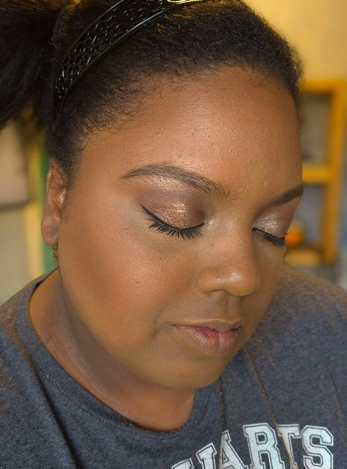
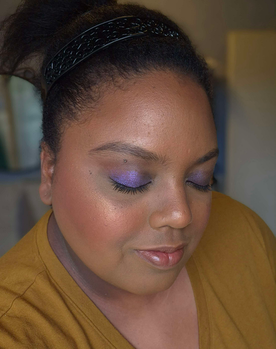
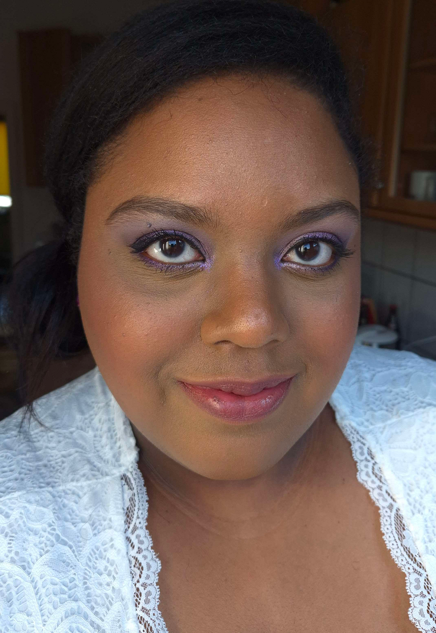
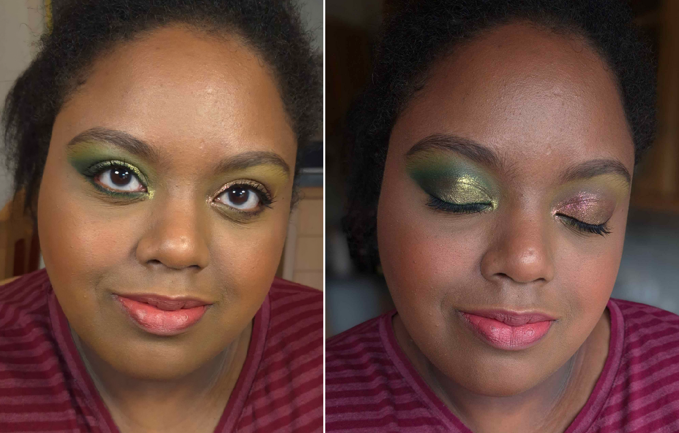
For starters, I am so on board with this color story! If I’m going to wear yellow leaning greens or blue leaning greens, these are the shades I prefer. I love how bright Dai Li looks, although it darkens on my lids if used with other dark shadows or on one of my wetter primers. I’m not sure if Metalbending is technically a duochrome, but at the very least it has a beautiful yellow-green shimmer on what looks to be purple-grey base. I’m not the most knowledgeable about color theory, but on my eyes it looks like it leans on the cooler side of yellow. It has been a long time since I’ve used Lethal Cosmetics shadows and the shimmers seem more to my preference now than before. They don’t feel as thick, but they go on smoothly and opaque. I don’t know if the brand necessarily increased the sparkle level; it appears the particle size of the shimmers are just bigger. Kyoshi is a somewhat flaky multichrome. I have minimal fallout applying the shimmers with my brush and fingers, but Kyoshi gets messy if I try to apply it to my inner corners without dampening the brush.
I get a little creasing near the inner corners where my eye line is the deepest. Wherever I place the shimmer has a tendency to move up a bit higher on my eyes over time (basically covering up some of the crease). So, if you have oily eyelids, these might be a potential problem depending on the severity of it. The amount I get doesn’t deter me from using this palette.
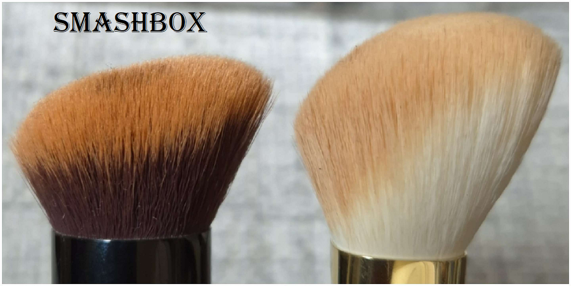
The mattes are closer to how I remember them always being. With Lethal shadows, they’re going to pack a punch! They are pigmented and a bit on the dry side, not the soft nearly creamy feeling powder mattes that have become my preferred formula. I like that these apply opaquely. They require some work to blend, but the end result is beautiful. They adhere well and don’t fade throughout the day. I recommend not using a tightly packed brush and applying with something that won’t put on a ton of product at once. I recommend also using a resilient type of bristle for blending, though it being dense isn’t required per say. This isn’t the kind of formula where I can easily blend it out by working the edges back and forth repeatedly. It sticks too well to the skin, which ensures no patchiness and no fading, so the tradeoff is just needing to switch up my technique. I have an easier time applying a lighter color, darker color, and then applying the lighter color back on top to blend and create that gradient.
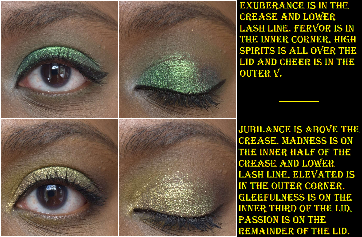
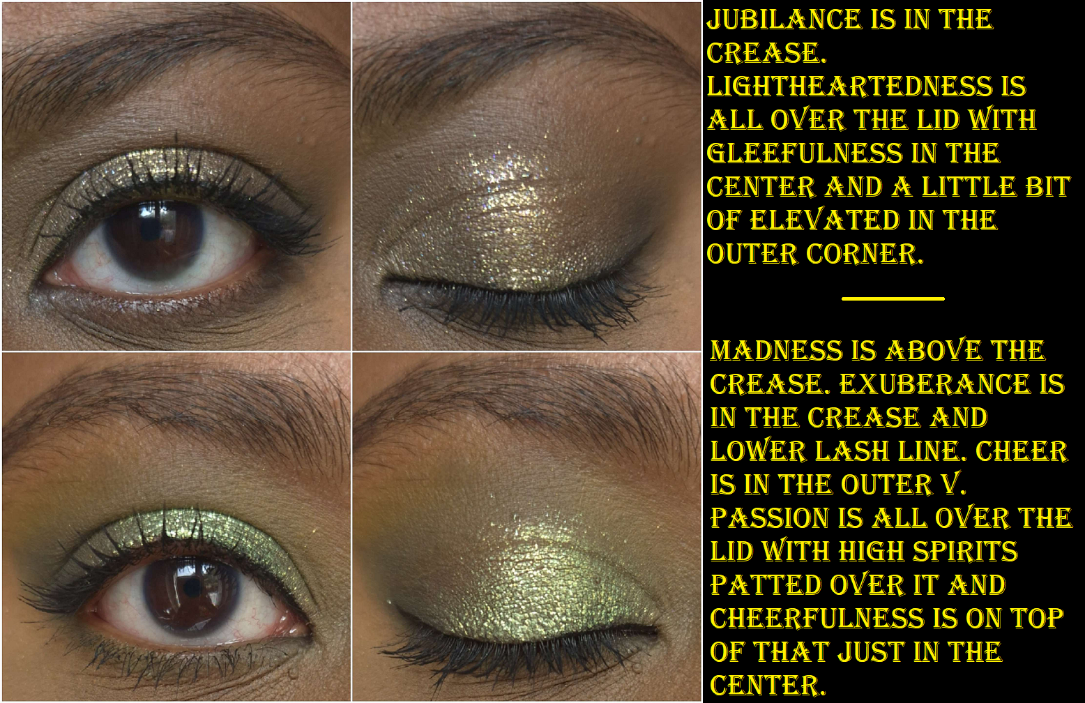
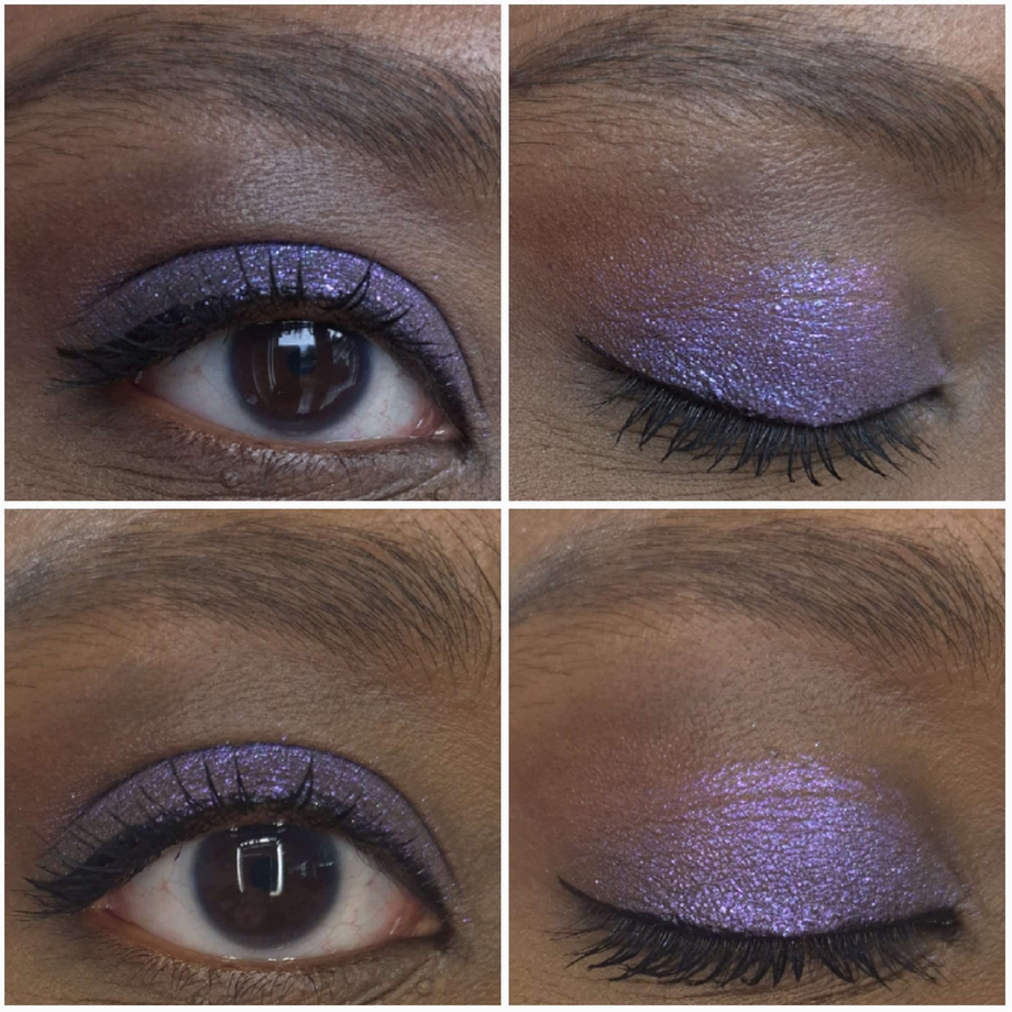
I used the Earth palette, plus a beige shade under the brow bone (Lodge) and shimmery greenish gold (Antheia) in the very inner corners of the eyes from Natasha Denona’s Mini Gold palette. So the majority of the eyeshadows used in the look are from Lethal Cosmetics.
If you’re a fan of depotting palettes to create custom magnetic ones or rearranging shadows, these pans are magnetic and able to be removed.
I have a gigantic Lethal Cosmetics eyeshadow collection. They’re one of the first indie brands I tried, and there was a time when I had nearly all of the shadows. I love their color stories and the way that they’ve grown as a company. Everything I have praised them for in the past holds true today. Their eyeshadows, though better than before, haven’t been my preference for a few years now. However, I have no regrets buying this palette. I don’t like to switch up my makeup applying techniques just to use specific products, but I don’t mind for this one.
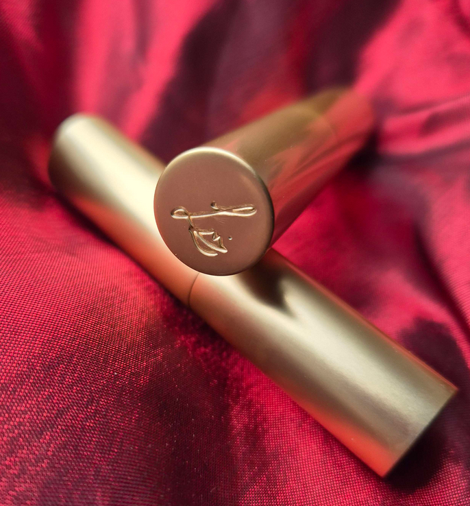
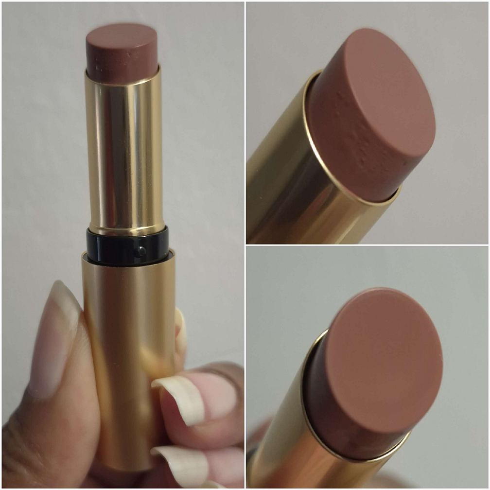
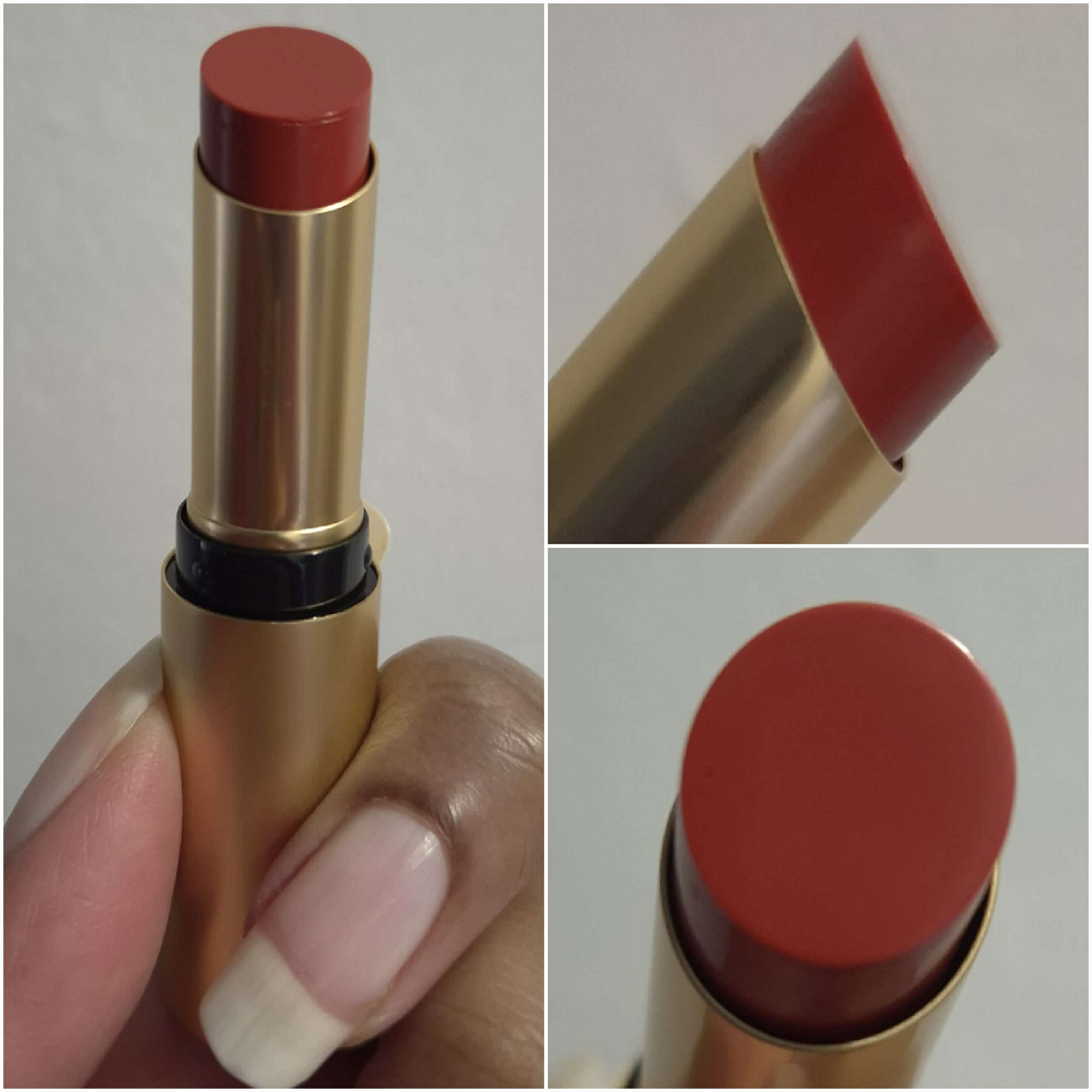
Ty Lee Lipstick
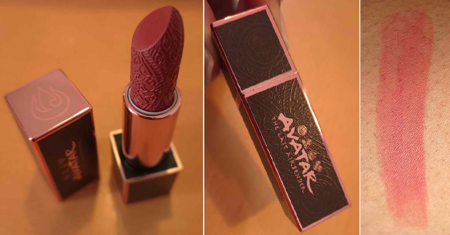
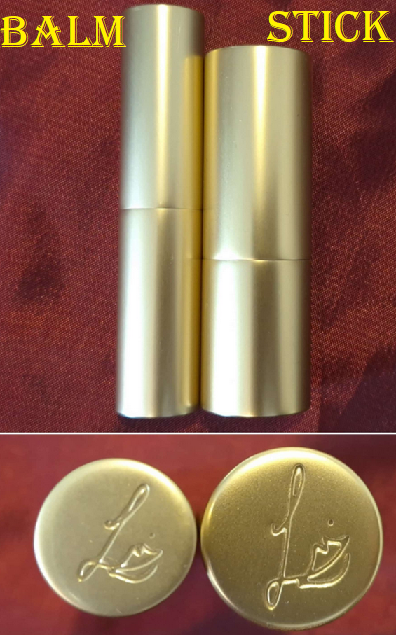
Lipsticks are less exciting for me than other forms of makeup, but there was no way I could resist that component and with the intricate design on the bullet. It’s just so pretty! I like that it has a magnetic closure, but the magnets are on the weaker side. I would feel nervous chucking this in a purse with other objects for fear the top would come off. However, I assume it would be just fine in a pocket of a purse.
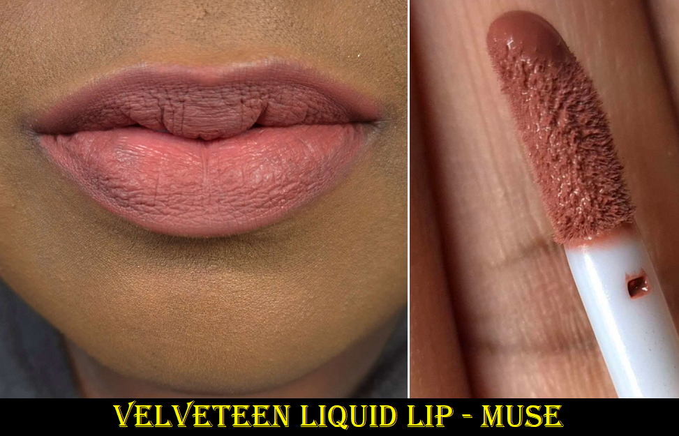
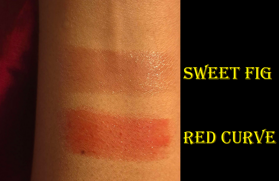
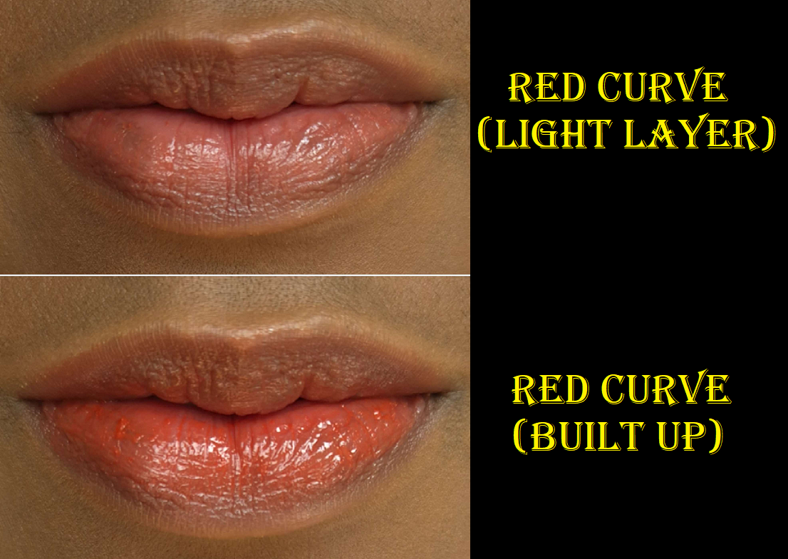
The lipstick bullet appears quite dark. All three shades in the collection looked to be the same depth with just different undertones in the marketing images. However, when applied to actual skin, this lipstick reveals itself to be a medium-dark pink. I understand the confusion about this shade though because Lethal’s Instagram page was flooded with comments about how “the Ty Lee lipstick should be pink” and “I wish these lipsticks weren’t all red.” The brand responded by telling people it was pink and that there was a softer option, but the color in the tube is not how it will actually appear when worn. It even looks dark and red in the brand’s swatches, but it appears much brighter on me. I can’t even say it’s a skin tone difference because they have swatches on an arm that’s similar in color to mine!
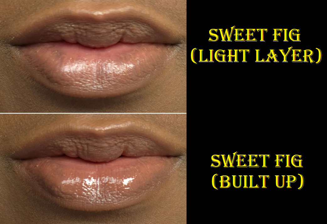
Regarding the formula, it has a creamy finish. It feels soft and the tiniest bit waxy (like a Burt’s Bees balm) as it spreads across the lips. It has a little shine, but it’s closer to a satin than a glossy formula. It feels comfortable in the beginning, but is drying over time. The shine lessens after several hours and although the lips continue to have some slip to it when I rub them together, I can still feel it drying beneath the surface.
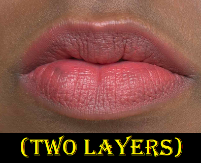
It has medium pigmentation, so if I want the color to look opaque, I have put at least four layers to cover the two spots on my lips that are naturally darker than the rest. For this reason, I have the urge to want to pair a lip liner with this lipstick so that the outer edge remains defined and opaque, plus to fill in those darker spots so I could use less product. Despite it not being fully opaque, it has a slight staining effect. If I try to wipe it off after it’s been on for at least four hours, there will still be some color left behind, especially between the cracks of dry patches. It doesn’t take much to remove the stain though. Just a little water on a cloth will do the trick.
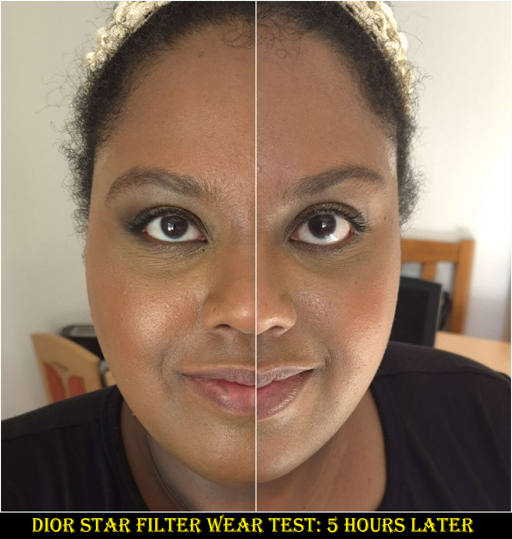
At the time that I took these photos, it had been cloudy all day for a full week. The pictures above were the better ones I could capture between using my artificial lights versus the natural light available to me. Videos of the products can be found on my Instagram post HERE.
Now that I’ve finished the testing phase, I’m going to stop using this lipstick. It’s not because it’s a bad formula; it’s because this shade of pink is a bit bright for my taste. I like the design and packaging of the lipstick, so I plan to keep it shelved as a collector’s piece instead.
Appa Makeup Bag
I wanted this because it’s cute! Don’t throw tomatoes at me, but I’ve only seen the M. Night Shyamalan version of The Last Airbender. I haven’t seen the Nickelodeon show*, nor the Netflix live-action show. However, it is on my list of things to watch. I have a feeling that once I do, I will be even more happy to have this bag. Cute creatures in anime always become my favorites like Chopper from One Piece, Happy and Frosh from Fairy Tail, Chiaotzu (technically human) and young Dende from Dragon Ball Z, etc. Call it FOMO, but I couldn’t shake the feeling that I would regret not getting one even though I have no need for more makeup bags.
This is another product that’s going to stay on a shelf for collector purposes! The “fur” is soft and seems pretty well made. I think $25 was a very reasonable price for it. It looks like it could hold a fair amount of makeup, but it doesn’t have a handle, which is what I would prefer to have for a functional cosmetics bag. Don’t be surprised if I end up stuffing this with soft accessories like scarves and wool caps and using it as a pillow or stuffed animal instead!
Yes, I still like stuffed animals.
Anyway, I think Lethal did a fantastic job with this collab. Even without me knowing very much about the series, it seems like they worked really hard to do this franchise justice. I would love for them to tackle another IP or do a Round 2 for this collection!
That’s all for today! Thank you for reading!
-Lili ❤
*UPDATE: I finished watching the animated series (not the Netflix live action), and although I didn’t like the show as much as I hoped, I did end up being happier with my decision to buy the Appa bag.