For the last several years, blush has been my #1 favorite category of makeup to purchase and wear. I have a similar taste in blushes as Angeschka Nyqvist, especially when it comes to shimmery ones, so it made sense for me to try some from her own brand. There are currently four shades in the range. I have three, but I did not buy Riveting Rhubarb under the assumption that it won’t be as flattering on my skintone as the others.
DISCLAIMER: I purchased all of these products with my own money. All thoughts and opinions are my own.
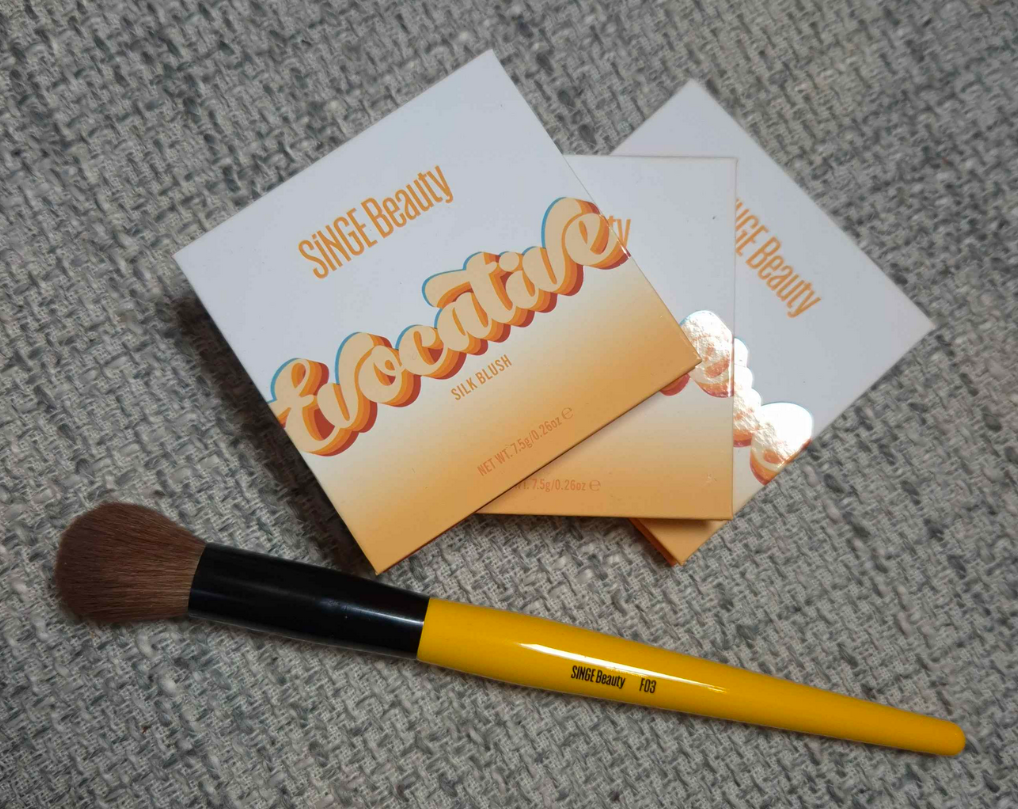
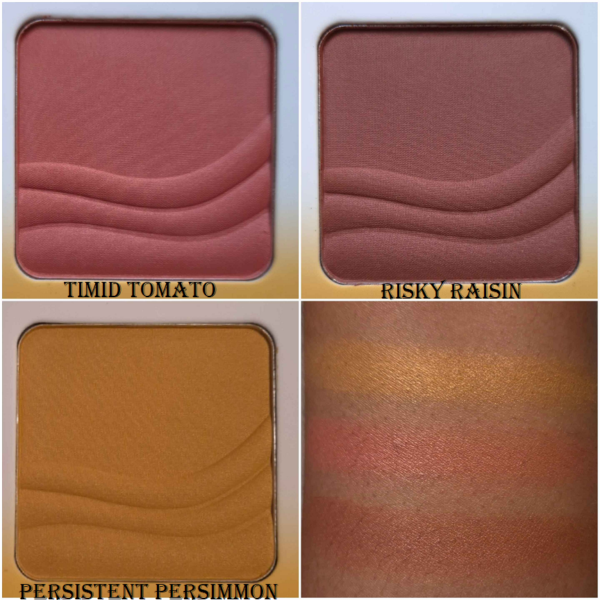
Singe Beauty Evocative Silk Blushes in Timid Tomato, Risky Raisin, and Persistent Persimmon
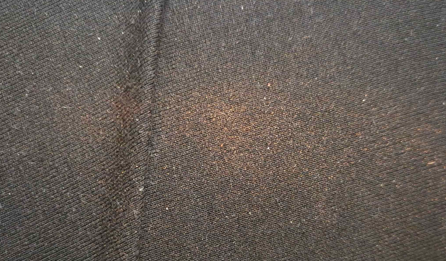
These blushes are pressed firmly enough to maintain the shape of that embossing, but they are loose enough to be easily picked up with any brush I own, whether they’re a delicate natural hair brush or a sturdier synthetic type. I get kickup in the pan, but it’s an acceptable amount most of the time. I got it on my clothes once from a brush that picked up a bit too much!
To the touch, these powders are soft and have a slightly silky feel to them. It’s difficult to see shimmer on the surface in normal lighting. The blush has to have light shining directly onto it to spot it easily. This makes me happy because when I say I want a shimmery blush, I don’t really wish to see large individual shimmer particles. I just want a sheen, or an ultra refined reflect to make my skin have a bit of glow to it. I’m not looking for a highlight-blush hybrid, so I’m pleased with the way these blushes are.
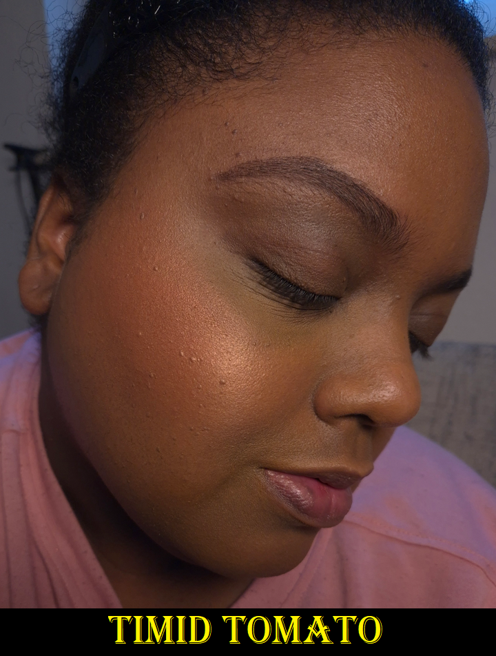
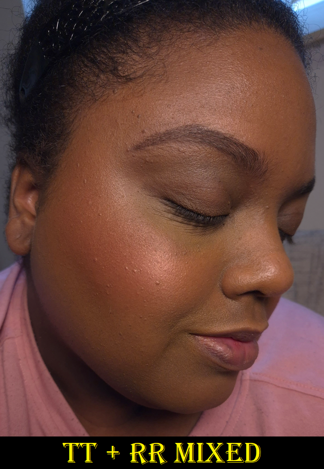
They are all quite pigmented. I prefer to use a medium density brush or one that is on the light side to have better control over how much I put on. It’s quite easy to get carried away and find myself saying, “slow build…gradual build…oh, gosh too much!” The blushes blend easily, especially with each other, but it still requires using a light hand. I’d rather they be pigmented over having the problem of being sheer because Timid Tomato is my favorite of these shades, but the inclusion of shimmer could have had the Nars Orgasm effect on me (that when the light hits it, the shine obscures the base color and then it looks like I just have highlighter on my cheeks instead of blush).
I have no longevity issues with this blush, as long as it’s on top of skin that is moisturized in some type of way (via skincare or foundation).
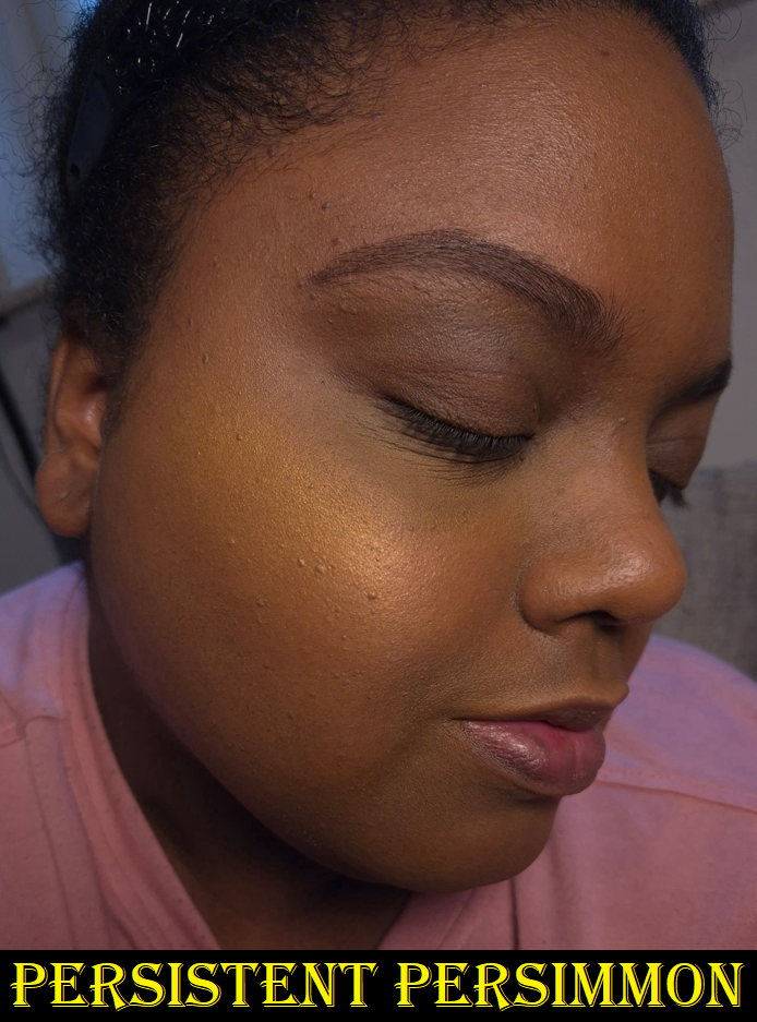
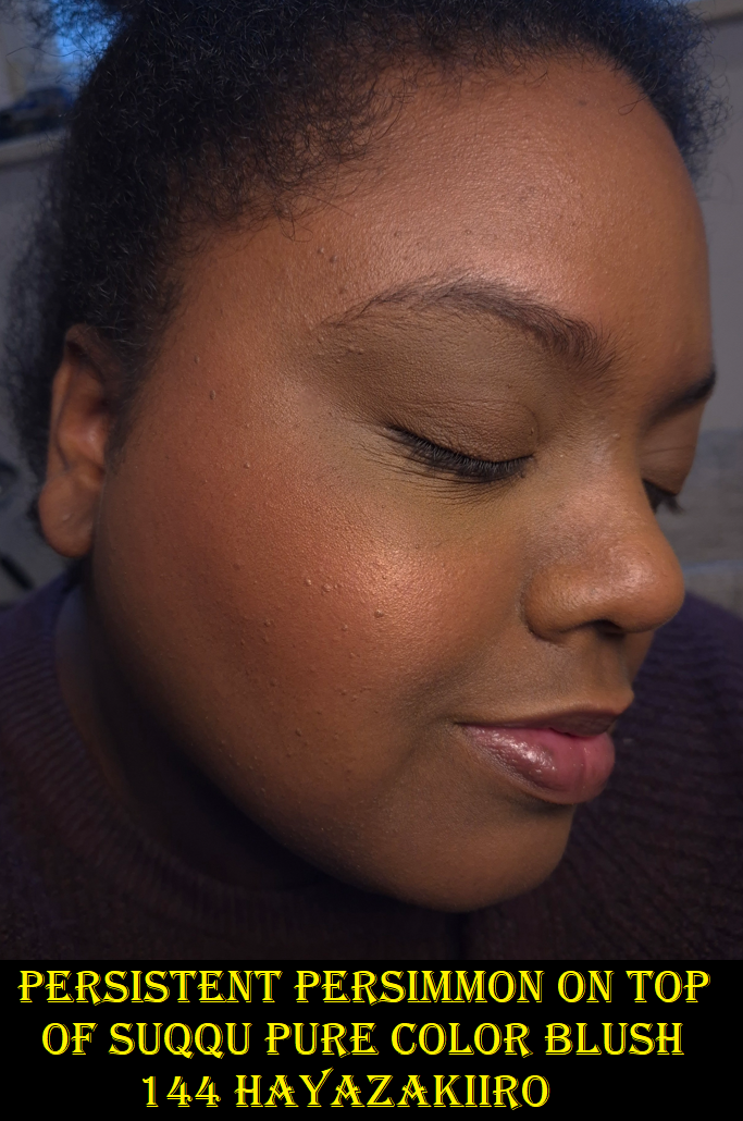
I bought the other two blushes in October 2024, but I didn’t get Persistent Persimmon until December of that same year. I kept seeing people use this blush to create a sunrise cheek type of look, which was pretty enough to make me reconsider. I knew this was too light to be a standalone color for my cheeks, but I remembered how Scott Barnes had a yellow blush in his Chic Cheek palette that could be used to add warmth to blushes if they were leaning too cool toned on someone. I’m less into matte blushes now, which is why I didn’t bother to keep that one with me, but I thought having a shimmery version could be perfect! Below are some examples of cool and/or berry blushes I don’t like as much and how Persistent Persimmon added on top turns them into a somewhat coral color that I like way more!
Besides using this shade for adding shimmer and warmth, I can partly lighten blushes that may be too dark for my liking. So, I’m happy that this turned out to be another “fixer” type of product in the same way that I use the Dior Powder No-Powder for blurring and blending or the r.e.m. beauty Interstellar Highlighter Topper to fill in the gaps of scattered effect highlighters.
I have considered the possibility that Singe’s pink blush could have the same role as Persistent Persimmon, except to cool things down, but my need for that is so rare that I don’t think it would be worth the purchase for that purpose.
As I mentioned before, these blushes look different in natural or indirect light compared to light hitting it straight on. This shade is like my version of Nars Orgasm X, but better.
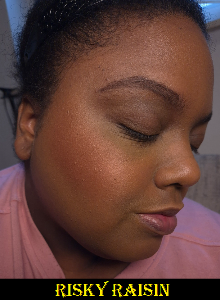
Risky Raisin looks a bit close to Timid Tomato on my skin. The difference is that it’s a touch darker with some brown and is a less saturated color overall. The red tinge in Timid Tomato pops a little more.
Overall, these are nice shimmer blushes. I like them, but there are blushes in my collection that I’m crazy about. I don’t have the same level of excitement using them as I do with, for example, Dior’s Rosy Glow Blush in the shade Bronzed Glow or Benefit’s Wanderful World Blush in the shade Terra. Those two are also twice the price as the ones from Singe, so I can at least say these blushes are among the top shimmer formulas I’ve used for under $20 USD. Because of VAT, the price I paid is around 23 Euros each.
On a less important note, I’ve been spoiled by luxury packaging, but I don’t mind Singe’s cardboard packaging or the absence of a mirror. I like that these details have kept the cost down. However, I’d actually prefer if these were available as refills. I would like to keep them in one single custom magnetic palette, so I’ve considered depotting them. The only reason I haven’t is that I also like how lightweight this packaging is. All of the custom palettes currently in my possession feel heavier in their empty state than the weight of these three blushes in one hand. I still don’t have a proper makeup area (renovations are still taking place), so it’s easier for now to carry these around in their current packaging until I have a more permanent setup.
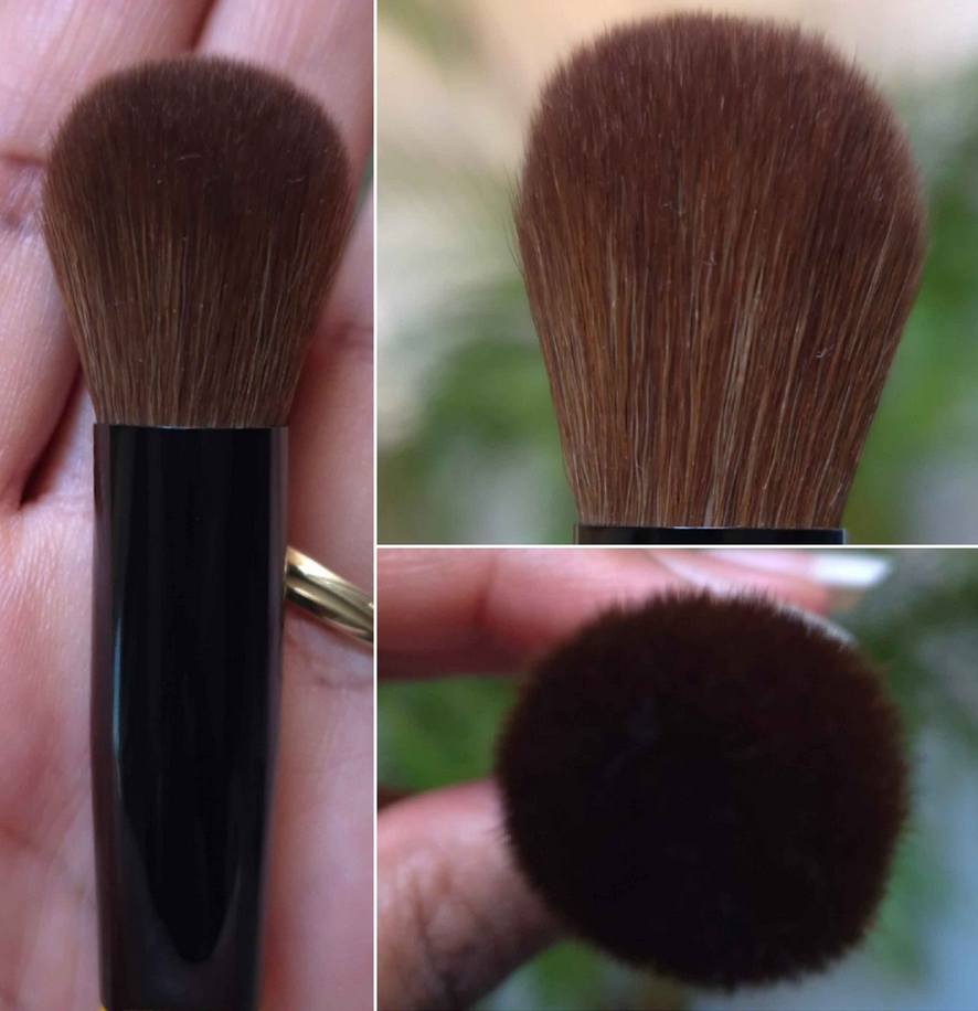
Singe Beauty F03 Brush
I’ve found Singe’s eye brushes to be useful, but not as enjoyable of an experience compared to my fude brushes. I decided they weren’t for me and assumed the face brushes would be the same. However, from one brush snob (I say this with love) to another, Tina the Fancy Face has given Singe’s face brushes a more positive review than the eye brushes. So, I assumed I would prefer them too.
This brush feels wonderful when I rub my fingers across the fibers, but it’s similar to rubbing Sokoho level goat across my cheeks. It feels nice at first, and certainly fine with the brand’s own blushes, but if I try to use a makeup product that requires additional blending time, it can irritate my cheeks a bit. My skin has admittedly gotten more sensitive with age (or perhaps I’m just so used to using ultra soft brush hair), so this won’t be a problem for everyone. I just wanted to put it out there that if you’re the type that uses mostly natural hair brushes and only loosely packed synthetic ones, you might not want to buy this brush. But I’d like to reiterate that it’s only if I have to spend a long time blending that it starts to agitate my skin.
The Singe blushes are pigmented, but I don’t have to worry about overapplying as much when it’s on my bare skin. The product looks so skin-like and I can use this specific brush in a heavy-handed way. However, when my face has a little dew to it, the application of blush with this brush can be too concentrated if I’m not careful. I have to dip the brush lightly onto the surface of the blush, tap off excess, and sweep it on first before attempting to do the full on circular buff.
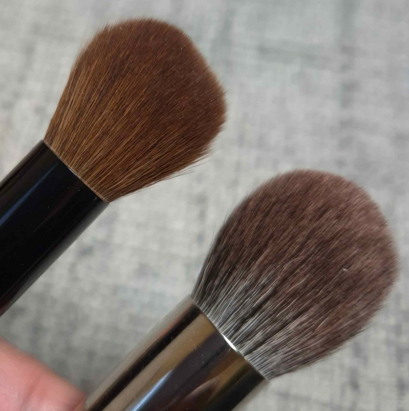
Because of these two potential complications, it’s just easier for me to not reach for this brush with powder products. What it’s fantastic for are creams and liquids. The size and shape is somewhere in the middle between my holy grail Sonia G Mini Base and the Classic Base that was too big to be a multi-purpose brush for me. I have enjoyed using this brush with Glossier Cloud Paint blushes, the Chanel cream to powder (Joues Contraste Intense) blushes, the Charlotte Tilbury Unreal Skin Foundation Stick (that I use as highlighter), etc. Those are products that I pounce on and they practically blend themselves. The way this brush moves ensures I still get good color payoff without the product getting absorbed into the bristles or dispersed into too wide of an area. I will probably continue reaching for the Mini Base over this one, but the Sonia G brush is almost double the price, so perhaps the Singe F03 would be a good alternative for someone.
Because of my enjoyment of this brush, but my desire to have it in a softer hair/bristle type, I purchased the Hakuhodo G6440 from Fude Bobo’s website and it is so wonderful! It’s only for use with powders (as it’s a blue squirrel/goat mix), but I’m thrilled to have it! I got mine during Black Friday, but it was still super expensive. It might only be worth buying for people who are lovers of pom pom style of brushes.
That’s all for today! Thank you for reading and I hope this has been helpful.
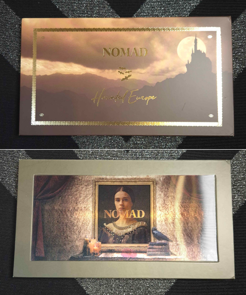
In 2020, I reviewed my first Nomad Cosmetics product: the Tokyo Harajuku Palette. It is one of the worst palettes I ever owned, which is a shame because the palette art was so cute and I tried so hard to make it work on me. It was bad enough to scare me away from purchasing anything else from the brand. However, in the last 2-3 years I’ve heard nothing but good things about the brand’s eyeshadows. Beauty Influencers and other makeup enthusiasts that I trust all seemed to like their palettes. Granted, not a single one of them ever reviewed the Tokyo palette and even the people who owned nearly all of them coincidentally were only missing that one. I always found that to be strange considering the Tokyo palette was extremely hyped up when it first came out and it was the reason I even discovered that Nomad Cosmetics existed.
Pastels are notoriously tricky to make look good on dark skin, so I was willing to accept that factor could account for the particularly bad experience. I had also heard their formula “got even better” over time. So, at some point I made up my mind to give them another try, especially since I felt bad that their only review on my blog was a negative one. The problem was that none of the color stories were of interest to me until the launches of the Haunted Europe and Royal Europe palettes. I also didn’t want to spend so much money on a palette when the potential was high that I might not like it. So, I finally caught Haunted Europe in stock during Black Friday/Cyber Week!
Before we get into the review, I just wanted to mention that this palette was delivered to me in Germany via GLS. This was my first and hopefully last time having to deal with that service. I was literally looking out the window as the delivery van passed my building and stopped somewhere else to deliver a package, then continue driving away. At the end of the work day, they updated tracking with a note that my package couldn’t be delivered because I was on vacation, instead of them just admitting they forgot to stop at my place.
I sent an email to GLS customer service. My package was delivered the next day, but they never responded to that email. I found plenty of complaints about GLS online, so this wasn’t an isolated incident. If you’re ordering something that uses them as delivery partners, just be forewarned!
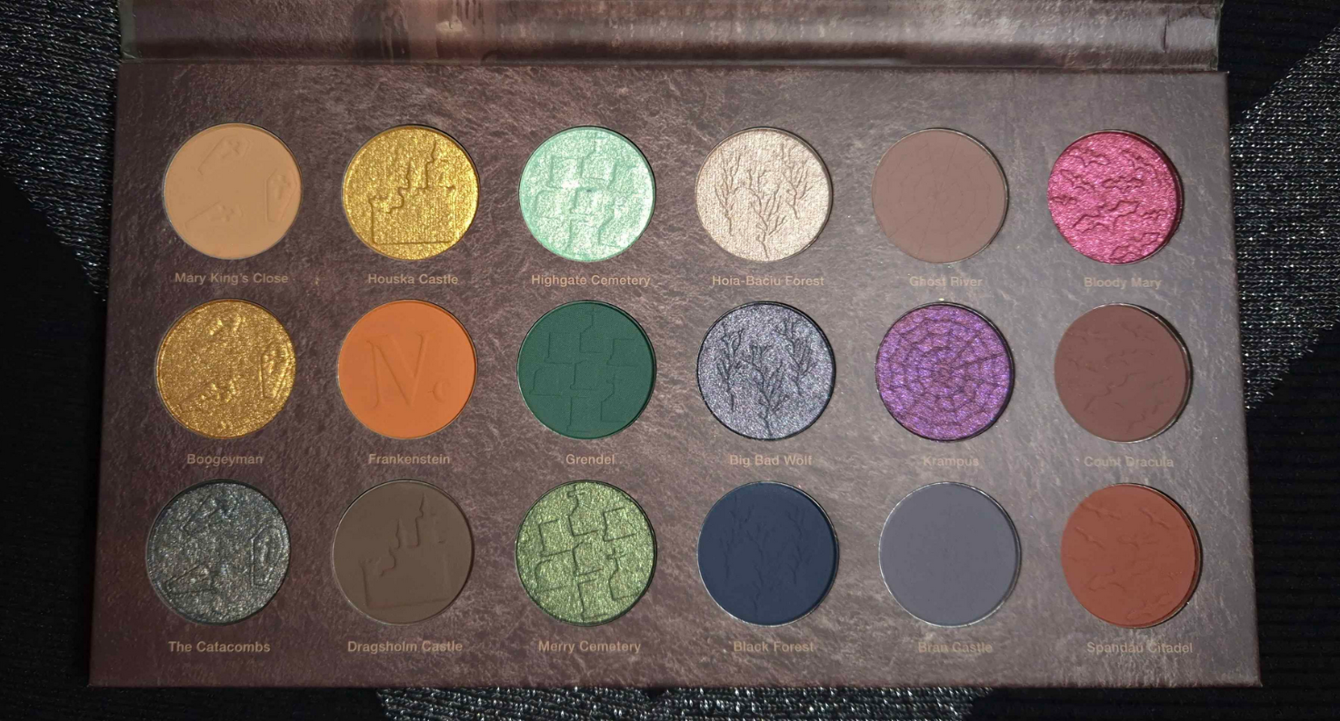
Haunted Europe Palette
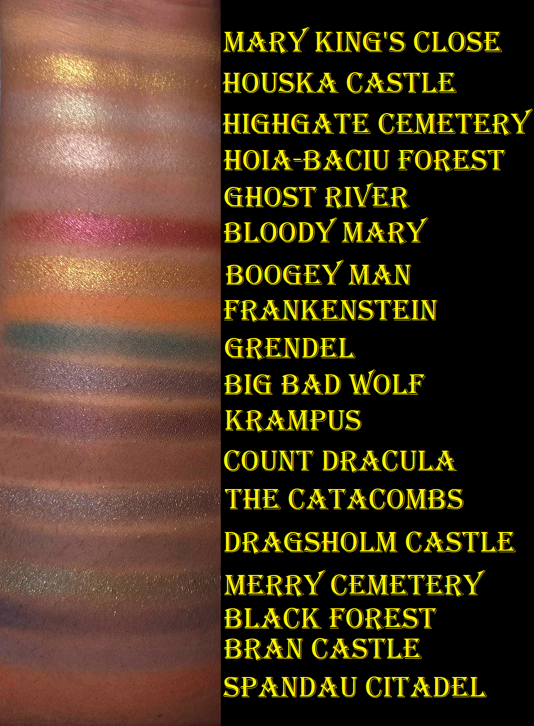
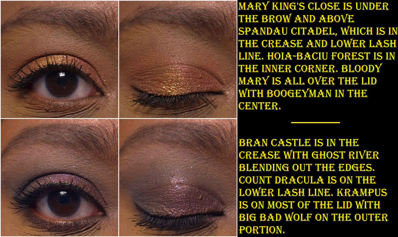
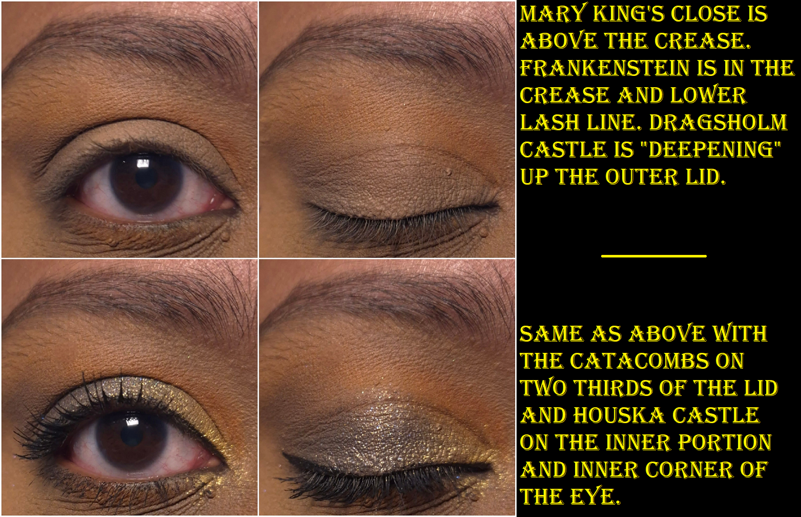
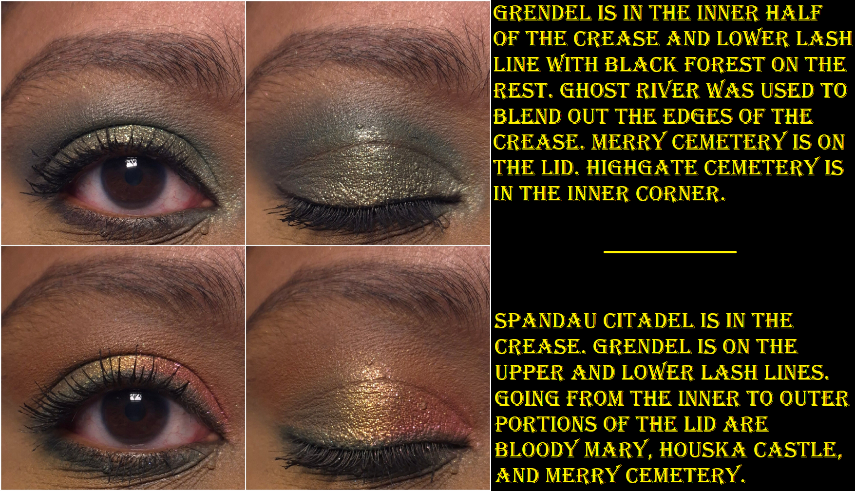
I was so relieved to discover that this palette is leaps and bounds better than the Tokyo palette!I’ve been able to create quite a few pretty eye looks. This has a nice mix of neutral and colorful shades, but the matte colors are a bit muted. The mattes are soft to the touch and powdery. They are all opaque and apply smoothly without being patchy, but they create a soft and hazy kind of look. The brand describes all their palettes as “intense,” including this one, which surprised me because these aren’t vibrant colors. I can’t think of a single indie brand whose eyeshadows are less saturated than these. For example, Spandau Citadel looks reddish brown in the pan, but it’s a medium pinky-orange on my eyes! Bloody Mary looks so promising in swatches, but it’s so much less impactful on my lids.
I’d like to clarify that I don’t think this is inherently a bad thing. It’s about preference and I think a palette like this is perfect for the neutral lover who wants to dive into color, but gets easily intimidated. This could also work for someone who likes to combine neutrals with colorful shades and without the overall look being too bold. Someone that likes smokier type of colors might enjoy this as well. It could also be the case that these look more intense on people with lighter skin or someone who uses different primers or bases. The ones I use with this palette are MAC Paint Pot and Lisa Eldridge’s Liquid Silk.
These mattes have a hazy effect that make them look well blended. It is easy to get a gradient look from a single shadow, but they aren’t easy to build up, nor to they layer well on top of each other. If I want real depth, I have to start with the darker shades first and work backwards from my usual order of eyeshadow application. Black Forest is the most pigmented shade in this palette and is the one that layers the best. Using that shade or the dark shimmers is the quickest way for me to deepen my looks with the least amount of effort. Grendel has the second strongest amount of pigment, but it’s not as easy to blend as Black Forest.
Houska Castle is a yellow-gold and Boogeyman is orange-gold. To keep them from feeling redundant, I think Nomad could have benefited from giving them different finishes instead of making them both smooth metallic shimmers.
The golds are fairly smooth, opaque, and vibrant. Highgate Cemetery and Merry Cemetery have bigger sparkle particles, but I can see my skin through them. I can fix that by wetting them so that they apply more compact on my lids. TheCatacombs and Bloody Mary have more opacity and more obvious shimmer, but they’re not able to complete with brands like Pat Mcgrath or Natasha Denona with intensity, let alone other indie brands. Big Bad Wolf and Krampus stand out because of the multi-colored shimmer, but they aren’t duochromes and they look smoother than the previous four I mentioned. Hoia-Baciu Forest is the smoothest of the shimmers and what I prefer to use as the highlighting shade, especially in the inner corner. It pairs well with nearly all the eyeshadows in this palette. To me, the shimmers are just fine. They don’t crease on me though, so that’s a plus. I also get an acceptable amount of fallout throughout the day, as it adheres to my lids pretty well, but after that it’s impossible to remove all the shimmer particles with micellar water and a microfiber cloth alone.
Since the theme of Haunted Europe is supposed to be spooky and smokey, I assume this is why the colors are muted and that Nomad’s other palettes are more saturated. That could mean that I still have gaps in my knowledge regarding the brand’s eyeshadows, and therefore shouldn’t assume the others perform like this one.
Haunted Europe is good enough to have redeemed Nomad Cosmetics in my eyes, and I can see how people would like the quality, but this is still in the middle of the road among the palettes in my collection. There are too many aspects that aren’t a perfect fit for my makeup preferences, so this is probably where the journey ends between Nomad and myself. My curiosity has been sated.
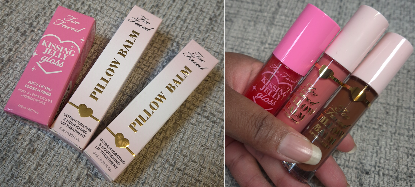
I owned and reviewed eight of the brand’s Hangover Pillow Balms prior to Too Faced dropping them from the Hangover line. They renamed them just Pillow Balms, redesigned the packaging, and revamped some shades while introducing a few new colors. Besides the two I’ll be reviewing today, I also purchased the brand’s Kissing Jelly Gloss, which I believe they released in 2023, but I didn’t buy it until late last year.
Too Faced Pillow Balms in Pink Pineapple Kiss and Hot Cocoa Kiss
I enjoy the formula of the balms, but I only brought the original clear version with me when I moved because the other shades I owned were a pale milky color that was not all that flattering on my lips, or they were sparkly with no base color. However, when I recently returned from visiting the US, I brought Vanilla Kiss and Holiday Wine back with me. Holiday Wine is the most pigmented of all that I’ve tried and Vanilla Kiss had the prettiest sparkle.
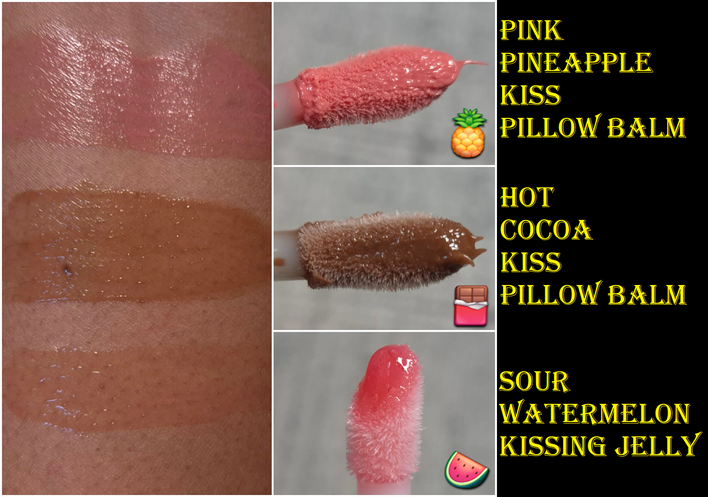
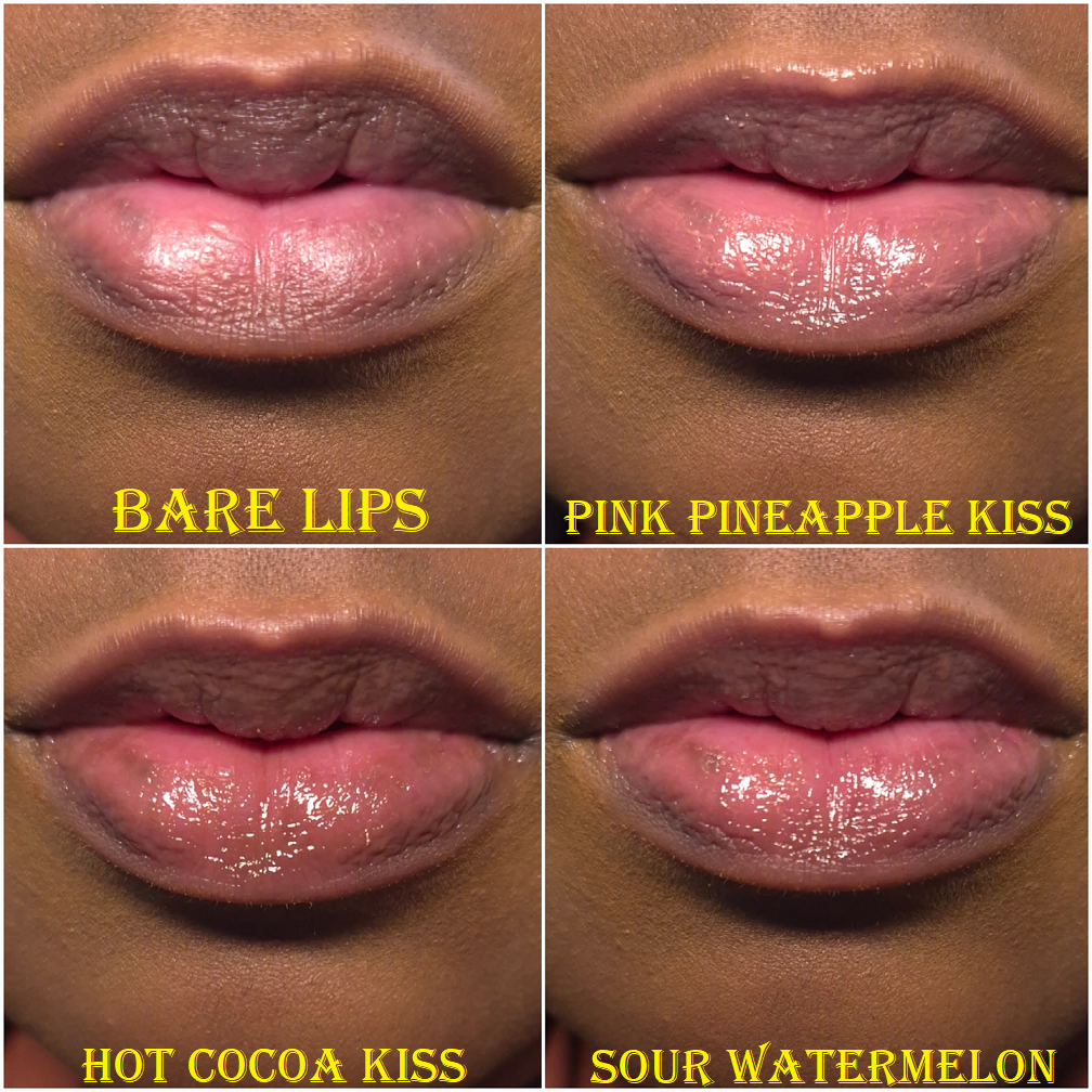
When the new ones launched, I was excited to potentially own some with more pigment. As it turned out, Pink Pineapple Kiss is still a bit light for me, but at least it doesn’t look milky, so it’s an improvement. I would consider this a neutral light-medium toned pink. It is supposed to smell like tropical fruit, but to me it smells more strongly of mango than the original Mango from the previous line (and that shade/scent was discontinued).
Cocoa Kiss from the prior line was much lighter than the new Hot Cocoa Kiss. It is a much better color on me! The brand states that this has a chocolate smell. I think this smells exactly like a Tootsie Roll! It’s very nostalgic for me, but considering how artificial Tootsie Rolls are, I can imagine that a lot of people who didn’t grow up with those candies might find the smell unpleasant. Chocolate is one of those things that a lot of people hate when it smells artificial, but then again, Too Faced gained notoriety with their Chocolate palettes and bronzers, so they have been known to produce that scent well enough. I think the scent is still an improvement from how the previous Cocoa Kiss smelled.
I don’t own Juicy Watermelon Kiss, but based on the website photos, it appears to be a richer and more vibrant version of the old Watermelon shade. Banana Kiss doesn’t seem different from Banana, but I cannot confirm. I don’t own either one.
Even though the Pillow Balms have deeper color options now, these are still lightly pigmented lippies. I don’t think it’s necessary to own more than a few unless you want a larger scent variety.
The original formula and this one seem identical to me. They still have the minty-cool sensation when first applied. There’s still a tiny bit of flavoring. These hydrate quite well and are a bit sticky because that top layer locks in the moisture. I am relieved to say Too Faced didn’t ruin a good thing. In fact, they made a few minor improvements with the scents and colors, so this is a product I can still recommend.
Too Faced Kissing Jelly Gloss Juicy Lip Oil/Gloss Hybrid in Sour Watermelon
The scent of this is like a Watermelon Jolly Rancher, which I like. My lips get smoother quicker with this lip oil than the Pillow Balms, but it doesn’t feel as deeply nourishing as I wear it despite it containing so much sunflower seed oil that my lips love. I don’t know how well the good ingredients are actually penetrating the skin of my lips. It’s certainly moisturizing, but it isn’t long wearing. Lip oils typically lack longevity, but the hybrid ones I own from other brands (like Ami Cole) have better adherence. So, the fact that this is a little less sticky as the Pillow Balms and other hybrid lip oil/glosses explains the weaker lasting power. It grips the lips at least well enough to not give a runny or dripping sensation if this was an oilier product.
The Kissing Jelly glides smoothly across the lips, but it can feel goopy if too much is applied. The Pillow Balms can cause that white ring around the inner lips if there’s too much, but an uncomfortably wet feeling is the worst that I’ve had with the Kissing Jelly. No white ring.
One of the downsides to this product is that despite there being so many “shade” options, it looks pretty much clear on the lips. So, the color is negligible and I chose mine based on the scent I wanted and trying to avoid getting one with glitter. Otherwise, I would have gotten the Piña Colada scent. The other thing I don’t like is the packaging design, which looks a bit juvenile to me. It’s supposed to be cutesy, but I think the Pillow Balms are a better reflection of how to do cute packaging while still looking like the pricepoint that was paid. The Pillow Balms are only $3 more than the Kissing Jelly, but they also contain 1.5 more ml of product. The Pillow Balms look on brand, but the Kissing Jelly look like they could have been made by Colourpop.
Essentially, I think the Pillow Balm is better for someone like me with extreme dry lips. The Kissing Jelly is better for someone who wants a thinner product and whose lips are still dry, but at manageable levels.
That’s all for today! I hope you’ll stop by again to read more posts written by me!
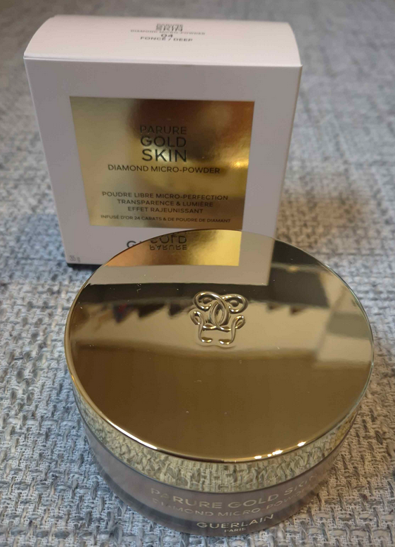
When the Guerlain Parure Gold Skin Diamond Micro Powder launched in September 2024, it was not even on my radar because of the price alone. However, over time, so many luxury beauty reviewers were praising this powder as the best alternative to their holy grail face product: the iconic and now infamous Givenchy Prisme Libre Loose Powder.
When my makeup obsession began in 2014, I only cared about face powders to set my concealer and help lock in my makeup for longevity purposes. I had closer to normal skin at the time, so as the years went on and my skin became drier, I only needed powders to set the concealer under my eyes. Every so often I would fall prey to the hype surrounding a powder, but there was never one that I fell in love with for putting all over my face until the Dior Powder No-Powder. I had several that I really liked, but Dior’s was an actual love. That product caused my interest in powders to soar, but none since then have even come close to surpassing that one. This is largely in part to the sheen of the powder and how intensely it blurs and evens out my skin.
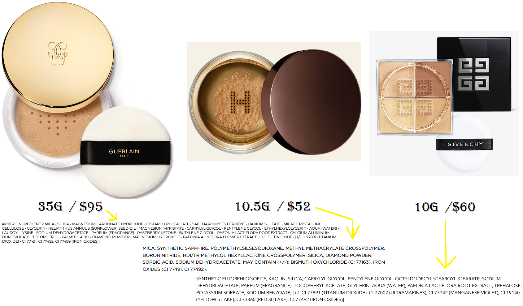
The reason this is important is because the most I ever spent on my precious powder was $45 for 11g. Because I was working through two different shades, I have not yet panned one, and it has taken me nearly four years to get this far with the Dior powder. So, there was no way I was going to spend $95 on something else, even if it turned out to be the most magical makeup product on the planet. I waited, very impatiently, until this powder could be found for a deal greater than 20% off. I was so excited when that eventually happened via Flaconi and I snagged it for 56 Euros!
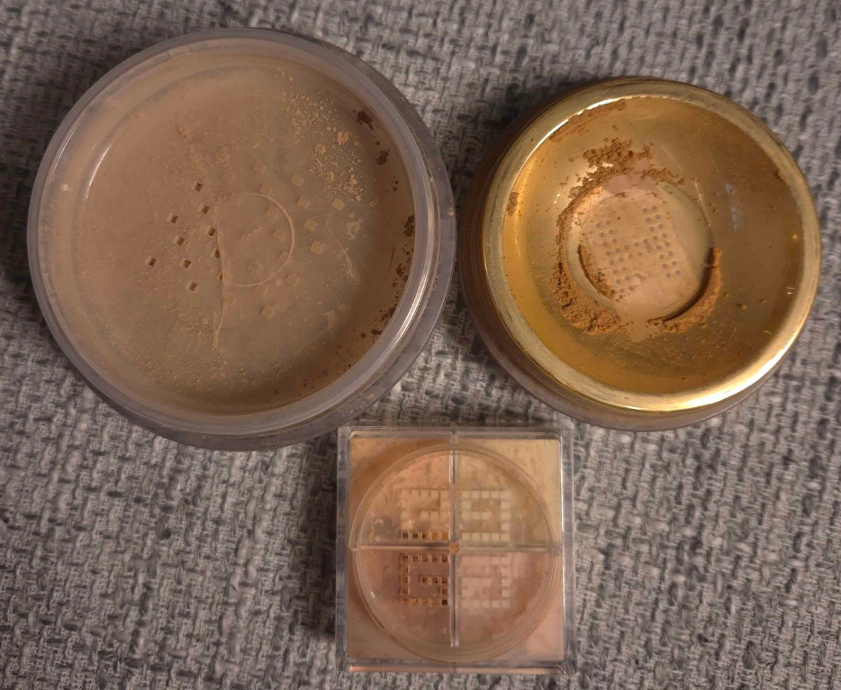
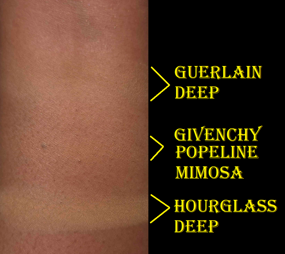
The photo below shows how it looks (top left) compared to the Hourglass (top right) and Givenchy powder (mini on the bottom). Please ignore the tape covering the holes. This is my way of maintaining control over how much comes out at once.
The texture of the Guerlain powder is very fine and smooth, but dry feeling. Despite the product name, which sounds like it should be super radiant, I cannot see any shimmer nor sheen when I apply this to my skin. This powder completely mattifies without the skin looking dry. It also leaves a slight veil of color and is a little blurring.
I was pleasantly surprised that Deep works for me, even though it’s a neutral color (warmth would suit my undertone best). I kept hearing how comparable Guerlain’s powder was to Givenchy’s, and they do feel similar to the touch, but the way it actually looks on my skin reminds me more of the Hourglass Veil. The main difference though is that the Hourglass Veil isn’t as translucent and it provides some coverage to aid in creating a smooth canvas, moreso than through means of blurring. Because it’s easier to see the Hourglass powder on my skin, it’s less forgiving during the times of the year when I’m at my lightest. Because Guerlain’s is similar to Hourglass, but sheerer, it’s like having an even better suited replacement.
My most blurring powder is the one from Dior, second comes Chantecaille’s Perfect Blur, and then Guerlain’s is third. Technically, the reformulated Givenchy Prisme Libre Powder has the same amount of blurring capabilities, but I only liked it under my eyes as it left my face looking too matte. When it comes to the kind of finish I want on my skin, I still prefer a product with a sheen. Even though Guerlain’s powder is mattifying, if my foundation is hydrating enough, this powder eventually allows for the oils to come through as the day goes on in a controlled manner that allows for some glow, but never enough for my naturally dry skin to appear oily.
I always applied the Milk Hydro Grip eye primer to my under eyes and then put the KVD Good Apple concealer on top before setting it with the Charlotte Tilbury Airbrush Flawless Finish powder. This trio of products was the best way for me to keep my dark circles covered all day. When I tested out my usual pairings with the Guerlain powder instead, I was shocked to see that it held up nearly as well as Charlotte Tilbury’s. When I tried the KVD concealer with just the Guerlain powder, it lasted longer than if I use KVD together with Charlotte’s without the Milk primer. The more I used Guerlain’s powder, the happier I became with the results and being able to skip the step of using Milk’s primer! The Charlotte Tilbury powder is part of my Project Pan, so I am continuing to stick to my usual routine, but every so often I’ve been using the Guerlain powder for my under eyes as well. Although I still wish the Guerlain powder had some sheen, I recognize the fact that it might not have looked as nice under my eyes if this was the case.
As much as I like this powder, I still keep circling back to the price and being unable to understand why the hype for this is so intense. There aren’t a ton of reviews on YouTube, but I see a lot more of my fellow makeup lovers championing it on Instagram. This is a great product, but I just don’t see how it’s $95 kind of great. Perhaps I just don’t get it because I don’t have the right skin type to be able to fully appreciate its capabilities. So, I’m going to try and look at its worth from different angles.
The easiest defense for the cost of this powder is the price per grams. This contains a whopping 35 grams. The Hourglass and Givenchy powders would cost way more money if they had the equivalent amount of product. The Guerlain Parure Powder has enough powder in the jar to last me a lifetime, but will it? It has a PAO symbol representing 12 months. In addition, I start to get squeamish about using any makeup older than five years old. If it looks, smells, and performs the same, I might continue to use it a few more years after that, but I do not use makeup indefinitely. The “it’ll last me forever” line is one that I say sometimes, but it isn’t an actual selling point for me. If I’m able to use this powder happily for 5 years, it would essentially be like paying $19 a year to use it. That still seems steep to me considering I like this, but I’m not in love. Since I bought this at the discounted price of 56 Euros or $58 USD, that’s about $11.60 per year. Factoring how little product I use and how many other powders I have in my collection, this is more acceptable to me. I am satisfied with the powder for the price that I paid.
Another contributing factor to the high price tag could be the expensive ingredients. There’s supposed to be real ground up 24 karat gold, crushed diamond powder, and perhaps they are even charging more money for the fragrance that’s included considering how expensive Guerlain’s perfumes are. My counterpoint to those is that gold and diamonds are so low on the ingredient list that they have no actual impact on the overall look of the product on the skin. They are too small to contribute to the radiance level and they don’t give any benefits to the skin. Their only purpose is to add to the luxury factor of just knowing it’s in there. As for the parfum, it’s not the signature violet smell that I loved in the original meteorites, but it’s still nice. However, I prefer for my makeup to not have any scent at all, so this is actually one point against them. There are times when I was going to reach for the powder, but my husband was in the room, so I didn’t. He’s sensitive to smells and opening the jar causes powder to permeate the air, which lingers for 5-10 minutes. So, the perfume in there actually prevents me from using it as often as I would like.
As for the packaging contributing to the price, this is just plastic. It has a pretty gold colored lid and comes with a thick luxurious puff. In fact, Guerlain’s puffs are the nicest ones that I own (that come included with the makeup I bought). Considering Guerlain has such stunning Meteorite tins, I can’t imagine the Parure packaging being more expensive than those. So, I don’t think the packaging is enough of a factor either.
There are other points that could be made, but the bottom line is that even if I can calculate how it adds up to $95, I don’t see the value for myself. At a sale price though, I kind of get it. I’m content with my purchase, though I still believe they should sell a mini.
That’s all for today! I hope this has been helpful or at least an interesting addition to the growing debate regarding luxury goods in this economy. Thank you for reading!
I’m calling this a Part 3, even though Parts 1 & 2 were solely about blushes (plus one more about the fails). This post is intended to showcase additional colors of products I’ve already reviewed before. If this is your first time visiting my blog…welcome! Herzlich Willkommen! I will have links to the original reviews in each section (ex: in bold blue) if you’re looking for in-depth information about each product. In a way, this particular series is for the email followers and regular visitors to get any updated information and see how additional colors look.
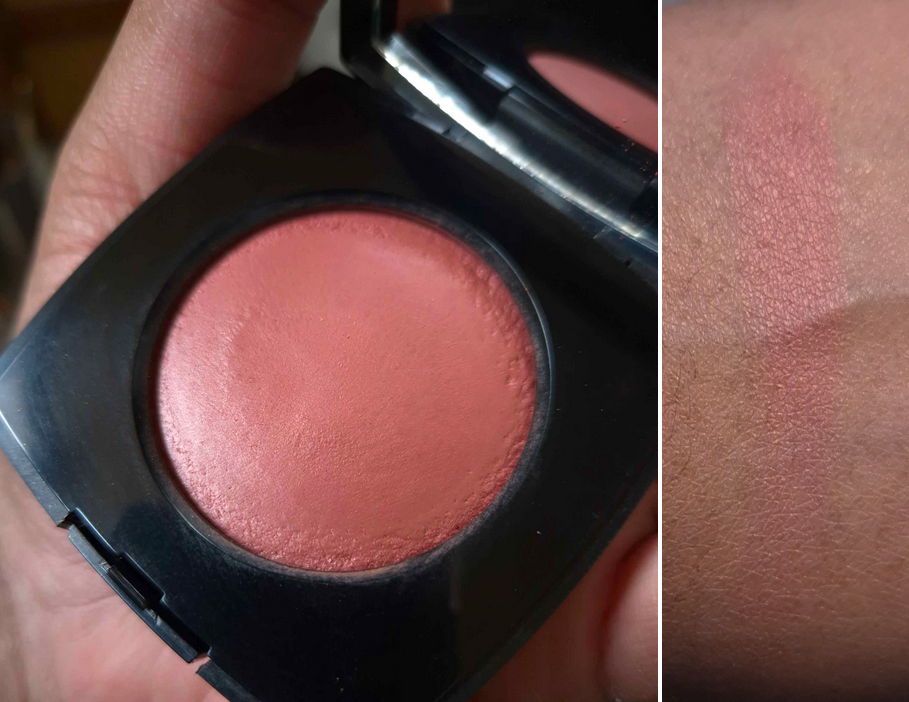
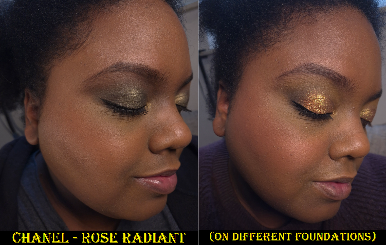
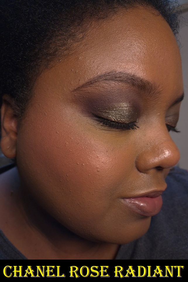
Chanel Joues Contraste Intense in Rose Radiant (Rouge Franc)
I was so eager to try this on, that I only took one good photo of this in new/untouched condition. Unfortunately, it was in a room with ultra warm lighting. Once I realized this, I tried very hard to color correct the picture, but I couldn’t get it to look accurate enough and had to take a new photo instead.
This is the color I wanted most all along. I just didn’t think it would show up on me until I saw how it looked on someone a little darker than me. I’m very happy with this blush and I like that its appearance is subtle. Although I still like Rouge Franc, I didn’t like it enough to put it in my Project Pan. This one, however, is included in it.
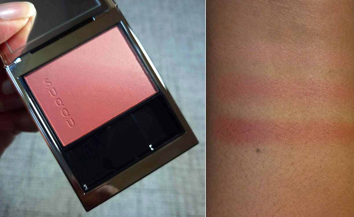
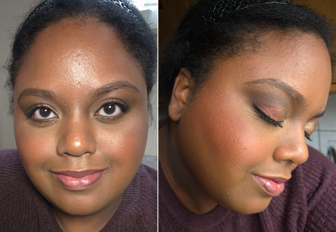
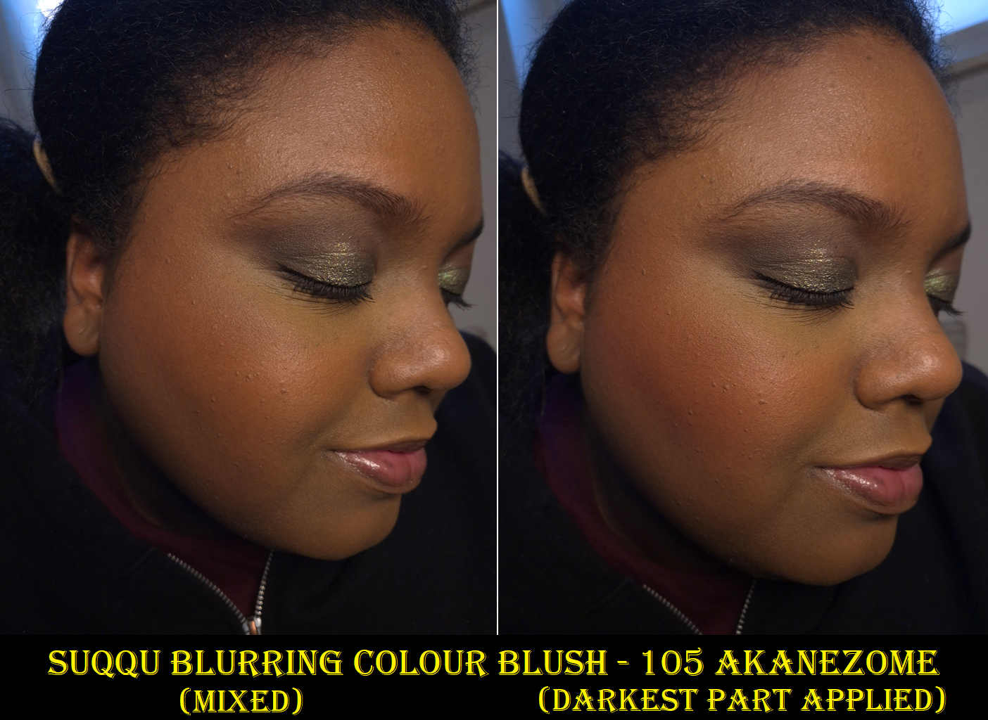
Suqqu Blurring Colour Blush in 105 Akanezome
I’m including this here because I have so many Suqqu blushes, but this is technically a new formula and Akanezome is the only color I have in the Blurring Colour Blush line. My list of various Suqqu Collections, which consist mainly of blushes, can be found HERE.
I gave up on trying to take photos in front of the window. Time with sunlight streaming in is too limited in Germany and my pictures get washed out. The part that is important to see among the various photos is that this blush shade works for me despite how light it looks in one half of the pan. I do mostly concentrate on swirling my blush brush into the darker corner for more impact.
Suqqu’s Blurring blushes are in the same compact as the Pure Color ones and discontinued Melting Powder blushes, but they are matte black on the outside instead of shiny black. Regarding the quality and performance, I really can’t tell a difference between the Pure Color and Blurring Blush formulas. My guess is that the Blurring Blush line just has more subdued tones, especially with the kinds of shades that are available to mix with in the compact.
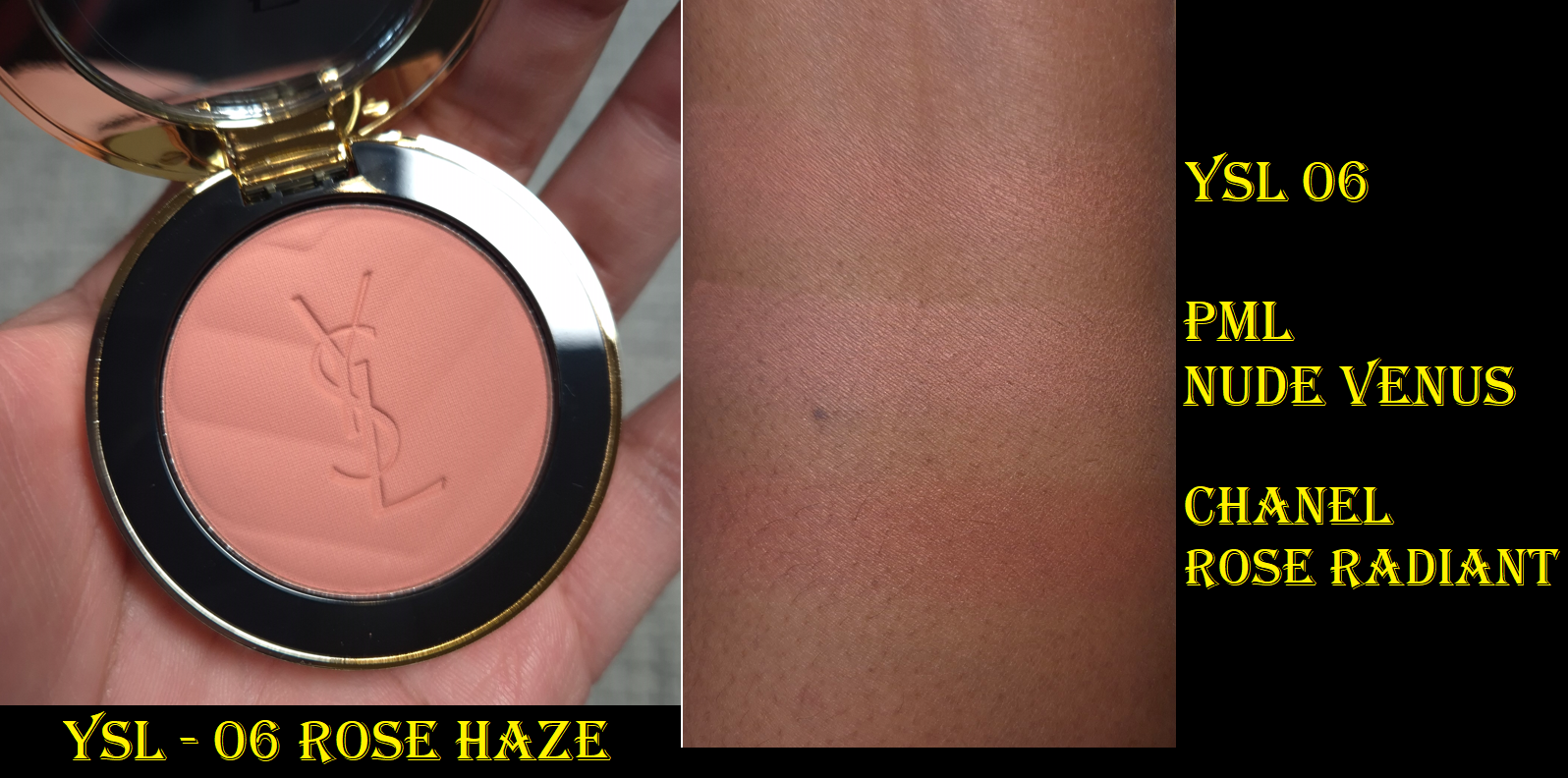
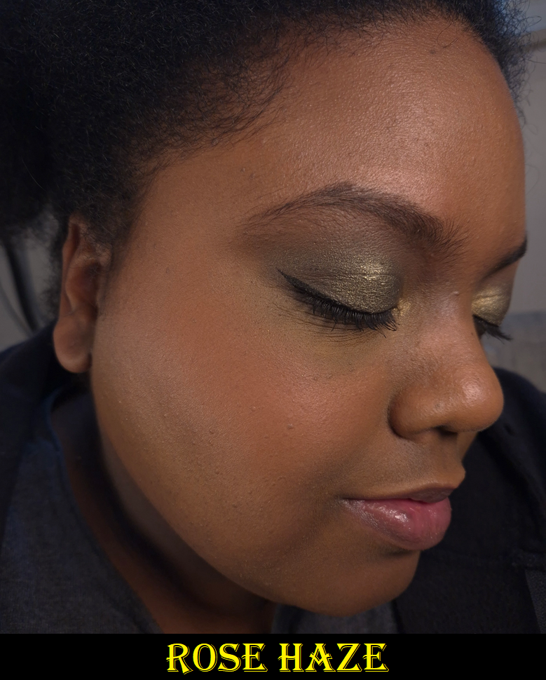
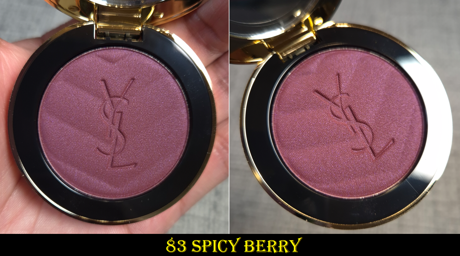
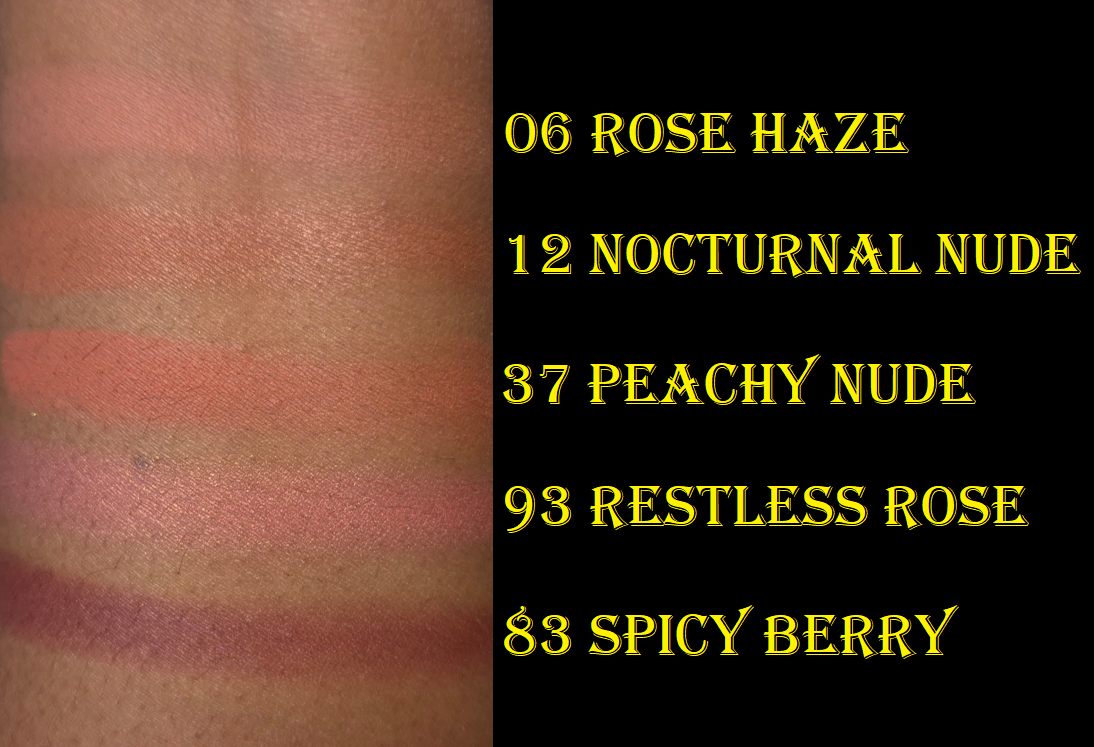
YSL Make Me Blush Bold Blurring Blush in 06 Rose Haze and 83 Spicy Berry
The review containing Peachy Nude, Restless Rose, and Nocturnal Nude can be found HERE.
Because of the way Rose Haze looked on me when using the virtual try-on tool, I just couldn’t let this color go. It still looks pretty and is visible on my cheeks (even more so in person than in photos), but the light color combined with the matte finish makes this look a little less appealing on my dry skin than if it had a shimmery finish. Peachy Nude, being a little darker, doesn’t look as dry on my skin from my perspective.
Sometimes I want a light and subtle blush. It happens so infrequently though that there isn’t a reason for me to have too many of them. If I didn’t have a color like this from Sephora, Nabla, Chanel, and Pat Mcgrath already, I’d have felt more content in adding this to my collection. By now though, I do feel a twinge of regret, although the consolation is that I got it deeply discounted.
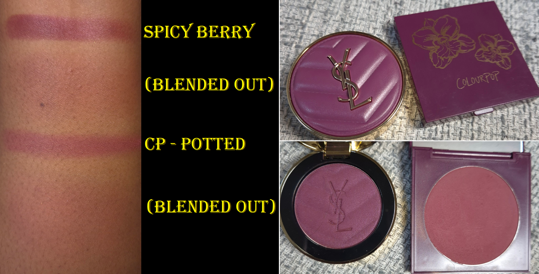
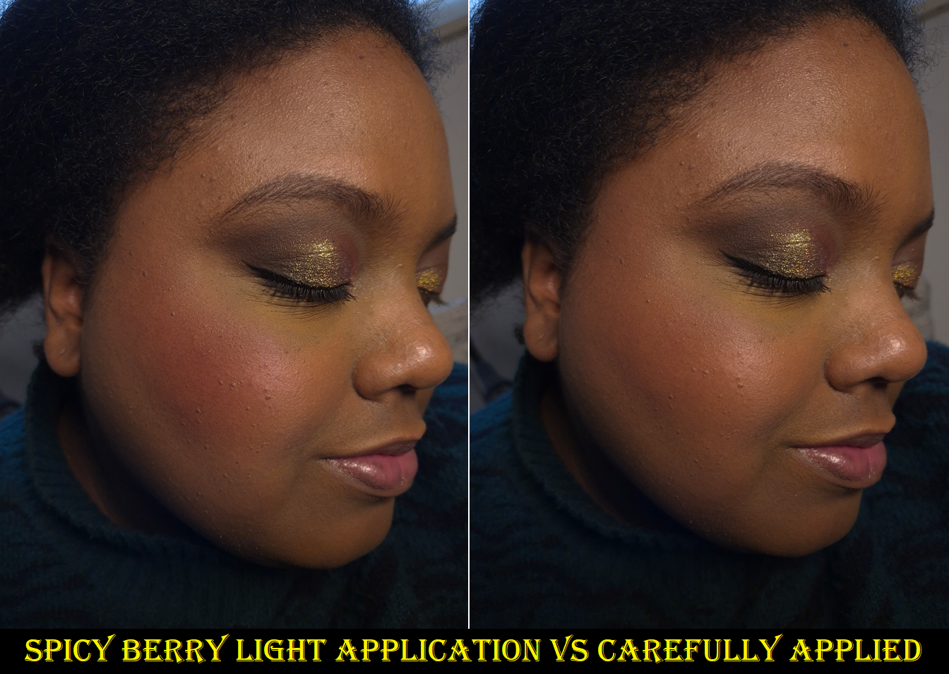
The scarcity tactic for this shade absolutely worked on me. It was the last thing I purchased from Selfridges before my Selfridges+ subscription ended. I must also admit that my discussion with Olive Unicorn Beauty about purple blushes led me down the path of wanting a higher quality and newer replacement for the singular purple blush I owned, my four year old blush called Potted from Colourpop. I have raspberry colored blushes and mauves, but Potted was my only true purple. I loved it, but the formula became less smooth over time and it’s a matte blush. Spicy Berry is a satin, which I prefer, so I bought it.
When I look at Spicy Berry up close, it looks cool toned and I could almost swear I see the faintest tiniest tinge of blue shimmer. However, when I hold it at a different angle, it looks more like a dark raspberry or deep magenta. Warm purples suit my skin better. Because my foundations are a bit golden and I discovered that orange mixed with purple or mauve turns into more of a pink color on me, I wasn’t that surprised to see how the blush shade appears on my cheeks.
All of these YSL blushes are pigmented, but Spicy Berry is extra pigmented. The photo above on the left shows how my cheek looked with just two taps of the blush onto my cheek with the rephr Koyo brush, which is a relatively airy squirrel and saikoho goat mixed brush. In the second attempt on the right, I made sure to tap just once at the top and apple of my cheeks and then switched to a clean brush to buff everything in. The result from that is exactly how I hoped this would be and it looks more like Potted this way. If I want a more visible color, I can just add Nocturnal Nude or another orange leaning blush on top because of color theory and how purples and oranges mixed together turn dark pink on me. The other alternative is applying a little more, but toning it down with the remnants on my foundation brush or using a blurring finishing powder.
I am very happy I bought this shade, but be forewarned that at this level of color intensity, it does have a tendency to look a little patchy. Blending it out or mixing it with other things can cover up it and fix it.
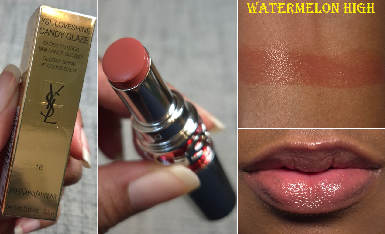
YSL Loveshine Candy Glaze Stick in 16 Watermelon High (YSL Lippies)
The Candy Glazes are my favorite of YSL’s lip formulas. I knew I should have stopped at buying number 14 and 15 because these are so sheer, but I couldn’t help myself once I saw 16 (which was part of this year’s shade expansion). It’s basically how I wanted 15 to look on me, but that one is a little light and milky on my pigmented lips. This color is a perfect light-medium pink nude for me! So, even though I know I could have gone without having this, I don’t actually regret buying it.
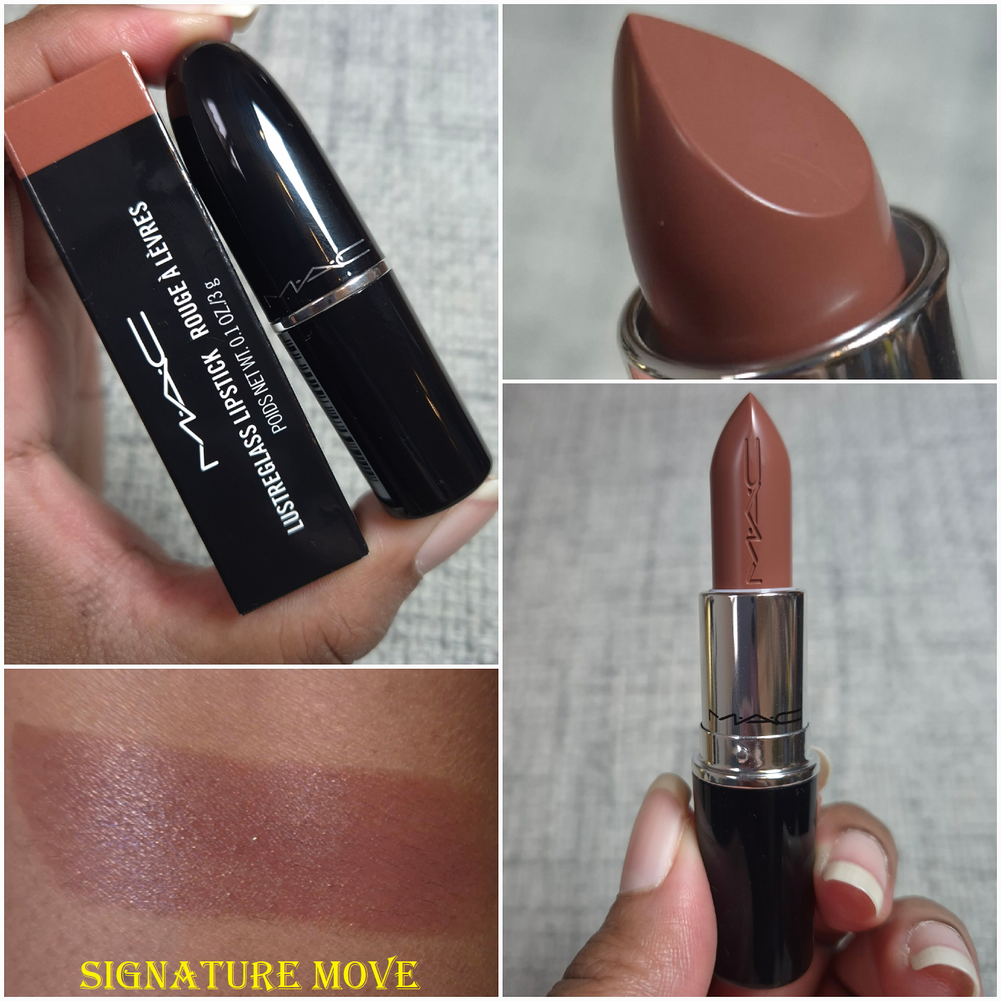
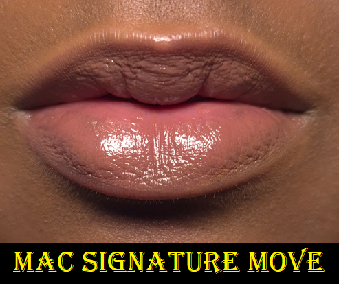
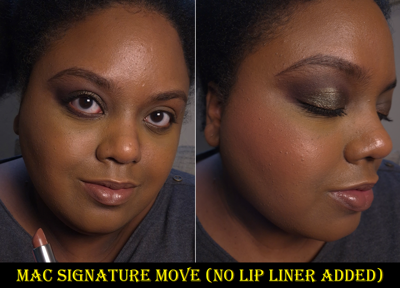
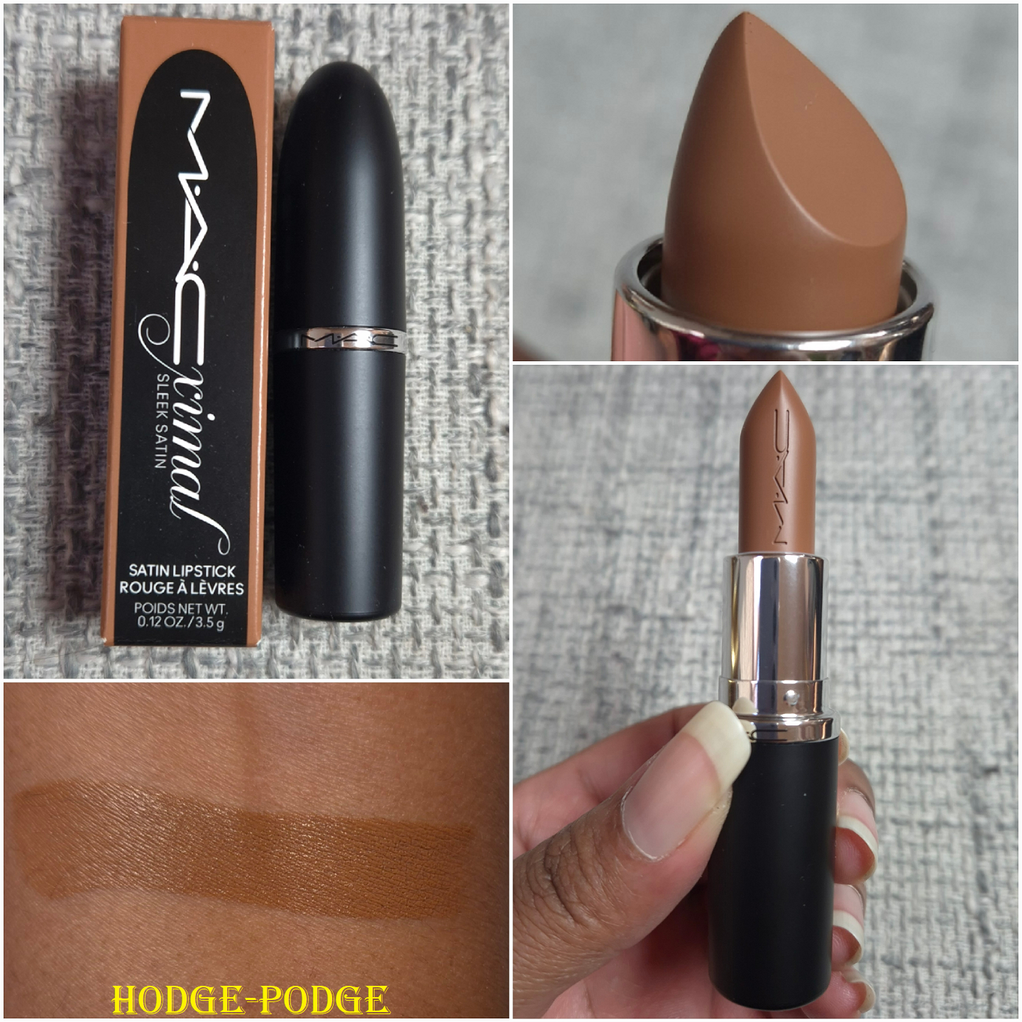
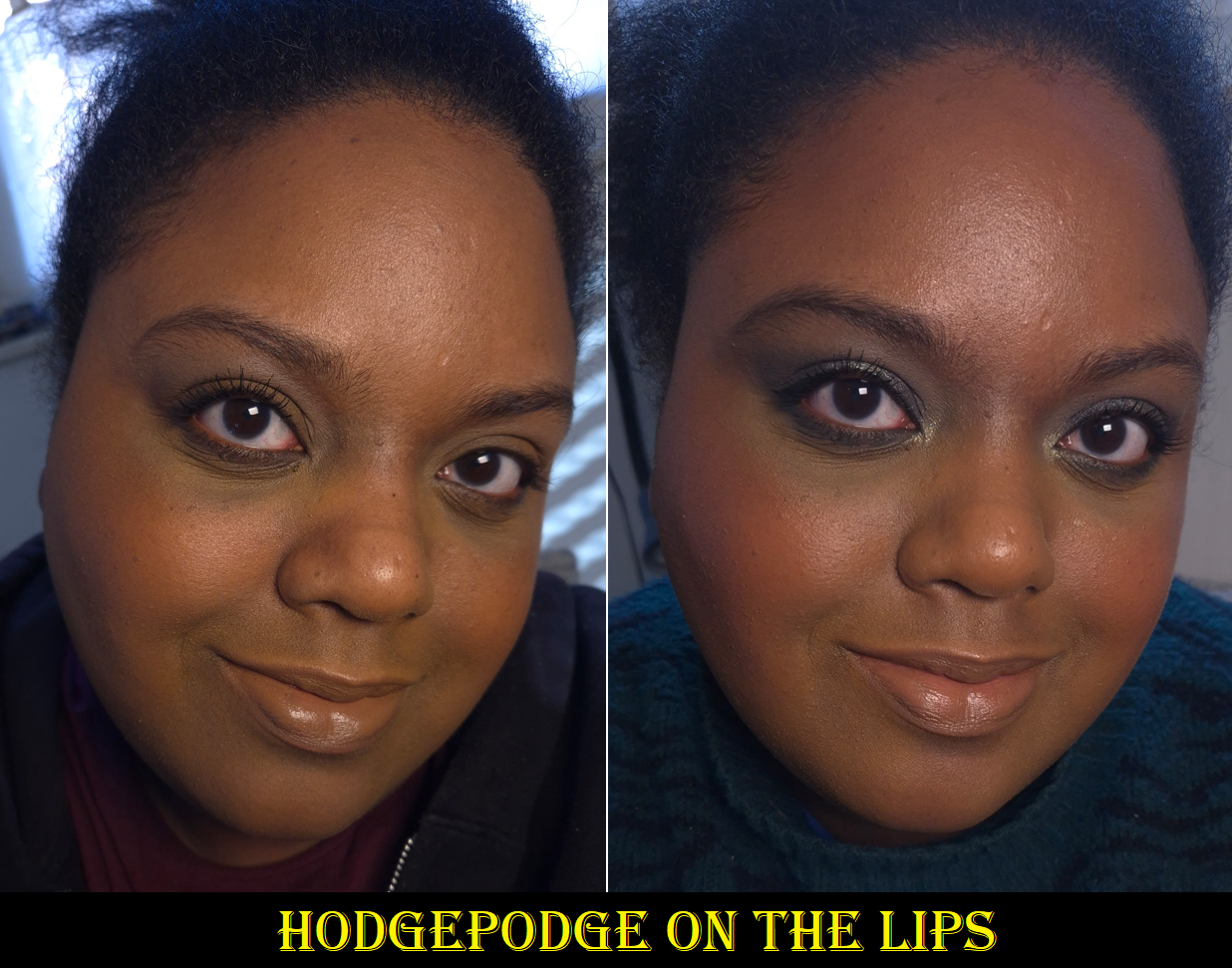
MAC Intimate Nudes Collection: MAC Lustreglass in Signature Move and MACximal Sleek Satin in Hodge-Podge
Both of these lipstick formulas are new to me and I only have one of them in each formula. However, they’re both from MAC’s Intimate Nudes range of lipsticks. After loving the way Signature Move looked on me, I purchased Hodge-Podge next because it’s a unique color for my collection. So, I think this can count for being in the category of a lipstick so good I had to buy another!
I love the shine level (when first applied) and the lightweight buttery feel of this lipstick. In addition to the sheer partly buidable coverage this has, these attributes remind me of the Lisa Eldridge Luxuriously Lucent Lip Colours. This just feels like an even more emollient version. I find that this has more pigment than the Lucents, but no matter how much I try to build up color over the darker pigmented spots on my lips, this does not cover it completely. I don’t mind this, but I wanted to be clear that the buildable aspect has limitations. This MAC formula also does not have the same staying power as the Lisa Eldridge Lucents.
After only an hour, my moisture-greedy lips absorb some of the lipstick and I can feel that there is less slip when I rub my lips together, in addition to the shine having dulled down. Even though there is less lipstick on the surface, my lips continue to feel moisturized. However, if I want the color to be noticeable, I definitely have to reapply after eating, and sometimes after finishing 1-2 cups of water. This is definitely not a long lasting formula. I end up feeling compelled to do touch ups every 3-4 hours (more or less frequently depending on my eating/drinking habits). By the end of the day, there are only the subtlest signs that my lips are drier than before. I can wear this a second day with no issues, or wear a lip treatment to bed to return my lips to a well conditioned state. So, that makes this one of the better lipstick formulas I’ve encountered, but the shorter wear time is a big tradeoff. Because I can get lip nourishment and sheer color from products like the YSL Candy Glazes, I feel like I own enough of these types of products. I foresee myself buying one or two additional shades in the future, but only if they are part of a limited edition collection or have some type of special packaging.
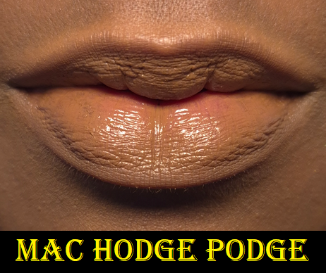
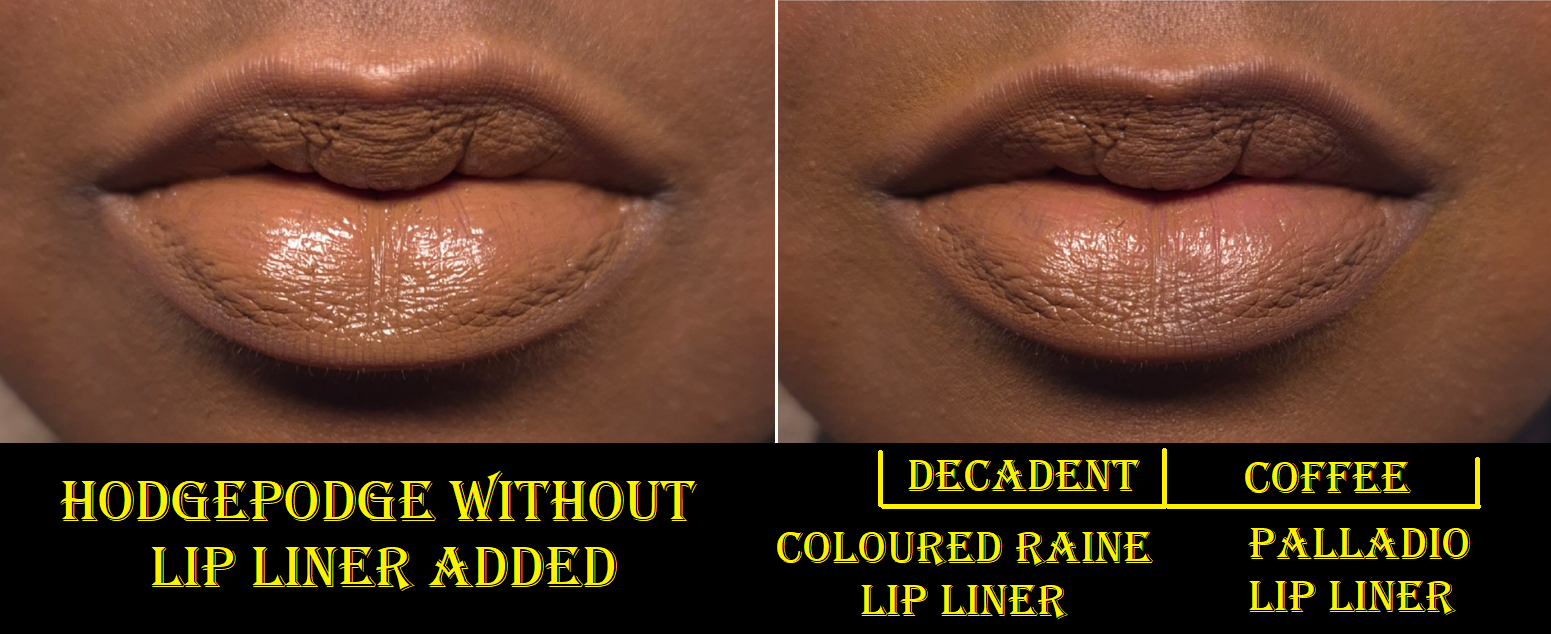
To me, this color is a muted yellow-brown. However, sometimes I could swear it looks a bit olive or that it leans a stronger grey depending on the lighting. How we perceive color is in relation to other colors, so sometimes I think Hodge Podge looks good when I have no other makeup on versus my foundations that tend to lean even warmer. The tones and depth of this shade is like a desaturated version of my skin, so it doesn’t look like full on concealer-lips/foundation-lips, but I don’t feel confident enough to wear this in public without a lip liner. Maybe it’s due to my preference for high contrast looks on myself, and Hodge Podge looks too flat.
In the second photo above, I demonstrated how this pairs with my two darkest brown lip liners. The one from Coloured Raine is warm, so it looks like a better compliment for my undertone. Palladio’s is cool, so I think it pairs better with the actual lipstick.
Although I can get this to fully cover the darker spots on my lips after I first apply it, the color wears down just enough to faintly see those spots after a lot of talking or repeated lip movements over time. So, the coverage level on me is high, but not full.
Regarding the performance, I don’t have to worry about reapplying anything from just drinking, though it will leave obvious imprints on surfaces and will not make it past a meal. After about two hours, similarly to the Lustreglass, some of the lipstick gets absorbed and it feels noticeably less creamy, though not to the levels of being considered drying. It feels super comfortable to wear, but I can still see that at the end of the day my lips show the beginning stages of wear before chapping. So, it still dries my lips like nearly every bullet lipstick formula on me, but at least while I’m wearing it, it looks smooth and shiny to the eye. In fact, my lips look smoother wearing this formula than the Lustreglass after several hours of wear (even though the Lustreglass is actually more moisturizing).
I like this lipstick formula, and it’s a relief to finally have some MAC lippies I’m not afraid to wear for fear of having my lips dry out. However, I don’t feel the need to purchase anymore (unless it’s part of an eye-catching limited edition collection).
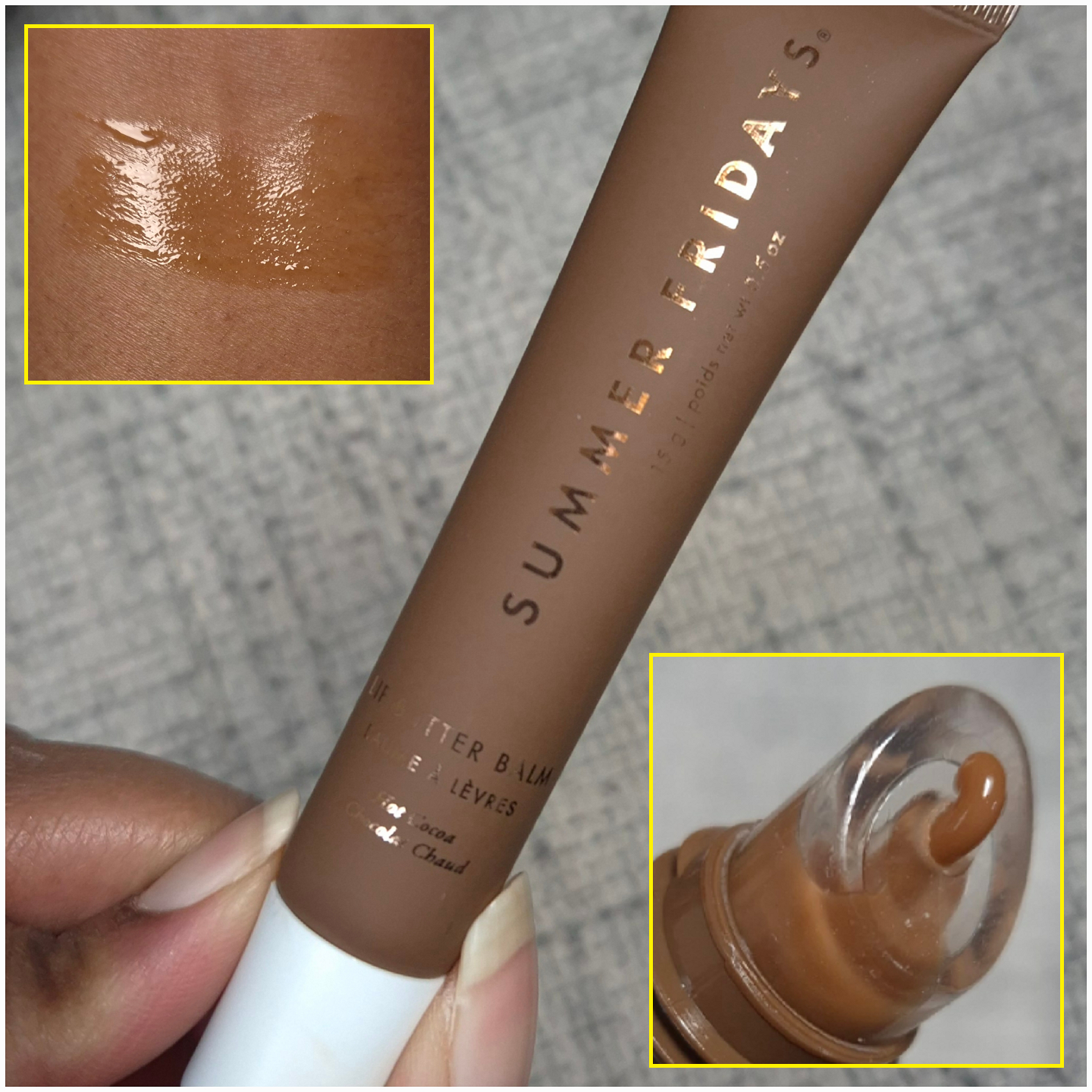
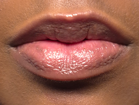
Summer Fridays Lip Butter Balm in Hot Cocoa (Vanilla Mint)
I said in my Battle of the Lip Balms post that I wouldn’t buy another of these because my collection is so large, but I wanted one with a yummier scent and with a bit more color. Plus, there’s a 12m PAO, which mine has passed, so getting a discounted replacement during the holidays wasn’t quite so bad.
This has flavoring and smells like a tootsie roll, hot chocolate from a powder pack, or some other kind of highly processed chocolate. I don’t recommend licking this, but I did it for science and it does taste like a tootsie roll (plus Vaseline and wax)! I think it’s fun to have a hot cocoa scented lip balm, and I enjoy it. My husband doesn’t agree.
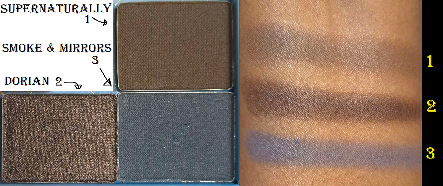
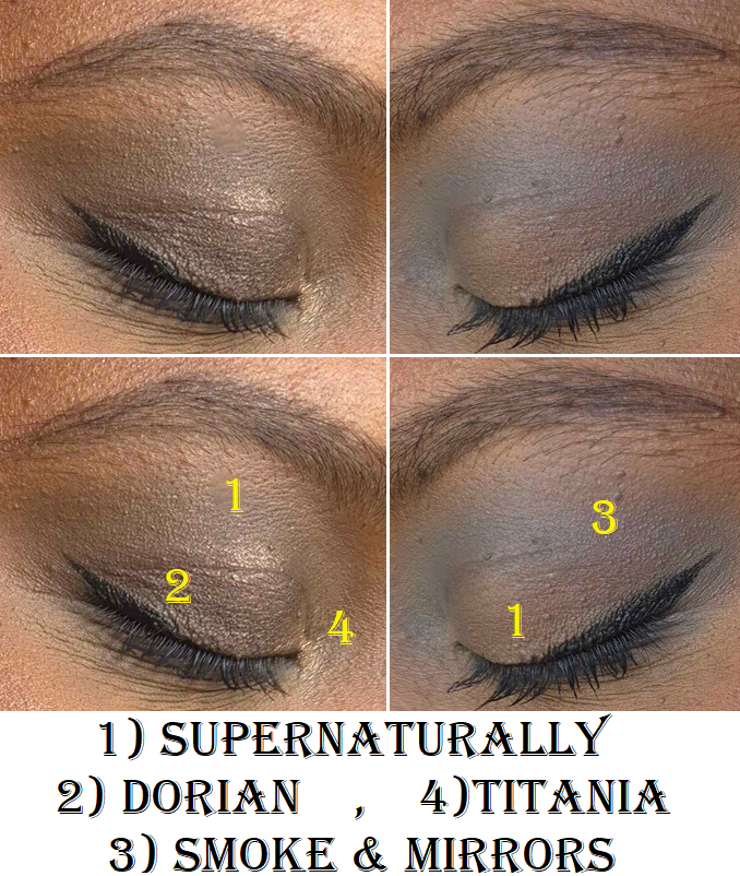
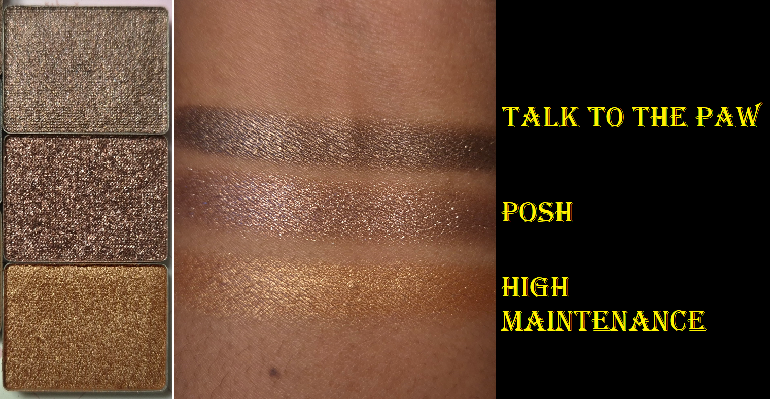
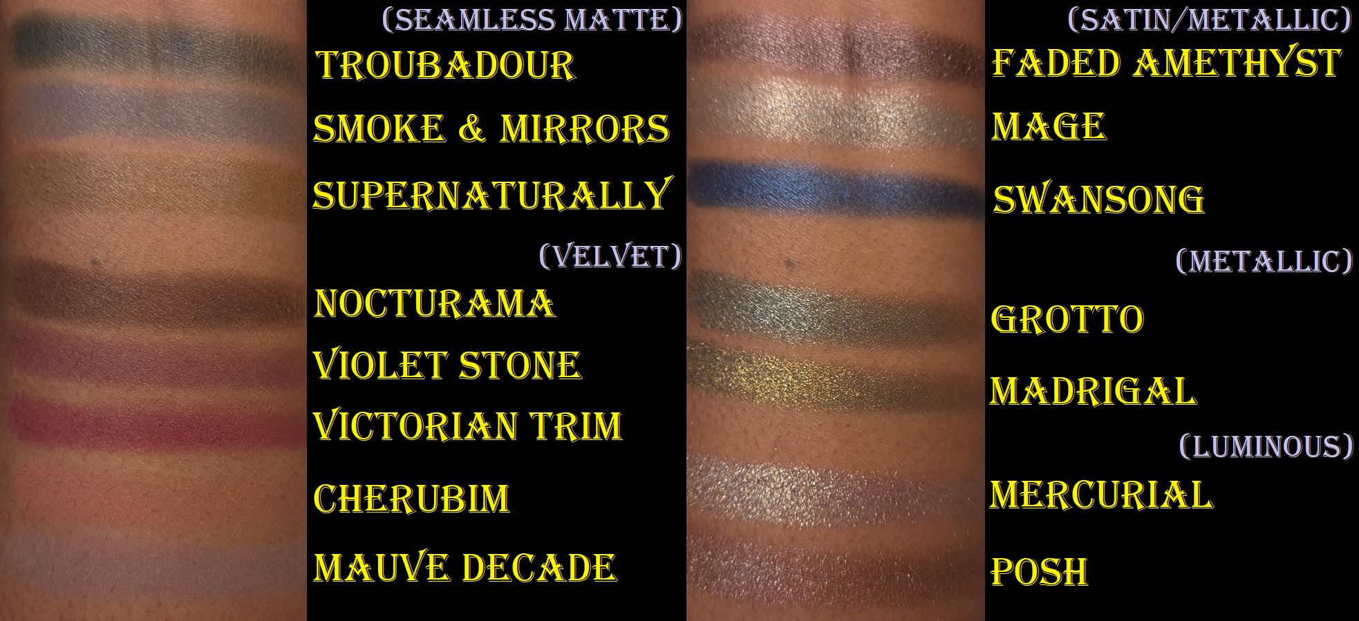
Lisa Eldridge Eyeshadow Singles: Supernaturally, Smoke & Mirrors, Dorian, Talk to the Paw, Posh, and High Maintenance
I was actually working on a Lisa Eldridge post separately, but then realized this was a better place to put the content since I have reviewed at least the eyeshadows before.
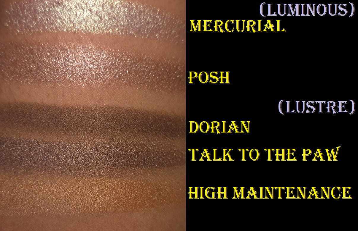
I’ve had Smoke & Mirrors from the Vega palette for over a year. Dorian and Supernaturally are from the Fawn Palette and I’ve had them since September 2024, but I didn’t start using these three until December last year. I was honestly a bit disappointed by the ones from Fawn, and it almost stopped me from buying Talk to the Paw, Posh, and High Maintenance from the limited edition Betty palette. However, I had hope the formula of those would be better after watching a few reviews on YouTube, like this one from Beauty with Substance.
Supernaturally is a Seamless Matte, just like Smoke & Mirrors, but it’s so much stiffer, drier, and less pigmented. Even though it’s natural for certain brown shades to have a hard time showing on my brown skin, this color is even sheer when I swatch it on the palm of my hand. Fired Earth and Troubadour are others in my collection that have better color payoff as well. So, I don’t know if Supernaturally was intended to perform, apply, and feel differently than the others.
Dorian is a Lustre, yet it is so dull! It looks like a matte shadow until light hits it directly at the perfect angle. Based on the website description of this formula, it seems like this is supposed to be the most subtle of the shimmer types. Based on my experience (and photos of Taffeta Fan) it seems like Dorian is the only one that can’t take on a pearly effect and isn’t as shiny as even Talk to the Paw despite it being a deep brown as well.
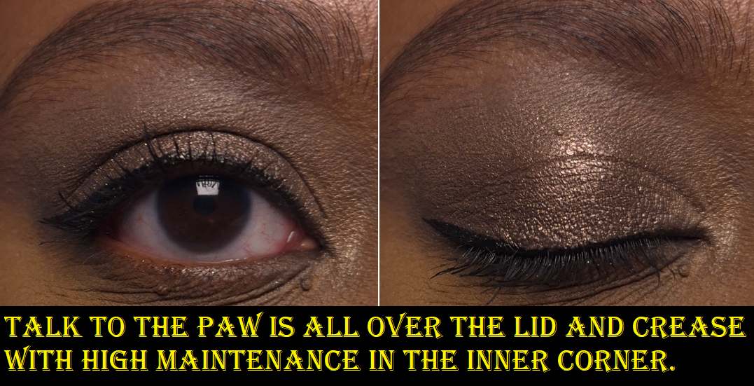
As I mentioned before, Talk to the Paw and High Maintenance are Lustre shadows. As seen in the swatch photo below, they are clearly less shiny and shimmery than Lisa’s Luminous formula, but they still pack more of a punch than Dorian.
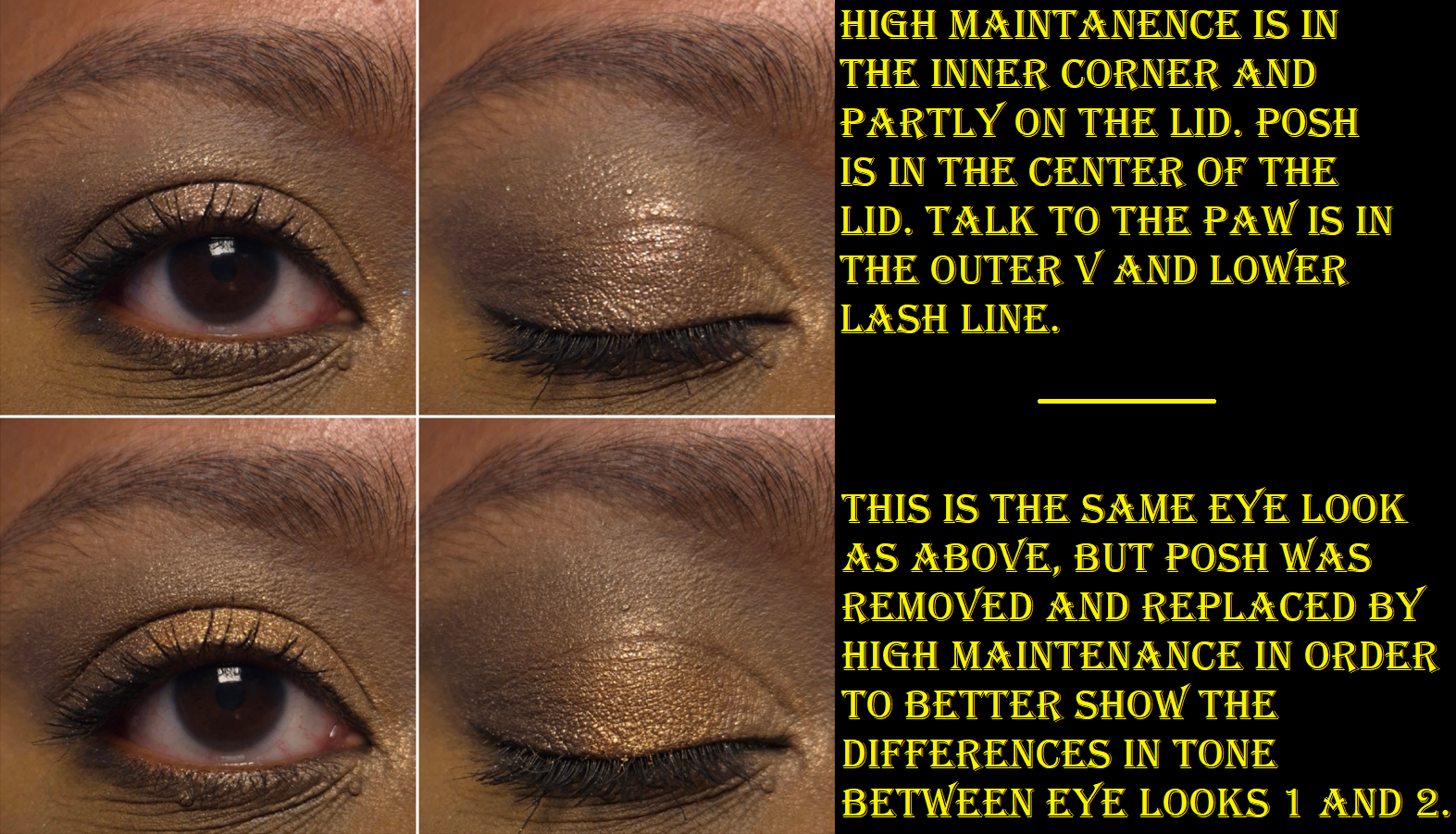
I wanted a deep smokey shimmery brown all over my lids, so Talk to the Paw fulfilled the wish (though technically a taupe) that Dorian could not.
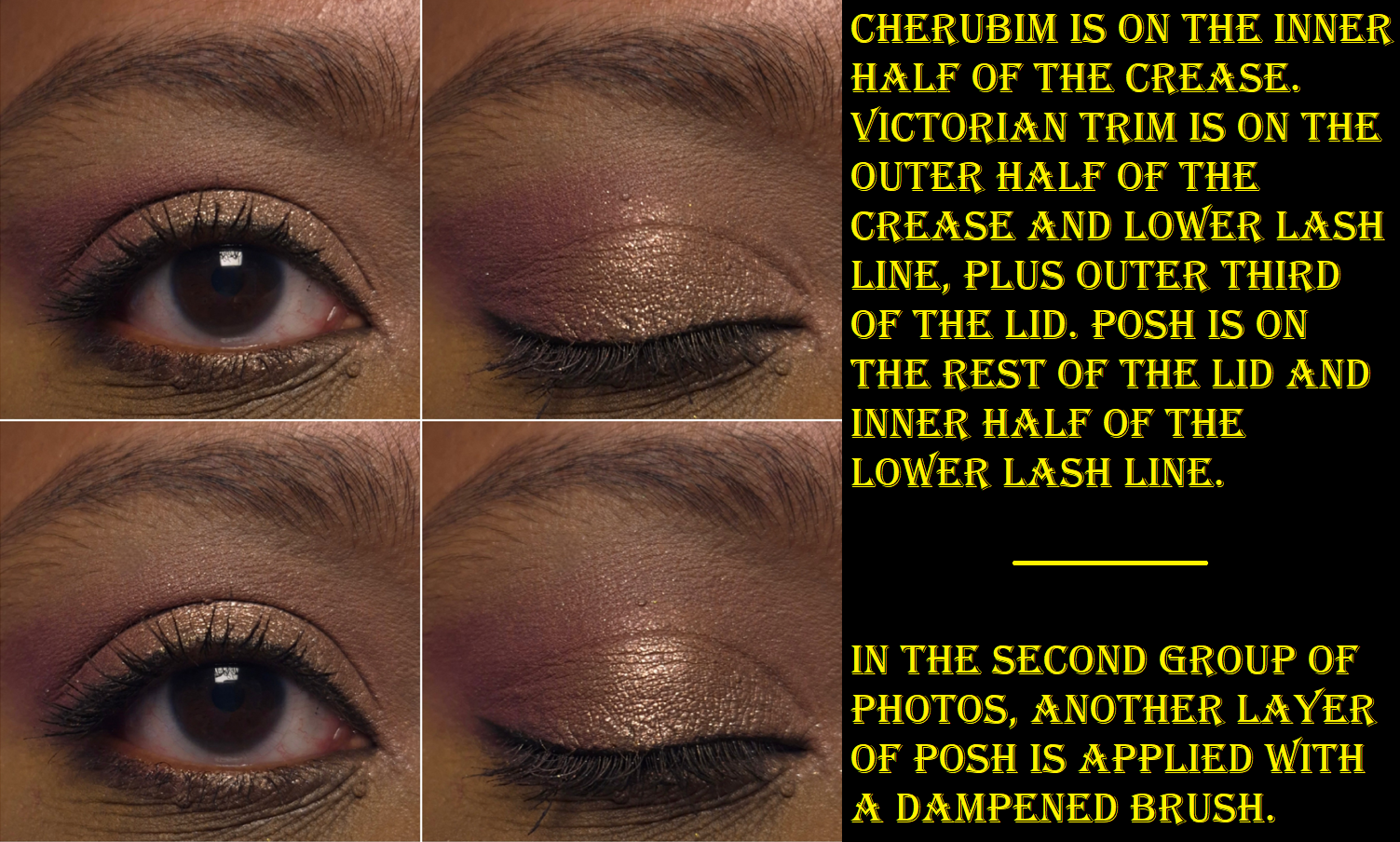
Posh is a Luminous shadow. It has the shine factor I want (once it is applied damp and/or with my fingers), but this particular shade has a hard time appearing pink (or mulberry mink) in tone on me unless I pair it with other shades in the same color family. This is not unusual for me when it comes to light pink shimmer eyeshadows looking more like a silver instead.
In the dry application, the individual shimmer particles are easy to spot. In the damp application, the shimmer looks smoother.
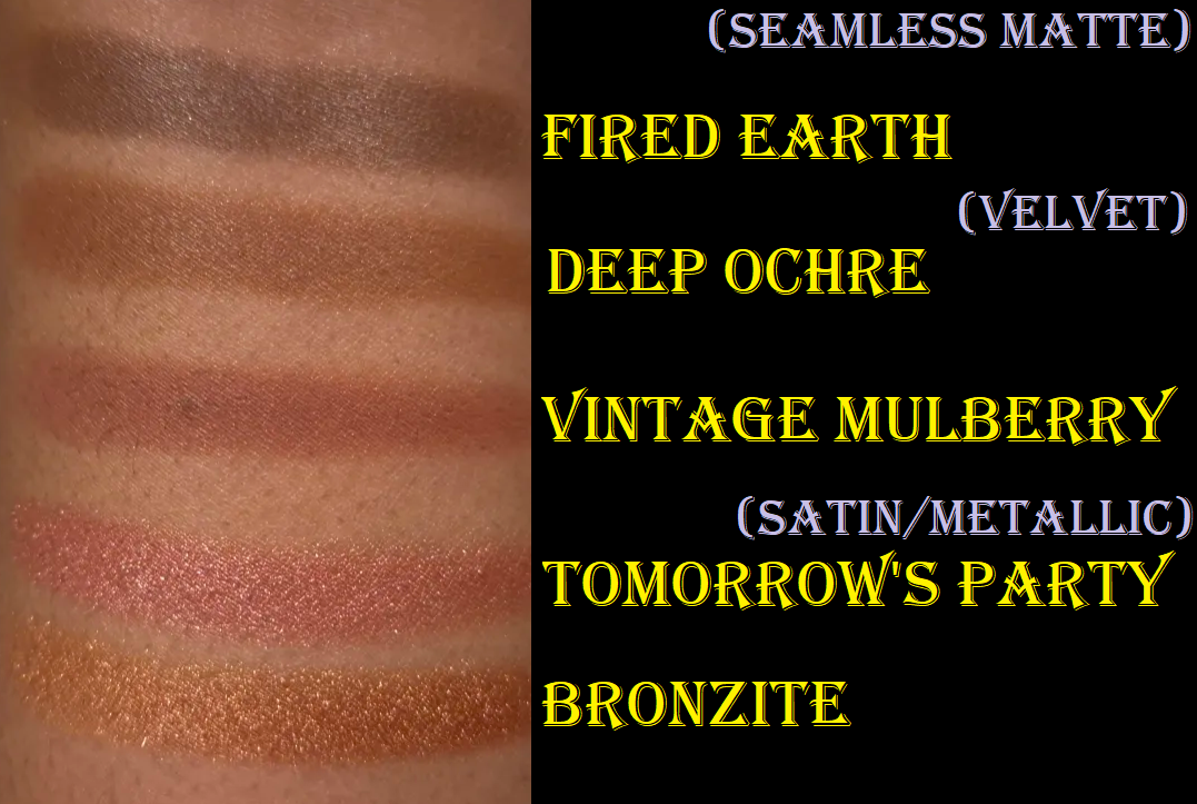
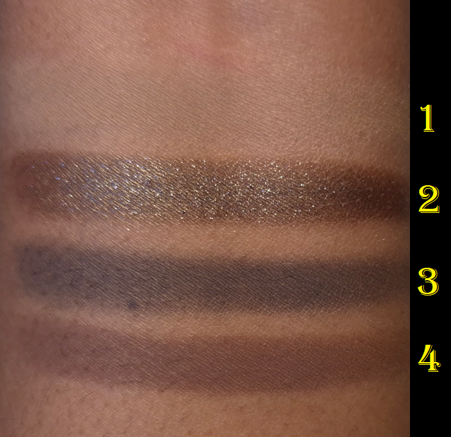
Below are swatches of the other shades in my collection that I kept with me.
And here are the swatches of the shadows I left behind.
I went through my Clionadh eyeshadows and found similar shades to the purples from the Betty palette, but nothing close enough to call a dupe because my Clionadh ones are duochromes and multichromes with strong shifts. I learned from Fedaro Beauty that there are much closer similarities within the Viseart Coy palette, but I left those shades in the US. What this indicates to me is that I don’t currently have those colors for a reason. The types of purples in Betty are just not my favorites. It was definitely for the best that I focused on the three shades I wanted most. I probably could have talked myself out of getting the three I did anyway, but because these shades are limited edition, I did not want to miss out.
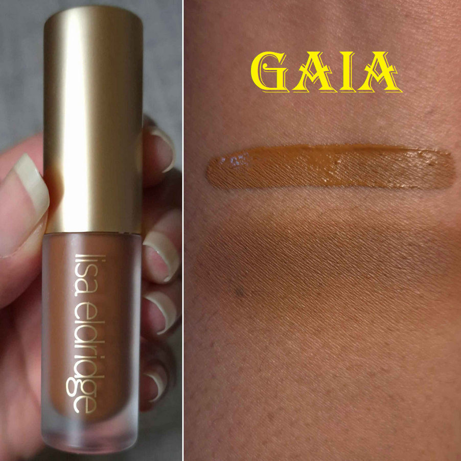
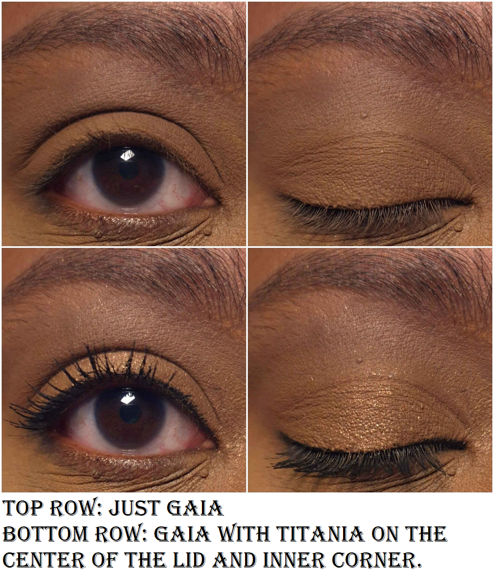
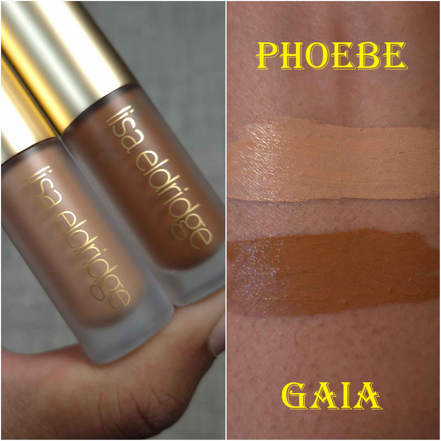
Lisa Eldridge Liquid Silk Eyeshadow in Gaia and Phoebe
I planned to only get Gaia, but I enjoyed it so much that I felt compelled to own at least one more too.
Gaia works as a subtle one-and-done liquid eyeshadow, but I was more entranced by the color because it reminded me of one of my favorite eye bases from a brand I don’t support anymore. It’s so smooth on the lids. I have enough time to blend out the edges before it fully sets and it mixes well with other shades. It doesn’t crease, nor fade, and it doesn’t look drying on my lids. It usually stays put very well in my deepest eye wrinkle/crease. This formula is the reason I’m excited to try the brand’s upcoming liquid concealer!
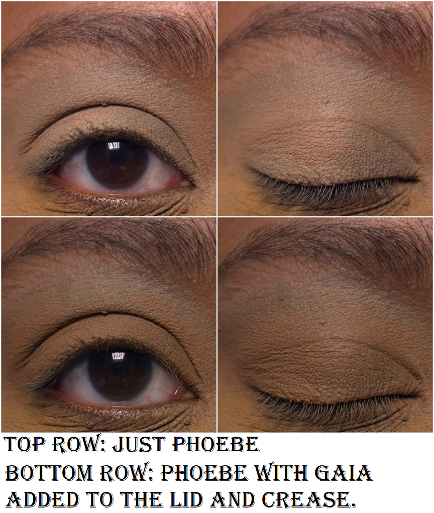
Since I reach for powder eyeshadows 49 times out of 50, buying a lot of these wouldn’t be practical for me. I use matte liquid and cream eyeshadows even less than shimmery ones. However, when I tested this out as an eyeshadow base and it worked wonderfully with no issues, this became my replacement for the product that shall not be named! The only downside is that I needed a lighter shade to prime under my brows. That’s why I purchased Phoebe, but since it’s less pale than I expected, I have mostly been using Phoebe as an eye base/primer by itself. Gaia doesn’t get used as much anymore, but Phoebe is now a staple in my collection!
I have additional pictures of both of them used together in the Benefit mascara section, but I realized everything I photographed was during the testing phase, so I didn’t have any of me actually trying to create a seamless transition between the two shades.
The photo above is that demonstration. I have to put in more effort to get 100% full coverage considering the super dark sections in my eye area, so how this looks in this quick low effort example is satisfactory for me. There are plenty of great matte liquid eyeshadows at a lower price from other brands, so I consider this a semi-splurge type of product unless you’re someone with mature eyes. Then spending this amount of money for this product might be well worth the cost. There are also great primers available for a cheaper price, but since I prefer having an eyeshadow primer that covers the discoloration around my eyes (in a shade that isn’t that crazy far off from my skin tone) without having to resort to using an actual concealer, this product is doubly important to me.
*JUNE 29, 2025 UPDATE: I started using Gaia almost exclusively and within three months I was struggling to get product out. I had to uncork the stopper and mix it a little to start reaching product again. It still periodically moves to a spot along the sides that I cannot reach with the applicator, so I have had to uncork it an additional two times, which is not an easy task! I had to use tools because it’s very tightly in there to keep the product from drying out. So, if you think you might have used yours up quickly, I recommend removing the stopper and checking. By this point, six months after purchasing it, I estimate I’ve used up half of the product.
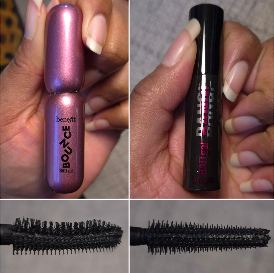
Benefit Cosmetics BADGal Bounce Mascara
I’m reaching a bit on this one to have this fit the theme, but I’ve been a fan of the original Benefit BadGal mascara, so I felt compelled to give the new Bounce version a try!
I conveniently had a free mini of the original from a past purchase, so I was able to compare it to the travel size of Bounce. Both are dry formulas. The original Badgal Bang has a plastic applicator that starts with a small round tip that gradually widens. It also has a bendy part on the wand that allows me to better angle the applicator to avoid accidental smudging of the mascara. The Bounce version has one side with a bunch of brush bristles that curve and another side with straighter spikes that act a bit like a comb. I’ve tried to figure out how best to apply mascara with it, but I just prefer the original wand. The Bounce wand creates a fluffier wispier look, but it takes so much time to build up the length and thickness I want. It’s also tricky applying the mascara to my lower lash line because the brush part is too thick to get that close, but the comb part has more gaps, making it easier to miss the finer thinner hairs of my lower lashes with repeated swipes. I can get it to look good, but it takes extra time. I wonder if adding a bendy portion to this wand could have made it better.
I don’t recall my past minis and full-size tubes of the original BadGal Bang having an issue of flaking, but this newest tube does flake a little. However, the Bounce one flakes even more. For this reason alone, I don’t intend to wear the Bounce anymore and if I had to choose a winner, it would be the original!
That concludes everything in today’s post. I hope this has been helpful!
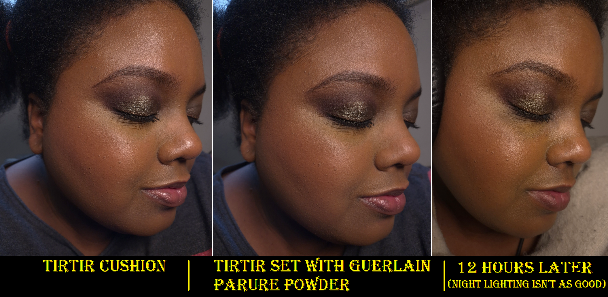
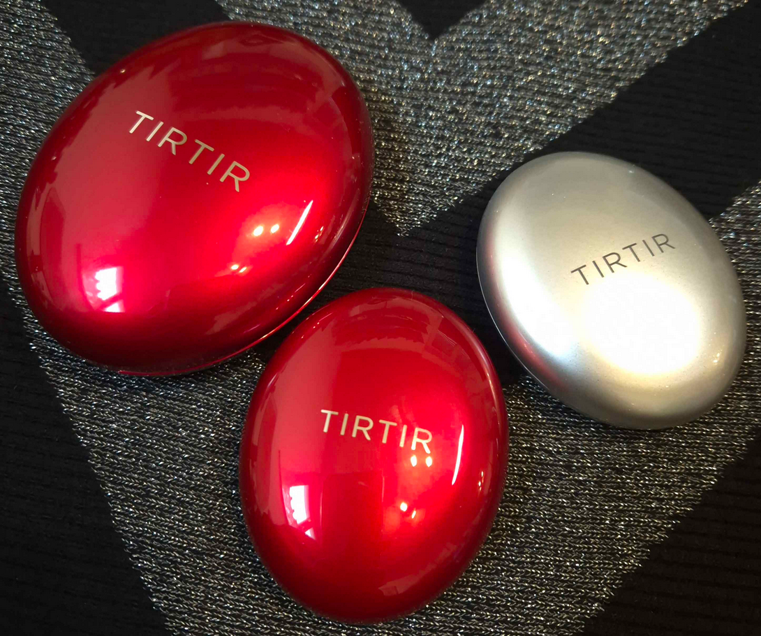
As a lover of medium to full coverage liquid foundations, I had a difficult time understanding the appeal of cushion foundations. I can see the theoretical benefits regarding ease of use, the finish, texture, and so on, but for every pro I can also list a con. Regardless, no brand made my shade, so it was a category of makeup I mostly ignored.
The hype surrounding TIRTIR’s original cushion foundation, however, was inescapable. My social media feed was flooded with videos of people putting a single swipe of the sponge across their skin and being shocked by the instant full coverage. Again, I wasn’t all that impressed because this feature is only “special” in a cushion form of complexion products. What started piquing my interest was the news that TIRTIR was rapidly expanding their range, and I started to see influencers with dark skin trying them out. Not only did the brand potentially have a shade that could work for me, the finish was supposed to be radiant (it also says semi-matte in some descriptions), have high buildable coverage while being long-lasting, budge-proof, and it contains skin-caring ingredients, as well as SPF that supposedly doesn’t look grey or ashy on dark skin. It sounded like one of the best products out there, and for much less money than than I usually spend on foundations. Upon further reflection, I think it’s important to take into account that I bought it from YesStyle for $22, but it has 0.63 ounces of product compared to the standard 1 ounce liquid foundation. The minis cost $11 for a minuscule 0.15 ounces.
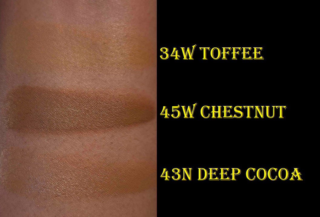
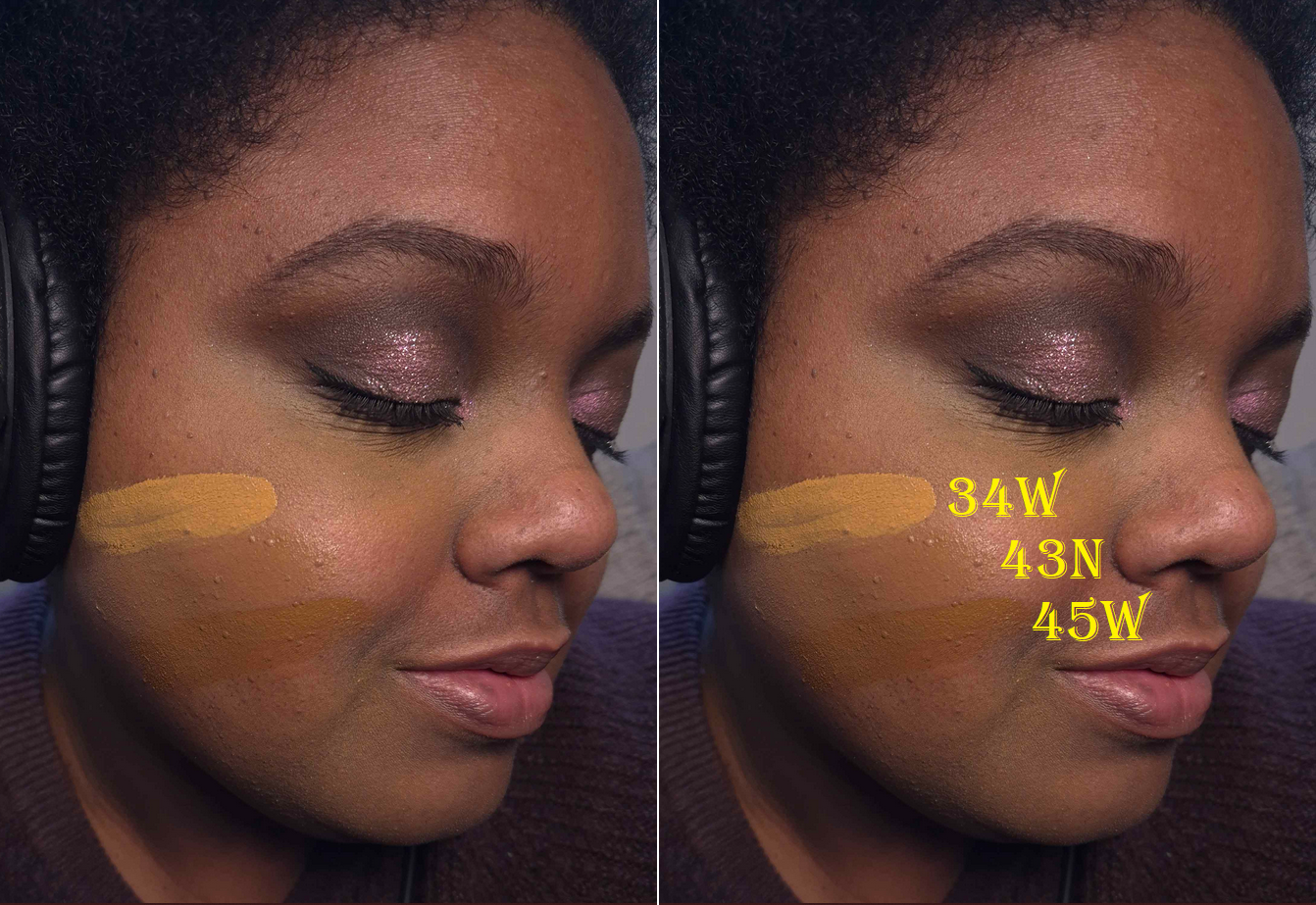
So, I bought the TIRTIR – Mask Fit Red Cushion in 34W Toffee. It was way too light on my skin and at the time this was the darkest of the warm shades. With this much coverage, trying to get one in an undertone that didn’t match me seemed like a bad idea. So, I put it aside and waited until I heard news of another expansion to the range. Eventually, 45W Chestnut became an option in that same red cushion, so I bought it this time in the mini size during Black Friday. By this point, the brand released two new finishes of cushions in pink and silver packaging. I chose to buy the TIRTIR – Mask Fit Aura Silver Cushion Mini in 43N Deep Cocoa because this formula is supposed to be the dewiest and actual radiant one of the three. My skin needs the hydration, so even though there are currently no warm undertone options for the darker spectrum among the silver cushion range, I wanted to at least see if I liked these enough to continue waiting for more shades.
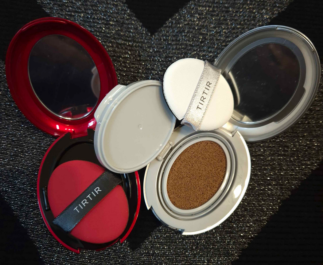
As it turned out, Red Cushion 45W is too dark. I could probably mix 34W and 45W together, but since they are in a semi-matte finish (and flat out matte in this cold not-as-humid climate I live in), I don’t plan on using them all over my face anyway. I like the high medium to full coverage that it offers, but it doesn’t suit my skin type and conditions. The only time I get use out of 45W is to add shape back to my face in the areas where I normally add bronzer and contour. Since I don’t need shine in those areas, it works as a Brontour and melts into the skin surprisingly well combined with other foundations, including the Silver Cushion.
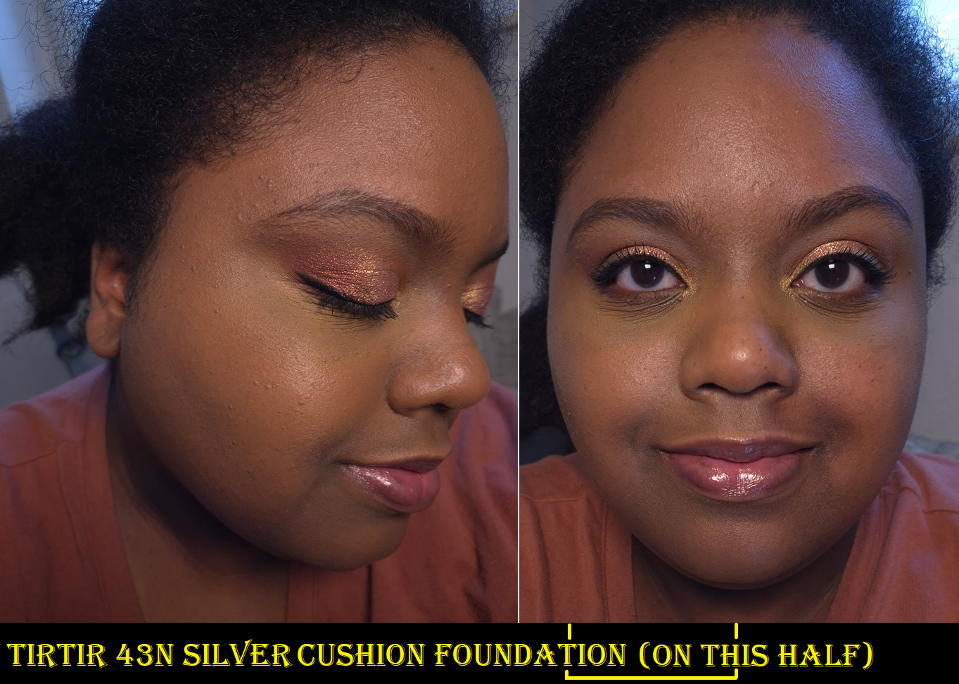
Silver Cushion 43N is the closest match and certainly close enough for me to do wear tests and not look crazy. It is a touch lighter and visibly not warm enough for my complexion, as seen by the borderline grey tinge. If the brand releases a 43W or 44W, I think that would be my correct shade. Then again, I’m a bit darker than usual as I still have a little extra color from summertime. I would ordinarily blame the SPF for the color being slightly off, but I really think it’s an undertone issue.
The best part about this Silver Cushion’s formula is that my skin looks and feels hydrated. Dewy foundations can sometimes feel heavy on the skin, but this one feels fairly light. Testing it throughout winter confirmed that all I need is a few minor hydrating skincare products underneath to prevent my skin from looking dry. The luminosity increases slightly as the day goes on, but not enough to look oily. The amount of transfer I get is mild and it sets well, but it takes much longer to set on its own than the red cushion. Thankfully, it is still long lasting on me, even without using powder. I’m not certain how much someone with oily or combo skin would enjoy this one, though. This also isn’t suitable for someone trying to avoid products with fragrance, as this has a very noticeable perfume-like floral scent.
The slightly off match isn’t as noticeable when I put on the rest of my makeup, at least when I’ve used a foundation brush that isn’t dense so I can apply the product sheerer than it would look with TirTir’s sponge. However, compared to something else that also isn’t full coverage such as the Danessa Myricks Yummy Skin Serum Foundation, other products look noticeably better purely because they’re a better shade match.
For this reason I still can’t say whether the crazy hype is warranted or not. The Red Cushion gives relatively full coverage, but the finish isn’t as flattering on my dry skin. The Silver Cushion has buildable medium to full coverage, but since it’s also not a perfect shade match, it doesn’t look as good on me if I try to reach medium or higher. So, I’m unable to wear it in a way that has the potential to be something I really like, and therefore I prefer many other foundations over this one. However, I have used it around my mouth area, as if it was a concealer, and it works wonderfully for that purpose since it blends in very well with whatever foundation I’m wearing underneath it. I can at least answer my own question in the title of this post and say that the TirTir foundation does not work for everyone, but they’re getting there. This is at least the first cushion foundation I can wear out in public, which counts for something.
That’s all for today. Thank you for stopping by! And consider clicking “follow” if you’d like to be notified when I publish my next post!
I don’t have any interesting tidbits to open this post with, so I’ll just get right into the review.
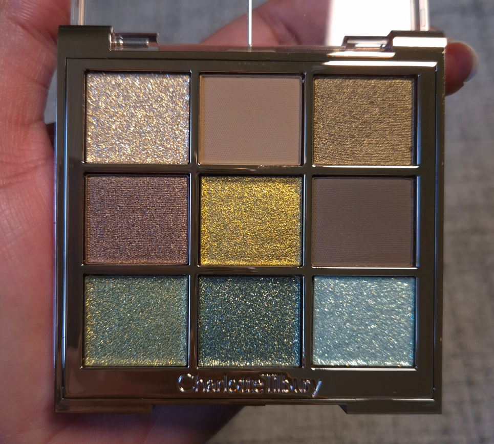
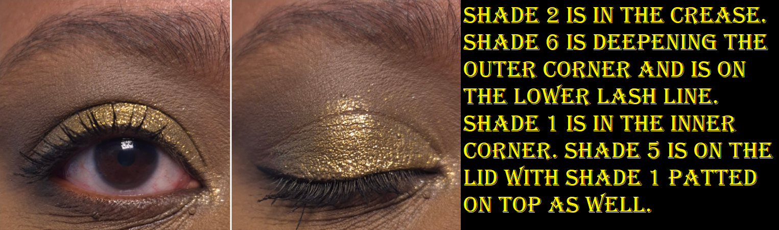
Charlotte’s Palette of Beautifying Eye Trends in Emerald Effect
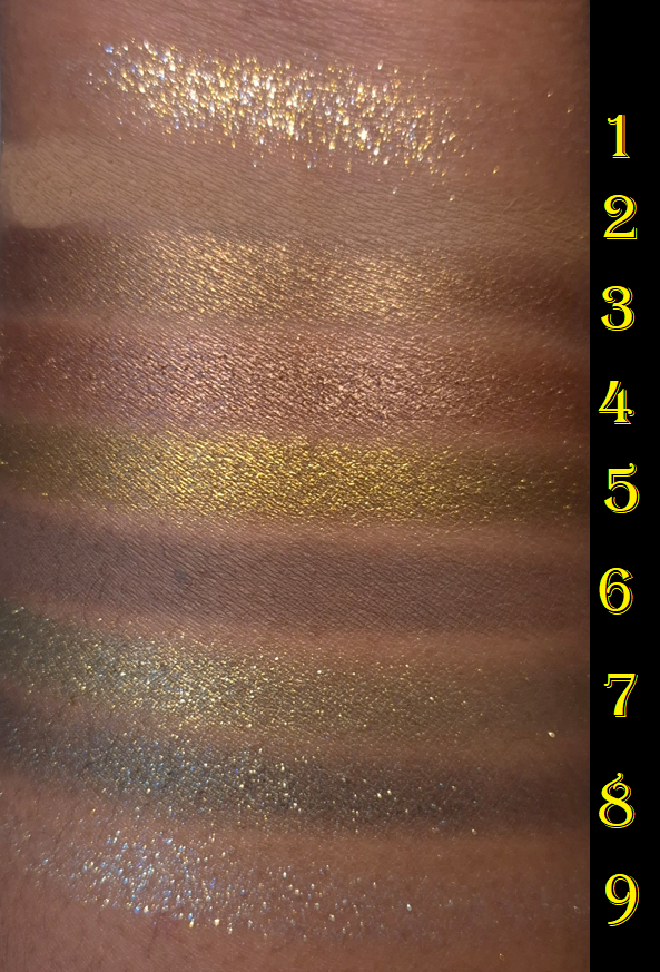
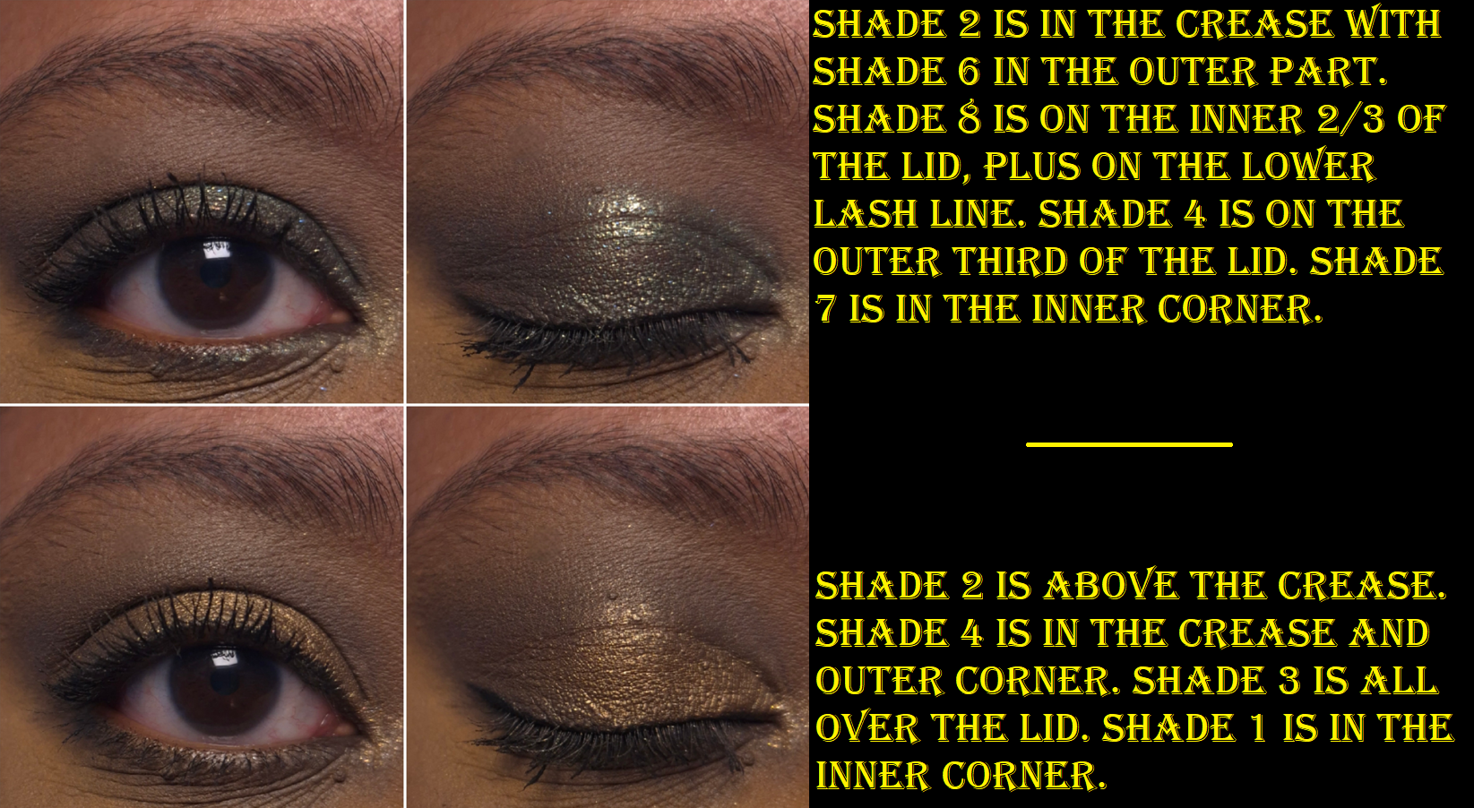
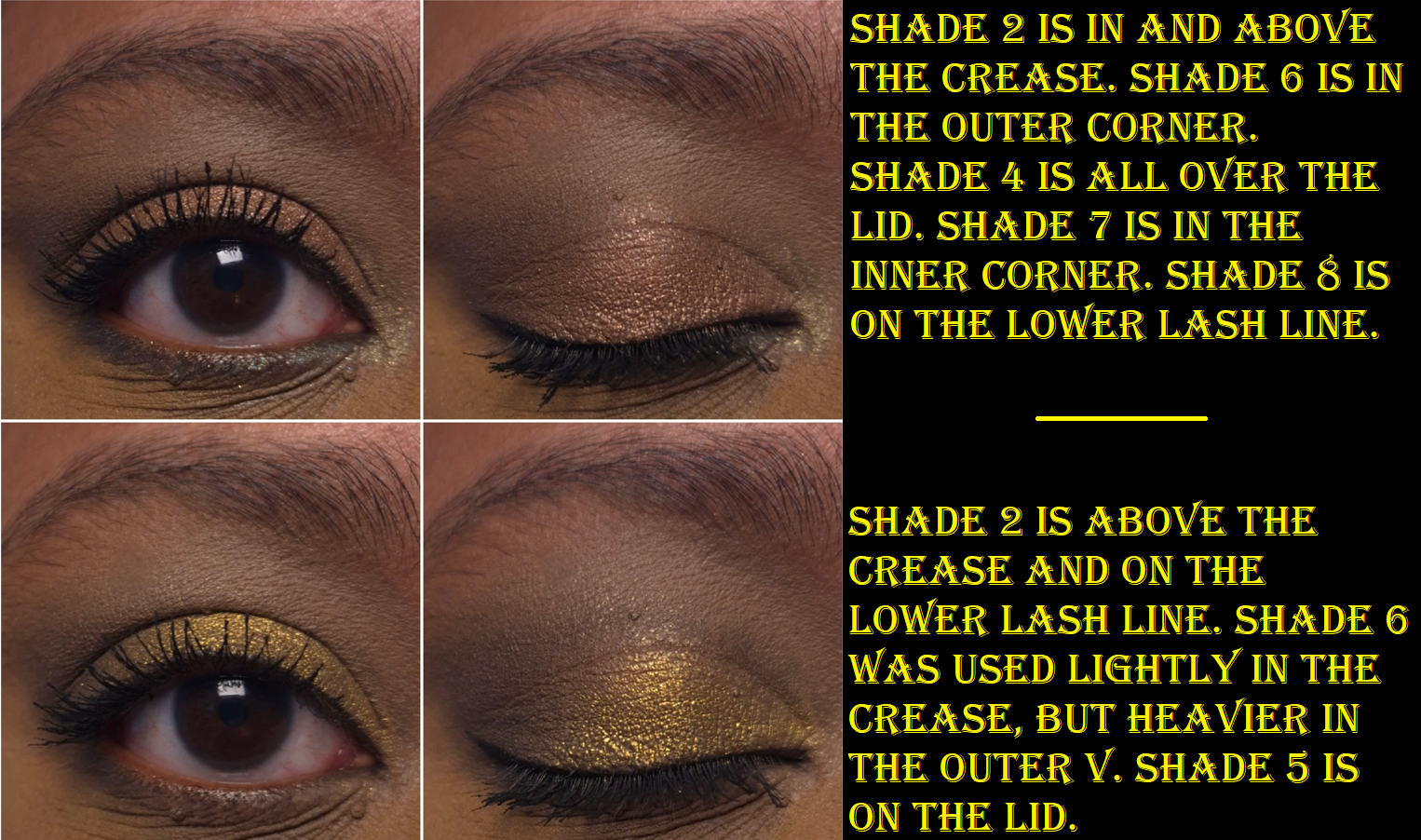
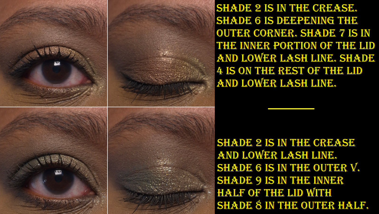
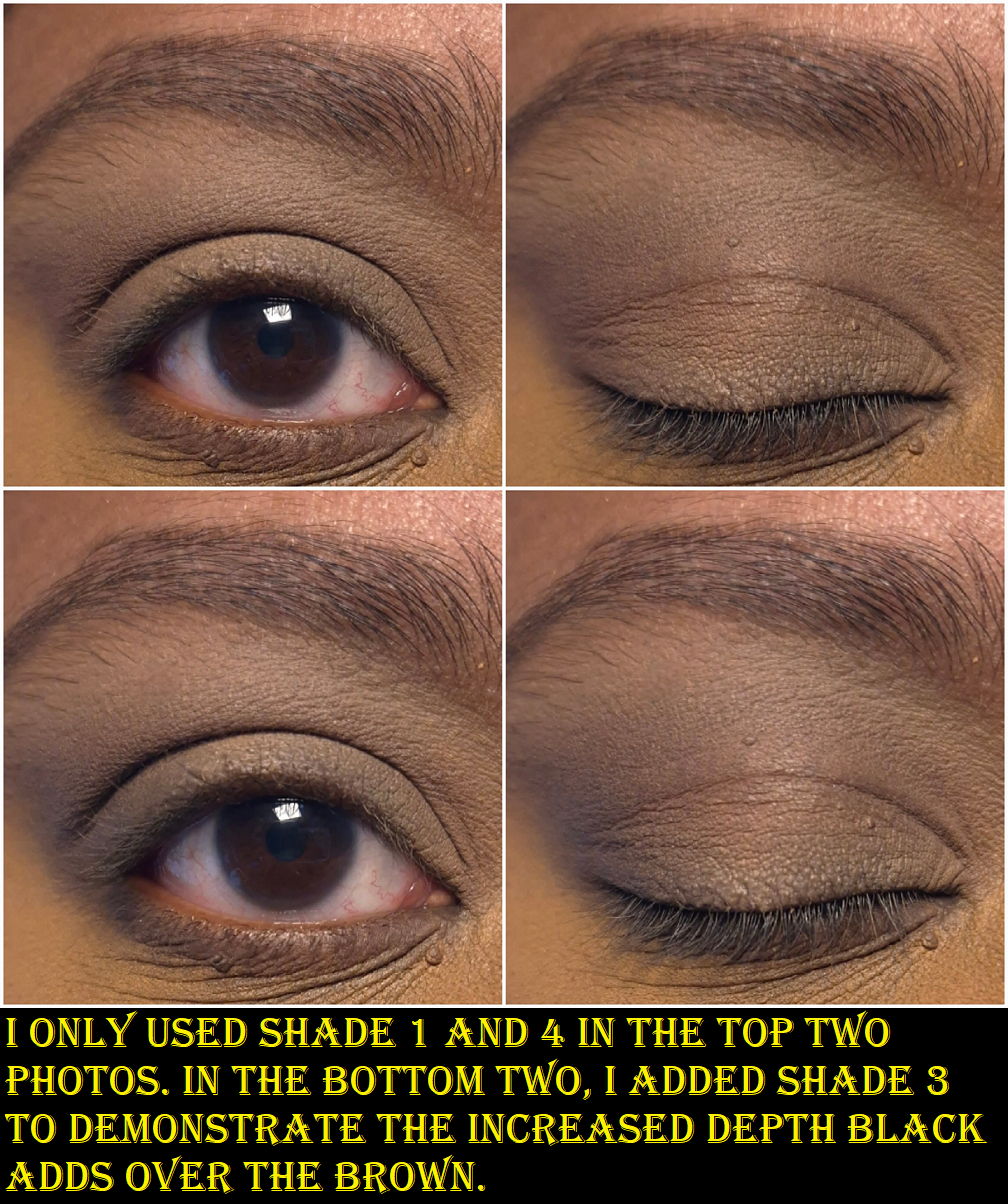
The first thing I noticed was that the Matte Silk eyeshadows feel like the mattes from Natasha Denona’s midi palettes (within the last couple of years). They are silky feeling rather than creamy. They are pigmented and blendable, but not my absolute favorite. They are great, but not superb. Shade 2 is a light beige brown that doesn’t show up strongly on me, but I can see it in my eye looks. Shade 6 is the depth creating neutral brown shade, which is dark enough to work, but I do wish it was a touch deeper. I used both of these eyeshadows together nearly every time I created a look with this palette, but now that the testing process is over, I’m going to use something else instead of Shade 6.
I’ve used these eyeshadows with concealers as bases and it works as long as there’s a thick enough matte powder layer in my crease before adding the shimmer. By “working,” I mean that the migration/creasing in my deepest line is at acceptable levels. However, my KVD Good Apple Concealer doesn’t play well with a lot of products and has more obvious issues with these eyeshadows than when I used the Natasha Denona Hy-Gen concealer as primer. I tend to blend excess concealer into the inner corner of my eyes, so even if I use a regular primer from my lids and upward, I still have to be careful about my concealer placement or else it could interfere with the eyeshadows. In general, I just recommend using a regular eye primer. These worked nicely with MAC Paint Pot and the Lisa Eldridge Silk Canvas as bases.
Shade 7 (spring yellow-toned green) and Shade 8 (dark blue-based green) are Crystal Pops. I wondered if they are supposed to be similar to the formula in the brand’s Pop Shot singles, but I don’t have those with me to confirm. Based on what I remember of them though, I think these don’t pop as much on the eye as the Pop Shots.
I had to redo three of these eye looks because the Crystal Pops did not want to show true to color in photos. I think it has to do with the type of shimmer used and how it reflected from my lights, combined with them not being fully opaque.
The Diamond Dimensions are softer pressed, flakier, and are basically sheerer toppers, so I expected to have a hard time seeing the blue tinge from Shade 9. Shade 1 looks white in the pan, but it has a gold reflect.
I can get stronger color payoff from the Crystal Pops and Diamond Dimensions if I apply them with a dampened brush, but I don’t do it to intensify the appearance of the sparkles. I am satisfied with the shimmery effect of all of them in their dry state. Also, the Diamond Dimension shadows remind me of the topper shade from Guerlain (#2 from Royal Jungle) because of the flaky glittery high shine nature to them, but Guerlain had it in a baked formula, which solidified it in a way that made it harder to pick up. I’d rather not have topper eyeshadows in palettes, but I at least prefer the way Charlotte Tilbury made these.
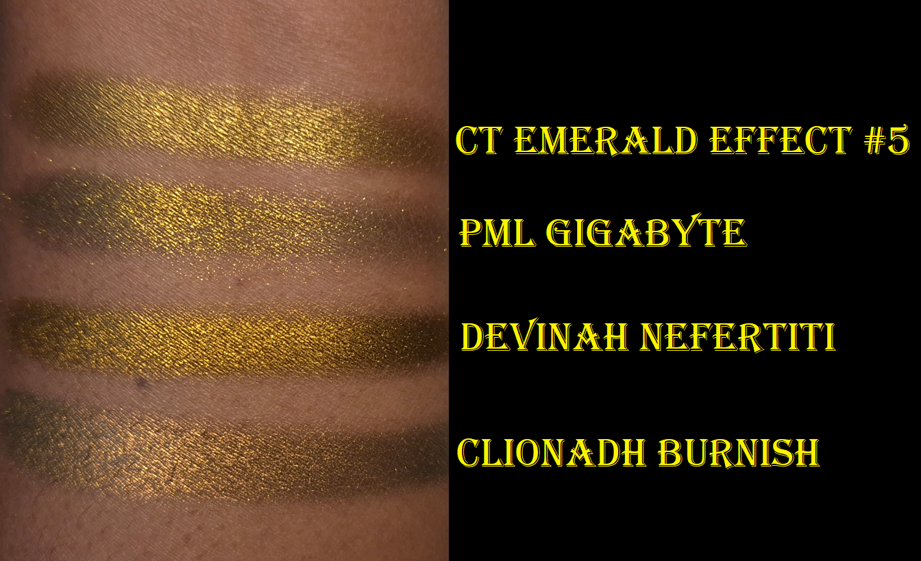
Shade 5 (antique gold/borderline chartreuse) is the Crystal Chrome which seems like a more opaque, smoother, wetter version of the Crystal Pop. Both eyeshadow types stand out on the eyes, but the Crystal Chrome achieves that effect without the large shimmer/glitter particles. This is the standout eyeshadow in the palette and it made me think of other shades similar to this that I have in my collection (photo below).
The light golden brown color called Shade 3 and chocolate brown Shade 4 are called Molten Satin. They feel like the Crystal Chrome, but with slightly less slip to them. From name alone, the Crystal Chrome is clearly intended to be more impactful as a shiny metallic. Although I usually prefer the wow factor of a great shimmer on my lids, if I’m in the mood for wearing brown, it’s usually because I’m going for a low-key look. Shade 3 is something I’d use in my inner corners or under the brow arch, and I prefer for shades used there to be smooth. So, I’m pleased with these being in the palette.
The most similar feel and finish of an eyeshadow to the Crystal Chrome comes from Devinah Cosmetics. Devinah’s is insanely smooth, but I believe it has a little bit of a darkened base to help it look more intense, plus it’s just overall more pigmented. That swatch went on so far for such little product. Nefertiti leans more golden-orange than Shade 5’s kind of antique gold. Pat Mcgrath’s Gigabyte is one of the baked special shades, so it is drier and flakier, so it looks less opaque unless applied damp or on a glitter primer. Clionadh’s Burnish is one of the Stained Glass Multichromes, so it has a dark base, is smooth, but has a slightly more shimmery finish. The fact that this shadow can even compete with indie ones proves to me that some of the high price tag went to the formula. I don’t think Charlotte Tilbury cheapened out on the formula, even if the brand reduced costs with the packaging.
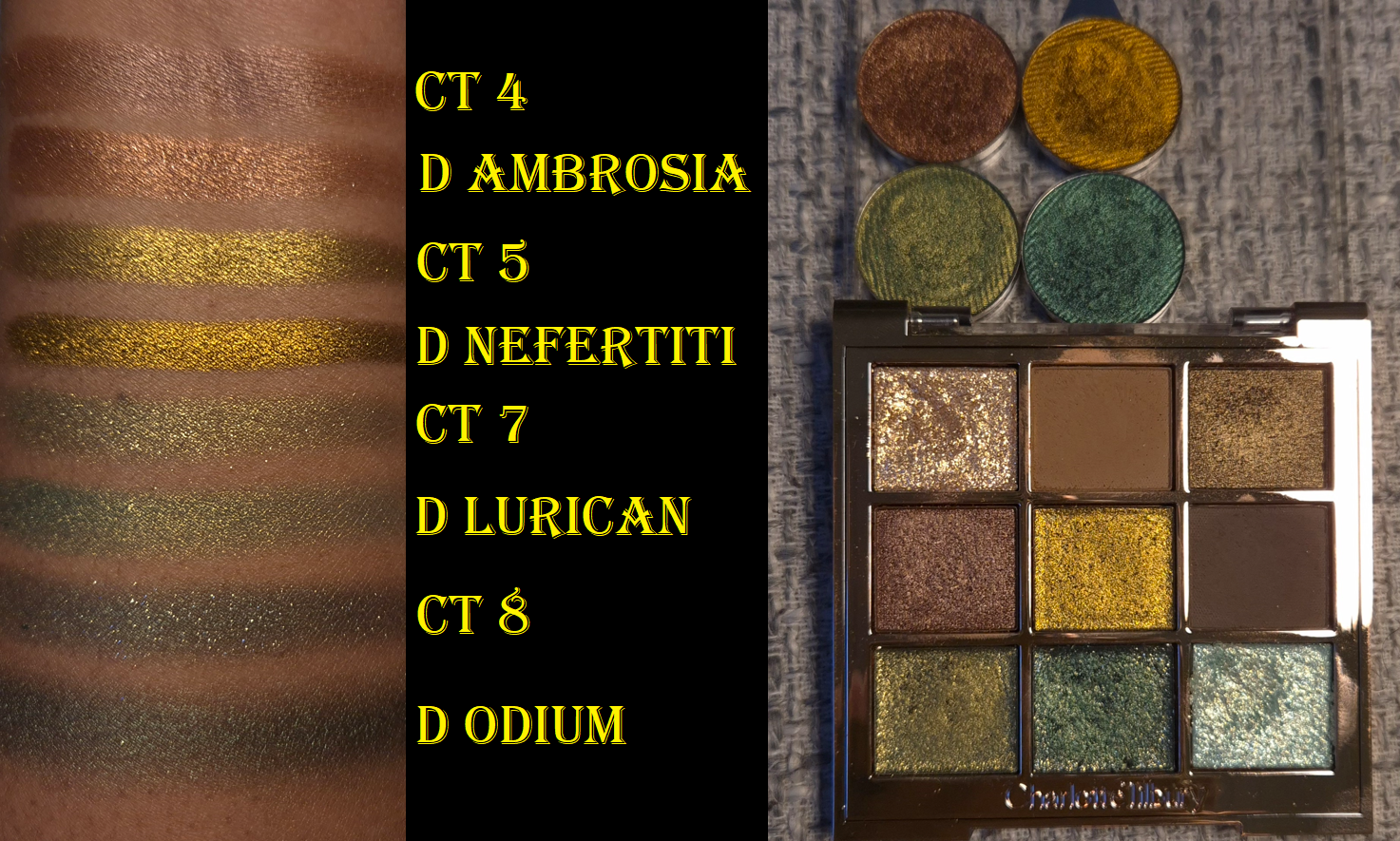
I love greens, but I realized this palette has some similarities to some of the Devinah shadows I keep in one of my custom travel palettes. This is probably why I couldn’t let my desire for getting the Charlotte Tilbury palette go despite owning similar things. These are some of my favorite types of colors!
When I compare the swatches, I honestly do prefer Devinah’s over these. Shade 4 is the most different. Lurican is more pigmented and less sparkly. Odium is also far less shimmery, but since I would typically use this on the outer portion of the lid, I’d prefer for it to be this way. Devinah has discontinued some of their older shades (like Odium and Nefertiti), so I guess it’s a moot point. I just figured it would be interesting to compare because it’s not everyday when high end or luxury shimmers are even worthy of comparing their eyeshadows to ones from non-mainstream brands.
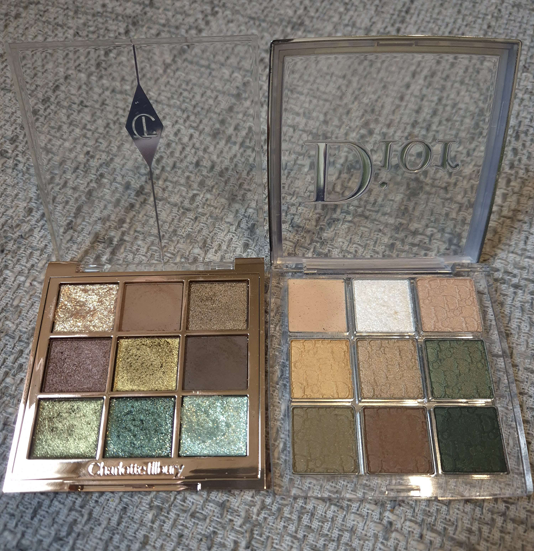
What is shown above is ultimately why I ended up buying this palette despite my best efforts to tell myself I didn’t need it. I already had the Dior Backstage 008 Khaki Neutrals palette that I hardly used after the review. There are way more interesting green palettes in my collection. The color variety still interested me, but these satins and “glitter” eyeshadows were just too subdued for me. I wanted so much more shine and impact. In trying to use the palette again, I realized Charlotte’s might be the version I wished for. The perfect combination for me in Emerald Effect would have been if the brand replaced the light green or the flaky pale blue with a light green matte shade like Shade 6 from Dior. Or, since the dark green shimmer from CT isn’t fully opaque, I’d have liked a dark green matte as well. Perhaps since I have both palettes with no intention of getting rid of either, I could just use them both together.
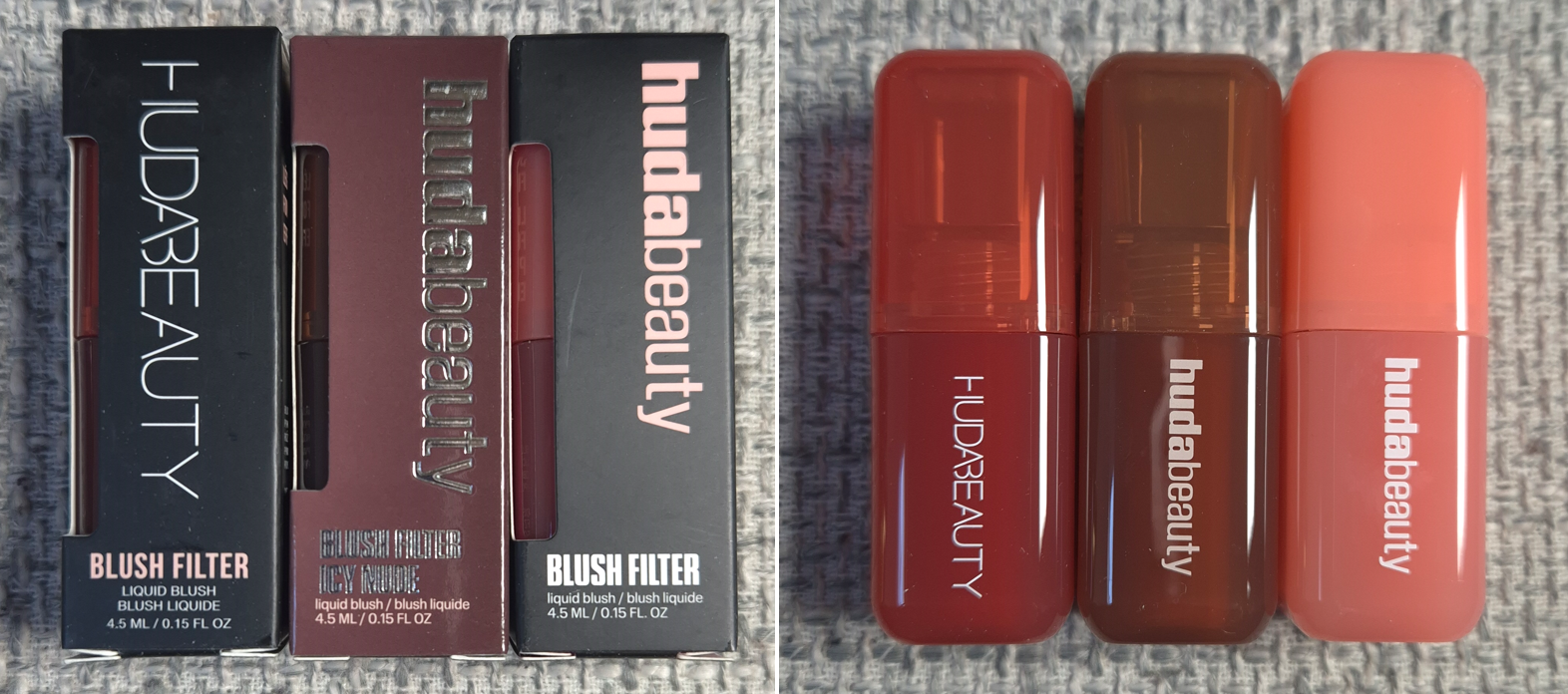
I have been on a no-buy for liquid and cream blushes since August 2023. The immense hype surrounding these Blush Filters had been steadily chipping away at my resolve. After eight months of resisting, I finally caved.
It’s convenient that the three shades I was most interested in buying were from the original launch, the Icy Nude Collection launch, and the newest “Blush Crush” or “Vibrant” Collection. I was able to see the changes that coincided with the brand revamping their logo and packaging. I was also curious if the formulas would be different between them, but they’re all the same from what I can tell.
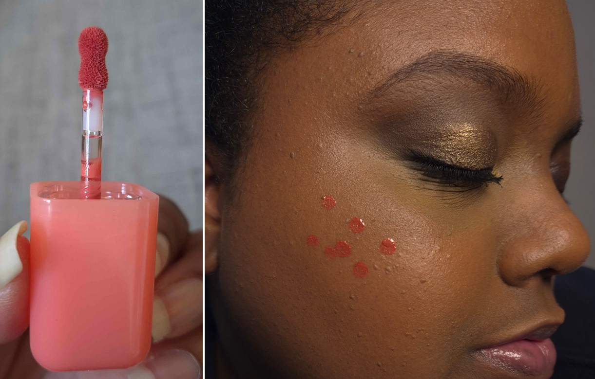
The first thing I noticed was the fruity candy smell. It smells delicious, but it is a bit strong in the initial few minutes that I have the container open, and as the blush dries on my cheeks. A thin controllable amount comes out of the stopper and with the small applicator.
The Blush Filters are less pigmented than the liquid blushes from Rare Beauty and Juvia’s Place, but still a lot more pigmented than Glossier’s Cloud Paints. With the amount shown in the photo above, I get about 80% opacity, but these can be built up.
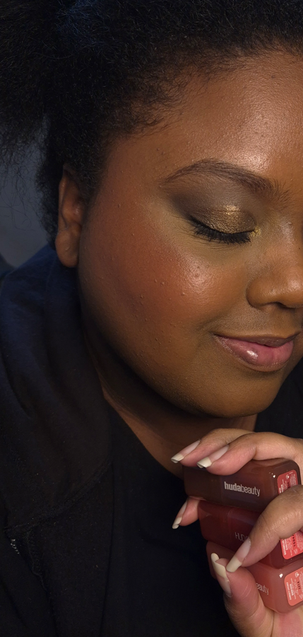
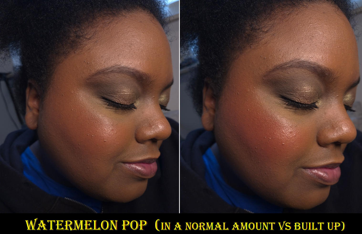
The blush doesn’t immediately set on the skin, but I still work on one cheek at a time because it doesn’t have an emollient consistency (nor gel-like or watery), so they don’t look like they’re spreading enough at first, but I just trust the process and keep moving my brush around and the blush does fully blend out and is streak-free. It doesn’t disturb makeup underneath either. Once it dries down, it’s fairly budge-proof and there’s no fading by the end of the day. I’ve been impressed by its hydrated look, even though it’s completely dry to the touch, but I think that can be attributed to the “micro pearls” in this product. When I first tried it, I thought my glowy toner combined with a hydrating skin tint was the reason it looked luminous, but when I looked very closely at the swatches, I could see a faint gold sheen in Watermelon Pop. It’s too difficult to see the individual particles within the other shades, and it’s something I can just barely see when light hits it. The radiance is subtle, but enough to keep my cheeks from looking matte and flat. It looks great on minimal makeup days, but even better when it blends into my foundation to melt into the skin, turning even the more vibrant colors into wearable shades.
The glow combined with my lights actually made them look subtler in pictures than in person, so I built them up much heavier when I did a second round of photos. I don’t think my attempts made much of a difference, except with Watermelon Pop.
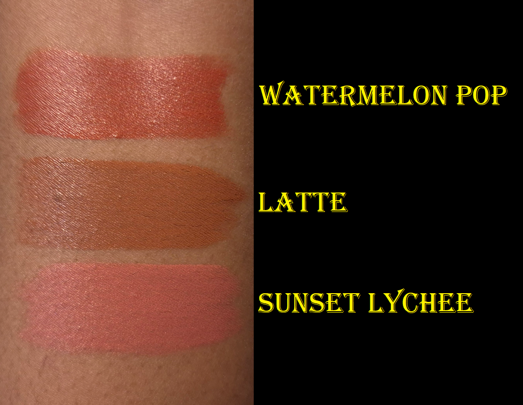
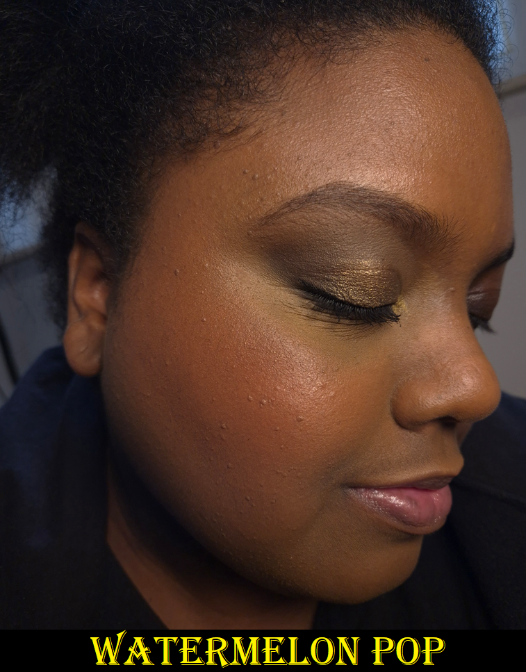
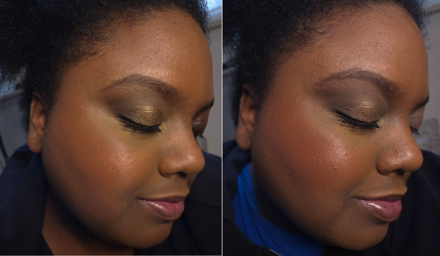
Watermelon Pop is a warm red that made me instantly think of the shade Love from Rare Beauty and Lily Love from Juvia’s Place. This isn’t a very unique color, but the warm golden micro shimmer makes me like this even more!
Latte is a medium reddish brown that looks redder on my cheeks than I expected, but it’s pretty and the kind of blush that’s right up my alley.
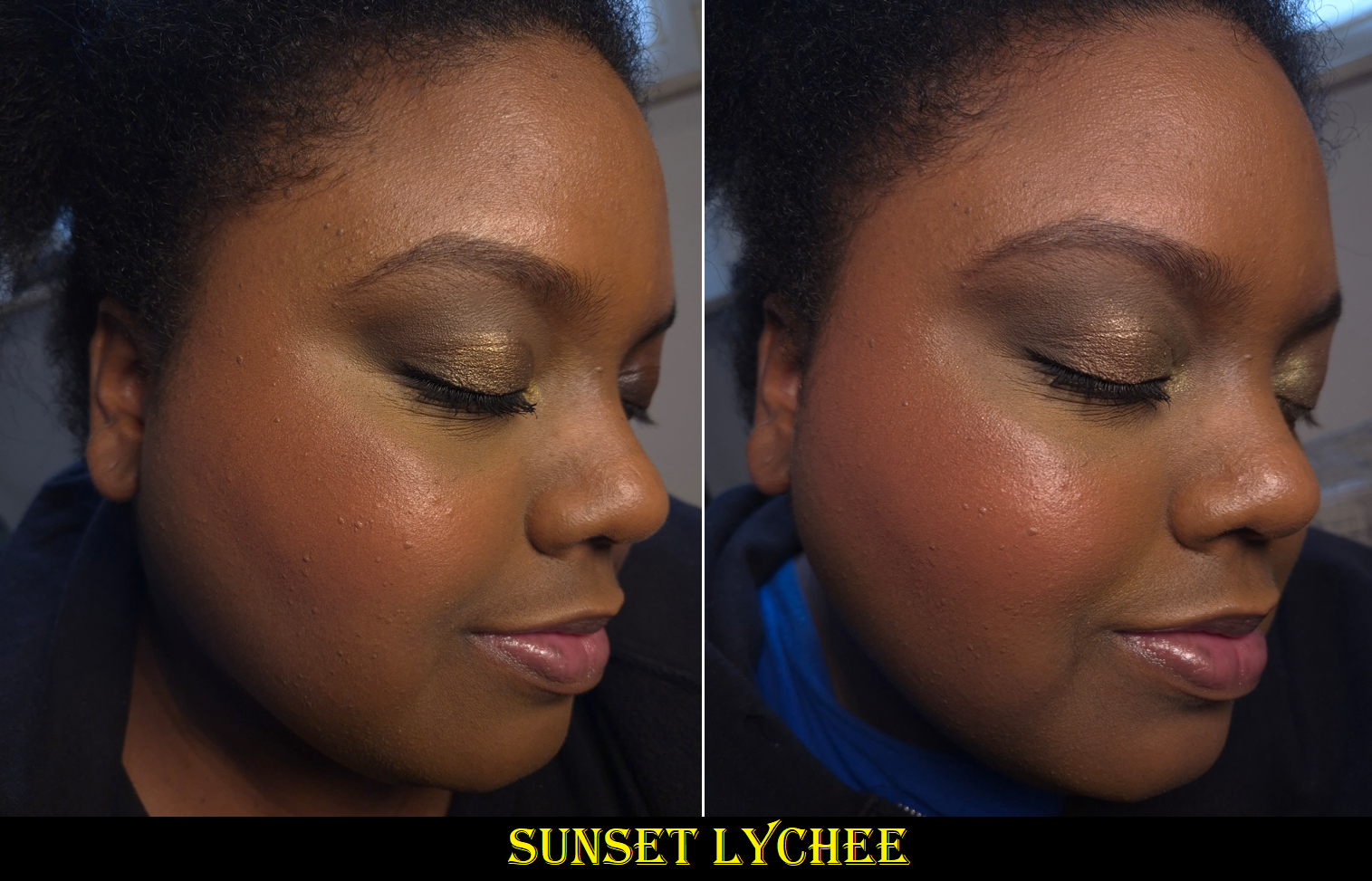
Sunset Lychee is described as a “Rosy Orange” and I’ve seen it look closer to orange on some people, but it is very much pink on me. It reminded me a bit of Rare Beauty’s Joy, but this one has more pink and less apricot.
These shades work out for me on their own, but they also layer well together.
I think this is a great product. Great products deserve to be raved about, but because there are plenty of fantastic liquid blushes out there that are blendable, set down, and are available in gorgeous colors, the Blush Filter’s level of hype seems to have been cultivated in part by very smart marketing.
I’ve always liked nice packaging, but now I’m even more aware of how non-luxury goods can still be very pleasing to look at and interact with. The Blush Filters’ rounded square shapes with their vibrant and semi-transparent packaging combined with the fruity-candy scent remind me of popsicles. There is also the collectable factor since each blush packaging matches the color on the inside. This makes the Blush Filter even more memorable and desirable. When there exist similarly performing blushes, packaging can make all the difference in choosing one brand over another. I have no regrets ordering these, even though I have reinstated my liquid and cream blush no-buy. The fact remains that I still don’t use them as much as powder blush no matter how amazing they are.
It’s a nice bonus that I got 30 Euros knocked off the price because of the reward points I accrued on my Huda Beauty website purchases over the past year. In that same order, I got samples of the #Fauxfilter Color Corrector, so I thought I would include swatches of those as well. My review of the full-size product can be found HERE.
The shade I own is Mango, which I like a lot. I have always gotten shades like Papaya in the past, and it works, but never 100% perfectly. Mango is essentially a pink-orange, which apparently suits me very well, but is a hair on the light side for me. At least, that’s what I thought until I had the idea to mix Mango and Papaya together, which I think looks the best out of all the options!
I still think it’s fantastic that Huda Beauty offers more nuanced shades of color correctors than I’ve seen from other brands. For instance, I don’t know anyone else who makes as dark of a pink as Lychee! Because of the effectiveness of Mango on me, I wondered if perhaps pink was a better corrector color shade and that brands just didn’t make any dark enough. It’s nice to confirm that Lychee doesn’t suit me. My correct corrector should be a fine line between pink and orange.
I should also point out that the demonstration photo of Cherry Blossom looks better than it actually should be. That was my mistake not cleaning my concealer brush well enough and the two colors mixed, so it doesn’t look as stark white as it should be (which is to say even paler on me than Pink Pomello). I couldn’t redo the photo because I didn’t have enough product left from the sample card.
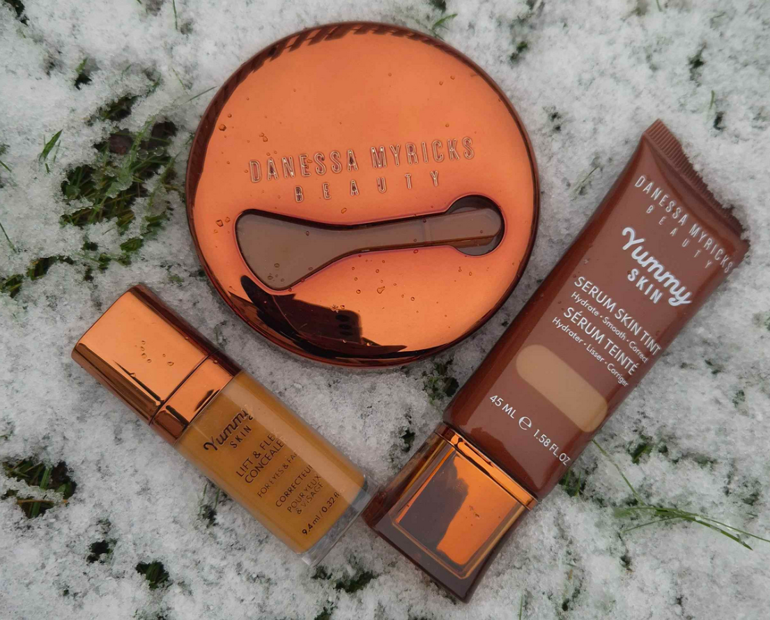
This is technically a review of some of the Yummy Skin line.
I admire Danessa Myricks’ artistry and her dedication to her brand. Even when she comes out with a product that isn’t necessarily new to the market, there’s always an innovative twist to it. For this reason, her products have always either worked exceptionally for me or really didn’t suit my needs. This is why I’ll never be the first to review something by the brand and why I don’t have as many things to post about despite how closely I pay attention to their releases.
I’m sharing my thoughts about these products now, but the timeline of my purchases are as follows: Yummy Skin Microfiber Velvet Sponge – June 18, 2023 Yummy Skin Moisture Repair Balm Serum – July 5, 2024 Infinite Chrome Pencil – July 5, 2024 Yummy Skin Lift & Flex Hydrating Concealer – July 10, 2024 Yummy Skin Serum Tint – November 8, 2024
Some of these items I’m still using today. Some of them, I had to redo the testing process because I forgot how they performed! Anyway, onto the reviews!
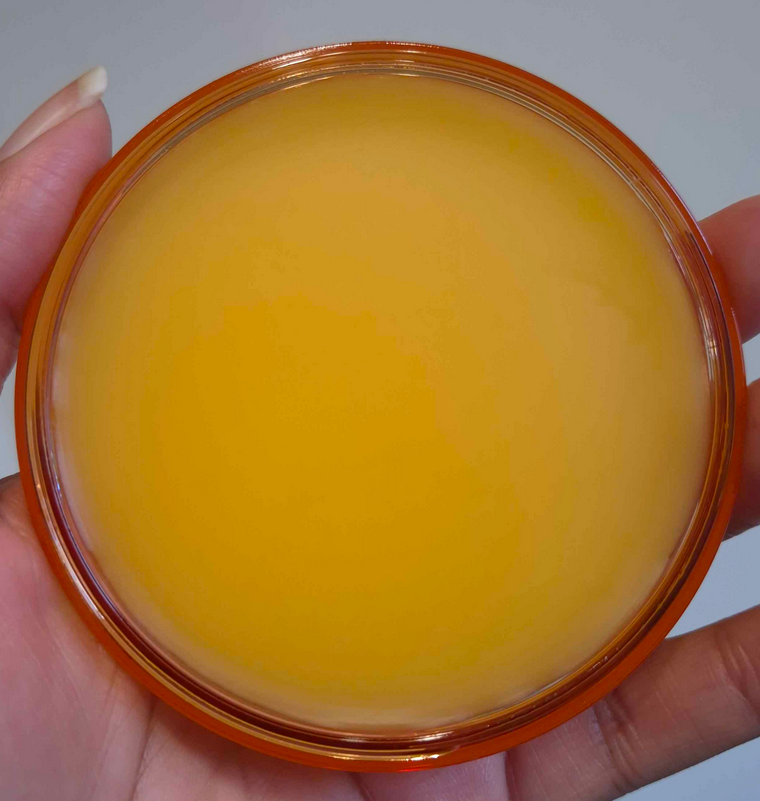
Yummy Skin Moisture Repair Balm Serum
The texture of this balm is like a firmer version of Vaseline. I despise having products that don’t set down to a dry touch on my face, but I was so desperate back then to find a product that would lock in moisture on my skin that I was willing to take the risk, at least when a sale rolled around.
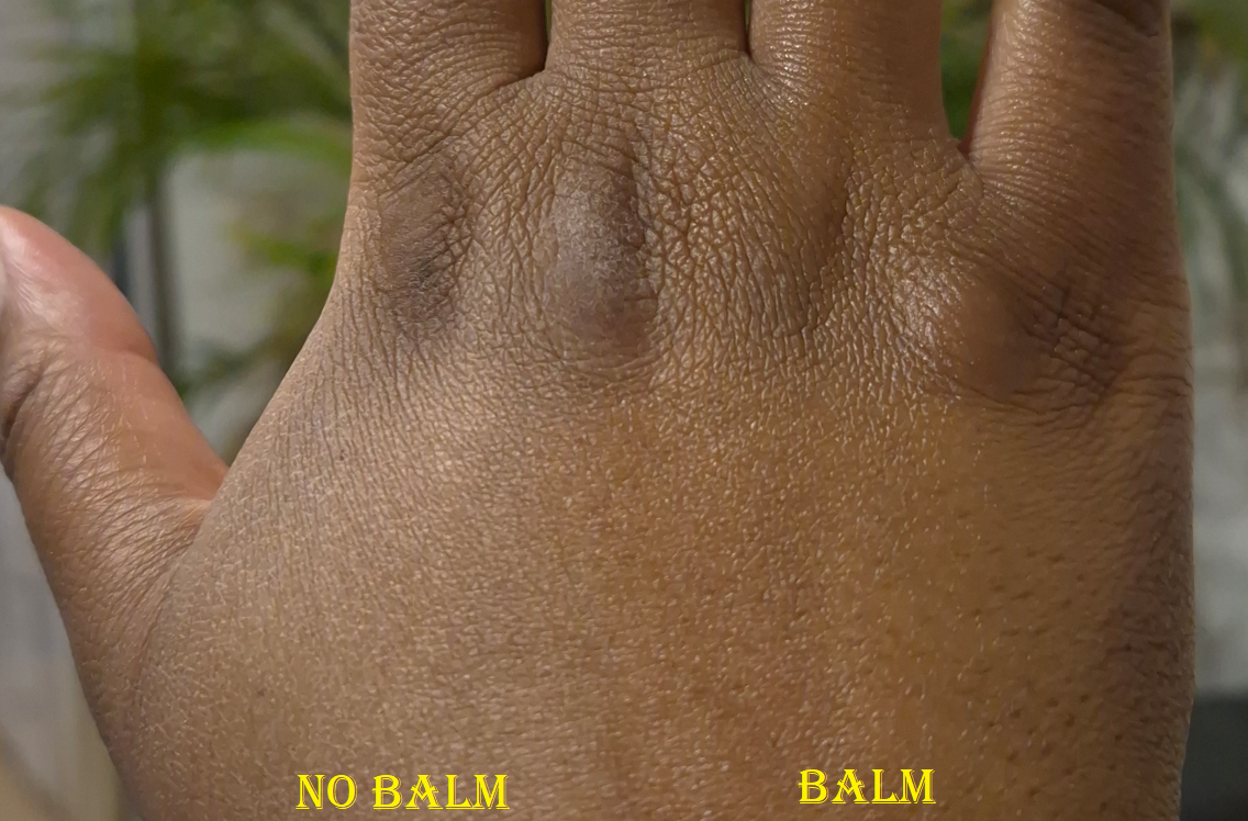
Excluding the hottest days of summer last year, natural finish foundations looked matte on me and dewy ones looked satin due to my skin being drier than usual in a new climate. Using the tiniest amount of this balm, where barely any residue is left on the skin, results in foundations looking the proper finish they’re supposed to have. With my small amount, any foundation that sets without needing powder will still do that.
I saw the amount that Danessa Myricks uses, thanks to Instagram, and it’s way more than I use. When I try to use closer to the recommended amount of balm, my skin feels heavy at first, but I eventually get used to it. After adding foundation on top, my face looks like it has more than a natural finish, but it doesn’t get to dewy levels until somewhere between 3-5 hours of wear depending on the weather and how much sweating I’m doing. Once it gets to that dewy point, it makes my foundation much easier to transfer. It also won’t set to a fully dry finish on me, even in the beginning and even with powder on top.
I also continually have problems with my nose area and it making my foundation there look patchy or broken down. So, even on my driest skin days, I avoid applying it to this area.
If I apply more than a tiny amount, my foundation will eventually get oily looking and become easier to transfer. My makeup everywhere starts to break down around the six or seven hour mark.
The photo above is the only example I have of this. I’m sorry that it’s a washed out photo and that I didn’t want to take additional pictures. I did not want to deal with the transfer issue and heavy feeling again.
So, essentially, I like this product if I use it super sparingly in the high points of my face where I don’t mind having some glow. Starting to use milky toners again was actually the solution to my dry skin issue, and made it unnecessary for me to apply this all over. Now, I pretty much use this product more on the back of my hands than on my face!
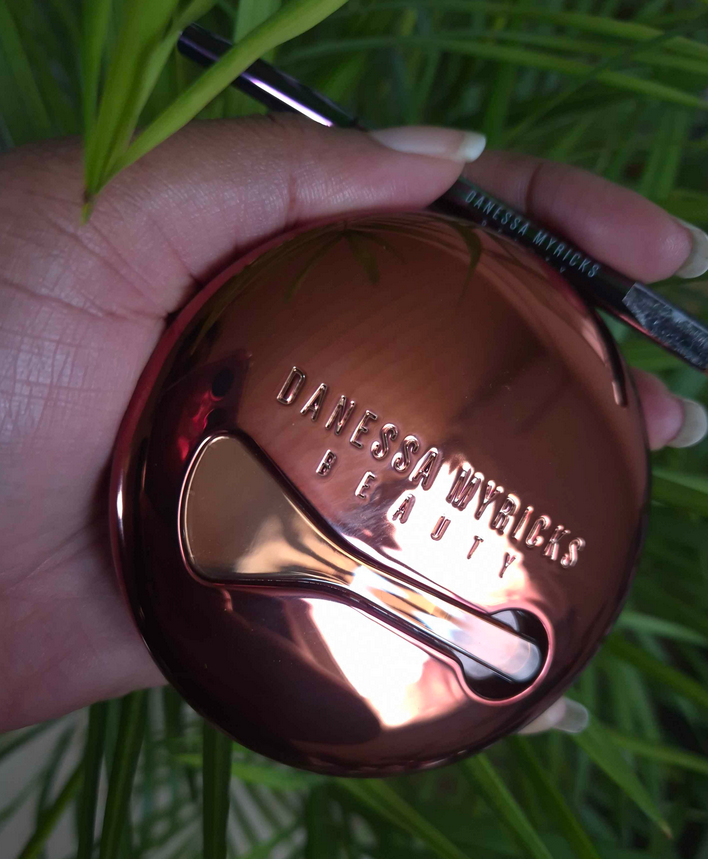
I’d also like to mention that I find the packaging of this product very satisfying to interact with. I like the addition of the spatula at the top, the beautiful bronze lid with a semi transparent jar, and the balm color that reminds me of orange juice despite actually being colorless on the skin. It’s fragrance-free and smells like a mix of wax, oil, and petroleum. I normally don’t advocate for scents in my products, but I could have made an exception for this one considering how it smells.
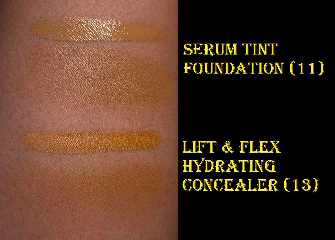
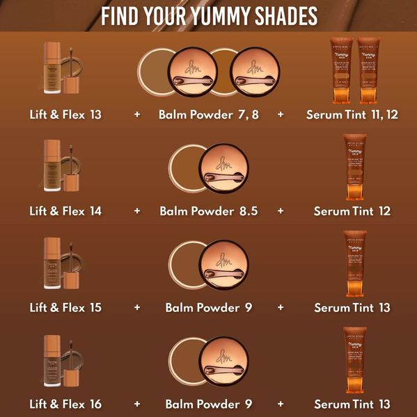
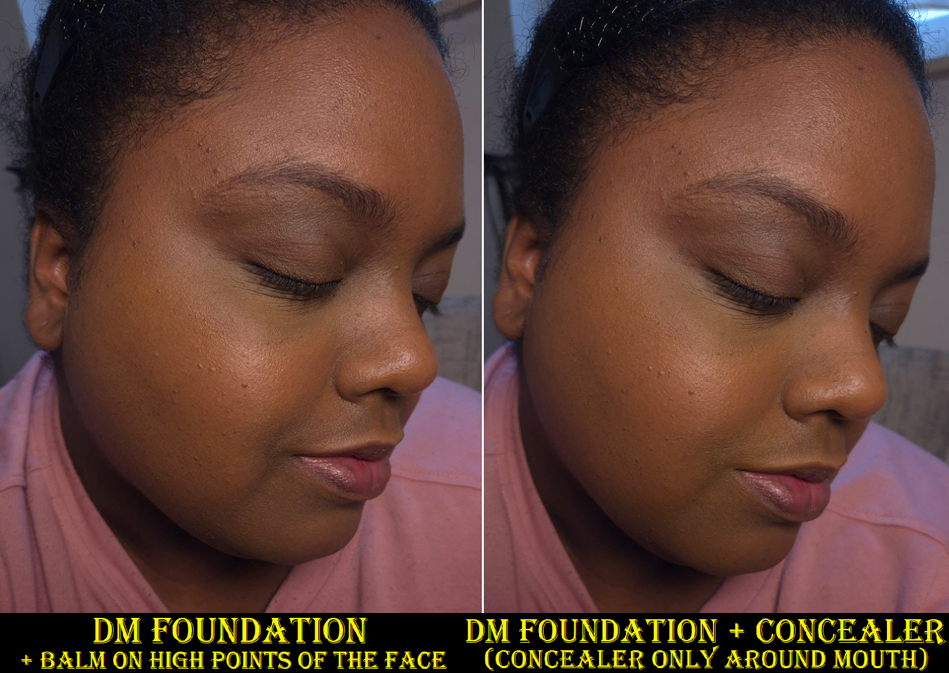
Yummy Skin Serum Skin Tint in Shade 11 and Yummy Skin Lift & Flex Hydrating Concealer in Shade 13
As seen on the timeline, I purchased the concealer first. I chose number 13 because the model showcasing it looked closest to my skin tone. As it turns out, the depth is about right, but it’s quite orange. So, it doubles as a corrector and concealer for me. If this product worked as well as my other concealers under my eyes, I would have considered buying number 12. Unfortunately, it creases too much (moving out of my under eye lines) and disappears too quickly. My under eye area produces oil between some of the wrinkles, but is dry elsewhere. So, it’s a tough spot for a lot of concealers to handle. However, this product works perfectly fine on the rest of my face that’s smoother. So, I use it mostly around my mouth area and spots with darker discoloration. It’s nice that it has high coverage and that I’m still able to make use of it. A concealer that doesn’t work under my eyes doesn’t have much chance of being considered part of my favorites though by default.
Purish had a fantastic sale on Danessa Myricks products, so that’s why I finally gave the Serum Tint a try and chose my color based on the concealer match recommended by the brand. I’m very happy with Shade 11 and think it’s the best match. I consider it a golden color because it’s a good balance between yellow and orange. Even though I’m still a bit darker than usual, the coverage being light (or on the lighter side of medium if applied with a brush) allows for wiggle room. It’s called a Serum Tint, but it gives me similar coverage as Fenty’s Liquid Eaze Drops and almost as much as Nars Sheer Glow. I like the nozzle because it makes it so easy to control how much or little I want to squeeze out. And even though the product is thick enough that when I draw lines across my face it doesn’t drip or move in the slightest, it’s not so thick as to feel heavy. The consistency feels like applying a skincare moisturizer.
I would call this a satin finish foundation on me as it’s not as glowy as I expected. It does look even better when I use a sparing amount of the Yummy Skin Balm with it, and it feels more hydrating than it looks outwardly. If I want my skin to look truly luminous, I just need to apply a very generous amount of my glowiest milky toners as part of my skin prep.
Overall, my skin looks smoother with the tint on. I like that it fully sets down without needing to be powdered and it doesn’t transfer much. The thickness of the tint can basically withstand the consistency of the balm. This lasts all day and I think it’s very skin-like.
I don’t know how effective the infused skincare ingredients are in the long-term, but I can agree with the hydration and moisturizing claims. This doesn’t have any fragrance and I like this packaging as much as the packaging of the Yummy Skin Balm. Besides the convenience of the squeeze tube and nozzle, the cap’s color and shape is aesthetically pleasing.
I’m very happy that this turned out to be a good purchase. Even though I got it on sale, I think it’s definitely worth buying at full price. It performs and feels like high-end and luxury foundations. I mentioned in my Project Pan post that I may end up adding this to the bunch after reviewing it. Since I kept it in my foundation rotation even after the testing phase, I think it’s safe to include it in there.
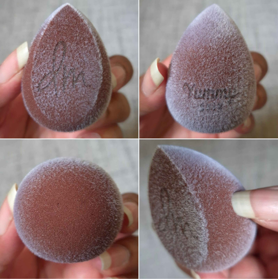
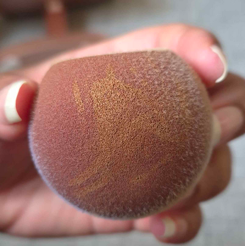
Yummy Skin Microfiber Velvet Sponge Dark Chocolate
I’m fairly certain I used this sponge once or twice when I first bought it, but then did not use it again until February of this year. Since sponges are intended to be thrown out every few months, is this still considered hygienic if I only used it a few times and then kept it in a bag away from dust and other elements for over a year and a half? I don’t know, probably not, but I did this for science (and not wanting to buy another one)!
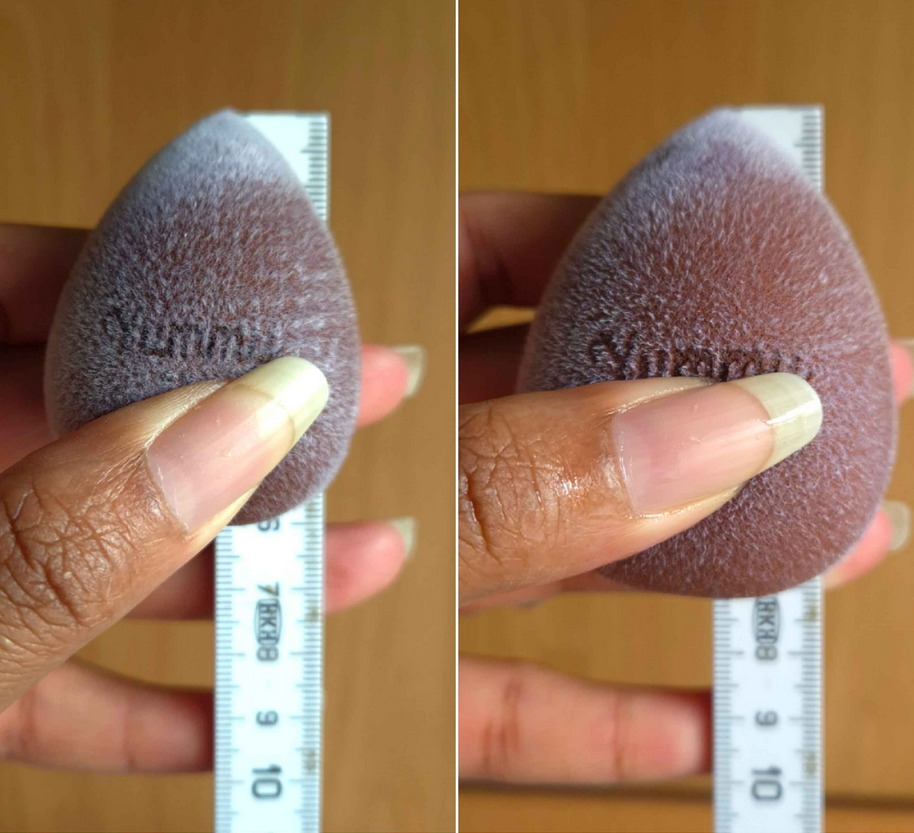
The sponge in dry form versus damp
This feels very firm in its dry form. It’s softer after being wet, but is still firmer than other sponges I’ve used. The microfibers make it feel slightly velvety, like applying my makeup with a cloth. However, it’s not the same as when I’ve used my Blendiful in the past. The end result is the same as with other sponges though, only differing in the way that I need to use this. With most sponges, I’m used to pouncing it all over my face and the sponge pushes the product in a wider, diffused, and partly diluted area. This sponge does a bit of diluting and soaking up of product, but if I apply foundation to my face first and tap this over it, it just spreads more dots wherever the sponge touches instead of spreading it out. When I use the Danessa Myricks Serum Tint, I usually draw lines on my face and use a brush to spread it around. As seen in the photo below, there are a bunch of lines on the bottom of the sponge were the lines just stayed on there and didn’t spread out.
So, the technique I have to use with this sponge is to spread foundation across my face with the flat edge and then tap it to blend after. If I still want to use the bottom, I have to do a drag and then bounce motion, not quite the same as a press and roll with other beautyblenders.
When it comes to cleaning this sponge, it takes much longer to dry and I can’t get it spotless, although the color makes that hard to see (which I like about it). I can only really tell that it has a stain when I run it under water. Another benefit is that it’s more tear-resistant.
I go through brief phases trying to use sponges and it’s just not for me. The look and feel of this sponge is different from any other I’ve used, but the end result isn’t any different. So, I don’t feel the need to repurchase something like this. It’s a nice product, but I much prefer more affordable sponges, or the classic original beautyblender.
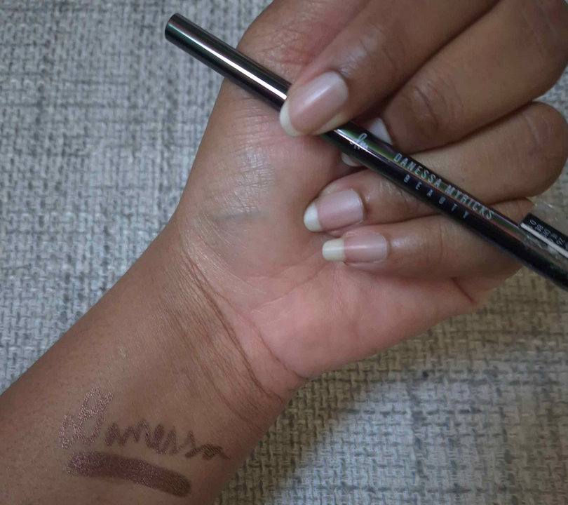
Infinite Chrome Pencil in Bronzite
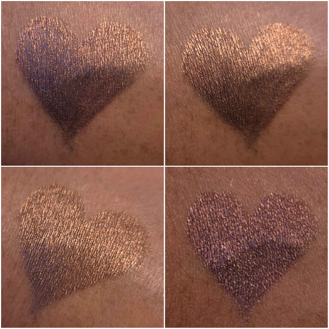
Heart shaped swatch at different angles.
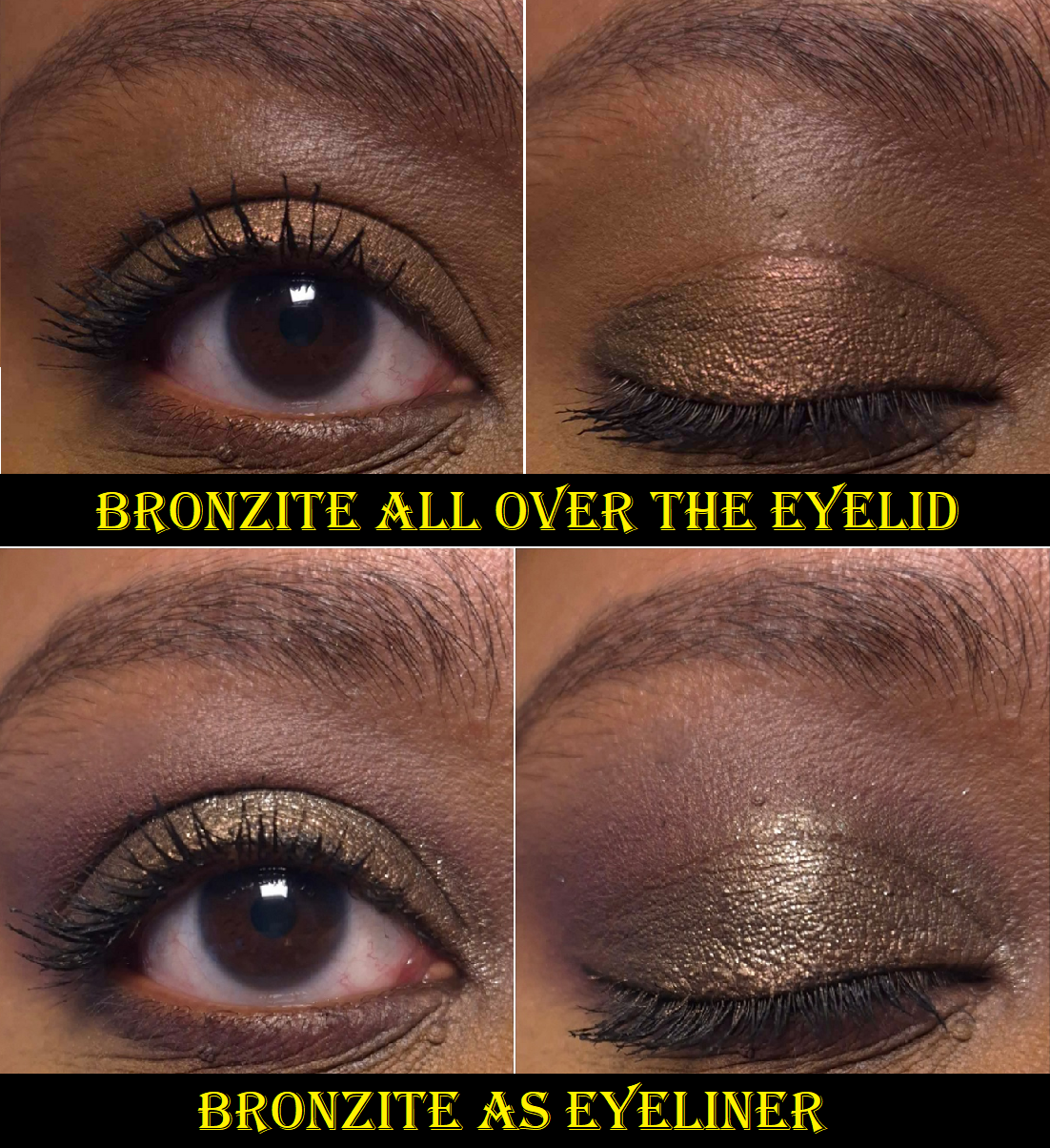
I have discussed this formula of pencil already, but this is the only additional one I have purchased since then. It’s waterproof, thin enough to be used precisely, and the strength of the shift depends on the shade. Bronzite is probably the hardest to see, as it has only ever looked bronze on my eyes.
This, at least, has more impact than the Golden Brown liner from Oden’s Eye. I also only paid 9 Euros for Bronzite on sale. Black eyeliner is my go-to, so I don’t use this very often, but I don’t mind having it in my collection. It still gets used once every 2-3 months.
Everything I reviewed today are products I will continue to use until they go bad (excluding the sponge I’m tossing for being old). However, the only one I would consider repurchasing is the Yummy Skin Serum Tint. I like that one a lot. The rest are good, but able to be substituted by other makeup I own.
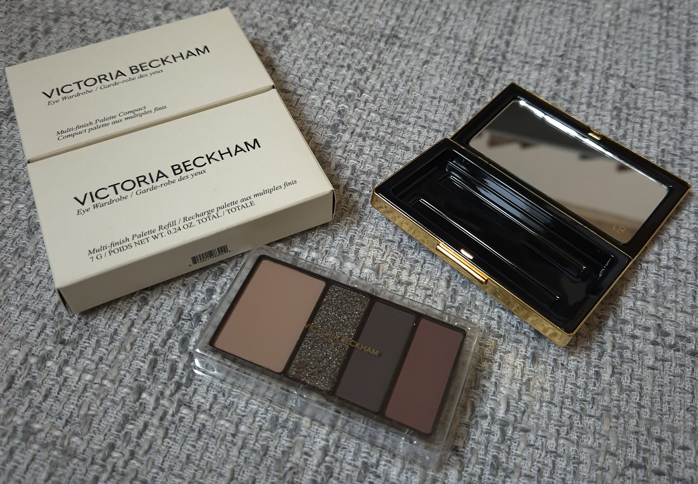
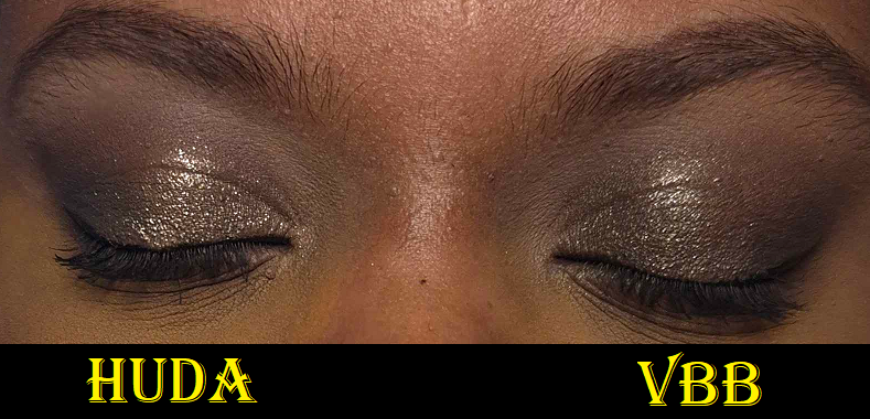
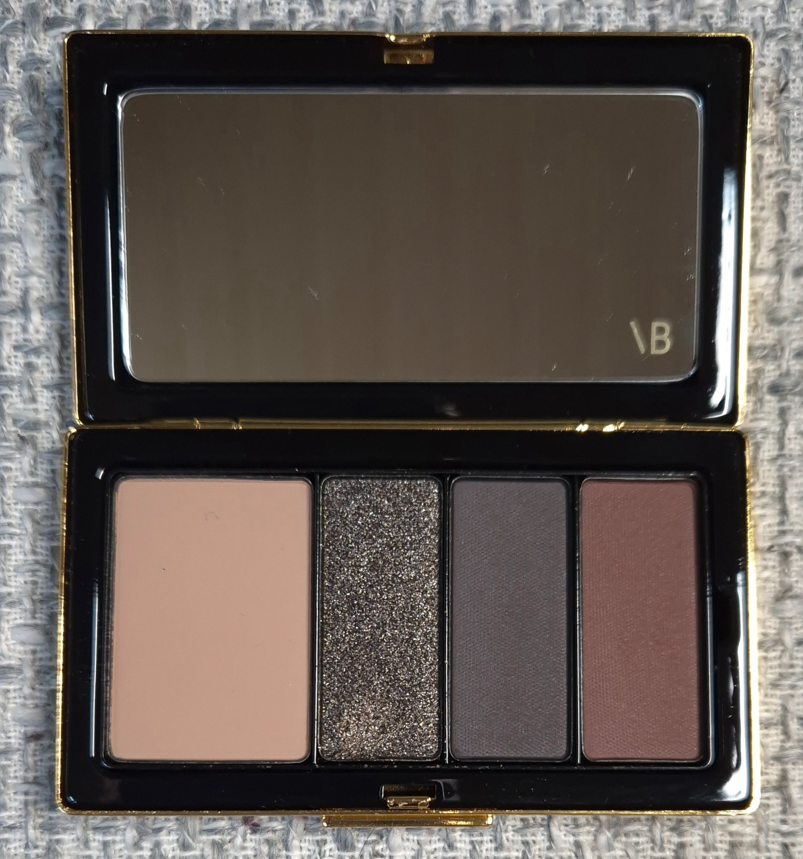
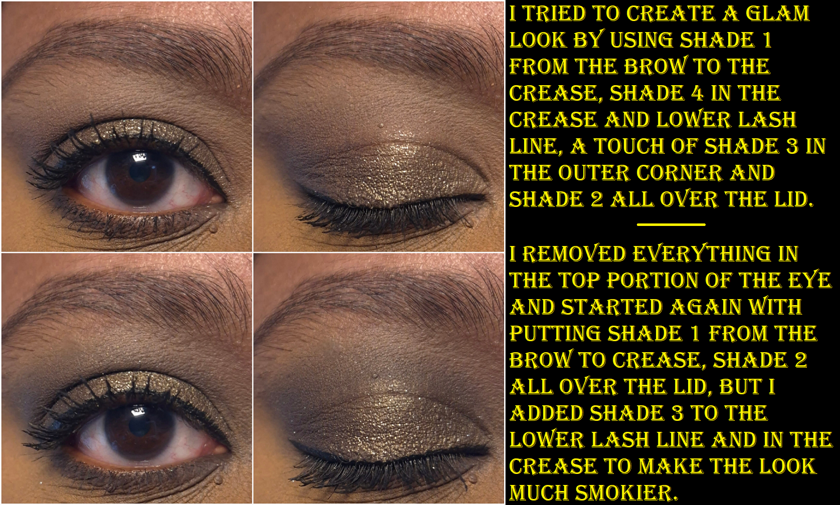
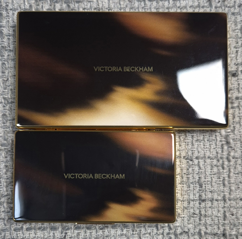
I’m no stranger to luxury eyeshadows, but I usually wait until I can buy them at a discounted price. I don’t know how to explain why I chose to purchase the compact and refill at the upcharged price from Selfridges. Call it temporary insanity I guess.
I was very interested in the Victoria color story, which is the only one I purchased, and the palette called Olive. This is finally the year of greens with Charlotte Tilbury releasing the Beautifying Eye Trend in Emerald Effect and Tom Ford launching Olive Smoke at around the same time. I painfully held off on buying them because I already have the Viseart Peridot quad, Dior Backstage Khaki Neutrals, Bobbi Brown Jadestone, Melt Gemini II, Natasha Denona Mini Gold and other of ND’s greens, plus all of Oden’s Eye’s greens, etc. I’m trying my best to use the makeup I already have, but I was super curious to find out whether I would like this brand’s eyeshadows or not. Although I know I could find similar shades to Victoria across all my palettes, I didn’t think I’d have them all in one place and one quad. So, this felt like the best choice for me out of the four available.
After seeing Victoria in person, I realized that I do have a palette that gives a similar vibe. It’s the Huda Beauty Wild Obsessions Jaguar palette.
The biggest difference between the two is certainly the quality. With Huda’s palette, it gives off a lot more pigmentation and opacity. It blends well, but noticeably takes longer to complete the look than Victoria’s. In the grouping of three photos below, the eye looks on the top and bottom are with VBB shadows, but the one in the middle is with Huda shadows. Even when I build up Victoria’s shades to be more dramatic, the color values and depths from Huda’s colors are more distinctly different from each other, so they naturally pop and stand out more. Huda’s shimmer particles are also much larger. The finished looks are both beautiful to me and have their place. It’s a matter of whether someone wants more impact or wants more seamlessness.
The Jaguar palette is still available for $35 at full price, versus Victoria for $75 (or $50 for just the refill). In my Huda Beauty Palette Ranking post, Jaguar took and still holds the top spot. So, I just wanted to offer this alternative for anyone who wants similar colors at a more affordable price.
Victoria Beckham Beauty Eye Wardrobe in Victoria
This is described as a neutral palette, but my eyes are picking up a little warmth to the shades. The first one in the biggest pan is what I would consider a beige-taupe. It looks like a pale brown, but it goes the tiniest bit grey on my skin, so I would consider it neutral. The shimmer shadow has a dark brown base with a little red that adds the tiniest of warmth underneath the silver (and maybe even fine gold?) sparkle. The third color and neutral is what I would call a soft black or an incredibly deep purple-tinged brown that is practically black. The last shade is a near-neutral warm-leaning dark brown or mahogany.
These eyeshadows are soft to the touch and create low or medium kickup depending on the brushes used. They’re not quite as buttery as YSL’s eyeshadows, but these are still incredibly good quality! They are pigmented, but so easy to control. They give enough pigment for me (excluding Shade 1 that doesn’t show up as much) right from the start and can be built up a bit. There is just enough difference between the shades to avoid feeling redundant in the palette, but they also blend seamlessly into each other and create a smokey hazy effect without putting much effort. I am so impressed!
I’ve tried this on three different eyeshadow primers/bases and had no issues with longevity. How my eyeshadow looks in the morning is exactly how it will look at night. These don’t fade on me. I don’t get creasing from the shimmer, which surprised me because it feels creamy and that can sometimes lead to migration on my lids from other brands’ eyeshadows. I also get very little fallout from the shimmer. It adheres well to my eyes without needing a glitter primer and I haven’t felt the need to spray my brush with it either. If I do want more impact and for the shadow to look more silver, applying the shadow to my lids with a damp brush turns it creamier, smoother, and opaque. Although I usually prefer a more intense shimmer eyeshadow, it’s nice to have one that is a bit…demure.
For more impact, one can start with the darkest color first and then work from lightest to darkest again.
When I did a side by side comparison of Jungle to Victoria, it made me think about how well this palette would look paired with a purple, so I tried that and liked how it turned out. For Valentine’s day, I combined the colors in Victoria with eyeshadows from other brands as well, and can confirm that they all play well together.
I may have similar colors to the Victoria Eye Wardrobe, but the ease of use and control that I have on building up the colors makes this palette much more valuable to me. YSL makes my favorite matte formula, but I can’t build up depth in the same way because the only shade deep enough is the black shadow from Over Noir and that is much more intense than Shade 3 in this one. My best palette for that task was previously the Hindash Beautopsy palette, but this one has an even easier formula to work with. Victoria, for my skintone, is still best for building subtle depth and not for intense drama. There will be times when I want more out of my black eye shadows.
Regarding the size, the eyeshadow palette is significantly smaller than the bronzing brick.
The bronzing brick compact is also way easier to open and close. I can open it with one hand, whereas it’s much harder to try that with the eyeshadow component. I don’t know if my empty palette is supposed to have such a stiff hinge, but I know for sure that I shouldn’t be having so many issues with mine closing and staying closed. There appears to be a slight defect because mine clicks back open again and I have to press it back down 2-3 times before it will remain closed. However, I can also press or hold the front part of the compact (not touching the button) and sometimes the pressure of just picking it up makes it pop open. The Selfridges rep agreed with me upon reviewing the video I submitted to them and they reimbursed me for the cost of the empty palette. So, if mine continues to get worse with repeated use (it went from needing to be reclosed 50% of the time to now 100% of the time) or I’m unable to shut it at all, I could try my luck and buy another one. There is another option, which is to stick this in a regular empty magnetic palette because the refill works in those. However, the reason I bought it is because I specifically wanted the luxury packaging.
In my review of the Lisa Eldridge Pinpoint Concealer Pencils, I explained that it performing better on my smile line than any other concealer is the only reason it was worth buying for me. In the case of this palette, the eyeshadow quality is among the crème de la crème in my collection. However, how much I like this or will use this depends on my mood. I might reach for a Pat Mcgrath eyeshadow instead because it delivers stronger pigment. I could choose a Natasha Denona shimmer because it’s more eye-catching. The best quality doesn’t automatically mean it’ll suit someone’s preferences. So whether this palette is worth buying is going to be subjective and up to each individual shopper.
I think the quality is top notch. I think the compact is elegant and weighty (although I was unlucky to have an issue). I am still open to the possibility of buying refills in the future, but I don’t know how likely that will be considering I still prefer YSL’s formula and I can find their permanent quads for at least 10-20 Euros cheaper. Those compacts aren’t as heavy, but they are still luxurious to me. I would rather wait around and hope for YSL to release a color story similar to Olive. Tom Ford is the most comparable brand I can think of in terms of pricing, and I prefer VBB quality over theirs (excluding the wet/dry formula), but even Tom Ford’s quads can be found at a CCO/CCS for 40% off or more. I prefer VBB over Lisa Eldridge, Guerlain, and Gucci palettes that are comparable to the price of VBB’s refill alone, but it’s not always about quality. There are some shades I love that I know I will never see made by certain brands, so I will continue to seek out eyeshadows from other cosmetic companies.
I’m content with my singular Victoria Beckham Beauty Eye Wardrobe, but if they release a breathtaking color story, I could be swayed to purchase another.