For those who haven’t read my Project Pan Introductory Post, below is a small summary.
TLDR:
*Ban on cream and liquid blushes and bronzers.
*No highlighter purchases.
*Only allowed to buy lip products from Lisa Eldridge, Ami Cole, Too Faced, Fenty, and Pat Mcgrath, but I am allowed to swap out PML with MAC. YSL was always in my head as a potential number six, but I wanted to keep it down to five.
*Trying to avoid buying anything in the primer, brow, mascara, and liner categories.
Reason to Buy Less Makeup: New products take time away from using the older ones that I love.
Additional Reason for This Experiment: Seeing if using only my holy grail products will make me less interested in new makeup. Will this Project Pan make me feel satisfied enough that I don’t want to add more to my collection.
Foundations
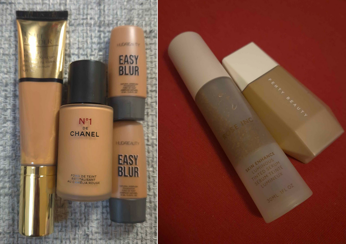
My Estee Lauder Foundation went bad. The oil parts took my makeup back off and was being weirdly patchy, plus the tube was too difficult to shake and mix properly. I didn’t start using it that long ago, but the backup was purchased on sale at the beginning of 2023, so it’s possible this tube had already been on the shelf for a long time prior to then.
I replaced it with the Danessa Myricks Yummy Skin Serum Tint and I feel like I got my money’s worth out of that Tint by now.
As much as I like the Fenty Eaze Drop Liquid Foundation, it being more transfer prone than everything else in my collection made me not want to use it more than a few times. The Danessa Myricks Tint was a good replacement for that too. The Rose Inc Serum Tint oxidizing made me skip using it as well. Huda’s foundations were only really meant to mix with things to get a better shade match or increase the coverage, so I only used one a few times and I’m okay with that.
I will say that I got a whole lot of use out of the Chanel foundation, and it was the one I used most during this six month time period. I didn’t use my darker shade of this foundation at all, so I think in the year and a half that I’ve been using it, it has oxidized a little. I’m not sure how much longer it will be good for, but I foresee myself eventually repurchasing it when the time comes. It’s still my favorite in my collection and I would not want to be without it for long. This is one of the instances where using a holy grail product did in fact curb my appetite for buying more foundations. I believe my mini of the MUFE Ultra HD Foundation is the only one I purchased in these past six months, and I still haven’t worn it! I was definitely tempted by new ones from Guerlain, Givenchy, and Nyx, but being at my foundation maximum also helped. Not counting multiple shades of the same foundation, I have around 20 foundations in my current collection. My goal is to have only 5, but the lowest I’ve ever gotten my collection down to is around 10. So, I give myself kudos for holding strong against buying more. However, I still feel some guilt knowing I won’t ever use them up before they go bad. I’m only about halfway through the bottle of the Chanel foundation even though it’s the one I used the most in the past 18 months, not just during this project. So, I’m more determined than ever to keep a much smaller collection of foundations and I’m less interested in buying new ones because if they don’t top my Chanel, they will instantly go to waste because I cannot return them to the store.
Concealers
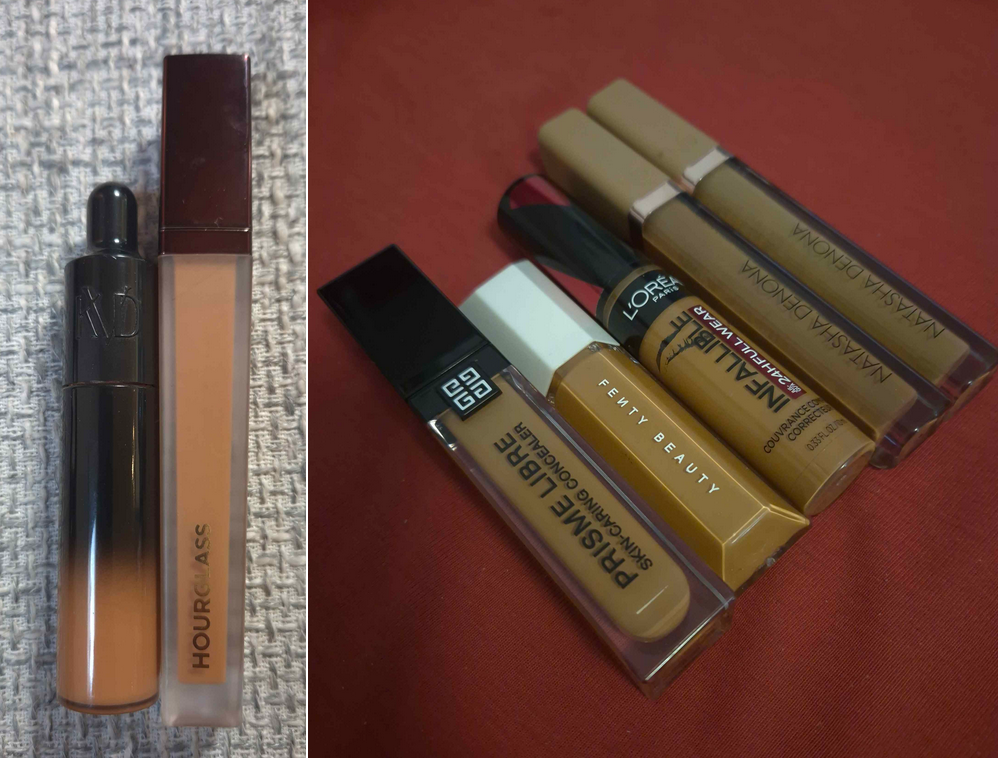
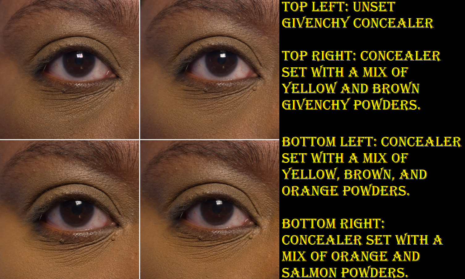
The Danessa Myricks Yummy Skin Lift and Flex concealer snuck its way in too and was used more than the other honorable mention concealers. I used Givenchy’s a few times and Natasha Denona’s more than I expected, but did not use Fenty’s or L’Oreal’s even once. Ultimately, for concealing around my mouth, I stuck with Hourglass and Natasha Denona. I like my two ND shades, but the packaging of one of them leaks and it drives me nuts! I’ve been very close to tossing it out, but I like having a somewhat color correcting yellow and brown in those tones. So, I try to put up with it and I keep the leaky one stored upright in a cup.
I got to about a quarter left of my tube of the KVD Good Apple Concealer, but tossed the rest because it darkened in color. So, I started using one of my two backups. Because I’m not using any other concealer under my eyes, this fresh tube is getting a lot of use! I would say I’ve used up about a third of it, but this isn’t a surprise. Whichever concealer I deem my number 1 will always get used up and repurchased!
I did not purchase any other liquid concealers during the Project Pan until June when I was recommended to try out the Gucci concealer. Earlier in the year though, bought three shades of the Lisa Eldridge Pinpoint Concealer pencils. I don’t consider this wasteful per say, since I bought them for purposes that I wasn’t using my liquid concealers to do. However, I admit that I don’t use them as much as I thought I would. Making sure I build up my foundation around my mouth means I use less concealer there, sometimes skipping it entirely. I also couldn’t be bothered to always fill in my smile line, so that’s how my interest in the pencils started to fade.
I’m not feeling as tempted to get more concealers. I must admit though that the only reason I haven’t bought the new Estee Lauder Double WearStay-in-Place 24-Hour Concealer is because every retailer I’ve found in Germany has 11 or fewer of the shades out of the 30 that exist. The deepest color I’ve seen listed is either 5C or 5N. So, I am literally unable to try it.
If Lisa Eldridge releases a liquid concealer or if Estee Lauder finally has a shade for me that I can try, those would most likely be my next purchases. However, I’m still very content with my KVD Good Apple and feel disinterested in trying most of the others.
Powders
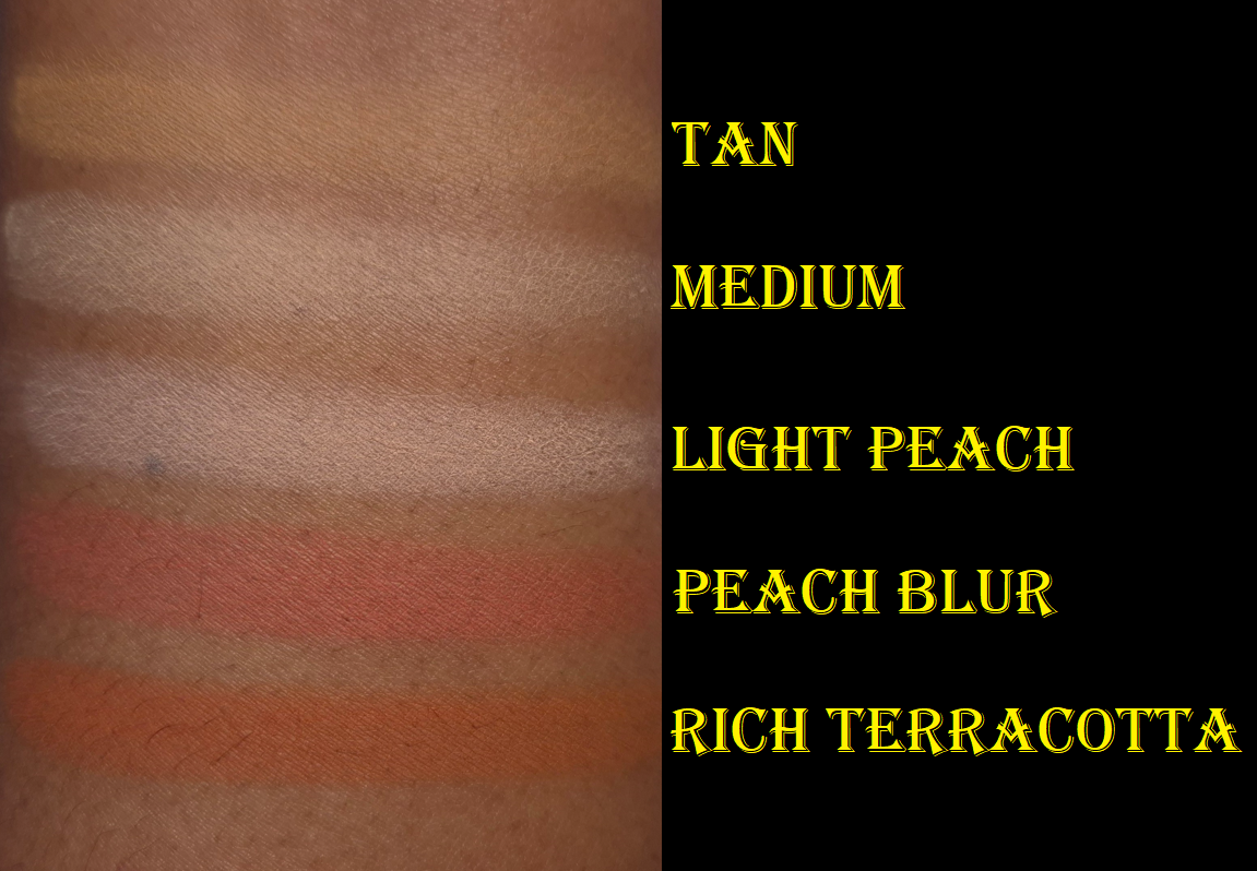
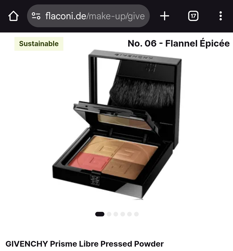
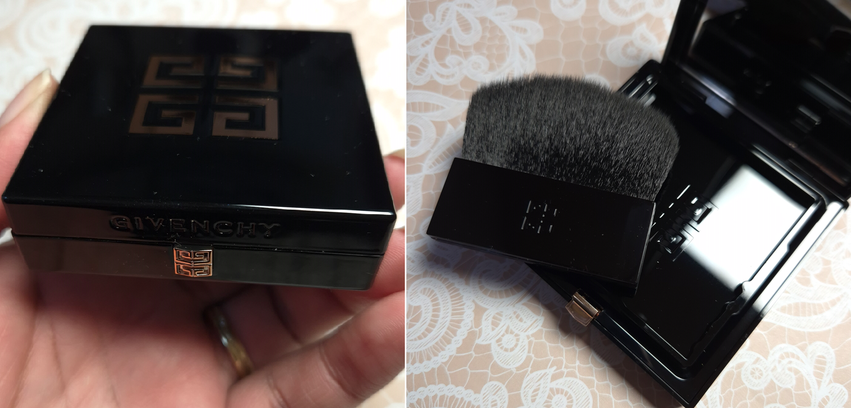
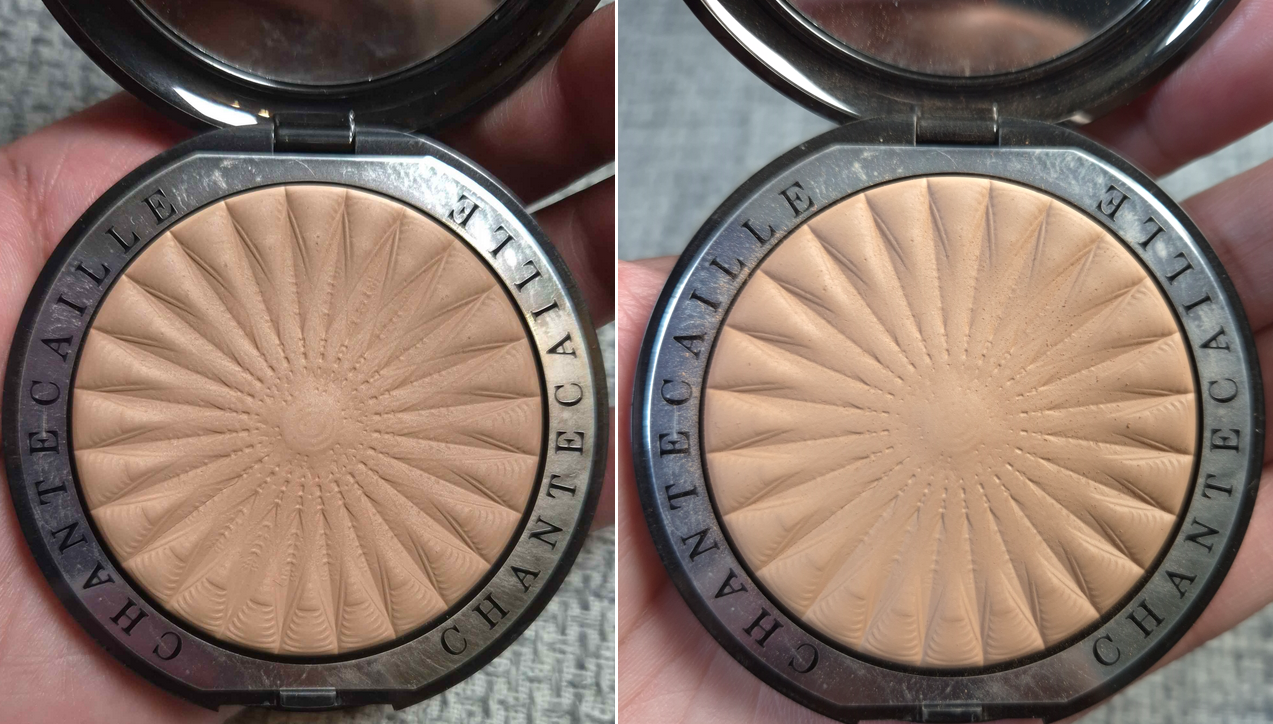
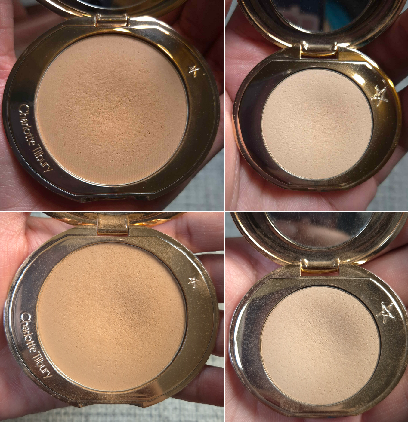
I didn’t do too badly in terms of adding new powders to my collection. I bought the Givenchy Prisme Libre Setting Powder, Guerlain Parure Diamond Powder, and ELF Halo Glow Pressed Powder. They’re good, but they were unnecessary purchases. They didn’t beat out my Dior Powder no Powder, nor the Charlotte Tilbury Airbrush Flawless Finish Powders (technically Guerlain tied in performance but I don’t use it as often because of the added fragrance). So, I shouldn’t have bought them.
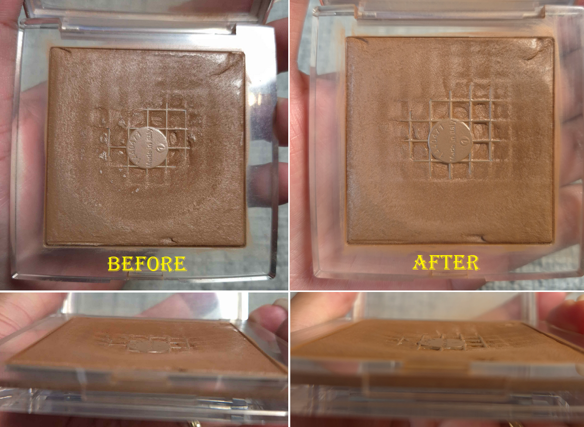
I also only used my Chantecaille Perfect Blur Finishing Powder in the month of June, so it looks largely unchanged. In general, during these six months I hardly powdered my face. So, I didn’t finish the Dior Powder No Powder as I expected. I even brought my lighter shade back with me from Florida, so I have that one again, plus the spare I bought before it was discontinued. I also got back my Laura Mercier and additional Hourglass baked powders too.
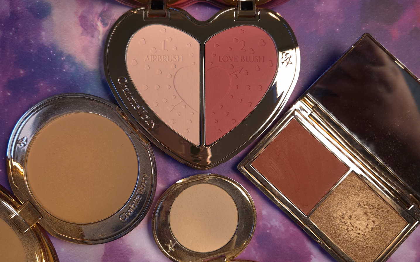
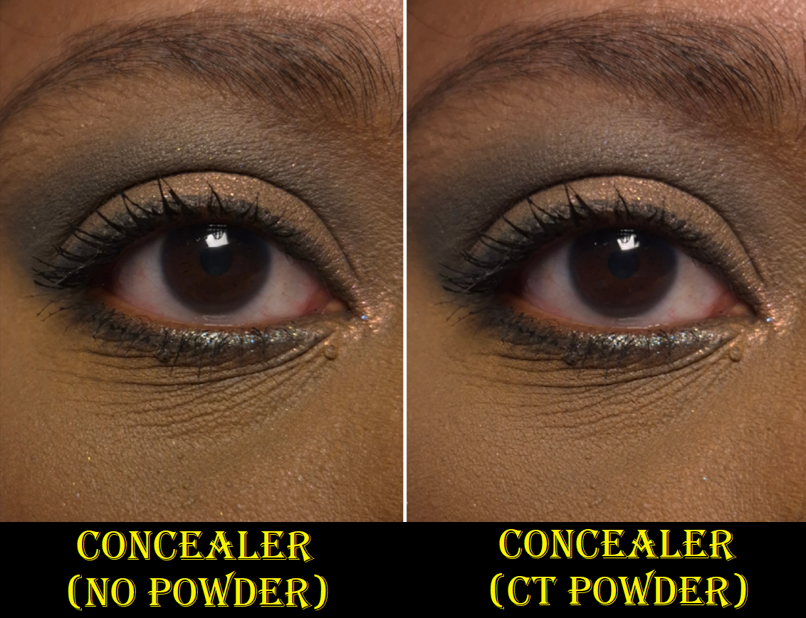
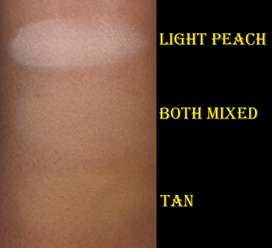
I continued to wear concealer, so the Charlotte Tilbury powders were used at the same rate that I expected. The only disrupting factor is that I bought the Soulmates duo, which had the light peach Charlotte Tilbury powder. So, I started to rotate between three of them in the last few months.
I no longer have an interest in buying new powders between the semi wasted new ones I bought already, older powders I have access to again, and the ones in this Project Pan.
Contour
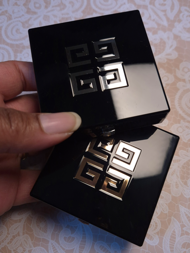
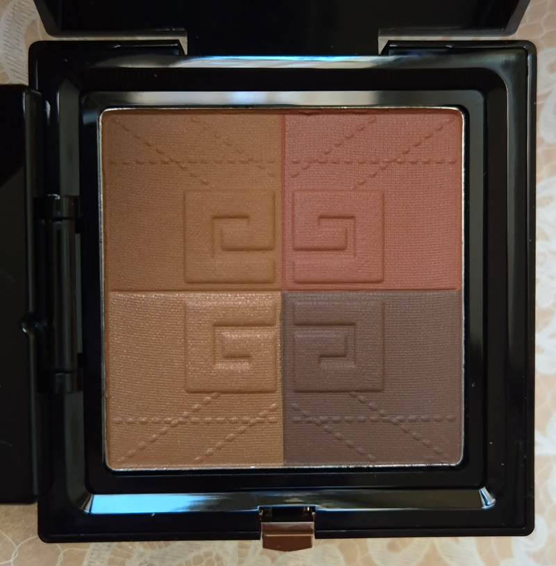
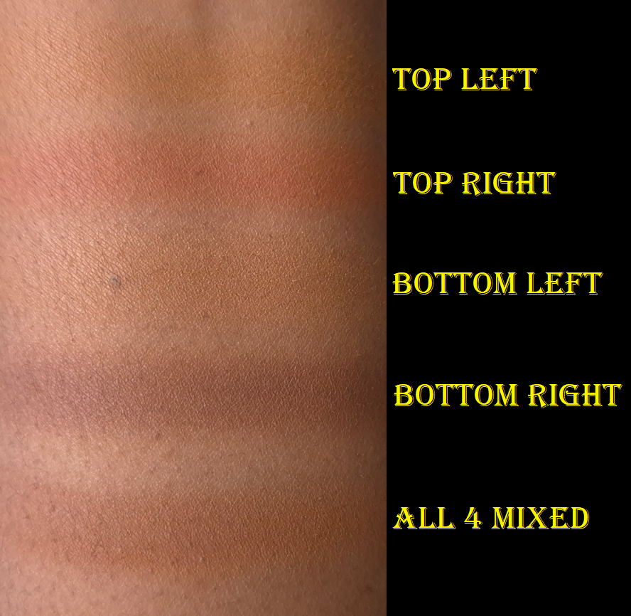
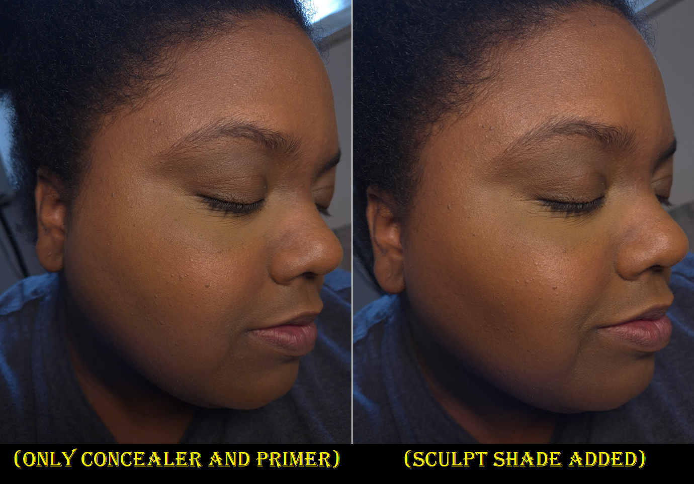
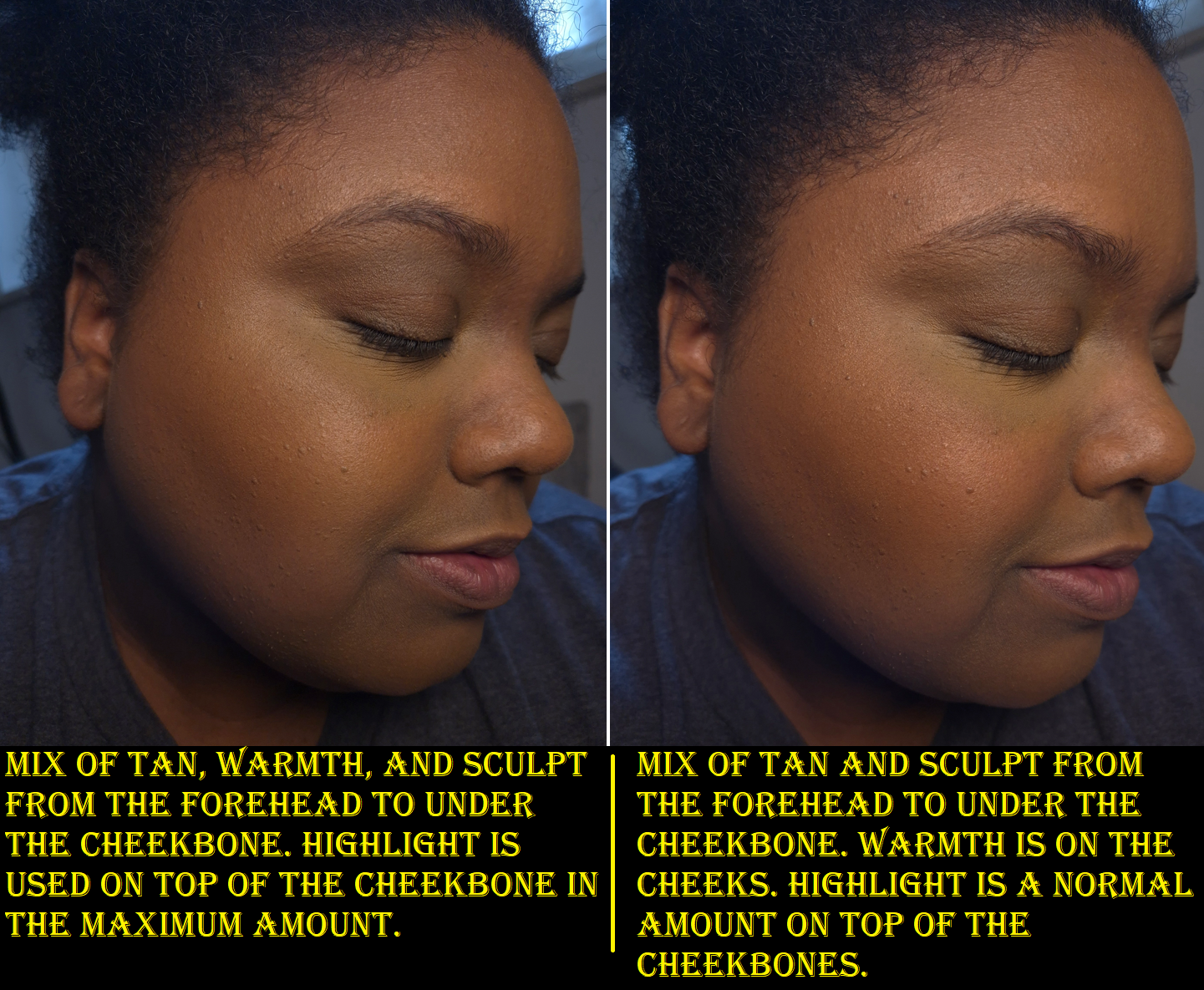
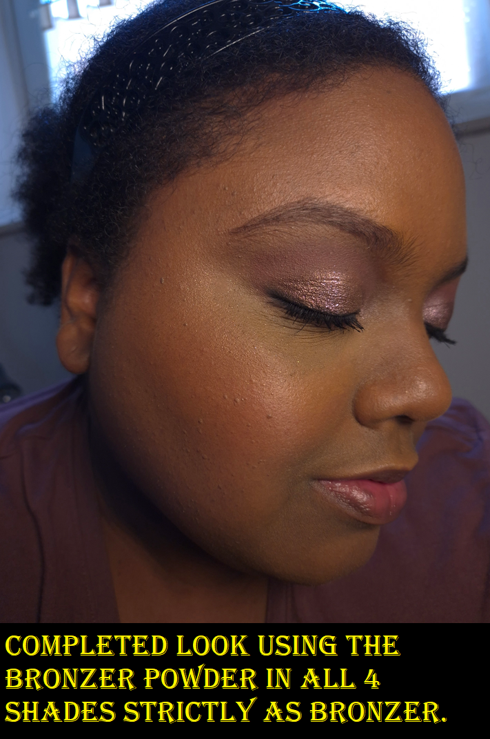
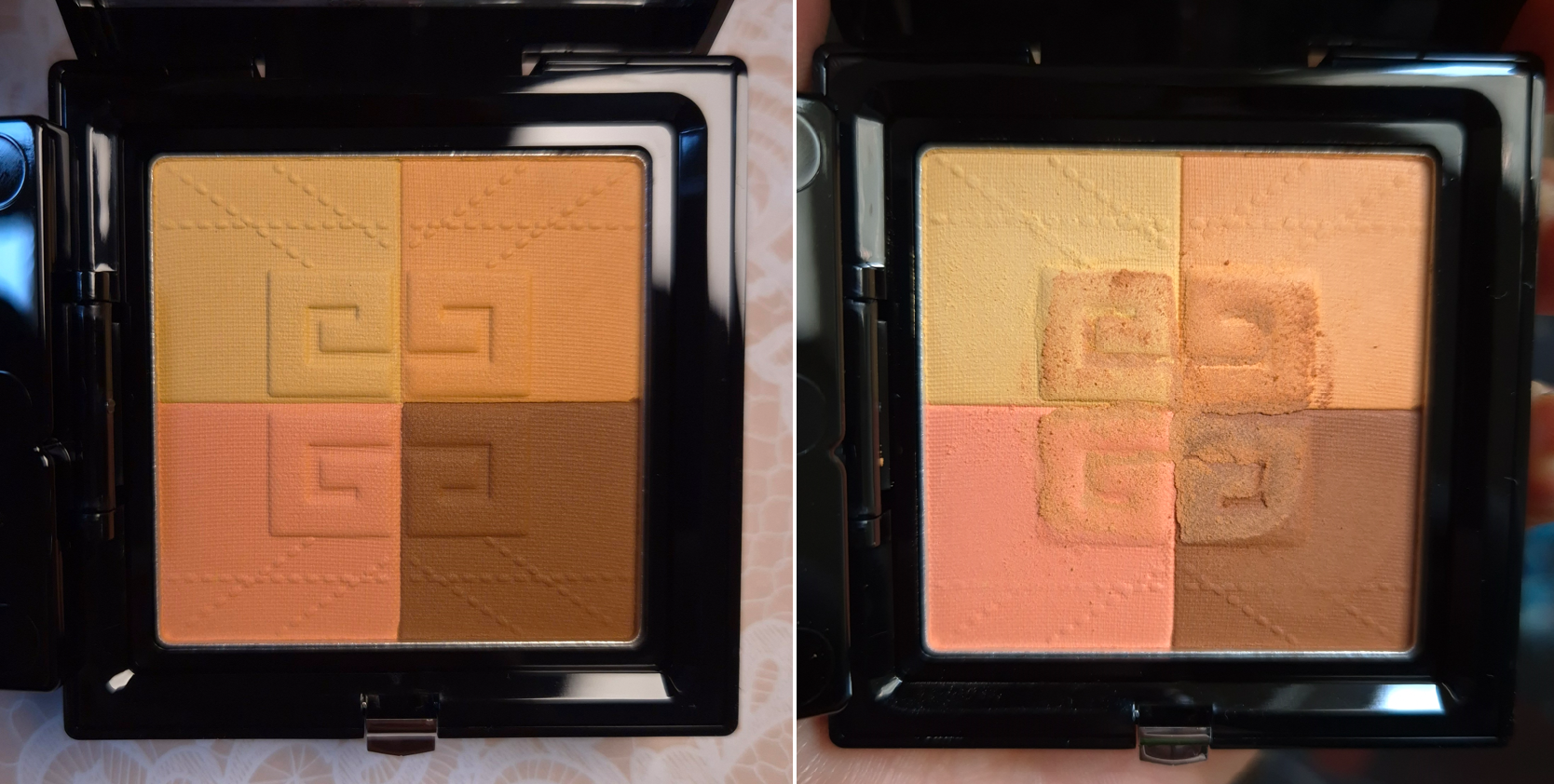
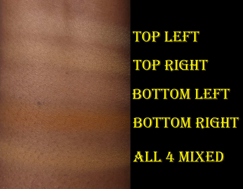
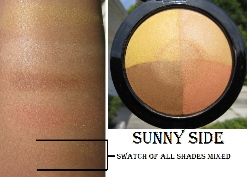
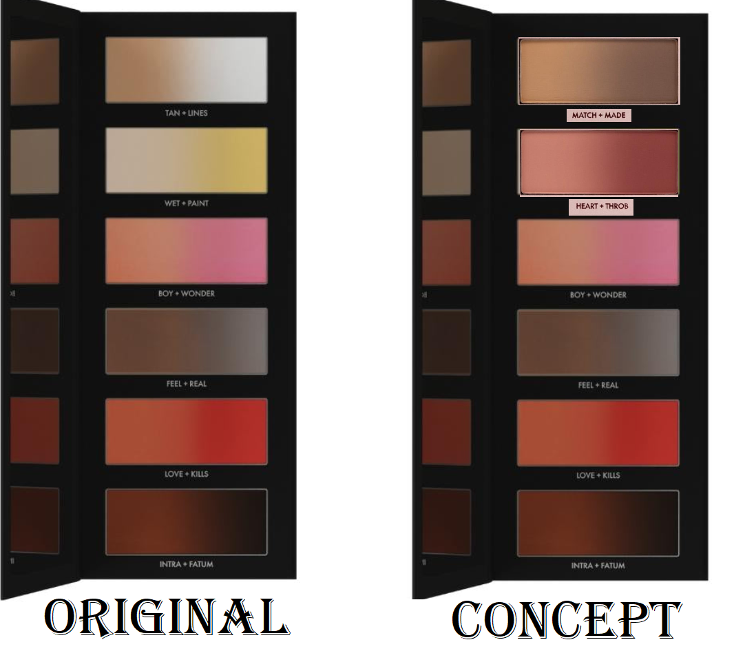
I technically have a new contour out of the Givenchy Prisme Libre Bronzing and Sculpting Powder that comprises of four different colors. However, there are no other new ones. I used my Hindash Beautopsy palette a handful of times, but I mostly just skipped contouring. I did some jaw and cheekbone brontouring at most, so new things weren’t of interest at this time purely because of my current habits and preferences. The only temptations were Charlotte Tilbury’s Contour Wand, Anastasia Beverly Hills Smooth Blur Contour Stick, and the Rare Beauty Soft Pinch Liquid Contour. I had doubts about getting a good shade from the first two (plus they’re creams), and I never use liquid ones. So, that was an additional reason to skip purchasing them.
I have access to Monochromance again, and I’m debating whether I want to risk depotting the pans so I can have my most used shades in Beautopsy and hopefully get even more use out of it due to the increased convenience.
I’m a bit reluctant to take that step though out of fear of messing them up without my Z-Potter, especially with the bottom being a bit thick. I’m not sure how well the heat would flow through. Even more reason for me to not want to potentially damage or ruin the powders is that I feel like any day now there should finally be a dip in these pans. I’ve used them a ton, but there’s so much product that they look new endlessly!
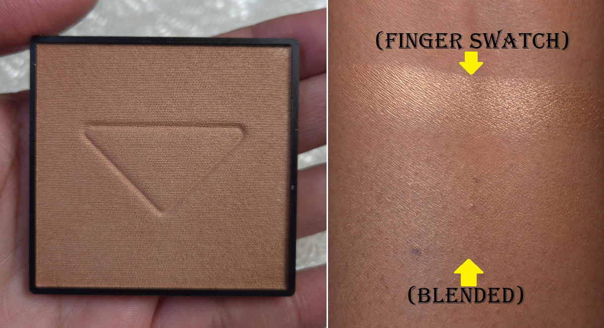
Bronzers
This is where things start to fall apart a bit!
I mentioned buying the Givenchy Prisme Libre Bronzing and Sculpting Powder already, but I also bought the Benefit Powder Bronzer, Benefit Hoola Wave Cream Bronzer, Laura Mercier Bronzing Duo, Fara Homidi Essential Bronzer (refill), Anastasia Beverly Hills Smooth Blur Bronzer, and Kess Berlin 365 Bronzer. Benefit’s was for nostalgia reasons as I like the quality, but it was just too red toned, so I stopped using it. The brand changed the deepest color a bit, so I was curious to see if I would like it enough to be able to start using it again. I kind of broke my no-buy with the Hoola Wave Cream Bronzer though. Oops!
I at least resisted getting the Dior Forever Nude Bronzers, reformulated Haus Labs Bronzers, and the Too Faced Chocolate Soleil Cream Stick. Chanel also expanded the range to one additional darker cream bronzer, but it’s not available at any German retailer (for me to get a discount), so I managed to avoid the purchase for that reason.
The point is that I have grown to love bronzers, so I am frequently tempted, especially if it comes from a brand that has always been hyped and they finally expand the range. It’s like when someone reaches the drinking age and goes overboard on the alcohol because they are so overeager to do what they couldn’t before. Choosing to skip on a purchase requires discipline, but being forced into missing out doesn’t allow one to build up that resistance. So, lifting the restriction without having built up defenses against it is hard.
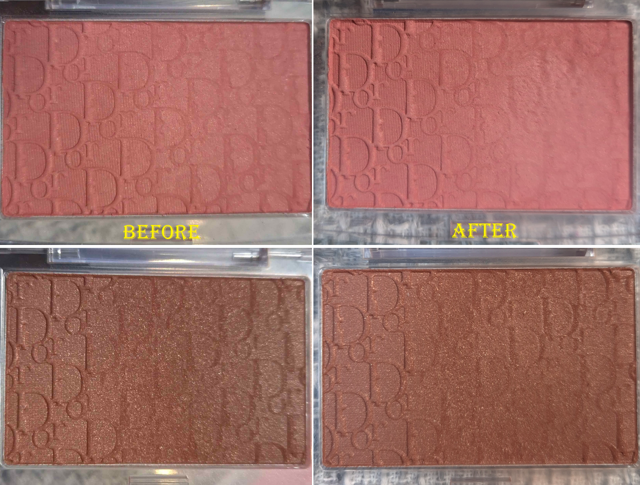
Because I had so many new bronzers to test, I only used my Charlotte Tilbury Cream Bronzer a few times. The Hermes Bronzer was used in-between testing, but not enough to bother showing progress photos. For that reason, I feel like I failed in this category.
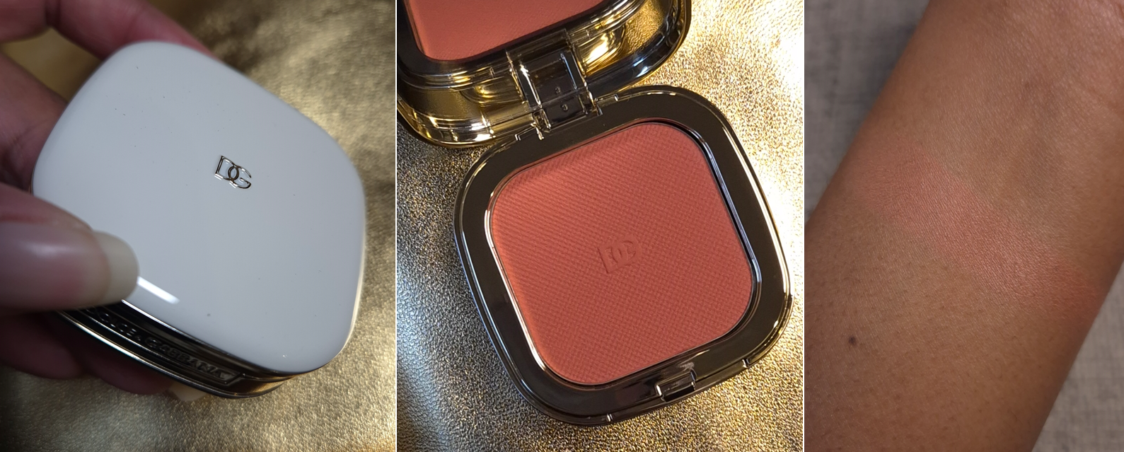
Blushes
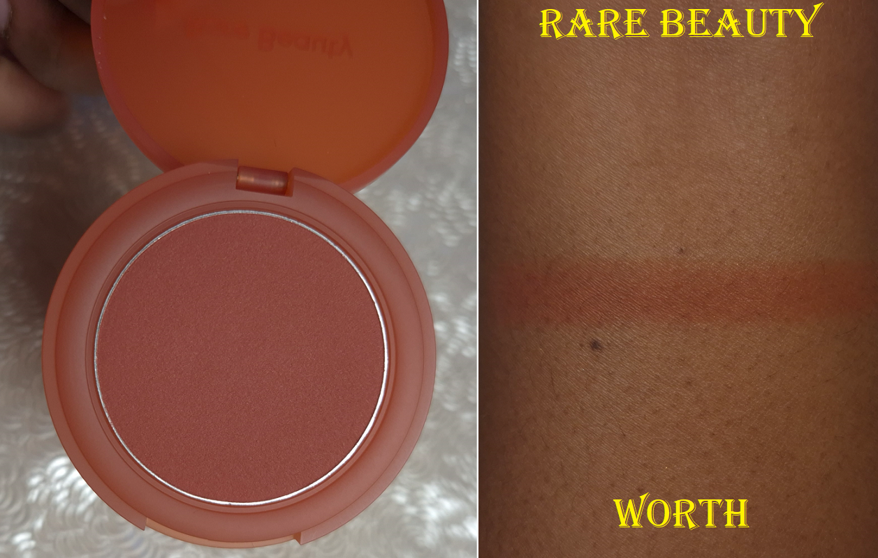
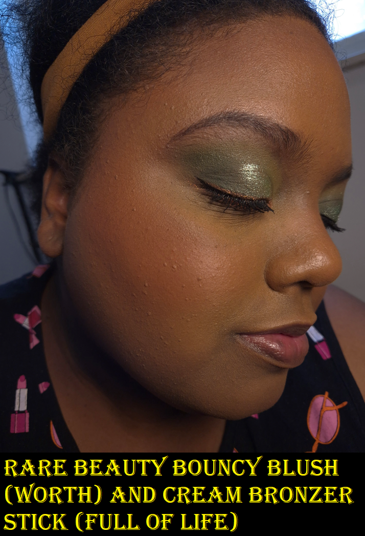
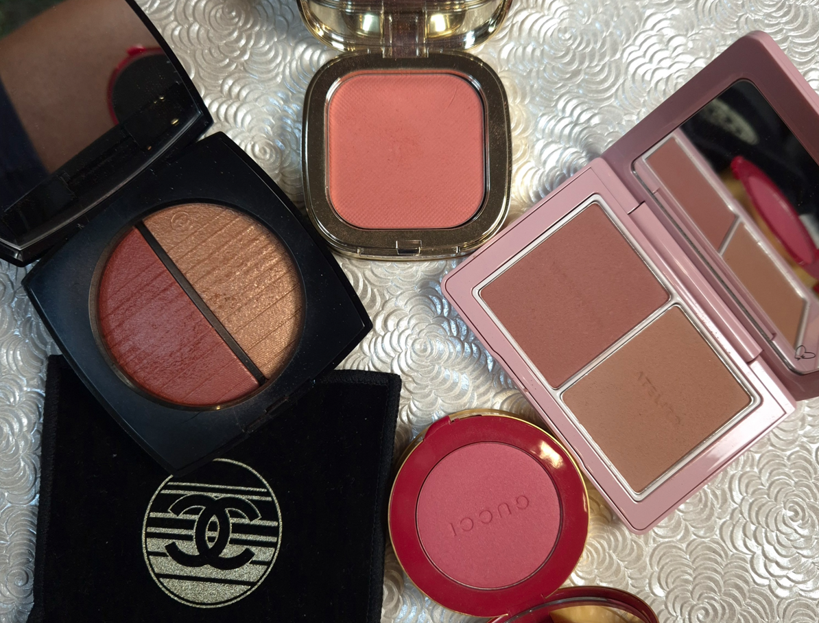
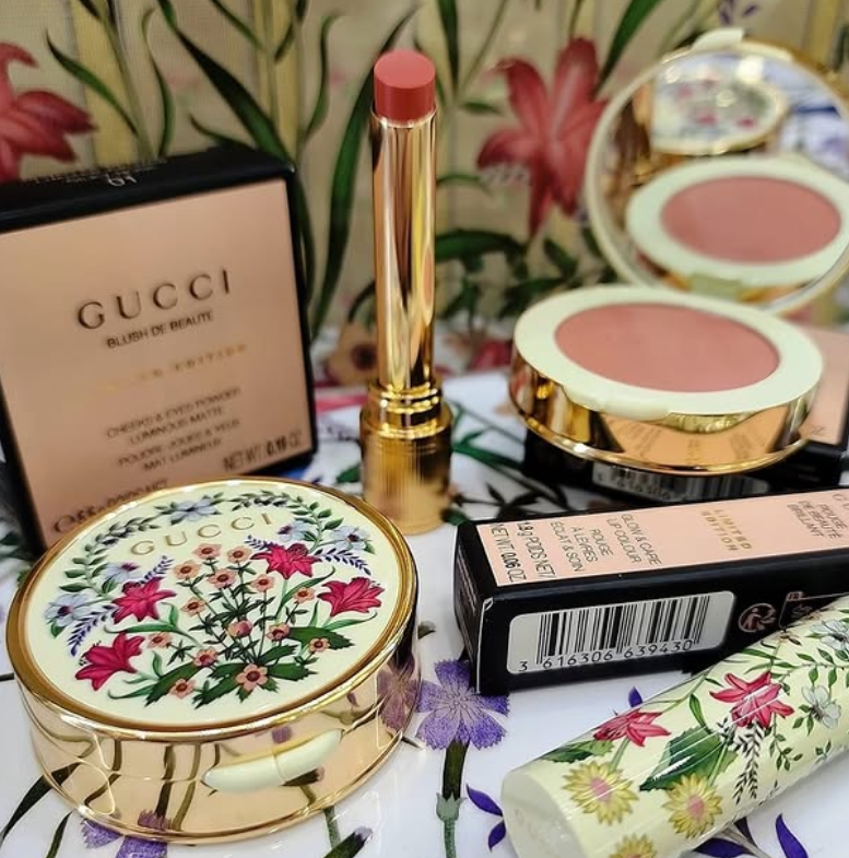
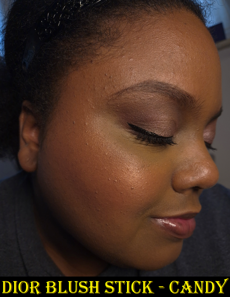
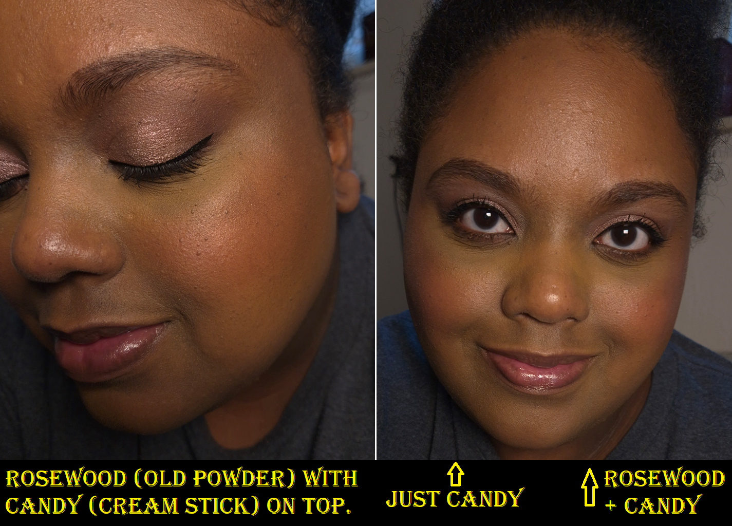
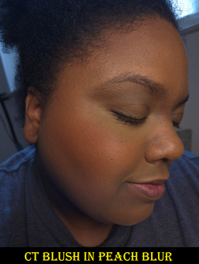
Well, I definitely broke my cream/liquid ban by buying three Huda Beauty Blush Filters, a Rare Beauty Soft Pinch Matte Blush, an Anastasia Beverly Hills Stick Blush, one Dior Rosy Glow Cream Blush Stick, and two Charlotte Tilbury Unreal Blush Healthy Glow Sticks. I’m not totally upset by it because of how long I resisted getting the Huda ones and the one from ABH.
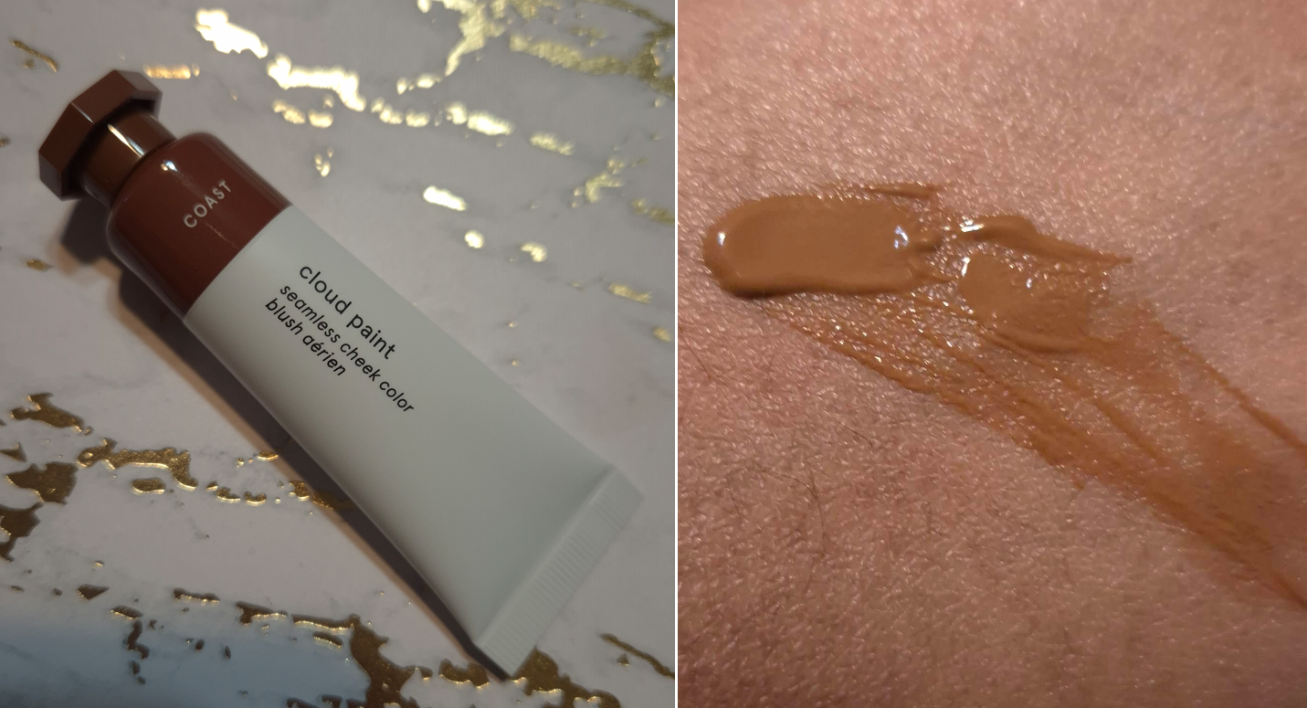
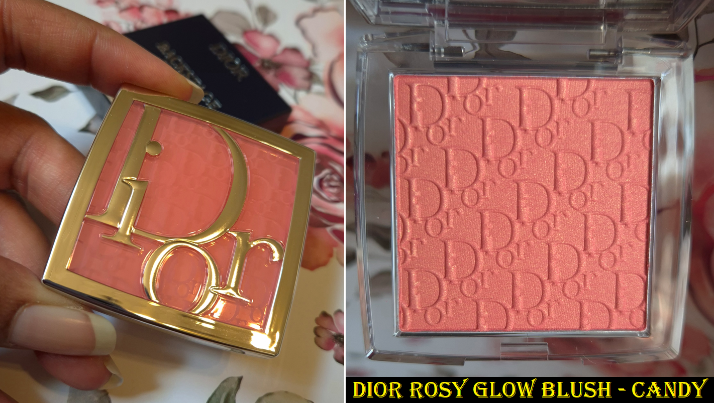
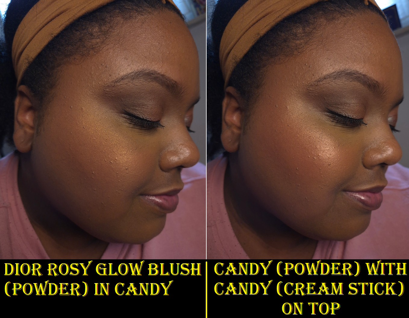
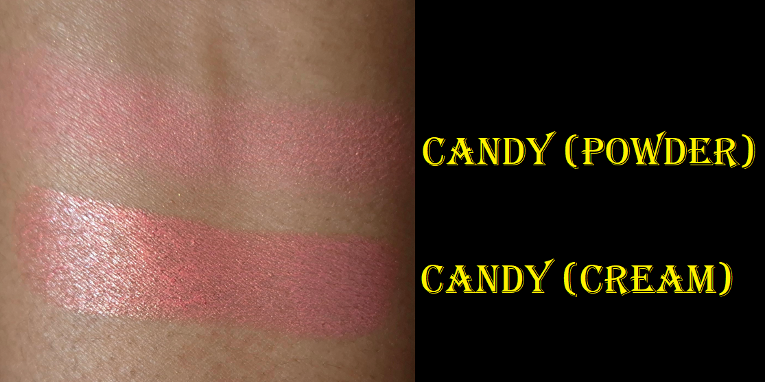
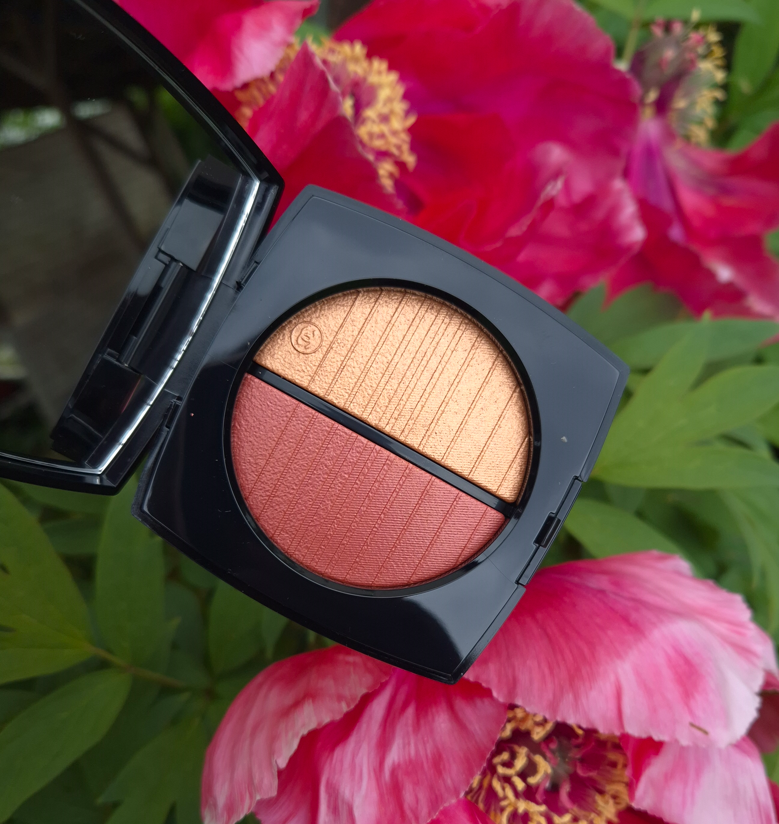
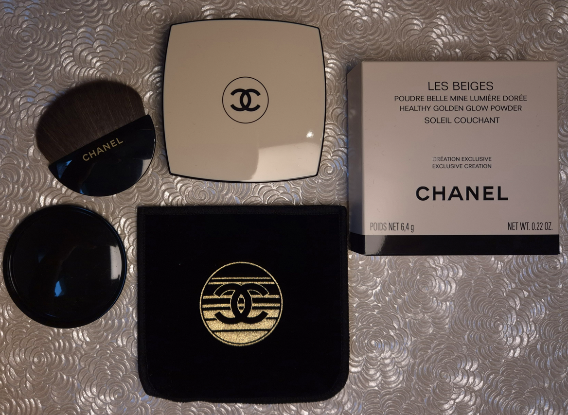
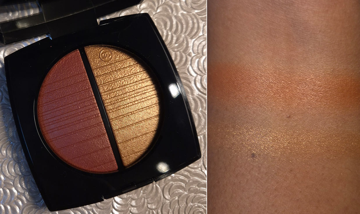
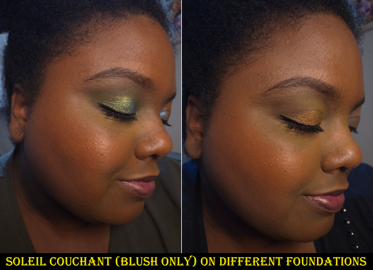
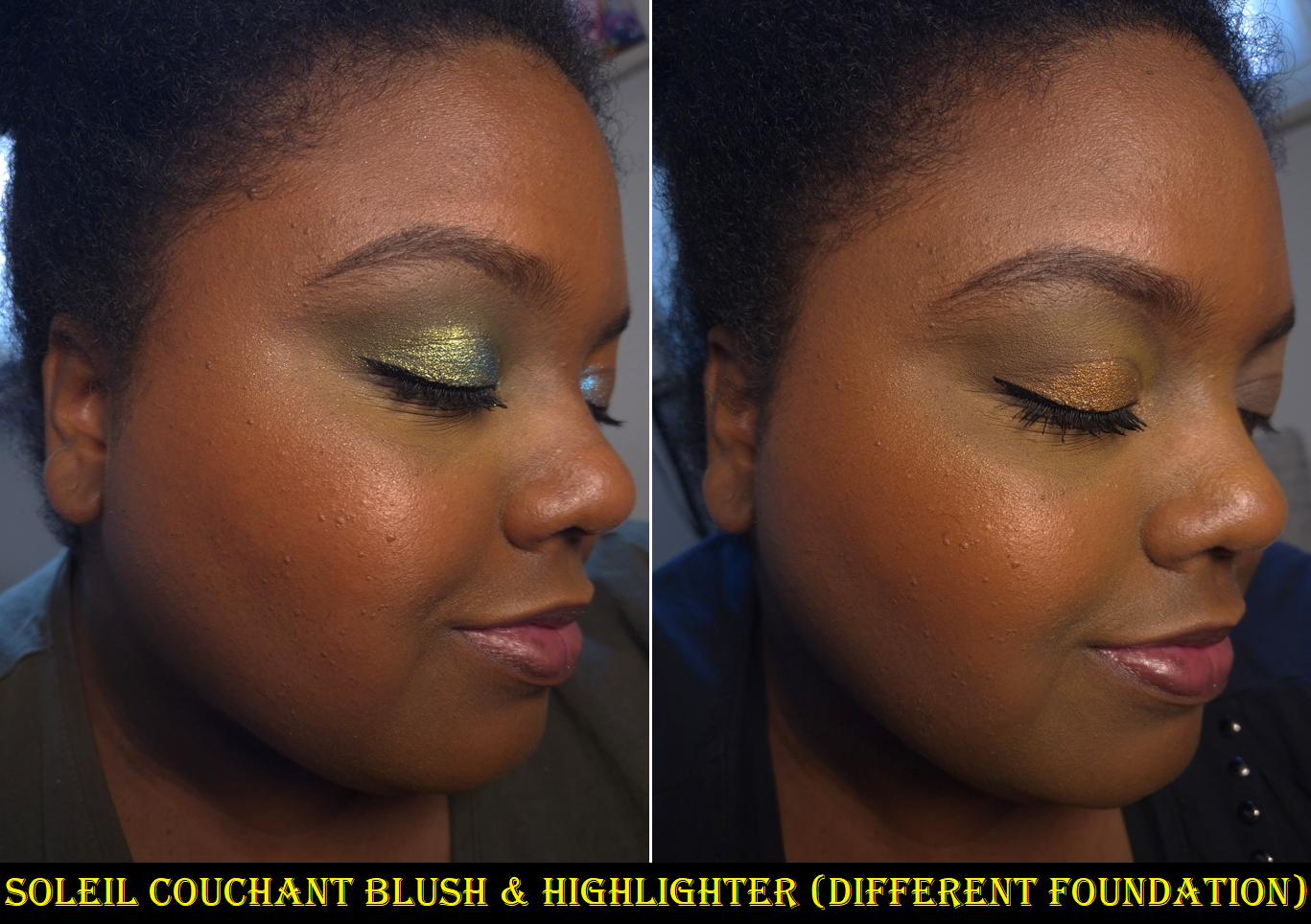
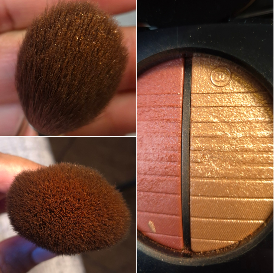
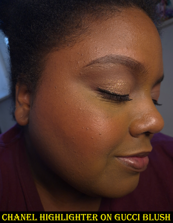
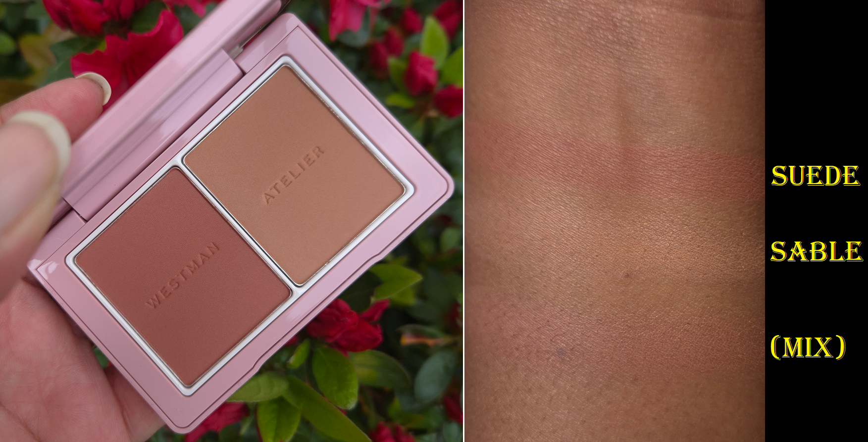
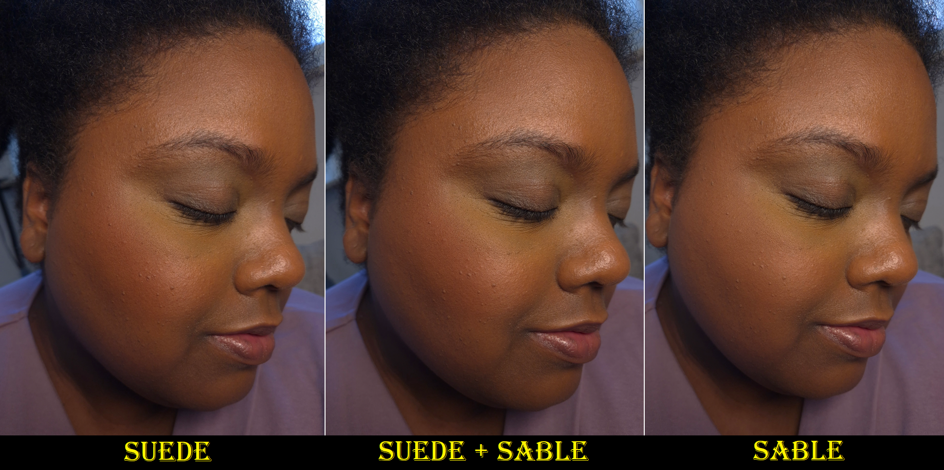
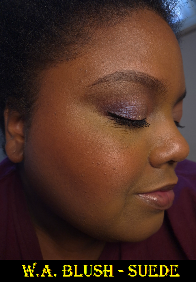
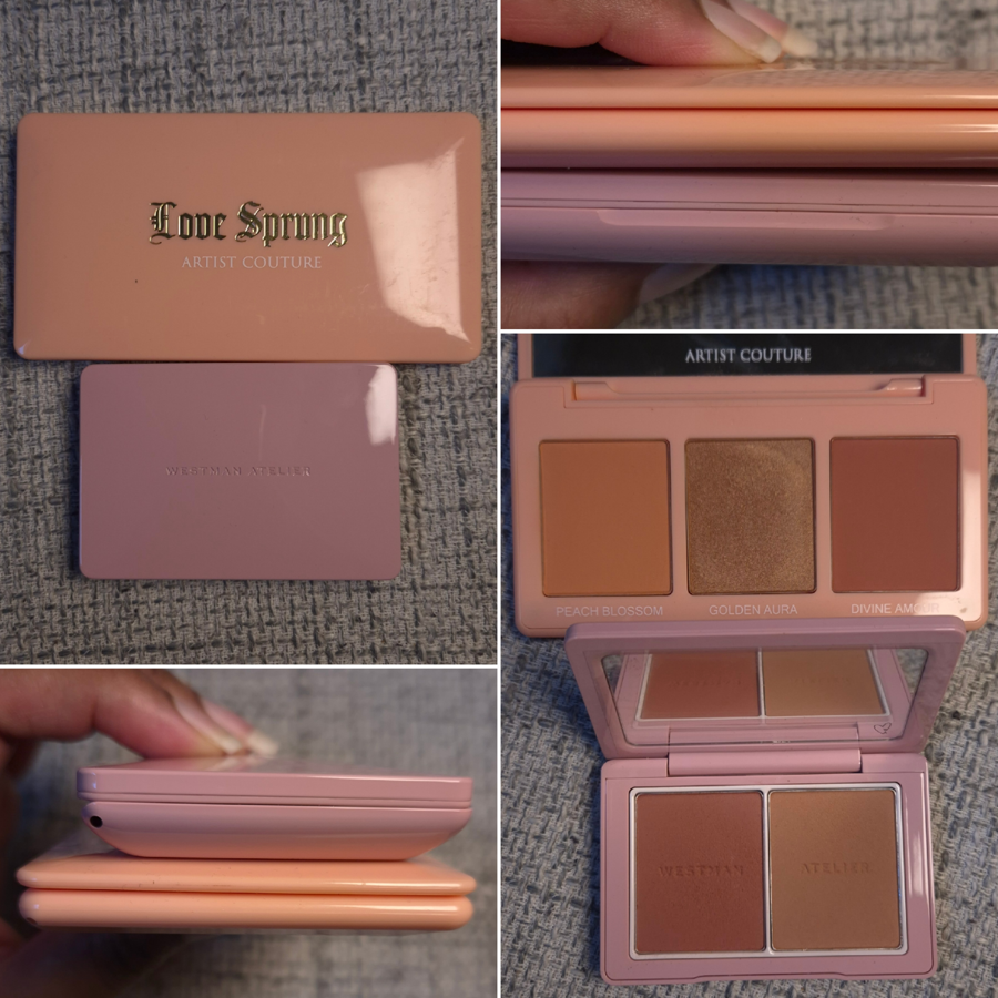
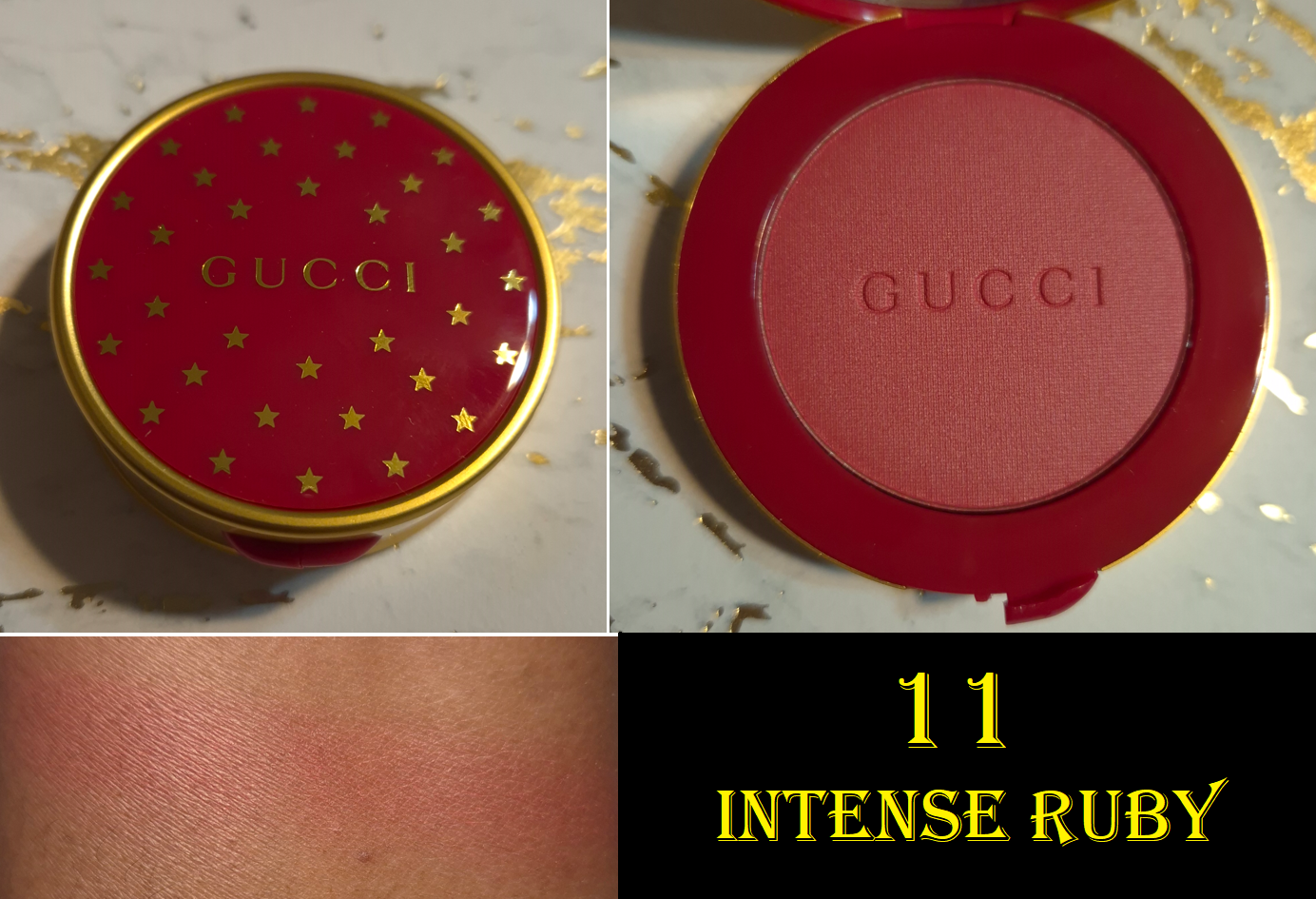
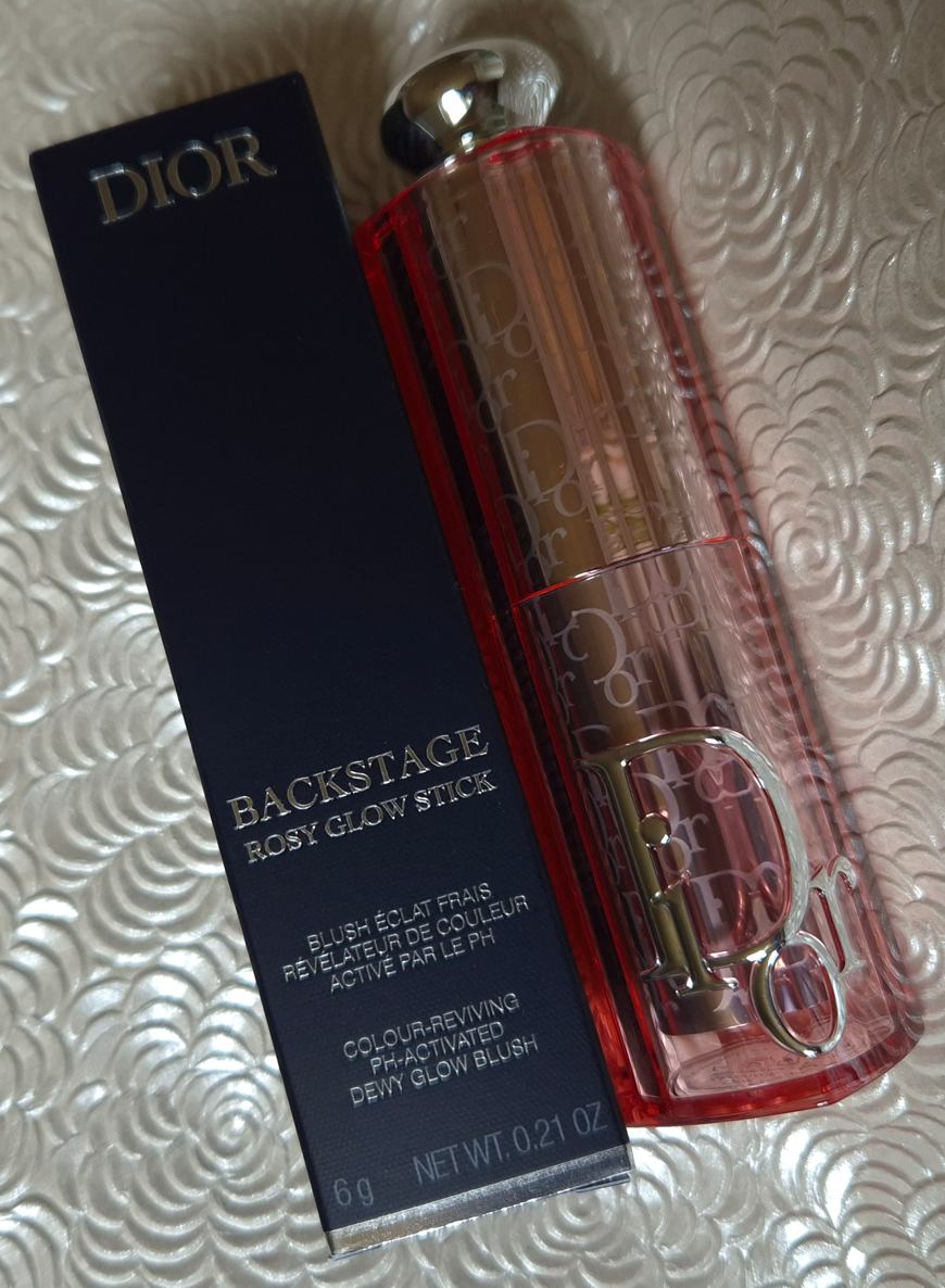
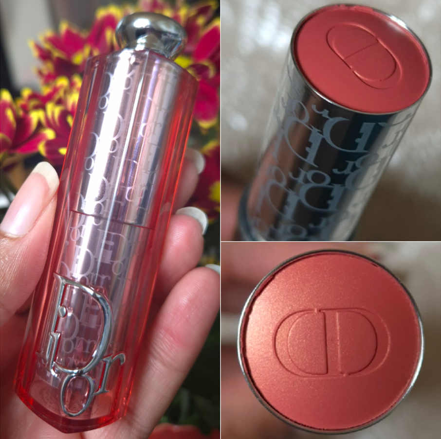
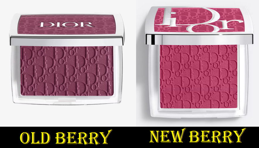
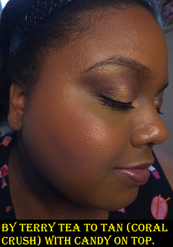
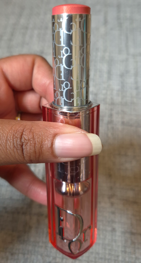
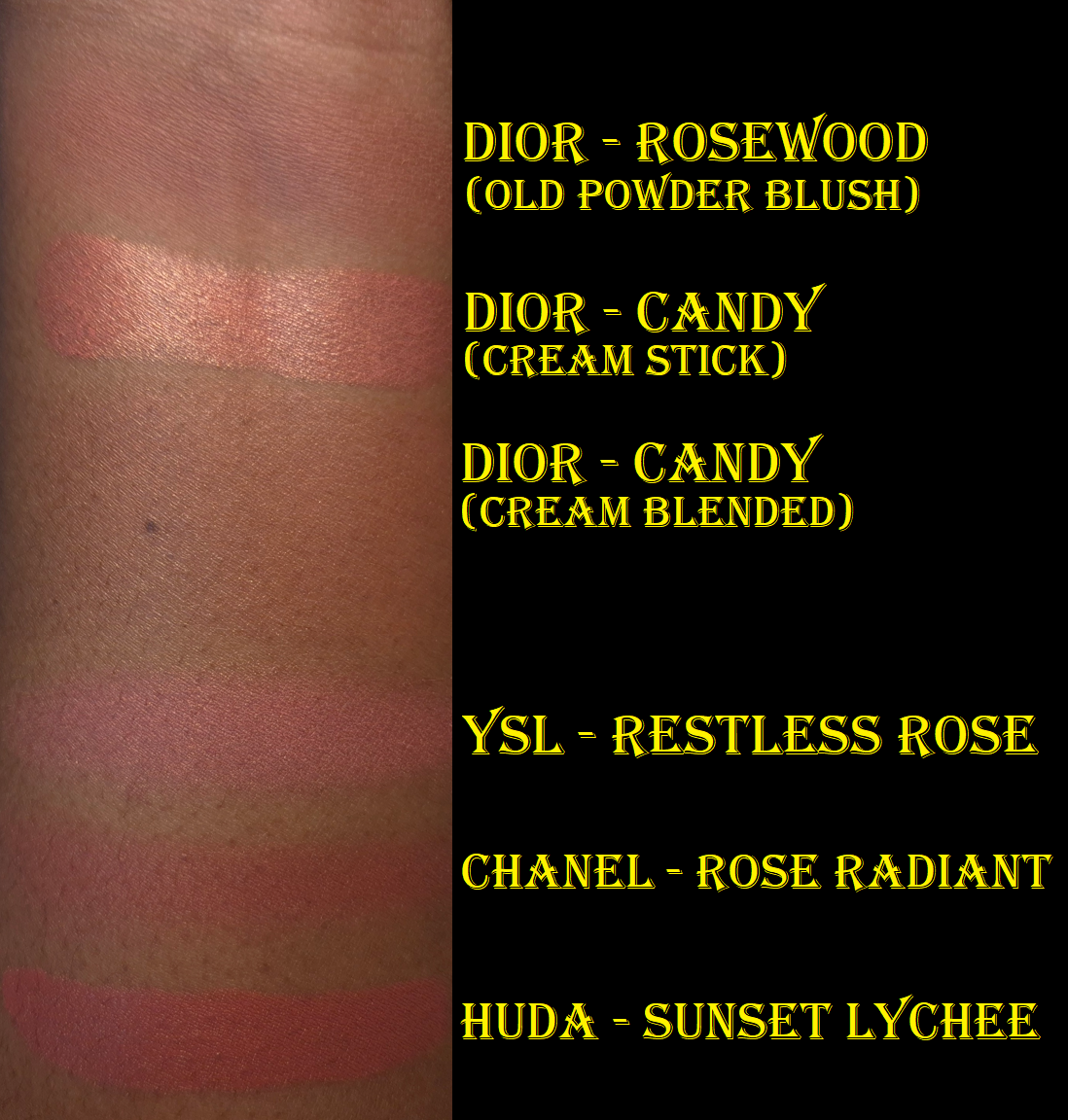
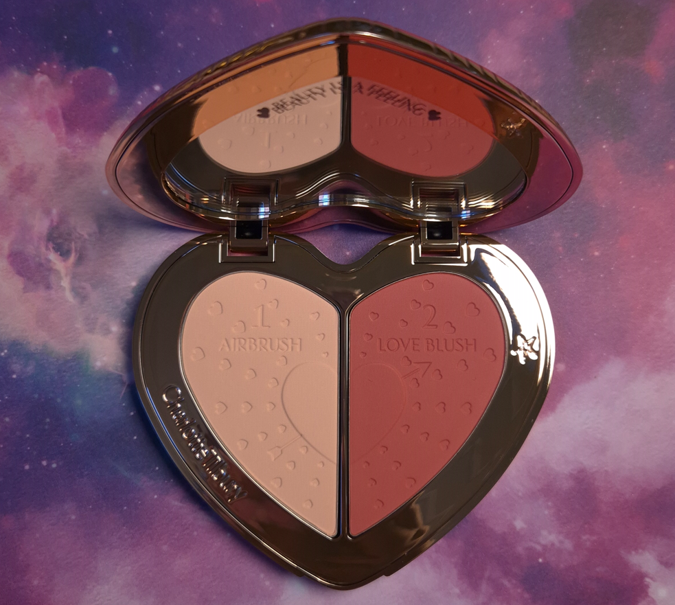
Where I feel like I went way overboard is buying 5 YSL Bold Blurring Blushes (and later sold Rose Haze on Mercari while on vacation). I also bought the Charlotte Tilbury Soulmates Face Palette that had a blush half of the duo. There was also the Westman Atelier Powder Blush Duo, Chanel Les Beiges Healthy Golden Glow Powder that had a blush and highlighter, a By Terry Tea to Tan Blush Powder, and two of the seven shades in the newest reformulation of Dior Rosy Glow Blush.
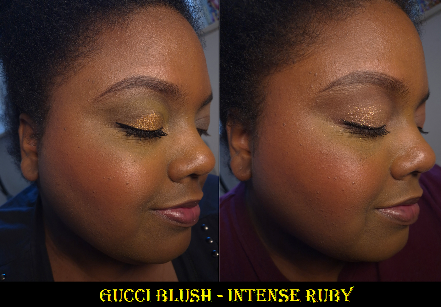
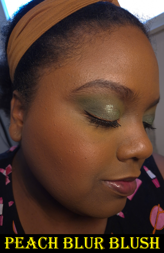
Considering my past history of buying an absurd number of blushes, this is actually a huge improvement for me. However, the goal during this time period was to get more uses out of what I already have. I had the same issue as the bronzers; having so many new blushes took time away from using anything older. I had 14 blushes in my Project Pan, and I used most of them at least 1-3 times, which means I have almost nothing to show in terms of progress pictures.
I was supposed to be using holy grail blushes to curb my blush buying appetite, but I don’t have one specific holy grail. There are so many that I love equally, and I think that’s why it’s harder for me to resist buying more because the chances are so high that I’m going to enjoy whatever else is new too. I am subconsciously still looking for one to be better than everything else. I also get the impulse to rotate through all of them rather than just sticking to using a few. I’m not sure how I can resolve this without figuring out where each blush ranks in my collection.
I’m not going to be too hard on myself over this category, but this was very much a fail.
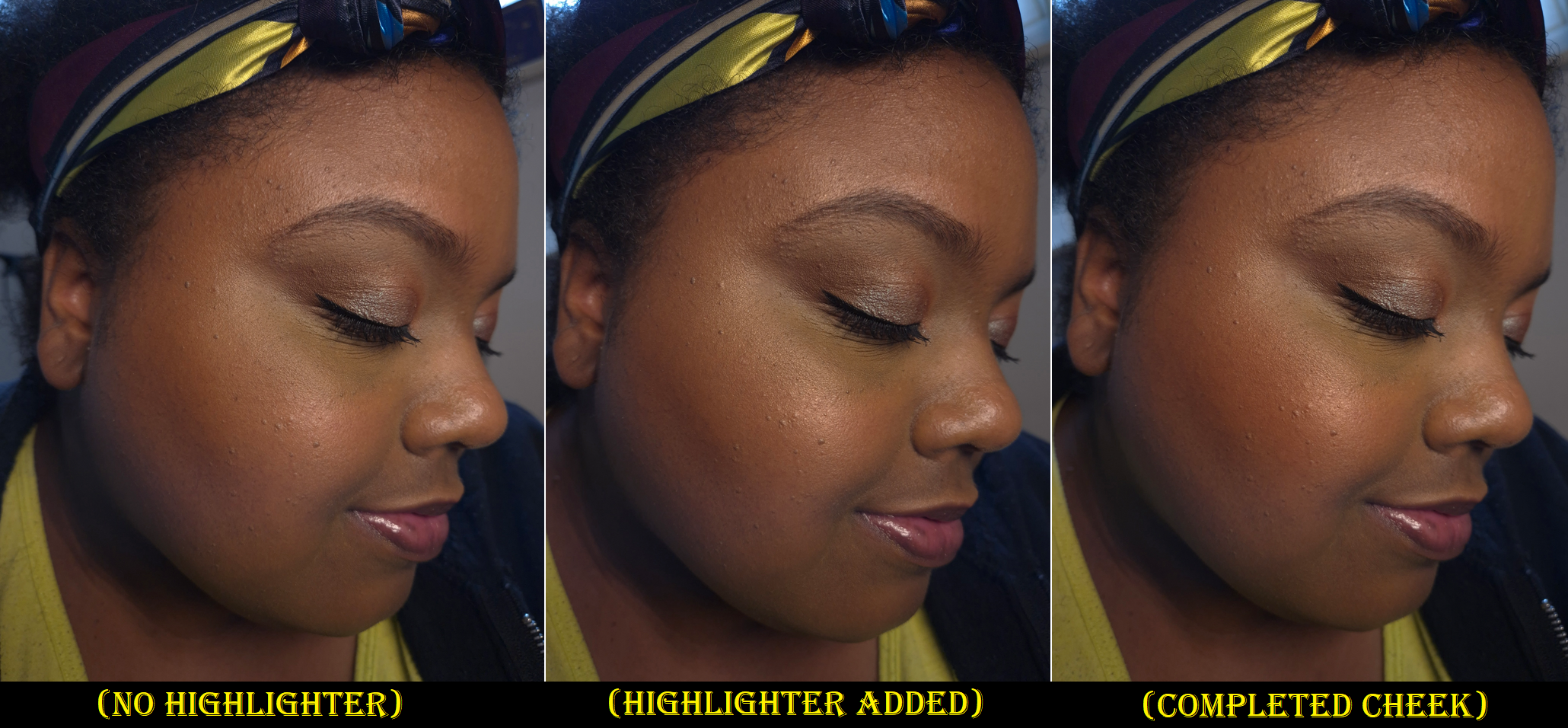
Highlighters
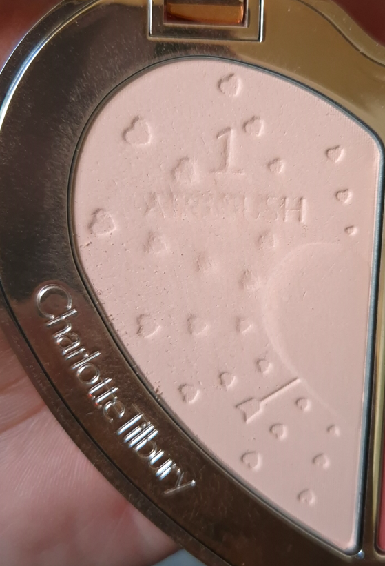
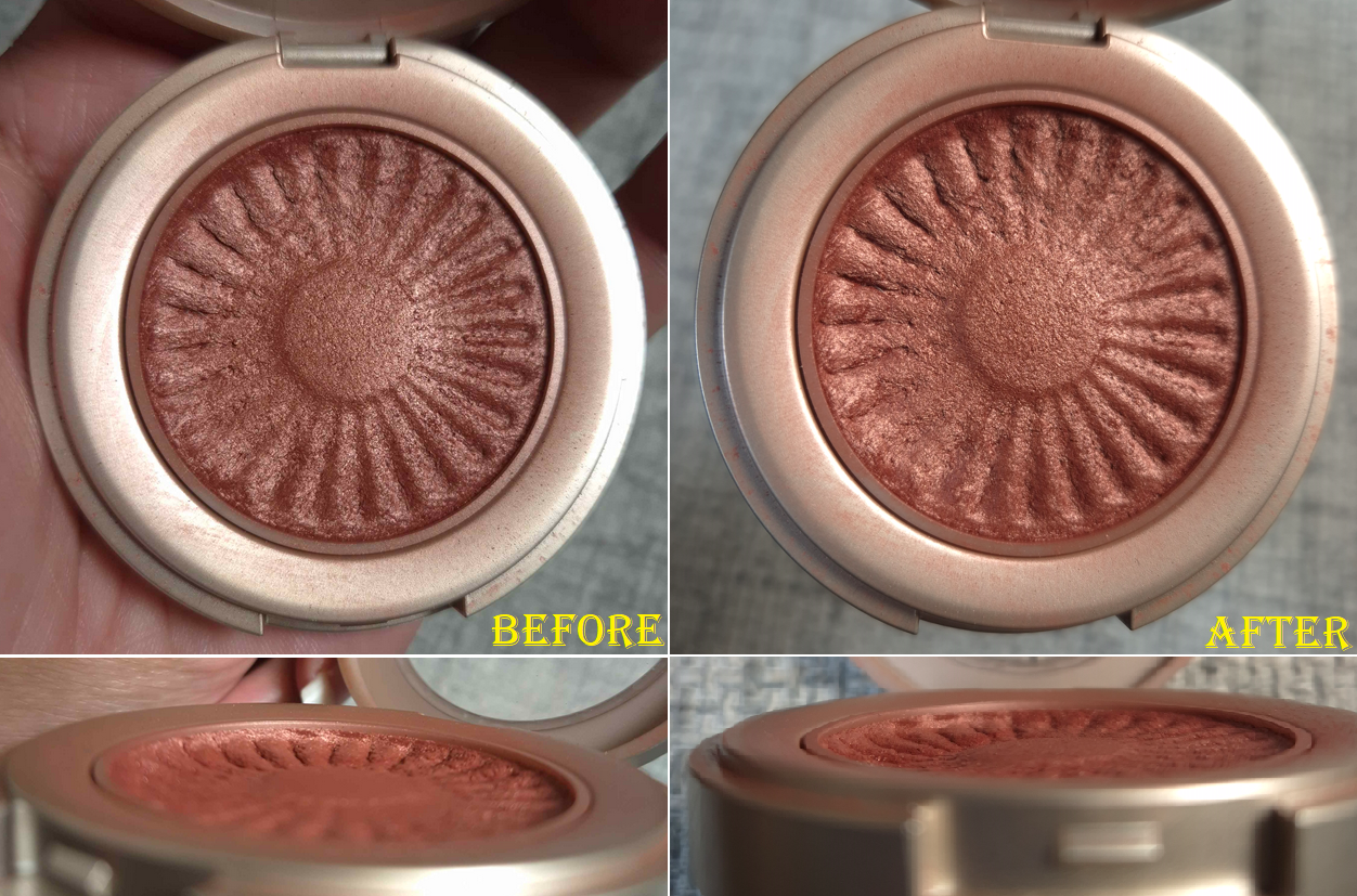
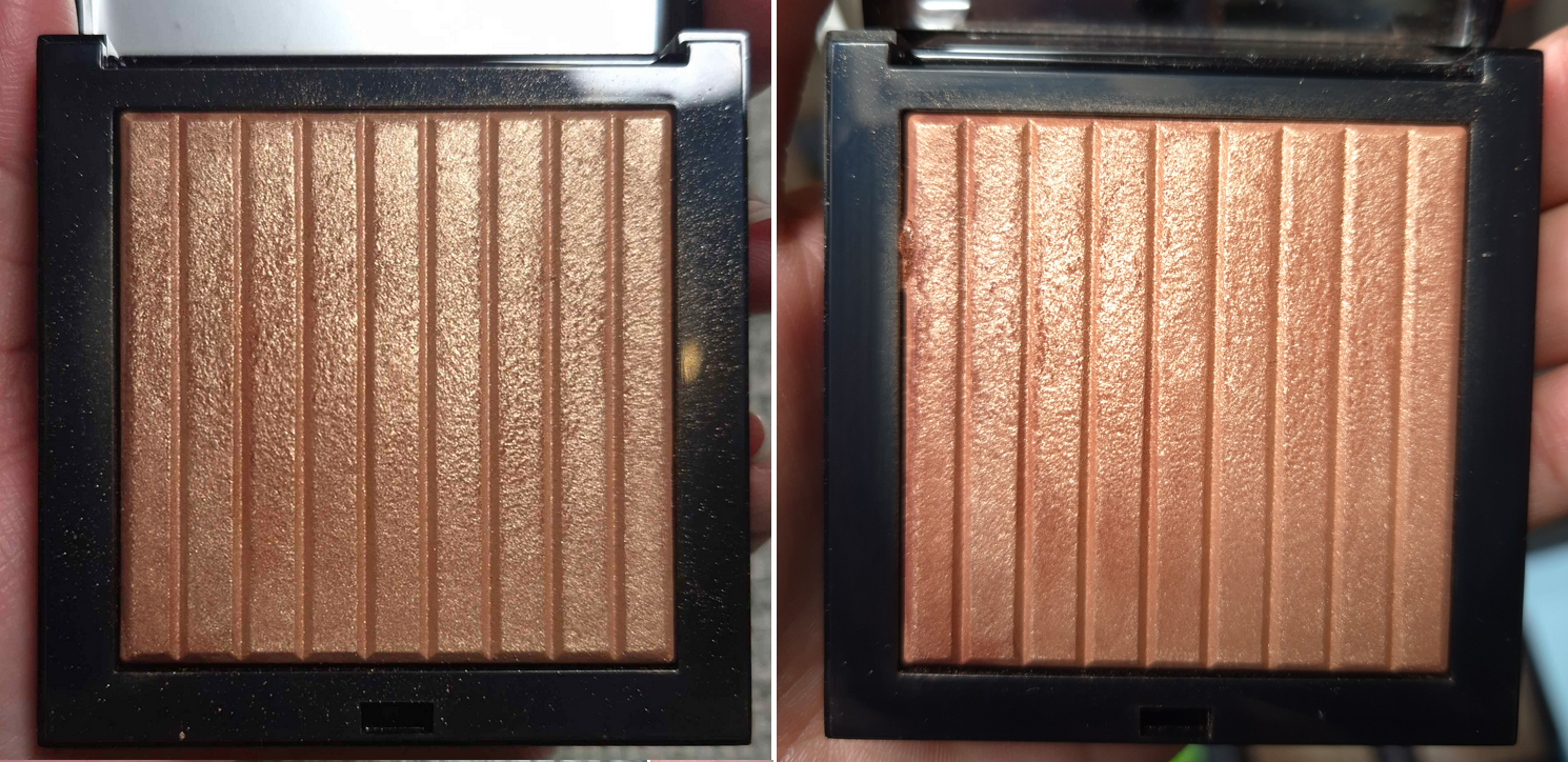
There is no point in showing the progress of my Charlotte Tilbury Foundation Stick that I use as highlighter, nor the Charlotte Tilbury Pillow Talk Multi-Glow Highlighter Palette because I used them less than a handful of times during the Project Pan process. In fact, I used way less highlighter than usual because I relied on my glowier blushes for shine. When I wasn’t testing the highlighters from duos or quads that I bought, I was wearing the Hindash Gradient Highlighter. So, that one has visible wear on the surface, but it looks hardly any different. Highlighters are probably the hardest for me to make a dent on in my collection.
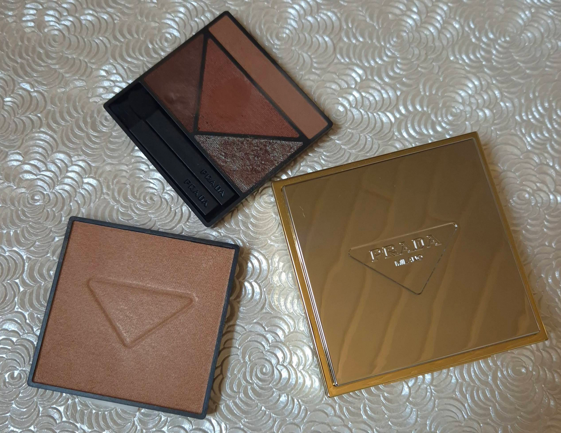
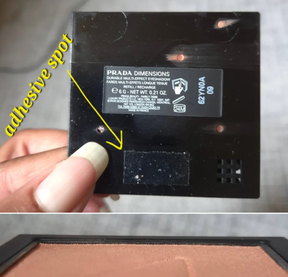
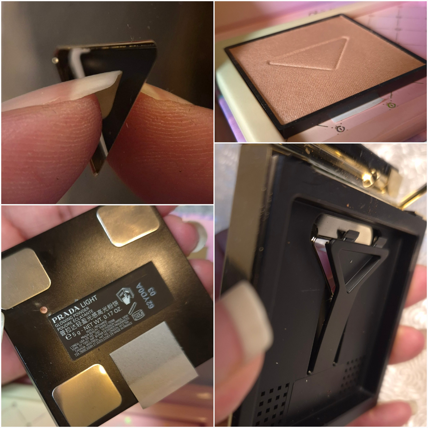
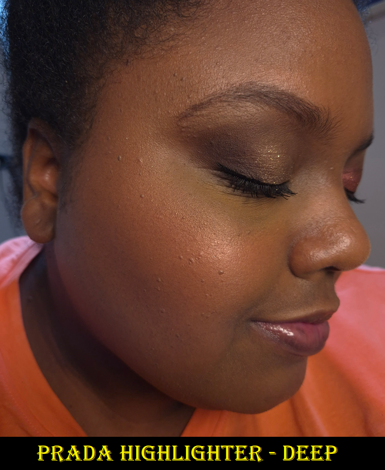
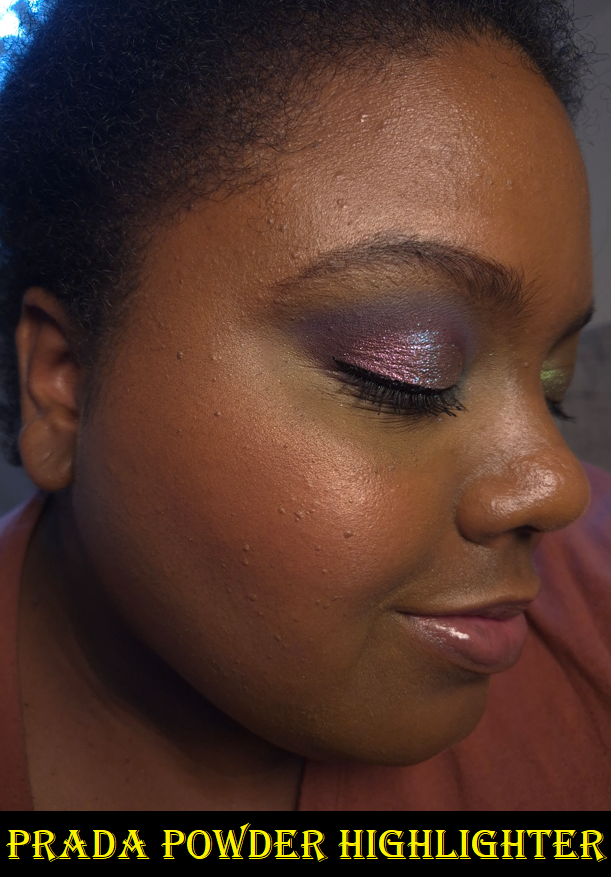
I barred myself from buying individual highlighters in any form, and almost succeeded until I succumbed to the Benefit Glow La La highlighter and the Prada Light Glowing Highlighter in June. I waited over five years for Benefit to make one darker than Tickle, so if it turned out to be amazing, I wouldn’t have chastised myself over it. As for Prada, it was at least less expensive because I only bought the refill.

I must also confess that I was extremely interested in the highlighters from Nars. Technically, if I had been able to make a custom Hourglass quad or palette, there would have been a highlighter or two in there as well.
It might be considered a loophole, but I don’t recall placing a limit on face palettes. I did get a Nars highlighter within the Medium Deep Hot Escapes palette. Despite all this, I’m going to give myself kudos anyway. In addition, I am more committed than ever to let the Prada highlighter be my last highlighter purchase for at least an additional year, or perhaps even forever. The only temptation I could see going forward is if Pat Mcgrath releases a deeper shade in the Ultra Glow Divine Rose Highlighter formula or a limited edition launch with packaging that I want and the makeup inside happens to be a highlighter.
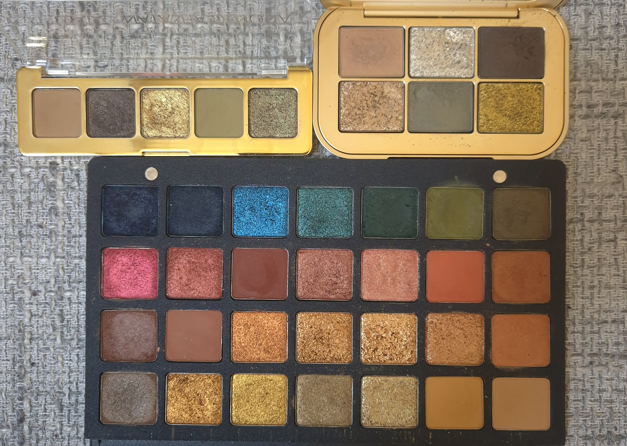
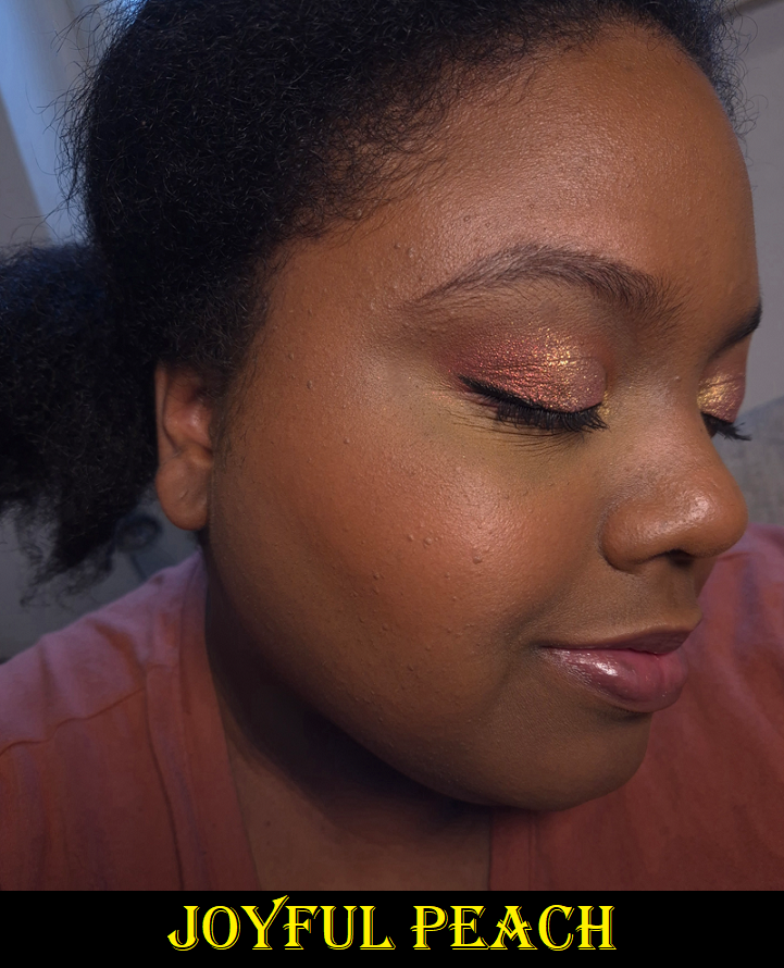
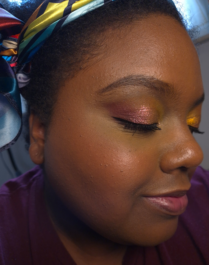
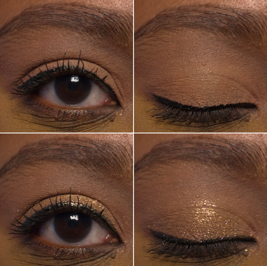
Eyeshadows
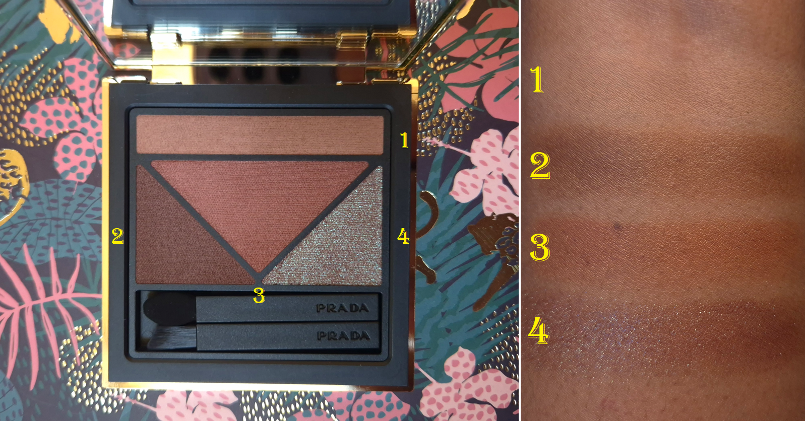
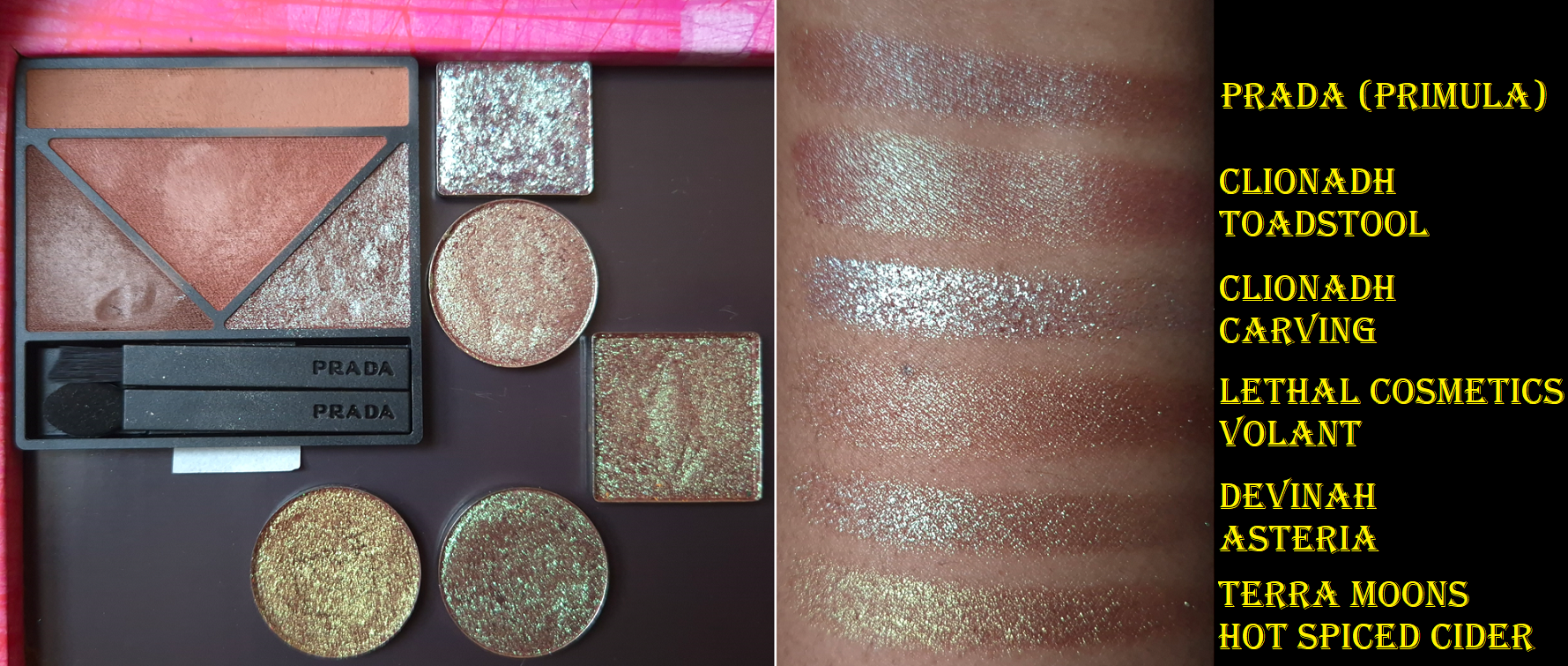
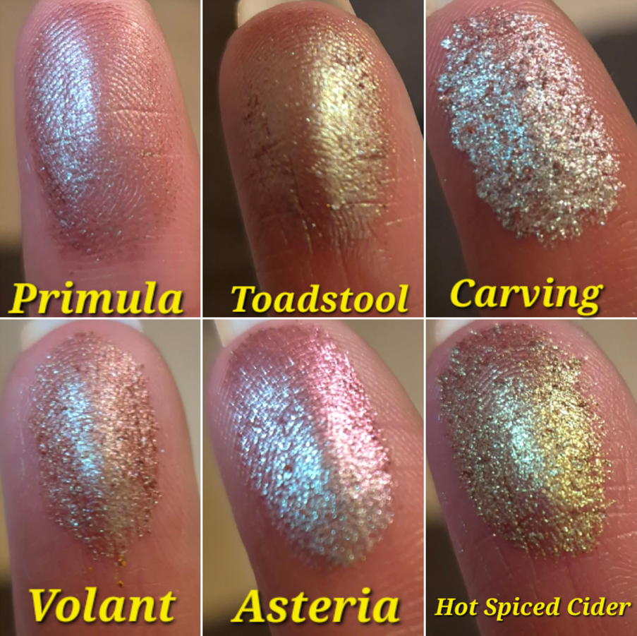
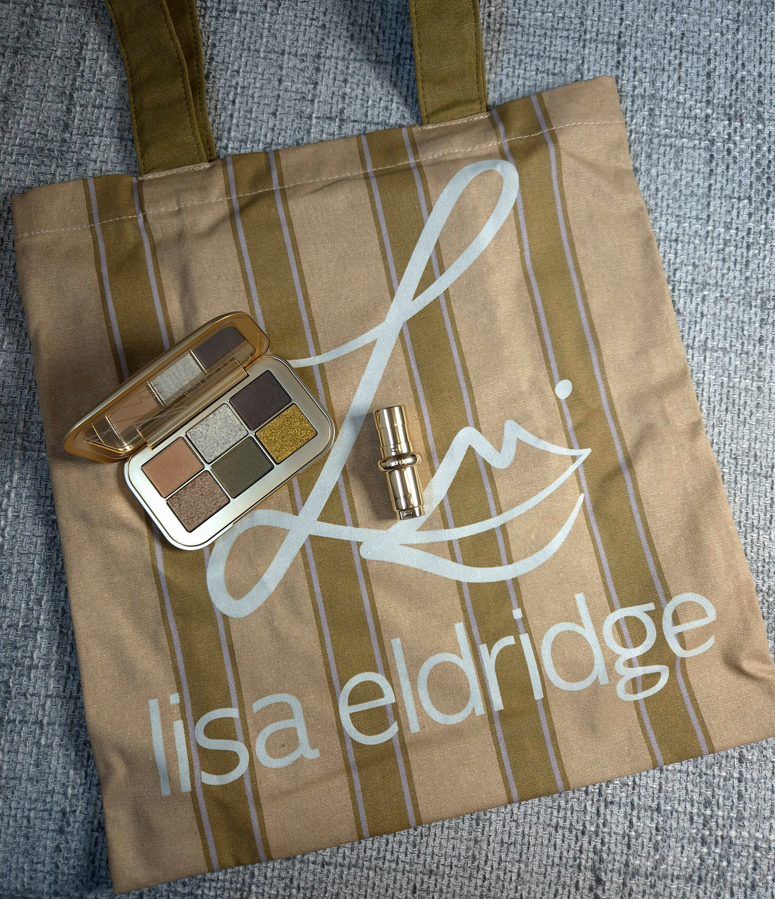
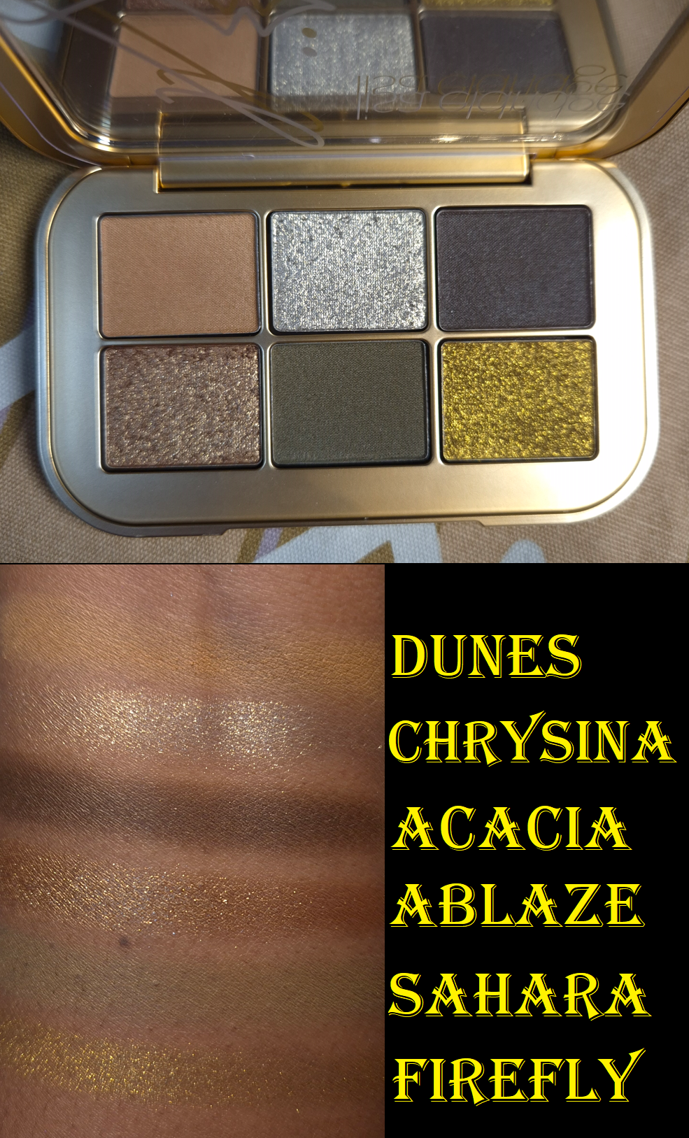
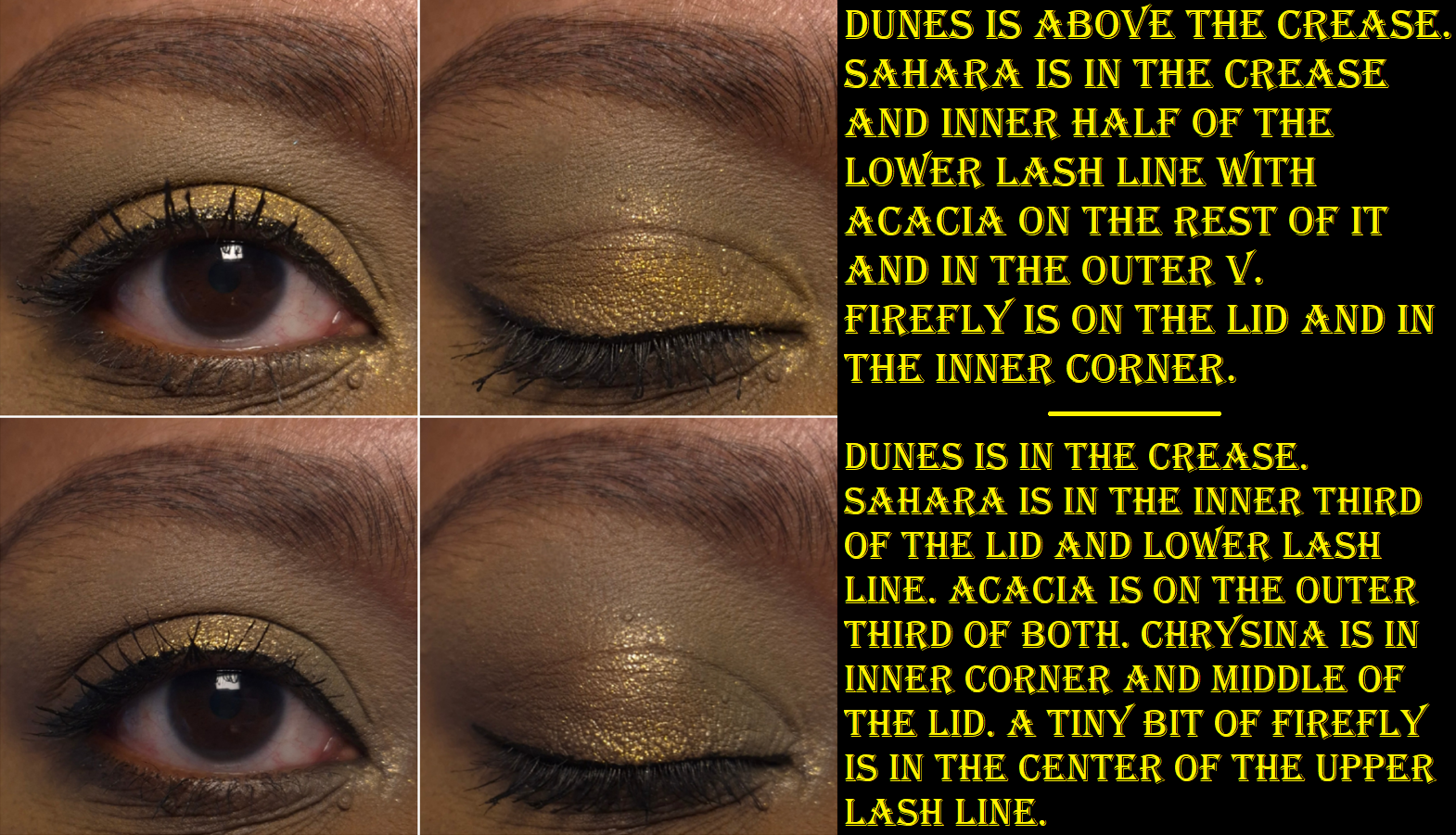
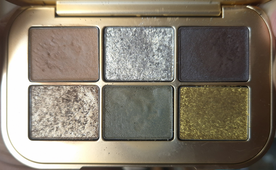
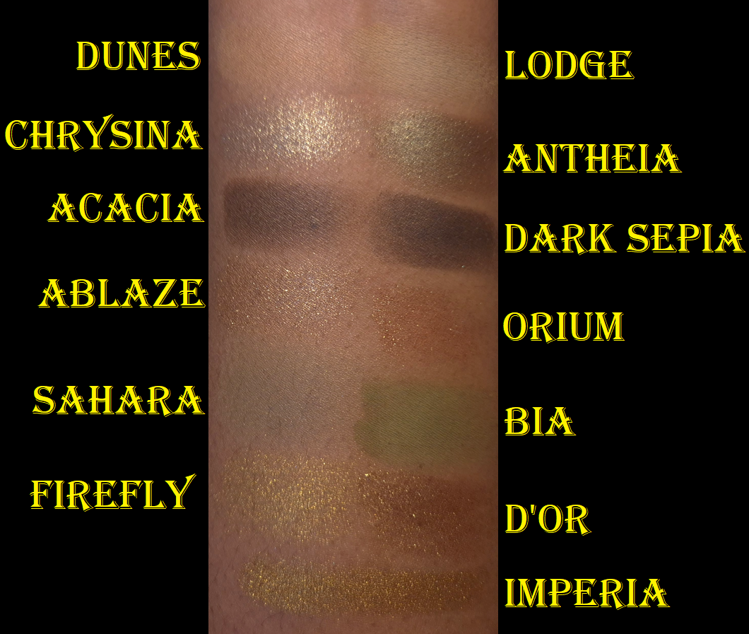
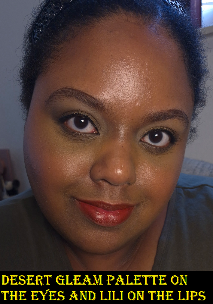
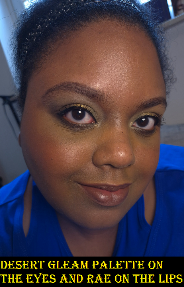
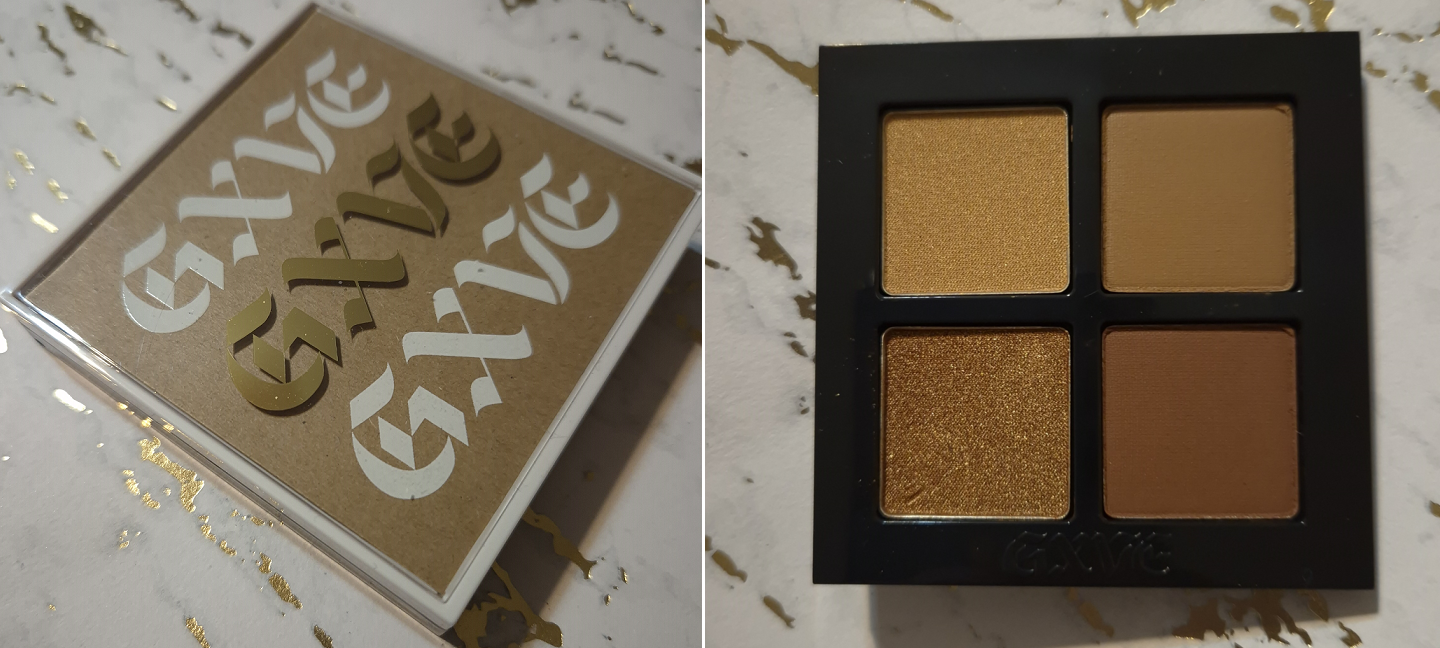
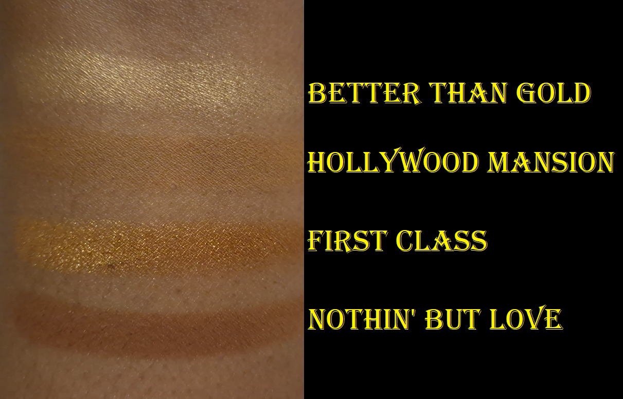
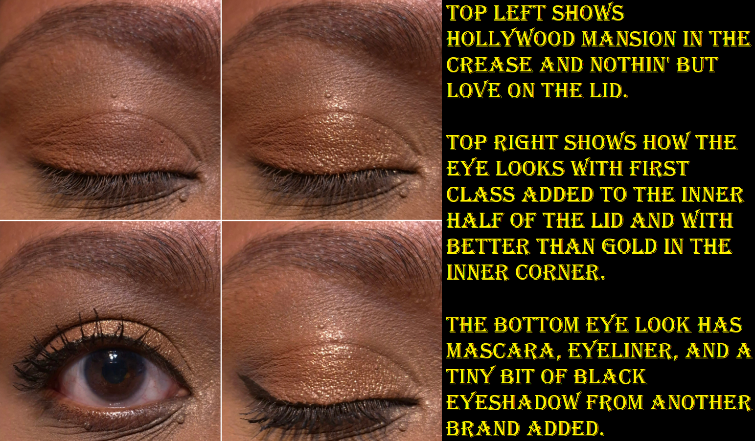
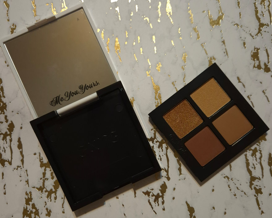
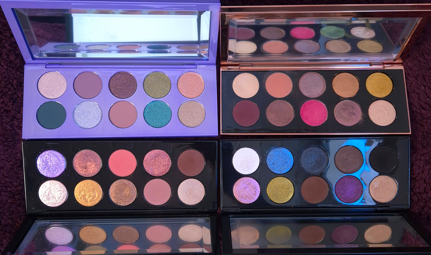
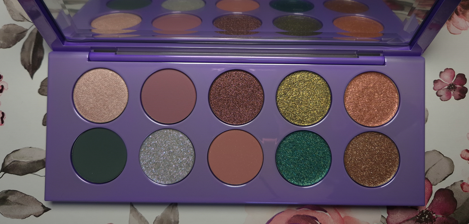
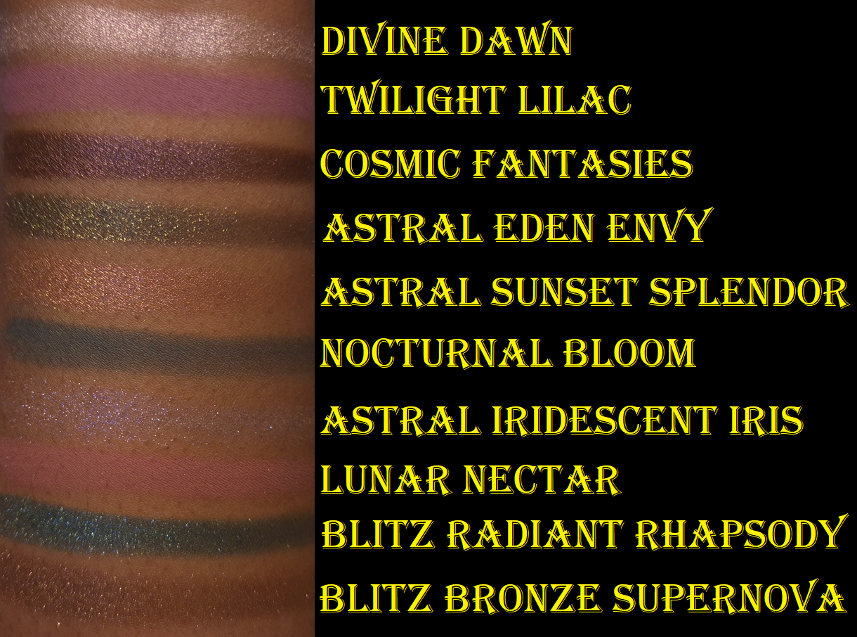
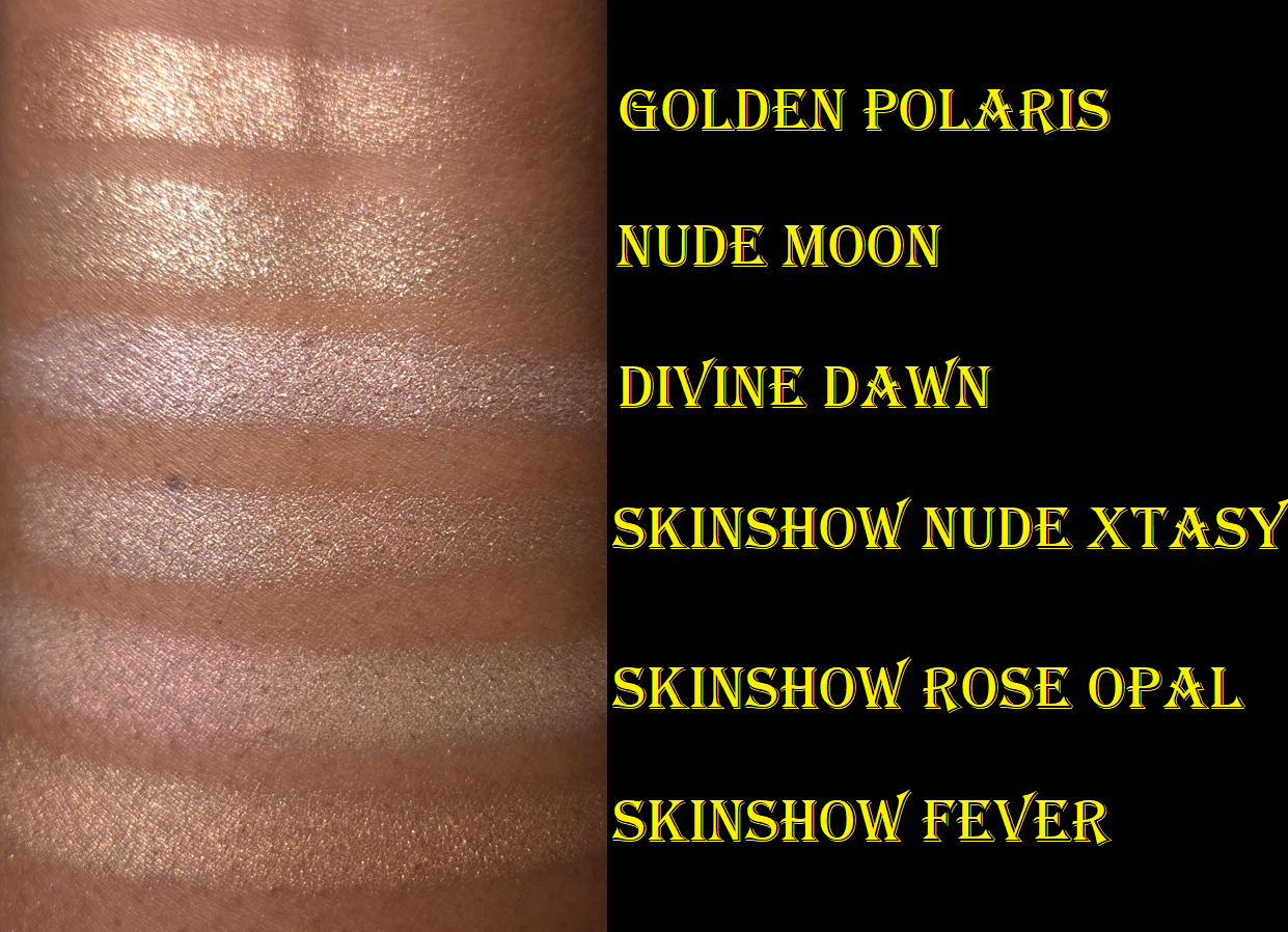
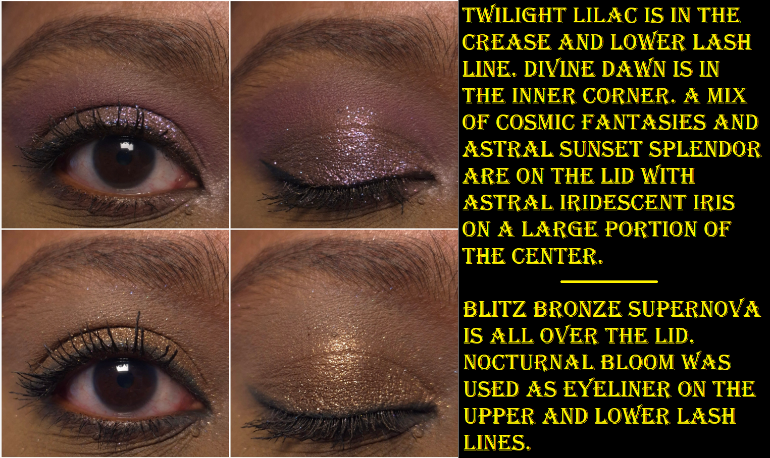
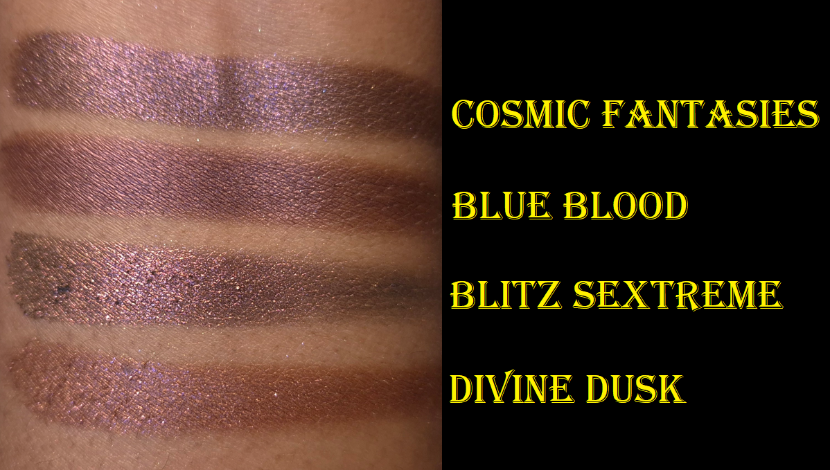
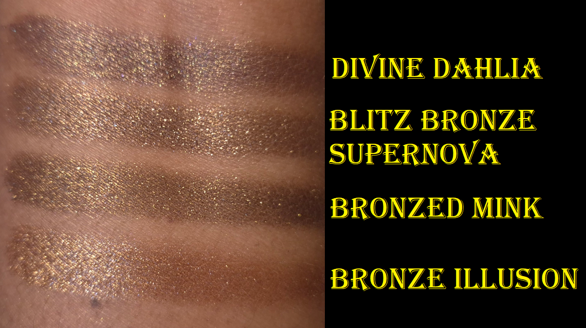
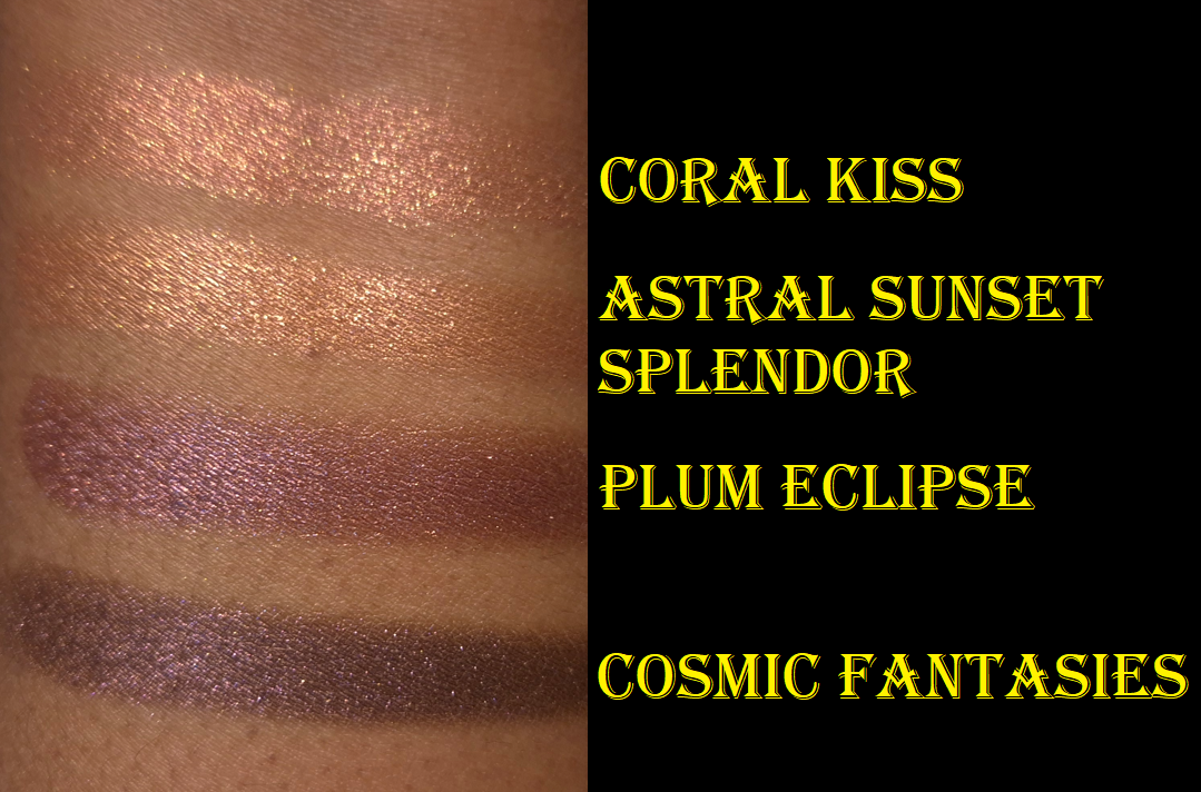
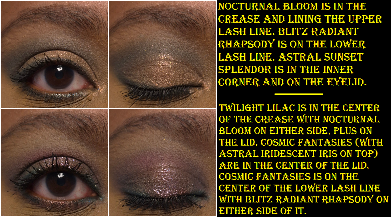
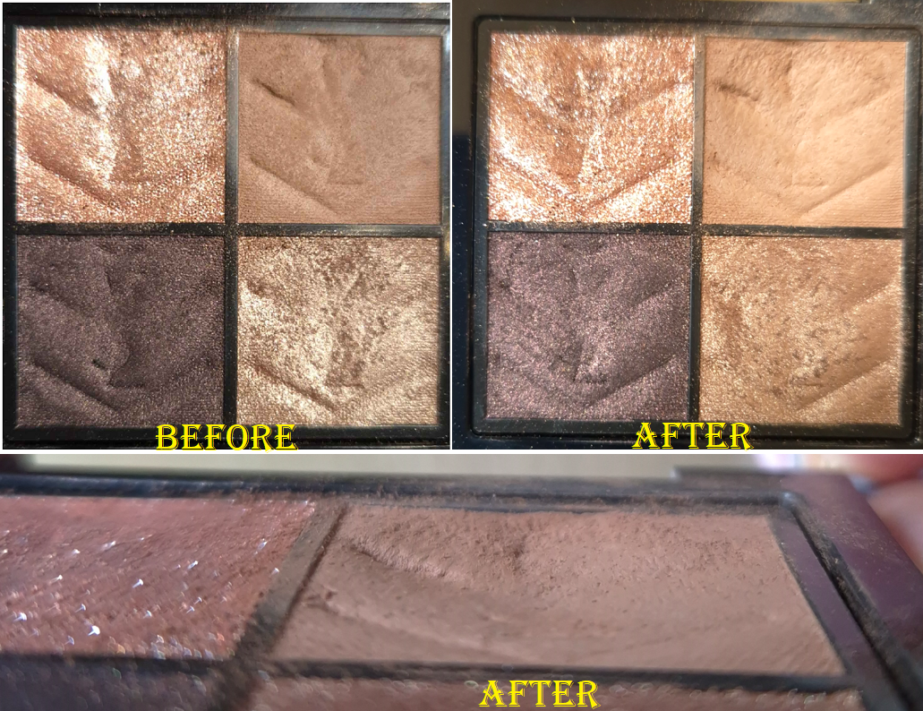
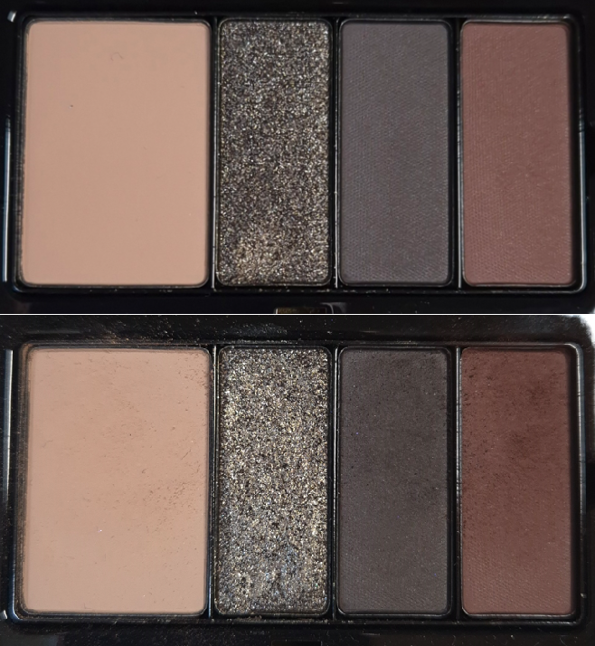
I bought the Lisa Eldridge Liquid Silk Liquid Eyeshadows (technically just Phoebe in January), but since I use those as bases/primer, I’m not counting it towards this category. What does count are the four Clionadh Cosmetics multichrome singles plus the Garland and Garden Quad, a Victoria Beckham Eye Wardrobe palette, three Pat Mcgrath Motherships, three eyeshadow singles from the Lisa Eldridge Betty palette plus the Desert Gleam palette, one of the Charlotte Tilbury Palette of Beautifying Eye Trends, the YSL Unexplored Garden quad, and one of the Prada Holo Nude Eyeshadows in 09 Primula.
I consider this to be a mixed bag of reasonable and less reasonable purchases. For starters, Clionadh is an exception to everything as my favorite indie brand of all time. I’m halfway inclined to give the same leeway to Pat Mcgrath as my favorite “mainstream” brand, and considering I bought nothing from them in 2024. However, it was still a bit impulsive since I had gone all these years without wanting the first Divine Rose and Bronze Seduction palettes, but suddenly I couldn’t help myself.
I’ll give myself a pat on the back for sticking with one VB Eye Wardrobe instead of the two others I wanted, one palette from CT and not the second one, plus buying half of Betty so that I wouldn’t be stuck with 3 extra eyeshadows I wouldn’t use. I also skipped many more launches I wanted such as the Tom Ford Olive Smoke quad, the four other new YSL quads, and a few indie palettes.
I would have had room to review the new palettes and still focus on a few of my old ones, but I had so many eyeshadow purchases from 2024 to catch up on testing that I was unsuccessful in making many dips in the pans. My most used eyeshadows during this Project Pan were likely the lightest shade in the YSL Over Brun quad and darkest shades in the VBB Victoria quad because I used those the most to pair with other palettes and eyeshadow singles.
Everything Else: face and eye primers, mascaras, eyeliners, brow products, and lip products
I did end up buying a mini set of the Milk Hydro Grip that contained the original and glow version, though that might have been just before my low-buy started. I honestly can’t remember. Then, my old Gerard Cosmetics Clean Canvas started to change consistency, but it was nearly empty anyway, so I tossed it out. I still have my MAC Paint Pot and Nyx Glitter Primer, but I felt more comfortable having a third option. This is how I ended up using the Lisa Eldridge Liquid Silk for eye primer purposes. Speaking of which, I ordered Gaia in November 2024 and Phoebe in January 2025. I was paring them both in the beginning, but soon started using Phoebe exclusively. I was shocked that within only 3 or so months of use, I was struggling to get product out. I had to uncork the stopper and mix it a little to start reaching product again. Product still periodically moves to a spot that I cannot reach with the applicator, so I have had to uncork it an additional two times, which is not an easy task! I had to use tools because it’s very tightly in there to keep the product from drying out. So, if you think you might have used yours up quickly, I recommend removing the stopper and checking. I estimate that I have used up half of the tube by now.
I ended up buying more mascaras, but the high end ones were minis on sale and the full size were from Essence and at least very inexpensive. I managed to use up a few older mascaras, so that was nice.
I bought one brow pencil, and it was the waterproof version of Elf’s Instant Lift, which I won’t use until I finish my current ones. As for eyeliners, I hadn’t bought any until June. I’d been waiting ages for Hindash to have a sale that also included free shipping. So, I bought 3 Color Fluids and the Heroline eyeliner pen.
I didn’t set a hard stance for myself against buying setting sprays, because going overboard hadn’t been much of a problem. I think prior to this year, the most I ever had at the same time were three. I was unprepared for so many brands coming out with their own this year, so I fell victim to a lot of hype. I ended up buying the one from Huda, Tir Tir, Pat Mcgrath, and I got the one from Charlotte Tilbury in my Genshin Impact collab box. That means I now have seven! Most of them are travel sizes at least. There are several more I was interested in trying, but I will now ban myself from buying more for at least a year.
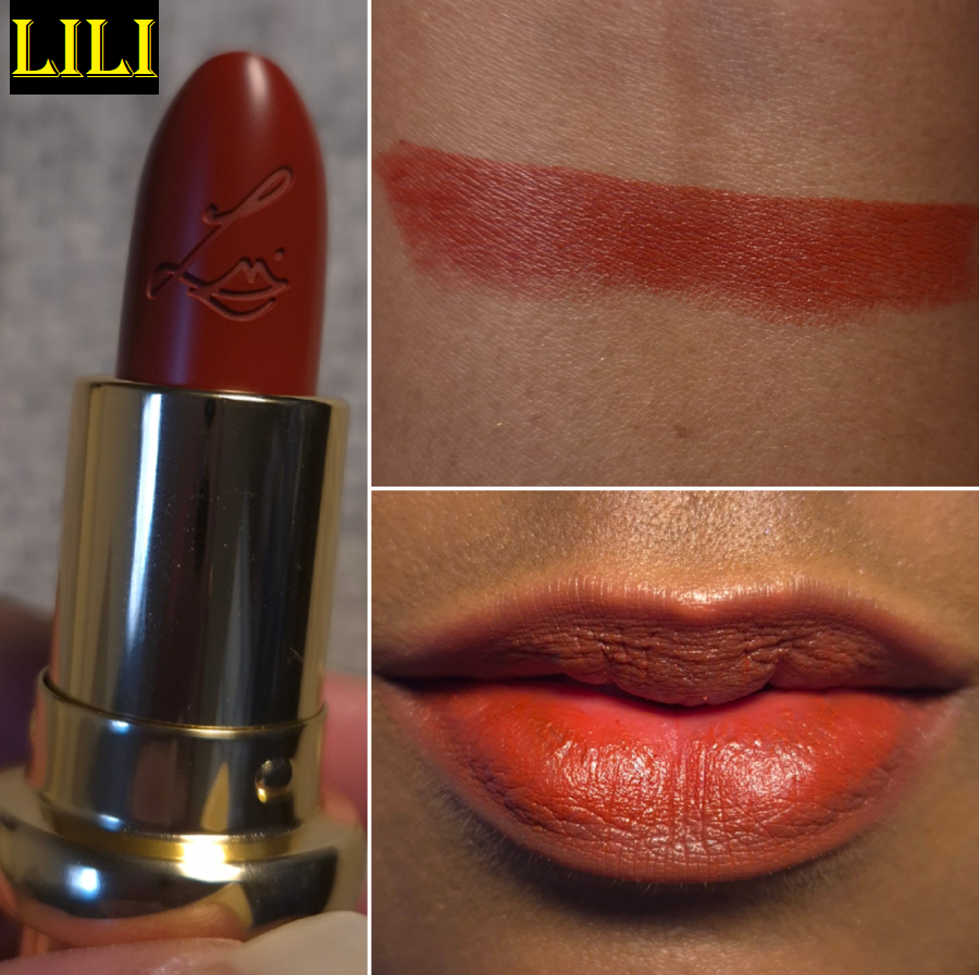
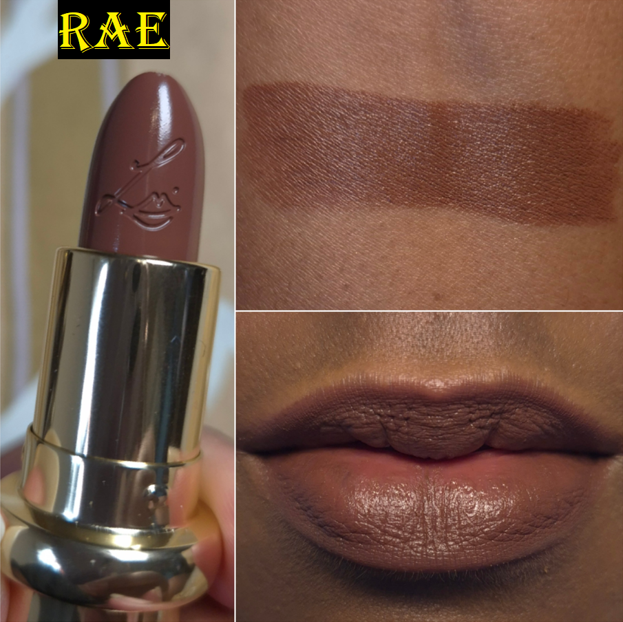
Regarding lips, I mostly stuck with the designated brands. I have three lippies from MAC, two from Too Faced, and two refills from Lisa Eldridge. I swapped out PML for MAC, as I made an allowance for, but technically YSL wasn’t officially on the “allowed” list, even though I mentioned them. So, I’m not sure if I should admonish myself for buying two YSL lippies.
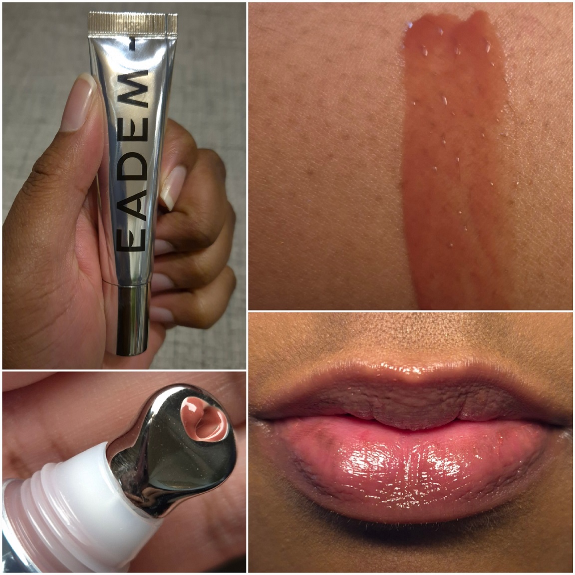
One allowance I had in my head, but didn’t mention in the Project Pan, was the lip balm from Eadem. I wanted to buy that well before my Project Pan, but could not get it because the brand doesn’t do international shipping. So, I bought it while in the US. Lastly, I wasn’t supposed to get another Summer Fridays balm, but I couldn’t resist.
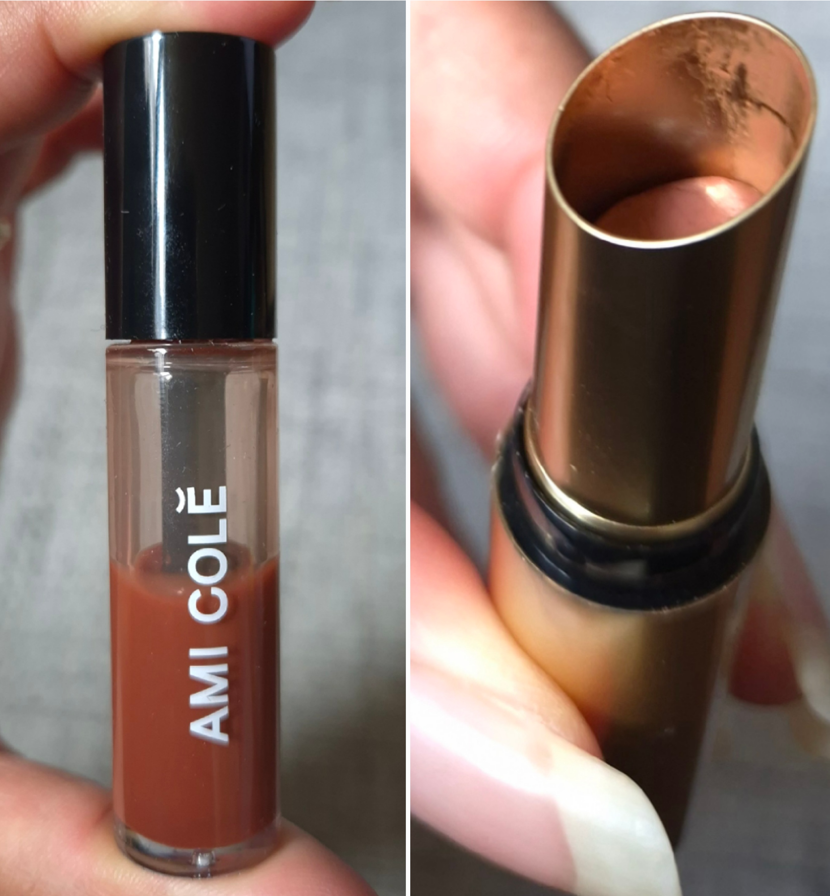
I rotated through a lot of my lip products, but I can say the top two I used the most were the Ami Cole Lip Treatment and Lisa Eldridge Baume Embrace.
And that is everything!
I could have done a lot better, but for me this was a semi successful endeavor. In fact, I want to stick with this same Project Pan idea for another six months. I want to see if I can be even stricter with myself, especially now that I have twice as many items in my collection between getting some of my old makeup back and adding so many new ones in the first half of the year. The goal was to use more of my holy grail makeup in the hopes that it would curb some spending urges. However, the amount of time I designated to reviewing my stack of unreviewed makeup took enough time away from my holy grails that I don’t think I was able to give a strong enough effort.
So, Round 2 starts now!
-Lili ❤