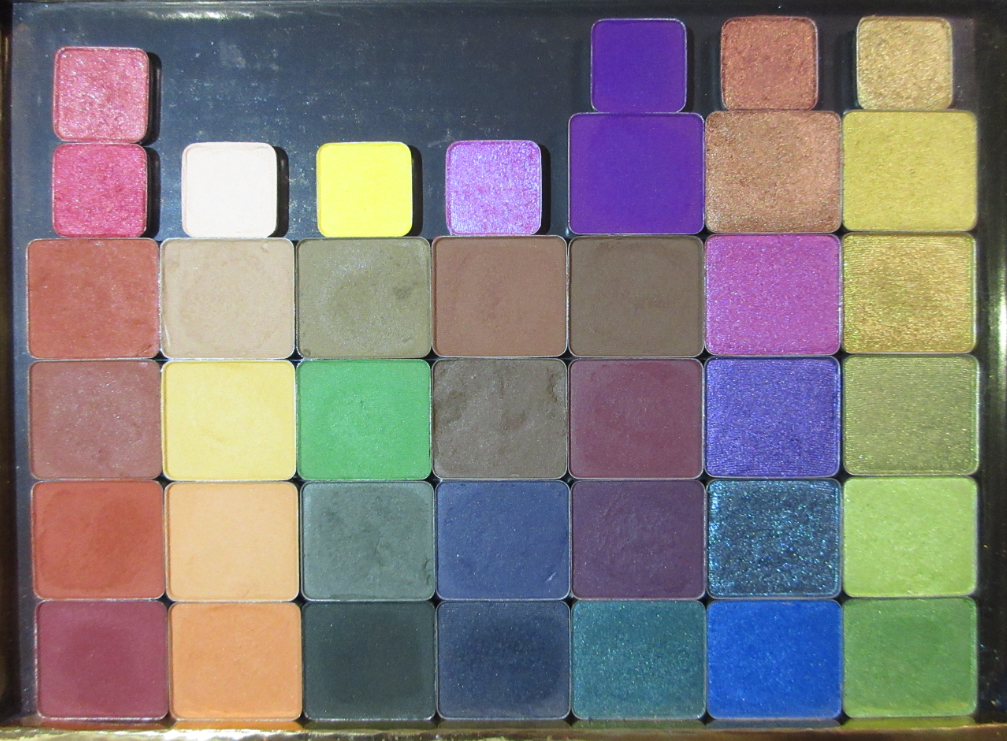
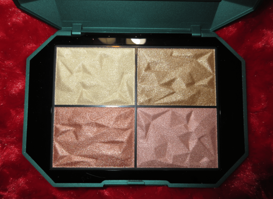
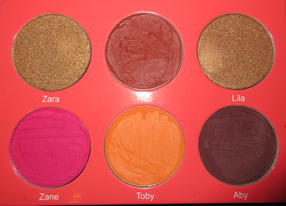
In order to get more use out of my Viseart shadows, I depotted them from their smaller palettes, then placed them in one custom magnetic palette, and lastly sold the remaining shades I didn’t want in my collection. Muse Beauty Pro sells some shades individually, so I ordered a few of those as well during various sales.
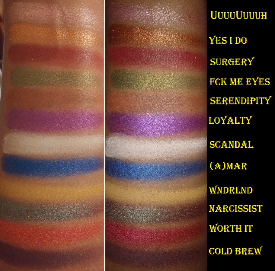
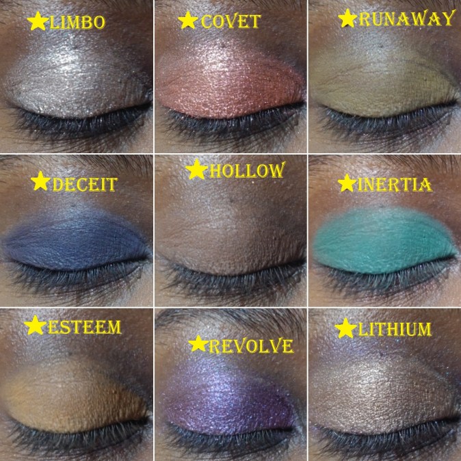
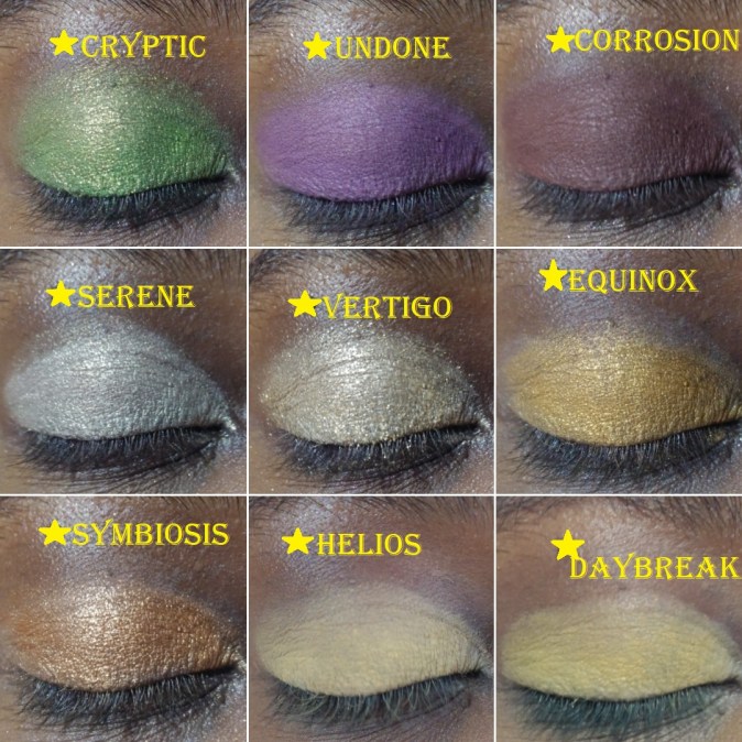
Most of these do not have names, but I labeled some of those according to their positions in the palettes.
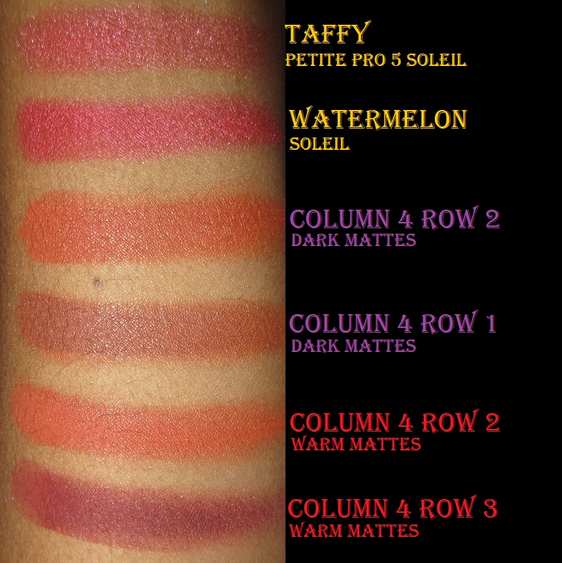
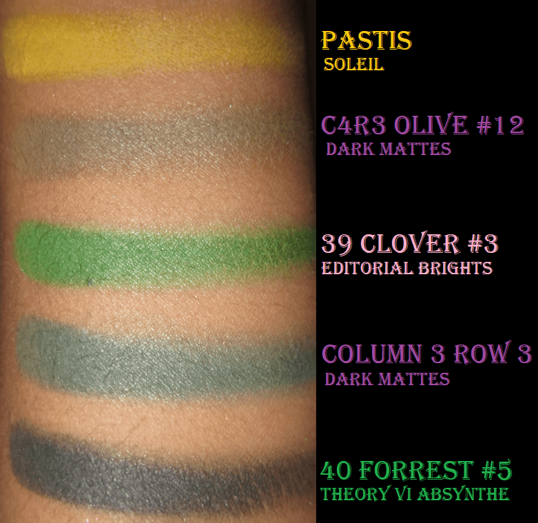
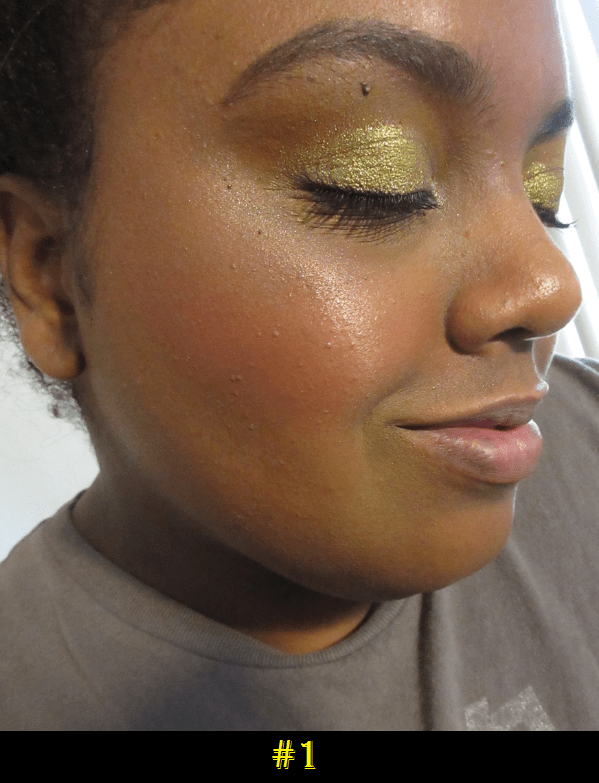
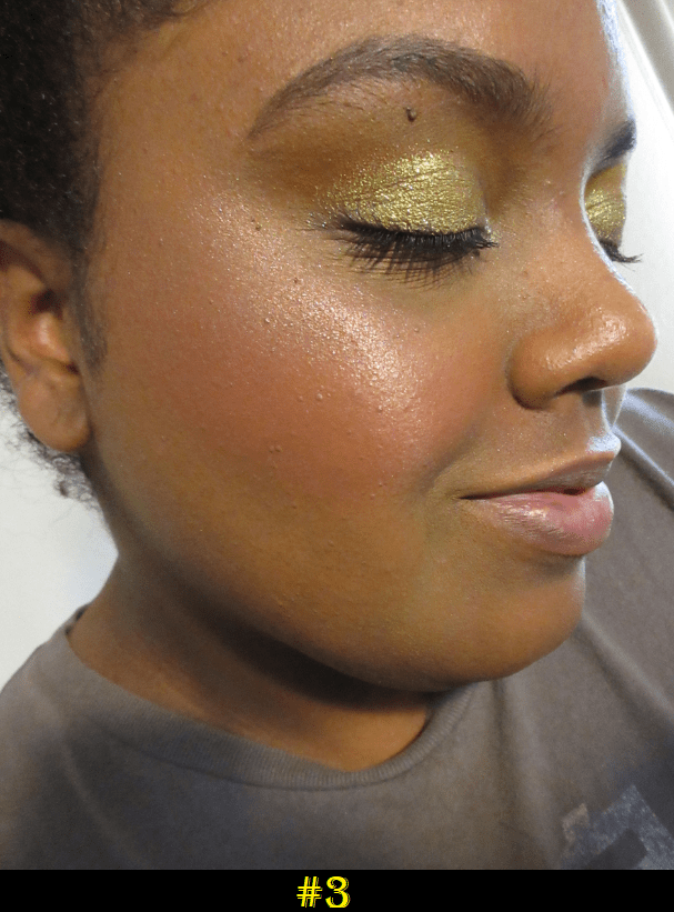
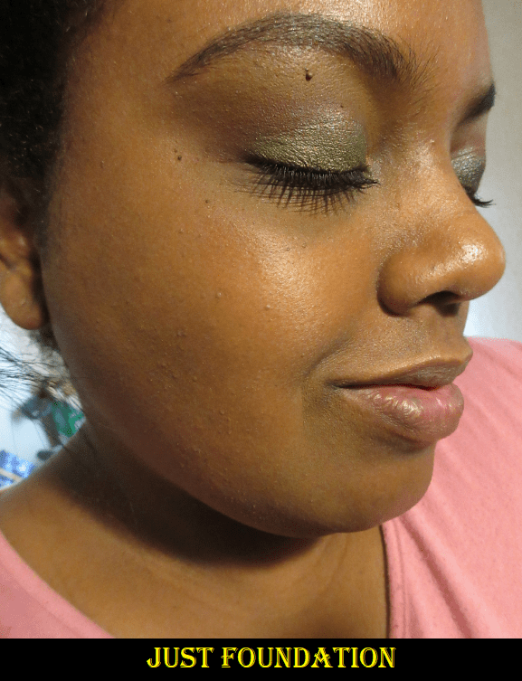
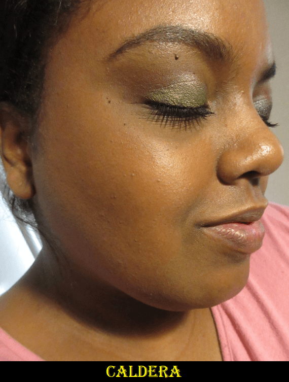
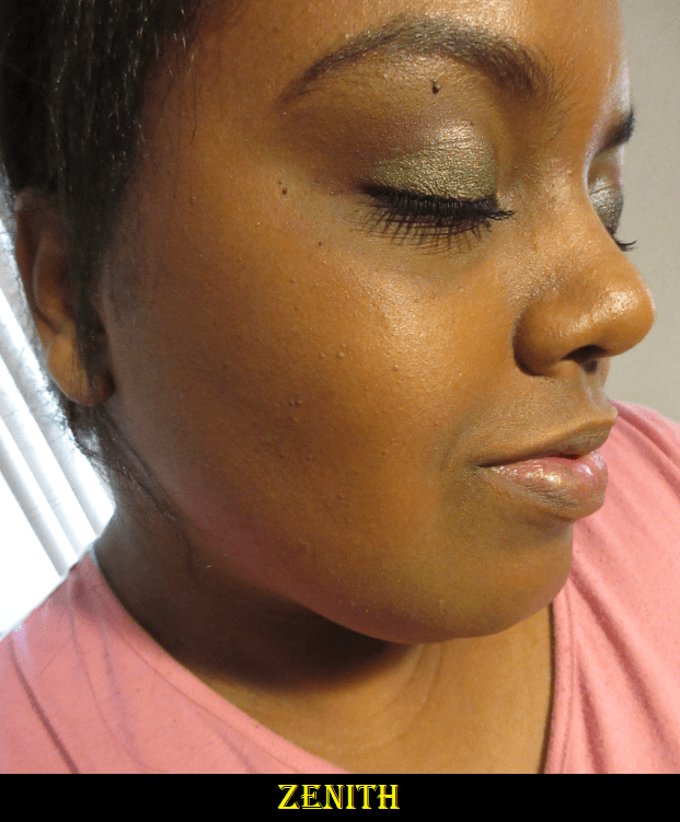
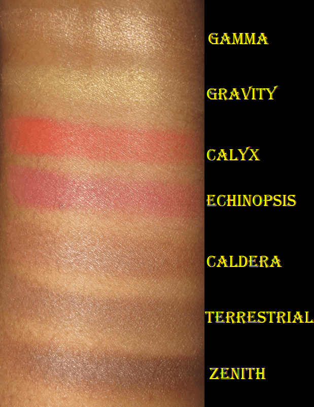
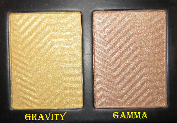
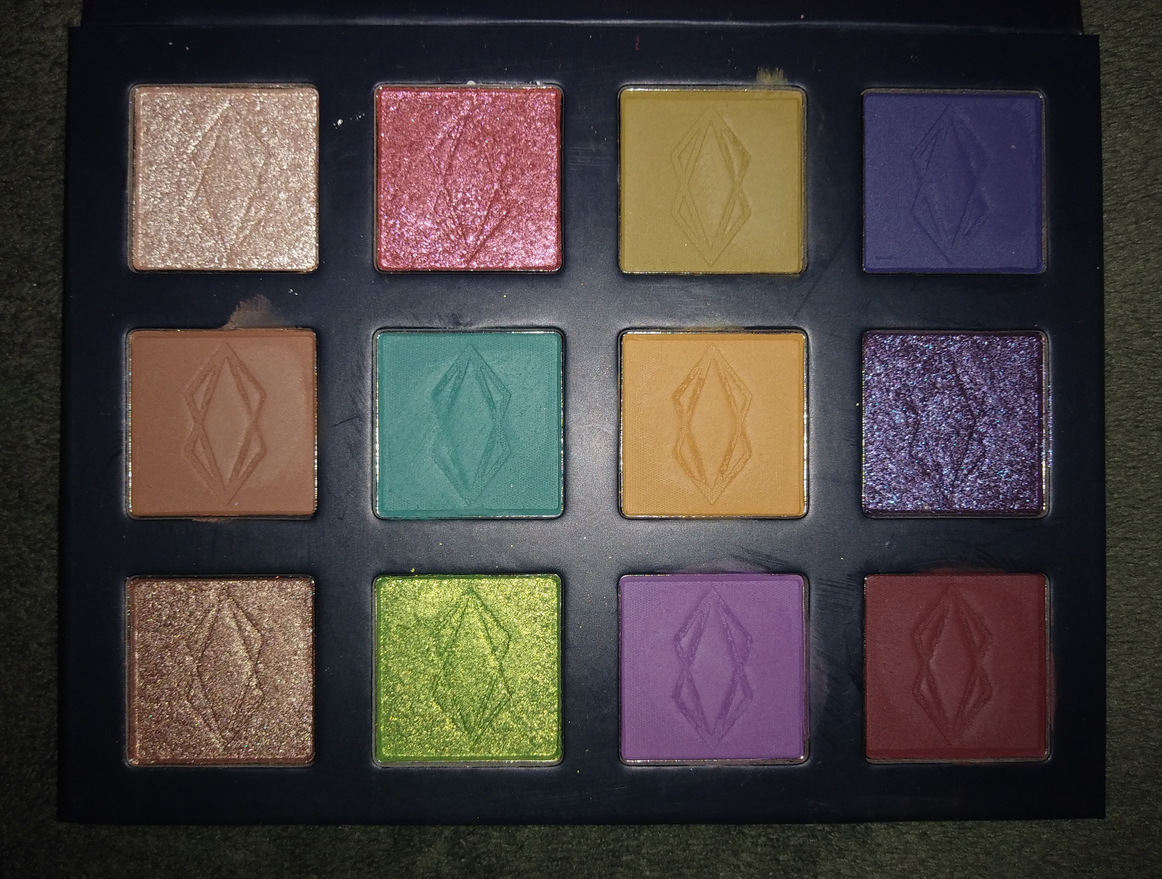
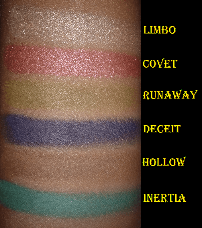
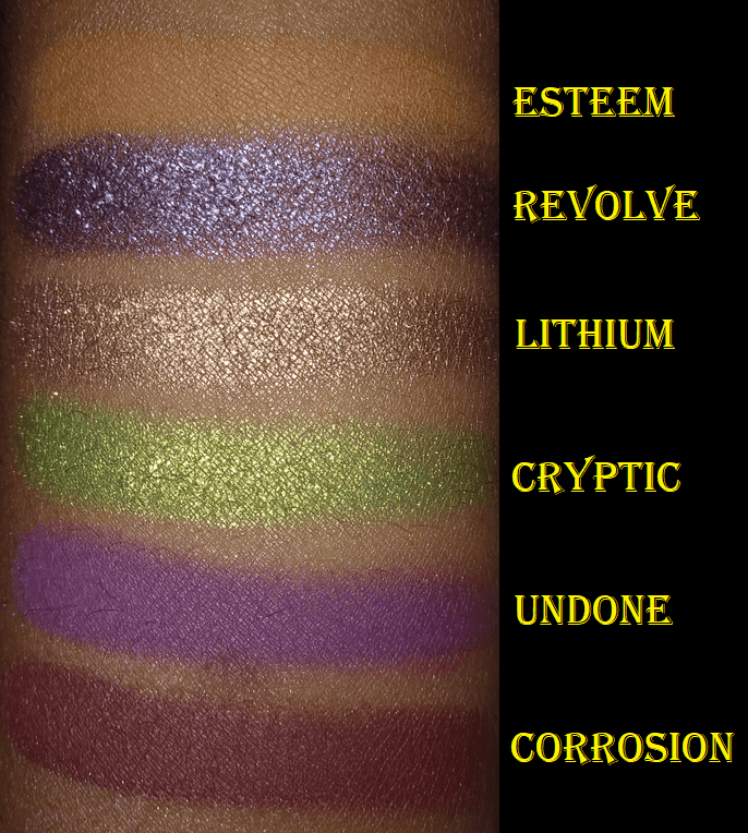
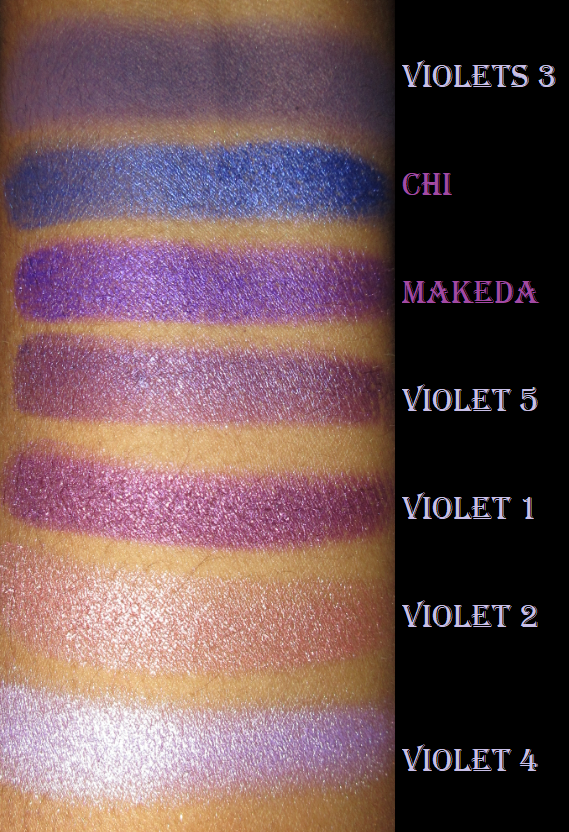
The shadows from my Viseart Dark Mattes palette are exactly five years old. I can see the changes in texture, even though they still perform nearly the same way. The oranges and reds were always the best shades in the palette. The blues and the olive shade were always the patchiest in swatches. I honestly only kept the blues because the shades are pricey and many years too old to sell. Since I still love the oranges and purples, but I feel like I need to toss them, I have considered purchasing the Viseart Dark Edit Eyeshadow Palette which has those shades as minis (minus the blue), plus a few additional pretty shimmers. The only reason I haven’t yet is because I won’t allow myself to purchase anymore Viseart shadows unless I prove to myself I’m going to use the ones I currently have even more.
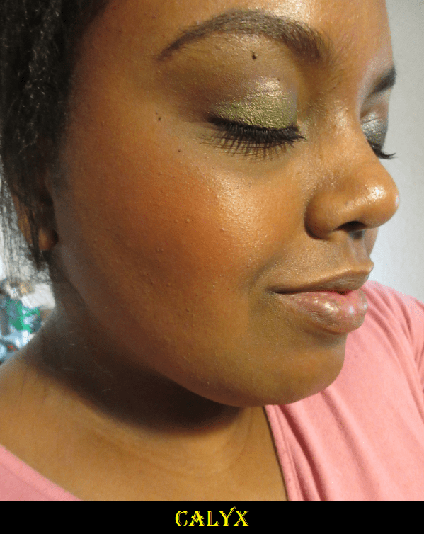
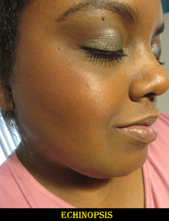
The Pastis shade had to be built up many times. I have a hard time getting that shade to stay vibrant and visible on my eyes. Clover and Forrest don’t look the best in swatches, but they perform better on the eyes. I mentioned the Dark Mattes shades are old, but all my other Viseart shadows were purchased in 2019.
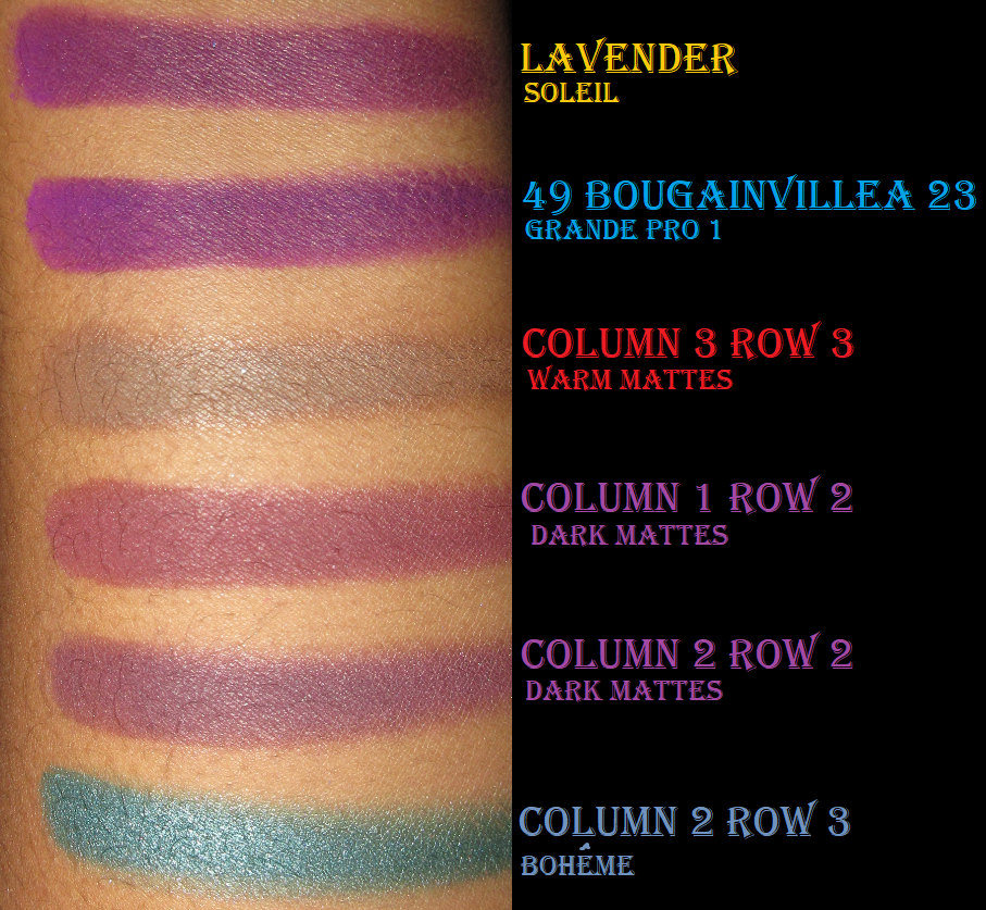
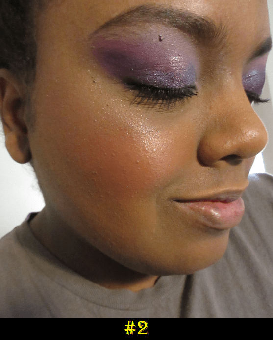
I was a little annoyed when I purchased Bougainvillea as a single shadow and found out how similar it looked to the Lavender shade I already had. The only difference between the two is that Bougainvillea is slightly brighter. It has a more vibrant purple pigment in it.
I didn’t purchase any of Viseart’s new palettes in 2020 because they always mixed light neutral shades I never wear with a few pops of interesting colors I want. The Étendu Violette Palette has some stunning purples, but out of the four shades I want, one looks like Bonbon and one looks like Lavender in certain photos. So, the Viseart no-buy continues.
That’s everything I have for now. Have a fantastic day!
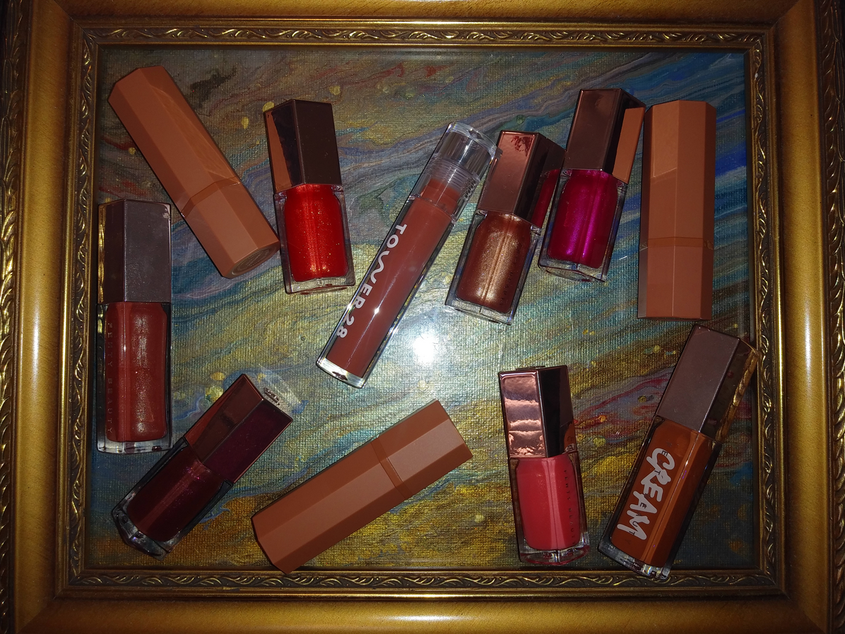
Besides the few other lip products I reviewed earlier in the year, the items I’m discussing today are the only other lip products I purchased in 2020! It wasn’t even a matter of having to wear a mask in public being the deterrent. I’ve just always been more of a balm girl. I’ve purchased many lipsticks and lipglosses in the past, only to let them go no more than 25% used because I’m always reaching for balms instead. Last year, I decided to go on a serious lippie low-buy and it nearly worked! However, in November and December, those holiday deals were what got me!
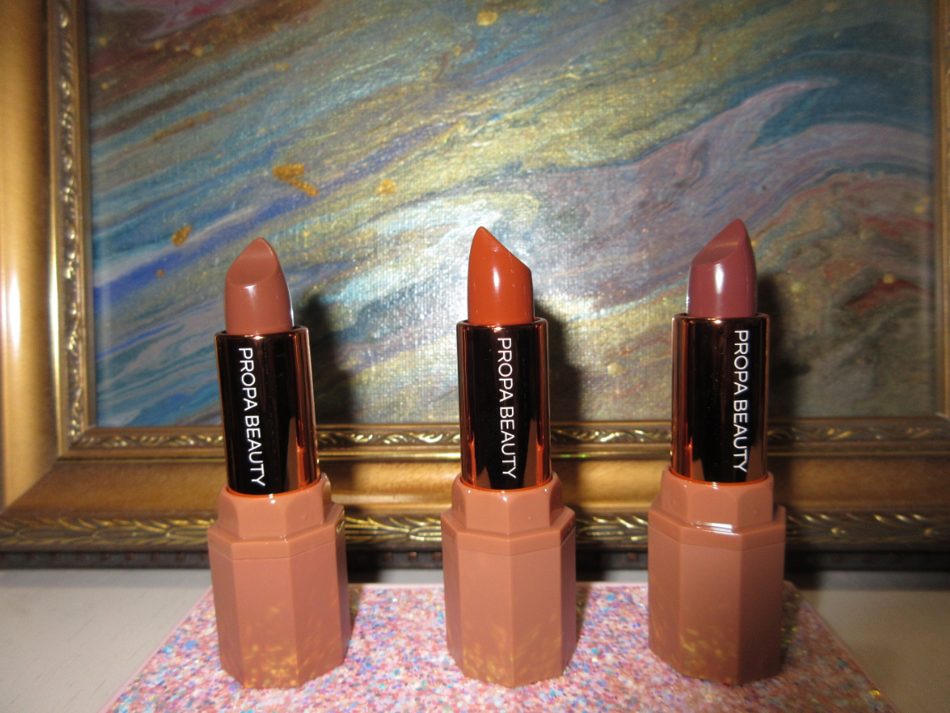
PROPA BEAUTY
Propa Beauty is a new brand that received a ton of attention in 2020 within the indie beauty community. I heard nothing but positive things about their satin lipstick formula, so when I saw their Black Friday deal, it was too tempting to resist. At the time I’m writing this, the satin lipsticks are the only products they have available, but one of the Youtubers I watch said they have another lipstick formula in the works.
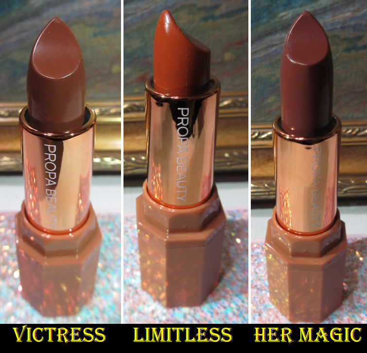
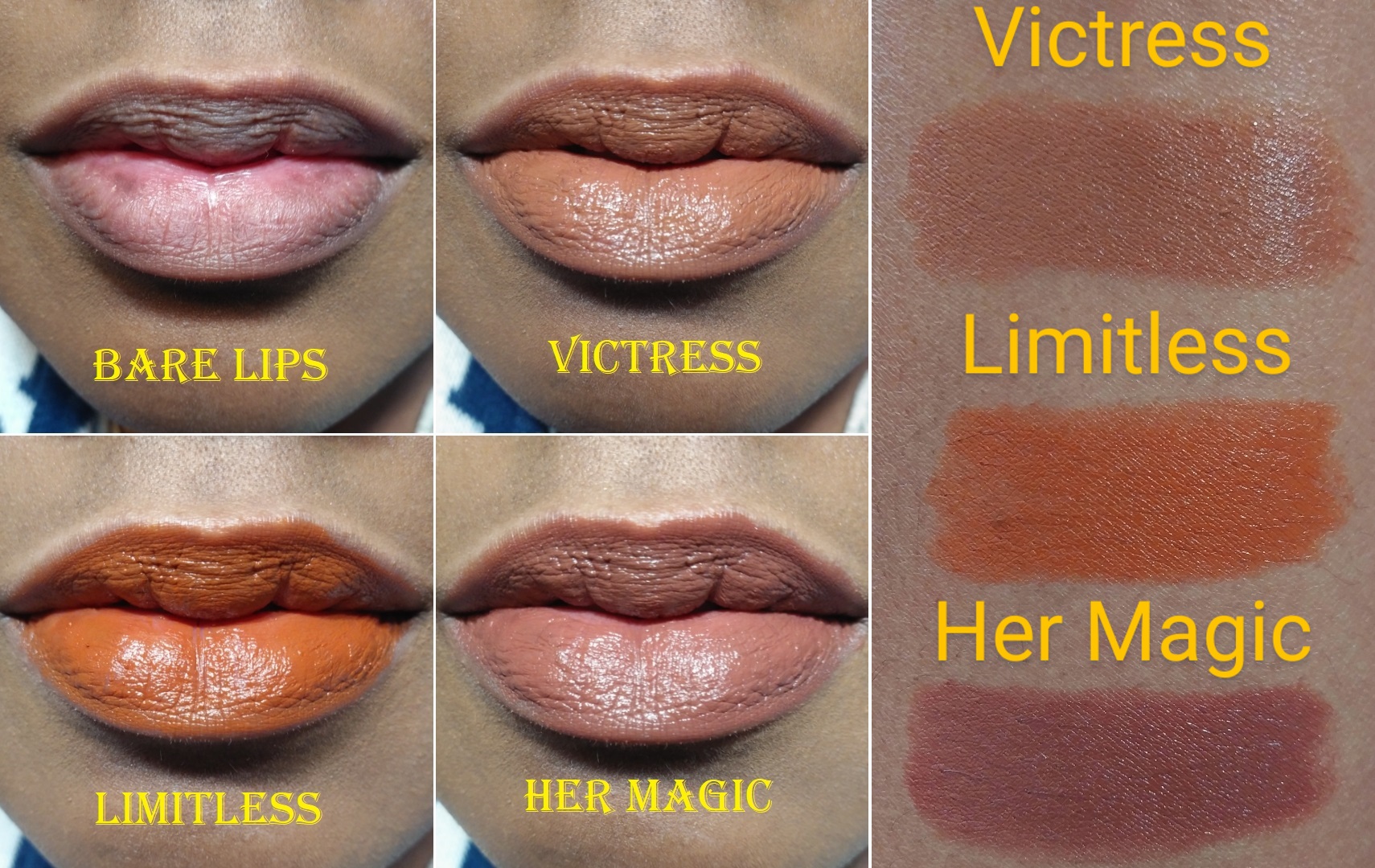
Victress – This shade has, “deep rose petal tones.” It is one of the two lightest colors available, and in the first photo taken with flash on, you can see the color that will actually show on the lips. Because it is so light, I didn’t expect it to work for me, but the brown tones keeps this wearable. While people of every skin tone can use these lipsticks, they were formulated with darker skin tones in mind and that really shows with this shade. It’s lighter than the lip colors I normally wear, but it has just enough pink to keep it from looking like ‘concealer lips.’
Limitless – The, “toasted pumpkin-tones,” in this shade are so pretty! This is one of the most obviously orange shades I’ve ever had in my collection, but the brown tones keep it grounded and prevent it from being too bright for my comfort level. I’m so glad I bought this and I intend to utilize this shade a lot when pairing it with my orange and Fall-inspired eye looks.
Her Magic – This shade is described as having, “deep rose-tones.” The other lipsticks tend to lean brown or orange, but this is one of the few pink toned lipsticks currently in Propa’s collection. I almost bought the full-size Rare Beauty lip balm I discussed a few months ago, but I’m glad I waited because I like the tone of this shade even more!
I was very pleased with all three shades. Her Magic and Limitless are my favorites, but I easily recommend any that might catch your eye.
TOWER 28
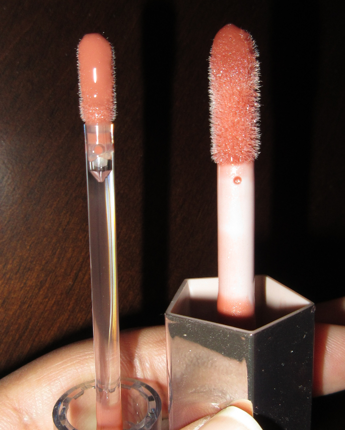
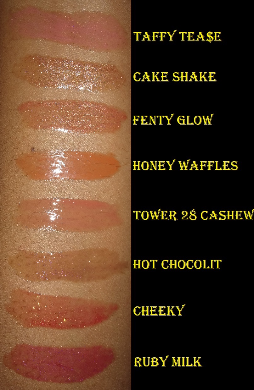
I have the ShineOn Milky Lip Jelly Gloss in Cashew. This is another brand whose lip glosses I heard nothing but good things about. I was so excited when it finally arrived but the first few times I used it, I hated it! This formula feels like a combination of a sticky humectant with a lot of oils. I am used to applying lip gloss from edge to edge without fear of it moving. This gloss feathers, so I kept getting a dripping sensation on my lips and would have to wipe the edges, even though I remained within the lines upon the initial application. By the third time, I figured out where I have to apply so that when it spreads, it will stop exactly where I want it to. Also, I kept hearing everyone say this gloss is more lightweight than the Fenty Gloss Bombs and that it’s not sticky at all. I don’t think there’s much of a difference in terms of thickness. The Tower 28 gloss has a different feel because of the oils. And while it doesn’t feel sticky if you apply the initial layer, as time goes on and the oils start to wear away and I’m left with an incredibly sticky layer. I realized this when I tried to combat the dripping feeling by dabbing the excess product off my lips. The napkin removed the oils but what was left behind was the stickiest gloss I’ve ever had!
Tower 28 applicator on the left. Fenty Gloss Bomb applicator on the right.
I was so tempted to buy the mini set of 4 glosses initially, but I’m glad I did not. On my pigmented lips, the amount I will texturally be comfortable using isn’t enough to add significant color to my lips. I have enough sheer glosses from Fenty, I definitely don’t need additional ones from Tower 28.
Now that I know the right amount of gloss to use (slightly less than the amount on the wand from one dip in the tube), I will get more uses out of this product because it’s still hydrating. I can ignore the stickiness. It does have a very pleasant scent that I wasn’t able to easily identify, but I suspect it is from the apricot oil.
FENTY BEAUTY
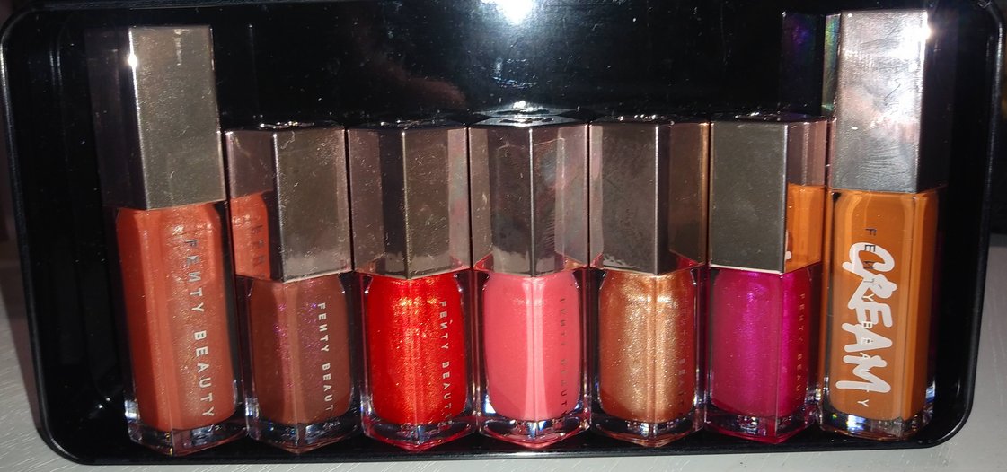
All the Gloss Bombs currently in my collection.
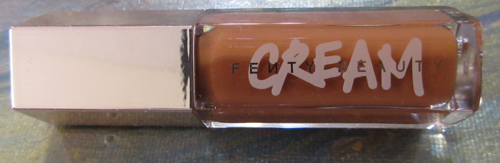
Fenty Gloss Bomb Cream Color Drip Lip Cream in Honey Waffles– This is the newest lip product release from Fenty. The cream version has more pigment, no glitter, and is a bit thicker in texture than the traditional Gloss Bombs. Those also have a sweet fruity/Starburst candy type of smell. The Cream Bombs are supposed to smell like peaches and cream/vanilla. It was very nice at first, but after using it several times, my tube smells like peaches mixed with chemicals. It isn’t unpleasant, more of a ‘makeup smell,’ but it’s not the same as when I initially used it. I also noticed the scent faded in my other Gloss Bomb minis from December 2020, whereas my older holiday minis smell exactly the same as when I bought them. Those were created for Holiday 2019, but my purchase history shows that I didn’t buy them until April 2020, so they’re only eight months older. I’m guessing Fenty used less fragrance or a weaker fragrance in the Holiday 2020 batch. This isn’t necessarily a bad thing, just something I thought was interesting.
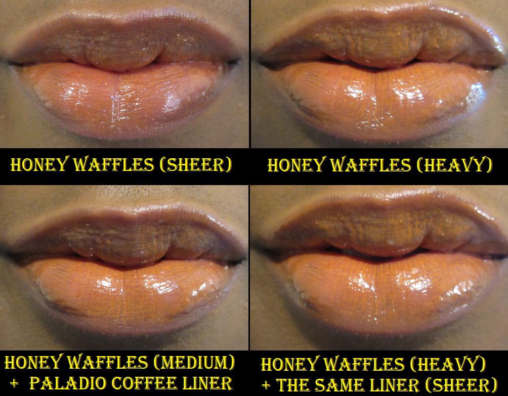
In the initial reviews I saw for this product, Honey Waffles was the prettiest shade on every person from light to dark. It wasn’t until I already made my purchase that I started to notice the reviews where Honey Waffles gave the ‘concealer lips’ effect on the ladies closer to my complexion. Even though Fenty Glow is my favorite Gloss Bomb shade, the cream version looked on the cool side of pink, so I picked Honey Waffles instead. Regardless of the shade, and despite how much I thought I wanted a product like this, I’ve realized it isn’t for me. The color looks patchy and gathers in the lines of my lips. I tried this with lip liner and still wasn’t thrilled with how it looked. The only way I can enjoy this is to use a thin layer. Normally, the amount I pick up on the tip of these applicators is the perfect amount to apply to my lips. With Honey Waffles, I have to wipe off a quarter to a half of the gloss back in the tube. Then I use what’s left to spread the gloss as evenly as possible onto my lips. As long as I continue to use this method, I will keep using Honey Waffles. I have tried to mix this shade with the other gloss bombs and aside from Ruby Milk, none of the other combinations helped. I will continue to experiment and see if there is a lipstick shade in my collection that I would enjoy putting on top of this gloss. Then again, I’d still have to watch out for the uneven pigmentation issue.
Fenty Glossy Posse Mini Gloss Bomb Set: Holo’daze Edition
I am missing Baby Brut because I gave that shade to a friend.
I am fairly certain in my review of the Holiday 2019 Mini Gloss Bomb set, I said I wasn’t going to purchase this one because the glosses are too sheer to look different on my lips. Well, look at me now!
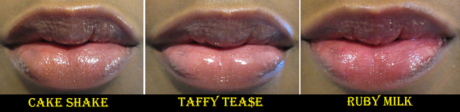
Cake Shake – I didn’t expect to get much color out of this shade, but I wasn’t prepared for the ramifications of wearing the least pigmented Gloss Bomb: looking like I have random bits of glitter all over my lips! It looks accidental rather than intentional. You won’t catch me using this one again!
Taffy Tea$e – This shade is the main reason I couldn’t get this set out of my head. Something about the color in the tube is so alluring to me! It looks like there is no shimmer in the tube, but upon closer inspection there are light pink particles of glitter in there. Even though this shade looks completely different in the tube than Tower 28’s Cashew, they both have pink tones that are light and milky looking on me, so they look similar on my lips. I think a shade like this would look even more pink and stand out more on someone with a lighter lip color.
Ruby Milk – This is the most pigmented shade of all the gloss bombs. I like it much more than I expected. I thought it would have a metallic finish, but it just leaves some shine and glitter. This shade can be built up to slightly more opacity, but I like how a minimal application looks.
The verdict for the set is that I don’t think anyone is missing out by not buying it. I’m glad to have it because I needed to satisfy my curiosity. It’s unfortunate that I used my Sephora points on the Tower 28 gloss and Fenty Cream Bomb when those two aren’t my favorites, but at least I didn’t spend much out of pocket. I can also confirm that the regular Fenty Gloss Bombs keep their title as my favorite lip gloss formula!
In 2020, I went on a lip product low-buy. For 2021, I’m going to attempt a complete lip product no-buy (excluding my holy grail Nuxe Reve de Miel lip balm in the pot jar that finally became available on the Nuxe US website again)!
Those are all my thoughts for now! Thank you for reading!
It’s a bit late to post about last year’s holiday items, but as these products are still available and on sale, I really wanted to post my thoughts on them.
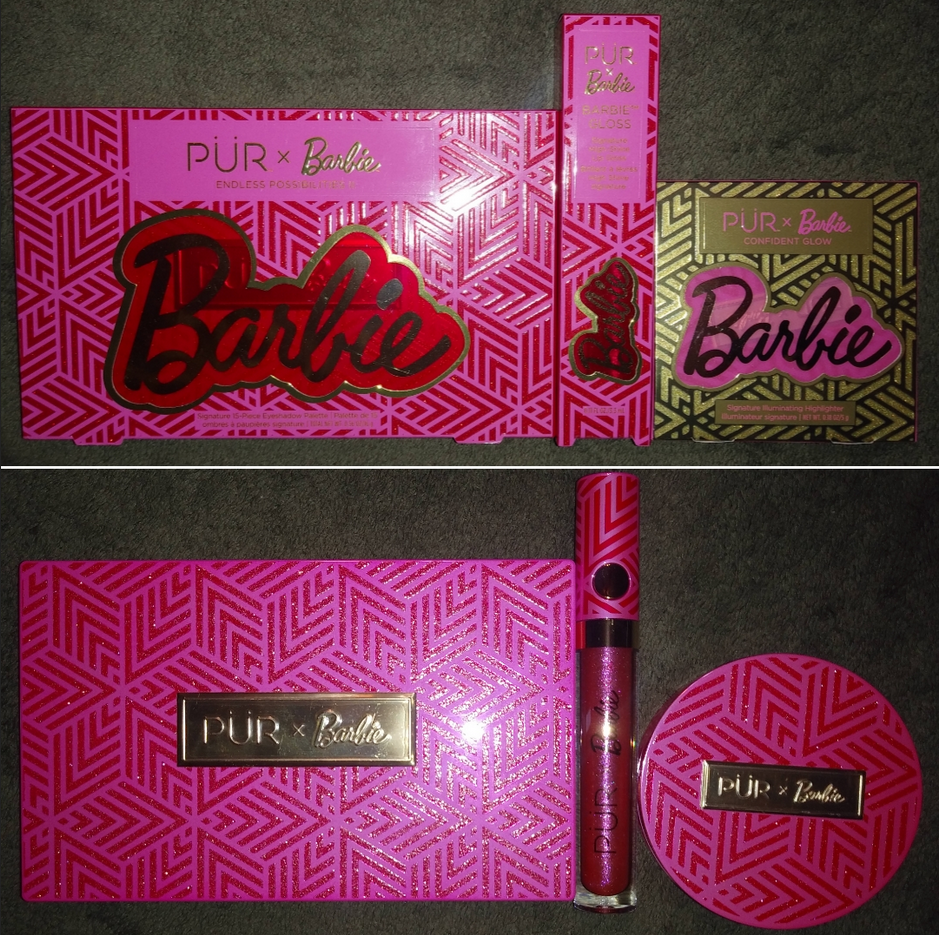
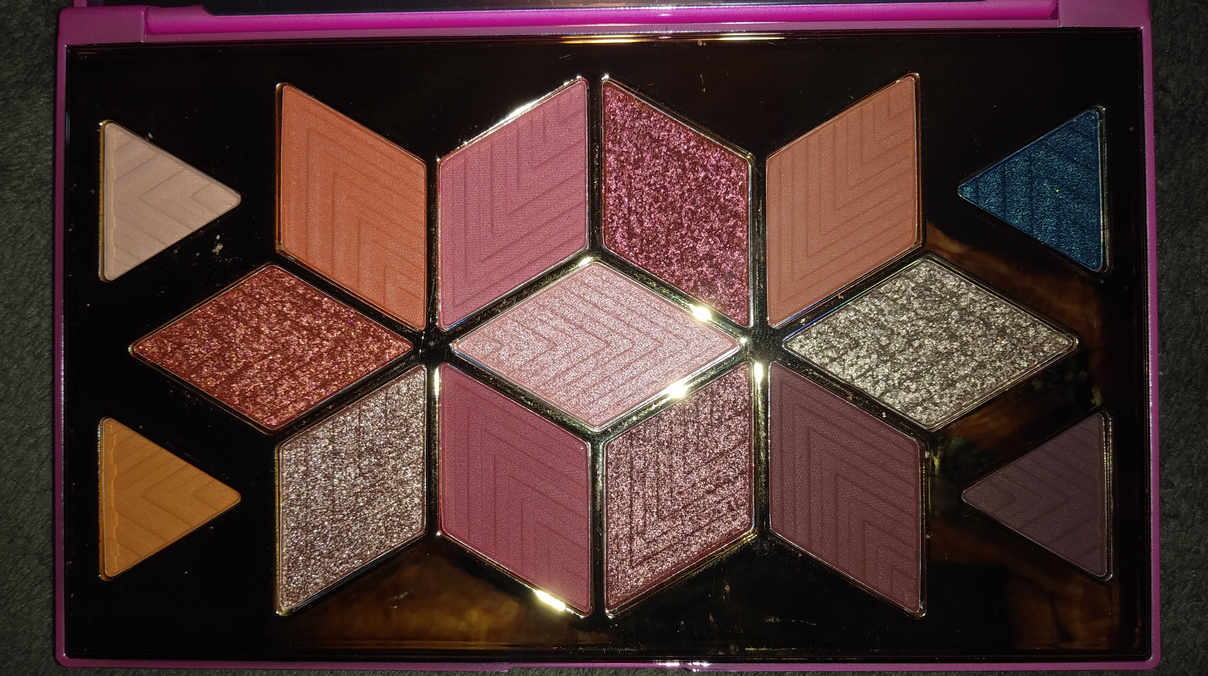
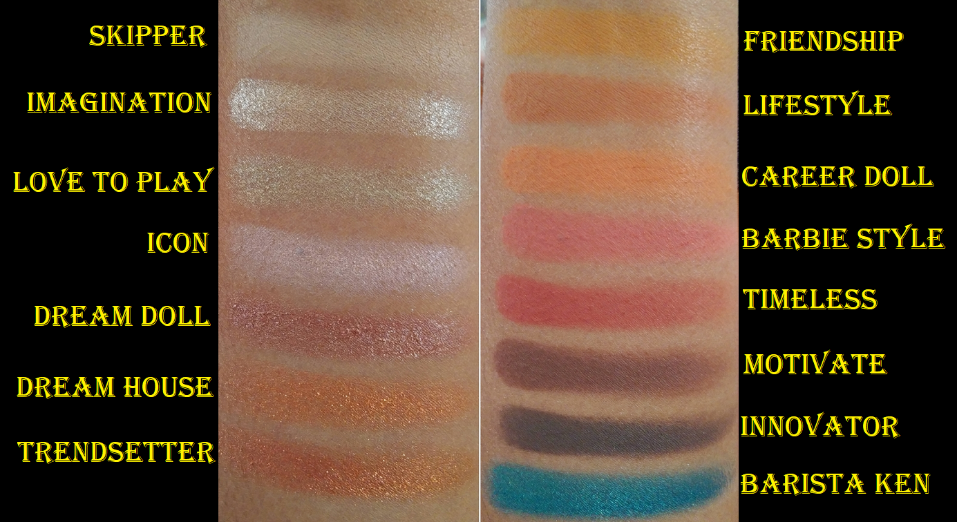
Pur x Barbie Palette
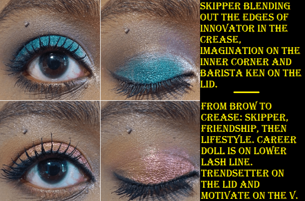
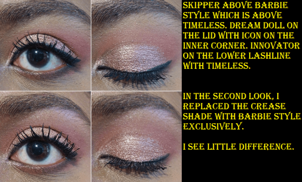
I received this palette as a birthday gift. Until this point, I hadn’t tried anything from PUR, but I heard mixed reviews about their eyeshadow formula. I was pleasantly surprised how much I enjoyed using this palette! The shadows have a decent amount of pigment, are smooth, and blendable. I am very happy that the orange mattes are distinctly different on my eyes and although the orange shimmers are similar, Trendsetter is actually a duochrome that shifts from the lighter orange in Dream House to a slightly darker red-orange. I’m not sure if I should even call them “shimmers” because they have a semi-flaky texture that reminds me of metallic foiled shadows. I don’t know if I’m a fan of the textured look when applied dry on the eye or even with my finger. In order to get them to look the smoothest, I apply them with a wet brush, which changes the texture, but then it becomes sheered out. That’s when I apply an additional layer on top using my finger. The wet shadow underneath meshes with the dry powder applied on top to keep it smooth yet have that extra layer of pigment. All of the “shimmers” are like this, excluding Icon which is more of a satin formula. The foiled shadows also leave a ton of glitter particle fallout as the day progresses. I recommend using something like a glitter glue/primer to help with adherence.
The shade Barbie Style is medium pink and Timeless is medium red. Although I can tell the difference when I use them separately, because they’re the same depth, I find them to be too similar to use together in an eye look. Motivate and Innovator are both dark brown shades, but I prefer to use Motivate for warmer looks and Innovator if I’m going for something cool-toned.
This palette is great for anyone who wants to dabble a bit into color eyeshadows. The shadows are colorful yet soft with enough neutral shades to keep the looks grounded. Although I love shimmers, I can see myself using this palette mainly for the matte shades.
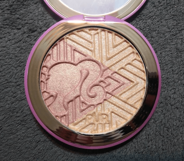
Pur x Barbie Confident Glow Signature Illuminating Highlighter
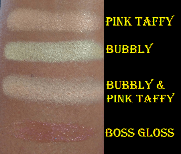
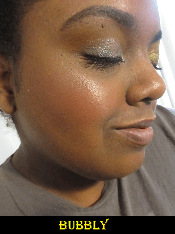
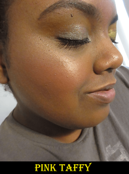
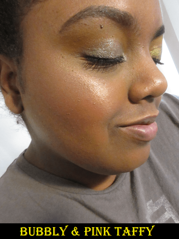
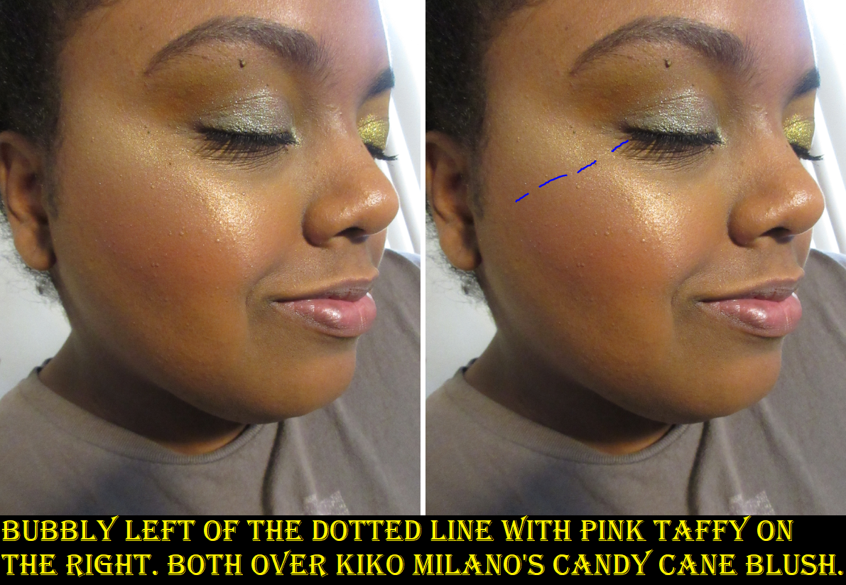
Seeing the eyeshadow palette in person made me curious about the highlighter, so I bought it afterwards. I don’t believe it’s available at Ulta anymore, but at the time of writing this, PUR still has it for sale on their website. The formula of this highlighter is very soft and I was happy to see that whether I used exclusively the gold shade, the pink, or both swirled together they basically look the same on the skin. Since I tend not to like the look of pink highlighters on me, I was worried about keeping the shades separated when I apply them, but Pink Taffy has gold shimmer in it which keeps it looking warm toned and not much different from the Bubbly shade. The base color isn’t very strong in either shade, so it blends into my skin nicely.
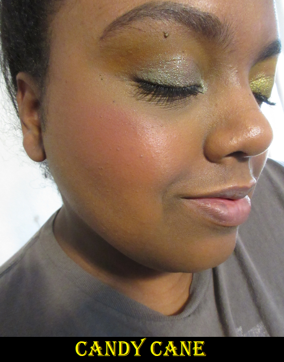
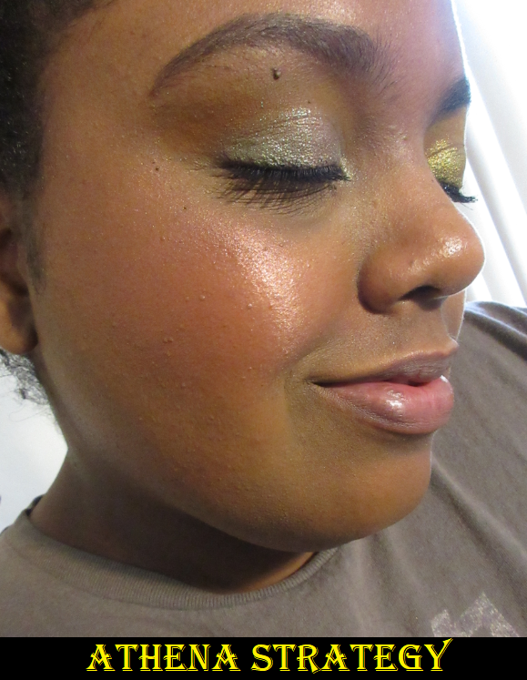
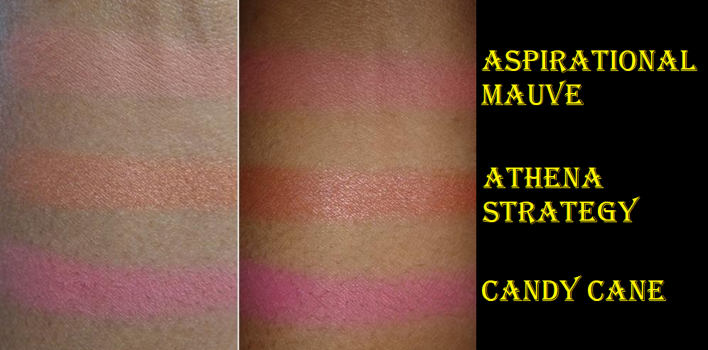
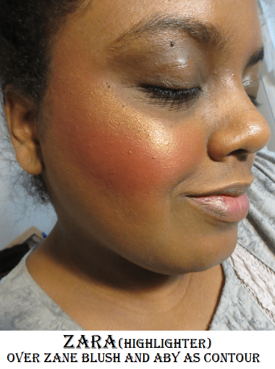
All the Barbie highlighter swatches are over Kiko Milano’s blush in Candy Cane and Make Up For Ever Velvet Matte Foundation in Macao.
When I apply a heavy amount side by side to my cheekbone (as shown above), there is a minimal difference between them. It’s even less noticeable when I use my usual amount. Since I didn’t purchase this with the intention of having two different highlighters in one, I’m happy that they are similar so I can just swipe my brush in the pan and not have to worry about the shades mixing.
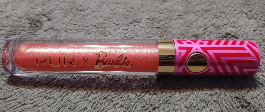
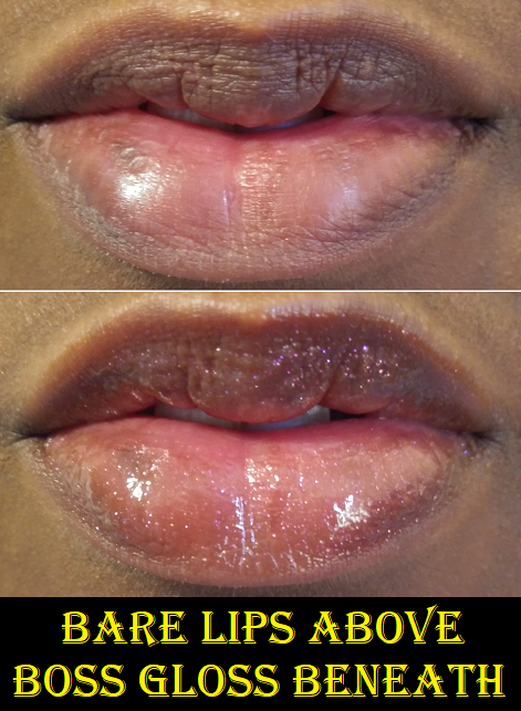
Pur x Barbie Glossin Boss Gloss
I received this as a free gift with purchase from Ulta. I had the option to choose between this shade or the lighter one called Girl Gloss. Boss Gloss has about as much pigment as a standard Fenty Gloss Bomb, plus noticeable glitter particles. The predominant glitter color is a hot pink/magenta that has an almost metallic affect on the lips. It’s a bit sticky, so I wouldn’t normally wear the amount that it takes to look a bit metallic (double layer). I’m happy to have this, especially at the low cost of $0.
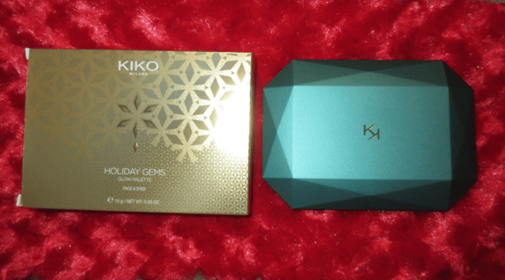
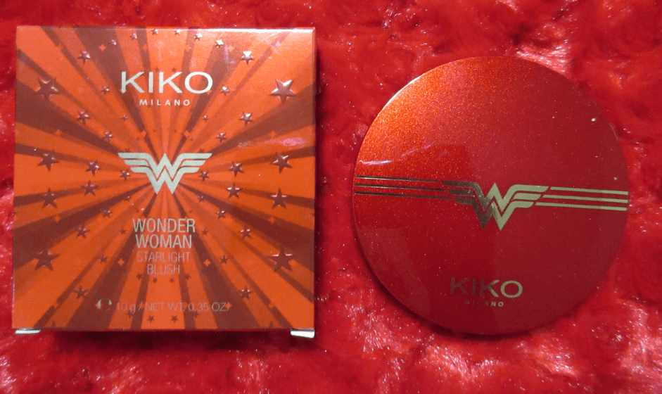
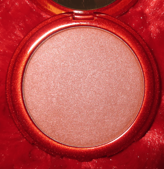
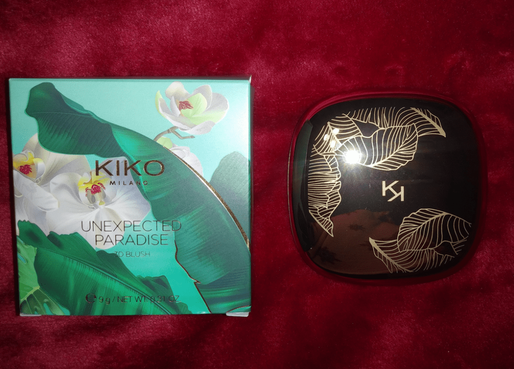
KikoMilanoHoliday Gems Highlighter Palette
I really wanted this, even though I could clearly see in photos that the texture looked glittery. I was so happy when I got it in person and saw that after touching the powder, it looked like more of a wet sheen, rather than sparkly! That’s not to say it isn’t glittery, because it is, but it’s not at the level that would prevent me from wanting to use it (excluding the golden brown shade).
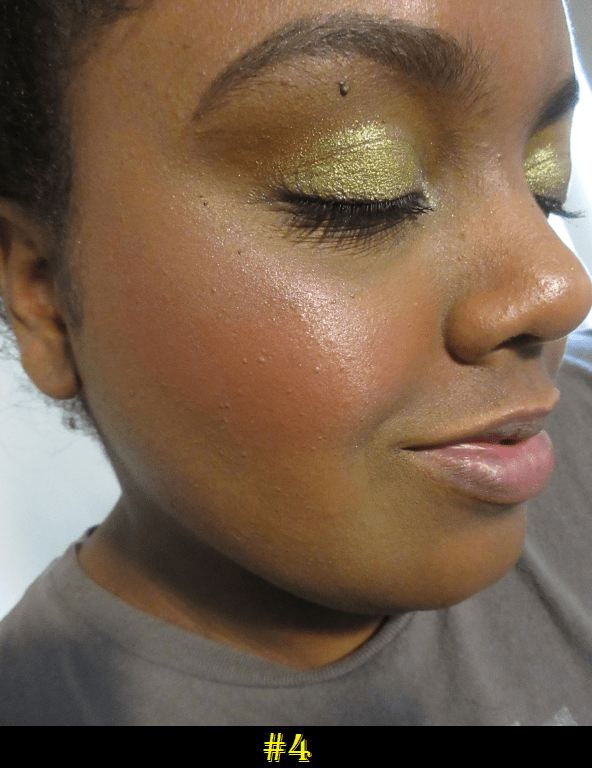
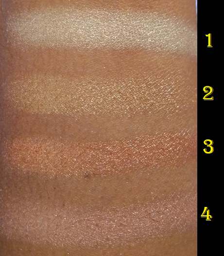
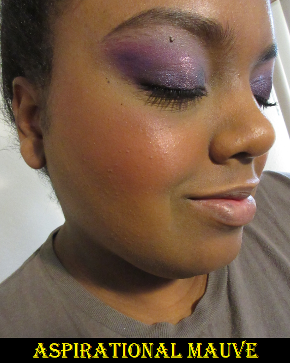
These highlighter swatches were all over the Kiko Milano Unexpected Paradise Aspirational Mauve blush. Kiko didn’t give them names, but they are numbered instead. Highlighter #2 was so subtle in my initial photo that I retook the picture. Although I applied a generous amount, the base color is so close to my skin tone that you can’t see it and all that shows are the sparkles.
As is common with highlighters on me, they look similar, especially on camera. However, there is a faint enough difference that I can say I like shade #1 and shade #3. #1 is my typical highlight color. #3 in person has a warm sheen that compliments my skin tone. #4 is okay, but I find it to be a touch ashy.
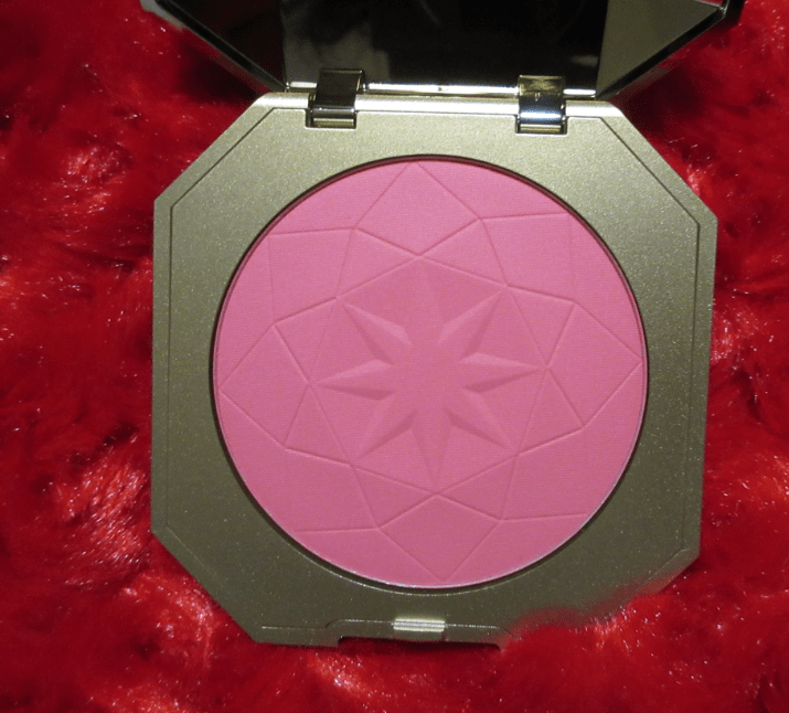
I’m happy to report this blush had no detectable scent! It’s supposed to smell like vanilla, according to Kiko’s website, but I don’t smell anything from the powder. Unlike the Unexpected Paradise blush, which is on the texturally softer side with some kickup, this blush has very little kickup. I wouldn’t say it’s hard-pressed, as I can pick up the product easily enough with any brush regardless of the bristle type, but it’s on the medium side and harder than my other Kiko blushes. Although this shade is a much brighter pink than I’d typically go for, I didn’t think the other two shades would show up on my skin tone (though it’s difficult to tell via online photos which is the only way I have access to these products) and the pretty packaging was a major factor in me purchasing this. I did get this on sale, which happened very quickly after being released on Ulta’s site.
After a little while, this blends into the natural oils of my skin and looks better than the initial application. For that reason, I definitely like it. Even when it first goes on it reminds me of winter wind-kissed cheeks!
I have mixed feelings about this blush. In warmer lighting, this blush looks extremely metallic. I like the color, but it’s as though I put a metallic eyeshadow on my cheek. In brighter and slightly cool lighting, it looks more like a shimmery eyeshadow instead, but in a somewhat nicer way. Regardless of the light, this does emphasize texture and accentuates my pores, which is normally not a problem for me. For those looking out for fragrance, this has a pleasant fruity scent. I don’t smell it once it has been on my cheek for a bit, but the smell lingers in my blush brush.
I don’t see myself using this again, but I wanted it for the Wonder Woman theme anyway. This is the only Wonder Woman collection I’ve seen within my price range (*cough*House of Sillage*cough*) that excited me. So, I’m holding onto it for collector purposes.
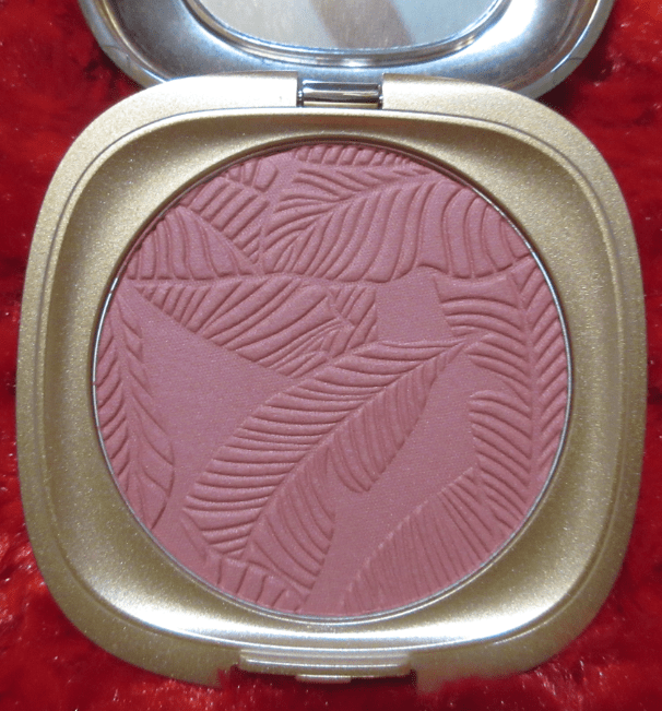
Kiko MilanoUnexpected Paradise Blush in 03 Aspirational Mauve
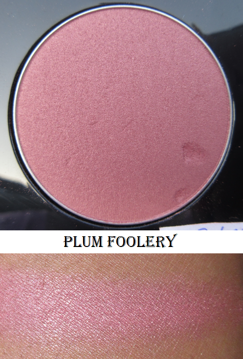
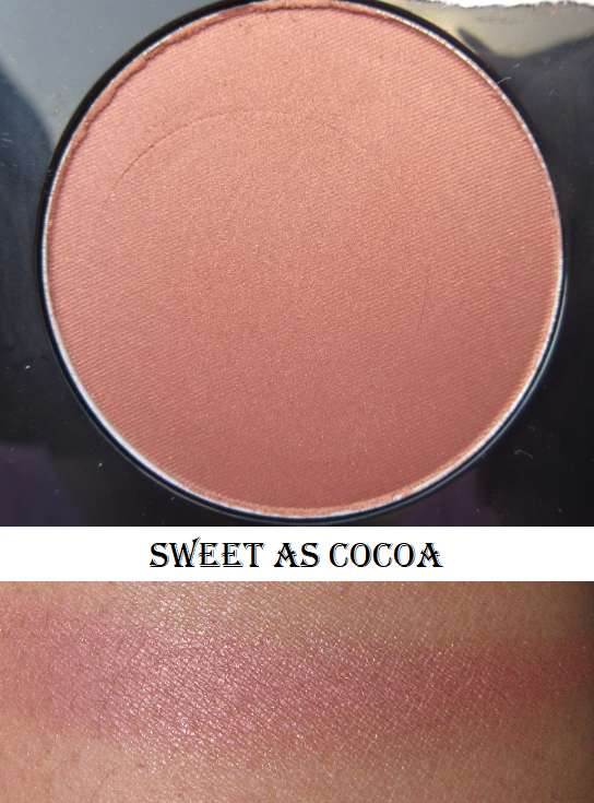
This blush smells a bit like coconuts and sunscreen or tanning oil. The smell is very artificial but it fades quickly on the cheek. There are three shades in total. I thought MAC was the only brand that could make mauve and plum blush shades I like on me, but after wearing this one, I’m beginning to accept that perhaps mauve is a generally nice color for me! Although it’s the darkest shade they had, it gives me a flush of color that I can’t overdo, even if I really pack this on. However, this will probably not work on someone more than a few shades darker than I am.
Here are all the blushes swatched together with flash off and on.
That’s everything! It was fun to try PUR and Kiko Milano for the first time. I don’t think any of these products will end up being holy grail status, but I’m happy to have and enjoy them.
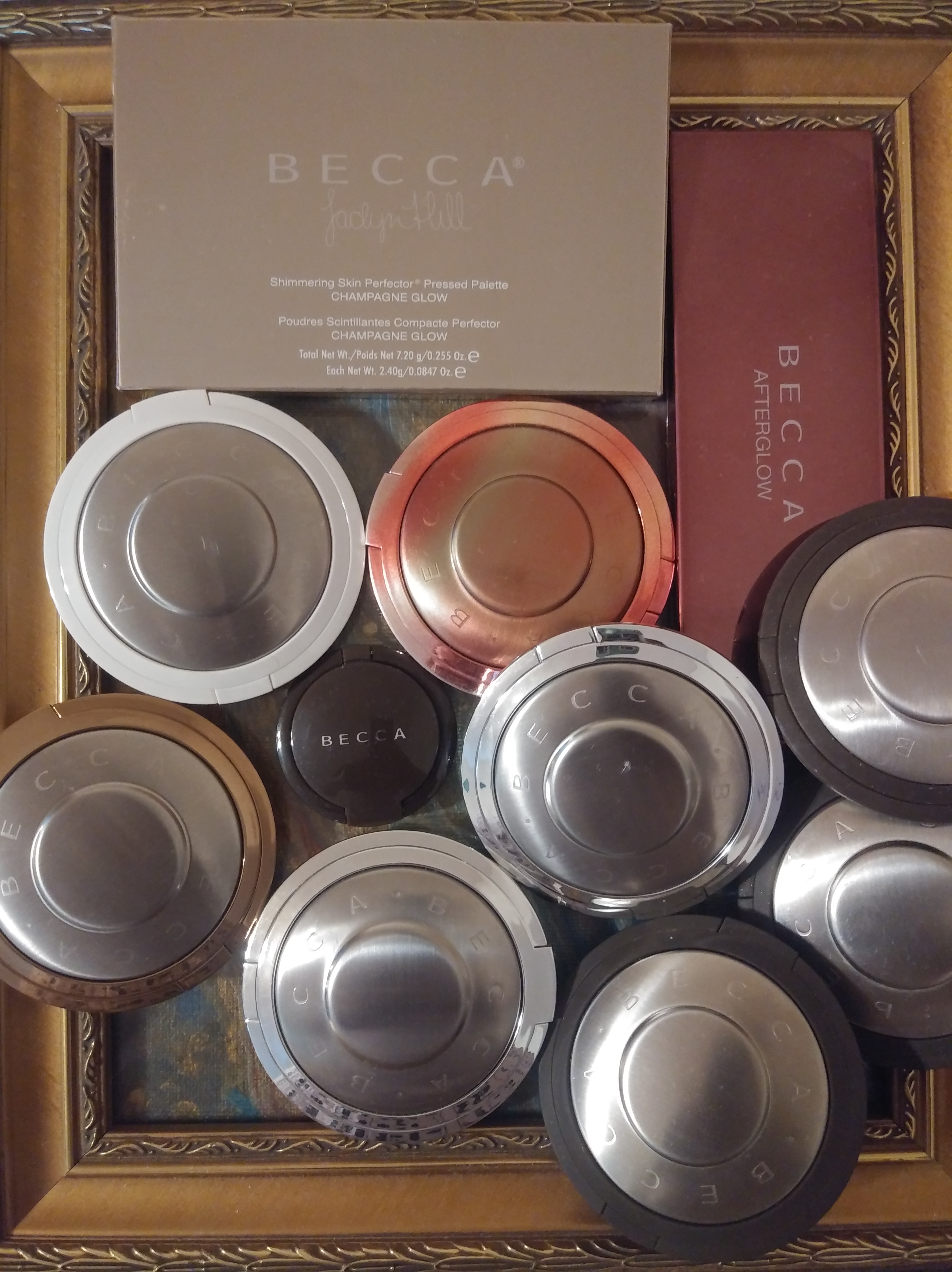
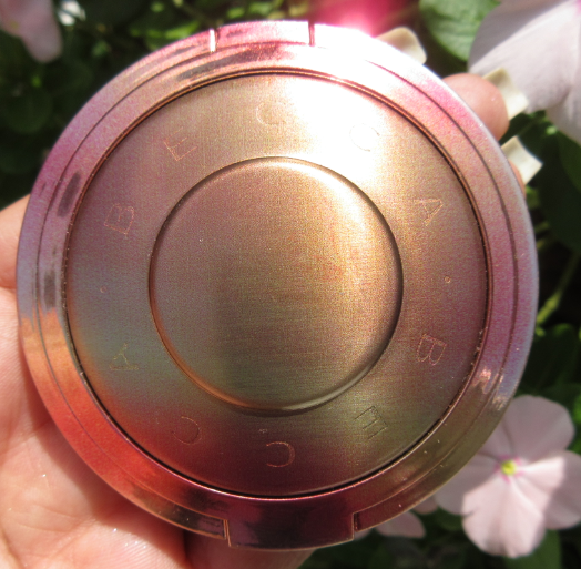
Becca Cosmetics was initially known for having a very inclusive shade range of complexion products and making shades for the deepest of skin tones that few companies at the time were willing to create. But the main hype around the brand, what it’s best known for, are their shimmering skin perfectors. They became even more popular within Beauty Youtube after collaborating with Jaclyn Hill to make Champagne Pop.
In 2014-2015, my makeup obsession wasn’t as strong as it would later become. After swatching the Becca Perfectors in-store, I firmly believed they were the best highlighters on the market, but I wasn’t about to drop $38 on just one. During the holidays in 2015, Becca released the Champagne Glow and Afterglow palettes, which allowed me to have multiple shades for the same price. So, I’ve been using Becca’s highlighters ever since! Although Becca has dropped in popularity, and their place among the top highlighter makers is wavering, their formula is still in my top 3.
I acknowledge half of my Becca collection should be retired to my products-too-old-to-use shelf, but they’re still just as good as when I bought them. I threw out all my liquid and cream Perfectors, but I plan to use the oldest powders for a little longer.
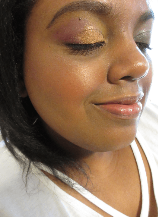
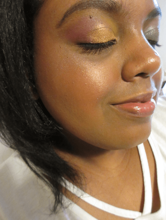
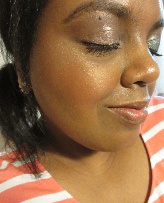
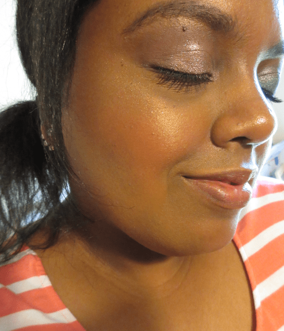
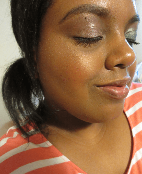
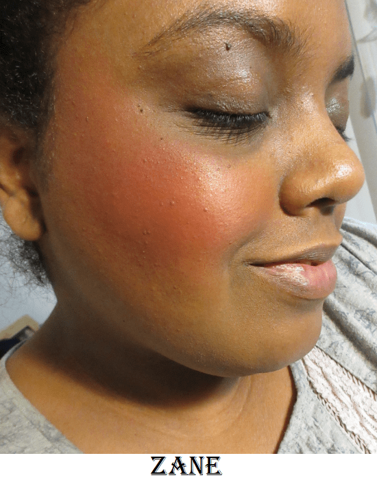
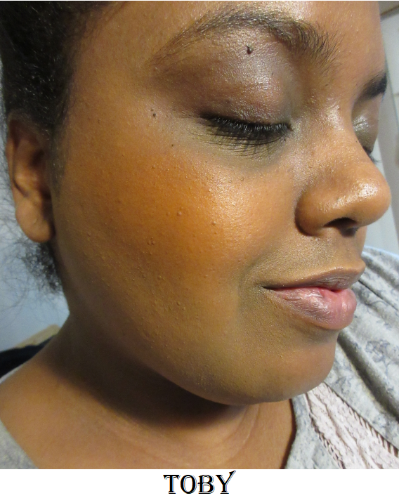
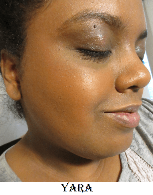
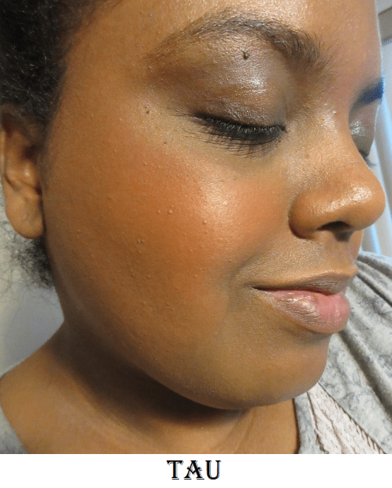
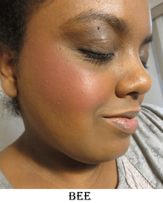
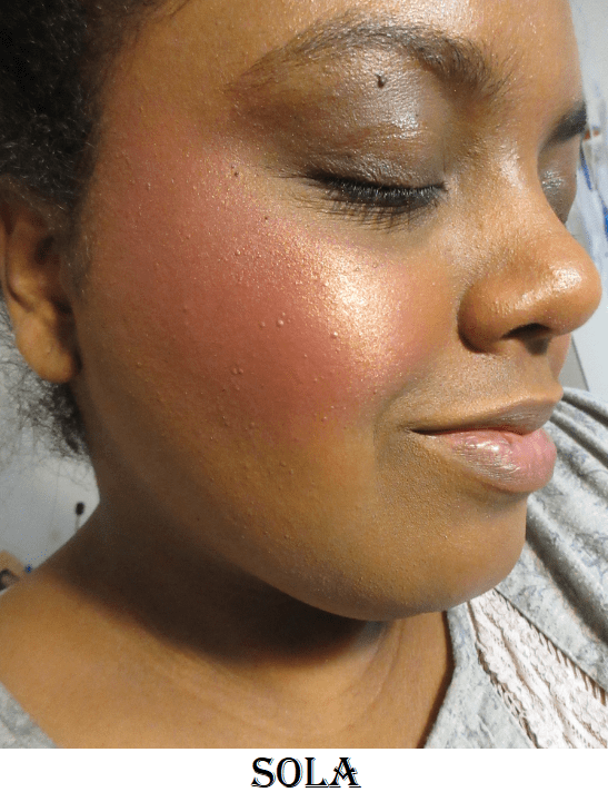
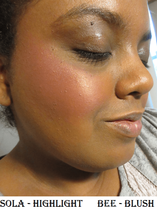
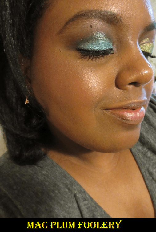
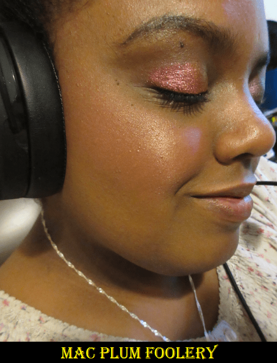
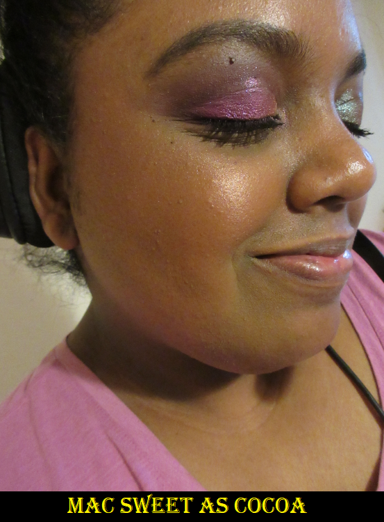
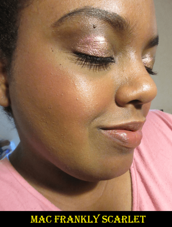
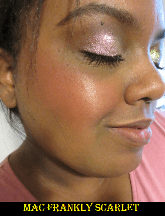
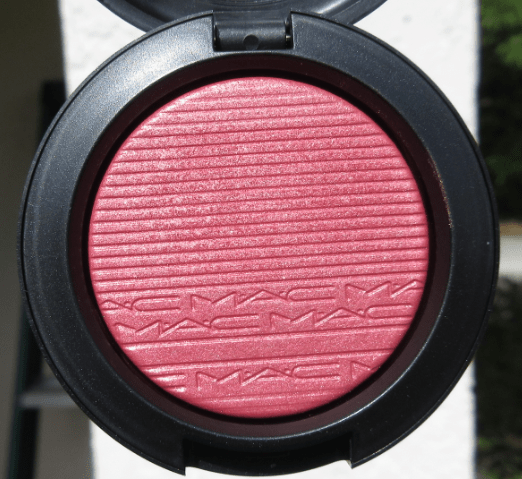
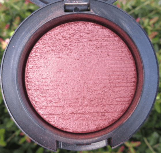
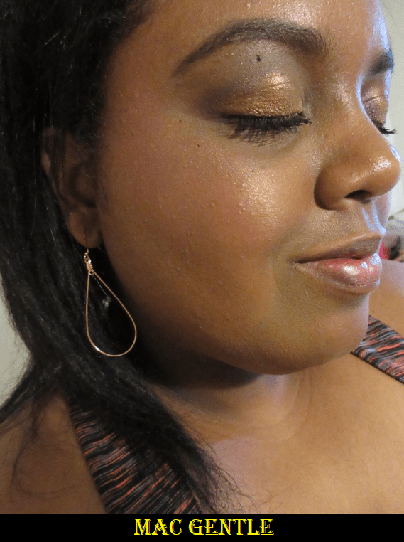
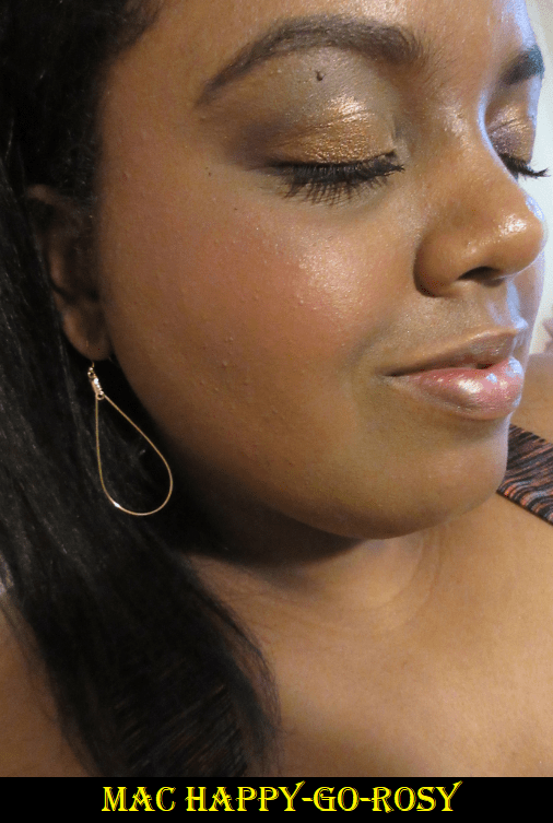
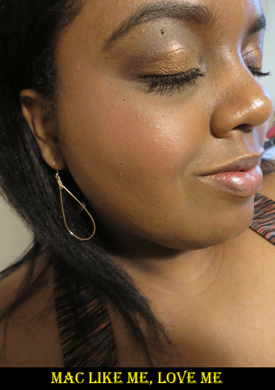
For consistency, I am wearing MAC’s Pinch Me blush, Nars Sheer Glow foundation, and Tarte Shape Tape concealer in every photo. I did not use contour powders or bronzers in any of the pictures.
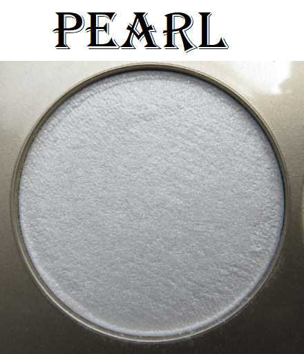
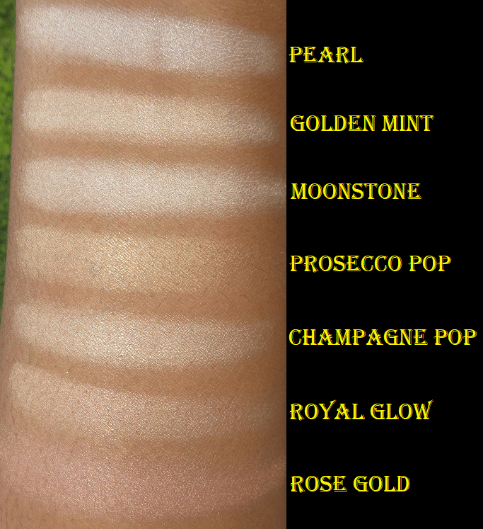
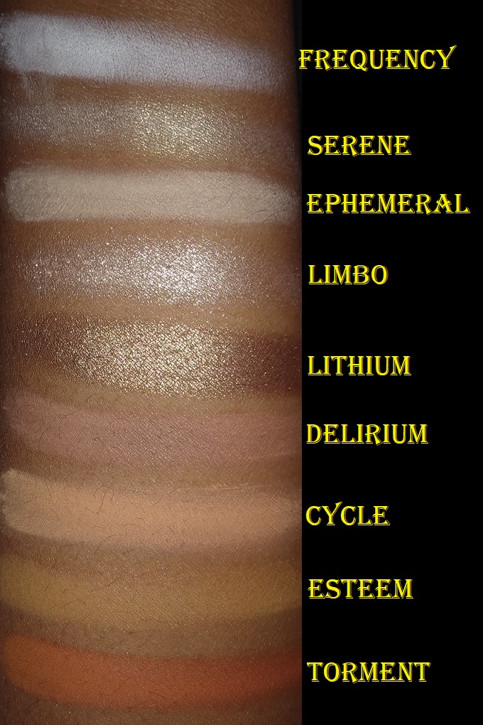
Pearl
Other than for testing purposes, I never use this color on its own. I only wear it mixed with Topaz. It’s described as a “soft luminous white,” which I expected to be incredibly stark and unwearable on its own because it’s the whitest shade of highlighter in my collection. However, this has a semi-transparent base that doesn’t leave a powdery white cast that other highlighters in my collection, which are technically darker, can have. I still prefer a warmer highlight, but it’s nice to know I could wear this if I wanted without it looking too crazy. Pearl was originally said to be a limited edition shade that Becca later made permanent.
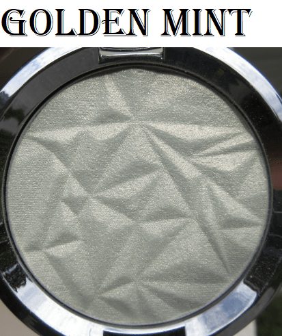
Golden Mint
This is a website exclusive “minty green that transforms into a wearable gold.” It was supposed to be limited edition, but three years later it’s still for sale. On social media, Becca asked followers which shade between Smokey Quartz and Golden Mint they wanted to be produced. They removed those posts from their Instagram after later criticism, but I have screenshots other accounts reposted.
Smokey Quartz supposedly had the most votes and was released within days. Then three months later, Becca released Golden Mint anyway. It was very clear for everyone to see that both colors had been in production long before they asked anyone for opinions. This deceptive marketing move left a sour taste in my mouth, but no one explains it better than the ladies at Beauty News, whose video I will linkhere.
I was annoyed with Becca but still bought it anyway during a promotional discount event. I do absolutely love this shade. The slightly green-tinged white powder transforms into a peachy gold shimmer. For anyone curious, I have reviewed this shade in the past. It’s more pigmented than Pearl and can actually look harsh if I apply too much, so I typically use my Wayne Goss 15 Fan brush with this product.
Moonstone
Like Pearl, I only wear this if mixed with Topaz. It’s described as a “pale candlelit gold,” and is an extremely common shade for a highlighter, but I don’t have that many shades which are this light in my collection. Moonstone was part of Becca’s original launch of Shimmering Skin Perfectors.
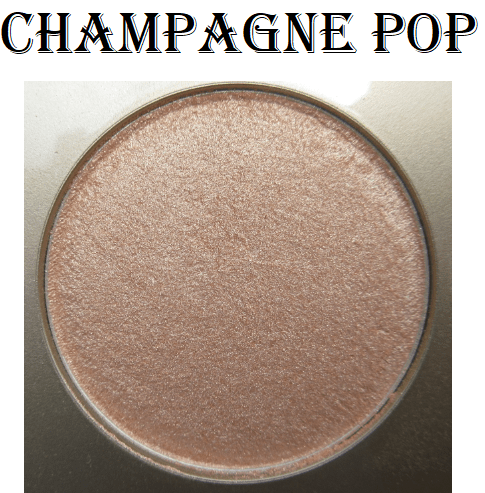
Champagne Pop
This “soft gold with peachy-pink pearl” shade is the one that catapulted Becca to mainstream fame thanks to the collaboration with Jaclyn Hill. The previous highlighters I’ve mentioned can be applied lightly to give a more subtle glow. Champagne Pop was intended to have a strong beam, as is Jaclyn’s highlighter preference.
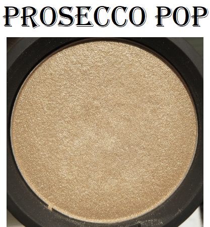
Prosecco Pop
Prosecco Pop was Jaclyn Hills’s second collaborating shade. It’s described as an “ethereal gold with rich golden bronze pearl” and that bronze is what makes this shade a bit better for my complexion than Champagne Pop. Although I don’t think this is quite as finely milled in terms of glitter particle size, I still like it.
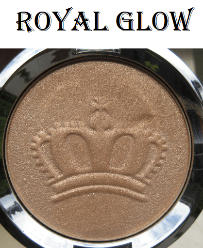
Royal Glow
This is a limited edition, “bronzed opal shade infused with shimmering gold pearl,” but is still available for sale. I bought it mainly for the pretty crown embossing, and therefore, I don’t use it as often in order to preserve the imprint. This highlighter has the most subtle shimmer and reflectivity of the Skin Perfectors in my collection.
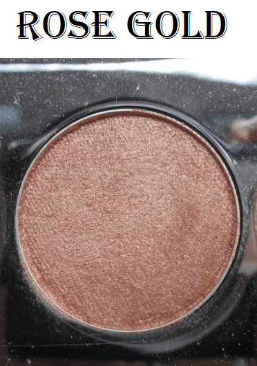
Rose Gold
This shade is a “rosy pink with warm gold pearl.” I usually dislike pink highlighters, and the same can be said of this one. The pink tone doesn’t show on my skin. It just looks slightly ashy (less ashy thanks to the addition of gold pearl) and cool on my cheek. It looks better in photos than it does in person. I don’t wear this shade and haven’t tried to mix it with any of the others.
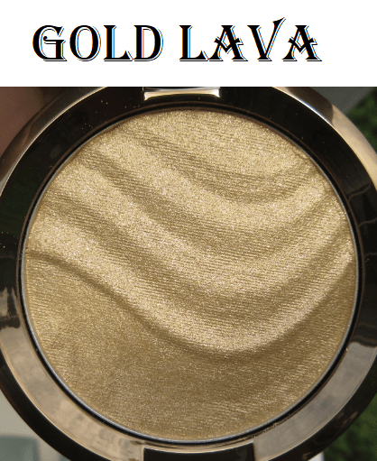
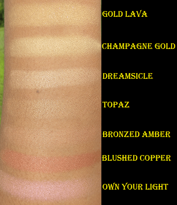
Gold Lava
This limited edition “24k gold with light pink pearl” highlighter is still available. It is the most glittery of the Skin Perfectors that I have. In terms of color, this shade is similar to Champagne Gold and would be more “wearable” if the formula was smoother with smaller glitter particles. Because this shade isn’t as old as Champagne Gold, I was hoping this could be a nice replacement for when that highlighter goes bad, but I rarely use Gold Lava and I don’t see that changing in the future.
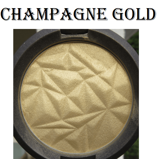
Champagne Gold
This limited-edition “soft warm gold” shade was released around October 2014 and I wanted it so badly! However, my frugal side refused to purchase it for the full price. I was waiting for a sale from Sephora or Ulta, but it never came. For an entire year, I was kicking myself for not getting it while I could. But in November 2015, Hautelook put it on their site for $30 and I finally got my hands on it! Champagne Gold was not a popular color. This was long before Fenty’s Trophy Wife, and there were a lot of complaints about how this particular shade of yellow wouldn’t work for a majority of skin tones. I don’t know how well it suits me, but I still used it a lot within the first year of having it (even though you can’t tell by looking at the pan). The base color is very pigmented, so I used it frequently but sparingly in the amount of product applied.
My theory is that Becca produced a small enough batch that rather than putting the rest of their stock on sale, which could lower the brand value for customers at their biggest retail partners, they unloaded their remaining inventory onto Hautelook, a much lesser-known website that still holds more prestige than TJMaxx because of its connection to Nordstrom. This shade might have even been sold at Nordstrom Rack, but I didn’t live near one to be able to confirm that.
The most telling indication that Champagne Gold didn’t do well is the fact that Becca never re-released it. Anything that sells well, Becca always brings back or adds it to the permanent collection. They were able to save face with Champagne Gold, but after that it was unavoidable. The Light Chaser Highlighters and Khloe Kardashian/Malika collection have been on sale for years now. The evidence of the brand’s dwindling popularity hasn’t been a secret for a long time.
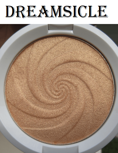
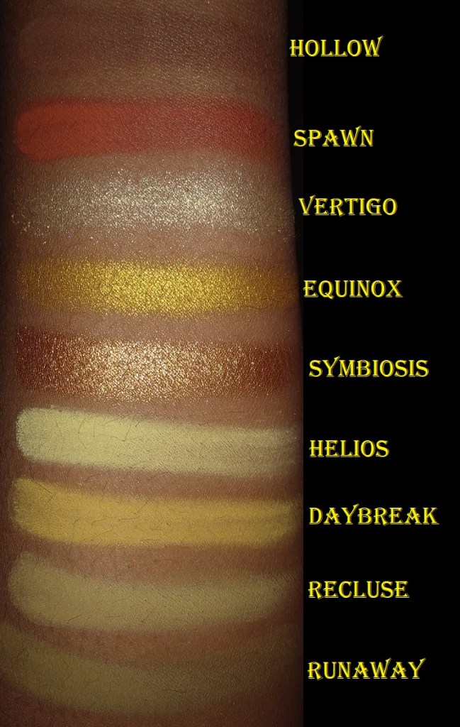
Dreamsicle
Real Dreamsicles are a combination of orange and vanilla. I expected this shade to be more on the orange side, but this limited edition “soft tangerine shade infused with white gold pearls” appears more peach on me. As is the case with Champagne Gold, I don’t know if this shade is flattering or not, but I like it. I don’t use it often though because it has become more of a collector item in my eyes.
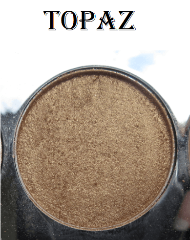
Topaz
I can’t remember if this, “warm bronze with gold pearl,” shade was part of the original highlighter launch with Moonstone and Opal. I do know that this was the first one created for those with darker skin tones. Many years ago, when I was several shades lighter, Topaz was just on the cusp of being too dark to highlight with. However, this color is perfect for me now. Either that or the top layer is lighter than it’s supposed to be due to the frequency in which I mixed Topaz with other shades.
There was a time when the only way I could get a highlighter as dark as this was to use a shimmery bronzer. When I see the highlighter offerings today, even from Becca who has made even darker shades like Chocolate Geode, it makes me happy.
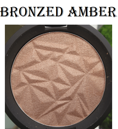
Bronzed Amber
The only description I could find for this shade is “warm bronze.” It’s a little more on the pink side, which isn’t my preference, but it looks much better on me than Rose Gold. I bought this shade out of pure curiosity and although it doesn’t look bad, I wish I skipped out on getting this (along with Gold Lava).
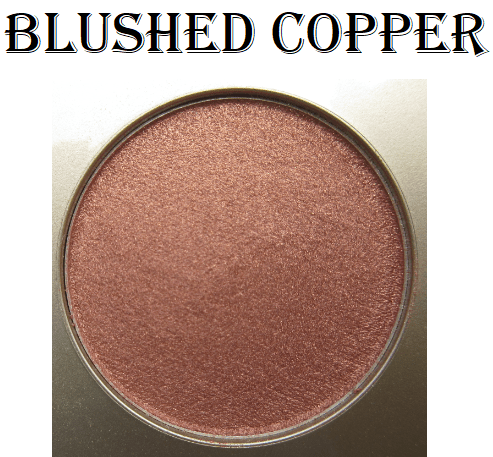
Blushed Copper
This “warm copper” shade is categorized as a blush and has been discontinued. Even though it looks dark in the pan, it blends in very well on my cheekbone and paired with my very pink blush. For some reason though, I never wear this as blush or highlighter.
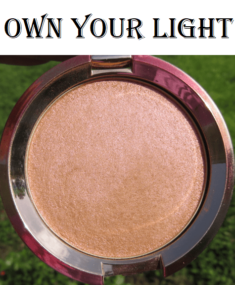
Own Your Light
I knew full well this highlighter wasn’t for me, but I wanted it anyway purely for packaging, so I bought it at a steep discount from a third party seller.
It’s hard to capture the shift on this “warm gold-infused [Perfector] with luminous peach and pink pigments.” The pink is less pronounced in these pictures, but in certain lighting, it is extremely strong. I can use this if I’m in the mood for an uncommon highlighter shade, but realistically I won’t touch it again. It’s purely a collector item for me because this is yet another limited edition item. I saw this for $22 at Ulta during the holidays, so if anyone is interested in this shade, you can probably get it on sale if you keep an eye out!
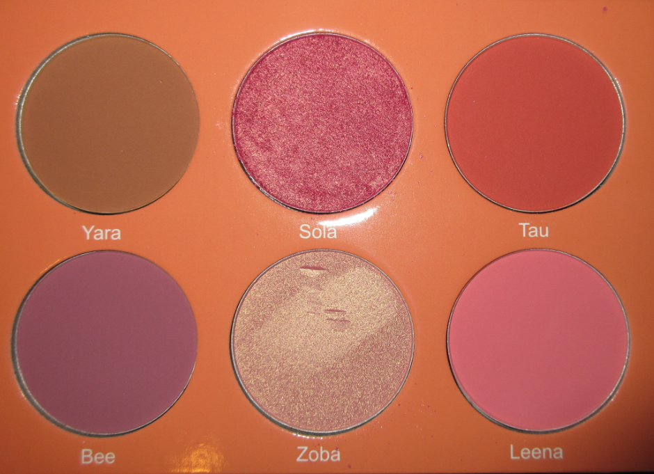
SWATCH COMPARISONS
As can be seen in the cheek swatches, although Becca makes a variety of distinctly different highlighter shades, they essentially look the same on the cheeks: whitish gold, yellow gold, or pink. Some of the colors are brighter and more intense than others, but there isn’t a need to have as many as I do. Out of the 14 Perfectors I own, the only shades I would miss are Golden Mint, Champagne Gold, and Topaz.
Although this is one of my favorite highlighter formulas, I’ve never thought these were worth $38 and I haven’t purchased a single one at full price. If you can get one in the $25-$30 range, or one of the mini sizes, then I could confidently recommend these Perfectors. However, Nabla’s Skin Glazing highlighter in Amnesia has become my most used highlighter for a year now and it’s $24. There are stunning highlighters at more affordable prices, which also adds to my hesitation recommending the Shimmering Skin Perfectors, despite how great they are.
Today’s review is about redemption! My first experiences with Milani and Clinique blushes were not very good, but I decided to give them another chance. With one brand it was worth the risk, but not so much with the other.
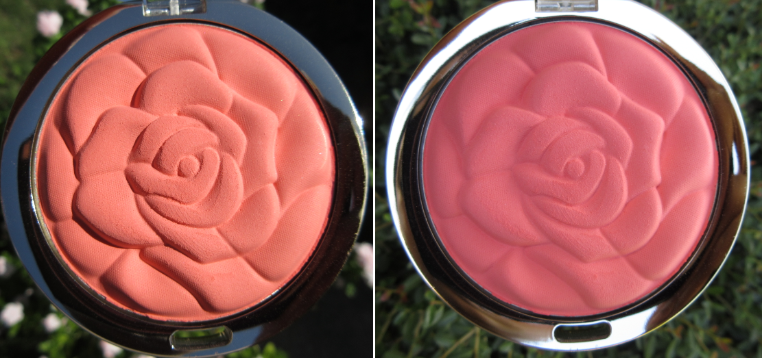
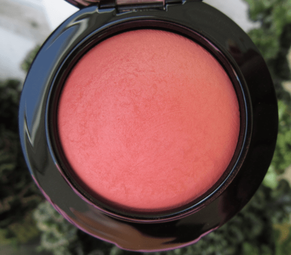
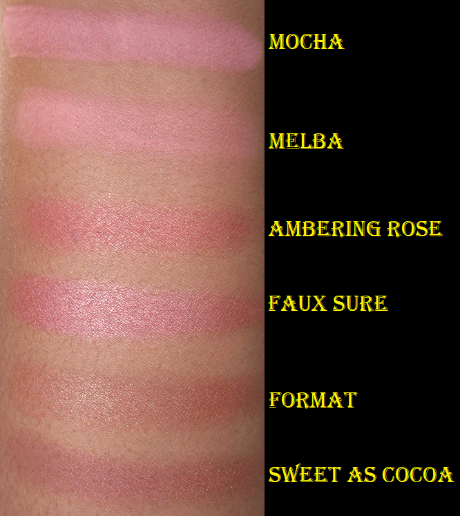
Milani Rose Powder Blush in Coral Cove
Coral Cove in varying amounts of sunlight.
This was the first Milani blush I purchased, and it was almost my last. This brand is so hyped up when it comes to blushes. I’ve never heard a single criticism about them, so while I was in the midst of making my original MAC blush post, I decided to give Coral Cove a try to compare. This blush is shockingly chalky and gives a low color payout. I can build it up on my cheeks, but it’s not just a matter of the shade not being pigmented enough. I really dislike this formula. The rose imprint and the color are nice, but I will never reach for this again.
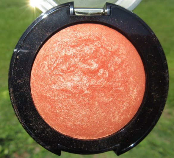
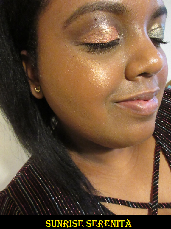
Milani Sunrise Serenità
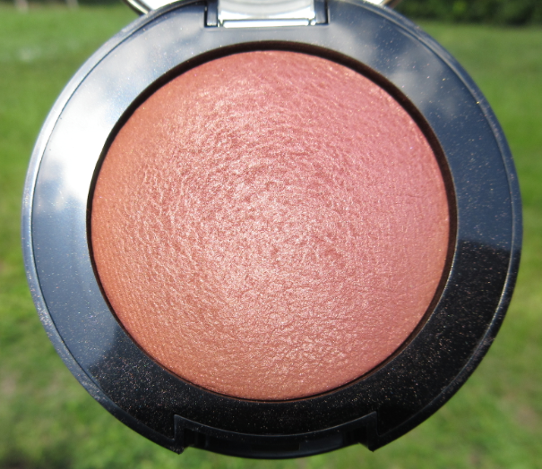
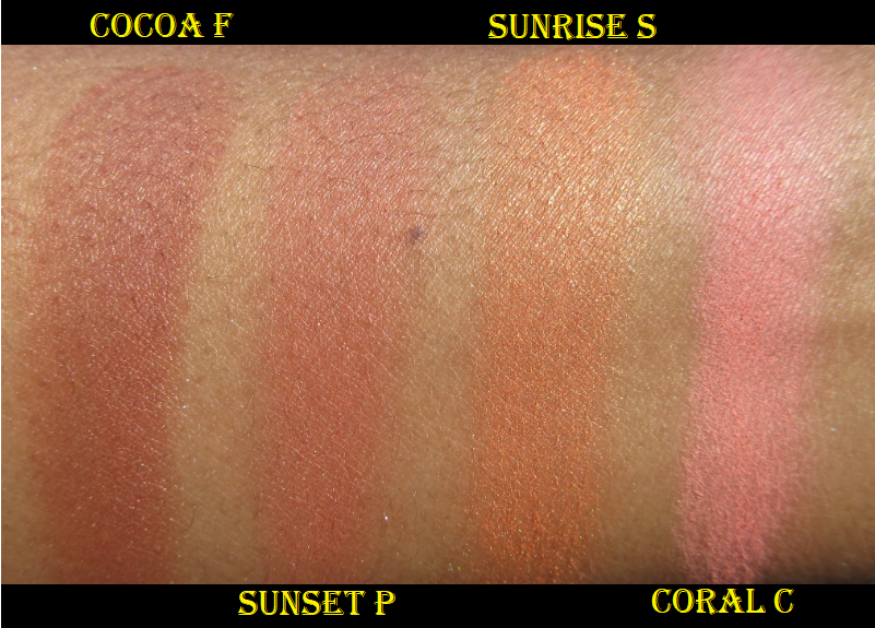
This shade and Cocoa Felicita are the newest additions to Milani’s line of baked blushes. They are the reason I decided to give the brand another try. I figured it was possible that when everyone raved about their blush formula, they might have been talking about the baked ones. I can say that I do enjoy these. They are much better than the rose powder blushes.
This particular shade works more as a highlighter or blush topper on me.
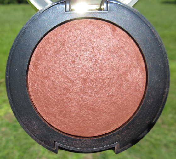
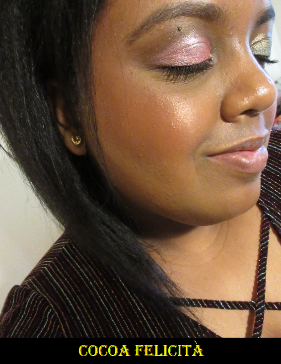
Milani Cocoa Felicità
In Yours Colourfully’s review video, she mentions that the blushes in the original packaging (with gold bottoms) were made in Italy. I expected to see the two new ones with this packaging (black bottoms) but the Sunset Passione shade that I’ll discuss after isn’t a new shade but was sent to me in the new packaging and was made in the US too. So, perhaps the original packaging is being phased out and all of the newly produced baked blushes are being made in the US now. I’m mentioning this because although I like these blushes, they have an insane amount of kickup! I don’t know if these are meant to be like this or if there was a formula change. On all three blushes, the powder you see around the edges were like that when I opened the package. The blushes weren’t even used yet when I took the pictures. And once I did start using them with my goat hair blush brush, a ton of powder came up with it. It has the most kickup I’ve seen from a blush or any other baked/pressed powder! When I switched to a synthetic brush, it lessened the amount of powder picked up, but there was still a moderate amount of kickup.
This shade works the best for me as a blush. I really like it! It’s not as dark as I expected from looking at it in the pan, but it’s the darkest shade in the line. I would like to see other deeper toned blushes from Milani in the future.
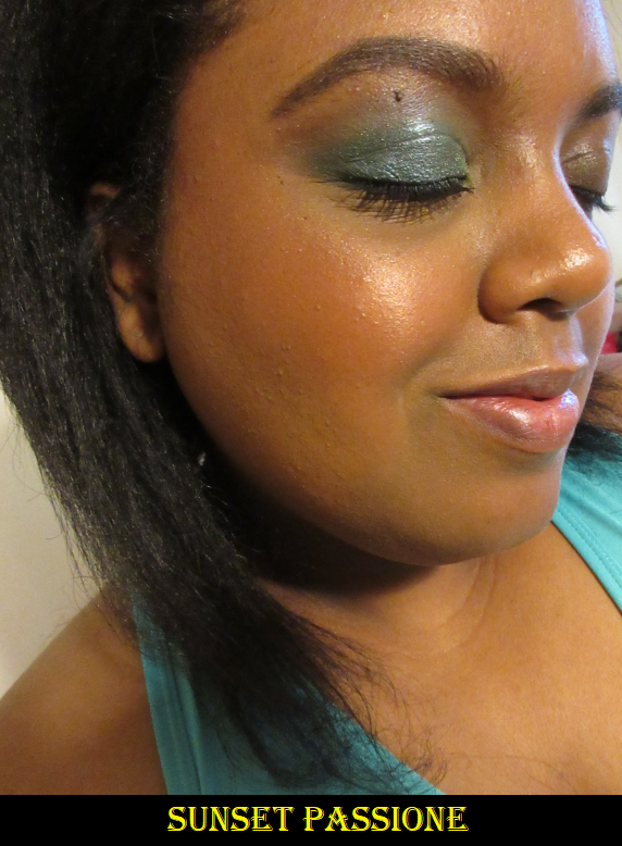
Milani Sunset Passione
This shade is very similar to Cocoa Felicita, but a little lighter and a little more rosy toned.
It’s a little harder to see on camera. In person, it still looks subtle on my cheeks with the exception of the obvious shimmer.
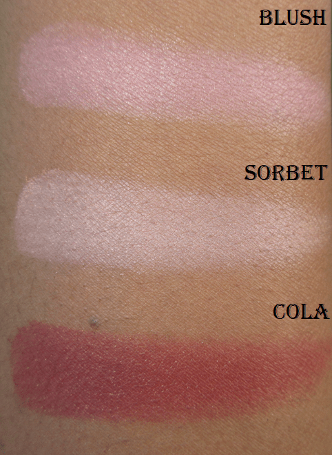
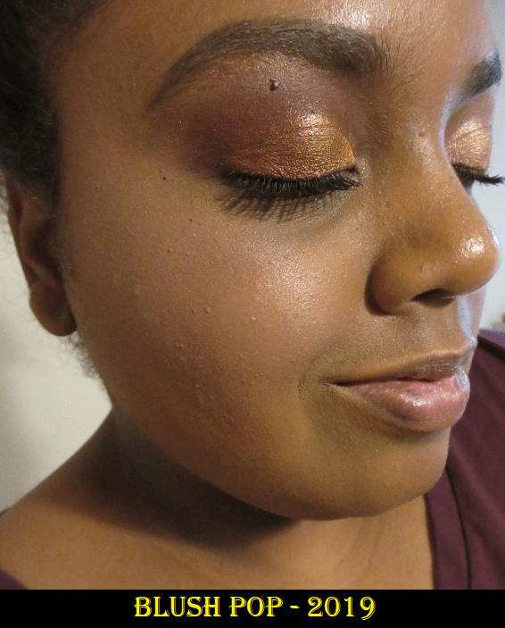
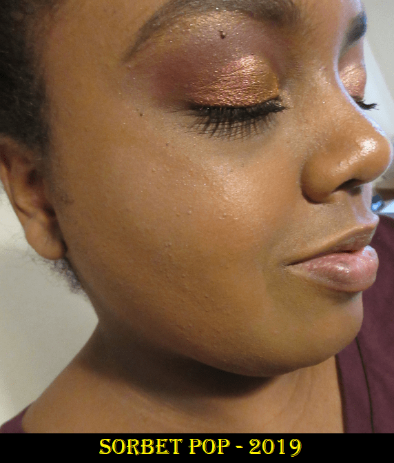
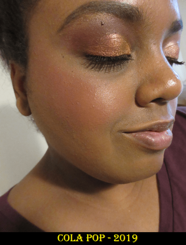
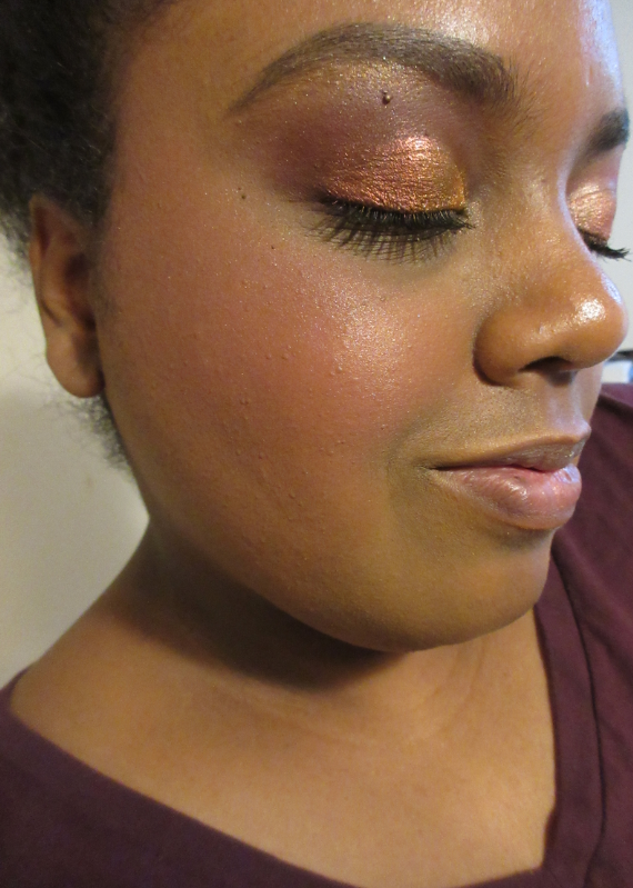
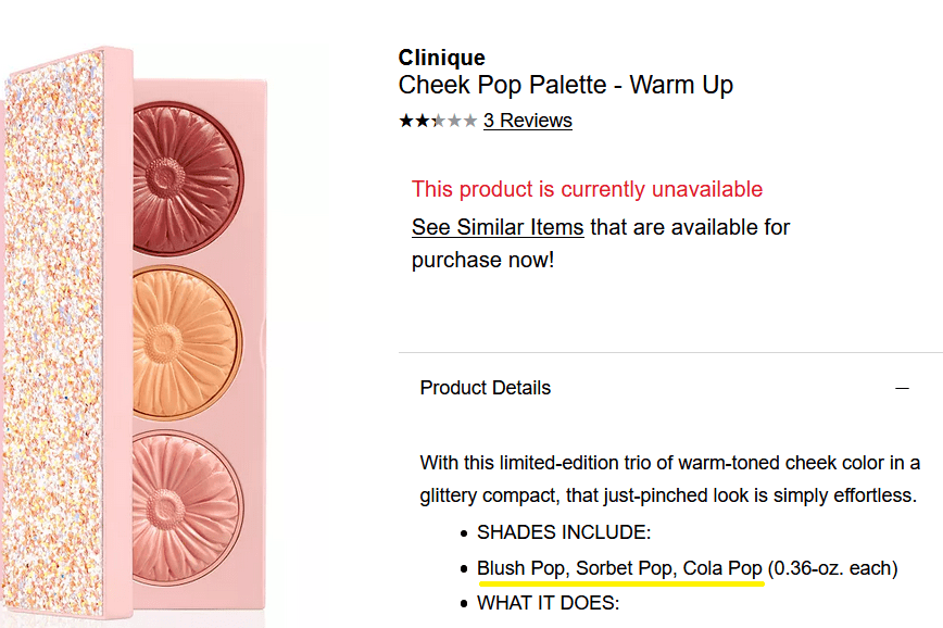
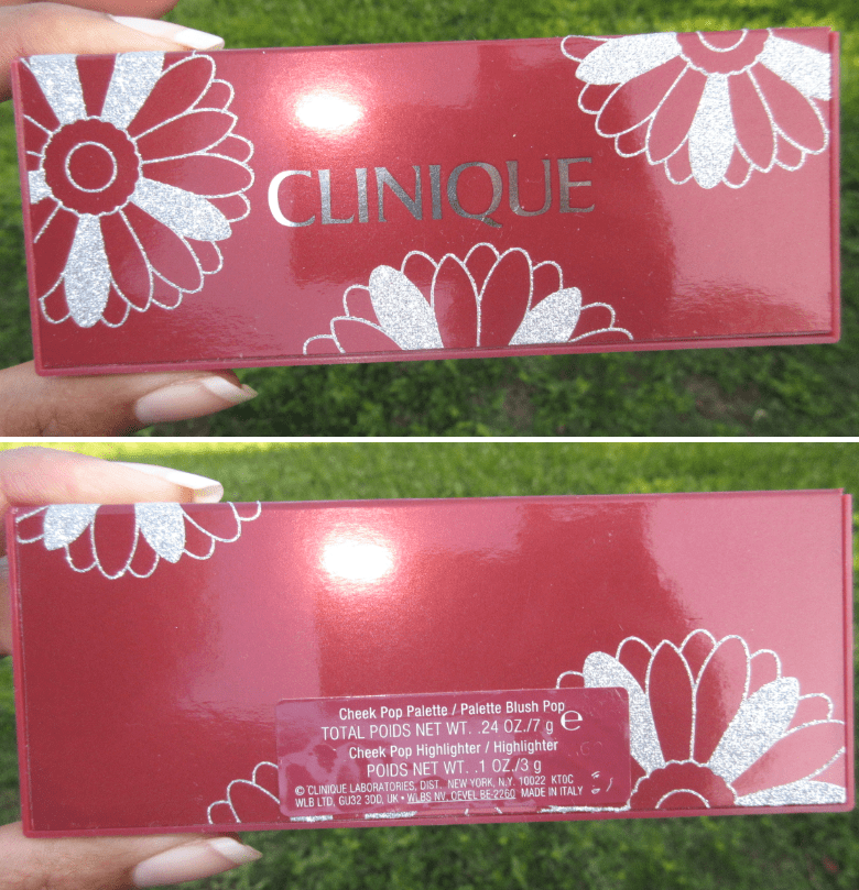
CliniqueWarm Up Cheek Pop Palette 2019
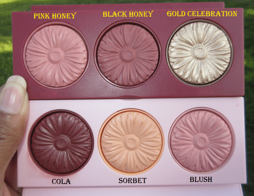
I bought this holiday palette last year and barely used it. The shades Blush and Sorbet were limited edition, but Cola Pop is a permanent single blush in Clinique’s Cheek Pop Blush line. The reason I wanted this item was to try out Cola Pop and for the ability to mix the shades for additional color combinations, but I just didn’t like how any of them looked on me.
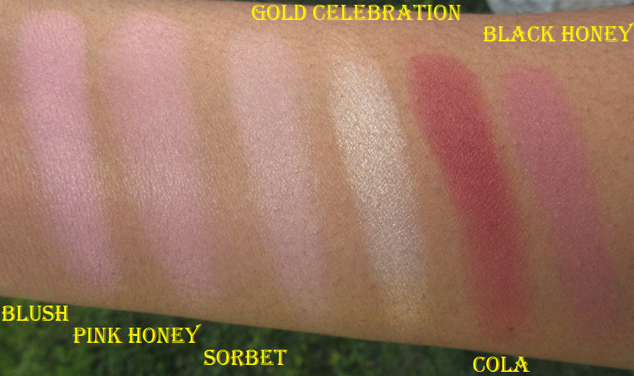
All 3 shades mixed together.
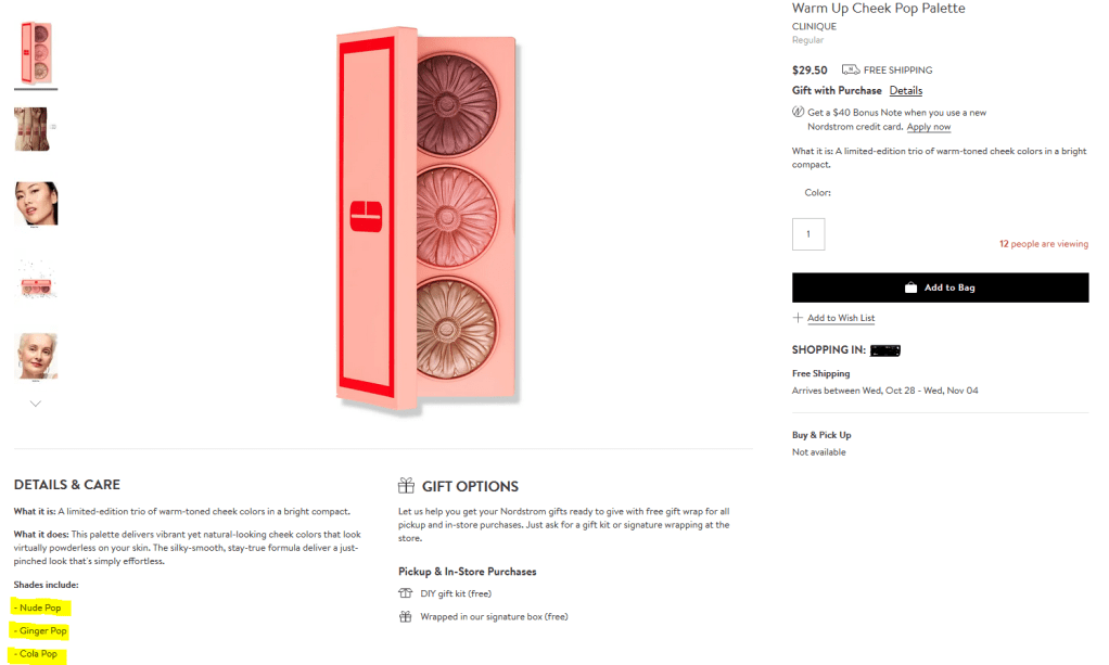
They brought back this palette with the same name but the only shade from the original is Cola. The two lighter blushes are different.
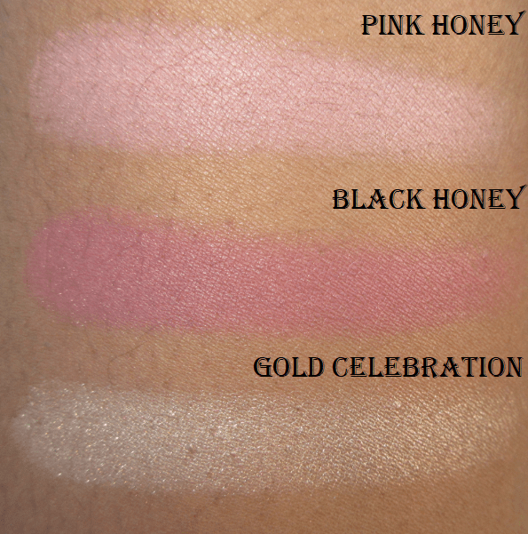
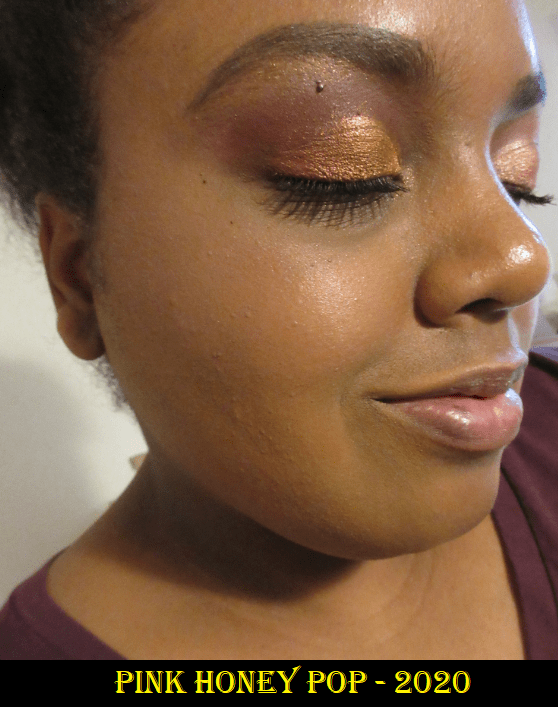
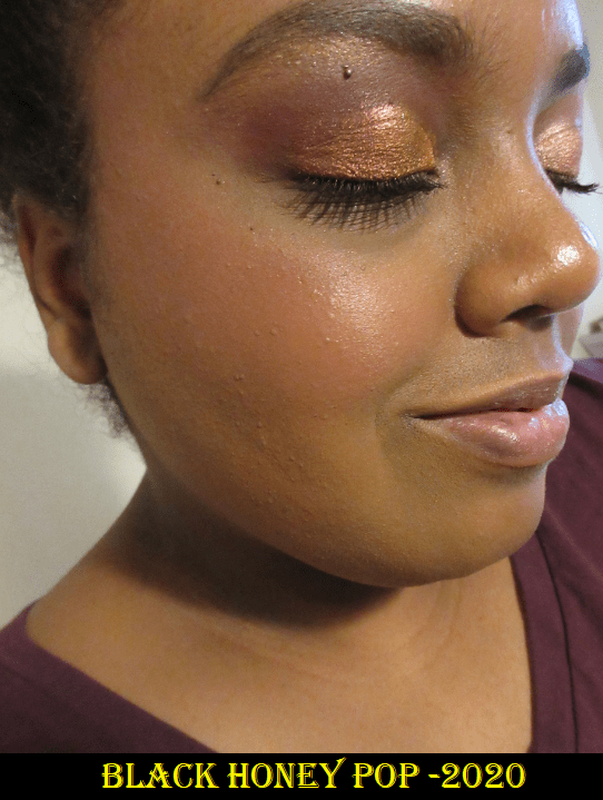
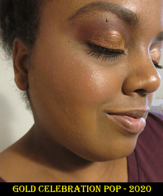
Clinique Holiday Cheek Pop Palette 2020
I told myself not to buy this year’s palette but my curiosity got the better of me. I knew the Black Honey shade would show up on me, based on another video from Yours Colourfully, and I really wanted the highlighter. I purchased this during Sephora’s Friends and Family sale, so the price was a great value. I like that this formula is more matte. The blushes from last year were more satin than matte. The packaging also feels sturdier and better quality, as this includes a mirror in the lid, unlike the one from last year. I like the highlighter, but unfortunately, I still don’t like how these blush shades look on me either.
The Gold Celebration shade is used as highlighter over a different blush (I forgot which blush I used).
I think I can officially say the Clinique blush formula just isn’t for me. They aren’t bad blushes at all, and if you like them already, these palettes are a fantastic deal. It comes down to a matter of preference for me and how they look on my skin in person.
Clinique Comparisons
Overall, my second chance blush experiment was a success because it helped me fine tune what my preferences are. I’m glad I could finally try Milani’s blushes in a formula that I can recommend. Although Cocoa Felicita is the only shade that I will use as a true standalone blush, at $7.99 each (I used a first time customer discount code so it was even less) these didn’t break the bank. Do I still recommend waiting for MAC to have another 30-40% blush sale and purchase from them instead? Honestly, yes. But this is a decent alternative for those who don’t want to wait.
I’ve never been one to fawn over brands. There are some companies whose products I really like, and I speak about them highly, but when it comes to Clionadh Cosmetics I fully acknowledge I am a Stan.
I respect the company so much because of their amazing customer service, social media presence, and support of customers, creators, and even other indie brands. The biggest reason is of course their phenomenal eyeshadows. Their standard eyeshadow collections are fantastic (and underrated) but their Stained Glass Collection is several tiers above the rest. Other brands can make multichromes and do a decent job, but no one has been able to replicate Clionadh’s “mirror” finish in their Jewelled multichrome formula. Leigh and Maggie have created truly extraordinary eyeshadows.
THE ORDERING PROCESS / DELAYS
When I first heard about Clionadh, they were already popular. It was just a two-person team handmaking everything. The processing time was 20 business days and it was not uncommon having to wait 1-2 months for an order to arrive from Canada where they are based. However, they had a huge boom on January 21st, 2020 with their belated Black Friday sale. They had a new workspace and hired a few employees, but the demand was so massive that things were selling out within minutes. In order to give everyone a fair shot, they turned the Stained Glass collection into a pre-order collection and on February 4th they made preorders available and honored the sale price for the first two days. This is the reason why what once took a few months turned into a 2-5 month wait. In one of their updates they explained, “In total, we received more orders from this single restock than we did the entirety of 2019.”
This process became a lesson in patience for me. For the January 21st restock, I checked out 14 minutes after the launch and received my order on February 18th. For the February 4th Pre-Order launch (planned to ship in April), I was better prepared and checked out two minutes after the launch. However, I combined that order with my later February 25th order. So, my package arrived on July 8th. My March 4th order was also part of the April pre-orders and arrived on August 4th.
The COVID-19 pandemic with social distancing restrictions caused a far greater delay than anyone could have anticipated. This is the reason Clionadh didn’t catch up with everything until November 30th. That included closing their store for a month in order to complete the pending orders, build up inventory to reopen, move to an even larger space, hire additional help, order two custom pressing machines, and transfer their website to a different e-commerce platform. They have since reopened and from December 18th – December 31st, their biggest restock/sale yet has been underway. My intention was to post this before the sale, but my final order did not arrive in time for that to be possible.
Regarding the current sale, they plan to ship the standard orders after the holidays (January 2021) for the current inventory they have in stock. All orders containing a pre-order item will begin shipping in late February. This is a reasonable amount of time considering how long it takes to create new shadows, so it appears they won’t be as backed up in 2021 as they were this year.
This post has been many months in the making. I kept debating whether or not to post considering I still had so many pending orders. Ultimately, I decided to work on this a little at a time, as my orders came in, so I could finally make a giant 2020 Clionadh Collection post all in one!
PRICING
One of my initial deterrents from the brand was the cost of a single eyeshadow. Prior to watching Lauren Mae Beauty’s video, which is when I decided to finally try out the brand during their next sale, I only knew of Clionadh from photos on Instagram. I thought those pictures had been photoshopped or enhanced in some way because I didn’t think eyeshadows could ever look like that in real life. The irony is that they look even more stunning in person! At the time, I didn’t want to spend $25 on a shadow when I’d already been a little disappointed by the $15 multichromes I purchased from Sydney Grace. What I didn’t take into consideration is that the prices listed were in CAD, which is higher than USD. It’s only the most expensive shades, the Jewelled multichromes, which are 25 CAD at full price and $19 USD. Their website now has a conversion changer, which makes things easier to calculate.
Terra Moons Extreme Multichromes are $17, Sydney Grace Pressed Multichromes are $15, and JD Glow Multichromes are $16. Devinah Cosmetics shadows in the Butterfly Kaleidoscope Collection are $10, but the shifts are a lot weaker than the multichromes from the other brands. Devinah now has Aurorae Flares for $16 which are comparable to Clionadh’s Jewelled multichromes. They are the closest in quality that I have seen, though Clionadh’s are still just a touch better in my opinion due to that mirror shine. However, they are nearly identical enough that I would suggest if you live in the US and don’t already have the equivalent Clionadh shades to the Aurorae Flare shadows, you’d be saving $3 per shadow going with the Devinah options.
Clionadh’s prices for multichromes within the Stained Glass collection range from $8-19 USD. The duochromes from their other collections, which still have strong shifts depending on the shades, range from $5-6 USD. Devinah’s Duochromes are $8 with regular shadows as low as $5. Terra Moons’ are $6-13. Lethal Cosmetics Duochromes are $6.50-7. Give Me Glow’s regular shimmers are $7. JDGlow’s regular shimmers are $7.50. So, Clionadh’s eyeshadows are on par or better price-wise than other indie brands. Other brands have more sales though and some are at deeper discounts, so it just depends.
The cost of shipping to the US is around $11 (15 CAD) but it is tracked and insured. My last Terra Moons order cost me $7.29 insured shipping (free if you spend $65). Considering Clionadh is based in another country whereas Terra Moons is based in Tampa about one hour from where I live, I think it’s a pretty good deal. In addition, Clionadh knows that it would be so disappointing to wait months and have anything arrive broken, so they pack them the most securely of any brand. It takes me quite a while to unpack the shadows from all the bubble wrap!
THE STAINED GLASS COLLECTION
I will be categorizing by formula and showcasing eye swatches. Arm swatches and other comparisons will be towards the end of the post. For eye swatches, I used Nyx Glitter Primer on shimmers and MAC Paint Pot for mattes. For arm swatches, I used Nyx Glitter Primer on the Stained Glass Collection and Urban Decay Primer Potion on the standard collection.
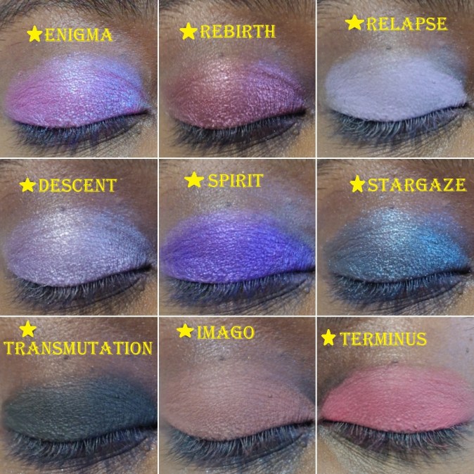
Series 1 Iridescent Multichromes
These appear white in the pan but have color shifts and a transparent base. They are recommended to be used as lid topper shades and highlighters for the eyes and face.
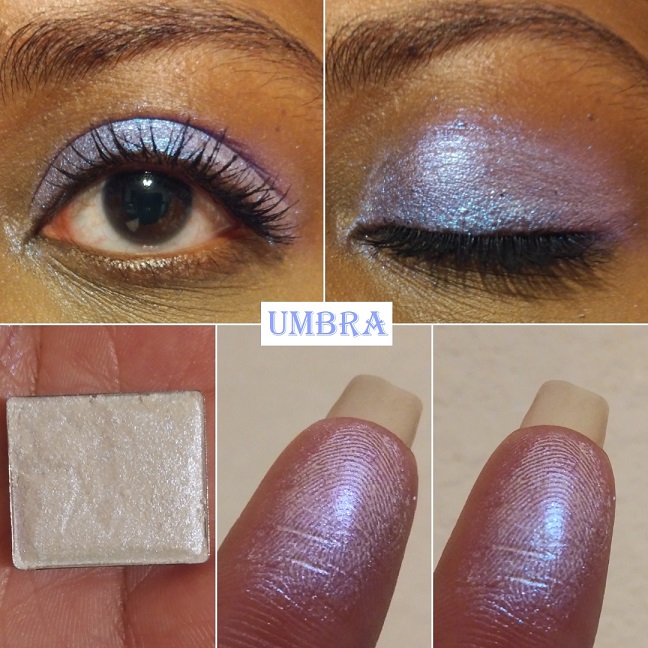
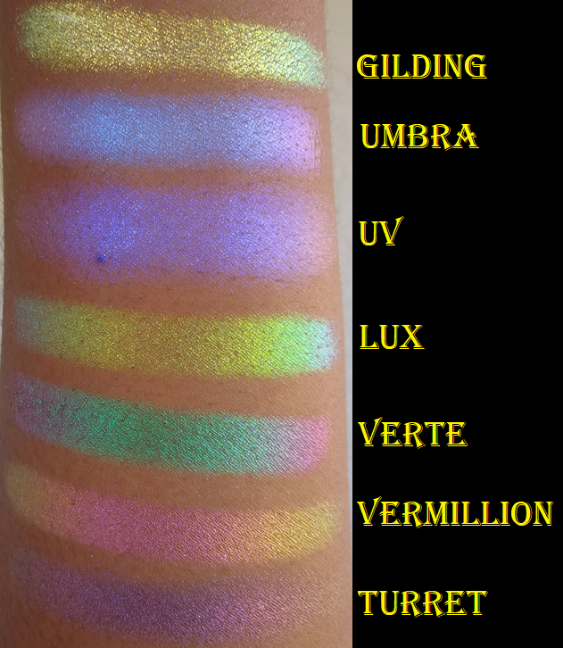
Umbra has “colour shifting reflects that go from blue-indigo-violet-pink.” This is the only one I have in this formula because although this kind of eyeshadow still works for me and is beautiful, it takes a bit of rubbing to make the white part of the powder disappear. It gets messy when I have to rub the shade rather than gently patting it onto my glitter-glue-primed eyes which I use to avoid fallout.
Series 2 Iridescent Multichromes
With Series 2, Clionadh says, “We don’t recommend using these on their own as a shadow because their formula is so thin and slippery, thus it doesn’t have the same adhesion a regular shadow would need on its own. But they certainly are perfect for the inner corner or brow bone.”
Of course, I still put them all over the lid for demonstration purposes. You can see a few sparse areas despite me building up these shades because they aren’t meant to be opaque. I currently have two shades and I was able to buy one more during the sale, which I will review in a future post.
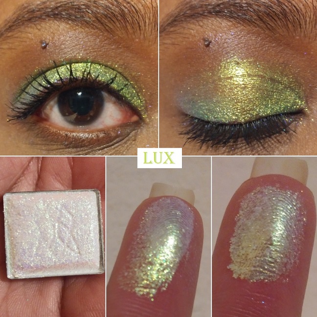
Lux has “colour shifting reflects that go from yellow-lime-turquoise-violet with a slightly more glittery finish.” This shade is so reflective and beautiful that I literally gasped when I first swatched it. My camera doesn’t come close to doing it justice!
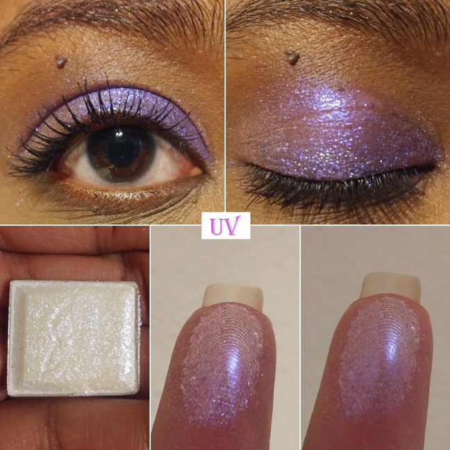
UV has “colour shifting reflects that go from violet-peach.” I can’t really see the peach on my skin tone but the shade of purple is beautiful and I’m happy with how it looks. It practically glows!
Overall, Series 1 feels a little more powdery and Series 2 does appear to have a more invisible base. With Series 2, I don’t have the same issue of needing to rub it in for the color to show. The regular application process is enough.
Deep Iridescent Multichromes
The Deep Iridescent Multichromes have a tan base which makes them easier for customers with medium to deep skin tones to wear without a white cast. They still look gorgeous on every skin tone though. I have 2 of 5 shades but I ordered two more during the restock. Clionadh mentioned plans to add new shades to the Stained Glass collection. I’m hoping they will expand the shades in the Deep Iridescent multichrome range, especially if they create a purple to top the ones I have from the Iridescent Series 1 and 2. A girl can dream!
These shadows go on easily and definitely don’t leave a cast. They look glittery but are super smooth in texture. Of all the iridescent formulas, this is my favorite!
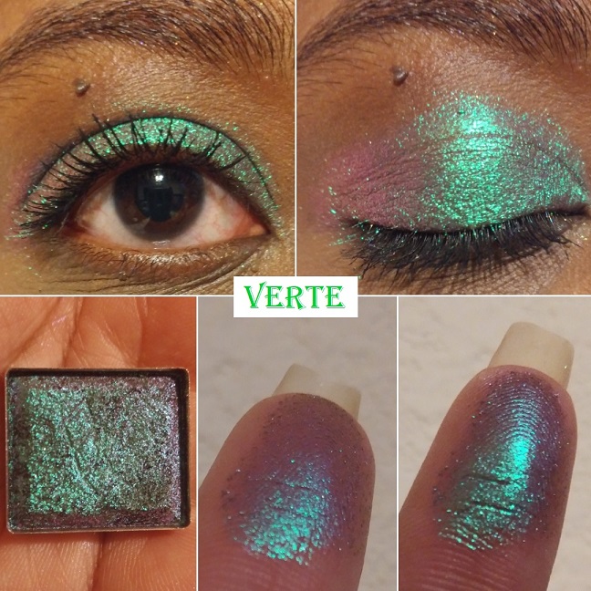
Verte is an “emerald-turquoise-purple-pink shifter with a medium, cool tan base.” This is another shade that made me audibly gasp. It’s one of my favorite shades from Clionadh’s entire collection and just my eyeshadows in general. It completely exceeded my expectations. I have quite a few green to purple shifting shades, but these tones are unlike anything else I’ve seen before!
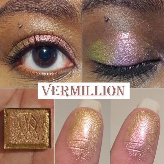
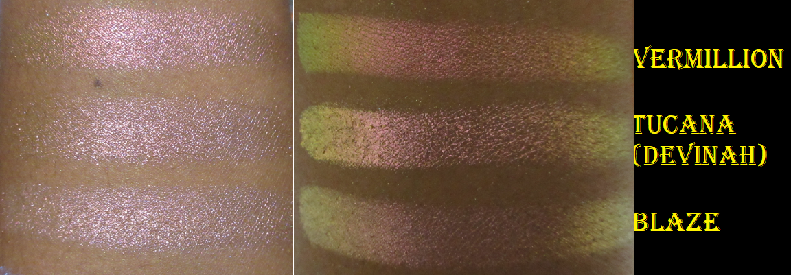
Vermillion has a “light, warm tan base that shifts pink-orange-gold-lime.” It’s not easy for me to be impressed by pink shades but this one is very pretty. It’s a smoother and shiftier version of Devinah’s Tocana.
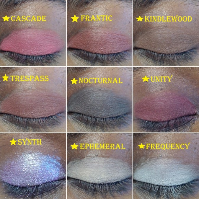
Iridescent Glitter Multichromes
The Glitter-Type Iridescent Multichromes aren’t pressed glitters. They have larger particles than most of the other shadows though, so I highly recommend using a glitter primer/glitter glue. Clionadh recommends this as well, along with, “applying them with your finger or a shader brush sprayed with a setting spray. Don’t swipe.”
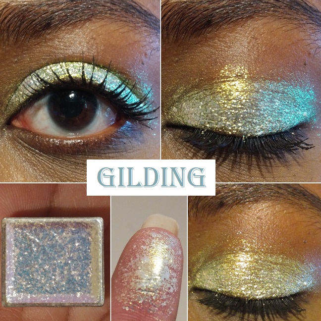
Gilding “has a translucent base that reflects bright gold-silver-green-turquoise.” The eyeshadows in this line are so incredibly beautiful, but because I prefer smaller sized glitter specks, this is the only one I intend to have in this formula. Also, I love how intense this is, but I wish the silver wasn’t there. On my complexion, the silver looks like unblended white powder in comparison to all the gold.
Glitter Multichromes
The Glitter Multichromes are once again not pressed glitters or plastic-based glitters. Clionadh says, “These have varying levels of opacity in the base colour and varying sizes of glitter particles. They are safe to use on the eyes.”
I have 19 out of the 23 currently in the collection. The missing shades are Corrosion, Ornamental, Kaleidoscope, and Engrave. From pictures alone, those four don’t look the most unique or shifty to me, so I decided not to buy them just for the sake of wanting to complete the set.
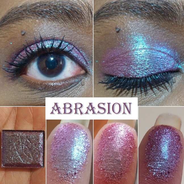
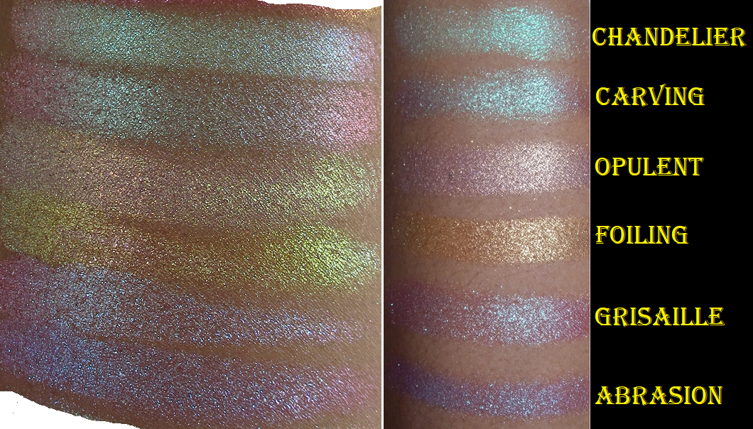
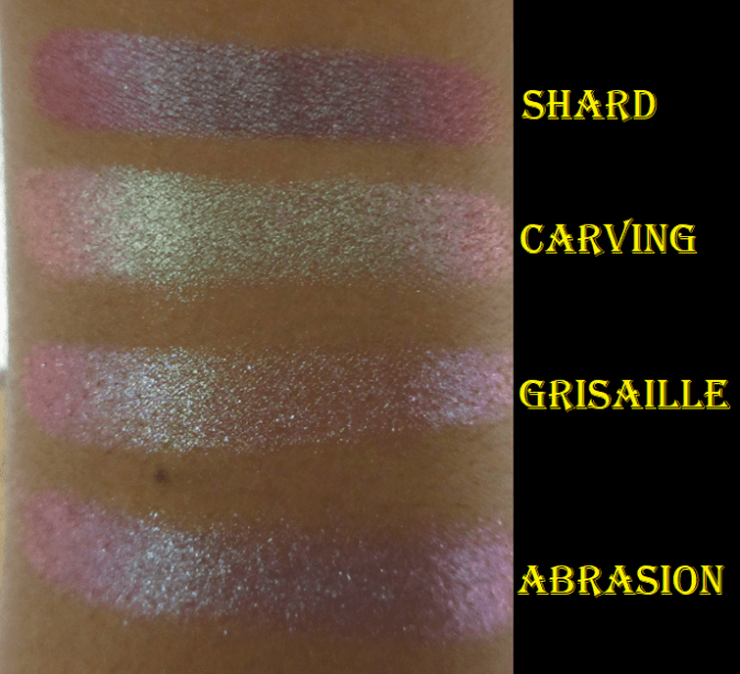
Abrasion “has a semi-sheer burgundy base with large glitter particles that shift turquoise-indigo-violet.” The color it looks in the pan is so similar to a multitude of duochromes I’ve seen before, even from mainstream brands, but when it’s actually swatched and put on the eyes, you can see how multi-dimensional it is. It’s so much more special than I thought!
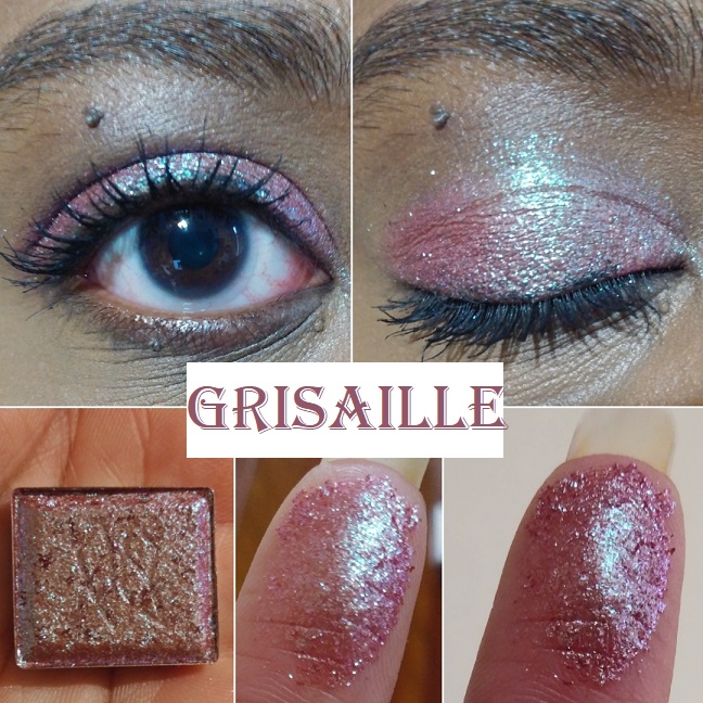
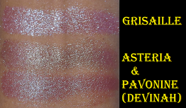
Grisaille “has a semi-pigmented terracotta base with medium glitter particles that shift turquoise-indigo-violet-pink.” This shade looked similar to Abrasion in the pan, but the base color changes the look on the eyes. Abrasion has a stronger turquoise shift whereas the sparkle in this appears more minty green, even though it isn’t described that way on the website. Pavonine from Devinah Cosmetics is a bit similar to this shade.
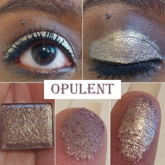
Opulent has “a warm purple-brown base (almost rose gold) with medium glitter particles that shift orange-gold-green-turquoise.” Certain shades don’t shift the way it is described, and I thought it might be due to my darkly pigmented eyelids, but I couldn’t see the other colors on my finger either. When I wear this one, it shifts from dark rose gold to a lighter and brighter gold, but that’s about all I can see. Perhaps the others show in different lighting. As it stands, the tone still makes it unique when seen in person.
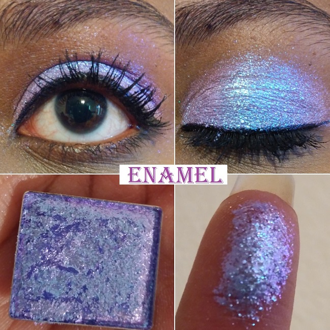
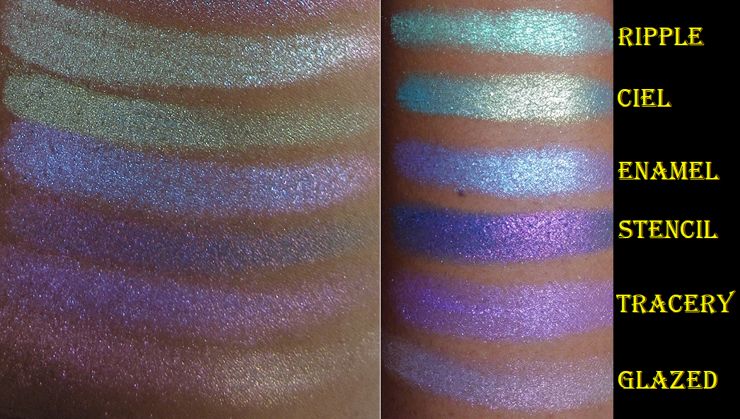
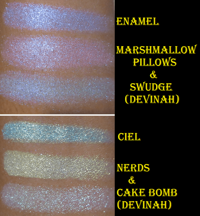
Enamel “has a semi-sheer lavender base with small glitter particles that shift blue-violet-pink.” This shade is gorgeous! I absolutely love the color, but I’ve discovered that thinking a color is beautiful doesn’t mean I’ll love how it looks on me. For my comfort zone, this one is a little too pastel-bright to be used all over the lid. However, when this is patted on top of other eyeshadows in strategic places, I absolutely love how it looks! If Clionadh makes a shade in 2021 that has a deeper purple base (similar to Stencil) with a blue-violet-lavender shift I would be all over it!
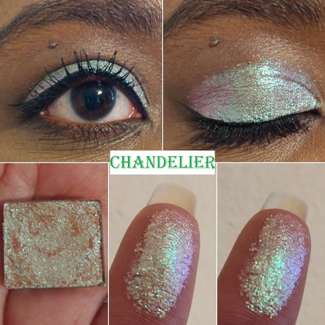
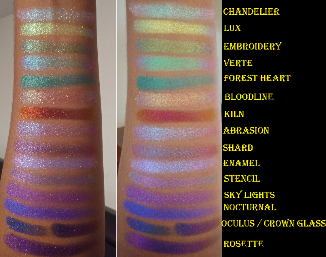
Chandelier has “a sheer pale mustard yellow base with small glitter particles that shift turquoise-indigo-violet-pink.” This shade surprised me. I typically don’t like shadows this light, but the shifts make this so wearable and flattering. It’s such a unique take on what could have been a typical goldish green, especially with how it looks so intensely turquoise at night. This is one of my favorites to wear alone or combined with other eye looks to give it extra oomph.
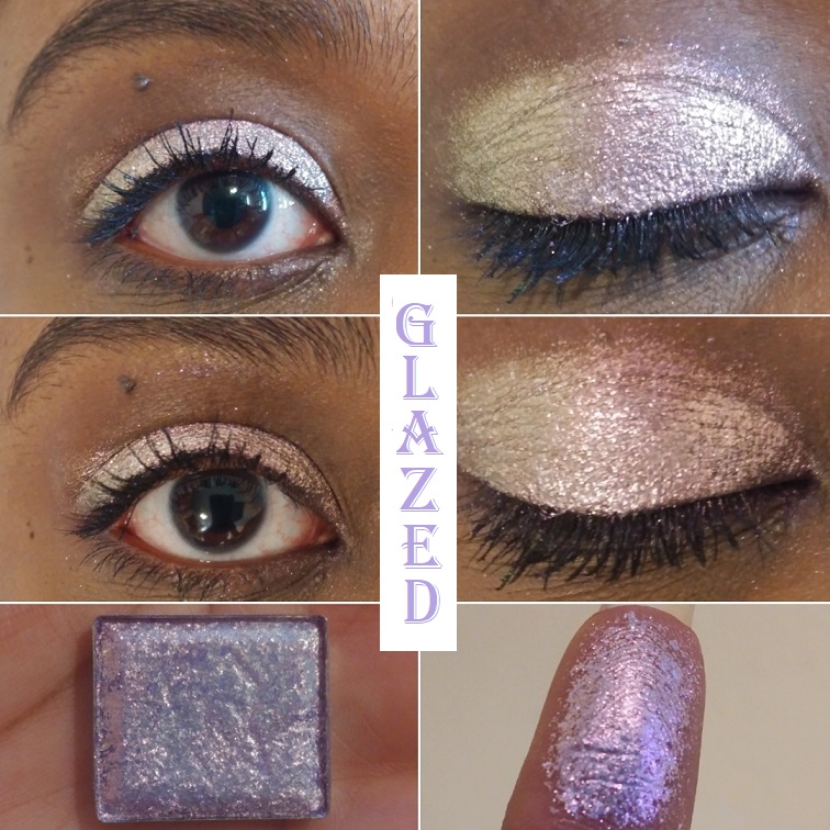
Glazed “Has a sheer lilac base with large glitter particles that shift pink-orange-gold.” I’ve learned that lighter purples are not my favorite and this pulls very white-gold/baby pink on me, which I also don’t like. Combine this with the larger glitter particles, and therefore added mess risk factor, and it becomes clear that this shade isn’t for me. Objectively speaking, it’s a pretty color though. On my eyelid, in this photo, it looks more strongly pink. At night, when the lighting shifts, the lilac is a bit more apparent and looks like the color on my finger.
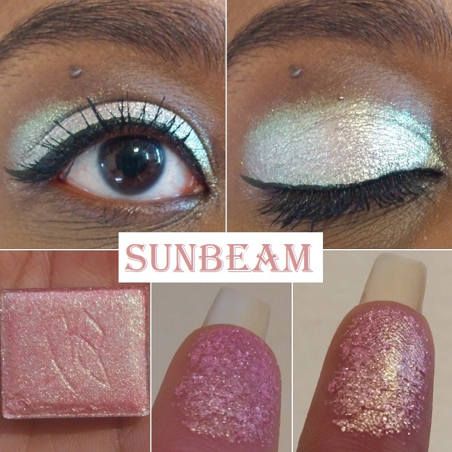
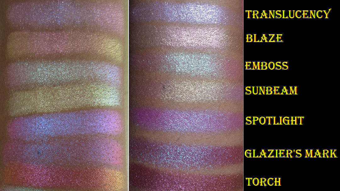
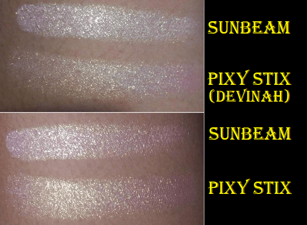
Sunbeam “has a sheer pink base with small/medium glitter particles that shift pale gold-lime-turquoise.” I have a few pink shadows with gold shimmer in my collection that I think are actually quite pretty: Pinkleberry from Coloured Raine, Meadowhawk and Golden Rose from Sydney Grace, and Empress from Devinah. This shade is more like Devinah’s Pixy Stix Xploder where it looks pink on my finger and in swatches, but on my dark eyelids, it looks incredibly light in a way I couldn’t have predicted. I have an easier time seeing the gold lime and turquoise at night when the lighting is different.
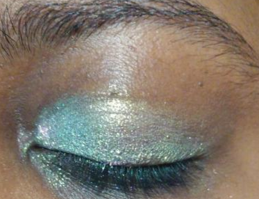
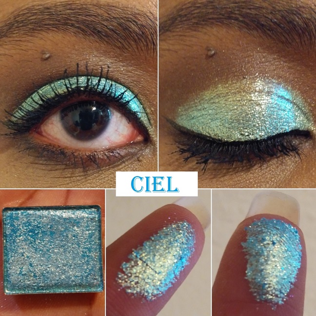
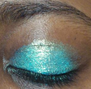
Ciel “has a semi-pigmented sky blue base with large glitter particles that shift gold-green-blue.” Ciel and Ripple aren’t typically the kind of blues that I like, but I thought if anyone could make me like this kind of color it would be Clionadh. Although it isn’t my favorite, I still use it from time to time. In the daytime, the lighter sky blue is more visible whereas, at night, it looks closer to the pan color.
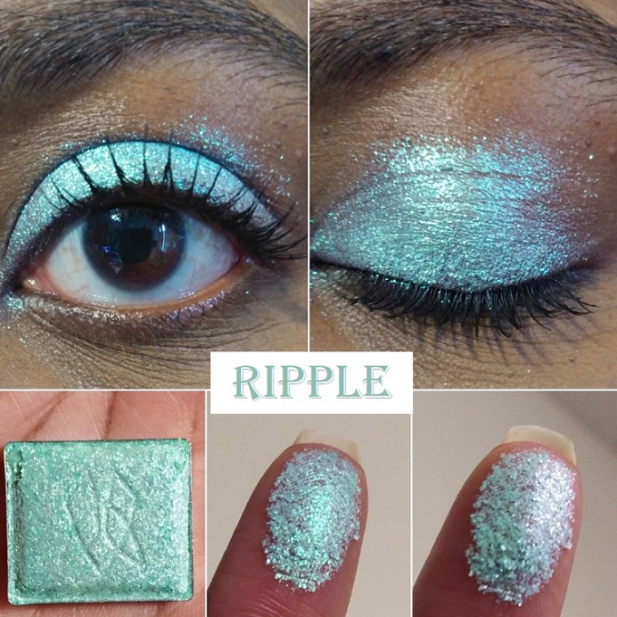
Ripple has “a sheer aqua-green base with large glitter particles that shift turquoise-indigo-violet.” This shade looks similar to Ciel overall, but the shifts are different. It’s not easy for me to detect that shift in person or in photos though. I’ve noticed that quite a lot of the lighter shades look deeper at night, but with this one there wasn’t much of a difference. At sharp angles, I can see the violet, but it’s still just not easy for me to see.
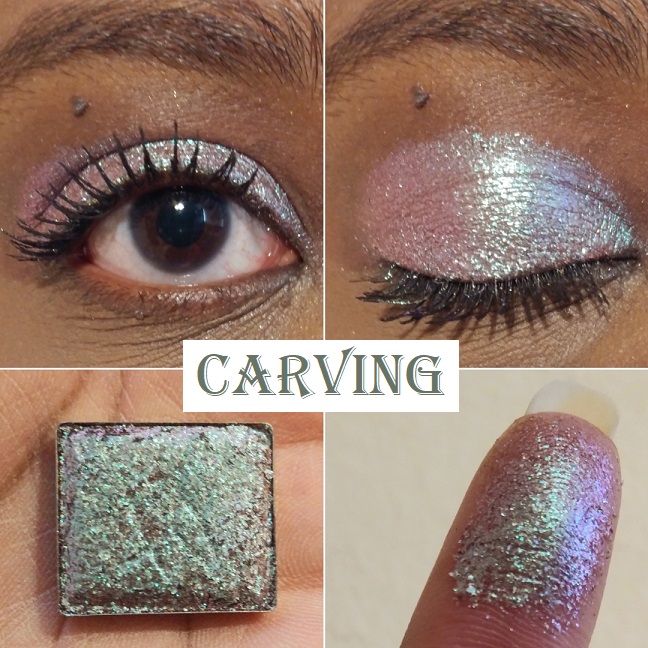
Carving “has a sheer, grungy, light brown base with medium/large glitter particles that shift turquoise-indigo-violet-pink.” I still haven’t decided if I like this shade or not. I’ve only worn it twice, so perhaps I’ll have a stronger opinion once I’ve worn it more. The pinkish turquoise gives it an interesting twist and I don’t recall having anything quite like it in my collection, though it gives me similar vibes to Grisaille and Abrasion.
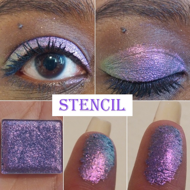
Stencil “has a semi-pigmented deep blue base with medium glitter particles that shift violet-pink-orange-gold.” I have purple-pink eyeshadows but nothing with this exact tone. Wow! It is so beautiful. If you’re a purple lover, this is an absolute must-have!
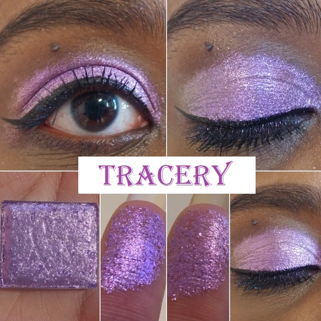
Tracery “has a semi-pigmented purple base with large glitter particles that shift indigo-pink-orange.” The purple and pink in this shade are close in tone, so the shift isn’t as apparent in person or on camera. I can see the variances between the indigo and pink, but I’ve yet to see orange.
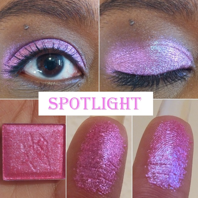
Spotlight “has a semi-sheer hot pink base with medium/large glitter particles that shift blue-indigo-pink.” I didn’t buy this shade based on the color in the pan. It was entirely based on how it looked in swatches where the hot pink takes on more of a purple tone. It still isn’t as purple as I had expected it to turn but, it’s an interesting shade. It’s not my favorite but I don’t hate it.
Translucency “has a sheer baby pink base with small glitter particles that shift blue-indigo-violet-pink, and tiny gold sparkles.” The way it looks in the daytime isn’t my kind of color, but how it looks at night is beautiful to me. It’s the kind of shade I prefer to use as a topper and not as a one-and-done eyeshadow.
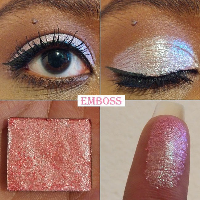
Emboss “has a semi-pigmented salmon base with small/medium glitter particles that shift lime-turquoise-blue.” On my eyelids, this looks a bit similar to how Carving and Sunbeam looked in regular daylight lighting. At night, I have an easier time seeing the lime and turquoise. I think I prefer Carving over Emboss, but I like Emboss more than Sunbeam.
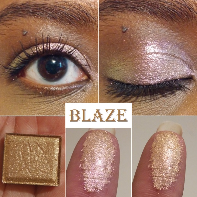
Blaze has “a sheer orange base with medium glitter particles that shift peach-gold-lime.” Blaze reminds me of Vermillion but with a less noticeable shift due to the peach, gold, and lime being all light tones and therefore harder to see without as much contrast in color. This is close to Devinah’s Tocana shade.
Torch has “a pigmented copper base with medium glitter particles that shift red-orange-gold.” This is very pretty but very hard to see a shift with indoor lighting. While outdoors, it was very easy to see orange and gold. This shade is like a toned-down version of Kiln.
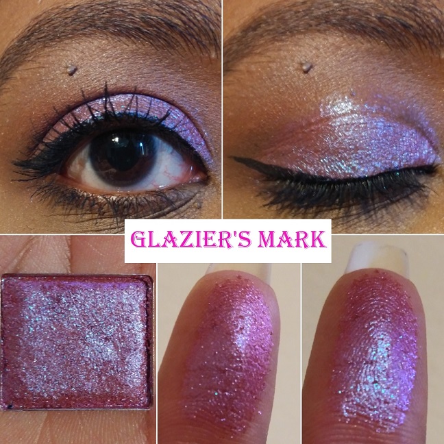
Glazier’s Mark “has a sheer orange base with medium glitter particles that shift indigo-violet-pink-orange.” My brain keeps saying I’ve seen shadows like this before, but everything I’ve tried to compare this to isn’t similar enough. On Temptalia’s blog, Enigma from Lethal Cosmetics and Magenta Dreams from Sydney Grace are some cited dupes that I also thought about based on the color in the pan. The way they look on my eyelids is where the biggest differences between them are seen and why I don’t think I have a close enough dupe. I think the choice to use an orange base, yet maintaining the magenta look, is what makes it a bit more unique.
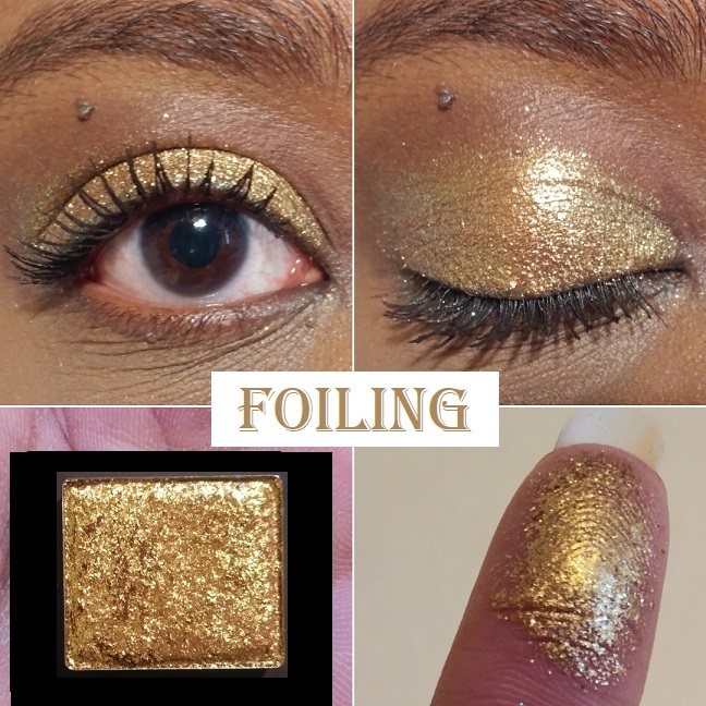
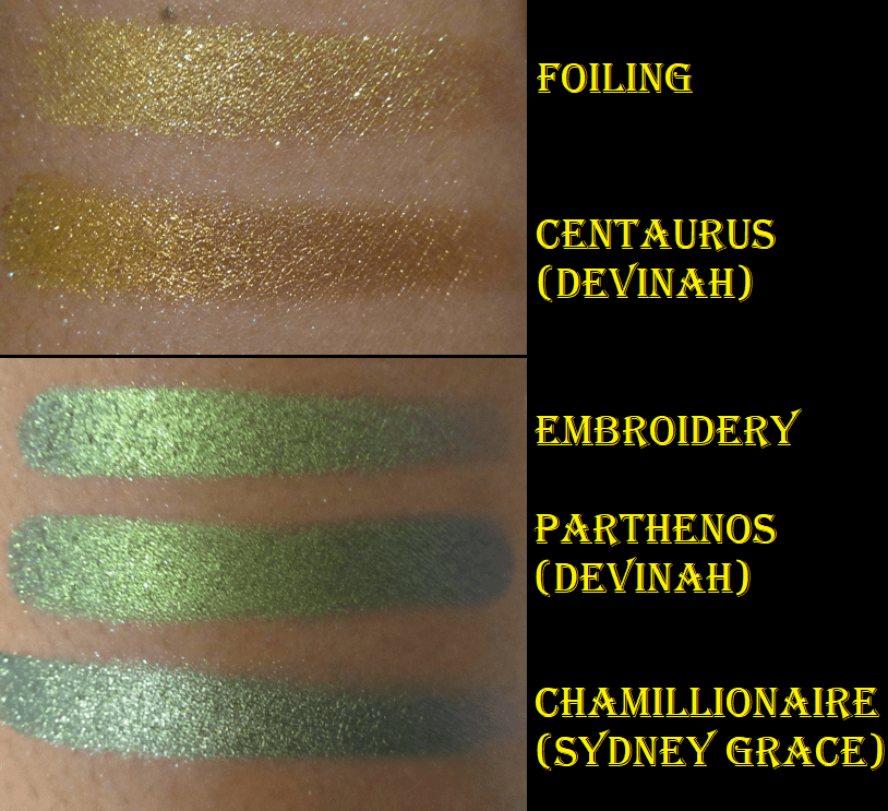
Foiling “has a pigmented warm gold base with medium/large glitter particles that shift orange-gold-lime.” This doesn’t show a shift easily. While outdoors, I can see the orange and gold, but still not the lime. I’m happy to have this because the glitter intensity and level of warmth in this gold shadow still make it stand out in my collection.
Hybrid Multichromes
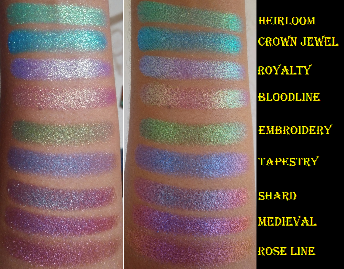
The Hybrid Multichromes are supposed to be the middle ground between the Jewelled and Glitter Multichromes as they “behave more like the small/medium particle glitters, but with the tones of the Jewelled Multichromes.” They can be applied sheer for a wash of color or packed on for full opacity.
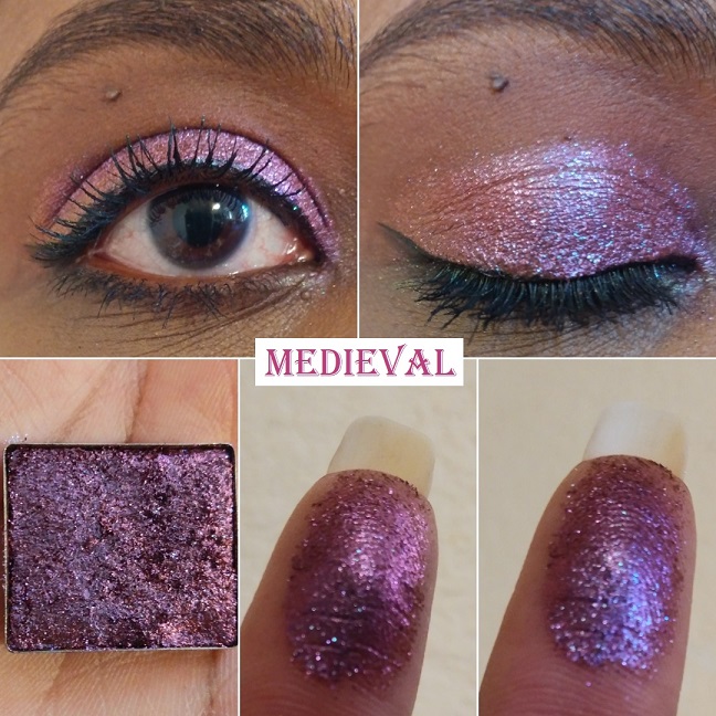
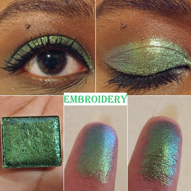
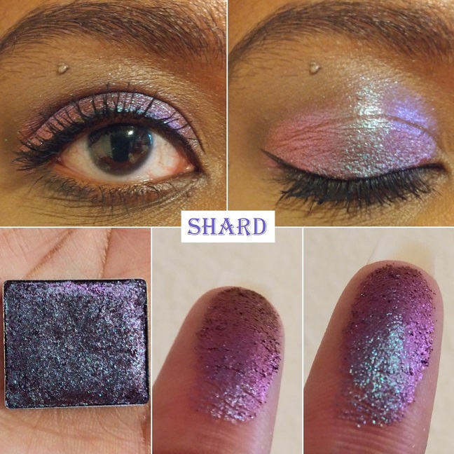
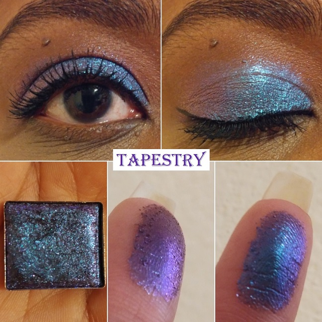
Because these are intended to be similar to my two favorite formulas in the Stained Glass collection, I had high expectations. I thought the shifts would be even stronger than the Glitter formula or essentially Jewelled shades without the black base. Shard, Embroidery, and Rose Line have lived up to that assumption but Medieval and Tapestry need particular lighting and a wet base to stand out like the others. It’s confusing because sometimes I wear those two and I’m amazed by their beauty but other times (again, due to lighting) they look dull and not as shifty.
I like that this collection has smaller particles and the fact that they still have visible shifts. I have five of the eight shades in this formula and while I’m constantly tempted to complete the collection, I keep thinking about my mixed feelings over Medieval and Tapestry, so it holds me back.
Medieval “has a warm brown base with medium glitter particles that shift indigo-violet-red-orange.” While Glitter Glue isn’t a necessity, I feel that it takes a tacky wet base to have a better shot at seeing all the color-shifting nuances in this shade. I like Abrasion more than Medieval, and that one is less expensive. This is still pretty. I just expected more from it.
Embroidery “has a grey base with small/medium glitter particles that shift lime-blue-purple. The shift is very clear to see on my finger. On my eyes, it’s just a hint, but it’s such a beautiful color that I don’t mind. You can see just a tinge of blue on the outer corner of my eye in the lid picture.
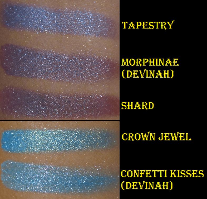
Shard “has a brown base with small/medium glitter particles that shift turquoise-indigo-violet-red.” Look how gorgeous it is on my finger! In some lighting this reminds me of Abrasion and in some lighting, it reminds me of Grisaille. This makes it different and interesting enough that I would probably still buy it if I knew at the time of purchase what I know now.
Tapestry “has a grey base with small glitter particles that shift blue-indigo-violet.” Like Medieval, I only like how this looks when applied wet and on a sticky base. It’s a pretty shadow, especially if you like blues with a tinge of purple, as opposed to purples with a tinge of blue. I am admittedly the latter.
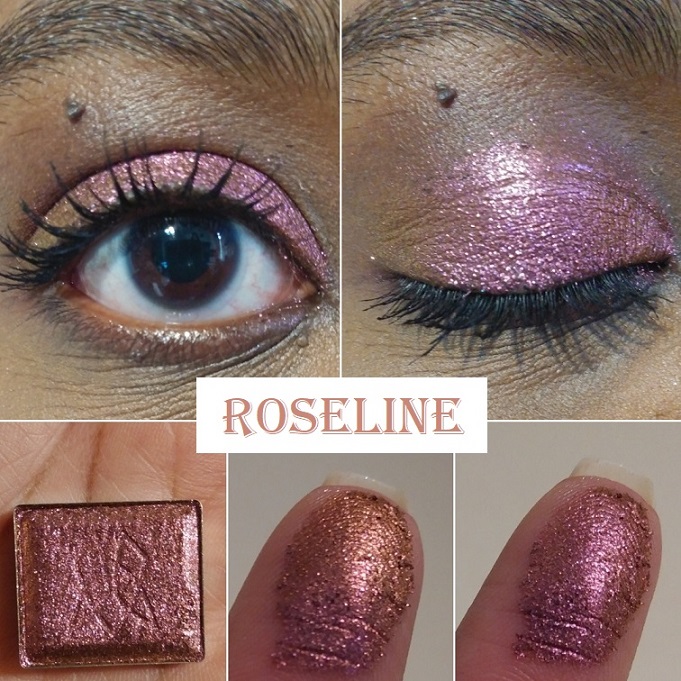
Rose Line “has a brown base with medium glitter particles that shift rose-orange-yellow.” The rose and orange tones are very easy to see. I haven’t been able to see the yellow on my finger, but it’s faintly visible in the outer corner of my eye. Even with just the rose and orange, I’m happy with how it looks.
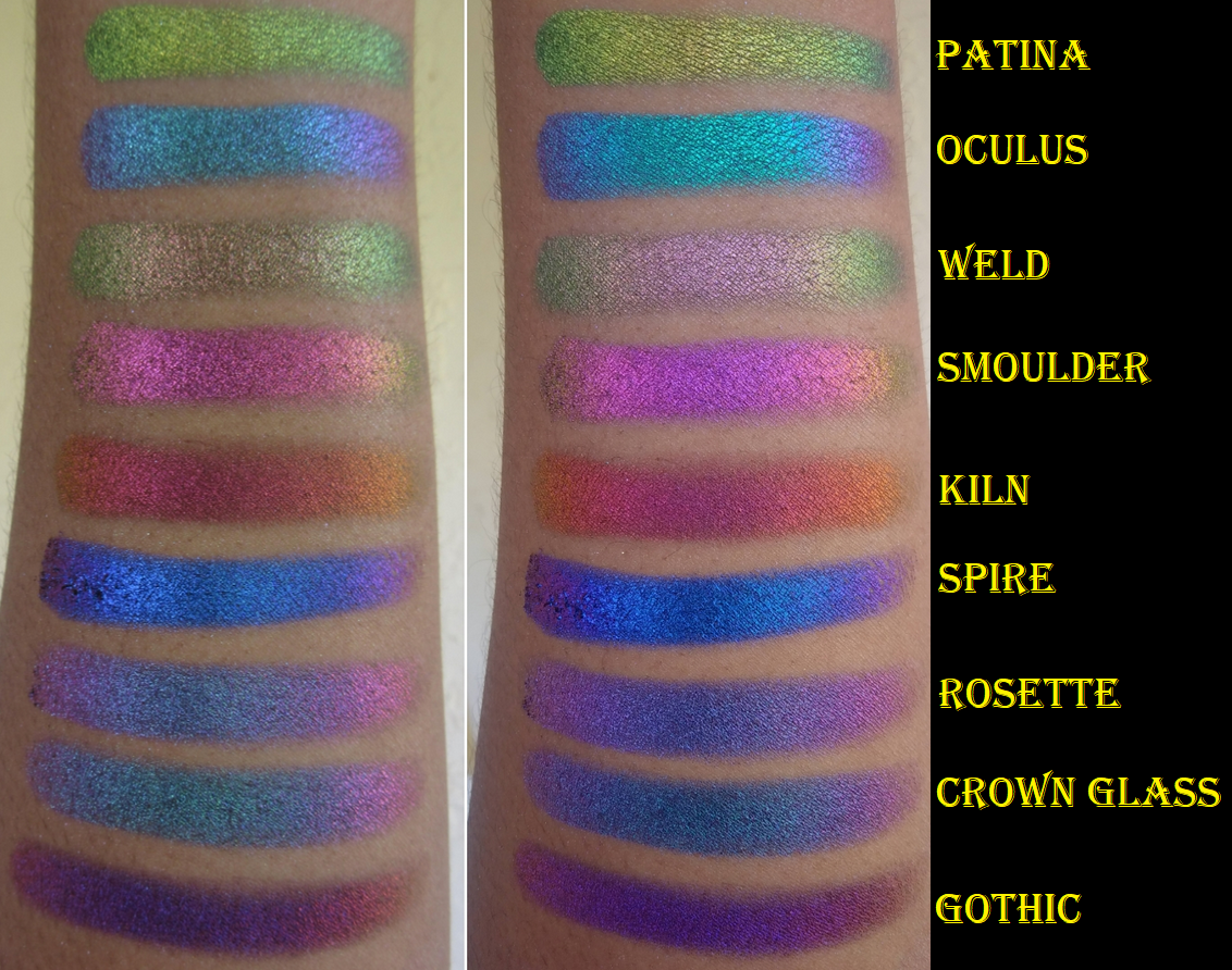
Jewelled Multichromes
These are the crown jewels of Clionadh’s collections and of the Stained Glass formula. They state, “The Jewelled Multichromes are finely milled, ultra rich pigments. They have a black base and intense colour shifting reflects. They’re packed with a high pigment concentration, so the end result is a saturated, vibrantly shifting shadow.” This is the bar which all other multichromes are compared to for me. They have yet to be surpassed and I have nicknamed them the Rolls Royces of eyeshadows!
I have 9 out of 20. Aside from buying some for my sister, I may get 1 or 2 more in the future. The oranges and yellows are where I have gaps in my Clionadh collection.
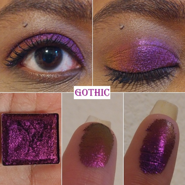
Gothic “shifts violet-pink-red-orange-gold.” This shade reminds me of an oil slick. It’s a beautiful warm purple and the shifts are very apparent in person. This isn’t a unique shade among multichromes, but from my research, this seems to be the best version of this color combo that anyone can buy.
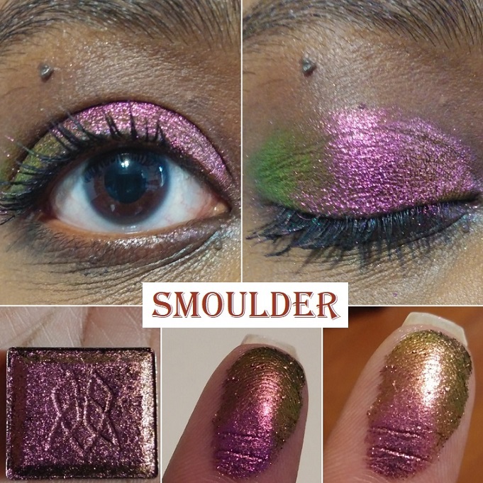
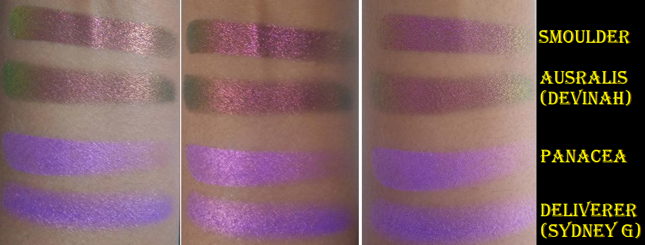
Smoulder “shifts magenta-orange-gold-lime.” The magenta dominates this shade. I found it interesting that I could see the lime and orange on my eye, but I couldn’t capture the lime shade on my finger. The magenta, orange, and gold are very easy to see. It reminds me of Pat Mcgrath’s Sextraterrestrial shade, but replacing the magenta with pink. I’ve heard Forge is a closer dupe to Sextraterrestrial, which is why I didn’t buy Forge. Devinah’s Australis shade is very close to this.
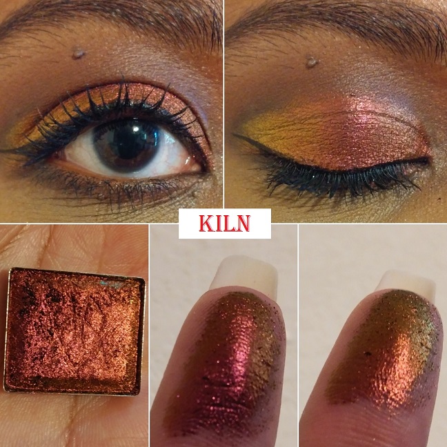
Kiln “shifts red-orange-gold.” Green and purple have always been my favorite eyeshadow colors, so you can imagine my surprise that this shade became my most used shadow from the Jewelled formula. It reminds me of sunsets; which yellow, orange, and red tend to be one of my go-to color combos. This also reminds me of Autumn and beautiful changing leaf colors. The leaves stay green in Florida, so I’ve always been a little fascinated by that process in other parts of the world.
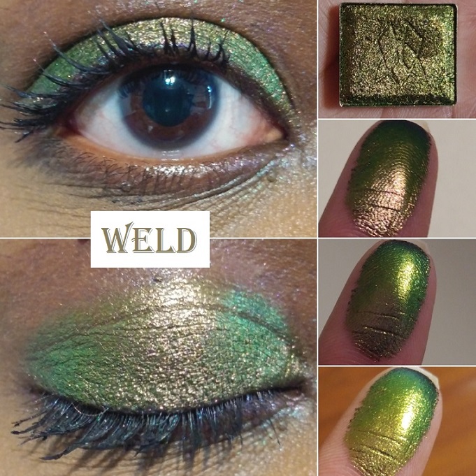
Weld “shifts grungy rose pink-antique gold-lime-teal-navy.” I bought this shadow specifically as a more neutral-leaning shade. I thought it would be cool to have that antique gold, which would look like a brown and blend in with my skin, which could also shift in different lighting to show an intense lime. When I wore this, I could see a little pink mixing in with the antique gold in the center of my lid, which again gave me Sextraterrestrial vibes, but it wasn’t strong enough for me to capture in the pictures.
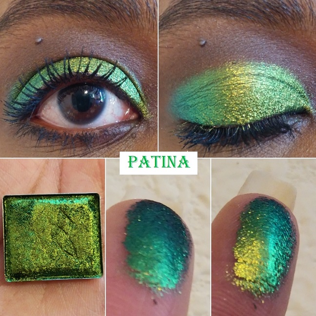
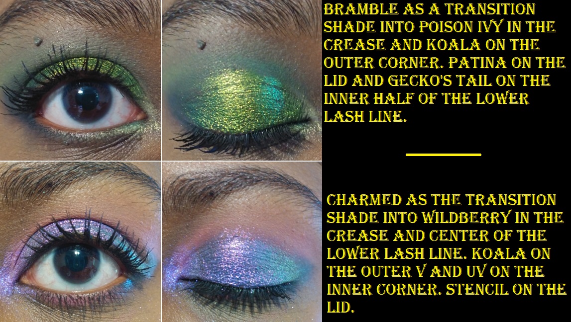
Patina “shifts gold-lime-emerald-turquoise.” There is no doubt that this green is striking. In fact, it’s a little intimidating. I still have yet to use Patina to its full potential because I’ve been drawn to the other greens in this collection. I would say that simple eye looks are better with intensely shifting multichromes because nothing should detract from the beauty of each shade on its own. However, I want to reserve Patina as the surprise pop to a look; to elevate a look that might be otherwise boring.
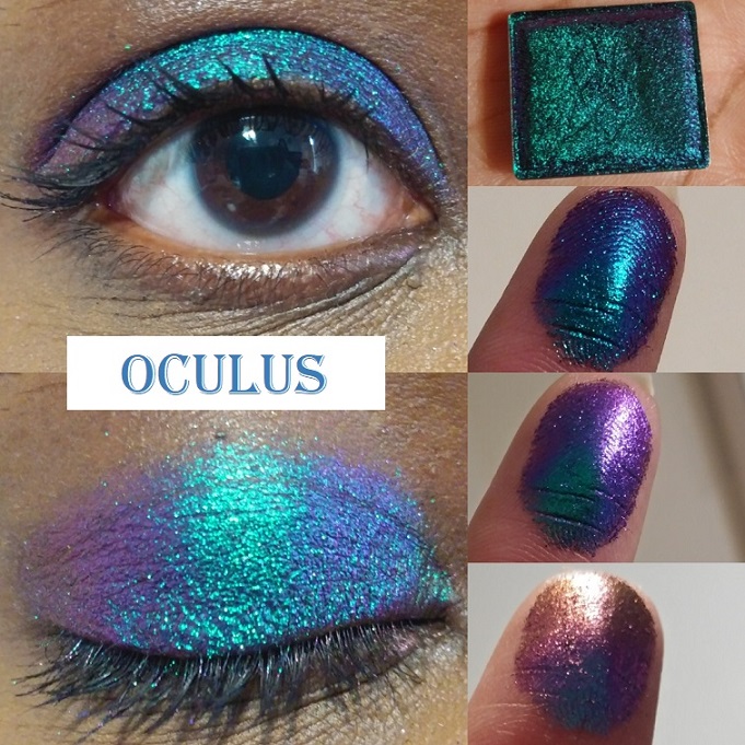
Oculus “shifts turquoise-blue-violet-pink-red-orange-gold.” I can see why this is one of the most popular shades in the Stained Glass collection. It’s one of the most shifty shades of all of them and I could easily see all the colors described on the website!
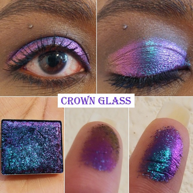
Crown Glass “shifts teal-indigo-pink-red-orange-gold.” This shade and Oculus are very similar in their shifts, but I just could not decide between them. I chose Crown Glass first, but since I wasn’t totally satisfied and kept thinking about Oculus I decided to get that one as well. I thought this would be my favorite of the two because it leans more purple, however, with Oculus I still get purple and I think I favor the turquoise in that one over the teal in Crown Glass. I recommend getting at least one of the two because they are such standout shades in the collection.
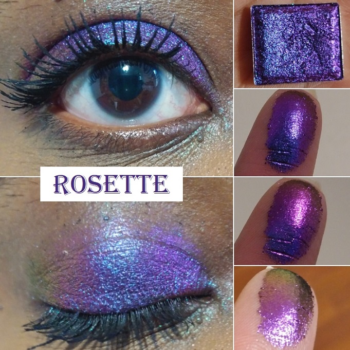
Rosette “shifts indigo-violet-red-orange-gold.” I almost skipped out on getting this shade because I thought I had too many purples and didn’t want to get another one too similar to the others, but this is my favorite purple-dominating shade of them all! It’s what I wanted from the shade Spire, but with more shifts and leaning more purple than blue. I love it!
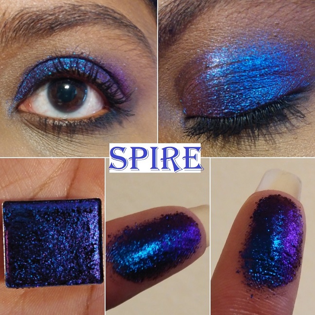
Spire “shifts royal blue-violet-red-orange.” This is actually the first Jewelled multichrome I purchased from Clionadh. Although the purple and blue are so close as to make the shift harder to see, I could still see the potential this collection had. I figured if I was pleased with this less obvious shifting shade, I would definitely love the others. This is great for dark dramatic looks, which I don’t do often, but it’s nice to have it available to me.
Pastel Multichromes
These “have a soft, sheer, grungy, grey base with bright, metallic coloured reflects.” They are a less intense version of the Jewelled multichromes. I like intense eyeshadows, so I honestly just bought one of the four in order to try out the formula in person to see what it was like for myself.
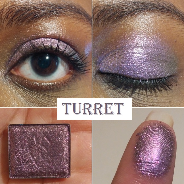
Turret has a “neutral grey base that shifts lilac-pink-orange-gold.” If I hadn’t read the description, I would have never known this was a multichrome. When I study the shade very hard, I can see a bit of a pink hue in the lilac, but the lilac color dominates. Despite this not being a favorite of mine, it still made me curious about the other pastel shades. However, I don’t see myself buying them when I know they aren’t intended to make a statement.
Vibrant Multichromes
Clionadh describes these best: “They behave more like the small/medium particle Glitter Multichromes. They have intense colour shifting reflects and colourful, saturated bases.“
These are extremely sparkly and glittery, even more than the glitter multichromes, despite these having just as small of glitter particles as them.
I have half of the collection, but I think that’s where I will stop. If I get another vibrant multichrome in the future, it would be Majesty.
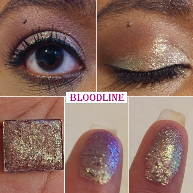
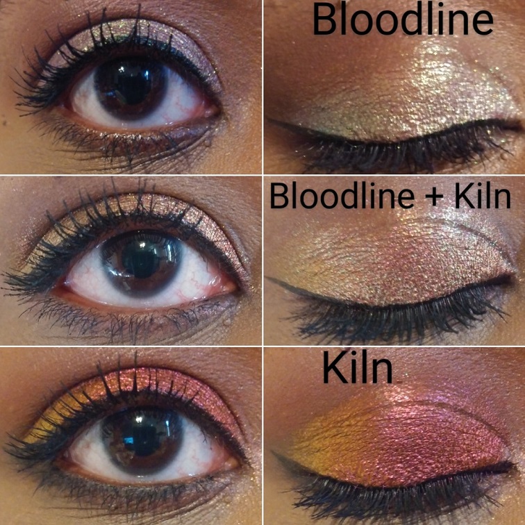
Bloodline “has a burgundy-berry base that shifts gold-green-turquoise-blue-purple.” This is definitely my most used shade of the Vibrant multichromes, and among the top most used of the Stained Glass collection. In February’s preorder sale, this was the second shade to sell out. It’s definitely one of the favorites. The berry tones don’t show on me as much as I expected, but I still love this shade so much. When I’m looking to add a little more red/warmth, I pat a little bit of Kiln on top and it gives me exactly what I am looking for!
I have an example of this from a photo I uploaded to Instagram as seen above. Perhaps in the future I will make another blog post or a series of photos on Instagram showing new shades that can be created when combining two Stained Glass shadows together.
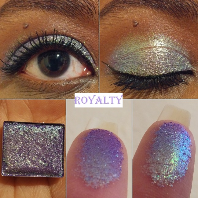
Royalty “has a grape purple base that shifts pink-gold-green-turquoise-blue-purple.” I wish the way it looked on my finger was how it looked on my eyelids. It’s more of a cool purple-blue than the vivid purple I had hoped for. However, this is a beloved shade and it was the first to sell out during the initial round of preorders. I may be able to create the shade I envisioned by patting one of the Stained Glass purples or blues on top, like Crown Glass. During the current sale that started December 18th, Clionadh released a very similar shade to this called Regal which has a blue base.
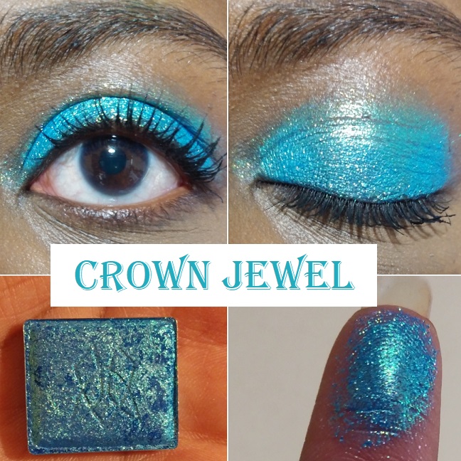
Crown Jewel “has a bright blue base that shifts gold-turquoise-blue.” It’s gorgeous and serves as another example of an eyeshadow shade I don’t wear but bought anyway purely because I couldn’t resist that stunning blue hue!
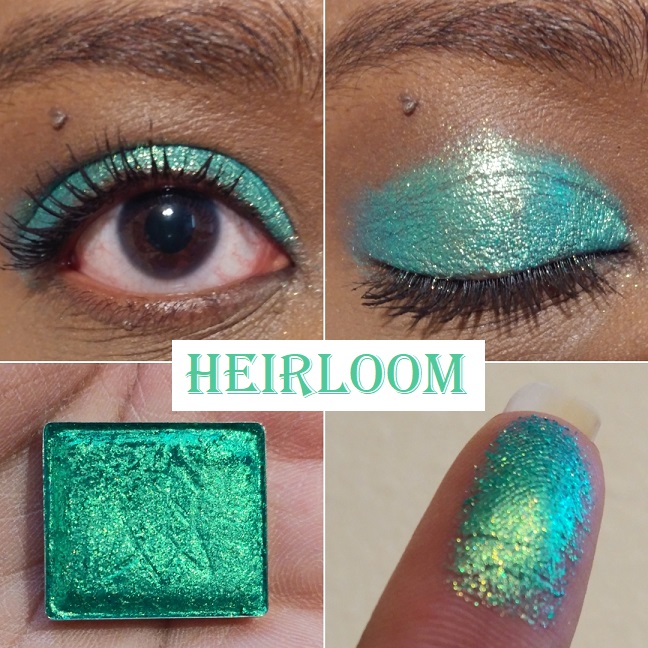
Heirloom “has a teal green base that shifts gold-green-turquoise.” Green and gold is a classic combo, but the base color is what gives this shade a unique twist. It’s such a fascinating shade that I don’t utilize enough.
CLIONADH’S OTHER EYESHADOW COLLECTIONS
Before we get into the shades from the different collections, I wanted to mention the Koala Charity eyeshadows that Clionadh said, “100% of the proceeds will be donated. This time to Wires Wildlife Rescue & Wildlife Victoria Emergency Funds, which benefit the wildlife affected by the Australian bushfires.” They kept their word, and although these shadows are no longer available, Clionadh plans to have another charity to support in 2021.
What I also needed to say about the standard eyeshadows is that the mattes are incredibly fragile! One arrived partially broken and one arrived with cracks, two broke when I accidentally dropped my palette (those are on me), but the last one literally shattered apart when I was placing the shadow into my magnetic palette. The draw of the magnet on the pan was so strong it slipped from my fingers a touch too high and that did it. So, please use the absolute most caution when handling the mattes. Clionadh mentioned at one point debating whether or not to continue imprinting their logo into some of the shadows for fear it would make some of them more fragile and they ultimately decided to just skip imprinting the delicate ones. The nice thing about the mattes is they do press back easily and perfectly using the dry pressing method. The quality of them is really nice. Just use care. If your shadows break in transit, they will replace them for you, but I haven’t gone through that process myself. Considering how busy they are and the shipping cost, I didn’t want to give them the trouble, especially now that I know how to fix them to look brand new.
Lastly, Clionadh updated their Witchcraft vs Alchemy Bundle (the duochrome collection) to include all the shades in the range. The largest one used to be missing a few shades and some shadows in the collection weren’t part of the main bundle or the “Additional Shadows Bundle.” Now you can get all 26 in one bundle. I also saw an option to create your own custom bundle of 6, but it was taken down before the sale.
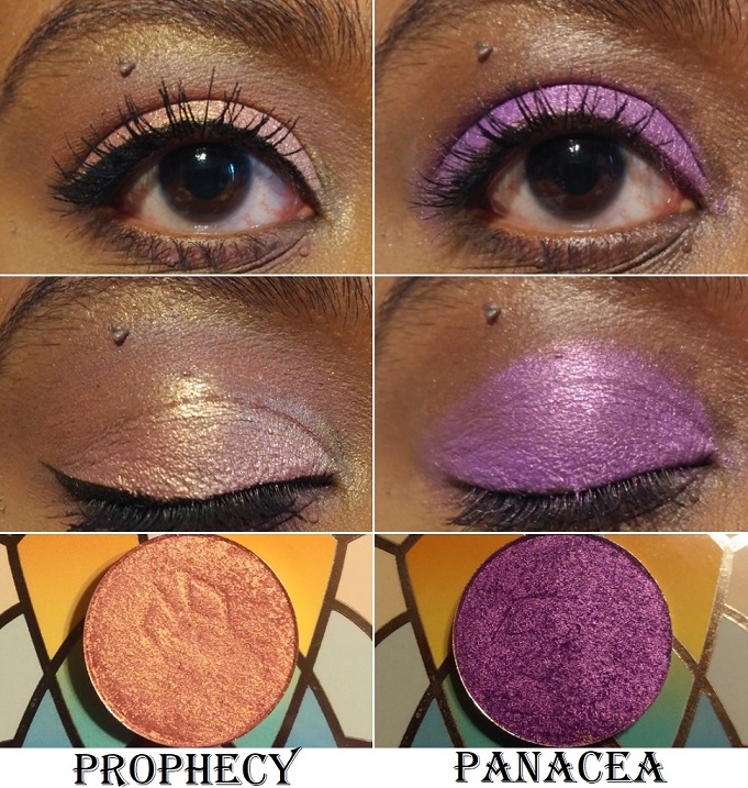
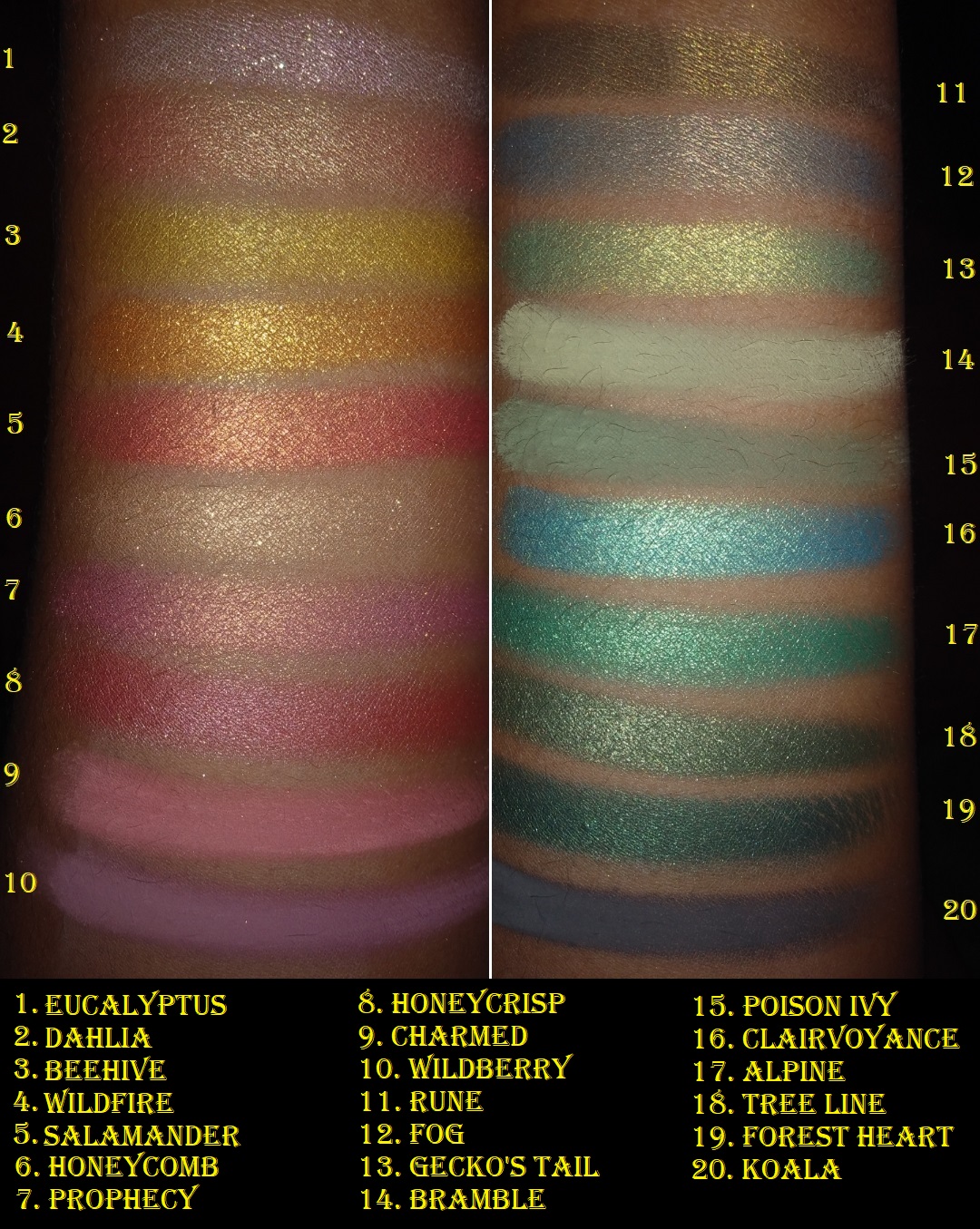
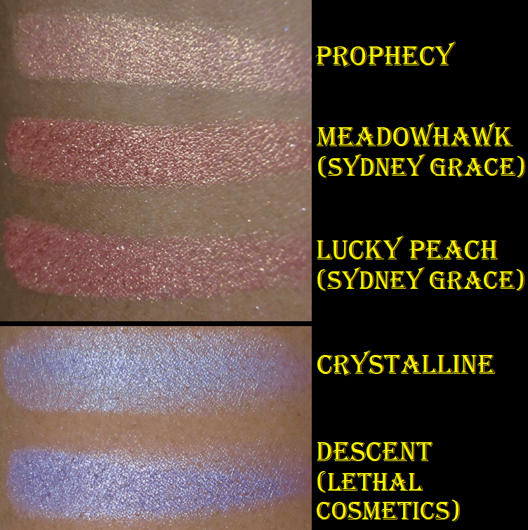
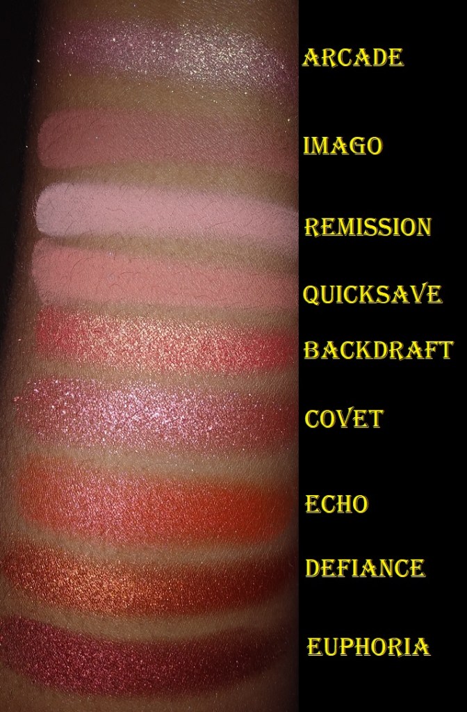
Prophecy – from Team Witchcraft. This is the pinkish gold type of shade I always want, but when some brands make this kind of color, it looks more white than pink on my lids. This one is the same as the pan color, which makes me very happy.
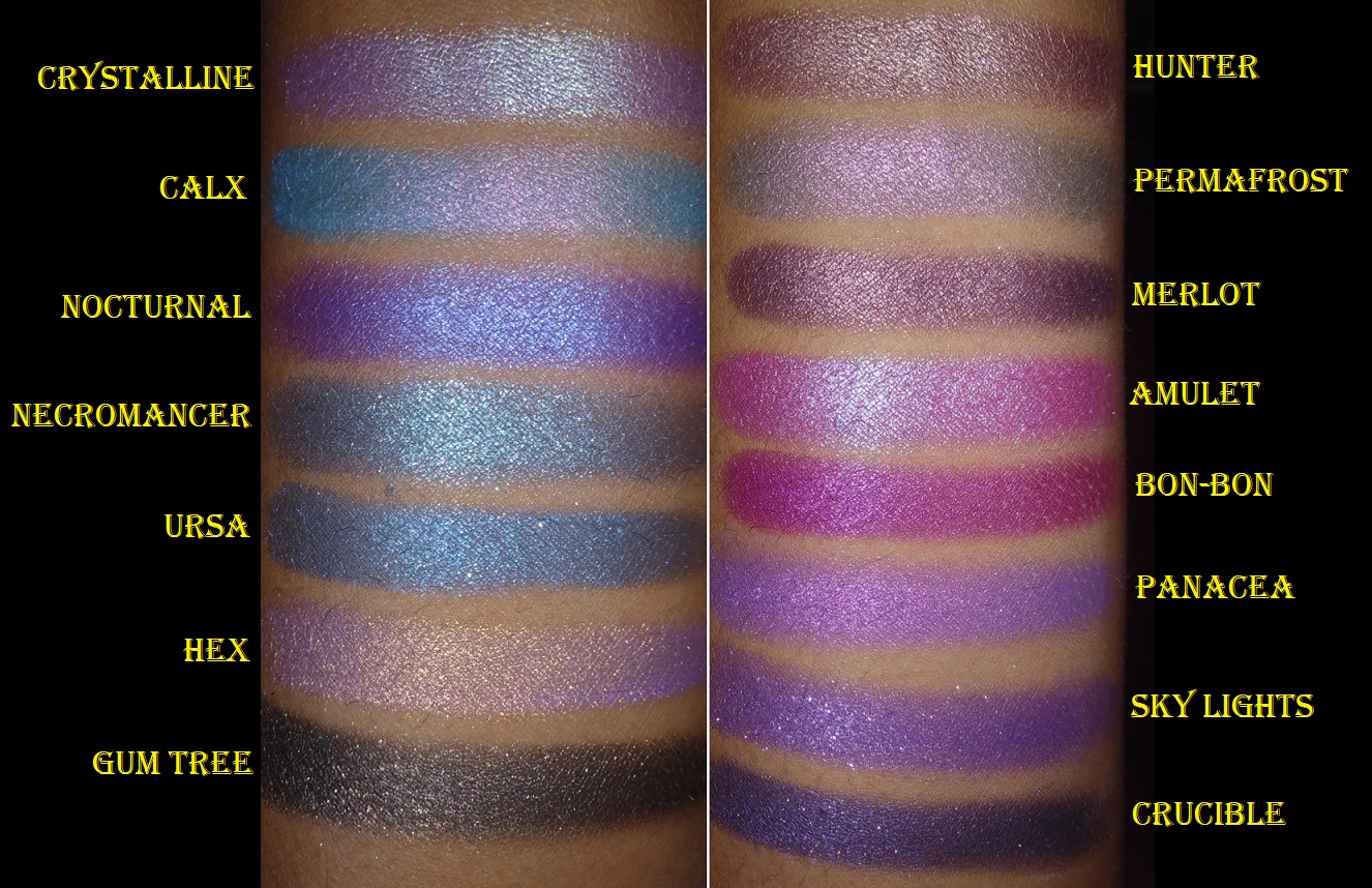
Panacea – from Team Alchemy. It’s a vibrant beautiful “grape purple with pink reflect” that I recommend to any purple shadow lover.
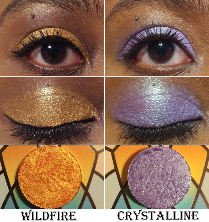
Wildfire – from the Woodlands collection. This is a very sparkly shade that gets most of the intensity from the gold glitter, though I was hoping more of that deep fiery orange base would look stronger on my eyelid. When my next order arrives, I could try putting Burnt Sienna on top to see if it will give me the intensity level I envisioned.
Crystalline – from Team Witchcraft. I normally wouldn’t be interested in this light of a purple shade, but the duochrome aspect made it so much more intriguing of an eyeshadow. The reflect color is lime green but on my lids, I thought it looked aqua.
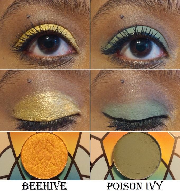
Beehive – from the Woodlands collection. This is one of the prettiest yellow-orange shades in my collection.
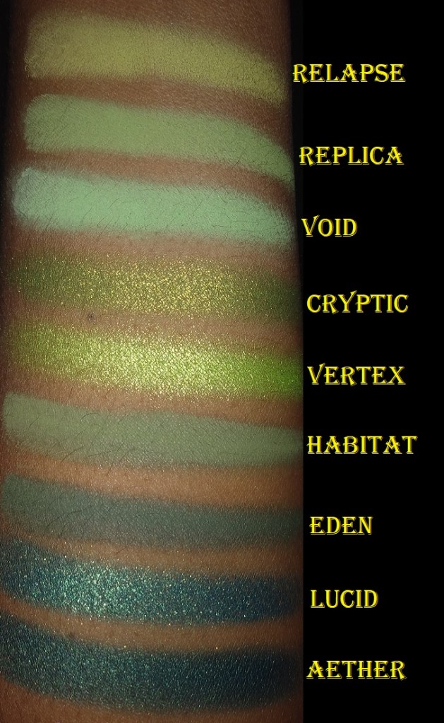
Poison Ivy – also from the Woodlands collection. This color reminds me of the mossy green shade called Habitat from Lethal Cosmetics.
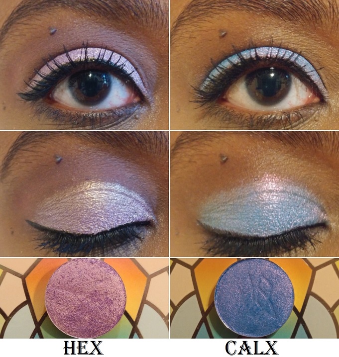
Hex – from the Dreamweaver collection and Team Witchcraft. It’s a beautiful, “mid-toned purple base with a gold reflect.” Hex is lighter and cooler toned than I expected based on swatch photos I saw around social media. It’s not my favorite on me, but the color in the pan is true to what you get on the eyelid.
Calx – from Team Alchemy. Based on swatches, I thought the blue would be at least a deep mid-tone, but the description as a cornflower blue is accurate. Although the reflect is pink, the glitter color over the blue makes it look a little more on the purple side, which I like.
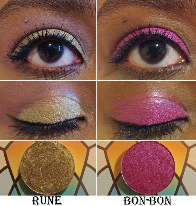
Rune – from the Harvest Moon Shadows and Team Alchemy. It is described as, “a grungy base with a gold-green reflect. This shade pulls more moss green on the eye.” It is so beautiful! I love green-gold, olive-gold, and antique gold type of shades, so this is perfect for me.
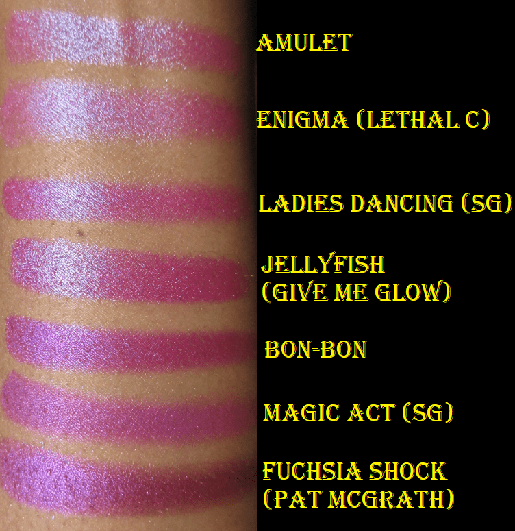
Bon-Bon – from the Dreamweaver Collection. This is a stunning color that’s as vibrant on the lids as it is in the pan! Clionadh describes this shade as, “a rich berry metallic with a cool purple reflect,” which surprised me because the base color is so intense that I didn’t notice the reflect on the eyes. The shimmer is so fine that the particles are undetectable, but it’s visible when the light hits it.
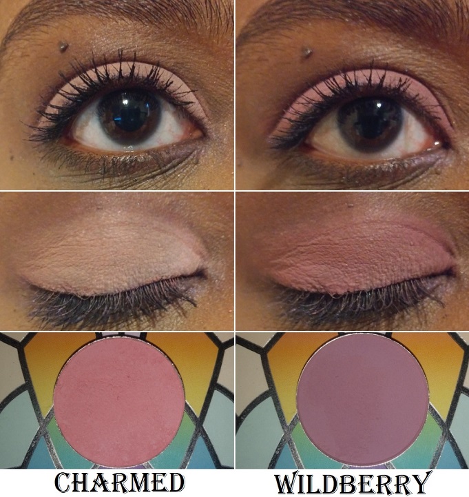
Charmed – also from the Dreamweaver Collection. I bought this shade during a time when I was really into using peachy pink and blushy medium pink shades in my crease for my pink and purple eye looks. Although my obsession with that combo has nearly passed, I still use this shade quite a bit.
Wildberry – from the Woodlands Collection. I tend to pair with this Charmed to slightly deepen up the outer corner when I don’t want to go for full smoky look. It looks like a mauve-purple in the pan but it shows up dark pink on the eye.
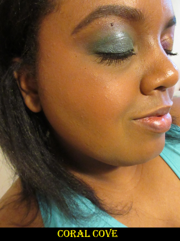
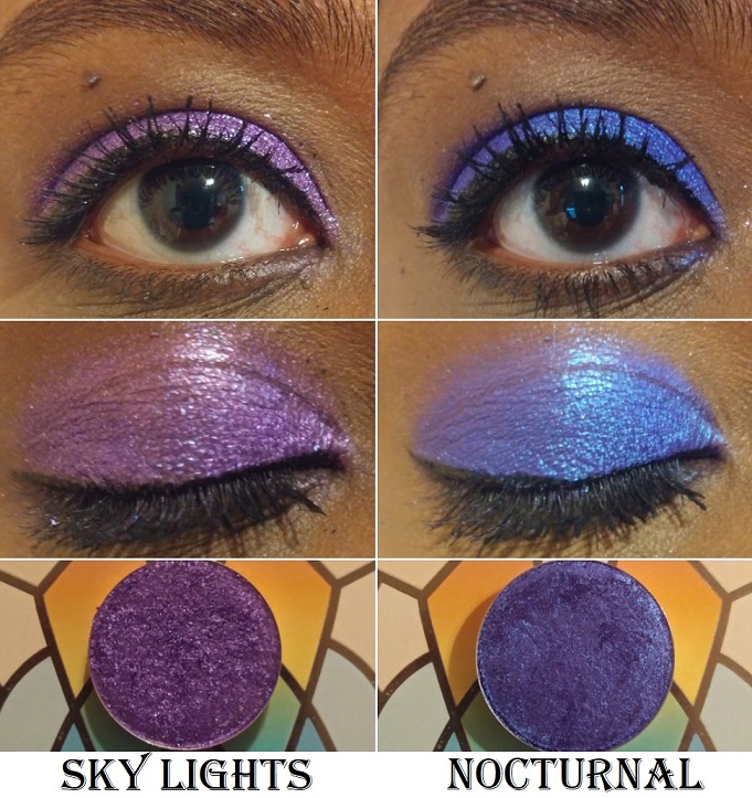
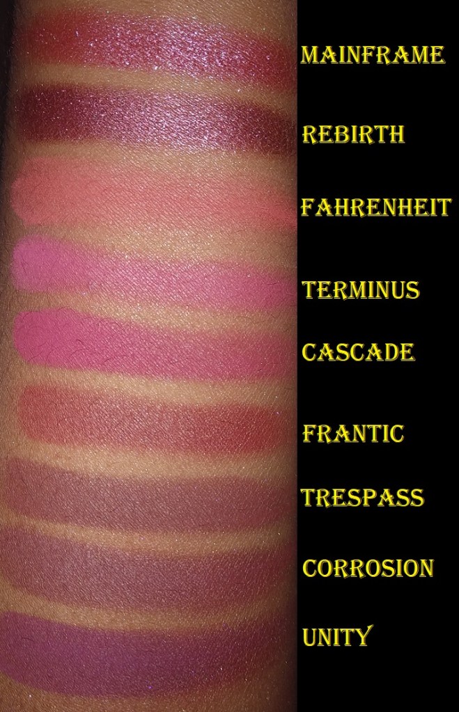
Sky Lights – from the 66.5° N Collection. This is “a shimmery shadow with a royal purple base and purple, blue and pink sparkle.” This was part of my first Clionadh order and it’s one of my favorites from the brand. The multicolored sparkle in person is even prettier than my picture shows.
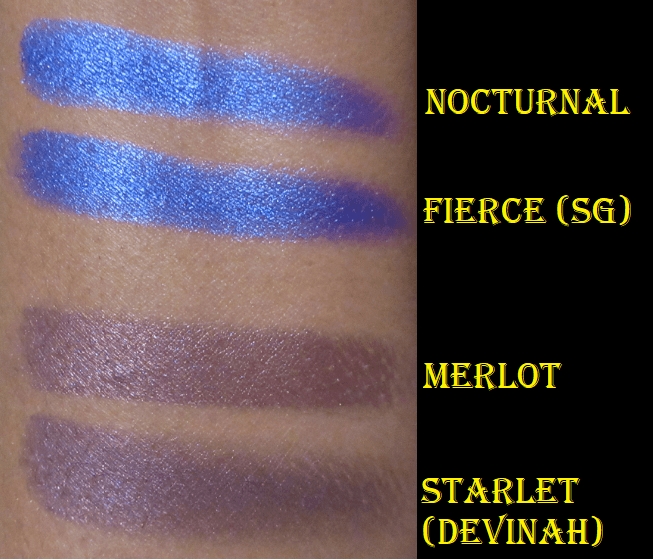
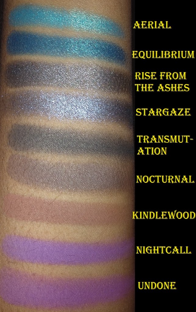
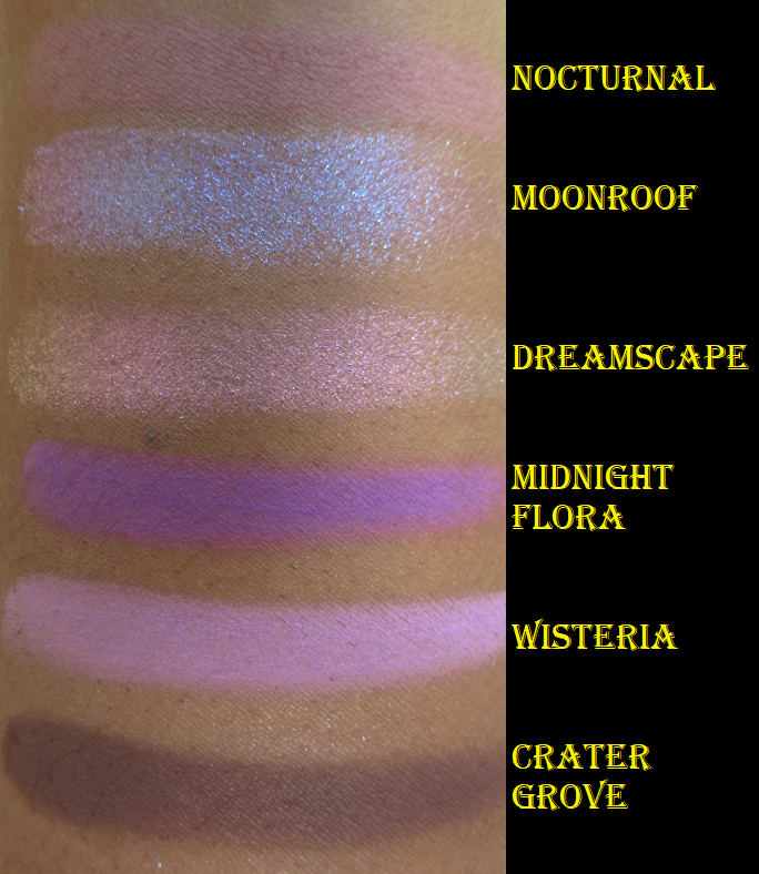
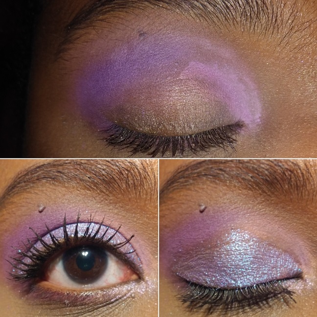
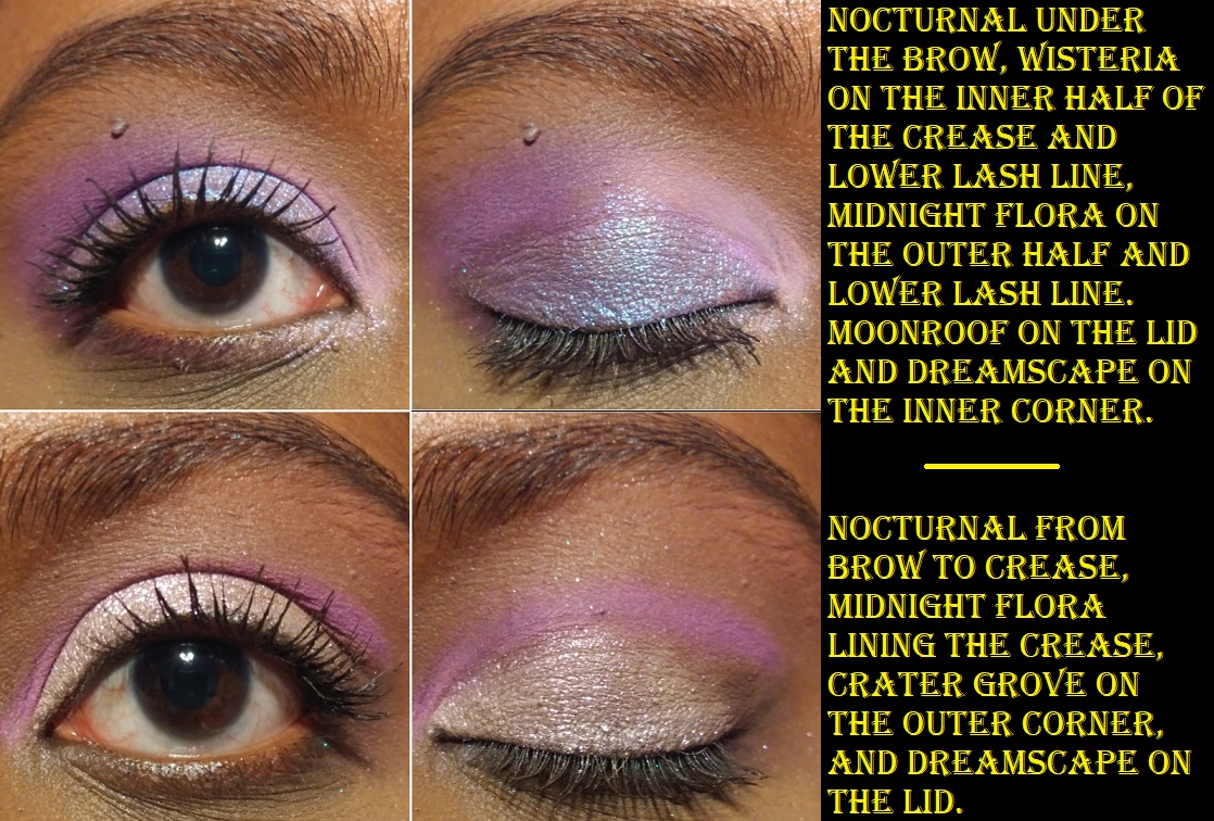
Nocturnal – from Team Witchcraft. This “indigo base with a blue reflect” was also part of my first order. I love bluish-purple eyeshadows but the tones of this seem special. I love vibrant blues and there is nothing subtle about this one!
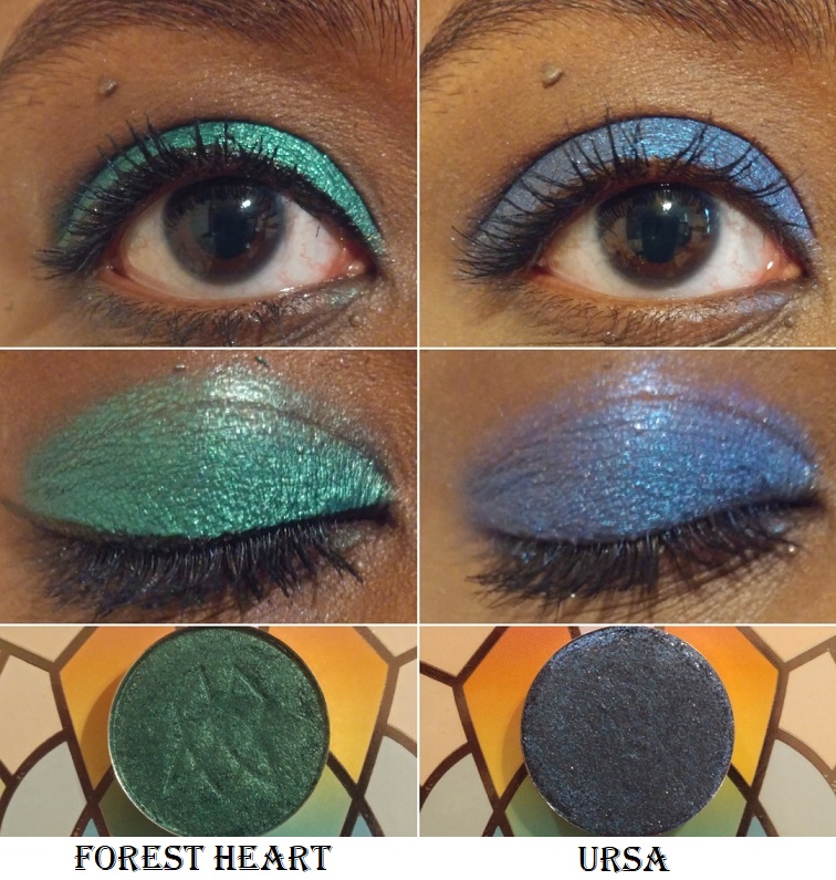
Forest Heart – from the Woodlands Collection. It’s described as a metallic teal-green and I always thought it had a bit of a blue tinge, but it just looks like a medium-deep green on my eyelids. Sky Lights, Nocturnal, and Forest Heart remain my top three favorites out of the standard eyeshadows. It’s very easy to overlook the “regular” shadows when you have the Stained Glass collection available, so if it wasn’t for these three shades blowing me away, I wouldn’t have continued purchasing from the standard eyeshadow collections.
Ursa – from the 66.5° N Collection. This is a “blackened-blue shadow with a blue reflect and gold sparkle.” It’s not as dark on my lids as it looks in the pan, which makes me happy. I like the tone of it on me. The sparkles get a bit lost though and although I can see that lighter blue reflect, it didn’t wow me like some of the other shades. However, Clionadh set a huge bar for themselves and though I wasn’t as impressed, it’s still a beautiful shade.
Bramble – from the Woodlands Collection. This is a light yellow-green shade. For some reason, on my camera it comes off looking way more yellow than green. I can confirm that in person it does look more green, but still with a strong yellow tone to it. This is one of the few shadows I wouldn’t miss if it was removed from my collection (based on the color, not performance).
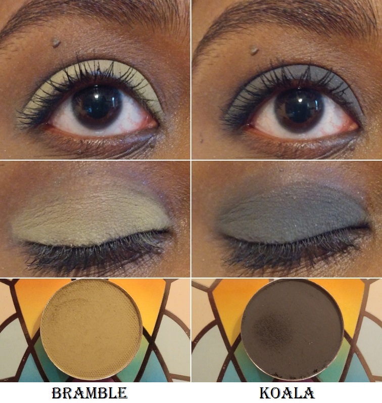
Koala – from the Koala Trio. It’s a charcoal grayish black color, which is typically a shade I don’t like, but my goodness this is amazing! It would be great if Clionadh brought this shade back to be sold individually and not have to be tied to the charity aspect. This is such a perfect shade for creating a smoky eye that isn’t too intense and dramatic, though I’m into that kind of look as well. This pairs so nicely with all the other Clionadh shadows, and for a few weeks straight I used this shade exclusively to deepen up all my eyeshadow looks when using other brands’ eyeshadows too!
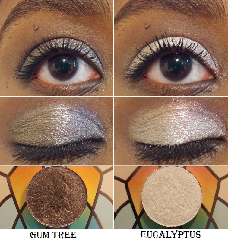
Gum Tree – from the Koala Trio. I definitely don’t have another eyeshadow like this in my collection. It’s like a gunmetal or antique pewter with a bronze-red reflect. It is so beautiful and such a shame it’s discontinued.
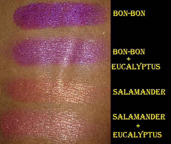
Eucalyptus – the last shade from the Koala Trio. It looks just white on my eyelid, but when applied sheer, like a topper, it’s an iridescent shade with red, gold, and a little bit of green reflect. It’s a fun and unique color that amps up any eye look when patted on top.
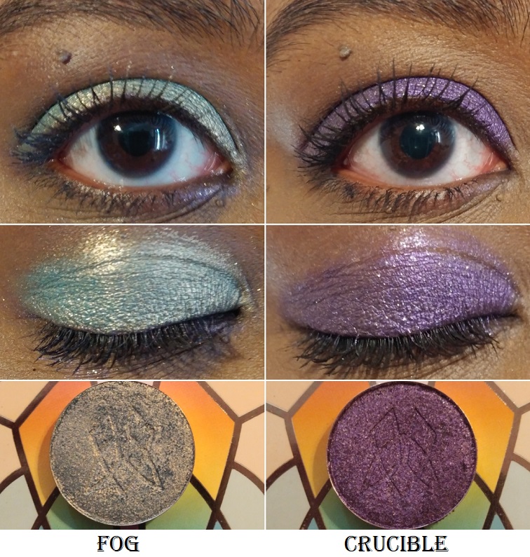
Fog – from Team Witchcraft. I’ve mentioned before that light colors aren’t my favorite, but this blue has enough warmth from the sparkle that I think it looks so pretty! It’s described as, “a dusty, teal base that shifts golden-peach.” It instantly reminded me of the shade Narrow Path from Sydney Grace. They have the same base color but that gold glitter makes me like Fog more than Narrow Path.
Crucible – from Team Alchemy. It’s a deep purple with a subtle “purple shift and gold sparkle.” Sky Lights is my perfect purple, so it’s harder for me to get excited about this shade by comparison. That being said, Crucible is so beautiful that it still deserves appreciation. It’s a great color to use for a purple smoky eye.
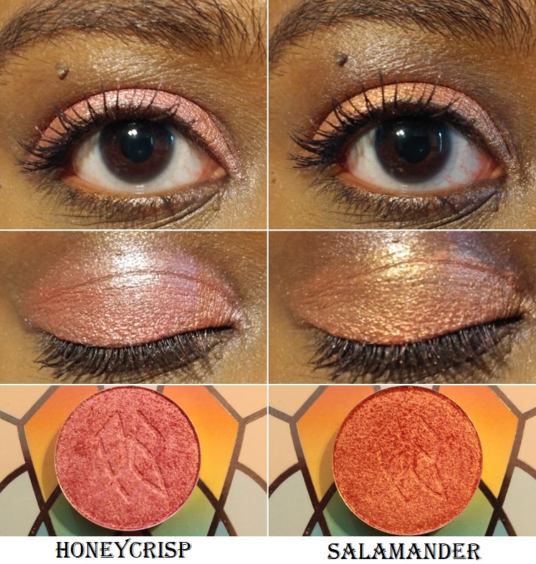
Honeycrisp – from the Harvest Moon Collection. Something about this shade was so alluring to me, particularly around the time I bought it. I was still going through my phase of searching for a golden pink. Honeycrisp is described as, “a coral pink satin with a pearly reflect.” Sydney Grace has a lot of shades along this same vein like Meadowhawk and Golden Strawberry. Even Salamander looks similar, like a slightly more orange toned version, especially in the photo above where I combined Salamander with Eucalyptus. This doesn’t take away from the fact that this is a gorgeous shade and despite having similar colors, I’m still glad I have it.
Salamander – from Team Witchcraft. This is described as, “a coral base with a gold reflect,” which accounts for the similarities between this shade and Honeycrisp. It’s like a fiery golden tangerine. I really like it.
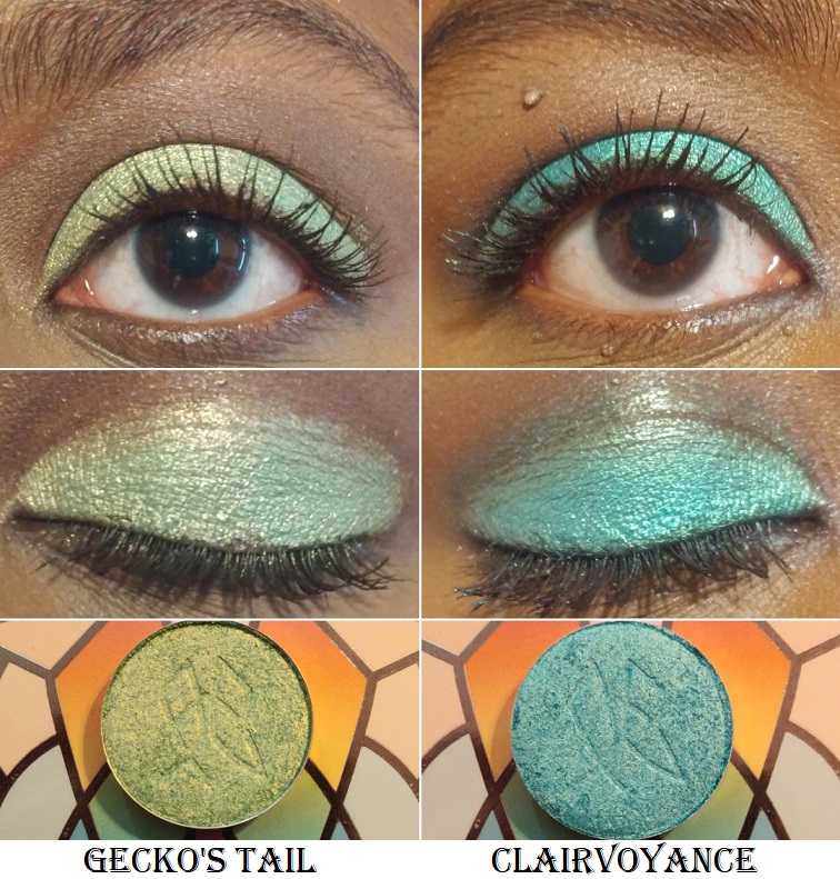
Gecko’s Tail – from Team Alchemy. This shade has an “apple green base with gold reflect.” It’s a lighter tone than a typical Granny Smith Apple shade. I think I would have liked it more if it was a touch deeper, but it’s a fun color.
Clairvoyance – from Team Witchcraft. I didn’t expect to like this color, but I couldn’t resist buying it anyway. It’s “a turquoise base with a light green reflect.” It reminds me of Blitz Aquamarine from Pat Mcgrath, but the green reflect is a different twist.
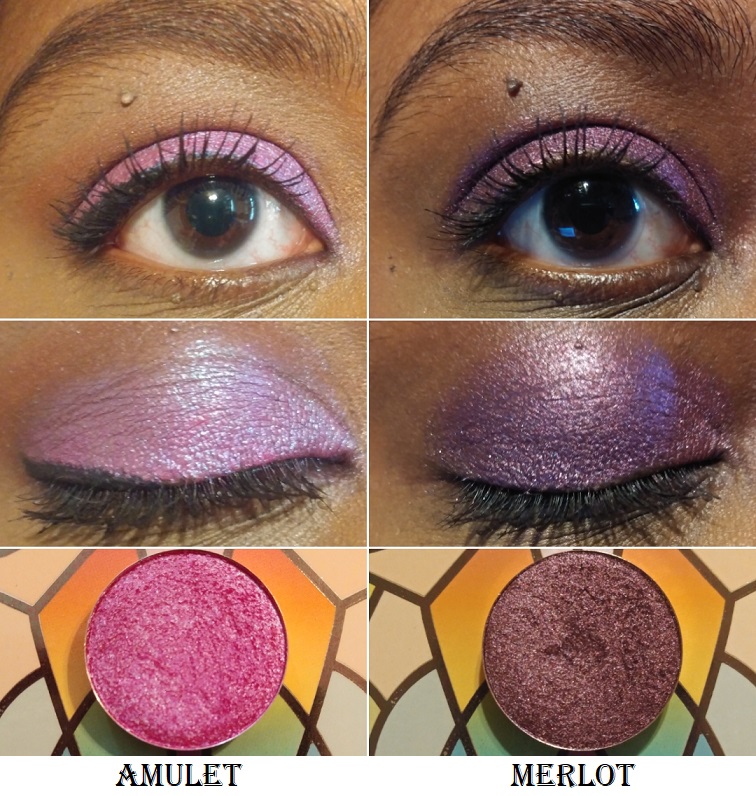
Amulet – from Team Witchcraft. This is a “a bright fuchsia that shifts blue.” This is a very popular type of duochrome shade. The base color is similar to Bon-Bon but Bon Bon is much deeper.
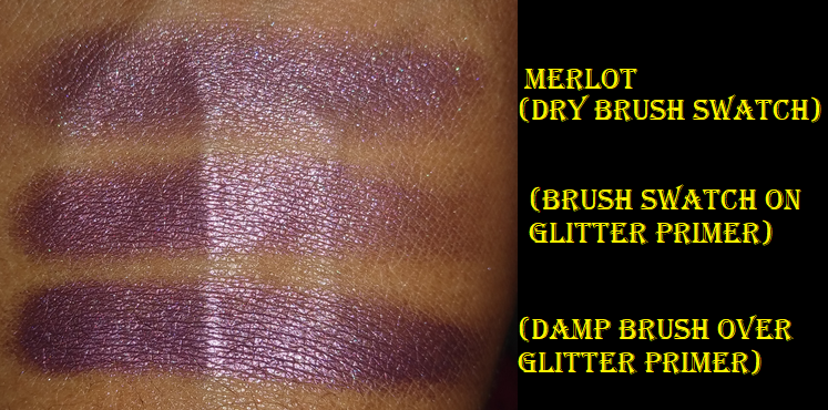
Merlot – This is a metallic plum shade from the Ultra Metals Collection. It looked a little grey in some of the swatches I saw online, so I was much happier with the actual color. It looks very rich in person. It also looks like a regular shimmer or satin shade when applied dry. With a wet brush, this shade looks much more metallic and pretty. This is currently the only shade I have from the Ultra Metals because I was using this shade as a tester before I considered buying more.
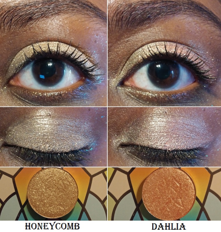
Honeycomb – from the Woodlands Collection. As, “a warm beige metallic with gold sparkle,” I bought this shade to use specifically as an intense inner corner highlight.
Dahlia – from the Woodlands Collection. It’s “a light peach-gold duochrome” that I thought would look a little more different on me than Honeycomb. Between the two, I think I like this shade slightly better for all over the lid because of the pinkish shift. As an inner corner shade, I would prefer a more neutral color like Honeycomb.
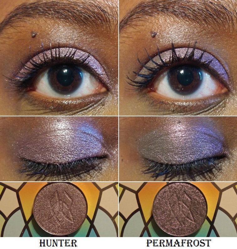
Hunter – from the Woodlands Collection. Hunter is described as a metallic mulberry. The base color is a dark purple but the lighter shimmer prevents it from being a traditional dark purple. It’s like a silvery purple mauve.
Permafrost – from the 66.5° N Collection. It resembles Hunter on the eye, when looking straightforward, because of the grey tone. However, this shade has a noticeable pink shift in person that gives it a grey pinkish purple look.
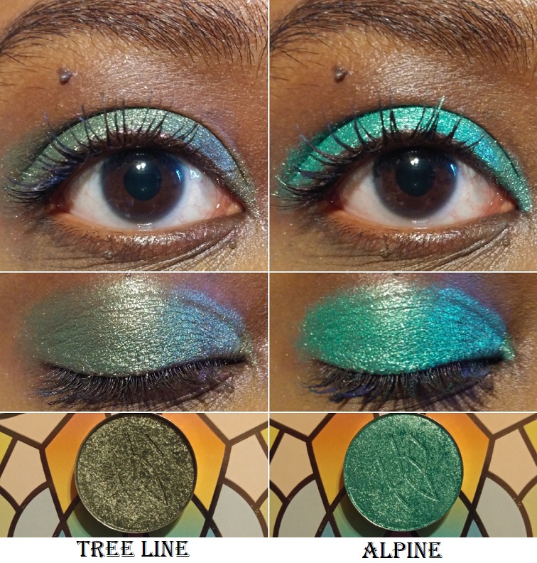
Tree Line – from the 66.5° N Collection. This “sage green metallic” shade looks a bit more blue-tinged on my eyes, though I was expecting a brownish-green. I still like it.
Alpine – from the 66.5° N Collection. This is, “a rich, blue-toned metallic green,” as opposed to the teal-green shade in Forest Heart. This shade is a lot brighter. It’s like a deeper toned version of The Shallows from Sydney Grace.
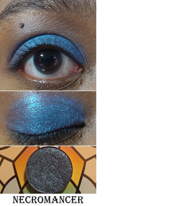
Necromancer – from Team Alchemy. It has a “blackened-blue base with a teal reflect and silver sparkle” that looks similar to Ursa in the pan, but the teal reflect makes it look brighter and more vibrant than Ursa.
STAINED GLASS SWATCHES
On Instagram, I have videos of the Stained Glass swatches in this post. You just need to scroll sideways to see more.
STANDARD COLLECTION SWATCHES
EYESHADOW SHADE COMPARISONS
The hardest parts about comparing multichromes are that the shades in the pans don’t necessarily correlate to how they will look on the eyes, especially depending on the lighting. Sometimes they look similar based on one shift at one angle, or in the dark, or in bright light, or in the pan, or the types of colors that they shift to. Sometimes it’s only the base color that is similar.
I tested out many more comparisons that didn’t make it into this post for the reasons above. Some of the dissimilar ones I kept in order to demonstrate how similar pan shades can differ from the swatch.
The duochromes were easier to find comparisons with other brands, but the level of glitter/sparkle in Clionadh’s shadows tend to be so intense that they ended up not looking the same, despite having similar base colors.
TOP RECOMMENDED SHADES AND EXTRA EYE LOOKS
If I had to pick my personal favorite shades they would be Lux, Verte, Abrasion, Stencil, Enamel, Chandelier, Embroidery, Shard, Kiln, either Crown Glass or Oculus, Rosette, Bloodline, Sky Lights, Nocturnal, and Forest Heart.
When it comes to this brand, there really aren’t duds in terms of quality. It’s just a matter of personal preference like colors and particle sizes. I’ve been able to create some gorgeous looks even using shades that aren’t my favorites.
Just one shimmer shade or multichrome patted on top of an existing look can really change the outcome.
My camera always picks up the green hue in Weld even though, in person, the whole lid looks like the antique pink in the center. That’s what gave me the idea to use a different shadow to tone down the green in the photo below.
That’s everything! I know this was another incredibly long post, but I wanted to be thorough.
I’m a big fan of Lethal Cosmetics for their quality products, fantastic customer service, fast worldwide shipping, and the importance they place on diversity and inclusion. My initial interest in the brand was for their eyeshadows. At the time of writing this, I own 72 out of their 90 individual shades released so far, and I reviewed most of them earlier this year.
Even though I’m trying to limit the number of face products I buy, I couldn’t resist ordering from Lethal on launch day. I purchased the Solstice palette, another highlighter, blush, bronzer, and the Lethal Cosmetics x Jolina Mennen eyeshadow palette. The same morning I began working on this post, the brand announced their new Velvet Dusk Collection and details about a Black Friday sale, so I delayed posting until those items arrived as well.
Face Powders
The Solstice Palette
This is one of the four premade palettes on Lethal’s website. It was created for those with dark tan/olive to deep skin tones. Lethal Cosmetics has six individual highlighters that have been available long before the bronzers and blushes, but the highlighters in the premade palettes are exclusive to those palettes. The exclusive shade from Solstice is called Gravity and it has a strong yellow base. The blush included is called Echinopsis and the bronzer is Caldera.
Although Lethal doesn’t have designated contour powders, within the bronzer line are three shades with cool undertones that I consider contouring-bronzers. I picked up one of them called Zenith.
Until Zenith, I had no real contour powder that I liked enough to wear regularly. The best one I have is actually a Colourpop eyeshadow called Cloud Nine. Because Caldera is warmer and I prefer to use bronzer around my forehead, while Zenith is cool-toned and I prefer that for cheek and jaw contouring, I have found uses for both powders in my collection. I actually replaced the Gravity highlighter with Zenith in my trio palette when I was on a brief trip for my birthday. The palette is magnetic with holes in the back and the pans are not glued in, so that makes it easy to mix and match face products.
Terrestrial is the newest addition to my face powders that I purchased with the launch of the Velvet Dusk Collection. I wanted to see if I could get a cool-toned contouring bronzer that was closer to my skin tone for times I might be in a rush and don’t want to have to be careful about how much I apply. Between Terrestrial and Zenith, I think Terrestrial is better for me.
I’m experimenting with daylight bulbs so the newest photo additions look different in terms of my skin tone for this reason. I’m trying to find a balance between being bright enough versus washing colors out.
I like these powders, but I should note that these are not beginner-friendly in the sense that using the wrong brushes can make these harder and more time consuming to blend. I found this to be the case for the bronzers and blushes, but not the highlighters. Also, when it comes to bronzers, I still prefer the Kosas Sun Show Moisturizing Bronzer and the Charlotte Tilbury Airbrush matte bronzers because of how they look on the skin and how they blend regardless of the tool. It should be noted that those two bronzers are 2-4 times more expensive than the ones from Lethal.
The texture and consistency of Lethal’s powder products remind me of MAC’s Satin blush formula but they are definitely matte and they perform like MAC’s brighter blush shades, such as Loudspeaker and Frankly Scarlet. What I mean by this is that wherever you first apply with the most pressure is where the powder mostly sticks. They’re still blendable, but using too small of a brush can concentrate the product in too small of an area that is time-consuming to smooth out. If the initial placement covers the entire area you want, it makes the blending process easy. This is why I recommend using a fluffy brush with these powders in order to disperse the product lightly and evenly.
Calyx was more orange than I expected. Echinopsis is more of a berry color, and darker, but it can be worn in a sheer layer as demonstrated in the photo above (a heavier application is in the Terrestrial section). Between the two, I think Echinopsis looks better on me.
As I mentioned before, Gravity has a strong yellow base, so I prefer to wear it only on days when my blush is on the more neutral, natural, and sheer side. This way, the highlighter doesn’t have to compete for attention, so to speak. If I use less, Gravity doesn’t look as strikingly yellow, but it’s still very apparent in person.
Gamma is an “elegant bronze with warm gold highlights.” It is everything I want in a highlighter! It can be subtle and look more shiny than glittery, but it can also be built up more intensely. I think it’s a better shade match for me as well.
Both highlighters are over Echinopsis and Terrestrial.
Gamma, Echinopsis, and Terrestrial is my new favorite trio palette pairing! I have a magnetic palette with depotted face products that I’ve taken on trips before, but this is the first time I’ve ever had a highlighter, blush, and bronzer/contour from the same brand that actually works for me and is kept in an aesthetically pleasing palette that looks like it was premade! Although I could pack a trio of Nabla Skin Glazing Products, I find carrying one palette to be easier with less chance of an accident than a stack of 3 compacts.
Eye Palettes
Lethal Cosmetics x Jolina Palette
I love the fact that these shimmer shades make beautiful new colors when mixed together. For example, Fck Me Eyes and (A)mar create a pretty turquoise blue. Loyalty is a red-based purple but when combined with (A)mar is makes a nice deep cool purple. For a white shade, Scandal is not stark on my skin tone and I can actually use it in the crease. This is probably the only white shade in my entire eyeshadow collection that I like! The only color in the palette I dislike is Cold Brew, and that’s because it’s the same color as my hyperpigmentation. When I use it, it looks to me like I missed a spot or that the eyeshadow faded, but it’s just the color of the shadow.
Overall, I find the quality of this palette to be consistent with Lethal’s single eyeshadows. With the exception of a few shades, there are close enough similarities to other Lethal singles that I don’t think this palette is a necessity for anyone with a large enough collection of their shadows. If your collection is on the smaller side, this is a great way to get a variety of neutrals with vibrant pops of color at a more affordable price. The pans in this palette are smaller than the individual shades, but I have still yet to hit pan on any eyeshadow in my collection, even with mini palettes.
Velvet Dusk Eyeshadow Palette
These pans are also available for purchase individually, which is why I counted them as part of Lethal’s 90 current shadows. What made the Velvet Dusk collection especially exciting is that for the first time, Lethal introduced two “triochrome” eyeshadows.
Lethal has had duochromes for a while, such as Aerial, Stargaze, and Mainframe. Apart from certain shades like Enigma and Lucid, I don’t consider a lot of them to be true duochromes because they don’t make as much of an impact as the duochromes from other brands. I’m also more impressed when a duochrome is one base color that either shifts to another shade or the glitter color very different, as opposed to a base color with plain gold or silver shimmer particles.
Keeping this in mind prevented me from expecting much from the triochromes, so they weren’t the selling point for me for this palette. I just loved the overall color story. It’s rare that I like even half of the shades in a palette. With this one, I was drawn to 10 of the 12!
As for the triochromes Revolve and Covet, they do have a shift but they aren’t easy to see. With Clionadh, you can see a change on the fingertips, the pan, the eyelid, and/or arm swatch. Revolve is a shade I can slightly see on the finger in very specific angles but Covet is extremely difficult. I cannot see a change on either of them in arm swatches. I can faintly see a shift on the lid while wearing Revolve if I’m in the proper light. However, the only time I could capture anything from Covet was on my palm. I included a photo below, but to see a 3-second video clip you can click here. I was unable to figure out how to change the video dimensions to be smaller and embed it to a reasonable height and width on this page.
There’s something that seems a little different about the formula of the Velvet Dusk shades (and even the ones from the Afterdark palette), but I can’t put my finger on what it is or how to explain it. They’re still pigmented like the others and long-wearing. Corrosion and Deceit took a bit of work to blend. Deceit specifically is a bit patchy but the sparse areas can be patched up if extra shadow is added on top and not manipulated too much. All of the shadows in this palette stuck to my arm fine in swatches, but these absolutely need a primer in order to stick properly to my eyes. There isn’t anything wrong with needing a primer, but my other Lethal shadows from the older collections still look great without it.
I’ve found that the mattes work better over MAC Paint Pot and the shimmers work better on the Urban Decay primer potion or a non-dry base, even though Lethal recommends a dry base for all of them.
This palette is another great mix of pops of color with neutrals, just with a grungy twist. It isn’t perfect, but I would still recommend this to anyone who likes the color story. I don’t recommend this to someone specifically wanting it for the duochromes and multichromes. For those kind of shadows with more impact, I suggest Clionadh, Devinah, and Terra Moons. Even JD Glow’s Galaxy Shadows have more sparkle and shine.
Additional Single Shadows
Besides the new Velvet Dusk Palette eyeshadows, I added Synth, Ephemeral, and Frequency to my collection. I kept updating my previous Lethal Cosmetics post with either arm swatches or eye swatches each time I got a new order. It looked a bit messy, so for the sake of consistency, I redid all 72 eye swatches here! I felt it was important to show how they look on my eyelids because what I expect from the pans isn’t always what I get on my lids.
I also redid all the arm swatches because I wanted to have similar shades from lightest to darkest next to each other for comparison purposes.
The only shadows I don’t have yet, plus the remaining face powders I’m curious about are in the photo below.
Light colors of eyeshadow are my least favorite, and I don’t need so many medium-toned browns, so that is why these haven’t made it to my collection. Due to the cost of shipping, I don’t intend on making another purchase just for two more face powders, so those won’t be reviewed unless another new release catches my eye from them in 2021. I’m also planning a low-buy for 2021, so perhaps I will skip them entirely.
That’s everything! Thank you for reading! If there are any swatch comparisons you’d like to see from Lethal or any of the products in my posts, just let me know!
I’ve been a Juvia’s Place customer for three years now, but it wasn’t until 2019-2020 that I actually started using what I purchased. Most of my experience with the brand is through their eyeshadow palettes. The quality is great but the color stories always threw me for a loop. I never knew how to pair colors together in a way that I felt was cohesive and made sense. Depotting the shadows helped because it was easier to have access to other complementary shades. Now, I’m actually getting use out of them!
Lip Products
I’ve heard amazing things about Juvia’s lipsticks and lip liners that were released this year. I’m not very adventurous when it comes to lip products, so I had no intention of possessing any, but due to an error on Ulta’s part, I wound up with a mini Lip Duo.
Wahala Mini Lip Duo
A strange but unimportant thing I noticed is that the lip gloss in the set came with a plastic shrink band but the liquid lipstick did not. I don’t know if it’s just mine that was like that or if all of them are supposed to be that way.
Shakara is a gorgeous color, but right on the cusp of being too pale for my preference. Using a lip liner is enough to make Shakara wearable for me, but my favorite combination is pairing it with a lipliner and gloss. Petty Betty isn’t the kind of pink I normally gravitate towards, but it pairs well with Shakara and is still nice on its own.
Juvia’s Place Eyeshadows
I used to have the Saharan palette, but I gave it to my sister. I even gave my unused/unswatched Tribe palette to her because I was uninspired by the color story after seeing it in person. It wasn’t until I watched LonDen Makeup Artistry’s video that I suddenly felt the urge to give it a chance and repurchased it. I’m so glad I did!
The only eyeshadow palette I haven’t depotted yet is The Chocolates, but I intend to soon.
Juvia’s Place currently has 11 mini six pan palettes. Other than the Mariposa collab, the minis don’t have shade names. Whenever I’m referencing them, I refer to them from left to right by row. I’m missing shade number 6 from the Violets palette. It broke when I was depotting it and I wasn’t interested in that color enough to try and salvage it.
The shade names in green are from the Tribe palette, which has been discontinued. Blue is for the Magic palette, Purple for Masquerade, and lilac purple for the Violets.
What I like most about Juvia’s Place eyeshadows is the level of pigmentation. I never have to worry about shades not showing up on me. They also last a long time without fading. The mattes and shimmers are equally easy to work with. There are frequent 30-40% off sales on their website, and even periodically at Ulta, so you can always snag their products at a discount. So far, Wahala and Wahala 2 are the exceptions to the discounts. They’re already a great price. The only reason I haven’t purchased them is, once again, due to the color stories. Another deterrent is that Juvia’s Place has been putting a lot of pressed glitters in their palettes this year, which I try to avoid.
Blushes
When I said Vivid Azalea from Wayne Goss was the most pigmented blush I’ve ever come across, I completely forgot about my Juvia’s Place Blush palettes. When I saw these in person, I realized right away that they were not going to work for me. Both palettes have the most unique blush shades I’ve seen, which is a great thing in terms of bringing something different to the makeup world. However, this does make them less wearable to the average consumer, as only a few of these will look natural and on someone and not everyone is into wearing avant-garde blush looks for the remaining shades that are too bright, light, dark, or too different of a tone to give a natural flush.
The Saharan Blush Palette Volume 1
When I realized these blushes were a bit too out there for me, I utilized the palette by scraping some of the powder out and combining them with other brands’ blushes to create custom blush shades for myself. I intended to get more use out of these by using them as eyeshadows and depotting them into my magnetic palette with Juvia’s Place shadows, but I typically break every pressed matte shade from Juvia. That’s the only reason I haven’t done so already. I can always press them back, but I’ve contemplated whether it’s worth the hassle.
Abywas clearly far too dark for me, so the best use I’ve found for that shade was as a contouring-blush. I used a fluffy blending eyeshadow brush to slowly and lightly build the color into the hollows of my cheeks.
Neo is the most “natural” shade for me in this palette, though I’ve struggled to use a light enough hand to apply that shade in a way that I would feel comfortable wearing it. In the second photo above, I applied with a light hand but it was still incredibly pigmented. In the third photo, I used a Makeup Eraser cloth to remove some of the color in order to tone it down a bit.
Lila and Zara look very similar in the pan, but Lila has much smaller shimmer particles, so it looks less glowy and a little more subtle.
Zane was the most difficult to apply to the cheek without looking patchy. I kept over applying in the process of trying to get it to look smooth.
Toby was the easiest to apply evenly. However, I’m not a fan of this color blush on me.
The Saharan Blush Palette Volume 2
I bought the Saharan 1 on August 2019, and even though those shades were not what I expected, I still bought the Saharan 2 in December 2019 because I was hopeful that this palette would suit me better. In some ways it does, because I prefer a blush that’s too light over a blush that’s too dark on me. However, these are cooler-toned blushes. Warmer tones look better on me. There’s also the issue of Yara being invisible on my skin.
Tau is the most natural-looking blush of the bunch on me. I tried to apply a subtle amount like I did with all the other blushes, but I could have built up this shade more heavily. It’s very unique for orange, as orange is typically warm, but this one is muted as though it has a cool pinkish undertone to it.
I was happiest with the way Bee and Sola looked on me, as I prefer to wear standard blush colors on my cheeks. I expect a shade like Bee to be too light for me, but because it is so pigmented, it definitely shows on my skin tone and without a grey cast! Unlike Zara and Lila from the previous palette, which I would never use as blush or blush toppers (just highlighter), Sola works as a highlighter, blush, and blush topper. The only potential issue is that it takes some blending when using Sola as a blush because the shimmer doesn’t spread evenly. It’s as if the shimmer is still moveable on the skin but the base pigment stays in place.
I’ve used these blushes as eyeshadows. The mattes are heavily pigmented for blushes, but they need a little building up on the eyes for full pigmentation. This does make for easy blending though. The shimmers in this formula are a slightly thinner version of the regular eyeshadow shimmer formula. They don’t require glitter glue or wetting them, but those methods can be used to intensify them. In the eye looks below, I only used MAC Paint Pot.
Juvia’s Place consistently has great quality products at affordable prices. I do recommend giving them a try!
The Space Age line of highlighters from Kaleidos is known for having non-traditional shifty duo-chromatic shades like blue, bright red, green, etc. They even recently released a multichrome highlighter. As much fun as it would be to have colors like that in my collection, I’m not bold enough to rock shades like those regularly enough to get my money’s worth out of them. Instead, I chose to buy the two most traditional types of highlight colors: Solar Sailor, “a sleek and radiant satin gold,” and Ray Rider, “a velvety champagne sheen with a trace of peach.” Ray Rider was repromoted/reformulated during the launch of the Make Your Escape Collection. Although I don’t have the original shade to compare, according to Angelica Nyqvist, the new one is slightly lighter and smoother with a more translucent base. This change happened in June. As of November 2020, Ray Rider’s packaging was updated. However, it is not listed on the website as being a different from the original, unlike the shade Mars Melter which was reformulated with new packaging and is being sold as “Mars Melter” and “Mars Melter Original.”
The swatches are on bare skin. In the Solar Sailor photo I applied it under the brow arch and on the center of the lid. In both photos I have the highlighters on the cheekbones applied on top of a mixture of Love and Joy blushes from Rare Beauty.
These highlighters look glittery, which I usually despise, but because they blend a bit into the skin, they become a little more wearable. I used the tiniest amount of highlighter in these pictures, so a regular application would look much more intense! Ray Rider’s particles are a bit smaller, which I like more, but I prefer the actual shade of Solar Sailor on me. Because they are right on that line of glitter level that I like, I doubt I will wear them regularly, but they won’t be completely neglected in my collection.
The Futurism Eyeshadow Palettes
Futurism I: Sci-Fi Green
This was my first Kaleidos palette, but I purchased it from a third-party. I know I’m fortunate to have such low shipping fees as a US consumer, but having to pay for shipping still bugs me. I only wanted to try one palette to see if the eyeshadow formula was worth the hype and didn’t want to spend $8 in shipping to find out. The other three palettes, however, were purchased directly from Kaleidos.
Swatches over a light layer of MAC Paint Pot.
I do think these palettes are worth the hype. That black shade is incredibly rich and dark. Sometimes yellow shadows don’t stay true to color on my eyes, but I don’t have that issue with Radioactive. The shimmers have a wonderful slip to them and the mattes are pigmented and blendable. My only complaint is that although you can see the shade differences in the swatch, my forearm is lighter than my eyelids. On my dark lids, the two matte greens look almost the same. Glamora appears more yellow than green on my eyes, which makes it harder to distinguish from Nuclear.
Futurism II: Cyber Bronze
Swatches over a light layer of MAC Paint Pot.
I’d have to double-check my single shadows collection, but I do believe plasma is the best silver eyeshadow I own (though I don’t have that many silvers in my collection). It is shockingly brilliant and intense without even being applied wet or on glitter glue. Droid is my favorite shade out of all the palettes to use from the brow to the crease. Y2K and Carbon look a bit more subtle on my eyes because they’re closer to my natural crease and lid shades. I can still see them in person, but they aren’t as distinct on my camera. Quantum is an uncommon shade among my collection and I was pleasantly surprised how much I liked it. Infared looks intense in swatches but for some reason, that shade of red doesn’t have the same vibrancy on my eyes. If you like shades like Infared, I highly recommend Salvatore, Blazed, or Homicide from Devinah Cosmetics. In my opinion, theirs are the best.
Futurism III: Astro-Pink
Swatches over a light layer of MAC Paint Pot.
This is my favorite of the four palettes I purchased! That blue-to-purple duochrome shade, Neptune, is gorgeous! The fuchsia shade, Nebula, isn’t a unique color but it is so incredibly smooth, pigmented, and easy to blend. It’s possibly the best-formulated version of that shade I have. Lightyear is just as brilliant as plasma, but with a light pinkish purple tone to it. It just looks silver on my eyes though. Cosmos is one of those sequin shades that usually drive me nuts (matte with a dash of glitter…just pick one shadow type!) but the glitter is so sparce that it’s mostly matte and I can use it as though it’s a plain matte, which is why I like it. And that shade is so pigmented and buttery smooth that I can easily use it as a powder liner. I’m not as impressed with Stardust and Lunar, purely because they don’t show up enough on my eyes, but they do give a rose-toned tinge under the brow and crease that pleases me to see in person, even if I know no one else will notice.
One interesting thing I noticed with the shimmers is that Nyx Glitter Primer, my tried and true product to enhance the impact of shadows on my eyes, doesn’t make much of a difference in terms of bringing out the pigments and sparkle. I still use it on the duochrome shades, but on the regular shimmers, in order to intensify the look, I dampen the brush with some MAC Fix+ spray. And even after that, I pack more shadow on top with my finger.
Futurism VI: Lunar Lavender
Swatches over a light layer of MAC Paint Pot.
I don’t enjoy being critical. I love gushing about good makeup, but I have to talk about issues that arise while using them. This palette gave me flashbacks to the Nomad Cosmetics Harajuku Tokyo palette that was a nightmare to use.
The top photo shows the patchy issues with MAC Paint Pot when trying to blend. The bottom two photos show how they look better on top of the Nars eye primer but despite that one being a wetter base, it still didn’t stick properly to the eyes and were blending away.
Unlike that formula, which worked better with a wet white base, I find these mattes work better on a dry white base. Because these shadows have more pigment than the Nomad Tokyo mattes, they are still usable and visible on the lids. This formula isn’t as bad as that one, but I don’t have the patience to try and make them work with continued use in the future. Even the two duochromes, though they work the same as the other Kaleidos duochromes, reminded me of the Nomad duochromes in terms of how they feel to the touch. But there’s no comparison in terms of performance and overall look. Kaleidos still wins on that front.
My improved eye looks using this palette when combined with a little of the Anastasia Beverly Hills eye primer.
Here are additional eye looks using shades from any of the 4 palettes.
Futurism V and VI are part of the new Fresh Fantasy collection, so I don’t know if there has been a tweak in the formula. As beautiful as the duochromes are, I cannot recommend anyone spend $24 to get just those two shades. $6-$8 CAD duochromes from Clionadh Cosmetics are still more intense, sparkly, and shifty than these.
I have since decided to depot these and put them all together (excluding the Lunar Lavender mattes) in one large custom magnetic palette. I know I wouldn’t get as much use out of them if I kept them all in their separate smaller palettes.
For anyone interested in ordering from Kaleidos, I recommend checking out the bundle section on their website. That’s how I was able to get any three palettes I wanted (excluding the limited edition Futurism IV) for $59 instead of $72. There is free shipping at $70, so I only needed to add one more item to my cart. There are also affiliate codes that can be found from different YouTubers, but the codes don’t work on the bundle.
Also, you can expect a long wait once your order is placed. I completed my order on September 9th and it arrived October 13th. 24 of those days were in transit as it was shipped directly from their factory/manufacturer in China. It roughly took a week to travel from Shanghai to LA, a week to clear customs, and another week from Compton to my address.
I believe I covered everything. If you have any questions, feel free to leave a comment. Thank you for reading!
This is a continuation of my initial post where I reviewed 19 MAC blushes. Since that time, I have bought several more (because I am insane) and wanted to share them here. In my previous MAC post, I purchased the shades I thought would suit me best, but this post has the blush colors I knew in advance I’d be taking a risk on.
Powder Blushes
Mocha is a “Soft Plum-Pink” matte. It’s not far off in color from Melba, but I have an easier time getting this to show on my skin tone. Although I can wear it, I think this shade was intended for those with light to medium-tan complexions. I was a bit surprised, considering products named Mocha tend to be very dark-skin friendly, but I’m glad I can still wear it and I like how it looks.
Mocha built up heavily on my cheek.
Peachykeen is a “very baby peach” sheertone shimmer blush. This is the kind of shade for someone who likes Peachtwist but wishes it had more of a pink tone. Although it looks very pigmented in the swatch, building up this shade leaves me with a lot of shimmer and a little bit of a pink tint that is easier to see in person than on camera. The base color would likely appear more strongly on someone with a lighter skin tone.
Peachykeen applied heavily on my cheek.
Breath of Plum is a “light plum” sheertone blush. Though it’s a sheertone matte, it can be applied heavier for more color payoff.
The left photo shows Breath of Plum applied with the normal amount I would use. The right photo shows what it looks like with a heavier application.
Plum Foolery is a “faintly plum” sheertone shimmer formula blush only available in the Pro Refill pans. Just as it was with Peachykeen, when I apply this shade heavily, the shimmer is what shows up more than the base color. Though it doesn’t come across as well on camera, in person, a heavy application looks very intense.
Heavy Applications of MAC’s Plum Foolery
Sweet As Cocoa is a “chocolate brown with gold pearl,” sheertone shimmer blush only available in the Pro Refill pans. It closely resembles the frost shade called Format, but Sweet as Cocoa has a little more red to it.
The normal amount of blush I would use of Sweet as Cocoa on my cheek.
Frankly Scarlet is a “vivid rose-red” matte shade and was a last minute addition to this post.
On the left is one single blush application of Frankly Scarlet. In the photo on the right I used a second dip into the pan. This was still done with a light hand and using the soft, non-densely packed Chikuhodo FO-4.
This truly is a rosy color. I wanted to show how sheer an intense shade like this could be applied onto the cheeks. The texture of this blush is unlike most of the others within the matte powder formula. It wants to stay on the cheek in the spot wherever you first apply it, so I recommend using a large fluffy brush in order to disperse the product in a wider, more evenly blended way. As I’ve gotten older, I’ve started to prefer smaller and more precise blush brushes, but a smaller brush takes a lot more time and effort to get the same amount of color across the entire cheek. Plus, a larger brush requires less dips into the pan (1-2) whereas my smaller brushes take 3-4; and with each dip into the pan it risks applying too much in a single area.
Extra Dimension Blushes
Sweets For My Sweet is a “mid tone yellow pink.” When I first bought Cheeky Bits, which is described as a “mid tone pinky coral,” I thought it would be the perfect kind of shade I love. When it didn’t look the way I hoped, I decided to give Sweets For My Sweet a try considering the similarities in color. I do like this one more.
A slightly heavier than normal application of Sweets For My Sweet.
Faux Sure is described as a “warm pinky mauve,” but I consider it to be a dark copper shade. It’s very similar to Hushed Tone, which was previously my #1 favorite blush shade from MAC, but I believe this one suits me even better. Within the Extra Dimension Blush line is a brown blush shade that I believe goes even deeper than this (you never know for sure with MAC’s product photos) called Hard to Get.
A heavy application of Faux Sure on the cheek.
Mineralize Blushes
Gentle is a “raspberry with gold pearl.” MAC’s Powder formula blushes appear darker on the cheeks than it looks in the pan, but I find that the Mineralize formula blushes do the opposite. There are light and plum toned blushes from MAC that I believe work for me, but something about this particular shade seems too cool and almost ashy on my skin.
Happy-Go-Rosy is a “midtone rosy pink,” that looks incredibly vibrant in the pan, but doesn’t appear that way on my cheek. It still brightens my face a little bit, but I’m not happy with how it looks on me. I think it could be stunning on someone else.
Like Me, Love Me is a “bright orange coral,” that I wanted desperately to like. However, it comes off a little ashy on me as well. Mineral powder products tend to look this way on me, but I had hoped things would be different among MAC’s line.
Love Thing is a “dirty burgundy with gold pearl.” This is definitely suitable for darker skin tones, so it looks the nicest on me among the four shades in this formula that I tried. I still wasn’t sure how I felt about it at first, but the more I use it the more it has been growing on me. However, I’m still not a fan of how any of the mineralize blushes sit on my skin.
Comparisons
Even when I find similar shades, if I love the colors, I want to keep them all! This is how I’ve ended up with 31 MAC Blushes before I had the strength to give my sister a few of them. I even have another blush on the way (the shade Peaches) as my free birthday gift from MAC! I was going to postpone this post until I received it, but I’m pretty sure that shade will be too light for me, so I will either give it to a friend or sell it. As of November 21st, everything except pro palettes and inserts are 30% off on MAC’s site for customers at a certain tier level within their reward program. Now would be a great time to get something if you’re interested!
Final Thoughts
Although part of me still wants to try MAC’s Glowplay blushes, I know that I have far more than I need already. I also purchased a lot of cream blushes this year, which don’t have a long shelf life, so I should put getting anything else on hold.
The Powder blushes and Extra Dimension Blushes are still my favorites. I have normal to dry skin (mostly leaning on the dry side), which may play a part in why I don’t care for the formula of the Mineralize blushes. Even the one flattering shade, Love Thing, looks a little more textured and dry on my cheeks in person.
Out of the 12 shades discussed today, Faux Sure and Frankly Scarlet are my favorites, followed closely by Peachykeen. As much as I like the majority of this round of blushes, Faux Sure and Frankly Scarlet are the only ones I’d repurchase immediately if they were gone from my collection.
I hope that these MAC posts have been helpful. The way that MAC shows their blushes is very confusing for determining which colors would work for me. There are so many shades I thought would be too dark or too light based on the pictures and descriptions, but they looked so different in person.
MAC’s color chart on their website.
My hope, for those who don’t have easy access to a MAC store, is that you won’t have to purchase a ton of shades to find the right color for you!
Thank you for reading! Since this is my last post before the Thanksgiving and Black Friday sales hit, I’d like to wish everyone a Happy Holiday!