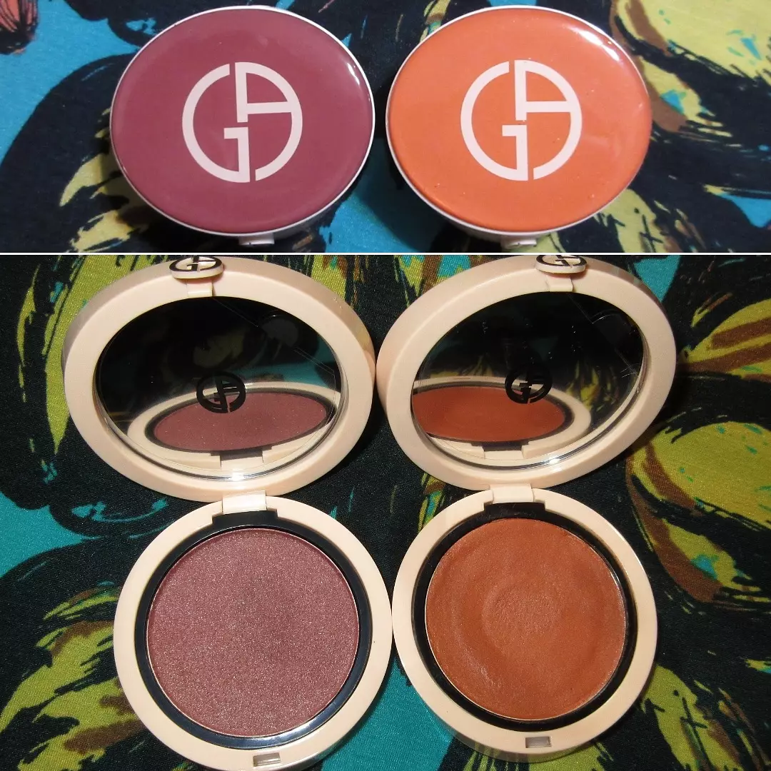
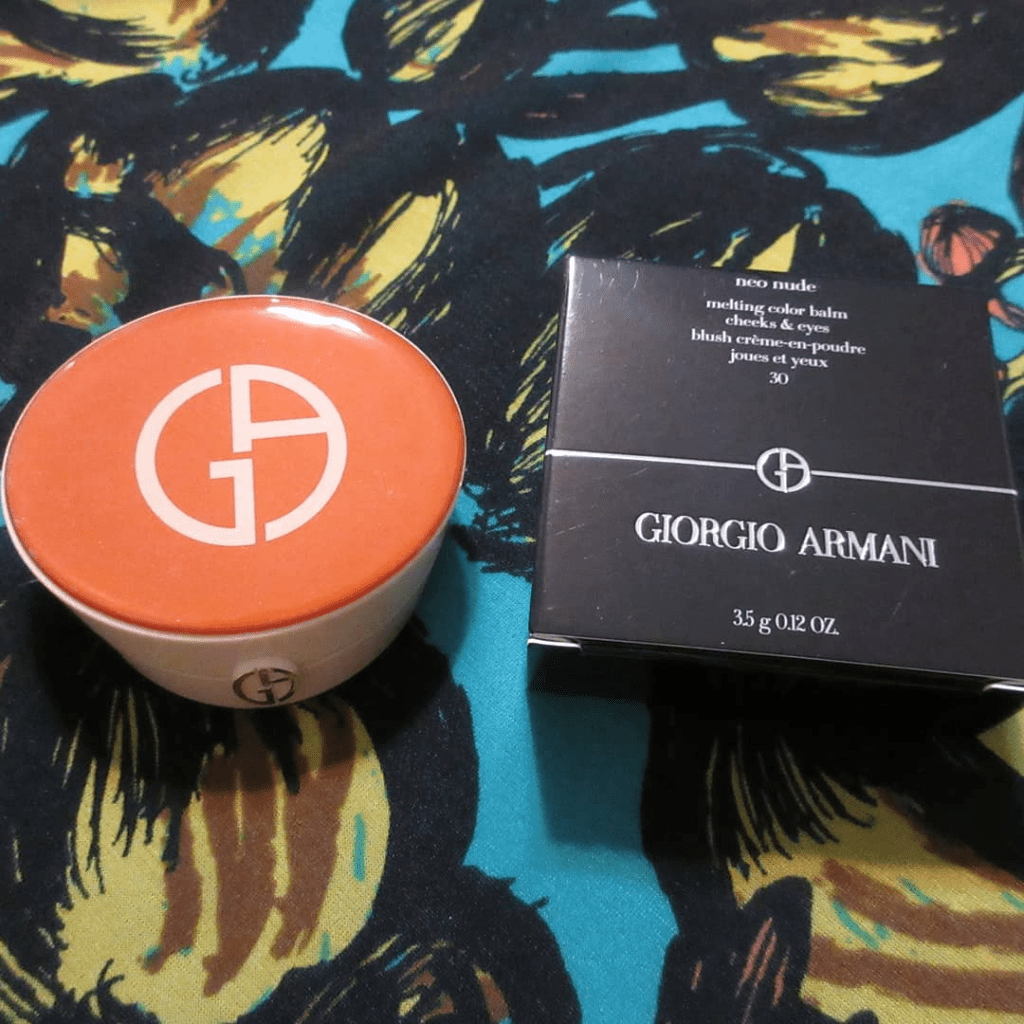
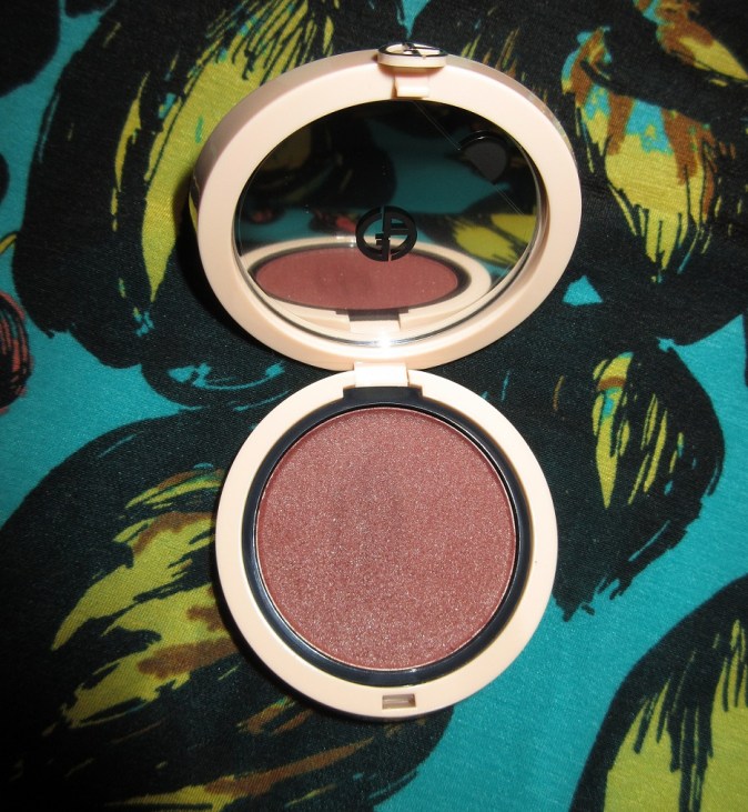
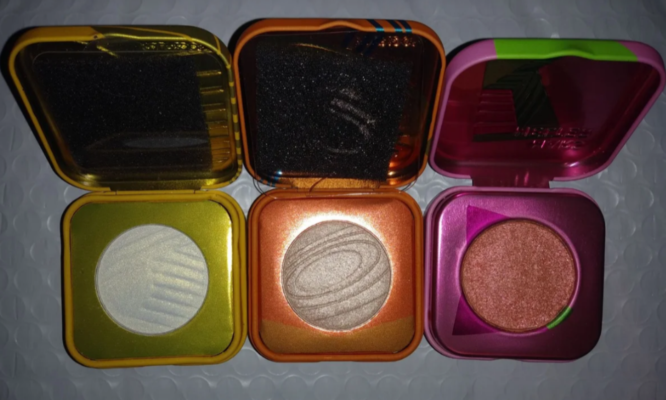
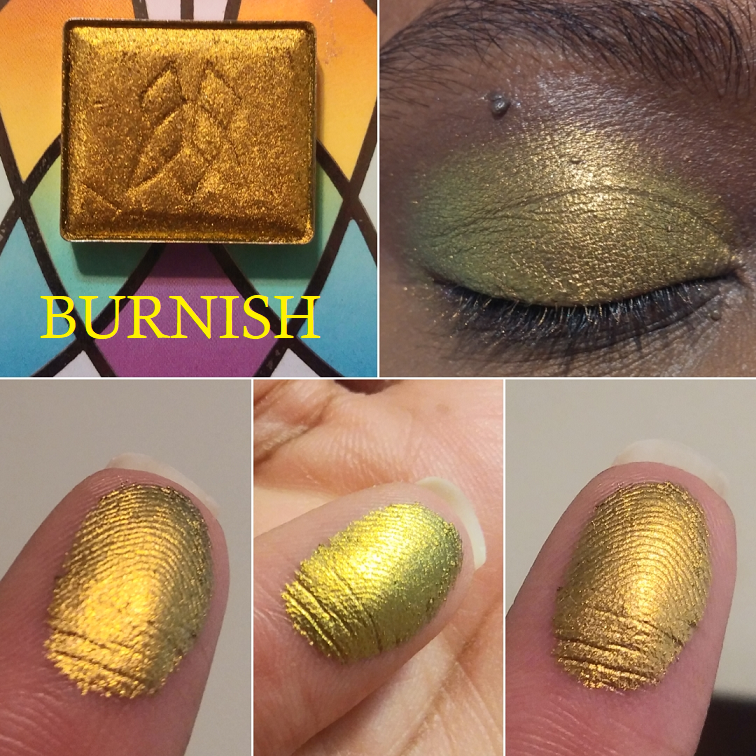
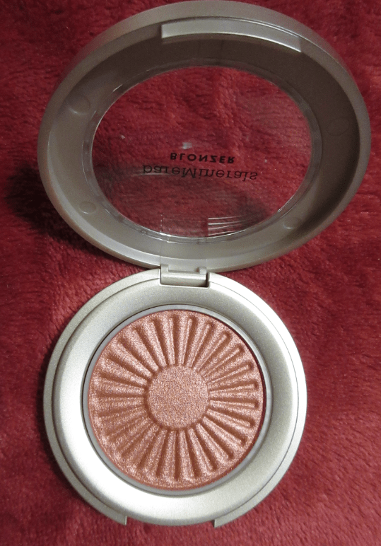
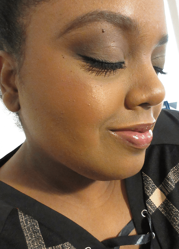
This product also goes by the name of the Armani Beauty Neo Nude Color Melting Cream Blush. “Balm” is a less accurate description because it implies there’s a glossy or sticky texture, which this blush does not possess. It’s creamy to the touch and reminds me of a putty texture (but softer) or a Colourpop Supershock Blush (but with less slip). Tara Lynn on YouTube was the first to accurately described the consistency as being similar to Natasha Denona’s cream-to-powder eyeshadow formula. I began working on this post in July and overall, this has been one of the strangest product launches I’ve seen.
Wacky Availability
Other than the initial sneak peek from Trendmood1’s Instagram page, I saw barely any mention of this blush around social media or on Youtube. Two weeks after it released, there were still only four videos I could find. There was very little promotion for it across other platforms as well, including from Armani themselves. It released first to Sephora and Armani’s US site in only five of the nine blushes. Then Neiman Marcus got seven of the nine. Then it disappeared off Neiman’s website and appeared at Saks Fifth Avenue in the full range, but as a pre-order for July 17th. By July 19th there was no trace of the blushes on the Saks website. Then on July 22nd, all the blushes returned to Saks’ website as yet another pre-order, but with a note on the page that they were, “not shipping until August 17th at the latest.” They also returned to Neiman’s at some point. On July 24th, Sephora joined the other retailers (including Macy’s and Dillard’s) in having seven shades available and by July 29th, Sephora had the complete range listed but with the last Shades 51 Peach Pink and 60 Warm Plum still unavailable. By September 13th, the only retailer I found that had those last two shades actively in stock was Selfridges.
Production and Formula Issues?
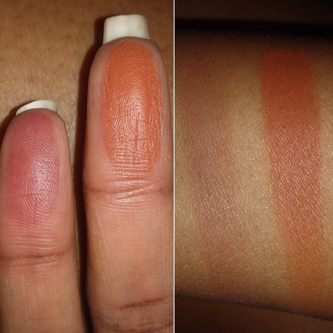
When the Melting Color Balms kept going back and forth between being available and then wiped off websites entirely, I wondered if they were merely behind on production and could not supply everything to all retail partners at once. That explanation would at least account for the severe lack of promotion for the launch on Armani’s part. The fact that my 30 Warm Coral shade arrived with the blush pan separate from the compact and 60 Warm Plum was partly dried out and hard led me to suspect the delays might be due to flaws in the manufacturing process and a quality control problem with the elusive missing 51 Peach Pink and 60 Warm Plum shades. I can’t think of other reasons it was unavailable from the rest of the line, including Armani’s own website, for nearly three months. I even tried searching for it online while I was in Germany in case it was available in Europe.
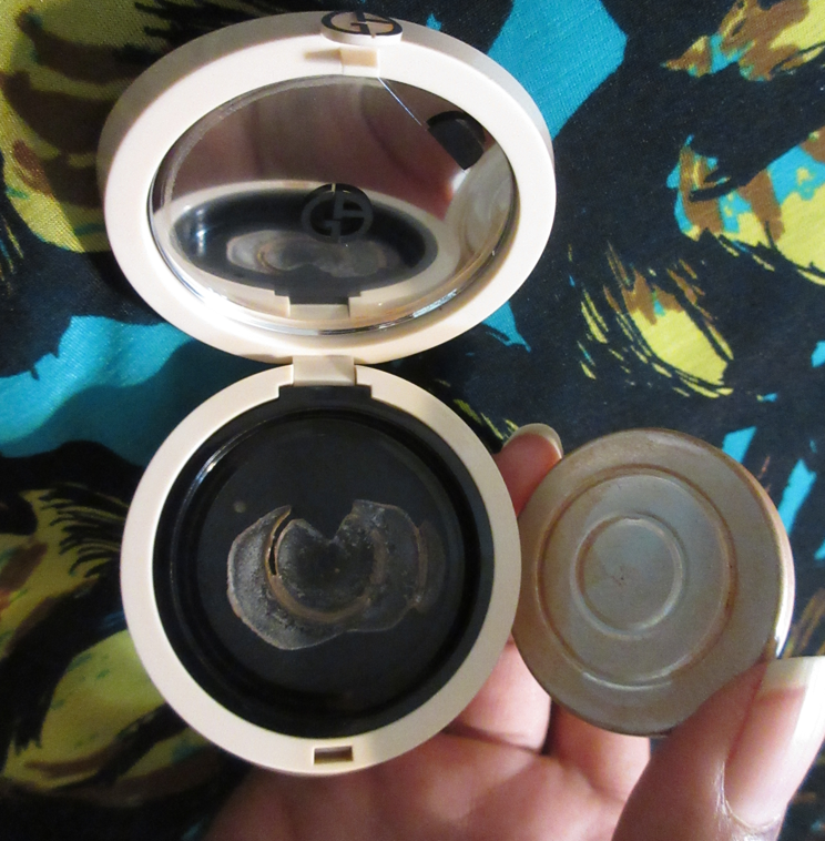
Regarding the detached pan, when my order arrived, I instantly took it out of the box to begin taking photos. I noticed it felt very warm to the touch. It was a hot Florida day and it was likely even hotter in the delivery truck. When I turned the compact over to take a photo of the back, I heard a clink sound and opened the compact to see the pan plop out onto my hand. Glued products when left in a hot vehicle can melt enough for pans to detach. Then when it cools down, if the pan isn’t touching the glue anymore (as the ring of blush on the mirror of my compact suggested) the glue can dry back up and leave you with an unstuck product.
I noticed a hole at the bottom of the compact (the sticker on the bottom is peeking through from the other side), which usually indicates the product is recyclable and/or refillable. So, I thought if it’s refillable then the pans should attach to something on their own. I cleaned off the bottom of the blush pan and put it in a custom magnetic palette to see if it would stick, but it did not. Then I wanted to see if the compact would hold the pan without glue, so I cleaned off the glue bottom as well as I could, but it wouldn’t stay in. Because this isn’t a powder product and I don’t have to worry about it breaking, I figured I could keep using the blush while loose in the compact as long as I was careful with it. I’m not sure if the pan suddenly adhered to the remnants of the glue again or if the pressure from my brush hitting the pan into the compact got it to attach, but it somehow stayed within the compact again, even when I held it upside down!
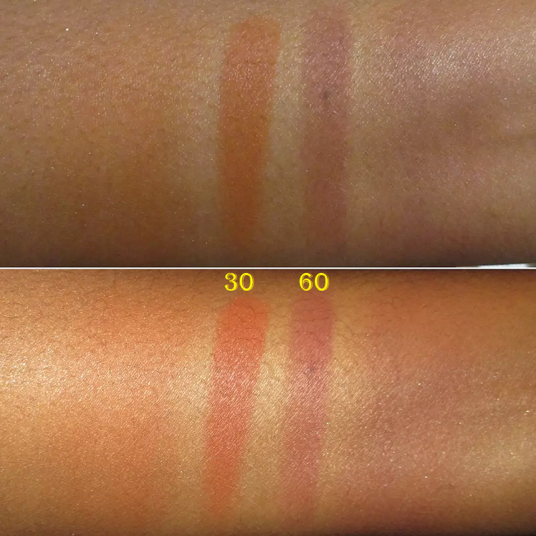
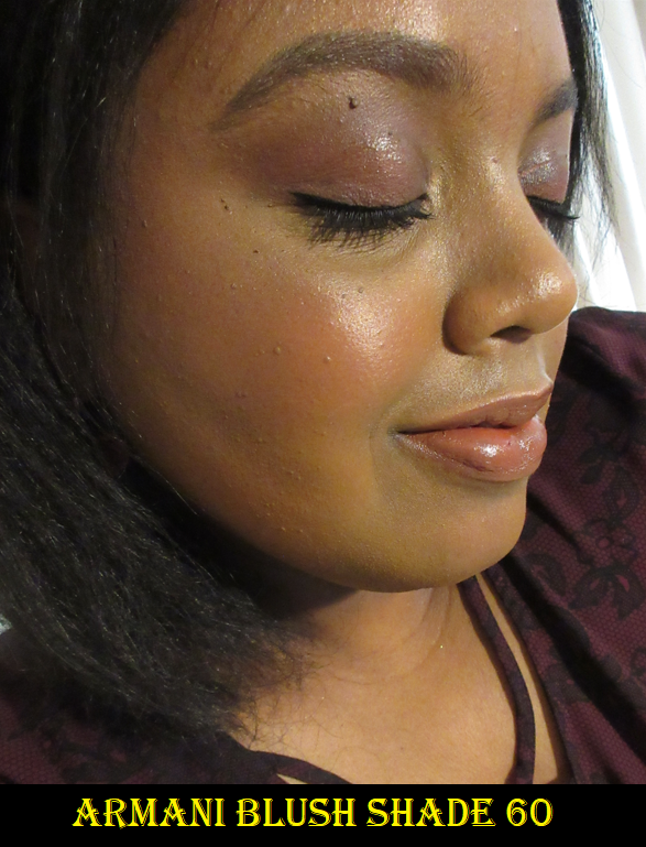
As for Shade 60 Warm Plum, my experience with it was completely different to Shade 30, but I’m willing to bet Shade 30’s consistency and performance is the way the line is actually intended to be. Unfortunately, what I got with this one was a blush that took quite a lot of effort to get product onto my brush and even on my fingers. The blush was so hard that I could barely scratch the surface with my nail and what I was able to scratch away broke off in a hardened chunk. I contacted Selfridges inquiring about a possible batch issue and they informed me they were unaware of one but would look into it. Then they refunded me, which is nice considering the level of dryness and difficulty to work with it will only get worse with time. So with the refund, perhaps I’ll buy it again in the future and hopefully it’ll be in the beautiful creamy formula that 30 Warm Coral has.
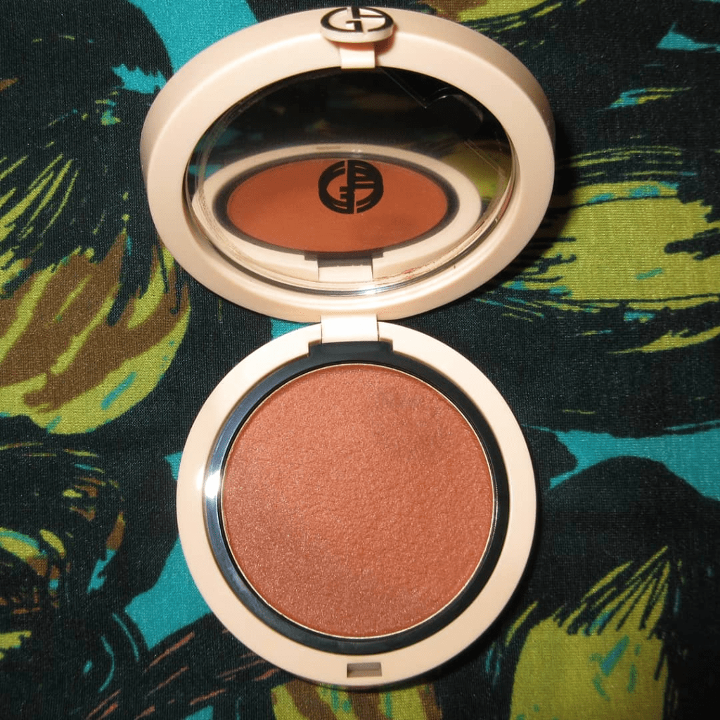
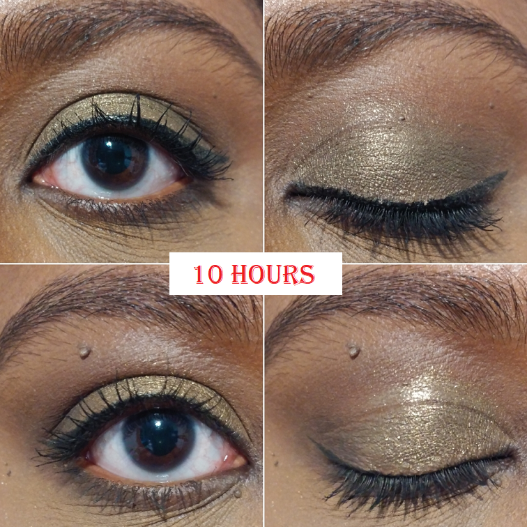
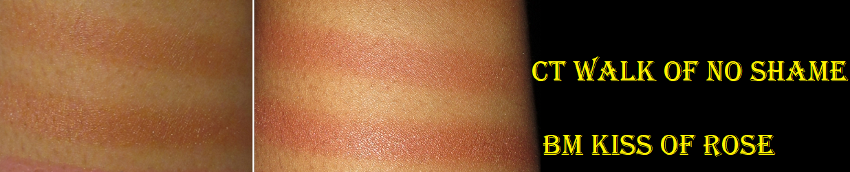
This photo demonstrates the amount of product that gets picked up with one swipe of the Plum shade versus a single swipe of Coral.
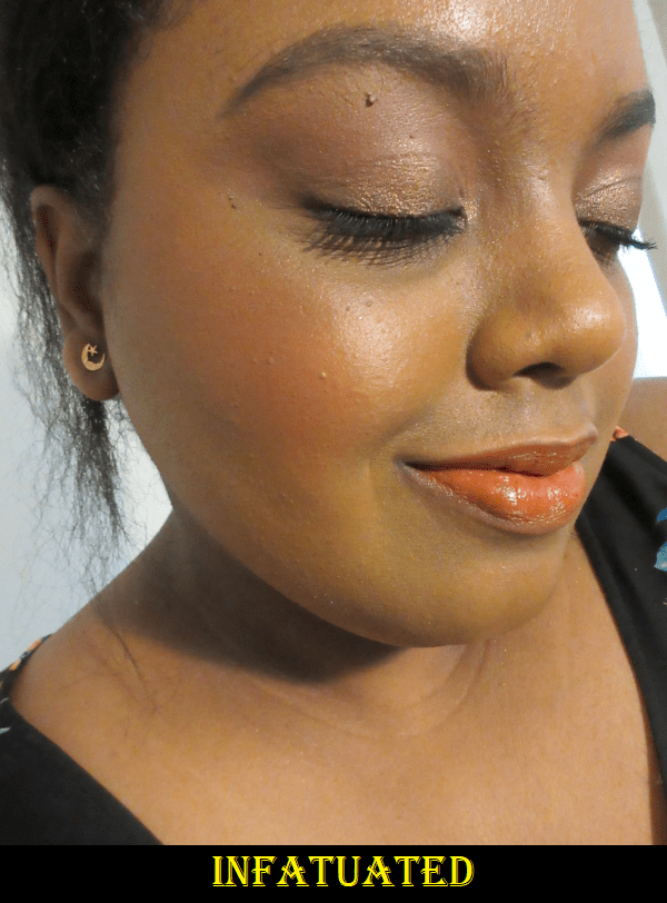
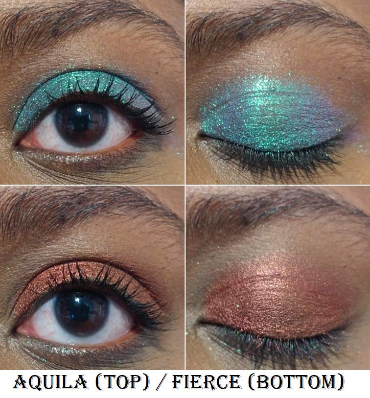
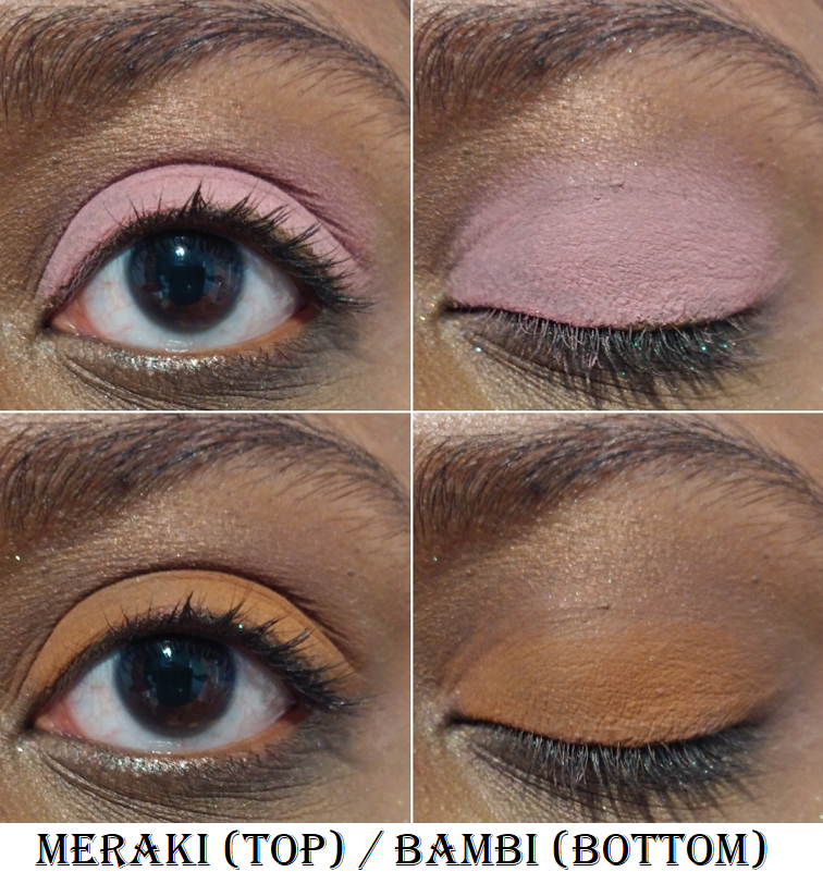
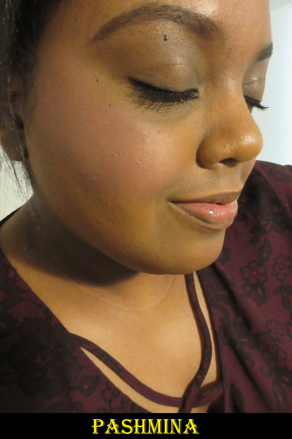
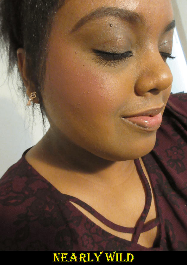
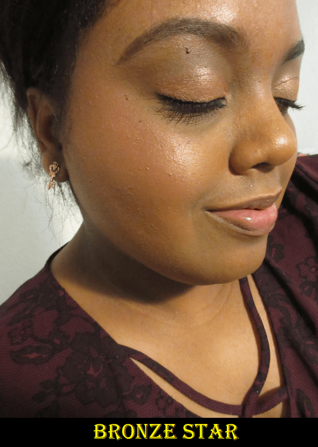
30 Warm Coral Review
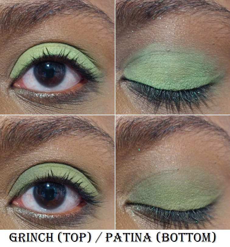
This product is so pretty on the skin! It’s described as, “a lightweight oil-in-powder formula that seamlessly adds color to cheeks and eyes for a natural matte makeup look.” The shade range is quite unique, seeing as how there aren’t any true pinks. The blushes are on the warmer or cooler sides of brown, with the most colorful pops leaning orange and plum. Specific shades in the line are intended to be contour shades. Because these tones are so natural, there’s a limit to how much you can build them. I can make Shade 30 fully opaque on my cheeks, but the color is somewhat camouflaged against my skin tone, so it still appears a bit subtle in person and on camera. I do like that it’s impossible for me to go overboard with this shade, but I only enjoy it on days I’m specifically in the mood for a warm-neutral look.
I love how this melts into my other products. It embodies the best that a cream product can offer in terms of the finish and application process. This doesn’t leave a wet or heavy feeling on this skin, but it transfers heavily and easily since it does not dry down. Powder helps to minimize the transfer, but this is the type of product I only suggest to those who don’t touch their faces a lot.
This product looks great when blended with a brush or a sponge. When I apply with my fingers, it looks alright, but it’s not as perfectly smooth on my skin as it would be if I used tools. The formula is likely the reason because it’s prone to transfer, so the fingers simultaneously smooth the product with each tap and also picks some of it back up. Multiple layers with a brush is easily eclipsed by 1-2 dips into the product with a sponge, so the sponge will give the most color payoff in the quickest amount of time. My guess is that it has something to do with the water in the sponge and the oil in the blush repelling each other and preventing the blush from getting too soaked into the sponge, therefore applying more product onto the skin.
The Melting Balm is long-lasting and wonderful when applied on top of foundation, but on bare skin, the product got absorbed within hours! I reapplied during the first non-foundation wear test to see if I just didn’t apply enough at the start of the day, but the same thing happened! On day two of testing, I skipped foundation again, but applied setting powder all over my face to see how the blush would perform on top of it. Once again, my skin soaked up the product within hours! Realistically, I wouldn’t want to wear these kind of shades on a minimal makeup day anyway. If I’m going to wear nothing but blush, I prefer for it to be a color that stands out a bit more. But it’s important to note that those with dry skin should wear this over a cream or liquid foundation. Then there should not be longevity issues.
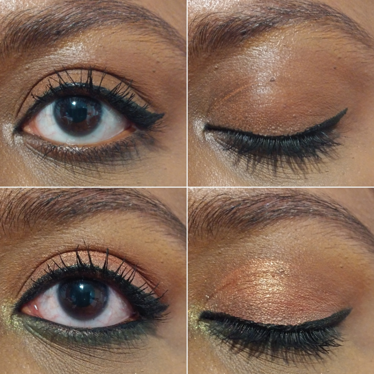
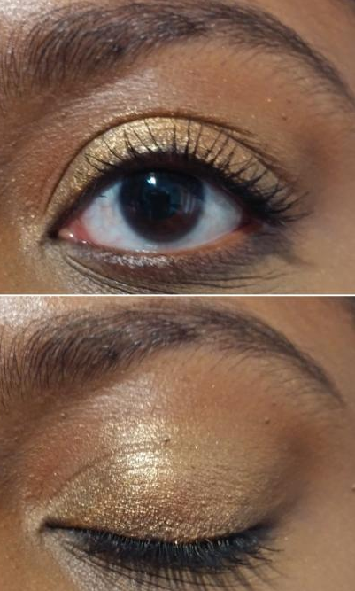
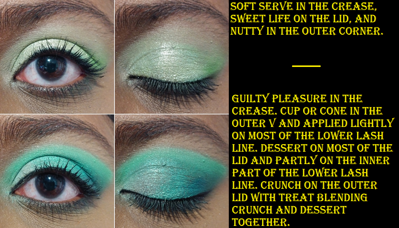
Besides the cheeks, this can also be used on the eyes. It looked fine when I tried it in the crease, and lasted all day as well, but when I tried to use it all over the eye without any other eyeshadows, I could see that it settled into the lines of my eyes. This happens regardless of whether I apply the product onto my bare eyelids, on top of set or unset concealer, or over a MAC Paint Pot. This also happens even if I try to set with power after applying. If I were to continue using this on my eyes, I would keep it in the crease only.
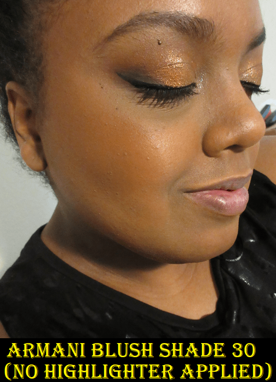
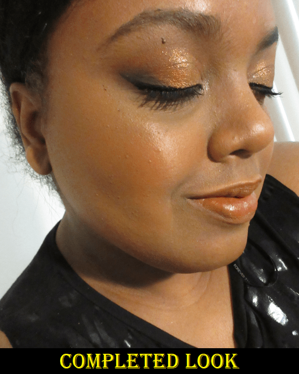
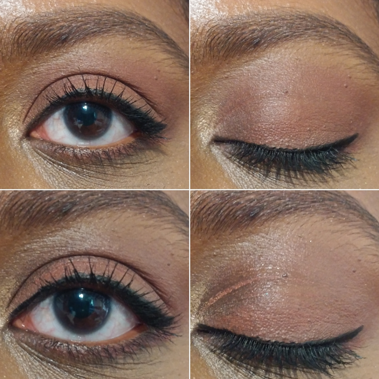
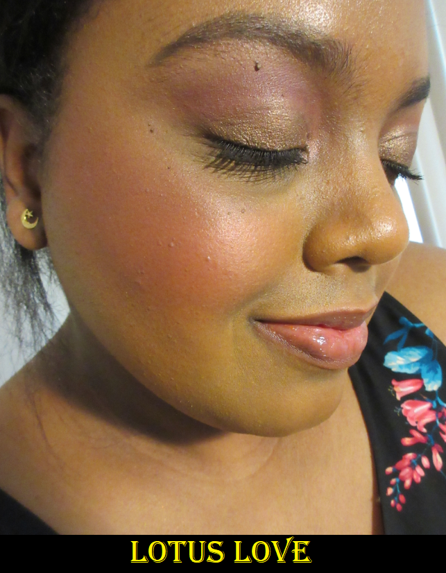
Shade 30 is around the entire eye in the top half of the photo. In the bottom half of the photo, it’s applied only in the crease with Natasha Denona Metropolis shadows.
60 Warm Plum Review
Whatever happened with the formula of this particular shade caused it to feel significantly less creamy, which also gave it a drier feeling on the skin. When I finally get the intensity of the blush that I want, which is still relatively subtle, I would say that it dries down. It still transfers like the Coral blush did, but the transfer is minimal and it is just as long lasting on my skin when applied on top of my usual liquid foundations.
Because of how long it takes to build up the color, using my fingers to apply the blush is impractical. The formula issue makes it prone to patchiness. With a brush, I have to use hard pressure in order to get the product onto my cheek and the force needed to blend it can disrupt my concealer and also where I put bronzer if I’m not careful. Just like with Coral, a damp sponge will give the most pigmentation with the least effort. I actually like how this looks when it isn’t applied intensely, so I put on the blush with a sponge and then use what’s left of my foundation brush to sheer the edges and get a deep pink on my cheek since it only looks plum-purple when heavily applied.
When used on the eyes, I have the same creasing issue. Technically this is worse because of how many layers I have to apply to get it to show up. No matter what I do, the creasing happens within five to ten minutes. Then within an hour it moves, breaks down, and fades in places. With Shade 30, it will last longer in the crease of the eye but not the lid. With Shade 60, it doesn’t last anywhere.
Regardless of all the complications associated with these blushes, I don’t regret buying them. They aren’t my favorite cream formula, but something about the particular tones stand out in my collection. The packaging is also aesthetically pleasing and makes me so happy to see them on my dresser. Judging based on Shade 30 alone, I’m still not certain they’d be worth the price to everyone, but somehow I still really like them. The benefits are so special to me that they outweigh the negatives I normally wouldn’t want, especially for such pricey blushes.
One extra bit of information left to note is that according to the packaging, these should last 24 months after opening, which is quite a big claim for a cream product. We will see if that holds up with Shade 60 if I continue to use it with a sponge.
That’s all for today! I’ve certainly tried my hardest to give the full picture of the best these blushes can offer, along with potential issues. I hope this has helped!
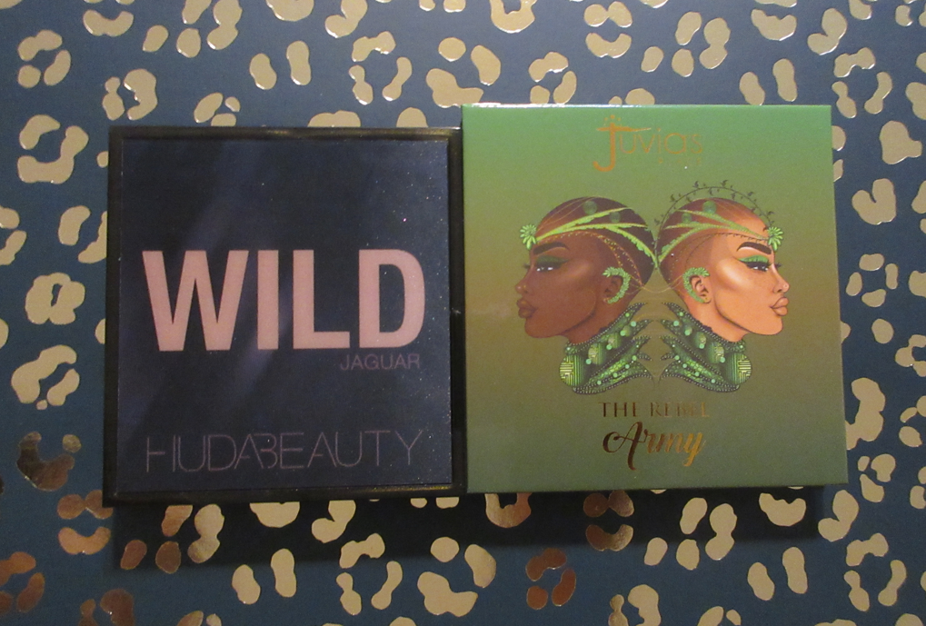
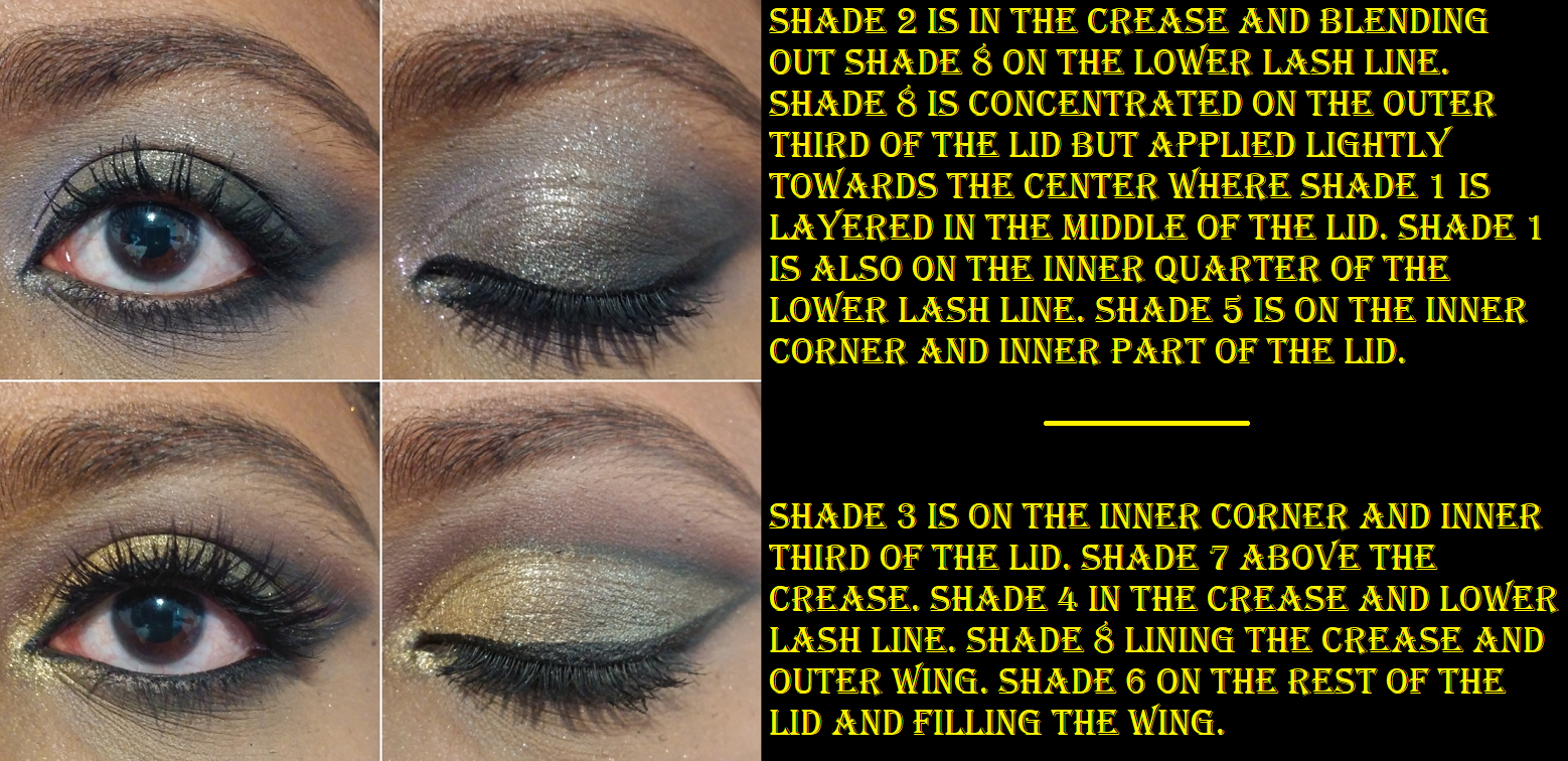
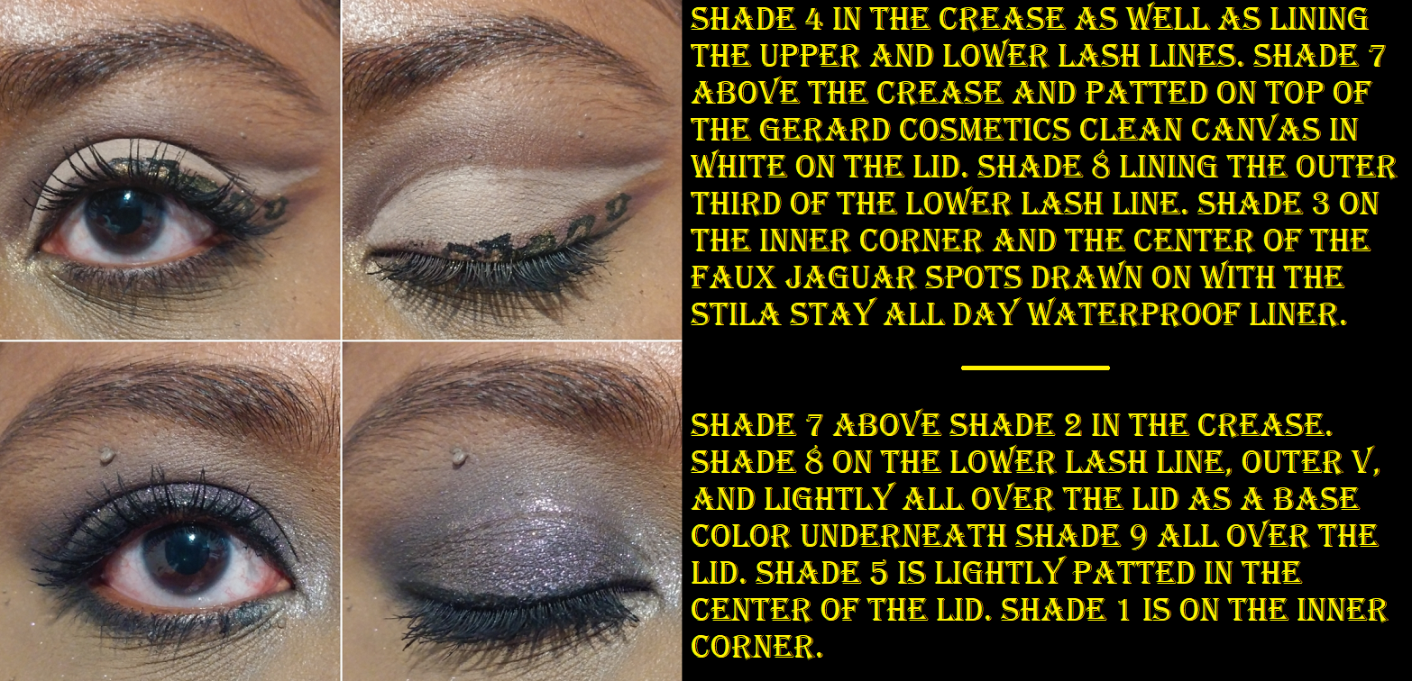
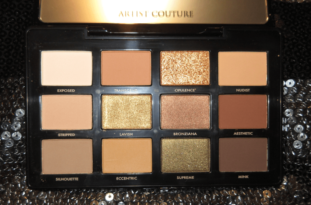
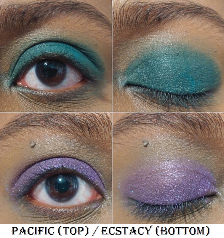
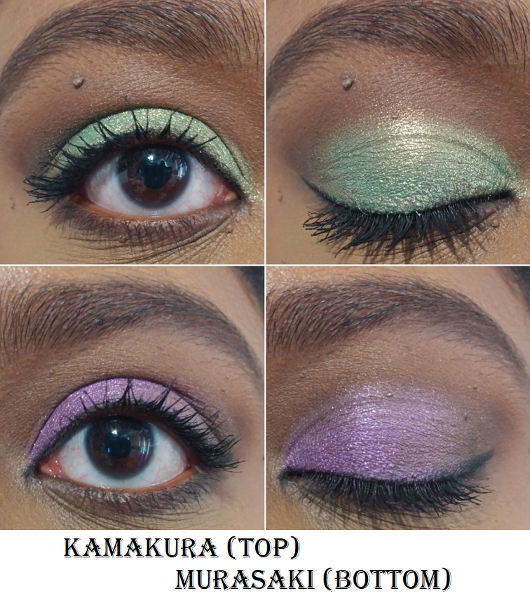
Today’s theme is Danger in the Jungle! It’s a classic man versus nature battle with man being represented by the Army quad from the Juvia’s Place Rebel Collection. The challenger representing nature is the Jaguar palette from Huda Beauty’s Wild Obsessions Collection. The Army quad is the first Juvia’s Place eyeshadow I’ve purchased since February 2021 after declaring in my review that I was taking a break from their 4-6 pan palettes. I was disappointed by the quality of the mattes and the constant additions of pressed glitters. The stakes were high when I decided that my view of this quad would determine if I would permanently stop purchasing 4-6 pan eyeshadows from Juvia’s Place. This was also my first Huda Beauty Obsessions palette since the release of the Gemstone collection in 2018, so the success of the Jaguar palette would help determine my confidence in purchasing more from the Obsessions line in the future.
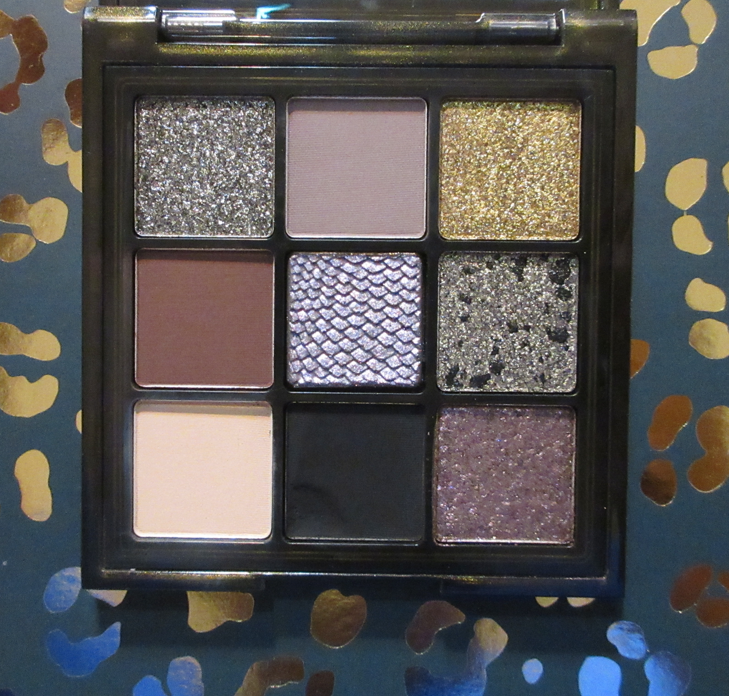
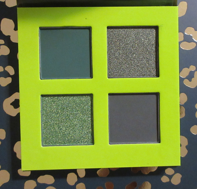
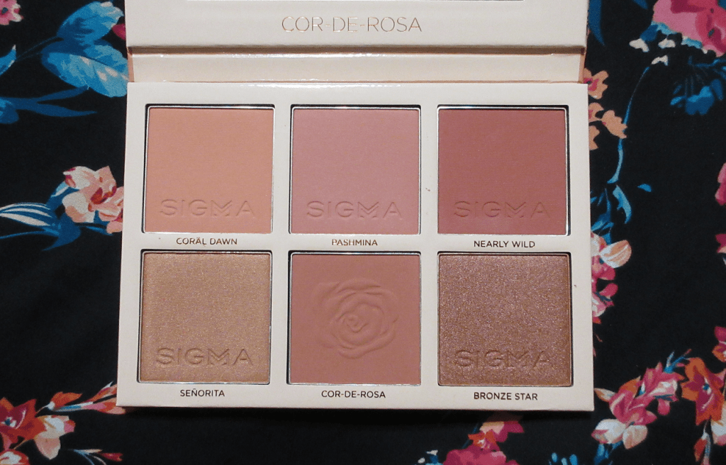
Huda Beauty Wild Obsessions Jaguar Palette
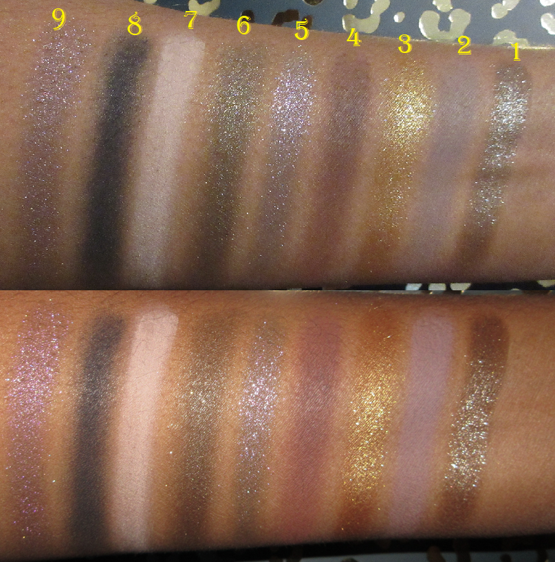
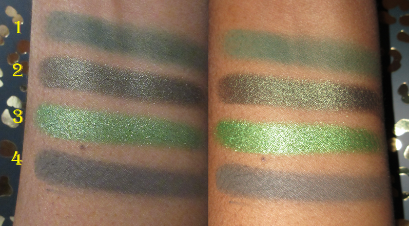
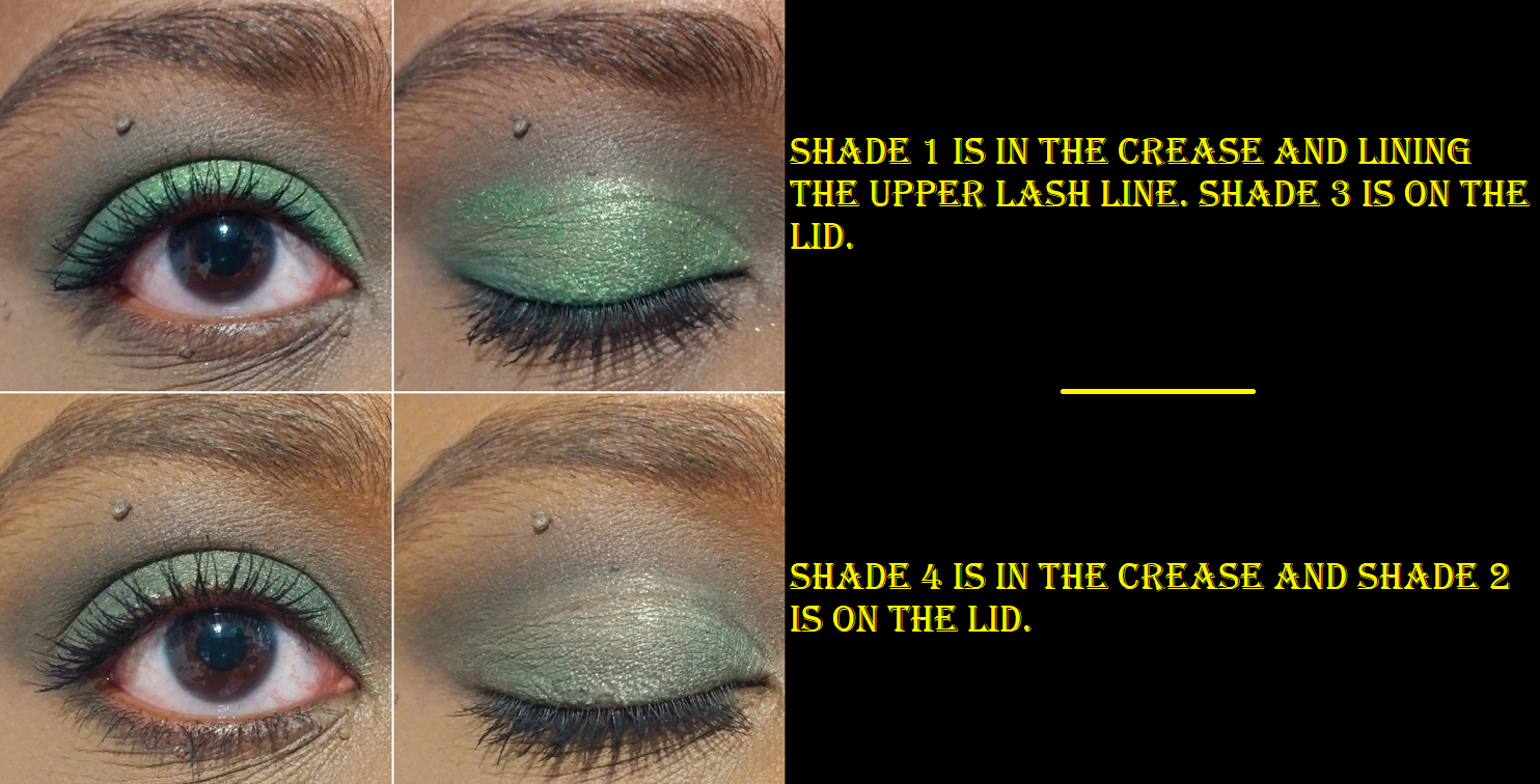
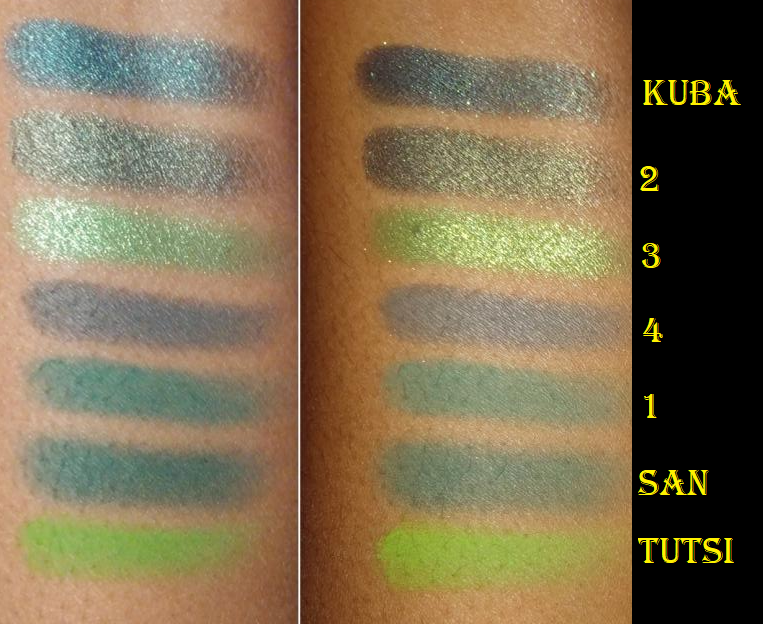
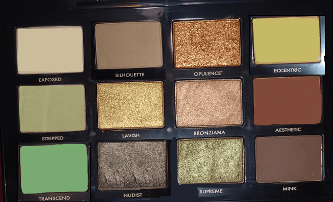
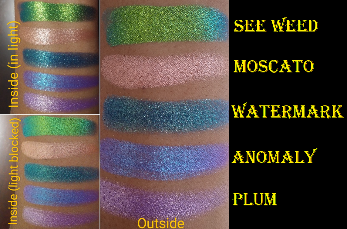
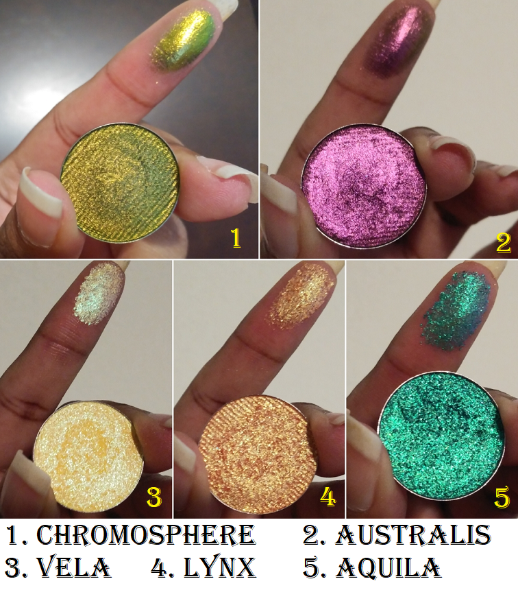
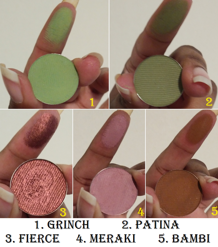
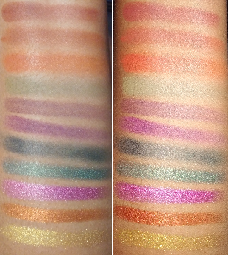
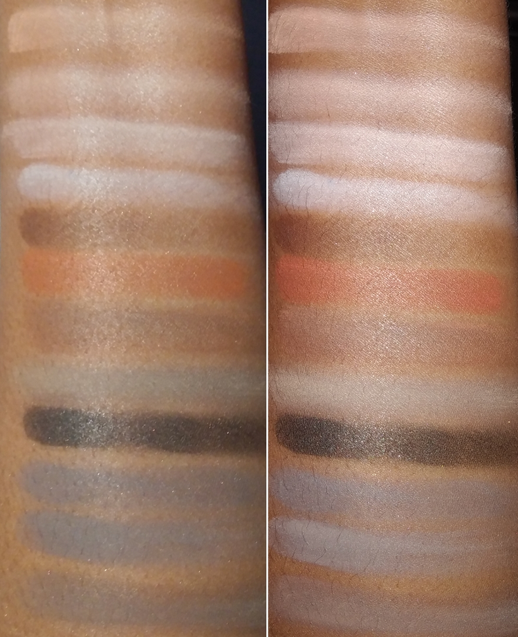
The eyeshadows are not named, so I numbered them based on their positions in the palette from left to right from the top to the bottom.My swatches are in the reverse orderthough.
Jaguar is like a vastly superior version of the Fenty Snap Shadows palette in #6 Smoky. Huda’s has over 7x larger net weight than Fenty’s and has three additional shades for only $4 more. This palette has a mix of warm and cool tones that add a slightly different twist to a traditional smokey eye color story.
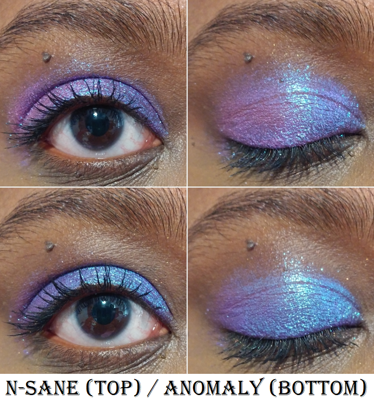
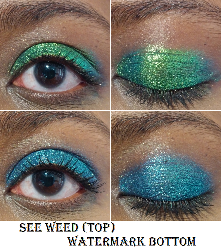
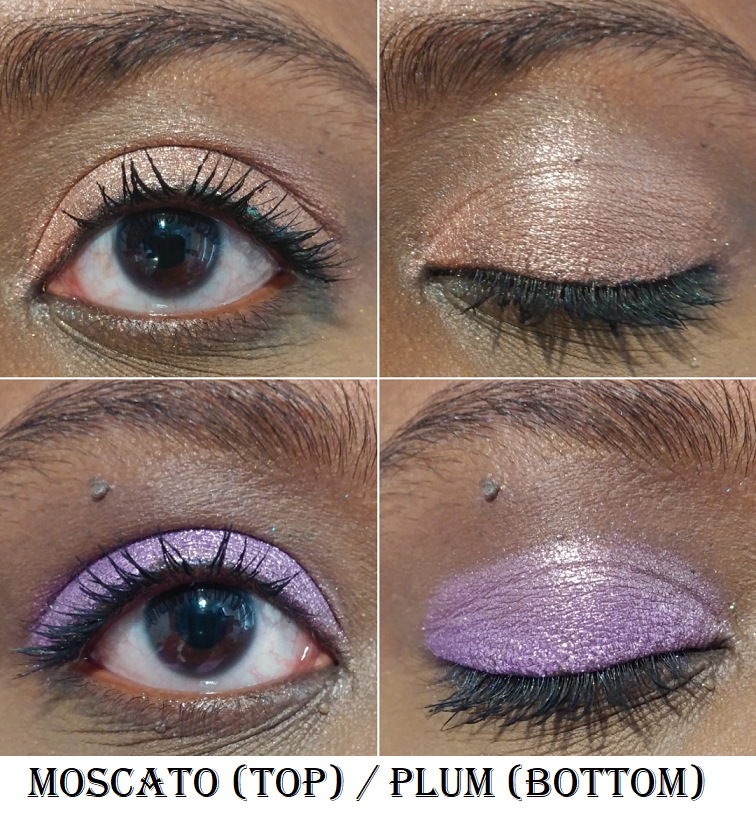
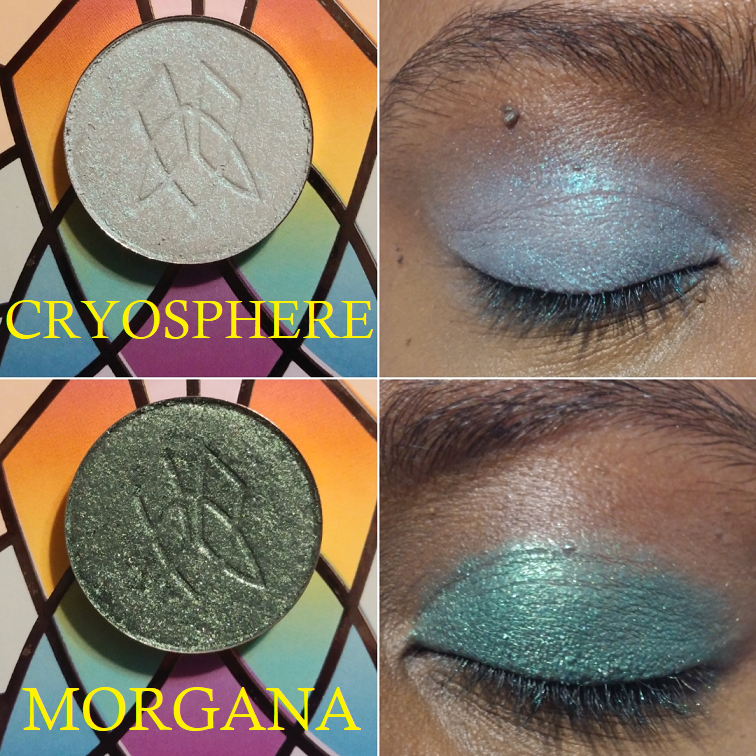
Shade 1 has a warm dark base with silver shimmer. I pick up more of the silver if I use a brush, but when I apply with my finger, I’m able to get more of the warm dark base color underneath. Shade 2 is a purplish grey that pairs well with a cool-toned look and the other purple shades in the palette. Shade 2 and Naaru from the Kaleidos Club Nebula palette are the only pale purple-grey shades that I can think of that look nice on me. It is opaque and easy to blend. Shade 3 is a pigmented metallic gold. There’s nothing really exciting about it beyond being a pretty color with a nice amount of sparkle.
Shade 4 looks slightly burgundy-toned with flash on, but in normal lighting, it’s a pigmented dark brown. I prefer to use it to add depth to warm looks and just use the black shade for cool-smokey ones. Shade 5 is listed as the “one never-before-seen, multi-reflective, 3D-embossed python print,” shade. Based on the wording, I think the marketing is literally referring to the embossing being never seen before from Huda’s range and that they’re not actually talking about the formula being special. I bring this up because I kept hearing that the snake skin shade was supposed to be a brand new formula, but besides the semi-dry texture, I don’t notice anything different about this shimmer over the others in this palette. It has multi-color shimmer (lilac, pink, and silver) and that’s the extent of what makes it special. It’s very pretty but a little over-hyped. Also, I expected this to be a topper shade, but I was happy to see the base color shows through and it’s not fully sheer. Shade 6 is the gold shimmer version of Shade 1, but with an added dark-olive tone. It’s a little warmer of a color than Shade 1, but not by a lot.
Shade 7 is a creamy beige. I was impressed that it was so opaque that it could cover the darker shades in the crease, but it’s not as easy to use when trying to create a gradient with the darker mattes, since blending it too much sheers it out. Shade 8 is a lovely matte black. It has the right amount of pigment that keeps it opaque but easy to blend as well. It also makes for a great base underneath the more sparkly shadows. This shadow did come broken and got some of the particles in the other shades, but I was able to wipe them clean, even off the cream shade number 8. So, I decided not to bother contacting Sephora. Shade 9 is the one disappointing shade in the palette in terms of formula, but not color. It has a warm purple base with purple and gold shimmer. It’s a sheer shade to begin with and is difficult to get product onto the brush. I had to use my finger and it felt like there was already some kind of film or hard layer on top at the very first use. I had to use Shade 8 underneath to get it to stand out on my eyes, and even then, I didn’t think it was impactful enough on its own.
Although I felt it necessary to use the black shadow under some of the sparkly shades, and I favor opaque shadows over toppers, I’ve been very happy with the overall quality of this palette. I feel confident in buying more in the future if the colors included are shades I would use often enough. The mattes were easy to work with for the purposes I wanted and I liked the tones of them. They were certainly much better than the ones in the Juvia’s Place Quad.
Juvia’s Place Rebel Army Quad
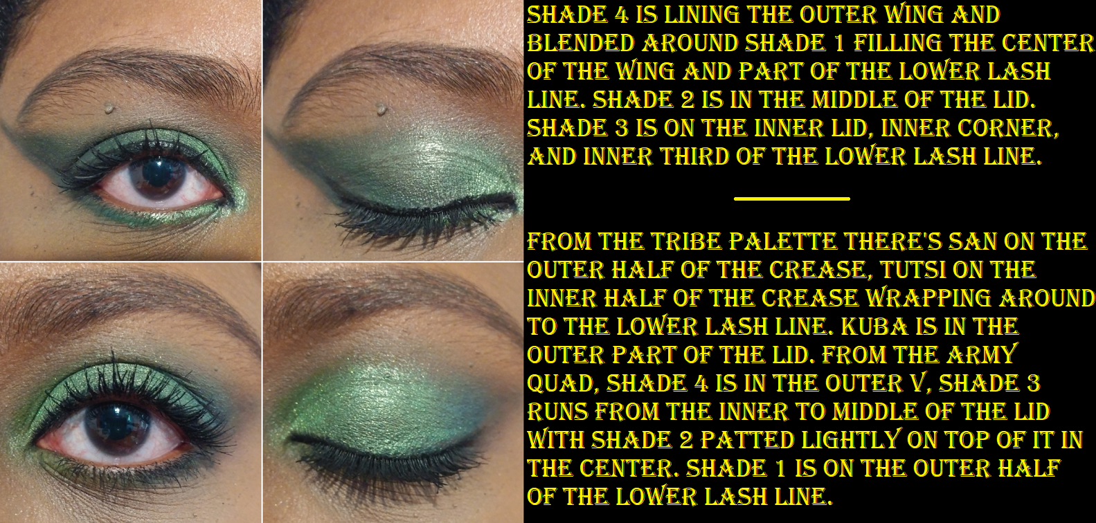
I’m sad to say this palette did not live up to the expectations I had for it. It is not like their older formula that I loved. If a shadow swatches poorly, it doesn’t automatically mean it won’t perform well on this eyes, but Shade 1 looked patchy on my arm and took ages to blend and keep from looking patchy on my eyes. The time it took me to blend Shade 1 in my crease to my satisfaction was the same amount of time it took for me to do the entirety of Look #1 in the Huda Jaguar section. Shade 4 still takes a while to blend, but it’s not as hard to do as Shade 1. When I compared the mattes in this palette to the ones in The Tribe palette, Tribe’s mattes aren’t as thin. They are so much more pigmented and take significantly less time to blend. Juvia’s Place has their own eyeshadow primer now, which is said to be similar to the Anastasia Beverly Hills Eye Primer. I’ve used these shadows over the MAC Paint Pot and Gerard Cosmetics Clean Canvas, so perhaps if I used Juvia’s primer the shadows would perform better.
The shimmer shadows remind me of the formula of Menagerie Cosmetics’ shimmers, which is a texture and consistency I despise. I don’t dislike these as much as the ones from Menagerie, but they are still wet, thick, and clump up. This makes them difficult to apply smoothly over the lid. Shade 3 is much wetter than Shade 2 and I had such a hard time trying to use my Nyx and Stila liquid eyeliner pens over that texture. The tip frayed with the Nyx and got clogged with the Stila. The Nyx pen was on its last legs, but the Stila wasn’t even 6 months old. I have to use these with more traditional eyeliner pencils and it’s still a struggle. Formula issues aside, I do really like the colors and the level of shine. Shade 3 is much brighter than I’d expect out of an Army quad though, so I felt like it didn’t fit the looks I was trying to go for (grungy and muted). I had to tone it down with Shade 2 on top of it.
While this quad is only $10 for nearly the same amount of product as the Jaguar palette, I’d rather spend more for better quality. In fact, it’s a shame that the Tribe palette from Juvia’s Place was discontinued because I would easily recommend that one over this. While it’s true that I can make this palette work and the colors are beautiful, I don’t want to spend the time required in order to get the outcome I want from the shadows. So, I will only buy the larger palettes from Juvia’s Place in the future because Wahala II leads me to believe the newer palettes in the larger size might still be better quality. I am happy the Rebel Army quad did not have a pressed glitter, which is moving in the right direction, but I doubt I will use it again.
It seems that in the battle between man and nature, nature has won today!
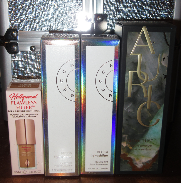
I’m not sure what to classify these products as: liquid highlighters, dewy skin tints, illuminators? These multipurpose glow products can be used in whichever way someone wants, but today I will be sharing my thoughts on how they compare to each other and the ways I prefer to use them. In honor of Becca closing its doors on September 30th at 1 PM EST, I wanted to make sure I post this beforehand in case anyone is interested in the Light Shifter Dewing Tint and is considering making a last minute purchase.
UPDATE: September 17th, 2021
It appears Estee Lauder is saving Becca’s best formulas by pairing it with their other brand, Smashbox. I thought I would update this post with that information. Now, onto the review!
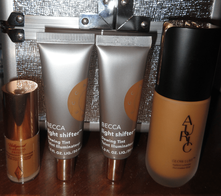
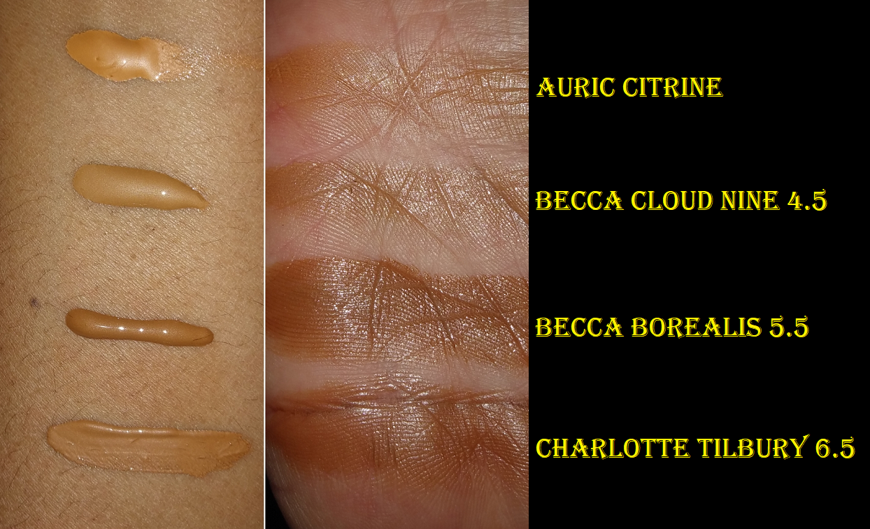
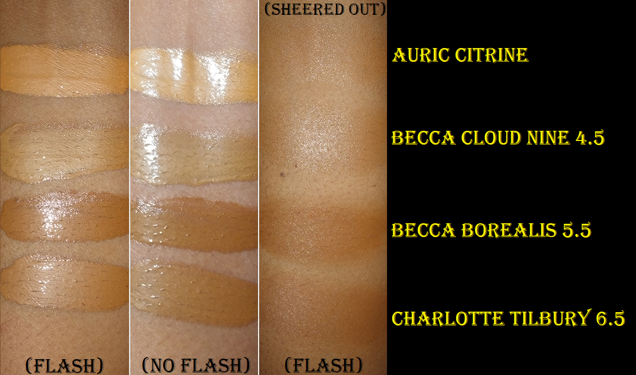
Auric Glow Lust Radiant Luminizer in Citrine
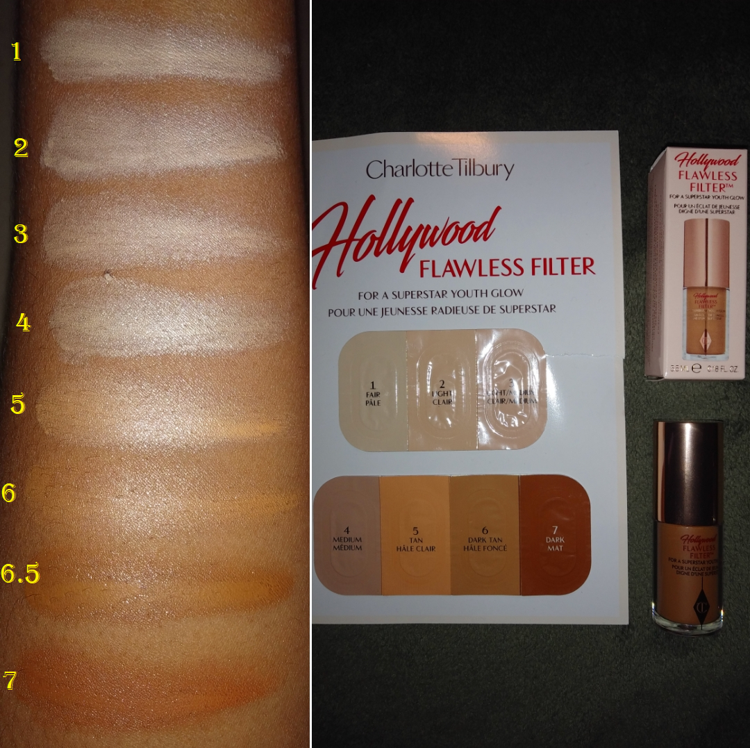
Auric is a brand created by beauty influencer Samantha Ravndahl. I’ve watched a couple of her videos, but my interest in the Glow Lust was purely from the angle of wanting to see if it’s comparable to Charlotte Tilbury’s Hollywood Flawless Filter. This costs $45 plus shipping for 35ml whereas Charlotte Tilbury’s is $44 for 30 ml (and likely free shipping from Sephora if you’re in the US). Auric has seven shades available. Charlotte Tilbury had seven shades initially, but released an additional five shades just weeks before Auric’s launch.
This product can be added to skincare, mixed with foundation, used under foundation like a radiant primer, or applied to specific areas for extra glow. It was created to be sheer enough that a wide range of people could use one or more shades. This also means it will not offer much coverage on its own as a foundation, so I regard it as a mixing liquid or liquid highlighter.
I prefer to use this with a brush. I take a tiny amount and slowly build it up. The highlight lasts easily through a full wear test. The times I’ve tried it with a sponge, it moved my concealer a bit (Tarte Shape Tape). Also, despite using a lot more product with the sponge, the Glow Lust either gets absorbed into the sponge or melts too much into my skin because the end result is less reflective/shiny than when I use a brush. The fingers can blend the product in nicely, but I don’t like how it feels to the touch, so this is not a method I’d use again.
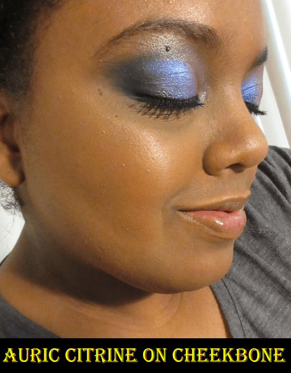
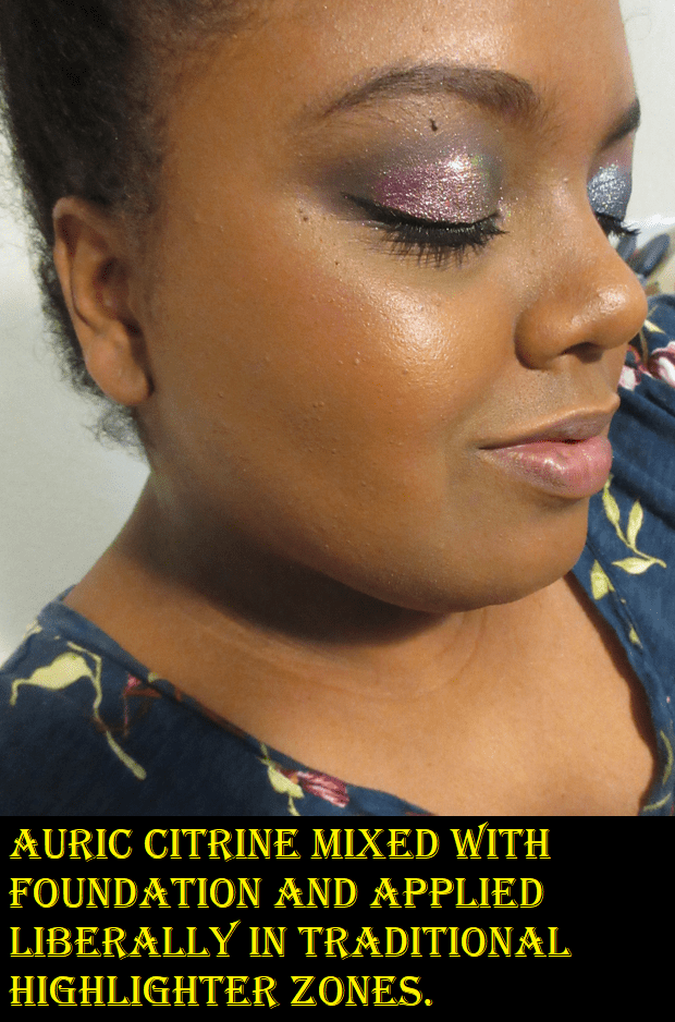
Citrine leans heavy on the yellow undertone and, on its own, it’s a bit too light for me to use as anything but a highlighter. Perhaps the shade Goldstone could have worked for me as a base product, but the texture feels thick on my skin, even when I use the Glow Lust sparingly. For this reason, it’s my least favorite of the three formulas I’ve tried. The effect is pretty, but I cannot stand how it feels when I wear it. I should note that I’ve also tried mixing it with foundation to make a better color match and give me a more subtle glow. The combination allows me to wear it all over my face for as long as I want without it feeling heavy. However, by the end of the night, my face looks greasy. It’s more glow than I want, so I would only continue to use this on my cheekbones. This makes me very glad I purchased this for significantly less than retail from a Mercari seller. I have a personal rule against buying liquid products from third party sellers, but I made an exception because this product was newly launched and had a pump top (so I could confirm it wasn’t old and hadn’t been exposed to the elements). Considering my feelings about it, I would have been very unhappy if I purchased this at full price.
I don’t like the thick consistency of the Glow Lust and I don’t like the fact that this doesn’t dry down (at least not with the Dior Backstage Face and Body Powder No-Powder nor when I mixed it with the Nars Soft Matte Foundation). These are personal preference issues and not about it being a bad product. It does what it’s intended to do, so I understand why it’s so hyped up. Regarding whether it’s worth the price or not, I honestly cannot say because Auric aims for this to be seen as a luxury product and the brand delivers on that. It isn’t worth it to me, but that’s because I know I will never use up a full size liquid highlighter enough for any of them on the market to be worth it.
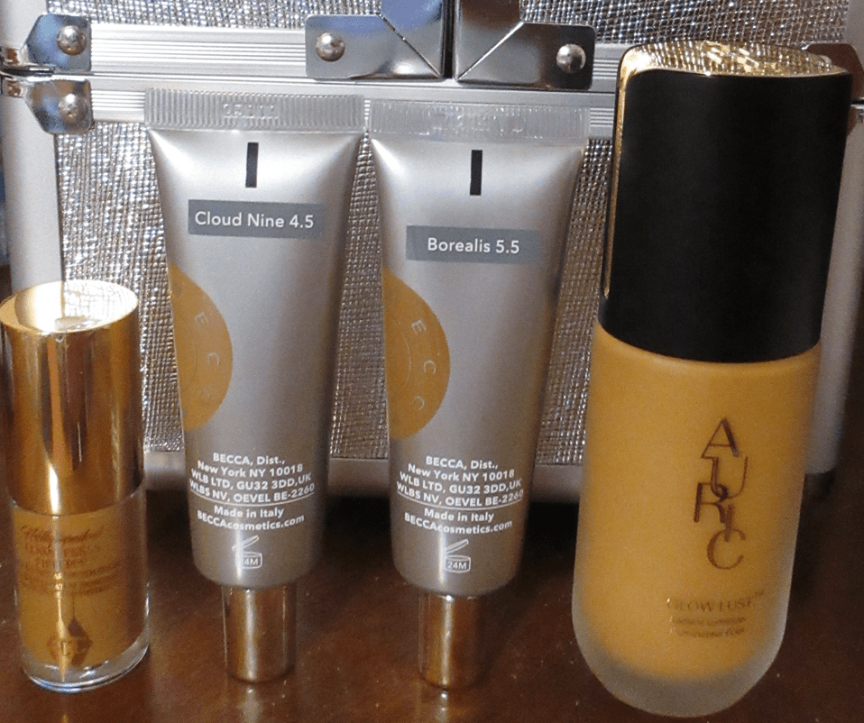
Becca Light Shifter Dewing Tint in 4.5 Cloud Nine and 5.5 Borealis
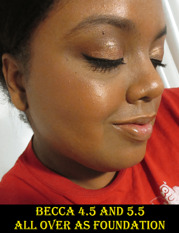
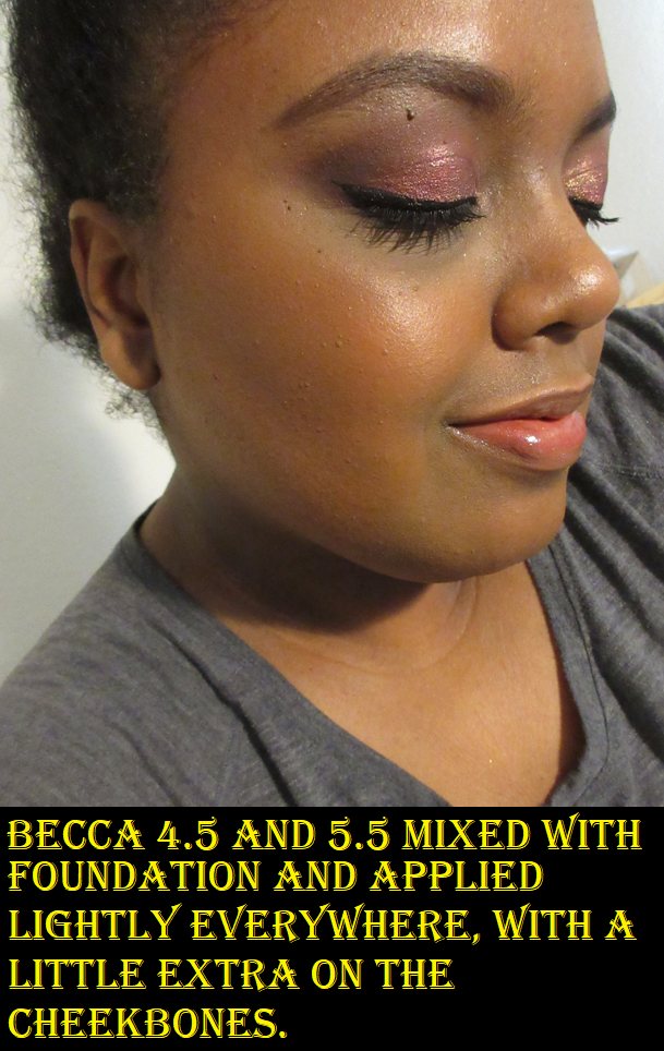
I seem pretty silly having bought two full-size glow products after I just said a single one wouldn’t even be worth it. However, I purchased these as radiant tinted moisturizers the way Angelica Nyqvist and Not Fit For Print Beauty on YouTube wore theirs. Plus, I got them both at half price. Beautylish was the first retailer to discount this product to $15 during their Spring sale in March. That’s when I bought Cloud Nine and realize it was way too light for me to use all over my face. Then a few months later I bought Borealis from Sephora. That shade was way too dark for me, but I figured I could mix them both. As a tinted moisturizer, the Dewing Tint provides more coverage than the Auric Glow Lust, but it’s still supposed to work for those a few shades away from each color option. However, the gap between 4.5 and 5.5 is huge and the swatches at the end of the post make it clear why I couldn’t use either one alone. Also, I’m not very good at mixing my perfect shade. It took many attempts to find the right ratio. This isn’t an issue when I use them for highlighting purposes, but it’s significantly noticeable when it’s in place of foundation.
Fragrance isn’t on the ingredient list, but I swear there’s a faint chocolate smell. Perhaps my nose is mistaking that for Shea butter, which is the twelfth ingredient. The liquid consistency is lighter than the Auric, but it’s also stickier. When I’m wearing this product, I’m hyper aware of the fact that it doesn’t dry down and when I’ve used it as foundation, I had the urge throughout the whole day to wipe it off my face, the way one gets the urge to wipe away a crumb of food or a loose strand of hair. I could barely tolerate doing an 8-hour wear test. I know this type of sensation doesn’t happen to everyone because it’s the same reason so many people love the Tower 28 Cream Blushes but I hated the texture enough to return that blush. Also, all the beauty YouTubers I’ve seen who say this dries down ended up using quite a bit of powder with the Dewing Tint, certainly more powder than I use, and I didn’t powder at all during the wear test. The feeling of the product aside, I don’t want this level of glow all over my face.
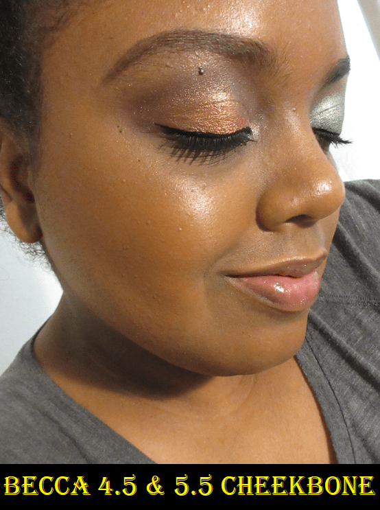
Luckily, this product plays well with my Nars Soft Matte Foundation. Mixing the foundation and both of these shades together gives me a glow that I don’t mind putting all over, and it also dries down without needing to set it with powder. It’s more lightweight on the skin when used this way, and I add the tiniest extra amount of the Dewing Tint onto my cheekbones to make that spot stand out from the rest of the dew.
This product gives me a wet type of glow as opposed to the pearl/shimmer effect the others have. As a highlighter, it doesn’t disturb any products underneath. The fingers, brushes, and sponges all apply the product well, though I was surprised that the prettiest result was with a sponge. However, the result with the sponge wasn’t significant enough that I would switch out of using brushes.
There are eight shade options in total, so if you can find your match, this is a more affordable glow liquid option. I don’t think this is my kind of product, yet I’m not ready to declutter it because I do love the look of it as a highlighter and I can make this fit my needs even more if I continue to use it mixed with foundation.
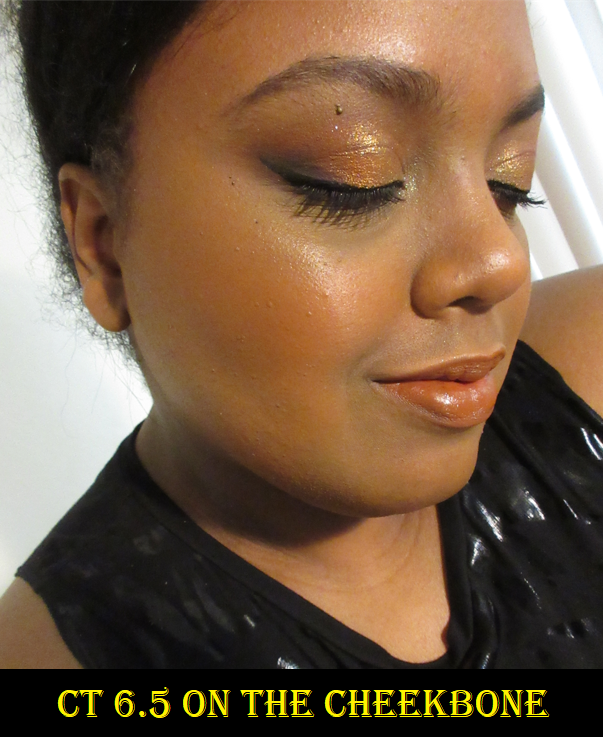
Charlotte Tilbury Hollywood Flawless Filter in 6.5
This is my favorite formula of the three. It’s the most lightweight on my skin, it dries down the most, it’s just as long lasting through a wear test as the others, and it doesn’t disturb products underneath when using the fingers or a brush. Using a sponge requires a little more product and can move my base products if I’m not careful. The end result between using a sponge and a brush look the same, so a brush is my preference. Shade 6.5 is the closest to my skintone if I want to use it as a foundation, and the fact that it’s slightly darker than my skintone aids in giving the appearance of more coverage. For highlighting purposes, shade 6 would presumably be more flattering, but they don’t make minis of shade 6 yet. As much as I like this product and don’t have liquid consistency issues with it, my comment about never going through a product like this stands. I purchased this mini from Sephora on December 2020 and I have plenty of it left. A full-size would still go to waste, so I’m really happy I have this smaller option and easily recommend the mini.
I once tried to use this all over my face as a foundation, but I removed it shortly afterwards. The Becca Dewing Tint is shinier, but its wet effect looks more natural than the way the Hollywood Flawless Filter shimmers and reflects on areas other than traditional highlighter spots.
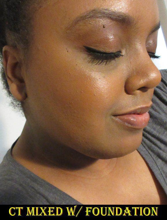
I have only tried actually mixing it with my Nars Foundation once, and the result wasn’t as shiny, so I didn’t mind having it all over my face that way. But when it comes to using a combination of a glow product in with foundation, I think the Becca Dewing Tint gives the prettiest results. So, I prefer to utilize the Hollywood Flawless Filter as a highlighter and as a wet base to intensify any powder highlighter that’s applied on top of it. And because I’ll likely only continue to use these three products for highlighting purposes, the Hollywood Flawless Filter is still my preference.
Swatch Comparisons
Overall, the Glow Lust has a pearl-like type of highlighted shine, the Dewing Tint gives the wettest type of radiance, and the Hollywood Flawless Filter is somewhat in-between. I like Charlotte’s consistency the most, Auric’s packaging the most, and Becca’s price the most.
They’re beautiful products, but I won’t purchase anymore like this in the future. Powder highlighters are better suited for me because they’re easier to use and cost far less than what I spent on the three I reviewed today.
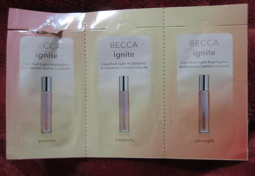
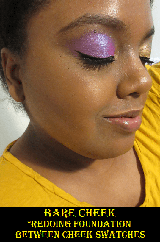
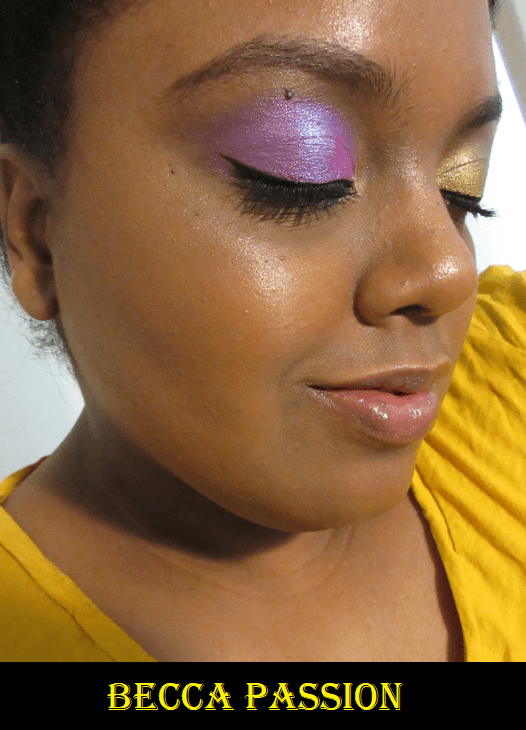
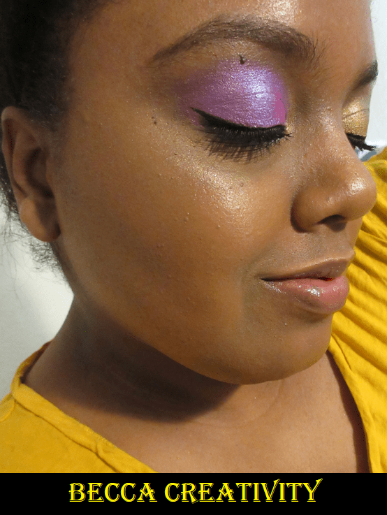
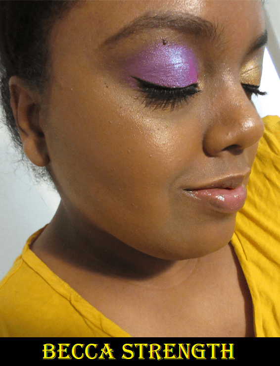
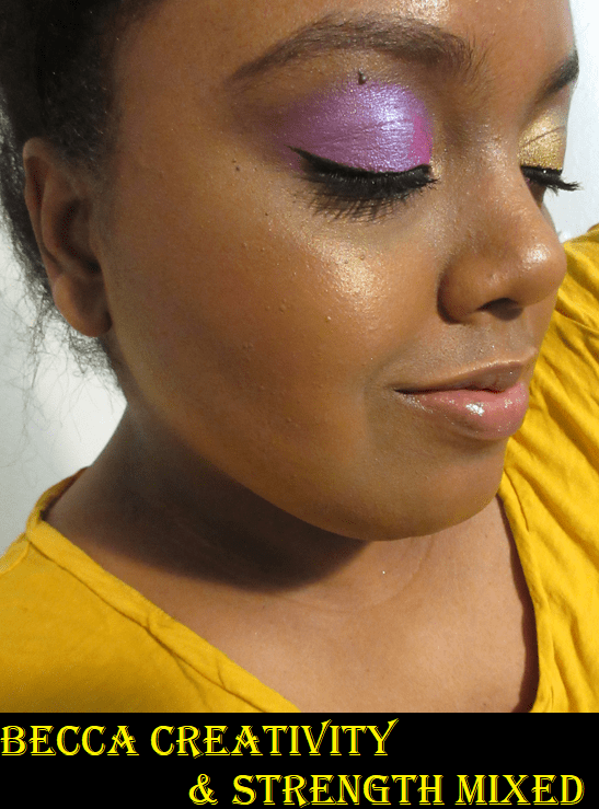
Becca Ignite Liquified Light Highlighters
I had a sample of three different liquid highlighters from Becca and figured this would be the perfect place to feature them. There are five shades in the line and the two not featured here today are Acceptance (pink) and Gratitude (dark copper-pink).
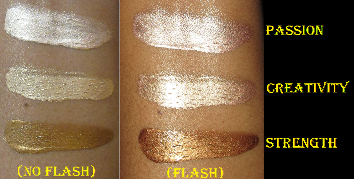
These highlighters remind me a lot of the consistency of the Dewing Tints, except that they feel oilier to the touch, like a typical shimmer body oil. These have a strong but pleasant smell (fragrance is on the ingredient list). The Ignite highlighters have a metallic shine rather than the glow of the Dewing Tints, and actually show visible shimmer particles on the skin, rather than a wet sheen. They “set” in the sense that touching one’s face wouldn’t completely remove the product. However, it doesn’t dry on its own. I did a nine hour wear test and it wasn’t until around eight hours that it felt a little drier in the areas that the highlighter was on top of concealer where I covered some discoloration.
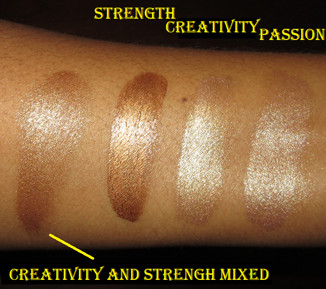
When used sparingly on the tops of the cheekbones, the varying shade depths of the highlighters aren’t that dissimilar. Even regarding the tones, while I could see slight differences between them, I was able to pull off wearing the lightest shade, which is a light champagne. It didn’t look stark like I expected. Creativity is slightly more golden-tone version of Passion. The deep bronze tone of Strength blends with my skin, so it’s not as intense as the rest, but the shimmer particles still give a bold highlighted effect. Strength and Creativity together gave the prettiest results, in my eyes, but the oily residue guarantees I wouldn’t purchase them. The results are beautiful, but I prefer powder highlighters.
If I have a strong negative or positive opinion about something, you can expect that to stay the same. This post will mainly center around the items I had mixed or indifferent feelings about in my reviews, but I’m now definitively on one side.
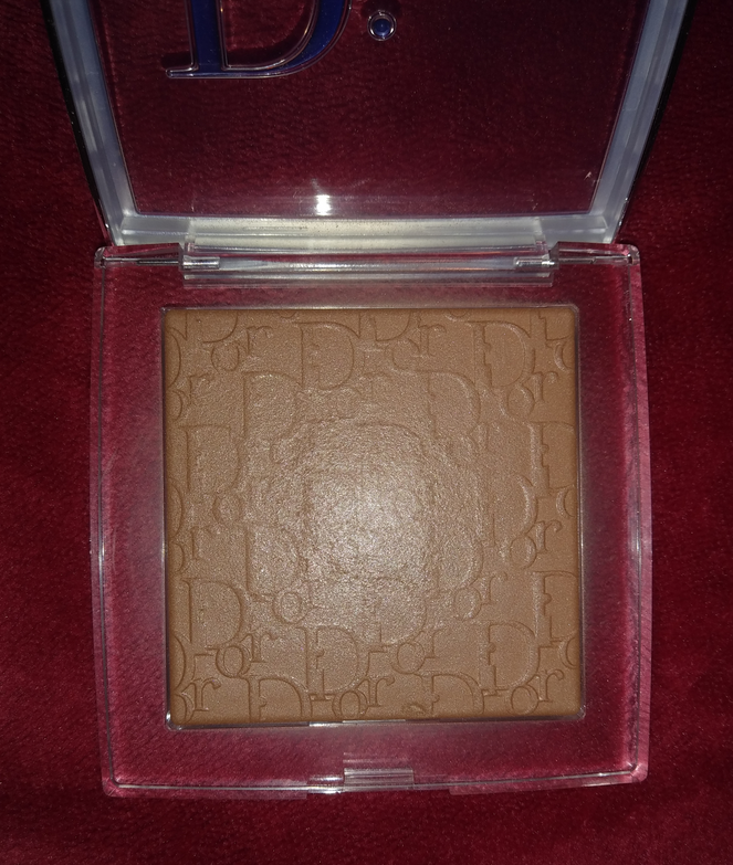
Dior Backstage Face and Body Powder No Powder
I remember saying that for my personal needs, I wasn’t certain if this powder was worth $40. I initially didn’t notice that much of a blurring effect because if I take my time blending and concealing all my problem areas, the powder doesn’t make much of a difference except adding a flattering sheen. However, it’s when I’ve been in a rush to put on makeup that I have noticed a dramatic difference! The blurring effect is so much more noticeable from blending out harsher lines of bronzer or contour, toning down a blush, adding some life to a look that’s too flat or dry looking. This has saved me so many times from having to restart a makeup look. I’ve grown to love this powder so much and wholeheartedly recommend it now because I think everyone has those moments when we just don’t have time to make things as smooth as possible, which this powder helps with, assuming it works with your skin type.
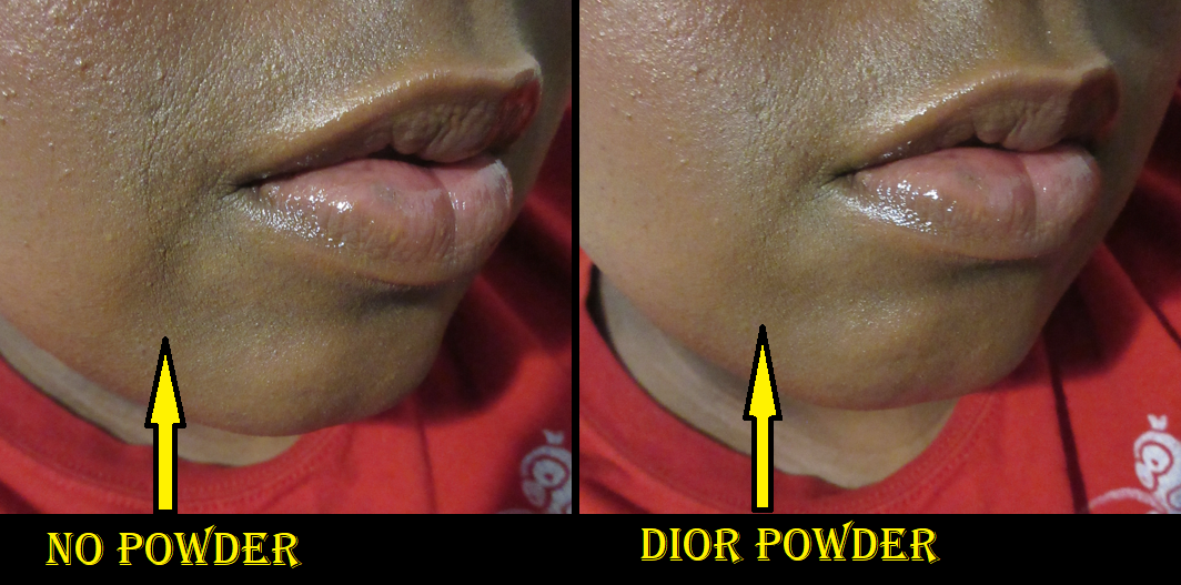
All foundations eventually settle into the smile line on the right side of my mouth. This powder fills and smooths it over so that you can’t even see it! After several hours it starts to be visible again, but the fact that it can make this dramatic of a difference at all is amazing to me!
The left side of the photo shows my mouth area after six hours of wearing theBecca Dewing Skin Tint as foundation. It had not been set with powder all day. The right half of the photo shows what the area looked like after I applied the Dior Powder-No-Powder to that spot. It completely freshened up the area.
Rituel de Fille
I was already at a disadvantage with this brand because of my sensitivity to lanolin (which so many of their products contain). When I discovered mold growing around the outer rim of one of the Nectar Balms, I decided that I am no longer interested in any products from this brand that are not powder based. That eliminates practically everything they sell. That Nectar Balm was only 8 months old and I only used it a few times. Then 6 of those 8 months it remained clasped shut and inside a resealable pouch. So, I do not trust how the brand preserves ingredients (it’s supposed to last 12 months after opening), on top of the lanolin issue and the waxiness of other products and certain items being overpriced.
Kaleidos Space Age Highlighters
These were on the cusp of me liking them, as having visible glitter particles is not my preference, but they weren’t so sparse for me to stop using them altogether. However, I’ve embraced my highlighter preference as there are so many reflective illuminating smooth products that suit me, so I decluttered all three of them. If the glitter/shimmer in a highlighter isn’t fine enough, I will just not continue to use them. I have decluttered other highlighters that don’t fit my style such as Fenty’s Trophy Wife Killawatt Highlighter and the Oden’s Eye Solmane Palette.
Tarte Shape Tape Ultra Creamy Concealer
Other than this Instagram post, I haven’t shared my finalized thoughts about this concealer until now. Unfortunately, I really do not like it. I decluttered both from my collection. My love of the original Shape Tape runs pretty deep because I practically need Spackle to cover my dark under eye circles. The main downside to Shape Tape is that it can look dry, so the Ultra Creamy version seemed like the perfect remedy. The finish is nice, but it provides way less coverage than the original, creases significantly, and is not long-lasting. The only thing I find similar about them is the packaging. Even the original 53N Deep and Ultra Creamy 53N Deep have different undertones despite them both being labeled neutral. The original leans golden, which I like, but the ultra creamy leans pink.
Mixing the new and original concealers together improves the performance, but the combo is still worse than if I used the original on its own. Even in reviews I watched where people said they liked it, to me, their under eyes did not look as nice as usual. So, I definitely don’t recommend it.
Final Thoughts
It would have been nice to end this post with a list of five products in total, as five is a nice number, but I could only think of these four. There still a few things I haven’t made up my mind about, such as Makeup Geek eyeshadows (which I will officially review at some point this year), and Viseart shadows after being unimpressed by the Dark Mattes Edit Palette in my last Viseart purchase, but I need a bit more time with them in order to decide.
As a sort of honorable mention, I can say that the ELF Instant Lift Brow Pencil has reclaimed the top spot as my favorite brow product over the ELF Ultra Precise Brow Pencil. I liked how thin and easy it was to draw those realistic brow hairs, but I still missed the Instant Lift after I used it up. Then one day, when I went to use the Ultra Precise, I don’t know if it dried out but the whole product just slid right out. It was unusable at that point. I don’t know if it was just a fluke or if that tends to happen with the Ultra precise, but since I loved the Instant Lift anyway (and it’s cheaper and I know I can use up the entire pencil without issue), I decided the Instant Lift deserves the crown and I’m now on brow pencil #2.
That is all for today!
I have one review scheduled for next week, but my consistent return to Monday postings will not begin until September 13th. I hope you all are doing well!
I’m Lili, and it has been two weeks since my last bronzer purchase. This initially started as a declutter post, but I realized there wouldn’t be any point to that since I’m essentially keeping them all. Even the Kiko Milano Dolce Diva Bronzer in Cocoa and the Too Faced Chocolate Gold Bronzer, which are too light to bronze my face, I’m keeping as highlighters. At least for now.
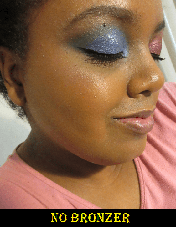
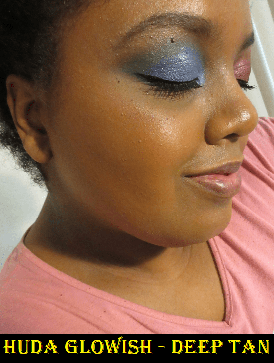
Also, please excuse the fact that I really did not want to do a full face of makeup this week, particularly eye makeup. Or do anything with my hair. In a lot of these photos I just have on the bronzers with concealer and foundation. I try to get blog posts scheduled far in advance so that when I inevitably go through a short 4-7 day period of not wanting to wear makeup, I can skip taking photos. Unfortunately, I ran out of completed posts and I couldn’t afford to wait for it to pass, so I compromised by doing partial makeup looks.
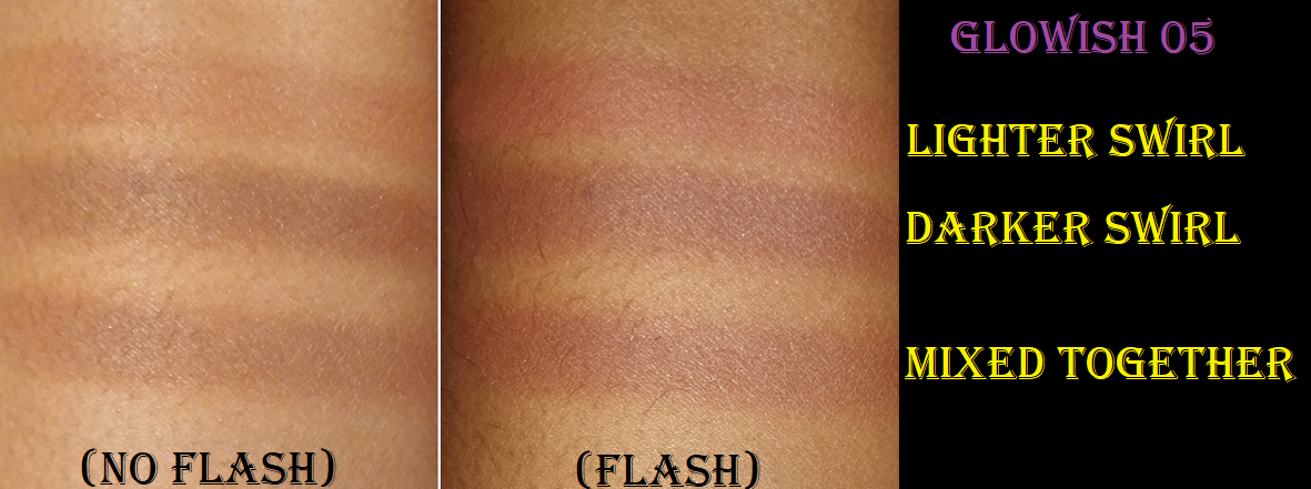
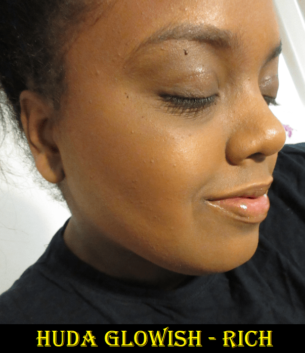
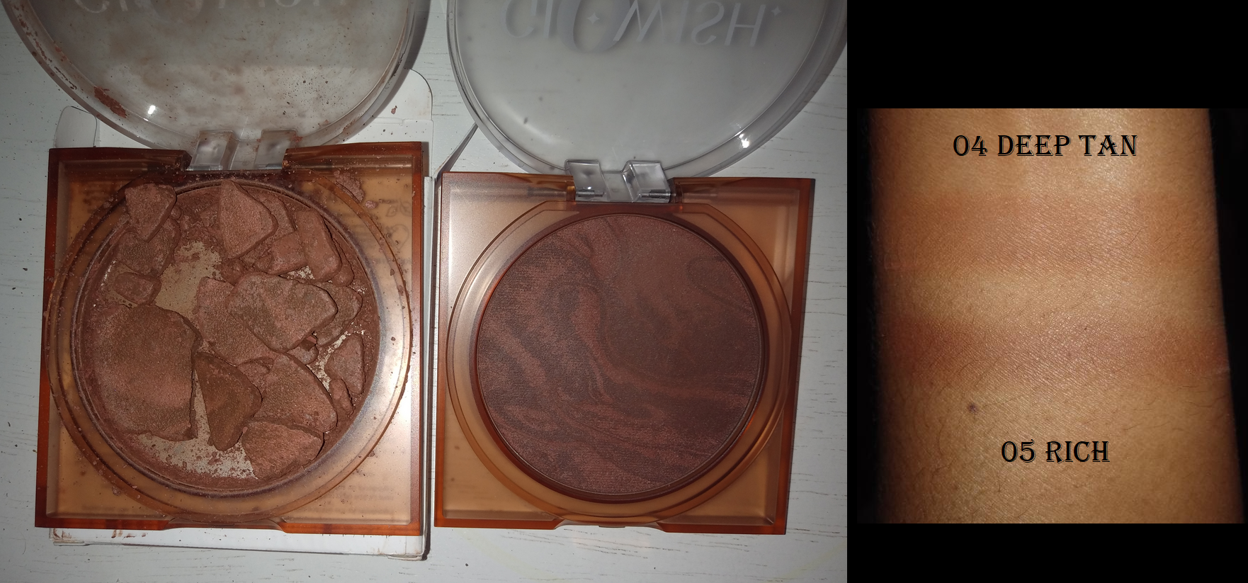
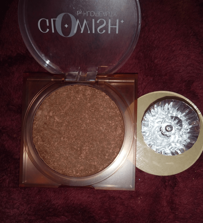
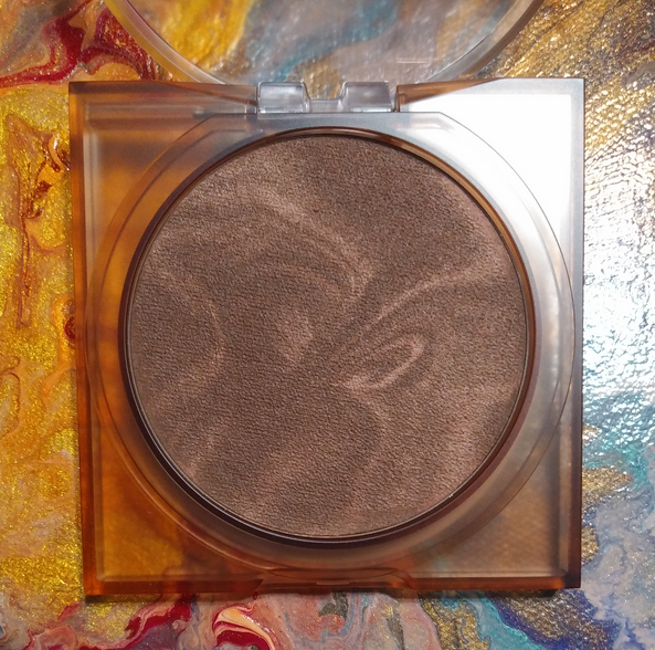
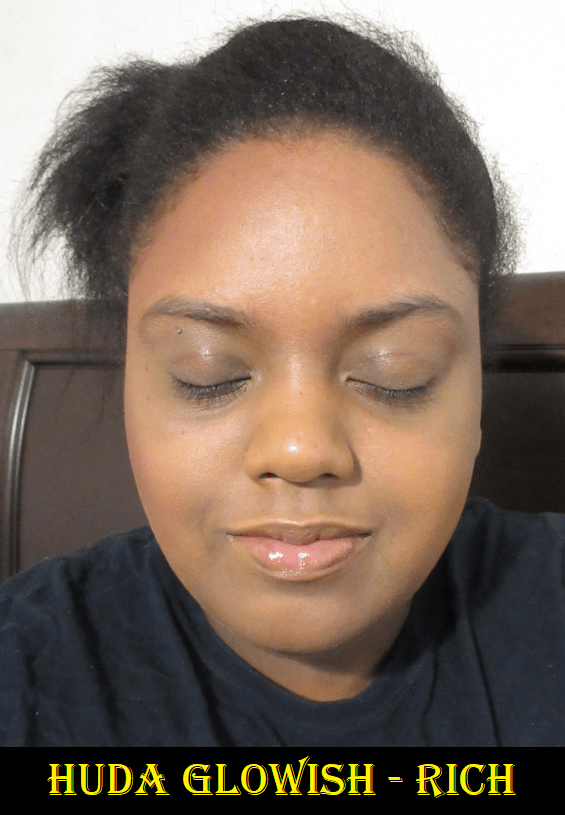
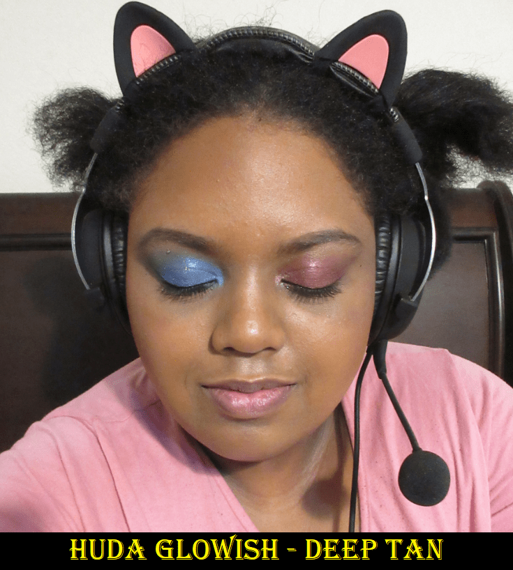
Huda Beauty GloWish Soft RadianceBronzing Powder in 05 Rich and 04 Tan
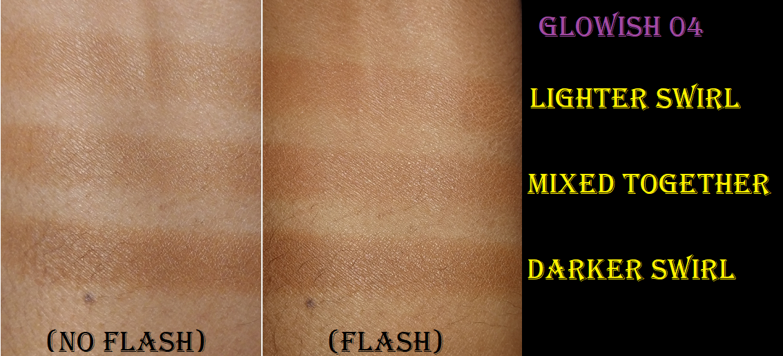
I’m in the Deep-Tan category of Huda’s foundations, but I was hesitant to purchase the 04 Deep Tan bronzer shade. I couldn’t tell if the combination would suit me because the darker swirl looked dark enough, but the lighter swirl appeared so light in the promo photos. I didn’t want to end up with another bronzer in my collection that needed to be built up like crazy in order to be seen, so I purchased 05 Rich.
05 Rich isn’t perfect for me, as I can see it’s a bit deep when I get too much of the darker shade on my brush. I have to be mindful of where I swirl it in the pan to get an equal amount of both shades, but my goodness, it’s worth the minor inconvenience! The finish of this powder is so skin-like and gives a beautiful sheen. It reminds me of the same finish the Nabla Skin Bronzing formula gives, but without so much effort getting product off the hard pressed bronzer and without having to build up it up to be seen. This bronzer is definitely pigmented and it gives a natural satin look to the skin even though it looks matte in the pan (likely due to being being a mica-based formula). If the two shades are applied evenly, it looks neutral but leaning red.
The texture is completely unique to anything else I have in terms of the level of creaminess it feels to the touch without actually being wet nor a cream-to-powder formula. It actually reminds me of the way a block of pottery clay feels, and I don’t mean a sticky wet consistency; I mean smoothness when you glide your finger down it.
This bronzer lasts a full eight hours on bare skin and foundation equally.
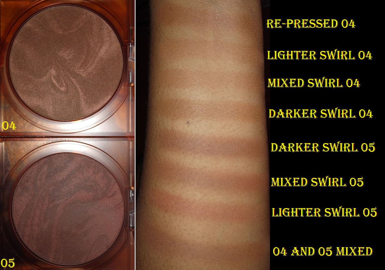
This is a little on the pricier end of my collection for a single bronzer, but considering it gives Kosas a run for its money and that bronzer retails for $34, I’m okay with this price. Also, because I’m such a fan of this formula, I took the risk and ordered 04 Deep Tan right after I finished the first draft of this post. It arrived on Saturday but unfortunately, came shattered.
Trying to get some product onto my brush out of the broken pieces led to very inconsistent mixtures of color, so I crushed it up even more before re-pressing it (no extra liquid needed). Sephora is sending me a replacement, but in the meantime, this is the best I could do at the last minute*.
04 Deep Tan seems to be my correct shade. It only takes a few dips in the pan to get the amount of bronze that’s slightly darker than my face and looks extremely natural (making it still easier to use than the Nabla Bronzer). When I say 04 is slightly darker, I mean it truly is subtle. I’ve tested mixing 04 and 05 together, and I had to still be careful about how much of the darker swirl in 05 I pick up with my brush.
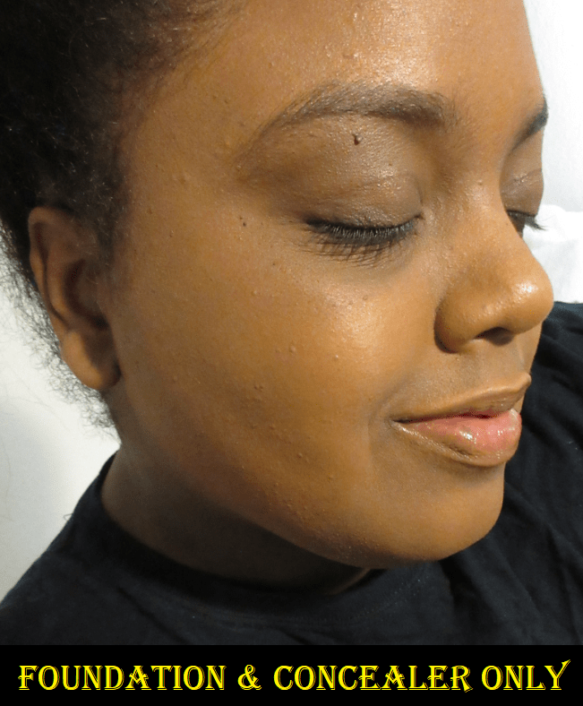
In the last minute photos above, I’m wearing a lot of new products including a sample of Make Up For Ever’s Watertone Skin-Perfecting Tint Foundation in Y445, Flower Beauty Blush Bomb Color Drops in Melon, Laura Mercier Roseglow Highlighting Powder, and the Sydney Grace x Temptalia Radiant Reflection (Deep) Palette. I was originally wearing the Danessa Myricks Contour Balm as I just wanted to try some new things in my collection and had no intention of taking photos that day, but when GloWish Deep Tan arrived, I removed it to try that shade out instead.
*UPDATE July 16th, 2021: Here are the additional photos I took after my replacement bronzer arrived.
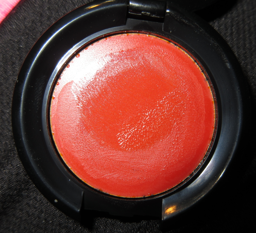
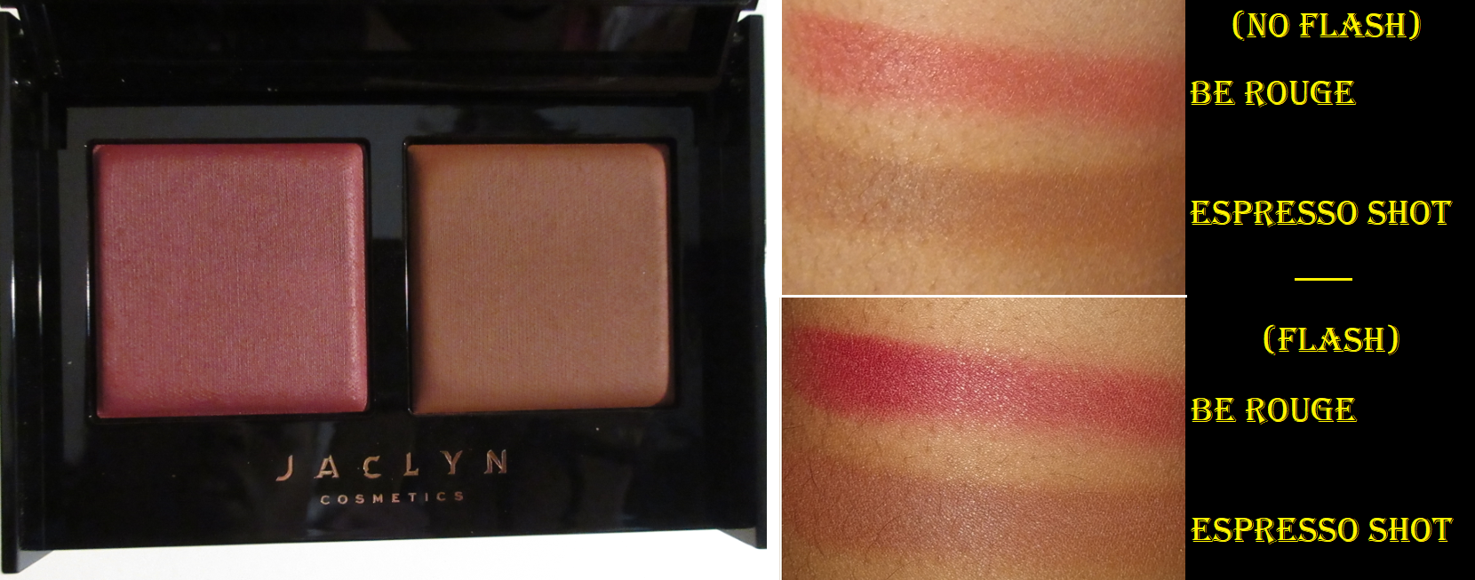
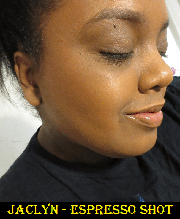
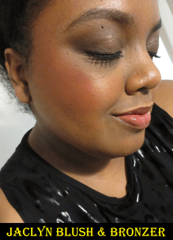
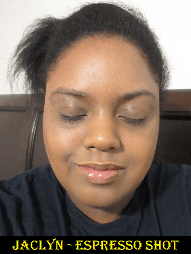
Jaclyn Cosmetics Bronze & Blushing Duo in Be Rouge / Espresso Shot
I’m one of the lucky people that happened to only purchase the “good” Jaclyn releases that had no scandals attached to them. Because I haven’t been burned by the brand yet, I made the decision to cautiously try the products via Ulta. I’m not a Jaclyn hater, but I feel justified in being wary about Jaclyn Cosmetics considering the ridiculous number of things that have gone wrong with her collabs in the past. I don’t trust Morphe as a brand and Jaclyn Cosmetics is owned by Forma Brands (formerly Morphe Holdings), so that doesn’t fill me with confidence either.
I watched a ridiculous amount of videos to help me decide between the two darkest shade options and ultimately I picked this duo because the bronzer is listed as neutral, whereas the other option is very red. I generally avoid berry blushes, but Be Rouge passes for a dark pink if I use a light hand. So, I picked this one and while I do think this was the best choice out of the two, I was surprised to see that Espresso Shot wasn’t as dark as I’d expect for the deepest shade in the line, plus it’s more red toned than neutral. However, this range is more inclusive than the Patrick Ta and Wayne Goss duo launches, so I give the brand credit for that. Also, the formula really impressed me. When I applied both products over foundation, I was able to get a well blended look very quickly and with minimal fading after 9 hours. The result of the blush was similar to, but not better than, the Makeup by Mario Soft Pop Powder blushes. On bare skin, the powders cling to the moisturized areas and take longer to blend. I would recommend this duo for use over foundation only. I also only recommend this if the bronzer and blush are colors and tones you will like. The blend is flattering, but it’s definitely not worth $36 to only like one shade, and it’s still not worth it to somewhat like each.
Bee Shot is very pigmented. I used a medium amount and it showed this intensely on camera. I would use less on a normal makeup day.
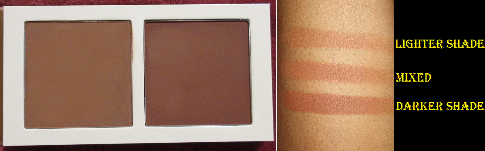
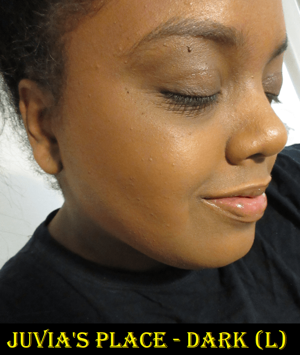
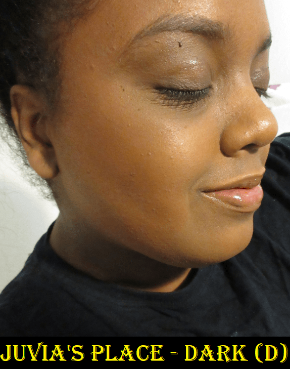
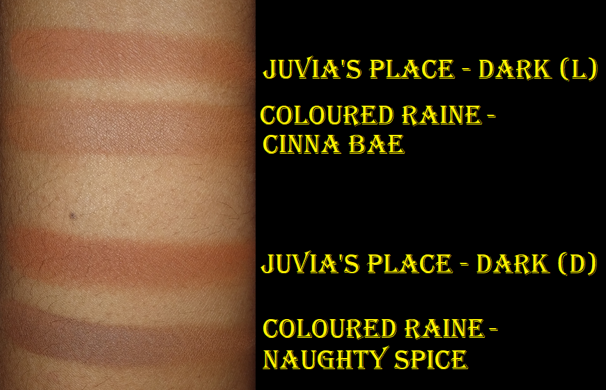
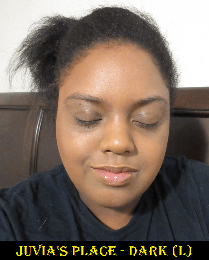
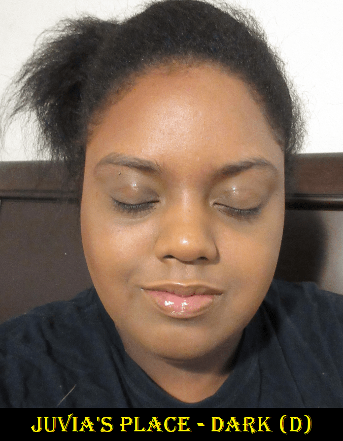
Juvia’s Place Bronzed Duoin Dark
These bronzers look more different in their pans than they do on the face. They also look neutral until they’re actually applied to the skin. The lighter shade in the duo leans golden-orange and the darker bronzer has a stronger orange tinge. I think the lighter one is best suited for me, but it still looks nice when I mix both together. I just wouldn’t use the darker one by itself.
These bronzers are nicely pigmented, smooth, and last beyond eight hours. However, I should note that twice when I used this duo (the light shade alone and then again when both shades were mixed), it completely disappeared off the left side of my forehead. I hadn’t done anything strenuous and I wasn’t out in the heat. It was still going strong on my cheeks, so I think I might have rubbed it off by resting my forehead on my hand while watching a show. Furthermore, when I swatched both shades on my arm, the lightest shade basically blended away if I kept rubbing at it. The darker shade only rubbed off a little. I found this to be so strange considering there is only one ingredient list printed on the box, so they should basically have the same formula. I don’t know why one shade rubs away and the other doesn’t, but that’s something to consider when deciding if this duo is worth buying. It will certainly last on the skin of someone who doesn’t touch their face a lot. Also, I have no way of knowing if it’s only an issue with the Dark duo or if the other Juvia’s Place Bronzer duos perform like this as well.
When I first bought this, I was very curious to see how it stacked up to the Coloured Raine bronzers. The Juvia’s Place bronzers feel slightly softer to the touch and are pigmented yet buildable (and perhaps too blendable)! The Coloured Raine bronzers are more pigmented and I think Cinna-Bae is the best shade for me out of the four. Also, besides the differences in tone, I think the Coloured Raine bronzers look a little nicer on the skin. Juvia’s Place gives a better deal at $18 for the duo versus $16 for an individual bronzer, but at least I don’t have to worry about Cinna-Bae coming off until I’m ready to remove my makeup.
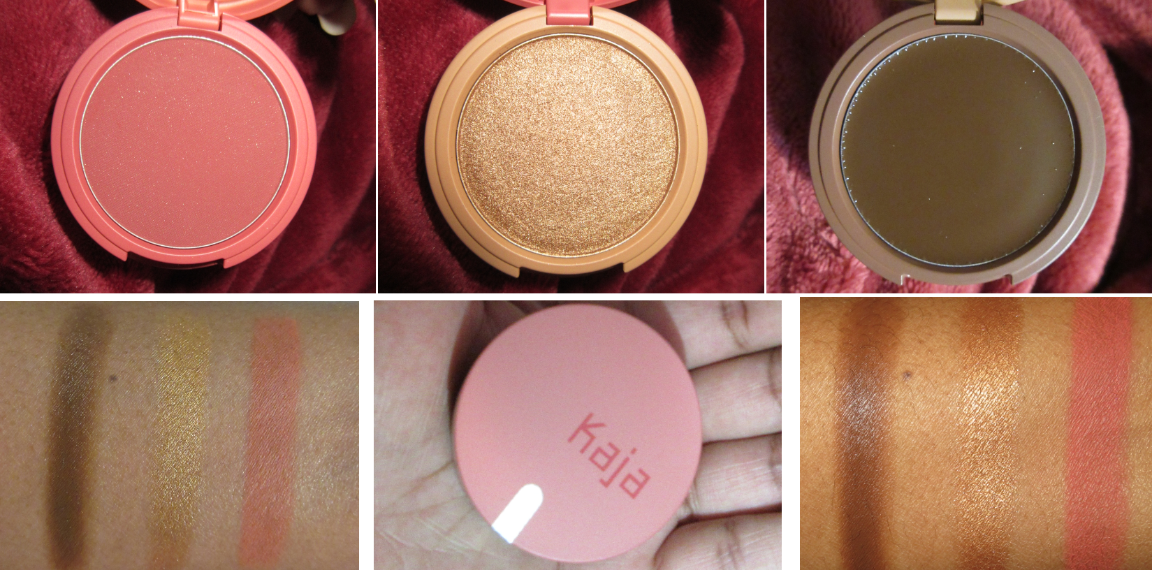
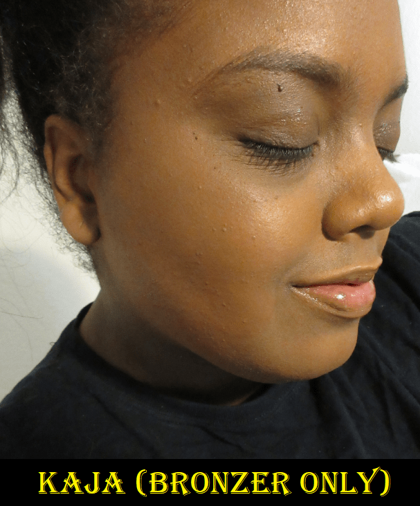
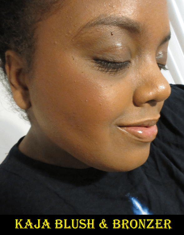
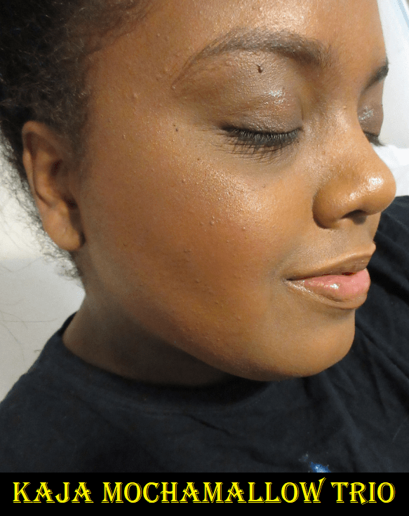
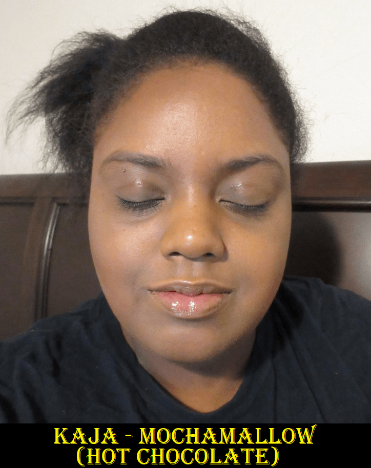
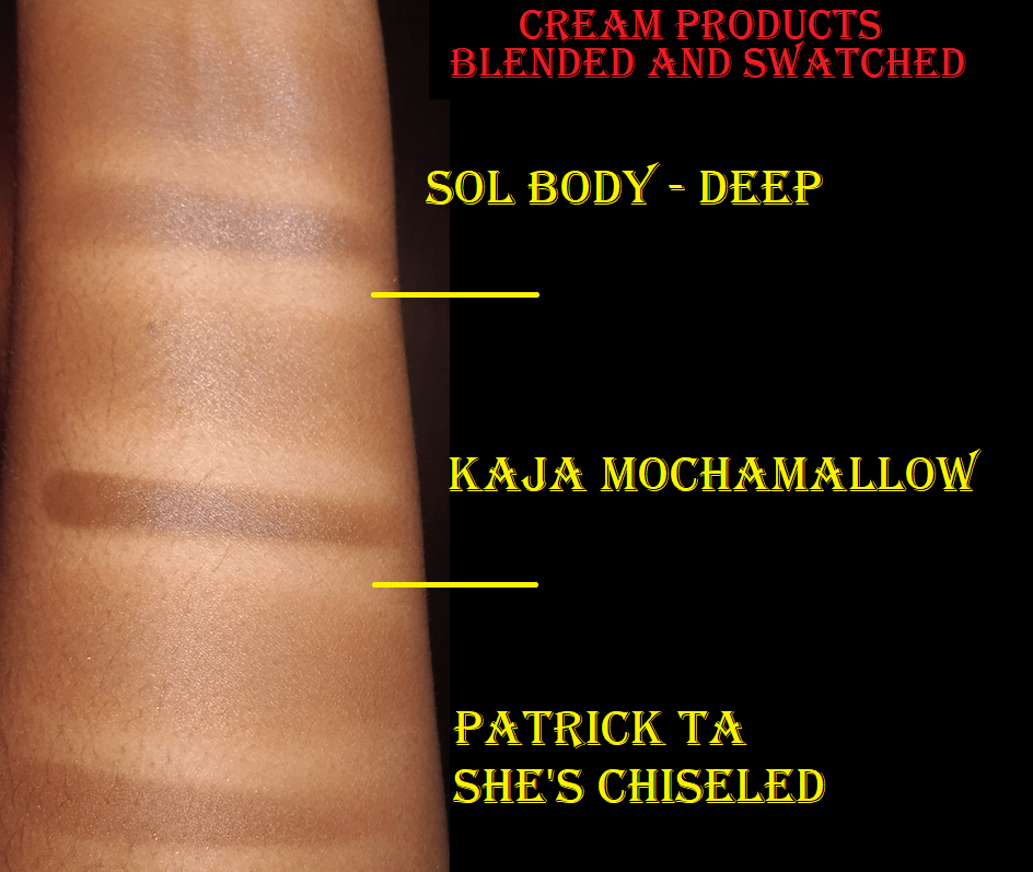
Kaja Play Bento Cream Bronzer, Powder Blush and Highlighter Sculpting Trio in Mochamallow
This is my first ever Kaja purchase and I couldn’t be happier. I still haven’t gotten over how cute and compact it is. I think all three shades are flattering on me. I bought it during the VIB sale, so it was only $20 and well worth it. The highlighter is reflective from the shimmer but because it’s a somewhat dark gold and close to my skin tone, it’s not intense. It’s a nice middle ground. As the day goes on and the shine diminishes a bit, it looks darker, but still does it’s job as a highlighter. The blush is a pretty shade of dark pink that gives good color payoff. It’s not as smooth as some of my higher end blushes, but I still like it. It fades after about five hours on bare skin, but it doesn’t start to fade until after 8 hours when applied over foundation. The bronzer gives me a realistic looking sculpt. It performs a bit better than the Patrick Ta and gives me no issues for a full eight hours.
Regarding the application process, I prefer to use these with brushes. When I use a damp sponge with the bronzer, it can lift the foundation if I’m not careful. I also tried using the sponge with the highlighter and it gives a gorgeous dewy glow effect. I can’t apply it as precisely with a sponge, but the way it melts into skin makes precision not as necessary.
In the photos, I used a normal amount of everything, but these can all be built up even more. I also applied the three products with brushes only.
The Kaja Play Bento Sculpting Trios come in two lighter varieties as well.
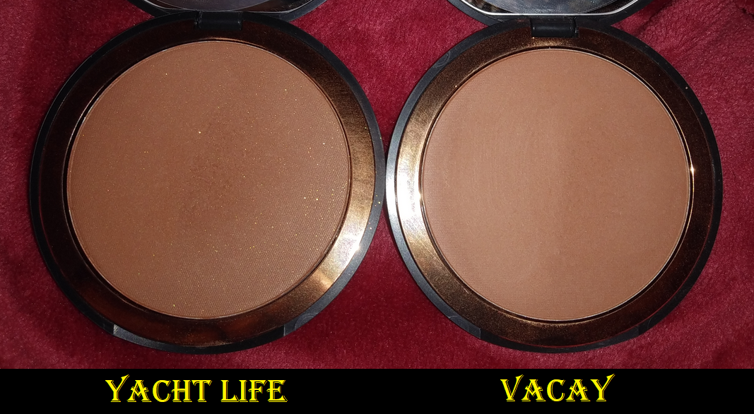
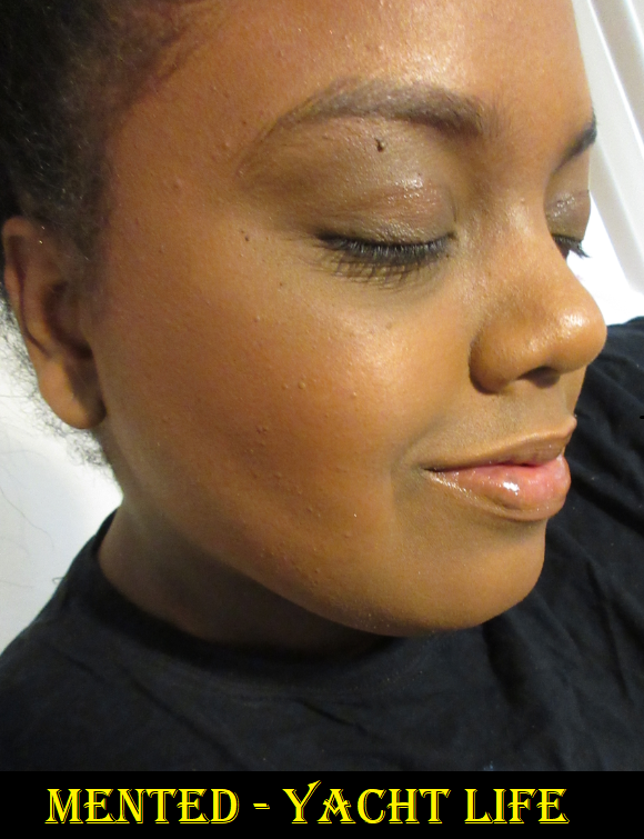
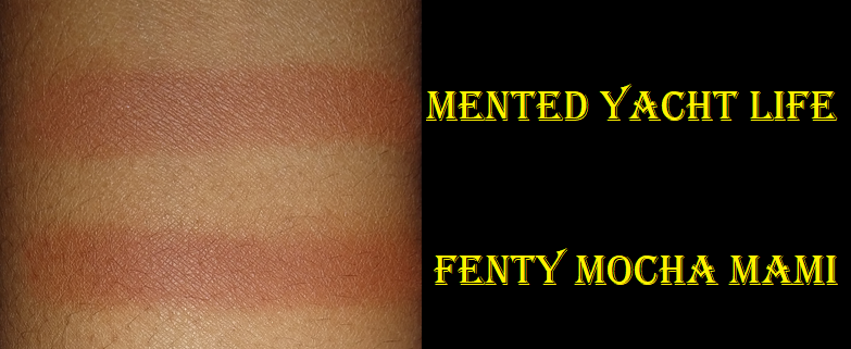
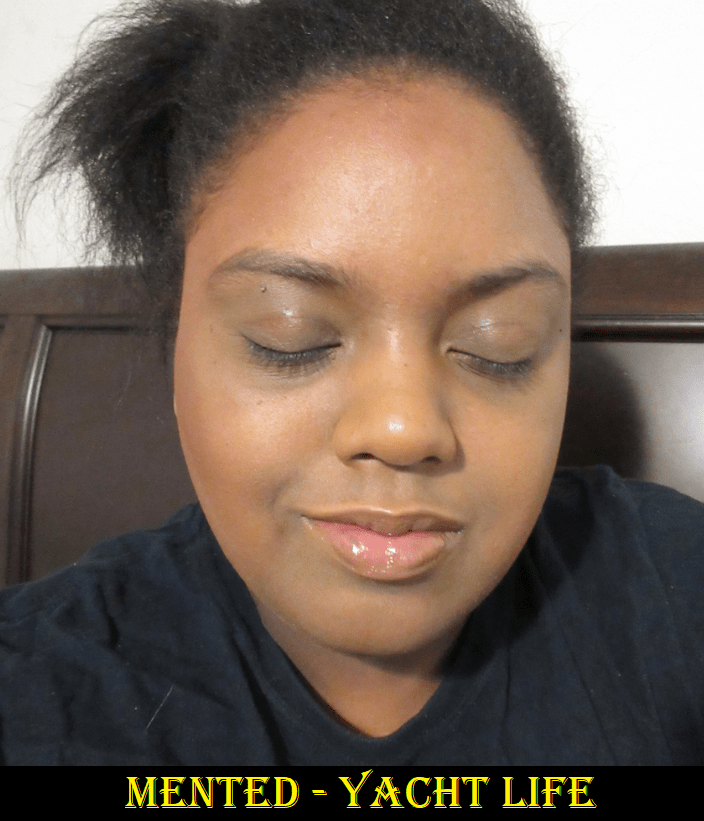
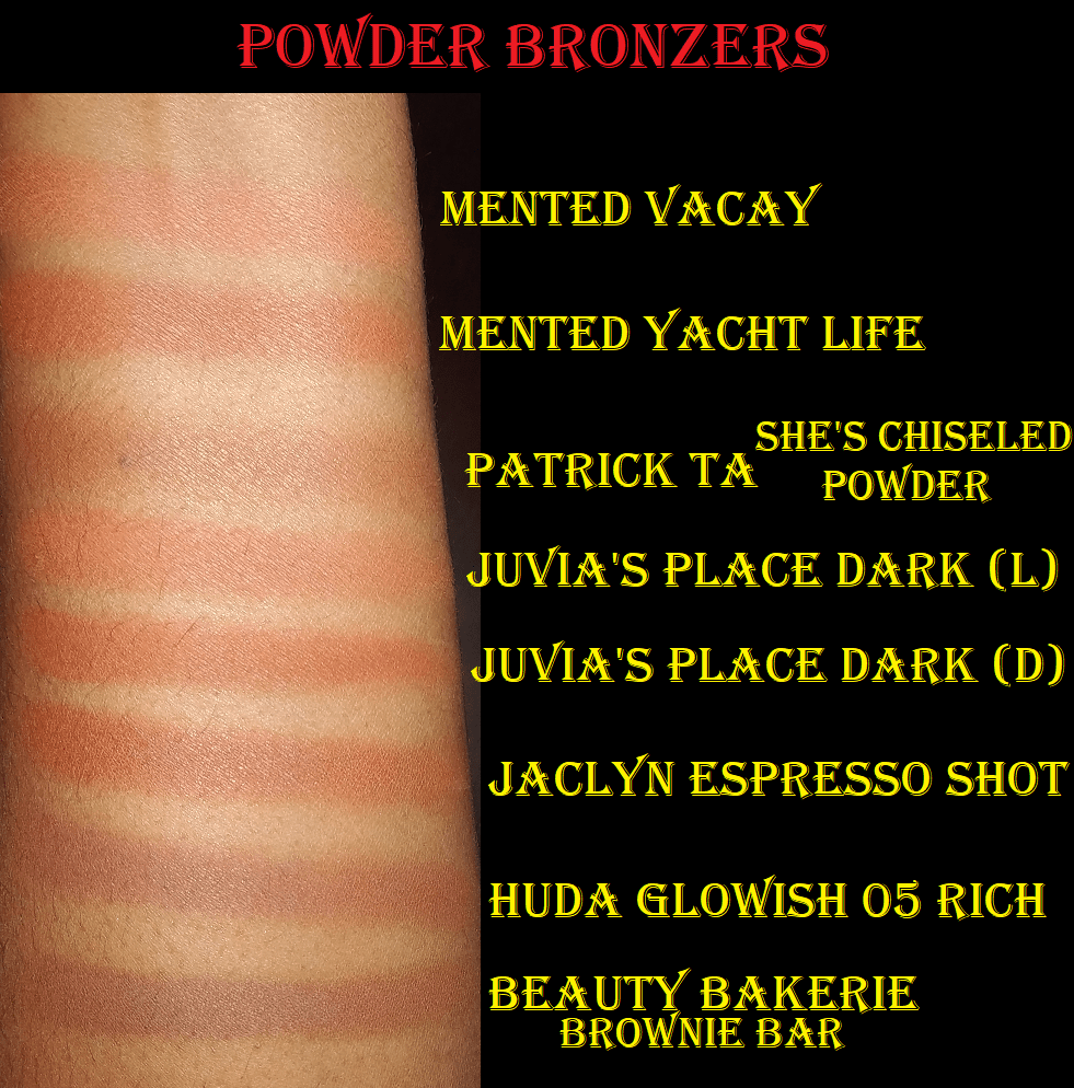
Mented Cosmetics Bronzer in Yacht Life and Vacay
I have reviewed the Mented Cosmetics Bronzer in Vacay before, but I recently picked up Yacht Life on sale. Vacay didn’t have any shimmer, so I was shocked to see the gold colored particles throughout the Yacht Life Bronzer. However, I think most of the shimmer floats away when I apply the product to my skin because I can’t see it on my face when I wear it. It has the same smoothness that impressed me about Vacay, but as a darker shade, this one has a much easier time showing up. It’s also on the orange-red side, but it’s as nice and smooth as I expected.
One of the biggest reasons I held off on buying Yacht Life was that I thought it looked quite close to Fenty’s Mocha Mami. I can confirm that they do look extremely similar, though I like Mented’s formula better. It’s just so silky and easier to blend.
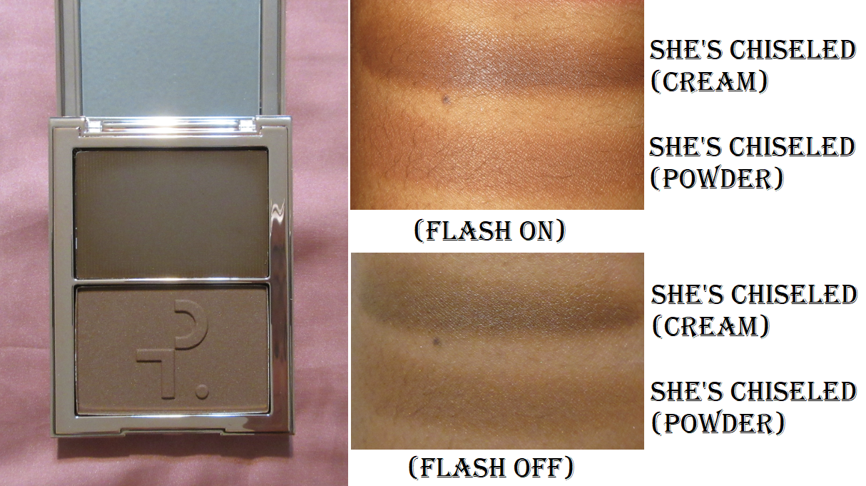
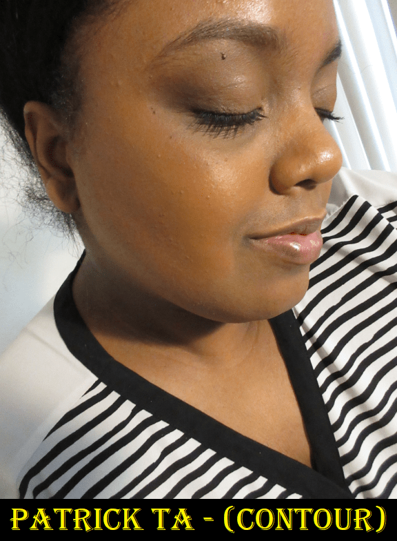
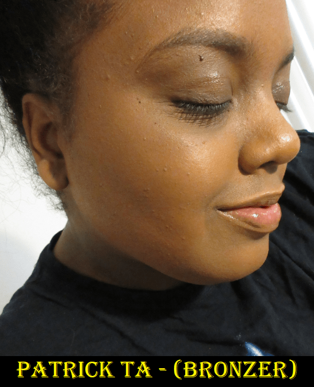
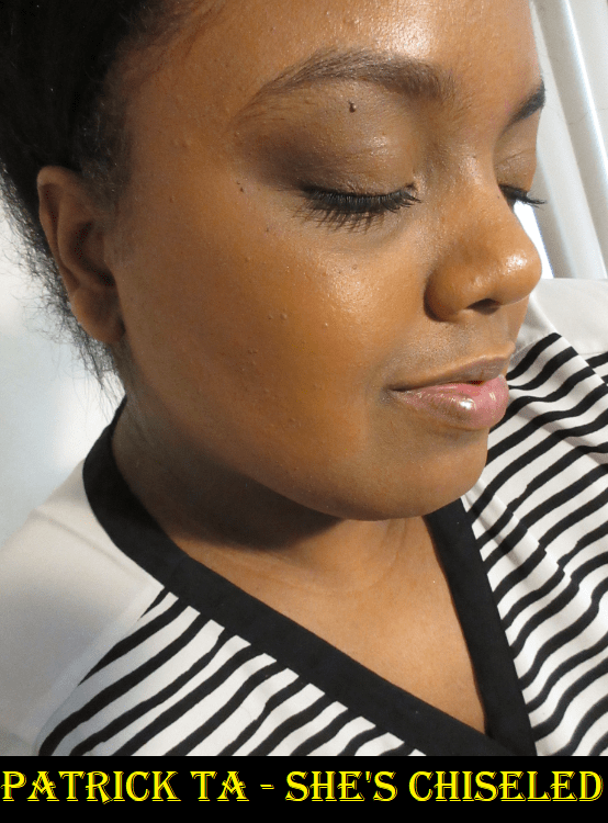
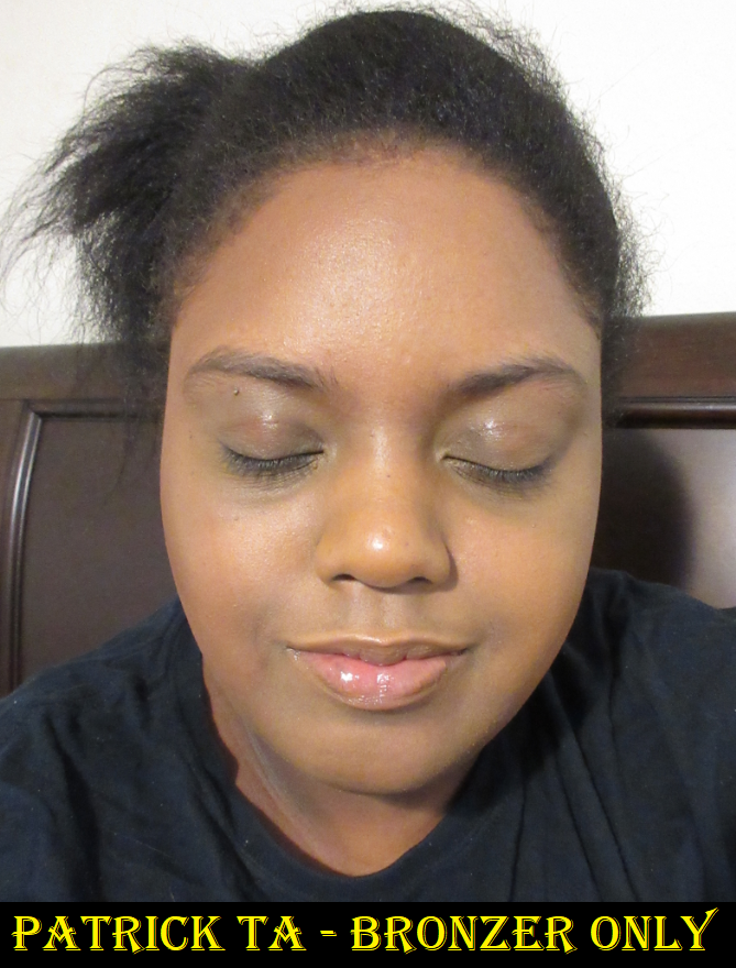
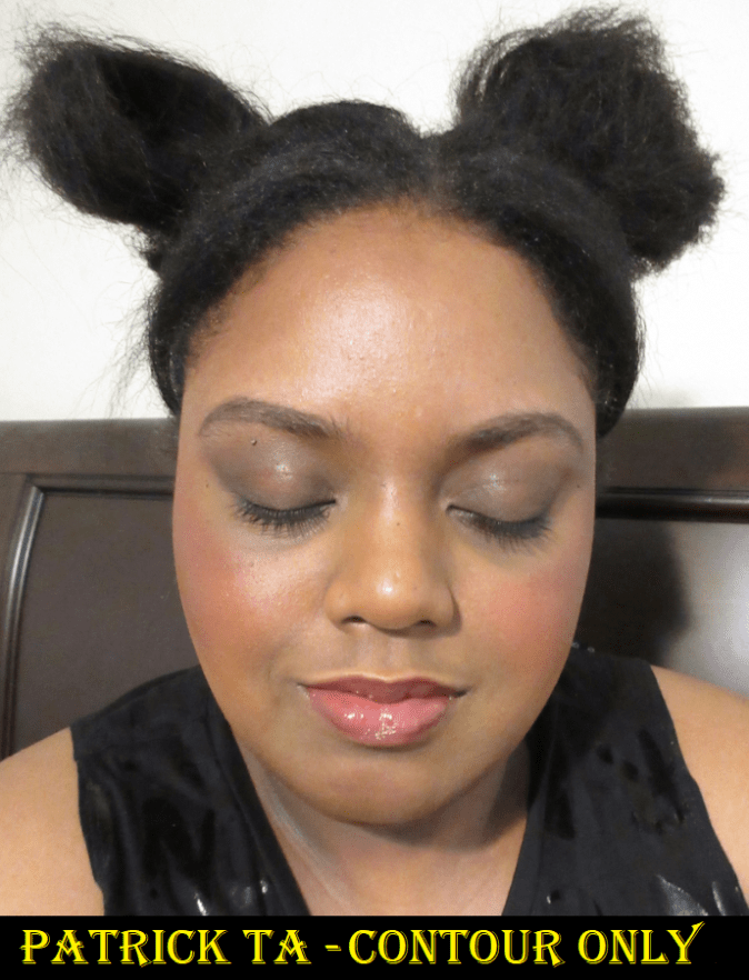
Patrick Ta Major Sculpt Creme Contour & Powder Bronzer Duo in She’s Chiseled
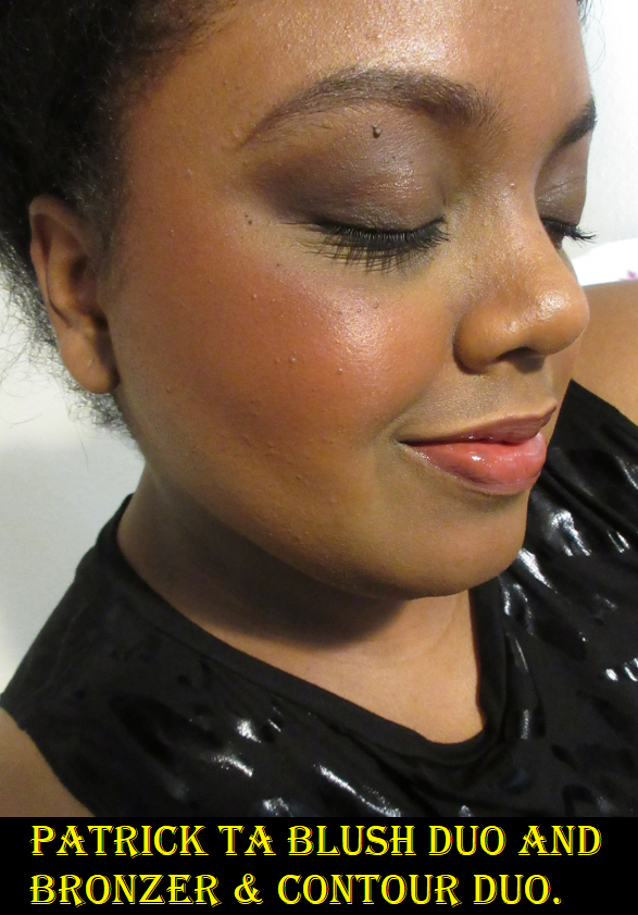
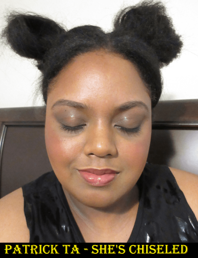
I am so conflicted over this duo. What I do like about it is the end result from combining the bronzer and contour together. The contour alone is a nice consistency and blends very well, but it sheers out a lot no matter if I use a damp sponge or brush. It’s the darkest duo Patrick Ta offers, and in swatches it looks nearly as dark as Kaja’s Mochamallow, but the Kaja cream has more pigment. The best that I’m able to build up the Patrick Ta contour, while keeping it looking blended, still isn’t rich enough in color to live up to the name of making me look ‘chiseled’. It also makes my skin look dull until I add the bronzer on top, which gives my face some life again. Unfortunately, adding the bronzer back loses a lot of the shadow effect, especially as the day goes on because I don’t find the contour to be very long lasting, but I still prefer the combination. The powder bronzer on its own is quite sheer and barely shows on me. I get that softer makeup looks are more on trend now, but I don’t think anyone darker than me will enjoy this duo. Also, the texture is also not very smooth at all. I bought it during the VIB sale and I could swear the powder felt smoother at the time, but now it’s a bit rough. Even the powder from my much older Patrick Ta Cream and Powder Blush duo feels softer and smoother.
Speaking of Patrick Ta’s blush duo, I only find that the bronzer and contour duo is exceptional when combined with it. I built things up in the photo above, but in person when I’m using the amount I normally would, the blend between both cream products and both powder products together is seamless and so beautiful. That’s when it really becomes impressive, and that’s also what has me feeling torn. I know they all work well together, but I don’t think anyone should have to spend a combined $72 to get both duos to make a great look. At this point, I don’t regret buying the contour/bronzer duo because I already had the blush duo in my possession and now I can continue using them both together. However, I really don’t recommend The Major Sculpt Creme Contour & Powder Bronzer Duos unless the shades happen to perfectly match you so the lack of lingering pigmentation isn’t a factor. I also don’t think the quality is there for $38.
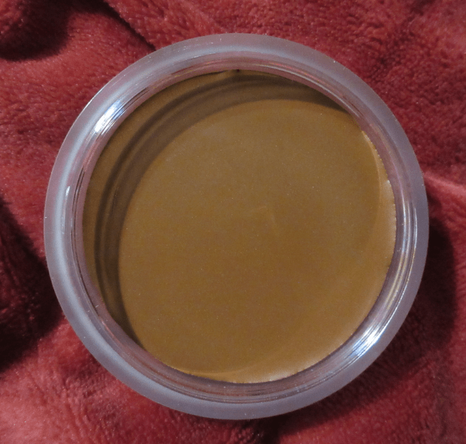
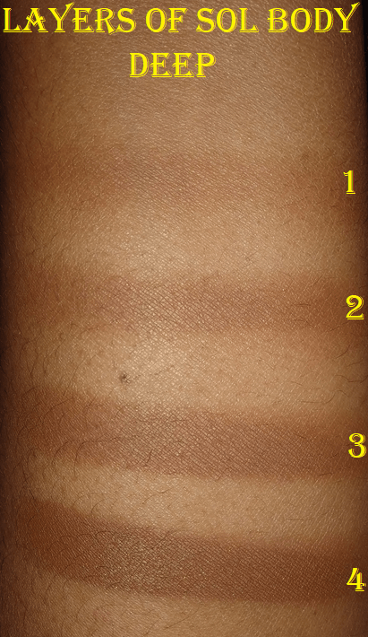
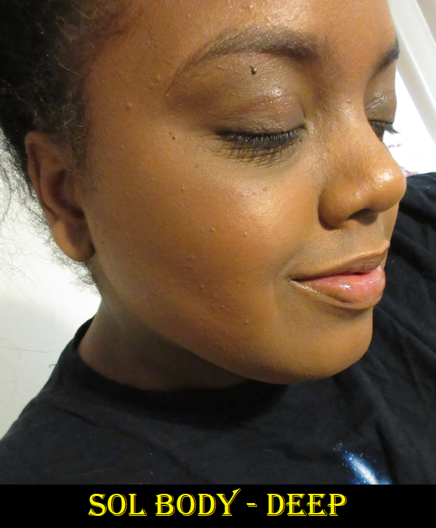
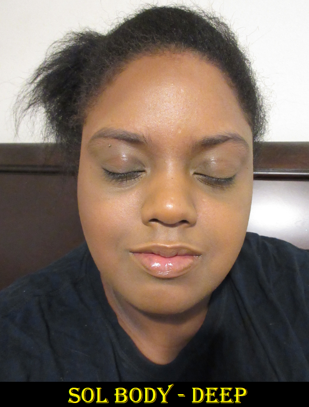
SOL Face & Body Bronzing Balm in Deep
This is easily the most emollient of the cream bronzers I have. I bought it because The Fancy Face mentioned this formula is the closest dupe she’s found for the Chanel Bronzing Cream, and in a far better shade range. Though it has a lot of glide, making blending super easy, I still prefer the Kaja Hot Chocolate shade because Deep looks either beautiful and golden when I use a small amount or it turns a bit olive-grey toned if I use too much. It doesn’t look olive in the heaviest swatch above, but it turns that way on my face, which is darker than the inside of my arm where I swatch products. I think golden, neutral, orange, and red bronzers all look better on me than olive. So, I’m really not a fan of how this looks unless I keep it nice and sheer. Also, when I use my neutral color Dior Powder no Powder, it gives the bronzer a cooler toned tinge that looks more like a contour.
I know some people really love the smell of the fragrance in this product, but I wish it wasn’t there. The artificial-coconut-meets-tanning-oil scent reminds me of the Kiko Milano Unexpected Paradise Blush. It even makes me sneeze sometimes, though the smell thankfully doesn’t linger too long on the skin depending on how much I use.
In addition to the fantastic blending power this product has, it also comes with a drawback. It moves around so easily that I lose control of far it spreads and suddenly it’s covering half my cheek or is dangerously close to my jawline and/or my mouth. The Sonia G mini base is actually still too big unless I’m extremely careful about how I apply it. A sponge is even harder to apply precisely with, so I recommend using a very small brush or a flat thin contour brush that’s shaped like the Nars Ita.
One of my favorite aspects of this bronzer is that it completely dries on its own without having to be set with powder (up to 3 layers but the third takes about 45 minutes). I like the look of cream products, but I don’t like when they transfer or remain creamy or tacky feeling on the skin, so I’m happy I don’t need to worry about that. This also lends to it being a very long lasting bronzer, especially for a cream product.
That all being said, the undertone aspect is hard for me to overlook. I did consider getting another shade to see if I would like the tone better, but $15 is a little high for a Colourpop brand regardless of the whopping 30 grams in the jar. It’s certainly cheaper than Chanel, but I don’t use cream bronzers enough to really justify investing another $15* into something that isn’t going to last me as long as a powder. And considering I already like the Kaja cream so much, I’m challenging myself to use that up first. I think if I find a brush I really like for this task, I might continue to use it, but that’s a big if. For anyone else who has the right tools, doesn’t mind fragrance, and likes the undertone of either this shade or the others available, it’s worth checking out.
*As of today, Colourpop is still having a 30% off sale which would bring this bronzer down to $10. At that price, I thought it was worth testing out a second shade (Dark which is lighter and looked more golden toned). However, Colourpop orders take about three weeks to get to me, so I won’t be able to update this post for a very long time regarding how it worked for me. Plus, focusing on the Kaja is still my priority.
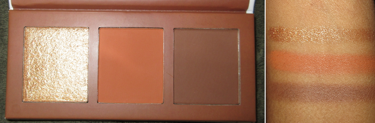
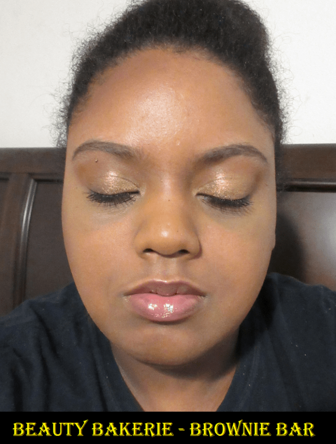
Beauty Bakerie Brownie Bar
Technically, according to Beauty Bakerie, the orange shade that I call a blush is supposed to be a bronzer and the darkest shade that I use as a bronzer is supposed to be a contour. For the purposes of this review, when I refer to the bronzer in this palette, I mean the darkest shade. I’m fine with an orange leaning bronzer, but that is a bit extreme! I will only use the orange shade as a blush, even though it looks subtle on the cheek because it blends in a lot with my skin tone. I always have a difficult time finding an orange blush I like, but this is one of them. I just keep forgetting I have it in my collection! On bare skin, none of the three shades last very long. Over foundation, the bronzer has fantastic staying power for 10 hours. The highlighter shine dulls down by the 8 hour point but is still visible. The blush fades a bit but is still there too.
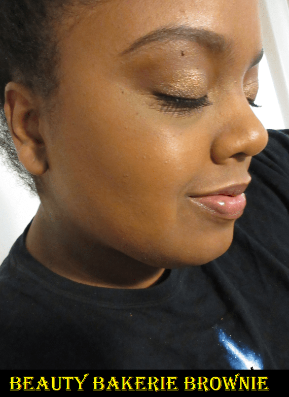
The left photo shows all three together. I took this picture last December when I first got the trio. The right photo shows the darkest powder alone on the cheek, but all three are on my eyes.
The highlighter is super reflective and the glitter particles are very visible on my cheek, just a bit over the line of being too much for my taste. However, I will continue using it on the eyes because my goodness it’s so pretty! My camera doesn’t even do it justice. I may even transfer this face palette to my eyeshadow collection because all three lasted so well on my eyes without me using a primer of any kind. The dark brown didn’t blend as well on top of the orange, but I think a primer would fix that.
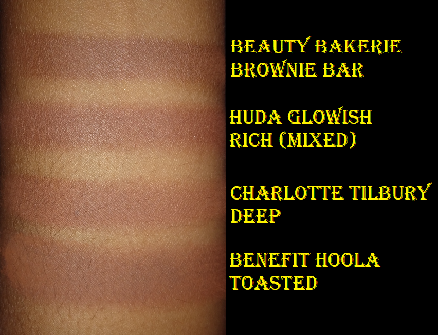
The swatches below are showing the four darkest bronzers in my collection. Despite this one being the darkest of them all, it’s a soft thin buildable powder, so it’s hard to over do it. It’s very pigmented in swatches, but it doesn’t go on the face as intensely. Even though Beauty Bakerie calls this a contour, it’s neutral rather than cool, which also helps to look natural on me. They also have a Neapolitan Bar, which they say are universal shades, but in my opinion they suit light to tan skin tones. The Neapolitan Bar actually was intended to have a bronzer, highlighter, and blush.
I would say the quality of the Brownie Bar is on par with the Makeup Revolution Bronzers. They’re surprisingly nice, but they’re not on the same level as some of the other products I’ve reviewed today. Also, $18 for a face palette with three options seems like a really good deal, but you’re getting very little product at a net combined weight of 3.8 grams (estimated 1.26 grams for each pan). To put that in perspective, the tiny $3 ELF Bite Size Face Duos contain a net weight of 4.6 grams. The $18 Juvia’s Place Bronzer Duo contains 32 grams! Will I still ever hit pan on the trio? Probably not. For others who actually use up their makeup, the Bar products from Beauty Bakerie aren’t the cost savings they seem in terms of weight. However, it is a savings in terms of variety, provided someone likes a glittery highlighter and the two other shades.
Comparisons Grouped Together
The bronzers are only applied to one half of my face (your left, my right) so the impact the bronzers make is easier to see. The Sol Body one actually blended too much to be picked up by the camera, so I added another less blended layer so it would be visible.
Update on Other Bronzers
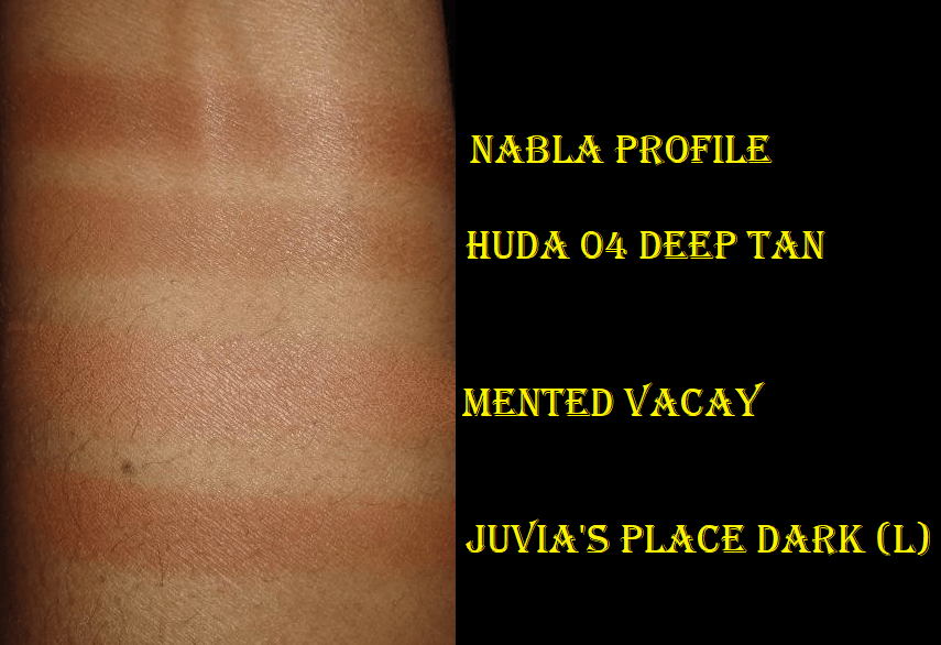
Bronzers Previously Reviewed(and the remainder of my current collection): Makeup Revolution Glow Splendour in Medium, I Heart Revolution Tasty Coffee Bronzer in Mocha, LYS Beauty No Limits Matte Bronzer in Strength, Benefit Hoola Bronzer in Toasted, Nabla Skin Bronzing in Profile, Coloured Raine Bronzers in Cinna-Bae and Naughty Spice, Kosas the Sun Show Bronzer in Deep, Danessa Myricks Balm Contour in Deep 1 (technically a contour but it’s warm like a bronzer and more of a bronzer/contour hybrid), Fenty Sun Stalk’r Instant Warmth Bronzer in Mocha Mami, and the Charlotte Tilbury Airbrush Matte Bronzer in Deep.
As I mentioned before, I still own all the previously reviewed Bronzers. My feelings on them have not changed, though my Hoola Toasted has some hard pan from continually swatching it for comparison purposes and it keeps crumbling with each use because of the crack in the pan I haven’t fixed. It has a 12M POA, and it’s nearly two years old, so I will either re-press it or declutter it. Of the other bronzers listed, I have only continued to use the Nabla, Coloured Raine, Kosas, Charlotte Tilbury, and more recently the Danessa Myricks Contour Balm. My absolute favorites have been the Kosas and Charlotte Tilbury, but I think Huda’s GloWish has overtaken CT for the second place spot! It might still be too soon to say for sure, but we shall see!
When I mentioned that it has been two weeks since my last bronzer purchase, I am referring to the Haus Labs Bronzer duo I purchased during the Amazon Prime Day deals when everything from Lady Gaga’s brand was 60% off. I have plans for an Amazon Makeup post in the future, so I’m reserving that review for another time. Reviewing eight bronzers at once was challenging enough.
That’s everything I have for today!
Actually, that’s everything I have for the next few weeks. I want to keep the momentum going that I started by consistently posting every Monday since August 2020. However, I have some health/personal issues that I need to sort out which cannot be pushed back any longer. I will also be in Germany for almost the entire month of August. During that trip, I will be bringing very little makeup and will not be doing wear tests, which are required for a lot of the unfinished drafts I want to complete. So, I anticipate that it will take me a while to get back on a consistent posting schedule. My goal is September 13th!
In an effort to not be completely absent for two months, I intend to mix things up with a few article style posts, which are scheduled to publish while I am on my trip. There’s so much I want to write about and review, but my ideas are all very time consuming and I don’t want to rush through them. Hopefully, they’ll be worth the wait to you!
Much love, Lili ❤
p.s. I may photograph some new purchases on my Instagram for those who are curious about what I’m buying, even without official reviews. I might also post a few travel photos during August. The website allows you to see the page without an IG account (just won’t let you click to see more or scroll through very far).
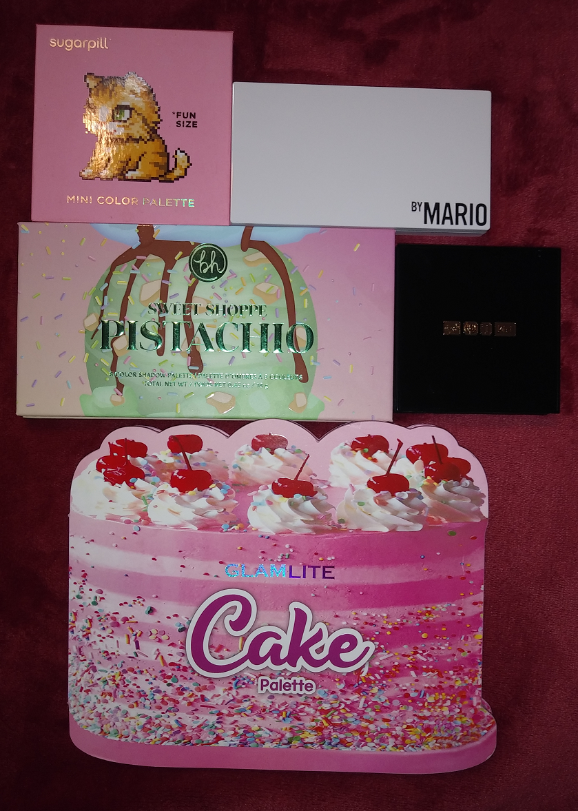
Today I’ll be discussing palettes that I purchased, but I felt uninspired to review after the hype went down. I’m going to discover whether these purchases were still worth me buying or if I should have skipped them.
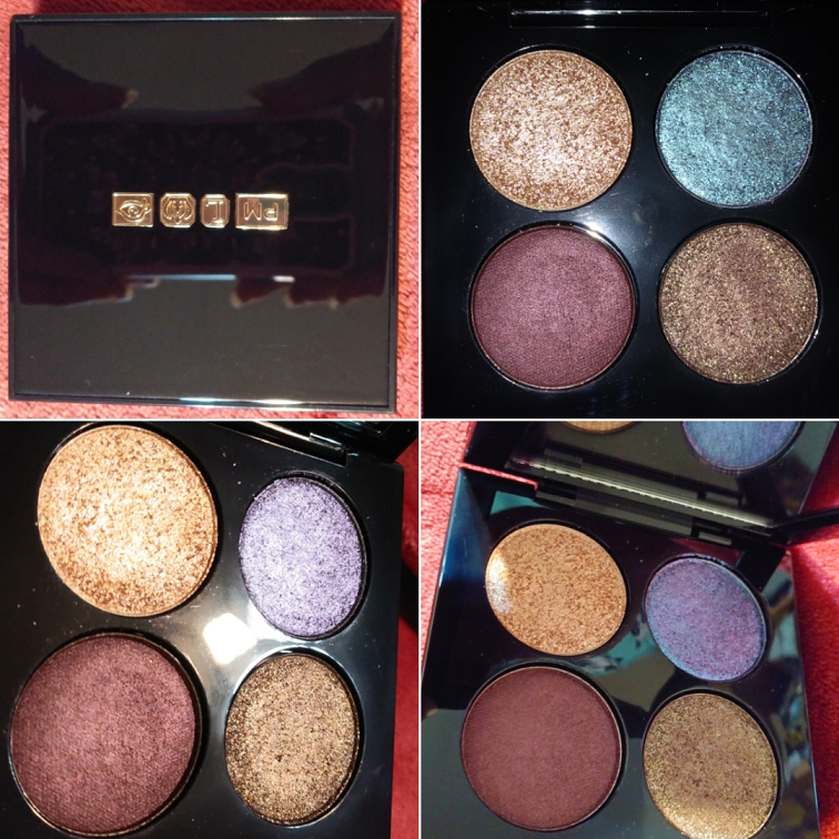
Pat Mcgrath Celestial Divinity Luxe Quad in Interstellar Icon
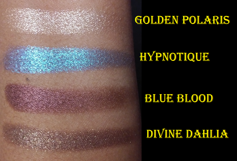
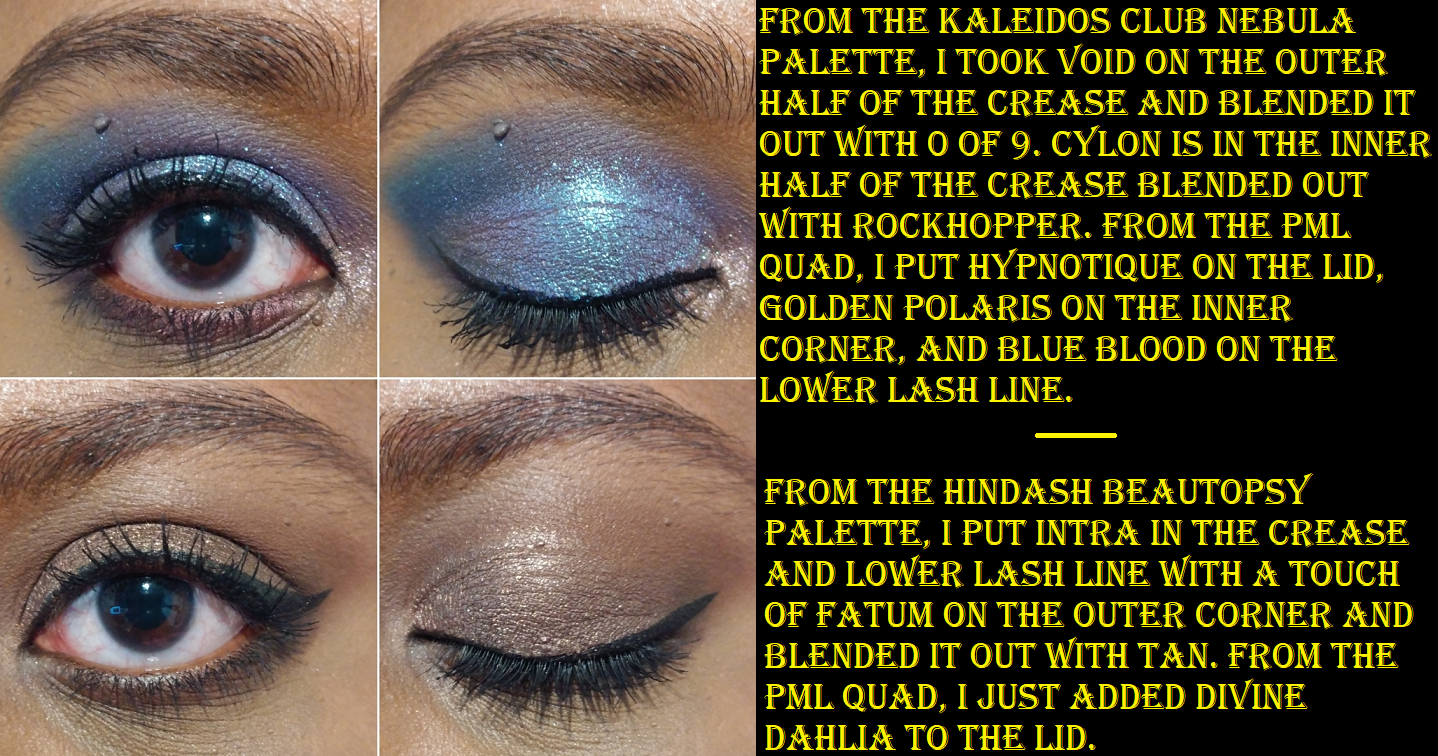
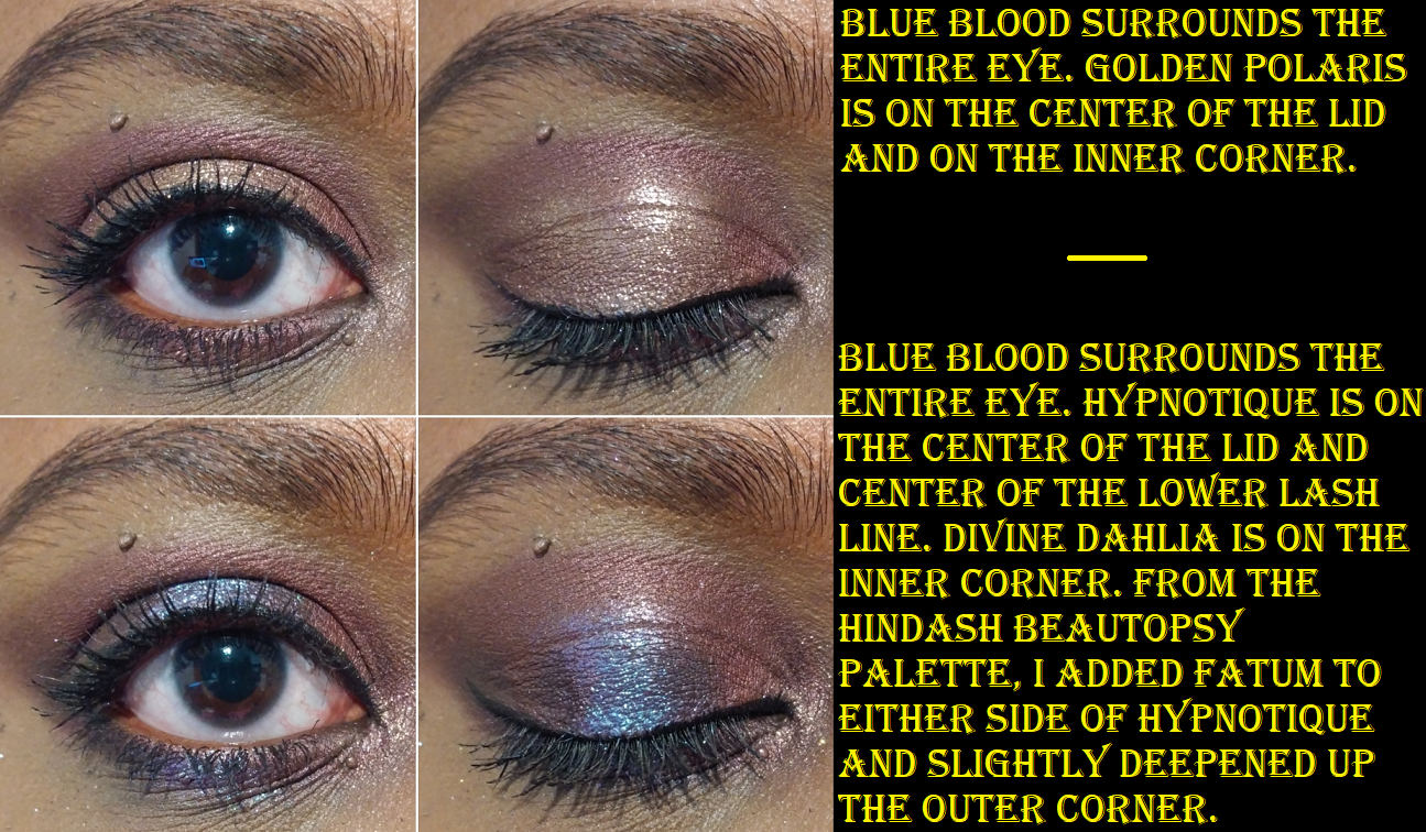
I essentially traded my Nocturnal Nirvana Blitz Astral Quad for this one instead. I already own Blue Blood in the Eye Ecstasy: Subversive mini palette, but I don’t mind having a repeat shade since that one is so small. I couldn’t get the stunning blue-purple duochrome Hypnotique or the sparkly bronze-taupe Divine Dahlia out of my mind, so I knew at some point I would add this to my collection. I like palettes with at least 6 shades, so having only four options feels limiting, especially as there are no mattes: just three shimmers and a satin. However, I don’t take PML eyeshadows on trips, so as long as I’m only using them at home I can utilize mattes from other palettes. I also don’t mind using the burgundy Blue Blood shadow in the crease or outer corner the way I typically would use a dark matte shade. Golden Polaris is a nice highlighting color for the inner corner, under the brow, and center of the lid. While these are all pretty on the eye, I’ve always found that glitter primer under the shimmer shades is needed to show their true beauty.
Despite feeling limited in shade options, I understand why this palette sold better than the other quads and I’m happy to have this.
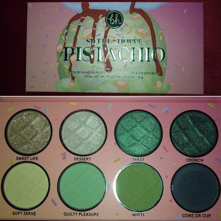
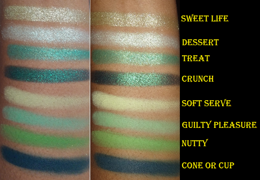
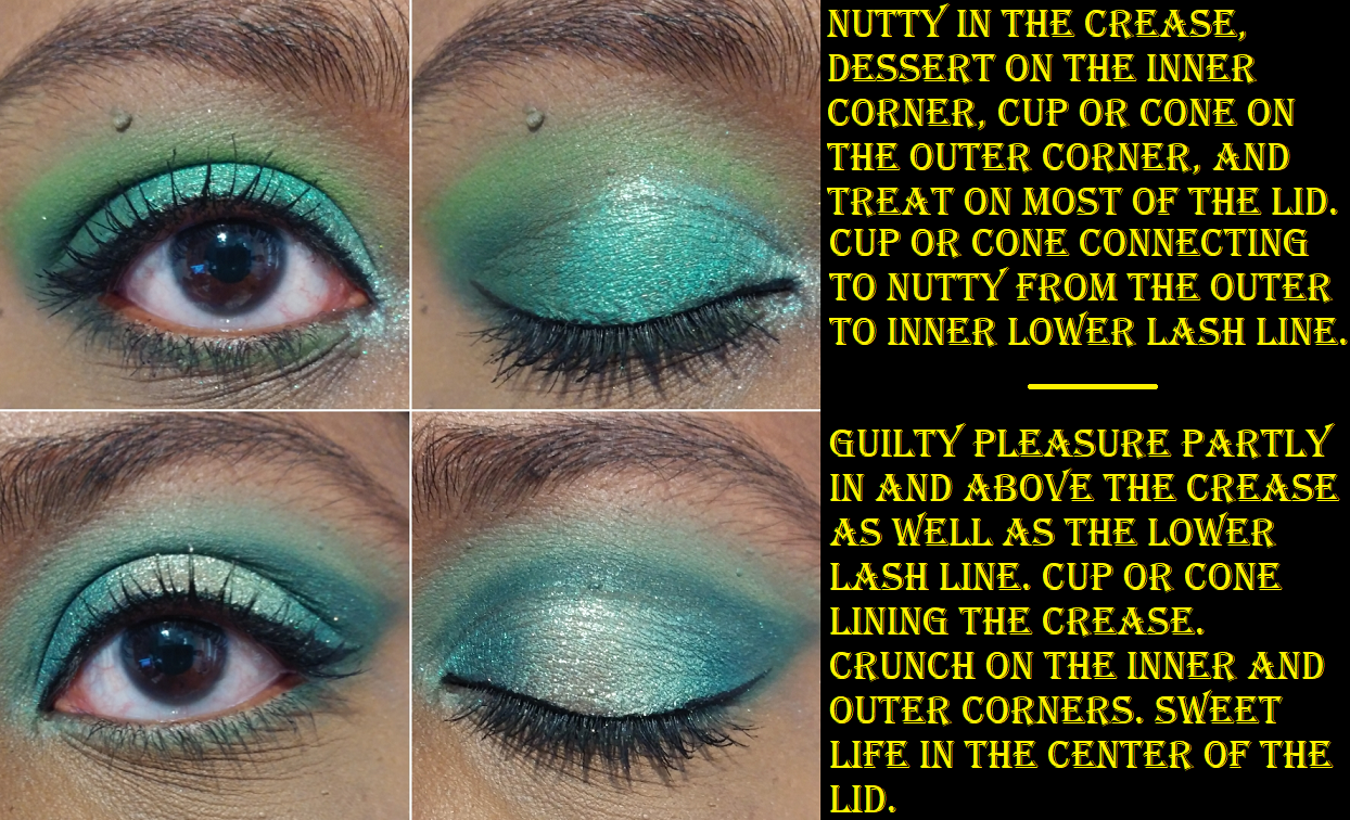
BH Cosmetics Sweet Shoppe Pistachio Palette
I didn’t purchase this during the initial launch, but I was able to get it during the restock. At the time, I had a negative experience with their customer service and wasn’t planning on buying from them again, for multiple reasons, but my love of green shadows wore me down. Everyone talked about how this is the best quality BH cosmetics has done, but I don’t see it. To me, it’s on par with the other shadows from them in my collection like the Zodiac palettes. It’s great quality considering the price, but it’s not more special than anything else from the brand, nor does it top Juvia’s Place, Sydney Grace, Pat Mcgrath, Natasha Denona, Kaleidos, etc. It might be better than most of Colourpop’s shadows, but not even all of them. It’s good, I just don’t know why it got the insane attention that it did. The mattes are pretty tones and not necessarily hard to blend, but they took a little work. I had no issues with the shimmers though. When I think about all the gorgeous green shadows I own from Sydney Grace and Coloured Raine, I think I could have skipped this.
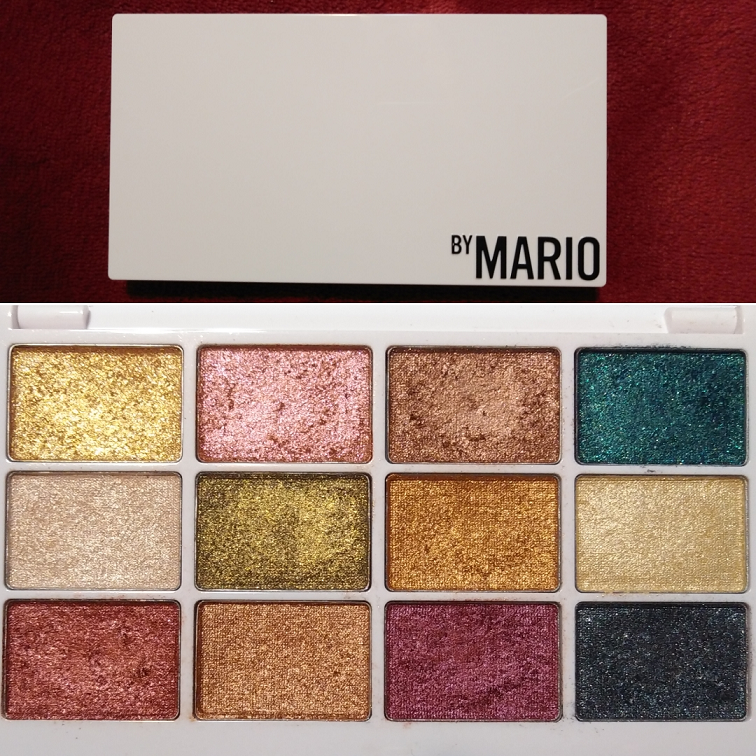
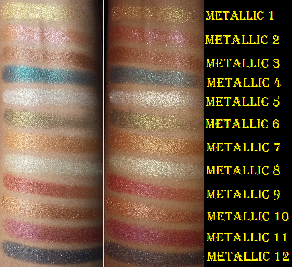
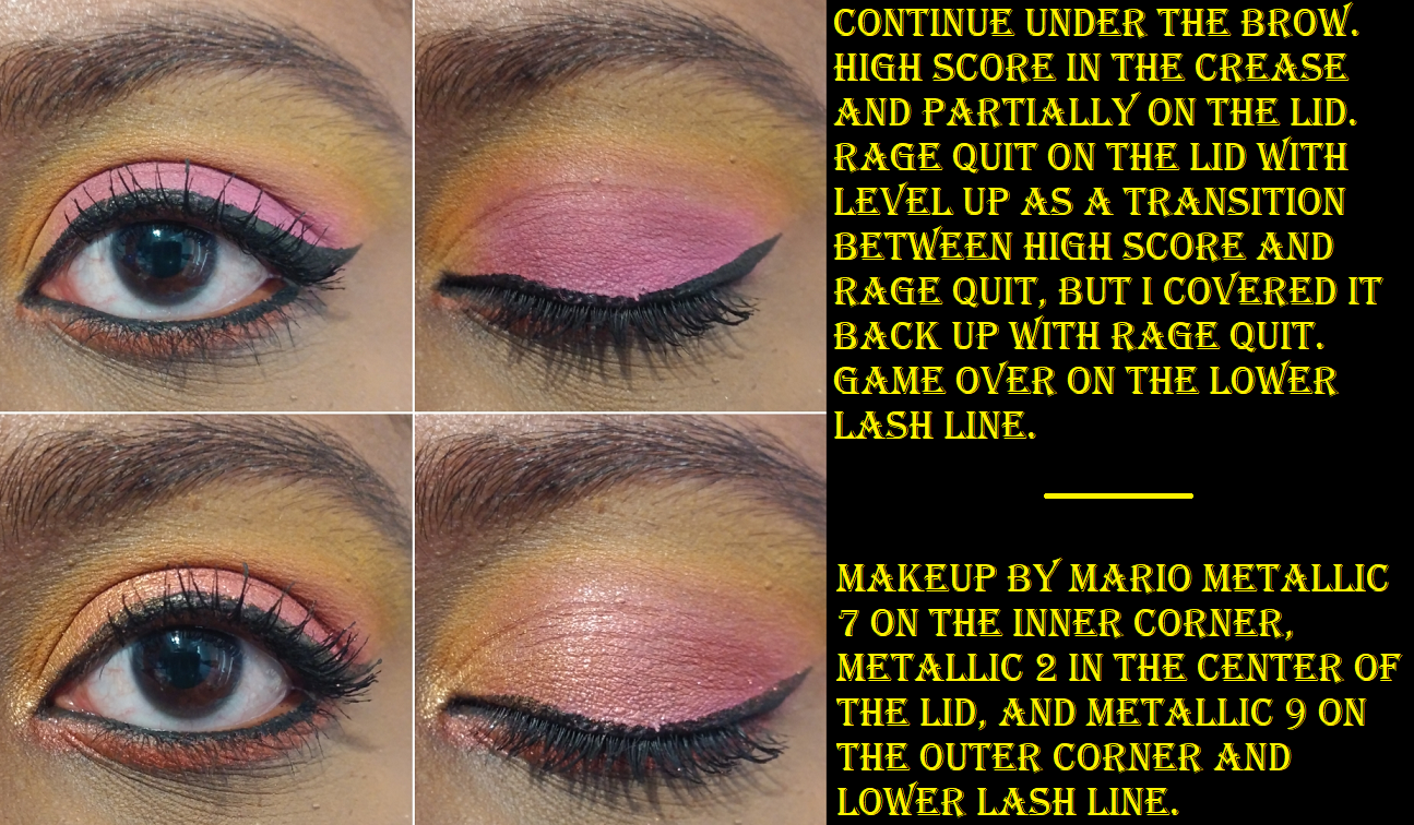
Makeup by Mario Master Metallics Eyeshadow Palette
I heard nothing but crickets just one month after the brand’s launch. I’m used to specific product hype dying down, but I literally forgot this brand existed until the recent Soft Pop/Sculpt collection release of bronzers and blushes. In any case, I had absolutely no idea what looks I could create with this palette, but I wanted it anyway. Because they are all shimmery shades, I knew this would be a supplemental palette. However, I struggle to think of anything but basic shade combinations involving neutral mattes or one single matte shade to pair with one of these on the lid.
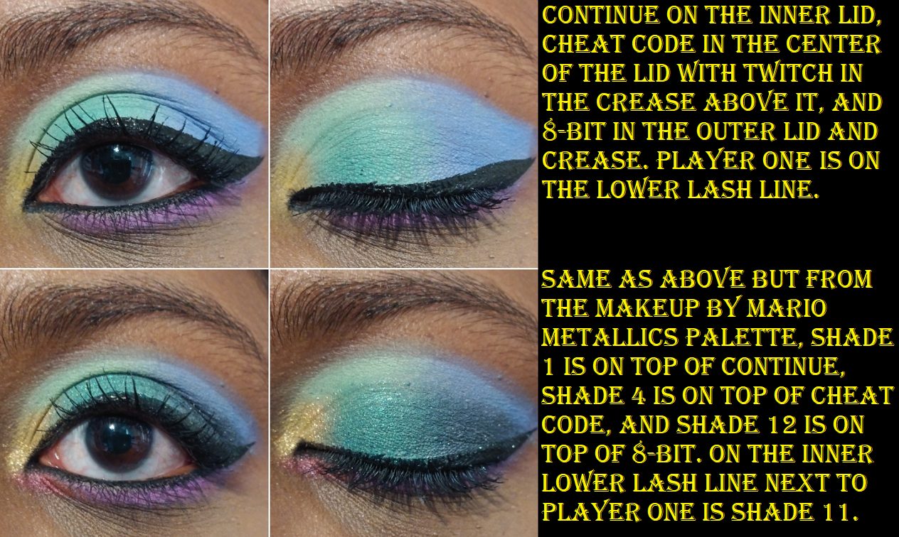
I have more examples of the Makeup by Mario shadows in use in the Sugarpill section.
That Metallic #6 olive-gold-green shade is my weakness!
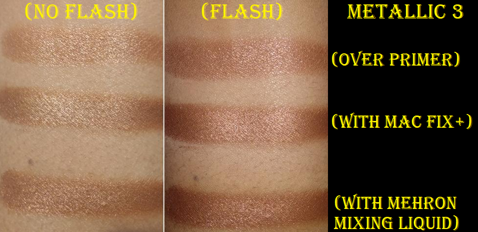
These shadows look more impactful, smoother, and more metallic when applied wet. Using a finger isn’t even enough for my taste; I need to use these with a spray. The brand has a palette specifically for use with a mixing medium (Master Metals), so I wondered if that was the case for this palette as well. Though I technically don’t have the same product, the slight extra intensity that the Mehron mixing medium provides isn’t enough for me to suggest anyone has to buy it for use with the Master Metallics. I think any spray will be good enough.
This is a nice palette of lid shades, but the fact that I have so many gorgeous single shimmer eyeshadows means I could have skipped getting this.
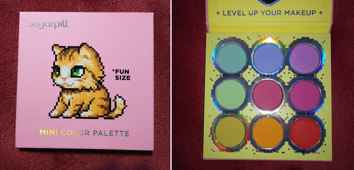
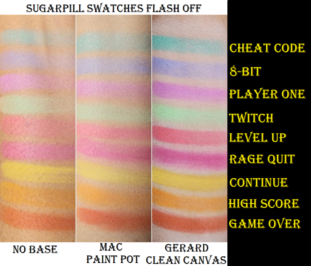
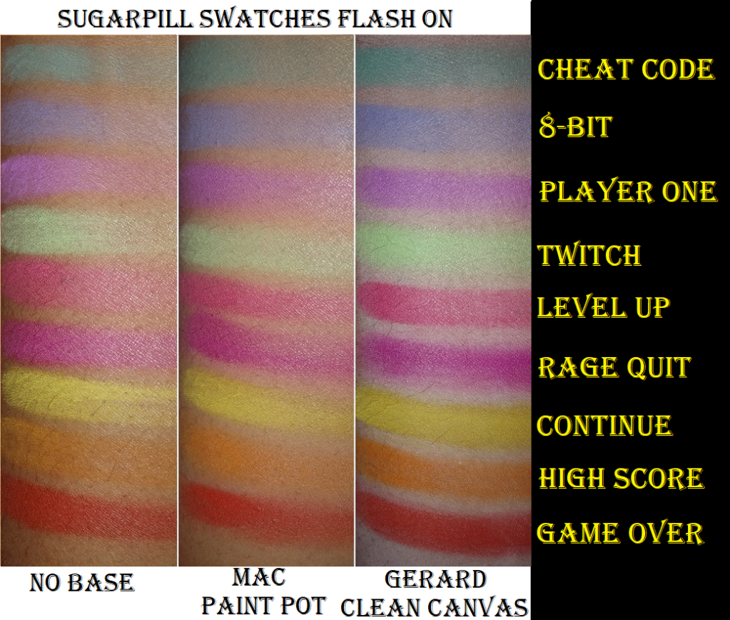
Sugarpill Fun Size Palette
This palette took many months (maybe even a year) to restock, but I eventually got my hands on it. I went in depth showing the different swatches above because I find that the primer you use with these will seriously impact how well this palette performs. Besides pastels and white bases being a great match, the actual Gerard Cosmetics formula helps these to stick better to the eye. I think these shades are very interesting and they are the best I have in my collection when it comes to super vibrant mattes in pastel-like colors. I like these even more than the Terra Moons neons, but between the Neons and Fun Size, I definitely don’t feel the need to buy anymore pastel or neon eyeshadows after this. This palette was definitely worth the hype.
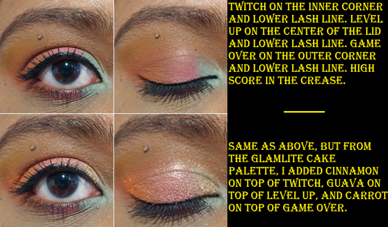
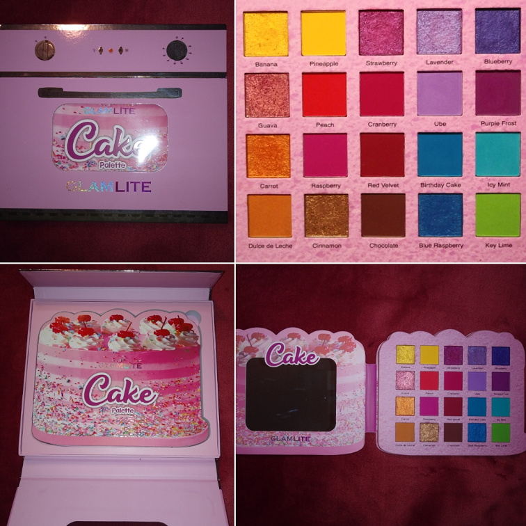
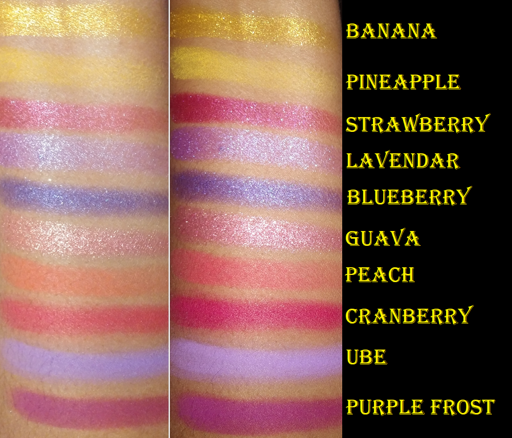
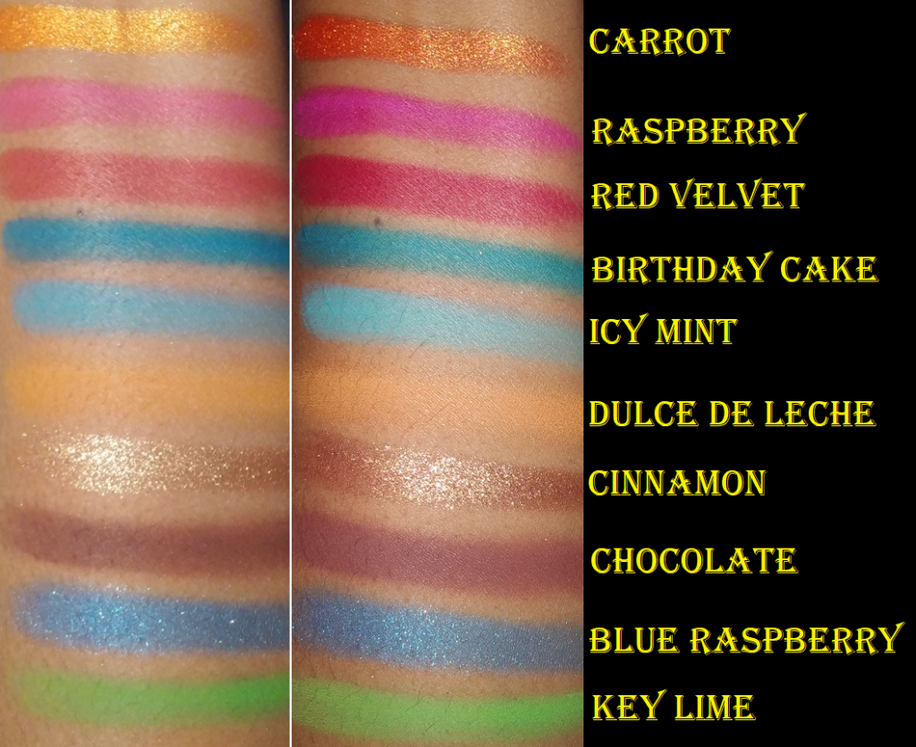
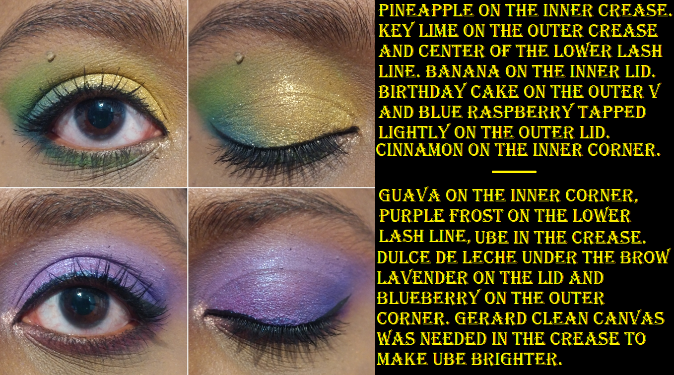
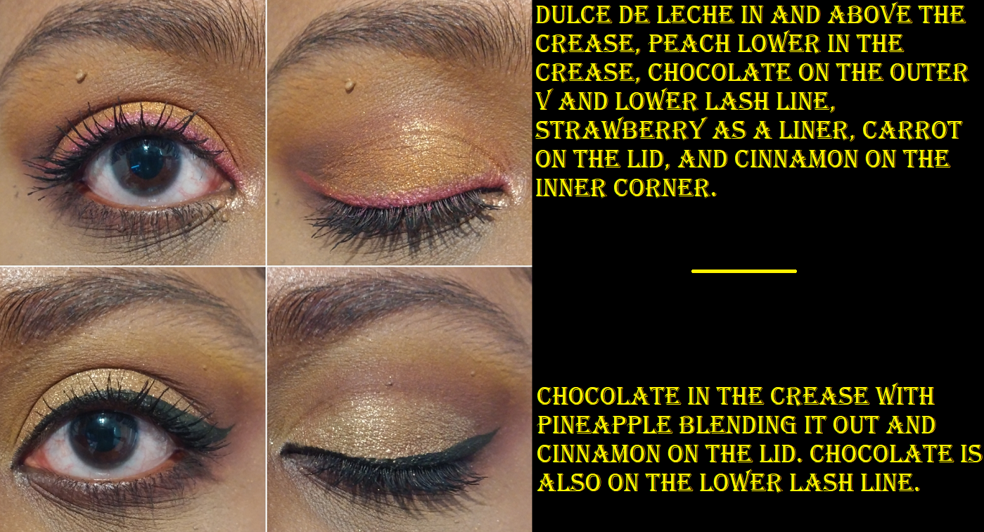
Glamlite Cake Palette
This comes in very bulky, but very cute packaging, which I have kept despite how much valuable space it takes up on my eyeshadow palette holder. Because Glamlite isn’t sold at retailers, it has only been hyped up among the Indie Brand Youtubers and other makeup enthusiasts who buy from small independent brands. But among that circle, this was definitely spoken about consistently until the release of the Ice Cream Dream palette. Then this one took a backseat.
The mattes are a nice balance of being very pigmented but still easy to blend. The majority are easy to use. I’ve only had issues with Pineapple and Ube needing a light base underneath to help the shadows be more vibrant on my eyes. Dulce de Leche also needs to be packed on heavily in order to stay. Other than needing a lighter base with some shades, these have worked well with the different primers I use. As for the shimmers, they remind me of slightly less sparkly versions of JD Glow shadows with a smoother texture and smaller shimmer particle size. Cinnamon and Guava are the standouts for me. Also, I think Banana is the only yellow shimmer I have that’s this bright without a grainy texture. The other shimmers are nice, just not unique shades. The only complaint I have about the shimmers is that I still get a lot of fallout around my eyes even when using a glitter primer. Other than that, I don’t think this was a bad purchase!
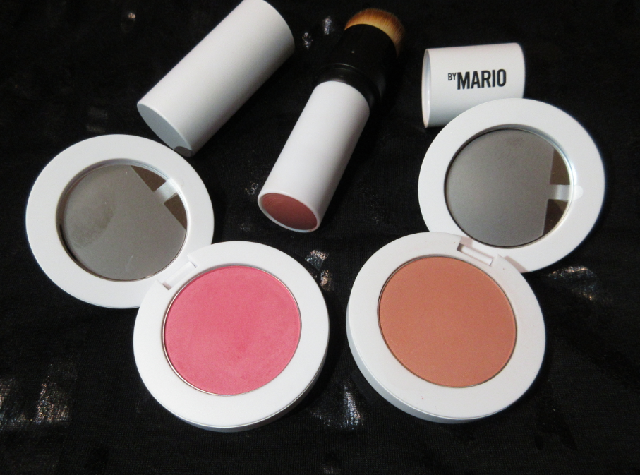
Sometimes I really am a curious cat. I’ve made it no secret that most of what Makeup by Mario releases aren’t exciting enough to compel me to make a purchase. However, this third collection launch revolves around highlighters, blushes, and bronzers, the latter two categories of makeup which have become a Herculean task to resist. I managed to talk myself out of the bronzers (and highlighters), but the best I could do was limit myself to three blushes. If you sign up for emails and use the code WELCOME15, you can save 15% off your first purchase from the official website. In addition, ground shipping is free. Of course, I could have saved even more money if I waited for a sale but…that’s the price of impatience!
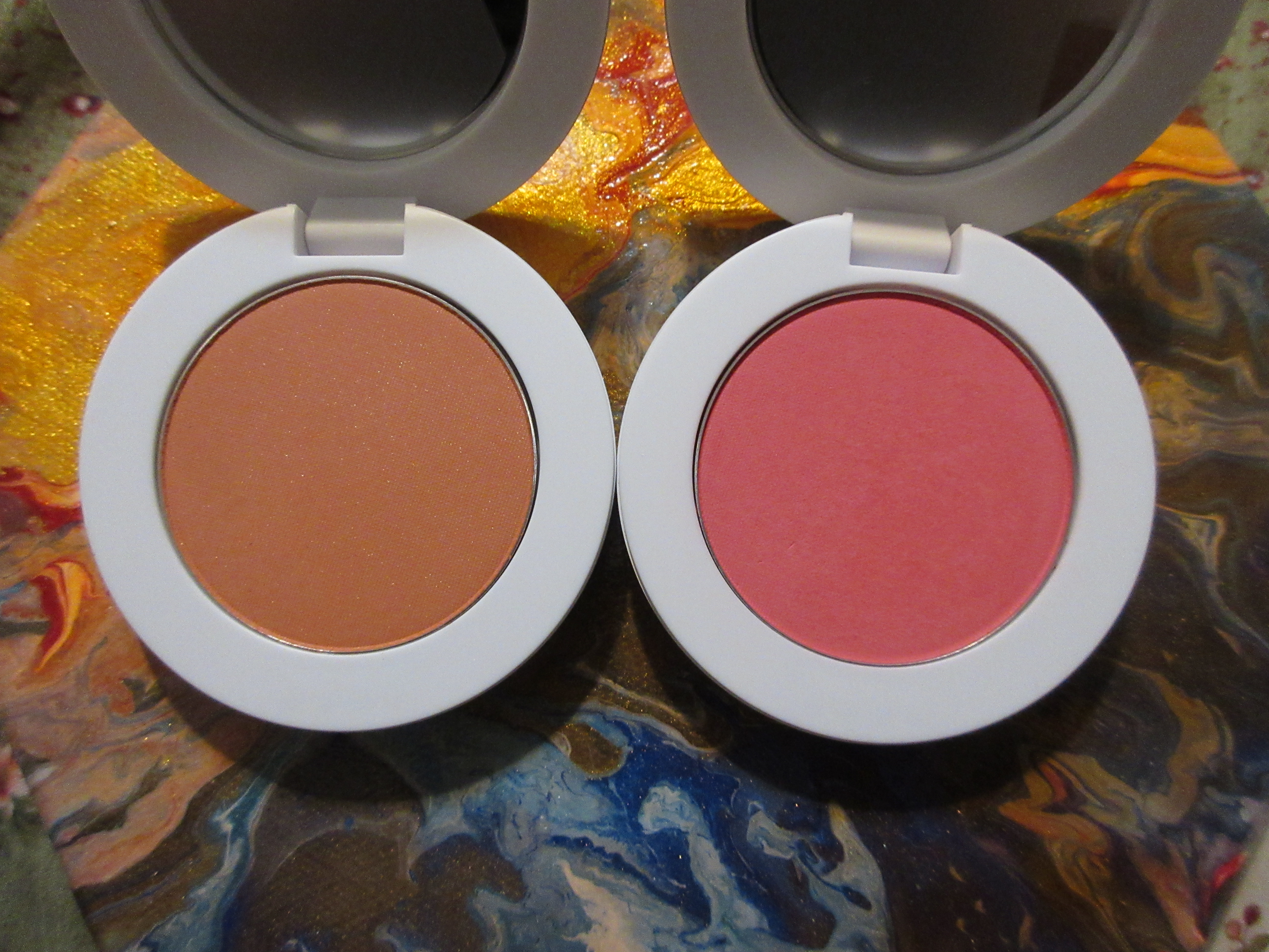
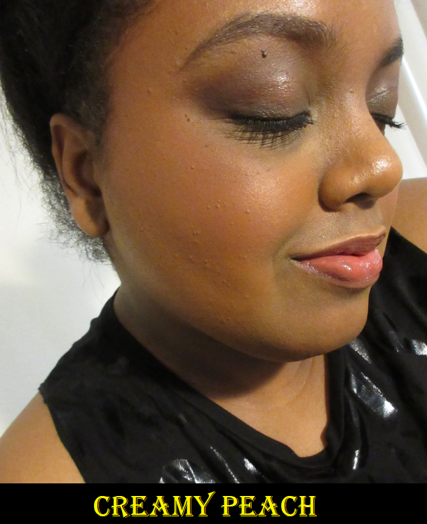
I have two Soft Pop Powder Blushes in the shades Creamy Peach and Poppy Pink. Both products are equally smoothing on the skin. They give good color payoff and are buildable. In saying that, I have to point out that most brands know how to make a decent quality blush. It’s more common to find a good one than a bad one. Between all the brands, the main differences come down preferences of the levels of pigmentation someone wants, the shade and tone, how finely the powder is milled, the finish, and excluded ingredients (if you subscribe to the “clean beauty” trend). What I consider a top tier blush is whichever of those qualities suit my particular preferences the most. Anything deemed above standard is technically subjective. The Makeup by Mario powder formula is faultless, which is what I expect of any blush. However, what makes these unique comes down to longevity. The majority of powder blushes last a full eight hours on me. With the Mario blushes, I noticed that by the end of the night they looked nearly fresh! I went as far as a twelve hour wear test with Creamy Peach, which is very subtle on me to begin with, and other than slight fading on the apples of my cheek where I applied the least amount of product, it looked like I had only worn it for a few hours instead of twelve! This test was done with no setting powder or setting spray, it was just applied on top of a face primer and foundation. Based on previous 8-9 hour wear tests in which I used a powder as well, I believe it would increase the longevity even more. The long lasting results occurred with Poppy Pink too. I have dry-normal skin, so I cannot say whether other skin types will have as much luck with these as I did, but I recommend anyone who has trouble with the staying power of blushes to look into these. They are by far the longest lasting blushes I own with the least amount of fading when applied on top of foundation.
On completely bare skin, the blush started to significantly fade after 6 hours and by 8 hours it was pretty much gone. I expect a makeup artist brand to create products intended for use on foundation, not bare skin, so this test was purely for those who sometimes put on a blush and go about their day. I do that occasionally, so I know to reserve these blushes for days that I’m wearing foundation.
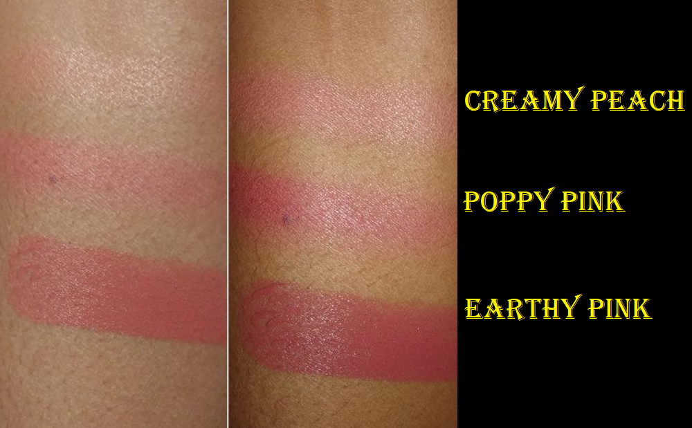
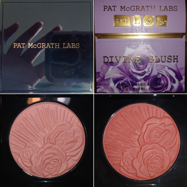
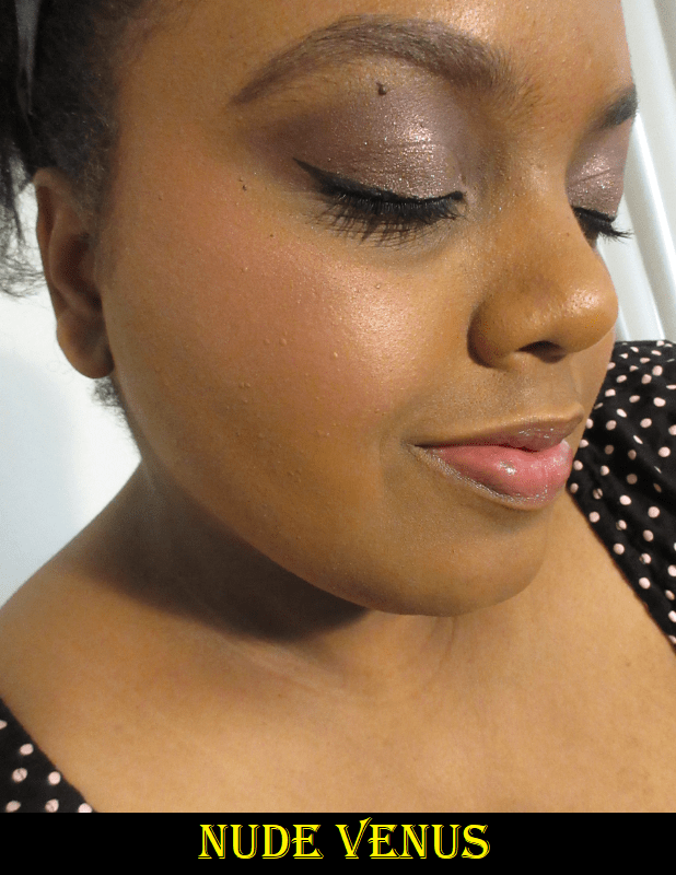
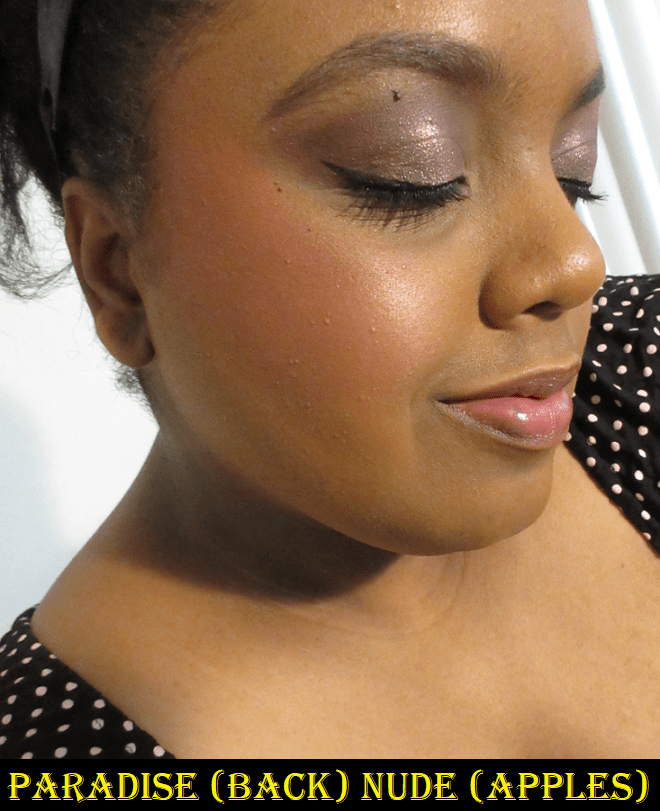
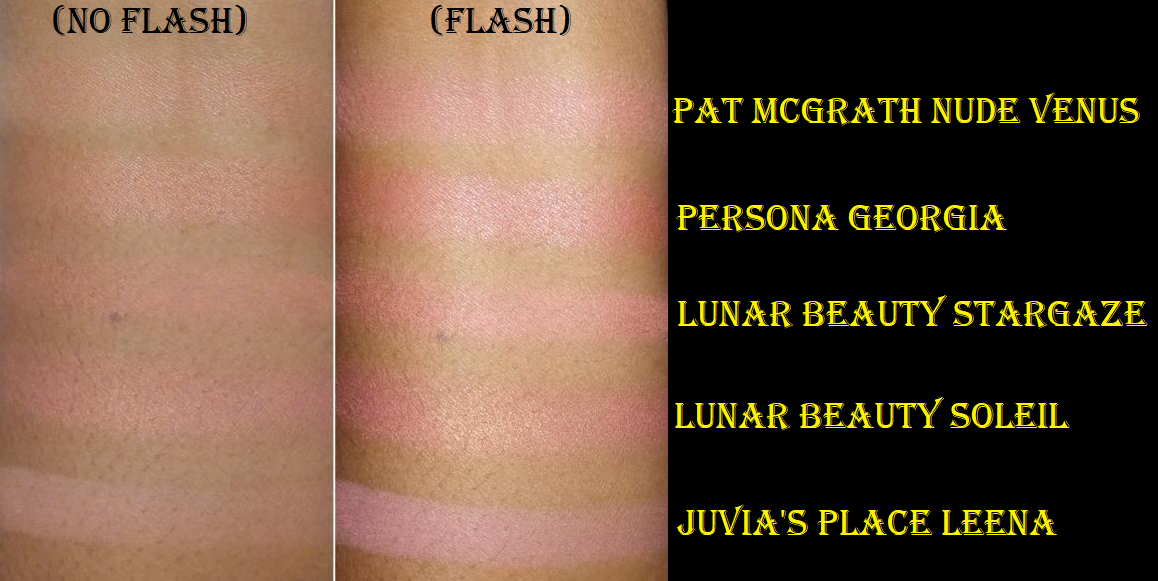
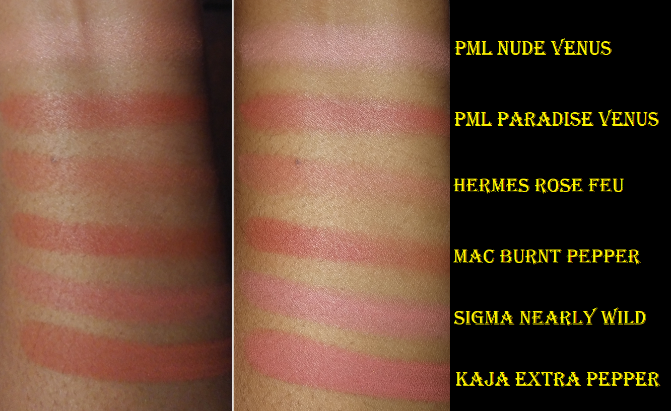
On Sephora’s website, Creamy Peach is listed as a shimmer formula and Poppy Pink as a matte. When I turn the pan in the light, I still see tiny sparkles here and there in Poppy Pink, but that doesn’t translate to the face. It still looks matte (though not dry or flat). As for Creamy Peach, the shimmer particles are easier to see, but it gives the effect of a satin finish. In my previous review on the Pat Mcgrath “shimmer” blush formula, I mentioned that Nude Venus didn’t have as much of a shimmery look on the skin, and Creamy Peach is even less so. I’d consider it a demi-matte. Below are swatches of some shimmer blushes I have in my collection to compare the amount of particles that can be seen.
I don’t consider this to be a negative aspect, just a warning for anyone expecting Creamy Peach to be very shimmery, reflective, or glowy. Instead, it’s a subdued satin radiance.
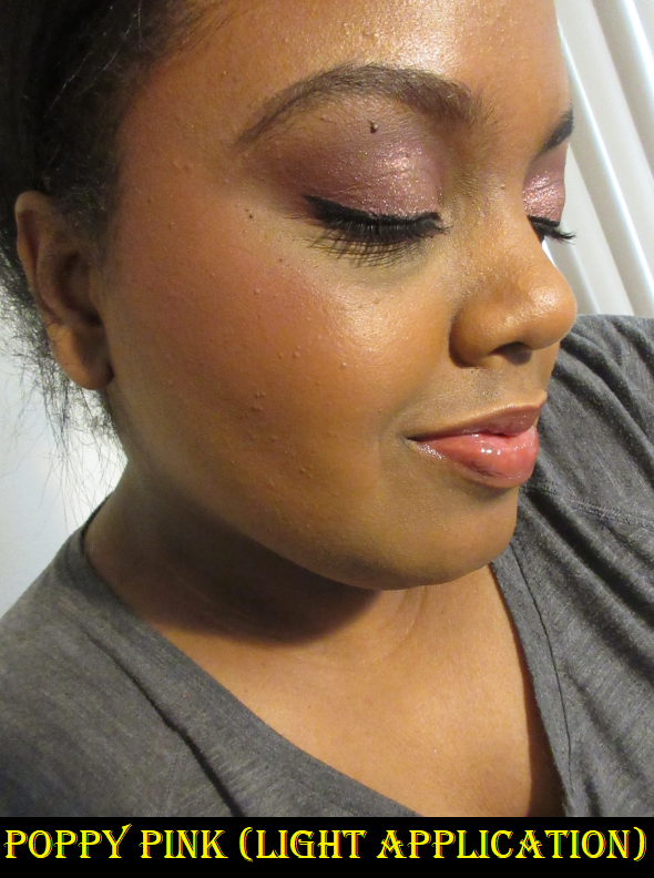
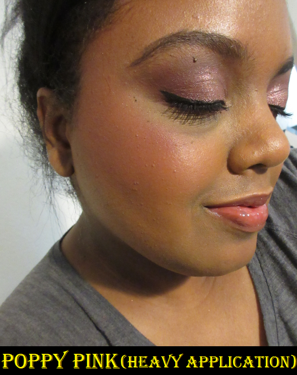
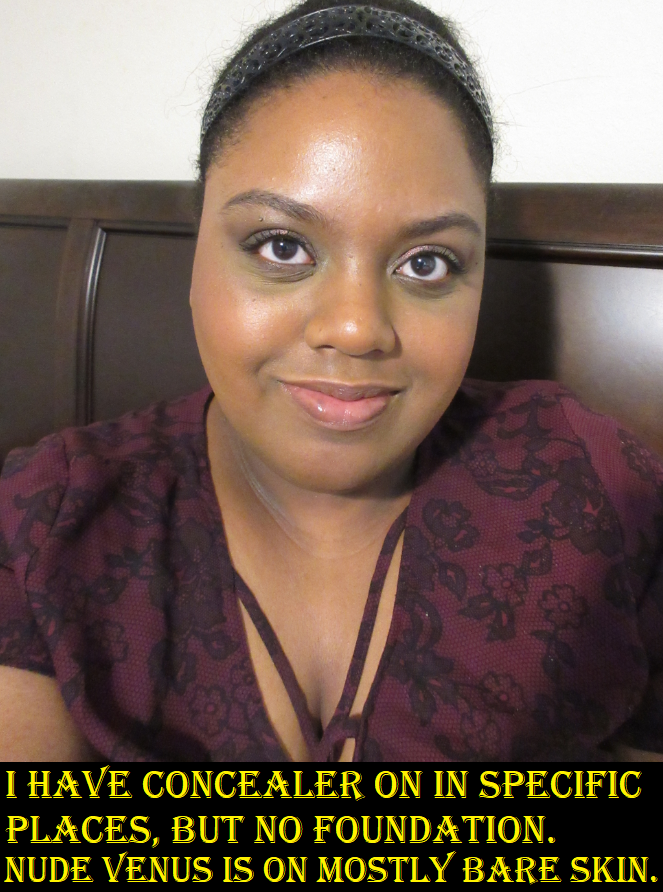
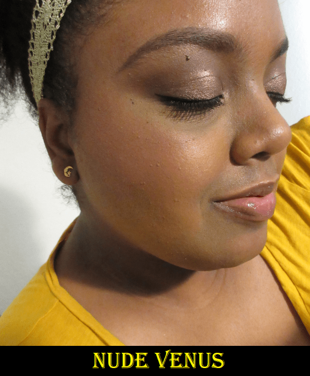
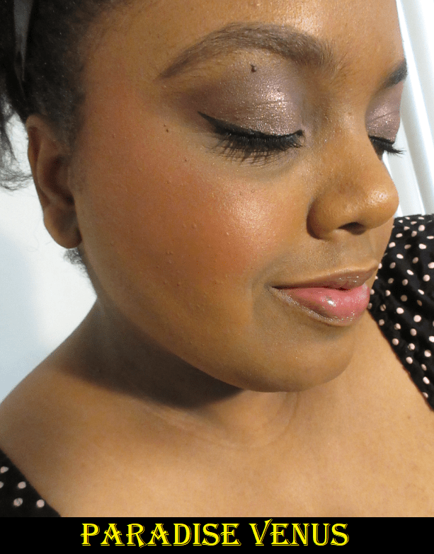
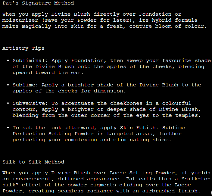
I watched some of Mario’s demonstration videos, and his intent was to create a soft, everyday natural “makeup for real life” kind of look. Poppy Pink is quite a vibrant shade, so using a fluffy lightly packed brush helps to achieve the vision Mario had in mind. I only need one or two dips with my brush. It’s the perfect blush draping color which I’ve been loving to apply further back on my cheeks, leaving the apples bare. On the other hand, because the tones of Creamy Peach blend into my skin tone so much (and it’s a little less pigmented than Poppy Pink), I have to heavily pack on 5-6 layers to get it to show. The nice thing is that even after applying so much product, it doesn’t look at all powdery on my skin. And the lack of reflective shimmer actually works in my favor because any other shimmer blush would have me beaming like the sun if I put that much on. The shade darkens a tiny bit, when it has had time to settle into my skin, but it’s never going to give me more than a subtle flush of color. This goes hand in hand with MAC Melba and MAC Mocha, Pat Mcgrath’s Nude Venus, and Hourglass Diffused Heat as shades that are barely deep enough to work for me, but I love them anyway.
One thing that I found to be odd was that during the first week of the launch there were skin tones recommendations for each product on Sephora and Mario’s websites. Now they only have it for the highlighter, powder bronzer, and shaping sticks. The note that Creamy Peach could still work on medium-dark skintones and up to dark skin tones for Earthy Pink is the reason I felt comfortable taking a chance on those shades. Maybe they thought the advisory notes were too limiting and removed them, like Poppy Pink being listed for medium dark to deep dark skin tones even though it’s a pretty universal shade. Or perhaps there were some complaints for the blushes and that’s why they were removed, such as me being medium-dark and having Creamy Peach technically work for me, but only if I really pack it on. It’s still difficult to see on camera (clicking the image to enlarge it helps) but it’s visible in person.
For $24, these are an easy recommendation if you actually need a blush or just want something nice. As I mentioned before, the only aspect that really puts this above others on the market is how long lasting they are, so if that’s not an amazing feature to you, you may not find these blushes to be that impressive. I’m glad I have them, though.
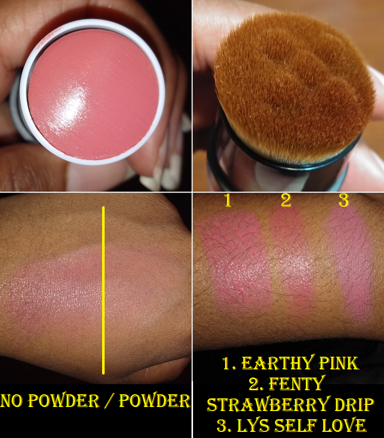
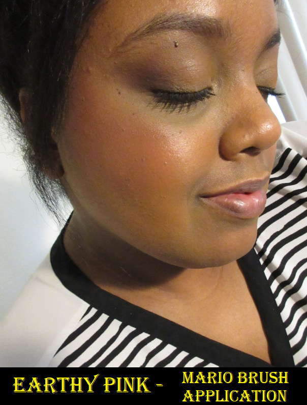
I have no business continuing to purchase cream blushes, especially in the stick form which I don’t like as much, but my rationale was that I could use the special brush at the other end of the stick with my other cream products. That way, when the Soft Pop Blush Stick eventually goes bad, I’ll still have something usable out of it. I purchased the shade Earthy Pink, as I thought it would look the most natural on me.
I think this is a nice product. It’s like a slightly dewier version of the LYS Higher Standard Satin Matte Cream Blush. The LYS blush is only $16 for 6.5 grams. The Blush Stick has 10.5 grams, plus a brush, for $28. So, I do think the Mario Stick is fairly priced. It’s also only $2 more than the Fenty Match Stix Shimmers (which come in blush shades) which have 7.1 grams and, in my opinion, a lower quality formula.
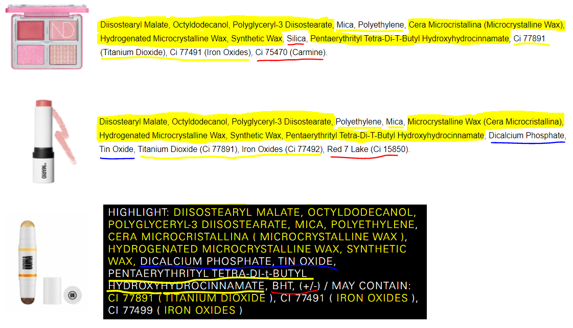
Because I noticed the similarities of ingredients between the cream product in the Makeup by Mario Master Eye Prep and Set to MAC’s Foundation Stick, as well as the Master Metal Manipulator to the Mehron Mixing Liquid, I was curious to see if there were any products that came before which had similarities to the Stick Blush formula. The ingredients that follow the same order are highlighted in yellow. Underlined yellow means they all contain it but in different orders. Underlined red shows the ingredients unique to that formula and underlined blue shows an ingredient shared by two but not all three. The three products are the Glow Cream Base from the Natasha Denona Love Glow Cheek Palette, Makeup by Mario Blush Stick, and the Highlighter end from the Uoma Beauty Double Take Sculpt and Strobe stick. I own a Uoma Stick and can confirm they actually don’t feel the same. The one from Uoma has a bit more slide/glide to it. They have similar griping power on the skin but Mario’s has more of a tacky feel whereas Uoma’s has more slip. I own a different Natasha Denona Cheek Palette and the Cream Base formula for the version I have contains different ingredients, so I don’t know if they are similar or not.
The ways I recommend applying this product are as follows:
Swipe the blush onto the back of the hand and pick up the product with the brush end to stipple it onto the cheeks. This method gives the most control in terms of being able to build up the product and leave a slightly less shiny finish. A second option is to dab the blush directly onto the cheek and stipple with the brush. This leaves more shine on the skin and reduces the amount of cleanup. I do not recommend swiping the stick across the cheek as that can move the foundation underneath.
Use your fingers or a different (less dense) brush for a sheerer application. I personally do not like the look of the product when applied with the fingers. On bare skin it took me longer to blend and over foundation it kept getting splotchy.
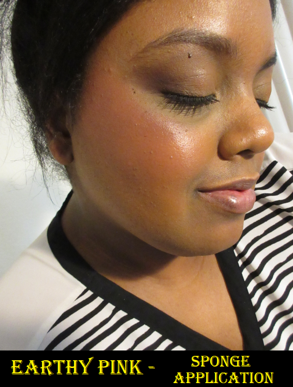
Swipe a slightly damp sponge across the surface of the blush stick and bounce it onto the cheeks for the (surprisingly) most opaque non-foundation-disturbing application and for the dewiest finish. For a sheerer application, dab the product onto the cheeks first and then bounce with the sponge to blend it out.
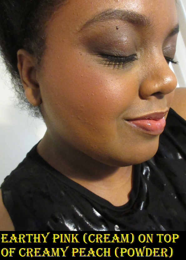
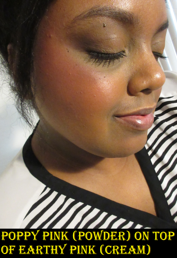
As seen in the four photo collage further up, a setting or finishing powder will lighten the cream blush and instantly mattify it. Any powder, including powder blushes, will both set it and ensure it lasts on the face looking quite fresh for at least eight hours. I have not done longer wear tests on it. Putting a powder blush on top of the cream looks nice, but it also looks fantastic when the blush stick is applied on top of a powder blush (like the Patrick Ta method). I’ve tested this with a few other brands’ powder blushes, but using the Makeup by Mario blush stick and powder blushes together absolutely locks it onto my face and they work together so seamlessly and beautifully. If you don’t use powder, the cream blush will set on its own after a few minutes. However, it won’t be fully dry which means it will mostly stay on the face if touched. Regardless of me applying it over foundation or on my bare face, it fades around 6 hours if not combined with a powder in some way. Perhaps a setting spray will work to avoid powder, but I have not tried that out. The finish isn’t very dewy on my skin anyway, so I don’t feel like I’m missing out on the luminosity by using a powder. It’s easier for me to just do that or apply a powder blush on top when using the Stick Blush.
I mentioned that I used other brushes with this product. With my Sonia G Keyaki Mini Base brush, it worked fine but was a bit sheer. I thought perhaps the natural and synthetic bristle mix caused this effect but I had the same result with my Smashbox Cream Cheek Brush which is fully synthetic. Between the three, I prefer to use the Mario brush with the Mario blush.
I also tried the Makeup by Mario brush with the Patrick Ta cream blush from the powder/cream blush duo, as well as an LYS cream blush. It works fine with them, though I still prefer the Sonia G Keyaki Mini Base with my other cream products because the bristles are softer.
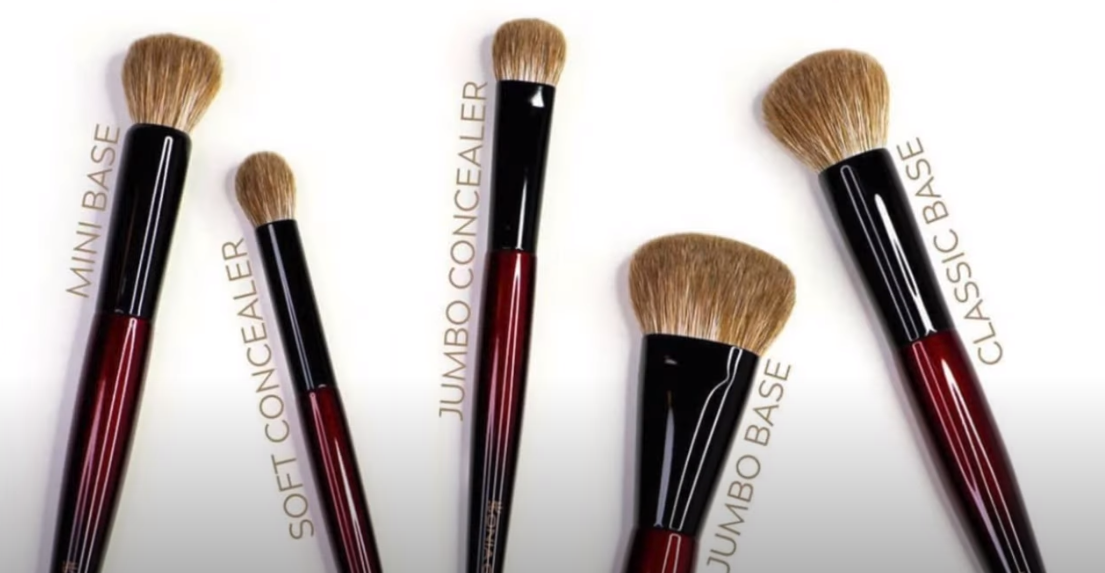
Speaking of the Mini Base, did you know that the new Sonia G Fusion Series is launching at Beautylish tomorrow? The same fiber mix in that brush is used for all the bristles in this series. Photo credit goes to Mel Thompsonwho was the first person to put out a video.
I will be getting two or three brushes. Considering how much I rave about the Mini Base, I wanted anyone who may be interested to know it will be available June 22nd! Okay, back to the review!
The foundationsI used in the wear tests were the Nars Soft Matte Foundation, Dermablend Cover Drops, and a mixture of the Uoma Beauty Say What Foundation with Beautyblender Bounce Liquid Whip Foundation. The primers used were the MILK Hydro Grip Primer, Good Molecules Silicone-Free Priming Moisturizer, and Tatcha Liquid Silk Canvas. The brushes I used with the Poppy Pink blush were the Chikuhodo KZ-4, rephr 05, and HS-2 Hana Sakura Blush Brush. The brushes I used with Creamy Peach were the Bisyodo B-C-01, rephr 24, and Chikuhodo FO-3. The rephr 24 was most helpful because it’s so dense (as long as you keep it in a brush guard after washing) which meant I could layer up Creamy Peach easier. To those who read my last Fude update, do you remember that the rephr 24 was the one other brush I wanted to try, but it was always out of stock? I finally got it! It happens to be my favorite of the rephr brushes I own now. No figure!
Additional notes about the detachable Makeup by Mario Blush Stick brush is that any residue is easily wiped away with a microfiber cloth. I fully washed the brush once so far and the bristles maintained their shape and did not fray or become looser packed.
Because I already have cream blushes I like and the Mario brush is only superior when used with the Mario cream blush, in hindsight, I should have only bought the powder blushes. My inner makeup goblin talked me into it, and while I don’t regret it, I could have gone without the blush stick.
That’s all for today! One final thing I wanted to mention is that every so often I feel it is necessary to put a disclosure that all products reviewed in this post were purchased by me. I always disclose if I did not buy something, even as far as mentioning if the product was a birthday or holiday gift from a friend.
I’ve toyed with the idea of making an “Influencer Brands” review, but I kept pushing it back as I haven’t been inspired by the products in mind for that post. So, I decided to give Artist Couture a solo review. The brand is owned by Angel Merino, also known as “mac_daddyy” on social media. I heard the name mentioned many times by Jackie Aina when I used to follow her, but I’m more familiar with the brand than the owner. I remember when Artist Couture first started out with loose highlighters at Sephora. I wanted to try the brand, but I wasn’t interested in the products until the Midnight Maven palette. I did not end up buying that palette, but in 2021 my wish to try some of the products was finally too strong to ignore, especially near the peak of my blush obsession.
Artist Couture Love Sprung Face Palette Version 2
Fun Fact: In my order from the Artist Couture website, this was actually listed as VII, which looks like roman numeral 7. I was very confused when I added version 2 to my cart but the confirmation page had what I thought was Love Sprung 7, until I figured it out.
This was actually my first Artist Couture product! I purchased it before the Supreme Nudes palette, even though Supreme Nudes is an older release. I had no idea what to expect, but I was hopeful that it would be great. The satin blushes are both quite pigmented. They look like mattes in the pan but they are technically satins since they have the tiniest amount of sheen to them.
Infatuated is my preferred type of shade because I like blushes with a little bit of orange, but leaning more on the side of brown or pink. This one is described as a terracotta peach, which is just what I like. Bold oranges don’t look as nice on me.
I was surprised how pretty I thought Lotus Love was, considering I typically don’t go for berry blushes, but this isn’t a deep berry. Perhaps that makes a difference. I find it fascinating that oranges and berries, shades touted as being best for deep skin tones, are present in this blush palette, but in ways that make them more interesting and different from what is common on the market. These blend well into the skin, but they aren’t the longest lasting. They fade a bit quickly on my cheeks at around the six hour mark, and also when I’ve use them as eyeshadows. I don’t mind that as much, but it’s important to note. Also, the satins have an extreme amount of kickup! I haven’t seen kickup on a blush like this since reviewing the Milani Baked Blushes!
I’m also not certain if the pigments in these blushes have something that throws off cameras. It seems like a standard formula, but I attempted to take photos of these blushes four different times over the course of four different days before I finally settled on these. I literally had over over 500 unusable photos. I had to change my camera settings to properly get them to show up. I also had to wear specific clothing colors and lipstick colors to get the blushes to show true to color on my cheeks. I always struggle with my camera and lighting, but never to this extent!
The shimmer blush in the center, called Angel Energy, is a mauve-pink intended to be more of a highlighter or blush topper than a standalone blush. It feels very wet to the touch and when I first opened the palette, I noticed part of the left side of the pan looked darker than the rest. It resembles the uncommon occurrence when oil separates from a creamy shimmer eyeshadow. I figured perhaps this shade wasn’t mixed well, but I looked at the ingredient list and saw the amount of emollients: the dimethicones, forms of glycerol, the oils, and waxes. It’s definitely not an issue of being mixed improperly. This is intended to feel slick. Sephora describes it as being a “bouncy” formula, which gives the impression that it would feel similar to a Colourpop Super Shock Blush or putty blush, but it’s not bouncy to me, just wet.
I’ve highlighted the ingredients that to my knowledge are emollient/slip/moisturizing ingredients in Angel Energy. I may have missed some or mismarked some as I am not a cosmetic chemist. As a makeup enthusiast, I did my best research.
Overall, I do recommend this palette. The packaging is cute, it blends well, the shades are pretty, and the price is pretty good. Of course, it’s only worth buying if you love the color story. The formula isn’t holy grail status by any means, just nice.
Artist Couture Supreme Nudes Palette
I wrestled with my decision to buy this palette for an entire year. I kept talking myself out of it because it’s a neutral palette when I prefer colorful ones, it has quite a lot of those light brown toned shades that tend not to show up on me, and the shimmers looked pretty but I knew they could never compare to the quality of shimmers from indie brands. During the last Sephora VIB sale, I couldn’t hold back and decided to get it. The shade Supreme was pretty much the sole reason I could not let go of this palette. Olive leaning antique gold type of shades are my Kryptonite.
The edited photo above represents how I expected this palette to work for me: repeat brow bone shades, repeat golds, a warm brown shimmer, antique olive green shimmer, a warm deepening shade, and a cool deepening shade. I wish I could say it turned out to be more diverse than I predicted, but it did not. While I can see the differences in tone among the six shades I marked above as being brow highlighting shades, it’s not enough to make a significant difference. Exposed and Stripped look cooler or warmer depending on what eye base I use; their own tones don’t matter. I’m glad that they at least are not stark or ashy on me like some light shades are. Nudist, Transcend, and Eccentric all blend into my skin and look like my natural skin tone, regardless of the color of the eyeshadow base. Silhouette looks like my natural skin color as well, but a cool tone version.
All the mattes in this palette are equally pigmented and blendable. There is a bit of kickup that I have to clean after each use, but it’s nowhere near as messy as the Love Sprung Blush palette. As for the gold shades, Opulence has larger shimmer particles and takes on more of a copper gold tone. Lavish is a yellow-toned gold with finer shimmer, and when I put I these two next to each other on each eye, I could see the difference. However, as time went on during the day and the shadows started to dull, but not fade, they looked less different than before. In the future, I will likely stick to using Opulence on the lid for the sparkle factor and Lavish on the inner corner so I can worry less about it getting in my eye. They serve different purposes due to their consistencies and not as much for their color. When it comes to the two deepest shades, Aesthetic slightly darkens the outer corner but isn’t deep enough to give me any real depth. For that purpose, I can only rely on Minx, but it makes all my eye looks a lot cooler-toned when I use it. I expected Aesthetic to be much warmer but it only stays warm if I use it on bare skin. If I use it over a base (whether a traditional eyeshadow primer or foundation/concealer), it deepens to a neutral toned brown, even if the base has fully dried down and even if it has been powder set as well.
The two most distinct shades in the palette are Bronziana and Supreme. Bronziana is much prettier than it looks in photos. It’s a bronze shade, but I believe it has reddish specks in the shimmer as well. It’s what I imagine the Hot Chocolit Fenty Gloss Bomb would look like as an eyeshadow. As mentioned before, Supreme is a dark shimmery olive, but it doesn’t look on me the way I had hoped. I didn’t think it would be dull and muted. I can make it shinier if I spray my brush with MAC Fix+ and make it brighter by lightly patting Lavish on top. You can see how it looks on its own in eye look #1 versus eye look #6. Wetting it also helps to last longer because my eyeshadow looked just as good 10 hours later on the day I sprayed it in look #6.
Left eye and Right eye after 10 hours of wear.
I would have been crazy for Supreme if it had a touch more green in it, similar to Antheia from the Natasha Denona Mini Gold palette. In fact, if I could recreate this palette, it would be a combination of shades from the Mini Gold, and I would add a brighter or darker green and turn up the saturation of the red in Aesthetic and the yellow in Eccentric.
Of course, my desires would make it a far less traditional “Nude” palette. It’s clear to me that besides usability, every time I’m drawn to a neutral palette, it’s never as exciting as I anticipate. I knew Supreme Nudes wasn’t going to suit my tastes, but I still bought it anyway, and that’s my own fault. But what’s amazing to me is the fact that every time I use this palette, I find it to look so boring on my eyes until I put liner and mascara. Then suddenly I appreciate how soft the colors are, and how blended it looks, and the way the shimmers sparkle when they catch the light just right. It’s not my favorite palette and yet I can create pretty looks with it. They aren’t diverse looks, but at least they look pretty.
While my main goal of wearing eyeshadows is to create a pretty look, I need to have a desire to keep using it in order for it to be worth the purchase. I’m not confident in how I feel about this palette. The quality is great. The color story will be diverse enough and perfect for some but redundant and limiting for others. What I appreciate about neutral palettes is the ability to create a complete look, which technically this does because of Mink, but I would prefer to use a deep brown or black from another palette instead. I do like this palette more when I have another one to supplement it with. The packaging is so pleasing to look at, touch, and use (and this goes for the Love Sprung Palette as well). Something about the smooth shape, rounded edges, and shiny black surface makes me happy on some strange emotional/psychological level. The actual smooth surface literally feels nice under my fingers in a tactilely pleasing way. Regarding the functionality, it has a great mirror size and I love that the lid fully folds back so that those of us with vision problems can bring the mirror closer to the eye. It’s also a compact size, with the right amount of product, and is priced fairly. Of course, there’s also the extreme hype regarding this palette. I think it was in most beauty gurus’ “Best of 2020” videos. Because of my love of colorful shadows and my preferences regarding the depths and tones of shades, it didn’t live up to the hype for me. However, I do think I will continue to get use out of it when I pair it with other things. It does bring me joy to have it in my collection. If you’re a fan of neutral shades, I could easily recommend this to you. If you are my skin tone and wouldn’t get as much variety from this palette, assuming you want more variety, I would say maybe think twice about how useful this will be.
For those who are a fan of the Supreme Nudes Palette, it may interest you to know that Artist Couture has released a similar palette called the Supreme Bronze Palette. If this palette had been released during the Sephora VIB sale earlier this year, I would have still chosen the Supreme Nudes instead, purely for the olive Supreme shade.
Photo and information credit goes to Trendmood1 on Instagram. It is now available for purchase at the Artist Couture and Sephora websites.
I tend to post my newest purchases far in advance on my Instagram page, so if you’ve found me through there, you may have seen some of these already. However, the majority of these shadows I’m featuring today have not been posted on this blog until now. In addition to arm swatches, I’ve also tried to do eye swatches and some finger swatches as well. Certain multichromes and duochromes look different depending on the light, so the trickiest ones to capture have the most variety of photos. Lastly, unlike my in-depth Monday reviews, the intent of the Swatchfest is to just show how these look on me. I will of course still make mentions of things that I feel are important to note, and may be different from my past reviews of these brands.
Terra Moons
Cosmic Blaze is one more pressed neon pigment I added to my collection. Purple Clouds is a duochrome. The rest of the shadows I purchased are part of the expanded range of Chameleon shadows.
In the comment section of my Hindash review, I offered to compare a few shades in this post today. It’s interesting to see the differences between all the blue-purples. JD Glow’s Anomaly does look a lot like Terra Moons’ Moon Tide depending on the angle and the light. The base color of Anomaly leans purple with blue/aqua shimmer. The base color of Moon Tide is like a navy and purple with very similar shimmer. Moon Tide just has additional colors of shimmers as well. One doesn’t really need both, though differences are more noticeable on the eyelids.
JD Glow
I said I wasn’t going to buy anymore JD Glow shadows, but I saw the words, “30% off sale,” and I couldn’t help myself. I always wanted the shade See Weed and even though the discount didn’t apply to this shadow, I still wanted it anyway. I’d like to say now I’m content with my JD Glow stash.
Anomaly is a Galaxy shadow. N-Sane is a Galaxy shadow I reviewed previously, but I wanted to show it again in comparison to Anomaly.
See Weed is a pressed multichrome. It also comes in a loose and liquid form too. Watermark is a Galaxy shadow.
Moscato is part of the shimmer formula. Plum is a Galaxy shadow.
Devinah Cosmetics
At the time of me publishing this post, in one hour from now Devinah Cosmetics will be restocking most of their shadows and releasing their new Halo Moon Collection! I just wanted to let everyone know in case you’ve been waiting to get certain shades. I have a ton of duochromes and multichromes to go through, so I’m skipping the new launch for now.
Chromosphere and Australis are Aurorae Flares, the shadows most comparable to the Clionadh Cosmetics’ Jewelled Multichromes. I like the finish of Clionadh’s a tiny bit more, but the ones from Devinah are smoother in texture and easier to apply. I was tempted to get other shades but Australis is already supposed to be a dupe of Smoulder (which I have), Phenomenon to Weathered (also have), Magnetosphere is often compared to Rosette (another I have), Exosphere is like Trefoil (which I don’t feel I need), Hemisphere to Gargoyle (I also don’t need), Thermosphere and Spire (again, already have), Borealis to Castle, and Polaris to Oculus. Oculus and Crown Glass are similar enough, so I didn’t want a third similar shade. Chromosphere is similar to Clionadh’s Patina but apparently not an exact dupe. To see these similarities in action, I will link one of Millie’s videos a.k.a. badtothebrow a.k.a. the Queen of Multichromes.
Vela and Lynx are part of the Star Chasers Collection. On my skin, Vela does not look as yellow like the pan. Lynx looks how I expected Vela to look. It’s yellow with only a hint of warm orange that I hoped for. They’re still pretty but I would have skipped buying them if I knew.
Aquila is another Star Chaser. I was a lot more impressed with this shade. It reminds me of a more sparkly and more blue version of Verte from Clionadh. Fierce is a pressed pigment that may be discontinued as I can no longer find it on the website. It is the perfect copper-red-bronze shade I’ve been wanting!
Grinch and Patina are pressed mattes.
Meraki and Bambi are also pressed mattes.
Clionadh Cosmetics
Cryosphere is from the 66.5 N collection. Morgana is from Witchcraft vs Alchemy.
Ochre and BurntSienna are Deep Iridescent Multichromes.
Karat and Chocolate Orange are from the Ultra Metals collection.
Ray is from the Series 2 of Iridescent Multichromes.
Burnish is a Jewelled Multichrome.
Viseart
Viseart had a spring sale, so I purchased directly from their website. It took nearly a month to arrive and one item was declared as sold out a week after I purchased it, so I’m not sure if they were overselling. It’s also a bit strange to me that they had everything available for purchase as single shadows, but after the sale they wiped everything. Muse Beauty Pro is once again the only place to buy Viseart singles as an authorized seller.
In addition to single shadows, I bought the Dark Edit Palette as a replacement for the shadows in my original Dark Mattes palette which were very old and not performing as well. I haven’t worn any of them on my eyes yet.
The last thing I bought was the BoxyCharm x Viseart version of the Neutral Matte palette because despite it not being my kind of color story, I could never shake my desire for this. It came in the old packaging (with the square edges). I had empty Viseart palettes I wasn’t using, so I transferred them into the nicer custom palette with the rounded edges. I cracked most of the shadows in the process, but I was able to save them as seen in the photo below!
Some of the browns look straight up grey, which I was not expecting. This isn’t a case of the shades getting mixed up together either. They just pull very cool and gray on me. I’ve started to appreciate greys a little more, but I don’t think I’ll get as much use out of this than I hoped. At least I can finally stop pining for it! Also, Viseart matte swatches look terrible, but I’ve tried these on the eyes and can confirm they blend far better than they look.
Anyway, those are all the swatches for today! The next post will be Monday as usual!
I noticed how many of the newer blushes in my collection had ‘Rose’ in the name, and thought it would be cute to make a play on “War of the Roses” as the title of this post. It was intended to be a lighthearted review, but I admittedly went on a rant in the BareMinerals section. If you’re strictly interested on a discussion of the product and not about issues with the beauty industry as a whole, I suggest skipping that portion of this post.
BareMinerals Gen Nude Blonzer in Kiss of Rose
At least with Ofra’s Blushzer, they gave us a split pan of blush on one side and bronzer on the other, but the concept of the “Blonzer: blush and bronzer in one” is a gimmick to me, and similar to the way Becca tried to market their zero pigment foundation. These Blonzers are just blushes in a combination of bronze and rosy toned hues that add warmth to the blush areas of the face. Even Kiss of Copper, the most bronze-like of the three, still just looks like a warm blush shade. I would look ridiculous if I tried to use this on my forehead or jawline where I sometimes apply bronzer. In fact, BareMinerals recommends applying this in the “W” area of the face. I was familiar with the C and 3 patterns, but I hadn’t heard of this technique until I watched this video.
Photo taken from Sephora’s Website.
Issues with marketing aside, something about the imprint and shades of these Blonzers infatuated me. I made myself wait until the Sephora VIB sale in order to get Kiss of Rose, the darkest shade. There are only three in total and Kiss of Rose is right on the line of being barely deep enough to work on me. If it was the tiniest bit lighter, it wouldn’t show up on my skin. Although it’s no longer showing as a “Top Dupe” on Temptalia’s blog, I have to give credit for where I learned that the Kiss of Rose shade was extremely similar to Charlotte Tilbury’s Walk of No Shame blusher. Kiss of Rose is practically a slightly more shimmery version of it.
This fact almost stopped me from purchasing the blonzer because I want to avoid adding dupes to my collection. However, I never reach for Walk of No Shame because trying to use solely the dark ring of that blush (the highlighting center part lightens the blush too much when mixed in) was such a hassle. I thought that shade was beautiful, so the idea that I could have that without the ring is what caused me to buy it and I have no regrets! I am so happy with this purchase. I love the shine on my face from this blonzer. It looks so flattering, and although it doesn’t take the place of a bronzer for me, I’m happy to continue using it in the “W” formation.
Also, when I wear this, I tend to skip using highlighter. This blonzer lasts at least 8 hours on me, which is usually as long as I test makeup for. I recommend this, even at full price, but I hope BareMinerals expands the range. It’s silly to include “bronze” in the name and call this the equivalent of “deep” when it’s not. For two months, Sephora had Kiss of Rose listed as being suitable for deep skin tones, even though BareMinerals hadn’t specified that. “Deep” from the Western/Euro-centric perspective is not the same as “Deep” on the spectrum of all human skin tone possibilities between the lightest and darkest. For example, on PUR Cosmetics’ chart of their 100 foundation shade range, I am most likely DG4 in the Dark category. I believe Kiss of Rose would appear ashy, icy, and more like a highlighter on someone in the actual Deep range, even starting at DPG1. This admittedly does irk me when the last shade in a paltry range is automatically called deep, just because it’s the darkest one they have. I wonder how many people bought Kiss of Rose thinking it would suit them because of Sephora’s misleading description, only to find out it’s too light for them. And how many of them are like me and kept it just because they hate returning things?
I’m sorry for the rant, but it gets very tiresome. Testing out beauty products is my passion and hobby of mine. I love it. When brands aren’t being inclusive, it limits what you can use for your hobby. If you take race and skin tones out of it and think about any other hobby, like painting, imagine if you went to a store and saw they were selling the most beautiful paints in all kinds of gorgeous finishes. You buy the paints and take it home but the paints won’t stick to your particular canvas. It’s repelled. It doesn’t show at all or the paints that do stick look dull and lifeless on your canvas. The store tells you, “Sorry, we only make paints for these specific types of canvas boards. Maybe one day we’ll make one for yours.” And you see all the beautiful artwork everyone else can create, but not you. Imagine flowers that won’t grow in your garden but will for your neighbors or pans that won’t heat the food you try to cook in it. I see the comment far too often on social media, “If they don’t make it for you, just don’t buy from them,” and that misses the point entirely. It ignores the pain of how frequently you’re limited in something you’re passionate about. How bad it feels when you see others have the world at their fingertips and you have to make do with less, and they don’t care that it isn’t equal. I wish more people had the compassion to understand this concept. We’re all part of the beauty community and when a new launch is hyped up, we want to be able to take part in that. It’s so disheartening when you then realize you can’t be part of it because they didn’t make a product you can use. Great for my wallet, but not great in feeling part of the community. If I don’t have a perfect match, I feel comforted if someone deeper than me at least has an option. Kiss of Rose is beautiful and it works, but I can’t pretend it doesn’t bother me that I’m where it ends because this is actually a great product! I think I’m especially bothered because at the time that I started working on the draft for this post, 6 out of my last 10 purchases wouldn’t work on anyone darker than me. There have also been several items I wanted to buy, but they weren’t even deep enough for me either. Is this not 2021? Anyway, I’m putting my objective hat back on!
Sigma Cor-de-Rosa Blush Palette
This is a very medium-tone selection of shades, so those with a lighter skin tone will have to be careful not to overapply, especially as the blushes are pigmented. Those deeper than MAC’s NC/NW 50 might not get much use out of these shades, other than Nearly Wild and perhaps Bronze Star. I like that the matte blushes give good color payoff because I prefer to use my natural hair brushes on powder products, but if I use them on a sheer blush, it can take so long to build up, if at all. So, I’m glad I don’t have that issue.
Cor-de-Rosa is the namesake of the palette and also my favorite shade out of the six! I thought my favorite color would be Nearly Wild, but it’s a close second. The peachy-brown tones within Cor-de-Rosa is more of my preference over the deep rose of Nearly Wild. They’re both very pretty, but I like when there’s a little brown. Señorita is a tad light for me to use as a blush on its own, but it makes a stunning blush topper! I mentioned that Cor-de-Rosa was my favorite blush color, but when it comes to what actually looks the most beautiful on my skin, I think it’s Bronze Star. Bronze Star is just a hair darker than MAC’s Extra Dimension Blush in Hushed Tone, which is one of my favorite blush shades in general.
The matte blushes in this palette are decent, though they don’t feel as soft as I’d like. They’re a bit on the powdery side and look dry on my skin the way Clinique Cheek Pop blushes look on me. However, the shimmer formula is fantastic! This depends on the brush I use though, as can be seen in the differences between my two Bronze Star photos. Some of my brushes just pick up the shimmer and therefore don’t add much color to my cheeks. If I were to give them grades, the mattes would all get B- but the shimmers get A’s! Unless, of course, I pick the wrong blush brush. Then I’d rate the shimmers B- as well.
I expected Coral Dawn and Pashmina to be too light for me, and they are, but they weren’t as far off as I anticipated, especially if I take the time to really blend them into my skin. If they were a shade or two darker, I would have been able to use them too, but 4ish out of 6 is a better ratio than I’m used to having! I can still wear the lighter shades in the blush palette if I layer them on top of one of the deeper blushes.
This palette retails for $49 but I didn’t realize Sigma had sales and deals so frequently. I could have gotten this for $40 (shipping fee included) if I had waited just two weeks after the launch. Although I like this palette, I don’t know how often I’ll use it. Unlike eyeshadows where I never reach for singles and always prefer a palette, I typically grab singles when it comes to blushes. And although the quality is decent and the tones are nice, I literally have 1 and a half drawers of blushes, so I’m not sure if this is something I want to keep if it’s just going to take up room and won’t be used. It survived my recent blush declutter, but it may not last through another. I’ll just have to keep using this for the time being to see if my enjoyment of it dwindles or grows.
Winky Lux Cheeky Rose Cream Blush in Crown
How red this looks in the globe packaging is not how deep it looks on the skin. It’s a medium toned warm pink that closely resembles Fenty’s Strawberry Drip. Lys’ Self Love came first to mind, but Self Love leans more mauve and is more pigmented. Strawberry Drip is a touch lighter and less pigmented than Crown. Also, and this is likely due to the consistency needed to maintain the rose shape through multiple uses, the texture of this blush feels like a dry oil. It’s a cream product, but it doesn’t feel creamy or waxy or balmy to the touch. It feels oily and dry at the same time, though it does blend very well into the skin.
This blush is recommended to be applied with the fingers or a brush. I prefer using my fingers with wetter textures, so it makes sense that I prefer to use a brush instead. I’ve only used Crown a few times. If I wear it without powder on top, it eventually dries down on its own. However, it noticeably begins to fade around 5 hours, but will still cling on by my 8 hour testing minimum. If I set with powder, the powder diminishes the color, but the shade it becomes is the color it stays for the full 8 hours. So, to ensure it stays on, I pack on the blush to its maximum level of payoff before setting it with powder.
There are five shades in total on the Winky Lux website and four of those are available at Ulta. They are listed at $20, but I got mine on sale for $13. I’m glad I have a product that is more than just cute and can actually be used, but it’s middle of the road in terms of quality. I’m not excited by or disappointed when I use this. To anyone who wants this purely for looks, I’d say at least it isn’t bad. Otherwise, the LYS blushes and Glossier Cloud paints rank higher on my recommendation list.
Pat Mcgrath Labs Skin Fetish: Divine Powder Blush in Nude Venus and Paradise Venus
At the beginning of the post shows what the pans look like outside and inside. The inside photo is more accurate to the shade. The photo above was taken at night, so my lights made it look a bit lighter and slightly more cool toned. The photo below is a clearer version of an indoor photo and was taken in the daytime.
These blushes officially launched at Sephora on May 28th, and normally I take a few weeks of trying something before I review it, but I thought it would fit well with today’s theme due to the rose imprint. Designs in powders are my weakness, but surprisingly that aspect had zero effect on me! As I mentioned in my Hindash review, my blush collection feels complete. I wasn’t interested in this launch until I saw non-promotional images from real customers. The gorgeous tones looked much better in their pictures than the official Pat Mcgrath photos (with the insanely built up swatches). My favorite blush colors are medium toned warm pinks, warm pinkish brown, and reddish brown shades, so Paradise Venus was easily my first choice. I had some points and gift cards to use, so I allowed myself to choose one other shade. Desert Orchid looked so beautiful, but it was just a hint of color on Alicia (Kinkysweat), so I knew it would be too light for me. This was later confirmed when I watched Tina (TheFancyFace) try it on, and you could only see a hint of shimmer and nothing else. For shade reference, I am about 1-2 shades darker than her, depending on the time of year. Electric Bloom was another shade that caught my eye as it looked so vibrant, almost neon, in the pan. However, the swatches and how it looks on the skin seemed a lot like the KVD Everlasting Blush in Poppy. I asked Tatianna (Tatianna Anesa) in her comment section how they compare, and she said they are very similar. Side note, did you know the KVD Blushes with the rose compacts are refillable? I saw that Sephora recently released the singles on their website. Then I checked the back of my compact and noticed the small hole near the top. I’m guessing that was the intent all along and goes with the brand’s initiative to create less waste. Nice job, Kara Veritas Decora! I still think their second attempt to make the K-V-D initials work is silly, but I give them kudos. I almost never use Poppy or MAC’s Loudspeaker or News Flash, so I skipped getting Electric Bloom as I probably would not use it that much either.
*UPDATE June 24th, 2021 – I bought Electric Bloom and the closest shades I have to it are Fenty’s Strawberry Drip and MAC’s Heat Index, but they aren’t super close.
I’m not the biggest fan of berry blushes, but Lovestruck appeared to be more of a raspberry pink than a deep berry, so perhaps during a good sale I might get it. While I was trying to figure out the best shade for me, I noticed Sephora secretly made Nude Venus available early for about 12 hours. Again, based on how it looked on Alicia, I thought perhaps it might be just rich enough and pigmented enough to show on me.
Luckily, that turned out to be the case! At about three layers, Nude Venus shows up well enough to appear on camera. It’s faint but still visible. I’m not the biggest fan of how these blushes look on my bare skin. They have a harder time lasting on my cheek, as though the blush needs something to grip onto besides moisturizer. Nude Venus specifically pulls a little ashy over the areas of my face with dark discoloration, so I have to at least cover those areas with concealer if I want to wear this shade without foundation on minimal makeup days.
However, over foundation it goes on smoothly and is a more noticeable flush of color. Pat Mcgrath mentioned that these blushes look beautiful with a deeper shade towards the back and a lighter or brighter color in the front. I do enjoy pairing this with Paradise Venus. I almost bought Desert Orchid to combine with that one instead, but I think both Venus shades are perfect together. In the photos that I’m wearing yellow, I have the Bobbi Brown Face Base Priming Moisturizer as my primer and the Nars Soft Matte foundation. In the photos that I’m wearing black with pink polka dots, I have the same foundation with the Milk Makeup Hydro Grip Primer. I’m not wearing any bronzer or contour products, as I didn’t want those products to be mistaken for Paradise Venus.
Nude Venus is described as peachy-pink with golden pearl. Sometimes shimmer can improve the look of a blush, but I don’t feel like the pearl in this shade adds enough glow to make it any more special than the satin finish of Paradise Venus. If Nude Venus was demi-matte, I think it would have looked just as pretty. I mention this because I felt compelled to have one shimmer and one demi-matte blush from the collection, and while the shimmer formula is of course more glowy than the demi-matte sheen provides, it’s still far more subtle than other shimmer blushes I own. The shimmer doesn’t count against it though. It’s beautiful shade with a flattering finish.
Regarding Paradise Venus, I can get the level of pigment I want from just one dip in the pan. I still have an issue of fading when it comes to bare skin (only the lightest layer will cling on), but as I mentioned before, the lasting power is phenomenal over foundation. I usually apply the blushes first before setting with powder. Powdering afterwards can tone down the blush, so I apply the lightest layer, if any at all. For the sake of the review, I also tested these over a powder set base. I find that I need to use more blush that way, but the end result is still nice. So far, I have only applied the blushes using the Sonia G Cheek Pro, which I noticed picks up more of the shimmer in Nude Venus, and the Bisyodo B-C-01 Highlight / Cheek Brush. They’re both goat hair and I always do layers of just one tap. I don’t swirl my brushes in the pan, as these are soft powders and prone to a lot of kickup if you don’t do a gentle tap. Here are some tips from Mother herself regarding the application process!
I can’t emphasize enough that these are highly pigmented (but not over pigmented like the Shocking shade from Wayne Goss’ Vivid Azalea duo), and while that is fantastic news for me because it means I can wear a shade like Nude Venus, those with a lighter skin tone will need to be especially careful when applying the deeper half of the range. Using a setting powder or the leftover foundation on your brush or sponge can help with overapplying.
One of the things I wanted to know most before purchasing was if there were any shade dupes. According to my YouTube history, I literally watched 53 videos involving these blushes and yet I’ve seen very few comparisons. From my own collection, I was unsuccessful at finding a dupe for Nude Venus. The closest is Lunar Beauty’s Stargaze, though it is a matte blush. Lunar Beauty’s Soleil looks somewhat close as well, but in person it has a very strong golden shimmer that gives a different effect than Nude Venus on the skin. As for Paradise Venus, I found that MAC’s Burnt Pepper is the most similar color to it that I own.
I’m happy to have the Pat Mcgrath blushes, but I wonder if some of the hype is driving my excitement for them. Although I don’t think anyone would be disappointed by these blushes, there isn’t a pressing need to rush out and get them like I did. If I didn’t have the points and gift cards, I would have waited for a sale because I already have blushes of comparable quality in my collection. I appreciate that for a high end brand, these are still a few dollars less than Hourglass, Charlotte Tilbury, and Natasha Denona charge for their blushes. I certainly prefer this soft smooth formula over Natasha’s and I prefer the pigment in these over Charlotte’s. If you’re on a low-buy and wondering if it’s worth getting, I’m here to say they aren’t reinventing the wheel. They’re wonderful and top tier, but not so amazing that you’re missing out by not getting them, provided you already have blushes you love. If you don’t mind splurging on something nice, these are a great option to consider. In addition, the average blush is between 4-6 grams. These blushes are 9 grams and because they’re so pigmented, they would take even longer to use up. That is yet another difference between the Divine Blushes and other high end and luxury ones on the market.
Who Won The Rose Blush War?
Out of all the products reviewed today, the BareMinerals Blonzer is my favorite and the one I have continued to use the most. I was still occasionally reaching for Nearly Wild and Pashmina from Sigma, but that came to a halt once my blushes from PML (I’m going to get out of the habit of writing PMG) arrived.
BareMinerals won the spoils of war, Pat Mcgrath Labs still profited, Sigma survived the battle, and Winky Lux retreated to return another day.
The final thing I wanted to mention is that this post reminds me a lot of why I started making videos and blogging in the first place. In 2014-2017, I had the hardest time finding photos and videos of people with my skin tone trying out products. My nearest standalone Sephora is 50 miles away, my nearest Ulta is in the next town over and both Ulta and my Sephora-JCP don’t carry the products in store that I want to buy. I rely on seeing the product on others to judge if a shade will work for me when I order online, and I wanted to be a resource for others in cases like these where there are barely any options to view. The only person in the tan and deeper category I’ve seen try the BareMinerals Blonzer is Karen Harris and other than the haul video, I can’t remember which video she actually tried it in, so I can’t link it. For the Winky Lux blushes there are small sections between two of Tina’s videos here and here and from Peachy D, but those are the only ones. For the Sigma palette, it’s once again just Karen. There’s no shortage of Pat Mcgrath videos, but everything else I reviewed is quite limited on the tan and deeper spectrum, so this is extra motivation to keep posting and fill a void.
That’s all for today! I hope you’ll return again next week. Thank you for reading!