Viseart Palettes: Violetta, London Étoile, Grand Pro 1x, Bijouxette and Peridot

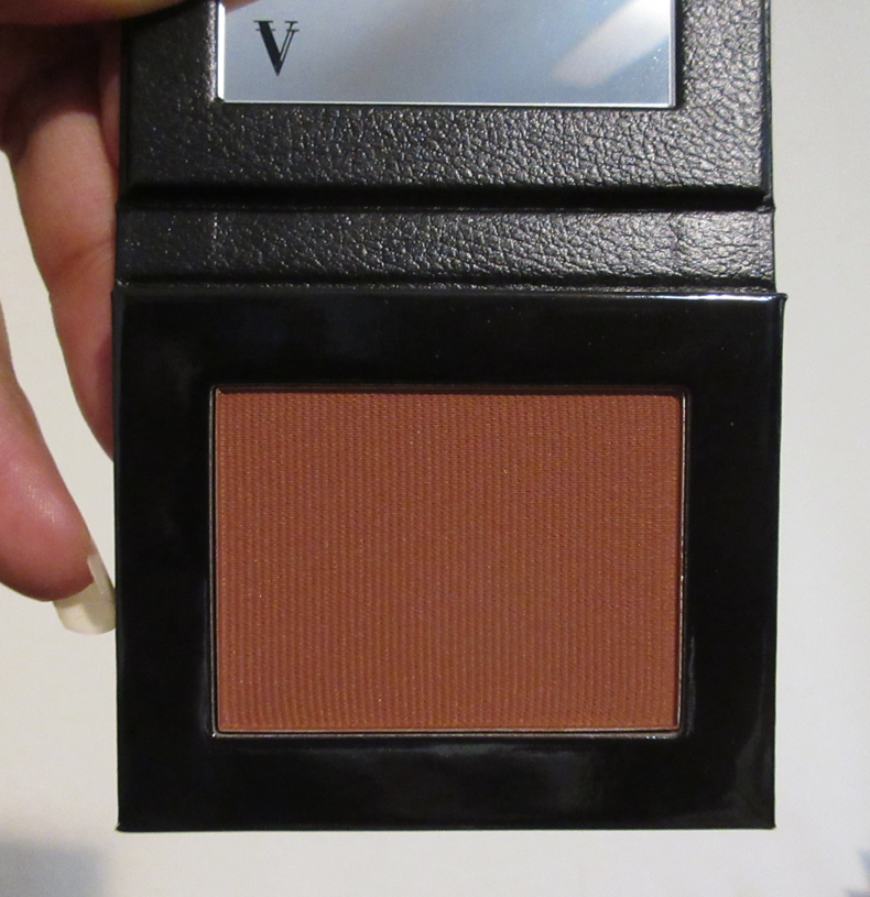
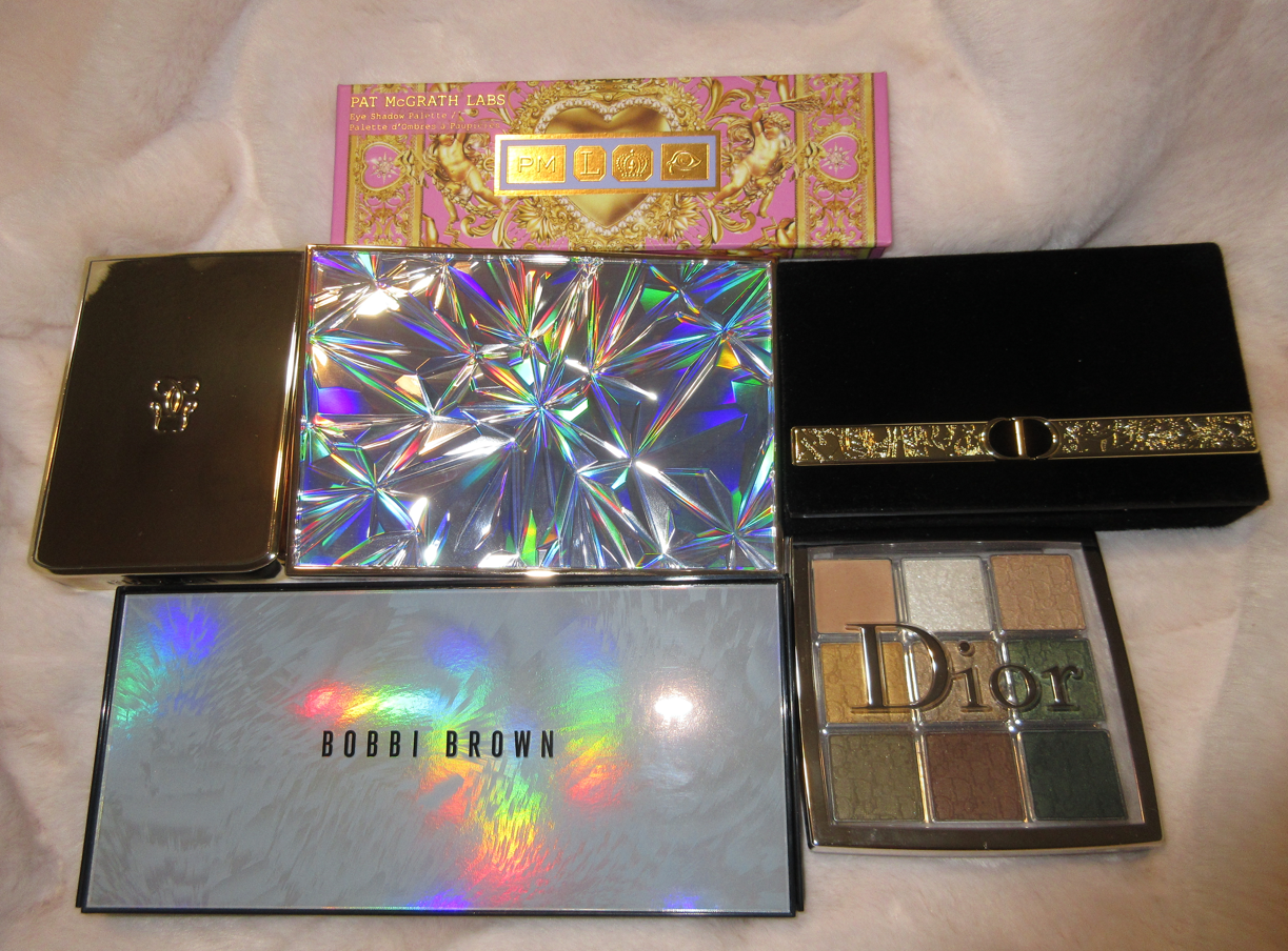
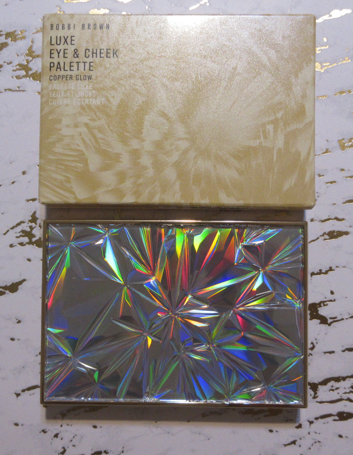
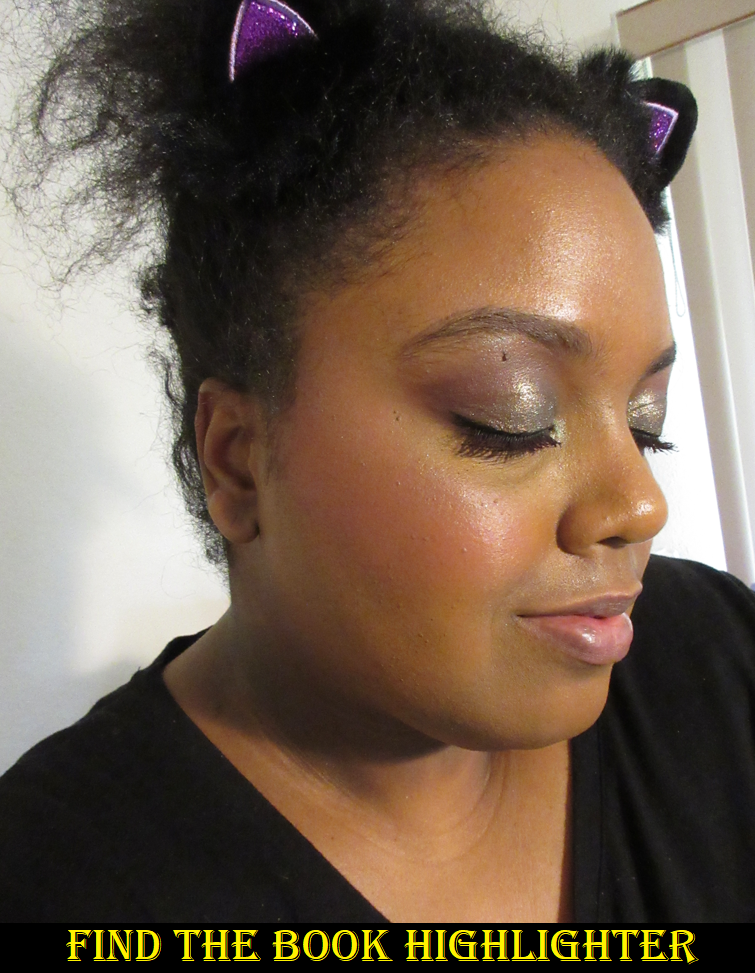
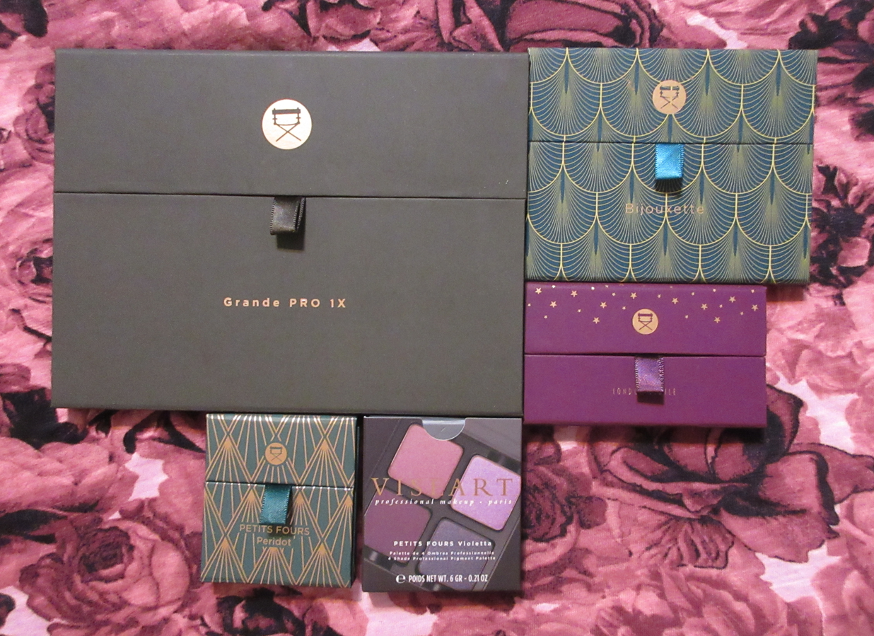
This post has been in the works since I purchased three of the palettes during Viseart’s annual Spring Sale in May. I was having some issues with the Grande Pro 1x, which is why this review got so delayed. Then, I bought London Etoile during the Beautylish Gift Card Event in October, and Violetta in November. So, this post is now featuring all the Viseart palettes I purchased in 2022!

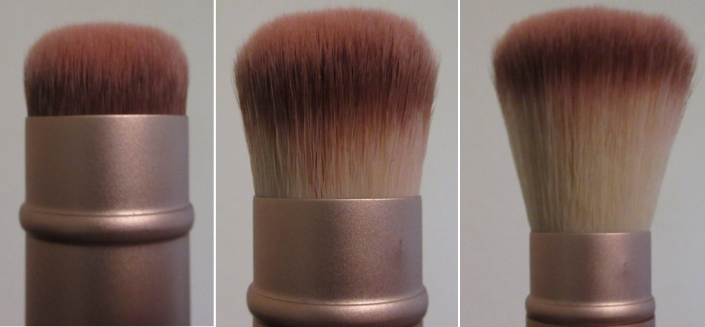
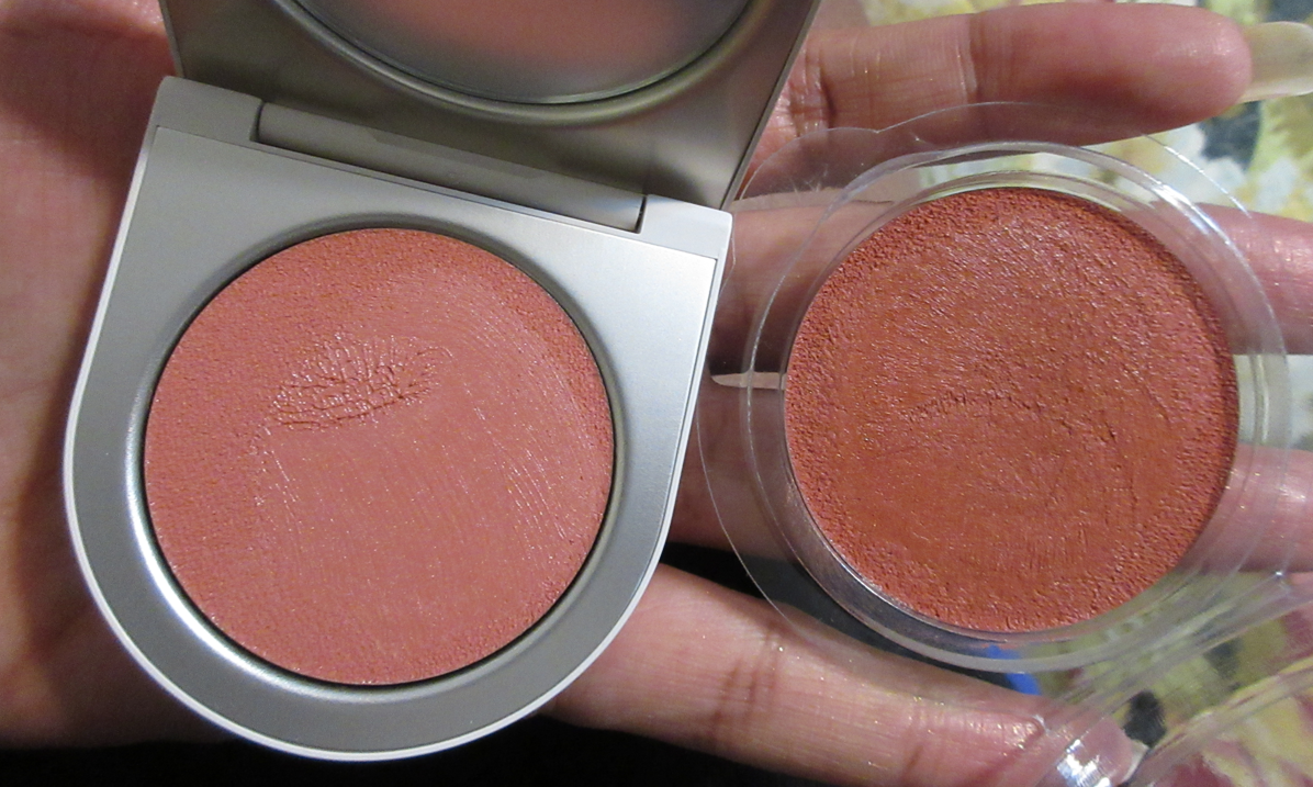
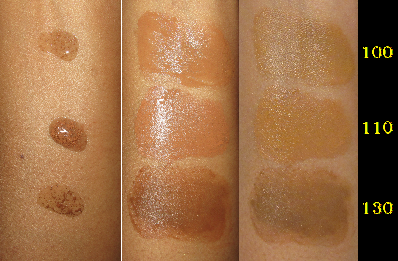
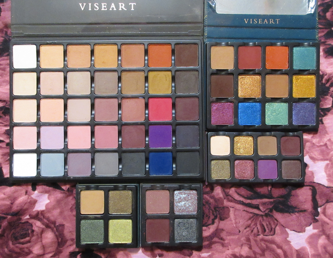
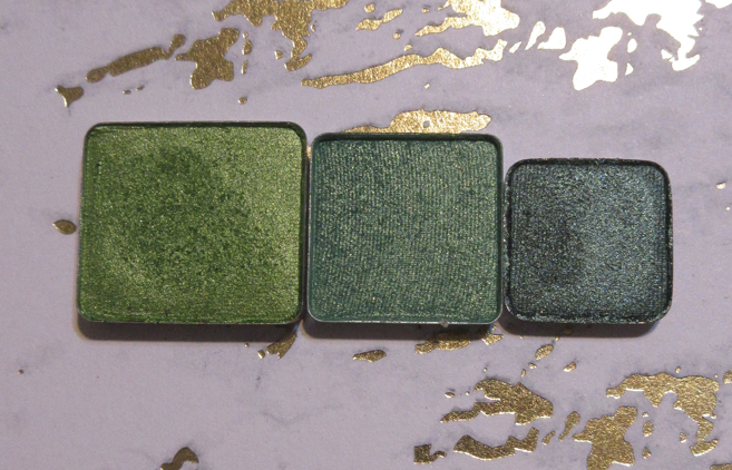
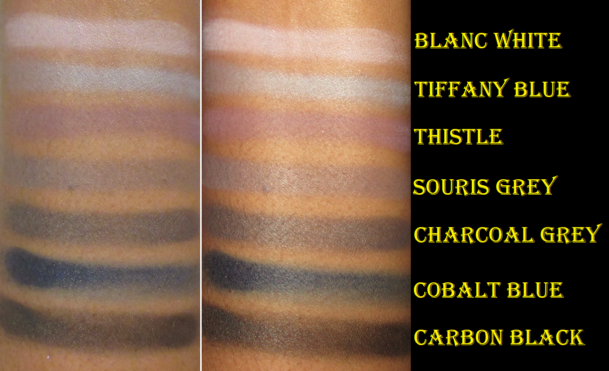
Before we dive into the reviews, I just want to get the discussion of the pan sizes out of the way. I think it’s important to know for those who like to customize/rearrange their palettes. The standard original eyeshadow pans Viseart launched their brand with is their largest size and are part of the newly named “SlimPro” palettes. Their medium size pans are part of the Petits Fours and Étendu palette lines. The smallest pan sizes are part of the Petites, Petit Pro, and EDIT palette lines. Also, the original Grande Pro 1-3 palettes were in that largest/standard pan size, but the Grande Pro 1x has the medium pans. Below is a photo showing the standard, medium, and small.

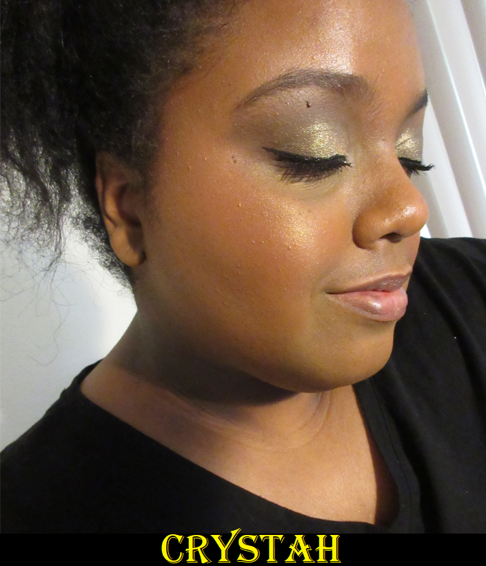
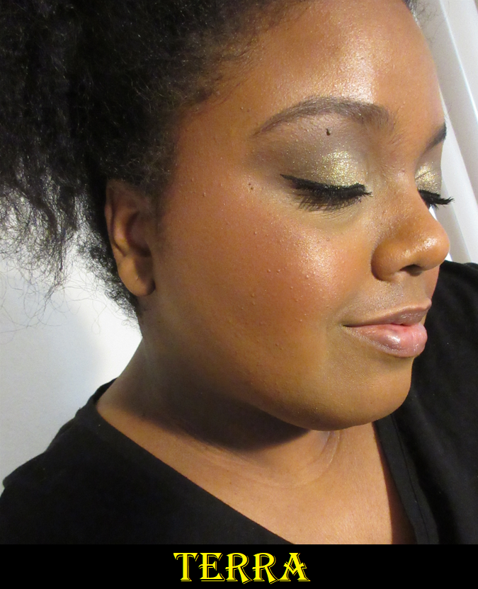
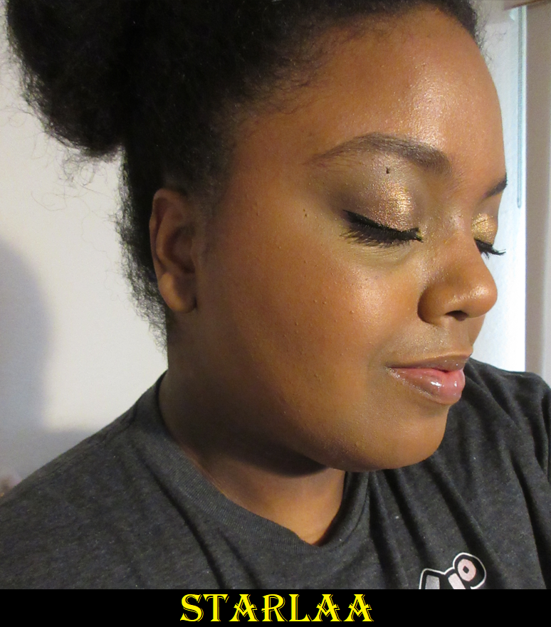
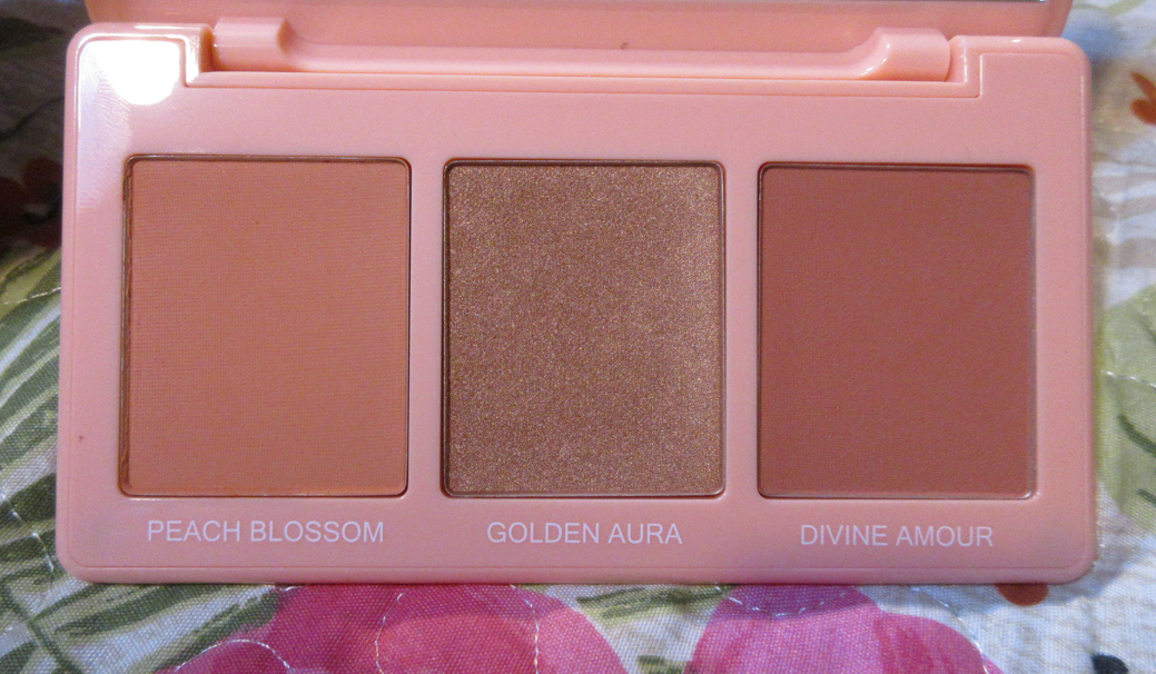
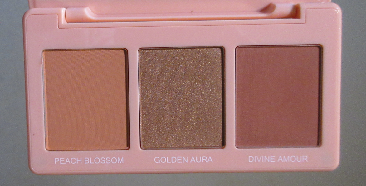
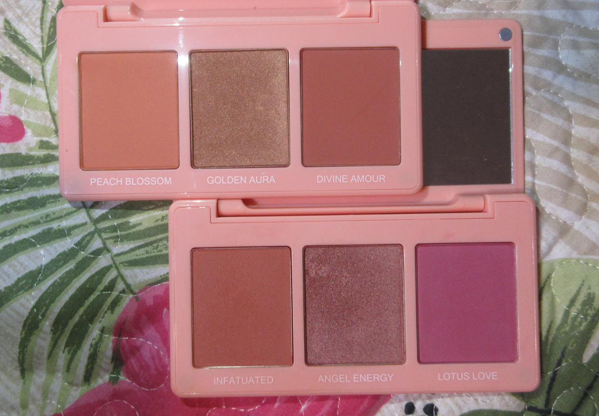
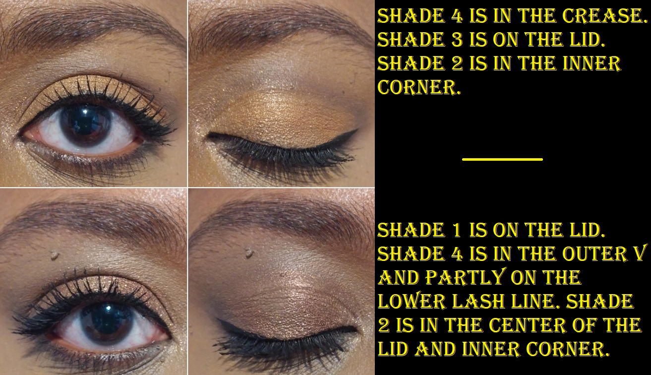
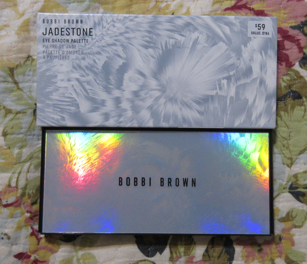
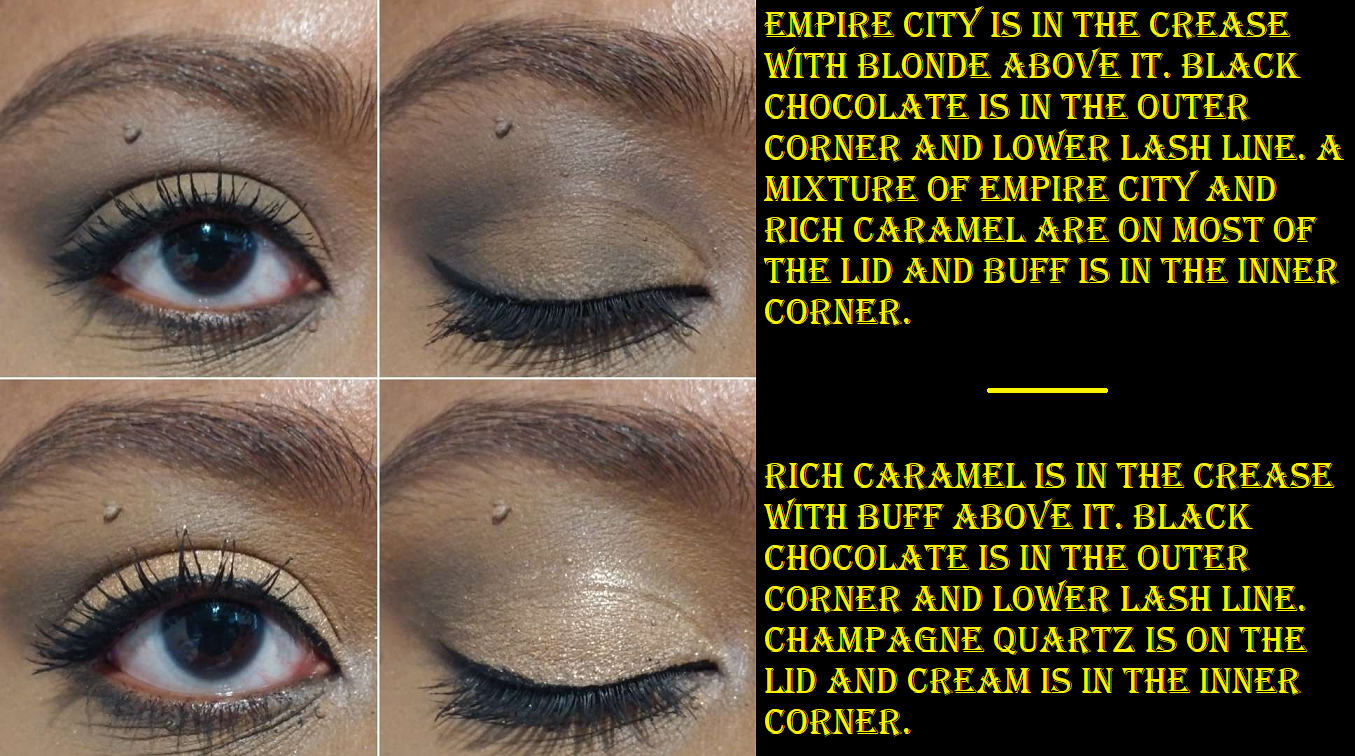
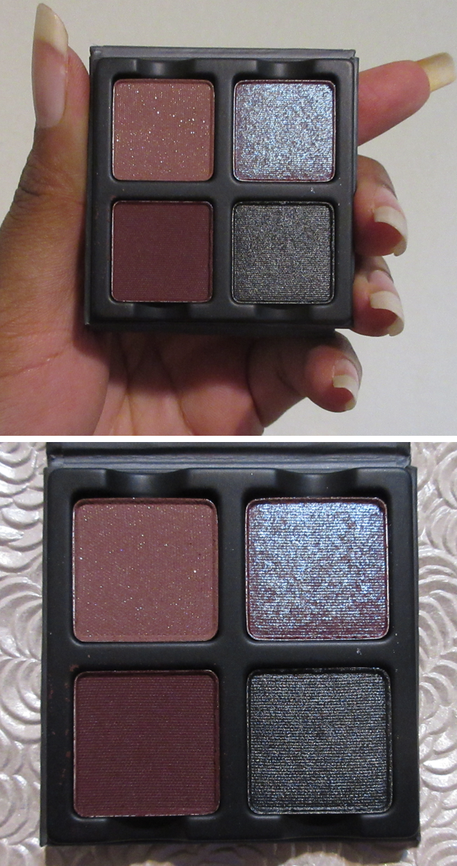
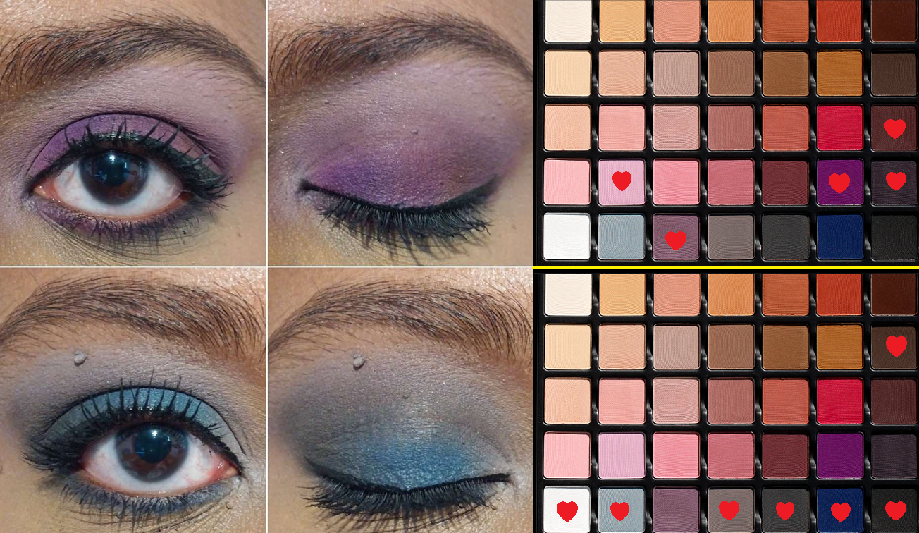
PETITS FOURS – VIOLETTA

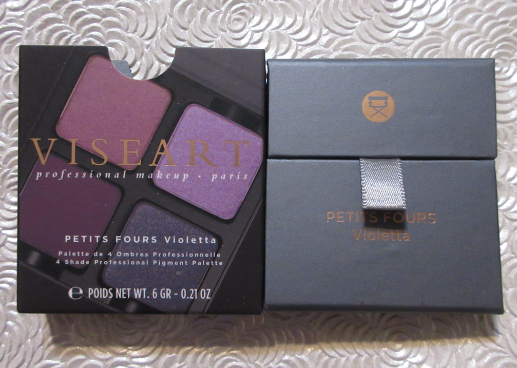
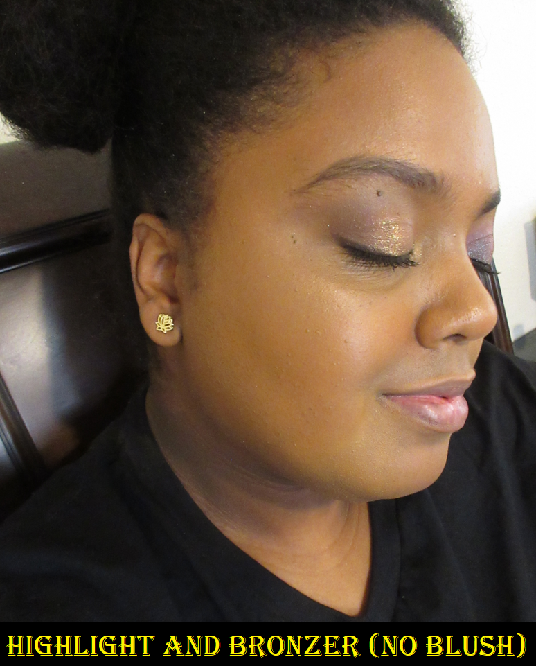
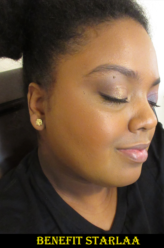
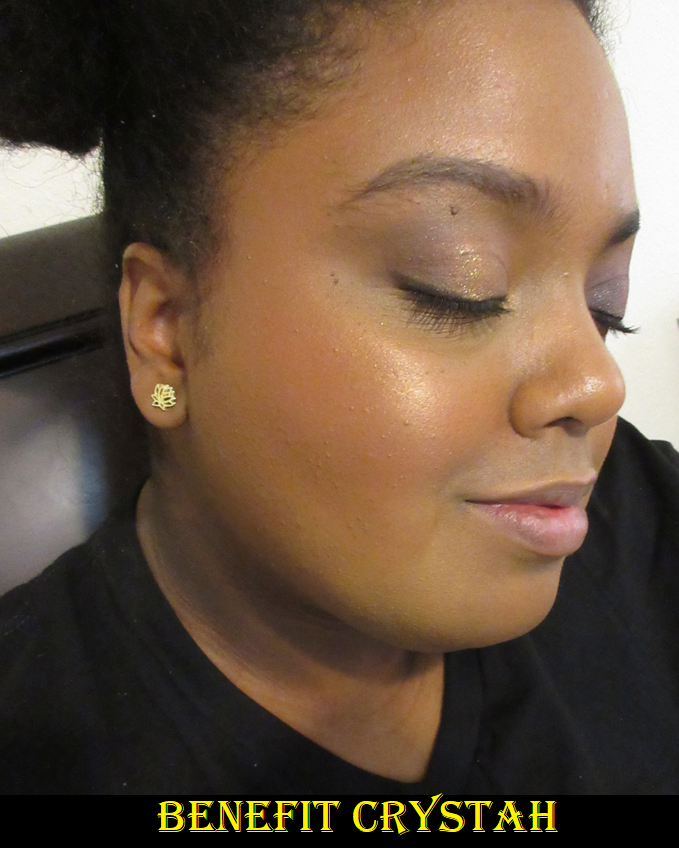
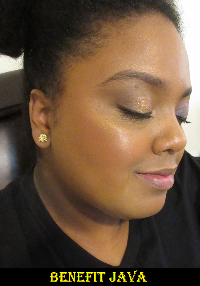
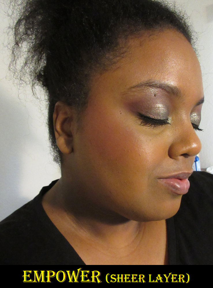
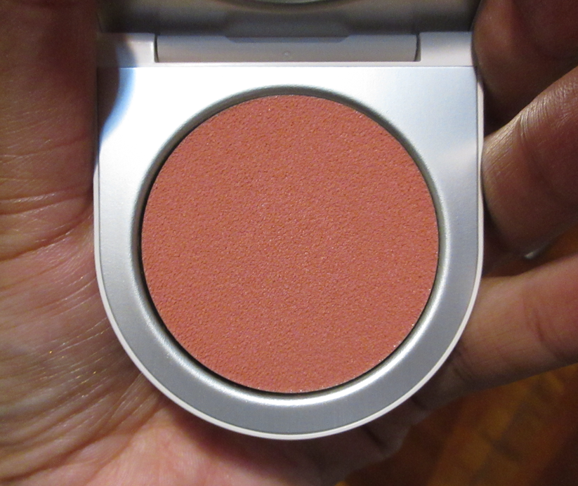
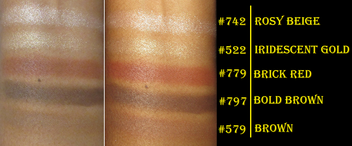
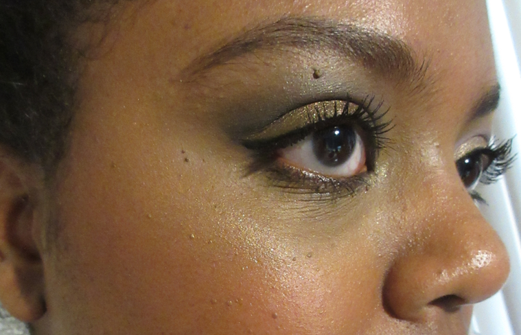
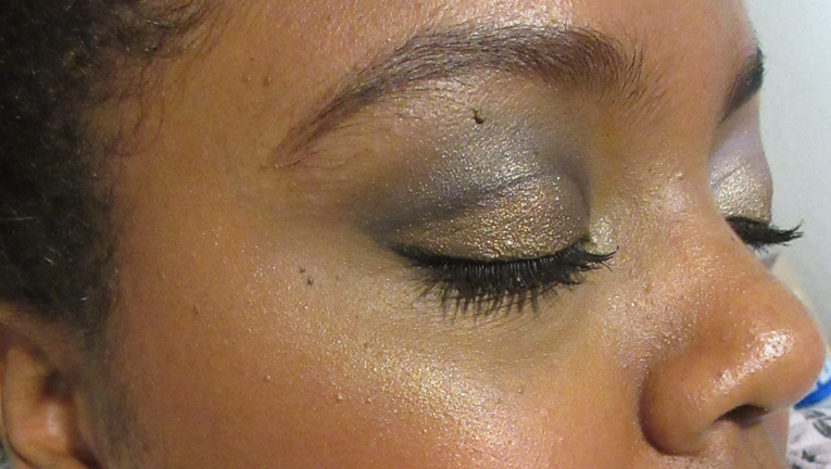
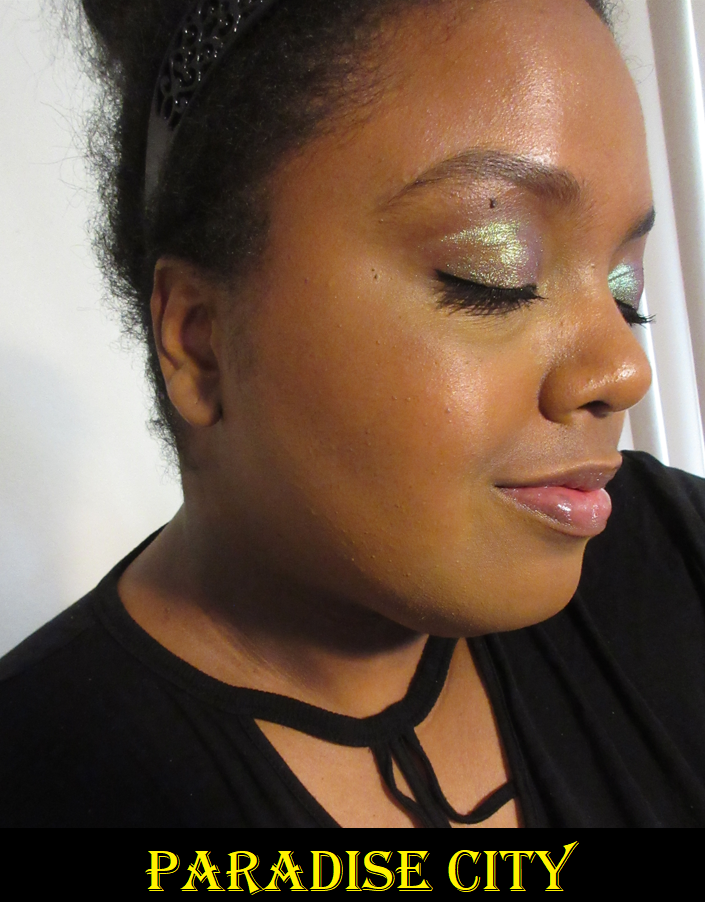
Violetta is one of the three holiday quads and one of Viseart’s newest releases, which I purchased from Beautylish at full price. I’m not going to downplay how much I love this palette. It is literally the best offering of finishes Viseart has ever put together in a quad, the most cohesive and unique color selection, and their best eyeshadow quality yet! It also happens to swatch better than a lot of Viseart’s other palettes.

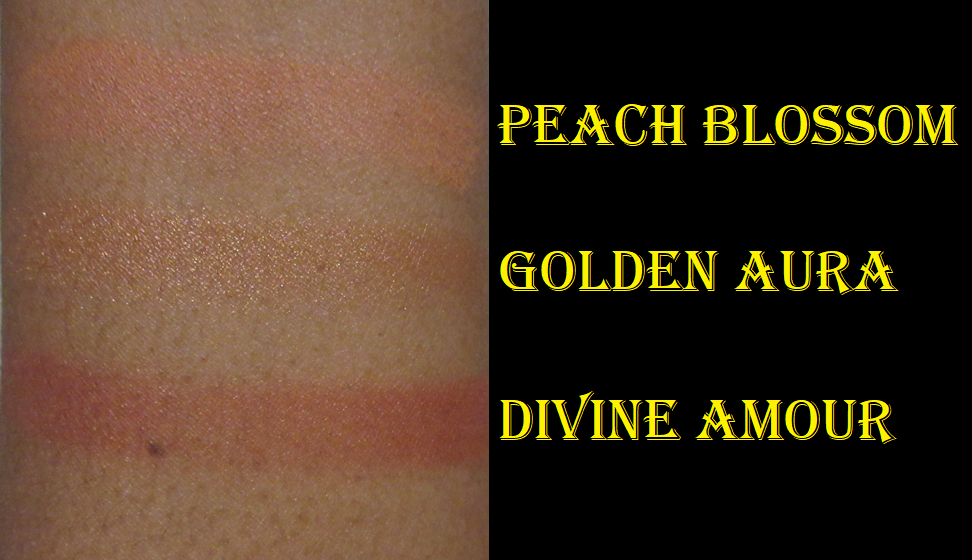
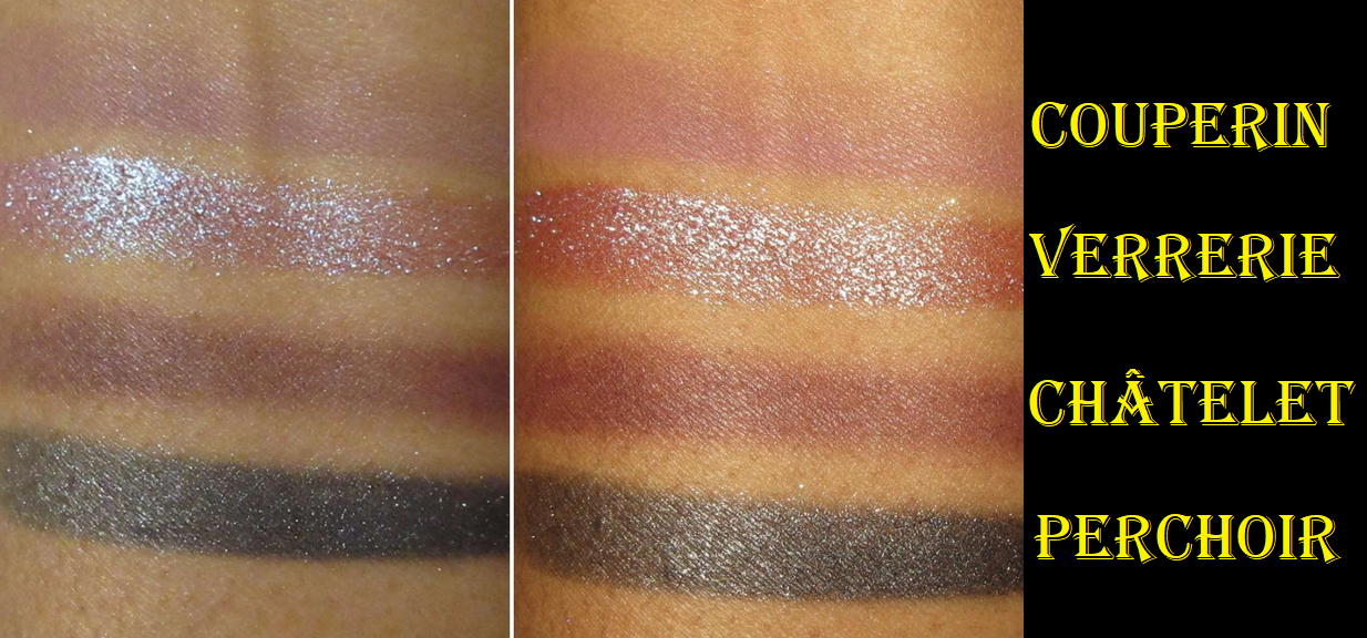
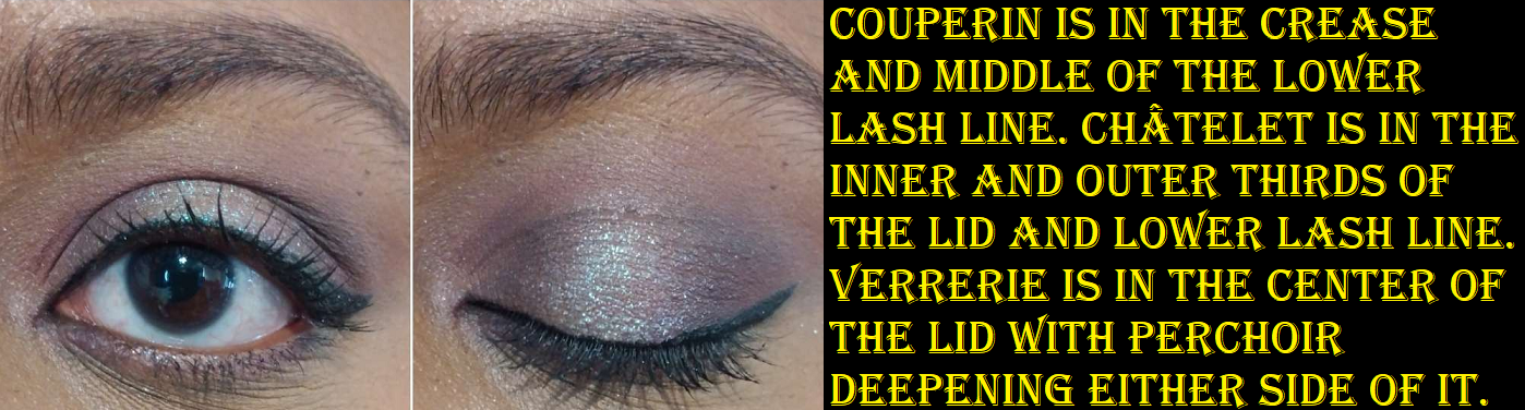
I normally despise mattes with random flecks of glitter, but Couperin is such a gorgeous mauve-pink shade that I don’t mind. Plus, one of the reasons I don’t like sequin type shadows (Viseart calls it a “matte hybrid finish”) is that when applied, the shimmer is mostly gone but it looks out of place having a few individual specks on the eye unless I pair it with a shimmer. With a color like Couperin, I don’t see myself using it in an all-matte look anyway. I have been such a fan of this shade that I’ve paired it with other eyeshadow looks I’ve done lately, and that is not a usual thing for me to do. I will usually only reach for additional palettes to pull out specific shimmers, so a matte shadow being memorable for me is rare. Also, a shade this light to show up pigmented on me and remain looking mauve without looking ashy is not that common, even among similar Viseart shades in other palettes.

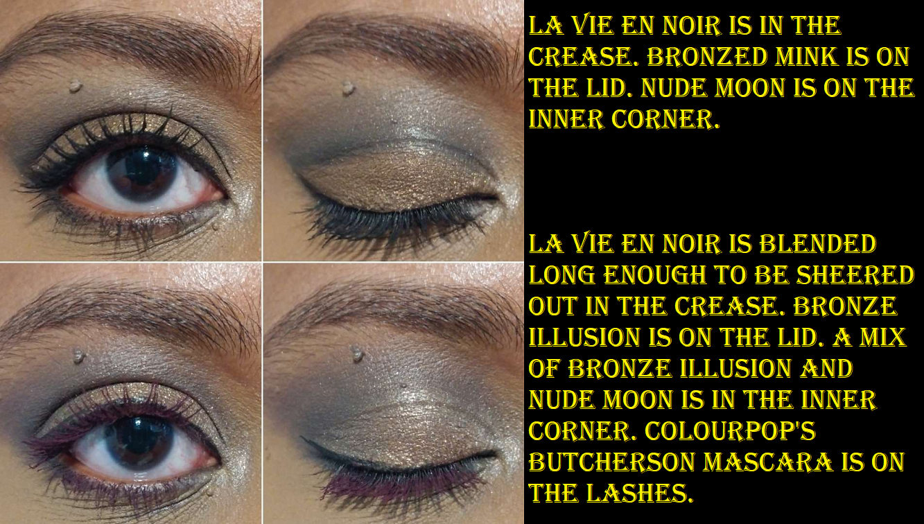
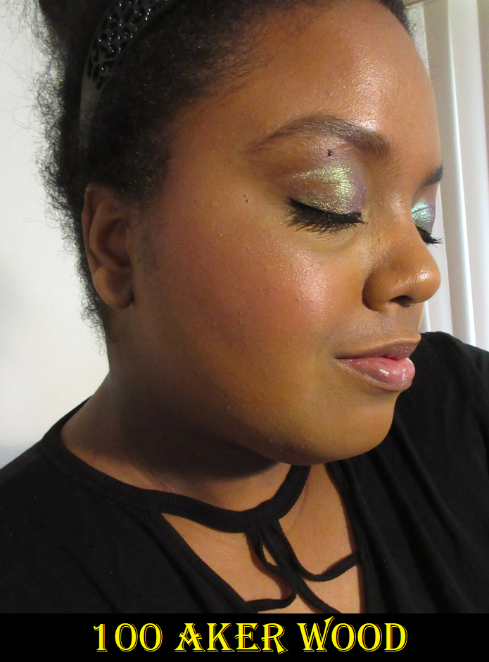
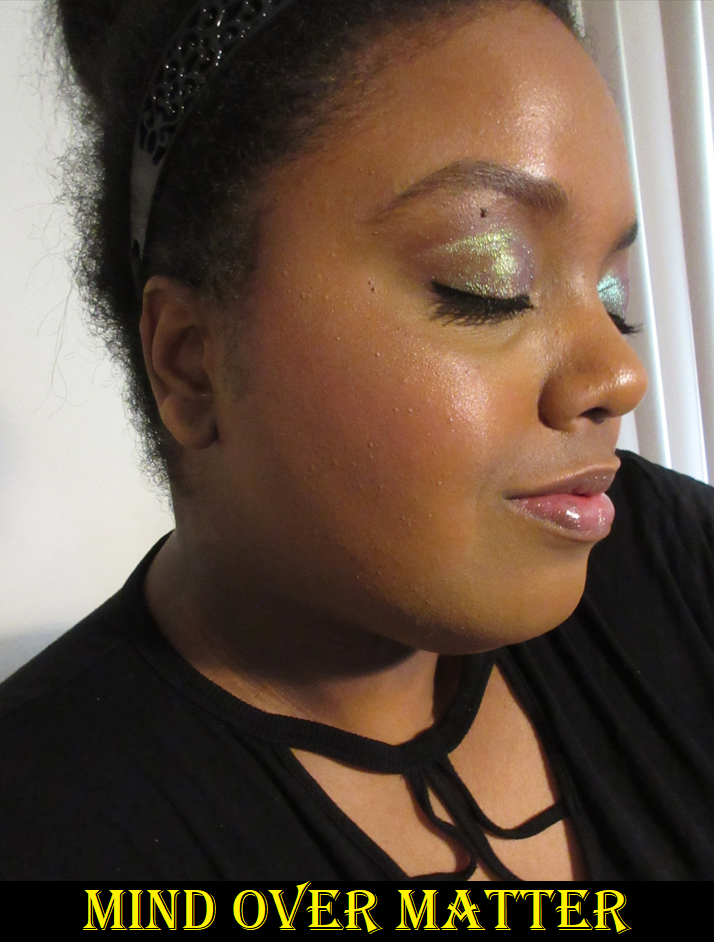
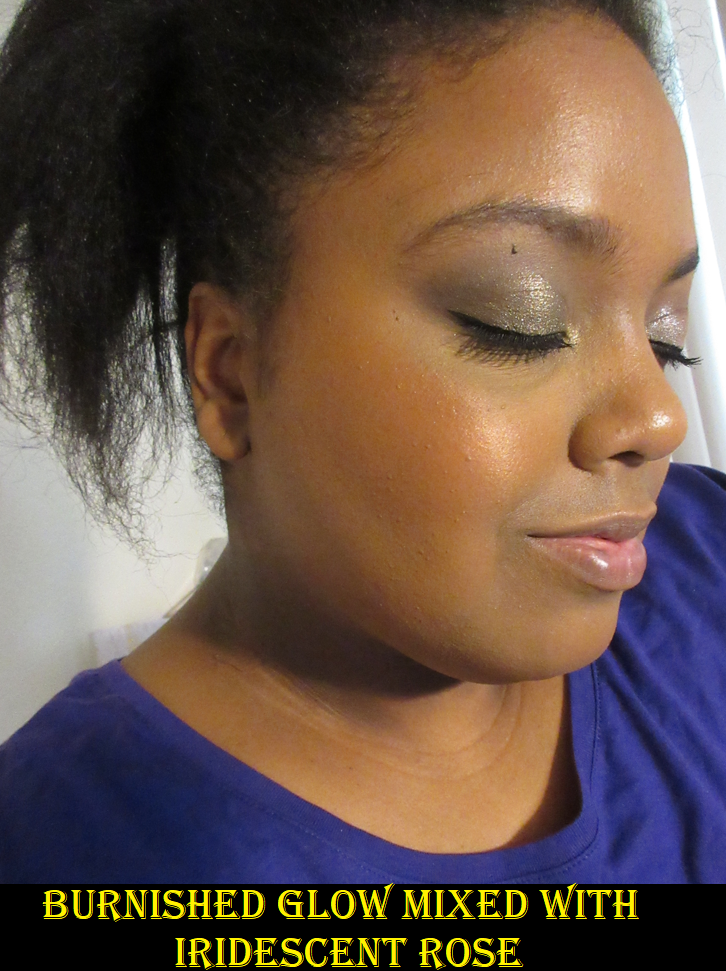
Verrerie is described as a, “midnight-purple with a duochromatic metallic finish,” and I am obsessed! It has beautiful bright reflective shimmer that is more impactful than Viseart shimmers I’ve used in the past. In fact, the sparkle quality and duochromatic nature is on par with some of my favorite smaller indie brand’s duochromes! I haven’t felt the need to even apply it damp, though I recommend glitter glue because I have gotten some fallout without it. This shade and Couperin together is a dream for creating a light ethereal look. The base color is in the same family as Châtelet, which makes them go well together too, and the blue shimmer on top of that deep gunmetal with a greenish tinge really pops. This is an amazing lid shade, but also makes for a very pretty and popping inner corner shade and highlighting shade.

Châtelet is the least unique color of the bunch, but it goes so well with the others that it makes sense to be included. This matte is pigmented, but easy to blend and layer with the other shades. It’s great for adding depth, but also can be sheered out and not look too dramatic if it’s also in the crease.  

Lastly, we have Perchoir, which is a slightly green leaning “gunmetal with a metallic pearl finish.” I have to be a bit more careful with this one as it’s so pigmented and intense, but that makes it great for adding depth, smokiness, drama, and lining the eyes.

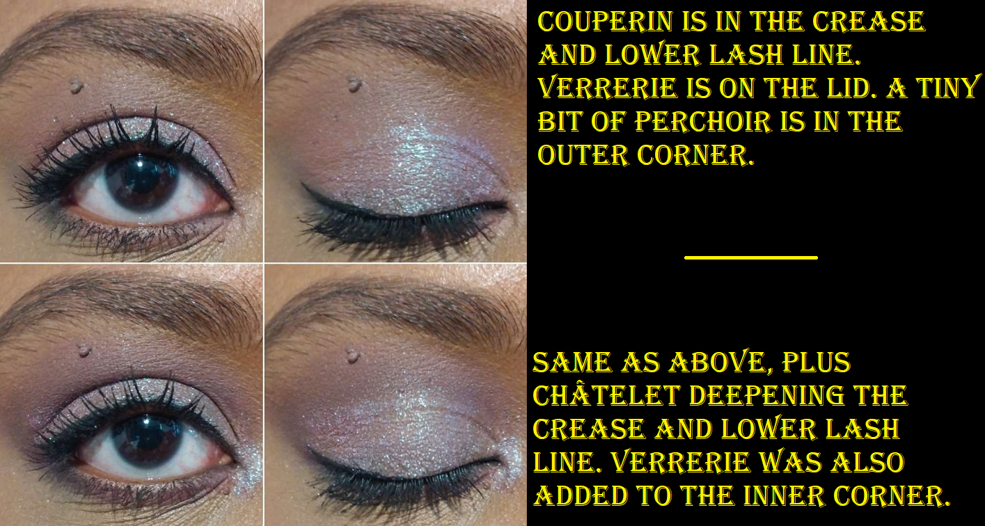
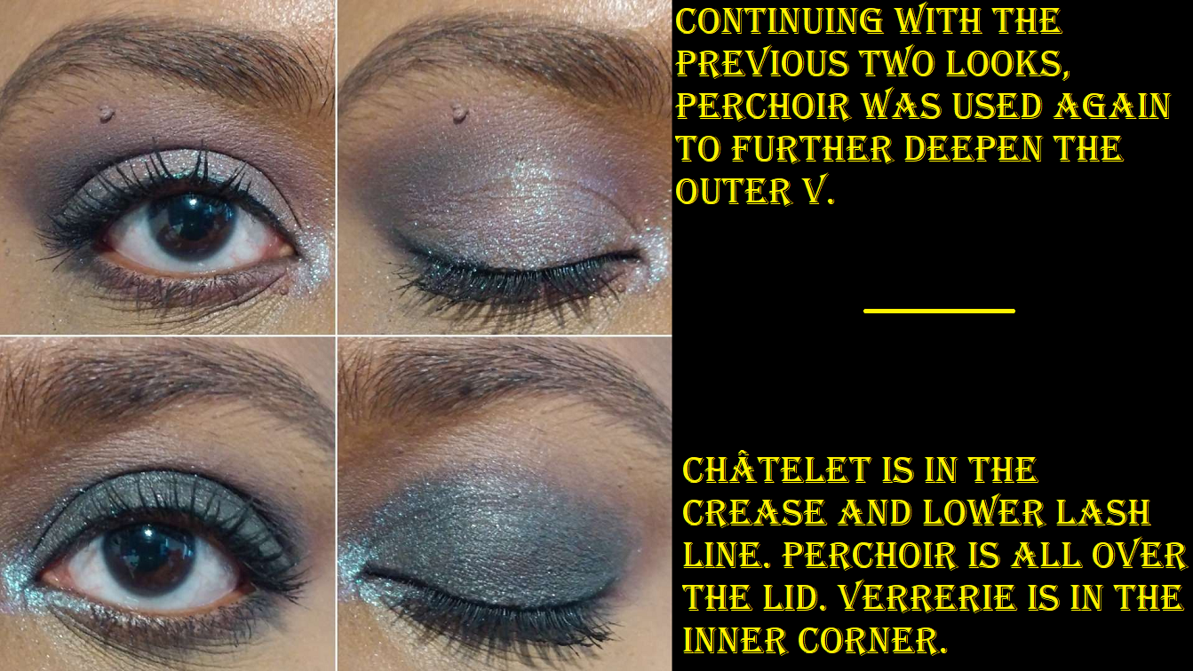
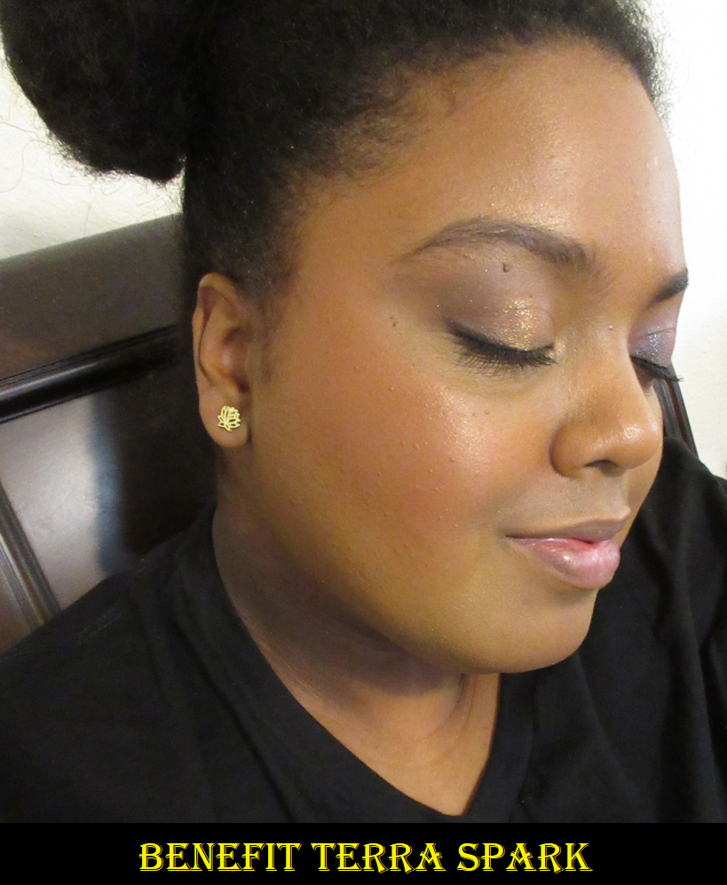
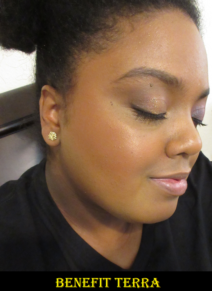
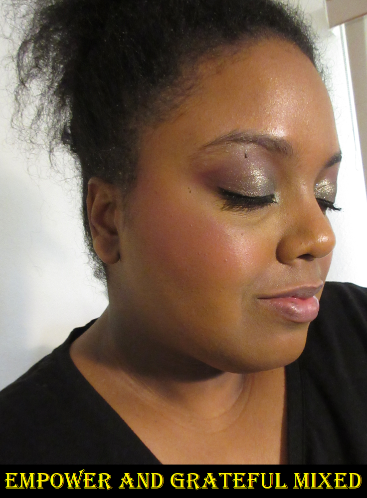
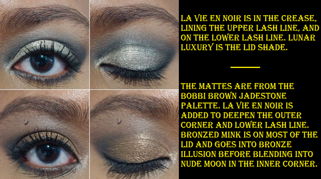
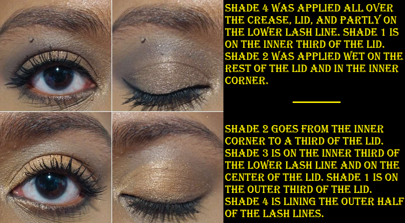
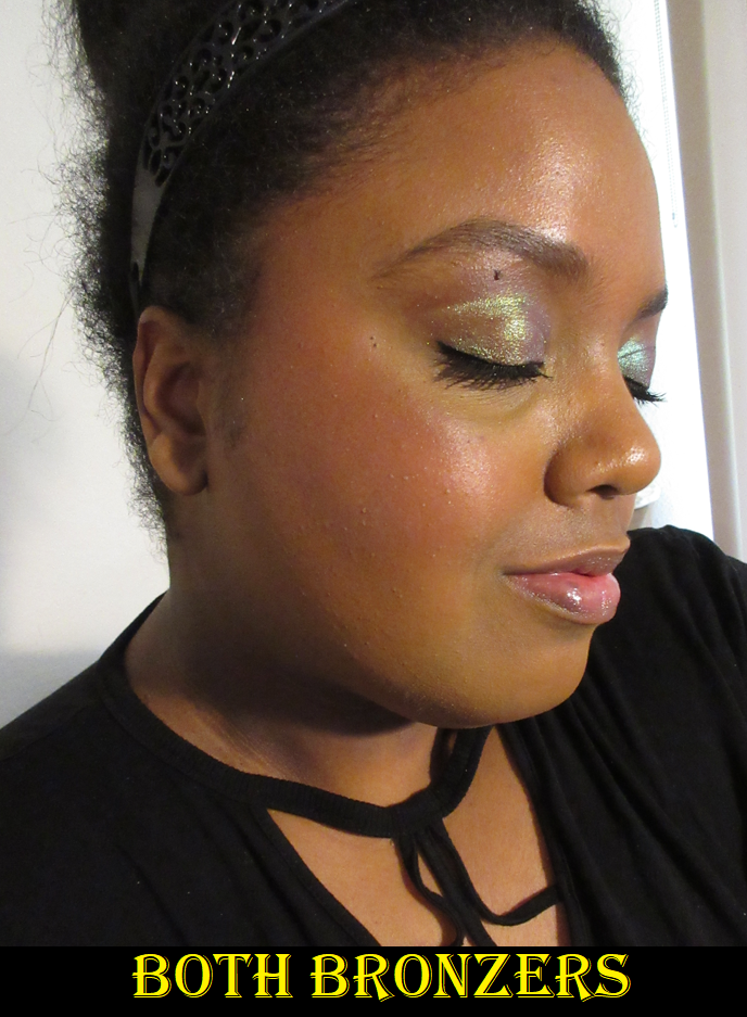
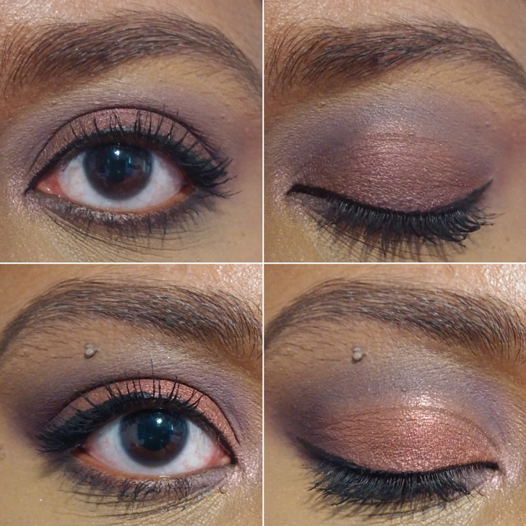
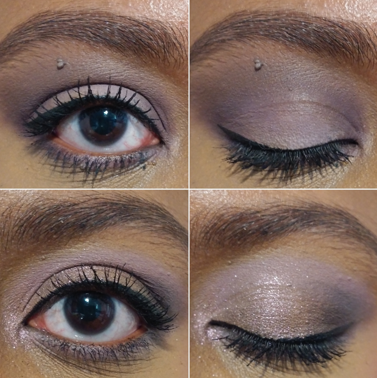
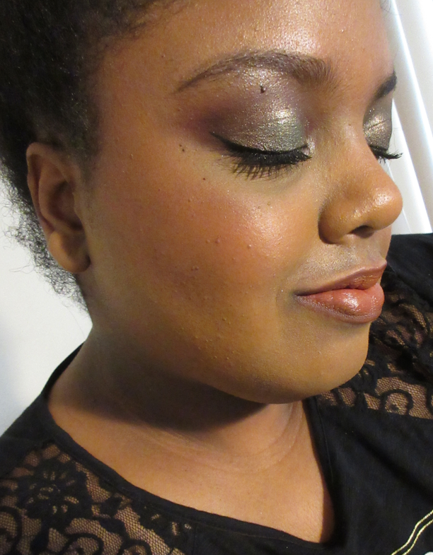
How the intial three eye looks came about is that I essentially took photos at each stopping point that I felt I could have been pleased with how it was and could have left it alone. The first one is the lighter look for minimal daytime makeup. The second one is where I would usually stop after adding a little more depth and tiny bit of smokiness. The third is a more dramatic going-out-at-night type of look. They are three similar looks that I love equally for different situations. It’s a truly special quad with no longevity issues, no blending issues, and I’ve been able to use them effectively with all my primers. This gets a glowing recommendation from me!

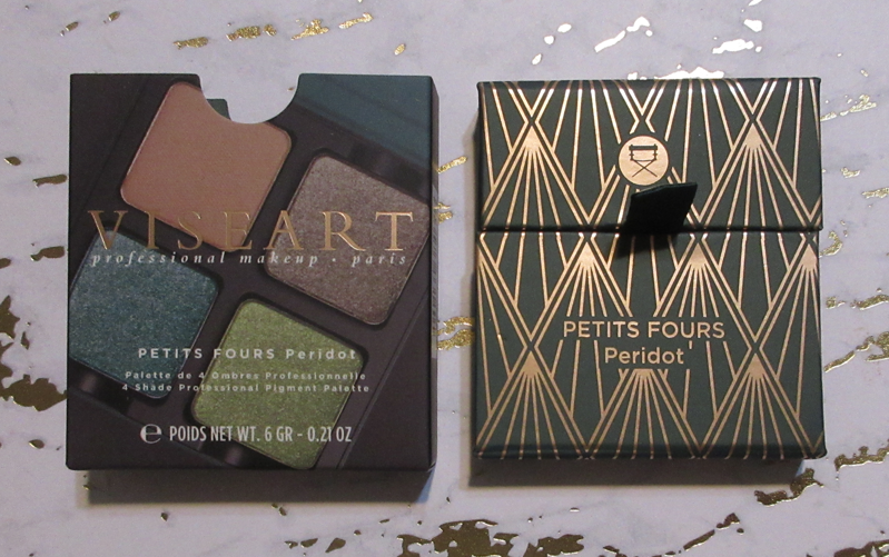
PETITS FOURS – PERIDOT

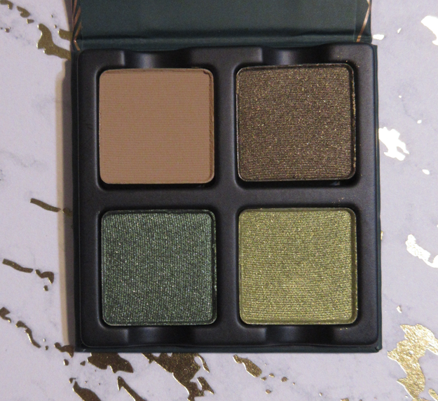
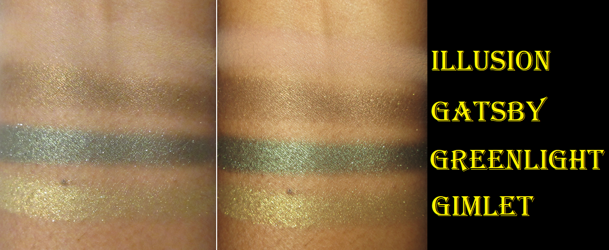
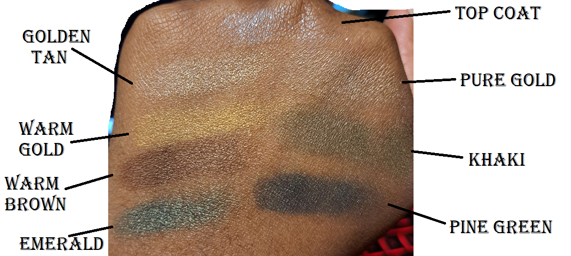
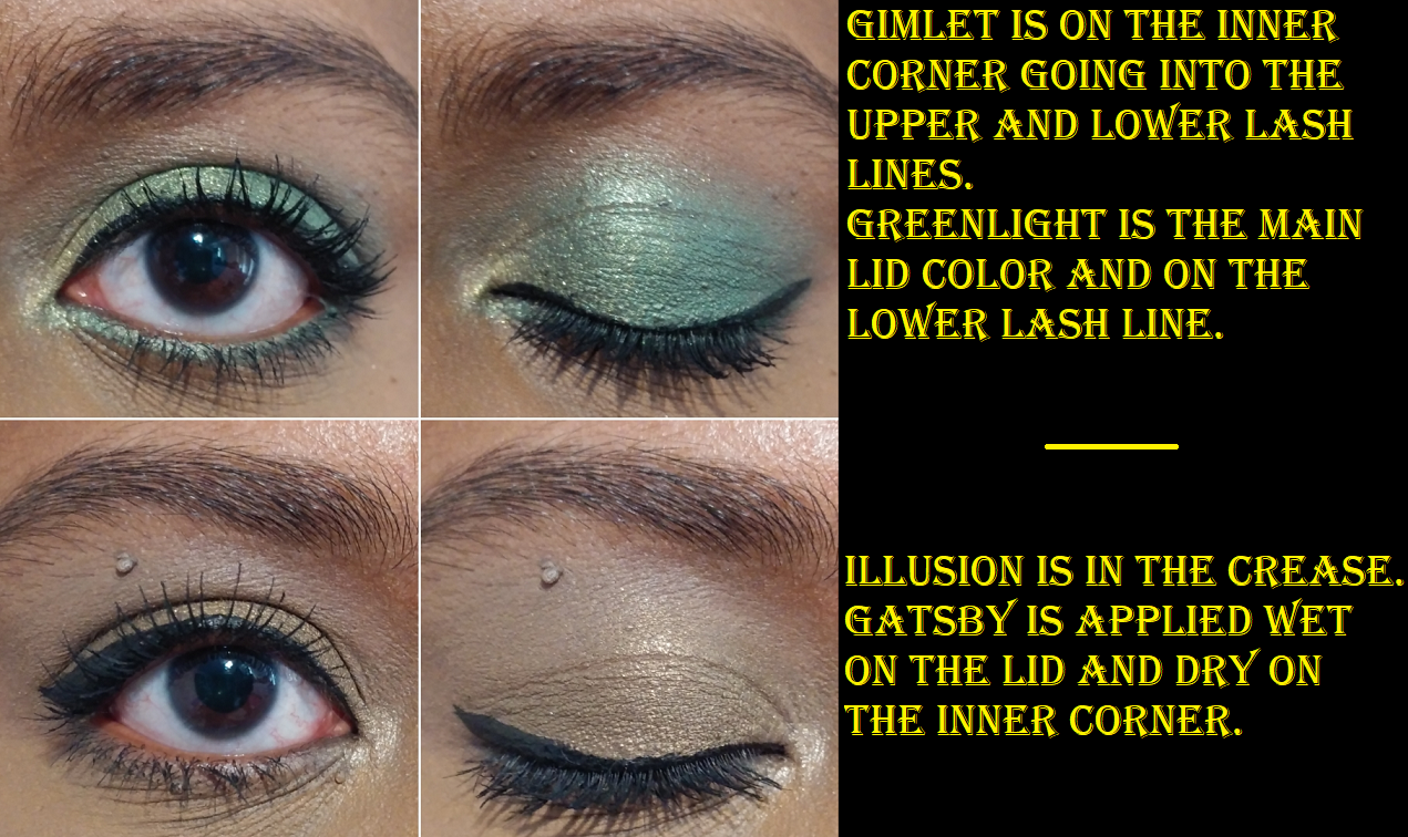
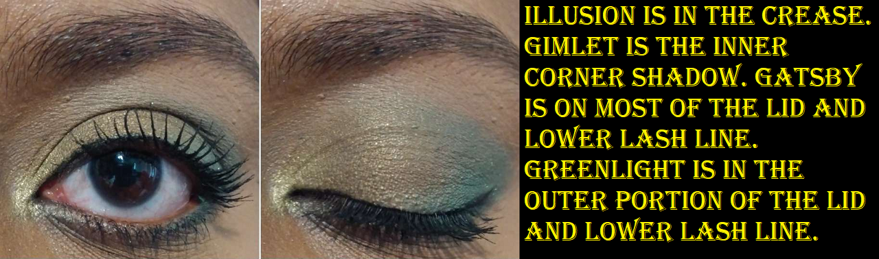
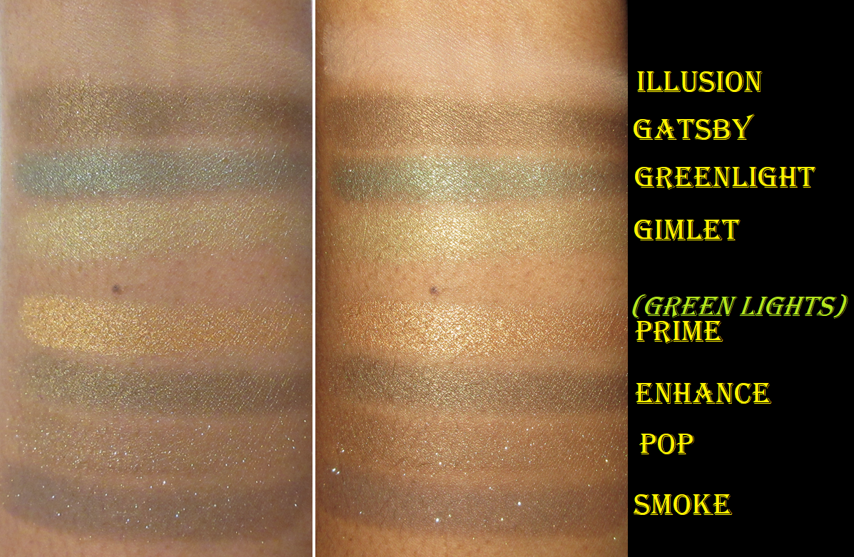
I love greens, olives, and golds, so I knew this quad would end up in my collection. Illusion is the only matte and unfortunately it barely shows on my eyes. Having a shade like this doesn’t add any value to me in a quad, but it will be just fine with my other Viseart shadows.

I’m a little confused by Viseart’s metallics because sometimes they are shimmery and wonderful even in their dry state, but at other times they are like Gatsby and are more like satins until they are wet. Gatsby is described as a “khaki with a metallic finish.” When wet, the intensity is raised, but it’s still a tame shadow. I like the color, but I prefer the shade called Khaki from the Dior Backstage 008 Khaki Neutrals palette because it has a stronger green hue to it.

Greenlight is the darkest shade, but it’s not as deep as I would normally prefer for my outer corners. So, I feel like this quad still lacks a depth-providing shade. Being viewed as an individual shadow though, it’s a beautiful color that’s bright and shimmery. It beats out the Emerald shade from that Dior Backstage Khaki Palette I reviewed here before, but not Pine Green which is along the lines of how deep I wanted Greenlight to be.

Gimlet is the last shade. It’s a nice bright yellowy green that goes well with Greenlight and for highlighting purposes. However, I prefer a deeper yellow shimmer or the green to be stronger to wear Gimlet as a lid color. The middle ground limits things for my personal preference, but I needed a bright shade for my inner corner, so I see its purpose in the quad.

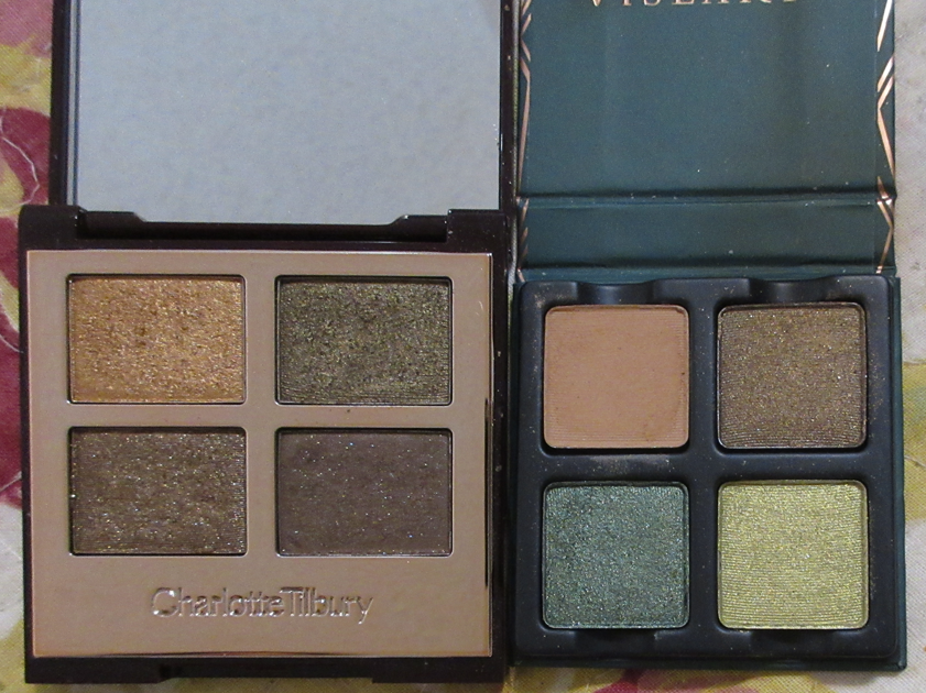
I got the Charlotte Tilbury Eyeshadow Quad in Green Lights around the same time as Peridot. Essentially, because I wasn’t completely satisfied with the khaki shade and I had long been lusting after Green Lights since it was released, I decided to just get it after all. I only recently learned the story behind it (thanks to Temptalia’s blog), that began with a quad called The Rebel which had a pale shade, deep teal-green, olive, and spring green. That palette was discontinued. Then in 2020, the brand released the same color story as the Green Lights palette, but called it The Rebel even though the shades were different from the original The Rebel palette. Then, later that same year, “Green Lights” was released despite it being essentially identical to the current iteration of The Rebel quad. I don’t know what the point was in doing that, especially since Green Lights is apparently limited edition and so once it’s gone, The Rebel will continue to be sold with the Green Lights color story instead of the original. Strange choice.

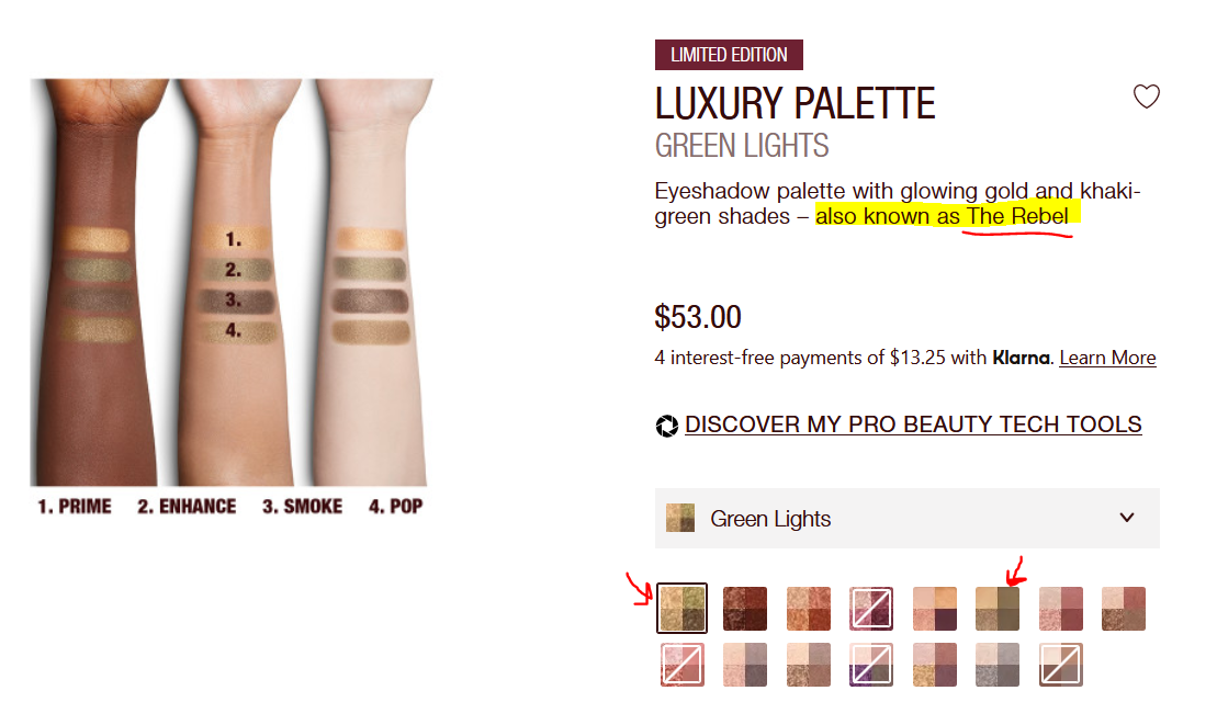
This screenshot was taken from the Charlotte Tilbury US website.

CT quads are swatched by the brand in a clockwise direction, but I stick to my typical left to right and top to bottom.

Even though Peridot gives me the most variety as a curated quad, I actually prefer the Charlotte Tilbury quad. When I’m craving olives, I’m craving something with a more toned down color, but with amped up sparkle, and paired with neutrals. I don’t usually want a bright shade to go with it like how bright of a green that Greenlight is or with something as lemon-lime green as Gimlet. I would have preferred a traditional gold instead. Plus, Illusion hardly shows up on me, so it adds nothing to the quad. The upside is that Peridot is half the price of Charlotte’s Green Lights quad. The shadows don’t feel the same, as they’re very different formulas, but they’re both still high quality performers. So, even though I don’t like the Peridot color story, I like the satin and shimmer shades individually and had already planned to swap around the shadows within my Viseart collection to create a green quad I prefer. For that reason, I’m still glad I bought it (especially at the $17.50 sale price).

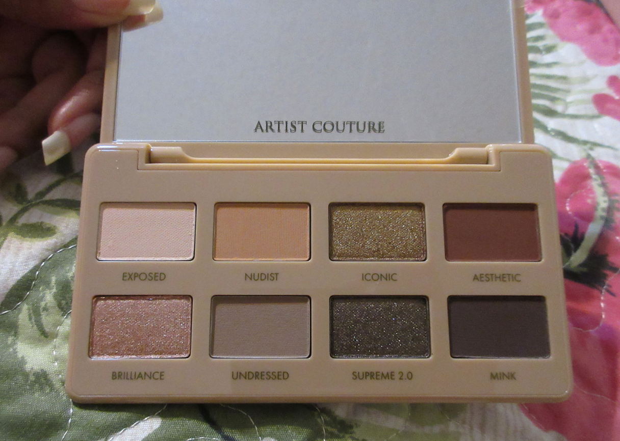
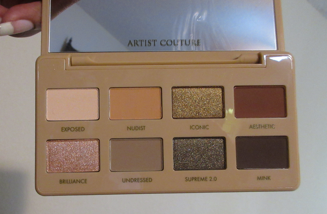
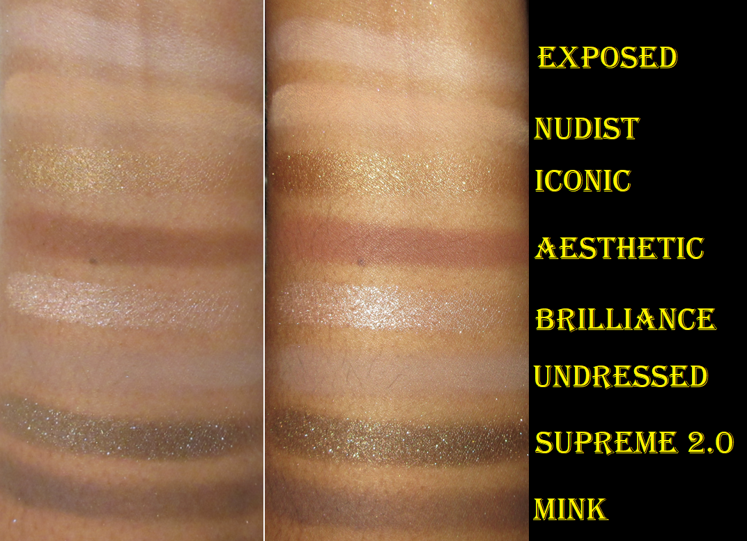
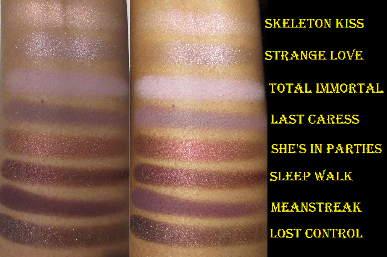
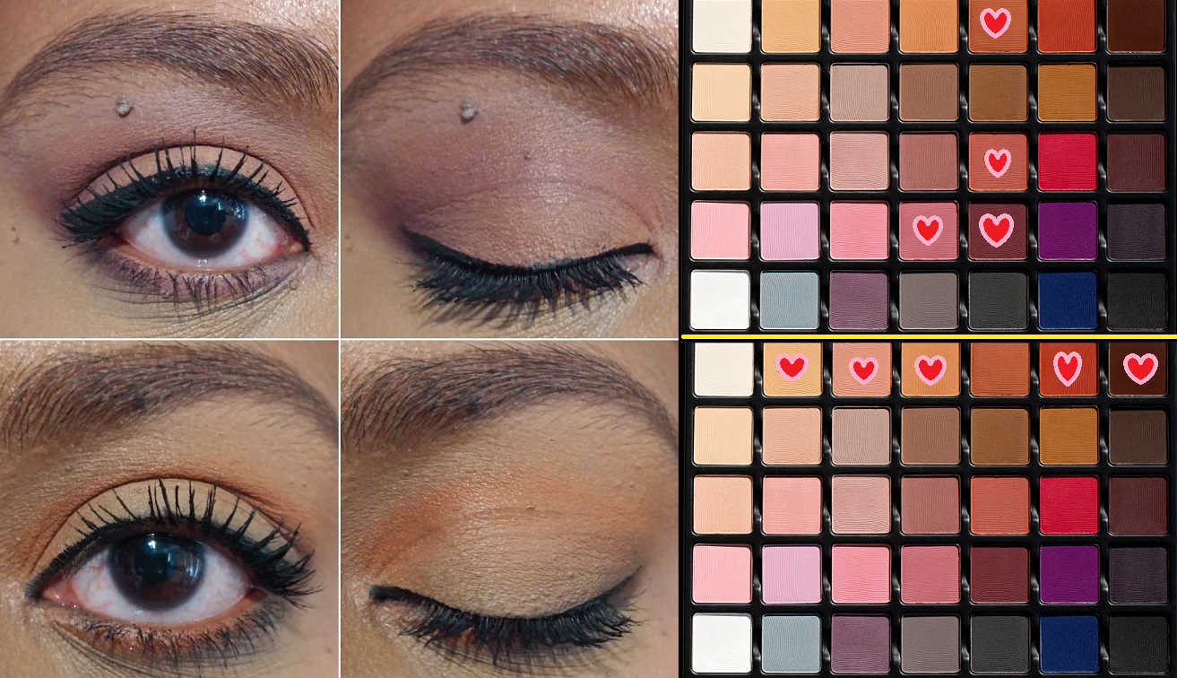
PETIT PRO LONDON ÉTOILE

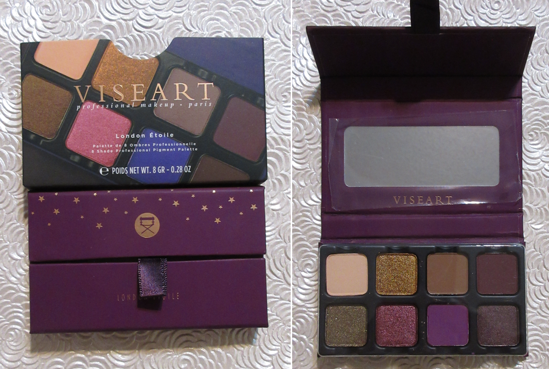
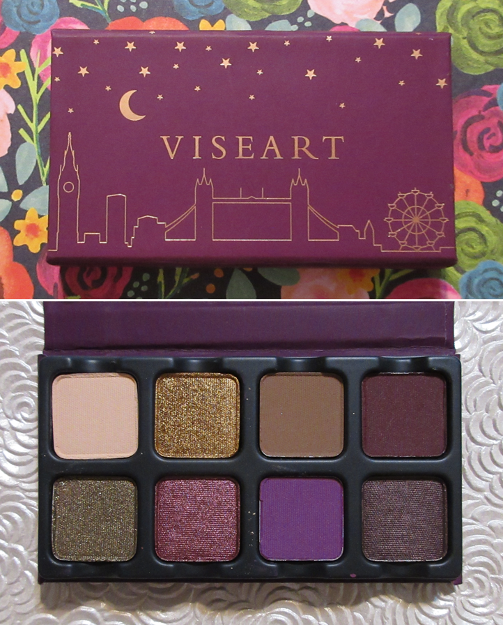
I knew I absolutely did not need London Étoile. I have similar enough shades within my Viseart collection, but I just couldn’t skip it. With purples, green-brown, and gold, this palette may as well have been named Lili Étoile because of how often I’m drawn to these type of colors.

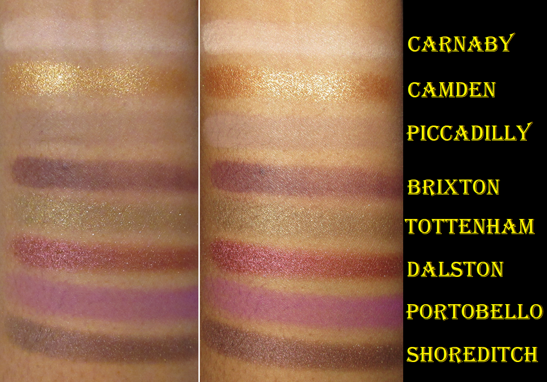
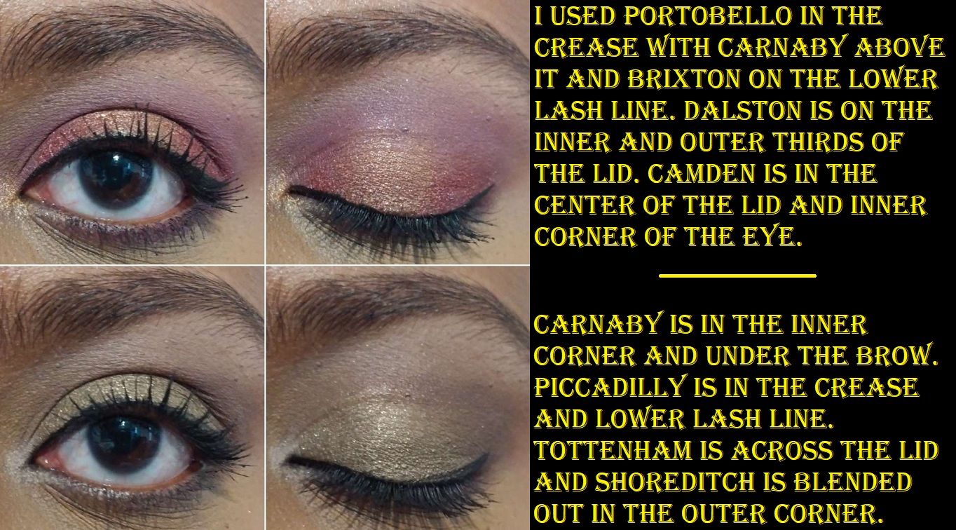
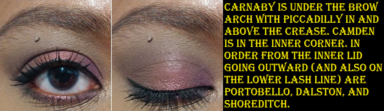
Now, Carnaby is the exception. It’s a pale cream beige that’s too light for me and looks ashy wherever I use it. The brand says it can be used, “for highlighting the brow bone for all skin tones,” but I politely disagree. It only looks passable on me if I blend it out so that there’s barely any pigment left, and then I even add a little Piccadilly to tone it down. So, I even prefer to skip using Carnaby entirely and just use Piccadilly in the crease with another shade added to deepen the look.

Camden is a traditional dark gold, but it’s much needed in this palette because of how many deep shades there are in comparison to the wearable lighter colors. It’s the pop of brightness to most of my looks. It’s got a lot more intensity to it than the other shimmers, so I don’t need to use it wet, but if I do, it gives off an intense metallic finish.

Brixton is a matte, “Boysenberry purple,” and looks especially similar to Blackened Honey from the Grand Pro 1x and Beaujolais from the Dark Mattes. This shade blends decently enough, but not as easily as the other mattes we’ve discussed so far. It takes a bit more work and is a little troublesome to get it to show distinctly if there are too many shades already packed underneath it.

Tottenham is described as a “muted sage taupe with a metallic duochromactic shimmer finish,” which is close enough to the golden olive that I expected when I ordered the palette. However, I don’t know how this is considered a duochrome. Irrespective of that, it’s still my favorite shadow in the palette and has a satisfactory amount of sparkle to it.

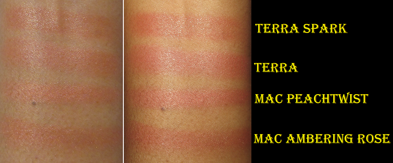
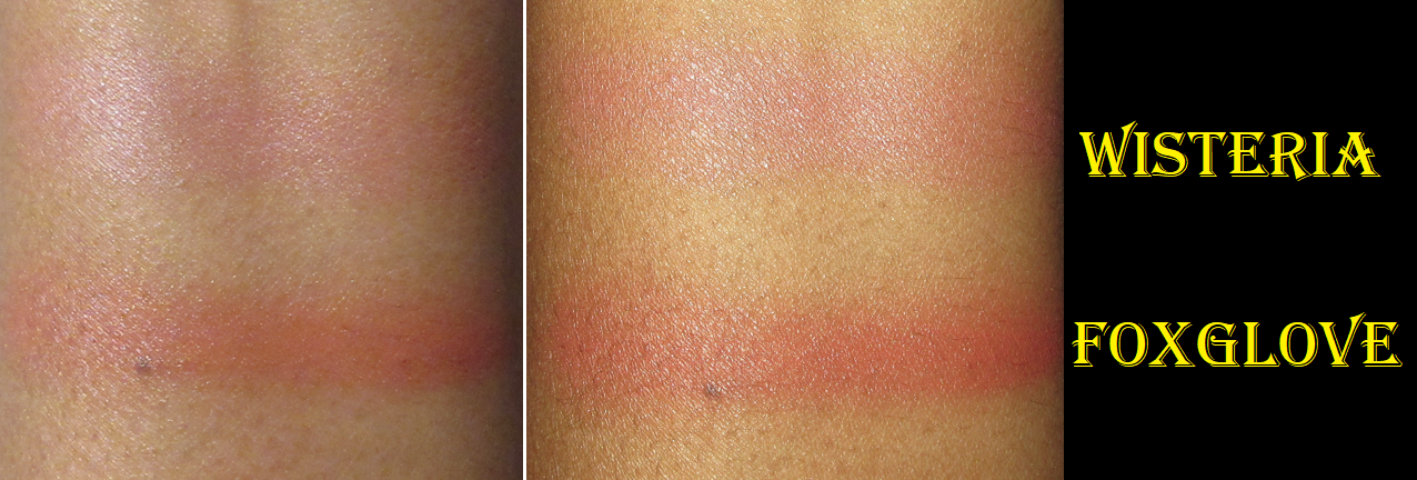
I don’t have any Viseart dupes of Dalston, but reddish burgundy shimmers and metallics are very common in my collection. I think it’s quite beautiful in person, but for some reason, my camera has a very difficult time capturing how vivid it looks on my eyes. How Viseart shadows can sometimes look on camera, particularly the deeper purples, is an issue I will get more into in the Grande Pro 1x section. So, I just want to reiterate that it looks even better in person than my eye looks below suggest.

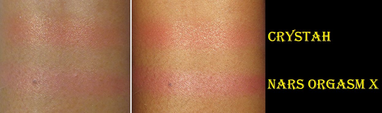
Portobello is a medium tone matte fuchsia shade that in the pan looks so similar to many other shades in my collection, but how it looks on the eyes and swatched is much more vibrant than I expected, which is a quality I like about it. Sometimes a purple like this can be tricky to formulate, but this one gives me no issues building and buffing.

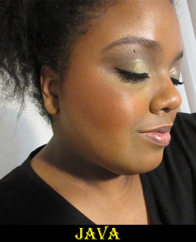
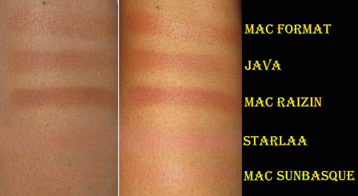
Shoreditch is the final shade in the palette and described as a “soft metallic plum with a shimmer finish,” and it’s my go-to shadow to deepen up any of the looks in the palette. It naturally goes well with the purples, but it takes on a dark brown appearance when it’s next to the neutrals, so it works with shades like Tottenham and Piccadilly too.  

I’ve enjoyed every look I’ve created with this little palette. The quality is solid. Although I still believe I didn’t need this palette since I have enough shades close to the colors in this one, I’m glad I bought it anyway. Considering how tiny the pan sizes are, I probably should have waited for a sale to get it so it could feel a little more worth the price ($25 is what I’d have preferred), but I still got a deal of sorts because I bought it during the Beautylish Gift Card Event.
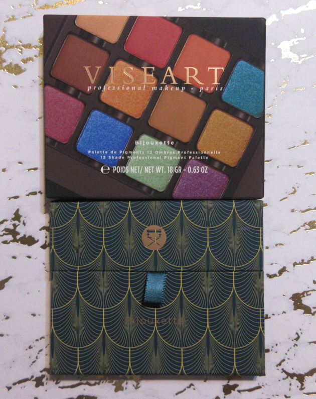
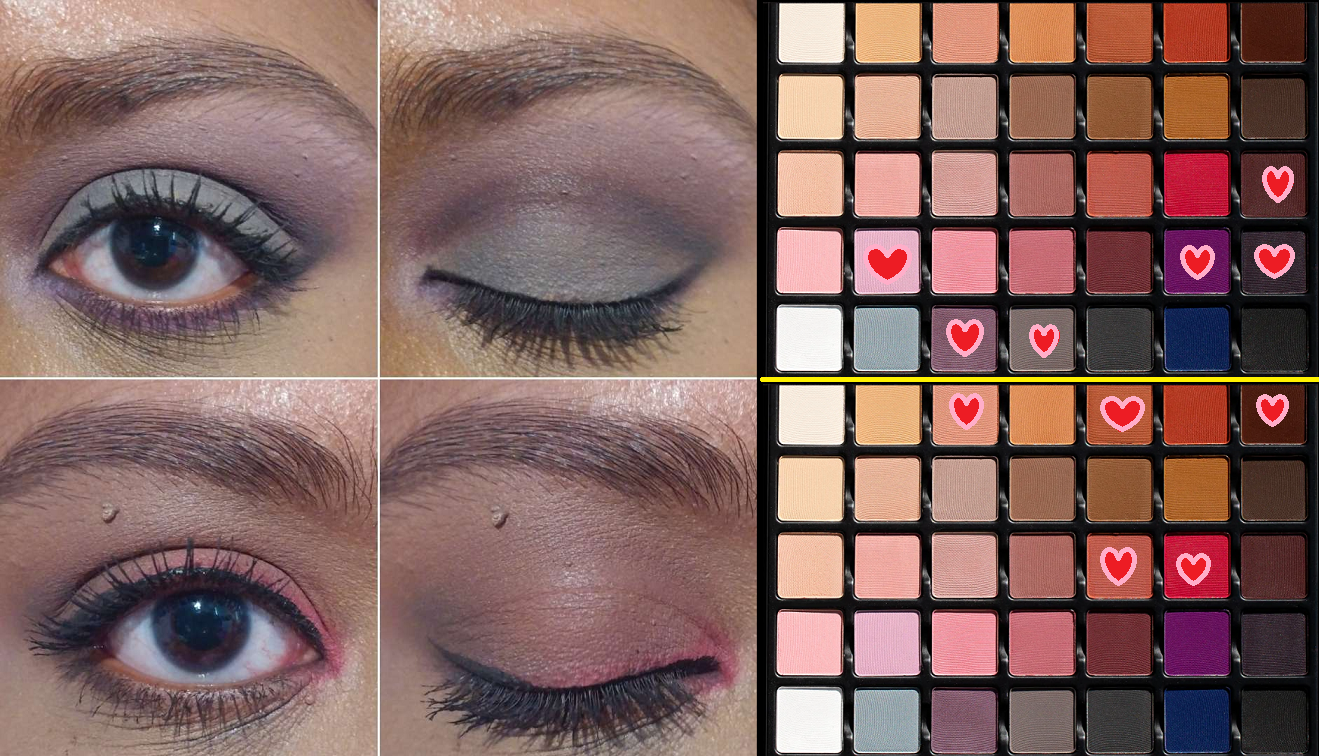
BIJOUXETTE ÉTENDU

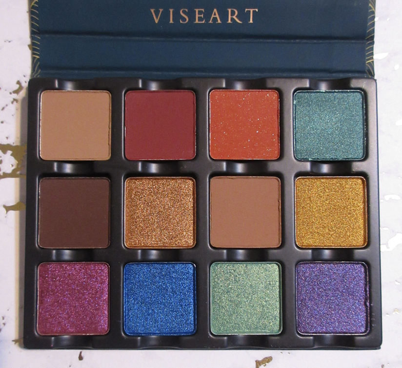
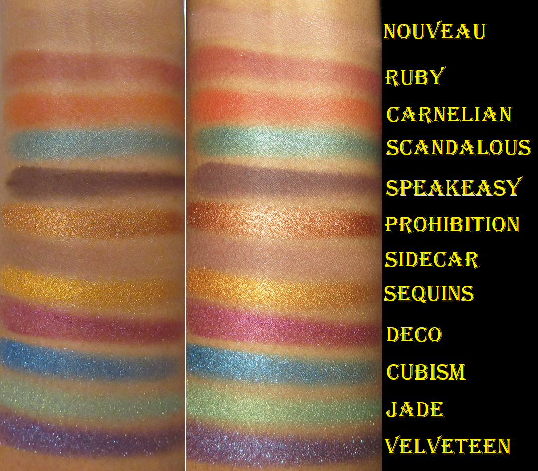
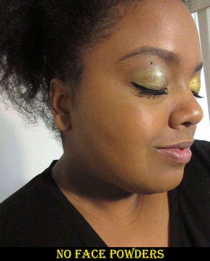
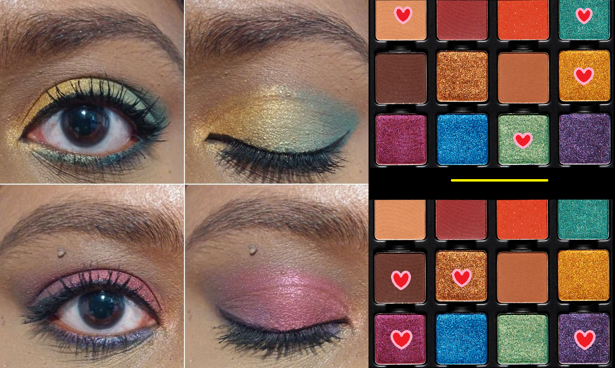
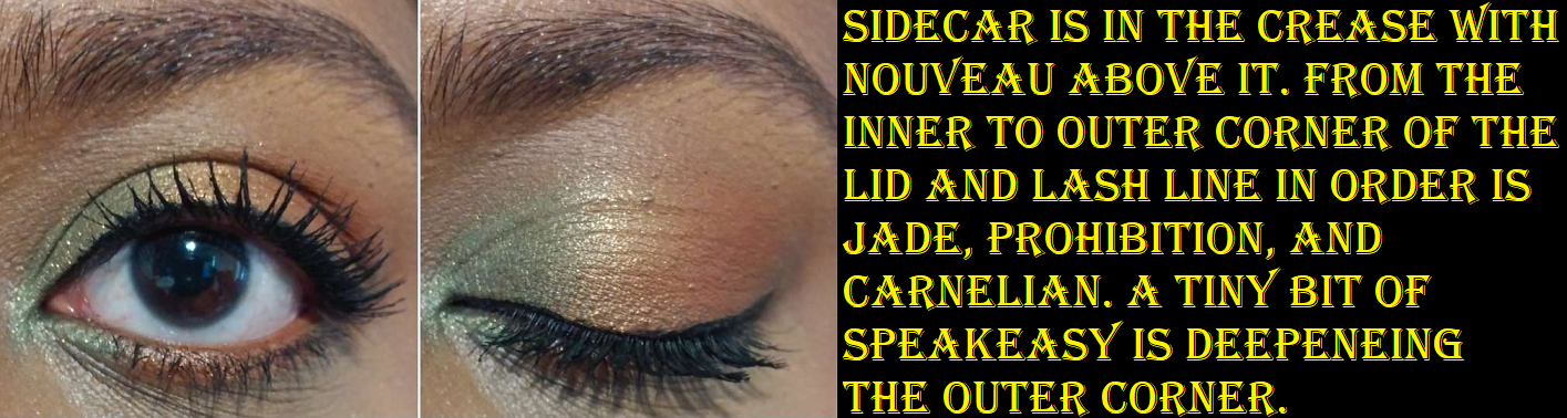
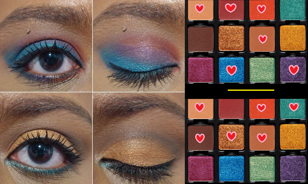
Viseart has a rainbow palette in the form of their Editorial Brights, but I view Bijouxette as the brand’s jewel toned rainbow. To me, this is the ultimate Viseart palette for people who like a matte neutral eye base with a pop of color on the lids. I tried to create a wide variety of looks further down to show off every color in this palette, but I could keep it simple with Nouveau, Sidecar, and Speakeasy and then add Prohibition on the lid and be perfectly happy with that.

Every matte in this palette is pigmented, but blends and layers well. They’re buildable and long lasting on the lids. I would prefer Carnelian to not have that sparkle added to the orange, but most of that comes off by the time I’m finished applying it to my eyes. I don’t know for sure if Viseart tweaked their matte formula, but these seem to be even better performing than the ones I own that were released prior to October 2021.

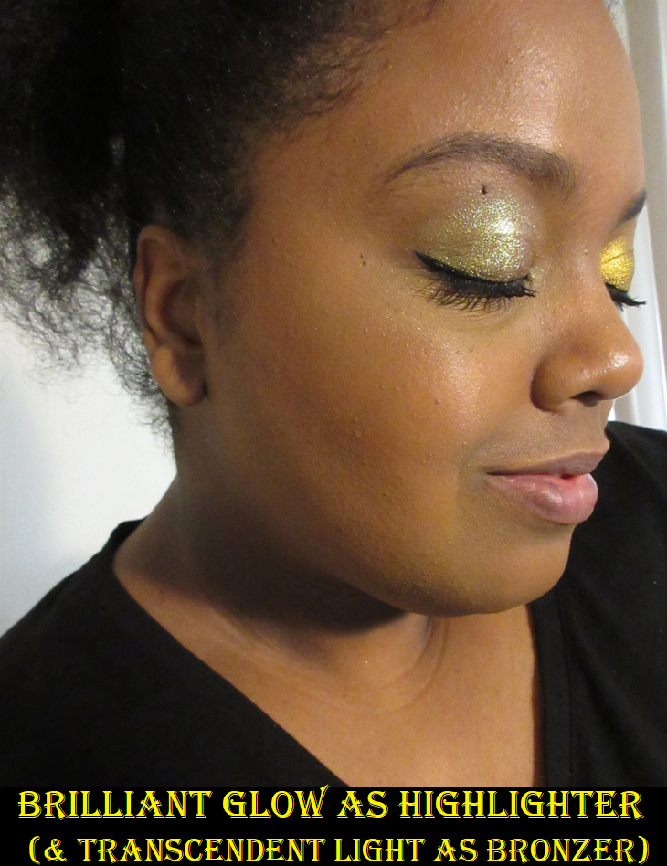
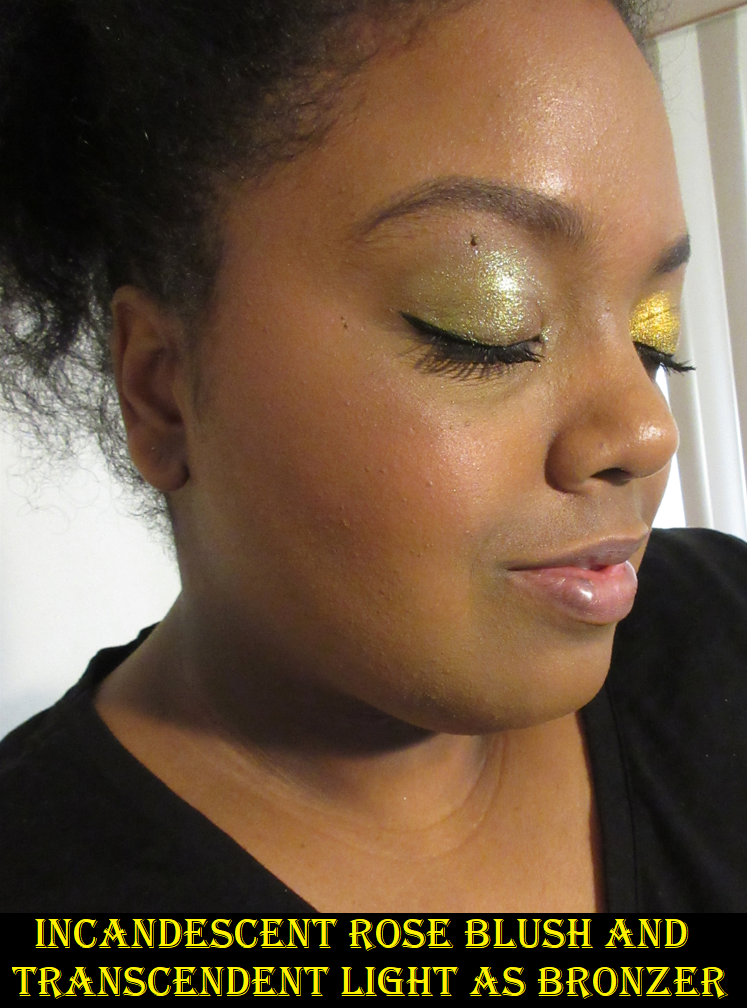
For a long time, Viseart’s shimmers weren’t praised among consumers because they were an artist brand known for making things that work beautifully in the television and film industry, which meant small less reflective shimmer particles and basically being glorified satins. However, around the time of the launch of the Grand Pro 2 palette, they started amping up their shimmer intensity. In the past year or two in particular, they’ve also gotten more pigmented and colorful. The shimmers in Bijouxette are, in my opinion, Viseart’s best shimmer quality yet. I feel that these can actually compete now with Clionadh’s standard circle pan shadows and Devinah’s shimmers. Granted, some are still on the satin side like Scandalous, or not completely opaque unless built up heavily like Jade and Cubism, but after Verrerie from the Violetta palette, every shimmer in Bijouxette ranks higher in my books than all the other shimmers in this post. They’re quite good. They apply smoothly across the lids, but they don’t have that dimethicone slip to them that other creamy/buttery formulas often have, which means I don’t need to worry about creasing and I don’t need glitter primer either.

I’m very glad Viseart started releasing smaller and more “affordable” palettes. I got this for $26, but based on my experiences with it, I’d have been happy paying full price. I don’t know that the original 12-pan palettes in the standard sizes were necessarily worth the retail price for non-makeup artists or those with extensive eyeshadow collections, but if there was ever a Viseart palette that I would recommend to a colorful shadow lover wanting to try the brand for the first time, this is the one I would suggest. Color preferences aside, if the quality in this one isn’t to someone’s liking, I don’t think any other palette from Viseart can top it.
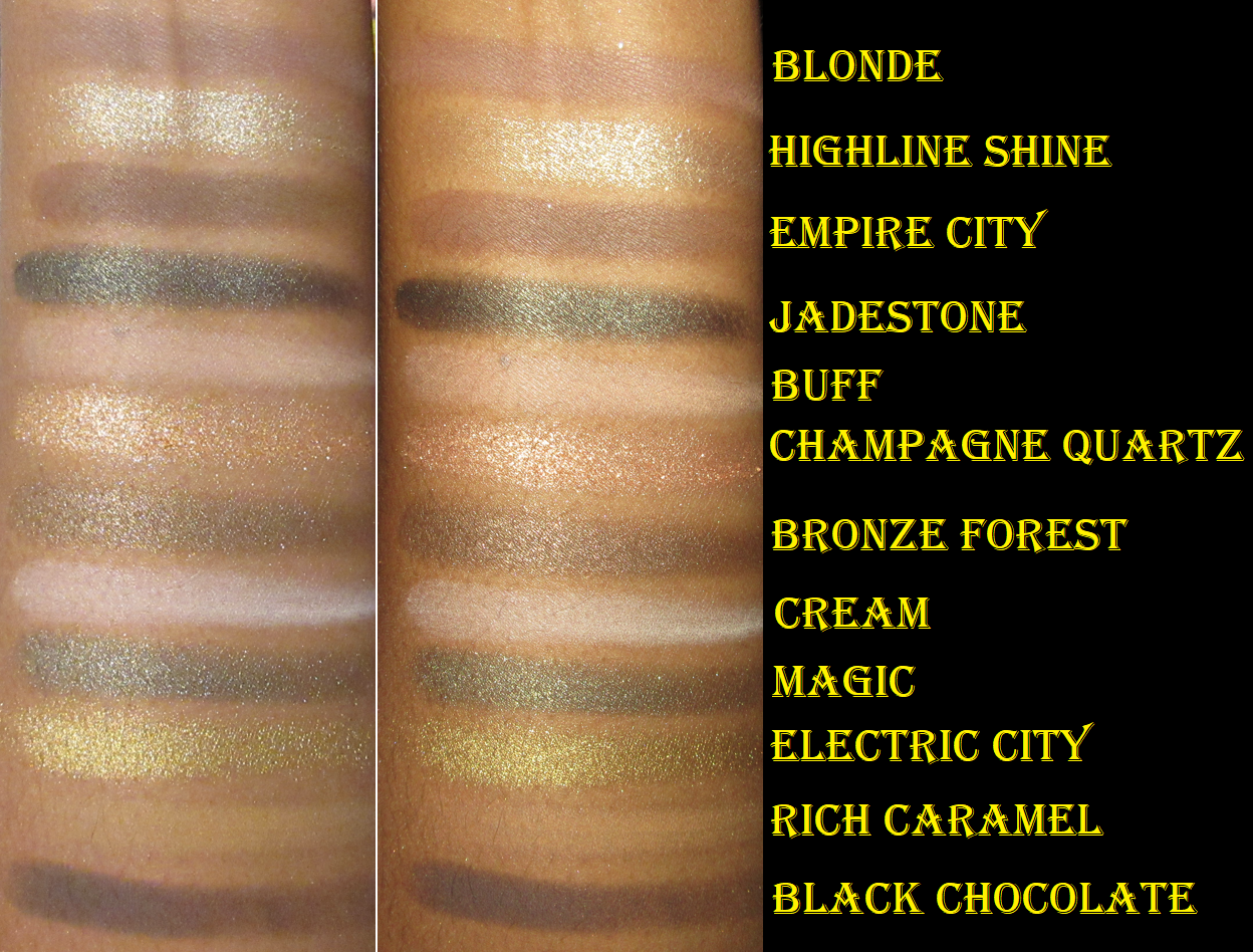
GRANDE PRO 1X

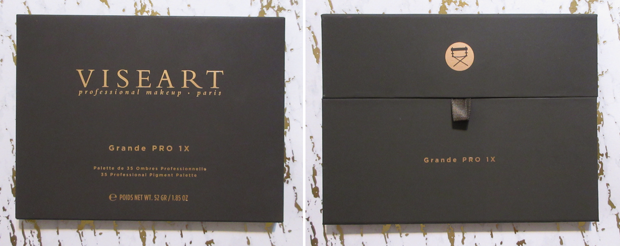
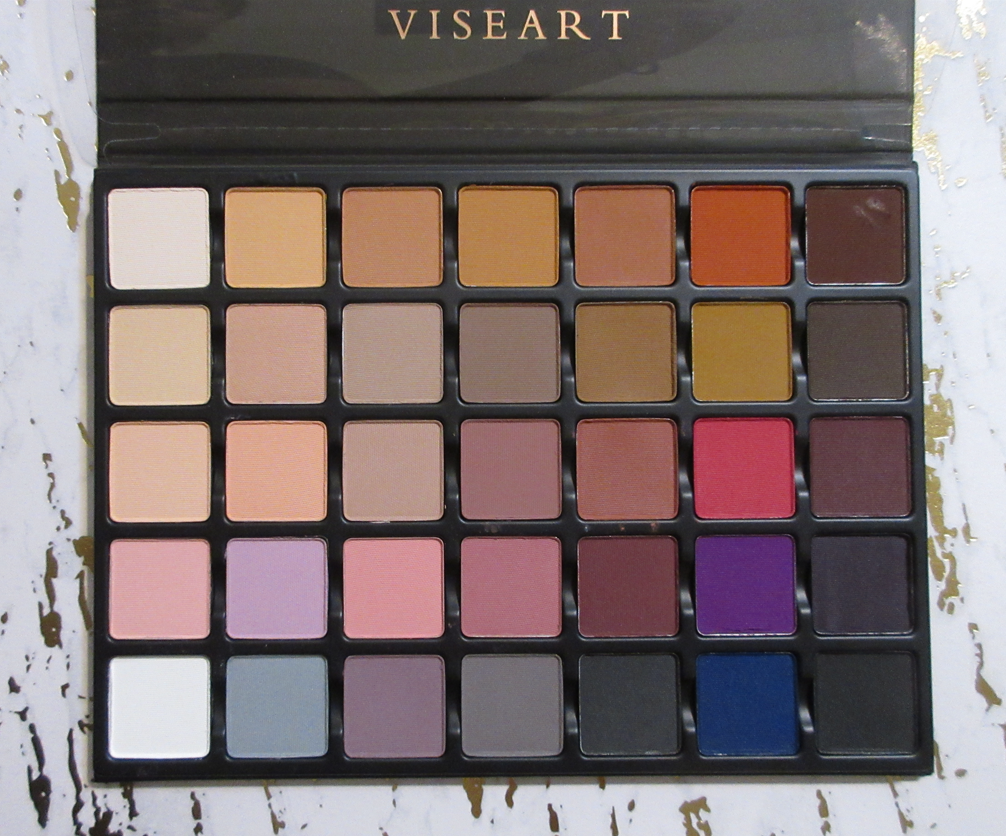
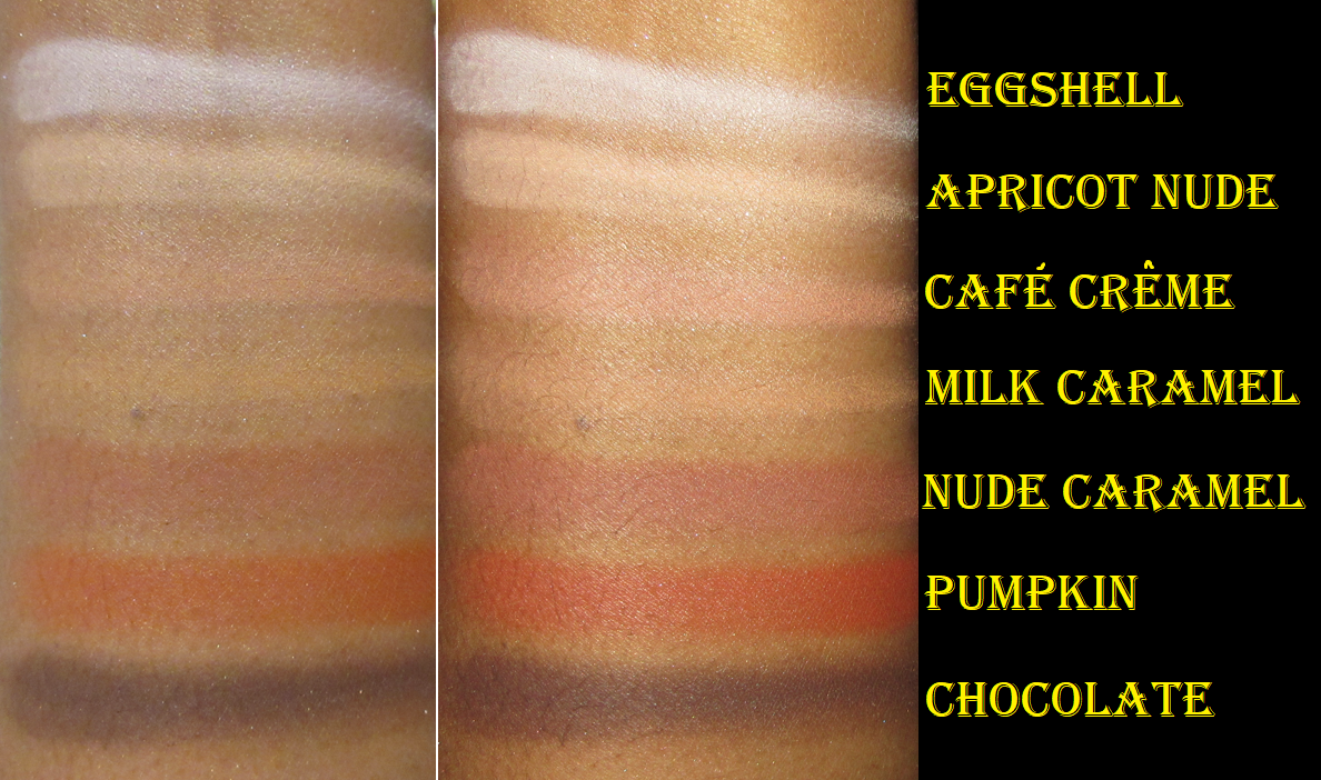
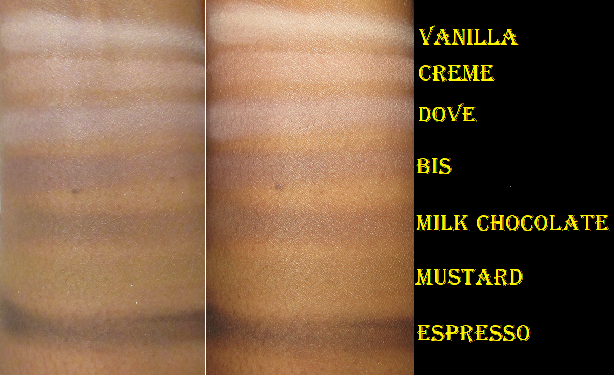
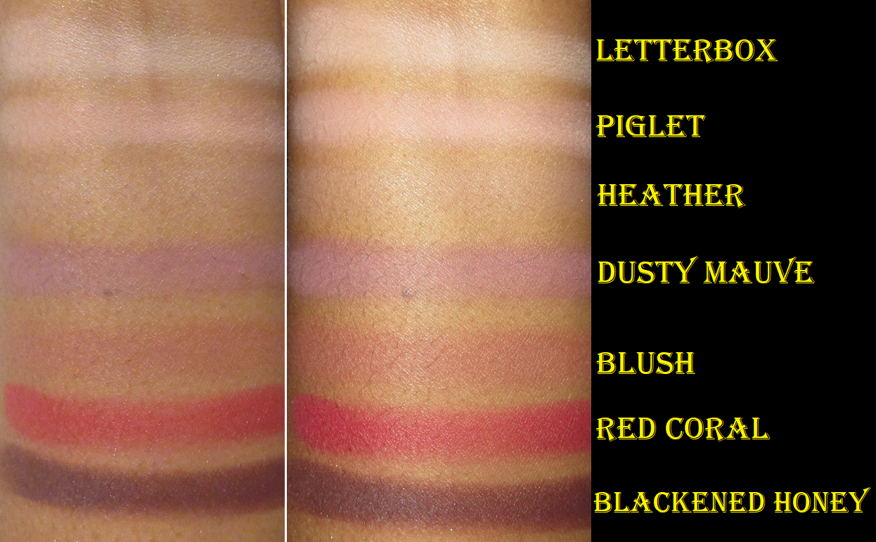
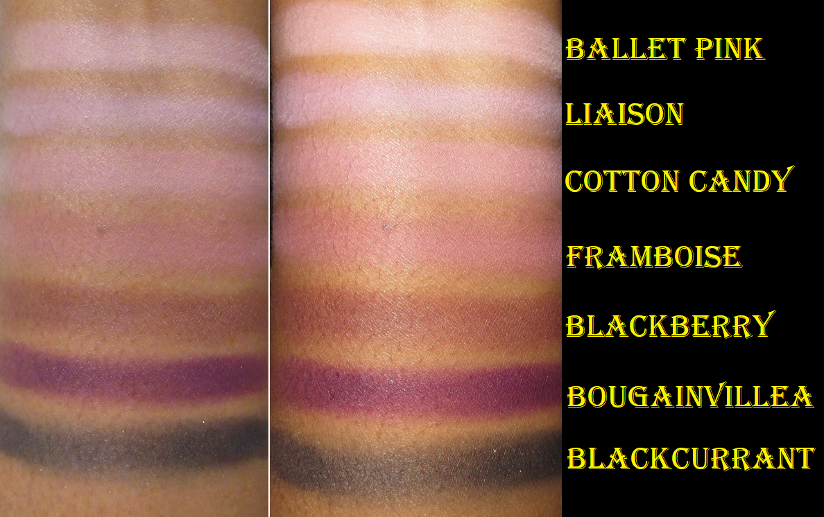
When I saw this on sale for half price, I was so excited because I lusted after the original Grande Pro for years, but it was never in a price range that I could justify to myself. Then it sold out and was discontinued. I planned to mix and rearrange my older standard size Viseart shadows with the ones in Grande Pro 1x instead, but completely forgot that the pan sizes in 1x are medium! So, there went that idea, but I can at least interchange them with the other palettes in this review (excluding London Etoile).

This mega palette is the reason I’ve delayed posting a Viseart review for ages. My experience with the mattes in here has been so inconsistent. The biggest issue has been that so many eye looks (deleted and not posted here) looked horrible on my camera. They were so beautiful and well blended in person, but for whatever reason, they just do not translate on my camera. They looked so patchy as if my skin was showing through. I kept trying to add more to cover up spots that I saw on camera that looked odd (though I still couldn’t see it that way in my mirror) but it never helped. I literally started to question if my optometrist was wrong and if my eyesight had suddenly gotten worse, though I didn’t have this issue with palettes from any other brand! I would add additional product over the spot in question and it would then look unblended, but if I blended it in, then it would cover up too much of the other shade in the look or turn a different color. It drove me mad! No matter what primer I used, it kept happening with back to back eye looks. I would be so happy with how they looked in the mirror and then take the photo and feel that sense of pride deflate. Considering these are meant to look great on camera, it boggled my mind as to why this was happening. I still don’t have an answer. Perhaps it’s just something that happens without a high quality camera and/or professional lighting. Again though, this issue is exclusive to the Grande Pro 1x and Dark Matte Edit palettes. My other Viseart eyeshadows look great in various lighting situations and with the devices I use.

To put this in perspective, I’ve been using Viseart shadows since January 2016. My first palette was the original Dark Mattes. Some of the shadows in that palette had to be tossed out by now, but most are still performing wonderfully to this day. However, I started to feel uncomfortable at the idea of using a palette so old. So, in April 2021, I purchased the Dark Mattes Edit palette as a partial replacement with the bonus of some shimmers. I had no issues with Viseart’s mattes prior to this purchase, and my last purchase from them had been the Boheme Dream in December 2019 when they still had the original sharp edge palettes and not the curved SlimPro ones. The Dark Edit palette gave me such a rough time using the purples and black matte, that it put me off buying another product from Viseart until this year. The Dark Edit palette had the same issue with it that I was dealing with regarding the Grande Pro 1x, so by this point I started to question whether the Viseart matte quality had dropped considerably at some point between 2020 and 2022. I hadn’t used the other two palettes I got in the sale by that point because I was so disheartened by my experience with Grande Pro 1x. I spoke with Queisyani who is one of the two biggest Viseart fans I follow on IG (murderingjellybabies being the other) and she reminded me that Viseart previously had a difficult transitional period adjusting to expanding from France to the US and that this may account for the time in which Viseart’s matte quality wasn’t measuring up for some people. This issue with the mattes did appear to be a temporary thing considering the Bijouxette and Peridot palettes I bought at the same time worked perfectly fine. Then I started to think about how the Dark Matte Edit palette had been newly launched when I bought it in April 2021 and that even though I bought the Grande Pro 1x in May 2022, it originally launched in February 2021. It’s possible my Grande Pro 1x was from that original batch. Bijouxette was released in October 2021 and Peridot in November 2021, so it started to seem more likely that palettes produced between 2020 to mid 2021 (or at least released in February 2021 to April 2021) could have been the ones affected.

I’m happy to say that the mattes in palettes with launch dates from October 2021 and onward seem to have consistent quality again! In fact, I love the mattes I bought between 2016-2019, but the ones from the end of 2021 and onward are as good as they used to be or arguably even better!

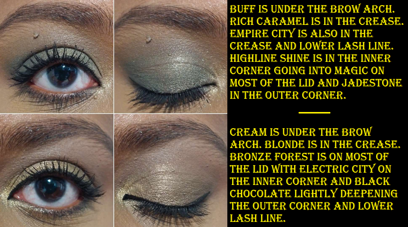
The eyeshadow examples above aren’t to my satisfaction, but they were the best of everything I had with the Grande Pro 1x. As I mentioned, they all looked so pretty in person, but looked worse on camera. However, this palette is not a complete dud. I had less trouble with most of the lighter and mid-tone shades. They are on the thin side, so building up the opacity level was a challenge with some of the shadows in the 1st and 2nd columns, but columns 3-5 were perfect. The darker shades took a little more time getting them to layer on the other shadows, but the outcome of the blend was so pretty in person. The shadows that were most problematic were the truly vibrant shades: Red Coral, Bougainvillea, and Cobalt Blue. They even felt drier to the touch than the other shadows. I didn’t expect Pumpkin to cooperate, but that one is colorful and performs well. I shouldn’t have been surprised though, as Viseart really nails orange.

When there’s an issue with the blend of a matte, it can usually be covered up with a shimmer, so that’s where this palette is at a disadvantage. There aren’t any shimmers to hide the flaws.

Based on the palette in front of me, I cannot recommend it to others. However, this comes with the note that newer batches of the Grande Pro 1x are possibly better performing than the one I’ve got. For the time being, I’m not going to declutter this palette. I plan to reduce the number of lighter shades, especially the ones that just look white on my skin or look too similar to each other. Then, I’m also going to remove the troublesome darker shades and fill the empty spots with shimmers! Or completely rearrange all the medium sized pans. I just have to remember not to wear a Grande Pro 1x all-matte eye look when I’m taking photos!

Wow, this was a monster of a post.

I hope this has been helpful and that you’ll return to visit this blog again next week!

-Lili

Benefit Cosmetics Wanderful World Blushes and Limited Edition Set

Benefit’s new collection of blushes in the full-size and minis launched in May of 2022, and I bought them as soon as they were released on Benefit’s website, with the exception of Starlaa. Starlaa was the shade I wanted the most, so I planned to wait until it was available for purchase before posting this review. I figured it was delayed in shipping and would be ready in a few weeks, but rumor has it that Starlaa was pressed too softly and was shattering in transit, so Benefit had to remake them, which caused a four month delay! These powder blushes are on the softer side, so even my original mini of the Terra blush arrived broken. Granted, Benefit’s packaging of it was abysmal in the flimsiest recycled paper envelope in the world’s thinnest padding I’ve ever seen. It’s a miracle the other two didn’t break with it! The customer service exchange was tedious and required my email to be forwarded and to wait for the initial response back before trading multiple additional exchanges of information including photos, providing the lot number (only found by peeling back the sticker off the bottom), etc. The customer service rep(s) were polite, but the hassle of this instance and knowing what kind of horrible packaging such a delicate product was put in, makes me not want to order from Benefit’s website again. I opted for a replacement instead of a refund, and feel lucky that the second one made it safely.

In September, I saw Starlaa first available in the UK in one of Benefit’s holiday sets called the, “Blushin Benetint Bundle,” but in the mini size. I decided that since I waited so many months already, it couldn’t hurt to wait to get the full-size when it would eventually come to the US. I ended up buying it from QVC and got a discount with a promo code.

The holiday set called “Beauty Mail Blush n Brush gift set” (or “Blush ‘n Brush Delivery” later in the US), with the limited edition blush called Terra Spark, was also available in the UK first. I loved the original Terra blush, so I grew too impatient to wait for Terra Spark to come to the US and immediately ordered it from Selfridges. Imagine my surprise when I found out the shimmery red-gold blush I planned to use as a highlighter was basically Terra with a gold overspray!

The left swatch shows the first swipe with the gold overspray. The right swatch shows the second swipe from the same spot.

Terra is a “golden brick-red blush,” listed as having a shimmer finish, though the gold shimmer running through it isn’t nearly as obvious as other shimmer blushes I own. The only difference between Terra and Terra Spark (when the overspray is gone) is that Terra Spark has a stronger golden sheen, which alters the tone from brick-red to a slightly orange hue. They essentially look the same on my cheeks, though perhaps on someone with a lighter skin tone, the differences may be more significant. Those two blushes are so close that I had to double-check my files to make sure I didn’t get them confused in the cropping and labeling process because Terra can still look a bit terracotta if the light hits that shimmer a certain way too.

I put a photo with no blush next to Starlaa to emphasize how subtle the color is on me, but that it does show up.

Photos of Crystah, Terra, and Java (while I’m wearing a ponytail in the section further down) were taken on the same day in June. The photo of Starlaa in the grey shirt was from October. The photos in this section were taken in November. I had to resort to using my ring light to get consistency in showing the way the blushes look on me. Previous attempts to retake these photos without it resulted in vast differences due to foundation choices, problems with my camera, and lighting issues. The highlighter and bronzer I’m wearing in this batch of photos above is the R.E.M Beauty Interstellar Highlighter Topper in Miss Mars and Huda Glowish Lightweight Blurring Pressed Powder (as bronzer) in Deep Tan.

Though they are technically different, I feel that the promo images for Terra Spark are misleading in representing how much of an impact the gold shimmer will have on the look of the blush.

I bought this primarily for Terra Spark, though the set also came in a cute tin with a sheet of stickers and a retractable synthetic fiber blush brush. The tin can be reused for anything like storing pens, makeup brushes, liners, candy, holiday treats, and more. I haven’t decided yet how I will be repurposing mine.

I didn’t expect to get much use out of the Benefit Multitasking Brush, and most of its value to me was the fact that it’s a limited edition version (same brush with painted white dots). However, it’s quite a bit handier than I expected because of the adjustable aspect! When the bristles are fully out, it’s the most floppy and least dense. To me, it’s almost unusable with the blushes in that state, but it’s perfect for something like a face powder that I’d want applied in a sheer layer and to be able to blend without needing to buff. With the head retracted a little further (about a third down) is the sweet spot for using this brush with the blushes. I get the amount of density I like for buffing them in. With most of the bristles pushed below, the brush is at its densest and strongest buffing power, suitable for something I want extra blended like sculpting powder products.

I have also used this brush with the Rare Beauty Soft Pinch Liquid Blushes, Glossier Solar Paint Bronzer, and the Nars Laguna Bronzing Cream in order to test out how this brush works with cream and liquid products. It works beautifully with them because of that ability to control how tightly or loosely the bristles are compacted, and therefore adjust to what each individual product requires. It stays in the position I set it, for the mostpart, but if I apply too much pressure it does start to slide down. However, I’m still very pleased with this brush and the fact that it came in this set for $30, which is the same price the non-limited edition brush retails for anyway.

I’ll get back to the blushes now.

There are three different finishes among the permanent blushes: Crystah and Terra are shimmers, Starlaa is a satin, and Java is a matte. The shimmery affect in Terra is on the subtle side, though the base color is pigmented. I only need one dip in the pan to get the amount of blush I would normally want; two dips makes the blush prominent, but not garish. I would not exceed two dips into the pan with the brush. With Crystah, the gold shimmer is more abundant and brighter. It’s like Benefit’s version of Nars Orgasm X, but better in my eyes. One layer of blush is all I need to give me a vibrant flush of pink. I can see it straight on, but when I turn my head to the side, the gold reflects brightly and literally makes the pink less visible wherever the light is hitting it. So, at certain angles, it looks like I just have a golden cheek with the barest amount of pink tinge underneath. A lot of coral blushes with gold shimmer that I’ve used in the past have ended up looking silly on me because of the way light reflects off the shimmer, but in the case of Crystah, Benefit made the base color so pigmented that it still ends up looking pretty to me, especially since the shimmer is so fine in size. If I add a second layer, I can definitely see more of the pink color even when light hits it, but that means it’s also very intense when looking at it head on. I prefer to just stick to a light layer when using it alone, or it looks fantastic on top of Benefit’s blushes and as a topper for other blushes in my collection.
When it comes to Terra Spark, just like Crystah, the base color also pulls a disappearing act wherever a certain intensity of light hits the shimmer, but because the surrounding blush area is a much darker color than Crystah, it makes those camouflaged sections look patchy or poorly blended. So, I prefer to now use Terra Spark as a blush topper instead. That isn’t to say the Benefit shimmer formula isn’t opaque enough to be standalone blushes, it’s just the reflection issue that makes me prefer to mix them with other blushes.

Starlaa, in my eyes, is like a sheerer and slightly lighter version of Terra. This “rosy bronze” satin blush is mattifying, but it does have a sheen to it that keeps it from looking flat and adds a pretty finish to the skin without detectable shimmer. I have to build up this color a lot as the brown in it blends in so much with my skin tone. However, I love the slightest whisper of rosy pink that’s visible on my cheeks in person. It’s especially great for no-makeup makeup days. For that reason, I get a fair amount of use out of Starlaa, which is my second most used blush, while Terra reigns as the favorite.

Lastly is Java, which is thankfully not the kind of matte that will look powdery or heavy on my dry skin. In fact, it doesn’t look like a flat matte to me, but I wear mostly natural/dewy/glowy foundations, so that could be a factor. Java is described as a “rosy mocha” and one layer is more than enough product for each cheek since it, like most of the others, is so pigmented.

All of these blushes, no matter the finish, are long lasting on the cheeks. I love the fact that there are options to buy a decent amount of these in mini sizes. It makes it easier to afford owning multiple shades and is less wasteful, since I would be surprised if I used up all of even the mini sizes. Although I’m over Benefit putting their pressed powder products in the box packaging, this launch is when they introduced the slimmed down packaging that no longer included those mini brushes that a lot of us never used anyway. Also, I was glad to see that although the mini size is quite small for the $17 retail price, the pans are wide enough that I don’t have an issue fitting the blush brushes I want to use with them into those boxes.

Those who don’t like fragrance may not like these as they have an orange blossom or some other kind of sweet floral scent. Because I like this formula so much, I overlook the fragrance, and thankfully I am able to stop smelling it on my face after a few minutes. I thought I would post some comparison swatches of these to other brands that don’t include fragrance in their blushes.

Starting with MAC, Ambering Rose is nearly identical to Terra, but with a little more gold shimmer. Ambering Rose is in my top three favorite blush shades from MAC, so I understand now why I love Terra so much. Unfortunately, Ambering Rose is discontinued, but at least Terra is a good alternative. Peachtwist from MAC is also still available. It’s not an exact dupe, as it leans more peachy-pink, but it’s quite close.

I’m sure I could find more dupes for Java, since I have quite a few pink and red leaning brown blushes now in my collection, but since MAC makes my favorite blushes, a dupe for it would be my top recommendation. MAC’s Format has the same base color as Java, but it’s like the shimmer version with fine golden specks. MAC’s Raizin is matte and quite similar, but with a stronger red tone to it. Raizin had too much red in it for my liking, and I always thought it would be perfect if the brown was stronger in that shade, so I’m happy to have gotten my wish in the form of Java.

The closest dupe I have for Starlaa is MAC’s Sunbasque. I never use it because it’s too light for me to work as a blush. Starlaa is just barely dark enough with just enough of a deeper pink for it to show on my skin.

Swatching Crystah and Nars’ Orgasm X side by side, I now see why Crystah is a better fit for me. It’s more coral leaning in the base color rather than pink. With my undertone, I find corals to be more flattering.

So, those are all the new Benefit Blushes in my collection! When I love a blush formula, I tend to want to buy all the shades that work for me (or appear as though they would work), so I’m still tempted by Butterfly and PomPom, but those are currently only available in the full-sizes, which is why I haven’t taken the plunge. And when it comes to which finish I prefer, I’m so thoroughly impressed by how smooth and blendable Java is and how natural it looks on my face, so the mattes are my favorite. Then, when it comes to the satins or shimmers, the satin is the safer bet, because it doesn’t have as reflective of shimmer in it, but at the same time I can’t help but wish it was either firmly in the matte or shimmer categories. The slight shimmer effect in the satin feels almost pointless. I prefer the look of the shimmers over the satin, but Terra Spark and Crystah had that reflective issue while Terra did not. So, it would be riskier for me to blindly purchase another shimmer blush in the hopes that it will perform more like Terra.

Also, regarding the formulas, Benefit Powder products tend to get hard-pan easily if swatched too much. I was surprised to see that I don’t have this issue with the matte and shimmer blushes, but for some reason Starlaa does have that problem. So, I scraped off the top layer lightly and began using brushes for the remainder of the swatches I needed to do.

Well, I believe that’s everything I have to say about the Wanderful World Blushes! I love them and recommend them (but I personally would wait for at least 20% off which is easy to find between all the retailers that carry Benefit products).
Thank you for reading!

-Lili

Artist Couture Love Sprung 3 and Quickie Palette Review

The brand had a 40% off sitewide sale on Labor Day, so I used that as an opportunity to buy two items I’ve been unable to get out of my head. Love Sprung III had a blush that looked similar to Love Sprung II that I own and reviewed before and the Quickie palette admittedly has four repeat shades already present in the original Supreme Nudes palette, so I talked myself out of buying them until this all too enticing deal.

Love Sprung Face Palette 3 (listed as VIII for version three)

It turned out that despite how similar Infatuated and Divine Amour looked in their pans, they are different enough on the cheeks. I’m happy to say version III is the perfect one for me and the formula seems even better than the previous version II! The highlighter is certainly not as wet and is easier to apply and blend smoothly on the face.

I find it fascinating that Divine Amour and Infatuated look similar in the pans, but Infatuated is closer to Peach Blossom on the skin.

These blushes are very pigmented but easy to blend out, smooth looking on the skin, and the kind of tones I love. There’s a lot of kickup in the pan, but I don’t mind that when it’s so easy to clean because all the edges are smooth plastic. Peach Blossom surprised me that it showed so easily on my cheeks and deepened slightly, but it still maintained the peachy look I wanted. I had to build it up even more for the photo, so it looks a bit darker, especially next to the bronzer I’m wearing, but I think it will still look nice on a wide range of skin tones. Golden Aura is not very far off to my skin tone in terms of depth, so I can get a subtle look easily (which I prefer) or I can build it up to about a medium amount of shine. The shimmer isn’t light enough on me to be intensely bright. With Divine Amour, I barely need any product for it to show, but I don’t need to worry about being light-handed with it if I’m using one of my softer, looser, more delicate bristle brushes.

Even though I originally questioned why the brand would make such similar looking peach and pink leaning blushes among the three Love Sprung blush and highlight trios, this new one is my favorite! It’s the one I will actually get use out of and its slim compact packaging makes it easily portable. I’m very happy with this one!

Supreme Nudes: The Quickie Palette

I was relieved to discover that the quality in the Quickie palette is the same as Supreme Nudes. Artist Couture’s palettes do not get consistently positive reviews. The Caliente, Ethereal Bloom, and Supreme Mauves palettes spring to mind as some I’ve heard people assume had a different formula based on the performance of those palettes. So, I’m glad that the mattes in Quickie are the pigmented and soft shadows that I’m familiar with and because of the amped up sparkle level of these shimmers, those have been upgraded in my book.

In my review of Supreme Nudes, I mentioned that all I see among the mattes are a bunch of brow bone shades, Aesthetic, and Mink. So, I support the decision to cut out some of those transition/crease shades, especially since Nudist, Transcend, and Eccentric had the same effect on my eyes. However, the cooler toned taupe called Undressed in Quickie replaced Silhouette which was a more neutral version and I would have preferred to keep Silhouette. However, because Undressed can take the look in a more cool toned direction, I understand why the brand wanted to swap it out in this mini palette.

The four new shades in this palette are Iconic, Brilliance, Supreme 2.0, and Undressed that we discussed above. I knew I was getting repeat shadows when I bought this palette, but I wasn’t expecting the new ones to be so similar to the full size. I do like the extra shimmer in Iconic over Lavish and the fact that it’s more of a true gold. Brilliance has no dupe, but it looks silvery white on my eyes, so that limits how I’d use it. I tried using it as a lid shade in the demo to do something different, but I don’t think it looks good. It’s just a spotlight shade for me. As for Supreme 2.0, I like that it has more sparkle and is a darker olive than Supreme, but with that silver shimmer, it gives the shade a cool toned look when I usually prefer to do a warm toned one if I’m wearing “natural” colors.

I thought having this mini would be handy for travel, but since it’s still not my perfect palette and by now I have many other green and neutral palettes I prefer, I would be more likely to take something else on vacation instead. I thought that I might like having a condensed version of Supreme Nudes and get a lot of use out of it, but I have only reached for Quickie a handful of times while knowing there are still shades in Supreme Nudes that I prefer. I also thought that if I ended up favoring either the Supreme Nudes or Supreme Nudes Quickie, I could declutter the other one, but my enjoyment of Iconic and Supreme 2.0 with my favorite two mattes (Aesthetic and Mink) is so strong that I can’t give it up, even though it still feels like I bought two of the same thing, yet have no will power to get rid of either of them. At least I only paid around $18 for Quickie.

So for those who like the color story in Quickie, I think it’s a nice palette even if it wasn’t the best decision for me to buy it. Considering the price difference of Mini Supreme Nudes Quickie being $30 and Supreme Nudes being $45, getting the mini for full price doesn’t feel like it would be worth it to me. I recommend trying to wait for a sale, which I expect to be possible at least one more time this year. For those who love Artist Couture mattes, the brand recently released a Supreme Nudes Matte Masterpiece palette in the same size and packaging as the Quickie palette. I won’t be picking that one up.

That’s all for today! Thank you for reading!

-Lili

Swatches of Previously Reviewed Makeup in New Shades

With today being Black Friday and holiday sales approaching, now is the time it’d be the most useful for me to get as many reviews out as possible. I’m constantly testing new products, but it takes ages for me to get closeups, swatches, demos, and the written portion of posts completed to my level of satisfaction. I’m allergic to posting first impressions, but I think it may be helpful to share photos of the new makeup I purchased that are just new shades of things I’ve already reviewed for this blog. The formulas of everything should be the same, and therefore the performances should be no different, with the exception of the first item I’m showcasing below.

Fenty Beauty Double Cheek’d Up: Freestyle Cream Blush Duo

The compact color is stunning! I bought this partly for the packaging, along with liking Fenty’s permanent cream blush formula that I reviewed here. Since “Freestyle” is still in the name of the duo, I expected the formula to be the same, but it’s a little more emollient and slightly less pigmented. Because Peony Droppa is on the lighter side, it takes an extra few layers to build it up on me, but Mali’booze just needs one additional layer to build up to the level of opacity I get from the original shades. I was pleasantly surprised that Peony Droppa showed up on me and actually looked nice despite being cool-toned (warmer blushes look better with my undertone). I’ve only used this duo twice so far and I prefer how they look when I use the darker blush all over my cheek and keep the lighter one on just the apples. Trying to wear them mixed was a little tricky trying to find the tonal balance I liked, so I think I’ll stick to either using Mali’booze alone or applying both in those specific zones on the cheeks.

The compact is much bigger than the standard cream blushes and each half of the duo is 3g, meaning each shade in the duo has the same amount of product as the full size single cream blushes. The cream duo compact has the same dimensions as the full size bronzers, highlighter duos, etc. I get two products in one for $34 instead of $44 if they were sold separately, however, I still prefer Strawberry Drip to both of these shades because I get the bright popping color without it clashing with my skin tone. So, in my case, I’d still be better off buying a single blush. I got the duo at a discount via Ulta, and my single blushes from Fenty are two and a half years old by now, so this is a good time to have a replacement.

I was planning to make a dedicated Fenty update post, so I have photos already wearing this one, but I thought it would be best to just include them here.

Fenty Beauty Sun Stalk’R Face + Eye Bronzer & Highlighter Palette

I bought this one from Mercari. I have reviewed the Mocha Mami shade of Sun Stalk’r Instant Warmth Bronzer as an update to one of my bronzer posts here. I barely used it because the shade was more red than I liked, particularly for a matte formula. I suspected one of the other colors could work, or that I could mix the deepest two in this palette together as a better match. It turns out I was correct, as Coco Naughty works on me, or I can mix that one with Thick Mint for extra intensity. I was so concerned with knowing my correct shade that I failed to consider the fact that the formula is good but not great. There wasn’t a need to try and find a better color if I was still going to reach for my Huda Beauty Glowish Bronzer, Charlotte Tilbury, Kosas, and Nars bronzers first.

I find it interesting how much the color Private Island blended into my arm. At some point I’m going to test if that shade can be used as an all over setting powder or to set my under eyes. If so, that would be a nice way to make this palette even more useful.

The Phat Glass highlighter was a little broken, but I pressed it back. Also, that shade is way too light for me, so I don’t wear it alone anyway. The Gold Card color is very beautiful and suits me really well. I can wear it alone or mix it with Phat Glass for a little extra brightness. I’ve also used it on the cheekbones and then added Phat Glass to a tiny portion of the highest point to really emphasize the structured look I want in that area. It’s nice to finally have a Fenty highlighter that matches my preferences in terms of the smaller shimmer particle size. All others I tried from Fenty had some aspect that’s usually a negative, such as being in stick form in the MatchStix, an unnatural color as a Killawatt, or ultra glittery like the Diamond bombs. Even the Chocolate Swiller Fenty Toast’d Swirl Bronze Shimmer Powder with its smooth texture has some larger particle size shimmer specks that makes it something I only want to use periodically.

LYS Beauty Higher Standard 3-Piece Cream Blush Set

Grateful looks so much like Confident in the pan, but when swatched, it looks more like Self Love instead. This mini trio is $20, making it a really great option for trying out additional shades from the brand. The retail price of the single blushes is $16 and each individual “mini” has about 2/3 the product of the full size. The packaging isn’t as lux with the clear lid, but that also makes it easier to figure out which shade I’m grabbing. I only tried these out once so far, and don’t have pictures of each blush included, but that one time using it was enough to know the formula of the minis is the same. It’s one of my absolute favorite cream blush formulas, if not the top favorite, and I’ve felt like this long before I joined the LYS ambassador program. I’m technically still one, but I haven’t done anything for the brand in nearly a year. More about that is detailed here. As for my first review of this cream blush formula, that can be found here. All three included in this set show up on me.

Huda Beauty GloWish Cheeky Vegan Soft Glow Powder Blush in Sassy Saffron

This is another one of those situations where I was so enamored with the look of the new shades that I forgot how I actually felt about the formula being “not particularly special,” mentioned here. I thought this was colorful enough to work on my skin tone, especially with how much richer it looked online, but it was very ashy the first time I tried it. I will have to try it again focusing on the deeper swirl to see if that helps, but I have my doubts. I bought this during Sephora’s previous VIB sale, but Huda’s official website has an even better deal going on.

Chantecaille Perfect Blur Finishing Powder in Med/Dark

In my powder declutter post discussing the original shade here, I mentioned that I wasn’t getting the same amazing results that had been hyped up in all the reviews I’d seen, so perhaps a darker shade would work better on me. I planned to sell the original and get a darker version. The first iteration of the Med/Dark shade was from Chantecaille’s Flower Power line, but I hated that packaging and that wasn’t nice enough to make up for me having to sell that gorgeous hummingbird packaging. I contacted Chantecaille during that time, and they told me they wouldn’t bring the new shade in that hummingbird packaging, but it would at least come in the larger size of their “pebble” compacts, like their philanthropy blushes. After that, the Dior Powder-No-Powder was released and I got so much more blurring from that than I ever did with the original shade and at half the price, so I decided to just give up on this powder. Then, as luck should have it, Space NK had it deeply discounted during their sale in June this year. With shipping included, I only paid $33 for it!

The Med/Dark shade is much better suited to me. It looked invisible on my inner arm, so there was no point trying to post a swatch of it here. Even with the photo uploaded to my computer, I had a guess as to where it was based on my skin looking slightly more matte, but I wasn’t confident enough to mark it. Getting that new shade did work out better for me than the original. I could see a little bit of blurring, but it was nowhere near as good on me as the Dior Powder-No-Powder. So, I still recommend that one over this (though the Dior one has a sheen and this powder does not). I’m just glad I didn’t spend a fortune on it to figure that out!

Tarte Amazonian Clay Blushes in Blissful and Natural Beauty

The Tarte blushes I owned were minis reviewed here. I really enjoyed them, so when Ulta had the full-size blushes on sale in September for $14 each, I couldn’t resist and bought several more. Since Exposed worked for me, I thought Seduce would be even better, but it doesn’t show on me at all. That one is out of my collection, so I couldn’t include it here. The tartelette blush in bloom Amazonian clay cheek palette didn’t work for me either, excluding the darkest shade, but it was too cool toned looking on me so that’s not in my collection anymore either. I’m glad Blissful and Natural Beauty worked out! Tarte’s Amazonian Clay Blushes have the issue of looking light in the pan but sometimes they work for me and sometimes they don’t, so I never know until I actually try them out.

One/Size Cheek Clapper 3D Blush Trio Palette in Phat Ass

I loved the Freaky Peach shade, reviewed here, and was always drawn to Phat Ass, but with how similar the cream and powder versions looked, I didn’t think it would be worth it to buy another trio from One/Size. However, I saw a good deal on Mercari and bought this. Unfortunately, the shimmer exploded in the package, so it took quite a while for me to repress it (not my best work) and clean off the cream which it had also gotten into despite the plastic flap. Unlike Freaky Peach where the shimmer blush was light enough for me to use as a highlighter, the BBL shade in this one is a bit too deep and pigmented in the base color for that. I can use this as an actual shimmer blush or blush topper though, the way it was intended. It’s the kind of shade that’s along the lines of a Nars Orgasm X, but I like this one better!

Pat Mcgrath Skin Fetish: Divine Glow Highlighter in Venus Nectar

Venus Nectar was another broken item I had to repair (dry pressing wasn’t an option with how broken it was). It’s on the pink side, but I love this formula from Pat Mcgrath. It’s a shame that I still can’t get the exact golden tone in this formula that I’m looking for with Bronze Mirage, reviewed here, being a bit deep for me. PML’s Ultra Glow Highlighter in the pink packaging still hasn’t been topped for me. Swatches of Venus Nectar and Bronze Mirage will be in the next section of PML highlighters lower down.

Pat Mcgrath x Bridgerton Skin Fetish: Sublime Skin Highlighter in Incandescent Gold 002

Don’t ask me why I bought a Bridgerton highlighter. I’m citing temporary insanity. I know I hate deep yellow highlighters (being scarred from Fenty’s Trophy Wife), so I opted for the other one instead because I heard it’s still gold but with a sheer base that’s technically supposed to work on the majority of skintones. The glitter level is my main issue with it, but I forgot that the highlighters in this particular formula, similar to my Lunar Nude highlighter (reviewed here), share this excessive sparkle feature. I only have this photo to show of it on my bare face. As much as I’d prefer not to show something like this, it’s all I’ve got at the moment.

As the swatches above show, the sparkle level and shimmer particle sizes are very different. I prefer the Divine Glow over the Sublime Skin, and I need to remember that in the future!

Rose INC Cream Blush Refillable Cheek & Lip in Wisteria

I’m sensing a pattern here. The pattern of trying to find the ultimate blush shade from every brand, despite how I feel about the formula. The Rose Inc blushes don’t dry down, as mentioned in my review here, so I have to be in a particular mood to wear them. I don’t know if I got confused while comparing the different shades on the Rose Inc website, but I could have sworn Wisteria looked darker in photos I saw. This shade does not work on me at all. It shows up, but is extremely ashy. I didn’t know it was going to be significantly lighter than Foxglove, which is already just a flush of color on my cheeks. In any case, I vow to myself that I will not buy another Rose Inc Cream Blush. Now, if they start making powder blushes, that will be another story.

Rose Inc Skin Enhance Luminous Tinted Serum in 100

In one of my Rose Inc orders, I got samples of additional foundation shades. Because of that, I was able to see that despite how much I loved the shade 110 (in that same review linked in the blush section), shade 100 is the better undertone match for me. So, I utilized Rose Inc’s fantastic Pre-Black Friday sale to get my better shade! I have to add though that I was shocked 100 is my shade considering the model photos on the website. Based on the model, 100 shouldn’t be for me at all. But it is!

Rose Inc Solar Radiance Hydrating Cream Highlighter in Prismatic and Lustrous

This is a bonus mention because I hadn’t shown these on the blog until now, and I don’t intend on including it in any other posts this year. I bought the two refills of the Rose Inc Cream highlighters because I wasn’t sure if this formula would be closer to the blushes or the bronzers. These fall somewhere in the middle. They don’t fully dry down like the bronzers, but they aren’t as emollient feeling on the skin as the blushes, but that may also be due to me needing less product to get the impact I want. Prismatic is too light for me and I don’t intend to keep it in my collection. Lustrous is the perfect shade for me though. I wasn’t sure if I should get it because it looks dark online and bronzes tend to be too deep on me, but this is a lot lighter in person and more golden leaning. I’ve only worn them a few times, but I still don’t know how I feel about this product. As of now, they don’t get a recommendation from me despite the color and wet look that I like. Towards the end of the night I notice more texture and I’m not sure if the product slightly picking up is user error yet or a formula issue.

Nars Blush in Dolce Vita

I saw a review somewhere that this blush would work on deeper skin, despite how light it appeared in other photos I had seen. It was so pretty that even though Nars blushes (reviewed here) don’t quite measure up to MAC blushes that I have no shortage of, I still wanted it. Sometimes when I see a Nars blush shade I don’t own, I think I should hold off on buying it because chances are high that it will end up in a palette with some other repromoted shades. But Ulta had another deal, so I went with it and have no regrets! I like it quite a lot!

Vieve Sunset Blush in Piazza

In my March purchases post, here, I said the blush formula was great quality and that I wanted the Piazza shade, but it was supposed to be too similar to others I already own in my collection. SpaceNK’s pre-Black Friday sale made me change my mind and I bought this, plus the bronzer I had been curious about since its launch. It takes a while to arrive from GB, so it only arrived a few days ago. I haven’t actually worn this shade yet or the bronzer on my face, but they all look like they’ll work for me. And I have no reason to think Piazza will not be great since I’ve enjoyed Sorbet so much.

Whew! That’s everything for today! I did way more talking than I expected, though this isn’t a typical Swatchfest.

I hope everyone had a great day yesterday and that this post will be helpful for all the sales going on! I tried to get this post out in a rush, so if there are typos or errors I missed, please excuse them! Thank you for reading!

-Lili

Six New Luxury Palettes from Guerlain, Pat Mcgrath, Dior, and Bobbi Brown

I typically buy makeup that is in the mid to high-end range, as well as from small indie brands. Purchasing this many luxury eye shadow palettes (and so neutral-heavy no less) is very unusual for me. I can’t explain why the sudden interest, but here we are!

Pat Mcgrath Labs Celestial Nirvana Eye Shadow Palette in Bronze Bliss

The quint picture above shows how La Vie En Noir and Lunar Luxury will look on the eyes. The quint photo below shows how the shadows actually look in the pans.

I was intrigued when I read these were new formulas for the brand, and that was confirmed as soon as I saw and felt the eye shadows for the first time. La Vie En Noir, the only matte, is not creamy like Natasha Denona’s Cream Powder shadows, but it still has a creamier texture than Pat Mcgrath’s traditional mattes. The shadow is easy to pick up with a brush and finger, easy to smudge, and almost too easy to blend out. When blended, I can see the blue tinge in the shade. Some people will like that this isn’t a pure black shadow, but this feature will prevent me from being able to use this palette solo in the future. Although I technically don’t need a transition or crease shade, I prefer having a shadow there to add definition and block off the roundest portion of my eyes and get the defined almond shape I’m nearly always trying to achieve. I don’t mind using blue for that purpose with cool toned shades, but I’m not the biggest fan of using it with the palette’s two bronzes. If I want the deep black appearance La Vie En Noir can provide, the shadow has to be drawn on or nearly unblended, giving it more of a graphic lined look. If I’m not interested in something that harsh, I have to either accept that it’s going to look blue-black or I’ll need to reach for a supplemental palette.

The first three looks above, using the Bronze Bliss palette exclusively, demonstrate the various blended states of La Vie En Noir in the crease. The fourth look involving mattes outside of this palette where I can just use the blue-black exclusively in the outer corner, shows how it’s a lot less blue looking on the eyes when I use it as just an outer corner deepening shade, the way I prefer to use my darkest shadows. The photo demonstration below shows the process of that transformation.

It’s so tricky using this shade when very few strokes of buffing mean the difference between the shadow looking blended versus it looking faded to a borderline patchy level (and/or too blue).

Color aside, I’d be interested in trying out more mattes like this from the brand in this formula. The unbelievable spreading ability comes from that creamy element, but it’s not actually emollient where it will move on the eye or crease with normal eye movements. It’s only when I touch the shadow with my brush or finger that it comes off. It’s still a powder formula and fully dry to the touch on my eyes.

As for the shimmer formulas, these are definitely different from any other Pat Mcgrath shimmers I’ve experienced. Lunar Luxury is the wettest of them all, and feels the most like a cream shadow. It’s an intense silver, spreads far, and a lot of product gets picked up in one tap. So, I recommend starting with that one dip into the pan and slowly building up to the desired amount to avoid a thick application on the lids. Bronzed Mink and Bronze Illusion aren’t quite as wet, which makes them easier to apply since I don’t have to worry about them looking chunky on the eyes. They contain a nice amount of sparkle, but these can still be sprayed on the brush to really bring out that foiled nature (though a foiled texture comes with it). Nude Moon has the same consistency as the bronze shades, but it’s less metallic and closer to a traditional shimmer. It applies smoothly with my finger, but a lot of product still gets picked up onto my brush and I always have to apply one swipe to my eyes, wipe off my brush completely, and then spread what’s on my eyes with that clean brush so that it doesn’t add more product and can be smoothed out and not look so heavy. Although the shimmers don’t feel wet once they’re on my skin, they will transfer when touched and always transfer to my crease area in the places where my eyes are partly hooded. This is another reason I don’t like using La Vie En Noir as my crease shade, because the shimmers transfer onto it in a very obvious way. It makes it look like my shadows are creasing even though they aren’t. When I’m using mattes from other palettes with these shimmers, I don’t mind that they transfer higher.

Visually, the shimmers are stunning. Every formula in this palettes is interesting to work with and I like that there are warm and cool toned options for eye looks. This is very much a glam oriented palette and there’s certainly a place for that in my collection. Although it’s not a perfect solo palette for me, I think it’s a great product and I would love to buy more variations in the future (other than Nude Allure).

Guerlain Ombres G Eyeshadow Quad in 940 Royal Jungle

Guerlain had some colorful options in their new Ombres G line of eyeshadows, but I actually wanted a “basic” quad that I would be able to create looks from without needing to think too hard about coordinating the right colors together. I never heard that much praise regarding Guerlain’s eye shadows in the past, so I thought neutrals would be the safest bet since those shadows are easier to get right. This palette isn’t cheap at $85 USD at most retailers, but I got it for $62 via Selfridges. The conversion rate between USD and GBP has been in the favor of USD for a while now, so I’ve been utilizing my Selfridges Global Shipping to my best advantage.

I think I threw out the box*, but the shades are 1-4 in a clockwise motion on Guerlain’s website. It’s very confusing seeing the top right shade as an orange that’s darker than the shadow below it when in reality, the top right corner shadow is the lightest of them all.

*Update: I found the box. The numbers written on it are the same as depicted on the website.

Photo from Guerlain’s site HERE.

Shades 1-3 have the same texture, which is similar to Tom Ford’s wet/dry formula, but drier. The Guerlain shadows are soft, but the shimmers add a little grit. #1 is a gorgeous chocolate brown metallic with a dark base plus red and bronze shimmer reflects. This is my favorite shade in the palette and the type of shadow I love to wear either all over the lid or as a smoky outer lid shade. #2 is a warm toned pale gold with a transparent base heavily packed with purple, pink, and gold micro shimmer. It is such a stunning topper type of shadow that my photos just can’t do justice in showing. It looks nothing like the deep golden orange depicted in the promo pictures, not just on my skin but in the compact as well. Because of that sheer base, it only works for me as a highlighting type of shade and wherever I want to amp up the sparkle level. Applying it damp is the way to go for more of an effect, but glitter glue is needed to make it look opaque and like an actual shadow, not just a topper. #3 is an orange-gold metallic. It’s very smooth and opaque, but it looks soft on the lids unless it’s applied damp or over glitter glue. Using these damp and dipping the wet brush back into the shadows will start to effect the way it looks in the compact in terms of creating an unflattering texture. I just wanted to mention that for people like me who actively try to keep their shadows looking new and don’t dip their brushes in the same spots over and over to try and “pan it.”

The wear time for these shadows is pretty good. They can look slightly worn at the end of the day, but it’s not that bad. Plus, I have a bit of trouble keeping the pale topper/shimmer lasting in my inner corner unless I apply glitter glue there. Essentially the shadows in that spot are susceptible to the frequent rubbing of my eyes in that spot.

In the third eye look, I had to use leftover concealer on my brush and sweep the edges of eyeshadow #4 to save time on blending.

#4 appears to be a baked eye shadow like the others, but it feels creamier to the touch. It’s like Guerlain’s version of a cream to powder formula. It looks nearly black in the quad, but it’s a dark espresso brown that applies in a sheer layer and takes quite the effort to get enough product onto the brush and fingers. Using my finger was the easiest application method, but it wasn’t the best experience. It darkens up the outer corners of my eyes, but it can take on a sooty appearance because of the lack of control since depositing the color off my finger and onto my eyes requires a bit of tugging. I think the formula of this fourth shadow is intended for makeup lovers that prefer to slowly build up their darker shades. That isn’t me, and though I had some critiques about the darkest shadow from the Pat Mcgrath Bronze Bliss palette, even that tricky one was easier to use than this because of it’s spreadability. This one smokes out, but at the cost of requiring friction. While using various brushes, I had the best results with dense brushes with sturdy bristles. This meant my dense synthetic or weasel/sable/kolinsky brushes in pencil, liner, and packing shapes. Wetting the brush minimally increases the opacity and still takes many passes to build up to the level that satisfies me. However, I still cannot make it intense. The problem isn’t about that first layer of color, which isn’t so bad to lay down, but after that first layer it’s tedious to build up to the depth I want. Every look with it is on the softer side. There’s a time and place for that kind of thing, so it’s not the end of the world, but it’s a bit of a letdown of a shadow. That first initial thin layer might be enough product for someone with a lighter skin tone, but I only get a sooty appearance if I don’t manage to pack more on with those brushes I mentioned. Then again, Theresa is Dead on YouTube still had a problem with #4. I couldn’t find her original first impressions video but I linked another one where she discussed it.
Lastly, the shimmers all work fine with any primer I use, but #4 is harder to work with on one of my holy grail primers (MAC Paint Pot), perhaps due to the semi emollient nature of both.

For this pricey quad, I got two great shades, an okay/nice shade, and a troublesome shadow. If I paid full price, I think I would have had regrets considering all the fantastic other neutral and less expensive palettes out there. Weirdly enough, I’m still happy with this purchase despite it not being perfect. However, Guerlain would have to create the absolute perfect color story in order for me to want to purchase anymore from them. I like the packaging and some shadows are a hit, but it’s too expensive to have such limited options of four shadows with one being guaranteed to be hard to work with. Pat Mcgrath’s velvet matte, Nathasha Denona’s cream powder, and Tom Ford’s wet/dry formulas are all better than shade #4 from Guerlain.

Dior Écrin Couture Iconic Eye Makeup

I recently fell down the rabbit hole into the world of Dior Beauty and its devoted following, and there was so much to learn! I hadn’t paid attention to the fact that Dior has special sets with special holiday packaging that changes every year. This year’s stunning floral and constellation design is by Pietro Ruffo. In addition to the box for the Écrin Couture palette, I also got a gift bag with the same design when I made this purchase via Dior’s website.

This (and technically the Dior Backstage Palette I’ll discuss after) is the only eyeshadow palette from Dior that I own. I always wondered what the quality was like of the brand’s traditionally packaged quints, but since this five pan palette is a special holiday release, I’m not sure if this quality is the same, better, or worse. I still plan on finding out one day, if Dior ever creates my dream color story. After using this palette, I’m even more interested in purchasing Dior’s eyeshadows if/when another color selection of theirs grabs my attention.

I’ve been interested in neutrals lately, but in using this palette, I very quickly realized that this is too basic of a color selection even for me. The shimmers are not as sparkly or reflective as I prefer for lid shades, though I appreciate how finely sized the shimmer particles are. In fact, the Iridescent Gold in particular has so fine a golden sheen that I can and have actually used it as a face highlighter. It’s very texture-friendly and despite being light for me as a face highlighter, it can still work if I’m on a trip or some other situation where I don’t have my usual variety of highlighters with me. I definitely can’t use Rosy Beige on my cheeks, not just because it’s too pale for me, but also because the texture of the particles are more visible in that shade.

The lightest color option is quite icy in contrast, but even the gold when used on my actual eyelids looks like a very pale yellow, so both are best as eye highlighting shades. If the shimmers were more intense, how pale they are would still limit how I’d want to use them in my eye looks anyway. Also, the shimmers are so thin that applying them damp or with glitter primer doesn’t intensify them enough for me; helping them along just makes them usable.

I’ve been enjoying the mattes more. It’s hard for me to see them as special, but objectively they are special in the sense that they don’t give me any problems to use them at all. They’re smooth, soft, and blend well into each other. I can build up the intensity of the Bold Brown to the level that’s deep enough for my needs. That shade and the Brick Red one are nicely pigmented and show up right away. The lighter Brown is only a few shades darker than the color around my eyes, so it’s a good transition shadow.

There really isn’t much to say. I’m not excited by these eyeshadows and they’re not very inspiring, but I can still see the value in having wearable everyday colors in a dependable easy to use formula. This palette is useful for transitioning between daytime and nighttime looks. It’s great to have as a supplemental palette to form a basic eye and pair it with another palette or single shadow for a lid shade with some added spice. This is the kind of palette that could be enticing to someone who wanted the Hindash Beautopsy palette, but with a focus on quality best suited for the eyes rather than a focus on the whole face (plus Écrin having the added bonus of shimmers). To clarify, the shadow formulas within Beautopsy and this one are completely different, but they have similar colors and both are fantastic quality in their own ways with differing strengths.

I don’t know if this palette was worth me getting, but I do really like the velour box packaging that I intend to repurpose for jewelry or something else long after the shadows expire. So, the keepsake element could be appealing for some people beyond just the makeup. In addition, the whole experience of unwrapping such extravagant packaging could make this a special gift for someone who owns very few eyeshadow palettes, neutral lovers, color-shadow-phobes, or those who just love luxury makeup.

One final random note I wanted to add is that the starry box was too cute to get rid of, but taking this palette in and out of the box was a pain, so I decided to use the dust bag that the perfume samples arrived in as a dust bag for the palette instead.

Dior BACKSTAGE Eyeshadow Palette in 008 Khaki Neutrals

Now, this is my kind of palette! It’s filled with so many varieties of greens in the kind of tones that I love, in addition to golds and a gorgeous brown. I’ve seen some comments around social media despising the addition of a primer in here, but because I don’t own multiple backstage palettes, this isn’t redundant or wasted space for me. The primer works well with the shadows, but my only gripe with it is the fact that it doesn’t have enough coverage to give me a blank canvas around my eyes. When used in the proper amount (and not as thick as a swatch) it’s quite sheer and all the discoloration on my lids and crease area show through. That’s fine if I’m using highly pigmented shadows, but these soft tones of shadows don’t do the best at covering them up. So, I prefer to use my own primers with this palette, but I solely used the primer included for the first two eyeshadow demo photos. In the bottom two, I used the Coloured Raine primer in the color Wheat.

Regarding Dior’s descriptions of the different finishes of these shades, it’s a bit confusing. Primer being an eye shadow primer and Top Coat having a sheer base but being the most sparkly and reflective of them all are straightforward descriptions. Golden Tan and Warm Gold are satins and just look like they have a sheen in their pans, but that sheen is quite reflective and gives them more of the look of being soft shimmers. However, I can accept their definitions of them as satins. Warm Brown is the final satin listed, but unlike the other two, this shade doesn’t have a strong sheen to it. It’s almost matte.
Pure Gold is a glitter and very similar in color to Golden Tan, except that Golden Tan is actually more reflective than Pure Gold, is more opaque, and ironically looks more golden because of the stronger sheen. Pure Gold’s base color is golden, but because the base is so sheer and the glitter is like a champagne, the shimmer overpowers it. So at certain angles, Pure Gold can look more champagne or more gold depending on the light. The very obvious glitter particles are why I accept this definition as a glitter. However, Khaki and Pine Green are the other two glitters listed in this palette. Pine Green does have dark green shimmer in it, but there’s so little visible sparkle that it may as well be matte. Even more matte than Pine Green is Khaki, which I can only see the gold sparkles in the pan. The sparkles just give a barely visible golden sheen and looks no more reflective than Warm Brown. I think of all the shade descriptions, Khaki should be considered a satin.
There’s only one metallic listed, and that’s Emerald, which does have a metallic reflect to it. However, Emerald has a golden sheen and so much visible gold shimmer that it takes away the smooth nearly foiled nature I expect when I think of metals and it looks like it should be considered a glitter shadow.

So, despite what Dior lists, I consider Top Coat to be a glitter, Golden Tan, Warm Gold, Emerald and Pure Gold to be shimmers, and Khaki, Warm Brown and Pine Green to be satins. That’s why I use that bottom row of the palette in place of mattes in the crease because the shimmer in the pans have such little effect on the eyes.

I love the color scheme, but the one aspect that doesn’t make sense to me is the fact that Top Coat is such a cool toned icy sparkle shadow when it clashes with all the gold shimmer and golden sheen that’s in the majority of these shadows. It doesn’t look right when I try to use it as an inner corner highlight shade either, so I doubt I will use it again once this review is posted. Also, Pine Green is seriously pigmented and a little more powdery to the touch than the rest, so I recommend using a precise brush with that shade, though it does still blend easily.

These shadows don’t swatch the best, but they blend well on the eyes and have a soft, pretty, smoothing, and sophisticated look to them. They’re more pigmented than I expected and I like the satins and glitters in this palette more than the shimmers in Dior Écrin Couture. If I want a little more drama, applying these damp gives me even more of what I want. Overall, I’ve really been enjoying this palette and the fact that it’s so compact in size makes it the kind of palette I can see myself packing as an extra travel palette. I can use them with any primer. I have no issues with creasing or longevity either.

Although I didn’t purchase this from Selfridges, I noticed it is cheaper there at the current price of $41 instead of $49.

Bobbi Brown Jadestone Eye Shadow Palette

I bought this palette for 25% off during a “play to win a discount” event that brands sometimes do. I got free shipping as well for being part of Bobbi Brown’s reward program. Bronze Forest arrived broken, but I just pressed it back.

This palette is fantastic! I like it even more than the Dior Backstage Khaki Neutrals because I prioritize shimmers over satins and the shimmers in this palette are much more impactful, plus this has true mattes in it. This formula reminds me quite a lot of Lorac’s revamped PRO formula (Fairytale Forest in particular) with such buttery mattes and soft yet shiny shimmers. The shimmer particles are small in size, but nice and reflective. I also don’t have any issues with creasing or fading.

The mattes are buildable and blendable, but despite how pigmented Cream looks, it blended away and wouldn’t stick where I put it. So it left me with an ashy cast unless I mixed it with another shadow (like Champagne Quartz for my inner corner). As a brow highlighting shade, leaving a brightened cast wasn’t as much of an issue because it was so stark against my skin tone anyway. So, overall, I prefer to just avoid using that shade entirely and to use Buff instead as the matte highlighting eye shade.

Rich Caramel is essentially my skin tone and I love having a shade like that in here so I can make my eye area look natural again after using certain primers. For that reason, it’s among my favorite shades in the palette along with Bronze Forest and Jadestone. Electric City surprised me with how much brighter of a yellow tone in the gold that it has. Blonde also surprised me with how much darker of a taupe it looks when applied to my lids. It’s not dark enough to be a deepening shade on me, but it works as a transition shadow in the crease.

I forgot to mention that it’s not just Cream in the inner corner of the last demo photo, but a mixture of a bit of Champagne Quartz as well to make the shadow look purposefully added and not so ashy.

The brand calls all these shimmers metallic, but it’s only when they’re applied damp that I can see what they mean about that. For the price I paid, this was an absolute win. With Black Friday sales approaching, I recommend getting this palette for a deal if possible, for those who find these greens and neutrals appealing. The full price is a lot when I compare it to Lorac’s PRO prices and quality, but since I’m getting fantastic quality either way, I’m very happy to own this one. I have no regrets!

Bobbi Brown Luxe Eye & Cheek Palette in Copper Glow

This is the final palette in this review, but I purchased it even before Jadestone. I didn’t get as great of a deal at 15% off my first purchase from the brand’s website, but it still helped to soften the blow of that price tag. For the same price as Jadestone but with fewer individual products inside, I guess the dazzling outer packaging was a big factor into the cost. It admittedly reminds me of Smashbox’s Hoodwitch Collection highlighter, in particular, because they have the exact same feeling plastic around them and the raised plastic light refracting top. Both brands are under the Estee Lauder umbrella, so it’s possible the packaging was made by the same place. The main difference is the shapes of the textured top and the Bobbi Brown one being extremely holographic.

When I got my hands on this palette, I was surprised to see the reds look so orange on me and the matte brown, Hazel, gives me such little depth. It’s more of a rose-brown than the rich dark brown I expected and still feel this palette needs. Between Noho Glow and City Dawn, the former is a deeper orange with a hint of red while the latter is a medium toned warm orange. Despite me not minding the unexpected color, what throws me off is how similarly they look on my eyes, which makes them feel redundant in the palette despite them being two different finishes.

The stars of the show for me are the brownish-bronze shade called Sunset and the sparkly gold called Plated for the glittery impact it adds to eye looks.

Overheated is a little more interesting for an inner corner shade because it’s a pale gold that can go well with warm or cool looks, plus it has festive micro-fine green and red glitter that I only noticed upon close inspection within the palette. It just looks pale gold on the eyes though.

Just like with the Guerlain Quad, the makeup in this Luxe palette are baked shadows in a wet/dry formula. The shimmer and metallics are easy to pick up; they’re fine enough to use dry and to intensify when wet. The same goes for the red-orange matte, but Hazel is definitely less impactful when used dry. It doesn’t have the “deeply saturated shade intensity and clarity for dramatic payoff,” that is described on Bobbi Brown’s website. Using the non-mattes wet is easy, but with the matte shades I need to use only a tiny amount of liquid and spread it across the lid and/or crease in solid swipes or else it will dry strangely by literally looking like a discolored patch from thinning out the pigment and basically turning it into a watercolor shadow. Dampening Hazel doesn’t make it darker, but it does save time on needing to build it up in opacity and evenness.

As for the Copper Glow highlighter, it’s so smooth looking in the compact and gives me that wet look to my cheeks that I love. However, unlike the Bobbi Brown Highlighting powder I own with a similar texture, this one has additional larger size sparkles too. I’m a broken record about how I only want small particle sizes in my highlighters, but this is a bit of an exception. It’s not overly sparkly and there’s just enough twinkle to be the kind of highlighter I’d want to wear for festive occasions and even just for photos because it looks really nice on camera. In fact, in pictures it just catches the light and doesn’t show the dark cast that’s visible in person from the tone being a little too bronze-red for me. I can make it work in person if I pair it with the right blush.

Also, there is an Incandescent Glow version of this palette, which I do not own. However, I’ve heard the highlighter in that palette is extra glittery. Unlike Copper Glow, Incandescent Glow is a duochromatic highlighter, so perhaps the particles that make it a shifty pink to gold is responsible for it being sparkly, and perhaps even more sparkly than Copper Glow.

The brush I use makes a huge difference in the amount of product that gets picked up and the sparkle level. In the demonstration photos above, I used the Chikuhodo ZE-5 (silver fox hair) as a highlighting brush and it applied the amount I would normally want for a nice subtle, but not too subtle amount of product. In the photo on the right, I redid my eye makeup and cheek products (so the highlighter application isn’t two layers, just one) and I used my usual Bisyodo CH-HC (goat) which picked up and dispersed significantly more product. So, the tool will really make a difference in the intensity level. I haven’t applied this highlighter to damp skin, beyond the dewy level of my typical foundations, but I imagine this highlighter can get even more impactful.

I don’t give a grading scale because makeup is so subjective and my color preferences can even overshadow quality sometimes, but I will try to summarize how these rank compared to each other. In order of my most favorite to least favorite, it would be:

  • Bobbi Brown Jadestone
  • Dior Backstage Khaki Neutrals
  • Pat Mcgrath Bronze Bliss
  • Dior Écrin Couture
  • Guerlain Royal Jungle
  • Bobbi Brown Copper Glow.

The highest quality, easiest to use, and most well rounded palette is technically the Dior Écrin Couture, even though it’s not in the #1 spot. In terms of quality, the Bobbi Brown Jadestone should be in second place, but I love the color story in this palette the most so it’s my favorite. The Dior Backstage Khaki Neutrals comes next and is a great balance of quality, pigmentation, and color story, though it’s not a perfect palette with me not being thrilled to have the Top Coat shade and the Pine Green being a bit more powdery than the rest. I still ranked the Pat Mcgrath palette over the Dior Écrin Couture despite the tricky to use blue-black shadow and the transferring shimmers because of my love of the shimmer intensity on the lids, the tones of the bronzes, and the texture to the touch. Those two are the most polarizing to compare with one giving a very effortless, soft, and sophisticated glam look whereas the other bestows an intense, attention-grabbing, over-the-top glam look. The Guerlain palette ranked below the Pat Mcgrath palette because the issues with that deep brown shade is actually troublesome, not just tricky. Guerlain’s other shadows don’t have the transfer issues and are pretty hues too, but the amped up intensity from PML’s shadows is more important to me. Then, the last one on the list is Bobbi Brown Copper Glow because of the hassle with Hazel, the lack of variety with the color story despite having more shades to choose from than the Guerlain quad, and the shimmer/metallic intensity level.

I definitely love my top three of the six. Because of the packaging of the Dior Écrin Couture and my enjoyment of the non-mattes in the Guerlain quad, those are still going to stay in my collection. The only one that I’m unsure if I will keep for very long is the Bobbi Brown Copper Glow palette. It’s a decent product, but since I’m just one person that can only get a small percentage of use across my whole collection, being just “decent” means it’ll be on the chopping block during my next declutter.

That’s everything for today! Hopefully having six reviews in one post will make up for missing last Monday’s post. For those visiting my blog for the first time, be sure to click the follow button if you want to be notified of all future posts! My recovery is going really well, but as predicted, it’s going to be difficult for me to post on a consistent schedule for the rest of this year.

Thank you for reading!

-Lili

DISCLOSURE: I haven’t posted one of these in a while, so just as a reminder, all products in this post were purchased by me. My opinions are my own and all links in this particular post are regular non-affiliated links. Any connections I have to brands and companies are detailed in the “About Me” section of my blog. Anything affiliated or sponsored in this blog and future posts will be clearly marked.

Catching Up With Colourpop: Hocus Pocus 2 and More

Happy Halloween to all who celebrate it! Halloween used to be the holiday I was most excited about, and the original Hocus Pocus movie was one of my favorites. I still haven’t watched the sequel, but I was drawn to several items in the collection which I will review here today. In addition, I have two shades of Super Shock bronzers I’ll be reviewing along with two of the three Winnie the Pooh Super Shock highlighters.

One more thing to note before we discuss the products is that there are two items missing today. Colourpop surprised us all on October 28th by restocking the adorable Winnie the Pooh Hunny Pots. Since I was already placing an order, I added a Hocus Pocus 2 lip gloss to my cart. It takes at least two weeks for me to get my orders from Colourpop’s website, so there’s no way it would arrive in time for Halloween. Rather than delaying this post, I decided that it would be better for me to just update it in a few weeks with product photos and a demonstration of the lip gloss on my lips. I’ve reviewed Colourpop lip products in the past, and these are just new shades and scents, so I don’t expect there to be anything significant to say about them. If you’re interested in those two specifically, please revisit this post by the end of November at the latest (unless something goes wrong with the shipment).

UPDATE: Nov 10th, 2022 – The missing items are here! I’ve continued the trend of picking something from the Hocus Pocus 2 Collection that is completely out of character for me…a sparkly sheer black gloss! Boys Will Love Me in the So Glassy Lip Gloss formula feels great on the lips, is shiny, and gives me a “wearable rebel” vibe to my look! There’s no fragrance in it but it has a slight chemical smell.

The hunny pots with the plastic honey dipper applicators are the cutest things! I’m so happy I was able to snag these when they restocked. The lip mask smells deliciously of honey and they added a slightly sweet flavor to it. It feels so soft on the lips. I forgot how nice these lip masks from Fourth Ray/Colourpop are! The lip scrub has finely sized sugar particles, the kind that don’t do very much exfoliating for my lips, but I like that the formula it’s suspended in comes off my lips easily enough without leaving my lips feeling oily or sticky.

Back to the main review!

Hocus Pocus 2 (Partial) Collection

Sol Body Find the Book Shimmering Highlighter

I stopped purchasing highlighters in unnatural colors, but made an exception for this one. The texture of this “liquid-powder” is similar to the Super Shock formula, which is one of my favorites because of how smoothing they apply and look on the skin. This also got me in the nostalgia feels because it reminded me of the Becca Cosmetics Shimmering Skin Perfecter in the shade Golden Mint, just with a more intense green tinge that nearly glows.

The highlighter has the typical Sol Body beachy/coconut type of scent that is pleasant enough, but I’d prefer if it wasn’t in the makeup at the very least. The smell is thankfully not as intense in this product as it is in their cream bronzers. It looks white in the pan head on, but the base color is actually an iridescent type of pale “opal” pink shade and at an angle it reveals the gold and green shimmer. It’s basically a duochrome highlighter, but I haven’t seen one before with such a glowing green shade. It’s so beautiful, I had to try it as an inner corner highlight and it was perfect for that! It was easy to apply there and stayed on. However, when I tried it as an all-over lid shade, it was far too creamy on my eyes. It wouldn’t stop moving and creasing, so I took it off once the photos were taken. Because of the scent and the ingredient PTFE (polytetrafluoroethylene which is still a microplastic), I probably shouldn’t be using this in my eye area anyway.

Is this shade too light for me? Technically, yes. The pale opal-pink leaves a cast on my face that’s visible wherever the light isn’t illuminating the green shimmer. However, the cast is less noticeable if I pair it with a neutral pink blush (the lighter the better). Also, the fact that I’m wearing a duochrome highlighter means it’s intended to stand out. So, I think it’s fine that it’s not exactly one with my skin. I won’t be fooling anyone into thinking my cheekbones naturally glow green! If anything, I think the liquid-powder formula helps to make this kind of highlighter as natural as possible in the texture and blending department.

For times that aren’t Halloween, I learned that when I want something unique yet wearable, I just need to put on a deeper highlighter (like Colourpop’s Mind Over Matter) and add Find the Book on top of it. This combination does change the color a bit. Green is still present, but the bronze-orange tone in Mind Over Matter mixed with Find the Book really intensifies the gold. I decided to show that very example in the two photos below. They have been cropped to just show the cheekbone highlight because the day I took the pictures was intended to just be an eyeshadow palette testing day when I often just put makeup around my eyes and leave everything else alone. On this particular day, I skipped foundation and did not conceal the hyperpigmentation around my mouth, so I didn’t feel comfortable showing a full face.

Find the Book is intended for face and body use, but I have not tried to wear this anywhere else. I can’t stand wearing body makeup, so that will not be demonstrated today. As I mentioned earlier, it moves and stays too creamy on the eyes. On my cheekbones though, it does dry down but it’s not transfer-proof. I still get sparkles that come up on my finger when I touch my face.

Butcherson BFF Mascara

The shade of this mascara is “rich plum,” and typically burgundy and maroon type of colorful mascaras look nice on those with brown or green eyes, so I had high expectations. Color-wise, I was extremely happy with this mascara but that’s where it ends! According to Colourpop, this mascara is made to be buildable and “instantly volumizes, lifts and dramatically lengthens…with zero clumps or flakes.”
The first time I used this mascara, the only issues I had with it were minor flaking and that it took a bit of time to fully coat my lashes. The formula was a little dry, but I got the results I wanted in terms of color, though I noticed no length or volume. I don’t know if in that first use it took so long to apply that while the tube was open it dried out further, but the problems intensified right afterwards. The next time I went to use it, the performance was far beyond what can be considered “buildable” and it was a hassle to get the mascara off the bristles and stick to my lashes. Even when I was using the tip that had excess product on it to try and coat my lashes, it was like the formula was too waxy to want to stay in place and not just come back off once I combed it through with the brush. In the photo below, I demonstrated the differences when I applied this mascara on top of another one (a fiber one, so it’s to be expected that the lengths will be different) versus applying it to my bare lashes. It looks so much better applied on top of another mascara. On bare lashes, it didn’t give me much extra length than a basic mascara, but also it’s definitely not voluminous enough for my taste.

On top of a black mascara, it’s admittedly harder to see the plum color, but I prefer having that subtle touch to the look.

I would gladly continue using this product if it wasn’t for the intense flaking issue that occurred upon the second and last uses. The third time I used it, pictured below, I laid down on my bed and one of the mascara flakes/crumbles got in my eye. When I used my finger to take it out, the other side of my finger touched the upper lashes where parts of the mascara turned out to be still wet. So it smeared on my finger even though it had been thirty minutes since I first applied it. Then I noticed all the rest of the flakes under my eyes, even wider spread below my face not seen in the picture below. I tried to wipe a particularly large flake away and that smeared the plum color, so I grabbed a Makeup Eraser and my Bioderma solution to remove it all.

Other than that first application, this mascara is hard to apply, is completely lacking in length and volume, flakes terribly (some of the dots in the outer corner of the eye photo aren’t all moles they are flakes too), is “dry” but somehow doesn’t fully dry down if too much is applied even after thirty minutes and will therefore smudge. Once a product has the risk of getting in my eyes, it’s an absolute no for me. So, I won’t be using it anymore. This is quite the shame considering how much I really like the color and the packaging is cute as well. I’m debating between putting it on my retirement shelf (makeup not to be used but kept for collector purposes) or tossing it. The experience was so bad removing the mascara because of the smearing and trying to get more of it out of my eyes that I’m 90% sure I’m going to just toss it. I was so shocked by the positive reviews on Colourpop’s site that I thought maybe I just got a bad one or the time it took for me to build it up dried it out too much, but the reviews on Ulta’s site tell another story (linked here but they may eventually remove it from their website).

There are plenty more of the negative reviews on Ulta’s website and it’s currently sitting at 2 out of 5 stars for a reason out of 24 reviews. The only other positive thing I can say is that it did not clump for me, but that’s because I could barely even get the mascara to coat my lashes. Because plenty of other people are having issues too, I absolutely cannot recommend this. I’ve tried one other mascara from Colorpop and that didn’t go as poorly but there was no benefit either, so no more of them for me.

Give Him Fur Hair Clips

I’m not a cat person, but somehow over the last five years or so I’ve acquired the “Kitty” nickname which I’ve fully leaned into by now. I own cat headbands and clip on cat ears, so this product certainly appealed to me not just for Halloween.
I think they look great! The fur is soft and the cloth ears are soft as well. I feel obligated to point out some of the flaws though, as these aren’t the highest quality. For example, part of the fur lining came unglued from the handle, a tuft of hair came out already, the inner portion of the cat ear peeks out beyond the stitching, and because the handle end of the clip isn’t exposed and the fur strap goes past it, I have to be careful how I place my fingers to open the jaw of the clip so that I don’t potentially tear anything off. In addition, the clip is made of a very thin metal and whatever paint coating they used gives it a plastic feel.

I don’t believe these flaws would be noticeable to other people. As long as I continue to handle these carefully, I think I’ll be getting my money’s worth out of them. I foresee the fur strap coming more unglued to the claw over time, but at that point I can just glue it back down.

This entire Hocus Pocus 2 Collection inspired me to create a Fall-Halloween type of look and step out of my comfort zone, so there are no regrets. Even though the mascara didn’t work out for me, it was fun to give colored lashes a try again.

In the Halloween look above, I’m wearing the Butcherson mascara on the tips of the lashes, Find the Book highlighter (on the top of the cheekbones and inner corner of the eyes), and the kitty ears. The third photo on the bottom was taken with my cell phone to show the brightness of the highlighter that I struggled to capture with my regular camera.

Bronzers

Super Shock Bronzers in Dream Vacay and Paradise City

The original line of Super Shock bronzers were discontinued in 2017, but these 2022 versions are supposed to be an improved formula. I have no idea how the originals were received, but these new ones deserve to be hyped up! They are amazing! They are so smooth to the touch and look smooth on the skin. They blend effortlessly. They last all day. They look so natural on the skin. These are everything I could want from a cream (or cream-like) bronzer! These are way easier to use and are more pigmented than the Sol Body Cream Bronzers.

Packing on Dream Vacay produces a very subtle bronze on me, but it doesn’t take much effort if I use my dense Patrick Ta Contour Brush to apply it. If I use something a bit softer like the Sonia G Mini Base, it has to be built up in multiple layers. If I want a deeper bronze, I use Paradise City and blend it out with the Mini Base or use the tiniest amount with my Patrick Ta Contour Brush. Paradise City is deep enough on me to give a slight sculpting affect, but I will sometimes add Dream Vacay back on top to lighten it up if it gets too intense.

I’ve had these open for three months now and they haven’t dried up, formed a film on top, nor changed in consistency. There’s also no scent to them unlike the Sol Body Cream Bronzers, so I’m especially happy about that. Right now, these are among my top 5 favorite non-powder bronzer formulas.

Also, Kudos to Colourpop for having an even deeper shade available called Summer 4ever. We love an inclusive product range! There are also three bronzers lighter than Dream Vacay.

Highlighters

Winnie the Pooh Super Shock Highlighters in 100 Aker Wood and Mind Over Matter

I’ve reviewed Colourpop’s Super Shock Highlighters so many times on this blog. I love how smoothly they apply and melt into my cheeks. They don’t stay feeling slippery on the face and they can look subtle or intense depending on the application process. Some observations I noted that make these stand apart from the others I own is that more than just having a strong yellow base, I can see micro green and gold shimmer in 100 Aker Wood that stands out on my skin, in addition to Mind Over Matter having some larger bronze sparkles that make the skin look more textured than normal. The tone in 100 Aker Wood isn’t anything like Fenty’s Trophy wife, but it’s still slightly too yellow to match me despite me also having a yellow undertone to my skin. Depending on the foundation shade I’m wearing, it looks more natural if I pair it with a more yellow or olive foundation, but if I wear my summer foundations which are more of a golden-orange, then the yellow in the highlighter becomes more obvious. More often than not, I end up mixing 100 Aker Wood with one of my darker Super Shocks like Mind Over Matter or Champagne BB.
I applied a light amount of 100 Aker Wood below. As for Mind Over Matter, the tone matches me really well to the point that I had to build it up in the demonstration photo below in order for it to be seen on my cheeks. Adding more also emphasized the amount of glitter specks that can be seen. The extra sparkles aren’t so much to stop me from wanting to use this highlighter though. I have only worn these over natural and dewy foundations. I can attest to these melting better into my skin the dewier my face is.

I’m including a comparison of the current “natural” shades of Super Shocks in my collection. The photos were taken at night so the non-flash photo is washed out whereas the flash side is slightly intensified in color.

Flute Punch is too light for me but I bought it to mix with Champagne BB. Champagne BB on its own is slightly too dark for my face. Mind Over Matter is close to that one in depth, but just slightly lighter and closer to matching the brown tones in my face. Parasol and Got Glow are still the best ones I have for highlighting purposes, but Got Glow is better because it’s the tiniest bit more golden and darker. The shimmer particles in Parasol are lighter than Got Glow, so Parasol can look too light from the shimmer reflecting more harshly in contrast to my skin tone at certain times of the year. The downside to Got Glow is the mix of multiple colors in the pot that doesn’t always look as complimentary depending on how much of the darker or lighter colors get picked up and applied.

As much as I love the Super Shock highlighters, there has to be a stopping/satisfaction point and I think I’ve reached it. I will continue using all of them and mixing them if necessary to continue getting enjoyment out of these products.

That’s everything for today! Thank you for reading and Happy Halloween!

-Lili

Melt Cosmetics Mini Bad Side Zodiac Eyeshadow Palette

I believe the “Bad Side Zodiac Collection” is taking the place of Melt’s holiday palette this year, especially with the timing of its initial release and the length of time it has been listed as a pre-order on their own site (versus Sephora’s). With the majority of brands having production/supply issues right now, I can’t imagine Melt coming out with anything else until 2023.

We’ve seen plenty of zodiac and birth month themed makeup over the years, but it’s something that never gets old for me. If anything, the only aspect that drives me nuts is that the majority of the time I dislike the ones intended for me. I’m a Scorpio and felt a compulsion to buy the Water Sign palette along with Air, but I’m in an anti-blue eyeshadow phase, so I reminded myself not to fall for that selling tactic and only get the colorway that I actually want. Besides, I’m already aware of my toxic traits and don’t need a palette to remind me of them, haha.

So, let’s get right into the Air palette and discuss the shades and performances.

Frivolous is such a pale pink that it looks white on my skin tone (as pale pinks tend to do). I hoped it would translate a little more pink, and in fact, Reckless has more pink to it than Frivolous! However, shades as light as Frivolous and Reckless are the types I use in eye highlighting spots. So, I use them in the same way and paired with the same shadows, even though one is whitish pink and the other is a pale pink-lilac or wisteria. So, I get out of Reckless what I wanted from Frivolous.

Because of the explosion of pinks in palettes, especially these past few years, I’m still very tired of shades like Indecisive. However, peaches like Ghosted are still welcome in my book! I was worried that these two would look too similar (and perhaps they would still be if they were both used in the same eye look), but they are distinctly different in photos when I used them both separately as crease colors.

All four mattes blend beautifully, even Mind Games despite the not-so-great swatch it makes. I was very happy to see that the matte quality wasn’t lower than I’ve gotten used to from Melt’s larger palettes. I was also impressed to see Chismosa go on so smoothly as shades in the manganese violet category are hard to formulate.

Flaky is the type of dark purple shimmer with slight redness to it that I am obsessed with and have purchased many palettes purely because they contained this type of jewel tone shade. Too Faced is a shimmery coral, another shadow I’m frequently drawn to as well, although it went on my eye a bit less intensely than I wanted. It’s like a light warm pink instead, but still looks nice enough. Flaky, Too Faced, and Frivolous are all a smooth, opaque, and dependable shimmer formula that aren’t too creamy but aren’t stiff either. They aren’t thick and chunky nor thin and powdery. It’s like the Goldilocks of formulas, except that I like more sparkle to my shimmers. Despite the bold and vibrant colors, the reflectivity of the shimmers are toned down from some of the shimmers I’ve seen that Melt is capable of doing, even from my Amor y Mariposas palette. However, I’m still satisfied with them overall since they don’t crease and are still pigmented. The shimmers are good, but not particularly special, which is fine. Lately, I’ve been appreciating different times when I want something vibrant and glittery, something pretty and wearable, or times I want a sophisticated and subtle satin. There’s a place for all types of formulas in this eyeshadow phase I’m going through. So, the shimmers meeting the baseline of “good” and the mattes being “fantastic,” I feel like the quality with the price point makes this a great purchase. It might be too repetitive of a color scheme for avid Melt collectors though.

Rather than sticking to two monochromatic eye looks of a pink shadow look vs purples, I wanted to challenge myself in mixing the two and ended up choosing shades to the left in one quad and the right in another.

Of the four elemental inspirations, this and the Earth palette’s color stories appealed to me the most. This is no surprise as I’ve frequently mentioned purples and greens are my eyeshadow kryptonite and I’m always tempted to purchase palettes that lean heavily on those shades. One such example that I’m amazed I managed to resist is the Beauty Bay Dark Fantasy Palette, but after seeing blogger Leanna’s review, I’m not certain if I’ll hold out forever.
It took all of five minutes for me to add the Air palette to my cart when Sephora made it available early as an app-exclusive, but as much as I loved the look of the Earth palette, I felt it was too similar to shades in the Amor y Mariposas palette and my BH Cosmetics Emerald Palette, among other green and brown-burgundy filled palettes.

When the Air palette arrived, I began to question if I had some dupes for those shades as well, between my She’s in Parties Palette and Amor y Mariposas. In the swatch photo below, the shade names in yellow indicate the shades in the Air palette. The purple font represents shades from She’s in Parties and the green font represents the Amor y Mariposas shadows.

None of them have true dupes, but since Mind Games is the kind of shade I’d only use in the outer corner, the tone differences between that one and the two other dark purples would be indistinguishable on my eyes. Two Faced and Sagrado are clearly different, but still close enough in my book. Also, what keeps Frivolous and Skeleton Kiss looking so different is that Skeleton Kiss is an iridescent shadow, so despite it looking pale in the pan, it has a stronger pink color to it when swatched. If anything, Reckless and Skeleton Kiss have more in common since Reckless is another iridescent shade, but in a pink-lilac tone. Other than those few shadows, I feel I can still justify buying this palette and don’t view it as duping my own Melt Collection.

Melt Cosmetics SexFoil in Gold Ore

In my previous Melt Cosmetics post, I reviewed the SexFoil in the shade Fetish, and afterwards ended up snagging a deal from Mercari for the Gold Ore color. My opinion of the formula has changed a bit since then, so I wanted to add that new information here (and I’ve also already updated my original post).

It occurred to me that the majority of the time I’ve been using this product was on top of cream blushes, many of which are of a stiffer and opaque formula, so I did not notice it removing any product underneath. However, I recently had an issue of it removing product when applied over a powder blush and a bit in the area of my KVD Good Apple Concealer. This did not happen the time before when I used the exact same products, but I also didn’t have as strong of a dark circle problem then as I do now. My dark circles are hereditary and likely under-eye collagen loss is contributing to it as well, however, my dark circle area has spread to a wider and lower area (getting in my highlighting cheekbone zone) and is more intense due to iron-deficiency anemia issues that’s a post-surgery complication I’m still dealing with. So, this generally would not be a problem having product being removed if it wasn’t so obvious due to my current situation.

Also, I forgot to note originally that I have the most control using this product when I’m using my fingers instead of a brush to apply it to my cheekbones. The brush exacerbates the product removal issue. I do not recall what happens with a sponge as I haven’t used one to apply the product in a long time.

Since Gold Ore is so close to my skin tone, it is quite subtle, even when built up. It’s mostly just shimmer particles that are apparent and the base color is barely lighter than my skin, so the highlighting effect is low. For this reason, it’s unfortunately not my favorite. I think the shade Peaches and Cream might have shown up better because of the undertone being different and standing out, but I normally try to match my undertone with highlighters and I don’t usually go for colorful ones, so I chose Gold Ore instead. Considering the newly recognized learning curve to the SexFoils, I won’t be buying another one to try out. I really meant it when I said no more liquid highlighters for me, but the SexFoil (Fetish shade) being part of my mystery box reopened Pandora’s box. Hence me being curious enough to get Gold Ore too. However, I’m back to my position about powder highlighters being the best for me and if I were to buy any other liquid highlighter in the future, it would be from Rare Beauty.

I am obsessed with the shades of SexFoils and the metallic look, but it is a little more difficult to work with because of the amount of product that gets dispensed out. I am usually good about squeezing out the tiniest amount, but while I still have a little trouble with the fingertips of my dominant hand (another lingering post-surgery complication with my right arm that I’m sure will be fully healed in a few more weeks), it occurred to me that others may be squeezing out too much as well. So, my thoughts on this product is that I still like it, but it’s not as user friendly as I thought when I started having personal issues that revealed these complications. And in terms of formula, (based on samples I’ve tried) the Rare Beauty Positive Light Liquid Luminizer Highlights are metallic but can also be intensified or sheered out, fully dry down, are easier to control, are a more reasonable product size, and are significantly less expensive. So, as much as I’m still drawn to these from Melt, I recommend looking into the Rare Beauty ones as a potentially better version of the SexFoils. I’m using a lot of emphasis on the “potential” because I haven’t used those enough to say for certain.

That’s all for today! Thank you for reading!

-Lili

Hourglass Ambient Lighting Edit Unlocked Tiger Palette Holiday ’22

Well…Hourglass did it.

In my holiday post from last year, I wrote at length about the things that would need to be different in order for me to be willing to purchase another palette from the brand. I had hoped for a more accurate reflection of the shades in their marketing images, a clearly designated palette suitable for tan to deep skin tones (or darker) or at least an extension of the permanent bronzer range. I also believed three face palette options should be the standard minimum (although I’d begrudgingly continue to accept two). In the mockup section for holiday palette ideas, I mentioned that I would have been satisfied if they swapped out Radiant Light and Coral Flush for Transcendent Light and At Night in the Universe Unlocked Palette and that would have made it appropriately deep skin friendly.

The deepest powder face products Hourglass has created thus far plus two other blushes not pictured here (The deepest blush in Universe Unlocked ’21 and the darkest blush from the Unlocked Butterfly ’22 palette).

This year, they actually did put in Transcendent Light. Iridescent Rose isn’t as deep as At Night, but it’s at least workable for me. So, because the Tiger palette hit so many of the marks I specifically was critical about in the past, I decided to give this holiday palette a chance. It also helps that the Tiger design is beautiful!

So, this will be my review for the Tiger palette. Even though I had been stalking the website and was among the first to purchase one even ahead of the early access launch, I haven’t had the most time to spend with this palette because of my post-surgery recovery process, then losing power for over a week due to Hurricane Ian, and getting COVID. Thankfully, Hourglass powders perform consistently, so there weren’t any surprises. The formula is solid. Whether this palette is a good one to purchase really depends on a person’s skin tone and makeup preferences about the blush vibrancy and pigmentation level, highlighter intensity, and opinions on shimmer and texture.

Transcendent Light is a warm dark brown finishing powder that leans a bit red-orange and that I use as a very subtle bronzer. It first debuted in the Ambient Lighting Volume III trio palette, but I could swear the one from the Tiger palette is a hint darker and a touch more neutral. However, I have mixed my other face powders (which are lighter and lean yellow or golden) with Transcendent Light, so perhaps my original one looks different on the surface level for that reason.

Brilliant Glow Strobe Light differs from the Ambient Lighting face powders in that there’s a shimmer quality to it. I find it interesting though that the intensity level of this shade is significantly more tame than the other two Strobe powders in this palette, in addition to the other “Strobe” formulas from Hourglass that I own. This product is more similar to the original Guerlain meteorites that can be used all over the face, though the particles are still visible, so I prefer to use meteorite-esque products as very subtle highlighters. Or, at least I would if this wasn’t borderline ashy on me despite the added peachy-brown swirl that gives more pigment to the shade. Because of the shimmer level, it keeps me from wanting to use it to brighten under my eyes. This is essentially a less refined version of Radiant Light. That aspect is disappointing as I wish the color stood out a little more within my Hourglass collection. It feels like getting more of the same again, with a different name. This isn’t to say this shade is pointless, as I’ve been successfully using it on top of the Copper Flash highlighter to lighten that color and make it more suitable for my skin tone.

Speaking of getting more of the same, Divine Strobe Light looks an awful lot like last year’s Solar Strobe Light from the Universe Unlocked palette. The main difference is that Divine Strobe Light is more of a traditional gold while the undertone of Solar Strobe leans toward a champagne gold. The differences are minor, but I do prefer Divine Strobe Light. It’s perfect for me! It would be great to have more of a shade variety among what I have, but since this slight tweak gives me an even more flattering highlighting option, I don’t mind. The formula for this one is more of what I expect from Hourglass Strobe powders with the metallic finish that can be built up for more intensity or present without being understated.

Unlocked Tiger on Top Compared to Universe Unlocked Below

Copper Flash Strobe Light is deep highlighter that’s a bit difficult for me to pull off if I’ve been too heavy-handed with it, but I can add Brilliant Glow on top to make it lighter. It also still works if I apply the barest layer on top of a pink or brown blush as a sort of blush topper, but not adding it too low on the face since this strobe formula isn’t the most texture-friendly depending on how much unevenness one has in the highlight and cheek zones. I don’t consider myself as having an issue with texture on the high points of my face, but I have some bumps and moles in my cheek area, so I personally just use Copper Flash as a highlighter and not a glowy blush. Even though I have to be creative with making this work for me, I appreciate that there’s such a rich option for those who are darker than me.

Burnished Glow is the blush I was the most excited for because Hourglass hasn’t done an orange blush in the past, let alone one that’s such a rich pumpkin color. In addition, my Oden’s Eye blush purchases this year made me forget how much of a struggle it used to be for me to find a shade of orange I liked. I usually love blushes with a sheen, but for some reason I really don’t like the intensity level of the sheen in this one. The shimmer is super finely milled, but the finish is a bit pearlescent, which is okay but not preferred. I think I would have enjoyed it more if it was matte. I also wish it was closer to a terracotta color to be better suited to my preference, but it’s objectively pretty, it shows up, and it’ll likely look great on others who are of a deeper brown skin tone than mine. I don’t think this tone of orange is bad on me, but it’s not going to be one I reach for by itself. Adding a bit of pink from another blush (like Iridescent Rose) creates a more pink-orange coral tone, and then I really enjoy that combination! Also, this blush is buildable. I can get it to look sheer easily, but it can be packed on for a more intense orange look.

Iridescent Rose isn’t new like I thought (it’s in the 2019 Ghost Palette). It looks quite ashy on me in swatches and barely shows up on my arm, but on my face with a dense brush I can build up the color easily enough and blending it in mixes the pink with the base color and takes that ashy powdery look away. I’m a bit at the mercy of the pink marbling because I need that deeper pink for it to show on my cheeks, but thankfully more of the pink is available deeper underneath and I can get to it when I swirl my brush around enough to shed more of the top layer. I was worrying about that with my At Night blush in using too much of the darker pigmented veins in the blush. At Night is still a better fit for me than Iridescent Rose, but since I mix Iridescent Rose with Burnished Glow (plus it pairs well with Copper Flash), it’s still useful for me within this palette. Ironically, I ended up mixing both of last year’s blushes together as well to create a shade that I liked more.

Tiger Palette Used on My Face

I can use every shade in this palette. The powders all show up on me. However, I have to admit that though I like this palette, I don’t love it. I’m very happy that Hourglass has given more options for everyone, but just as I said about last year’s palette, it still has to suit my taste in order to be worth buying and to be something I’ll continually want to select out of my vast makeup collection to use. I’m not confident that this will become a favorite face palette, though I do prefer Unlocked Tiger over Universe Unlocked. I think one day I’ll do a DIY project and depot the powders to form one ultimate palette of my favorites. However, for that, I would need Hourglass to finally make a mini of the At Night blush so it can fit in the 6 pan tins. If possible, I would put Transcendent Light, At Night, and Divine Strobe Light. I’m less certain about the other three spots.

*2025 UPDATE: I can’t believe it’s taken me three years to notice I kept going back and forth between calling the Iridescent Rose blush “Incandescent Rose.” Please excuse some of the mislabeled photo descriptions.

In the photos above I didn’t fully blend Copper Flash Strobe Light because the shimmery pink from Iridescent Rose blush blends in with the pink tones within that highlighter and on camera just looks like an extension of that shade. That’s why I prefer using those two together, but I had to keep it partly unblended so it would be easier to see in pictures. Also, when I wear a dewy foundation base, it’s harder to mix Brilliant Glow Strobe light with Copper Flash Strobe Light for the lightening effect. I also built up the Iridescent Rose shade of blush, but I did not build up Burnished Glow to full intensity and just showed it as lightly as I would likely use it.

I still don’t understand why the Butterfly palette with the palest face powders was the one with the deepest blushes of them all. I wish Hourglass could have committed to making deeper bronzers this year and had actually given the Tiger palette a true bronzer for deep skin tones rather than a face powder that is also deep enough to be used as a bronzer for those with skin tones in the dark tan and lighter range. However, the brand’s effort is admittedly better than last year and last year was already a small step in the right direction. So, I give Hourglass some Kudos. I also think it was brilliant to make the cases customizable because if the darkest palette didn’t have the Tiger print, I would have been sad to have missed out on it. I wish it was possible to make the actual powders inside customizable as well, but the price already went up this year by $5, so perhaps that kind of option would likely put us in the territory of being $100+ instead of $85. Also, how fun would it be if Hourglass used their “miscelare technique” to mix two medium or darker colorful shades in a series of blushes instead of pale beige bases with a single color? As it stands, I’m happy someone at Hourglass is doing more listening to their customers. I am still tentatively watching and waiting to see if the improvements towards inclusivity continues and if I can get to the point of feeling confident about the direction the brand is going. I truly hope they continue on this path.

Thank you for reading!

Also, thank you to those who have been understanding of my scheduling issues due to recovery, but also after being hit hard by Hurricane Ian. Being without electricity for nine days made it impossible to work on my blog during that time.

-Lili

Melt Cosmetics She’s in Parties Palette and the Short Lived Mystery Boxes

I got to this review much later than expected, but I promised The Olive Unicorn Beauty I would make more of an effort to bump it up on the list. I think this is good timing considering Melt has recently launched 4 new mini palettes as part of their upcoming Bad Side Zodiac Collection and I know others share my hesitation to purchase Melt’s eyeshadow palettes given their history. Perhaps my review today can help tip the interest in either direction for someone curious about that upcoming release.

This post will mainly focus on reviewing Melt’s She’s in Parties Palette, but I did not purchase it through traditional means. This palette was part of Melt’s Black Friday Mini Mystery Bundle that was released November 2021. There was a large box for $75 and the smaller one I bought was $25 (plus $10 shipping). I watched Amy Loves Makeup post a video ASAP and considering all the boxes were supposed to be the same (and were still in stock at the time), I figured it was totally worth finally being able to try out my first Melt palette and the Sexfoil liquid highlighter formula for less money than the eyeshadow palette alone would cost.

The photo above from panningcorner on IG shows the mystery items from the $25 box, although I don’t recall getting the pencils, single eyeshadow, nor sample in mine. The liquid lipstick I believe I gave away. So, what I ended up keeping was the palette, mascara, and liquid highlighter which I will briefly review the other two in this post as well.

Regarding the mystery boxes, the brand continued to put them out in December 2021, January, and February of this year, but I believe the February box (or perhaps one more in March) was the last one. I loved that they were doing these and it wasn’t just older palettes that were a possibility to receive. The newer Brunet palette was an option for one of them, and I think the Mary Jane as well. I’m hoping that this Black Friday, they bring the Mystery Boxes back or offer a fantastic deal, even potentially coinciding with the severely discounted Amor y Mariposas Collection that was a newer and quicker reviewed purchase of mine.

Melt Cosmetics She’s in Parties Palette

I started working on this post in Spring, but other eye-catching makeup took priority. One benefit to this delay is that I’ve had the She’s In Parties Palette open and exposed to the elements for over six months, which is typically the benchmark for when any formula issues start to crop up (if at all) with Melt’s palettes. I am happy to report that my palette hasn’t had any changes to it and is still nice and usable, as well as my Amor y Mariposas palette. What a relief!

So based on my experience with both of those palettes, I fully understand why people rave about Melt’s mattes. They really are great. The Amor y Mariposas palette had pressed pigment mattes which required a bit more effort, but the three mattes in this palette are stellar! They’re buildable, blendable, and very pigmented! Total Immortal is a great shade to blend out a shadow in the crease, though it’s a bit light to be alone in the crease without a deepening shade, for my taste. It also had a little trouble sticking to my eyelid, but I can get there in the end and I usually put shimmers on my lids anyway. Last Caress is a medium-dark mauve but it goes on the eyes way darker than I expected from how it looks in the pan! I wanted that as my crease shade for most looks, but it’s so dark that it makes every eye look I created appear as though I was using Meanstreak in the crease instead, even when I hadn’t. So, without a true medium shadow in this palette, nearly every look I create turns out dark and dramatic, even when I purposely intend to create something on the lighter and brighter side. This palette is very much for dark vampy looks! And yes, Meanstreak is a nice deep burgundy, though the texture is a bit drier and rougher than the other mattes which are soft to the touch. However, it still performed just as well.

I usually describe what I did for my eye looks, but I created these so long ago, I can’t recall for certain.

I was very much looking forward to trying Melt’s shimmers, but Strange Love is the only shade that has a lot of sparkle to it and it’s not the kind of shadow I typically use all over the lid. It’s the kind I’d use mostly in the center of the eye and/or the inner corner. Skeleton Kiss also has a nice amount of shimmer to it, but because the white base color is kind of transparent, it’s more of a topper kind of shade and just looks sparkly pink. It’s another one I would use in the exact same way as Strange Love. The remaining pigmented colorful shimmers in the palettes are more like satin shadows. They are smooth, with very refined and small size shimmer particles. They are also on the thin side but fully opaque and not powdery. They also don’t crease on me. I can use She’s In Parties, the deep red, and Sleepwalk, the dark plum, in the crease in place of mattes, but I prefer to stick to my safe zone and use them as lid shades even though that also guarantees my looks remain on the darker dramatic side. As for Lost Control, there are shimmer flecks in the shade, but it’s so subtle that I’m left with a mostly matte looking shadow. This is something I don’t mind, although I would have preferred if it was either entirely matte so I won’t have a random few twinkling specks in the outer corner, or if it was a full on shimmer that could add some bling to the looks.

Overall the quality is great, the shades are pretty, and there’s something sophisticated about this palette and color story. I think it’s quite textured-lids-friendly as well. I can use any primer with it, and it performs well. So, while I personally prefer sparkle and drama to my shimmers and would have liked a true medium tone matte shade, I do recommend this palette.

Melt Cosmetics SexFoil Digital Liquid Highlight in Fetish

Melt’s imagery for this product is so attractive that I haven’t stopped wanting to try more, even though liquid highlighters are my least used form of highlighters. I’ve established in every review of this kind that I never use them enough to be worth purchasing. Unlike the Auric Glow Lust, Charlotte Tilbury Hollywood Flawless Filter, and other liquid shimmer products that can be mixed with foundation to impart a glow or to be used in other creative ways, the SexFoil is more metallic and best suited for highlighting in the traditional manner. I’m able to pack it on to look extremely intense or, as is my preference, use it sparingly and blend it out so that it’s a little more on the subtle side. I was surprised that I ended up loving Fetish despite it being one of the two lightest shades in the line and a pink to boot! It looks stunning when coupled with a pink blush. I also like that it fully dries down, so I don’t have to deal with any stickiness or transfer other than perhaps a few shimmer particles.

I would have loved to take additional photos showing various intensity levels but this is the only picture I have wearing the product and as I’ve noted on the Home Page of my blog, I’ve had spine surgery again and am in a long recovery process which makes taking blog photos a lot more difficult and will continue to be an issue the rest of this year. So, I just had to work with the photos I took prior to my surgery.

This product makes me wish I could get more on board with liquid highlighters because I like this formula and I still wish I could get more, although I believe having a full ounce of this is excessive. I can’t even finish a foundation of the same size in time before it expires. Having this much product would be wasteful even if I did use it on a regular basis. “Minis” would have been more practical. In addition, the full price of $39 is more than I’m willing to pay, no matter how much I like it. I’d be all in at $25 and $30 would still be pushing it. But that’s just my opinion.

*UPDATE October 13, 2022 – It occurred to me that the majority of the time I’ve been using this product was on top of cream blushes, many of which are of a stiffer and opaque formula, so I did not notice it removing any product underneath. However, I recently had an issue of it removing product when applied over a powder blush and a bit in the area of my KVD Good Apple Concealer. This did not happen the time before when I used the exact same products. The only difference this time was that I also applied foundation in that area and a bit under my eyes in my dark circle zone whereas I usually reserve that spot for laying concealer down first and then having foundation on the edges. Meaning, I usually apply concealer first and add foundation after wherever it’s needed, rather than the more traditional process of putting foundation everywhere and spot concealing after. The EL Futurist Hydra Foundation is dewy and more emollient rather than being stiff and doesn’t completely dry down on its own, so perhaps that was the culprit for why I suddenly had a problem with it, but I wanted to at least include this information to be careful what products one is using with the SexFoils.

Also, I am obsessed with the shades of SexFoils and the metallic look, but it is a little more difficult to work with because of the amount of product that gets dispensed out. I am usually good about squeezing out the tiniest amount, but while I still have a little trouble with the fingertips of my dominant hand (lingering post-surgery complication with my right arm that I’m sure will be fully healed in a few more weeks), it occurred to me that others may be squeezing out too much as well. So, my thoughts on this product is that I still like it, but it’s not as user friendly when I started looking at it even more critically. And in terms of formula, (based on samples I’ve tried) the Rare Beauty Positive Light Liquid Luminizer Highlights are metallic but can also be intensified or sheered out, fully dry down, are easier to control, are a more reasonable product size, and are significantly less expensive. So, as much as I’m still drawn to these from Melt, I recommend looking into the Rare Beauty ones as a potentially better version of the SexFoils.

Lastly for this update, I did end up purchasing (via Mercari) the shade Gold Ore and can share some additional photos today, but please excuse the skin tone differences between my old picture and this one. Although it was a seven month difference, I’m also pretty sure I was testing out a foundation that was a little dark for me at that time of the older photo. As for the new one, it was a cloudy day so I relied a lot on my indoor lighting, which meant the photos I took were washed out, despite me choosing the darkest of the bunch.

Since Gold Ore is so close to my skin tone, it is quite subtle, even when built up. It’s mostly just shimmer particles that are apparent and the base color is barely lighter than my skin, so the highlighting effect is low. For this reason, it’s unfortunately not my favorite. I think the shade Peaches and Cream might have shown up better because of the undertone being different and standing out, but I normally try to match my tone with highlighters and I don’t usually go for colorful ones, so I chose Gold Ore instead. Considering the newly recognized learning curve to the SexFoils, I won’t be buying another one to try out. The only liquid highlighter I will purchase again is from Rare Beauty.

*UPDATE October 18th, 2022 – It’s highly unusual for me to need to update a post so many times, but I made one final attempt to get more accurate photos of these worn on my cheeks. A better photo representation is below. I wore a different foundation this time and still had issues with my concealer coming off when the SexFoils were applied in that zone and required that I reapply a thicker layer to cover it up. My dark circles are particularly intense right now and in a wider area than usual, so I’m thinking this is just a temporary problem and when I get back on a normal sleeping routine and no longer anemic (another post-surgery complication), the dark circles will shrink back to their normal range and I won’t need to apply concealer that low onto my cheek area and therefore also not interacting with the Melt SexFoils. My foundation coming off wouldn’t be as big of a problem for me if it didn’t show nearly black underneath it because of my current dark circle problem.

Melt Cosmetics Supernatural Lash Mascara

I’ve only used this mascara a handful of times (it has only been open for a month), but I haven’t had any issues with it in terms of smudging or flaking or excessive clumping, though it wants to start clumping at two layers. It’s a wet formula. I like the depth of black color. I like the length it provides, although it’s tough to fan out my lashes in a way that I prefer. This formula has the tendency to want to make my lashes go straight and not really curl or curve. I don’t use mascara curlers because mascaras I like have that effect without it. This one, not as much. The length is right, but I prefer to have a little more volume along with it. I also don’t like using this mascara for my lower lashes because I always smudge it there due to the applicator’s size and shape, and have to clean it up with some concealer afterwards.

The photo on the left shows no mascara. It looks like I have hardly any upper lashes, but my concealer and eye primers usually get a little on my eyelashes and make them harder to see because it’s blending in with the primer color. In addition, my lashes naturally stick outward except at the very tips, so it’s hard to see how long they are without mascara to lift them upwards. The right photo shows what my lashes look like with two coats of the Supernatural mascara.

The first coat of this mascara gives me length. The second coat gives me no additional length, but adds slightly more volume. My favorite mascaras are the kind that I can build up in one go before it dries. This one starts to dry on my lashes before I’m satisfied with the volume level, hence needing to do an actual second coat. This isn’t a deal-breaker for me. I wouldn’t mind doing two coats of a mascara if the end result was fantastic. The end result of this one is okay enough for me to be willing to keep using it until it’s finished, but not enough to want to purchase again, even at a lower price, when my favorites take less effort and give me more of what I’m looking for on my eyes.

I continue to be intrigued by Melt Cosmetics. I like the brand and always want to try more products, though the full retail price usually pumps the brakes on me buying all the makeup from them that I want to, like their newest bronzer launch. For those wondering, I did end up ordering the Air palette from the Zodiac Collection and am waiting to see what other products are part of that lineup.

That concludes this week’s post! Thank you for reading!

*Note: Also, stay safe my fellow Floridians with Hurricane Ian approaching!

-Lili

Unearthly Cosmetics Lore Palette and Gigi Blush

Unearthly Cosmetics is the new rebranded name of Alien Cosmetics. I made my first purchase from the brand round July 2021, but soon after I heard there were reformulations, palettes getting new packaging, and other changes that made me decide to take a pause before talking about them here. I purchased the Gigi blush when I thought things were settled, but once again found out news that the brand was allegedly forced to change their name. So, I continued to hold off on talking about them until they had their new name secured and were officially finished selling products that still bore the Alien Cosmetics name.

Considering their track record of making changes to products seemingly out of nowhere, I have no clue if my products from 2021 are the same as what someone will get from Unearthly Cosmetics now. In case they are, I hope this review will still be valuable, but I needed to put out this disclaimer that it’s possible the quality is different.

Lore Palette

As I mentioned above, I intended to review this palette well over a year ago. I have additional eye looks and a video showing the color shifts of the multichromes in this Instagram post.

These mattes are very dry. I remember them being a bit like this when I first bought the palette, but I think over time, before even a year had passed, the mattes got drier. Minotaur is especially stiff and doesn’t want to move from where I place it, but Cerberus and Centaur blend decently. Cerberus just requires slow building since it can get intense fast depending on the brush used. Faun is one of those matte formulas with glitter specks in it where the glitter mostly dusts away when blended on the eyes. This shadow is quite thin, so to even get the base color to show takes a lot of building up on me. I wish Faun was either a bit more yellow or that Centaur was a deeper orange because the two shades look nearly identical when used together. Ironically, during the first launch, the brand sent out palettes with a brown shadow listed as Centaur and then mailed everyone who got the wrong shade the correct orange one. Perhaps I would have liked that accidental shadow better.

I was very excited to have duochrome and multichrome options in this palette, but I wasn’t expecting such near transparent bases to the point where three of the five shadows nearly function as toppers for me. Serpent‘s base is the faintest of all and looks like it’s just a sheerer version of the somewhat more visible hot pink base in Sphinx. I use Serpent when I want blue, green, and purple shifting sparkles with cool toned looks and Sphinx’s aqua, green, and gold sparkles look best with warm toned ones. Whenever I plan to use them in the palette, I have to swatch them first on my arm to remember which effects they give because I really didn’t like the times I’ve chosen the wrong combo. My favorite multichrome of the three is Medusa, which has a dark but still semi-transparent base. It pairs so well together with the deep blue-green shimmer shade called Basilisk. Medusa and Basilisk are my two favorite shadows in this palette. All the shimmers have a smooth texture except Griffin, which is a little chunkier, but has a very high-shine look to it. It’s like a less obvious color-shifting version of Centaurus from Devinah Cosmetics.

Showing the transparency of Medusa.

Regarding how they wear on my eyes, I didn’t have anymore creasing than usual. I didn’t have any extra fallout. The shimmers didn’t dull down as the day went on and they looked decent still by the end of the day. To anyone interested in this palette, I recommend it based on preferences. In general, with it not completely meeting what I want, $33 isn’t a bad price (it was $30 at the time I bought it with $5 shipping and no tax, but I used the influencer code ANGESCHKA), though it would be more like $38 now.

This palette would be a fantastic option for someone who likes grungy colors, high shine duochrome/multichromes with no dark bases, and is mostly in it for the shimmers so they don’t mind reaching for other palettes for better mattes.

Gigi Blush

I’m not sure why “blush palette” is written on the packaging when it’s just a single blush, but in any case, I saw this shade and that Scorpion on the inside and I had to buy it! It’s aptly described on the website as a, “satin finish rosy terracotta,” blush. If I remember correctly, the brand is run by two sisters and this blush is named after Gigi and the highlighter that was released at the same time is named after Dani. I didn’t purchase the highlighter because I thought it would be too light for me, but it has a silver to gold shift. So, the gold would probably have looked nice, though I don’t know if the silver still would have been too much.
While there is visible dark pink shimmer in the blush, after all the blending that is required, I don’t see the shimmer on my cheeks.

Light-Medium application of Gigi blush to the cheeks.

I’ve tried to love this blush because it’s such a pretty color, but it’s super pigmented and not very blendable, regardless of the brush I use with it. I’ve tried my synthetic brushes like the Smashbox Sheer Buildable Cheek Brush, my MUFE Highlighting brush (basically blush size). I’ve tried my very expensive brushes with different types of natural hair suited for pigmented products, but the issue is that it sticks where it’s blended, but is also a thin powder so it’s also sheer in some places at the same time. It needs to be buffed properly to smooth it out. It’s not a terrible blush, as I have the tools to lightly apply it and switch to another brush to blend it out and make it look nice. However, with my huge blush collection, I don’t feel that it’s worth the effort for me, when I can get a smooth flush in a snap with other blushes out there.
I have tried powdering my cheeks first before applying the blush and that just prevents it from wanting to blend properly into my skin. Applying it to my cheek and then buffing with a finishing powder after also works, but again, it’s extra work.

One thing that this blush definitely has going for it though is the longevity. Using my normal application methods, this will last on my face all day without fading.

Unearthly Cosmetics released additional single blushes and highlighters in April of this year, so perhaps the formula is better than before. You really never know with their brand!

That’s all for today! Thank you for reading.

Note: This is my last completed pre-scheduled post. I had surgery September 15th and due to the long recovery period for this surgery, regular Monday postings will be interrupted/inconsistent for the rest of this year. I still have about 20 partial posts that were started prior to surgery, and therefore I will still have content coming to this blog, just not at a stable predictable rate. There may be a few weeks or a month gap without posts, but if you’re following via email, you will be notified of every post. Thank you for understanding.

-Lili