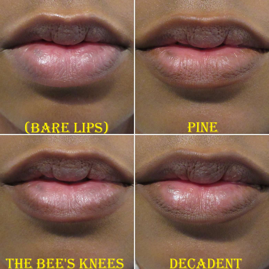
Today’s post certainly includes swatches, but I’ve worn most of the products between 1-3 times. So, I thought it might be nice to add my initial impressions along with it, considering I did not bringing any of these on the trip with me and this could be as close as I get to reviewing them. However, if my initial impressions are vastly off or if I discover additional useful information about the items, I’ll update this post (anytime from June ’23 and onward).
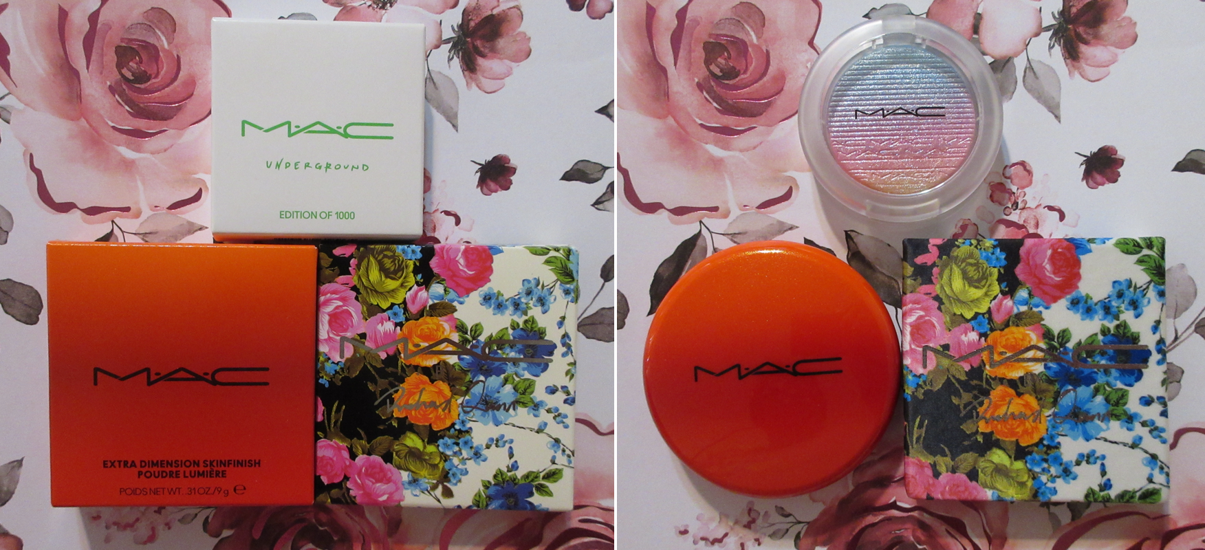
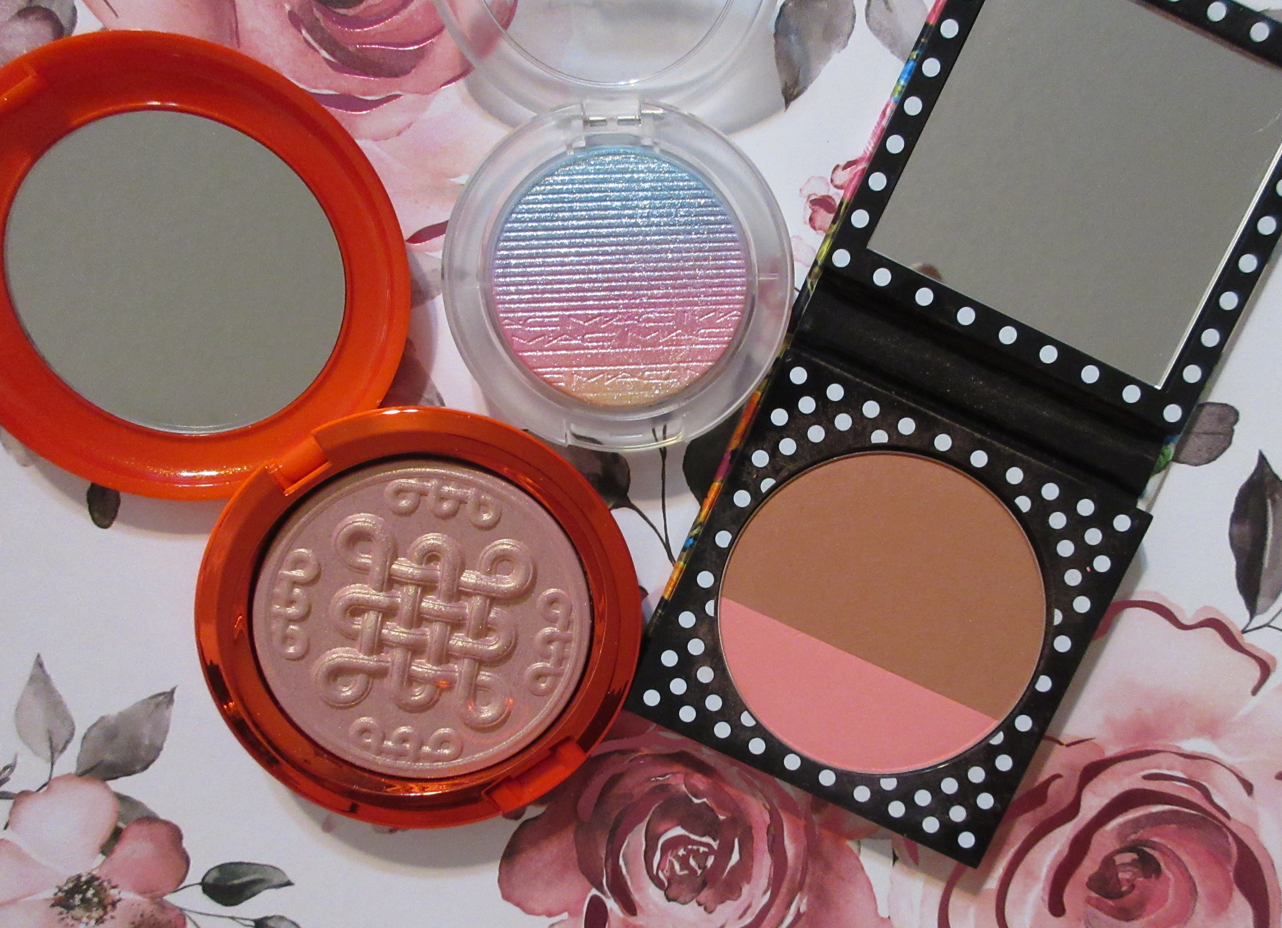
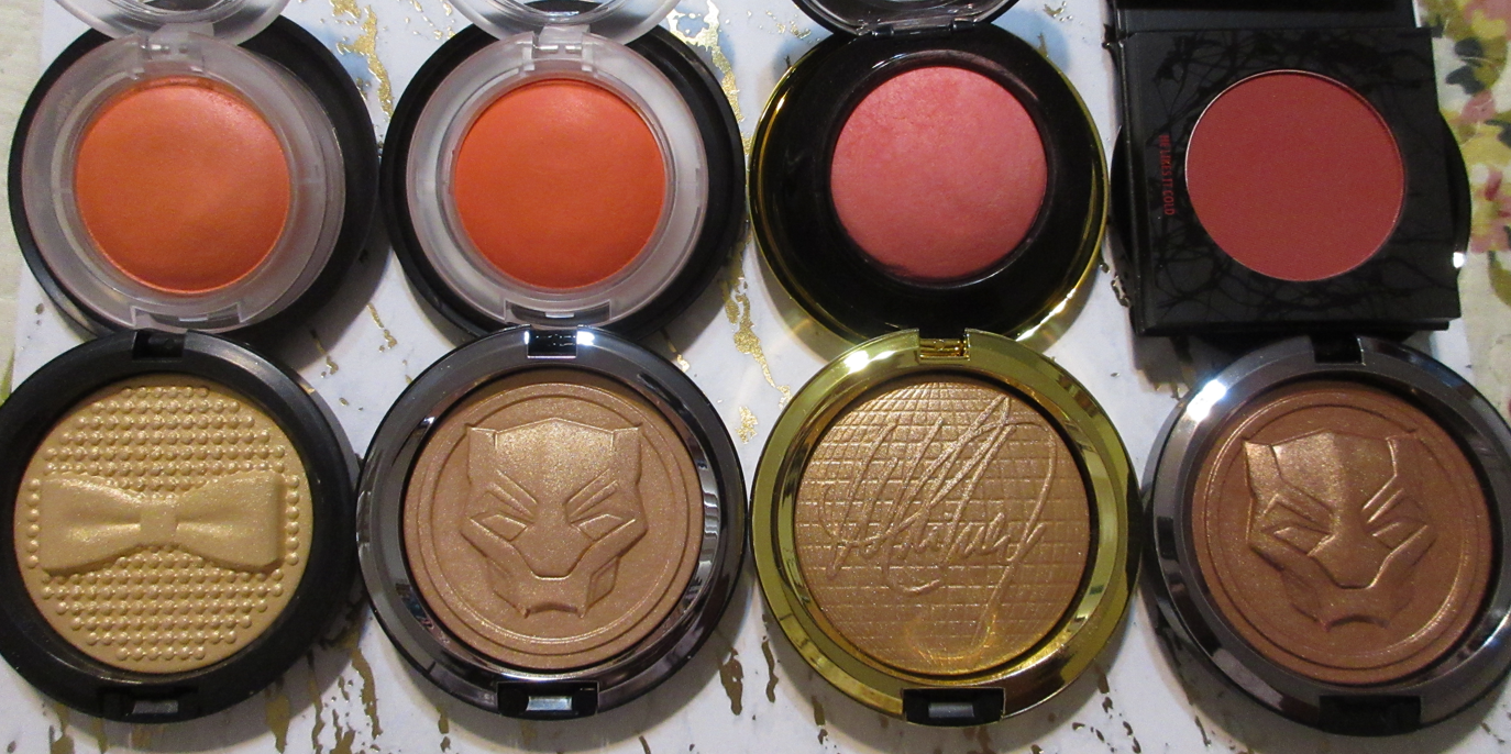
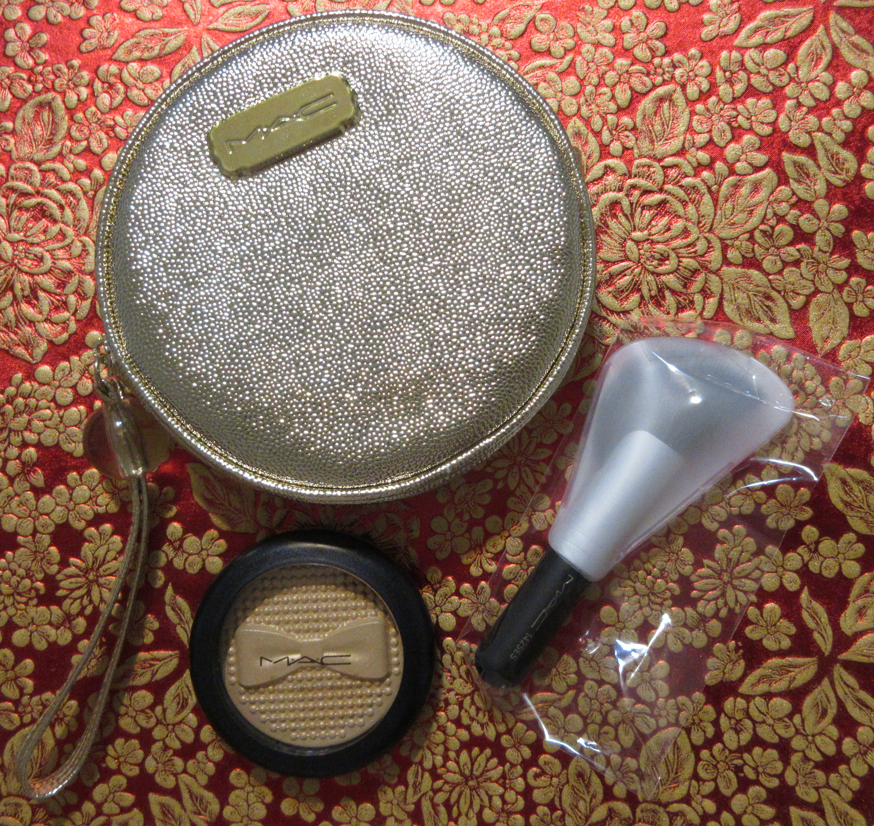
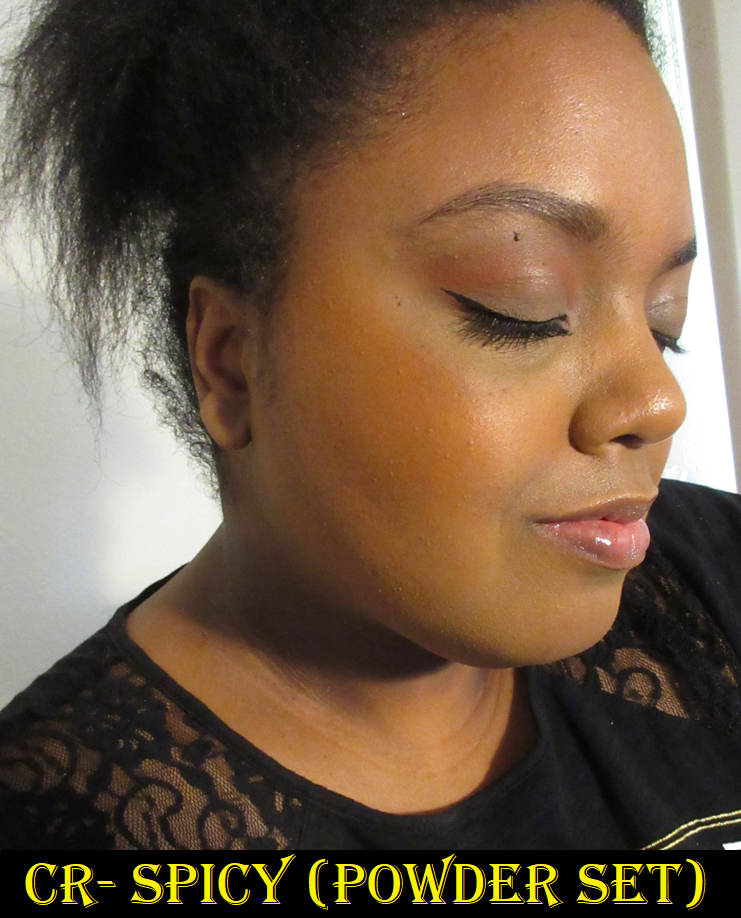
MAC Underground Limited Edition of 1000, MAC New Year Shine Extra Dimension Skinfinish in Beaming Blush, and MAC x Richard Quinn Powder Blush Duo in Sunset Boulevard (Bronze and Coral)
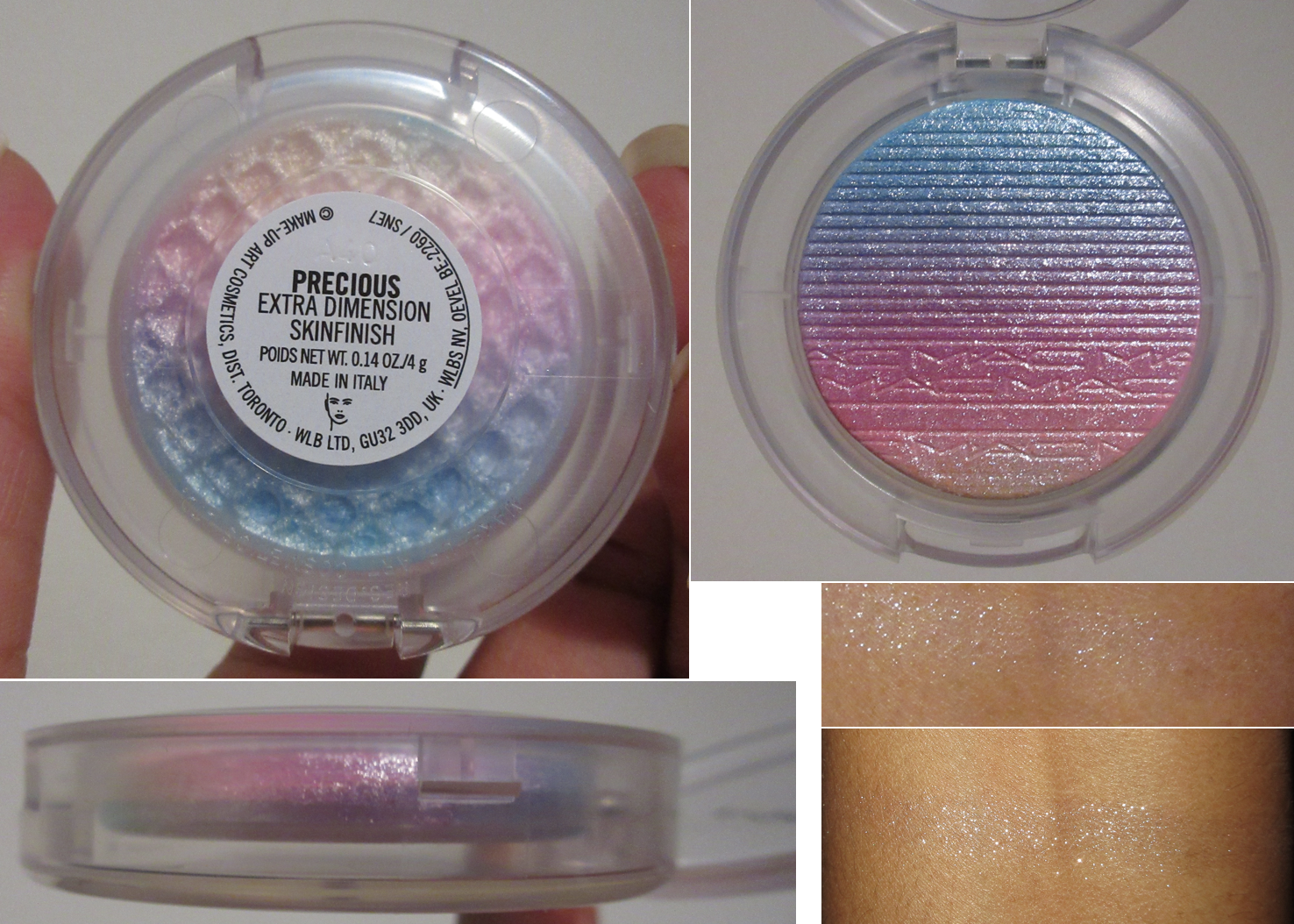
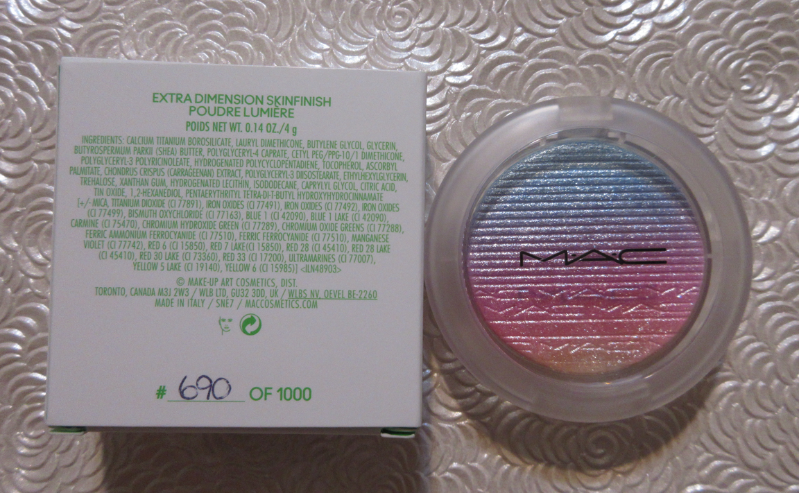
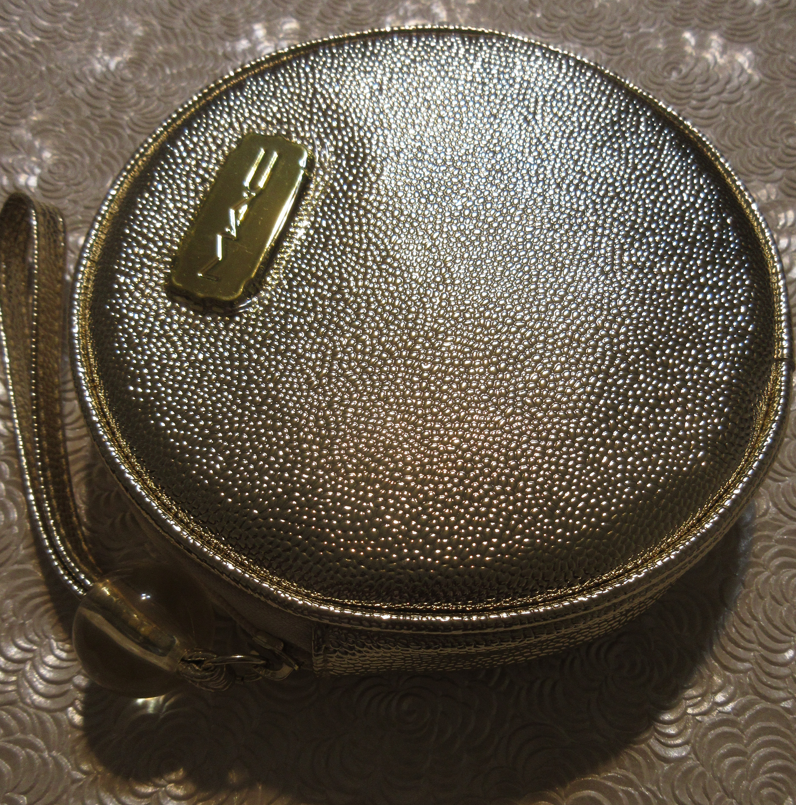
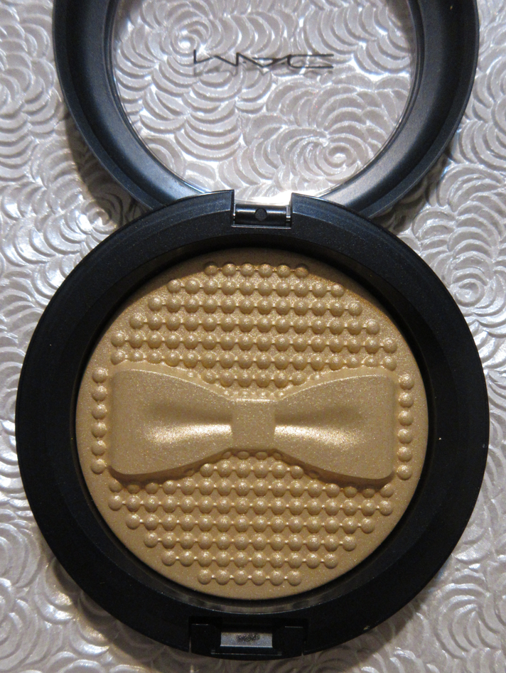
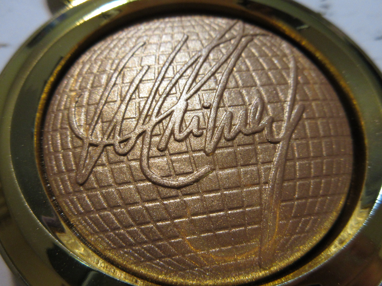
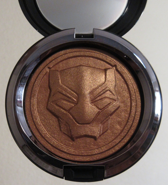
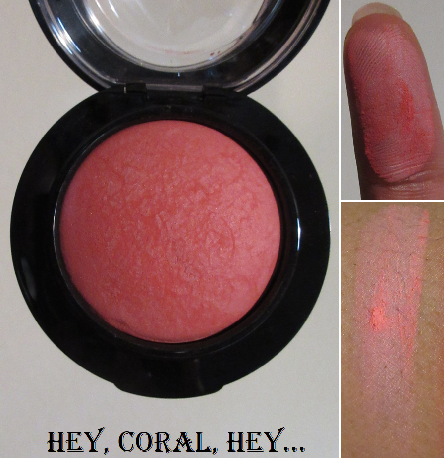
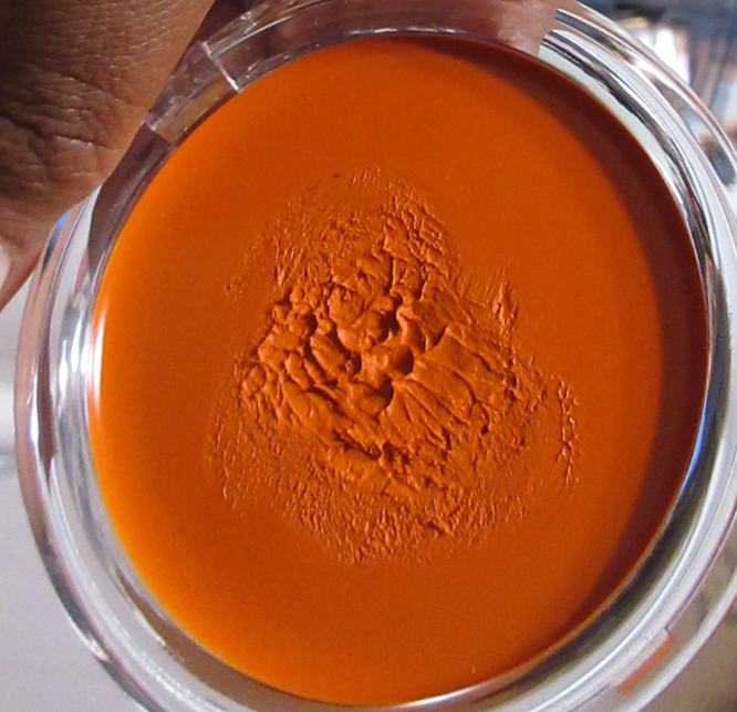
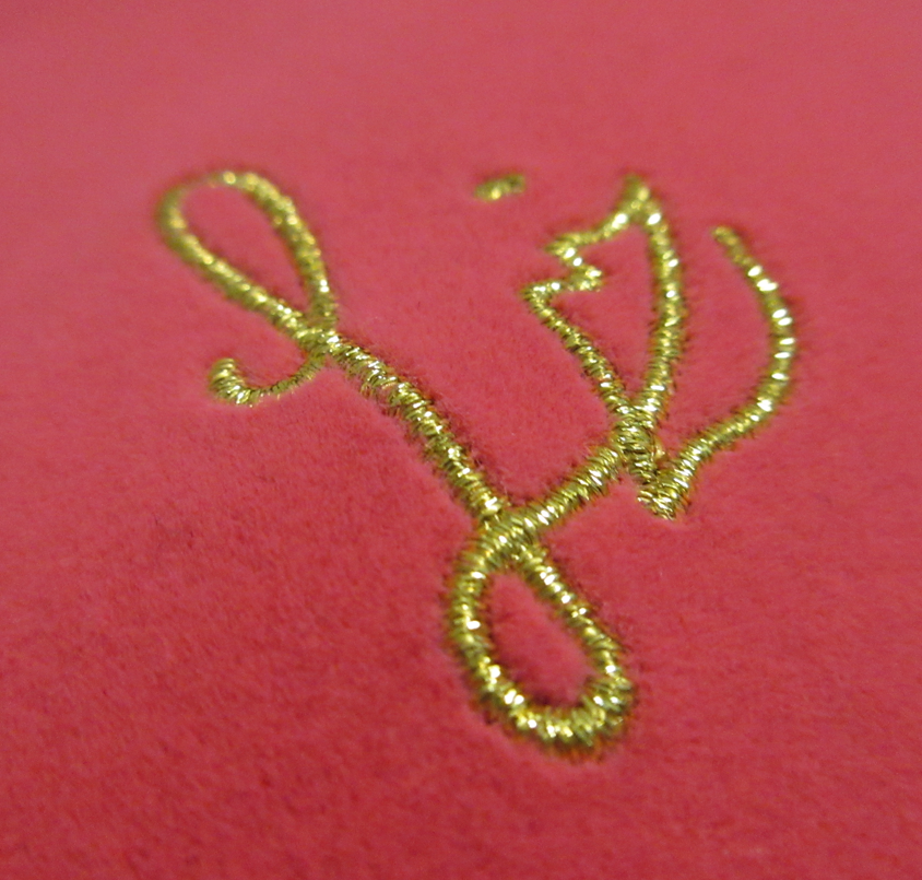
Starting with multi-colored (at least in the pan) highlighter, I actually purchased Precious on February 18, 2023 even though the initial release was in Summer of 2020. I remember how much I regretted not stalking the website, missing out on that launch, and not even being able to buy it from resellers because they were putting it for sale at $100 or more! So, when I recently saw it available on MAC’s US website, I thought it must be a mistake considering they only made 1000 and they sold out extremely quickly. Then, I thought maybe they did a limited re-release. However, mine actually had the number 690 written on the box, which leads me to believe MAC may have misplaced some of that initial inventory from three years ago. I was surprised to see that this order was shipped from Canada (even though I ordered from the US site), which I don’t believe is a usual occurrence with my orders and further leads me in the direction of suspecting this was a misplaced item recently found and put back up for sale. The link I included above had broken (not visible) photos too, which is also why I expected it to be mistakenly made live on the website and thought my order would be cancelled. So, I was quite surprised when it went through and I got it!
It was listed as “low stock” for about ten days before it sold out again. I apologize for not posting about it on my blog or Instagram sooner! I hadn’t expected it to be available for that long.
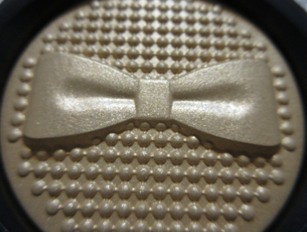
The swatches above are the only ones I took of it. Since it’s definitely not a wearable color for me, I plan on not touching it again and just keeping it for collector purposes just like I wanted to back then! Also, I wonder if MAC will ever make something like this again. It’s so visually stunning and from every angle!
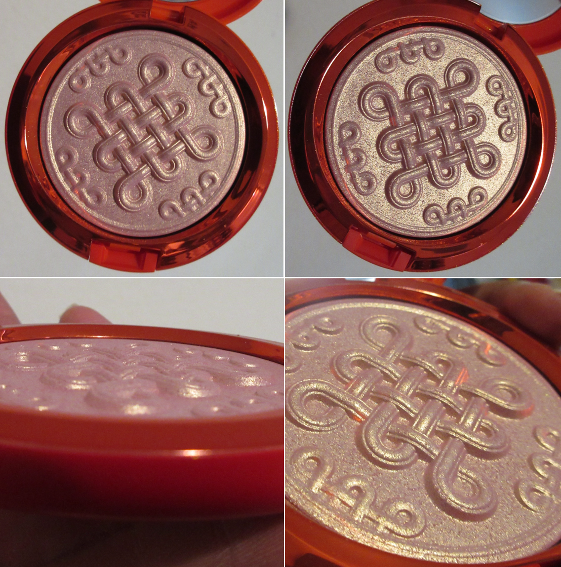
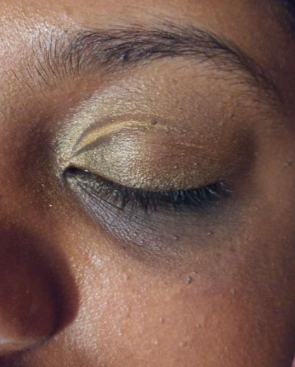
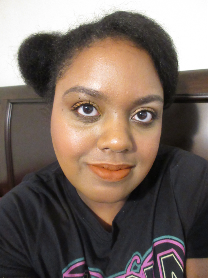
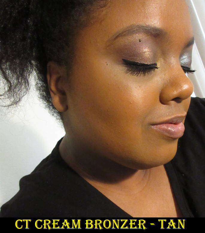
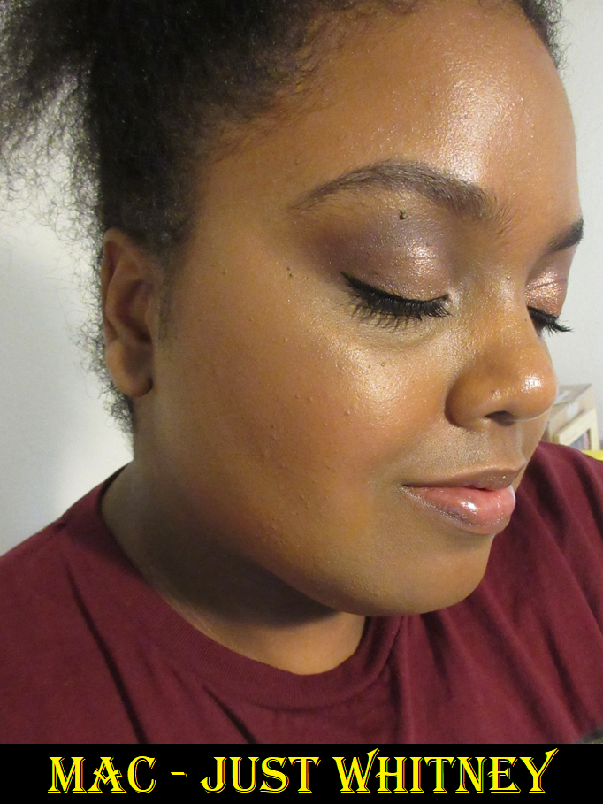
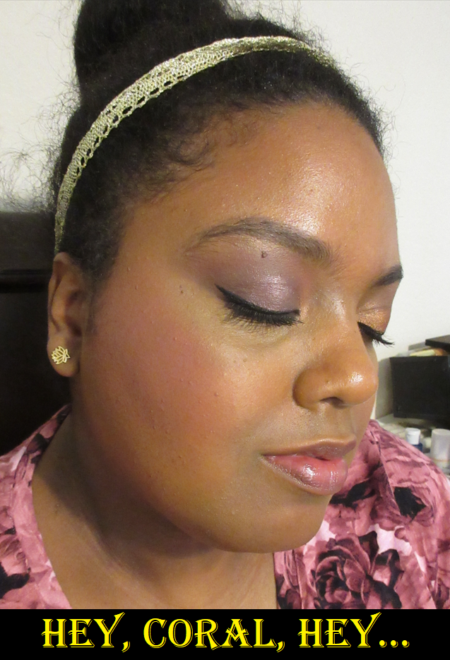
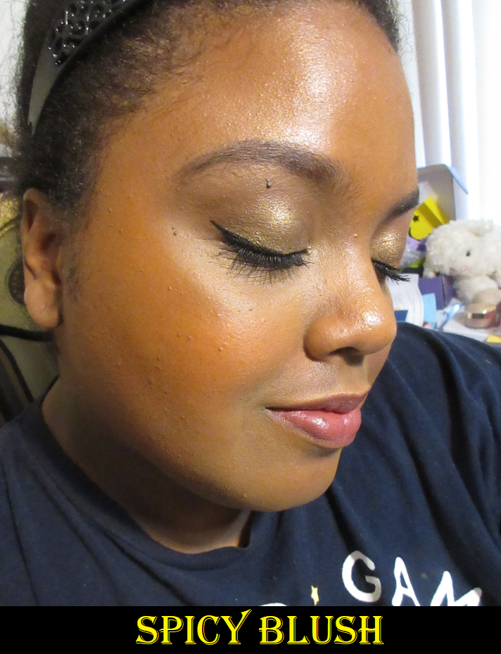
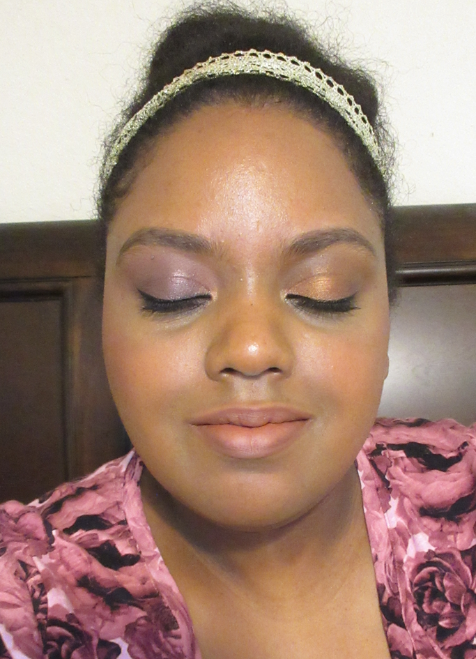
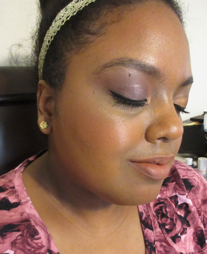
Next on the list to discuss is this year’s Lunar New Year release. Both highlighters in the New Year Shine packaging are previously released shades. Show Gold looked gold but had a stronger pink hue on the skin. The one I purchased, Beaming Blush, looks pink while appearing much more gold on my skin. I was drawn to the embossing, the colors, and packaging from the beginning, but they looked so frosty and light in photos that I didn’t think I’d be able to pull it off until I watched B Rich Beauty on YouTube show the collection and compare them. This one does indeed work for me!
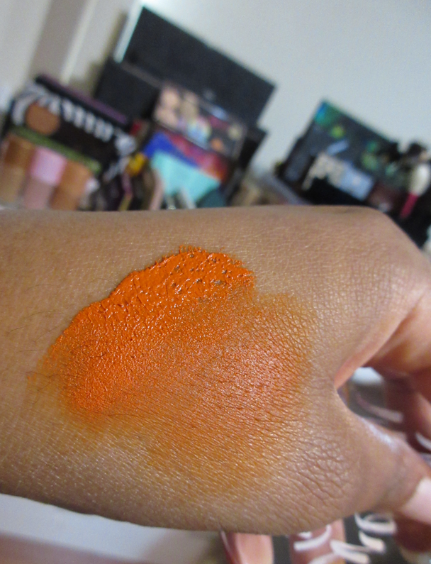
The photos I took are all of Beaming Blush at various angles and light situations to show how it goes from pink to gold.
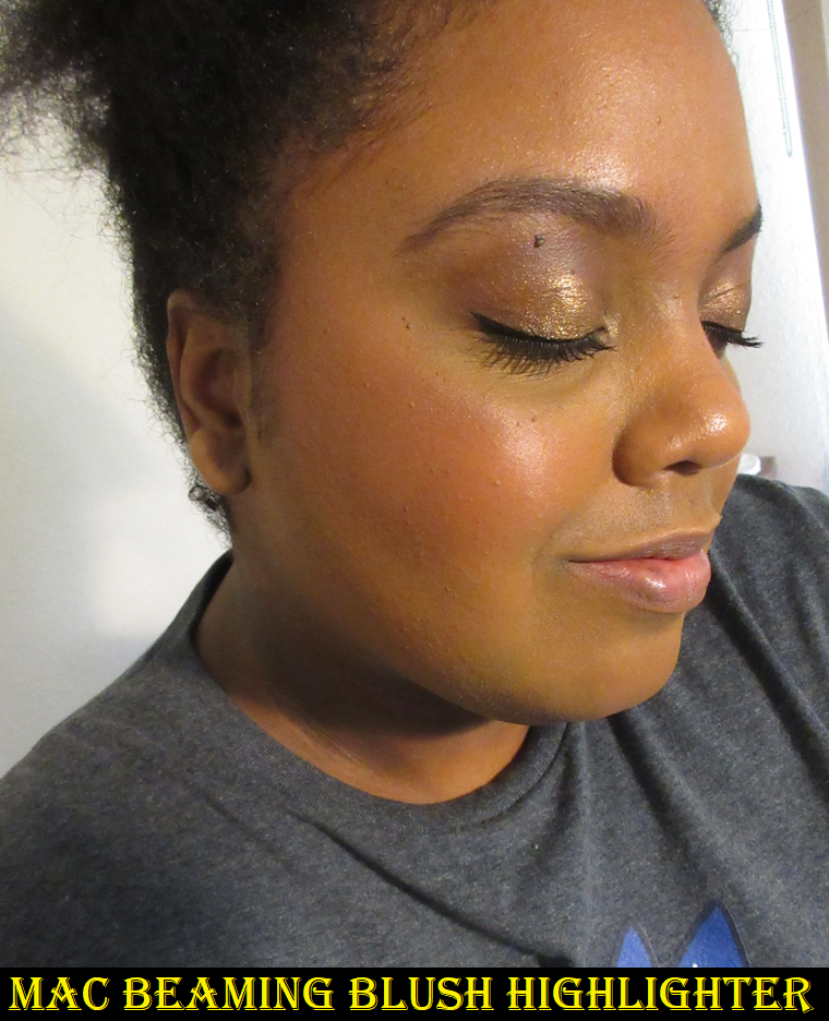
I do happen to have one photo wearing Beaming Blush, but I was wearing the Rituel de Fille Thorn Oil as primer and wearing a mix of two different Armani Color Melting Balms for blush, which means the highlighter looked extra smooth and merged even more with my skin because of these wet ingredients. Beaming Blush isn’t a glittery highlighter by any means and does still work for my skin tone, but it is a little more stark if I’m not wearing my winter foundation, a pink blush, and my skin is drier. The actual formula though is no different from MAC’s other Extra Dimension highlighters, which is a good thing since it’s one of the products MAC nails.
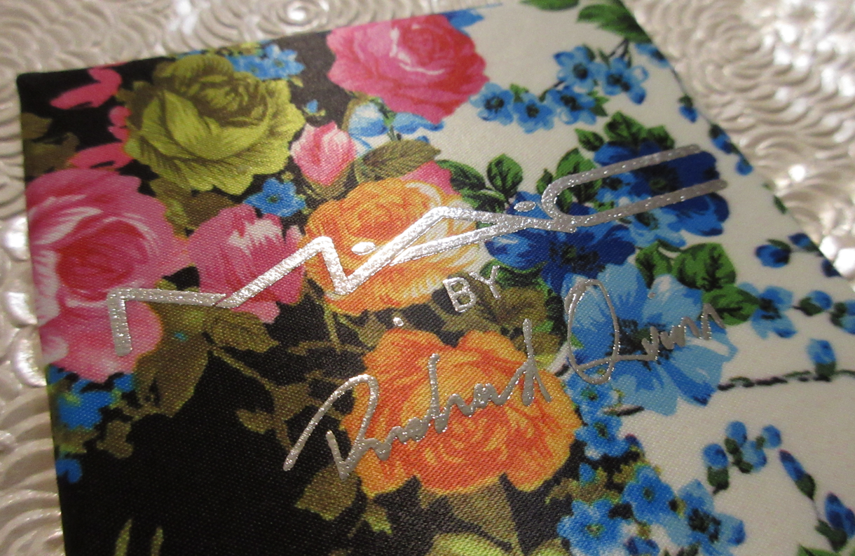
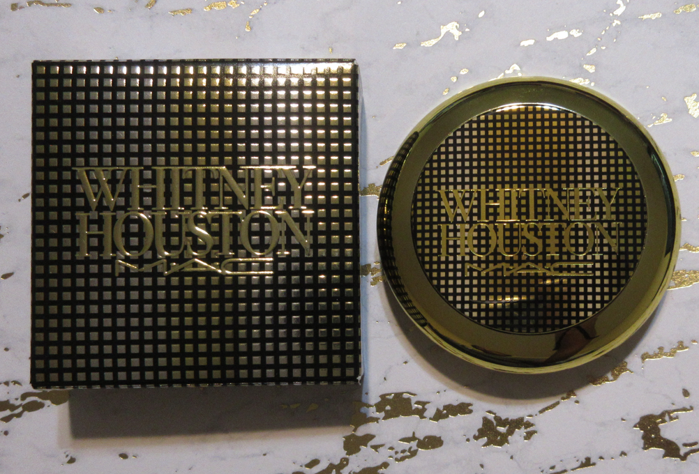
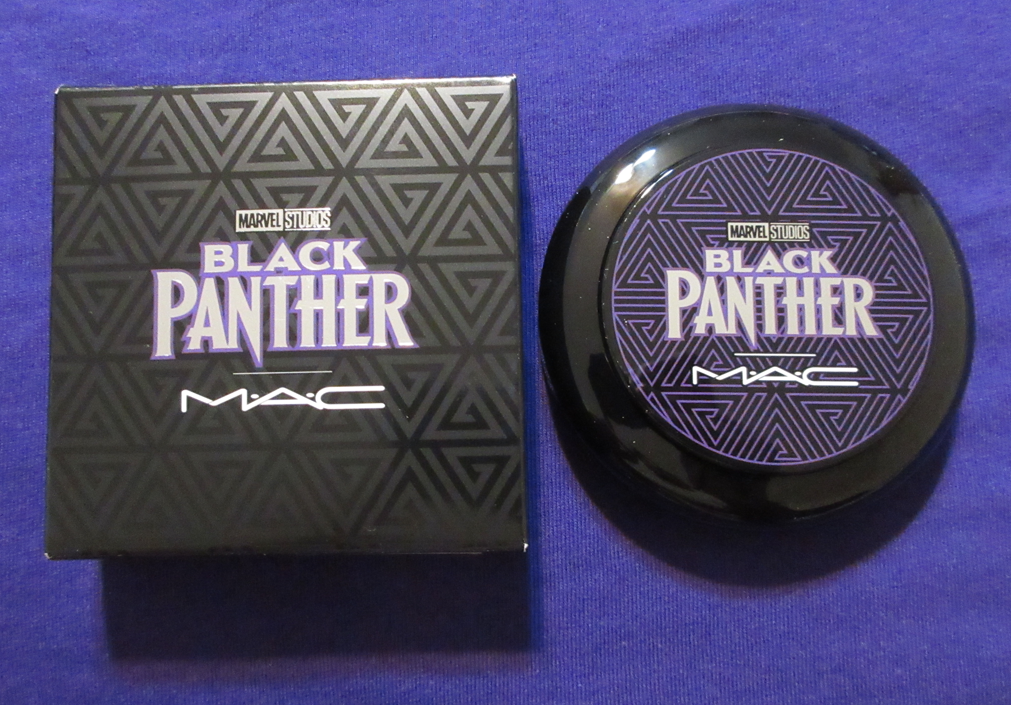
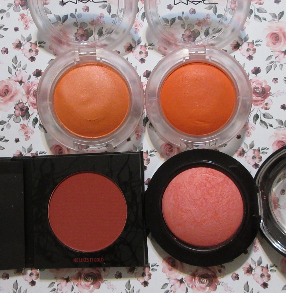
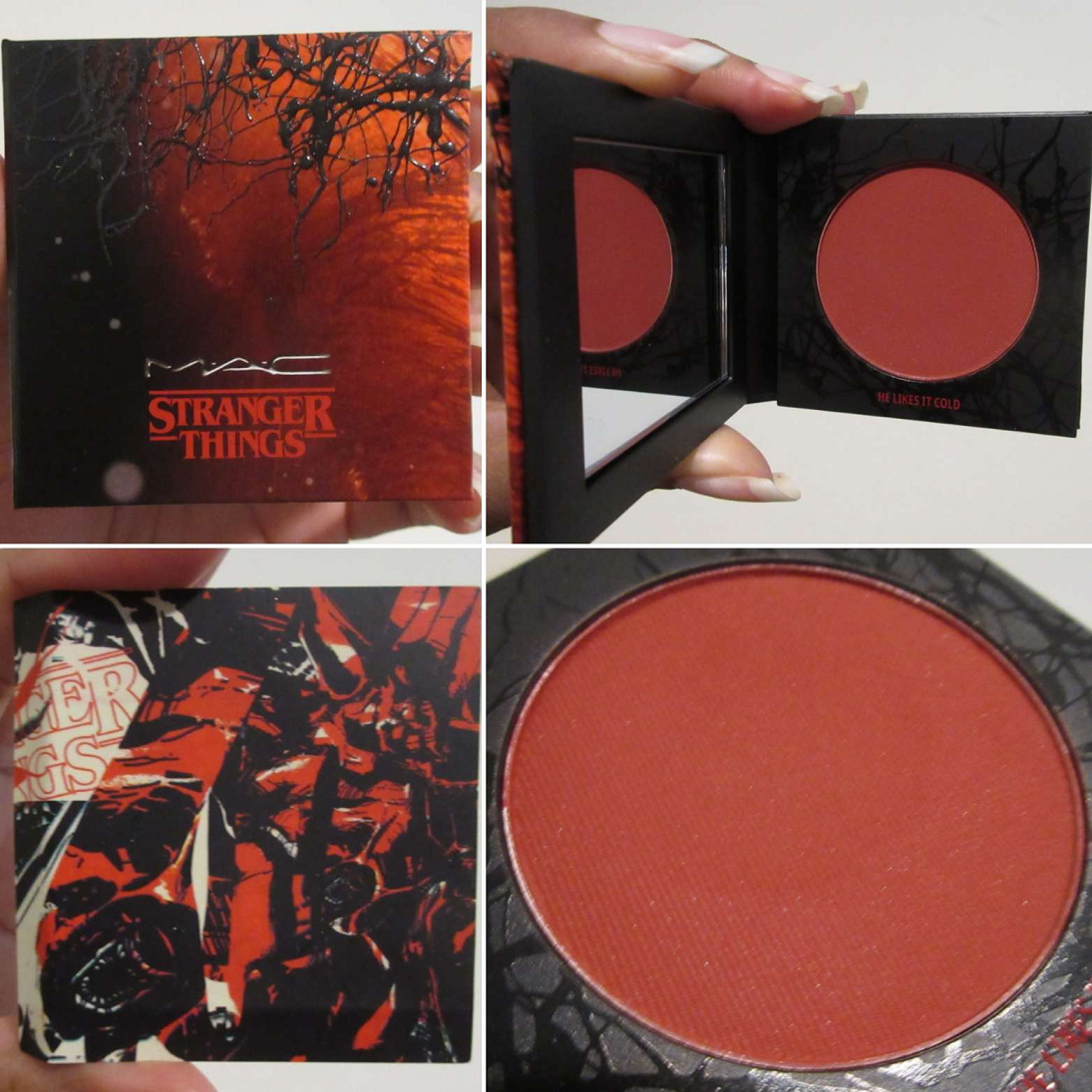
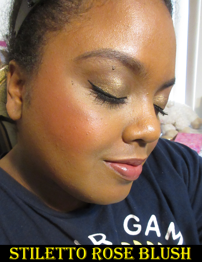
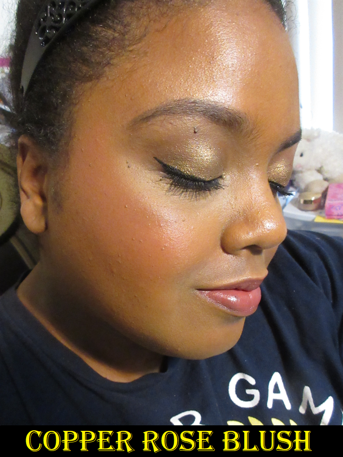
Then, we have the MAC x Richard Quinn Collection with the gorgeous floral print fabric outer packaging. It has a very nice tactile feel to it. I purchased my duo from Selfridges, but it’s now available in the US.
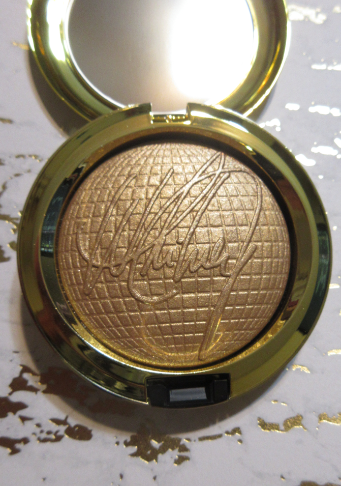
As a packaging lover, I knew I had to get at least something from the Collection, but the makeup isn’t very dark-skin friendly between the pastel eyeshadows and light silvery-beige highlighter, but I thought I had a decent chance of the blush duo working for me.
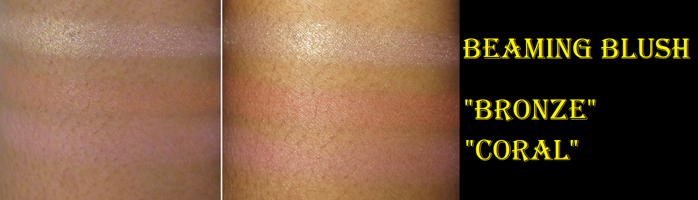
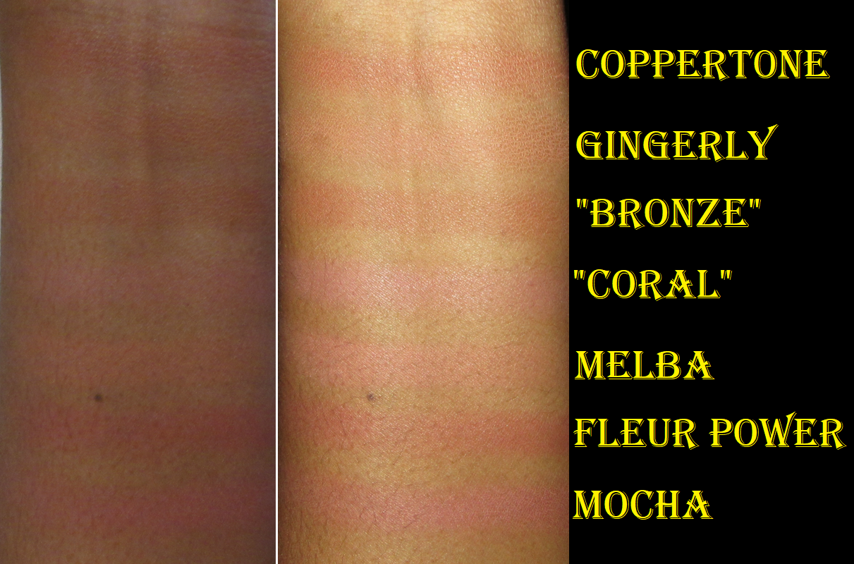
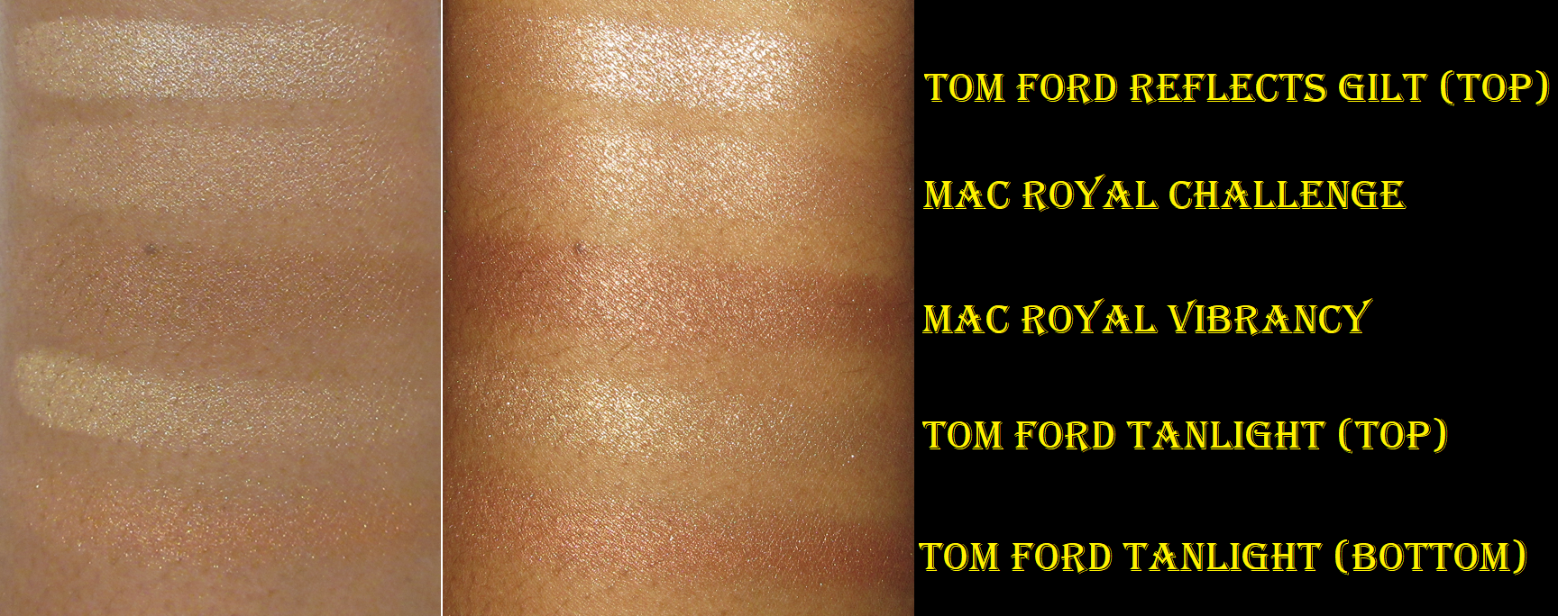
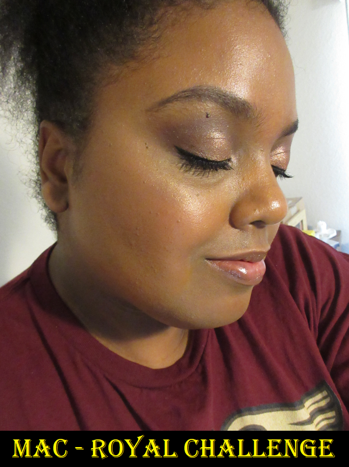
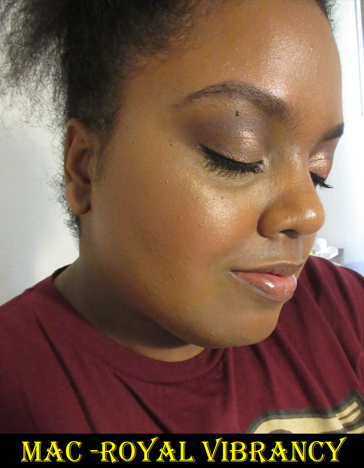
I was right about the “bronze” portion, which isn’t actually named Bronze, but described as that color. It’s quite close to MAC’s Coppertone blush, which is one that only shows when I’m at my lightest. It’s brown with a slight bit of rosiness to it. It’s just like any other MAC powder blush I’ve used before. Long-lasting, buildable, and blendable. I have to build it up for the color to show, but it works for me right now. As for the pink portion, the “coral,” looks ashy on me. It’s much too light, especially with the cooler tone to it. In terms of depth, it’s on par with Melba, but Melba is peachier, which is why I can rock that one when I’m at my lightest. Unsurprisingly, I don’t have many other shade dupes for Coral.
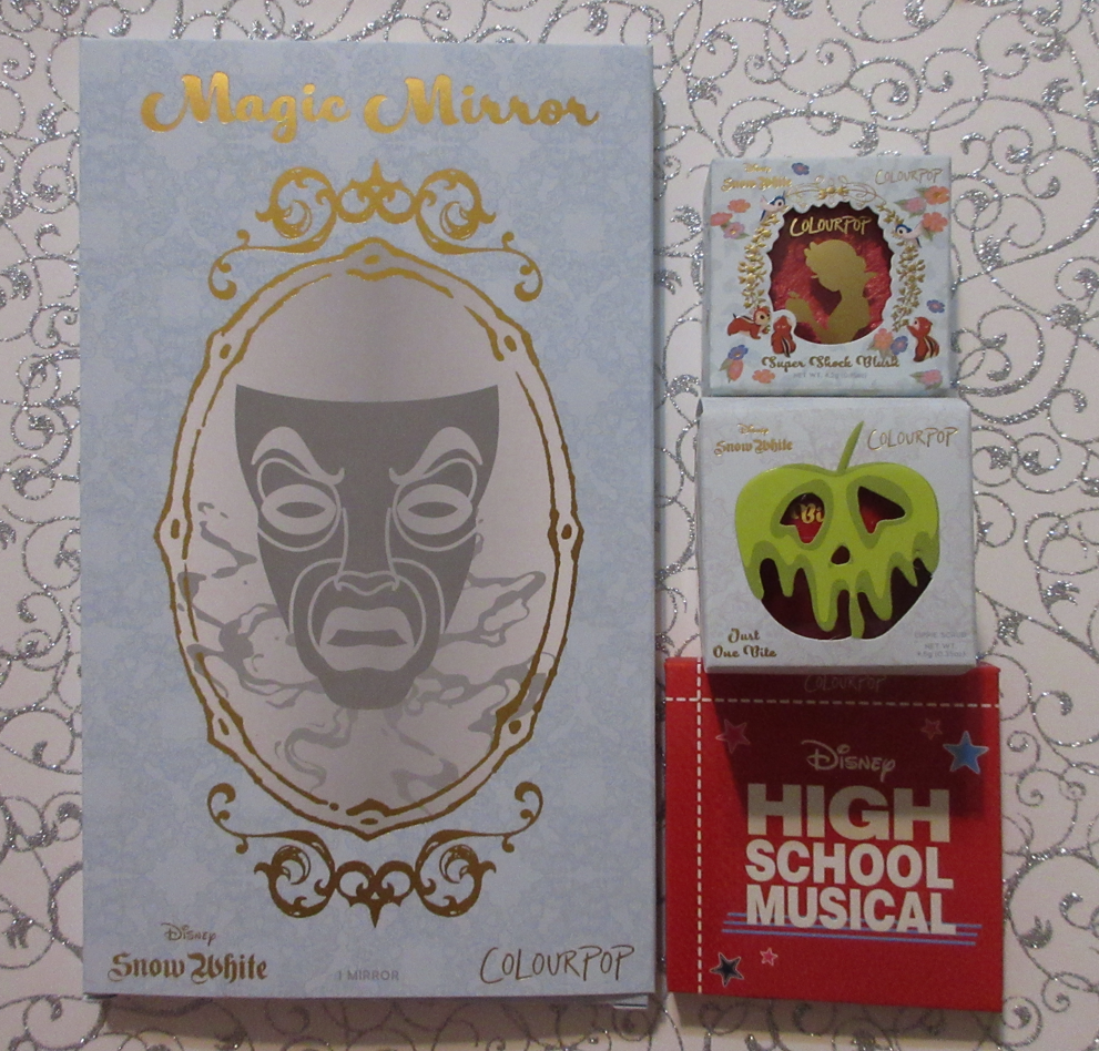
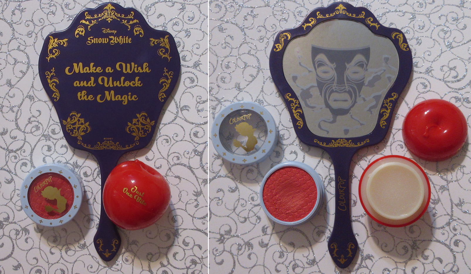
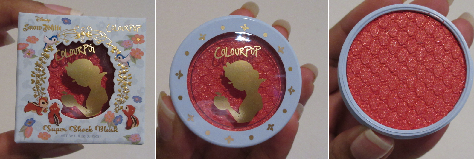
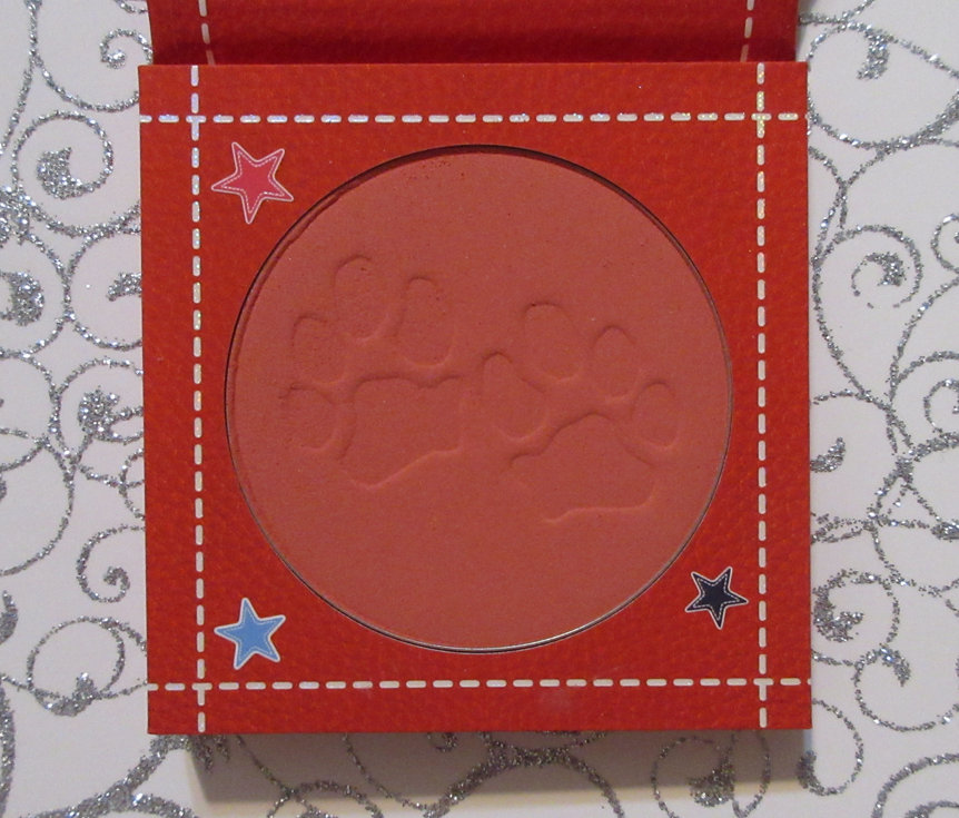
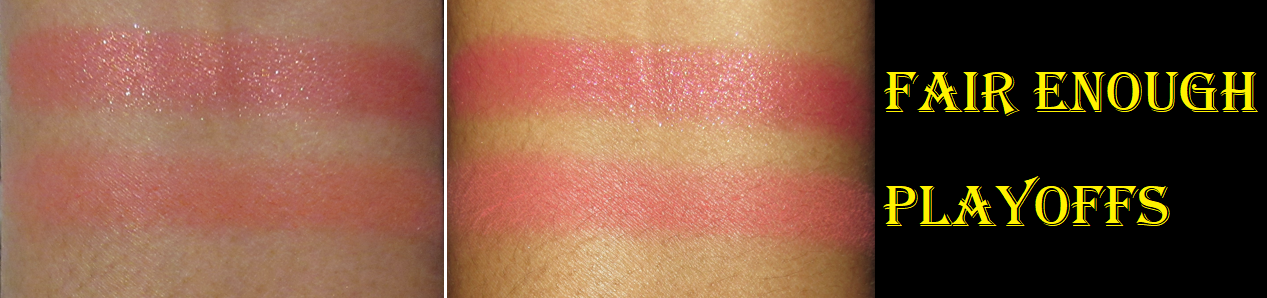
Colourpop x Snow WhiteMagic Mirror, Super Shock Blush in Fair Enough, Lip Scrub in Just One Bite, and Colourpop x High School MusicalPowder Blush in Playoffs
I didn’t need a new mirror, but I have a difficult time resisting unusual shaped ones, like the Colourpop x Hocus Pocus one in the shape of a cat head. This is another collector item purchase.
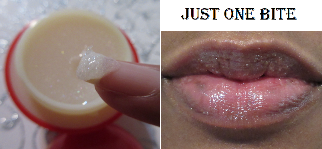
The Just One Bite lip scrub has very fine sugar granules and smells like apples, but thankfully it’s not an overpowering smell. As nice as it is for there to be small crystals, lip scrubs barely work for me because they just aren’t strong enough no matter how much I rub them across my lips. I still wanted this anyway because I’ve been in the mood for DIY projects and know that I could always clean out this cute apple container and replace it with a lip balm that works better for me, or travel size skincare, etc. I’ve done this kind of repurposing with Tony Moly products, including their Red Apple Hand Cream container that’s much larger than the lip scrub one from Colourpop.
I love Super Shock face products from Colourpop, and with this adorable packaging and this shade, I had to grab this one even though I knew it would be shimmery and I’m a little less interested in that type from Colourpop unless it’s a highlighter. As I suspected, the shimmer particles in this one are borderline to my comfort level. The specks are medium sized but a reflective gold that’s absolutely beautiful, but not the most natural looking on the cheeks. I absolutely love the color of this one and can see myself continuing to wear it on occasions that I don’t mind pronounced shimmer and am not going for a subtle look. A product like this is going to be the star of a makeup look because of how much it stands out.
As for the High School Musical blush, I bought it because of how much Angelica Nyqvist was raving about it. It’s true that this is my type of color and it does have a very soft feel to the blush. For some reason though, I wasn’t as impressed when I put it on my cheeks, and that has nothing to do with the formula. I think I just prefer to have a satin or shimmer finish when I wear blushes of this color. So, all I could think about while wearing it was that I prefer the Bare Minerals Blonzer in Kiss of Rose, Hourglass At Night, or even all my pink/red MAC blush shades despite how much more expensive those are compared to this one from Colourpop. I’m also wearing matte blushes less often lately, so this could be something I end up likely a lot more in the future. Also, I wore it while testing out some less glowy foundations, so it’s possible I could like it more if it was on top of something glowier, so I could feel like I wasn’t looking so dry. Playoffs is one of the few items I could see myself changing my mind about for the better. For now, though, it’s just okay.
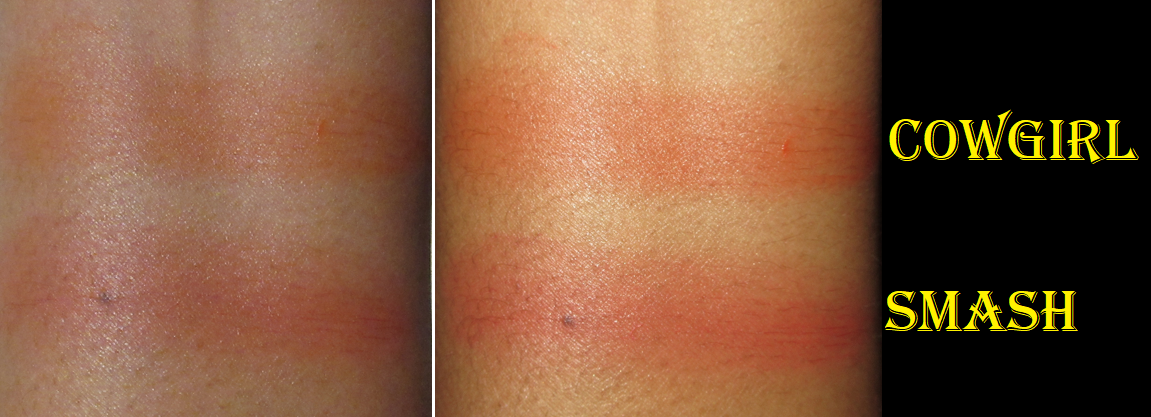
about-face Cheek Freak Blush Balms in Cowgirl and Smash
I bought these during Black Friday last year, but didn’t get around to trying it for the first time until recently. By then, I had completely forgotten these are supposed to be “balms” and intentionally sheer. They still build up to a nice amount of pigment. It feels oily as it instantly melts from the touch of my finger, but as I dab and smooth it onto my cheeks, it takes on a velvety finish and feels a little more silicone-like. It reminds me of the way the One/Size Cheek Clapper in the cream feels after it’s applied to the cheeks. I love that it fully dries down. I like the shade Smash the most. Cowgirl is more orange and less terracotta than I wanted. These look darker in promo photos and in the compact than they will appear on the skin. I’ve used these with a brush and fingers, though I prefer using my finger. I have not tried them with a sponge.
I’ve worn them on bare skin and over foundation, but prefer them over foundation because it gives a blurred and diffused look with the veil of color it leaves on the cheeks. On my bare skin, the vibrancy of color with how sheer they are was an unnatural combination to me, but I have a lot of discoloration, which may have contributed to why I felt that way.
Regarding the longevity, my longest wear test has been eight hours and there was noticeable fading, but I still had enough color by the end of the night to be satisfied. It just faded to looking like a subtle flush, but it might still look vibrant on someone with a lighter skin tone than me. My first impression of this line of blushes is overall a good one. It’s only the color variety that keeps it from being a blush that I’m obsessed with. The line has shades that are a bit too on-the-nose for me. I prefer the nuance of a pink-brown, orange-pink, brown-red, etc. I think I like Smash the most because it’s actually a rosy red and that makes it a little more interesting than a basic red. I know it’s a bit strange to want something different when the brand simultaneously goes so far as including various purples and berries in the line that are definitely more unique types of colors to the market. So, I acknowledge that the brand does have “normal” and out there type of blushes, but I would love to see an expansion of the line to include something between the two. The fact that I instantly went on the website to try and see if they had other shades that I would prefer (they currently do not), is a testament to it being a very interesting product. I really like the formula and just need the perfect color for it to be a favorite.
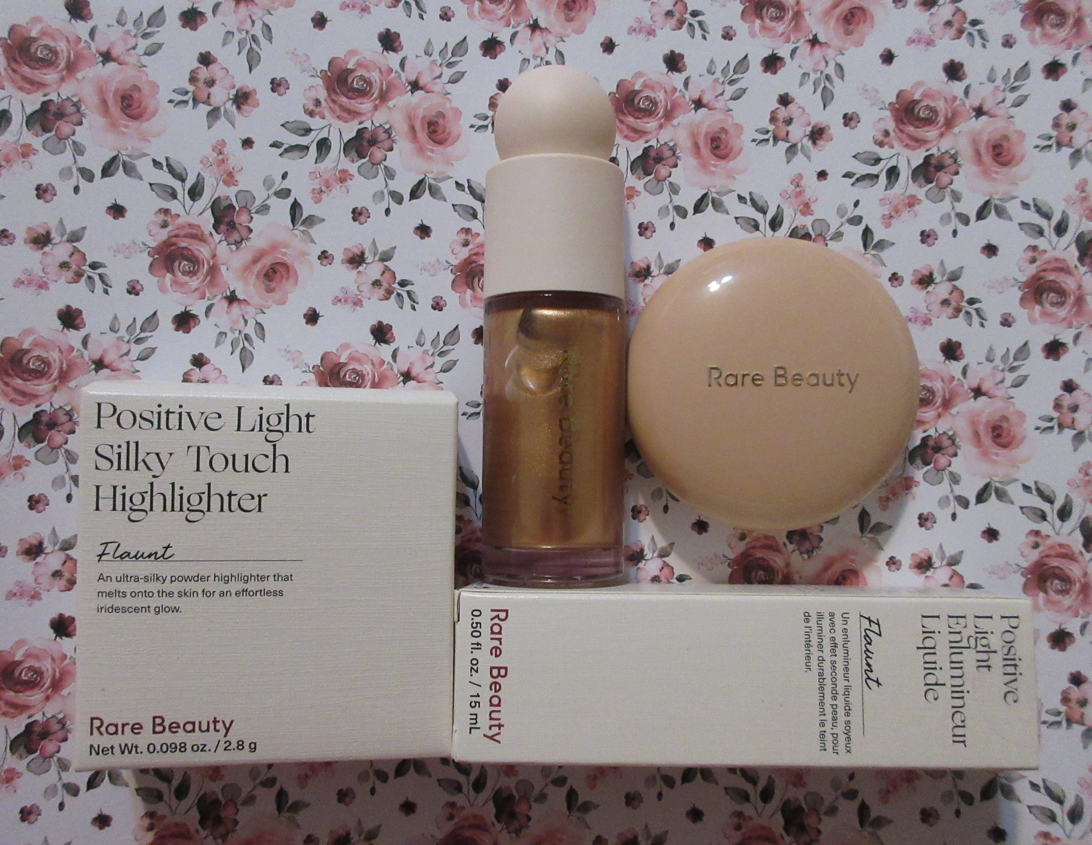
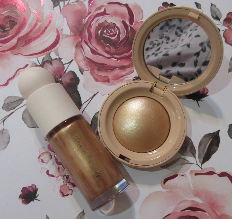
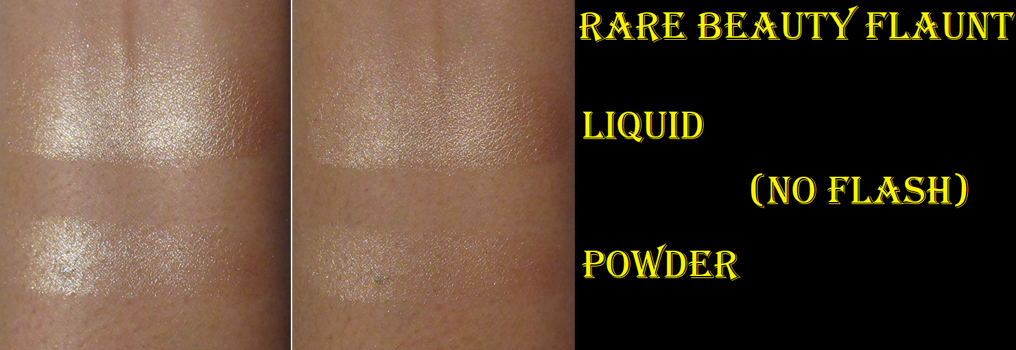
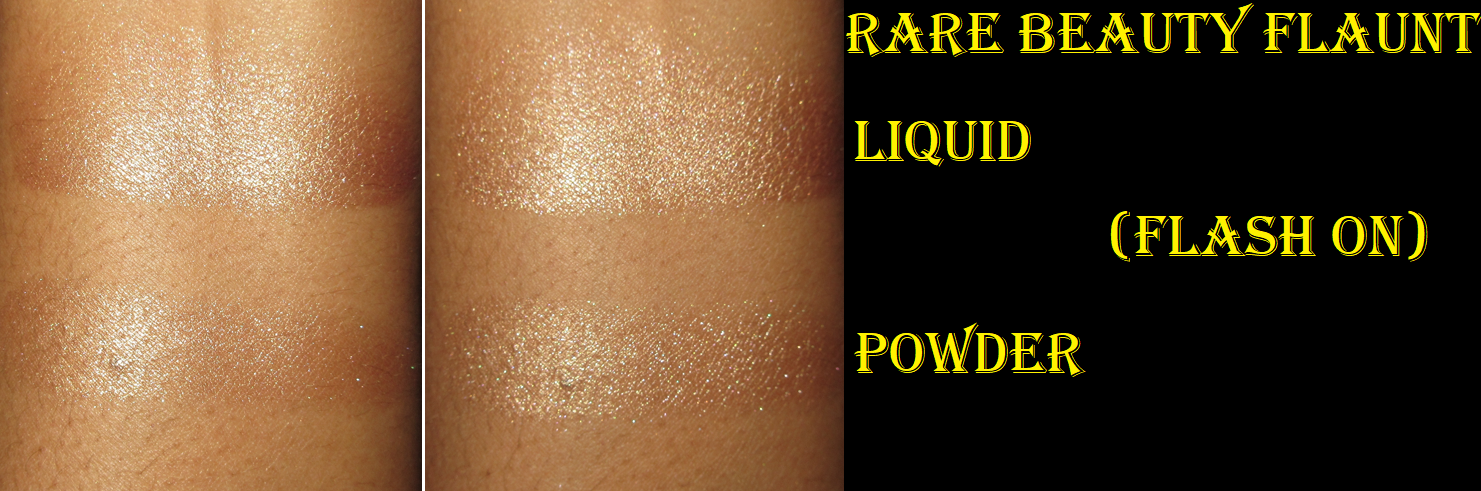
Rare Beauty Positive Light: Silky Touch Highlighter and Liquid Luminizer Highlight in Flaunt
I’ve shown the liquid highlighter before when I tried it as a sample in this post, and I specifically said I wouldn’t buy a full-size (only a mini), but I did it anyway!
I didn’t like the powder version at first because it was so intense and sparkly. What I did not know is that it can actually look smooth depending on the lighting situation. Robert Welsh posted a YouTube short explaining it and demonstrating how the highlighter looked in yellow light versus white light. Sure enough, I loved how it looked under warmer light. My ceiling fan I take pictures near has two daylight lights and a warm one, so depending on the spot I took swatches, it looked smoother or more intense. So, I like that this highlighter can be flattering, but the problem is that we cannot control what kind of lights will be around when we’re out and about. So, I don’t want to be paranoid about having a glittery cheek when I’m in public and caught in literally a bad light. So, it’s very possible I will end up decluttering this.
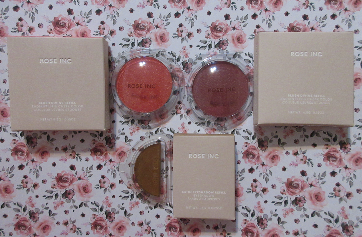
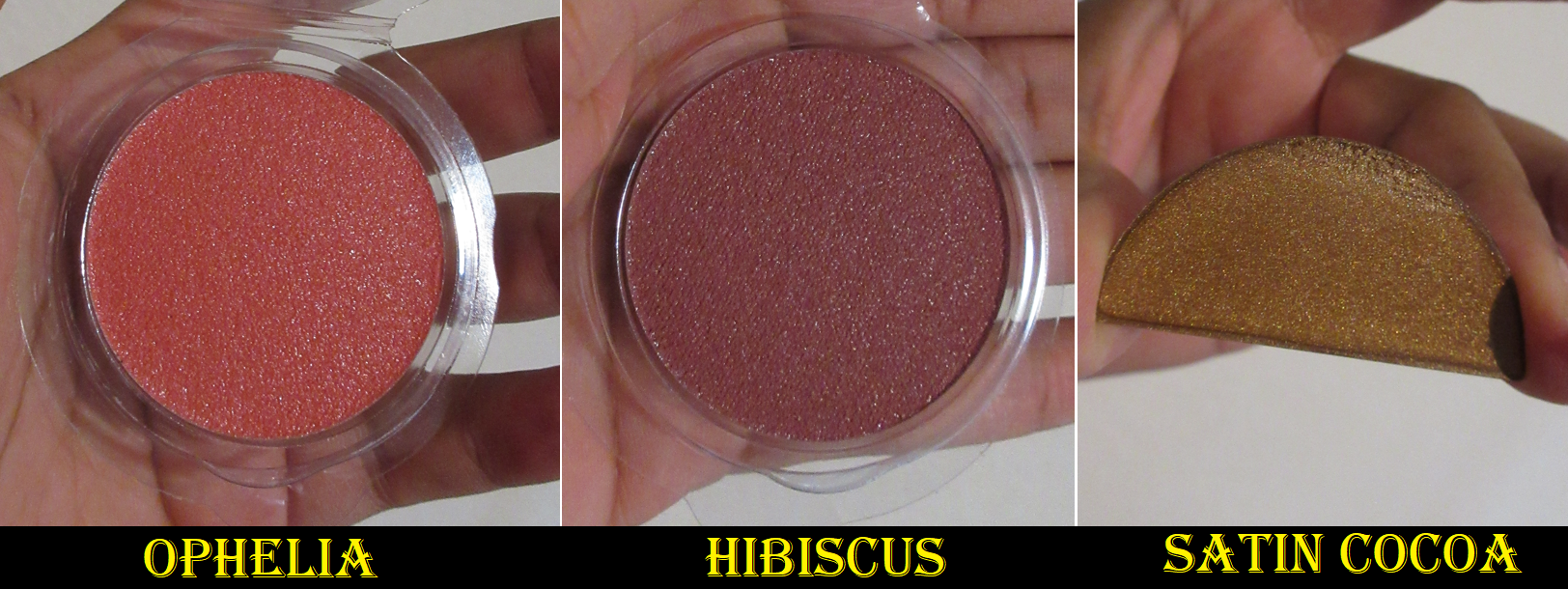
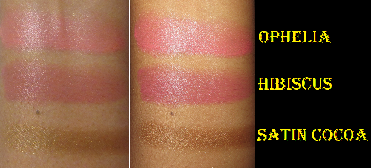
Rose Inc Refills: Cream Blush Refillable Cheek & Lip Color in Ophelia and Hibiscus and Satin Eyeshadow in Satin Cocoa
In that same post that I linked in the Rare Beauty section, I reviewed and demonstrated four different Rose Inc blush shades. I also showed the shade Wisteria here, and in my depotting post, I mentioned that saving the samples was keeping me from being tempted to buy more shades when I know that I don’t like the dewy feeling from them never drying down, which keeps the blushes from being a favorite even though I love the actual look of them.
However, Rose Inc temporarily added full-size blush refills to the free samples with order sidebar. They offer free shipping (at least to the US) with no price minimum and allow up to 2 free samples with orders. So, essentially, I bought the eyeshadow and got the two blushes for free! Plus, I was able to use a promo code to make the price even lower. There was no way I could pass that up! Especially since I have been curious to see what the eyeshadows would be like. I haven’t worn these particular blush shades on my cheeks yet, but since I’m familiar with the formula already, I think it’s safe to wager they aren’t any different from the ones I’ve reviewed on this blog before.
Rose Inc currently has two eyeshadow formulas in two finishes, a satin and shimmer. I somehow mixed up the fact that the satin is a cream product and the shimmer is the pressed one. The green one I was most interested in was sold out, so I opted for Satin Cocoa as one can never go wrong with a pretty gold or bronze…or so I thought.
I have only tried these on bare lids and with the Danessa Myricks Blurring Balm because I know with my oily lids, I figured the cream would need some oil absorbing properties to last on my eyes, but that was a bad idea. I had instant creasing before I could even finish applying it on the other eye! The creasing got worse and within a few hours most of the eyeshadow was just gone from my eyes.
Unless a cream shadow dries down completely or I use one with thick mattes that I can essentially use as a barrier between my oils and the cream, ceasing is inevitable. However, to have it completely gone off my eyes by the four hour mark is a little less common. I’m not ready to completely write this off yet, as I have other primers and techniques I could try, but this is just a first impression.
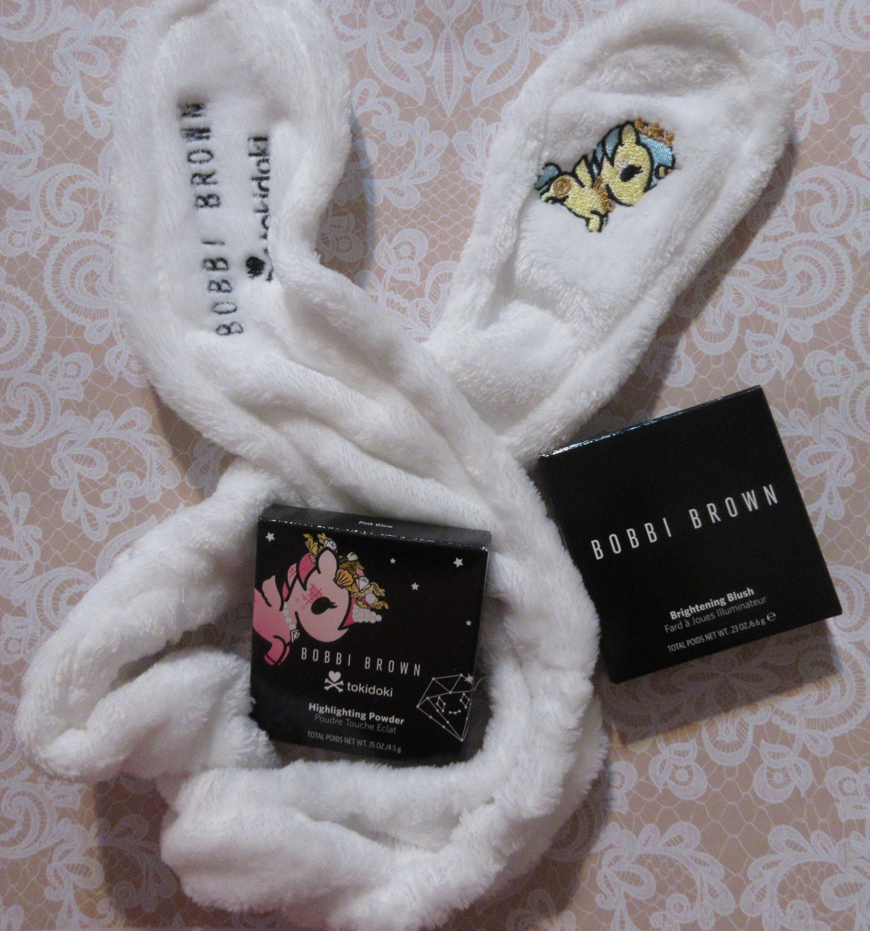
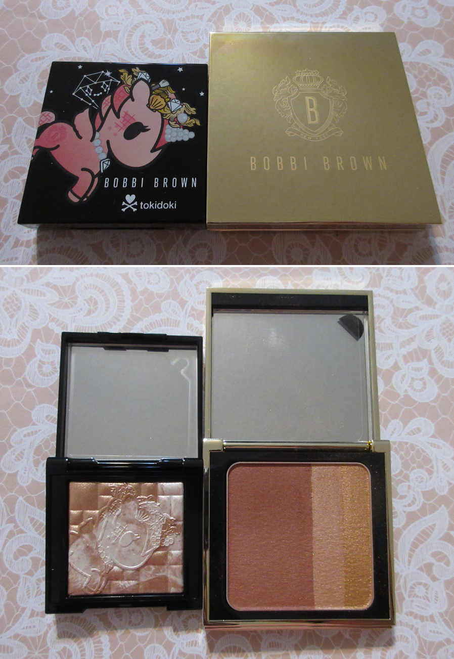
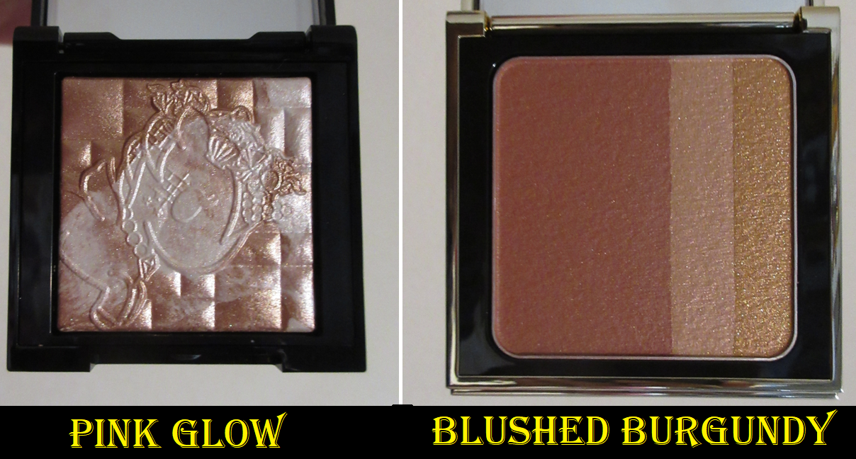
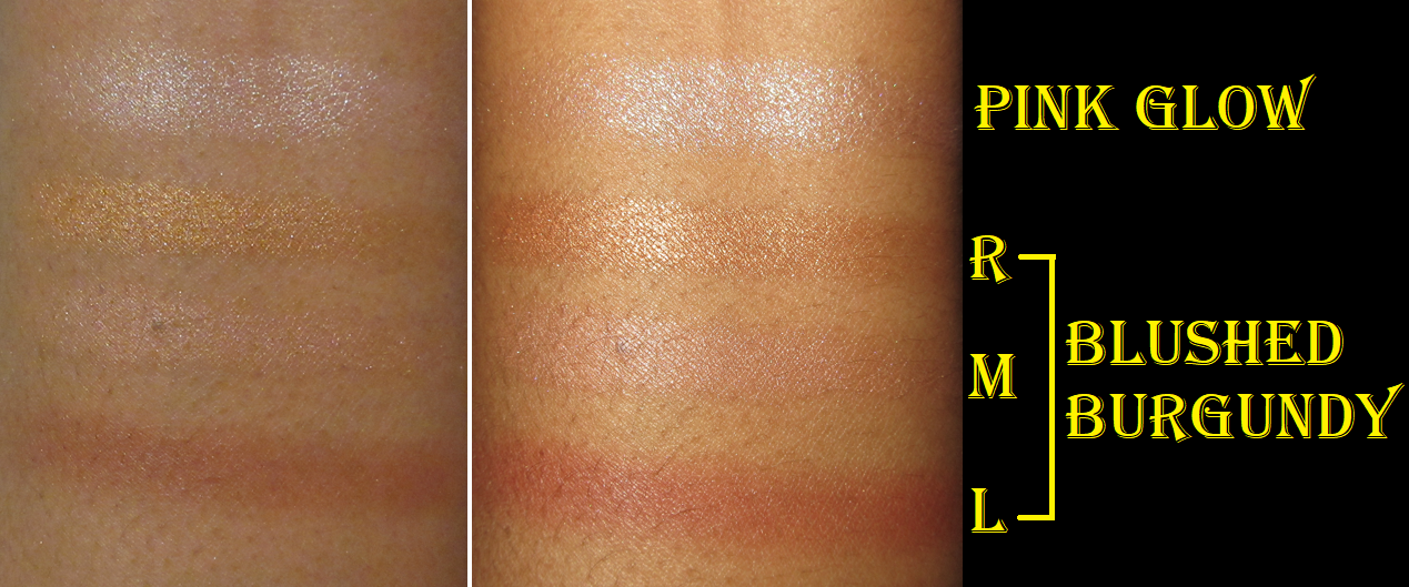
Bobbi Brown x Tokidoki Mini Highlighting Powder in Pink Glow and Headband and Bobbi Brown Brightening Blush in Blushed Burgundy
There was a sale on the Toki Doki items on Bobbi Brown’s website last December, and any order of an item from the collection came with a free headband, so that was enough to steer me towards getting the mini highlighter (as one of the lower priced items available) even though I knew Pink Glow would be too light for me. This is yet another product I purchased for collector purposes. I’ve used Bobbi Brown’s highlighters before in this same formula, just different shades, and it’s quite pretty and very shimmery without being that glittery/sparkly level I don’t prefer. I think it’s a nice product, but I always end up feeling like MAC does it better for a lower price as well, even though formulas are probably shared under the Estee Lauder umbrella.
As for the Brightening Blush, I bought that from Selfridges in order to get it for a slightly lower price. There are two different shimmery strips, which is nice for those who want something champagne and lighter or gold and deeper, though I can only isolate each color if I use a fan brush. With the main blush, which I believe is a satin-matte, it’s a little trickier to get just that color onto my blush brushes and avoid the shimmer. However, I personally find it prettier when I use them separately and keep the burgundy shade on my cheeks and put the gold shimmer on my cheekbones, versus swirling all of them together for a glowy cheek look. I’m not sure if it’s the champagne strip specifically that throws it off, but the shimmer just doesn’t look as refined to me when on top of the blush. However, it looked nice and smooth when just kept in the typical highlighting areas.
Oh! And I updated the Kaleidos post in the eyeliner section to show swatches of the additional Danessa Myricks multichrome liners that I bought.
That’s all I have for today! As I mentioned in last week’s post and on the Homepage, I’m spending two months in Germany and there’s a high chance posts will not be on the regular Monday schedule during this time. Thank you for reading!
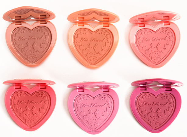
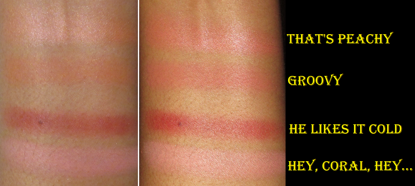
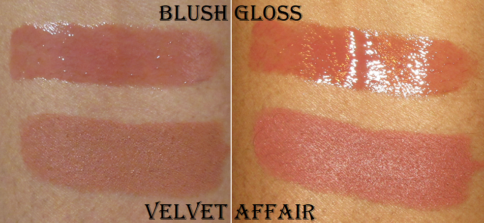
I vaguely remember owning the Too Faced Sweethearts Perfect Flush Blush, but in the shade that was a highlighter for my skintone rather than a blush. As for their other line of blushes, the Love Flush Blushes, I never owned any of those.
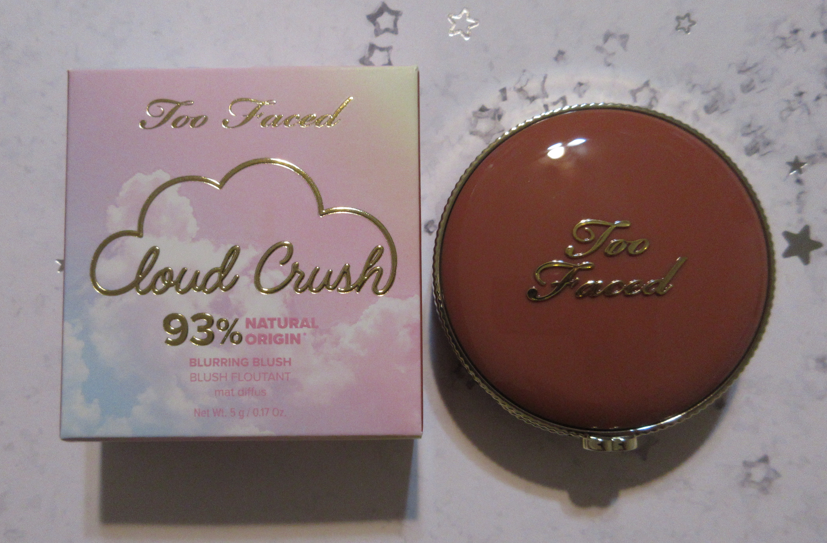
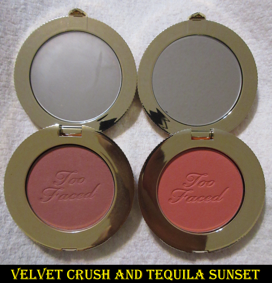
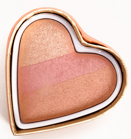
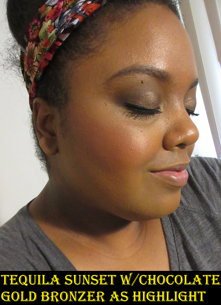
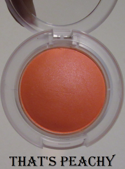
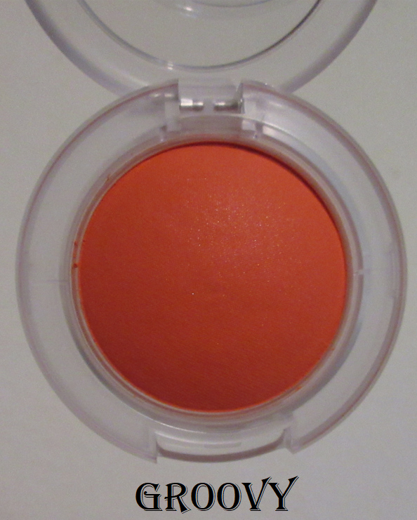
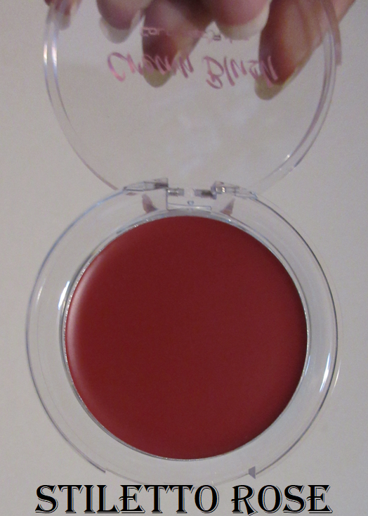
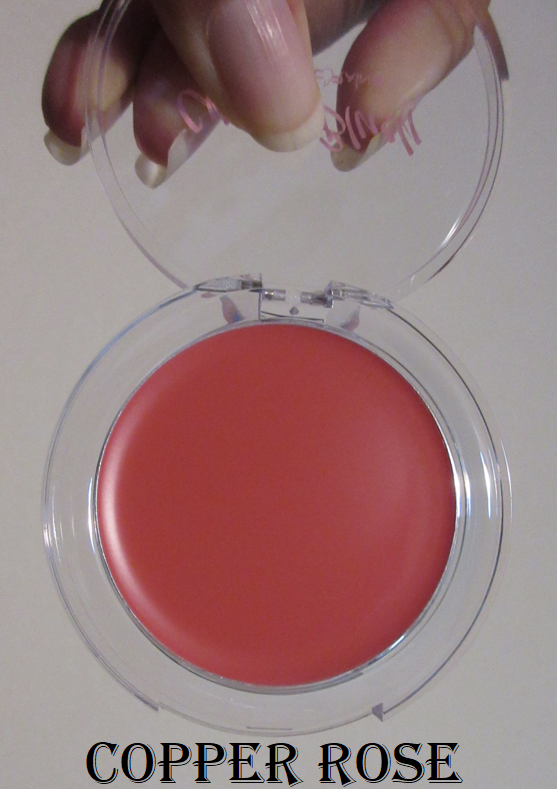
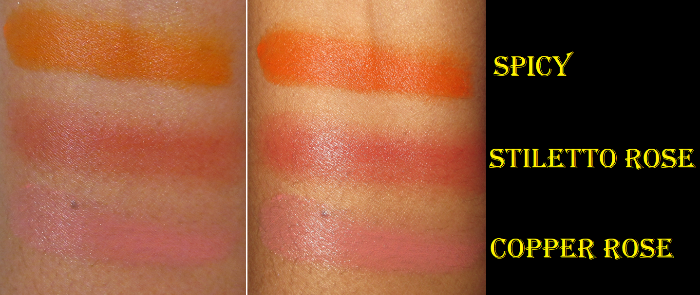
Today’s review is what I consider to be my first time really experiencing Too Faced’s blushes with their new line of Cloud Crush Blurring Blushes. The collection is available, “in diffused satin and diffused matte finishes,” but Velvet Crush and Tequila Sunset are both mattes.
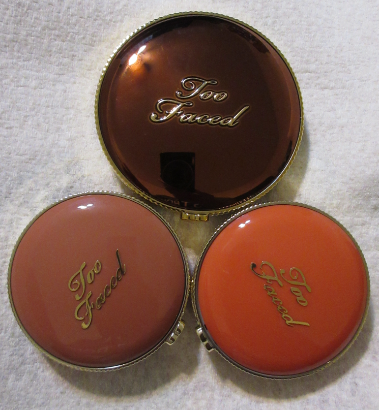
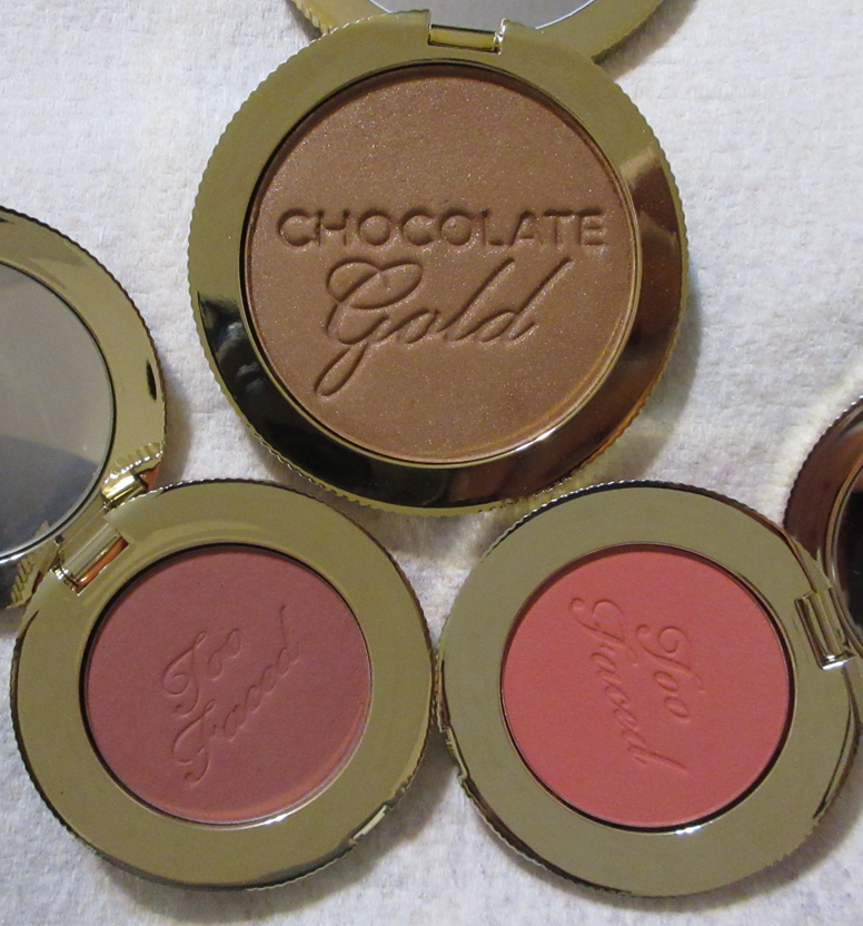
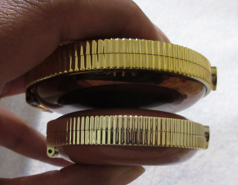
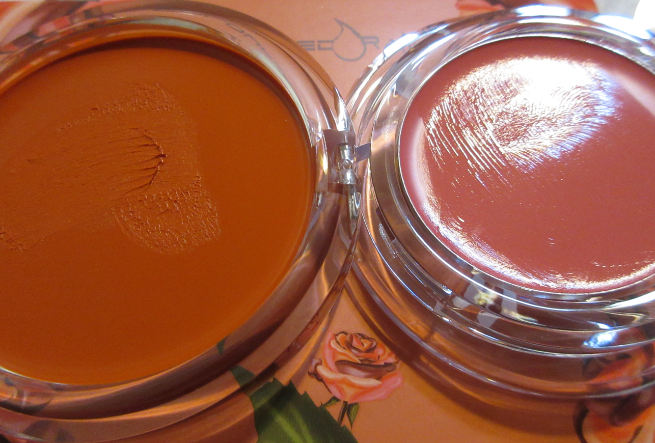
Because I have the Too Faced Chocolate Gold Bronzer, which is in similar packaging, I wanted to compare these in size and color.
The bronzer compact and pan is larger than the blushes in length and width, but about the same height. The outer rim of the bronzer is gold, whereas the blush rims are closer to silver. Both products are scented, with Chocolate Gold still maintaining its chocolate scent three years after I got it, and the Cloud Crush blushes have a pleasant fruity fragrance that smells familiar, but I can’t pinpoint what it is specifically. Too Faced just says it smells like a tropical beach.
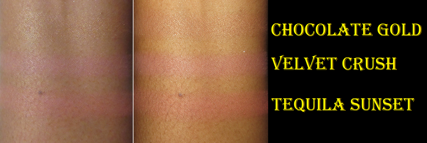
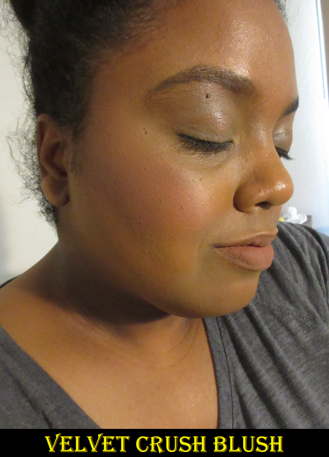
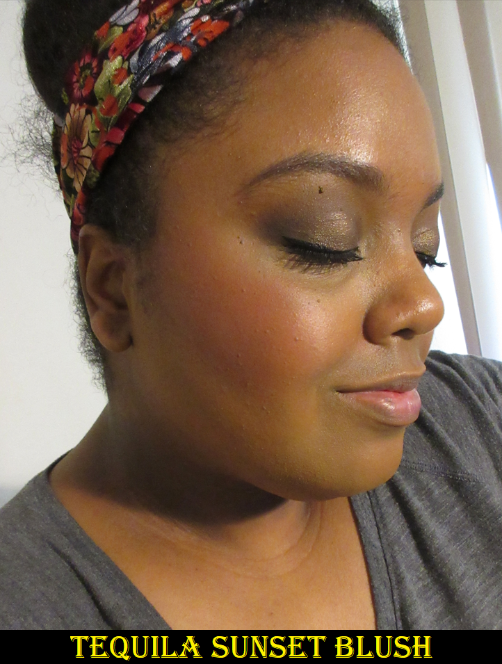
The claims for these blushes is that they’re supposed to be “ultra-smooth, velvet-like, buildable and blendable with a natural blurring effect and a soft, second-skin feel.” There’s no mention of them being long-lasting, but they are. I’ve had no issues with them fading. They certainly are smooth to the touch, not patchy, and I find Tequila Sunset to be blendable, though I need a loose bristled airy brush and light hand for it to be buildable considering the amount of pigment. Velvet Crush showed up right away too, but due to the nature of the muted pink color, I had to apply a lot more for it to show the amount of color on my cheeks that I prefer.
I’ve mentioned in a previous post that I can sometimes wear light-medium toned blush shades, not anticipated to be flattering on dark skin, as long as they don’t have too strong of a white base to them. What I noticed with Velvet Crush is that it’s right on the border of having almost too much. My theory is that the “blurring” effect Too Faced describes is similar to the technique with eyeshadow of taking a lighter shadow to blend out the edges of a darker eyeshadow as one method of creating a blurred gradient look. When I take my time really blending these blushes together, Velvet Crush looks gorgeous, provided I’m rocking my lighter winter foundation shades. When I wear one that’s a little bit darker, then the blush looks less flattering on top. Tequila Sunset has that quality too, but because the depth of the peachy-orange pigment is so strong, it ends up having more of that blended effect that Too Faced was going for with these.
So, even though Too Faced demonstrates these blushes on multiple skintones to where it would seem they all could work on everyone, it’s my opinion that the line overall is more suited to those on the lighter skin spectrum because of those whitish ingredients that intentionally make these blush colors more muted. However, for those tan to deep (though maybe not rich), Watermelon Rain and Tequila Sunset are viable options.
Chocolate Gold works as a highlighter for me, not a bronzer, which is how I rationalized not decluttering it after buying a set that included it and other items from the brand. I only used it for that purpose less than a handful of times in three years, but something about the packaging makes it impossible for me to let it go, and I think it’s the same with the blushes.
Sure, these are pretty colors that are smooth with good longevity. I was extremely excited about them in the beginning, but the more I used them and compared them to other blushes within my collection, I realized they weren’t more special than my favorites. The “blurring” element isn’t as effective on me, which is the aspect that would have pushed it higher up the ranks. But, as it stands, I have blushes that are also buildable, ones that are easier to blend, are just as soft to the touch, also long-lasting, and fragrance free (which I prefer for avoiding the development of skin sensitivity despite how much I do enjoy their smell). One example of a line of blushes that does everything the Cloud Crush Blushes can and more (except in the packaging department) are the Sephora Collection Soft Matte Perfection Blush Duos, which I think Sephora is unfortunately discontinuing. I am obsessed with the shades English Rose and Peach Blossom, the latter of which is the only one of the two still available on the US website. I also have Sweet Pea, but mine broke, so I had to re-press it and that affected the way it applies, although that color is stunning too.
So, ultimately, these are nice blushes, but not as innovative as the marketing makes them seem. I love the packaging and Tequila Sunrise (even mixed with Velvet Crush) is such a beautiful color that I personally don’t regret buying them and will keep using them, but I don’t think anyone is really missing out if they give these a pass.
Thank you for reading.
– Lili ❤
IMPORTANT NOTE GOING FORWARD: I had this post scheduled to publish while I would be at my final appointment with the surgeon to review my imaging results verifying whether or not my spine fused properly. This appointment will determine whether I can proceed with my plans to return to Germany (from March to May) or if I’ll have to rebook my plane ticket. Because this is a hectic time getting other last minute appointments in, planning for the trip, etc. I nearly missed being able to finish this week’s post, and I can only imagine it will not get easier closer to and during the trip. So, I wanted to inform you awesome visitors to my blog that I will do my best to continue consistent postings, but the content might be more varied for the next two months (such as an increase in swatchfests, finally doing a few anti-haul posts, and maybe even a few ranking ones along with the reviews). Of course, I would never want to waste anyone’s time, so these will not be “filler” posts, in my opinion. I will do my best to post what I think would be helpful, especially since the Sephora Spring sale and other retailer’s spring sales are bound to start while I’m overseas and I still have a ton of products to test and review that I cannot pack with me. So, I’ll prep the best that I can.
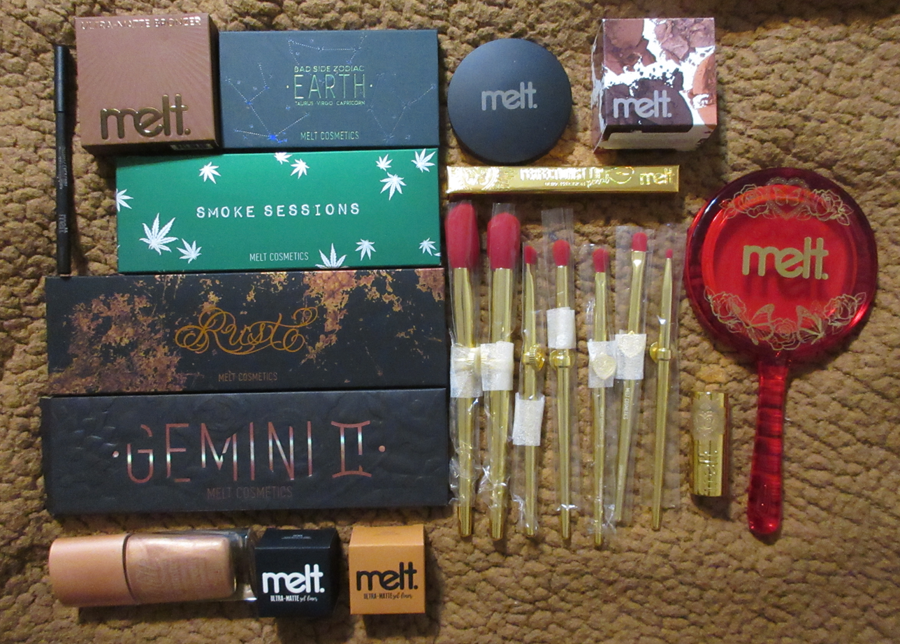
Once again, Melt Cosmetics made mystery boxes available starting on Black Friday with a smaller $25 option and larger $75 box. They repeated these price options for the December versions, and the large December box is still available at this time. Everyone gets the same items in each specific box, so I watched quite a few videos on YouTube so I could know in advance what I’d be getting. Sure, it took the mystery element out of it, but I was able to guarantee the value would be worth it for me.
There are plenty of other items from the Mystery boxes that I am not going to feature because they are products I’ve already reviewed, I can’t wear because they don’t show up on my skin, I don’t like because of the color, or I’d feel uncomfortable trying out due to the suspicious smell (most of the Amor y Mariposas Collection lip liners).
The products I selected for the photo above are the ones I decided to keep for myself from the mystery bundles, in addition to a few extras I added to my cart during the 40% off sale that was simultaneously happening on the website (mystery boxes excluded). However, tackling them all in one giant post was too overwhelming, so I’m splitting this into two parts. Part 1 will cover all the eye products and Part 2 will come at a later date covering the face and Mariposas items.
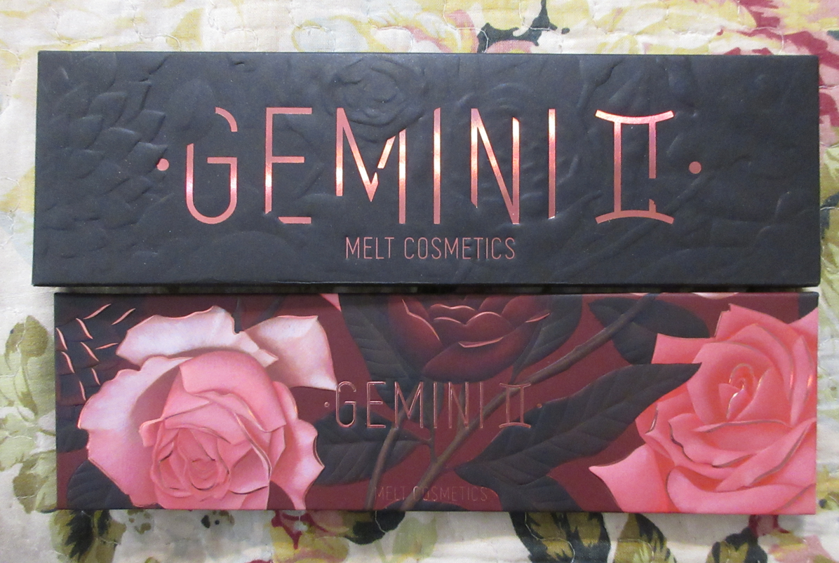
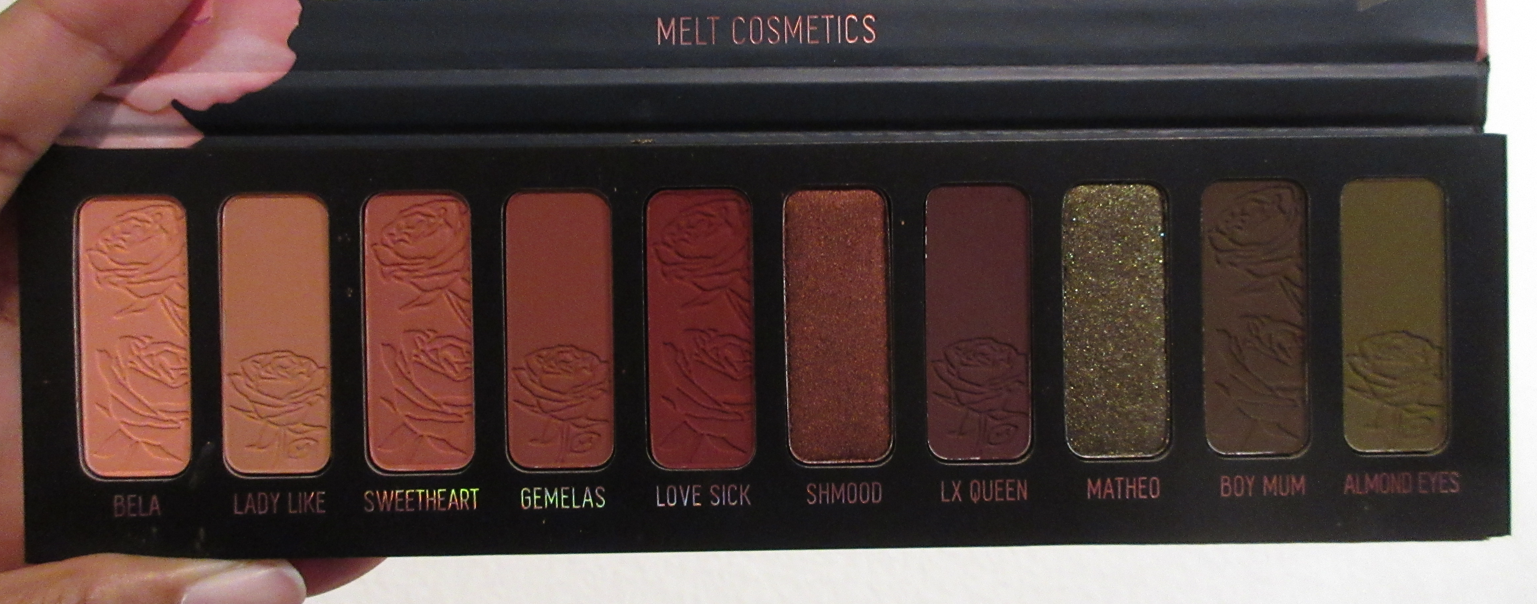
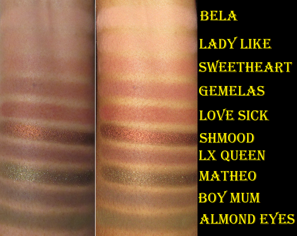
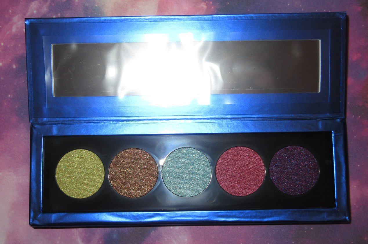
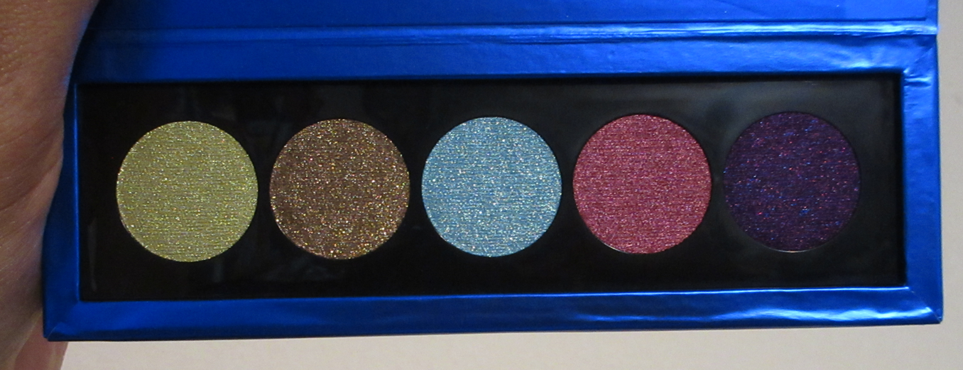
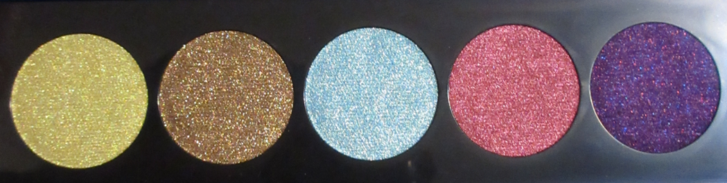
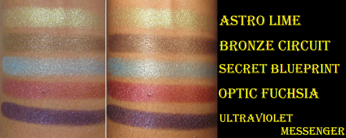
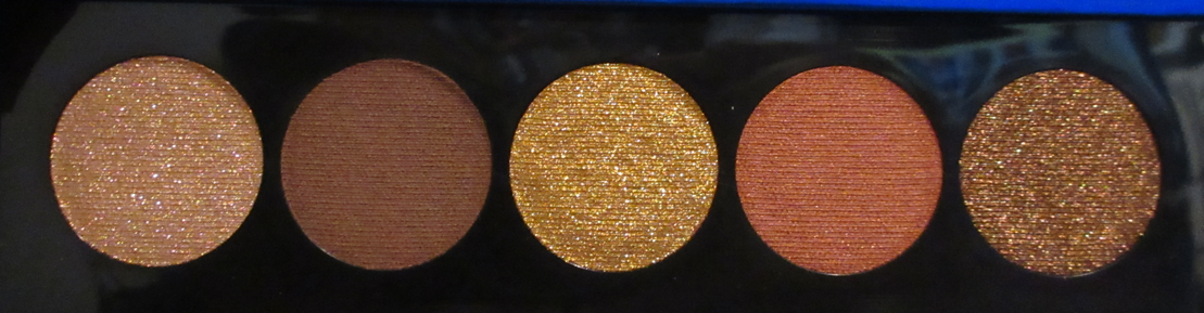
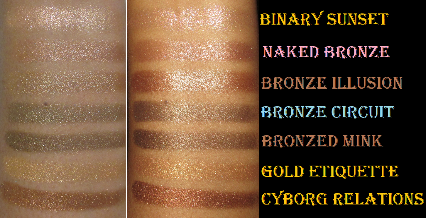
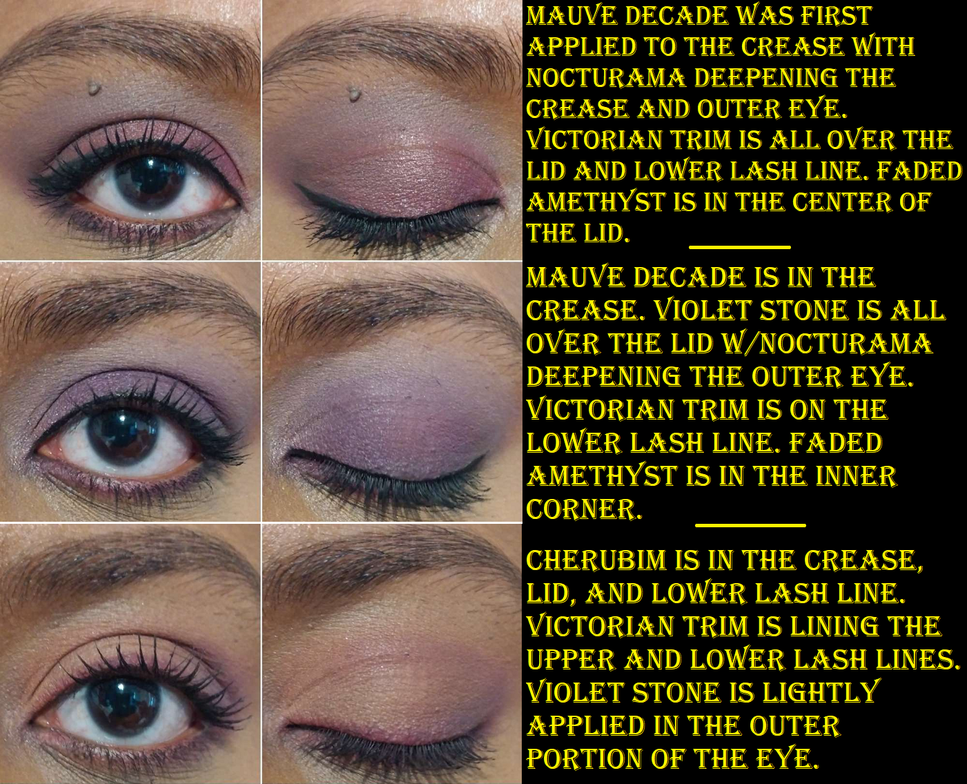
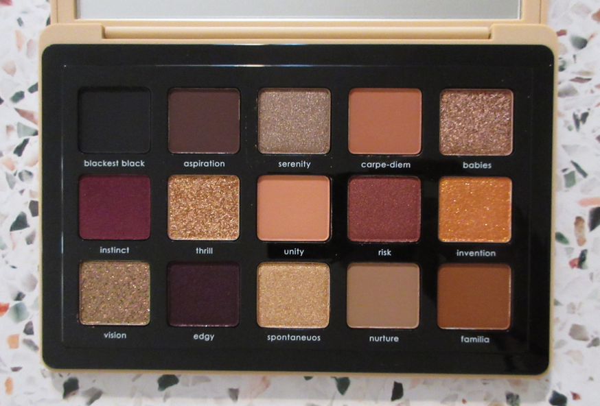
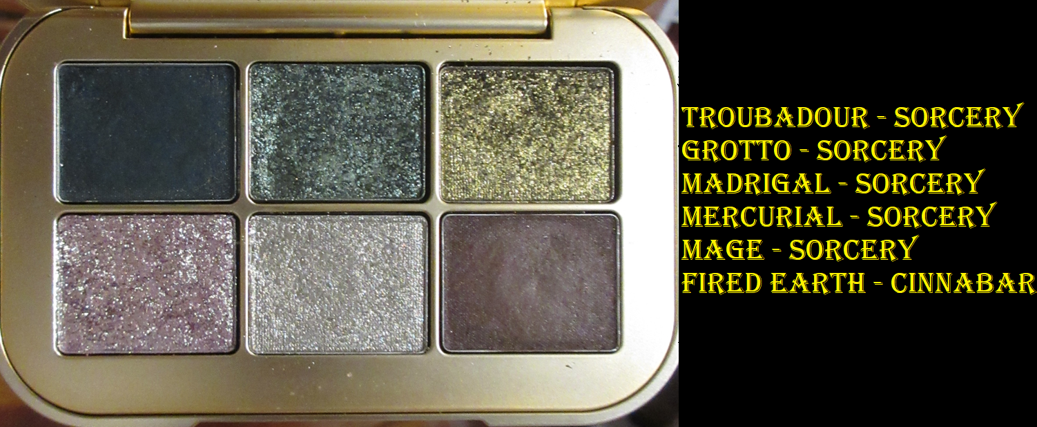
Gemini II Palette
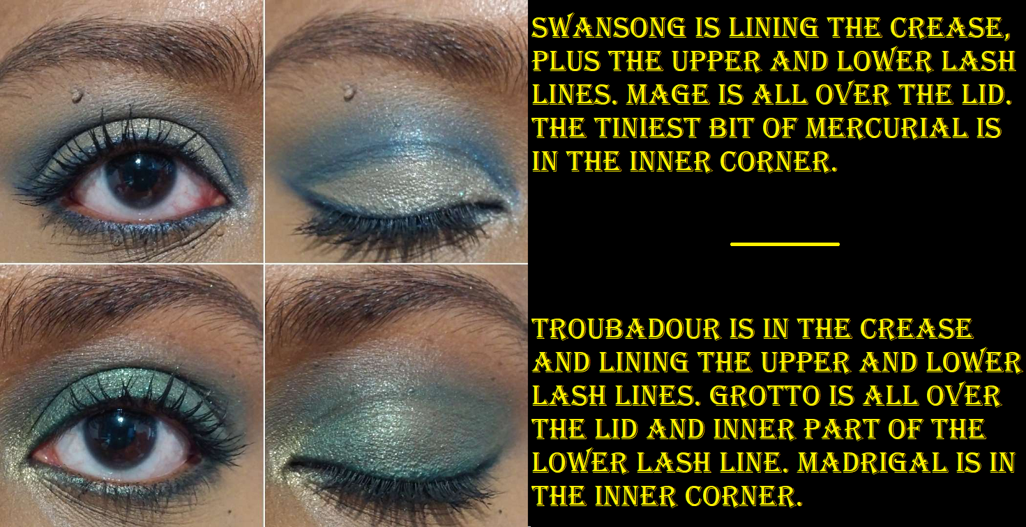
Sweetheart, Gemelas, Matheo, and Almond Eyes are my favorite shades from this palette. I don’t know what it is about pinks and greens that is such a struggle for me to think of ways to use them together, but that’s ultimately why I didn’t buy this palette at launch. I do like these two color families when used separately, so I continued to be tempted by them. As time went on and I saw the repackaged version of Gemini with Gemini II being used by others more and more, I reconsidered getting them until I began seeing photos online of some sort of growths appearing in various people’s palettes just two months after they bought them. Melt has notoriously had issues with their eyeshadow formulas in the palette versions (as opposed to their stacks), which is why I’ve never been willing to risk getting them at full price in case it happens to mine as well. It had been at least a year since I heard of any major issues, so I was just beginning to let go of my fear until I saw that. However, my two oldest Melt Palettes that I started using Spring/Summer 2022 (Amor y Mariposas and She’s in Parties) are still in perfect condition. So, that’s why I keep taking partial chances because I love their formula.
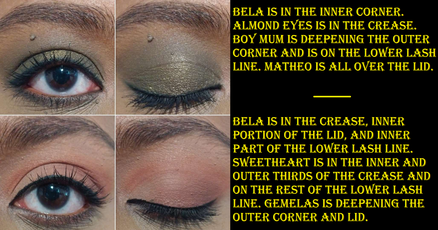
The mattes in this palette are exactly what I expect them to be from Melt: very pigmented, opaque grungy tones, and easy to blend. Matheo is a real shimmer with its brownish-green color and green sparkles but it’s a bit on the thin side and needs to be built up. Shmood is more of a metallic-satin. Shmood instantly reminded me of the She’s in Parties shadow from the She’s in Parties palette, but that one is a slight purple leaning red whereas Shmood is a warmer red with an orange shift on the eyes. I’m not used to owning such a matte-heavy palette, but I don’t have a single bad thing to say about the performance of any of these shadows. For my personal taste, I didn’t need both Bela and Lady Like since Bela is basically a brow bone shade without being impactful enough for me as an inner corner brightening color and Lady Like only faintly shows up and is the kind of color I just include for the transition shade to blend into, but no quality complaints. Everything is long lasting. The shimmer and satin don’t crease on me. They’re great! I just hope the quality doesn’t diminish over time.
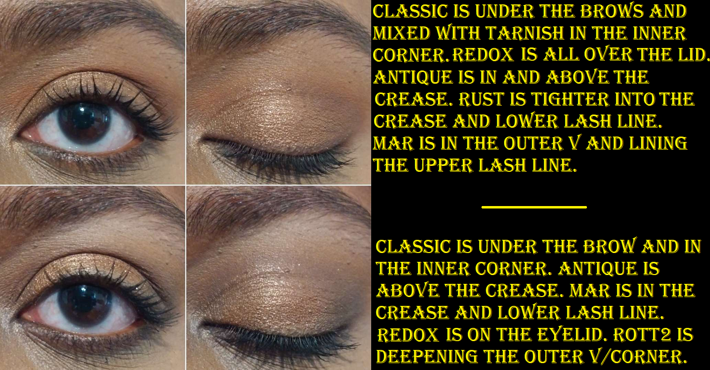
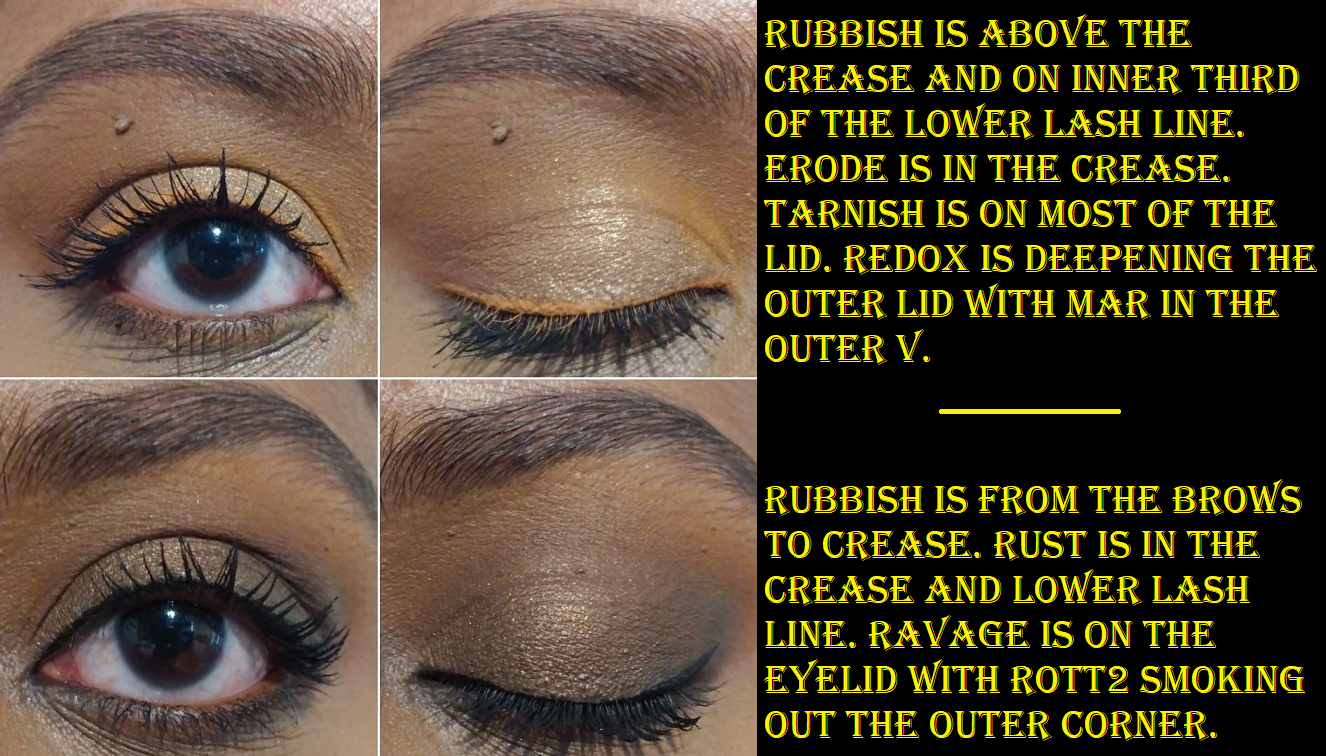
I used the Allday Everyday Ultra Matte Eyeliner in 1987 in both of the green eye looks in this section.
As much as I enjoy this palette and am very pleased with it so far, my inability to use it to its fullest (the color choices and my skill level with color theory) is why I’m glad I was able to get it in a mystery bundle for technically a better savings value with the other items combined.
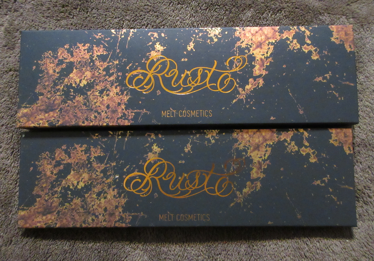
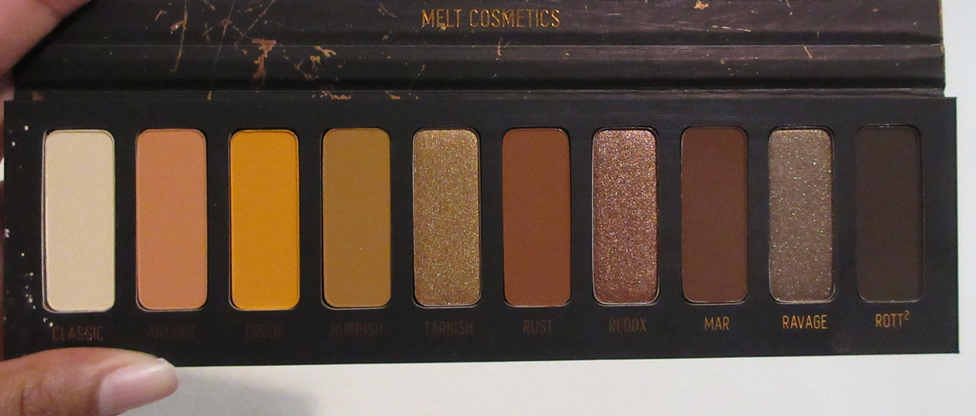
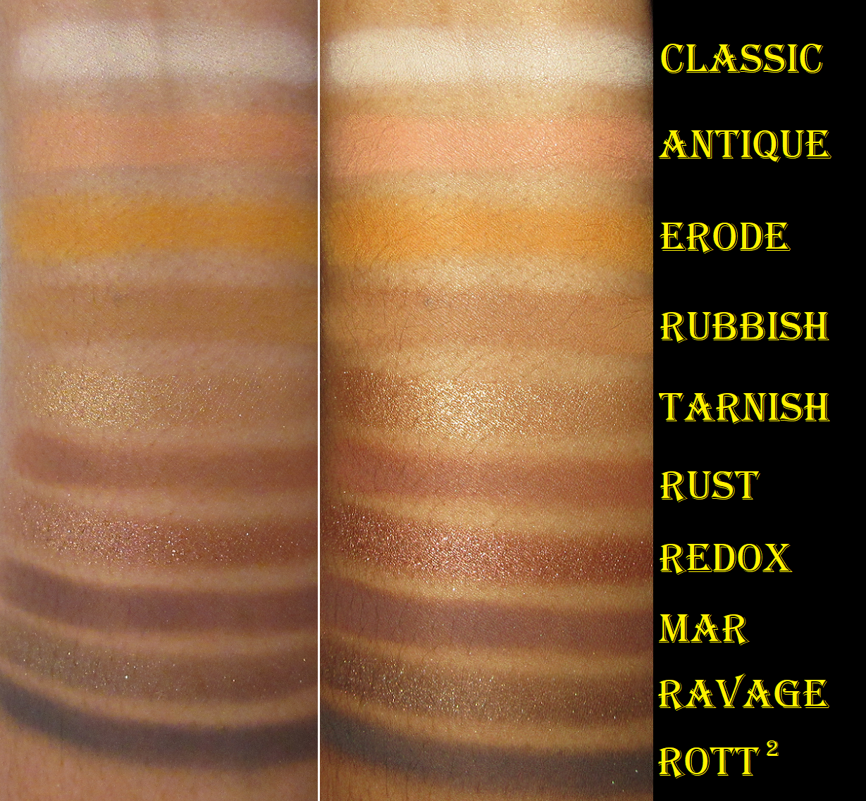
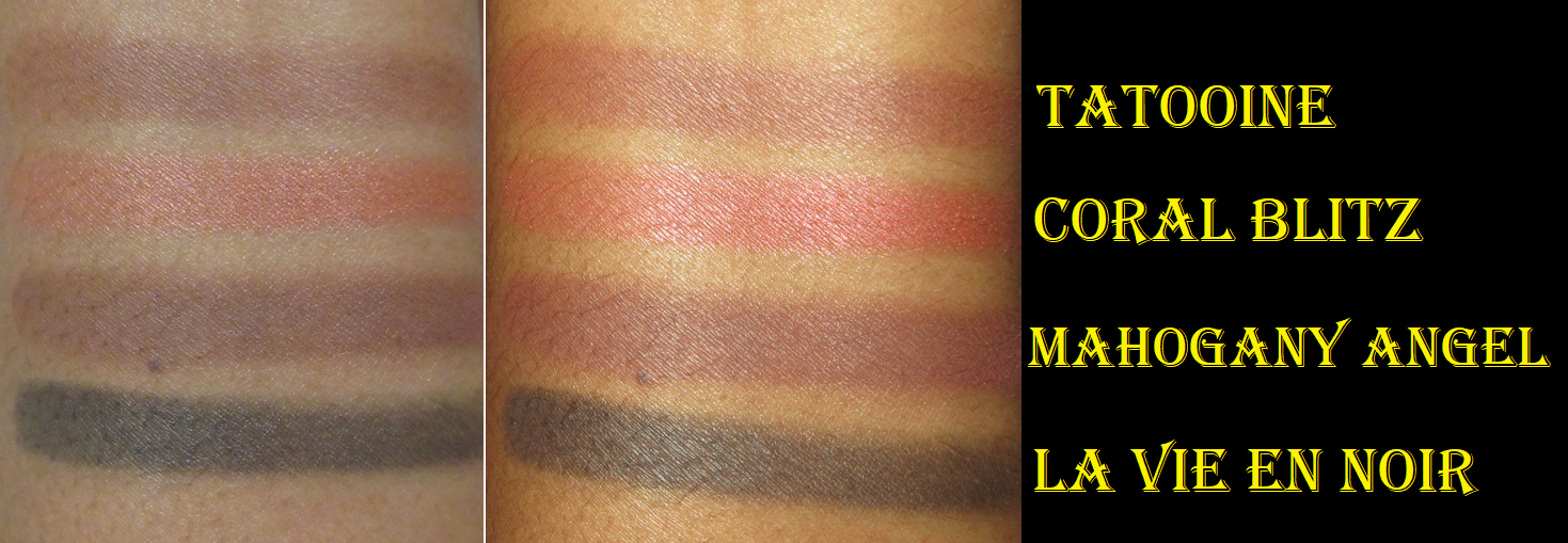
Rust Palette
Once again, I’m impressed by the mattes. Pigmented, soft, and blendable are the best words to describe them. Rott² is so intense that I have to be careful with that shade, but it can be sheered out if the tiniest amount is applied and heavily buffed. Other than Rott², the other mattes are easy to use. I’m also impressed with Erode considering tons of yellow mattes from other brands don’t show up very well on me because the amount of yellow tone I have to my skin blends in too much with the shadow color. Yellows also tend to disappear off my eye area because they are usually made to be a thinner or more powdery consistency (possibly too much titanium dioxide or another white base powder throwing off the dry base to binder ratio) that dusts off and doesn’t stick for long on me. So whenever I find a yellow matte eyeshadow that actually lasts, is a flattering and easily visible shade that’s also easy to blend, I always take notice.
This palette contains three metallics, but they’re only satisfactorily reflective for my tastes if applied wet. The end result is still on the low-sparkle side compared to the types of shimmers I typically wear, but I’m occasionally in the mood for something on the more subtle side, so I don’t mind. However, in doing swatches and building them up so much on my eyes with my fingers, both Tarnish and Ravage are starting to form a seal on the top layer of those shadows. It’s possible this could also be happening from double-dipping with my partly damp brush to get more intensity out of the shadows, but I think it’s moreso due to oils from my fingers. Redux hasn’t given me any issues yet, but it also has a more traditional shimmer texture to it than the other two metallics. I think it’s a little looser packed than the others, which could explain why it’s easier for me to pick up and why it hasn’t hard-panned.
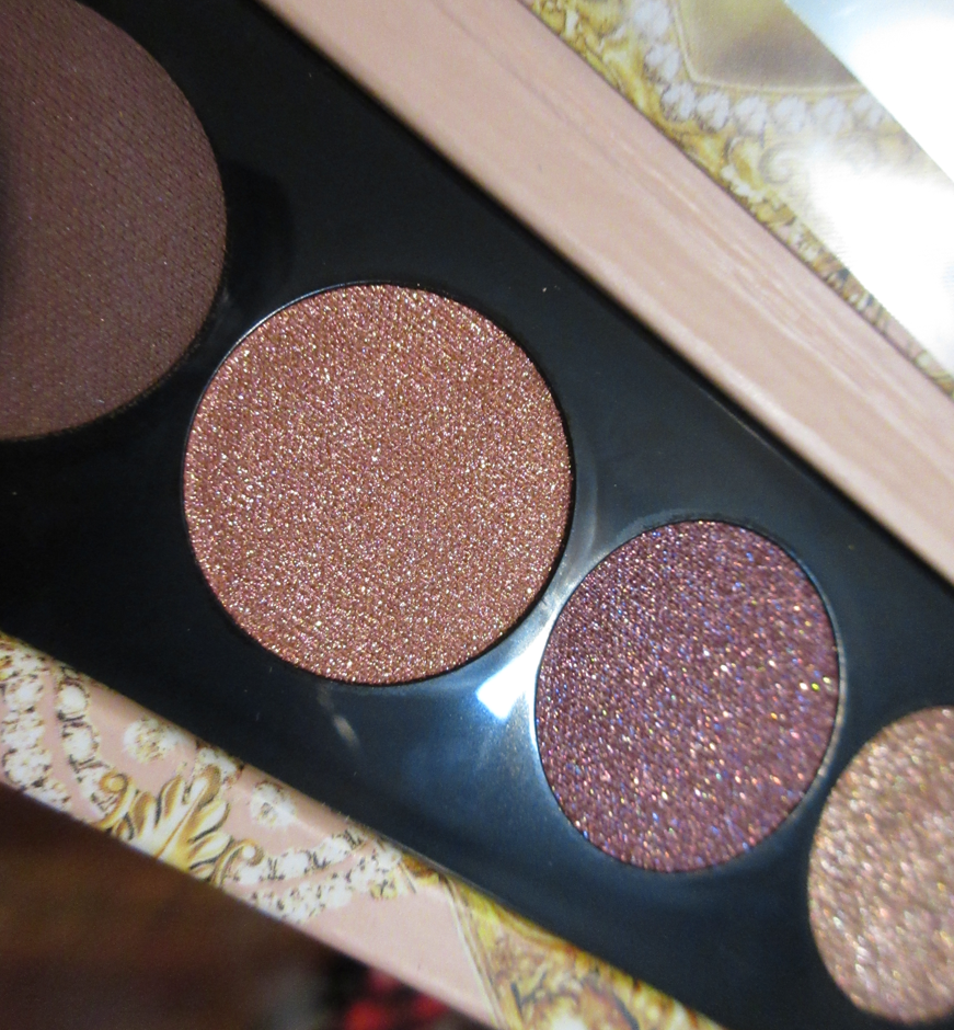
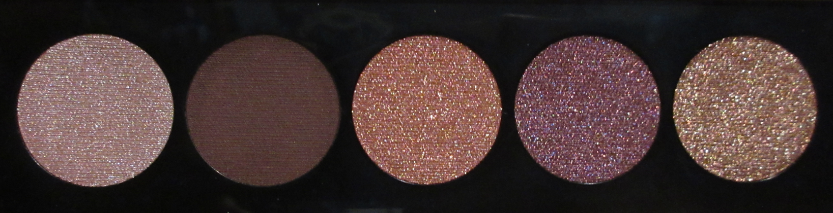
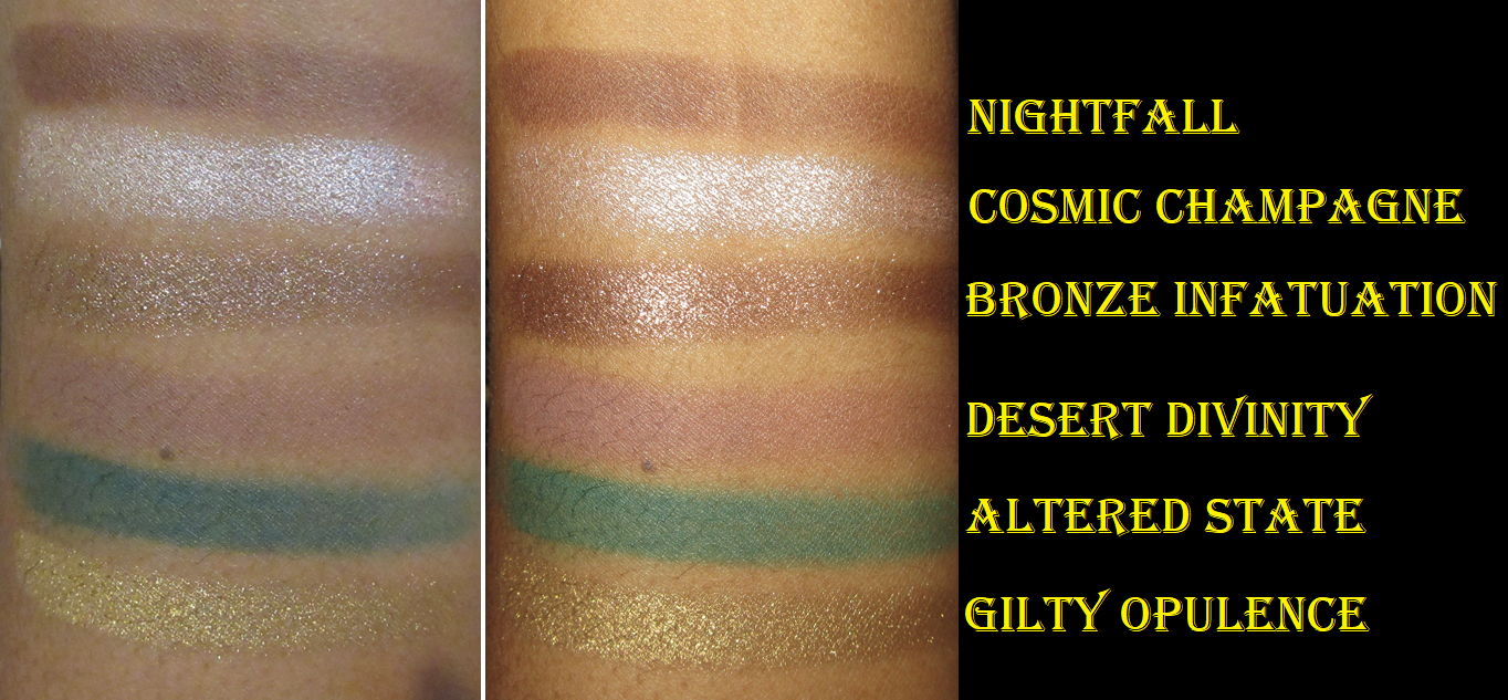
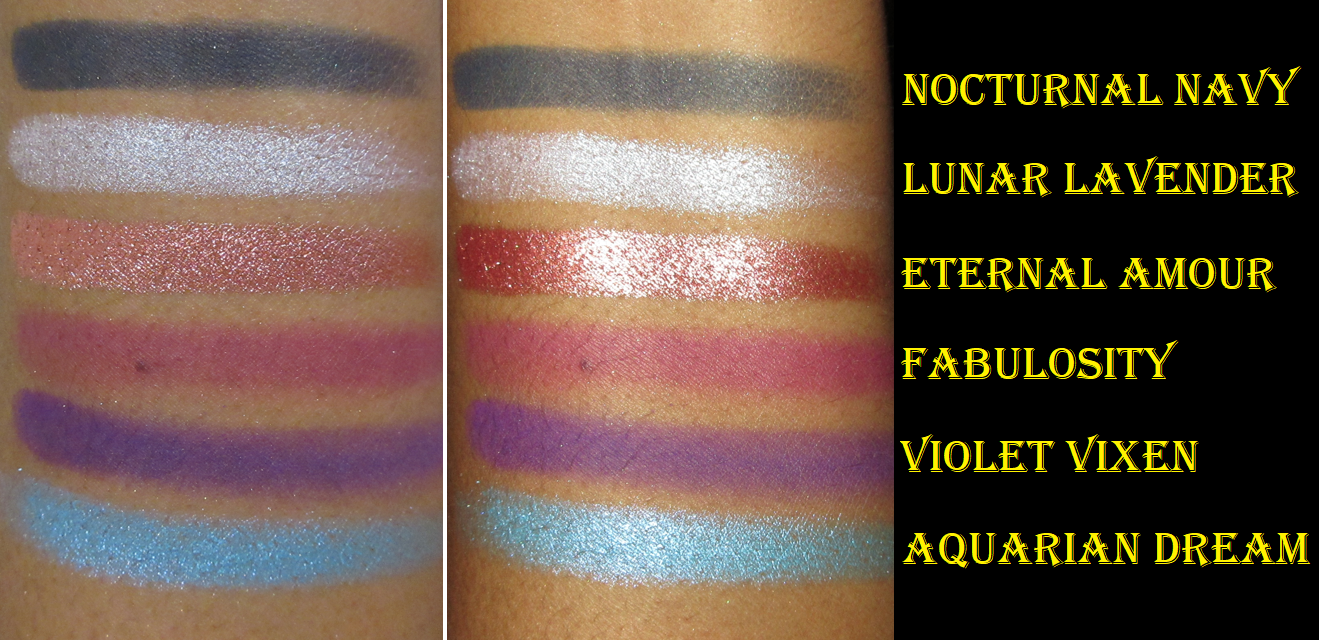
It’s a shame that Tarnish and Ravage are the troublesome shadows because those are the two colors I like the most along with Erode, Rubbish (the tone of yellow I love to use as a transition shadow), and Rust (a nice warm brown). However, because I enjoy nearly all the mattes, plus the colors of these two metallics, I still very much like this palette overall. It’s not a very inspiring palette for me, but it has the go-to type of shades I like and use. If Pat Mcgrath can charge $65 for an all matte 6-pan palette, then I guess it’s not really my place to say the Rust palette isn’t worth full price considering Melt’s matte quality, but I personally recommend getting Rust on sale if possible.
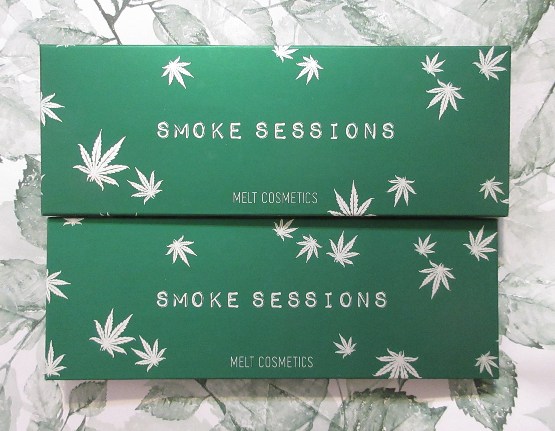
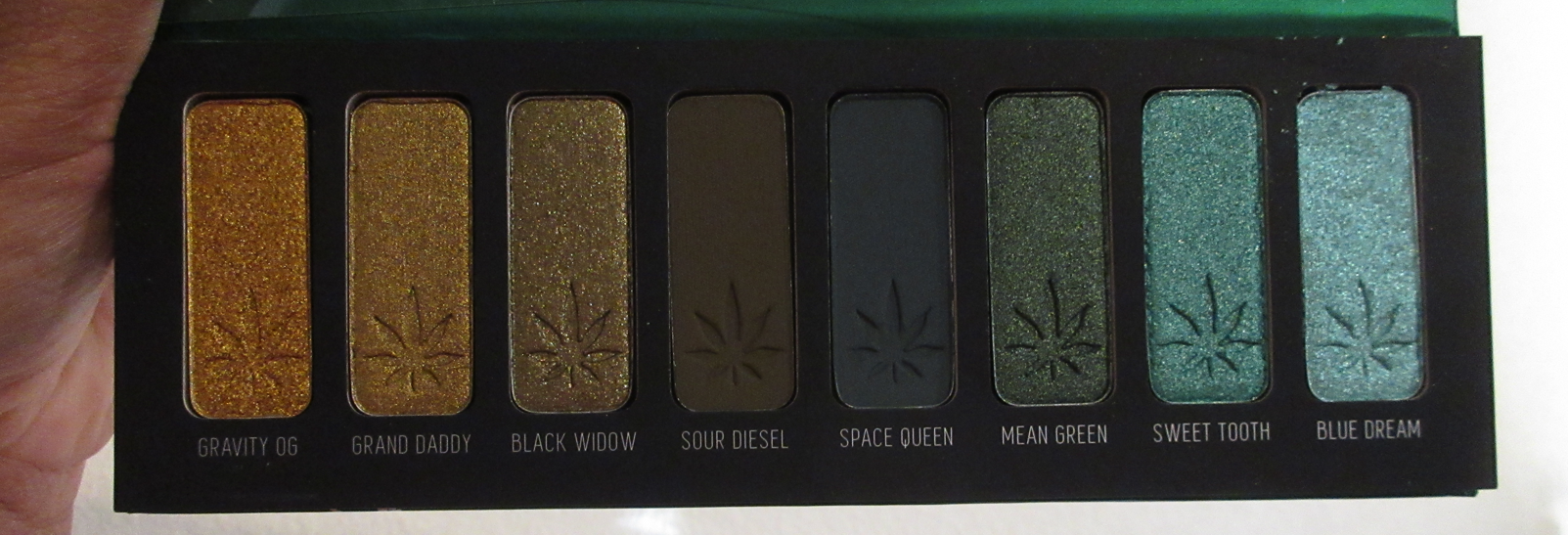
Smoke Sessions
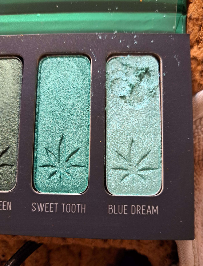
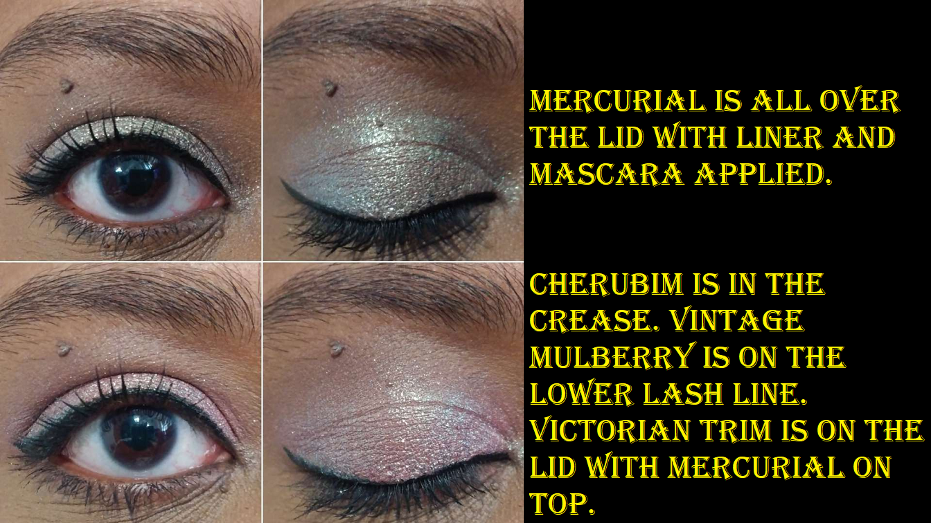
I’ve wanted this palette for years, but this is the one I heard the absolute most complaints about in terms of formula stability issues. I’ve heard of the shimmers randomly expanding in the pans and exploding out of them (then people pressing them back and it happening again), and I’ve seen the most growths and things appearing in these. From the moment I felt the shimmers, I understood how this may be possible considering how much wetter they are than all other Melt shimmers/satins/metallics that I’ve felt before. When I first got the palette, I opened it just to check that no shades were broken before setting the palette aside. When it actually came time that I was ready to use it about a month later, Blue Dream was cracked in the upper portion of the shadow. I have no idea if it’s just because the shimmers are more softly pressed or if it’s because mine was in the process of a reaction. I’m more inclined to give the benefit of the doubt and say it’s just soft and somehow broke in my handling the palette (even though I never dropped it). I pressed the shadow back with my finger (no wetting agent added) but the consistency of Blue Dream is so loose that it keeps picking up in strange chunks. I took a photo of it below. In order to use this shadow without getting fallout everywhere (plus have it look opaque), I have to apply it with a dampened brush. The binding ability appears to be weird in that one. I will of course update if I notice anything else, but we’ve passed the two month mark and nothing else has changed now. Hopefully there won’t be any additional developments.
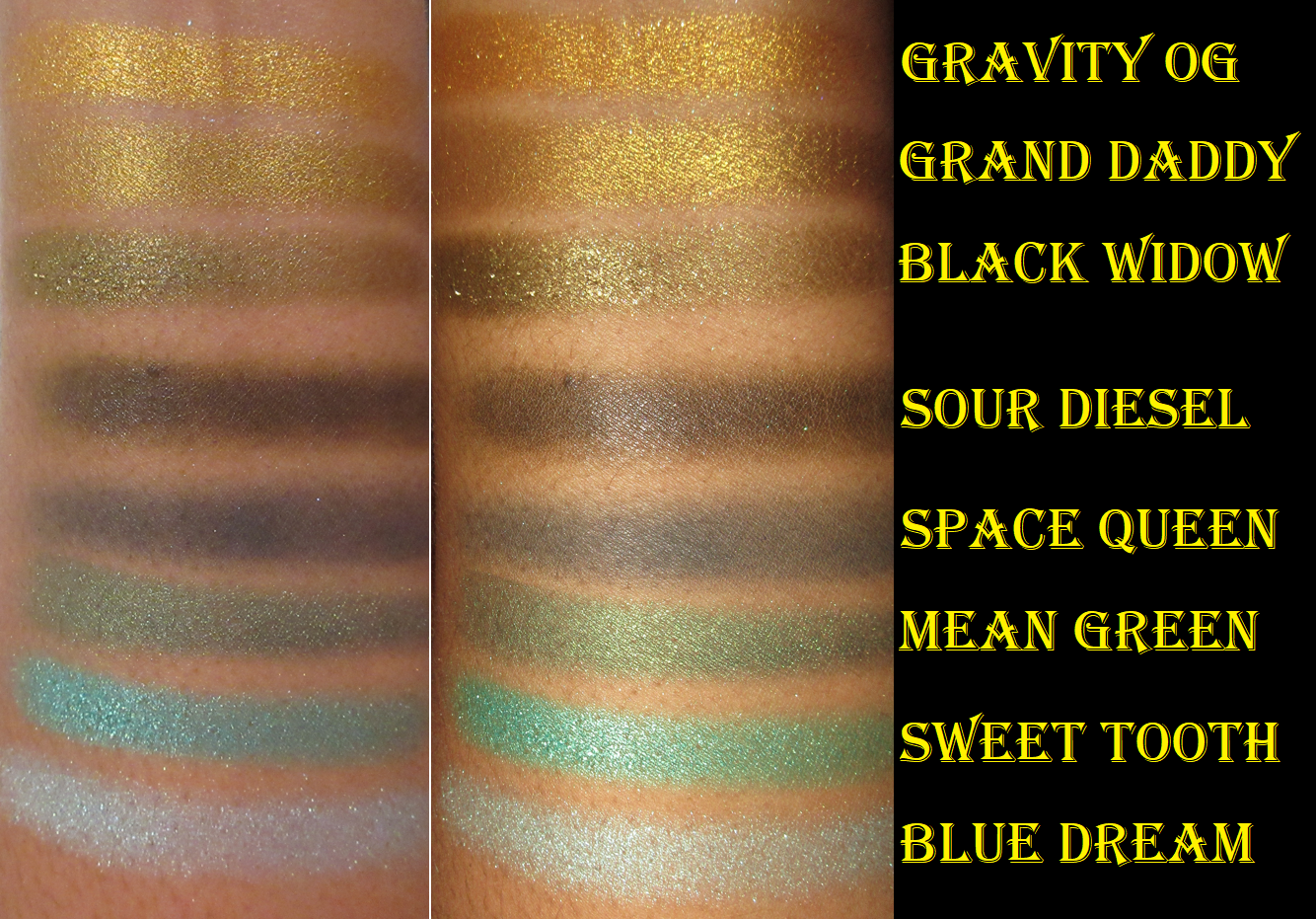
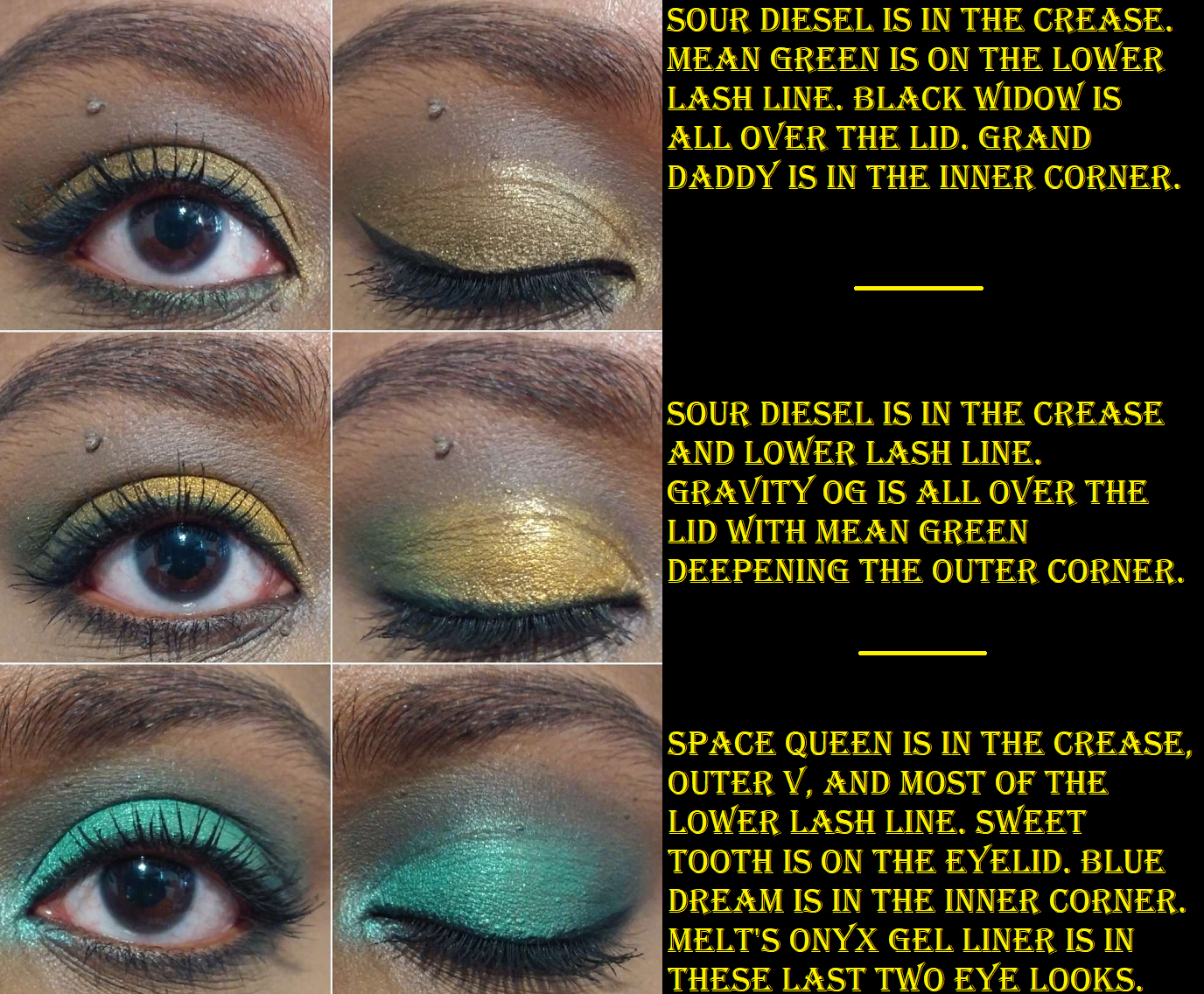
Grand Daddy, Black Widow, and Mean Green are like my favorite types of greens in terms of color. Having them all in one palette is what drew me in. Gravity OG, Sour Diesel, and Space Queen are colors I also like, so despite all the questionable things said about this palette, it was just impossible for me to skip forever. I don’t have regrets getting it for 40% off during the sale, but this formula has to be babied a lot.
These mattes are not what I’ve come to expect from Melt. They’re so much stiffer and less easy to blend. I was quite disappointed in Sour Diesel since that murky green just looks murky brown on my eyes. I wanted more of that green tinge to show through. As for the shimmers, they are a wetter texture but they still don’t pick up that well and the consistency somehow isn’t enough to make them impactful on the eyes. I still have to dampen my brush when I apply them. On the positive side, they do look beautiful after that and I’m used to wetting my shadows anyway, so that isn’t a deal breaker for me. I’m just perplexed as to how they’re so creamy/wet yet still under-perform without help. I’ve also had a little bit of creasing with these too, which is something I’m not used to from Melt either. So, as beautiful as these tones are, I was a bit disappointed. I think if Melt reformulated this palette to what they’re currently using in the newer ones, this would have had the potential to be a favorite in my collection, and not just out of the palettes I’ve bought from the brand.
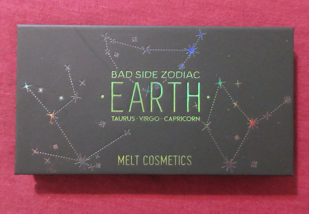
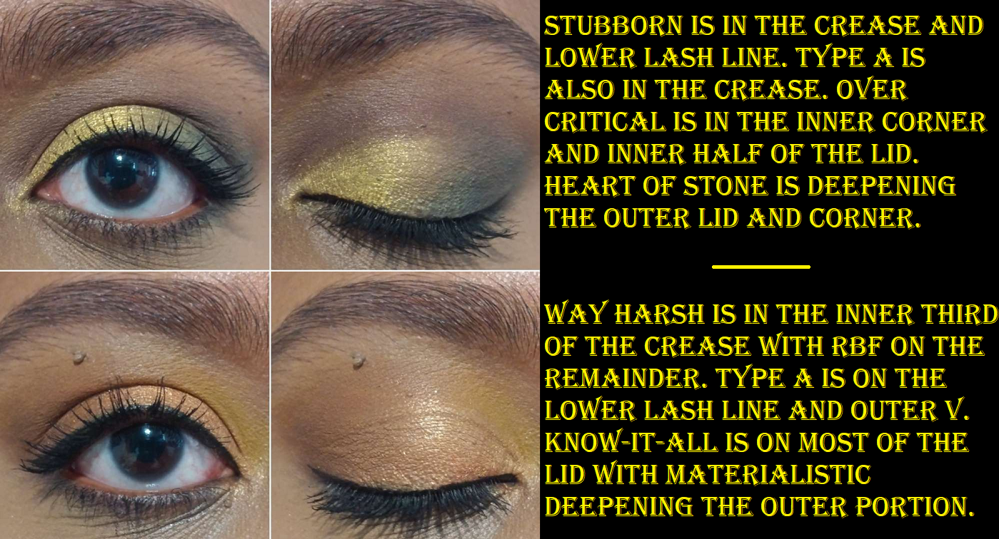
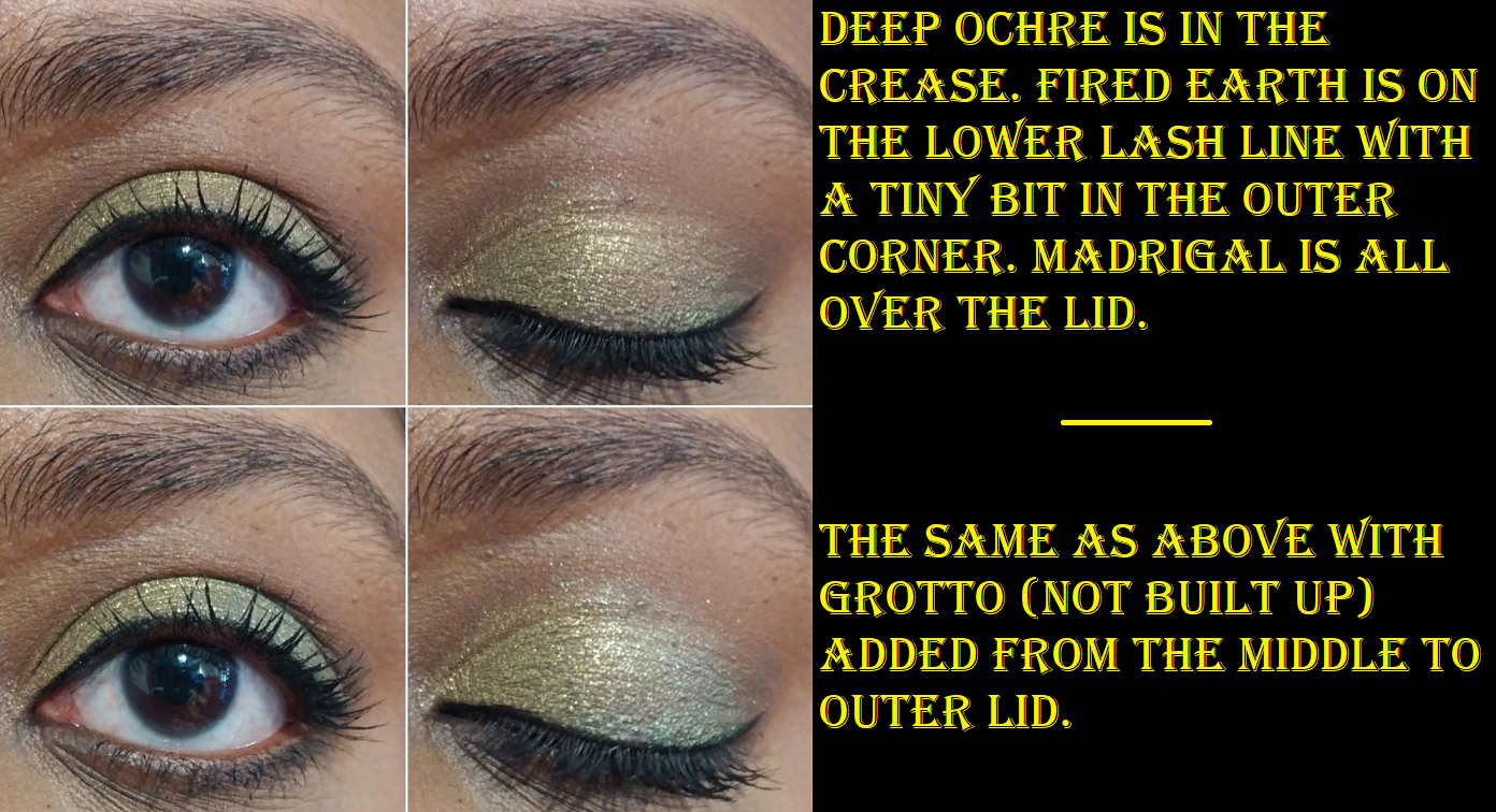
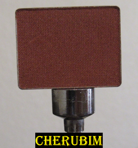
Bad Side Zodiac Mini Eyeshadow Palette in Earth
I bought this during the 40% off sale and before I noticed how similar it would be to all the other Melt palettes I have. I was just so focused on wanting this color story.
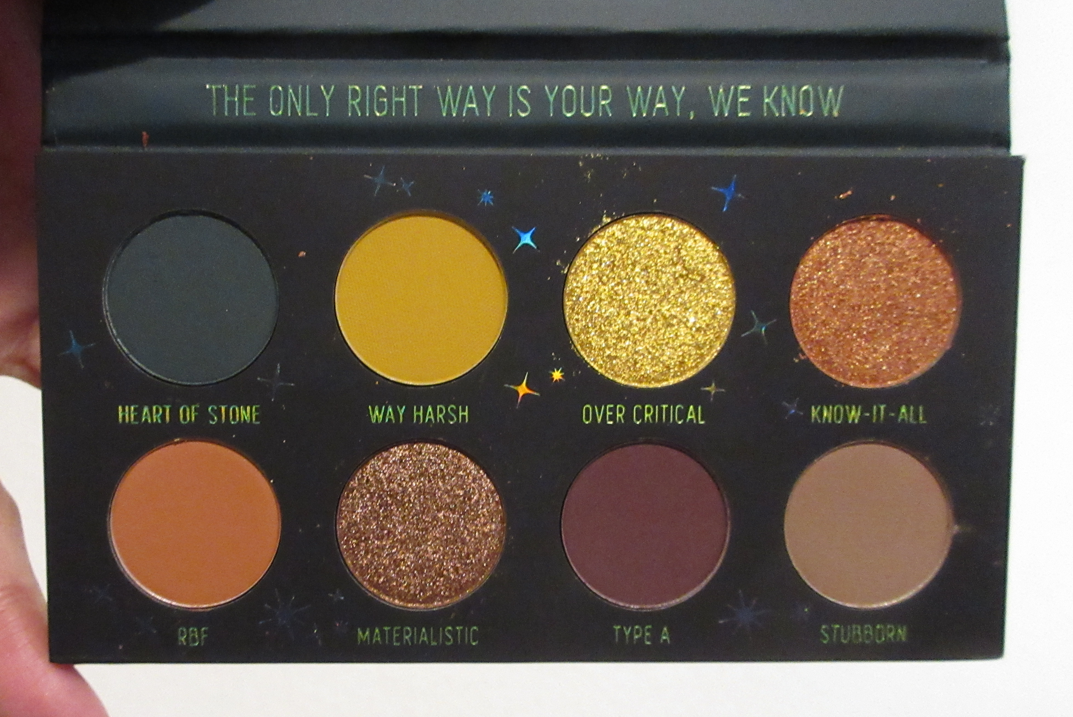
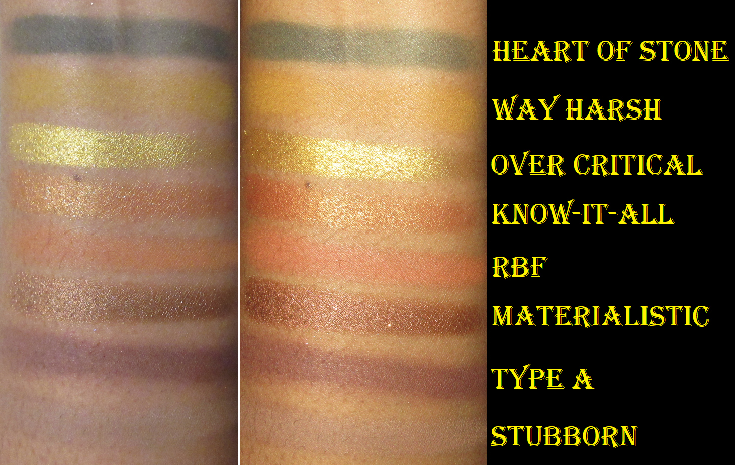
Now that I have a lot more experience using Melt’s shadows, I can say that the matte quality of Earth (I didn’t notice a difference with Air) is the tiniest bit lower than in She’s in Parties, Amor y Mariposas, Rust, and Gemini II, but only the tiniest bit. I still very much like them and find them to be quite good. It’s only really when layered on top of each other that they can look a little muddy.
I’m not sure if it’s just because the shimmers are yellows and oranges, which can blend in quite a bit with my skintone, but I felt the need to wet them for more impact. Over Critical is quite a harsh tone of yellow though on me, and wetting it made the consistency a little odd in terms of getting it to lay smoothly and not patchy, kind of like my troubles with the Blue Dream shade from the Smoke Sessions palette. Know-It-All and Materialistic, however, were creamier and easier to pick up and spread smoothly. I’ve noticed that I prefer Melt’s shimmer formula in their newer palettes rather than their older ones, but their mattes are what is special about their eyeshadows. That’s why even though I prefer palettes with more shimmers than mattes, it’s probably a good thing that Melt’s palettes tend to be the opposite.
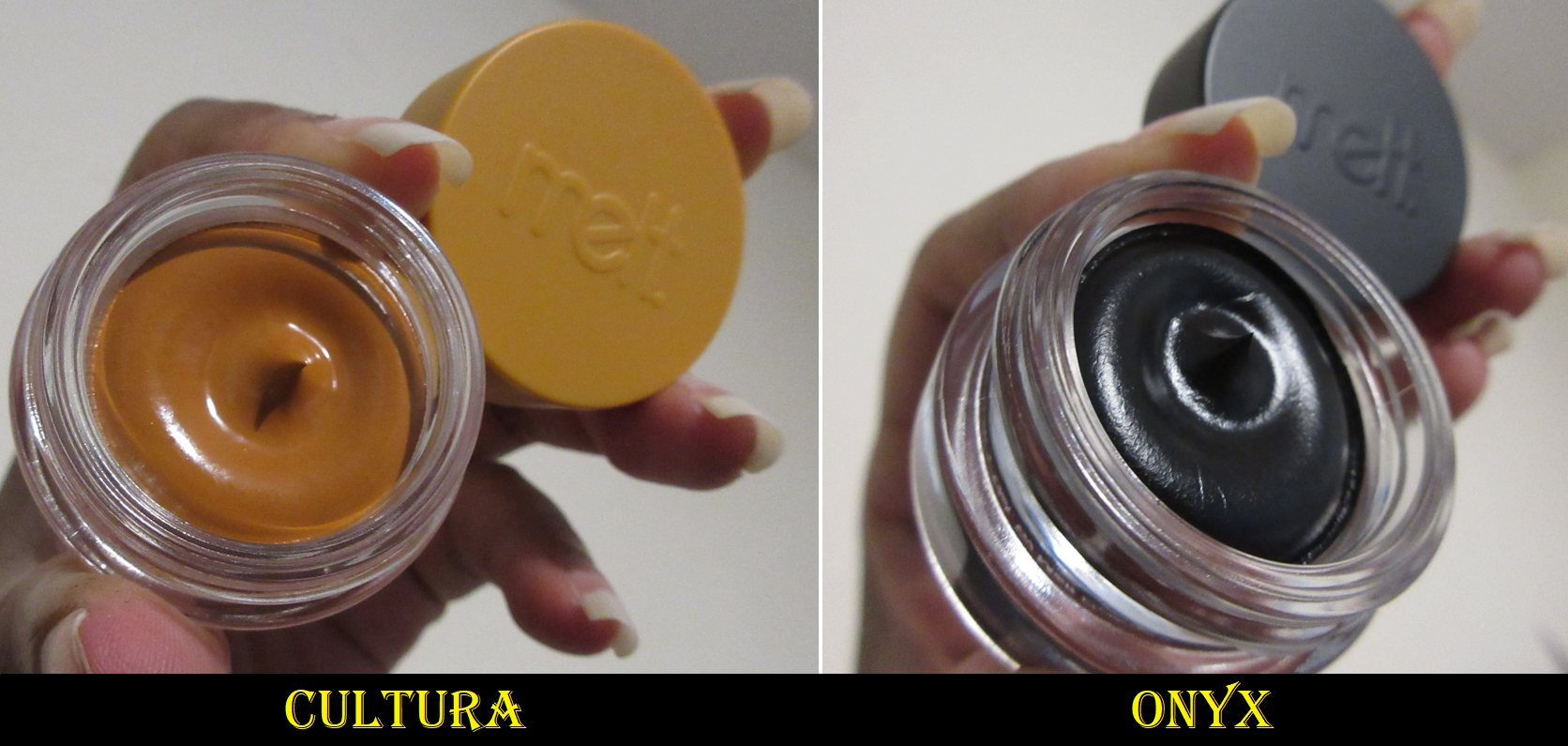
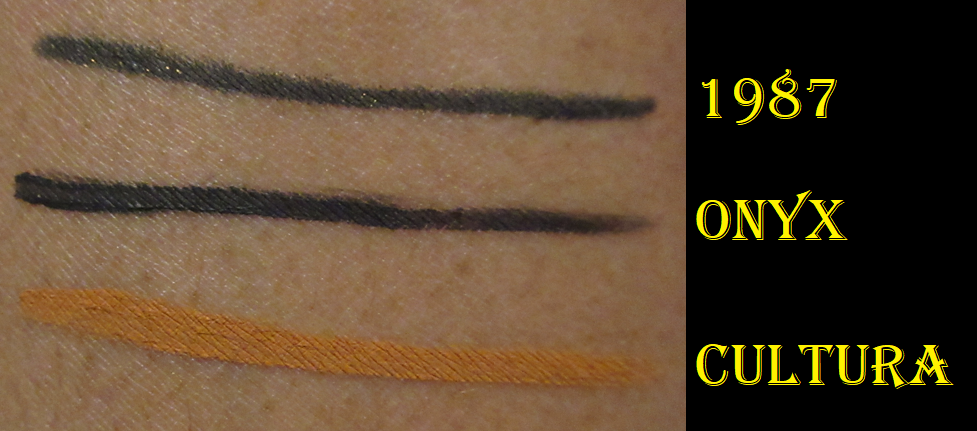
Ultra Matte Gel Liner in Onyx and Cultura
The Melt Gel liners are fantastic, in my experience, so I purchased Cultura during the sale and received Onyx twice in mystery boxes. I like the waterproof nature to them (and how they still come off with a bit of Bioderma and a makeup wipe without needing a waterproof remover specifically). They dry quickly, don’t smudge, and last all day without the line cracking. I don’t mind using a jar eyeliner if it’s a colorful one, but I would honestly not get much use out of Onyx purely because I find liquid eyeliner pens to be so much easier to use for all my black eyeliner needs.
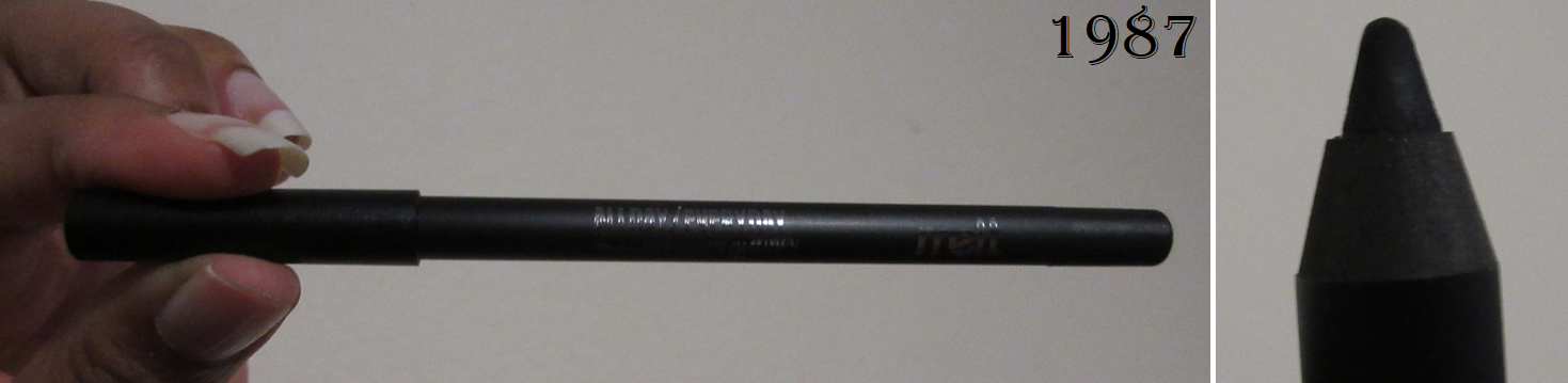
Allday Everyday Ultra Matte Eyeliner in 1987
I got this liner from the Mystery Bundle. It has been discontinued at Sephora, though it’s still available for sale on Melt’s website. Melt has a new range of eyeliners called “Slick Waterline Eye Pencils,” so my guess is they’re just trying to get rid of the remaining stock. I hope these aren’t too old.
This pencil’s color is dark enough for me, but I prefer ultra rich black liner shades similar to the depth of Onyx. It glides across the lash line easily. It needs a little time to fully set before it will be smudge-proof and water-proof, but that does happen if it’s fully dry. It’s even easier to remove than the Gel Liners, but is tough enough to not budge all day (not that I usually have problems with that unless it’s in my waterline). It’s a decent eyeliner, but I almost always create a wing and the point of this pencil isn’t sharp enough to create that easily. If I want one, I have to use an angled brush to sharpen the outer line or to use concealer. So, I honestly don’t think I’ll get much use out of this either, but I wanted to try it out anyway.
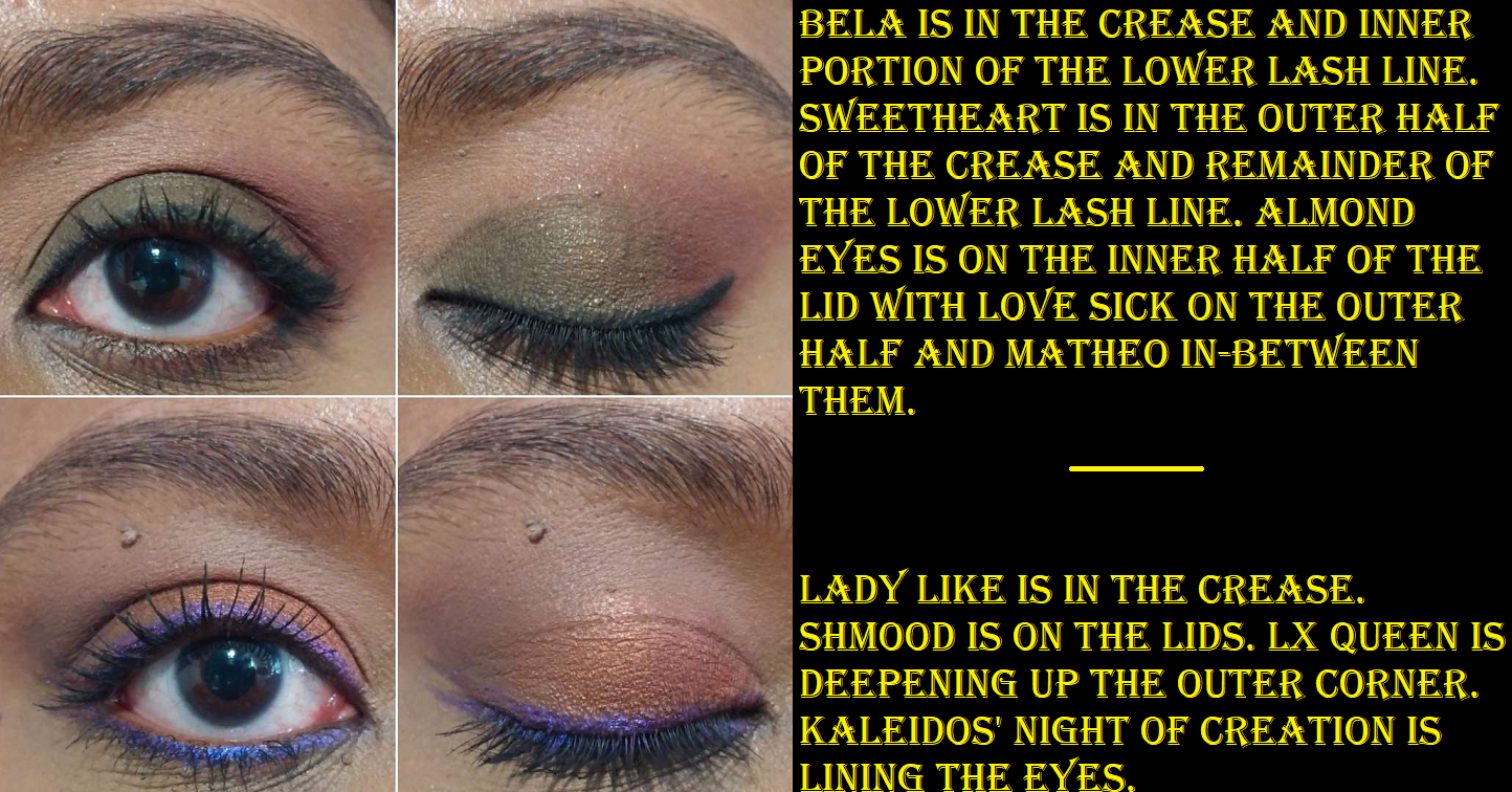
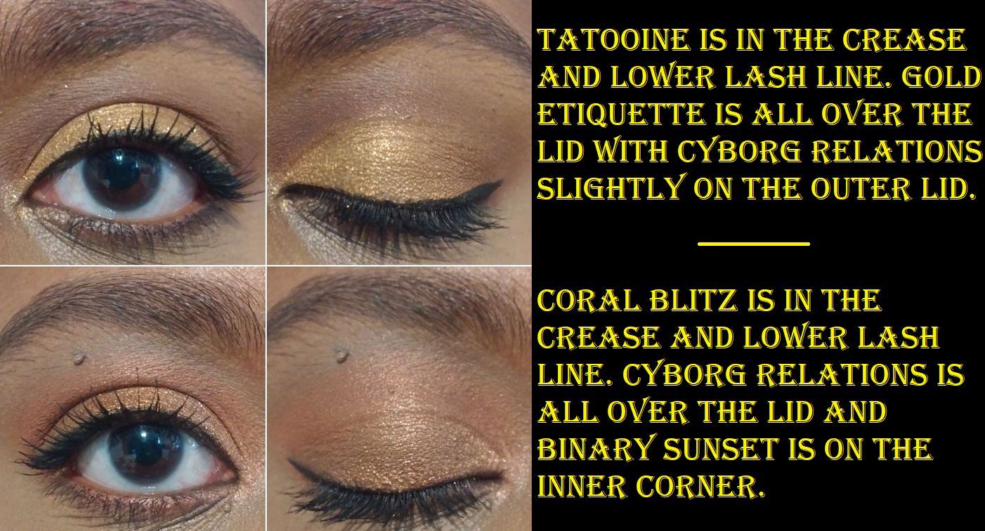
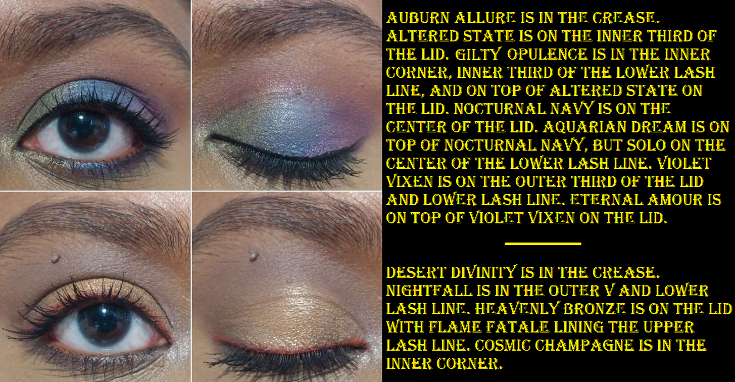
To see these on the eyes, 1987 is in the two eye looks using the green shadows in the Gemini II section. Onyx are in the last two of the three eye looks in the Smoke Sessions sections. Cultura is the yellow liner in the Rust palette eye looks section.
That’s everything for today! Part 2 will probably take several more weeks to give me time to finalize my thoughts, but I have tried almost everything for that one so far and I have been taking photos for it already. Thank you for reading and I hope you’ll check back here again for more beauty content!
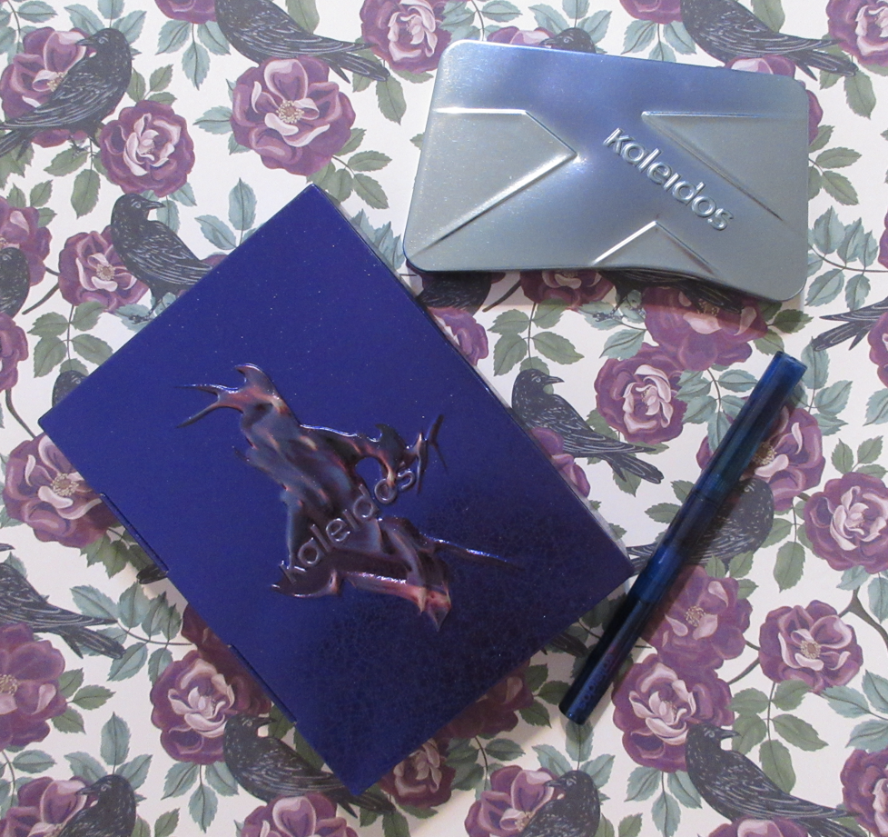
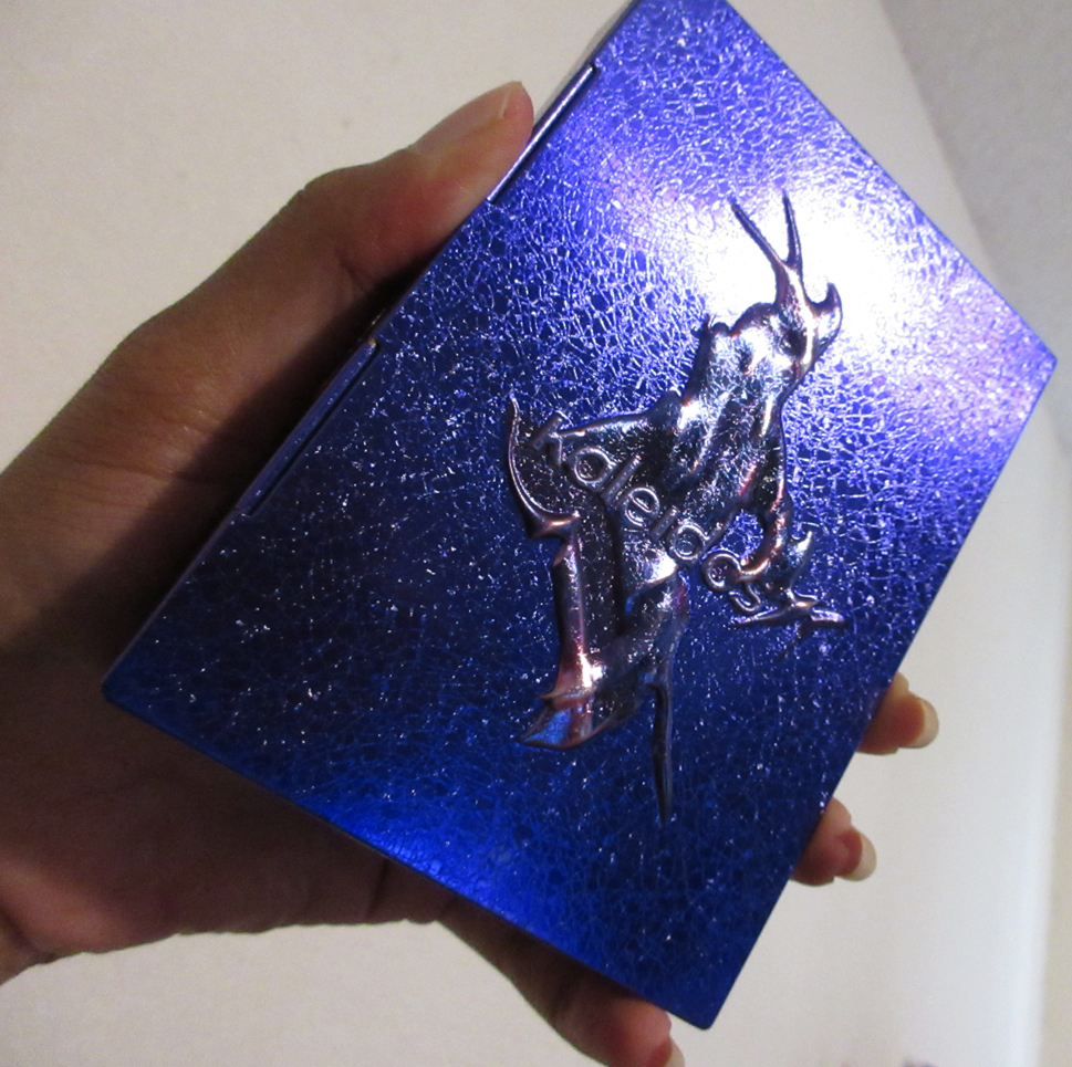
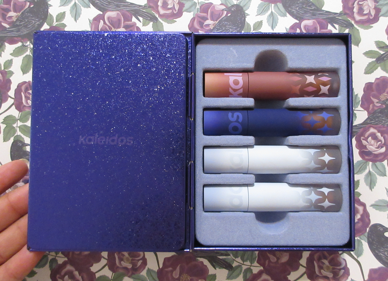
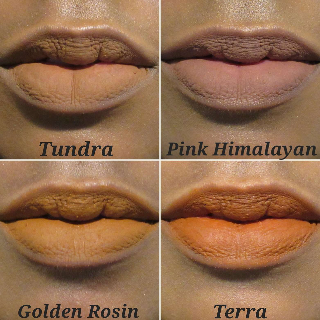
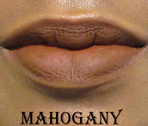
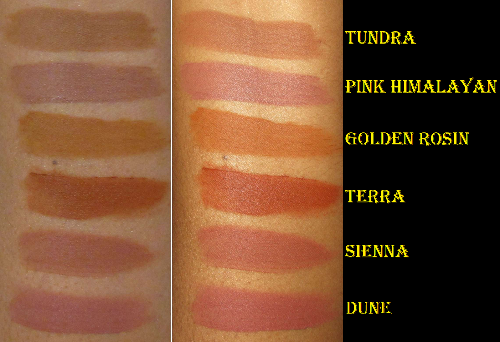
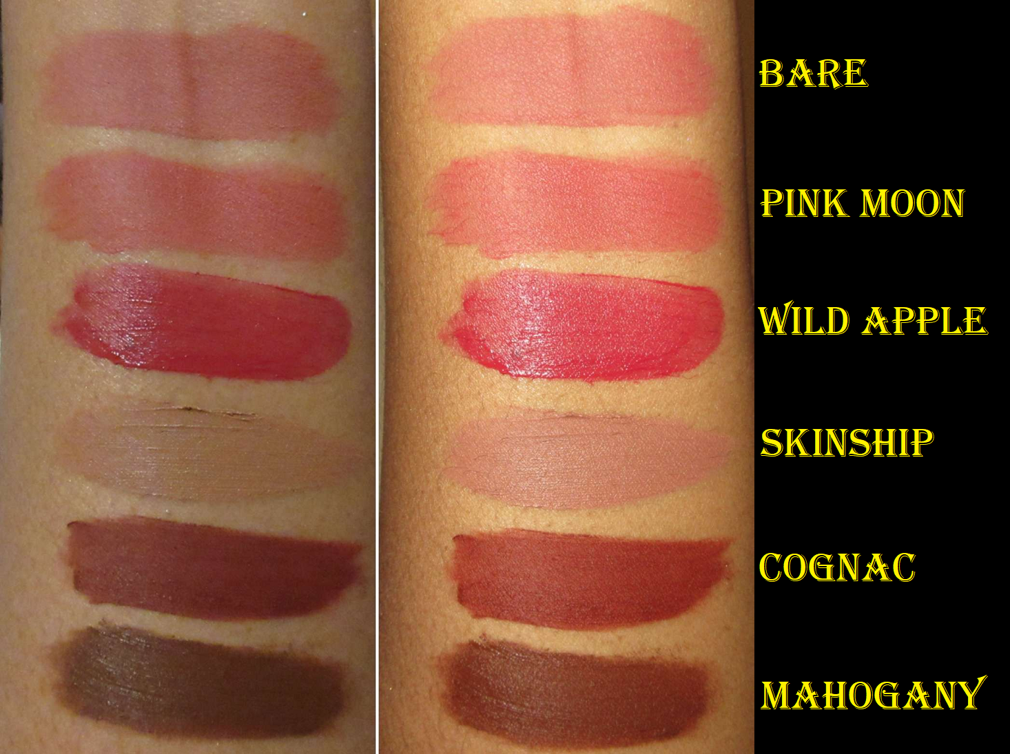
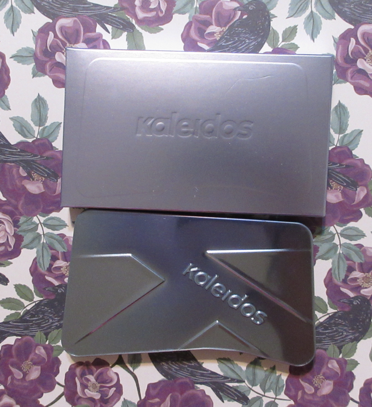
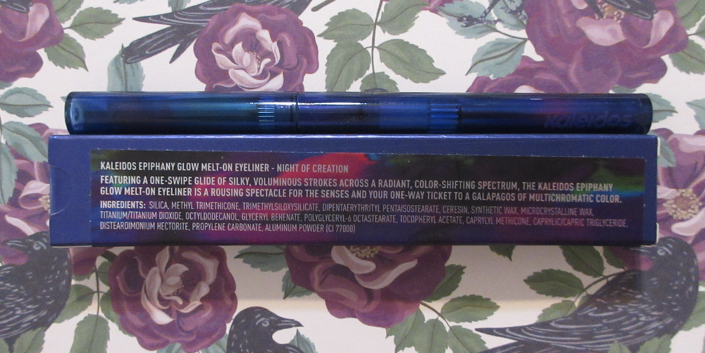
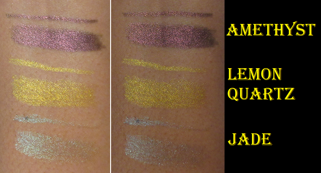
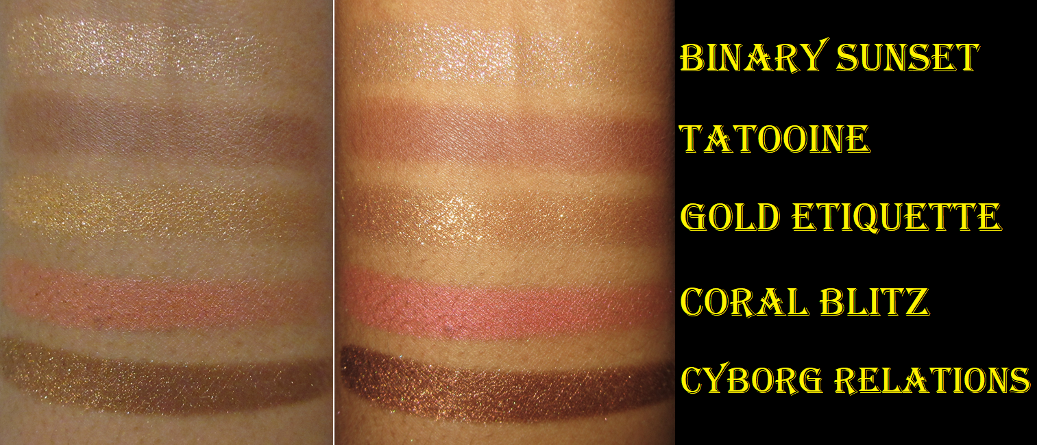
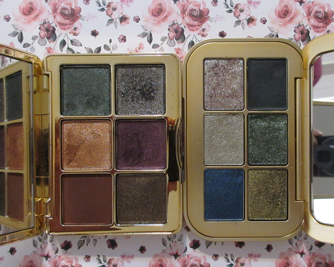
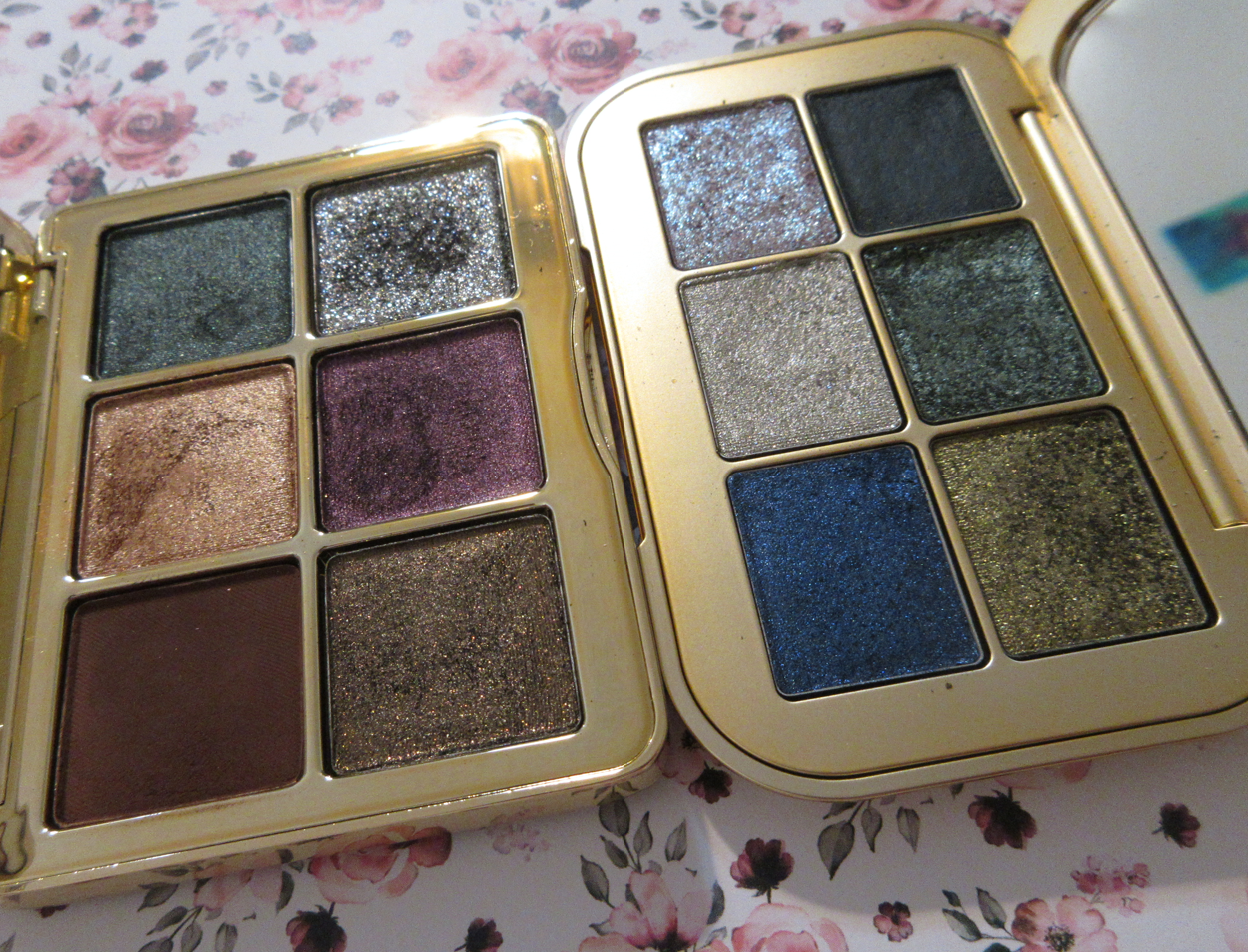
The absolute newest release from Kaleidos is the Sound of Winter Lip Clay Collection. I purchased a custom bundle so I could buy the Willow Wisp Tin with Golden Rosin from that set, Pink Himalayan and Tundra from the Polar Placid Vault, and Terra from the original Sand Castle Vault. I nearly forgot that I purchased Mahogany from the Flora Noir Vault as well in one of the November or December orders, so I will include demonstration photos of that too. The release prior to that was of the Symphony Contour Trios. I purchased the option in Dark. There are five of them in total with one version darker than mine and three that are lighter. I’m impressed with these offerings considering how their first contour palettes weren’t very inclusive and only came in two options. Then, the third newest release was their line of Epiphany Glow Melt-On Eyeliners. I purchased the one called Night of Creation.
I bought the face trio and multichrome eyeliner during Black Friday, but I didn’t receive it until late December. The newest Lip Clays were available for purchase mid December and did not arrive until early January, so I have spent less time with these Lip Clays, but they’re no different than the ones I’ve used throughout 2022.
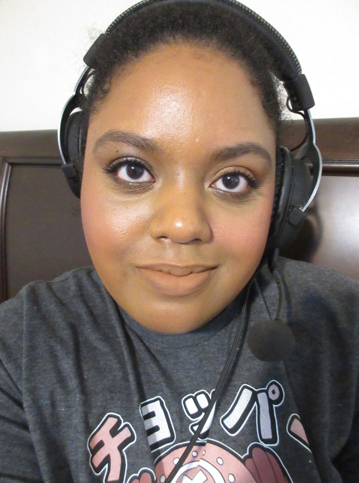
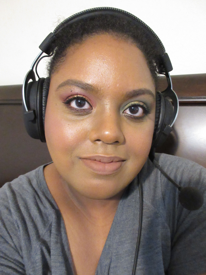
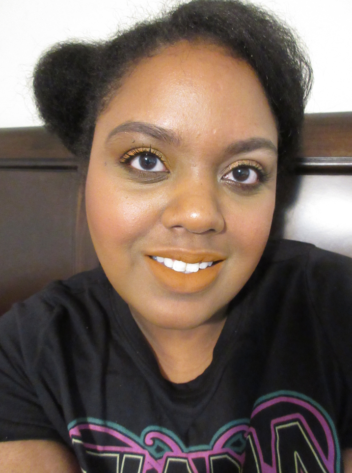
Photos I take in this spot tend to wash out my skin, but I’m not posting these face-foward pictures for color accuracy. I just wanted to show examples of the Lip Clays on the face without being zoomed in so closely. Also, I frequently wear two different eyeshadow looks on testing days, so please excuse that.
I now own twelve Lip Clays. My opinions of them haven’t changed, and those who wish to see my reviews of the rest can find them here and here. I’m still impressed with how long wearing yet comfortable it is on the lips. It’s transfer resistant, as long as oil from food hasn’t broken it down, and it’s easy to touch up. I love the plush velvety texture, although it’s not as completely unique as I thought. I recently learned that Colourpop’s line of Lux Velvet Liquid Lipsticks are similar enough that I would recommend those as an alternative if Colourpop happens to be more accessible to someone than Kaleidos. The lip products have similar price points, though Colourpop tends to have deeper and more frequent discounts. Kaleidos makes unique shade options though for the more daring and color-loving makeup wearers.
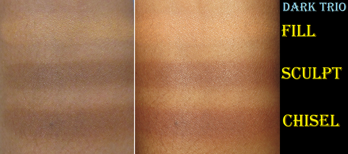
The only new development about the Lip Clays I’ve experienced is that Wild Apple separated a bit. Unlike all the other Lip Clays that maintained their mousse-like texture, my version of Wild Apple was giving me fully liquid swatches until I stirred it in the tube and it mixed back with the rest of the lingering thick creamy product inside that I’m used to seeing. It’s even visible in the swatch photo above with all except Wild Apple having mostly dried down in spite of me waiting a few minutes for it to dry. Wild Apple was part of my oldest custom set that I purchased a little over a year ago. The other three Lip Clays that came with it haven’t changed. The smell is slightly more chemical-like, so it might be starting to turn early considering the 18 month period after opening date.
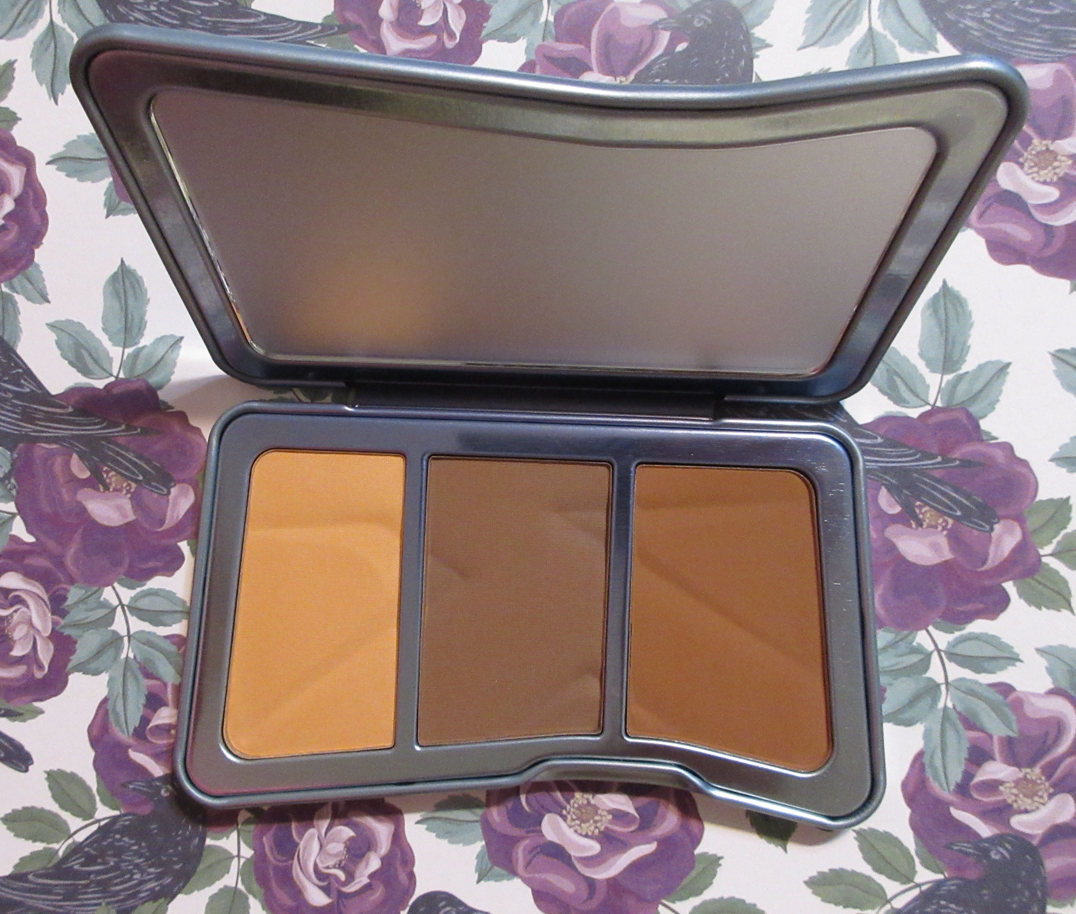
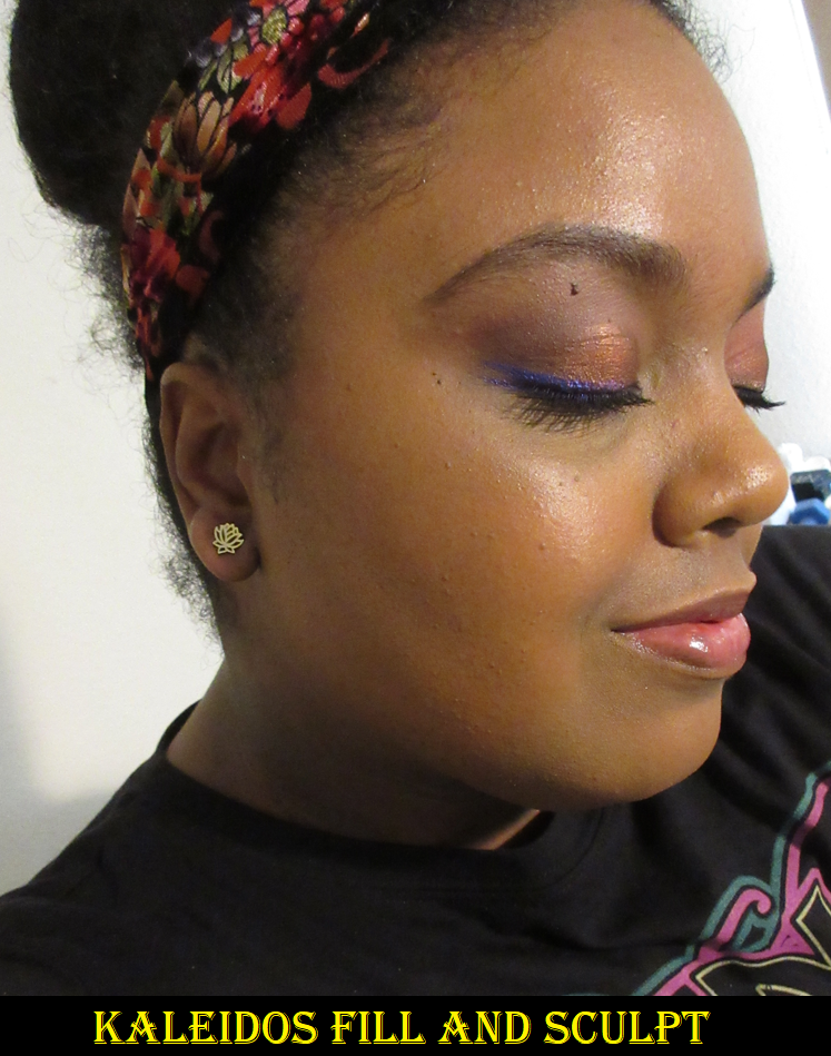
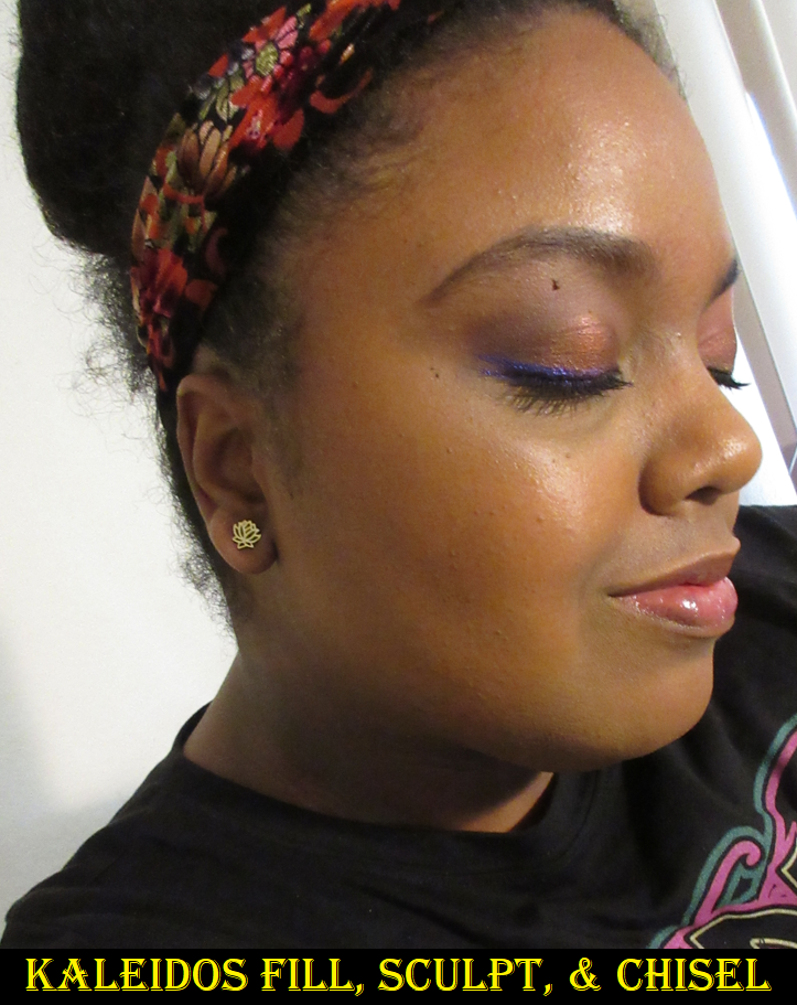
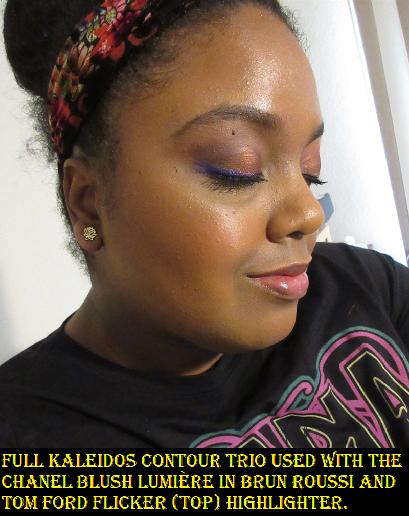
I’ve been using the Symphony Contour Trio quite a lot since it arrived. The powders feel super soft to the touch and remind me of the Hourglass Ambient Lighting and Laura Mercier Candleglow Perfecting powders, put more heavily pigmented. The fill shade is supposed to be the illuminator that, “delivers soft, from-within radiance with buttery smooth powder that expertly blurs skin textures and naturally brightens targeted areas.” I’m a bit confused that this is considered a glow product when I am unable to see any shimmer or sheen to the powder whatsoever. The only glow I get is from my foundation. The powder imparts a natural finish at best, which is why I feel so comfortable using it to set my under eyes. Kaleidos also sells the “fill” compacts separately and I was considering getting a lighter shade since this just sets things in place and doesn’t deliver on the brightening effect (possibly due to the color depth), but I’m not sure if the Tan version would be too light for me. Had this product been less of a setting powder and more of a finishing one with shimmer or a sheen like the Guerlain meteorites, I’d have been willing to give another shade a try. But I only need it for setting and am perfectly happy to have this one for that purpose. That also being said, kudos to Kaleidos for the fact that all my comparisons to this product are high end brands because that’s the quality level of this product and for a really great price!
The packaging is surprisingly weighty metal while also being sleek and easy to hold in the hand. I’m quite impressed with the design!
When it comes to using the sculpting contour shade or the chisel brontour color, I get near airbrushed results when my base makeup is matte. When it’s on my typical slightly dewy or natural finish foundations, it can require a little more effort on my part because it may stick a tiny bit where I first lay the product down. Because the sculpt shade is a bit deep for me and I already have to use a controlled hand to have it blend into my skin, I have to be especially careful to apply a little at a time and with a brush that will disperse the product lightly while also aiding in the blend. With the chisel shade, I don’t have to worry about being as precise with it because the color match suits me better. In fact, when I use this trio, I often reach for the fill shade and chisel shade and skip trying to contour. The sculpt shade is cool-toned and deep, so it does have a sculpting effect, but I prefer to have a little more grey so I can actually create a faint shadow. So, if I’m in the mood to contour, I still reach for my Hindash Beautopsy palette instead.
Although not completely perfect, I like this a lot and foresee myself continuing to get use out it!
My review of this liner is a first and second impression, so please keep that in mind. I will update this post in the future if I discover anything that differs from what I experienced initially.
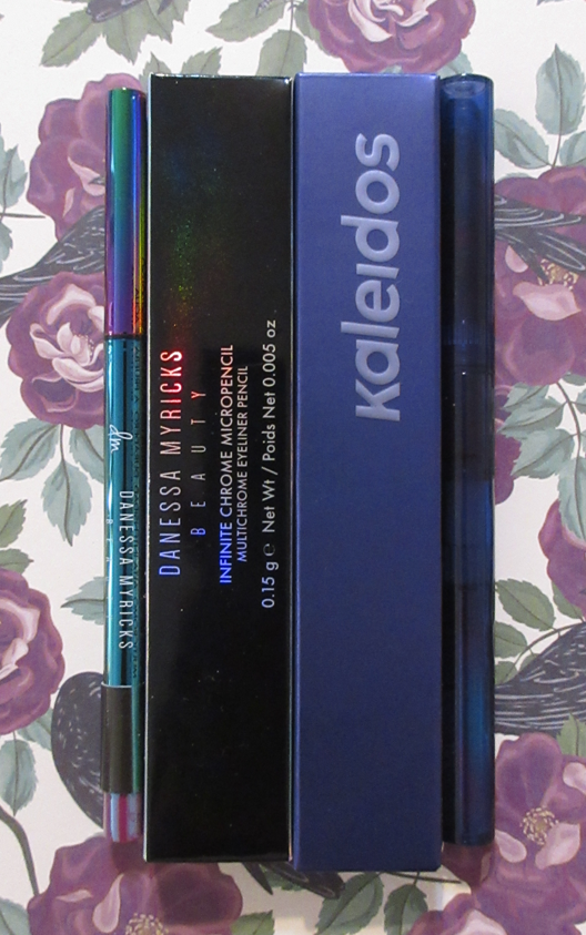
I love multichromes, so it’s only natural that I find multichrome eyeliners super appealing. However, I know how to turn eyeshadows into liners, so I’ve tried for the longest time to prevent myself from buying them for the convenience/ease of not having to scrape some off and mixing it with a liquid product (like MAC Fix+, isododecane from TKB Trading, Inglot Duraline, or Mehron Mixing Liquid) and applying carefully with a brush and then having to clean off the tools, etc. So, I ultimately skipped getting the $28 Natasha Denona Chromium Liquid Eyeshadows, the $26 Danessa Myricks Twin Flames, and JD Glow MultiChrome Gel Liners for $18.50. It was also easier to pass since those are liquid products. I was a lot more tempted when I heard Sugar Drizzle had multichrome eyeliner crayons, but I don’t think they are sold individually and I’m always wary about purchasing from small indie brands for the first time. So, when I was already making that Black Friday order from Kaleidos, the $12.80 (regularly $16) was too good to pass up on. Around the same time, I got the Danessa Myricks Beauty Infinite Chrome Pencil in my Mystery Trendmood Box, so it’s only natural to want to compare them.
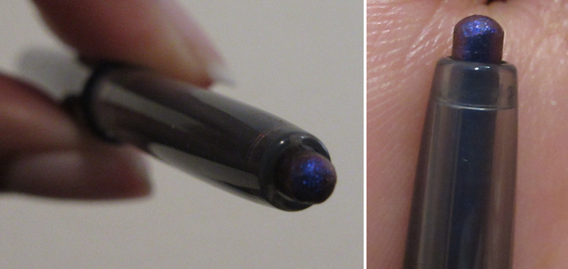
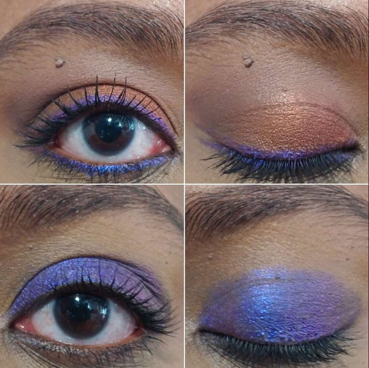
I chose Night of Creation because its the type that no matter what lighting situation it’s in, the angle, or whether it shows a visible shift or not, I would love it and use it in the same way. Kaleidos describes the colors as, “Ultramarine, Violet, and Dark Plum,” and I often use deep and vibrant blues and purples on my lower lash line as a pop of color to a neutral look or as a secondary color to an otherwise monochromatic eye. The other liner color options, for example Limelight, goes on the spectrum of blue, blue-green, green, and yellow-green in a look that I might not want any yellow because the warmth could clash with an otherwise cool tone look, for example. Of course the benefit to having a multichrome is to have a shift, but not if the shifting color might look off next to the tones of other eyeshadows I would be wearing. Night of Creation has all cool tone bold colors, which means it’s most likely to all look good or not at all. That makes it simpler to know when I want to incorporate it in a look or not.
Night of Creation applies so easily to my hand, but on my eyelids with my lines and texture, I had to go over the same spot for a full minute in order to get the opacity level shown all over my eyelid in the photo above, and at least ten times to just my upper lash line. This isn’t due to a lack of creaminess. The product is soft, but it’s as if I get a coating of the black base and have to keep rubbing over and over until the sparkle part with the actual pigment comes off. For this reason, I haven’t thought to use this in my waterline and don’t plan on it either. The product tip is very thick and not easy to apply precisely. I’m someone who loves doing a wing and had to switch holding the pencil from 180 to a 90 degree angle to try and get a thinner line using its side. I still had to sharpen up the edges with concealer in the examples above. Also, I can still see patches in the full lid example, so I don’t plan on using this pencil for that in the future and will stick to keeping it on the lower and/or upper lash line.
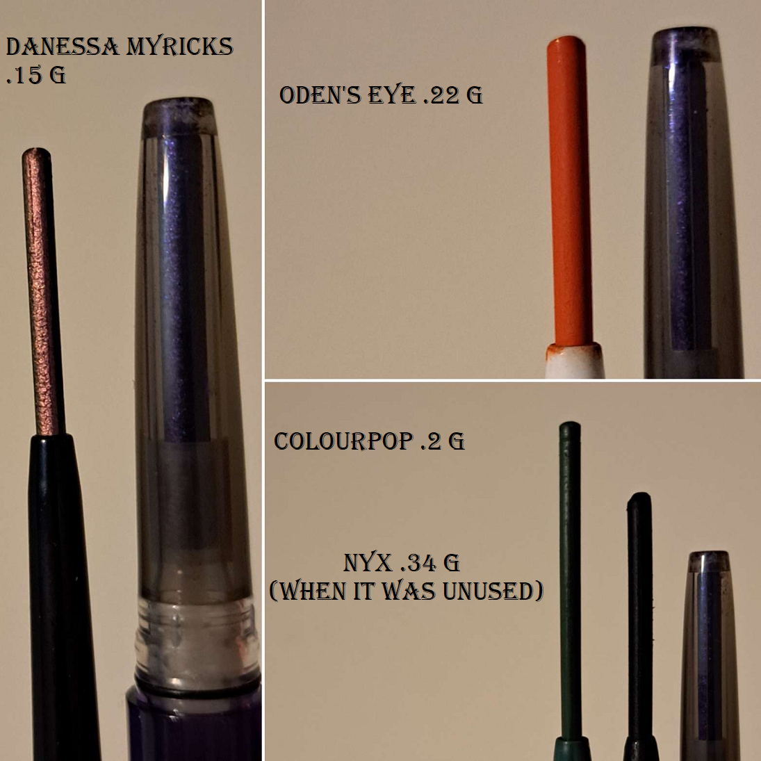
One advantage the Danessa Myricks pencil has over the one from Kaleidos is how thin it is, which makes it so much easier for me to use precisely. I know a big complaint from customers about it is how little product one gets in the Chrome Micropencils, but as someone who normally takes six months to use up a black eyeliner, even if it was in almost every eye look for those six months, a product like this one that I’m going to use a lot less frequently should last me ages. Kaleidos has 0.20 grams compared to Danessa’s 0.15 grams, so I’m fine with that difference. Some brands give a ton of product, but among the micro pencil category, the Hourglass 1.5MM Mechanical Gel Eye Liner is 0.06 grams and the Shiseido MicroLiner Ink Eyeliner is 0.08 grams, so those have even less for around the same price and they’re not multichromes.
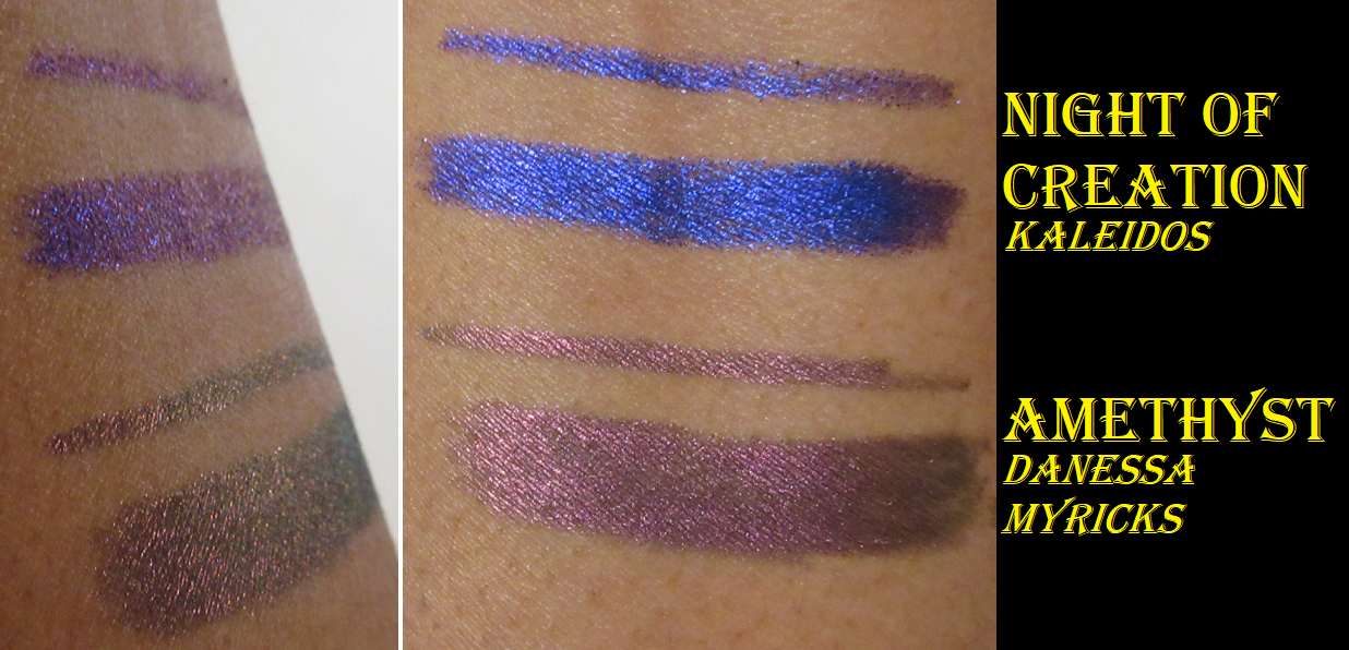
They’re both beautiful on the eyes. Because they’re very different colors, I don’t think it would be fair of me to compare shifting ability and shine between them (dark vs light color and contrasting shifts vs similar color depths in shifts), but Tina compared several in her video here. She actually owns Charoite, which is most comparable to Night of Creation.
These are also both waterproof. I do not recommend trying this on without a waterproof makeup remover or an oil of some kind to help break it down because these are truly waterproof, especially the one from Kaleidos. Most of the time when a product is waterproof I can still remove it from my skin with Bioderma, but neither of these budged at all when I made multiple passes over my swatches with Bioderma and my Makeup Eraser cloth. I then used regular hand soap and water, which only the tiniest bit of the Danessa Myricks came off at. I then used Dr. Bronner’s Pure-Castile Liquid Soap that contains oil in it and that removed about half of the Kaleidos and most of the Danessa Myricks. Ultimately, I still pulled out my Sephora Waterproof Eye Makeup Remover which did the trick but was still not a breeze to do like I expected. So these are no joke! When I was using the Kaleidos liner on my actual lids, a piece of it broke off (during the attempt to cover the whole lid when I was rubbing the eye repeatedly and forcefully) and fell somewhere on my laminate wood floor. I couldn’t see where it was, so I assumed it rolled under the bed and I planned to deal with it later. What I did not realize was that it didn’t roll under the bed. I accidentally stepped on it when I got up, and since I was wearing socks I didn’t feel a thing. I started walking to my door and then realized I had a trail of probably fifteen spots of deep shimmery purple smudges into the laminate. I grabbed a paper towel and some water to start wiping it up, and when it wouldn’t budge I remembered in horror that it’s waterproof.
So, I had to use oil to remove the trail of liner smudges from across the floor, and then use soap and water to get the oil residue off the floor, and then dry it all up again so I wouldn’t accidentally slip and give myself a whole new set of problems.
The moral of the story is not to underestimate the waterproof power of these liners! Haha.
As for longevity on the eyes, they both live up to the claims of being smudgeproof, but because I get oily lids and I tend to rub my eyes, these had some spots that wore off by the end of the day. My upper lash line was fine, but the inner portion of both my lower lash lines had missing product. The Kaleidos held up better though than the Danessa Myricks one did. Those that get oily lids, but don’t rub their eyes, plus those that don’t have an oily-lid problem should have no trouble with longevity. And I should also mention that even though I have oily lids, removing the leftover liner was not an easy task.
UPDATE FEBRUARY 28, 2023: I ended up buying two additional Danessa Myricks liners and thought I should add swatches of them here since I will be unlikely to re-review them again.
Well, that’s everything I could think to mention! I hope you have a great week and thank you for checking out this post today!
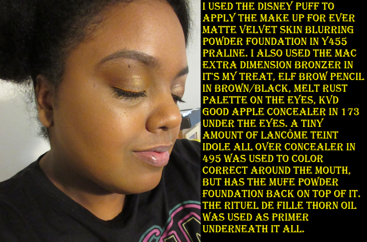
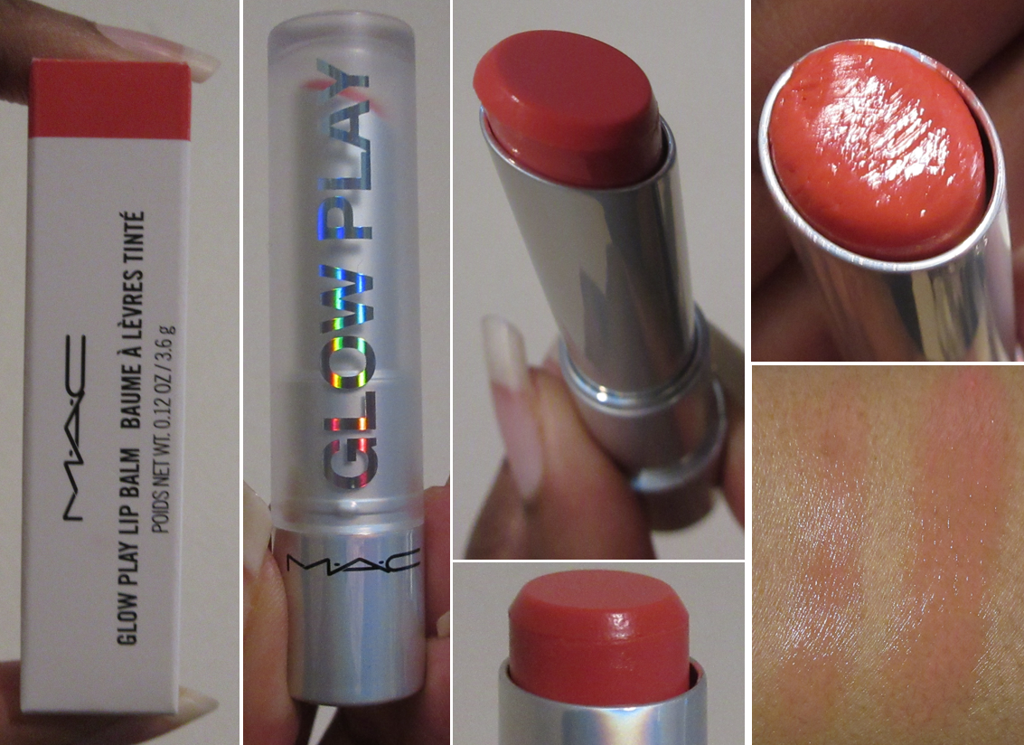
This review is technically eight months in the making since the bronzer, Pillow Talk Highlighter, and mascara were supposed to be part of last year’s “May Purchases Reviewed” post that I still have yet to complete. In fact, so much time has passed that I fully used up and decluttered the travel size mini of the mascara, and had to rely on a sample size version to complete this review. The advantage of this situation is that I have very solidified options on most of the products we’ll be diving into today. But, let’s start with the newest product that I’m the most excited to talk about first!
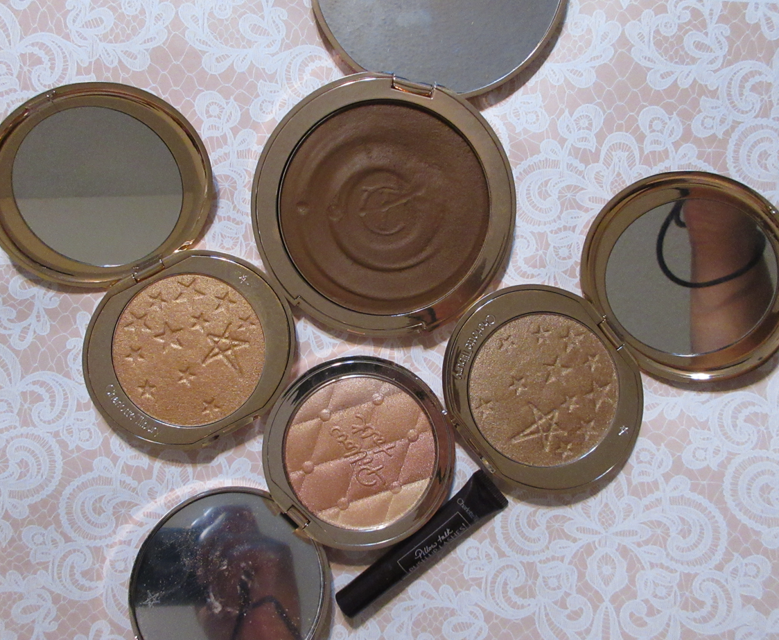
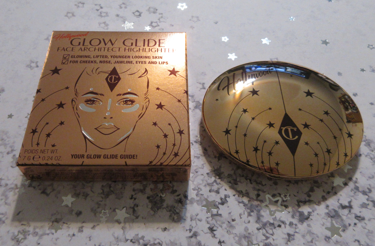
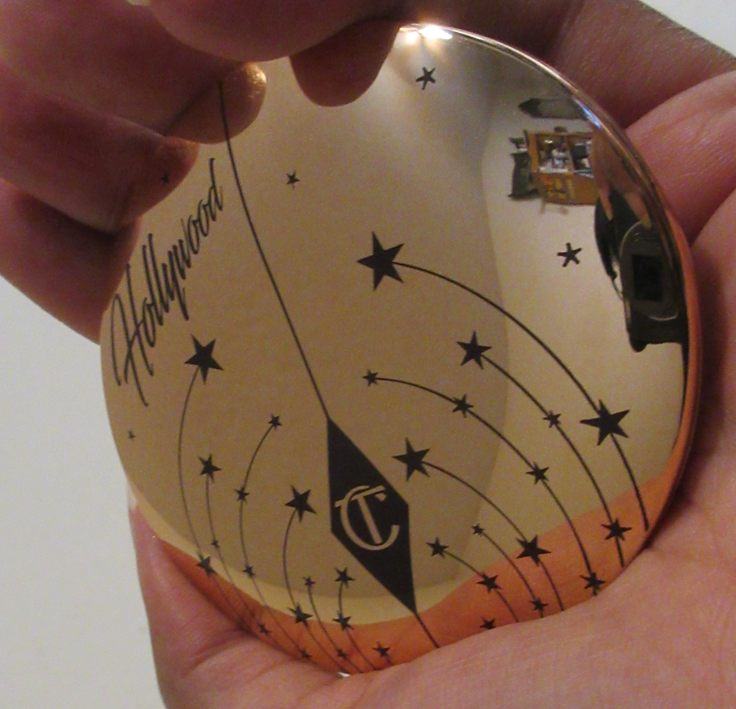
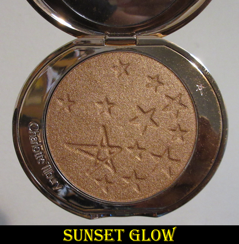
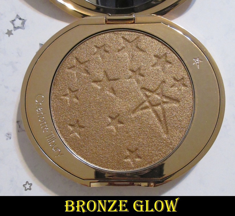
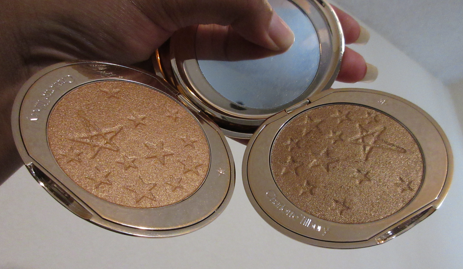
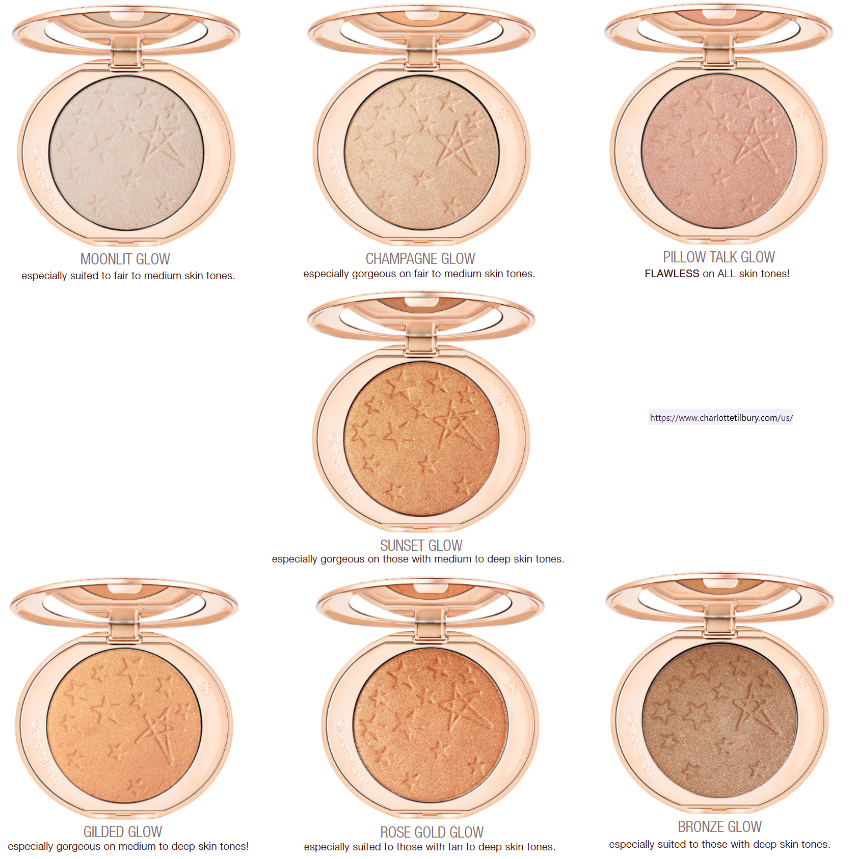
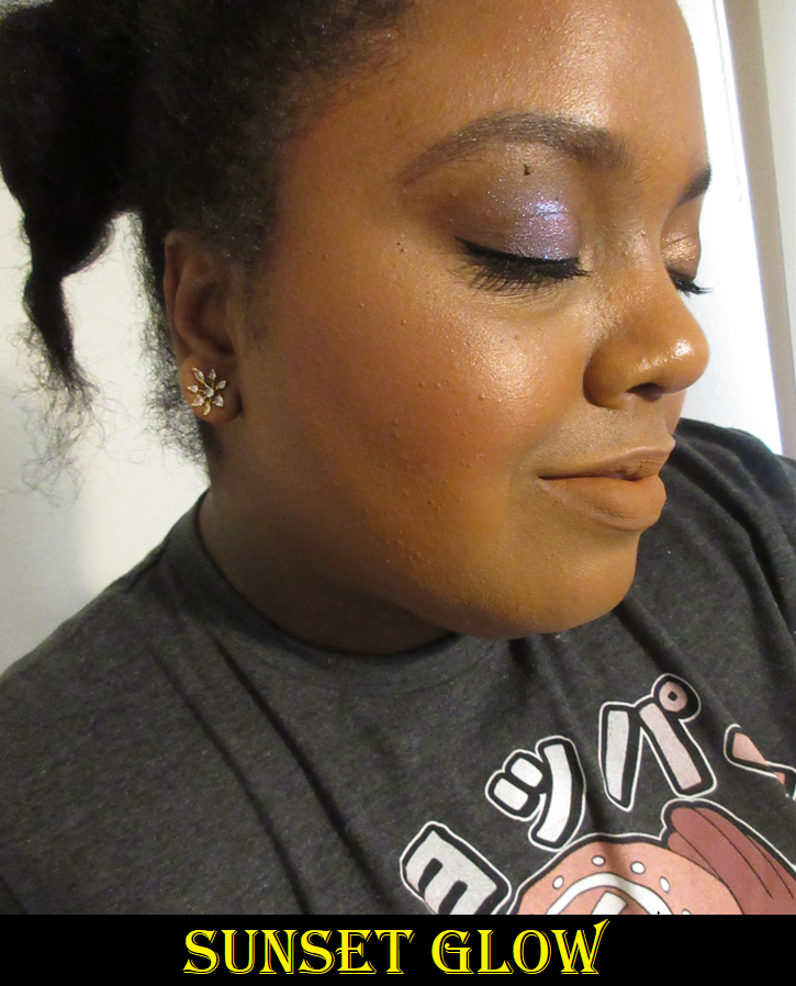
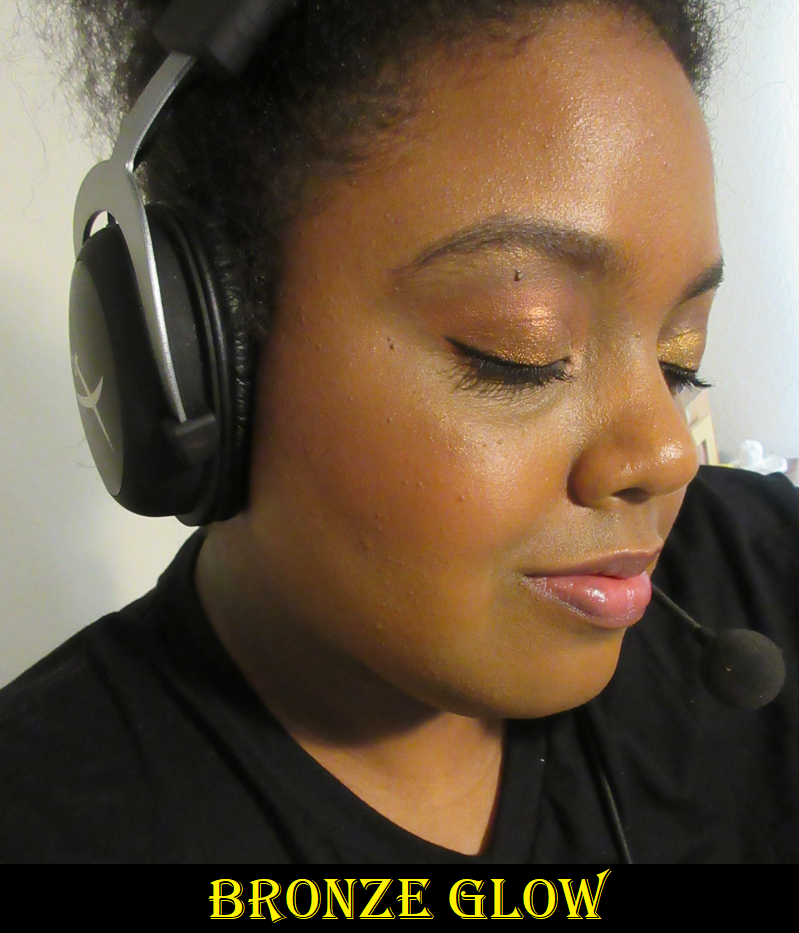
Charlotte Tilbury Hollywood Glow Glide Face Architect Highlighter in Sunset Glow and Bronze Glow
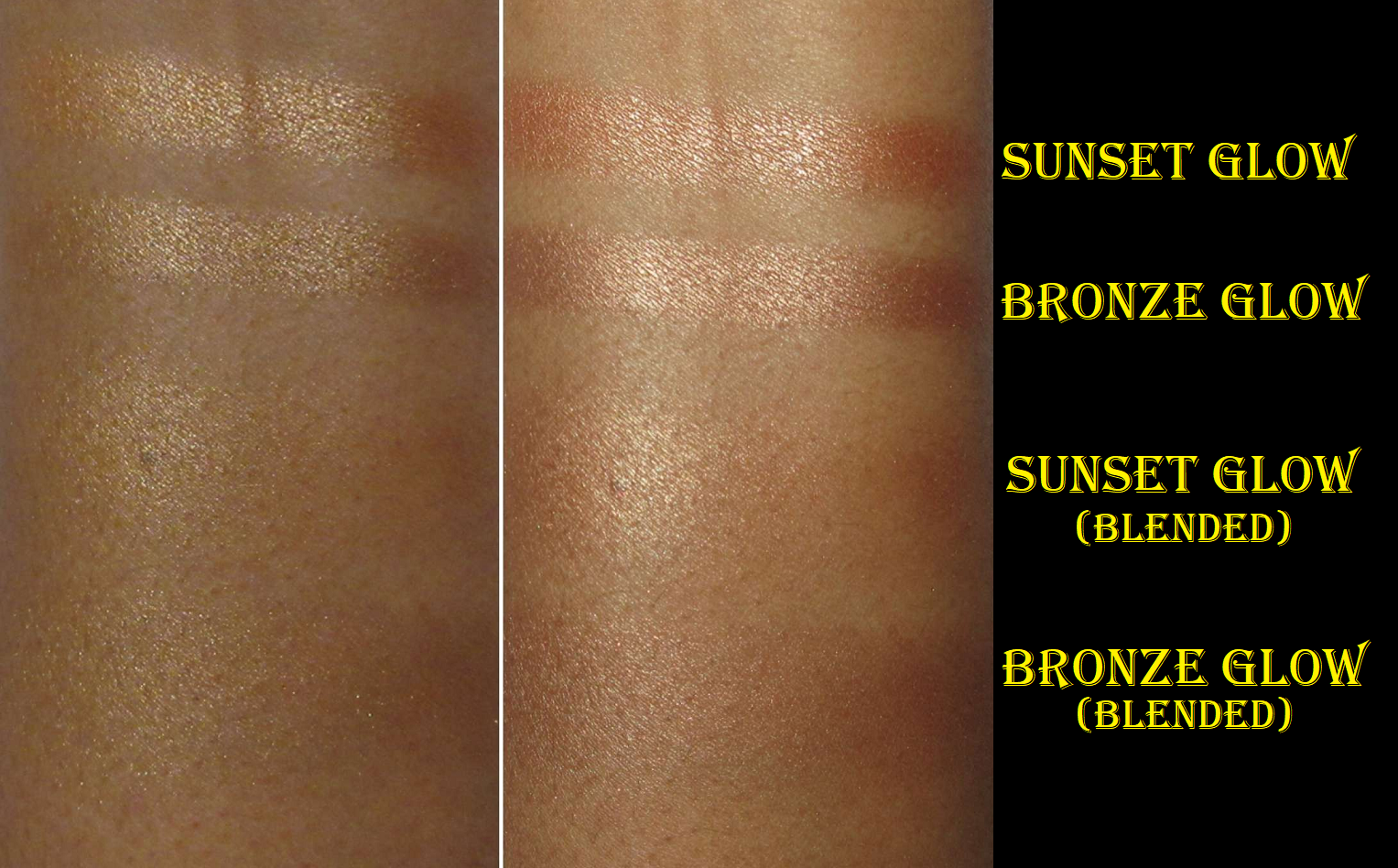
Even though Sunset Glow is my better shade match, the blended out swatch shows that it’s close to my skin tone. If it was the tiniest bit darker, I might not have liked it as much as I do.
This was supposed to be an early 2023 release, but 6 of the 7 shades were available via Selfridges for $38 on December 30, 2022. I knew Sunset Glow was the shade I really wanted the most, but it started off as a CT website exclusive for a week or so before it came to Selfridges, and I had already ordered Bronze Glow. As of this moment, Sunset Glow is still not available at Sephora, SpaceNK, Nordstrom, Bloomingdales, Saks Fifth Avenue, or Beautylish. I spotted it on the Feelunique website, so it seems the best chance to get this particular shade (if you live in the US) is from UK based places that have a US site too.
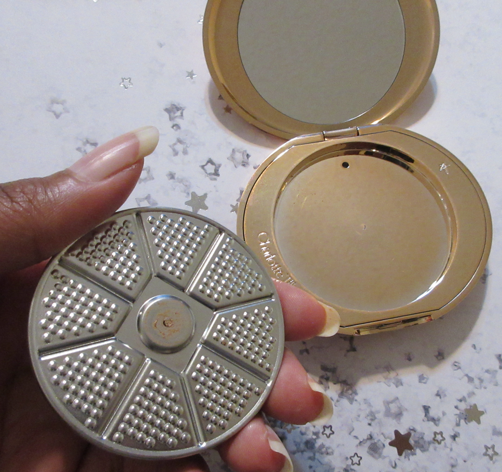
One of the first things I noticed when I got the product in my hands was how much it rattled when I held it and used it, to the point where the pan starts spinning in the compact when I try to do swatches. It’s not loose and it doesn’t fall out when held upside down. It’s just a matter of it being magnetic and not glued down. I don’t know if the ridges/raised elements on the bottom of the pan is the cause for the actual sound from it not laying evenly or if it’s due to having a weaker magnet inside the compact. It’s a minor flaw that I don’t mind because it makes it that much easier to transfer this pan into a different compact if Charlotte Tilbury comes out with something in the future with a pretty design on it. I like this outer packaging design more than the basic logo, but it’s not as cute as some of the past lunar new year compacts for instance, so I’d love to transfer this into prettier packaging some day because I really like this highlighter!
I created a chart using the images from the Charlotte Tilbury website to make it easier to see the color recommendations. Since Sunset Glow is the harder to find shade, I put that one in the middle, though it’s supposed to be in the 5th position.
According to the brand, these shades are “flawless on everyone,” but certain colors look especially pretty on certain skin tones. Bronze Glow is supposed to be the deepest color, but the shimmer looked light enough to work for me based on the brand’s swatches and examples on models. I was right in that regard, but the darker tone does keep it from looking as nice on me as it could. The point of a highlighter is to draw attention to a particular area of the face and bring that forward. Bronze Glow looks flatter and duller compared to Sunset Glow because the base isn’t light enough to create that lifted illusion. It still draws attention due to the sparkle color, but it’s not as pretty as when it’s both shimmery and lighter in depth, but not so light as to leave a pale stripe on the face. For this reason, I recommend taking the depth of one’s skin tone into account when choosing a shade despite the brand’s insistence on a universal aspect to them. As I learned, certain models are demonstrating one specific highlighter color for a reason and I found that choosing the shade closest to the model that looked like me resulted in the highlighter looking its smoothest. The “wrong” one drew a little more attention to texture.
Judging this based on Sunset Glow alone, these highlighters are super smooth. It feels slightly damp to the touch, but it is dry on the face. Part of what’s supposed to make this line of highlighters different from the rest is that it’s supposed to have a finish that looks like it’s melting into the skin like liquid highlighters would, while benefiting from the ease of use as a powder product. It looks beautiful all day and doesn’t lose its reflectivity like some lower quality shimmer in highlighters can do. This is by far my favorite highlighter from the brand and I believe it could be in the top ten ranking among all the ones I own.
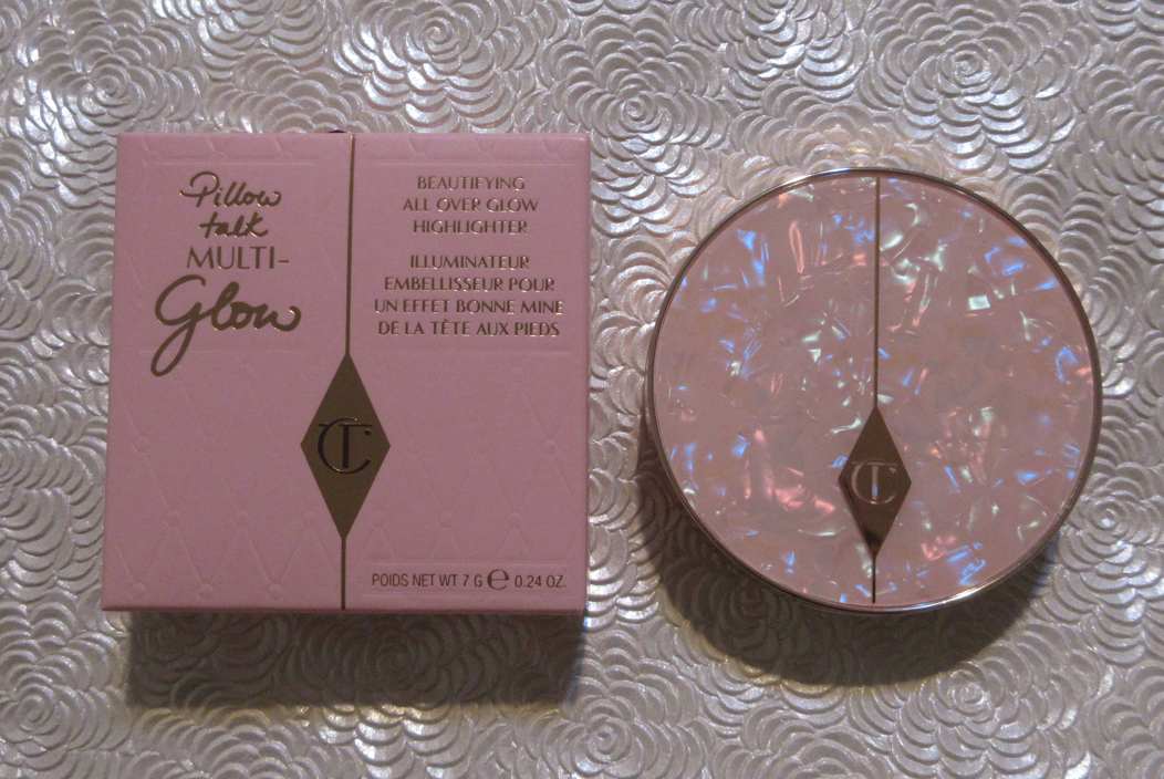
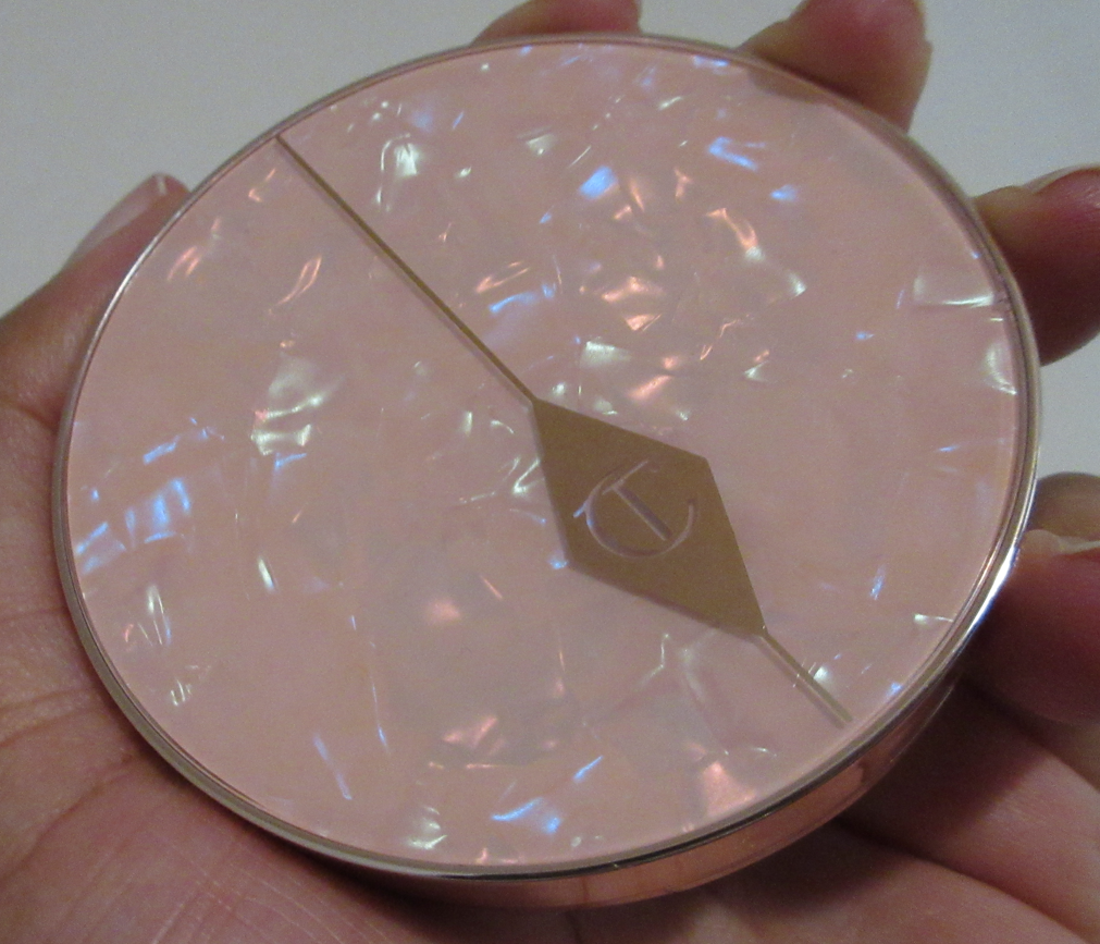
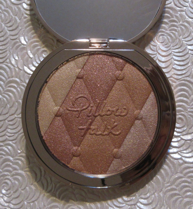
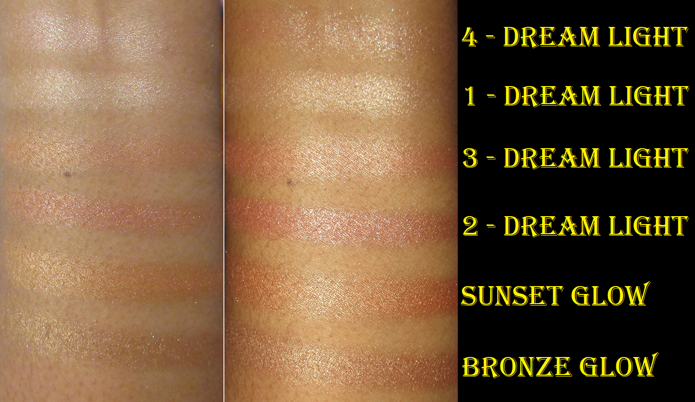
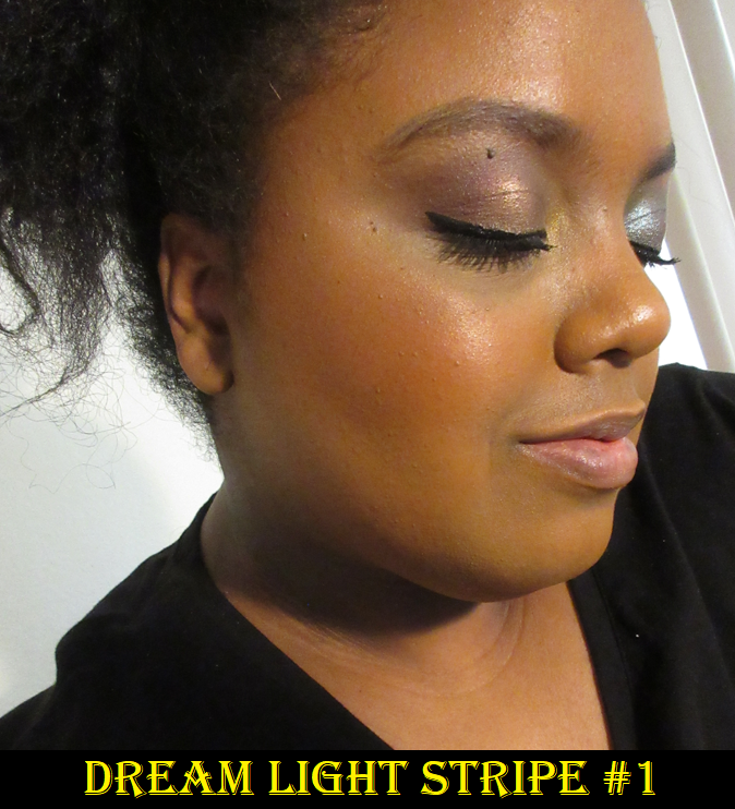
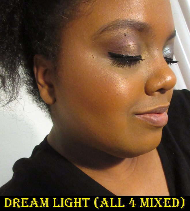
Charlotte Tilbury Pillow Talk Highlighter in Dream Light
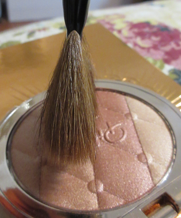
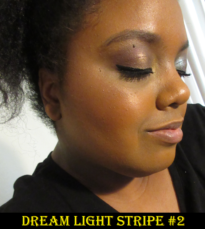
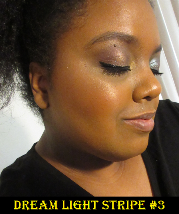
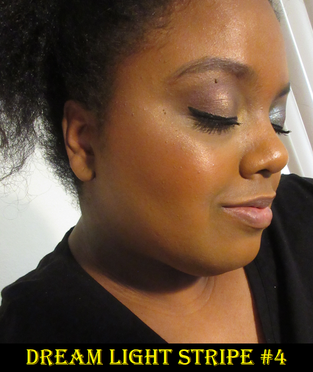
This may come as a surprise, but I wasn’t impressed with this product initially. It’s possible that I just had a sour taste in my mouth from my first one arriving broken. When this one arrived, I was disappointed to see the random larger glitter specks particularly within the dark reddish bronze strip (#2) and champagne colored strip (#4). Part of the theoretical benefit I saw to owning this highlighter was the ability to have four different highlighter colors within one product and be able to customize the shades by mixing two or more together, but the ones on the left and right sides of the pan are so small and thin that a select few brushes allow me to pick up the single color I choose. It turns out that the only shade I feel I can pull off wearing by itself is the deep golden one (#3). For getting just that, I tend to use my discontinued Wayne Goss #15 fan brush.
When I want a stronger intensity level of highlighter, I add the tiniest bit of the light gold (#1) on the very highest point/spot on my cheekbones. Besides the random larger sparkles, my biggest reasons for not preferring Stripe #2 is that it’s too red and dark, and Stripe #4 because it’s too light. Mixing all four shades creates a beautiful middle-ground color that I like, but I don’t wear it that way because of the increased number of random larger glitter specks. Of course, the more I use this and the more the shades kick up into one another, it’s becoming increasingly more difficult to not get larger particle size shimmer in #1 and #3. So, it’s something I’m just trying to embrace.
Because this is another relatively smooth highlighter, I do like it. However, if I had to choose between the Pillow Talk highlighter and the new Glow Glide Face Architect ones, I prefer the latter because of the extra smoothness and glow it provides without looking so powdery. They are the same price, and the Pillow Talk highlighter gives more variety, but four pretty highlighter colors don’t compare to one near-perfect shade.
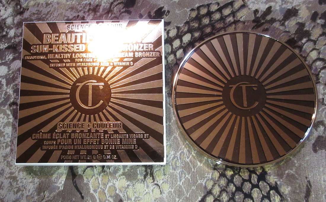
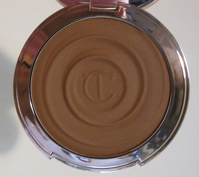
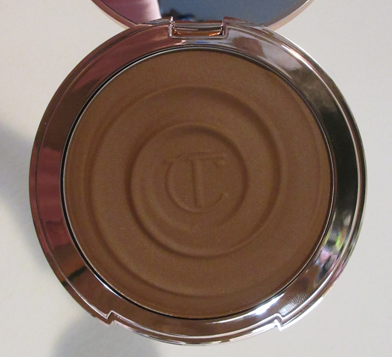
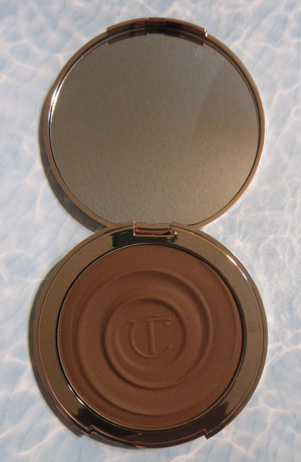
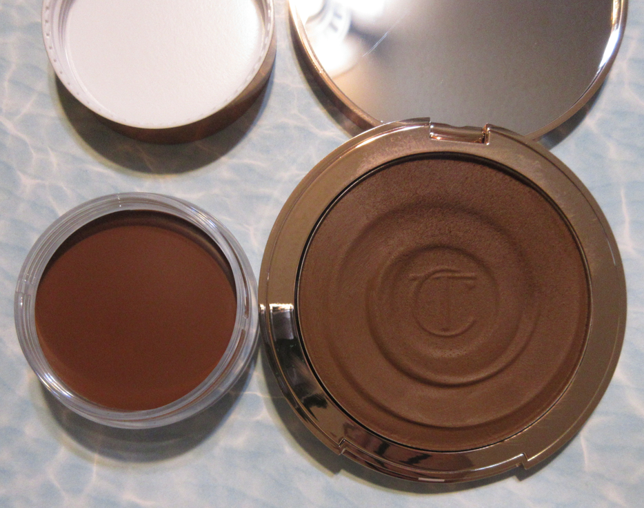
Charlotte Tilbury Beautiful Skin Sun-Kissed Glow Bronzer in 3 Tan
I love this bronzer, but it had me going crazy for a bit! I included multiple photos because no matter what background or lighting I use, the color doesn’t look consistent. To my own eyes, when I wear this on my face, it sometimes looks more olive, or neutral, or warm-yellow, or warm-orange. I still can’t give a definitive answer as to what undertone this bronzer in Tan has! When I first started using it, there were times I thought the shade was strange and then other times it was absolute perfection! I’ve been using it on and off since June 2022 and I haven’t figured out the witchcraft that makes it look so different sometimes, but it’s one of my top three favorite cream bronzers now. It blends effortlessly on my face and sets without needing to powder it. The longevity is fantastic. One of the things I’m super impressed by is the fact that the texture has remained creamy for all these months without a film or discolored layer forming on the surface, and hasn’t partly dried out, like some other cream products of mine have done. It’s a pleasure to use every time! Factoring my powder bronzers into the equation, this product has a ton of competition for claiming a spot in my top five favorites, but this might just be number one among the cream bronzers. I have three others that come to mind, but I haven’t spent enough time with them to say for sure yet which is the best of the best. Perhaps 2023 will be the year I finally do a yearly favorites post again to declare the winner.
In order to enjoy the pretty swirl pattern for longer, I mostly put my brush in the same spot (top right of the compact). It looks barely used, for that reason, from the top down perspective, but I’ve created a decent dip into the pan when taking into account how little product is needed.
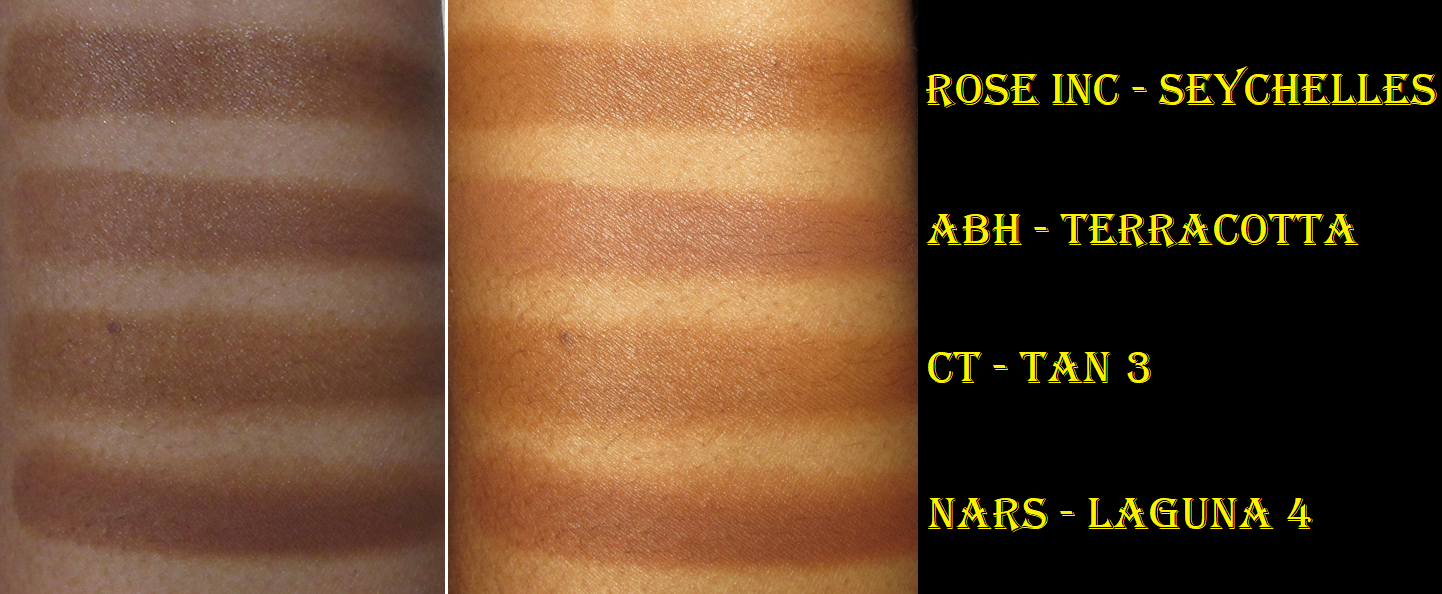
Below, I’ve included a photo (taken in June) of another bronzer I bought that same month and love: the Nars Laguna Bronzing Cream in Laguna 04. It’s darker and more red toned than the Charlotte Tilbury cream bronzer, which is why I prefer Charlotte’s over it. Plus, the Nars bronzer is heavily scented.
There are so many reviews of this product by now, so perhaps it doesn’t need to be said, but the cream products are darker than the powder counterparts. For example, the powder version of Tan is lighter than this cream version of Tan. The powder version of Deep is lighter than the cream version of Deep. So, despite there only being four shade options, this helps to round out Charlotte’s overall bronzer line if you don’t mind using cream versus powder. I always wanted a “Dark Tan” or “3.5” bronzer shade in the powder line, but cream Tan is filling that void for me.
The price of this is ridiculously expensive, but it was worth it to me. It’s like if the Danessa Myricks Power Bronzer Cream and Anastasia Beverly Hills Cream Bronzer had a baby and that baby acquired magical powers.
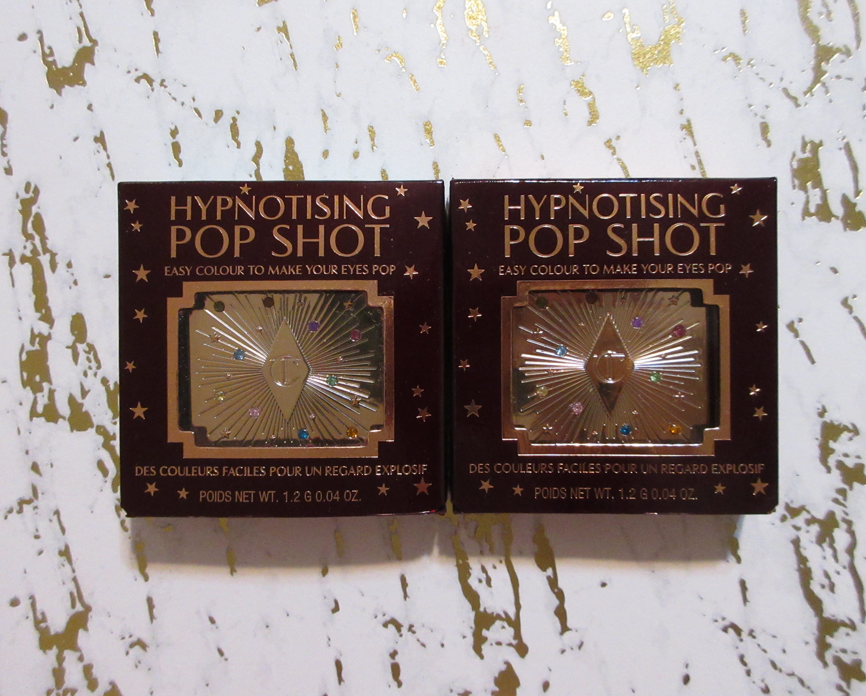
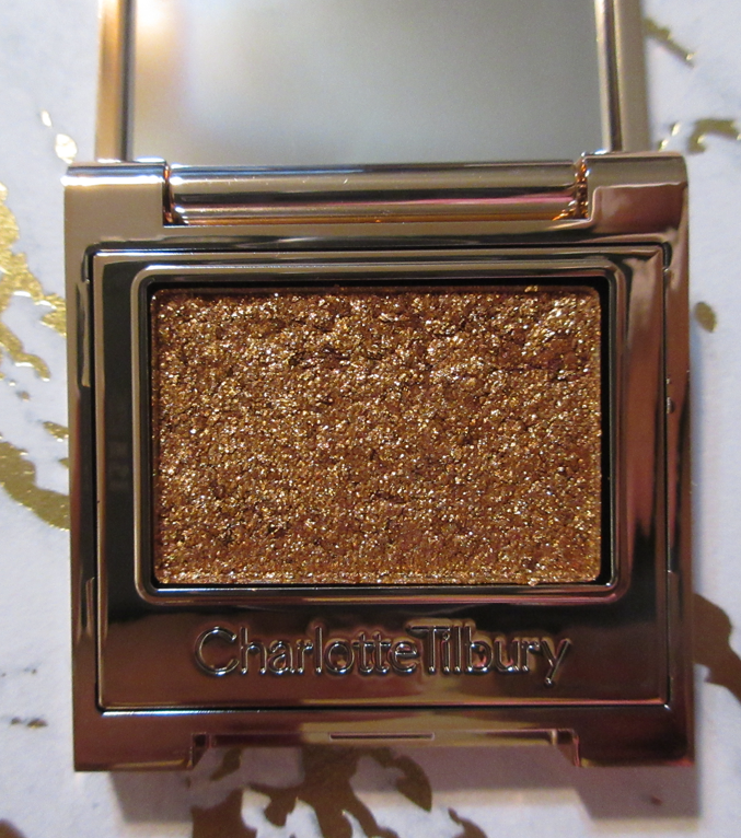
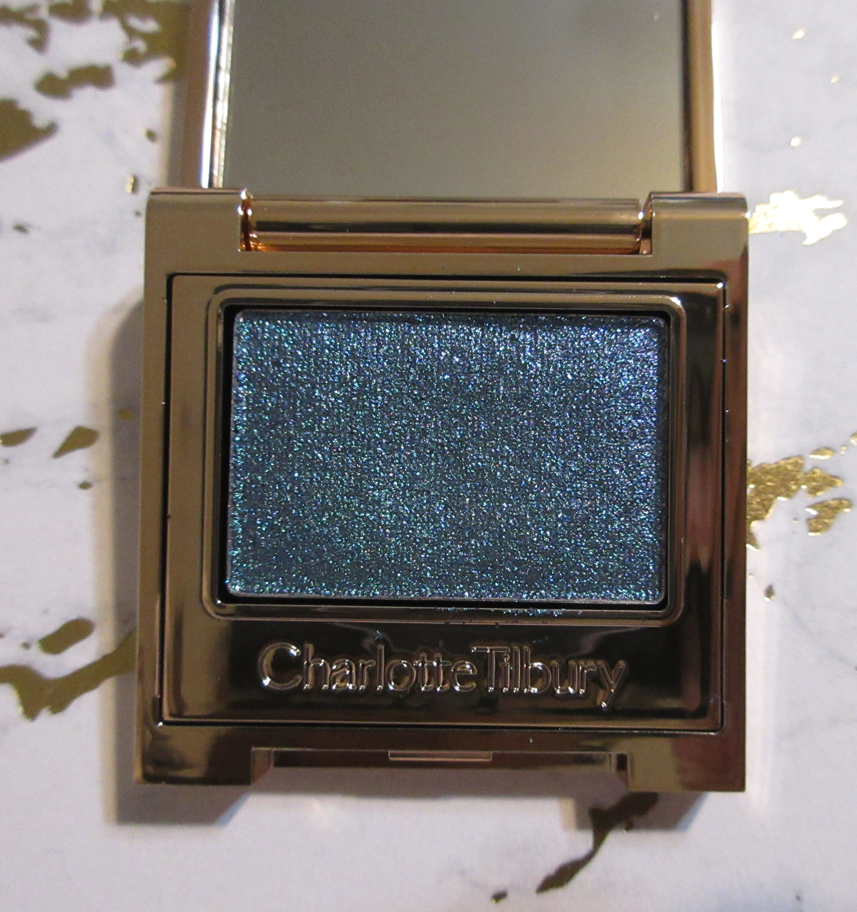
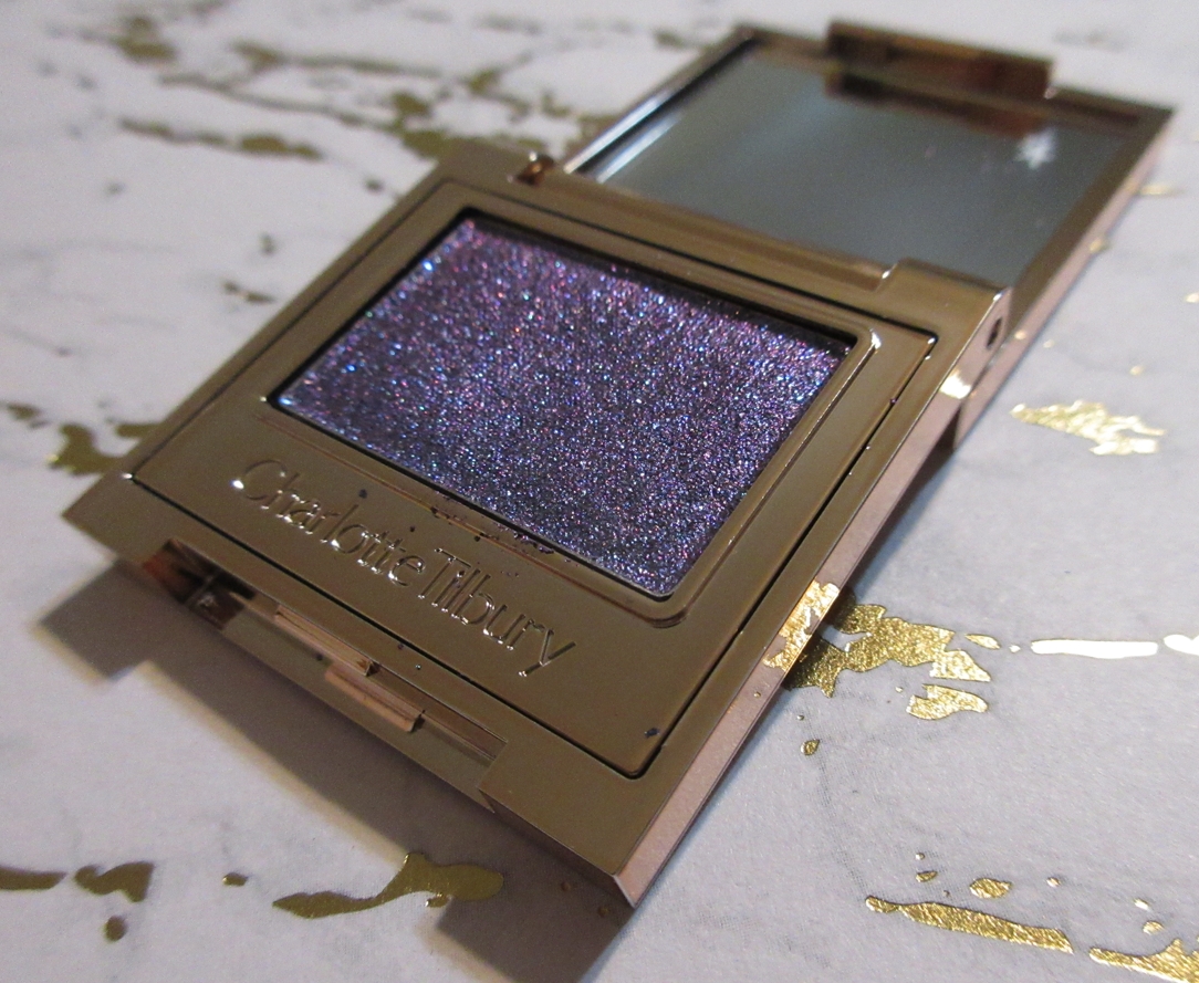
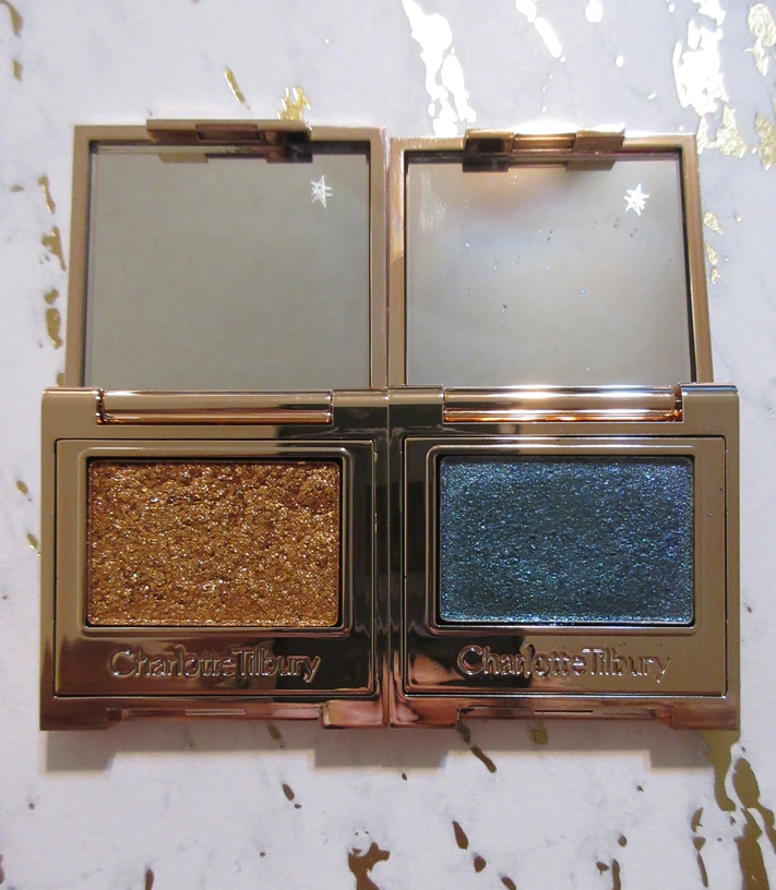
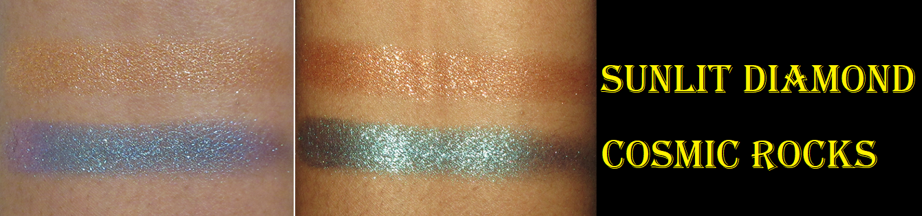
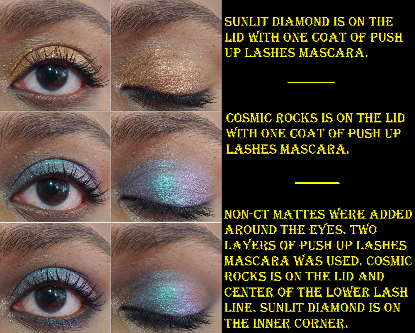
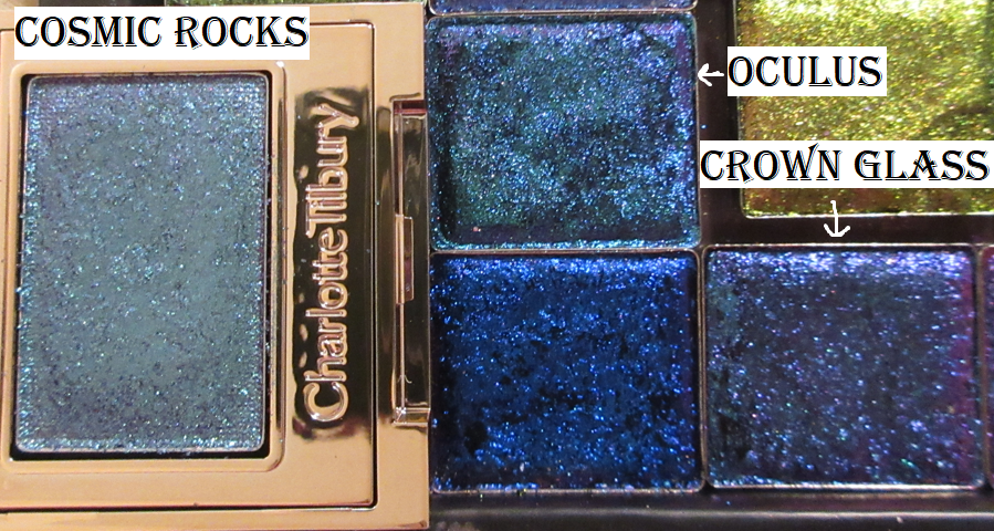
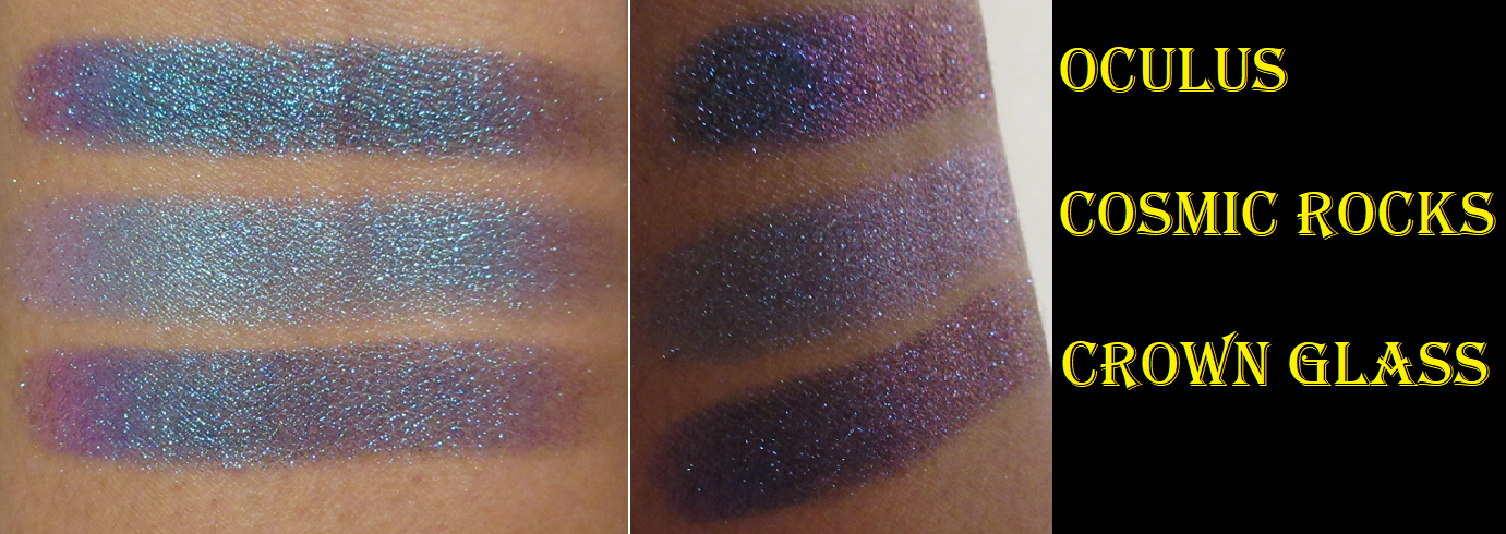
Charlotte Tilbury Hypnotising Pop Shots in Sunlit Diamond and Cosmic Rocks
I rarely reach for single eyeshadow products, unless they’re in a custom magnetic palette, so I try not to purchase things like this. However, that packaging was pretty, and having a multichrome eyeshadow in a beautiful compact that I could reuse (if I wanted to re-press a different eyeshadow into there) was extremely appealing. So, I purchased Cosmic Rocks. The only reason I ended up with Sunlit Diamond is because the brand sent me that on accident instead of the Sunset Glow highlighter. So, they allowed me to keep it and sent me a second package with my correct item inside. Sunlit Diamond is a beautiful color, so I’m happy to have it, even though I wouldn’t have bought it myself. It’s not due to the product being bad. These eyeshadows are pigmented and sparkly and stay pretty well bound together when picked up, which means I can avoid making a mess when applying them and I don’t have to dampen them to apply them either. However, I did apply the inner halves wet in the eye looks below to see if there would be a dramatic difference and there was not. I don’t get much fallout during application, but I can get a bit of it as the day goes on. I still haven’t tried these with glitter glue, but perhaps that could prevent some of that fallout throughout the day.
Also, I get the tiniest bit of movement where the shadow doesn’t want to stay in the deepest line of my crease, but it could be the primer I’ve used with this. It’s such a minor amount for me, but I thought I would mention that anyway for those who might have deeper lines on the eyes than mine. Admittedly, since I’m not much of a single shadow wearer, I’ve tested this product the least of everything else (only four times).
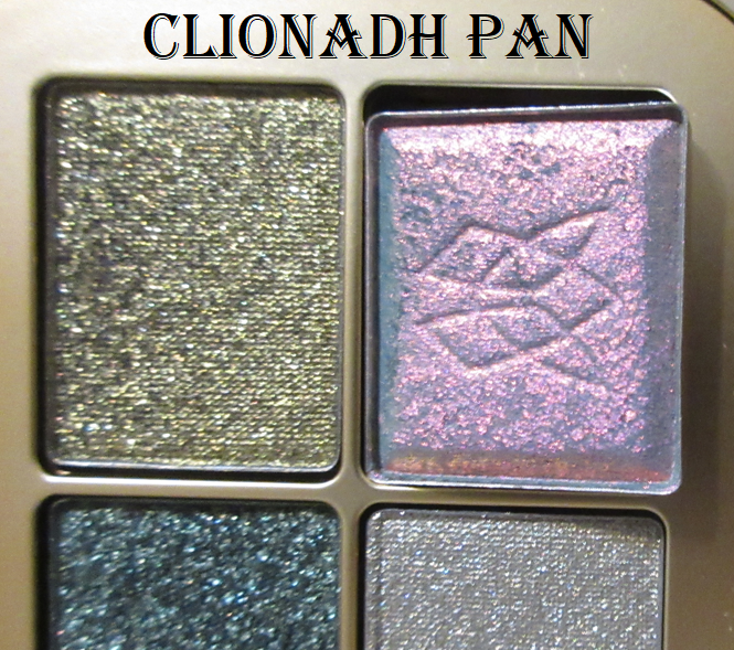
As far as multichromes go, Cosmic Rocks certainly can’t compete with Clionadh in terms of intensity, but I’m not certain if that was even the brand’s goal considering their typical clientele. It doesn’t have nearly as dark of a base as the others, so I’m guessing Cosmic Rocks is meant to be a more approachable way to wear a colorful shadow and a multichrome without intimidating neutral lovers too much.
Even without being as deep as Clionadh’s Jewelled multichromes, Cosmic Rocks is still pretty dramatic on my eyes, so I’m still pleased with it. However, considering the full $34 price of the Pop Shots (I bought Cosmic Rocks from Selfridges for $25), I wouldn’t recommend if for those who love really full on multichromes. Granted, it does come in a lovely lightweight compact, so perhaps the upcharge is understandable considering it houses a multichrome eyeshadow. As much as I like Sunlit Diamond, I personally find the full price to be astronomical for a more traditional eyeshadow.
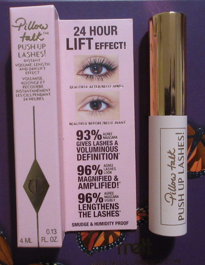
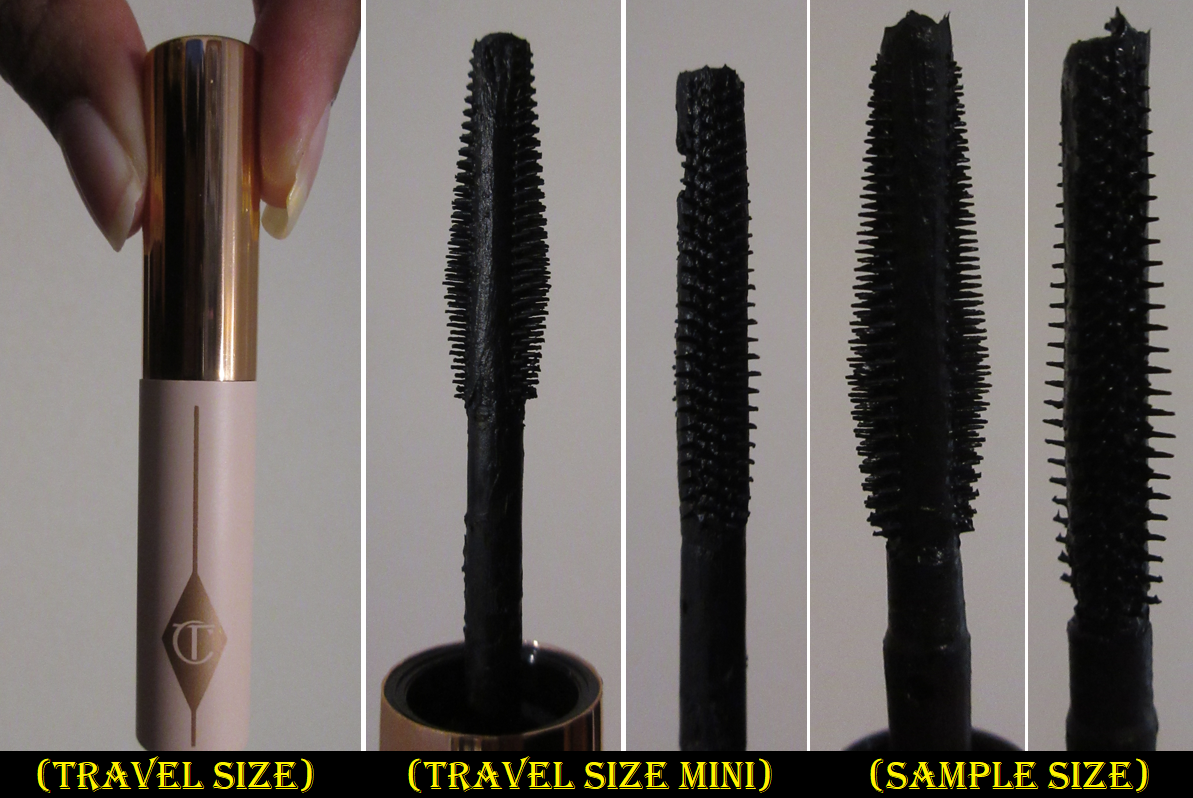
Charlotte Tilbury Push Up Lashes Mini Mascara
Right off the bat, I have to say that my experience with the sample was different from the travel size. I’m not sure if that has to do with the travel size having more product in the tube and being able to fully coat the brush or if there’s a slight difference between the two applicator brushes. All I know is that I liked the travel size enough to where I considered buying a full size, but I would never have been interested in this mascara if it was based on the sample alone, because with the sample I couldn’t build as much volume as I wanted without doing at least two coats. Unfortunately, I used up the travel size many months ago, so I cannot remember which eye looks I’ve taken in the past that I was wearing this mascara. I only have photos of this mascara using the sample size (which is in the pop shots section above).
Based on the travel size, I like that I can create a defined fanned out look with the wand. I get a decent amount of length and volume, although my lashes don’t get quite as long or full as my favorite mascaras can provide. I like that the brush is fairly skinny, so I have an easier time coating my lower lashes. I don’t get any clumping, smudging, or flaking with this either.
I considered repurchasing the travel size again specifically for my lower lashes, but after using the MAC Extended Play Lash, I decided against it because I prefer the applicator on that one and it’s slightly cheaper than the Push Up Mascara from Charlotte Tilbury. Plus, my top favorite mascaras do a good enough job with both top and bottom lashes and I just have to be a little more careful and deliberate when applying mascara to my lower lashes.
I’ve sometimes experienced a difference between the full size tube and travel size of mascaras (if for instance one is wetter or one gets too much or too little product on the applicator), so I don’t know if I would notice yet another difference if I had the full-size. But, based on the travel size, this is a nice mascara, but I don’t see myself repurchasing it.
That concludes this Charlotte Tilbury update post!
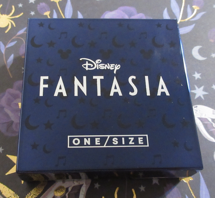
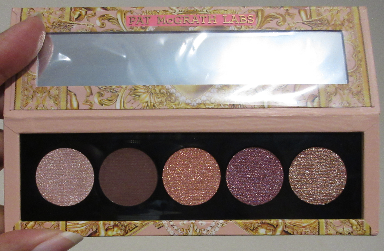
I thought this collection was cute, but I admittedly didn’t purchase it until it went on sale at the end of last year. Now, the products are being offered at an even greater discount at Sephora, so I wanted to post my review while there are still some items left to purchase for those who might be interested.
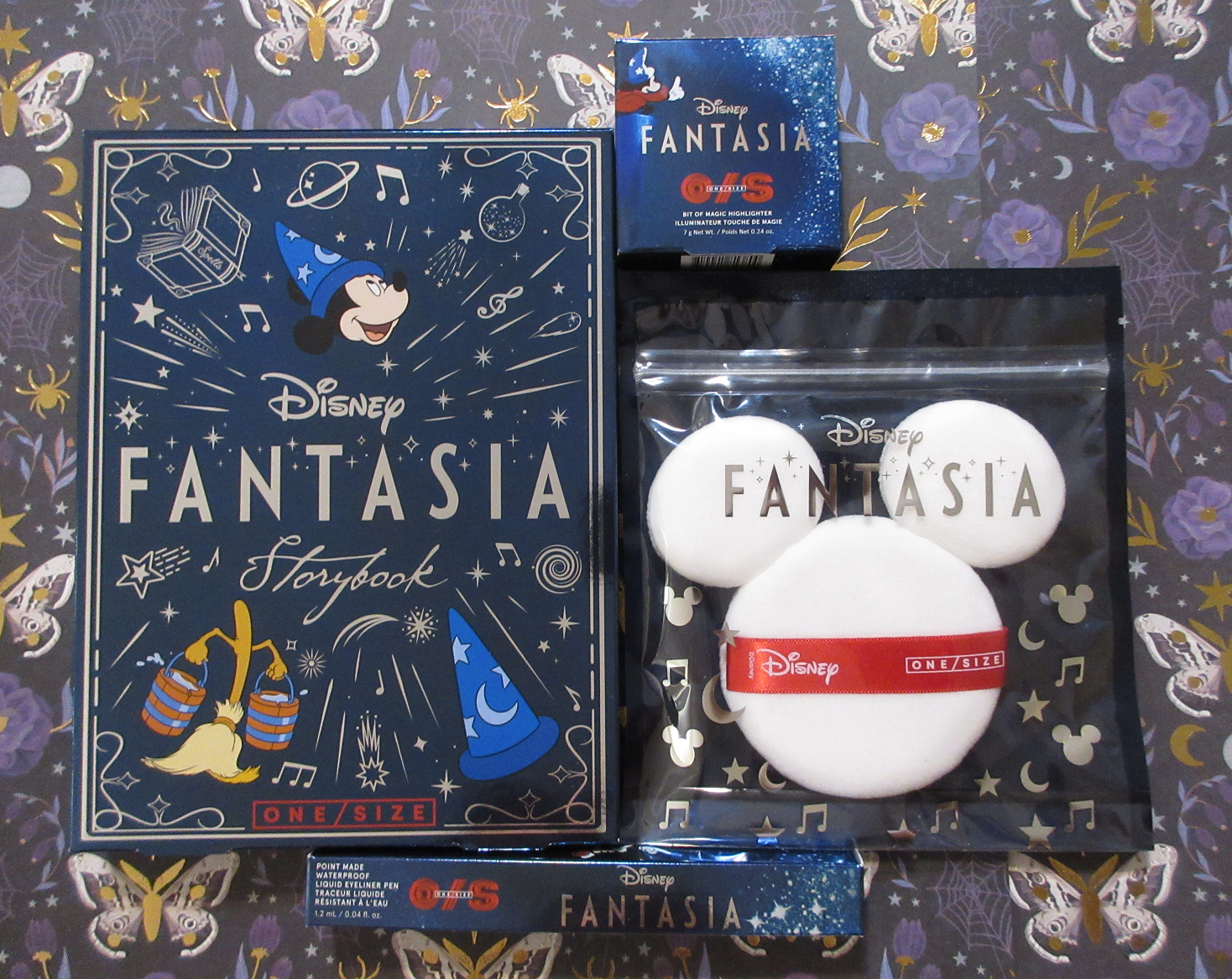
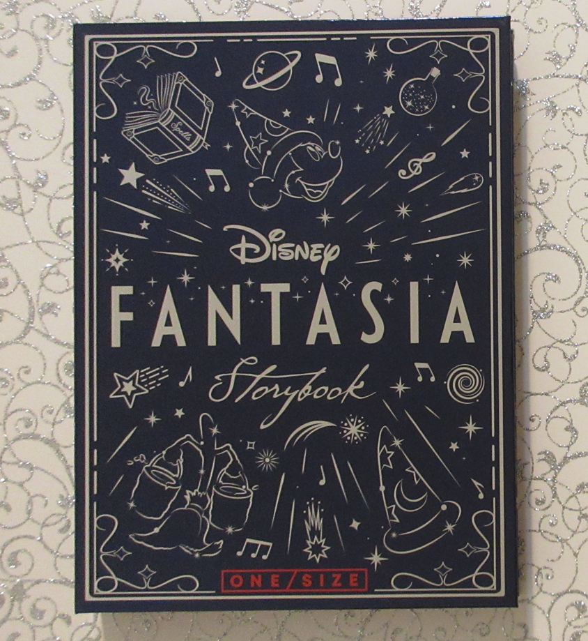
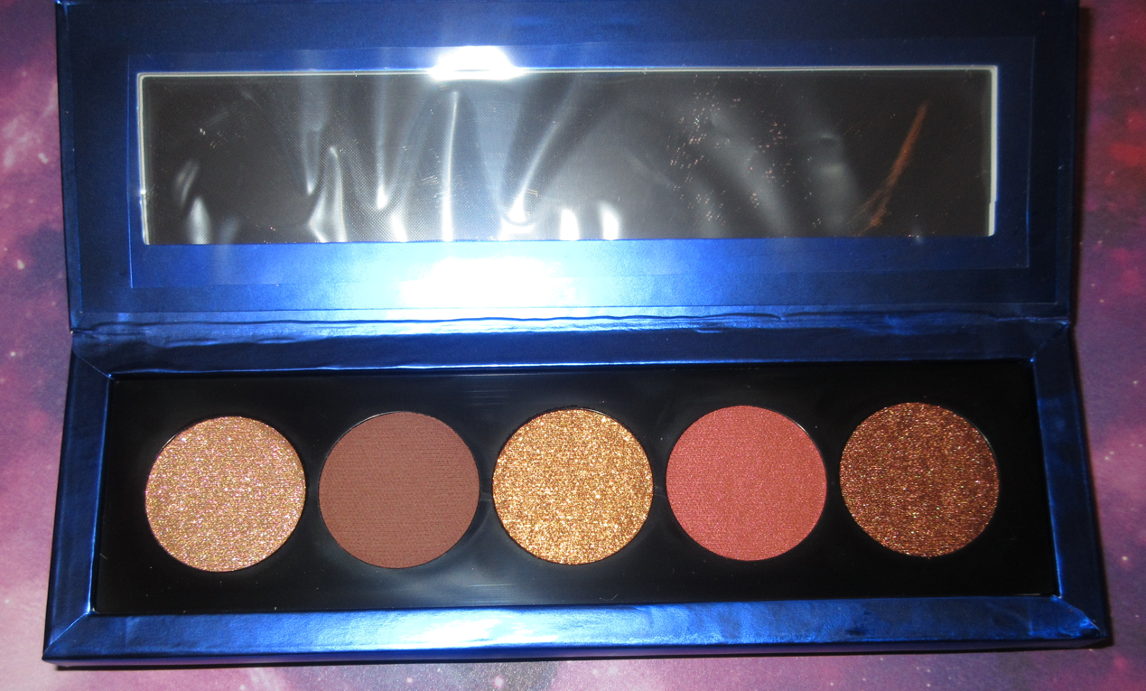
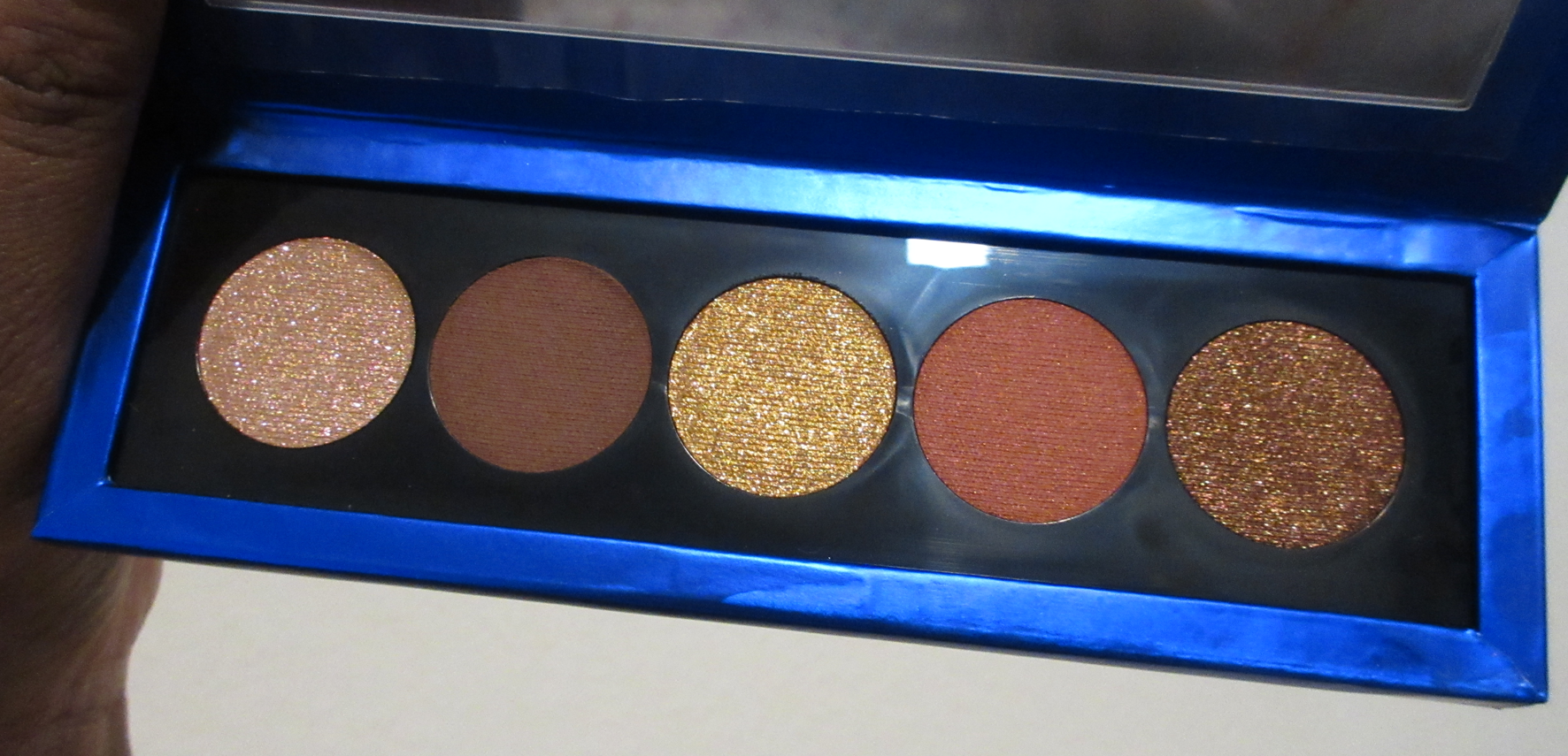
Disney Fantasia Face and Eye Palette
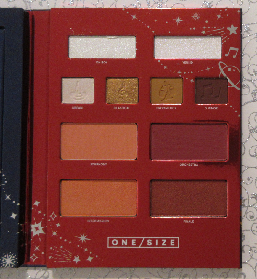
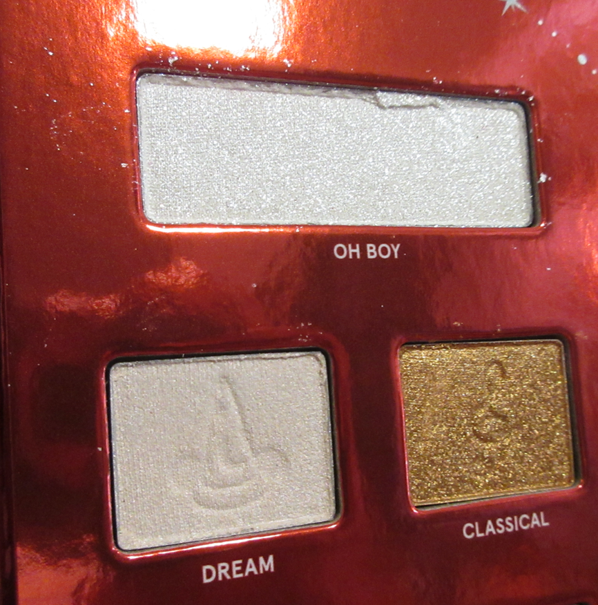
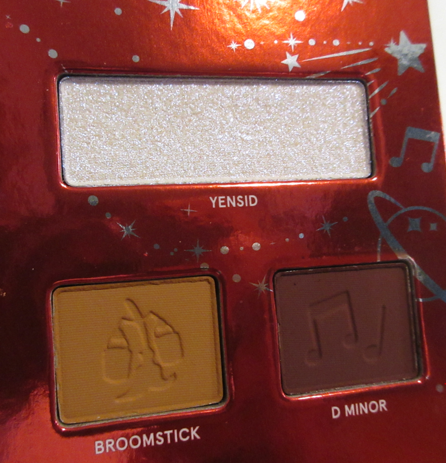
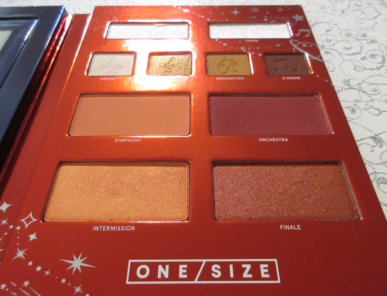
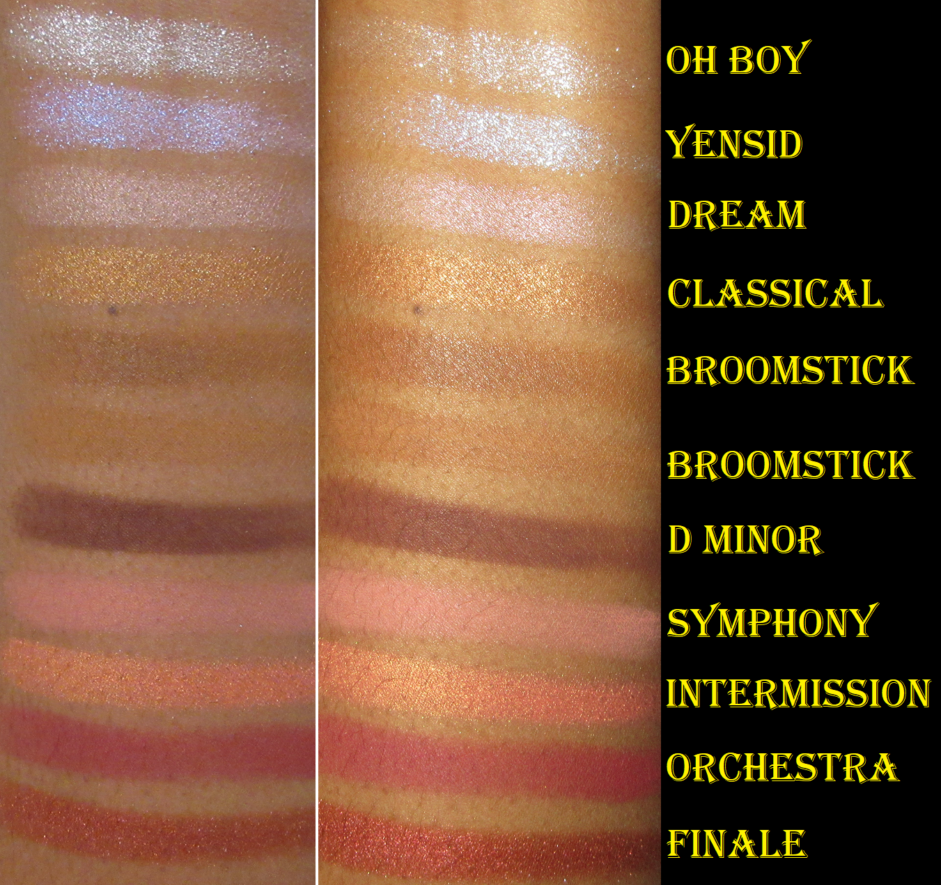
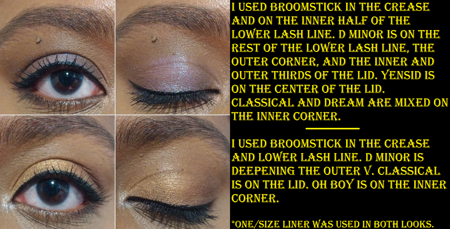
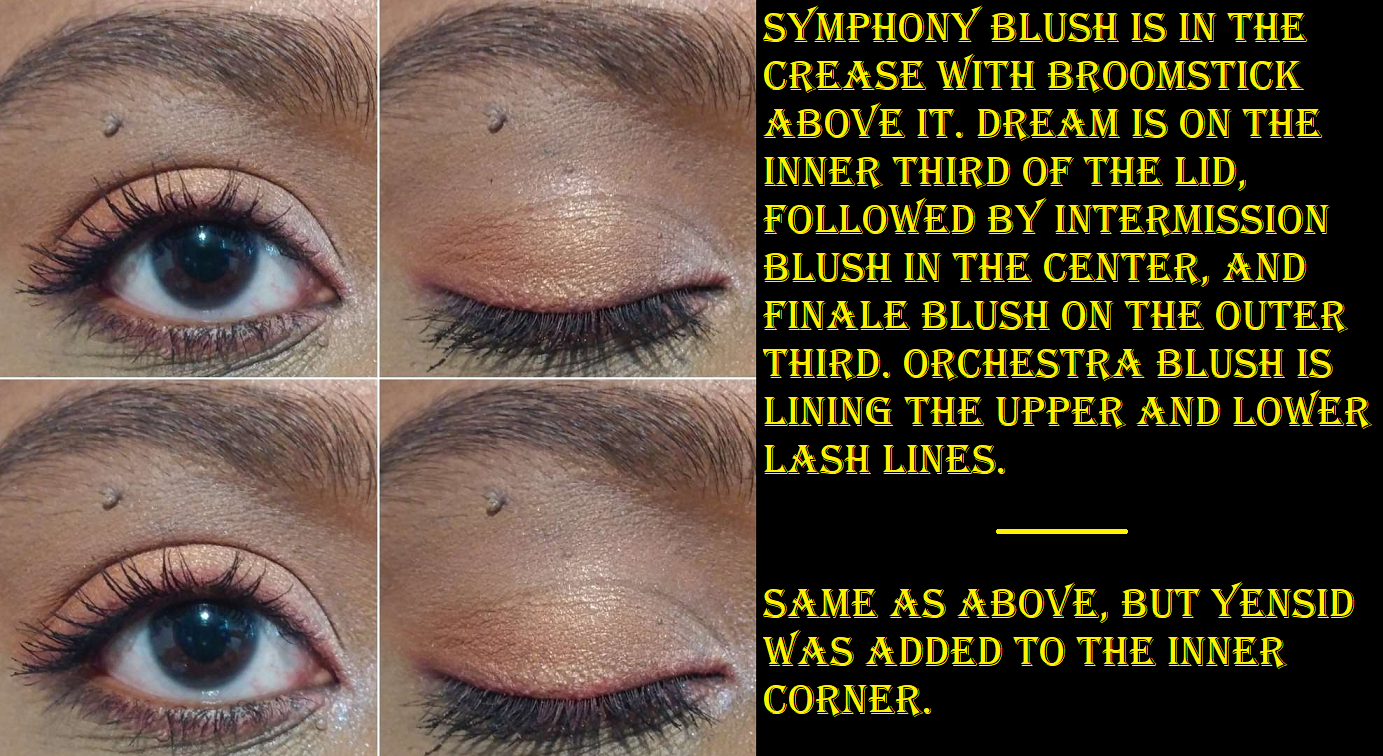
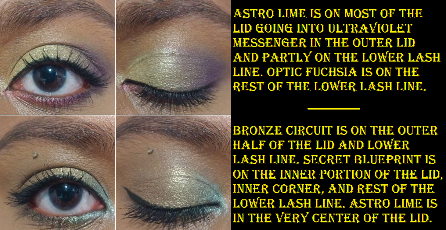
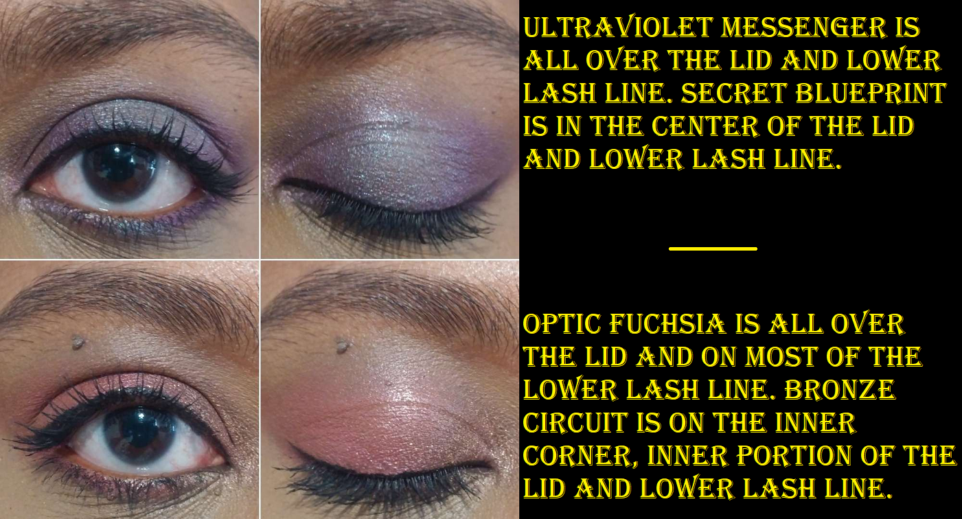
I hadn’t tried eyeshadows from One/Size prior to owning this palette, but I’m very interested in getting more if the brand comes out with palettes with my type of colors in them. The mattes are so soft and creamy, almost like a wet sensation on the fingers, despite being completely dry and a powder. The closest comparison I can think of is like Tarte Amazonian Clay matte eyeshadows, but even creamier. The matte eyeshadows in this palette are actually the most similar to the matte blushes from the Cheek Clapper trios that I love so much because of how pigmented they are while also being smoothing, blurring, and easy to blend. I’m no cosmetic chemist, but I’m guessing it’s the amount of silica and “cone” ingredients in the brand’s matte products that make them feel the way they do. It’s impressive that they managed to use dimethicone, for instance, in a matte without it sealing itself after being swatched a few times (as I noticed that pattern with certain matte powder products I own and back when I was attempting to make my own pressed eyeshadows), but I’ve observed that ingredient lists with dimethicone in a matte product tend to have kaolin clay, zea mays/corn starch, or some other oil-absorbing dry ingredient with it, so perhaps that’s why silica is paired with it. Perhaps there’s another contributing ingredient as well that I haven’t realized, but either way, I love the performance of these mattes. I have to say though that I noticed Broomstick darkens when wet. That’s why I have it swatched twice in the swatch photo above. With each swipe, to smooth out the swatch, it kept getting darker and darker in places. I don’t know if it was from oils on my finger or if my finger was slightly wet from a spot on my microfiber cloth I use to clean off my arm between swatches. So, I did the second swatch underneath when I knew for sure my finger was dry and after smoothing it just once, it still appeared like it wanted to darken on the edges. I have also observed Broomstick darken a little in my eye looks while on top of my creamier primers. I don’t mind this since it still works as a transition shade for me whether it stays true to color or deepens up, but this may be an issue for those wanting a light non-dramatic eyeshadow look. Then again, considering the intensity of the blushes and the inclusion of very sparkly transformer shadows, this palette isn’t for those wanting completely natural looks.
Ironically, the darkest matte called D Minor isn’t as deep on the eyes as it looks in swatches. It blends to a softer more subtle color (for me).
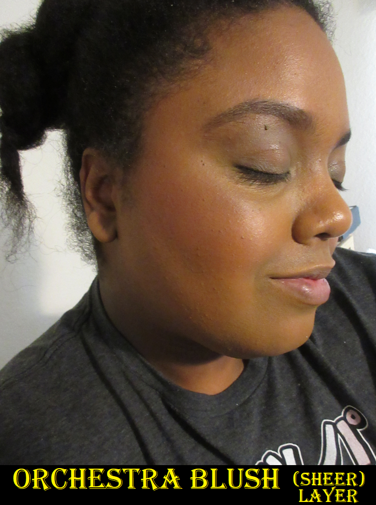
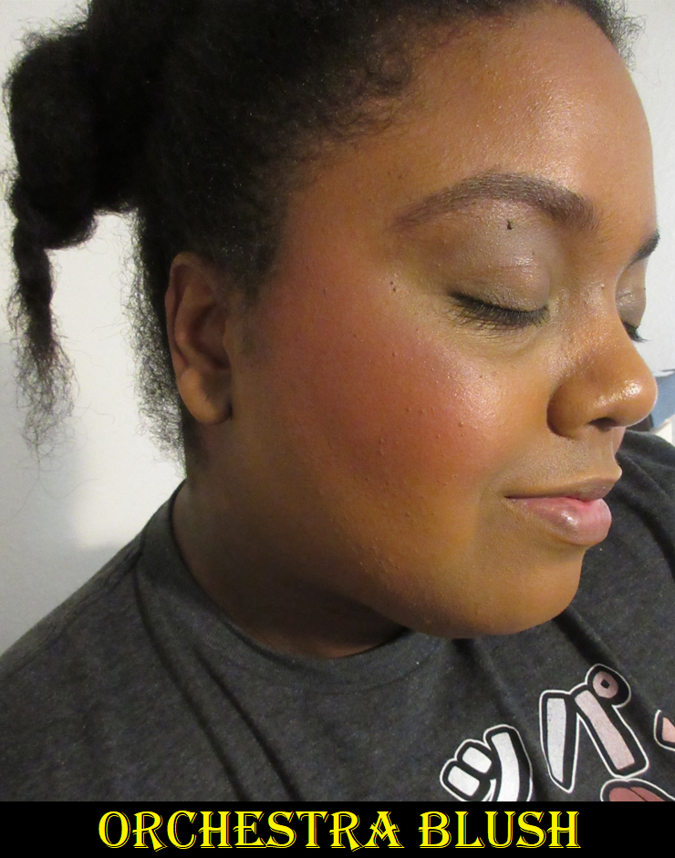
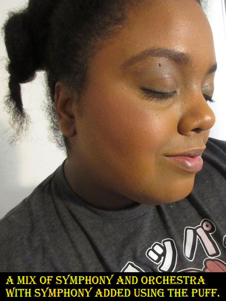
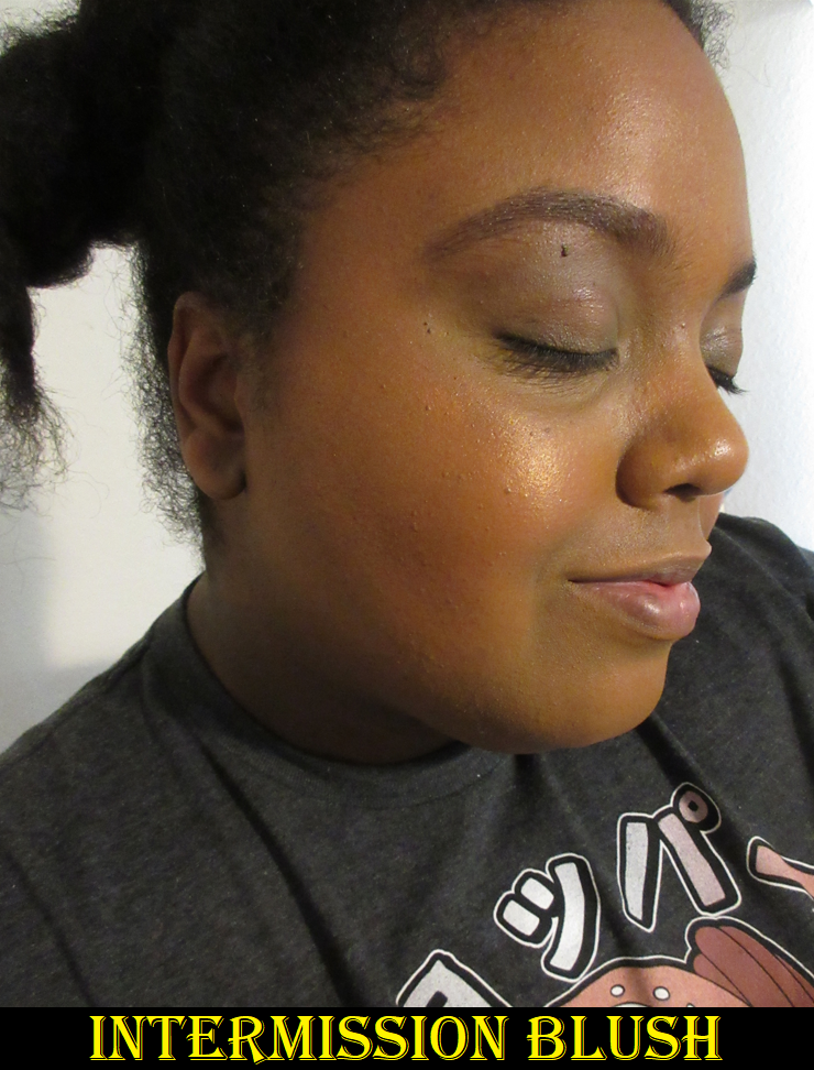
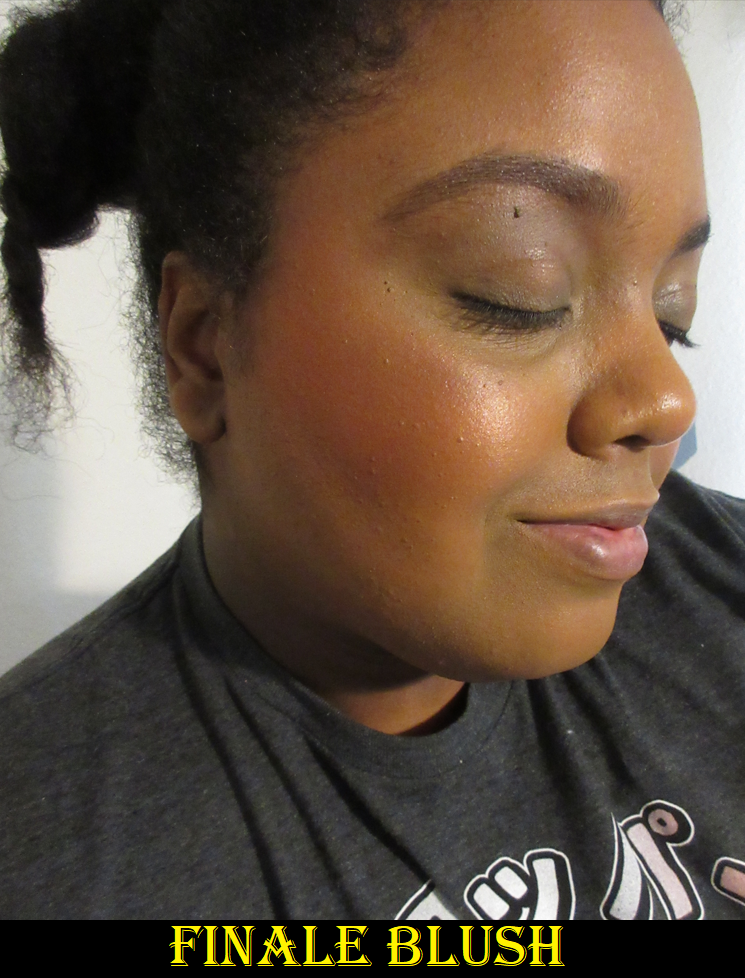
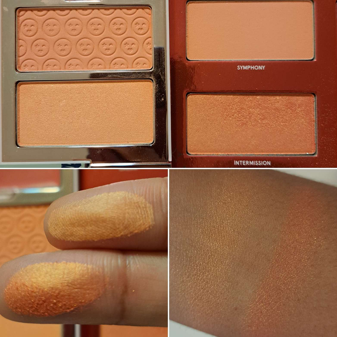
This collection going on sale at Sephora and the One/Size website since last December leads me to the conclusion that this hasn’t sold very well, and I can’t help but wonder if part of the issue is due to it trying to appeal to everyone. We have the very neutral eyeshadows that will give soft looks. Dream is a satin that looks like a pale iridescent pink at certain angles. We have pigmented but not intense mattes. Classical has small size shimmer for a refined look, while still being nice and shiny to the point where I don’t feel the need to dampen it on my lids, but the virtue of the color on my skin tone makes me want a little more impact when used in the inner corner. Anyway, the subtleties of those shades are countered by the highly reflective and glittery Oh Boy and Yensid shadows. Those are going to appeal to people like me who enjoy a more impactful look, but even Yensid could turn off some people due to the duochrome being like an iridescent pink with blue and purple shimmer. Those might be too wild of colors for a neutral wearer to ever want to use. I heard the transformer shades could be used as face highlighters as well, but that’s too outside of my comfort zone to try. Fun fact for those who don’t know: Yensid is Disney spelled backwards. Then we have a matte blush called Symphony for those with light to tan skin tones that’s so pigmented it manages to still show up faintly on me. Then Orchestra is super dark and likely intended for medium to rich skin tones. Those that prefer matte blushes will likely not enjoy the intense shimmery golden orange, Intermission, with its metallic reflective shimmer that is not for the faint of heart. Lastly, we have the even more intense and deep blush, Finale. By having something for minimalist and bold makeup wearers, plus products for two very different skintone spectrums, there are going to be some products in this palette that people skip using altogether. Sure, the blushes can be built up or sheered out, and used on the eyes* like I did in the eye looks above, but not everyone wants to do that. I’d wager that the majority of makeup users don’t want a gigantic palette that they only use half the products and neglect the rest. Funny enough, this mixture of having a little bit of everything makes this palette actually work fairly well for me, but I’m certainly not in the majority.
*I don’t know if the blushes are deemed “safe to use in the immediate eye area” or not, so I’m not advising anyone to do what I did without conducting their own research and determining its safety for one’s self. I’m just posing a hypothetical. Blushes can generally be viewed as multi-purpose.
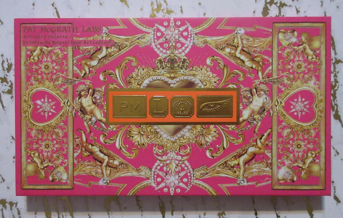
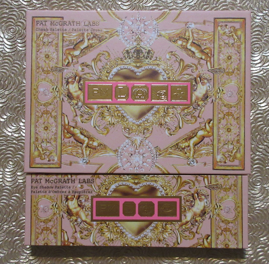
This palette has extra touches that could make it appealing, such as the beautiful Collector style book cover with actual Disney designs (and not just Disney-inspired drawings). The mirror lifts up to show a cute paper cut-out that reminds me of the Urban Decay Alice in Wonderland palette days. I love book style packaging, but we’re moving away from bulk these days as Pat Mcgrath Labs must have learned after the sales of the Bridgerton Blushing Delights Face Palette. Even if the size and shape makes sense for the collab, the majority prefers pretty yet sleek packaging.
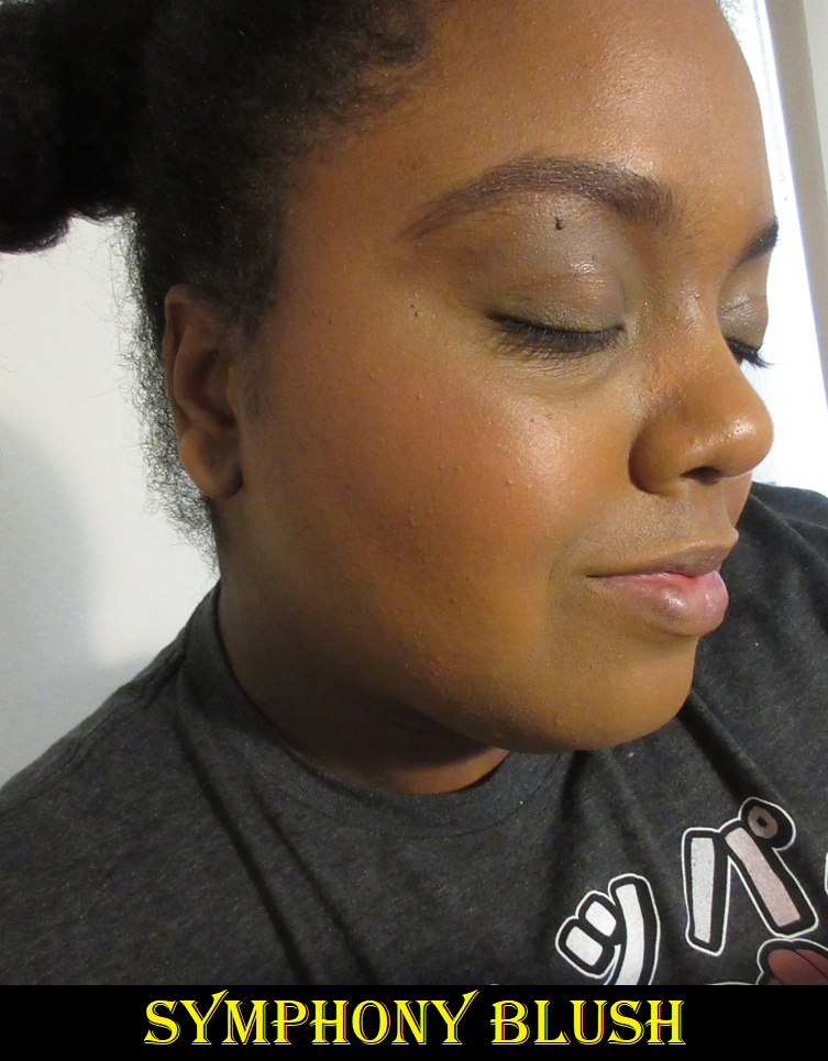
I love using round cheek brushes, but in order to get Orchestra to apply sheer and even, I needed to switch to a sweeping style brush instead and apply it in one direction rather than circular buffing.
Going back to the blushes, Patrick Starrr mentions in the launch video that they are the Cheek Clapper formulas from the Trios, but the matte blushes don’t feel the same to me. They’re not as smooth and definitely feel more like a typical powder. They’re not bad, but they’re not something I’d grab to wear if they weren’t already in the palette when I want to use the eyeshadows. The shimmery blushes I doubt I will use beyond this review. I forgot to powder my cheekbone after reapplying the Becca Under Eye Brightener (which is a sticky product) and Intermission immediately stuck to the spot, so I’d caution against wearing the shimmer ones on a dewy base. Making sure it goes on top of a powder layer first helped apply Finale more evenly, but the type of shimmer in these are not my style and are barely better than the blush shades within the Coloured Raine Glowlighters line that I despised. The color of Finale is too deep for my preference anyway. I can use Intermission as a highlighter if I’m feeling up for having it look quite apparently orange-gold. The base color is darker in Intermission than the one in the Freaky Peach Cheek Clapper Trio that I feel more comfortable using as a highlighter instead.
As seen in the photo, the shimmer formulas are very different. In the Cheek Clapper Trio, it’s a thinner sheerer powder with ultra fine shimmer that’s closer to a satin. The other one is chunky, wetter, and although it has pretty small shimmer particles as well, it’s more visible on top of the deeper orange base color. The one improvement in favor of Intermission is that the drier formula from Freaky Peach had a harder time sticking to my face and lasting on my cheekbones as a highlighter. Intermission having a wetter bind improved the longevity.
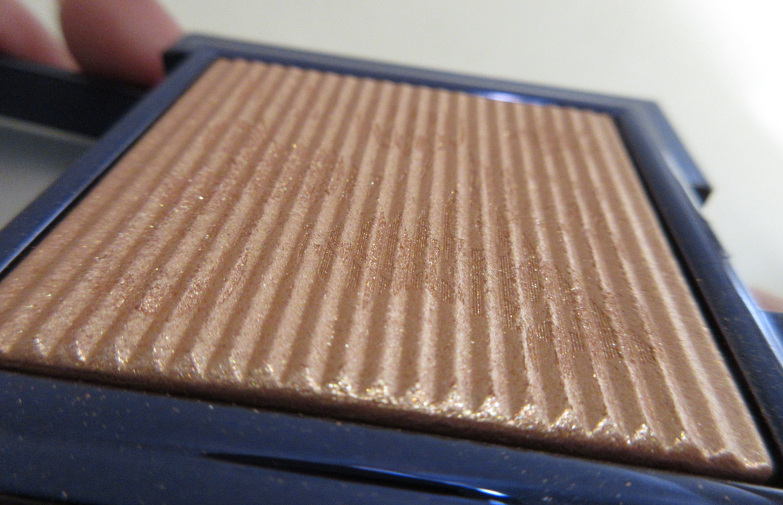
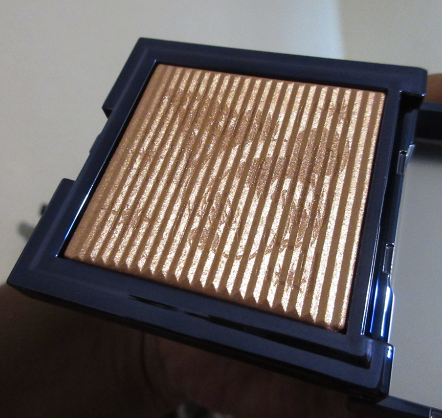
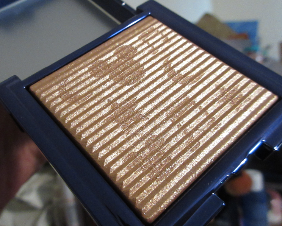
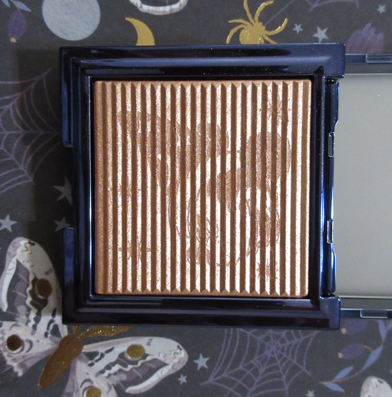
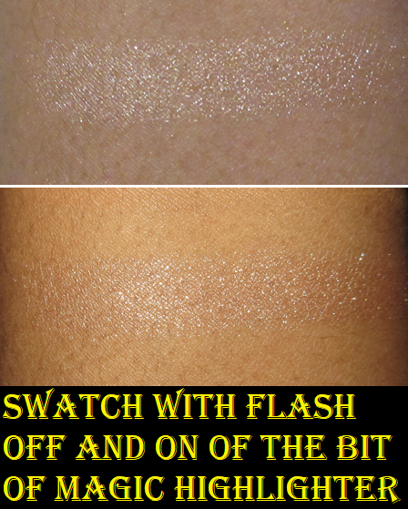
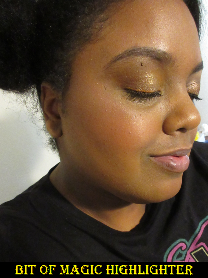
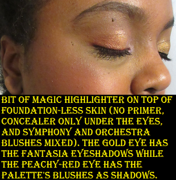
Disney Fantasia Bit of Magic Highlighter
If this isn’t the first review of mine you’re reading, then you know I typically prefer a subtle highlighter (or a beaming one that looks smooth and/or wet on the skin), so I’m going to just put it out there that I knew this was going to be glittery before I bought it and I still bought it anyway because of the sale and the cute gimmick of the highlighter having a different pattern depending on how it is held. That being said, Disney makes me think of sparkles and glitter, so it fitting the theme is something I’m happy about, even though that also means I’m not likely to reach for it. It’s a weird contradiction, I know.
This is semi-transparent, but there’s just enough pink-champagne hue (and mix of gold and pearl sparkles) that make it borderline able to work but also a bit on the light side for me. The depth of base color helps the situation for me, but that very thing could make it too dark for quite the range of people.
I noticed that it does blend better into the skin if it’s on top of something dewy. I’ve used three different brushes with this highlighter: the Chikuhodo Zen ZE-5, the Too Faced Diamond Light Highlighting Brush, and the Rephr 36. The Rephr brush is the most dense of the lot and worked the best for getting more than just a sparkle layer of highlighter.
There isn’t anything much else to add. Either the color will work or it won’t and either the potential buyer likes the glittery look or doesn’t. The packaging and trick with the imprint is about as special as it gets. Without that, I would say it’s a middle of the road highlighter.
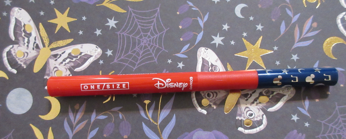
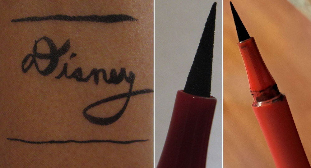
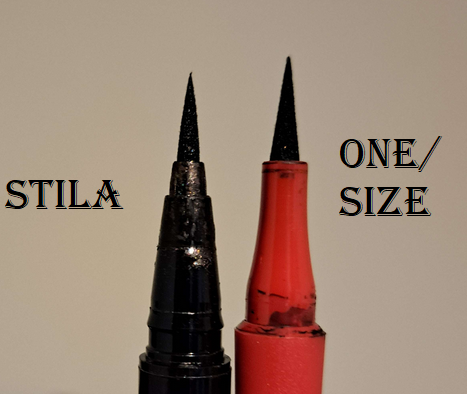
Disney Fantasia Point Made Waterproof Liquid Eyeliner Pen
The Disney eyeliner is the same as the standard One/Size eyeliner in the color Bodacious Black, just with slight tweaks to the packaging. When the original was first released, I didn’t pay too much attention to the reviews, but I remembered hearing that it was easy to control, dispensed a nice rich black color, but it had some kind of packaging design flaw. At the time that I bought the Disney one, I completely forgot about the design issue and only remembered the positives. The photos above and below demonstrate my experience that I can get a really thin, controlled, crisp line or at times too much comes out at once and it gets very thick. Contrary to what I had heard, it’s not immediately easy. If I do shorter strokes, I can create the line how I want, but if I rush it or try to do too long of a line in one go, I end up making it too thick. Overall though, I think I’d have liked this even more than my holy grail Stila Stay All Day Waterproof Liquid Eye Liner if it wasn’t for the leaking issue with the One/Size liner when too much product is at the tip and it doesn’t go back down in the tube so it gets all over the pen. I tried to resolve this by storing it tip side up, but I don’t know what the long term performance will be like, especially with the other issue of the cap. There’s no snap closure. A small touch can make the lid lift back up, which is highly likely going to make it dry up faster if I’m not careful. When I originally had it in my makeup bag, I saw a thin line where the lid hadn’t come off completely, but it was still not shut all the way. And there have also been times that after I used it, I put the cap back on and was about to put it to the side and realized it wasn’t closed all the way because just pressing it down instinctively isn’t enough. You have to look at it every single time you press down to make sure it’s actually closed because it isn’t going to make a snapping sound that a lot of pens and markers have to indicate that it’s closed. For that reason, I wouldn’t repurchase the original either unless it was put in a different component.
As I mentioned before, I can’t remember much about the original launch, but I’m not sure if the brand decided not to make the lids snap close in order to be easier for those with difficulties with their hands? The way that the pen also has a very smooth top and bottom but a rougher plastic portion where I would naturally grip the pen (and would be easier to avoid slipping) was intentional and called a “comfort grip handle,” so I’m not sure if the cap is for hand mobility too. In that case, I would understand this feature, but that would also make this not something intended for me.
I have photos wearing the eyeliner in the first two eye looks in the palette review section.
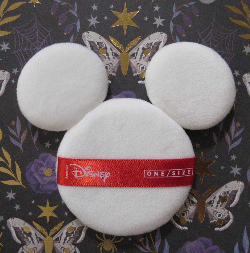
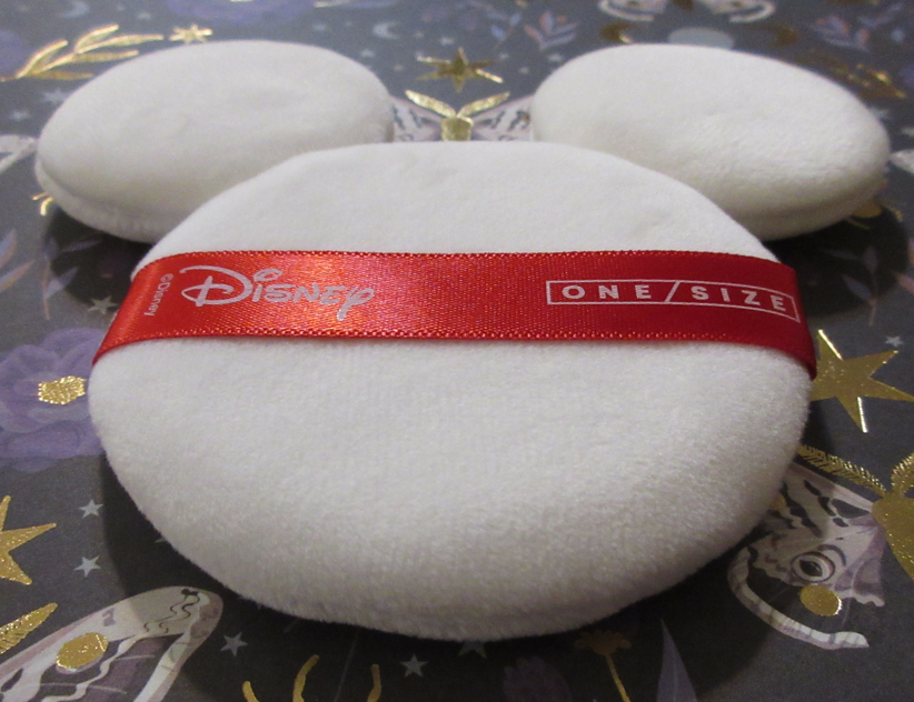
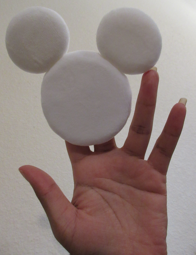
Disney Fantasia Ultimate Mickey Puff
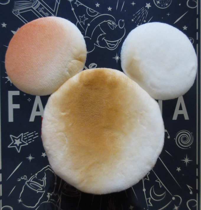
I’ve never been the powder-puff using type, but I always said that if I were to buy one, I would prefer for it to be thick and feel puffy and soft, which the One/Size puffs in the standard and Disney shapes check off all those boxes. The original one is a bit more practical for those who like that thick edge to be able to create a sharp line for baking certain areas, like under the cheekbones, but the Disney one has the advantage of technically being three puffs in one. So, I’ve used the bigger one (bent to avoid having the sponge ears get in the way) for applying powder foundation and setting powder. I’ve used one ear for blush and one ear for attempting to dab away shine at the end of the day. Regarding the oil, it didn’t do very much because my dry skin usually just produces enough to mix with my foundation and appear glowy, but not actually seep onto anything or actually feel oily. It’s mostly the work of my dewy foundations and mica in them, so there isn’t much that can actually be absorbed in the puff. So, I’m not the best person to test out that aspect. As for applying powder foundation quickly, it was nice for that. For getting an even but light layer, I prefer my brushes (and paid good money to ensure that those are my best tools for powder), but if I want more coverage, this puff is certainly handy for that.
Another way I’ve noticed I can get use out of the puff is almost like an eraser. If I carry my contour or bronzer too low down, I just use part of the puff (folded again to create an edge) to go over the spot with the bare puff or powder foundation to make it a little more crisp and cover up the mistake. Because I pretty much never use sponges or puffs that come with products, I have no idea how to treat them. Do I just toss them after they get too dirty? Do I wash them by hand with soap and water? If I do need to clean it, how frequently should I do that? Also, I don’t want this floating around my train case or makeup bag, so I’ve been putting it back in the plastic pouch after each use. Powder puffs for something like a translucent powder wouldn’t look too messy, but with my products, that’s another story!
As silly as it sounds because makeup puffs have been around for ages, I’ll have to do some research on them!
Other than the Cheek Clappers and travel size minis of the Ultimate Blurring Setting Powders, I hadn’t tried anything else from One/Size until now. My interest in the brand continues to grow, though my favorite thing is still those Cheek Clapper Blush Trios. I didn’t need this collection. I have friends that are true Disney fanatics, so I know my very general liking of Disney is super low in comparison. However, even someone like me can see how much thought went into the collection and I can respect the brand for attempting to combine high quality makeup with the collectible factor, even though it’s not the most practical of packaging. I liked my items enough to be happy with my purchases. I would just love it if One/Size changed their eyeliner components because that’s one factor that made what would have been a holy grail product become something I wouldn’t purchase again. For big time Disney fans and those who were interested in these items from the time they launched, I’d say it might be worth checking out while it’s on sale and still available.
Pat Mcgrath Labs is one of my favorite brands. Even though I was trying to avoid buying her holiday collection and only one of the Star Wars quints, those 30-40% off discounts got me in the end! The things I’m reviewing today are the remaining unreviewed items from the brand that I purchased in 2022. Technically, there are also lip glosses I haven’t showcased, but those will be in a lip collection post in the future.
Regarding what people are calling “Sticker-Gate” and whether or not the brand can be considered luxury or not, I will reserve that discussion for the very end of this post.
Pat Mcgrath Labs Eye Shadow Palettes in The Golden One, Divine Droid, and Nude Allure
I have 4 out of the 5 quints released from Pat Mcgrath. I specifically said in my review of Bronze Bliss that I didn’t want Nude Allure, but I saw additional photos that showed how the shadows actually look in person and the camera just doesn’t do them justice! So, now I own both of the holiday five pan palettes. The missing quint from the Star Wars collection is Sith Seduction which only one shade in that appealed to me until I realized it was darker than I wanted. So, I passed on that one. The completionist in me wanted to grab it anyway, but these five pan palettes are a hit with customers. I foresee the brand releasing a lot more of them in the future and it would be unrealistic for me to try and collect them all, especially if the color story isn’t to my taste. These four that I purchased are my types of shades.
Starting with the only palette that slightly disappointed me, Divine Droid, I can at least say the colors are beautiful. They look like they’re going to be as sparkly as the others in the pans, but Astro Lime, Optic Fuchsia, and Ultraviolet Messenger look slightly duller by comparisons on the eyes. Out of the reviews I’ve seen so far, I’ve observed that the highest praises for this specific palette come from Influencers that tend to wear mostly neutrals, and the strongest opinions against the palette are from Influencers who are used to indie brands’ shimmers and those who love truly vibrant colorful glittery shadows. These shades are bold and they are shimmery, but I think it comes down to the nature of colored shimmer versus reflective metallic sparkle that the colorful shades don’t have as much of as the others. The only other way I can think to explain it is that satins are shiny from a sheen and tiny shimmer particles, and Divine Droid eyeshadows look just like that, except that these shimmer particles are more apparent and textured. The shine level is the equivalent of an amped up satin. Secret Blueprint is an exception because there’s a lot of whitish-silvery sparkle, but I don’t like light blue shades and only use them when the look can benefit from having one. To get Secret Blueprint to stay bright on the eyes, I have to apply it damp. Bronze Circuit has some golden sparkle, but the color itself is less olive in person than I hoped. It’s still a pretty antique bronze-gold with a slight green tinge, but the shade doesn’t go far enough in the direction of green to be that unique.
Even though I wanted a little more from the first four shades, the true disappointment is Ultraviolet Messenger because it doesn’t blend as well and there’s barely any visible shine when it’s on the skin. By not blending well, I mean that it goes on harsh no matter how little product I use, so it requires blending, but it diffuses so easily that the magenta tone in the base starts to appear, which makes it look splotchy compared to the darker purple. I have to be extremely careful when blending it out and packing the color back on in places. It’s not so bad when I use Optic Fuchsia with it because the magenta just looks like an extension of that shade, but it’s more of an issue when I’m trying to use Ultraviolet Messenger right next to the green or blue. And despite being applied with a finger or wet, the shine doesn’t stay. It looks dull and matte on the eyes. This might make some people happy, considering we don’t have a matte in this palette and this shade could act as one or might just stay in the outer corner as a deepening shade only, but the part that made me the most excited for that purple was because it looked the most multi-colored in the pan. I wish that translated to the eyes.
The other downside to not having a proper matte is that these shimmers have so much slip to them that they’re prone to creasing without using the right products with them. In order from most effective to least effective anti-creasing abilities out of the primers I’ve tried with them are: Gerard Cosmetics Clean Canvas, Coloured Raine Paint Base, and then tied between the MAC Paint Pot and Makeup by Mario Master Eye Prep & Set if those last two are set very well with powder. Essentially, the drier the primer the better. However, even the best pairing of the primers isn’t good enough on me without having a matte in the crease to fill those lines. In some of my eye look demo photos, I skipped using the matte crease, but in practical daily usage I would always use a matte with these shades in the future.
Also, I no longer have the PML Nocturnal Nirvana Quad, but the lime green, blue, and purple shades from Divine Droid reminded me of that one. Sure enough, Dr. Ash on YouTube had the same thoughts and held them side by side in her video. Of course, the green in that palette is more multi-dimensional than this one. I don’t care for either blue shadow. As much as I was disappointed by Ultraviolet Messenger, it is easier to work with it than the purple in Nocturnal Nirvana. I sold that quad (and replaced it with the Interstellar Icon quad) purely because I wasn’t getting enough use out of it, and not because I disliked the shades. I’ve thought about that quad several times since it left my possession, so I don’t mind having something similar back in the form of Divine Droid.
We were given an actual satin in The Golden One palette, but I use Coral Blitz in place of a matte. The actual matte in that palette is Tatooine, which is a lighter brown than the one from Nude Allure. I had no intention of buying The Golden One until I realized it had that extra blendable matte formula unique to the five pan palettes so far from Pat Mcgrath, and because I was curious about Coral Blitz. As to be expected, I was thrilled with Tatooine, but the surprise hit for me was Coral Blitz. I don’t own a satin-shimmer in that tone. The closest thing I can recall is City Dawn, a “rich matte” from the Bobbi Brown Luxe Eye & Cheek Palette last holiday. This shade, with the peachy-coral and less orange tone, plus the tiny golden sparkles make it even prettier to me than the one from Bobbi Brown.
Binary Sunset is a little drier than the other shimmers whereas Cyborg Relations has extra slip to it, like Bronze Mink from Bronze Bliss. This palette isn’t as inspiring as Nude Allure or Bronze Bliss for me, but it has some great staple warm toned neutral options that will continue to benefit me as I use these palettes together.
Above is a photo comparing the three mattes (plus Coral Blitz) together, and it shows the depth differences between the browns as well. I would be thrilled for an all-matte 5 pan from Pat Mcgrath in this specific formula. If the brand includes one more brown that is lighter than Tatooine, I will feel they’ve reached their quota of neutrals and I will really be wanting more colorful mattes and/or satin-mattes. The allure of buying these quints specifically for the mattes won’t be as strong of a lure if it starts to feel repetitive. When it comes to the shimmers, I’m already feeling like we’ve hit the maximum amount of bronzes and golds needed. I also decided to compare a photo, this time below, of the most similar shades to each other from among the four palettes.
Font Color Guide: Yellow-Orange = The Golden One, Pink = Nude Allure, Brown = Bronze Bliss, and Blue = Divine Droid
If the brand can figure out how to make the colorful shimmers as sparkly and reflective on the eyes as the neutral metallic shimmers, I’d go even crazier for these palettes. For now though, after comparing the four, I’m feeling pretty satisfied with this bunch. It would take something really specific to my tastes to make me want to purchase more than these.
Coral Kiss and Mahogany Angel are the two main stars of this palette. Plum Eclipse comes in third, but it shares a similar issue with Ultraviolet Messenger from Divine Droid in that the gorgeous multi-colored sparkle doesn’t show as easily on the eyes. It still does a little and at least looks satin-like instead of matte, which is why I still like it. Coral Kiss doesn’t look as multi-colored as in the pan, but it does still look dynamic in person which is what counts the most to me. I love this shade and I love the first eye look demonstrated below. As for Mahogany Angel, it goes on the eyes darker than I expected, but I like that because I wanted a deepening shade that would work well with most eye looks. La Vie En Noir from Bronze Bliss has that blue leaning tinge that keeps me from using it as my deepening shade for most of my eye looks, though now that I think about it, it would probably pair well with the blue, purple, and green from Divine Droid.
Naked Bronze, to me, is like Coral Kiss without the extra oomph and vibrancy. It pales in comparison to that shade or even the other Bronzes from the other palettes because it is such a standard light bronze color. I’m sure others will like it more than me though since my style for most of 2022 was to wear neutrals with a twist. So far, this preference has carried into 2023 as well.
If I had to rank these from most liked to alright/fine, it would be: Bronze Bliss, Nude Allure, The Golden One, and Divine Droid. Bronze Bliss easily wins because it has the most of those metallic type shimmers which are what’s special about this new formula from the brand, in addition to the matte. Nude Allure comes second because of Coral Kiss and having an even more useful matte. The Golden One has the very special Coral Blitz, plus a matte, plus the gorgeous Cyborg Relations, but it is the least inspiring color story together in one palette which is what knocks it down from what could have been the second spot. Divine Droid is last because of there being no mattes, less reflective shimmer, and the stubborn purple.
These aren’t effortless shadows because of how easily they can actually overblend, the potential to crease, or the differences in textures causing a need to really spread and smooth out the shadows into each other. However, I really like these and am happy with my purchases. It’s one of those instances where I can say with confidence that I’m going to continue getting use out of these eyeshadows beyond this review.
MTHRSHP Mega: Celestial Nirvana
I swatched these from left to right going downward two columns at a time because I see these eyeshadows pairing nicely together in groups of six. So, the first set are the first two columns, the next set are column numbers 3-4, and the last are 5-6.
This palette has greens, purples, golds, and browns. This is very much my kind of color story, but that means it had to compete with the tons of other greens, purples, and neutrals in my collection. I heard mixed reviews about the quality of this palette, but it was honestly Altered State that continuously filled my thoughts. So many of us had been dying to get a matte green from the brand or just more greens from PML in general. They’ve released like fifty bronzes, golds, and pinks but like five greens. I actually think Pat Mcgrath hates the color green. Anyway, the old Lili was the type to buy a full palette just for one shade and I did not want to go back to that type of purchasing habit, but the brand had this on sale and after seeing Tina the Fancy Face’s in-store swatches, my resolve just melted away.
The palette was significantly heavier than I expected. I don’t know how Celestial Nirvana stacks up in weight compared to Celestial Odyssey because I skipped that Mega Palette, but it’s much heavier than the original Celestial Divinity. I like that feature because it feels more lux to me, but I also dislike it for being so large for storage and even handling every time I want to use it.
The majority of these shadows are extremely pigmented! I’ve gotten so used to creating eyeshadow looks with more softly pigmented shadows like the Lisa Eldridge Seamless Mattes and Velvets, Dior shadows, and Bobbi Brown Jadestone that I felt out of practice handling the level of pigmentation from every matte except Desert Divinity and Nightfall. I like that the brand gave softer options out of these shadows that perform like pressed pigments, but they’re almost too weak to hold their own in a palette with such bold other shades. Desert Divinity makes for a nice transition shadow, but it’s not the type that helps me blend the edges of the other colors very well. Nightfall is darker than Desert Divinity, but doesn’t give me as much depth in the outer corner as I prefer, which is why I have to lean on the brown tones within Auburn Allure to meet that line between the colorful red side and the slight lean towards brown. Auburn Allure is my best alternative if I don’t want to have to resort to the deeper yet more colorful options such as Nocturnal Navy or Violet Vixen. It was in times of searching for a neutral deepening option that I realized most of the shimmers are light and neutral (not my preference within a big palette) with Bronze Infatuation and Starlit Copper being the darkest ones that are medium depth level at best. Also, as dark as the mattes are, they deepen up even more on my eyes. Venusian Peony looks so light-medium pink in the pan, but turns medium-dark pink on my skin. The dark shades going darker (likely due to oily lids or too wet of a primer) isn’t as much of an issue for me as trying to keep the look light with the lighter shades, but it going darker than I expected.
I don’t think these mattes are as blendable as Pat’s usual formula. They’re still nice, and better than Urban Decay or Too Faced mattes for example, but not as easy to work with as I’ve gotten accustomed to for PML. Perhaps the quints have spoiled me in that regard. The truly troublesome shade is unfortunately Altered State that I was looking forward to the most. It has a tendency to stick in one place where I put it, no matter which primer I use with it and it goes on super intensely. Also, it has a blue tinge to it which I didn’t use to mind in the past, and I know that helps it to pair nicely with the blues in this palette, but I much prefer a yellow-leaning green. However, I can still make even that shadow work.
The shimmers are great. They’re fantastic. They’re impactful and just what I expect from the brand’s standard formula (not the “special” shades in the last two columns of Mothership palettes, multichromes, nor the quint shimmers). They don’t give me issues with creasing or fading, and there are no longevity issues.
In the green, blue, and purple eye look above, I attempted to tweak the look of the deep mattes by putting shimmers on top. It can be done, but it was such a long process because the mattes have to look perfectly blended underneath first. They are so intense and opaque that trying to blend them into each other just kept covering each other up rather than mixing. When I was adding the shimmers on top, which are also quite opaque, I noticed they were doing the same thing. Eventually, I was careful enough and applied the shimmer lightly enough between them to achieve the look I was going for.
For these reasons, I recommend this palette to those who love colorful shadows and are used to working with the kind that are pigmented and opaque. Even though this palette has neutral and softer options, this isn’t the type of product suited for those who just want to dip their toes into color. It’s intended for the full on color lovers. Also, as much as this price point makes sense for Pat Mcgrath, I personally wouldn’t have bought this for any less than a 40% discount because it’s not unique enough in shades or formula for me to be willing to spend a fortune on it. If this came out two years ago when we had far fewer high quality green and purple options, I’d have said this was worth the full price, but things have advanced and we’ve been flooded with options by now. There’s a lot of competition!
At the time I’m writing this, Sephora USA still has this palette available and on sale.
Divine Blush + Glow Cheek Palette in Nude Venus
When this palette went on sale, I bought it knowing full well that I had singles of Nude Venus, Paradise Venus, and Desert Orchid (in the form of the lighter half of the Paradise Glow blush duo) sitting in my blush drawer. I think we can all agree that someone who wants to use up their products shouldn’t buy a duplicate of them.
What I really bought this face palette for was the Sunset Nectar highlighter, Divine Rose III blush, and the convenience of having my favorite shades in one palette so I can take this traveling in lightweight durable packaging. I notoriously reach for blush singles over blush palettes, but that’s because pre-made blush palettes usually have shades I don’t like or can’t use, so I subconsciously make a mental note to skip it if I’m in a rush to put on makeup (which is almost every time). However, since this has all the ones I love, it’s more memorable and I do actually reach for it. By purchasing this palette, my original singles no longer served a purpose in my collection, so I gave Paradise Venus to my sister and Nude Venus to one of my best friends. I’m keeping Paradise Glow for now, but it may not survive my next declutter.
I have been enjoying possessing my favorite shades in an all-in-one palette that makes it so much easier (and less messy than dealing with kickup in multiple separate compacts) to dip into multiple pans at once to create tailored blush looks on my cheeks. In addition, I know exactly which product to grab for those shades, whereas the black lacquer packaging between the blushes, blush duos, and highlighters are identical and require me to read the backs of them all to tell, without having to open them, which shade is which.
I probably didn’t need to have Divine Rose III considering I already owned the other three blushes, plus Electric Bloom, as well as the Divine Rose II duo and Cosmic Coral duo. I’m still happy I got it though, because it’s giving me the effect I wanted from Nude Venus, but with more depth. Because Nude Venus has to be built up a lot to show on me, I always paired it with Paradise Venus and kept it concentrated on the apples of the cheeks. Now, I either use Divine Rose III on its own for a medium toned pink flush, or mixed with a combination of all the other blushes in the palette. To see additional blush photos with my review of the single blushes, they can be found here or my review of the blush duos can be found here. I haven’t noticed any quality differences between the individual blushes versus the ones in the face palette. They’re just as beautiful and long lasting as ever!
My favorite highlighter from Pat Mcgrath is still the Skin Fetish: Ultra Glow Highlighter in Divine Rose. It has the smoothest formula, gives the wet look I love that melts into the skin, and it doesn’t look glittery. Sunset Nectar is more similar to the permanent line of Skin Fetish: Divine Glow Highlighters, which have more apparent shimmer particles, but they still blend beautifully into the skin. I keep wishing for a Skin Fetish Ultra Glow Highlighter in a dark golden color without the slight pink tinge Divine Rose has. I didn’t expect Sunset Nectar to work for me because it is extremely light in the pan, but it somehow does! It looks powdery and stark pinkish-white on my skin when it first goes on, but when I blend it in and then pass my blush brush back over the edges around it, I think I can pull it off!
Below are different examples of lighting and days wearing these products. The first photo of the three is the Divine Rose III blush (no highlighter yet) under a ring light and wearing MAC foundation in NC47. The second photo is the same day with the same products, with the addition of MAC’s Sparkling Wine shade of highlighter, while under indoor light (with a little natural light peeking through the side). In the third photo I’m wearing the Sunset Nectar highlighter, plus a combination of Paradise Venus, Nude Venus, and Divine Rose III blushes. It’s under the same light as the second photo, but I have the Estee Lauder Futurist Foundation in 5W2 mixed with the Nars Light Reflecting Foundation in Macao mainly on the perimeter of my face.
We’ve reached the end of the review, and this is the point where I’d like to give my input on the recent “controversy” the brand has had over the Star Wars Collection, as well as the discussions around the brand devaluing itself between the frequent sales at significant discounts and the cheaper palette options and materials.
Starting with the Bantha in the room…As much as I love the Pat Mcgrath brand, it was certainly not a good idea to put Midnight Sun on sale for around $70+ until literally the day of the Star Wars launch of the same Midnight Sun palette for the full $128. It automatically sends the message to the customers that the Star Wars version isn’t worth the price and/or to wait for the Star Wars one to eventually go on sale for $70 as well. I was pretty shocked when I heard the news and watched the video going around because of what it signified for me about the brand going forward. Still, none of us can confirm with certainty that the Star Wars stickers were slapped on top of old unsellable palettes and put in Star Wars unicartons, the same way we can’t confirm that this year’s holiday specific lip products and mascaras had Star Wars stickers added to them after being removed from their original unicartons and put into Star Wars ones. Even if that’s exactly what they did, rather than viewing it as the brand trying to dupe people into buying an unpopular palette, I can see it from the perspective of the brand no longer keeping Midnight Sun on sale and putting it back at the original price with the bonus of a Star Wars sticker for free. I have been craving owning another special edition packaged palette from Pat Mcgrath, like if they took the Mothership unicarton artwork and found a way to get a high quality version of that print onto the palette, I would be thrilled. If it comes in the form of a sticker, I wouldn’t mind that either, so long as the sticker couldn’t just be peeled away. That’s where I think the brand really went wrong.
When I had packaging I didn’t like, I used Washi tape, stickers, and Mod Podge Dimensional Magic to create something I felt was beautiful. The way I did it, nothing is going to be lifting up or peeling off anytime soon. So, I don’t think Pat Mcgrath using stickers is as big of an issue as them placing many of them crooked (which cheapens the look) and not using a permanent adhesive. I don’t know if they had factory workers or machines applying those stickers, but if it was real people, I can see the benefit of making the stickers removable so they can attempt to fix extra crooked stickers on the palettes, but that’s a bit cheap to not use a stronger adhesive and be willing to toss out the imperfectly placed ones in order to ensure the customer won’t have the edges of the sticker lifting up within weeks or months of owning those palettes.
When I first saw the Star Wars Midnight Sun palette cover in photos, I actually thought it was a sticker with epoxy resin on top. Perhaps epoxy wouldn’t be clear enough (as it can turn yellow, although the vintage Star Wars image being yellow might have hid that), but at least then people would have an actual plastic feeling packaging that couldn’t be removed. This reminded me of the time when I was experimenting with Mod Podge versus Epoxy Stickers for jewelry when it came to cutting out images from Archie comic digests and turning them into pendants. I wasn’t very satisfied with either outcome so I abandoned the idea. However, that was due to a clarity issue. People who have the palettes in hand seem to think the stickers are pretty and are just disappointed by how easy they are to lift up or some people just don’t find stickers to be luxurious. The flat type of stickers I agree don’t look high end, but the raised ones are different in my eyes. Most people wouldn’t know how to make one themselves. The arts-and-crafts-loving side to me instantly started wondering if I could create my own covers for the PML palettes, but with how expensive they are, I don’t trust my skills enough to chance ruining it. However, I started thinking there might be people on Etsy working on making their own Mothership Stickers to sell. I think the brand could make bank creating their own palette sticker covers if they find a much stronger adhesive. I’d pay $15-$25 just for that because of how much of a sucker I am for pretty packaging. It’s a shame they ruined the concept because of how they went about “Sticker-Gate.”
I’ve seen some other complaints about the fact that we have stickers on top of the quints and them being cardboard. While that’s valid for people to feel that it’s not very luxurious, I feel the growing complaint about it is piggybacking off the Midnight Sun issue. We’ve had cardboard packaging for ages, starting with those six pan MTHRSHP palettes which I believe the brand released for the first time for holiday 2018 with the cumbersome envelope style flaps. The original six pan Star Wars palettes were the first time we got magnetic closure cardboard palettes in 2019. At some point (I believe 2020) we started seeing clear sticker labels on the bottoms of the packaging instead of the print being etched on. I remember being perturbed along with everyone else when the sticker on the first Mega Palette for holiday 2020 (Celestial Divinity) was crooked, but that was the point in which we all could have gotten off the hype train with the brand if we wanted. It’s as if people are just now noticing the printed paper edges of these palettes. It’s not new. The holiday quints from 2022 has stickers on them too, but they were the same pink background color as the palettes, so perhaps it wasn’t as obvious as the white ones from the Star Wars Collection. People are also pointing out the edges of the paper covering all of a sudden, but again, it’s only obvious because the paper is a shiny solid color without the busy pattern to distract from the fact that the holiday quints are folded and glued the same way.
I thought it was a bit funny that the holiday Mega palette for 2022 is larger and thicker than the first one. That extra weight ironically makes it feel more luxurious, but I haven’t seen anyone talk about that. Another funny thing is that the sticker on the back of my Star Wars quint was crooked and I was able to peel that off and affix it at least better than it was previously. It’s the kind of sticker that air bubbles are prone to form under without using something like a credit card to press it down evenly, but I was able to get the bubbles out with my fingers without one.
I think there is absolutely something that can be said about the downgrade of packaging between the Mothership palettes to the cardboard ones, plus the sticker labels. I think it’s absolutely valid to feel like it’s not luxury. I’d just like to point out that Natasha Denona doesn’t have labels etched on her palettes either. There are clear label stickers. Her things are a similar price point to Pat Mcgrath, and she has long been experimenting with more “affordable” options with the $69 midi palettes and $27 minis, yet I hardly hear a conversation about it being less of a high end brand for offering smaller and more wallet-friendly palettes. Also, for environmental reasons, an argument can be made about using cardboard versus plastic, though I think a lot of beauty collectors prefer the plastic (myself included to be honest, but I don’t turn up my nose at cardboard anymore). Charlotte Tilbury has sticker labels on the back as well. I see most of the complaints are about having stickers on the front, but I’ve also seen complaints about them being on the back instead of etched in, which is why I wanted to mention it because those same people never said a word about the other two brands I mentioned.
Everyone knows by now to not buy Pat Mcgrath at full price in most situations. However, if we’re going to accept that we’ll only buy the products at 20-40% off, we cannot expect to still get weighty plastic or metal bespoke type of packaging. It just doesn’t make financial sense for the brand. And the big Mothership palettes don’t usually go on sale for lower than $89. We can have a luxury line in the form of those larger palettes with the luxury packaging while still offering other price points like Natasha Denona has done or even Dior with their Backstage line. I’m at least glad they aren’t lowering their ingredient quality or “Going Full Urban Decay” by releasing a product and immediately putting it on sale for 50% off two weeks to two months later.
Materials aside, I understand why there’s a growing feeling that Pat Mcgrath Labs is losing its luxury feel when people have spotted the products at T.J. Maxx and when it feels like there have been discounts basically all year long with the sale announced and lasting what seems to be 2-4 weeks, a week break, and then the next one starts in an ongoing cycle. It does bug me sometimes when I purchase something and just a month later it goes on a deeper discount. I don’t have anything to say to rebut that feeling. It’s valid. What is also valid that I think are bigger reasons the brand doesn’t feel so luxurious is the ridiculous wait time between when the products launch and when it finally ships out. There are points where it felt like we all just paid for an unofficial pre-order because nothing ships out to anyone for weeks or the launches have been staggered out and only the palettes are available at one time and the blushes get launched a week or so later. Pat Mcgrath doesn’t have a reward program, so myself and others sometimes prefer to skip the guaranteed 10% off promo code at launch in favor of being able to purchase from Sephora using a gift card or to have the reward points accrue over there. Many times the product finally comes to Sephora by the time the warehouses PML uses starts to ship things out. Unhelpful or slow to respond customer service is another thing that makes the brand not feel like a luxury one. Items not being properly wrapped in the boxes and arriving broken is another. It has been my experience with them that if an item is known to break easily, they will send a new one with the acknowledgement that it’s possible the replacement will come broken again, but they will still ship it out anyway as a “one time courtesy.” Perhaps PML isn’t in the luxury category anymore, but they are still a high end brand in my eyes.
So, do I think Pat Mcgrath Labs is going downhill? It feels that way, but not necessarily. I think they’re cutting corners and have been cutting corners for several years now. I think they’ve set a precedent to wait for a sale. I think Sticker-Gate isn’t as big of an issue in itself, but is one example of a larger issue within the brand. I think plenty of people will closely scrutinize everything the brand does going forward, but the hype won’t die down. The issues the brand has are all able to be fixed and forgotten if that’s what they actually want to do. There will be exciting new launches to come. People, like me, will still try to wait for a sale, but also certain items will likely be bought at nearly full price. I also expect more repackaged products to be released. I’ve done my fair share of complaining about the issues within PML, but they’re still one of my favorite brands and I’m excited to see what’s next.
We’ve got ourselves another MAC Cosmetics post! These are the products from MAC that I purchased during the final few months of 2022. I’ll begin with the two item types I haven’t purchased or reviewed from MAC before, but the blushes and highlighters are formulas I’m very familiar with and will probably not have much new to add. For those interested in my previous MAC posts, the list with links can be found on this index page here.
Additional MAC Items
MAC Glow Play Lip Balm in Floral Coral
This is one of a few items I redeemed as a free birthday gift from MAC’s Reward Program. It’s a sheer product in a soft formula. The top layer of the bullet instantly melts when it touches my lips. If I apply the amount of balm to my lips based on how it feels, I get almost no color. I can build it up to show a pink tinge, but the amount I need to apply for that leaves my lips feeling excessively wet in a way that isn’t quite greasy or oily, but it’s a similar enough sensation that is uncomfortable for me. After I wear it for a short time, it gives me the feeling of dripping around the edges and a strong urge to wipe it off.
For this reason, I haven’t been using this beyond the handful of times I wore it to test it out. And even though it feels moisturizing, my lips aren’t actually being conditioned. The moisture lasts a few hours before I feel like I need to reapply, even if there’s still some balm left on my lips. If I want to wear a slightly colorful balm for a short time, like in photos, this is fine. If I want a balm that’s actually lip conditioning and having color isn’t a necessity, I’d reach for plenty of other balms instead. So, I don’t really recommend this. According to a sneak peek I saw on IG, MAC might be releasing a Valentine collection of new and/or existing shades of Glow Play Lip Balms and other lipsticks. I won’t be purchasing them.
MAC Studio Fix Fluid SPF 15 Foundation in NC47
This was a Black Friday purchase when MAC had 40% off complexion. The pump for this foundation is sold separately, and unfortunately was full price. I wish the package with the pump came with an extra cap that could fit over the foundation instead of the little dispenser cover piece because I always lose tiny parts to makeup and skincare (like the little spoons to scoop out products in jars).
With “fluid” in the name, I expected this foundation to be watery like the Uoma Beauty Say What Foundation or Kosas Tinted Face Oil, but it’s more viscous than those while still managing to feel lightweight on the skin. MAC describes it as being a, “buildable, medium to full coverage [foundation] in a natural matte finish.” While I agree with the buildable claim, the amount I would normally pump out and blend in with my Blendiful gives me light coverage, and I have to use quite a bit more product in order to get a solid medium. I can technically build it up to nearly full, but I have to focus on targeting my areas of discoloration specifically, and at that point it can look a little mask-like since it’s not my absolute perfect shade. So, I keep it at a nice medium and use concealer in the areas I need more coverage.
Additional photos of me wearing this foundation, under a different lighting situation (using my ring light), is in the highlighter section.
When I wore it the first time, I thought it was a pretty good color match, but upon subsequent usage and building it up to medium-full coverage, I realized it’s about a half a shade off in depth and it’s my correct undertone family but not perfect. The fact that I can wear it at all is quite surprising because I remember a time when I tried a sample of NC47 and it was too light for me, but the next shade NC50 was way too dark. I figured the hypothetical NC48 shade (if it existed) would be my perfect shade, but apparently NC47 can work for me in winter. Since I plan on wearing this at medium coverage level, it’s good enough of a match for me to keep it in rotation.
I do like the natural-matte finish of the foundation. It’s supposed to be sweat and humidity resistant, but I challenge that as well, since I managed to look sweaty on a day that was only 75 degrees Fahrenheit outside (and even colder in the house) when all I was doing was taking blog photos and rearranging my makeup drawers in the span of under two hours. It makes me wonder how this will look on me in the summertime when it’s between 85-98 degrees. After I noticed how it was looking, I powdered my face (I initially skipped that step) and that helped to take away the extra shine. The other days I wore it were not hot days and I wasn’t doing anything that would make me produce sweat, so my face remained looking matte even without powder. So, I’m not sure what to make of those results. I will say that I love the fact that this sets on me to the point of being dry to the touch without a trace of wetness/creaminess and no transfer on my fingers that I can see. I love my natural and dewy foundations, but those usually come at the price of various levels of being transferable. I’ve had to train myself to just not touch my face and to be careful when switching outfits and hugging people. It’s actually a relief to have a foundation with some coverage again that I don’t have to be so careful with. I just wish they had my full on perfect shade in depth and undertone.
This is a pretty nice foundation. I like it, but I still prefer my Rose Inc and Estee Lauder Futurist Hydra. I can also think of past Nars Foundations and the original Makeup Up For Ever HD and Ultra HD that I preferred as well when I owned them. I haven’t been using this very long, and normally I don’t review a foundation until I’ve worn it at least 10 times, so there’s still room for my opinion to change. If that happens, I will try to remember to update this post.
My Latest MAC Highlighters
I make it a point now to try and make my MAC purchases via Selfridges because of the price difference being in favor of USD, or from MAC’s website when they have a sale of 30% off or higher. However, it was only the MAC Indulgent Glow Face Kits that came to Selfridges, so I had to purchase the others elsewhere. Of course, I could have waited until a potential sale for the collaboration items, but I didn’t want to take the chance of them selling out, so I purchased the Black Panther Royal Challenge and Whitney Houston ones at launch. I did at least get 20% off on Black Panther’s Royal Vibrancy when I bought that one from Ulta. At the time I’m posting this, the Black Panther Collection is on a deeper discount on MAC’s website, along with last year’s holiday items.
For those who may be curious, in all four highlighter photos I’m wearingthe MAC foundation in NC47, The Anastasia Beverly Hills Cream Bronzer in Terracotta (newest shade addition to the line that came out after my review), and the Pat Mcgrath Divine Rose III blush.
MAC Indulgent Glow Face Kit/Set in Sparkling Wine
These kits came in two versions: Sparkling Wine and Rosé. I was impressed by the presentation of the box in a beautiful creamy light pink color and with a raised pattern on the surface.
The bag the items come in is quite cute. I haven’t found a purpose for it yet, but it’s a nice “free” addition considering MAC Extra Dimension Highlighters have risen in price to $40 (or $44 for collaboration versions). This set being $44 normally, means the bag and brush that come with it are essentially free. I paid $35 for it from Selfridges, so the deal was even better.
I didn’t have high expectations for this brush, but it actually surprised me! The more deeply shaped and intricate the embossed pans are from MAC, the harder it will have been pressed. That makes the top layer a bit tougher to pick up product from when using softer bristle brushes. This one feels soft, but the strands themselves are strong enough to really dig into the highlighter while still dispersing the product softly across the skin. Rather than following the direction of the brush, I swirled it roughly in the pan in a circular motion to get the most product pickup with the least effort. I’ve used this brush enough times that it softened the surface of Sparkling Wine, so I can now pick up the product with my natural hair brushes. Prior to that top layer being broken into, it was extremely difficult.
I’ve also used this brush to apply blush and bronzer in a sweeping motion and it’s pretty good with those as well!
The highlighter embossing encapsulates the “Bubbles and Bows” theme MAC chose for holiday 2022. MAC Highlighters tend to be smooth to the touch, but even when I rub my finger across the smoother part of the bow, it feels slightly rough and dry. However, it has such a healthy glowy sheen with a few twinkling sparkles that are just enough for me to feel like this is a festive highlighter I would want to wear to a holiday event, and not enough to be considered glittery. This contains medium size sparkles instead of large ones, which is probably why I actually find them to be quite pretty and wearable.
Ever since Fenty’s Trophy Wife highlighter came into being, I have feared pigmented deep yellow highlighters because of how terrible they look on me. So, I was afraid this one might be too yellow because of the way it looks in the pan, but then my fear switched to worrying it might be too light after seeing the swatch. However, on the face, it looks so pretty to me! Sparkling Wine has a semi-transparent base with just a hint of a yellow tinge to it. The color that peeks through blends with the undertone of my skin while not being pigmented enough to cause a stripe with the low amount of product I apply to my face. It also balances out the pearly looking particles within the highlighter. It looks lighter than Royal Challenge in swatches because the color of the inside of my arm is lighter than my face, but on my cheeks, the fact that Royal Challenge has a more pigmented and lighter base color gives it the lighter appearance, whereas Sparkling Wine’s slightly tinted base allows my darker cheekbone color to show underneath which makes it look darker than Royal Challenge overall. I really like this! As the embossing starts to wear down, I know I’m going to struggle with that part of me that doesn’t want to ruin it versus the side that wants to make sure I get good use out of the products I own. However, this embossing is lingering quite well so far, so I guess I have a ways to go before I need to start worrying!
MAC x Whitney Houston Extra Diminision Skinfinish in Just Whitney
This is another highlighter that was hard-pressed in a way that just affected the very topmost layer and is now getting easier to use as the print is fading. And, once again, I’m reaching the point where I want to keep it intact, but want to be able to wear it. This is slightly smoother and less drying feeling than Sparkling Wine. It’s certainly closer to the kind of deep golden highlighter shades I tend to prefer to wear. Just like all my other highlighters from the brand, this lasts all day and remains shiny without losing its reflectivity as the day goes on. It’s a solid product, but because it’s the most common type of color in my collection, I instinctively compare it to everything else I own, and then it doesn’t seem quite worth the $44 price tag. If the highlighter was in standard packaging, I believe it should be within the $28-$35 range. Because of the collaboration with such a powerhouse of an icon (or at least Whitney’s Estate on her behalf), the pretty limited edition packaging, and the highlighter embossing, the special factor is there. So, I don’t mind it being the price I paid, but I’m just not sure this particular color being added to my collection would be worth it otherwise. For anyone else though, I would recommend it with the acknowledgement that it could be considered a bit overpriced.
MAC x Black Panther Extra Dimension Skinfinishes in Royal Challenge and Royal Vibrancy
I still haven’t watched the Black Panther sequel, but I loved the first one, so I felt an inward obligation to purchase at least one thing from the collection. I tried to purchase the Black Panther Cosmetic Bag, but that was an utter mess. Even though I purchased it at 2am EST (I assume it launched at midnight), my order ended up canceled due to being “sold out,” but they didn’t cancel it until three weeks later after it was sold out at other retailers too. The most irritating part is that I called them about nine days in to ask them about the fact that they priced it at $35 whereas everywhere else had it for $25 and then they later changed the price to $25, but I hadn’t been reimbursed. That call, had the bags truly been out of stock, would have been the prime moment for them to let me know there weren’t any left and to cancel my order so I could have time to buy it somewhere else. However, they didn’t do that, so I don’t believe their statement to me about the bag being out of stock since the launch day, yet it somehow took weeks until it read “sold out” on the website.
Anyway, these two shades are gorgeous, but a better combination for me is to have Royal Challenge on the bottom and a little bit of Royal Vibrancy added on top. That way, I can get some of that darker shimmer without the dark cast when I turn my head at certain angles. In photos, Royal Vibrancy looks perfect for me, but I’ve been unsuccessful in capturing the dark cast I’m referring to from it being a little too deep bronze-red for me.
The texture feels soft and smooth. It’s softer than the others, but it’s also not as hard pressed because the embossing isn’t as detailed/intricate. Also, it’s lasting me quite a while. I forgot to take a photo of Royal Vibrancy prior to being used (or at least I lost the photos of it if I took them) so the picture I included above shows it after about eight uses and it looks nearly untouched! Granted, I was swiping highlighter across the entire pan and not just zeroing in on one specific spot in order to keep it looking even.
At the same time that I purchased these two, I also bought the Tom Ford Shade Illuminate Highlighting Duo in Tanlight that reminded me of a combination of those shades. However, in swatching them together, I see that the tones are slightly different. The lighter shade in Tanlight is more flattering on me than Royal Challenge and the deeper shade is not as dark, and therefore works on its own for me better than Royal Vibrancy. Most of the time I just mix the two Tanlight shades together for a highlighter shade I love a lot and it’s in an even smoother finish than the ones from MAC. Considering I paid around the same price for Tanlight (it was slightly discounted at Nordstrom) as the two MAC highlighters combined, it’s funny that the Tom Ford one was the better purchase for me. However, I also bought these as Black Panther/Wakanda Forever merchandise, so I don’t regret it.
While I could have waited for these highlighters to go on a deeper discount, I like the franchise and didn’t want to chance missing out. So, for me, these were worth having. I think I will stop using Royal Vibrancy though, in order to keep one looking pristine, and just start using Royal Challenge mixed with a different darker highlighter, such as the R.E.M. Interstellar Highlight in Miss Mars.
My Latest MAC Blushes
I currently have 35 MAC blushes in my collection (this number fluctuates as I get rid of some and purchase others) which is by far the most blushes I own from a single brand. Despite having so many, I can’t help but remain interested in them because MAC makes some of my favorite finishes, plus they’re pigmented, and are very long wearing. These four I’m discussing today are the remaining few that hadn’t been reviewed yet on this blog.
MAC Glow Play Blushes in Just Peachy and Groovy
That’s Peachy was the other free birthday item I chose. Based on how it looks, I thought there was no way it would show up on my skin. However, I felt the same way about Peaches ‘N’ Dreams, which ended up working on me too, so I tried it on a whim and was floored! Granted, I have to build it up a ton to get a flush of peach, but it still works and I think it’s beautiful!
Groovy looks like a deep coral-orange on me, and thankfully not a pure orange. As much as I love Heat Index, which was previously my favorite shade, Groovy dethroned it after just once use. I avoided getting this color for a long time because Nikki and a few others mentioned the formula difference in Groovy compared to the other Glow Play Blushes. It’s been a few years now since the Glow Plays launched (January 2020), so I think the original disappointing batch of Groovy are no longer being sold. Or at the very least, I was lucky and got one with the same texture as the others. I was more willing to chance it because I waited for a 40% off sale on blushes.
The Glow Play line remains one of my favorites from MAC and in general because they have the softness and sheen of a cream/putty with the benefit of drying down. They’re buildable and blend right into the skin. It’s a really gorgeous product that I highly recommend trying for those who haven’t.
Because there are such subtle differences among the shades I own, I figured it would be helpful to show the ones I own all together and in swatches.
And for those who like limited edition packaging, MAC currently has the shades Heat Index and So Natural in their Lunar New Year 2023 packaging for their “New Year Shine” collection.
MAC Mineralize Blush in Hey, Coral, Hey…
I included a picture of how the blush looks on my finger, plus a swatch that isn’t fully blended, to demonstrate my issue with this particular Mineralize Blush. The deep reddish-coral pigment is gorgeous and is a tone that looks pretty and suitable for me when I pick it up, but it’s got a light base powder that when blended lightens the shade overall and turns it ashy on my skin. This is even evident looking at the surface of the blush itself between the darker and lighter patches. It’s not super ashy, but just enough on the cusp to make me not want to wear it.
I’ve had issues with most of the Mineralize Blush shades I’ve tried in the past (and said it looked too matte and dry and lighter on my skin than it looks in the compact), and now I’m starting to wonder if the base color in this particular line of blushes from MAC is the reason most don’t work for me. Love Thing and Flirting with Danger are currently the only two that I’ve liked and don’t look ashy on me because the pigment is deeper than I’d normally wear, but is more toned down and lighter when blended on my actual cheeks. It’s unfortunate that it took me buying six of them to finally realize why some shades of Mineralize Blushes work for me, yet others don’t. But, I’m happy that now I know that if MAC creates more colors in this formula, it’ll be safe for me to get them as long as they are the deepest ones (and deeper colors than I normally go for). Any of the colors that look medium-dark or lighter in the compacts just won’t work for my skin tone.
Hey, Coral, Hey… isn’t staying in my collection, but I still recommend the Mineralize Blush line overall, as long as it’s well established to be careful selecting the right colors if you have a dark/deep skin tone. The two shades that work for me are in my top favorites, not just among MAC blushes but among my blush collection as a whole.
MAC x Stranger Things Powder Blush in He Likes It Cold
This color makes me think of MAC’s Flirting with Danger and Frankly Scarlet blush shades. I’ve tried several times to capture the variations in undertone, but they barely show a difference on my skin tone. I retook the photos again, but had to do brush swatches because my older powder blushes from MAC really don’t like to be finger swatched anymore. Nikki, who I’ve mentioned several times here, did a clear comparison of those three shades that can be found here on her blog for those interested, as well as a ton of other MAC content and more. Essentially, the undertone of those shades are going to make a bigger difference if you’re lighter than me (and then perhaps on the other end of the spectrum, if you’re much deeper).
I tried my hardest to skip buying this blush because I had similar enough shades to it, but I think I ended up paying $15 for it when it went on sale, so I couldn’t resist. This release celebrates Stranger Things Season 4, but I only watched seasons 1-3, so I don’t understand the “He Likes it Cold” reference (but it sounds creepy). It’s a pretty color, applies smoothly (even smoother than MAC’s older matte powder formula), and performs as fantastically as I expect from a MAC blush, so I’m happy I bought it. I just caution using a light hand with this particular shade.
That’s everything for today! I’m on another year long low-buy, so I would love to say it will be a long time before I do another MAC post, but that feels unrealistic as it’s one of the brands I purchase from the most. It can be expected that additional new releases from MAC will be reviewed here at some point, if not at launch, then perhaps after a big sale.
Thank you for reading!
-Lili ❤
Disclaimer: Other than free birthday gift items everyone who joins MAC’s free reward program is entitled to (I can’t recall if you need to be a certain tier for it though), I purchased all the other items with my own money. I am not affiliated with the brand. There are no affiliate links in this specific post.
From 2018 until 2020, Coloured Raine used to be my number one favorite brand for non-multichrome eyeshadows. What made me take a long break from buying their palettes was them discontinuing their eyeshadows to go full vegan. I’ve had issues with some vegan formulas blending away to nothing, or being too hard to blend, and being patchy. Some of the ones that did perform decently didn’t have an acceptable preservation method (tying in with the “clean beauty” anti-parabens movement), so I’d get hardly a year before the performance of the shadows changed and/or went bad. So, I was already skeptical about whether or not Coloured Raine’s new vegan formula could measure up to their old one. When they released their Juicy Boost Collection in August 2020, the reviews I watched with the demos were terrible! That was enough for me to want to steer clear of their eyeshadows until their 2022 Memorial Day sale in May. I figured that should be enough time for the brand to fix whatever formula issues they had, so I decided to give them another chance.
The formulas, textures, and how the makeup performs turned out to be different depending on the collection. In today’s post, I’ll be sharing my observations and experiences with these products. Just keep reading to find out which items I loved and which ones I should have avoided!
Coloured Raine Cream Blushes in Spicy (Original), Stiletto Rose and Copper Rose (Botanical Collection)
The first thing to know about these blushes is that despite them all sharing the description of “cream blush,” the original four that launched, which includes Spicy, are completely different from the two blushes from the Botanical Collection. The ingredient lists are different, along with the textures and pigmentation. The container of the originals are larger than the Botanical Blushes too!
Spicy has a waxy consistency that’s so tacky it lifts up when touched. It’s thicker and more opaque. Picking up a little is still too much, so I put it on the back of my hand and warm up a small section first before applying it to my cheeks with that finger in tapping motions and then a final light sweep of the finger across the cheeks to ensure it’s fully smoothe. A little product comes off underneath, but it’s so pigmented that it will cover up the missing spot anyway. A brush will pick up way too much, but it’s still possible to use by putting it on the back of the hand or a makeup palette first (or even tapping the excess off on a towel) to get a lighter even layer across the bristles before applying it to the cheeks. I still prefer fingers because I have more control that way and can also warm up the product.
The Botanical Blushes have a higher concentration of slip agents (various silicones) that feel a little more gel-like, but still like a softer wax once the heat of a finger melts that top layer. I keep my finger on top of a spot for several seconds before I start to rub to pick up the blush onto my finger and tap it onto the cheeks. It looks like it will be just as pigmented as the original line of blushes, but when blended, it sheers out a fair amount. So, it takes a few light layers to build up to my satisfaction. This product also lifts what’s underneath, but it still looks fine to me as a veil of color. In the spots with discoloration that lifts, I put concealer back on top of the discolored spot and pack a little more blush on top, and those additional layers help it to stay. I can use a brush with these, but it doesn’t pick up as much product without warmth.
These blushes remain creamy on the face. If I’m wearing something like the Rose Inc Luminous Foundation Serum, that wetter products tend to set well on top of, and apply the Botanical blushes in a thin layer with a brush, it can mostly set down. However, for the amount of pigmentation I want that isn’t just a flush, it’s going to remain creamy feeling on the skin unless I set it with powder. Spicy will absolutely not set on its own, plus easily transfers, so I only wear it powder-set. Setting all three of them with powder only temporarily makes them feel dry but at least does take down the creaminess enough that it won’t feel sticky or tacky. Powder-setting also makes the Botanical Blushes more transfer-resistant, but when it comes to Spicy it will definitely still transfer when touched, just a little less. Setting with powder has the final benefit of toning down the intensity level of Spicy, and even Stiletto Rose if I go overboard with that color.
These blushes will last all day, even without powder, as long as they aren’t touched. However, it’s just my preference to set them with powder, especially with a powder blush on top to add some nuance to the shades.
The photos above demonstrate the blushes with different foundations and at different times of the year. The middle three with the dark blue shirt were under the lighting conditions of my ring light. The others were with indoor lighting and some natural light coming in from behind the window blinds.
Had I completed this review three months ago, I’d have said, “These blushes require a little more effort, but are nice enough that I may still reach for them from time to time.” However, I’ve been going through my cream and liquid blush collection a lot more lately, and in comparison, these rank so low on the list. They still aren’t bad products, but I have so many options that don’t pick up product underneath, don’t require warmth or having to baby the formula, or do any other extra steps. Plus, my other blushes are in far more interesting colors. I’ve realized that I don’t like standard crayola type of blush colors like a pure orange, pure red, or pure pink. I love reddish browns, terracottas, pinky-orange corals, pinkish-browns, etc. Those type of colors look more natural on me. I expected Spicy to be a reddish orange with some brown, but it’s actually a slightly yellow leaning orange that may as well just be “orange.” Copper Rose sounded like it would be a fun copper-pink, but most of its warmth just comes from being picked up and mixed with my foundation and concealer while being blended on my cheeks. It’s not a very unique pink by itself. Stiletto Rose is a very common rosy red, although it’s the prettiest to me of them all. I always wore a combination of Stiletto Rose and Copper Rose (on the apples) together anyway, which is why I initially had a better impression of those blushes. However, if I view these as individual products, they’re not something I want in my collection anymore.
Coloured Raine Lip Liners in Pine (Secret Garden), The Bee’s Knees (Queen Bee), and Decadent (Botanical)
It was very difficult to tell the differences among the selection of lip liner shades on the website. I now realize it’s because the ones I wanted are so incredibly similar! Pine was the first one from Coloured Raine I tried and later bought a backup of because it’s the first shade I ever found that I can actually cover my full lip-line with and have it look normal. I have a very thick and pronounced lip line (Vermilion border) that is way lighter than my lips and surrounding mouth color. So, when I have used lip liners on my actual lip line (and not just the edge between the lip and lip line), it always emphasized that thickness and looked like I attempted to overline my lips because it sticks out, even when it’s still within the lines. The color is described as a “spiced brown” and I consider it like a caramel-pink-brown.
The Bee’s Knees is described as a “brick” color, but it looks more like a neutral brown to me on my arm. In fact, I looked at the website photos again comparing the other shade in the Queen Bee collection and The Buzz is supposed to be the neutral brown. I almost wondered if some got swapped in the manufacturing process because my lip pencil stick doesn’t have any red in it that I can see, like the ones below, and instead looks like the brown ones near it. However, on my actual lips I think I see some red tones after building up the color? Like maybe a splash? If so, it’s certainly not as red as I expected and less red than I’d expect from a brick color. When built up, it’s also darker than Pine. It’s pretty regardless.
The third and final lip liner shade is the darkest of the three and also the creamiest, which I find interesting since it’s the one that launched first. I’m guessing the brand decided to switch formulas after this collection, which is a very plausible theory based on a comparison of the ingredient lists. The other two glide across the lips nicely and aren’t too soft or too stiff, but I do prefer the feel of Decadent. This color is described as, “neutral brown with slightly cool undertones” and I can see that in the squiggle swatch. Also, the lip liners from the Botanical collection came with sharpeners at the bottom. The newer lip liners do not. Perhaps the brand didn’t feel it was necessary because of the formula differences.
I haven’t noticed any issues or differences with the longevity among them all. They suit my needs and because they’re all so similar in color, they all work for me and give me that ability to line my lips in a way that others I’ve tried haven’t. It’s very specific to me, but it’s a huge deal. In general, objectively, I still believe these are a nice comfortable long lasting product.
Coloured Raine Paint Base Eyeshadow Base in Wheat
I first tried this primer underneath the eyeshadows from the Coloured Raine Botanical Palette and was disappointed to see the shadows creased. After all, the eyeshadow primer is expected to work the best with the brand’s own eyeshadows, so that wasn’t a good sign for anything else I planned to use with it. However, in using it with my well behaved and favorite eyeshadows, and then as an alternative primer for eyeshadows I was testing that didn’t perform as well with my MAC Paint Pot, I realized it actually wasn’t the fault of the Paint Base! I’ll get back to the Botanical Palette in the next section, but basically every palette I tried with the Paint Base performed better or at least equal to my other primers! It quickly became one of the primers I keep in rotation along with the Gerard Cosmetics Clean Canvas and MAC Paint Pot. In fact, I bought a backup of it during the brand’s Black Friday sale.
I really like the ABH eye primer, but it is quite drying. That one helps to combat the oils that produce on my eyelids, but that’s sometimes to the detriment of buildable type of eyeshadows being able to stick properly. This Coloured Raine primer is similar to the ABH primer, but is less drying, which makes it the better of both worlds between combating the oils but still ensuring the eyeshadows can adhere properly. It’s fantastic! Because I bought the shade Wheat, it matches the color of my eyelids better and isn’t so stark against my skin, but still helps the shadows to pop. As with most primers, a little goes a long way (though not as long as the ABH and Gerard Cosmetics ones which are even more pigmented and thicker in consistency). Wheat still provides a good amount of coverage over the discoloration on my eyelids.
It’s interesting that the brand touts the squalane and sodium hyaluronate because I would have expected that to not go well with oily prone lids and would produce too much moisture for me, but it works somehow! The Paint Base sets on my lids to a natural finish. Perhaps those ingredients are what keeps it from being as drying as the ABH one.
When I’m working with an eyeshadow formula that’s not very creamy with a rougher texture, this primer can take a little longer to blend the shadows on it, but it’s a minor difference in time. That’s the extent of the negatives I’ve found in using this primer throughout the year, which made it an almost entirely positive experience.
Coloured Raine Botanical Eyeshadow Palette
I mentioned in the Eye Base review section that despite it being from the same brand, the Coloured Raine eye primer and this palette worked fine, except that it could not keep the shimmers from retreating from the deep line I have on my lid/crease. I have since used this palette with all my tried and true primers, and none of them stop this from happening. The best results I get though is if I set the primer with powder first. Then I’m much less prone to movement and creasing, but it’s not foolproof.
Cream Gerbera barely shows despite packing it on. I don’t mind, as I’d prefer a shade that light to be subtle rather than stark. Iberis and Leonidas have a decent amount of pigment and all three are decently blendable, but that’s a little bit of a letdown in itself because I remember how rich in color and buttery feeling Coloured Raine’s mattes used to be before they got rid of their single shadows. These are fine but not particularly special. The same goes for the shimmers. They are pretty and shimmery enough for my taste, but the formula is so much thinner, less smooth, way less impactful, less pigmented, and not vibrant like their single shadows once were. I mean, Coloured Raine shimmers used to be S-tier. Being “just fine” is going to be hugely disappointing by comparison. The quality of this palette reminds me of Colourpop, which is mostly good, but it’s not even like the best of Colourpop’s formulas.
These types of colors and this overall color story is a lot softer compared to what the brand used to release. I commend them going outside of their comfort zones. However, it isn’t just the color selection and lack of color saturation that makes it slightly underwhelming for me. There are so many brands that make satin shadows and have palettes with soft colors that still somehow look elegant and beautiful on the eyes. The literal texture of the eyeshadows themselves are so soft and buildable. These shadows don’t have those same qualities. They aren’t made the same way.
I also thought it was quite strange that the colors I expected based on how they looked in the pan did not look the same on my skin. Iberis was much more red than plum. Leonidas was a truer orange instead of terracotta. Rose Gold also had a stronger red tone, like a burgundy, when I was expecting a shimmering plum. The colors are still pretty, but when other eyeshadows like from Oden’s Eye and Sydney Grace give me a visceral excited reaction to using their palettes, I don’t see why I would want to reach for this one that doesn’t spark joy. It’s a new year. Being a decent, nice, workable palette isn’t enough. On the bright side, this isn’t one of Coloured Raine’s newest palettes and I believe they’ve continued to work on their formulas since the next palette is one that I actually will be keeping in my collection.
I forgot to mention in the last look that a tiny spot of Primavera is in the center of the lower lash line too.
Coloured Raine Queen Bee Palette
Unlike the Botanical Eyeshadow Palette, this one does not have “Eyeshadow” in the name, which is because it contains pressed pigments. Considering my experience with the previous palette, I was so nervous that the bump up in intensity with the mattes would mean the shadows would perform worse, but that’s not the case. Honeycomb is actually very soft and smooth feeling. I absolutely love this color of orange. Beehave and Pollen in Love are a little rougher to the touch, but they pack on the lids well and blend fairly well. I’ve had a little trouble building Bee-Witched on the other shadows at times, but it just takes a little more effort to get the definition I want without overdoing it or having it look unblended. It’s definitely not my favorite black matte, but it’s workable. Using Honeycomb and Beehave together in the same eye look can be a bit tricky because I get a lot more pigment from Beehave right off the bat and it can easily overshadow/overpower Honeycomb, so I have to be careful with its placement.
The two shimmers look like they would have the same texture, but they’re definitely not the same formula. Unbeelievable is a chunkier and flakier shimmer that gives me a lot of fallout. It’s a foil shadow, but even applying it damp doesn’t give me the smoothness I want. I don’t enjoy that shadow at all and won’t be using it again when I open this palette. It’s a shame because the color is so pretty. On the other hand, Mind Your Beesness is an almost glowing green-gold duochrome with more slip to it so that it glides easier across the lids. Because the binding solution is better, I get less fallout with this one. Honeycomb, Mind Your Beesness, and Pollen in Love are the colors that make this palette memorable and make me excited whenever I use it. This is the one that gives me hope for even better palettes in Coloured Raine’s future.
Black liner was also added to the upper lash line of the last look.
The eyeshadow primer and lip liners are absolute wins for Coloured Raine. The blushes aren’t the best and I have mixed views on the palettes. Considering what I paid, it was worth it to me to give them a chance and figure out how I feel about what the brand produced in 2022. At this point in time, I have hope for them in 2023 and I am truly rooting for them. However, the competition among indie and mainstream brands alike is the toughest it’s ever been. I recognize that they’ve lowered their price point, but I’d rather spend more for better quality. For me to continue purchasing from them, their products have to be truly special or incredibly appealing to my tastes. I look forward to seeing what they’ll release this year and I hope others will still give them a try. I heard positive reviews about their Rebellious Nudes palette, so I feel they’re on the right track. Here’s hoping!
Today’s post will be a long one. There are tons of other reviews about this new holiday launch, but I believe I can add a little more to the conversation with all the comparisons of colors, textures, sizes, pricing, and more that I’m including. There are a few additional items that I wanted to purchase from the brand, but they’re out of stock and will not be available again until 2023. I’ve heard that the brand also intends to expand on the eyeshadow range (along with making the eyeshadow system fully customizable with some form of empty palette option), so there will be a Part 2 at some point next year.
Whenever I review an Influencer/MUA/Celebrity owned brand on this blog for the first time, I include a disclosure for those concerned about possible biases. So, first, I will say that I’ve been a subscriber of Lisa’s YouTube channel for eight or nine years. I’m not a very consistent watcher, but I’ve had a long time respect for her makeup knowledge, skills, and I own her Face Paint book. Her love of Suqqu, Hakuhodo, and other natural hair brushes is part of the reason (along with Wayne Goss, Tati, etc) that I was motivated to try Japanese brushes for the first time. I’m not following Lisa Eldridge on other social media platforms. I’ve had no personal interaction with her. When it comes to the cosmetics brand, I have only begun purchasing things as of a month ago despite it being around for about four years. So, while I do respect her and like her, I feel I’m still detached enough to review these products objectively. However, the Lisa Eldridge brand is a luxury one and whether I believe the items from a luxury brand are worth the money or not is a lot more subjective due to the nature of things like packaging, special ingredients/formulas, ordering experience, and other extras factoring into the cost. In other words, the value placed on packaging (for example) and its usefulness vs its worth in beauty is going to differ from person to person.
Lisa Eldridge Eyeshadow Formulas
When it comes to these shadows, the colors are secondary to the finish, which is the best indication for whether or not they’re worth buying. There are a few outliers, but the formulas are overall consistent. So, I recommend deciding on the finish and then choosing the shades within those categories that are the most appealing. The single shadows I chose to buy are a hint to my personal preferences: the Velvets and Seamless Mattes.
*The numbers next to the finishes indicate how many I own out of the total of each type available.
Velvets (7 of 9) – I can’t think of any other brand’s eyeshadows that feel like this. The closest comparison is Natasha Denona’s Cream Powder formula, but smoother (or as the name suggests, more velvety). These give an even but thin layer of color. A soft look is fast to achieve. If I want the shadows built up to the full color displayed in the pans, that takes a little extra time and sometimes needing to reapply one shade over the other. However, this is worth it to me because of how perfectly they blend into each other and blend on the eyes. The darker shades are great for adding a smoky effect and definition, but the overall look will still mostly be soft, even with the more vibrant shades, like Victorian Trim.
I alternate between using my fingers and brushes with these eyeshadows, and using a finger sometimes causes too much product to bunch up and gives the surface of the pan a mottled looking texture, but it doesn’t seem to be effecting my ability to use them.
Seamless Mattes (2 of 6) – These feel even closer to the Natasha Denona Cream Powder shadows, but ND’s older formula that’s creamy on the surface but isn’t as wet as her newer ones. This means that the Seamless Mattes are similar to the Velvets, but with more color payoff. Ironically, the Velvets have a more matte looking texture than the Seamless Mattes, which have a little bit of a sheen to them. Although I use certain Velvets to create depth, I think the Seamless Mattes are better suited to that task because of the increased pigmentation and that sheen which looks better when applied on top of the shimmers/metallics I use on the lids.
I also alternate between using a brush and my fingers. I prefer to use a brush for precision and quicker concentrated packing of the shadows. With repeated use of my fingers, the surfaces look like they are forming hard-pan, but they haven’t actually solidified, so I don’t think they will. My older Cream Powder ones are like that too and haven’t become hard-panned either.
Luminous (1 of 3) – Mercurial is the only Luminous finish shadow I have, but it’s a duochrome. I don’t know if the others are as sparkly as this one, but the website description about giving either a light wash or intense top coat effect is accurate. This finish is way more impressive as a topper than the actual Top Coat shadows and is a bit grittier (just in comparison to the insanely smooth texture of some of the other shadows). It’s also easier to build up the opacity than the shade Grotto, which is supposed to be “full on [and] glittery.” I usually prefer to apply shimmers with my fingers, but I get a little fallout with Mercurial, so I tend to start with a brush and then pack on an extra layer with my fingers. Sometimes, I’ll just use it on top of Glitter Glue/Primer.
Metallic (2 of 2) – The Metallic category, at launch, didn’t have the Satin/Metallic subcategory, but I’m glad the brand updated that distinction on the website because I immediately noticed a difference the first time I tried Grotto and Madrigal versus Swansong and Mage within my Sorcery palette. Grotto and Madrigal have a visibly sparkly texture and are more reflective. Madrigal is the most special of the Metallics and Satin/Metallics, but that’s because of the tone of it and being more impactful and shiny on the eyes than the Satin/Metallics. It’s good, but I can name tons of shadows that can do the same or better at a better price. Plus, the glimmer effect dims a little as the day goes on. I’m glad it doesn’t dim down completely or fade off the eyes, but for $16 each, I expect more. Grotto is a shadow I really despised in the beginning. It’s much thinner than Madrigal and I have to apply more layers to get it to show the color and not just the sparkle. The website says, “Both metallics can be applied with fingers for full opacity, or as a wash with a brush,” and Grotto is much more prone to being a wash. I hated that quality at first because it was getting lost in my eye looks and blending too much into the other shades, but I’ve grown to appreciate it slightly more with time. The main reason being that it makes it easier to transition between other shades and also can add a greenish tinge to shadows for an interesting twist. I don’t like that this one fades, but it stays pretty for a while. I would still prefer to use many other greens in my collection over Grotto, so that one isn’t worth it. Madrigal, may be an exception. I still haven’t decided.
Satin/Metallic (4 of 7) – What makes the Satin/Metallics different is the smaller glitter particle size and smoother (satin) texture. These have much lower reflect than the shimmers and metallic shadows I’m used to, though they are a little more sparkly than satins from most other brands. The shimmering quality isn’t intense enough for my liking at all. What they have going for them are the pretty shade offerings and the opacity level. They aren’t “chunky” but a little goes a long way in spreading across the lids, but trying to build it up won’t make it any more intense. As flattering as the tones are, they’re not worth the single shadow price to me.
Top Coat (1 of 2) – This one I genuinely hate, and I don’t use the word “hate” lightly. It’s so difficult to pick up the product. Then, it hardly adds anything to the look after packing it on the lids, no matter how many times I try to build up the layers or even if I apply it wet or with a glitter primer. To be fair, in the website description and in Lisa’s launch video, it’s made very clear that the Top Coats are intended to be subtle. However, a good top coat eyeshadow for me is one that is the opposite and is the most glittery and sparkly type of finish of them all. I didn’t even wait for this review to be posted before I replaced it with Cherubim in my Myth palette. I will never buy one as a single from the brand.
Illusionism also keeps giving the appearance of being about to hard-pan, but since I’ve had trouble packing on the shadow from the beginning, I can’t tell if it actually is starting to or not.
Lustre (0 of 1) – This one I don’t own, so I cannot say what it’s like. I would have purchased Taffeta Fan to try out if the refill option hadn’t sold out. According to the website, “The densely packed, smooth and extra small pearls gives this texture a soft lustrous, pearly finish.” Since the “soft” shadows or shadows with the option to be applied softly haven’t been entirely worth it to me to purchase, I may have lucked out in not being able to buy it, as it sounds like it won’t be my preference.
I’ve had the most success using these shadows with the Gerard Cosmetics Clean Canvas and Coloured Raine Eye Base. MAC Paint Pot and the Makeup by Mario Eye Prep had a tiny bit of creasing, but nothing that obvious. They worked better when set with powder though. So, I recommend using a primer that fully sets but isn’t too drying either. This prevents creasing and aids in longevity. In addition, wetting the non-mattes helps to bring out the shine in the eyeshadows, but it’s a temporary fix. After a while, it goes back to looking however intense it was prior to being dampened.
Also, I have been enjoying using the Velvets and Seamless Mattes with eyeshadows from other brands too. They layer well and the Velvets work like paint in being able to make shadows a little more pink, purple, etc when added on top.
SorceryEyeshadowPalette
Just looking at the pans, the textural differences between the Seamless Matte, Luminous Duo, the two Metallics, and two Satin/Metallics are evident. The Luminous is most sparkly of all and the Metallics have larger particles than the Satin/Metallics.
Sorcery was the first palette to sell out, which is unsurprising to me because it contains the brand’s only duochrome and this has been the year of the green eyeshadow palettes. All of these shades appeal to me (although I’m still in an anti-blue phase but I can still even appreciate the beauty in the vibrancy of Swansong).
I understand that the inspiration for this palette was a peacock tail, and so the blue was necessary. The fact that Troubadour is a very blue leaning green helps to tie Swansong to this palette, but that makes both deepening shades in here blue. I found myself wishing I had either a dark brown to tie in with the greens and gold, or wishing for a true deep green. That’s why I ended up purchasing Deep Ochre and Fired Earth in the event that I wish to remove Swansong entirely.
As a standalone palette though, Sorcery is fantastic and the one I recommend the most. Having such a special shade like Mercurial, plus a unique tone of gold in Madrigal, getting an uncommon (at least in my collection) color like Mage, and one of my favorite formulas in Troubadour makes this especially desirable out of the premade palette options from the brand.
The first four eye looks were using the Sorcery palette alone. I felt that Swansong was quite overpowering in making the blue the focus point when the other shades were the ones I wanted to stand out. So, in the future, if I use Swansong, it will be as a slight pop of color on the outer corner or lower lash line.
Since I purchased the brown shades, I wanted to show how I would likely use them with Sorcery. I then wanted Madrigal to look a little more green, so I added Grotto to one of the looks for a subtle tinge difference. Also, I didn’t feel that I showed off Mercurial enough, so I made sure to include an eye look using it by itself and then as a topper with other shades.
Myth Eyeshadow Palette
I bought Myth later in a separate order. Once I tried the Seamless Matte from Sorcery and heard other people saying the Velvets were like it, but even creamier, I knew I had to buy this palette. Doing it this way was the easiest (and most cost effective) option to get the majority of the Velvet Mattes from the brand. Natasha Denona’s Cream Powder shadows are one of my top favorite formulas, which I’m often tempted to buy whole palettes just to get. So, even though I have shades like Victorian Trim, Violet Stone, and Nocturama a hundred times over in my collection, it was worth getting Myth to have those shades in the Velvet finish. I didn’t own Natasha Denona’s My Dream Palette at the time though, so I didn’t realize I’d be getting two shades similar to Victorian Trim, but more on that in the comparison section later.
Mauve Decade is a shadow I barely have in my collection. The only shade I can think of that’s comparable to it is Naaru from the Kaleidos x Angelic Nyqvist Club Nebula palette. Anything else that looks remotely similar has too much white base in it, turning it pastel, and then it ends up looking ashy and unflattering on my eyes. So, Mauve Decade is extra special and unsurprisingly one of the first single refill shadows to sell out.
I don’t have a lot of shades like Faded Amethyst either, but that’s because I’m not usually interested in that color. I can admit that it looks pretty with the others in this palette though, so I don’t mind having it. Illusionism is the only shadow I knew I wouldn’t want ahead of time, but it was coming with the others anyway. I could see in the launch video that it just wouldn’t give me the oomph I wanted. Even if someone wants a sheer and subtle topper, I can’t see how it’s worth the refill price with the myriad of other indie brands that make phenomenal topper shadows that can be applied sheer or more impactful if built up. Toppers with duochromatic features. I will give Illusionism praise though for not leaving me with much fallout. Perhaps that is enough to make someone desire the Top Coat formula from the brand, but the trouble I had picking up the product to get it on my eyes is a bigger deal to me.
The look above was inspired by the one Lisa did in her launch video. I tried to create some variety in the examples below, but I would realistically do the same one above every time I open this palette (minus Illusionism and just applying Faded Amethyst wet for more impact). I’m obsessed with the combination! I would have never thought to do a magenta pop of color in that spot had it not been for that video. Lisa’s look in the launch video pretty much sold me on the palette.
Since the Muse palette leans pink, the shades from there pair very well with the ones from Myth. So, I wanted to include an example of that in the final eye look above. Also, I wasn’t sure which section I should put this message in, but I wanted to warn about the reddish purple type of shades in this palette. I get teary eyes often and when I’ve worn the shades Vintage Mulberry and Victorian Trim, and had to wipe the corners of my eyes, the tears were pink. It happens every time my eyes decide to be watery. Those two shades basically run on me like non-waterproof mascara can. They haven’t hurt my eyes, but I just wanted to forewarn those in rainy climates or who have watery eyes like me that it could happen. I’ve continued to wear those two shades in my outer corner for depth, but I no longer put them on my lower lash line. Because my eye shape makes me prone to easily getting mascara and shimmer particles in my eyes while taking off my makeup, I’m not quite as concerned when the pink from Victorian Trim gets in my eyes as well, but I felt it was important to mention that the color is easily transferred to the liquid when wet.
Eyeshadow Palette Refills:
Cherubim and Vintage Mulberry (Muse) plus Deep Ochre, Fired Earth, and Bronzite (Cinnabar)
I didn’t buy these shades all in one order. I started with Cherubim first because I was in love with that color. Most pinks look lighter on my skin, and finding a light-medium pink that will show up looking like a soft pink and not ashy isn’t that easy for me to find. I also knew this was the shade I wanted to replace Illusionism with in the Myth palette. Then, because I wanted a shade to add depth without looking so dark and plum like Nocturama, I bought Vintage Mulberry. Vintage Mulberry ended up not looking as dark on my eyes as I expected, so it’s darker but not enough to add as much structure as I wanted. Considering it’s a Velvet, I’m still glad I got it. Then, I couldn’t decide which brown I wanted to use with the Sorcery palette that wasn’t cool-toned, so I added both Deep Ochre and Fired Earth to another order. By the time I bought Bronzite, I already knew the Satin/Metallic finish wasn’t my favorite, but I wanted to give it one more chance and also I wanted a neutral shimmer option. I didn’t realize it would be so orange in person and also so intense! That was a surprise, but still a nice one.
The singles came in their own individual boxes. There are no magnets or plastic used. I just peeled off the sticker keeping the flap securely closed, lifted the flap, and flipped the eyeshadow pan out into my palm. Most of them I had to clean off excess shadow powder around the edges and bottoms of the pans. They are not labeled, so I added my own handwritten sticker labels to them. Some pans are fully flat whereas others have bumps on the bottom. I’m not sure why they aren’t all the same. I can’t help but wonder if the bumped ones were intended for the palettes in the early stages of developing the eyeshadows, but then they decided to offer refills individually and just made all the rest smooth? Or maybe the bumped ones come from a different lab? Perhaps stock of one type of pans were purchased first and the others were found at a better price and purchased after? I’m throwing out complete guesses in the dark. It’s a curious thing that really doesn’t matter at the end of the day. They both stick just fine to magnetic palettes, so that’s what counts.
For the eye looks using my refills, I felt it necessary to show the step by step process because the shade and depth differences are so subtle and I felt it would be too difficult to tell which shades had the most dominance over the look if I only showed the end results.
Shade Comparisons to Natasha Denona’s Cream Powder Eyeshadows
To make things a little easier in this section, I color coded the shade names.
Yellow = Lisa Eldridge Green = Natasha Denona Metropolis Palette Purple = Natasha Denona My Dream Palette Red = Natasha Denona Love Palette Orange = Natasha Denona Bronze Palette
Troubadour, the “deep inky teal,” looks exactly like Symbol in the pan, but it’s much closer to looking like Enigma because it’s closer to blue than green. I would love for Lisa Eldridge to come out with a green like Royal. Actually, I’d love a dupe for Lethal and Troop too.
I didn’t realize the Cream Powders from the My Dream Palette were so similar looking. Instinct is the closer dupe for Victorian Trim, but it’s more pigmented. Had I realized this ahead of time, I might have reconsidered buying the My Dream Palette since I already owned Myth. At the same time, I can see that an argument could be made in favor of the Natasha Palette at $69 (around $58 with the 20% off discount at Sephora plus tax) for 15 shadows versus the Myth Palette at $68 for 6 shadows. I can’t say which one I prefer because I’ve yet to use the My Dream Palette other than swatching Instinct and Edgy.
The shades from Metropolis are the oldest of the Cream Powders I have in this pan size. They are starting to not swatch as well, but they are a month shy of being two years old, so they aren’t that bad in terms of age. However, I have been wishing for a replacement and I’m thrilled to be able to get them from Lisa Eldridge as an alternative.
Having Chrism is why I didn’t buy Raw Sienna or Tea Room, since I thought those two might be too light for my liking and Chrism is right on that border and can be used in place of those two in the eye looks I wanted to create. Deep Ochre and Antique are quite similar but, again, it’s from my Metropolis Palette that is getting up there in age. So, I don’t regret buying Deep Ochre. Fired Earth is a great choice since I didn’t have a dark neutral brown in this type of formula.
The Cream Powder shadows and the ones from Lisa blend and build perfectly together. So, I’m feeling a lot more with satisfied with the amount I have and feel like I can even skip buying Natasha’s Palettes (especially in light of the many controversies the ND brand has had even just this year alone). I’m more content with waiting for Lisa to release even more shadows with these finishes.
After comparing all these swatches, I see that I’d love to have some yellows, an orange, and more green tones as Velvets or Seamless Mattes from Lisa Eldridge. These are the ones where I feel the refill price is worth it for me. I also see the potential usefulness of having Lamp Black and Smoke & Mirrors, the only two shades from the Vega Palette that caught my interest. Perhaps those will end up being reviewed in Part 2 next year, if I get them during a restock.
Eyeshadow Pan Size and Palette Size Comparisons
I was extremely interested in the idea of being able to use the gorgeous eyeshadow palette container for traveling with Lisa’s shadows, plus shadows from other brands, but the wells are too short to fit my Clionadh shadows and even my medium sized Viseart pans. The Natasha Denona midi pan sizes can fit though, so there’s one saving grace. All the other square pan single shadows in my collection are far too large to bother trying to fit them in. Technically, I could put the small size Viseart pans in here, but that would feel like wasted space.
The “Extra Large” size of Make Up For Ever Artist Color Refillable Makeup Palette from Sephora (only 4 inches wide), not to be confused with the Refillable Pro Makeup Palette which is much larger and from MUFE’s website, is slightly bigger than the Lisa Eldridge palettes. For the sake of storing the two Lisa palettes and refills together, the Extra Large MUFE palette came in handy. I don’t know if Lisa Eldridge will make the empty palettes themselves be available for purchase, or if customers will have to buy six refills in order to get the palette with it. If I end up not being able to buy the empty palette alone, the MUFE one will have to suffice.
The comparisons of Lisa’s eyeshadow price per gram to Pat Mcgrath, Charlotte Tilbury, Natasha Denona, etc have been done by others. There’s no denying her shadows are extremely expensive. The palette I feel compelled to discuss instead is the Olivia Palermo Eyeshadow Palette in Regalia, since the Olivia Palermo brand is also in the luxury sphere, has similar sized palettes with six shadows, and is at a near enough price point (on the surface).
Regalia is $58 for 7 total grams of product at around $8.29 per gram. Sorcery is $68 for 5.7 total grams of product at approximately $11.93 per gram. I’d like to note that the industry standard is at least 1 gram per shadow and Lisa’s are slightly under that at 0.95 grams. So, this math just doubles down on what we already know about not getting one’s money’s worth in terms of the amount of product contained within these palettes. The customer’s view on the formulas, shades, likeliness to use up the eyeshadows, and more are the determining factors in the “worth” of them for the price. Honestly, I don’t mind having eyeshadows with less product because my collection is too large to ever hit pan on them anyway.
Then, regarding the packaging itself, they are both beautiful luxurious looking gold palettes. Lisa’s are aluminum or some other kind of lightweight metal. The shadows are interchangeable and that’s a bonus factor in being able to use them for travel and take up less space and weight in a travel bag or purse. Olivia’s is weighty like a brick! It’s some form of very heavy metal. Two of Lisa’s palettes are literally still lighter on the scale than a single one of Olivia’s palettes. In fact, it would take three of Lisa’s to surpass the weight of Regalia alone. However, this is kind of like a display piece. It wasn’t intended for travel or being on-the-go. Whether someone wants a custom designed weighty luxurious product to keep on the vanity or a bespoke unique and functional product is up to the customer to decide which factor is most appealing. I personally love the weightiness of Olivia’s palette because it screams luxury, but I can’t deny that Lisa found a way to make hers elegant while being a lot more practical.
Weight depicted on the scale above is in ounces, not grams.
For the price point, Olivia’s palette is what I expected from Lisa, but I think I’m happier with how Lisa’s actually ended up being. I still don’t think it would have been worth the price without the Velvets and Seamless Mattes though.
Palettes Rearranged
Of course, now that I have the extra shadows, I played around with the different color story possibilities. Below are my favorites.
The first palette of the bunch is what my Myth palette currently looks like. For now, I left Sorcery as is. However, I am the most likely to change it to the last arrangement out of my examples above.
Lisa Eldridge Lip Products
I have to post the disclaimer that I am NOT a lipstick person. I buy them and most of the time end up not wearing them. I’m a gloss person through and through, but it’s really difficult for me to want to shell out anything above $20 for a gloss and I usually wait for a sale that I can buy a higher end gloss below my $20 preference. However, for the sake of science and my interest in the way the Gloss Embrace formula was described as being nourishing for the lips, I bought one. As for lipsticks, anything over $25 is…well it just doesn’t happen! Prior to my purchase of the True Velvet Lip Colour, the most expensive lipsticks I ever bought were from Bite Beauty for I think $26. I never expected to be so drawn in by the rave reviews, massive hype, and my growing curiosity in the brand that I would spend $36 on one from Lisa before even trying the other luxury lipstick brands I’ve had for ages on my beauty bucket list. But here we are!
True Velvet Lip Colour in Velvet Affair and Gloss Embrace Lip Gloss in Blush
I love the gold on both the lipstick and lip gloss. 10 out of 10 for packaging. I especially like the magnetic closure of the lipstick cap which adds to the weightiness of the product (but isn’t too heavy to make it inconvenient to take on-the-go). I also like the embossing around the bullet in the attempt to make it look like actual velvet.
Despite how dark the bullet of Velvet Affair looks, it’s too light for my comfort level to wear by itself. I saw the wonderful array of model photos on the website and purposely intended to get a near-nude lipstick shade. It just ended up being the kind of color that I only like when paired with a darker lip liner. I heard the lipsticks can be used on the cheeks for blush, and when I really pack the color on, I think it does work nicely for that purpose. I’ve only tried it twice and didn’t do a full wear test, so I’m not sure if there are any issues with transferring or fading when using the lipstick on the cheeks. However, I liked it for the short times I wore it that way. On my lips, I also have only worn it so far for a short time and haven’t done a full day’s wear test. I intend to update this post with my thoughts once I do.* At this moment in time, I see why people like it because of how comfortable it is to wear a lipstick this matte. I may one day try another color if it’s the perfect shade that I can wear without lip liner, but as a non-lipstick person, I don’t think it’ll be worth it for me to have more than one of these Velvet lipsticks. The times I’ve actually loved lipsticks have been with more satin type of formulas and sheer buildable ones. So, perhaps the Lucents will capture my heart even though they are less hyped up.
*UPDATE Dec 26th, 2022: It remains comfortable feeling all day, and surprisingly there’s a lot left on the lips after a meal. Despite it not feeling drying, it does still dry my lips. I still like it, but this isn’t the product that will somehow turn me into a lipstick lover, unfortunately!
The lip gloss is really nice! I love how long I can feel the sealed hydration effect on my lips, even after the top layer of the gloss is gone. I have only worn it a few times, but I do like it. I wish I had more colors, but that price tag is deterring me. I haven’t yet decided for myself whether the gloss was worth it. I would say yes if it was the only one in my collection, but considering the others I own and love like from Fenty and Pat Mcgrath, perhaps it’s not.
In addition to photos of lip swatches up close, I like to also show a pulled back photo to show how well or not the lip products compliment my complexion. In these photos, I’m wearing the Hourglass Ambient Soft Glow Foundation, Lisa Eldridge eyeshadows on both eyes, Velvet Affair lipstick on the lips and cheeks, my mix of lip liners around my lips. I also have on the Melt Cosmetics Ultra-Matte Bronzer and the MAC x Whitney Houston highlighter.
I have the Luxuriously Lucent Lip Colour in Meet Me in Berlin on my wishlist for the same reason as the Liquid Lurex Eyeshadow in Liza…because of my difficulty with resisting products that I have a personal connection to. In the case of the lippie, it’s because of my boyfriend in Germany. In the case of the liquid eyeshadow, it’s because it’s my sister’s name (though pronounced differently). Truth be told, I’m not a single eyeshadow (unless depotted) or liquid shadow type of gal, but if I were, it would be Titania and Zora that would be more my speed. So, it’s very likely that a review of the Liquid Lurex, Luxuriously Lucent Lip Colour, and additional Eye Shadows from a future launch can be expected in Part 2 in 2023.
Velvet Makeup Pouches
These can normally be purchased for $25 each in various colors. However, there is currently a deal that a free bag will come with every purchase of three or more items. The Pompadour color was available with the eyeshadow launch. At some point they ran out and I saw the blue one there for a short time, the cherry red one for a short time, the Emerald which I made a purchase to get, and then the Pompadour shade returned. There was one point where no bags were in stock at all and therefore no gift with purchase option with it.
I didn’t think these were that special until I actually got the first one in my hands. I love the luxurious texture of the bag, the pretty logo, the variety of colors, and the zipper. I actually keep my Lisa Eldridge products together in one because of how well they fit in it. I can see why these are collectable to some people and if a purple variation was released, I would likely be willing to buy it outright! For Oden Eye’s Saga of Freja collection, they had an exclusive sage green velvet makeup bag for those who bought the entire bundle and I just couldn’t do that when I didn’t want the majority of the collection. So, I’ve had the dreaded feeling of having missed out. In a way, the Emerald bag from Lisa Eldridge has finally filled that void even though they are different sizes and shapes entirely.
Ordering Experience
Apparently, the brand has a distributor in the US and worked out some kind of deal to keep the shipping free for US customers. That has been one of the reasons it’s been so much easier for me to talk myself into making the additional purchases (when I told myself I’d only buy the Sorcery palette and nothing else).
Ordering from the website was hassle free. The shipping is fairly quick and so far has taken anywhere from 3-7 days to arrive. It only tends to be longer if I made a purchase just before the weekend.
The items are well packed and instead of generic cardboard boxes, they are white with the brand’s logo on the inside. I haven’t had any order mixups and everything has arrived intact. For that reason, I’ve had no need to interact with customer service, but I’ve heard they’re great.
The only thing I wish was that I could actually create a customer account so I could see my order history in one place and keep a wishlist on the website. However, it might be for the best not to have that kind of thing stored.
So, overall, my ordering experience has been great with this brand. The prices are a bit hard to swallow, but my interest in Lisa Eldridge makeup has increased a lot and I look forward to seeing more.
That’s everything I’ve got! Thank you for reading! Also, if I messed up the shade names, please excuse that. I have been calling several shade names the wrong thing for three weeks and only in this past week I realized my mistake and had to fix all the errors I could spot.