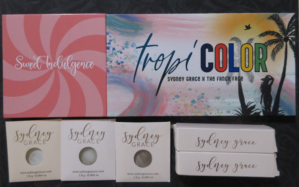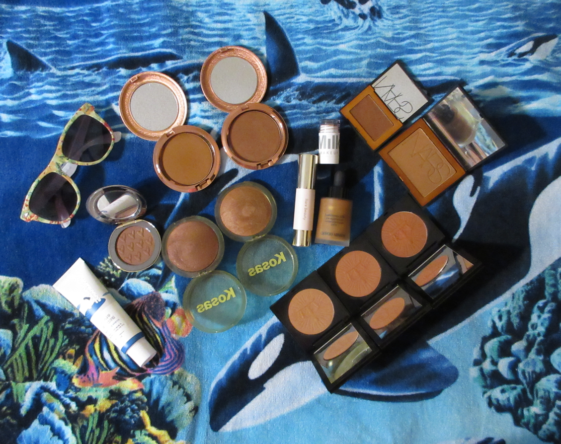
In my Bronzer Ranking and Declutter post, I mentioned that I would review all the 2023 bronzer releases at least several months later because it wouldn’t be fair to compare them to the others without having tested them thoroughly. I believe I’ve spent enough time with them by now to review them properly, but I’m not ready to include them in an ultimate ranking list. Perhaps I’ll do that during summer 2024.
Included in this post are bronzers that launched, were reformulated/repackaged, or underwent a shade expansion this year.
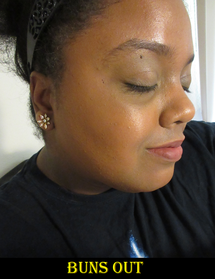
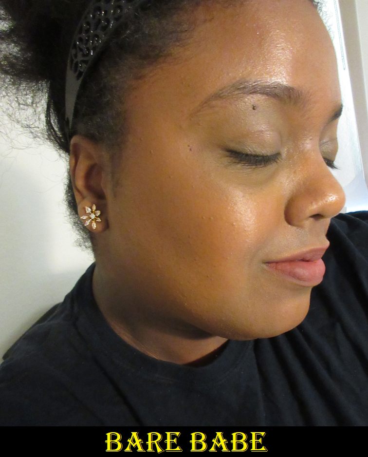
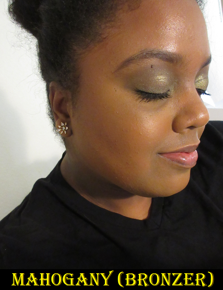
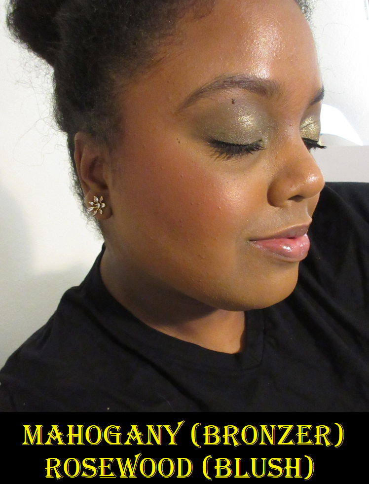
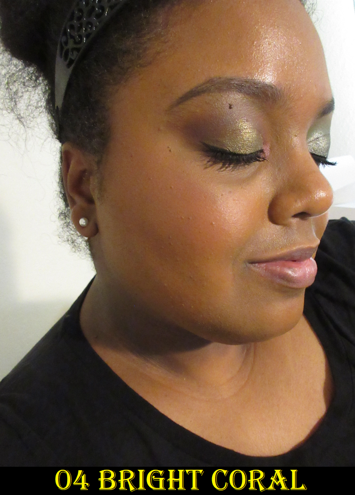
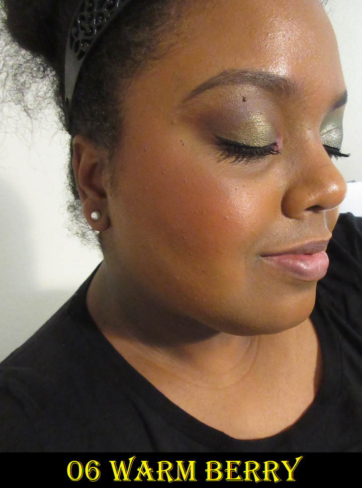
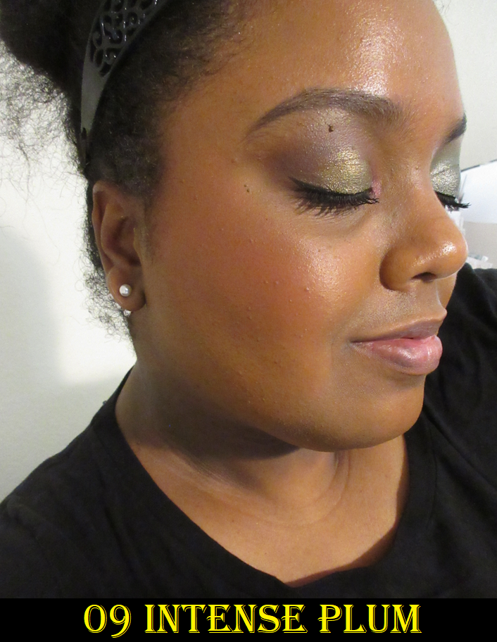
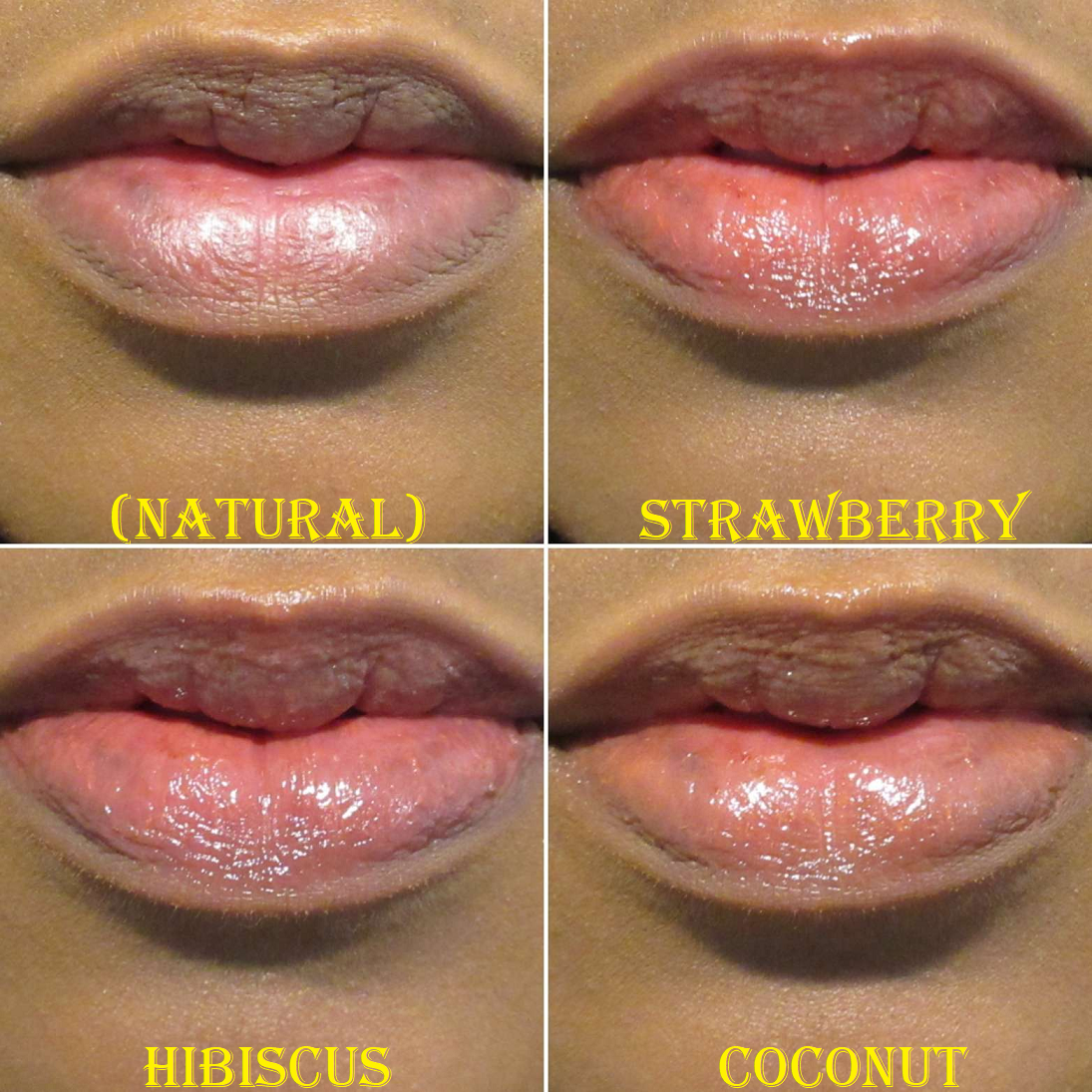
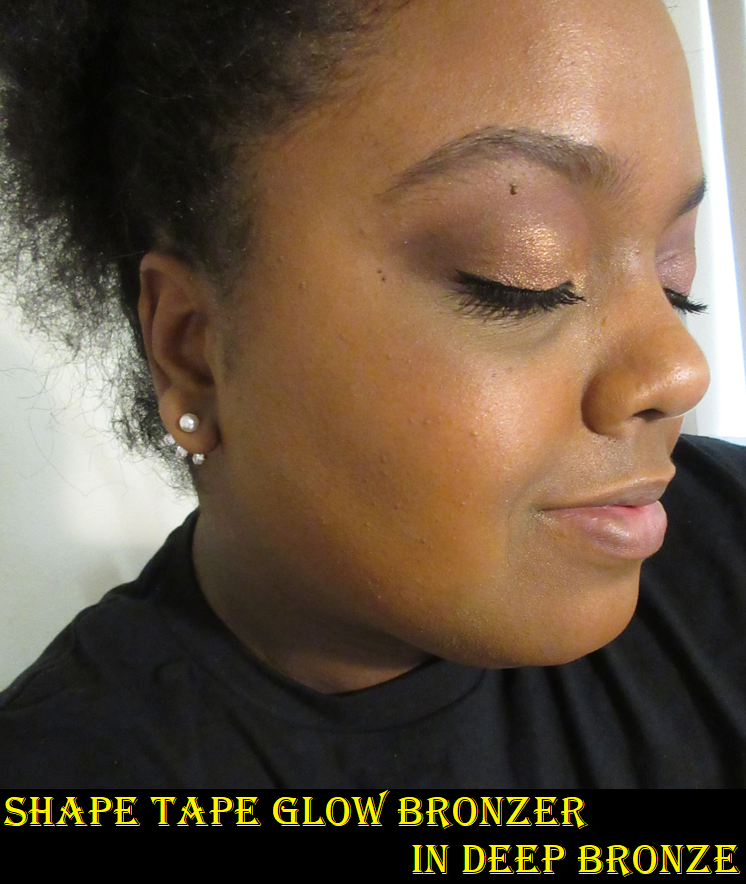
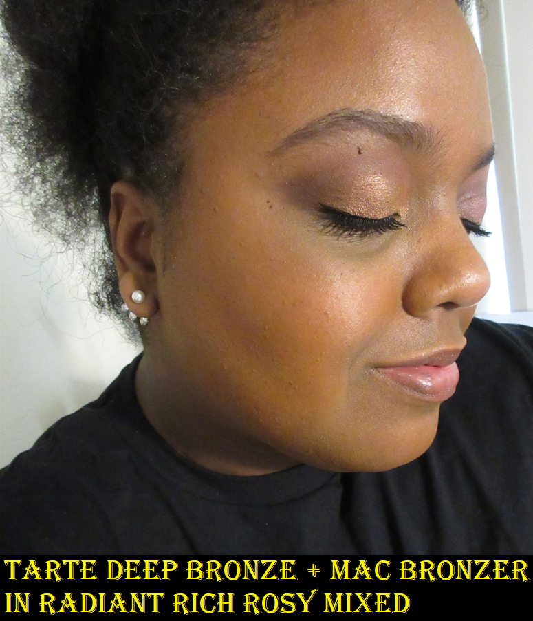
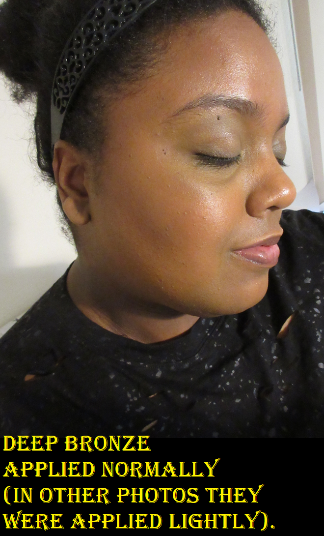
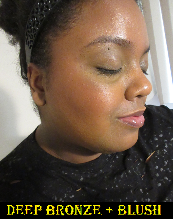
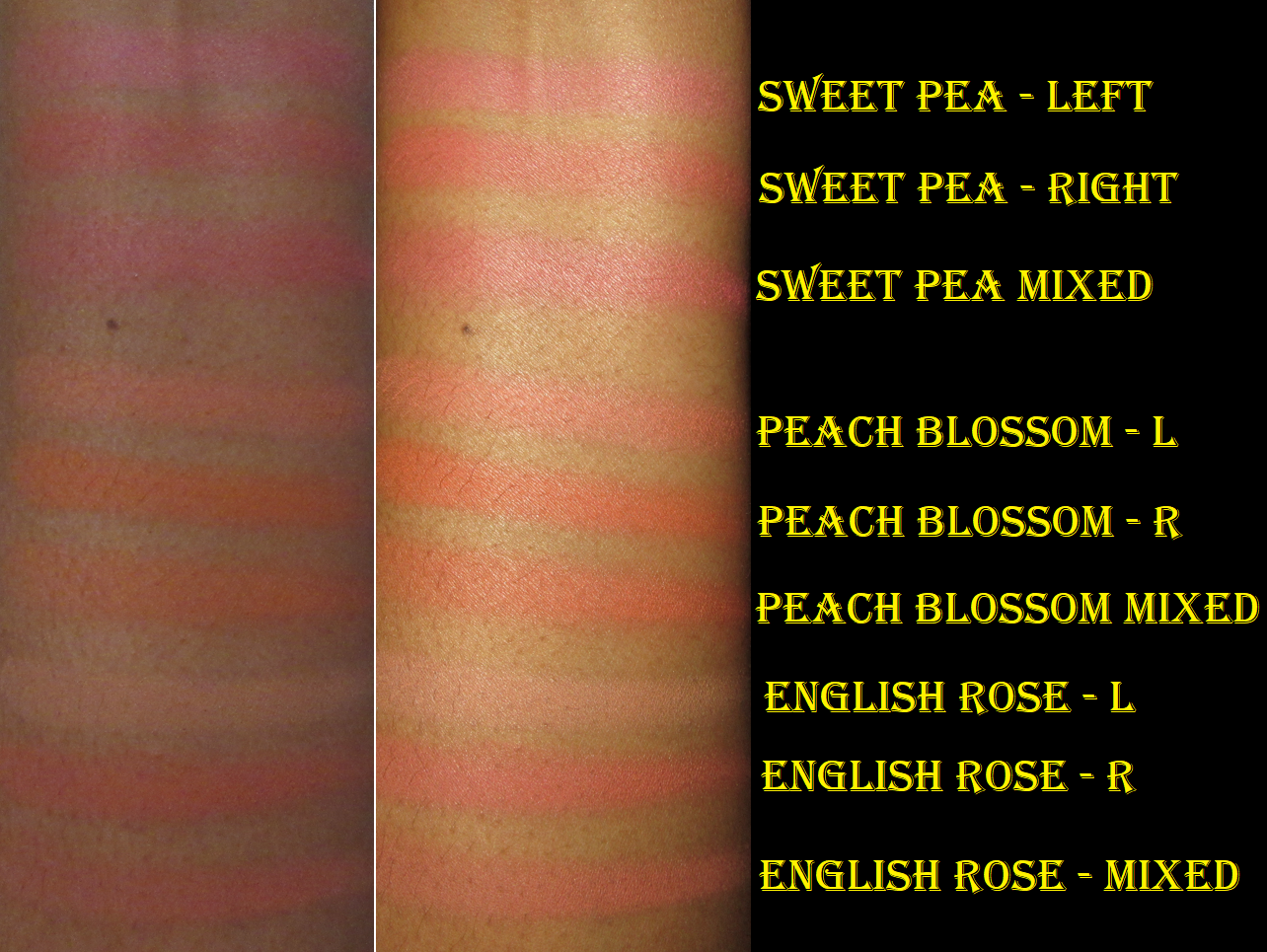
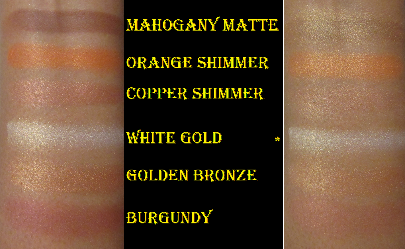
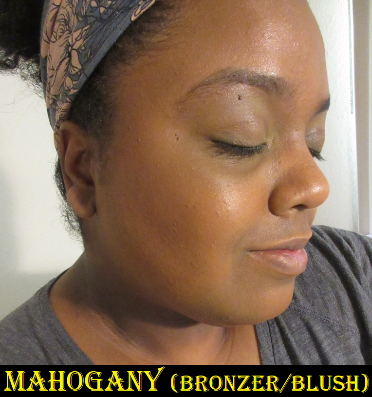
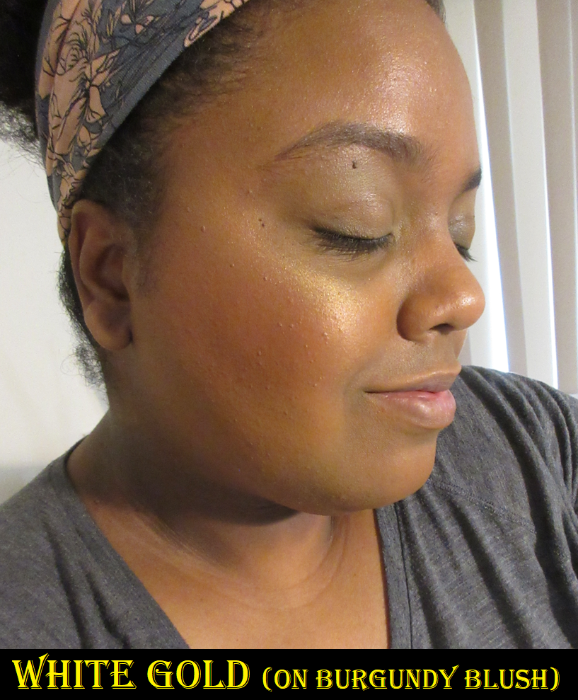
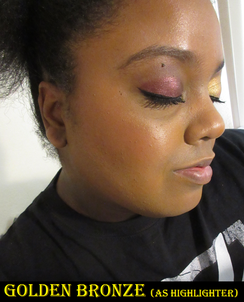
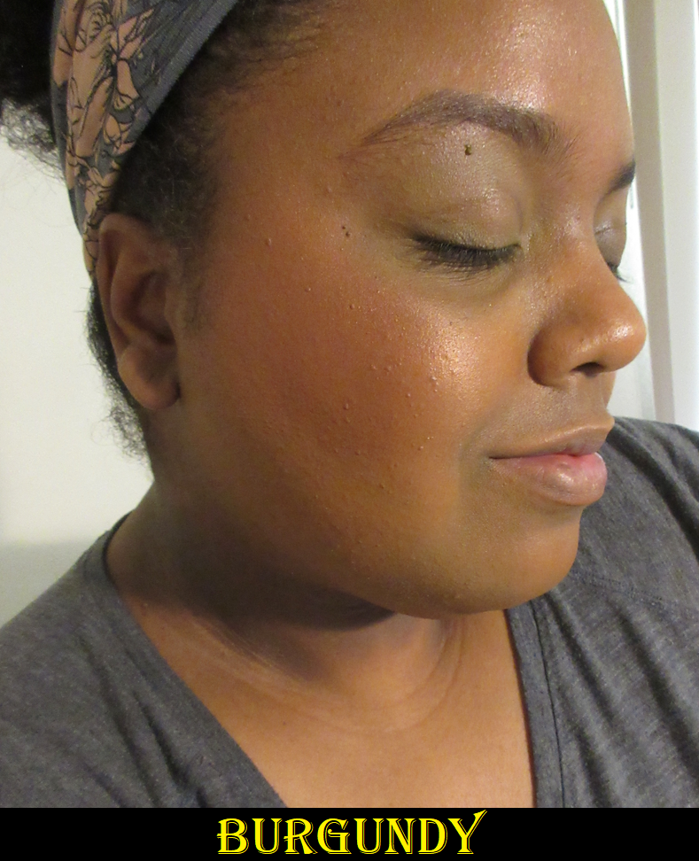
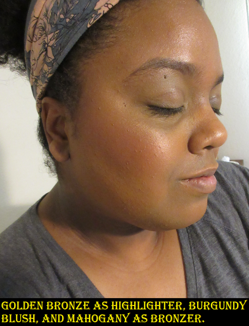
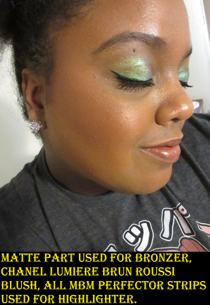
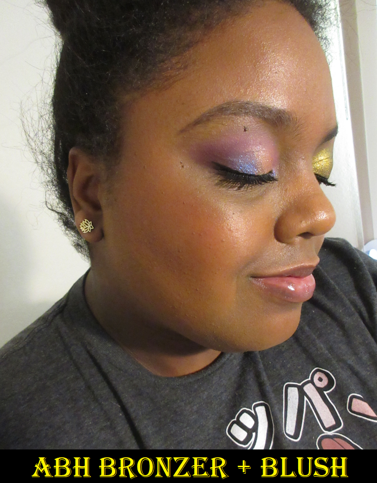
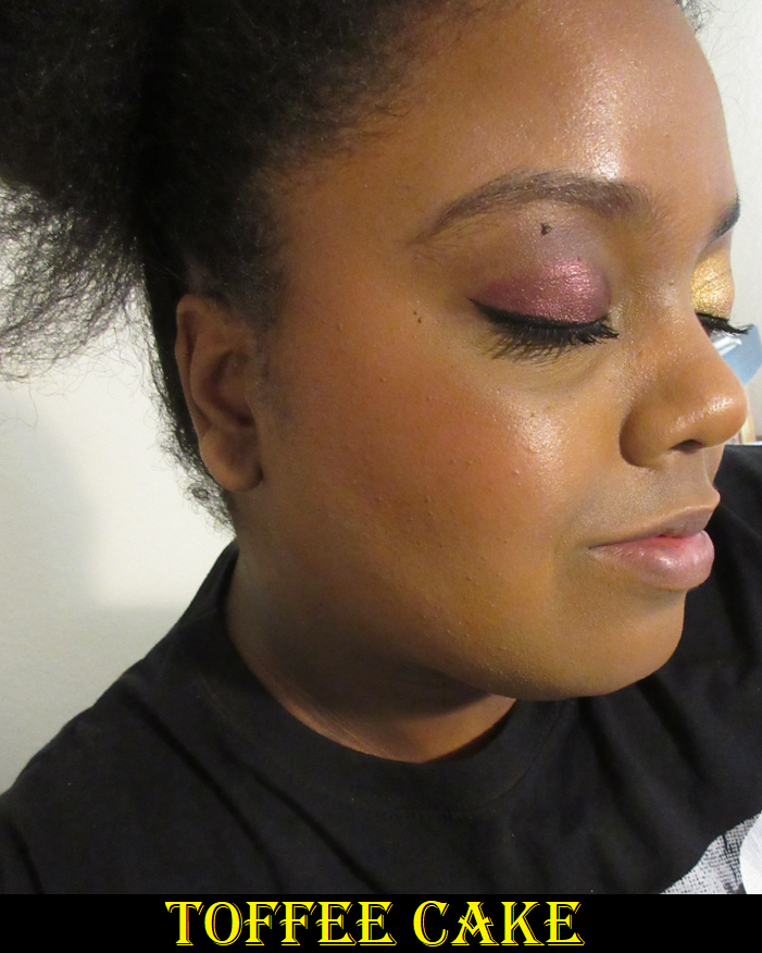
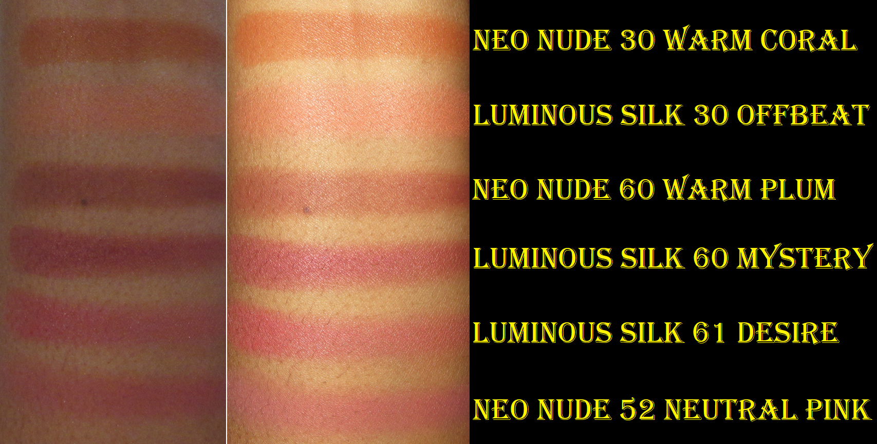
In the demonstration photos (and whenever I review bronzers), I try to apply it nicely, but it still needs to be seen on camera, so I don’t blend it as much as I normally would. If I applied them as subtly as I would normally wear them in every day life, it would be difficult to see the difference between the bronzer and my natural skin tone. I wouldn’t normally apply bronzer in a way that lines can be seen, and would even apply a finishing powder on top to ensure it was seamlessly blended. Of course, I don’t use a finishing powder when the photos are for the blog since that would be an inaccurate representation of what the bronzer looks like on the skin. So, I always try to find a balance between blending it and ensuring it is visible.
*DISCLOSURE: Non-highlighted links in bold blue font (Example) are standard non-affiliate links. Links marked in bold black font with a light blue background (Example) are affiliate links. Affiliate links allow me to get a commission if purchases are made directly using my link. There is currently just one affiliate link in today’s post.
New Holy Grail?
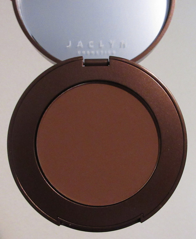
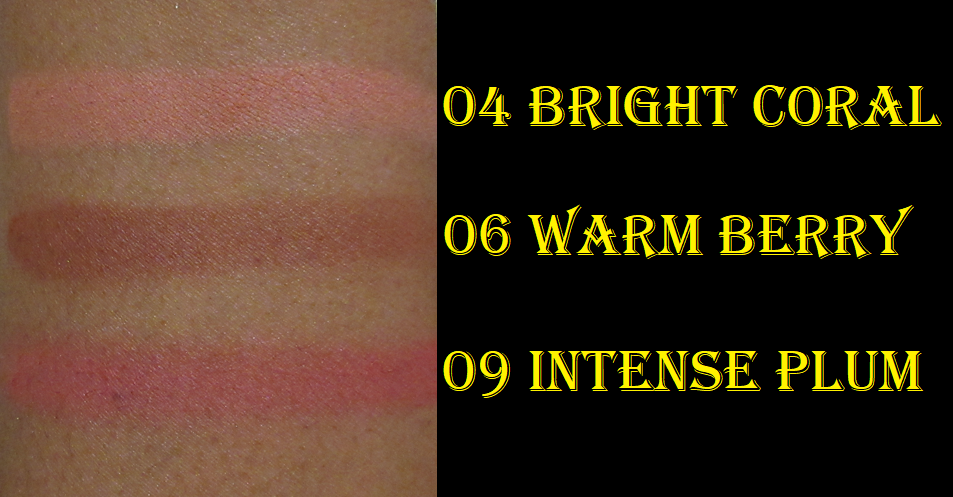
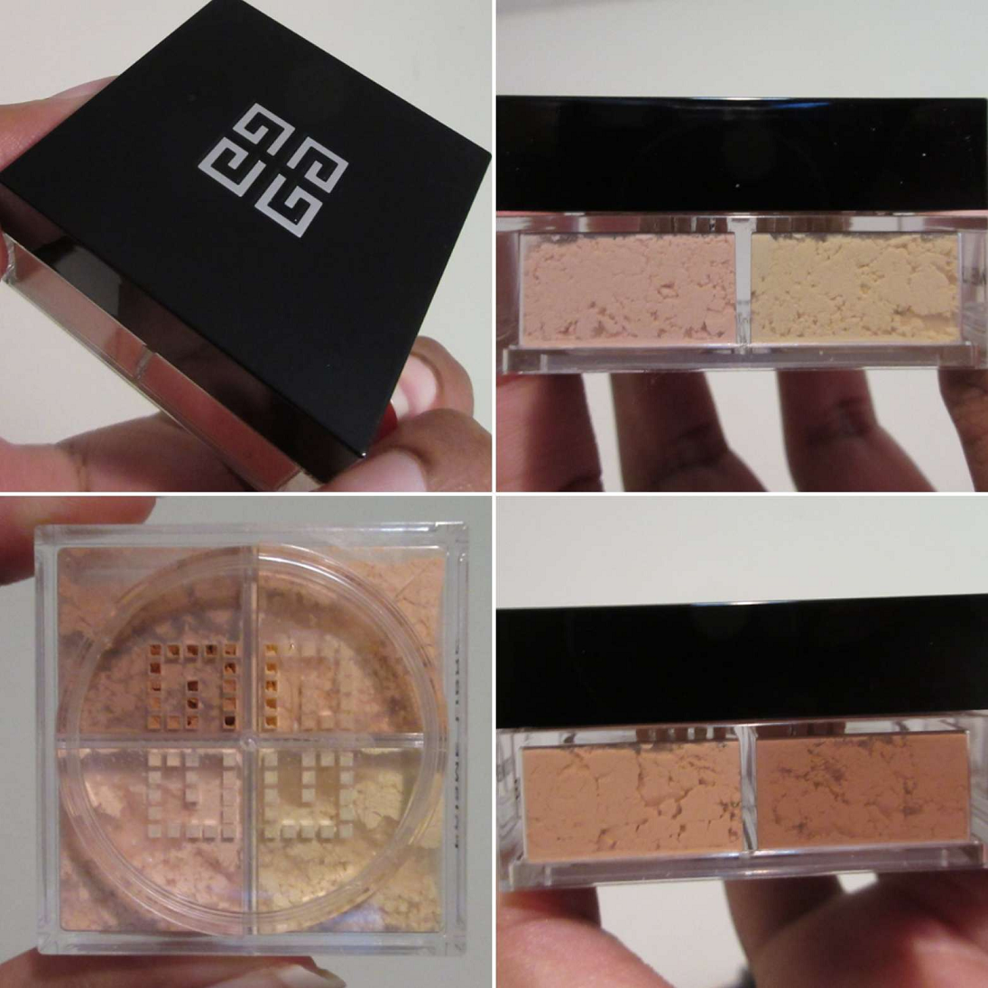
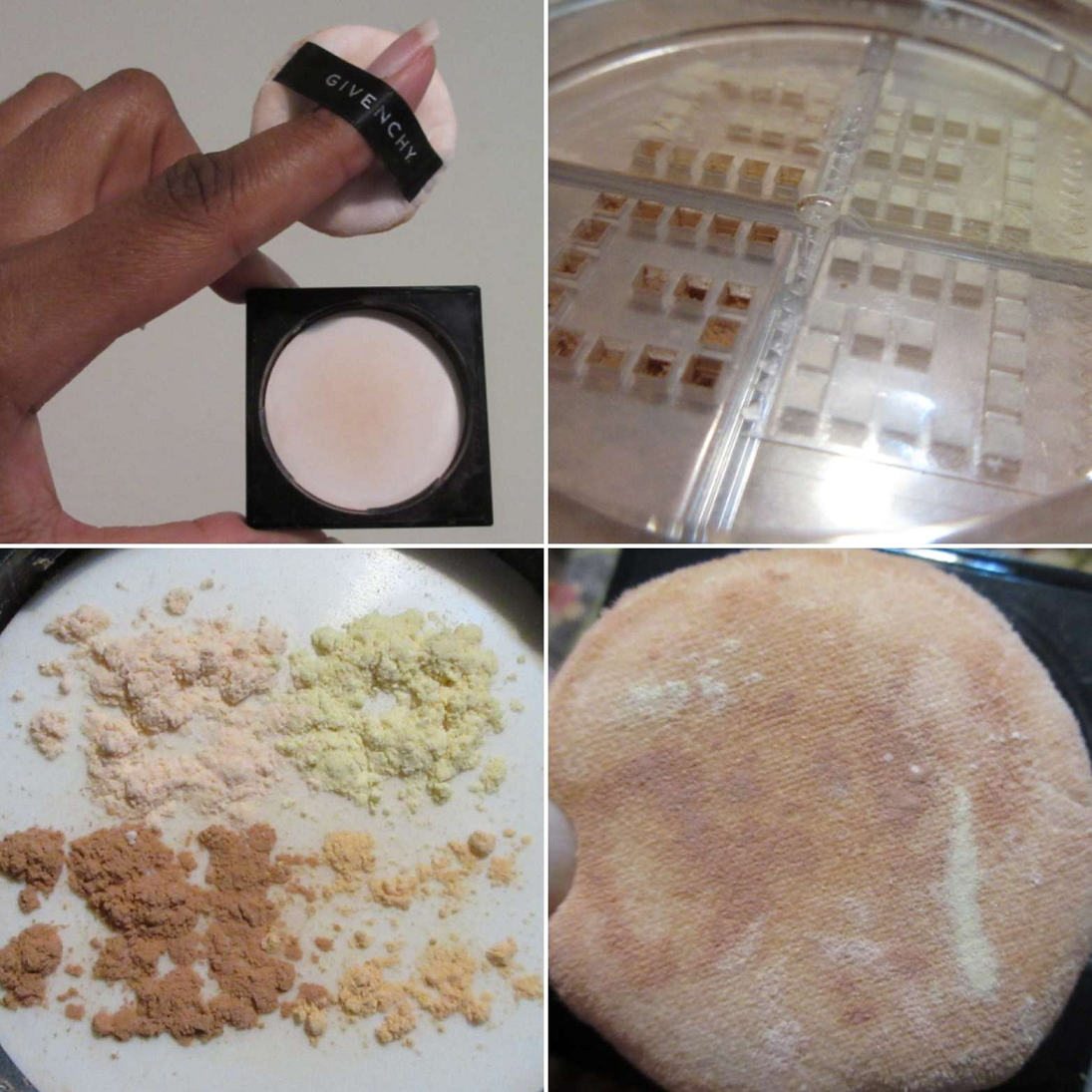
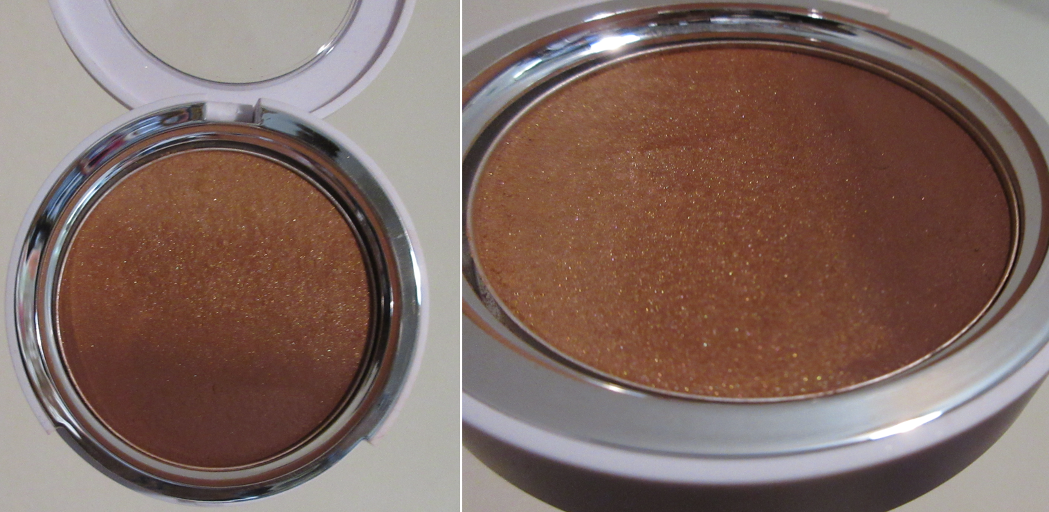
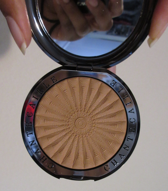
Hermès Plein Air H Trio Healthy Glow Mineral Powder in 04 Sienne (refill)
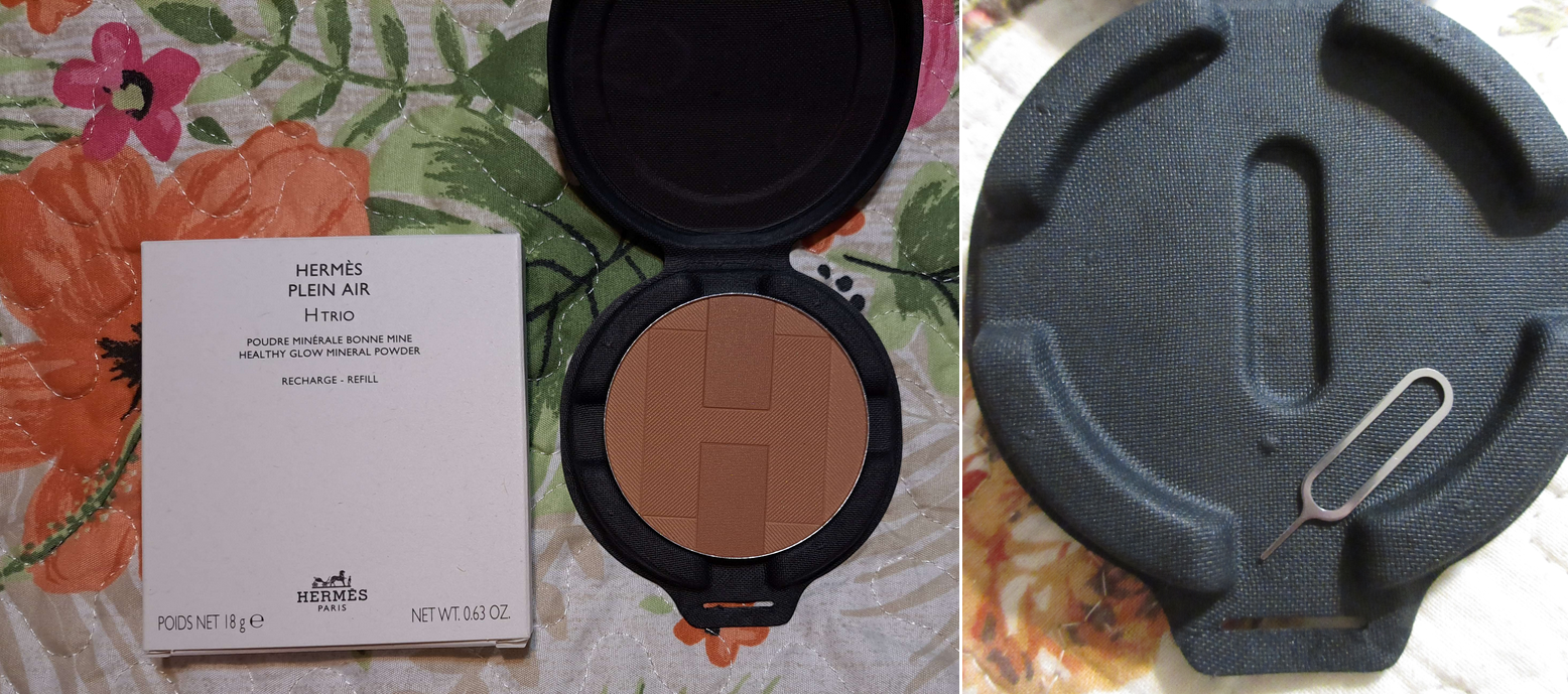
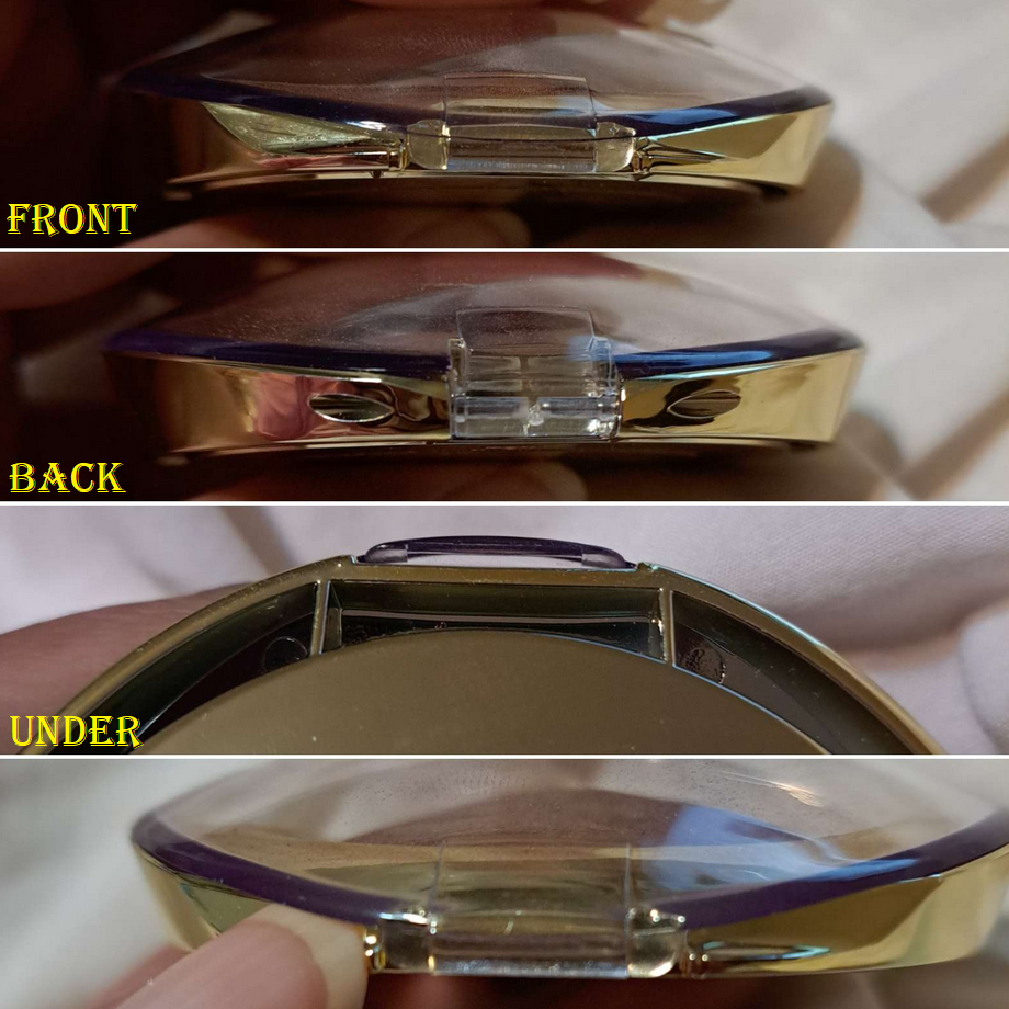
Packaging is one of the biggest reasons I sometimes make luxury purchases, but in this instance, the rave reviews of the Hermes formula was convincing enough for me to buy it. I purchased mine through Selfridges because the refill was significantly lower priced on their website than in the US. The refill pan is not magnetic, so I had to put metal stickers on the bottom in order to store it in my empty magnetic palette. The packaging it came in is durable, but I knew I’d be more likely to get use out of it if I kept it in my Z-palette of face products that has a clear lid, rather than the forgettable unicarton. The pan size is wider than nearly every bronzer I own (I have a wide Makeup Revolution compact, but the Hermes pan is too tall in height). So, even if I wanted to depot a compact so I could put this in there, I can only do that with the bronzer compact from Charlotte Tilbury (though it would have gaps around it), or settle for my custom empty palettes.
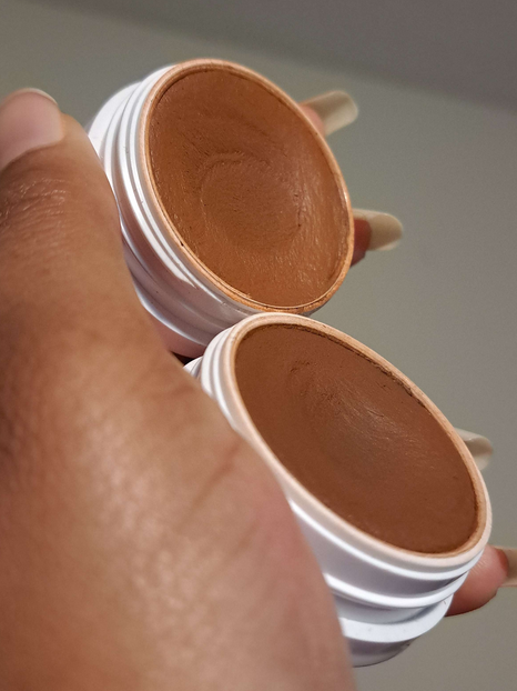
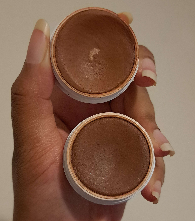
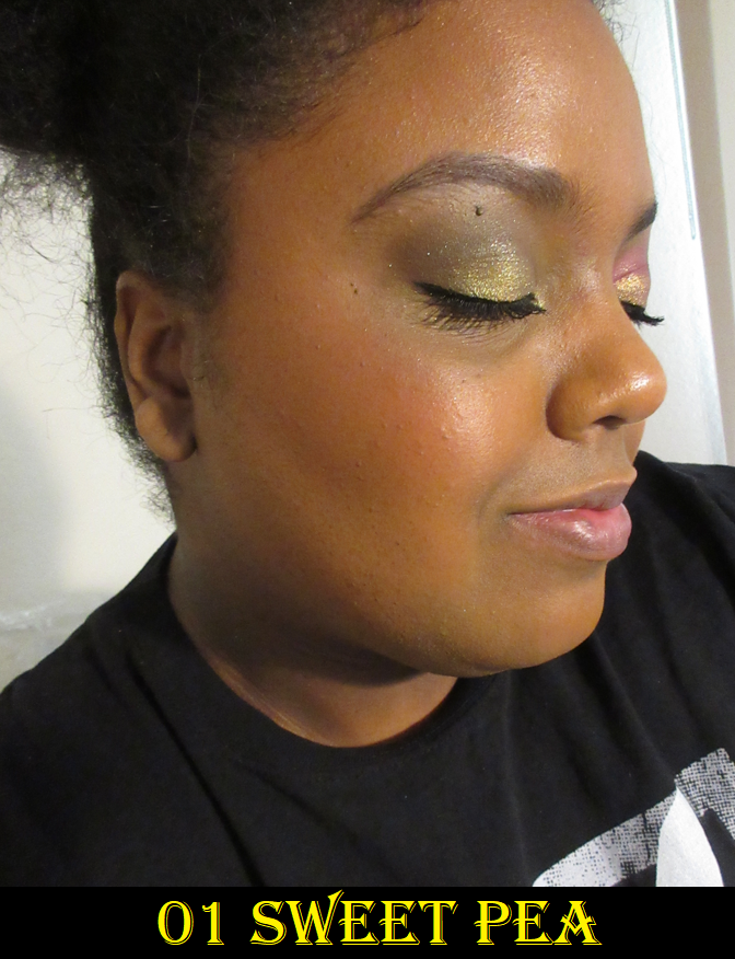
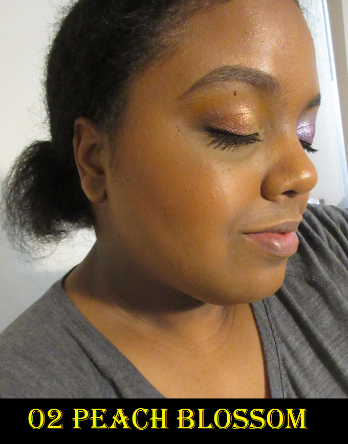
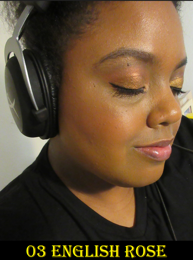
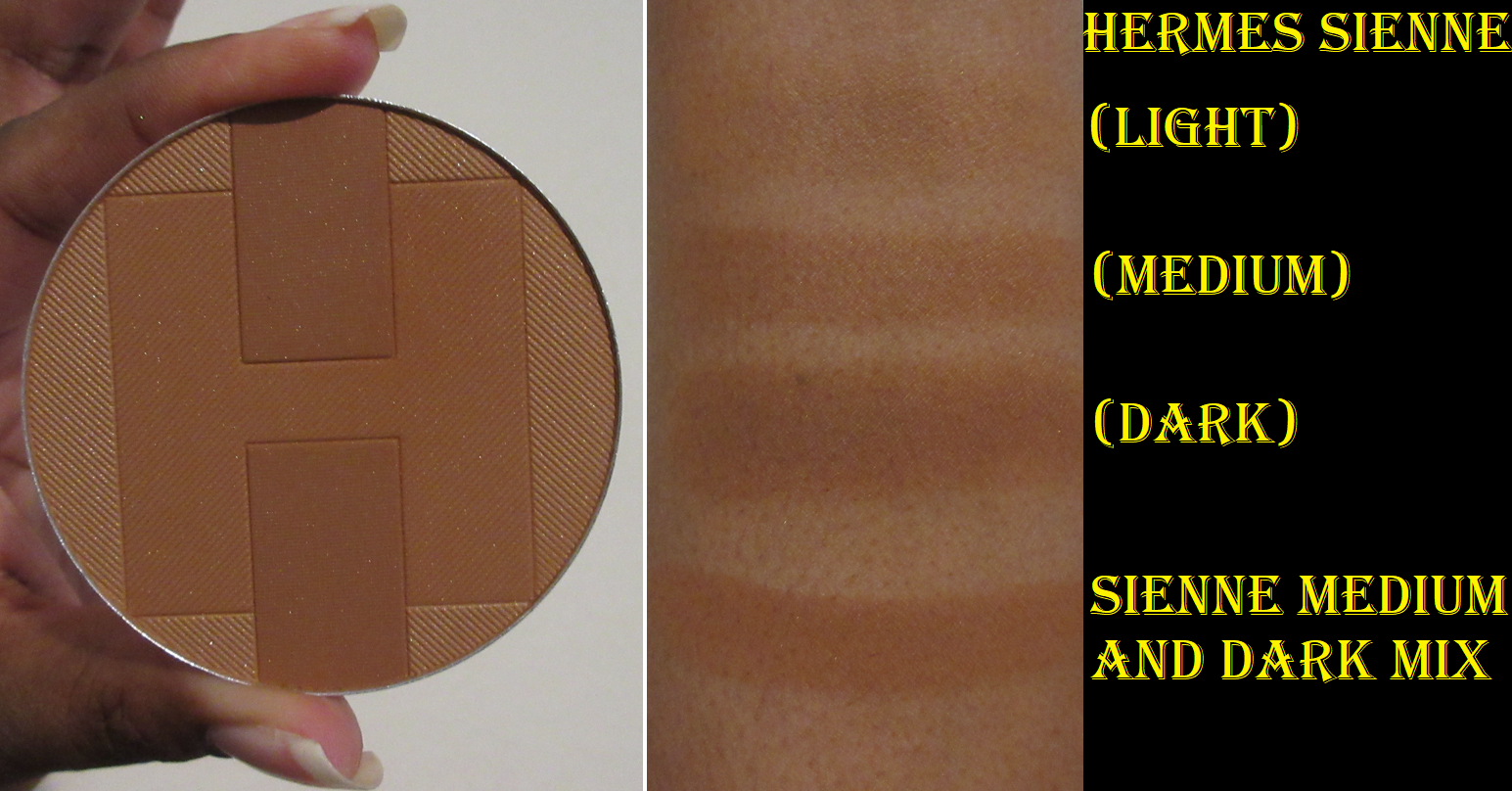
Each bronzer contains three different colors. It’s unrealistic to use them separately without them mixing at least a little, but the placement of the brush in the pan will determine the depth of color. For example, swirling the brush in a circle around the rim of the pan will get more of that lightest shade. Swiping up and down on the left half or right half, avoiding the darker blocks in the center, would get more of the medium color. Trying to get an even mix of all three colors makes it too light to bronze me properly, so what I do is swipe my brush back and forth vertically between the two darkest rectangles, and that turns out to be the perfect bronzing shade for me. I built it up in the photo below to show the the maximum depth I can get from it. So, if you’re close to my skin tone, know that Sienne is on the subtler side though it still works. I chose not to get Colorado, which from what I’ve seen in photos and reviews is a little darker, but seems to be more red-toned.
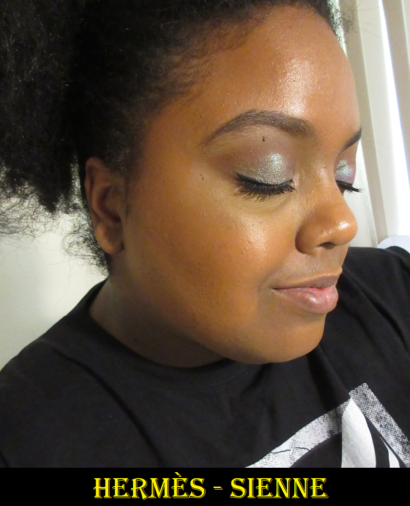
I don’t get kick up in the pan and the product picks up easily even with my most delicate natural hair brushes. It’s the most natural looking finish from a standard powder (by standard I mean not baked gelee or cream to powder) bronzer that I own. It’s the smoothest and most refined. It contains shimmer particles that aren’t visible as sparkles on the face, but just enough to add a realistic skin-like look instead of being purely matte. I have no longevity issues. I have zero blending issues, no matter which foundation I use, and regardless if it’s powder-set or not and whether it’s matte or dewy. It’s pretty much perfection. I have to build it up a little, but it’s a low-effort task to complete that takes almost no time at all.
My favorite brushes to use with it have been ones that aren’t too dense but aren’t too airy either, and sweeping style brushes like the Sonia G Jumbo Bronzer and Eihodo RE8-3 Makie Blush Brush.
I still need time to see if this bronzer will eventually get hard-pan with extended repeated use or any other changes, but thus far, it is my #1 powder bronzer.
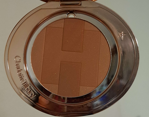
I should note that the difference in performance between this one and the Charlotte Tilbury powder bronzer, Victoria Beckham Bronzing Brick, and others that have crept their way higher on the list of “standard” powder formulas is so slim, it’s not going to be worth the price difference for the majority of people. To put it in different terms, if the Hermes bronzer scores a 9.8 out of 10, the Charlotte Tilbury scores 9.5 out of 10. At the US prices of $105 (or $67 refill) for Hermes versus $58 (or $41 refill) for CT, it seems simple to conclude Charlotte’s is the better deal. However, that’s really up to each individual to decide based on their own skin type and skin tone. I have no way of knowing how the Hermes bronzer will work on someone with a skin type other than dry. I know some people that don’t like the tones of the other bronzers in the line, and even find Sienne to be too orange based on their undertone. This purchase was worth it to me because of how well it suits me in every way, and I don’t have my perfect color in the CT powder formula specifically. Plus there are luxury lovers who might be perfectly content with paying premium prices for the designer name and the look of the packaging. I’m happy I bought the refill, but I understand why it wouldn’t sound worth it for everyone.
Almost a Three-way Tie: Pat Mcgrath, Nars, and MAC
These three bronzers are the reason this post took so long to complete. I had the hardest time deciding where I rated the formulas because they’re all blendable pigmented powdery mattes (ignoring the MAC radiant finish) that are long lasting and produce an airbrushed finish at similar price points. I felt compelled to review these three together, as they’re so similar, and I will point out the subtle differences along the way.
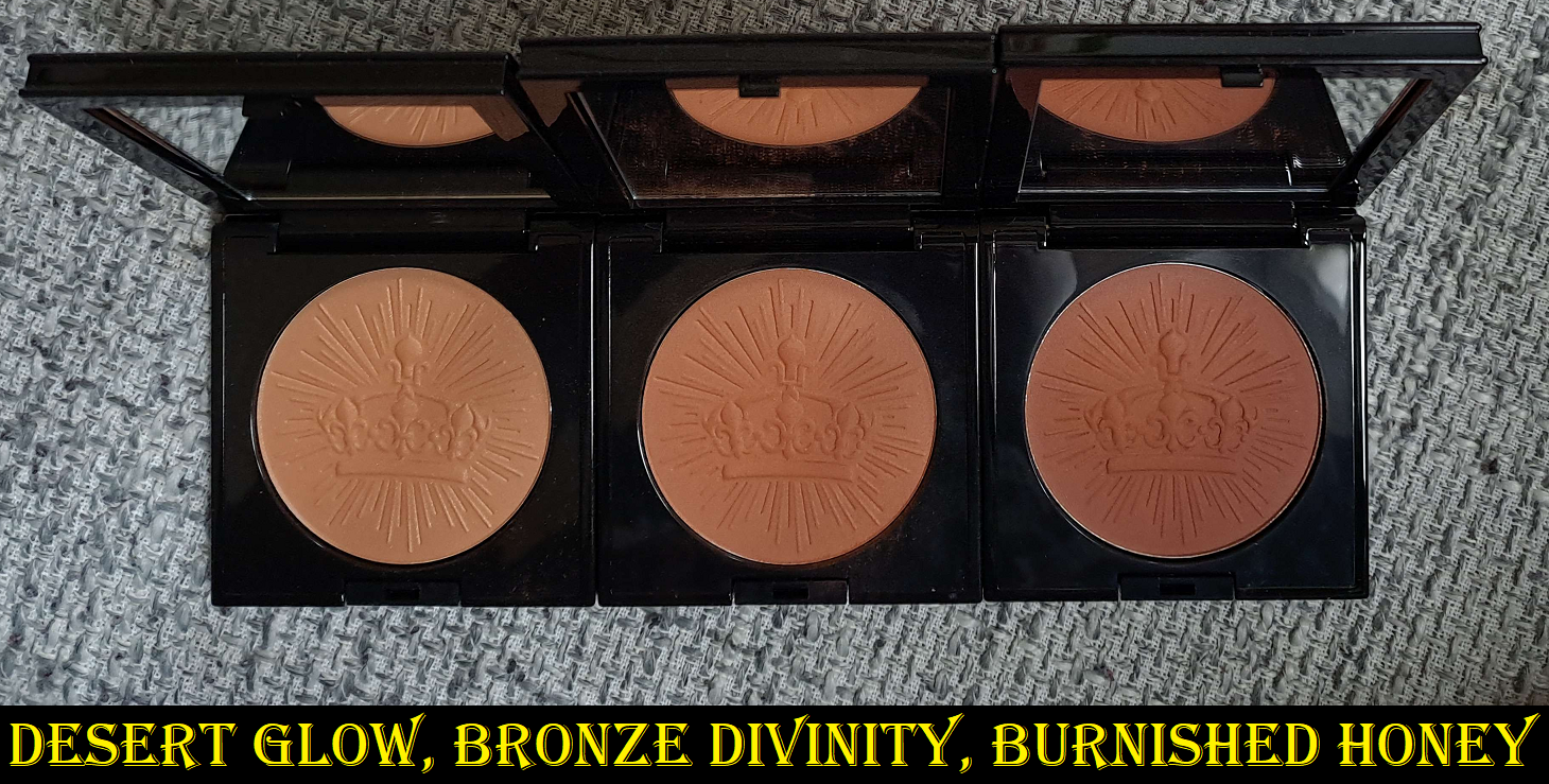
Pat Mcgrath Labs Skin Fetish: Divine Bronzers in Desert Glow, Bronze Divinity, and Burnished Honey
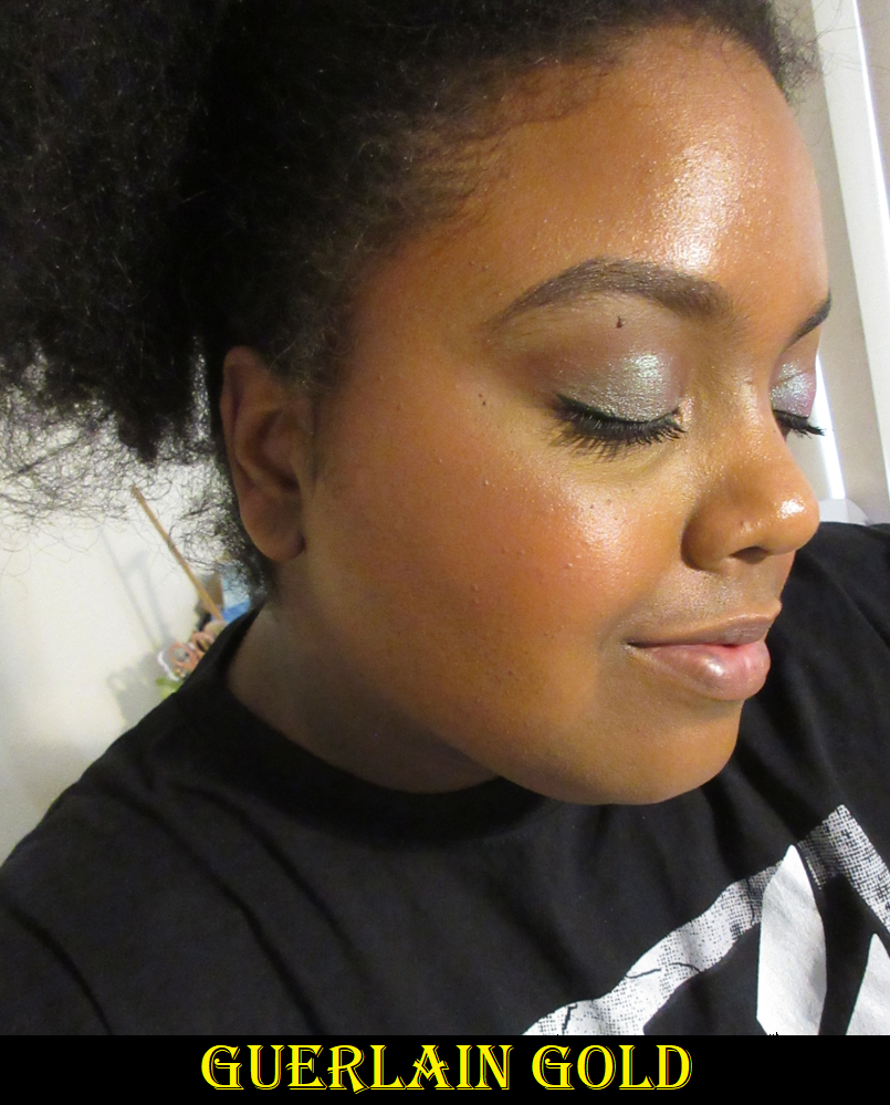
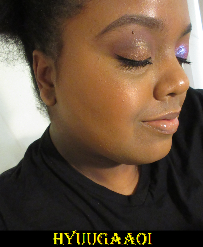
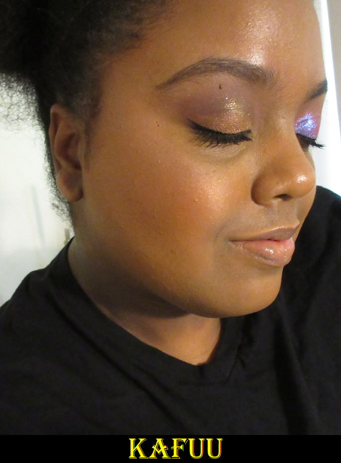
First, I have to apologize for the fact that I’ve worn the Pat Mcgrath bronzers plenty of times, and had these the longest out of all the new ones, yet I don’t have any photos wearing it that were taken with my main camera before it broke. I made a post on the home page about needing to switch to my cell phone camera now. I hope that this change will still be satisfactory to you.
I don’t have the PML Foundation, but based on their concealers I owned (MD22-24, with 23 being the correct depth), I should be shade 23 or 24 in the foundation. Thanks to the last minute shade suggestions added to the website before launch, I knew Bronze Divinity (MD22-27) was supposed to be my shade. Yet, I couldn’t stop myself from getting Desert Glow (M15 to MD22) and Burnished Honey (MD25-30). I should have stuck with my suggested one, but it’s hard to control myself when it comes to this brand. I’m at least glad I saved some money buying the 006 Duo and then getting Desert Glow later with a 25% off code.
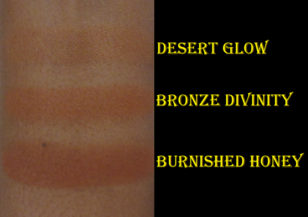
Desert Glow was a little easier to see in spring, but this deep into summer, it’s very difficult to detect since it’s so close to my skin tone now. As for Burnished Honey, it’s still a bit deep and also more of a reddish-orange compared to the more solidly orange Bronze Divinity. Bronze Divinity can be built up more intensely and Burnished Honey can be applied more sheer than depicted in the photos below, so it’s really the undertone that makes a difference between them and why I prefer Bronze Divinity.
That being said, this is an extra warm line of eight bronzers. I love an orange leaning bronzer, but these are some of the strongest orange tones I have in my collection. Those that are the type that prefer cool toned or neutral bronzers might want to look elsewhere unless there’s a shade expansion for the range.
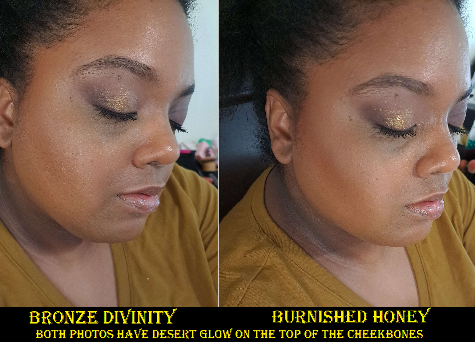
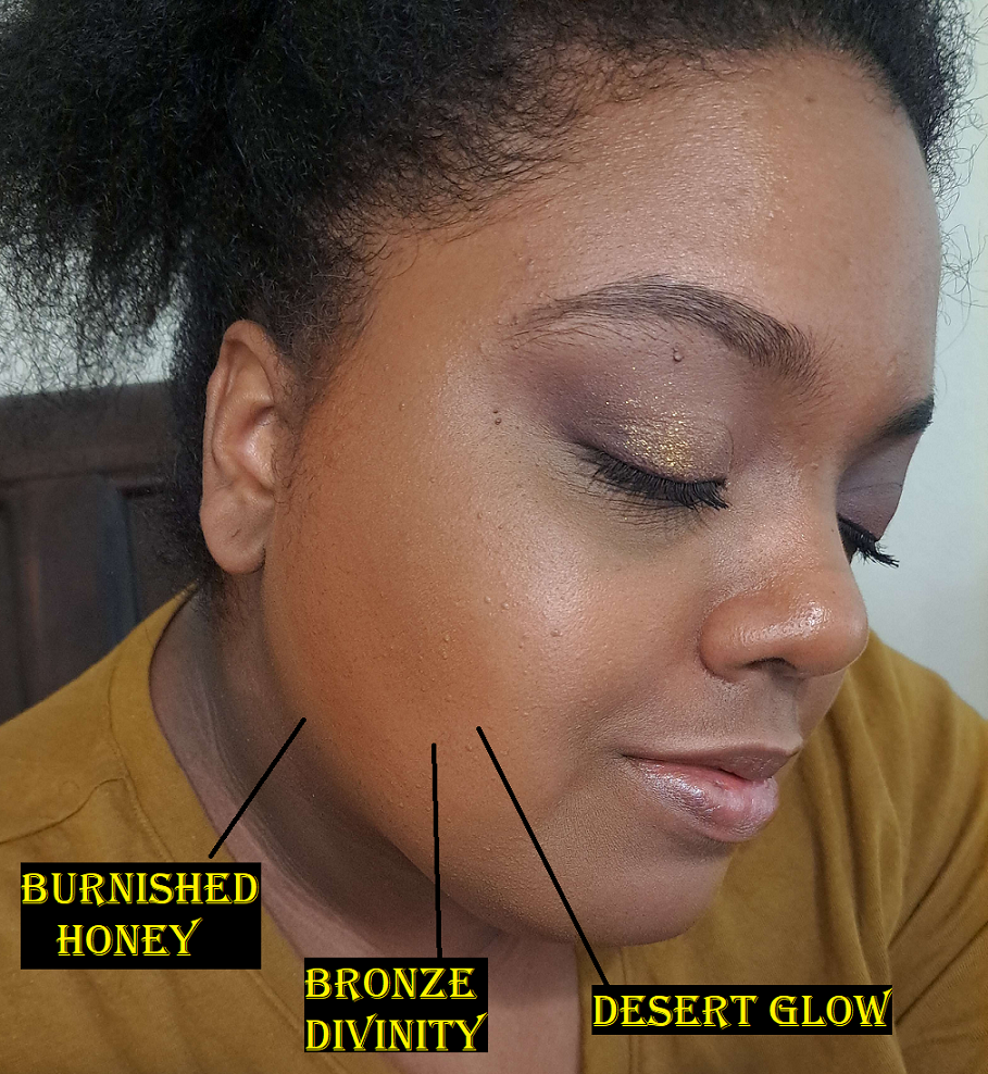
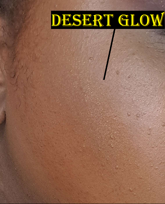
Desert Glow is the only one currently in the line with the pearl shimmer particles, compared to the rest that are semi-matte. Even in the summer, this shade is still useful to me to amp up the glow of Bronze Divinity when used on top of it. This is shown in the photo below where I have Bronze Divinity on the perimeter of my face from my forehead to under the cheek bones, but the cheek bone area is toned down in color from putting Desert Glow on top in that spot.
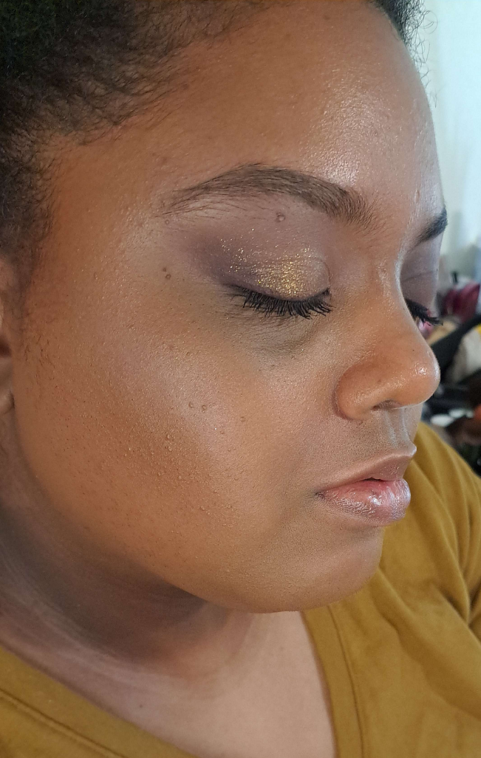
I’ve always thought the shimmer looked beautiful and refined on the skin, but at certain angles it looks like I used a highlighter as bronzer in photos captured with my cell phone. I’m a bit less happy knowing this now.
Regarding the formula, those that love Pat Mcgrath’s blushes will love this one since it feels pretty much the same, though perhaps slightly drier to the touch. The look on the skin, texture, finish, and performance are identical.
Sometimes I prefer the Nars bronzer over this one because the Nars powder feels softer, not just to the touch with my finger, but even when applied with the same brush it has a smoother glide across the face making it a slightly more pleasurable experience. Sometimes I prefer the one from Pat Mcgrath because I can apply Bronze Divinity in practically two swipes and not have to do more than a few additional swipes for blending because it’s a good tone match and the amount of pigment I want is achieved with such minimal effort.
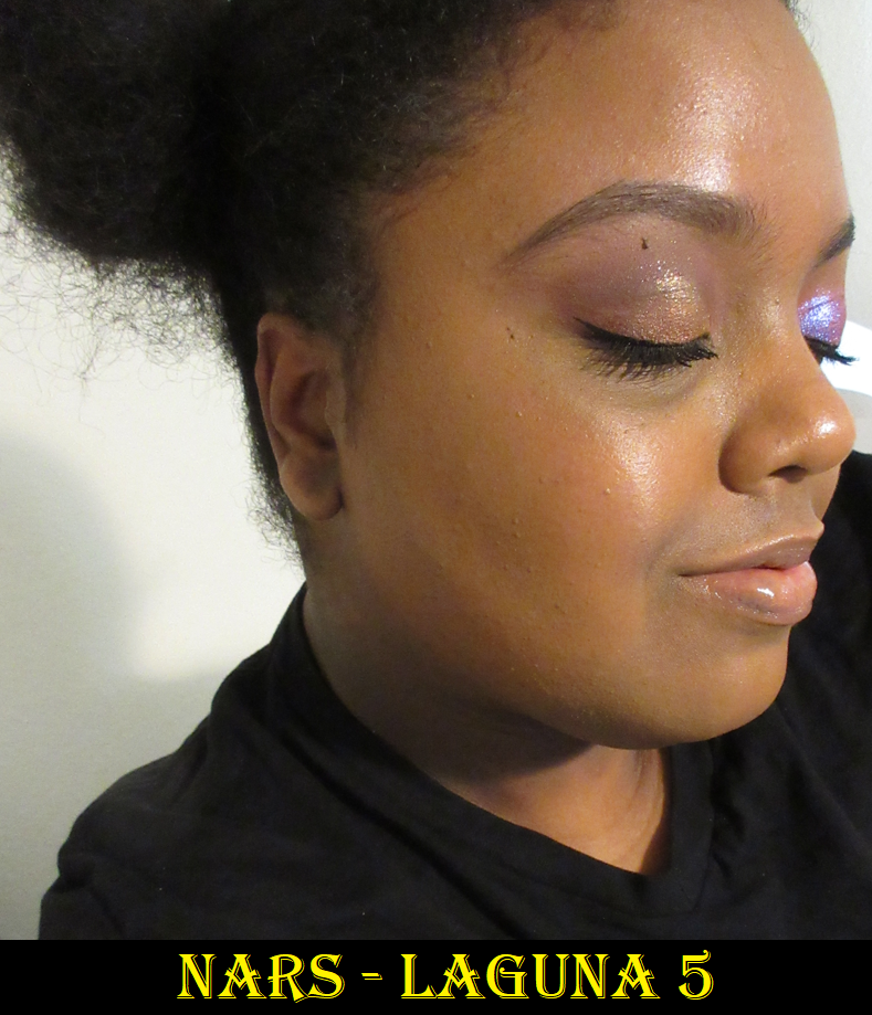
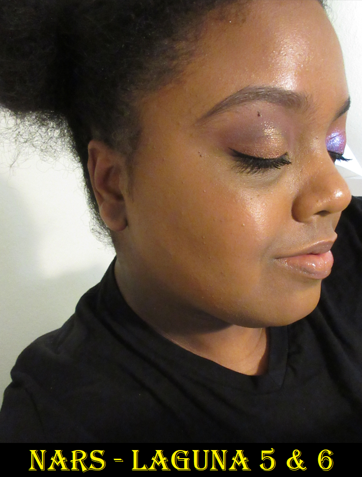
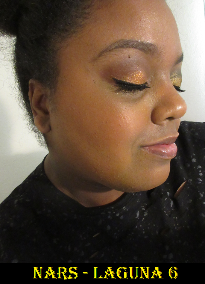
Nars Laguna Talc-Free Bronzing Powders in Laguna 05 (full-size) and 06 (mini)
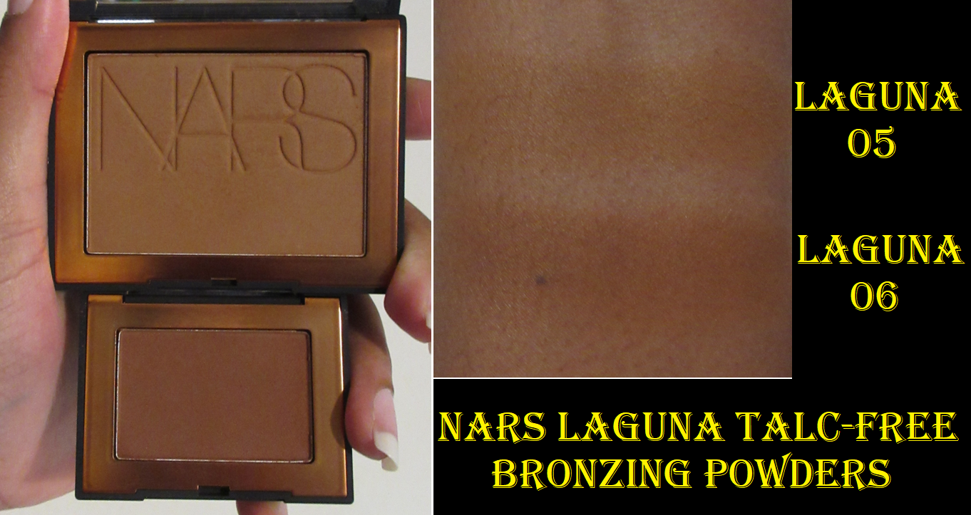
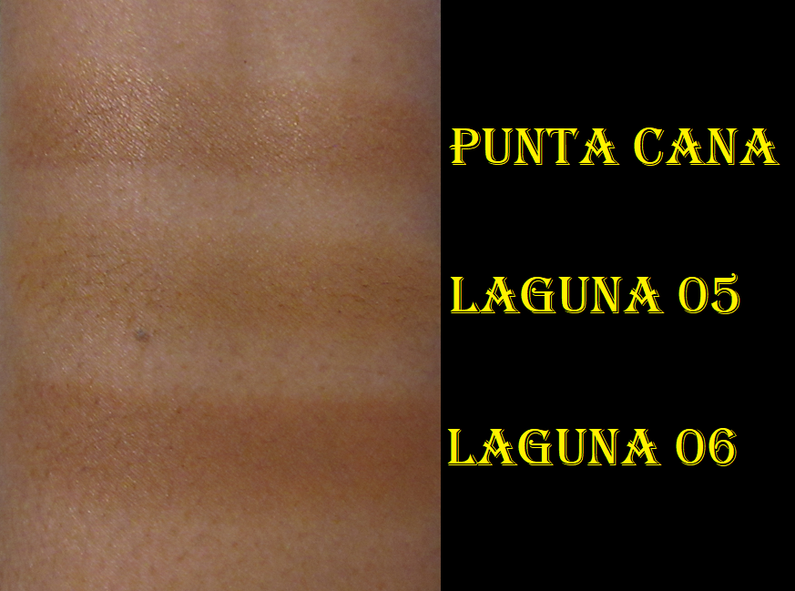
This is a buildable formula, and not what I’d call sheer, but it is the sheerest of the three powder ones I’m comparing. This could be a great thing for those who are heavy handed with bronzer. Laguna 6 is the best suited of the nine options for me and looks deep and red in the pan, but because it’s such a lightweight powder, I have to build it up more than the lighter colored Bronze Divinity from PML. Laguna 5 is too close to my skin’s depth and undertone to create a bronzed look on its own. So, on a day that I’m feeling lazier, I use Laguna 6, but I love the tone I get from mixing 5 and 6 together. It’s just more effort and therefore sometimes I can’t be bothered.
For those curious how the new formulation compares to the previous ones from Nars, I have that review here, along with the Laguna Cream bronzer.
As mentioned in that review, I believe the new formula by Nars is just the tiniest bit better than their old one. Because the talc-free version only comes in a matte finish, I’m still holding onto my original one that contains shimmer.
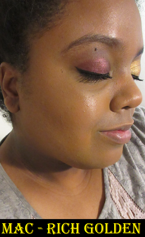
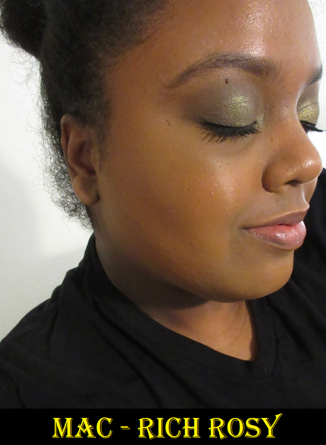
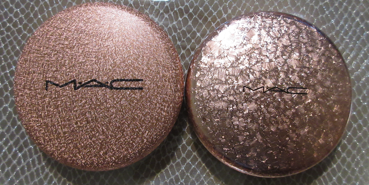
MAC Sunstruck Bronzers in Matte Rich Golden and Radiant Rich Rosy
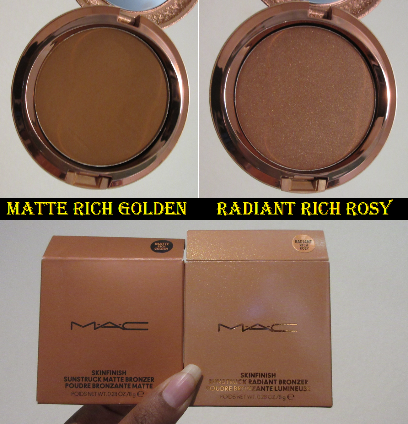
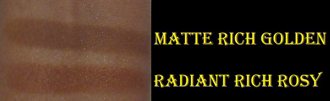
These perform so well! They give slightly less color payoff than the ones from Pat Mcgrath, but still more than the bronzers from Nars. I love Rich Golden because it’s a deep golden yellow tone, which is not a common bronzer shade in my collection. I have an easier time finding olive than a dark yellow-brown. It’s only this year that I’ve made discoveries of any deep enough to work for me. Previously, my only options were orange, red, neutral brown (and I tried to stay away from cool toned ones). I also have a few more rosy options, though Rich Rosy is closer to orange-red than pink on me.
The difference between the matte and radiant formulas is similar to matte versus satin eyeshadows. Rich Golden has a thinner consistency that’s less compact in the pan, but not so powdery as to have kickup. Rich Rosy has some slip to it and seems to have more adhesion/binding properties. This makes the radiant formula take a little more effort to buff out. I prefer MAC’s matte bronzer compared to Nars for the color and near identical finish/performance. I prefer MAC’s radiant bronzer over the Kosas baked bronzers in the new yellow packaging, though I’m not a big fan of the tone of Rich Rosy. However, there is one gigantic flaw that drops this lower on the rankings and why I can’t recommend it. They stink.
I don’t remember the exact timeline, but essentially MAC released these bronzers online on March 19th. Then a few days later they were abruptly removed from all websites for about a month or so, but my order was still delivered. There was speculation that it was because there was something wrong with them, and some people said it was due to the smell either from having gone racid fast, contamination, or a harmful ingredient. However, if those were true, I don’t think they would have been made available again so quickly (unless it was batch specific and they identified which ones to not sell). I was in Germany when mine were delivered, so I had to wait until mid May to come home and smell them for myself. The first time I opened the compacts, I detected a faint smell in one, but it wasn’t that bad. Every time after that, I either could smell one or both very strongly, but then the smell would dissipate and had me wondering if I imagined things. Now, it’s at the point where the smell is quicker to identify but it does disappear in the air after the container has been opened for a while, but it reminds me of the Beanboozled Vomit flavored Jelly Bean. I wish I had an explanation as to how the smell comes and goes (sometimes the smell even temporarily transfers to my brushes), or what is causing it. At least the smell doesn’t linger from the powders when used on my face, but the mystery bothers me. Kosas bronzers have a frying oil smell due to the use of “clean” ingredients. MAC thus far hasn’t jumped on the clean beauty train for cosmetics, so I don’t know what their excuse is and I haven’t seen any official explanations for it online, nor them even addressing the fact that it was temporarily pulled from the website including all the various retailers of MAC products.
I’m still trying to decide what to do with mine. I’m very torn between liking the formulas, but being concerned about the smell. I would love to at least keep the packaging, since I like reusing them and swapping them with different products inside. However, I did see a comment online about it possibly being the components that smell and not the products, so that wouldn’t be the best solution.
The final thing I wanted to mention is that when I saw the packaging photos online, I hoped it was going to look like the Snowball Holiday 2017 packaging for the Whisper of Gilt highlighter. I see now that it’s a different pattern. Considering both bronzer finishes come in identical packaging, it would have been nice if they added a shiny varnish at least to the radiant ones.
Liquids Drops and Cream Sticks
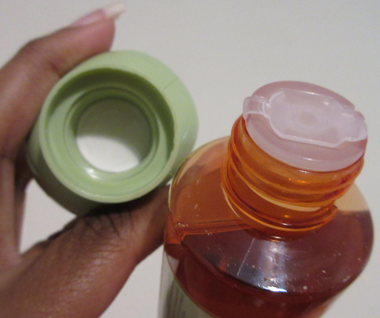
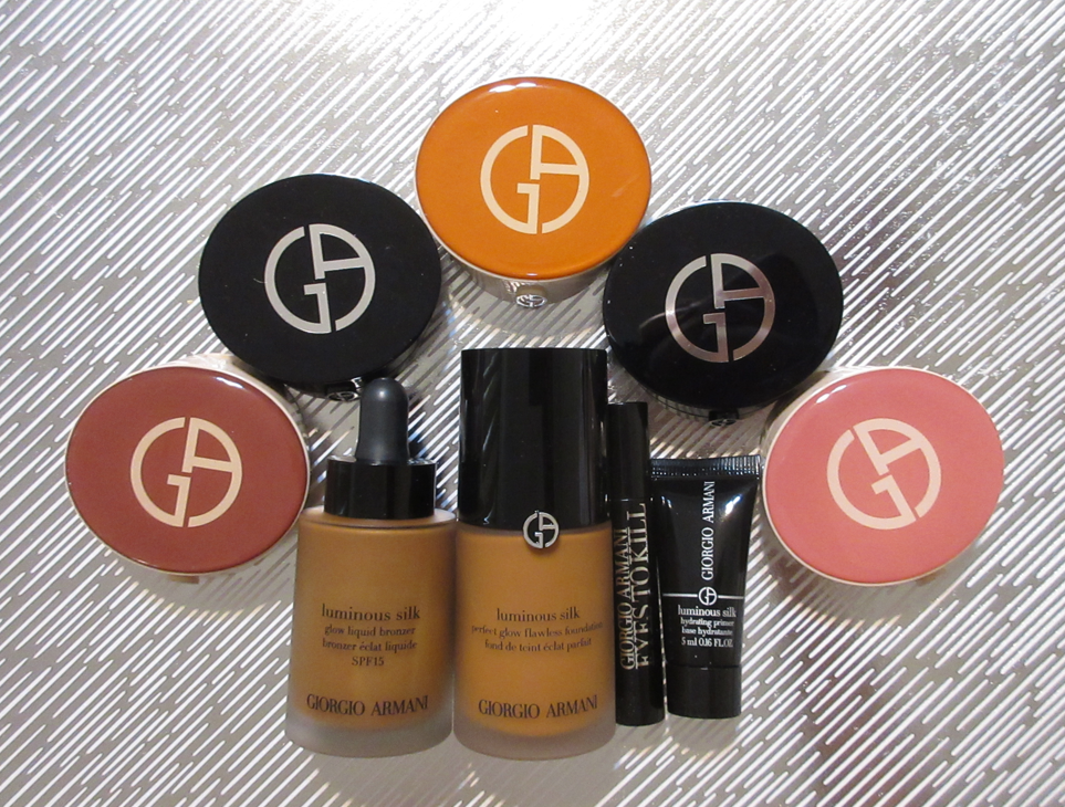
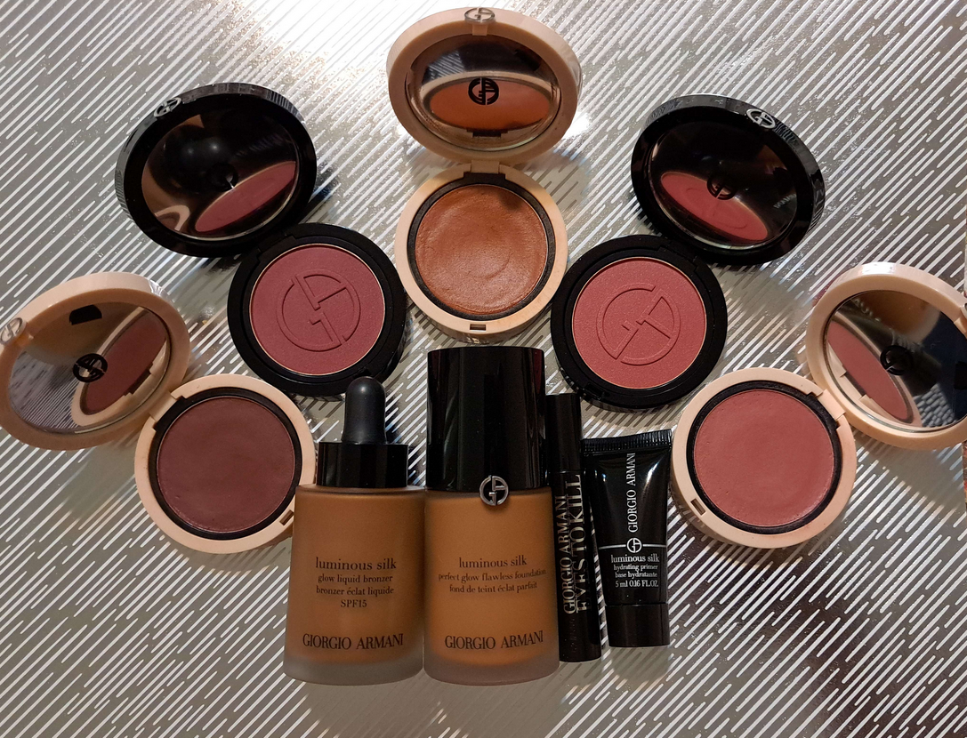
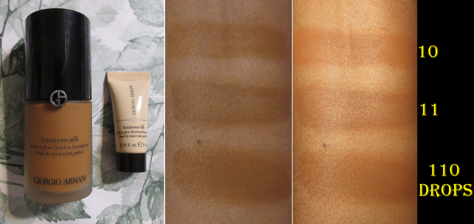
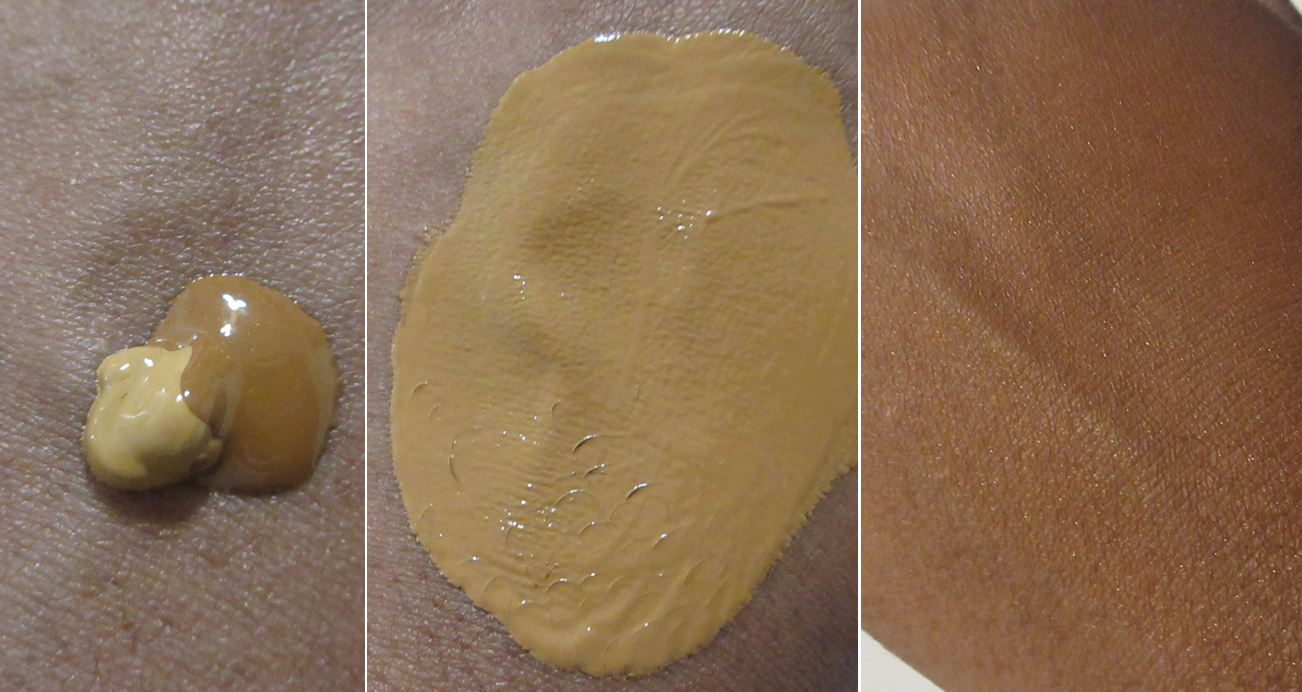
Armani Luminous Silk Glow Liquid Bronzer Drops in 110
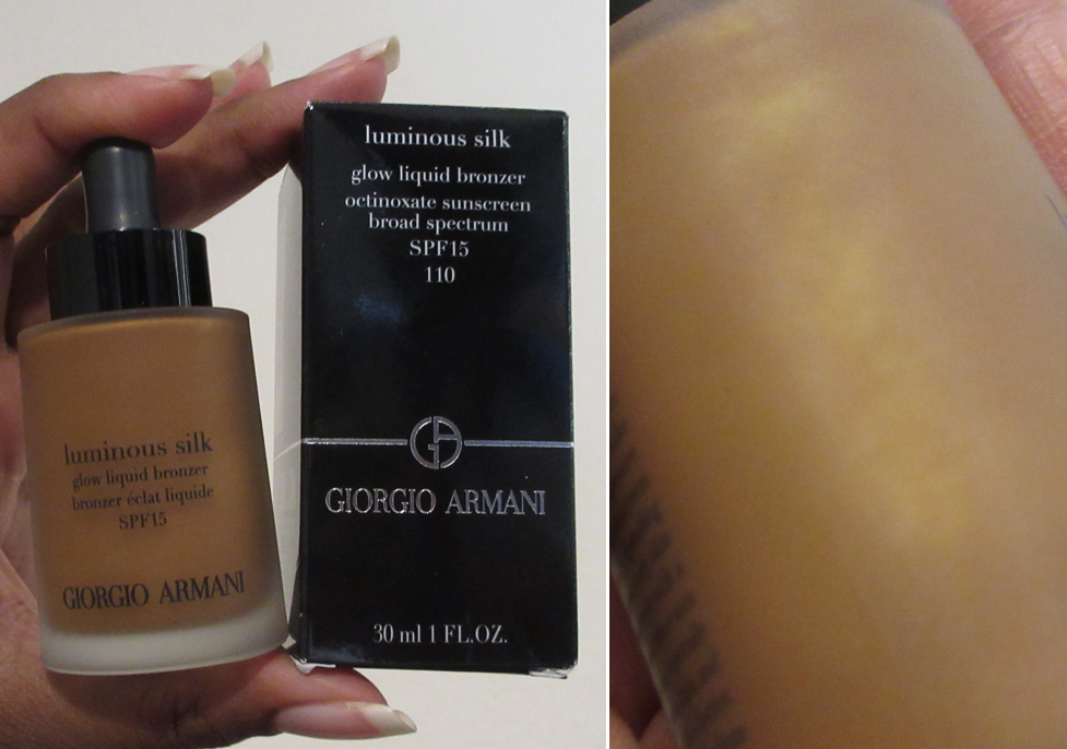
To recap the preview of info I mentioned about this bronzer already in the Armani Beauty post, I don’t think shade 110 will work that well for anyone who wears darker than Armani’s foundation shade 10 or 11. It barely shows on me once I blend it in.
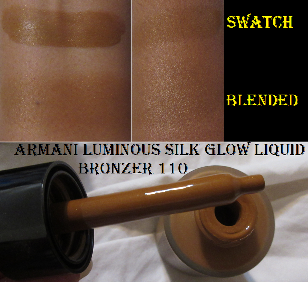
Sometimes this will randomly have a grey tone on my skin. I thought it was because I’d gotten darker, but I now am fairly certain it’s from the sunscreen in there if I forget to shake the bottle well enough before use. I also tend to pick up the excess product on the bore of the bottle with my Patrick Ta Contour Brush, which could have been improperly mixed if I pick it up from that spot instead of using the dropper.
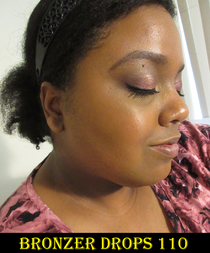
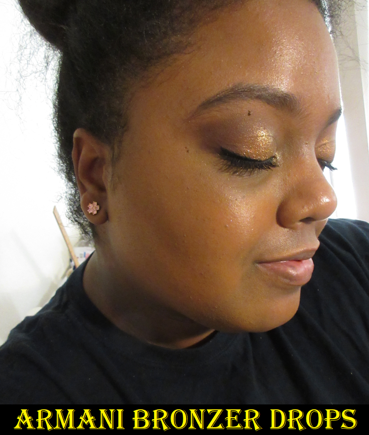
The photos in the rose print shirt were taken May 18th and the black shirt photo was taken July 25th.
This product sheers out a lot when blended, so I have to essentially pack it on for it to still show by the time I’m finished applying blush and highlighter. It looks quite beautiful on the skin and sinks right in like an oil, but it has dimethicone and other “cones” that account for that slip and it being so easily spreadable.
I expected a more glowy/dewy finish, but I think the brand was relying on some of the glow to come from the tiny gold micro shimmer. While the shimmer succeeds giving a pretty golden color to the face, it’s hard to see the shimmer unless you’re really close up to the skin. The sparkles are very obvious in direct light, so I’d rather it just not be there at all.
This formula lasts on my skin for a good portion of the day in most cases, and it dries down, but it isn’t transfer-proof. If I touch it, I see a lot of shimmer on my finger and a little bit of the base color. Setting it with powder changes nothing.
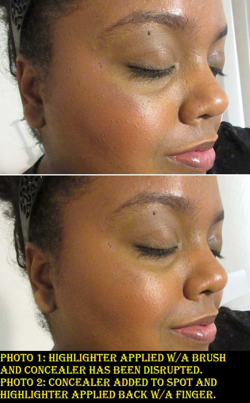
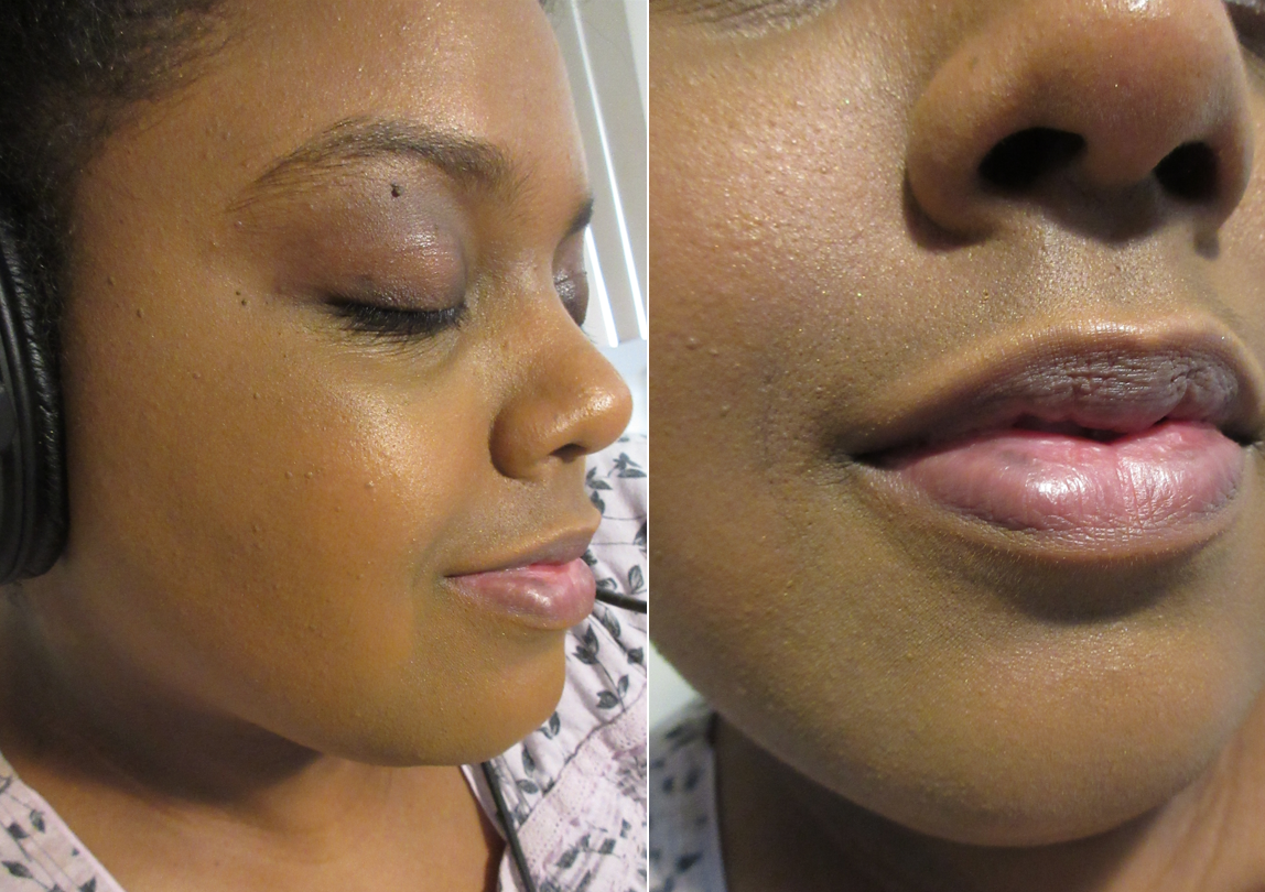
According to retail websites, this product “can be used all over the face for added warmth,” or mixed into moisturizer, sunscreen, or primer for a glowy base. I figured if it can be mixed into products and used all over the face, then surely it can be mixed into foundation. It looked so pretty at first, but then I looked closer and noticed all the tiny random sparkle particles all over my face. So, that was an absolute no-go. In the up close picture, there’s one right near the center of the underside of my nose, in the cheek area in and next to my pores (though camouflaged a little by the light illuminating my skin there), and a few diagonally between my nose and the deep smile line by my mouth.
I thought perhaps it would be possible to mix it into a foundation that’s too light in order to deepen it up slightly, but there’s so little pigment in this, that although it looked like it darkens at first, the moment it dries down, it basically returns to the same color it was originally, just slightly more warm-olive in tone. I tried to do this with a few other foundations and it didn’t matter. They all barely changed in color, even though I used a much bigger portion of bronzer than the single pump of foundation.
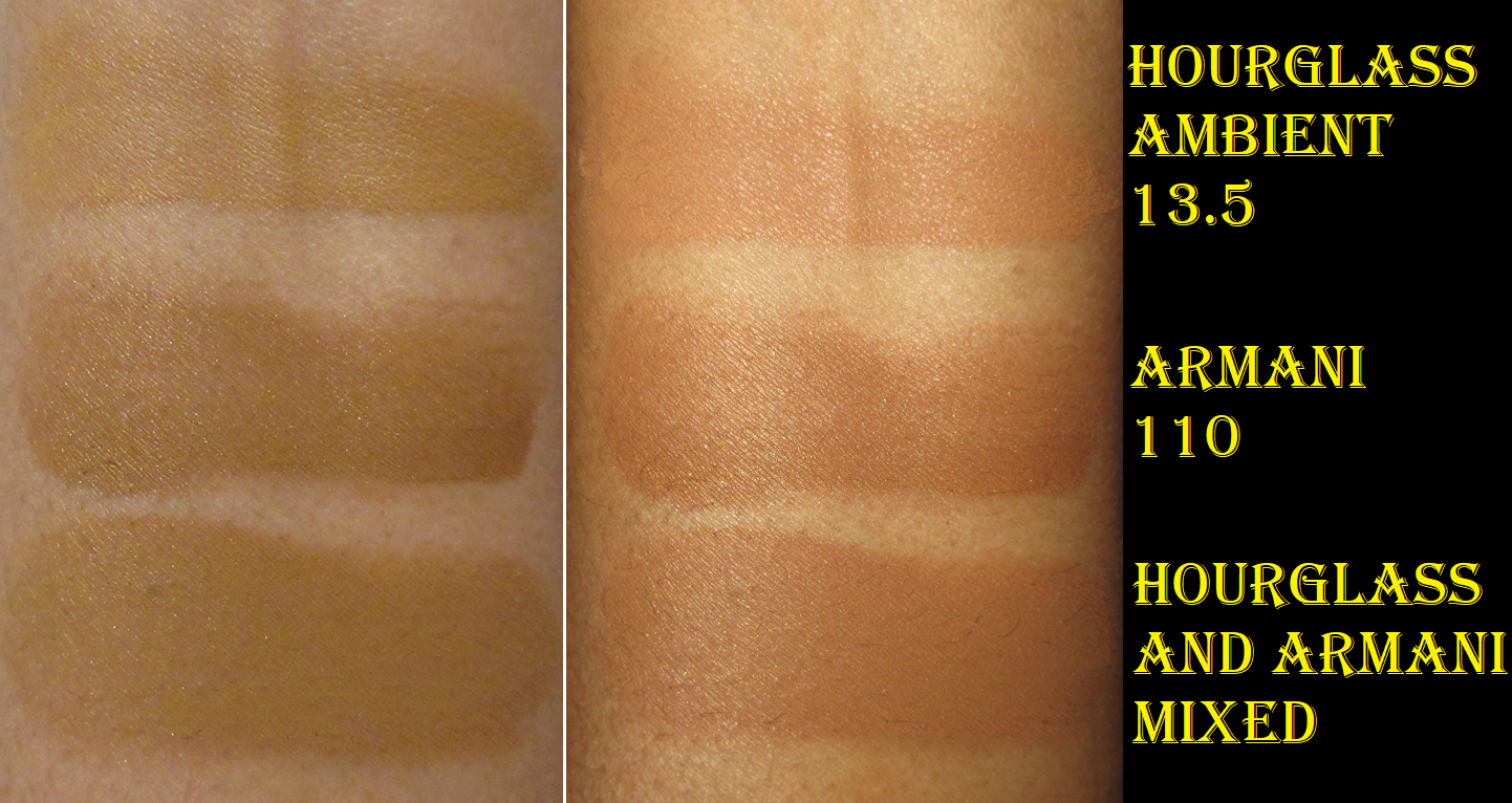
As a bronzer, I like this for minimal makeup days. For any other use, it just doesn’t work for me. Because it’s not very successful in living up to all the claims, and considering the price, this isn’t the Armani product I recommend to others.
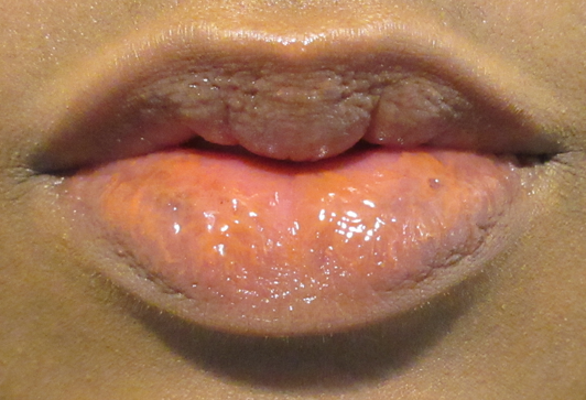
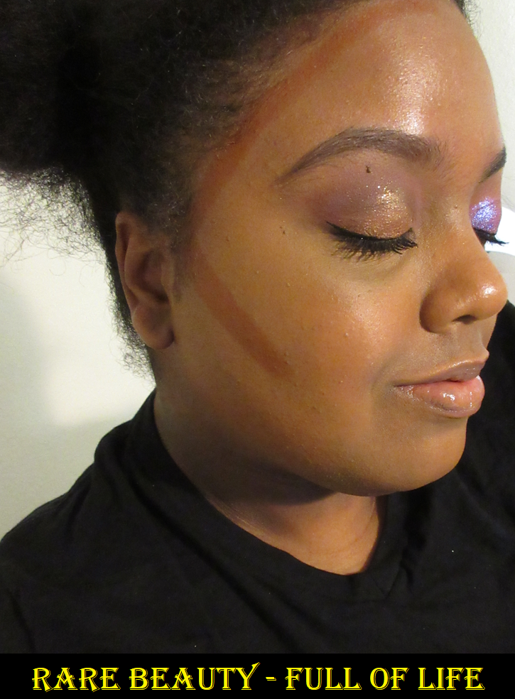
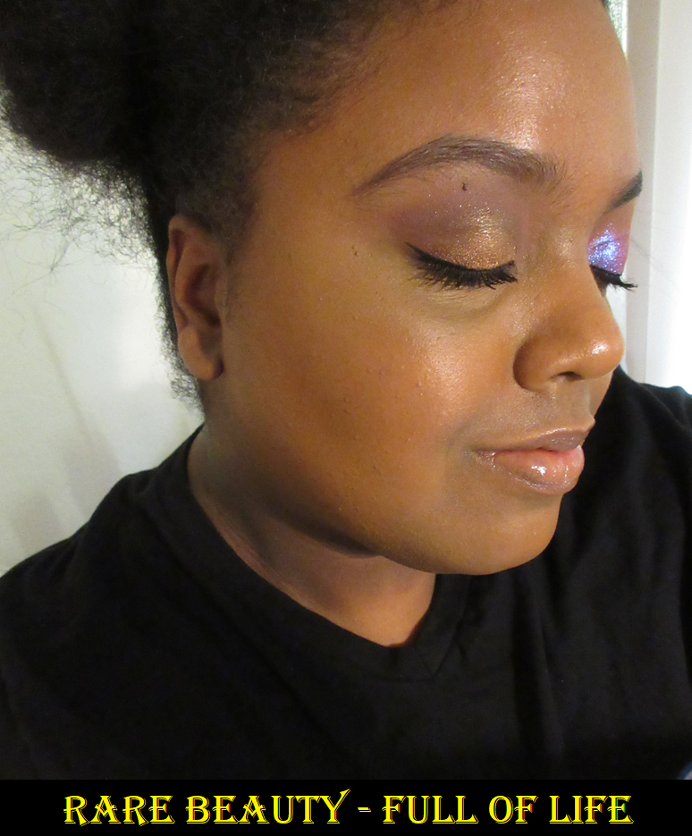
Rare Beauty Warm Wishes Effortless Bronzer Stick in Full of Life
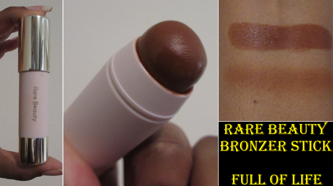
This is one of the most hyped up bronzers, but I usually hate stick products since they’re a firmer texture and tend to dry out faster than pot creams. It was a little easier to ignore the hype since the closest depth match for me was True Warmth, which looked way too red for my liking. After they extended the range and I saw Full of Life looking a lot more neutral by comparison and described as “deep bronze with golden undertones,” I bought it without hesitation. Imagine my surprise when I saw how warm this one was too! However, when I blend it out, it somehow matches me so well and I can easily get it to look even more natural and subtle when I use less than the amount pictured below. Unlike many stick products I’ve used in the past, this one isn’t stiff and practically melts as I glide it along my face. I typically draw a stroke that’s the length of my ear and blend that out dragging it slightly lower under my cheekbone. I also draw from the center of my forehead to about where my brow tail is and blend the rest of it out and connect it to the rest by the ear. I add a little more after blending if needed and it doesn’t disturb my makeup underneath. If I want it to last on my skin, I have to apply it a little more generously since my skin likes to absorb some of it. It makes me very happy though that even though the formula feels creamy, it fully sets on my skin and I don’t get an imprint on my finger when I touch it. This looks so natural, and I finish bronzing so quickly, that I now understand the hype. It’s well deserved. If my year late low-buy series has taught me anything though, it’s that cream products could take six or more months to start behaving differently, like a film forming on top or it drying out. So, I am curious to see if this continues to perform well as time goes on.
Milk Makeup Matte Bronzer Cream Stick in Blitzed
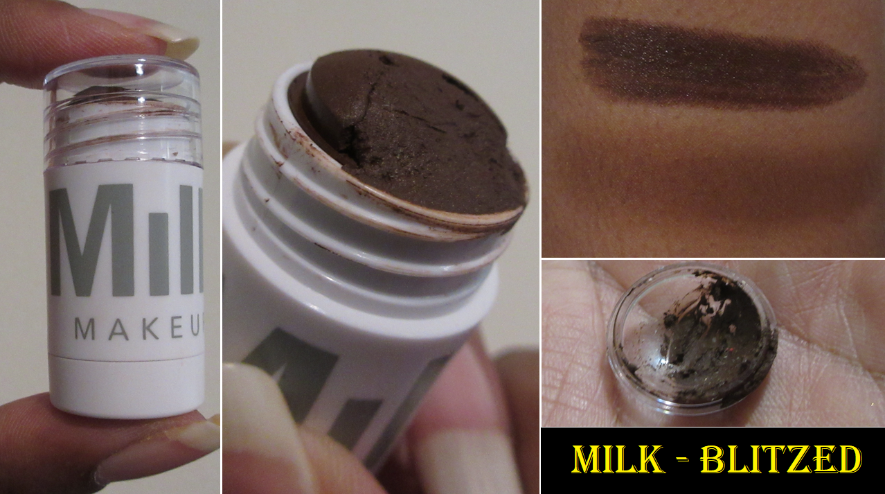
After unscrewing the cap, be careful removing the plastic dome off the stick portion. I saw a lot of creators break theirs in their videos, so I was trying to be careful removing mine, but a chunk still broke off since it was stuck too tightly to the plastic.
I had a feeling Blitzed would be too deep for me, but I wasn’t sure if Blaze would be too light. I can get Blitzed to work if I blend it out very well, and the amount used in the photo is about what I use per side, though maybe a little less in the cheekbone portion to start off with. It can easily get out of hand if I’m not careful.
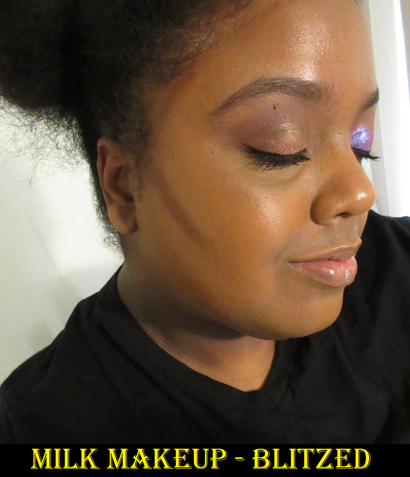
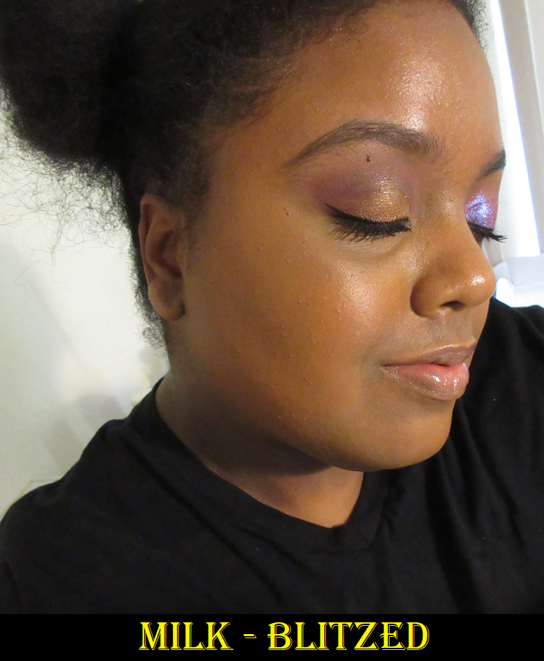
This bronzer is the perfect example of the type of stick products I don’t like since it’s stiff, doesn’t blend as easily as traditional creams, and can be a little patchy looking at times. I like that it’s more of a neutral color by comparison to my shade from Rare Beauty, but I’m just not a fan of this formula.
Also, it’s a bit funny that I avoided buying this bronzer when the full-size used to be 1 oz / 28 g because I knew I’d never use it up and didn’t want it to go to waste. Then, they came out with minis that I believe were either $18 or $20 for 0.19 oz / 5.7g but they did not have my shade. Then when Blaze was available as a mini, I still felt the price per grams were so bad by comparison that I wanted to wait for a sale. Instead, I got the surprise that Milk decided to make the previous mini-size the new full-size, yet they did not adjust the price. It’s now $24 for 0.19 ounces. I don’t mind having less product, but to pass the cost onto the customer and not adjust the price accordingly for getting less product isn’t very cool in my books. Especially since Blitzed was released this year and only ever released in this tinier size.
I waited years for a better price, so I figured I may as well keep waiting. Then there eventually came an opportune time to get it during a SpaceNK sale.
This was like THE bronzer stick before Rare Beauty came along. This was people’s holy grail bronzer for years, but considering the texture and the way it blends, I don’t see why. It has slightly more lasting power since the thicker and less emollient consistency keeps it from sliding off or moving, the way other cream bronzers can, though I don’t have this problem with Rare Beauty either.
The Better Butter Bronzer?
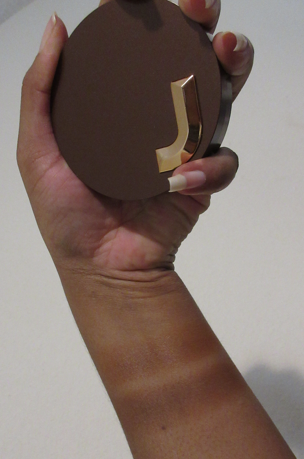
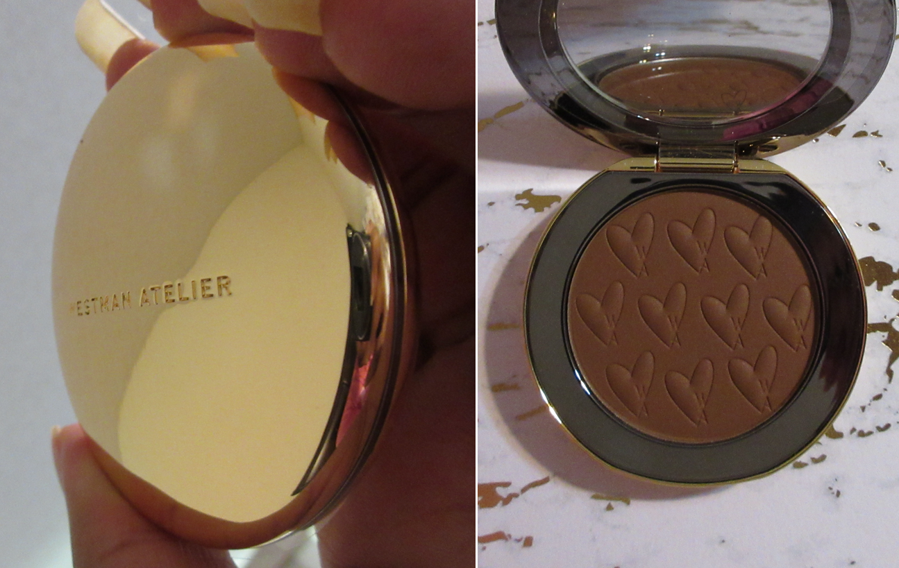
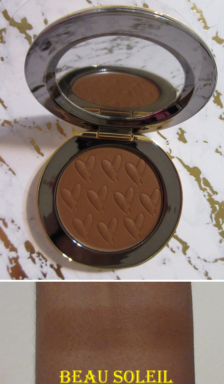
Westman Atelier Beauty Butter Powder Bronzer in Beau Soleil
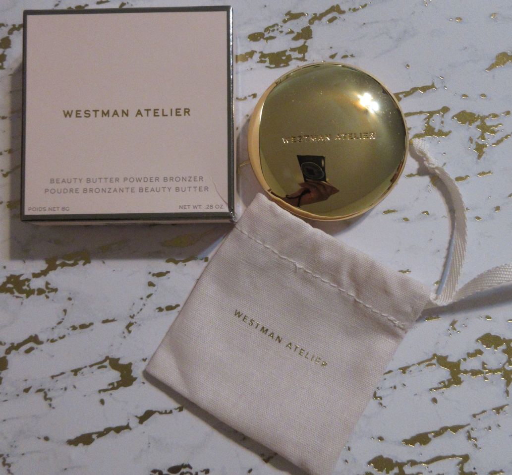
Even though I purchased this during a Credo Beauty sale, it’s still the most expensive single bronzer in my collection (since the Hermes Bronzer was only the refill). I heard great things about the formula, but I was never interested until they added this deeper shade to the line.
The bronzer is small, but its packaging is so heavy! Between the weighted metal, shiny gold surface, and the dust pouch it came with, it feels very luxurious. I also like the cute heart pattern with the “W A” representing the brand’s initials on the product surface.
Beau Soleil is definitely not as deep or neutral as it looks in photos. It’s also not heavily pigmented, so I still have to build it up. I like the color, but it’s unfortunate that they don’t have a rich shade available for those with skin tones darker than mine. In fact, it’s a little difficult to see in my photos, but it’s at least present (still subtle) in person. I believe the original two bronzers launched over two years ago. I’m glad we got this one this year, but I hope there will be another shade expansion sooner than that.
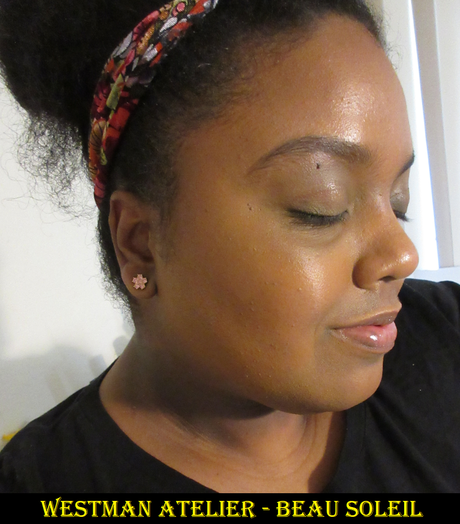
The photo on the right was digitally adjusted to improve the color accuracy.
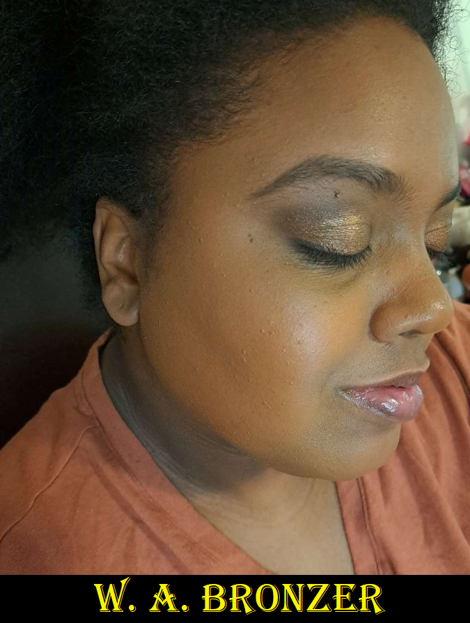
The texture is buttery, as the name implies, and smooth. Of course, because of the name I couldn’t help but think about the famous Physician’s Formula Butter Bronzer. I disliked that one immensely because it was overly shimmery for my taste, which is a shame since it had a nice texture. The Westman Atelier bronzer is actually matte. It has a sheen that isn’t in a shimmery way, but in a moisturized way. The best way I can describe the look is like when the skin’s natural oils show the tiniest sign of coming through a powdered face. It isn’t to the level of being glowy or shiny, but resembles slightly moisturized skin. Another way to describe it is the look of skin after spraying one’s face with MAC Fix+ once it dries back down. The bronzer looks great when I use my medium density brushes, but if I try to use something that’s lightly packed it can look uneven. Due to the nature of it having this texture, the pigment packs more heavily in some places if the brush bristles aren’t strong enough to move it smoothly across the skin efficiently enough. But all it takes is more time buffing, a slightly denser brush, or a more resilient bristle to smooth it out.
This product is up there with some of my more enjoyable bronzers like Nars, Mented, and Pat Mcgrath. I definitely think it’s good, but the bigger selling point is the packaging. If this bronzer was in MAC packaging instead, I’d have said this is way overpriced. However, I bought this specifically during a time when I wanted something that was undeniably in the luxury category with a formula that was at least “good.” So, I’m satisfied with what I got.
Reformulated or Just Repackaged?
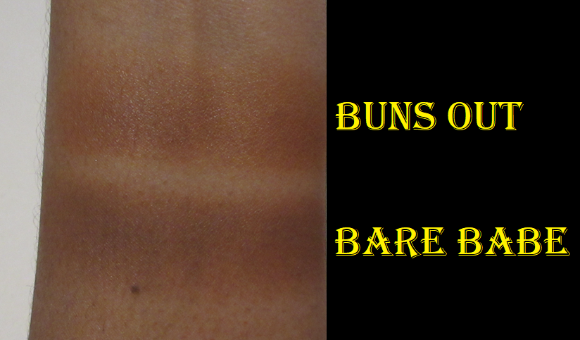
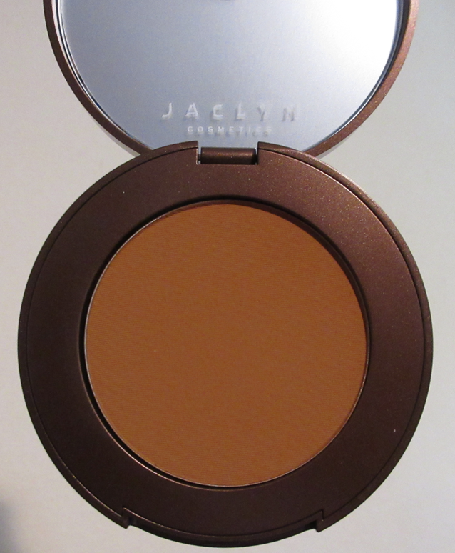
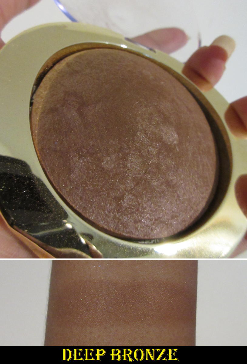
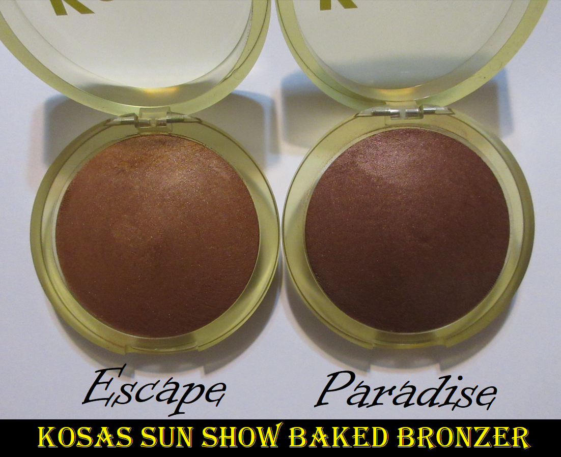
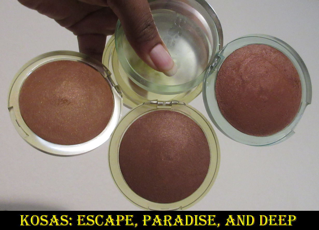
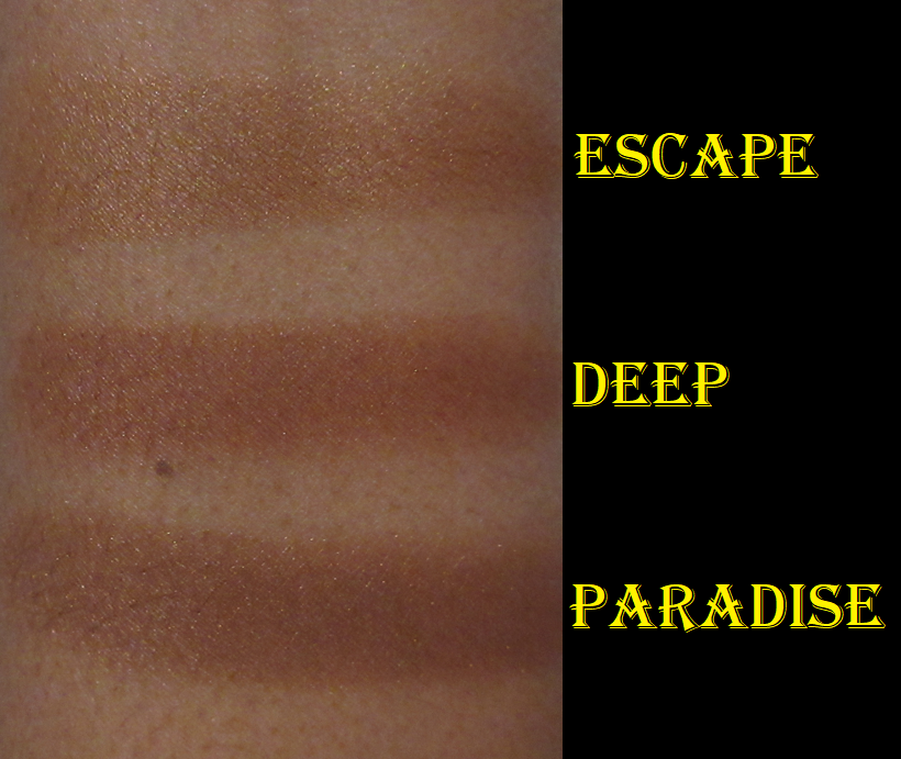
Kosas Sun Show Baked Bronzer in Escape and Paradise
The original Kosas bronzer was in my top 3 favorite formulas for many years, only recently dropping slightly lower because the shade became too dark for my liking, it had a smell that couldn’t be ignored, and the reputation keeps growing about the brand’s products going bad quickly (which made me question whether mine was still safe to use). Until recently, this bronzer was my #1 favorite in the shimmer finish category.
The brand posted on the product page, “new packaging…same formula,” but I believe there is something off about the shimmer. Every time I’ve compared the new ones to my old one, the new ones look like there’s way more shimmer and reflects more strongly. Escape and Paradise look borderline metallic in direct light. Perhaps it’s just something to do with the shimmer color with Deep and its orange base tone compared to the golden tone of Escape or the red tone of Paradise, but the bottom line is that I don’t like the finish of the new ones at all compared to the old one. It’s too much for me. It sounds wild to say considering I’m in my glowy cheek era for blushes, but I’m not usually a fan of metallic blushes either.
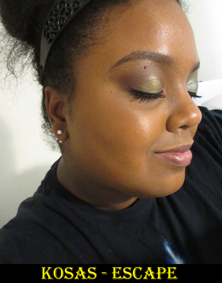
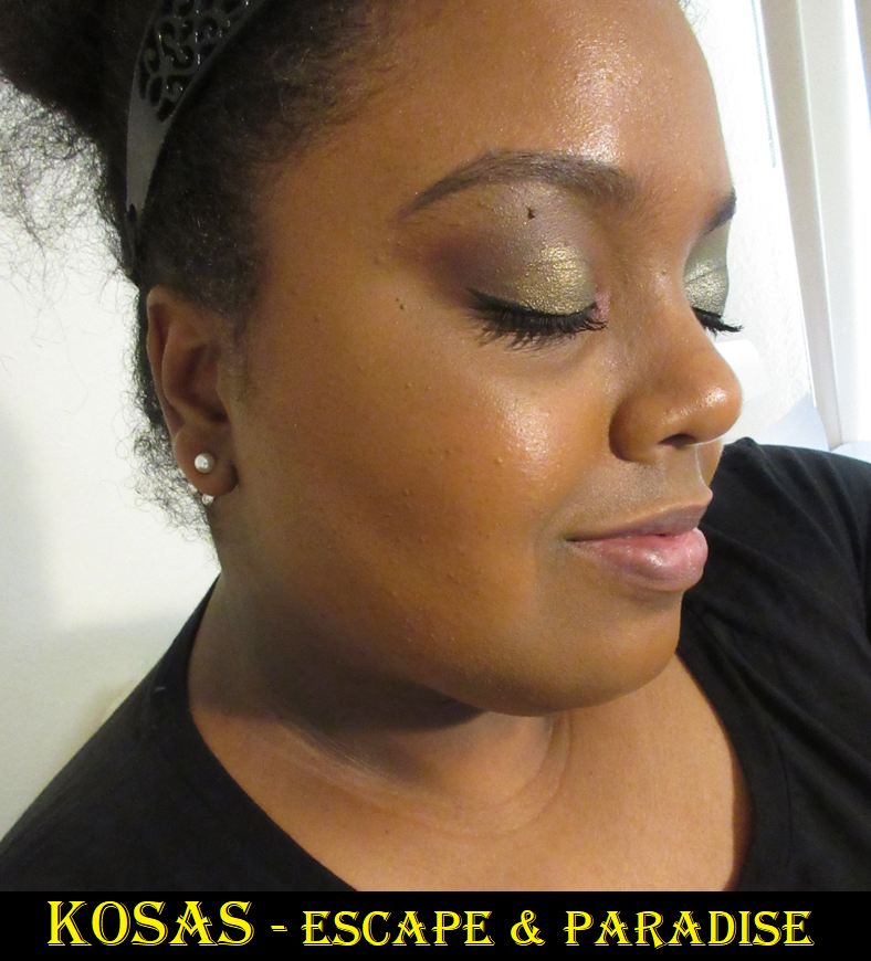
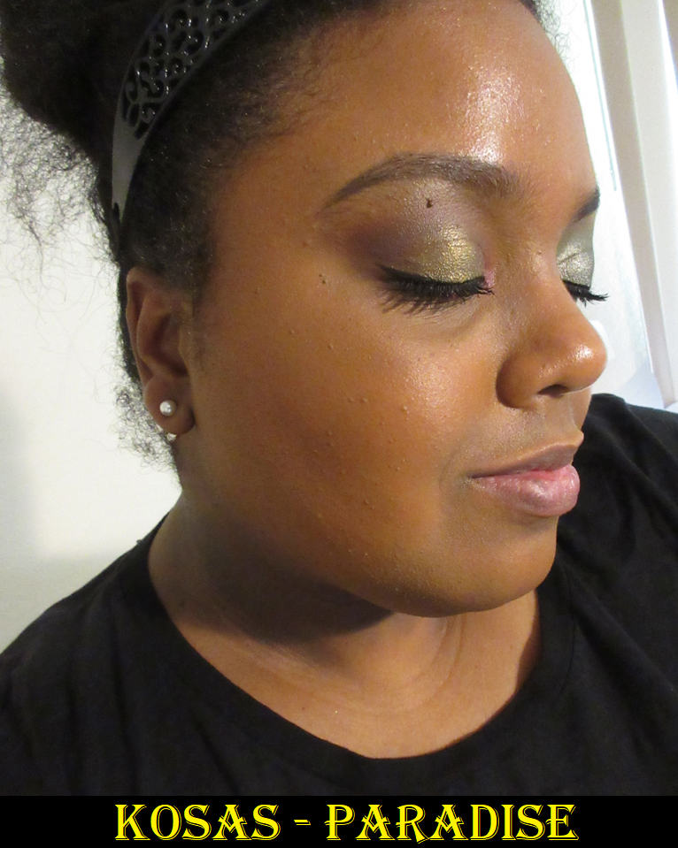
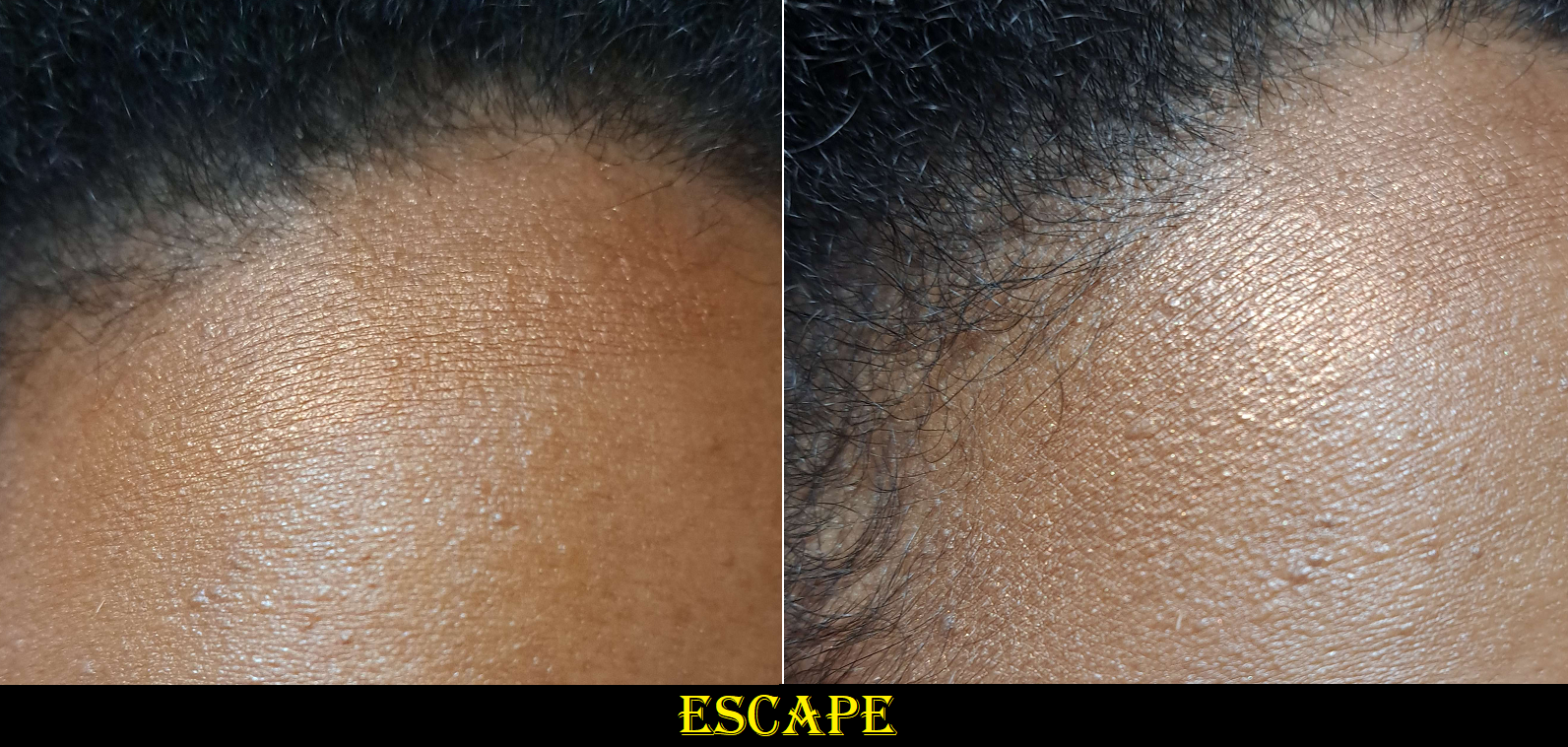
One of the other unfortunate things is that I’ve been wishing for Kosas to expand the line and make something slightly lighter than Deep, which was previously their darkest one. I was thrilled to see they added an even darker bronzer called Tropic and hoped that meant Paradise would be slightly lighter than Deep, but it’s slightly darker instead and in a less flattering undertone for me. Escape is less than a half shade darker than me and basically worked to add a golden glow, but not actually bronze me. However, it does seem to have gotten a little more orange several months after purchasing. My solution in the beginning was mixing the two new shades together, so I can’t say that didn’t effect the color Escape turned into now. Even though I have a workable color, the shine is a bit offputting. I spend quite a bit of time buffing the product in to try and get some of that shimmer off my face. At this point, I don’t know if I kept them because I genuinely liked them enough to not be worth returning, or if it’s the nostalgia and my desire to find a worthy replacement for Deep. It’s such a shame because the formula of the original truly is fantastic, beautiful, and I couldn’t recommend it enough to those who could get past the frying oil smell. The new ones don’t smell of it as strongly, but I can definitely still detect it. Perhaps it’s the Meadowfoam Seed Oil and/or Hydrogenated Vegetable Oil which are listed as the second and third ingredients.
So, after all this, Deep is still the best shade for me, but I can’t trust using it anymore because it’s so old and the brand doesn’t seem to like preservatives. So, I will make do with the two new ones for now. This could be something to take a chance on for those that love a super glowy bronzer, baked formulas, and “clean” makeup. It performs the same as the old one, which was so blendable and smooth. However, my personal disappointment keeps me from being able to recommend it.
BONUS REVIEWS
When it comes to the Vieve and Victoria Beckham duos, I forgot to include them in my previous bronzer ranking because they were in my face palette drawer and I also hadn’t decided which one I liked more. So, even though they aren’t 2023 releases, I thought I should try to include them in the bonus section. Also, kudos to both brands for making their duos refillable/replacable.
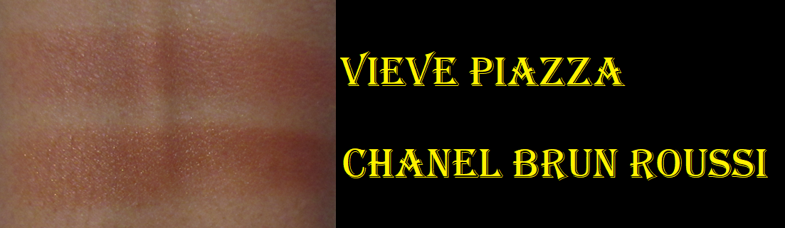
Vieve Modern Bronzer Duo in Deep
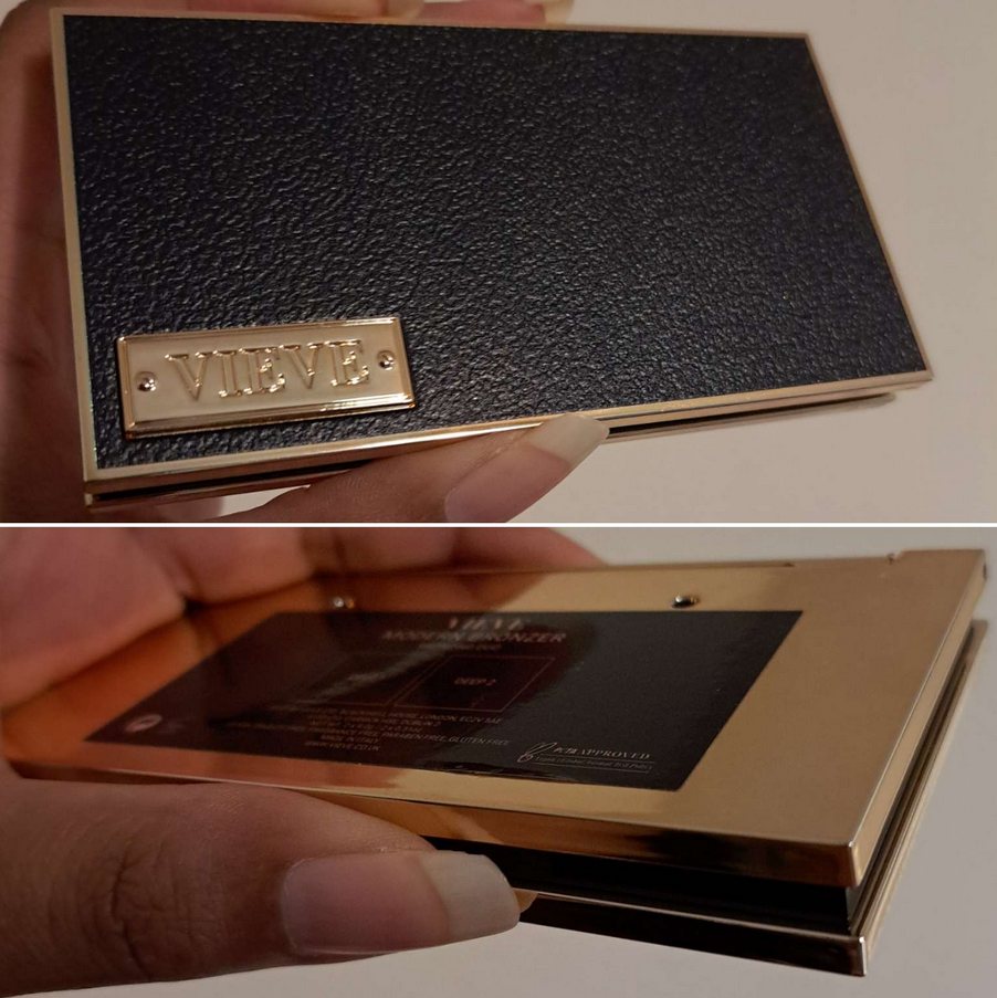
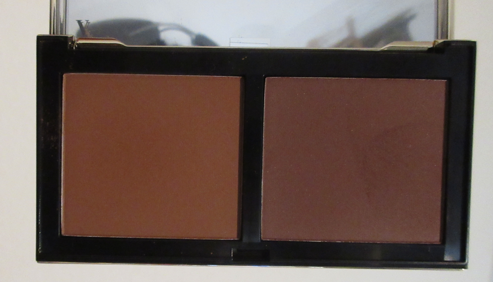
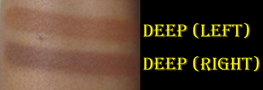
The left powder is intended to add warmth, while the right powder is for sculpting. The latter is a bit too deep, so I use the lighter shade in the duo almost exclusively. That one is my kind of color, though a little bit strong on the orange tone. The performance and texture reminds me of Charlotte’s bronzer, but not quite to that level of looking airbrushed. This is a buildable formula that I was surprised to see described as “satin” on the website, but I can agree it has a natural finish. I’m very pleased with this duo, but longevity is the only issue. If I’m wearing a dewy foundation or my skin has been properly primed and moisturized, the bronzer lasts. Sometimes it sticks a little too well and requires more blending time. Conversely, if my skin is on the dry side, it doesn’t cling to my skin as well and will come off in spots at some point in the day. This normally isn’t a problem for me except on minimal makeup days where I tend to skip a lot more steps in my routine.
I also have to note that I’m impressed with the packaging. It’s a lightweight plastic, but it still looks like an upgrade compared to the cardboard blush compacts. The extra bits of gold color on the back side and around the edges of the duo really help to elevate the packaging. However, I’m guessing the reason the blush compacts aren’t plastic is because they’re not refillable, unlike the powder bronzers.
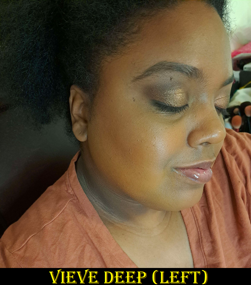
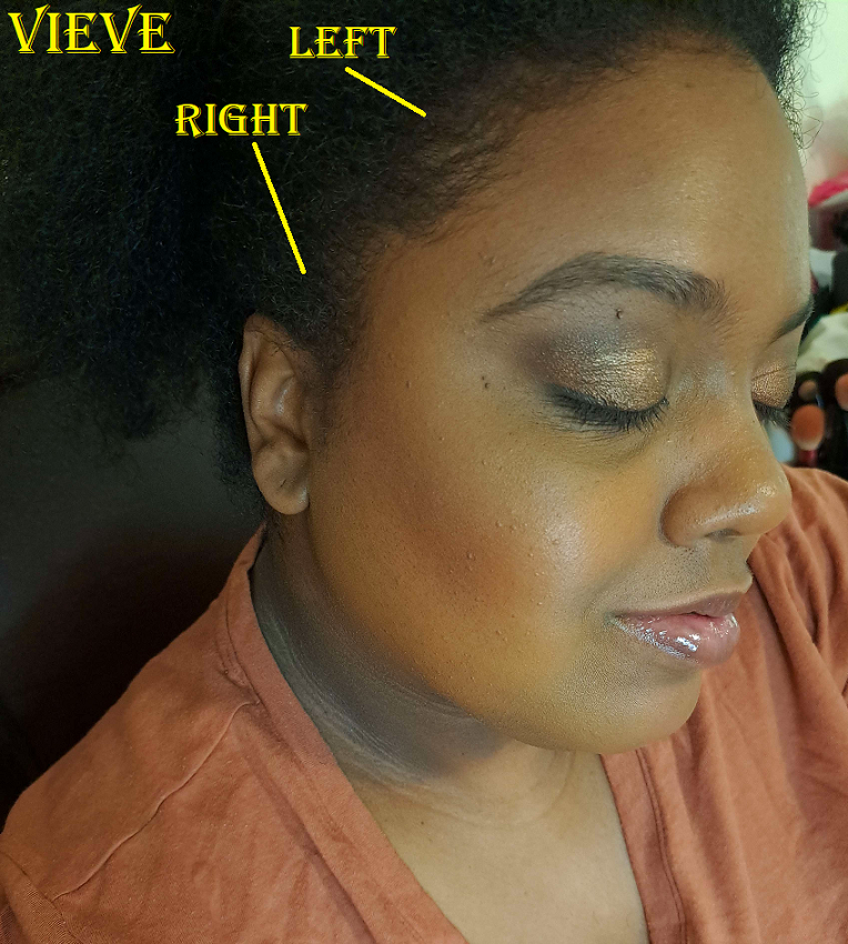
In the photo with both sides listed, I started to rub away the lighter one before I thought about how I could probably leave it there for comparison purposes. So, I labeled it mainly to indicate that what’s lingering is the Vieve bronzer on the left side of the duo and I did not apply the right one to both spots. The demonstration under the cheekbone was applied with the amount picked from a single tap into the powder with a brush and blended out a lot, which still looked dramatic enough to feel it wasn’t necessary to apply it to my forehead too.
A month or so ago, Vieve released cream bronzers. I’m curious about them, but I recently put myself on a cream product no-buy, so I guess I won’t be finding out what they’re like for a very long time.
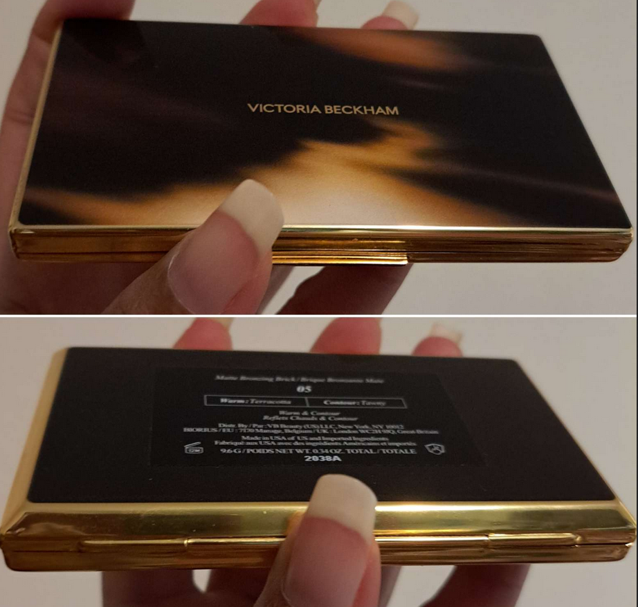
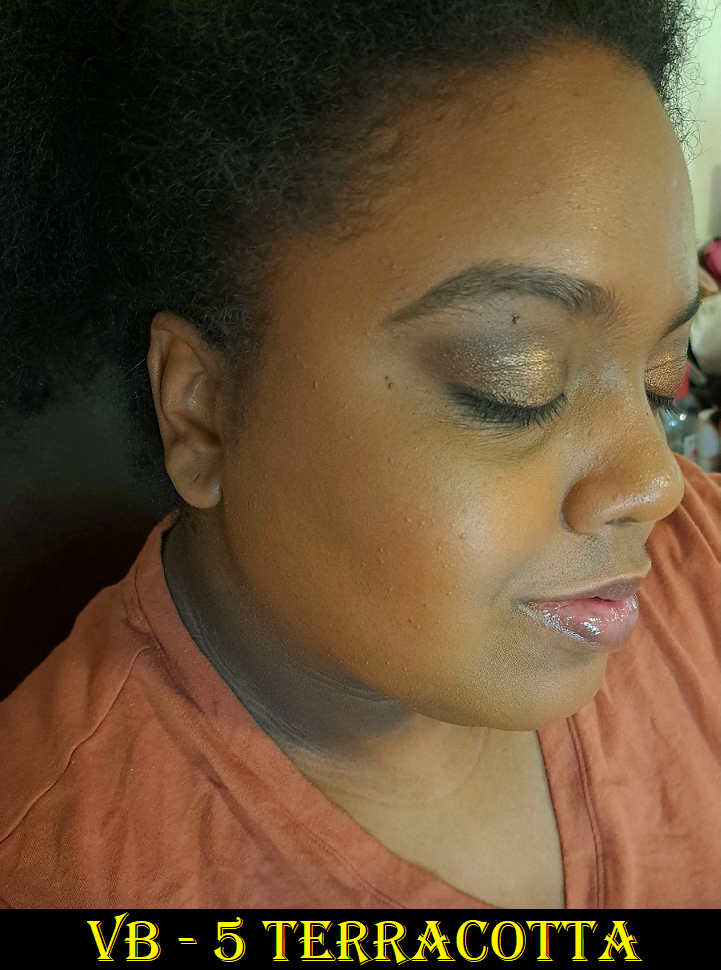
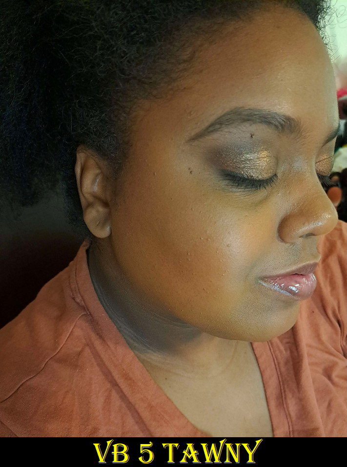
Victoria Beckham Matte Bronzing Brick in 05
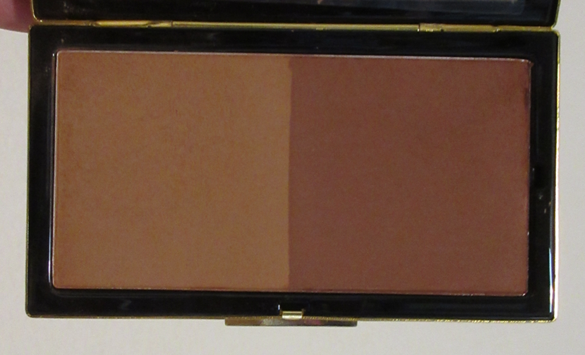
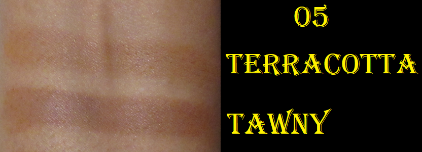
I couldn’t figure out whether I should get 04 or 05, but I’m glad I chose the darkest one because this isn’t as deep as I anticipated. The lighter shade is a bit subtle for me and the darker one is a bit too red (even though that’s supposed to be the sculpting shade). So, once again, I end up mixing them both together to create a golden-orange color. And it ends up looking quite similar to the lighter shade from Vieve’s Deep duo.
Full disclosure is that I bought this from a third party seller in new/unused condition, so technically I can’t verify the authenticity of the product. I strongly believe it is authentic though based on how weighty the packaging is, the product performance, and all labeling including the box it came in, all compared to photos I’ve seen online. I am super impressed with the compact and it being as lux as I’ve heard described by others. This bronzer is similar to Vieve’s but the powder feels a little more fine, and it also gives me no issues blending or with longevity regardless of the condition of my skin. It’s the closest comparison I’ve found to Charlotte Tilbury’s powder bronzer with how airbrushed it looks on the face, the way it gets picked up with my brushes, and the texture of the powder. My one complaint is that certain spots look like hard-pan is starting to form. I assume it’s from the increased frequency that I’m using oil based products as primer. So, I wonder if people with oily skin will have a problem with hard-pan after extended use.
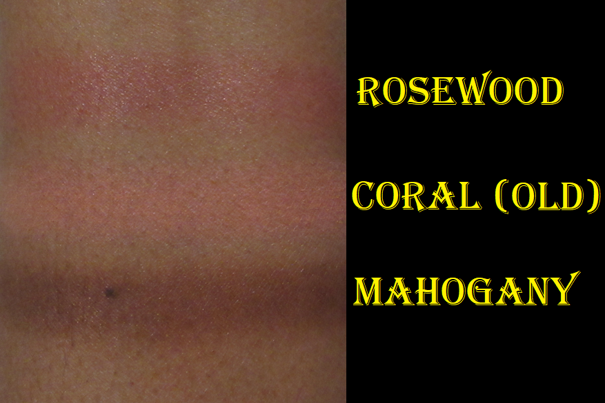
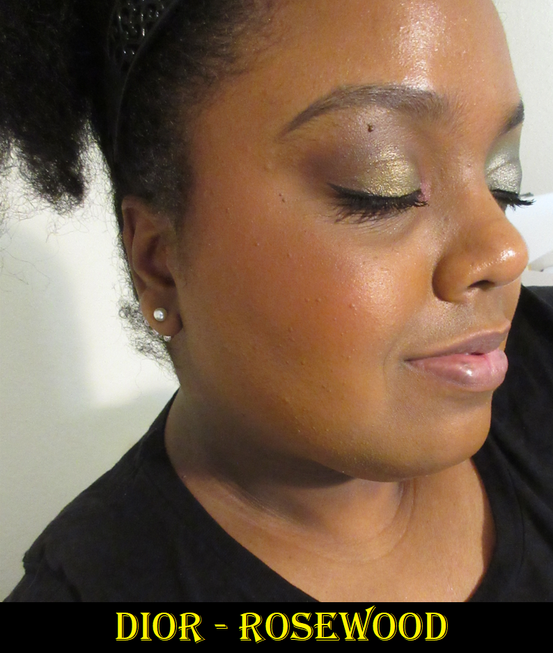
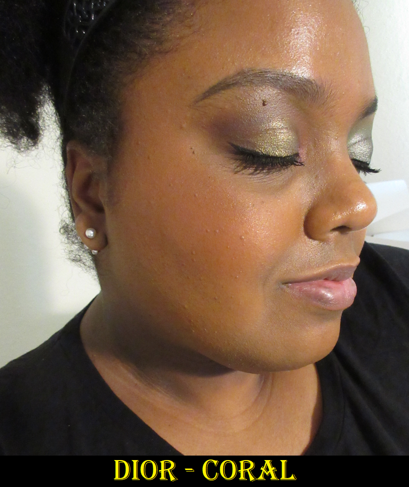
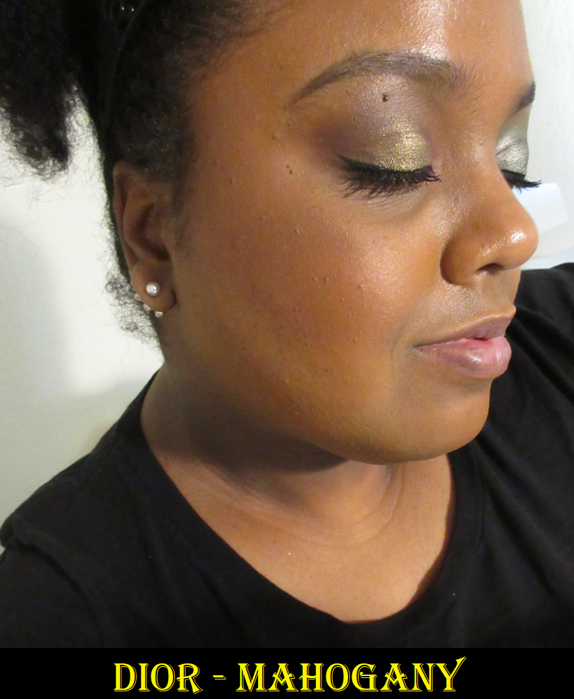
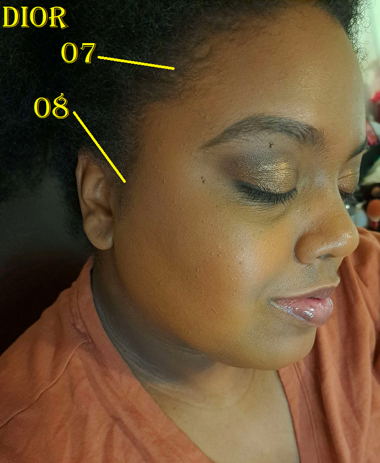
Dior Forever Natural Bronzer in 07 and 08
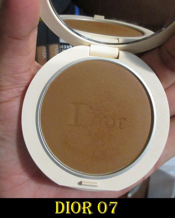
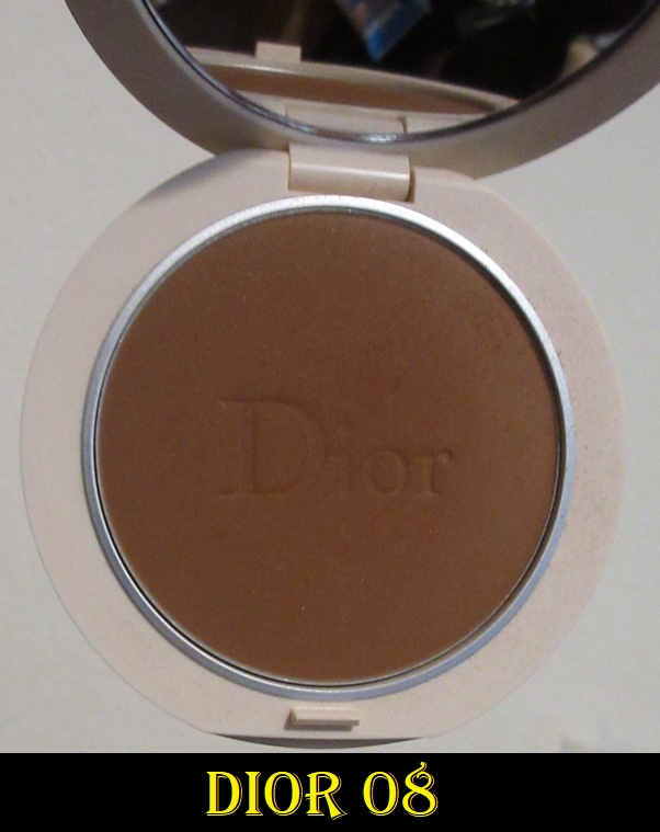
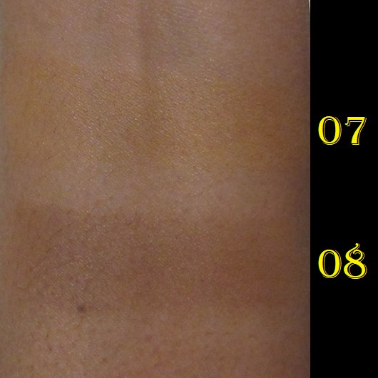
I put this in the bonus section because I got these from a third party seller and had no intention of reviewing them until I realized how high they ranked among my collection, and that I should share this information. Even though these aren’t new, a few shades from the line were re-released in new limited edition packaging this year. I preferred the look of the original quilt pattern ones and it occurred to me that Dior might reformulate them as they have for nearly everything else that’s a permanent product. So, I tried to get them while I had the chance, even though I was still uncertain if 07 was going to be too light and 08 too dark. As expected, 07 is so close to my skin tone that I could literally (and have a few times) use this as an all-over face powder. It matches my undertone so well, it’s a shame there isn’t an in-between shade that’s this color but just a shade or two deeper. As for 08, it’s darker than I prefer, but I just have to use it sparingly. It’s also a neutral color, which I don’t mind if I want to look like I got darker from the sun, but I don’t look bronzed without that warm undertone. It has a slight sculpting effect, so I like to use it almost the same way as Nars, but in reverse because 07 isn’t pigmented enough to lighten up 08 if 08 is underneath. I apply a liberal layer of 07 first and then a sheer amount of 08 so that I get the benefits of slightly deepening what I laid already down. This creates a pretty shading effect on the face.
This bronzer reminds me of the Nars ones, but even softer. I really like it, but not enough to pay full price. If I couldn’t have gotten it elsewhere and had to choose between Nars and Dior, I would feel Nars is more worth the price. The Dior bronzer comes in what I consider to be a cuter compact, but I’d rather pay a little more and just get Charlotte’s bronzer instead.
RANKING AMONG THE BRONZERS IN THIS POST
- Hermès Plein Air Mineral Powder
- Victoria Beckham Matte Bronzing Brick
- Rare Beauty Bronzer Stick
- Vieve Modern Bronzer Duo
- Dior Forever Natural Bronzer
- Westman Atelier Butter Powder Bronzer
- Nars Laguna Talc-Free Bronzing Powders
- Pat Mcgrath Divine Powder Bronzers
- MAC Sunstruck Bronzer (Matte)
- Armani Luminous Silk Bronzer Drops
- MAC Sunstruck Bronzer (Radiant)
- Kosas Baked Bronzer (Yellow Packaging)
- Milk Makeup Matte Bronzer Stick
Although I feel it’s too soon for me to rank these with the rest of my collection, I can at least say with certainty that my first three here would make the top 10, knocking Nabla, Mented, and Covergirl lower. Four through eight here could potentially knock those three even lower.
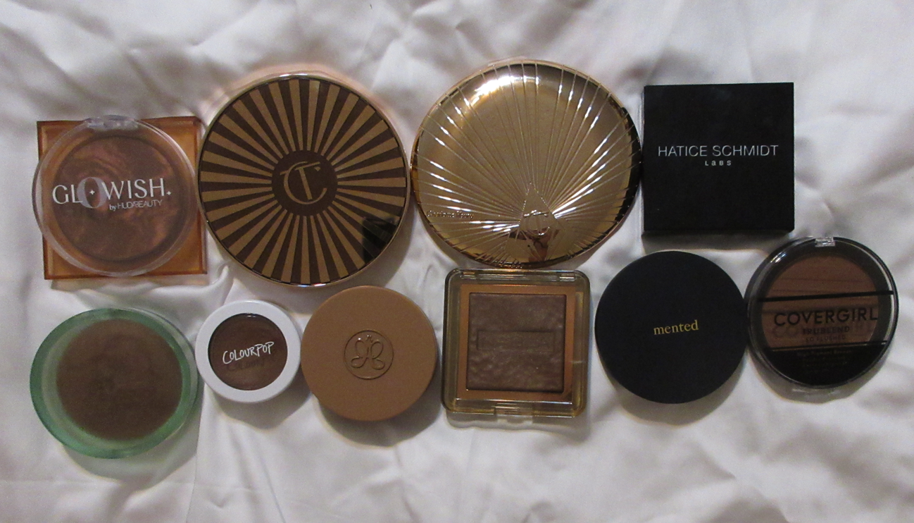
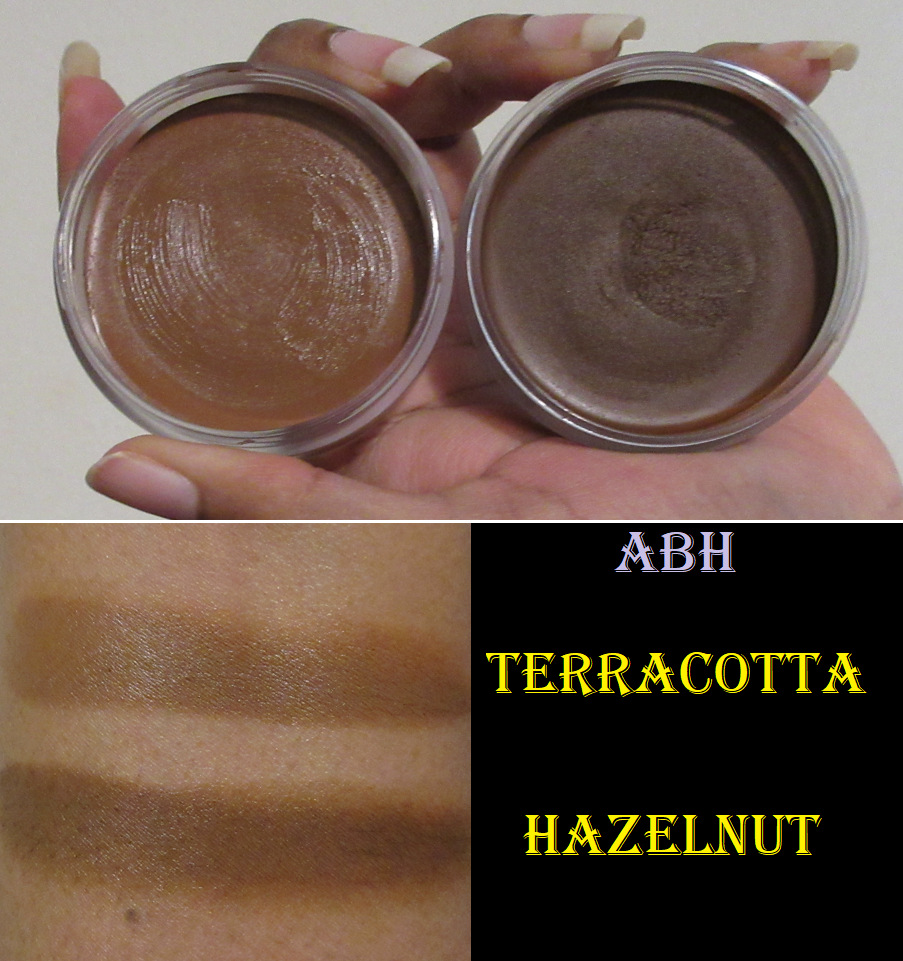
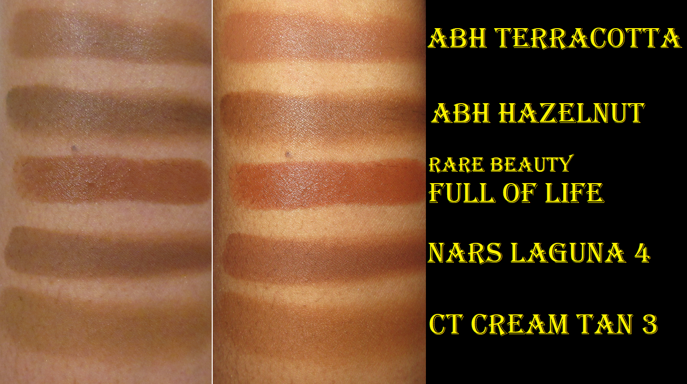
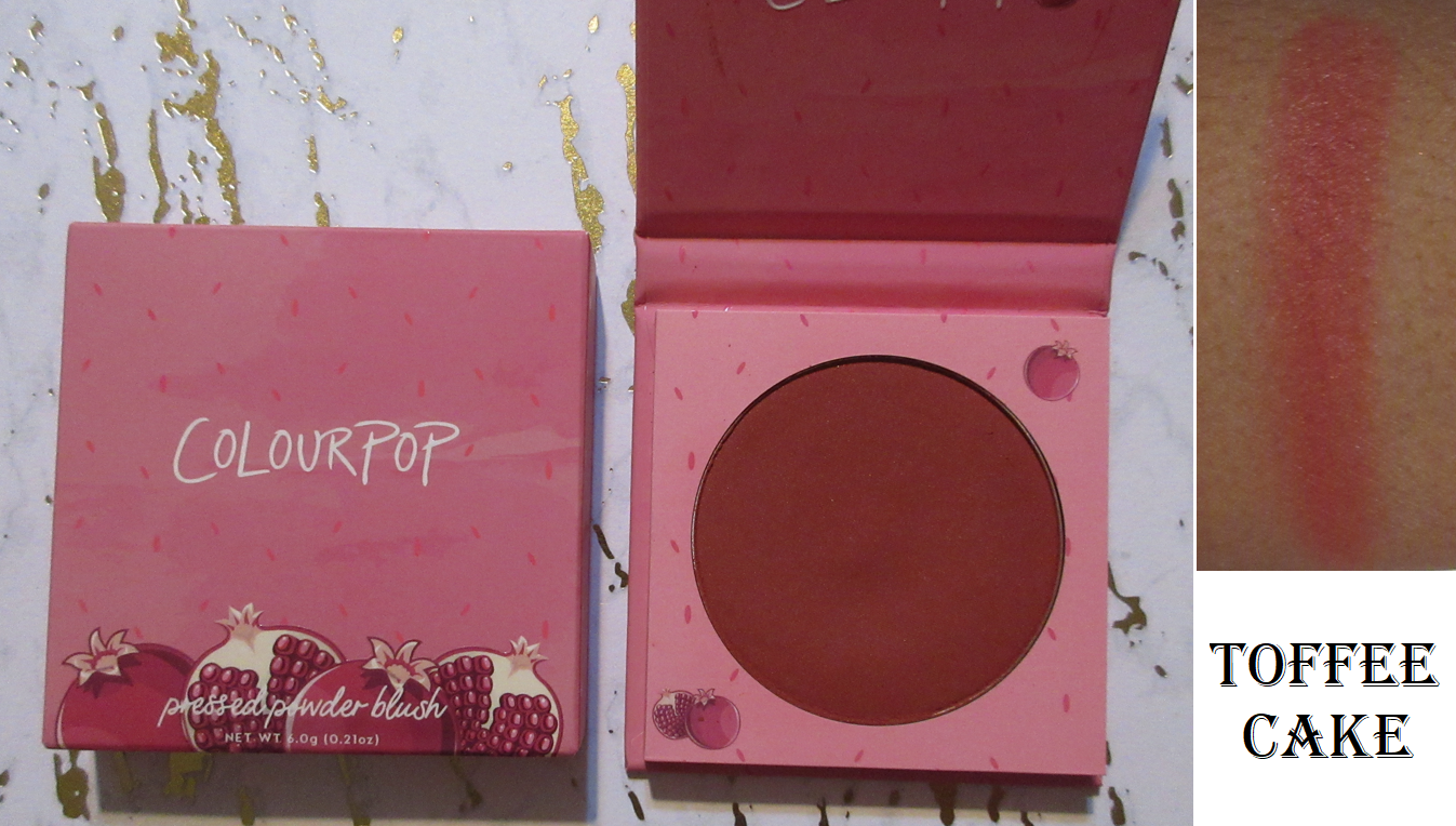
It’s easy to say the Hermes is my top “standard” powder formula, GloWish is the top with a sheen (performs like a baked gelee but I have no idea what it technically is), and Charlotte makes my top cream formula. However, deciding between the three where they rank is too difficult to say with full confidence. The one from Victoria Beckham comes just after Charlotte’s Powder bronzer, (so basically fifth place). I mentioned in last week’s post that Colourpop’s bronzer would drop lower since it started to perform differently at the one year mark of opening it. I still don’t know what place that put’s Colourpop now, but I know that ABH’s cream bronzer moved above it. Between ABH and the Rare Beauty Stick, I cannot make a decision without seeing how Rare Beauty performs in the long term of at least one year too.
So, that is everything! While it’s true I technically have more bronzers in my collection if one counts my face palettes too, I just don’t use the bronzers in there enough for it to be fair to include them. The only ones I can think of that could significantly shake up this list is the Hourglass Ambient Lighting Finishing Powder I use as bronzer (Transcendent Light) and the Captivate bronzer from Sephora’s Microsmooth Multi-Tasking Baked Face Palette. Those two would be somewhere between 15-25, but that’s as far as I could narrow it down.
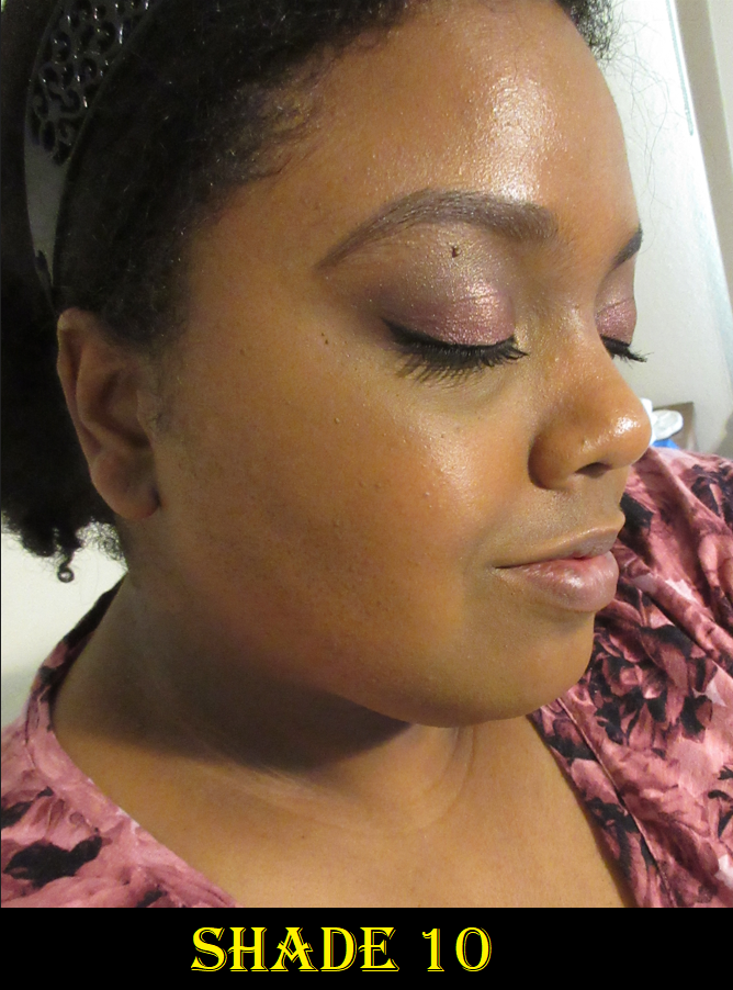
Thank you for reading! Again, apologies for needing to switch now to my cell phone camera. I’m still trying to figure out the settings, color, and lighting.
-Lili ❤