As a lover of mythology, and of course makeup, I’ve been drawn to this company from the moment I heard about it. When the Swedish brand first established themselves, they stated, “Oden’s Eye is inspired by ancient Nordic mythology, and our products and collections will also be built around this theme.” Their initial collections were very light and whimsical with eyeshadow palettes that reflected a too-light color story for my taste. I was so happy to see the release of the Norn’s Collection in their most beautiful palette artwork to date and color stories that have a better range of light, medium, and deep tones. I decided this was the time to place my first order. And second. And third. Then they released Mystery Boxes. I intended for this post to come out in March, but each new order required that I push this back to do further testing, reviewing, and rewriting. Now, it’s finally complete!
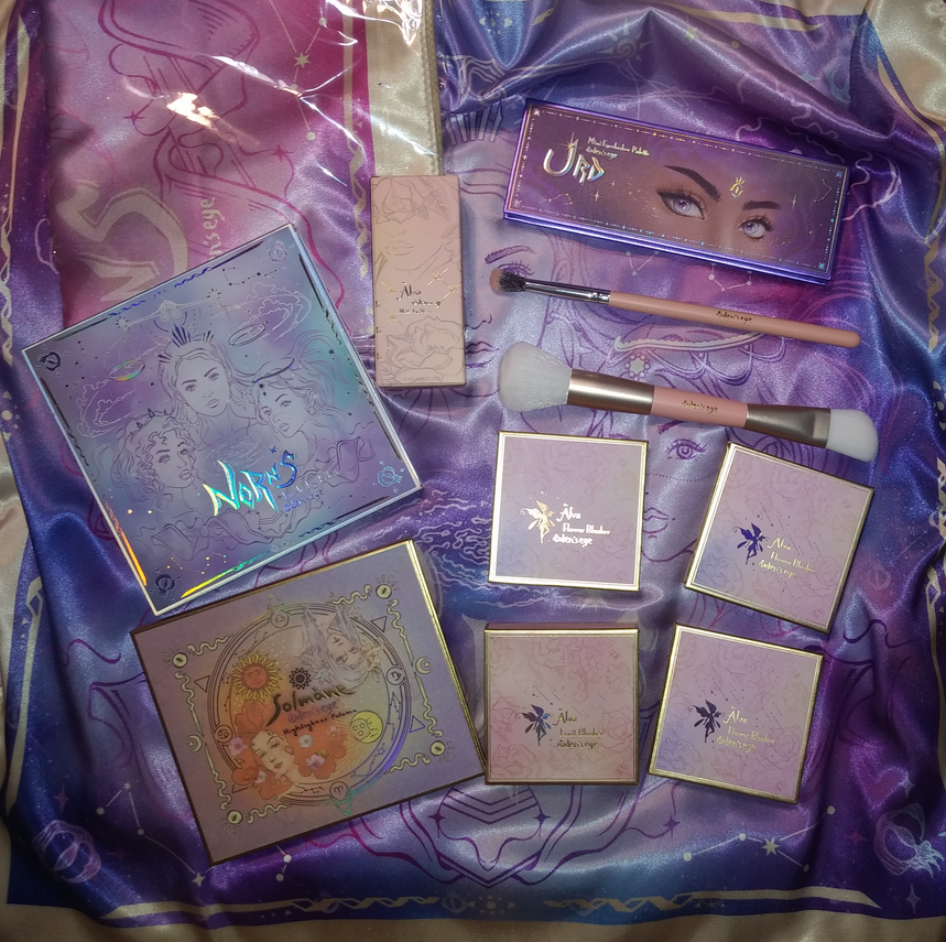
Before I get to the few products I bought out of the Norn’s Collection, I will start with their older products in my possession.
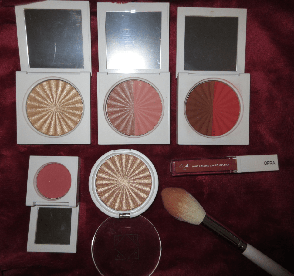
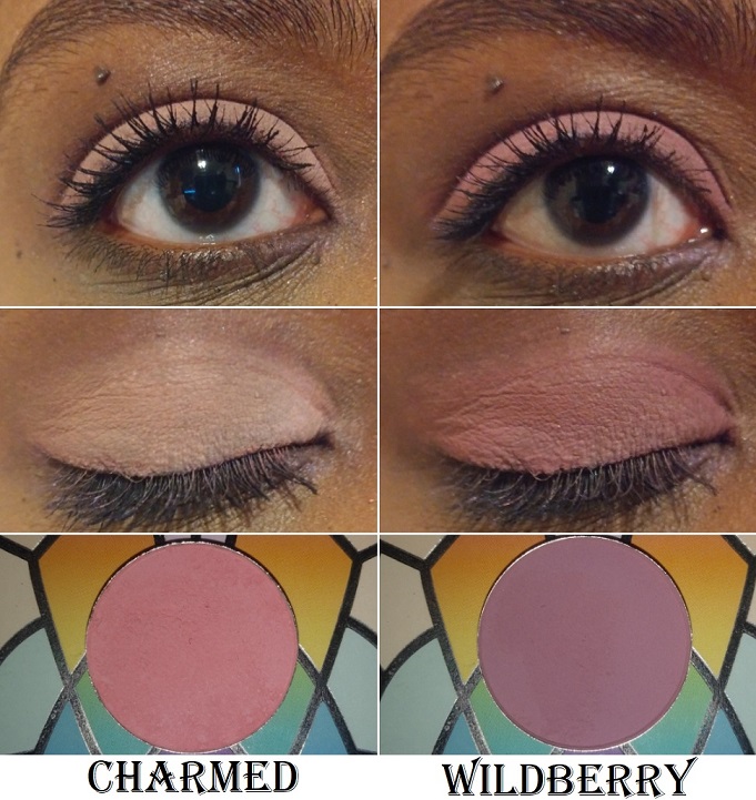
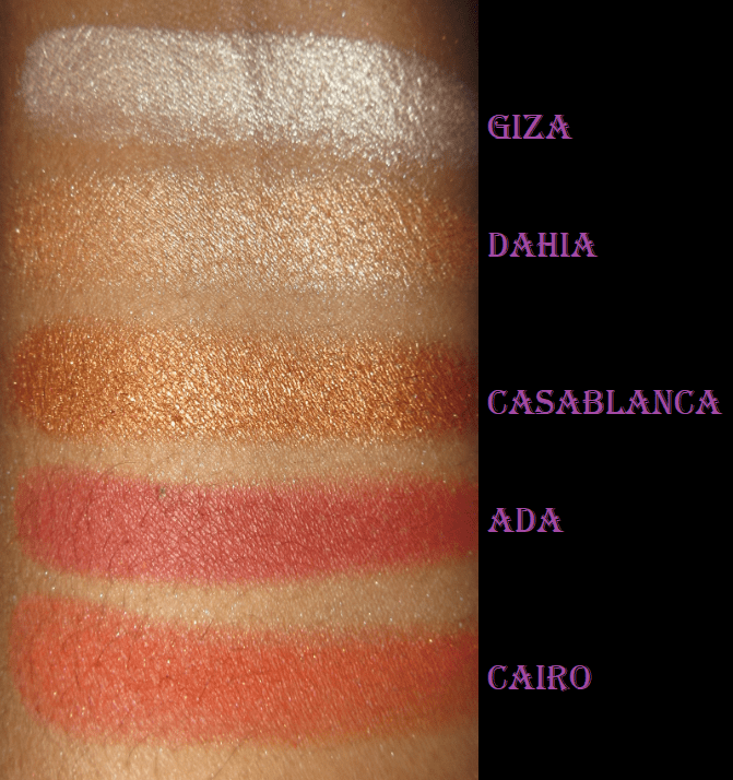
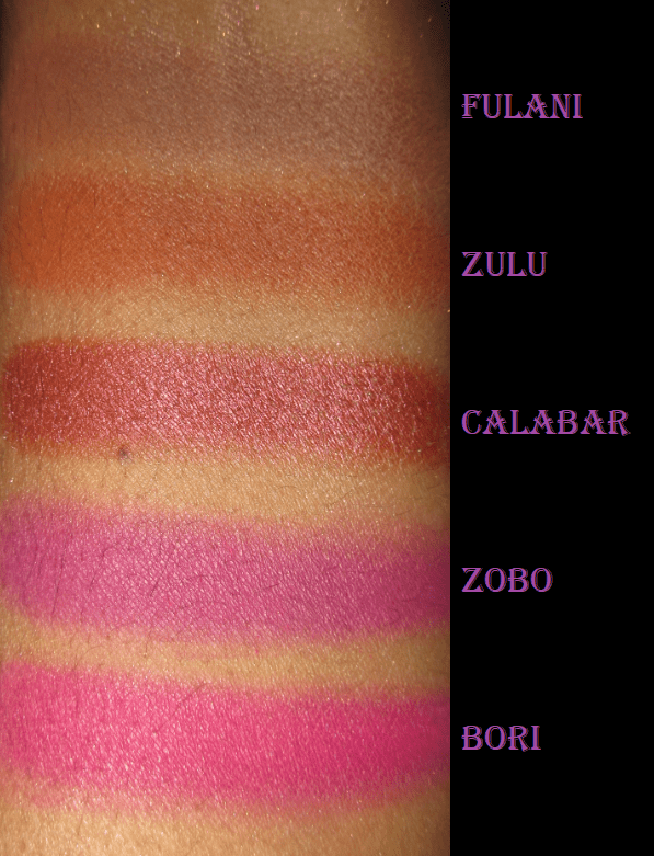
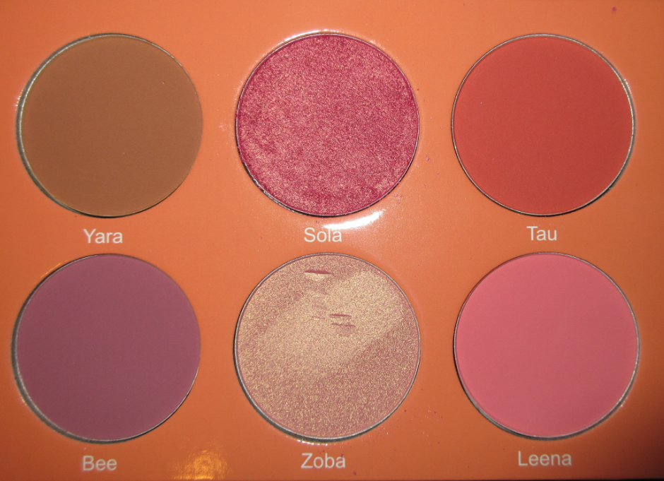
Oden’s Eye Blushes
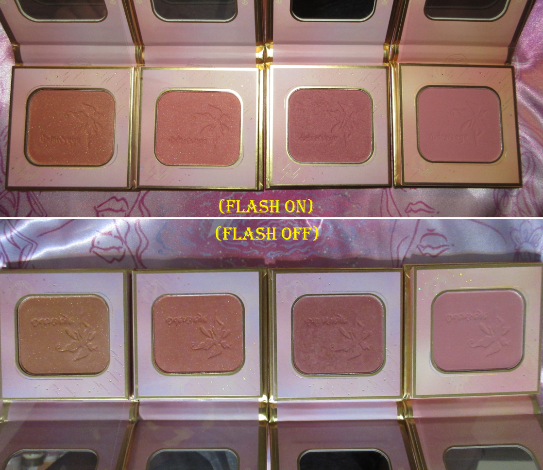
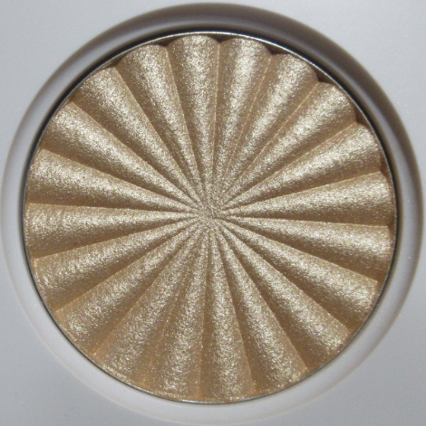
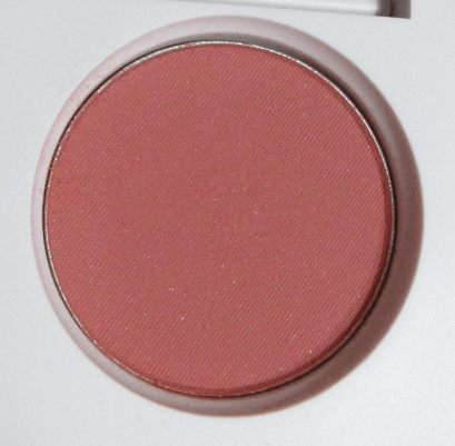
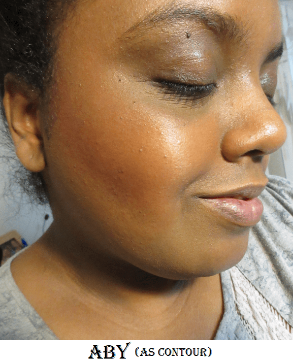
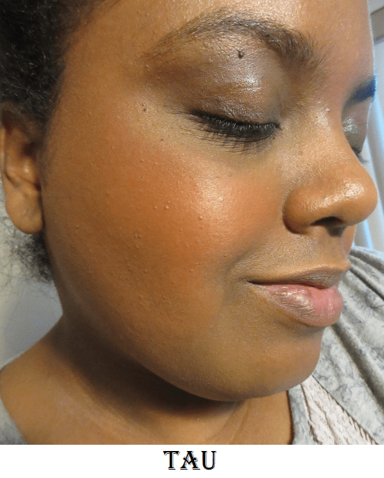
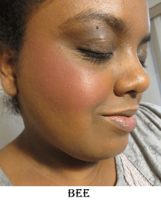
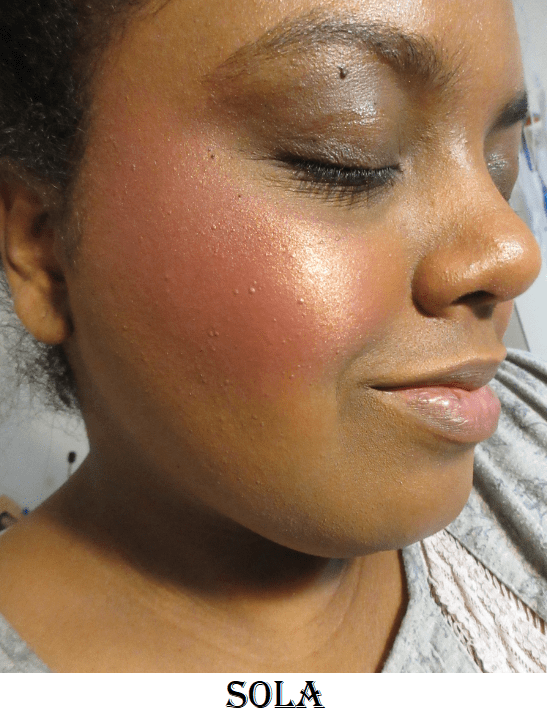
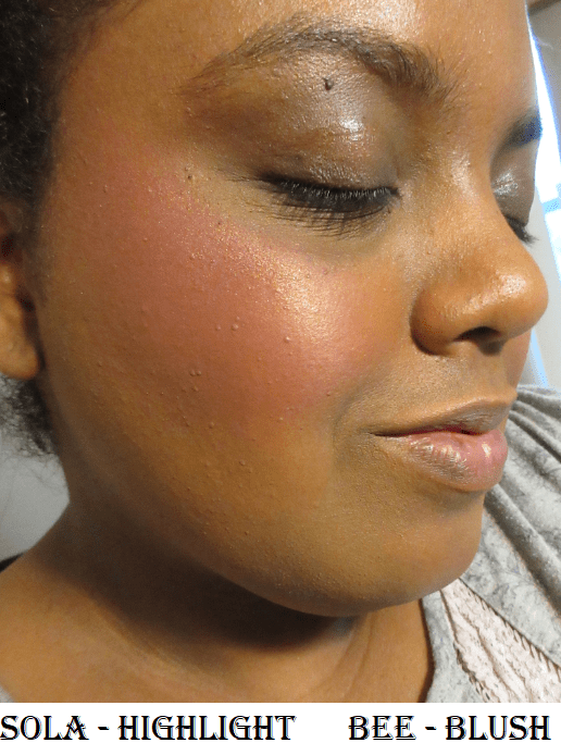
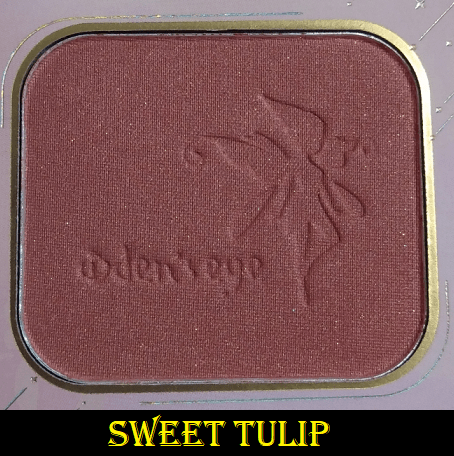
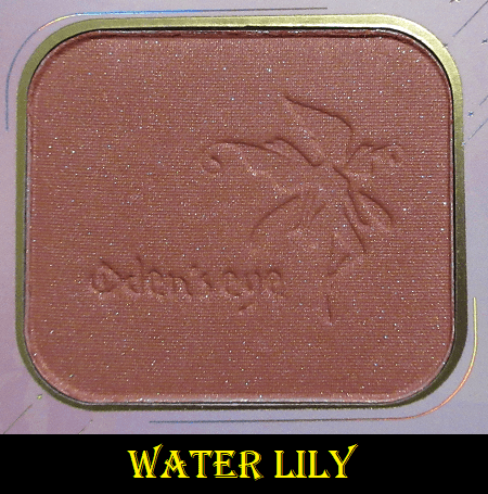
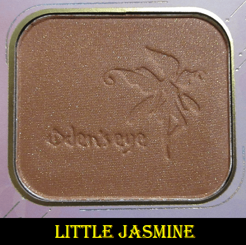
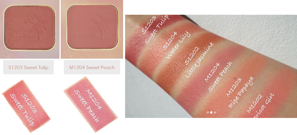
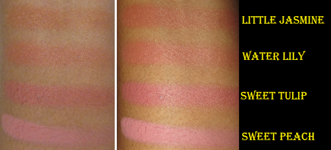
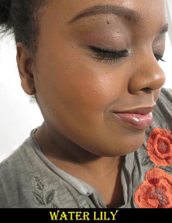
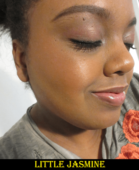
Alva Flower Blushers in Sweet Tulip, Water Lily, and Little Jasmine
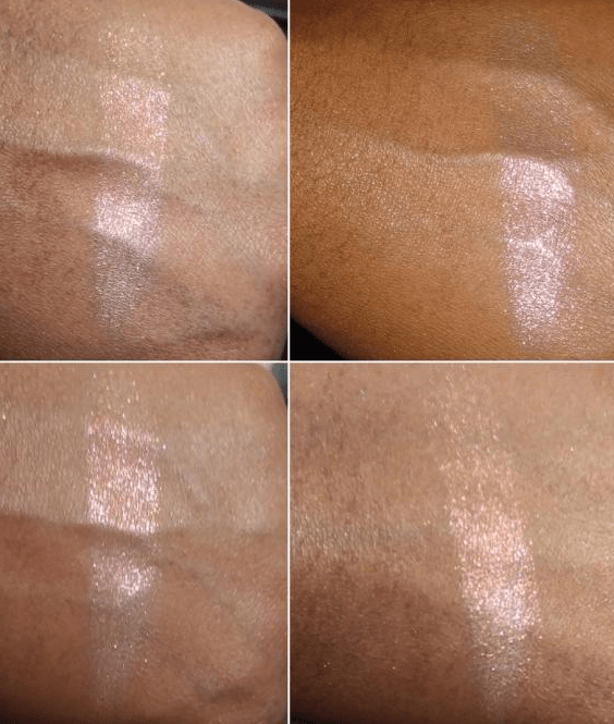
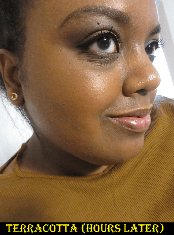
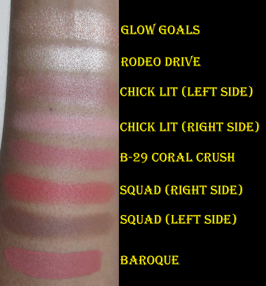
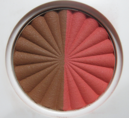
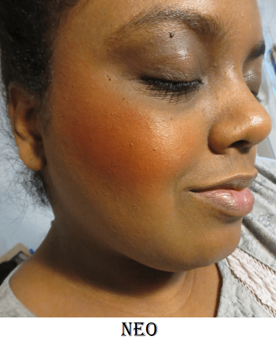
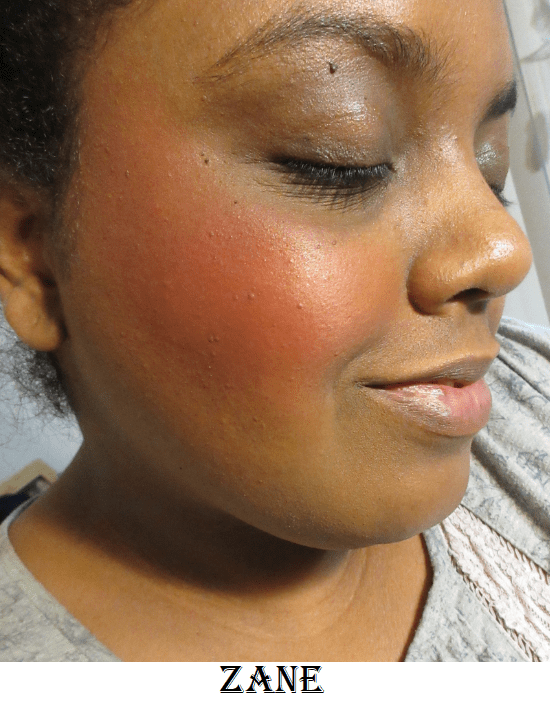
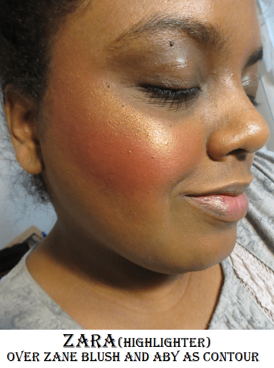
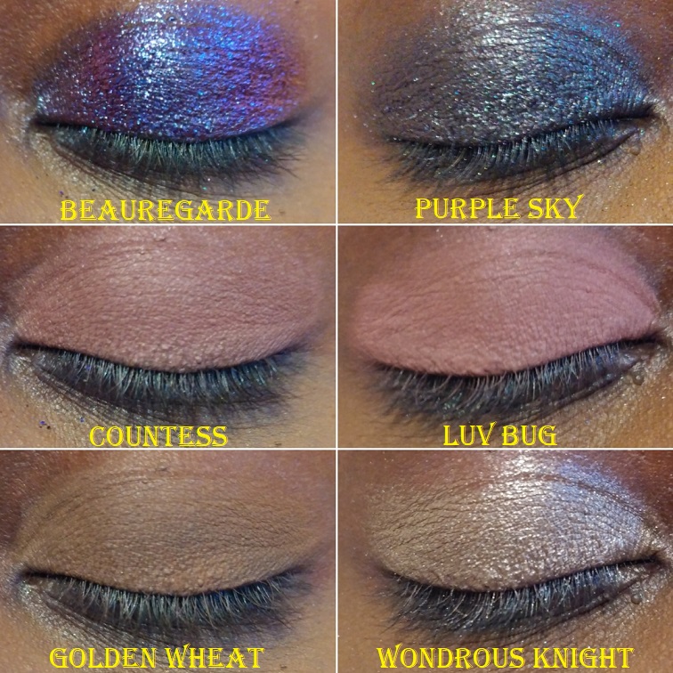
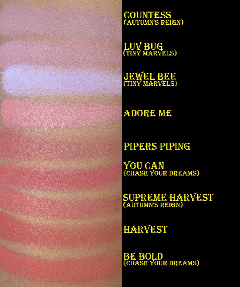
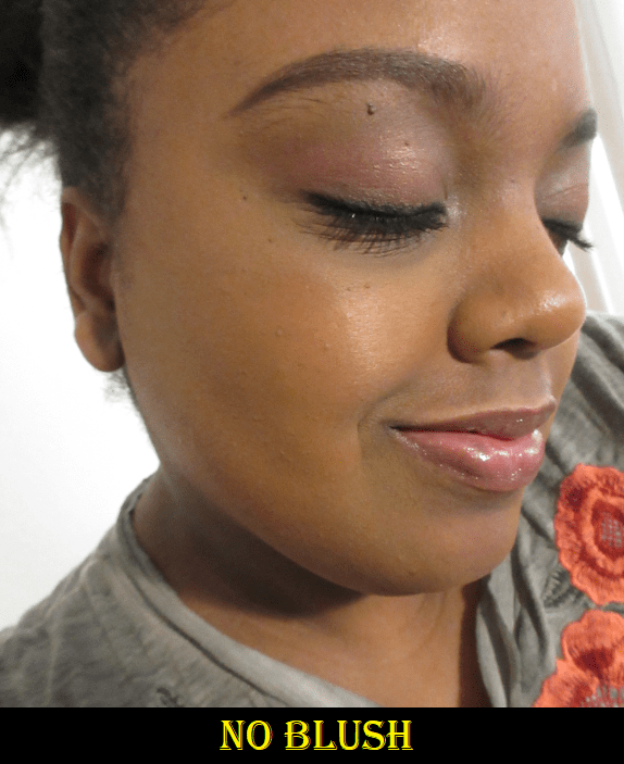
Oden’s Eye currently has three shimmer shades in the Alva Flower Blusher series. Most of the visible glitter specks is on that top layer and they disappears after a few uses. What remains is more of a satin finish with a natural looking sheen. However, the more I try to build up the color, the more radiant and reflective it becomes from the actual shimmer building up on my cheek. So for me, it’s best to stop at a medium amount of blush as building to the maximum payoff results in it looking lighter than before! For example, the shimmer in Sweet Tulip is a bit silvery and looks icier when I’ve packed it on.
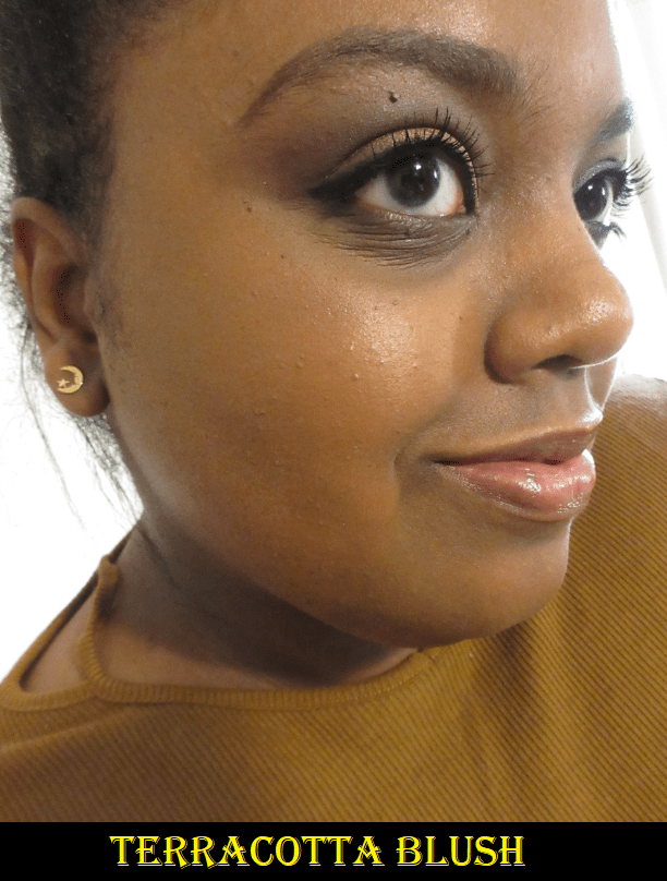
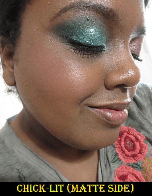
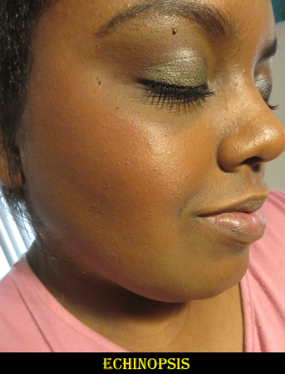
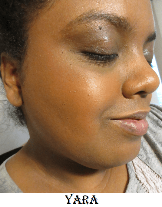
I purchased Sweet Tulip first because it’s the deepest blush out of the original six and I wasn’t certain if that shade would even be dark enough to show on my cheeks. Sweet Peach is the darkest of the mattes, but I couldn’t tell if it was more on the mauve or cool toned side. If a shade is a little too light for me, I can sometimes pull it off if it’s mauve, but the cooler it is the less I like it. It was hard to tell the difference between the shades on their website versus Instagram.
Have I mentioned I have a very bad habit of doing 1-3 am shopping? The majority of my excessive spending happens during that time while I think I’m still capable of making rational spending decisions. Then, after I fall back asleep and wake up later, I realize that it wasn’t the smartest thing to do. This is how I ended up making a third order and then a fourth when they released Easter mystery boxes with free shipping. I purchased the 25 Euro box and was still able to use a discount code on top of that, but more on the mystery boxes later.
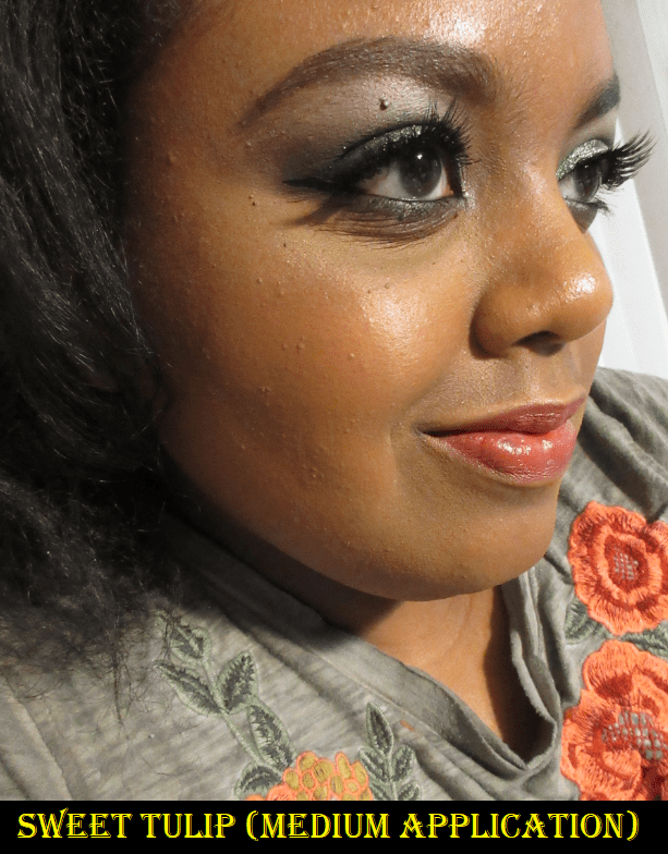
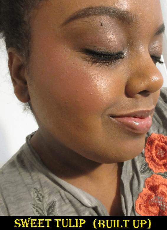
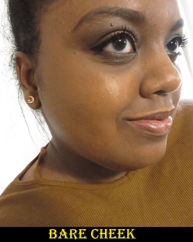
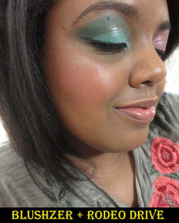
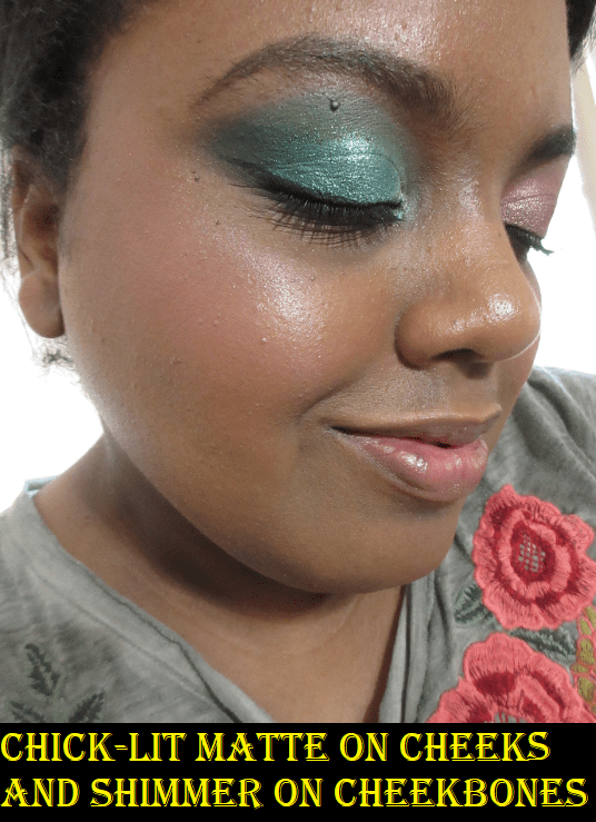
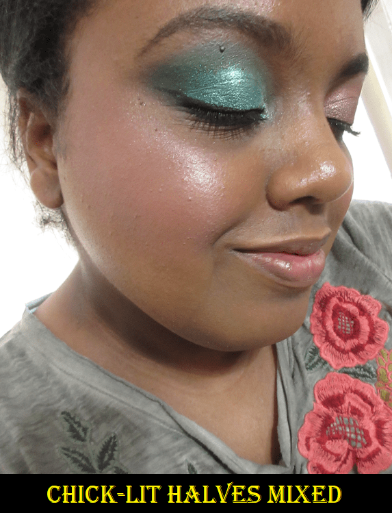
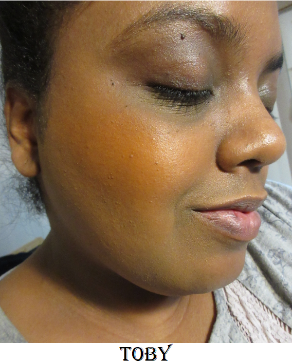
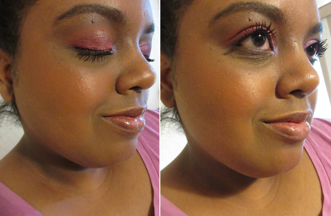
I love these blushes so much! In the Sweet Tulip photo on the left, I do have the tiniest amount of highlighter on my cheekbone, but I could have almost skipped it because I love the gentle glowy sheen that the shimmer in this blush provides. It’s long lasting, pigmented, and the tone is quite flattering! The blending is so quick that I can finish applying color to both cheeks in under a minute! I see the potential for this to be in my top favorite blush formulas. The Little Jasmine shade shocked me that it still showed on my skin tone despite how much brown there is to that shade. It’s my second favorite of the four, and maybe even tied with Sweet Tulip. Little Jasmine is the warmest one I bought and the shimmer shows more golden when built up. Water Lily is darker, yet it took a ridiculous amount of building up to make it visible on my skin. I don’t think it is an issue of the color match or hard pan. I can see the powder getting picked up on the different brushes I’ve tried. I believe there’s just less pigment in the formula of this specific shade. The blushes are good for 36 months after opening, but my Water Lily package was the only one with an actual expiration date printed on it (November 21st 2022). Because I have 18 months instead of 36, I wonder if the Water Lily shade is already performing differently. Regardless of the reason, I appreciate that there’s an actual date on that one so I know not to keep it around as long as the others.
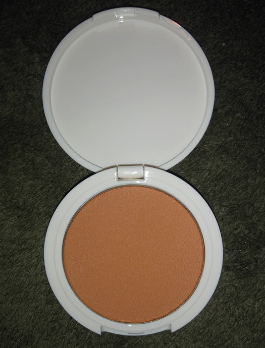
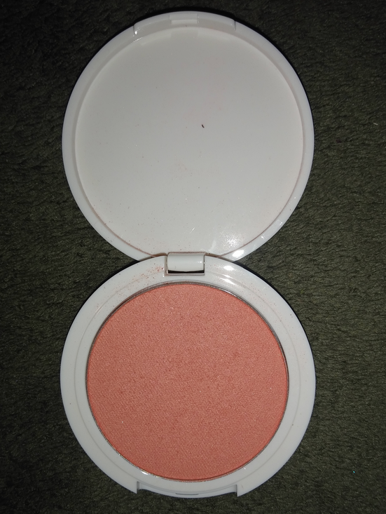
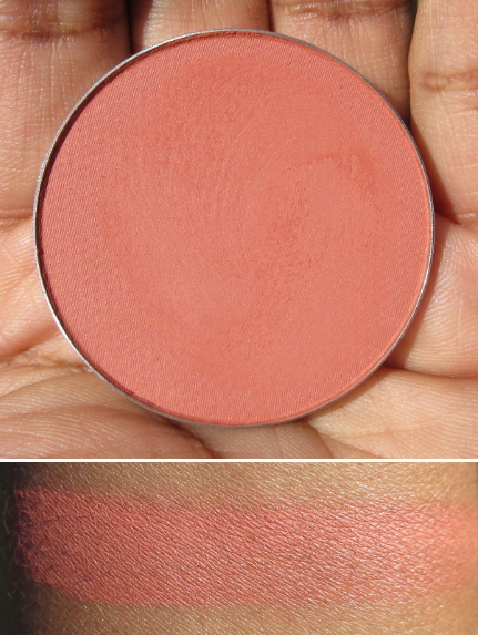
Alva Fruit Blusher in Sweet Peach
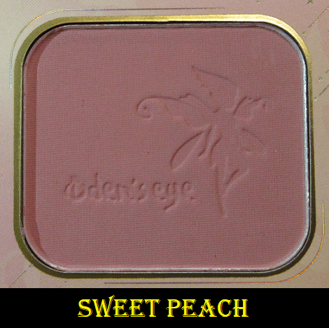
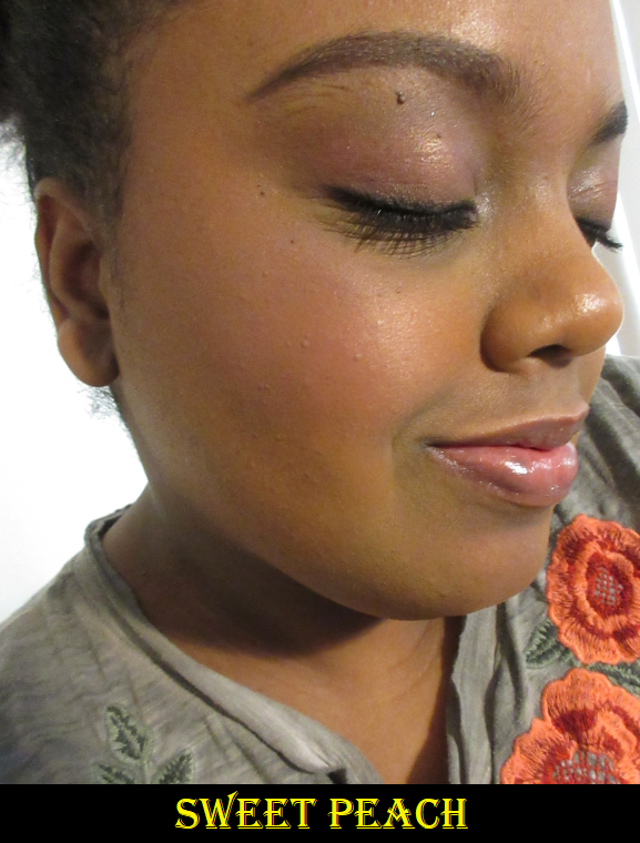
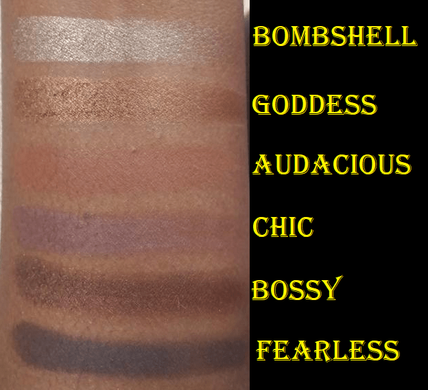
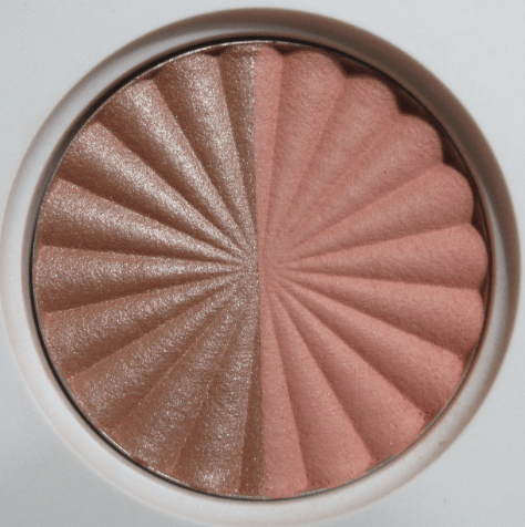
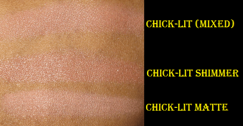
There are three matte blushes in the Alva Fruit Blusher line but I purchased only one of them. The Sweet Peach shade looks much more mauve than peach on me. I was pleased to see it show up, but it looks a little ashy. I think this shade is a bit too light for my skin tone. This is the darkest of the Fruit Blushes, so the other two shades in the matte formula would not work for me either. I can at least say the matte formula is nice and if the brand releases dark colors, I would be interested in trying them.
Small Mystery Box
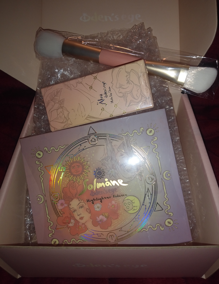
Oden’s Eye released a small (25 euro) and large (55 euro) mystery box in celebration of Easter and the company’s anniversary. Affiliate/Influencer codes worked on the deal, so I was able to get my small box for 22.50 euros with free shipping. The Norn’s collection was excluded, but nearly everything else was a possibility. I anticipated I would get a palette, lip product, and brush. I only hoped the shades would work for me and that I would not get a product I already own, so I was happy that all expectations were met. The brush that came with my order will be discussed in the brush section.
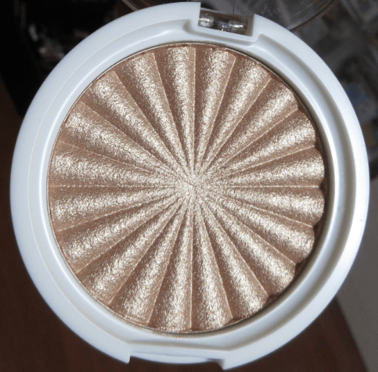
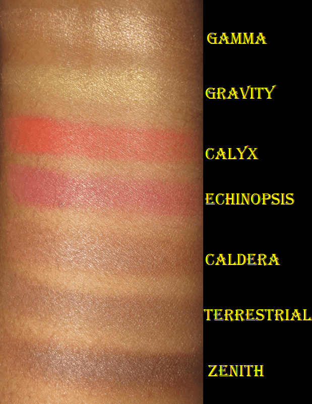
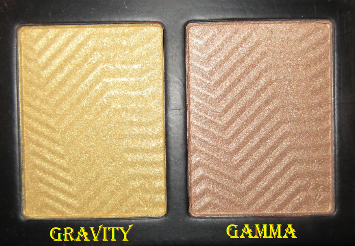
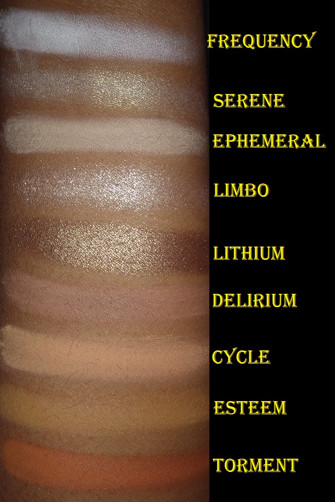
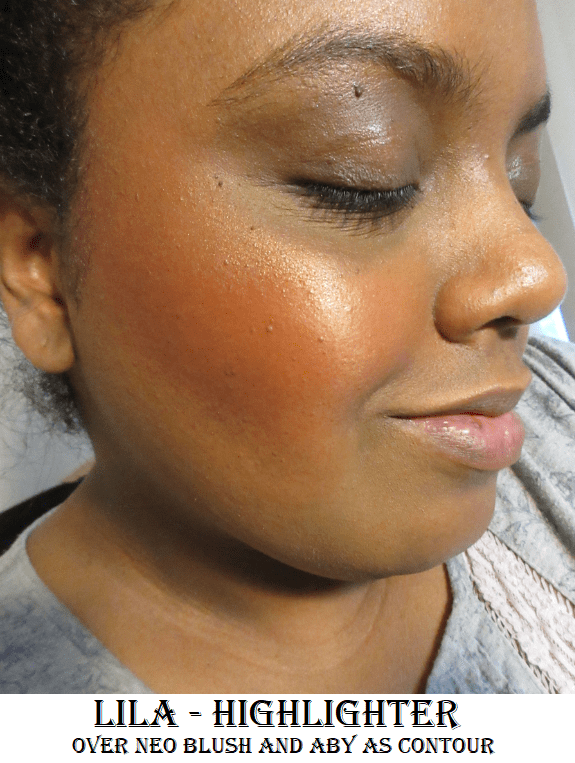
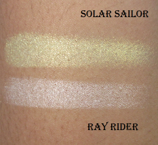
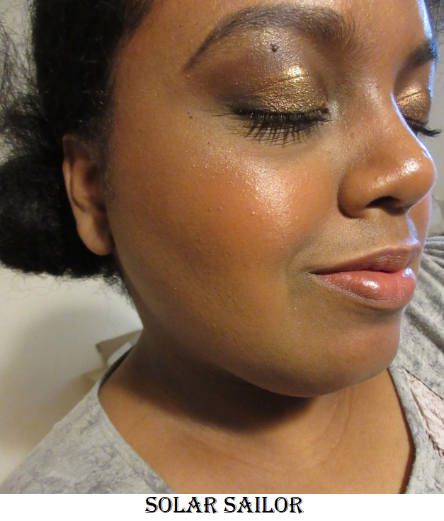
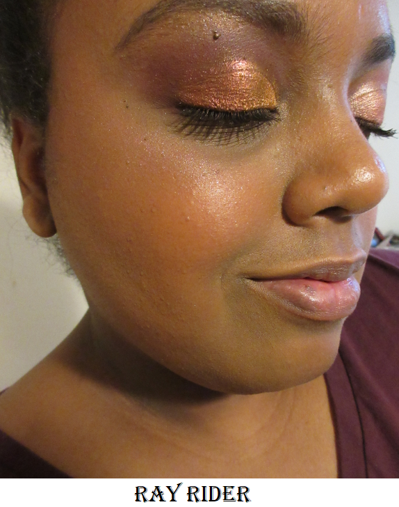
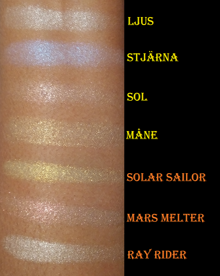
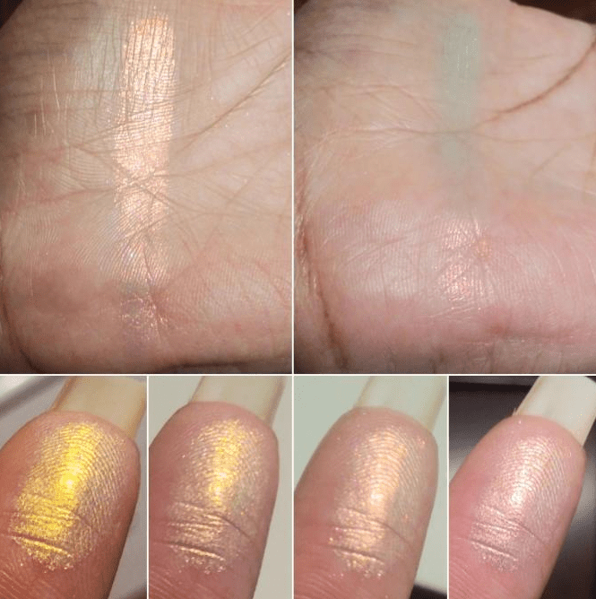
Solmåne Highlighter Palette
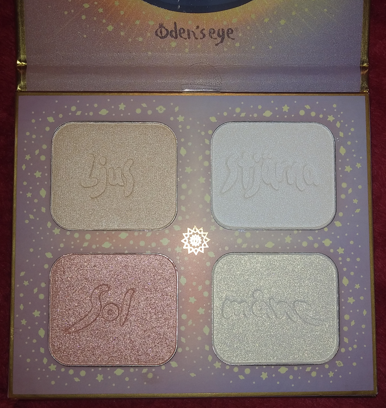
Ljus (light in Swedish) is a pale gold and has the smooth shimmer formula I like, but it’s too icy looking on me. Stjärna (star) is a beautiful iridescent shade that looks white in the pan but is blue with a tinge of purple. These two would make beautiful inner corner eyeshadow highlight shades. Sol (sun) and Måne (moon) remind me of the Kaleidos Space Age Highlighters, but with sparser glitter particles, which is not a feature I like in highlighters. I could use them as eyeshadow toppers, but I don’t know if this palette will survive an end of the year declutter. I’m still happy I received it because my curiosity about the formula would have led me to buy it eventually anyway.
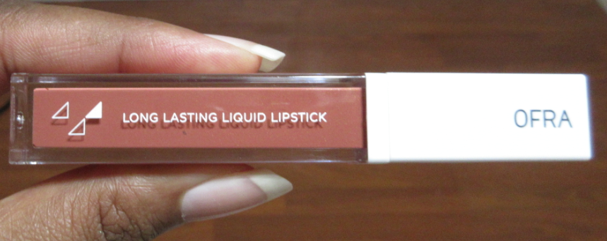
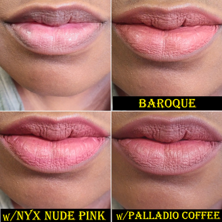
Alva Matte Lip Stain in Ripe Papaya
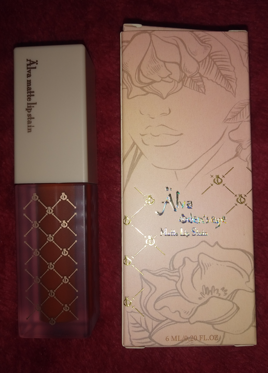
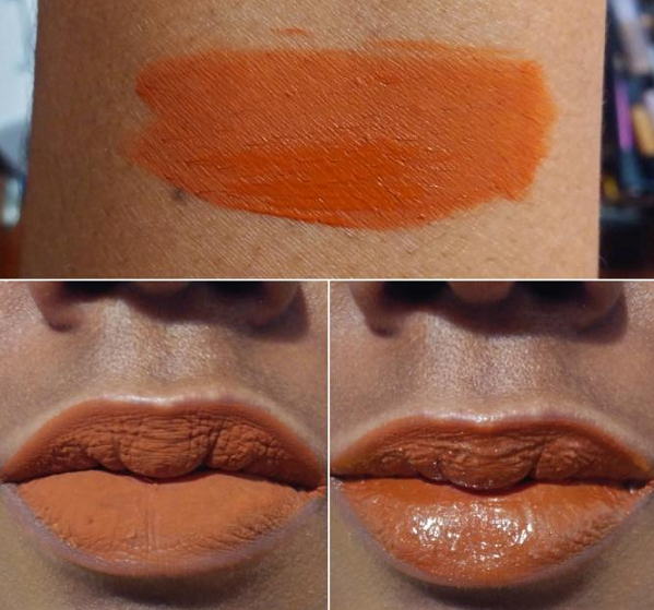
The first thing I noticed about this lip stain was the strong but pleasant fruit candy smell. Then I realized the formula was not the typical watery texture of a stain that I was used to. The consistency is more similar to a liquid lipstick. I can get nearly opaque results with one layer, but I need a little more to cover the dark patches on my lips. One time I made the mistake of applying too many coats, which turned the smell from nice and fruity to an unpleasant cherry cough syrup smell. On the bright side, I discovered it layers up well. It’s definitely matte and makes my lips look and feel uncomfortably dry. I cannot wear this by itself, but it looks amazing under a thick shiny gloss. In matte form, it’s transfer-proof but comes off with an oil based remover or just some oil. If it’s under a gloss, it will last on the lips if left alone, but it’s easy to transfer at that point. Considering how much I loved the color but needed a more hydrating formula, I wonder if I would prefer Oden Eye’s Cream Lip Stain formula. One day, I will find out!
Oden’s Eye Brushes
Double-Ended Highlighter Brush
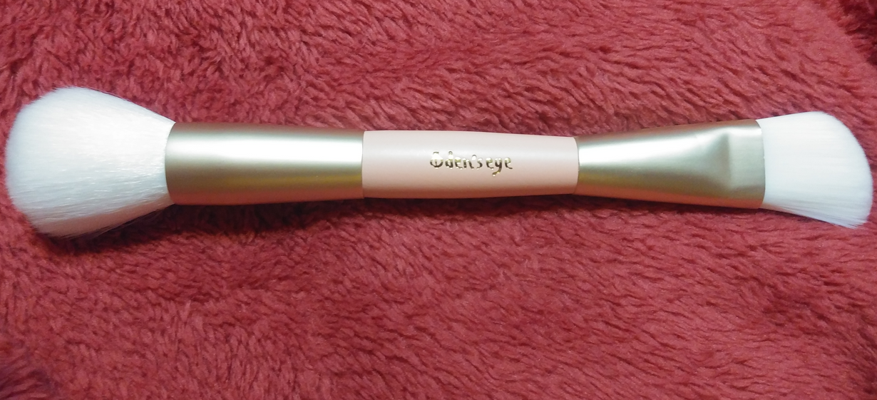
This brush is made of synthetic bristles. The fluffier end is very floppy and loosely packed, but it makes a fairly nice blush brush. The stiffer and tighter packed end is slightly angled. I can use it on its widest side to brush the highlighter in small sections of my cheekbone. With this one, the bristles can rub harshly when I do that. A smooth and soft application occurs when I turn the brush to the side and use one long sweep with the tips of the bristles to spread highlighter across my cheekbones. I don’t foresee myself continuing to use the stiff side, but I will probably use the soft side for blush every now and then.
Eyeshadow Blending Brush
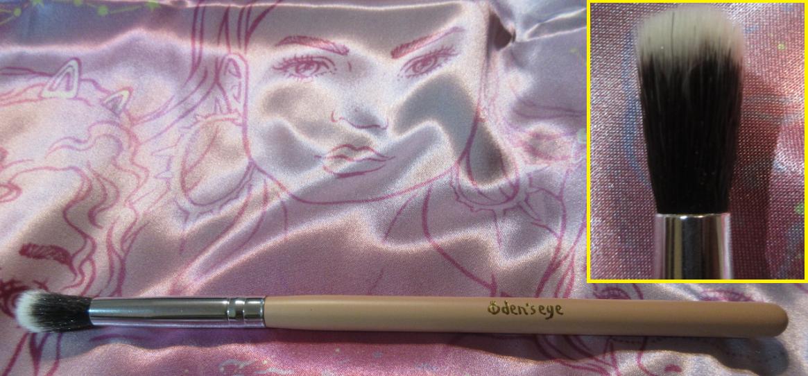
This brush was a surprise addition to one of my earlier orders. I’m not sure if there was a deal going on at the time, if it was a mistake or intentionally gifted for free, but I appreciate having it all the same. The bristles are synthetic and balance softness with medium-packed tightness so that I can get a decent blend with this brush in a light to medium application. The bristles are too long to get a really intense blend. It also becomes looser packed with continued use.
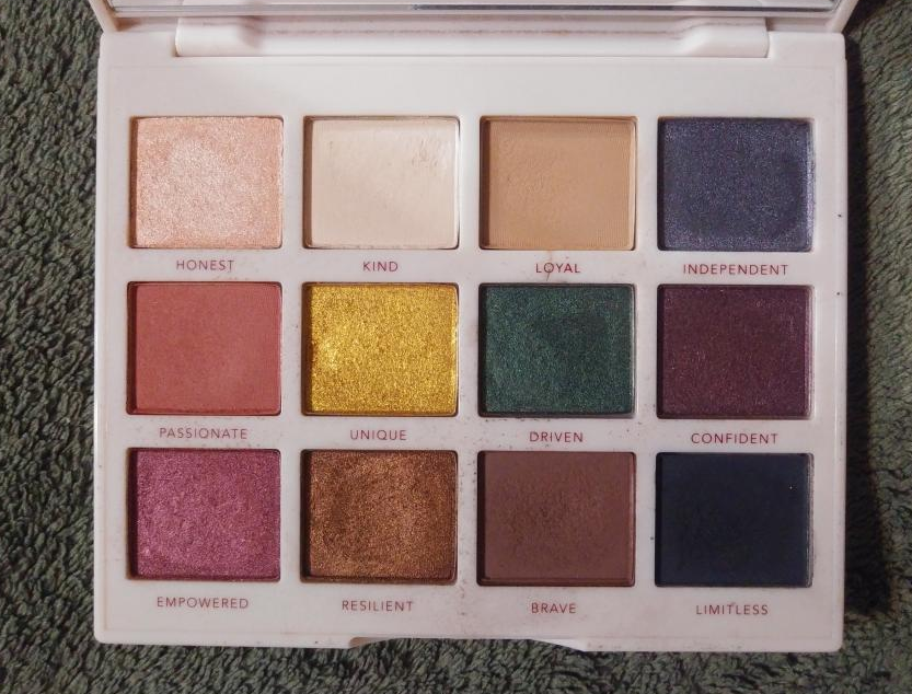
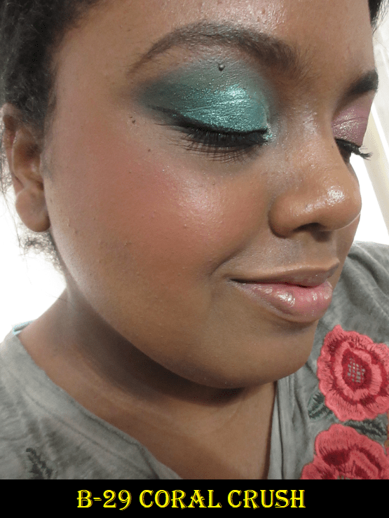
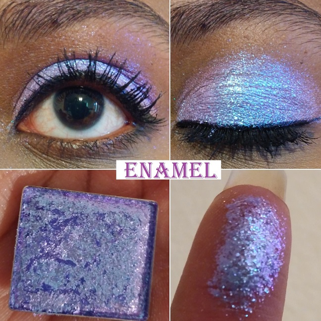
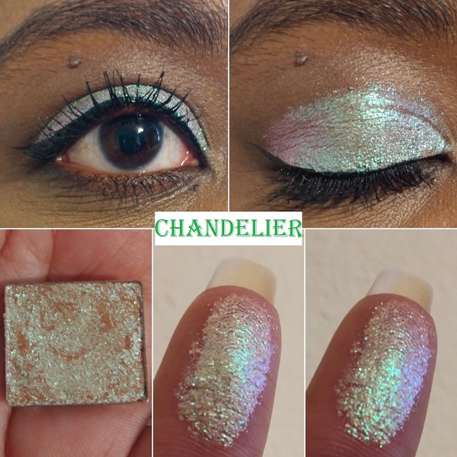
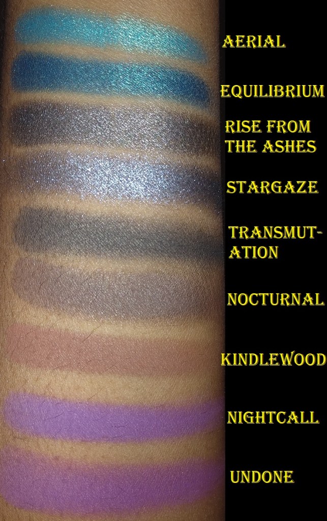
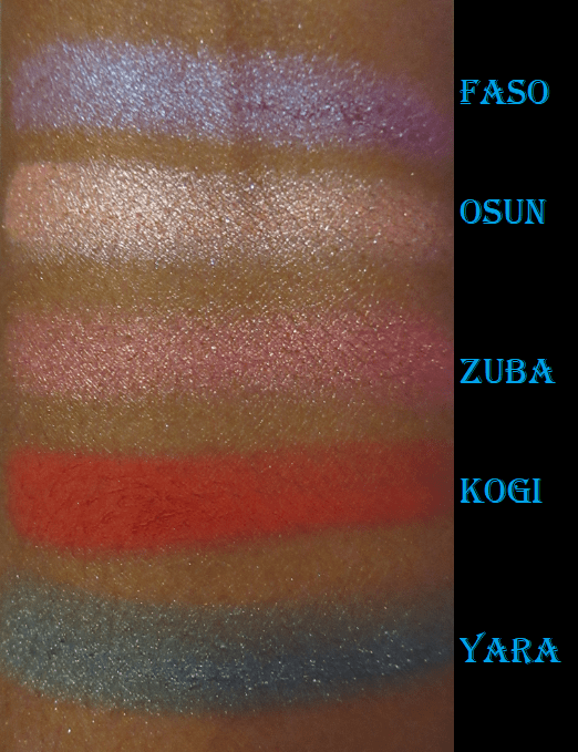
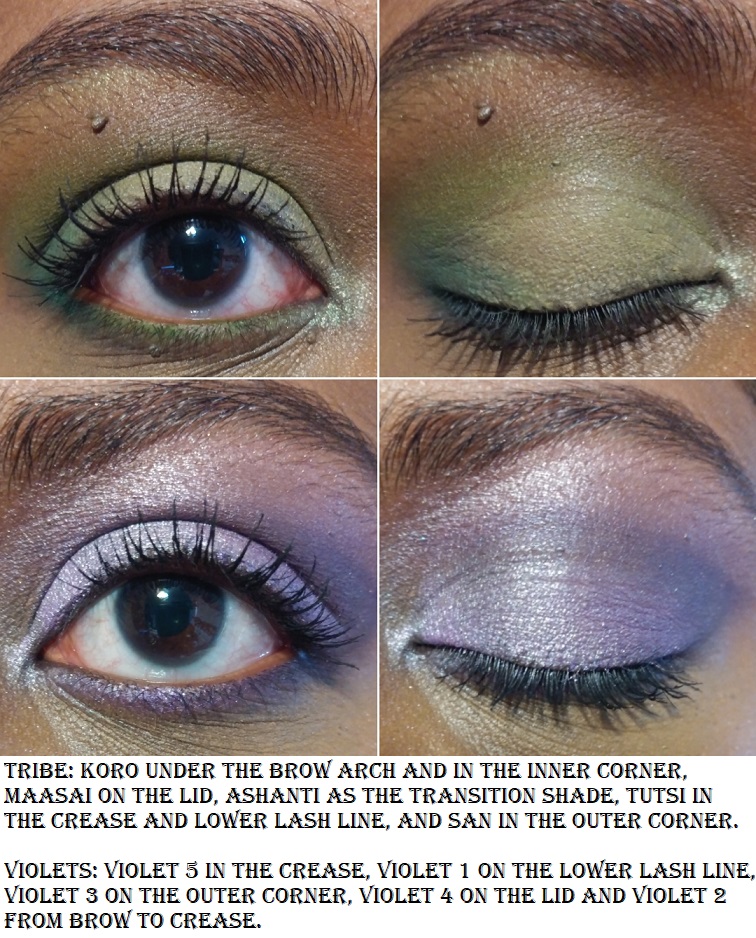
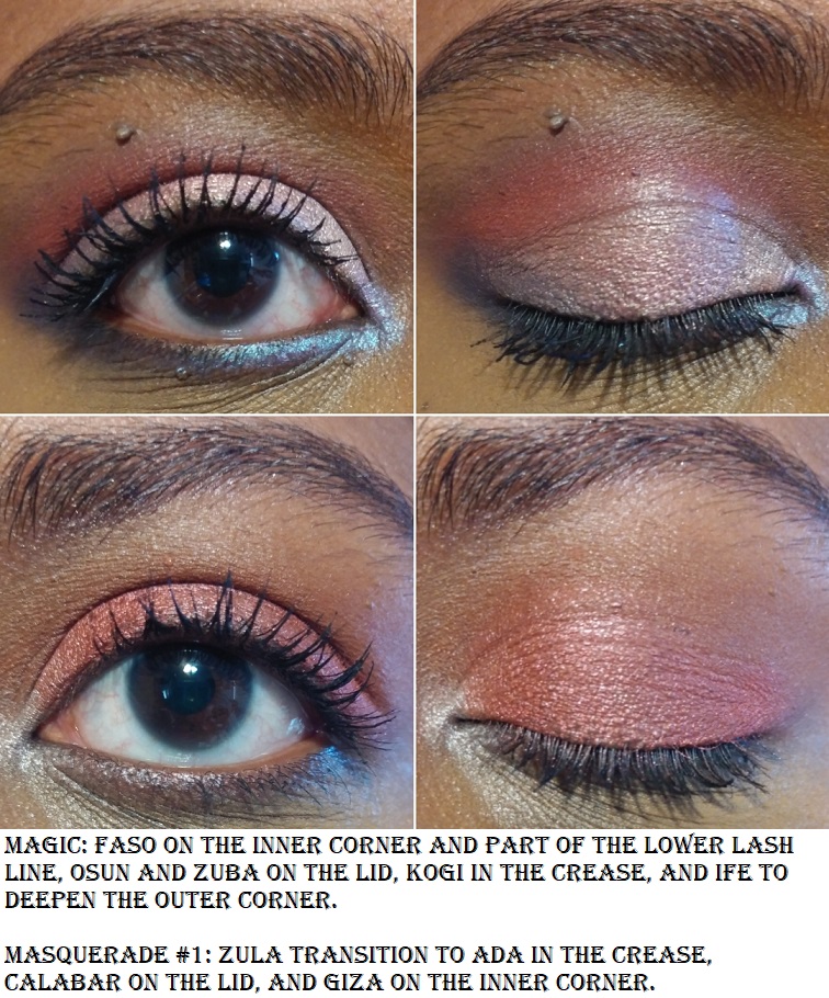
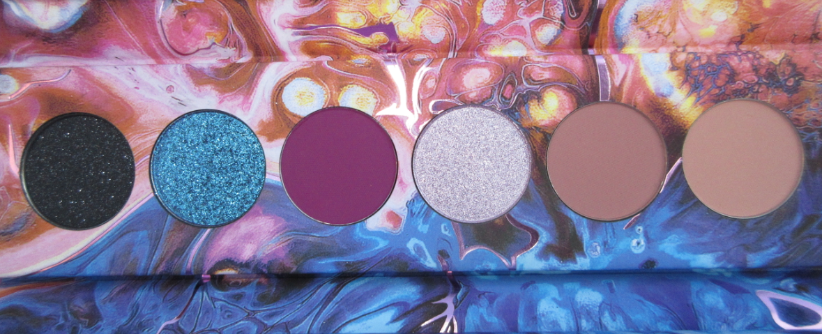
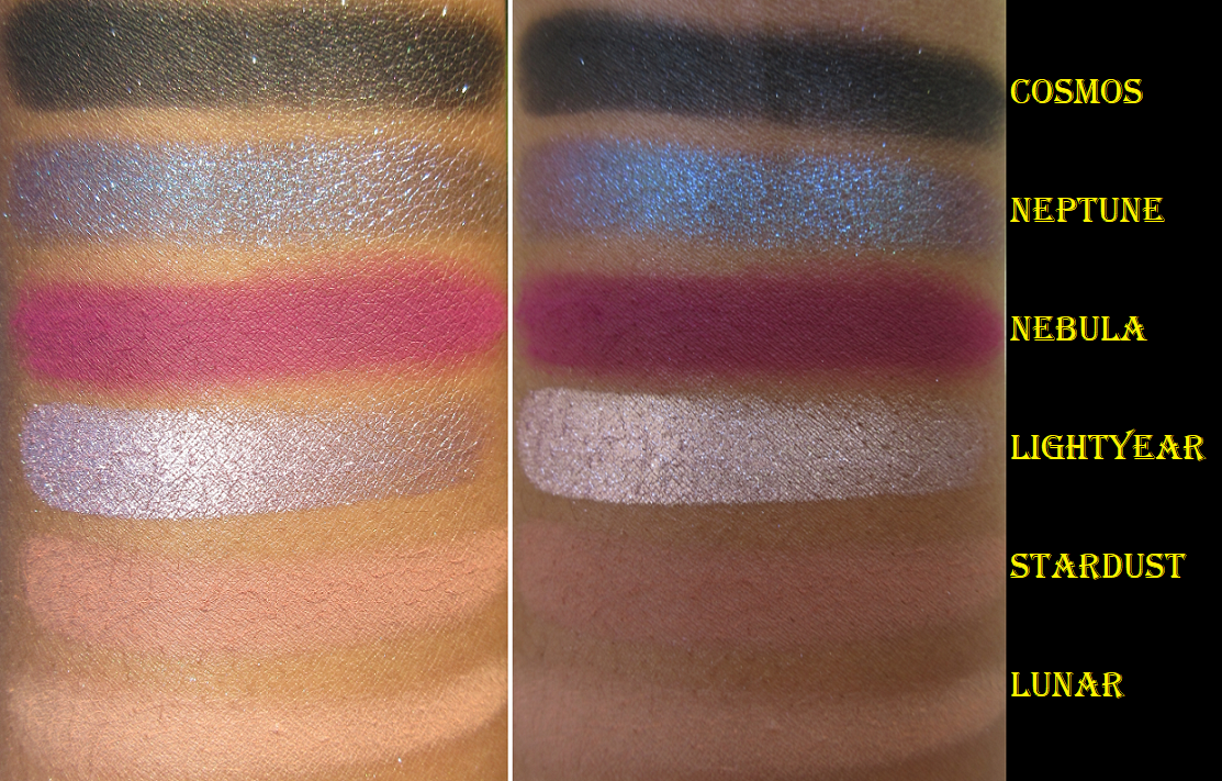
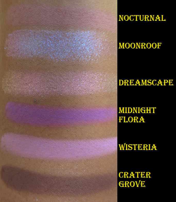
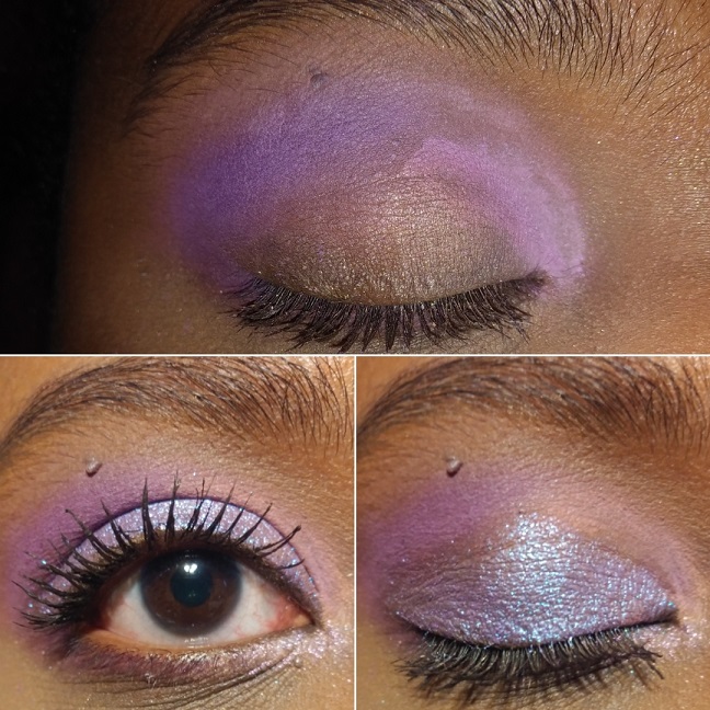
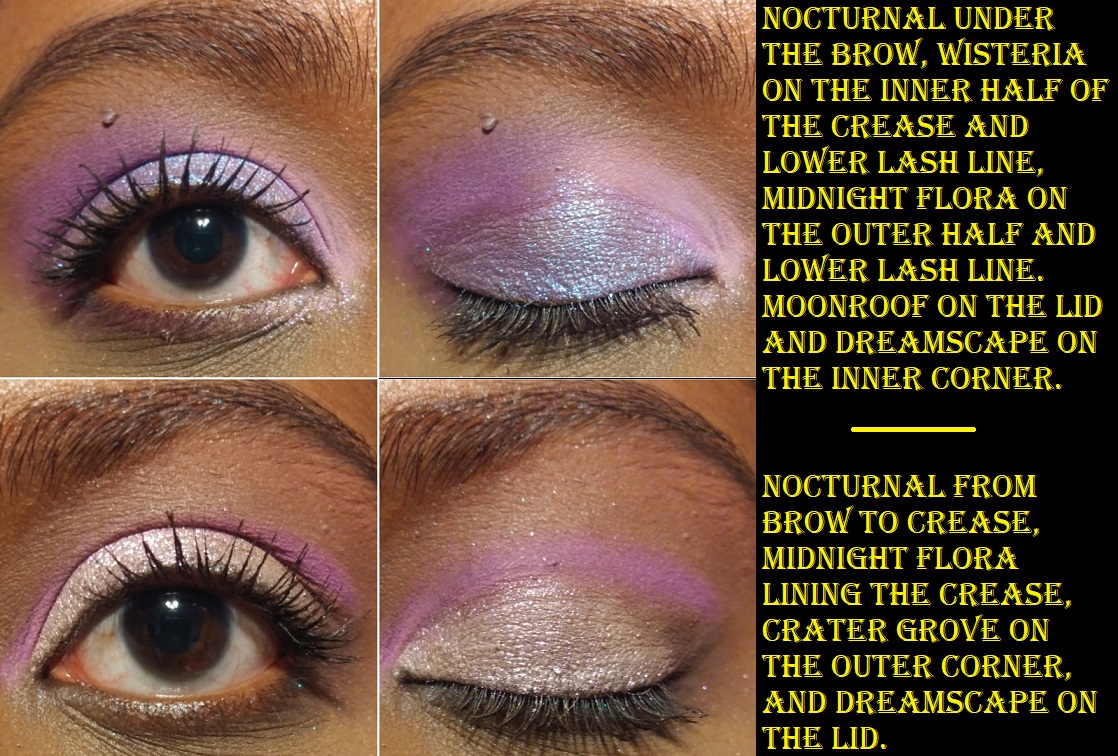
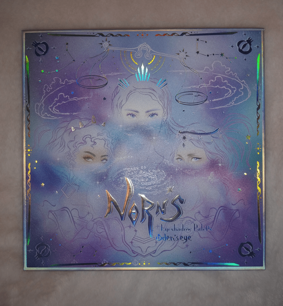
Norn’s Series
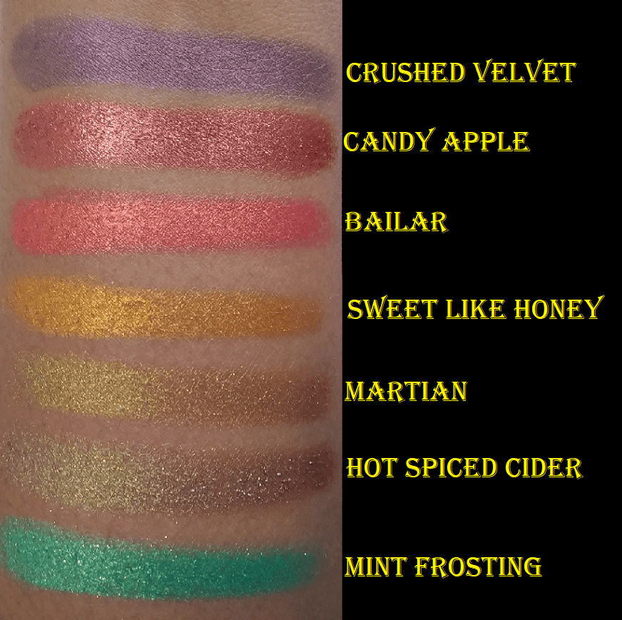
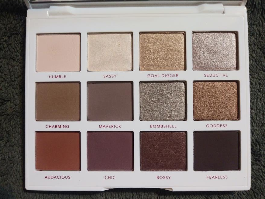
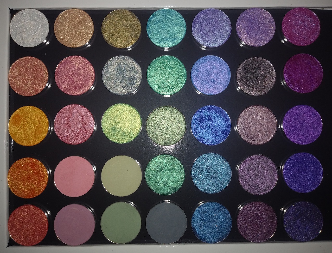
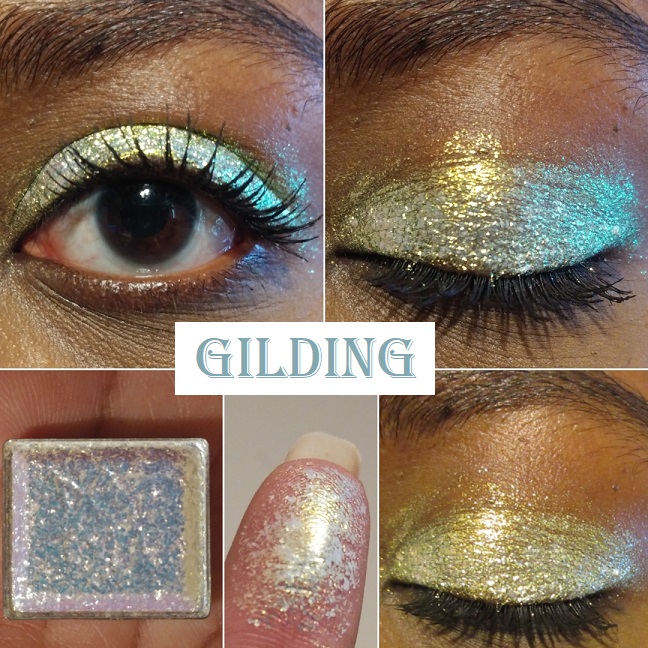
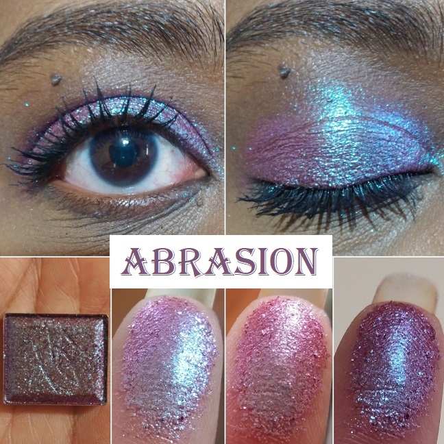
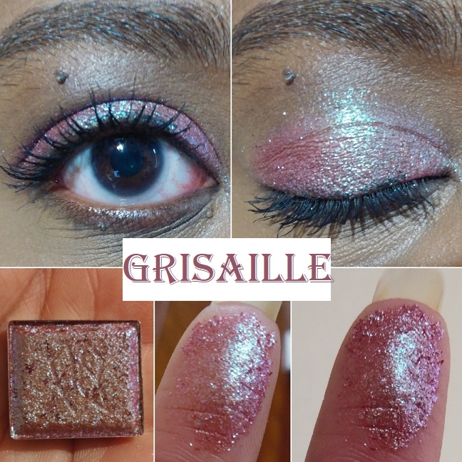
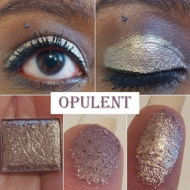
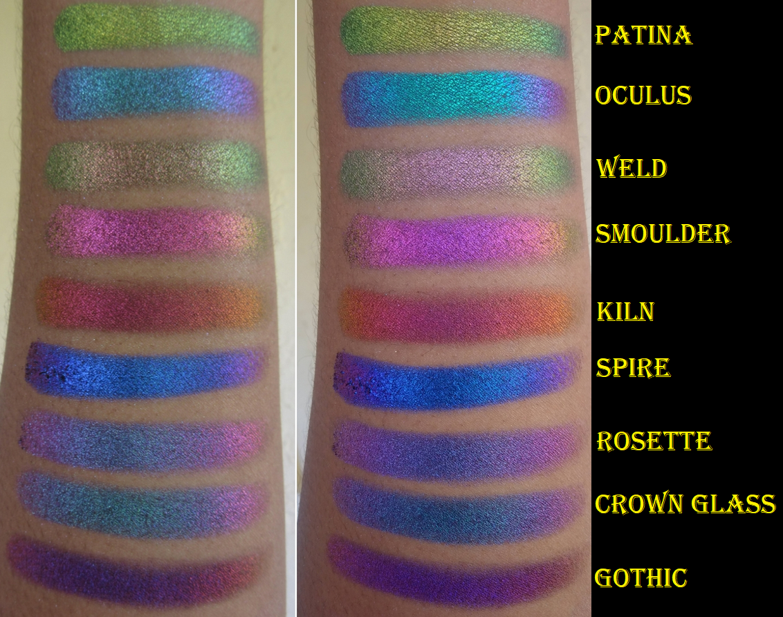
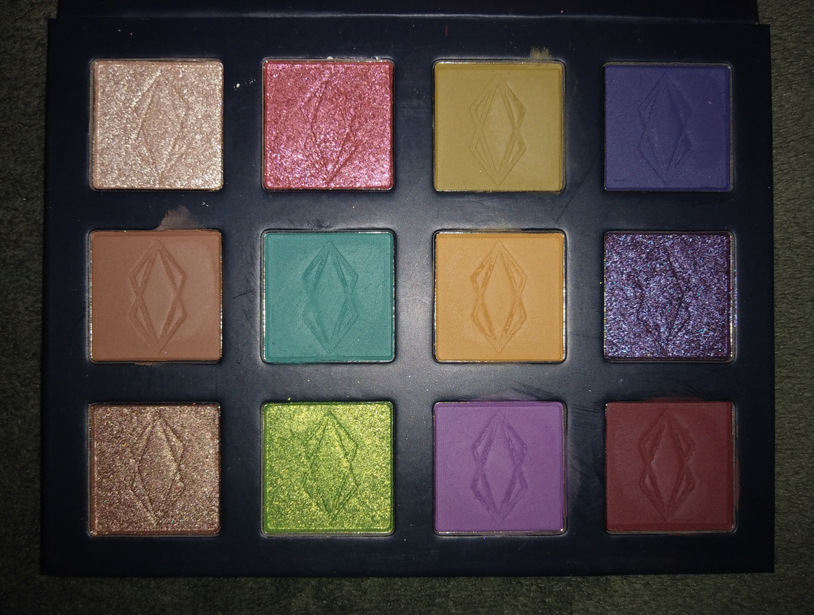
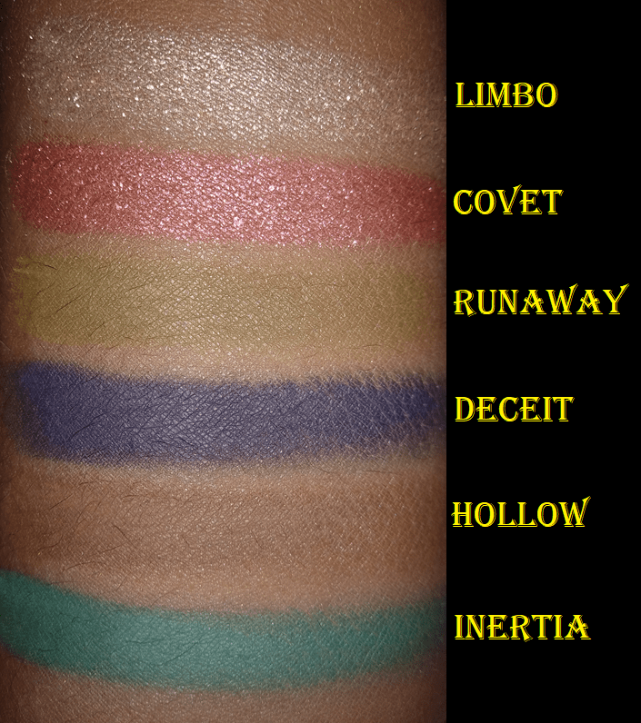
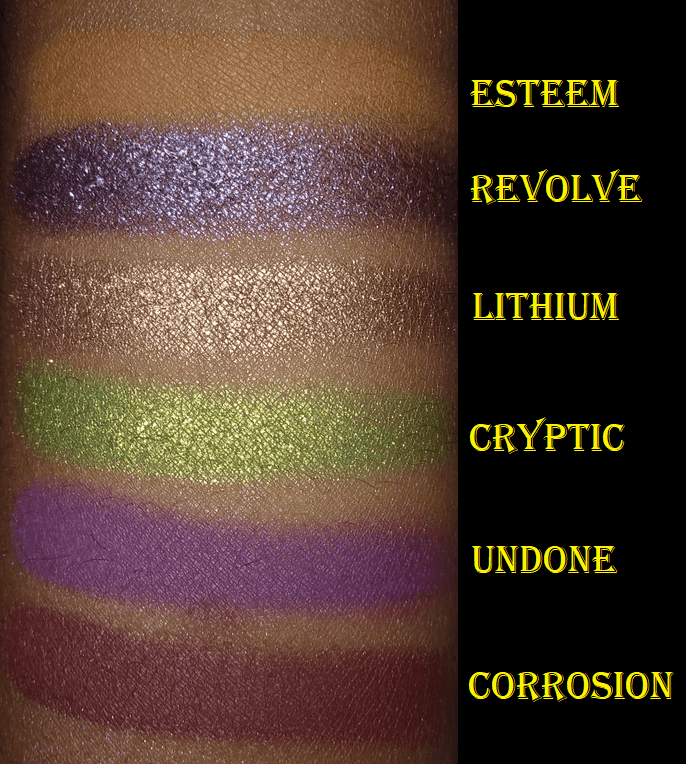
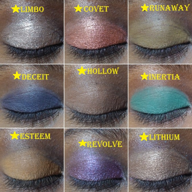
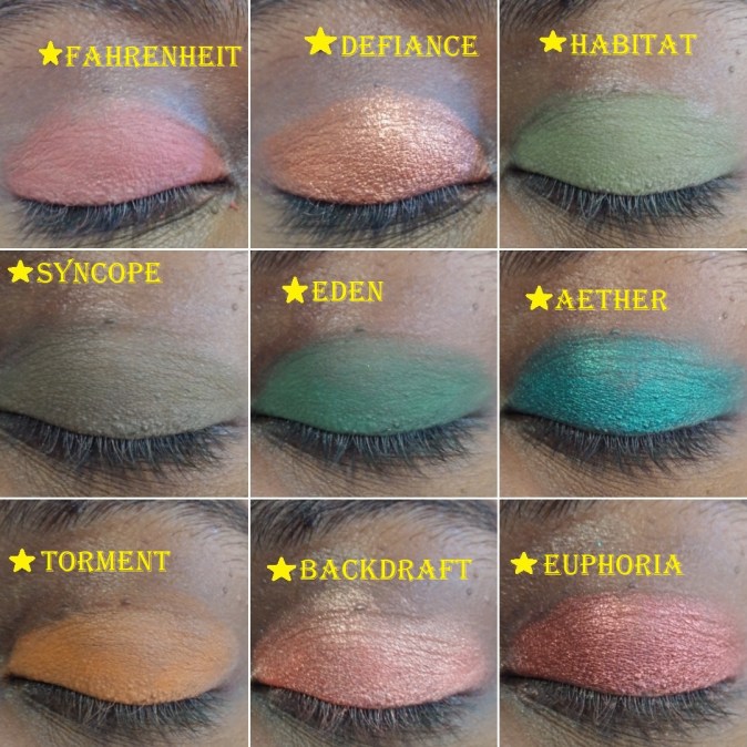
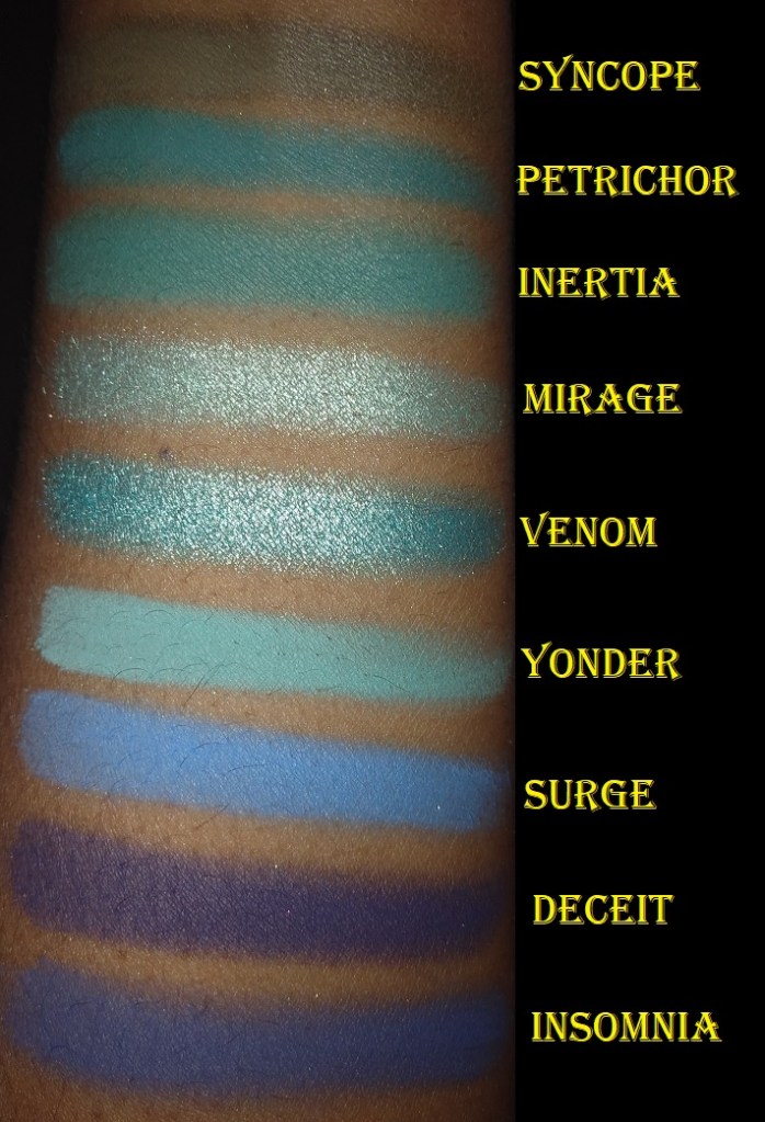
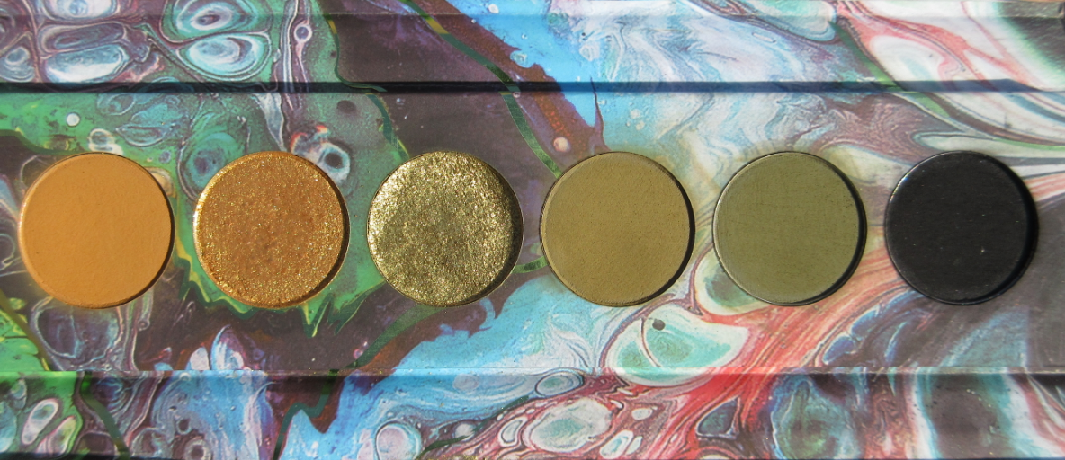
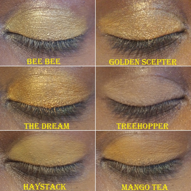
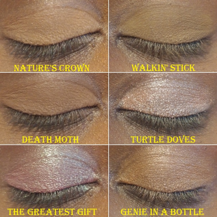
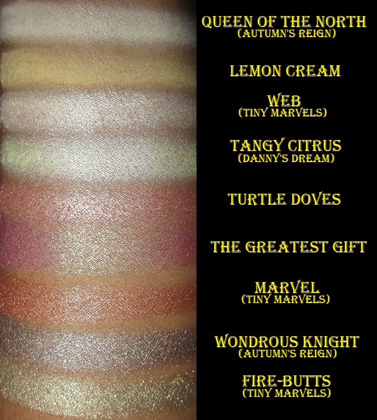
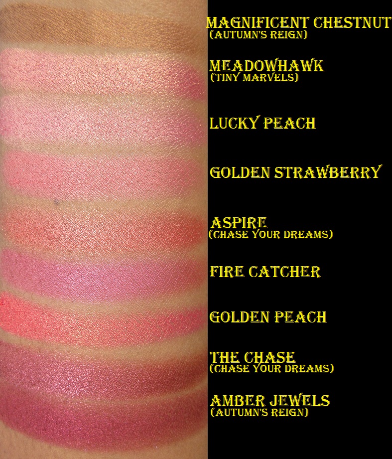
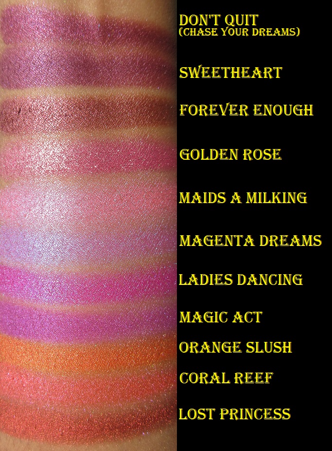
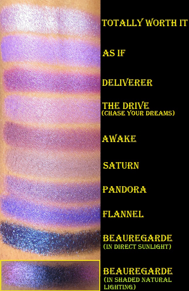
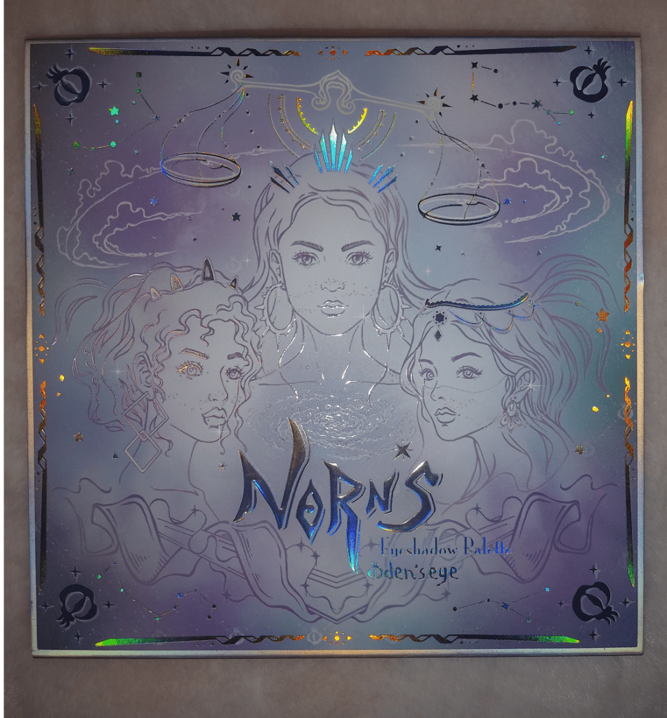
Norn’s Eyeshadow Palette
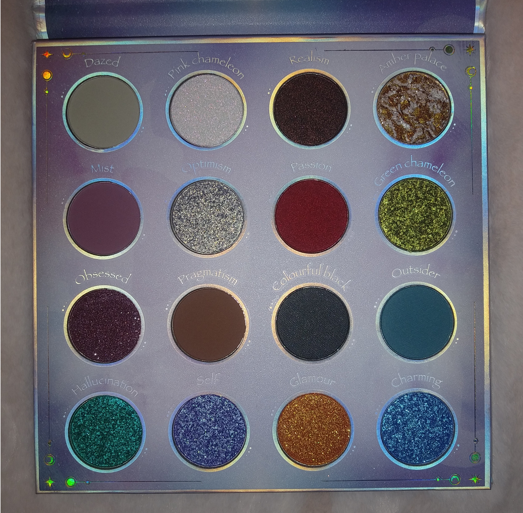
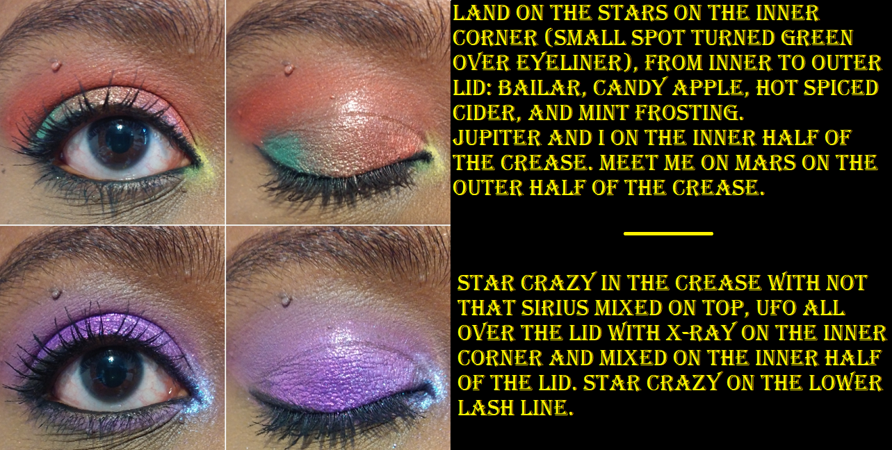
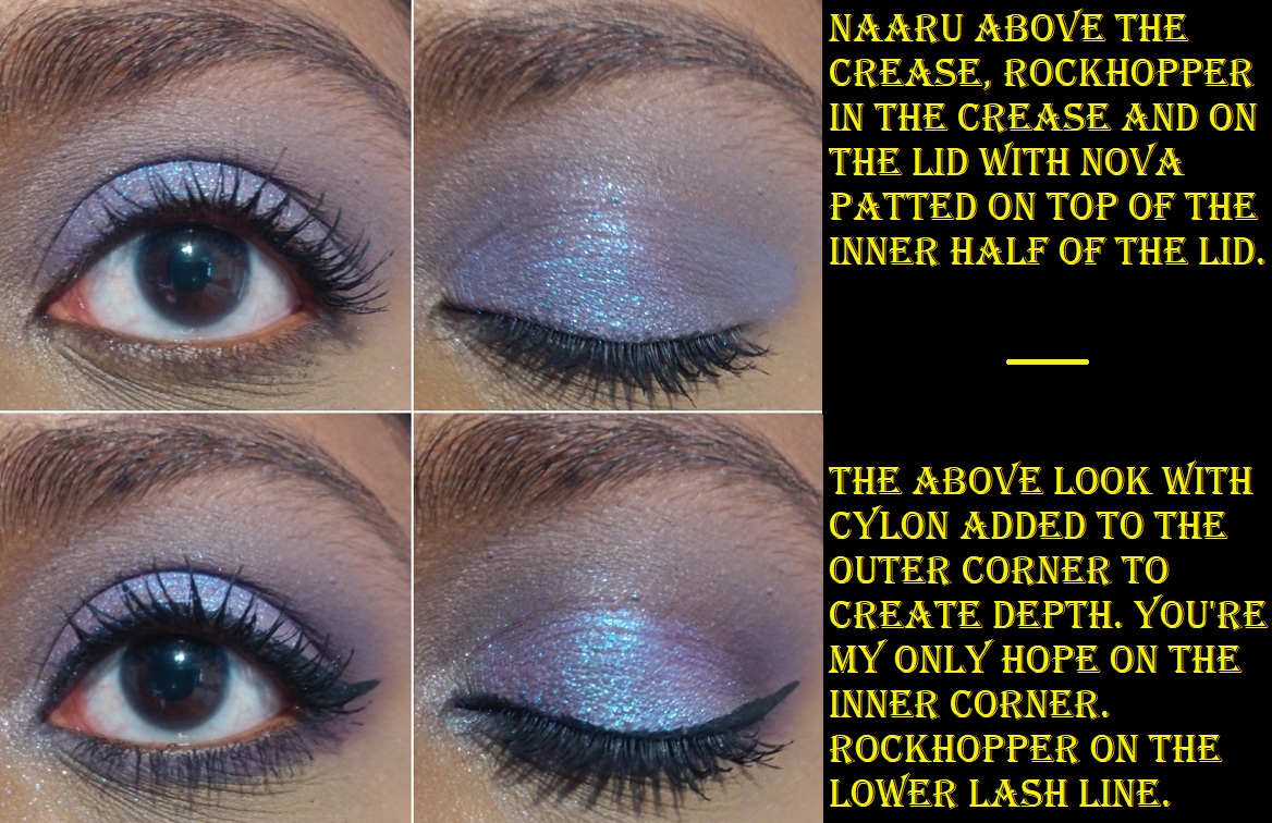
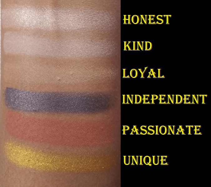
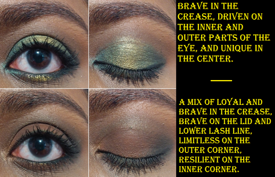
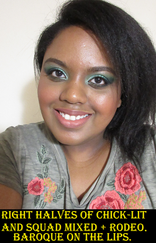
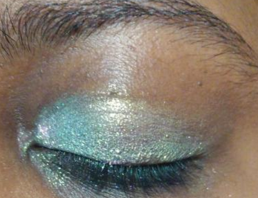
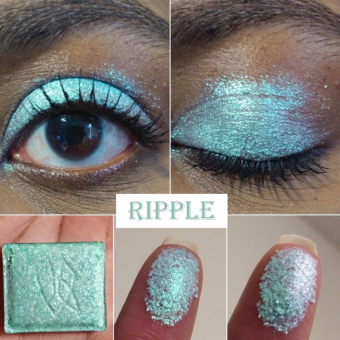
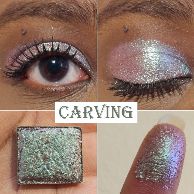
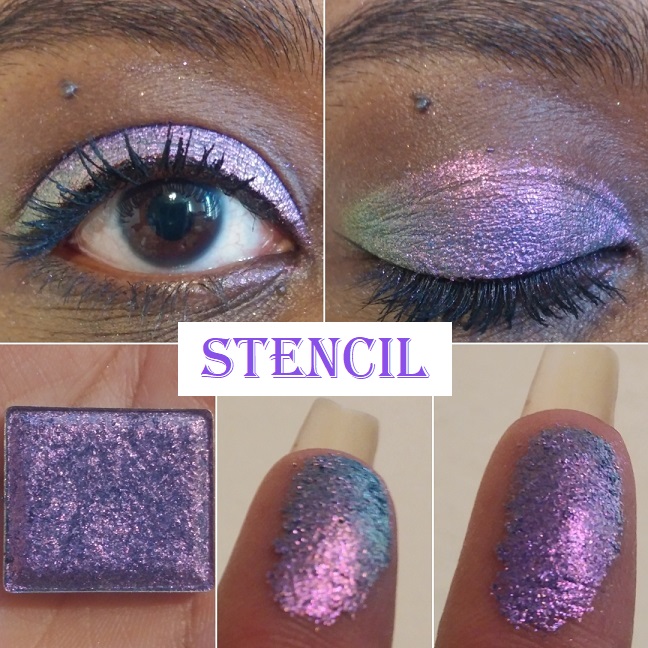
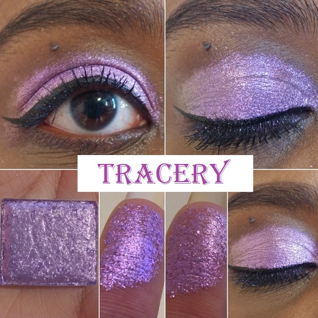
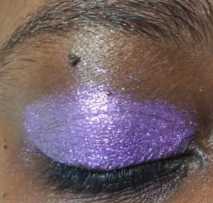
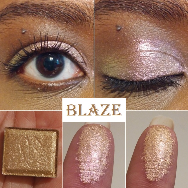
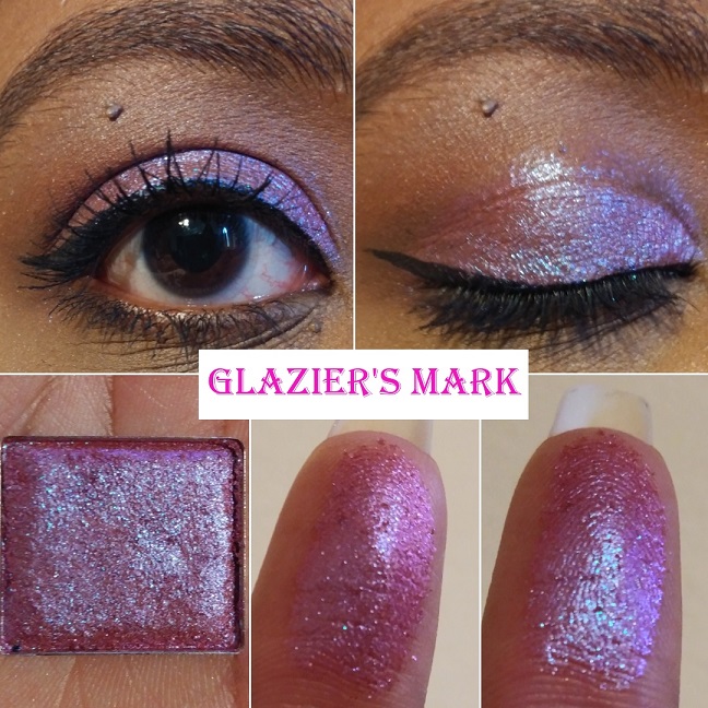
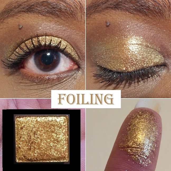
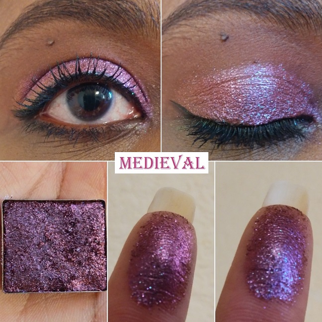
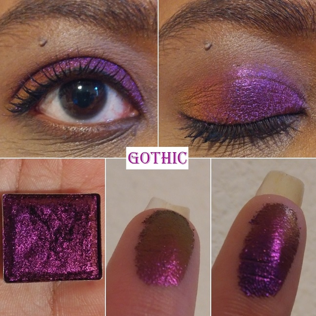
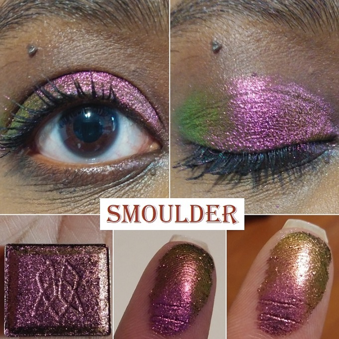
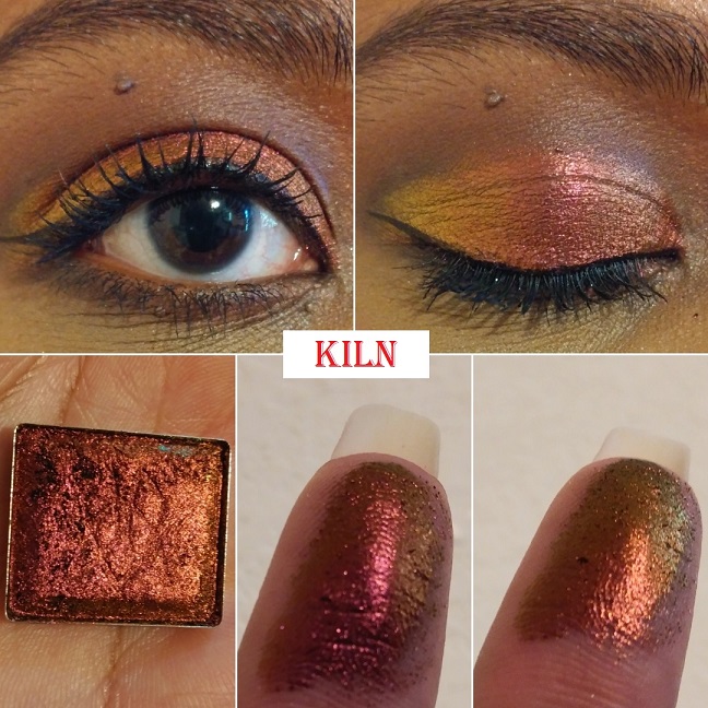
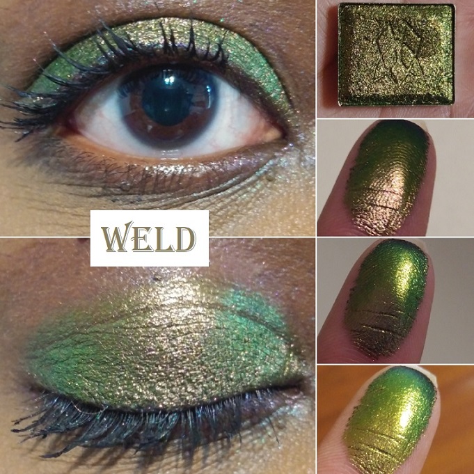
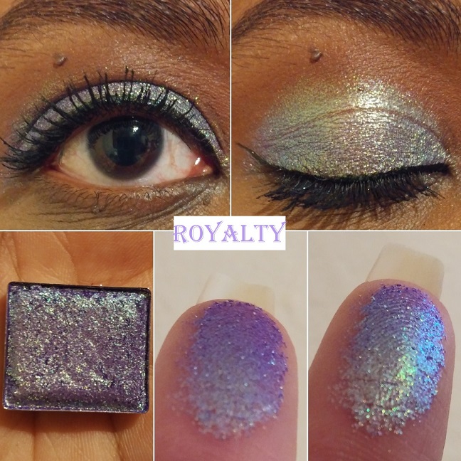
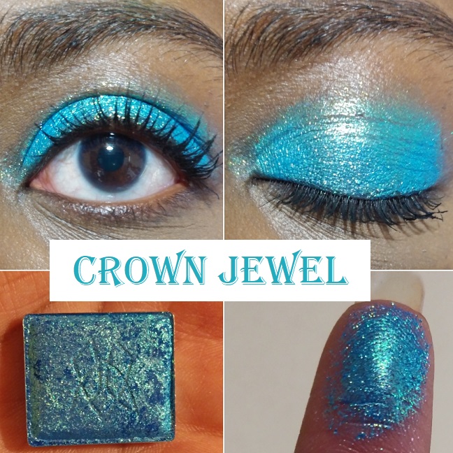
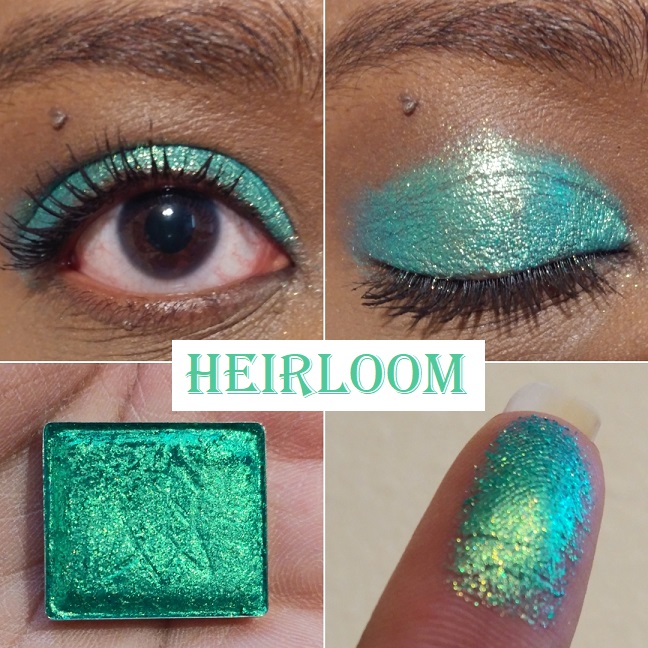
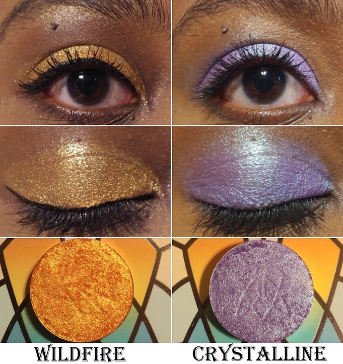
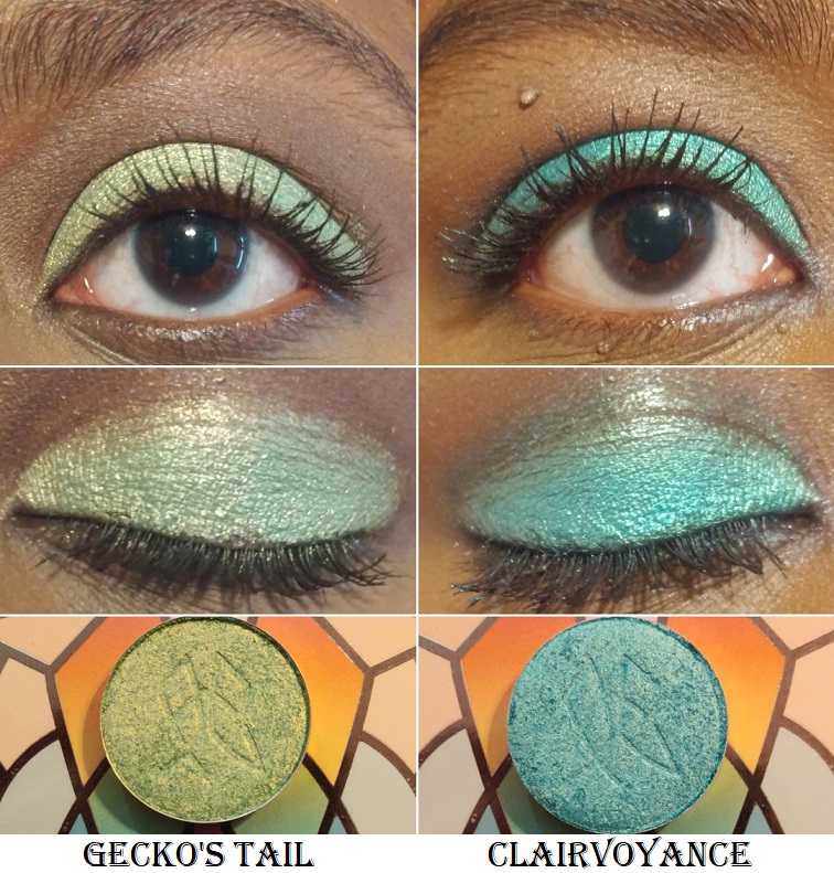
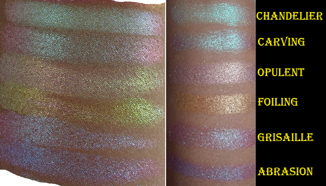
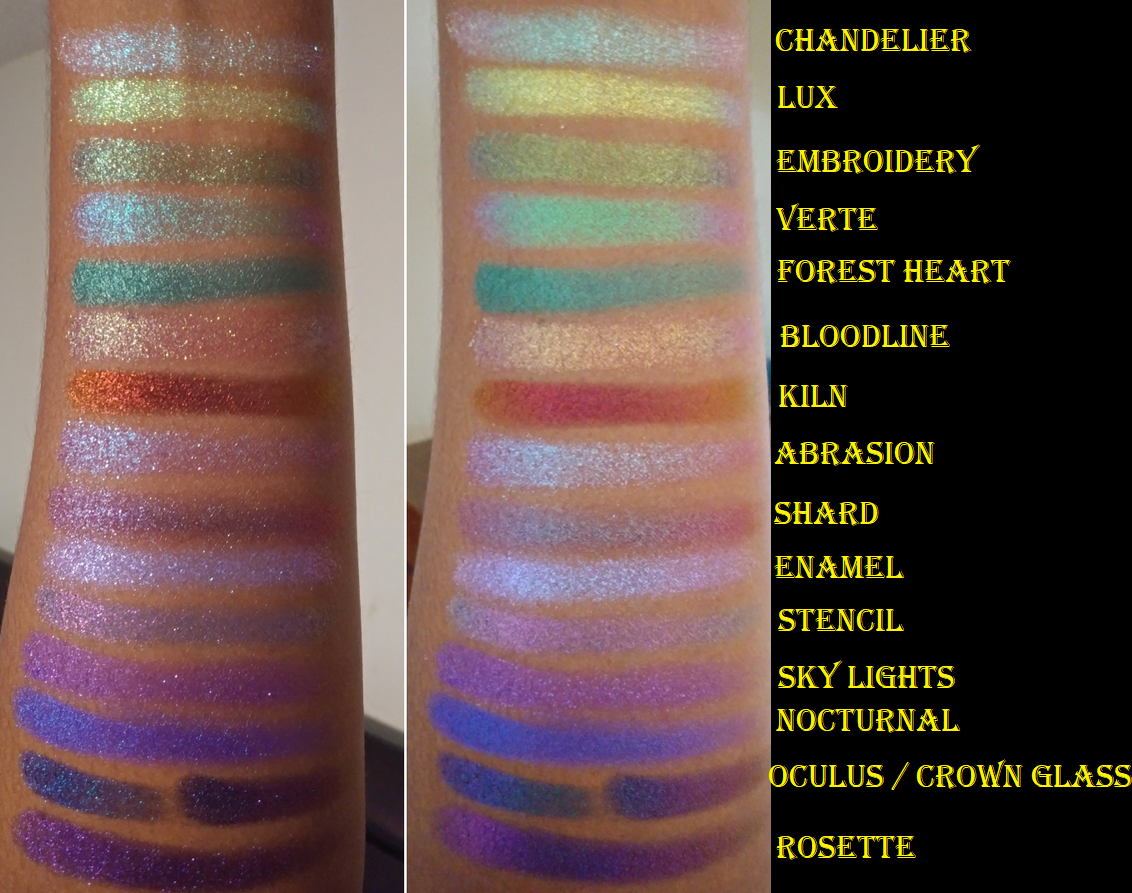
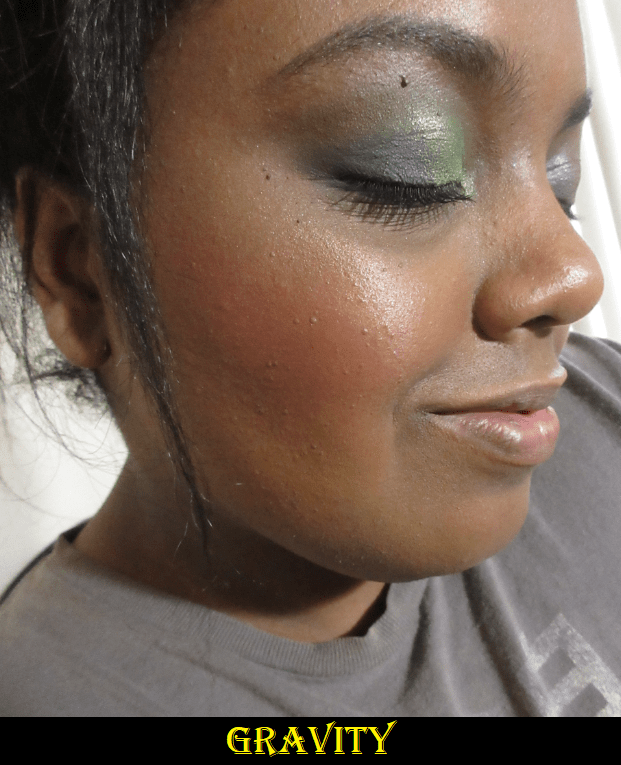
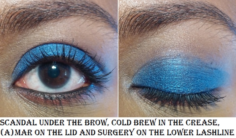
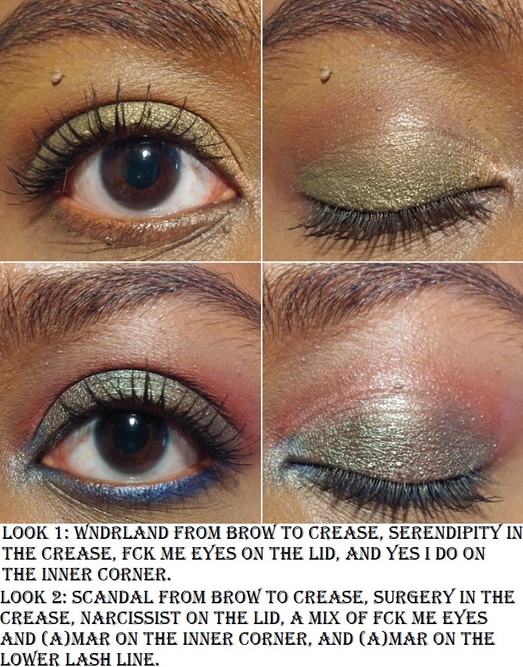
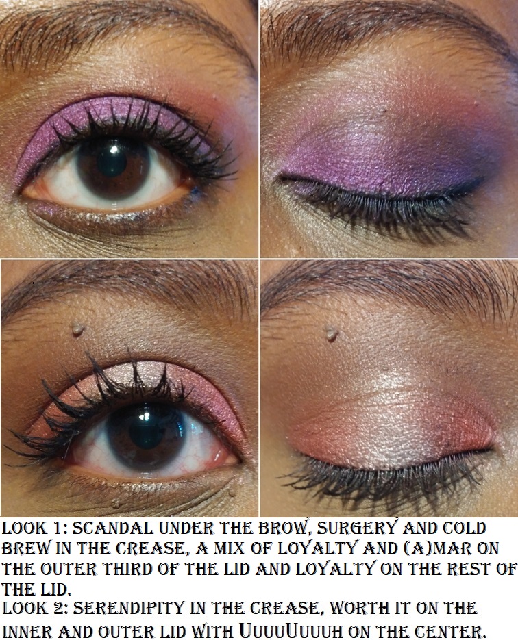
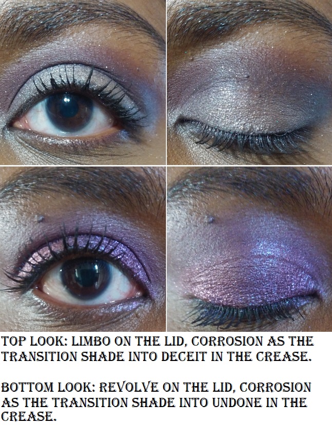
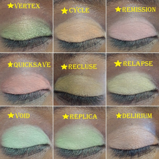
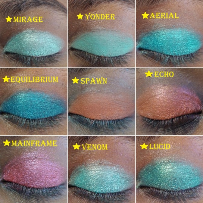
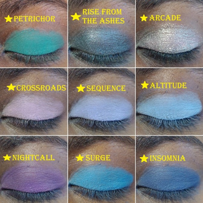
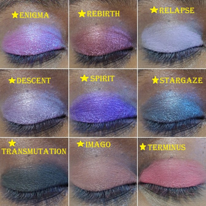
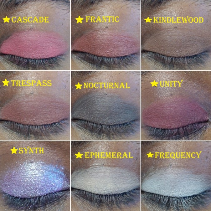
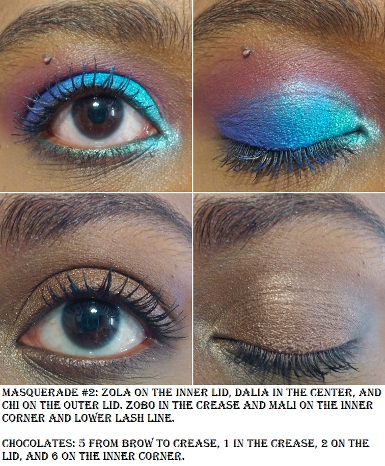
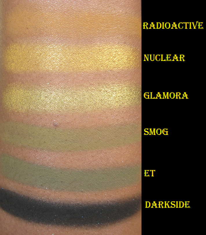
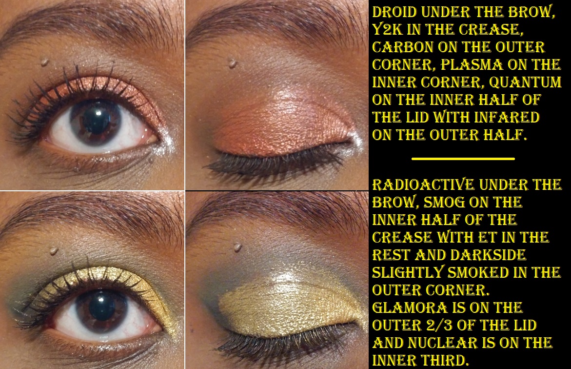
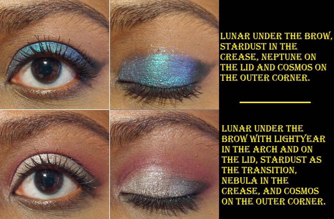
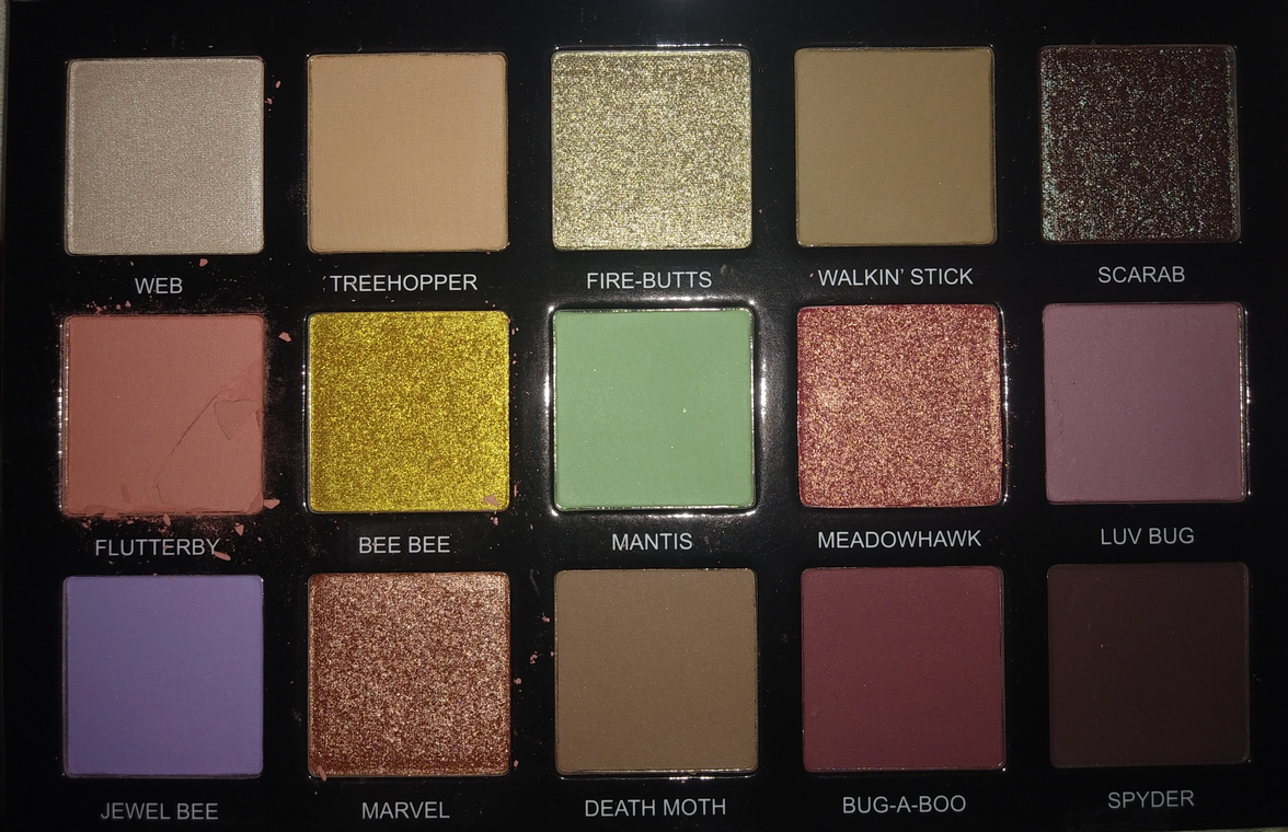
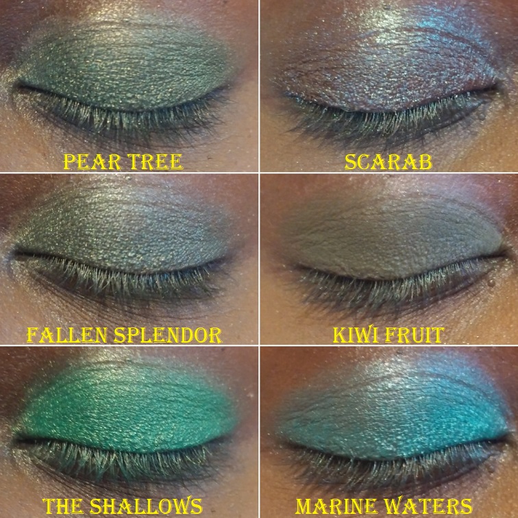
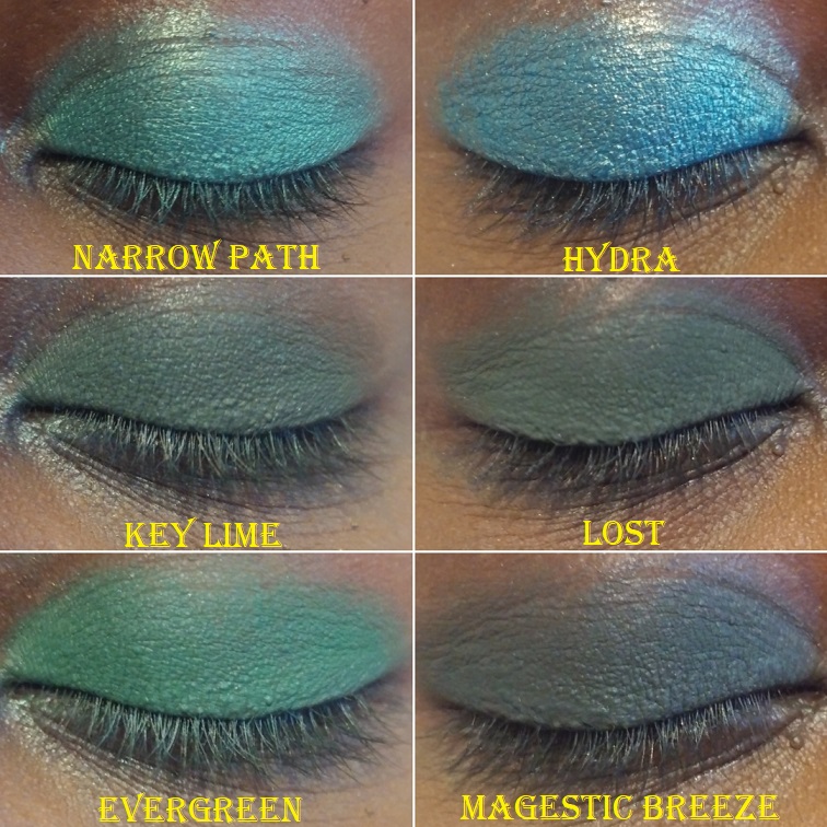
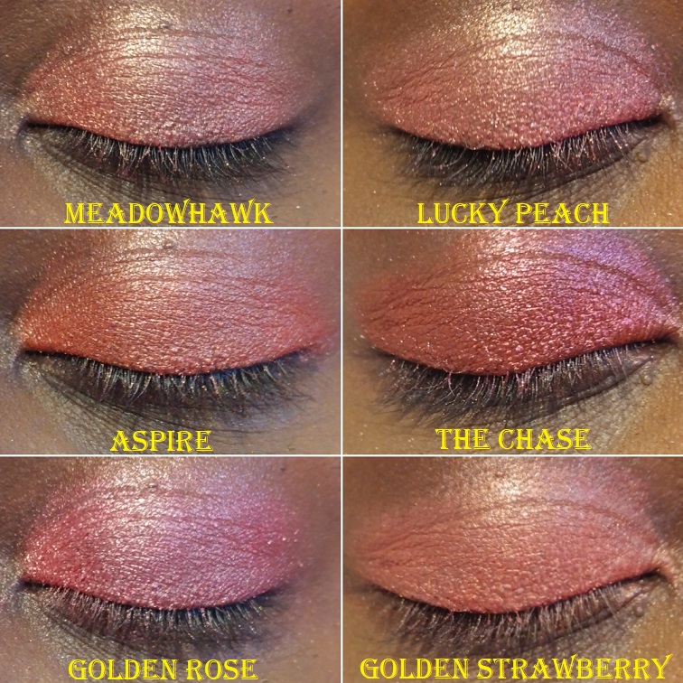
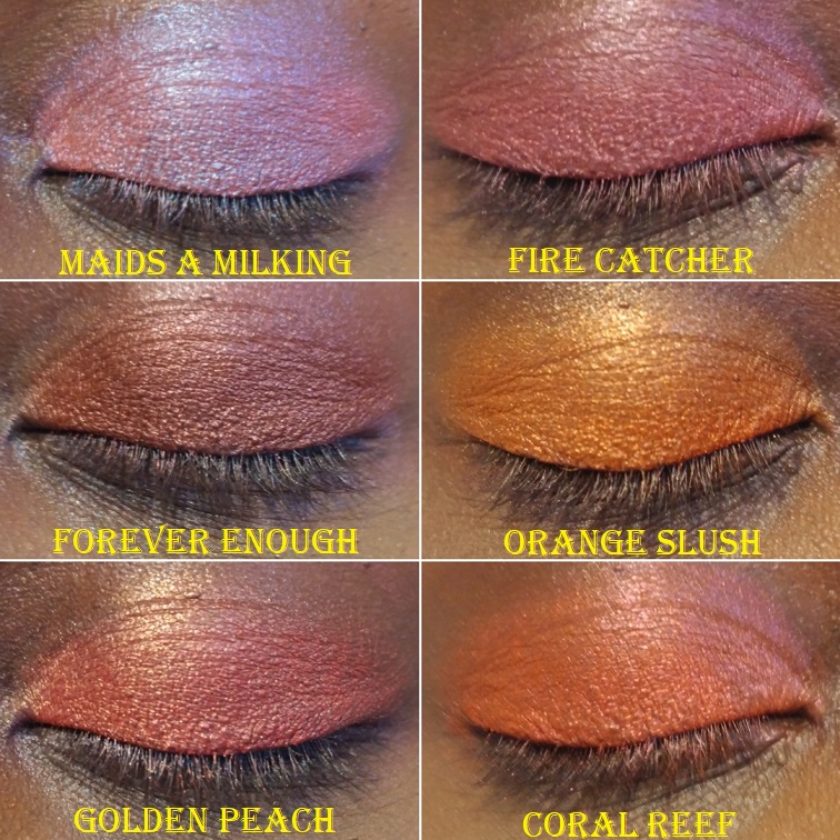
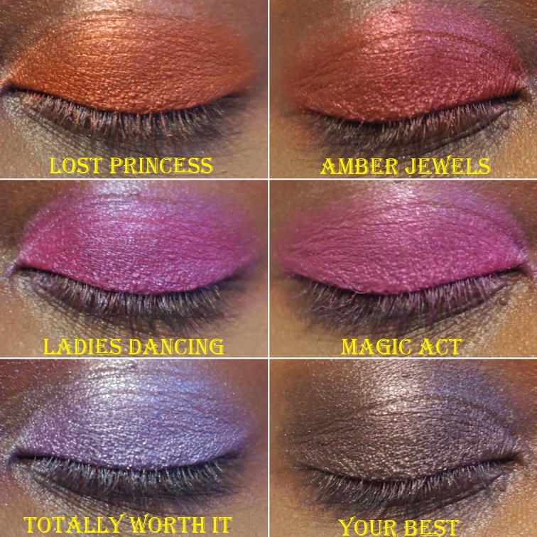
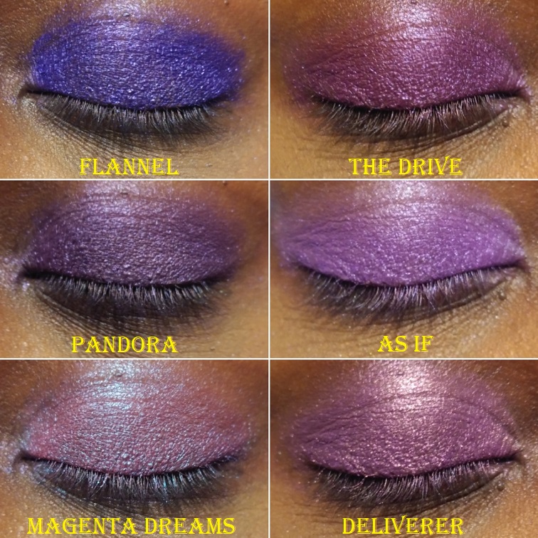
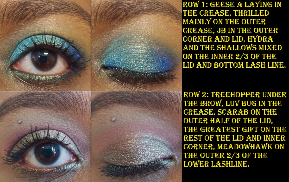
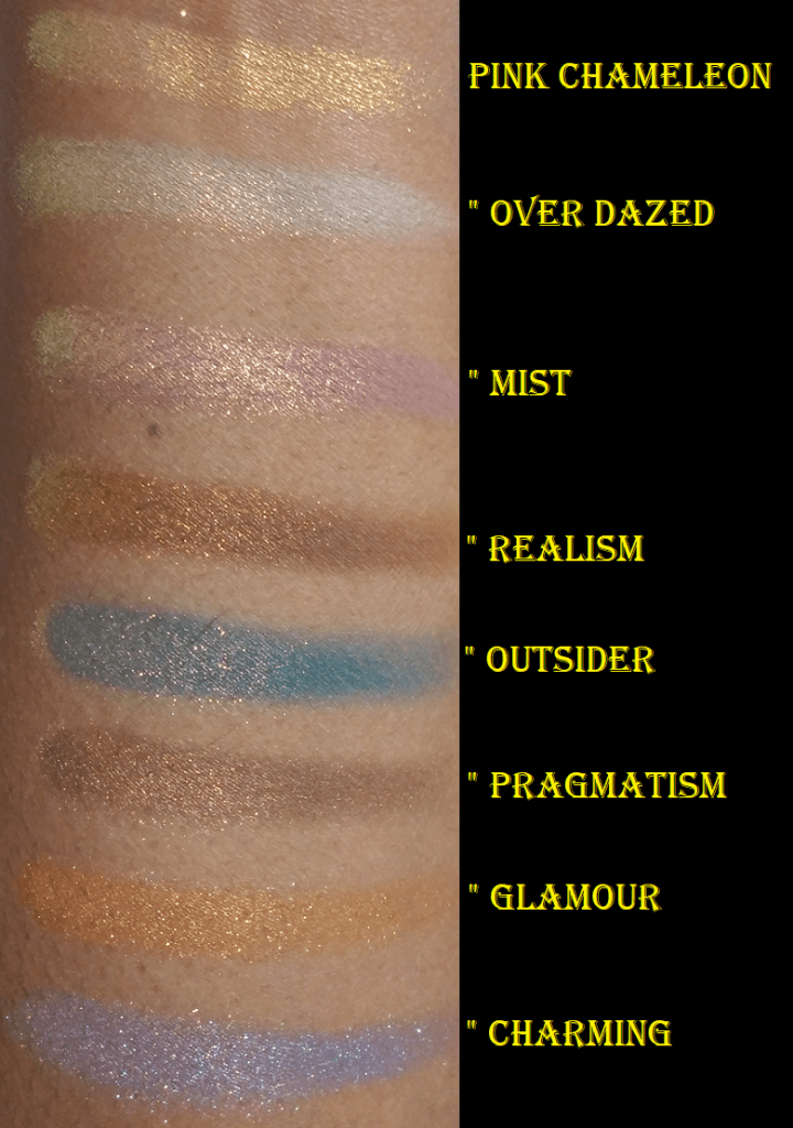
This palette’s eyeshadows are a wild mixture of different textures, finishes, and levels of opacity. Swatching each shade was like unraveling a mystery; I got quite a few surprises! I instinctively switched between using my brushes of various shapes and fibers and density versus my fingers, when to use a glitter glue, when to spray it, etc. to create the looks I wanted. Although it was fun and not too time consuming to discover the ins and outs of this palette, this is technically not beginner-friendly. The very fact of having a palette with so many different textures lends to the challenge. I think it would be easy for anyone to create a pretty look because the mattes are pigmented while still being super blendable and the shimmers make an impact (by mainstream standards) without extra effort. In that sense it’s beginner-friendly, but maximizing the full potential of this palette takes intermediate level and above. There were certainly times I had to restart an eye look or do swatches on my arm to test how some of the shades paired with each other, since the effects were sometimes unexpected.
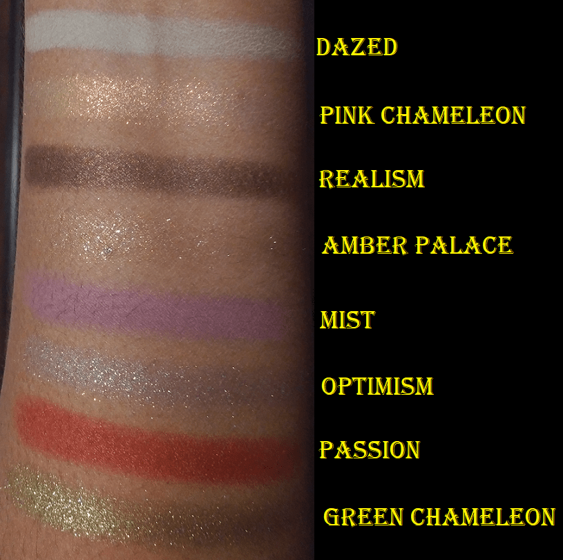
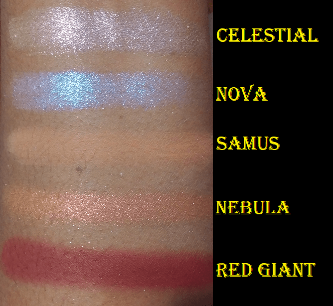
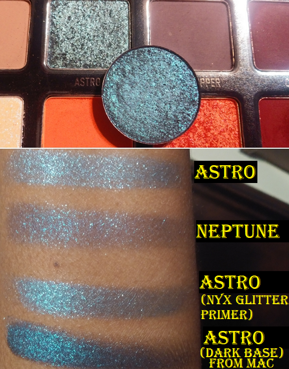
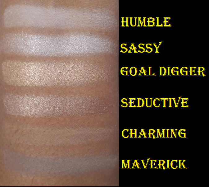
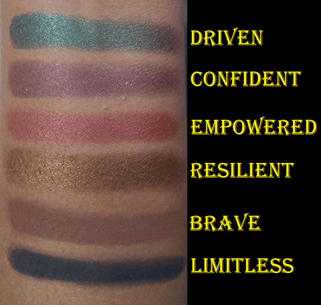
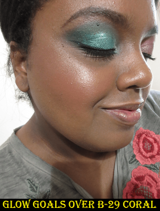
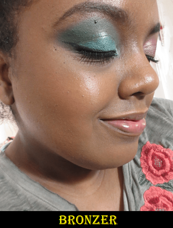
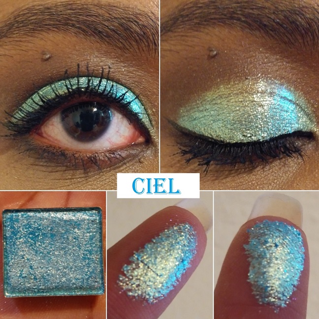
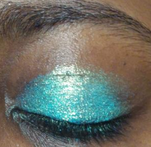
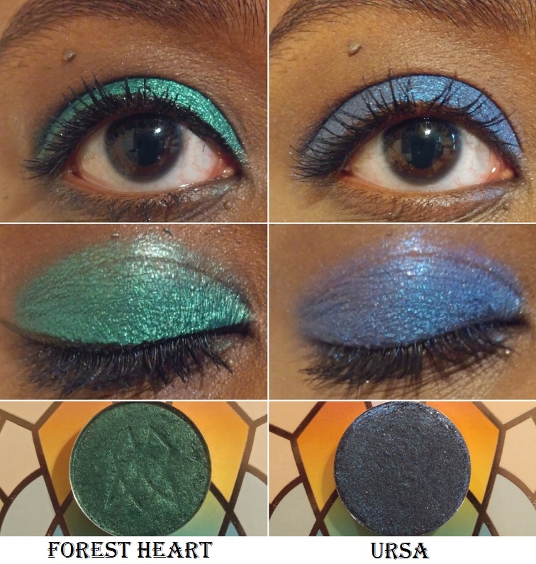
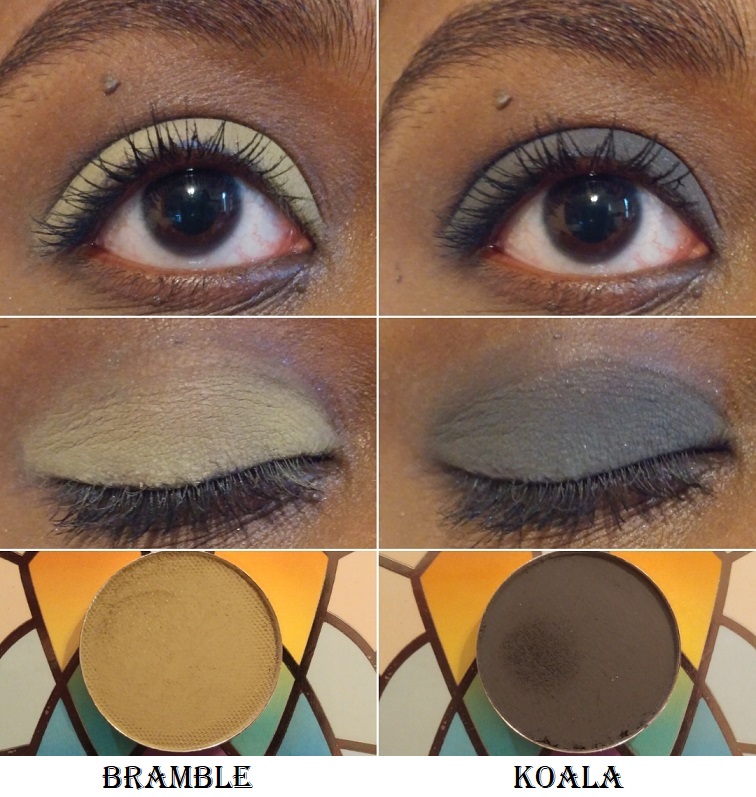
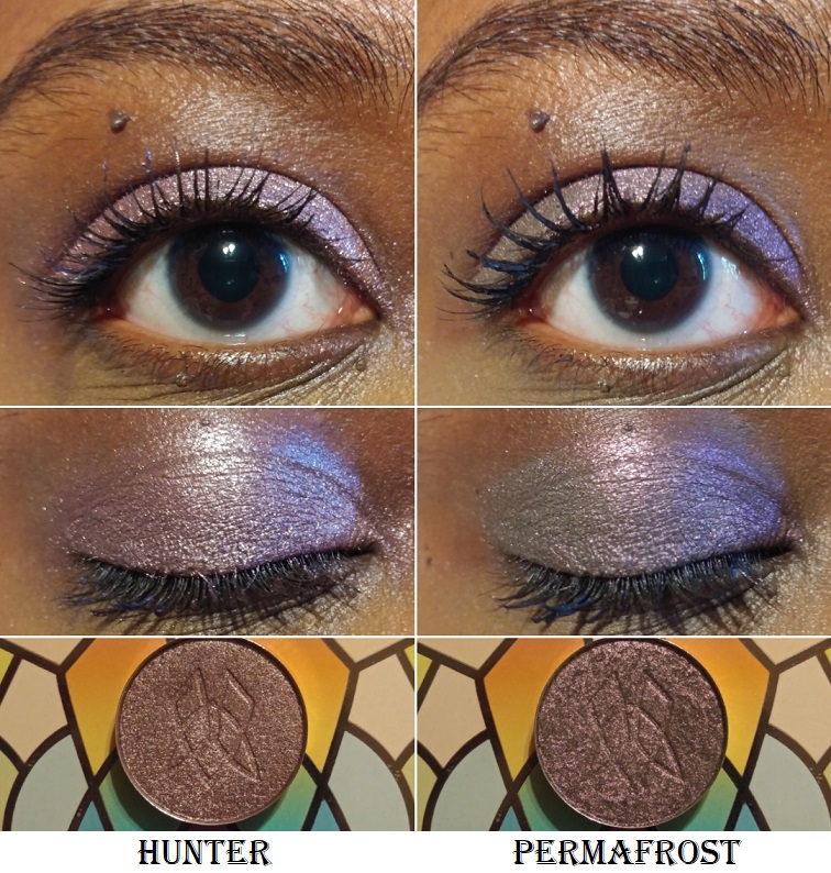
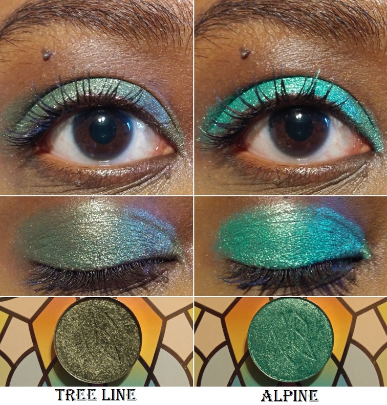
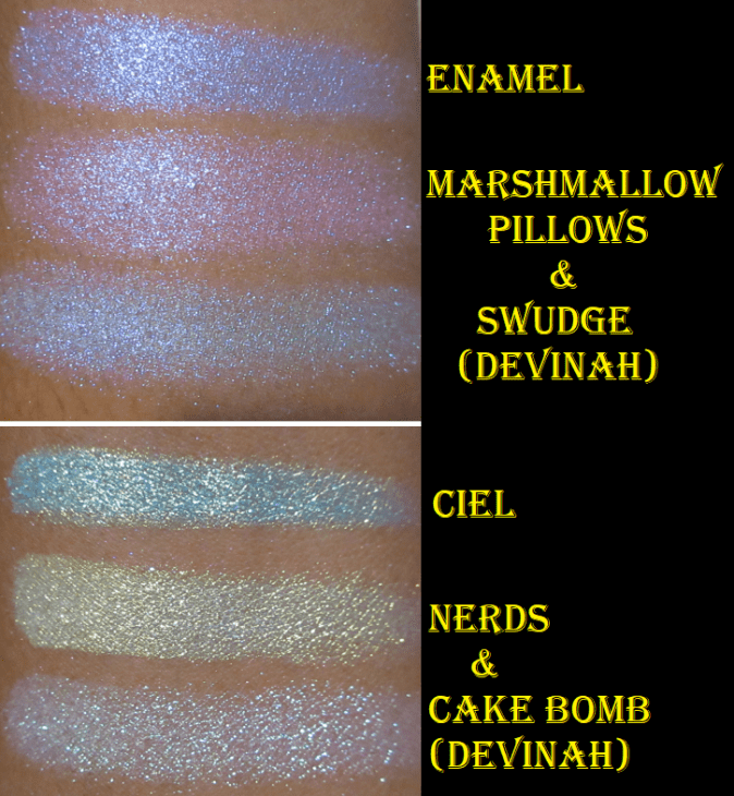
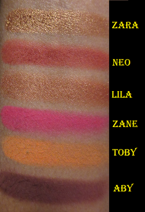
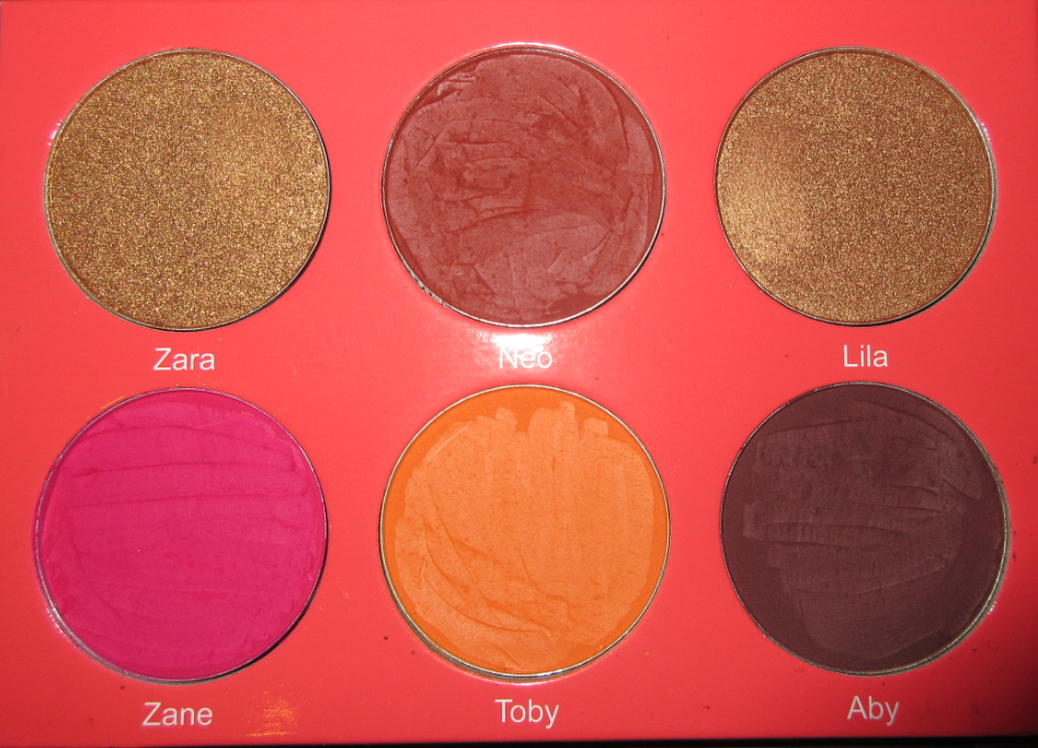
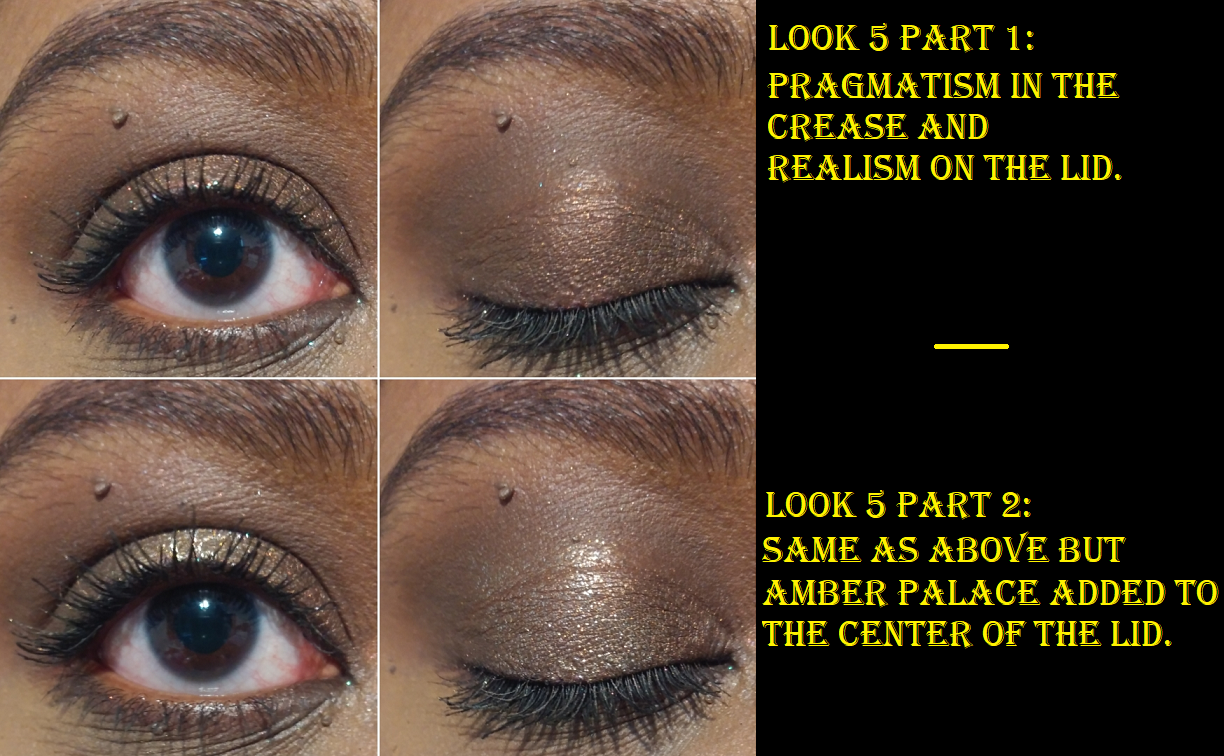
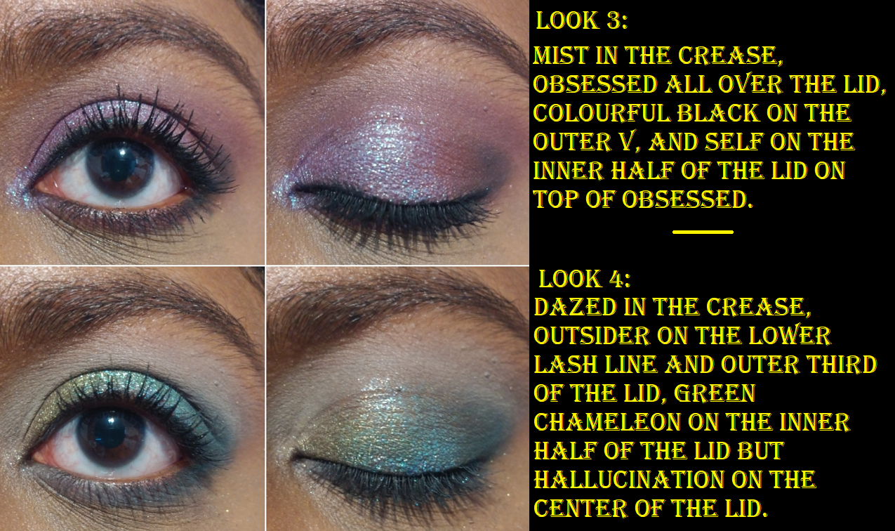
There are four mattes in this palette. Dazed is a cool grey. I was impressed with the level of pigmentation and how a shade like this didn’t look patchy or ashy on me. I think it’s because there is a little green to the tone of that shade which goes well on my warm yellow-toned skin. Mist is a cool light purple. This is another shade that would usually appear a little ashy or patchy on me, but I have zero issues with this one! Pragmatism is a medium brown that deepens up the more it is applied. I prefer to use it in the crease to create depth there, but it’s not quite enough for my tastes to deepen the outer corner. Outsider is a gorgeous peacock blue or ocean blue or medium blue leaning teal. I’m not sure what the best name for this shade is, but I don’t think the description from Oden’s Eye as a, “retro green” is that much better.
Sometimes mattes swatch beautifully, but don’t perform as well on the eyes. I’m happy to report that these mattes do both!
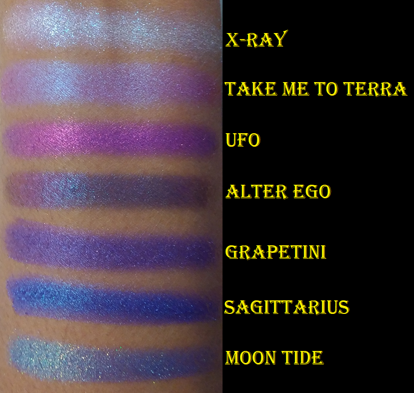
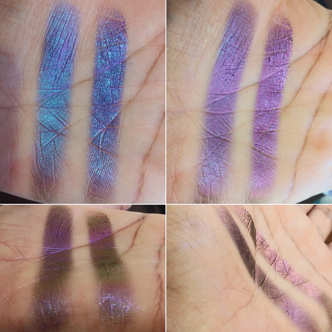
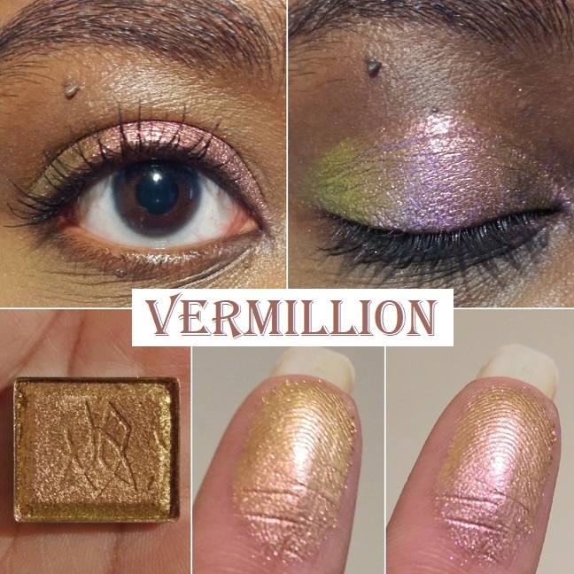
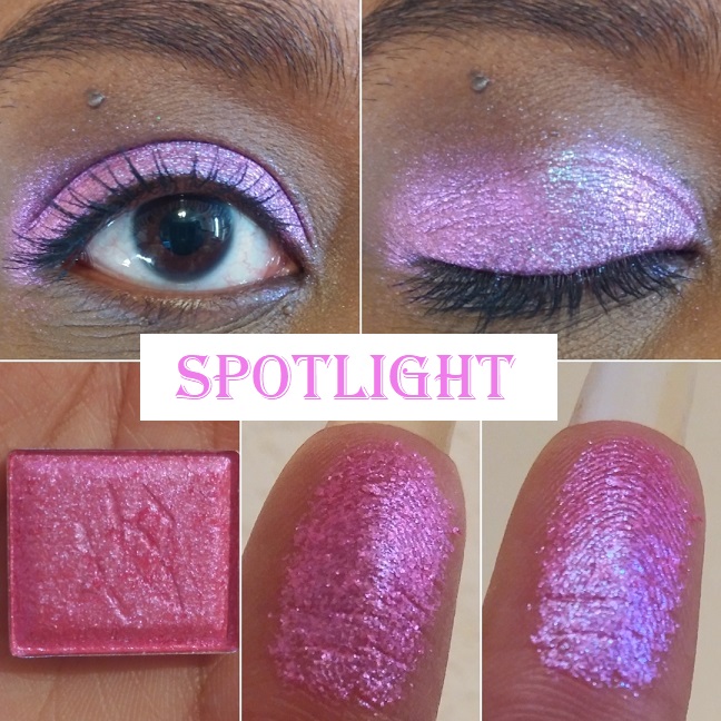
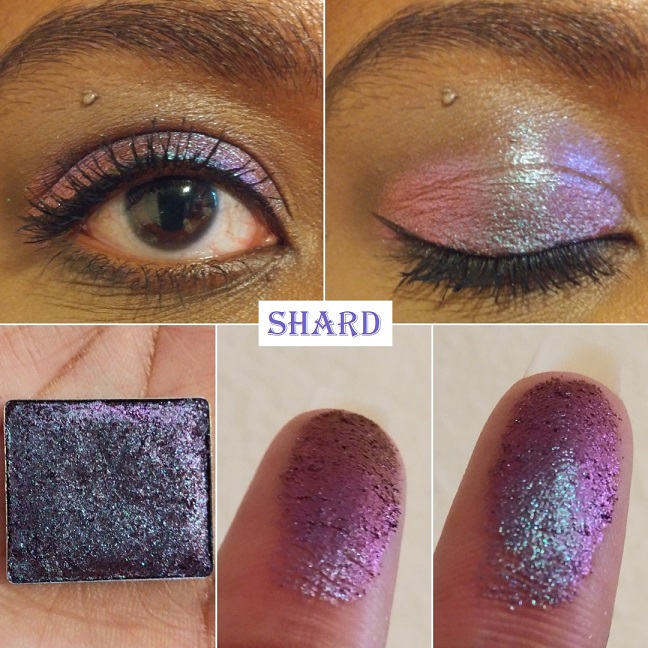
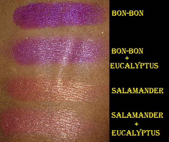
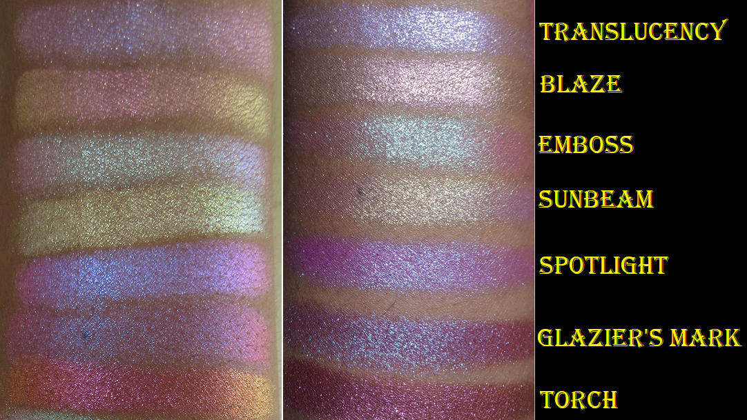
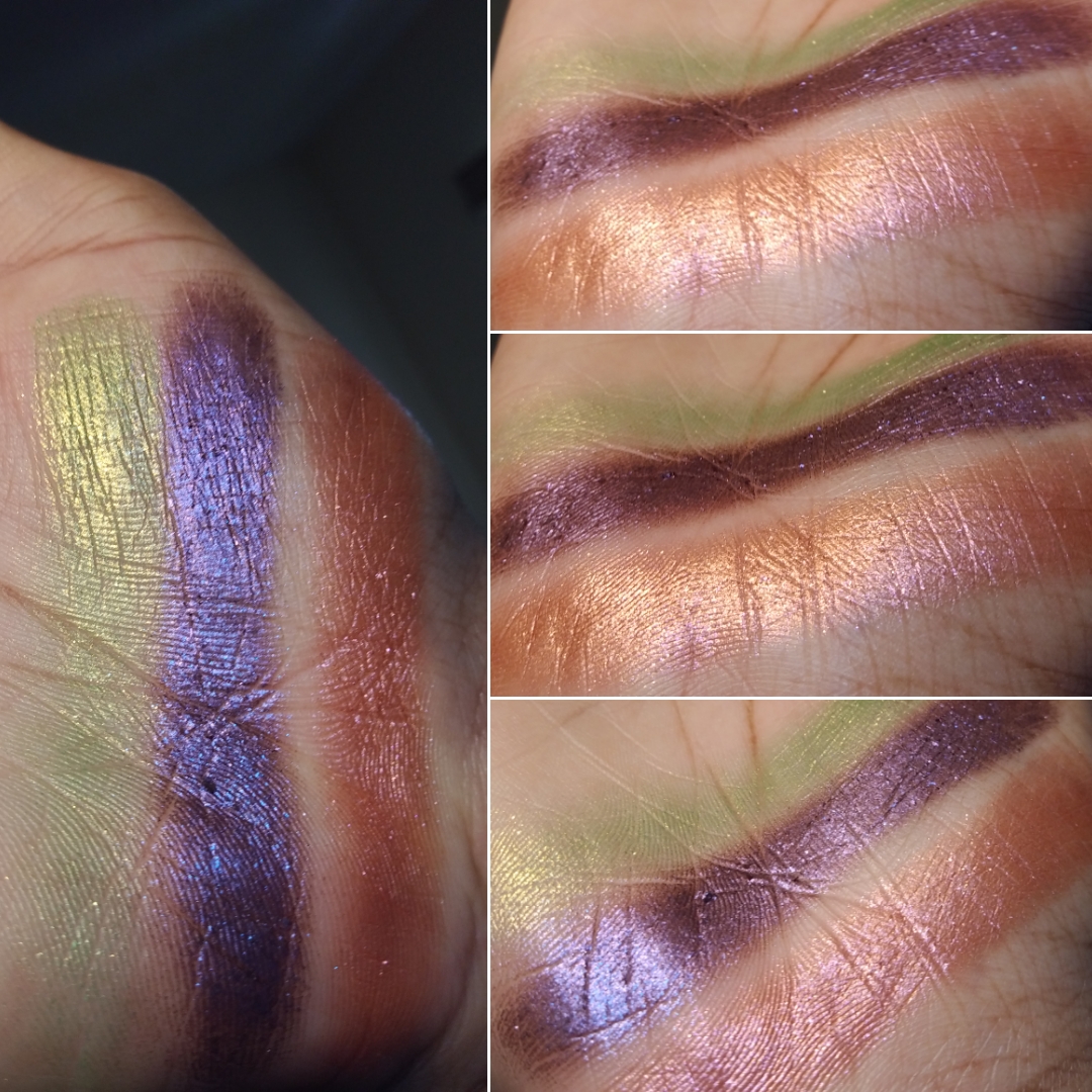
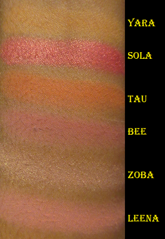
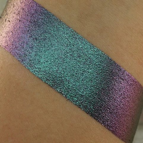
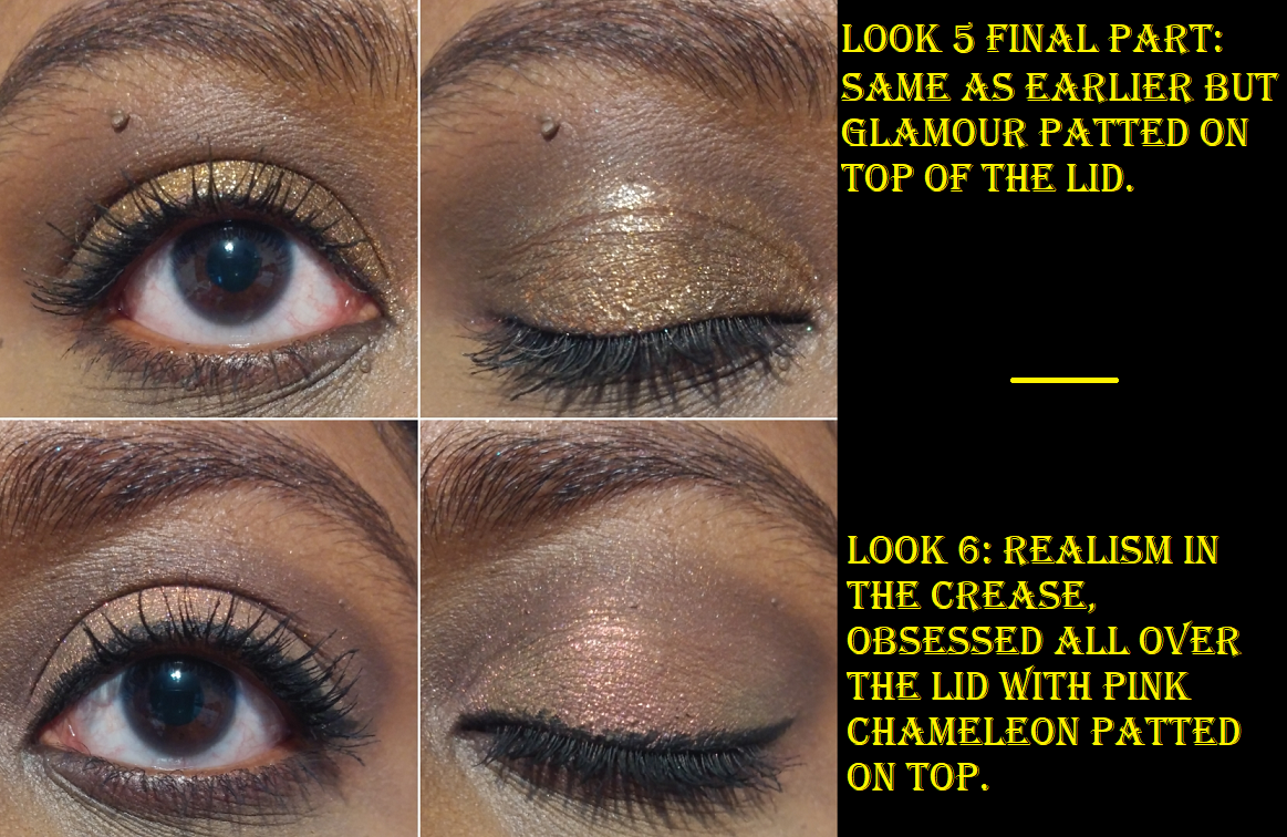
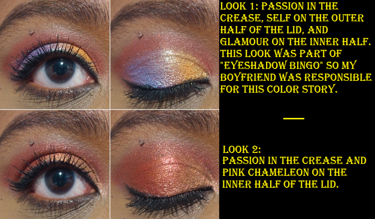
Pink Chameleon is a multichrome! The brand only describes this as having a pink, yellow, and green shift, but I swear it also looks a bit more orange or red or peachy depending on the light and angle. On my finger, this multichrome had clear and obvious shifts. On my eye, this color looked very different depending on which shades I put it next to or on top of. For instance, sometimes it would only pull peachy-pink or yellow-gold, or yellow-pink. In rare occasions I could see pink-green. The green element being the least visible on my skin and especially on camera. I had to do a lot of experimenting with Pink Chameleon to figure out which combos would give me the effect I wanted.
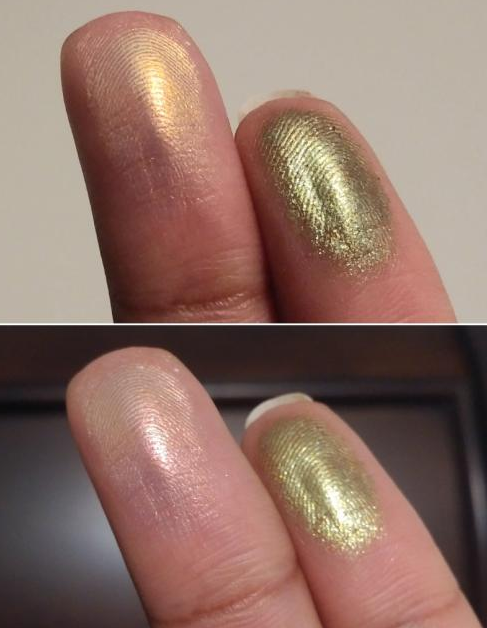
There’s another shade called Green Chameleon in this palette. The website has this listed as an, “Olive green chameleon eyeshadow, multichrome shift,” without describing what what the other colors are. Honestly, I don’t see any shift. The texture of Pink Chameleon is that slick recognizable multichrome texture like Clionadh’s Jewelled formula, Devinah’s Aurorae Flares, the shade called Fake from the Juvia’s Place Wahala 2 palette, etc. Green Chameleon feels like the other four diamond shimmers in the bottom row of the Norn’s palette. The two best ways I’ve been able to detect multichromes is to swatch them on the palm of my hand and rotate my hand around, or to apply them to my fingers and hold them vertically and raise my fingers up and down so that it moves closer then further from the light. All I can see is it going from an olive green to a slightly lighter olive green or a greenish yellow. Its not a difference anyone will notice if you put this on your eyes. It’s still a pretty shade, but I don’t count it as a multichrome or duochrome.
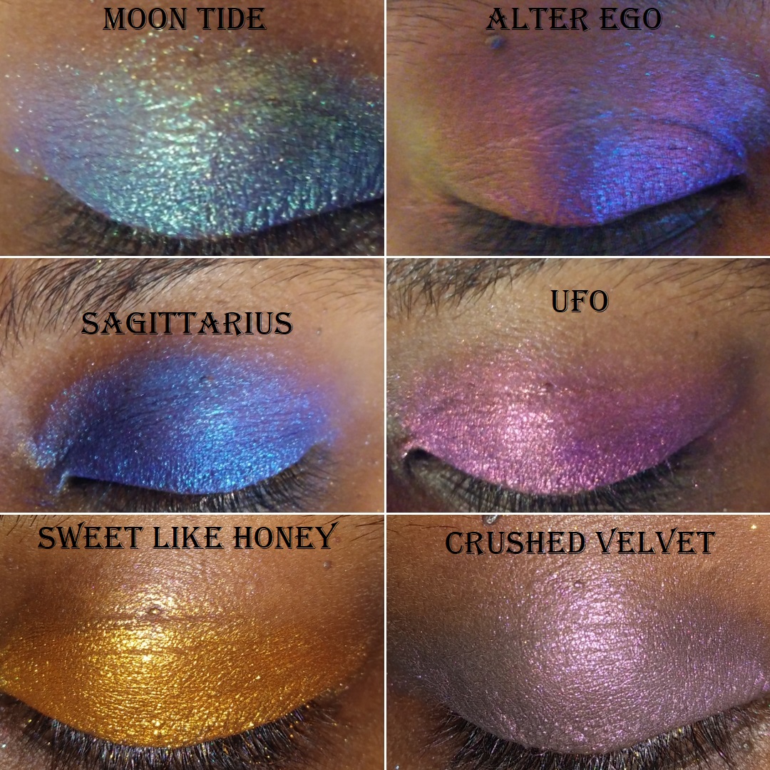
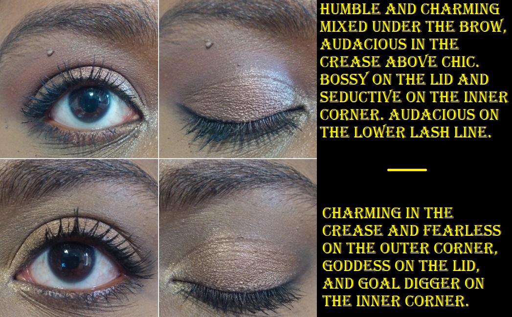
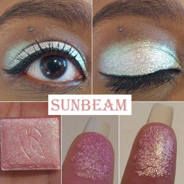
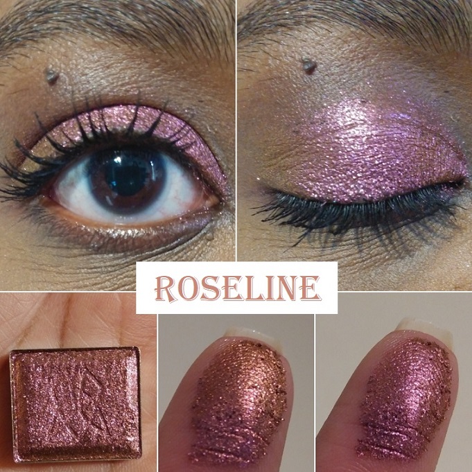
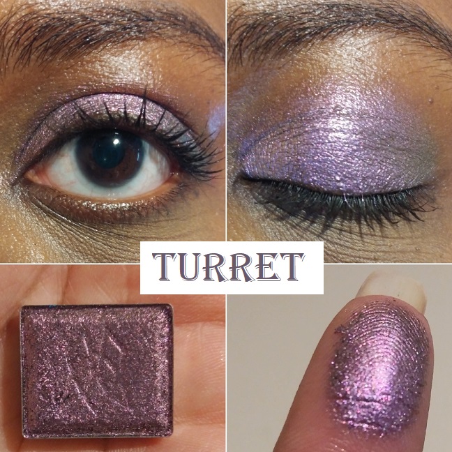
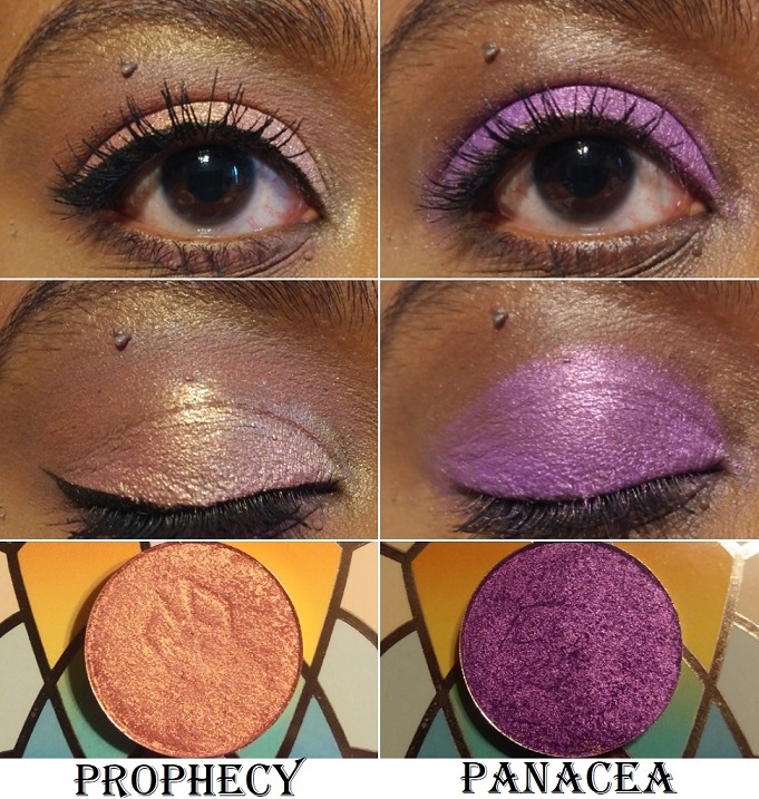
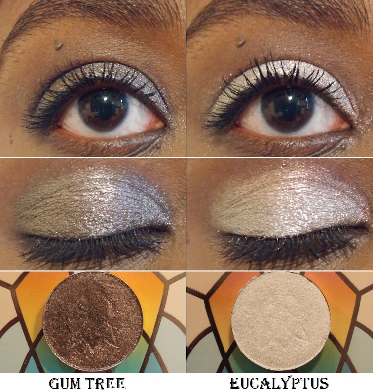
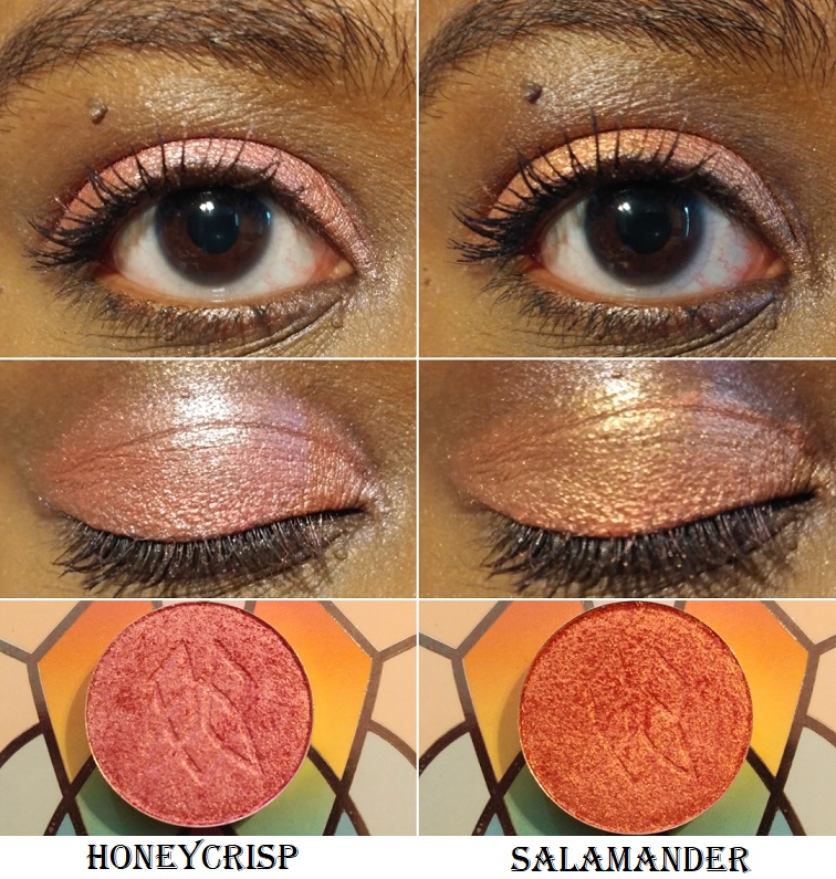
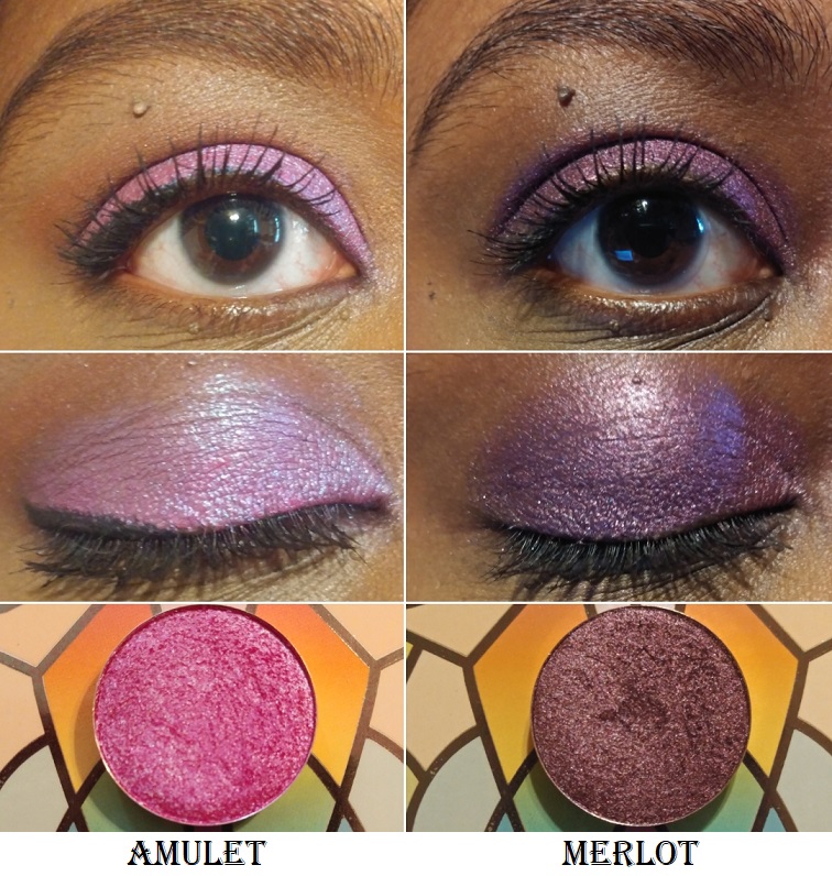
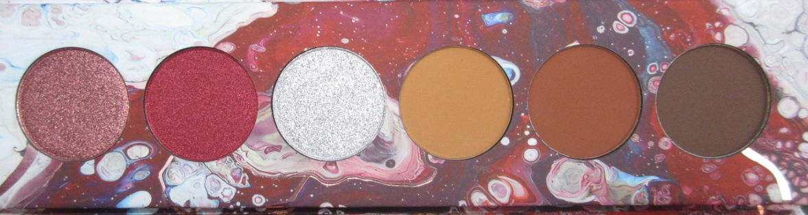
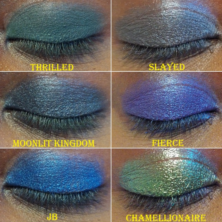
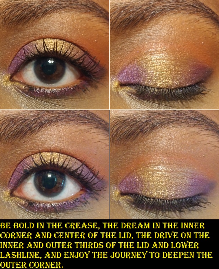
There are two easily recognizable satin shades in this palette, or as Oden’s eye says, “metallic eyeshadows that look like satin.” Metallic shades are different from my perspective, so I’ll just refer to them as satins. One is Realism, a gorgeous medium-dark brown. Realism has visible copper reflects, but I prefer to have more of a contrast in my eyeshadow looks. I don’t mind doing a neutral eye from time to time, but if I’m going neutral I want a bit more sparkle. So, what I love to do is combine this shade with pretty much any of the more sparkly shades in this palette. There are so many options to choose from that are so pretty. The outcomes are different enough that I wanted to demonstrate several of them.
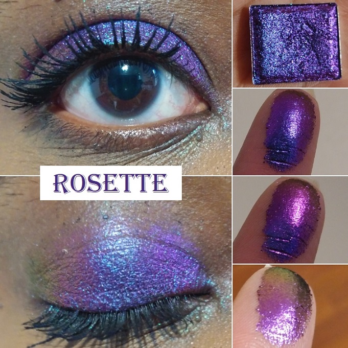
The other satin is a “red velvet” shade called Passion. Although pretty, I don’t think this particular tone of red goes that well with any of the other colorful shades. Even though reds and purples or reds and oranges are usually a match made in heaven, I find that this shade clashes with anything other than the neutrals or surprisingly the Pink Chameleon shadow.
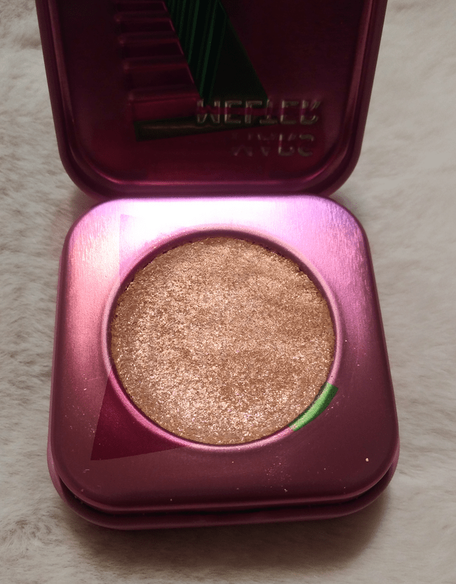
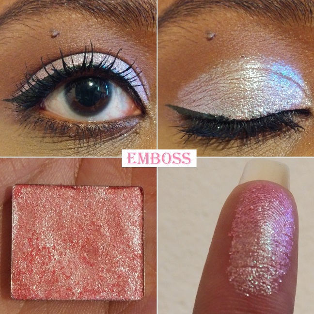
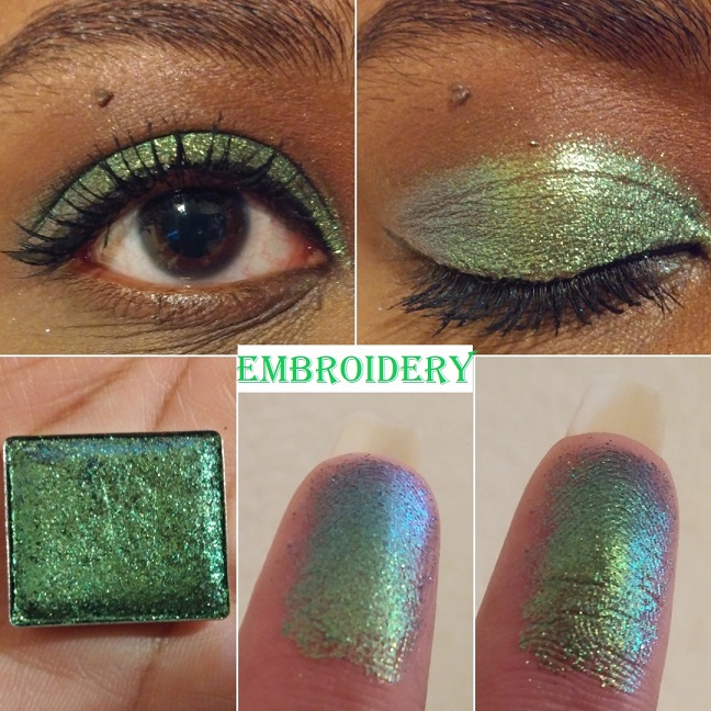
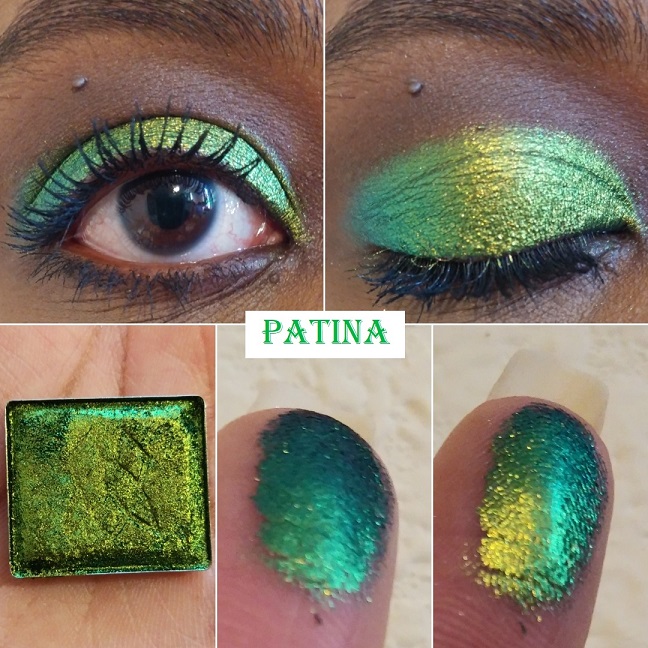
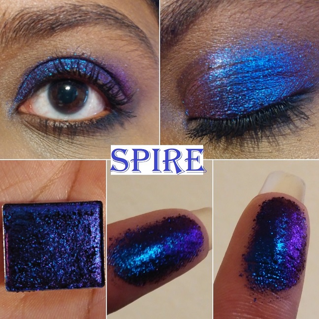
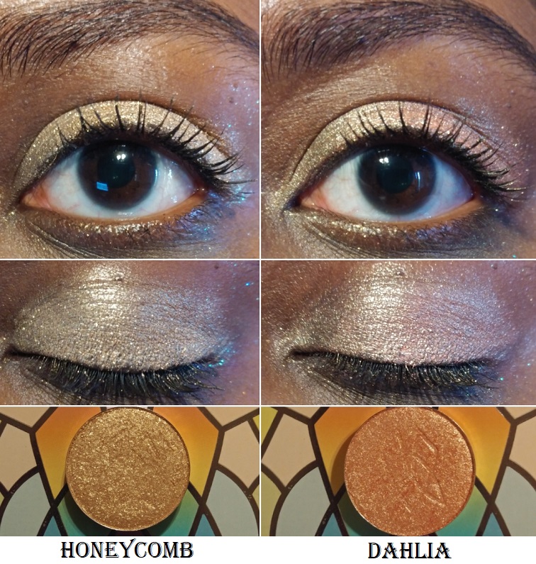
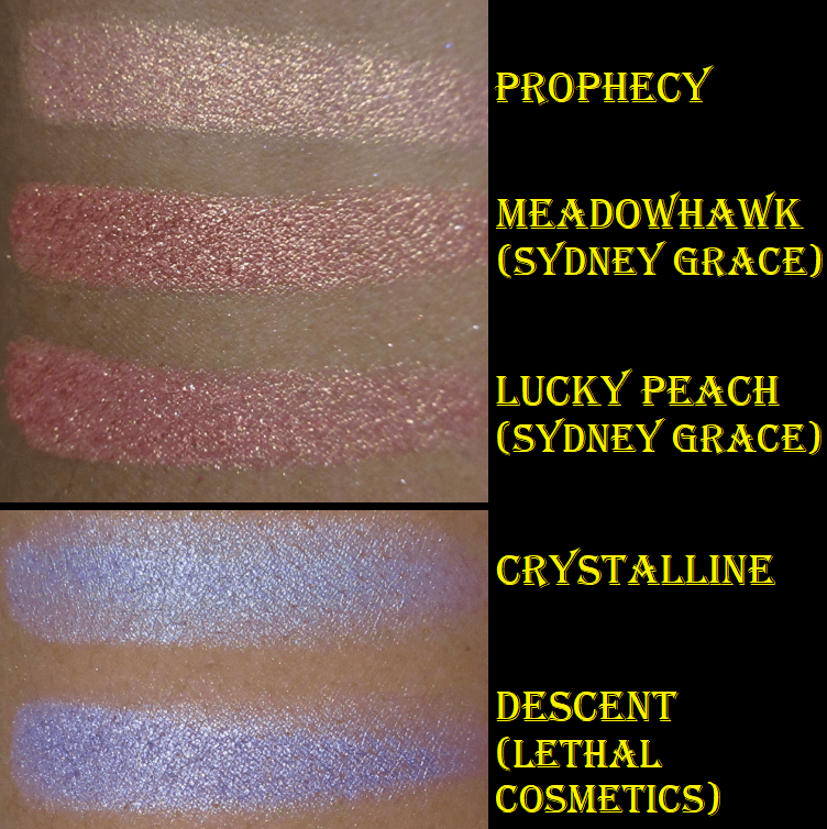
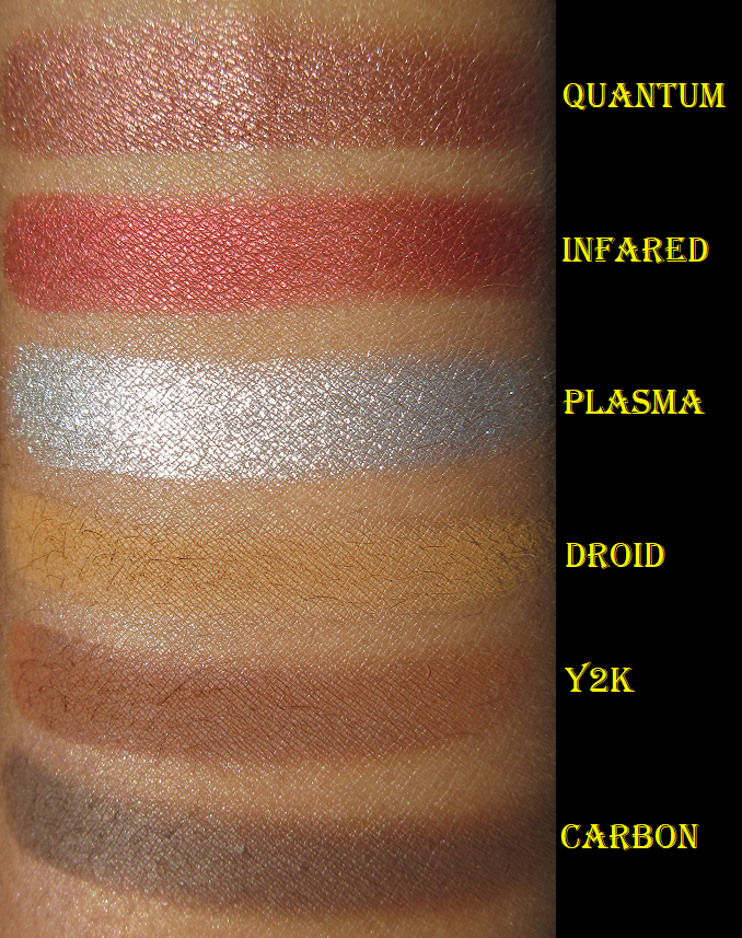
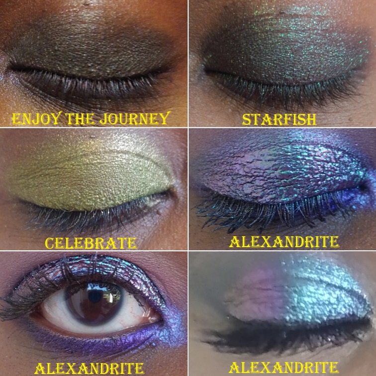
Amber Palace looks marbled in the pan and I’m happy to report that it’s not an over-spray and the pattern doesn’t disappear once you’ve used it a few times. This “sparkling diamond shimmer shadow” is a mixture of gold and silver that runs throughout the entire pan. I consider this a topper shadow because the amber orange-brown base matches my skin tone so much that I just see the sparkle. It doesn’t look like there’s a base at all until I swatch it on my palm.
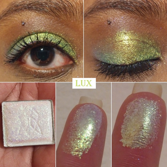
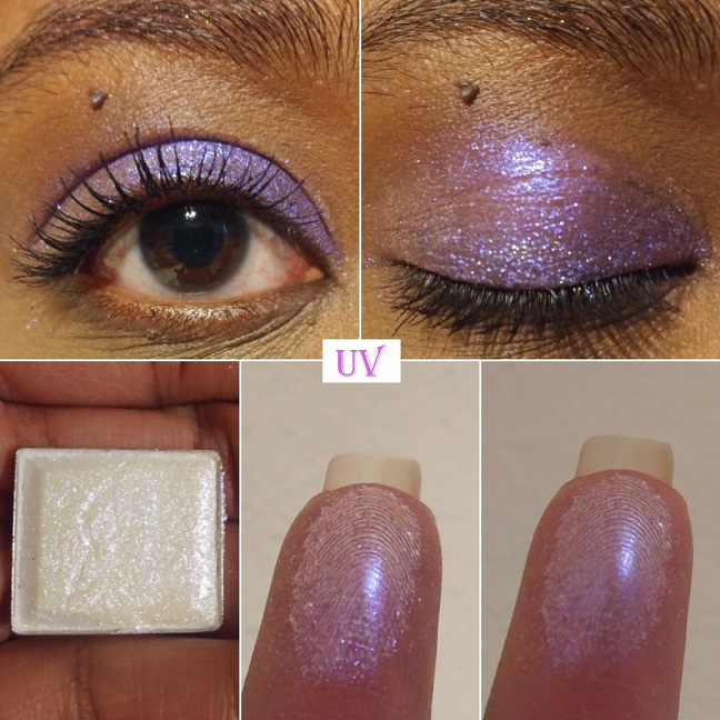
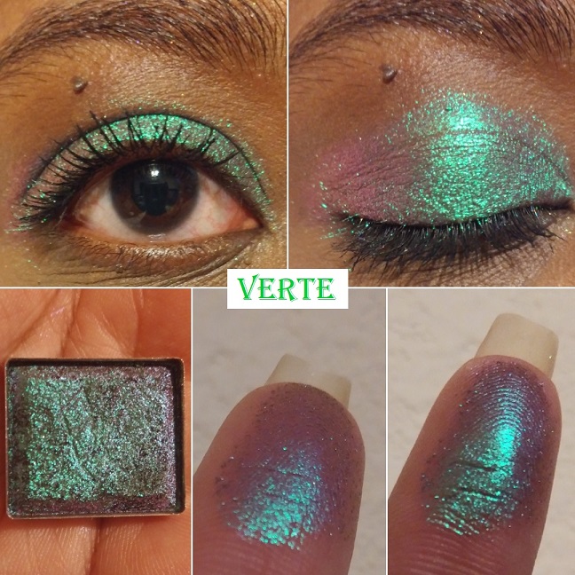
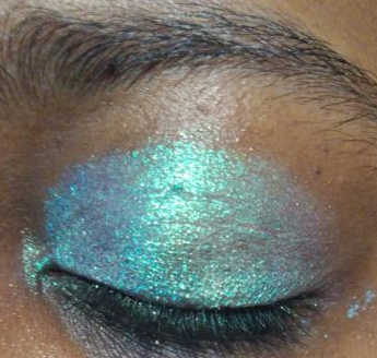
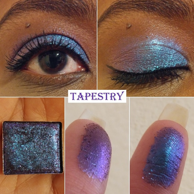
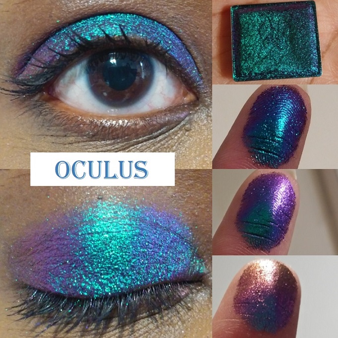
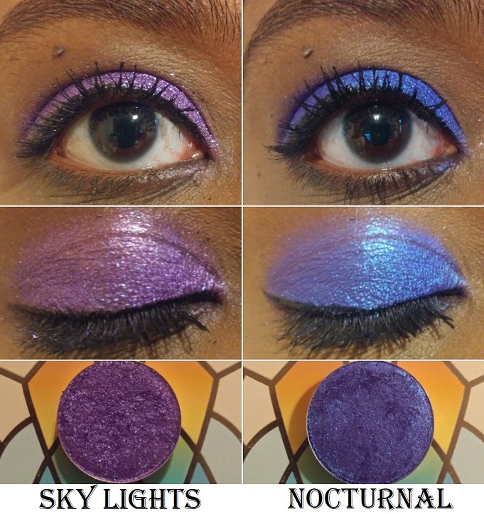
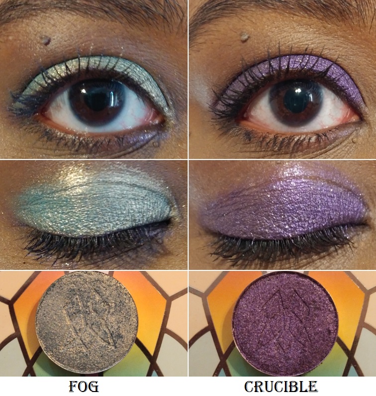
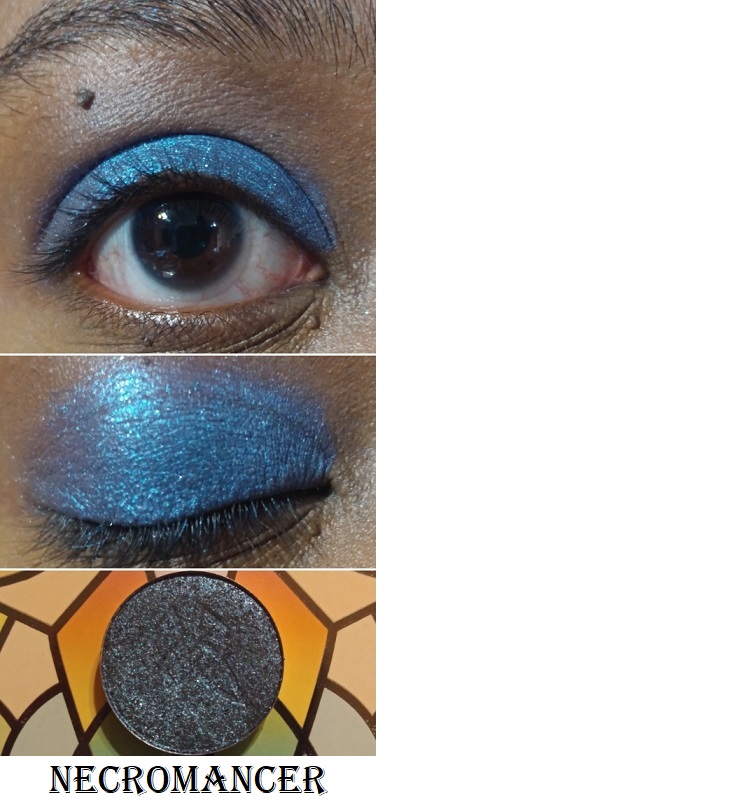
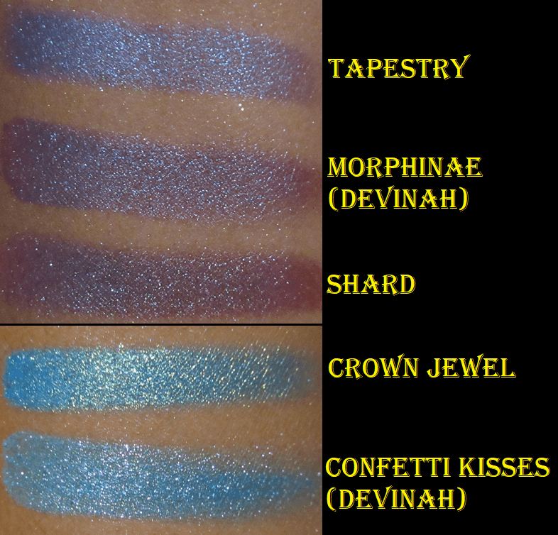
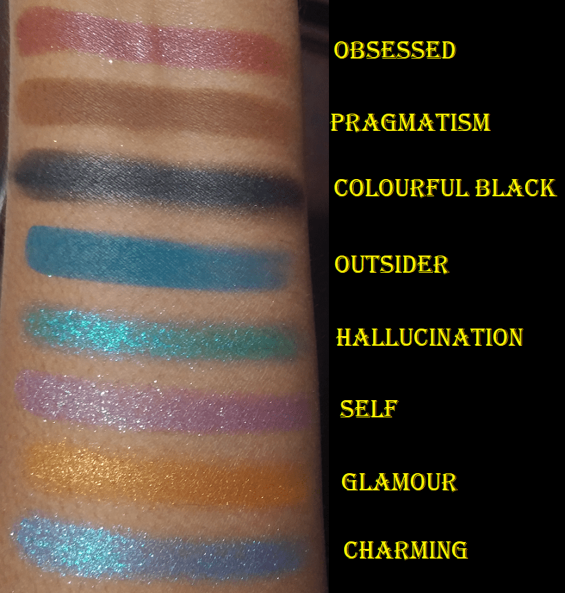
There are five other diamond shimmers listed in this palette. In fact, all the sparkly-glittery shadows in this palette are referred to as diamond shimmers. The first is Optimism, which looks similar in swatches to Amber Palace except the base color is purple. It’s another shade I consider a topper because the base is so sheer. I prefer to use this shade with cooler toned looks and Amber Palace for warmer ones. Next is Hallucination, a blue-green shade that’s like a medium toned turquoise with pink and purple shimmer. The texture of this shade is wetter than the others and doesn’t feel as well bound to the sparkles as the others. It feels like it was intended to be a shimmer version of a cream to powder formula. It leaves a residue behind on the finger, the way cream products do, and takes a bit of smoothing to give it less of a chunky appearance. The color is beautiful but I’m not a fan of this particular formula. It reminds me of the texture my homemade eyeshadows feel like when I use slightly too much liquid binder. Self is a stunning purple with teal, silver, and perhaps green sparkles. It’s very much my kind of eyeshadow shade. Glamour is an orange and gold shadow that reminds me of the pressed glitter shade I wanted from the Juvia’s Place Nubian Glow palette (but depotted and thew away). I’m so glad to have this version as a regular non-pressed-glitter shadow! The eyeshadow palettes from Oden’s Eye’s previous collections had some pressed glitters in them but there are none in the Norn’s Collection.
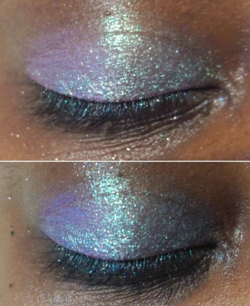
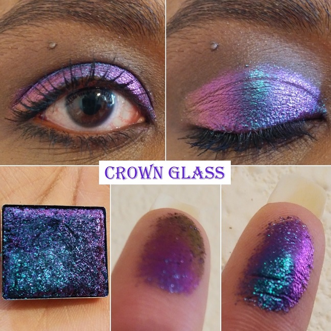
Lasly, Charming is like a blue-purple duochrome with teal, purple, and pink shimmer.
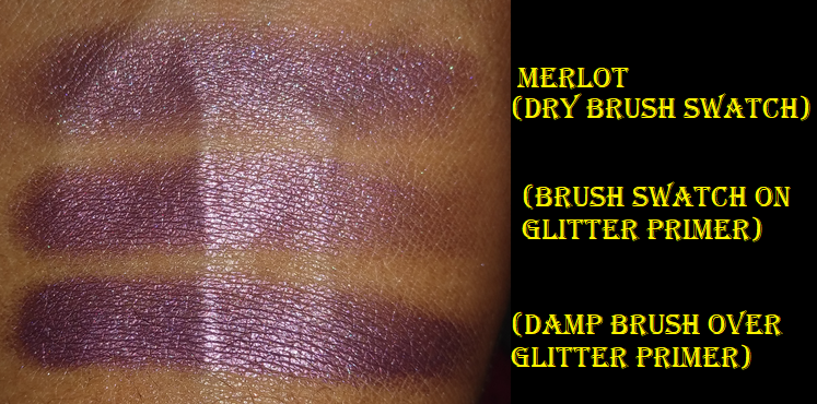
Then there are two other textures that stand out. Obsessed, the “violet with pink and purple diamond shimmers,” feels is like a cream to powder shadow. It feels wetter than the two satin shades in this palette, but not as full on creamy as the cream shadow shades Natasha Denona has in the Metropolis palette. Obsessed takes several dips with a brush to get an opaque layer on the eye. It’s slightly easier with a finger, but the product sticks a bit more to the finger than the eye, so it tugs on my skin more than I’d like. Colourful Black felt like Obsessed in the beginning, but after a week it felt a lot more dry, like a typical shimmer eyeshadow. This goes on the skin very easily with a brush, so there’s no need to use a finger to apply it. It’s very pigmented straight out of the gate, but it can be blended to appear in a lighter and sheerer layer. According to Oden’s Eye, this shade, “…contains all colors of shimmers. Different usage will create different effects.” It makes for an excellent deepening shade, liner, and base. Although I can see the sparkles in the pan, the effect is satin-like with more sheen than a matte but without seeing the glitter particles. Usually all I require for black shadows is for them to be dark enough and blendable. This is one of the few times I can say I actually like the shade for its color and not just about its depth.
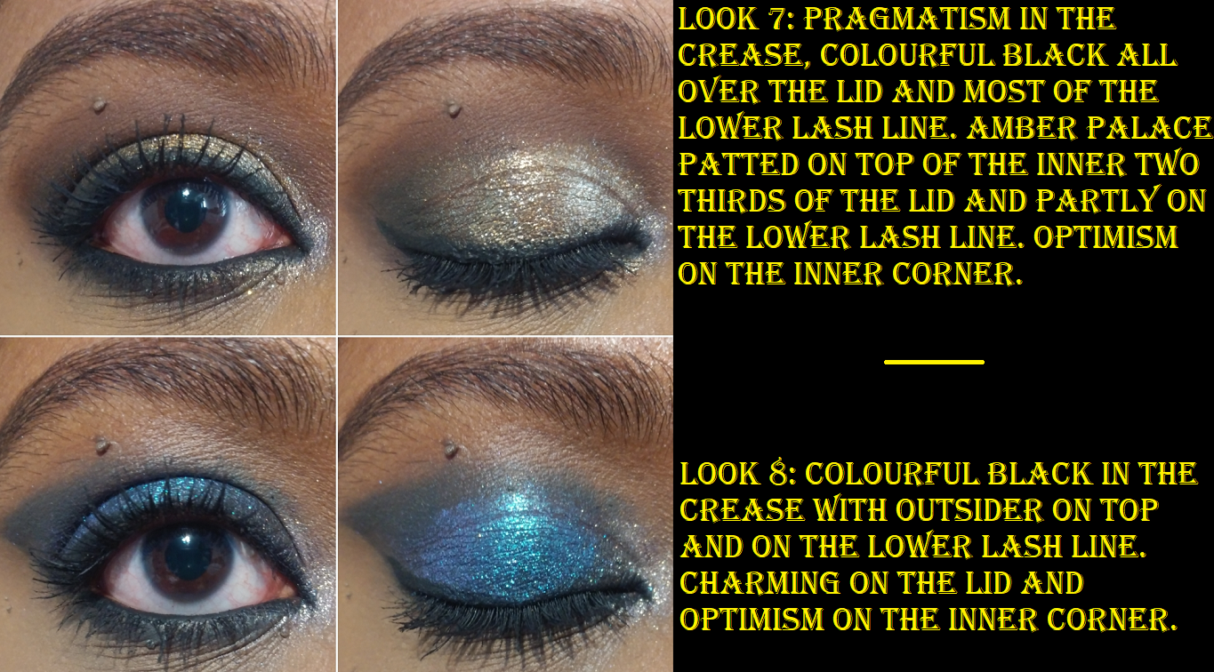
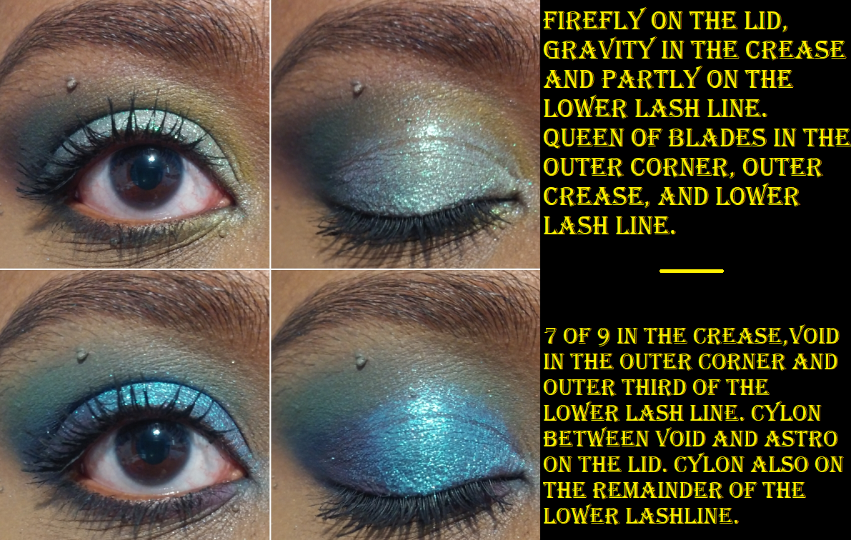
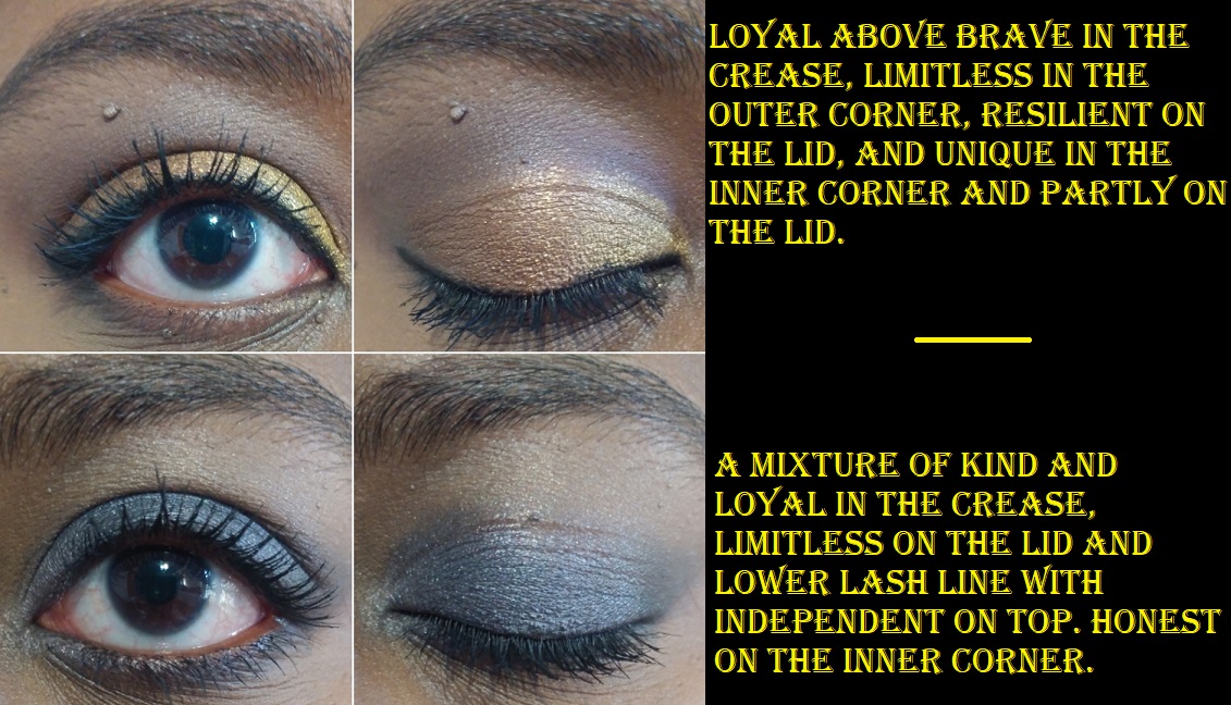
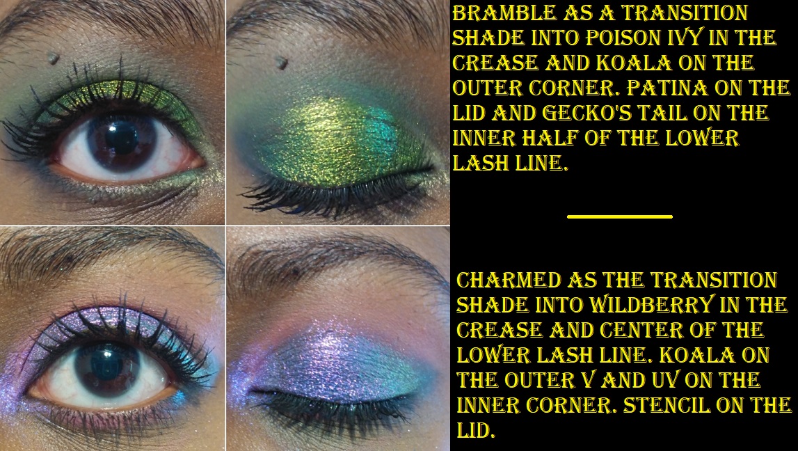
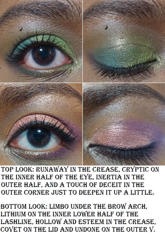
In Look #8 I forgot to mention that Colourful Black was also applied all over the lid before Charming was added on top. This is what caused the stronger blue tone to the shade.
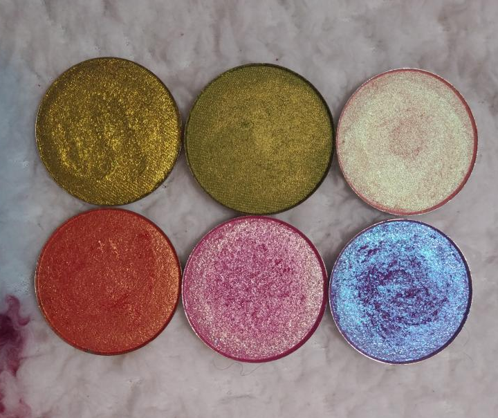
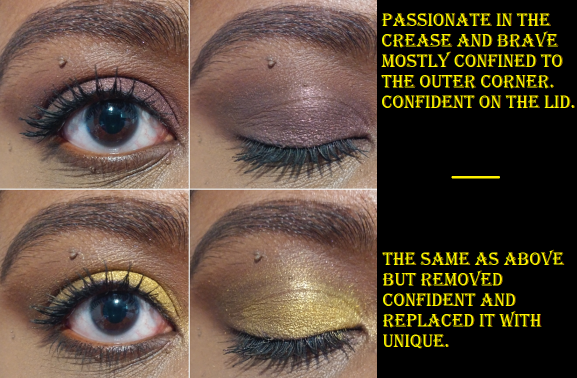
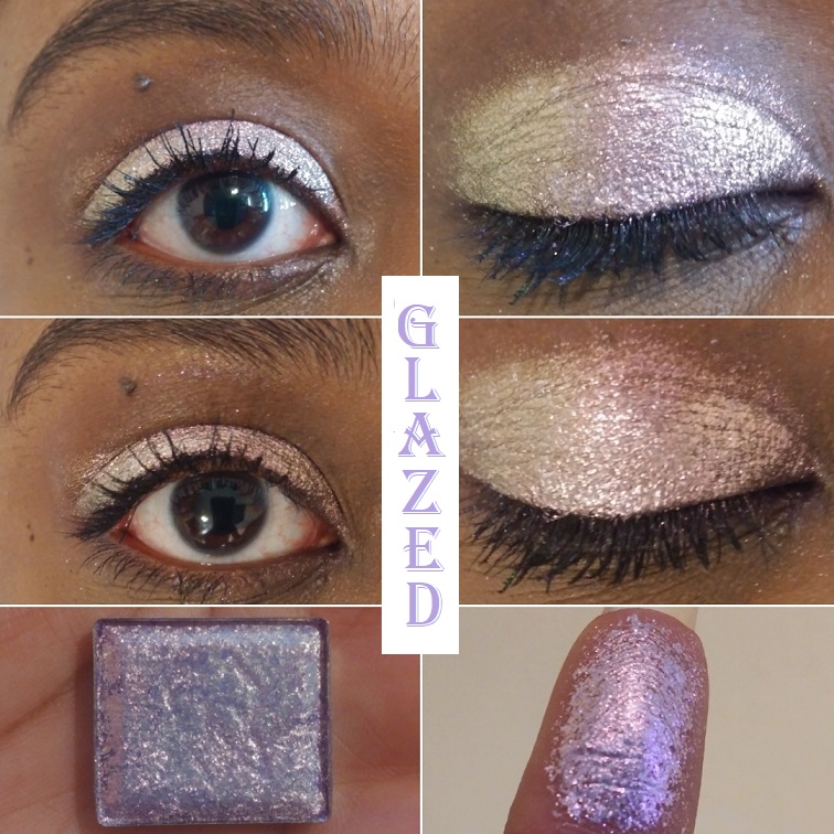
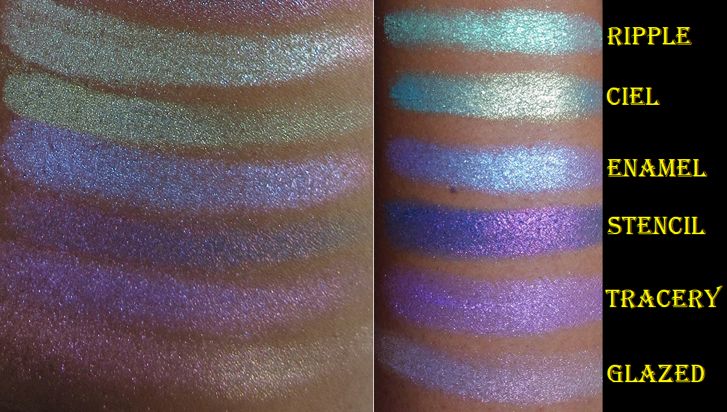
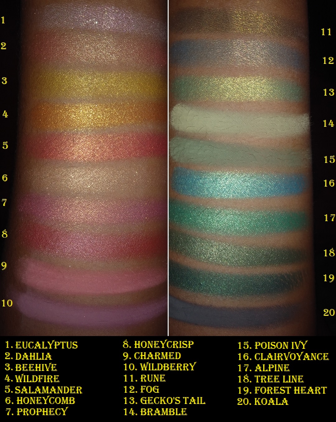
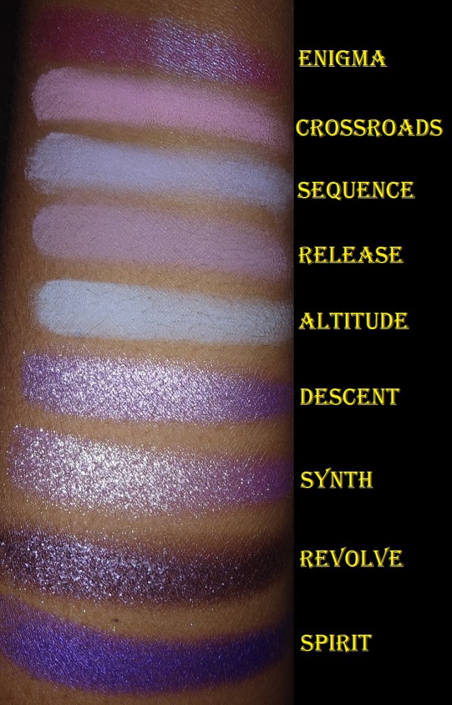
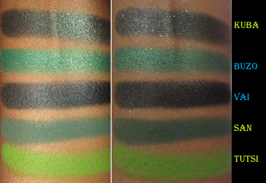
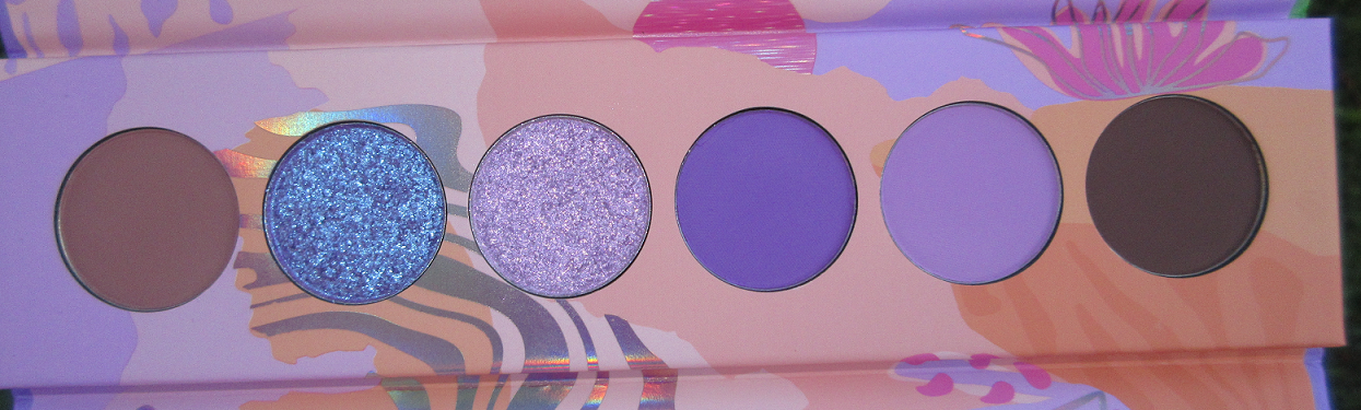
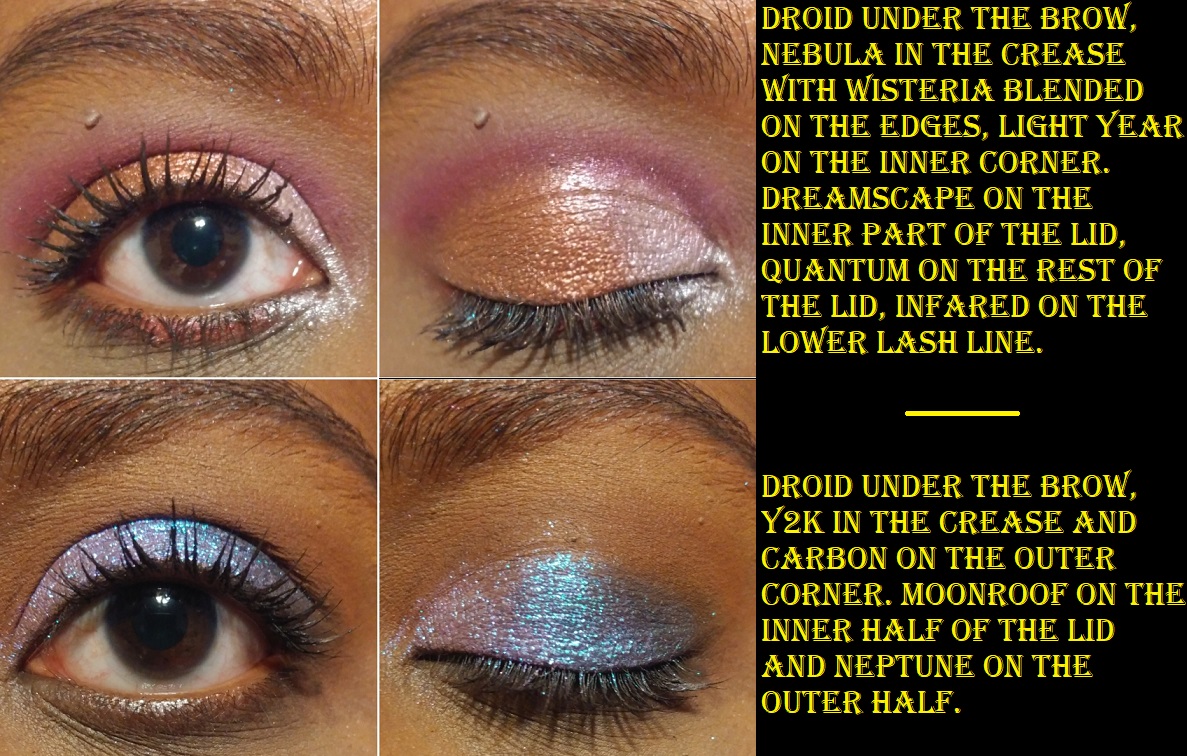
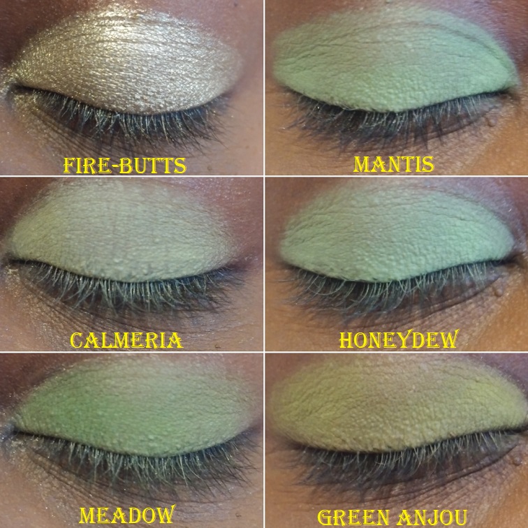
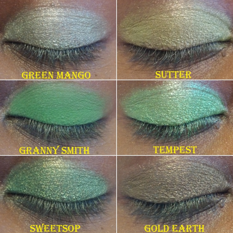
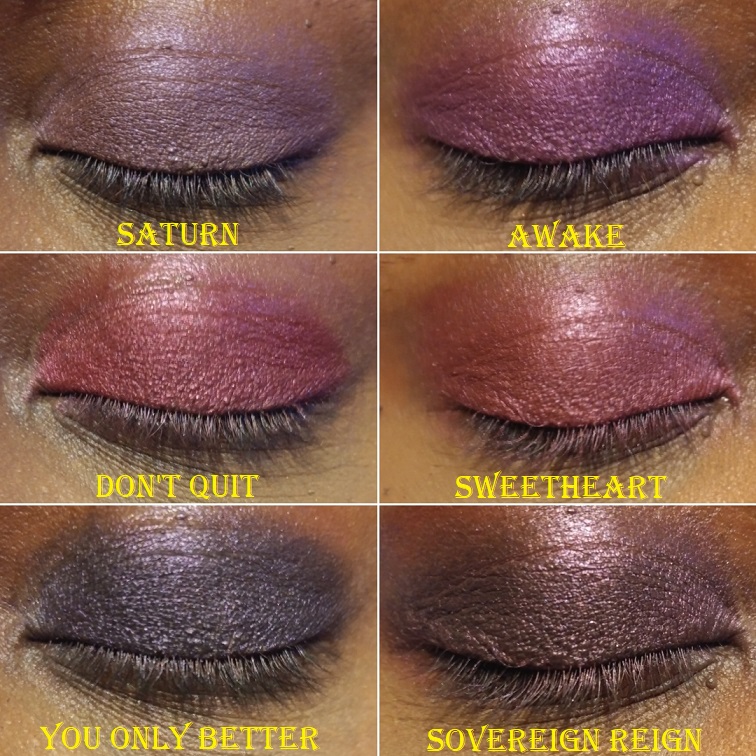
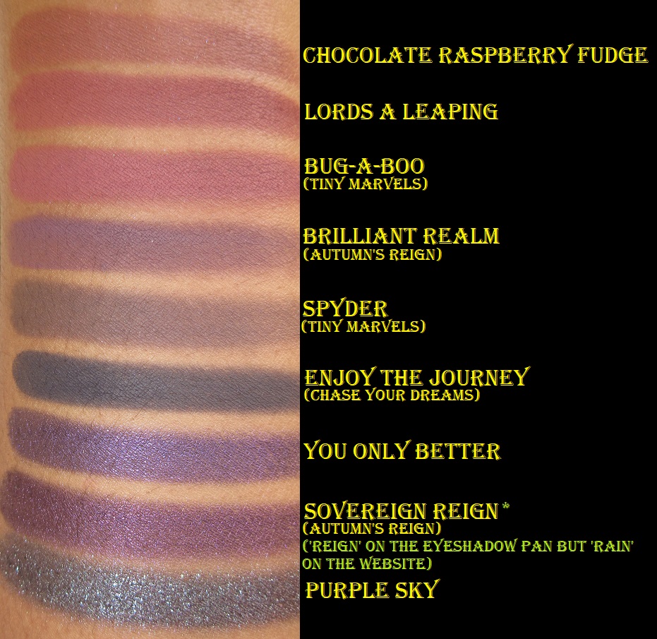
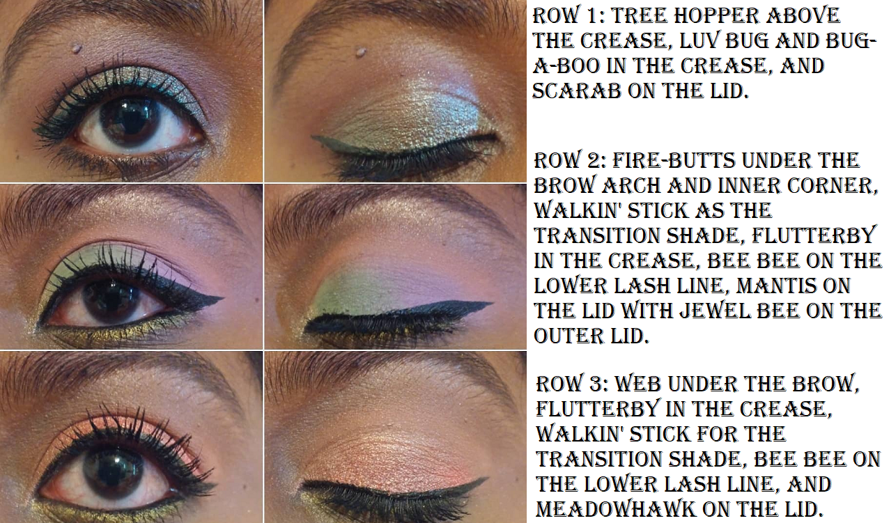
URD Mini Eyeshadow Palette
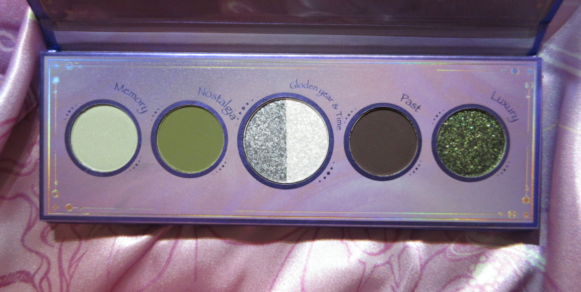
This palette is gorgeous but all the minis, in my opinion, are overpriced compared to the larger palette prices. You get 6 shades for $21 versus 16 for $36. $3.50 per shadow compared to $2.25 per shadow. For that reason, I had to decide between the Urd palette and Skuld palette. As much as my eyes were drawn to the colorful nature of the all shimmer Skuld palette, I knew I could get a complete look with Urd and that green was irresistible!
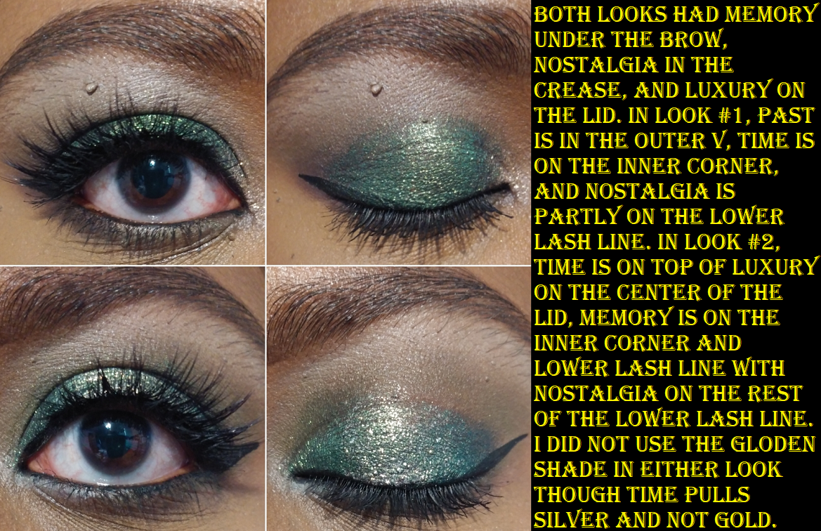
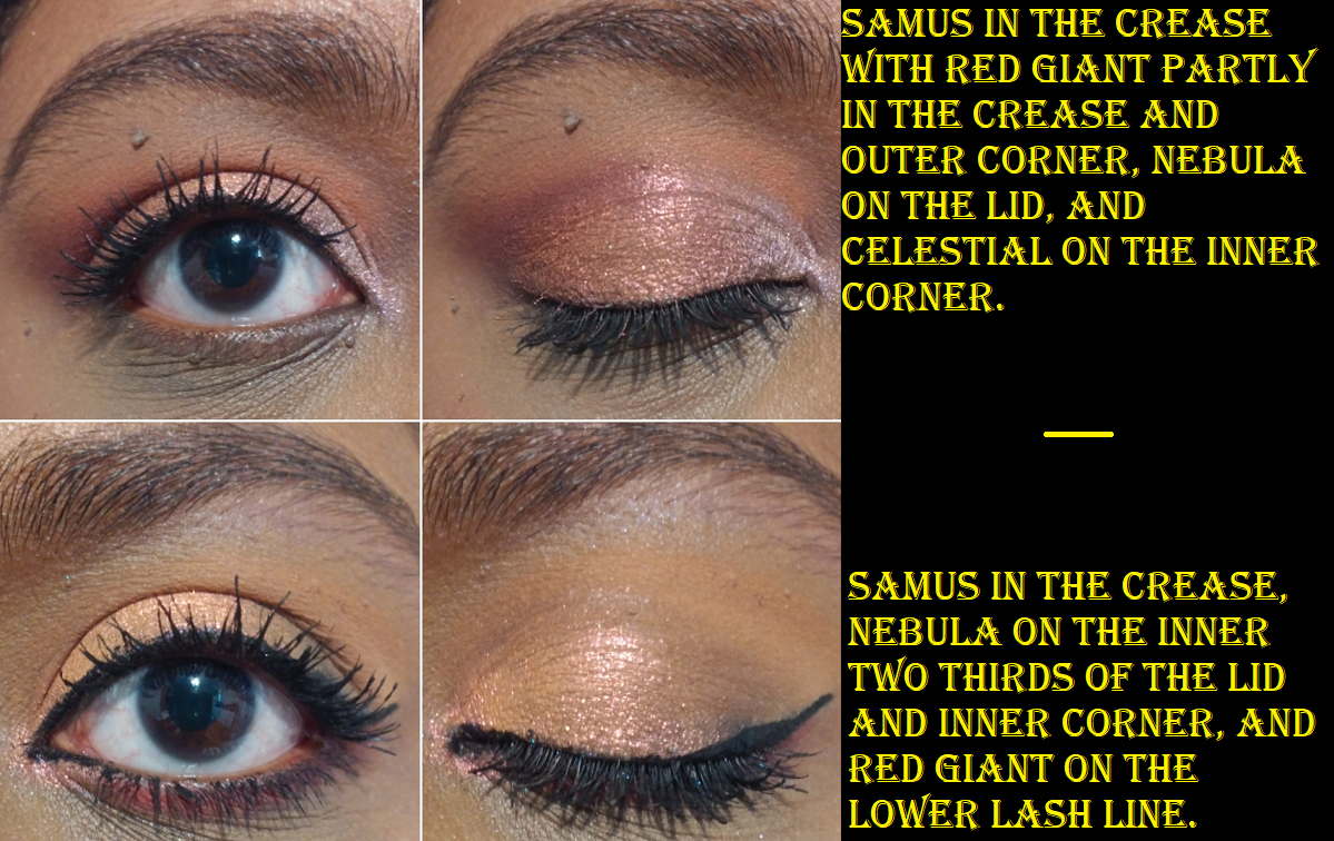
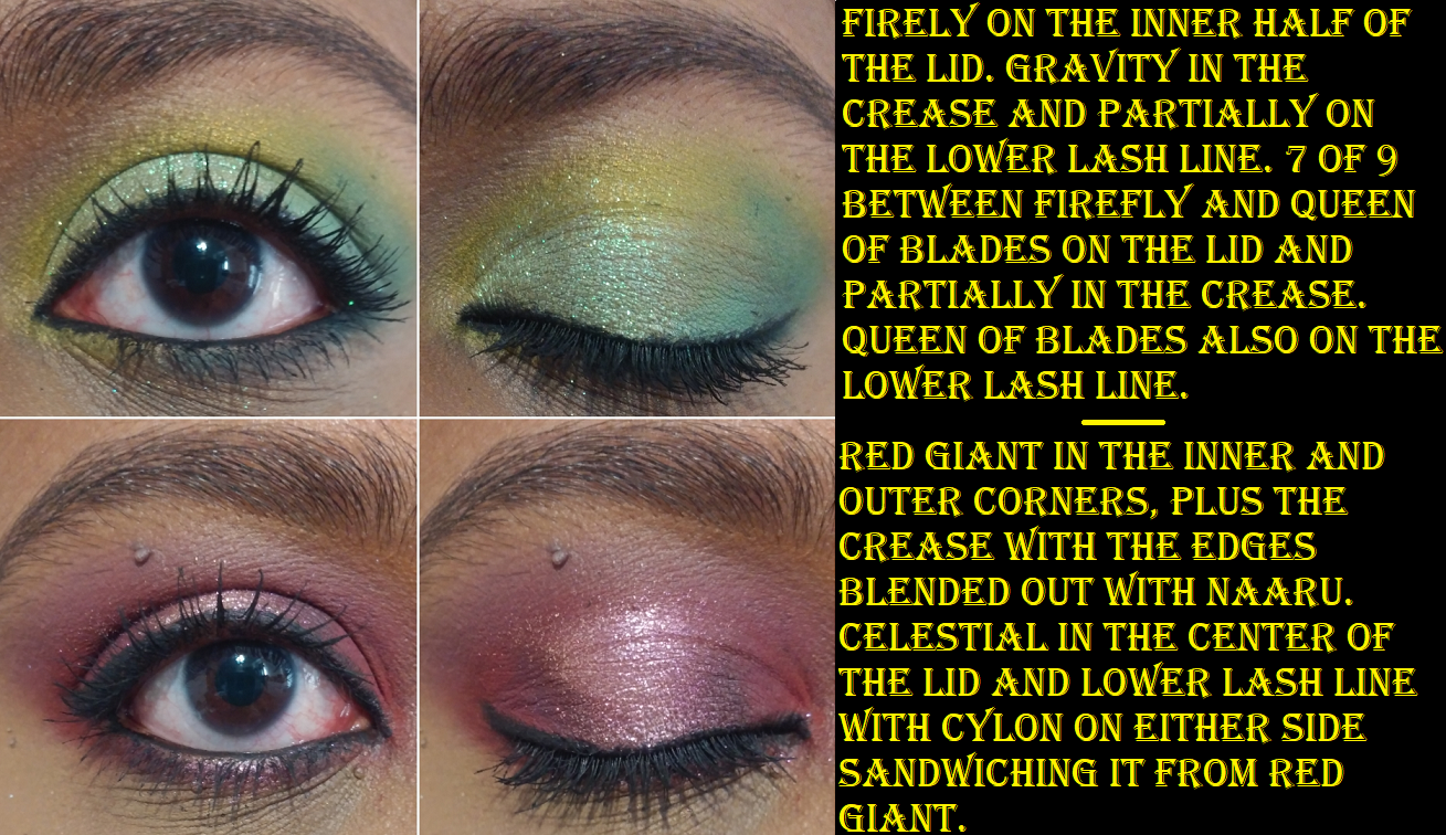
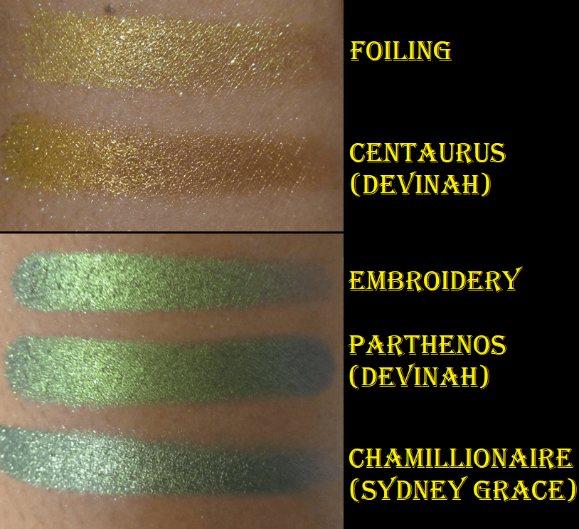
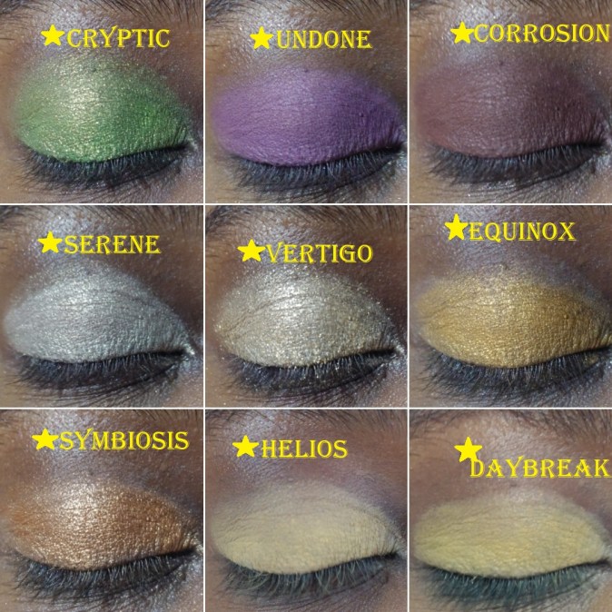
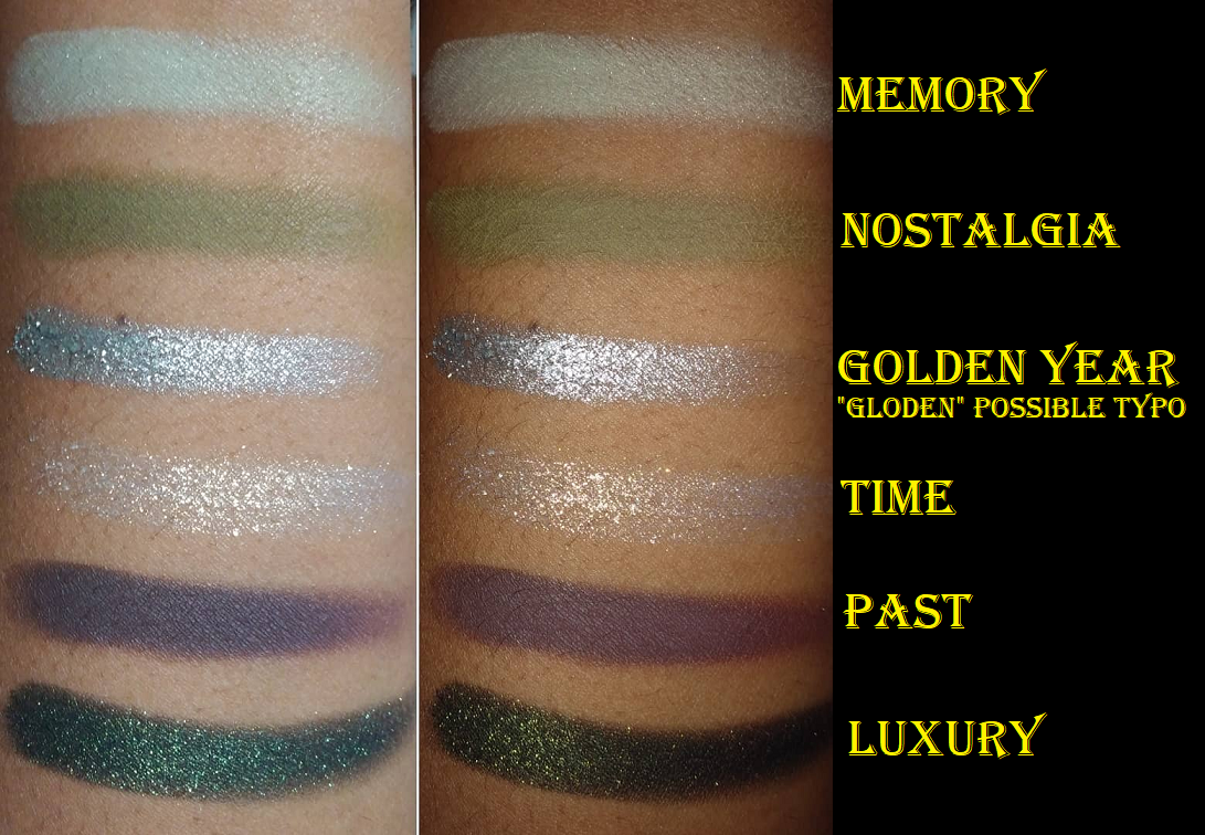
This has the same great shadow quality as the Norn’s palette and it was so easy to create a look. I used the same shades for both of the eyes, but the change in technique and color placement made them look surprisingly more different than I expected! The Luxury shade on the lid is gorgeous! It’s mostly green with yellow gold reflects of diamond shimmer. Luxury has a black base which I noticed darkened the crease shade on the eye that I used the MAC Foundation Stick as a primer (look #2). In Look #1, I used a MAC Paint Pot and this did not happen. I also used the Nyx Glitter Primer on both lids.
Memory is definitely a bright “light gray-green matte” but just as it was the case with the shade Dazed, it’s somehow not too stark for me. That green tinge works! Oden’s Eye describes Nostalgia as a “matte grey olive green,” and those grey tones come out on the eye to create more of a khaki green tone. I wish it was a little less grey, but it goes well with the other shades in the palette.
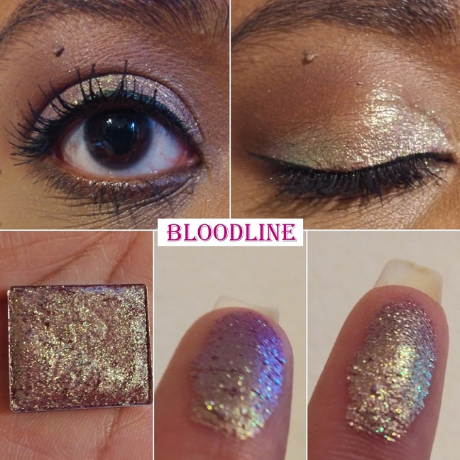
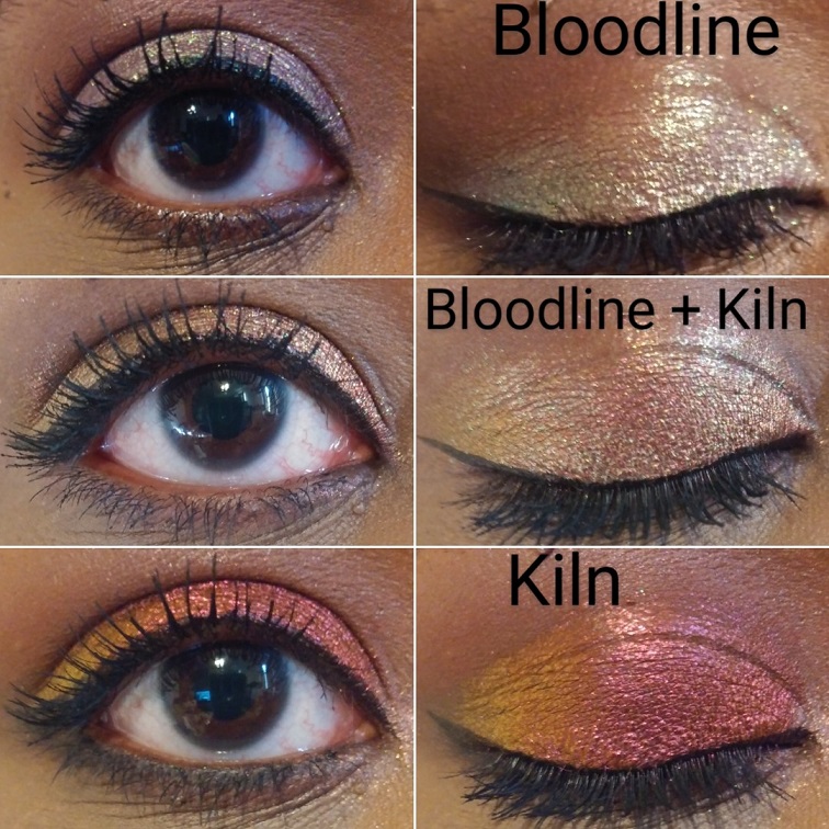
Gloden Year & Time are the split pan shadows. I believe ‘gloden’ was a printing error because the website description says, “Golden year: Silver metallic color, the golden year is just a silver memory in the past” and “Time: Colorful shift of multiple colors against a semi-transparent base.” Golden Year is much smoother and the shimmer particles are much closer together than the shade Time. Time is a chunky flaky topper formula that I can clearly see as gold toned in person, but my camera only picks up a silvery hue.
Lastly, Past is a dark coffee brown matte. It’s a perfect addition to add a bit of smokiness to the look. This color story was well thought out and even though I think $15 would have been a fairer price (more than the $2.25 but less than $3.50 per shadow), I’m happy I bought this.
Norn’s Silk Scarf in Pink and Purple
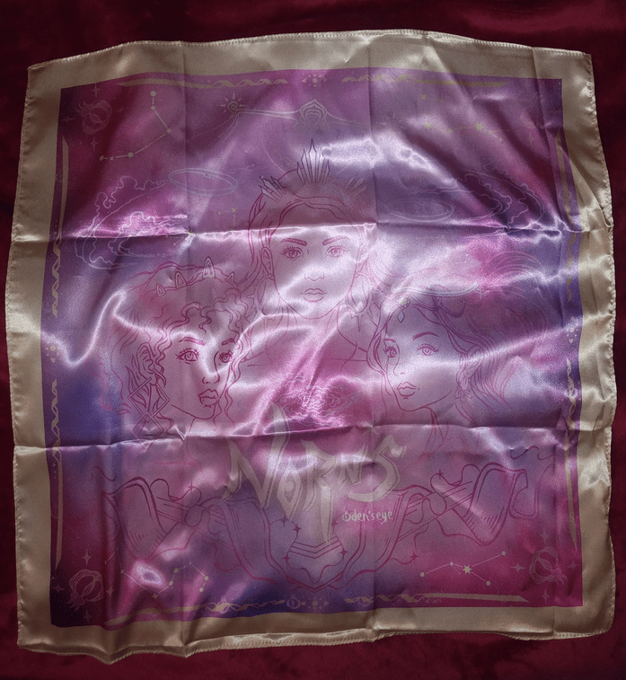
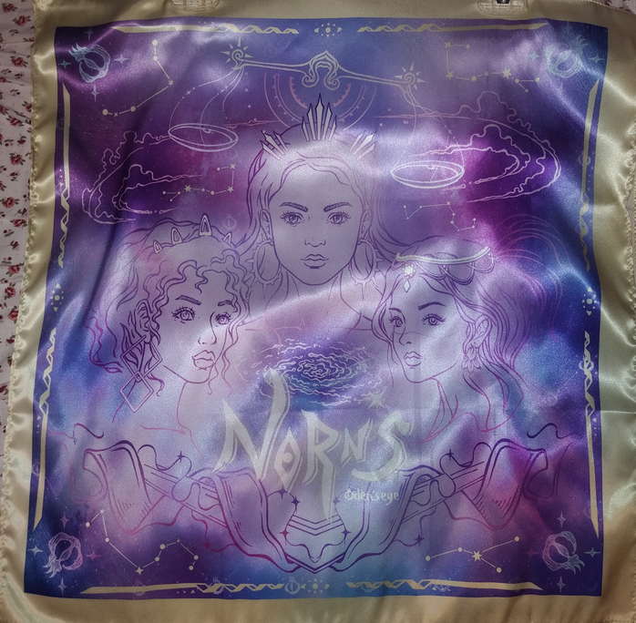
There were pink, purple, and blue versions of this scarf available and Oden’s Eye was adding one for free to any Norn’s Collection order above 50 euros. At the time I bought them, they were on sale for 50% off.
I just purchased these because of the design. The print is so pretty to me and I wanted another item that had it, even though I have zero use for scarves and I never wear them.
Also, I could have sworn there was nothing written about the scarf being “artificial silk” until I made my last order because I remember being surprised at the low cost and wondered why silk would be used by a cruelty-free brand, but perhaps I just missed it.
Additional Information
All of the powder products have a slight powdery talc-like smell. In 2014, I owned a Coastal Scents palette that smelled incredibly chalky. Nothing I’ve purchased since then has ever been that bad, but I try to keep track of that kind of thing and share that information with others.
When ordering from the website, the default prices are listed in euros, but they have a tab at the top where you can change the currency. Although Oden’s Eye is based in Sweden, their products are made and shipped from China. My favorite independently owned brands to support are the ones who make their own formulas like Lethal Cosmetics, Terra Moons, Devinah, Clionadh, (or on the larger side Ofra and Colourpop), etc. For some reason, I was under the impression that these were created-in house, so I was a little disappointed. However, I know this is the norm. Juvia’s Place and Kaleidos palettes are made in China. Even indie brands whose products are formulated in the US don’t necessarily make them themselves. A separate cosmetics lab is usually responsible. With this thought in mind, it bothers me a little less. It’s also pretty neat that some products in their line are still handmade, like the Amber Palace shade within the Norn’s palette and the Norn’s Mesmerizer Highlighters. Oden’s Eye posted a fascinating video showing the Highlighter process on Instagram that can be viewed here.
I’m not sure what the shipping fees are for other countries, but I paid six euros (a bit over $7 USD) the first two times I ordered. They do offer free shipping over 50 euros. My initial order shipped within 24 hours but took exactly 3 weeks to arrive. Oden’s Eye emailed that my package would be delayed due to Chinese Lunar New Year and then there was a delay at customs. They ship through DHL and transfer to USPS and state that 7-14 business days is typical. My second order took 17 days (14 business days). The transition between DHL to USPS is where it was held up quite a bit. The third order only took 8 days of the 8-12 business days if you choose the upgraded USPS first class option for eight euros. Two extra euros for the package to arrive 2 weeks before regular mail is quite a good deal. The Mystery Box took 13 days.
I appreciate that for a small brand, they still make an effort to try and feature a variety of skin tones in their promotional photos and their Instagram. Of course I wish there were more swatches on deeper skin and in a variety of lighting settings, as well as clear pictures of what the products look like on the face, but they put in more effort than some other brands I’ve seen. The Fancy Face has received PR from them, so I recommend viewing her channel for extra swatches with her take on this collection. At the time I started working on this post, she was the only WOC on Youtube with a review of Oden’s Eye beyond reviewing a single palette, and her video was made after I had already placed all three orders. In fact, at the time I started my first draft of this post, she just had this video available with sneak peeks of the review to come. I wish I had this video as a resource before placing my order, but I’m still happy with the items I chose. Sometimes I get lucky and my guesses work out. Tina is close to my skin tone, but a little lighter than me. There’s one other youtube channel I found by someone a little darker than me with several more Oden’s eye products, which can be found here. For anyone wanting to see swatches on a tan skin tone can click here, and for pale to medium skin tones there are a plethora of options to choose from on Youtube like from Amy Loves Makeup, Morgan Turner, and Angelica Nyqvist.
Lastly, about the palettes, the eyeshadow pans are smaller than the standard 26mm. There is slightly more than 1 gram of product per pan, which is what I always like to see. I do wish the pans were slightly larger because most of these shades apply better with a finger and I have limited space to rub and pick up the shadow on the pads of my fingers.
That’s all for today! I hope this was helpful if you were considering placing an order with Oden’s Eye. If you do, don’t forget to use an affiliate code for an additional 10% off! FANCYFACE, MORGANTURNER, AMYLOVES, and ANGESCHKA are a few of them.
-Lili ❤