Danessa Myricks Beauty, Mented Cosmetics, and Coloured Raine Mini Reviews

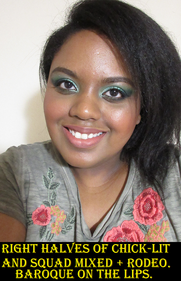
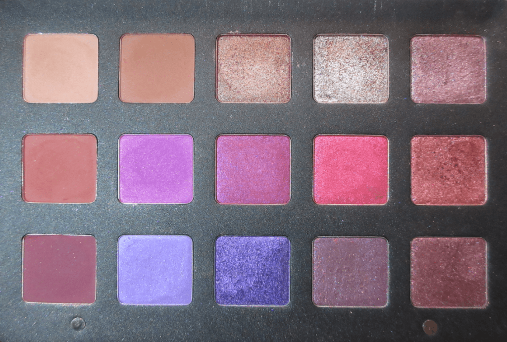
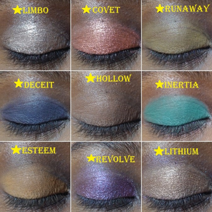
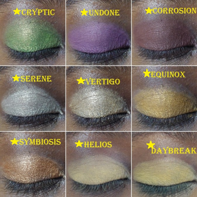
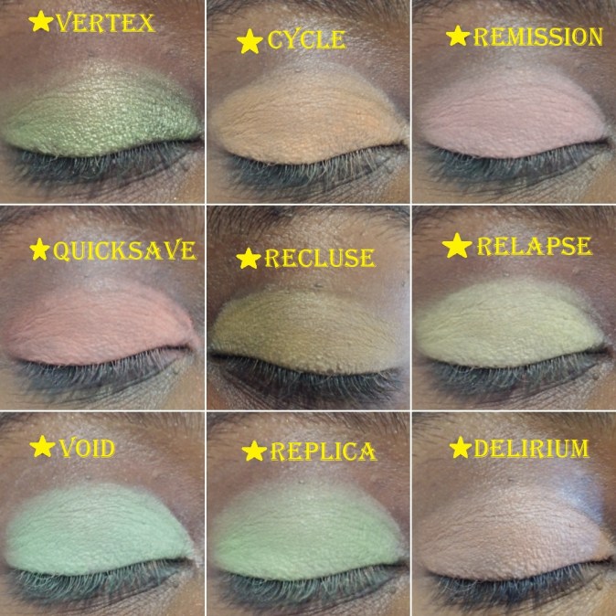
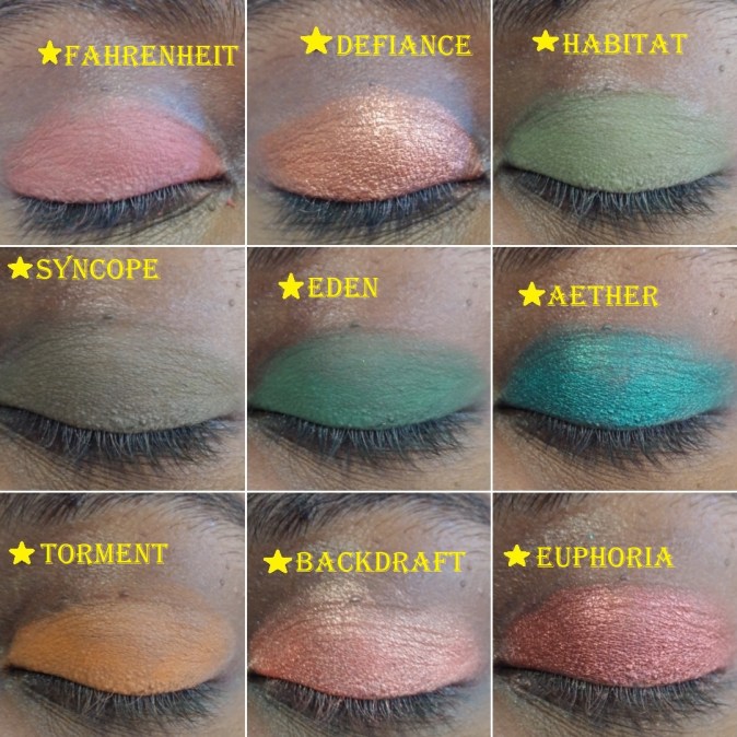
Danessa Myricks Beauty and Mented Cosmetics are brands I’ve been curious about over the past year and I decided to try a few things from each of them! This is also the first time in a long while since I’ve purchased something other than eyeshadows from Coloured Raine!

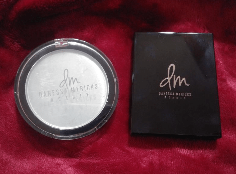
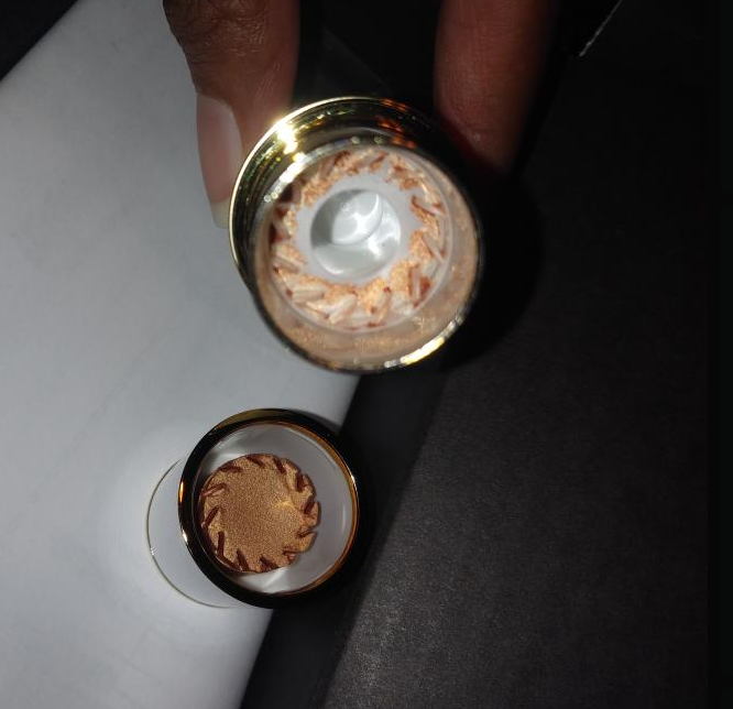
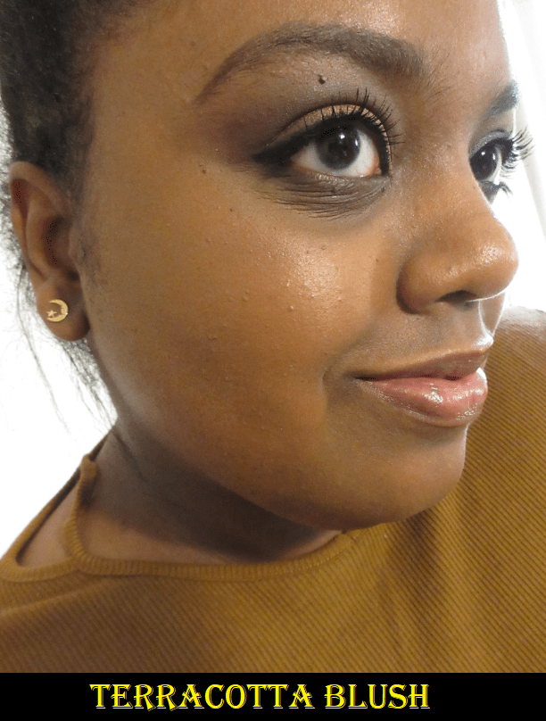
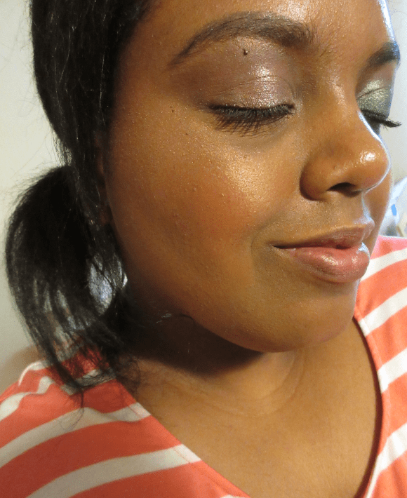
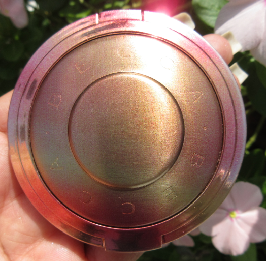
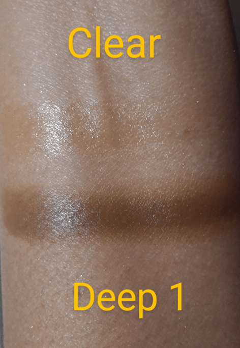
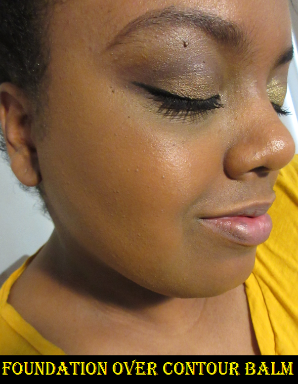
Danessa Myricks Balm Contour in Deep 1

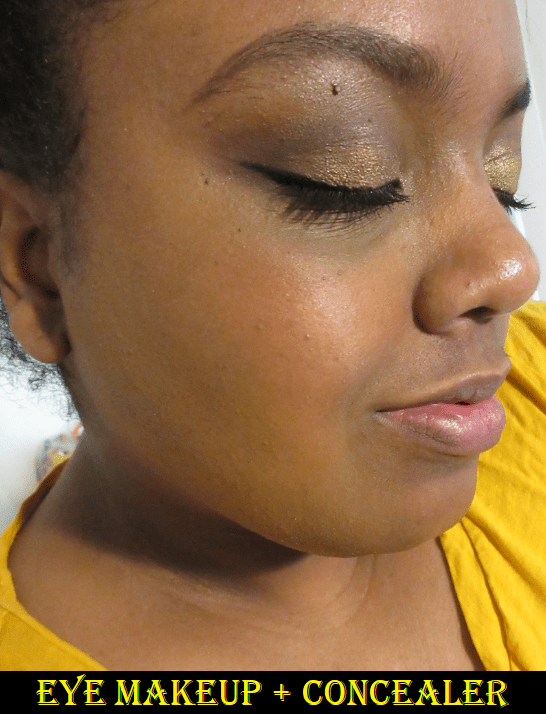
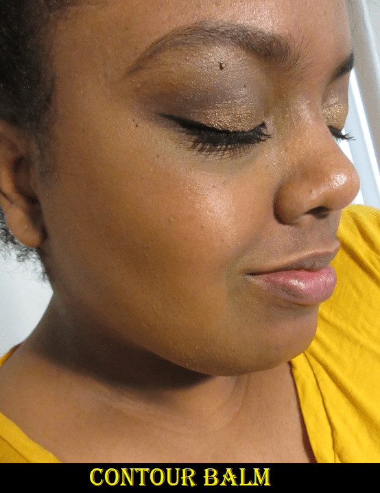
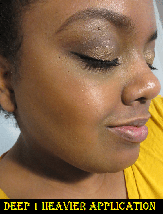
Danessa Myricks is a makeup artist and her products are intended for use in a professional setting. By that I mean there is a learning curve to these products. They aren’t beginner friendly. I absolutely did not like this product until the sixth or seventh time I used it. The issue is that I just needed to find the right tool; in my case it was the Sonia G Mini Base brush from the Keyaki Set. I didn’t like the results when I used my fingers, a dense contour brush, a dense concealer brush, a Beautyblender, and the Tati Blendiful. A heavier application gives a more intense sculpted look, but I prefer the controlled yet natural looking blend which a medium density brush can provide.

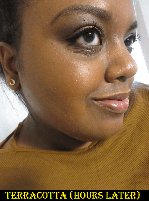
When it comes to this shade match, I was surprised how orange it was considering most contour products are cool toned to create a shadow. If I want to use a warm color to contour with, I prefer to have one that is more shades darker than my skin tone. However, if I exchanged or purchased Deep 2 instead, then I believe it would be too similar to cream contours I already have in my collection. So, I’m glad I chose Deep 1, but I wish it wasn’t as warm so I could use it on all areas of my face. I don’t mind using warm contours on my forehead and cheek bones but I hate them on my jaw and nose.

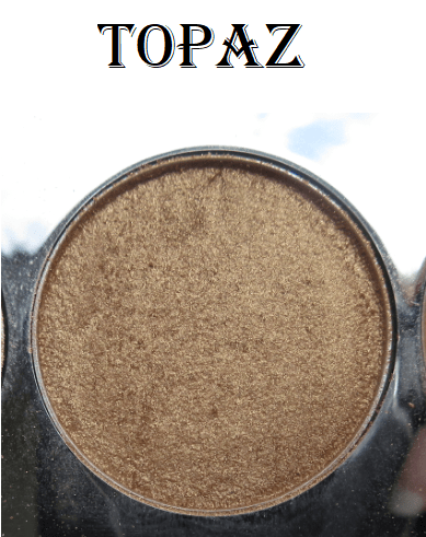
I also tried the underpainting technique (applying a heavy layer of dimension creating products to the skin first and applying a light layer of foundation on top to shape the face in a less detectable way) but I think I need a darker shade if I want to continue using it in that way. Deep 1 is a touch too subtle on me with underpainting, but perhaps I just need more practice.

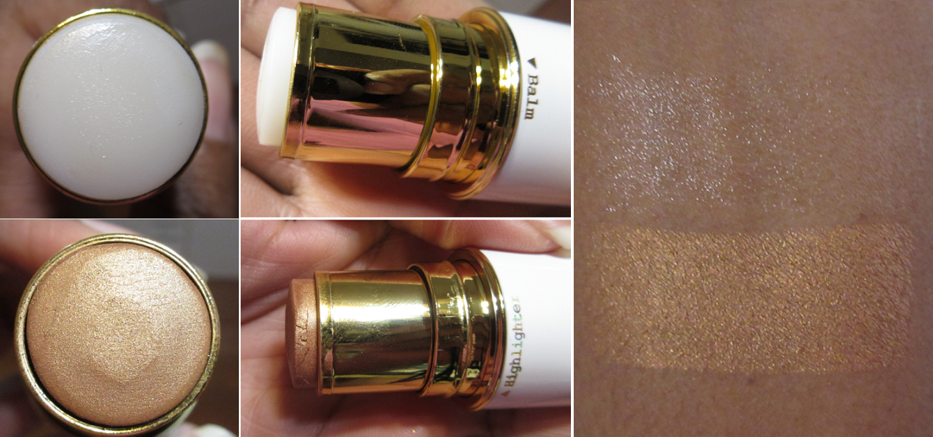
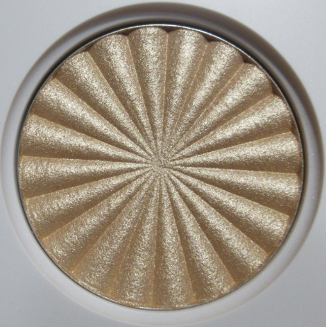
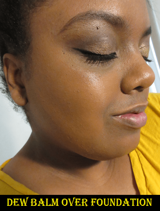
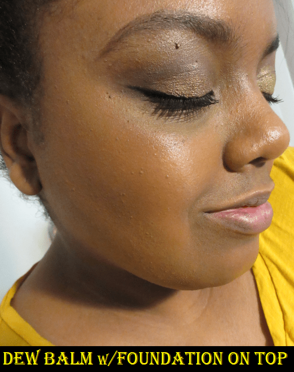
Danessa Myricks Dew Wet Balm in Clear

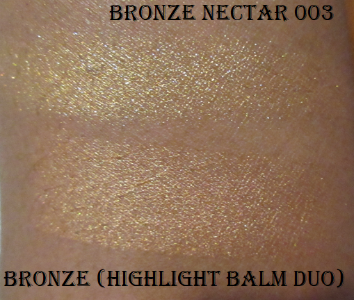
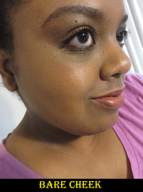
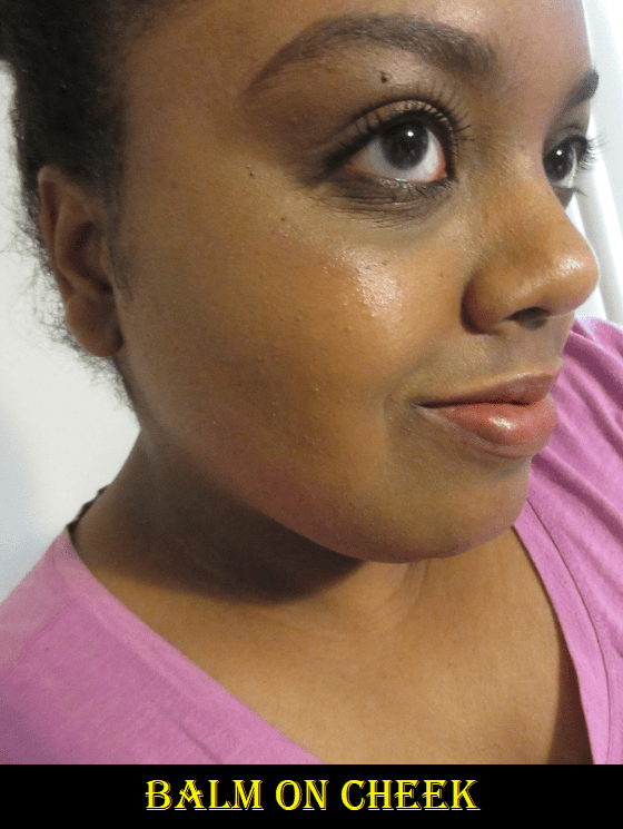
There are four other shades of these balms, but they contain shimmer. Based on website photos, I was concerned the shimmer/glitter particles might be too large for my liking, so I thought getting the clear one would be a safer bet. This reminds me of a stickier version of the clear balm in Pat Mcgrath’s Highlighter + Balm Duo. With my hair down, loose strands have stuck to my face while wearing this. Although this product is intended to be worn alone or with makeup, it looks too much like I have Vaseline or lip gloss on my cheekbones if I’m bare faced, so I prefer to use it with makeup.

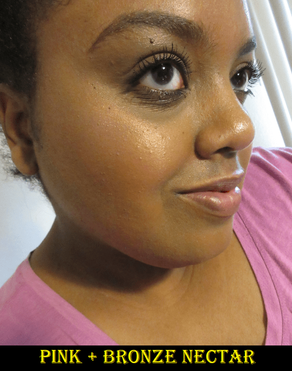
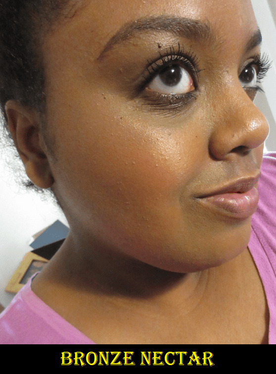
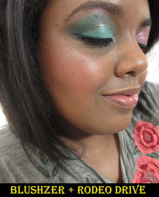
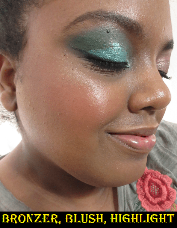
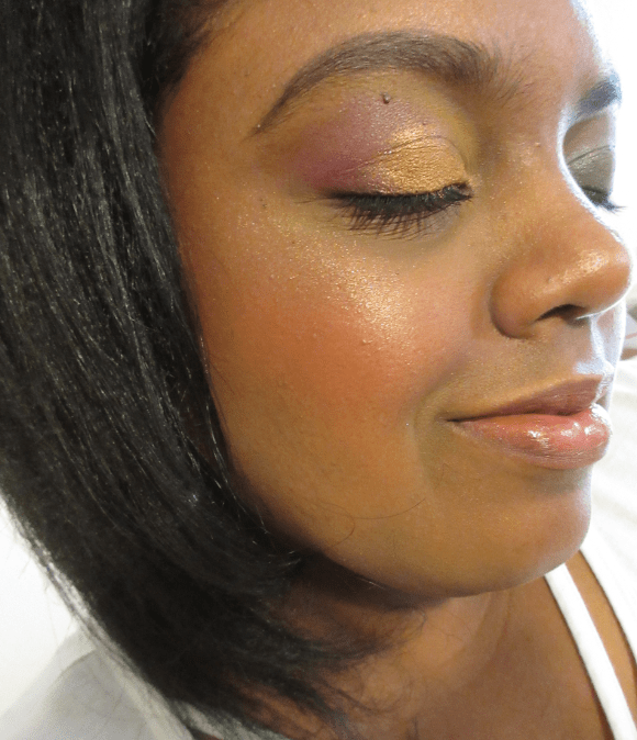
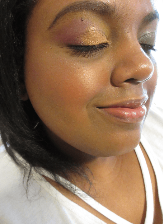
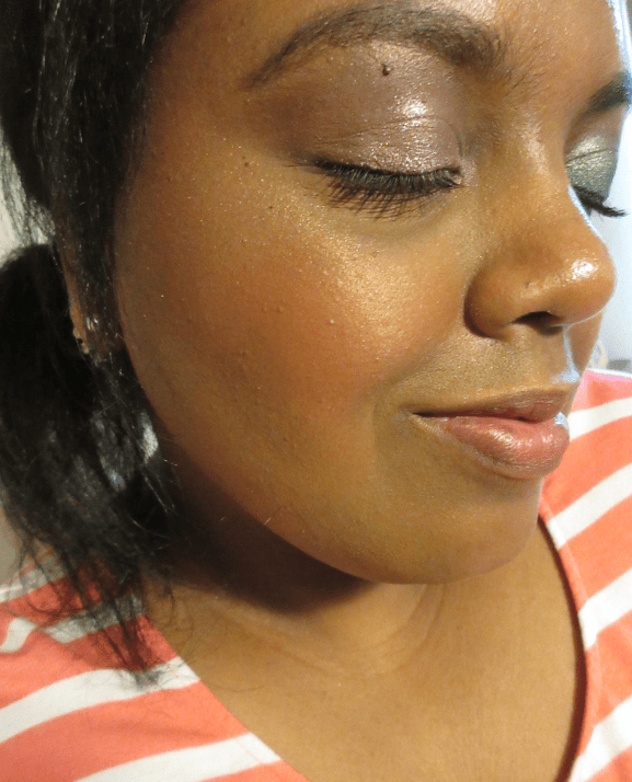
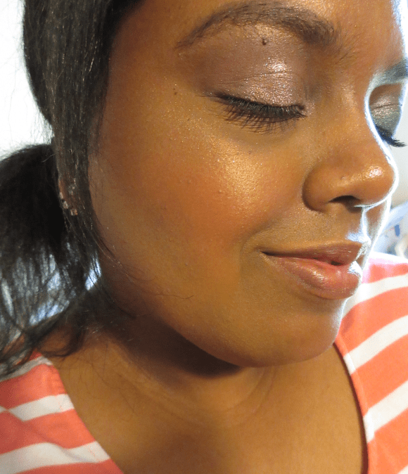
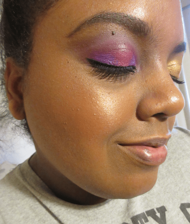
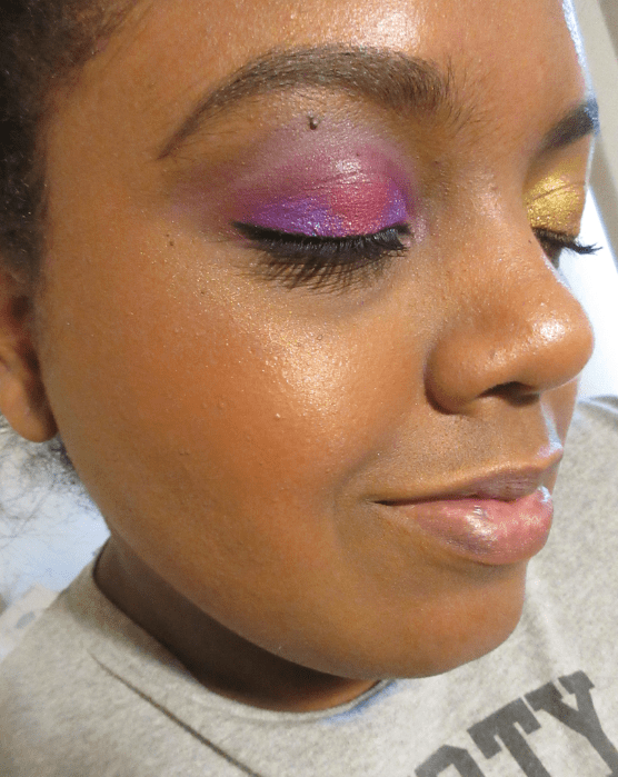
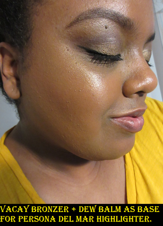
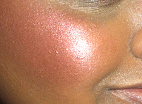
This product, like many highlighting balms, disturbs my makeup underneath. Thankfully, the shine is still visible under foundation. I figured out that I like this product when I’ve applied it to my cheekbones, then I take whatever foundation is left on my brush or sponge and apply it over the top of the Dew Balm. It still gives me shine without the Vaseline look or sticky texture. I can leave it like that or use the Dew Balm as a wet base to apply a highlighter on top of it for a very intense shine. I have an example of what it looks like as a base for a powder highlighter in the Mented Bronzer section.

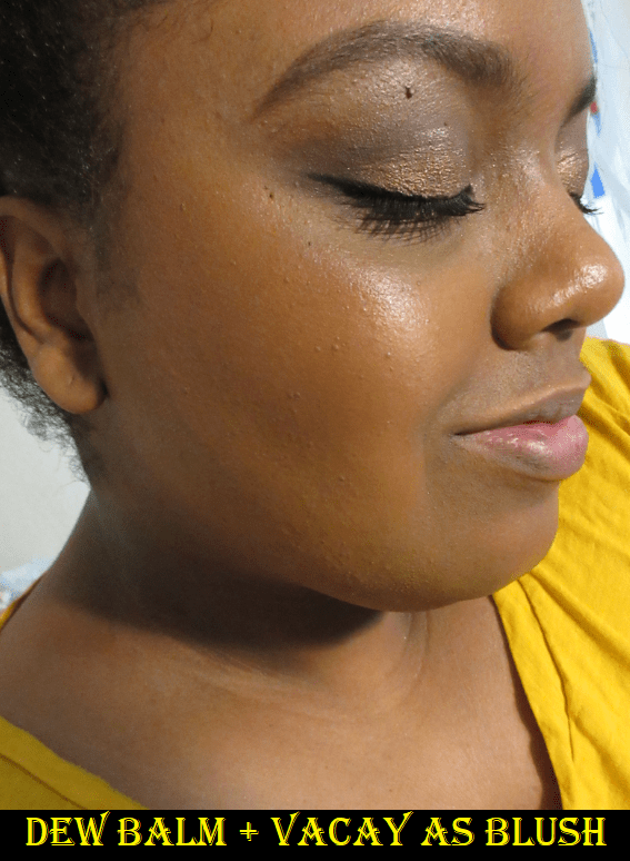
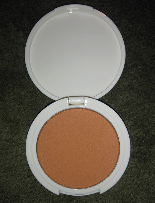
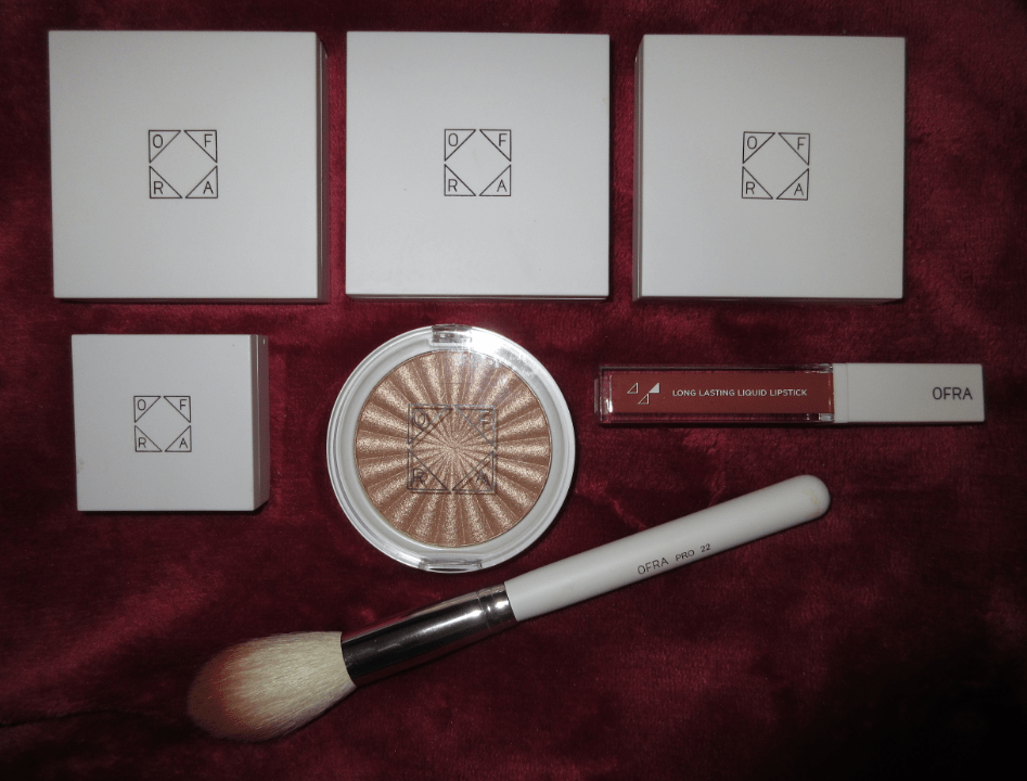
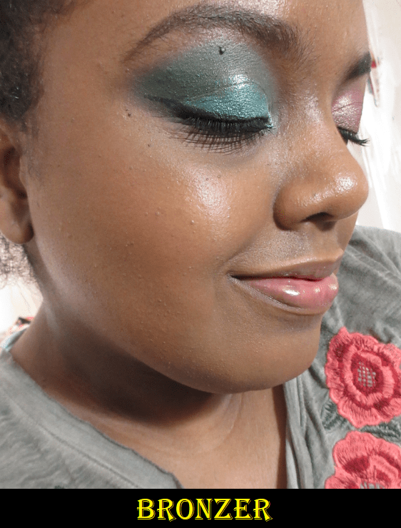
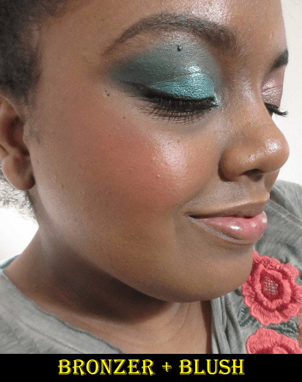
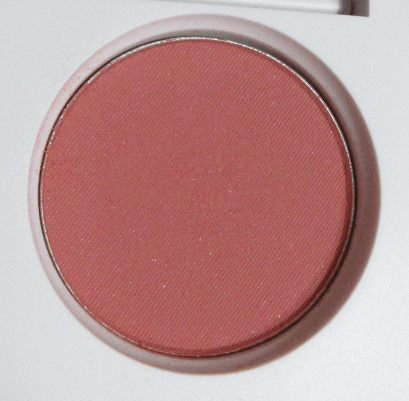
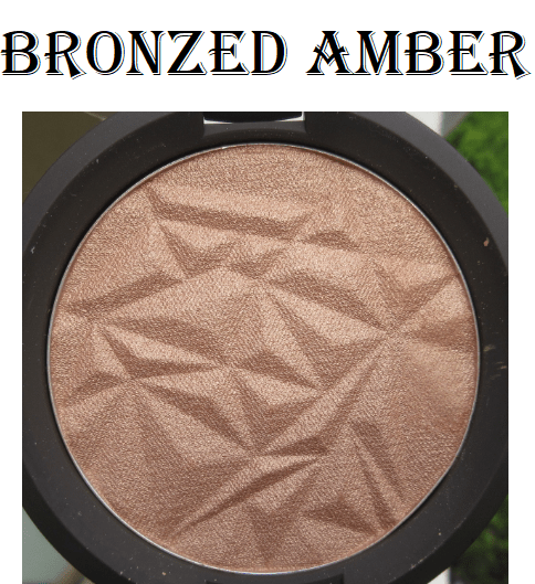
Mented Cosmetics Bronzer in Vacay

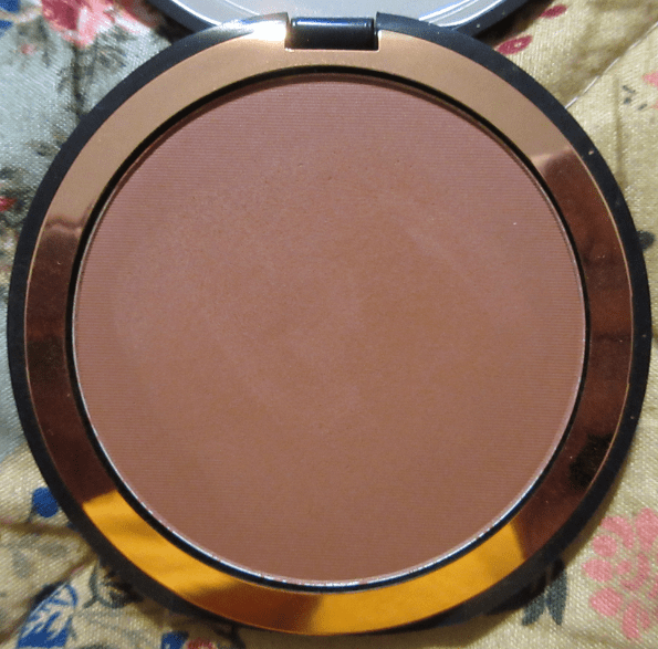
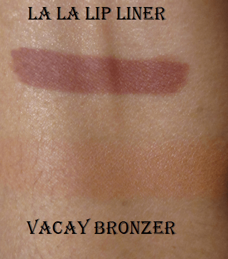
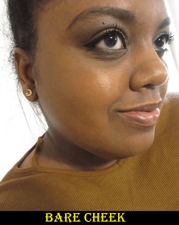
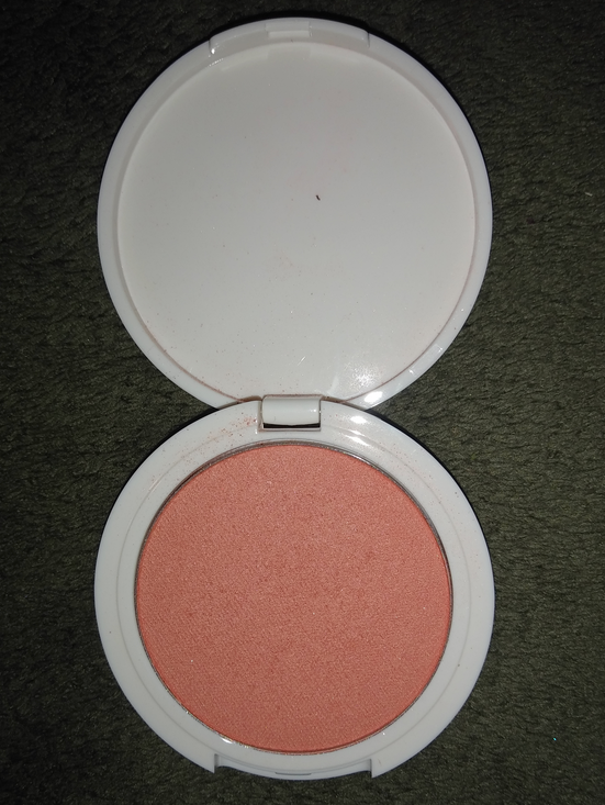
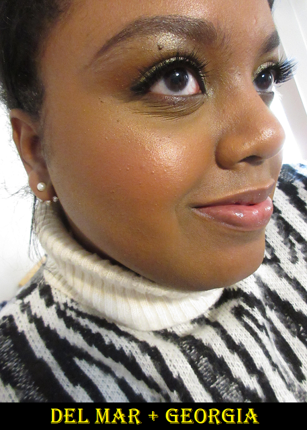
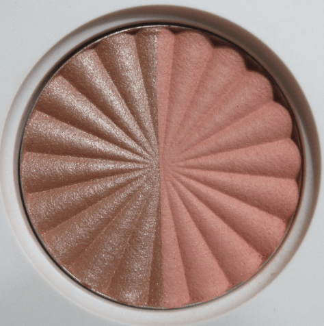
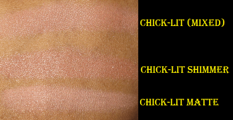
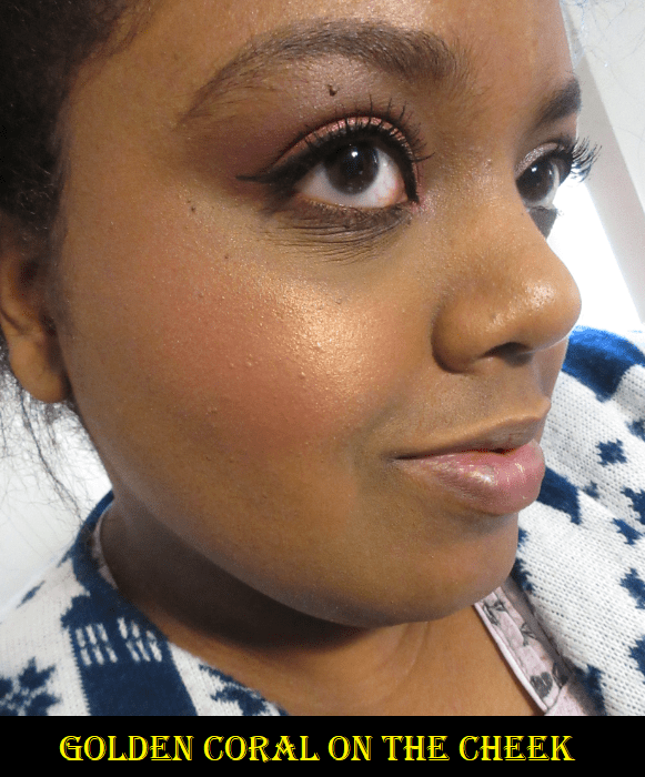
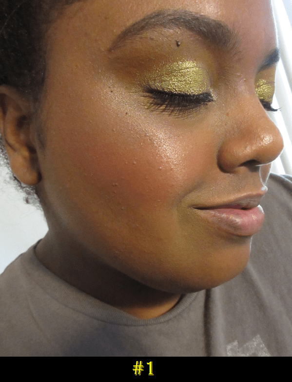
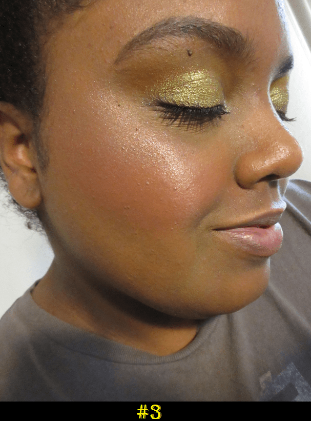
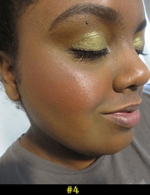
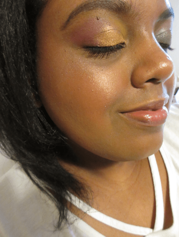
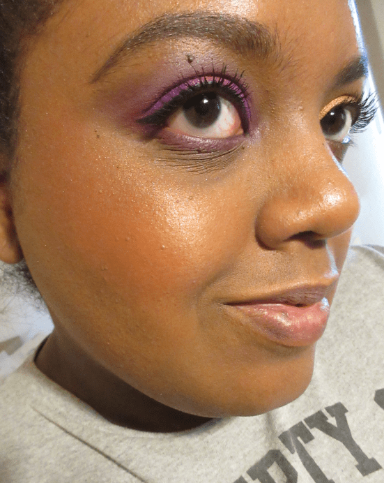
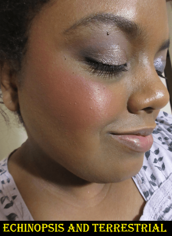
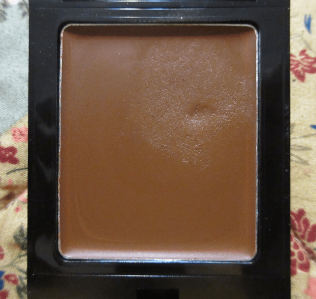
Mented has four shades of bronzer. I suspected Vacay, intended for medium/tan skin tones, would be only a shade or two darker than me while Yacht Life, intended for deep skin tones, would be darker than I wanted and too similar to Fenty’s Mocha Mami, which I already own. Vacay turned out to be as light as I thought. If I really pack it on, it does work as a subtle bronzer. The undertone of the powder is a bit on the pinkish terracotta side, so in many photos featured here today, I’m actually wearing it as a blush. I believe Vacay is actually lighter than Mented’s Clay Too Much blush.

This formula is so smooth and reminds me of the Airbrush Bronzer from Charlotte Tilbury, but at a fraction of the cost. I am extremely tempted to buy Yacht Life and assuage my curiosity as to whether I would like it better than Vacay (and to find out how similar it really is to Mocha Mami), but I have to remind myself that I have enough bronzers as it is. It has been difficult to talk myself out of it and I’ve had it in my cart via Ulta about to check out at least three times by now. If I didn’t already have the Charlotte Tilbury bronzer, which is still the smoothest one I own, I would have absolutely purchased the other shade from Mented.

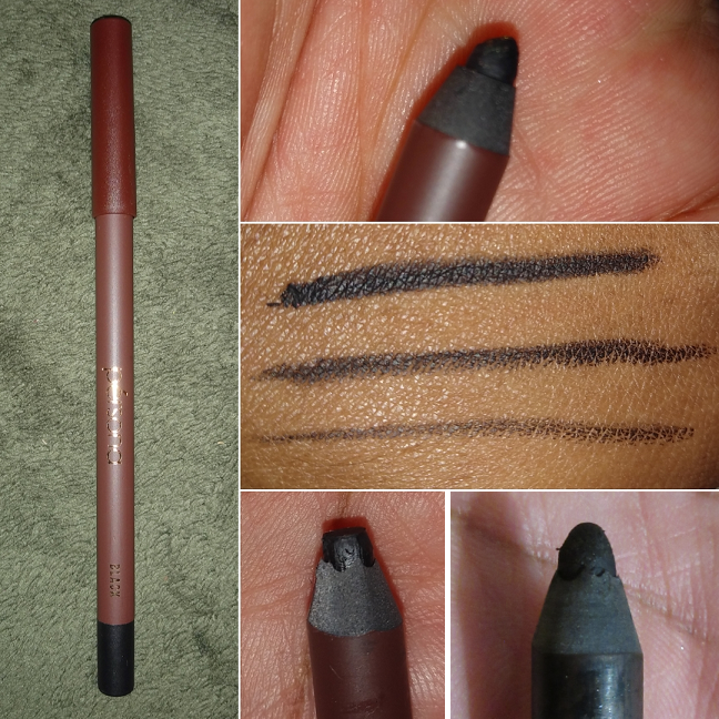
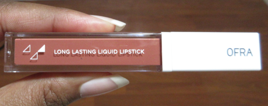
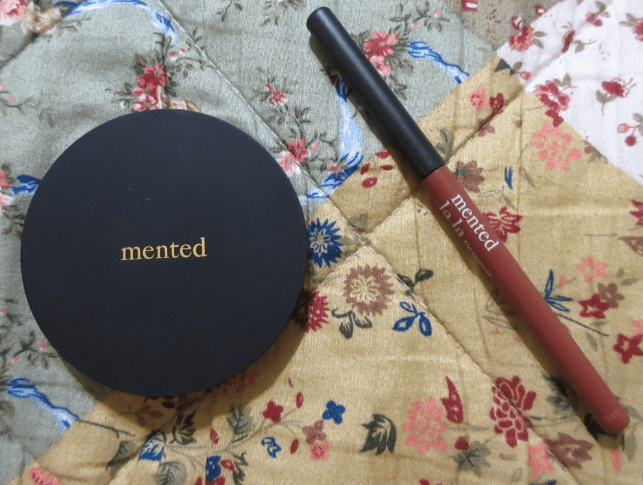
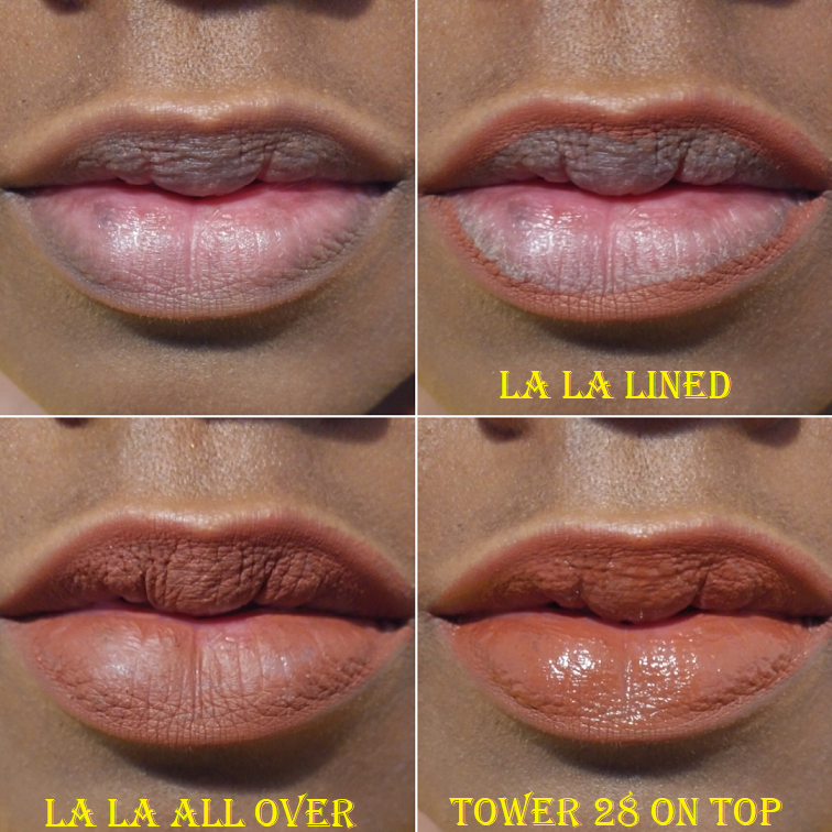
Mented Cosmetics Lip Liner in La La

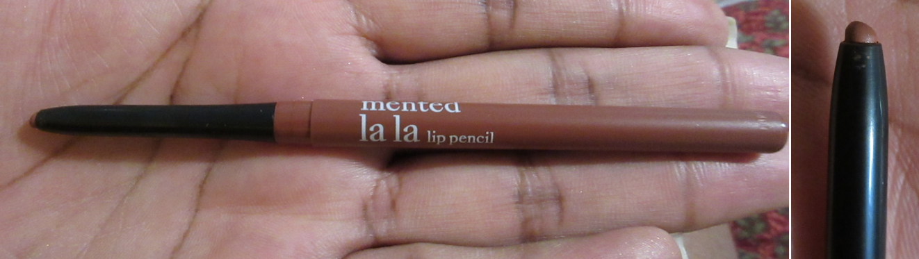
I forgot my lip product no-buy when I purchased this, but I’m secretly happy to have it. I like that it’s retractable and I was able to get this for $9. It’s the kind of shade I love using all over my lips. It isn’t too drying and doesn’t look as bad as it could over my non-exfoliated lips, which is nice. It stays in place. The Tower 28 lip gloss contains oils, so I was surprised to see how well it lasted with that gloss on top, as long as I didn’t eat or drink anything.

Propa Beauty lipsticks impressed me with their brown-skin friendly versions of lighter shades with wearable pinks and oranges. Mented’s range impressed me with their nude lip shades. If I wasn’t on a lip product no-buy, I would be looking further into Nude La La, Dope Taupe, Foxy Brown, and Mented #5. I watched a Q & A session with one of the brand owners and she was explaining how Mented wanted to create nudes that weren’t just brown. Shades that matched, for instance, the darker pigmented brownish purple of my natural top lip. I always tried to get shades to match the pink in my bottom lip, but after seeing that interview, I became so intrigued by the idea of matching the brownish purple part instead. I intend to do my best in sticking with my no-buy and will perhaps try another Mented lip product in the beginning of 2022.

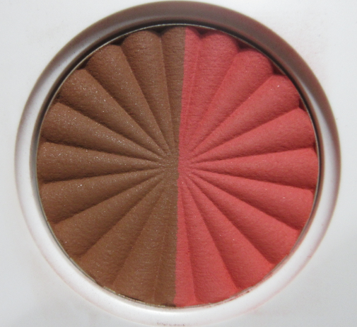
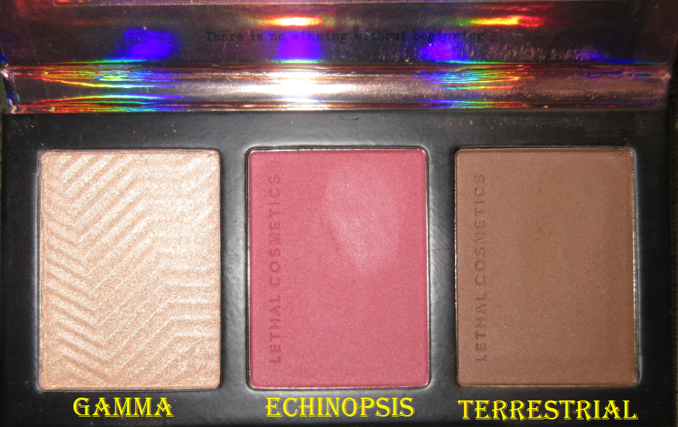
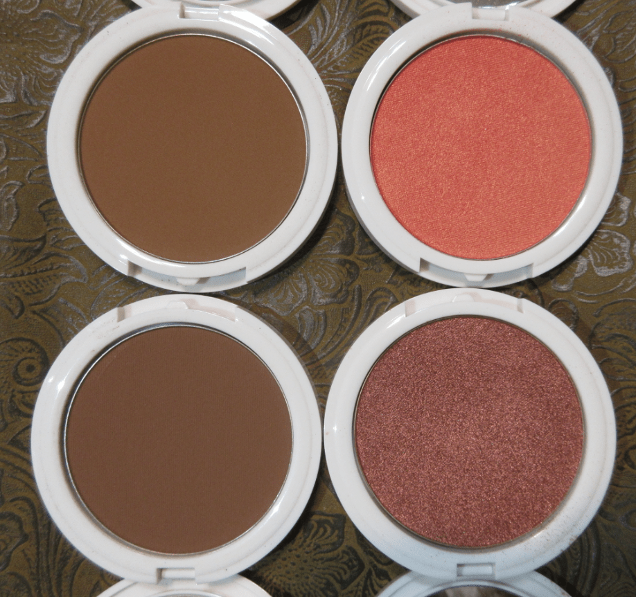
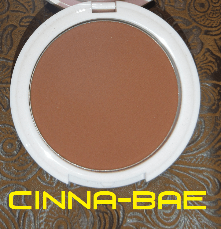
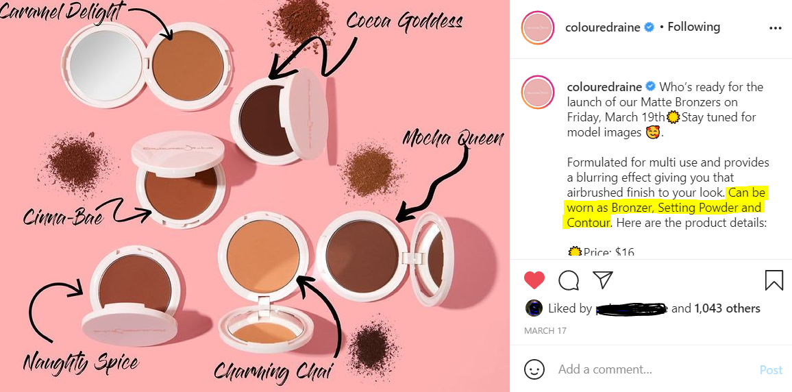
Coloured Raine Bronzers in Cinna-Bae and Naughty Spice

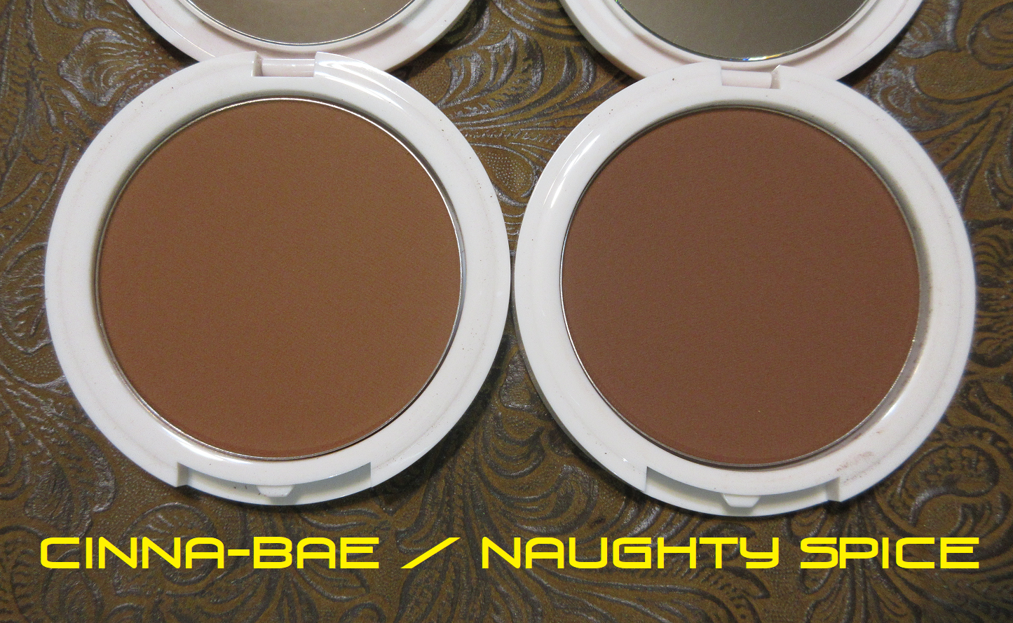
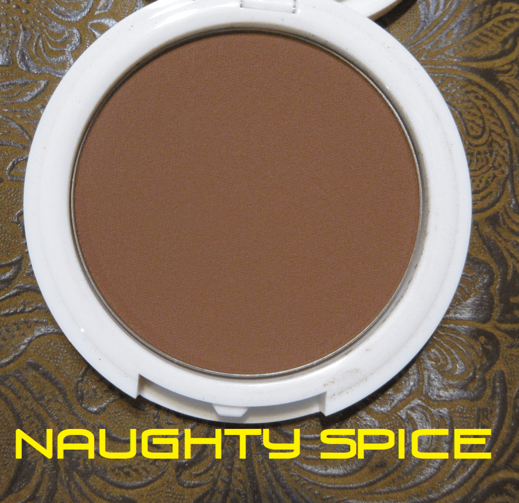
These bronzers look very similar on the skin, but Cinna-Bae is on the warm side and Naughty Spice is more neutral.

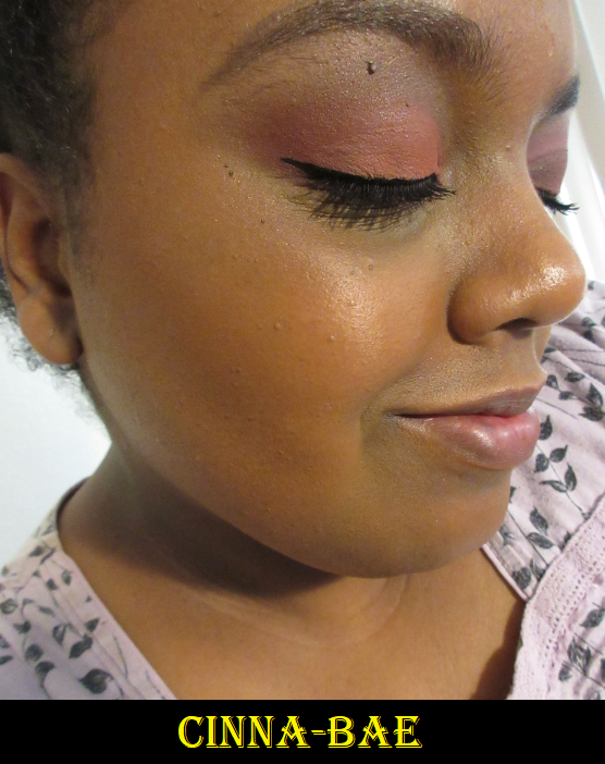
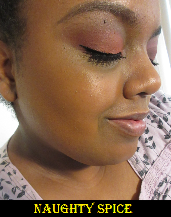
Between the two, Cinna-Bae is absolutely better suited for me. It’s the right tone and depth. Coloured Raine did a fantastic job with their product photos to help me decide that this was the best shade for me. I still purchased Naughty Spice in case I was wrong. I also wasn’t sure how pigmented they’d be, so I thought having a darker version as well couldn’t hurt. I am able to build up Naughty Spice and use it as a Bronzing-Contour. In the photo above, I applied somewhere between a light to medium amount of Naughty Spice. I used a medium amount of Cinna-Bae. It’s nice to know I can still use both though. Also, these are labeled as bronzers but on Coloured Raine’s Instagram they say these can be used as setting powders and contours as well.

The bronzers are smooth and blend well, so it’s tempting to get additional shades to try the other uses, but I refrained. I would say this formula reminds me of Fenty’s Sun Stalk’r Instant Warmth Bronzers. It doesn’t beat out my top 3, but I think it’s still very good quality.

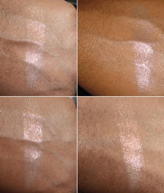
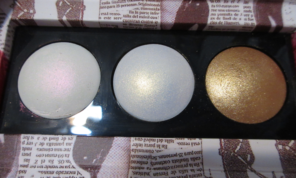
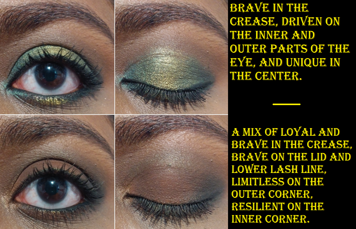
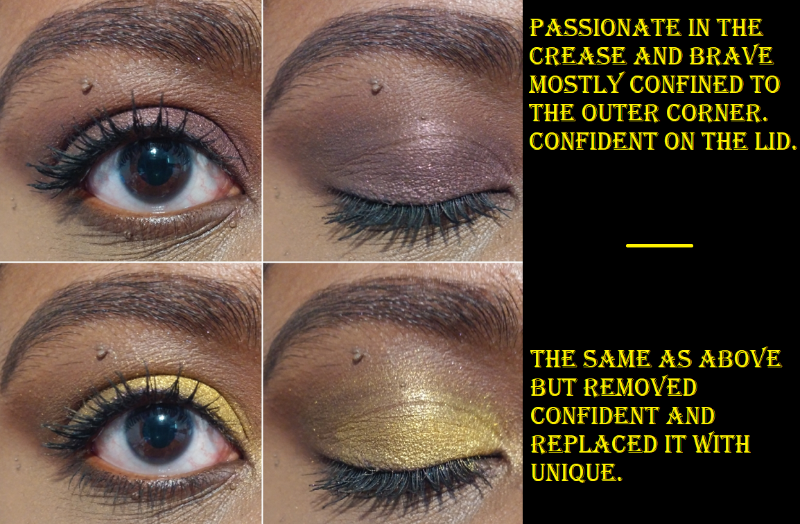
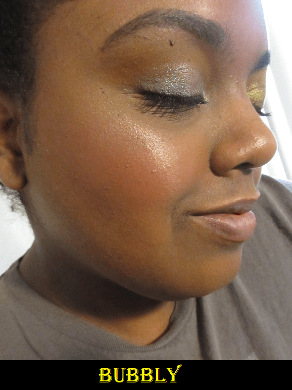
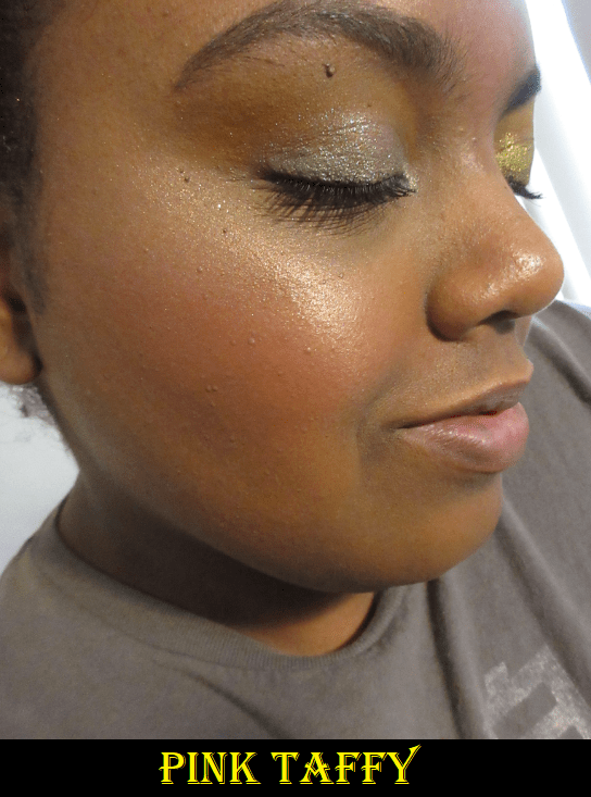
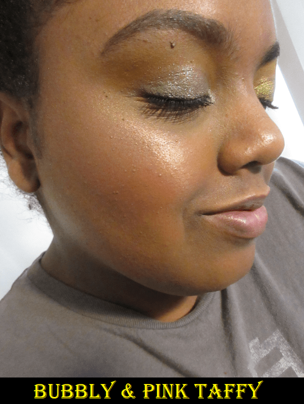
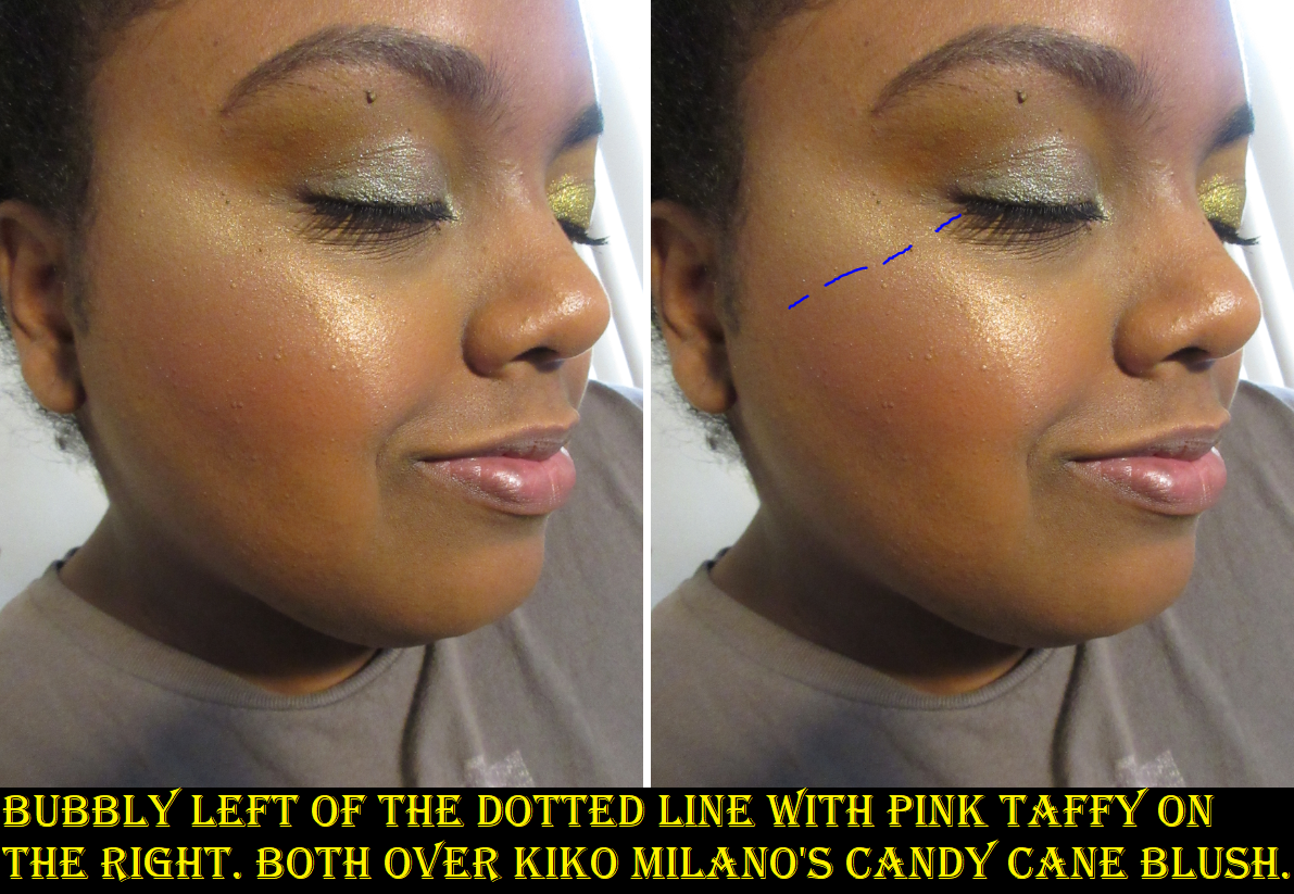
Coloured Raine Focal Point GlowLighters in Bourgeois and Just Peachy

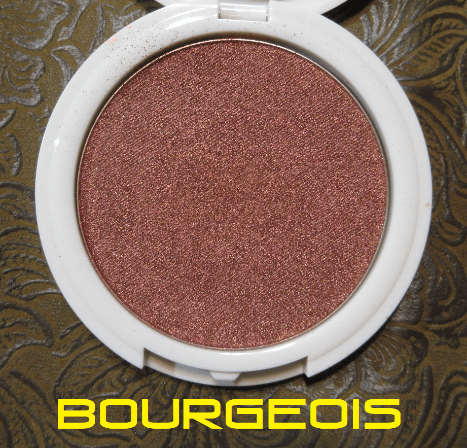
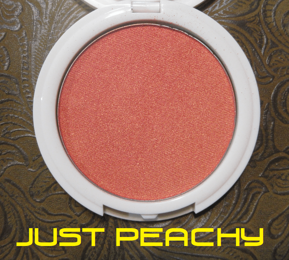
In my Kiko Milano review, I mentioned that there are only a few brands I trust to make a shimmery blush that I like, and unfortunately Coloured Raine is not one of them. On the individual product pages it says the Focal Point Glowlighters can be used as blush, so I thought these would be like the Nabla Skin Glazing formula that are highlighters but also come in blush tones like Adults Only and Lola that make them suitable for blush too. At the very least, I thought they might be similar to MAC’s Extra Dimension Blushes which are very shimmery but still flattering. I was wrong.

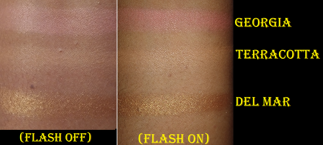
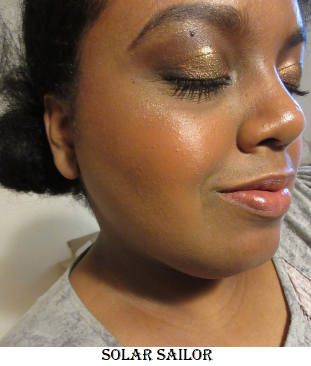
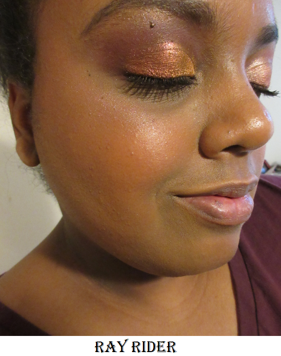
I own two of the Coloured Raine x Power Blush and Highlighter Duos, and while I thought the highlighters were too glittery for my taste, I thought the matte blushes were decent. If Just Peachy and Bourgeois were a matte formula, I know I would enjoy them because the tones are so pretty, but in this formula they are unbelievably metallic! I’ve been struggling with my camera lately and with flash off, it could not begin to show just how metallic looking they are in person when the light hits them, nor the intensity of the shades. If I try to use the lightest amount of Just Peachy, my cheeks look slightly peach from straight on, but when I tilt my head and a little light hits my cheek, all I see is a blinding gold. As pretty as the color itself is, I don’t want a gold blush. If I apply enough product to get the peachy tone to show at all angles, then it looks like I tried to use a metallic eyeshadow for blush. It’s the same case with Bourgeois. The burgundy base color is overshadowed by the intense hot orange shimmer.

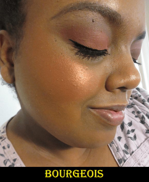
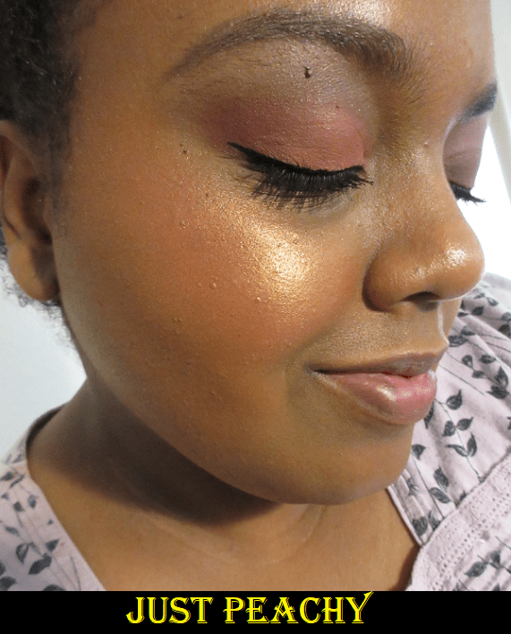
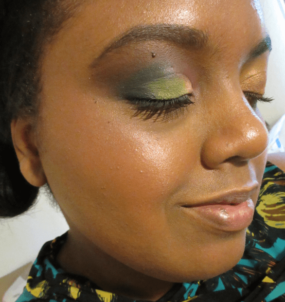
Both blushes without flash.

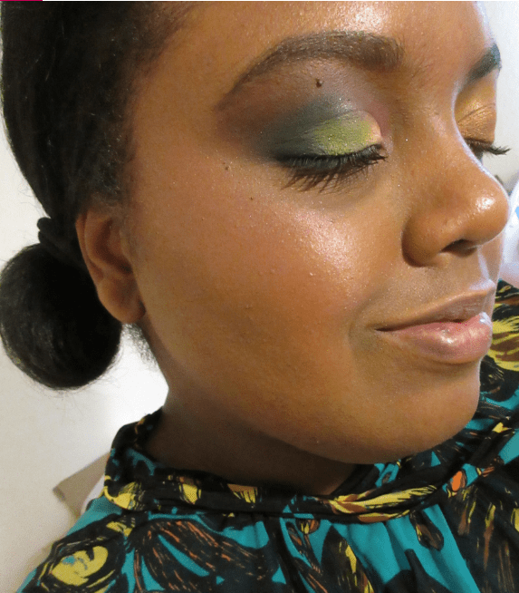
Bourgeois with Flash On.

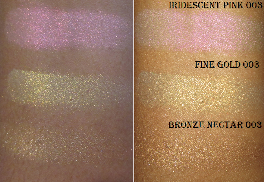
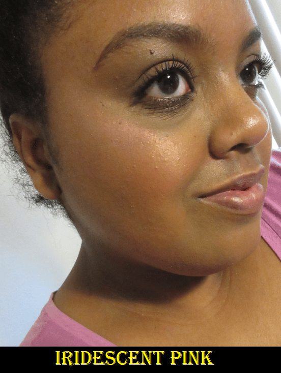
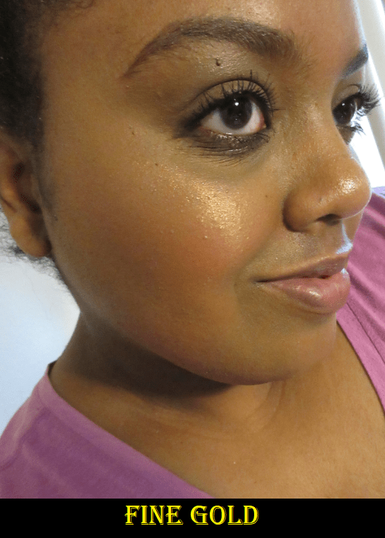
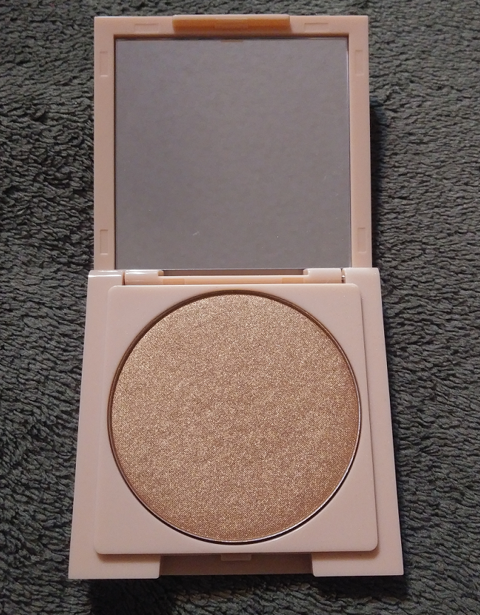
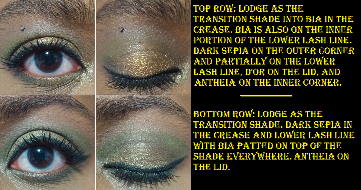
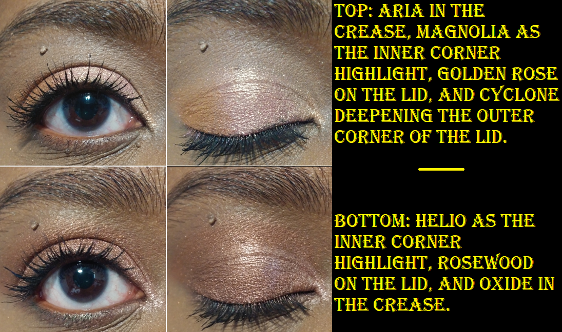
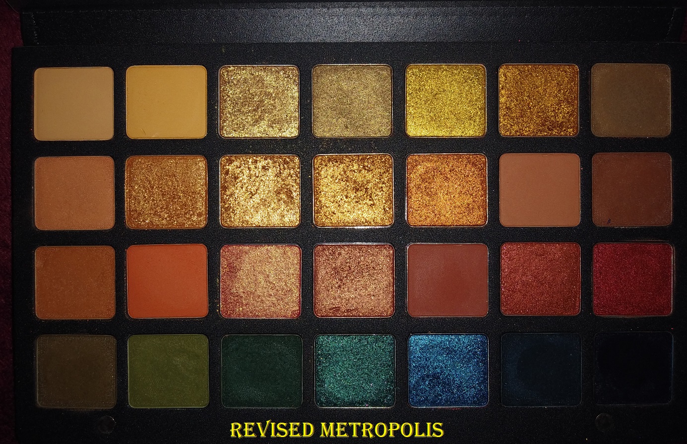
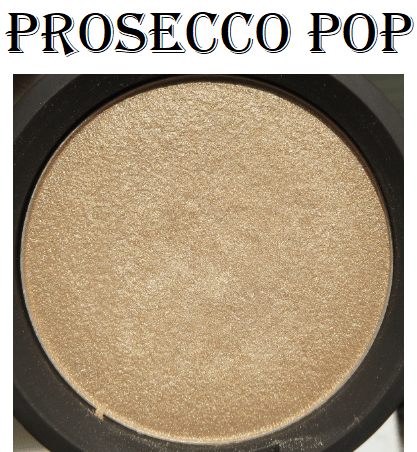
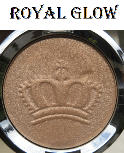
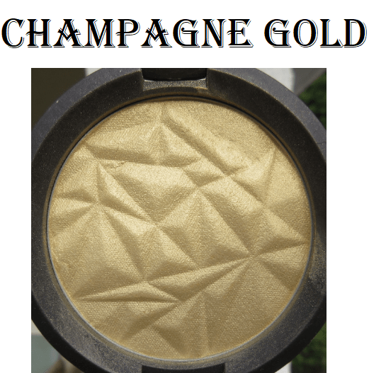
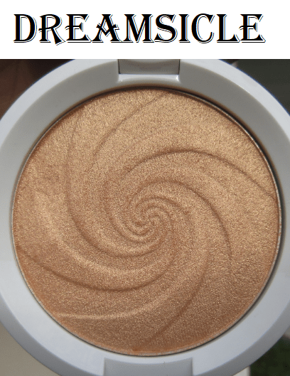
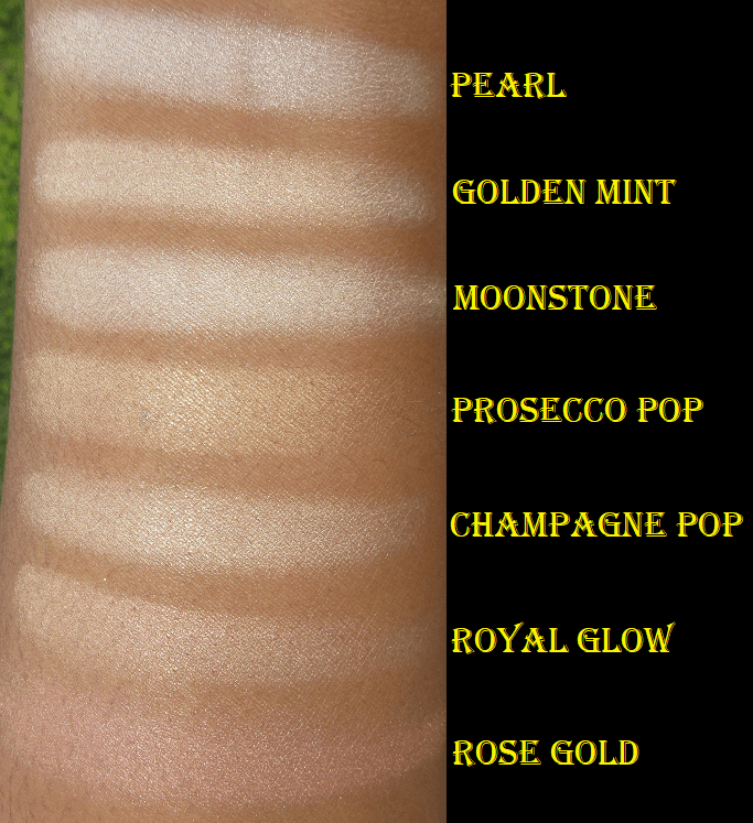
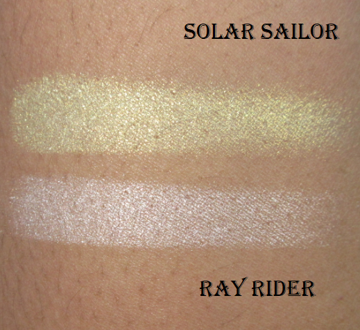
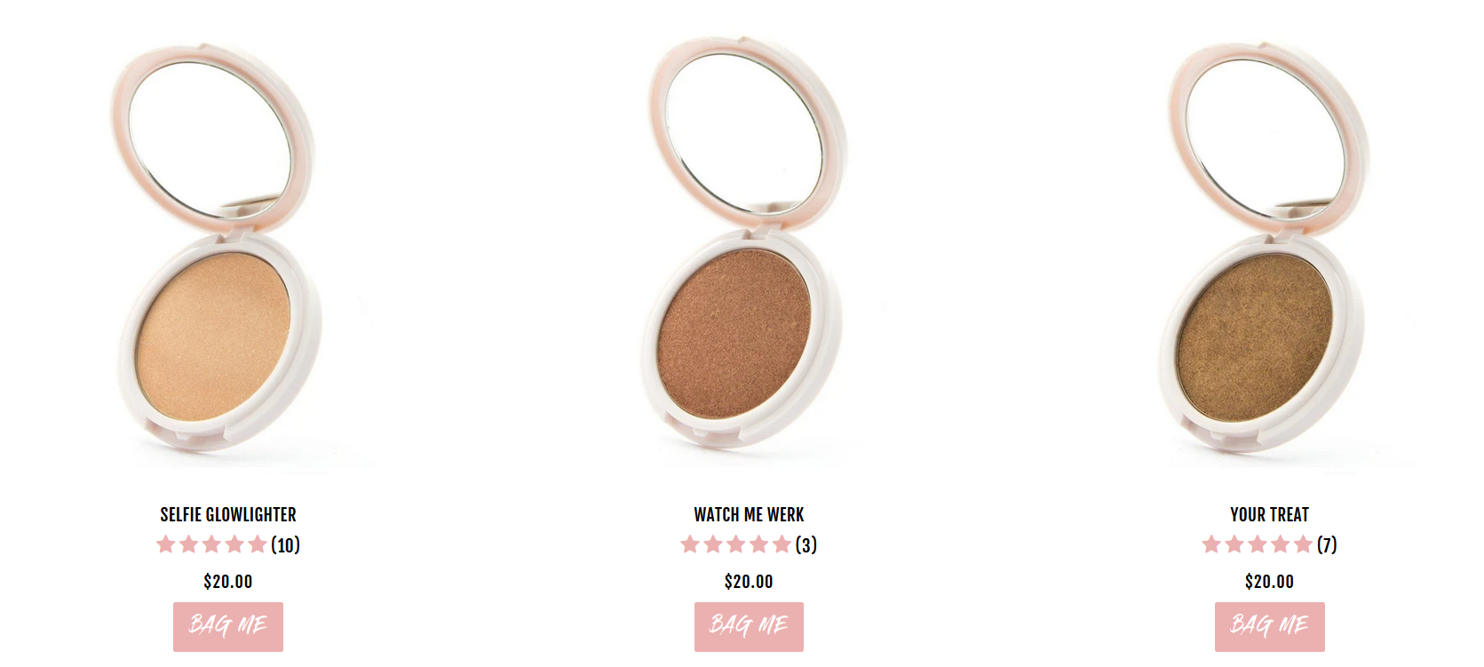
As blushes or blush toppers, these are unwearable for me. It comes down to the reflectivity of the shimmer. The Focal Point Glowlighters also come in traditional highlighter shades of golds and bronzes. This formula is much better suited for highlighting purposes. For those who like highlighters at this level of intensity, getting one of their standard shades (pictured below from their website) would be my recommendation.

Coloured Raine Large Powder Brush

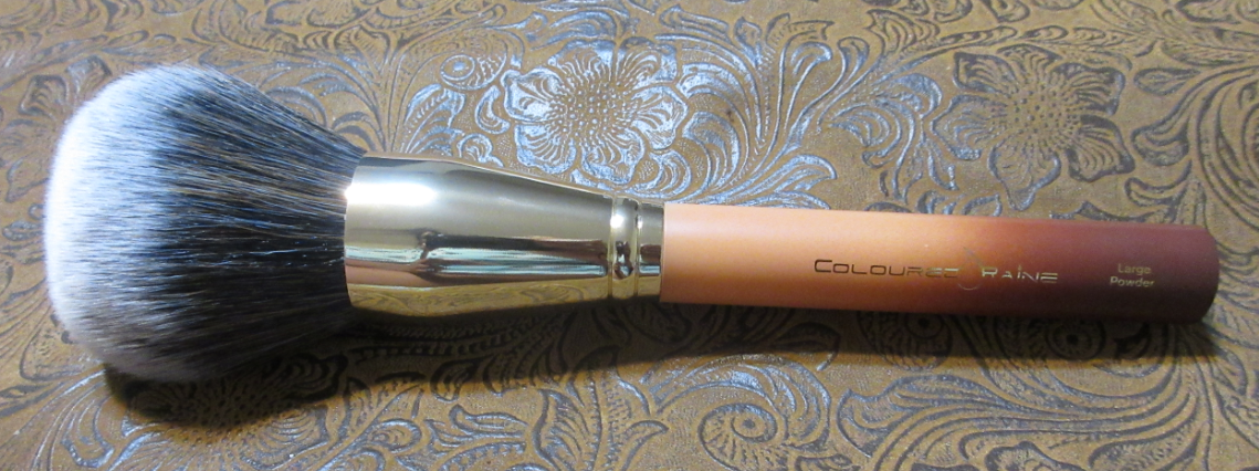
This brush is the biggest in my entire collection and also the heaviest. I think this brush is weighted because the ferrule is very heavy in a way that isn’t proportional to the heaviness of the ferrule of the Angled brush. I’ve only had one other makeup brush that was weighted in order to create a better balance for how the brush should be held and applied to the face, to intuitively allow the user to apply the right pressure with the brush. I’m not sure if the ferrule weight of the Large Powder brush was chosen for this reason, or if it was purely to allow this brush to be able to stand upright on a flat surface with ease.

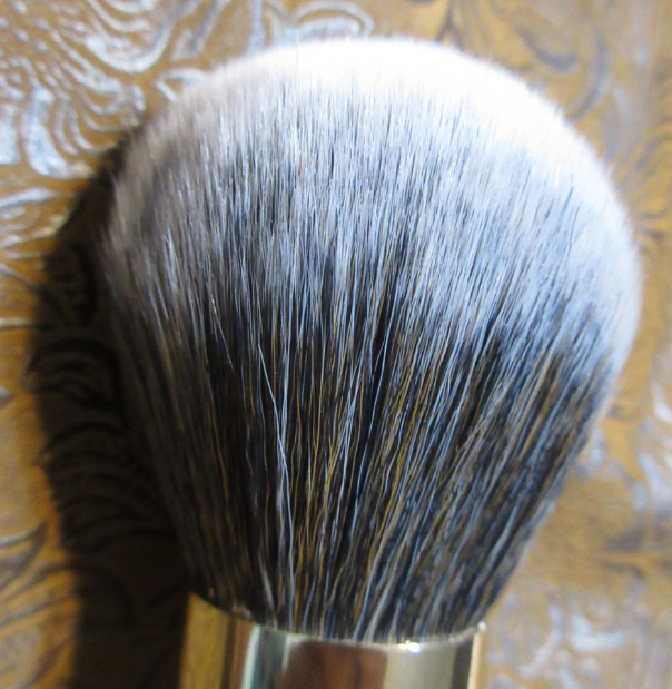
As mentioned before, the flat bottom of the handles let these brushes stand upright. The handles are plastic. The bristles are synthetic. The coffee color gradient of the handles are as pretty in photos are they are in person. The fibers are soft, but as wide as the bristles are splayed, they are not densely packed. They are long and floppy and bend dramatically with light pressure from a single finger.

I don’t mind the floppiness from the Powder Brush because the volume of the brush combined with the placement where I grip the brush (towards the base of the ferrule) allows me to sweep a light dusting of powder all over my face quickly without the bristles bending enough to impede the application. It’s a pretty good brush considering the $13 price.

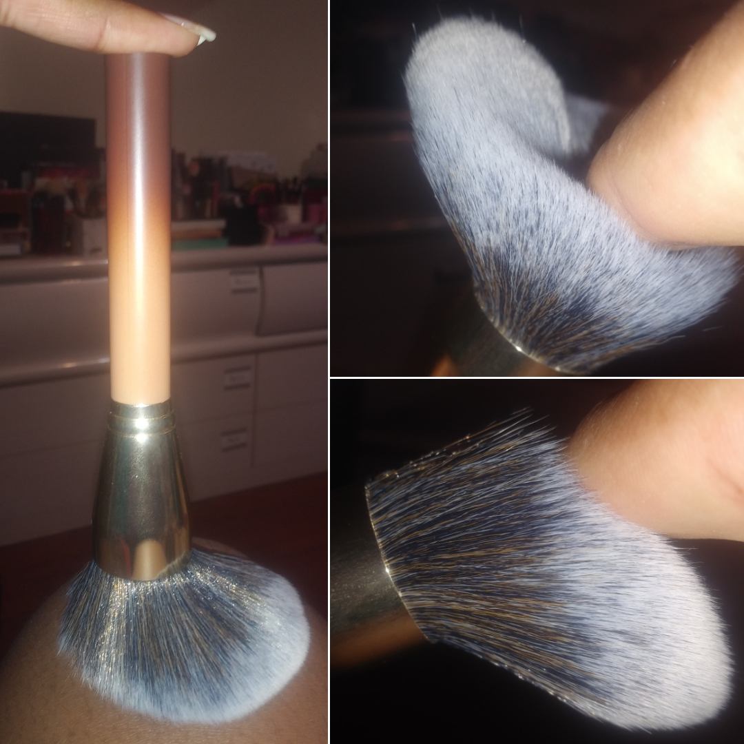
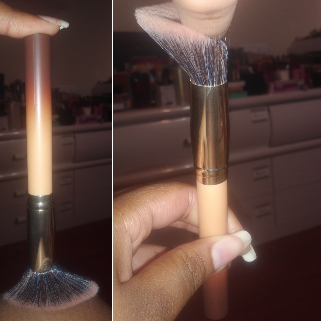
Coloured Raine Angled Blush Brush

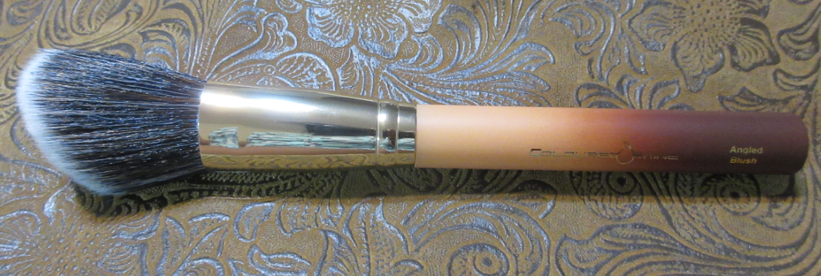
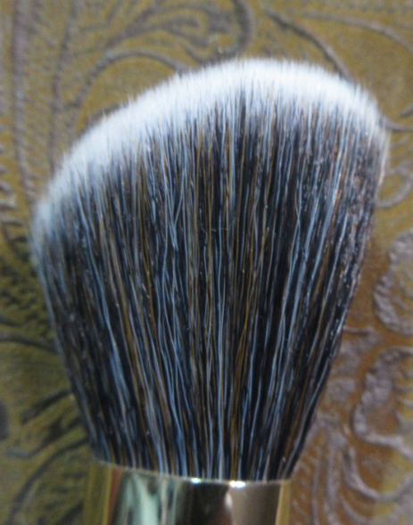
This brush technically cost $5 instead of $10 because I purchased it in the $21 bundle price with one of the bronzers. I expected this brush to work well with the bronzers since they were grouped together, but I despise this brush. I admittedly don’t favor angled brushes, but some like the Chikuhodo FO-4 are exceptions. On top of that, these bristles are not dense enough. They don’t give me enough pressure to blend. The floppiness of the brush impedes my ability to use the product. I can still use this brush with a lightly pigmented blush that wouldn’t require much blending but I recommend skipping this one. A better alternative is the Real Techniques Sculpting Brush which goes for around $15 individually, but Target has a set of three brushes and a holder for $20. The set includes the Real Techniques setting brush which I own two of and have been using almost exclusively for years to set my under eye concealer with powder. And full disclosure, the Target link is not affiliated and I make zero money from sharing it.

Final Thoughts

I’ve been curious about other Danessa Myricks products, like the Twin Flames multichromes, Color Fixes, and Vision Flushes. All the reviews I’ve seen, combined with my own experience, leads me to believe I can create beautiful looks with DM’s makeup if I’m willing to invest time into learning how best to use them. I foresee myself continuing to explore more from the brand in the latter half of 2021.

As for Mented, I’m definitely excited to try more from them in the future, especially since they’ve been made available at Ulta. It was tough for me to skip out on the blushes, but I haven’t seen enough videos and photos online to be able to tell which shades, if any, are my style. If new shades get released, I’ll be all over them!

I’m always interested in the new things Coloured Raine comes out with. In a “Behind the Beauty” episode a while back, the owner hinted at a Queen of Hearts 2 palette coming out, so I am still looking forward to that and more from the brand.

That’s everything! Thank you so much for spending your time with me today! I already had that impromptu Saturday review, but I wanted to keep the Monday schedule consistent and still make this post available today.

-Lili

Kaleidos x Angelica Nyqvist Club Nebula Palette

Today, I’ll be reviewing the Club Nebula palette and showing the reformulated Mars Melter Highlighter.

The reason I’ll just be showing, but not reviewing, the highlighter is because mine was shattered. My usual method of repressing shimmer products is to use a little 91% isopropyl alcohol. While I don’t believe the integrity of the two eyeshadows from the palette were effected, I believe not dry-pressing the highlighter might have compromised the performance. The highlighters in this line are glittery, but they lay on the skin in a way that is right on the edge of my comfort zone. When I do a finger swatch, the highlight looks exactly the way I expect, but when I use a brush to apply this to my cheekbones, the way it picks up the product causes the shimmer particles to be too spread out and uneven. It looks like a glittery mess. Wet-pressing also caused it to shrink so flat. I imagine this highlighter wasn’t meant to be condensed/compressed in such a way. Because I think it would have performed better in its regular state, I feel I can’t properly review it. I could perhaps still find use for it as an eyeshadow topper, but I will not be using this as a highlighter.

If it was just the two shadows in the palette that were broken, I would have left it alone, since the breakage was contained within the pans and I could salvage those. However, the highlighter being broken as well bugged me considering the $10 shipping fee (increased from their previous $8 charge) and the 25 days it took to arrive after it departed Shanghai.
For anyone wondering about Kaleidos’ customer service, I received a reply within 24 hours. I was offered a reshipment or to receive a partial or full refund depending on which item(s) I decided not to replace. I hadn’t heard the best things about their customer service, so I was happy that my experience with them was actually pleasant and was resolved quickly. Although I wanted a pristine palette, I felt too guilty at the idea of getting a whole extra palette knowing there were people who still couldn’t get their hands on Club Nebula, even after the restock. After my wet-press mistake, I could have benefited from a new Mars Melter highlighter, but considering my usual view on glittery highlighters anyway, I thought it best to just opt out of the replacements for both.

The packaging was so elaborate and beautiful that I wanted to show how it came to me (the box was wrapped in an air pillow/cushion/pad/pouch roll for extra protection). I usually want smaller packaging for storage reasons, but for something this beautiful I would love to have it displayed after I complete my declutter series and hopefully have spare surface area.

The special custom shipper that is included with the order of this palette comes in the large and small size. I believe mine is the large, the one intended for the set with a deck of cards. The padding for the Space Age Highlighter (plus divider layer of foam and extra tissue paper) caused the highlighter to sit too high for the box and the lid had to be forced down and secured with tape in order to close. The magnets alone weren’t strong enough to keep the lid closed with the excess padding inside.

I think it was an accidental oversight on the part of whoever packed my order, as I suspect the added pressure to force the box to close (forcefully enough to cause the dents in the front corners of the box) is what caused the breakage.
Anyway, just a heads up to anyone ordering this palette with an additional item! Let’s proceed to the review!

Kaleidos Club Nebula Palette x Angelica Nyqvist

The swatches above were taken indoors with no flash on bare skin.

I’m very impressed with the quality of the packaging and the designs. It is stunning! I’m incredibly pleased with the smoothness and richness of the matte shades and how deep they go. After being disappointed by the Lunar Lavender mattes and questioning if Kaleidos’ quality was taking a dip, I was relieved to see the mattes in Club Nebula are fantastic. Because I love duochromes and multichromes, buying this palette should have been a no-brainer, but for some reason I wasn’t 100% sold on the color story. Honestly, I purchased this to avoid FOMO (fear of missing out). It was made very clear that this palette was limited edition. I preferred to have it and not use it, rather than skip it and regret it later. I am subscribed to Angelica and I’ve grown to really like and respect her. Of course I felt the tug and impulse to support her collab, but I don’t believe that factored into the FOMO because I know I already support her in other ways by watching her vids, allowing the ads on her videos to play in full, shopping through some of her affiliated links and codes, etc. One thing Angelica said in her launch video did play a factor in my decision to buy the palette. She said to give this color story a try and step outside our comfort zones. I felt that trying to dupe a palette like this wouldn’t be the same. I wanted to see for myself if I could be inspired by something that wasn’t entirely my style. Plus, I figured this many multichromes and duochromes in a palette for $45 was a steal! While I’m thrilled to have Nova and Nebula, and I think Firefly is quite pretty in certain angles, I was a bit let down by the other three.

The swatches above were taken outdoors with no flash on bare skin.

I appreciate the dark mattes, but pale shimmers tend to go unused in my collection. You’re My Only Hope is described as a lavender with a pale blue shift. The purple is so ridiculously hard to see on my skin tone regardless of indoor and outdoor lighting. I had a similar issue with the Lightyear shade from The Futurism III: Astro-Pink palette. Celestial is another one that I absolutely could not see any shift in while inside, no matter if I was under warm or cool light nor the angle in which I held my arm. So, I was surprised to see this one is considered a multichrome, “a radiant hot pink multichrome with decadent fuchsia and golden shifts.” The only way I could see a shift was while I was outside. If I want to wear a shade like this, but with a stronger shift, I’d rather reach for Blaze from Clionadh Cosmetics. Astro is another disappointing multichrome in the sense that the shift between royal blue, teal, and violet are too close in tone and it’s almost a lighter version of Neptune from the Futurism 3: Astro-Pink palette. The upside to this color is that it’s at least very pretty. I can still use it like a statement shimmer even without the shift. I can see the lighter and darker blue particles in the pan but that shift to violet does not show on my lids unless I’m outside.

Firefly has a beautiful mint green and fuchsia duochromatic sheen that is visible in person but harder to capture on camera. I’m at least happy that it’s noticeable at the right angles, unlike the previous three shades I mentioned. Nova is gorgeous! I would have expected this to be the multichrome because of how well it shows up, but this is, “a glistening amethyst blue sparkling duochrome topper with a warm violet shift.” Nebula is my favorite color in the palette, as “a rose-gold red sparkling duochrome with a molten copper shift.” It’s very unique to my collection. The closest shade I have to it is Clionadh’s Torch if Nebula had a darker red tone to it. Surprisingly, I actually prefer Nebula. In one of the looks posted below, you can see that in some lighting Nebula can look nearly as light as Samus. Speaking of Samus, that peachy orange is gorgeous! I have a hard time liking the way it looks when paired with other shades, so I actually prefer to just use this color solo blown out on my eye with some mascara and/or liner and leave it like that.

I mentioned how well the mattes blend, but I am particularly impressed with the four lightest ones because those type of shades are notoriously difficult to show on my skin tone. None of the mattes were patchy. They gave me zero issues when used over the MAC NC45 Foundation Stick as an eye primer, Gerard Cosmetics Clean Canvas, MAC Paint Pot, and Nyx Proof It primer. Naaru in particular is the kind of shade that never looks good on me because there usually isn’t enough pigment and it looks like an ashy gray instead. This shade actually looks on me the way it does in the pan, and for once it looks nice! I also like to blend the edges of darker shadows with Naaru. Gravity is easily the best performing matte lime/chartreuse eyeshadow I own! I have nothing negative to say about Queen of Blades, Void, Cylon, Rockhopper, and Red Giant. They’re top notch!
For the shimmers, I apply them wet or on top of Nyx Glitter Primer because as beautiful as they are, they need a little help to really pop on my eyes. I always want more pigmentation than topper shades provide, so those two methods help me achieve more of the look I want. It also helps to lay down a shadow underneath the topper shade first.

I mentioned in my Lethal Cosmetics Velvet Dusk palette review that I only recommend getting the palette if you like the colors as is and aren’t getting them for the multichrome aspect since they’re more like shiftless shimmers or duochromes at best. The shifts were weak in those. I’m going to say the same thing for the Club Nebula palette. Firefly, You’re My Only Hope, Astro, and Celestial have weaker shifts than even the Velvet Dusk shades. They may as well be regular shimmers, though the amount of sparkle in them still puts them above some mainstream brands’ shimmers. Nova and Nebula are true duochromes though. So, if someone doesn’t mind having topper shades or weak shifting shadows or if the duochrome and multichrome aspect isn’t a factor at all, I would easily recommend purchasing this palette. Angelica mentioned there may still be one final restock coming in the future, but beyond one probably depends on how high the demand is.
*After my post today I saw in a pinned comment on Angie’s latest video that the restock is in May.
**As of April 1st it was announced that the restock was moved up to April 14th.

As much as I wasn’t enthralled by the color story initially (despite being a lover of greens, purples, and oranges), the more I’ve used this palette, the happier I’ve become with my decision to buy it. As one can see from the amount of example looks I showed, I kept reaching for this palette and wanted to try different styles and shadow combos. I’m up to fourteen by now (though not all made the cut for this post)! I love when I can look at a palette and feel inspired to play.

Thank you for reading!

-Lili

Pat Mcgrath Highlighters and Mascaras

I posted several reviews of Pat Mcgrath’s eyeshadows, but today I wanted to showcase some of the other makeup items I own from the brand.

Pat Mcgrath Skin Fetish: Sublime Skin Highlighting Trio

I’ve had this trio for about a year, but I forgot to include it in my last PMG brand review. It’s not something I use very often because it includes two iridescent highlighters, which I do not wear outside of the home. Even though it’s not my style, I’m still happy to have it in the event that I want to add a surprise twist to my makeup look.

Iridescent Pink 003 has a strong red shift on my cheek, which looks surprisingly beautiful. I’ve found that when I mix that shade with Bronze Nectar 003, it turns into a peachier shade, which is even more wearable and looks great on my cheekbones.

Bronze Nectar on its own is is a traditional highlighter shade, but that doesn’t make it boring. It’s still a very pretty color. I thought I would like Fine Gold 003 more than Iridescent Pink, but the strong yellow shift doesn’t look as great on my skin as I had hoped. It’s still fairly nice, but just my least favorite of the three.

Pat Mcgrath Skin Fetish: Highlighter + Balm Duo

During PMG’s winter sale, I was able to get this for $29 on Black Friday (with an added promo code). The packaging is beautiful, but please note that if you buy this, it’s possible the highlighter portion may come broken/detached from the base and stuck into the cap.

I’ve had dual ended products before, so I knew to be careful not to twist when opening. This is a product/shipping defect and not user error. When I wrote to PMG about it, they sent me a replacement with the comment that, “Just keep in mind this can happen again, as sometimes with the temperature change this will occur.”
I was still hoping to get one intact, but the replacement duo arrived exactly the same way where it was stuck in the cap. On the bright side, I was able to get both out in a solid piece by gently moving one with the tips of my fingers, and the other by smacking the flat side of the cap. Since I doubt I will use up even one of these, I gave the other to my sister. Pushing it back into the base has held well so far.

There are three shades available. The one I have is just called Bronze and it’s a slightly darker color than the Bronze Nectar shade from the highlighting trio. I like that the shimmer is also smoother because when it comes to highlighters, the finer the particles the better!

Although the Balm side can be worn on its own to give a dewy look, I prefer to use it on bare skin because it can remove foundation or concealer underneath it. Perhaps it only removes matte foundations because I don’t recall it removing my Nars Sheer Glow, but it has with the Nars Soft Matte Foundation and MUFE Matte Velvet Skin. For this reason, if I’m going to use the Balm over foundation, I either use the Bronze side on top of that or a different powder highlighter as an intensifier.

Both the Balm and Shimmer sides require a little heating up in order to glide better across the skin. A second or two of rubbing with the finger is enough for the balm, but the Bronze stick requires more warmth. So, I either rub for 5-10 seconds before applying the stick directly to my cheek or I apply some to the back of my hand and try to warm it up there before applying it to my cheek with my finger.

Pat Mcgrath FetishEyes Mascara Mini

I only opened this mascara a month ago, but I think I had it sitting unused in my drawer for too long. It has a noticeable scent that I cannot tell if it’s perfume or has gone bad. The formula is also on the drier side, but I don’t know if that’s also an age issue. In good faith, I cannot say that my experience with this mascara is accurate to what is normally in a good tube. Two coats of this gives decent length but I think anyone can find better for cheaper. I do like the applicator and how it keeps lashes nice and separated.

Pat Mcgrath Dark Star Mascara Mini

I also opened this mascara a month ago, but I purchased it four months ago, so this analysis should be accurate. It smells like a mascara should. The formula is a bit wet. Two coats gives the same length as the FetishEyes mascara with additional volume, but two coats is where it tends to clump up. I don’t know if this is due to the difference in formula or because the applicator is an hourglass shape instead. I usually have great luck with hourglass mascara wands. Even if this was clump-free, it didn’t impress me enough to think the full size is worth buying without a deep discount.

Mask Majorness 001

I have better protection masks, but when I saw this on the PMG website, I had to buy it! It’s a 50/50 cotton polyester blend mask with that pretty Divine Rose pattern and adjustable ear loops. It pokes out strangely at the sides when I wear it alone, and it doesn’t look any worse when I wear it on top of a disposable mask.

Pat Mcgrath is one of those brands that I’m always interested in, but the prices keep me from trying everything I want. I could bet money that by the time this post is up and ready to go, there will be something else I want from the brand.

That’s all for this week! Thank you for taking the time to read!

Also, on a personal note, I completed the doses of the COVID-19 Vaccine last month. I hope everyone remains safe during this still very dangerous time in our lives. Much love!

-Lili

INDIE BRAND SPOTLIGHT: Persona Cosmetics Review

I’d like to begin this post by noting the Georgia Blush, Del Mar Highlighter, and 24Hr Eyeliner were gifted to me by Persona Cosmetics for the purpose of customer satisfaction and not for blog/reviewing purposes. I will go more into detail on that in the Terracotta Blush section.

Prior to January 5th, I only had the eyeshadow palettes. The Identity Two palette specifically had become the closest thing I had to an everyday palette. I loved it so much that I bought the older one, the original Identity Palette afterwards to see how they compared. Ulta briefly listed it for half price and I figured if it had the same formula as the Identity Two, I did not want to miss out, even though the color story isn’t my usual go-to.

Persona Identity Palette

I’m not sure if the formula was changed or updated when Persona updated the packaging of this palette from cardboard to plastic, but I do find these shadows to be a tiny bit on the drier side. The shadows still perform nicely despite being slightly less pigmented (excluding Fearless). I was also surprised to see how grey Maverick looked on me considering how brown it looks in the pan. The overall color story is a little more cool-toned than I expected, but I like having some of these shades anyway. Ironically, I still have to mix Humble and Charming together to highlight under my brows (to avoid looking ashy) like I do with Kind and Loyal. Goddess is a brighter alternative I wanted alongside Resilient. Goal Digger is the more traditional gold shade I wanted alongside Unique. Audacious is the kind of shade I love to have in the crease, so I’m very happy to have that one. It leans more orange than than the shade Passionate which leans more pink. One of the things I really wanted from the Identity Two palette, after using the pink leaning white shade called Honest, was a white leaning gold. When I saw Sassy, I was hopeful this might be it, but it’s more of a silver shade. If Persona ever makes an Identity Three, I hope that pale gold will be in there, though I can still use Goal Digger for the purpose I envisioned.

Persona Identity Two Palette

I raved in-depth about this palette in my 2020 Eyeshadow Tag. If I had to declare a favorite premade eyeshadow palette from 2020, it would definitely be this one. It was one of my favorite palettes to pair with my beloved Clionadh Cosmetics multichromes. Everything I mentioned about the formula of this being creamy, pigmented, blendable, being worth the full retail price, something I can take traveling (which I have by now) and being versatile enough to create simple or complex looks and go neutral or colorful holds true. What I forgot to mention is that Limitless makes an excellent powder eyeliner.

I have additional looks with the Identity Two Palette in the 2020 Eyeshadow Tag post.

Now that I’ve compared both, I can say that the Identity Palette is great, but the Identity Two is the version that suits my preferences specifically: creamier, slightly more colorful, more pigmented, and warmer. If an Identity Three palette is ever released, I will probably purchase it on launch day. The palette would most likely still be neutral, as the owner and brand’s overall aesthetic favors everyday/natural glam.

Persona Superblush in Terracotta

Terracotta is the newest addition to the Super Blush range. As I went completely bananas for blushes last year, I naturally had my eye on them for a very long time. It was difficult to find anyone with a deep complexion wearing Georgia or Carmel via Instagram, Youtube, Persona’s website, or Ulta’s site. There was only one woman I could find, who was darker than me, and I could hardly see the colors on her cheek so I thought perhaps these shades just weren’t meant for me. When Terracotta was released, I had an even harder time trying to figure out if this shade would work for me or not, especially as even the color in the pan looks vastly different depending on the lighting. I watched one of Sona’s videos (owner of Persona) and it looked pretty light on her, but she mentioned that this blush gets much deeper the more it is layered. The website also listed Terracotta specifically as being suitable for medium to dark skin tones. My foundation shade among inclusive ranges like Make Up For Ever, Nars, Fenty, etc tends to be in the beginnings of the dark category and often called medium-dark, sometimes even the tail end of the tan category. So, I figured this should give a subtle color to my cheeks at the very least. Considering how often MAC’s paler shades surprisingly worked for me, I decided to give it a try and purchased the Georgia and Terracotta duo (with the intent to give Georgia to a friend for Christmas).

Unfortunately, Terracotta doesn’t work on me. At the time, I felt duped by the ‘suitable for dark skin tones’ label considering the shade isn’t just faint, it disappears entirely. It’s too close to my skin tone. I have four heavy layers of blush in the photo above, though it looks like nothing. I tried to leave a comment on their website to warn other shoppers about the description inaccuracy, but my comment was never made public. So, I wanted to at least warn those who followed me on Instagram about it. I had no idea Persona Cosmetics would see my post (or I expected it would be ignored by them if they did come across it). Their response was beyond anything I expected. Not only did they change the description from “medium to dark” to “medium to tanned skin tones,” which was the best case scenario outcome I could have hoped for, they also refunded the amount I paid specifically for Terracotta, sent me Georgia (since I had already given mine to my friend) because they were confident that shade could work for me, and sent the eyeliner and highlighter as extra surprises. It became very clear to me that customer feedback is important to them and they didn’t glaze over the situation like plenty of other brands would. It restored my confidence in the brand. It was especially poignant considering a short week later, Hourglass tried to pull the wool over everyone’s eyes with their release of the Ambient Lighting Palette Volume II, promoting it with a photo where the model and palette looked edited to appear deeper. The shades in the trio palette were repromoted ones (two of which I have) and that darkest shade which is considered a bronzer is what I literally use as a highlighter. The response from Hourglass was to simply remove the photo from Instagram and ignore the problem entirely. The different responses between these two companies are night and day, and I have even more respect for Persona Cosmetics when the situations are compared. This is the reason I felt it was important to share this story. If I’ve had a customer service issue in the past that was rectified, I would normally delete my original post since it was resolved. This time I kept my post on Instagram and am talking about it here because I think it’s really important to show the growth and integrity that was shown to me by Persona’s response, and also to present this as an example for how brands should handle things.

The last point I wanted to make is that I’ve tried to use Terracotta many times on my cheeks (and it actually makes a decent under eye setting powder). There was one time that I had it on and a slight tinge of color actually showed on my cheek by the end of the night. I don’t remember what foundation I was using at the time, but it led me to believe that if this shade is applied on foundation that oxidizes or will allow my natural oils to come through, it could potentially show on my skin. I have since tried to recreate that same scenario and have been unable to get the color to show visibly enough on camera (hence the hours later photo in the gallery above). So, I still stand with the fact that this won’t work on someone with my same skin tone. In the best case scenario situation it’s barely a whisper of color.

Persona Superblush in Georgia

Persona was correct. This shade does work for me! Honestly, I was pretty shocked considering my friend who I gave my original one to said it’s perfect for her and she is much lighter than me (though still in the caramel family). It gives a very light flush of pink as if I’ve been out in the cold. If I really layer it on, it’s the type of shade that I think of when anime characters blush, which is super cute!

Persona Del Mar Cali Glow Highlighter

As seen in the Georgia section, the Del Mar Highlighter is perfect for me! It’s close enough to my skin tone to blend in very well, it can be as subtle or as shimmery as I want, and there are no chunky glitter particles! Although I am wearing the Charlotte Tilbury Hollywood Flawless Filter under my foundation on the high points of my cheek, this highlighter looks just as great without it. I need to use it a bit longer to see how often I reach for it, but it could potentially knock Nabla’s Skin Glazing in Amnesia from the top spot on my list of favorite highlighters!

Persona 24HR Waterproof Eyeliner in Black

I’m going through this pencil very quickly as I feel like I lose a lot of product when I try to get the tip sharp enough with my Nars sharpener, which I need to sharpen every 1-2 uses. This formula is very creamy and easily glides across the skin. That softness does make it difficult to sharpen as I previously tried to use it with the sharpener that came with my MILK Makeup Gel Eyeliner, but that did nothing but instantly break off the tip. I like that when this dries it becomes smudge-proof and when I use it at an angle I can make lines in varying thicknesses. I can make a very precise thin line across my lid, but creating a sharp tail has proven immensely difficult due to that blunt tip. So, I just draw a line as well as I can and then use concealer to clean up the outer corner. The fact that this stays so well in the waterline makes this pencil worth it to me and I’m curious to see how long this pencil will last at the rate I currently use it. For the precision issue, I usually have to use a brush with my MILK eyeliner pencil, so the fact that this is nearly as black and budge-proof as that, while still being easy to remove with Bioderma (and the creaminess makes it easier to spread with a brush), makes the potential for me continuing to like and use this very high. I’m glad I have it, but I honestly wouldn’t recommend it in this current form. If Persona comes out with a retractable/twist up version, I’d buy it in a heartbeat.

That’s everything! I will continue to keep my eye on new products from this brand as I am more excited about them than ever. They recently launched lipliners and colored balms, but I’m on a lip product no buy. I’ll keep my eye out for the next new release from them!

Thank you for reading!

-Lili

Ofra Cosmetics Review

Ofra is a small Florida based company best known for their highlighters and liquid lipsticks. I wasn’t aware of the brand until four years ago when Ofra had their first collaboration with Youtuber Nikkietutorials. Since then, they’ve continued to partner with influencers: Nikkie, Kathleenlights, Samantha March, Jen Luvs, and more. I imagine Ofra is doing very well considering their products are available at Ulta. Then again, Ulta recently announced they’ll be carrying Jaclyn Cosmetics despite Jaclyn only having one successful launch after the disastrous lipstick release. That combined with Ulta selling KVD despite the brand struggling for the last two years and taking on Hourglass at their lowest dip in popularity has me questioning what it takes to be stocked at Ulta.

In any case, after my most recent order of the Blushzer, regular blush, liquid lipstick, and brush, I decided I had enough products from the brand to do a full review!

Glow Goals Highlighter (Nikkietutorials Collab)

I have this in Ofra’s older (but not oldest) packaging. It’s a bit difficult to see on camera, but this champagne colored highlighter has a light pink tinge that shows that shade in swatches but isn’t as detectable on my face. I tend to not favor pink highlighters, so I’m glad this looks essentially gold on my skin. This highlighter is a little softer pressed and even though I used the Wayne Goss Air Brush to apply Glow Goals and Rodeo Drive in my photos, the brush picked up way more product with this one and I was left with a far more blinding strip of color. Of course, it makes sense that Glow Goals would be extremely striking considering how much Nikkie loves her highlighters. On occasion, I like an intense highlight, as long as it isn’t glittery. This is definitely one of the most blinding shimmer highlighters I have in my collection and I love the fact that the particles are so fine. Because of the $35 price tag, it’s easy to want to compare this to Becca. The consistency and texture of the powders are different, but the result is similar. If someone wants a more intense version of Becca’s Shimmering Skin Perfectors, I recommend trying this one.

Rodeo Drive Highlighter

This is a warmer champagne/gold shade. I like that I have a bit more control with this product and can use a light amount for an everyday look or build it up to be much more intense. The amount seen in the photo above was created using one dip into the pan, which is the perfect amount for my usual tastes. Ofra considers this a “universally flattering shade,” and I honestly think this is as close to one as any brand can really get. It would be those on the lightest and darkest ends of the color spectrum who may not like how this looks on them.
The result I get when using this shade reminds me even more of the effect Becca highlighters can give. One of the benefits Ofra offers over Becca is that the current packaging is magnetic with moveable pans, so I don’t have to keep these highlighters in their bulky packaging. I can put them in my custom magnetic face palette. Other benefits are that they sell refills (which uses less plastic for repeat buyers) and also mini sizes for those of us who never hit pan on powder products anyway, or would just rather spend $18 for less product.

Chick-Lit Blush Duo (Samantha March Collab)

I saw some photos of this blush online that made it look darker than it really is, so I began to wonder if perhaps this is one of those light blushes that could still work for me (like MAC’s Melba and Mocha). Unfortunately, this was not the case. I think this would look better on anyone at least two shades or more lighter than me. I liked the way it looked when I mixed this shade with the right side of the Squad Blushzer, pictured below. This was basically useless in my collection, so I’m glad to know I can keep Chick-lit as a mixer shade.
I found it interesting that the shimmer half of Chick-lit has a darker base color in it than the matte/satin side, but combining the two leads to some icy looking results that I’m not into. It reminds me of the Clinique Pop Blushes, but I like the quality of this one better. Mixing them both also leads to me picking up too much product in the pan, which is quite easy to do as these blushes and blush duos from the brand creates quite a bit of kickup. The large packaging suddenly makes sense to keep the powders contained within the compact so it doesn’t waste product, but as I have a hard time panning anything, I don’t mind losing product.

Ride or Die Blushzer in Squad

While there are other products from Ofra that I’ve been curious about for well over a year (e.g. the Bali highlighter, beauty sponge, and liner), this duo drew me in to the point that I could only resist for about a week after it first launched!

As deep as these halves look, they don’t give intense pigment upon the first application once it’s blended. One pass of the blush, for example, sheers out to a soft medium pink flush. And for this bronzer to show enough to add warmth to my face, I have to really layer it on. This means that someone a few shades darker than me could wear this, but also those much lighter than me could as well.

I mentioned that this blush is sheerer than it looks upon initial application. While it’s great to have a blendable blush, I think it’s mainly due to the fact that this doesn’t stick to my skin very well. I’ve tried it over bare skin, different primers, and different foundations. The result is that this starts to noticeably fade around 3-4 hours and is gone around the 6 hour mark. I rarely have issues with blushes fading on me, so I thought it was a bit strange. However, if I use a setting spray, it does lock this product into place. Out of all the blush products I’m reviewing today, I’m the happiest with this one because I love the shade.

B-29 Coral Crush Pressed Blush

I have mixed feelings about this blush due to this specific color. I like that this is deep enough to show on me, but the particular tone isn’t my favorite. Like the Squad Blushzer, this shade has a bit of kickup. It has a little easier time sticking to my cheeks, but it will fade in five hours unless I use a setting spray.
Coral Crush is smaller than Ofra’s newer blush releases. This was $15 for 4g as opposed to $29 for 10g.

#22 Blush Brush

This is a blush brush in name, but the item description says this is a highlighting brush. I find it’s far too big to highlight with, especially considering how intense Ofra’s highlighters can get. I wouldn’t want an even bigger stripe of this on my cheekbones. The pointed tip makes it suited for the split pan products as a typical blush or bronzer brush might be too big.

This isn’t that soft of a brush and it’s a bit scratchy. The bristles have the look and feel of a low grade goat brush, but it’s actually synthetic. I was a bit surprised because I’m used to synthetic brushes feeling softer than this. Also, it sheds quite a lot. While it’s normal for a natural hair brush that’s been hand bundled to lose a few hairs, I’ve only had a synthetic brush shedding issue from my lower quality ELF brushes, so I was once again surprised considering the price of this brush. At least I got it free with my $35+ purchase.

The washing process can free the remaining straggler hairs from natural bristle brushes, so I hoped that washing this brush would do that as well. Unfortunately, washing this brush only increased the shedding and letting it air dry caused the brush to puff out and become too rounded to be useful. So, I recommend using the aloe vera method or a brush guard after washing to maintain its shape (and I have since done that with this brush to reshapen it). Ofra makes some nice products, but this brush just isn’t one of them.

I’d recommend the ELF Pro/Studio line (with the black handles), EcoTools, or Real Techniques over this one. They’re less expensive, synthetic, and softer. For synthetic bristle brushes at a higher price point, I recommend some of Tarte’s brushes and Scott Barnes. I used to use It Cosmetics for Ulta brushes, but my less expensive brushes are comparable in quality. Also, I enjoyed Smashbox’s original line of brushes (which was mostly natural hair) and while their line is completely synthetic now, I’ve heard great things about the new ones. I haven’t tried them myself yet though.

Long Lasting Liquid Lipstick in Baroque

I’ve mentioned in a previous post that I have no intention of purchasing lip products this year (with the exception of balms), but this was on sale for $8 and would let me reach the free shipping minimum, so I decided to buy this so I could test out the formula. This shade is described as a nude pink with gold flecks. I haven’t seen any shimmer in this at all and despite looking warm toned in the tube, it’s not as brown or warm on my lips as I’d hoped. I don’t mind that it’s a light shade, but the undertone isn’t my style, even when I’ve paired it with other shades of lip liners.

I still did a few wear tests on it. This formula is very comfortable on the lips. Some liquid lipsticks show a discolored patch if you try to touch it up, but this one doesn’t do that. It isn’t completely transfer-proof (it left a faint imprint on my glass when I was drinking tea), but I had great results from the time I put it on until the time I ate. Without retouching after eating, the lipstick is susceptible to transferring a lot more, but I don’t expect any lip product to last past eating. I give this kudos for only really disappearing in the center-most part of my lips.

While it doesn’t feel drying, at around the eight hour point it starts to look drier than it feels, so that’s when I’d remove what’s left and replace it with a balm. I’ve also tried this with a Tower 28 gloss on top, and while the lipgloss doesn’t displace the color underneath, once you eat, it makes the lipstick especially easy to remove to the point that reapplication is definitely necessary.

In the future, if I want to buy liquid lipsticks, I would definitely consider this brand, but hopefully I’d be better at choosing a shade. I also think Ofra’s reputation for having fantastic highlighters is well deserved. Those two types of products are my recommendations.

That’s all I have for today! Thank you for reading!

-Lili

Natasha Denona Collection Review

I forgot to include my Natasha Denona cheek products in my initial photo, but this post will cover everything I own from the brand!

Bloom Blush and Glow Palette

I use the Glow Cream Base as a subtle wet looking highlighter. I also mix it with the dark red Cream Blush to create a medium pink shade, since I don’t like the tone of the blush on its own. Because of the texture and how quickly it sets/stops being as blendable on the skin, I apply a layer of the Cream Base first to my cheek, then I add one tap of the blush on top and swirl it around with my finger until the adequate amount is laid down. I wipe the excess blush off my finger before continuing to blend until I’m satisfied with the look. I’ve tried the Glow Extreme several times but the sparkle level is too glittery for my taste. On the flip side, the Duo Glow is stunning! I imagine this could be a blush on some people but it is a stunning duochromatic highlighter. Being able to utilize so much of a face palette is uncommon for me, so I’m very happy I bought this. Also, I’ve had this for ten months and the creams haven’t dried out. This palette is meant to last 18 months, so that’s also a pleasant surprise!

Blush Duo

I bought this from a Boxycharm subscriber. The main blush shade is called Golden Coral and is described as a, “champagne peach shimmer and warm pink with slight champagne sheen.” This is not to be confused with the Duo Glow shade in the Bloom palette which is a combination of a, “vibrant coral with golden champagne.” The TouTou shade is meant to blend out the edges. On my skin tone, it’s too stark and just makes the edges look ashy. When I look forward, Golden Coral is a bit too bubblegum pink, and when I turn my face to the light it looks like I applied highlighter all over my cheek instead of a glowy blush. I think if I had a different shade, I would still not be a fan of the way it looks on my skin or its satin texture. MAC and Nabla are the two brands I trust to make a shimmer blush I will like. I haven’t had quite as much luck with shimmer blushes from other brands.

I think I will be decluttering this one from my collection since I doubt I will use it again. It looks pretty in the photo, but in person there’s just something about this color that I don’t care for. Despite the warmth from the gold shimmer, the base color of the blush itself is too cool toned for my liking.

The Mini Lila Palette

I purchased this palette when it was on sale and being discontinued about two and a half years ago. I haven’t noticed any changes in the quality because these shades were always very pigmented, but not the easiest to blend. Although Poison Berry (the dark red-toned purple) and Raisin (warm reddish-brown purple) are pretty colors, they look nearly interchangeable on the eye and I have plenty of shades like them. I wanted this palette for the Blue Dahlia shade, which was more unique in my collection when I originally bought it, but I have many duochrome blue-purples in my collection now, such as Nocturnal from Clionadh and Fierce from Sydney Grace. Linen is pretty, but I typically only use that kind of shade to highlight the inner corner of the eye and under the brow arch. Flint is only good for highlighting under my brow (though it barely shows) and blending out the edges of Poison Berry and Raisin.

I’ve tried to use this many times and to love it, but I think it’s best if I declutter it to allow other palettes I’m more excited by to get my attention.

My Revised Lila Palette

The Lila palette is an older one from Natasha Denona’s brand, but I purchased mine from Beautylish in November 2019. Some of these shades from the original palette are so beautiful, but I felt it wasn’t purple enough, which is why I rearranged this palette using six additional purples from the 28 Purple-Blue palette: Calypso Blue, Nina’s Orchid, Aubergine, Electric Violet, Smoky Plum, and Maroon. I am much happier with the results! The colors are mainly midtones and darker shades, so I don’t have anything to give a true pop of brightness in this one, but I tend to just use whatever highlighter I have for inner corner and brow arch highlights anyway.

As a purple lover, if I didn’t have the ability to add more purples to this palette, I honestly think I would have been more disappointed with this purchase and felt it wasn’t worth buying, even though I got it during one Beautylish’s infrequent sales. I still don’t use this palette as much as I should, but it’s aesthetically pleasing to me and I get joy from knowing it’s there in my collection.

The Mini Gold Palette

I purchased this shortly after it was released, which is rare for me to buy anything at full price. However, the color story was calling to me so strongly that I didn’t have the self control to wait for a sale. Lodge hardly shows on my eyes, but I love all the other shades! Dark Sepia is a much needed deepening up shade, even though I typically reserve that task for mattes. I found that it looks great in the outer corner but I can also use it in the crease with Bia on top to give that grungy olive green depth that I need if I want it to look like more than just a soft wash of green. I originally didn’t like the flaky texture of D’OR, but now that I’ve worked with many different glittery shadows for the past year, my experience makes using this shade much easier now. I thought the green would be my favorite shade, but D’or really elevates the eye looks I create with this palette. Antheia is a beautiful duochrome olive-brown with gold and green shimmer. That shadow’s tone doesn’t pop as much on my eyelid as I think it would on someone else, but it’s still pretty and I prefer how it looks as an inner corner highlight.

If I ranked my Natasha Denona palettes in their non-revised forms, this would be tied with the Bronze palette for second place. It’s also a favorite palette in my eyeshadow collection overall.

My Revised Gold Palette

This is another palette that is older, but I purchased it late in 2019. Although I liked the blue shades, I wanted to have all my blues in the 28 Purple-Blue Palette instead. I kept 8 of the original shades and added 4 from Lila (Magnolia, Layla, Helio, Cyclone) and 3 from the Purple-Blue (Rosewood, Golden Rose, and Oxide). This palette holds one of the most amazing nearly-glowing greenish gold shades called Lime Chrome. It’s possibly my favorite eyeshadow color from Natasha Denona! It’s hard to justify the price when I got this palette for a few specific shades, but I can at least attest to the shimmer quality being amazing! The mattes weren’t very well suited for me.

When it comes to doing eye looks, my version of the Gold palette is better for simpler eye looks if used alone or as a companion palette. If I wore Brass one day and Oro the next, I doubt anyone would notice I was wearing a more yellow-toned gold shade that day. Or if I wore Brass one day and Alchemist the next, I don’t think anyone would wonder if the eyeshadow suddenly became less glittery than the previous day. So, really, the differences in gold shades is for the wearer’s knowledge and benefit. Although I don’t mind repetitive golds, there were quite a few light shades that were going to look pretty much the same on my eyes, so that’s why I removed most of those.

For the eye looks, I added Python, Sparks, and Aria back, although I had to use the very pale Anastasia Beverly Hills primer in order for Aria to show at all on my eyes. The last two eye looks were created using the pink shades in my revised palette, which were not part of the original Gold palette, but I included them in this section anyway.

My Revised 28 Purple-Blue Palette

This is the oldest ND palette in my collection, as I received it from my 2018 Lucky Bag. These have under performed for a while now, but I am not ready to put them on the shelf of retired makeup products kept purely for collector purposes. Although this palette has been rearranged, the majority of the shadows are still here. I mainly removed the purple shades to spruce up the Lila palette. This one currently holds all the colors I like the least or would seldom use in my ND collection, which are mainly cool tone shades. Some of the yellows and golds are beautiful, but I wanted to minimize the amount of similarly toned shadows in the other palettes, which is how those ended up here. 19 are from the original palette, 2 are from Lila (Juneau and Per Se), and 7 are from Gold (Cava, Sandstone, Sparks,Aria, Teak, Aurora, Python).

The Metropolis Palette

I love the greens and blues, plus I enjoy enjoy orange shades, so this palette has a lot to offer me. On a lighter skin tone, the subtle nuances and differences in texture and undertone is enough to keep this palette from being repetitive, but I acknowledge a lot of these colors look similar on me. My favorite shimmer from Metropolis is Orium, a duochromatic “coral with light greenish reflects,” which goes well with everything in this palette. That being said, I still haven’t used Metropolis as much as I wanted. I know the shades are arranged in a way that can be complimentary if used in adjacent quads or by rows and columns, but I am unused to these color combinations, so I tend to not know what to do and I reach for something else instead. I was happy to discover that the pans in Metropolis are the same size as the medium 15-pan $65 palettes, so I decided to swap some of my least use shades and replace them with Suntan, Magma, High Degree, Alloy, Gloaming, and Bliss from the Bronze palette. Then I organized them in a way that makes it easier for me to visualize how to pair the colors together on my eyes!

Metropolis launched in September 2019, but I’ve only had this palette for 13 months. I can happily say that the cream shadows have not dried out, although Symbol did feel less creamy than Enigma from the very start. They’re all still blendable and such a pleasure to use. This palette is labelled to be good for 2 years after opening, which is fantastic.

I already reviewed this palette, mini Lila, and mini Gold in my 2020 Eyeshadow Tag post, which included eyeshadow looks, so I wanted to expand on that by creating new looks using different shades for this one.

This is my favorite Natasha Denona palette and a favorite in my collection overall!

The Bronze Palette

This is the newest addition to my collection. I kept telling myself I didn’t need this and that the color story is repetitive, but I caved and bought it. When I looked at this next to Metropolis and saw all the neutral browns and oranges, I was reminded even more how much I didn’t need this palette. It’s so pretty though! Bliss is an amazing dark pink shadow with gold and green sparkle. Deep Dive has the cream to powder formula that’s present in the Metropolis palette which works well to smoke out any look or add a unique twist to any shadow that’s patted on top of it. Gloaming is a stunning, “burnt umber with a light bronze reflect.” Magma is the perfect crease shade for all these bronze and orange tones. The shadow quality is fantastic. They are all pigmented, even if most of the lighter mattes are the same depth as my natural lid shade and they just blend into my skin and become hard to see. The other shadows more than make up for it. Even Rhodium, my least favorite shade because it doesn’t have enough sparkle to stand out on my eye, looks amazing when paired with the more sparkly shades in this palette. What helps differentiate this palette from Metropolis is the fact that the similar orange shades lean more on the pink and brown side of bronze. The oranges in Metropolis lean more yellow and gold. Although I removed the most fun six shades and put them in Metropolis, I’m happy to say that what I have leftover in my revised Bronze palette still looks pretty and I can see myself reaching for it to use True Copper, True Bronze, Sundown, Deep Dive, and possibly even Rhodium again.

I left Bronze as a workable and still cohesive palette, unlike my revised 28 pan Blue-Purple one filled with shades I wouldn’t miss. Although I wanted to put Deep Dive in my Metropolis palette, I needed to keep it here as my main deepening up shade.

COMPARISONS

When it comes to specific categories like inner corner shades, browns, golds, bronzes, and blues, Natasha Denona’s shades are without question very similar. At the same time, I thought a lot of shades were more similar than they ended up being. For example, in my mind I thought Bia and Lethal were similar because they’re both light greens. However, Bia is on the grassy pastel side and Lethal is a more grungy yellow-green. I also thought about the fact that Golden Rose is a duochrome pink shadow with gold shimmer, and the same can be said of Bliss. In swatching them, I realized Bliss is more of a coral than a true pink. So, Natasha Denona’s use of different undertones and levels of glitter really helps shades that would ordinarily be similar look quite different when swatched.

That’s everything! I’ve been wanting to do a post like this for a long time, so I’m happy it’s complete now. Thank you for taking the time to visit my blog!

-Lili

PUR x Barbie and Kiko Milano 2020 Holiday Collections

It’s a bit late to post about last year’s holiday items, but as these products are still available and on sale, I really wanted to post my thoughts on them.

Pur x Barbie Palette

I received this palette as a birthday gift. Until this point, I hadn’t tried anything from PUR, but I heard mixed reviews about their eyeshadow formula. I was pleasantly surprised how much I enjoyed using this palette! The shadows have a decent amount of pigment, are smooth, and blendable. I am very happy that the orange mattes are distinctly different on my eyes and although the orange shimmers are similar, Trendsetter is actually a duochrome that shifts from the lighter orange in Dream House to a slightly darker red-orange. I’m not sure if I should even call them “shimmers” because they have a semi-flaky texture that reminds me of metallic foiled shadows. I don’t know if I’m a fan of the textured look when applied dry on the eye or even with my finger. In order to get them to look the smoothest, I apply them with a wet brush, which changes the texture, but then it becomes sheered out. That’s when I apply an additional layer on top using my finger. The wet shadow underneath meshes with the dry powder applied on top to keep it smooth yet have that extra layer of pigment. All of the “shimmers” are like this, excluding Icon which is more of a satin formula. The foiled shadows also leave a ton of glitter particle fallout as the day progresses. I recommend using something like a glitter glue/primer to help with adherence.

The shade Barbie Style is medium pink and Timeless is medium red. Although I can tell the difference when I use them separately, because they’re the same depth, I find them to be too similar to use together in an eye look. Motivate and Innovator are both dark brown shades, but I prefer to use Motivate for warmer looks and Innovator if I’m going for something cool-toned.

This palette is great for anyone who wants to dabble a bit into color eyeshadows. The shadows are colorful yet soft with enough neutral shades to keep the looks grounded. Although I love shimmers, I can see myself using this palette mainly for the matte shades.

Pur x Barbie Confident Glow Signature Illuminating Highlighter

Seeing the eyeshadow palette in person made me curious about the highlighter, so I bought it afterwards. I don’t believe it’s available at Ulta anymore, but at the time of writing this, PUR still has it for sale on their website. The formula of this highlighter is very soft and I was happy to see that whether I used exclusively the gold shade, the pink, or both swirled together they basically look the same on the skin. Since I tend not to like the look of pink highlighters on me, I was worried about keeping the shades separated when I apply them, but Pink Taffy has gold shimmer in it which keeps it looking warm toned and not much different from the Bubbly shade. The base color isn’t very strong in either shade, so it blends into my skin nicely.

All the Barbie highlighter swatches are over Kiko Milano’s blush in Candy Cane and Make Up For Ever Velvet Matte Foundation in Macao.

When I apply a heavy amount side by side to my cheekbone (as shown above), there is a minimal difference between them. It’s even less noticeable when I use my usual amount. Since I didn’t purchase this with the intention of having two different highlighters in one, I’m happy that they are similar so I can just swipe my brush in the pan and not have to worry about the shades mixing.

Pur x Barbie Gloss in Boss Gloss

I received this as a free gift with purchase from Ulta. I had the option to choose between this shade or the lighter one called Girl Gloss. Boss Gloss has about as much pigment as a standard Fenty Gloss Bomb, plus noticeable glitter particles. The predominant glitter color is a hot pink/magenta that has an almost metallic affect on the lips. It’s a bit sticky, so I wouldn’t normally wear the amount that it takes to look a bit metallic (double layer). I’m happy to have this, especially at the low cost of $0.

Kiko Milano Holiday Gems Highlighter Palette

I really wanted this, even though I could clearly see in photos that the texture looked glittery. I was so happy when I got it in person and saw that after touching the powder, it looked like more of a wet sheen, rather than sparkly! That’s not to say it isn’t glittery, because it is, but it’s not at the level that would prevent me from wanting to use it (excluding the golden brown shade).

These highlighter swatches were all over the Kiko Milano Unexpected Paradise Aspirational Mauve blush. Kiko didn’t give them names, but they are numbered instead. Highlighter #2 was so subtle in my initial photo that I retook the picture. Although I applied a generous amount, the base color is so close to my skin tone that you can’t see it and all that shows are the sparkles.

As is common with highlighters on me, they look similar, especially on camera. However, there is a faint enough difference that I can say I like shade #1 and shade #3. #1 is my typical highlight color. #3 in person has a warm sheen that compliments my skin tone. #4 is okay, but I find it to be a touch ashy.

Kiko Milano Holiday Gems Plush Suede Blush in 02 Candy Cane

I’m happy to report this blush had no detectable scent! It’s supposed to smell like vanilla, according to Kiko’s website, but I don’t smell anything from the powder. Unlike the Unexpected Paradise blush, which is on the texturally softer side with some kickup, this blush has very little kickup. I wouldn’t say it’s hard-pressed, as I can pick up the product easily enough with any brush regardless of the bristle type, but it’s on the medium side and harder than my other Kiko blushes. Although this shade is a much brighter pink than I’d typically go for, I didn’t think the other two shades would show up on my skin tone (though it’s difficult to tell via online photos which is the only way I have access to these products) and the pretty packaging was a major factor in me purchasing this. I did get this on sale, which happened very quickly after being released on Ulta’s site.

After a little while, this blends into the natural oils of my skin and looks better than the initial application. For that reason, I definitely like it. Even when it first goes on it reminds me of winter wind-kissed cheeks!

Kiko Milano Wonder Woman Starlight Blush in 03 Athena Strategy

I have mixed feelings about this blush. In warmer lighting, this blush looks extremely metallic. I like the color, but it’s as though I put a metallic eyeshadow on my cheek. In brighter and slightly cool lighting, it looks more like a shimmery eyeshadow instead, but in a somewhat nicer way. Regardless of the light, this does emphasize texture and accentuates my pores, which is normally not a problem for me. For those looking out for fragrance, this has a pleasant fruity scent. I don’t smell it once it has been on my cheek for a bit, but the smell lingers in my blush brush.

I don’t see myself using this again, but I wanted it for the Wonder Woman theme anyway. This is the only Wonder Woman collection I’ve seen within my price range (*cough* House of Sillage *cough*) that excited me. So, I’m holding onto it for collector purposes.

Kiko Milano Unexpected Paradise Blush in 03 Aspirational Mauve

This blush smells a bit like coconuts and sunscreen or tanning oil. The smell is very artificial but it fades quickly on the cheek. There are three shades in total. I thought MAC was the only brand that could make mauve and plum blush shades I like on me, but after wearing this one, I’m beginning to accept that perhaps mauve is a generally nice color for me! Although it’s the darkest shade they had, it gives me a flush of color that I can’t overdo, even if I really pack this on. However, this will probably not work on someone more than a few shades darker than I am.

Here are all the blushes swatched together with flash off and on.

That’s everything! It was fun to try PUR and Kiko Milano for the first time. I don’t think any of these products will end up being holy grail status, but I’m happy to have and enjoy them.

Thank you for reading!

-Lili

Becca Shimmering Skin Perfector Highlighters

Becca Cosmetics was initially known for having a very inclusive shade range of complexion products and making shades for the deepest of skin tones that few companies at the time were willing to create. But the main hype around the brand, what it’s best known for, are their shimmering skin perfectors. They became even more popular within Beauty Youtube after collaborating with Jaclyn Hill to make Champagne Pop.

In 2014-2015, my makeup obsession wasn’t as strong as it would later become. After swatching the Becca Perfectors in-store, I firmly believed they were the best highlighters on the market, but I wasn’t about to drop $38 on just one. During the holidays in 2015, Becca released the Champagne Glow and Afterglow palettes, which allowed me to have multiple shades for the same price. So, I’ve been using Becca’s highlighters ever since! Although Becca has dropped in popularity, and their place among the top highlighter makers is wavering, their formula is still in my top 3.

I acknowledge half of my Becca collection should be retired to my products-too-old-to-use shelf, but they’re still just as good as when I bought them. I threw out all my liquid and cream Perfectors, but I plan to use the oldest powders for a little longer.

For consistency, I am wearing MAC’s Pinch Me blush, Nars Sheer Glow foundation, and Tarte Shape Tape concealer in every photo. I did not use contour powders or bronzers in any of the pictures.

Pearl

Other than for testing purposes, I never use this color on its own. I only wear it mixed with Topaz. It’s described as a “soft luminous white,” which I expected to be incredibly stark and unwearable on its own because it’s the whitest shade of highlighter in my collection. However, this has a semi-transparent base that doesn’t leave a powdery white cast that other highlighters in my collection, which are technically darker, can have. I still prefer a warmer highlight, but it’s nice to know I could wear this if I wanted without it looking too crazy. Pearl was originally said to be a limited edition shade that Becca later made permanent.

Golden Mint

This is a website exclusive “minty green that transforms into a wearable gold.” It was supposed to be limited edition, but three years later it’s still for sale. On social media, Becca asked followers which shade between Smokey Quartz and Golden Mint they wanted to be produced. They removed those posts from their Instagram after later criticism, but I have screenshots other accounts reposted.

Smokey Quartz supposedly had the most votes and was released within days. Then three months later, Becca released Golden Mint anyway. It was very clear for everyone to see that both colors had been in production long before they asked anyone for opinions. This deceptive marketing move left a sour taste in my mouth, but no one explains it better than the ladies at Beauty News, whose video I will link here.

I was annoyed with Becca but still bought it anyway during a promotional discount event. I do absolutely love this shade. The slightly green-tinged white powder transforms into a peachy gold shimmer. For anyone curious, I have reviewed this shade in the past. It’s more pigmented than Pearl and can actually look harsh if I apply too much, so I typically use my Wayne Goss 15 Fan brush with this product.

Moonstone

Like Pearl, I only wear this if mixed with Topaz. It’s described as a “pale candlelit gold,” and is an extremely common shade for a highlighter, but I don’t have that many shades which are this light in my collection. Moonstone was part of Becca’s original launch of Shimmering Skin Perfectors.

Champagne Pop

This “soft gold with peachy-pink pearl” shade is the one that catapulted Becca to mainstream fame thanks to the collaboration with Jaclyn Hill. The previous highlighters I’ve mentioned can be applied lightly to give a more subtle glow. Champagne Pop was intended to have a strong beam, as is Jaclyn’s highlighter preference.

Prosecco Pop

Prosecco Pop was Jaclyn Hills’s second collaborating shade. It’s described as an “ethereal gold with rich golden bronze pearl” and that bronze is what makes this shade a bit better for my complexion than Champagne Pop. Although I don’t think this is quite as finely milled in terms of glitter particle size, I still like it.

Royal Glow

This is a limited edition, “bronzed opal shade infused with shimmering gold pearl,” but is still available for sale. I bought it mainly for the pretty crown embossing, and therefore, I don’t use it as often in order to preserve the imprint. This highlighter has the most subtle shimmer and reflectivity of the Skin Perfectors in my collection.

Rose Gold

This shade is a “rosy pink with warm gold pearl.” I usually dislike pink highlighters, and the same can be said of this one. The pink tone doesn’t show on my skin. It just looks slightly ashy (less ashy thanks to the addition of gold pearl) and cool on my cheek. It looks better in photos than it does in person. I don’t wear this shade and haven’t tried to mix it with any of the others.

Gold Lava

This limited edition “24k gold with light pink pearl” highlighter is still available. It is the most glittery of the Skin Perfectors that I have. In terms of color, this shade is similar to Champagne Gold and would be more “wearable” if the formula was smoother with smaller glitter particles. Because this shade isn’t as old as Champagne Gold, I was hoping this could be a nice replacement for when that highlighter goes bad, but I rarely use Gold Lava and I don’t see that changing in the future.

Champagne Gold

This limited-edition “soft warm gold” shade was released around October 2014 and I wanted it so badly! However, my frugal side refused to purchase it for the full price. I was waiting for a sale from Sephora or Ulta, but it never came. For an entire year, I was kicking myself for not getting it while I could. But in November 2015, Hautelook put it on their site for $30 and I finally got my hands on it!
Champagne Gold was not a popular color. This was long before Fenty’s Trophy Wife, and there were a lot of complaints about how this particular shade of yellow wouldn’t work for a majority of skin tones. I don’t know how well it suits me, but I still used it a lot within the first year of having it (even though you can’t tell by looking at the pan). The base color is very pigmented, so I used it frequently but sparingly in the amount of product applied.

My theory is that Becca produced a small enough batch that rather than putting the rest of their stock on sale, which could lower the brand value for customers at their biggest retail partners, they unloaded their remaining inventory onto Hautelook, a much lesser-known website that still holds more prestige than TJMaxx because of its connection to Nordstrom. This shade might have even been sold at Nordstrom Rack, but I didn’t live near one to be able to confirm that.

The most telling indication that Champagne Gold didn’t do well is the fact that Becca never re-released it. Anything that sells well, Becca always brings back or adds it to the permanent collection. They were able to save face with Champagne Gold, but after that it was unavoidable. The Light Chaser Highlighters and Khloe Kardashian/Malika collection have been on sale for years now. The evidence of the brand’s dwindling popularity hasn’t been a secret for a long time.

Dreamsicle

Real Dreamsicles are a combination of orange and vanilla. I expected this shade to be more on the orange side, but this limited edition “soft tangerine shade infused with white gold pearls” appears more peach on me. As is the case with Champagne Gold, I don’t know if this shade is flattering or not, but I like it. I don’t use it often though because it has become more of a collector item in my eyes.

Topaz

I can’t remember if this, “warm bronze with gold pearl,” shade was part of the original highlighter launch with Moonstone and Opal. I do know that this was the first one created for those with darker skin tones. Many years ago, when I was several shades lighter, Topaz was just on the cusp of being too dark to highlight with. However, this color is perfect for me now. Either that or the top layer is lighter than it’s supposed to be due to the frequency in which I mixed Topaz with other shades.

There was a time when the only way I could get a highlighter as dark as this was to use a shimmery bronzer. When I see the highlighter offerings today, even from Becca who has made even darker shades like Chocolate Geode, it makes me happy.

Bronzed Amber

The only description I could find for this shade is “warm bronze.” It’s a little more on the pink side, which isn’t my preference, but it looks much better on me than Rose Gold. I bought this shade out of pure curiosity and although it doesn’t look bad, I wish I skipped out on getting this (along with Gold Lava).

Blushed Copper

This “warm copper” shade is categorized as a blush and has been discontinued. Even though it looks dark in the pan, it blends in very well on my cheekbone and paired with my very pink blush. For some reason though, I never wear this as blush or highlighter.

Own Your Light

I knew full well this highlighter wasn’t for me, but I wanted it anyway purely for packaging, so I bought it at a steep discount from a third party seller.

It’s hard to capture the shift on this “warm gold-infused [Perfector] with luminous peach and pink pigments.” The pink is less pronounced in these pictures, but in certain lighting, it is extremely strong. I can use this if I’m in the mood for an uncommon highlighter shade, but realistically I won’t touch it again. It’s purely a collector item for me because this is yet another limited edition item. I saw this for $22 at Ulta during the holidays, so if anyone is interested in this shade, you can probably get it on sale if you keep an eye out!

SWATCH COMPARISONS

As can be seen in the cheek swatches, although Becca makes a variety of distinctly different highlighter shades, they essentially look the same on the cheeks: whitish gold, yellow gold, or pink. Some of the colors are brighter and more intense than others, but there isn’t a need to have as many as I do. Out of the 14 Perfectors I own, the only shades I would miss are Golden Mint, Champagne Gold, and Topaz.

Although this is one of my favorite highlighter formulas, I’ve never thought these were worth $38 and I haven’t purchased a single one at full price. If you can get one in the $25-$30 range, or one of the mini sizes, then I could confidently recommend these Perfectors. However, Nabla’s Skin Glazing highlighter in Amnesia has become my most used highlighter for a year now and it’s $24. There are stunning highlighters at more affordable prices, which also adds to my hesitation recommending the Shimmering Skin Perfectors, despite how great they are.

Thank you for reading!

-Lili

Lethal Cosmetics Face Powders, Velvet Dusk Palette, and More

I’m a big fan of Lethal Cosmetics for their quality products, fantastic customer service, fast worldwide shipping, and the importance they place on diversity and inclusion. My initial interest in the brand was for their eyeshadows. At the time of writing this, I own 72 out of their 90 individual shades released so far, and I reviewed most of them earlier this year.

Even though I’m trying to limit the number of face products I buy, I couldn’t resist ordering from Lethal on launch day. I purchased the Solstice palette, another highlighter, blush, bronzer, and the Lethal Cosmetics x Jolina Mennen eyeshadow palette. The same morning I began working on this post, the brand announced their new Velvet Dusk Collection and details about a Black Friday sale, so I delayed posting until those items arrived as well.

Face Powders

The Solstice Palette

This is one of the four premade palettes on Lethal’s website. It was created for those with dark tan/olive to deep skin tones. Lethal Cosmetics has six individual highlighters that have been available long before the bronzers and blushes, but the highlighters in the premade palettes are exclusive to those palettes. The exclusive shade from Solstice is called Gravity and it has a strong yellow base. The blush included is called Echinopsis and the bronzer is Caldera.

Although Lethal doesn’t have designated contour powders, within the bronzer line are three shades with cool undertones that I consider contouring-bronzers. I picked up one of them called Zenith.

Until Zenith, I had no real contour powder that I liked enough to wear regularly. The best one I have is actually a Colourpop eyeshadow called Cloud Nine.
Because Caldera is warmer and I prefer to use bronzer around my forehead, while Zenith is cool-toned and I prefer that for cheek and jaw contouring, I have found uses for both powders in my collection. I actually replaced the Gravity highlighter with Zenith in my trio palette when I was on a brief trip for my birthday. The palette is magnetic with holes in the back and the pans are not glued in, so that makes it easy to mix and match face products.

Terrestrial is the newest addition to my face powders that I purchased with the launch of the Velvet Dusk Collection. I wanted to see if I could get a cool-toned contouring bronzer that was closer to my skin tone for times I might be in a rush and don’t want to have to be careful about how much I apply. Between Terrestrial and Zenith, I think Terrestrial is better for me.

I like these powders, but I should note that these are not beginner-friendly in the sense that using the wrong brushes can make these harder and more time consuming to blend. I found this to be the case for the bronzers and blushes, but not the highlighters. Also, when it comes to bronzers, I still prefer the Kosas Sun Show Moisturizing Bronzer and the Charlotte Tilbury Airbrush matte bronzers because of how they look on the skin and how they blend regardless of the tool. It should be noted that those two bronzers are 2-4 times more expensive than the ones from Lethal.

The texture and consistency of Lethal’s powder products remind me of MAC’s Satin blush formula but they are definitely matte and they perform like MAC’s brighter blush shades, such as Loudspeaker and Frankly Scarlet. What I mean by this is that wherever you first apply with the most pressure is where the powder mostly sticks. They’re still blendable, but using too small of a brush can concentrate the product in too small of an area that is time-consuming to smooth out. If the initial placement covers the entire area you want, it makes the blending process easy. This is why I recommend using a fluffy brush with these powders in order to disperse the product lightly and evenly.

Calyx was more orange than I expected. Echinopsis is more of a berry color, and darker, but it can be worn in a sheer layer as demonstrated in the photo above (a heavier application is in the Terrestrial section). Between the two, I think Echinopsis looks better on me.

As I mentioned before, Gravity has a strong yellow base, so I prefer to wear it only on days when my blush is on the more neutral, natural, and sheer side. This way, the highlighter doesn’t have to compete for attention, so to speak. If I use less, Gravity doesn’t look as strikingly yellow, but it’s still very apparent in person.

Gamma is an “elegant bronze with warm gold highlights.” It is everything I want in a highlighter! It can be subtle and look more shiny than glittery, but it can also be built up more intensely. I think it’s a better shade match for me as well.

Gamma, Echinopsis, and Terrestrial is my new favorite trio palette pairing! I have a magnetic palette with depotted face products that I’ve taken on trips before, but this is the first time I’ve ever had a highlighter, blush, and bronzer/contour from the same brand that actually works for me and is kept in an aesthetically pleasing palette that looks like it was premade! Although I could pack a trio of Nabla Skin Glazing Products, I find carrying one palette to be easier with less chance of an accident than a stack of 3 compacts.

Eye Palettes

Lethal Cosmetics x Jolina Palette

I love the fact that these shimmer shades make beautiful new colors when mixed together. For example, Fck Me Eyes and (A)mar create a pretty turquoise blue. Loyalty is a red-based purple but when combined with (A)mar is makes a nice deep cool purple. For a white shade, Scandal is not stark on my skin tone and I can actually use it in the crease. This is probably the only white shade in my entire eyeshadow collection that I like! The only color in the palette I dislike is Cold Brew, and that’s because it’s the same color as my hyperpigmentation. When I use it, it looks to me like I missed a spot or that the eyeshadow faded, but it’s just the color of the shadow.

Overall, I find the quality of this palette to be consistent with Lethal’s single eyeshadows. With the exception of a few shades, there are close enough similarities to other Lethal singles that I don’t think this palette is a necessity for anyone with a large enough collection of their shadows. If your collection is on the smaller side, this is a great way to get a variety of neutrals with vibrant pops of color at a more affordable price. The pans in this palette are smaller than the individual shades, but I have still yet to hit pan on any eyeshadow in my collection, even with mini palettes.

Velvet Dusk Eyeshadow Palette

These pans are also available for purchase individually, which is why I counted them as part of Lethal’s 90 current shadows. What made the Velvet Dusk collection especially exciting is that for the first time, Lethal introduced two “triochrome” eyeshadows.

Lethal has had duochromes for a while, such as Aerial, Stargaze, and Mainframe. Apart from certain shades like Enigma and Lucid, I don’t consider a lot of them to be true duochromes because they don’t make as much of an impact as the duochromes from other brands. I’m also more impressed when a duochrome is one base color that either shifts to another shade or the glitter color very different, as opposed to a base color with plain gold or silver shimmer particles.

Keeping this in mind prevented me from expecting much from the triochromes, so they weren’t the selling point for me for this palette. I just loved the overall color story. It’s rare that I like even half of the shades in a palette. With this one, I was drawn to 10 of the 12!

As for the triochromes Revolve and Covet, they do have a shift but they aren’t easy to see. With Clionadh, you can see a change on the fingertips, the pan, the eyelid, and/or arm swatch. Revolve is a shade I can slightly see on the finger in very specific angles but Covet is extremely difficult. I cannot see a change on either of them in arm swatches. I can faintly see a shift on the lid while wearing Revolve if I’m in the proper light. However, the only time I could capture anything from Covet was on my palm. I included a photo below, but to see a 3-second video clip you can click here. I was unable to figure out how to change the video dimensions to be smaller and embed it to a reasonable height and width on this page.

There’s something that seems a little different about the formula of the Velvet Dusk shades (and even the ones from the Afterdark palette), but I can’t put my finger on what it is or how to explain it. They’re still pigmented like the others and long-wearing. Corrosion and Deceit took a bit of work to blend. Deceit specifically is a bit patchy but the sparse areas can be patched up if extra shadow is added on top and not manipulated too much. All of the shadows in this palette stuck to my arm fine in swatches, but these absolutely need a primer in order to stick properly to my eyes. There isn’t anything wrong with needing a primer, but my other Lethal shadows from the older collections still look great without it.

I’ve found that the mattes work better over MAC Paint Pot and the shimmers work better on the Urban Decay primer potion or a non-dry base, even though Lethal recommends a dry base for all of them.

This palette is another great mix of pops of color with neutrals, just with a grungy twist. It isn’t perfect, but I would still recommend this to anyone who likes the color story. I don’t recommend this to someone specifically wanting it for the duochromes and multichromes. For those kind of shadows with more impact, I suggest Clionadh, Devinah, and Terra Moons. Even JD Glow’s Galaxy Shadows have more sparkle and shine.

Additional Single Shadows

Besides the new Velvet Dusk Palette eyeshadows, I added Synth, Ephemeral, and Frequency to my collection. I kept updating my previous Lethal Cosmetics post with either arm swatches or eye swatches each time I got a new order. It looked a bit messy, so for the sake of consistency, I redid all 72 eye swatches here! I felt it was important to show how they look on my eyelids because what I expect from the pans isn’t always what I get on my lids.

I also redid all the arm swatches because I wanted to have similar shades from lightest to darkest next to each other for comparison purposes.

The only shadows I don’t have yet, plus the remaining face powders I’m curious about are in the photo below.

Light colors of eyeshadow are my least favorite, and I don’t need so many medium-toned browns, so that is why these haven’t made it to my collection. Due to the cost of shipping, I don’t intend on making another purchase just for two more face powders, so those won’t be reviewed unless another new release catches my eye from them in 2021. I’m also planning a low-buy for 2021, so perhaps I will skip them entirely.

That’s everything! Thank you for reading! If there are any swatch comparisons you’d like to see from Lethal or any of the products in my posts, just let me know!

-Lili

INDIE BRAND SPOTLIGHT: Kaleidos Makeup Review

Kaleidos Space Age Highlighters

The Space Age line of highlighters from Kaleidos is known for having non-traditional shifty duo-chromatic shades like blue, bright red, green, etc. They even recently released a multichrome highlighter. As much fun as it would be to have colors like that in my collection, I’m not bold enough to rock shades like those regularly enough to get my money’s worth out of them. Instead, I chose to buy the two most traditional types of highlight colors: Solar Sailor, “a sleek and radiant satin gold,” and Ray Rider, “a velvety champagne sheen with a trace of peach.” Ray Rider was repromoted/reformulated during the launch of the Make Your Escape Collection. Although I don’t have the original shade to compare, according to Angelica Nyqvist, the new one is slightly lighter and smoother with a more translucent base. This change happened in June. As of November 2020, Ray Rider’s packaging was updated. However, it is not listed on the website as being a different from the original, unlike the shade Mars Melter which was reformulated with new packaging and is being sold as “Mars Melter” and “Mars Melter Original.”

These highlighters look glittery, which I usually despise, but because they blend a bit into the skin, they become a little more wearable. I used the tiniest amount of highlighter in these pictures, so a regular application would look much more intense!
Ray Rider’s particles are a bit smaller, which I like more, but I prefer the actual shade of Solar Sailor on me. Because they are right on that line of glitter level that I like, I doubt I will wear them regularly, but they won’t be completely neglected in my collection.

The Futurism Eyeshadow Palettes

Futurism I: Sci-Fi Green

This was my first Kaleidos palette, but I purchased it from a third-party. I know I’m fortunate to have such low shipping fees as a US consumer, but having to pay for shipping still bugs me. I only wanted to try one palette to see if the eyeshadow formula was worth the hype and didn’t want to spend $8 in shipping to find out. The other three palettes, however, were purchased directly from Kaleidos.

Swatches over a light layer of MAC Paint Pot.

I do think these palettes are worth the hype. That black shade is incredibly rich and dark. Sometimes yellow shadows don’t stay true to color on my eyes, but I don’t have that issue with Radioactive. The shimmers have a wonderful slip to them and the mattes are pigmented and blendable. My only complaint is that although you can see the shade differences in the swatch, my forearm is lighter than my eyelids. On my dark lids, the two matte greens look almost the same. Glamora appears more yellow than green on my eyes, which makes it harder to distinguish from Nuclear.

Futurism II: Cyber Bronze

Swatches over a light layer of MAC Paint Pot.

I’d have to double-check my single shadows collection, but I do believe plasma is the best silver eyeshadow I own (though I don’t have that many silvers in my collection). It is shockingly brilliant and intense without even being applied wet or on glitter glue. Droid is my favorite shade out of all the palettes to use from the brow to the crease. Y2K and Carbon look a bit more subtle on my eyes because they’re closer to my natural crease and lid shades. I can still see them in person, but they aren’t as distinct on my camera. Quantum is an uncommon shade among my collection and I was pleasantly surprised how much I liked it. Infared looks intense in swatches but for some reason, that shade of red doesn’t have the same vibrancy on my eyes. If you like shades like Infared, I highly recommend Salvatore, Blazed, or Homicide from Devinah Cosmetics. In my opinion, theirs are the best.

Futurism III: Astro-Pink

Swatches over a light layer of MAC Paint Pot.

This is my favorite of the four palettes I purchased! That blue-to-purple duochrome shade, Neptune, is gorgeous! The fuchsia shade, Nebula, isn’t a unique color but it is so incredibly smooth, pigmented, and easy to blend. It’s possibly the best-formulated version of that shade I have. Lightyear is just as brilliant as plasma, but with a light pinkish purple tone to it. It just looks silver on my eyes though. Cosmos is one of those sequin shades that usually drive me nuts (matte with a dash of glitter…just pick one shadow type!) but the glitter is so sparce that it’s mostly matte and I can use it as though it’s a plain matte, which is why I like it. And that shade is so pigmented and buttery smooth that I can easily use it as a powder liner. I’m not as impressed with Stardust and Lunar, purely because they don’t show up enough on my eyes, but they do give a rose-toned tinge under the brow and crease that pleases me to see in person, even if I know no one else will notice.

One interesting thing I noticed with the shimmers is that Nyx Glitter Primer, my tried and true product to enhance the impact of shadows on my eyes, doesn’t make much of a difference in terms of bringing out the pigments and sparkle. I still use it on the duochrome shades, but on the regular shimmers, in order to intensify the look, I dampen the brush with some MAC Fix+ spray. And even after that, I pack more shadow on top with my finger.

Futurism VI: Lunar Lavender

Swatches over a light layer of MAC Paint Pot.

I don’t enjoy being critical. I love gushing about good makeup, but I have to talk about issues that arise while using them. This palette gave me flashbacks to the Nomad Cosmetics Harajuku Tokyo palette that was a nightmare to use.

The top photo shows the patchy issues with MAC Paint Pot when trying to blend. The bottom two photos show how they look better on top of the Nars eye primer but despite that one being a wetter base, it still didn’t stick properly to the eyes and were blending away.

Unlike that formula, which worked better with a wet white base, I find these mattes work better on a dry white base. Because these shadows have more pigment than the Nomad Tokyo mattes, they are still usable and visible on the lids. This formula isn’t as bad as that one, but I don’t have the patience to try and make them work with continued use in the future. Even the two duochromes, though they work the same as the other Kaleidos duochromes, reminded me of the Nomad duochromes in terms of how they feel to the touch. But there’s no comparison in terms of performance and overall look. Kaleidos still wins on that front.

My improved eye looks using this palette when combined with a little of the Anastasia Beverly Hills eye primer.

Here are additional eye looks using shades from any of the 4 palettes.

Futurism V and VI are part of the new Fresh Fantasy collection, so I don’t know if there has been a tweak in the formula. As beautiful as the duochromes are, I cannot recommend anyone spend $24 to get just those two shades. $6-$8 CAD duochromes from Clionadh Cosmetics are still more intense, sparkly, and shifty than these.

I have since decided to depot these and put them all together (excluding the Lunar Lavender mattes) in one large custom magnetic palette. I know I wouldn’t get as much use out of them if I kept them all in their separate smaller palettes.

For anyone interested in ordering from Kaleidos, I recommend checking out the bundle section on their website. That’s how I was able to get any three palettes I wanted (excluding the limited edition Futurism IV) for $59 instead of $72. There is free shipping at $70, so I only needed to add one more item to my cart. There are also affiliate codes that can be found from different YouTubers, but the codes don’t work on the bundle.

Also, you can expect a long wait once your order is placed. I completed my order on September 9th and it arrived October 13th.
24 of those days were in transit as it was shipped directly from their factory/manufacturer in China. It roughly took a week to travel from Shanghai to LA, a week to clear customs, and another week from Compton to my address.

I believe I covered everything. If you have any questions, feel free to leave a comment.
Thank you for reading!

-Lili