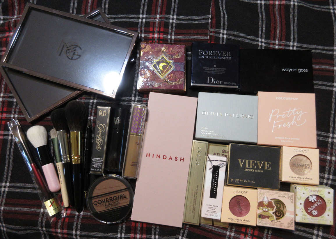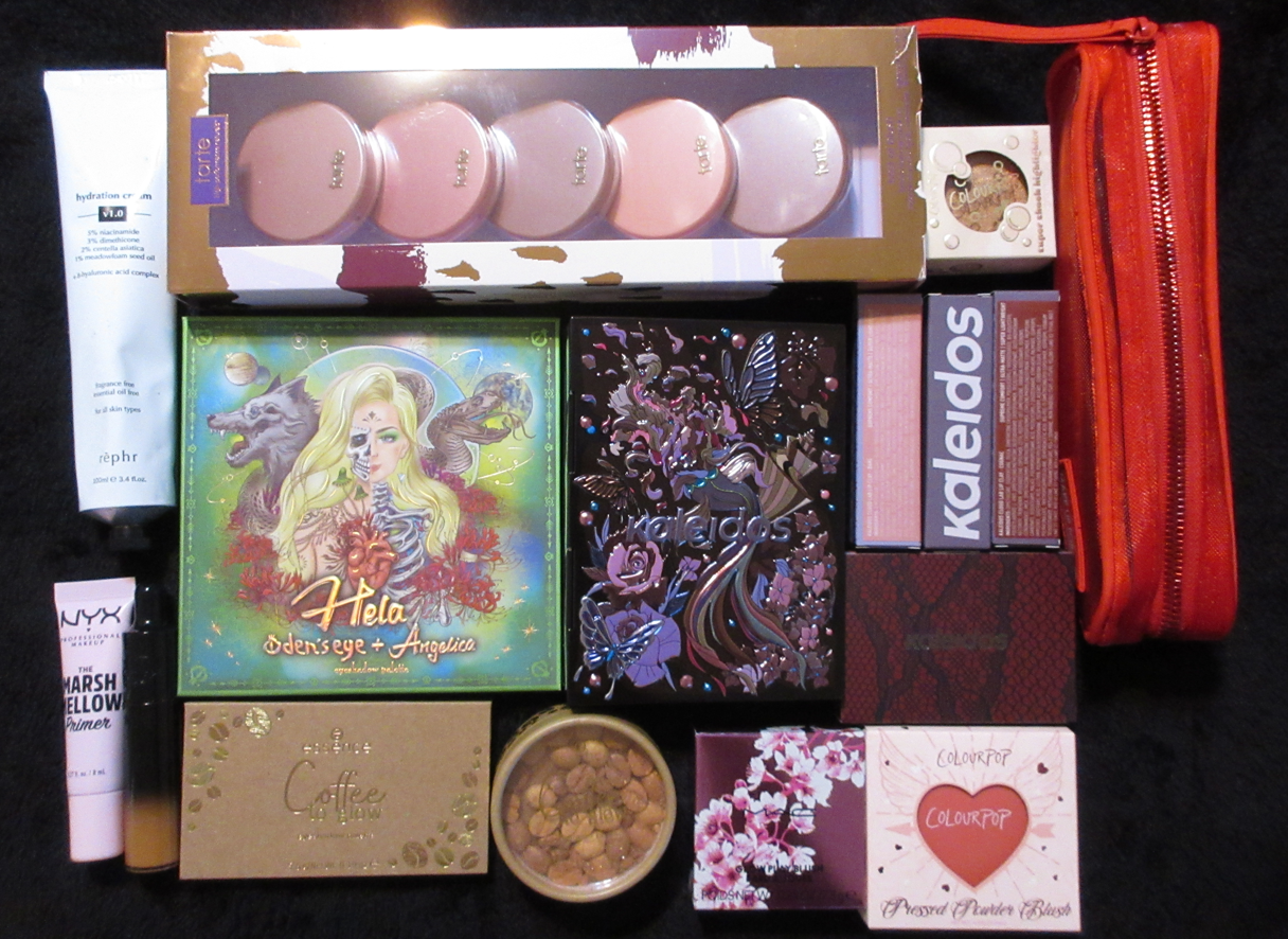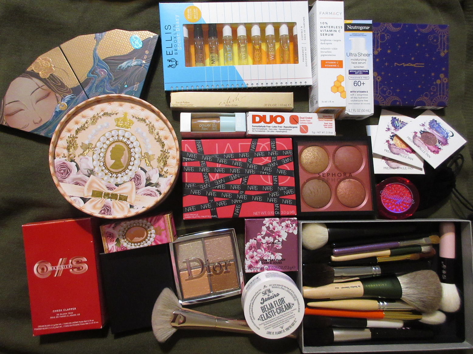
Welcome to my fourth low-buy check-in! This month’s three biggest hauls were due to Sephora’s Spring Savings Sale, me redeeming my points at Ulta for $125 worth of products, and the weakening of the YEN compared to USD enticing me to make several purchases from CDJapan and and Fude Japan. Most of these products were reviewed in posts prior to this one, and will be linked to open in a new browser tab, but there are still plenty to review for the first time here today.
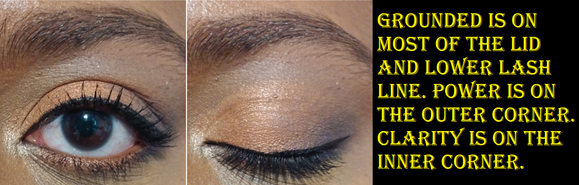
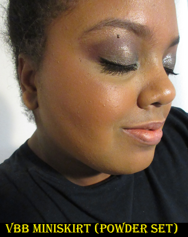
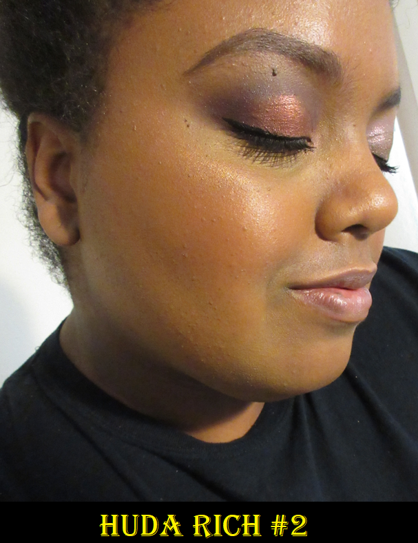
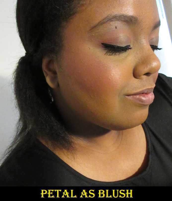
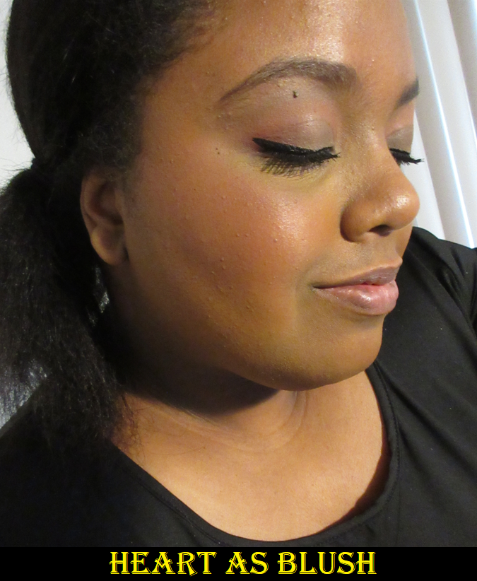
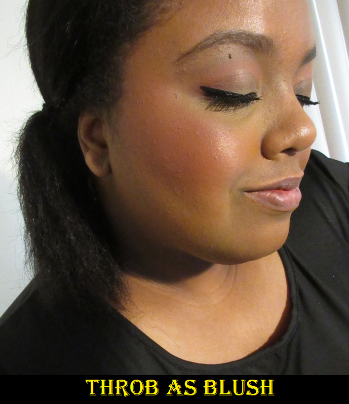
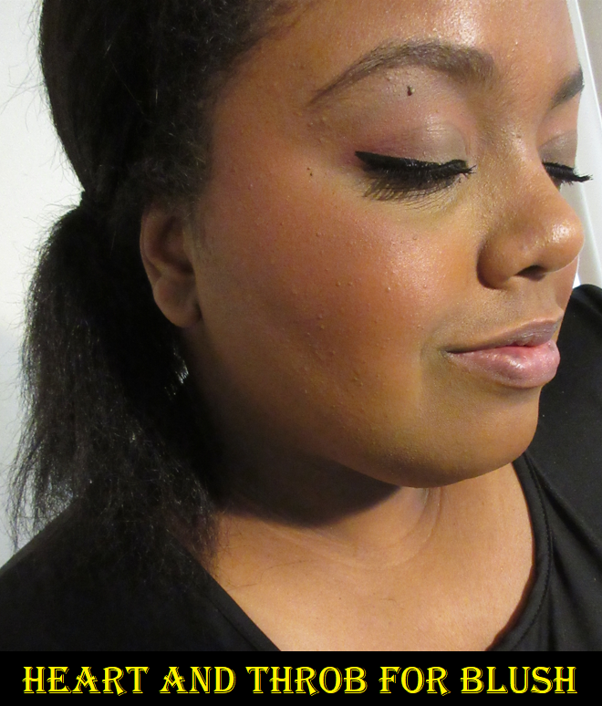
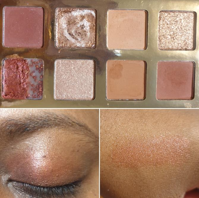
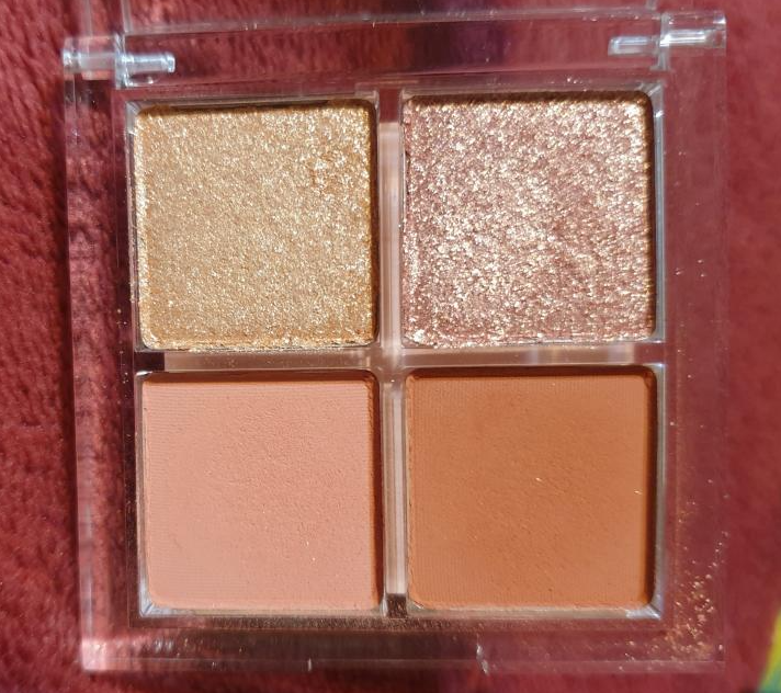
SEPHORA COLLECTION Microsmooth Multi-Tasking Baked Face Palette in Captivate
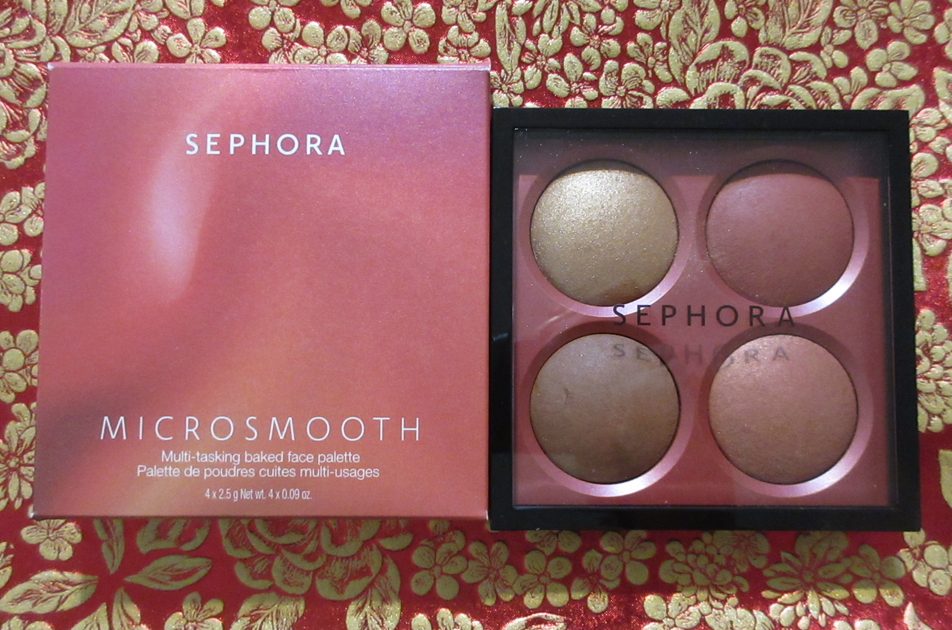
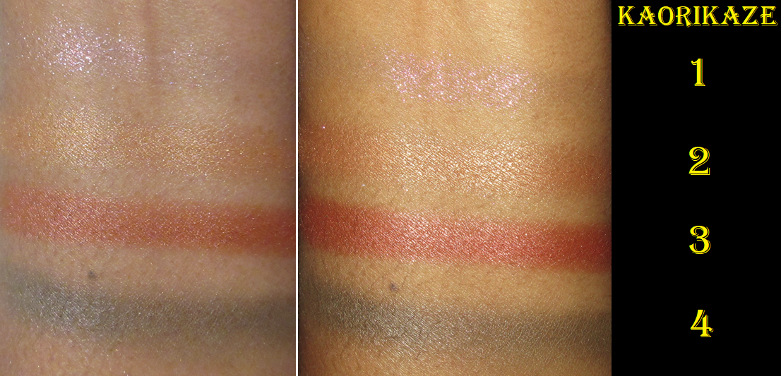
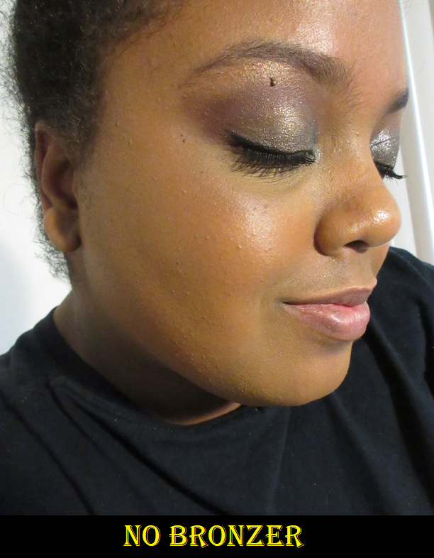
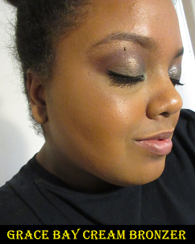
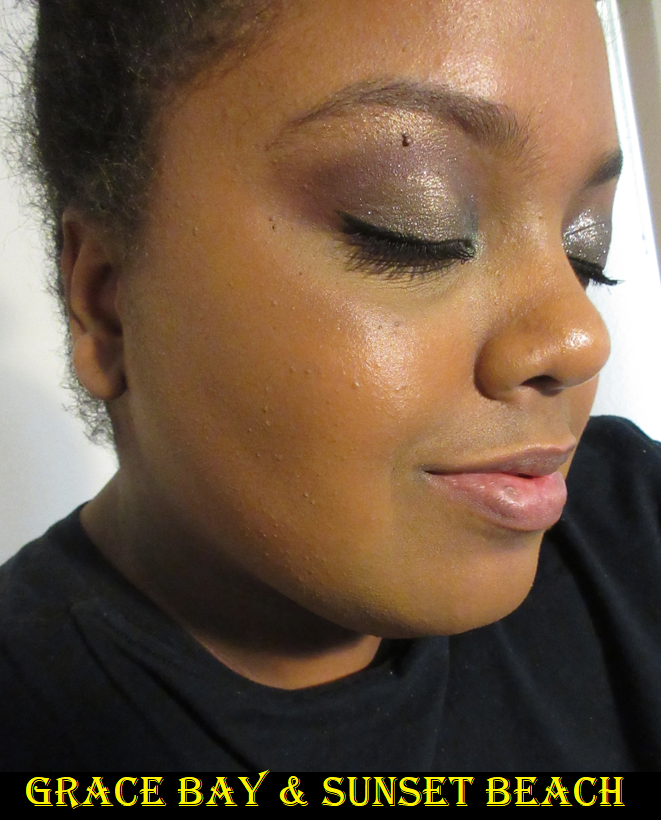
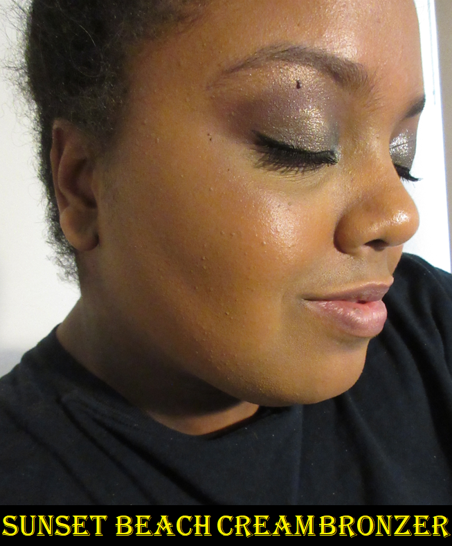
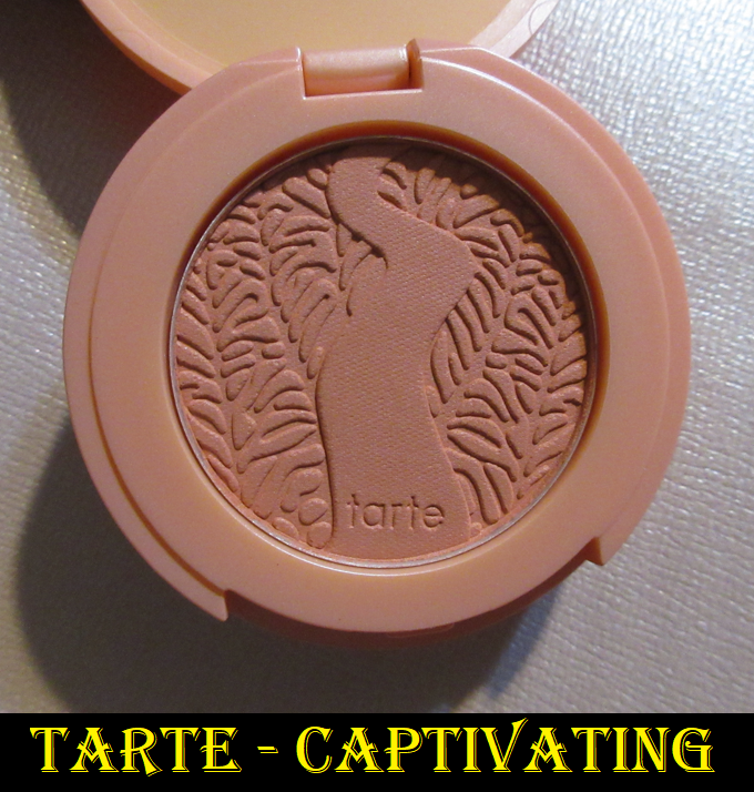
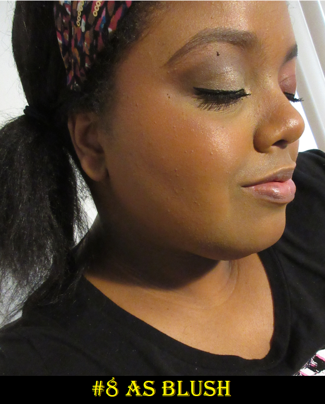
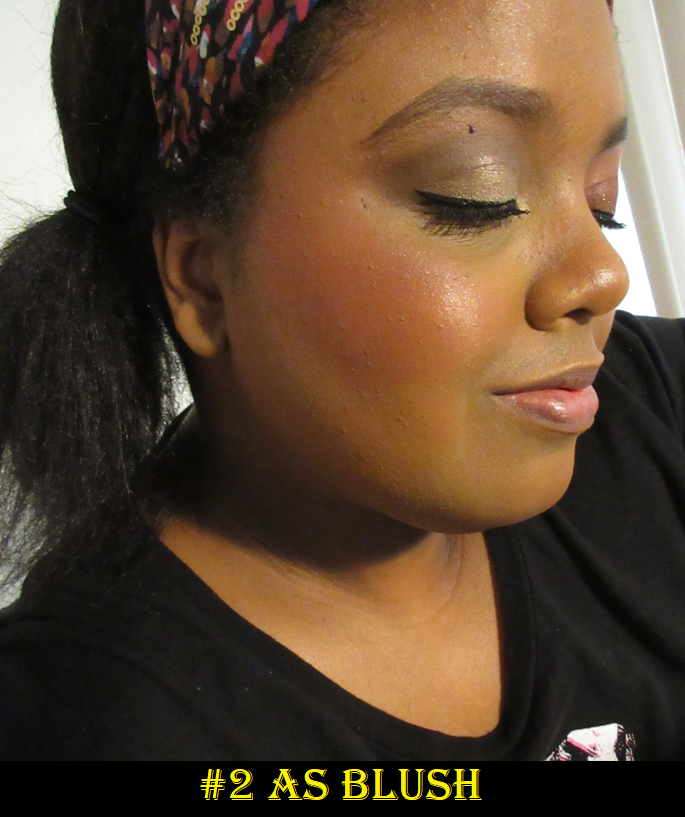
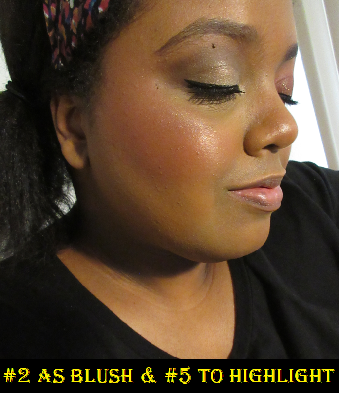
This is allowed in the Low-Buy under the face product category. I am so glad I finally bought this because it makes for a fantastic travel palette! There are two versions available from Sephora and I heard wonderful things about the deeper palette called Captivate, but baked products can sometimes look lighter than they would appear on the skin, so I wasn’t certain this would work for me until I had help on this topic from Beauty Blogger, Nikki.
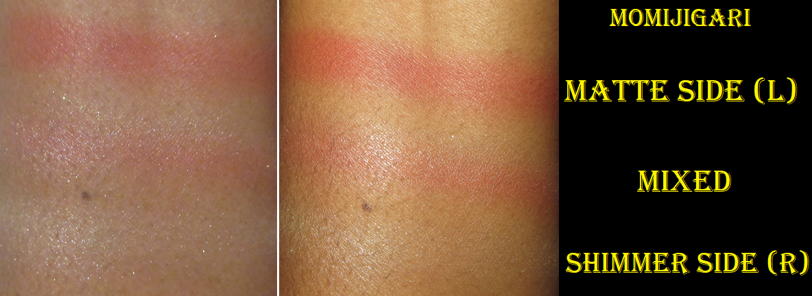
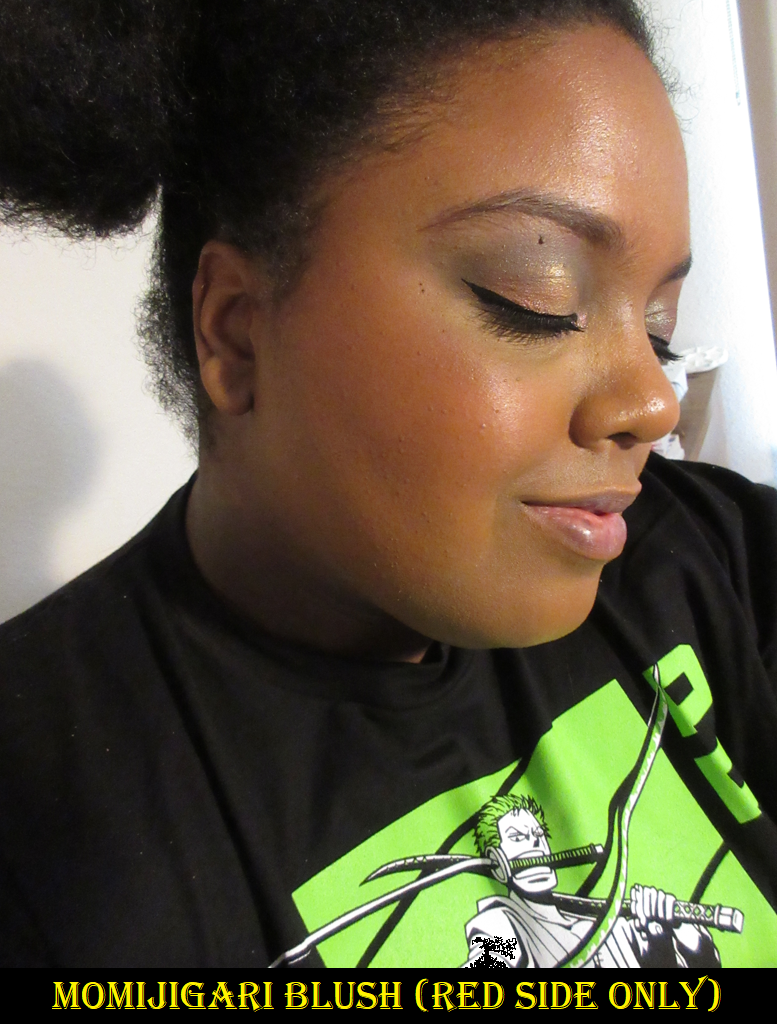
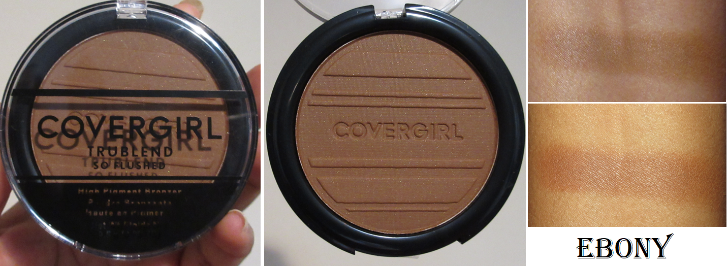
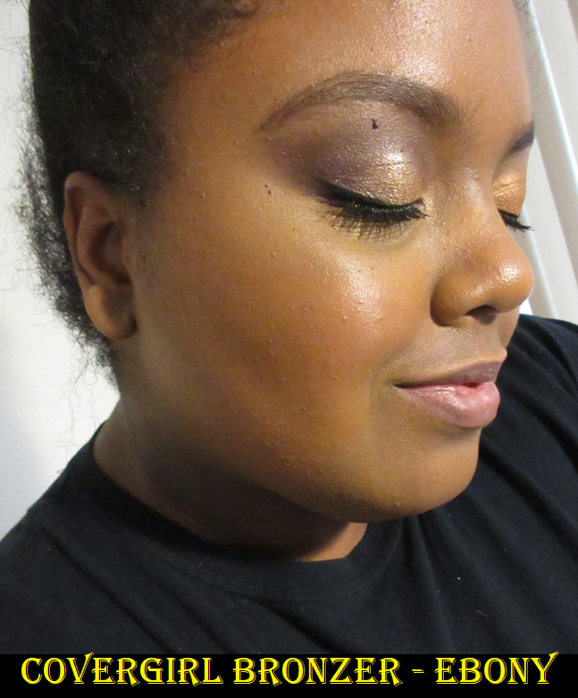
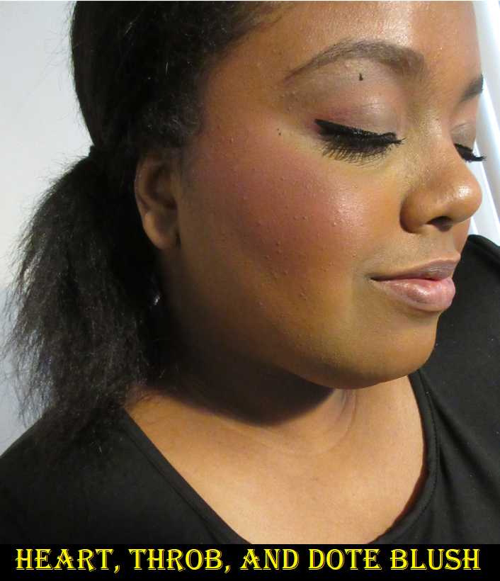
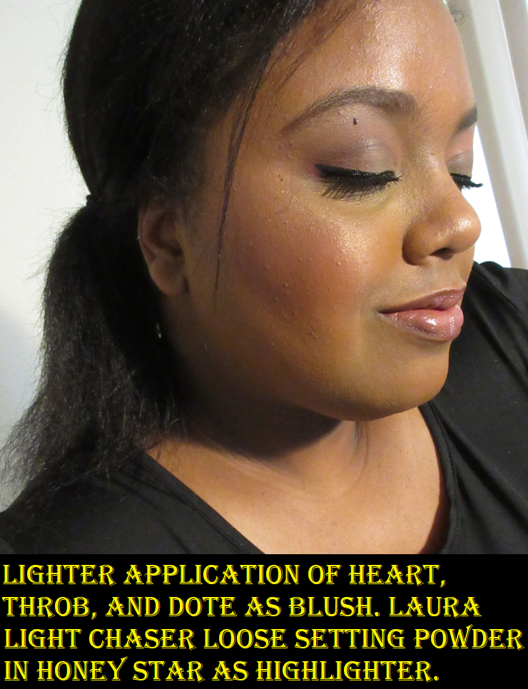
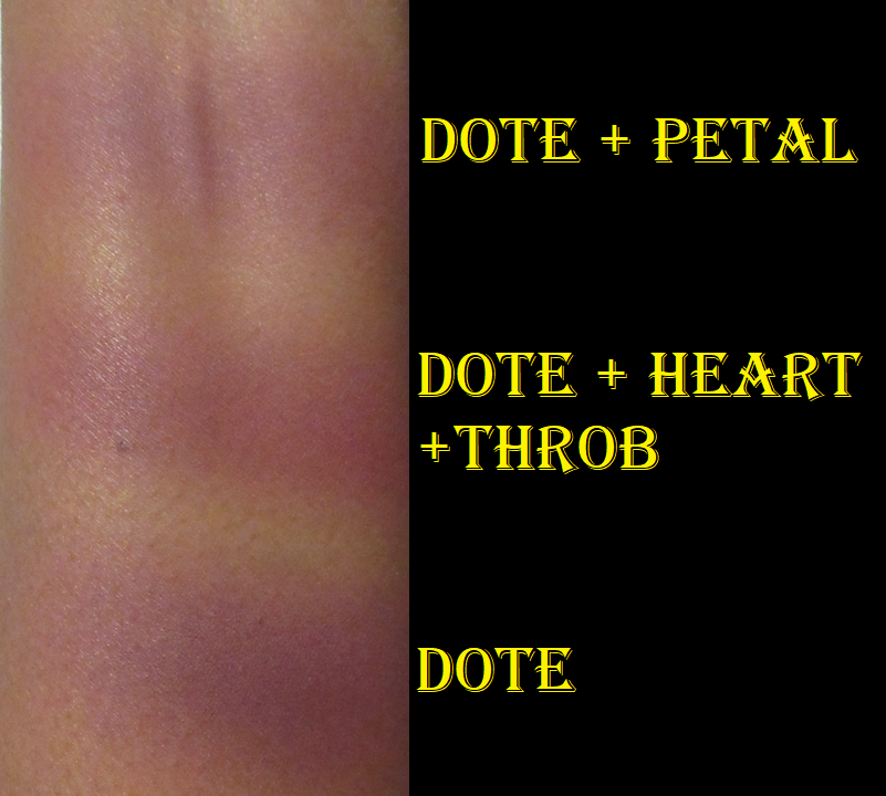
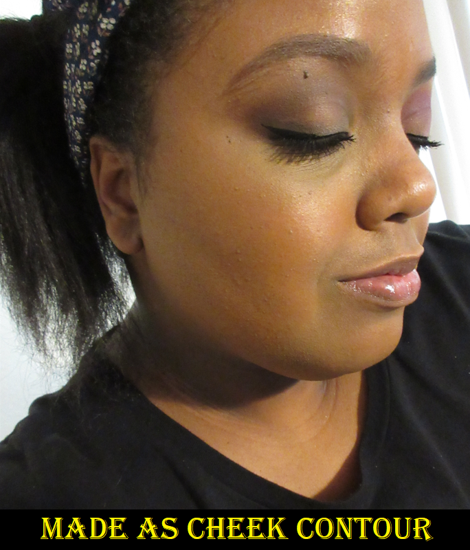
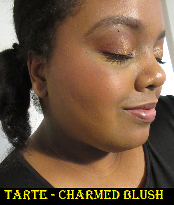
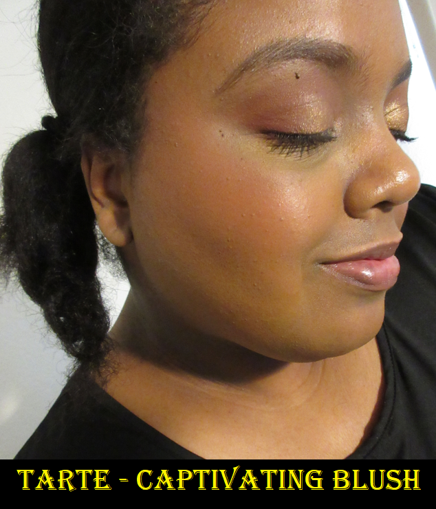
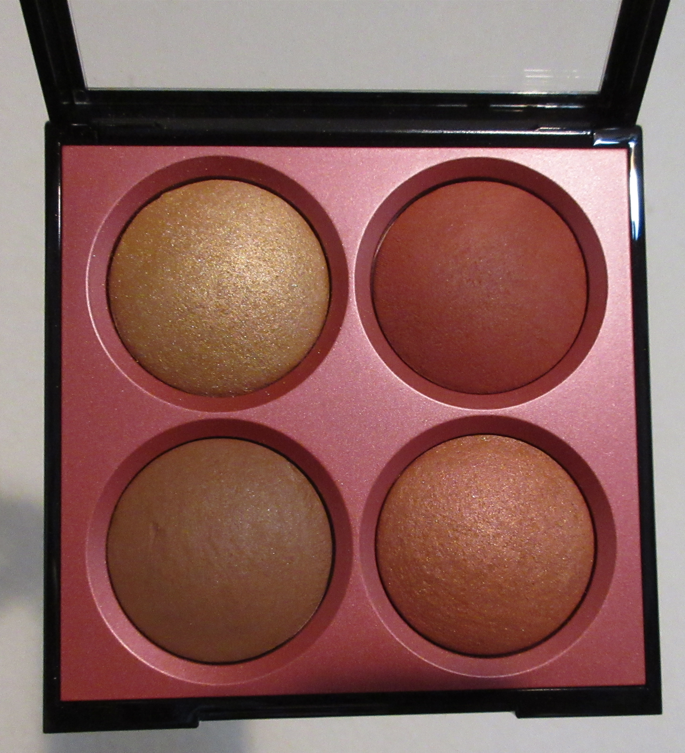
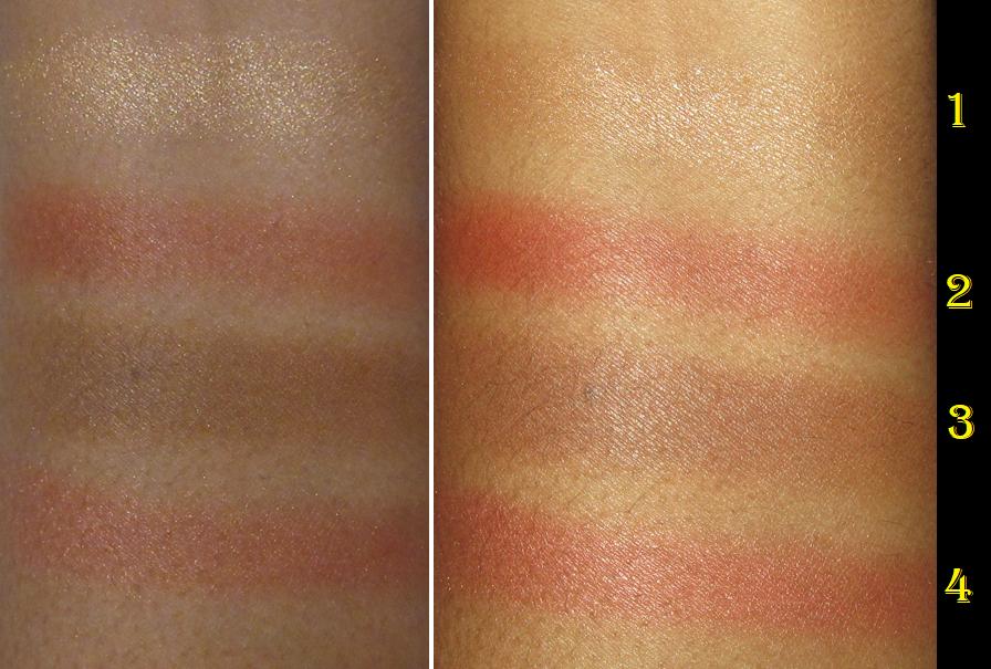
The bronzer is a fantastic shade for me in terms of both depth and undertone! Despite being a matte product, it leaves a beautiful natural finish and is very quick and easy to blend. I’m really impressed with it! The matte blush is one of my favorite type of red tones that reminds me of MAC’s Mineralize Blush in the shade Flirting With Danger. It can be built up to look intense, but I prefer to wear a very light application of it on my cheeks.

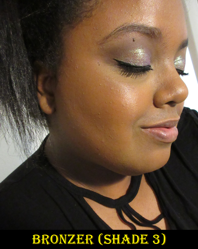
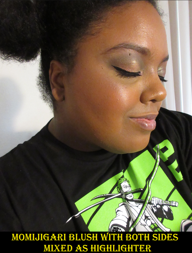
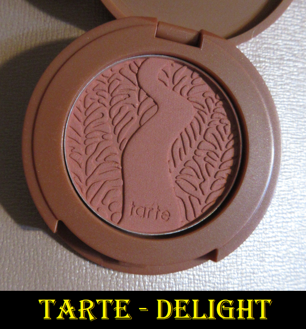
The shimmer blush is on the subtle side, but I still get a noticeable flush of color. It’s like a slightly lighter shimmer version of the matte shade in the palette. If I had to choose my favorite, it would be the matte one, but I still wear both. As for the highlighter, it’s not the most finely milled, but it’s still very pretty and if I chose to use this palette for the blushes or bronzers, I wouldn’t feel the need to reach for a separate single highlighter. I would just use the one in here.
The longest wear test I’ve had with this face palette is ten or eleven hours and only the shimmer shade started to fade at the end of the day, but I consider that to be a good result. The others remain looking nice until I’m ready to remove them.
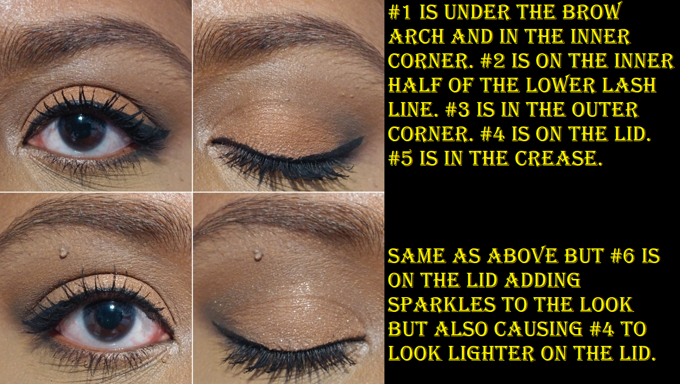
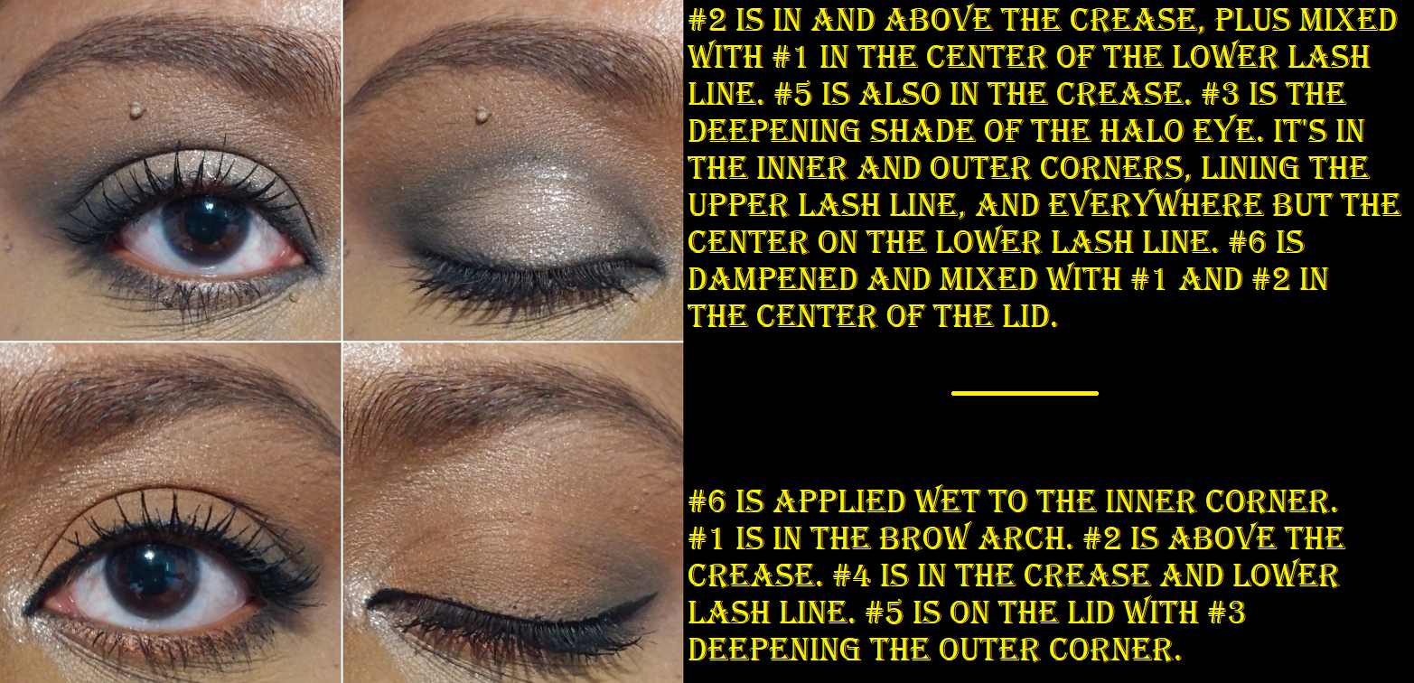
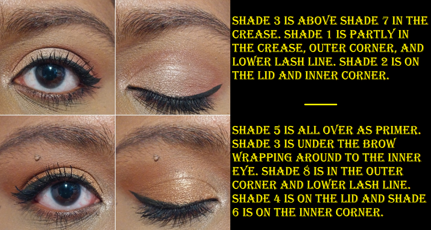
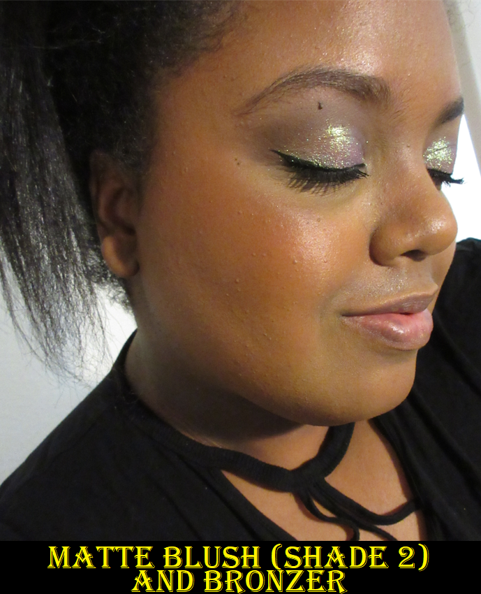
While I was on a trip in April, I actually forgot to bring an eyeshadow palette, so I relied on Shade 3 for depth in the crease and Shade 1 was my lid shade. Considering I got this already relatively affordable palette for 30% off, I am very impressed and happy with the quality and have no issues recommending this palette.
SEPHORA COLLECTION 2-in-1 Brush-on Lash Adhesive – This was definitely supposed to be a No-Buy, but it had been on my list for a long time and when all Sephora Collection products were 30% off during the Sephora Spring Sale, I chose to buy it anyway.
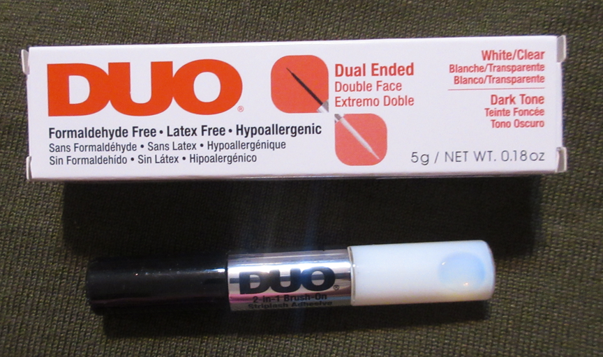
I’m sorry that I don’t have an actual review for this item. For all these months, I have tried to get myself to test this out, but I just don’t want to. I haven’t been feeling like wearing false lashes in a long time and I really don’t want to open this product and start that timer ticking on how long it will last unless I’m ready to start wearing false lashes regularly again, or else this truly will be a wasted purchase. This was holding up my ability to get this post out, so I decided to just explain why there’s no review for this one and to publish it. When I eventually do, I will edit this post.
Patrick Ta Major Sculpt Contour Brush
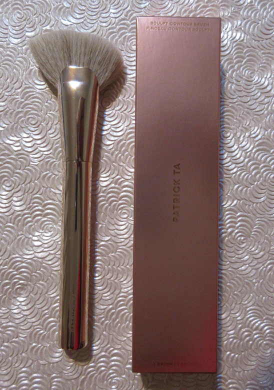
It’s a bit ironic that in my post about “Synthetic Brushes I Bought in 2021,” I mentioned that despite liking some of the ones I bought, I didn’t plan on getting any additional ones, yet for the Sephora Spring Sale, I couldn’t help myself and got it after enjoying the Patrick Ta Blush Brush so much. This one is the perfect softness, head shape, and the bristles are packed at the right density to accomplish a fantastic sculpt that isn’t too sheer or too sharp. It’s the right balance of showing the product while also being nicely blended.
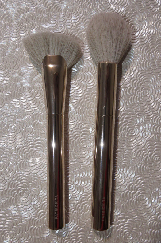
I love this brush so much for use with both my powder and cream bronzers and contours, that I was able to skip getting the Sonia G Lotus Base brush when that one was no longer tied to the full set. Being satisfied with a brush so much that I feel I can skip getting a similar Japanese version is a huge deal and shows just how highly I value this one from Patrick Ta.
Even though the Sonia G Mini Base is still my preference for cream bronzing and contouring, if the cream product is too sheer or too close to my skin tone and needs to be applied at maximum pigmentation, the Patrick Ta brush is my top choice. It’s also my favorite for powder formulas that need building up.
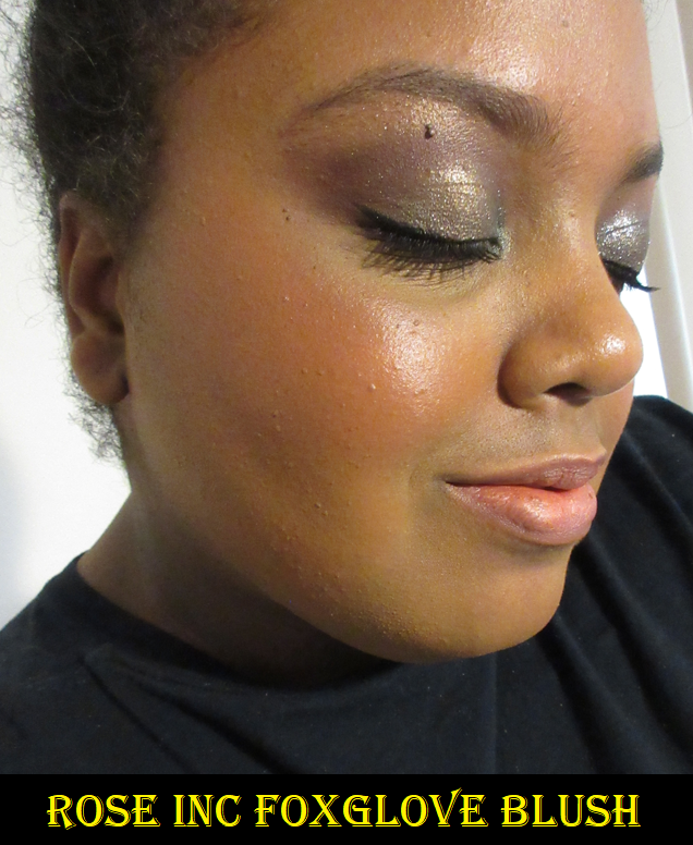
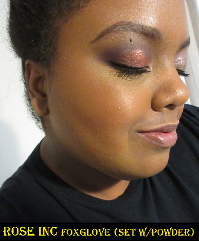
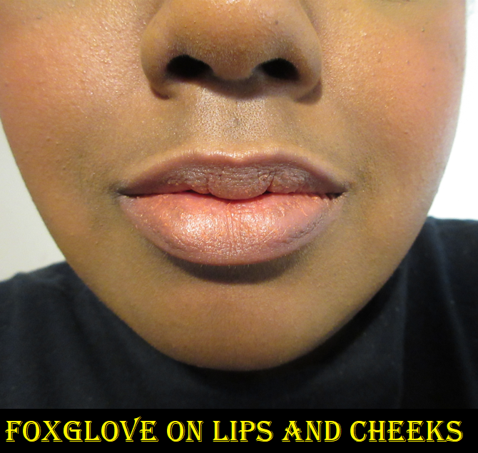
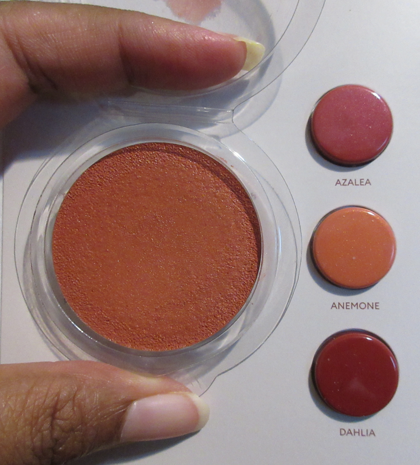
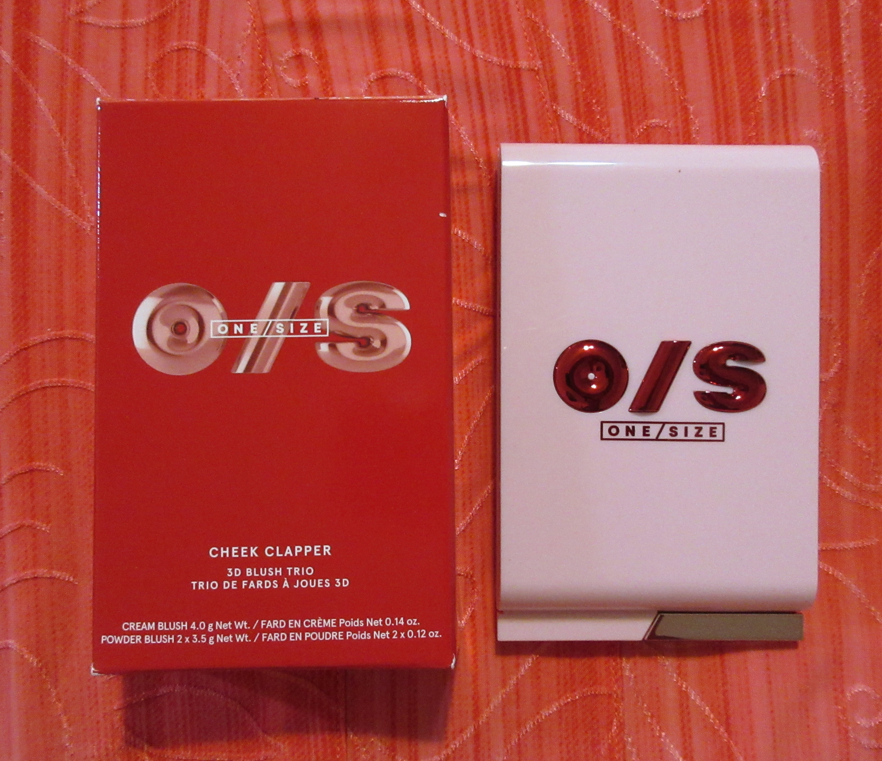
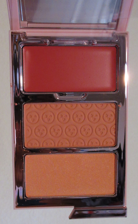
One/Size Cheek Clapper 3D Blush Trio Palette in Freaky Peach
I love this product so much! This is an all blush trio palette in three different finishes, but even though I can only use the shimmer one as a highlighter, I’m not counting it as a face palette. As a blush product, I was supposed to be limited on how many I buy this year, and I was also not supposed to purchase anything from new brands. This is my first ever One/Size purchase and it’s so great that I can’t regret it.
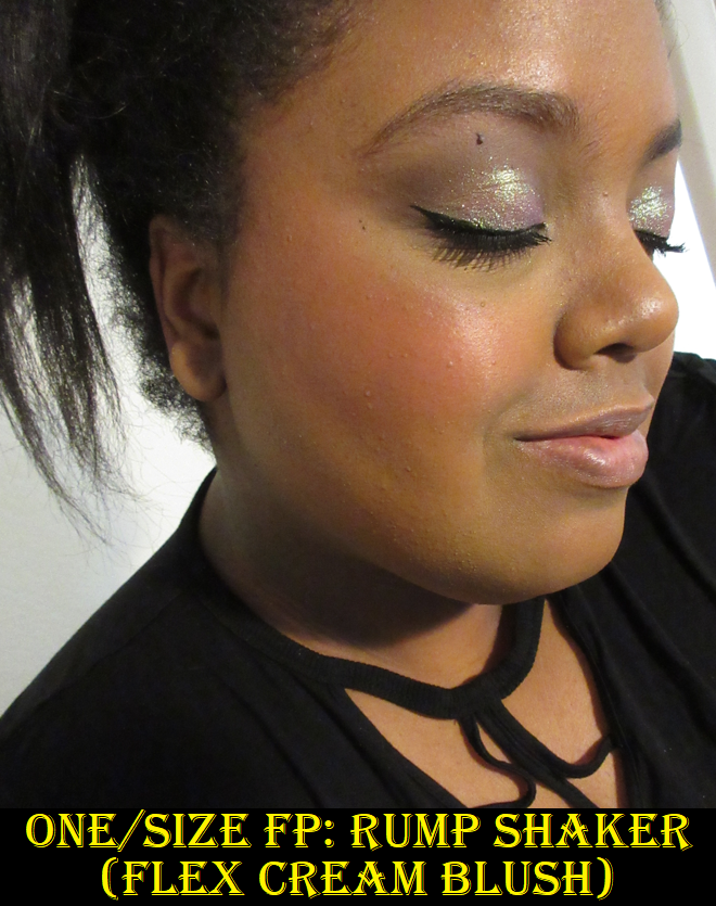
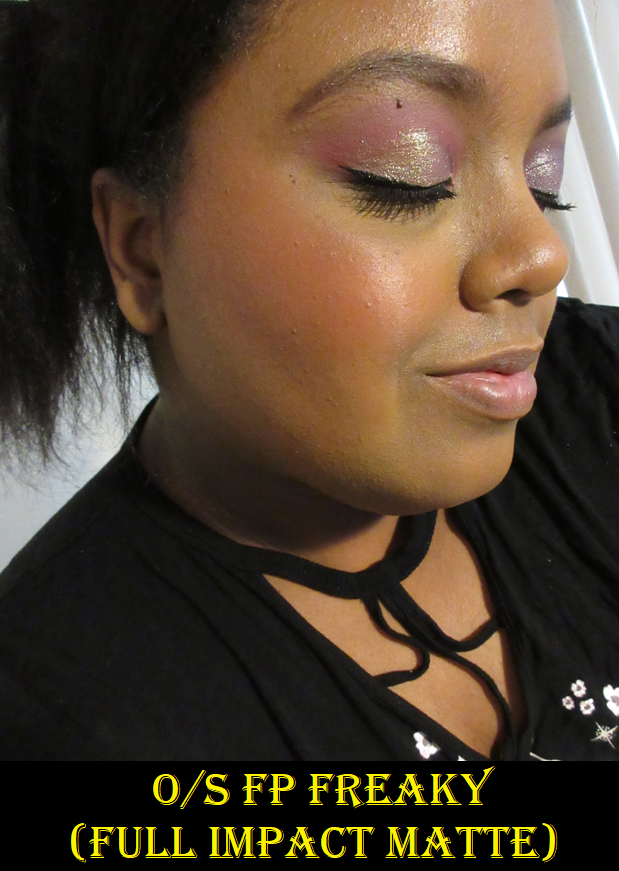
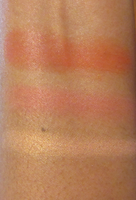
The peachy-coral cream blush, Rump Shake, is a very interesting texture. The closest I can compare it to in terms of formula is the LYS cream blushes. This reminds me more of a silicone balm than a traditional creamy emollient formula. It’s is very pigmented, blends easily on the cheeks no matter what type of tool I used to apply it with, it leaves a healthy sheen but it’s not dewy or sticky on the skin. Freaky is the name of the matte blush and it looks far too light for me in the pan, but One/Size face color powders deepen on the skin. So, it’s actually a medium toned shade of peach that is pigmented, yet buildable. I only need one dip in the pan though if I want to layer it on top of Rump Shake. I should also mention that tougher bristles can lead to a lot of kickup in the pan, so I use my softer natural hair brushes with the powder blush, and that also helps me to not overapply. I can’t emphasize enough that the cream and powder are quite pigmented, and me being able to use them both individually despite there being just one trio lighter than this one is proof of that. Whiplash is the shimmery golden peach blush topper/highlighter in this trio. It’s too shimmery for my taste as a blush topper, so I use it exclusively on top of my cheekbones. It’s a beautiful color, but unlike the other two products which give me zero issues with longevity, this one doesn’t want to stick to my skin for more than four hours. It lasts a few hours longer if I use it with a dewier foundation or wetter type of cream product, but six hours is around the time that the shine of the shimmer particles dulls down. So, for days I need my highlighter to last, I reach for something else. Considering I still have two other faultless products in this trio and the third is still usable, I’m very happy with this purchase and I do recommend giving this a try. For a long time, I was really tempted to buy additional shades, but I like the fact that each of these colors are distinctly different. Most of the other Cheek Clapper options are intended for monochromatic looks, and while I can still see the value in that, I feel like I’m getting more bang for my buck if I have different colors over different formulas. The cream blush isn’t the type I’d be afraid to wear in summer because it’s a little stiffer (as opposed to being super emollient) and the effect on my cheek isn’t that far from a matte look, which makes it not that much different of an effect as the powder blush. So, if I had the Rich Betch trio where the cream and powder look nearly identical, I would feel like I got a duplicate product. This is the only reason, other than my low-buy, that I haven’t purchased the two other Cheek Clappers that held my interest.
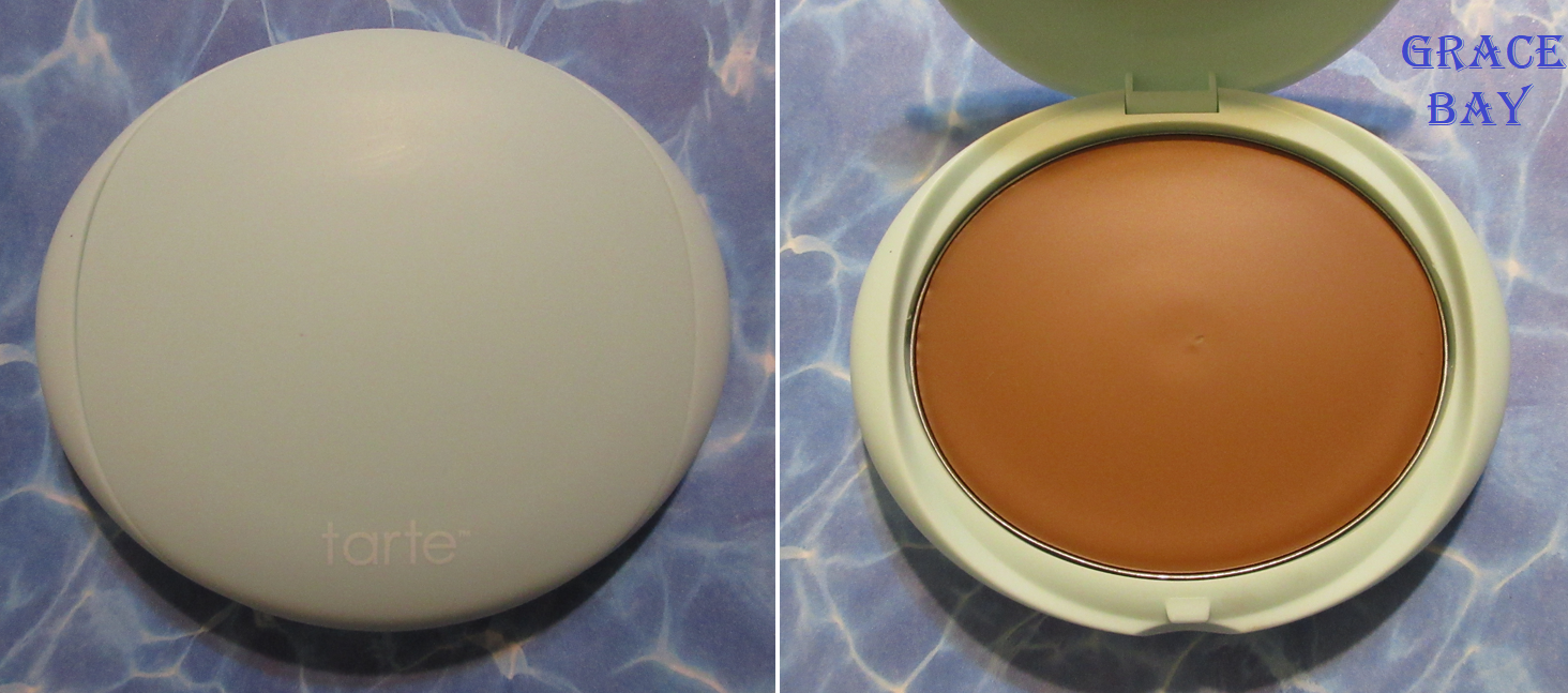
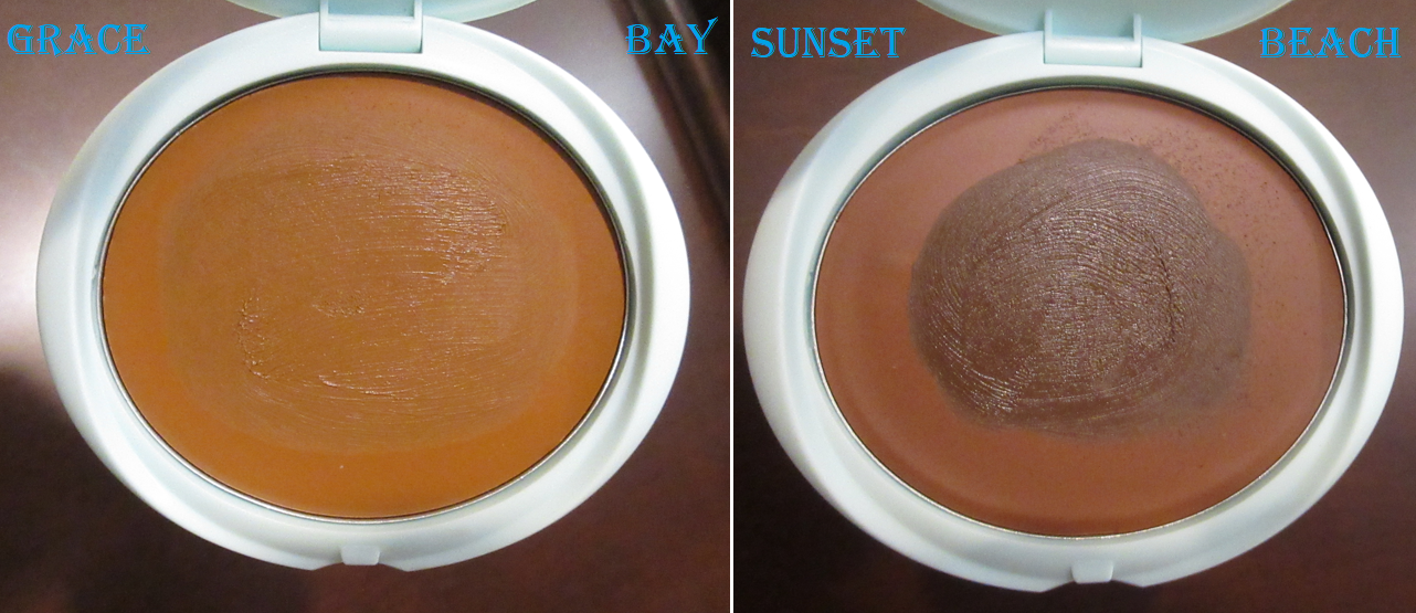
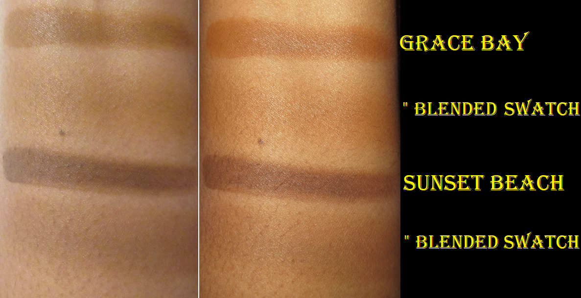
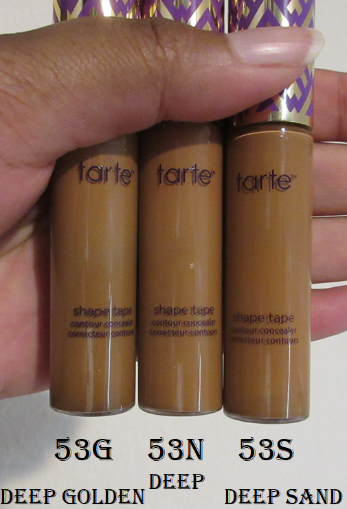
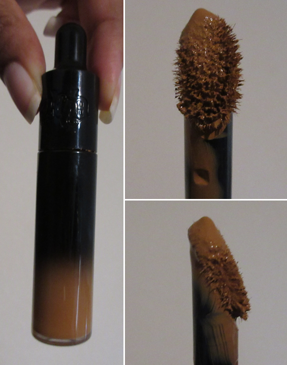
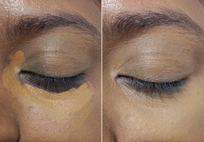
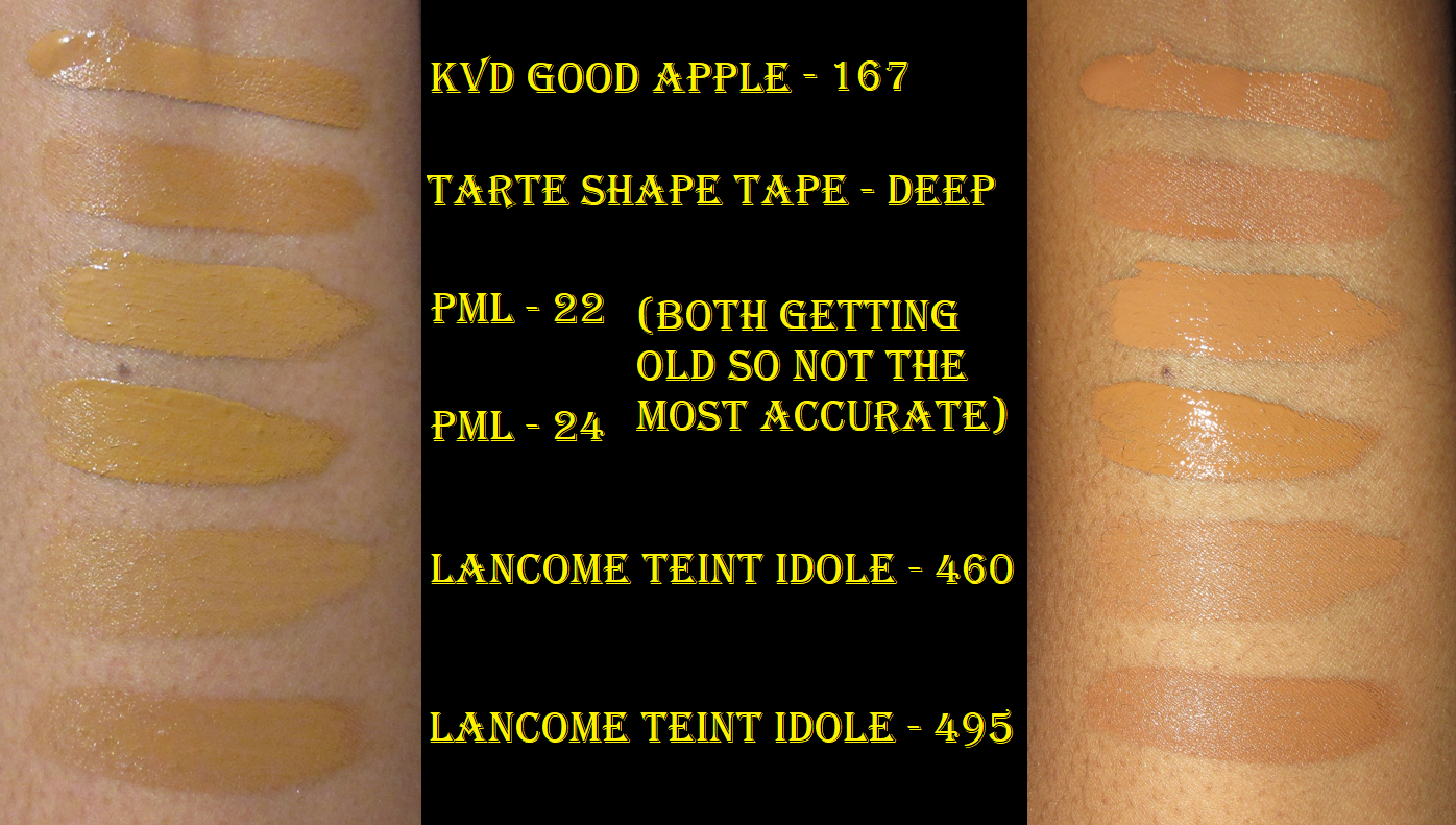
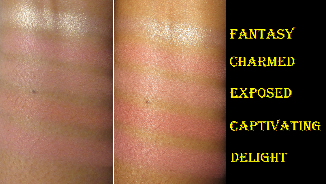
Tarte Sea Power Flex Concealer (Mini) in 53S Deep Sand
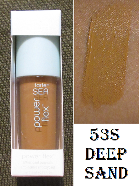
I bought this when Tina (The Fancy Face) raved about it in several of her YouTube videos. Even though concealers are allowed to be purchased in my low-buy, I didn’t want to take the chance of wasting a product if I didn’t like it, so I just bought the mini. That turned out to be a good decision because I hate this product. The shape of my tear troughs is such that products that are too creamy don’t stay put in the lines of my under eyes, so the concealer moves, creases, or does both even when set into place with powder. Because I have almost the opposite issue with Tarte’s Shape Tape, I didn’t expect their Power Flex to be a creamy intensely creasing product on me. The finish of it at least looks pretty and hydrated, but the negatives outweigh the positives.
The biggest issue I have with this product is that it offers medium buildable coverage, but I cannot get the maximum full opacity I need. The shade match is perfect, but my dark circles are still visible underneath even when I use 3 times the amount of my normal concealers. The Power Sea Flex is marketed as being full coverage, but the fact that it isn’t is reason enough to be unwearable for me. Unfortunately, I can’t even use it in other areas of my face because it doesn’t do a good enough job concealing my hyperpigmentation and scars.
This situation is very specific to me because many people don’t have the intensity of skin discoloration as I do, nor the amount of lines. So, those who have youthful and moderately blemished skin could find themselves loving this product.
Ellis Brooklyn Scent Diary Fragrance Discovery Set – It has been ages since I purchased anything perfume related! I’m unofficially on a no-buy with fragrances, but I can’t regret getting this since I rarely buy full-sizes anymore. I also hadn’t done a perfume post since 2015, so I decided to make one dedicated to this and other perfume samples that can be found HERE.
Sol de Janeiro Beija Flor Elasti-Cream with Collagen and Squalane (Travel Size)
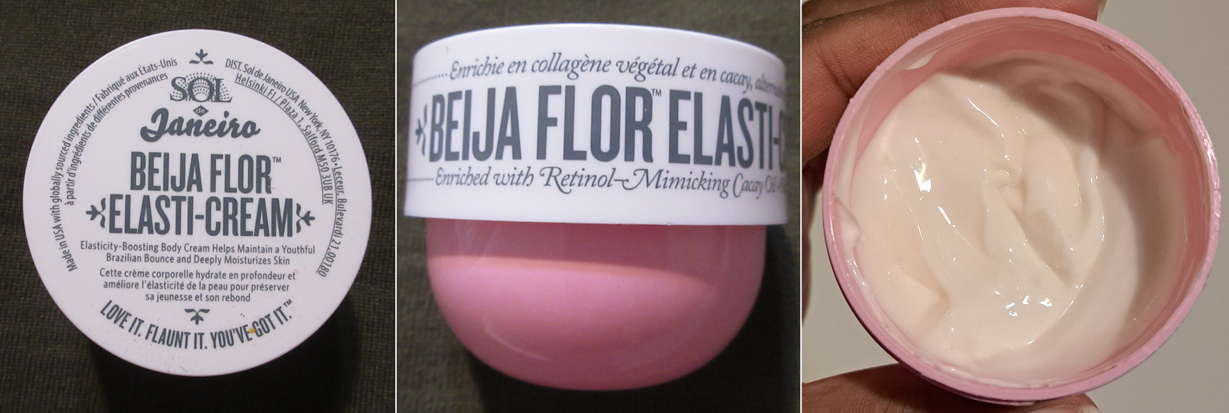
After experiencing the terribly smelling Bom Dia Bright cream that the brand previously released (mine smelled like potent olives instead of plums), I was too skeptical to purchase a full size of the Beija Flor even though the product claims sounded fantastic. The smell of this is at least pleasant, but a bit strong. It’s not surprising that parfum is listed as the third ingredient. I don’t know how to describe the scent, but it has been hyped up a lot by people on social media saying it smells like Baccarat Rouge 540. I’ve never smelled that fragrance myself, so I cannot confirm or deny if this is true.
The texture of this is very thick, yet it doesn’t feel as moisturizing as my other skincare products. It’s at least occlusive, so I like that it prevents my skin from drying out further. I haven’t noticed any other benefits when used on my body, like the advertised skin firming and cell turnover, but I still intend to use this up. I prefer the moisturization level of the brand’s Coco Cabana Cream, so perhaps I can apply that first and this new one after to seal it in. I believe I left my Coco Cabana in Germany, so unfortunately I cannot test out that combination anytime soon.
Farmacy 10% Waterless Vitamin C Serum
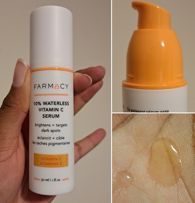
I was pretty shocked when I found this serum for such a low price on Mercari literally days after it launched at Sephora. Then again, this is one of those products that were sent to quite a lot of people in exchange for a review, so someone was bound to not want theirs.
I’m on a skincare low-buy, but I’ve been on the hunt for a good Vitamin C serum with a stable formula that will last longer than six months after opening. I believe that this has an airless pump mechanism and there are two holes under the bottle that support my theory. If it is indeed an airless pump, combined with the waterless formula, I anticipated that this could limit the issue I have of Vitamin C serums oxidizing and losing their efficacy before I can finish them.
The consistency of this is very runny and feels greasy initially, but this is also an oil-free formula. The brand says that propanediol ingredient is the reason it feels this way, but it does dry down on the skin after a few minutes and is no longer greasy, but I am left with a tiny bit of residue on the face. If my skin is especially dry, I don’t feel anything at all. Ultimately, this doesn’t matter since I put a moisturizer and other products on top afterwards anyway.
When I apply it to my skin, it instantly has a warming sensation. The first time I used it, my face was approaching almost burning level, but that only lasted a few minutes. It has never been hot like that again, and just continues to have a mild to moderate amount of warmth in the first minute that I apply it.
General skincare advice for Vitamin C usage and other acids is to start small, like around 5% depending on what the active ingredient is, and gradually increasing it over time as needed. I hadn’t used a potent version of Vitamin C in a while, but it was still in my routine enough that I didn’t expect to get a burning sensation from just 10% of L-ascorbic acid. So, just as a reminder, this could potentially be too strong for someone new to using Vitamin C or with sensitive skin, and consider how often you may be using other acids in your routine as well.
This serum with its additional ingredients are intended to brighten and even the skin, combat dark spots and hyperpigmentation, and keep it hydrated. I use this in cycles, so it’s hard to tell how much this serum alone is contributing. The two other products I rotate through have been giving me slight gradual improvements over time and adding this one to that cycle has not given a noticeable boost above the norm. So, there are three possibilities I can think of:
- The serum is as effective as my current products, not better or worse.
- The serum isn’t contributing at all and the benefits to my skin are from the other products I’m using.
- The serum could be more effective, but I don’t use it consistently enough.
I’m going to play the long game on this one and just continue to use it the way I have been and if I run out of the product and I notice its absence, I will consider repurchasing it at that time. However, based on past experience, I just don’t think Vitamin C is that effective for me. I get better results from AHA’s like the Farmacy Honeymoon Glow AHA Resurfacing Night Serum. Even that hasn’t rid me completely of my hyperpigmentation, but it noticeably faded those areas and the smile line that gives me trouble isn’t quite as deep as before. I’ve been relying on AHAs and BHAs well over a year, and in a cycle, so it’s not a fast process. I had improvements right away within the first week, two weeks, and then month, but after that achieving anything further has been a very slow process as adhering to a consistent skincare routine has never been my strong suit.
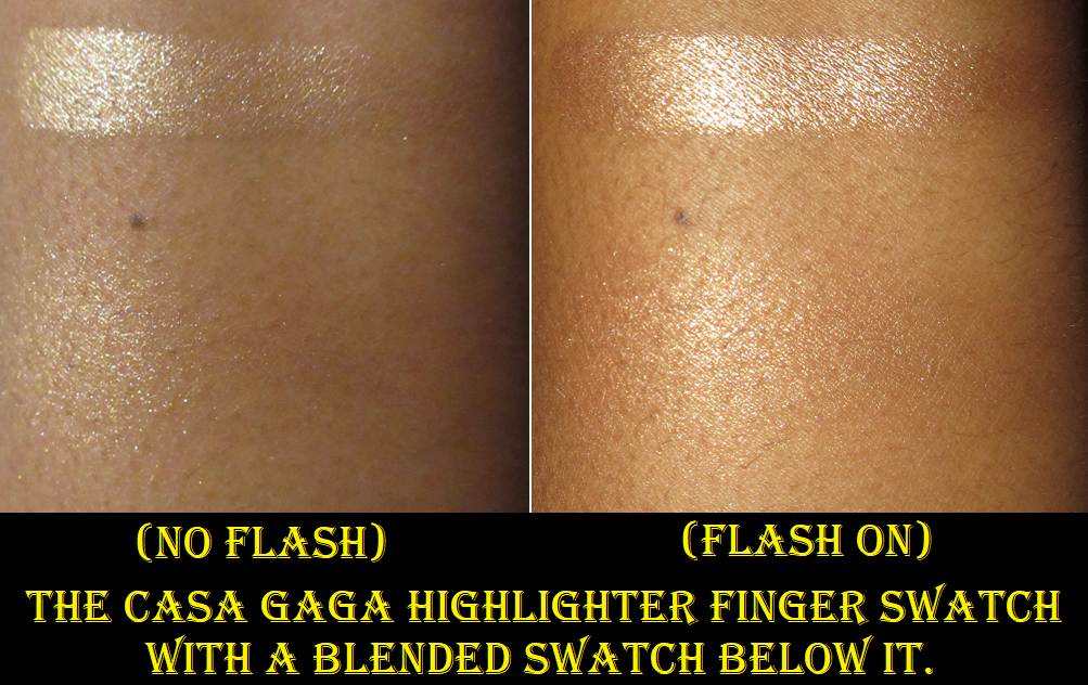
Lastly, as shown in the photo at the top, this product “leaks” in the sense that it always has the tiniest of droplets around the pump when I open it, even if I wipe it down along with the cap after using it. The droplets are so minimal in size that it doesn’t bother me much and I don’t consider the amount enough to feel like I’m losing product. However, I’ve seen some photos online of other people having a more significant leaking problem than me. I always keep mine stored upright, so perhaps this is why I don’t have as much of an issue as others do. I recommend avoiding putting this in a bag, flat in a drawer, and don’t take this traveling.
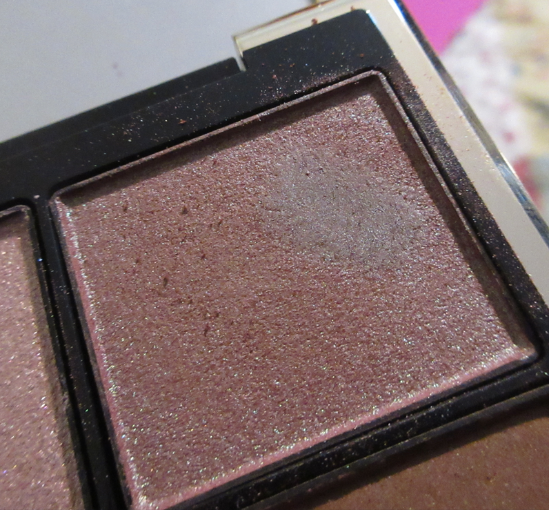
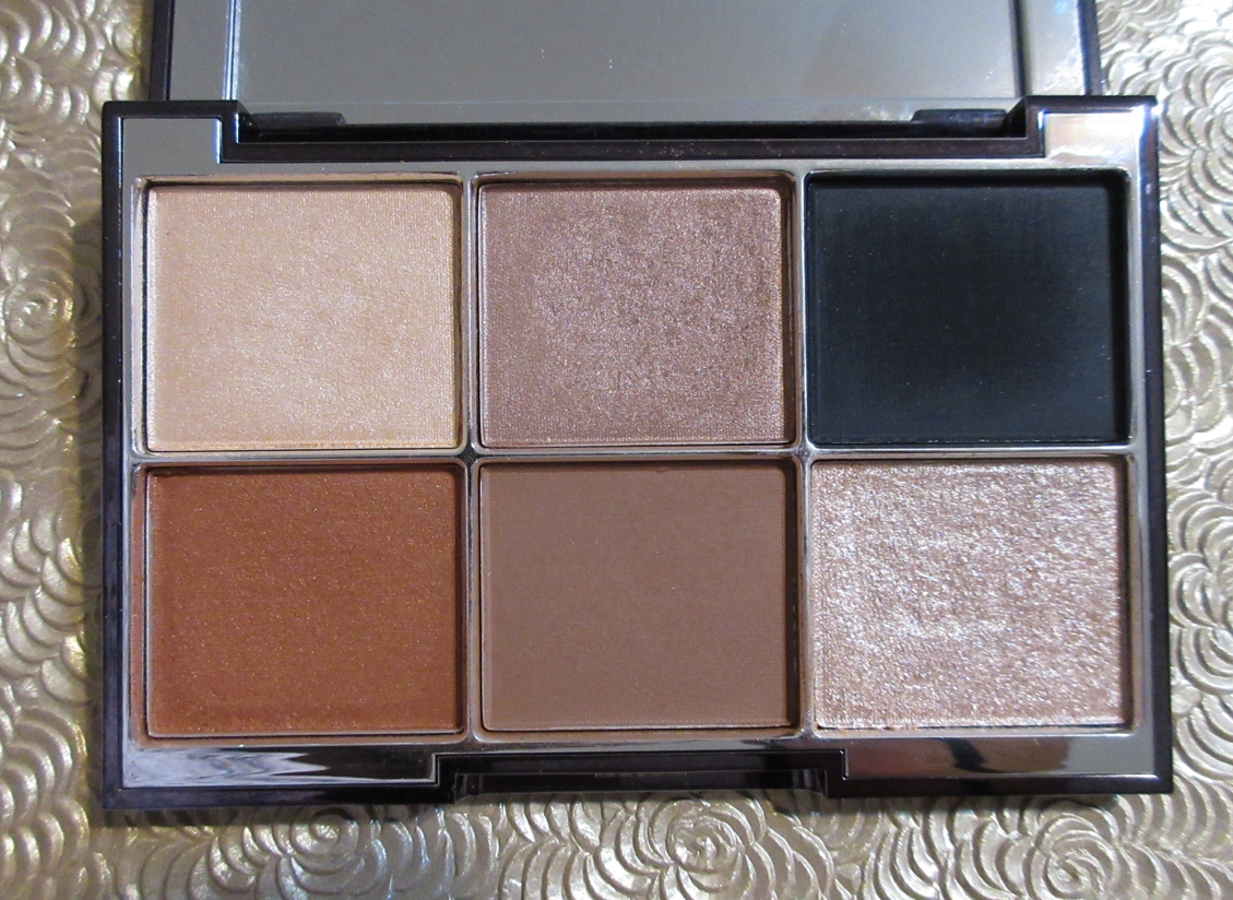
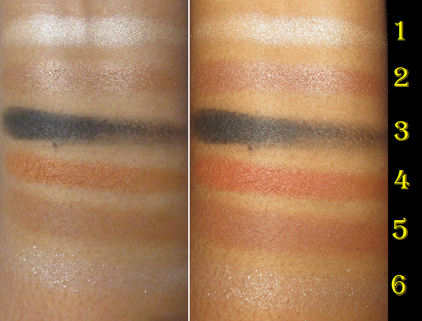
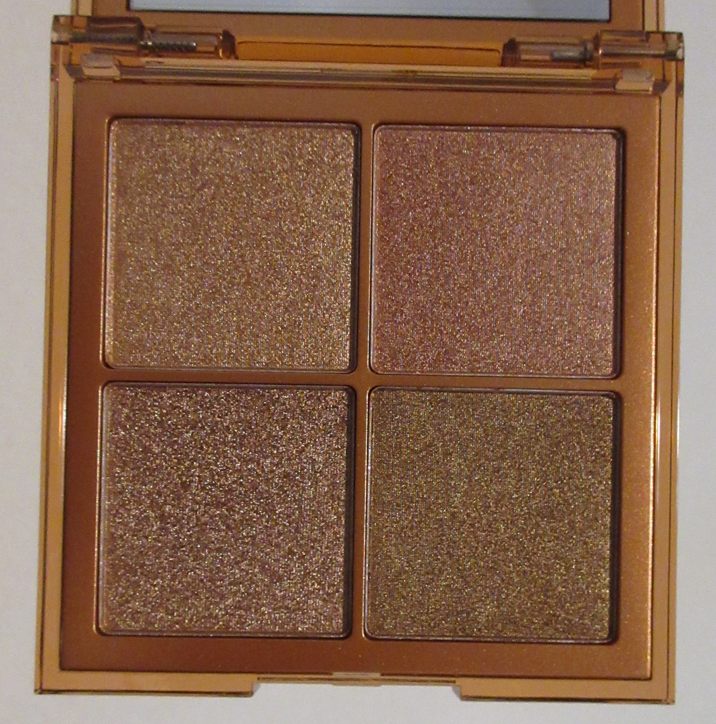
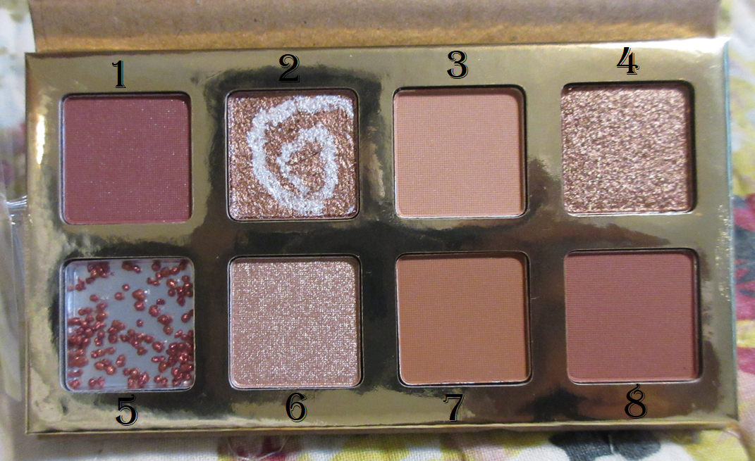
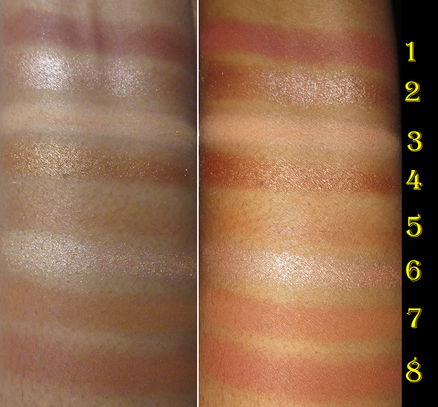
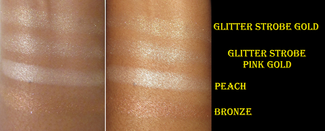
Dior Backstage Glow Face Palette in 002 Glitz
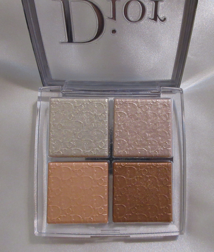
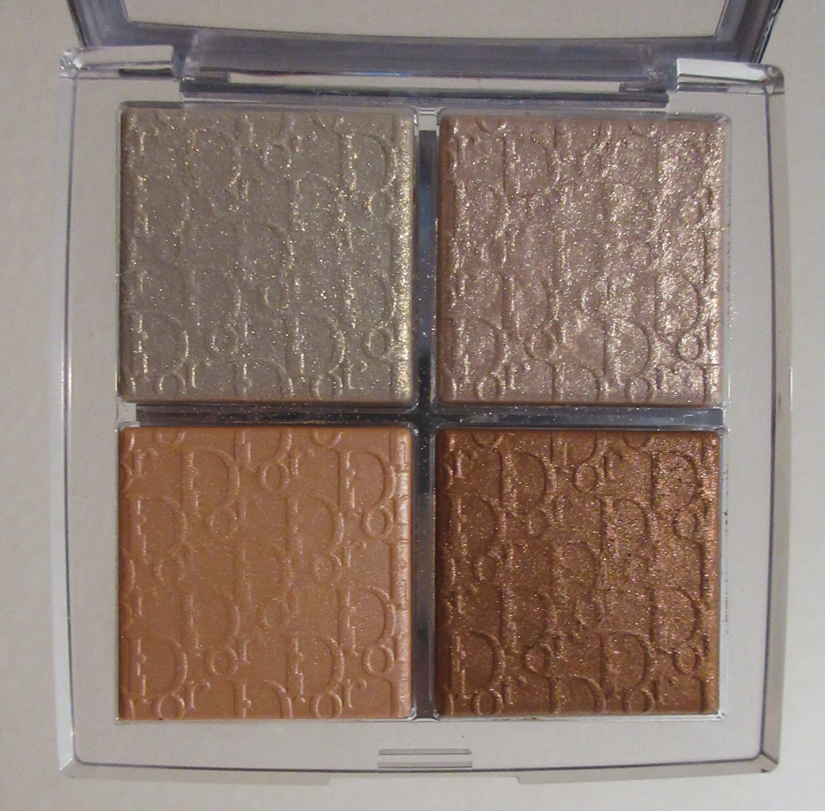
I really should not have bought this, breaking my highlighter no-buy aside, because I heard these highlighters would be sparkly and I don’t like visible glitter specks in my highlighters. So, I can’t explain why I was so determined to buy it.

This was yet another Mercari purchase. I make it a point not to review products I’ve purchased from a third-party if I purchased them too long from the launch date to be assured of its authenticity, but I also wanted to show what I purchased in April for low-buy purposes. So, I guess take this particular section with a grain of salt. I do believe this is the real quad, especially with that typical Dior scent these have. Below is how the shades look on me.
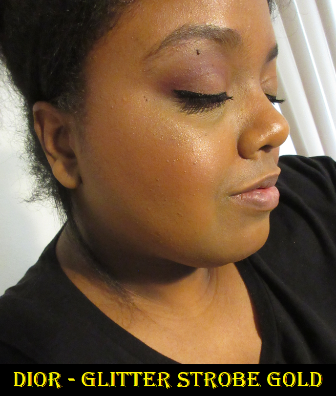
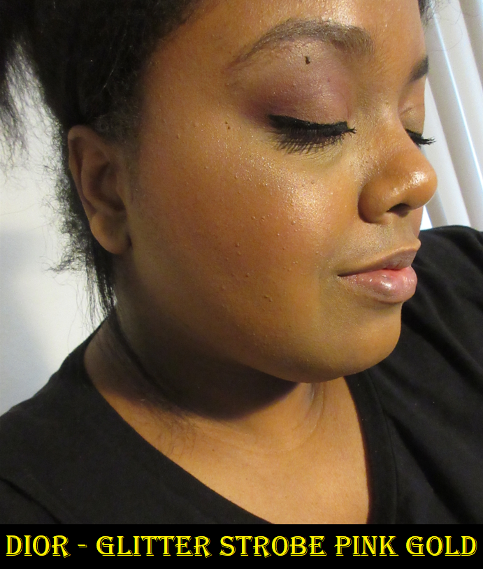
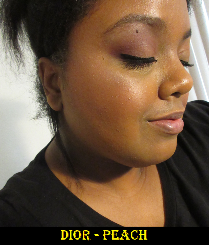
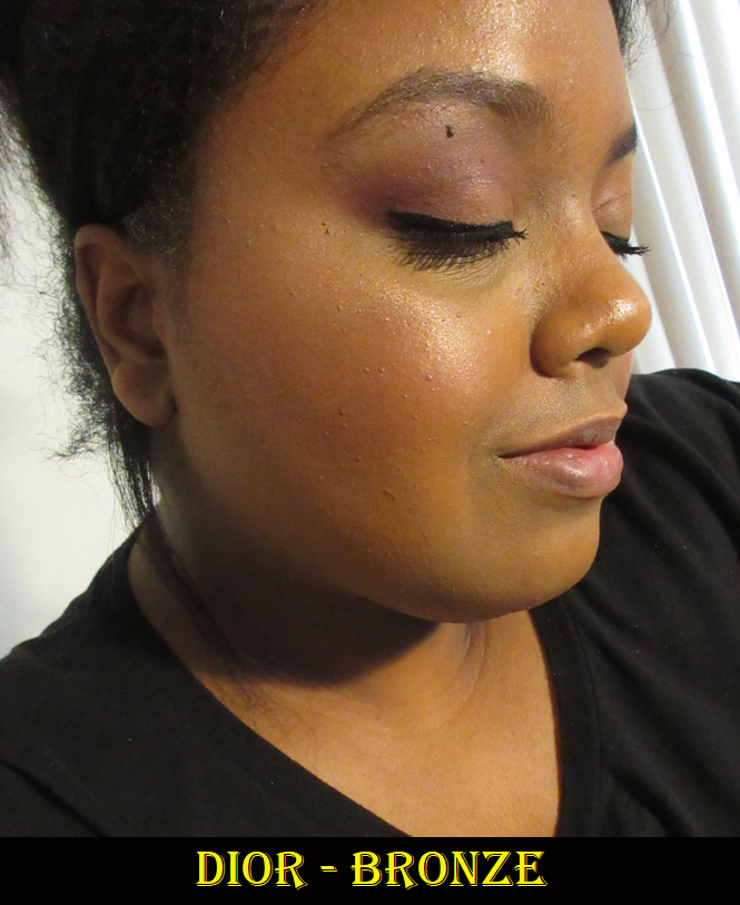
The highlighter named Peach is the only one without glitter that I would call a true shimmer shade, but unfortunately it’s too light for me. Because Bronze is closest to my skin tone, the glitter isn’t as obvious as the others. I didn’t have any issues with wear time or fading, but this palette isn’t for me and I may eventually declutter it.
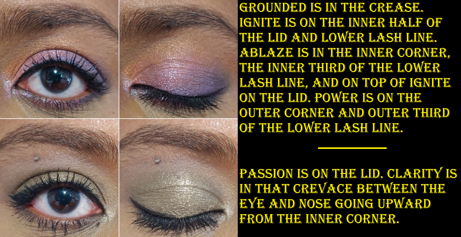
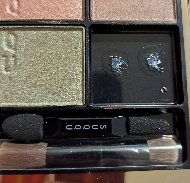
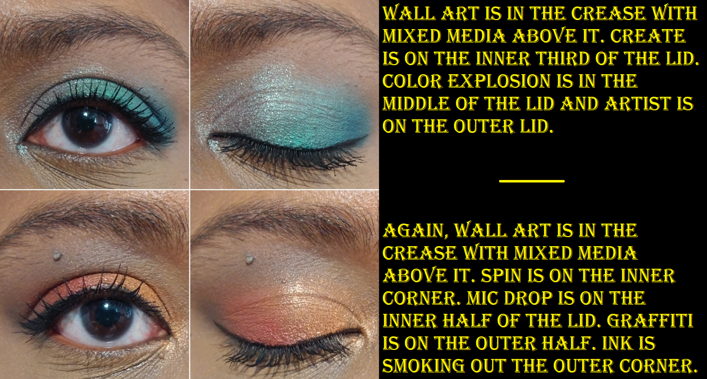
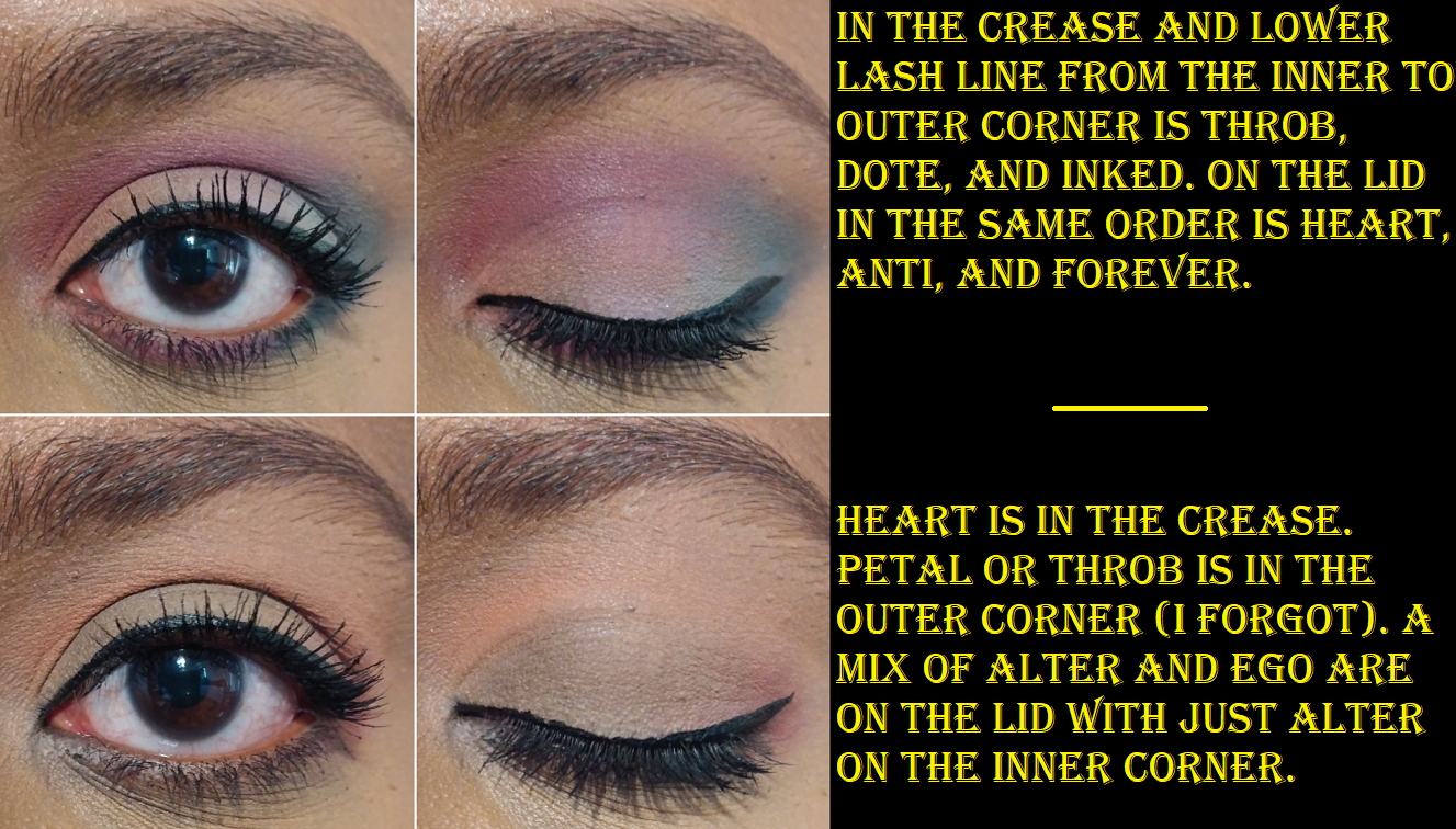
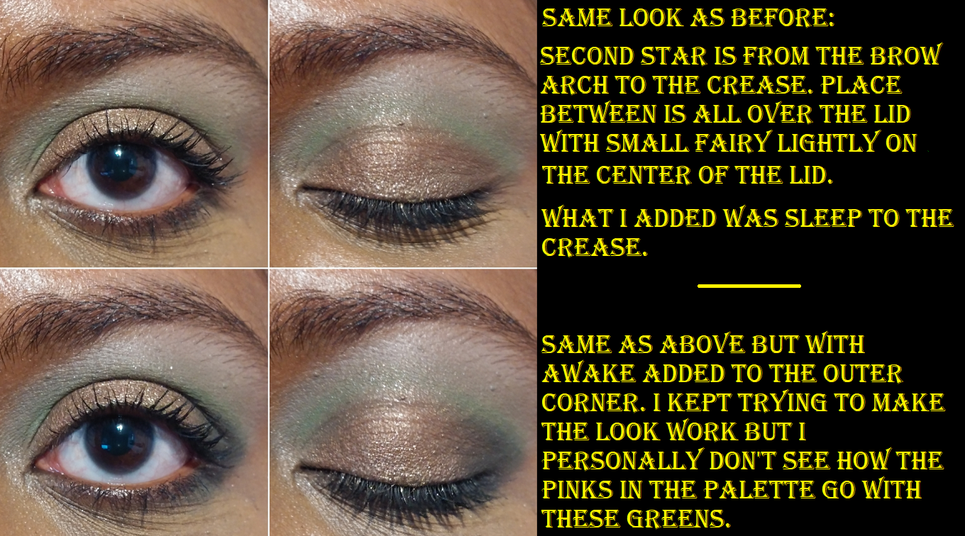
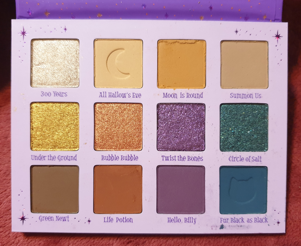
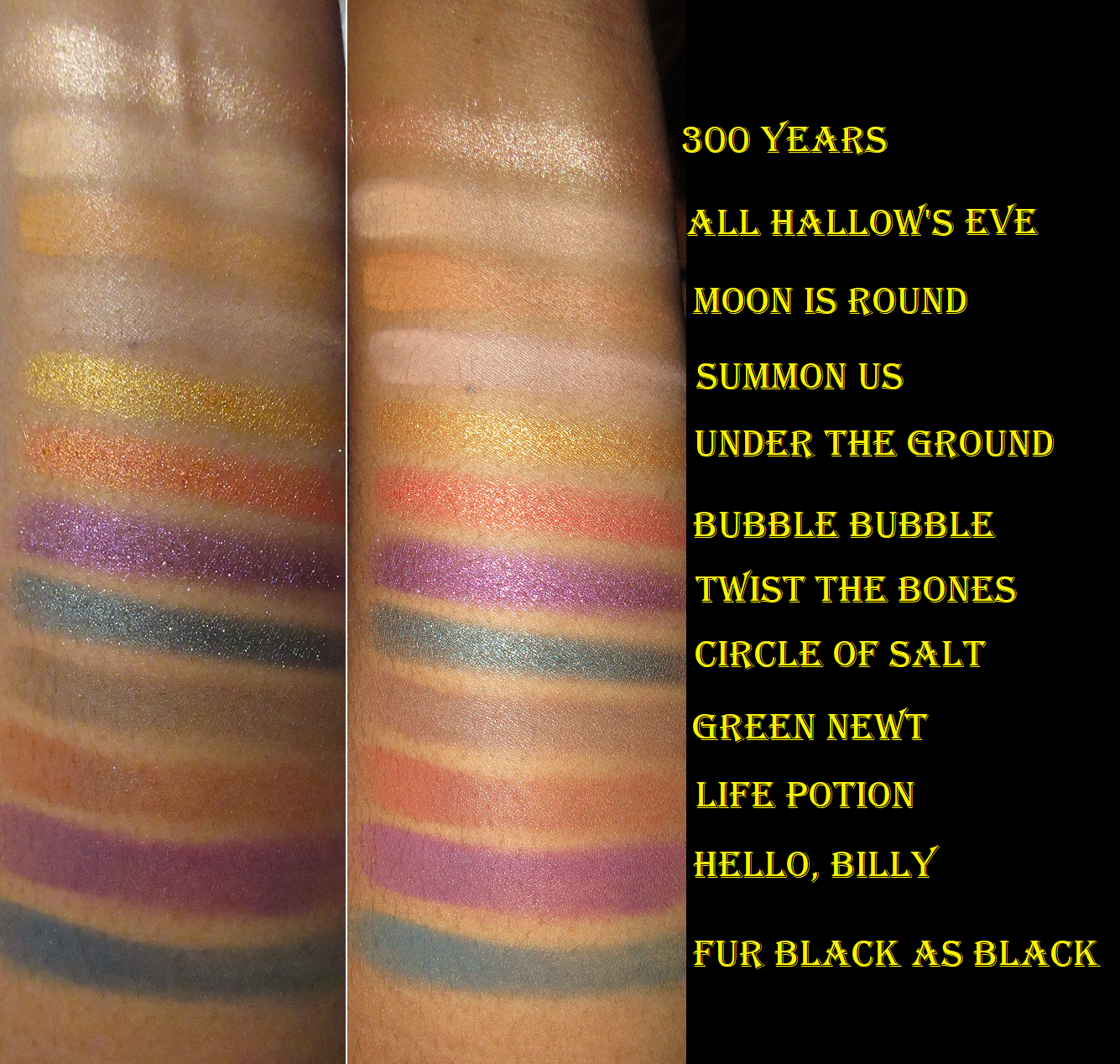
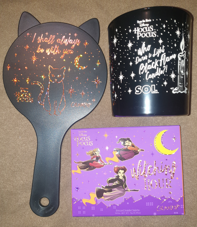
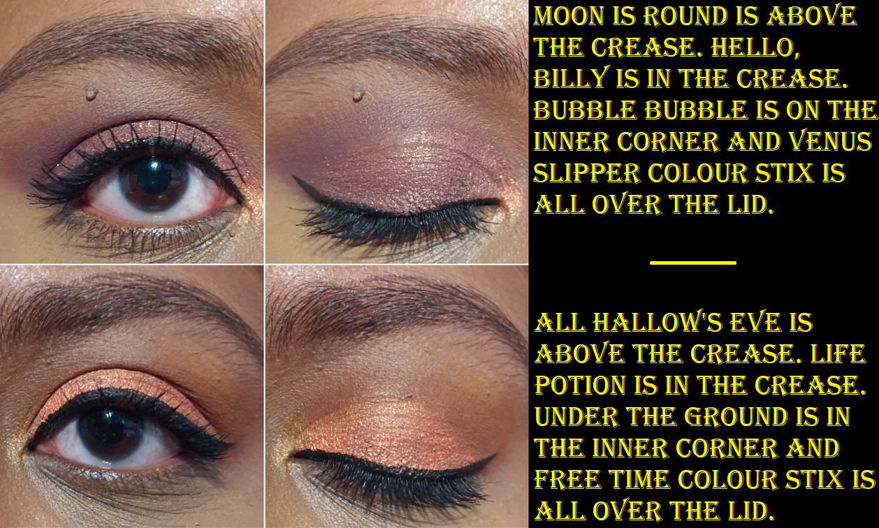
Florasis Floral Engraving Odey Makeup Palette (The Encounter)
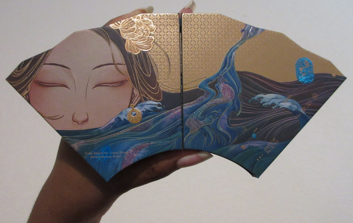
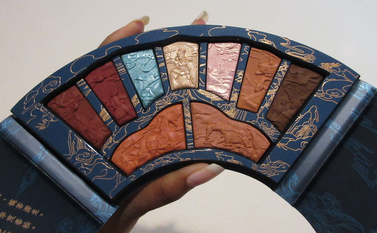

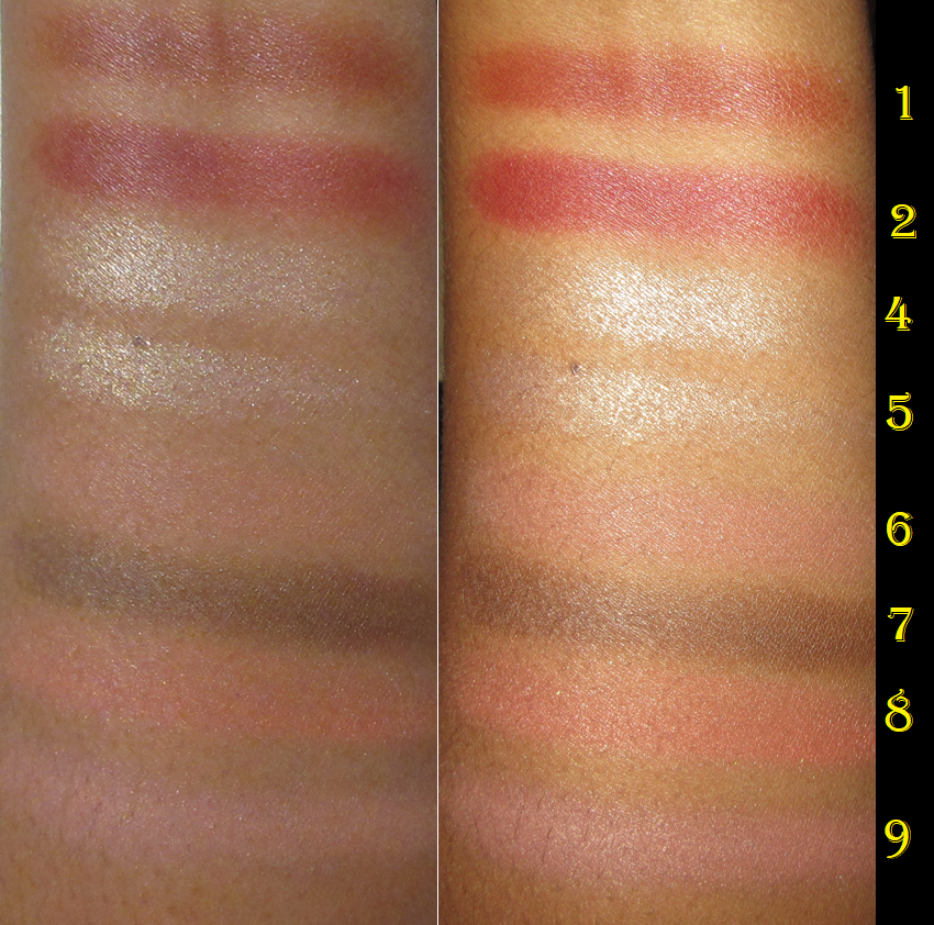
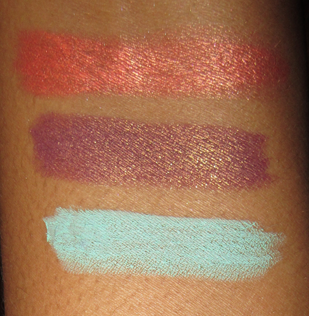
I forgot this wasn’t even the Florasis palette I wanted (the Floral Engraving Phoenix). I was just so excited to be able to grab a completely unused and untouched one of their stunning looking palettes at a reduced cost off of Mercari. You know a brand is doing well when people want to make dupes, but I was still surprised to come across one such dupe on Amazon. In any case, I am happy with the results of this palette but I wish the blue shade wasn’t in this because it contains PET (plastic glitter) which isn’t safe to use in the eye area. I also don’t think anyone wants to see glass listed as an ingredient in their makeup.
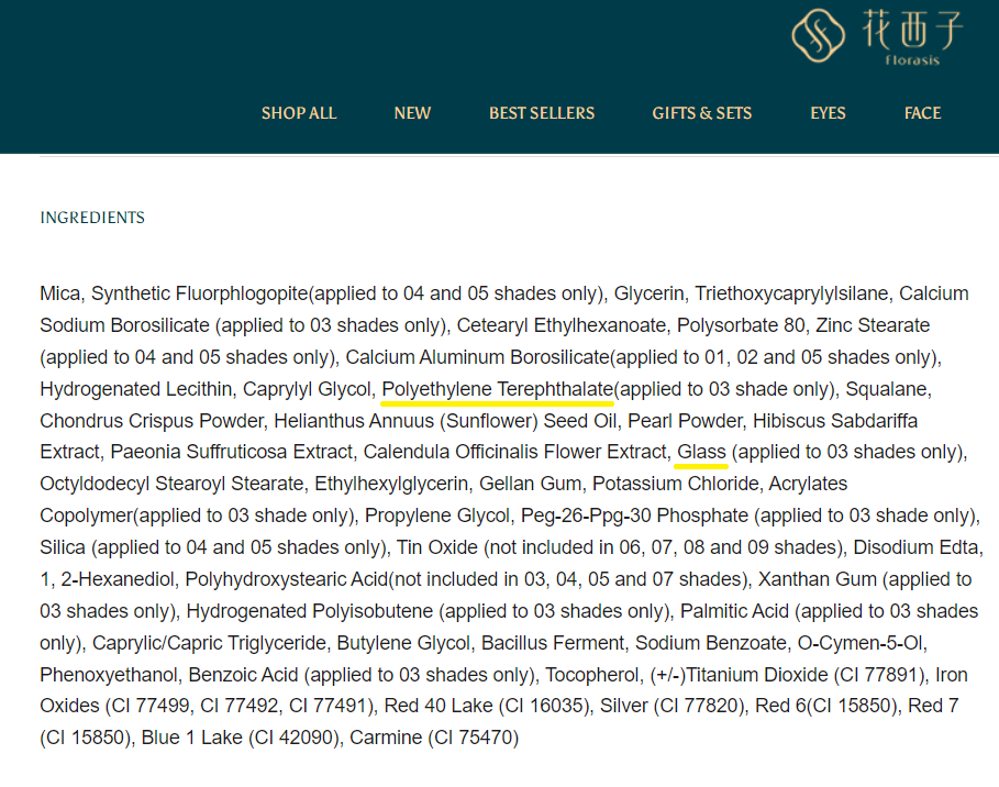
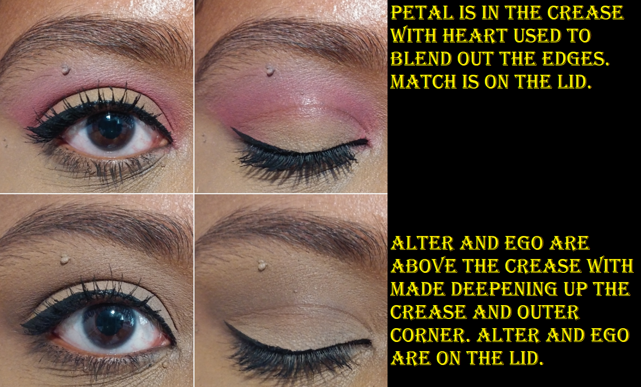
The “glass” probably refers to “glass microspheres” which are apparently so tiny that they aren’t dangerous. However, there is still PET, so I have chosen not to use or even swatch that blue shade. Also, I can only guess that the numbers start from left to right and top to bottom. Not all countries have writing in that direction, but I assume this is the same as English.
Florasis is a Chinese brand, so I can’t help but compare them to Zeesea. This palette is made of cardboard, but Florasis typically has very luxurious packaging, similar to Zeesea. However, Zeesea doesn’t currently have eye shadow palettes with as intricate of pan embossings as the ones from Florasis. This price point of Florasis products are also much higher.
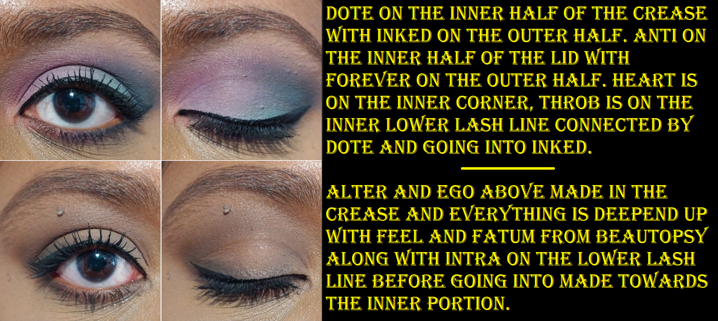
The website states that this palette is mutli-functional and the formula of the shadows certainly contributes to that. It’s listed as a powder formula, but they feel like a matte lipstick to the touch; like a stiff cream essentially. Applying with a brush was tricky because it wants to stick and dry to the bristles.
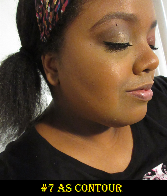
So far, I’ve stuck to my rate of two eyeshadow palettes per month so I adhered to my low-buy with this purchase (even though I said I wouldn’t buy from brands that are new to me this year). In addition, some of these eye shadows can be used for contouring, blush, and highlight, so it counts as a face palette too.
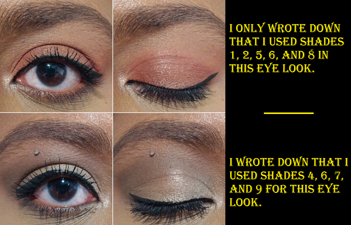
I haven’t touched this palette since I completed my initial wear tests. I could not even remember how I did the eye looks above because it was so long ago. Considering I never reach for this, the versatility aspect still didn’t make this a good purchase for me, but I just couldn’t let go of the idea of trying out at least one Florasis palette. My curiosity has been satisfied.
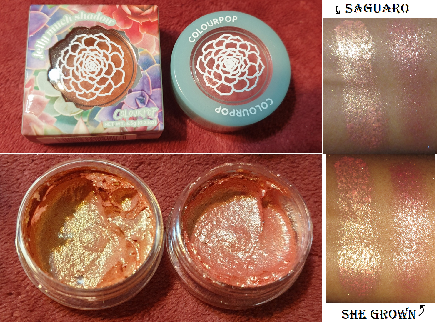
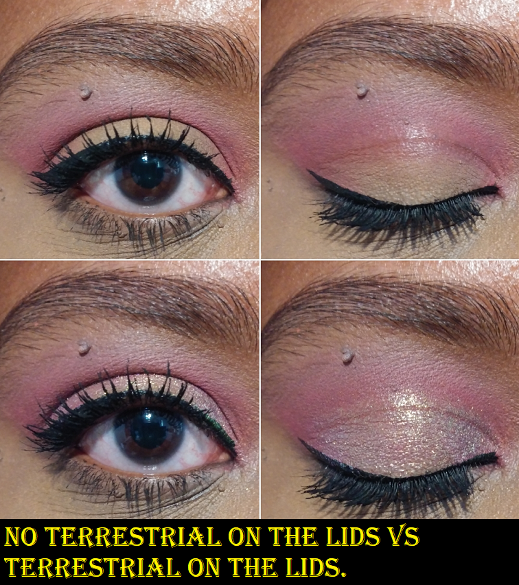
Terra Moons Cosmetics Chameleons in Terrestrial and Spring Equinox Multichromes in Galactic Blossom and Vela Supernova
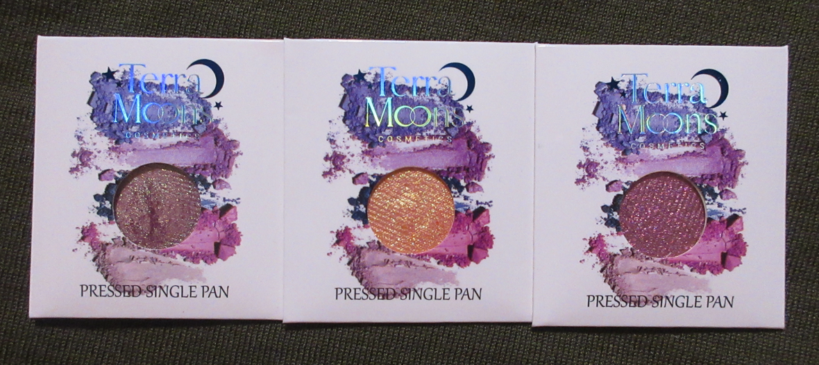
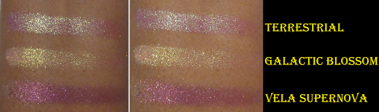
If you’ve used Terra Moons chameleons and multichromes before, these work the way you’d expect. All three are super sparkly looking with large glitter particle size and the colors are intense. The formula is smooth to the touch, but when applied to the eye without a tacky base or being applied with a brush that has been sprayed to wet it, it can get messy. So, I do recommend something like the Nyx Glitter Primer to keep them applied precisely and minimize fall out.
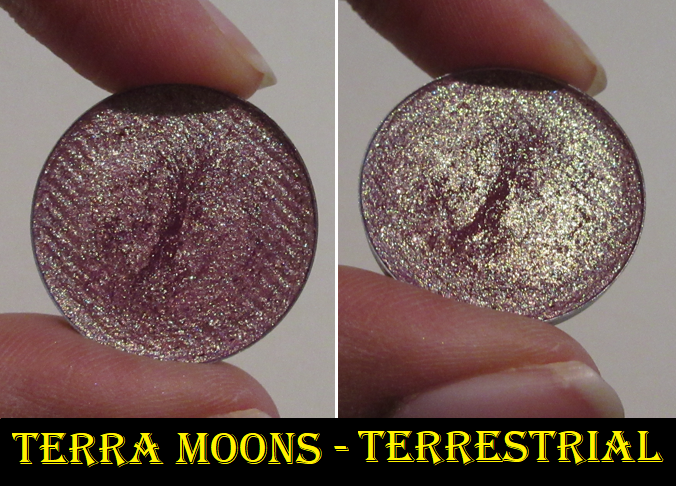
Terrestrial was a pre-order item that didn’t begin shipping until May. I used my points saved from their reward program in order to essentially have the shipping paid and part of the item. BadtoTheBrow noticed it was similar to Bloodline, and I am obsessed with how Bloodline looks in photos and on everyone else, but the base color doesn’t show through on my eyes. So, rather than buying a second Bloodline to check if it was a fluke, I wanted to try the one from Terra Moons in the hopes it would be more of what I wanted from Clionadh’s multichrome.
Unfortunately, Bloodline and Terrestrial basically are the same shade. I can bring out a little more of a pink look if I pair it with another pink shadow around it and I can always pat a red multichrome on top to manually create the red-toned look I want, but I wish it was naturally the way it looks in swatches on me and didn’t require extra effort on my part. I didn’t bother to show comparison swatches between the two because the swatches looking slightly different on my arm doesn’t show the issue of them looking identical on my eyes. And for whatever reason, Terrestrial’s shifts are easier to detect on my camera than Bloodline, so comparing eye swatches wouldn’t be a fair representation for Bloodline either.
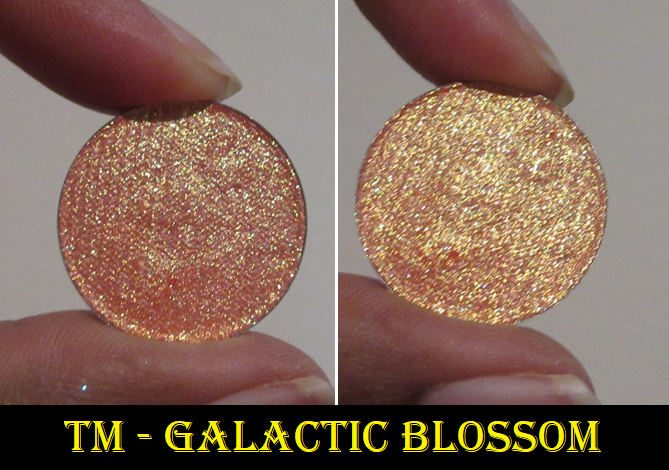
Galactic Blossom and Vela Supernova were pre-orders that were supposed to begin shipping in June, but I got lucky and had mine arrive in the middle of May. According to my Low-Buy rules, I’ve pledged to only purchase a few single indie eyeshadows per collection, so this was definitely allowed. My only regret is that I didn’t buy these two with my order of Terrestrial in order to save on shipping costs and time.
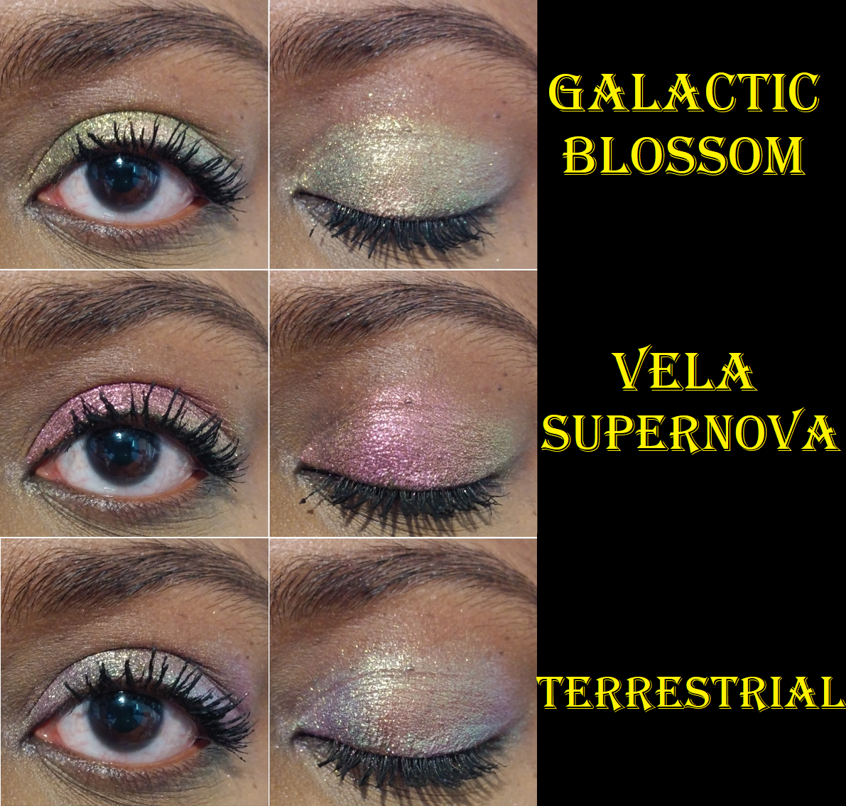
Photos showed Galactic Blossom as a strong pink-gold, and in some cases, shifting into literally a rainbow. I’d never seen a multichrome shift to so many colors, so I absolutely had to get it. Unfortunately, on my eyes it looks mainly yellow, and on camera it looks limey yellow-green with some pink. It’s not what I wanted, but I do like how it looks in person. On my arm, at sharp angles I can see that rainbow towards the edges, so it’s not false advertising. It really can shift that way, but it doesn’t look like that on my eyes and I want others to be aware of that possibility that it’s not going to look the same on everyone and how it looks depends largely on the curvature of the eyes and lighting.
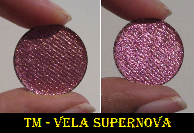
As for Vela Supernova, the colors are what I expected, but ironically, I like it the least of the three. It’s not as unique of a purple shade as I anticipated. I admittedly can’t think of multichrome dupes myself (Temptalia says Roseline, Cerise, and Mosaic) but the shade of purple looks like what I have as some of my purple shadows without the shifting ability.
I don’t get fading, dullness, or any other longevity issues with these multichromes. Terra Moons really stepped up in their multichrome offerings to the point that I think they’ve tied with Devinah for the #2 spot of best indie multichromes (from North America at least). Clionadh is still holding that #1 spot in my eyes.
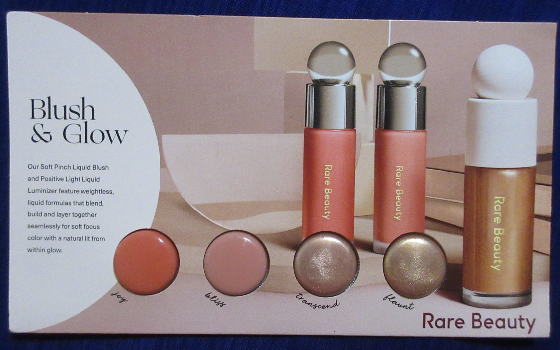
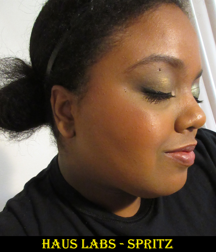
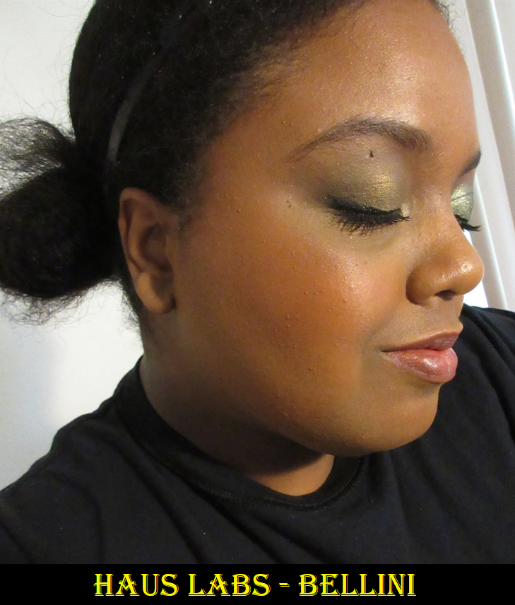
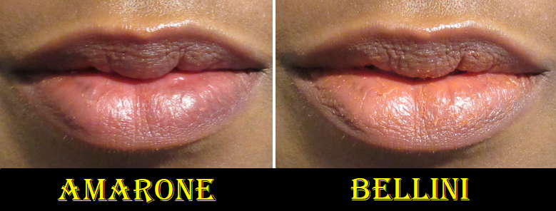
PAT McGRATH LABS x Bridgerton 2 Blushing Delights Blush + Highlighter Palette and PAT McGRATH LABS x Bridgerton 2 SatinAllure Lipstick in NÉGLIGÉE – The dedicated post to these products are HERE. Technically the Blushing Delights Palette is a face palette, and therefor allowed in my no-buy. The lipstick makes 5 out of 5 in my goal to end the year without purchasing anymore lip products.
Billie Eilish Eilish Eau de Parfum Travel Spray – The review for this is in the same post HERE as the Brooklyn Ellis perfumes. This was part of my Ulta points redemption, so I did not pay anything out of pocket.
MAC Wild Cherry Glow Play Blush Color Peaches ‘N’ Dreams and MAC Mini Macstack Mascara – These two were also part of my Ulta point redemption order and have already been reviewed HERE. I said I wasn’t going to get another Glow Play blush and I resisted for about a month or two, but my interest in peach blushes (especially in my favorite formula) got me again! As for the mascara, which I am on a year long no-buy for, I at least feel better that it wasn’t a full size purchase and that I’ve stuck to the mascara no-buy pretty well so far. However, I want to continue to stick to it and not purchase another in 2022.
Neutrogena Ultra Sheer Face Serum SPF 60+
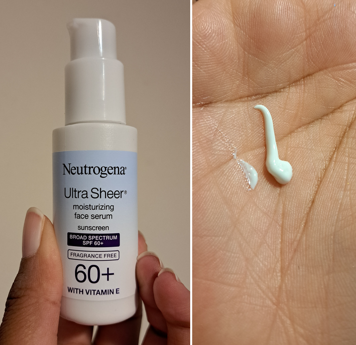
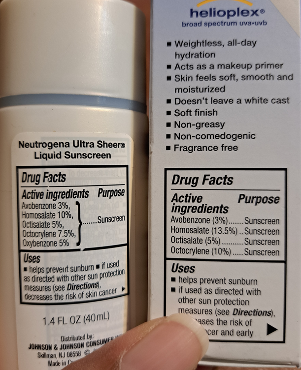
Left are the active ingredients of the discontinued Neutrogena Ultra Sheer versus the active serum ingredients on the right.
This is the only Ulta point redemption item I have left to review! I did have one other purchase in my order, but they kept sending me the wrong shade so that product was returned. In any case, I was the biggest fan for 7-8 years of the Ultra Sheer Liquid SPF 70 Sunscreen until it was discontinued. The fact that this is supposed to have 60 SPF protection while also being in a thin formula intrigued me. I planned to either wear it alone or wear it to help boost the effectiveness of my current sunscreen, the Round Lab Moisturizing Sun Cream SPF 50++.
I don’t think double-sunning (I just made up that term…can we please make “double-sunning” a thing?) is that bad of an idea, because in one of Dr. Dray’s videos, she said the Round Lab is fantastic for a variety of reasons, but she views it more as a moisturizer that happens to have a very good sunscreen in it due to it not being waterproof (and therefore not as reliable in occasions where one will be sweaty). This serum isn’t waterproof either, but I feel like I’m doubling up, in theory, by having both this serum and moisturizer/sunscreen with high spf. This serum leaves no cast on me and although it’s slightly greasy looking as I start to apply it, that look doesn’t remain when it’s fully rubbed in. I do have dry skin though. This serum isn’t a fluid consistency like my previous holy grail sunscreen, but it’s very lightweight and easy to rub in, unlike the Ultra Sheer Dry-Touch that I despise. It’s like a good middle ground between the two.
I’m on a skincare low-buy, but sunscreen is an exception since it’s vital that I have a good one. The kind of acids I’ve been using make my skin more sensitive to the sun, in addition to living in Florida with an extremely high UV index the majority of the time. It’s imperative that I keep my skin protected.
I haven’t had any issues with pilling while wearing this serum, plus the Round Lab Sun Cream, plus makeup, so I’m happy with this product. I don’t know if it will be completely necessary for me to continue repurchasing it in the future if I find a waterproof sunscreen that I end up liking, but we will just have to see!
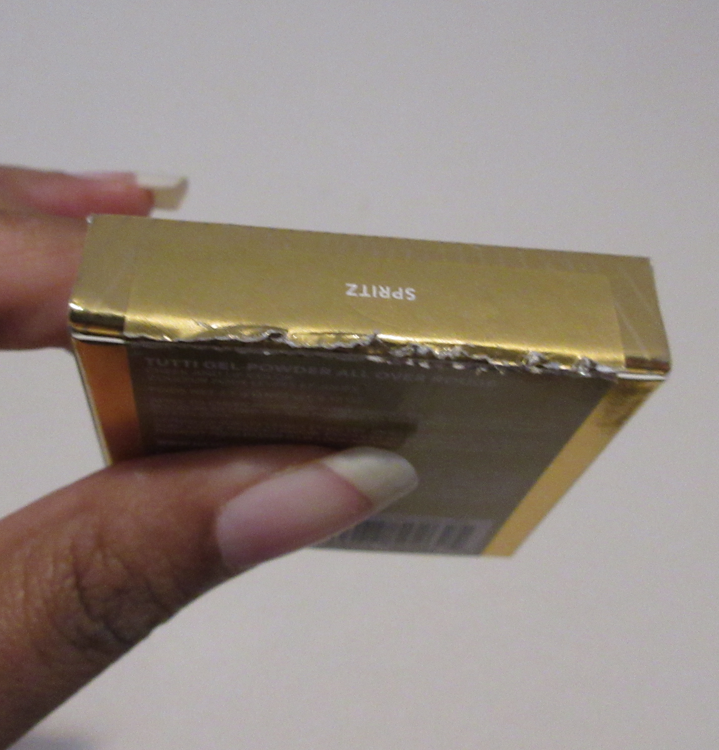
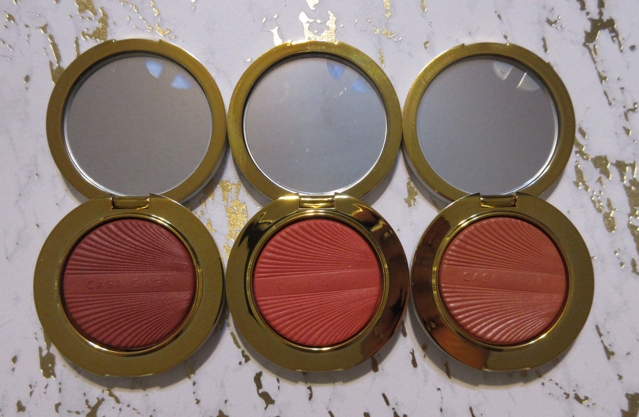
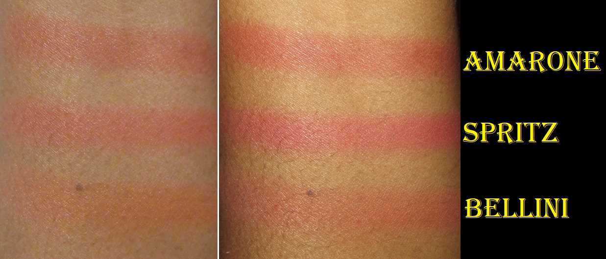
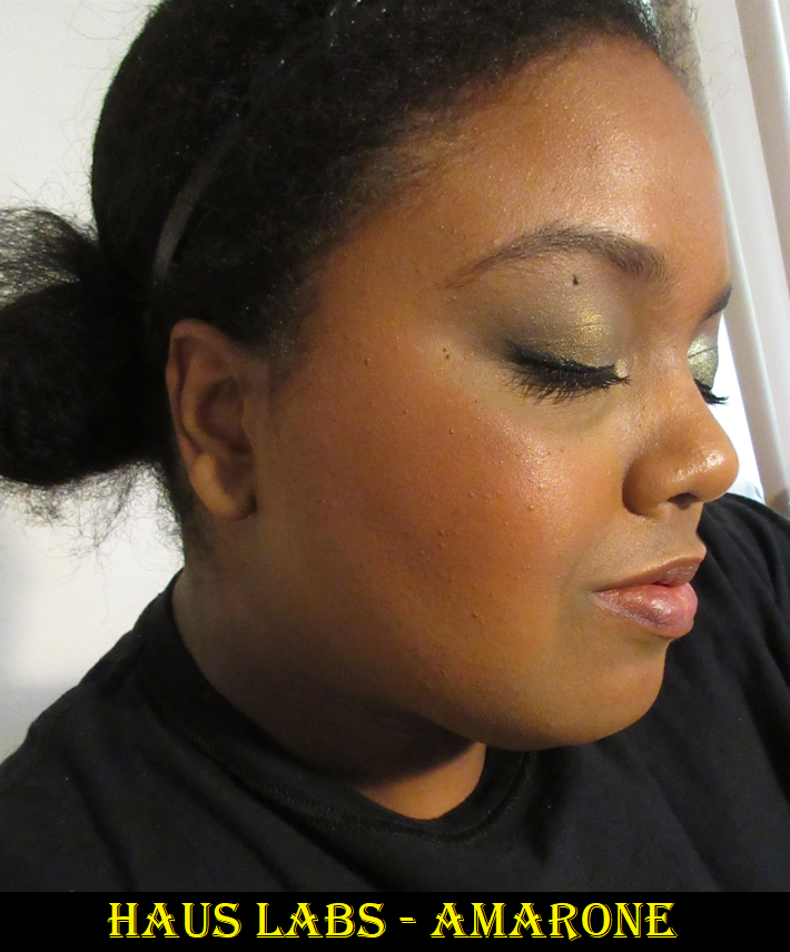
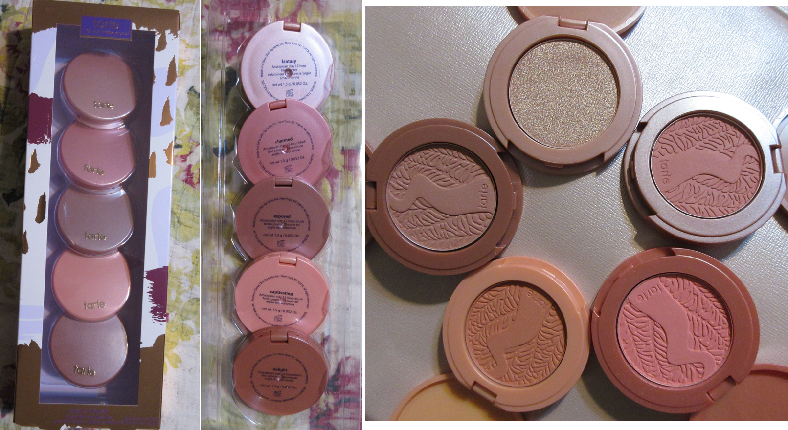
Nars High Profile Cheek Palette – This was a limited-edition holiday release in 2021 that I intended to purchase, but so many reviewers commented on how similar the blushes looked to each other. So, when I found one on Mercari that was barely more expensive than a single full size Nars blush, I decided it was worth getting at that point. By the time I bought it, I had already finished my Rediscovering Nars Blushes post, but I had to admit I was curious to try this gel powder formula to see if it would give me an additional finish from Nars that I could like besides their mattes. The review is HERE and as a palette with a highlighter along with the blushes, I think I’m going to allow myself to count this as being allowed in my low-buy.
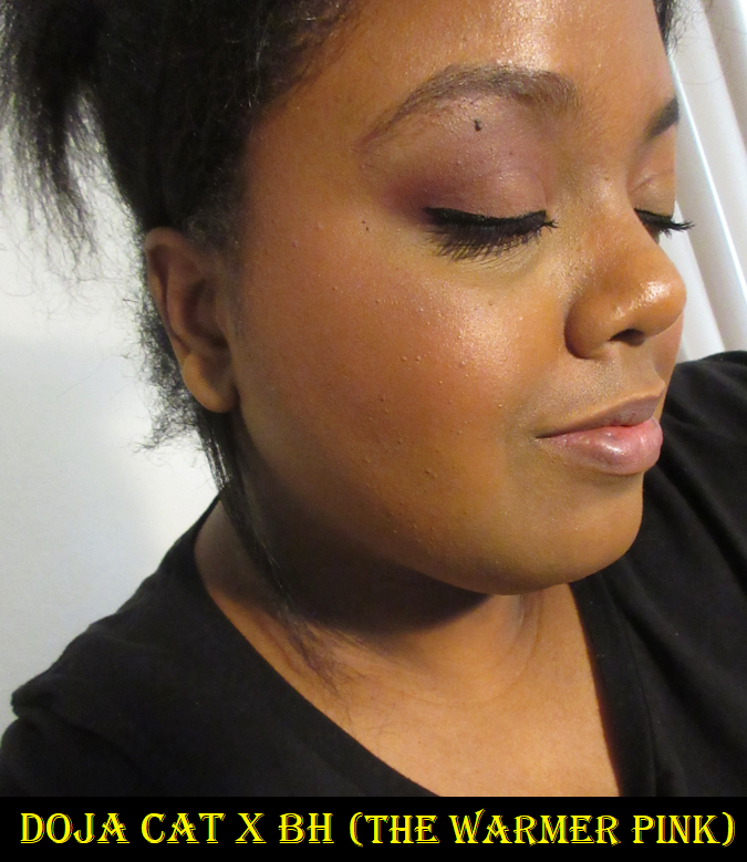
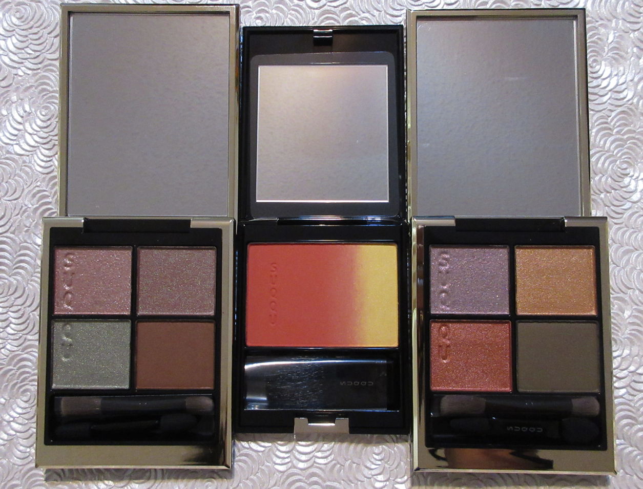
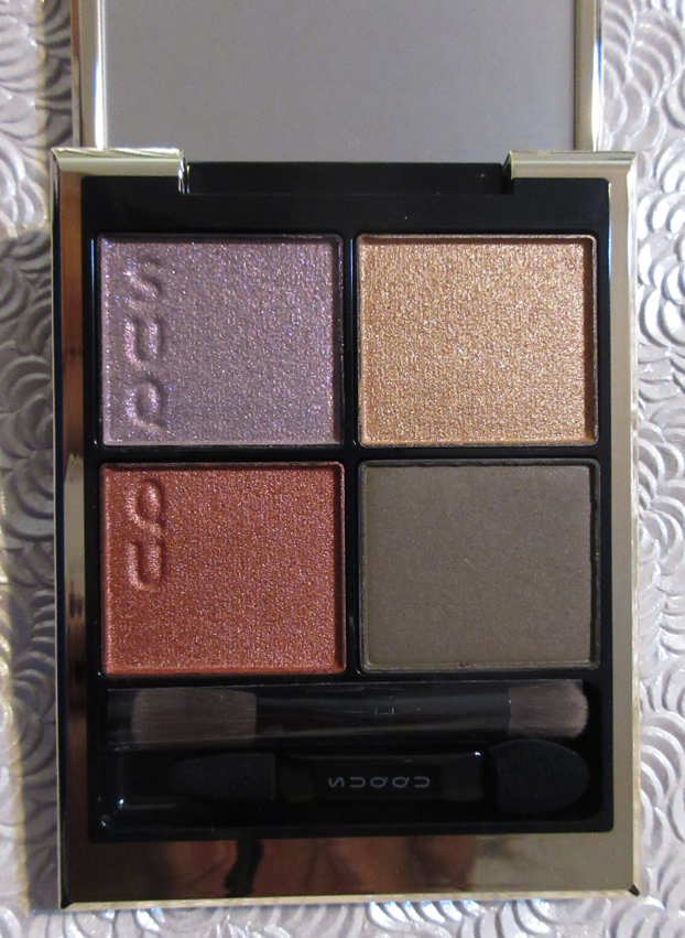
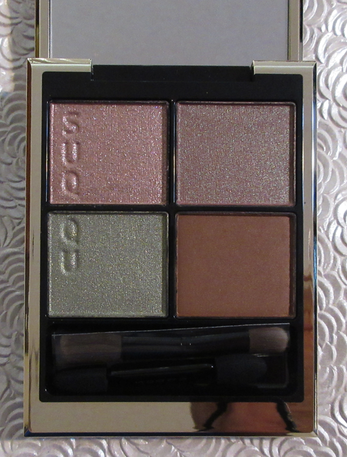
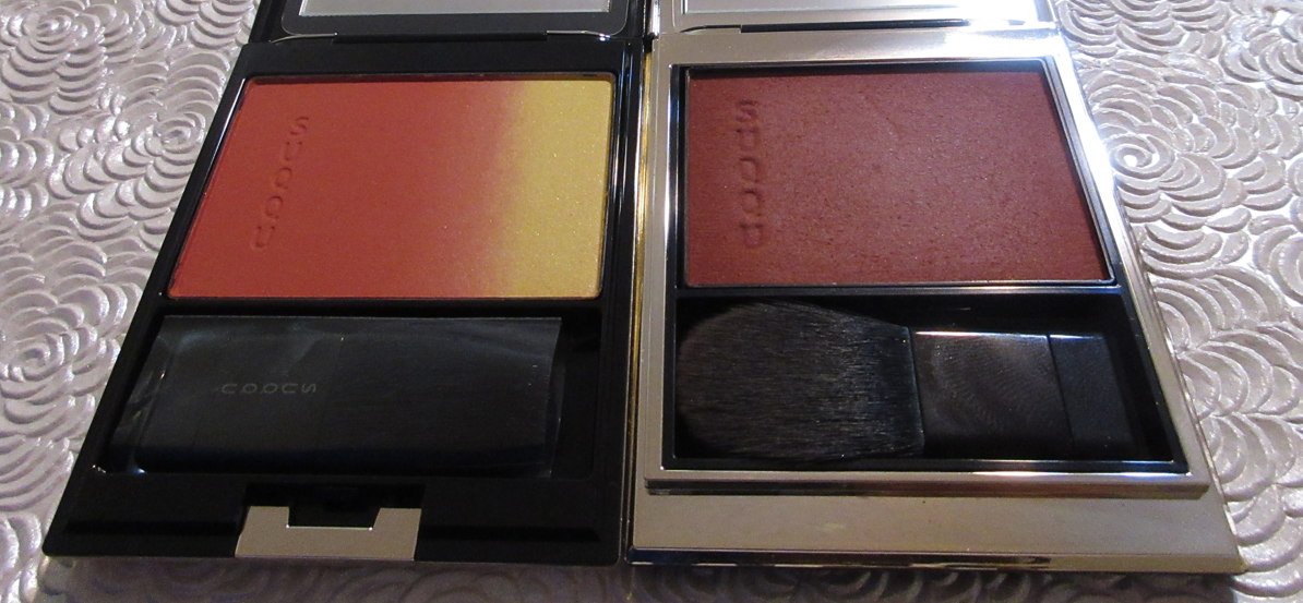
SUQQU Melting Powder Blush in 07 YOIURUSHI – This and all my Suqqu purchases have been reviewed HERE. Suqqu was definitely not on my list of exemptions to the blush low-buy, but I was curious how this new formula stacked up to the usual powder formula.
MAC Surrounded by Stars Extra Dimension Skinfinish Palette – The review can be found HERE. MAC’s Magnificent Moon Collection is supposed to be in celebration of Ramadan and was released worldwide first before coming to the US. I purchased mine from Selfridges since it was there first, I was waiting for something to add to my cart to get the Suqqu blush, and I had free shipping via the annual global shipping program I signed up for with Selfridges. Since it’s a split highlighter and blush quad, it’s allowed in my low-buy.
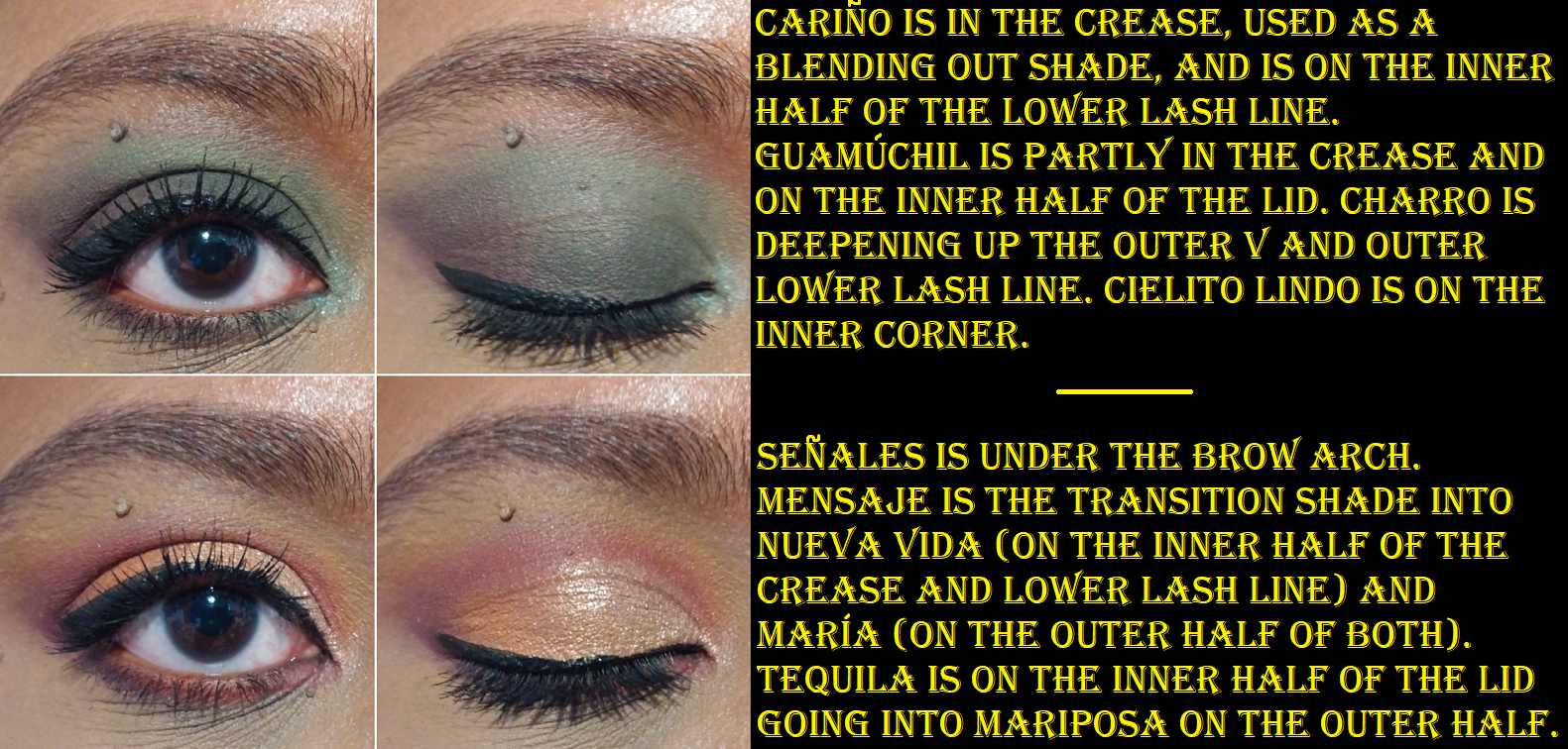
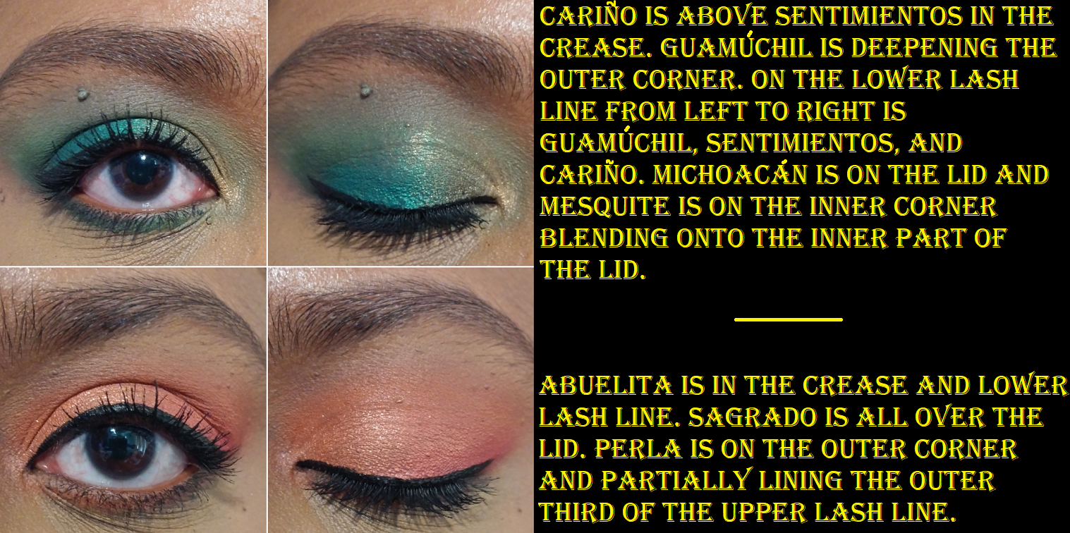
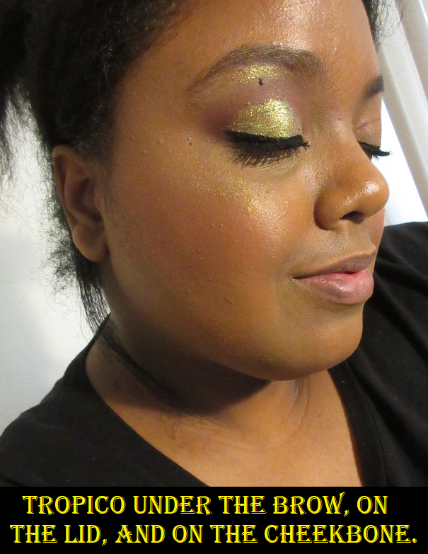
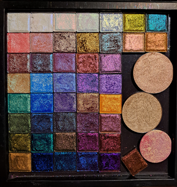
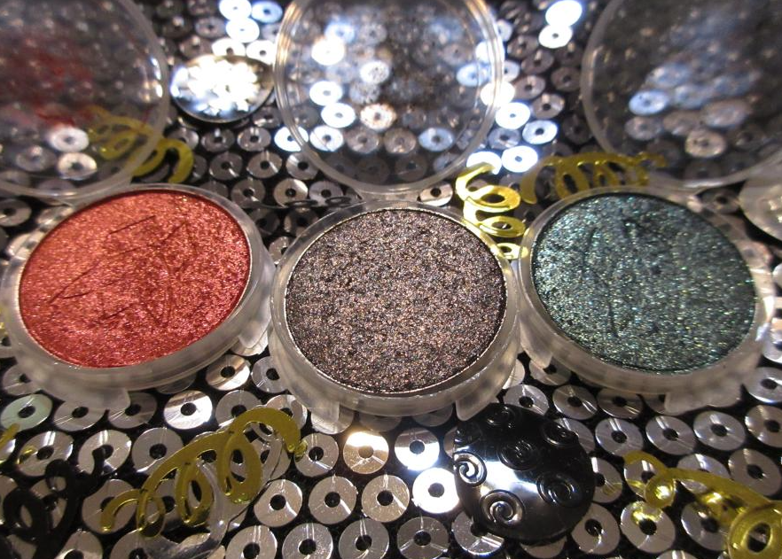
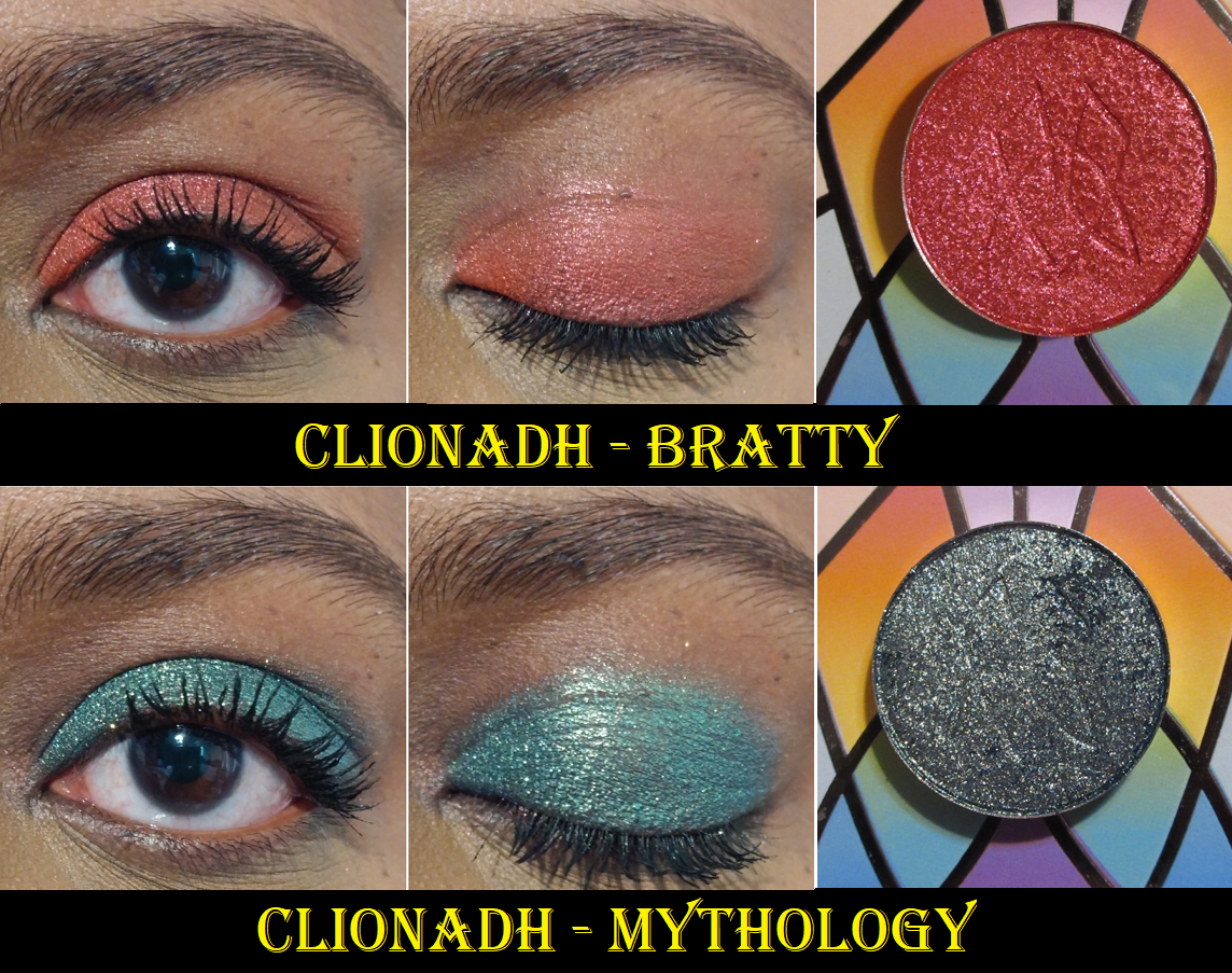
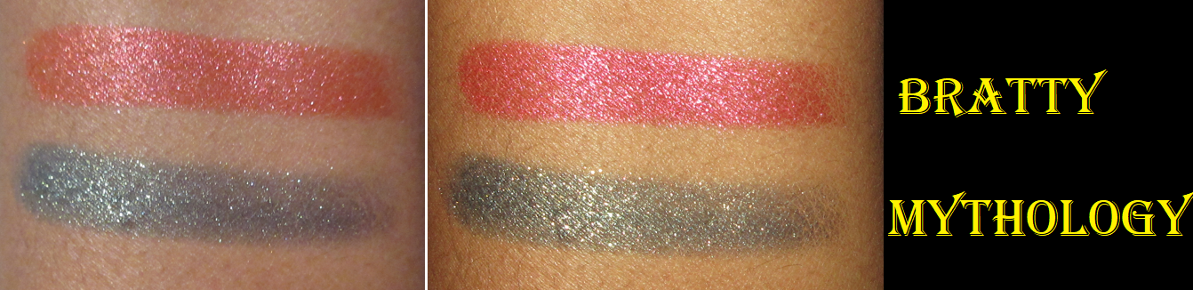
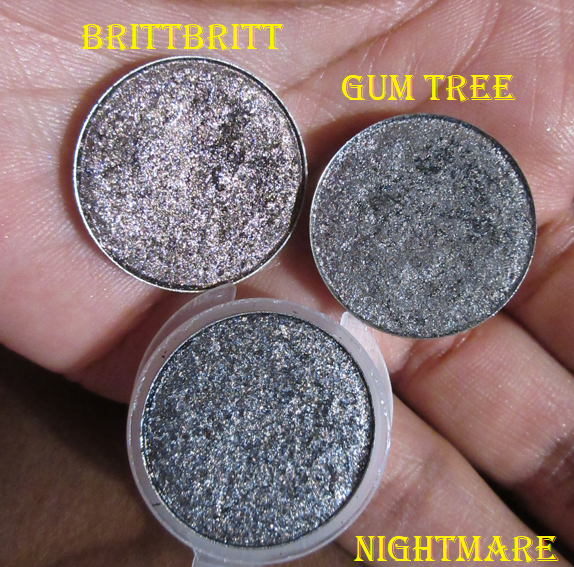
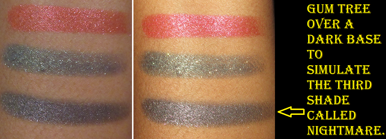
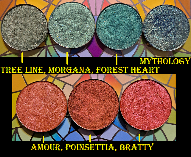
CLIONADH HAUL – I decided that I would do a dedicated post to this haul, found HERE, but as a Thursday bonus instead of my usual Monday postings. I’ve mentioned endlessly how much I love Clionadh eye shadows and multichromes, so there isn’t much to say about the formulas and it’s just a matter of showing them off and possibly doing comparisons to other indie brand shadows.
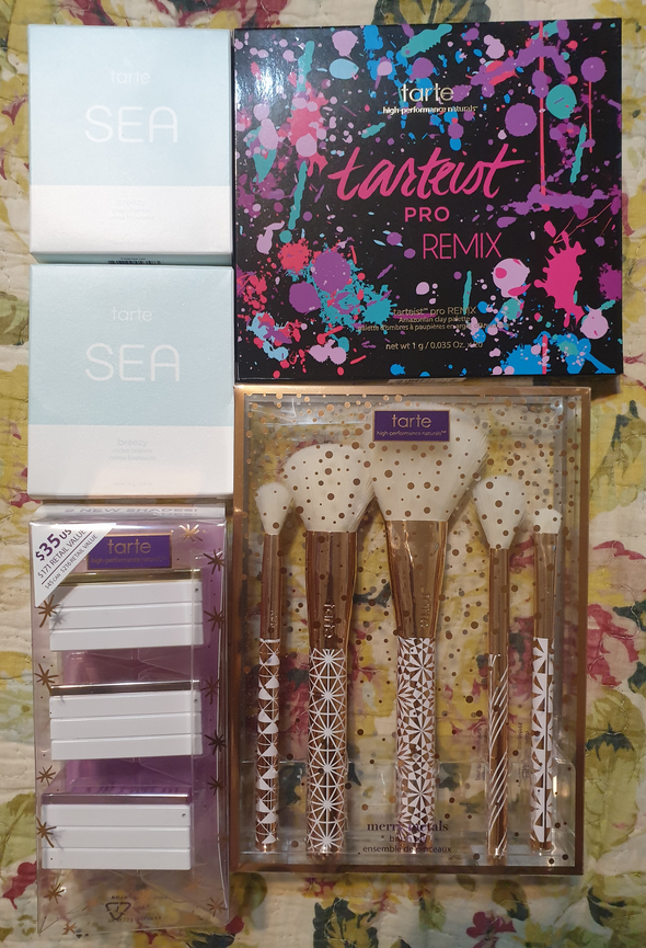
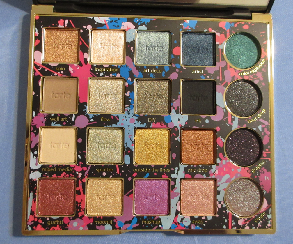
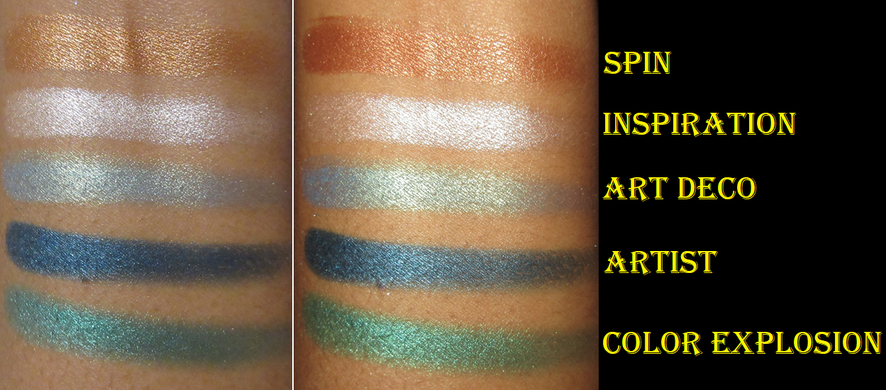
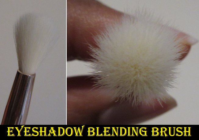
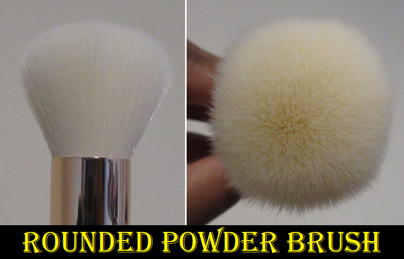
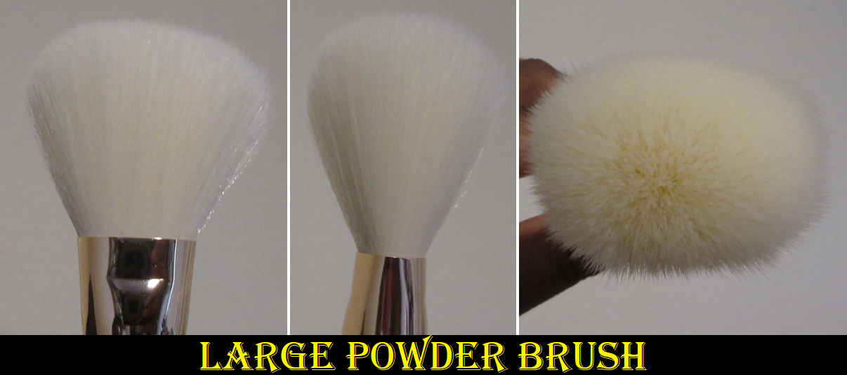
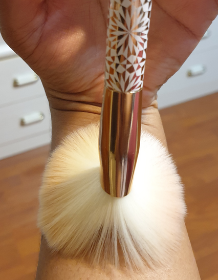
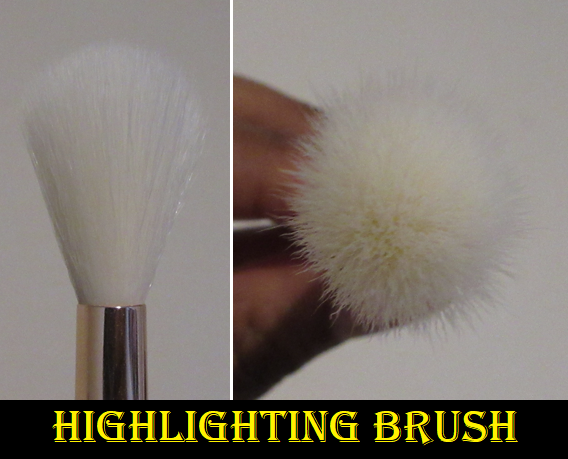
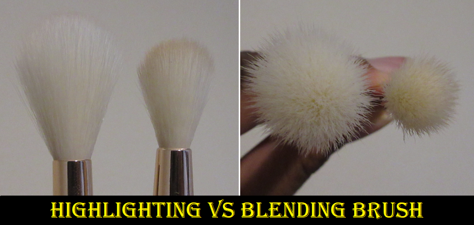
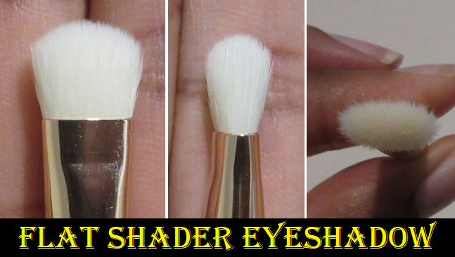
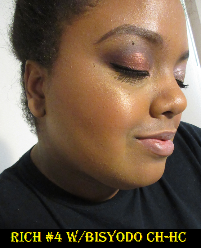
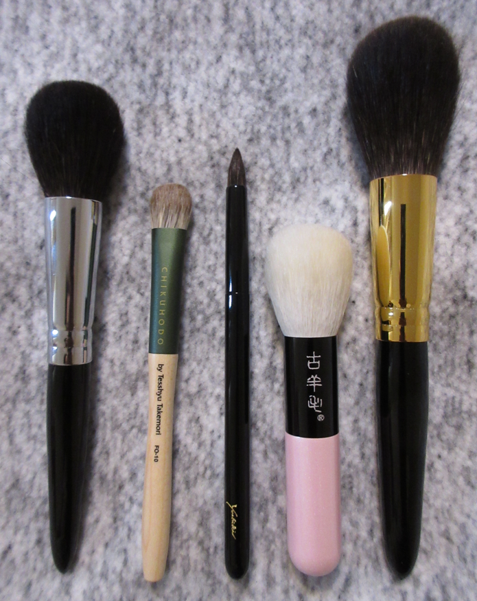
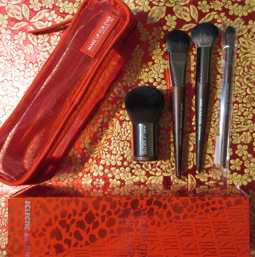
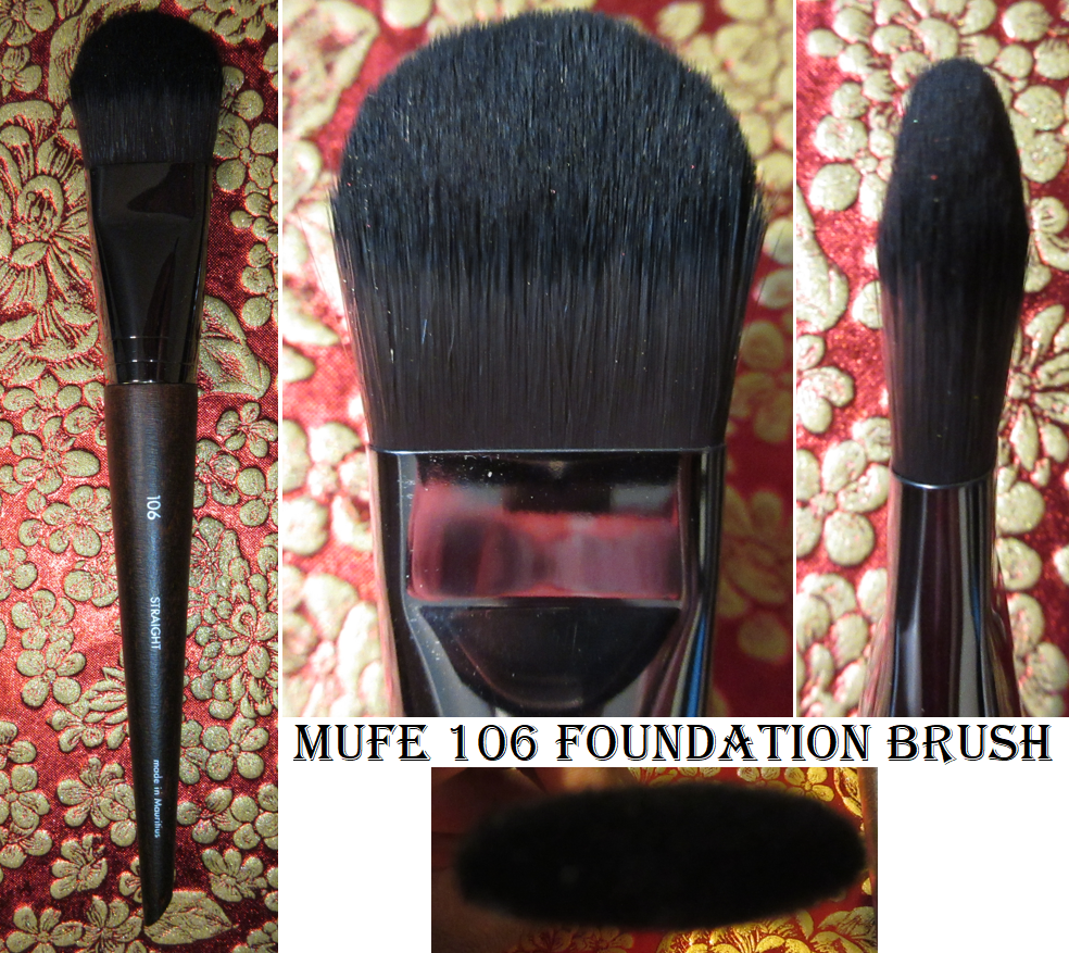
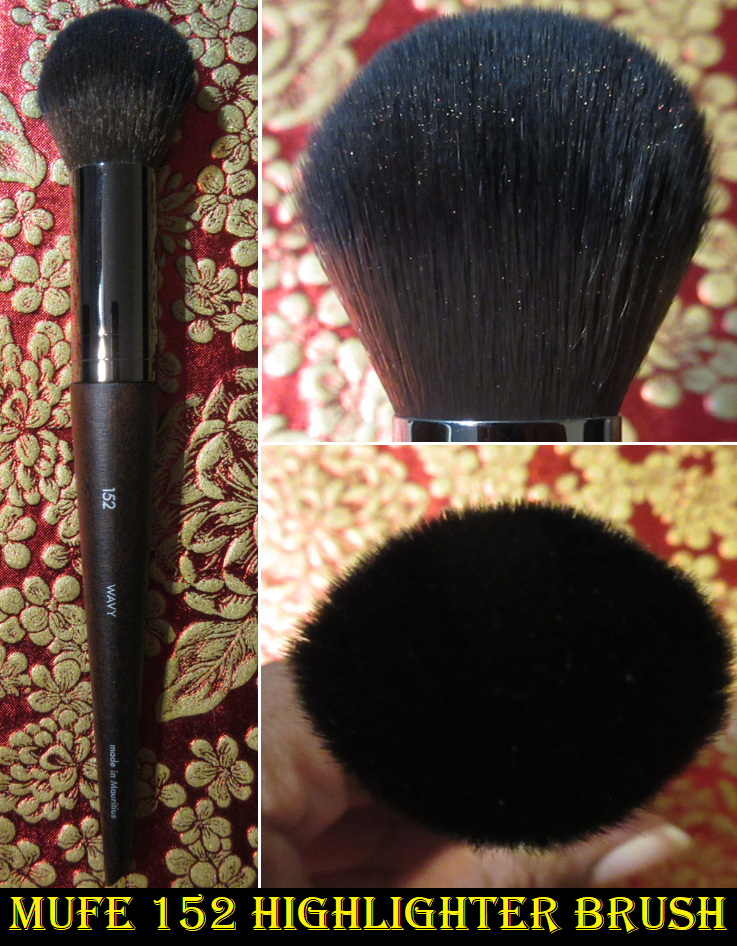
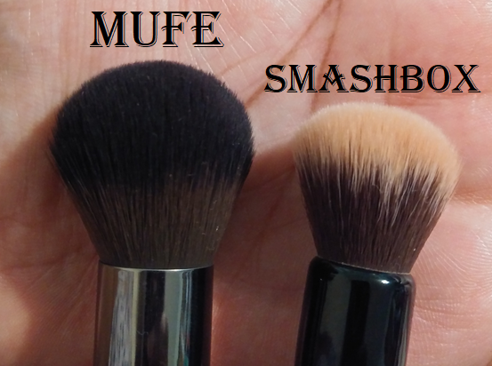
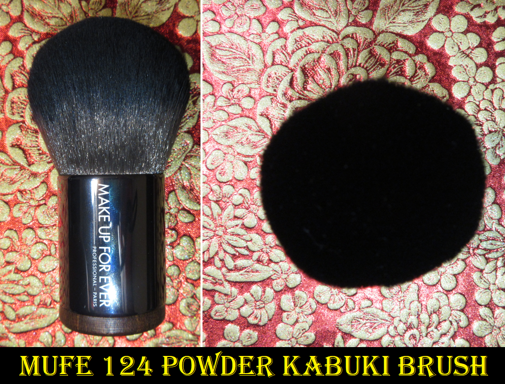
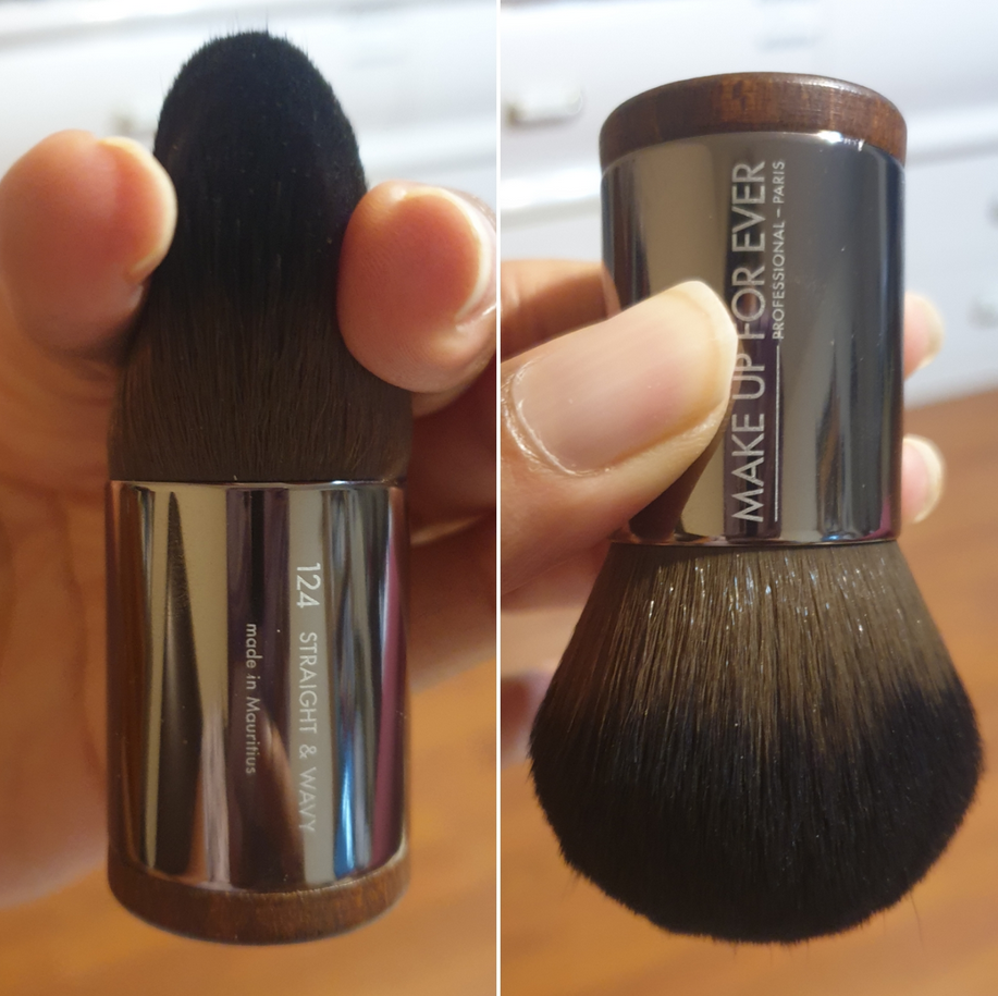
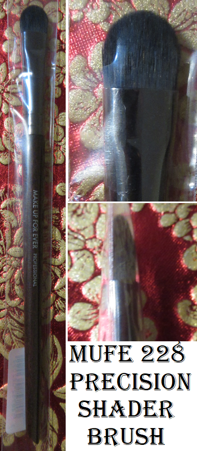
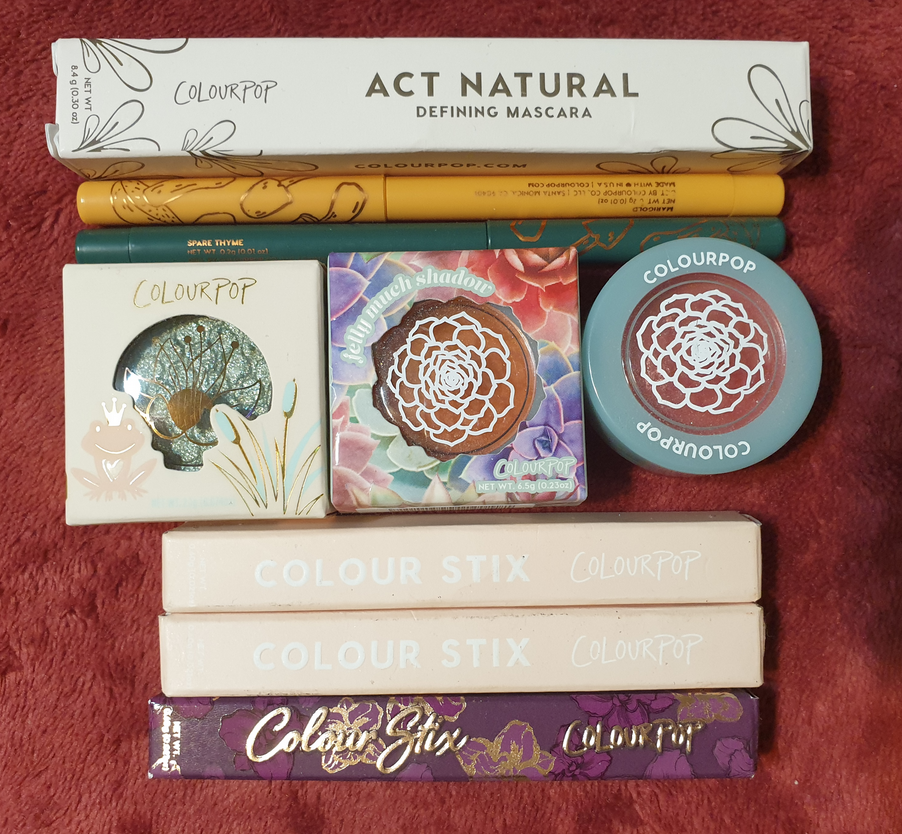
FUDE JAPAN HAUL and CD JAPAN HAUL – I believe the brushes I purchased in April have already been reviewed HERE, with the exception of the Hakuhodo brushes which are still being tested.
That’s all for today! If you’d like to see previous posts in the low-buy series, as well as sneak peeks for the upcoming ones, I created a dedicated page to it HERE. If you’d like to see more content from me, be sure to click follow via email or to return back every Monday at 11:30 am EST! Thank you for reading!
-Lili ❤