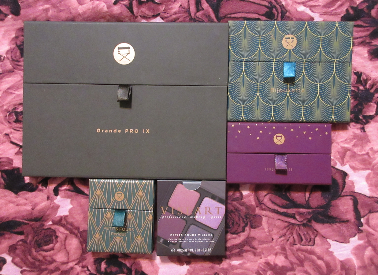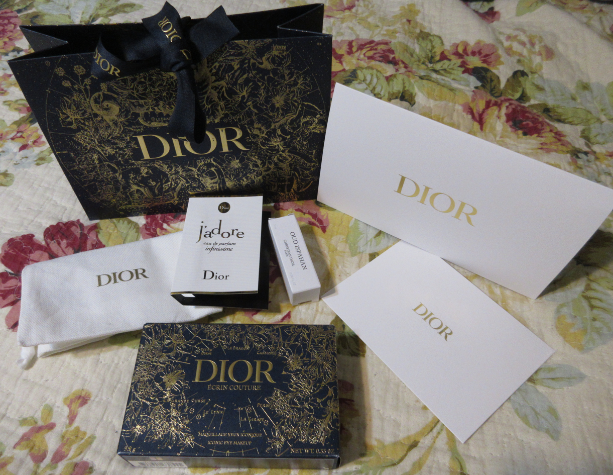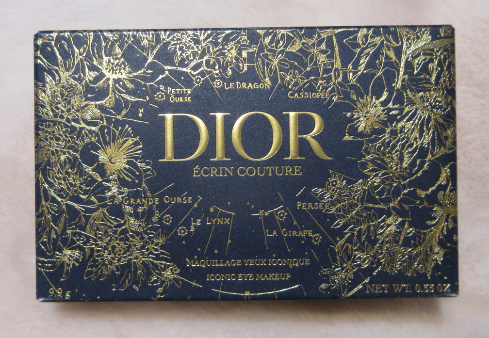
Today’s post will be a long one. There are tons of other reviews about this new holiday launch, but I believe I can add a little more to the conversation with all the comparisons of colors, textures, sizes, pricing, and more that I’m including. There are a few additional items that I wanted to purchase from the brand, but they’re out of stock and will not be available again until 2023. I’ve heard that the brand also intends to expand on the eyeshadow range (along with making the eyeshadow system fully customizable with some form of empty palette option), so there will be a Part 2 at some point next year.
Whenever I review an Influencer/MUA/Celebrity owned brand on this blog for the first time, I include a disclosure for those concerned about possible biases. So, first, I will say that I’ve been a subscriber of Lisa’s YouTube channel for eight or nine years. I’m not a very consistent watcher, but I’ve had a long time respect for her makeup knowledge, skills, and I own her Face Paint book. Her love of Suqqu, Hakuhodo, and other natural hair brushes is part of the reason (along with Wayne Goss, Tati, etc) that I was motivated to try Japanese brushes for the first time. I’m not following Lisa Eldridge on other social media platforms. I’ve had no personal interaction with her. When it comes to the cosmetics brand, I have only begun purchasing things as of a month ago despite it being around for about four years. So, while I do respect her and like her, I feel I’m still detached enough to review these products objectively. However, the Lisa Eldridge brand is a luxury one and whether I believe the items from a luxury brand are worth the money or not is a lot more subjective due to the nature of things like packaging, special ingredients/formulas, ordering experience, and other extras factoring into the cost. In other words, the value placed on packaging (for example) and its usefulness vs its worth in beauty is going to differ from person to person.
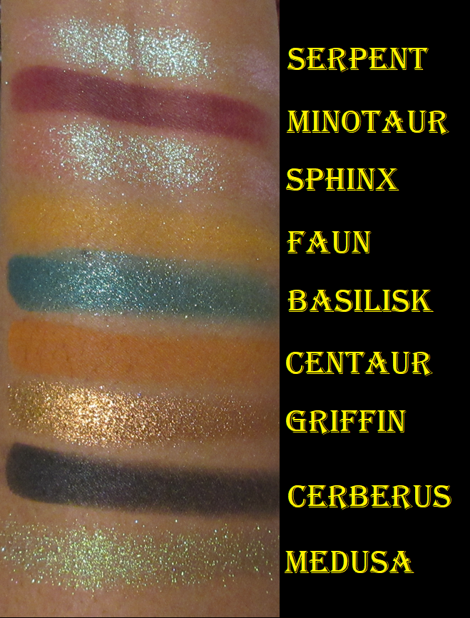
Lisa Eldridge Eyeshadow Formulas
When it comes to these shadows, the colors are secondary to the finish, which is the best indication for whether or not they’re worth buying. There are a few outliers, but the formulas are overall consistent. So, I recommend deciding on the finish and then choosing the shades within those categories that are the most appealing. The single shadows I chose to buy are a hint to my personal preferences: the Velvets and Seamless Mattes.
*The numbers next to the finishes indicate how many I own out of the total of each type available.
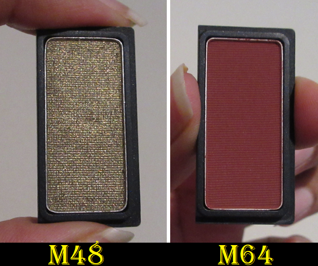
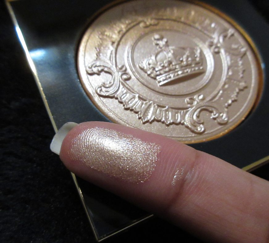
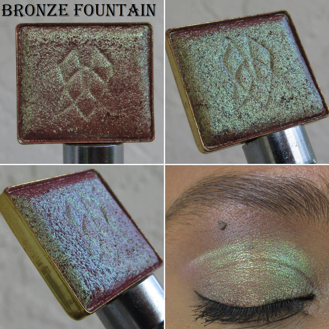
Velvets (7 of 9) – I can’t think of any other brand’s eyeshadows that feel like this. The closest comparison is Natasha Denona’s Cream Powder formula, but smoother (or as the name suggests, more velvety). These give an even but thin layer of color. A soft look is fast to achieve. If I want the shadows built up to the full color displayed in the pans, that takes a little extra time and sometimes needing to reapply one shade over the other. However, this is worth it to me because of how perfectly they blend into each other and blend on the eyes. The darker shades are great for adding a smoky effect and definition, but the overall look will still mostly be soft, even with the more vibrant shades, like Victorian Trim.
I alternate between using my fingers and brushes with these eyeshadows, and using a finger sometimes causes too much product to bunch up and gives the surface of the pan a mottled looking texture, but it doesn’t seem to be effecting my ability to use them.
Seamless Mattes (2 of 6) – These feel even closer to the Natasha Denona Cream Powder shadows, but ND’s older formula that’s creamy on the surface but isn’t as wet as her newer ones. This means that the Seamless Mattes are similar to the Velvets, but with more color payoff. Ironically, the Velvets have a more matte looking texture than the Seamless Mattes, which have a little bit of a sheen to them. Although I use certain Velvets to create depth, I think the Seamless Mattes are better suited to that task because of the increased pigmentation and that sheen which looks better when applied on top of the shimmers/metallics I use on the lids.
I also alternate between using a brush and my fingers. I prefer to use a brush for precision and quicker concentrated packing of the shadows. With repeated use of my fingers, the surfaces look like they are forming hard-pan, but they haven’t actually solidified, so I don’t think they will. My older Cream Powder ones are like that too and haven’t become hard-panned either.
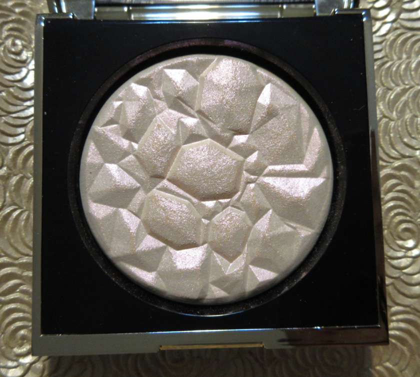
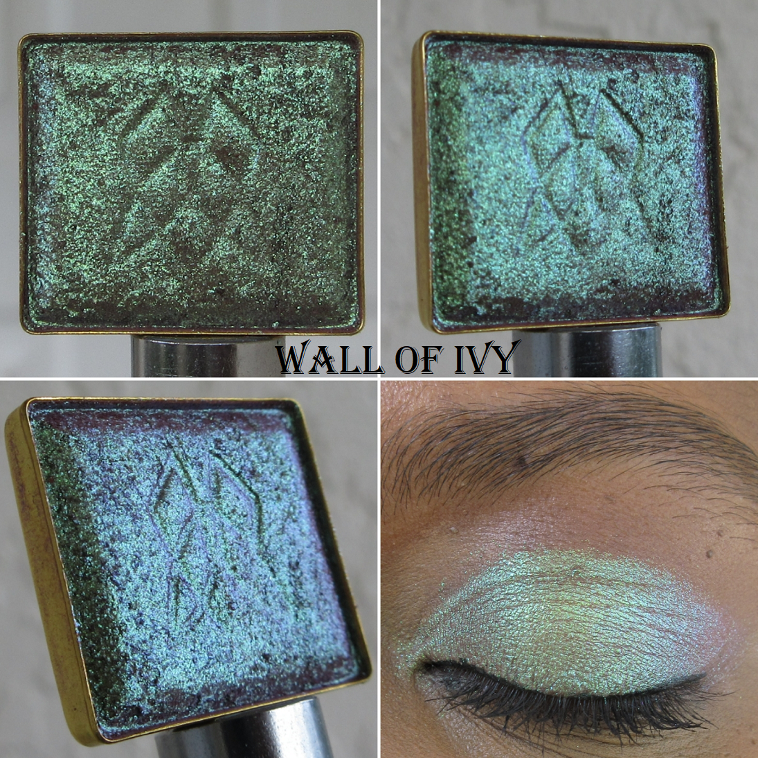
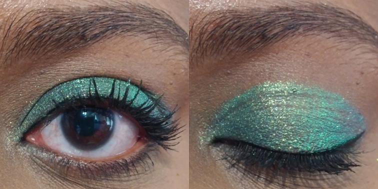
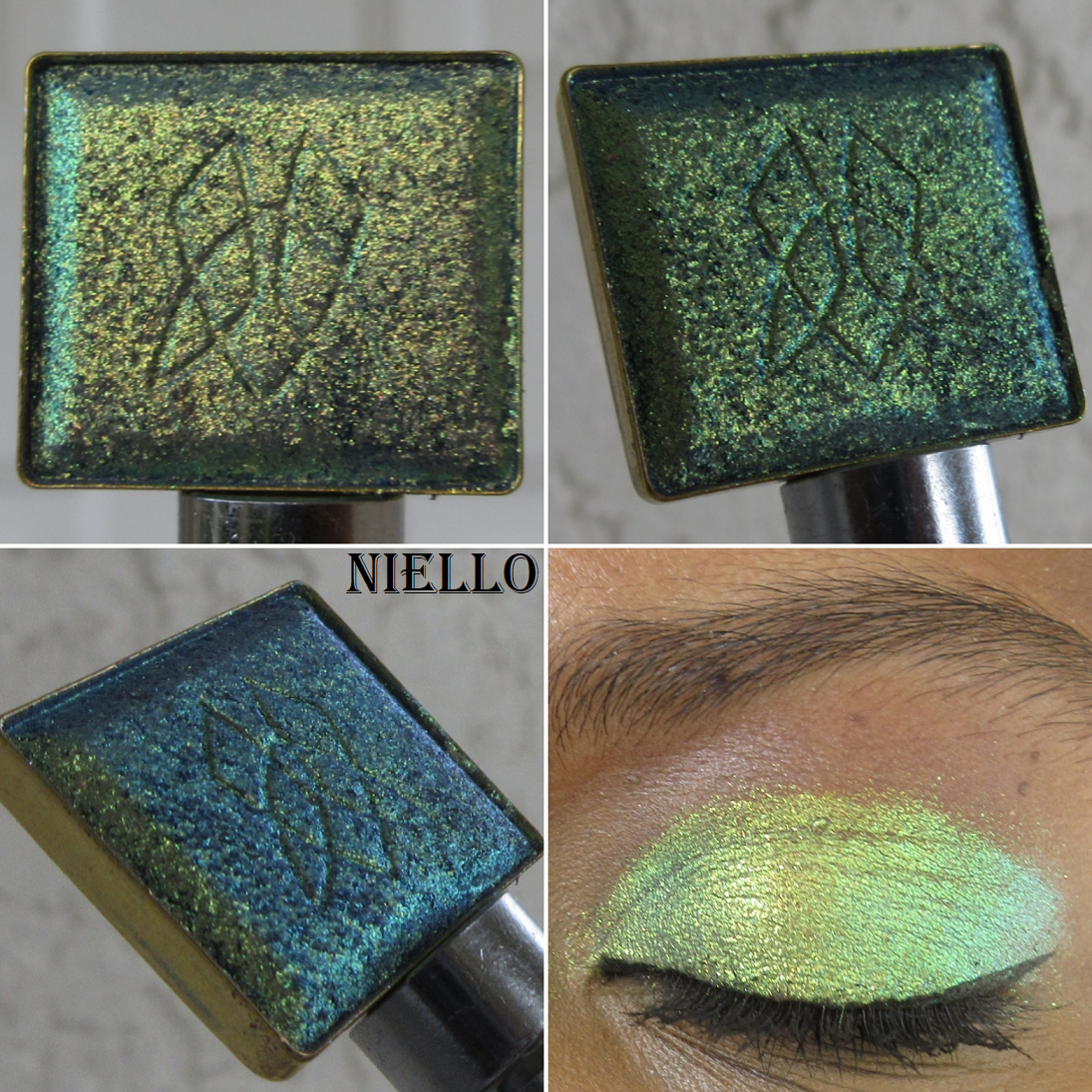
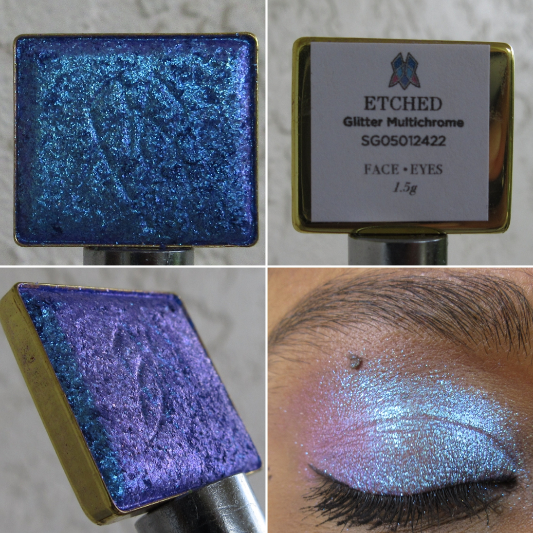
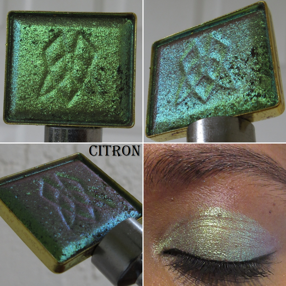
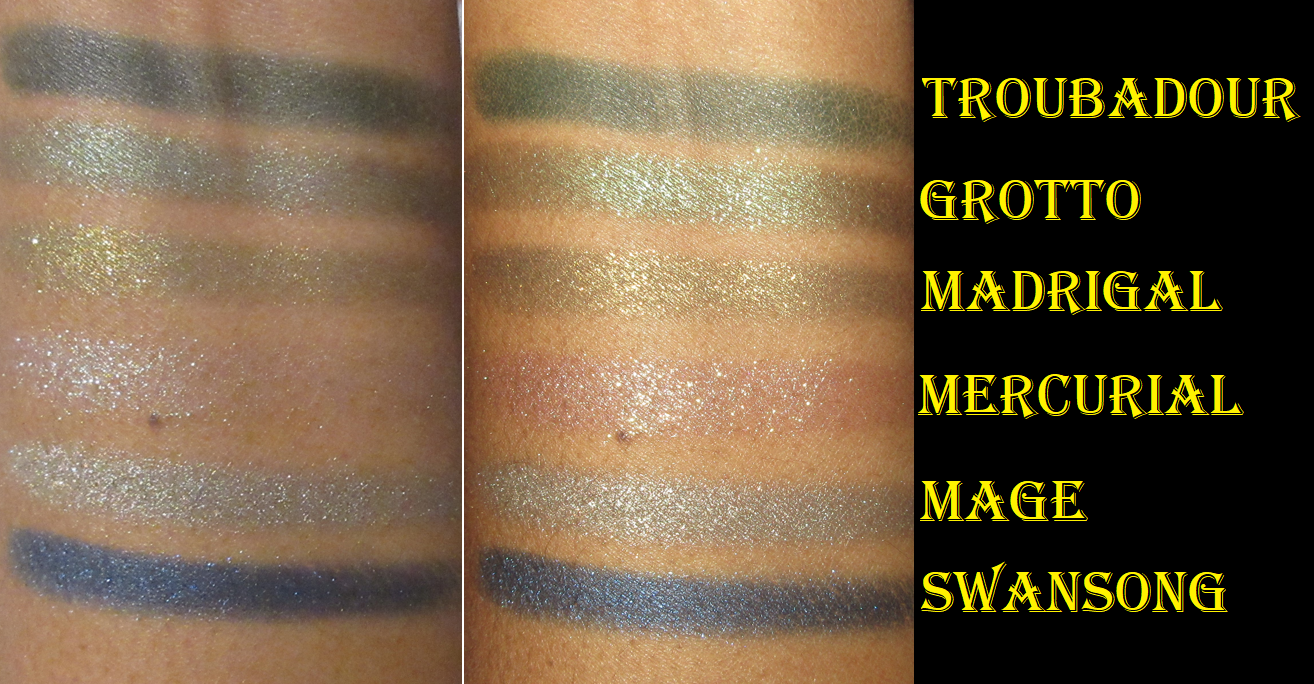
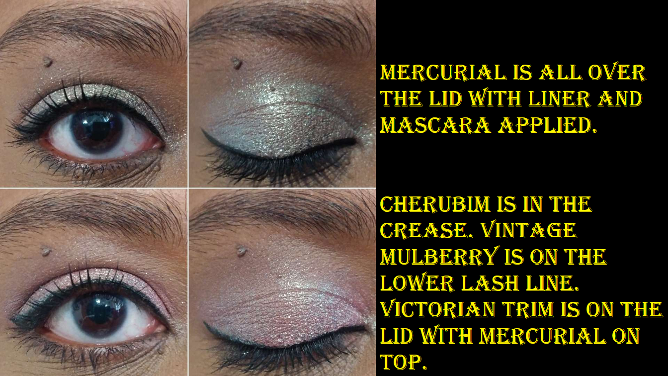
Luminous (1 of 3) – Mercurial is the only Luminous finish shadow I have, but it’s a duochrome. I don’t know if the others are as sparkly as this one, but the website description about giving either a light wash or intense top coat effect is accurate. This finish is way more impressive as a topper than the actual Top Coat shadows and is a bit grittier (just in comparison to the insanely smooth texture of some of the other shadows). It’s also easier to build up the opacity than the shade Grotto, which is supposed to be “full on [and] glittery.” I usually prefer to apply shimmers with my fingers, but I get a little fallout with Mercurial, so I tend to start with a brush and then pack on an extra layer with my fingers. Sometimes, I’ll just use it on top of Glitter Glue/Primer.
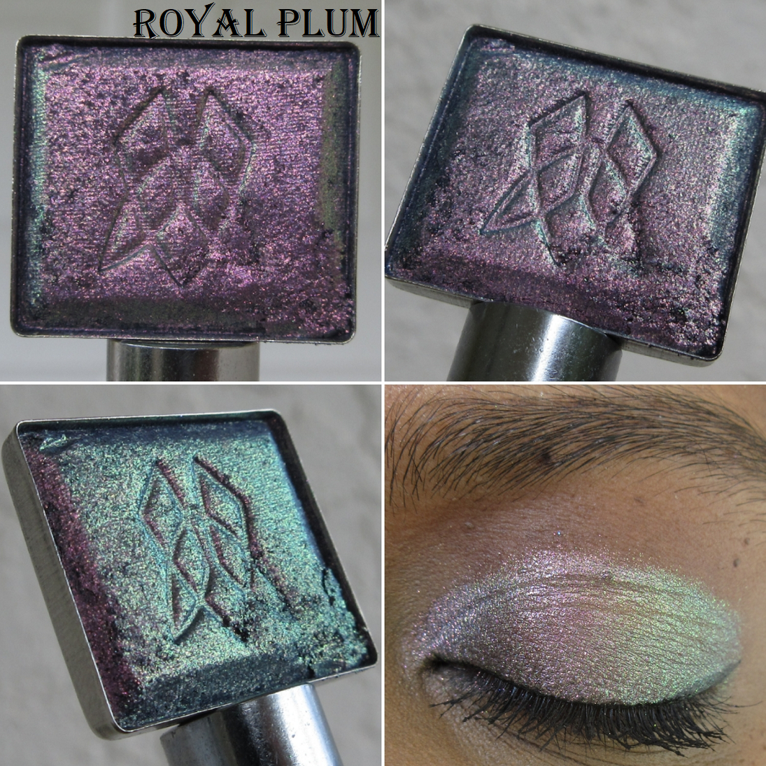
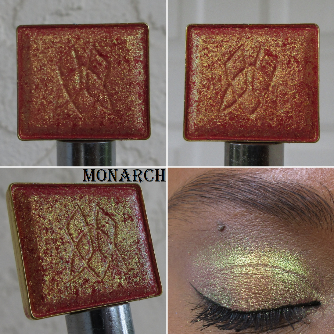
Metallic (2 of 2) – The Metallic category, at launch, didn’t have the Satin/Metallic subcategory, but I’m glad the brand updated that distinction on the website because I immediately noticed a difference the first time I tried Grotto and Madrigal versus Swansong and Mage within my Sorcery palette. Grotto and Madrigal have a visibly sparkly texture and are more reflective. Madrigal is the most special of the Metallics and Satin/Metallics, but that’s because of the tone of it and being more impactful and shiny on the eyes than the Satin/Metallics. It’s good, but I can name tons of shadows that can do the same or better at a better price. Plus, the glimmer effect dims a little as the day goes on. I’m glad it doesn’t dim down completely or fade off the eyes, but for $16 each, I expect more. Grotto is a shadow I really despised in the beginning. It’s much thinner than Madrigal and I have to apply more layers to get it to show the color and not just the sparkle. The website says, “Both metallics can be applied with fingers for full opacity, or as a wash with a brush,” and Grotto is much more prone to being a wash. I hated that quality at first because it was getting lost in my eye looks and blending too much into the other shades, but I’ve grown to appreciate it slightly more with time. The main reason being that it makes it easier to transition between other shades and also can add a greenish tinge to shadows for an interesting twist. I don’t like that this one fades, but it stays pretty for a while. I would still prefer to use many other greens in my collection over Grotto, so that one isn’t worth it. Madrigal, may be an exception. I still haven’t decided.
Satin/Metallic (4 of 7) – What makes the Satin/Metallics different is the smaller glitter particle size and smoother (satin) texture. These have much lower reflect than the shimmers and metallic shadows I’m used to, though they are a little more sparkly than satins from most other brands. The shimmering quality isn’t intense enough for my liking at all. What they have going for them are the pretty shade offerings and the opacity level. They aren’t “chunky” but a little goes a long way in spreading across the lids, but trying to build it up won’t make it any more intense. As flattering as the tones are, they’re not worth the single shadow price to me.
Top Coat (1 of 2) – This one I genuinely hate, and I don’t use the word “hate” lightly. It’s so difficult to pick up the product. Then, it hardly adds anything to the look after packing it on the lids, no matter how many times I try to build up the layers or even if I apply it wet or with a glitter primer. To be fair, in the website description and in Lisa’s launch video, it’s made very clear that the Top Coats are intended to be subtle. However, a good top coat eyeshadow for me is one that is the opposite and is the most glittery and sparkly type of finish of them all. I didn’t even wait for this review to be posted before I replaced it with Cherubim in my Myth palette. I will never buy one as a single from the brand.
Illusionism also keeps giving the appearance of being about to hard-pan, but since I’ve had trouble packing on the shadow from the beginning, I can’t tell if it actually is starting to or not.
Lustre (0 of 1) – This one I don’t own, so I cannot say what it’s like. I would have purchased Taffeta Fan to try out if the refill option hadn’t sold out. According to the website, “The densely packed, smooth and extra small pearls gives this texture a soft lustrous, pearly finish.” Since the “soft” shadows or shadows with the option to be applied softly haven’t been entirely worth it to me to purchase, I may have lucked out in not being able to buy it, as it sounds like it won’t be my preference.
I’ve had the most success using these shadows with the Gerard Cosmetics Clean Canvas and Coloured Raine Eye Base. MAC Paint Pot and the Makeup by Mario Eye Prep had a tiny bit of creasing, but nothing that obvious. They worked better when set with powder though. So, I recommend using a primer that fully sets but isn’t too drying either. This prevents creasing and aids in longevity. In addition, wetting the non-mattes helps to bring out the shine in the eyeshadows, but it’s a temporary fix. After a while, it goes back to looking however intense it was prior to being dampened.
Also, I have been enjoying using the Velvets and Seamless Mattes with eyeshadows from other brands too. They layer well and the Velvets work like paint in being able to make shadows a little more pink, purple, etc when added on top.
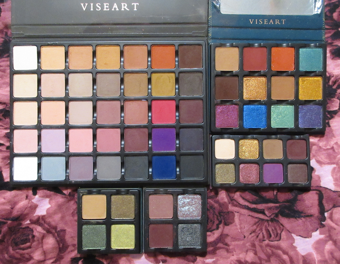
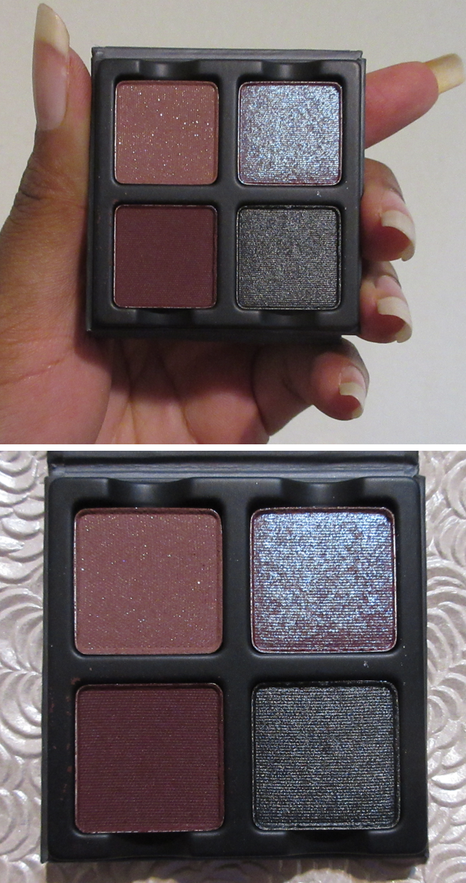
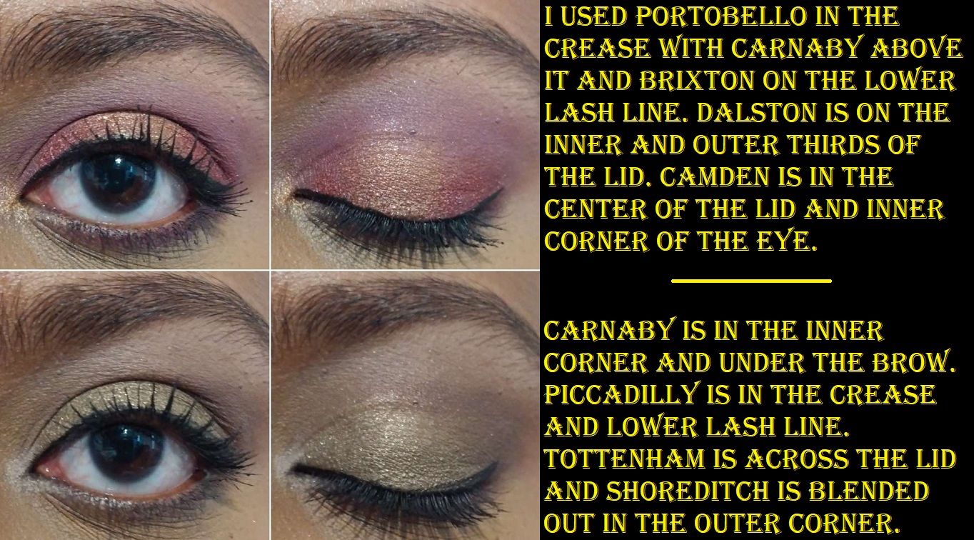
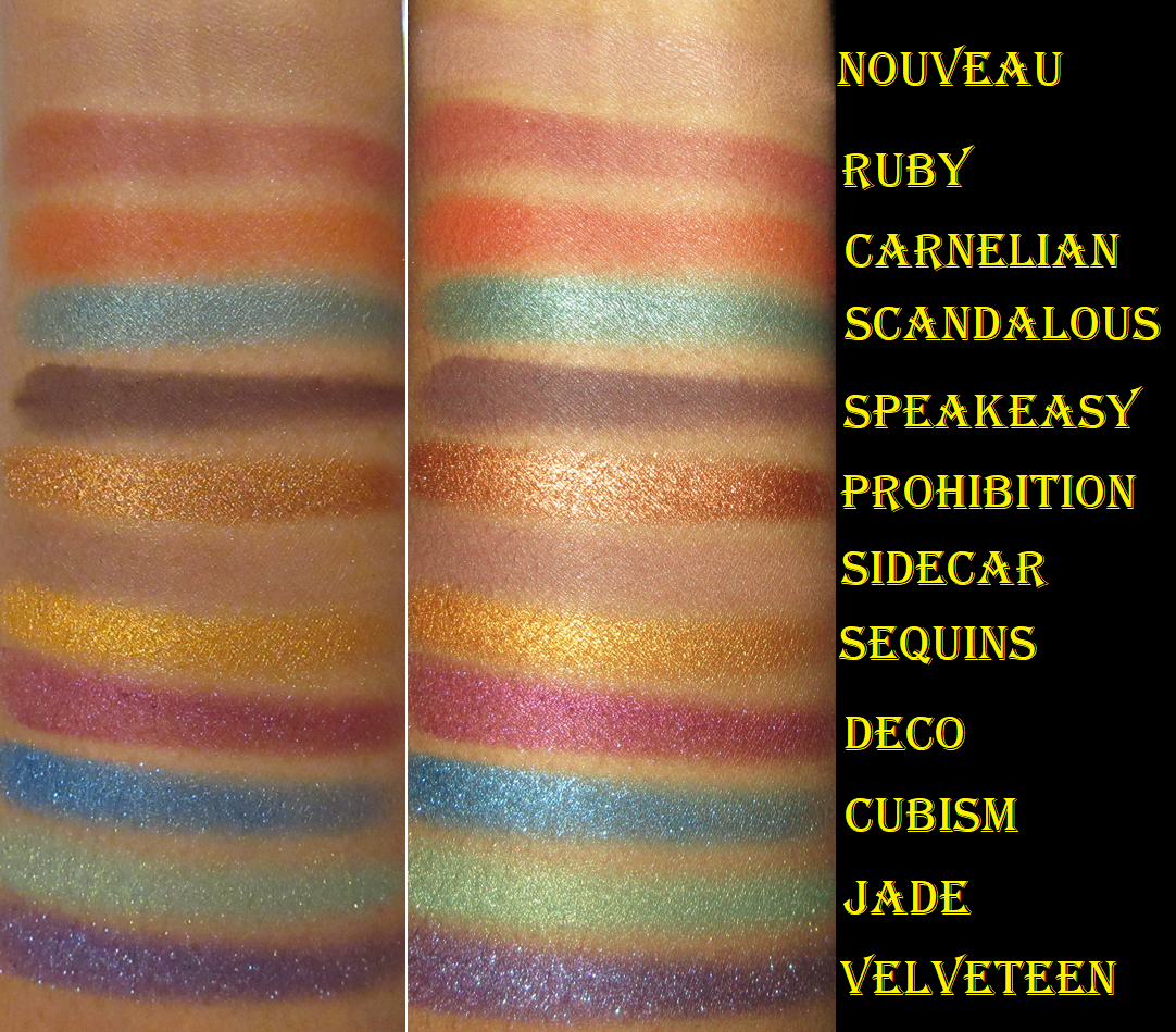
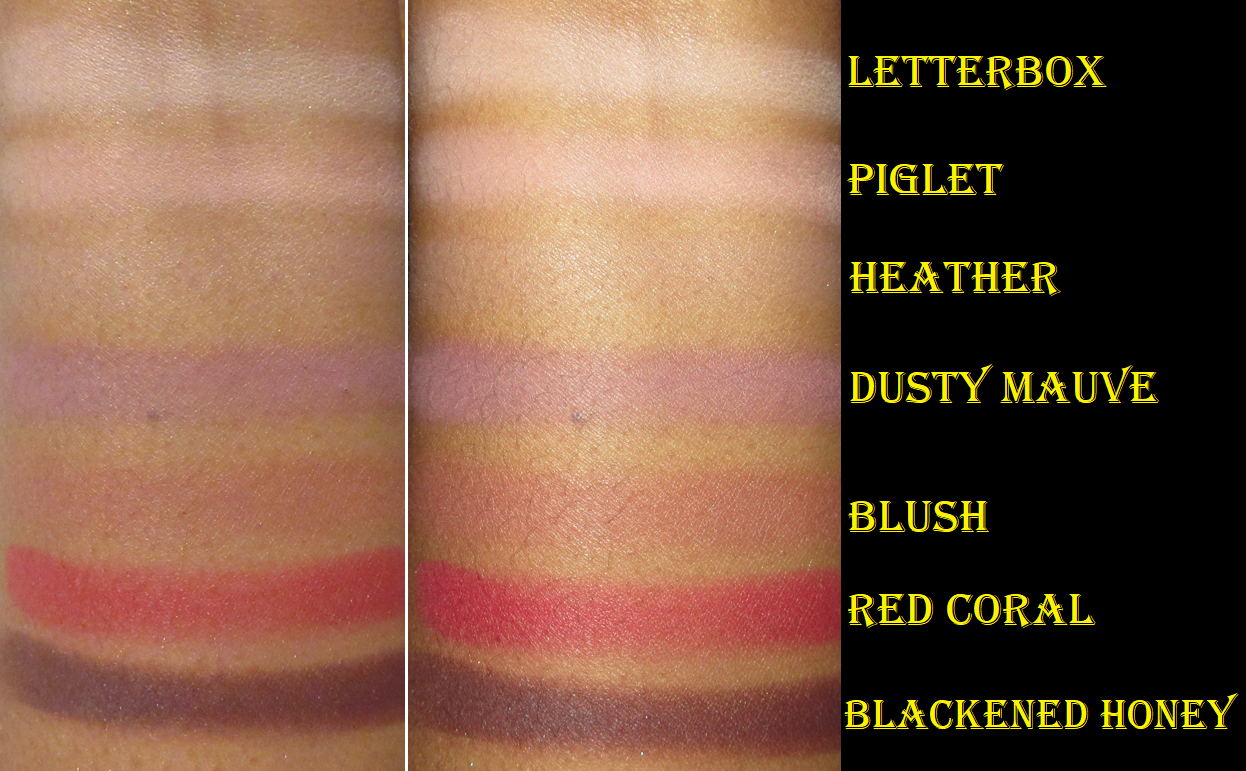
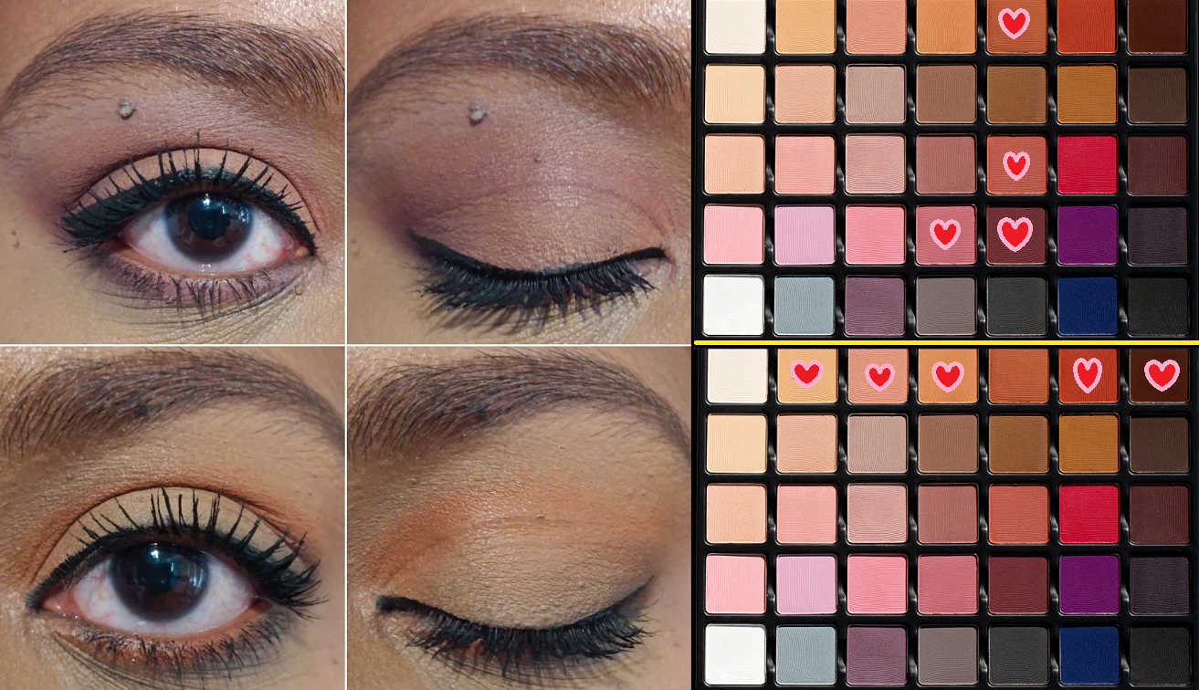
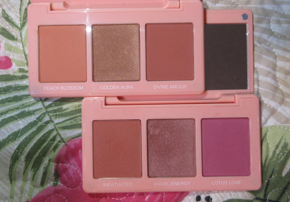
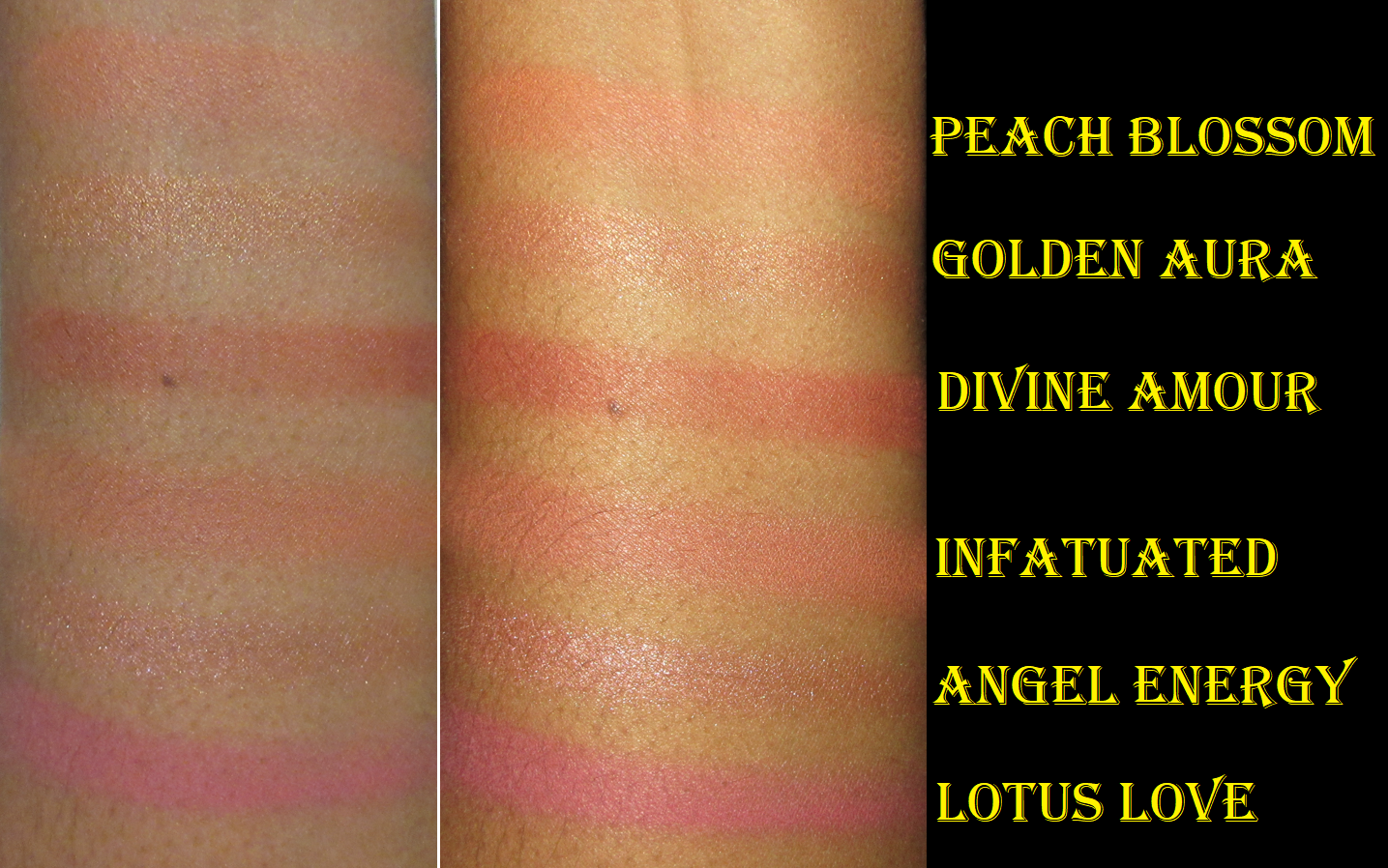
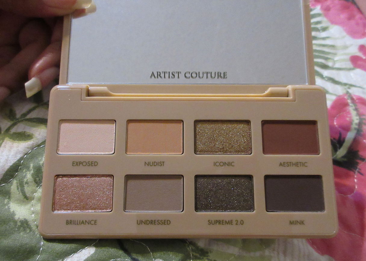
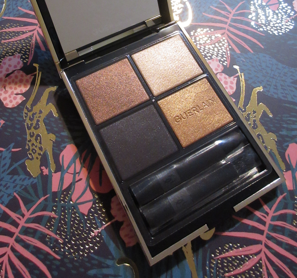
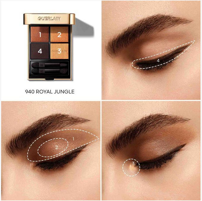
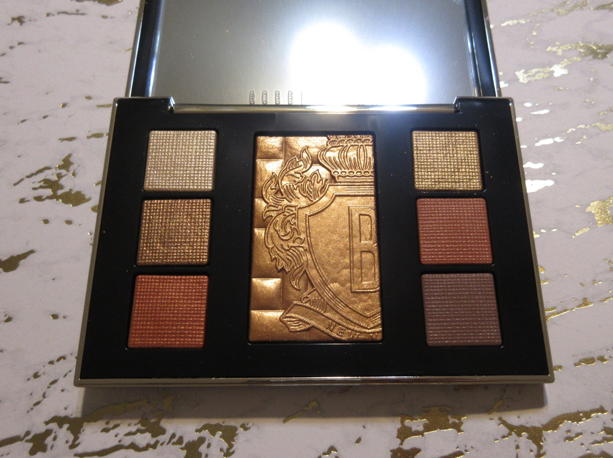
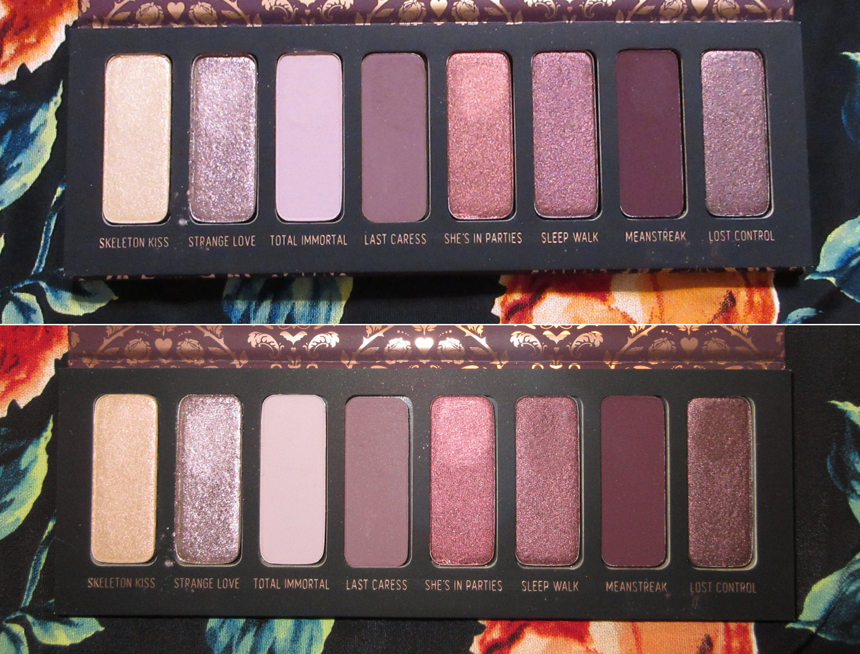
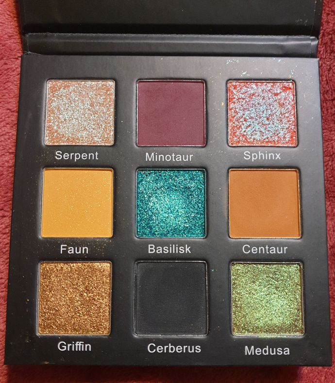
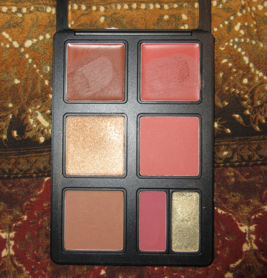
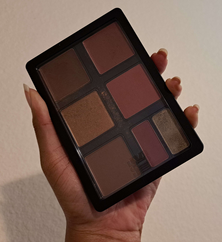
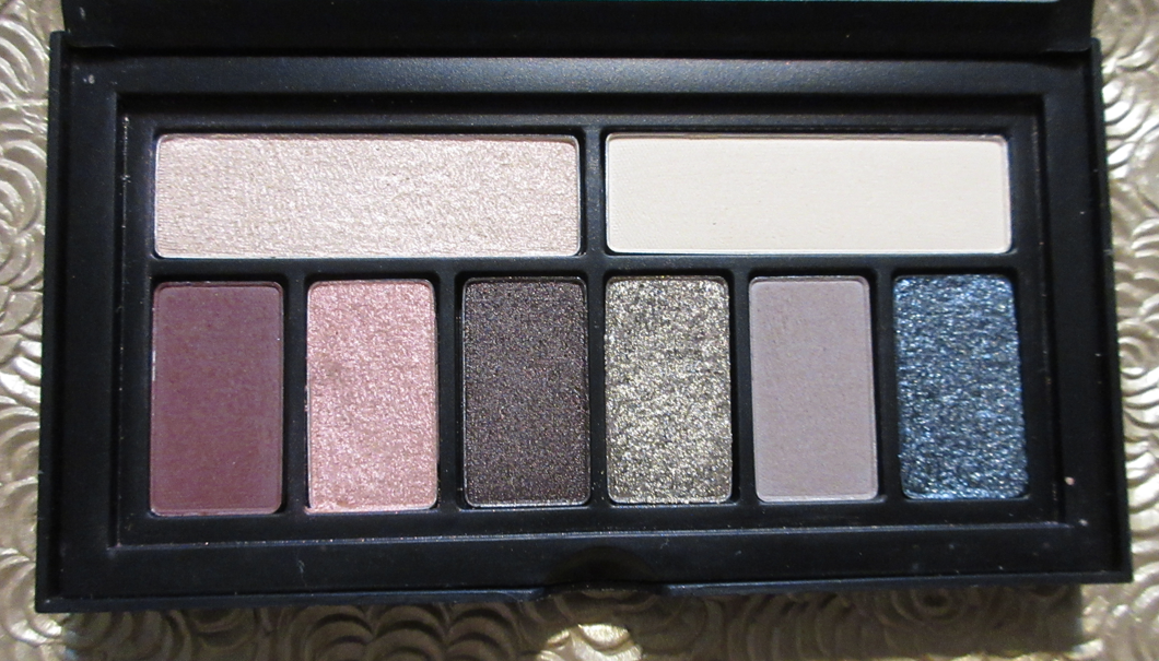
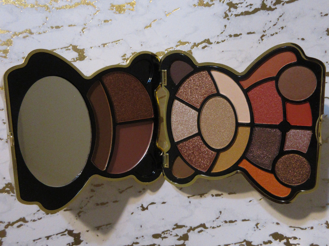
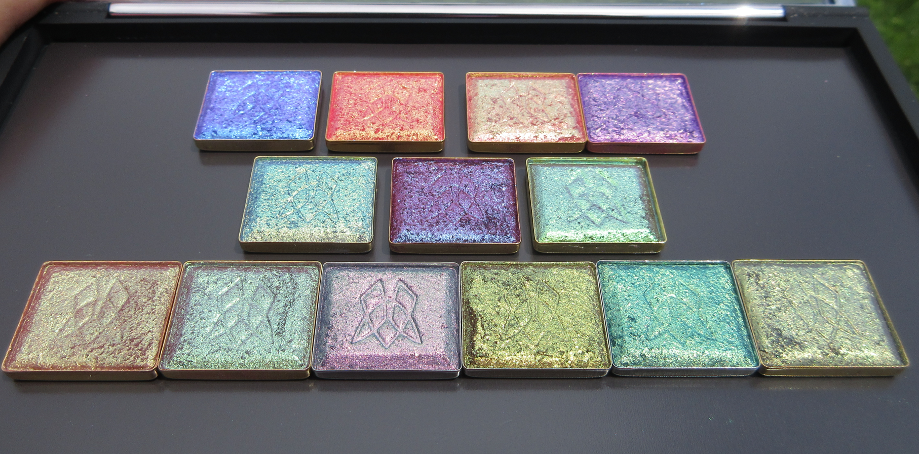
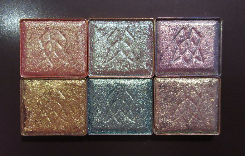
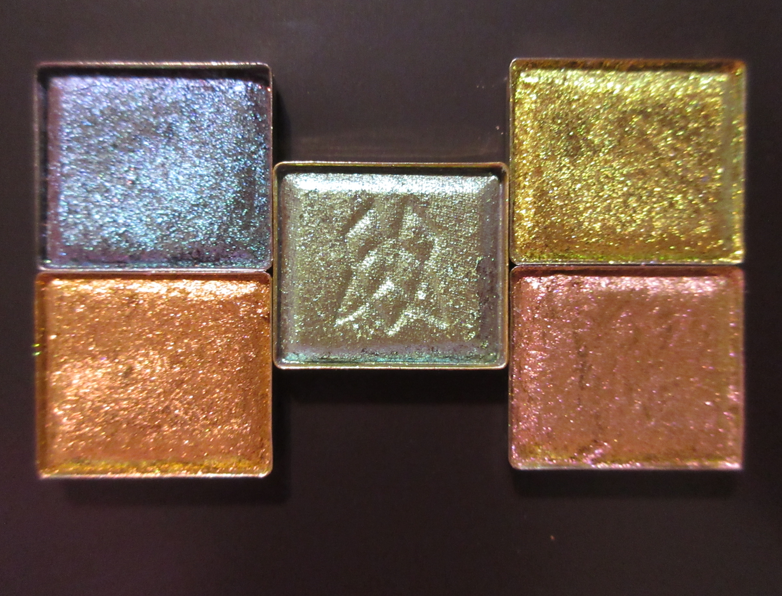
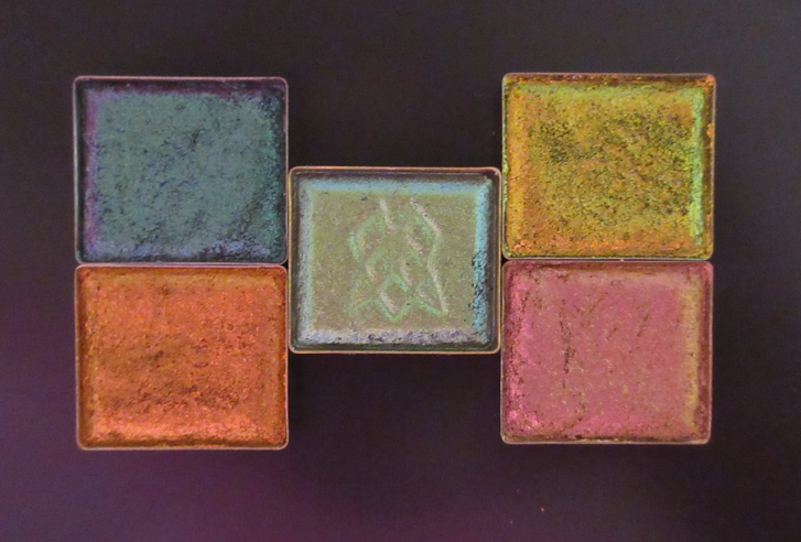
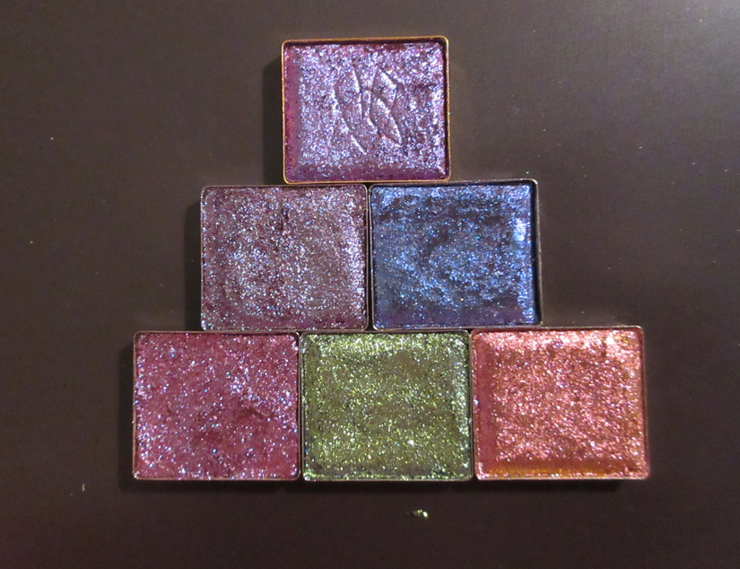
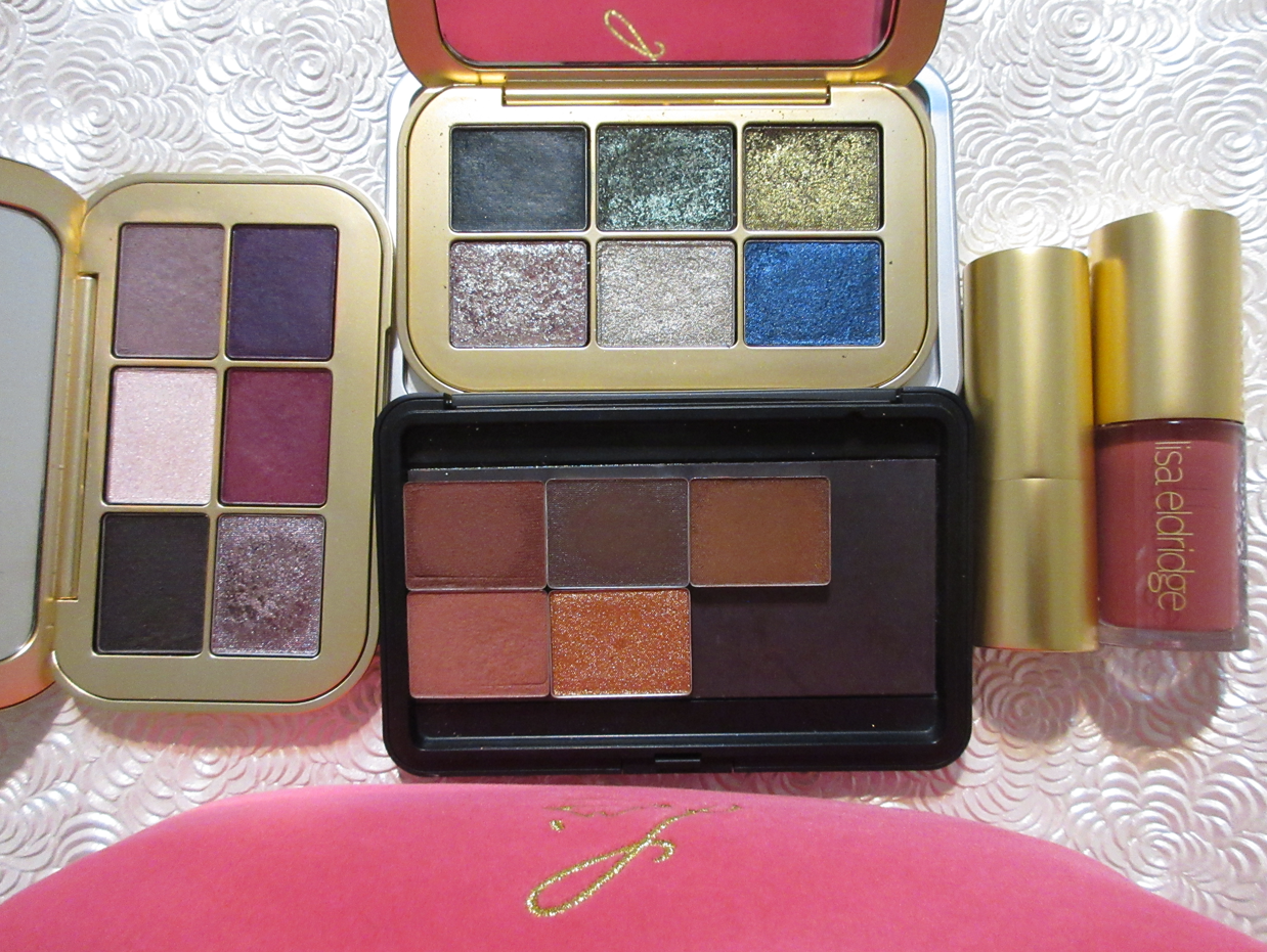
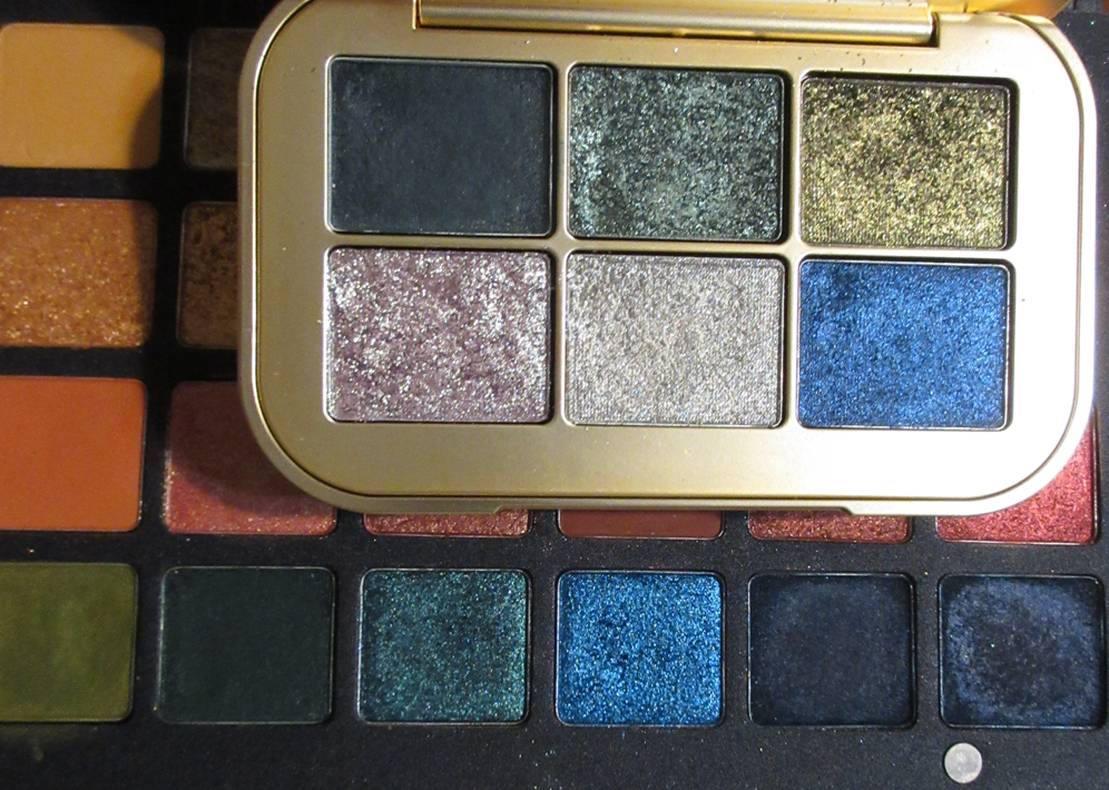
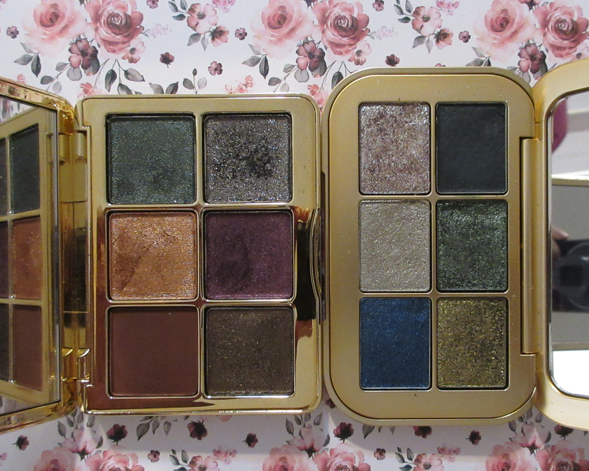
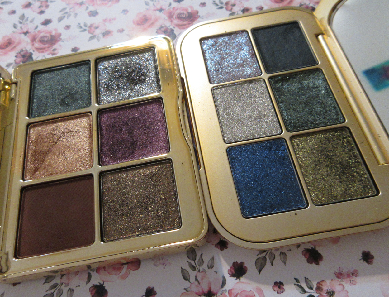
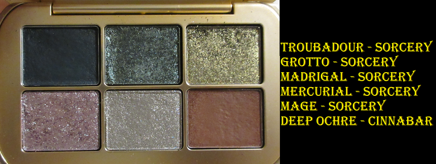
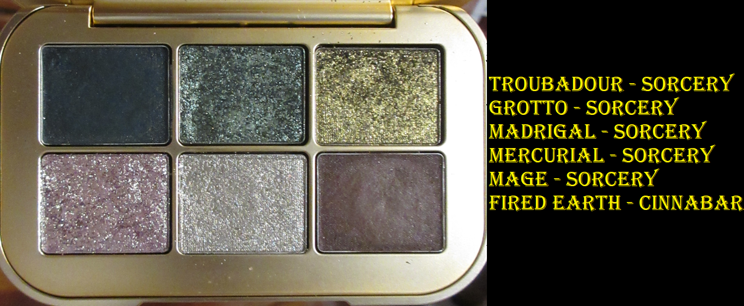
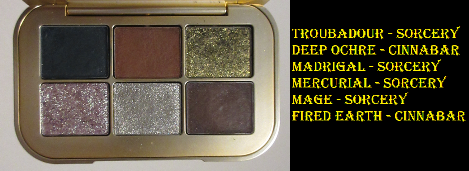
Sorcery Eyeshadow Palette
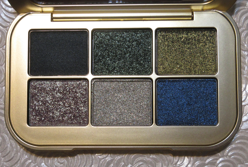
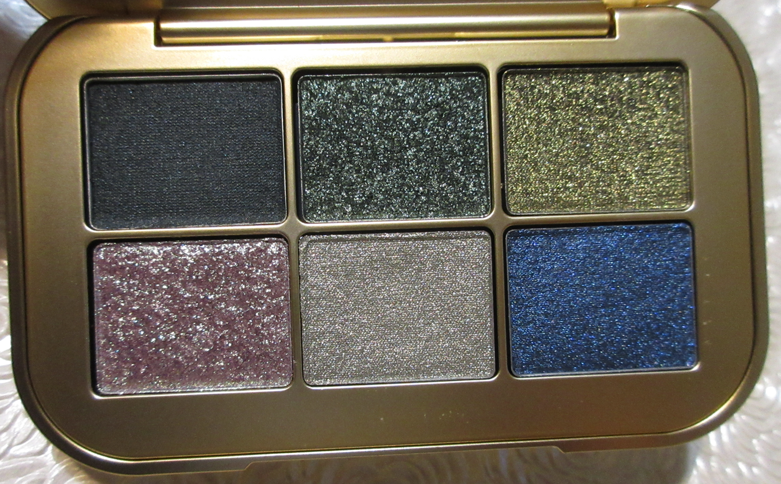
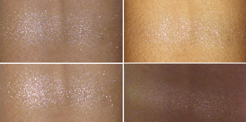
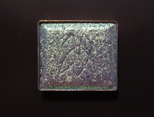
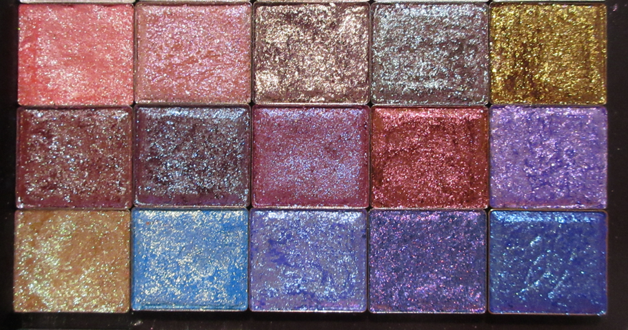
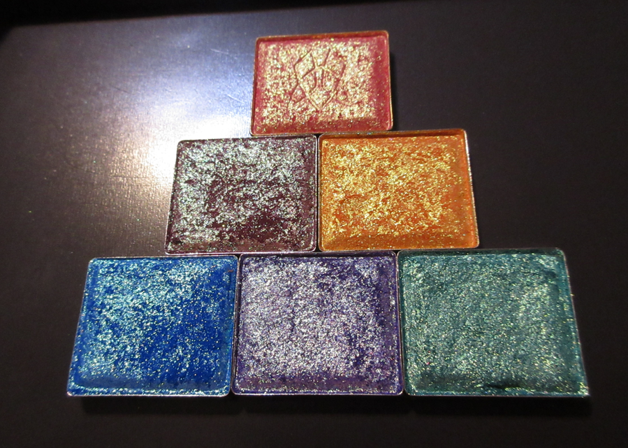
Just looking at the pans, the textural differences between the Seamless Matte, Luminous Duo, the two Metallics, and two Satin/Metallics are evident. The Luminous is most sparkly of all and the Metallics have larger particles than the Satin/Metallics.
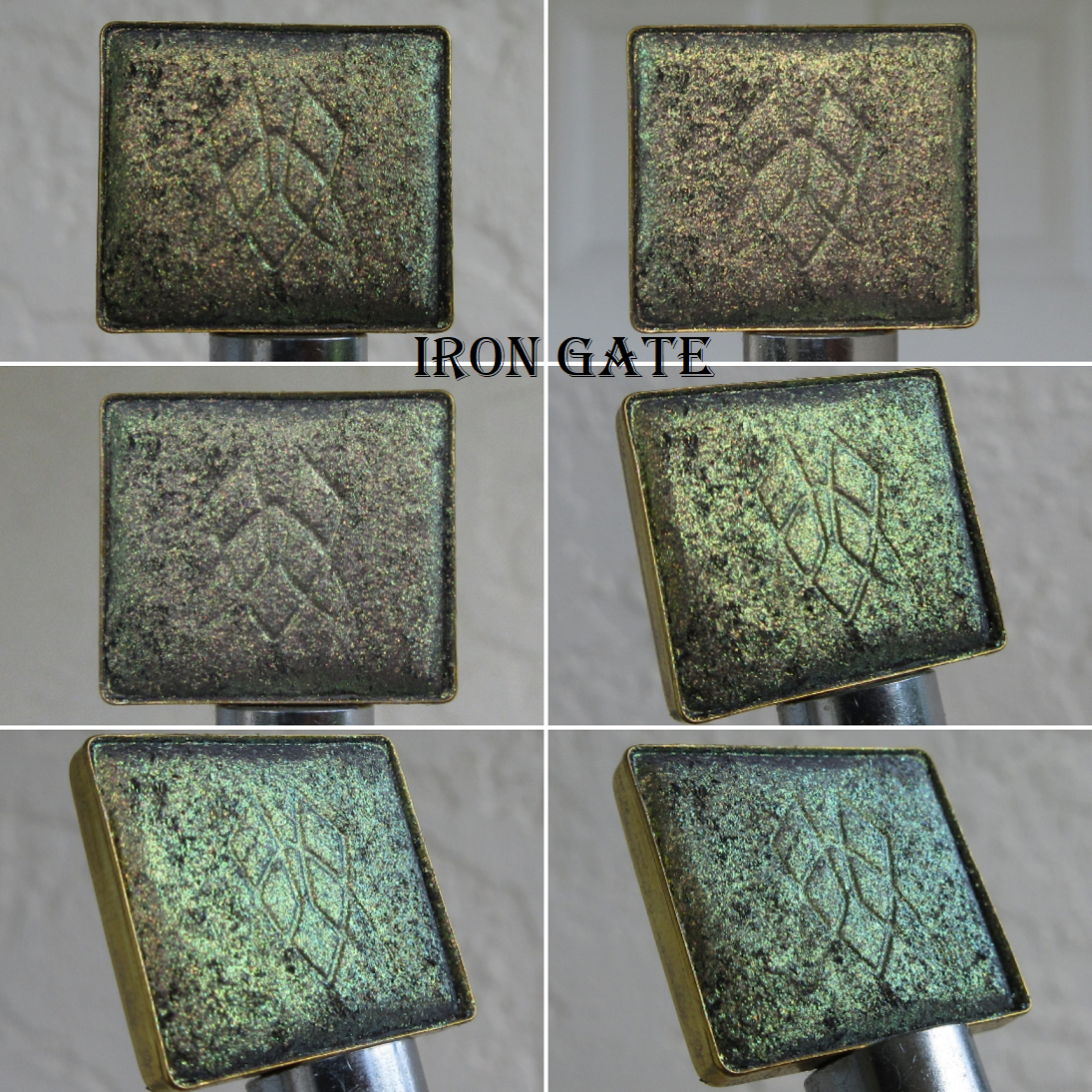
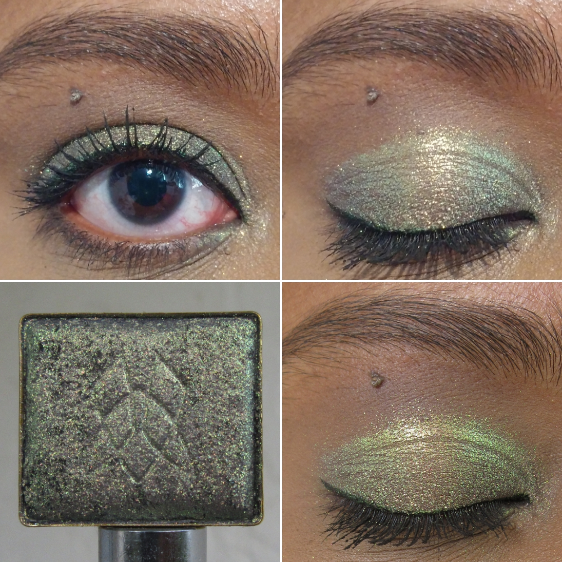
Sorcery was the first palette to sell out, which is unsurprising to me because it contains the brand’s only duochrome and this has been the year of the green eyeshadow palettes. All of these shades appeal to me (although I’m still in an anti-blue phase but I can still even appreciate the beauty in the vibrancy of Swansong).
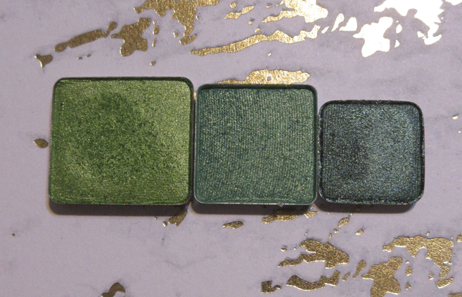
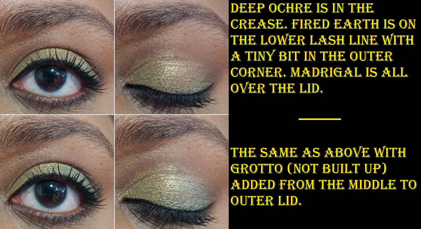
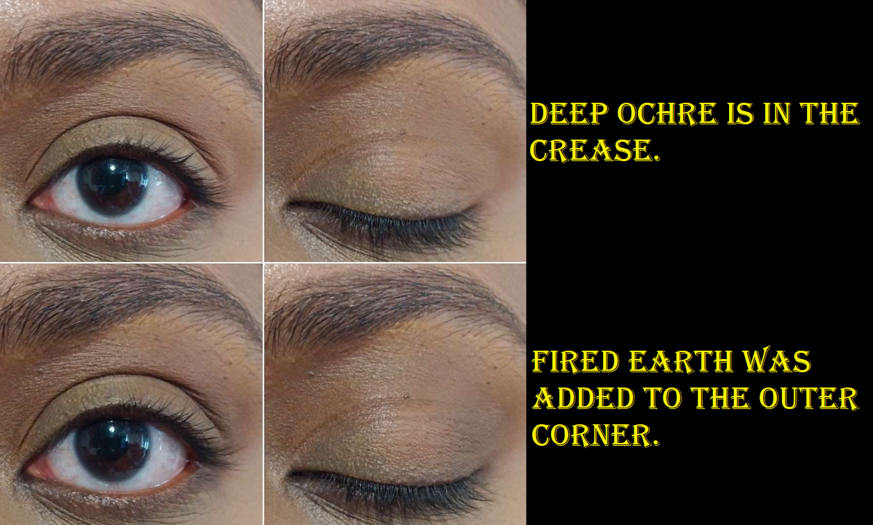
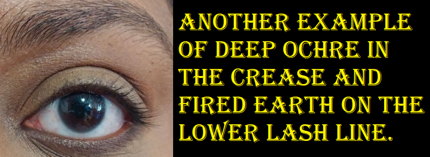
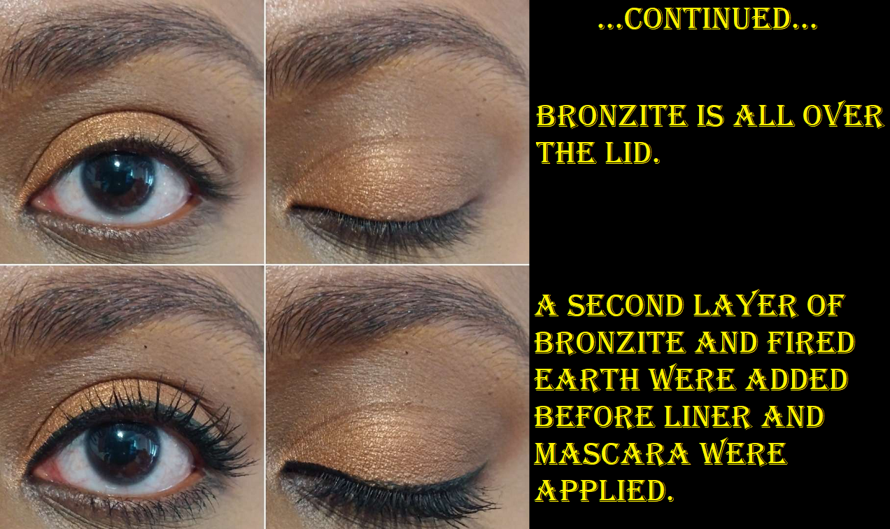
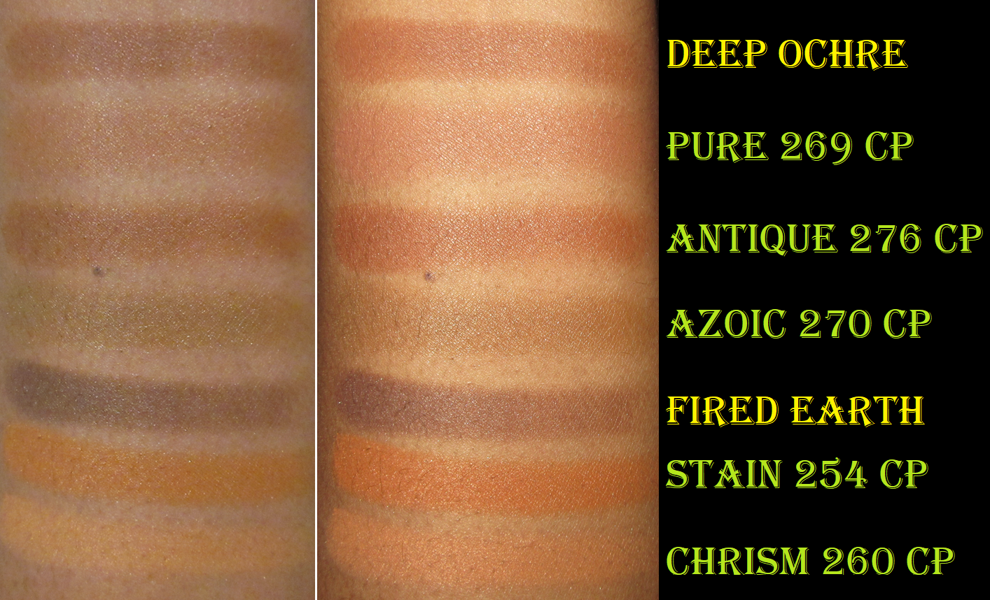
I understand that the inspiration for this palette was a peacock tail, and so the blue was necessary. The fact that Troubadour is a very blue leaning green helps to tie Swansong to this palette, but that makes both deepening shades in here blue. I found myself wishing I had either a dark brown to tie in with the greens and gold, or wishing for a true deep green. That’s why I ended up purchasing Deep Ochre and Fired Earth in the event that I wish to remove Swansong entirely.
As a standalone palette though, Sorcery is fantastic and the one I recommend the most. Having such a special shade like Mercurial, plus a unique tone of gold in Madrigal, getting an uncommon (at least in my collection) color like Mage, and one of my favorite formulas in Troubadour makes this especially desirable out of the premade palette options from the brand.
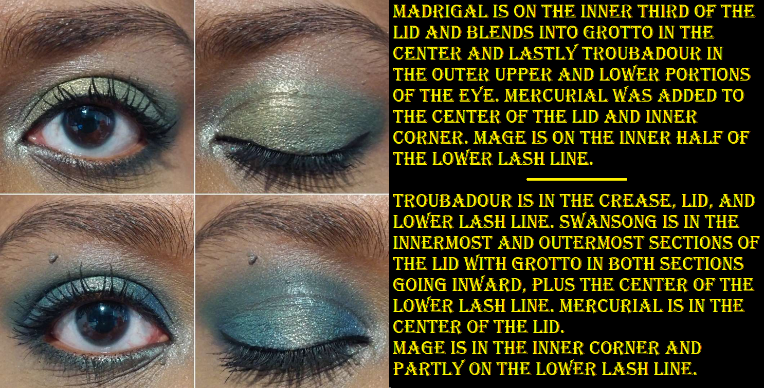
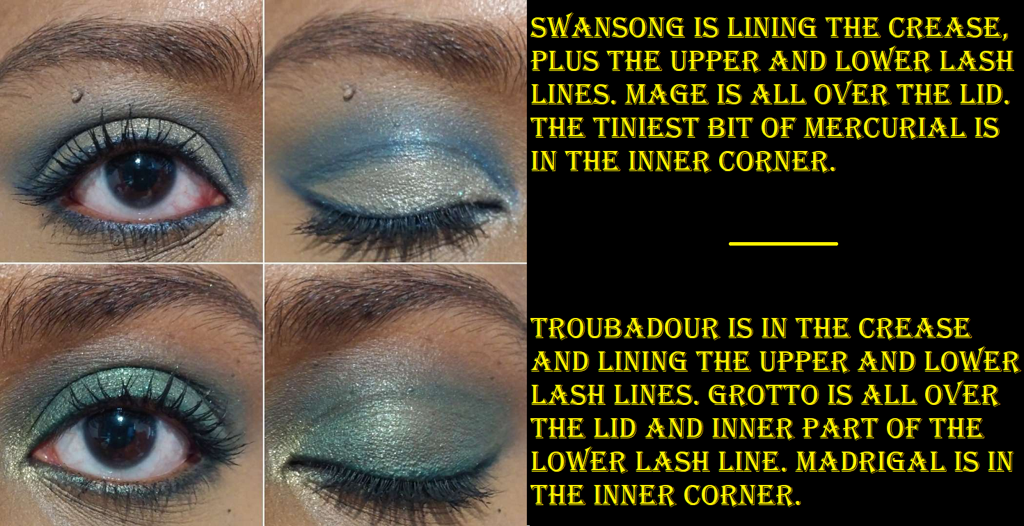
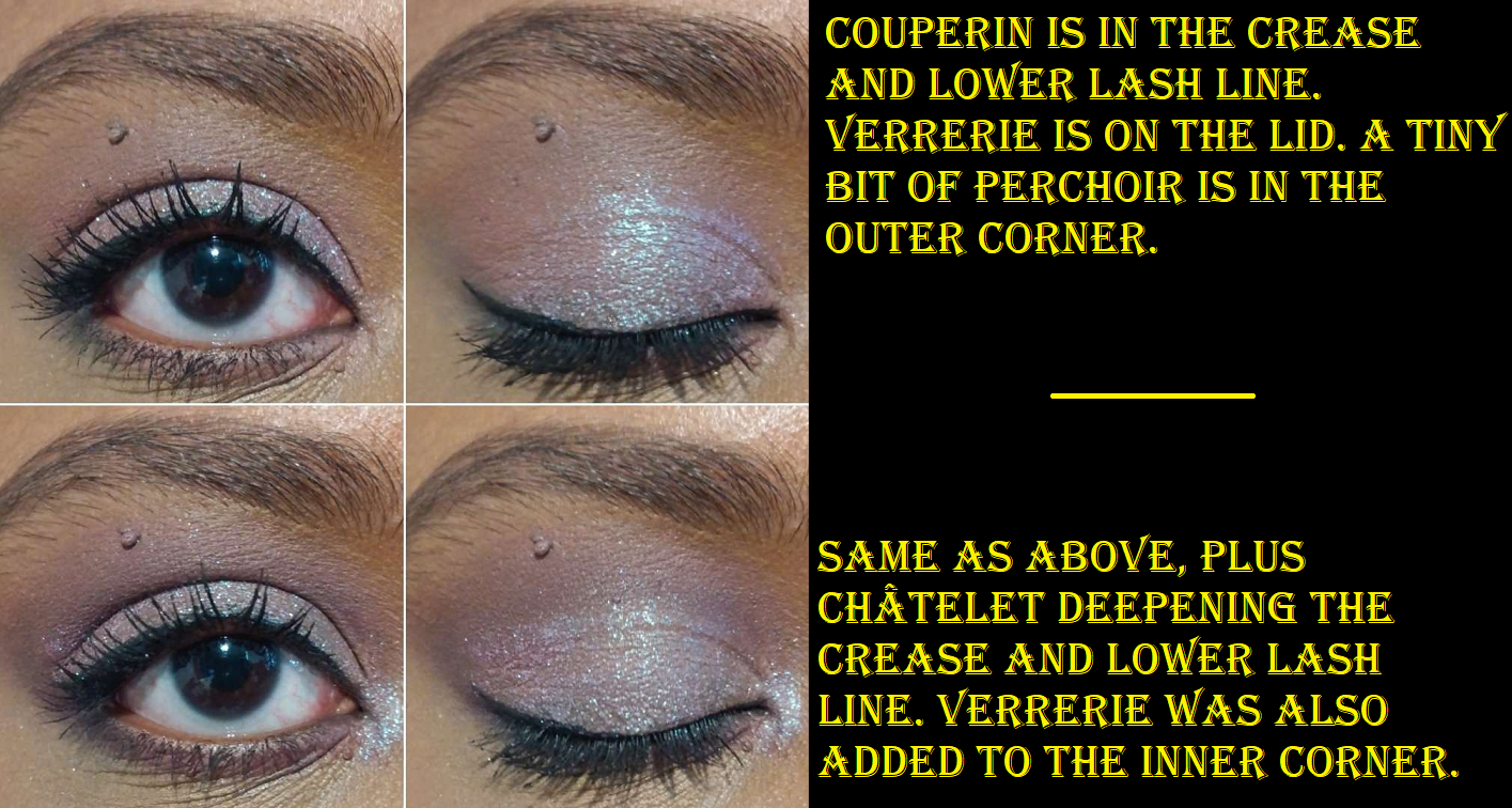
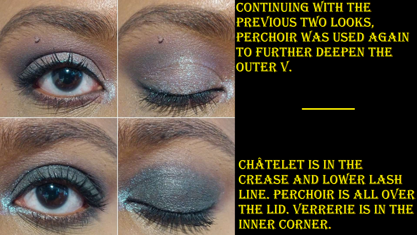
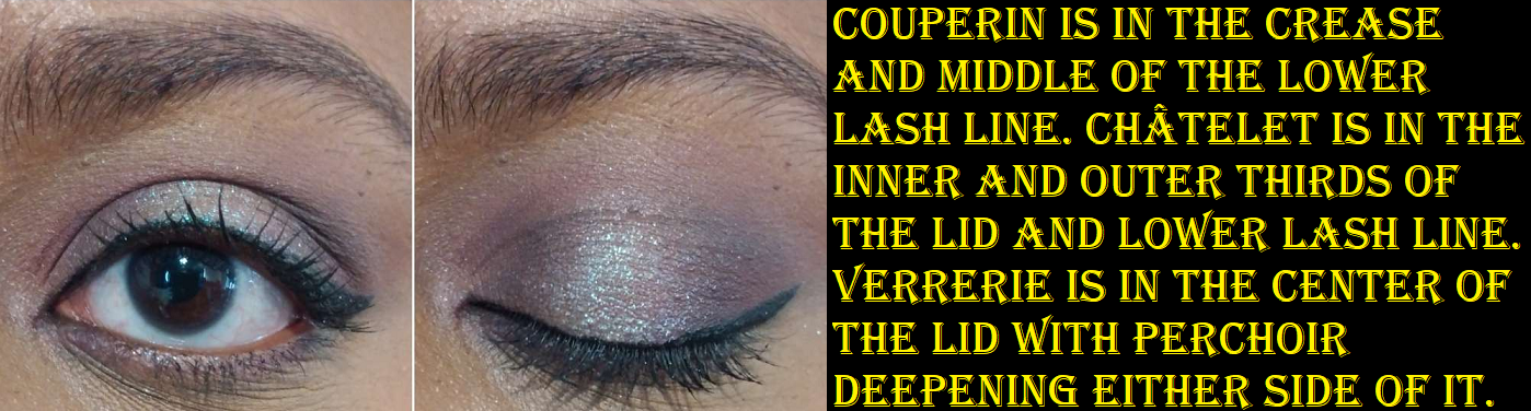
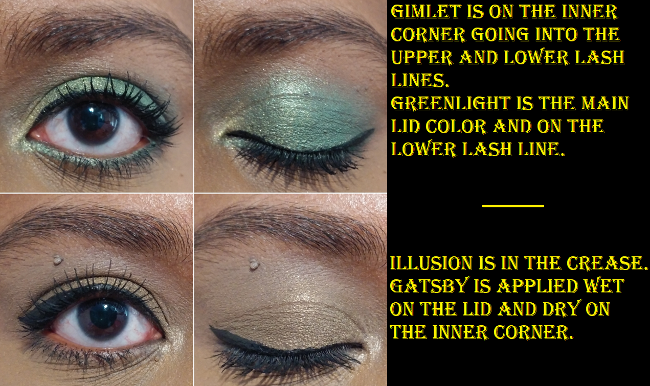
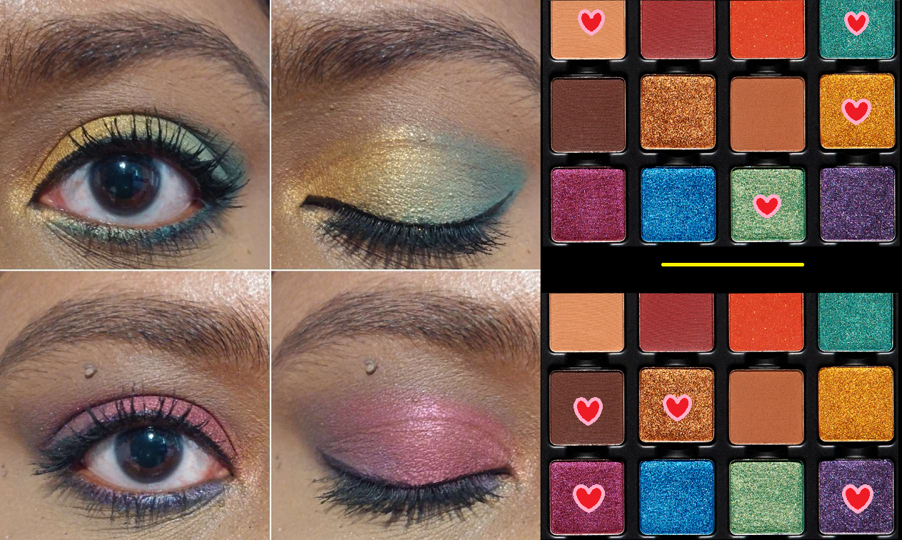
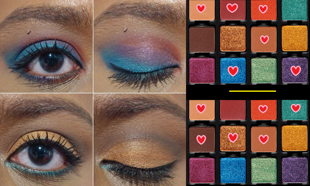
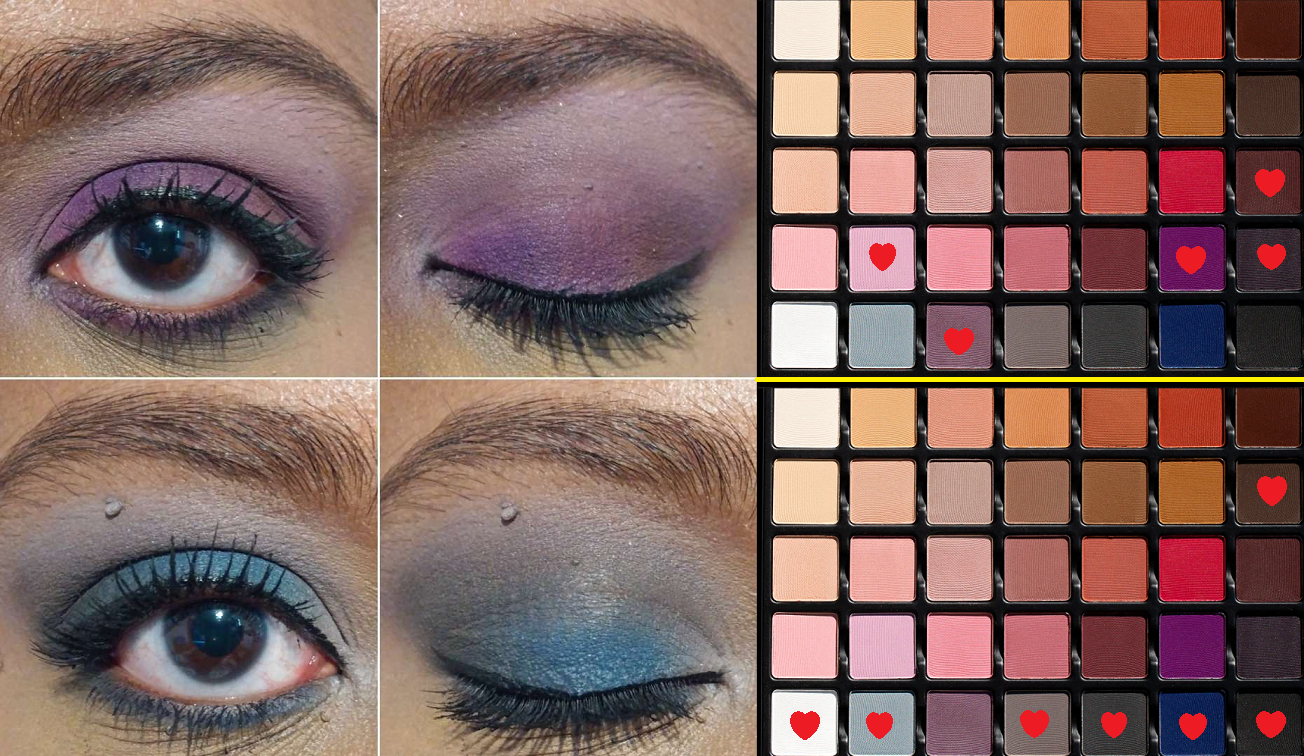
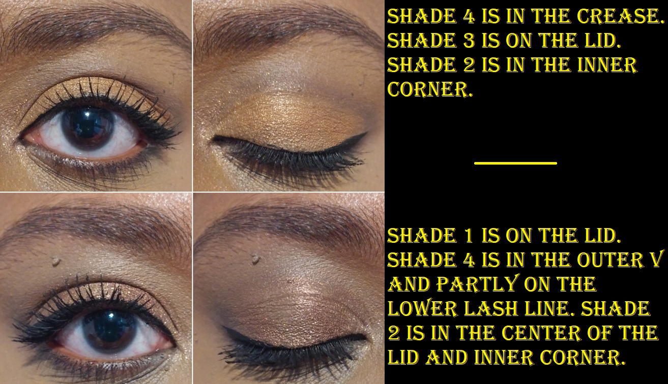
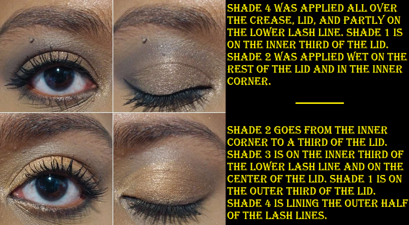
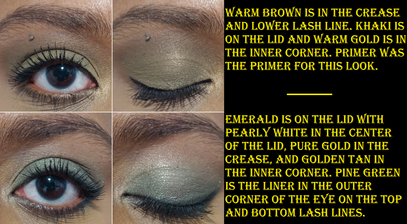
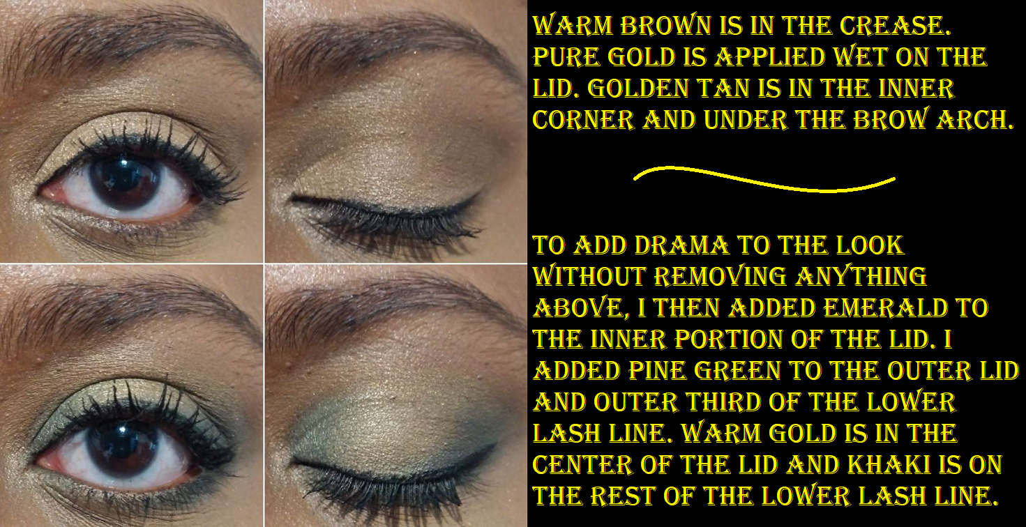
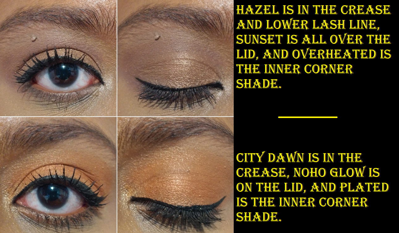
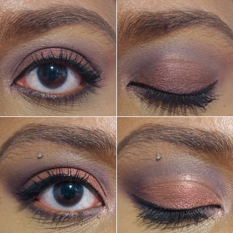
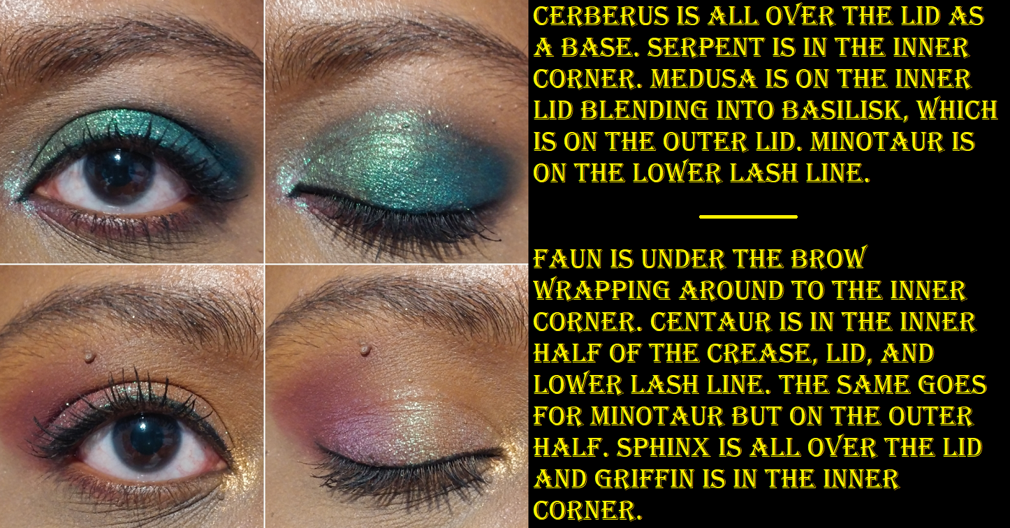
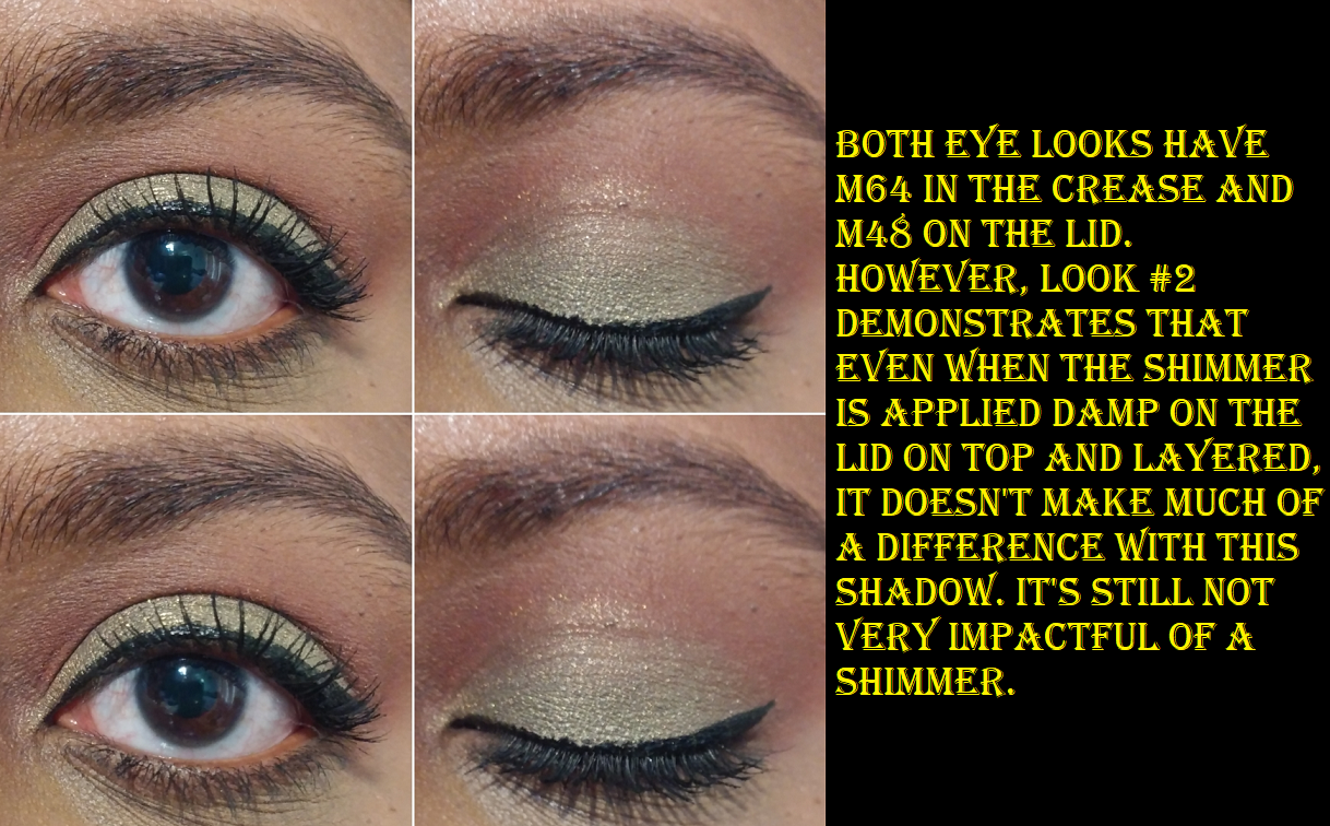
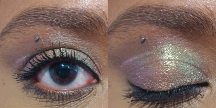
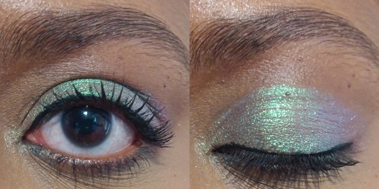
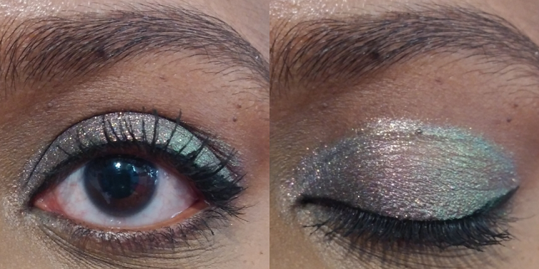
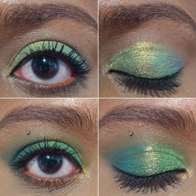
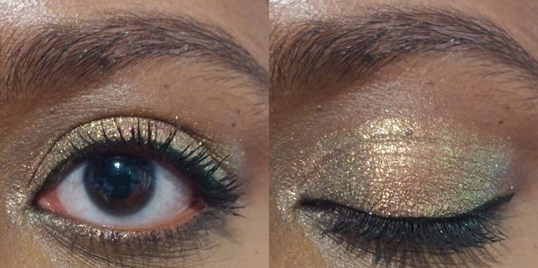
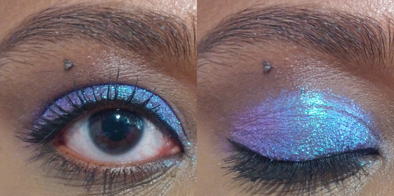
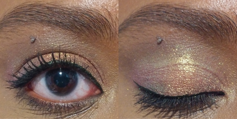
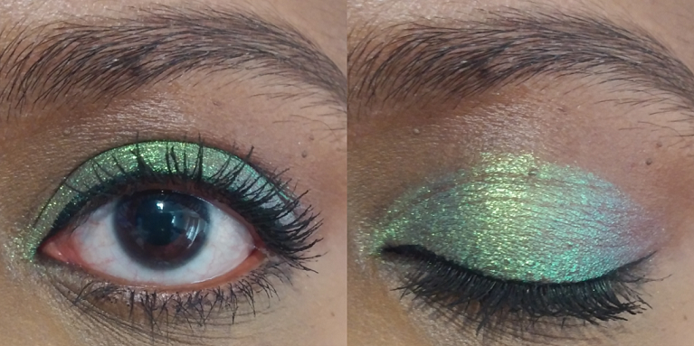
The first four eye looks were using the Sorcery palette alone. I felt that Swansong was quite overpowering in making the blue the focus point when the other shades were the ones I wanted to stand out. So, in the future, if I use Swansong, it will be as a slight pop of color on the outer corner or lower lash line.
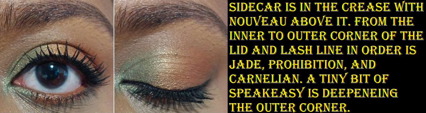
Since I purchased the brown shades, I wanted to show how I would likely use them with Sorcery. I then wanted Madrigal to look a little more green, so I added Grotto to one of the looks for a subtle tinge difference. Also, I didn’t feel that I showed off Mercurial enough, so I made sure to include an eye look using it by itself and then as a topper with other shades.
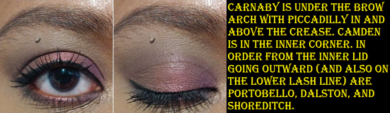
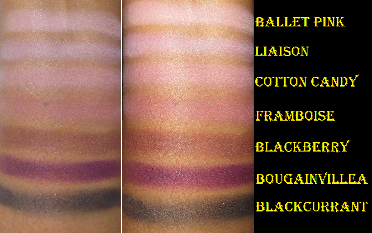
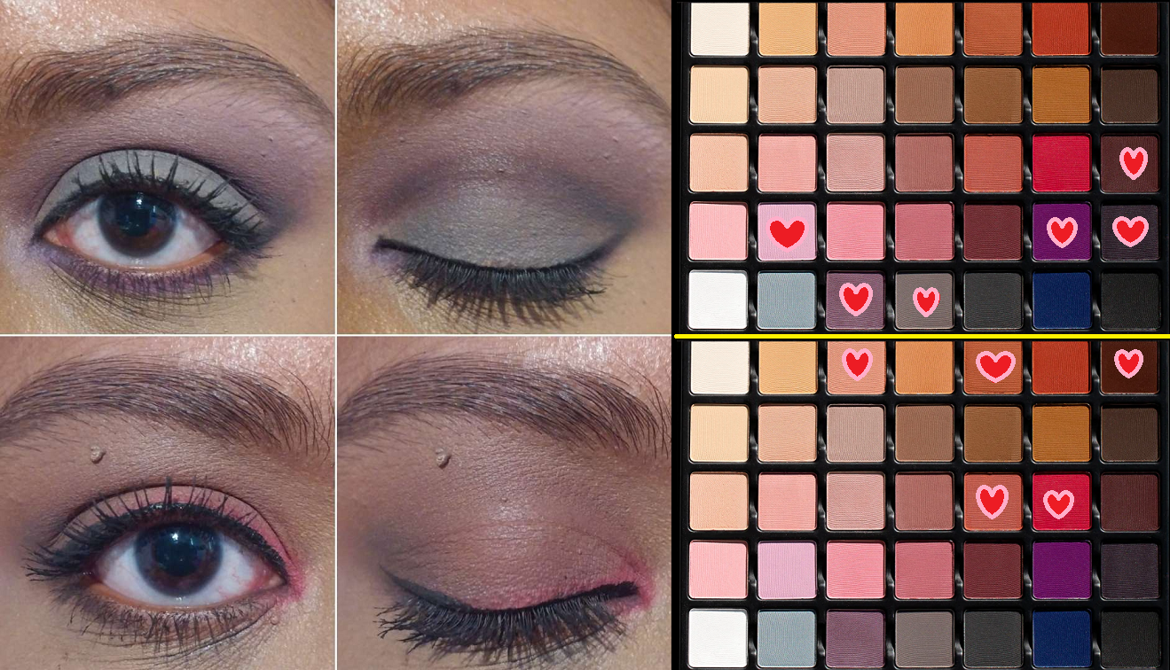
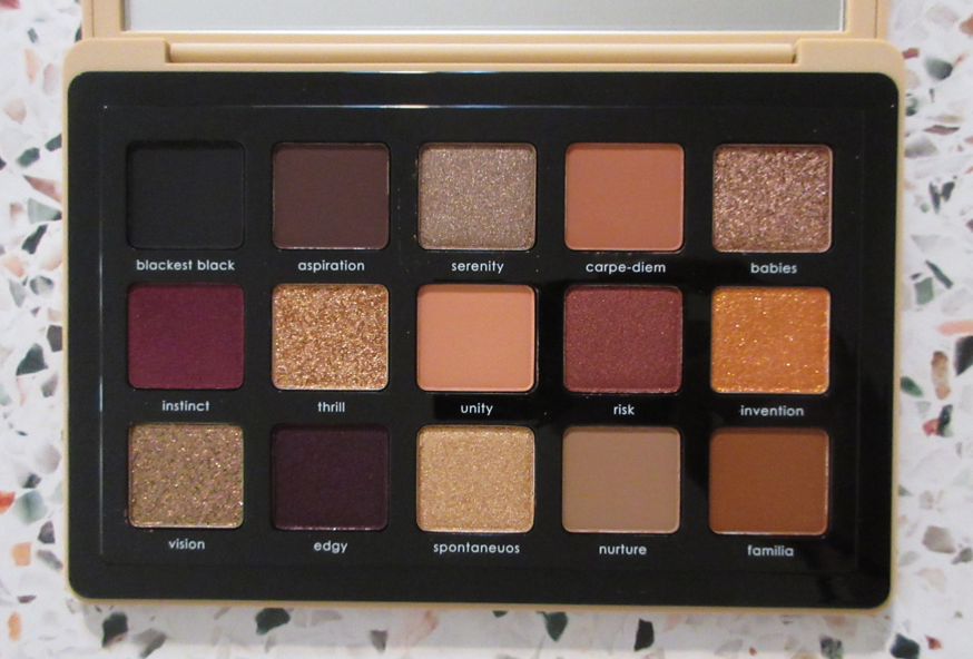
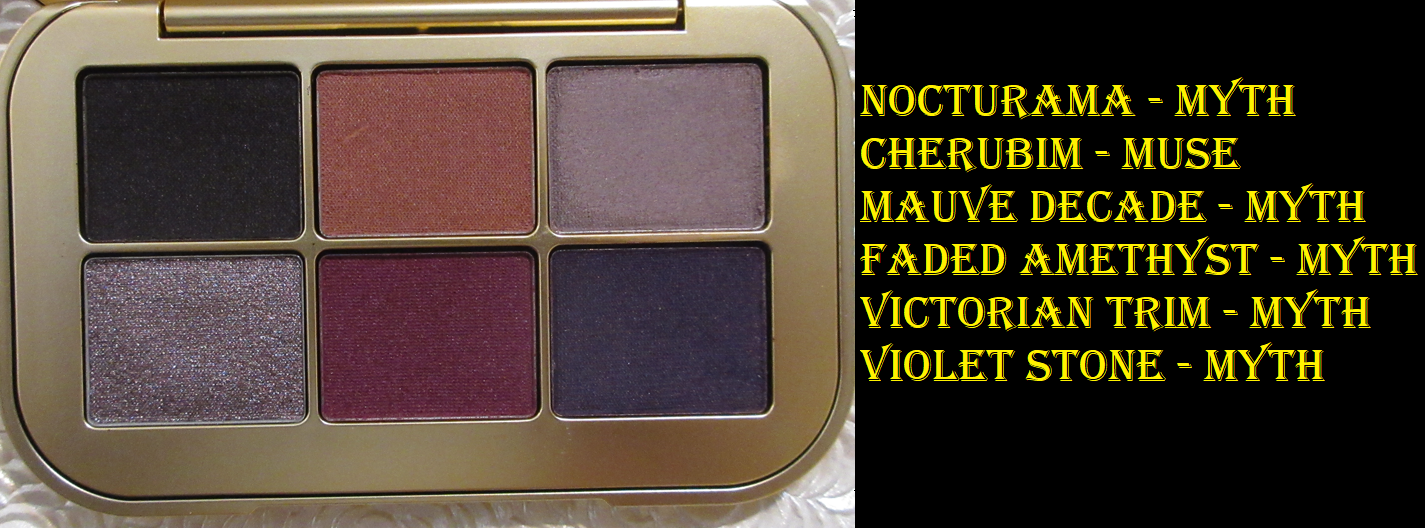
Myth Eyeshadow Palette
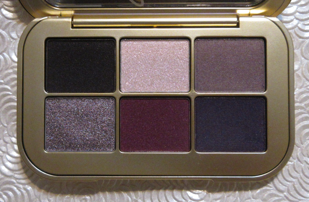
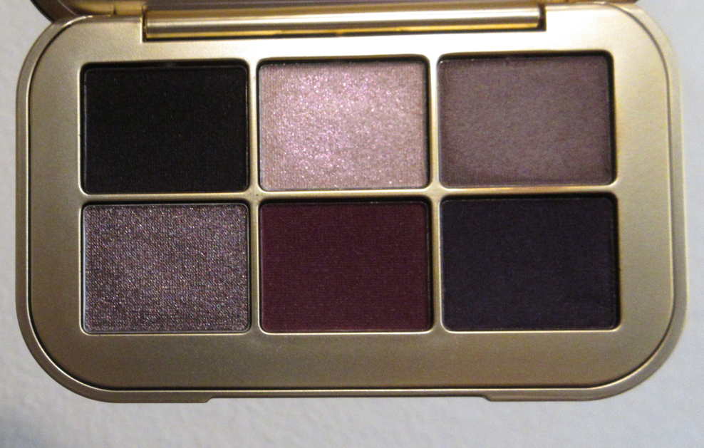
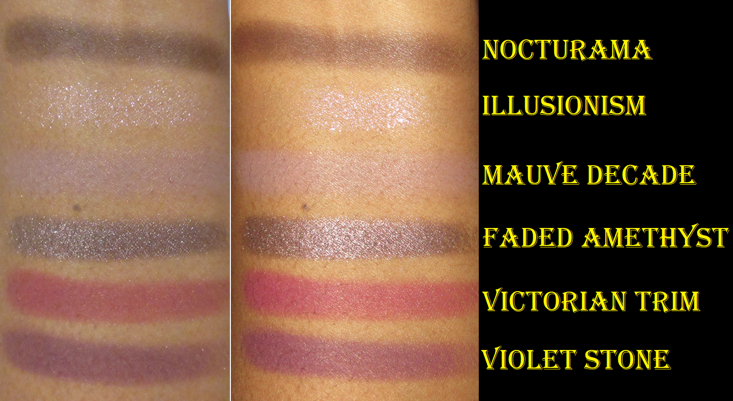
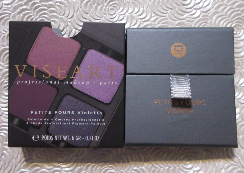
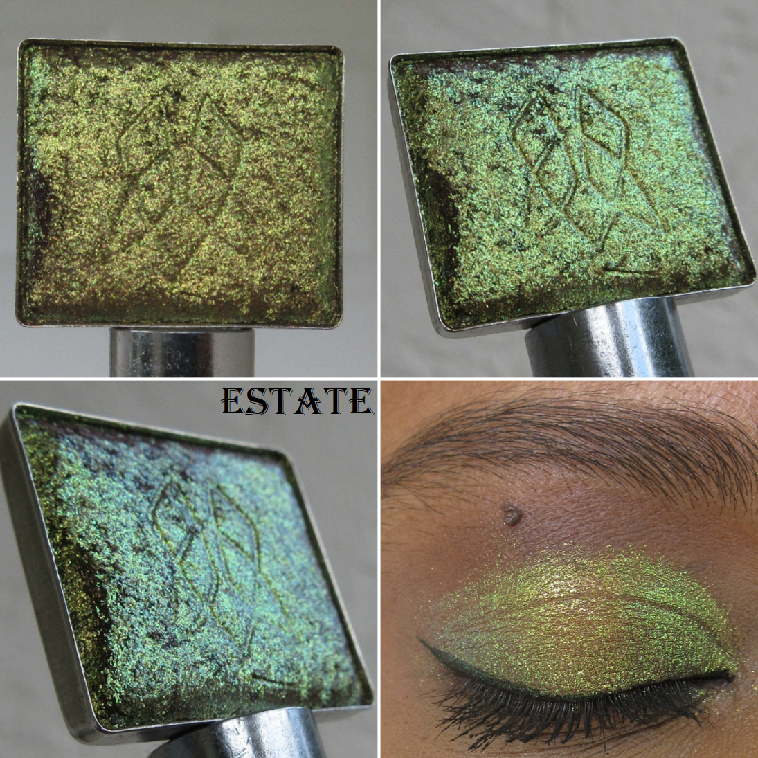
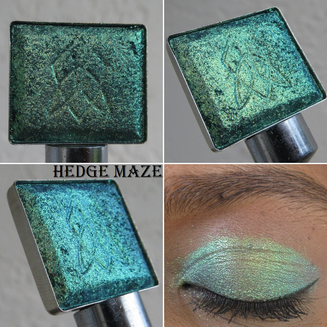
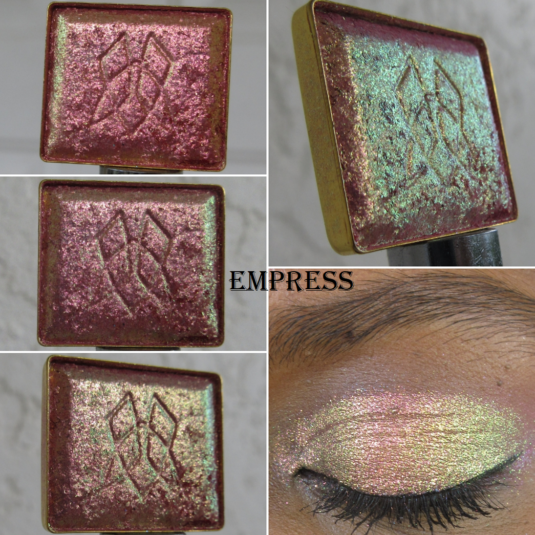
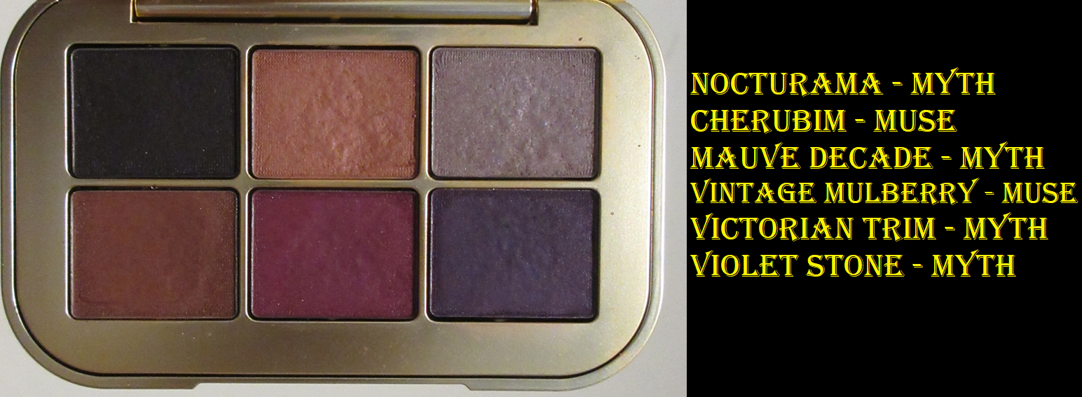
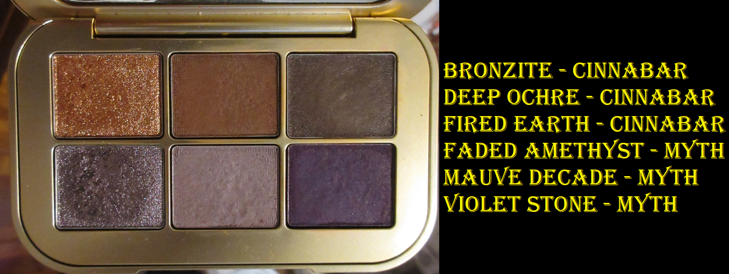
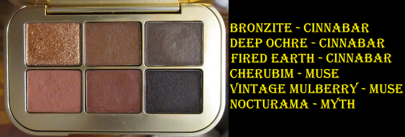
I bought Myth later in a separate order. Once I tried the Seamless Matte from Sorcery and heard other people saying the Velvets were like it, but even creamier, I knew I had to buy this palette. Doing it this way was the easiest (and most cost effective) option to get the majority of the Velvet Mattes from the brand. Natasha Denona’s Cream Powder shadows are one of my top favorite formulas, which I’m often tempted to buy whole palettes just to get. So, even though I have shades like Victorian Trim, Violet Stone, and Nocturama a hundred times over in my collection, it was worth getting Myth to have those shades in the Velvet finish. I didn’t own Natasha Denona’s My Dream Palette at the time though, so I didn’t realize I’d be getting two shades similar to Victorian Trim, but more on that in the comparison section later.
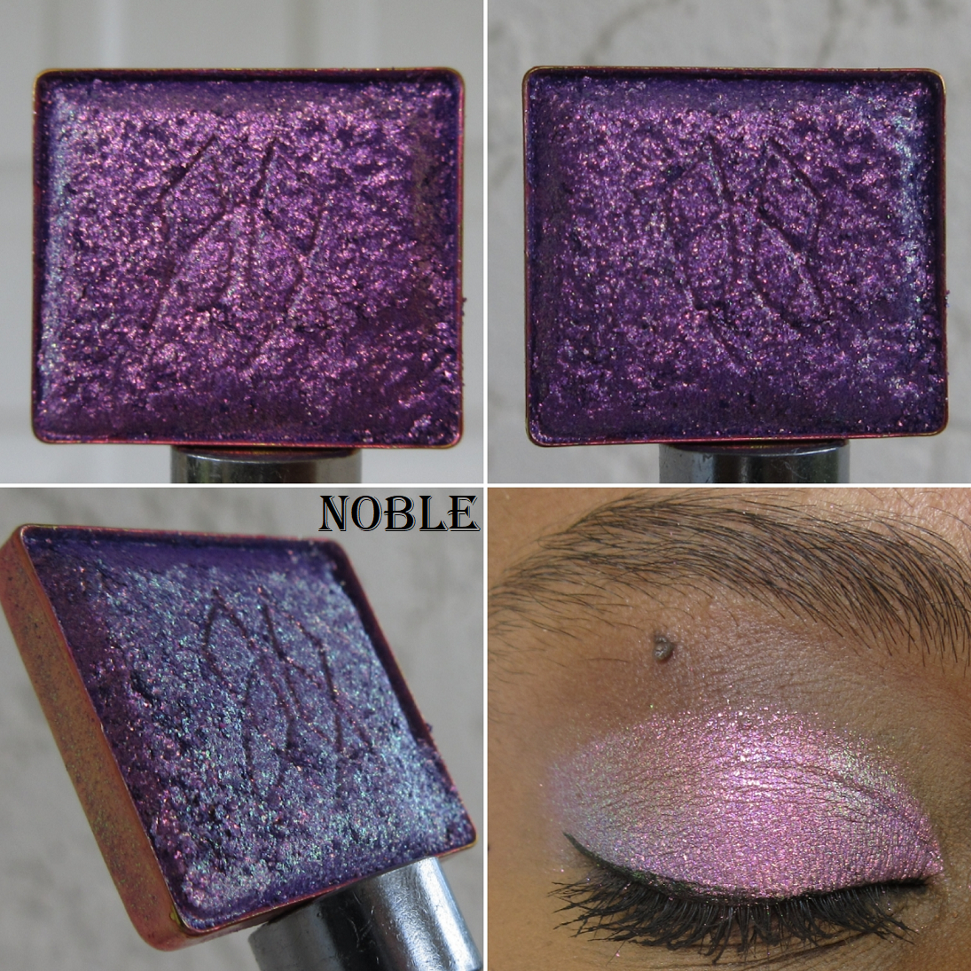
Mauve Decade is a shadow I barely have in my collection. The only shade I can think of that’s comparable to it is Naaru from the Kaleidos x Angelic Nyqvist Club Nebula palette. Anything else that looks remotely similar has too much white base in it, turning it pastel, and then it ends up looking ashy and unflattering on my eyes. So, Mauve Decade is extra special and unsurprisingly one of the first single refill shadows to sell out.
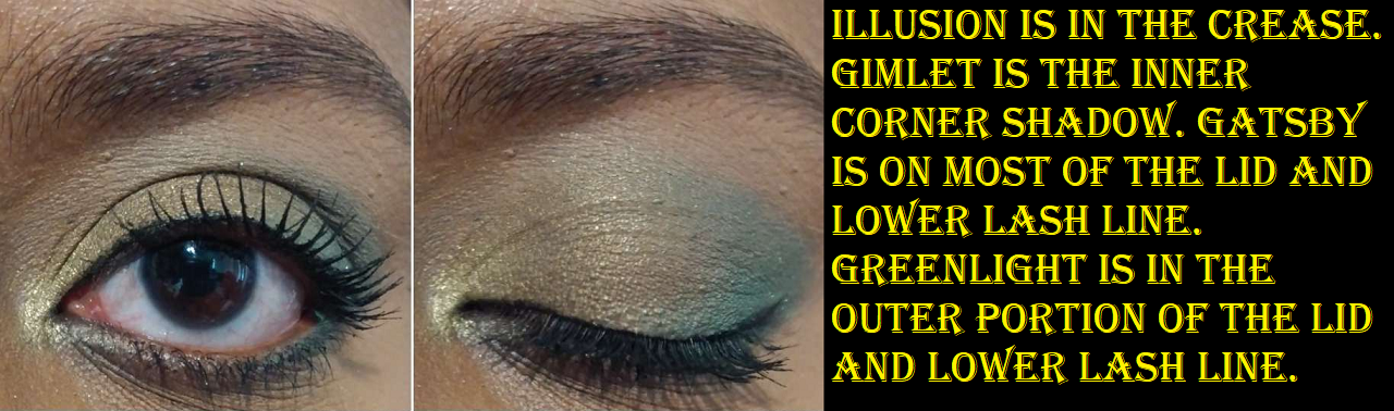
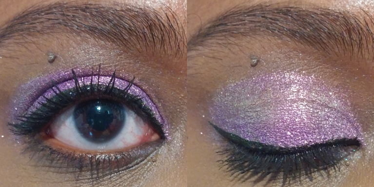
I don’t have a lot of shades like Faded Amethyst either, but that’s because I’m not usually interested in that color. I can admit that it looks pretty with the others in this palette though, so I don’t mind having it. Illusionism is the only shadow I knew I wouldn’t want ahead of time, but it was coming with the others anyway. I could see in the launch video that it just wouldn’t give me the oomph I wanted. Even if someone wants a sheer and subtle topper, I can’t see how it’s worth the refill price with the myriad of other indie brands that make phenomenal topper shadows that can be applied sheer or more impactful if built up. Toppers with duochromatic features. I will give Illusionism praise though for not leaving me with much fallout. Perhaps that is enough to make someone desire the Top Coat formula from the brand, but the trouble I had picking up the product to get it on my eyes is a bigger deal to me.
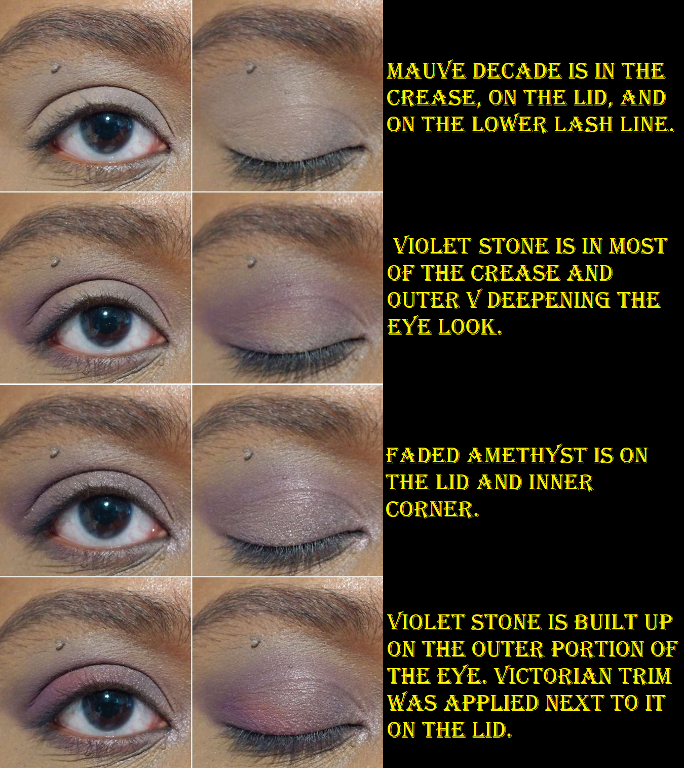
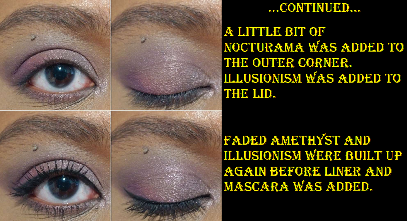
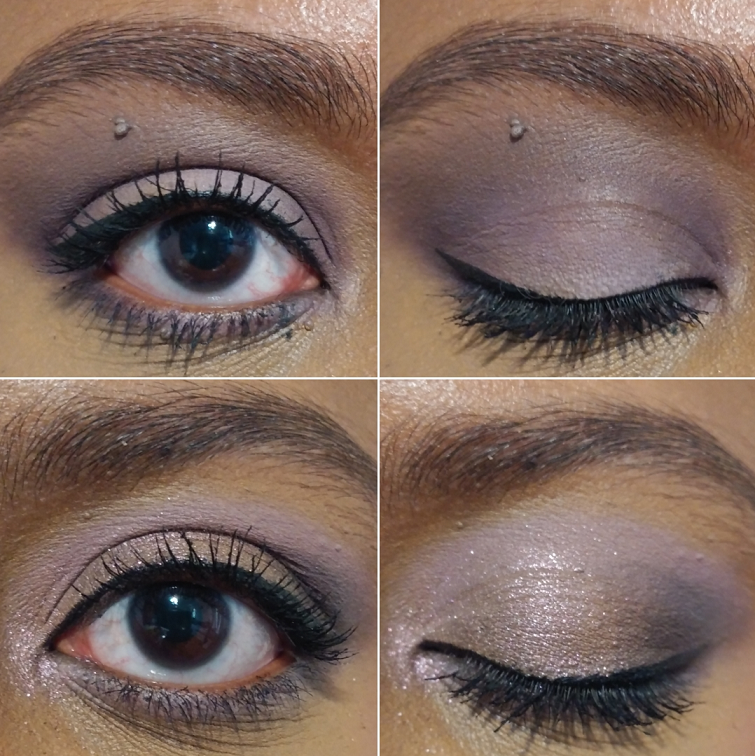
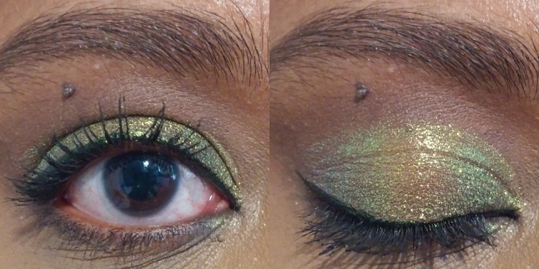
The look above was inspired by the one Lisa did in her launch video. I tried to create some variety in the examples below, but I would realistically do the same one above every time I open this palette (minus Illusionism and just applying Faded Amethyst wet for more impact). I’m obsessed with the combination! I would have never thought to do a magenta pop of color in that spot had it not been for that video. Lisa’s look in the launch video pretty much sold me on the palette.
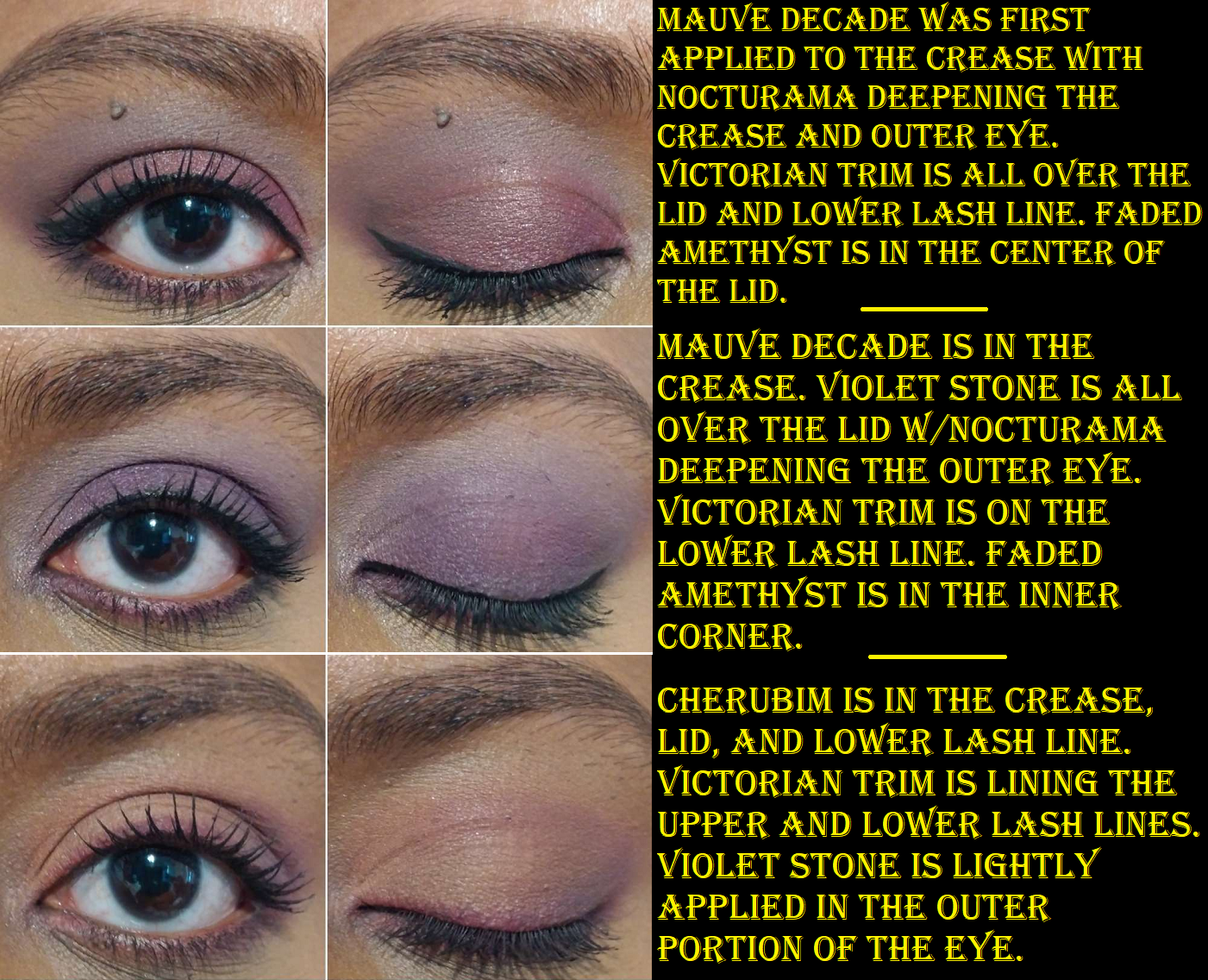
Since the Muse palette leans pink, the shades from there pair very well with the ones from Myth. So, I wanted to include an example of that in the final eye look above. Also, I wasn’t sure which section I should put this message in, but I wanted to warn about the reddish purple type of shades in this palette. I get teary eyes often and when I’ve worn the shades Vintage Mulberry and Victorian Trim, and had to wipe the corners of my eyes, the tears were pink. It happens every time my eyes decide to be watery. Those two shades basically run on me like non-waterproof mascara can. They haven’t hurt my eyes, but I just wanted to forewarn those in rainy climates or who have watery eyes like me that it could happen. I’ve continued to wear those two shades in my outer corner for depth, but I no longer put them on my lower lash line.
Because my eye shape makes me prone to easily getting mascara and shimmer particles in my eyes while taking off my makeup, I’m not quite as concerned when the pink from Victorian Trim gets in my eyes as well, but I felt it was important to mention that the color is easily transferred to the liquid when wet.
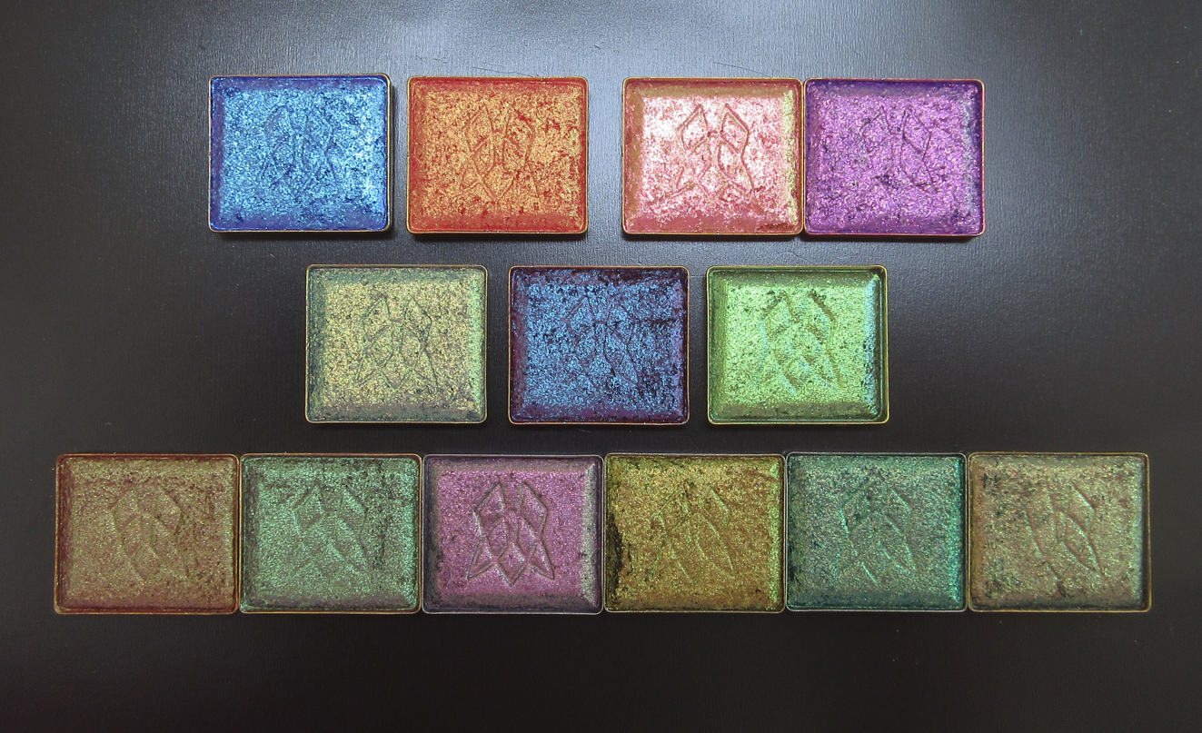
Eyeshadow Palette Refills:
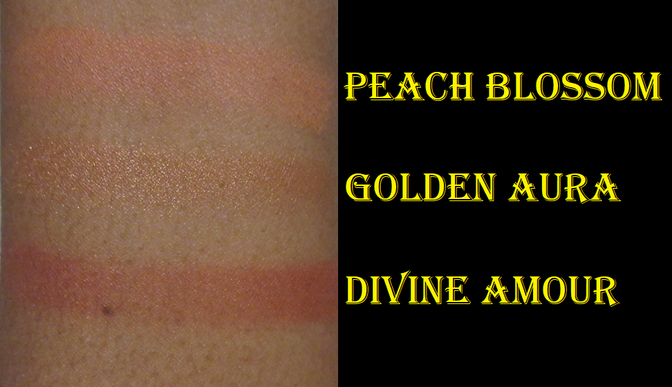
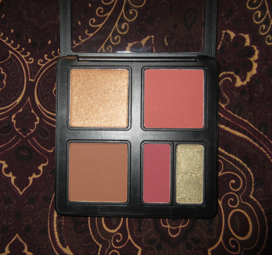
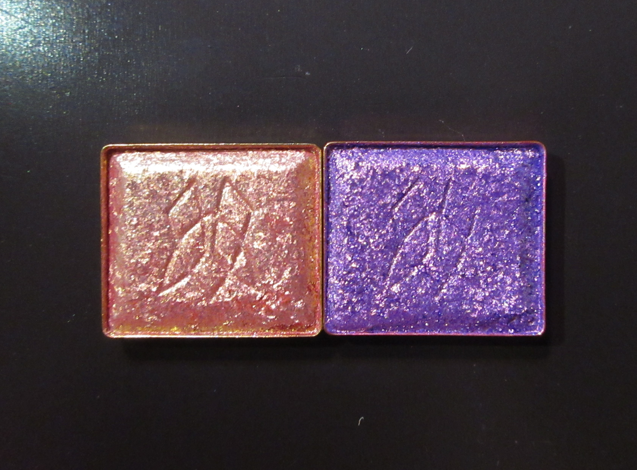
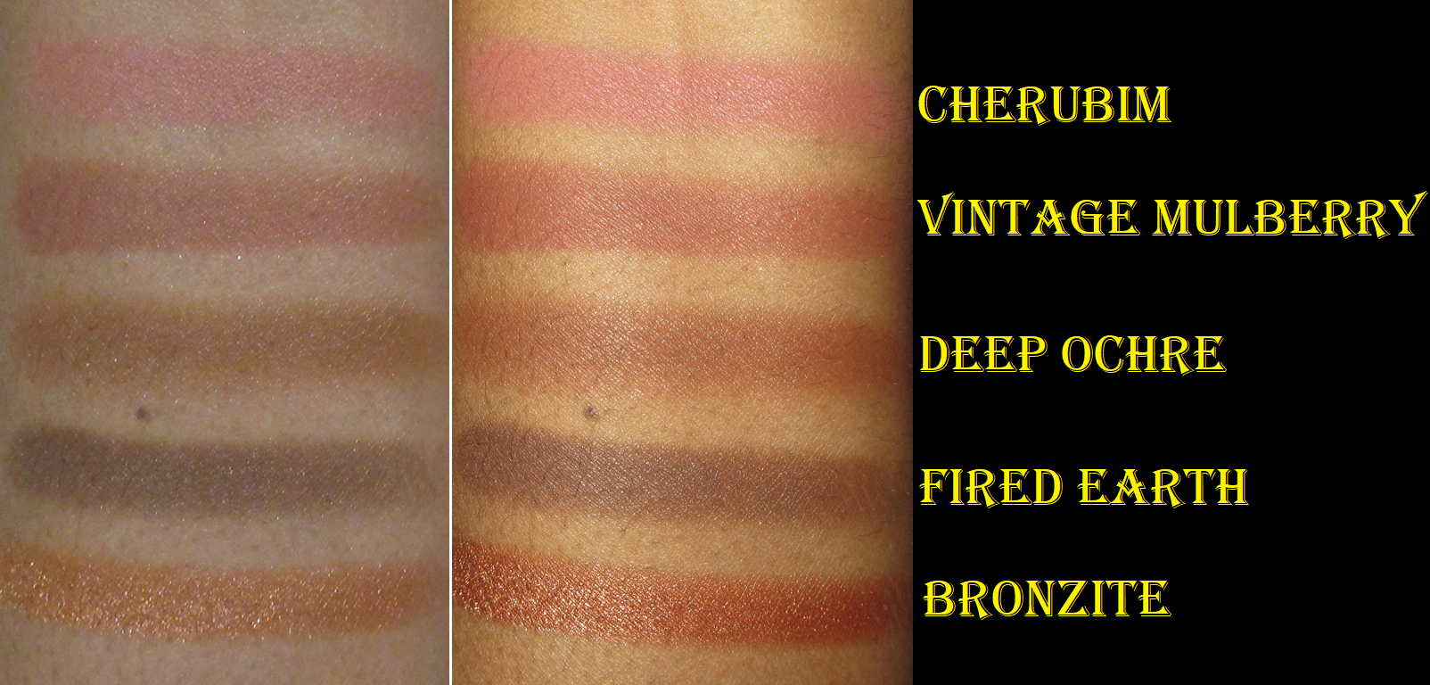
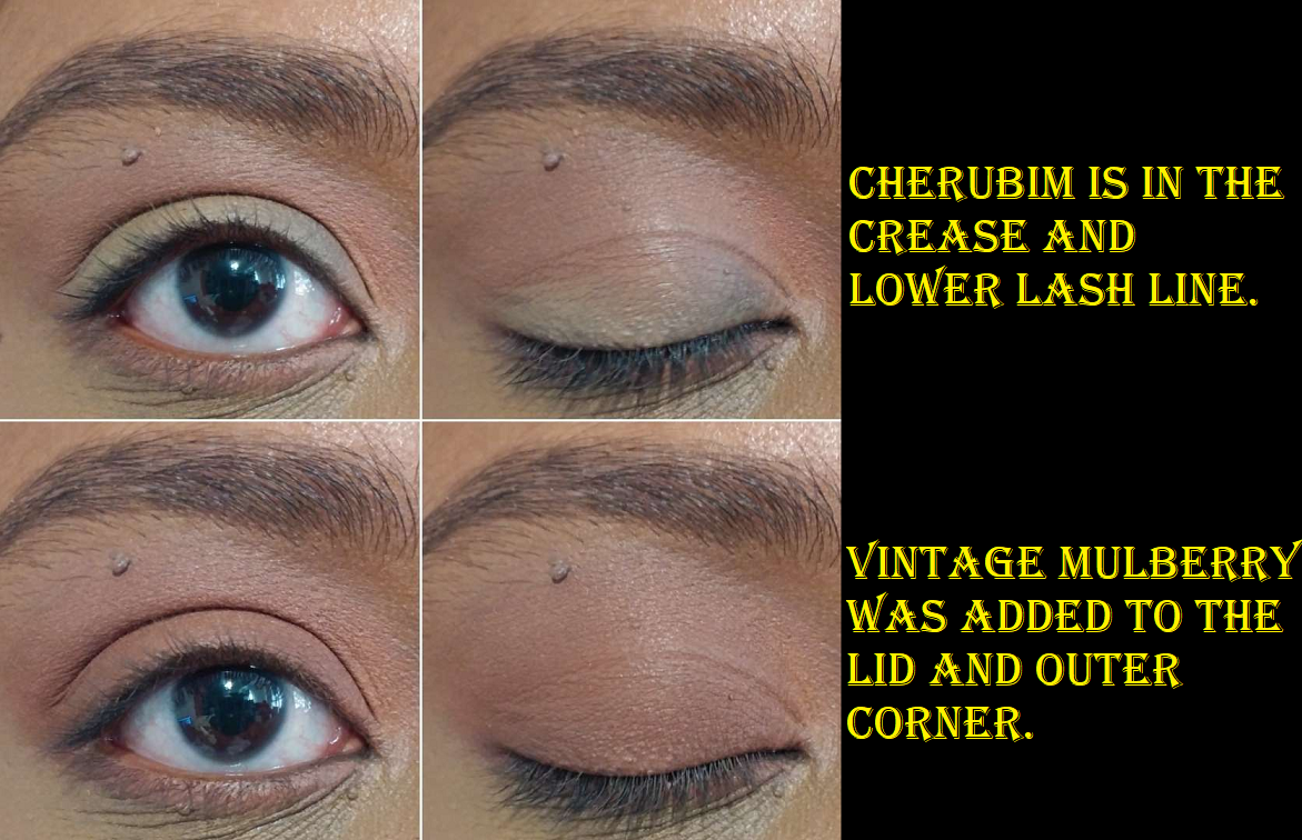
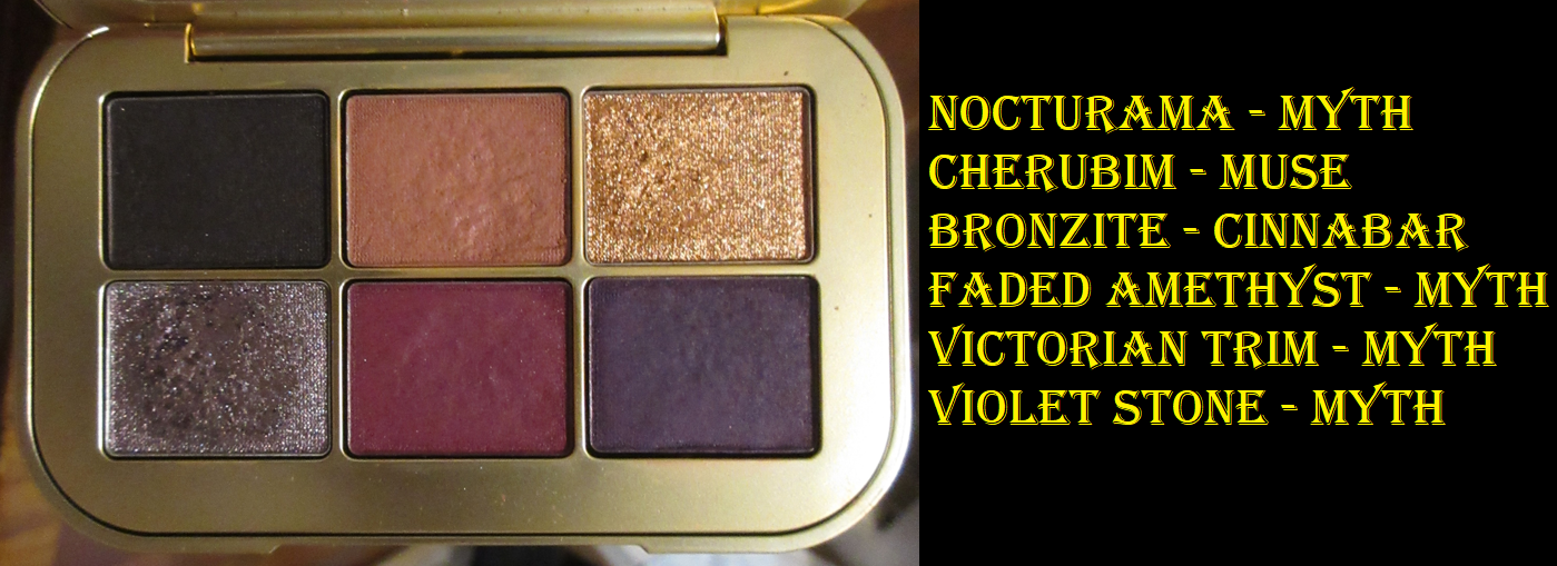
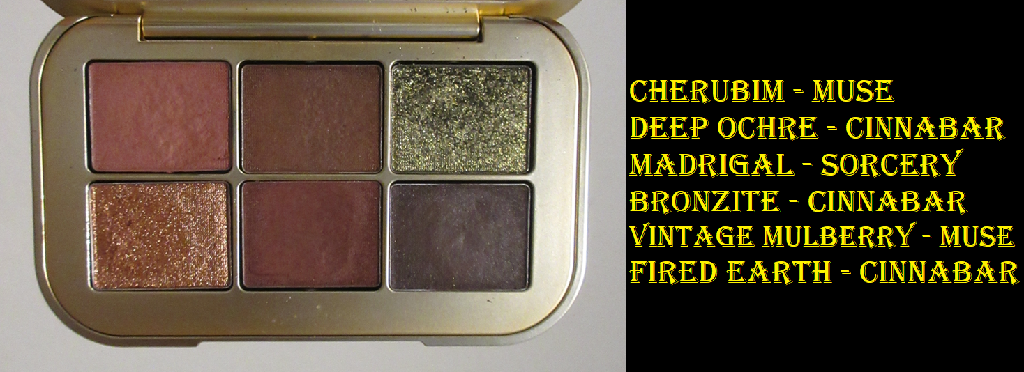
Cherubim and Vintage Mulberry (Muse) plus Deep Ochre, Fired Earth, and Bronzite (Cinnabar)
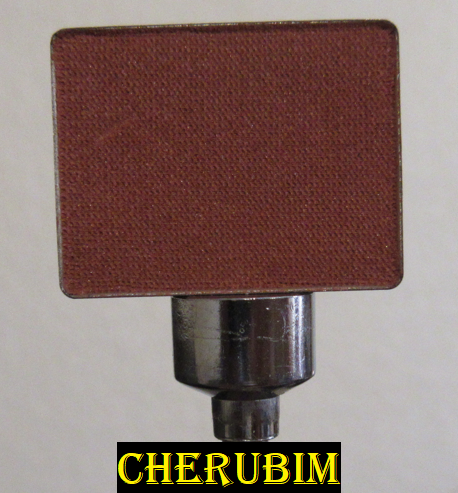
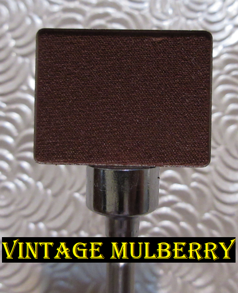
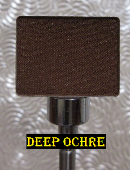
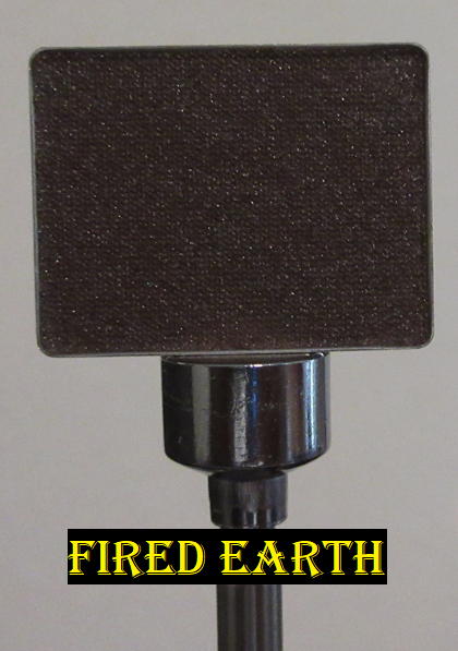
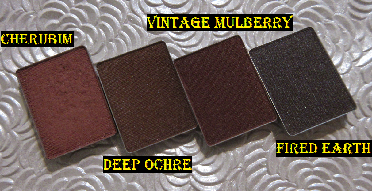
I didn’t buy these shades all in one order. I started with Cherubim first because I was in love with that color. Most pinks look lighter on my skin, and finding a light-medium pink that will show up looking like a soft pink and not ashy isn’t that easy for me to find. I also knew this was the shade I wanted to replace Illusionism with in the Myth palette. Then, because I wanted a shade to add depth without looking so dark and plum like Nocturama, I bought Vintage Mulberry. Vintage Mulberry ended up not looking as dark on my eyes as I expected, so it’s darker but not enough to add as much structure as I wanted. Considering it’s a Velvet, I’m still glad I got it. Then, I couldn’t decide which brown I wanted to use with the Sorcery palette that wasn’t cool-toned, so I added both Deep Ochre and Fired Earth to another order.
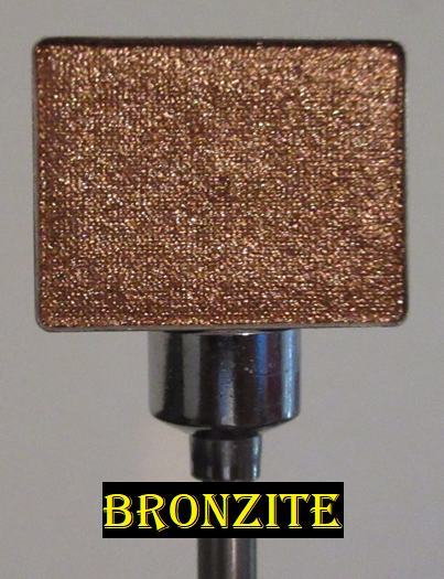
By the time I bought Bronzite, I already knew the Satin/Metallic finish wasn’t my favorite, but I wanted to give it one more chance and also I wanted a neutral shimmer option. I didn’t realize it would be so orange in person and also so intense! That was a surprise, but still a nice one.
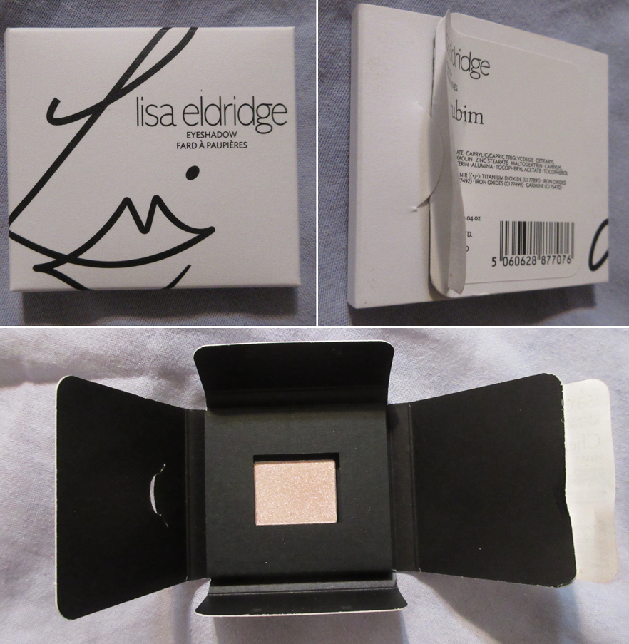
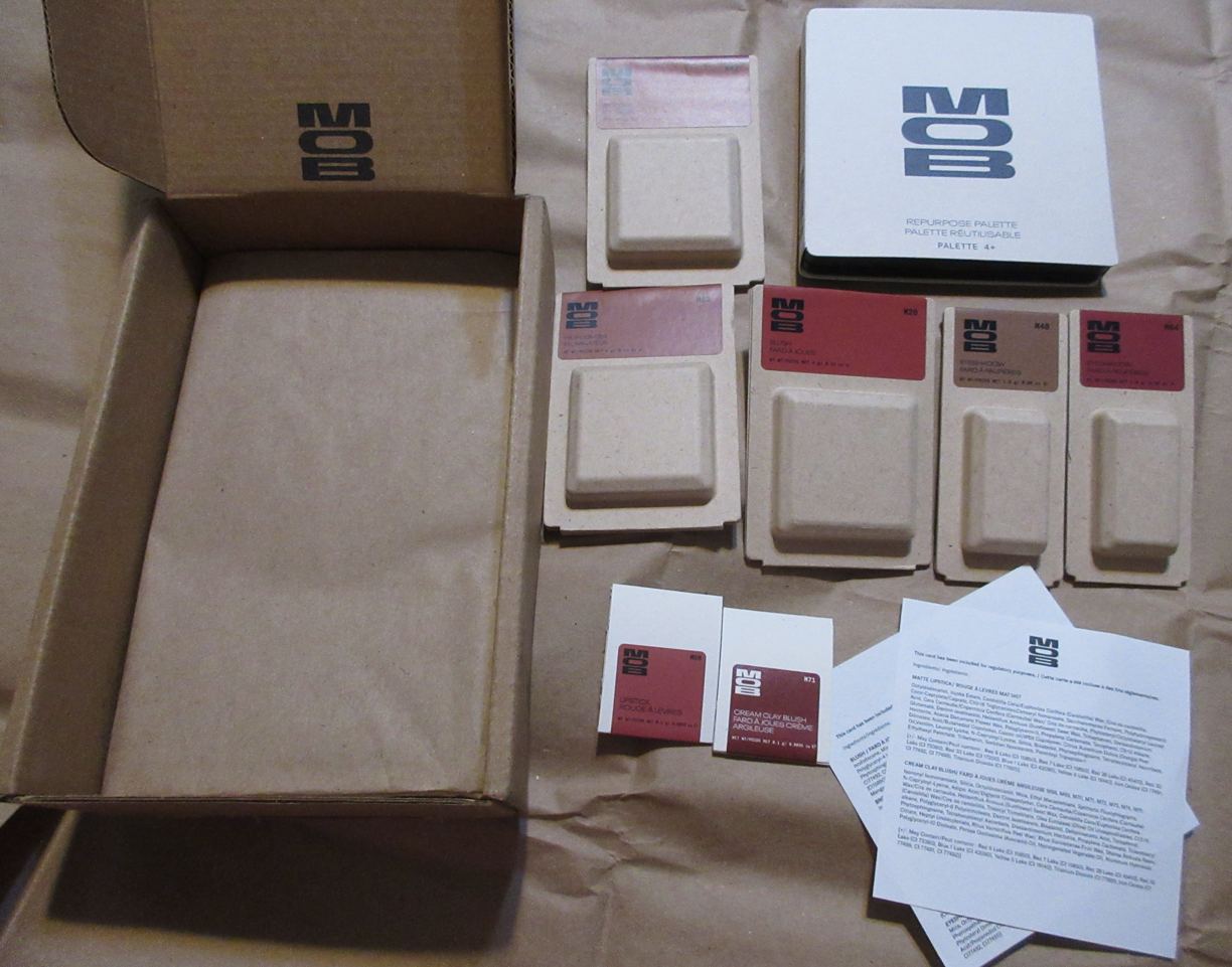
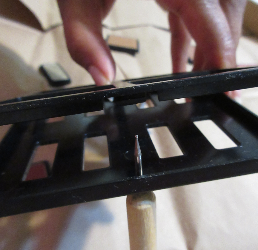
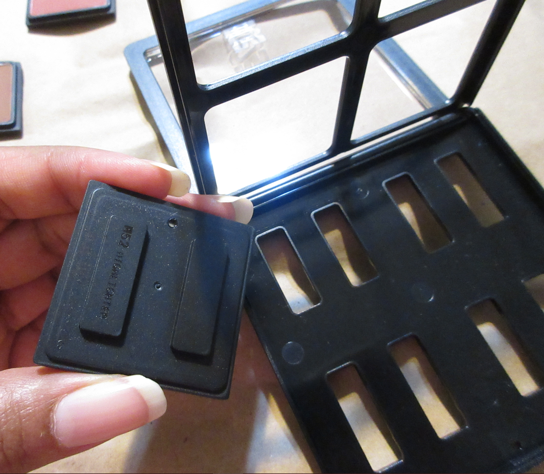
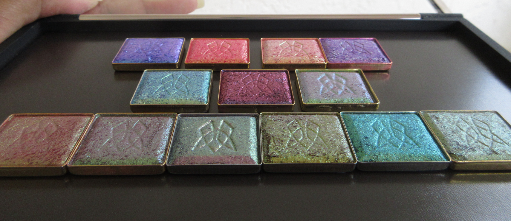
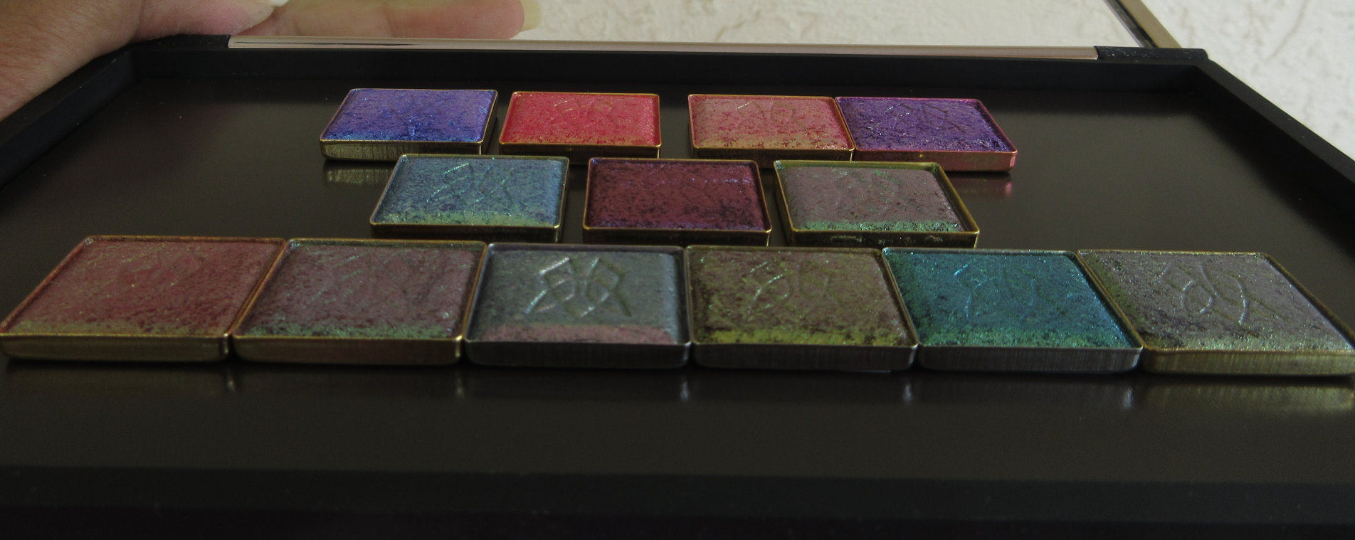
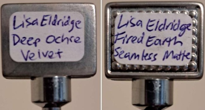
The singles came in their own individual boxes. There are no magnets or plastic used. I just peeled off the sticker keeping the flap securely closed, lifted the flap, and flipped the eyeshadow pan out into my palm. Most of them I had to clean off excess shadow powder around the edges and bottoms of the pans. They are not labeled, so I added my own handwritten sticker labels to them. Some pans are fully flat whereas others have bumps on the bottom. I’m not sure why they aren’t all the same. I can’t help but wonder if the bumped ones were intended for the palettes in the early stages of developing the eyeshadows, but then they decided to offer refills individually and just made all the rest smooth? Or maybe the bumped ones come from a different lab? Perhaps stock of one type of pans were purchased first and the others were found at a better price and purchased after? I’m throwing out complete guesses in the dark. It’s a curious thing that really doesn’t matter at the end of the day. They both stick just fine to magnetic palettes, so that’s what counts.
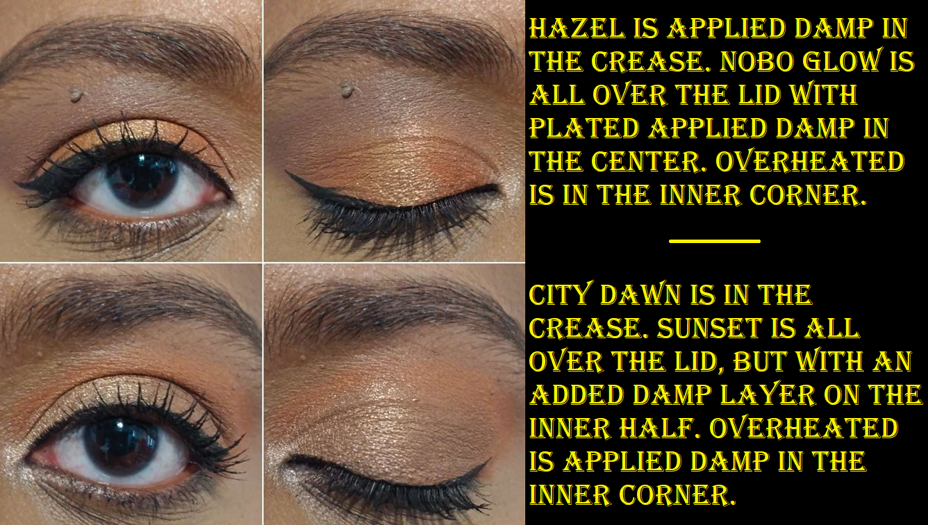
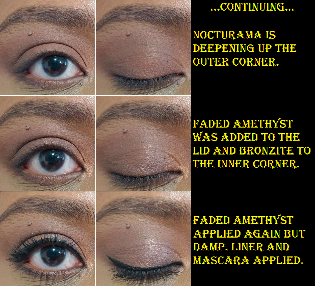
For the eye looks using my refills, I felt it necessary to show the step by step process because the shade and depth differences are so subtle and I felt it would be too difficult to tell which shades had the most dominance over the look if I only showed the end results.
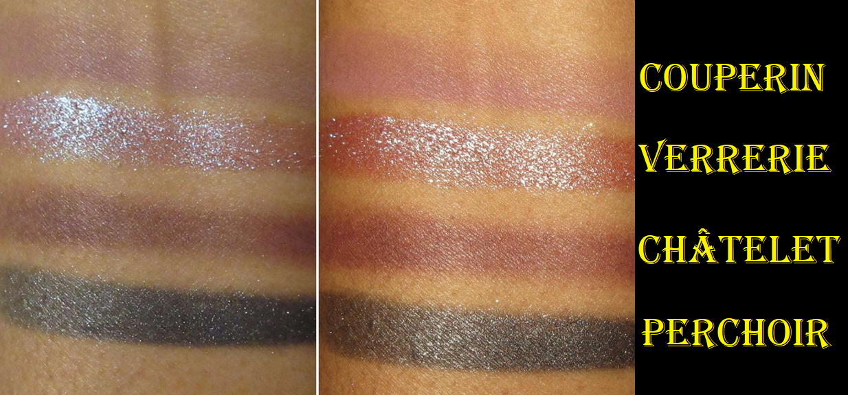
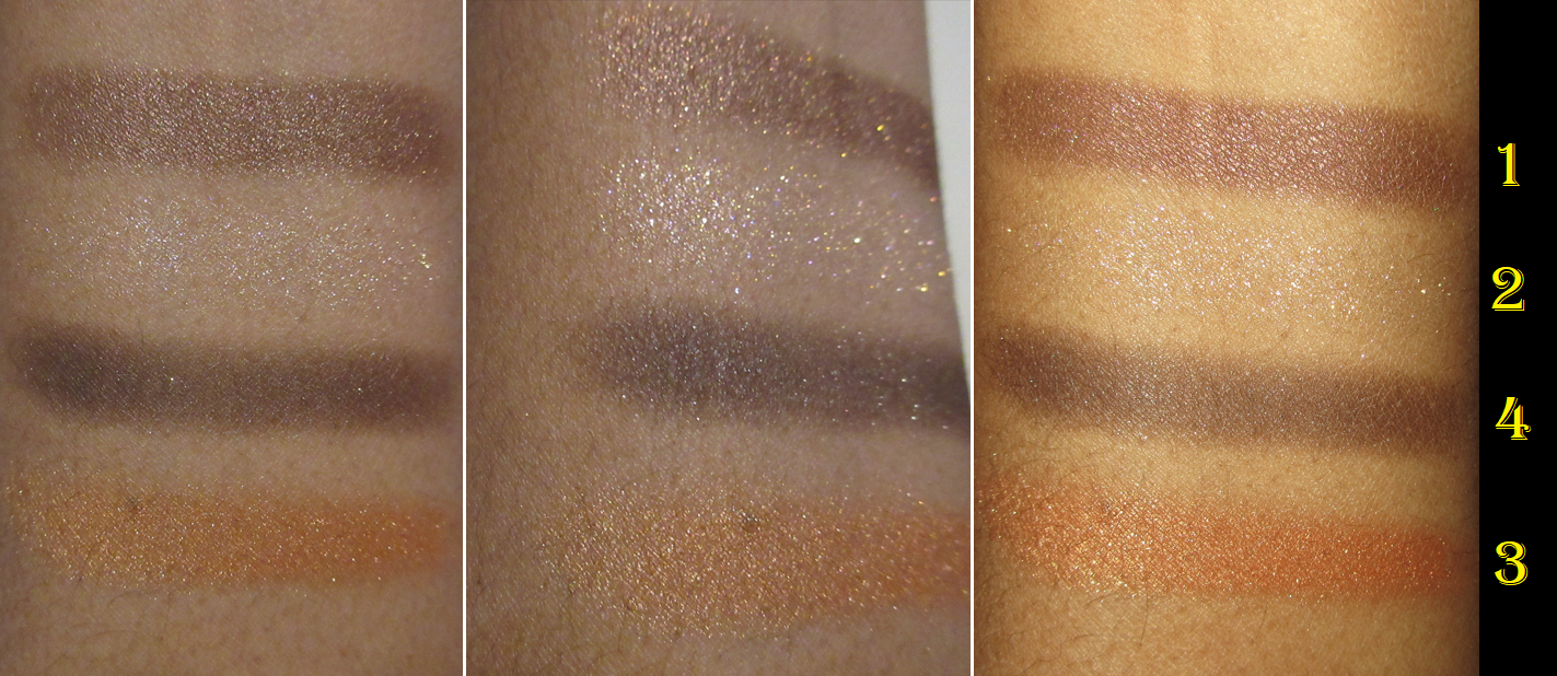
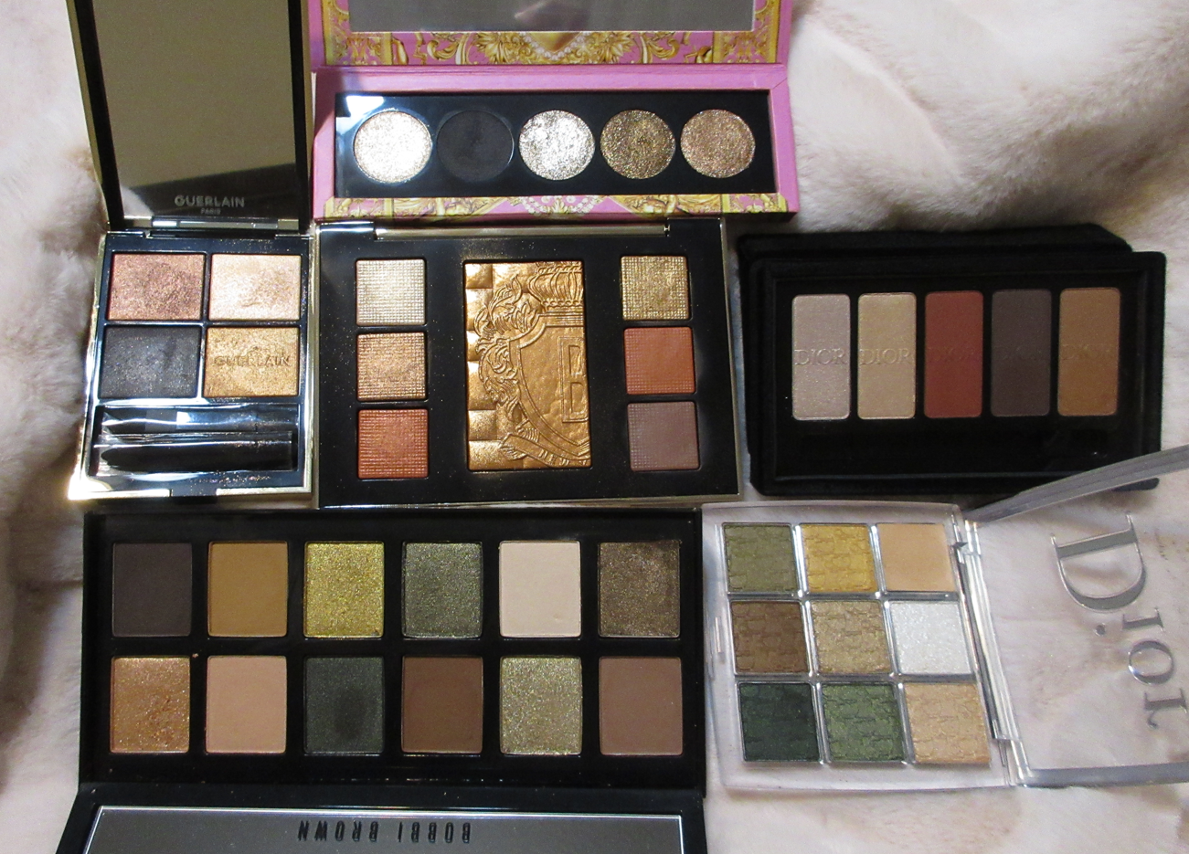
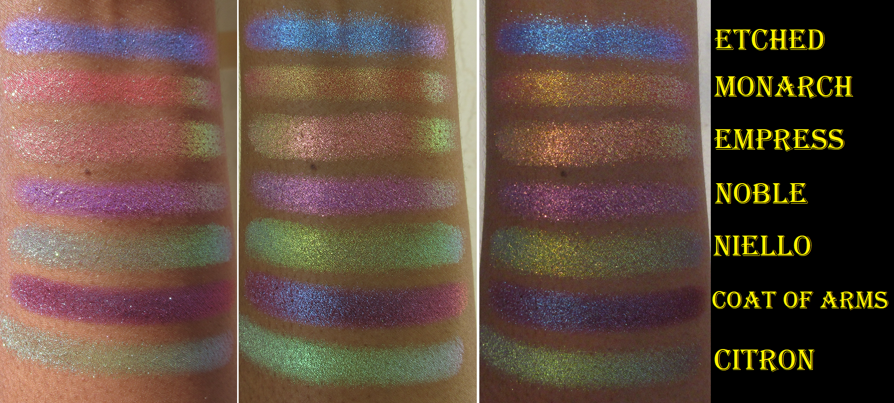
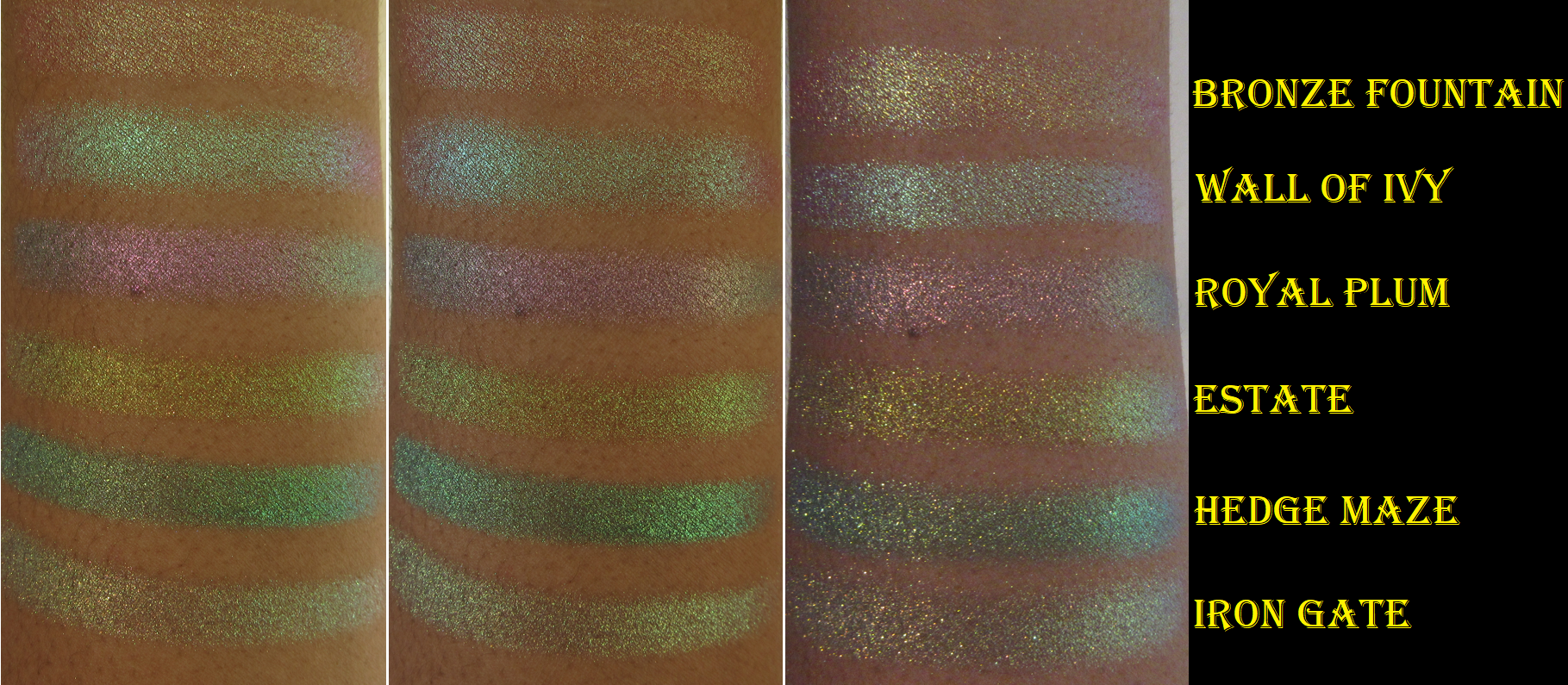
Shade Comparisons to Natasha Denona’s Cream Powder Eyeshadows
To make things a little easier in this section, I color coded the shade names.
Yellow = Lisa Eldridge
Green = Natasha Denona Metropolis Palette
Purple = Natasha Denona My Dream Palette
Red = Natasha Denona Love Palette
Orange = Natasha Denona Bronze Palette
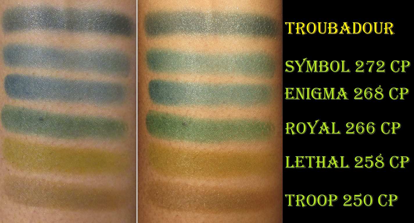
Troubadour, the “deep inky teal,” looks exactly like Symbol in the pan, but it’s much closer to looking like Enigma because it’s closer to blue than green. I would love for Lisa Eldridge to come out with a green like Royal. Actually, I’d love a dupe for Lethal and Troop too.
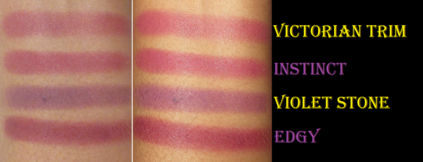
I didn’t realize the Cream Powders from the My Dream Palette were so similar looking. Instinct is the closer dupe for Victorian Trim, but it’s more pigmented. Had I realized this ahead of time, I might have reconsidered buying the My Dream Palette since I already owned Myth. At the same time, I can see that an argument could be made in favor of the Natasha Palette at $69 (around $58 with the 20% off discount at Sephora plus tax) for 15 shadows versus the Myth Palette at $68 for 6 shadows. I can’t say which one I prefer because I’ve yet to use the My Dream Palette other than swatching Instinct and Edgy.
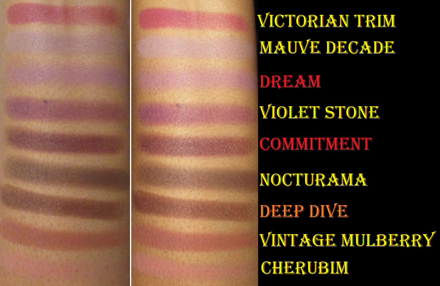
The shades from Metropolis are the oldest of the Cream Powders I have in this pan size. They are starting to not swatch as well, but they are a month shy of being two years old, so they aren’t that bad in terms of age. However, I have been wishing for a replacement and I’m thrilled to be able to get them from Lisa Eldridge as an alternative.
Having Chrism is why I didn’t buy Raw Sienna or Tea Room, since I thought those two might be too light for my liking and Chrism is right on that border and can be used in place of those two in the eye looks I wanted to create.
Deep Ochre and Antique are quite similar but, again, it’s from my Metropolis Palette that is getting up there in age. So, I don’t regret buying Deep Ochre. Fired Earth is a great choice since I didn’t have a dark neutral brown in this type of formula.
The Cream Powder shadows and the ones from Lisa blend and build perfectly together. So, I’m feeling a lot more with satisfied with the amount I have and feel like I can even skip buying Natasha’s Palettes (especially in light of the many controversies the ND brand has had even just this year alone). I’m more content with waiting for Lisa to release even more shadows with these finishes.
After comparing all these swatches, I see that I’d love to have some yellows, an orange, and more green tones as Velvets or Seamless Mattes from Lisa Eldridge. These are the ones where I feel the refill price is worth it for me. I also see the potential usefulness of having Lamp Black and Smoke & Mirrors, the only two shades from the Vega Palette that caught my interest. Perhaps those will end up being reviewed in Part 2 next year, if I get them during a restock.
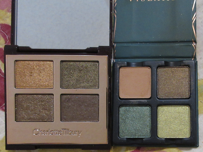
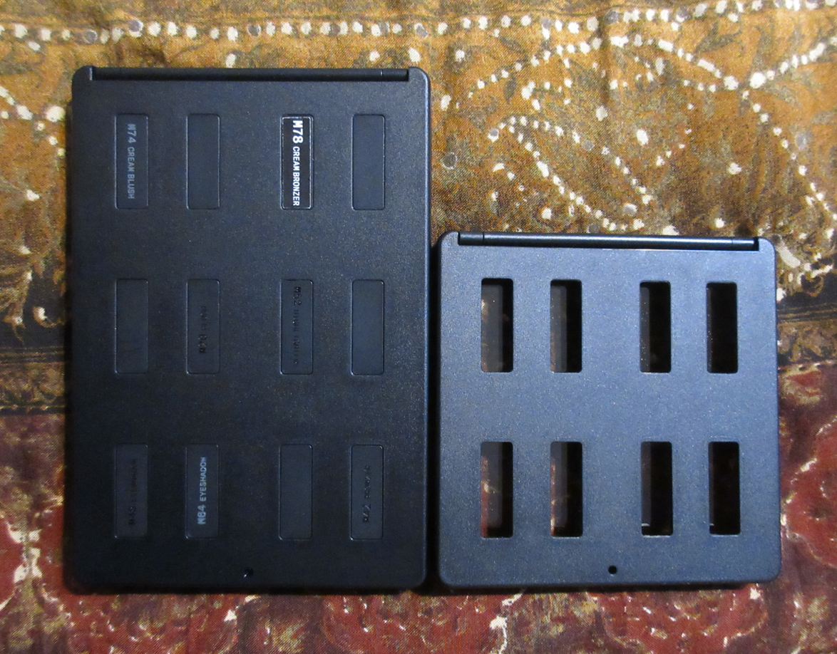
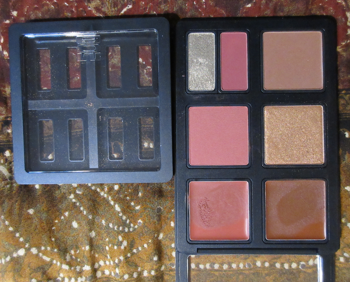
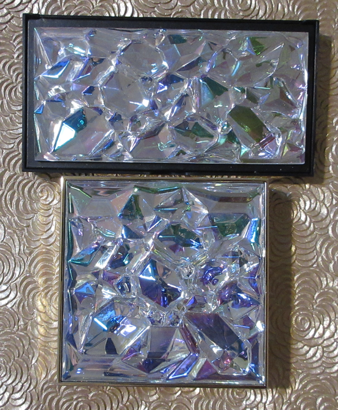
Eyeshadow Pan Size and Palette Size Comparisons
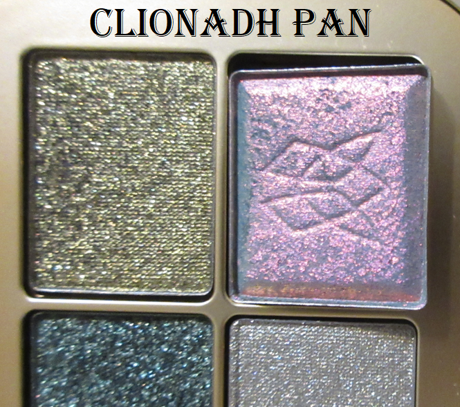
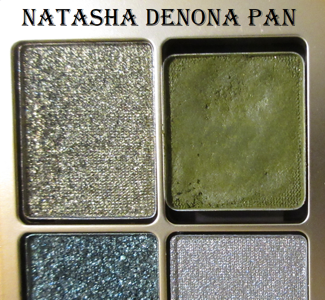
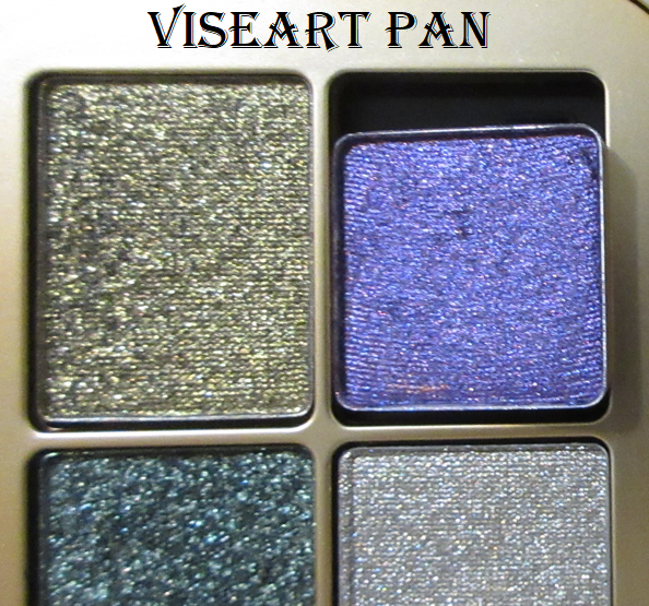
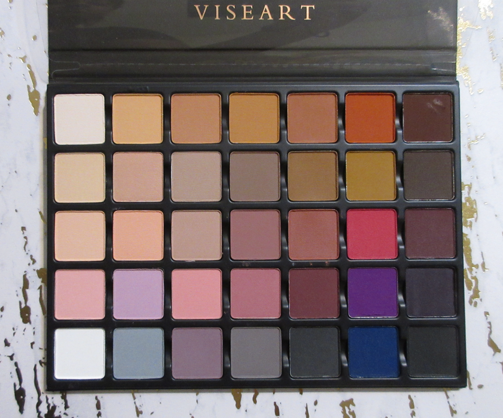
I was extremely interested in the idea of being able to use the gorgeous eyeshadow palette container for traveling with Lisa’s shadows, plus shadows from other brands, but the wells are too short to fit my Clionadh shadows and even my medium sized Viseart pans. The Natasha Denona midi pan sizes can fit though, so there’s one saving grace. All the other square pan single shadows in my collection are far too large to bother trying to fit them in. Technically, I could put the small size Viseart pans in here, but that would feel like wasted space.
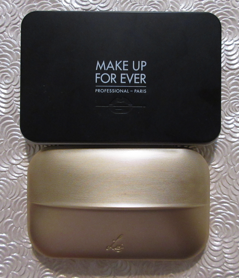
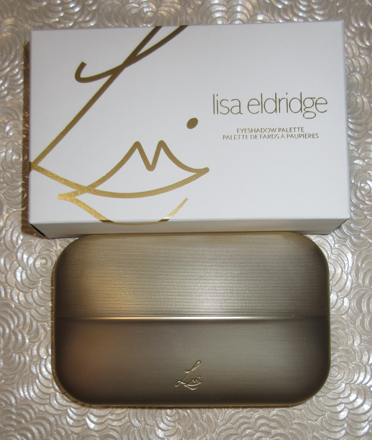
The “Extra Large” size of Make Up For Ever Artist Color Refillable Makeup Palette from Sephora (only 4 inches wide), not to be confused with the Refillable Pro Makeup Palette which is much larger and from MUFE’s website, is slightly bigger than the Lisa Eldridge palettes. For the sake of storing the two Lisa palettes and refills together, the Extra Large MUFE palette came in handy. I don’t know if Lisa Eldridge will make the empty palettes themselves be available for purchase, or if customers will have to buy six refills in order to get the palette with it. If I end up not being able to buy the empty palette alone, the MUFE one will have to suffice.
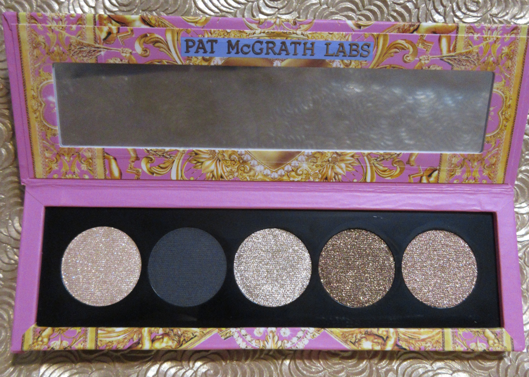
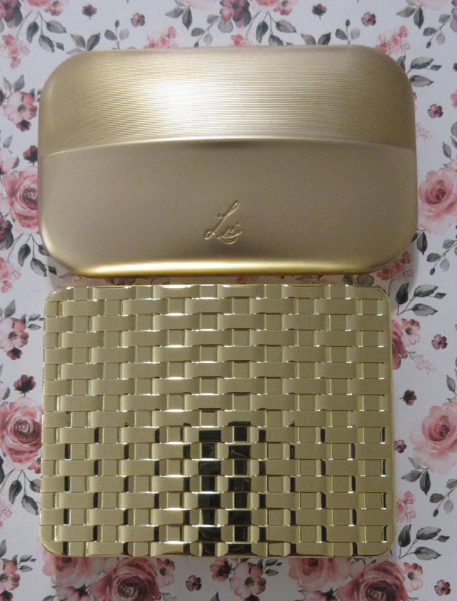
The comparisons of Lisa’s eyeshadow price per gram to Pat Mcgrath, Charlotte Tilbury, Natasha Denona, etc have been done by others. There’s no denying her shadows are extremely expensive. The palette I feel compelled to discuss instead is the Olivia Palermo Eyeshadow Palette in Regalia, since the Olivia Palermo brand is also in the luxury sphere, has similar sized palettes with six shadows, and is at a near enough price point (on the surface).
Regalia is $58 for 7 total grams of product at around $8.29 per gram. Sorcery is $68 for 5.7 total grams of product at approximately $11.93 per gram. I’d like to note that the industry standard is at least 1 gram per shadow and Lisa’s are slightly under that at 0.95 grams. So, this math just doubles down on what we already know about not getting one’s money’s worth in terms of the amount of product contained within these palettes. The customer’s view on the formulas, shades, likeliness to use up the eyeshadows, and more are the determining factors in the “worth” of them for the price. Honestly, I don’t mind having eyeshadows with less product because my collection is too large to ever hit pan on them anyway.
Then, regarding the packaging itself, they are both beautiful luxurious looking gold palettes. Lisa’s are aluminum or some other kind of lightweight metal. The shadows are interchangeable and that’s a bonus factor in being able to use them for travel and take up less space and weight in a travel bag or purse. Olivia’s is weighty like a brick! It’s some form of very heavy metal. Two of Lisa’s palettes are literally still lighter on the scale than a single one of Olivia’s palettes. In fact, it would take three of Lisa’s to surpass the weight of Regalia alone. However, this is kind of like a display piece. It wasn’t intended for travel or being on-the-go. Whether someone wants a custom designed weighty luxurious product to keep on the vanity or a bespoke unique and functional product is up to the customer to decide which factor is most appealing. I personally love the weightiness of Olivia’s palette because it screams luxury, but I can’t deny that Lisa found a way to make hers elegant while being a lot more practical.
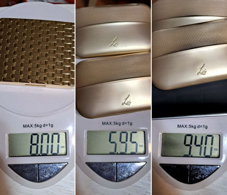
Weight depicted on the scale above is in ounces, not grams.
For the price point, Olivia’s palette is what I expected from Lisa, but I think I’m happier with how Lisa’s actually ended up being. I still don’t think it would have been worth the price without the Velvets and Seamless Mattes though.
Palettes Rearranged
Of course, now that I have the extra shadows, I played around with the different color story possibilities. Below are my favorites.
The first palette of the bunch is what my Myth palette currently looks like. For now, I left Sorcery as is. However, I am the most likely to change it to the last arrangement out of my examples above.
Lisa Eldridge Lip Products
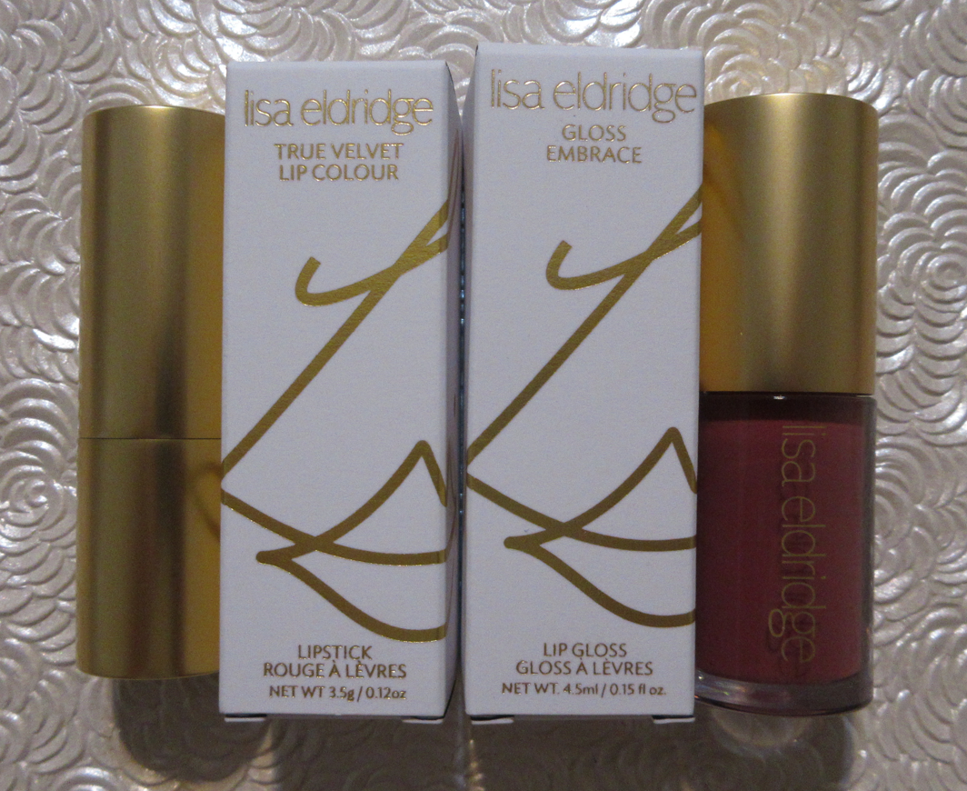
I have to post the disclaimer that I am NOT a lipstick person. I buy them and most of the time end up not wearing them. I’m a gloss person through and through, but it’s really difficult for me to want to shell out anything above $20 for a gloss and I usually wait for a sale that I can buy a higher end gloss below my $20 preference. However, for the sake of science and my interest in the way the Gloss Embrace formula was described as being nourishing for the lips, I bought one. As for lipsticks, anything over $25 is…well it just doesn’t happen! Prior to my purchase of the True Velvet Lip Colour, the most expensive lipsticks I ever bought were from Bite Beauty for I think $26. I never expected to be so drawn in by the rave reviews, massive hype, and my growing curiosity in the brand that I would spend $36 on one from Lisa before even trying the other luxury lipstick brands I’ve had for ages on my beauty bucket list. But here we are!
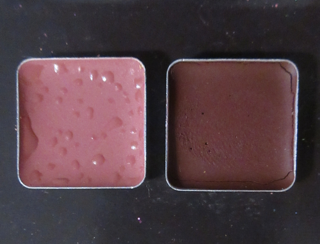
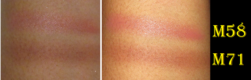
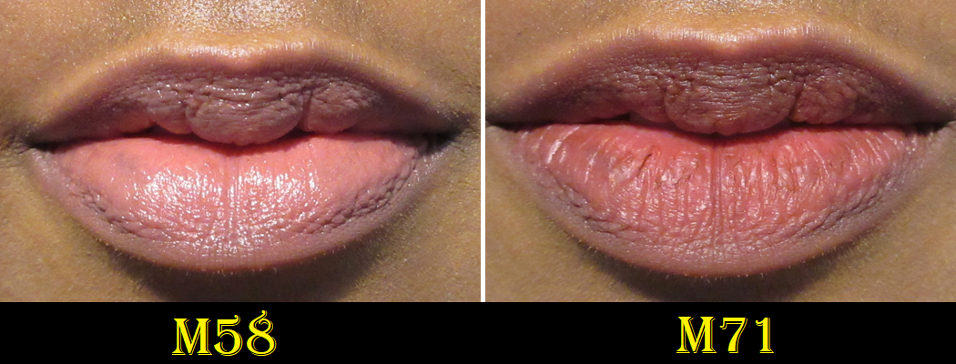
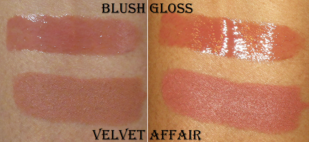
True Velvet Lip Colour in Velvet Affair and Gloss Embrace Lip Gloss in Blush
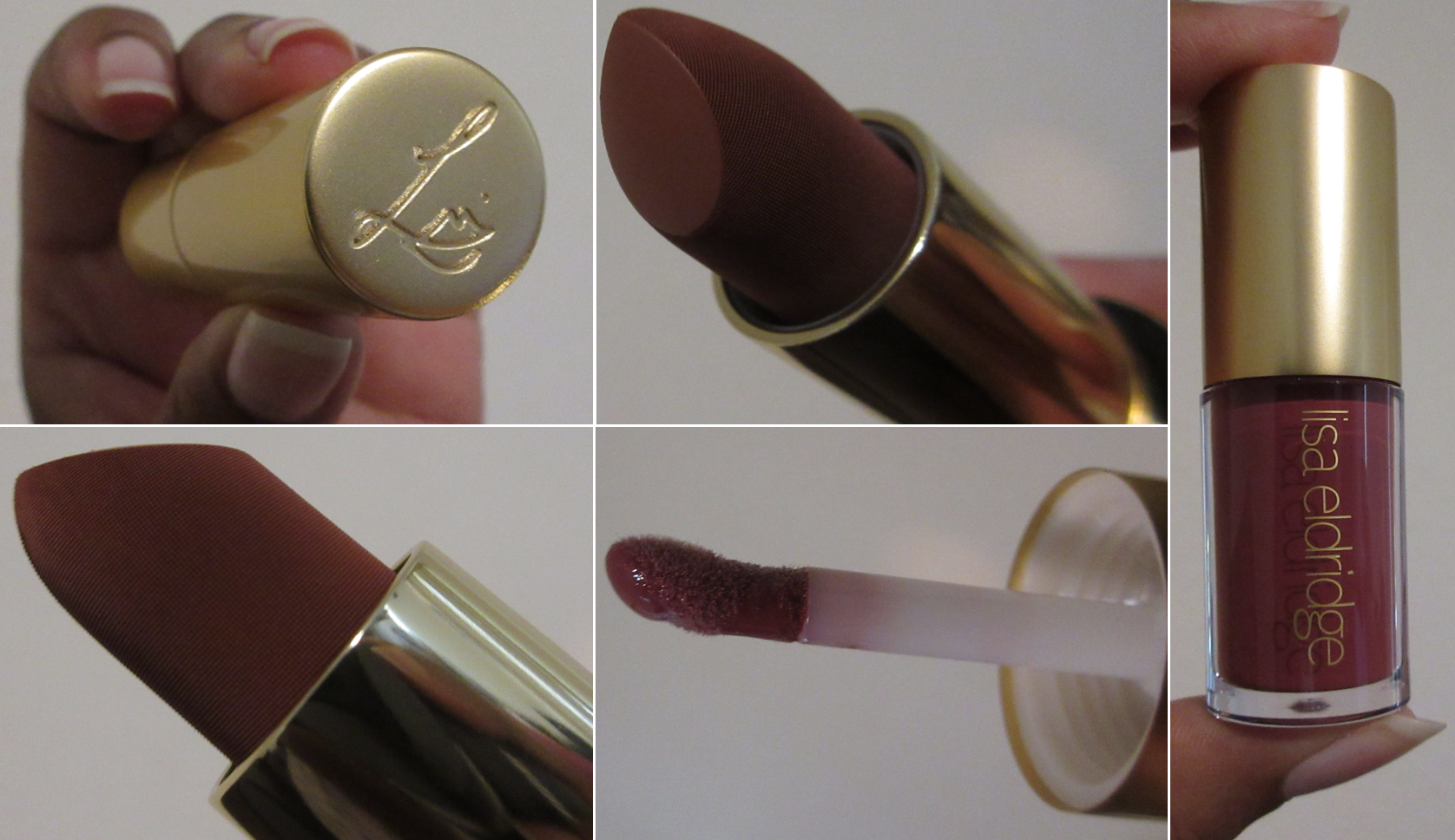
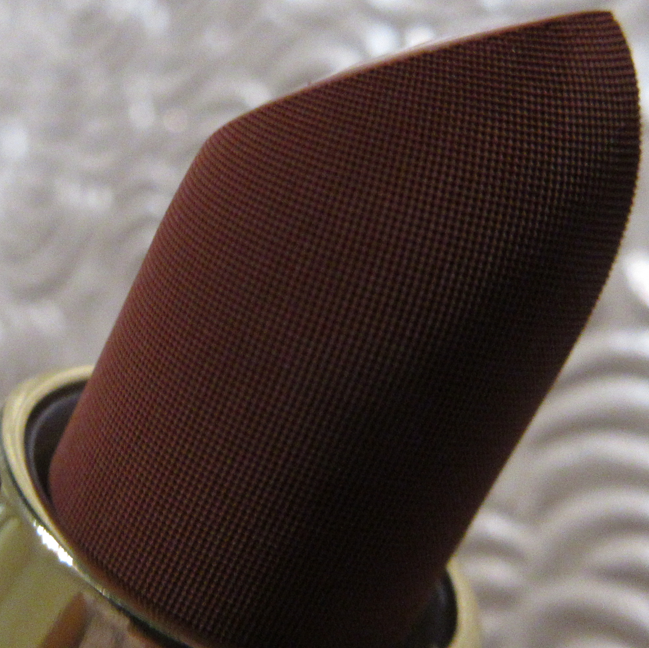
I love the gold on both the lipstick and lip gloss. 10 out of 10 for packaging. I especially like the magnetic closure of the lipstick cap which adds to the weightiness of the product (but isn’t too heavy to make it inconvenient to take on-the-go). I also like the embossing around the bullet in the attempt to make it look like actual velvet.
Despite how dark the bullet of Velvet Affair looks, it’s too light for my comfort level to wear by itself. I saw the wonderful array of model photos on the website and purposely intended to get a near-nude lipstick shade. It just ended up being the kind of color that I only like when paired with a darker lip liner.
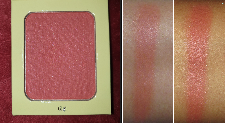
I heard the lipsticks can be used on the cheeks for blush, and when I really pack the color on, I think it does work nicely for that purpose. I’ve only tried it twice and didn’t do a full wear test, so I’m not sure if there are any issues with transferring or fading when using the lipstick on the cheeks. However, I liked it for the short times I wore it that way. On my lips, I also have only worn it so far for a short time and haven’t done a full day’s wear test. I intend to update this post with my thoughts once I do.* At this moment in time, I see why people like it because of how comfortable it is to wear a lipstick this matte. I may one day try another color if it’s the perfect shade that I can wear without lip liner, but as a non-lipstick person, I don’t think it’ll be worth it for me to have more than one of these Velvet lipsticks. The times I’ve actually loved lipsticks have been with more satin type of formulas and sheer buildable ones. So, perhaps the Lucents will capture my heart even though they are less hyped up.
*UPDATE Dec 26th, 2022: It remains comfortable feeling all day, and surprisingly there’s a lot left on the lips after a meal. Despite it not feeling drying, it does still dry my lips. I still like it, but this isn’t the product that will somehow turn me into a lipstick lover, unfortunately!
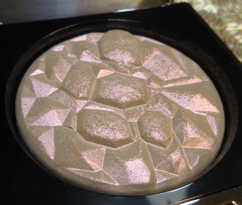
The lip gloss is really nice! I love how long I can feel the sealed hydration effect on my lips, even after the top layer of the gloss is gone. I have only worn it a few times, but I do like it. I wish I had more colors, but that price tag is deterring me. I haven’t yet decided for myself whether the gloss was worth it. I would say yes if it was the only one in my collection, but considering the others I own and love like from Fenty and Pat Mcgrath, perhaps it’s not.
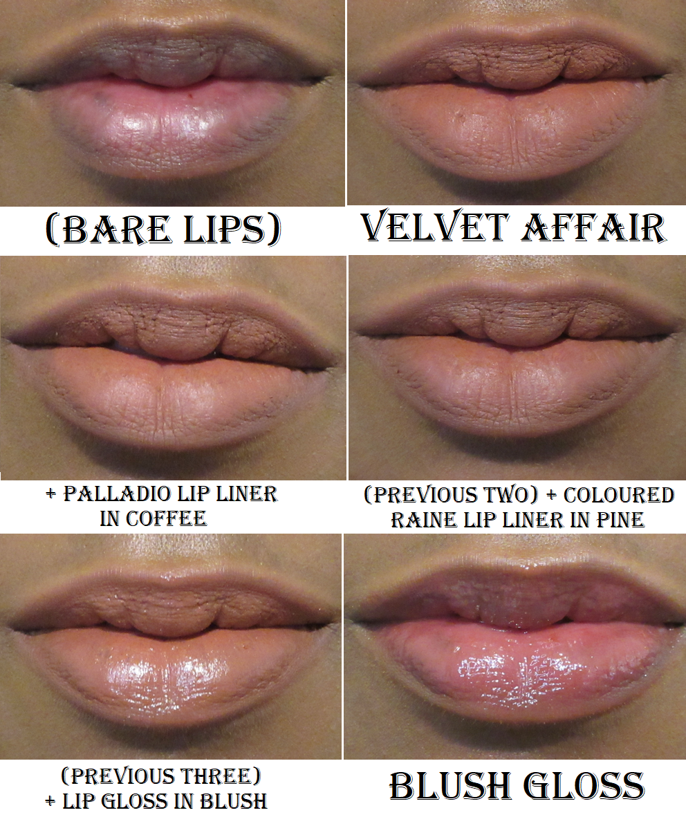
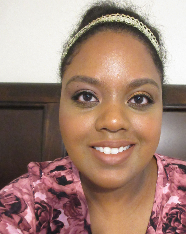
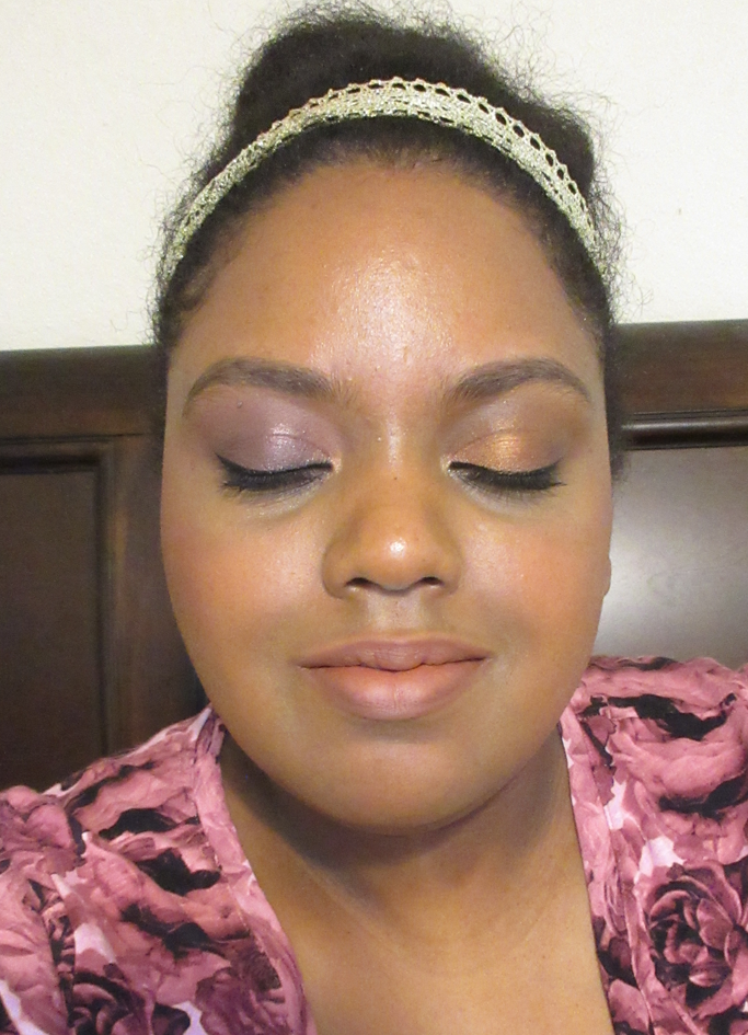
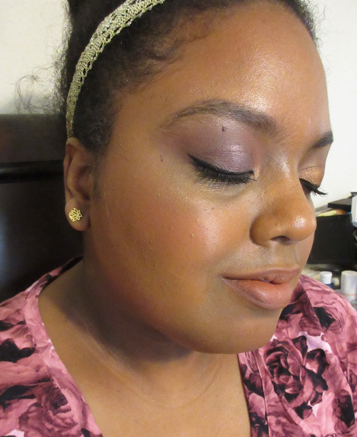
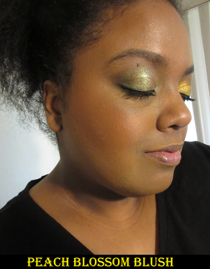
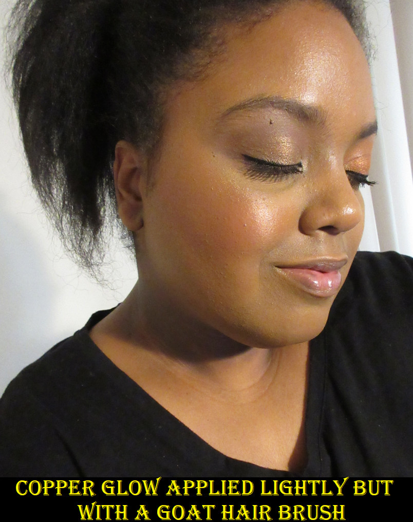
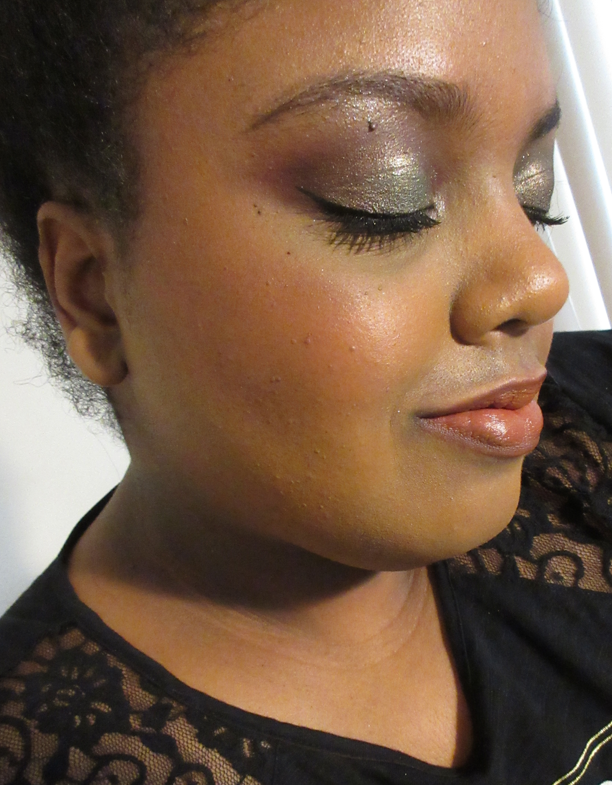
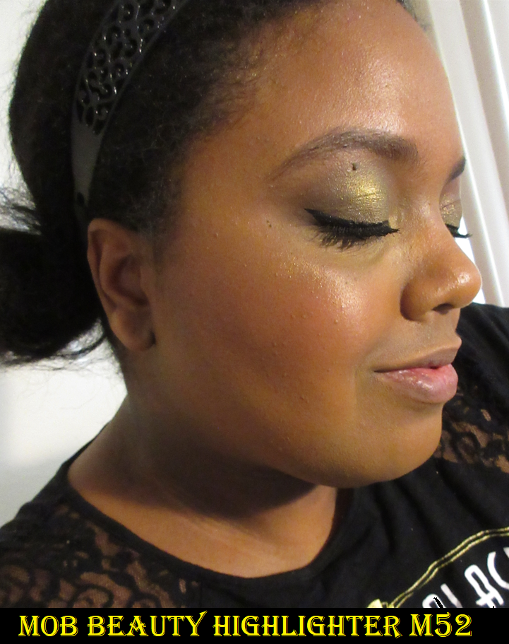
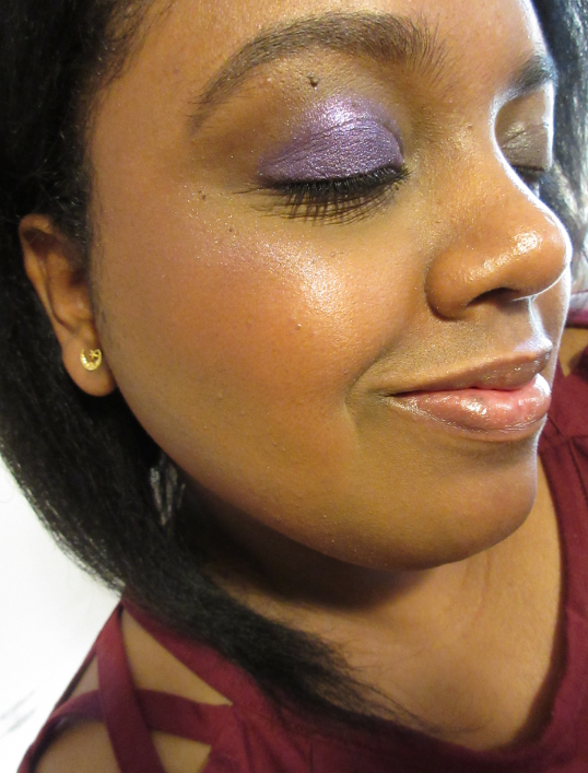
In addition to photos of lip swatches up close, I like to also show a pulled back photo to show how well or not the lip products compliment my complexion. In these photos, I’m wearing the Hourglass Ambient Soft Glow Foundation, Lisa Eldridge eyeshadows on both eyes, Velvet Affair lipstick on the lips and cheeks, my mix of lip liners around my lips. I also have on the Melt Cosmetics Ultra-Matte Bronzer and the MAC x Whitney Houston highlighter.
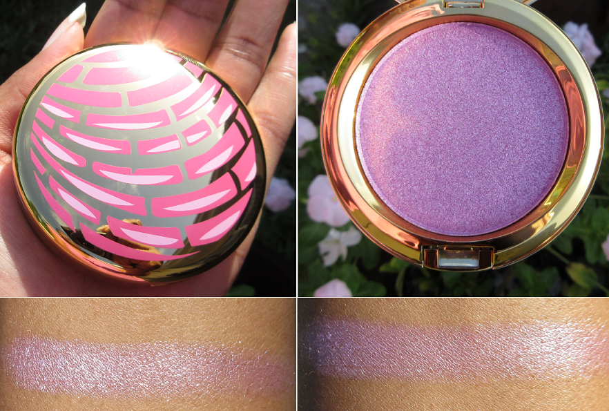
I have the Luxuriously Lucent Lip Colour in Meet Me in Berlin on my wishlist for the same reason as the Liquid Lurex Eyeshadow in Liza…because of my difficulty with resisting products that I have a personal connection to. In the case of the lippie, it’s because of my boyfriend in Germany. In the case of the liquid eyeshadow, it’s because it’s my sister’s name (though pronounced differently). Truth be told, I’m not a single eyeshadow (unless depotted) or liquid shadow type of gal, but if I were, it would be Titania and Zora that would be more my speed. So, it’s very likely that a review of the Liquid Lurex, Luxuriously Lucent Lip Colour, and additional Eye Shadows from a future launch can be expected in Part 2 in 2023.
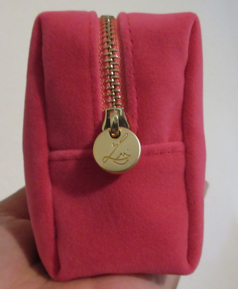
Velvet Makeup Pouches
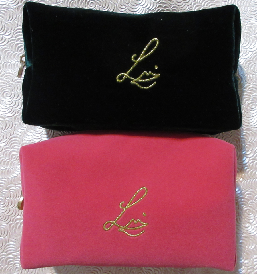
These can normally be purchased for $25 each in various colors. However, there is currently a deal that a free bag will come with every purchase of three or more items. The Pompadour color was available with the eyeshadow launch. At some point they ran out and I saw the blue one there for a short time, the cherry red one for a short time, the Emerald which I made a purchase to get, and then the Pompadour shade returned. There was one point where no bags were in stock at all and therefore no gift with purchase option with it.
I didn’t think these were that special until I actually got the first one in my hands. I love the luxurious texture of the bag, the pretty logo, the variety of colors, and the zipper. I actually keep my Lisa Eldridge products together in one because of how well they fit in it. I can see why these are collectable to some people and if a purple variation was released, I would likely be willing to buy it outright!
For Oden Eye’s Saga of Freja collection, they had an exclusive sage green velvet makeup bag for those who bought the entire bundle and I just couldn’t do that when I didn’t want the majority of the collection. So, I’ve had the dreaded feeling of having missed out. In a way, the Emerald bag from Lisa Eldridge has finally filled that void even though they are different sizes and shapes entirely.
Ordering Experience
Apparently, the brand has a distributor in the US and worked out some kind of deal to keep the shipping free for US customers. That has been one of the reasons it’s been so much easier for me to talk myself into making the additional purchases (when I told myself I’d only buy the Sorcery palette and nothing else).
Ordering from the website was hassle free. The shipping is fairly quick and so far has taken anywhere from 3-7 days to arrive. It only tends to be longer if I made a purchase just before the weekend.
The items are well packed and instead of generic cardboard boxes, they are white with the brand’s logo on the inside. I haven’t had any order mixups and everything has arrived intact. For that reason, I’ve had no need to interact with customer service, but I’ve heard they’re great.
The only thing I wish was that I could actually create a customer account so I could see my order history in one place and keep a wishlist on the website. However, it might be for the best not to have that kind of thing stored.
So, overall, my ordering experience has been great with this brand. The prices are a bit hard to swallow, but my interest in Lisa Eldridge makeup has increased a lot and I look forward to seeing more.
That’s everything I’ve got! Thank you for reading! Also, if I messed up the shade names, please excuse that. I have been calling several shade names the wrong thing for three weeks and only in this past week I realized my mistake and had to fix all the errors I could spot.
-Lili ❤