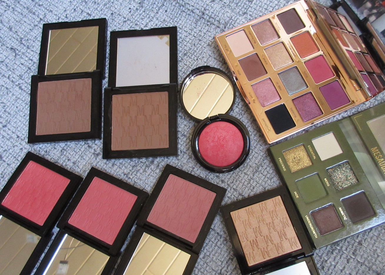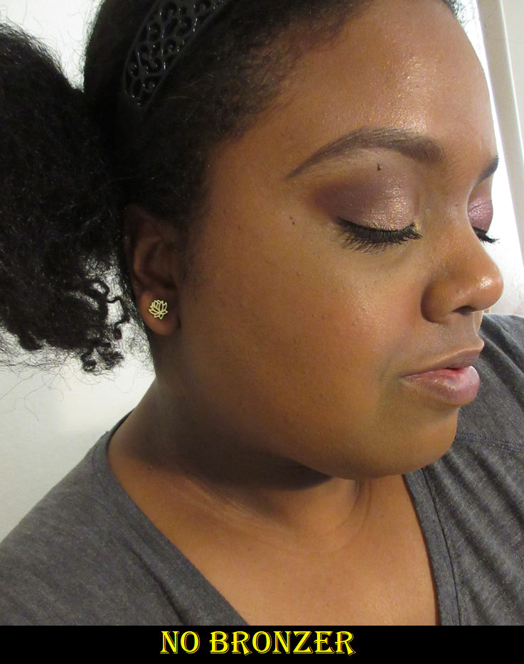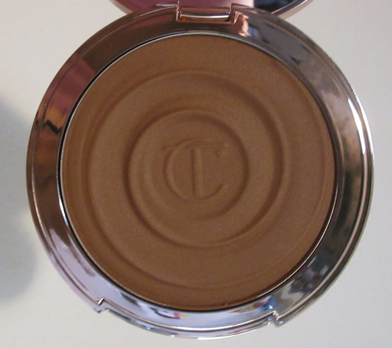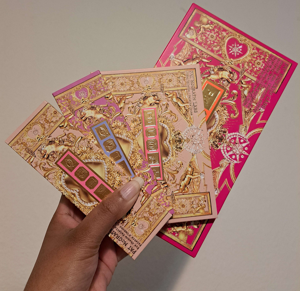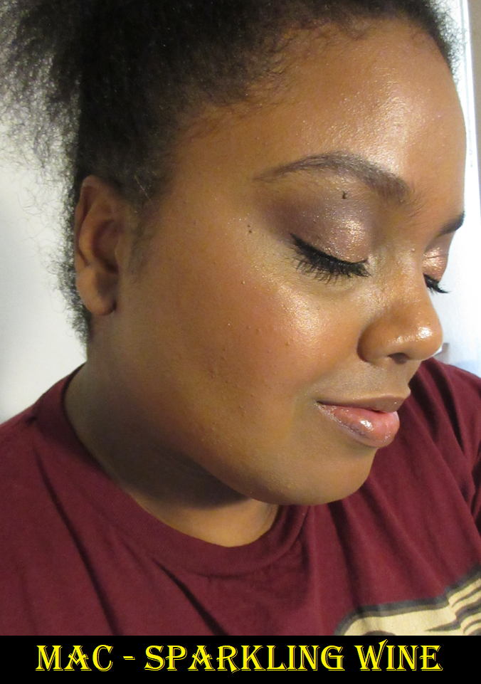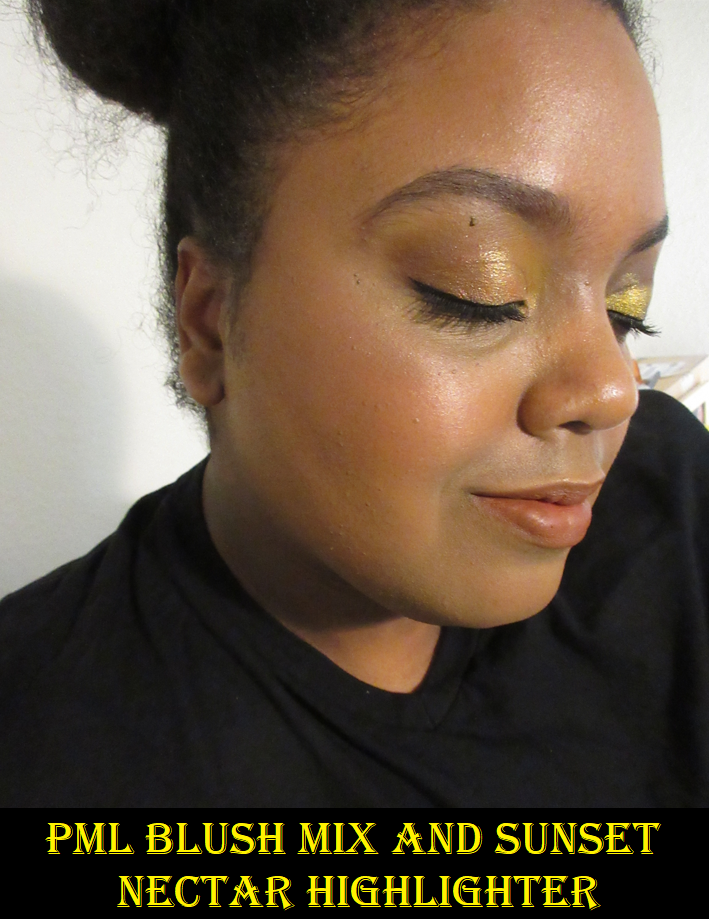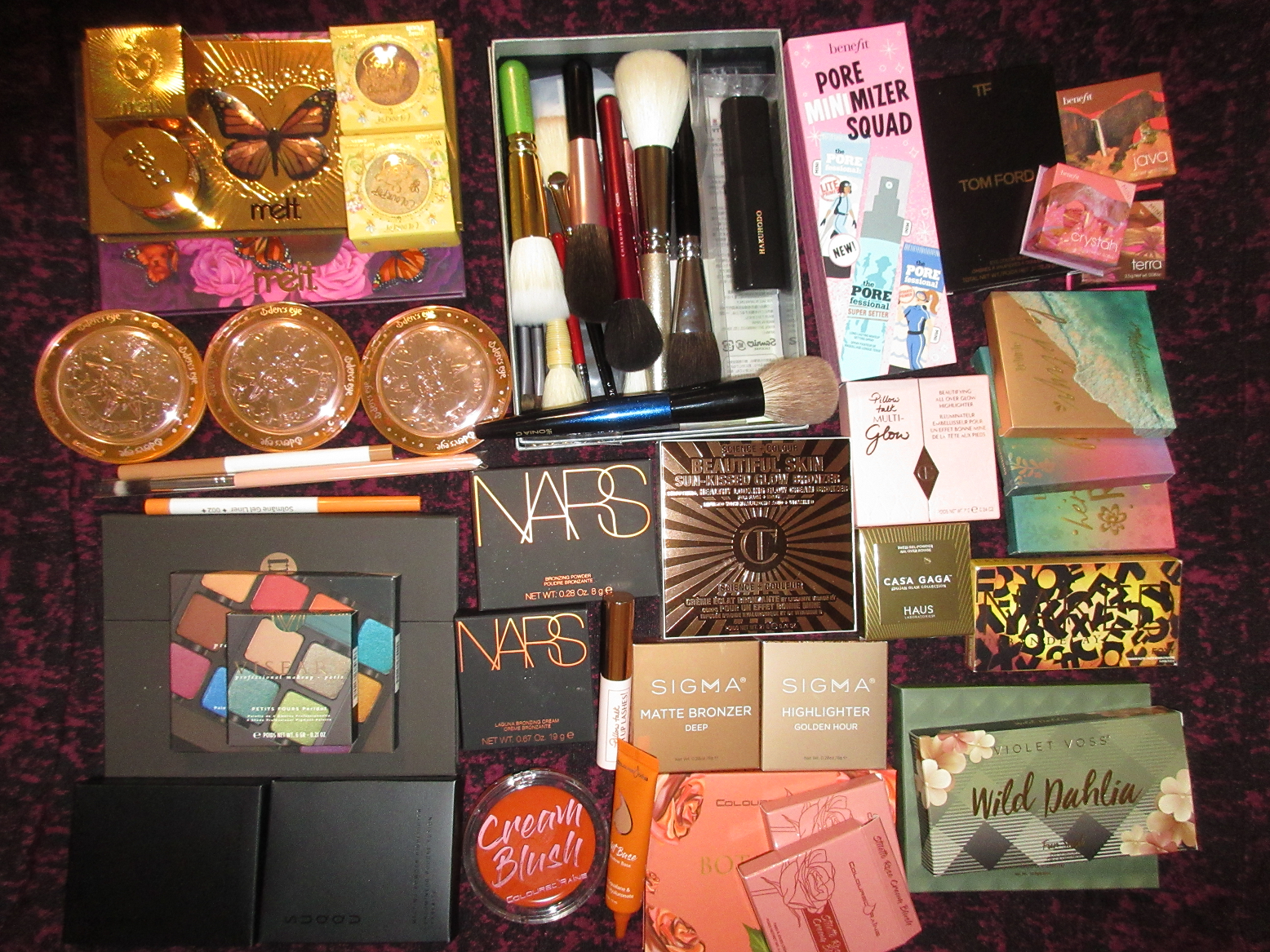
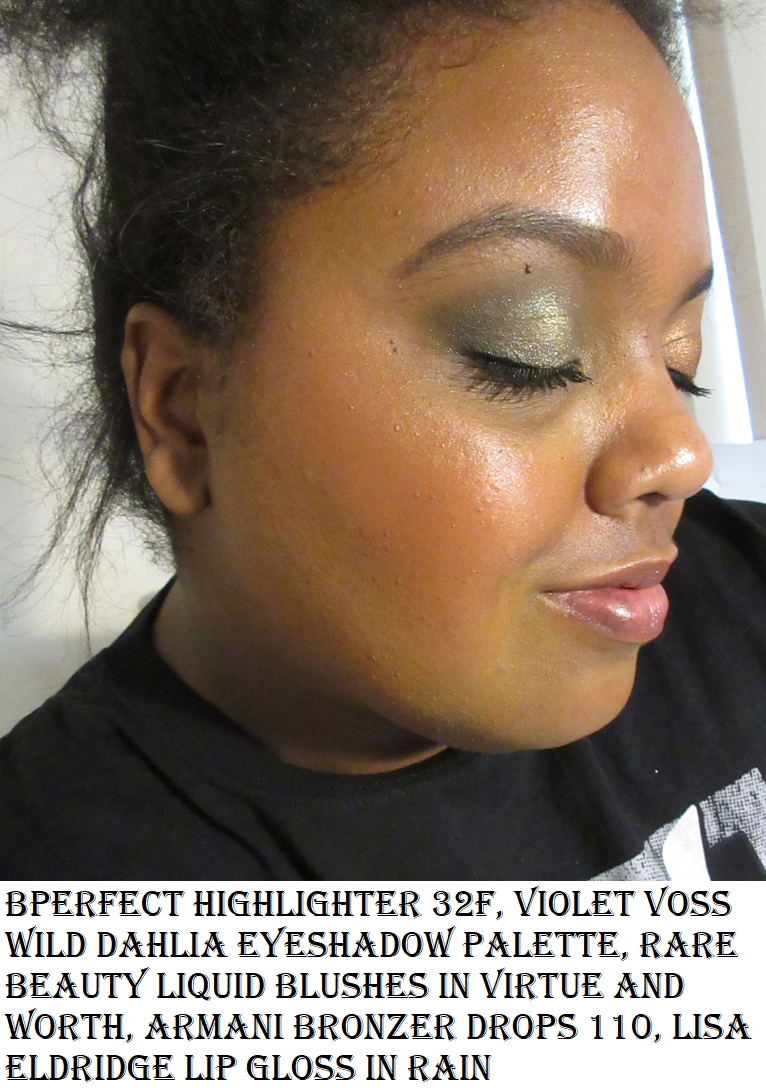
It’s officially one year since this monthly haul/low-buy series post should have been published. There are products I bought that should have been reviewed by now and are still relevant in my makeup collection. So, continuing with the series on and off as much as I can is something I wish to do. That brings us to our discussion for today! The photo above shows the products I bought this time last year that I will dive into, and add links to the reviews I did manage to post already.
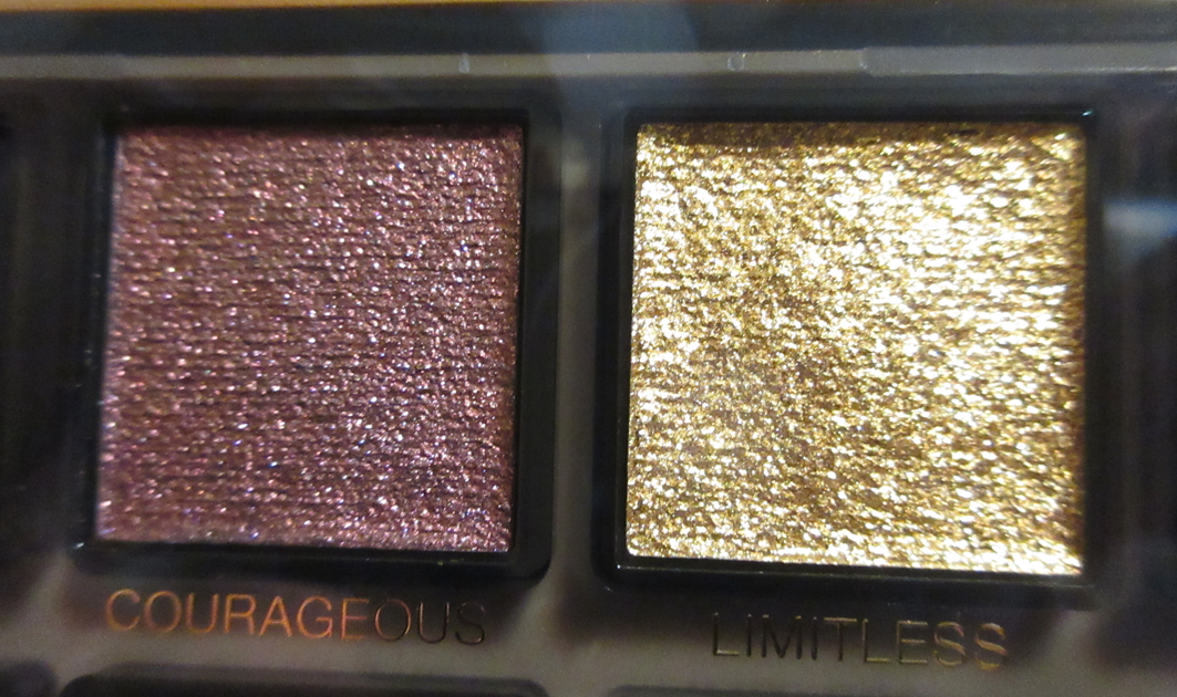
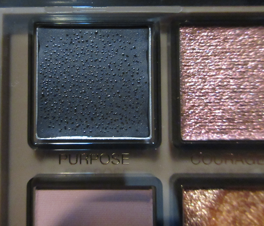
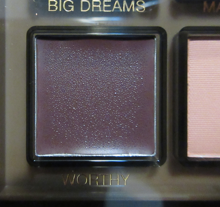
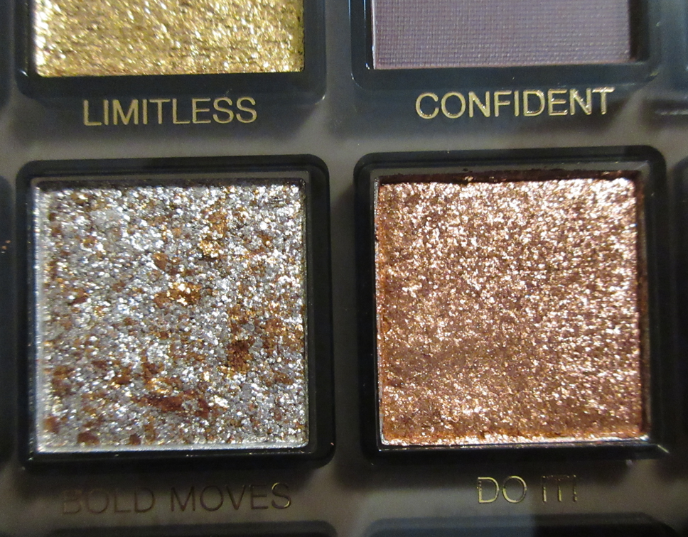
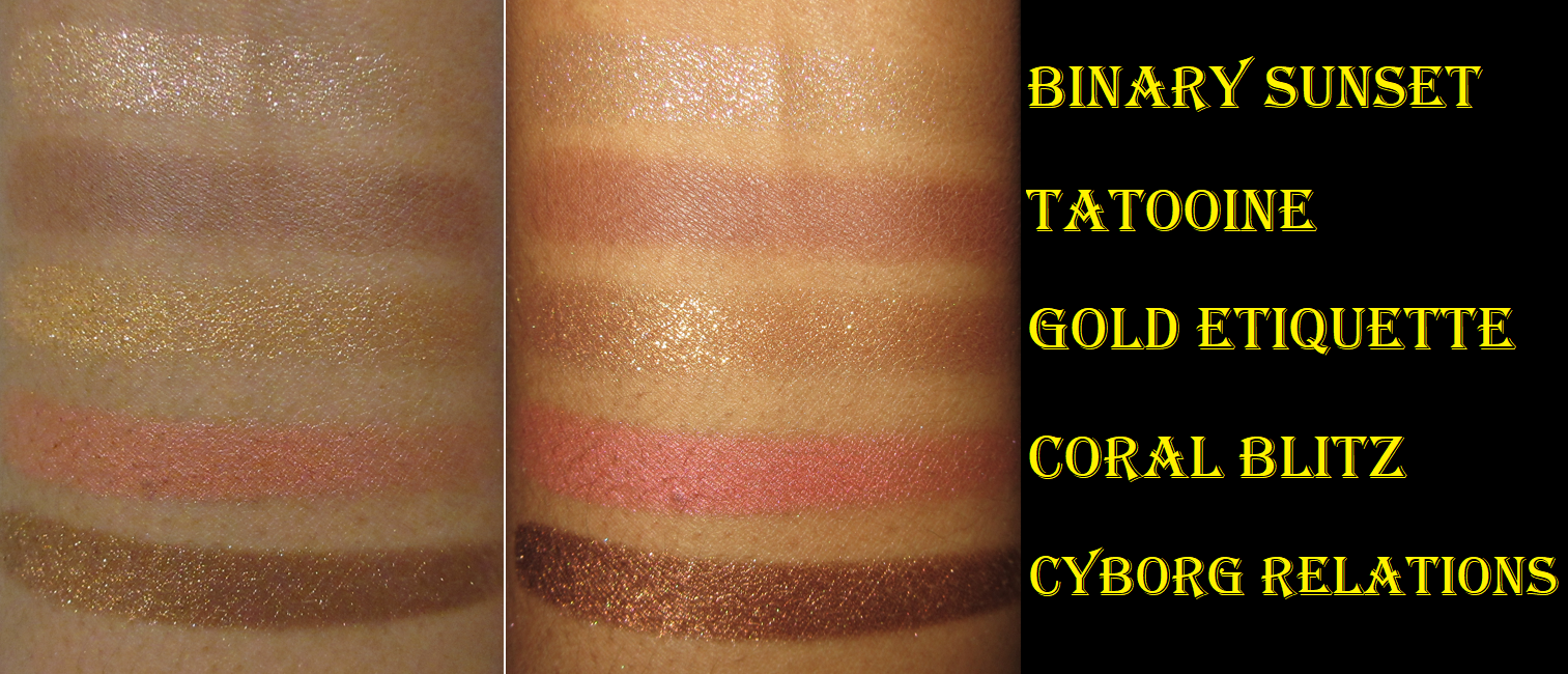
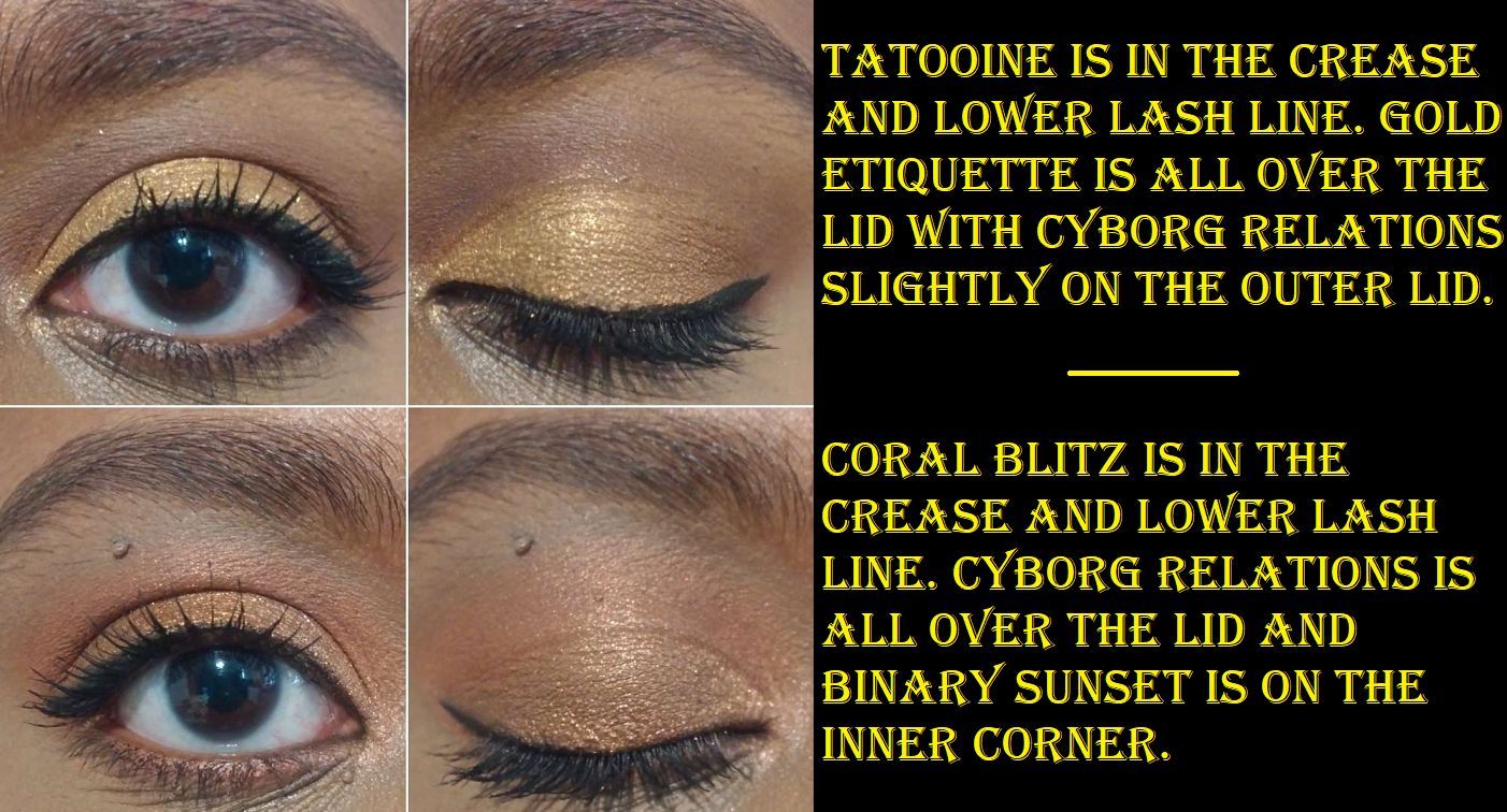
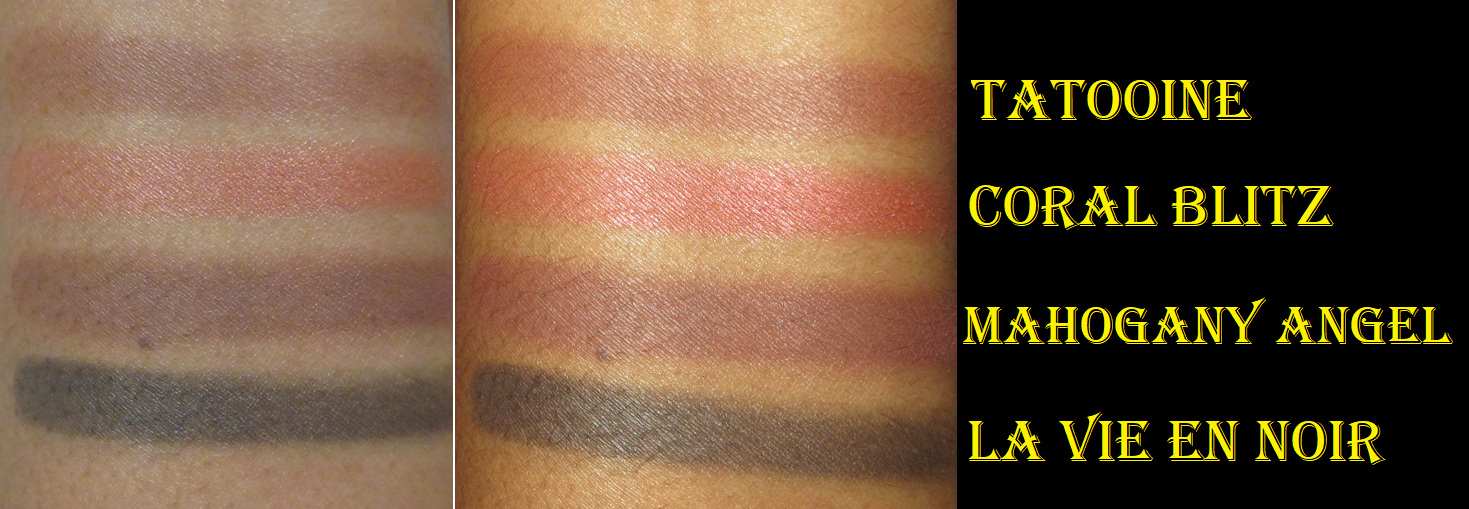
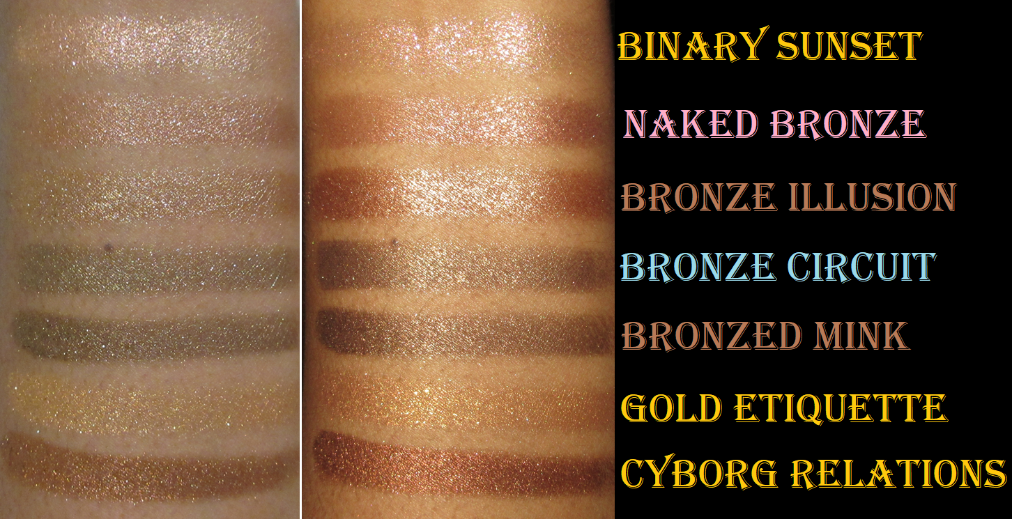
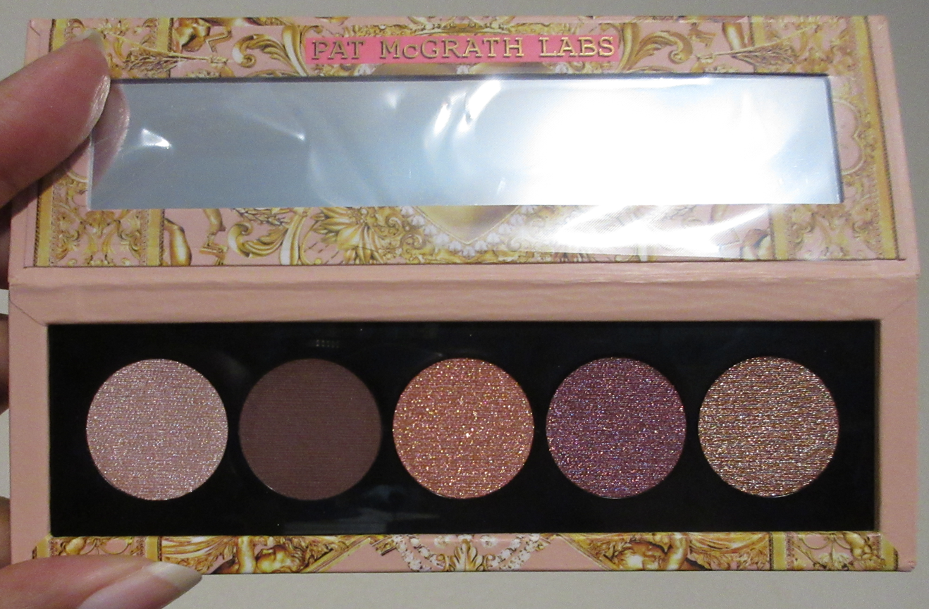
Tom Ford Eyeshadow Quad in African Violet
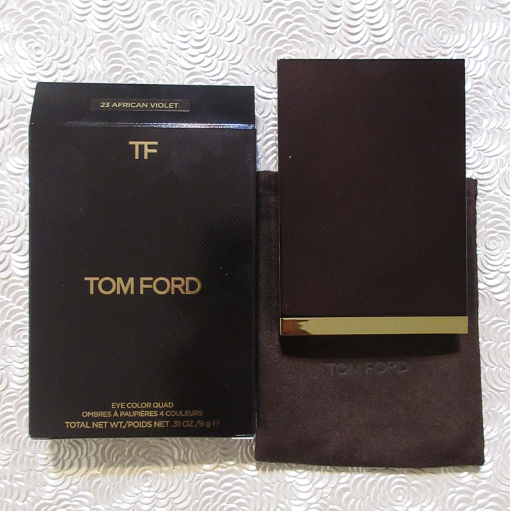
I bought this from the Cosmetic Company Store website (Estee Lauder Brand Outlet), and the other Tom Ford quads I own were purchased from people who said they also bought it from a CCO. Of course, I have no way of verifying the validity of that, but I think they are legitimate based on how they look compared to the one I purchased last May.
I was planning to do a dedicated Tom Ford post, but scrapped the idea because I’m no longer enamored by the brand. The eyeshadow quality is nice, and in some cases extremely nice, but I would never say they’re worth full price. I remember a time when they used to be $80, but now they’re up to at least $90. I can’t even bring myself to pay the lower Selfridges price despite their quality being admittedly better than Guerlain’s and I’ve spent more on a Guerlain quad than these at under $40 each. But, it’s actually not the price that is the problem as much as the lack of shades. At least with a Pat Mcgrath product, which has formulas I like, I can pay a similar price and have many more color options with it.
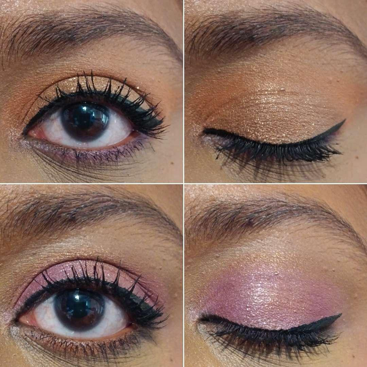
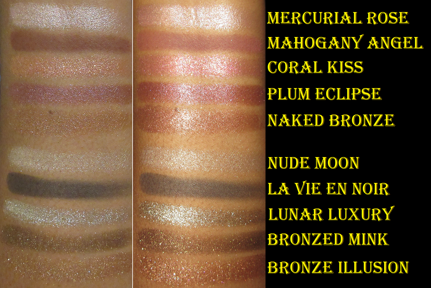
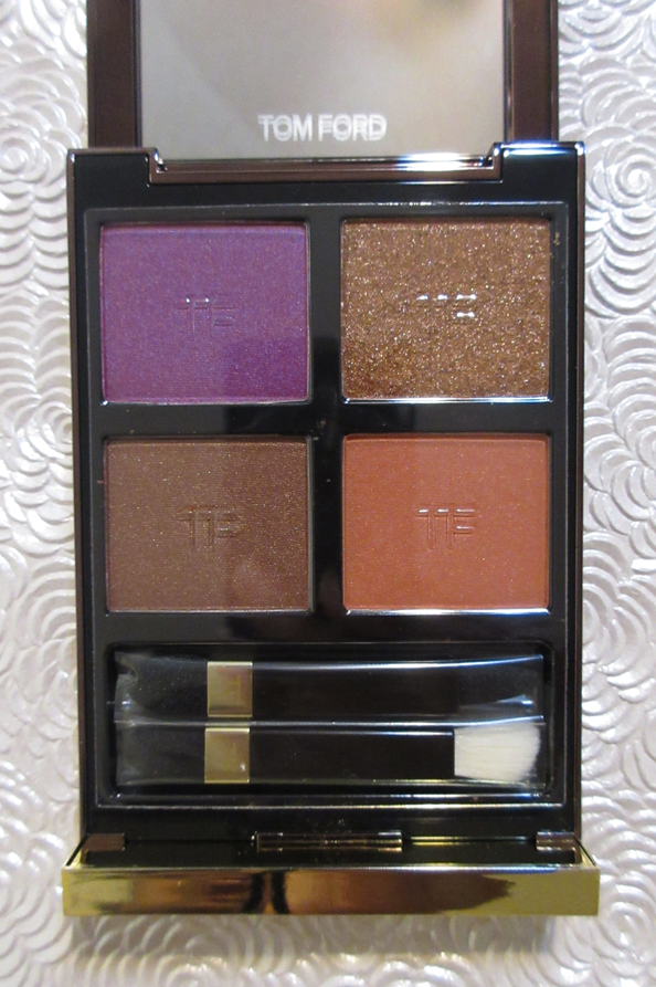
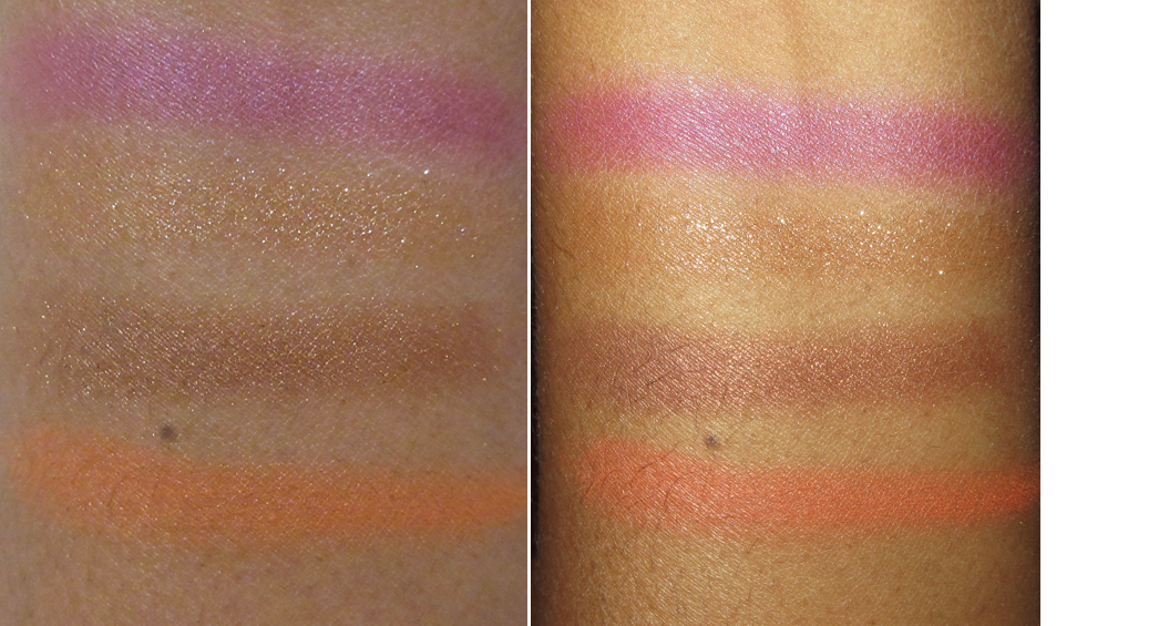
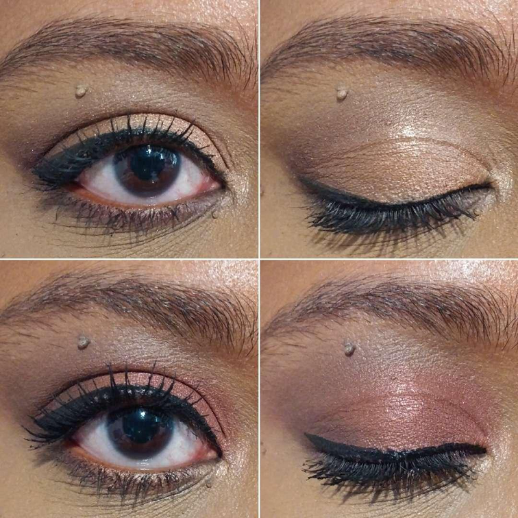
The African Violet palette specifically appealed to me because it’s one of the most colorful available from Tom Ford. However, it’s not as smooth, shiny, or blendable as the Wet/Dry formula everyone raves about. The eyeshadows are long lasting, have decent color payoff, and don’t give me trouble with fallout or kickup, but there’s absolutely nothing special about them beyond their performance being good. I can name a ton of brands with well performing eyeshadows in palettes that cost less than half the price with at least double the shade options.
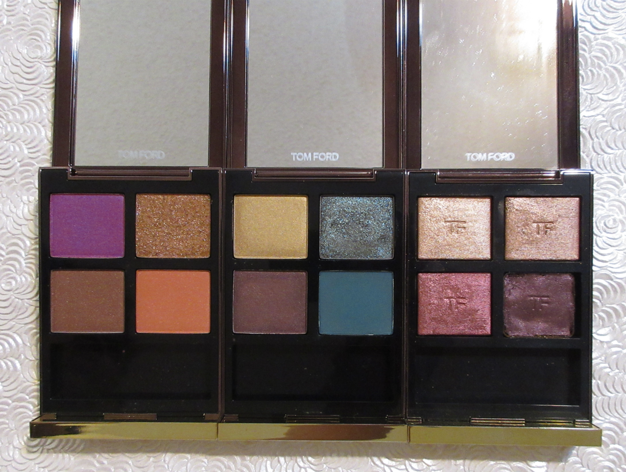
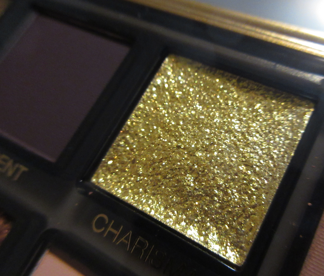
The other quads I own are Photosynthesex and Honeymoon (one shade in Honeymoon fell out and off the plastic grid, so I pressed it back into a spare eyeshadow pan and turned that empty well into a custom magnetic one so that I could continuously swap out any other brand’s eyeshadow that fits).
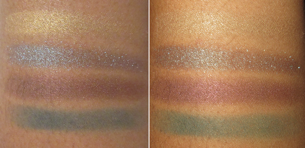
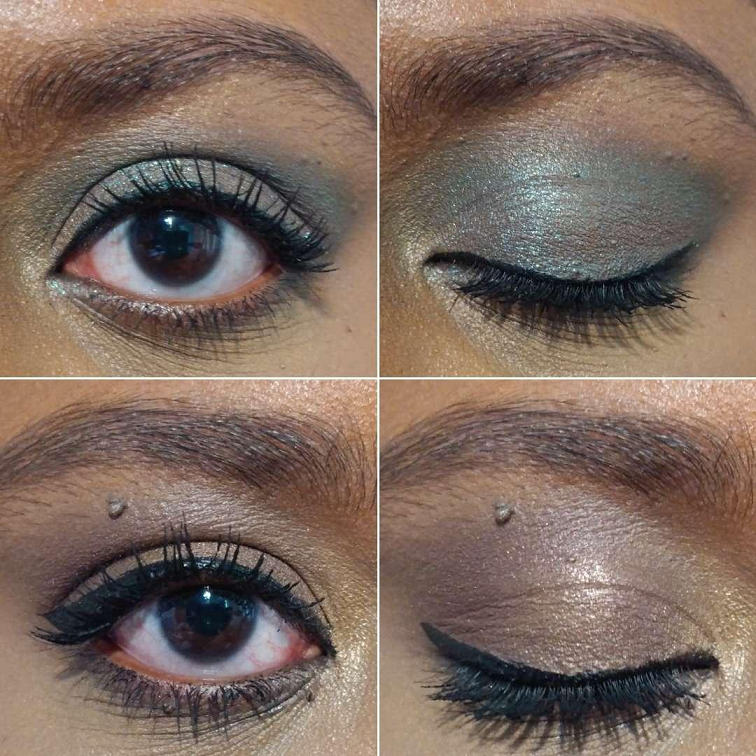
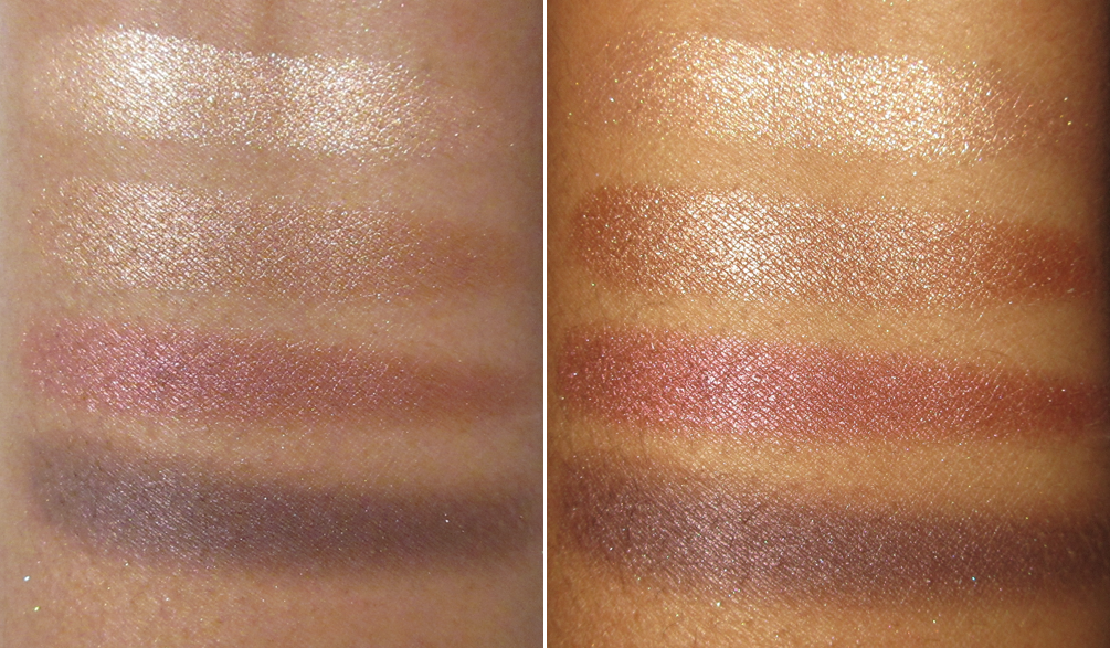
The quality of Photosynthesex is about the same as African Violet, but it contains a beautiful duochrome and I like the color story way more, so I get more use out of it. Honeymoon is the famed Wet/Dry formula which surpasses the others. It’s more special because of the shiny finish, the minimal effort needed to blend, the refined shimmer that don’t cause issues of creasing, and being flattering on textured eye areas. However, I still feel it’s worth half the retail price at the most. I understand the brand name and luxury packaging bumps up the price, but the sturdy yet basic plastic packaging doesn’t feel as special anymore considering the fun limited edition compact colors they release every so often. I believe the eyeshadows are a pricier formula than some others out there (even within the Estee Lauder owned brands), but I feel the markup is still too high. This is why I don’t foresee myself purchasing any additional Tom Ford quads unless I get it for a price that reflects what I think it’s worth and is in the preferred wet/dry finish. I’ve heard rave reviews about the newer cream formula, but I have not tried those. It’s typically the older quads that end up at the CCS/CCOs.
In addition, Tom Ford quads are incredibly repetitive in color stories and often contain similar shades that don’t look distinctly different enough on dark skin within the same quartet, let alone among the whole line. They’re also extremely neutral leaning. Give me some Wet/Dry greens and skip the brow bone shades, and they might just get another eyeshadow purchase out of me!
So, essentially what it comes down to is me thinking the eyeshadow quality from Tom Ford is good at the lowest and wonderful at best. I have no judgements to those who are fans of the quads. I get the appeal, even though I’m not their target customer. When it comes to luxury, everyone has their own ideas of what makes a product worth it to them versus something else. For me, having some Tom Ford highlighters was worth the splurge instead. I’ll have to review those at some point!
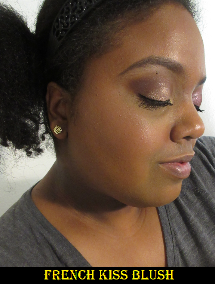
Haus Labs Casa Gaga Blush in Amarone – This was the first of the many blushes I ended up buying from the original Haus Labs collection before they rebranded away from Amazon. A review for it can be found HERE.
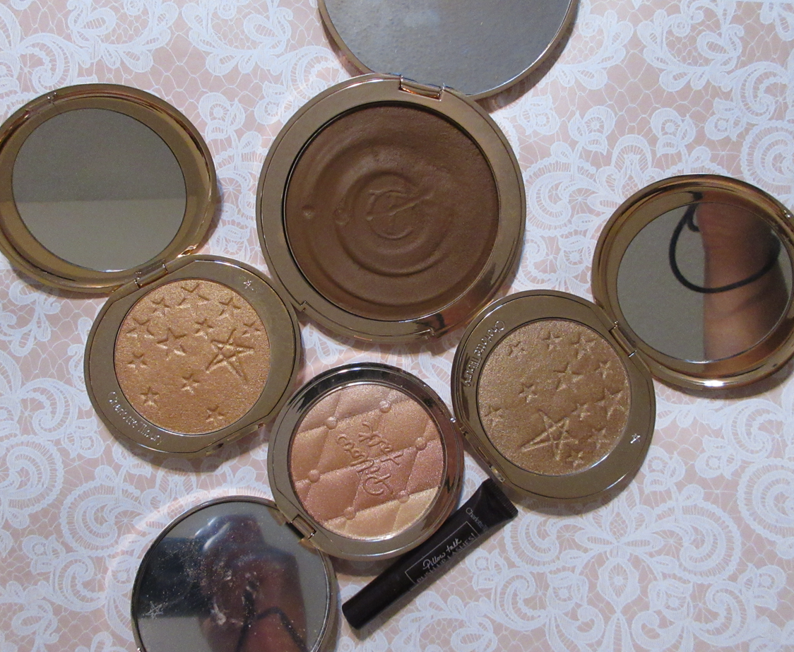
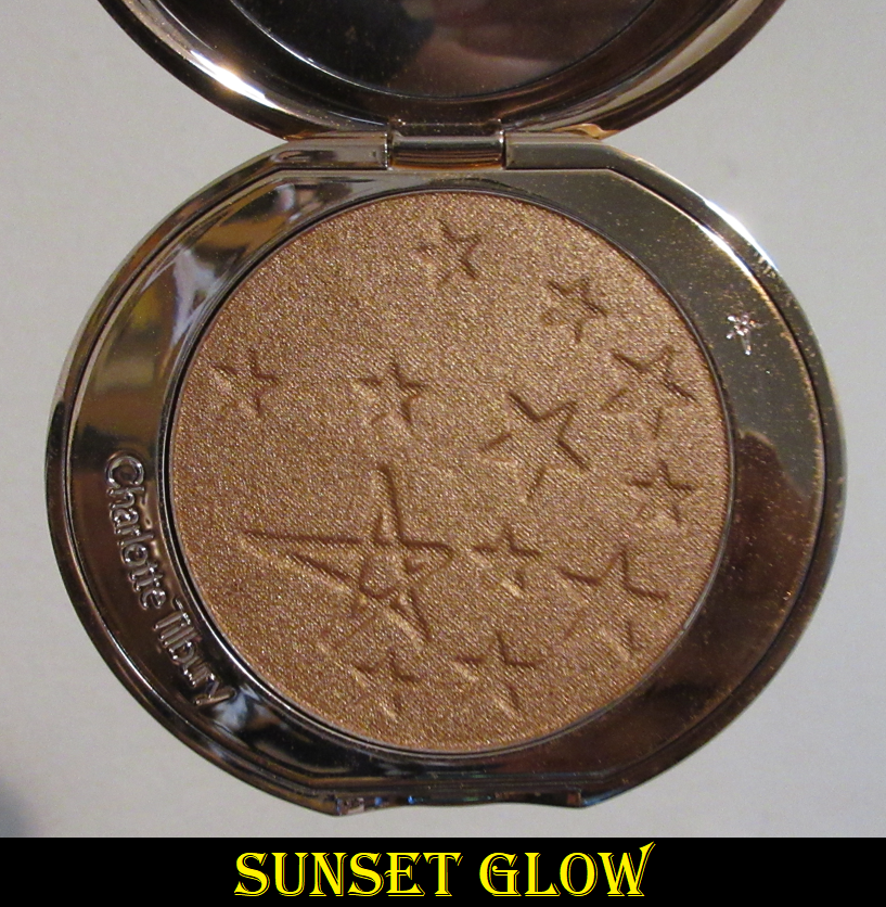
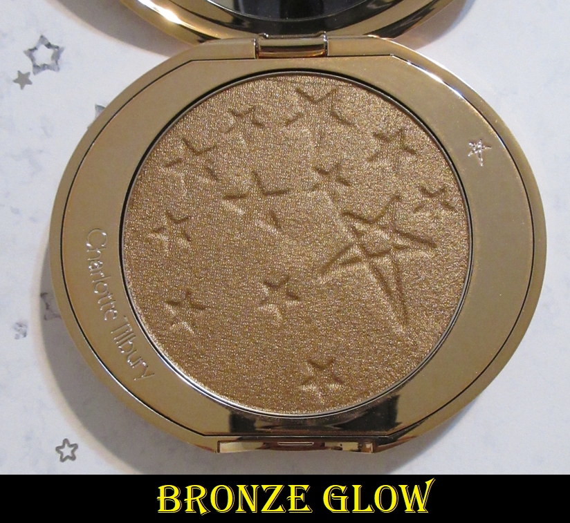
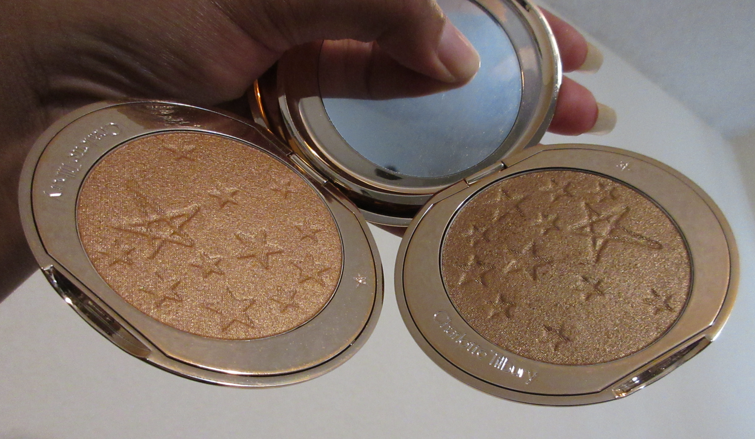
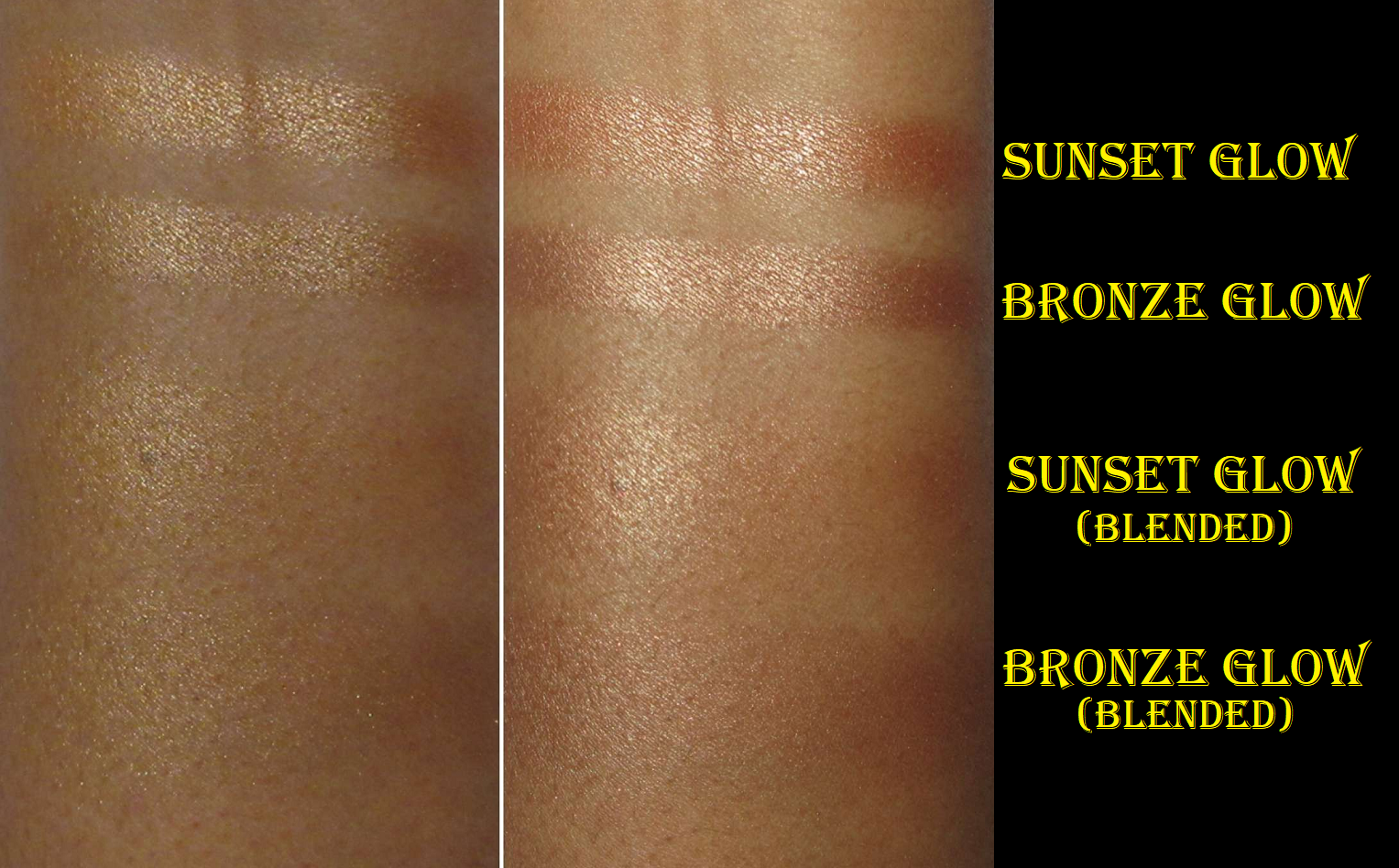
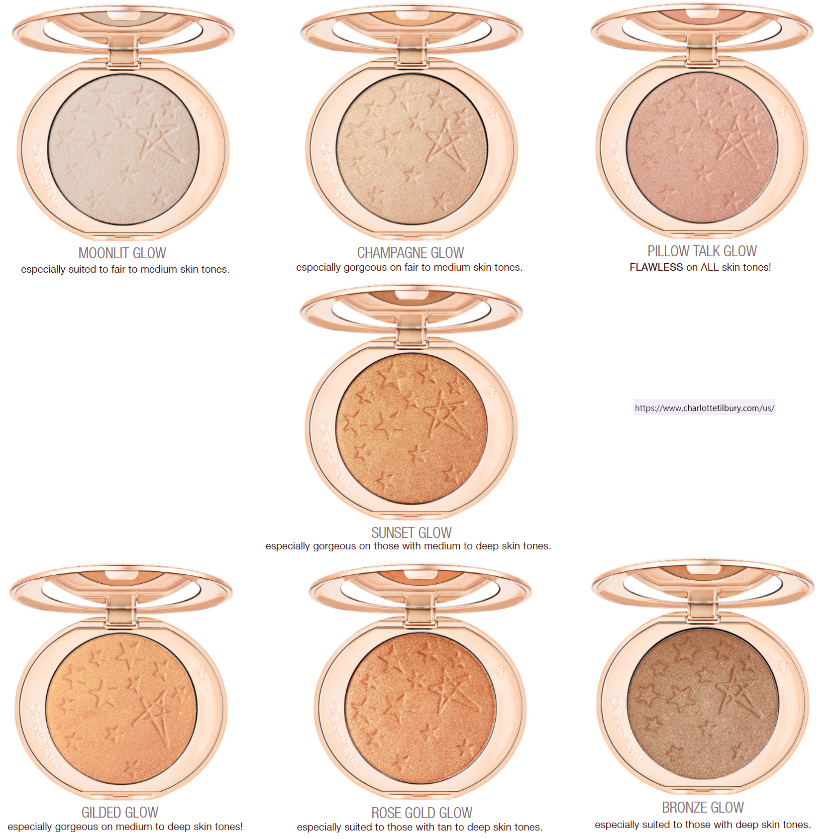
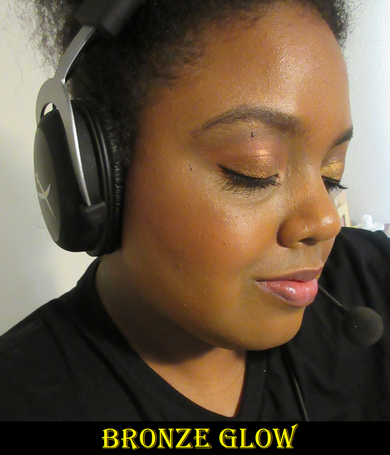
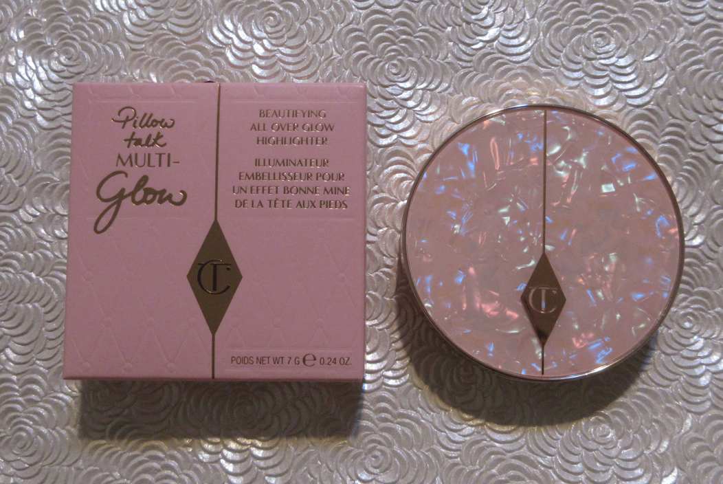
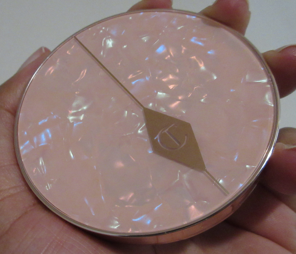
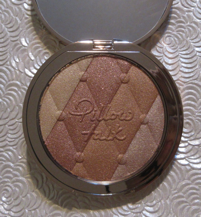
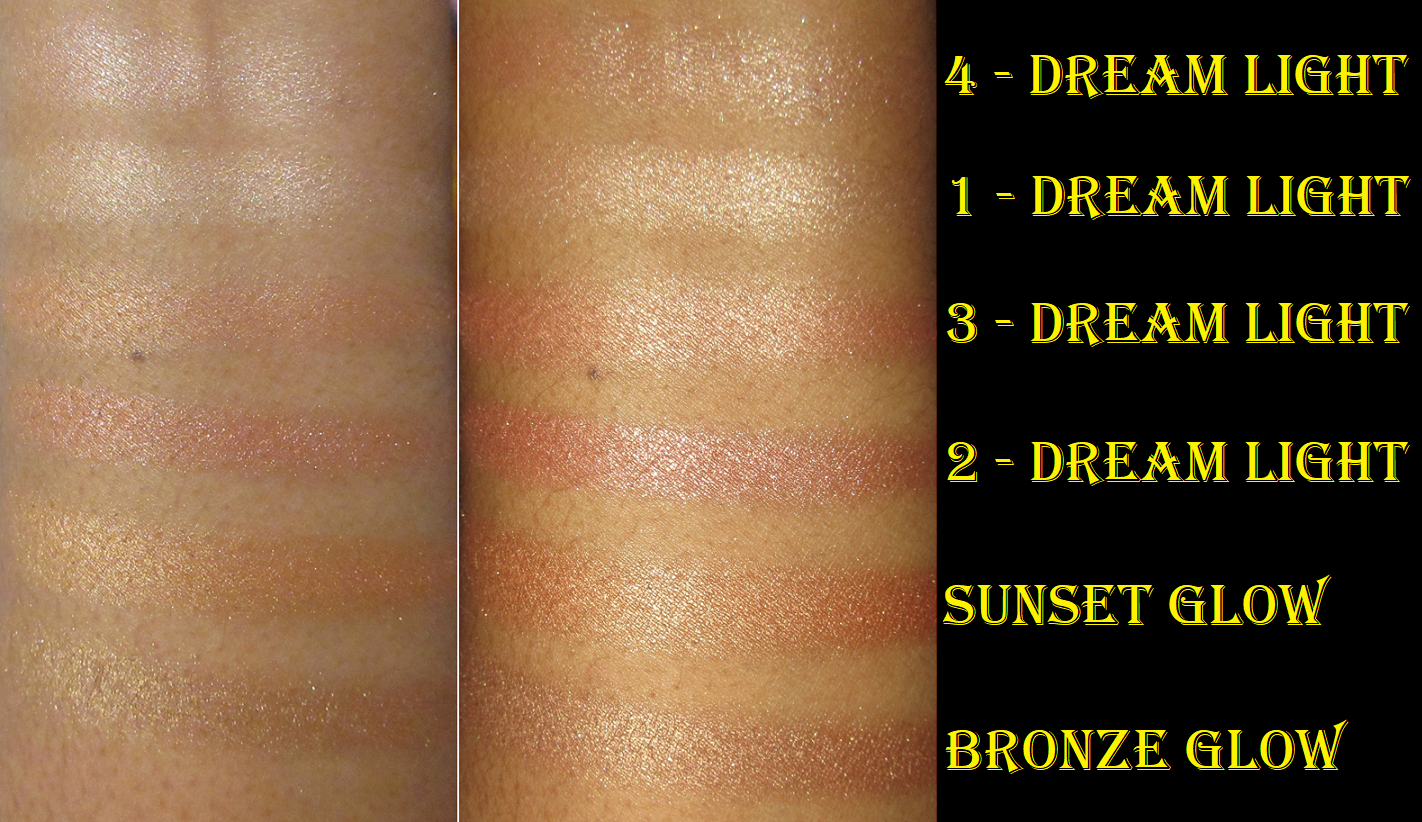
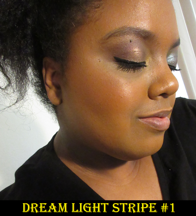
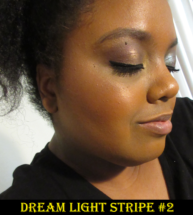
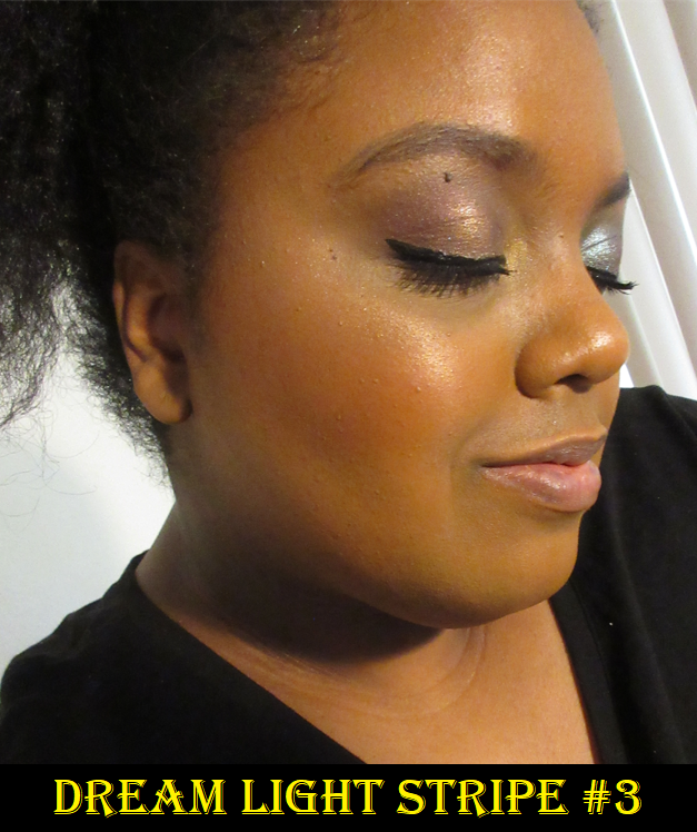
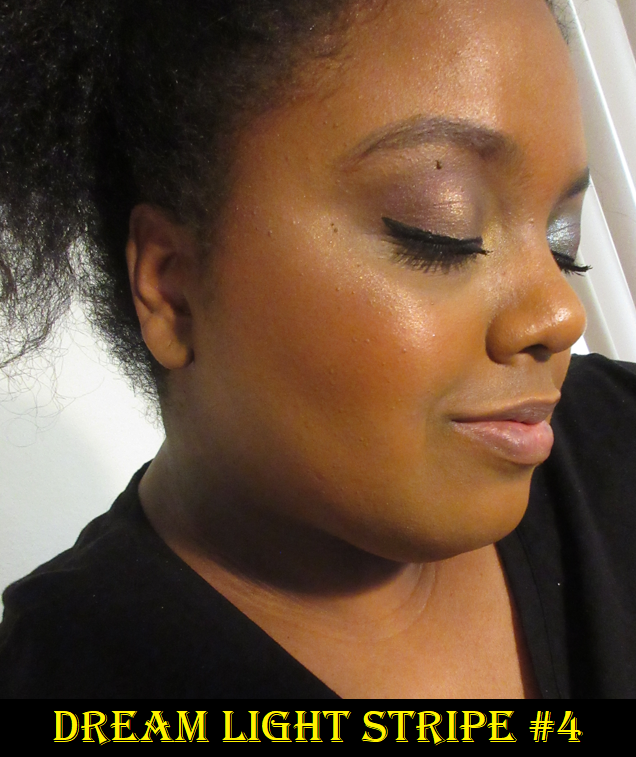
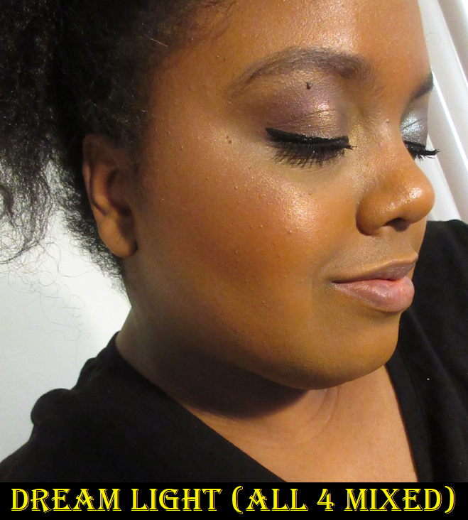
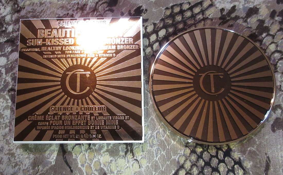
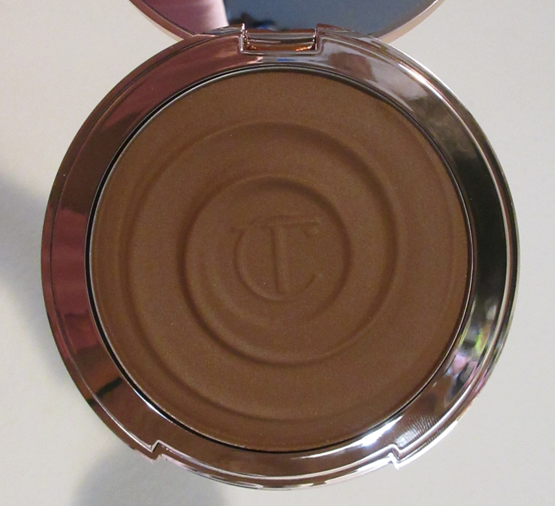
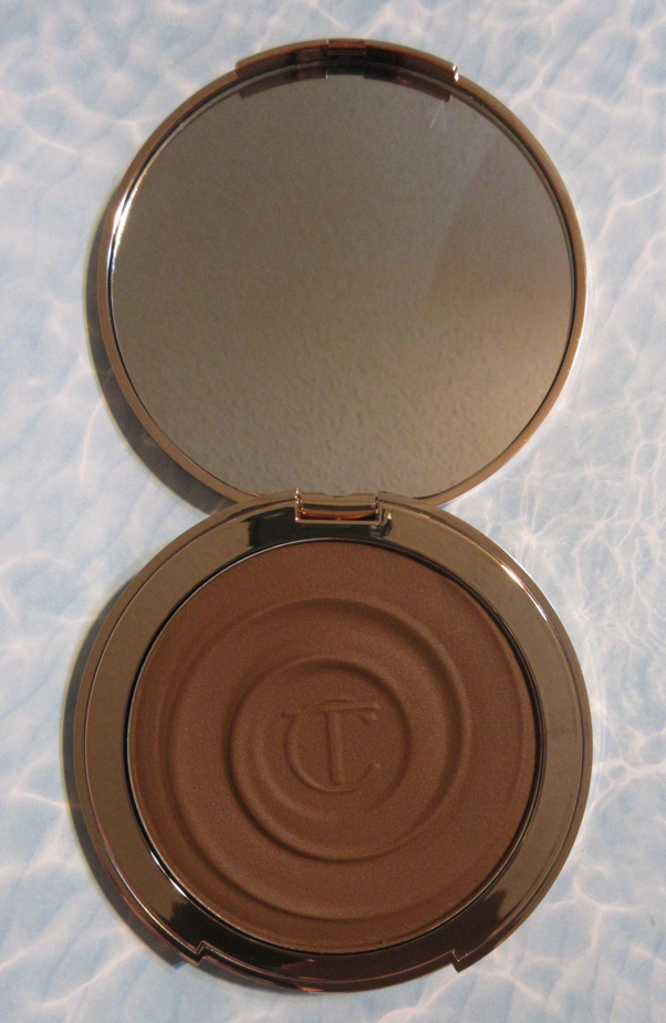
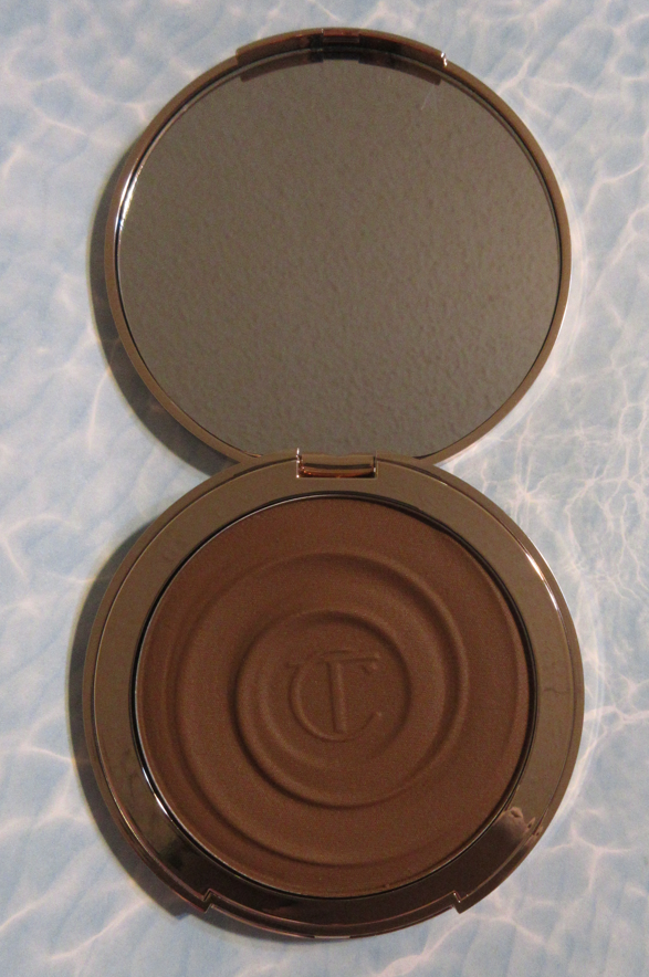
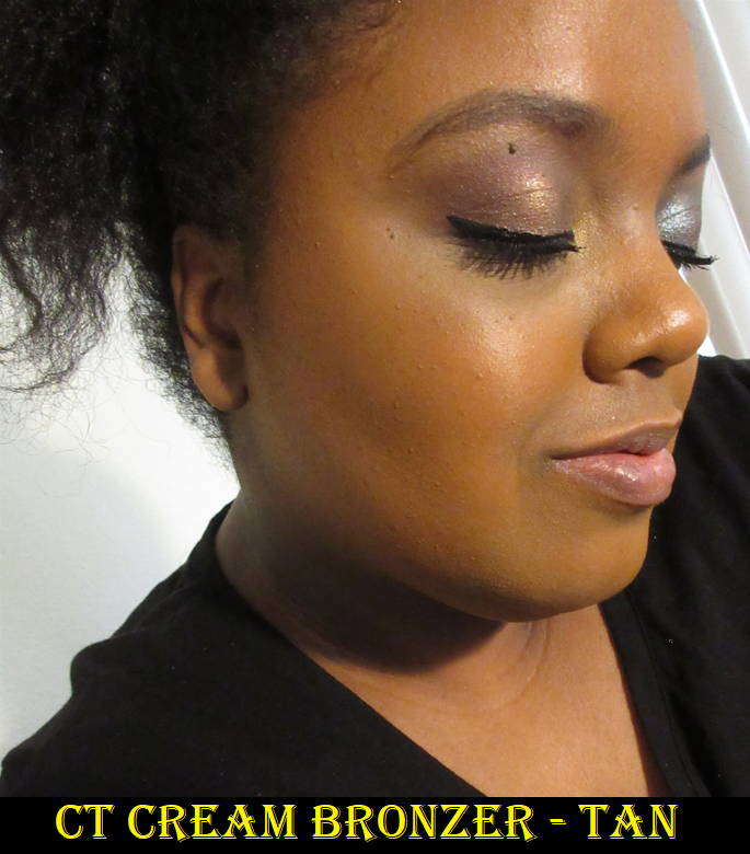
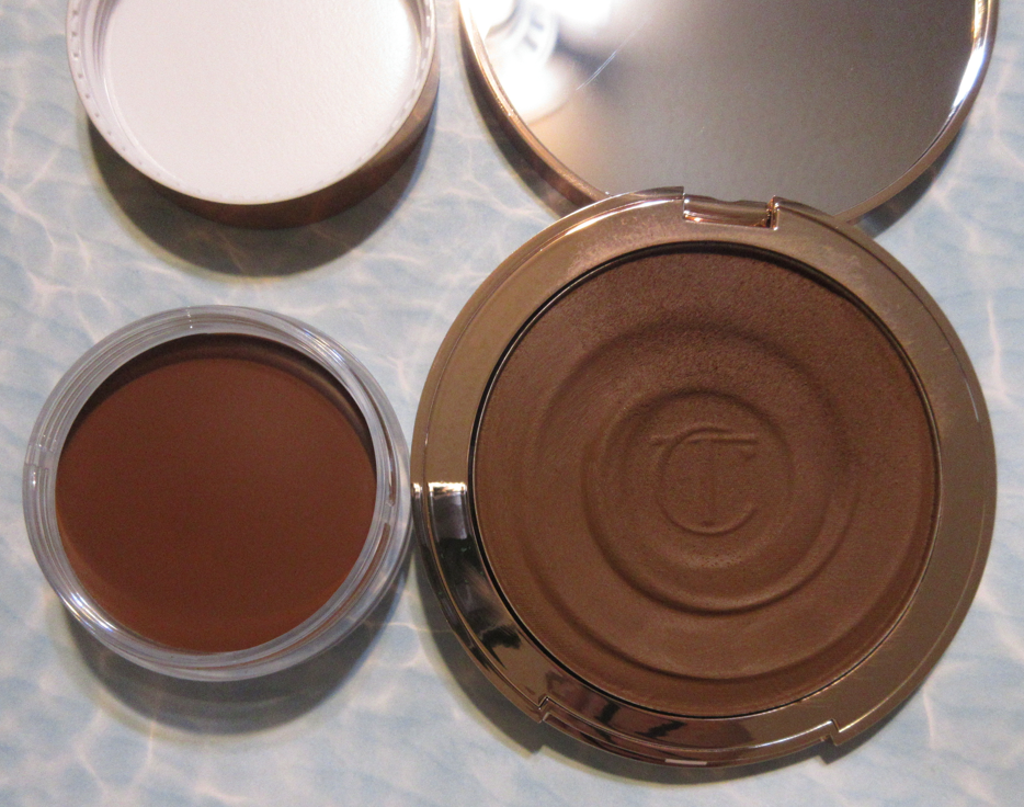
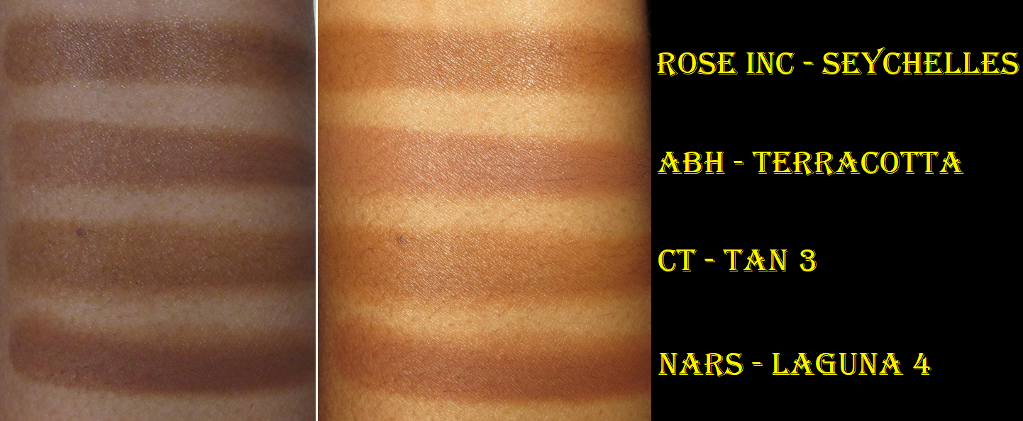
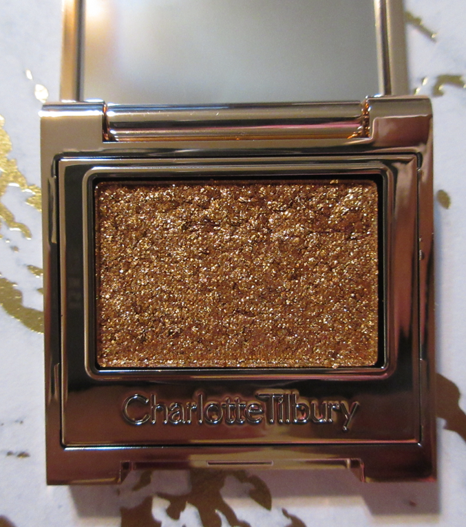
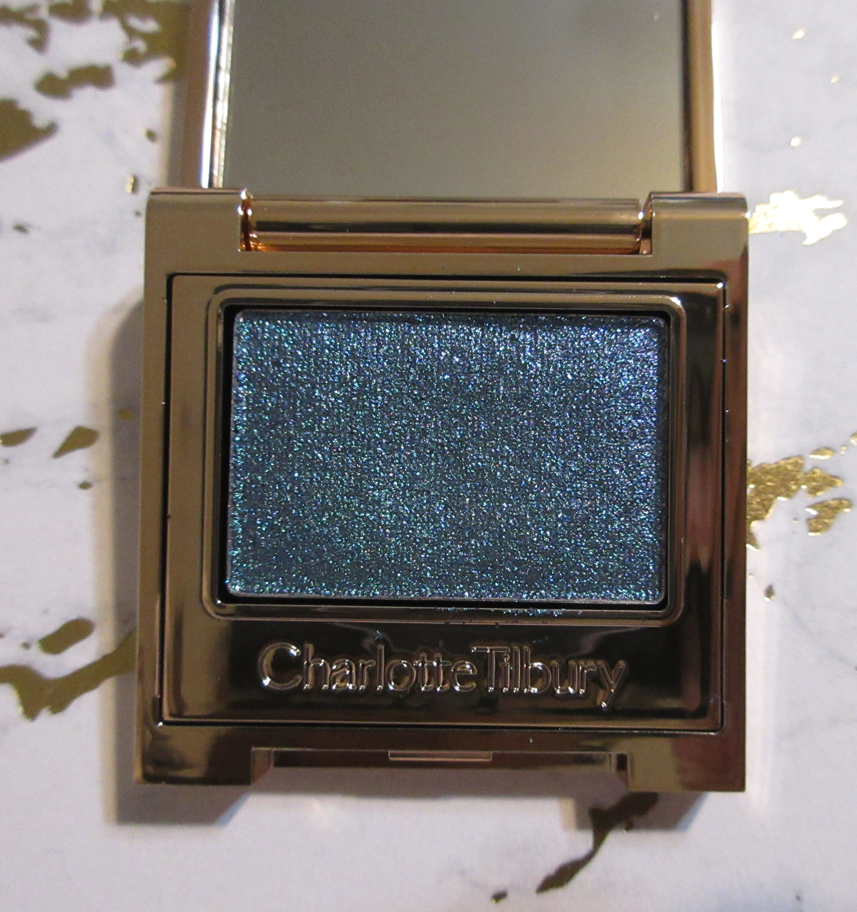
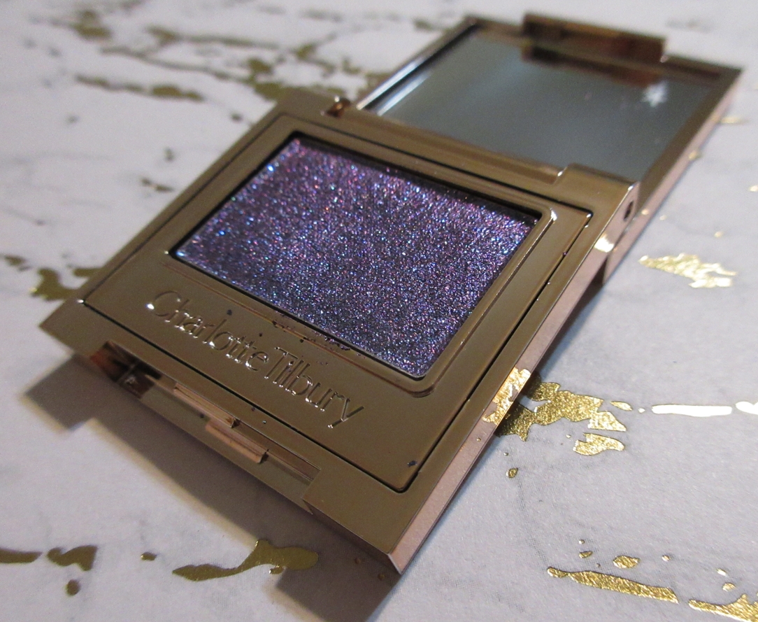
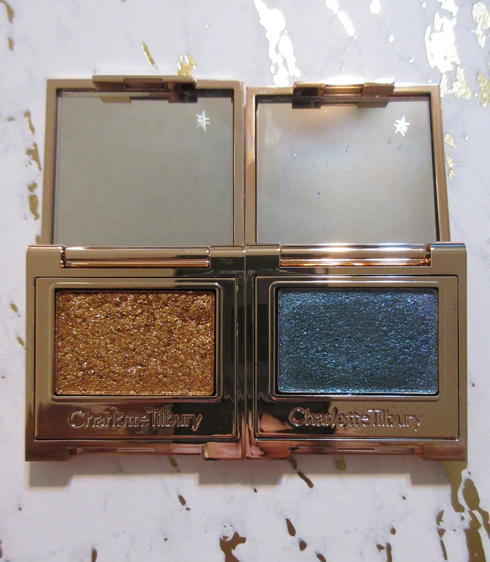
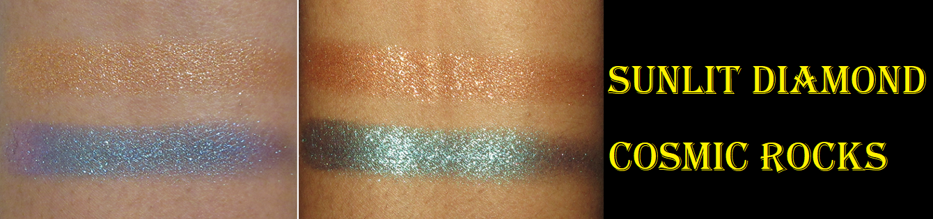
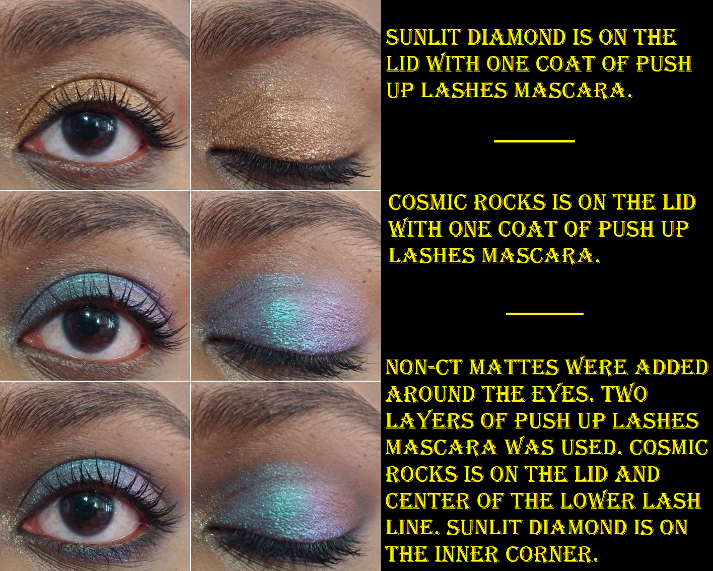
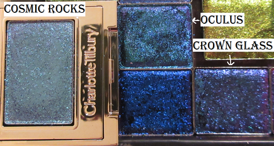
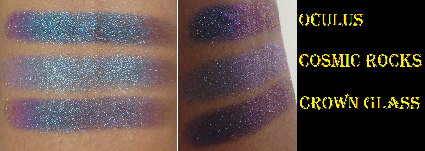
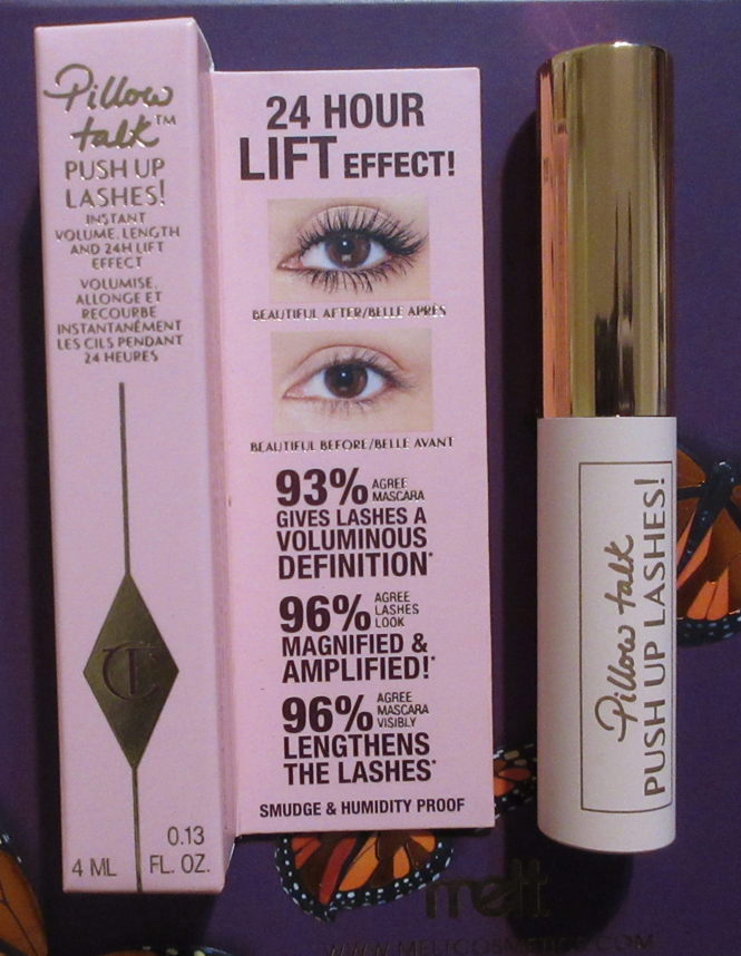
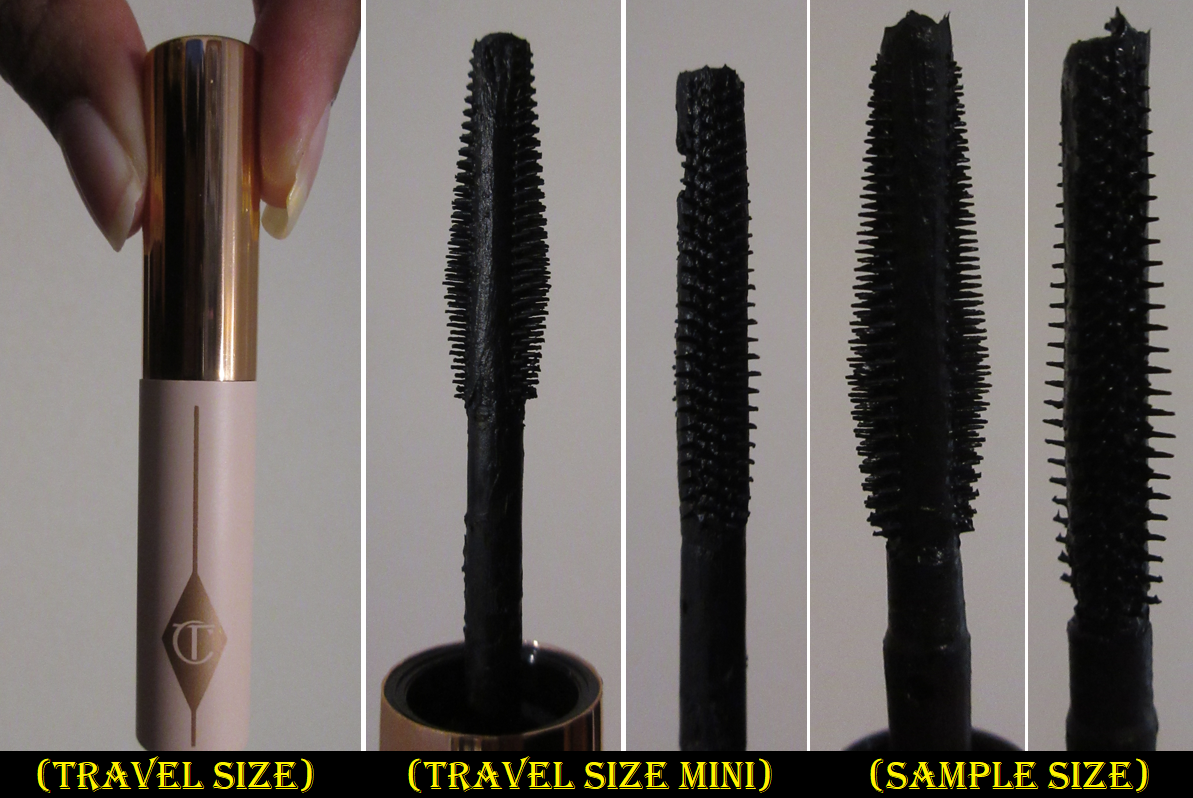
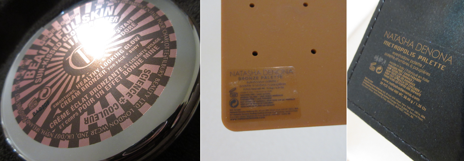
Charlotte Tilbury Pillow Talk Highlighter in Dream Light, Push Up Lashes mini mascara, and Beautiful Skin Sun-Kissed Glow Bronzer in 3 Tan – These items, plus newer releases from Charlotte Tilbury, have been reviewed HERE.
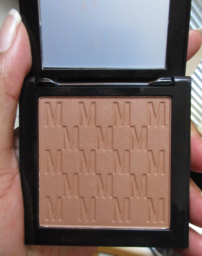
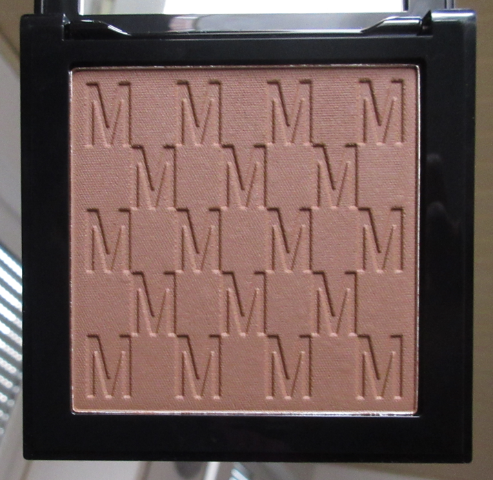
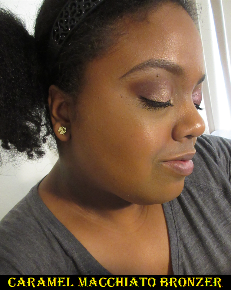
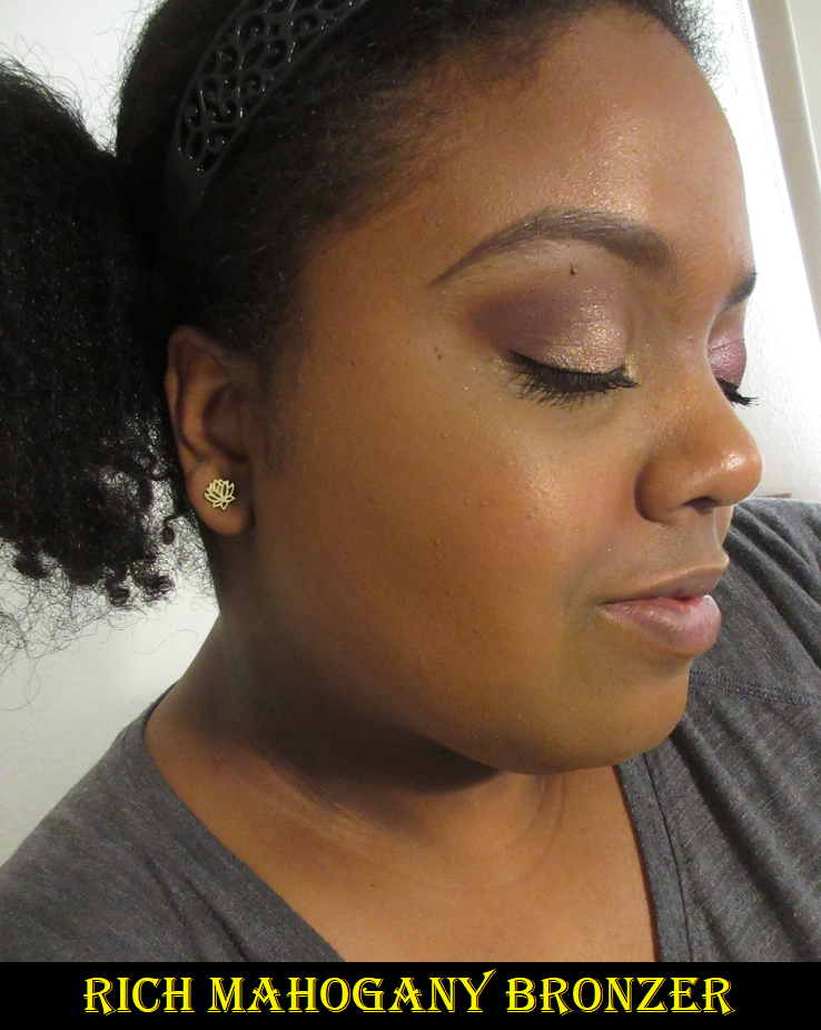
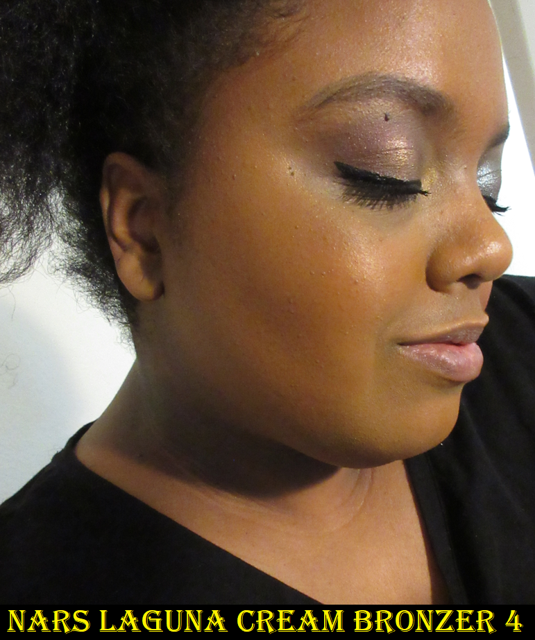
Nars Laguna Cream Bronzer in Laguna 04
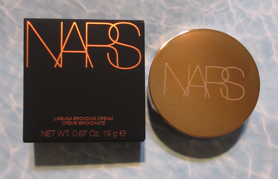
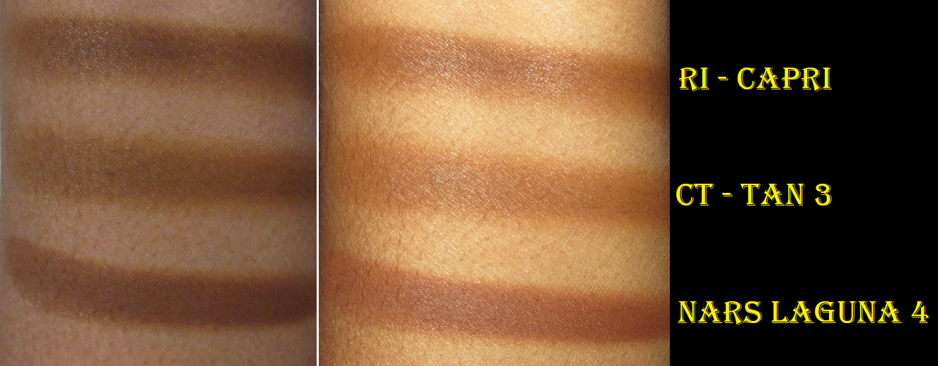
I’ve discussed this product a bit in my other cream bronzer reviews, but I’ll pretend like I haven’t. Essentially, this bronzer is quite emollient, blends nicely, has a strong but pleasant beachy scent, and has the benefit of not forming a weird top layer after repeated use. The downside for me is purely the color. I don’t mind a red toned bronzer as long as it isn’t too red. This has the misfortune of being a little more red on my face than I want, plus being a deeper shade that will probably work better in the summer, but is a bit dark for me now. For those who don’t mind the cons that I listed, I do think it’s a nice quality cream bronzer, but it’s admittedly not in my top favorites. I prefer the Charlotte Tilbury one (even though it’s more expensive) and the one from Anastasia Beverly Hills.
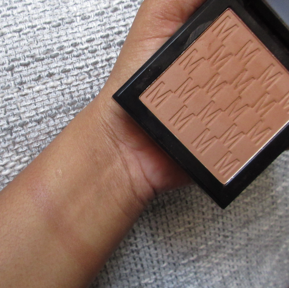
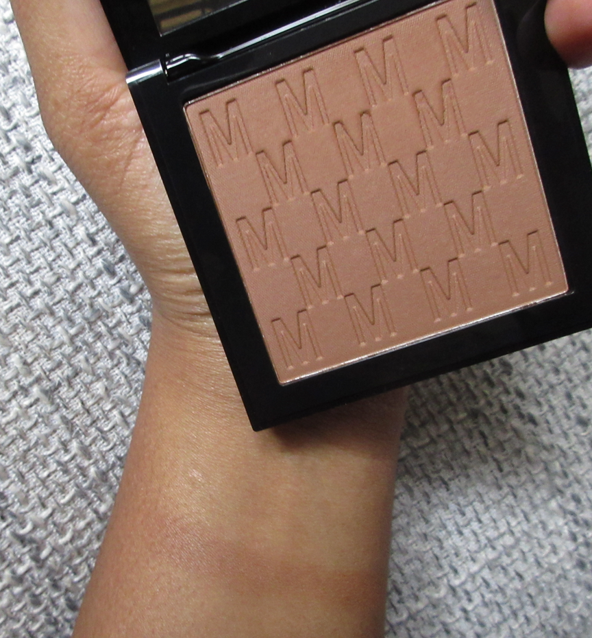
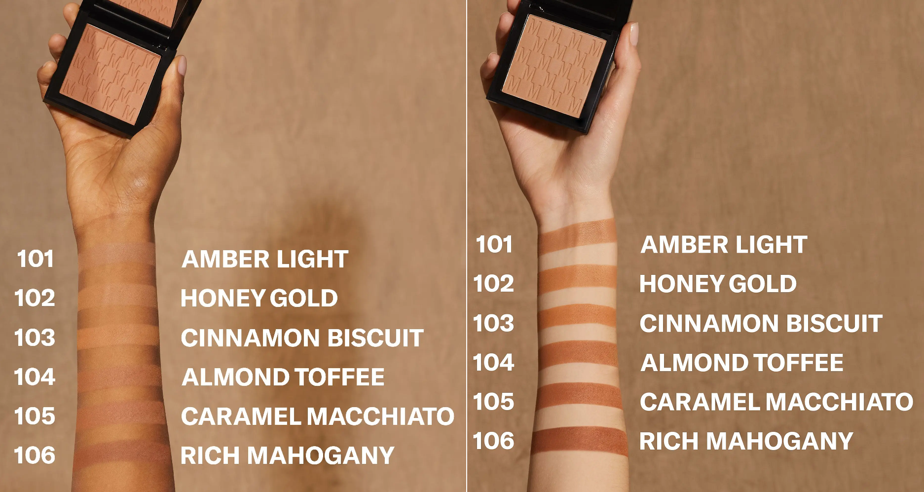
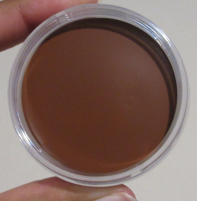
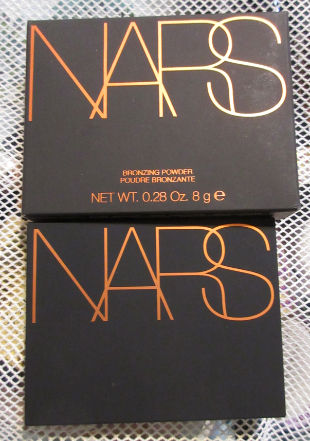
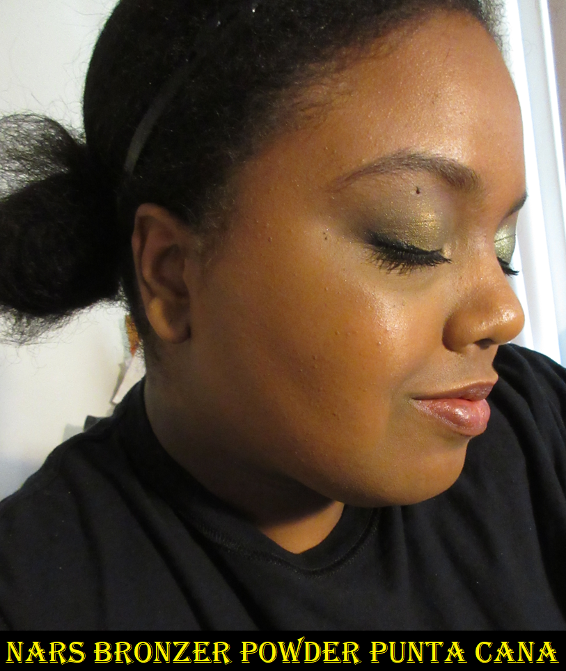
Nars Bronzer Powder in Punta Cana
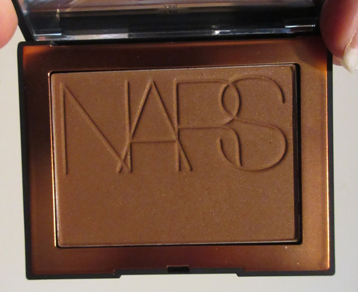
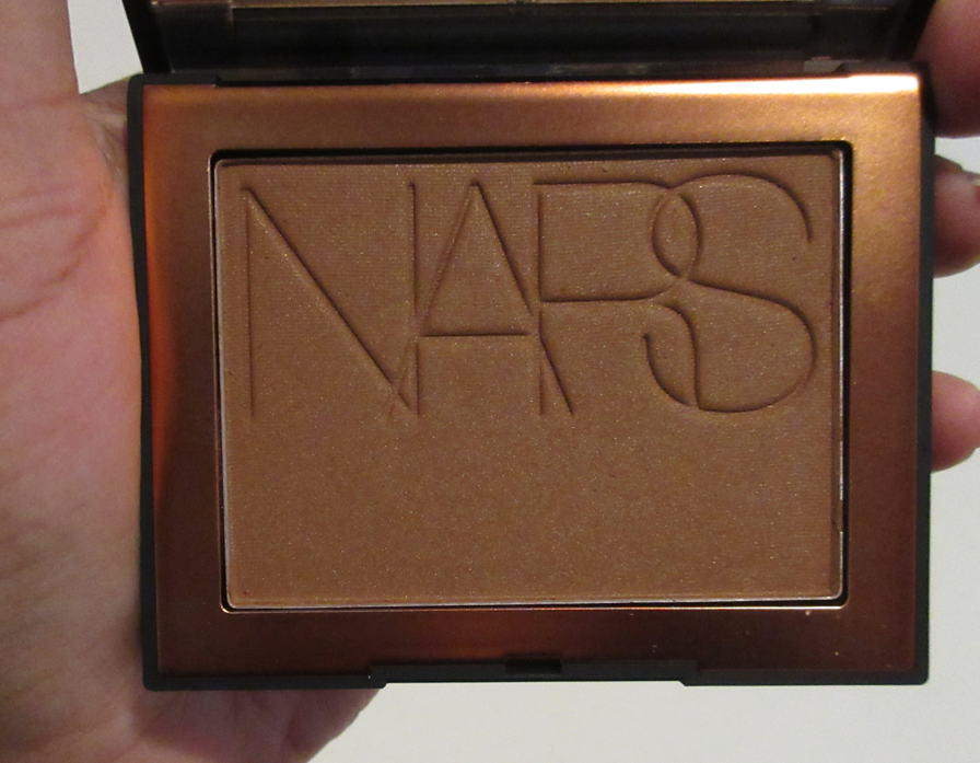
The photo below was taken in the time frame when I was at my lightest for the year, so this bronzer looks a bit deep in the picture, but normally this is a subtle, but not too subtle bronzer match for me. The depth and undertone (mix of red leaning base color plus gold shimmer) combines to a shade I like. However, despite the shimmer particles being barely noticeable in the pan, they reflect powerfully under daylight lights to the point where all you see is shine and it doesn’t even look like I’m wearing bronzer. For the longest time, I thought this shade was too light for me because of where I normally sit when I apply it and view myself in the mirror. I kept trying it every few months and when I could suddenly see it, I assumed it was because I was in my winter shade. It wasn’t until I happened to look in a different position and angle during one of the wear tests that I figured out what was happening. Once I made this discovery and could properly see how it looked on my skin in various situations, I started to enjoy this bronzer a lot more.
It’s ironic that now that I like it, it’s no longer available!
Nars discontinued their shimmery and matte Bronzing Powder lines in favor of the new, for 2023, Laguna Talc-Free Bronzing Powder. I purchased shades 5 and 6 of the new one recently and have yet to review them on this blog. I can say from a first impression standpoint that I slightly prefer the new ones. The original that I have looks quite pretty on the skin, but it wasn’t seamless blending. It stuck to the skin in places sometimes, but just the tiniest bit. I’m really nitpicking at this point because it’s still easy to blend, just not perfect. I still consider it a good bronzer. Oddly enough, I have more building up to do with the new bronzers because they’re slightly less pigmented. However, they haven’t stuck yet, are smoother gliding across the skin, and an airbrush effect can be achieved with them. It’s not as airbrushed as the Charlotte Tilbury powder one, but enough to at least make me think of it.
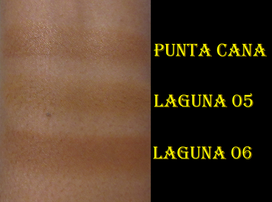
For those who already own the older bronzers, I don’t feel it’s worth getting the new ones if you’re satisfied with what you have, and especially if you already have the matte version. It’s not different enough from the previous formula, unless you’re the type of person trying to avoid talc in products. Since the new line contains no shimmers from what I can see, I’m going to continue using Punta Cana when I want a glowy bronzer. It was the darkest in the shimmer range and the base color is similar to Laguna 6, but the shimmer makes it appear a little lighter. That difference makes me feel like it still has a place in my collection. For those who don’t have a shade in the older range, this new one might have an option. Nars now offers minis in 5 of the 9 colors, so that helps in terms of being able to try one without breaking the bank.
Oh, and if you’re my shade twin, I recommend going with Laguna 06. I prefer mixing 05 and 06 together for the perfect color, but I can’t use Laguna 05 by itself because it’s practically my winter skin tone.
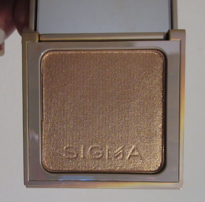
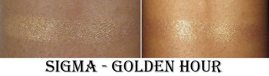
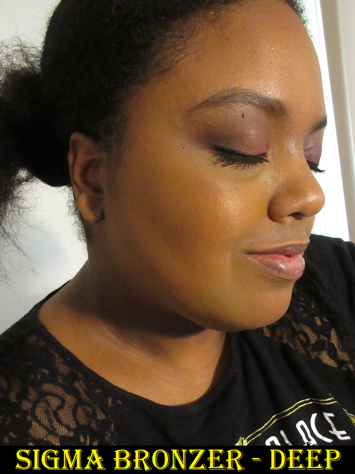
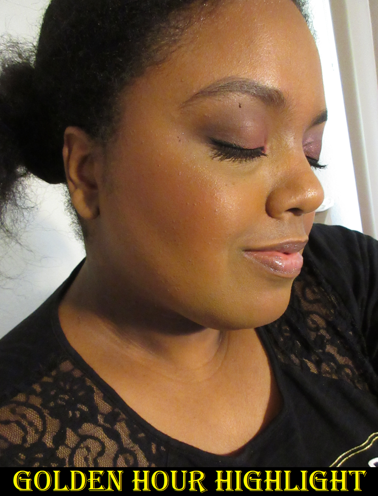
Sigma Beauty Bronzer in Deep and Highlighter in Golden Hour
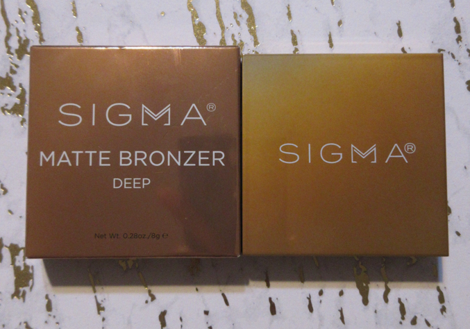
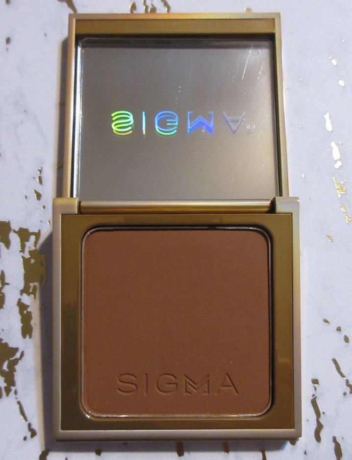
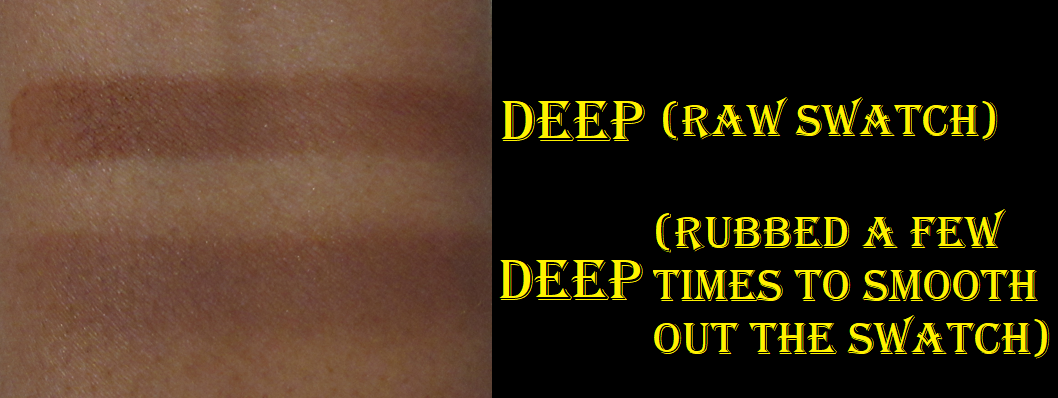
I’ve tried the bronzer so many times and I really do not like it. It’s so hard to blend, and try to fix after it goes on patchy, and it ends up looking like a contour if I blend it in too much because it goes too deep. It looks gorgeously warm when unblended, but it seems like there’s some grey in the base color. It’s still workable, but other than forcing myself to keep using it on top of various foundations (it looks better on top of matte ones) and switching to different brushes, I just don’t want to use it again. In fact, I had to rescue it from the declutter pile when I forgot I was supposed to keep it until I had time to post this review.
As for the highlighter, I was much more pleased with that one. I like the depth and tone of the gold. I like the smooth look to it on the skin. It’s shimmery, but not overly so. It looks even better on top of dewy skin. It’s not in my top favorites considering I do have others that supersede the shine level/reflectivity, smoothness, and refinement of particle size. However, I still use it from time to time and think it’s a fairly nice product. I don’t recommend paying full price for it though. I think I got mine for 25% or 30% off and that’s about the maximum I would pay.
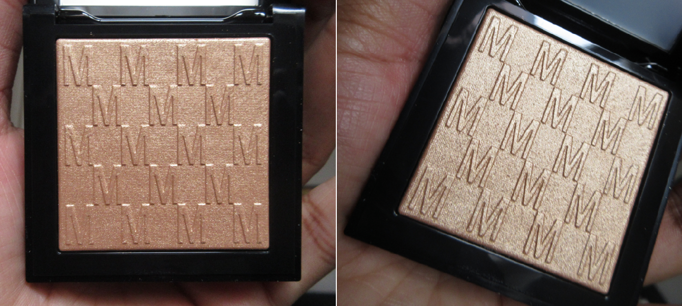
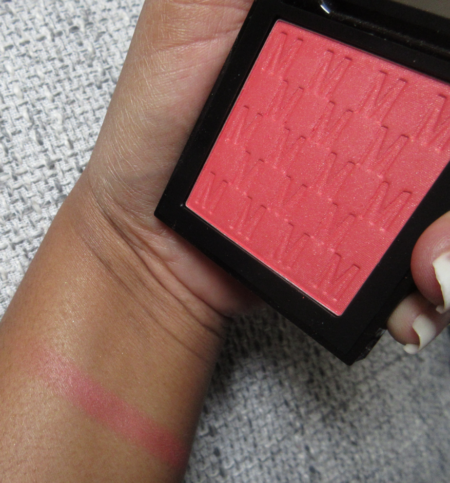
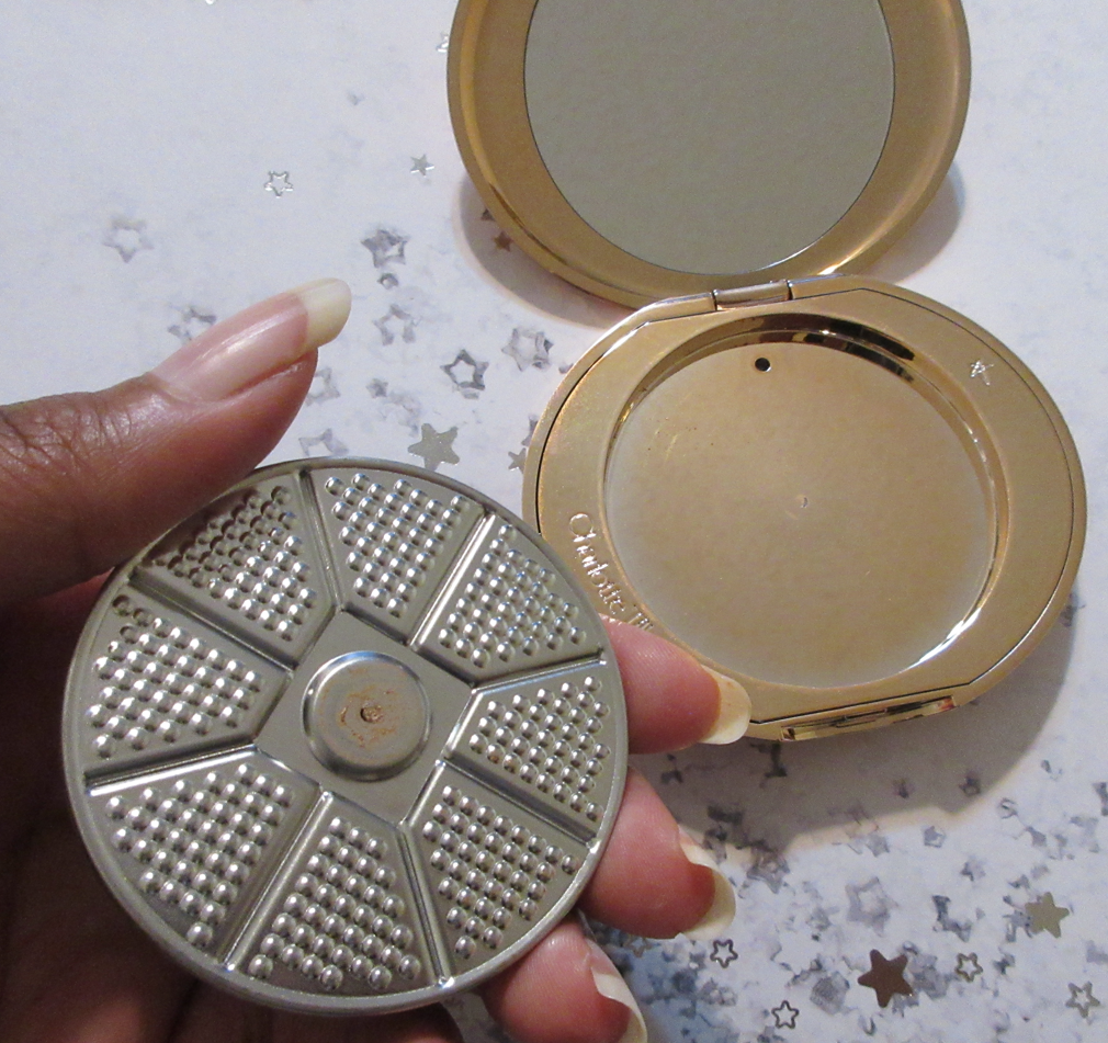
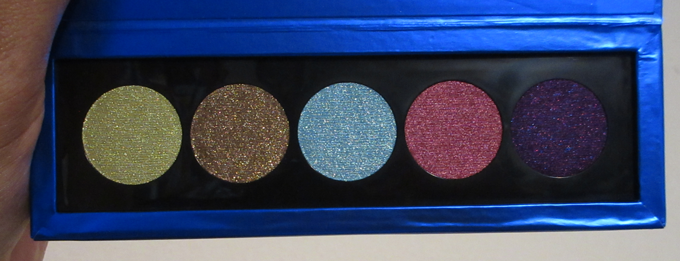
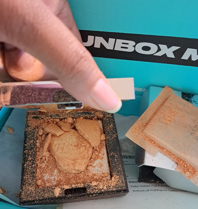
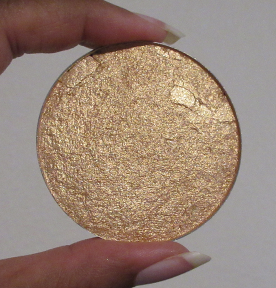
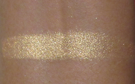
BPerfect Polar Vortex Highlighter in 32F
I haven’t reviewed this elsewhere, but I am unable to do so here either because Beauty Bay shipped this product in a box without bubble wrap or padding of any kind. The only shipping protection was literally one piece of paper, as seen in the photo below the demolished baked highlighter (two if the invoice paper counts). Every bit of it was covered in highlighter from the single open flap of the unicarton to the outside of the compact and all inside the box, above the plastic mirror protector, etc. I tried to re-press it into a spare empty highlighter pan from my DIY days, but because I used a liquid and didn’t dry-press it, it changed the texture completely. When I tried out the broken highlighter prior to pressing it back, it was insanely glittery (which is not my preference). The pressed version still has very visible particles on my face and is texture enhancing, even when I apply it on top of dewy skin to help melt it better onto the top of my cheekbones. So, I don’t feel it would be fair to consider this a review in this altered form, and it’s not something I want to keep anyway.
Suqqu Melting Powder Highlighter in 101 Kagerou (Limited Edition) and Melting Powder Blush in 06 Yuubae.
My review for these two can be found HERE. I’ve purchased several more items from Suqqu and had I known I would enjoy them so much, the Suqqu blushes would have been on my exceptions list for last year’s low-buy. I did manage to stop myself from purchasing every blush shade I wanted, so that counts for something, haha.
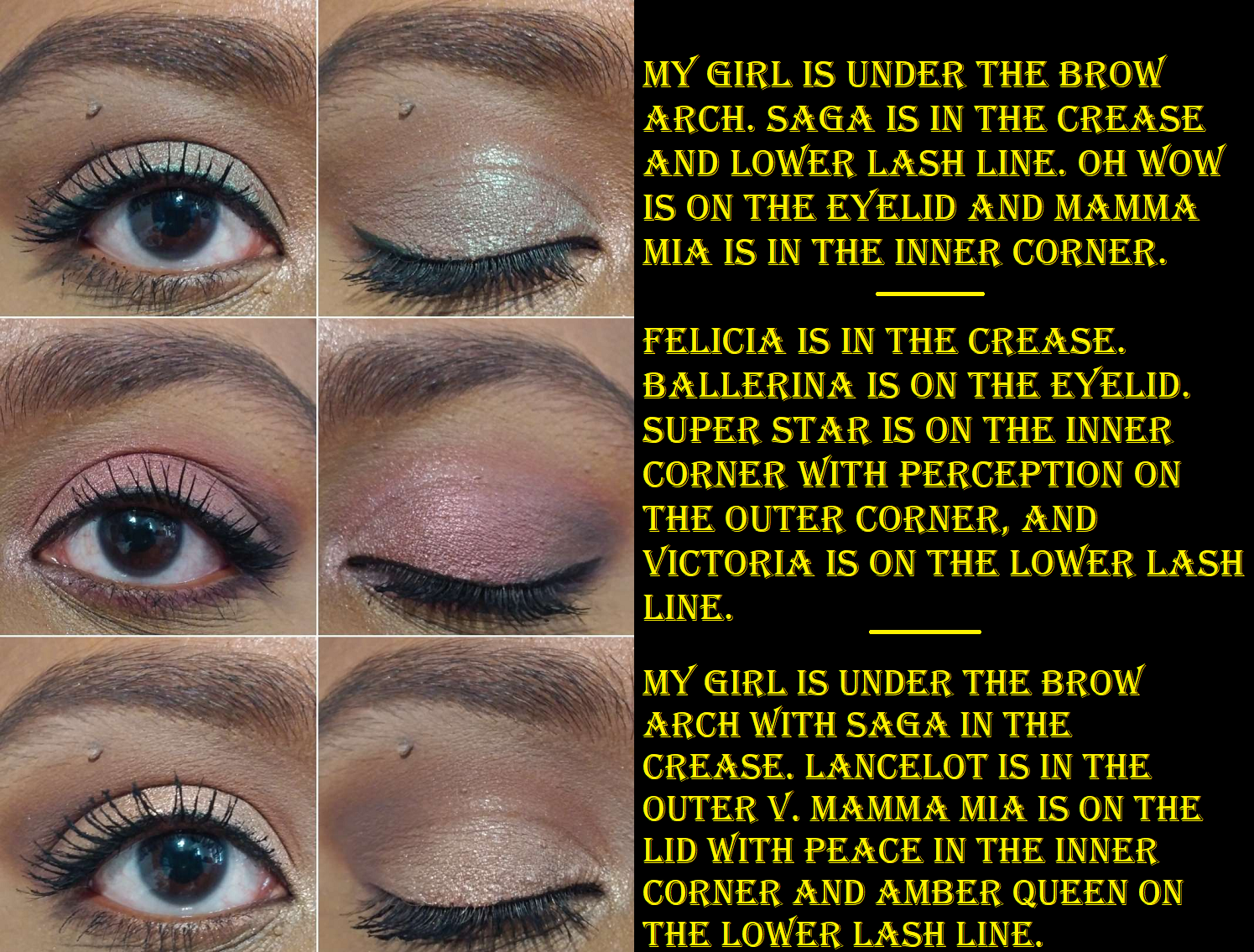
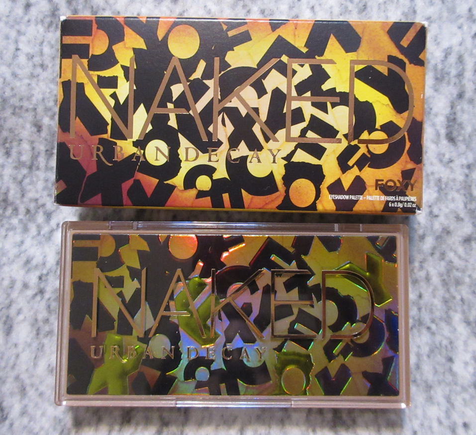
Urban Decay Mini Naked Your Way Eyeshadow Palette in Foxy
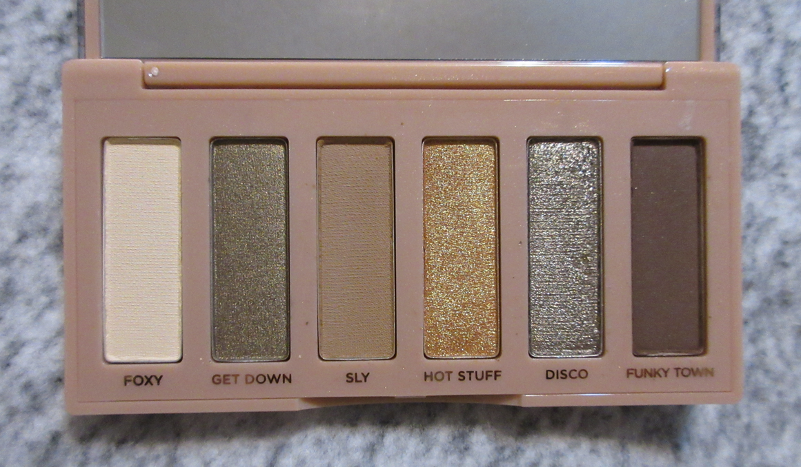
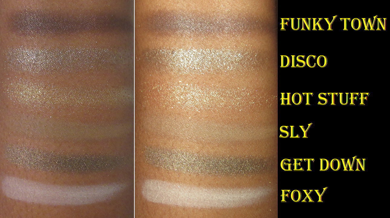
Once more, my strange aversion to using long rectangular shaped eyeshadow pans is in full effect with this palette. I’ve been able to create a few beautiful looks, but I stopped reaching for it shortly after the excitement of it being new wore off. I was drawn in by the greens, but these are lighter than I typically go for and cooler toned. I prefer the mini gold from Natasha Denona, Dior Backstage Khaki Neutrals, and ABH Nouveau palettes because they have some deeper options as well. Funky Town provides some depth, but I can’t get too dramatic with it on my skin tone.
The quality of these shades is a bit different for Urban Decay since adopting a vegan formula. I didn’t have issues blending the mattes, but they feel a little stiffer and are not as creamy to the touch. I guess all that really matters is how they perform, which is satisfactory enough for me. Foxy tends to disappear off my eyes though. If I want it to show up, I have to build it up a ton. Get Down is closer to a satin, whereas Hot Stuff and Disco are the true shimmers. The shimmers are impactful enough for me to use without feeling the need to wet my brush, but I get a lot of fallout under my eyes with Disco, so I tend to just dampen all of them. I sometimes even use glitter glue because I also have trouble periodically with the shimmers lasting on my eyes in the inner corner (my trouble spot because I tend to rub my eyes there). The shimmers are dryer than I recall from Urban Decay’s formula, and this probably adds to the issue with the inner corner, but it’s more important to me that the shimmers don’t crease on my eyes. So, I’m satisfied with them.
Overall, this is a nice palette. It’s not the most enjoyable experience in terms of textures, but the performance is there. It’s a small travel-friendly size, which I like. For the way I like to do makeup, I get about three different looks from this palette, which I find is a decent amount for so few shades.
I think this should really be in the $27 range, so I recommend waiting for a sale to try it out (I got mine discounted having purchased it from someone who got it in PR). Unlike all my other rectangular pan Urban Decay palettes that I declutter due to lack of use, I’m actually going to keep this one.
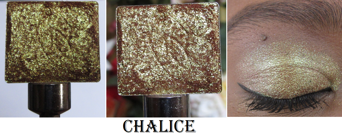
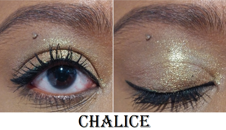
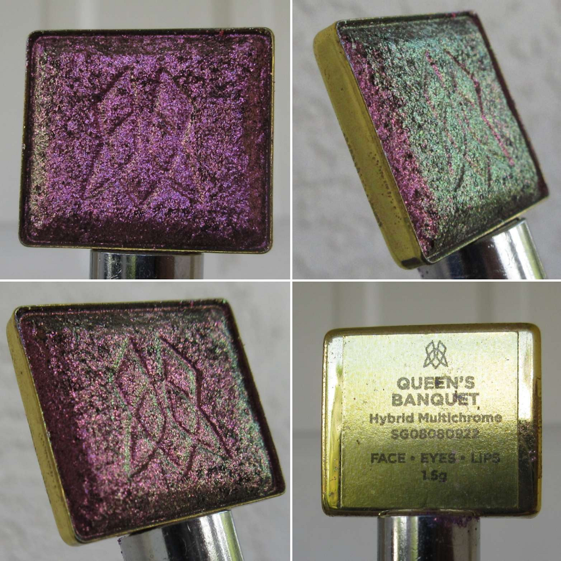
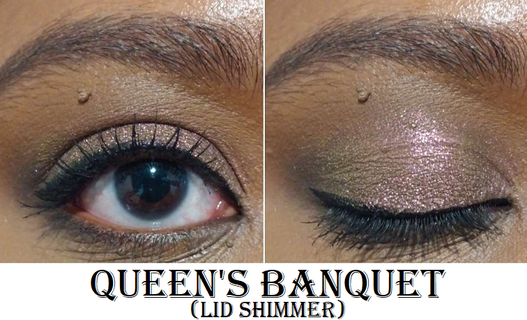
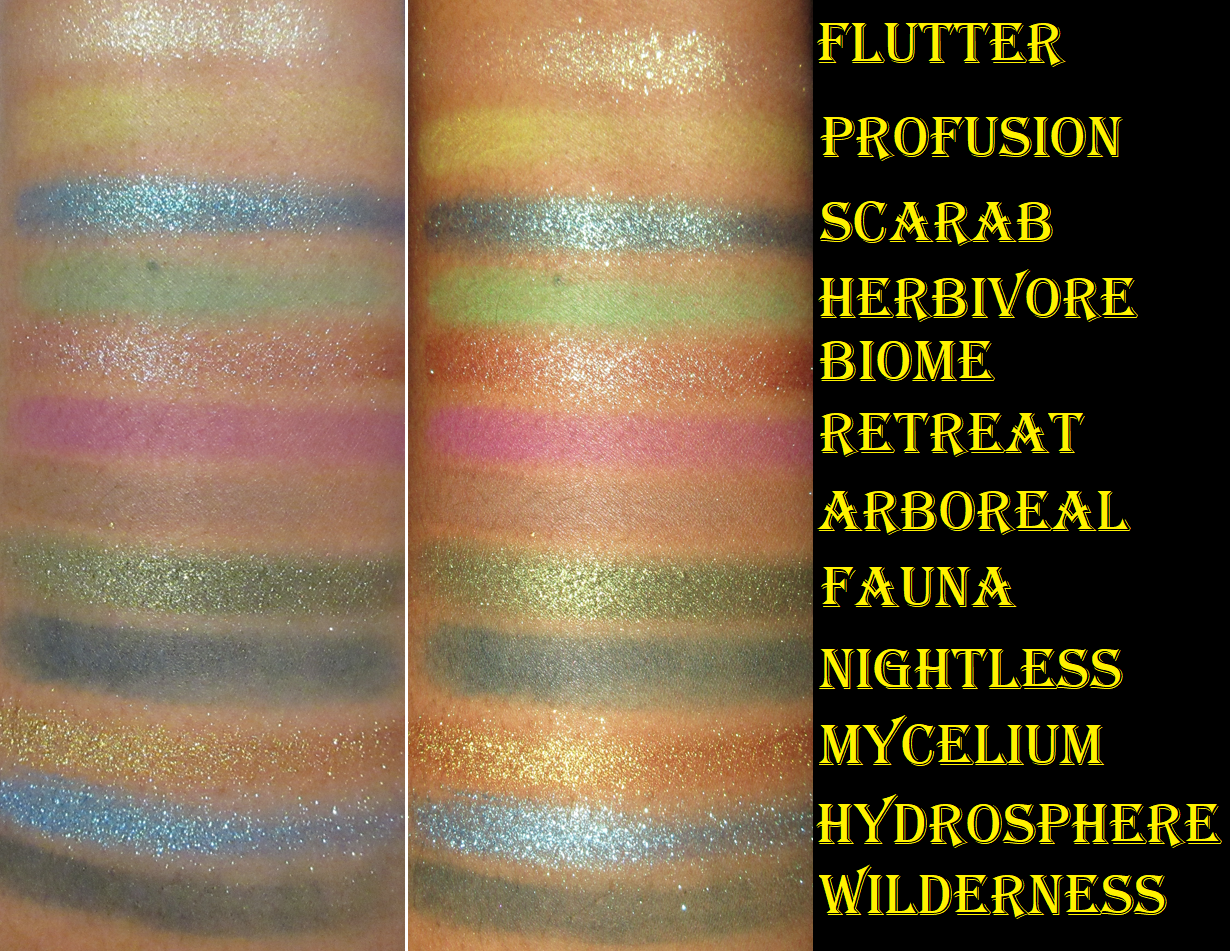
Viseart Haul: Viseart Grande Pro 1x, Petits Fours in Peridot, and Bijouxette ÉTENDU Palettes – These items and more from the brand have been reviewed already HERE.
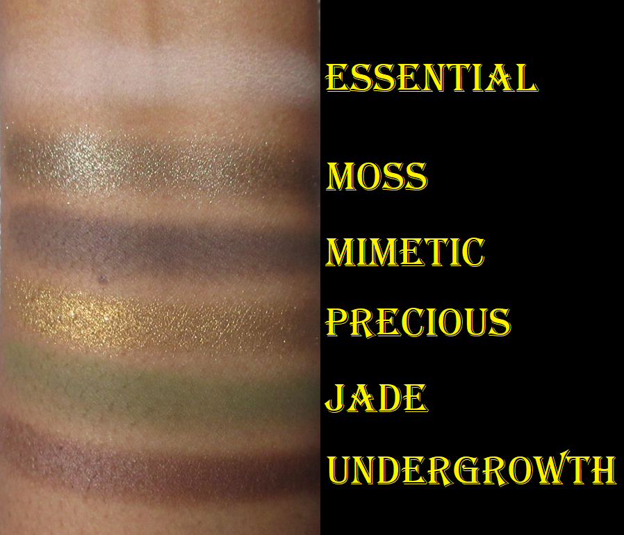
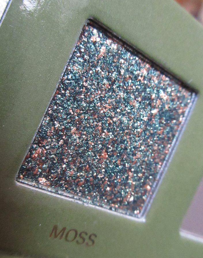
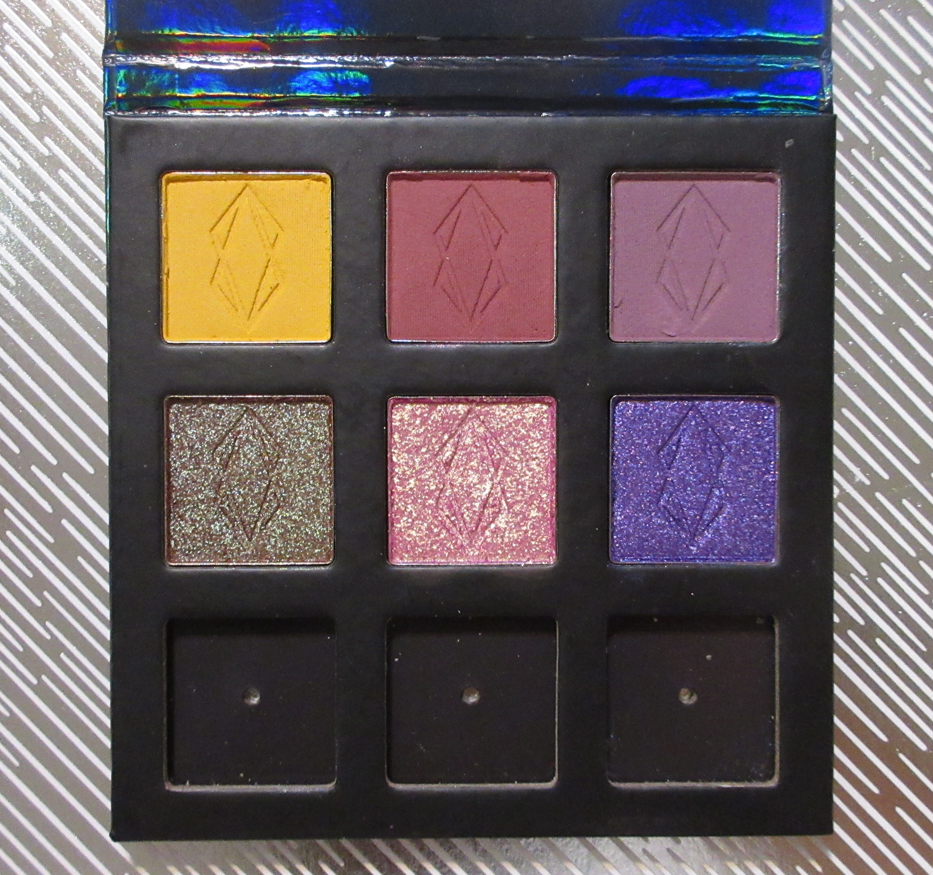
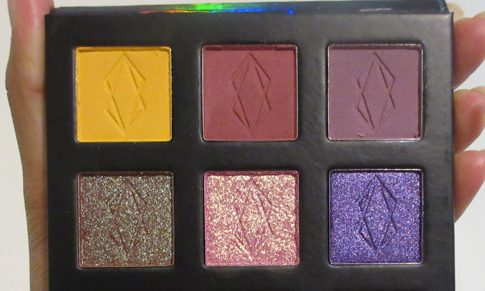
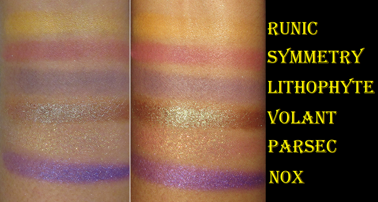
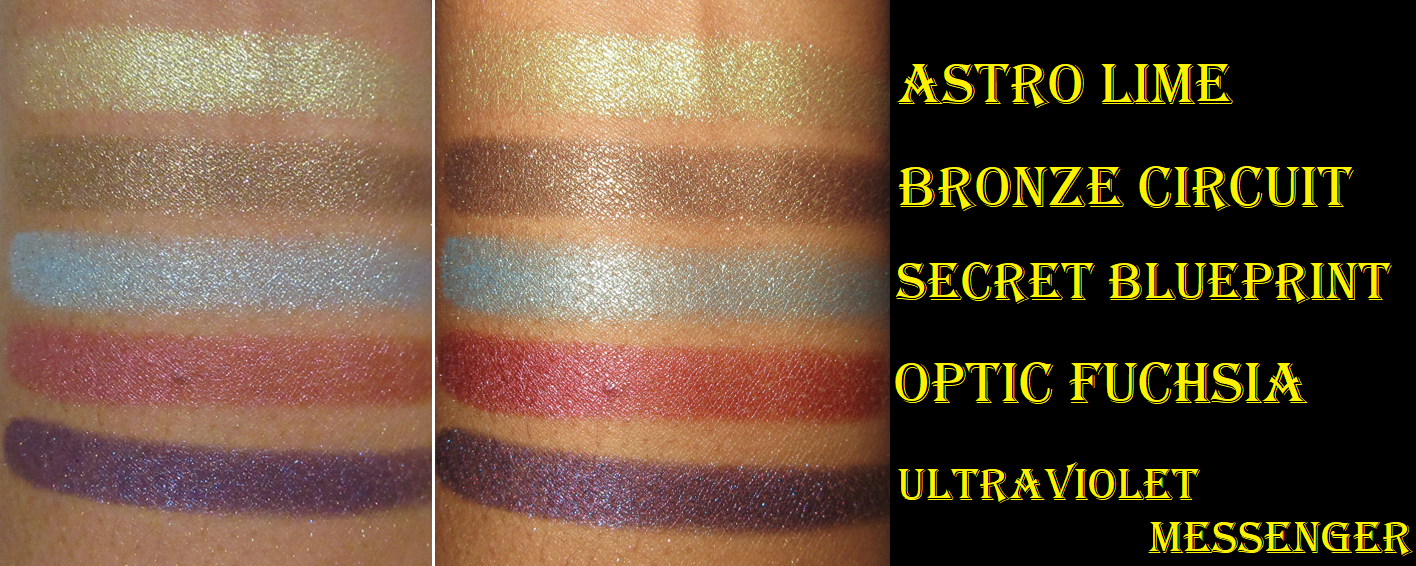
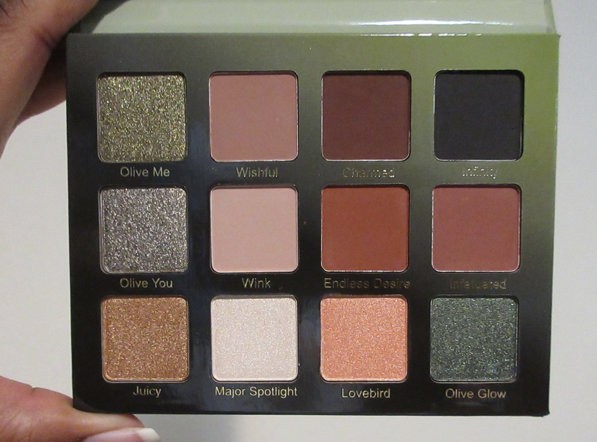
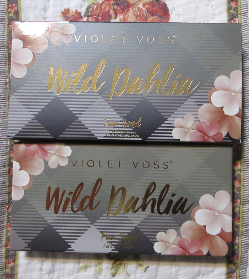
Violet Voss Olive You and Wild Dahlia Palette
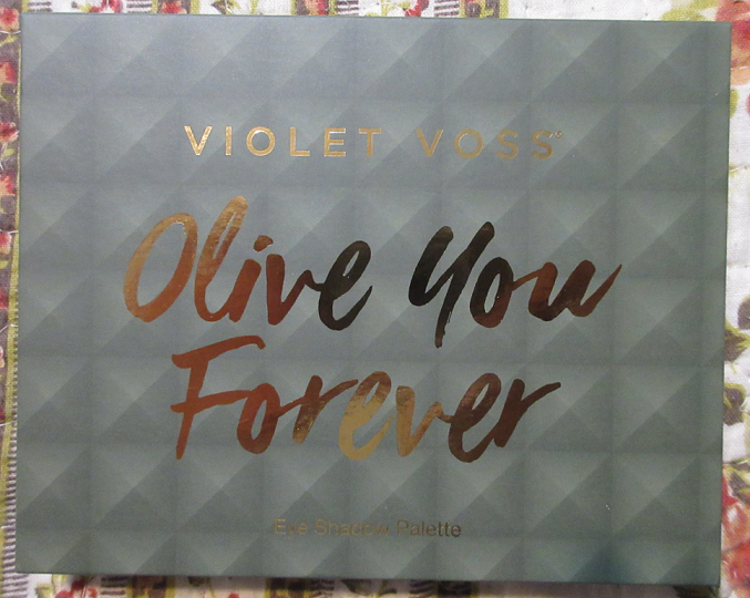
I purchased these two from a Boxycharm sale and did absolutely nothing with them for a full year. Since I own so many palettes in the Olive You Forever color story, I’m going to give it to my sister and not even swatch it so it can stay in new-ish condition. So, I don’t have a review for that one.
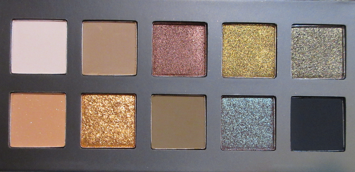
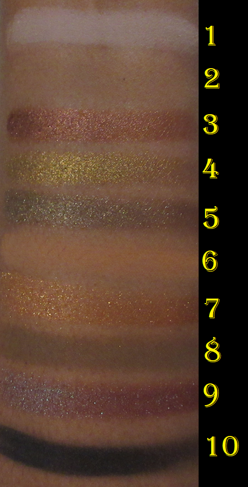
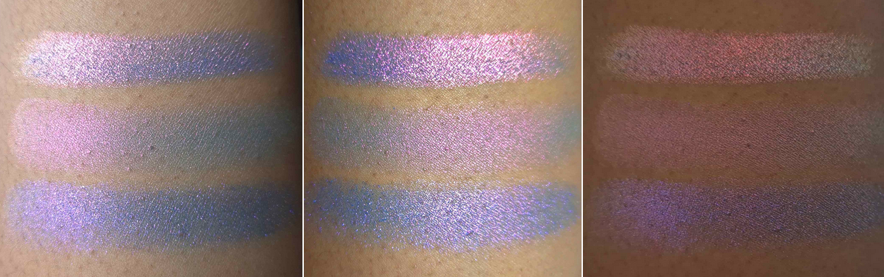
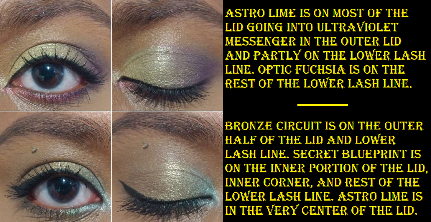
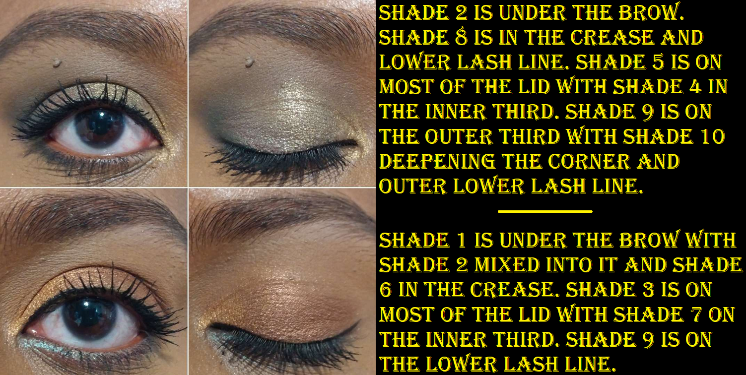
As for Wild Dahlia, so much time passed that I didn’t realize until I was doing swatches that it contained a beautiful duochrome! This palette offers quite an interesting shade selection. The mattes blend easily, are pigmented, and smooth. The shimmers are buttery, yet not the kind that causes an issue with creasing. I am so impressed! I do own one other mini Violet Voss palette that I depotted in the hopes that it would make me use the shadows more (and it had the opposite effect), so now I’m remembering how nice the quality was and I feel I’ve really been missing out on this experience!
The shimmers are decently impactful on their own, and applying them damp increases it slightly, but not enough to feel like it makes much difference. I also like that I had no issues with fallout either. I can easily recommend this one! The quality is fantastic. The shimmers are shinier in the Urban Decay Foxy palette, but I prefer the colors and tones of the shimmers in Wild Dahlia, plus the softness, blend, and color options of the mattes in this one too.
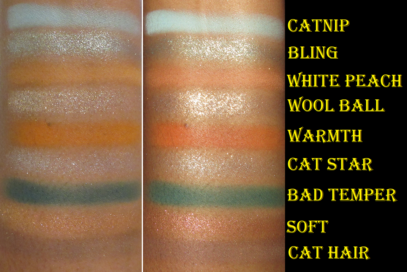
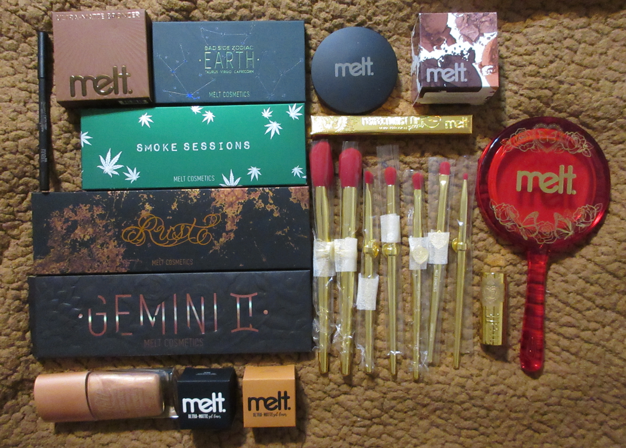
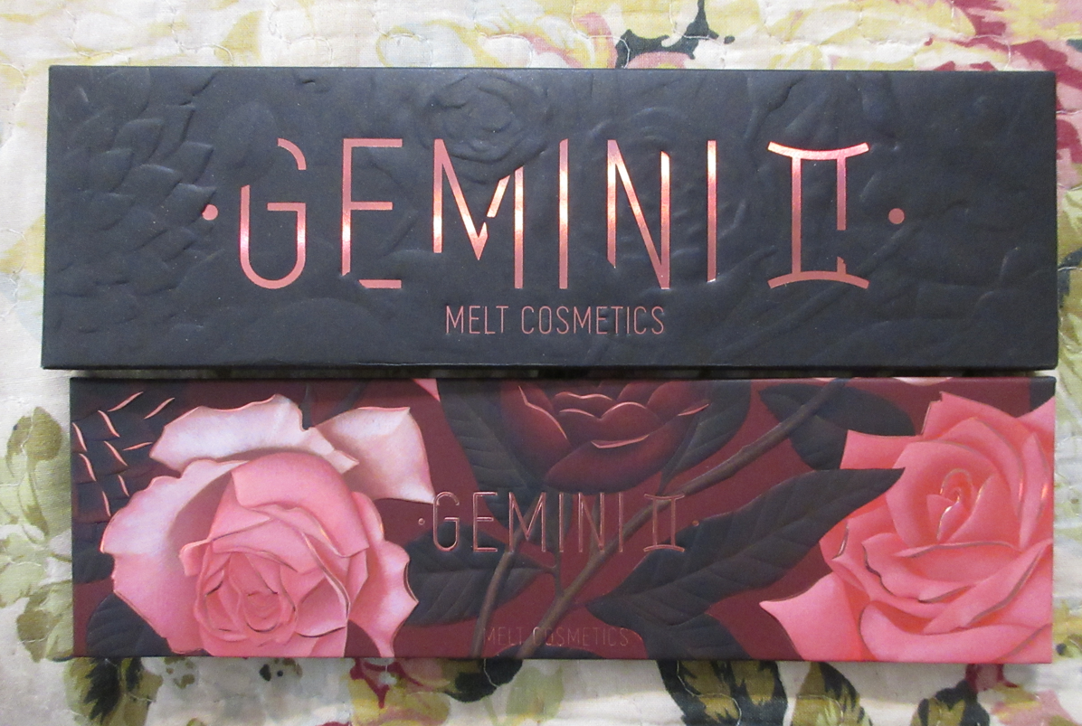
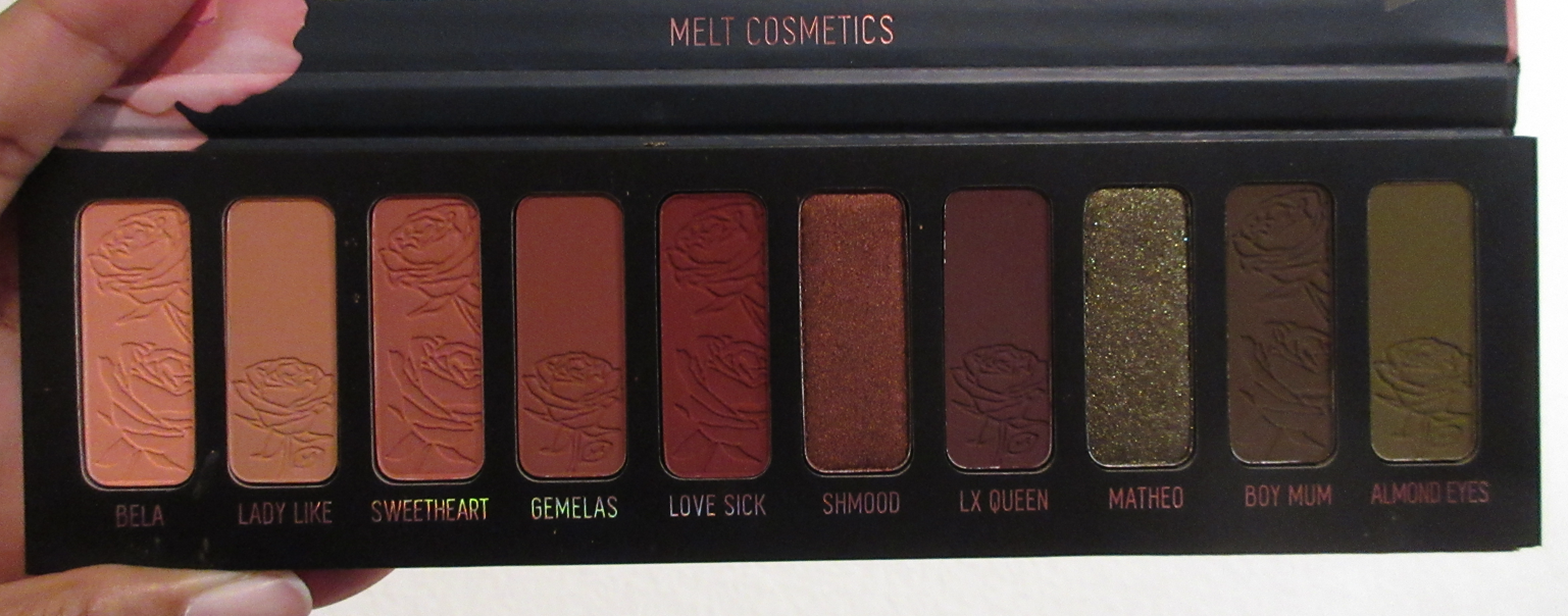
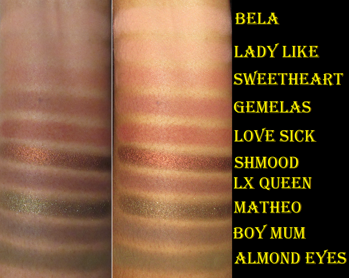
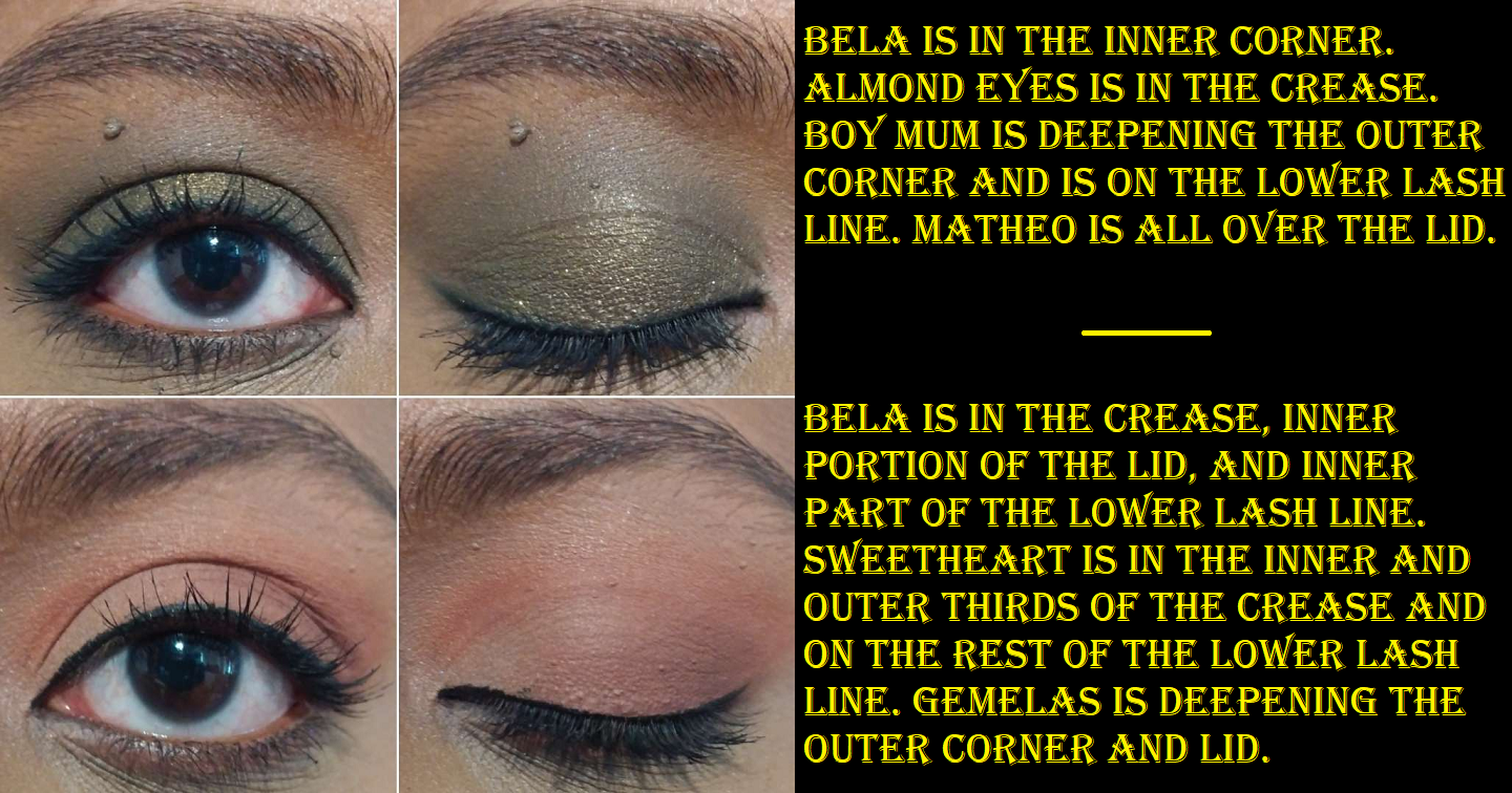
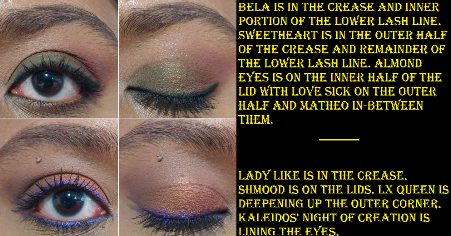
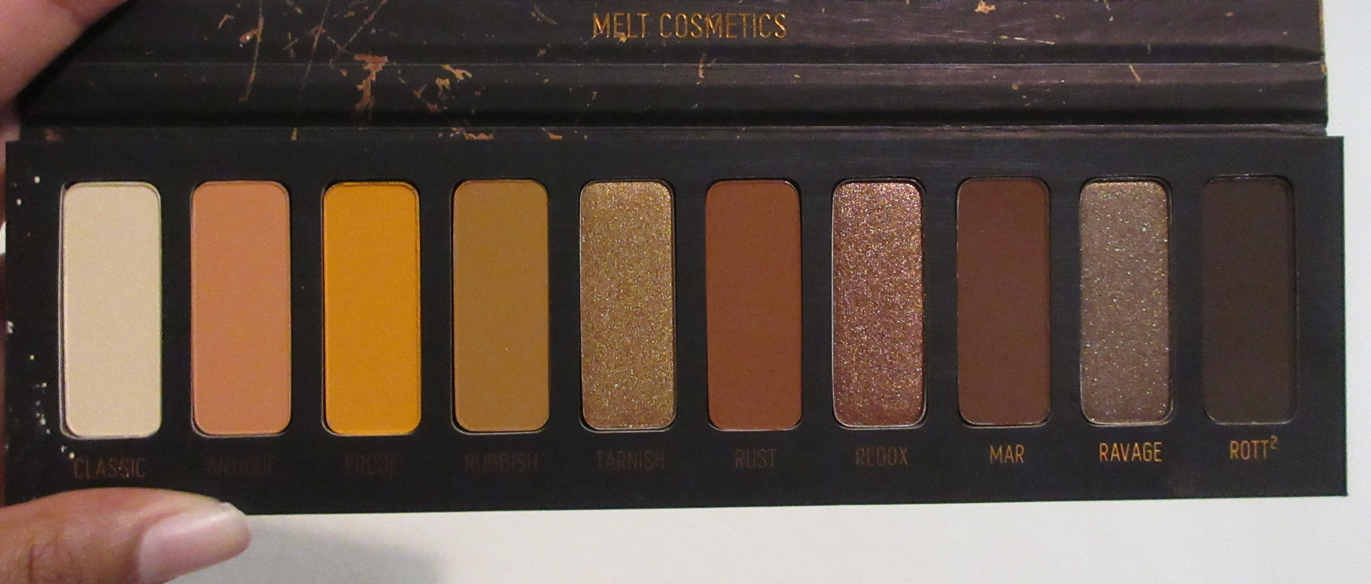
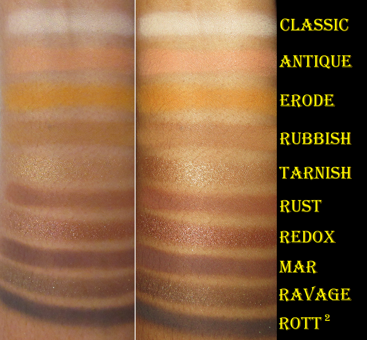
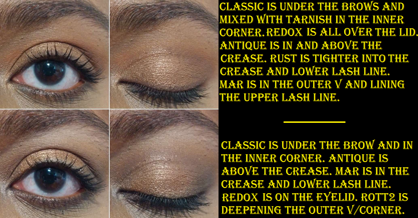
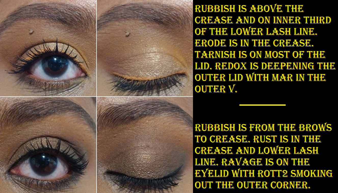
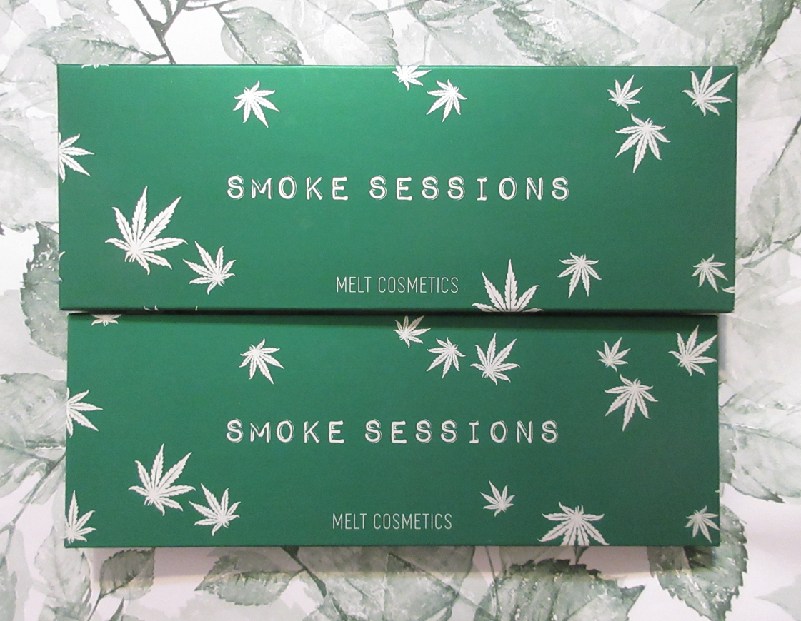
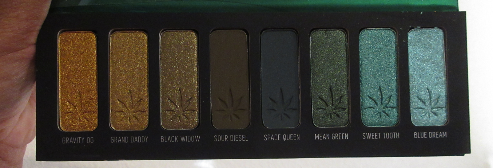
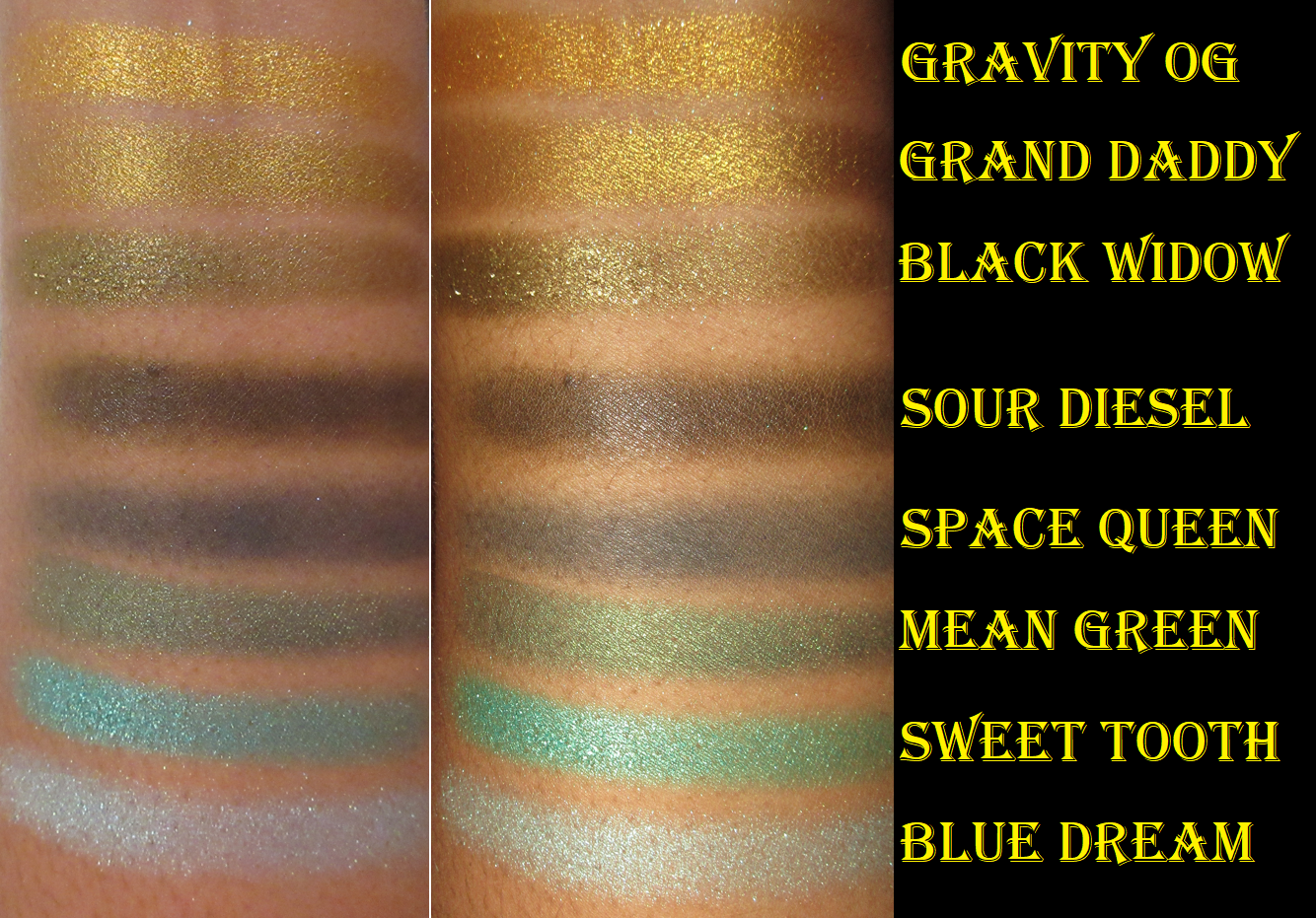
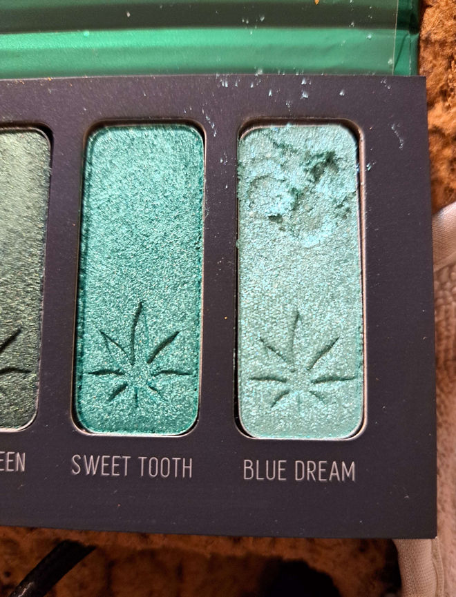
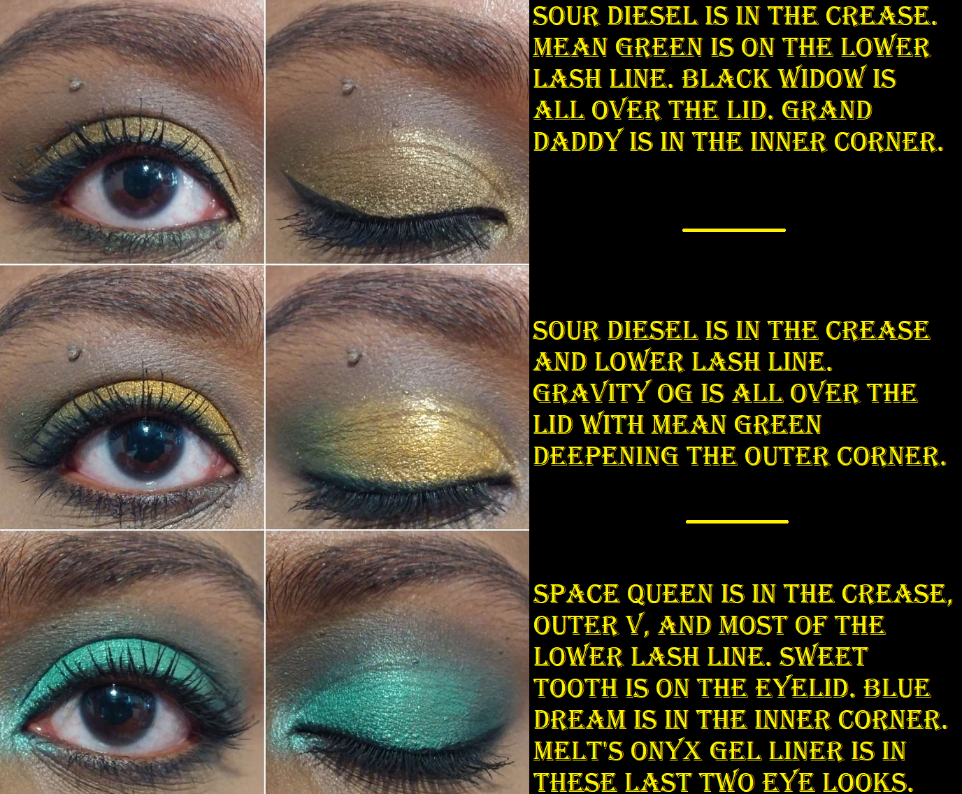
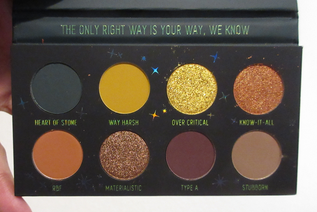
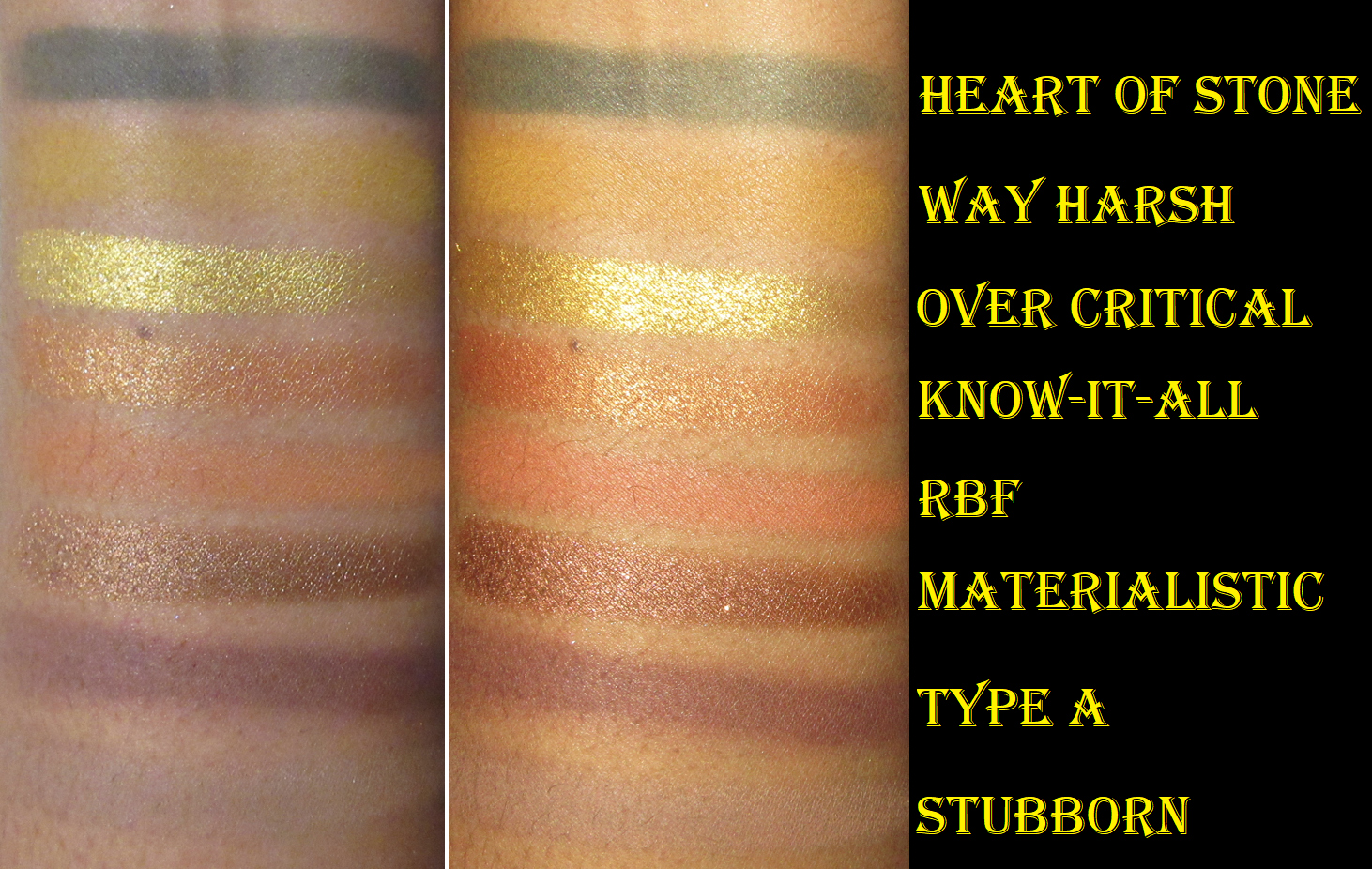
Melt Cosmetics Haul: Amor y Mariposas Pressed Pigment Palette, Monarca Blush Palette, and Gel Liners in Colibri and Estrella. My review for these items can be found HERE, and since I got such an amazing deal on it, I have no regrets! Even though I don’t use these a ton, I still very much love them.
Benefit Cosmetics Wanderful World Silky-Soft Powder Blush in Crystah, Terra, and Java
Crystah and Terra are in the shimmer formula and Java is the matte formula. I did not purchase anything in the satin formula because I was waiting for the delayed shade, Starlaa, to be released. I planned to review these blushes right away, but I had no idea it would take four months for that one to come out! In any case, I’ve been wanting mid-tone and deeper blush options from Benefit for so long that I just went overboard without thinking it through. My Beauty Resolutions were completely forgotten, or perhaps ignored, for this release. The review of them and even more shades can be found HERE.
Benefit Cosmetics Pore MINImizer Squad Primer Set
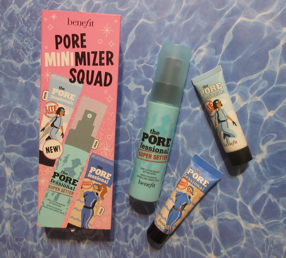
Aside from the fantastic price this was listed at via Asos, part of my motivation for buying this set was that I finished up a mini sample of the Hydrate primer and loved it enough to want another, but not a full-size, in addition to being curious about the Lite primer after Angelica Nyqvist raved about it so often, and I had no other setting sprays left in my collection.
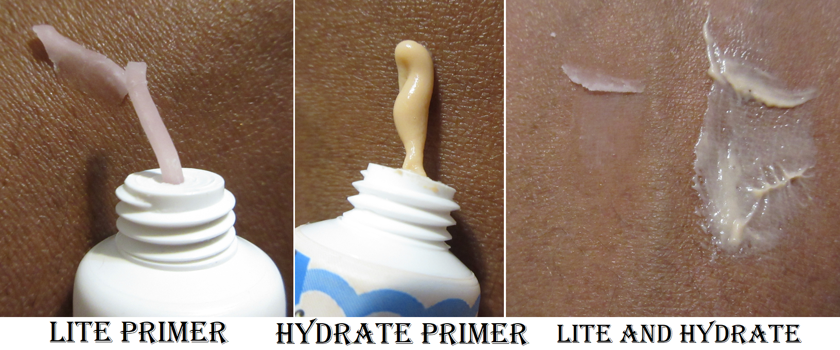
I recall trying the original POREfessional primer many years ago, and liking the way it felt on my skin, but it left a cast that lightened the look of my foundation. I was nervous the Lite version would do the same, but it did not. The texture is very strange. It feels dry and chalky when it comes out, though it’s in a form soft enough to be rubbed in completely and smoothly. It’s less gel-like than typical silicone primers. It blurs my skin when I put it on, but with foundation on top of it, I don’t see the blurring effects anymore. Also, if rubbed into the skin excessively, it can pill up.
I don’t consider myself as having that great of an issue with the size of my pores, so I only really require that my primer help my foundation look smooth on top of it and perhaps increase the longevity. I think my makeup looks nice initially when I put it on, but I don’t think it helps past midday. Sephora lists this as being, “Best for Oily, Combo, Normal Skin,” so it’s not surprising that it’s not the best fit for me.
The Hydrate primer, as I mentioned already, is one that I loved. The color and consistency actually reminds me of the Glamglow Thirstymud Hydrating Mask. It feels soothing on my skin because of that added hydration. It’s easy to apply. I don’t know if it extends the wear of my makeup, but so far there haven’t been any foundations I’ve worn with it that I disliked. This one is actually best for, “Dry, Combo, Normal Skin,” and although I don’t notice any blurring at any point, I think it improves the finish of my foundation.
The Super Setter I’ve only used a few times. It has a nice sprayer. Most of it sprays lightly and evenly, but with every spritz I can feel some spots that are heavier, yet when I check the mirror there are never any visible droplets on my skin. This is great news because I’ve had that issue with a few setting sprays in the past. This spray doesn’t make my skin feel tight, nor cooling, or change the look of my makeup in any way. I honestly don’t notice any effect it’s having on my face, even with longevity. So, I won’t be repurchasing it.
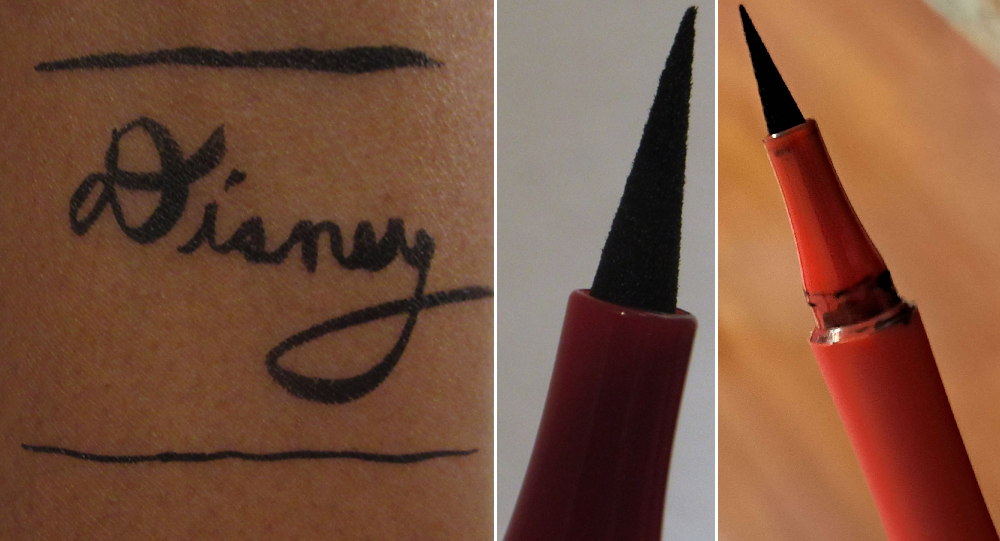
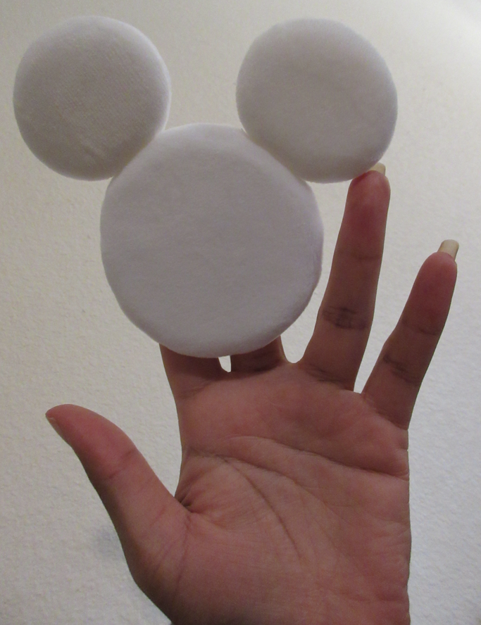
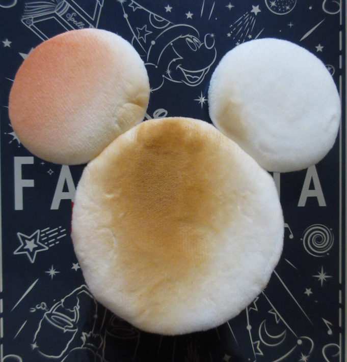
Alamar Cosmetics
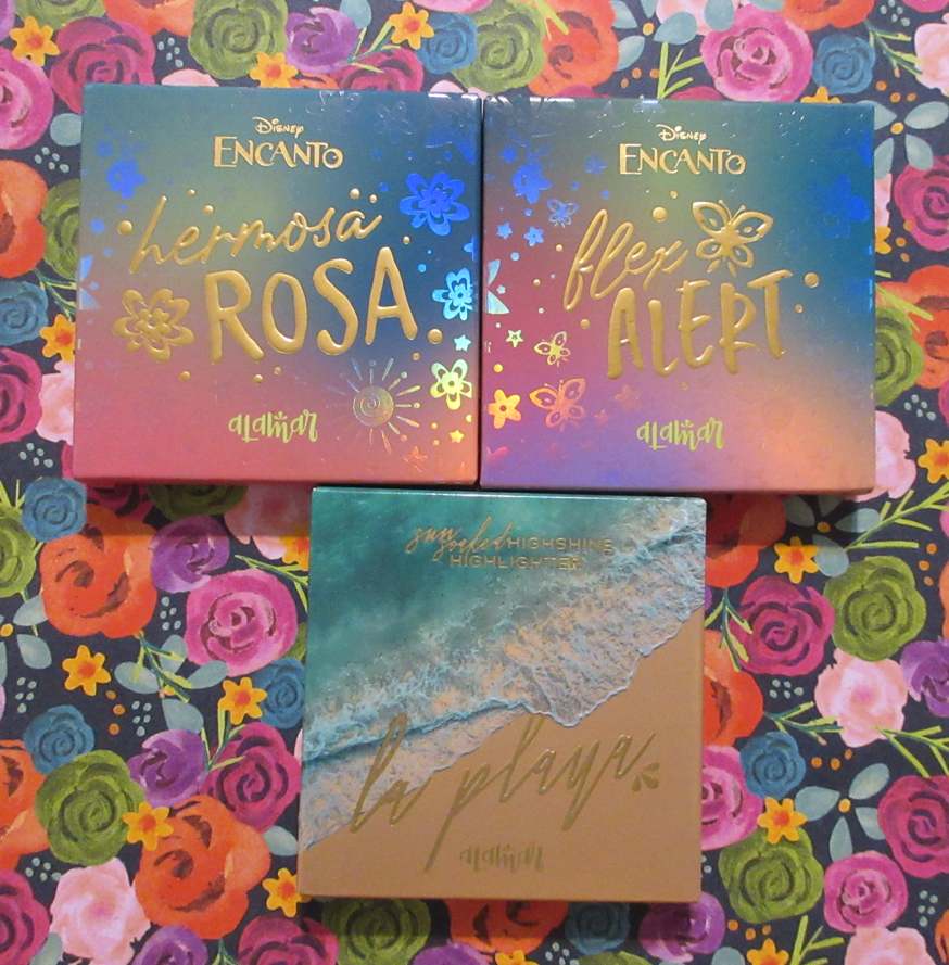
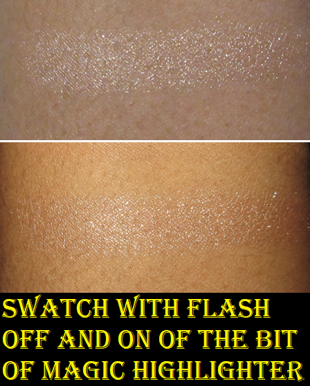
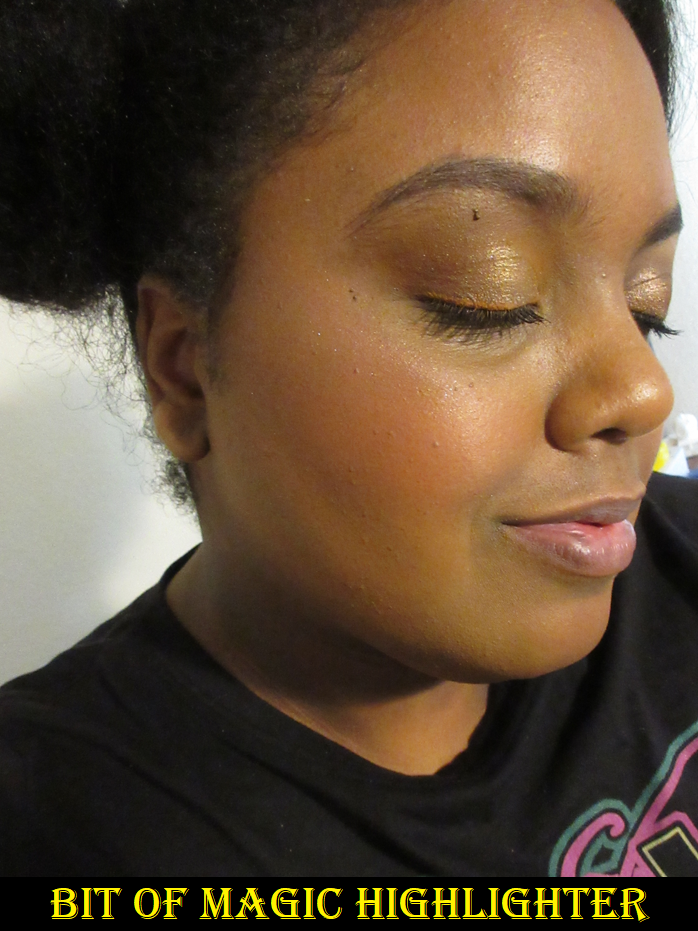
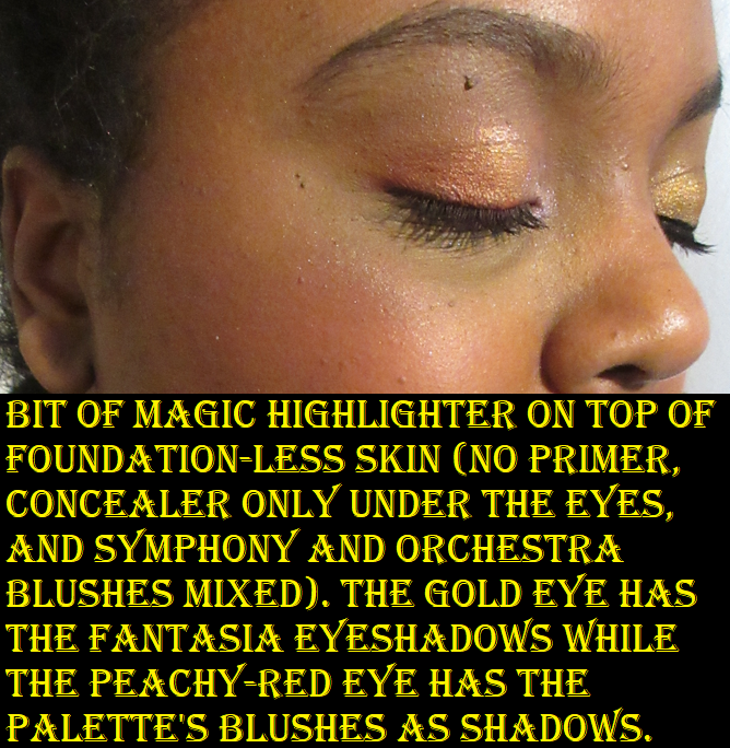
The two Disney collab products are sold out and discontinued. I strongly regret not posting this in time or in a separate review. I just could not make up my mind about them and kept forgetting the details of my wear tests when I kept trying them with several months gap between uses over the past year. The other highlighter is still available on the website.
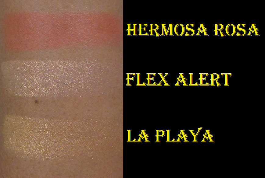
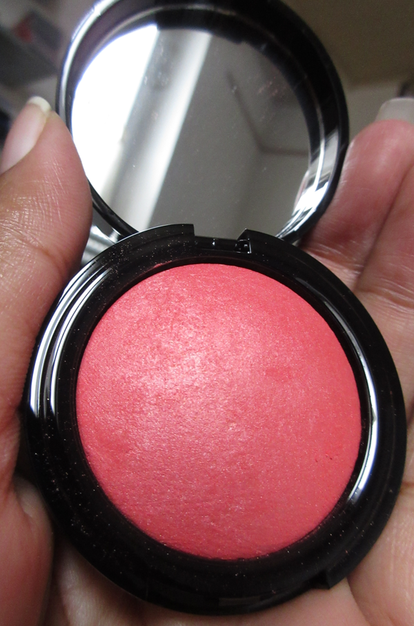
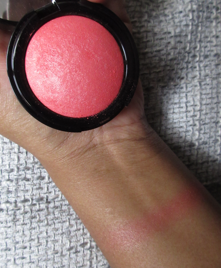
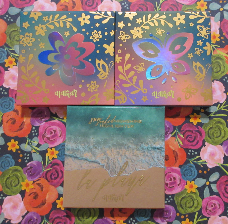
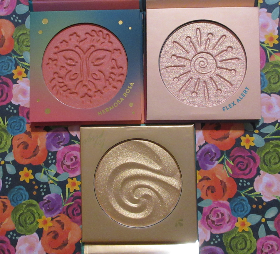
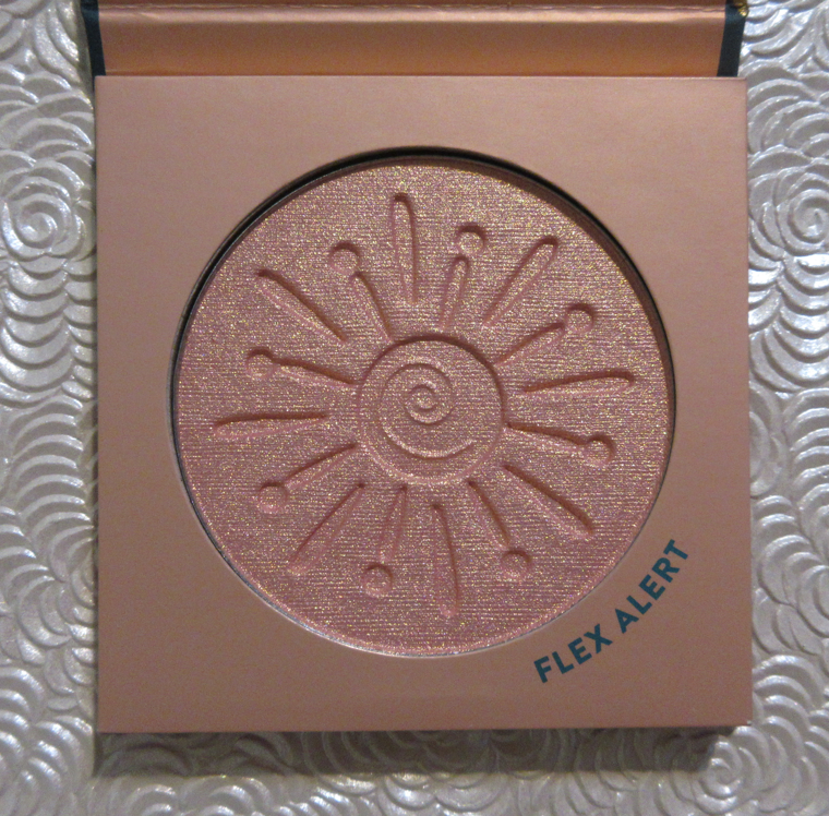
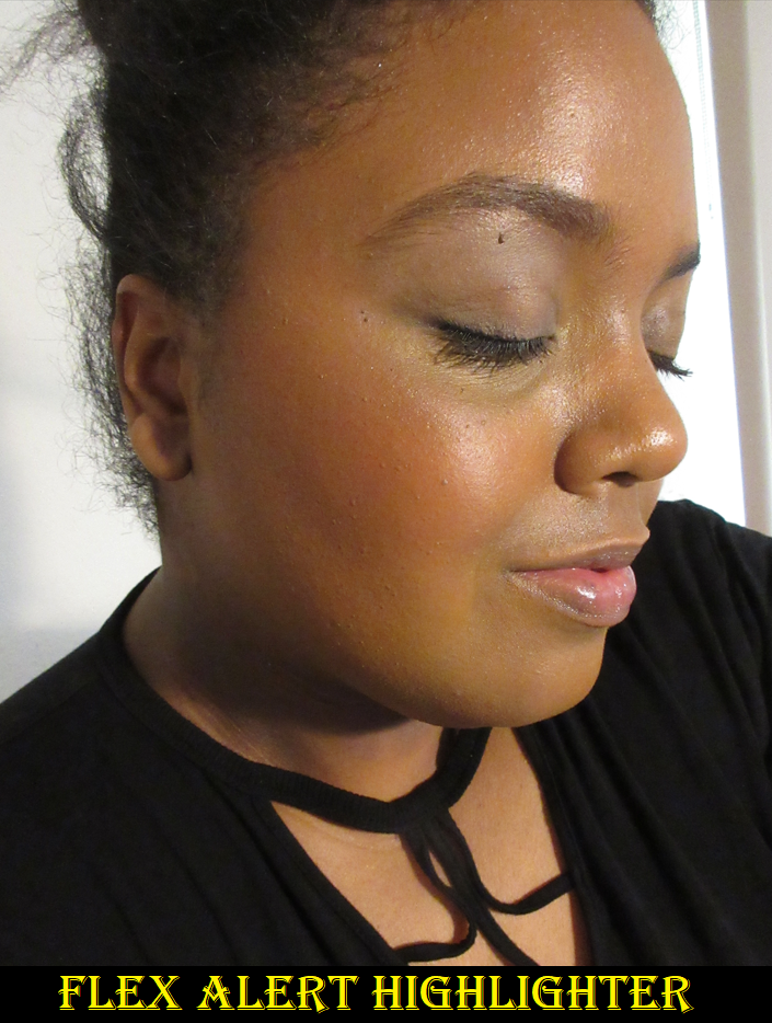
Alamar Cosmetics x Disney Encanto Collection Blush and Highlighter in Hermosa Rosa and Flex Alert
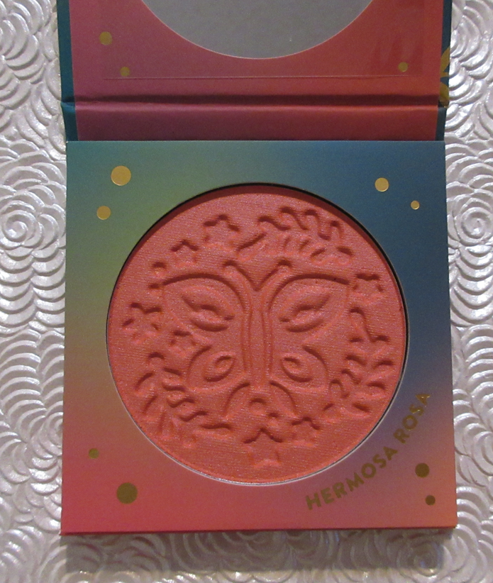
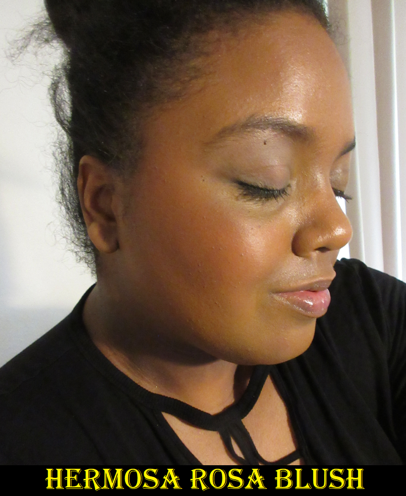
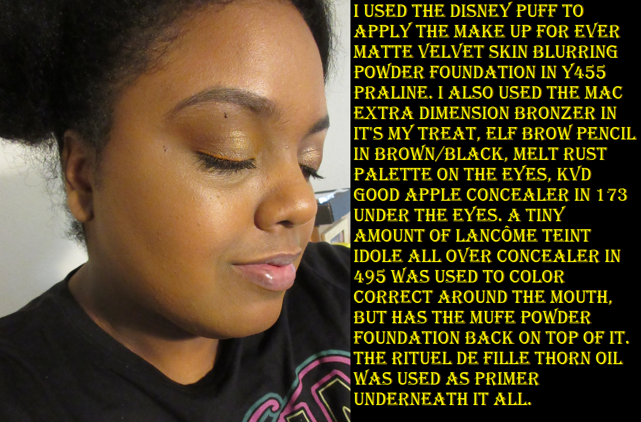
The Encanto Blush is in the brand’s Colorete Powder Blush formula. Hermosa Rosa is a stunning shade. On bare skin it has issues with longevity. There was one instance that I applied a sheer layer and it faded within 20 minutes. I then built up the color heavily and it continued to fade, but I was left with a reasonable amount of blush on my cheeks by the end of the day. Over foundation, this isn’t as much of a problem, but I still need to put at least a medium amount of blush for it to last. Trying to keep it looking sheer doesn’t work for me. Aside from that, it’s so smooth looking on the skin and even in color and opacity. It blends well. I like this blush so much that I’ve considered purchasing more from the brand numerous times, but they’re all in palettes and I’m not drawn to the shades available. However, I continue to check the brand website a few times a year to see if they have additional shades I might like as much as this one.
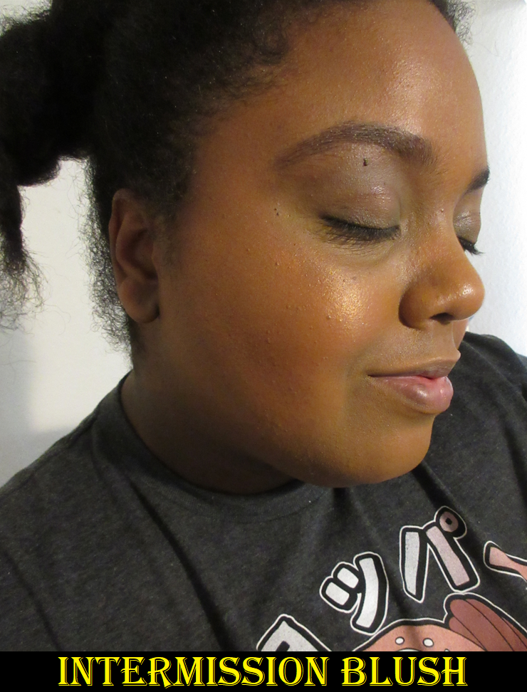
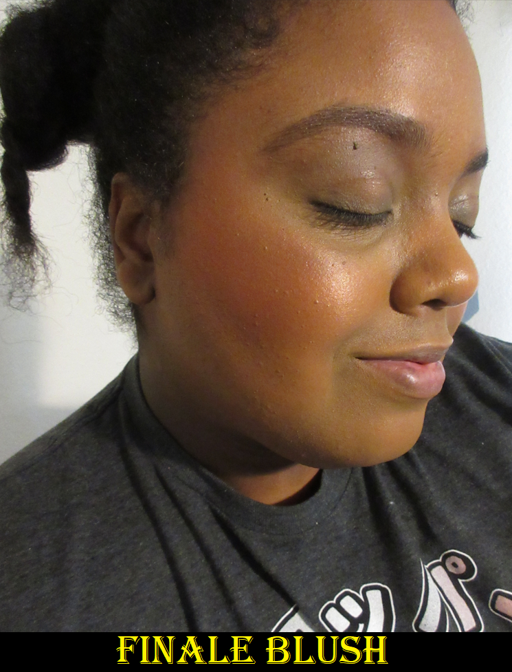
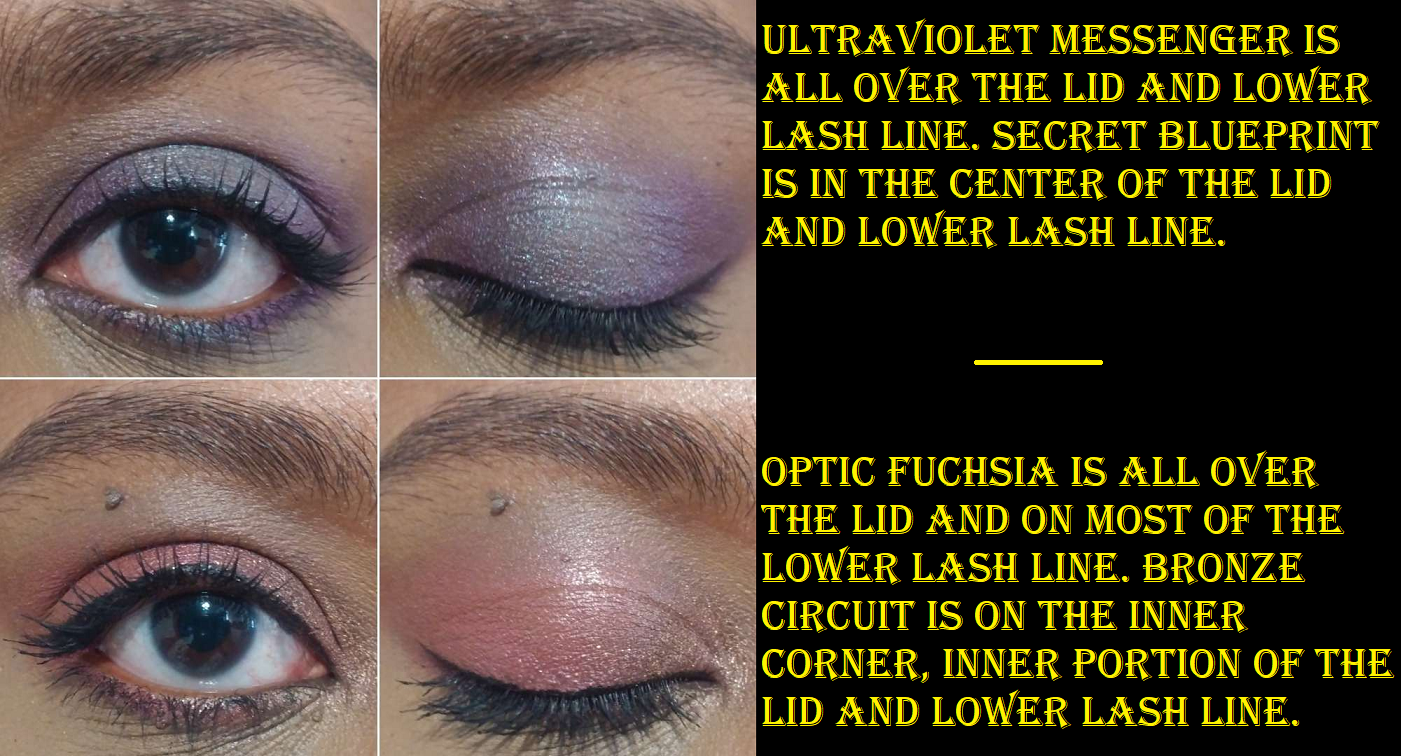
The Encanto Highlighter is in the Sun Soaked Highlighter formula. This is the trickiest one for me to pinpoint how I feel about it because it depends on the time of year. When I’m at my darkest, this highlighter looks terrible on me because the color looks more stark against my skin and each individual particle is that much more apparent on my skin tone which makes it look excessively shimmery. When I’m lighter, I put my blush a bit higher on my cheekbones so the highlighter, when going on top of it, looks more natural. The pink tones with the gold shift match well over the coral color. It’s still borderline glittery looking, but it somehow just works. At least, it works on top of the Hermosa Rosa blush. I haven’t liked how it looks on top of other blushes. Color aside, it looks fairly smooth and lasts all day. And even though there is a lot of shimmer, it’s at about medium intensity because it doesn’t have the strongest reflect. I would recommend this only to someone who doesn’t mind a shimmery highlight while also not expecting it to be blinding.
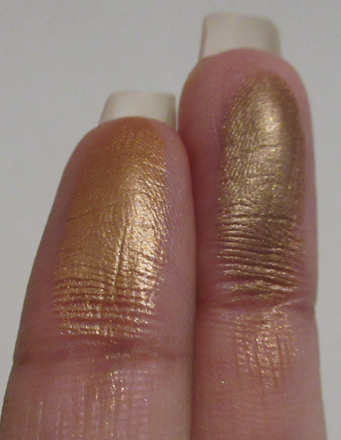
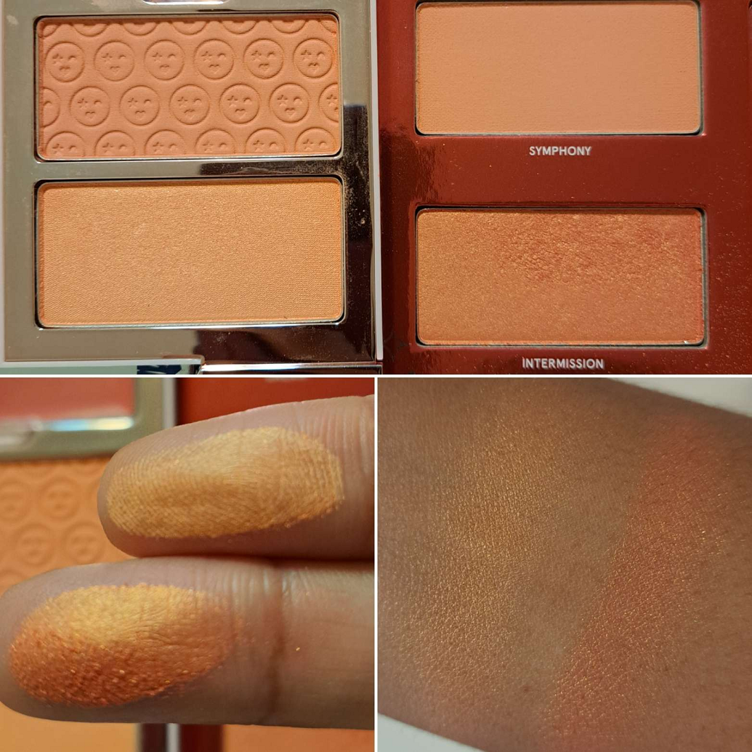
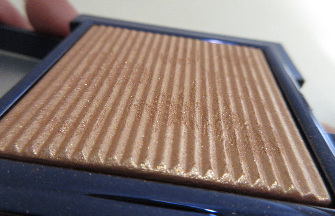
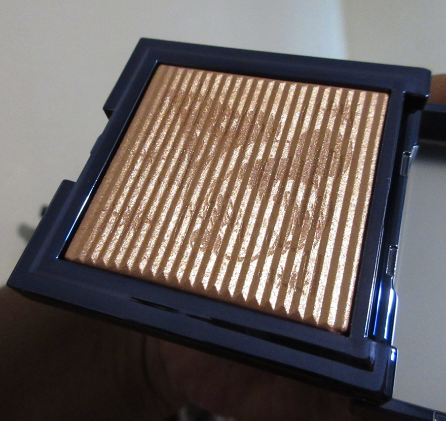
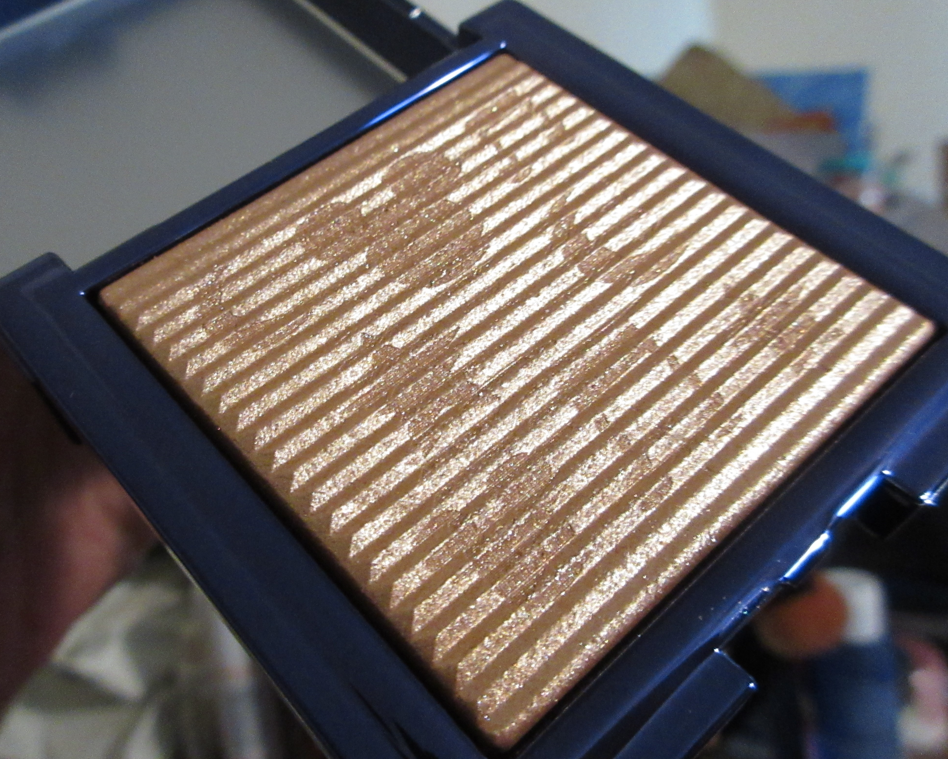
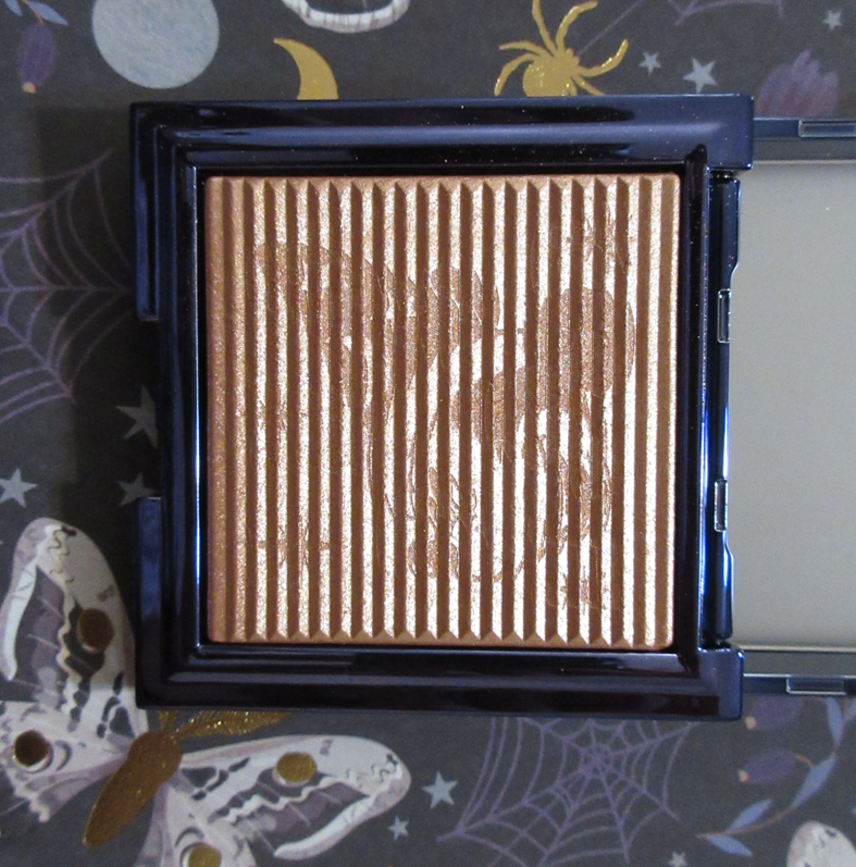
Alamar Cosmetics Sun Soaked Highlighter in La Playa
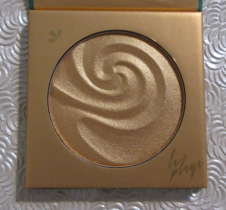
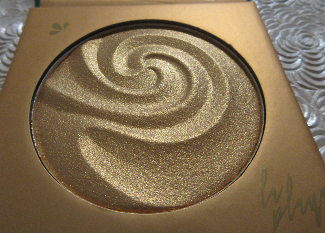
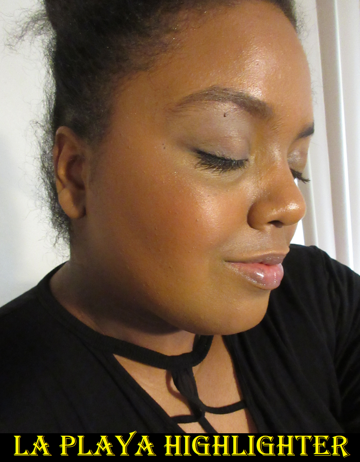
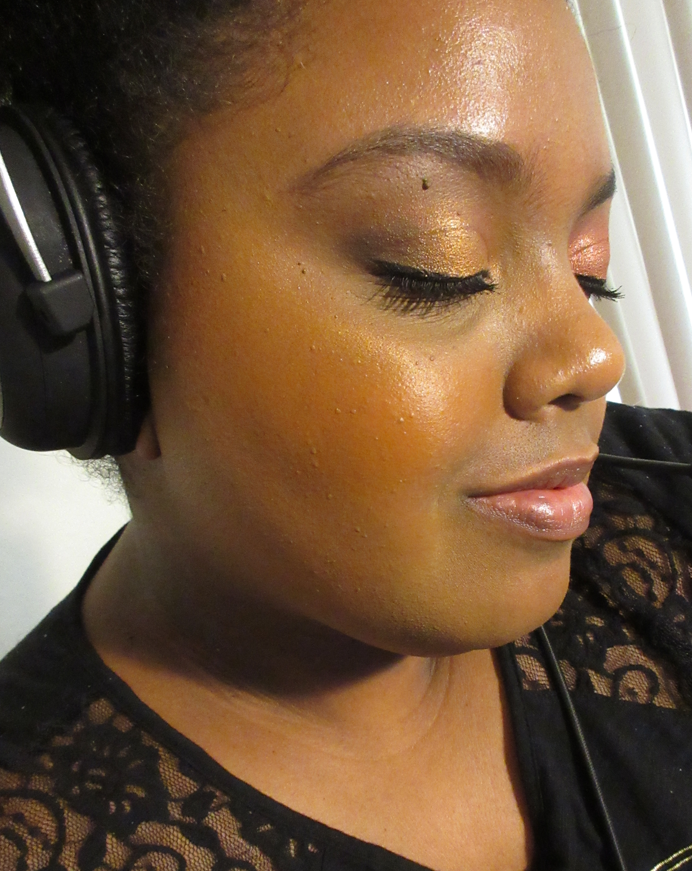
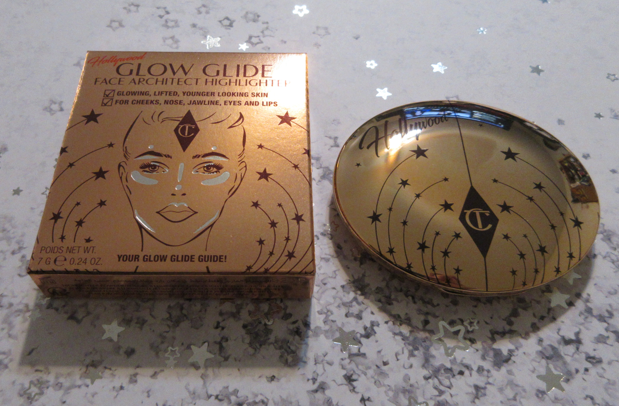
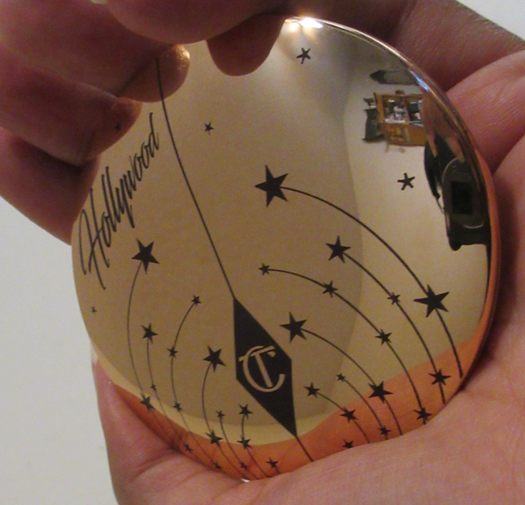
I love a gold highlighter, but this one looks extra yellow next to certain blushes, so I’m not sure if this is the best color for me, even though it’s the right depth. This is one of those wet look type of highlighters and it’s less shimmery than Flex Alert, which I like. It has a semi-wet feel to it with some slip, similar to the Charlotte Tilbury Glow Glide Face Architect Highlighter formula, except that sometimes that smooth buttery texture adheres too strongly to one spot in a patch/clump. I have to go over it repeatedly to try and smooth it out when it happens. Essentially, this applies better with a more resilient bristle brush. It needs to be strong enough to move the product around evenly as it goes on the skin since it’s harder to blend out once it’s stuck. But once that initial layer is down, the highlighter can be built up stronger and more intensely. I included two photos above to show how it can be applied lightly on a natural finish foundation and a pink toned blush, or built up intensely especially on top of dewy foundation and an orange blush.
Despite how long I’ve had this highlighter, my praise of it goes up or down depending on the circumstances. On paper, this should be my ideal highlighter because of the way it looks like it melted into my skin (when having a shimmer clump isn’t an issue), it being more glowy than glittery, and it being a medium gold. However, because the formula isn’t perfect, it’s not on the list of my favorite highlighters. However, it’s still nice and I do like it…70% of the time.
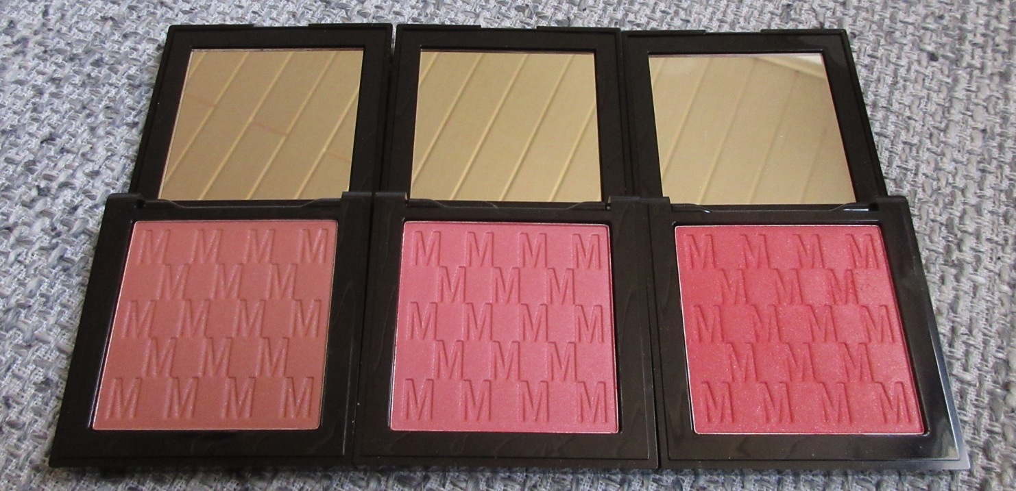
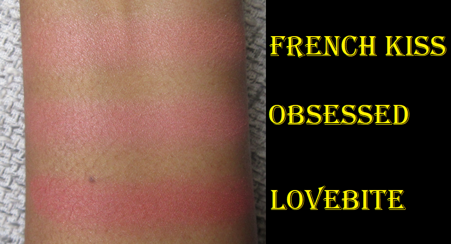
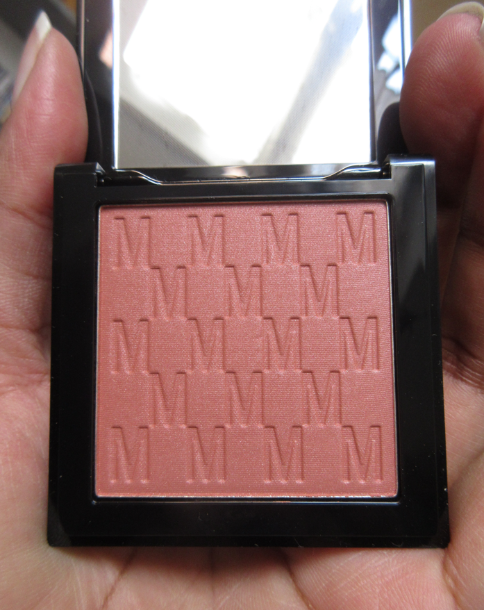
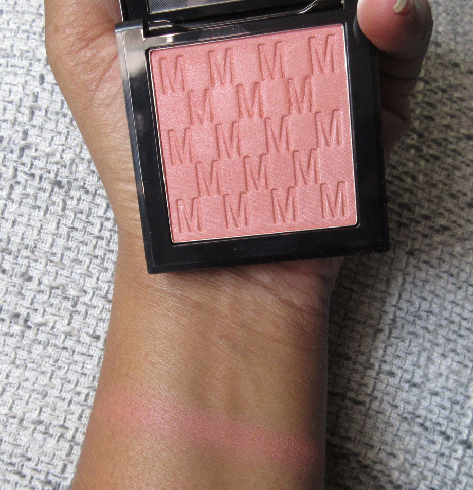
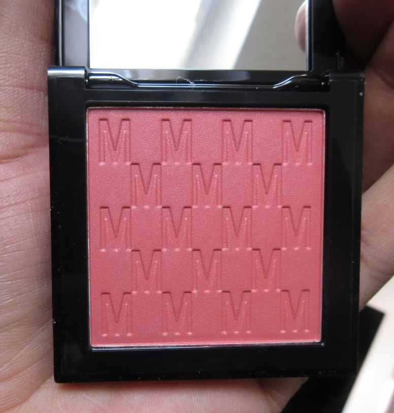
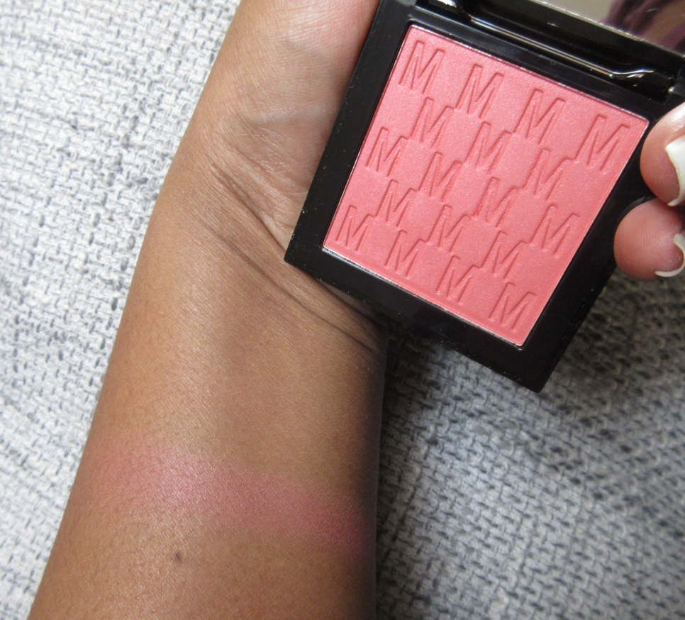
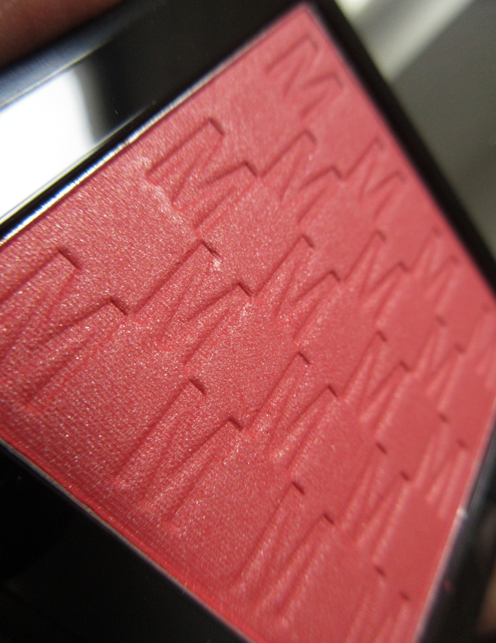
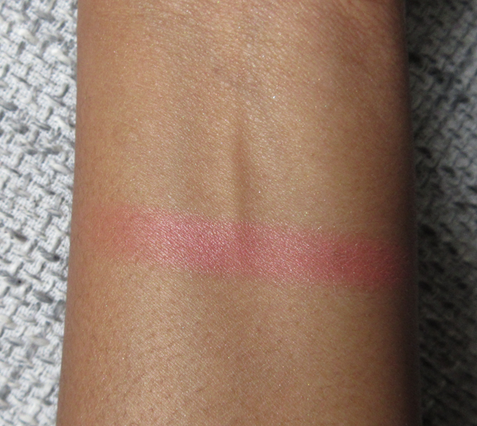
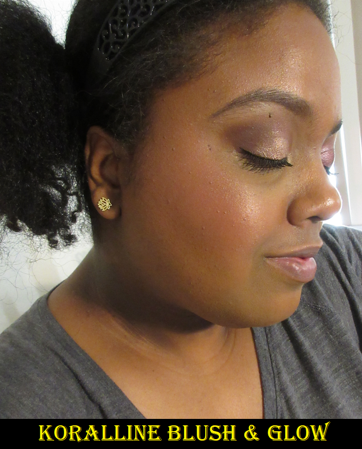
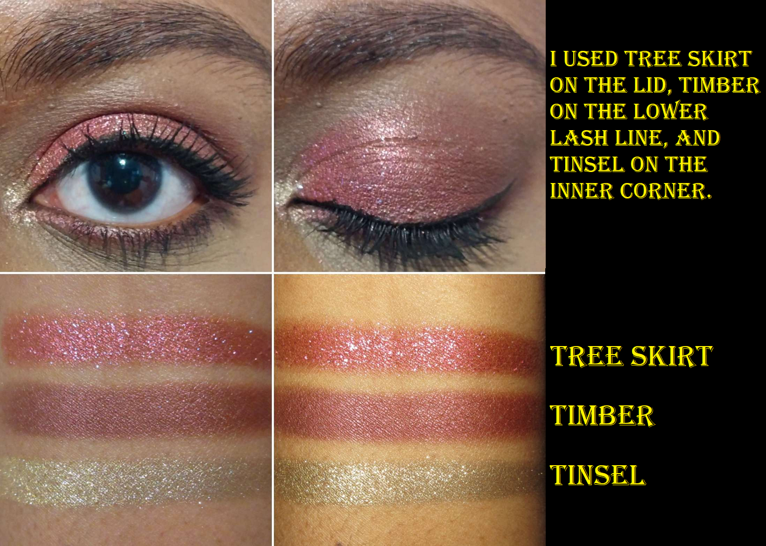
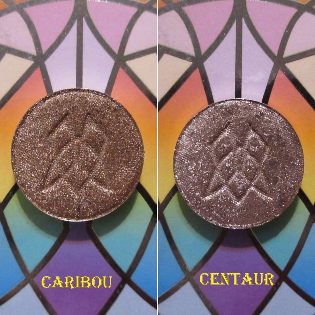
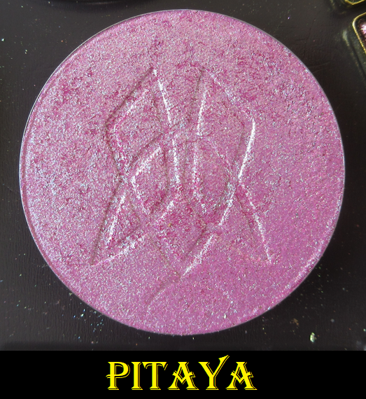
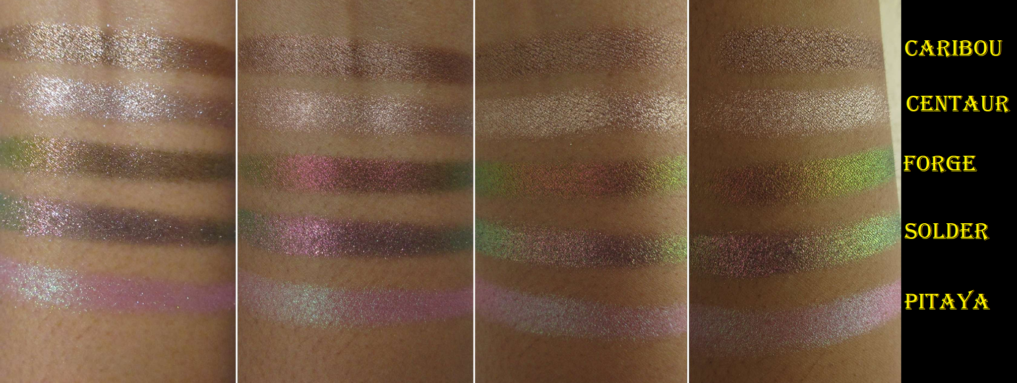
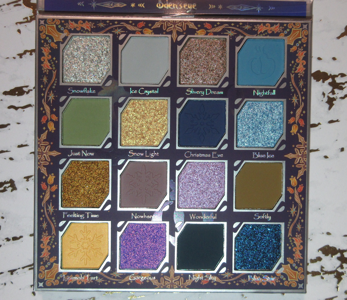
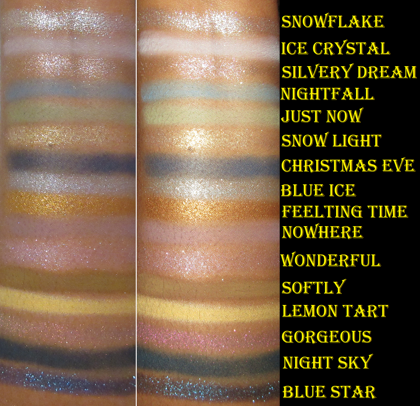
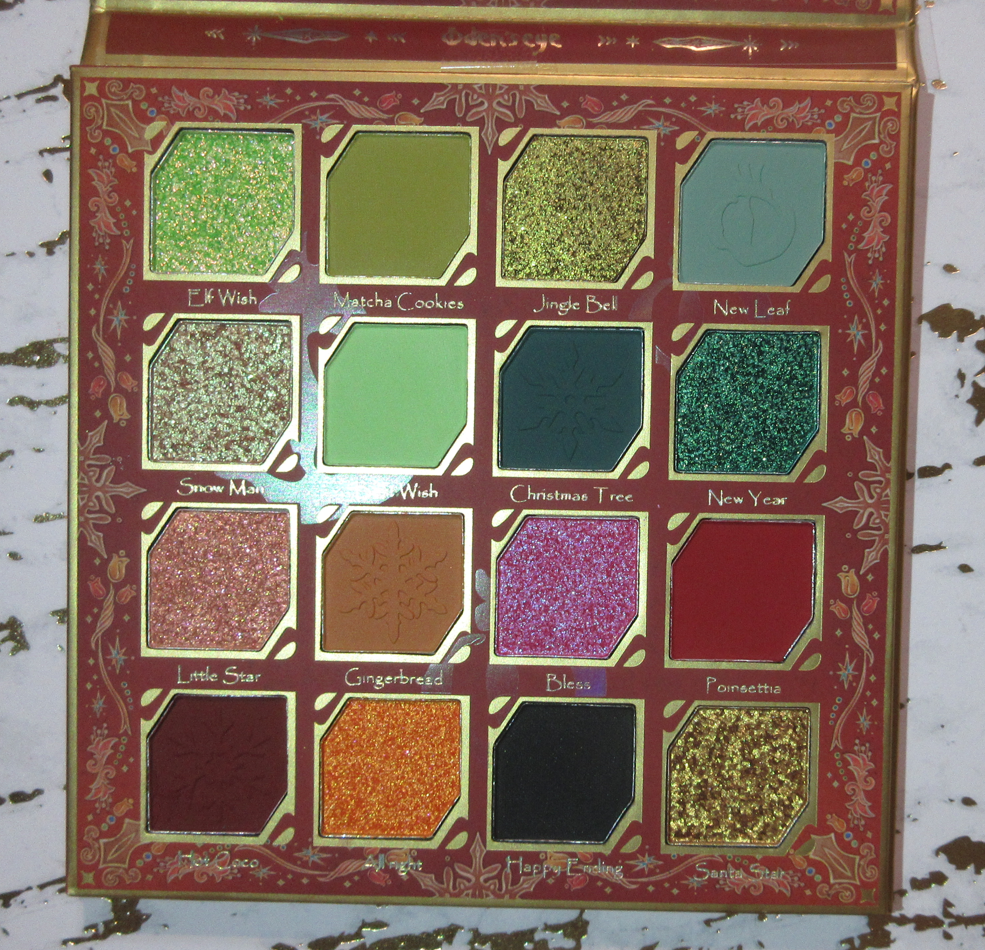
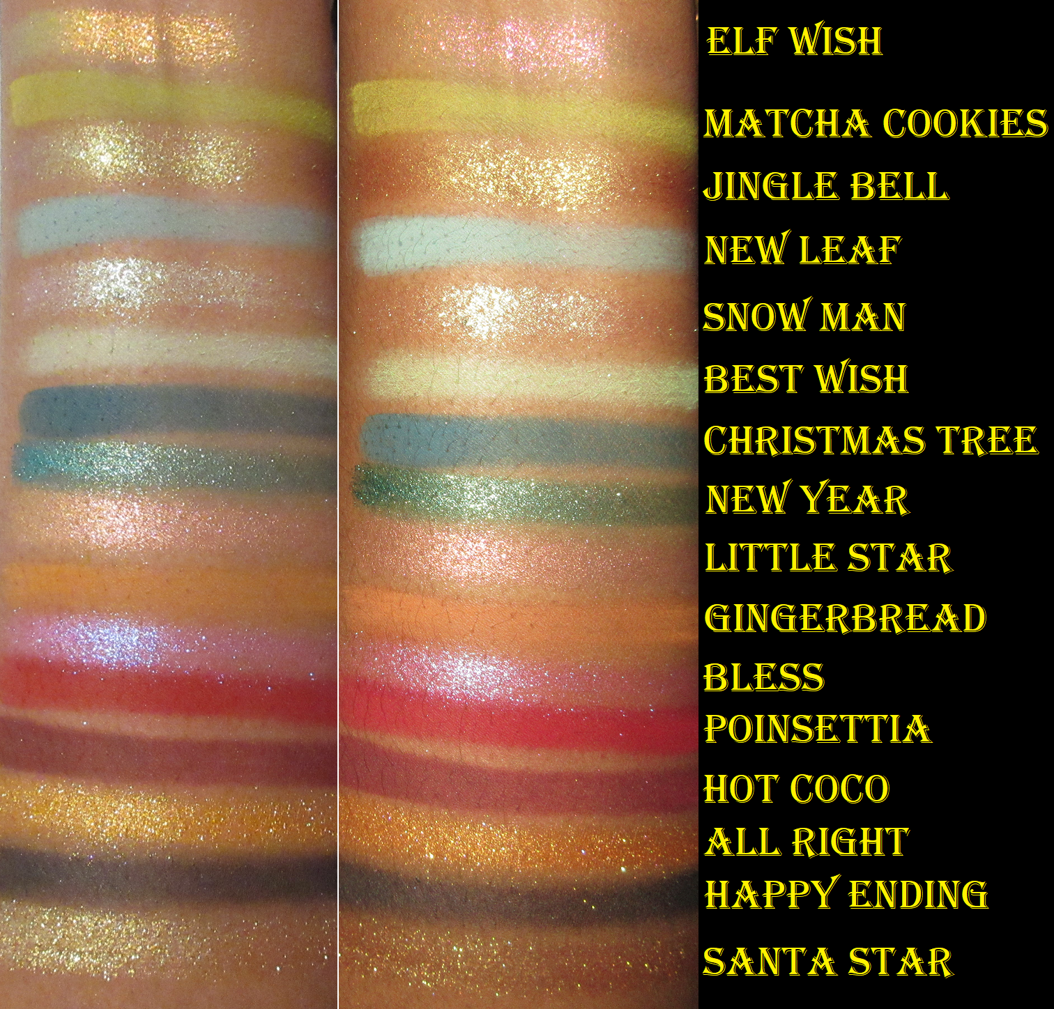
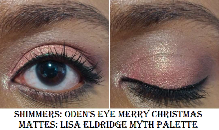
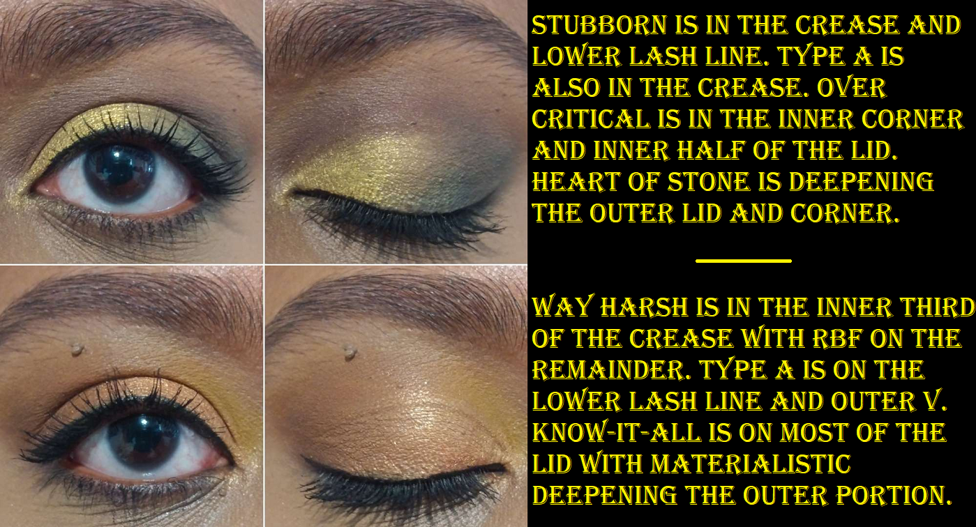
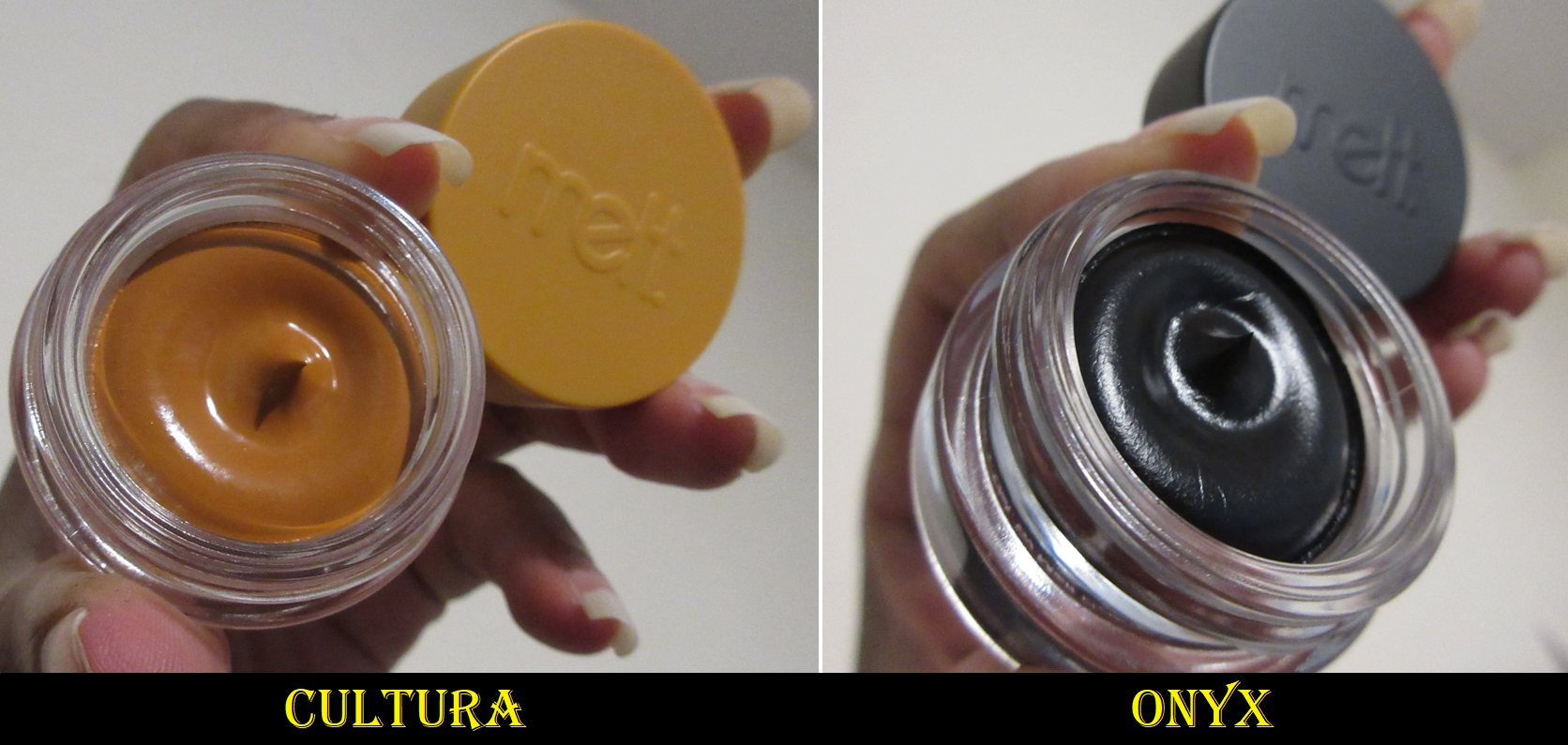
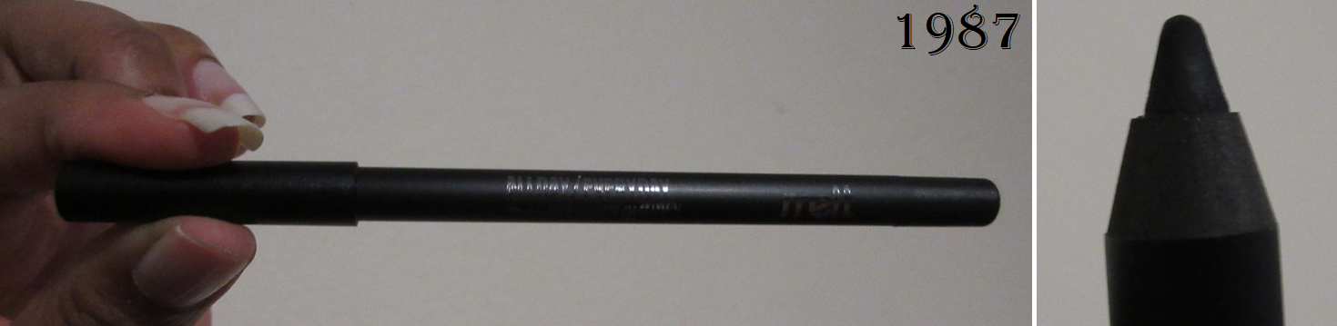
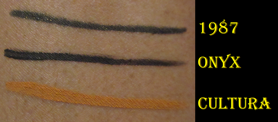
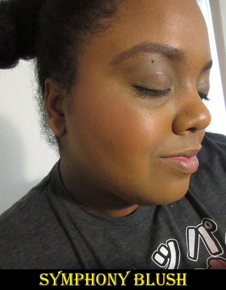
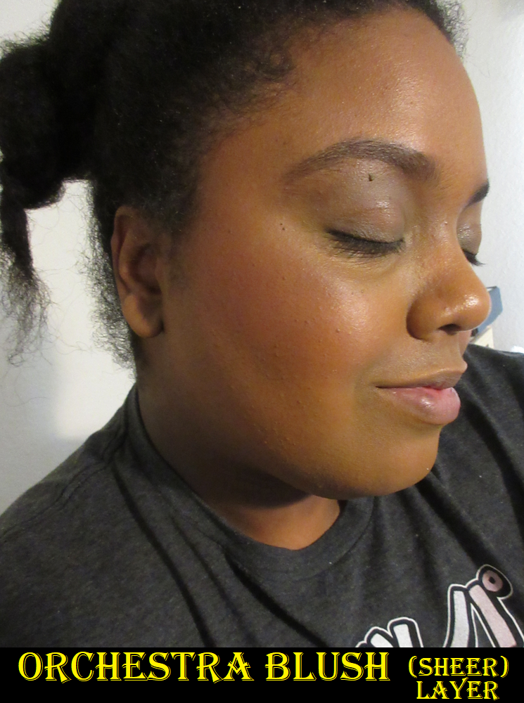
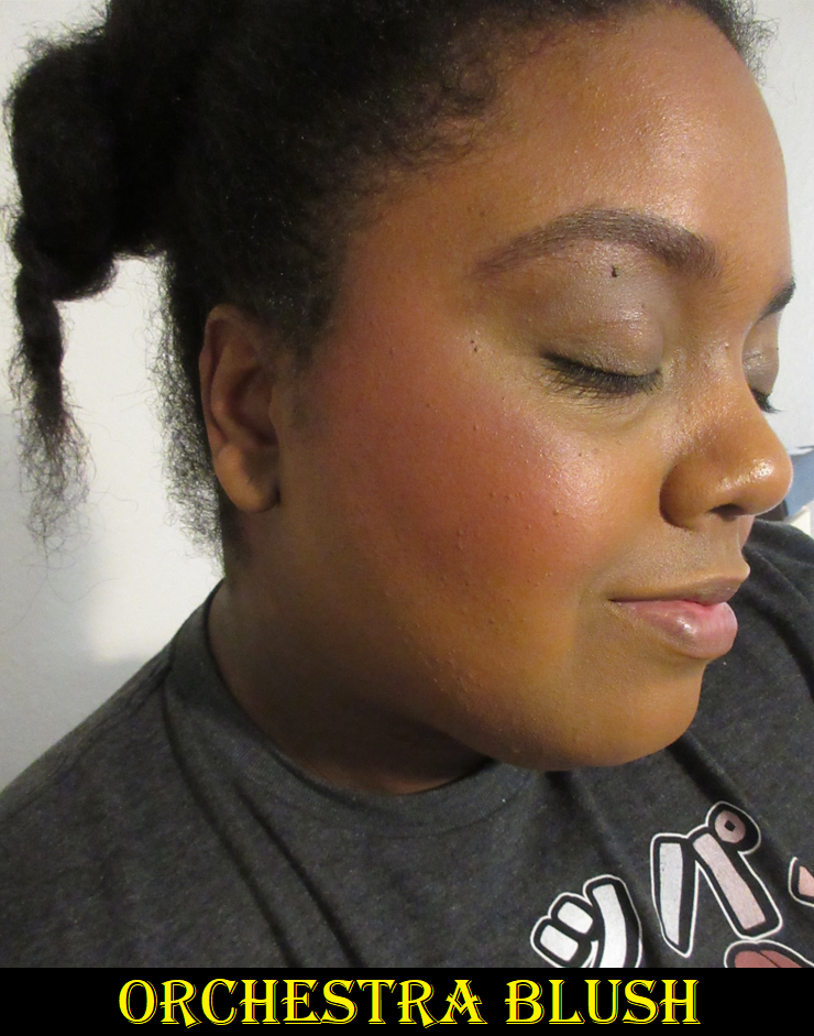
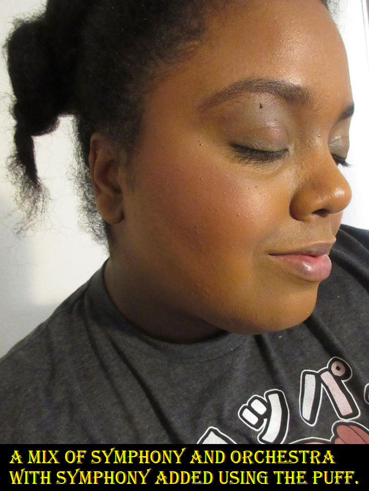
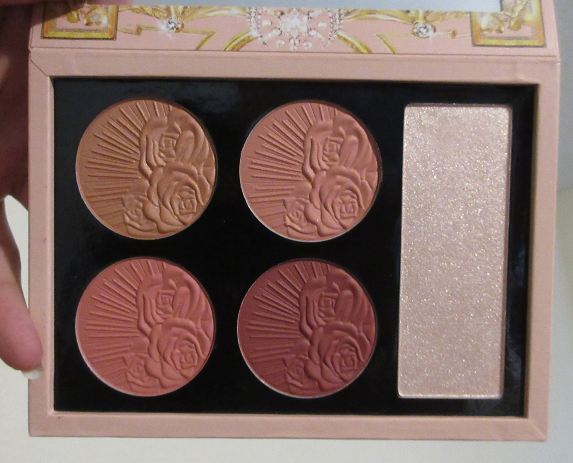
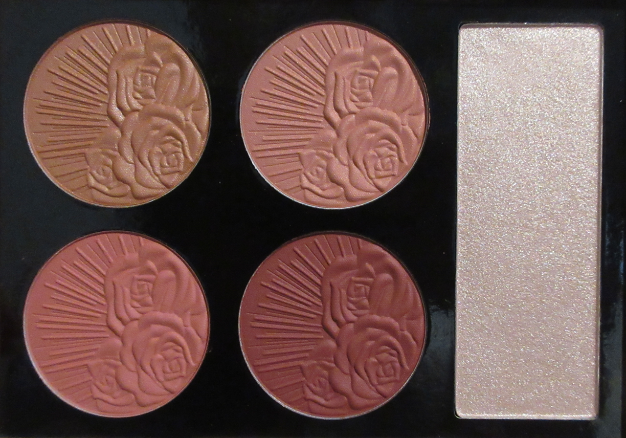
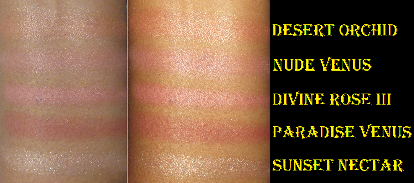
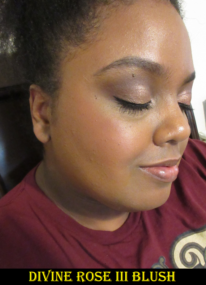
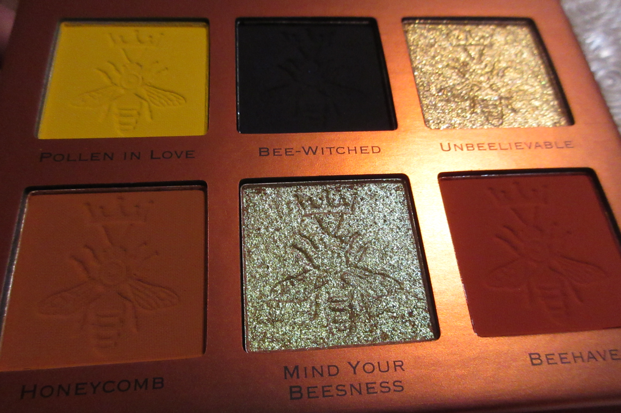
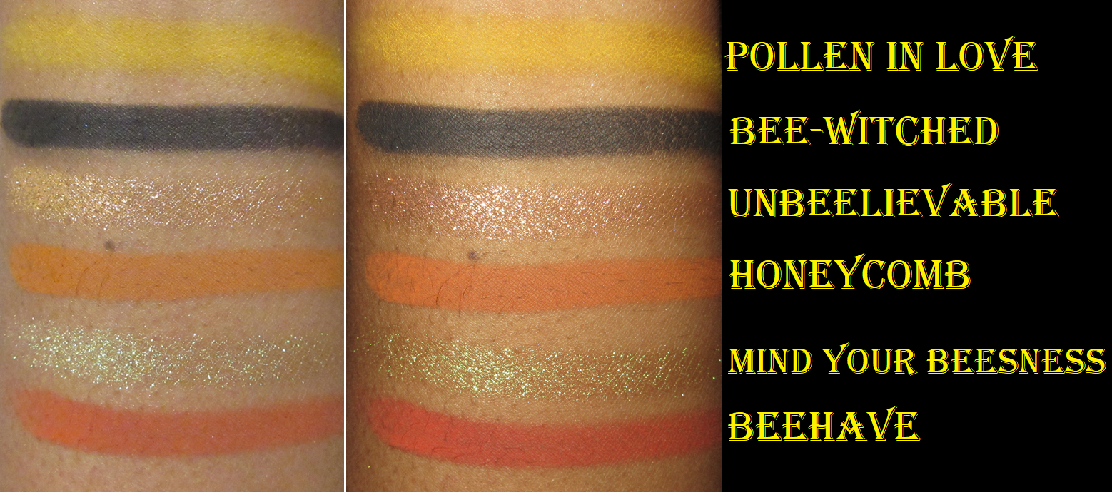
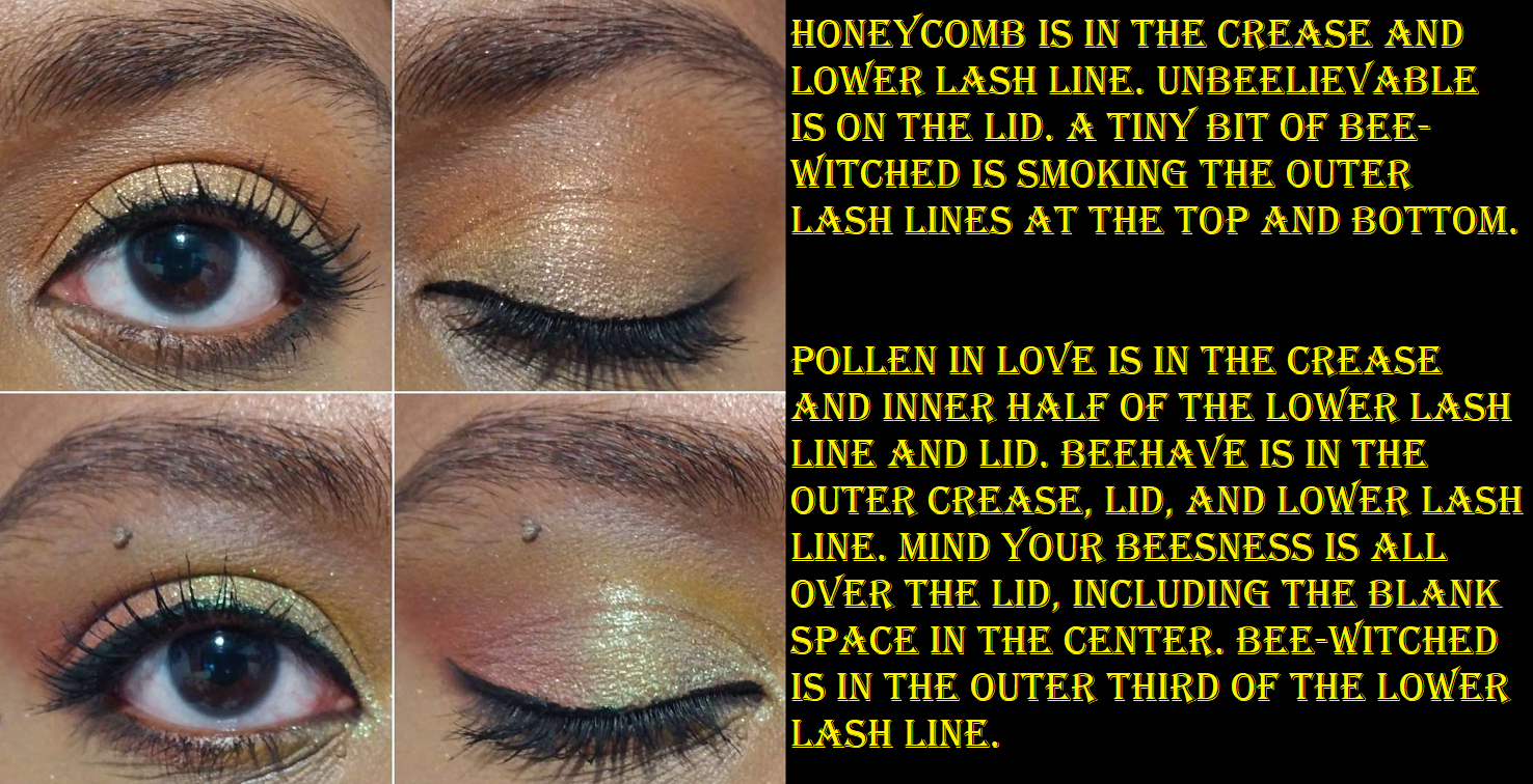
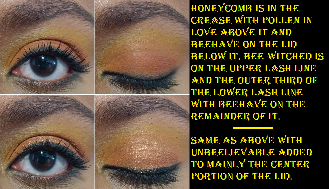
Oden’s Eye Solmåne II Collection: Sunlight Love Blushers in W102 Peach Gleam, W103 Sienne Lustre and B103 Orange Sunny as well as the Gel Liner Pencils in 002 Orange and 012 Golden Brown.
The review for all of my Oden’s eye purchases can be found HERE. Liners were not allowed in my low-buy, but I was curious, did not own these colors, and wanted to hit the free shipping minimum which would have nearly cost the same amount. The blushes from Oden’s Eye are still in my top favorites, but I don’t use them as often as I anticipated because I have so many other favorite blushes that I need to spread the love among. Plus, I’m still using the original Oden’s Eye blushes, so when I want to reach for one, I split the choices between the new ones and old ones.
Colourpop x Winnie the Pooh Super Shock Cheeks in 100 Aker Wood and Mind Over Matter – They were reviewed HERE.
Sonia G Master Face Brush – This brush was reviewed in Fude 4. I saved $20 on it because of credit carried over from the Beautylish Gift Card sale. It would have been worth it despite my low-buy if I ended up loving the brush, but it was just okay.
CDJapan, Fude Japan, and Hakuhodo USA Haul: This month was the last time I could get Hakuhodo brushes before the price increase (up to 30% in most cases), so I placed Fude Japan and Hakuhodo USA orders for that. From CDJapan, I bought Eihodo outlet brushes, the Chikuhodo PS-2, and Mizuho brushes MB123 and MB125. The Mizuho brushes and Hakuhodo ones can be found in Fude 5. The rest are in Fude 4.
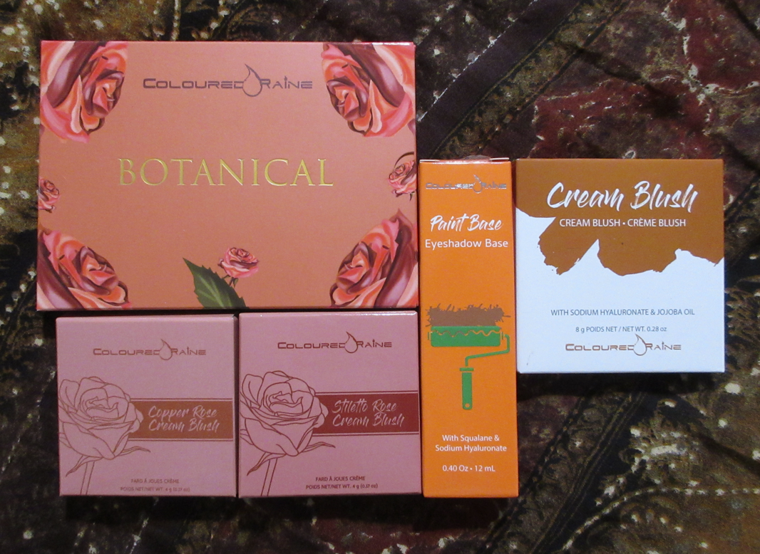
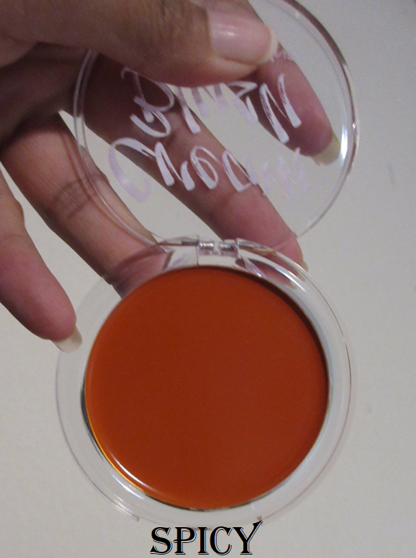
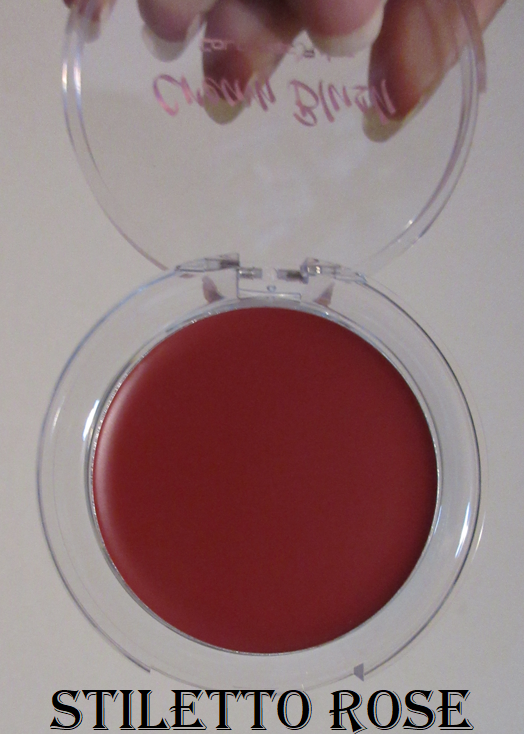
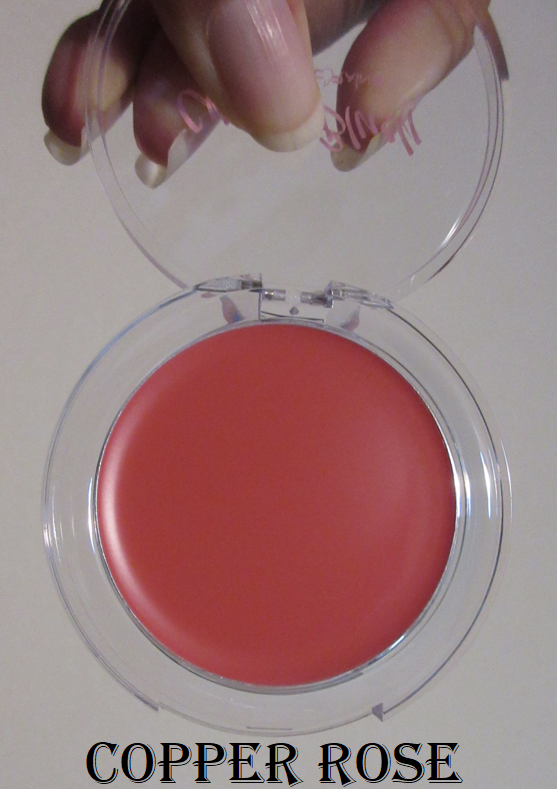
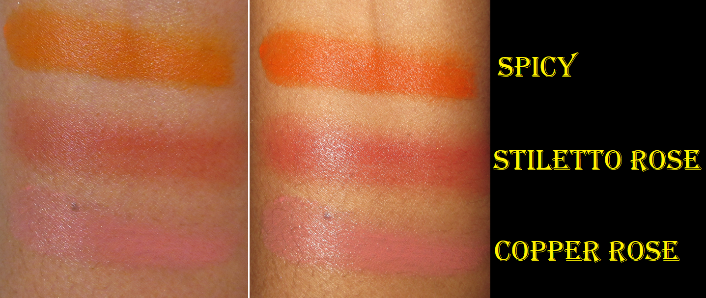
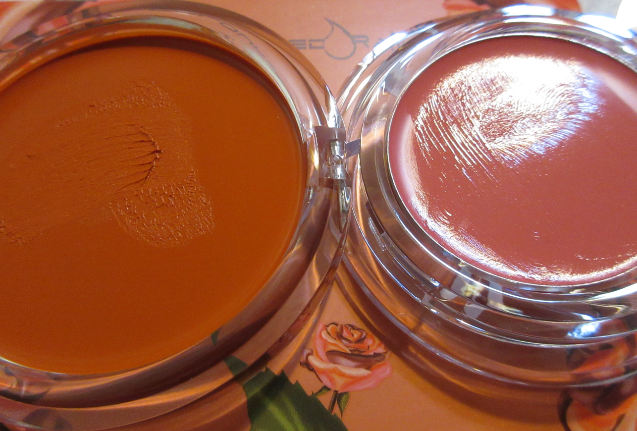
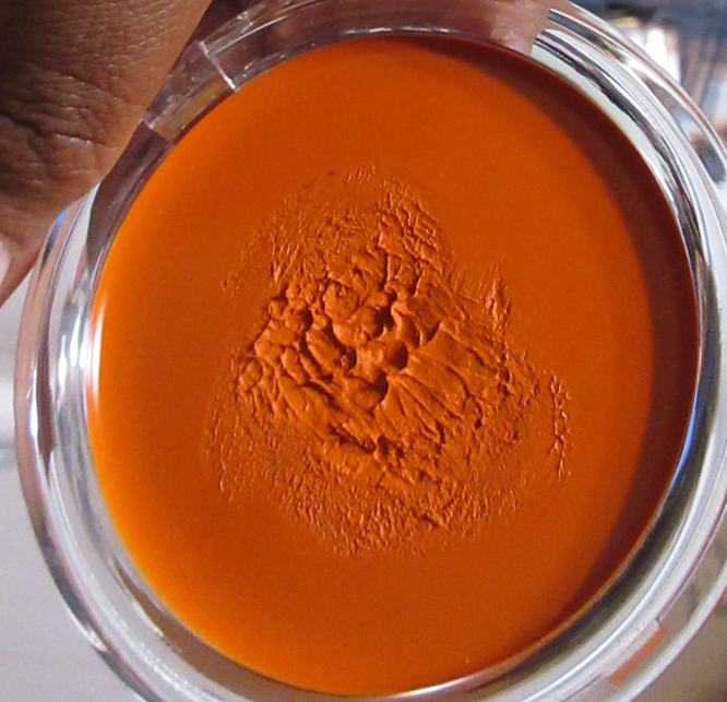
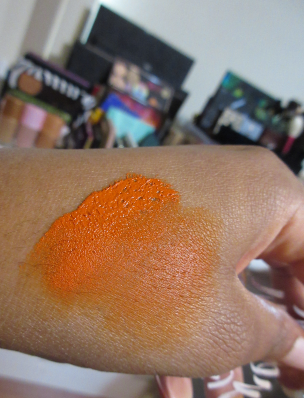
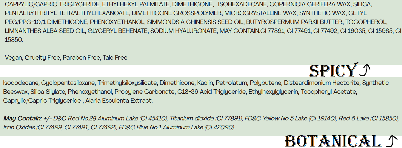
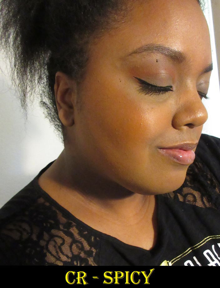
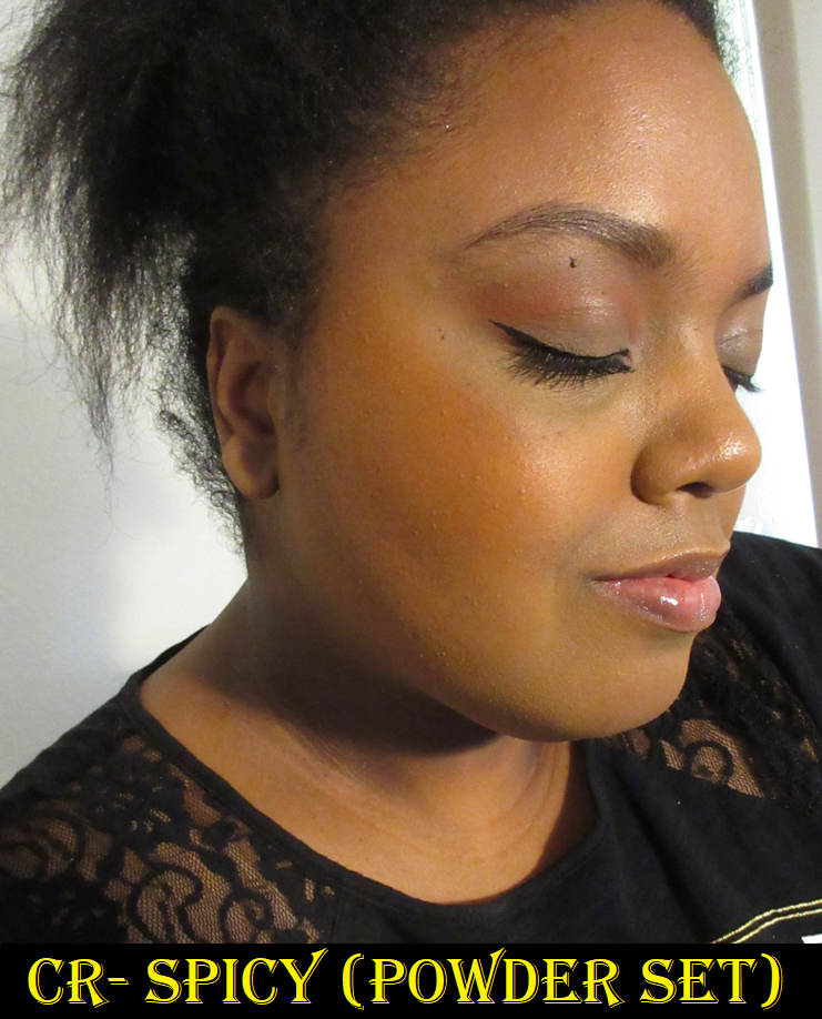
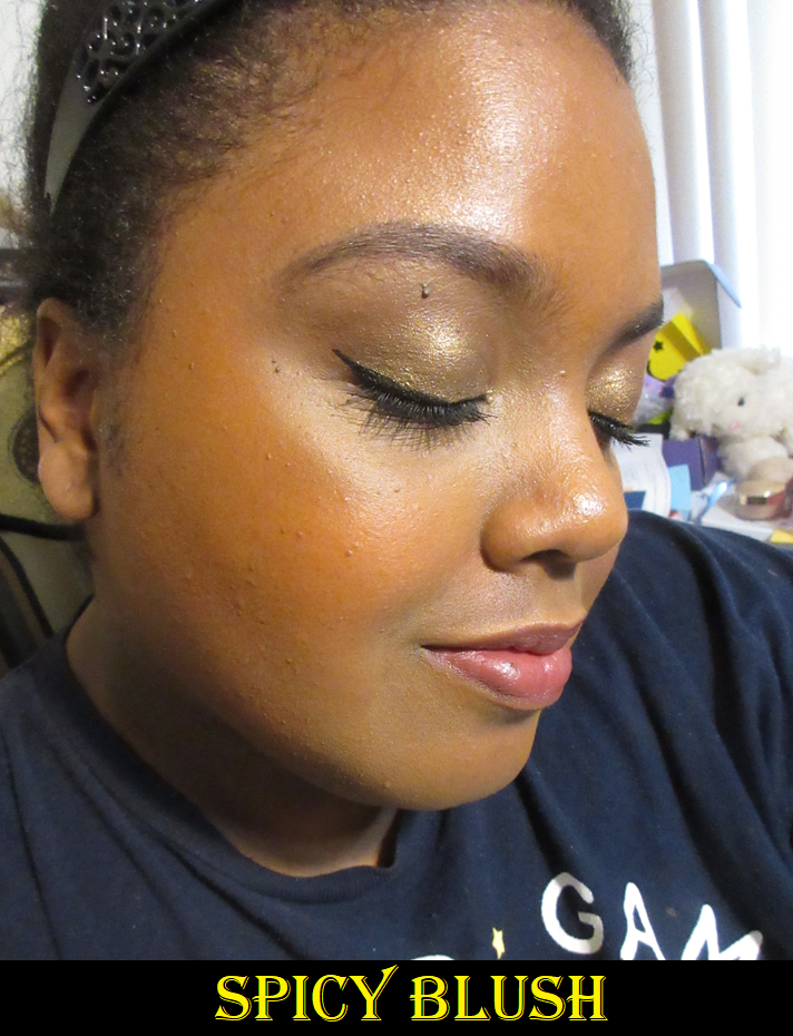
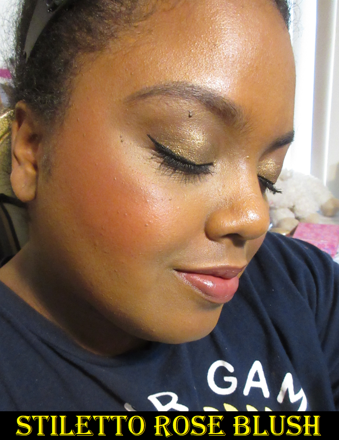
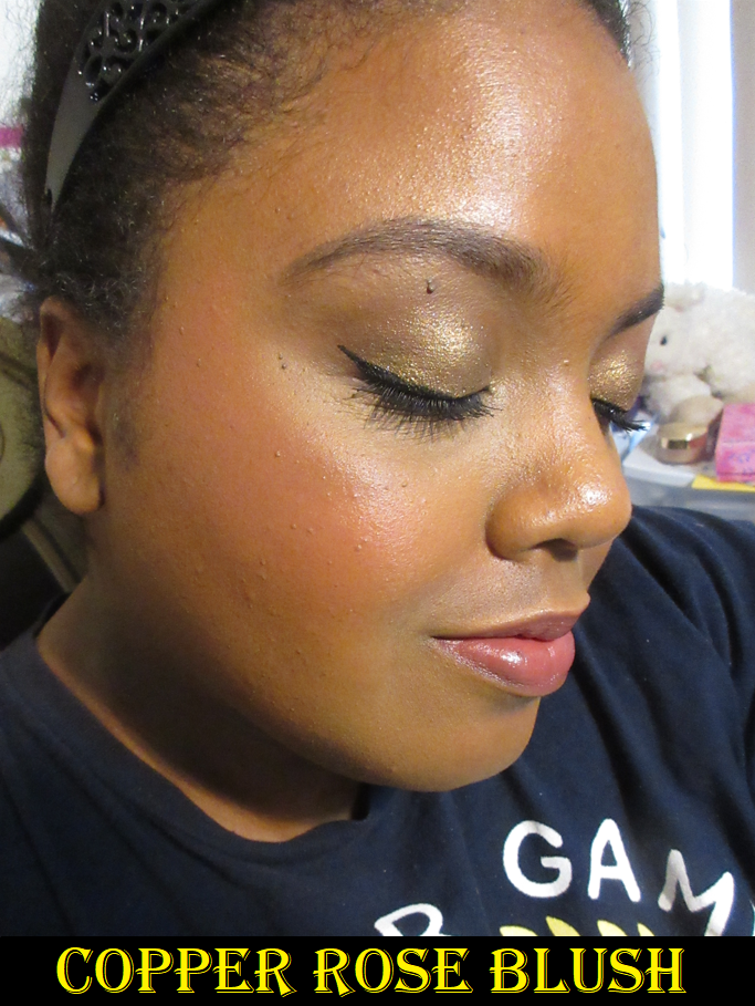
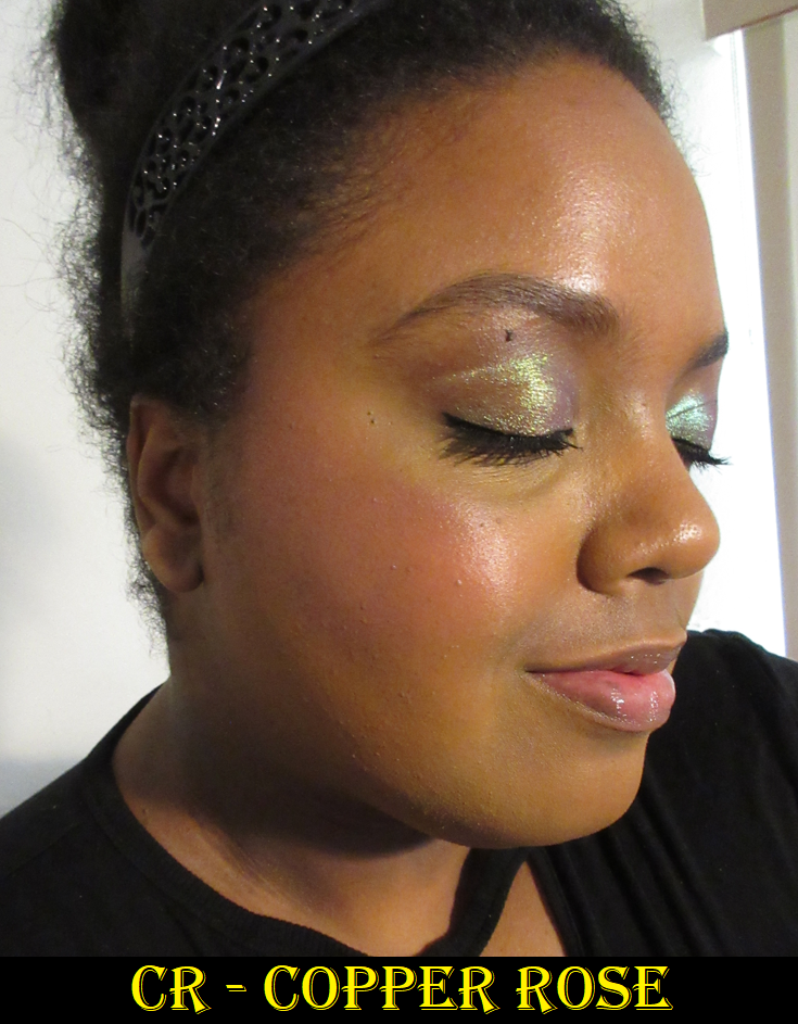
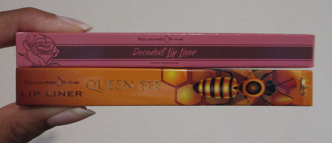
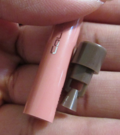
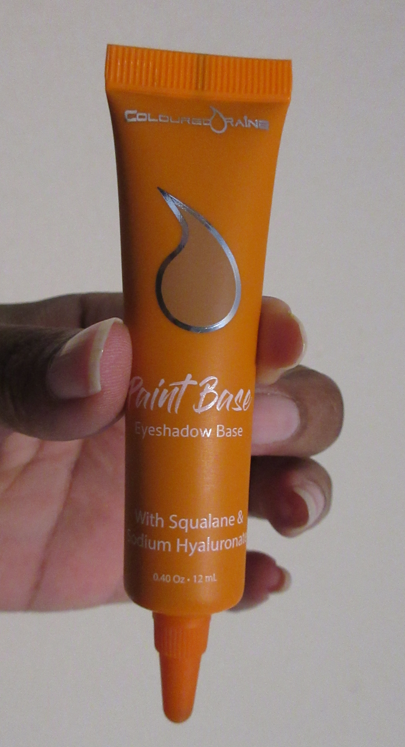
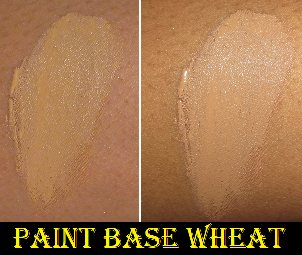
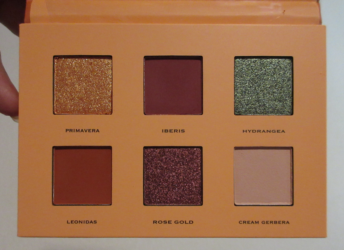
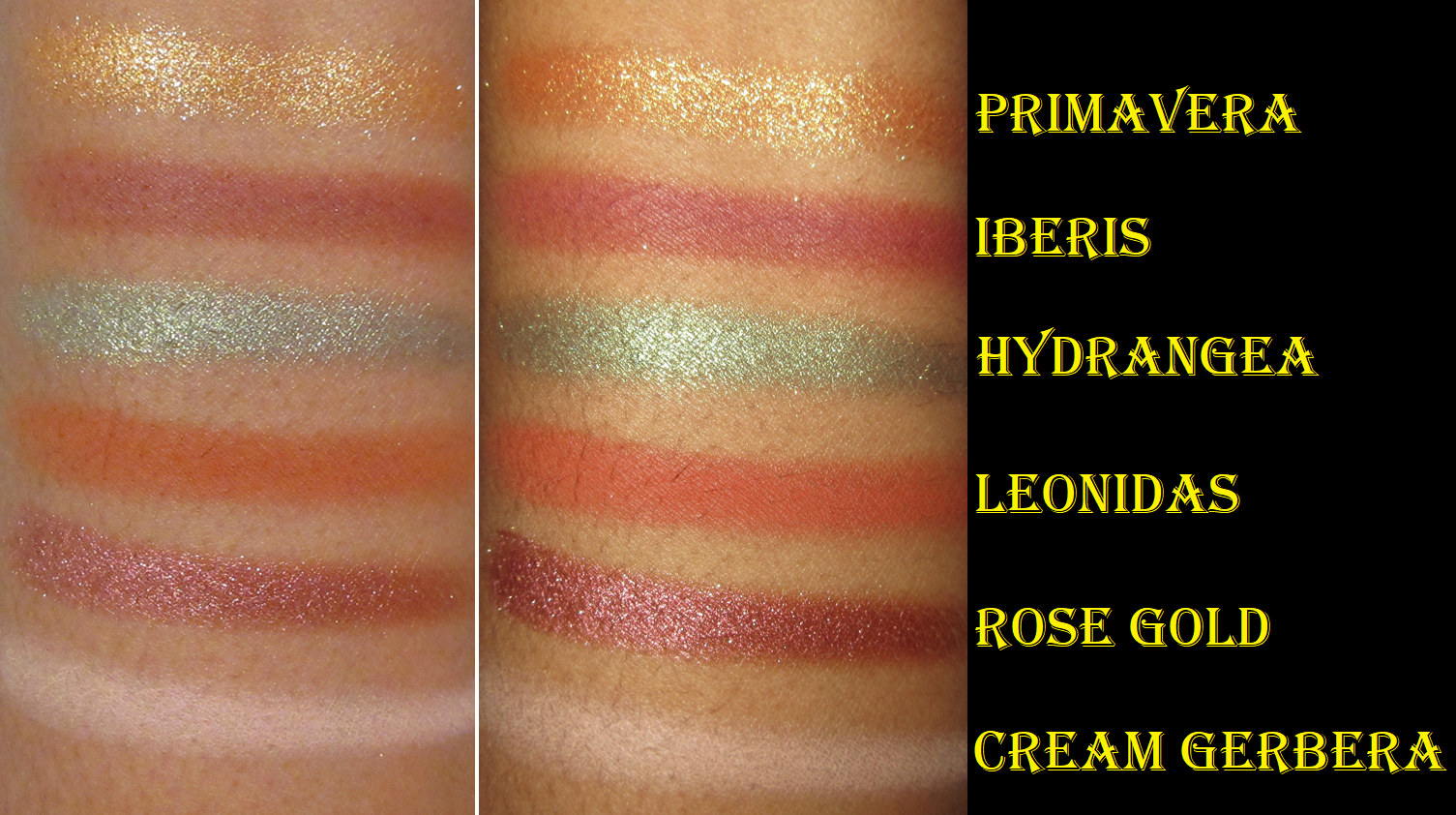
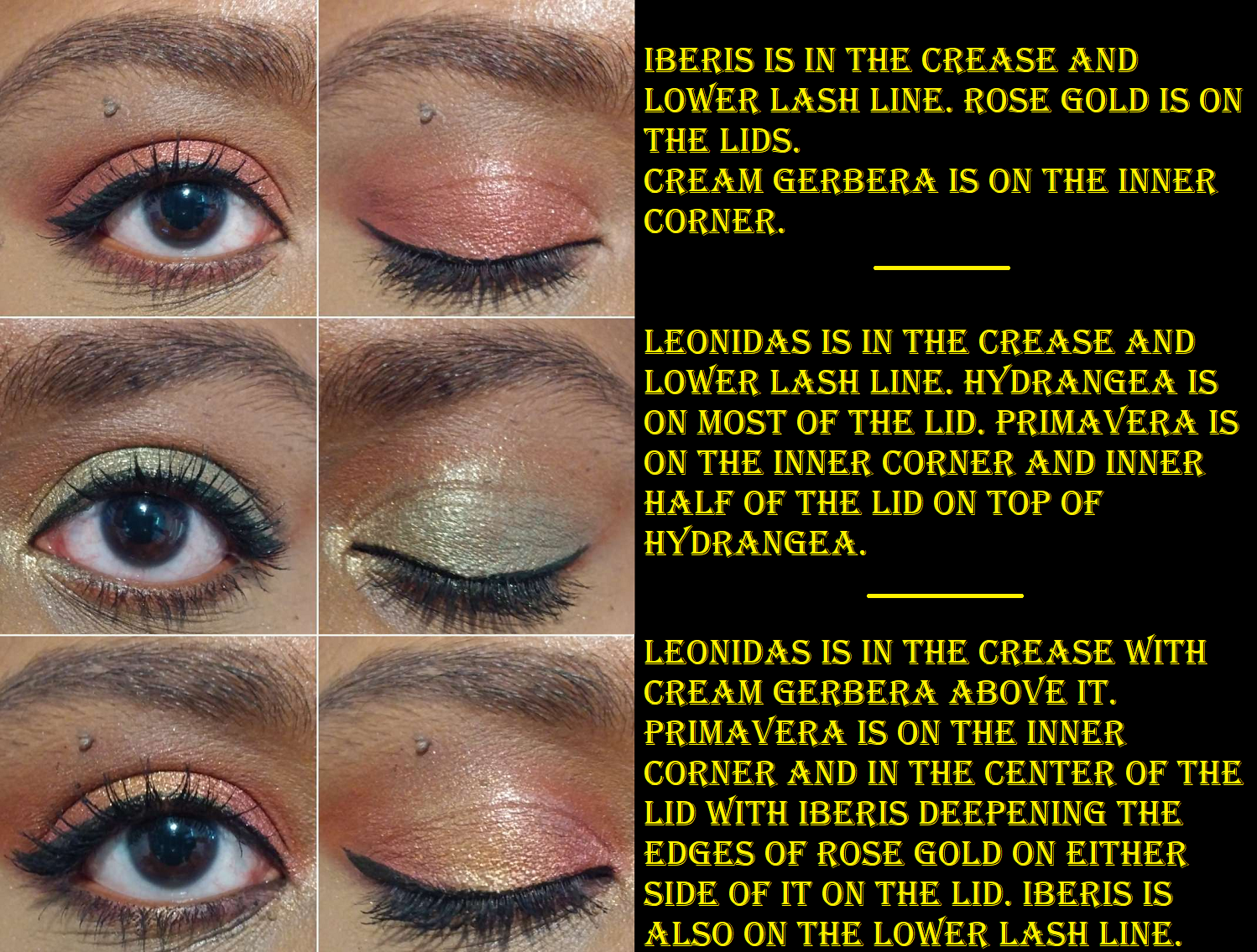
Coloured Raine Haul: Botanical Eyeshadow Palette, Cream Blushes in Copper Rose, Stiletto Rose, and Spicy and Eyeshadow Base in Wheat – These were reviewed HERE.
The Alamar products were the last ones that needed reviewing for the month of May from 2022! I hope this has been helpful and especially from a different perspective all this time later after hype for the products have died down. Thank you for reading!
-Lili ❤