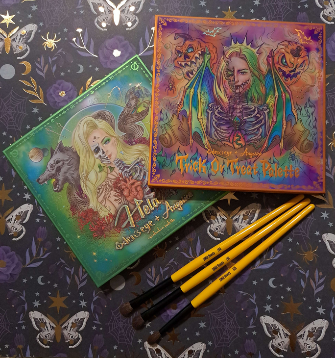
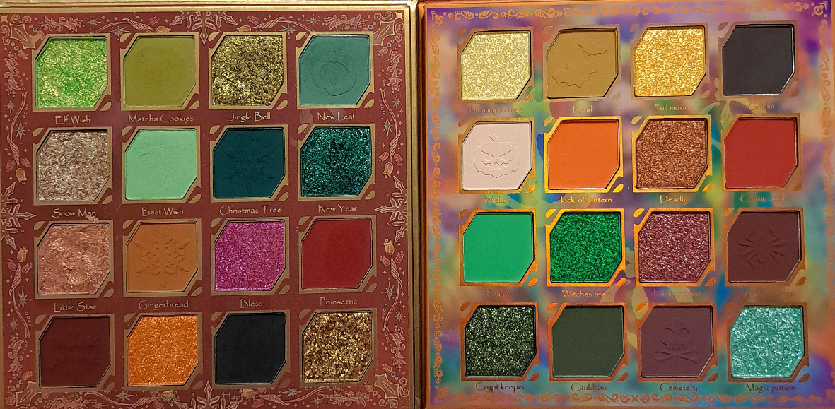
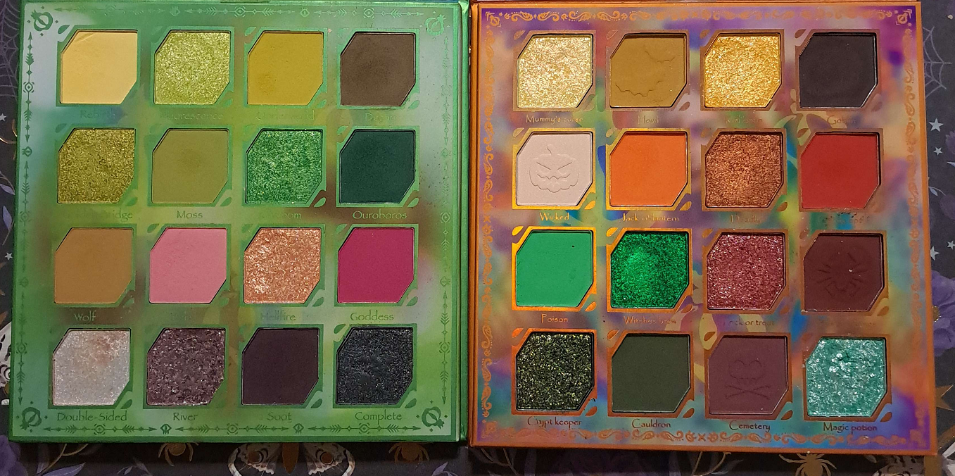
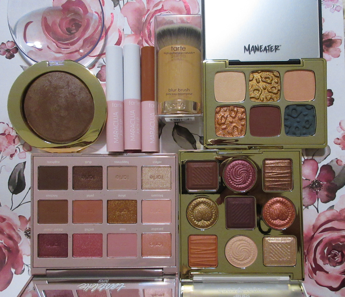
This is one of the two Halloween themed palettes Angie launched with Odens Eye, making it her second time collaborating with the brand overall. There are very specific shades that appealed to me in the Trick or Treat palette, so I decided to go ahead and grab it since the chances of it being restocked are low. There was quite a bit of drama associated with this launch on social media. Particularly on Instagram, I saw a disturbing number of borderline xenophobic comments regarding the brand and Angelica with people expressing displeasure that non-Americans were doing a Halloween themed launch, as if it’s an American invented holiday with no Celtic (and therefore European) origins. I’m paraphrasing in a nice way. Some people took it quite far. There was even one semi-large beauty account who tagged Angelica twice in a vile mean-spirited post. Reddit made me aware that this same person has said horrible things about other groups of people, so I’m no longer surprised. In any case, Angelica took the high road in not addressing the negativity, instead sharing her joy of her first Halloween experiences on her YouTube page, and everyone moved on. For that reason, I won’t dwell on the incident, but it was actually a pretty gross reminder of how small minded people can be and the aspects I despise about social media. I’m not sure if this impacted sales at all, but I believe this is the first time an Angie collab hasn’t sold out within the first month and with indie brand timetables being what they are, it’s safe to assume there won’t be a restock. So, for anyone wanting items from the collection, I recommend getting it sooner rather than later. Oden’s Eye is likely to have a Black Friday sale, and maybe even a Christmas one, but there’s no guarantee the palettes and lip products will still be available by then or even after that.
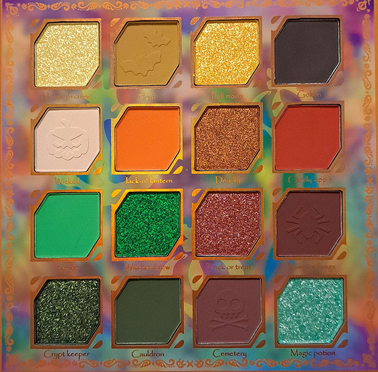
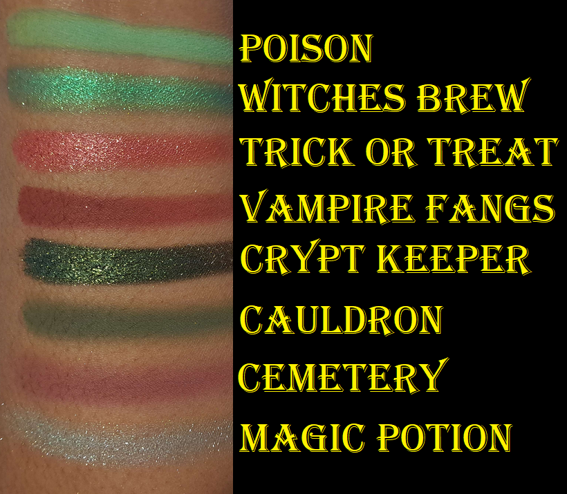
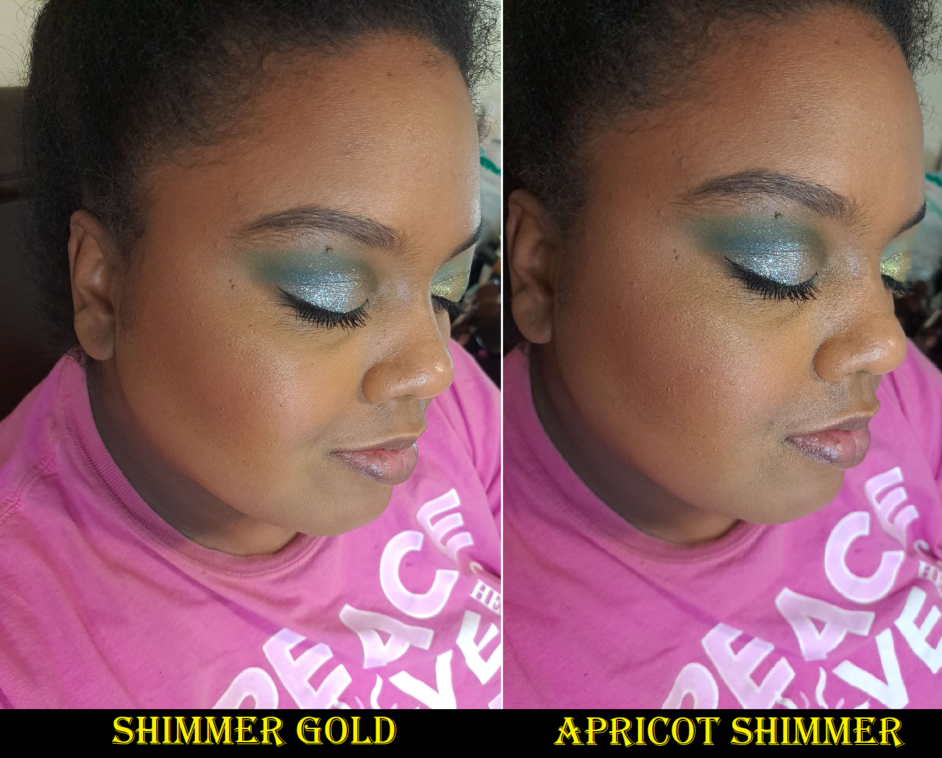
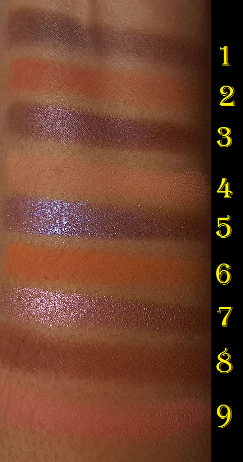
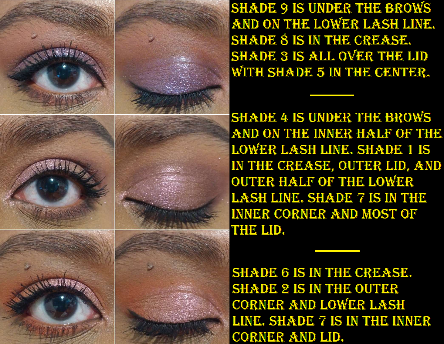
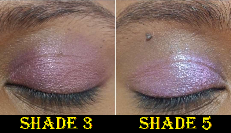
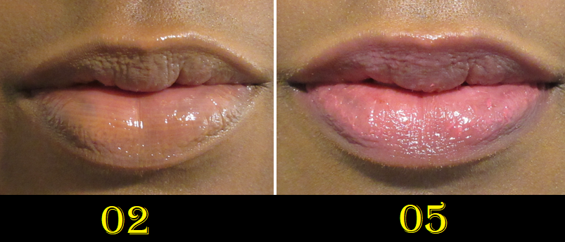
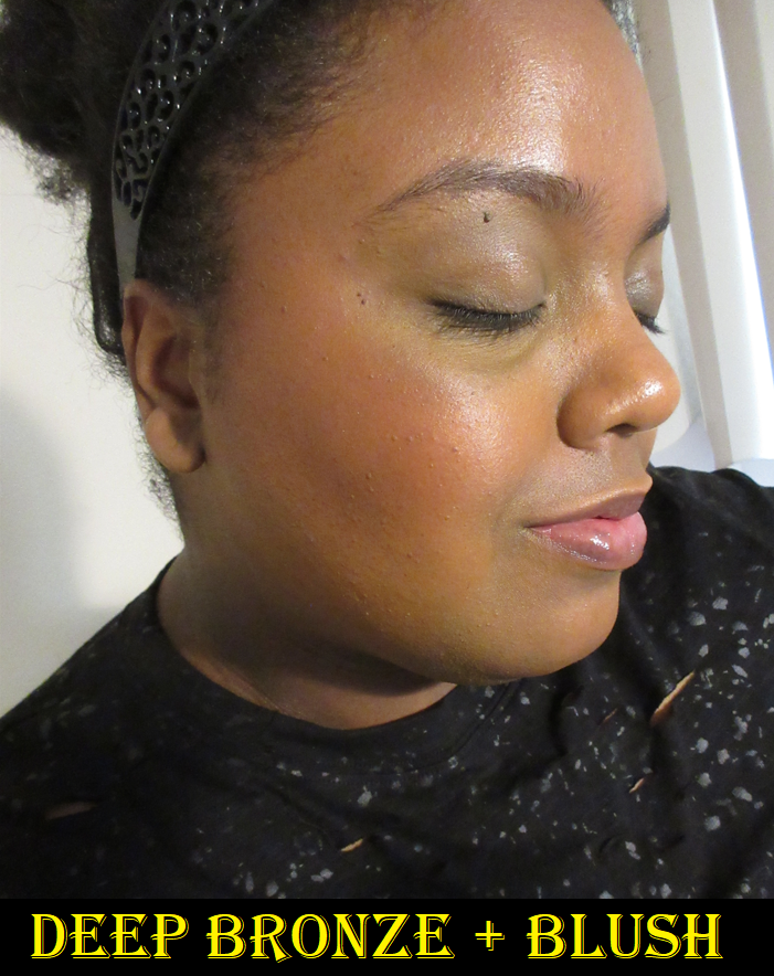
I’m happy to say the Trick or Treat palette is so much prettier in person than I could see from photos and videos. This is the good Oden’s Eye formula I’ve come to know and love. The shadows are pigmented, but blendable. The shimmers are high impact. The only issues I had were with two shades. Wicked is a much thinner and more powdery matte than the others. It doesn’t show up on me at all. I’ve tried several times to build it up in my inner corner the way Angelica likes to have a matte inner corner brightening shade, but it disappears after a few pats on my eyes. I can at least still use it as a shade to blend the edges of eyeshadows or tone down the brightness of colors, but it only makes a small difference.
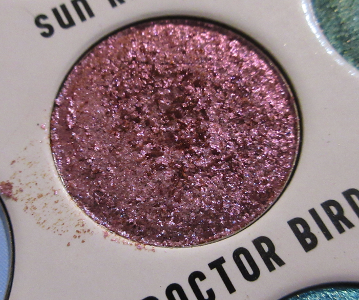
The other issue is that Witches Brew isn’t as even in color and smoothness on the eye. It’s like a slight separation between the base and the shimmer. I can get patches where the vibrant blue-green peeks through when I apply it, and there’s no shimmer in those spots, whereas all the shimmer has gathered onto other parts. So, it takes some smoothing back and forth to get the area covered evenly. It’s such a vibrant glowing shade and one of the ones I was the most excited to have, but it’s a little less enjoyable in the application process.
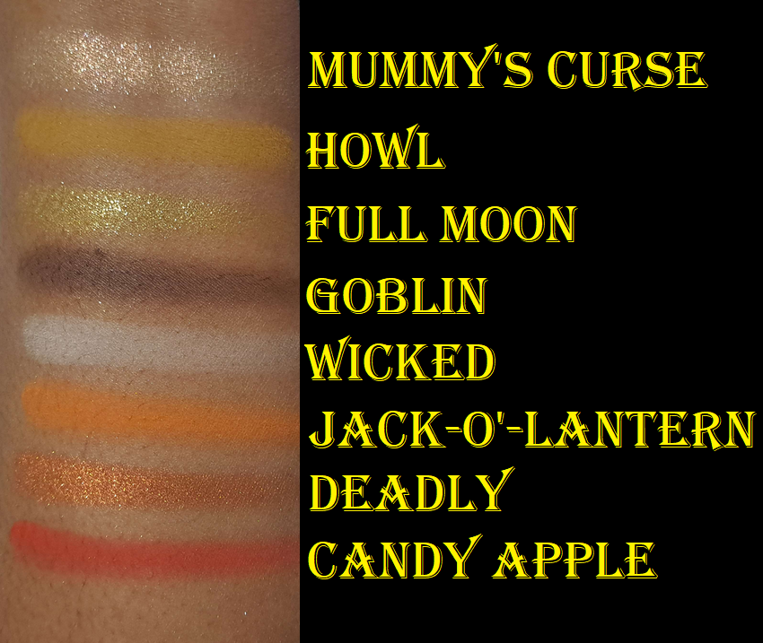
I have no issues with longevity or creasing. Regarding my skin tone and how the shades look on me, there are only two important enough to mention. One is that Cemetery looked like a red that was bordering on purple. I expected it to be nearly an ultra-deep mauve, but it’s more of a burgundy color on me. Magic Potion looks like it should be a silvery-light blue but none of that blue translates on my skin. It’s basically just silver, which might end up being better since I don’t know how much I’d have enjoyed that kind of blue on me anyway.
If you have a big Oden’s Eye collection, you might feel some of these shades are similar to what is in other palettes. I thought some of my yellows looked like others, but in swatching them on myself I realized there were no dupes. The reds are also just different enough. I thought Crypt Keeper would be similar to Luxury from the Urd palette, but luxury is lighter. The only one actually close was Deadly compared to Eternal from Solmane II. I don’t have every palette though, so perhaps there are a few more that are close, but I was satisfied that this palette is different enough to be worth having in my collection. In fact, one of the selling points for me was that it reminded me of the Merry Christmas palette and that those two pair well together.
And of course it can also be paired with the original Hela palette.
I’m on a lip product low-buy, so I wasn’t interested in that part of the collection and can’t vouch for the quality of those, but I think those who are interested in the eyeshadow palettes will be happy with them.
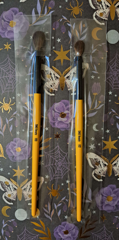
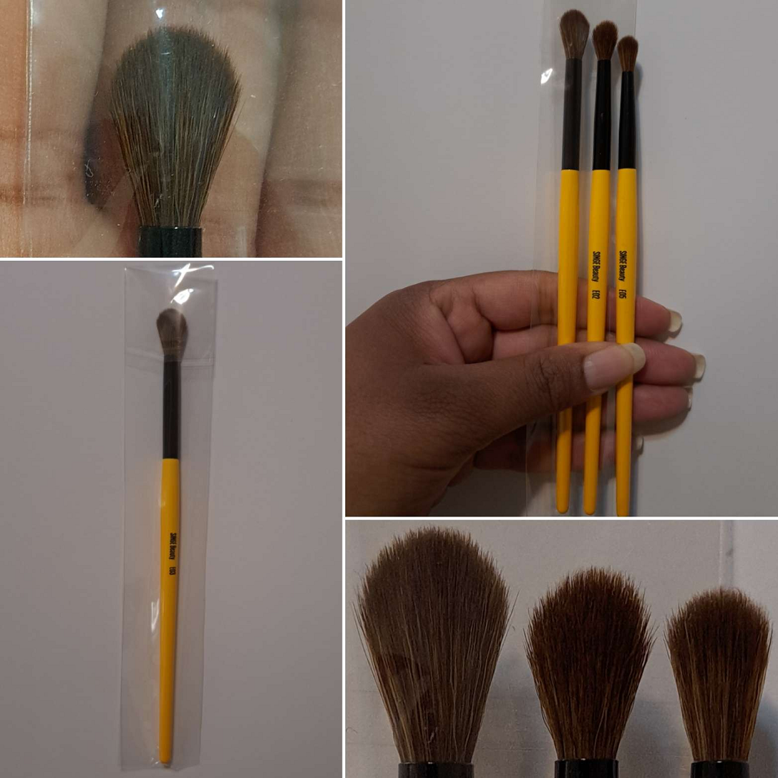
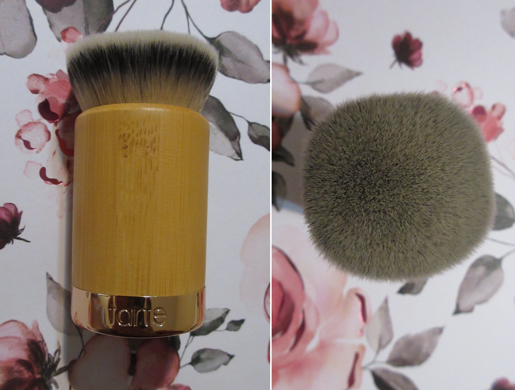
I wasn’t planning to review Singe Beauty, Angelica’s brand that she unveiled this year, because after my initial impression I didn’t think I’d end up using them enough to review. I really wasn’t a fan at first, and honestly being a natural hair Fude lover plays into that. However, I’m still going to share my thoughts here today because these brushes do have their benefits.
Singe Beauty
Angelica has said that her brushes are, “specifically made out of synthetic fibers to emulate the way a natural bristle will pick up and distribute product,” but in various videos including this one and others that came after, she describes them as “super soft” and that they feel like natural hair, not just perform like them. I have to say this is a major discrepancy between what I expected when ordering versus what I got in reality. I was expecting them to feel like the highest grade of goat, but I can see someone thinking it could pass for sokoho goat at best. They’re closest to sable, which some people love because of their strength and resilience. However, I’d prefer to spend a little longer blending if it means I can use a softer less firm brush. The manufacturer nailed the natural hair performance part of it, but there is absolutely no mistaking that these are synthetic and they feel synthetic. This isn’t a point against the brushes; I just think saying they’re comparable can lead to others having higher expectations and then being disappointed. I only use synthetic brushes for specific limited tasks, so I would not have been interested in picking up this set if not for the natural hair comparison.
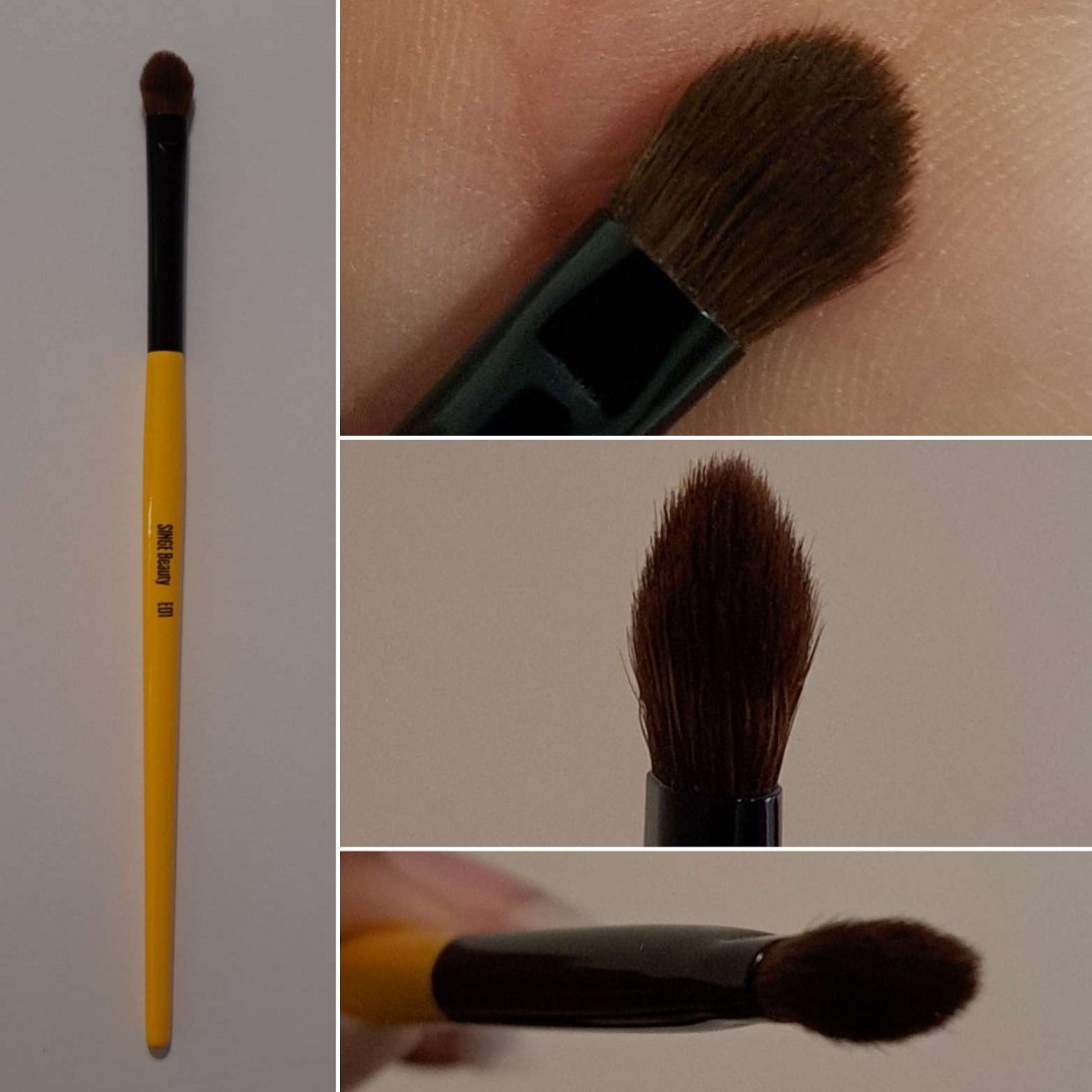
E01
The E01 is the brush I was most excited to have because the shape reminded me of the Sonia G Builder Pro which is one of my holy grail eye brushes. This is my favorite brush of the bunch for applying shimmers to the lid. When I was having a hard time getting the shade I mentioned in the palette section (Witches Brew) to apply smoothly, this was the brush I switched to that helped make things much easier. I know that Angie says it’s great for packing shadow on the inner corners, and while it can do that, I still prefer to use my smaller brushes for that purpose. Plus, this brush is a little pokey and doesn’t feel as comfortable in my corners and creases. So, I end up using this brush mainly for shimmer lid shades, and it’s great for that. Plus, as a lid packing brush, how soft it is barely matters. What matters is how well it picks up and lays down the product, which this works well for, making it quite useful for my collection. It being synthetic also has the advantage of being great with liquid and cream shadows.
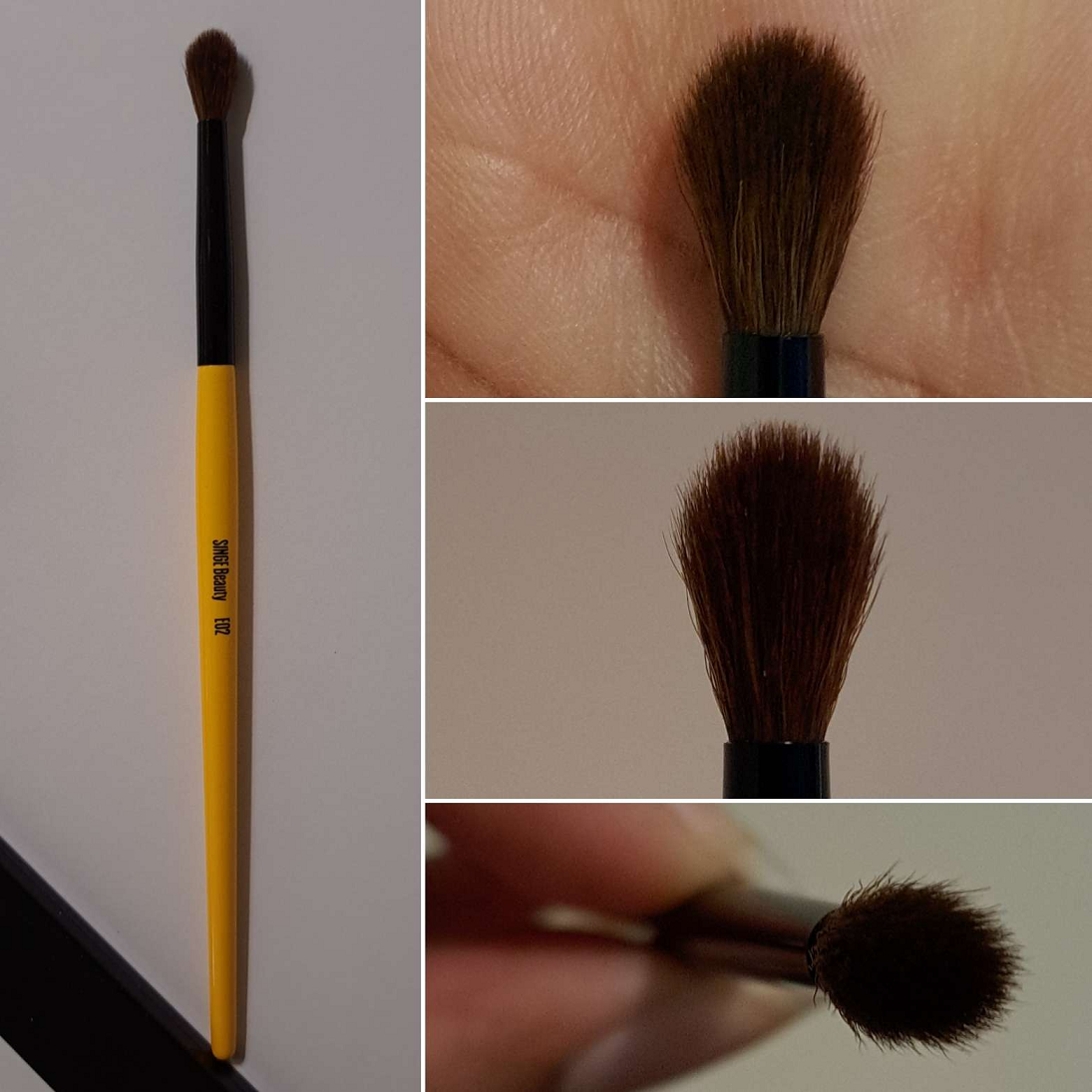
E02
The E02 is a brush I didn’t intend on using since I prefer smaller crease and blending brushes, but when I was working with some stubborn matte eyeshadows and found that the E05 was taking too long to blend out the edges because of its smaller surface area, the E02 came in handy. I was able to finish the blending job quicker and decided that this brush is actually perfect for me to blend shadows in my crease, but without any product on it. It’s still too large (even though it has a slight taper) for me to precisely apply shadows with in my crease, but I will continue to reserve it for the times that I have a stubborn or just extra pigmented eyeshadow that needs something firmer to blend with and that’s big enough to make it quick. Admittedly, the majority of the shadows I regularly use in my collection are high quality and don’t require me to have a brush like this on hand. But, since I do still test palettes and there’s always the chance I could wind up with a dud, having this within reach is useful.
E03
The E03 is the only brush still in the plastic because I know I will never use it. It’s essentially a larger version of the E02, which is a larger version of the E05. Because of my partly hooded eyes and need for more precision, I always use tiny crease brushes. The E03 is simply too big for my preference and if the time occurs when I do want a brush of this size, I have several in my collection already that are good blending brushes and also immensely softer feeling while I use them.
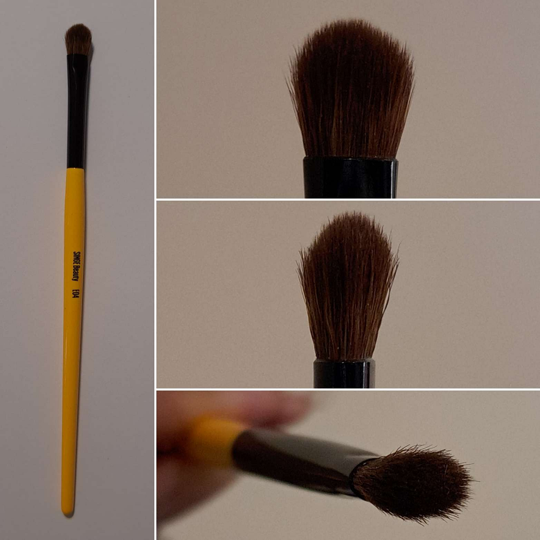
E04
The E04 is a packing brush with a taper that I find is great for applying shadows to the lid without getting too much of the lid shadow into the crease area, because I can pick up product on one of those tapered edge sides. It’s also nice for intentionally tucking color into the crease if product is applied just on the tip and those tapered sides have no product on there, keeping the width of the application area on the smaller side. I’m actually surprised that for a brush of this thickness, I’m still able to use it to apply eyeshadows under my eyes. I usually designate that task to my tiny brushes, but I haven’t needed to switch brushes to do that when I’m using this one. Of all the brushes in the set, this is my second favorite after the E01.
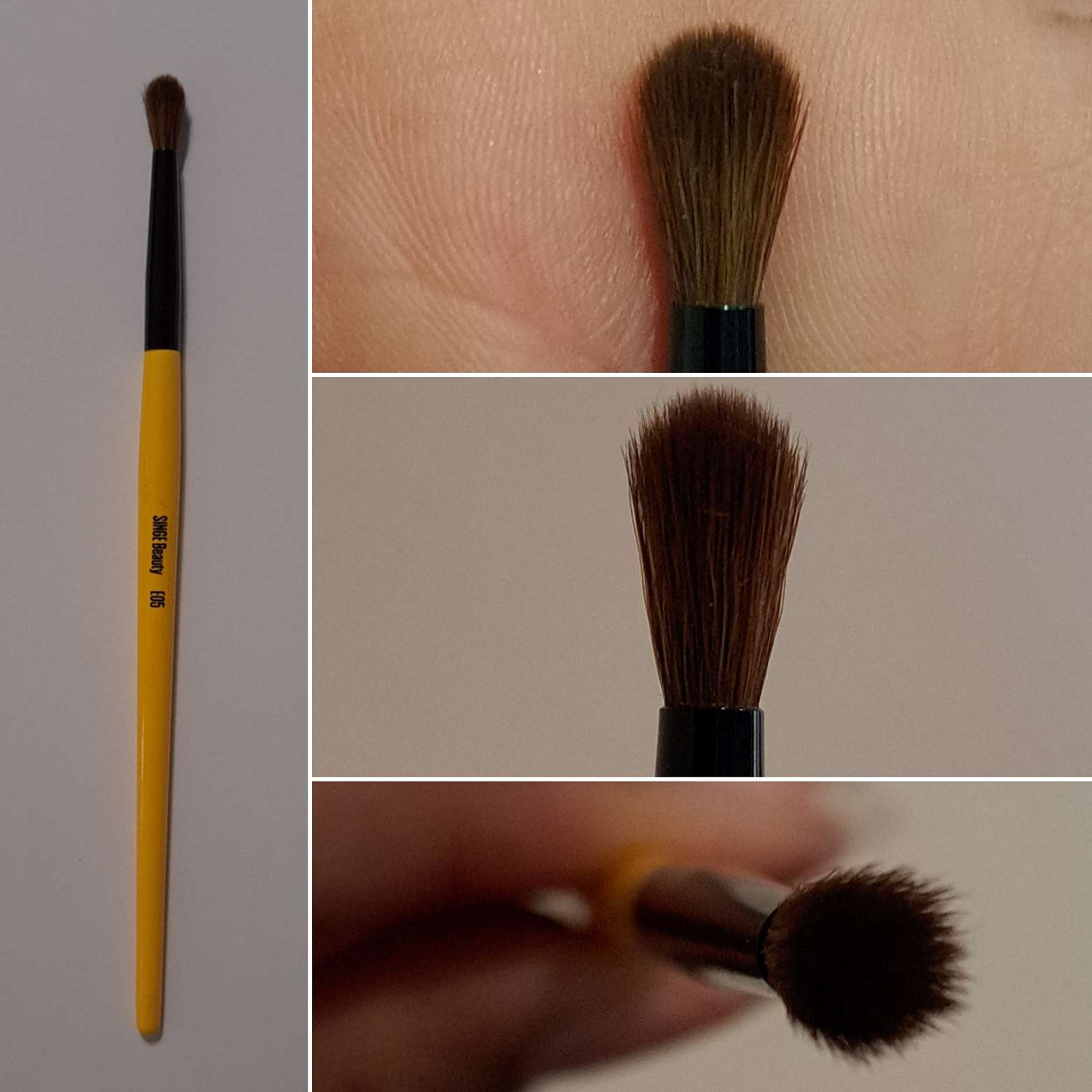
E05
The E05 is one of the brushes I was the most excited by because of its shape, yet was still concerned that it might not be able to measure up to my Sonia G Mini Booster. Honestly, this did end up being the case, but the Mini Booster alone is also the same price as half of this set costs.
The E05 is useful for its size, the ability to pack on a lot of color to a small region, and for detail work. However, the combination of how tall the fibers are with the tightness of how it’s packed in the center makes it partly bend/flop when pressure is applied that is then halted from bending any further because the fibers align to an even level at that point. It’s like the way it’s made generates extra friction, leading to the brush feeling like it’s not applying as smoothly as it could. Working the bristles around enough will complete the task and not lead to any patchy results, but the two battling forces makes the application process feel less comfortable than I think it could have been if the head was shorter with a flat top instead of rounded. Angelica chose these brushes to be shaped, bundled, and cut to the exact specifications she wanted, so my desire for a slightly tweaked shape is a matter of my own personal preference.
None of these brushes feel loose. They feel secure within the ferrules, unlike some of my inexpensive synthetic brushes like ELF and Real Techniques. I’ve only washed these a few times so far, but I haven’t had any shedding issues or problems with them losing their shape.
While I’ve found use for 4 out of 5 of these and enjoy the E01 and E04 in particular, I can’t easily recommend everyone just run out and buy them. These brushes are ideal for those who love very pigmented, intense, and opaque eyeshadows. Also, those who have a lot of troublesome eyeshadows could benefit from these. Since I review a wide range of products like high quality natural hair brushes to inexpensive Real Techniques ones, and soft refined luxury eyeshadows to intense pigmented indie brands’ eyeshadows, those of you who read my blog have varied and diverse interests. So, these particular brushes aren’t something I can recommend across the board to everyone. It’s a bit niche in my opinion, which makes sense considering Angelica says there isn’t a brush brand out there that has made what she considers her perfect eye set. So, it makes sense that it’s not going to be perfect for the masses if this specific collection is tailored to her.
I was able to get this set for 20% off during the brand’s Memorial Day sale, so considering the price and the usefulness of the set, I don’t regret it. If face brushes come next, I think I’ll be skipping them. However, I look forward to seeing what other type of products come out from Singe Beauty. If it’s makeup, and especially eyeshadows, I’m all in!
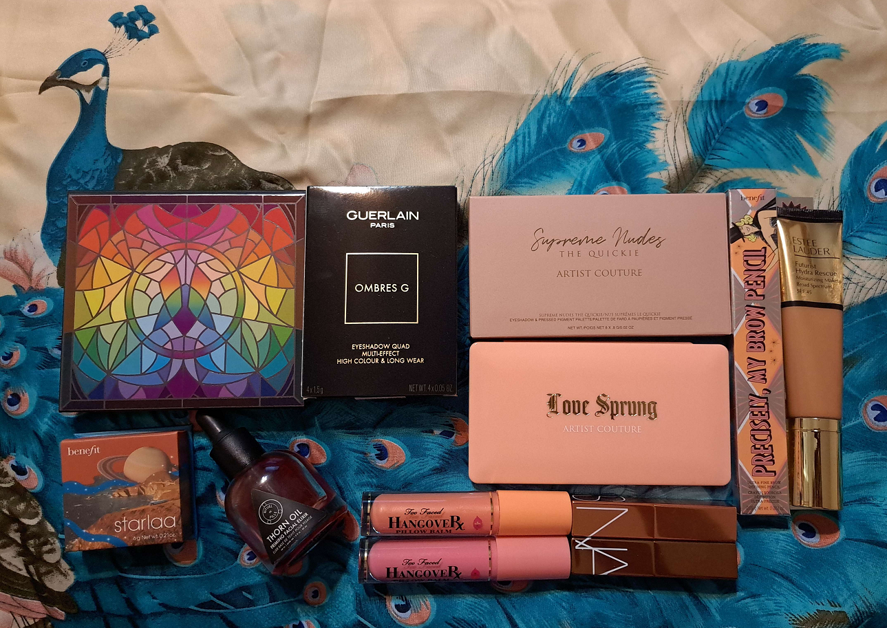
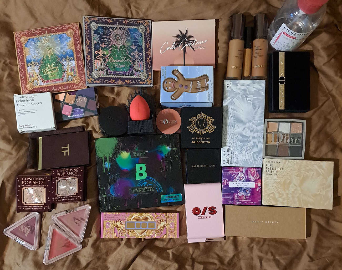
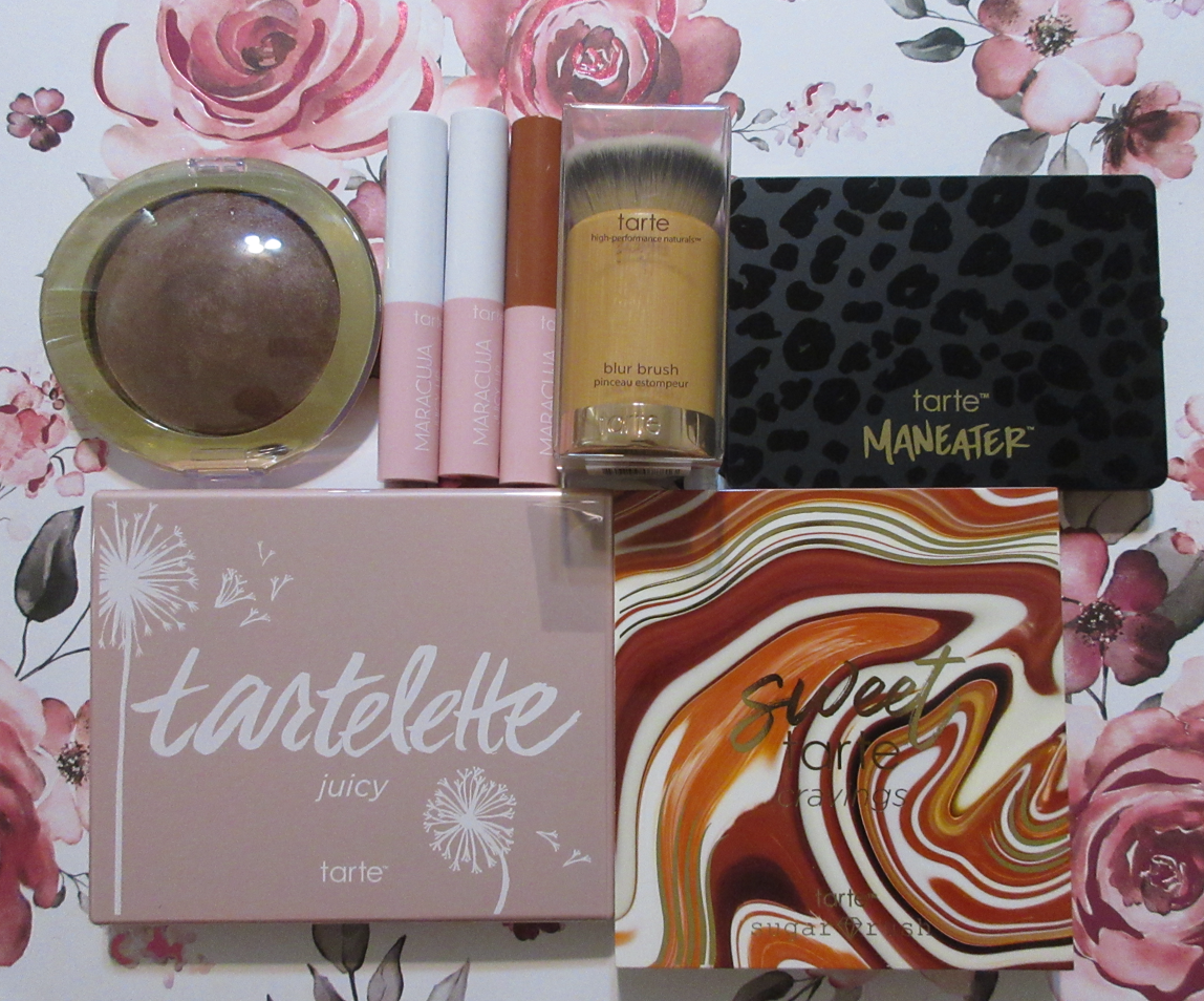
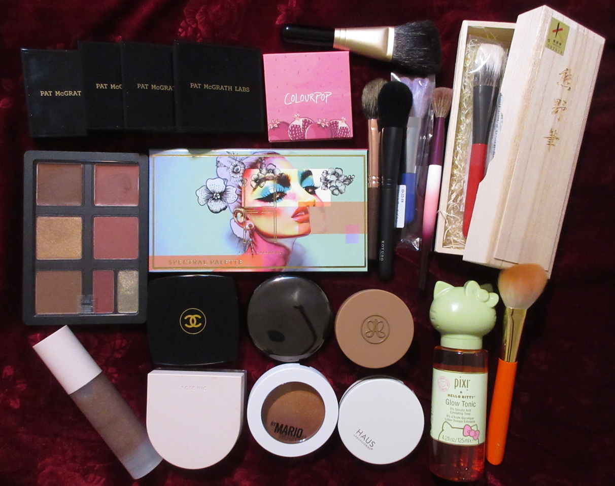
Brushes, makeup that was returned, products decluttered or given away, and a MAC highlighter are not pictured.
Welcome back to this series! I reviewed everything in separate posts from last year’s August purchases, so it made sense to skip that. As I began to work on September’s I realized I reviewed most things as well, except the unreviewed items were tied to pending posts I was currently working on. Since I at least purchased additional shades I knew I could show here, I decided to proceed with showing the September items, in addition to October’s!
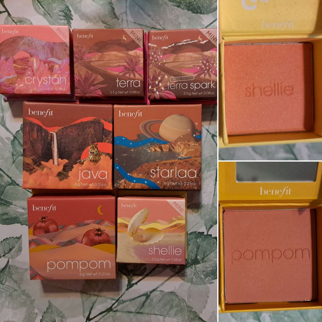
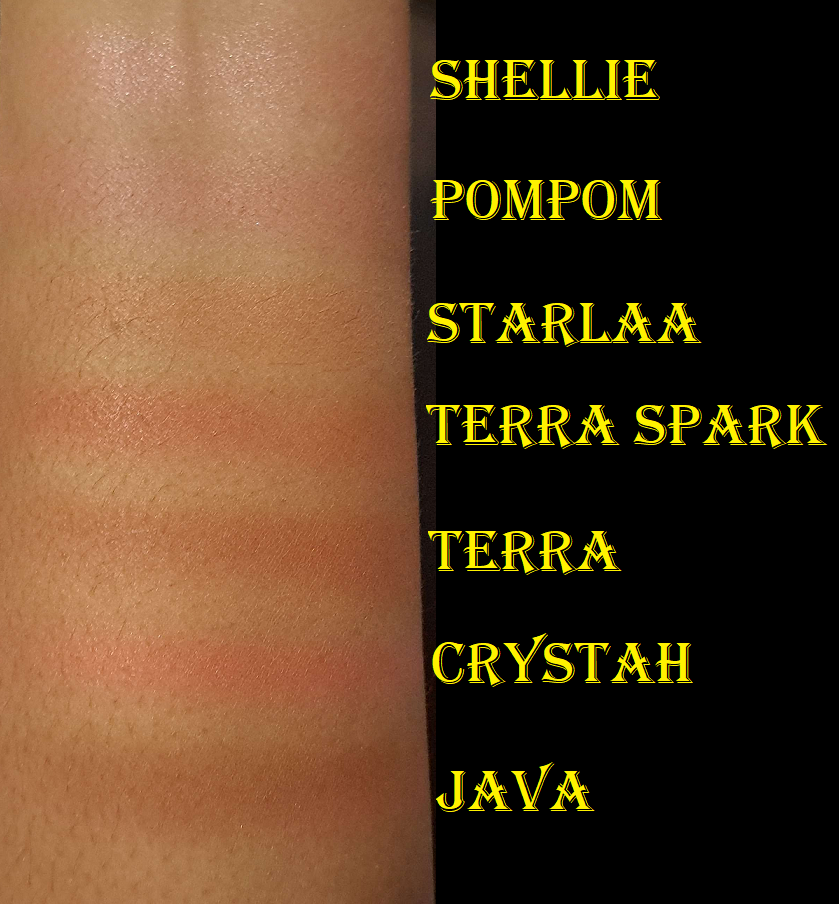
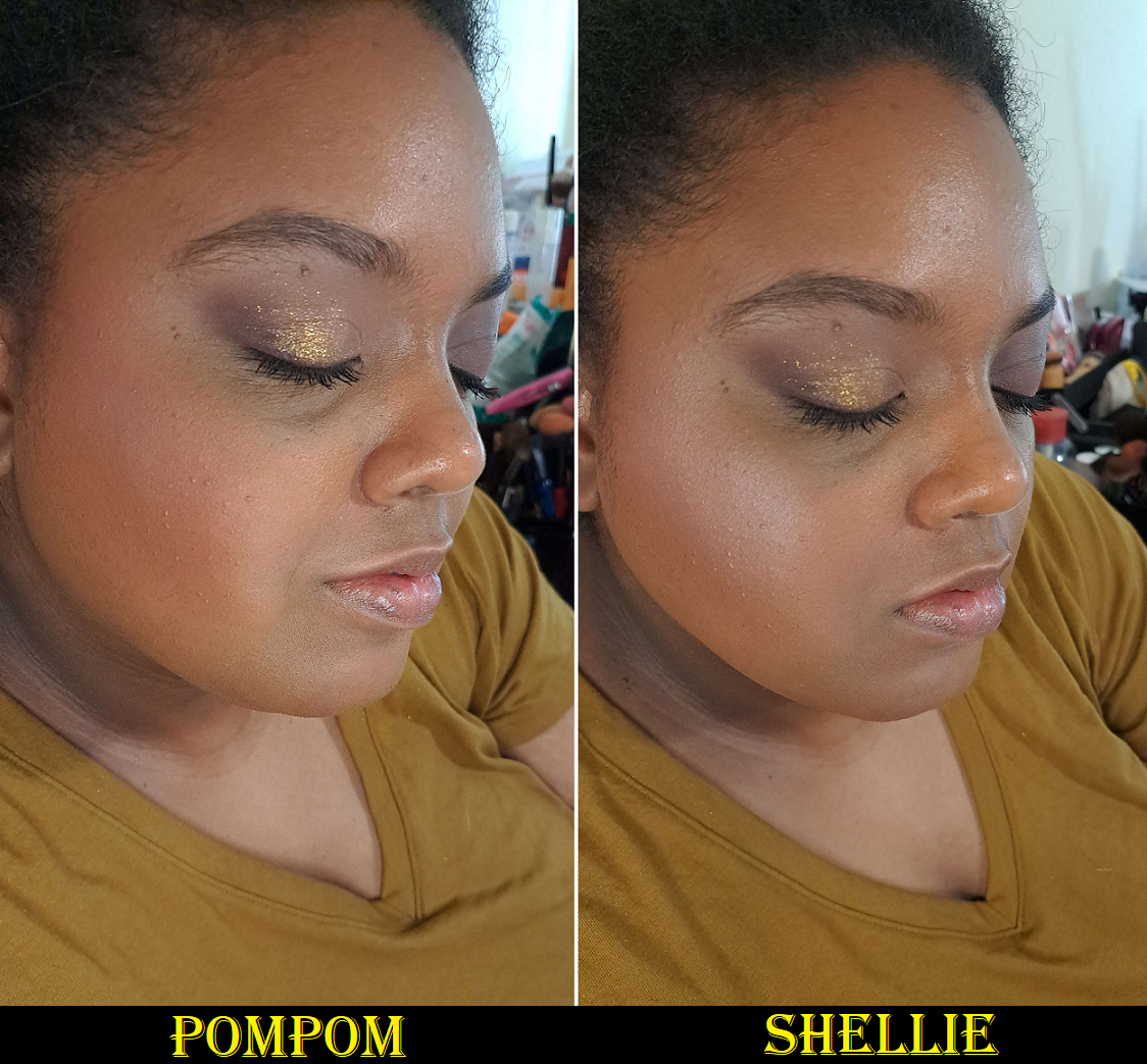
Benefit Cosmetics Wanderful World Blush in Starlaa (and later PomPom and Shellie) – This specific shade was delayed for four months after the release of all of Benefit’s other blushes. However, I waited until I got my hands on it to do my brand blush review, which can be found HERE. In addition to those four (five technically if you count Terra Spark) from last year, this year I purchased PomPom and Shellie out of curiosity as to how light I could go with the blush colors. Well, I learned that Shellie is my limit. That one doesn’t work, but Pom Pom is nice and subtle.
Another photo of Shellie
I like applying Starlaa and then adding PomPom to the apples of my cheeks. As a solo color, Terra is still my favorite of them all, but I continue to be pleased with this line and overall collection of blushes.
Guerlain Quad -I reviewed this along with many other luxury palettes HERE. Since that review, I’ve used it occasionally, but not enough to justify purchasing any additional ones. Honestly, I would still consider it at a reduced price if every shade in that compact was perfect for me. Chances of that happening are low. I thought for sure I would buy the upcoming Holiday quad, but that one doesn’t contain the baked shades, so I’m skipping it.
Artist Couture Love Sprung 3 and Quickie Palette – I reviewed both of these HERE. The Quickie palette has only been used once or twice since reviewing it. On the other hand, the Love Sprung 3 palette was such a good match for me that I finally had the nerve to declutter Love Sprung 2. The pink/purple blush is pretty, but I never reached for it. The highlighter in version 3 is better for my skin tone than version 2, and the deep peach blush in Love Sprung 2 is basically duped in 3. This shade was also similar to CoverFX Warm Honey, but slightly deeper and shows up on me better, so I was able to let the CoverFX go too considering it’s so old in my collection now.
Clionadh Haul – Stained Glass Shade Expansion (Queen’s Banquet, Quest, Oriel, Reign, Auric) and the previously released single shadow (Chalice) can be found shown HERE. However, I’m still planning to make several more Clionadh posts surrounding the expansion, doing additional comparisons, and showing the shades in full eye looks. It’s just such a daunting task!
Beautylish Haul – Wayne Goss The Radiance Boosting Face Palette (Deep Copper) + Brush 13 Bundle. I actually decluttered this because it got strange bumps on it after only two uses, which I’ve seen happen to other products after at least a year of use, so never this quickly. Beautylish handled it well when I emailed and said they think it’s due to oils on the skin effecting the surface of the powder? But they refunded me. The review for Brush 13 is coming in Fude 6.
CDJapan Haul – Koyudo BP019 Blush Brush (supposed to be outlet but not listed that way), [Outlet] Koyudo Powder Brush Black Handle, [Outlet] Koyudo Blush Brush Black Flat Handle, and MS-4 Mai Sakura Eyeshadow Brush. These brushes are also coming to Fude 6 and 7.
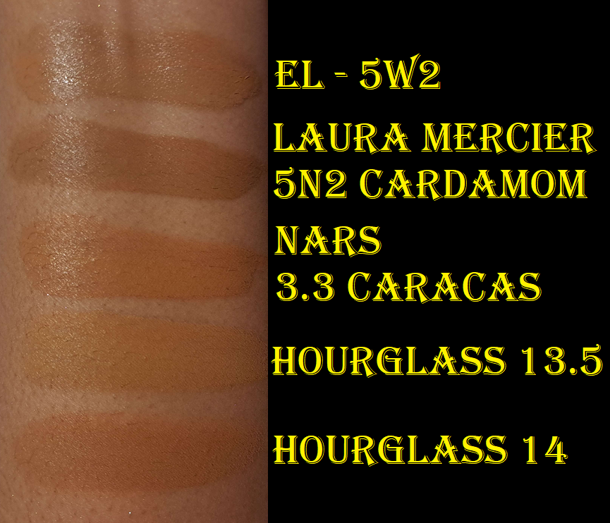
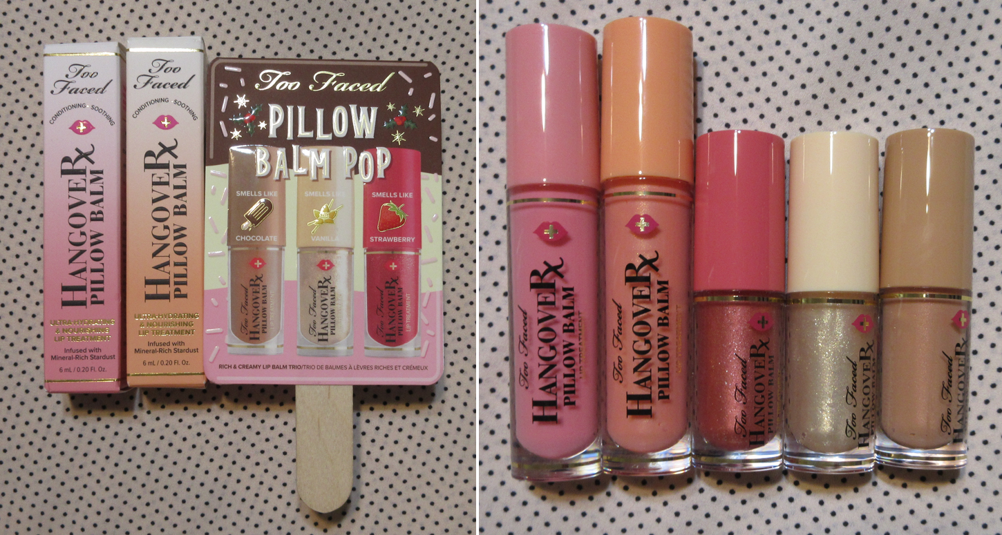
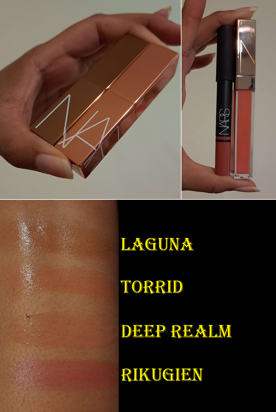
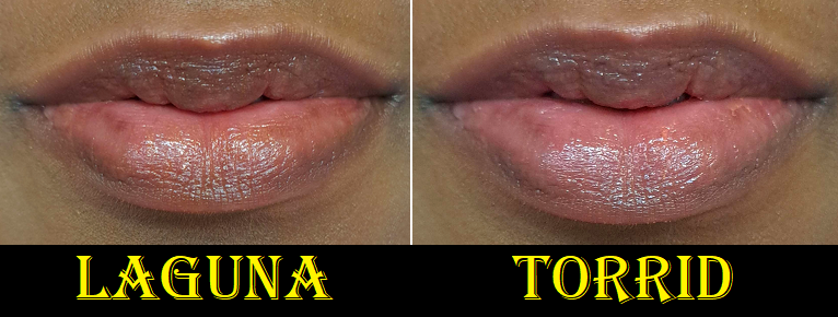
Ulta 21 Days of Beauty Haul – Benefit Cosmetics Precisely, My Brow Pencil Waterproof Eyebrow Definer in Shade 5, NARS Afterglow Lip Balms in Laguna and Torrid, Estee Lauder Futurist Hydra Rescue Moisturizing Foundation SPF 45 in 5W2, Too Faced Hangover Pillow Balm Ultra-Hydrating Lip Treatment in Watermelon and Mango (way more added in 2o23), and the Rituel de Fille Thorn Oil Priming Facial Elixir.
The Benefit brow product is a repurchase that I’ve discussed in various reviews, but isn’t exciting enough to showcase. The Estee Lauder foundation is in a new shade, but the formula has been reviewed HERE.
The Thorn oil was in a skincare post HERE. As for the lip products, those are tied to pending upcoming lip product posts. However, since I’m unsure which of these will come first, I’ll go ahead and review them here, along with the additional lip products I bought the following month as well: Too Faced Pillow Balm Pop Rich & Creamy Mini Lip Trio, Nars Afterglow Lip Shine Gloss in Deep Realm, and Nars Satin Lip Pencil in Rikugien.
The first thing I notice when putting on the Too Faced Hangover Pillow Balm is that it gives a minty-cool sensation on the lips. This contains menthol, so I’m not sure if it was added solely for cooling effect or if the brand wanted plumping action from it as well. What Too Faced touts as the lip plumping ingredient is sodium hyaluronate. Despite having more than one ingredient of this type, I don’t see any difference in the size of my lips beyond the trick of the eye that glossy products can provide. I bought the two full size lippies without even knowing they were supposed to do anything beyond conditioning the lips, so I’m fine with that. The only issue is that ingredients like menthol, cinnamon, and capsaicin irritate the skin, which can aggravate my lip issues. As far as I can tell, menthol and the flavoring and coloring agents are the only ones I spotted from the list that can dry out my lips. These are counterbalanced by the other ingredients in here that my lips love such as petrolatum and shea butter. Sunflower seed oil is another one, but instead Too Faced put “Helianthus Annuus (Sunflower) Seedcake” which is apparently, “residue from the expression of oil,” so I’m not sure how that stacks up to the oil. Mineral oil also tends to be great, but the brand uses hydrogenated polyisobutene, a synthetic mineral oil alternative instead, which can be effective for me if paired with the right other ingredients. This also contains mango seed oil, which is a slightly above average lip conditioner for me too. What this boils down to is the fact that I love the feeling of this product on my lips. It feels moisturizing, and though my lips don’t change in size, I can see where the lines of my lips get plumped up and smoothed out from the added hydration. A protective barrier is formed on the surface to lock that hydration in place and keep it there longer, but that means having to deal with everything sticking to my lips. Too thick of an application can also lead to the dreaded “white ring” around the mouth. Also, this isn’t the kind of lip product I can ignore when eating because of its thick texture, so I purposely try to wipe it off and then reapply once I’ve finished the meal.
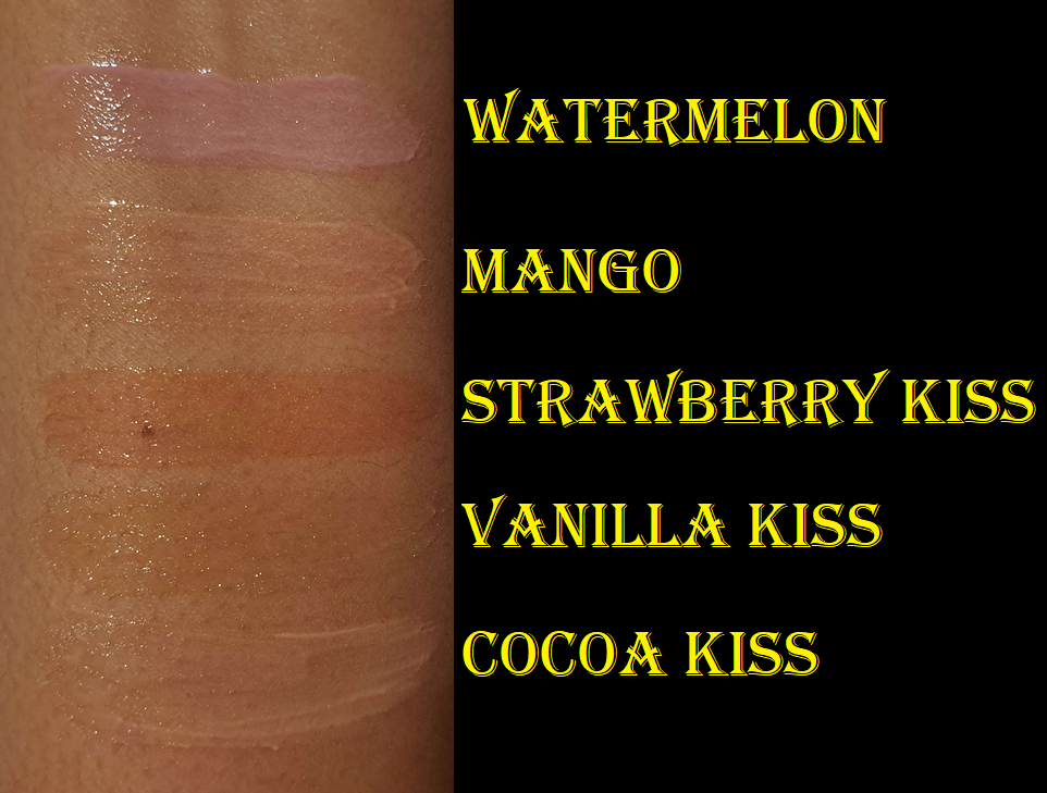
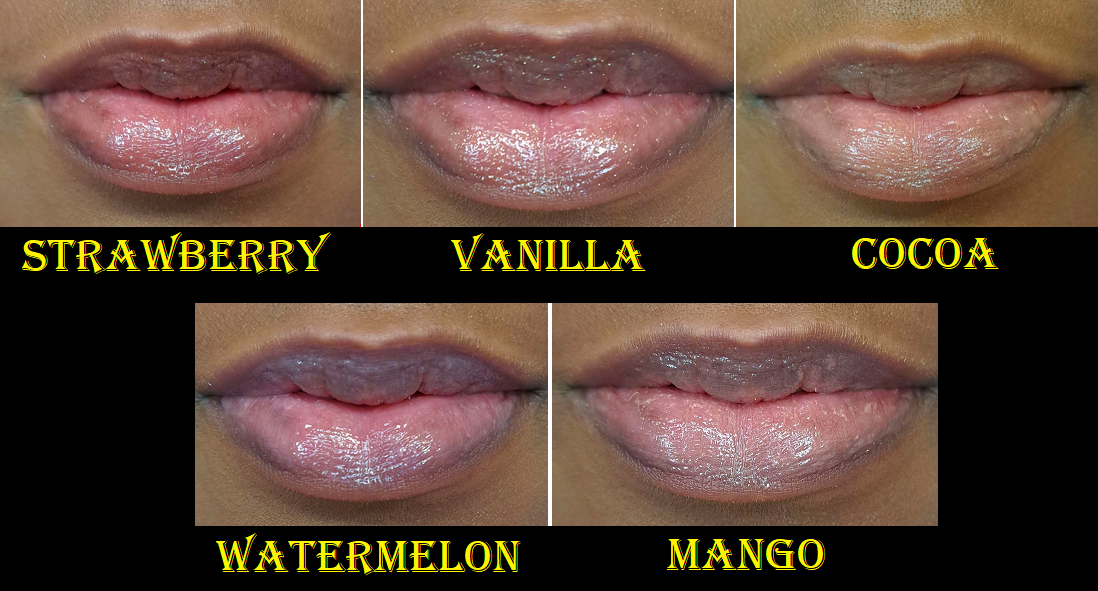
Regarding the colors, Watermelon gives me the tiniest pink tinge to my lips, but it’s not my favorite tone. I don’t see any shimmer in Watermelon, but Mango has micro gold shimmer. Mango and Cocoa Kiss are way too light and give a unflattering milky look to my lips, so I definitely don’t wear them in public and mostly just enjoy them for their scents. Watermelon smells like a delicious Watermelon Jolly Rancher candy, whereas Mango smells so faintly that I’m not sure I would have been able to figure it out based on the smell alone. It’s vaguely fruity with a tinge of mango. Cocoa Kiss does smell like slightly artificial hot chocolate. I still enjoy that smell though.
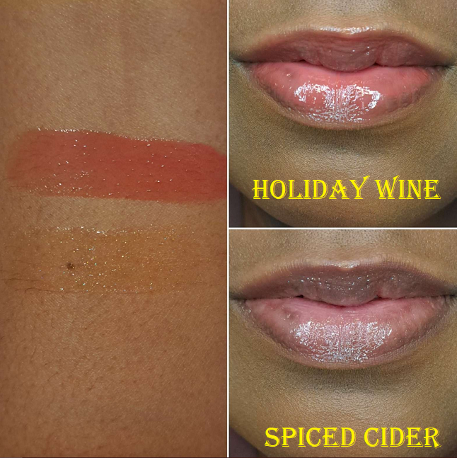
Vanilla Kiss looks beautiful for those who don’t mind obviously shimmery lips. It doesn’t smell like vanilla to me, just a slight sugary scent. Strawberry Kiss, which smells like strawberry bubble-gum or those old school strawberry candies in the strawberry print wrapper, is the most opaque and deepest color of the ones I own. I forgot that the milky aspect of the other shades, and only being able to wear it privately or as an overnight treatment, is why I stopped using them for quite a while. However, now that I remember how good they are, I will want to continue using them. The brand released a new mini trio for the holidays this year and I suspect that even though I don’t need it, I will be unable to resist if it goes on sale. There’s a holiday wine shade that looks like a gorgeous version of Strawberry Kiss without the shimmer.
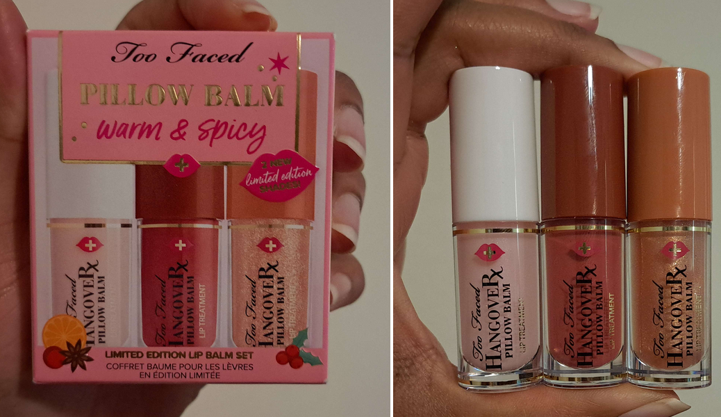
*BONUS PHOTOS: I ended up getting a discount and buying this year’s Too Faced Warm & Spicy: Pillow Balm Lip Balm Trio Set. I plan to gift the original one away, but I have swatches of the other two.
Holiday Wine smells like a cherry and strawberry forward sangria and Spiced Cider does have that spiced cinnamon scent! Also, even though Spiced Cider looks like a different color in the tube, on the lips and in swatches it looks no different than Vanilla, which is to say that it just looks like a beautiful shimmery colorless gloss.
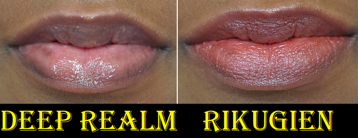
With the Nars Afterglow Lip Balms, they feel nice and moisturizing on the lips, but I don’t get as much hydration from them as some of my other top favorite lip products. There are emollient ingredients in there, but not the ones that my lips in particular benefit from the most. They’re just okay, like hydrogenated polyisobutene and squalane, which aren’t enough to counter the effects of the dryness I get from the coloring agents. So, I wear these balms for the subtle tinge of color to my lips that’s pretty and flattering colors for me, at least in these two shades. They feel comfortable to wear, but by the end of the day with reapplications, I know my lips will somehow end up slightly dryer than at the start. So, these aren’t something I use daily. I might use them for a few days back to back, but then I’ll have to switch to a truly nourishing lip product instead.
The lip gloss is pretty, but the color doesn’t show as well on me. I chose this shade because it looked like a wearable warm color, but mostly because it was in the clearance section on the Nars website. It’s a bit funny to me that the lip gloss contains more of the ingredients my lips like. It has the hydrogenated polyisobutene, but also shea butter replaces the squalane, and sunflower seed oil is present, though nearly at the bottom of the list. As a thick glossy product, it seals in the moisture better than the balms, but the end result in terms of moisture is the same. When the layer wears down, my lips look drier than when I first put it on. As a gloss though, without any additional expectations for it, it looks nice.
The Satin Lip pencil was reviewed in this declutter post HERE, and in that post I voiced my concern over my favorite shade being different and it appearing to be discontinued. However, I was surprised to see it eventually return to the website last year (still in the last chance section). I bought it and was happy that it was the same original formula I fell for the first time. Regarding it being discontinued or not, all I can say is that another year later, it’s still in the last chance section! Nars recently launched the Powermatte High-Intensity Lip Pencil, so I wonder if they finally will let the Satin Lip Pencils go or if they plan to reformulate and/or redesign the line.
Luxury/High-End Purchases from October ’22: Bobbi Brown Luxe Eye & Face Palette in Copper Glow and Bobbi Brown Jadestone Palette, Dior Backstage Khaki Neutrals and Dior Écrin Couture Iconic Eye Makeup Palette, as well as the Pat Mcgrath Labs Celestial Nirvana Eye Shadow Palette in Bronze Bliss
I reviewed all five of those HERE. The only one I regret buying is the Bobbi Brown Face Palette just because I bought a face trio earlier this year (not to be confused with the new holiday trio that contains 2 of the 3 same shades) that I get more use out of, plus it contains the same highlighter that is in that palette. As for the others, I am still always testing new eyeshadows, so I don’t have the time to use them as much as I want.
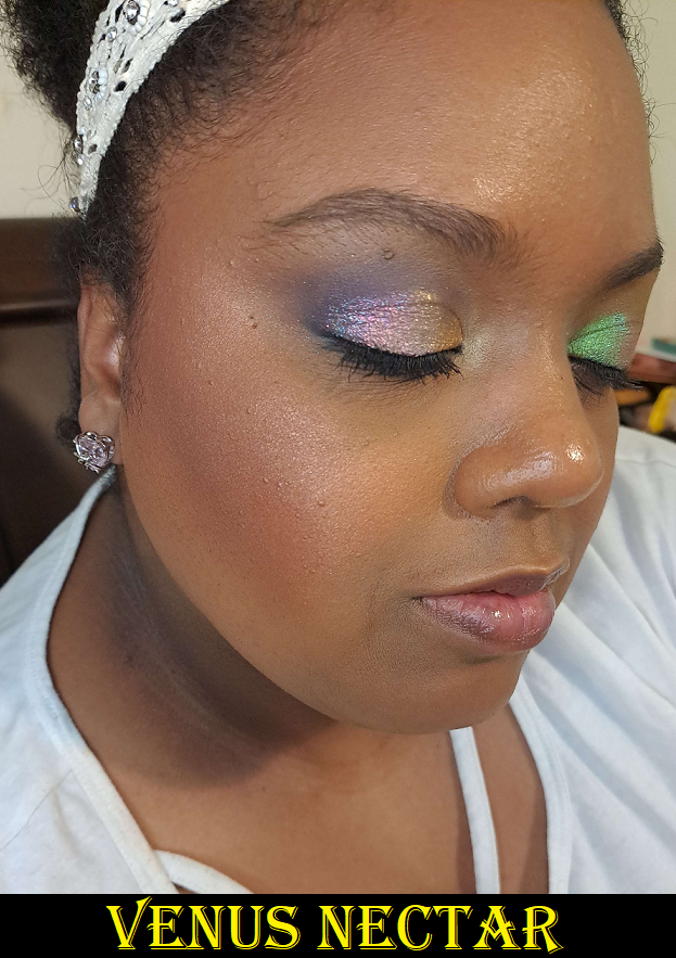
Pat Mcgrath Spur of the Moment Purchases: Skin Fetish: Divine Glow Highlighter in Venus Nectar, Pat Mcgrath Labs X Bridgerton Skin Fetish Sublime Highlighter in Incandescent Gold, and Pat Mcgrath Labs Skin Fetish Sublime Perfection Concealer in Shade MD23.
I showcased both highlighters HERE, though I didn’t show Venus Nectar on my face, so I’m including that at least in this post. As for the concealer, I reviewed the formula of shades MD22 and MD24 HERE, but I don’t think I updated with a swatch of MD23 once I got it. Essentially, I finally got my hands on that sold out shade and it was the perfect depth level, but the tone was still too olive and looked strange compared to the tone of my foundations, so I essentially gave up on using the PML concealers anymore. I don’t have MD22 or MD24 to compare next to it anymore, but I have a photo of MD23 compared to other concealers when I had intended (but changed my mind) to do an Ami Cole concealer post.
Fenty Beauty Double Cheek’d Up: Freestyle Cream Blush Duo – I reviewed it HERE and honestly haven’t picked it up a single time since reviewing. When the cream blush line was expanded this year, I picked up two new shades, but realized that even though I enjoy them for their colors, I prefer a product that sets to a fully dry touch. So, I don’t plan on reviewing anymore blushes from Fenty in the future, unless they release powder versions.
LYS Beauty Higher Standard 3-Piece Cream Blush Set – I reviewed it HERE and have only used it a few times after the review. It isn’t a matter of me losing interest. It’s still in my top 2 among traditional cream formulas. I’m just preferring to use powder blushes a lot more these days. I still very much recommend LYS blushes.
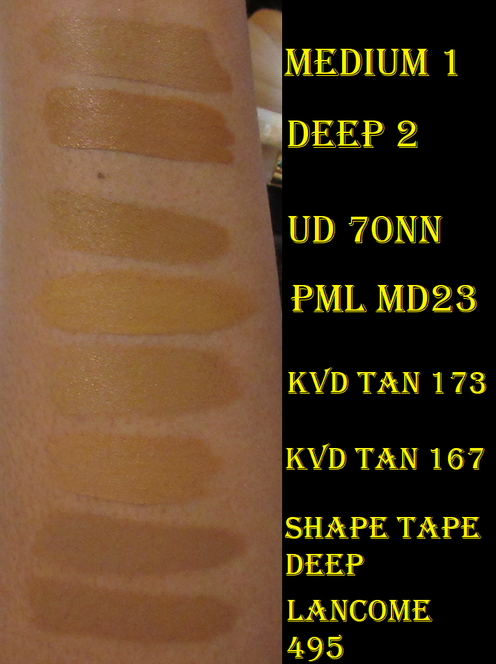
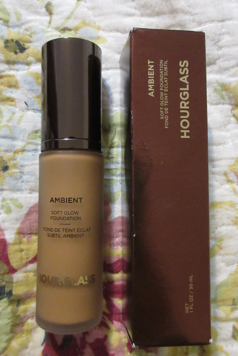
Hourglass Ambient Soft Glow Foundation in 13.5 and 14
I was initially saving this review for a foundation ranking/declutter post I started working on at the beginning of the year, but never finished. I purchased Shade 13.5 which was slightly too light, but I could pull it off as long as I used bronzer with it. I bought Shade 14 at the end of November, and that was closer to my skintone, but slightly too dark. I can get a good match by mixing the two, but I have to be careful because the color darkens once it’s dry. So, I can’t just mix to my correct shade while wet. I have to mix to get my correct dry-down color.
This foundation is thick, though not heavy. It doesn’t drip at all when squirted out of the pump. I get high-medium coverage from the foundation. When they say “soft glow” they really do mean that the glow level is low. It’s a natural finish foundation, but on my dry skin, it looks horrible for most of the day unless I either prep my skin well (with at least facial oil) or wait until my natural oils come through, which doesn’t end up happening until the late afternoon, if at all. Even when I use Rituel de Fille Thorn Oil, I don’t like how my skin looks until an hour or so later. Then, I find the finish to be quite beautiful. I like this foundation enough that I’ve been keeping it in rotation since buying it, but not quite enough that I’d repurchase it once I use it up, even if Hourglass was to make shade 13.75 or something. I have foundations I like equally (albeit a different finish) that are still expensive, but a better deal.
It sets completely and doesn’t transfer, so I don’t set it with setting powder or spray. I still use a finishing powder with it at times and in specific areas.
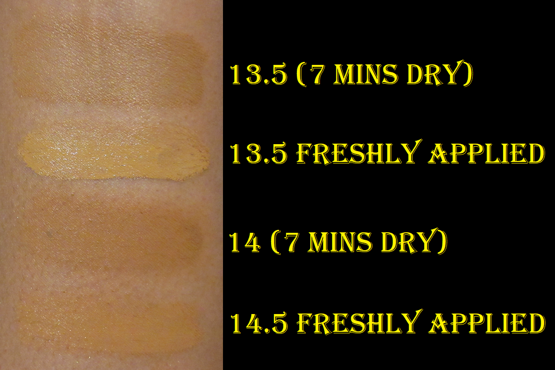
Hourglass Foundation Shade 13.5 with Gucci Bronzer Shade 5 (Taken with Camera)
Hourglass Foundation Shades 13.5 and 14 mixed (Taken with Cell Phone)
I posted on the home page that, unfortunately, my main camera broke and I had to switch to using my cell phone for blog photos. That has come with its own benefits and challenges. My main camera had higher megapixels, but I’ve been using additional light sources and trying to improve my light quality to compensate for my cell phone, so it’s debatable which one is better when I had different struggles with both. Anyway, I just wanted to explain why the two look so different, besides the foundation color. I still have a ton of photos taken with my former main camera, but not enough to complete the posts without needing to add additional pictures with my cell phone.
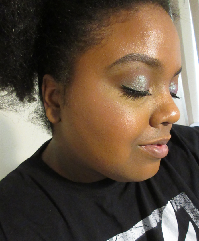
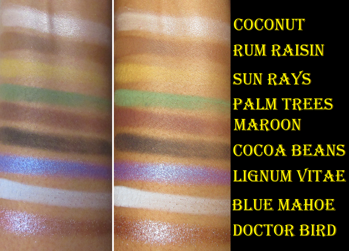
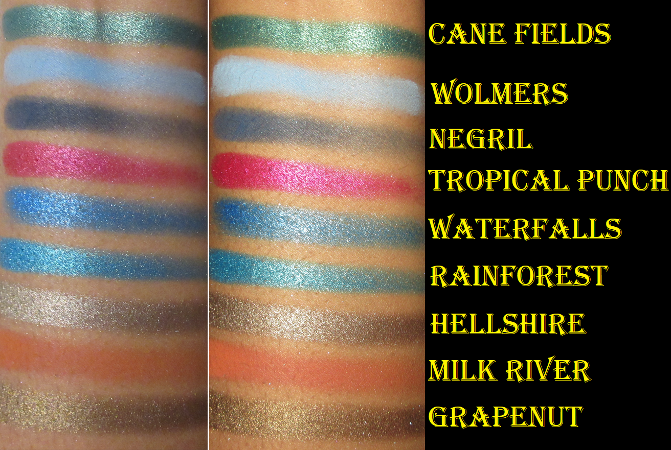
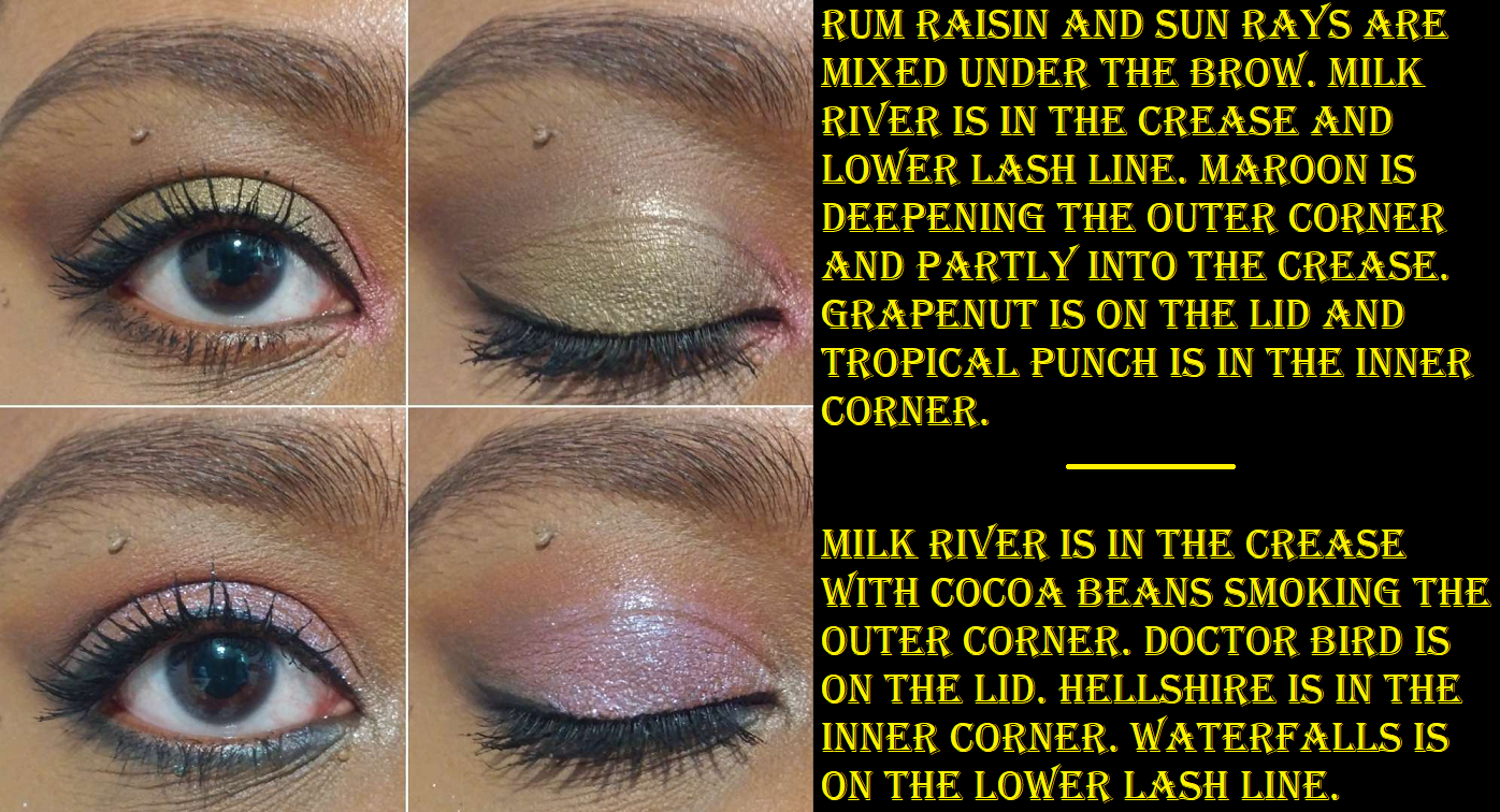
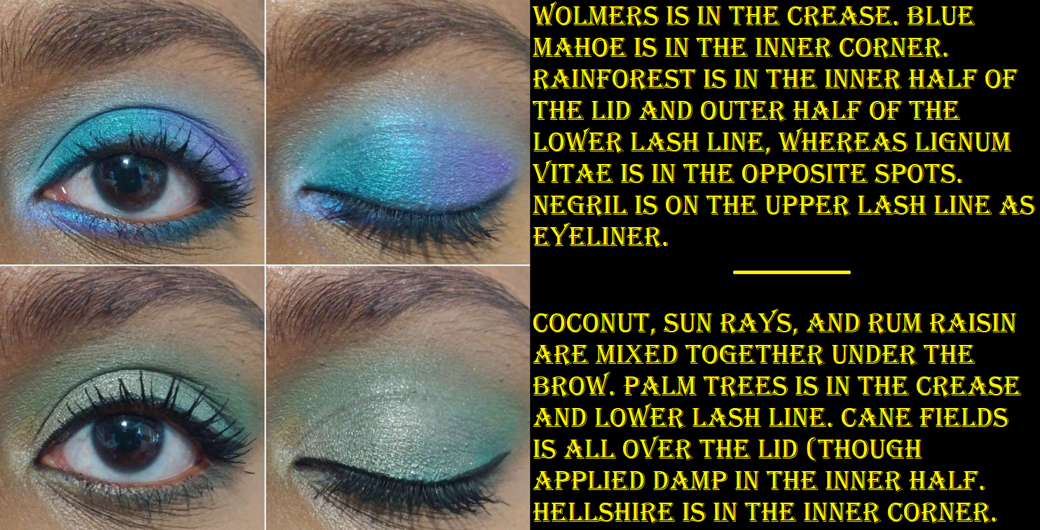
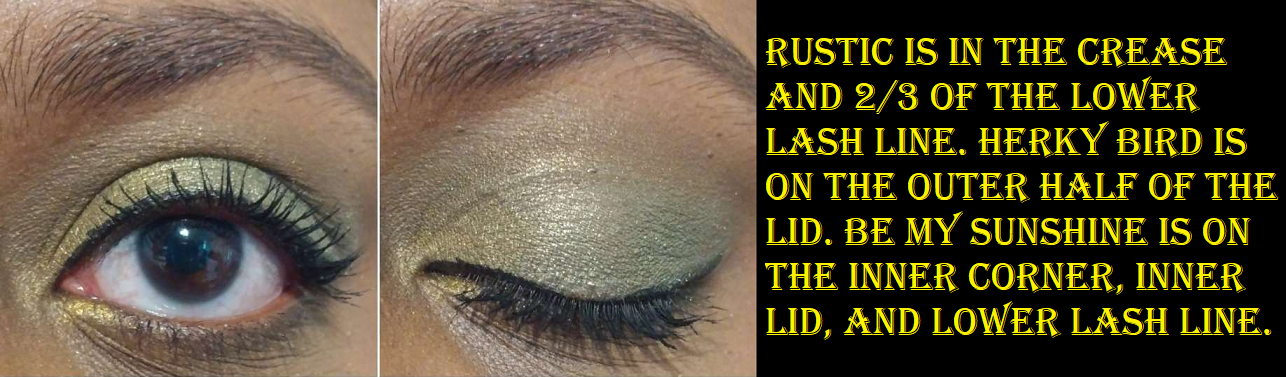
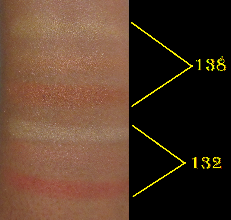
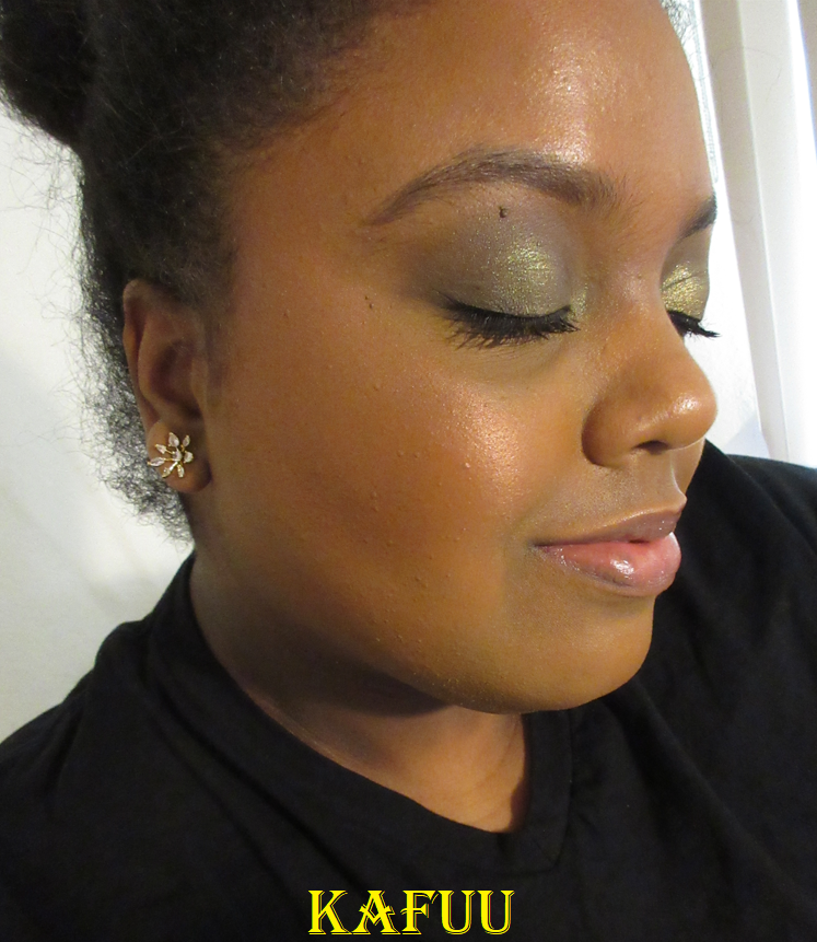
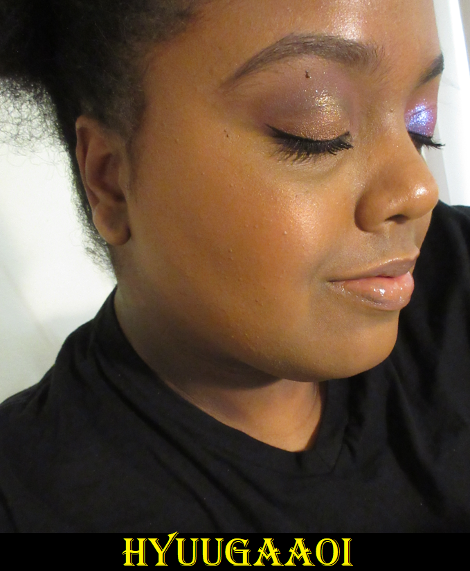
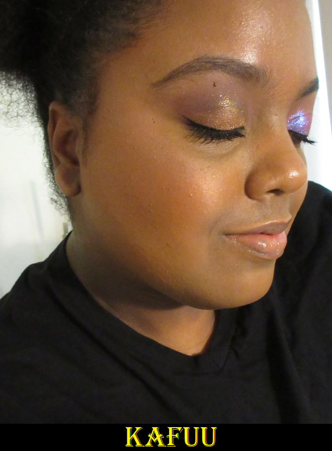
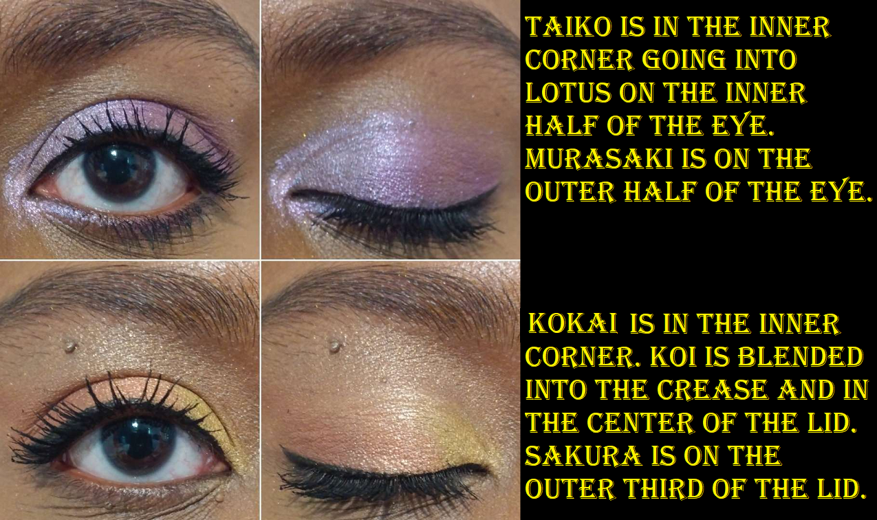
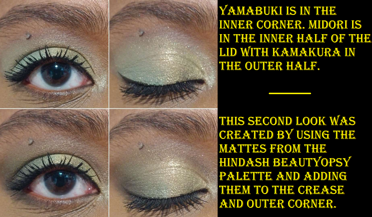
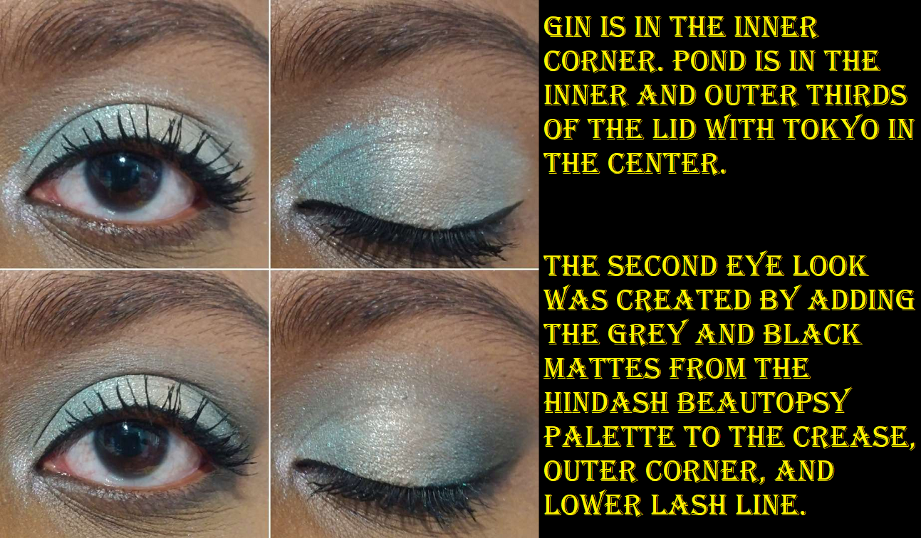
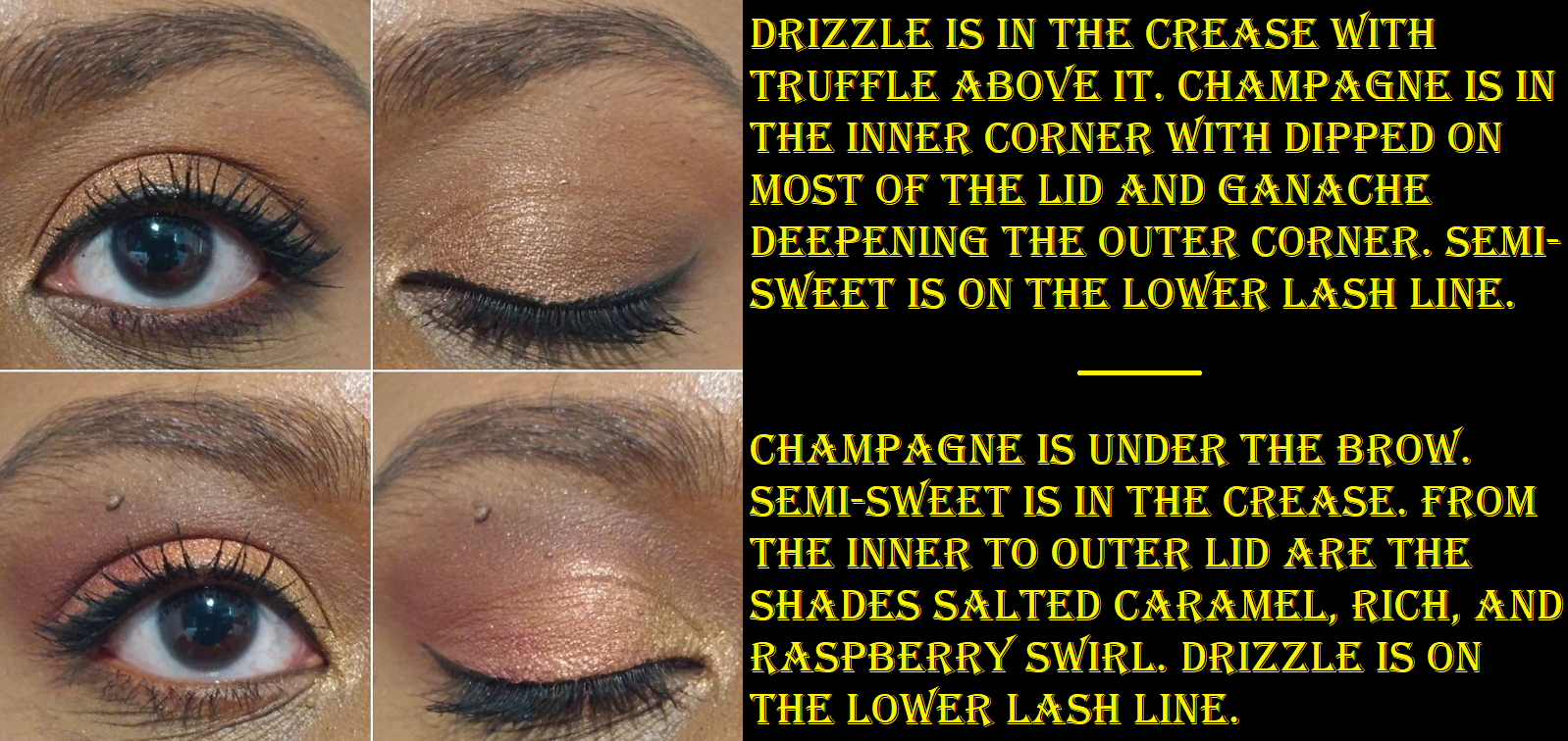
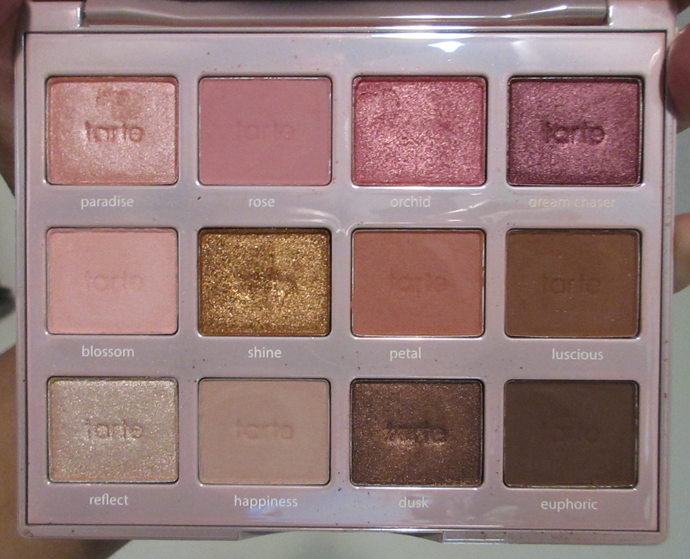
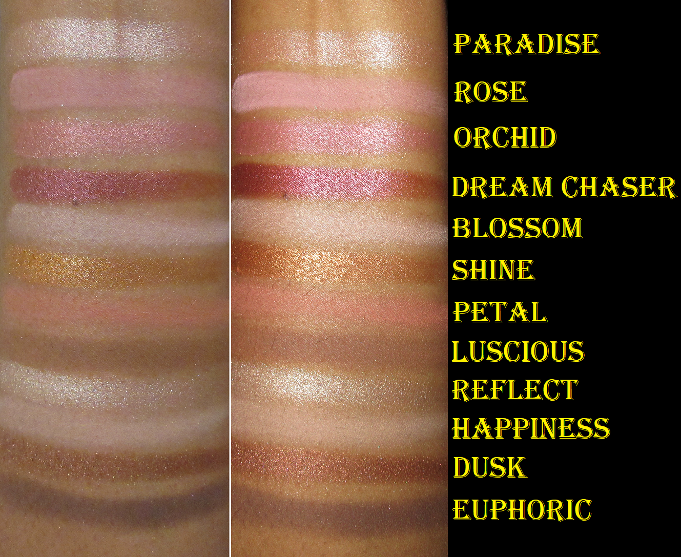
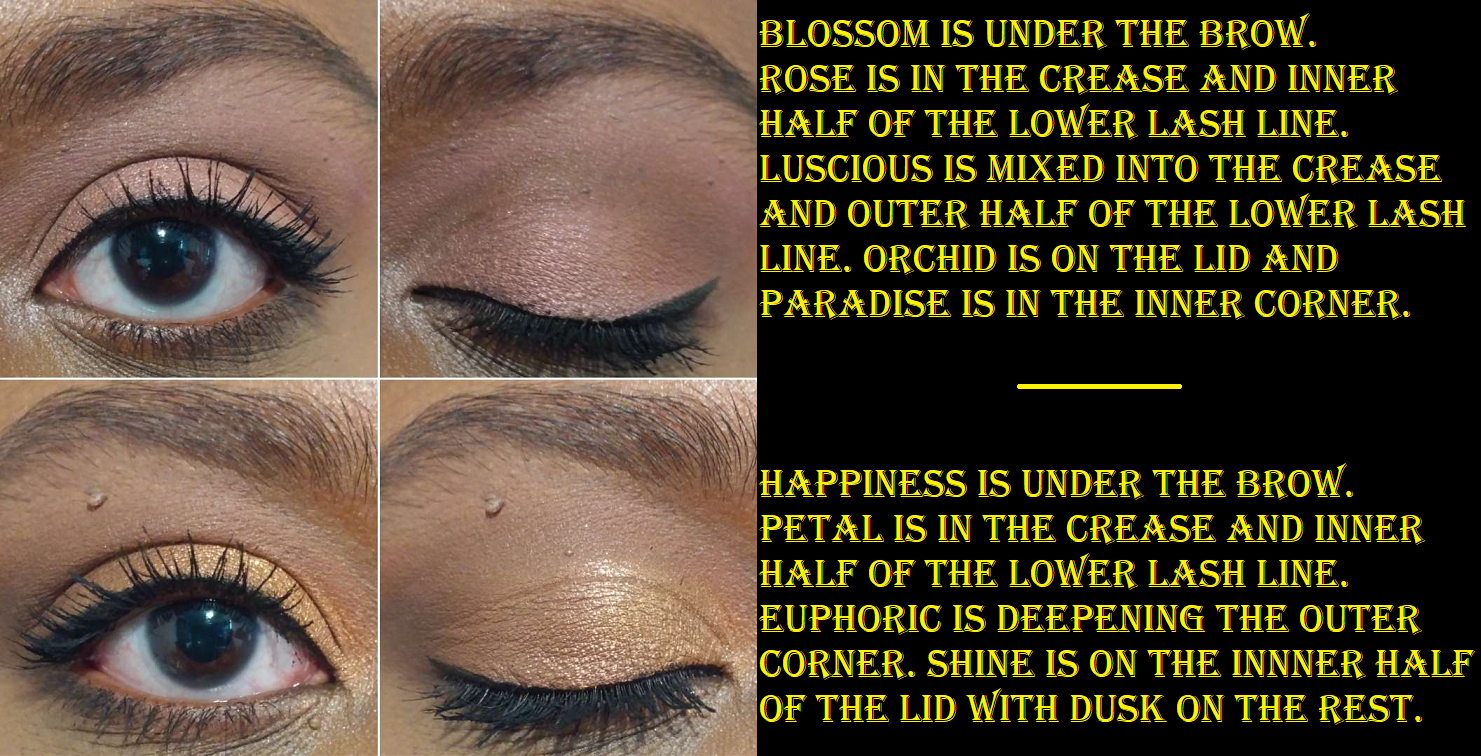
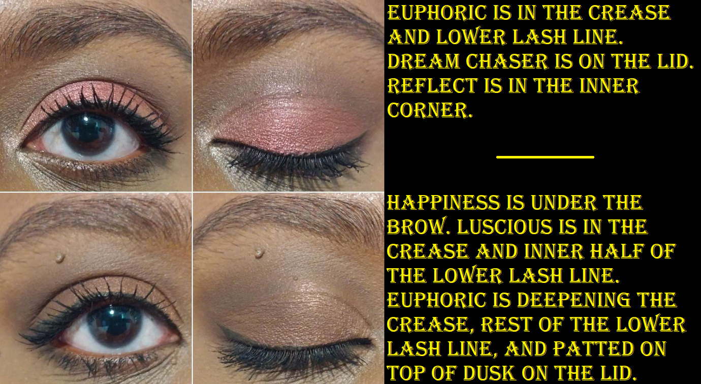
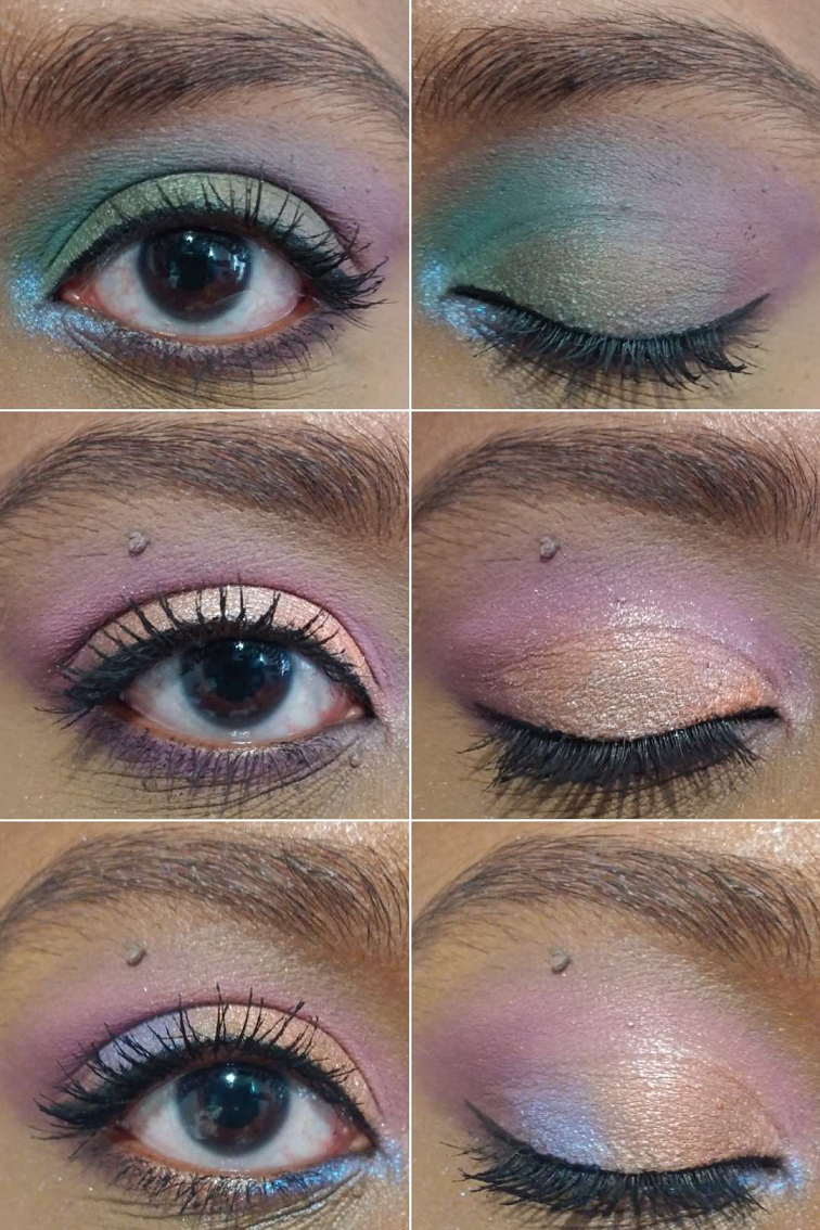
Oden’s Eye Merry Christmas and Christmas Eve Holiday Palettes – I reviewed these HERE but did not include any solo eye looks. I figured today would be a good time to share some. As I mentioned in my post, I always reach for these as companion palettes. Out of the eleven Oden’s Eye palettes I own, I would say the Merry Christmas one is my 2nd favorite. The Christmas Eve palette would be 4th place. I hope the brand decides to re-release them for those who missed out.
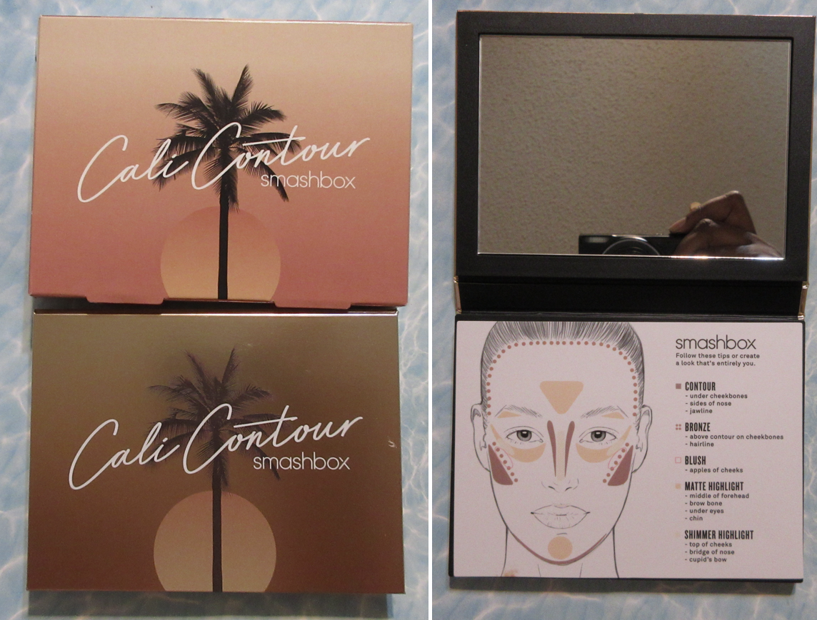
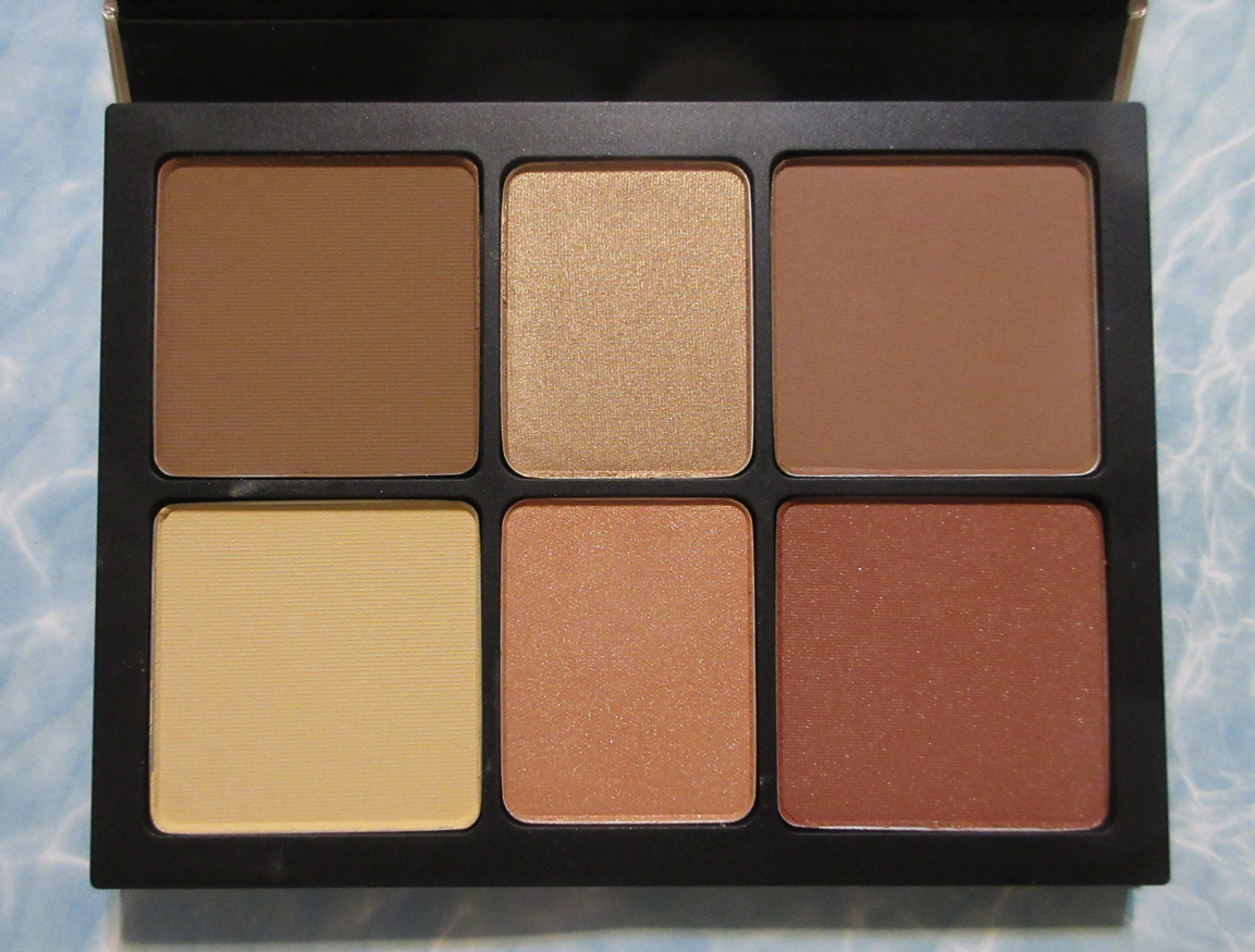
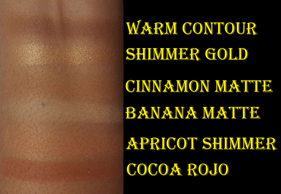
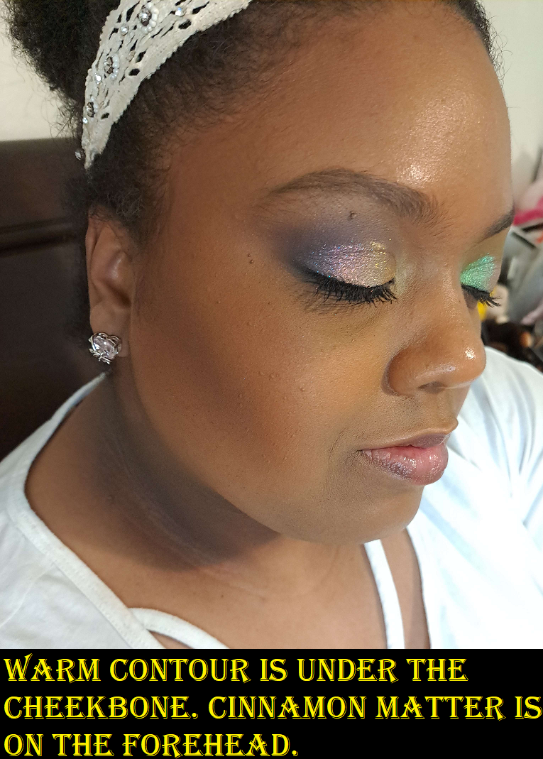
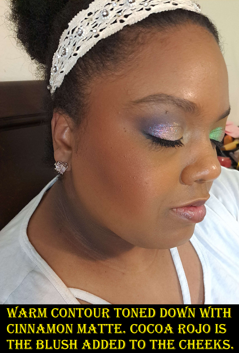
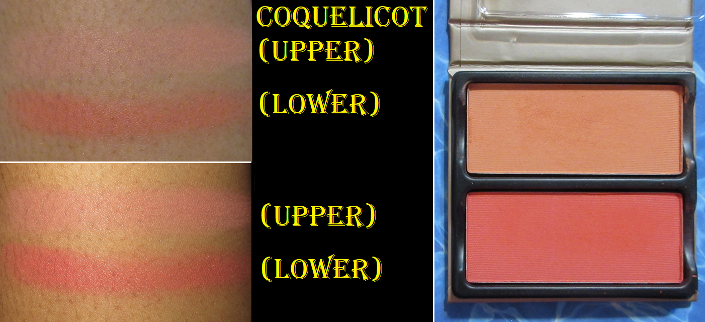
Smashbox Cali Contour Palette in Medium/Dark
It took the full year for me to make up my mind about this palette because there was always something I didn’t like about it when I tried to use more than one product at a time. Then it would take me a few weeks to a few months to want to try it again.
It’s very easy to overdo it with the contour (as seen below) and because it’s so pigmented, I can make it look blended, but it doesn’t sheer out enough. So, it’s best to start slowly and try and build up the color that way. Cinnamon Matte isn’t dark enough to bronze me (though I’m still not sure what purpose it’s actually supposed to serve), but I use it to tone down Warm Contour within reason.
Cocoa Rojo is a beautiful color, but for some reason I don’t like the finish of it on my skin. There’s subtle shimmer in this and I’m in my glowy cheek era, so I should like this. I’m just not sure it’s this type of shimmer that I like in a cheek product where it shows particles and the glow doesn’t come from a sheen.
These highlighters are subtle, which is also right up my alley. However, the shimmer isn’t as refined as I like. For some reason they just don’t excite me.
On paper, I should love this face palette, but I don’t. I like it enough to want to keep it, but I know I’m not going to reach for it when there are so many blushes, bronzers, and highlighters I use that actually cause an excited flutter within me when I put them on. Since I don’t have a ton of contour products, that’s the one thing from here that still has some appeal and I’m considering depotting it from the palette. However, I do have contour products that are working just fine for me, so I might not bother.
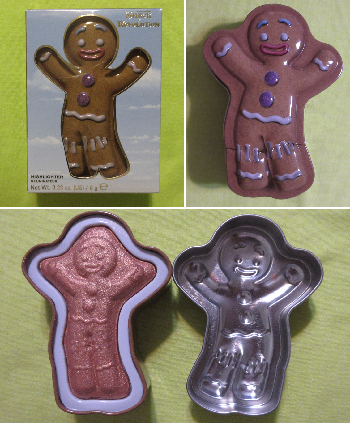
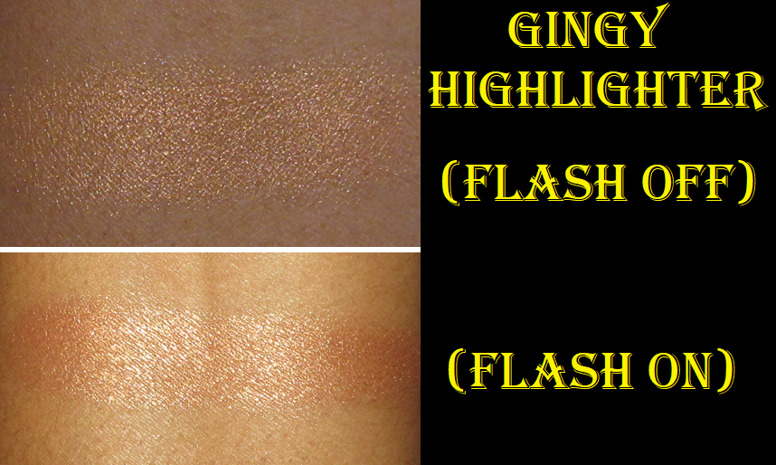
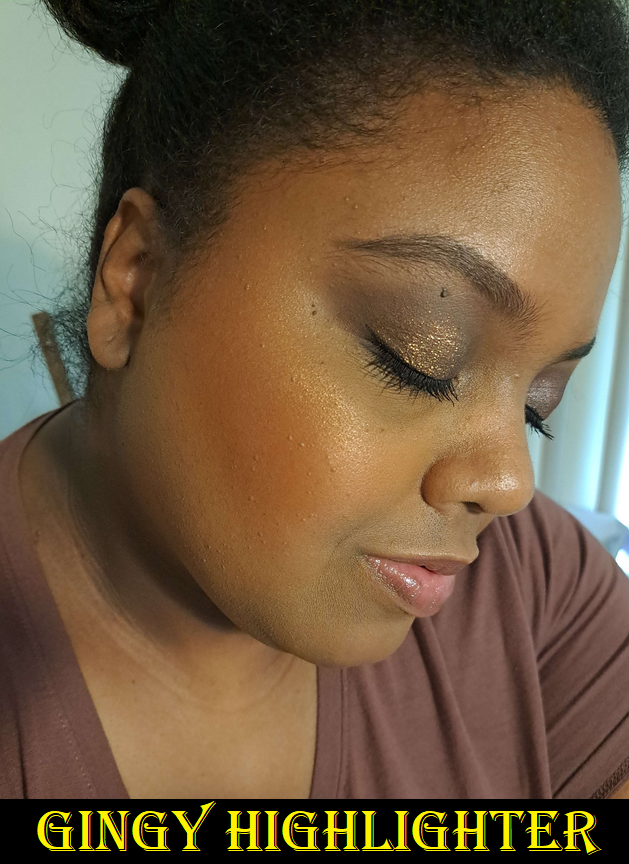
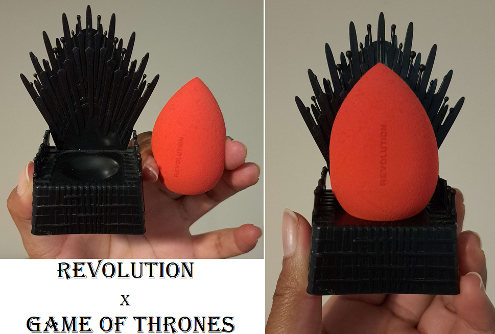
Revolution Shrek Gingy Highlighter and GOT Iron Throne Sponge Set
I bought the highlighter purely for nostalgia. I love Gingy! The Shrek series (really just 1 and 2) was my favorite series after the Mummy Series (again 1 and 2) for a very long time! I think Rush Hour 1 and 2 (okay apparently I only like the first two of trilogies) surpassed the Shrek series by now, but I still love those movies and Gingy is still my favorite. However, for review purposes I have worn it a handful of times. When I’m using my winter foundations, the highlighter is too deep of a bronze for me. In the photo above where I’m not quite at my typical summer shade but a little darker than I have been in a while, it seems to work well enough when used sparingly. In complete direct light, my camera can pick up the texture to the shimmer particles, but looks smoother at most other angles in the light. In fact, it’s smoother than I expected from a Revolution Beauty product. I’m a bit impressed! I don’t intend to use it anymore though since I want to keep it for nostalgia purposes, but it’s good enough that I could. Also, this used to have a strong gingerbread scent, but that faded in the year that I’ve had this.
How cool is this sponge and holder set! Plus, it was so inexpensive at $6 considering Beautyblender’s sponge stands/holders/cases are in the $10 range not including the sponge. The brand had a sale and I ended up buying another set to give to my friend at the even lower price of $4! As a Game of Thrones mega fan, I had to have this for the stand alone. It’s not only a functional holder, but also a nice spot to set the sponge to air dry after being cleaned. The sponge was just like any other inexpensive sponge I’ve tried. It blended my foundation in just as well while feeling a little firmer than the original Beautyblender, but not as firm as the Rephr sponge or Danessa Myricks ones. The Revolution Beauty sponge was also firmer than the Real Techniques Miracle Complexion sponge. It would be nice if it was a little softer when wet, but it still works great, especially for the cost. There are two big drawbacks for me, which is that if the sponge sits out for even as little as a few hours, I can’t wash it fully clean with any of my soaps. There will still be foundation stains after multiple re-washings. The other downside is that for whatever reason this sponge takes exceptionally long to dry. It had me concerned about the increased risk of something growing inside considering how long it stays wet for. So, after a few uses I decided not to bother with it. I’m happy enough with the stand. I know there have been quite the issues financially with this brand and their sub-brands and co-brands, but I hope they’re able to continue making gems. I haven’t had the best luck with everything of theirs I’ve tried, but they’ve got their occasional hits.
CDJapan Chikuhodo ZE-3 Blush Brush – This review is coming to Fude 6.
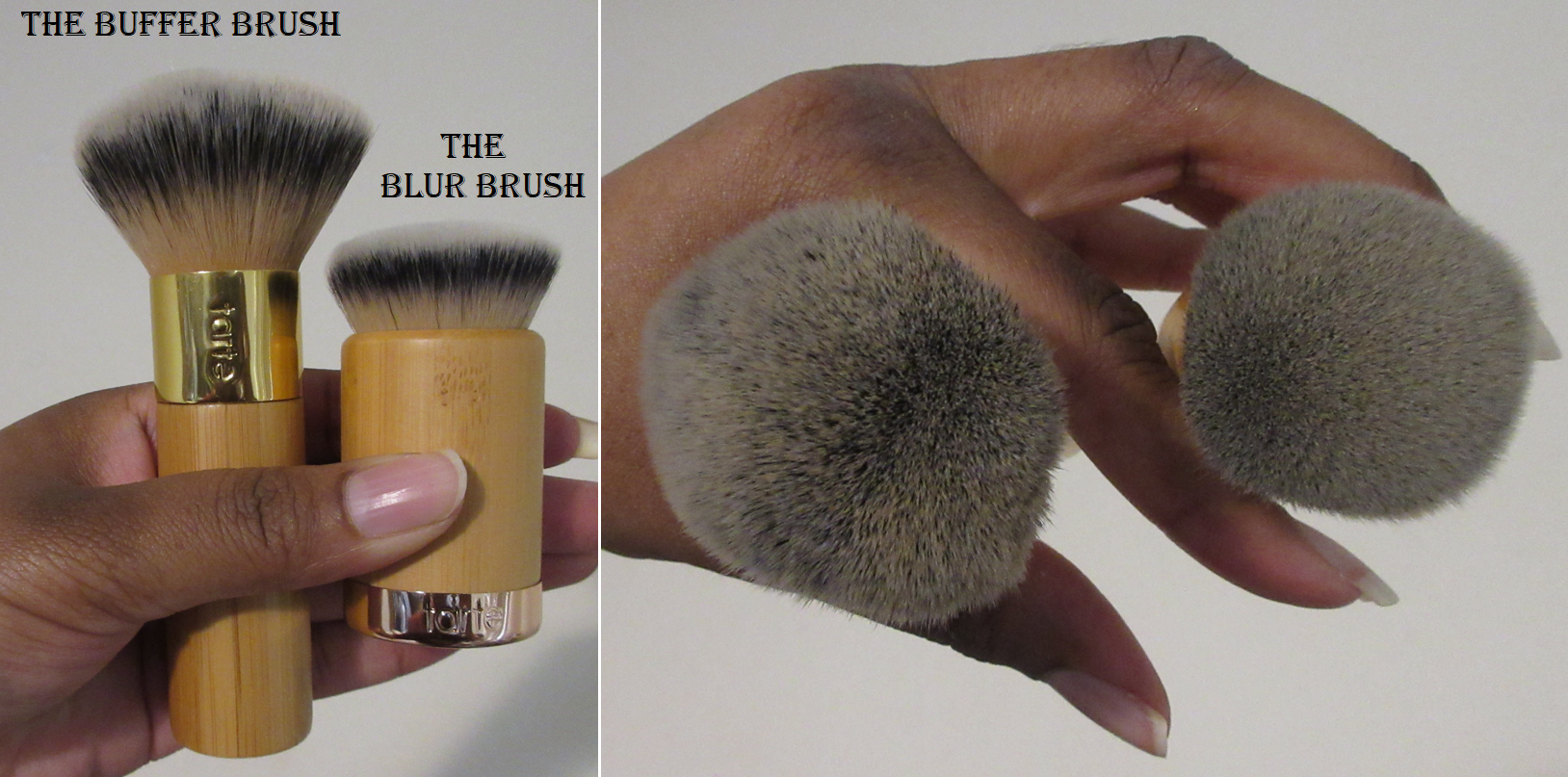
Sonia G Smooth Buffer Brush – This review is coming to Fude 7.
Viseart Petit Pro Palette London Étoile – I reviewed this HERE along with several other Viseart palettes. I created some pretty looks with it, but once the “new” feeling wore off, I didn’t use it again. I love olive shadows, but I have so many other olives that have more sparkle and wow-factor to them, which is why I always remembered to use those and forgot about the one from this palette.
Lunar Beauty 2022 Advent Calendar, Love Me Strawberry Lip Oil, and Dreamy Lip Gloss – I’m going to come right out and say I’ve chosen to not review these products at this time. I have always felt conflicted about whether to review Lunar Beauty or not because I’m always going back and forth about how I feel about the brand’s owner Manny Gutierrez (Manny MUA). The personality he portrays in his videos isn’t the style I enjoy watching in reviews, but it’s his past constant involvement in drama with other problematic influencers that bothered me. I do own the first Moonspell palette (purchased discounted from a third party and never used as it’s just for packaging), a Moon Prism highlighter I bought purely for packaging (also purchased from a third party and never used) and originally planned to compare it to the controversial dupe highlighter from Makeup Revolution, the first Moon Prism blush palette that I purchased when Lunar Beauty products were sold at Sephora, and the Large Powder Brush from his website (even gifted two of them). Manny had stayed away from the drama for a few years and his Fool Coverage podcast with Laura Lee started to change my opinion of him. That’s why I purchased the Advent Calendar and lip products last year and decided that I felt comfortable enough to finally put full energy into the Lunar Beauty post I’d been working on here and there for literally years. Then, as I started with the product photos and testing in 2023, I kept hearing about more and more problematic influencers that he was starting to show his public support for again and that bad taste in my mouth returned. Unlike certain people whose products I refuse to buy or speak about on my blog any longer (JS, JC, JH, etc.), I don’t know if I’m going to give a hard ban to Lunar Beauty products in terms of never speaking about them again. I at least finished reviewing the last Jaclyn Cosmetics products I owned before stating I was done with the brand. With Lunar Beauty, if I’m wearing those products in a post, I might mention it’s what I’m using, but I don’t see myself ever working on that brand review post again, and I personally will no longer purchase anymore products from them. The last thing I bought was a year ago anyway.
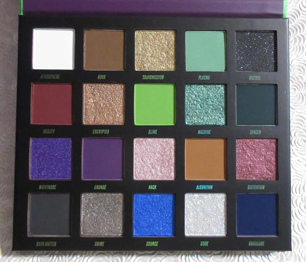
Beauty Bay Dark Fantasy Palette
I showcased this in a Swatchfest post, but hadn’t actually reviewed it at the time. These colors are stunning and right up my alley. I have loved the looks I’ve created with it. Regarding the quality, this doesn’t give me that many issues when I’m using a primer. Eye primers are a staple product for most beauty lovers, but I do personally know people in my life who are makeup dabblers and don’t always use primer. So, it’s for their sake that I feel the need to express that I had such a hard time using this palette without a primer. The lighter mattes are fine, but the darker ones are so pigmented with good adherence that they just don’t want to budge unless there’s a primer underneath. I can’t stress enough that primer is important! Also, I highly recommend working from lightest to darkest when building up layers.
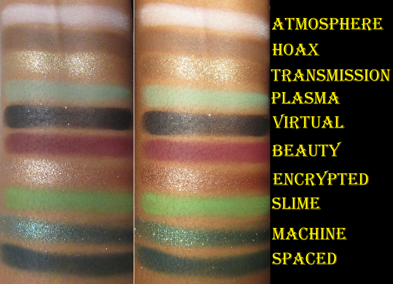
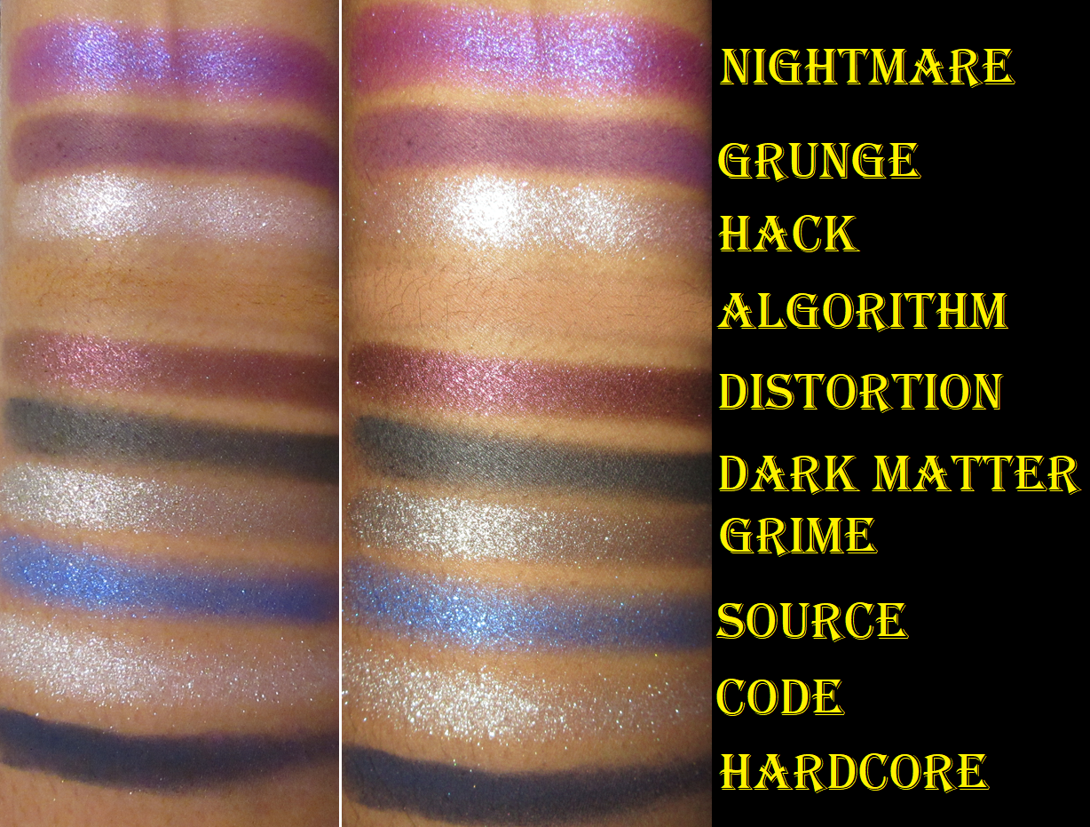
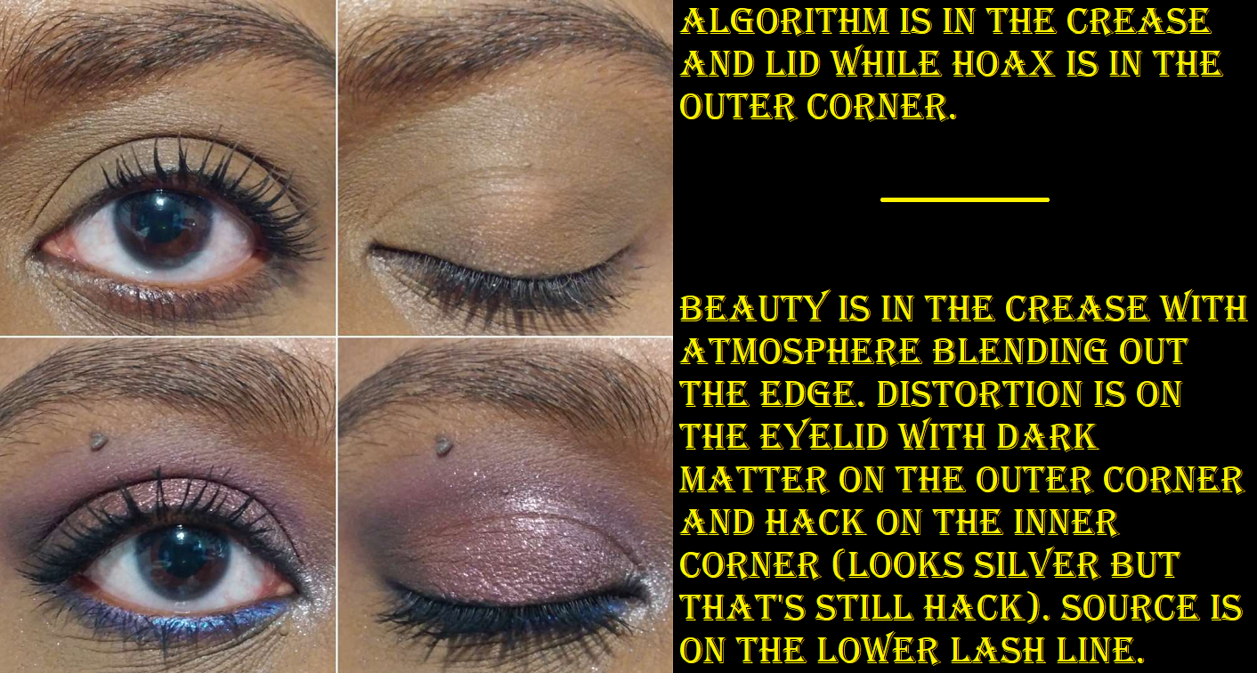
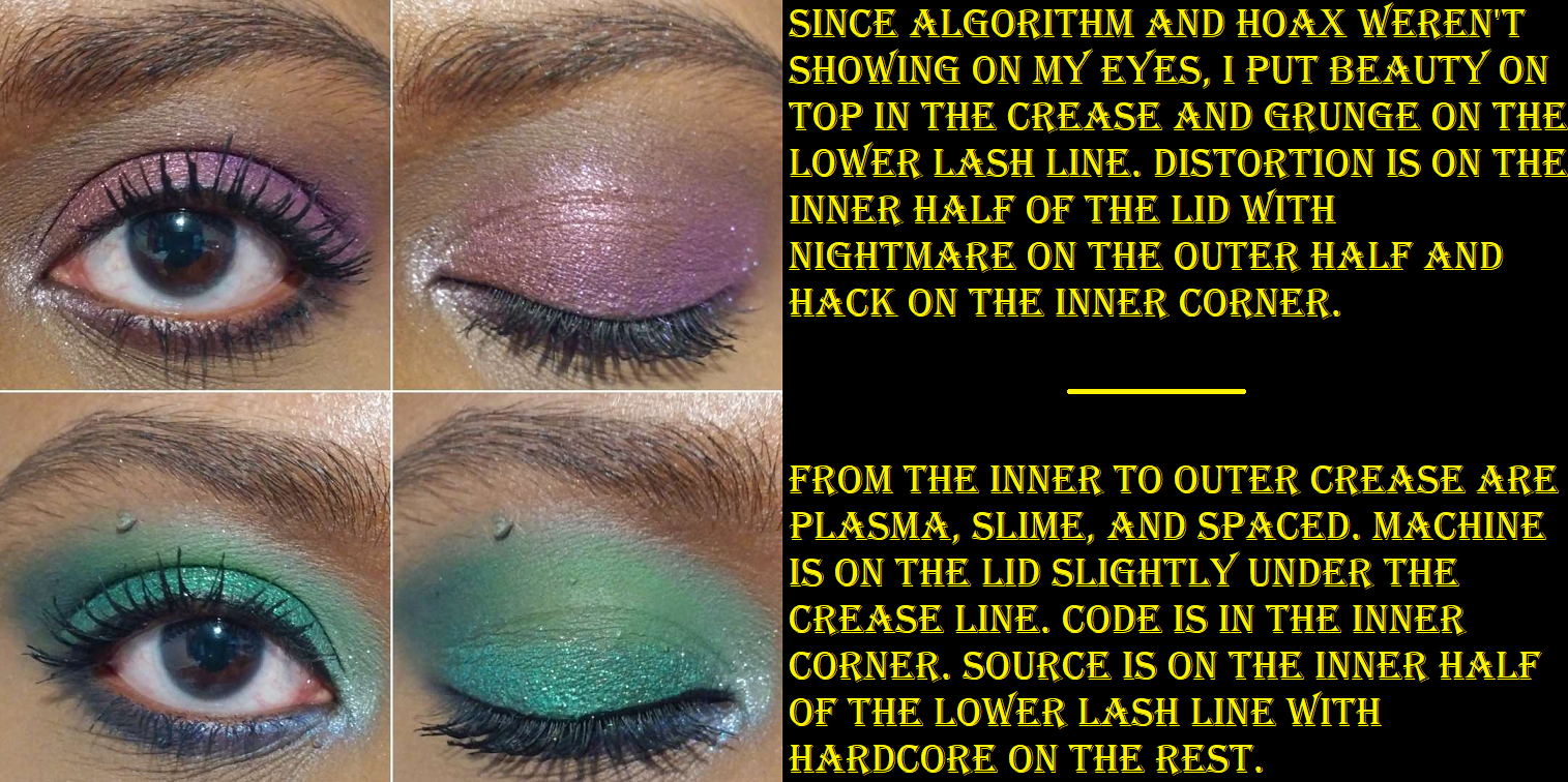
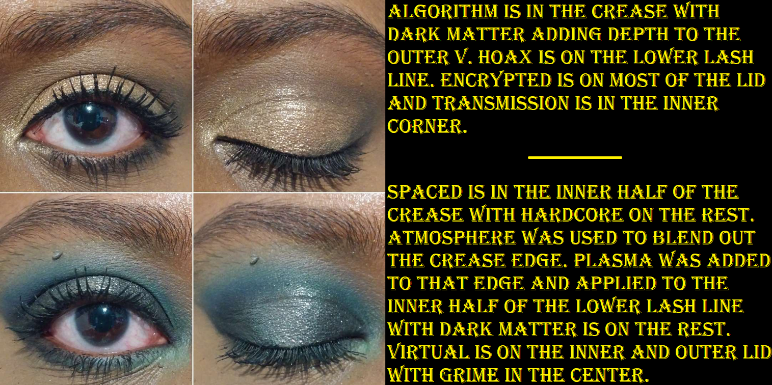
With primer, these mattes still weren’t as easy to blend as the majority of the eyeshadow palettes I use (also at double the cost or more), but with the staple Japanese eyeshadow brushes I’ve used hundreds of times, it was still better than I expected. It’s nice to see Beauty Bay eyeshadow quality has a positive reputation for a reason. Not necessarily as being the greatest on the market, but certainly great for the price (along the lines of BH Cosmetics, Colourpop, and ELF). It didn’t take that much longer blending as to prevent me from wanting to use this palette again. The first time was rough, but every time after was easy enough. I like how much color payoff I get from those mattes. For instance, shades like Plasma are usually treated like a pastel shade and are too thin or too white based and don’t look that great on my eyes, but this one was great! Hoax is a color that really doesn’t show on my eyes due to my skin tone and Algorithm is a slightly more golden tone version of my skin so it barely shows either, but I still like to use it as a starting shade in the crease. Atmosphere is the one that’s too thin and doesn’t show well enough on me and the other shades are too strong in pigment and overpowers it when I try to use it to blend the edges of the shadows, but it still semi works for that purpose. I just have to spend a little extra time on it. Beauty ends up looking way more purple on my eyes instead of burgundy or maroon, but it’s at least still a pretty color.
I have zero issues with the shimmers. I sometimes get a little fallout, but dampening the brush helps. The shimmers aren’t as refined as some of my more expensive eyeshadows either, but I like their sparkle level and they look pretty regardless. I want intensity and opacity from my shimmers, and that’s what these give me. I didn’t have any patchy or creasing issues either, so overall I do like this palette! I’m glad I was able to give the Beauty Bay eyeshadows a try. Because it’s not the easiest to get my hands on, I don’t know how many more I’ll get in the future. Plus, I’m usually not drawn to their color stories. However, if another one attracts my attention, I might get it.
MAC Indulgent Glow Rosé Limited-Edition face kit in Sparkling Wine – I reviewed this HERE and in comparison to other MAC highlighters I got around the same time. It’s super pretty, but I ran into that issue where I am so reluctant to actually use my makeup with cute embossing on it. I have no regrets buying it though.
Charlotte Tilbury Hypnotising Pop Shot eyeshadow in Cosmic Rocks – I reviewed it HERE along with the shade Sunlit Diamond that they sent me on accident with a different order. Just as I expected, these have become cute decor. I haven’t reached for them more than once or twice after completing the review. I just don’t use single eyeshadows if they’re in individual compacts. I only reach for the ones in my larger custom magnetic palettes.
Hourglass Unlocked Butterfly Palette – I got this from FeelUnique/Sephora UK for $46 purely to get the two blushes in that palette. I depotted two shades from my other Hourglass palettes that were unusable on my skintone, adhered them to the Butterfly palette’s now missing blush spots, and sold it as a custom palette on Mercari. Minus the fees, I made $32 back, so this was probably the best deal I got that year. I did not get so lucky on the deals this year, but that’s a story for another time. I talked about the process of depotting and showed the photos of the palette HERE.
Bioderma Sensibio H2O – This was just a repurchase. I decided to look through my purchase history and essentially since November 2015 I’ve bought 8 of the 500ml bottles, 2 of the 250ml bottles, and 2 travel size 100ml bottles. In the beginning, I was able to get heavy discounts on multi-packs, but the prices have jumped up quite a lot. So, I try to get them individually whenever I see them on sale, even if I need to accumulate backups since they will always be used up. In fact, I’m halfway through my last bottle and will need to find a new place to order it from when I go back to Germany so I won’t need to bring a big bottle over with me. This is one of those products that as long as they keep making it and don’t change the formula, I’ll be buying it for life.
Fenty Beauty Sun Stalk’R Face + Eye Bronzer & Highlighter Palette – I reviewed this HERE and though it’s still in my collection, I am considering decluttering it. I just have a ton of bronzers by now that I prefer and don’t need to resort to mixing to get the tones I like.
One/size Cheek Clapper in Phat @$$ – I reviewed it HERE. As it often happens, because my blush collection is so large, I don’t have the chance to use this as often as I would like to. It’s still one of my favorites, along with the other shade from the line called Freaky Peach. I still easily recommend this trio, even at full price.
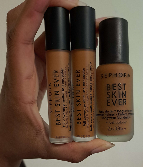
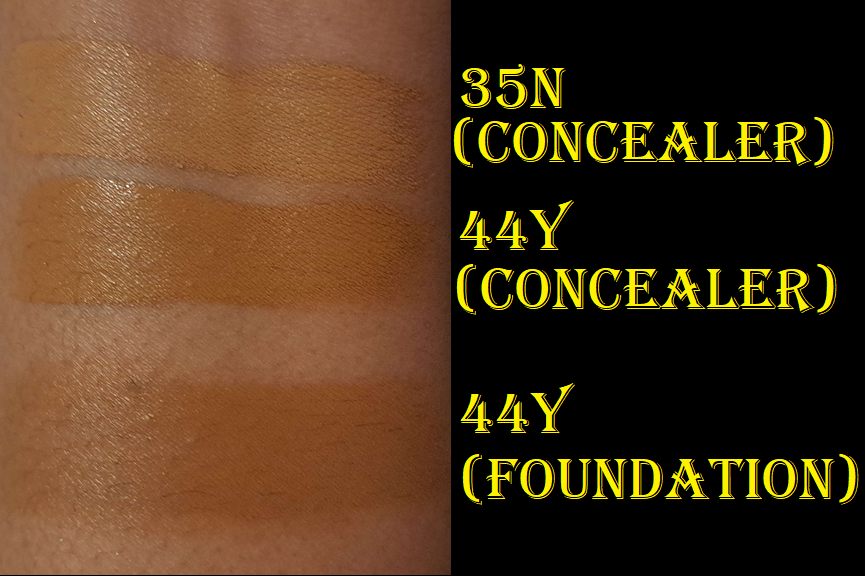
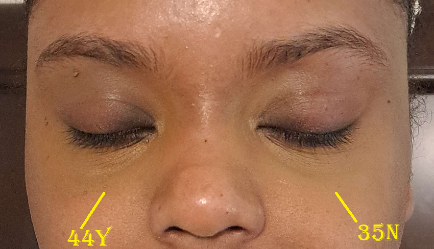
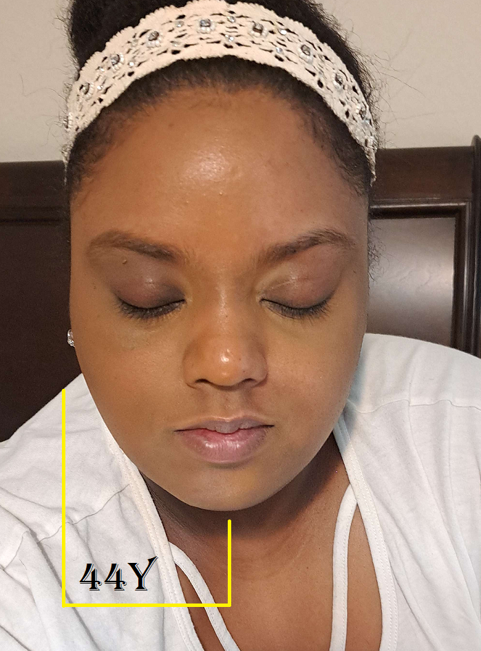
Sephora Collection VIB Sale Items: Soft Matte Perfection Blush Duo in 01 Sweet Pea, Best Skin Ever Liquid Foundation in 44 Y, Best Skin Ever Full Coverage Multi-Use Concealer in 35N and 44Y
The blush duo in three shades (two additional I bought later on) are reviewed HERE. As for the foundation and concealers, the shade matches are why I decided not to review them. I wasn’t blown away by the finishes and just didn’t feel inspired to keep using any of them.
Sephora’s Best Skin Ever line was really hyped up, but it was just fine. I didn’t like how the concealers wore throughout the day. The finish of the foundation was fine and the color match wasn’t too terribly dark if used lightly, but all of these smelled so heavily of chemicals after owning them for a year. For the record though, I didn’t open the concealers until around three months prior to posting this and they smelled just as bad as the foundation, like spray paint or nail polish. So, even without air exposure, the shelf life isn’t great on these. I threw them out before I could take a picture including them in the big October month photo.
Rare Beauty Positive Light Liquid Luminizer Highlight in Flaunt – I reviewed this already as a sample HERE, but I bought the full size a year ago during the VIB sale. I also have swatches and comparisons to the powder version of this shade HERE.
Kayali Eden Juicy Apple – I don’t normally review my perfume purchases, but I did so in a big Kayali post HERE. I have admittedly barely used this perfume because I’m always using Yum Pistachio or Lovefest instead, but at least I just got this in a small size so it’s not quite as wasteful. Plus, I got it on sale. As nice as it is, I decided to give it to my sister because of how deep my obsession for the other scents run. This was my first Kayali purchase, but since it’s only a year old, I haven’t attached any sentimental value to it.
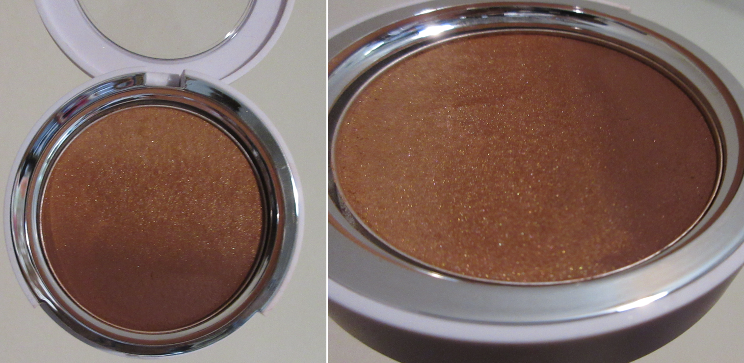
HUDA BEAUTY GloWish Cheeky Vegan Soft Glow Powder Blush in Sassy Saffron – I showed swatches of it HERE in comparison to the previous shades I bought. However, I don’t have any face pictures with it on because it just doesn’t show up on my cheeks. For that reason, I haven’t used this particular shade. The formula and finish wasn’t special enough either for me to prioritize it. I still like how Berry Juicy looks, and I wore it perhaps two more times in the past year.
Tom Ford Highlighter Duo in Tanlight – I reviewed it HERE. I still use it quite often and it’s one of my favorite highlighters in my collection. In fact, it’s such a great shade match for me that I don’t feel the necessity to purchase anymore highlighters from the brand unless they have another shade that’s similar to the mixture of the two colors in some form of special packaging. While I still have mixed feelings about the price and I’m not sure if I would universally recommend it to everyone, it was worth it personally to me.
Oh dear Lord, we’ve finally reached the end!
This was a monster of a post, even though so many of the products had already been reviewed elsewhere! We’re so close to completing the series but November and December 2022 had even more purchases than October! And considering what I know is coming for the rest of this year in my personal life, I think we’ll have to complete this series sometime next year!
I’m getting into a really exciting chapter of my personal life, which I will be sharing with everyone in December or January. Thank you to those who are choosing to be along for the ride!
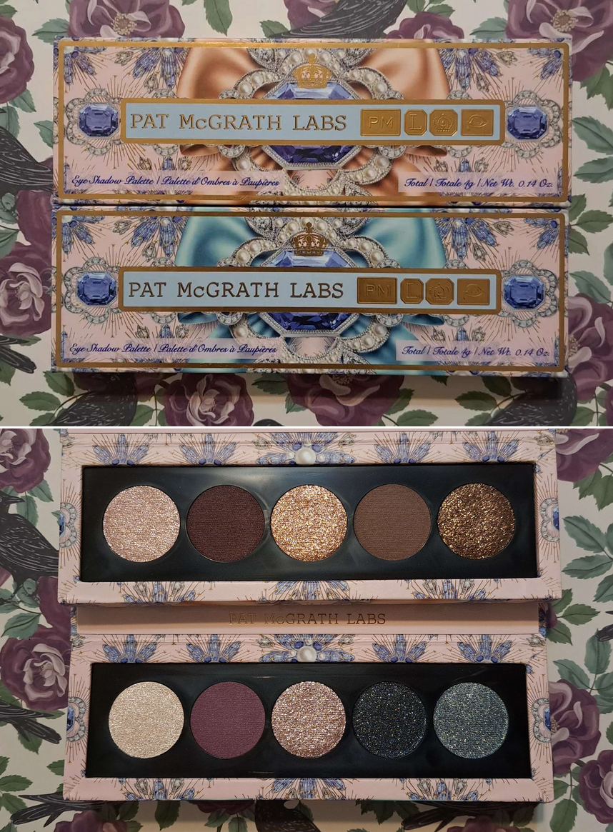
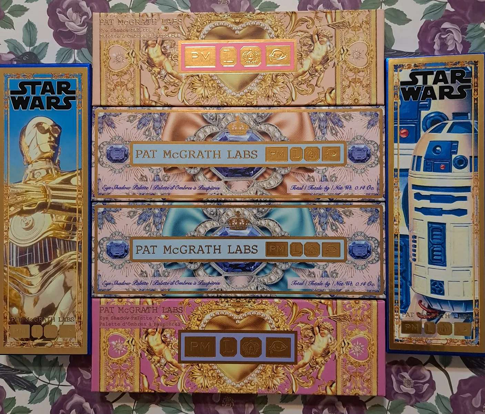
I purchased the Duo 003 Bundle to save some money since I knew with certainty I wouldn’t be able to stick with just one quint. Eventually, I would buy at least one more. I nearly always enjoy my PML purchases, so as soon as I fall in love with the parts of collections I buy, I’m always tempted to get more. However, I’m upholding some restraint with this collection. Buying two quints was the correct decision for me, but this might be all I get this year.
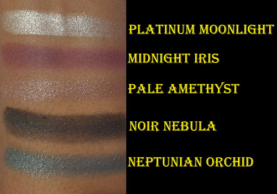
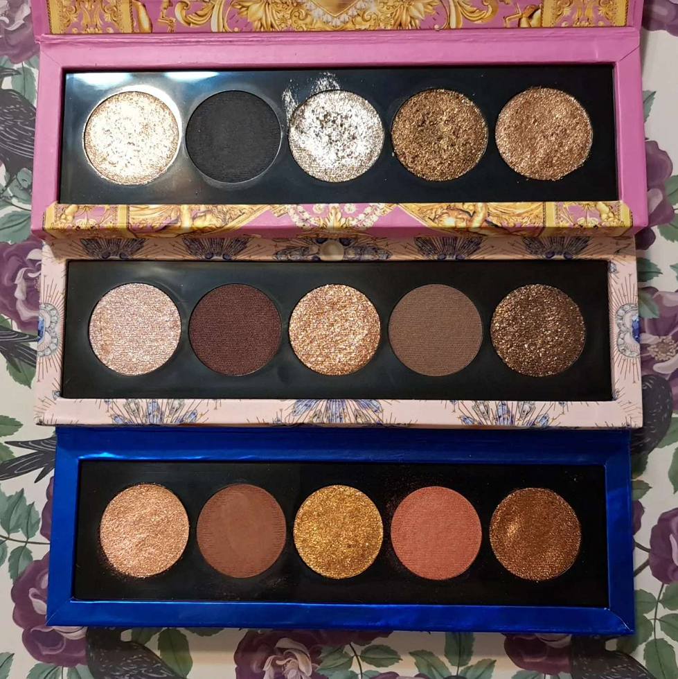
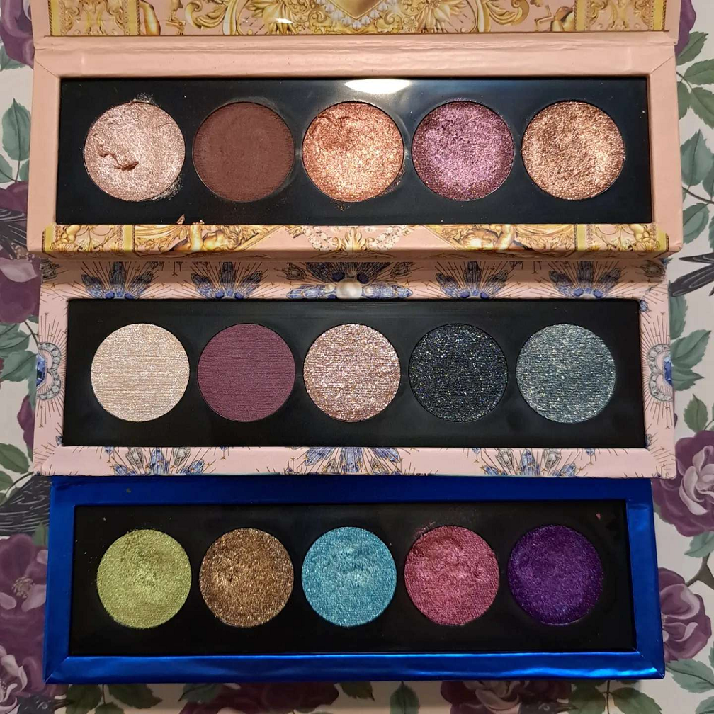
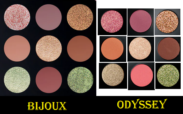
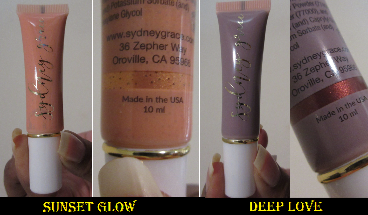
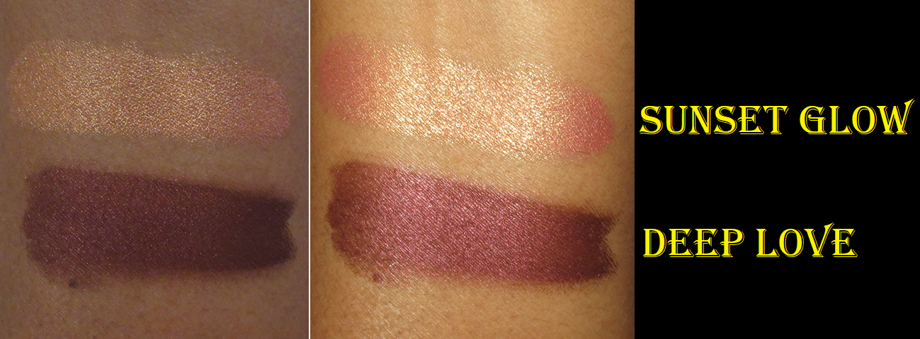
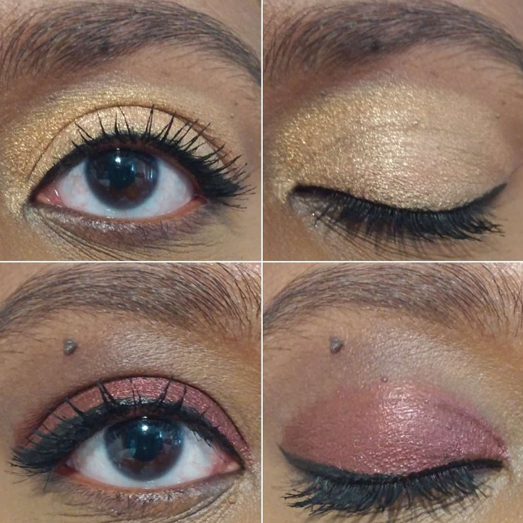
Bijoux Brilliance Eyeshadow Palette in Bronze Ecstasy and Lunar Nightshade
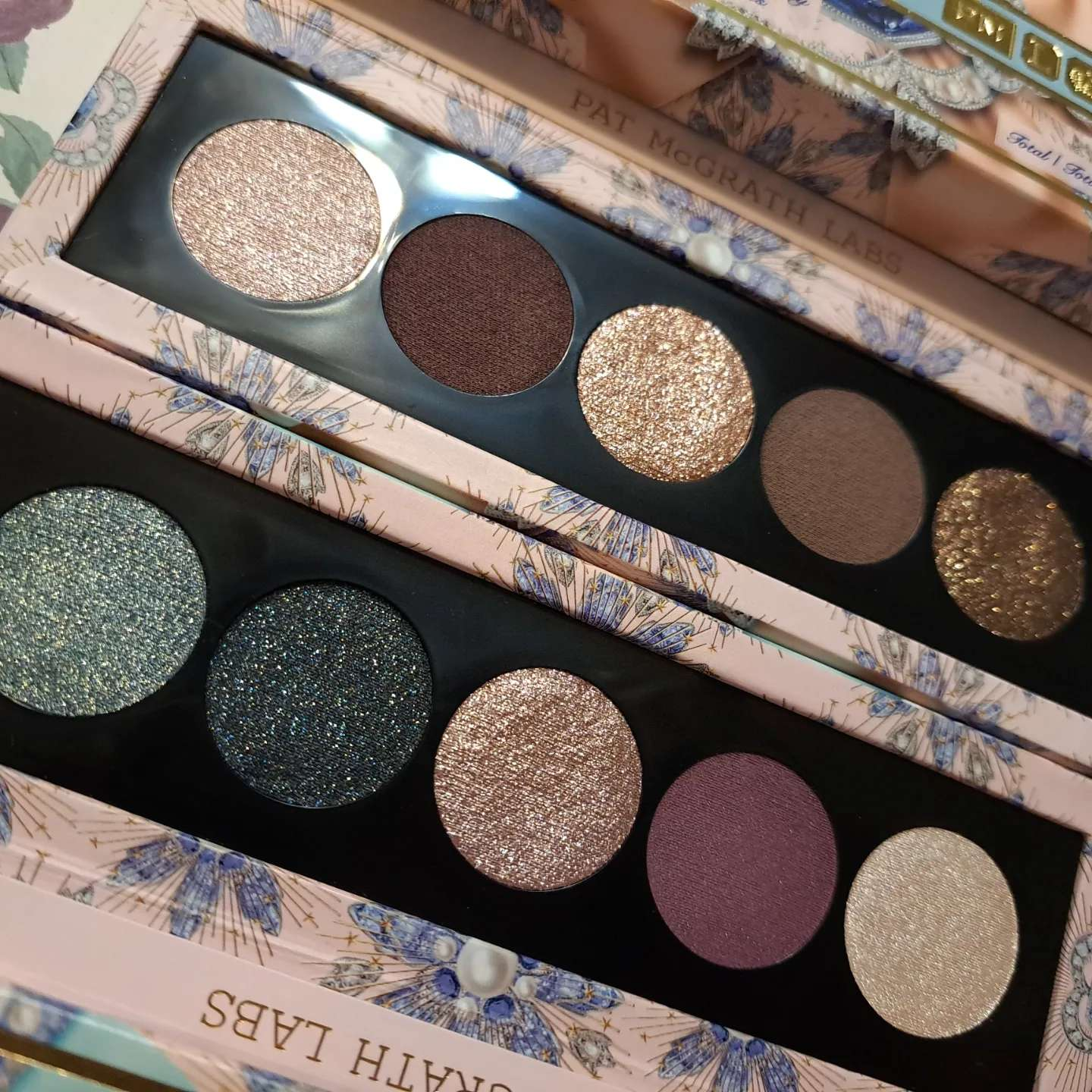
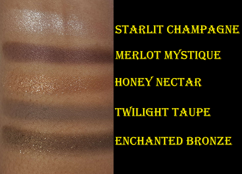
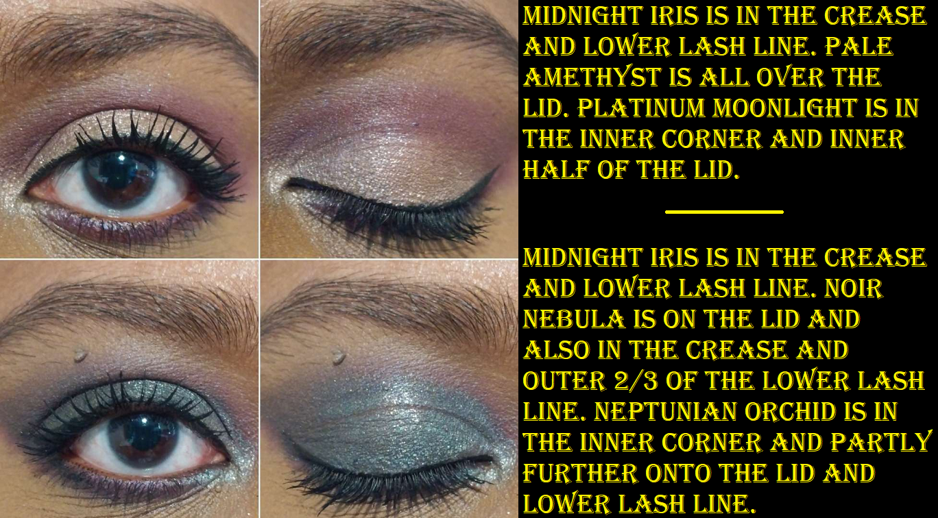
The quality of these are just what I would expect from the brand. The satins are stunning, the shimmers are beautiful, these are pigmented yet easy to blend, and among the shimmers there are various textures. The shades in the middle of both palettes are the wettest to the touch. As for Enchanted Bronze and Noir Nebula, they both have this very strange texture that smooths onto the lids nicely, and the base color is opaque, but the sparkles within those two are larger in particle size and not all that tightly grouped together. It nearly gives a scattered effect on the eye. Those two are also easier to get sparkle fallout, so I apply them precisely and carefully as the last step of the eye looks. I also tend to wet my brush since it makes me feel like they stick better that way, though it might not be necessary. My technique with those less easy shimmers is to apply them with my finger first, dampen a brush to pack on another layer to get the amount of sparkles I want, and then add one more final layer with my finger.
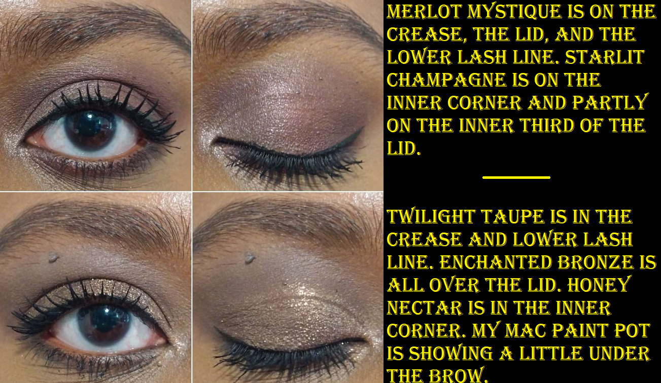
Merlot Mystique is a gorgeous plum-brown that reminds me of the darkest shade in Tom Ford’s Honeymoon quad. When I apply that to my crease, it loses some of the purple tone, so I basically blend those edges to my satisfaction and then add a little more of that shade on top to get the true color to show. The same goes for Midnight Iris that can just look like a deep purple, but adding a little back on at the end will show the vibrancy of that particular color.
I don’t get any creasing using these with the Gerard Cosmetics Clean Canvas or MAC Paint Pot, but I have gotten a tiny bit with the Coloured Raine eyeshadow base. The longevity is good since I don’t see them fading or dimming in their shine on the eyes.
I feel satisfied that the two quints I added to my collection are different enough from the rest to have been worth it, but I don’t think I’d have been excited enough over the other two color stories in the Bijoux Brilliance Collection. They’re pretty, but wouldn’t stand out as unique. Plus, I haven’t gotten as much use out of these as I’d like to, so adding four at one time would have been overwhelming.
After someone pointed out the similarities of the color stories between Lunar Nightshade and Kaleidos’ Futurism III Astro Pink, it feels less unique than I thought. However, I don’t regret getting it. And even though I don’t see myself coming up with a variety of different looks using Bronze Ecstasy, I’m very pleased with those staple looks I do end up creating. That one is actually my favorite of the two!
The brand’s 5-pan palettes seem to be an easy way to add more varieties of colors to their offerings, so I look forward to seeing more of these in the future. This is especially the case because as much as I love PML mattes, I love the matte/satin-matte hybrid formula that has thus far been exclusive to the quints.
HOLIDAY COLLECTION DISCUSSION
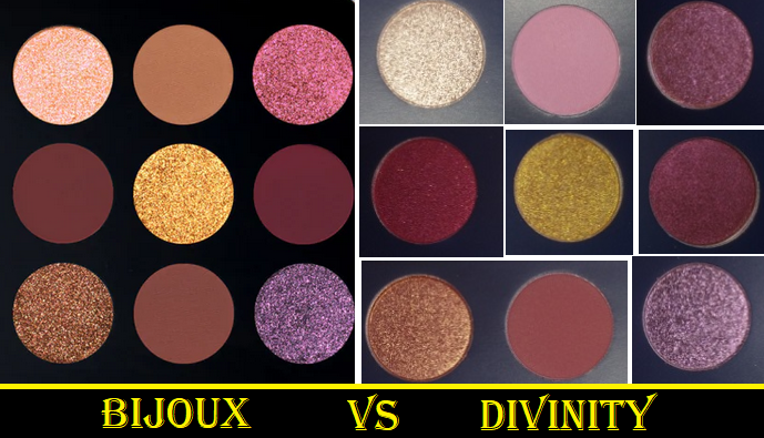
The most tempting products for me were the two MTHRSHP Bijoux Brilliance face palettes consisting of two blushes and 9 eyeshadows in each. These are great for people who haven’t purchased much from the brand, especially prior releases, which is why it would ultimately be a bad buy for me. Starstruck Splendour has both blushes that are too light for me (plus one is a repeat anyway). Jeweled Temptation has a new shade that’s too light, plus the famous Paradise Venus which I owned as a single before gifting it to my sister, but got it again in the Divine Blush + Glow Cheek Palette from last year, and it’s the darker shade within the Paradise Glow duo blush that I still own. My excuse for keeping the duo is for travel, but by right, I should find a new home for it. Even if I chose to do that, I’d still end up with two Paradise Venus pans left if I bought Jeweled Temptation. I was watching a discussion video when someone mentioned Jeweled Tempation’s color story looks like the MTHRSHP Mega Celestial Divinity Palette and I couldn’t unsee it. They’re not exact dupes, but it’s too similar for me to justify getting it even at a discounted price considering the blush situation.
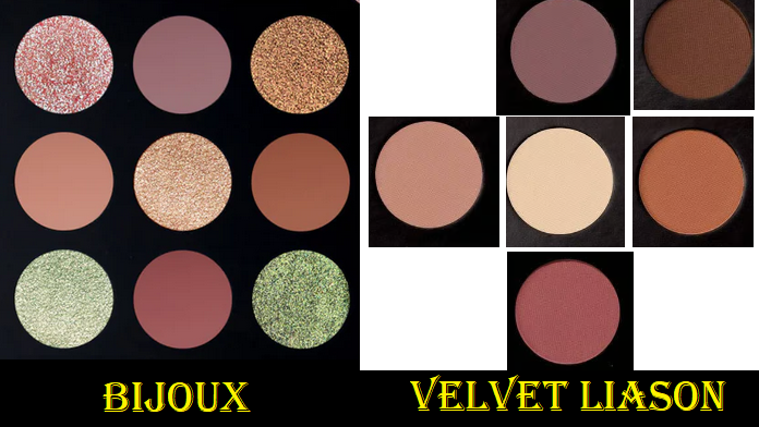
That same person also mentioned that Starstruck Splendour looks like Celestial Odyssey, which I did not purchase during the holiday season it was released. However, I own the six pan palette Velvet Liason (I left it in Germany), which comparing those promo pic colors to the Velvet Liason promo pic shades, the vibes are similar there too. So, I am ultimately skipping both products, even when they go on sale.
Next most interesting for me were the quints, but I bought the two that appealed to me most. I was actually set on also buying Bordeaux Bliss until I thought about all the pink and purple toned shades I have, and the fact that the nearly-cream-to-powder mattes were the stars of the show for me in the quints initially and Bordeaux Bliss only has shimmers. Sunset Romance is also pretty, but too pink and too neutral to avoid feeling repetitive for me.
The Divine Blush + Bronze + Glow Trio in Supernova Siren was nearly as tempting, specifically for the highlighter. I usually stick to golds, dark champagnes, and light bronzes, but a warm peachy-pink highlighter with golden shimmer can sometimes peak my interest. However, I already own the Burnished Honey bronzer (along with two other bronzer shades). I’d be willing to sell my individual one in order to not have two in my collection, but Burnished Honey isn’t even my favorite of the bronzer shades. I might have done that if it was Bronze Divinity instead. In photos, the new Midnight Orchid blush looks too vibrant of a fuchsia shade for my taste. It looks within the same color family of Lovestruck, plus deeper, and I specifically have avoided buying Lovestruck because it’s not the type of blush color I enjoy seeing on myself. So, unless this is one of those times when the website photos don’t accurately show how the shade will look in person, that makes two cons against getting the trio. While it’s true that I sometimes will buy a whole face palette just for one shade, a highlighter is rarely special enough to be worth that. And as intrigued as I am by Solar Fantasy, it’s in the Divine Glow formula whereas I prefer the brand’s Skin Fetish: Ultra Glow formula. A non-sparkly non-glittery baked gelee is my absolute favorite from the brand, and unfortunately that has only been for the Divine Rose one. They’ve yet to release that kind in another shade and I’d prefer to wait however long it takes because that one still trumps the rest of the highlighters I own from Pat Mcgrath, even though the Divine Glow formula is still nice. It’s just not as special on the market. So, this is ultimately the one product I’m still waiting to see photos and videos posted online to decide if the blush is more my style and if the highlighter is still something I want. If yes to both, I’d only get it on a deep discount considering the risks of me liking it are slimmer than the potential disappointment. It may very well be that these two quints I reviewed end up being the only Pat Mcgrath Holiday items I buy.
I nearly forgot that new shades of the colorful mascaras are part of this collection too! I commend the brand for taking a risk on those, since I don’t think there’s a big market for that kind of makeup product, but it’s an easy pass for me.
Also, I know it’s not just me thinking this collection and several past releases are all in the Bridgerton aesthetic. I can’t help but think that the collaboration didn’t sell as well as anticipated (which is backed up by the appearance of so many Bridgerton items at TJMaxx) and a lot of packaging and components intended to be extensions of the Bridgerton line have been passed off onto customers with different names pretending to be uniquely different collections. I like the bows and jewels patterns and designs, so I enjoy having these while the brand doesn’t have to take a loss by just excluding the Bridgerton label from the products. The only downside for me is the not-so-bold color stories, so I’m looking forward to when we’ll be able to move onto some fresh concepts and ideas.
Anyway, that’s everything for this week! Thank you for reading!
A few additional items discussed in this post are not pictured here.
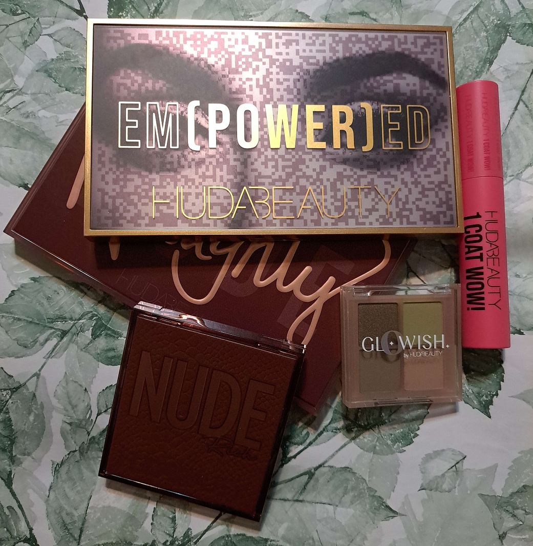
Between Huda Beauty’s main brand and the side brands of Kayali and GloWish (I’m not fully sold on Wishful yet), I’m becoming more of a fan these past two years than ever before! Today, I will be discussing the remaining unreviewed products I own.
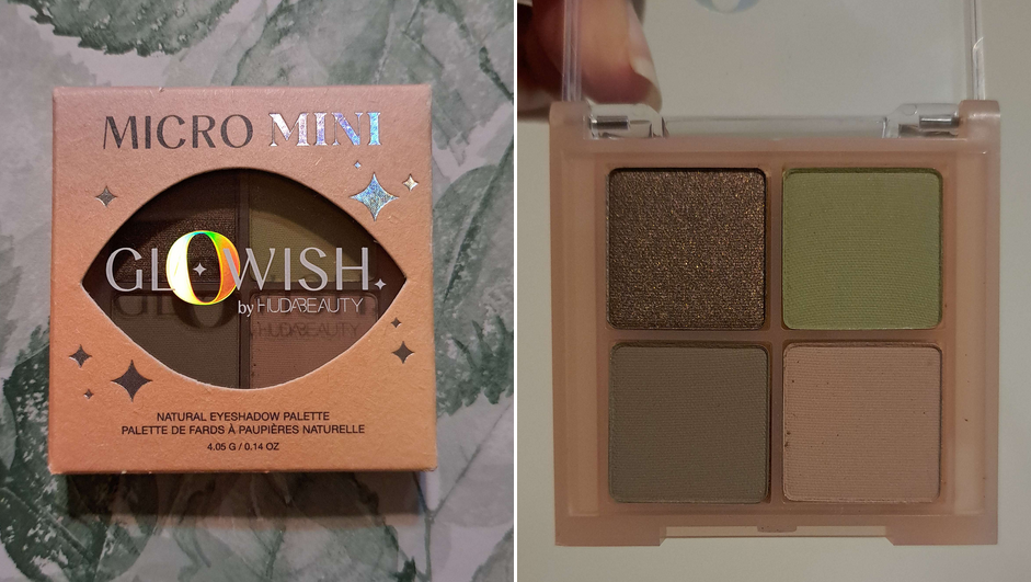
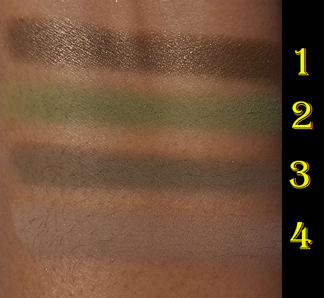
GloWish Micro Mini Natural Eyeshadow Palette in Moss
The Glowish quad is nice! It’s more pigmented than I expected, which is to say it’s the same Huda quality I’m used to. Unlike the 9-pans that are normally made in China, this quad was made in Italy like the bigger Huda palettes. So, that was interesting to see. A lot of people say the quality between the 9-pan and full size ones are different, but now that I have the Empowered and Naughty palettes to compare, I really don’t see a difference from the Obsessions palettes I own. Then again, I’ve only purchased the ones rated high in reviews.
The shimmer in the Glowish quad didn’t have the impact I usually prefer, but since it’s part of the Glowish line, I assume it’s not meant to be super attention-grabbing. That’s the only complaint I have. I don’t get creasing, I don’t have longevity issues, and the kickup isn’t that bad. I like this, but if I’m being perfectly honest with myself, Moss gives similar vibes to the Natasha Denona Mini Gold palette, but ND’s has way more interesting shimmers. To those that like muted earthy yet pigmented colors and like satins instead of shimmers, I recommend getting the GloWish quad. However, those that like a lot more sparkle with a quality that’s at least as good, plus even quicker to blend, I recommend spending the extra $6 to get the Natasha Denona Mini Gold, which has an fifth eyeshadow too.
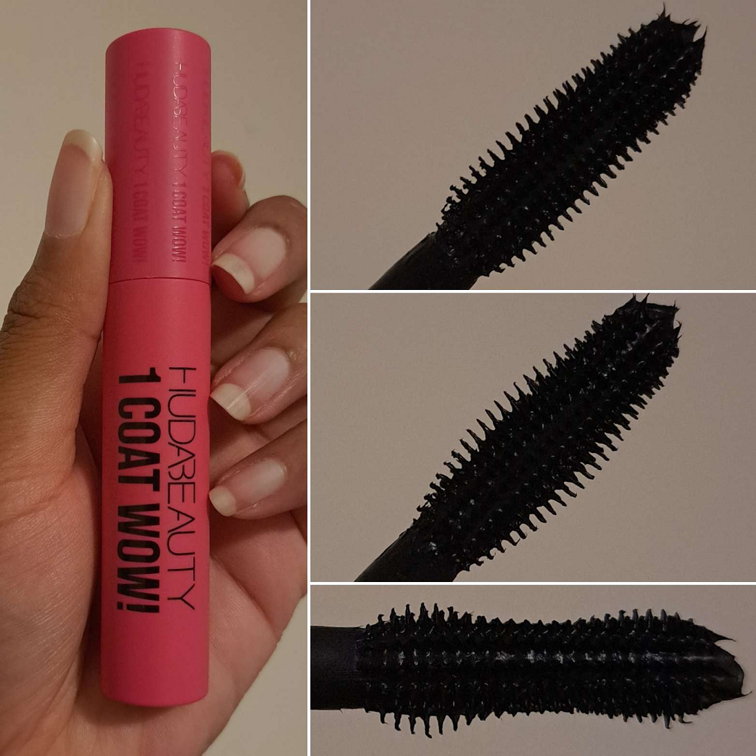
Huda Beauty 1 Coat WOW! Extra Volumizing and Lifting Mascara
An example of this mascara being worn is in the section with Glowish quad eye looks and the first two eye looks for the Naughty palette. For those curious, I’m using the COL-LAB mascara (in the pink writing not purple) in the last two eye looks showing the Naughty palette.
My version of one mascara coat is to pull the applicator out of the tube and apply the mascara to my lashes in repeated swipes until I’m satisfied with the length and volume, and without dipping back into the tube a second time. I start with the side of the wand that forms an hourglass shape, as that feels like I can get closer to the root of my lashes that way. I keep building up that single layer before turning the wand to the side that looks fully curved without an inward dip from brush base to brush tip. That side of it helps to comb out the lashes so they don’t look clumpy and/or remove visible clumps gathered on the tips. I prefer to stick to the single coat. Waiting for the mascara to dry and then applying a second layer only adds slightly more volume, but no additional length. I’m satisfied with the volume I get from one coat, so I don’t get extra value trying to build my lashes beyond the first coat.
I don’t get any smudging throughout the day, but I do get some flaking. The amount is acceptable to me, so I don’t count it as much of a negative. However, I have mascaras that give me the same results with less effort and don’t flake at all such as the MAC Megastack, COL-LAB mascara, and Essence Volume Stylist 18hr Lash Extension Mascara. So, this isn’t something I plan to repurchase. Also, this takes normal effort to remove with my Bioderma Micellar Water.
I should also note that I’ve used this mascara at least five times in a little under two weeks and the mascara consistency has gotten thicker. I have a much easier time getting volume, but the amount of clumps I have to remove from the tips of my lashes before it has time to dry is another annoying attribute that guarantees I won’t repurchase it.
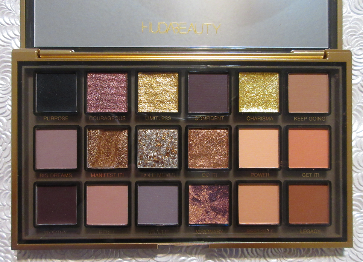
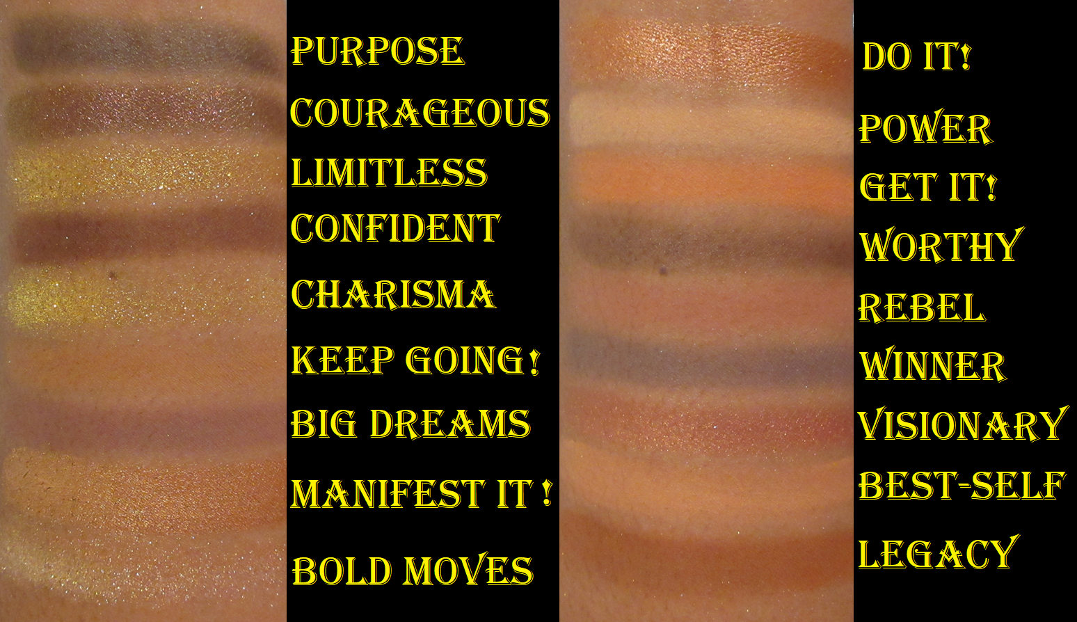
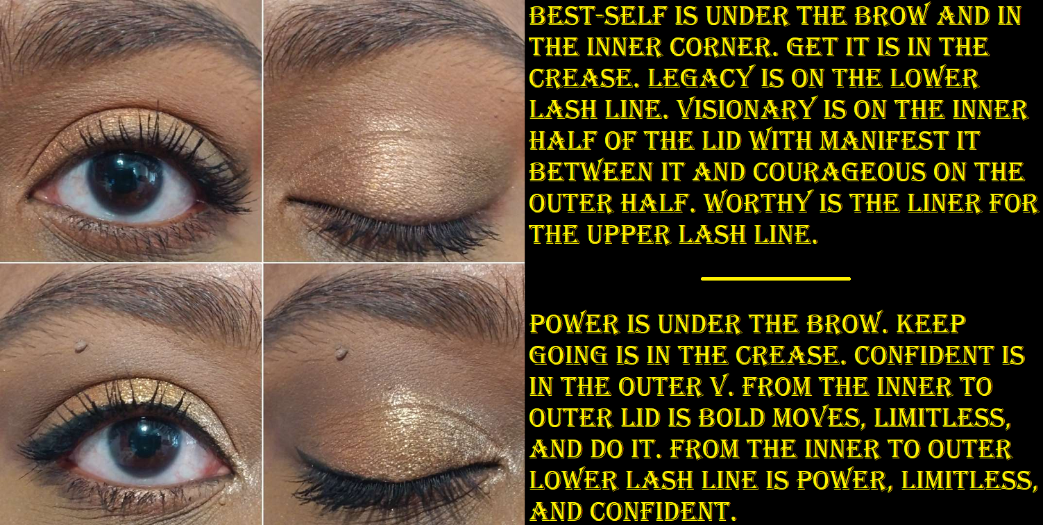
Huda Beauty Empowered Eyeshadow Palette
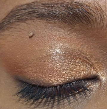
As I said in my Swatchfest #6 post that included this palette, but not a full review, Manifest It is that strange gel formula that Huda included in the Naughty palette, but the pigment is in cream form instead of the circular balls. I took a cosmetic spatula and recombined the clear hard waxy gel and pigment together to get an even coating of color. Unlike Slippery, I find that there’s enough pigment in my mixture to actually use Manifest It as a visible opaque eyeshadow and not just as a primer base. It looks fine on my eyes if I keep it away from any folds and lines, but if I put it in the inner corner or some of it strays from the lid and into the crease, it can look a bit textured and take some extra smoothing over with a flat brush or my finger, in addition to creasing and moving, leaving me with a bald patch in those spots. It looks passable for a few hours, but by mid-day the combination of eye movement and spots on my lids that product oil majorly exacerbate the creasing. So, I try to keep this shadow for use in areas of low movement and away from areas that show signs of “maturity.”
After two hours wearing Manifest It on the inner half of the eye compared to the worst of it by the end of the day.
The standard powder mattes are all great. It’s the typical Huda Beauty type of mattes that are pigmented and easy to blend. My issue is just that these shades are too similar on my eyes, so I’m a bit limited in the variations of looks I can come up with. Big Dreams and Rebel end up looking the same. That’s also the case with Power and Best-Self. Get It is darker and brighter than those two, but if I use it in the same eye look it will overpower them and just look as though I applied Get It by itself. The three mattes that stand out the most are Winner, Confident, and Legacy. In the case of Winner, it has equal depth to Big Dream and Rebel, but the aspect that sets it apart from them is how cool toned it is.
We have two gel hybrid eyeliners that can be used as eyeliner, eyeshadow, and/or as an eye base. They aren’t waterproof or transfer-proof, since I can rub the spot where they are applied and get a faded imprint on my finger, but they at least don’t smear. They’re easy to pick up on a brush, but not as easy to get off the brush and smoothly onto the eyelids, especially with other shadows already built up on the lids. I don’t have much patience when it comes to passing over the lash line repeatedly, so it’s actually easier for me to use Confident as a liner instead of Worthy. Because Purpose is a richer color that takes less effort to build up, I don’t mind as much using that one as eyeliner. I like applying it to my eyes with my finger for a smokey look and to increase the intensity of a typical multichrome used on top of it. It does fade on me as the day goes on, as it’s not that rich of a black color, but it’s still visible enough for me to be satisfied with it being included in the palette.
Courageous is described as being “multichromatic” and has a slight shift that can be seen in the pan, but not as evident on my eyes. It also has its own black base, so using it with Purpose isn’t necessary. Even though it’s not very shifty, it’s still a pretty eyeshadow and great for smokey looks. It has a little too much slip to it, which is prone to creasing on my eyes, so I try to keep it out of lines and folds as well.
As for the golds, they’re both beautiful, reflective, and shimmery, but Limitless is extra flaky. So I prefer to use Charisma out of sheer ease of use, though they both have a scattered effect if not applied wet.
Visionary is similar to Provocative from the Naughty palette, but I prefer this color, tone, and fact that it feels smoother on the lids. I’ve had the Naughty palette a little longer, so perhaps I feel a slight difference because Visionary is newer. The mixture of swirled colors turns out to be very similar to how Do It looks, which is yet another reason I feel these shadows are repetitive. Besides the slight tone difference (bright copper versus brown-copper), Do It is shinier with visible shimmer whereas Visionary is smoother, so they have textural differences and one gets to choose which shimmer intensity one wants.
Bold Moves is an interesting mottled shadow combining “white gold and true gold metallic speckles.” Considering this is a mostly warm leaning neutral palette, but with some cool toned options, this kind of shimmer is a good bridge between them. It’s creamy and adheres to the lid nicely, but I apply it damp if I want to avoid a mess when applying it to the inner corners.
I bought this for $46 on Black Friday, so I’m glad I didn’t pay full price. It’s just a little too repetitive in color story and the shimmers are a little too creamy for my eyes, so I don’t think I’ll be using it very much. The quality is good, but there are so many factors that will determine whether these shades will work for someone or not.
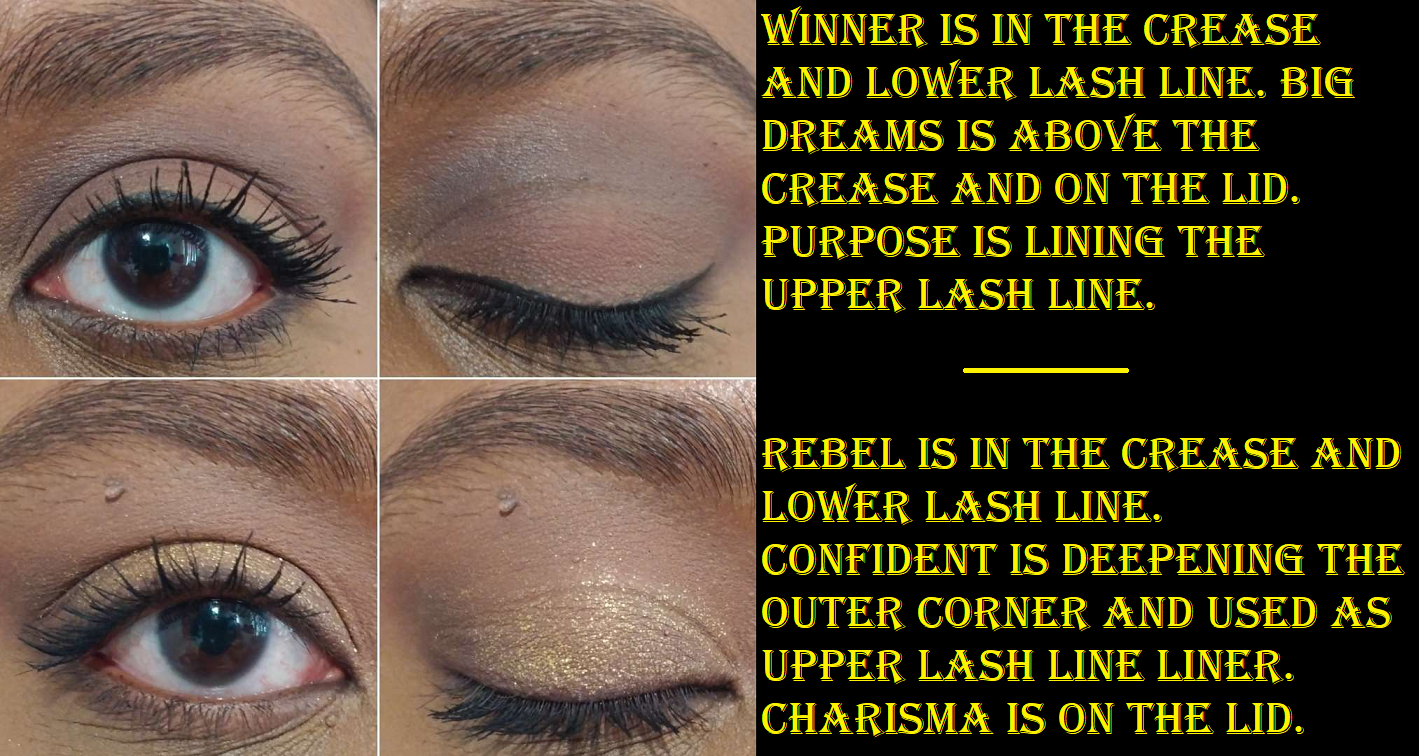
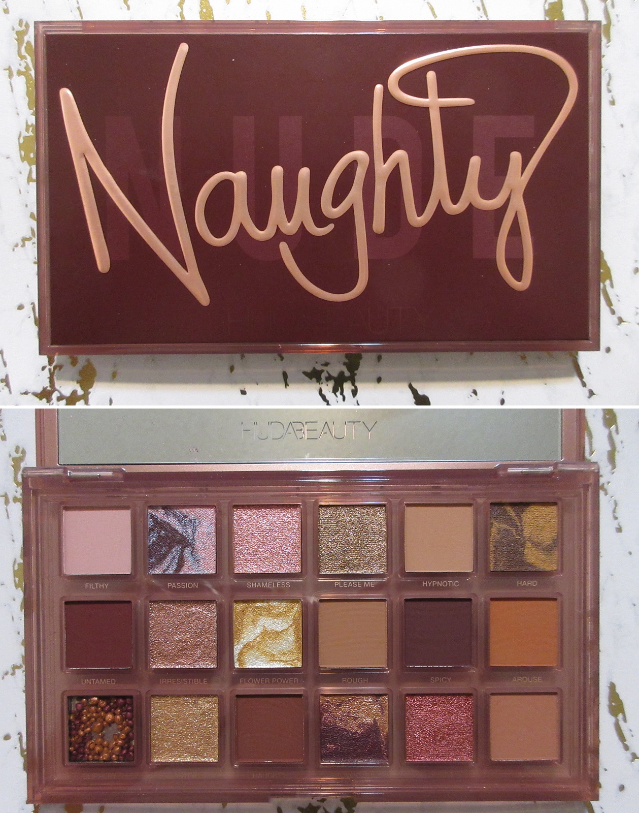
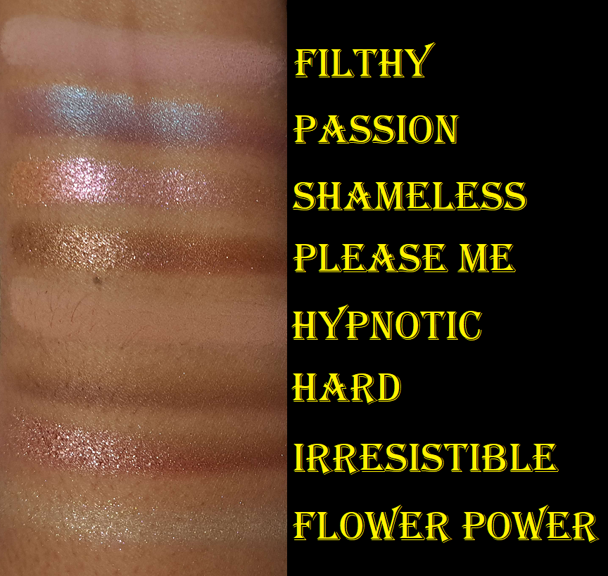
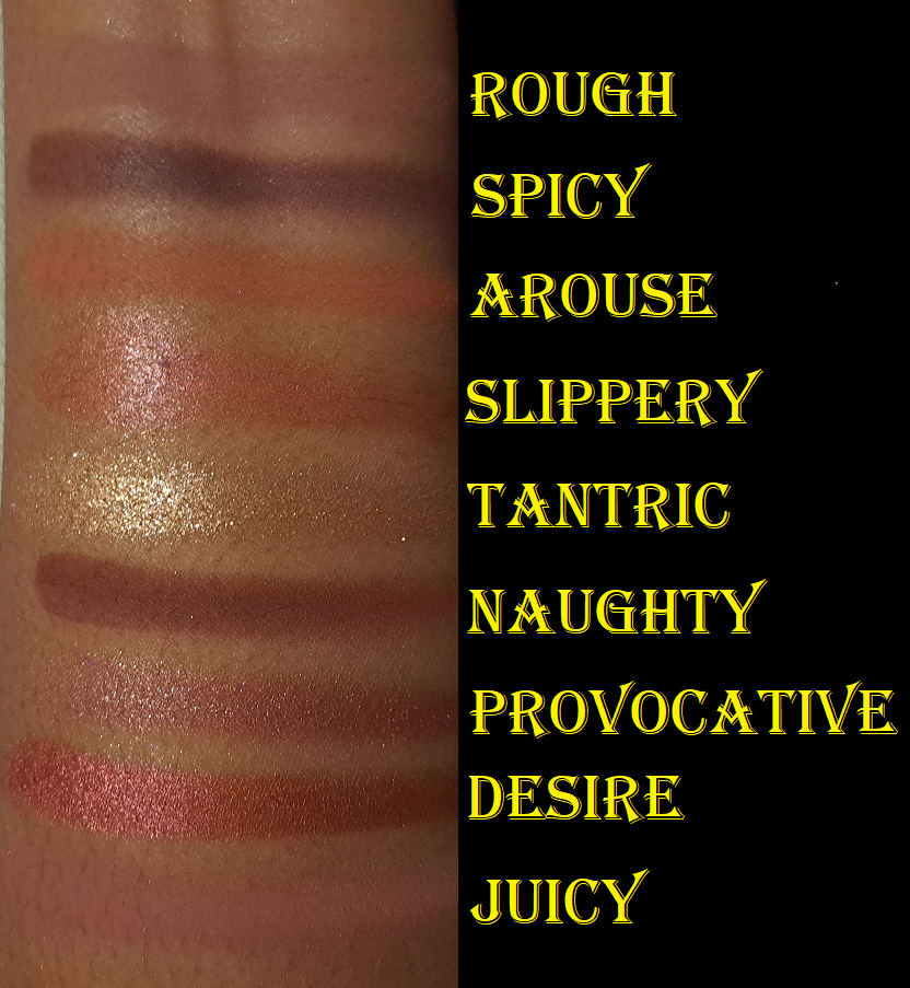
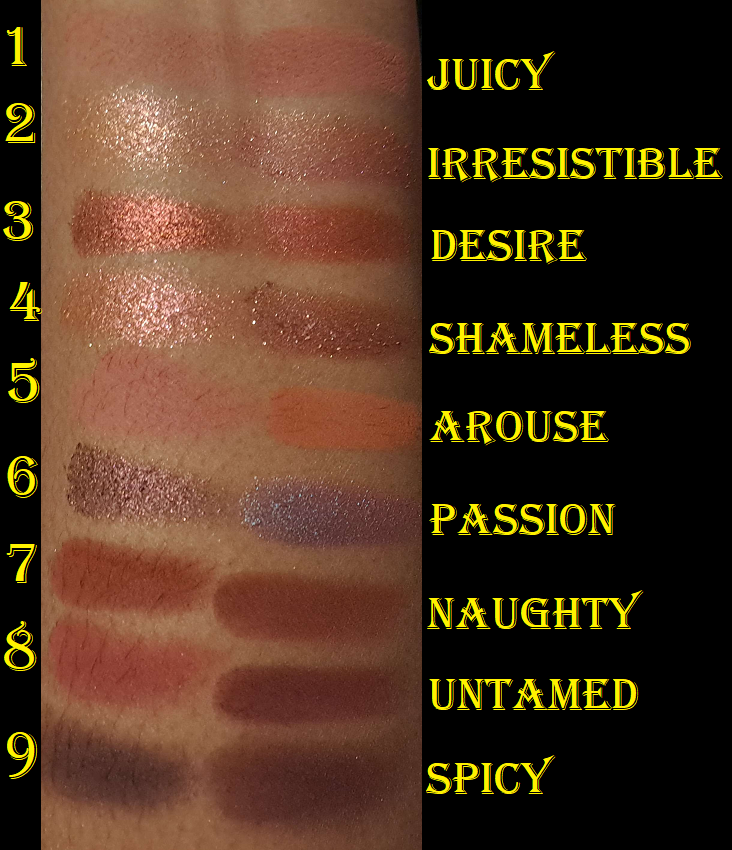
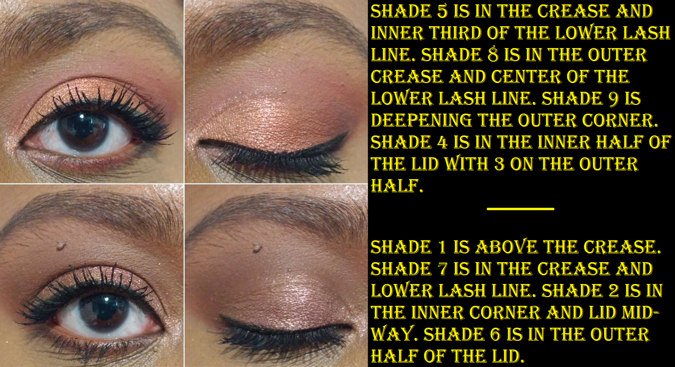
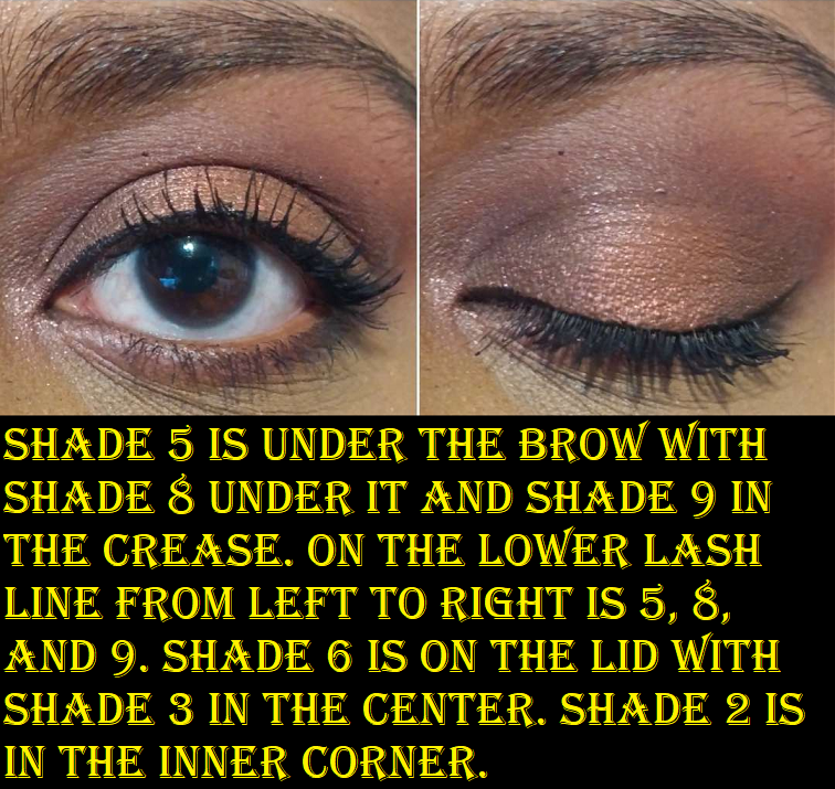
Huda Beauty Naughty Nude Eyeshadow Palette
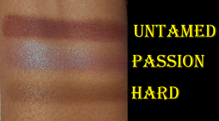
The last photo above has the swatch of Untamed because I accidentally skipped over it when I was doing swatches in order. I also re-swatched Passion and Hard because those shades needed to be mixed/rubbed together more thoroughly to show a solid color. It would have looked unflattering on the eyes to have random lighter and darker lines or patches on the eye if I just applied it like a duochrome.
I have to address the fact that Passion in this palette is like Astral Amethyst Moon in the Pat Mcgrath Huetopian Dream palette. It’s the surprise blue pop in a neutral palette. However, at least Passion is blue shimmer with a burgundy base, and that burgundy color works well with all the other pink and red-leaning shadows in this palette.
I had the Empowered palette first and dealt with Slippery the same way as Manifest It and the weird gel pigment bubble shadow in the Essence Coffee to Glow Palette; I used a cosmetic spatula to mix half of it together fully. It doesn’t turn into anything pigmented enough for me to wear on its own, but it does make a pretty good eyeshadow base for helping the shimmers stick to the eye.
Hard has a creamier feel to it than a standard matte, but it’s definitely still a powder that sets on the lid to a dry finish. The color it turns into basically just looks like my eyelid color. So, I haven’t found a use for it.
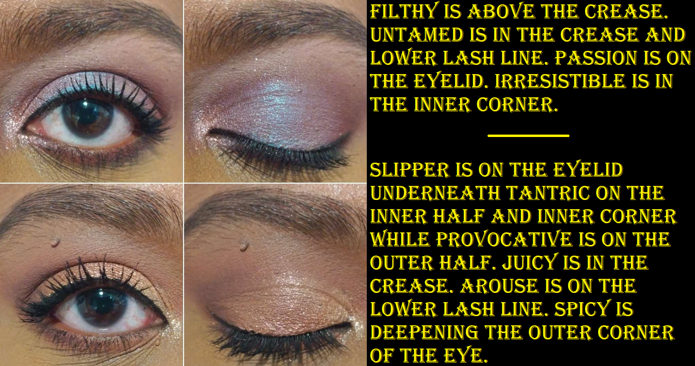
While I appreciate a pigmented and blendable product, the shade Untamed was so difficult to work with. It goes on the lid intensely immediately, even when I use a small amount. If I try to blend the edges, it fades to a dirty dark color that doesn’t show the burgundy tone anymore. It looks too harsh and unblended if I don’t at least try to smooth out the edge. Applying a lighter eyeshadow color on the edge tones it down far too much. Blending it out also wipes too much of it away. So, it’s extremely finicky trying to get the color to show true to how it looks in the pan, not be overblended (which takes 3-5 seconds to overblend) and lose color or look patchy, but also not look like a solid block of color. If I finally get it to look nice, adding a shade to my lid and it slightly traveling higher into the crease forces me to have to play the game all over again to try and fix it and avoid it looking patchy and messy. The time it usually takes me to finish an eye look is the amount of time I have to spend on just Untamed alone to make it look good. Thankfully, after dealing with Slippery and properly swirling together Passion, Hard, Flower Power, and Provocative, the only shadow left in this palette that gives me trouble is Untamed. Regarding the marble/swirl shades, the shimmers seemed the tiniest bit creamier than Hard which made them a little easier to mix evenly.
The five other shimmers are easy to apply, but Shameless, Flower Power, and Tantric are a bit flaky (though not to the extreme of the golds in the Empowered Palette) and I prefer to dampen my brush to apply them. I will get shimmer fallout if I don’t use something like a glitter primer or the Slippery shadow underneath to keep it in place. Dampening my brush works for getting it to adhere, but not for a full day. Another nice thing about these shimmers is that I don’t have to deal with creasing when I use them. As for the seven other mattes, they’re quite pigmented and blend nicely. It’s not as quick to use as Pat Mcgrath or Natasha Denona mattes, but these are still quite good.
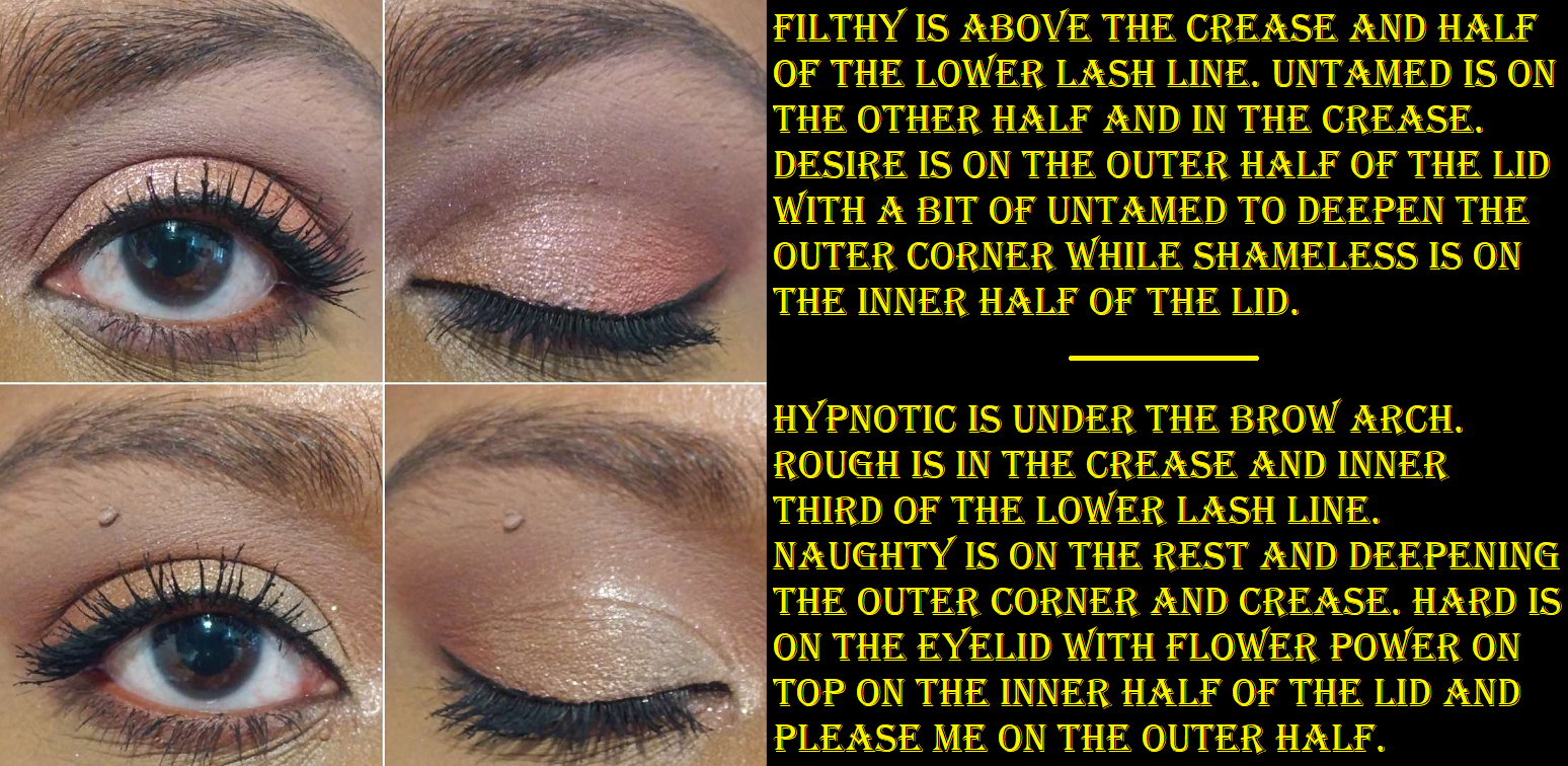
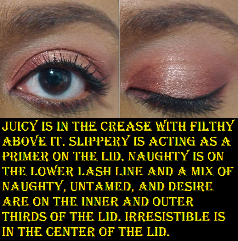
*I accidentally wrote Slipper instead of Slippery. Also, I intended to use Irresistible on its own in the inner corner, but as I continued to dip my brush into the pan to build up the shade in the inner corner, I got confused and started dipping into Shameless as well. So, it’s a combination of the two.
When this first launched, I was instantly drawn to the palette (admittedly the swirl patterns were a big part in that). What stopped me from getting it was my concern with it having too many similar looking shades. On my skin tone, this proved to be true. My second and fourth eye looks above used entirely different shadows, yet they look quite similar. Hard doesn’t show as a color on me. Hypnotic barely shows. Rough shows slightly more. Slippery may as well be a primer. Please Me, Provocative, and Irresistible look similar even in swatches, let alone on my eyes. I was surprised to see the opposite being true for the dark shades Untamed (mahogany red-brown), Naughty (warm neutral leaning brown), and Spicy (dark cool brown) that remain distinctly different as long as they aren’t used in one eye look. In a way, having paid $34 for this palette via Sephora makes up for it.
The other benefit to Naughty Nude is that there are various textures and finishes to experiment with, something I always admired about Huda palettes. However, because these shadows are organized in a way that isn’t as easy to distinguish between these similar colors, it takes extra time to plan out a look. This makes sense for a super colorful palette, but it’s a bit strange when I consider one of the benefits of a neutral palette is normally its easy of use.
This is a nice quality palette, but I’m glad I didn’t pay full price for it. For my preferences, I honestly wish I played with the Nude Obsessions Rich palette below so that I could have realized it’s like a condensed version of Naughty Nude, or at least similar enough. I had that one a whole month before purchasing Naughty Nude, but hadn’t used it beforehand.
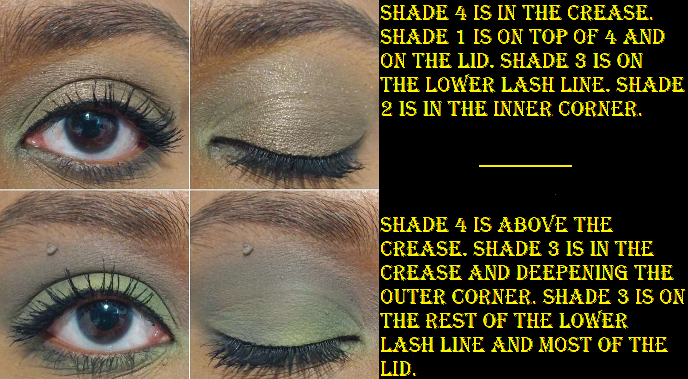
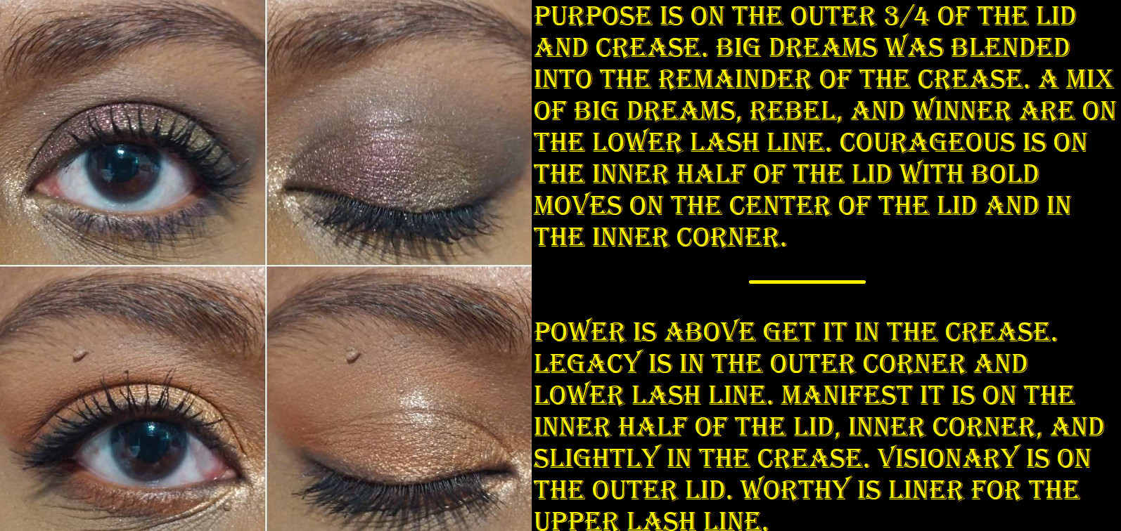
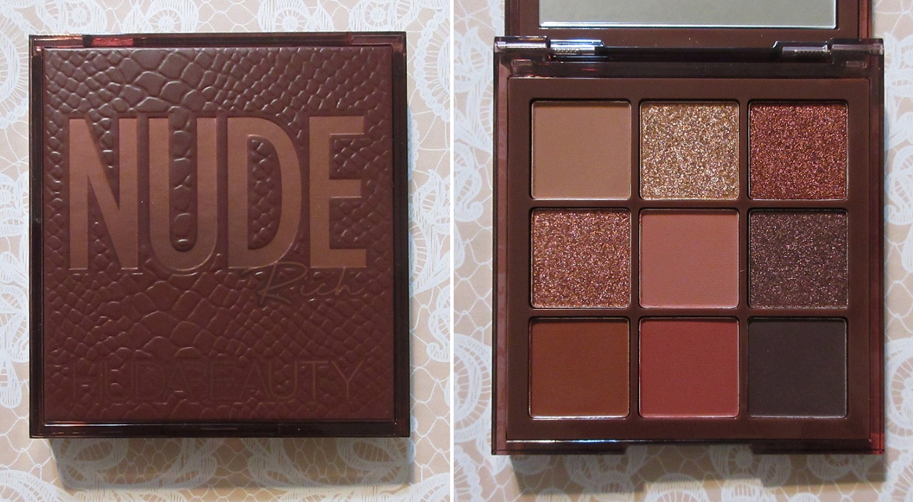
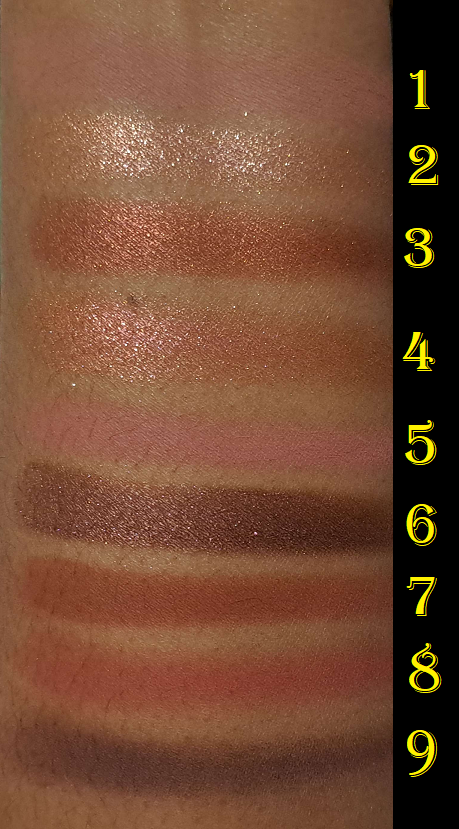
Huda Beauty Nude Obsessions Eyeshadow Palette in Rich
This is the oldest (in terms of release date) of the palettes I’m discussing today, but it’s my favorite of the bunch. The majority of the 9 colors are distinctly different from each other. The quality is just as good as the full size palettes, though perhaps slightly less pigmented. I don’t mind this though because there’s more control of the intensity of the eye look this way. Also, I think most of the shadows in the Rich palette are more shimmery and reflective, something I also like, and in shade tones I like even more than what’s offered in the Naughty palette.
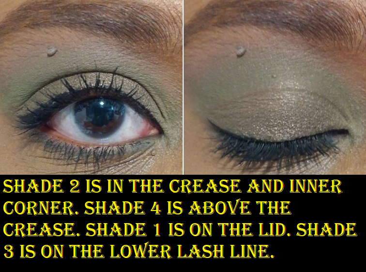
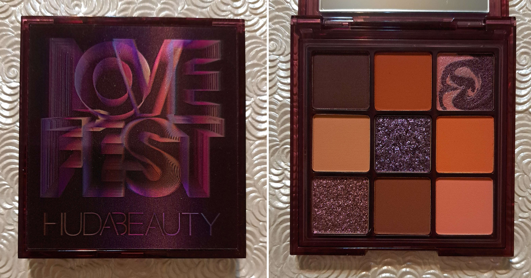
Huda Beauty Lovefest Obsessions Eyeshadow Palette
This was an unexpected addition to the post. Sephora had this and many other Obsessions palettes for half off during their Labor Day sale. It’s always the same song; several of the colors appealed to me, but I didn’t want to get it for full price because the orange shades looked too similar and I figured the two lightest mattes could look identical on my eyes. Plus, by now I certainly had all the warm toned shades (especially oranges, pinks, and browns) I could possibly want from the brand. However, I couldn’t resist that price.
I was correct that I can’t tell Shades 2 and 6 apart when I use them in the same eye look. Thankfully Shades 4 and 9 are different enough. The mattes perform just like my other Obsessions palettes. Shade 3 is a low impact shimmer that is smooth to the touch and basically looks like a satin on the eyes. Shade 5 is a pretty duochrome that brings the sparkle and drama that I want. Shade 7 is a medium pink that works to brighten the inner corner of my eyes, but also makes for a pretty lid shade. I’ve had this for the shortest amount of time out of all of these reviewed today, but so far so good!
Just as I was finishing this post, I remembered there are in fact a few extra items from the brand(s) I haven’t reviewed. From Wishful I have the Honey Whip Peptide Moisturizer that I’m waiting to open once I finish up one of my current moisturizers, a mini of the Thirst Trap Juice HA3 Peptide Serum that I used a few times and didn’t notice it doing anything, and a ton of samples of the Eye Lift & Contour 1% Bakuchiol & Peptide Serum which I still haven’t tried. There’s the GloWish Luminous Pressed Powder I stopped using and didn’t finish testing. I also have a deluxe sample of the Easy Bake Loose Baking & Setting Powder, but it’s in a color that’s too light for me. I could try to use it despite that, but I feel that it would throw off my ability to see the results properly. So, I don’t see myself reviewing any of those anytime soon. However, there are two things I intentionally skipped reviewing that I decided I will include.
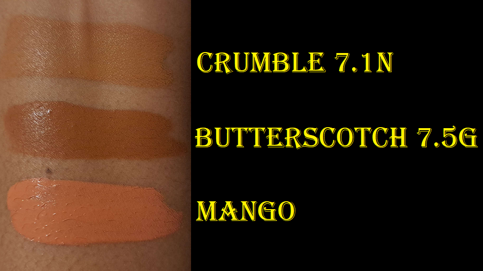
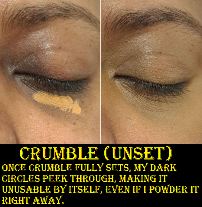
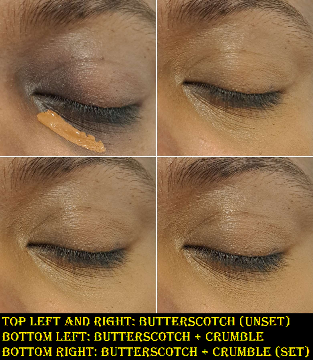
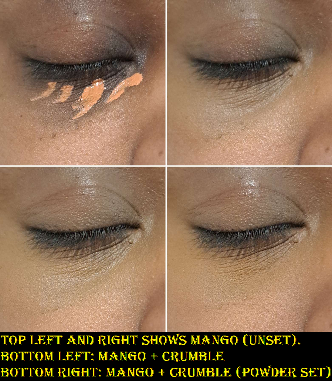
FauxFilter Luminous Matte Concealers in Crumble 7.1N and Butterscotch 7.5G and FauxFilter Color Corrector in Mango.
The reason I wasn’t intending to post about the concealers is because base products don’t excite me to review. It’s only when I find concealers comparable to my holy grail ones that I want to share my results with everyone. In addition, this is a bit of a regret purchase. I knew Crumble wasn’t full coverage enough to adequately conceal my extreme dark under eye circles and that it made my under eyes look about as dry as Tarte Shape Tape, but I purchased an additional shade anyway. I was more intent on trying to solve the mystery of how to make it work instead of asking myself if this was going to add something of value to my collection. Considering I can get more coverage from a single shade of the original Tarte Shape Tape (Deep) over buying Crumble and Butterscotch to mix with from Huda, it should have been obvious what I needed to do, but I somehow convinced myself finding the perfect color combination would make the Huda concealer magically suit me better.
Using the under-painting method, like with my Givenchy concealers, I’m able to get the coverage level I want, but at the expense of having a shade match that is darker than my cheek area. So, I don’t wear this combination on light makeup days that I plan to skip foundation. I typically match my foundation to my forehead which is darker than the lighter parts of my face, but lighter than my areas of hyperpigmentation. I either get this middle-ground depth that’s a combination of the various colors on my face, a slightly darker shade for summer, or a color that matches the lighter parts of my face that typically works after winter. So, I can use the combination of Crumble and Butterscotch with my middle-ground and summer foundations. The reason I took a break from using these concealers though is the fact that I can get similar coverage level to my combination of Givenchy concealers, with it looking and feeling less dry. The Huda concealers at least have the benefit of being long lasting, provided I pair it with the right powder and ensure that more is applied in the beginning if it starts fading within the first five minutes and any creases get smoothed out a second time before more powder is added. That process of keeping an eye on it in the beginning and making adjustments early on can get me a good ten hours of wear. If I don’t pay enough attention to my skin absorbing some of that product or not smoothing out those creases, it goes downhill quickly where I might only get six to seven hours where it’s significantly faded and looks awful. So, because of the dryness and mindfulness required, it’s taking a backseat until I finish up the ones from Givenchy.
As for the Huda Corrector, it made sense that if the concealers looked dry, the corrector should have the same finish, yet I bought it anyway. I was too intrigued by the Mango shade to skip it. Every brand of color corrector I’ve seen has a pink that’s too light for me to use and/or an orange that’s very deep and practically as dark as my under-painting shade. They’re also either so opaque that they don’t blend in with the rest of my skin or they’re so sheer that they don’t hide enough. This is the first corrector I’ve ever seen that’s deep peach/deep pink-orange with decent coverage and in liquid form. I’ve seen some cream ones that come close, but creams crease too much under my eyes. So, I’m able to use Crumble if I have this corrector under it. I even use Mango sometimes by itself and in other areas with discoloration. Of course, I still have the dry issue and needing to babysit it in the beginning, but because it camouflages well enough to my satisfaction, I continue to use this from time to time unlike the concealers.
Now, I consider us caught up on my Huda and sub-brands collection! If anyone wants a review of one of those specific items I mentioned that I own but don’t plan to post about, just let me know (via comments, email, or Instagram) and I’ll reconsider it.
That’s everything for today! Thank you for reading!
My previous Luxury Makeup postwas months in the making, and the next one was heading down that road as well. Rather than take a few weeks off of posting, which would have been necessary to complete it, I decided to split it into smaller parts. Today’s post will be dedicated to the high-end/luxury eyeshadows I have yet to review on this blog.
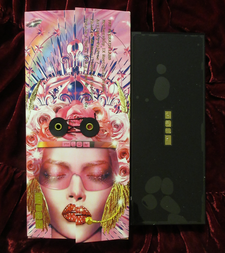
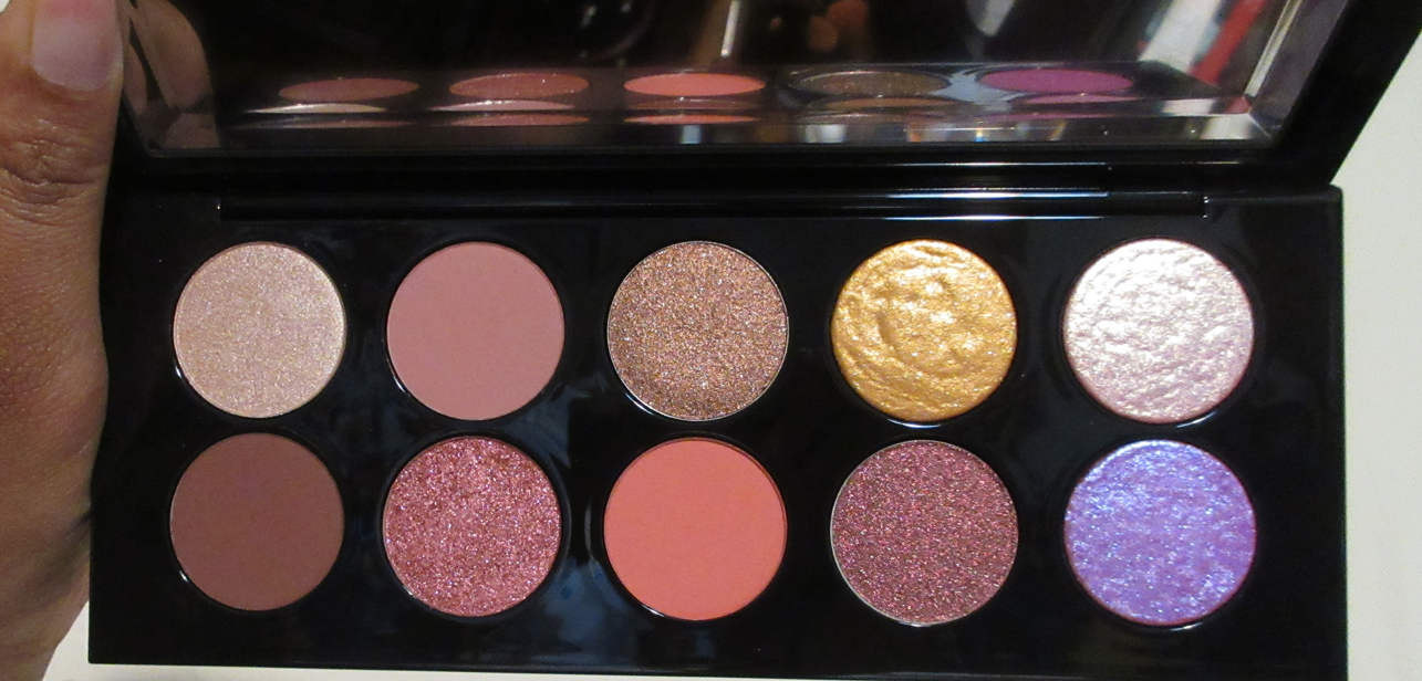
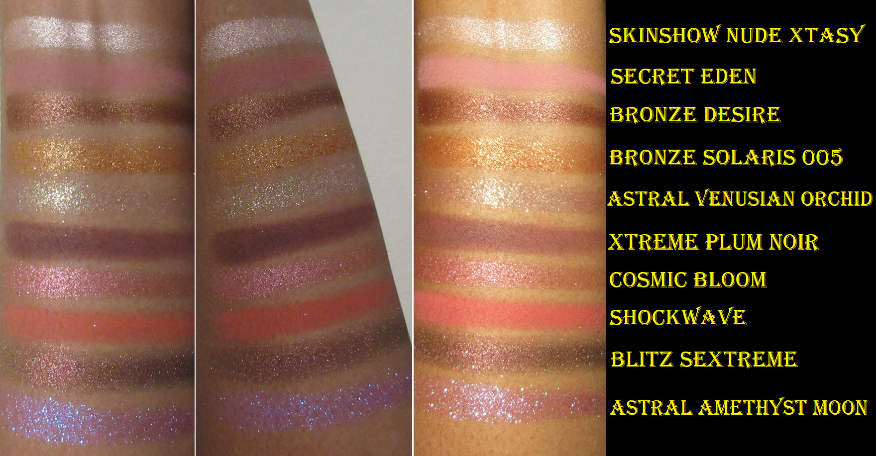
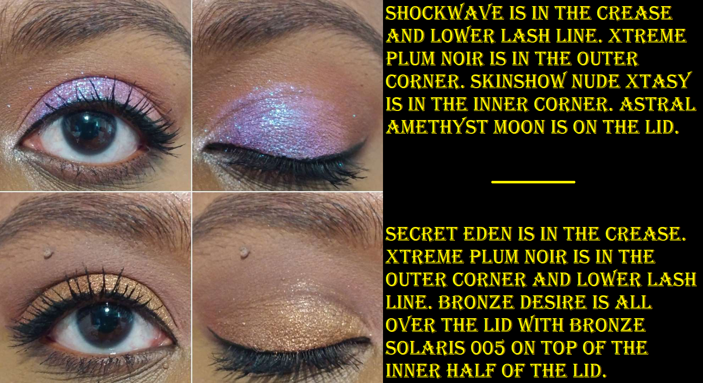
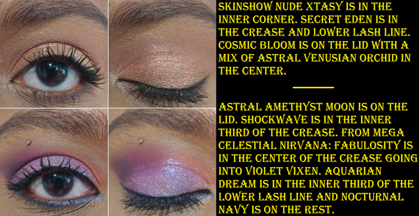
Pat Mcgrath Labs Mothership IX: Huetopian Dream
Astral Amethyst Moon is the real reason I wanted this palette, and perhaps 3-4 other colors. Because I felt like half of these shades were similar to what I already own from Pat Mcgrath, I told myself I wasn’t allowed to get it unless the price dropped to $80 at most. Well, at the end of June, Huetopian Dream was on sale for the lowest I’ve ever seen and it was under my maximum price, so I finally bought it!
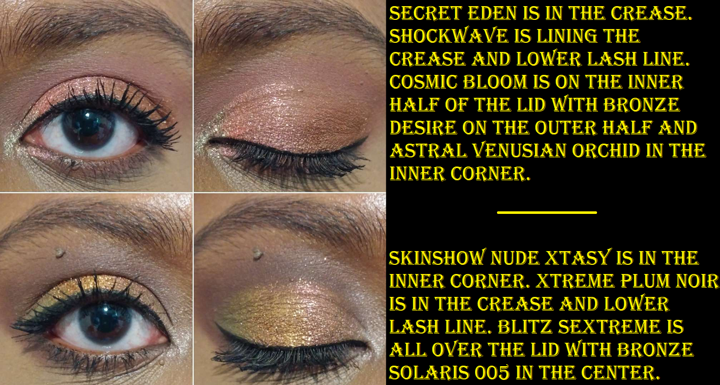
The mattes are the high pigment, blendable, smooth, fantastic quality I’ve come to expect from Pat Mcgrath. Skinshow Nude Xtasy is the typical fine shimmer satin-feeling highlight shade. The three baked shadows are the flaky, slightly rough feeling (Bronze Solaris 005 is a bit smoother), dry, high impact shimmers that look fantastic, but are best applied on top of glitter glue or with a dampened brush to minimize fallout. I love the colors and intensity of the baked shades, though the tricky application process and fallout issue prevents me from using them as often as I should.
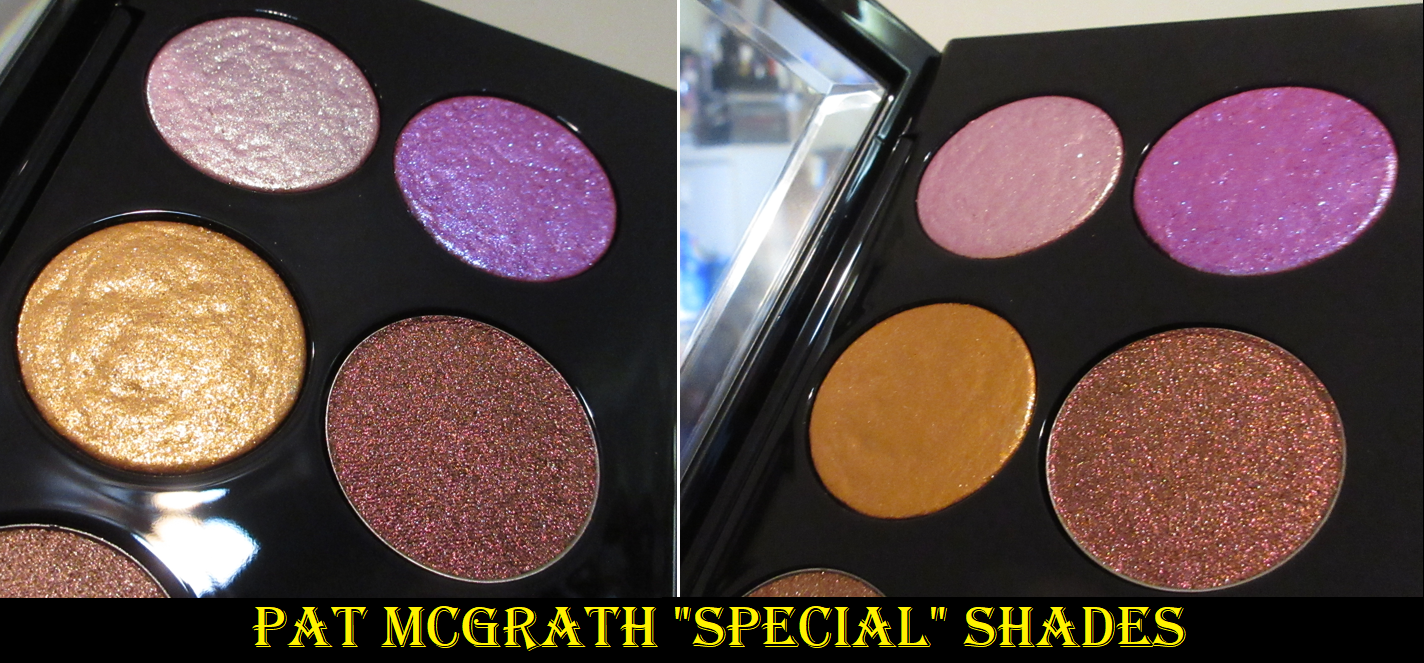
There are three shadows that surprised me though. Blitz Sextreme is less opaque than I expected based on my experience with the Divine Rose 2 palette’s Sextraterrestrial shade. Sextraterrestrial was so good that it kept me from buying the closest Clionadh equivalent for several years. I am dissatisfied with how Blitz Sextreme looks on my eyes unless I use glitter primer, which I had to apply in the second eye look below. It wasn’t until I compared the two “triochromes” side by side that I realized they’re different in texture as well. Sextraterrestial is a baked shadow whereas Blitz Sextreme feels close to gel-like. It feels like a Juvia’s Place multichrome. Perhaps it’s not a matter of skimping on the pigment as I originally suspected. Typically, when a brand uses this kind of formula, they have a black base to intensify it or at least some other base color that will enhance the multichrome, whereas in the baked form the pigments are practically concentrated. So, I wish that when they switched to making a triochrome in a non-baked form, they did something so that I wouldn’t have to help it along by packing it onto glitter glue myself. Perhaps the target PML customer would appreciate a more subtle multichrome, but that’s definitely not me. Clionadh proved with their Earth Vibrant line and more neutral colored Stained Glass shadows that it’s possible to make “wearable” duochromes and multichromes that are toned down based on color, while being fully opaque. When applied as is, Blitz Sextreme is an example of the kind of subtle I don’t like. To me, if a product like that is too weak to be able to see the color shift well enough, what’s the point? Without a shift, it may as well be a regular shimmer, which would be more affordable to make anyway.
The other two that were unexpected were Bronze Desire and Cosmic Bloom which also felt more like a gel rather than creamy feeling for PML’s “typical” shimmer formula. I had issues with them creasing in the beginning, but two months later, these feel a lot less wet. With it being less wet, the creasing isn’t as prominent either. I still try to keep these shades strictly on the lid though and avoid the crease, but I’m happier with their performance now. It was very strange that this happened at all though because I don’t recall anyone saying that in their Huetopian Dream reviews when they first launched. Perhaps it’s just my palette, but I’m glad it’s not an issue anymore.
Overall, I like this palette. I definitely would have been unhappy if I paid full price though. It’s not to say the quality is bad. I think it’s very good quality with a few little differences from past palettes. The thing that I have trouble understanding though is Astral Amethyst Moon’s presence here. It’s supposed to be the star of the palette considering it’s the most colorful shade with the brightest pop, even surpassing the triochrome. However, the other shades in this palette don’t fit with it. They don’t play off or enhance that color in any way. Astral Amethyst Moon is like a powerhouse of vibrancy, whereas everything else is too soft to support it. I thought Shockwave would be the color to do it, but it’s so much more muted on my eyes, and really not that much deeper than Secret Eden. Xtreme Plum Noir at least gives it some drama because of its depth, but when I build it up, it looks more brown than plum which isn’t as exciting. In my final eye look above, I used last year’s holiday palette to give an example of the type of colors I expect to help support this shadow. I wish this shade wasn’t tied to this largely pink-neutral color story. If I’m in the mood for those tones, I’m going to completely ignore Astral Amethyst Moon when I open the palette. If I’m doing an eye look and want a colorful vibrant lid shade, it’s unlikely I’m going to whip this one out just for that one shadow. It would have been better off in a quad, but whoever decided to put it in this palette got me to spend far more just to get it. Congratulations to them. I couldn’t let that shadow go, and honestly, I still don’t regret getting it at the reduced price.
Surratt Beauty Artistique Eyeshadow in Dore and Noir Le Plus Noir
These are normally $22 each, but for some reason these particular shades were on sale on Surratt’s website for $8.80 each instead. I was willing to pay the extra $5 shipping in order to try and see why these eyeshadows are raved about so intensely among the luxury beauty community.
Now that I’ve used them, I understand the hype. These remind me of Suqqu shadows in texture, and I believe Surratt eyeshadows are made in Japan as well. Both brands’ eyeshadows are thin, but after the initial layer with Suqqu, it doesn’t really build up beyond that. These Surratt shadows build up to a stronger intensity if I want them to, while still being just as blendable. However, as great as the formula is, it’s not so much better than the rest as to be worth it to me to spend $22 per eyeshadow if it’s not a multichrome. If I see more of these available online at a reduced price, then I might be interested in getting a few more.
Lisa Eldridge Liquid Lurex Eyeshadow in Titania, Zora, and Liza
Considering what I just mentioned above, it’s a bit funny how I don’t look at single eyeshadows the same way when it’s in liquid form. I guess it’s because I am rarely tempted by them, so if a brand can get me interested enough in theirs to buy it, they deserve the money they’re charging for them.
Other than these from Lisa Eldridge, and Sydney Grace, I think I hadn’t purchased liquid eyeshadows since the Stila Suede ones launched (not to be confused with the 2023 relaunch) in 2019. Technically, I do have Danessa Myricks ColorFixes (from a TrendMood box), but they’re still unopened. What made me interested in these is that they looked stunning on the models on the website, and reviewers said these don’t crack or flake, they last all day, and despite looking packed with shimmer they don’t have fallout which makes them great to incorporate in eye looks or for one-and-done looks. I happened to be caught right at the perfect time of wanting a satisfactory single-shadow look, which I normally am not interested in doing.
Essentially, what everyone said about them was true. This is a fantastic formula. They blend in with each other very well and on top of other brands’ shadows. If I use one even layer of product, I don’t get sparkles under my eyes as the day goes on. If I pack it on a bit too thick, then I do notice significantly more glitter particles under my eyes at the end of the day. Also, these shadows set and don’t budge if left alone, but if I touch my eyes I will still get sparkles on my finger though the base color doesn’t come off until I’m ready to remove it. Melt’s Gel Liners can be used as eyeshadows and eyeshadow bases, but the Lurex has the benefit of feeling like nothing on my lids. I don’t get any tightness. Melt’s aren’t stiff either, but there is more of an awareness of it on my eyes, unlike Lisa Eldridge’s that I forget I’m wearing.
I purchased Titania at the end of last year, then Liza when Lisa Eldridge products began being sold at Selfridges, and then recently Zora finally restocked on the official website. So, I now have all the colors I wanted.
Also, Titania and Liza are sentimental names for me! Honestly, that did partly influence my purchases. Plus, Zora is close enough to Zoro, who is one of my favorite characters from One Piece.
As a bonus, I wanted to show some eye looks combining everything in today’s post.
I hope this has been helpful.
Thank you for reading!
As a last minute note, I wanted to say that I have next week’s post auto-scheduled and ready to go. However, the forecast for Idalia hitting Florida and the level it’s projected to strengthen to, if I’m out of electricity and internet for a significant time or my area sustains damage near to what Hurricane Ian did last year, I might not be able to post for a while.
Update: Thankfully the Hurricane missed where I live and we just experienced the outer bands, which did not knock out our power or internet!
I’m posting at a slightly earlier time than usual because in one hour, Sydney Grace’s annual week-long Christmas in July event will begin! Everything in this haul was purchased last Black Friday, but that was because I skipped last year’s Christmas in July sale. The discounts look even better this year, so I wanted to show some of the unreviewed products from the brand that I haven’t featured yet in case anyone is interested in seeing them. My initial Sydney Grace review with a ton of eyeshadows can be found here, as well as the Temptalia collab here.
This event is typically the one time of year I make a purchase. I checked that everything in this post is still available, with the exception of the Sweet Indulgence Palette that launched during the previous sale and was on clearance by the time Black Friday rolled around. This year’s launches will be the Love’s Journey palette, Heaven on Earth palette, and Raspberry Kiss palette. If I decide to shop the sale, it will most likely be Day 2 where all palettes (including Love’s Journey, but I don’t think Heaven on Earth or Raspberry Kiss), cream shadows, and more are 40% off.
Tropicolor by The Fancy Face Eye Shadow Palette
Tina is one of my favorite YouTubers, so I wanted to support her collab like I did when she worked with Oden’s Eye, but this palette is very blue heavy and I’m still in a weird like/dislike relationship with blue eyeshadow. For this reason, even though I’ve had the palette since November 2022, I didn’t start using it until June 2023. Whenever I opened it up, my eyes were instantly directed to those blues and I’d get the urge to use a different palette instead. Since I knew the Christmas in July sale was coming up though, I decided to just push through and start playing. I initially felt like I had no idea how to use these colors together, besides monochrome color schemes, but every time after that was easy! My favorite shades in this palette are surprisingly the warm neutrals and unsurprisingly Doctor Bird and Lignum Vitae.
This palette has all the features I love about Sydney Grace eyeshadows. The mattes are pigmented and apply opaquely while still being very blendable. The satins are smooth and opaque as well. The binding in the shimmers are such that they adhere to the lid without getting a bunch of fallout specks everywhere. They don’t require me to wet my brush. They are pigmented with medium shimmer reflectivity, and opaque. They apply smoothly to the lid without leaning on a bunch of slip ingredients (the “cones”) to make it easy to spread. I love the tactile feeling of dimethicone in products, but the higher the percentage of it and the other -cones, the easier they are to crease on me. These eyeshadows work well on me with all my typical primers: Gerard Cosmetics Clean Canvas, Coloured Raine Paint Base, MAC Paint Pot, and Urban Decay Primer Potion. However, I have to be careful not to have an excess of the Paint Pot on my lids or else the shadows will move out of the crease. Too much wetness from an eye base will mess with the longevity.
Some other things to know is that Doctor Bird is a bit flaky, but not enough to cause shimmer fallout on the eyes once it’s finished being smoothed onto the lid. I still don’t need to apply this shade damp. The reason the texture is like this is because it’s a chromatic shadow and Sydney Grace’s pressed multichrome formula is the flakiest of the brands I’ve tried. So, it makes sense that this shade would have a bit of that texture. Waterfalls is chunkier than the others, but again, it’s just a tactile thing and doesn’t effect performance.
Cocoa Beans is a deep rich brown that is more on the buildable side than the other mattes, specifically for being able to control the depth it provides. I’m actually quite impressed!
In my swatches, it’s admittedly hard to see the tone difference between Waterfalls and Rainforest, so I included the photo below.
Besides the blues, the only other aspect of the palette that isn’t my preference is Cane Fields being such a blue leaning green. I love yellow leaning, straightforward greens, and even bluish greens if they’re deep enough. However, I understand that because of all the blues in the palette it makes sense to want to have greens that’ll merge the cool shades with the warmer ones.
If you’re like me and love most of the color story, but are a little put off by the arrangement, remember that these pans are removable. I rearranged mine by booting the blues to the bottom row and now I feel a lot more excited when I open the palette! I could also just put these in my giant palette with my other depotted Sydney Grace eyeshadow singles or switch out some of the shades for other Sydney Grace singles, but rearranging them was enough of a change for me. Now, I’m able to see the beauty of it. I put the shade names on label stickers on the bottom of the pans, so I can always put them back in their proper places.
Sweet Indulgence 9 Pan Palette
This palette released around the same time as Colourpop’s Ticket to Dreamland. I decided that between the two, I’d rather have Sydney Grace’s formula, so I was glad I eventually got my hands on this since that palette was discontinued by Colourpop as well.
I have to be in a very particular mood to want to wear pinks, and these in here are pretty! Gumdrop is quite the attention grabber, but definitely not a unique shade, and Sherbet is objectively a beautiful tone, but I don’t want to use it with any of the shades in this palette. I like Sweet Cakes, but I don’t need a second deepening shade with Sweet Tooth in there, so I replaced those shades with Deliverer (purple), Lost Princess (red-orange), and Turtledoves (champagne). Now, it has a candy and creamsicle vibe going on!
Even though this palette is discontinued, there are tons of single shadows still available from Sydney Grace that are similar enough to create a dupe version.
Individual Eyeshadows in Be the Sunshine, Herky Bird, and Rustic
The label on my eyeshadow pan says, “Be My Sunshine,” but the website name is “Be the Sunshine.” In my order confirmation email, the item has both names.
I didn’t intend to purchase coordinating eyeshadow singles. At the time, I just wanted eyeshadows that weren’t repeats in my collection and could feed more of my green obsession. It was a happy accident! I love these shadows together and they perform exactly as I’d expect from this brand. There’s nothing else really to say other than Rustic is a satin/shimmer and the other two are pressed pigment shimmers. So, I’m able to use Rustic almost like a matte and it doesn’t crease on me.
Cream Shadows in Sunset Glow and Deep Love
I previously only used Sydney Grace’s multichrome cream shadow. Once the texture got worse, over time, I really didn’t like it. So, I didn’t dive further into the line. However, for the multichromes specifically, they changed the tube size a few years ago and increased the shelf life. Since I’ve heard nothing but great things about the cream shadows overall, I decided to give them another try.
How I use them is to pour some out onto the back of my hand and take a flat concealer brush to spread them onto my lids with more precision than, say, my fingers. If I’m using both colors, I try to let the first dry before adding the second. I also try not to blink too much if using one as an all-over-lid shade so that it doesn’t get bald spots or patches while drying. If it does lose opacity in a spot, the brand recommends rubbing them. I have found it easy to just add a little back on to the spot in question. These layer nicely and I don’t get any cracking of the eyeshadow and mine don’t add extra texture. They blend well into each other and still look great on top of powder eyeshadow. I can even add powder shadows back on top without it looking strange.
In addition to lid shades, these work nicely as liners. These are fairly lightweight, even more than the Melt Gel Liners. They’re not waterproof, but they hold on very well and don’t fade on me. The shine dulls down a little towards the end of the day, but they have quite a long wear time. If I didn’t love the ease of using powder shadows so much, I would absolutely purchase additional colors from Sydney Grace. So, I recommend them to cream eyeshadow lovers.
That’s everything for today! I hope it has been helpful!
Summer is nearly over, at least in the beauty world. I believe Suqqu’s Fall Collection (or Pre-Fall) is coming to Selfridges on July 27th. So, I wanted to hurry and finish this post in case anyone is interested in getting the limited edition items while they still can!
Suqqu Pre-Summer 2023 Pure Color Blush in 138 HYUUGAAOI and 139 KAFUU
I watched several videos to help me decide which of the two Pre-Summer options I should get. Of course, I ended up with both, but my initial hunch was correct. 138 Hyuugaaoi is a copper-orangish red which appears as more of a blush tone on me than 139 Kafuu’s bronze-brownish pink. I do like them both though.
I was reluctant to purchase Hyuugaaoi out of fear it would be too similar to 132 Momijigari from last year’s fall collection, but they are definitely not the same. In fact, it’s a bit in reverse that Hyuugaaoi has a shimmery blush with a matte yellow strip, whereas Momijigari has a deeper, more vibrant and matte red blush with a shimmery yellow strip.
In the photo demonstrations that will come later, I used a mixture of the first and second strips as highlighters to show the way it looks on the face as intended. However, I normally ignore the highlighter parts of all the Pure Color Blushes because they’re too light for me unless I mix some of the blush shade in with it to add depth.
Above are the blush portions alone to show how similar they look. Below are two different attempts to take pictures of these blushes, but they’re a lot harder to see on my camera due to how reflective they are. I like them both, but Hyuugaaoi is more of my style.
Also, I couldn’t help but think about the Rms blushes when taking photos of these. The ones from Suqqu are surprisingly more shimmery and have nearly as much reflection strength as my more subtle highlighters. They’re not too shimmery for my taste, but I also try not to build up the color to the maximum level, which would increase the amount of reflective particles that come along with it.
These have more in common with the BareMinerals Blonzers, which are holy grail blushes in my collection. The shade Hyuugaaoi is like if Kiss of Copper and Kiss of Rose were mixed together. The BareMinerals Blonzers are actually more reflective, but have a more pigmented base and the original three are smoother as well. So, not only do I like them even more on my skin than the ones from Suqqu, they also show up easier on camera no matter the lighting situation.
As is the case with all my Suqqu blushes, I don’t have any longevity issues. I recommend these, though I still prefer the Melting Powder Blush formula and the matte Pure Color blushes over them. The upcoming fall release has shades more along the lines of Kafuu coming up, so I don’t plan on getting any of them. I have enough brown blushes now. I don’t plan on buying anything from the Anniversary Collection coming in September either.
Suqqu Summer 2023 Pure Color Blush in 140 IROMADOI
I knew this would never work for me as a blush, but I was so excited at the prospect of this potentially being like the limited edition Melting Powder Highlighter that was released without having another shade option available. It looked peachy in the photos and videos I saw a day or two before purchasing, by people who had it in PR or took photos of them in-store in Japan, but it looks chalky beige on my finger, let alone my skin tone. It didn’t matter if I rubbed the entire surface or just into just the darkest parts of the swirls. It always came out the exact same pale color.
The texture was also nowhere near like the highlighter. It was far too light for me to use as a highlighter, so this is actually already out of my collection. However, I wanted the gorgeous iridescent packaging, so I popped the pan out and swapped it for the standard packaging instead. That’s why blush 138 and 140 are not in their correct compacts in the first photo at the top of this review. I was able to at least keep the packaging and still have the makeup inside be usable. That’s one of the things I love about Suqqu. The glue remained tacky enough to be able to do this.
Suqqu Signature Colour Eyes Eyeshadow in 125 Hikarimai
The duochrome in the bottom left of the compact is the main reason I wanted this palette. It looked different from duochromes in my collection, I also wanted the packaging, and I didn’t mind having that dark shade as well. The eye looks on everyone I saw long after the launch is what made me decide to pick it up weeks later. Unfortunately the top left topper shade does hardly anything for me. It took ages to build up that shade in the inner corner of my eye, even after wetting the brush. It’s meant more for scattered effect looks. I depotted that and swapped it for a different Suqqu shadow (as seen once again in the group product photo in the beginning). The tan brown is pretty much my eyelid color. I can use it to blend out the darker shades and set my eye primer, but that’s about it. The dark color doesn’t stick well to my eyes. When I used it solo on my lids, I kept getting a bald spot where it just refused to stay looking opaque. It’s just a bit too sheer. It’s hard to use it in the outer corner as well because it fades away when I blend too much. The green duochrome is more subtle than I’d like, but it’s pretty. It’s still the star of the show. Overall though, this color story just isn’t meant for someone of my skin tone. In at least swapping out the pale shimmer pink, I’m able to create looks I like more. And I know not to use the dark shade except in the outer corner and when I don’t mind it fading. Which means I’m likely only going to use it to take quick photos or solely reach for this quad for the green shade.
Bonus: Suqqu Treatment Wrapping Lip Gloss in 02 Caramel Beige and 05 Candy Pink
The Summer 2023 Collection has two different shades of lip wrapping glosses that were released: a pearlescent pink and pearlescent blue that were intended to mimic the look of white and black pearls. I believe those might have been too cool toned to look good on me considering the warmth of my skin’s undertone, so I skipped getting them. However, I can still give my thoughts on the formula because I have two of them from the permanent range.
I first purchased 05, and loved it! My lips feel moisturized when I use it and I love the color when it’s built up. I have the issue that if I wear this for too many days in a row, my lips will start to dry out. This is still better than some products that cause my lips to peel before the day is even over. It’s just a problem I have with the majority of lip products containing color, but this speaks to the nourishing aspect of this product that it takes a few days before I need to switch to a Sara Happ balm, Avene Lip Cream, even just basic Vaseline, etc.
I wanted shade 02, and had to wait for it to be restocked, so that I could have a neutral shade that I wouldn’t feel was necessary to build up. And, in fact, it looks a little too light and milky on my pigmented lips to wear this particular shade alone if I’m trying to build up to a visible color. It looks nearly clear if I wear it in a normal layer, which means I can wear it that way with any makeup look without it clashing. It also looks good when paired with a lip liner.
I’m a big fan of this formula now and I was really loving the Lisa Eldridge Gloss Embrace Lip Glosses until this one quickly dethroned it as a treatment, though not necessarily as a gloss. Suqqu’s shine level with these glosses isn’t Fenty or Pat Mcgrath level or anywhere as much as a lip oil, but it’s a decent amount, even if a little understated.
This, in my opinion, is somewhere right in the middle between not being thin and watery, but also not being too thick or gloopy. It has just enough sticking power necessary to grip onto the lips and form a layer that lasts fairly well and there are sometimes even remnants of it after eating. I still reapply, but I can still feel the moisture even after the glossy layer comes off.
This is a bit pricey, but I would consider repurchasing it if it came in a clear version in the future. Then again, the Ami Colé Lip Treatment Oils agree even more with my lips (I can use it repeatedly without the chapping issue), so I may just stick with that instead.
I intend to make this a quick review of the two latest additions to my Viseart collection. I bought the blush duo during last year’s After-Christmas sale via Beautylish, but I’ve only had the mini Coy palette for two weeks.
Viseart Petites Shimmers Palette in Coy
I’ve wanted the full-size Coy since 2019, but because it consists of all shimmers and in pastel and light duochromatic shades that I wouldn’t wear often, I knew this would be a purely supplemental palette for me. Two years ago, I purchased my favorite individual eye shadows from Coy, Murasaki and Kamakura, as a compromise for being unable to justify spending $80 for a palette I would always feel like I had to pair with another palette in order to use it. So, I was thrilled when the brand finally released it in the Petites form!
I’ve reviewed Viseart’s shimmers in the past, and the list of their links can be found here, but these are a bit different because of how they’re thinner and more sheer. They have more pigment than toppers, but they seem to have been created for adding a veil of color over other shades. They can be built up to appear more opaque by spraying them and packing them on, which I tend to do since I’m not as into the watercolor eyeshadow look.
Viseart’s shimmers are famously intended for soft looks with their satin textures, muted colors, and low-sparkle level. So, whenever they deviate from that, my interest is piqued. These are still quite soft, with some shades tamer than others, but there’s extra glimmer to Pond (like an aqua blue mixed with seafoam green), Gin (duochrome cool silver-purple), Taiko (iridescent purple), Lotus (lavender with slight blue-purple shimmer), and Yamabuki (duochrome coral base with gold-green shimmer).
As I mentioned before, I already owned Murasaki (medium-dark purple with lighter purple shimmer) and Kamakura (medium green base with yellow/gold shimmer) as singles, but the other favorites I always wanted were Yamabuki, Midori (light yellow-green), and Lotus. Unfortunately for me, the base color on my eyes hardly shows in Yamabuki and all that can really be seen is the shimmery goldish green tinge. I wish it looked more like the color in the pan on my lids, so that was a disappointment. It’s essentially yet another highlighting type of shadow for me, as if Gin, Tokyo (light tan-beige), Taiko, and technically Midori and Lotus, weren’t enough. Midori has a stronger yellow tinge to it than green, which I wish was the reverse, but it’s still pretty. Lotus is the one that was exactly as I expected, which made me happy. However, it’s a shade I own plenty of in my collection, so I’m glad I didn’t buy it as a single. In fact, it was a good thing I didn’t buy any of the rest as singles because I think I’ll be reaching for these even less than I thought. I’m thrilled to finally have them all in a more affordable form, but if I’m being honest with myself, they don’t suit my particular eyeshadow style. That being said, I have no intentions of decluttering this palette anytime soon.
Regarding longevity, I’ve had no issues with these lasting other than the tiniest bit of creasing over MAC Paint Pot, but no issues over the Gerard Cosmetics Clean Canvas or Coloured Raine Paint Base primers.
The quality of this palette is good, so I do recommend it, but only for those that like toned down textures of eyeshadows and lightly colored shimmers that are bright in tone but don’t really “pop.” Those that like thin watercolor effect shimmers and like that they’re on the sheer side.
I did all these eye looks very quickly and wasn’t going for precision. Also, since the Isamaya Industrial 2.0 Collection just released, it’s only natural for it to be on my mind. The palette in that collection has some shades that remind me of these. This might be a tamer and easier to use alternative for those that don’t want to spend so much on that one. They are definitely not dupes, but I get spring vibes from both of them, which is ironic since they have seemingly opposite themes. One is a mix of mythology and nature, especially water themed, with “crystalline” finishes, while the other revolves around manufacturing and is a, “softer, subtler take on heavy metal.” To be fair, metals are a natural element too.
Viseart Blush Duo in Coquelicot
I like duos because of the ability to have essentially three shades in one: the first color, second color, and the third shade that results in combining them both. I’ve used this product less times than one would expect, considering I’ve owned it for over half a year. This is because of my preferences in blush finishes, shades, and texture. Plain matte blushes, the ones with no sheen whatsoever, have been the least favored type for me for at least a year now. I like soft matte, demi or semi mattes, and satins, but purely matte is a harder sell. However, it’s certainly not impossible for me to like them. Tarte and MAC are brands that come to mind that make mattes that aren’t flat. Thankfully, this one from Viseart doesn’t look flat, but also doesn’t look flattering either until it settles and combines with the oils in my skin. Knowing this, I try to help it along by prepping my dry skin with hydrating skincare before putting on my makeup, or at least applying a facial oil to my cheek area prior to adding foundation and then blush. This was the case in the demonstration photos with me wearing the blushes.
The texture of the powder is dry to the touch, but it at least doesn’t make my skin look drier, even without the extra skin prep. This makes it more successful than the reformulated Sephora Colorful Blushes I reviewed a few weeks ago. Since we’re on the topic of duos, if you’re looking for a fantastic quality blush duo in a soft matte finish, I highly recommend the Sephora ones discussed in that post too!
The blush shades from Viseart are colorful ones with no natural skin-flush colors in the line. Coquelicot has pretty colors. I don’t think I could have chosen a duo that suited my preference better than this one out of the six choices available, but I always end up mixing both shades together. When I wear the lightest one alone, I can built it up, but it’s a little more faint than I like. I instantly pine for something with more of a pop. Ironically, when I wear the darker one alone, it’s so pigmented, vibrant, and intense that I always feel like it’s too much and that I have to mix it with something else to tone it down. I used a light hand with it in my photo example below, though. In order to pick up less product, it makes sense to switch to my squirrel hair brushes, but most of those that I own are fully round and/or much bigger than those rectangular pans. It’s a little annoying searching through my limited options fitting that criteria for a brush shape that fits nicely and coats the bristles evenly without needing to dip into the blush multiple times or getting some of the lighter shade mixed in too.
While the perfect pairing is having these two together, I lose some of the benefits of having a blush duo when a single medium toned peachy-coral shade would suffice too. This is of course a “me” problem since plenty of other people can get enjoyment out of wearing each one by itself. I am happy though that Viseart’s blushes don’t contain the white base that can make a shade like the lighter one appear ashy on those with melanin-rich skin. It’s pigmented enough that I can still use it, though I have to spend a little time building it up. The second color takes time blending and applying slowly, as to not overdo it, which I easily can.
These blend decently and last all day without fading. I’ve grown to like them a little more than when I first got them, and part of that had to do with using the skin hydration trick and always wearing them mixed. At the non-sale $30 price for two blushes, I think it’s fair. I’ve paid that price for single blushes. It’s not my favorite formula, but I like it enough that it made me interested in the concept of Viseart’s new Fleurette Face Palettes. The option of combining a quad and blush duo in one magnetic/customizable package for $40 is a pretty great deal. The one I have my eye on for the blushes though, Bisous, looks quite similar to Coquelicot. When I contacted Beautylish customer service to ask if they are the same, the rep couldn’t confirm, but acknowledged they look similar enough that they might look the same on the skin even if they were technically different shades. Perhaps I should have contacted Viseart instead, but I need all the help I can get to remember I’m supposed to be on a low-buy and this answer gives me enough reason to pass on getting it.
So that’s everything for today! Thank you for reading!
Tarte is one of those brands that I’m interested in purchasing from, but I’m almost never willing to buy their products at full-price. And, frankly, one doesn’t need to because they have quite a few sales at 30% off or more throughout the year. Between my Black Friday purchases from last year, and the “Choose 4 for 50% off” deal from April, I have enough products to do part 2 of my original dedicated Tarte post.
Sweet Tarte Cravings Eyeshadow Palette
Considering how pretty the outer packaging is and how adorable the chocolate shaped eyeshadows are on the inside, it’s amazing that I was able to hold off on getting this palette until it was discounted. It’s so cute and has some fun textures and finishes.
These perform as well as any other Tarte palette, but it’s quite interesting how foiled and wet all five shimmers are. Tarte shimmers tend to be creamy, but these are much wetter to the touch than I expected, while still clearly being a powder product and not an actual cream. As for the mattes, or at least Truffle and Drizzle, they’re the standard buttery feeling mattes I’ve come to expect from the brand. Semi-Sweet and Ganache are semi-matte considering they have dark colored micro shimmer in there that I didn’t notice until about the fifth time I used the palette. They just look matte on my eyes. The texture of those is also a little drier than I’m used to.
Raspberry Swirl and other medium toned magenta shades tend to look red on my eyes instead of purple, and Semi-Sweet just looked brown instead of plum. So, I was a bit disappointed that I’m not getting the purple shades I wanted. It’s basically entirely a warm neutral palette for me. However, it’s pretty and good quality, so I’m happy with the palette. I get a little creasing from the shimmers, particularly in the inner portion of my eyes, but it’s acceptable for all-day wear.
Maneater Catitude Eyeshadow Palette
I was interested in the Maneater After Dark palette, but it’s quite large, and I tend to pass on those nowadays. This Maneater Catitude palette has the green and some neutrals I was interested in, so I bought it hoping it could be a more curated version of Maneater After Dark.
The mattes don’t feel like the others I’ve had from Tarte. Rather than creamy, they instead have a silky-slip feel to them. They are still pigmented and buildable, but not quite as easy to blend as the Amazonian Clay matte formula. Attraction, Smitten, and Infatuation are adequate quality. Instincts has the tendency to be patchy and is more time consuming to blend than the other mattes. The shimmers Sizzle and Spicy are foiled type of eyeshadows too, and smooth, though not wet like the ones in the Sweet Tarte Cravings palette.
I’ve liked the looks I have made with this palette, and I like the sparkle level in the shimmers, but because of the nearly flaky texture, I still spray my brush when I apply them because I feel they need a little help with adhesion. Doing that does lead to noticeable, but not terrible, creasing.
This palette is pretty good for the price, and even better at a discount, but it was most useful just to satisfy my curiosity. The quality wasn’t special enough to really be worth buying when I get more enjoyment out of my Dior Backstage Khaki Neutrals palette and Bobbi Brown Jadestone palette, even though those are twice the price.
Tartelette Juicy Amazonian Clay Palette
This was one of my Black Friday purchases, and getting the deal is the only way I’d have bought this palette because I have random moods when I want to rock pink eyeshadows, but they are few and far between. I really like the Amazonian Clay eyeshadow formula, as I discovered after getting the Tartiest Pro 2 Palette, so the quality didn’t disappoint. The mattes are creamy and blendable. The shimmers are shiny and smooth, though I like to help them along by applying them damp. I sometimes get issues with the shadows disappearing from the inner corner of my eyes from rubbing that spot, but otherwise, they usually have good longevity.
These are great for soft, girly, romantic looks and for neutral lovers. I knew this prior to purchasing. I just wanted more depth from Dream Chaser and Dusk. It’s the same issue as the Sweet Tarte palette’s magenta color pulling red instead. Dusk, on my eyes, isn’t the rich brown I expected. It’s more of a medium golden-bronze color. Euphoric is the only option for me to deepen up a look to the level I like. So, this isn’t perfect, but I like it. I might have regretted buying it at full price, but the 50% off made it palatable.
Maracuja Juicy Lip Balm (Travel Size) in Strawberry, Hibiscus, and Coconut
This balm comes in a plumping version as well, but I tend to avoid those types unless they’re very hyped up and described as a minty plumping product, since I like having a cooling sensation on my lips on occasion.
I think these give a decent amount of color payoff, but they do need to be applied thickly for it to show. The issue is that the formula feels almost too soft for the tube packaging. I think a doe foot applicator or some other type that could smooth out the color would have been better. The balm, when glided across the lips, comes off in thicker chunks of color. It looks terrible unless one rubs the lips together, which spreads the color evenly at the expensive of that action sheering it out.
To get the color to show in photos, I end up using my finger to spread it, add a second layer, then spread it with my finger again. Strawberry has more pigment than Coconut and Hibiscus, or at least Strawberry shows up more strongly over my natural lip color. The amount required to see my lips visibly tinted is a lot, so I started to just use them for nourishing lip purposes instead of a color product.
While it feels moisturizing and soft in the beginning of the day, eventually by the end (with retouches throughout the day since it doesn’t last after food), my lips dry out slightly. This happens to me with nearly every balm with color added to it. I just have excessively dry lips and so many things can exacerbate it. The upside and why I still use this from time to time is because a lot of other lip products dry my lips much earlier in the day. With this one from Tarte, if I just remove it by the evening time and switch to something more nourishing early in the night, I won’t have any of the negative consequences. I get to keep enjoying the slightly tinted and beautifully glossy look it gives.
To clarify, when I use the term “tinted” in this context, I mean visibly seeing a different hue on my lips instead of my natural lip color. I don’t mean tinted from a lip stain.
As I mentioned before, the texture is a bit strange to put in stick packaging since it’s such a soft melty consistency. It instantly made me think of the Makeup by Mario Plumping Lip Serums and MAC Glow Play Lip Balms. The difference is that the Tarte balm is thick, glossy, and creamy, whereas Makeup by Mario’s is thin, shiny, and oily. MAC’s is also wet and “oily” for lack of a better term. One more thing about the Tarte balm that others might not like is that it has some stickiness to it, but not enough to bother me.
Shape Tape Glow Bronzer in Deep Bronze
I bought this expecting to use it as a highlighter because Deep Bronze looks lighter and more golden in the product photos than it is in reality. I did not expect it to be so dark!
This means that I can use it as intended. Good job, Tarte! I’ve noticed the brand’s efforts to have more shade options for their products. There’s still some room to grow, after all, only two shades is still going to exclude a lot of people from being able to use them. Plus the brand still doesn’t have a traditional bronzer in a wearable shade for those with deep skin. However, I acknowledge the increased efforts as of late. That being said, I wish they’d be more transparent about what this product actually is and does, because it’s pretty much a contour.
The name Shape Tape implies that it’s a sculpting product, but the line started with concealers. Sure, technically it can lift the face if a brighter shade is used, but I believe most people are like me in viewing Shape Tape as a product to conceal unwanted things on the face, not as a highlighting and contouring product. There was a Shape Tape foundation, after all, which doesn’t fit the sculpting idea either. Although these “Glow Bronzers” are part of the Shape Tape line, they’re described on the website as, “radiant baked bronzing powders for a luminous glow.” So, I didn’t question it being anything more than a glowy bronzer. I was pleased when it turned out to be darker than I thought, but confused by how grey toned it looked in the compact. I own some products that look warmer in the light, but even in the light this has to be at a very specific angle to see a warmer tinge.
It’s only the box packaging that has writing on it stating that this product is a, “natural matte” and “cool toned powder.” Radiant and luminous, as described on the website, is definitely not the same thing as natural matte! In addition, the fact that it’s cool toned means it is very likely to have a contouring effect if it’s too many shades darker than someone’s natural skin tone, as is the case for me. There are people who specifically prefer cool toned bronzers, but the advertising gives no indication that this is what we’d be getting. Plus, most of the images of the product itself looks super shimmery, meanwhile only some of the model photos have it looking semi-matte. So, buyers please be aware that Deep Bronze is a sculpting bronzer or contour with a slight sheen. It’s not shimmery or glittery whatsoever. Below is an example of the shimmer level of the BareMinerals Blonzer (Kiss of Spice) and Kosas Sun Show Bronzer (Paradise) look like compared to the one from Tarte.
If I apply this lightly, I can see some of the red tones come through, but it always appears patchy. No matter what brush I use, or whether my base has been powder set or not, I end up needing to go back over the area with foundation, concealer, or to cover up the uneven spots with blush. If I use a normal amount of product, it looks more even, but it also creates a stronger contoured effect. So, what I tend to do more often is apply it like a contour and add a bronzer from another brand over the top of it. I’ve found a way to make it work and look pretty in my own eyes, but I don’t see myself reaching for this again. It’s just too much effort when I have a contour from Kaleidos that I like or the custom powder combination I can make from Hindash’s Beautopsy palette.
In the demonstration photos below, the sheer application looks quite grey, but grey/brown/red in the thicker layer. I didn’t realize until afterwards that my attempts to apply it, see it’s too patchy, remove it, try it again, and repeat the cycle with different brushes led to the final result looking darker/cooler. I believe it’s due to there not being enough time between my fourth or so re-application of foundation not being 100% dry before adding the sheer layer for the final time. I must have been feeling a little impatient by the fourth time since I wanted to demonstrate this product in the best possible light, knowing my words about it would be negative.
Another thing I can’t ignore is the closure of the packaging. Some genius thought it was a good idea to make the space to lift the lid practically flush with the bottom of the compact. A compact that already has holes on the bottom, making it awkward to place the fingers to grip. I have to literally stick my nail in the tiny space and hold my other nail in the side gap to pull it open. I rarely have trouble with packaging enough to need to mention it in a review, but this one is quite annoying.
These are examples of the space usually between the lid opening and bottom of the compacts. One of the easier ways to open the one from Tarte, if you have long nails, is gripping both sides of the gold portion and lifting both sides of the plastic lid with the other hand.
Expectations for a luminous bronzer aside, I recommend the evenly priced Huda Beauty GloWish Soft Radiance Bronzing Powder instead. It has a prettier sheen and blends right into the skin. Longevity isn’t an issue for either of these two produdcts. The GloWish comes in more shades, plus some of the colors are available in mini sizes too.
Blur Brush
I selected the Blur Brush because I’ve always wondered how it compares to The Buffer brush, a long time holy grail synthetic fiber foundation brush. They both have a ton of bristles packed together. I always thought The Buffer was dense, but the Blur Brush is on another level! It feels especially tighter packed because it has much shorter bristles. The Buffer brush has longer fibers, so there’s a little more room to bend and splay, so there’s more flexibility while buffing it. The Blur Brush is so dense that it takes more force to move the product across the face. The wide surface area keeps it moving quite evenly though, and the foundation remains mostly on the tips and doesn’t go far down the bristles, which means less product gets lost during the application. Because of that tightness, it’s also more intuitive to swipe the foundation as opposed to trying to buff it in.
I should also note that I’ve only used these brushes with liquid foundations. I haven’t used them with creams or powders. In theory, I think the blur brush might pick up and disperse too much powder if it’s a setting or finishing one. However, one might like it for maximizing the coverage of a powder foundation. Also, I can imagine a stiff cream product with this stiff brush might be uncomfortable. However, I don’t know for sure since I only ever intend to use this with liquids.
Because the excess foundation remains on the skin and doesn’t go further into the brush, it can look like product is sitting on top of the face if too much is accidentally pumped out. For that reason, the Buffer Brush is more helpful for me to use because it takes the excess off the face and also helps push the remaining product further into the skin for a more natural look. The Blur Brush is still quite useful, but it takes second place to The Buffer for me and my foundation needs.
Two other things I noticed is that wherever the brush touches the foundation first will leave the biggest pool of product on the brush. I can blend some of it out of the pool and onto the face, but that initial part is the only place foundation gathers, besides the tips. The other thing is that this feature of how tightly packed the fibers are makes it both harder and easier to clean. At least I don’t need to worry about opening the brush and soaping up what’s deeper, but it’s hard to get the product out of the places it did stick.
So far, I’m still pleased with my decision to give this brush a try.
That is everything for this post! Thank you for reading!
Once again, this post is a year late! It’s no longer relevant in terms of keeping up with last year’s low-buy, but I still intend to review the products that haven’t been discussed on this blog. I’m also including updates and links to the products I already reviewed.
Makeup by Mario Soft Sculpt Perfector in Dark
In May 2022, Mario released an Enhancer and Perfector. The Enhancer is essentially a tinted bronzer balm, and since I have several bronzers that are very subtle on me, I don’t feel I need something like that. Plus, I tend to dislike true balmy face products. The Perfector was marketed as a glowy setting powder, highlighter, and bronzer in one. Because of the multipurpose nature, I could only resist it for a few weeks before I caved and ordered it.
I find that the setting powder portion is too light and powdery looking to use alone on my skin. It’s also inconvenient having to use a small brush to try and pick up what’s supposed to be an all-over-the-face setting powder without getting some of the highlighter on the brush too. That accidental shimmer is why I wouldn’t want to set my under-eye concealer with it either, though it has a sheen to it anyway, even without the highlighter particles mixed in.
I’m also not the biggest fan of the way the highlighter looks by itself, as there isn’t much of a base color, but it’s borderline glittery. I discovered that mixing the setting powder and highlighter together balances those two issues out to create a pretty highlighting shade. Sometimes I even mix all three strips to form my cheekbone highlighter that has a sheen, less sparkles, and some color to it. This combination looks decent, but “decent” would put it at nearly the bottom of a highlighter collection ranking list if I made one. I just prefer much finer shimmer particles in my face products.
The best aspect of this Perfector is the matte bronzer. I tend to use that portion in the pan by itself, or to mix it with the setting powder (avoiding the shimmer highlight center strip) so I can give my face a more natural looking bronze glow. Over the past year, I’ve probably gotten less than 15 uses out of this product. The majority of those uses were for the bronzer alone. The quality of it is honestly the equivalent of the best of drugstore. By this I mean that it works well and looks great on camera, but there aren’t any extra bells and whistles. It’s not as airbrushed as the Charlotte Tilbury bronzer, as blendable as the Hermes, as soft to the touch as Huda’s Glowish bronzer, or have a pretty sheen on its own like the original Kosas ones. Still, it’s good enough that it’s not at the back of the drawer and still gets the occasional use.
I may not be using this Perfector as fully intended, but I can use it as a tailored highlighter, bronzer with a sheen, or plain matte bronzer. That’s a unique combination for me to have in one single compact. I could have done without purchasing it, and it’s not going to survive a declutter if I need to condense my collection for moving purposes. However, I don’t regret buying it. I’ve been able to make this work, but I don’t know if I necessarily recommend it unless someone really loves a glittery highlighter. One that will look much more textured and sparkly than the last face photo in this section where I demonstrated how it looks mixed/toned down.
Photos taken one year apart.
Rose Inc Cream Bronzer in Seychelles (Returned) and Capri
I ordered Seychelles during one of my bronzer purchasing sprees, but since that shade did not work out for me and it didn’t arrive until the first week of June (which is when I ordered Capri) I thought it would be better for me to list this as a June purchase. I had already been working on a Celebrity Makeup Brand post for months prior to the purchase, so my review for these bronzers and shade comparisons ended up there. Considering how long I’ve had it, I can update by saying it dried out way quicker than the expected period after opening. I would estimate it took somewhere between 6-8 months to happen. This had the makings of being in my top ten bronzers for the fantastic blendability, skin-like finish, it wearing well all day, and being pretty much sweat-proof and non-transferring. It’s still technically usable, but such a struggle to pick up that I don’t bother with it anymore. Considering the price, I can’t recommend it anymore if it requires needing to be replaced twice a year.
Rose Inc Skin Enhance Luminous Skin Tint Serum Foundation in 110
Of course, I also added this product to the review linked above dealing with Celebrity Makeup Brands. For those who like low coverage, lightweight formulas, and products that look dewy but dries down, I highly recommend checking out this one if you can get a close enough shade match. I ended up purchasing shade 100 instead (and selling 110) when I realized the depth was nearly the same, but 100’s undertone was better for me, even though a model with far lighter skin than mine is wearing it on the Rose Inc website.
Hakuhodo S110 Brush This brush is reviewed in my Fude 5 post.
Haus Labs By Lady Gaga Bio-Radiant Gel-Powder Highlighter in Fire Opal
This review wound up in that same Celebrity Brands post. I returned the product to Sephora. The only other Haus Labs product I’ve purchased from Sephora was the blush in Pomelo Peach. It didn’t look that pretty on me, so I gave it to a friend. I just don’t think this brand is meant for me.
Pat Mcgrath Duo Blushes and Divine Glow Highlighter in Divine Rose II, Cosmic Coral, Paradise Glow, and Bronze Mirage
My review for these can be found HERE. Of the three split pan blush duos, the one I use the most is Cosmic Coral, but I use a mix of Paradise Venus and Desert Orchid from the holiday Divine Blush and Glow Cheek Palette way more frequently than Cosmic Coral (and instead of the Paradise Glow Duo). As for the highlighter, I also eventually added Venus Nectar to my collection, but I barely use that shade or even Bronze Mirage. The Ultra Glow highlighter (Divine Rose) still reigns supreme.
MOB BEAUTYCustom 4-Pan Palette: highlighter, bronzer, blush, two eyeshadows
I did not have the happiest outcome with my attempts to make custom palettes out of products from the brand, but the review can be found HERE.
Chantecaille Perfect Blur Finishing Powder in Medium/Dark
In my powder declutter post from March 2021, I mentioned that I would sell my Chantecaille powder in order to help pay for a darker version if one came out. I did sell mine, but it took until June 2022 for me to get my hands on it for two reasons.
I hated the Flower Power packaging that the Med/Dark shade initially launched in and the standard silver packaging version wasn’t released until three to six months later.
I wanted to purchase this for a deeper discount than Chantecaille’s annual 30% off sale because my Dior Powder No-Powder was already doing more than my version of the Chantecaille powder (Light/Med) ever did. I did not want to spend above Dior Backstage prices for something that might not work as well, just to satisfy my curiosity.
Thanks to a sale at SpaceNK, and a promo code on top of that, I was able to purchase this darker shade for $33! Unfortunately, the darker color didn’t improve things enough to make this a powder I use very often. I can see the blurring effect, but it’s still not as good as the Dior Powder-No Powder (at least prior to Dior’s reformulation). The one benefit is that this doesn’t deposit a lot of color, so I can wear it anywhere on my face at any time. The Dior Powder-No-Powder has enough pigment that I have to switch between 4N and 5N at different times of the year, and there are even points when I’m too light for 5N and it deepens up on my face too much, versus when I’m too dark and get a slightly ashy sheen from 4N. There are pros and cons to the levels of translucency of powders.
I went on a little rant and also divulged history between myself and Chantecaille at the end of this New Makeup Releases post, for those interested.
Chanel Blush Lumière in Brun Roussi
I purchased this blush in swatched-only condition from Mercari. As much as I love it, I still never would have paid full price for it, so I’m glad I was able to get a deal. The color is beautiful! It’s a rich reddish-brown with slight golden shimmer. It’s a baked product (I think baked gelee), so I use my goat brushes and dense natural hair shapes to pick up the product. It blends seamlessly into the skin. I really enjoy the “standard” Chanel baked blush I have, but I love this formula even more because of how smooth it looks on the cheeks. I have zero complaints about the longevity, pigmentation, etc. My only issue is the retail price difference for the same type of packaging, but it’s technically a better deal at $47 for 4g versus $70 for 14g. At least, it was $70 when it launched, which was prior to the recent price hikes and this would likely be priced at $90 today. It’s still double the price for three times the product, but I still think it’s only worth that to the luxury lovers/collectors and not for the formula. However, it was so worth it to me for the discounted price!
Photos taken January 2023 vs June 2023 with different foundations worn (I believe the Rituel d Fille thorn oil made the difference in dewy skin levels as well).
I don’t use this blush as often as I wish, purely because I have such a large collection with many other blushes I love. In fact, I’ve been wearing the BareMinerals Blonzer in Kiss of Rose the most out of my glowy blushes for several months now, and it’s quite similar to Brun Roussi. The difference is Brun Roussi is darker and a satin-shimmer versus a shimmer-metallic.
The second closest dupe I have is the shade Piazza from Vieve, but Piazza has a matte (but not flat matte) finish. I hope these swatches have been helpful since Brun Roussi was limited edition and not available anymore, including unfortunately, some of those MAC comparisons.
LH Cosmetics Spectral Palette
I think the shipping cost will always play a factor in whether or not I make a purchase. I’ve wanted to try LH Cosmetics products when they were still going by Linda Halberg Cosmetics, but their prices as a new-to-me brand combined with their high shipping fees always kept me from making purchases, even during their sales. So, the only products I own from them thus far are from Mercari. That includes this palette, plus two quads someone depotted and left behind the colors I still wanted. Because of the states of those quads, I didn’t review them on this blog, and I’ve only used them less than a handful of times in the three years I’ve owned them.
Now that I know what to expect, it’s still the shipping cost that keeps me from exploring more. I can get cheaper shipping if I buy the brand’s products via Beauty Bay, but I’ve had one horrible delivery and customer service experience with Beauty Bay out of two orders, so I’m still wary about having things shipped over to the US by them.
Regarding the Spectral palette, the “shimmer” formula feels thin, soft, and smooth like satins, and reminds me a bit of the shimmer-satin formula of some of the shades from the Melt She’s in Parties palette. Without any help, they build up to a super thin yet opaque layer. However, they easily wipe away and don’t stay on my eyes unless I dampen my brush to apply them or use a glitter glue. This seems to be intentional based on the description of this palette being meant to, “give you a soft touch of color to a natural makeup look or create vibrant eye-catching looks.” By being so thin, it allows people who don’t want a lot of pigment to create soft eye looks despite how colorful they are. These shimmers have trouble sticking to my eyes with eye primers I tried them with a year ago, but because these shadows can be used wet or dry, it’s a bit expected that those like me who want full opacity can just spray the shimmers and they work exactly how I want. The glitters stick better to the eyes, but need help to avoid fallout. Abstract is a duochrome, which helps to compliment all the shades in this palette, and I have very little trouble using it. Illusion is not my type of shade as I prefer warmer shimmers for highlighting specific sections around the eyes, and it just doesn’t look right in the inner corner of my eyes, so I use it as a topper shadow for extra sparkle. Preferences aside, this shade gave me major fallout and it’s very gritty to the touch, unlike all the other shadows in the palette. So, those are additional reasons I try to avoid using this shade and really don’t like it.
I’m a big fan of the “muted” nature of Eerie, Phantom, and Unknown because they give me a pastel affect without the ashy white cast that makes the majority of true pastel shadows look awful on my eyes. Occult, Phantom, and Unknown are easy to build up and blend easily with each other. Eerie takes more packing on than the others, but using the right primer can help. All the shadows performed well with the MAC Paint Pot, excluding Eerie (which took more effort and the final result was just okay), but I had an easier time using that shadow over my Coloured Raine Eye Base. These all perform well (minus the fallout issue with Illusion and to some degree Abstract) on my Gerard Clean Canvas eye base.
My eye looks using this palette tend to be similar even though there is a variety of colors within it, so I view this as a supplemental palette. This is the kind of whimsical color story I want to reach for during Spring, so I expect I won’t get much use out of it again until next year.
Anastasia Beverly Hills Cream Bronzer in Terracotta
My original review for this is here, though I mentioned that I thought all my blending issues might be solved if I had a better shade for me. Eventually, ABH added three more to the line: Warm Tan, Terracotta, and Deep Tan. Terracotta and Deep Tan are similar depths and listed as being suited for tan to deep skin tones with the former having “warm red undertones” and the latter with “neutral” undertones. At the time, I owned a lot of deep bronzers that leaned neutral or cool and were so deep that they looked like contours on me. So, I chose Terracotta to guarantee I’d have something warm, even though red leaning bronzers aren’t my preference as much currently.
I find it quite interesting that it pulls a little olive on my skin, but the moment I pair it with blush, I think the tone looks perfect for me. I like the color and because the depth is right, I barely have to do any blending. This eliminates the issue I had with the other color in trying to build up the product slowly but it getting patchy as parts of it were setting at different times. Most of the time I use the Patrick Ta Contour Brush with it, which makes things all the faster. It even made it into my top 10 out of around 35 ranked.
Colourpop Pressed Powder Blush in Toffee Cake
I love this tone of blush, but it’s highly pigmented and I have to use the lightest hand to get a restrained flush of color to my cheeks. There’s a little bit of gold shimmer in it that I didn’t appreciate as much when I initially bought it, but I like it a bit more now.
This was a limited edition blush, but Colourpop’s new permanent range of blushes includes the color “Icing on Top,” which appears in website photos to look similar.
Longevity is rarely an issue with Colourpop. This lasts all day. It’s not the smoothest or most effortless to apply blush in my collection, but Colourpop blushes are quite good for the price. I still don’t know that I would have purchased it again if I could rewind time, but I still use it on occasion.
Pixi x Hello Kitty Glow Tonic
This is is such a classic product. I tried a sample of it once a long time ago and didn’t notice it having any effect on my skin other than making it have a slight tingle. When I saw this adorable packaging for the product, I thought it would be a good opportunity to test it for an extended period of time to see if the brightening results would be apparent this time. Worst case scenario, I could reuse this bottle. It has a stopper inside, but it’s removable.
I still haven’t seen any benefits. The hero ingredient is the glycolic acid. My skin responds quite well to AHA’s, but my favorite products pair glycolic acid with lactic acid at the very least, plus at a minimum of 7% concentration. While I admittedly haven’t used it consistently or very much over the past year, it might just be the case that it’s too weak for me at this point in my skincare journey. There’s also the issue of it smelling nice, but in addition to some natural sources like hexylene glycol, it also contains fragrance and dyes which I prefer to be absent in my skincare. There’s no alcohol in the Glow Tonic, and it doesn’t feel drying like some toners of the past that used primarily witch hazel instead of just a splash of it, in addition to Pixi adding skin conditioning ingredients (aloe leaf juice, glycerin, urea, etc.). So, I can’t attest to this product’s effectiveness, but it might be a decent starter for someone not used to AHAs who wants to get into it. Of course, one would have to be okay with having fragrance in their skincare. It’s a light herbal scent that isn’t offensive to the nose at least. If fragrance isn’t okay, I recommend for someone to consider from The Ordinary their Glycolic Acid 7% Exfoliating Toning Solution. It has no dyes, alcohol, or fragrance and contains similar beneficial ingredients I liked in the Glow Tonic, though it’s 7% instead of 5%, so proceed with caution.
CDJapan Haul – All of these have finally been reviewed in my Fude Collection 5 update post.
That’s everything! Of course, all the previous monthly check-ins can be found HERE. Thank you for reading!
-Lili ❤
*DISCLOSURE: To those who chose to use my affiliate link to shop from CDJapan, thank you so much! The commission from that was used to pay for a portion of one of the brushes in the Fude 5 post. Otherwise, all other products discussed today were purchased by me with my own money. Links appearing like this (Example) are standard links. Links appearing like this (Example) are affiliate links. There are no affiliate links in the body of this post.