Continuing with my Eyeshadow Palette Brand Ranking Series, we have Melt next! This was very tough because the quality is so similar across the board. It really comes down to color story for this one and how often I actually use the eyeshadows, not just look at them admiringly.
Melt Cosmetics Eyeshadow Palette Ranking: (Most Favorite to Less of a Favorite)
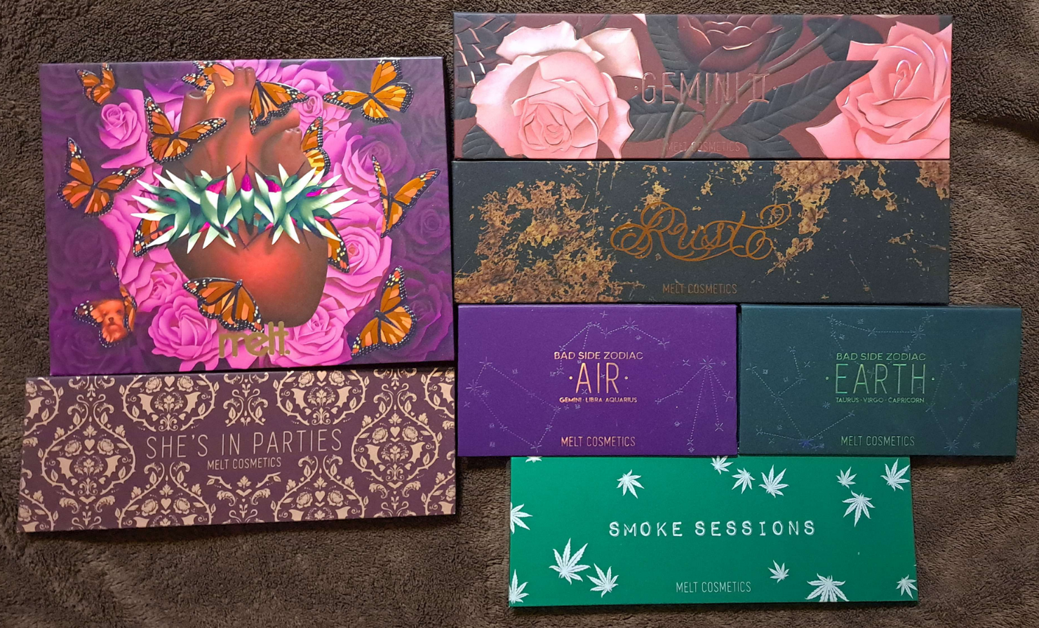
Being in the bottom three of something never sounds good, but I had very few issues with these palettes, save for Smoke Sessions. Melt Cosmetics is known for having, at the very least, a stellar matte formula. It’s a bit ironic that the most hyped non-limited edition palette from the brand is the one that is the worst performing on me. That being said, I still consider it a decent product. The reason it’s on the bottom is because it’s the only palette from Melt (in the rectangular pans) that had mattes that are stiff and took a bit of time to blend. The shimmers are not impactful without being dampened and are the only ones from Melt that give me any creasing. As for the color story, I love half of the palette and completely ignore the other half (the cool-toned blue-green shades). The first two photos at the top of the page were taken before I left the US. Because this particular palette is known for having the most problematic formula in terms of how long it can last before it goes bad, I was worried it wouldn’t last. However, I haven’t had any issues with any of my Melt palettes all this time. I consider myself lucky!
The Zodiac palettes have only the slightest lower matte quality than the top 4 in the ranking. The color stories are beautiful, but not unique, which is why I didn’t reach for them as often as the others. The shimmer quality of these is actually better, but having a good shimmer isn’t as impressive of an achievement as a good matte. These are the only reasons I put them lower. They just have so much competition in my eyeshadow collection that they are the last palettes that come to mind when I think to reach for some Melt shadows.
Mi Amor
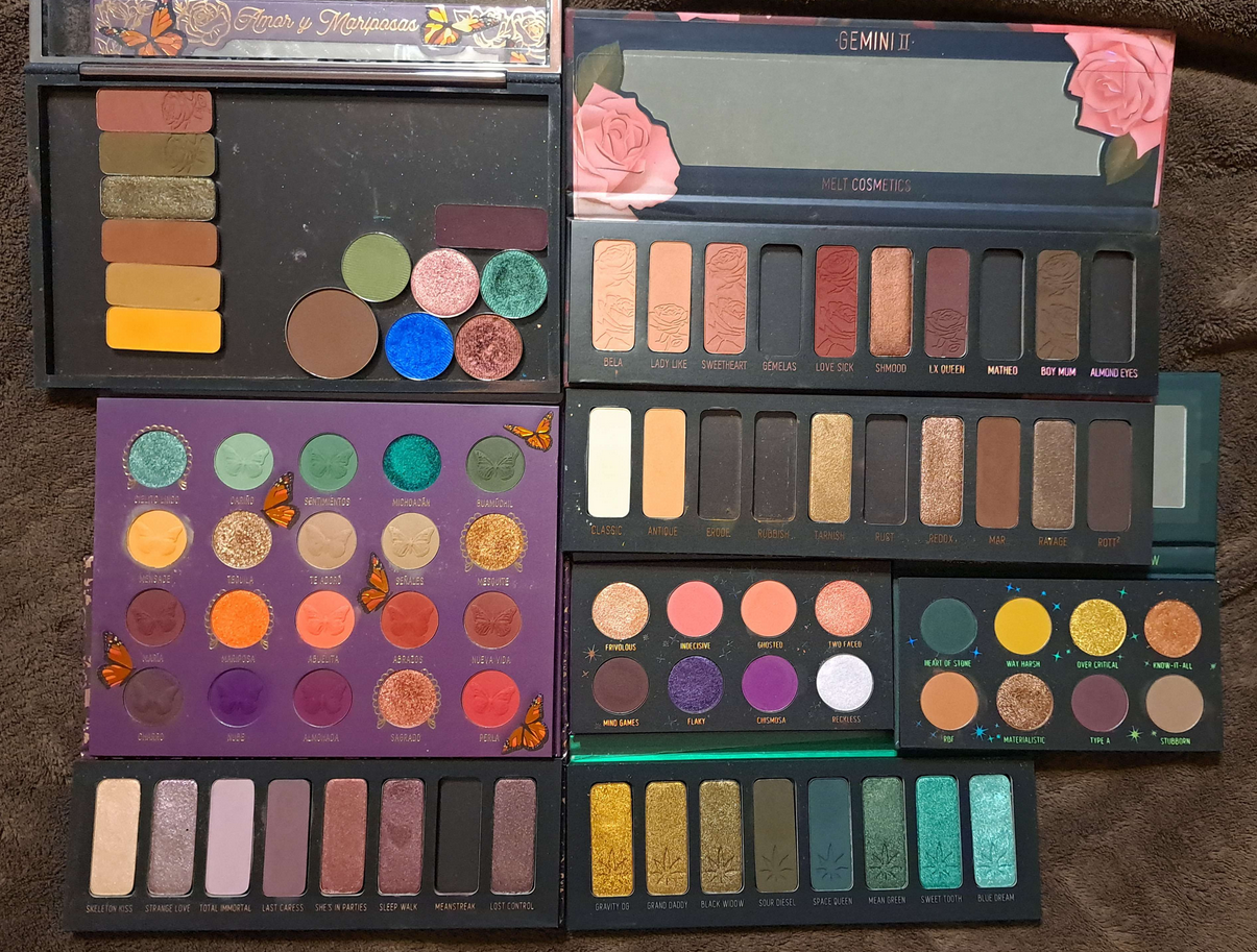
I like the performance of the shimmers in the Amor y Mariposas palette more than the top 3, but that wasn’t enough to get the palette to be bumped up higher on the list. 4 of the 14 mattes take extra time to blend because they are pressed pigments. They aren’t shades I use that much, so it isn’t as strong of a negative point against this palette. The color selection is beautiful. The pans in this palette are the same size as the Zodiac ones. I had the idea to depot them into those smaller palettes a bit too late. As much as I liked the colors, I didn’t reach for the palette as often because of its large size and how I inconveniently stored it. I didn’t use this palette enough, which is quite telling where it stands with me.
The Top Three
The palettes in this category have all been partially depotted at some point during my ownership of them, and I’ve taken them traveling as part of custom magnetic palettes. In fact, the flatlay photo above shows which ones were taken from a previous trip.
Rust is a beautiful warm neutral palette. I love the mattes in there to use as the transition and crease shades for a starting eyeshadow look. I usually pair them with a Clionadh shadow or other special shimmer, duochrome, or multichrome shade from my collection. The reason it’s number three is because the shimmers don’t give enough impact, even when applied damp, and I have sealing issues with the shades Tarnish and Ravage.
I love purples, so it makes sense that I like She’s in Parties. However, it’s warm purples I prefer and this palette has a mix of both cool and warm shades. The matte quality is fantastic. The shimmer quality is fairly decent in terms of performance and with passable levels of sparkle. This palette has light and dark shades, but it’s hard to get something in the middle. I may not use She’s in Parties as much as Rust, but the quality is overall better. So, it ranks second best.
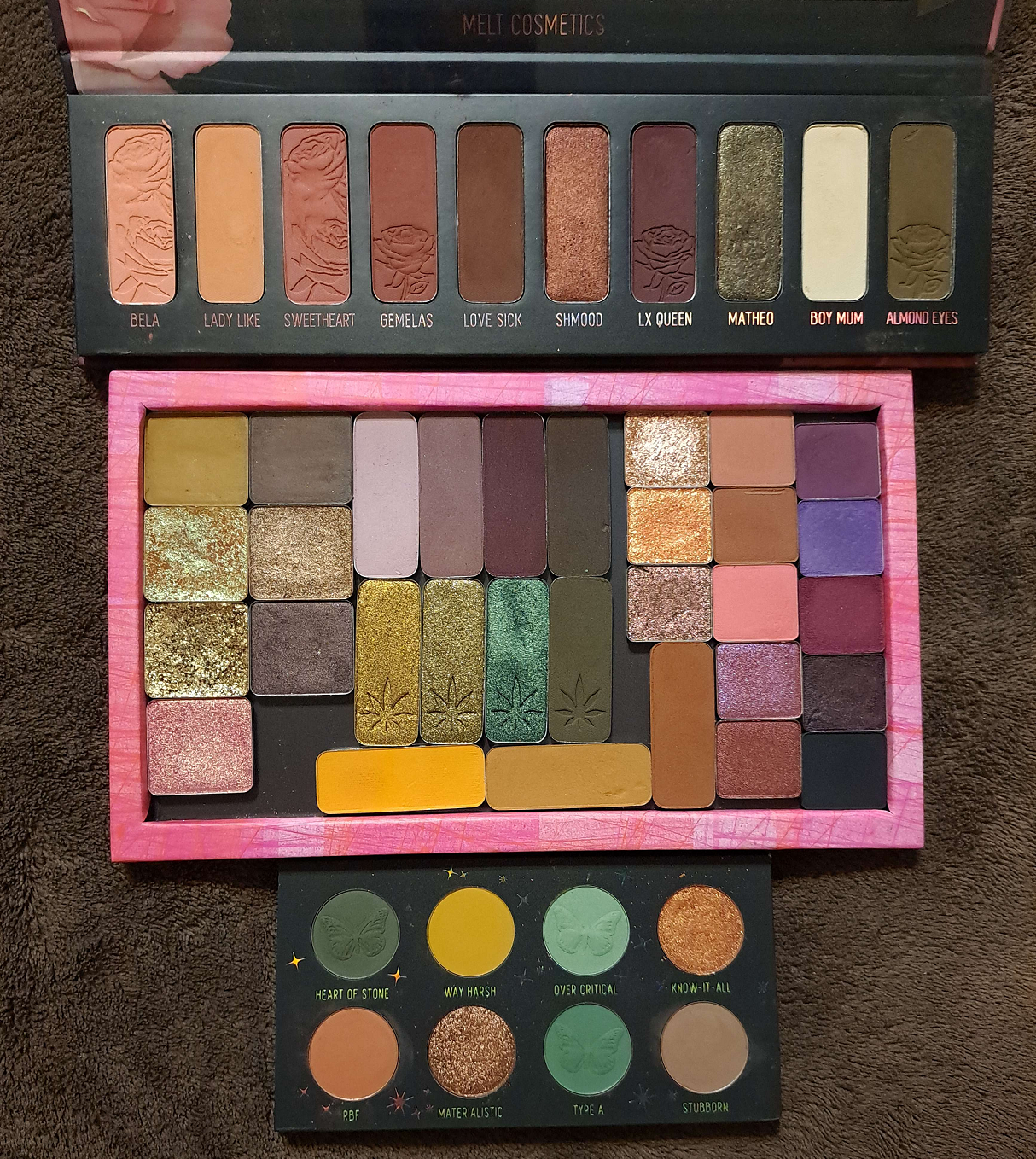
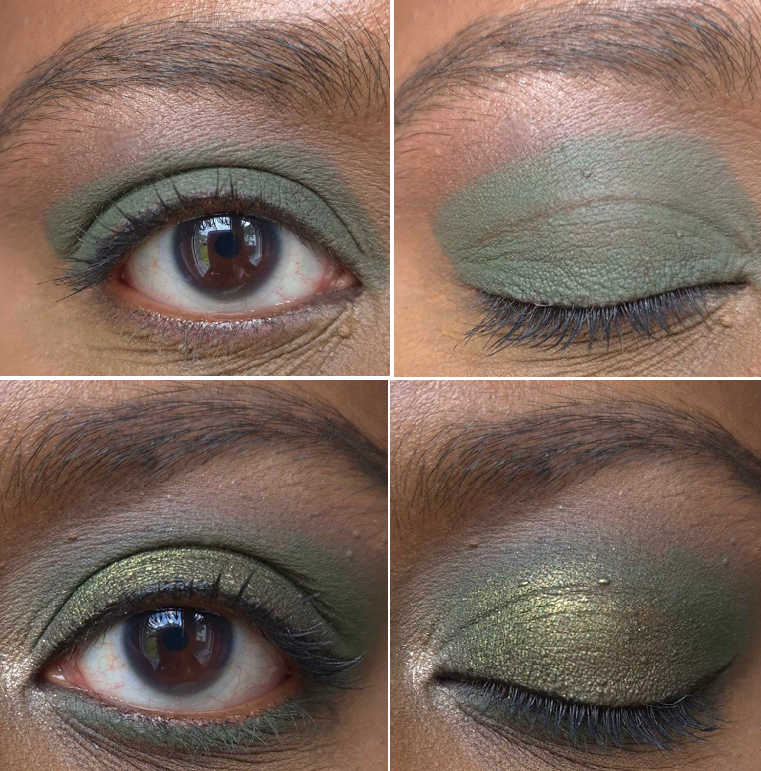
Gemini II has green shades that I adore! Almond Eyes and Matheo are some of my favorites from my entire collection! I can also get tired of pinks pretty fast, but the ones in this palette are the kind I love! Warmer pinks are great! The matte quality is superb, blendable, and pigmented. The shimmers are as good as it gets from Melt.
When it comes to using the Gemini II palette, I never use the pinks and greens together. Technically, that means I don’t consider it as cohesive of a palette, but I get a lot of use out of it by pairing it with other palettes and single eyeshadows. This gets the number one spot due to having the best quality and me liking every color in this one.
Another indication is that I only depotted Love Sick and Boy Mum, then took the entire rest of the palette with me when I moved! My most used shades from She’s in Parties and Rust came along in a custom palette as well, but the largest number of Melt eyeshadows came from Gemini II. The photo below shows all the long rectangular pan eyeshadows I ended up taking with me to Germany.
I created the custom palette as well with a mix of Zodiac Earth and Amor y Mariposas shades, but when my luggage went over the weight limit and I needed to leave some makeup behind, that one was unfortunately the one that had to stay back.
What can also be spotted are four Smoke Sessions shades. This is because those were my favorite colors from the palettes, but mostly also because I waited so incredibly long to buy that palette. I did not want to leave all of them behind. So, it’s a matter of principle and less about thinking I would miss them. My top three are the ones I would miss most because of the mattes. Melt’s mattes are within my top five favorite formulas of all time! It’s a shame I don’t feel the same way about most of their shimmers, but I have more than enough shimmers I love. It’s much harder to get me excited about mattes, which this brand certainly nails most of the time.
The final point I wanted to discuss is the acknowledgement that I have zero palettes from Melt that came out between 2023-2025. The only two that interested me were Smoke Sessions II and The Bride of Frankenstein. I skipped getting Smoke Sessions II because those are still not the kind of purples I wear often enough, plus my concern that the quality could be similar to the original Smoke Sessions that ranked last on my list. I would have absolutely bought The Bride of Frankenstein Palette if it was available to purchase in Germany. The only retailer I know that sells Melt Products is Purish, and they did not stock that one. I looked into international shipping from Melt’s own website, and it’s just too costly. So, only the future will tell if I ever get my hands on that one.
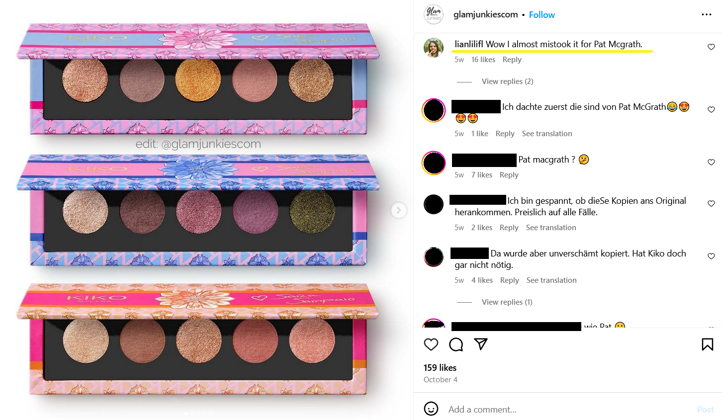
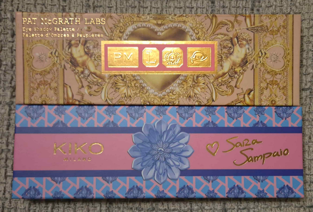
I was not the only person confused when I was scrolling through the GlamJunkiescom Instagram page thinking I just saw a newly launched collection of Pat Mcgrath 5-pan palettes, only to read the description and realize it’s a collaboration trio of palettes between Kiko Milano and Sara Sampaio!
I haven’t purchased a single thing from Pat Mcgrath in 2023, which is wild considering what a huge fan I am of the brand. The color stories just didn’t entice me enough. However, the Kiko Milano Dazzling Drama palette seemed practically made for me, so I bought it. In the collection, there is also Dazzling Sunset and Dazzling Daydream, but I didn’t get them because they had colors too similar to what I own from Pat Mcgrath. I just wanted to see if Kiko managed to recreate the look and performance of PML’s shadows for less money. If you’re curious, please continue reading! Also, I’ve included a few bonus reviews at the end of this post!
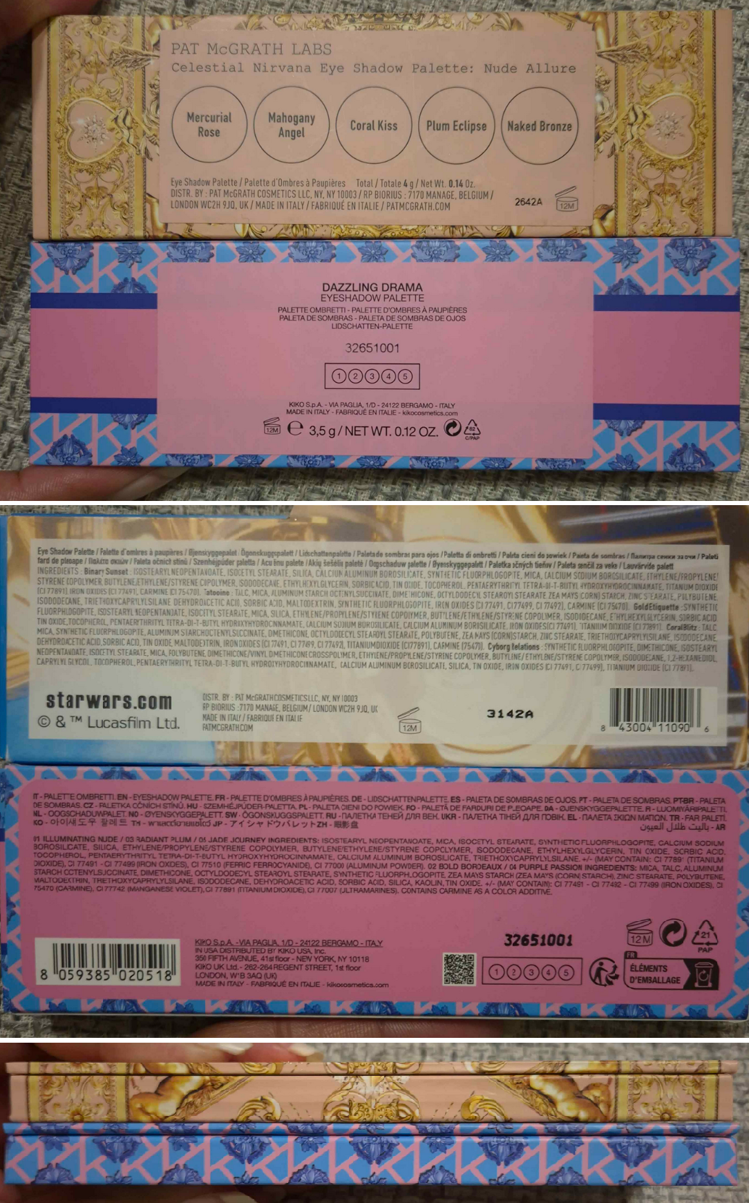
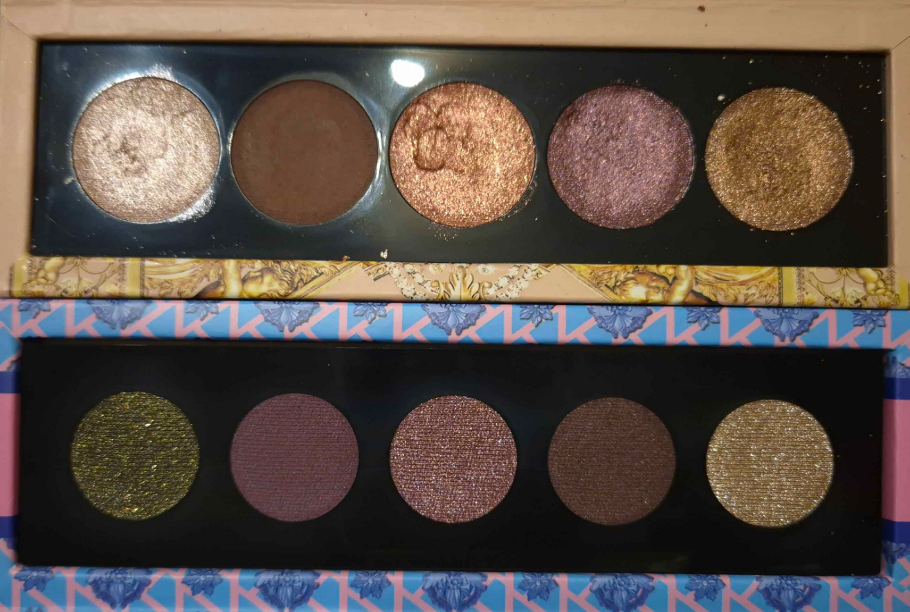
The palette sizes, unicartons, and packaging materials are identical. The texture of the shimmers and press/ribbon pattern on the non-shimmer shades look just like the 5 pans from Pat Mcgrath. Visually, the only identifiable difference is that Kiko’s pans are smaller.
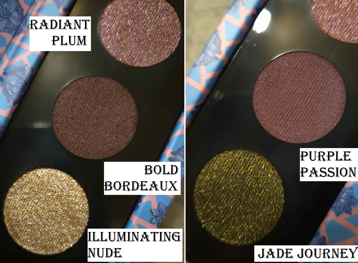
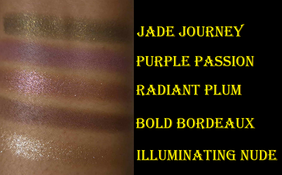
The palettes from both brands are made in Italy. From what I can see, the ingredients are the same too, just in different amounts/order. The biggest discrepancy is that the “mattes” from Kiko have silica and kaolin as the final ingredients. Bold Bordeaux looks like a matte shadow in the pan, but it’s a satin. It’s smoother than Purple Passion, which is the actual matte. Despite having such similar ingredients, Purple Passion doesn’t have the same creamish-powder feel that made me fall in love with Pat Mcgrath’s cream-powder formula from her quints. Kiko’s feel stiffer, less creamy, and not as smooth or easy to pick up, but the finish manages to look the same.
I would be fine with the “mattes” feeling different, as long as they performed as well. Unfortunately though, these two shades end up looking identical on the eyes because the vibrant color (Purple Passion) darkens and Bold Bordeaux turns smokey dark grey-purple when blended. It’s like there’s a dark base in them that’s used to create the illusion of opacity, but when I attempt to blend the shadows on my eyes, the purple tones get blended away and I’m just left with the darkness.
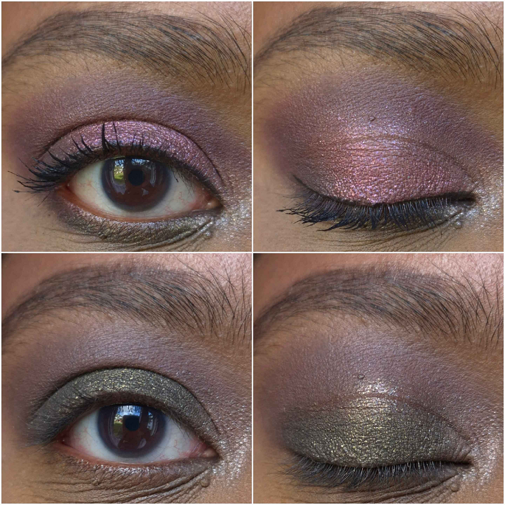
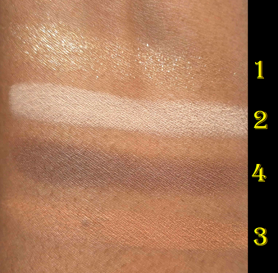
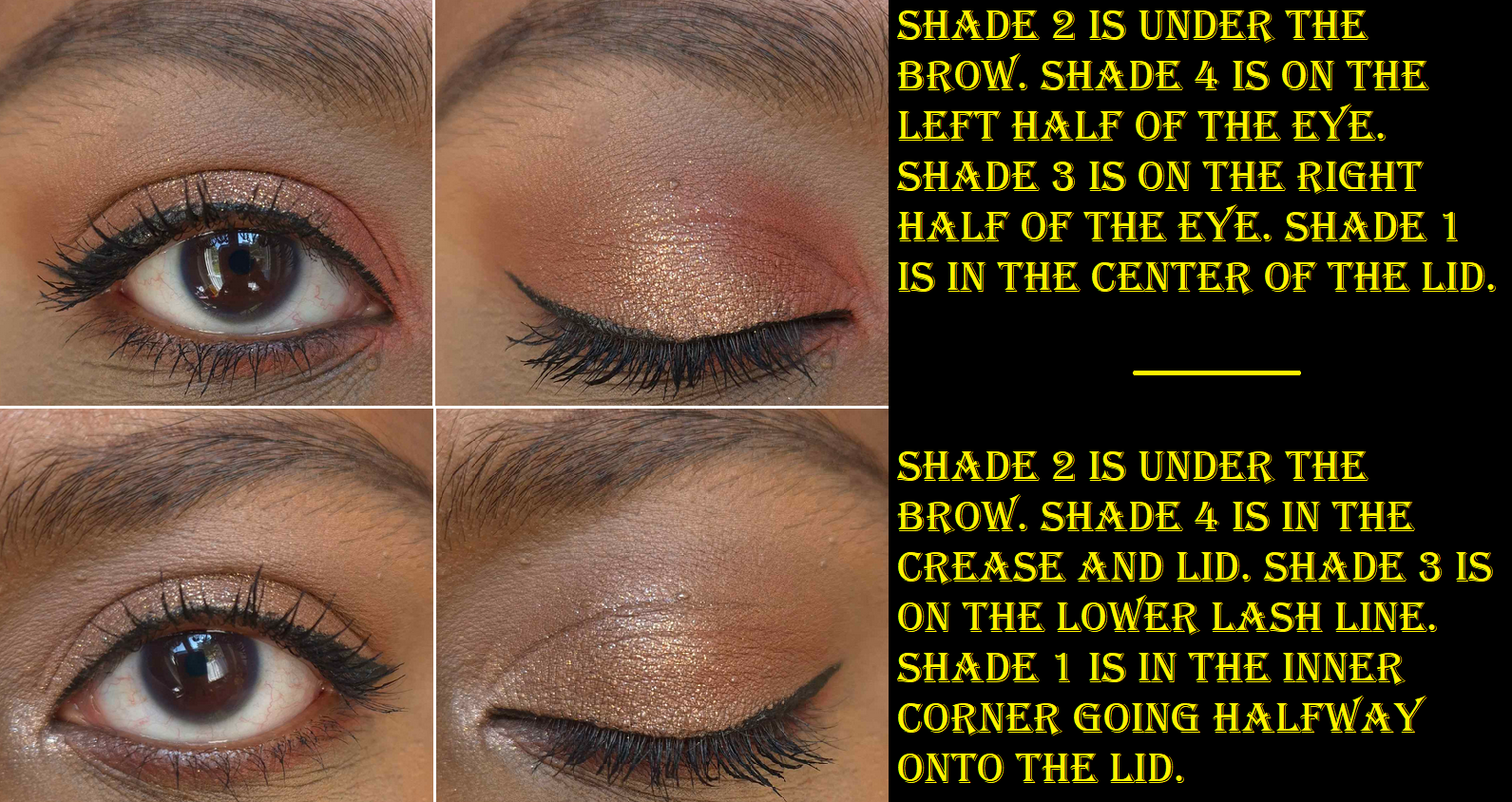
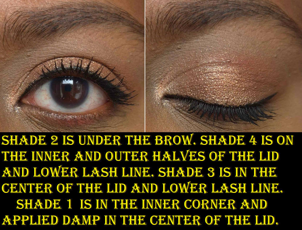
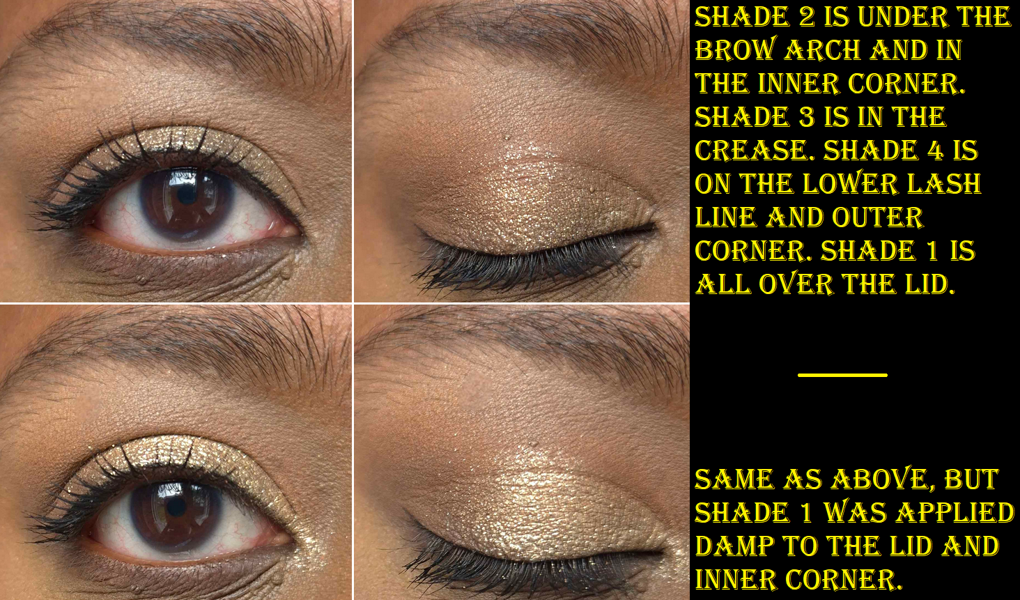
In the first eye look, Purple Passion is in the inner half of the crease with Bold Bordeaux on the outer half. In the second eye look, I used Purple Passion in the crease alone and tried my best to not blend it as much, yet it still darkened. I’ve tried different eyeshadow bases and using no base at all and it didn’t change the outcome.
I used Jade Journey on the lower lash line in the first look and all over the lid in the second look. In that second look, I put Illuminating Nude in the center of the lid and inner corner too. Radiant Plum is the lid shade in the first eye look.
The Kiko palette swatches beautifully. If I saw these swatches alone, I would have thought the quality of this palette was the same as Pat Mcgrath’s, but it’s only a match for the shimmers. I was able to show the vibrancy of Purple Passion because I didn’t have to swipe or blend back and forth on my arm, which would have caused it to darken. I am most disappointed by those, but the shimmers are great. Kiko’s shimmers don’t feel as wet, but they have nearly the same pigment level and sparkle as Pat’s quint formula.
I love the green shade! It is pretty much a dupe of Galactic Conquest from Pat’s Sith Seduction palette that I skipped buying because I only wanted that green. Now, I don’t feel FOMO since I have a decent substitute!
Radiant Plum and Illuminating Nude are the kinds of colors I see from all brands and I have similar enough shades from PML too, so they aren’t as special even though they perform well. In fact, this whole color story reminds me of Viseart’s London Etoile. Ever since making that comparison, I became less excited about this palette and just wished to have access to that one again. In some countries, that palette ranges from 24 to 28 Euros compared to Dazzling Drama costing 26 Euros. I would recommend the Viseart palette over this one.
Compared to Pat Mcgrath, Kiko’s eyeshadow is 7.7 Euro per gram vs 9 Euro per gram, so I see the price savings. It’s a collab product, so it should technically be cheaper if it wasn’t tied to a celebrity. However, is it really saving money if I only use the shimmers? With Pat Mcgrath, I normally don’t have to worry about shadows not being true to color. For me, I’ll stick with PML.
As promised, here are some bonus reviews. Since Kiko is on the more affordable side of makeup, I thought I would include some of my previously unreviewed drugstore purchases from this year.
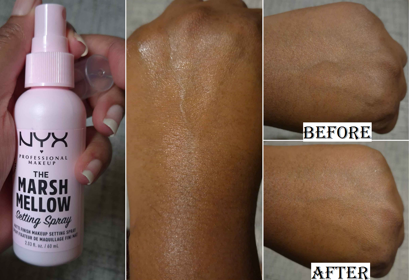
Nyx the Marshmellow Setting Spray
This has the same smell as the brand’s Marshmellow primer, which I like, but the scent is strong. I can still smell it for several hours after putting it on, which is why I count this as a negative aspect.
It’s a mattifying setting spray, but it’s only semi-effective. I don’t know how well this would hold up on someone with oily skin. It doesn’t feel like it dries out my skin and it doesn’t leave it feeling tight or uncomfortable. It prohibits my dry skin from letting moisture break through if I pair it with a foundation that essentially does the same thing, but if I’m using a dewy foundation, then my face will continue to glow (just less than usual). It basically helps low transfer makeup to improve on the transfer resistance, but it’s not tough enough to make an easily transferring foundation become transfer proof.
I decided to put my theory to the test and use the same foundation all over by face, but only spray one half of it. I waited four hours and then pressed a napkin to my face. The left half (the side with no spray) has slightly more transfer than the right half that was sprayed. However, the difference isn’t enough to make me want to use this product and I am content with just skipping the setting spray step altogether. If there’s a time when I need my makeup to be locked into place, I’m going to reach for others first.
My only other complaint about this product is the sprayer. A lot comes out, and forcefully at that. I wish it would spray like a mist, but I’m considering transferring the liquid into a different bottle so it will be more enjoyable to use.
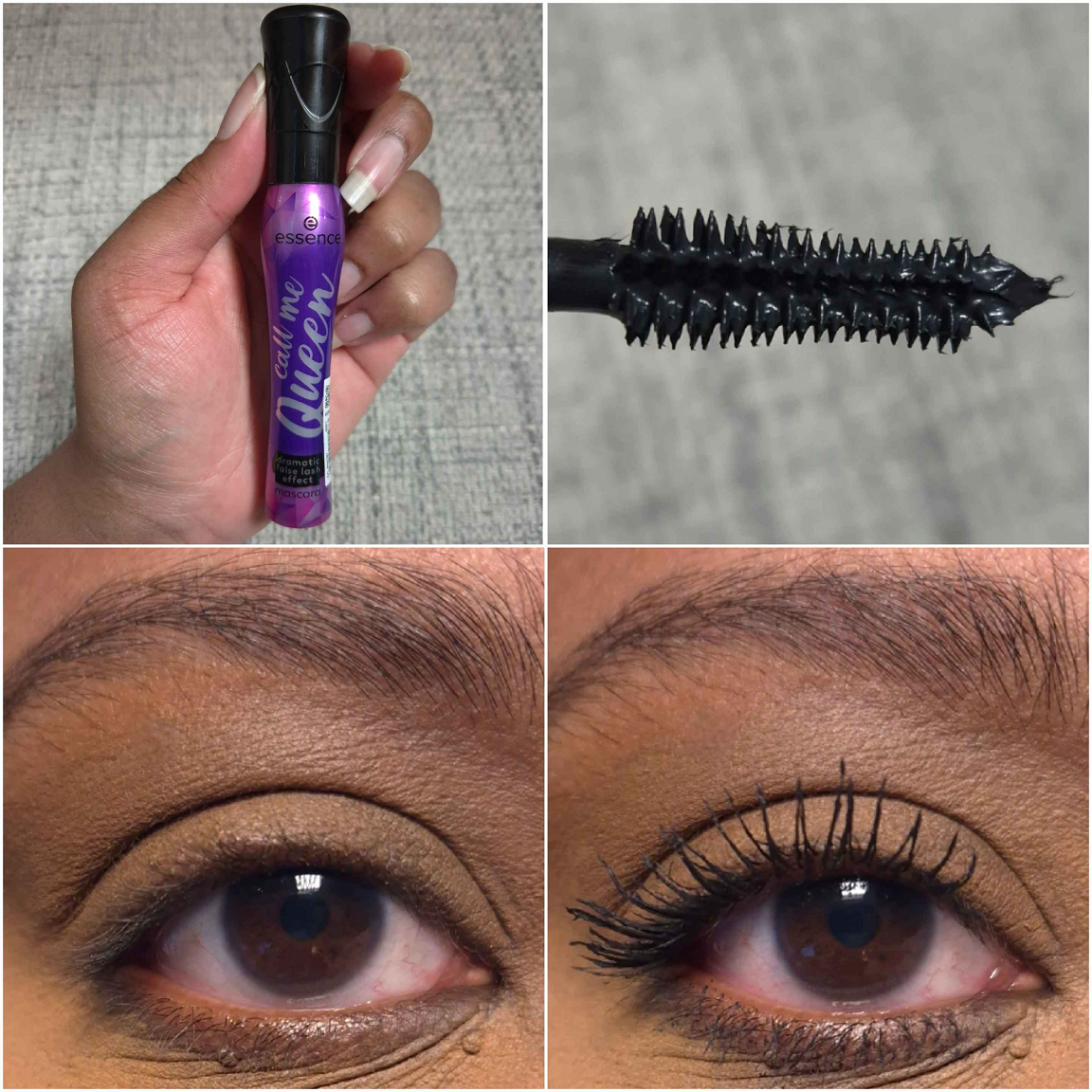
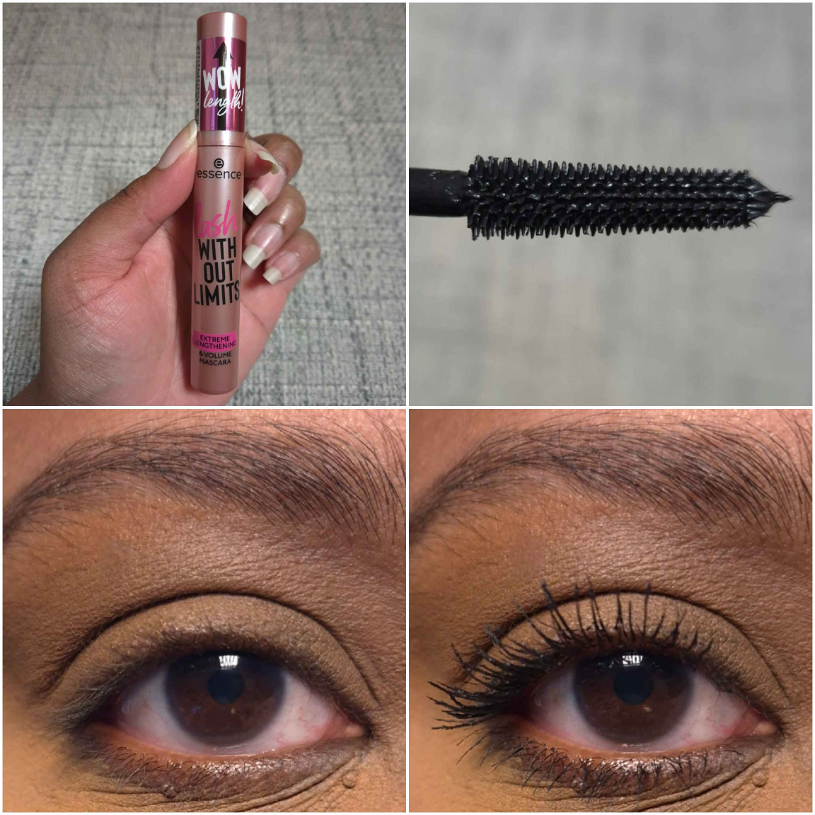
Essence Call Me Queen Mascara and Essence Lash Without Limits Extreme Lengthening & Volume Mascara
Both of these mascaras gave me an initially bad impression. I discovered that opening and closing them, then setting them aside for at least a week was the trick to getting a better outcome. When I first opened the tubes, they were too wet. The formulas had a hard time building on my eyelashes. Two weeks is the sweet spot for the mascaras to thicken, which is enough to get at least satisfactory results. Unfortunately, within a month of opening each, they both started to form clumps and started to be a bit too thick. It takes me five minutes to get them looking nice per eye. Ten full minutes to apply mascara is too long for me, especially when I can get it done much quicker with my favorite Essence mascara: Volume Stylist 18h Lash Extension Mascara.
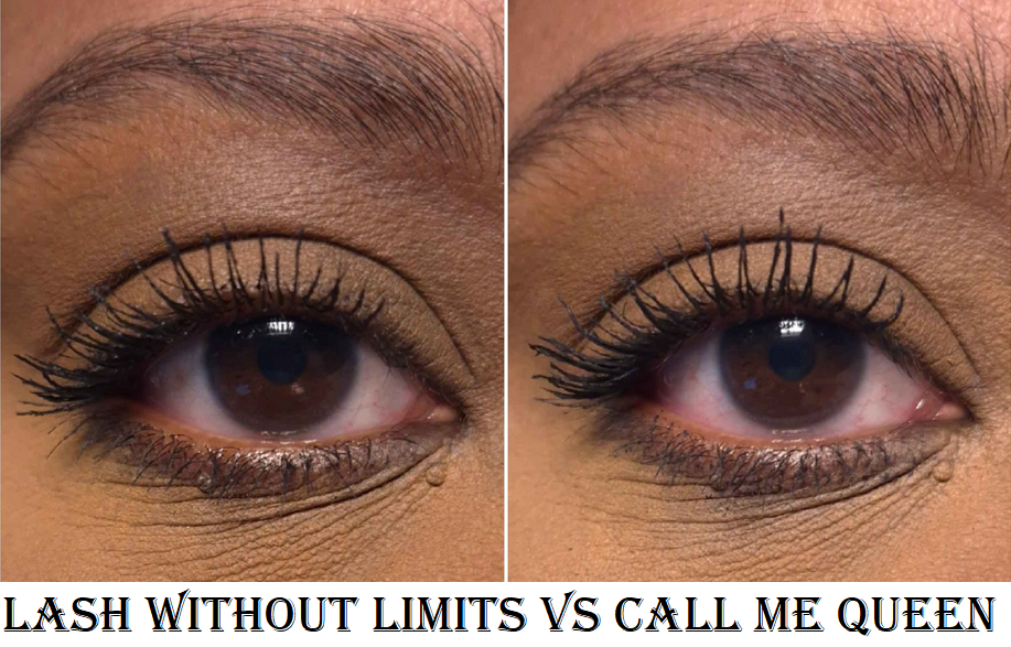
Lash Without Limits gives me a little more volume and a fluffy look to my lashes. Call Me Queen still gives volume, while also adding the tiniest bit more length, but the shape of the applicator makes it slightly harder to apply mascara to my innermost lashes.
I would consider the amount I used in the photos to be two coats, even though I repeatedly went over the lashes so many times. Because these mascaras are so wet, they are both prone to smudge onto my lid/lash line if I squeeze my eyes shut too tightly before the mascara has time to dry. I don’t notice flaking, but any clumps that stick to tips of my lashes have the potential to fall on my face later in the day.
My preference between the two is the Lash Without Limits, but I would not repurchase either of them purely because of how long it takes to get them to look separated, as clump-free as possible, and with enough length and thickness built up.
That’s all I’ve got for today! I hope you’ll return next week to check out another new post!
The retailer Purish was having a birthday sale in July. I didn’t know anything about the Berlin based company until this year when I realized I could get some harder to find indie products on their website. Along with some Danessa Myricks products I plan to review at some point in the future, I bought items from Nabla and LH Cosmetics that I’ve been eying for a long time while in the US, but didn’t want to deal with the shipping costs. I’ll be discussing them in the order that I tried them, rather than grouping by brand. I hope you’ll find these reviews interesting and helpful!
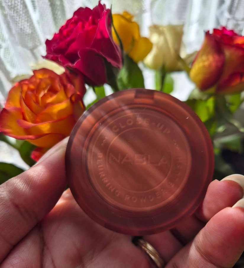
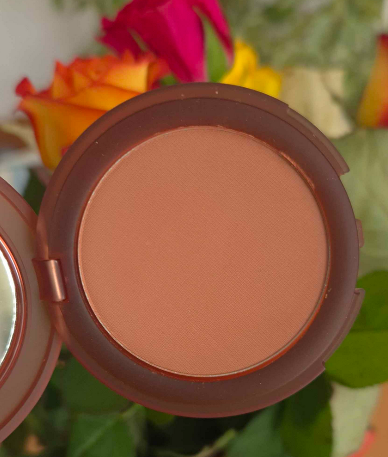
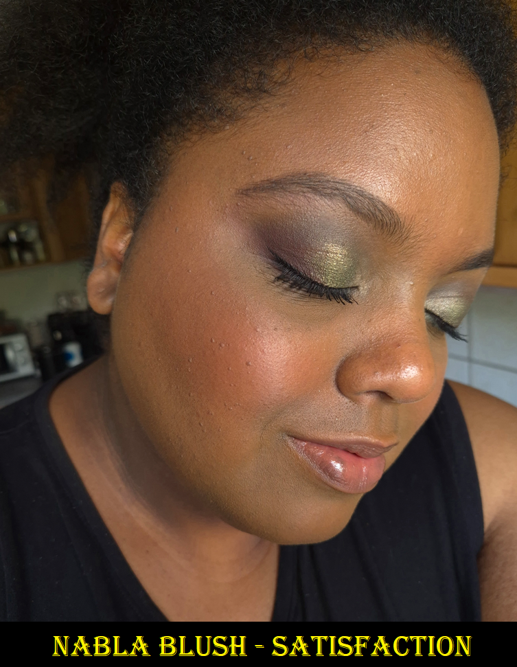
Nabla Close-Up Blurring Blush in Satisfaction
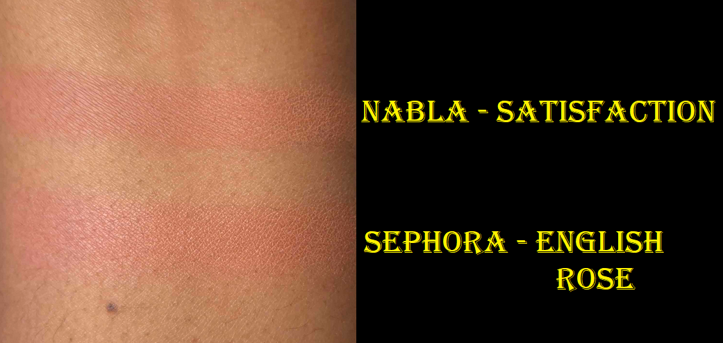
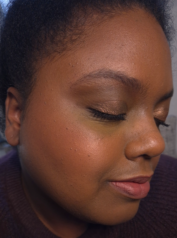
I love Nabla’s Skin Glazing blushes and have long wished for a shade extension. So, even though these new blushes are a matte formula, I felt compelled to try at least one of them. The shade I chose can be iffy as to whether it will work for me or not. The color reminded me of Too Faced’s Cloud Blurring Blush in Velvet Crush, Tarte’s Amazonian Clay Blush in Exposed, and Sephora’s Duo Matte Blush in English Rose. It might even be similar to MAC’s Gingerly, but I would need to see it again to know for sure. In any case, some of the above work for me all the time or just in winter, so I took the chance. The only one I have with me to compare in swatches is Sephora’s English Rose. I intentionally mixed the two split pan colors together to get as close to Nabla’s Satisfaction as possible. English Rose can look completely different if I use more of the pink within the duo.
If I just use Satisfaction on my bare cheeks, it’s a little ashy looking, especially because it’s a matte formula and I have dry skin. However, when it blends into my foundation, the color warms up further and looks just as I hoped. I like vibrant poppy blushes, but sometimes I like having just a flush of pink. Sometimes, I want light pink cheeks like an anime character. It all depends on my mood! In order to get as much payoff as it looks in the photo below, I had to really pack it on my cheeks. A normal amount is very subtle.
I have no blending issues or longevity issues with this. The part I dislike is actually the smell. It smells like a mix between chalk and chemicals, though not as strongly as the MAC Bronzer issue when those launched last year. I used to smell it only when I first opened the compact and then it would dissipate in the air. I noticed a similar thing with the LH palette that’s being reviewed next. What a strange coincidence! By now though, after many months, I only get a slight whiff of the chemical smell if I put it right up to my nose.
I like the color of this blush, but I have to admit that after comparing it to the Sephora duo, I like Sephora’s more. The Nabla blush is supposed to be blurring, but I don’t find that to be the case. Sephora’s is a soft matte, which is a more flattering finish for my skin type as well. Plus, with English Rose, I can tailor the color to be similar to Satisfaction or more vibrant if I’m in the mood for more of a punch. The times I don’t feel like mixing is when I’m most likely to use this. I don’t foresee myself buying additional shades.
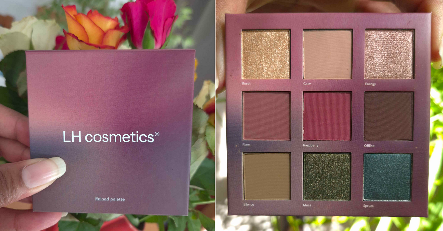
LH Cosmetics Reload Palette
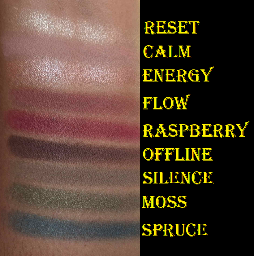
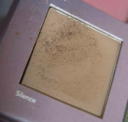
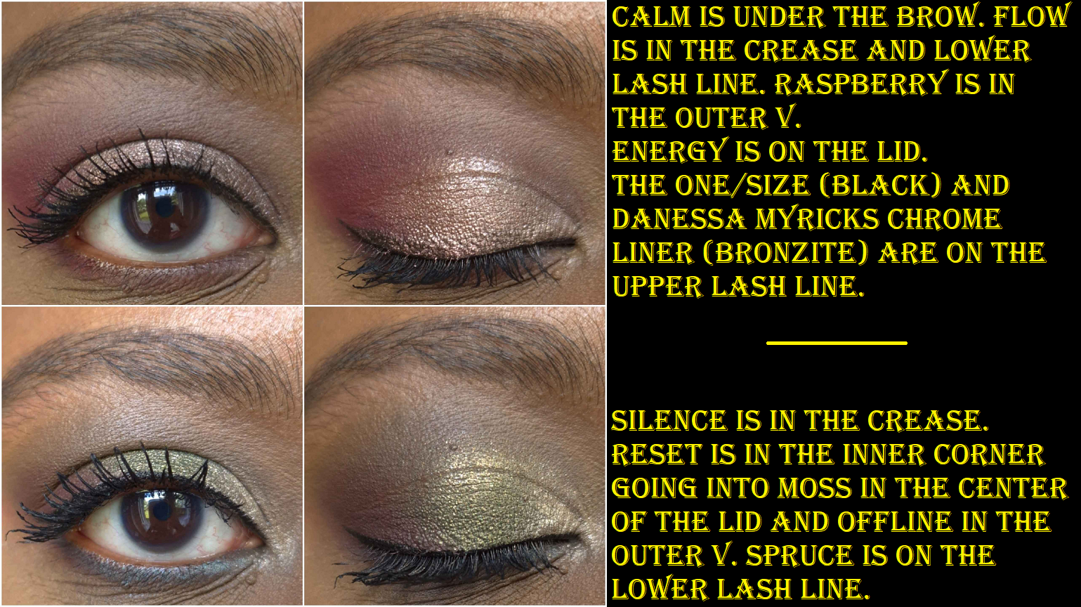
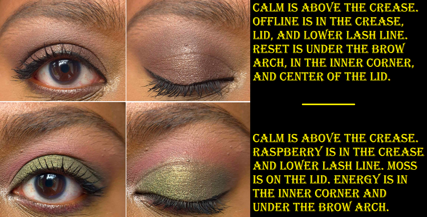
There are elements that I really like about this palette, but I’ll start with the issues first. I love how Flow and Silence look in the pan, but if you keep blending those shades back and forth, they turn much darker. Flow becomes a dark purple and Silence turns dark grey. I even used it as an outer corner deepening/smoking shade in the fourth eye look below. It doesn’t matter whether I use primer or not, it stays the pan color when first placed and patted on (which is how I could get them to look alright in swatches), but the moment I blend, Silence turns grey. It’s not an issue of dirty brushes either. I literally tried it with a brand new brush. Considering I already have Offline to deepen eye looks, and I don’t really have much in the way of mid tone mattes since Flow and Silence don’t count, I’m unable to create the kind of looks I intended without reaching for other palettes. The eyeshadows are still pretty, but more dramatic than anticipated.
Thankfully, I have no issues with the colors of the other mattes. I was also able to use three different bases for the eyeshadows and the performance didn’t change. The shadows are pigmented and require a bit more time to blend than I’ve been used to lately, but the final result is worth the effort. At least, that’s what I thought in the beginning, but I’ve only used this palette one or two more times after my initial rounds of testing were completed.
The shimmers are on the thicker side, but I suspect it’s for adherence purposes. I don’t feel the need to apply them damp to increase intensity on the lids, nor to keep them together. I don’t have any fallout issues with these. I also like that there is a warm toned option with Reset and an option to go with the pinks with Energy. The shimmers pick up easily on a brush, spread and blend nicely, and they don’t have enough slip to them to cause creasing on me.
The color story allows one to take the color scheme in different directions: monochrome pink look, neutral, neutral plus one color, blue-green, warm or cool, etc. It’s just a shame that the variety is lessened by Silence and Flow. I would have loved to put a true olive green in the crease, have Moss on the lid, and deepen it with Offline. I’m not disappointed by the performance, only let down by the shades because this could have been a palette I reached for quite a bit due to the convenience of having colors I love all in one palette. Because I have to pair it with something else, the reality is that I use it less than I’d like.
I also need to mention that these have a bit of a chalky smell. This palette is not cheap (even though I bought it at half price) and the eyeshadows are made in Italy, so I don’t think this was cheap to produce. However, that’s what I associate with this type of smell. I only smell it when I first open the palette and the kickup flies through the air. So, it’s not a big problem, but an aspect I don’t like. Especially when I think about Huda Beauty 9-pan palettes that are a similar size, and cost 29 Euros at full price, compared to the Reload palette that’s 49 Euros at full price. The formulas are completely different, but I like quite a few of Huda’s Obsessions palettes and if both brands had a palette comprising of similar colors, I would choose Huda’s.
Nabla Cupid’s Arrow Longwear Full Colour Stylo in Arrow #12 Khaki and Arrow #13 Mauve
These weren’t on my radar until I saw Angelica Nyqvist using them more frequently in her videos during the summer. Since they were on sale and I realized the colors I wanted would compliment what I was missing from the LH Reload palette, I figured I may as well try them.
For starters, the experience is slightly different depending on whether or not an eyeshadow primer was used underneath everything or not. What is the same for both is that liquid eyeshadow goes on top of the Nabla stylos well when used as an eyeshadow base. When this product is used as an eyeliner, it holds onto the skin very well. It’s budge-resistant and water-resistant. When I first apply it, I try to keep my eyelids closed to allow it to set and try to avoid creasing. It only takes a minute to set on an un-primed eye. In one instance on a primed eye when I had to scratch around my lashes, I placed my thumb near the lid to hold it steady and got transfer on finger. Essentially, the more emollient a primer is, the longer it takes to set. In this instance, it was closer to 10 minutes.
On a primed eye, Khaki essentially looked the same, but Mauve was warmer and leaned pink (as opposed to no base where it looks cooler toned purple-mauve. I can draw the stylos on smoothly to apply them without needing primer, but if I want to blend the edges or smooth it out with a finger, it takes too much product off and I can see my skin discoloration underneath. On a primed eye, it’s easier to draw smoothly, but blending the edge also removes the primer with it and I can see bald patches left behind. So, it’s best if I draw product on, but use a lighter powder to blend out the edges.
On a non-primed eye, applying the Nabla Stylo and adding another powder eyeshadow on top doesn’t result in as much creasing, but over a primed eye it settles in my deepest eye crease. The bottom line is that I prefer to use this product as a creamy easy-to-glide-on eyeliner, and perhaps as an eyeshadow base in areas that I don’t have lines yet, such as the mobile lid. To use this as a standalone eyeshadow is too finicky for me. It’s easier to use a powder or more traditional form of cream and liquid shadows.
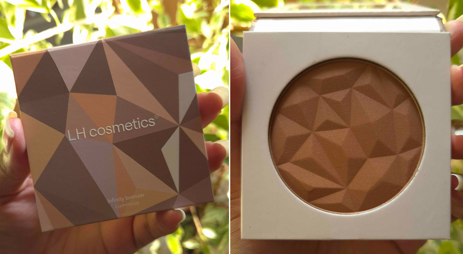
LH Infinity Bronzer in Forever
This purchase was made specifically because of Kackie Reviews Beauty. She took my curiosity and tripled it with her gushing about how great it is in multiple videos. With only four options available, I chose the darkest one. The shade Forever has enough depth for me, but will not work on someone with a rich skintone. It’s debatable how well it would suit someone within the deep category. My other concern was whether or not the color would be too warm of an orange, but I was compelled. The stars had aligned and now seemed like the time to get it.
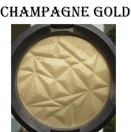
It’s a bit silly, but I will admit that there was something visually drawing me in too. There was some reason I couldn’t stop wanting this product from the moment it launched. It wasn’t until I finally bought it that it clicked. The pattern in the pan is similar to the limited edition version of Becca Shimmering Skin Perfectors! In my review, I talked about how I experienced regrets for over a year because Champagne Gold was discontinued, and how I immediately bought it when it popped up on the Hautelook/Nordstrom Rack website.
I don’t think I ever made that review comparing and discussing the situation between Lunar Beauty’s Moon Prism highlighter and the Makeup Revolution highlighter packaging debacle, but this crystal pattern I’m apparently obsessed with is on the outside of both compacts and I bought those back then despite never using the highlighters inside! And now, I believe I have solved the question why my inner makeup goblin couldn’t let the LH bronzer clear out of my mind. I think that experience of FOMO from the Becca days has continued, and now when I see makeup with that pattern I feel like I am missing out if I don’t get it. I’m finally aware of the psychology behind it, so I hope I’ll be better equipped to not let that be a factor in the future! As I’ve got the product now, let’s chat about it!
This bronzer feels very smooth to the touch. It isn’t as buttery as the Westman Atelier one, nor as creamy clay-like as the Glowish bronzer. The closest comparison I have is to the Kaleidos Symphony Contour Trios, which in turn feels like a lighter pressed version of the Hourglass Ambient Lighting powders. The LH bronzer has medium-buildable pigmentation and lasts all day.
Whether I get a smooth and diffused application or an uneven concentration depends entirely on my brushes. Because the surface of the bronzer has mounds and divots from the pan design, if the brush I choose doesn’t pick up an even layer (or I don’t swirl or sweep it around to coat it evenly), it will stick to my skin unevenly when I apply it and require me to spend a bit of time buffing. I tested a lot of new brushes with this bronzer specifically, so I was able to see that the density of the brush doesn’t matter as much as the even coating. I can use a dense brush for a strong yet blended look, or a fluffier brush to look seamless with the skin. In the photo below, I built up the bronzer so it would be more obvious on camera. It can also be built up to look smoother than I depicted, as I hadn’t learned the brush trick at the time I took the photo.
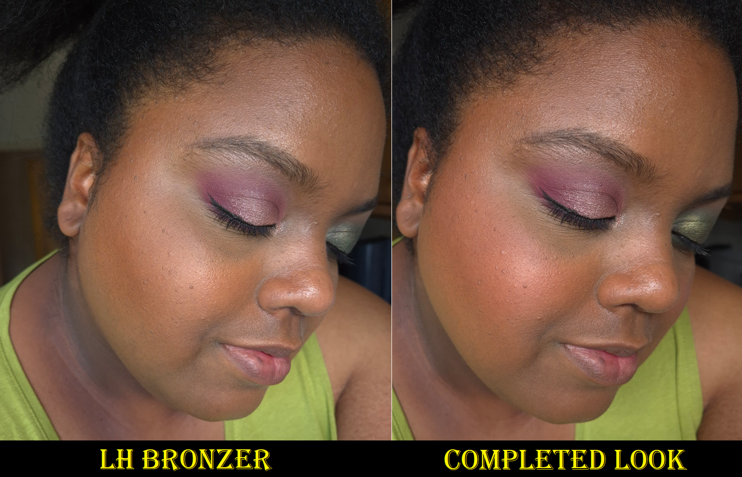
Because of how warm the color is, it’s harder to be able to tell I’m wearing bronzer, as it blends into my warm colored blushes (as seen in the right photo above).
Even when I use my best bronzer brush with this though, and even though I can get it to look smoother, it’s still doesn’t look as seamless as some of my other bronzer favorites.
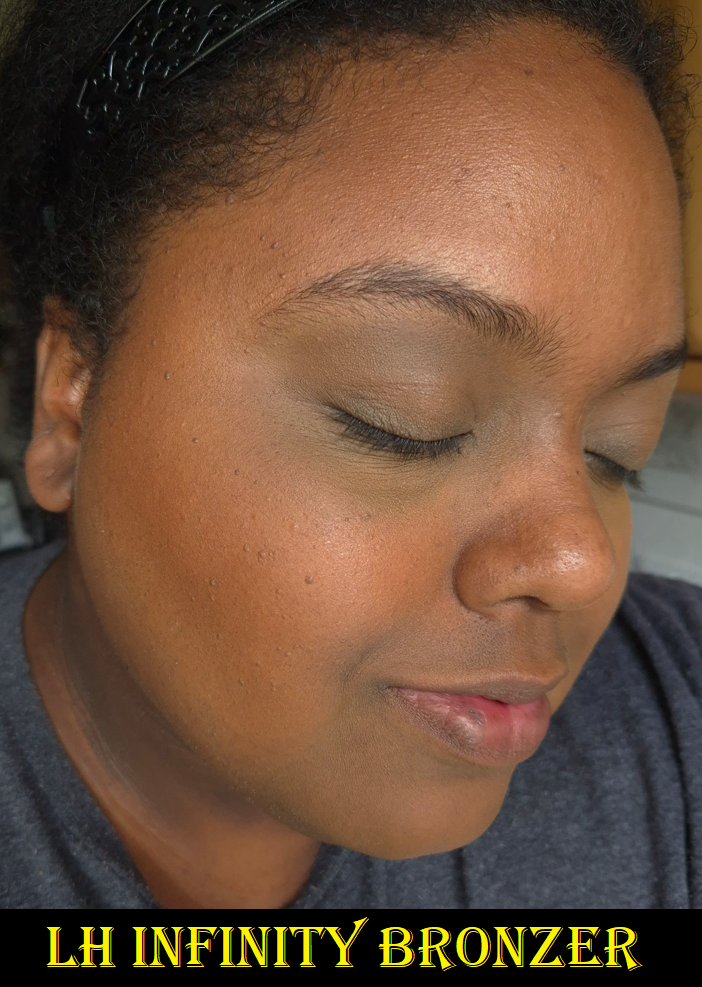
This photo was taken a month later in the peak of summer, so I’m a little darker. The bronzer color matches better after having gotten some sun, and I used my best brush with it. A tiny bit of foundation, concealer, and the bronzer are all that’s on my face.
This is described as a luminous bronzer, but it doesn’t have much of a glow. I consider it slightly more radiant than a soft matte bronzer. There aren’t traditional shimmer particles that I can see, just sheen from the mica. It has even less of a sheen than some of my semi-glowy favorites.
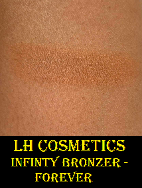
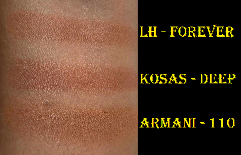
To show the undertone compared to other orange bronzers, I have swatches of Kosas, a true luminous bronzer, and Armani’s Luminous Silk Bronzing Powder that has some shimmer particles as well as the mica-like sheen. “Forever” is the darkest option from LH, but Kosas and Armani both have a deeper option in their lines. Just something interesting to note.
I like this bronzer, particularly at the discounted price I paid. However, there are tons of bronzers I like. I estimate this would rank no higher than top 30’s or 40’s among my collection. It’s good, but didn’t quite live up to the hype for me. The sheeny finish isn’t strong enough on my face for me.
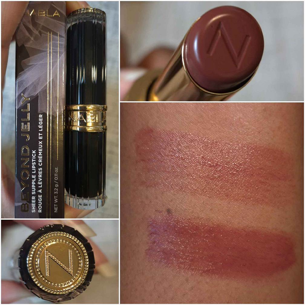
Nabla Beyond Jelly Lipstick in Ardor
Among the YouTubers I watch that review Nabla products, this particular formula has always been highly rated. So, getting it at half price was more than enough of a reason for me to buy it!
The lipstick component has a beautiful design with clear elements and black and gold touches that makes me think of timeless elegance. In the hand though, it feels like acrylic plastic, which I haven’t decided if I like or not. The fragrance used is an incredibly strong combination of fruit and florals. It’s pleasant, but also distracting. In the beginning, I didn’t like the fact that I could still smell it on my lips for hours after applying it. Thankfully, the smell goes away over time and is no longer an issue.
Its formula reminds me of the YSL Candy Glazes and Fenty Gloss Bomb Stix. It has a comfortable gel-like consistency that feels moisturizing on the lips and has sheer color that can be built up to medium coverage. Of the three lipsticks I mentioned, the one from Nabla feels the stickiest. It can last through a meal (depending on what someone eats), but it definitely needs a touchup after a second meal. When my lips are in a drier state prior to putting this on, within a few hours (even if I don’t eat) my lips will absorb some of the moisture it provides and I will have to reapply, despite still feeling the presence of the sticky layer on my lips. This has a few ingredients that my lips like, and my lips feel softer even after the lipstick has been removed, and that softness lasts until the next morning. So, this formula is hydrating and moisturizing, but I have balmy lip color products that are more nourishing. The reason I love this product though is for the color and how the jelly texture smooths out any dry or peeled looking skin on my lips. The retail price is 23 Euros, but I’ve seen it for 16-18 Euros on multiple websites for at least half a year. So, it’s a product I’d recommend to anyone who wants a less expensive option for a jelly or melty type of lipstick. In fact, of all the products I’ve reviewed in this post, this one is my favorite.
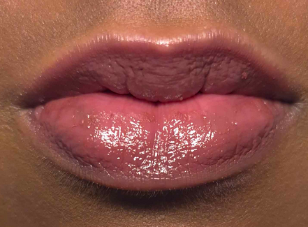
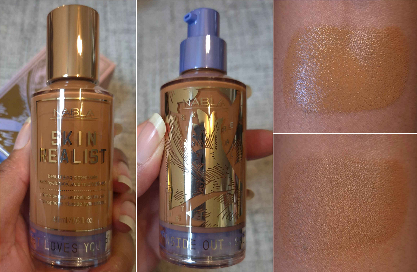
Nabla Skin Realist Tinted Balm in Shade 6 Dark
I had only seen three reviews for this product since 2021, and it was enough to make me want it, yet not enough to want to buy it without a discount. My reasons for that were the lack of reviews available and I felt very uncertain about the shade options. At the beginning of the post, I mentioned buying all these products during the Birthday Sale, but this one is from the Purish Black Friday sale when it was half off. Considering we’re in winter and I’m at my driest, now seemed like the perfect time to finally try it out!
In the photo above, I have the skin tint on in the left side of the yellow line and the Dior Powder no Powder on the right side with no foundation underneath. For me, I barely see a difference. This “tinted balm” only looks better compared to my bare face, so it doesn’t get any accolades for that. The name of the product implies that it will offer low coverage, but in the world of the Fenty Eaze Drops, Danessa Myricks Serum Foundation, and even Lisa Eldridge Skin Tint, the ones I buy usually have more coverage than I expect. This isn’t a deal-breaker though, considering it has similar coverage to the Givenchy Prisme Libre Skin-Caring Glow Foundation and I made that one work. My issue is that it fails to deliver on the radiance in multiple ways.
Another look of the Tinted Balm. In this photo, I’m not wearing a highlighter, but I do have on a satin blush.
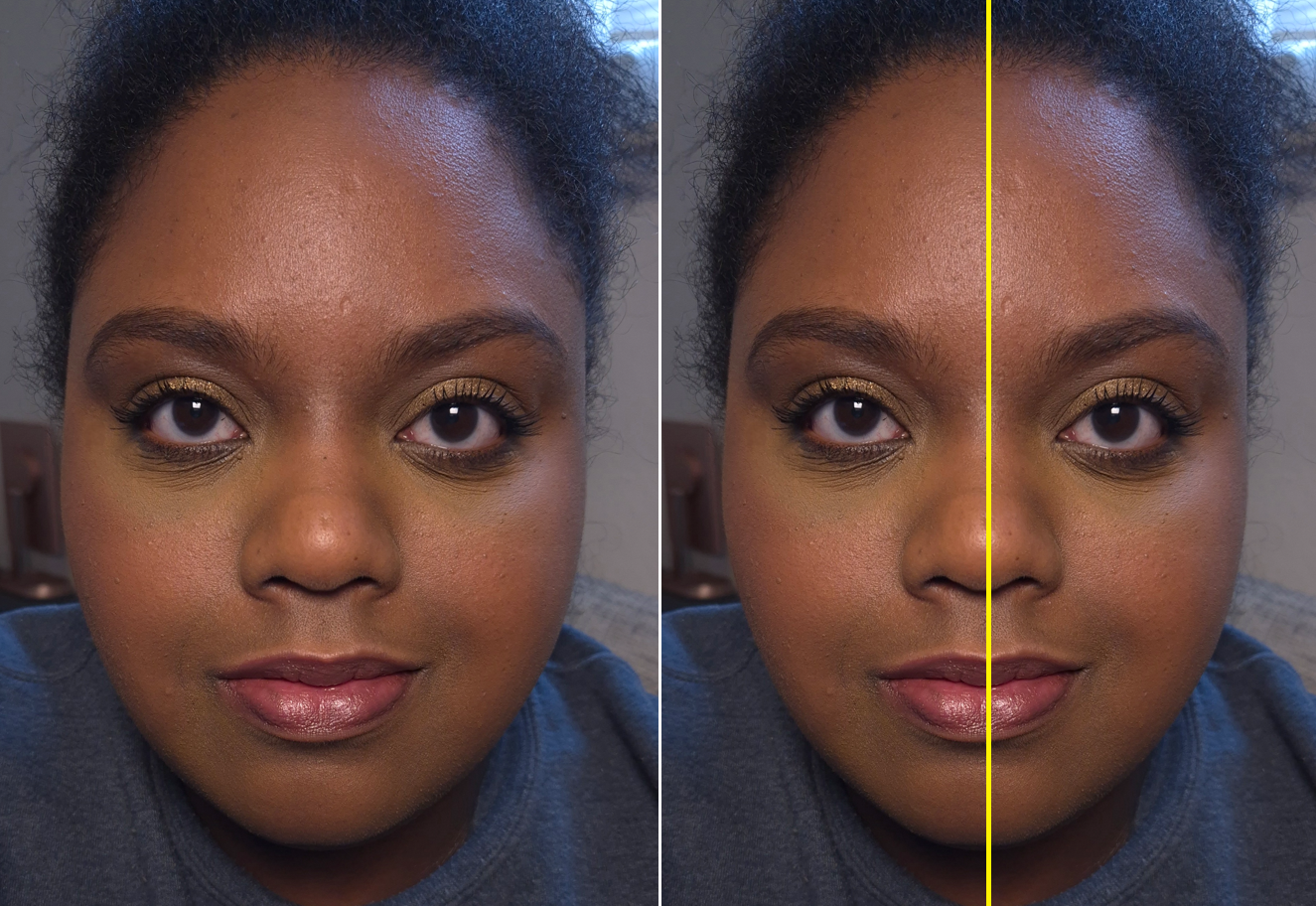
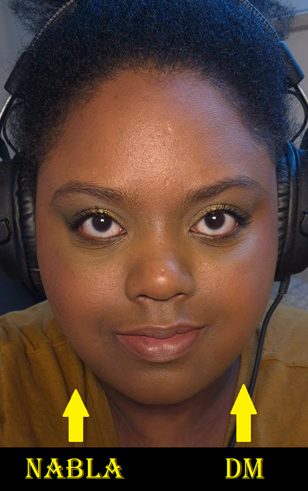
The Skin Realist isn’t matte, but it doesn’t give me nearly enough glow, even though I leave it unpowdered. This contains hyaluronic acid, which essentially does nothing for me in this region of Germany that isn’t that humid. The only time I get this to look to the glow level I want is if I fully prep my skin beforehand and use a ton of this balm. Then, it looks closer to a natural finish foundation, but it still takes six hours before my skin starts producing oil and looking luminous. Unfortunately, by that point it also starts to look like “end of the night” makeup, even on days when I’ve done nothing strenuous. If I actually do laborious housework or go for a long enough walk to start sweating, it makes everything on my face start to fade and break apart. This really isn’t a longwear product. When I try to counter this by using a setting spray, I lose the benefits of prepping my skin and the most I can get is a soft matte look again. I feel this product requires too much effort for a skin tint (and especially one that touts being a makeup-skincare hybrid product).
On the Nabla side in the picture above, I used at least double the amount of product as the Danessa Myricks Yummy Skin Serum Foundation side. Danessa’s product looks more skin-like while still offering more coverage (which is easier to see by looking at both sides of my mouth). Considering I actually have more hyperpigmentation on the “DM” side, Nabla’s should look better, but to me it does not.
I was relieved to discover that this had low transfer despite the “balm” name. It fully dried down on my skin. However, this product just isn’t suited to my preferences in a complexion product. I have several low coverage foundations and skin tints that give me a prettier finish on the skin, fully set, and have better lasting power. I wouldn’t call this bad; it just couldn’t compete with what I already own.
I didn’t have the most success with these newest additions to my collection from Nabla, but I continue to recommend the brand’s Skin Glazing line, lip products, and their face brushes are pretty nice despite being synthetic.
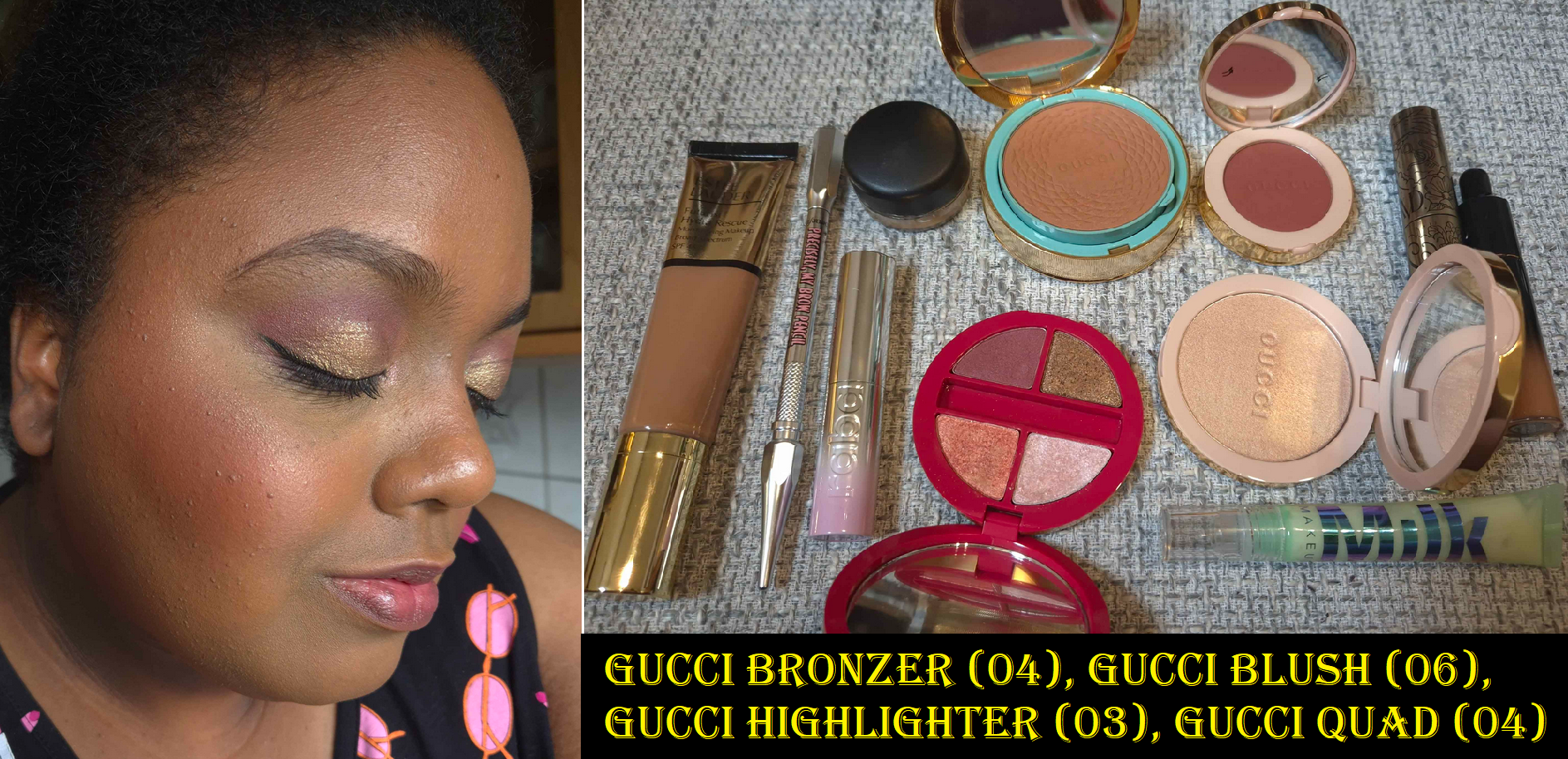
I have previously used Gucci’s foundations, bronzers, blushes, and face powder. Today is the continuation of my exploration of the brand, having added their eyeshadows and powder highlighter to my collection. Prior to these new additions, the standout products for me have been the bronzers and blushes, so I was curious to see if the others could live up to their hype!
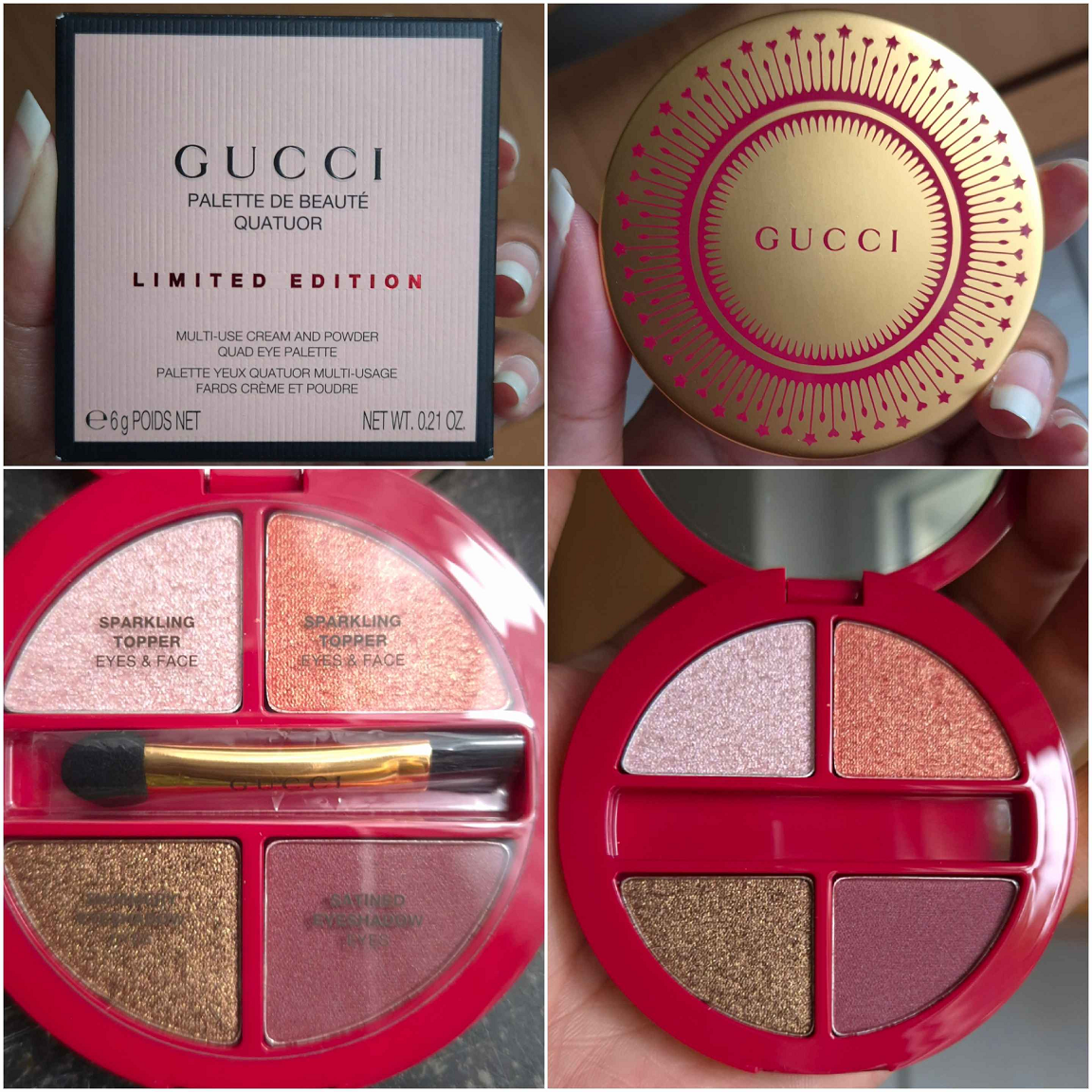
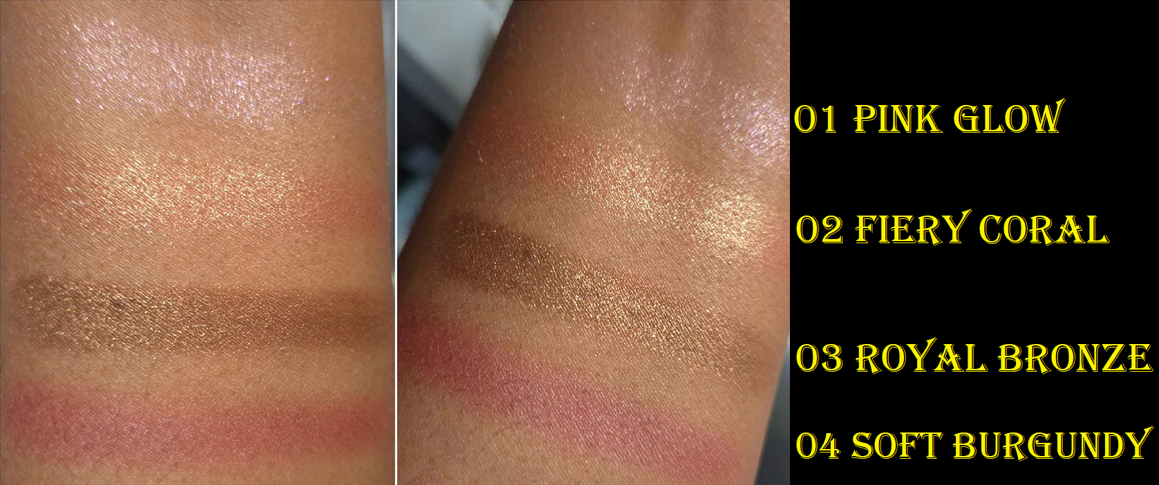
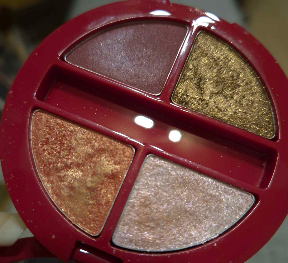
I was never attracted to the color stories, layout, pan shape, and packaging for Gucci’s eyeshadow quads in their permanent range, so I was shocked by how drawn I was to this holiday release. I like the red elements on the outer packaging and was enchanted by the Fiery Coral and Royal Bronze shades specifically. The retailer Douglas dropped the price for these by 20% within days of launching, so I was sold!
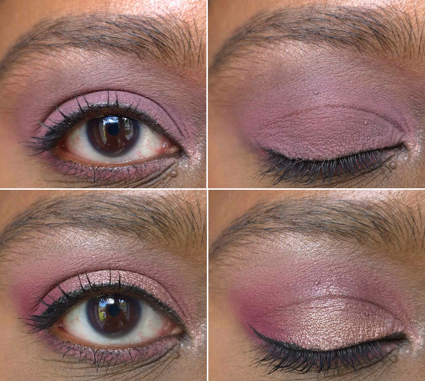
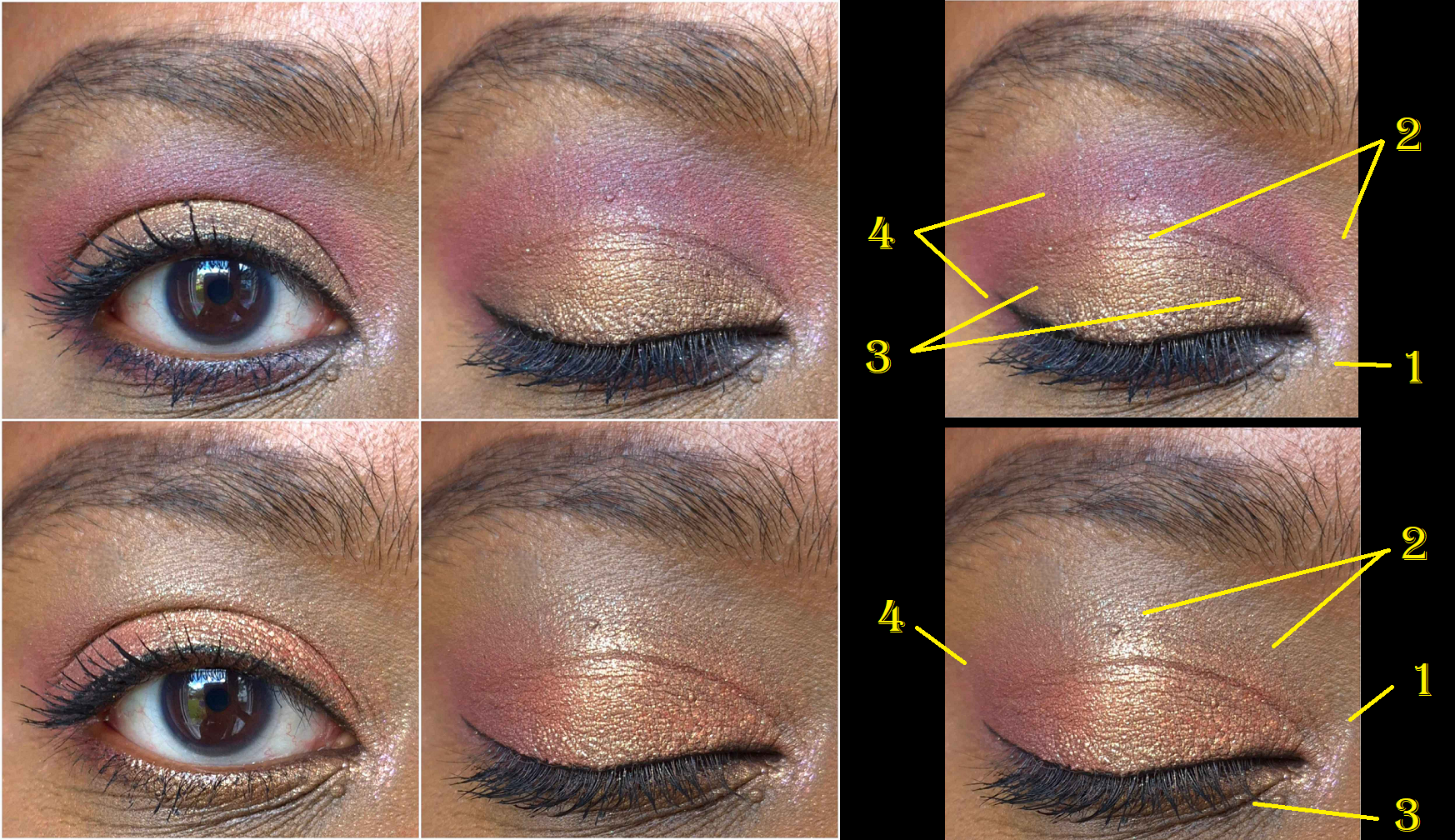
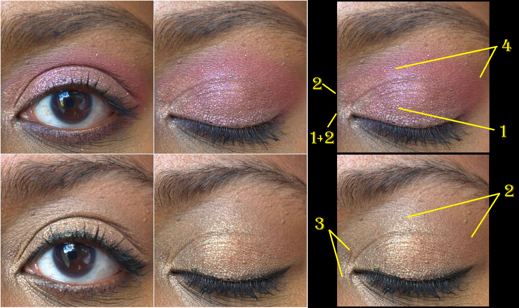
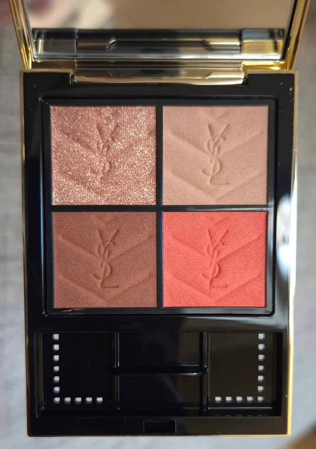
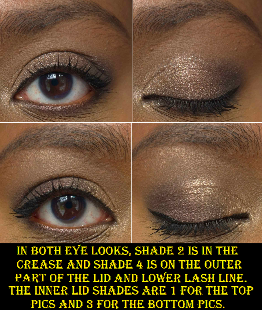
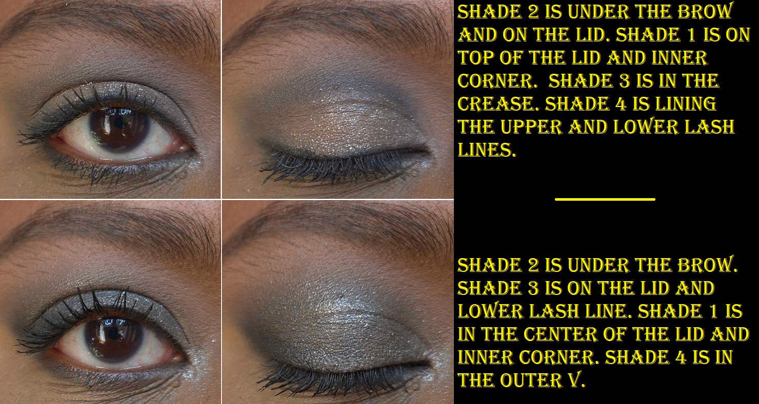
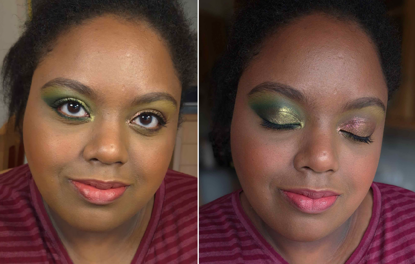
Pink Glow and Fiery Coral are both considered toppers, but only Pink Glow has a translucent base with iridescent pink shimmer. Fiery Coral has a subtle coral base color with gold shimmer. I can see this when I pack the eyeshadow onto my lid with my finger (4th eye look), but it’s especially visible when I apply it with a damp brush (2nd eye look). Pink Glow is absolutely not a unique color, but it’s useful to have as an inner corner highlighting shade and to pair with Soft Burgundy.
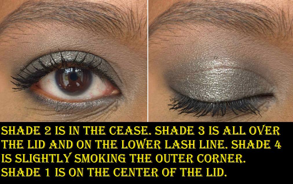
Soft Burgundy is a satin-matte, with a soft creamy texture that looks very smooth around the eyes and pairs well with the pinky-orange coral tones of Fiery Coral. Because Fiery Coral comprises heavily of gold shimmer, it can look very similar to Royal Bronze when Royal Bronze isn’t applied damp. However, I love the pairing the two together anyway, since Fiery Coral gives Royal Bronze a boost of extra sparkle.
These eyeshadows are all thin, but buildable to an extent. Pink Glow is a true topper, so I can’t get an opaque look out of it. Soft Burgundy is dark enough to provide contrast for the other colors, but I don’t consider it a depth creating shade on my complexion. These are some elements that prevent me from being fully in love with this quad, but I still like it a lot.
One of the aspects that can be challenging to use this quad is picking up color. The eyeshadows are firmly pressed into the compact and I get too impatient to build up color with a brush, so I often use my finger for everything, except the inner corner that requires more precision. I also prefer to increase the intensity and opacity by spraying my brush. Going in for second and third dips with the same brush has caused the surface to look a bit off-putting over time, as seen in the photo below.
This pricepoint puts it on par with Guerlain and YSL quads, but in my opinion those brands have a better eyeshadow quality than Gucci. What Gucci has going for it is this color story that is quite bold within the luxury beauty sphere. I applaud them for taking a risk with something so colorful and not leaning on neutrals. This is the most festive launch I’ve seen from a luxury brand this year, and I’m glad to have it, even if I don’t end up getting the most use out of it.
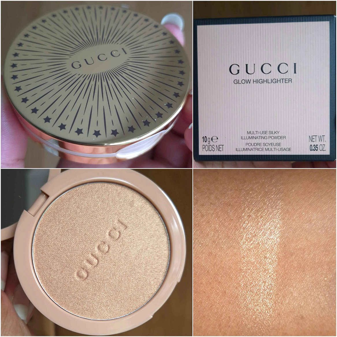
Gucci Glow Highlighter in 03 Warm Gold
It seemed like nearly everyone I watch on YouTube fell in love with this highlighter. I was fully planning to skip getting it because I’d already purchased two other high end highlighters, but Douglas’ 20% off got me again!
My friend and blogger Nikki shared photos with me of the Gucci highlighters, and those are what helped me initially decide not to get them. I even commented that on her page! The discount and all the hype made me forget my reservations about the visible particles, but I wish I remembered because that’s what is keeping me from liking this highlighter. YouTube influencers were hyping up the uncommon gel texture, but being different doesn’t make it automatically better (plus Natasha Denona’s Hy-Gen highlighter is even more unique feeling). It’s beautiful with a wet looking shine, but I don’t like that I can see the individual shimmers. When I watched TrillxLauren‘s video on YouTube, she mentioned with repeated use the highlighter texture looked more like how she tried it in store and had hoped it would perform more to her liking. I too had hope. I hated it the first time I used it, but once I wore off the top layer, I liked it a little more. From then on, I made sure to pick up product from the same spot every time I tried it. The result was it always looking pretty in photos, but I was so torn about how it looked in person.
I’ve tried different brushes and application techniques, but the bottom line is I just can’t get over seeing all the shimmer particles. Perhaps if I had a darker color it would blend more into my skin and then I would love it. This isn’t unheard of since I had a similar experience disliking Gucci’s Bronzer until I got the lighter shade. In this instance, I think Warm Bronze would be too dark and there isn’t anything else more suitable in-between (Opal Pink would look too icy for me). So, unfortunately this was a purchase I should have skipped.
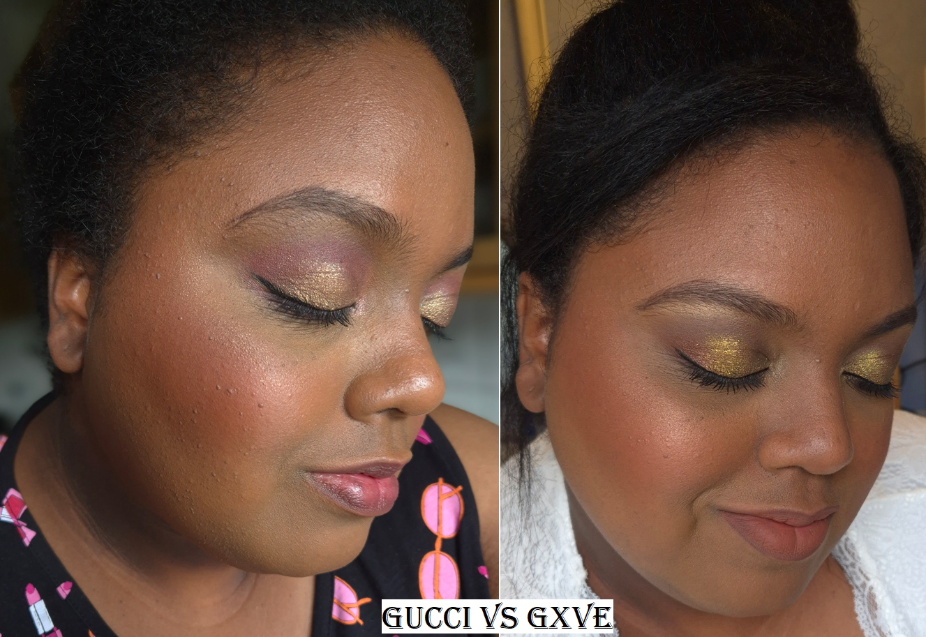
As a further example of what I mean, below is a comparison between Gucci on the left and Gxve Beauty on the right. The one on the right still has a visible glow and I can see shimmer still, but they’re much smaller. As pretty as Gucci’s looks in the picture, the texture is amplified when I view it from my own mirror. Gxve Beauty doesn’t have a unique formula, but it’s beautiful and it works. The retail price is $30 and I bought it during a half off sale. So, compared to Gucci’s $59 retail price, I regret giving into my impulses.
At least the quad was a win!
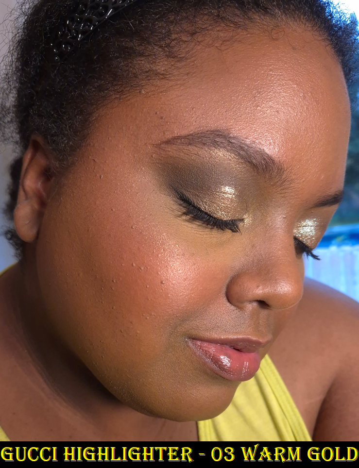
In the photo on the left above, I’m wearing the Gucci bronzer, blush (Warm Berry), eyeshadows, and highlighter. I forgot to use the powder and left behind the foundations. I wanted the new blush in 11 Intense Ruby (it’s called Watermelon in Europe) because of the color and beautiful limited edition packaging, but it bothered me that for some reason Gucci’s blushes cost way more in Germany than in the US. The rest of the makeup is closer to being the same price. Another reason I was hesitant to buy it for a higher price is that it looks like a slightly lighter version of Intense Plum that I decluttered. There’s still a chance that I might like Intense Ruby better, so I ordered it during the Sephora sale from the US site and it’s with my family there. When I eventually go back and try it, if I like it enough, I’ll bring it home with me!
Lastly, I will note that using my r.e.m. beauty Highlighter Topper (which I have called my “fixer highlighter” in the past) does help improve the look of the Gucci highlighter, but I’m not interested anymore in trying to make this work when I have so many others I can use by themselves to achieve the kind of glow I want.
That’s everything! Thank you for checking out this week’s post!
I took a long break from the Natasha Denona brand (since December 2022), but after purchasing the Yucca palette for half off, I wanted to continue my series of ranking all the eyeshadows from the brands whose palettes I own the most of in my collection. I’ve covered Pat Mcgrath Palettes, Huda Beauty Palettes, Oden’s Eye Palettes, and Viseart Palettes so far. Just like with Viseart, I’ve rearranged most of the palettes with removable eyeshadow pans. However, I’m familiar enough with them to be able to remember what they were like and rank them as they were originally intended.
Ranking List of All the Natasha Denona Palettes I Ever Owned:
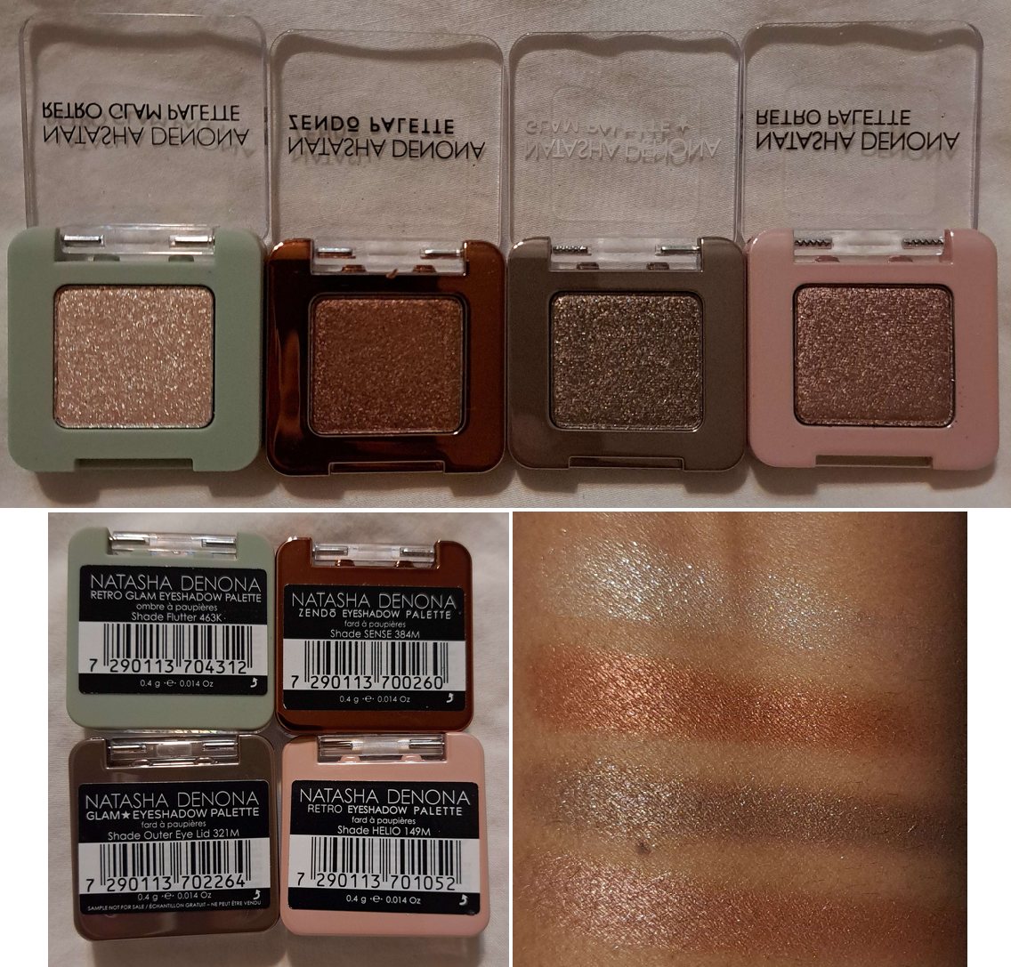
Before we get into the rankings, I wanted to show the eyeshadow singles I got as gift-with-purchase freebies I got from Sephora. I wish they weren’t glued down so I could put them in a custom magnetic palette to save some space when I moved. Because I couldn’t without using my Z-Potter, I left them behind.
I didn’t own any of these shades already because they all come from palettes I was uninterested in buying.
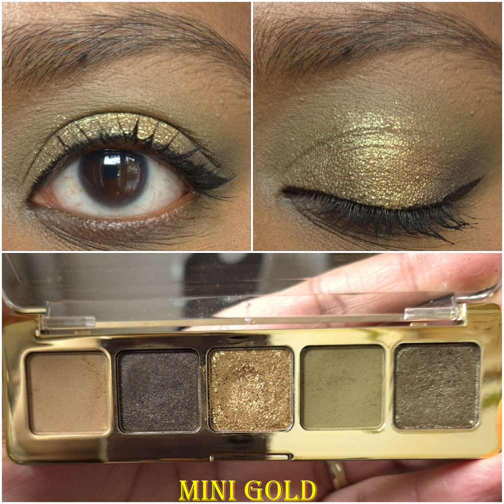
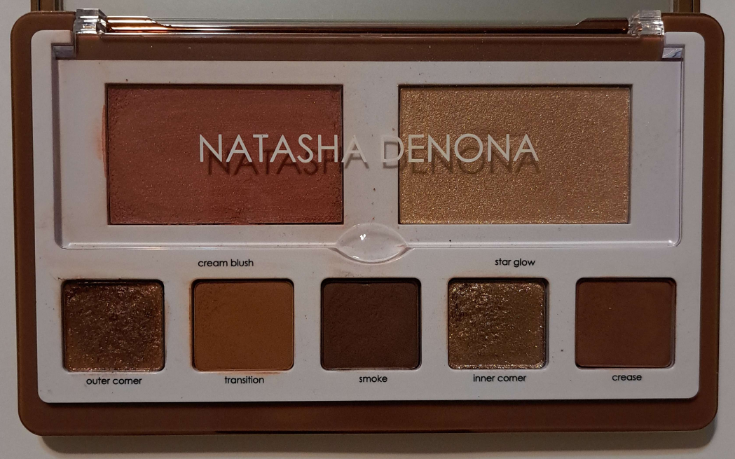
Mini Gold Palette
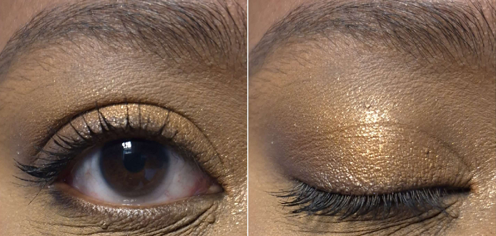
This is very much my type of color story! The beige shade doesn’t show very well on my skin tone, but I still use it along the brow bone. This palette is cohesive and the look I created in the photo above is my default combination for daytime. For night-time, I use a lot more of the deep brown. For so few shades in this small palette, I don’t feel limited by the available choices. They all still perform beautifully, even though this is five years old. The mattes blend well, Dark Sepia and Antheia are very smooth, and D’or pumps up the intensity from satin to sparkly when added to the look. I don’t need to apply any of them with a damp brush. The Natasha Denona formula has gone through its changes over the years, and the ones used in this palette is my favorite performing type from the brand. I also love that it’s small because it makes me feel like I could actually use this up one day. It doesn’t take up much space and is easy to travel with, which I have done several times. Other than making Lodge slightly lighter, the fact that I wouldn’t want to change this palette is why it’s number one!
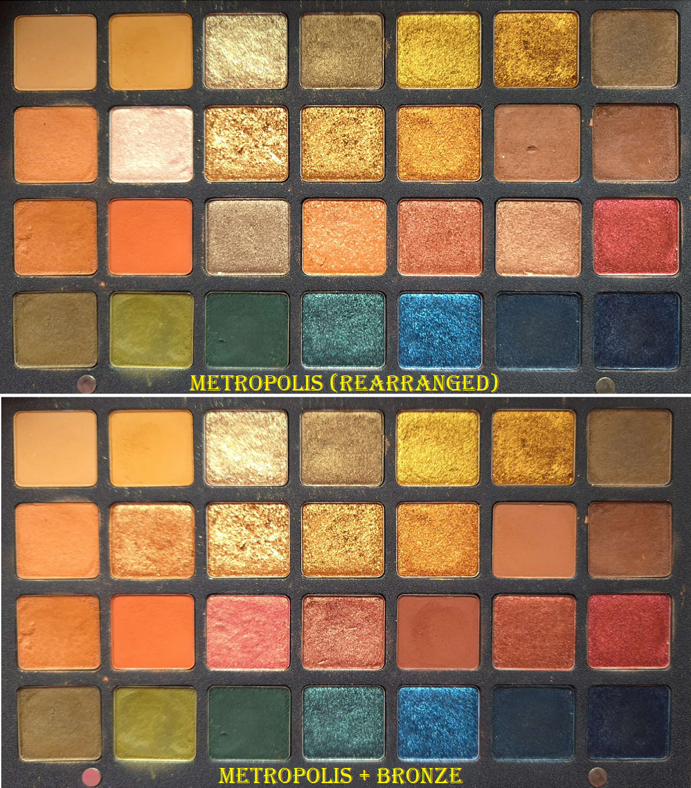
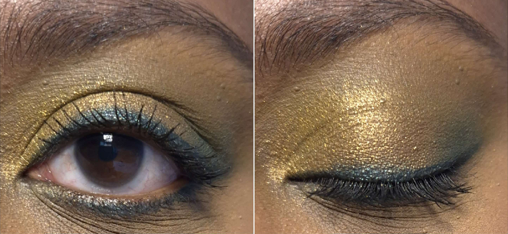
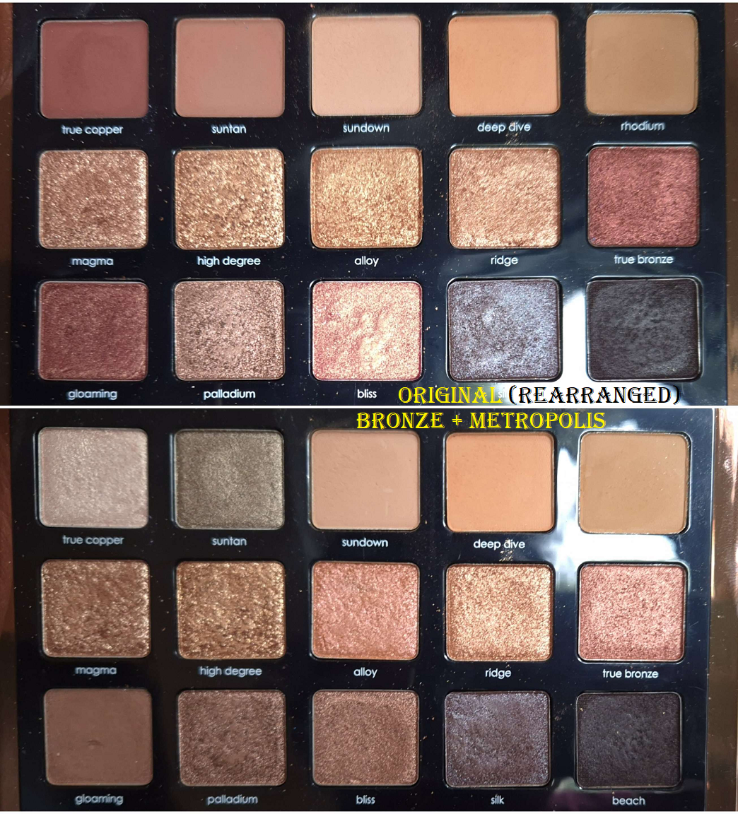
Metropolis Palette
The first picture has all the Metropolis shades, just not in the right order. The second picture is how I keep this palette with Metropolis and Bronze palette colors.
Other than Mini Gold, this is my next favorite color story from the brand. I have so many options, but I do end up with my favorite go-to looks as well. Although I replaced six of the shadows with ones from the Bronze palette, all that really did was give myself deeper orange and red shades. I essentially turned the Metropolis palette into something better suited for my skin tone.
This was the palette that ND seemed to have perfected the cream-to-powder shadows and my love for them really took off. They’re a few months short of five years old and still haven’t fully dried out. My lighter green and a brown shade require me to use my finger to get them out of the pan since they don’t pick up as well on most of my brushes, and one of the blues is nearly dry, but I still love this formula. I love the way it blends and looks on the eyes. It has a satin effect from sheen and not shimmer. The mattes and shimmers are perfect performers for my style. They’re pigmented, but still blendable. They’re smooth and nearly buttery feeling. They layer well on each other. The shimmers are impactful. They last all day. I don’t have creasing issues. To me, this is Natasha Denona’s best performing palette. The fact that I replaced some shades, and it doesn’t have something like Dark Sepia and Antheia (two of my all-time favorite colors from the brand), are the only reasons this ranks number 2. Realistically, it’s tied for the top spot.
Glam Face Palette
Even though this isn’t strictly an eyeshadow palette, I had to include this in the rankings because I really enjoy these eyeshadows. The only reason I left this behind in the US, which I regret, is the fact that the pans are glued in so I couldn’t have the eyeshadows without the blush and highlighter. I don’t mind the blush, but I hate that highlighter, and I kept forgetting to use this because I didn’t keep this palette with the rest of my eyeshadows. If the eyeshadows were in their own separate palette, it would probably look as used as Mini Gold considering how much more often I’m reaching for neutral eyeshadows.
The formula of these is good, but different from Metropolis and Mini Gold. There are no cream to powders. The shimmers are intense, but slightly less smooth with larger size shimmer particles. They’ve got more slip, so I get a little bit of creasing, but not too much. The mattes are pigmented, but a little less easy to blend. They don’t require a lot of effort, just more than their best performing ones. The end result though is gorgeous, which is why I still consider this a favorite.
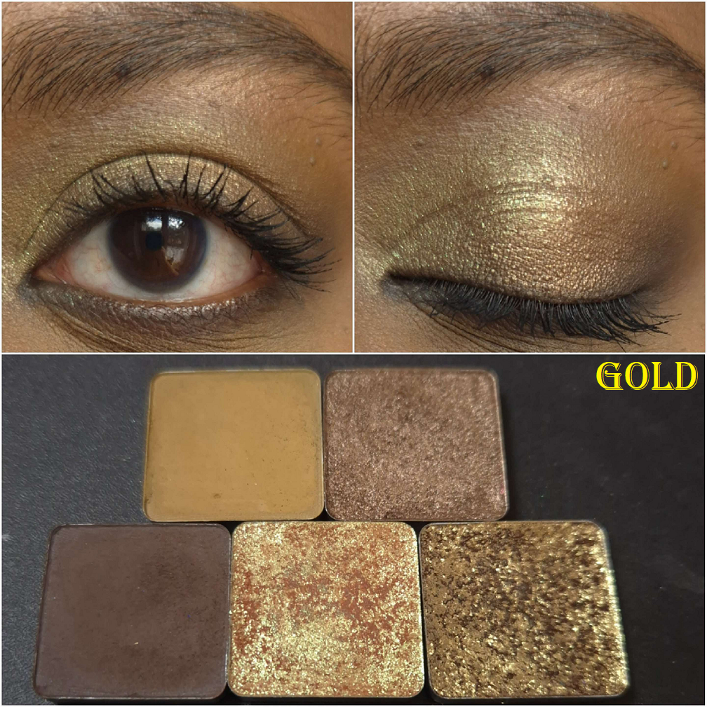
Gold Palette
The shades I kept with me from the Gold palette are Dijon, Varis, Log, Lime Chrome, and Brass. I liked more colors from the Gold palette, but I had similar enough yellows, golds, and browns from other ND palettes that they felt less necessary to bring along. Lime Chrome is another of my absolute favorite shades from Natasha Denona, Log was used on my wedding day, plus Dijon and Varis are shadows I use at least once a month. So, it’s not surprising that I hold the Gold palette in high regard. The brand’s new Golden Palette is meant to replace this one and has 9 repeat shades, yet only Varis and Log out of the ones I saved are in there. I clearly didn’t mind going without the blues, but Lime Chrome was the single most important shade for me in that palette and it’s not in the new one. So, even if I hadn’t pumped the brakes on buying new things from the brand, I would have skipped getting it (even though it’s admittedly pretty to look at).
I believe Python, the deep blue, was the brand’s first creamy-matte or cream to powder eyeshadow. It still needed some work, as I felt it remained too wet. It didn’t blend as easily or smoothly either. The ones from Metropolis were such a step up.
The Gold Palette colors were a bit repetitive, but condensing it down to favorites made it worth having in my collection.
Bronze Palette
I was using this palette quite a bit, until I decided to swap around six shadows into the Metropolis palette. I feel like my changes still improved upon the Bronze palette, but it could have benefited from being condensed down. Unlike purples and greens which I could own plenty of in a single palette and be content with the various nuances, the subtleties of bronze and oranges and everything in-between couldn’t hold my attention. This palette is so visually appealing that I couldn’t bear to leave it behind, but I don’t love it enough to actually use it as often as I should.
The mattes are less creamy/buttery and more along the lines of smooth, soft, and powdery. I like the cream to powder, though the slight purplish color of it is an interesting choice. The shimmers are impactful, smooth, and opaque though, just how I like them. So, the quality overall isn’t perfect, but quite good.
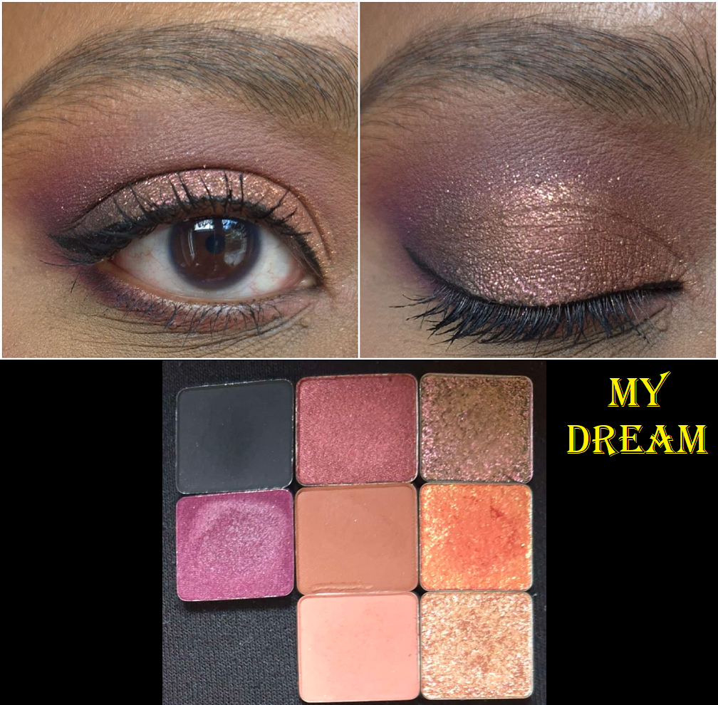
My Dream Palette
Shortly after I bought this palette, I went on my brand strike. So, I didn’t have the chance to review it. Considering I took 8 of the 15 shades with me, one could assume I really love this palette. However, I mostly just wanted to be able to continue testing the palette with shades I might actually reach for when doing my makeup.
What drew me to this palette in the first place were the additional cream to powders, the purple heavy color story, Vision as a multichrome, and Invention as the stunning fiery orange. I like having smoky options like Blackest Black and Familia, although I left Familia behind since I was taking Log. Some of the colors I abandoned were because even though they looked different in the pan, they looked too similar to each other on my skin. The mattes performed similarly to Bronze’s mattes (so good, but not the ultimate from ND), and the shimmers were either the same or in some cases even more sparkly. Vision is pretty, but doesn’t has as strong of a color shift as I’m used to from indie brands. Blackest Black takes a bit more effort to avoid overapplying or not sticking to the skin well enough and looking patchy. Invention also didn’t look the way on my eyes that I envisioned. This doesn’t count against it, but I have to point out that the misspelling of spontaneous as Spontaneuos is a bit comical.
The pros for this palette put it slightly ahead of Bronze, put the cons count slightly more against this palette as well. The overall performance is most important, and because of slightly more technical flaws, this palette got nudged out of the top five.
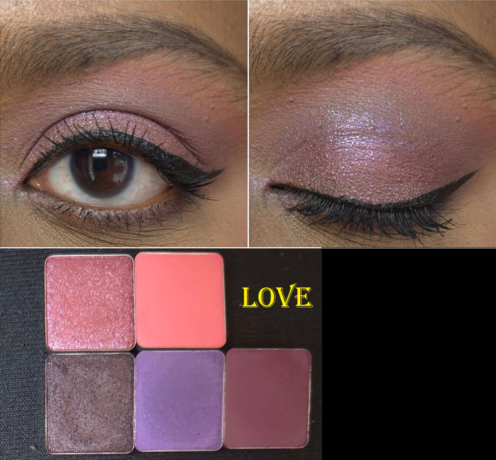
Love Palette
The palette has a cohesive color story, but I took my top favorite shades with me, and unfortunately that combination doesn’t look nice together all in one look. The cream to powder in this one is on the drier side now, which is interesting since it’s one of the second to last ND palettes I bought. It’s always been on the sheerer side, but getting product out is tougher now. The mattes feel similar to the ones from the Bronze palette. The shimmers are beautiful as always. Based on the amount of eyeshadows I saved and how much I liked the Love palette as a whole, I couldn’t put this palette any lower. However, I have a lot of pink and purple palettes I prefer over this one (from other brands). Some of those were custom palettes I made myself using individual eyeshadow singles from other brands. So, I couldn’t put this higher either. Considering how pink and red heavy this palette is, it’s shocking enough that I decided to place it above Natasha’s other purple palettes. Purples are among my favorite eyeshadow colors, but the quality differences were too big to overlook.
My disinterest in most pink palettes is the reason I am not planning to buy the Roxa palette. I would love to try the new matte formula in that one, but there are too many light shades and pinks for my taste. The palette would have to go on sale for nearly 50% off for it to be worth it for me to purchase (beyond financial reasons is the lack of space in my home and not wanting to be wasteful).
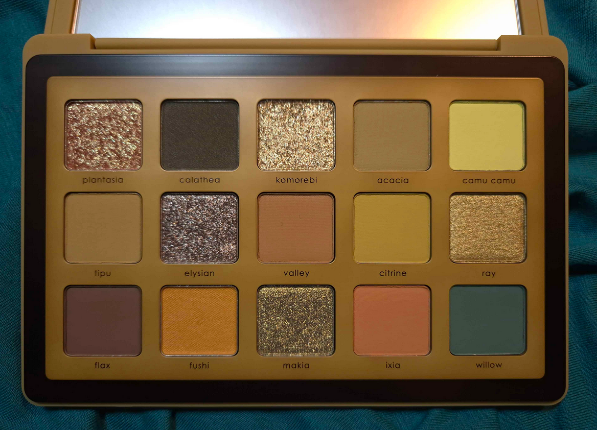
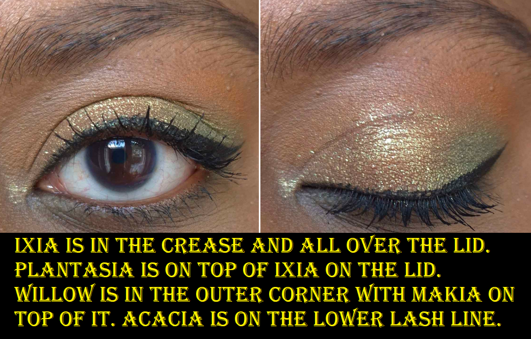
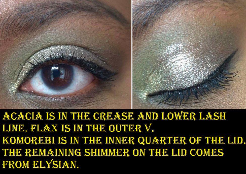
Yucca Palette
My first thought when I saw this palette was that the color story was pretty, but I didn’t need it since I still owned the Colored Raine Safari palette (which is honestly even prettier). I also said if I ever was to buy it, it should not be at full price since I was unsure how much this could bring to the table over Metropolis, which I assert has a better color story and formula, over this one.
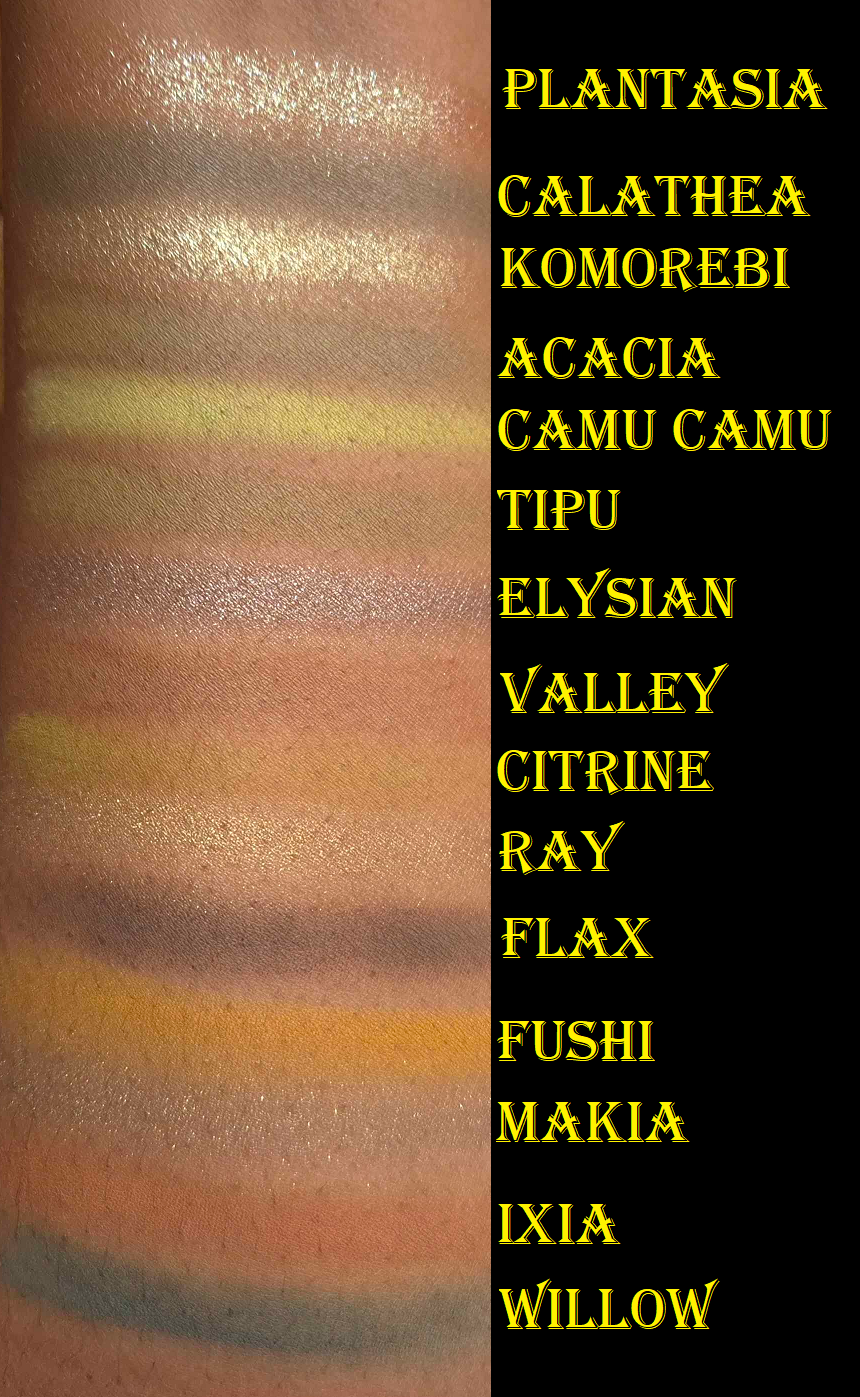
At some point the mattes from Natasha Denona strayed further away from the creamy ones I loved, to a silky drier one. It’s similar to the mattes in the Bronze, Love, and My Dream palettes except these don’t spread as easily. If we look back at my past posts, ND’s eyeshadows used to go on and on in a long pigmented opaque swatch. These mattes are still pigmented, but when I was trying to swatch them, they kept having gaps of no color. I had to swipe at least three times for all of them to get a complete line to show across my arm from left to right. Willow still looks terrible. The swatches don’t look that great in general even though I built them up a lot more than usual. Of course, swatches don’t tell the whole story, and it’s more important how the performance is on the eyes. Honestly, they blended fine, but it was far from effortless. They’re not bad, but something is just off in comparison to the quality from the brand I’m used to.
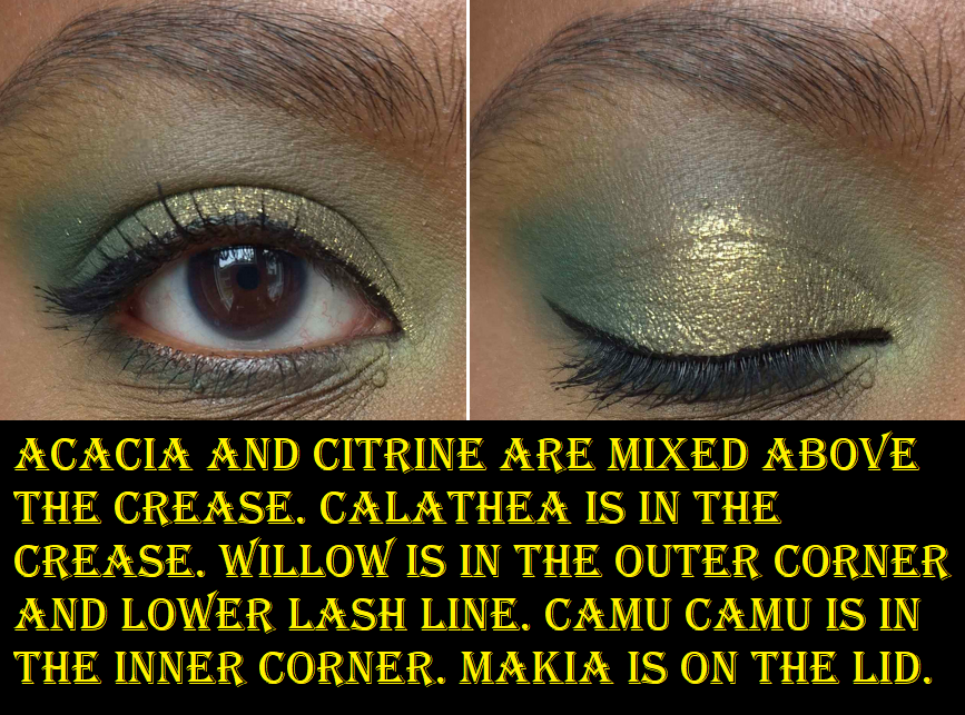
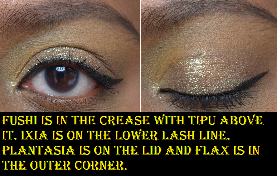
There are two cream-powder mattes in here. For some reason, Fushi is thicker in texture and Calathea has more slip. I prefer Fushi because it’s much easier to get the product onto my brush and smoothed onto my eyes. Calathea required more packing and effort. It’s also a different color on my skin than I expected by looking at it in the pan. I wanted a deeper and less muted shade, but I admittedly already have that in the Metropolis palette. So, I understand the brand wanting to offer something different.
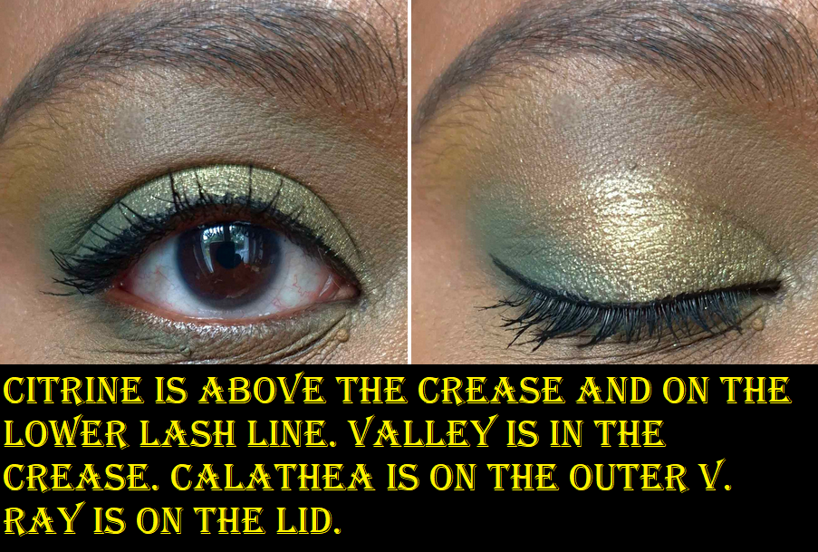
The shimmers are the best aspects of this palette, aside from Fushi. They give impact. They have sparkle to them. They don’t fade. They have minimal fallout and don’t require being applied dampened. However, I noticed that these are sheerer than I’m also used to. I can see my skin underneath, which makes them not look the same way as I envisioned. For example, Plantasia looks like an orange-reddish-bronze in the pan, but I see more golden-yellow on my lids. In order to get a warmer tone, I have to fake it by putting an orange matte underneath so that color is what shows instead of the brown of my skin. The same goes for Makia that I expected to be antique gold-olive, but looks more lemon-lime. For more green, I have to put a green shadow underneath. Those two were the shadows I was most excited to have, besides the cream-powder ones, so I was admittedly a bit disappointed.
A surprise favorite ended up being Camu Camu for its near neon brightness. On the flip side, one of the biggest disappointments was Flax because it just isn’t deep enough to give me the depth level I require for my skin tone.
Despite this palette consisting of colors I typically enjoy, this ranked much lower because it’s as I feared. It doesn’t give me much different than I could get from Metropolis, plus the formula is less to my liking. It’s further away from my preference, which doesn’t make it necessarily a bad palette. Or at least, it wouldn’t be considered that bad if the blending time wasn’t longer.
I expect to continue using Ixia (it’s a wonderful orange), Fushi, Makia, Citrine, Camu Camu, Plantasia, and perhaps even Calathea. That’s slightly less than half of the palette, so the 24 Euros I paid via Selfridges is still alright with me.
Lila Palette
From this point and onward, I don’t have any of the palettes with me.
I thought for certain that this was going to be my most beloved palette. The shades on my skin didn’t look how I expected them to though, which is ultimately when I had the idea to swap some colors around. That unfortunately didn’t cause me to use this palette any more often because the matte quality was not as great back then. The older ND formula had some that blended quite well, some that were slow builders, and some that were straight up duds. They were rougher in texture too. The shimmers were more like satins because they weren’t as reflective as I prefer. I think this was more of a makeup artist driven formula than consumer-friendly one where shadows were easier to blend with color stories that were more intuitive for putting together.
This palette holds a place in my heart for nostalgic reasons and appealing to my purple lover side, but it wasn’t the brand’s best by far.
28 Purple Blue Palette
This palette is also nostalgic because I got it in one of Beautylish’s Lucky Bags. The euphoric feeling I got from taking the chance on spending a lot of money and “winning big” on such an expensive palette was quite the rush. The reality is that I’m really not a fan of blues, so this palette was half wasted on me. Influencers really hyped up this palette when the brand first came to Sephora US, and it was very good at the time, but not $200+ good. The mattes had that stiffer formula I mentioned in the Lila section. They were pigmented and required some effort to blend, though they were still fairly good. The shimmers were crazy pigmented, but didn’t have the sparkle intensity I love. It wasn’t bad, just not to my preference. I basically turned this into the “discard” palette of all the larger pan Natasha Denona eyeshadows I would never use (mainly cool tones, blues, and unneeded browns). By the time I decided I should probably sell it or give it away, the shadow quality just wasn’t good enough. So, I only kept it for nostalgia reasons.
Mini Lila Palette
I got this in August 2018. It’s definitely one of the weakest performing ND palettes of all time compared to the rest of the brand’s eyeshadows. However, it was still a decent performing palette compared to everything on the market. Even when I felt like I outgrew the palette, I couldn’t fathom giving it up because of that Blue Dahlia shade, which was such an uncommon color at the time. I have to give this brand credit for having specific colors that stand out to the point that I know them by name. Even among my favorites out of my entire eyeshadow collection, I have some palettes I love for the quality and color combinations available. Some of my favorites I still reach for a Clionadh shadow to add something special on top. However, Natasha Denona’s brand does have some special shades within their palettes.
For quality reasons and the one direction this palette can take me, it’s nearly at the bottom of this ranking.
04 Five Pan Palette
This was my first ever Natasha Denona palette, back in February 2016. I don’t know how many people even remember when she used to put her large sized eyeshadows in these 5-pan palettes for nearly $50. This was so similar to Viseart’s Minx palette, but Viseart did it better which is why I ended up selling mine on Mercari. I basically just wanted to try the formula and see what the hype was about. The only matte shade in here was an absolute dud. In fact, it was supposed to be a satin like the others, but mine had not a single bit of shimmer in there and trying to get it on a brush and get it to not look patchy was too great a task. The other colors performed the way all her older shimmers did, which was nice, but not my cup of tea. I think the brand made a much smarter choice when they switched to minis. People could talk about crushed pearls and diamond powder all they wanted, but if the customer isn’t over the moon about the end result, the price tag still won’t be worth it.
So, that is every palette I owned from Natasha Denona ranked! The way it currently is today, I consider this brand a maker of one of my favorite formulas for both mattes (older formula and cream powder ones) and shimmers, which is not something I can say often about the brands I use. Metropolis and Mini Gold would for sure in the top 20 eyeshadow palettes in my collection (if a list were to exist) out of the several hundred I’ve owned.
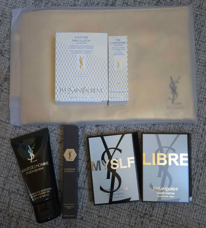
In my previous review of YSL Quads, I mentioned I’m willing to pay full price for these if they’re going to be color stories I love, though I always recommend trying to get a deal if possible. For this holiday order, I paid full price, but the brand offered a gift with purchase option where customers could choose one of twelve different bags/pouches, choose one of two travel size fragrances, and the mini shower gel came with it. I also had the option to choose two out of six samples, which comes with every order directly from YSL’s website. I only like their Black Opium line, so I gave the larger freebies to my husband.
At the time I started writing the first draft of this review, one month after the initial launch, the official website was the only place that sold the palette in Germany. I was not patient enough to wait for a potential monetary deal and the 10% off welcome discount code did not apply to new items.
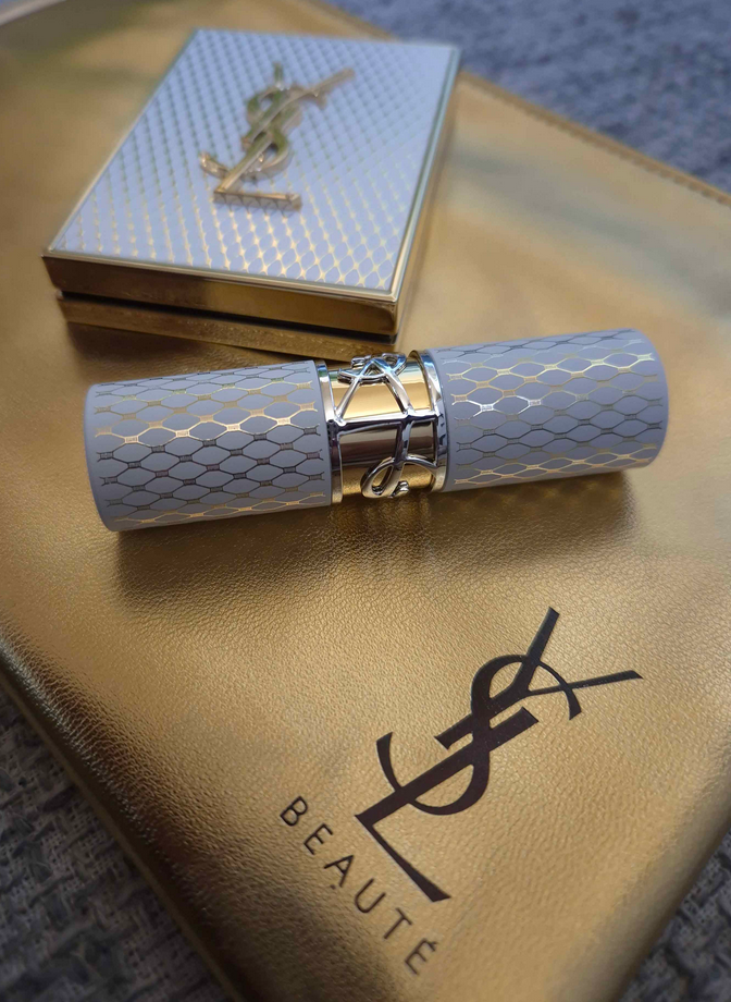
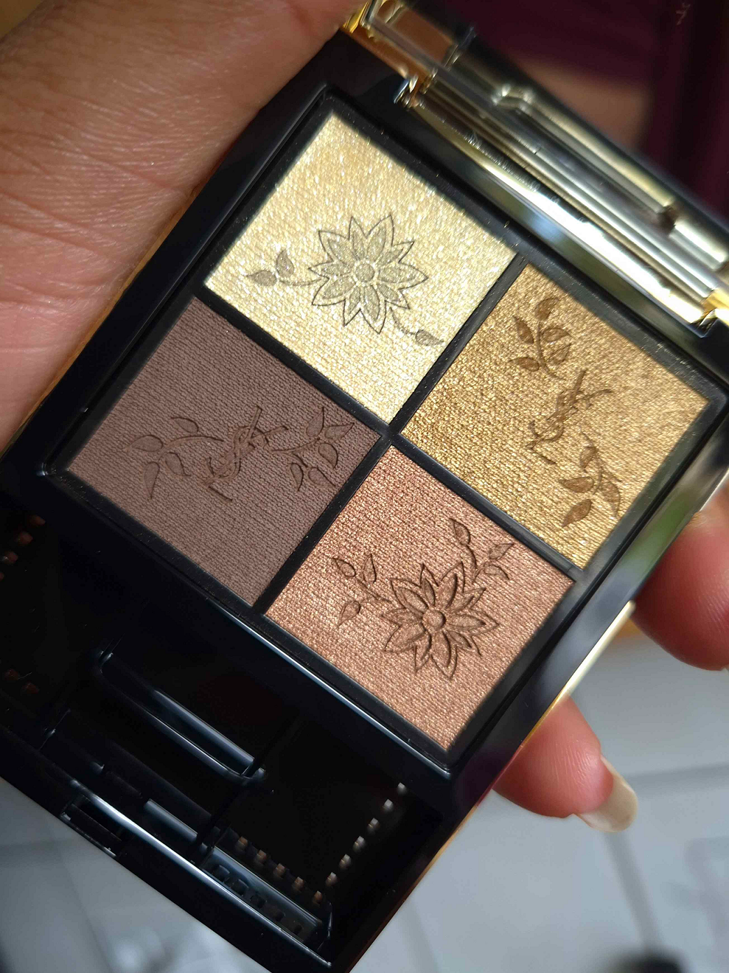
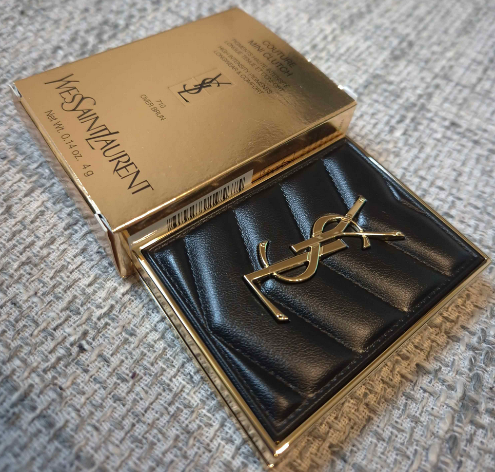
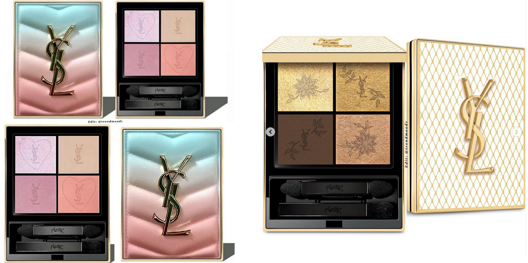
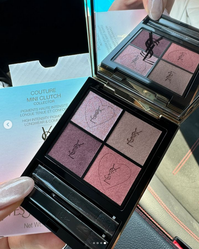
YSL Couture Mini Clutch in 024 Golden Lace
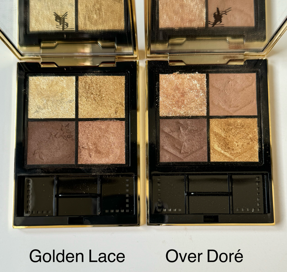
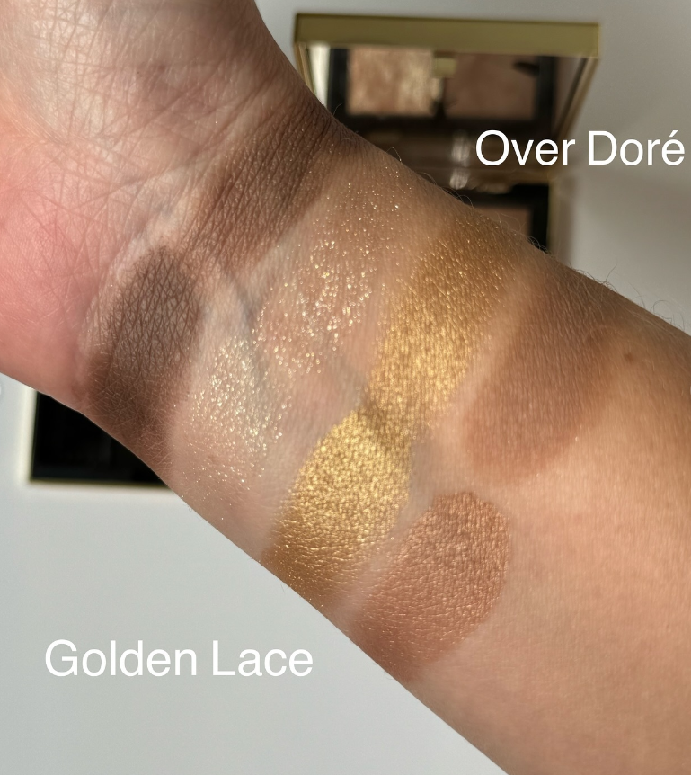
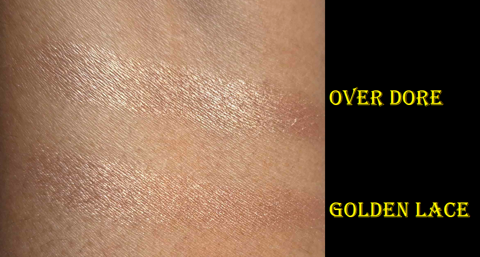
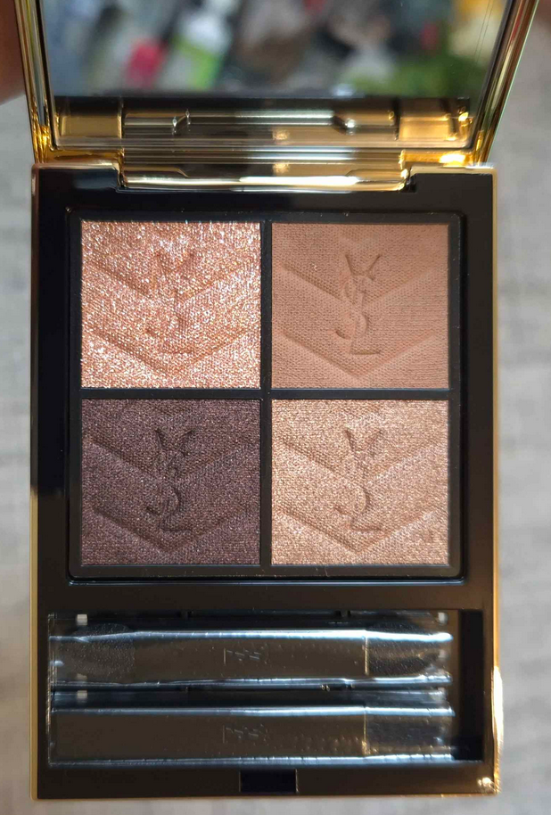
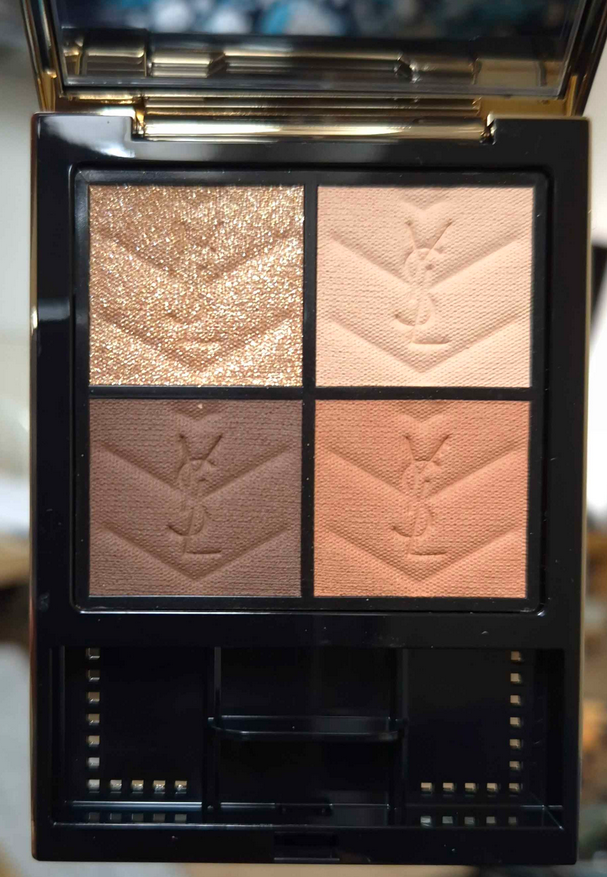
I think these colors are gorgeous! They aren’t unique, as I’m sure I could find dupes in my collection (perhaps from Natasha Denona’s Gold or Bronze palettes). The shades are extremely close to YSL’s own Over Doré quad. Fedaro_Beauty on Instagram has fantastic comparisons between both palettes. She was kind enough to allow me to share her example photos here, but her post has additional photos, including eye looks and the lipstick for those interested in seeing more.
To see her YouTube short of these two items in high quality video format, click HERE. I recommend subscribing to the Fedaro Beauty YouTube channel as well as following on Instagram. She has very insightful and in-depth reviews that have helped me be a better informed consumer and make smarter purchasing decisions. It was actually due to reviews from Fedaro Beauty that I realized Over Doré’s darkest shade didn’t look like it would be deep enough for my liking, and why I skipped buying that quad. Now, I am especially happy that I decided not to buy it because Golden Lace is slightly better suited for my preferences, making it the better purchase for me.
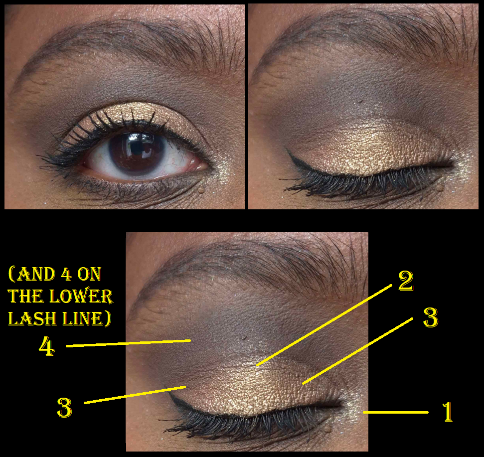
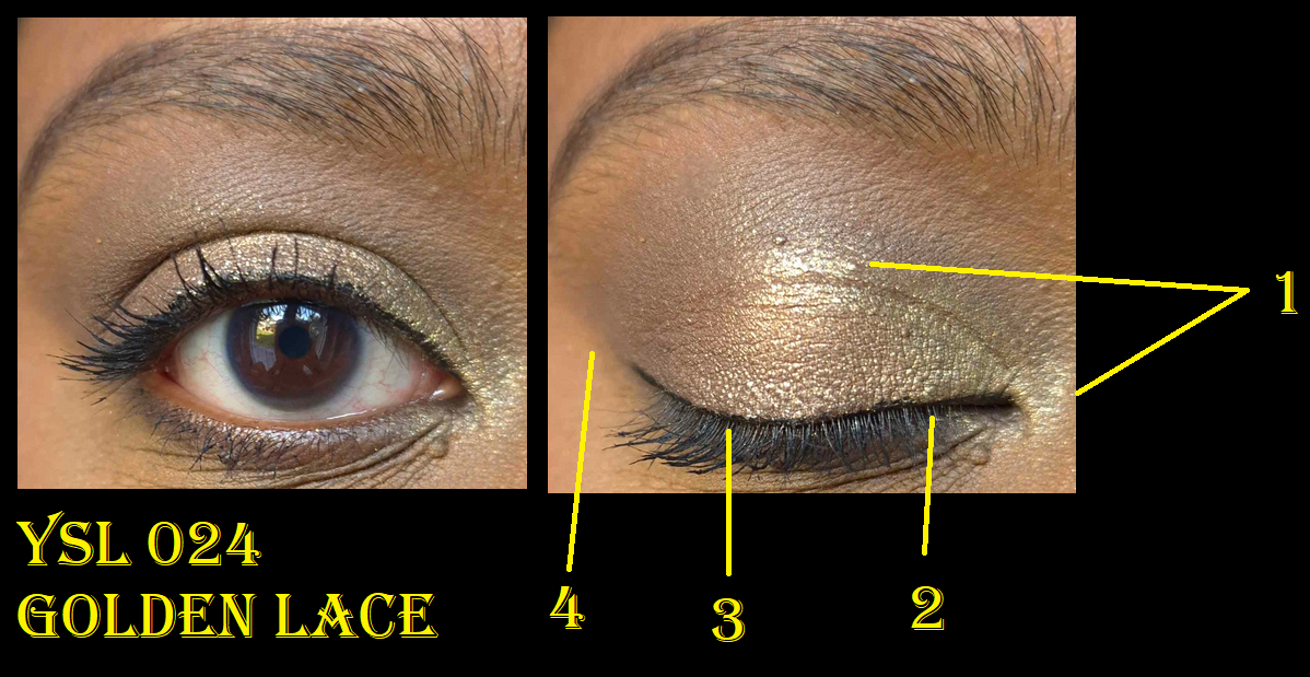
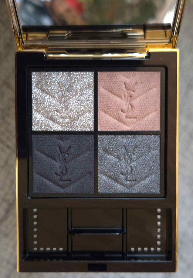
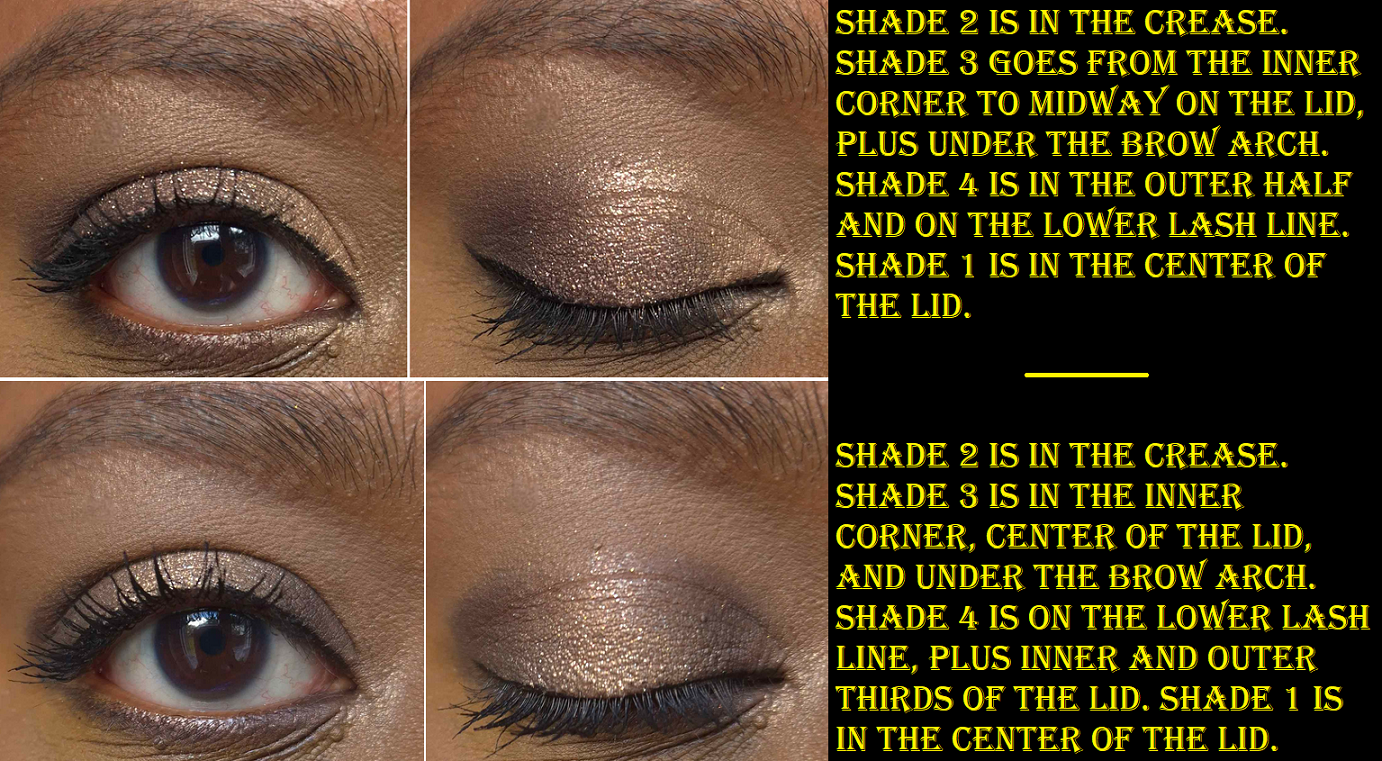
With Golden Lace, the darkest color adds depth, but I have to build it up so much that I sometimes get it higher above my crease than I want, and using a smaller brush takes too much time. One of the biggest selling points for me is that I can create pretty looks very quickly with YSL quads because they are so easy to blend. Building up Shade 4 and not having a lighter shade to help blend out the edges is only a problem for review purposes. In everyday life, I just use a lighter matte from the other quads or use this shade in the crease and deepen the outer corner with the black color from Over Noir. It’s not so bad dipping into other quads if it only takes half the usual blending time as eyeshadows from other brands would require.
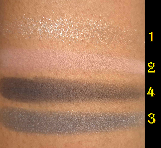
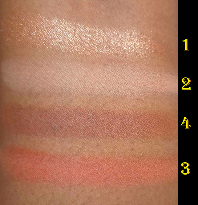
Above is a demonstration of a more dramatic look built up to the max. The shimmers were applied damp to intensify the shine. Below is an example of a toned down look with shimmers applied by finger and a dry brush. I also blended out the edge with Shade 2 from Over Brun.
I don’t notice any quality differences between this limited edition palette and the permanent line, which is a relief since many brands unfortunately use cheaper formulations for their holiday launches. I get no creasing or fading issues. There isn’t much fallout, particularly if I apply them wet. I’ve tested the quad on three different primers/bases and had no performance problems. The eyeshadows blend well, though I did mention needing to build up the darkest shade a lot and having to wet the shimmers to get the level of opacity and depth I want for my skin tone. This is unlikely to be a problem for those with lighter skin.
Although the colors in Golden Lace don’t scream holidays to me, the packaging and beautiful winter flower imprint on the shades fulfill that vibe. I’m quite happy to have purchased this! I have to add that Over Brun is still my favorite of the bunch!
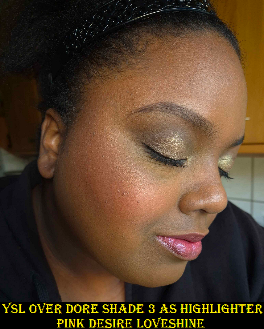
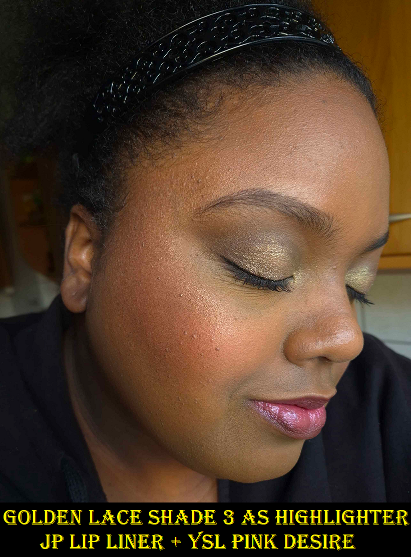
One other thing to add is that I was curious to see if Shade 3 could be used as a highlighter. In the swatches, it blends in so well with my skin tone. I can confirm that the color makes for a great highlighter and although the shimmer particles are a bit more apparent than what I usually go for, I’d feel comfortable enough to wear it for festive occasions. There are actual highlighters I’ve removed from my collection for being way more sparkly than this eyeshadow looks on my cheeks. I don’t think anyone would be able to tell, just by looking at me, that it was an eyeshadow I was using and not a traditional highlighter. I was inspired to use Shade 3 from Over Brun as well and that works too, although Over Brun’s shadow is a little more reflective.
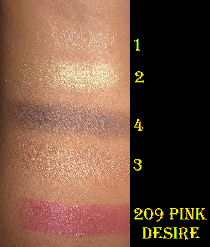
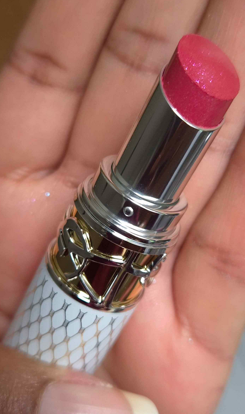
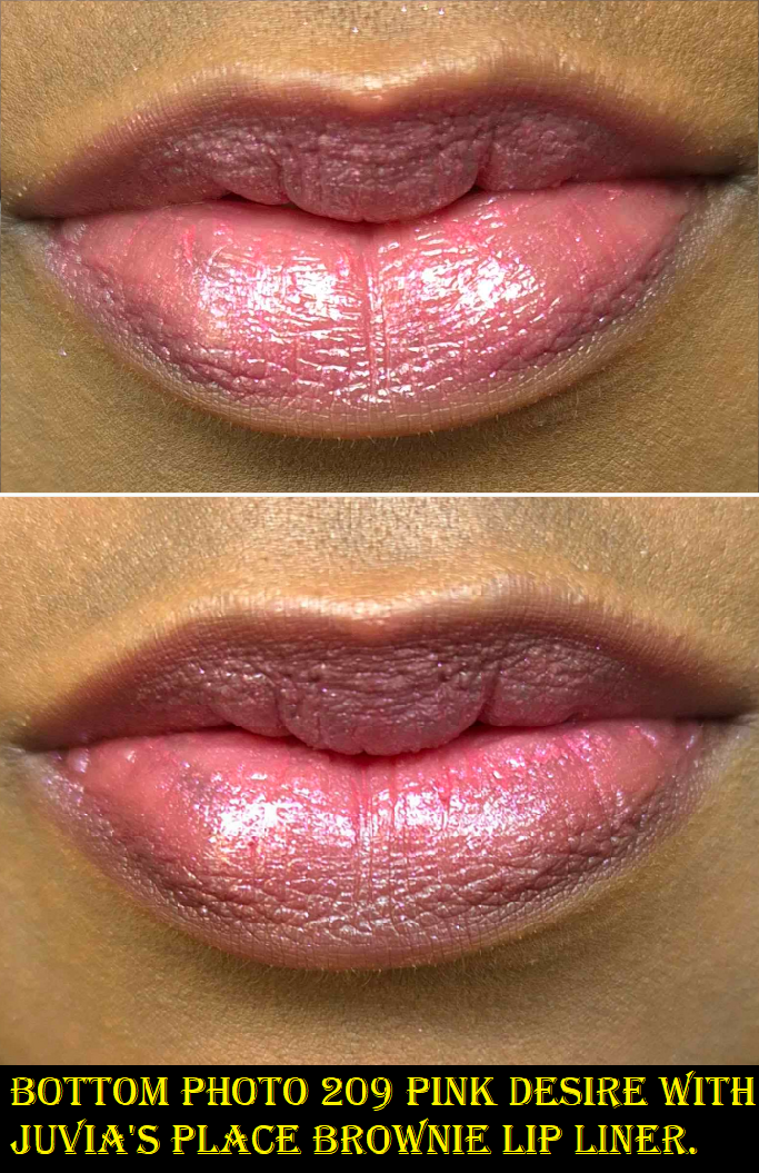
YSL Loveshine Lipstick Collector in Shade 209 Pink Desire
The swatch for this is further above in the eyeshadow section. In that picture, the magenta or pinky-purple sparkles are easier to see than I was able to capture in lip swatches. This version of Pink Desire is too vibrant for my taste and not the best suited for my warm undertone, but it’s such a fun color that I would just use it on particular occasions.
I’ve tried pairing it with a lip liner and it while it helps a little, I don’t see a significant difference. It’s still bold. As for the Loveshine formula, which is a first for me as I only had YSL Volupté lippies prior to this, I do like it. It feels comfortable and moisturizing on the lips, gives good color payoff, and has a yummy fruity-candy scent. I have not gone an entire day wearing this shade though. I apologize, but I can’t do a full day wear test with this one. I don’t have the confidence to rock it in normal everyday situations where everyone is able to see me. I ordered another Loveshine from the permanent range and intend to give that a proper test before updating this post 3-4 weeks from now.*
*NOVEMBER 7th 2024 UPDATE: As promised, I just want to update about the fact that this particular formula of Loveshine with shimmer differs from the feel of the other Loveshine High-Shine Caring Lipsticks. This one was balmier, but the normal range is more emollient. It feels moisturizing and nice, but by the end of the day, I still suffer a bit of dryness. I will be releasing a dedicated YSL lippie post in the future, so I will go more in-depth there. In summation though, “I have such picky lips that if I wanted to use it as a caring lip treatment type of product, this wouldn’t be worth the price (unlike on other people with less lip sensitivities who would have zero issues with this). However, as a makeup product and just wanting to have something comfortable enough to wear in a pretty color and with packaging that feels luxurious and indulgent, this succeeds in that.”
Below are more photos with the eyeshadow quad used on my eyes and Pink Desire on my lips (the photo with liner is on the right). Even after taking these pictures, I removed the lipstick and put a different shade on instead to finish out the rest of my day. This color isn’t for me, but I’ve seen it look beautiful on other people. There are two additional lip colors available in the limited edition tubes, but I believe they might be too light for my taste.
That’s everything I have to share! Thank you for reading and I hope this has been helpful!
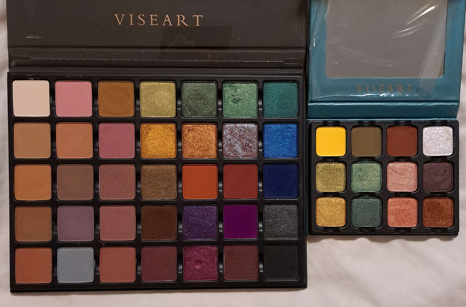
I have a long unstable history with Viseart, but the bottom line is that I own a lot of their eyeshadows and I continue to keep an eye out for new launches. Over the years, I kept curating my collection, only keeping the shades I felt were the most useful to me. When I was preparing to go overseas, I needed to evaluate which ones would have to stay behind, which is where the idea for this post originated.
The eyeshadows in the top left gold rimmed palette are my older ones that are more fragile. I excluded them from the custom palette, in addition to the Neutral Mattes that already had several damaged shadows from when I depotted shades from the older packaging to the newer Slimpro empty palette.
Below are the two custom palettes I curated. I couldn’t make just one because of the different pan sizes. Viseart currently has three eyeshadow pan sizes they sell.
Viseart has a lot of nearly identical shades, and some colors don’t look the same on my skin as they do in the pan. So, I had to swatch everything and choose the ones I liked the most. The color story in the revised Grand Pro 1x palette looks very heavy on the midtone neutrals, but that’s because I realistically don’t use a lot of the lighter colors. If I have one or two, that’s generally enough. However, the nuances between those various browns and pinks were so nice I couldn’t decide between them and decided to just take them all.
Since I had to analyze my collection and think about the palettes they were part of, I’m in a better position to be able to rank them in their original forms, similarly to the way I discussed my Pat Mcgrath Palettes, Huda Beauty Palettes, and Oden’s Eye Palettes.
Omitted from the ranking portion are the individual eyeshadow singles I bought, since they came from palettes I didn’t own in their entirety.
Ranking List of All the Viseart Palettes I Ever Owned:
Each of the thirteen above are linked to their previous reviews, swatches, or discussions.
Dark Mattes (purchased in January 2016)
This is my number one Viseart palette based on the original formulation and not the current Dark Mattes Slimpro palette. Viseart’s eyeshadow formula was always simplistic, but the original ingredient list used to include Octyldodecanol, Myristyl Lactate, and Isononyl Isononanoate, which are all emollients. I haven’t tried the current version of this palette, so I don’t know if it feels or performs in the same way. However, there was a period of time that I felt Viseart’s quality went down, so they’re not impervious to production issues. I think it would be a safe bet to guess that the original and new ones look and feel the same, but perform a little differently. It could still be good, but I don’t know from firsthand knowledge.
I loved this palette so much because of the gorgeous color story and insane blendability. It was my go-to Fall palette for so many years. The bottom row of blues and greens were a little less pigmented and took longer to blend, but overall it was a great palette.
After about five years, some of the shades eventually became hard to use (it’s only promised to be good for two years). I tried to replace it with the Dark Edit palette. Ironically, the Dark Edit is at the bottom of this list. Yikes! More on that later.
The remaining shades I still own from the original Dark Mattes were working extremely well before I left, particularly the oranges. Viseart’s orange shades set the bar that I compare to other brands. It’s similar to the way I consider Oden’s Eye an authority on greens.
Petit Fours – Violetta
This is among Viseart’s relatively newer palettes. Whatever quality/production/formula issues they seemed to have between 2020 and 2021 (allegedly) might have been over with by the time this was produced. To me, this is the most interesting color story the brand has released, or at least among the quads. For starters, it has a duochrome which is not a common feature among the brand’s palettes. Seeing the shade Verrerie next to all the other shimmers in my custom palette, one can see that the finish of it is different and it’s evident how much it stands out from the pack. Viseart also tends to love including brow bone shades and other light eyeshadows. For the ratio to be this high of dark colors is another uncommon, but very welcome, attribute. This selection of colors allows the user to truly be able to take a look from daytime to nighttime. It can go from relatively light and ethereal to deep and dramatic. Each shade is distinctly different, yet they all pair well together. It was a holiday release that gives me Christmas vibes reimagined without the use of straightforward reds or greens.
In terms of performance, it’s their best shimmers yet. There’s no creasing, fading, or any other kind of longevity issue. The only reason this isn’t in the number one spot is because it’s the newer of the two. It hasn’t stood the test of time like the Dark Mattes palette, and there is less variety purely because of there being less shades. If you’ll allow me some leeway, we can consider this quad tied for first. The best part is the fact that what’s available online right now should still be the same quality as the one I own.
Bijouxette Étendu
This was another unusual release because of how colorful it is, and not being filled with a ton of light shades. There was a time when I loved having a neutral matte crease and outer corner paired with a shimmery lid shade. This palette is perfect for that style. Creating looks within the same color family is possible, but I think the second best style option is to go for pairing multiple colorful shades together. I love the combinations I showcased in my initial review for Bijouxette. Back then, I called it a jewel-toned rainbow palette, but I want to add that it also has a tropical flair.
The mattes are very pigmented, but blend and layer well. They’re buildable and long lasting around the eyes. The shimmer finishes are a mix of the semi-toned down ones Viseart is known for, combined with ones that are more impactful and intense like in Violetta. However, the level of smoothness makes these shimmers the best Viseart has done (out of the ones I’ve tried), tied with the Violetta shimmers. I’ve always been impressed that they are smooth without having a dimethicone slip to them that other creamy/buttery formulas often have, which means I don’t have to deal with creasing.
This palette is a little bolder than what I reach for most often, but it’s one I have no regrets buying and I’m still happy I purchased it.
Petit Pro: London Étoile
This is very much my type of color story, and the quality is great (though Brixton takes more effort to blend than the other mattes), so this was bound to be rated highly. It has a range of depths among the neutrals and sophisticated colorful shades. It doesn’t offer a ton of variety, but enough to keep things interesting. The colors in here can be duped by other shades in other palettes from Viseart, but it was nice to have it all curated in one place. This is why I didn’t include the shades in the small custom palette. I would rather bring the whole thing, in the pre-arranged colors, during the next wave of products I return with from the US. When I’m in a very specific mood fighting between my desire for something demure, but still wanting my eyes to be the star of my makeup look, this is when I want to use this palette the most.
Petit Pro: Soleil
The purple shade in this palette is a little rougher to the touch, drier, and takes a bit of blending, but it’s a pretty color. The thing is, Viseart has made so many shades that look identical to it or near enough to duping itself, that it’s not as special. While the shimmers were a little more unique to Viseart at the time it was released, I also have similar colors from other palettes of theirs. That just leaves the cream matte (very replaceable) called Patile and bold yellow called Pastis, which is hard to build up adequately on my eyes. Although this was a likeable palette at the time that I originally owned it, I don’t think it’s as interesting anymore, beyond being a handy supplemental palette for travel. The options give strong sunrise and sunset vibes, making me think even more about vacations when I look at the color story. In terms of quality, it’s quite good with the exception of the two laborious mattes.
Petit Fours: Peridot
I like the colors in this palette, but the matte barely shows on my eyes and the deep green doesn’t provide enough depth for me. So, I don’t think this is as successful as a quad. As a supplemental palette though, this has been more useful. At the time, this was a very good option, but I can name plenty of other green palettes by now that have more to offer. Even though the quality of this one is very good, other brands have matched theirs with the added benefit of other ingredients in their formula that make them feel smoother, softer, or creamier to the touch. This makes other brands’ shimmers a more pleasant experience since I tend to apply those with my fingers. For that reason, I feel that this palette should actually rank lower, but the quality prevents me from being able to do that.
Petites Shimmers Coy
I was so enamored by this color story because it represents the shimmering nature of fish scales, colorful koi fish, and whimsical spring time. These eyeshadows are thinner and sheerer than the brand’s usual shimmer shades, making them well suited for producing a watercolor effect on the eyes (which is not my usual preference) or like toppers because the sparkle level was turned up a notch on some of the shades. They are so beautiful to look at that I forgot the most important thing about a palette is to choose one with colors I would actually wear on my face. Nearly all of them are light colors, I’m not interested in the cool toned shades, and I have to spray them to get the opacity level I’m used to. Plus, there are no true mattes. This palette really isn’t for me, which is why it’s lower. However, the great quality is undeniable and the eyeshadows work in the way they were intended, and can even be used in other ways for those willing to put in the effort. So, this palette doesn’t deserve to be anywhere near the bottom.
Theory II Palette- Minx
I’ve shocked and surprised myself in numerous ways regarding this palette. For starters, I could have sworn I reviewed it, but I can’t find details of it anywhere. What I had instead was a review of Natasha Denona’s large 5 pan (#4), which was extremely similar to Viseart’s Minx. I purchased Minx a month after that review and felt that the quality was even better than Natasha’s. So, in 2017 I decided to sell my ND quint on Mercari (my first sale on the app). In those days, these palettes had too simple of a color story for my tastes and I didn’t need two near identical palettes. I still ended up selling Minx a month after selling Natasha’s. However, I have to say that based on my preferences now, I would have appreciated these colors a lot more today. The brand made it so simple for consumers and professionals alike giving a light, medium, and dark shade plus corresponding shimmers. This was still during the time when Viseart’s eyeshadow quality was so good. The blend and ability to layer the colors together was great. Viseart’s shimmer level was more in line with my past, as a former lover of satins, but they were still pigmented and nice. They reminded me of the shimmers from Melt Cosmetics. In fact, both brands are notoriously not complimented on their shimmers. However, whether I like them or not varies from palette to palette. This was a better palette than I’ve given the brand credit for in the past.
Neutral Mattes 01
This is where the rankings start to get really tricky. I purchased this from Boxycharm in the original square packaging, but I can’t confirm if it was made in the current formula or if it was the last of older stock. I don’t know if I’m remembering correctly that the Viseart shadows still had a packaging change within the square shapes before they were replaced by the SlimPro palettes. In any case, the quality is actually very good, so I’m going to guess it was in the original formula. My biggest gripe with this palette is that the colors look way too similar on my skin. The first row looked like white, two off-whites, and cream. The middle row had a brown that didn’t look as deep on me as it looked in the pan, an orange, an ashier brown that looked similar to the deep one, and another brown that swatched cool toned grey with a splash of brown. The final row had black, blue-grey, regular grey, and another brown grey that had more grey in it. This was supposed to be my ultimate neutral palette. Had the eyeshadows looked true to color on my skin, it would have been. However, this palette could be boiled down to five colors: a light color, brown, orange, grey, and black. I always used the same shades, so the remaining seven were pointless to have. The only reason this palette is still in my collection in its entirety is because they’re too fragile in their depotted state to be sold. Objectively, on people with different skin tones, perhaps this palette is true to color. In that case, I can see why it’s Viseart’s best selling palette of all time. It even looks normal on the dark arm photo on their website. However, this palette was too repetitive to be considered worth the price, had I paid full price for it.
Grande Pro 1x
The quality in this palette is inconsistent. I went extremely in-depth with the positives and the negatives in my original review. The short version is that many of the darker shades were stiffer and harder to blend. The light and mid-toned colors were thinner and worked better, but needed to be built up a bit. Columns 3-5 were perfect. The vibrant eyeshadows were the toughest to use and driest feeling, with the exception of the orange (Pumpkin). It’s no surprise because the brand really nails oranges. The performance being all over the place is why I couldn’t rank this higher. I appreciate that I get more variety in this palette than the Neutral Mattes and I can essentially replicate those colors by using the shades in this one. However, the better performance is why Neutral Mattes is higher.
Warm Mattes 10 SlimPro
I didn’t have this palette long enough to review it or even take a photo. I kept six shades and sold the remainder in a custom palette. I don’t know what I was thinking when I got it. It seemed like a good idea in theory because I like warm shades, but it was just too repetitive for how the colors looked on my skin. It was in the current formula and still good quality, but not as useful as I hoped. The Neutral Mattes had various depths from light to dark. In this palette, the darker options didn’t go as deep as I needed. Considering I could also recreate some of those looks from Warm Mattes using Grande Pro 1x colors, and at similar quality for those particular shades, this had to drop lower in the rankings.
Boheme Dream
I kept seven and sold five of the eyeshadows from this palette. It wasn’t a surprise though. The pinks, silver, and light blue were never of interest to me, which is why I held off on buying the palette for so long. So, I intentionally purchased it on sale with the plan to recoup some money by selling the ones (in unused condition) that I didn’t want. I had no issues with the quality of these eyeshadows. The reason this ranks lower is because the overall color story was less cohesive and more of a supplemental palette. In addition, the Viseart older shimmers are decent but make the palette even more lacking for me with the absence of mattes. Even though I kept one more shadow from this palette than the Warm Mattes, I think the matte formula is more impressive compared to many other brands than their shimmers are to other brands. So, by default, it took position number 12 on the list.
Dark Edit
The same issues I had from Grande Pro 1x regarding blending the dark shades and showing patchiness on camera rather than real life were happening with this palette too. The purples and black matte specifically were so annoying to try and look non-patchy, smooth, and stay adhered to my eye area, that it put me off buying Viseart palettes for a very long time. It is overall the worst performing palette from them I own, and the only one I would say is actually objectively bad. There’s something wrong with the way my batch was formulated. There were more duds than good ones. The bottom row of shimmers were the only ones I could call great or good. It’s such a shame because I think this selection of colors is even better than the Dark Mattes because it gets rid of the blues I didn’t use often and had the benefit of including shimmers, so I could make a complete look. However, I knew immediately when I made this post that Dark Edit would be at the very bottom.
That’s the end of this ranking! I hope it’s been helpful, though it’s admittedly tricky recommending things from Viseart when the old and new eyeshadow ingredients are not the same. Their eyeshadows are not one of my top 5 favorites anymore, but I’m still interested in seeing what they release and I continue to be curious about their launches. For those interested, but wary about the quality, I recommend trying to catch one of Viseart’s sales. Sometimes they have select palettes up to 60% off, though a 40% discount applies to more palettes during their sales. It’s how I ended up with so many from the brand.
YSL Beauty has been making eyeshadows for years, but I heard they were mediocre. It wasn’t until they created smaller versions of the Couture Clutch palettes in 2023 that my YouTube and Instagram feed became flooded with posts about them. I could not escape the hype for these. Praises were thrown all year after they launched, many calling them the best luxury eyeshadow formula, so I believed there had to be some truth to it.
The two factors holding me back from buying any were the color selections and the price. So, when the brand released four new quads, I was very interested in Over Brun, which is basically the warmer version of Stora Dolls. Only a few weeks after they launched in Europe, all the quads (including the new ones) were discounted at various retail websites. The lowest I saw, in the month of July that I started working on this post, was 32 Euros for the older ones and around 38 for the new ones. That was the push to get me to finally try these eyeshadows out!
*DISCLOSURE: A highlighted word section like this indicates that it is an affiliate link. If you click it and choose to make a purchase, I will get a commission. Words that are bolded in blue font alone like this are regular non-affiliate links. I have no affiliations with YSL, no affiliate links with the brand, and I purchased all products discussed in this review with my own money. My opinions are my own. I feel it’s important to clarify this, especially since I hold the product in high regard.
I purchased my quads in four separate orders through the retailer Beautywelt DE. The packages came with a few free samples, shipped the same day of ordering (except the last one that took a week to be shipped), and arrived the next day! They had a discount code featured at the top of the website, but I found a better one on the first Google search results page and it was not a one-time-use code. What luck!
Yves Saint Laurent Couture Mini Clutch in 700 Over Noir, 710 Over Brun, 810 Over Orange, and 300 Kasbah Spices
Over NoirOver BrunOver OrangeKasbah SpicesOver NoirOver BrunOver OrangeKasbah Spices
Like the Guerlain quads, the shades are numbered in a clockwise direction instead of up and down from left to right.
Kasbah Spices, Over Brun, Over Orange, and Over Noir from left to right.
I didn’t anticipate needing to review these individually, but my experience has not been the same! So, we’ll start with the best one.
Over Brun is practically perfect. I’ve testedit with concealer as primer, MAC paint pot, and an eyeshadow base. It performs the same with all of them. I have no issues with longevity. There has been no fading, creasing, or fallout even with the sparkly shade! I’ve had no need to spray my brush to get the sparkly shadow to stick to my eyes or be intensified. The eyeshadows are all easy to pick up on my natural hair brushes, even squirrel ones. If I’m applying shadows to my lower lash line, I don’t need to press hard or make multiple passes due to the lash hairs being in the way. The shadows adhere on the first go. They blend well and quickly.
I should specify that I use laydown/packing brushes with this formula, such as the Koyudo Pine Squirrel Eyeshadow Brush. I’ve seen some people talking about issues with fallout while they’re using fluffy crease brushes or synthetic ones. Using different tools could effect the experience. It also depends on which quad one buys.
The texture of these shadows (shades 2, 3, and 4) are like a more buttery version of Pat Mcgrath’s cream powders from the 5-pan palettes that I was obsessed with. These are more buttery than Suqqu eyeshadows, more powdery than Surratt eyeshadows, and more pigmented than both. They’re not damp like a cream, just incredibly smooth. The brand describes the texture as silky. The closest comparison I can think of to describe the consistency of it is the Westman Atelier Butter Powder Bronzer.
In theory, I love that each quad contains a sparkly shade to amp up the drama. These are all called Shade 1 in the top left position. However, I still want a more pigmented glimmer shade for their palettes going forward because I don’t need multiple semi-sheer base eyeshadow toppers when there are only four options to choose from per palette. This was my one complaint when I only had the Over Brun palette. Little did I know that all the other Shade 1 eyeshadows in the YSL quads have even sheerer bases and perform like true toppers! Shade 1 in Over Brun and Over Orange are the odd ones out in a good way. It’s still a bit unfortunate for me that those colors are so similar on my skin.
Over Orange has all the positive qualities that Over Brun has, except when it comes to Shade 3, the vibrant pop of Orange. This particular shade is a bit more powdery, it takes a little more effort to apply evenly without sparse portions. If I’m using a primer that’s on the drier side, I sometimes have to reapply it so I can pat the orange shade back on and have it stick. The way pure pigments and neon eyeshadows tend have rougher texture and have to be handled a bit differently, like the Terra Moon Neon Mattes, explains on the smallest scale what is happening with this shade. It’s the tradeoff for getting this kind of vibrancy. This is me nitpicking a bit though. When the shadows are all working so well, I can’t help but notice the slightest difference. The amount of work I have to put in is still fairly low effort because I don’t use my driest eyeshadow base that often.
I love the terracotta eyeshadow (Shade 4), but the depth level and strength of the orange tone within it make it less easy to differentiate when used right next to Shade 3. So, placement is key when it comes to making distinctly different looks using every shade in the quad.
As for Over Noir, it performs identically to Over Brun, except with Shade 1. As I mentioned earlier, it has a clear base. Unlike the previous formulation, this particular color looks wet and reminds me of the original Fenty Diamond Bomb Highlighter (How many Karats). I rarely enjoy wearing silver or cool toned shadows on my eyes, but this shade is stunning! It also adheres just as well to my eyes as the other new ones. I might sometimes get a few particles that fall on my lashes or under my eyes while applying, but whatever is on my lids or inner corners stay there without giving me more fallout as the day goes on. Although I don’t own Over Dore, I assume this is a feature of all the new quads and part of the slight tweaks they made to the formula when they supposedly reformulated them.
The first two Noir eye looks were done in a rush. I am attending Sprachschule again with limited time during the week to do makeup looks with access to natural light directed through the window. I basically wanted to show what could be done in a rush versus the third one with a little more time. I was also rushing through the eye looks for the Over Orange quad, but since those tones are warmer and not as deep, it’s a lot more forgiving. So, when I say all the YSL quads are quick and easy to blend, there is the tiniest caveat which is that I shouldn’t be heavy handed with any black or dark gray eyeshadow no matter what brand it’s from. I’d also done multiple looks on the same eye with micellar water used in-between. So, the fact that they turned out okay is a testament to the quality.
The new round of YSL quads are phenomenal. However, I have to review Kasbah Spices differently. Starting with Shade 1, I get fallout. Using the same brushes I mentioned earlier doesn’t make it better and applying it damp doesn’t. The only thing that helps is glitter primer, and even then I still get some fallout as the day goes on. Glitter primer is still the better option than how my eyes look without it. This shadow feels smooth to the touch like all the other sparkly shimmers, but it doesn’t adhere the same way. It has more of a scattered effect on the eye, which I usually don’t like. I can change that entirely by wetting my brush at least (seen in look 2 of 3 below). The downside again is that it settles awkwardly in the deepest line in the crease of my eyes.
The rest of the shades in the palette are mattes and they also don’t adhere as well. I’ve tried various primers and bases, just like with the other quads, but eyeshadows in Kasbah Spices performs differently with each primer. The drier the better, it seems. Less dry primers cause settling in my deeper eye crease.
The strangest part about this all is that they feel no different to the touch than the newer launched quads, but they obviously are different. The Kasbah Spices mattes also look dustier on my eyes. The warm orange-brown gave way less depth than I expected. It reminds me of a creamsicle/dreamsicle type of color. I have to spend so much time packing on that color and Shade 2 in the looks above. Shade 4 gives me hardly any depth. I have to basically leave it partly unblended so it can be more visible in photos.
Other than these problems, which might be less of an issue for someone with a lighter skintone, these aren’t the worst eyeshadows I’ve ever used. The fact that I can still get a nice sparkle and enjoy the outcome if I resign myself to making a soft glam type of look makes this an okay quad for me. Ironically, the Shade 2 (all brow bone shades for me) in this quad is my favorite, but I intend to eventually declutter this palette. The equivalent light shadow in Over Orange is a very good alternative option. In fact, I consider Over Orange to be the Kasbah Spices for those with darker skin.
The packaging for all these quads is lightweight, but it still feels luxurious because of the black and gold coloring. Also, I love quilt patterned faux leather purses, so I find the lid appealing, and the bonus is that the raised parts are squishy. It’s a pleasant feeling gripping the quad in the hand. If they made a compact mirror like this, I would want to buy it to keep in my purse because of how enjoyable it is to handle!
Going back to these new eyeshadows, I don’t think there is a more perfect eyeshadow formula out there for me and my needs. They nailed every type of finish. My biggest complaint is the lack of colors available beyond neutrals. Even if this is the best version of them, the colors aren’t different from a ton of other neutral palettes I own. I was already content with Guerlain’s Royal Jungle, Pat Mcgrath’s Bronze Bliss, Tom Ford’s Honeymoon, etc. YSL has a Europe exclusive blue palette, but that’s my least favorite color in the rainbow. So, if the brand comes out with colorful quads that are more to my style, they will have truly done something in my book. It’s one thing to have the best formula, but quite another to have enough shades in that formula to make more than just a few looks. Even if I wanted to use YSL eyeshadows exclusively from now on, I couldn’t because of the limitations. Owning 4 out of the current 12 still hasn’t added enough variety for me to be fully satisfied. I think 12 of the 12 would not either, so I’m still looking to other brands for my eyeshadow desires.
Of the newest two I saw sneak peeked, I think the pastel packaging is stunning, but not my kind of color story inside unless the shades are more saturated in person. The upcoming holiday quad is gorgeous, but I would need to see swatches to know if those shimmer shades will have enough pigment to look different enough from what I own.
Photo Credit of Quad #125 Blooming Lust: Trendmood1 Photo Credit #024 Golden Lace: Trendmood1
Photo Credit of Quad #125 Blooming Lust: Sharonrulala
Regarding my purchases, the only one I regret is Kasbah Spices. At the same time though, I would have never known about the performance difference if I hadn’t tried it for myself. I watched a lot of reviews (trying to be an informed consumer too) and most people could not tell a difference at all. The few that did only noticed it with the sparkly shades. So, it might be the case that it’s only noticeable on someone with oily lids or just eye skin like mine.
I love Over Brun, and that’s what got me into this, so I have no regrets there. Over Noir is the quad I bought specifically to wear for my husband. I had a smokey gunmetal eye look on my first “fancy” date with him. Ever since then, smokey colors with gunmetals or pewters have been extra appealing to him. Ironically, I rarely wear those and don’t have many of them in my collection. I have one particular eyeshadow I saved specifically for those looks, but it’s quite old by now. Over Noir has been hubby-approved as a replacement.
I edited this post to include a photo from that date night I mentioned with the smokey eye look!
Over Orange is one that I like, but technically I could have skipped. It really wasn’t a necessary purchase, but I’m happy with it! I can enjoy using it on its own, but I’ve been liking how it pairs with Over Brun and sometimes use them together. It’s, once again, what I originally hoped I could do with Kasbah Spices, but am using Over Orange for instead.
That’s all for today! I hope this has been helpful. Knowing what I know now, I would have still bought Over Brun and Over Noir at full price because of how strongly I feel about them for myself and for nostalgia. However, I always recommend trying to get things discounted if possible! I would not have gotten the others otherwise.
Oh boy! I can’t start this review without talking about the insanity of this launch. There was so much traffic to the website that it went down even before the starting time (4:00 pm Central European Time). There were continuous 500-504 Gateway errors. US shoppers had the option to try their luck with the retailer Camera Ready Cosmetics, but the rest of the world only had the official Lethal Cosmetics website to be able to purchase from. After about 40 minutes, the brand announced on Instagram that they would need time to fix things and for everyone to try again at 5:30 pm CET. They specifically mentioned they would hold the stock back so that even if someone was able to get on the site, they wouldn’t be able to purchase until the appointed time as to make it fair for the ones who got off the website. It was clear they needed less people overloading the servers. The website was still giving the same errors until 5:36 pm, which is when the queue page appeared for me.
I took a screenshot, but the numbers were counting down so quickly that I couldn’t capture my true number in line (a little over 2000), but it did say 55 minutes and took close to that long to get on the main website. I added things to my cart, but the checkout process was constantly producing those same gateway errors again. The saving grace was that I didn’t need to go back in the queue or add things to my cart again. Refreshing over and over eventually got me back to the checkout page at the points where I last left off.
The most confusing part of this process was when I finally returned to the PayPal page and clicked to submit the order, it started loading, and then brought me to the error message again. I had a moment of hope when I could hear my cell phone buzz and saw I had the PayPal confirmation notification and email confirmation from Lethal Cosmetics. Just to be even more certain, I continued to refresh the page in the hopes that I could get back on the website and check the order status through my account information. However, when it finally loaded, it said the items sold out in my cart. My cart had been emptied though, so I added everything back to the cart and noticed that this time the Appa Bag was listed as “preorder.” I checked my confirmation email, but it didn’t have a preorder description. So, I think I may have been one of the very last people to get the remaining stock! Lethal Cosmetics set the limit of 3 of the same type of item per person, so I had added a second bag to my order so I could gift one to my sister-in-law. I wanted the Appa Cosmetics Bag because it’s adorable, but my Schwägerin is an actual fan of the show and she was thrilled to have it! Her toddler was instantly attached to it as well and started filling it with toys. Thankfully, anyone unable to get this collection was able to pre-order for what is estimated to be a July/August shipment.
It took 2 hours and 40 minutes for me to complete my order. I nearly missed getting the items I wanted as non-preorder. My order took over two weeks to get shipped and delivered. Let’s see if it was worth it!
Earth Palette
For starters, I am so on board with this color story! If I’m going to wear yellow leaning greens or blue leaning greens, these are the shades I prefer. I love how bright Dai Li looks, although it darkens on my lids if used with other dark shadows or on one of my wetter primers. I’m not sure if Metalbending is technically a duochrome, but at the very least it has a beautiful yellow-green shimmer on what looks to be purple-grey base. I’m not the most knowledgeable about color theory, but on my eyes it looks like it leans on the cooler side of yellow. It has been a long time since I’ve used Lethal Cosmetics shadows and the shimmers seem more to my preference now than before. They don’t feel as thick, but they go on smoothly and opaque. I don’t know if the brand necessarily increased the sparkle level; it appears the particle size of the shimmers are just bigger. Kyoshi is a somewhat flaky multichrome. I have minimal fallout applying the shimmers with my brush and fingers, but Kyoshi gets messy if I try to apply it to my inner corners without dampening the brush.
I get a little creasing near the inner corners where my eye line is the deepest. Wherever I place the shimmer has a tendency to move up a bit higher on my eyes over time (basically covering up some of the crease). So, if you have oily eyelids, these might be a potential problem depending on the severity of it. The amount I get doesn’t deter me from using this palette.
The mattes are closer to how I remember them always being. With Lethal shadows, they’re going to pack a punch! They are pigmented and a bit on the dry side, not the soft nearly creamy feeling powder mattes that have become my preferred formula. I like that these apply opaquely. They require some work to blend, but the end result is beautiful. They adhere well and don’t fade throughout the day. I recommend not using a tightly packed brush and applying with something that won’t put on a ton of product at once. I recommend also using a resilient type of bristle for blending, though it being dense isn’t required per say. This isn’t the kind of formula where I can easily blend it out by working the edges back and forth repeatedly. It sticks too well to the skin, which ensures no patchiness and no fading, so the tradeoff is just needing to switch up my technique. I have an easier time applying a lighter color, darker color, and then applying the lighter color back on top to blend and create that gradient.
I used the Earth palette, plus a beige shade under the brow bone (Lodge) and shimmery greenish gold (Antheia) in the very inner corners of the eyes from Natasha Denona’s Mini Gold palette. So the majority of the eyeshadows used in the look are from Lethal Cosmetics.
If you’re a fan of depotting palettes to create custom magnetic ones or rearranging shadows, these pans are magnetic and able to be removed.
I have a gigantic Lethal Cosmetics eyeshadow collection. They’re one of the first indie brands I tried, and there was a time when I had nearly all of the shadows. I love their color stories and the way that they’ve grown as a company. Everything I have praised them for in the past holds true today. Their eyeshadows, though better than before, haven’t been my preference for a few years now. However, I have no regrets buying this palette. I don’t like to switch up my makeup applying techniques just to use specific products, but I don’t mind for this one.
Ty Lee Lipstick
Lipsticks are less exciting for me than other forms of makeup, but there was no way I could resist that component and with the intricate design on the bullet. It’s just so pretty! I like that it has a magnetic closure, but the magnets are on the weaker side. I would feel nervous chucking this in a purse with other objects for fear the top would come off. However, I assume it would be just fine in a pocket of a purse.
The lipstick bullet appears quite dark. All three shades in the collection looked to be the same depth with just different undertones in the marketing images. However, when applied to actual skin, this lipstick reveals itself to be a medium-dark pink. I understand the confusion about this shade though because Lethal’s Instagram page was flooded with comments about how “the Ty Lee lipstick should be pink” and “I wish these lipsticks weren’t all red.” The brand responded by telling people it was pink and that there was a softer option, but the color in the tube is not how it will actually appear when worn. It even looks dark and red in the brand’s swatches, but it appears much brighter on me. I can’t even say it’s a skin tone difference because they have swatches on an arm that’s similar in color to mine!
Regarding the formula, it has a creamy finish. It feels soft and the tiniest bit waxy (like a Burt’s Bees balm) as it spreads across the lips. It has a little shine, but it’s closer to a satin than a glossy formula. It feels comfortable in the beginning, but is drying over time. The shine lessens after several hours and although the lips continue to have some slip to it when I rub them together, I can still feel it drying beneath the surface.
It has medium pigmentation, so if I want the color to look opaque, I have put at least four layers to cover the two spots on my lips that are naturally darker than the rest. For this reason, I have the urge to want to pair a lip liner with this lipstick so that the outer edge remains defined and opaque, plus to fill in those darker spots so I could use less product. Despite it not being fully opaque, it has a slight staining effect. If I try to wipe it off after it’s been on for at least four hours, there will still be some color left behind, especially between the cracks of dry patches. It doesn’t take much to remove the stain though. Just a little water on a cloth will do the trick.
At the time that I took these photos, it had been cloudy all day for a full week. The pictures above were the better ones I could capture between using my artificial lights versus the natural light available to me. Videos of the products can be found on my Instagram post HERE.
Now that I’ve finished the testing phase, I’m going to stop using this lipstick. It’s not because it’s a bad formula; it’s because this shade of pink is a bit bright for my taste. I like the design and packaging of the lipstick, so I plan to keep it shelved as a collector’s piece instead.
Appa Makeup Bag
I wanted this because it’s cute! Don’t throw tomatoes at me, but I’ve only seen the M. Night Shyamalan version of The Last Airbender. I haven’t seen the Nickelodeon show*, nor the Netflix live-action show. However, it is on my list of things to watch. I have a feeling that once I do, I will be even more happy to have this bag. Cute creatures in anime always become my favorites like Chopper from One Piece, Happy and Frosh from Fairy Tail, Chiaotzu (technically human) and young Dende from Dragon Ball Z, etc. Call it FOMO, but I couldn’t shake the feeling that I would regret not getting one even though I have no need for more makeup bags.
This is another product that’s going to stay on a shelf for collector purposes! The “fur” is soft and seems pretty well made. I think $25 was a very reasonable price for it. It looks like it could hold a fair amount of makeup, but it doesn’t have a handle, which is what I would prefer to have for a functional cosmetics bag. Don’t be surprised if I end up stuffing this with soft accessories like scarves and wool caps and using it as a pillow or stuffed animal instead!
Yes, I still like stuffed animals.
Anyway, I think Lethal did a fantastic job with this collab. Even without me knowing very much about the series, it seems like they worked really hard to do this franchise justice. I would love for them to tackle another IP or do a Round 2 for this collection!
That’s all for today! Thank you for reading!
-Lili ❤
*UPDATE: I finished watching the animated series (not the Netflix live action), and although I didn’t like the show as much as I hoped, I did end up being happier with my decision to buy the Appa bag.
This quad was on sale via Douglas, and I’ve wanted it for ages, so I snapped it up! I had completely forgotten that the eyeshadows in here were set into pans and are not the same eyeshadow formula as the initial Ombres G launch from the permanent range. If you look at marketing images, they look like baked eyeshadows without a pan, but only the original releases are this way. It’s a big deal for me because the non-pan eyeshadows are a more special texture and typically cost more to make. The baked gelee formula helped make the hefty price more palatable, so when I learned the newer launches weren’t the same, I said I wouldn’t buy them. Oops!
The colors are pretty, though very soft, muted, and natural on me. Shade 2 doesn’t really show on my eyes. I hoped Shade 1 would give me more dramatic depth. Shade 4 is quite pretty. Even though I have to be in a specific mood to want to wear pink, this is at least one of the types of pink I like. Shade 3 is pretty, but I can’t help but compare it to Shade 1 in the Royal Jungle palette that I love way more! It’s because the color in the Royal Jungle palette has a lot more pigment and sparkle. Wetting it makes it even more intense. Shade 1 from Wild Nudes is a satin and I will almost always prefer a shimmer over a satin.
Because the colors don’t show up intensely on me, I can’t really get much variety. I’m actually okay with that because I don’t expect too much from a quad. If I can get one very pretty look and wear that repeatedly, that’s fine with me. The unfortunate aspect is that Royal Jungle does that for me already, so I should have just stuck to using that one.
Guerlain Royal Jungle Compared to Wild Nudes
In terms of this eyeshadow formula, it’s a very smooth, finely milled powder. I definitely like this more than Tom Ford’s standard powder formula. However, I do still like Tom Ford’s wet/dry formula over Guerlain’s baked gelee one. I also still prefer Guerlain’s first release of permanent eyeshadows over the more normal powder one. My original review of Royal Jungle can be found HERE.
The Wild Nudes eyeshadows blend easily. They are opaque, though with a medium amount of pigment that’s slightly buildable, but not by much. They are soft to the touch, but not creamy and doesn’t have slip to them, so I don’t have to worry about creasing. There are no longevity issues either.
When I did an eye look combining shades from both palettes, I realized that other than the pink, the parts I liked about it were mainly from Royal Jungle. It’s only the black shade that is a bit of a dud in my quad. So, I also get some use out of having Wild Nudes to be able to use the dark brown matte even though I’d prefer if it was deeper.
Overall, this palette is nice, but not entirely worth the price I paid for it (even on sale). However, eyeshadow minimalists might love this one. For those wondering how I feel about Royal Jungle since my last review, I can say that I still enjoy it and that one was at least worth the discounted price.
As a bonus unofficial review, I wanted to mention that I’m wearing the Tower 28 MakeWaves mascara in all the eye photos. I purchased a travel size mini six months ago, but only started using it a few times within the last few months. It was such a hyped up mascara in 2023 that I could only deal with FOMO by stating I’d get it when it released in a smaller size. I have to say that I was not impressed. The formula was on the dry side, or rather, I couldn’t get much product on the mascara wand and had to dip in repeatedly. And then in order to get my lashes to look how they did in photos, I had to build up three layers (which I normally stick to one or two at most). Even with the extra layers, the end result wasn’t better than what I can get with my other mascara favorites in terms of length and volume. Granted, it’s possible that the full-size gives better results if the stopper isn’t so tight on that tube or perhaps mine partly dried already. Some mascaras in the travel size can perform differently than the full-size. I won’t be investing more money to try and investigate further though. I give allowance to the possibility that it could be different, but I’m personally going to treat this as an accurate representation of the full-size. On the positive side, I give credit for it not clumping or flaking, even with extra coats. Plus, the brand states that this mascara is intended to give “amped-up, natural-looking lashes” when I prefer more dramatic lashes. Influencers are the ones that hyped it up to be more my style. For those that want length and volume while also looking more on the natural side, I recommend Benefit Cosmetics Bad Gal Bang. It’ll give similar (but even prettier to me) results in less coats.