I said in my Prada review ten weeks ago, “For now, I’m content with the two products I have.”
Yet, here we are again!
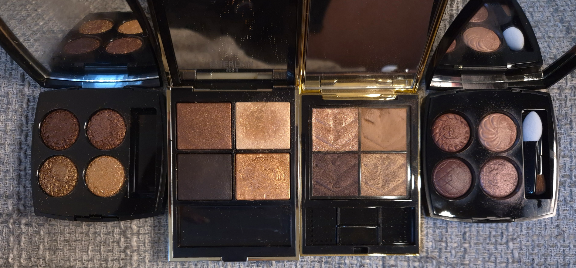
The contentment did not last. I couldn’t stop myself from buying Pansy to mix and match with Primula. I also watched a lot of balm related videos on YouTube, and the Prada balm kept ranking among the top. So, despite the fact that I’m on a restricted low-buy regarding lip products, I bought one anyway.
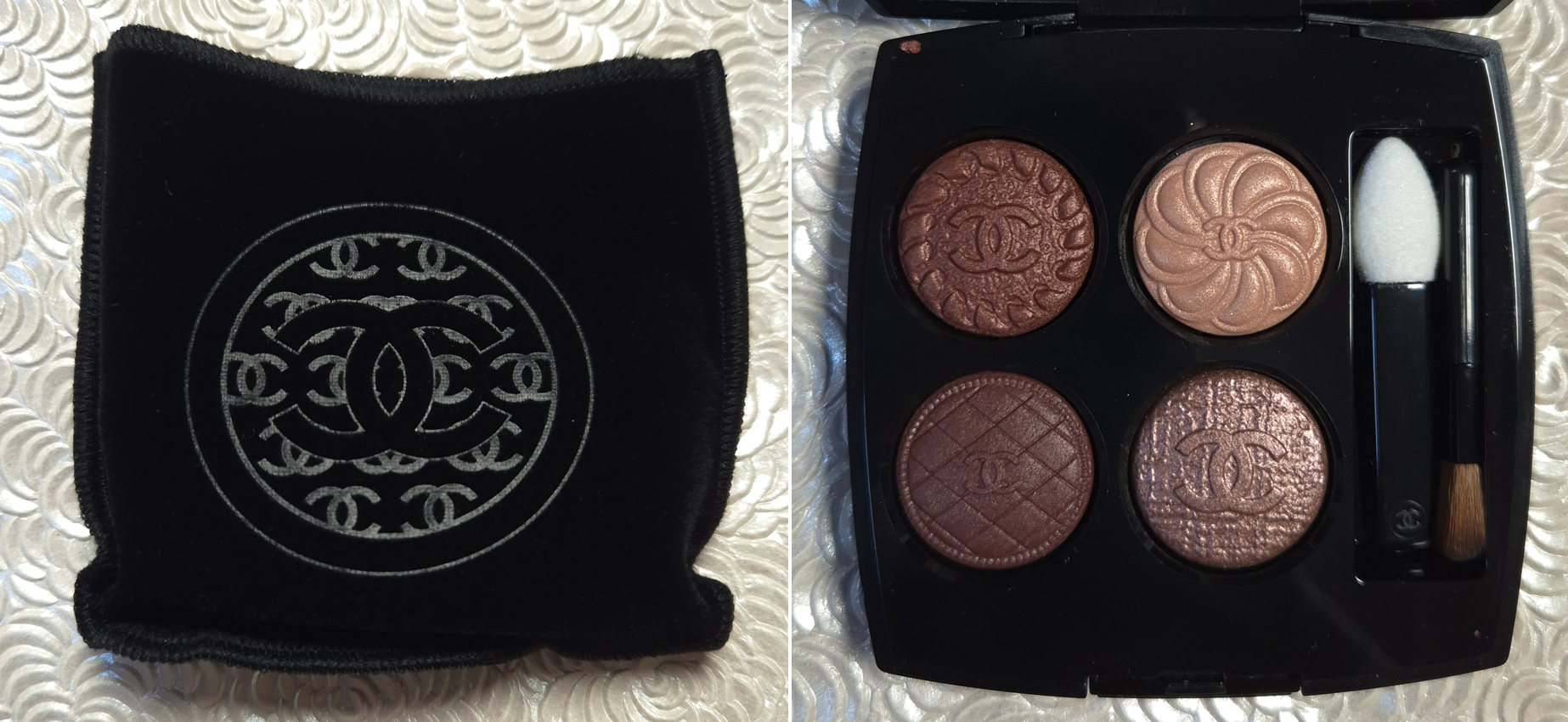
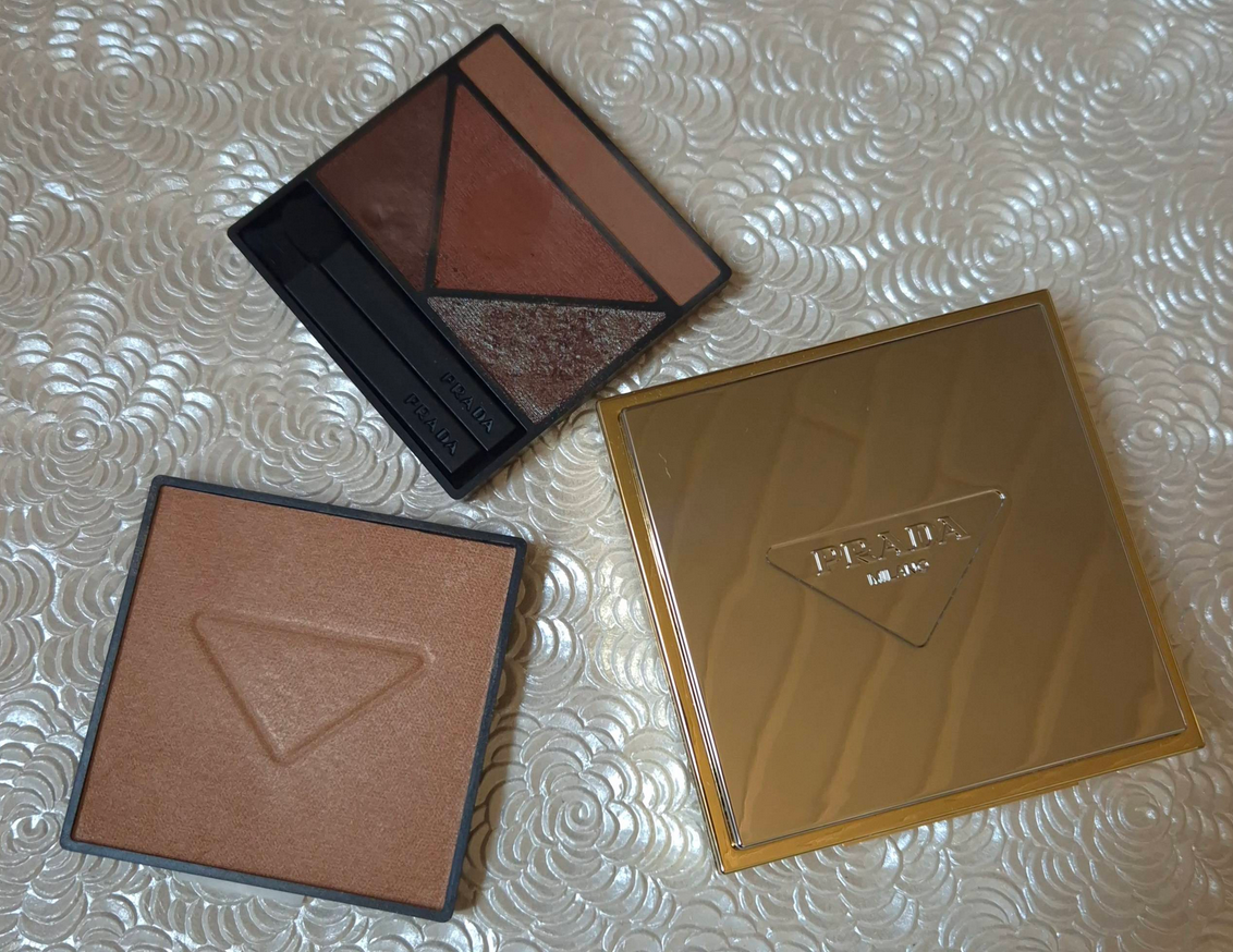
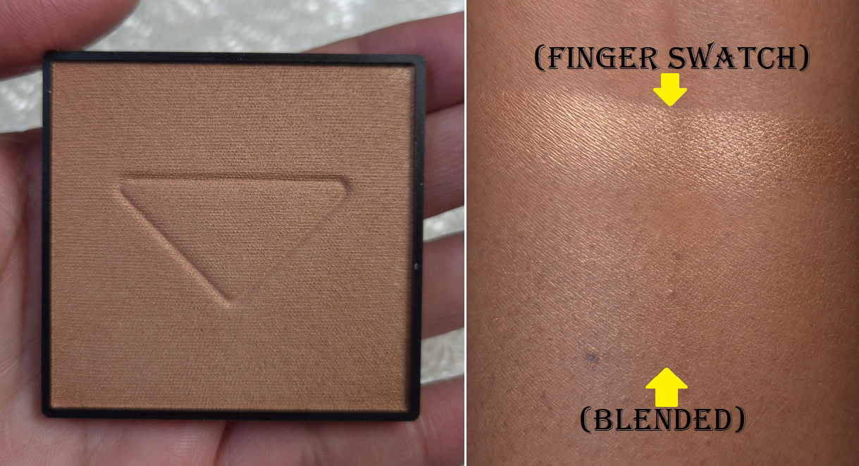
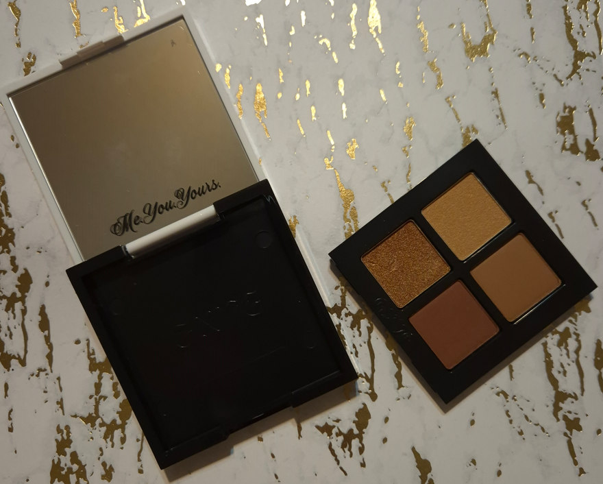
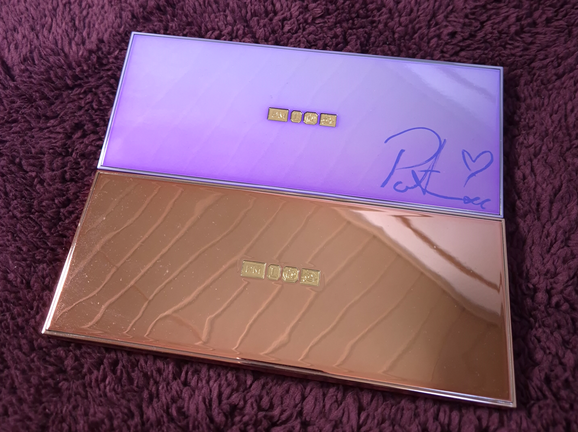
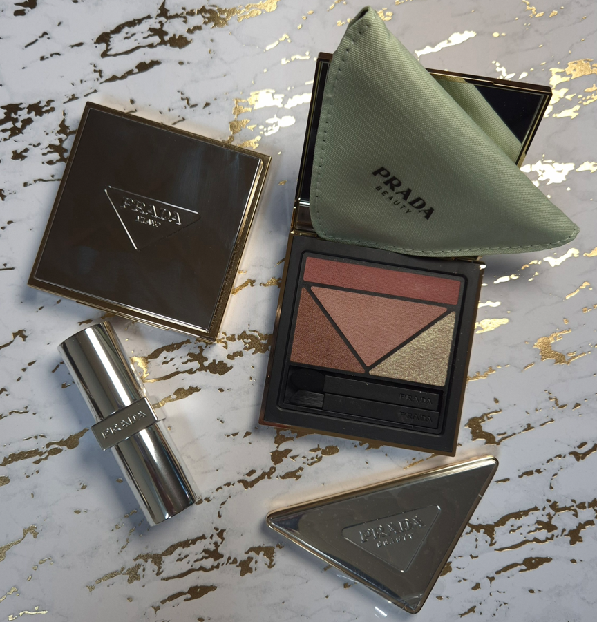
The triangular compact mirror was a free gift with purchase via Douglas.
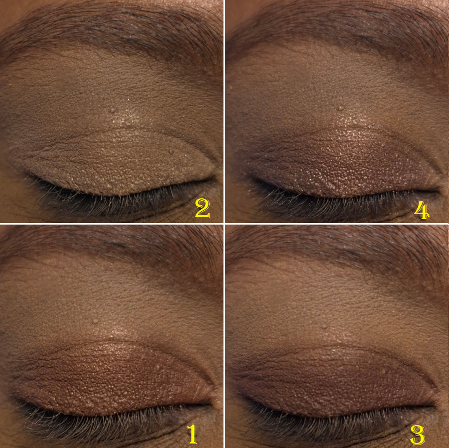
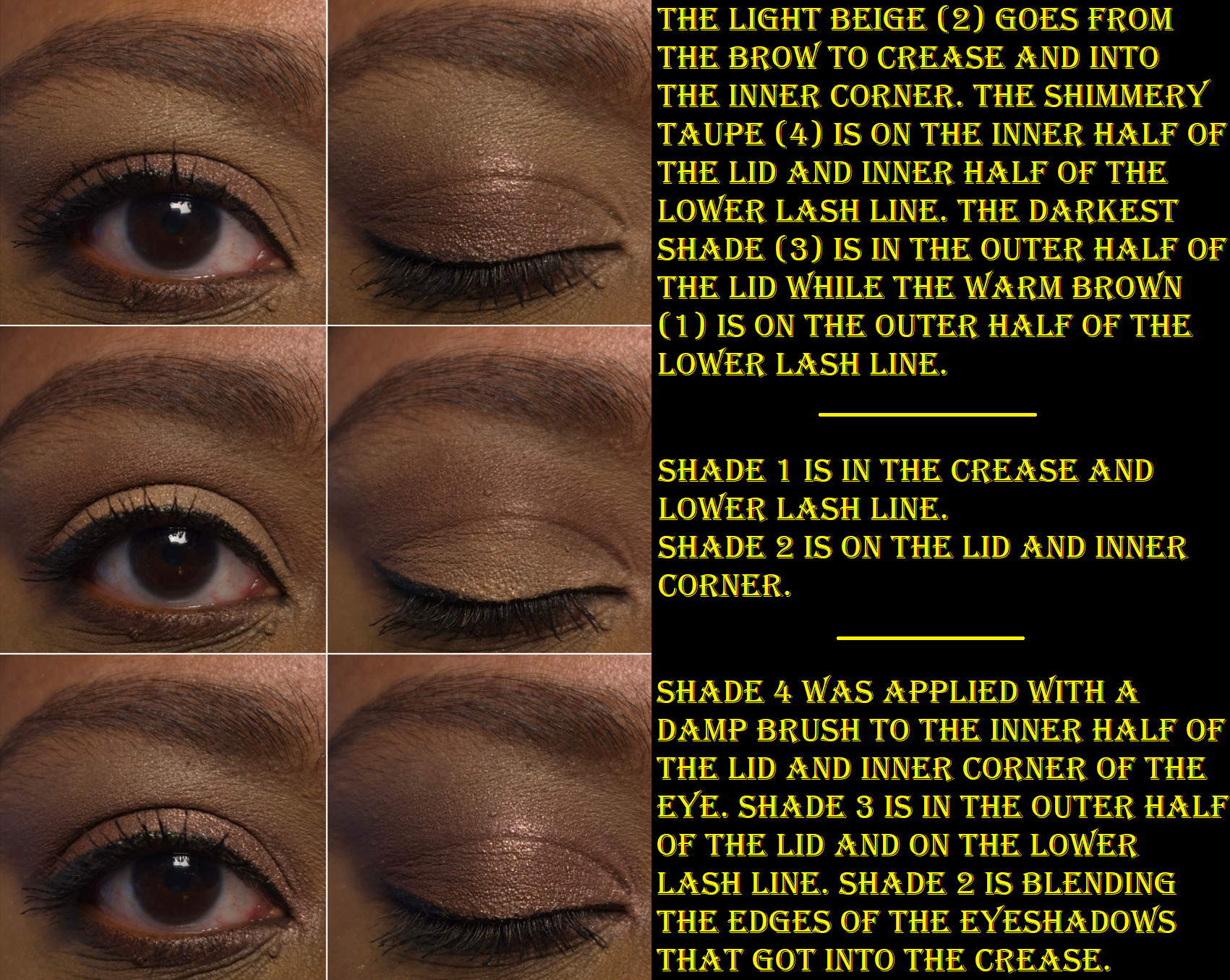
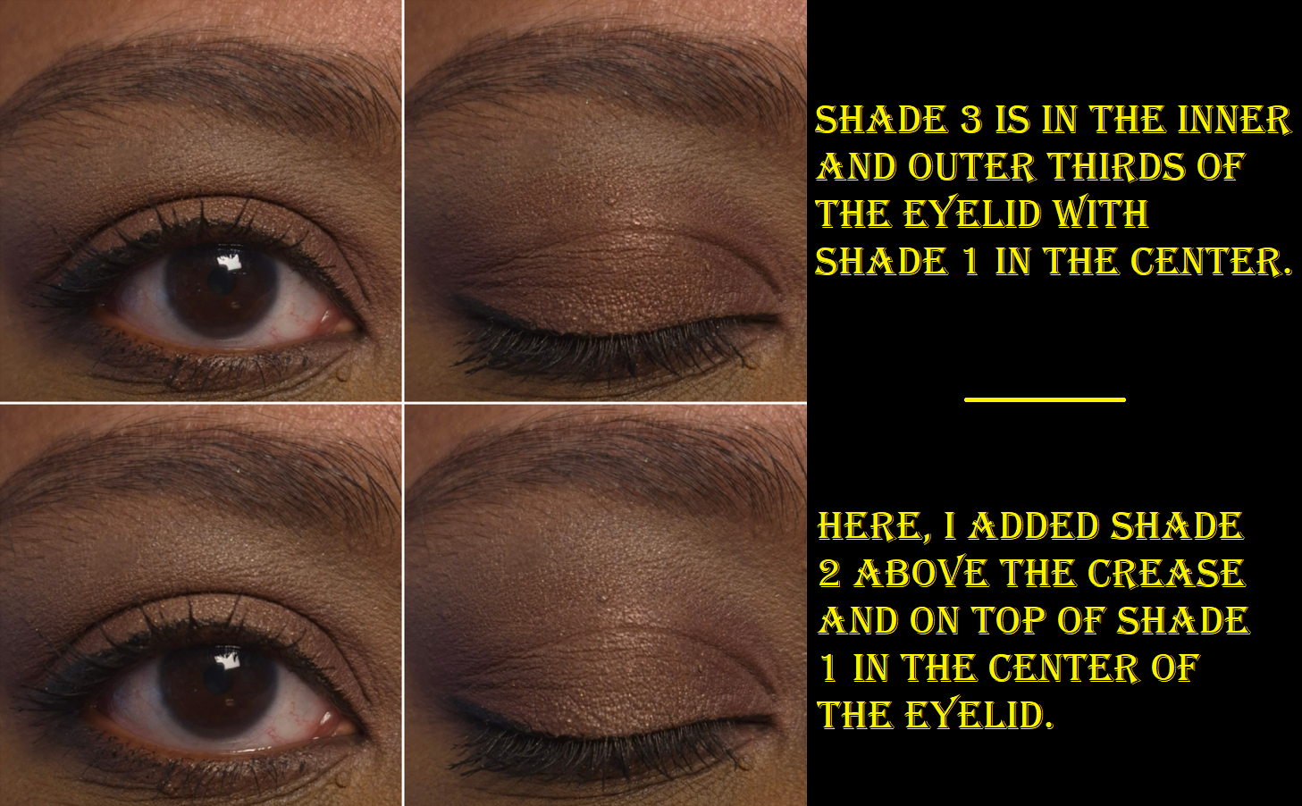
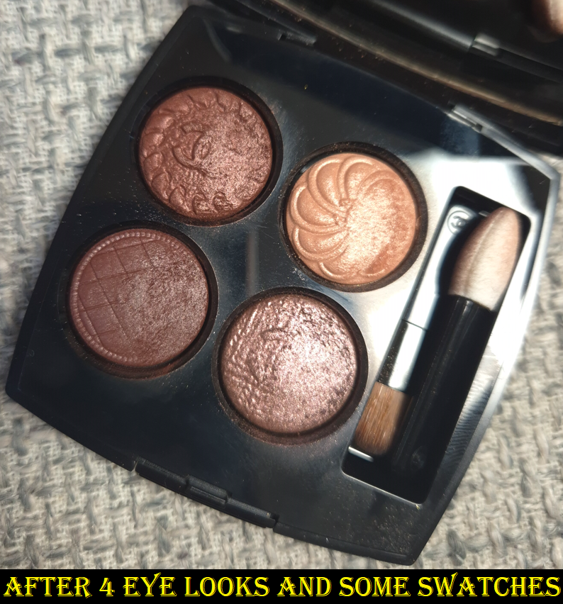
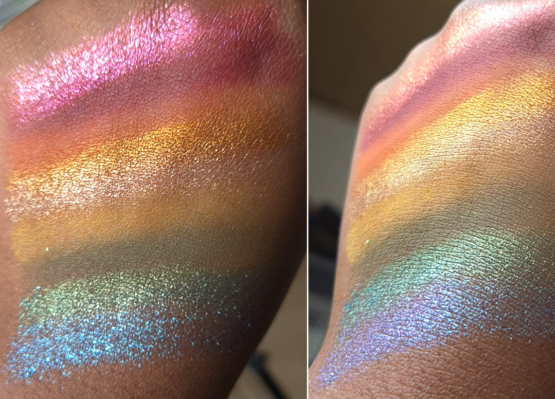
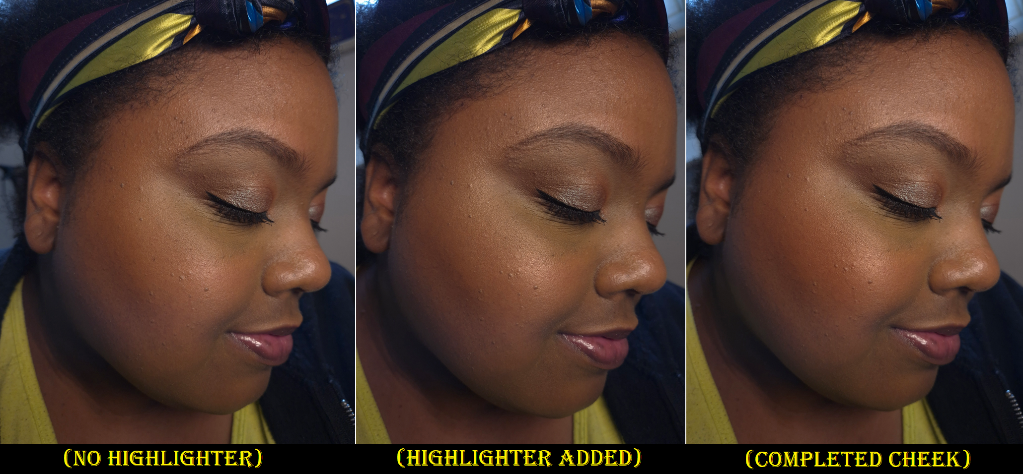
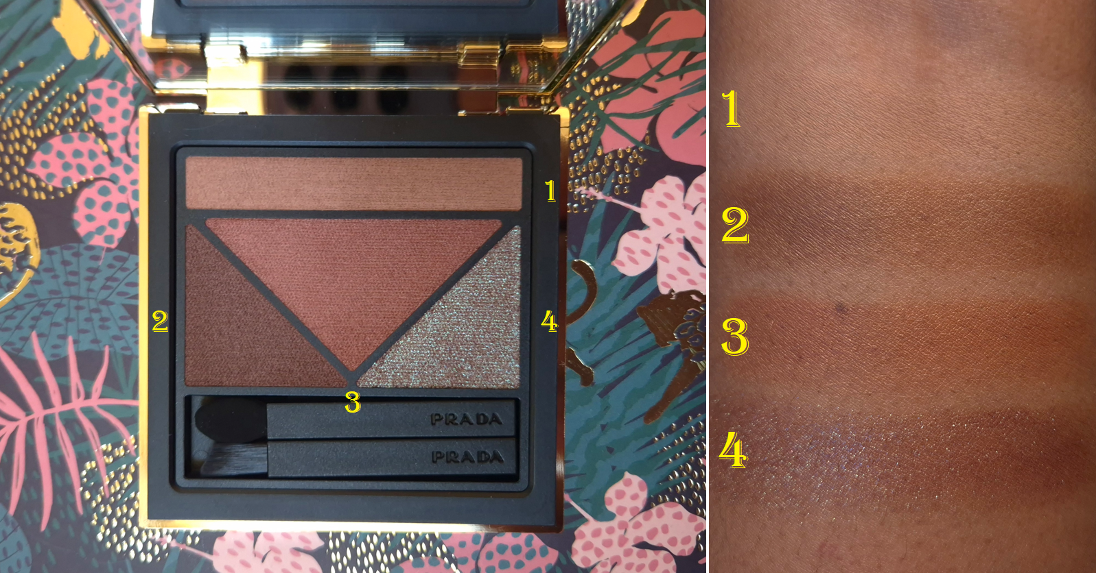
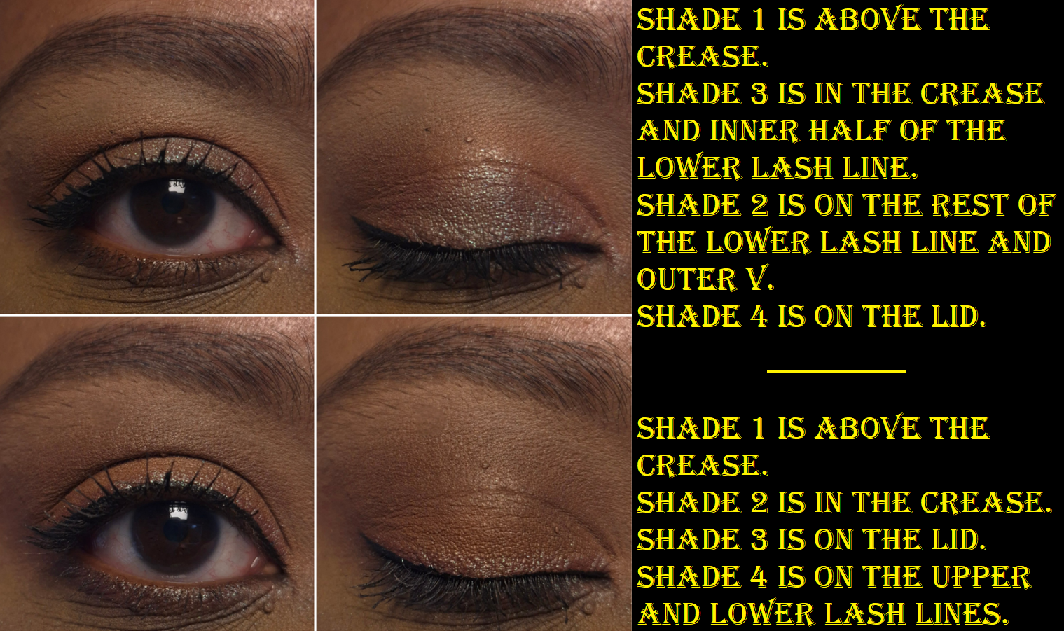
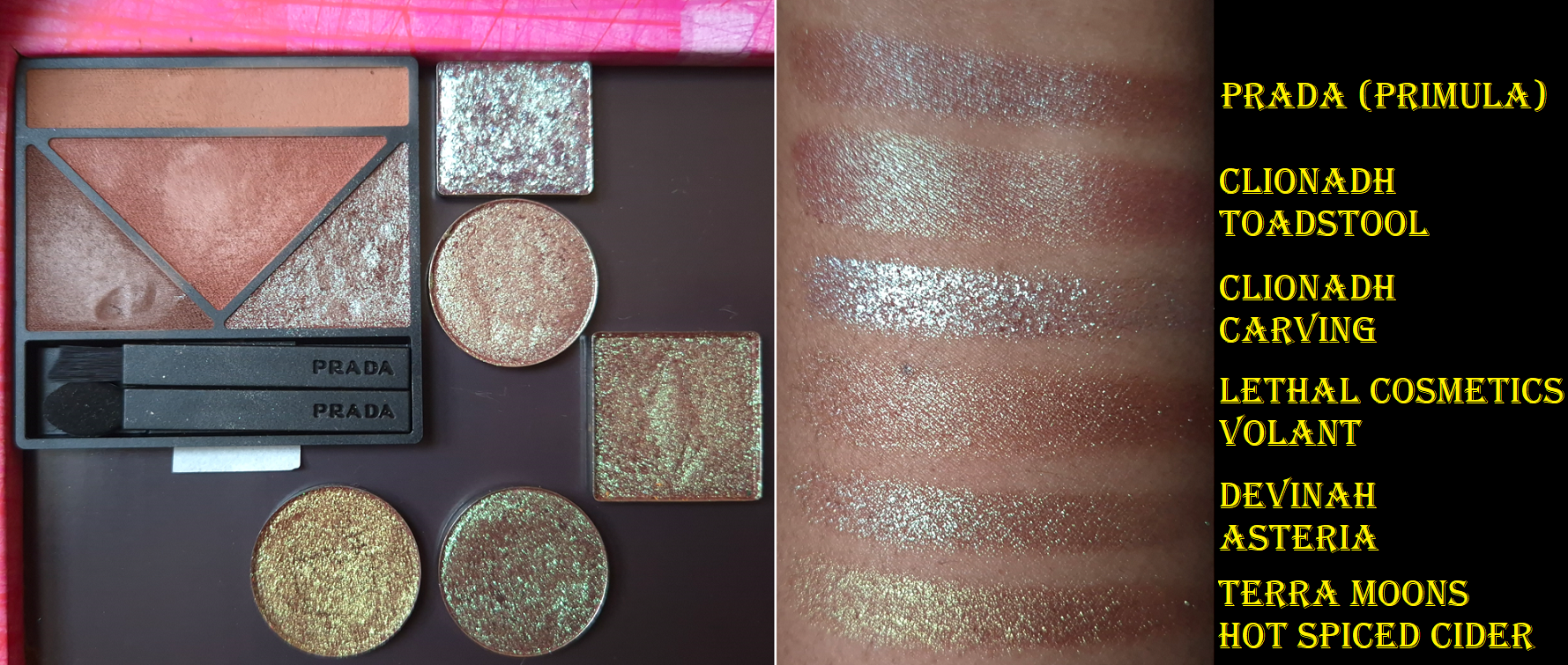
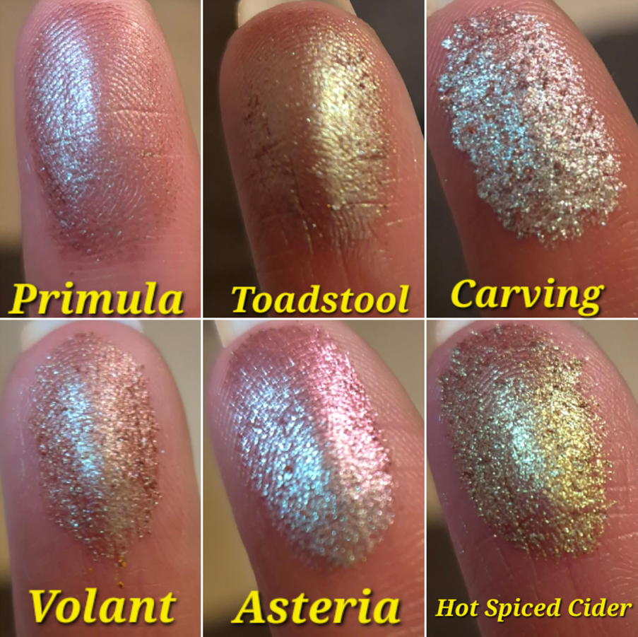
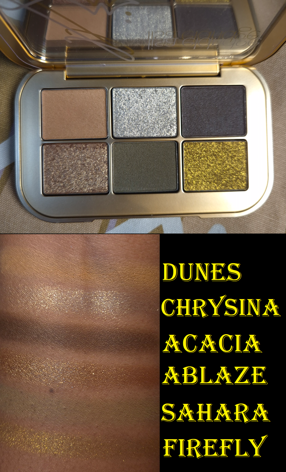
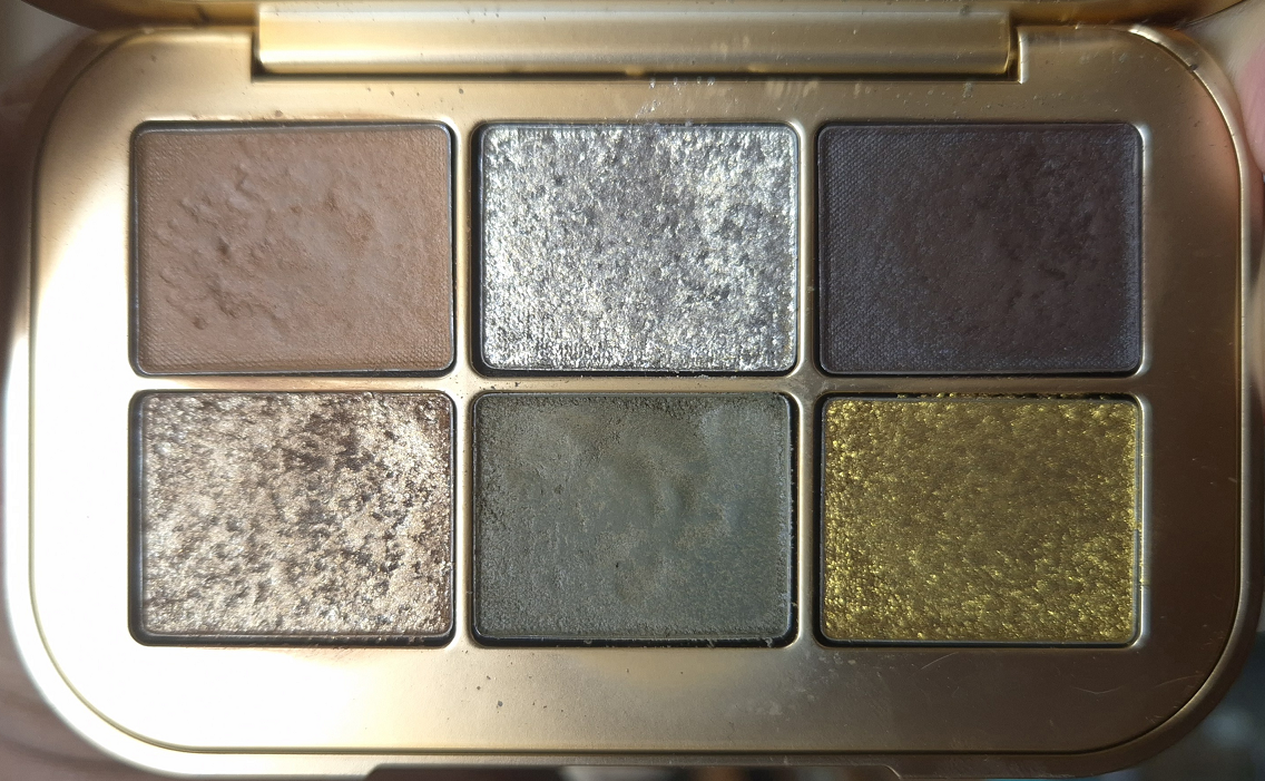
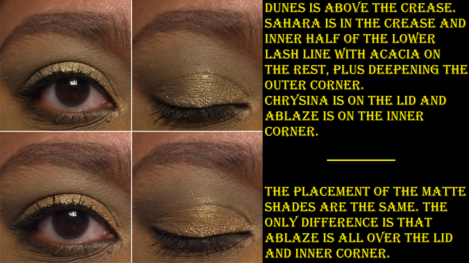
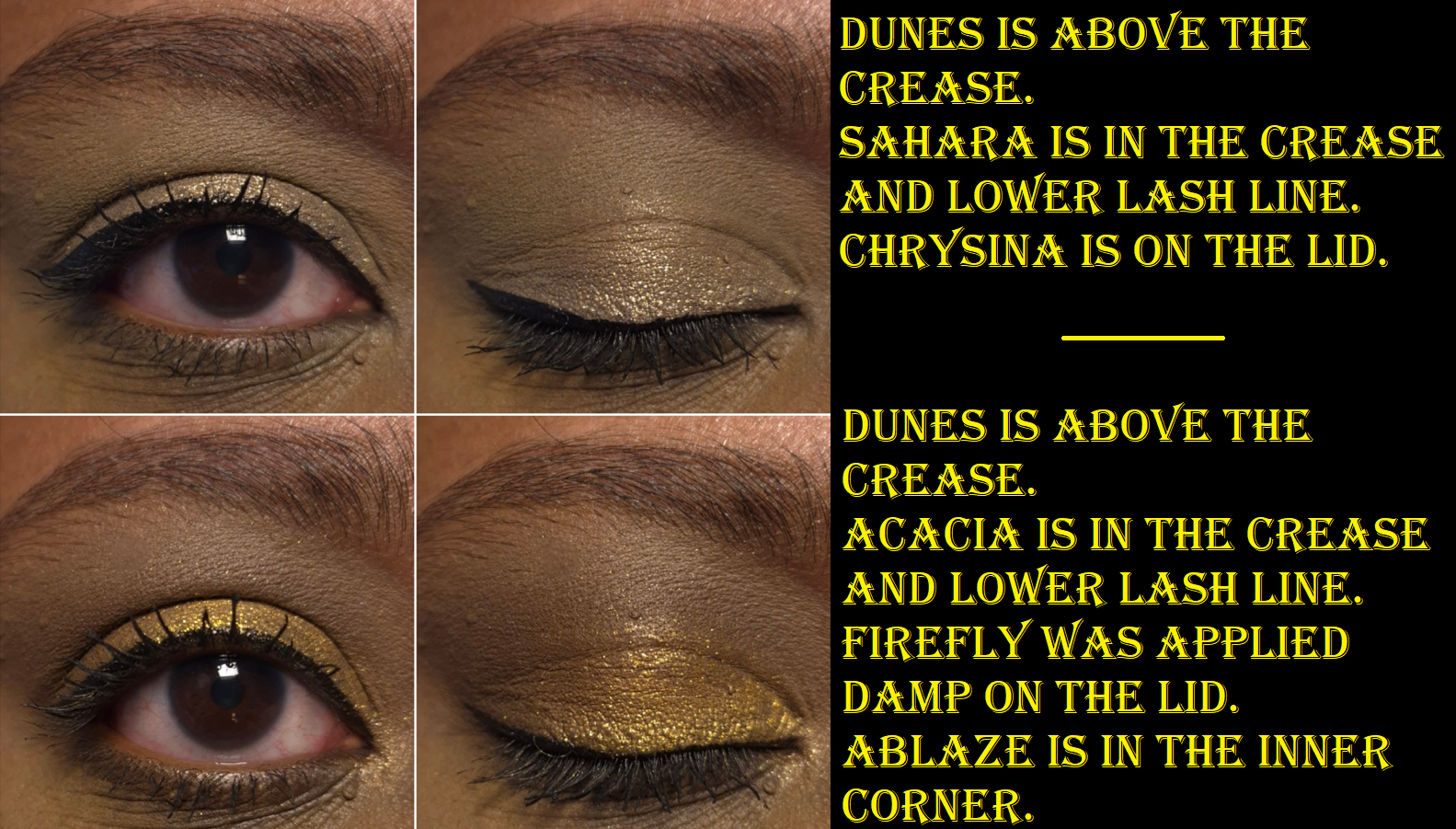
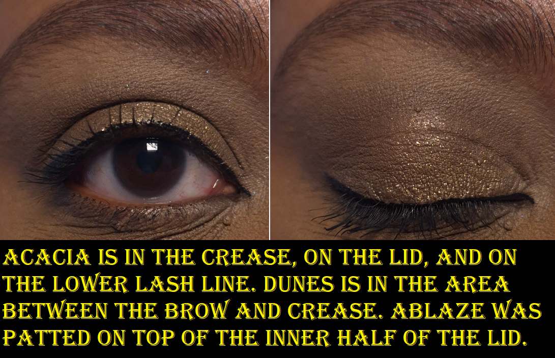
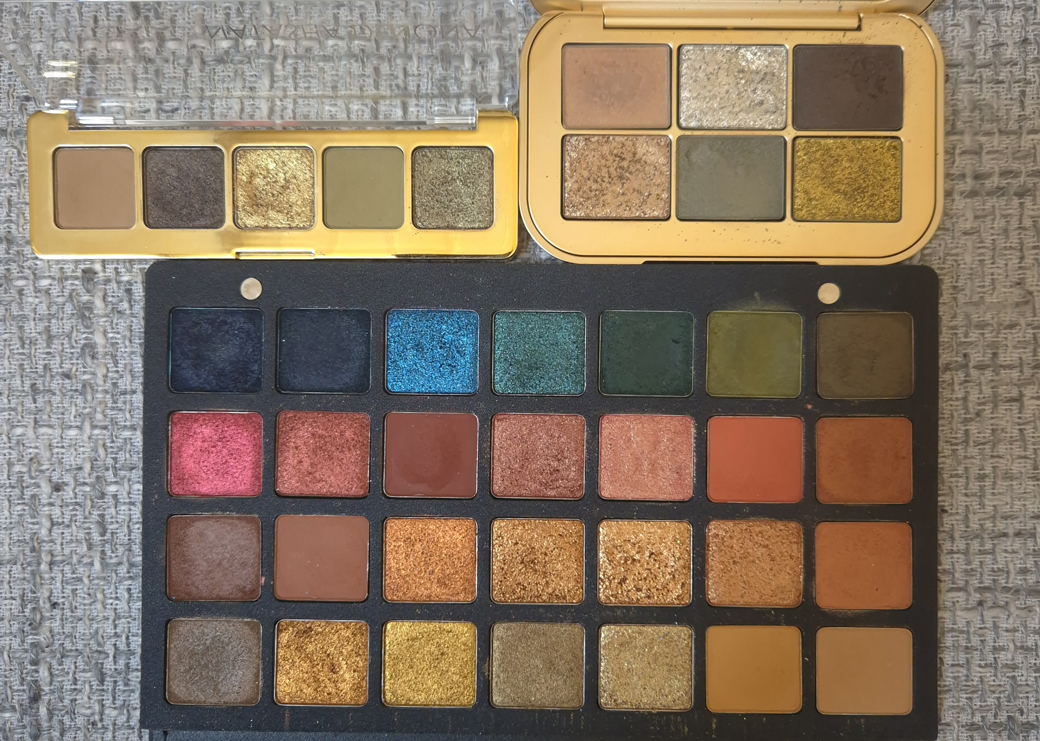
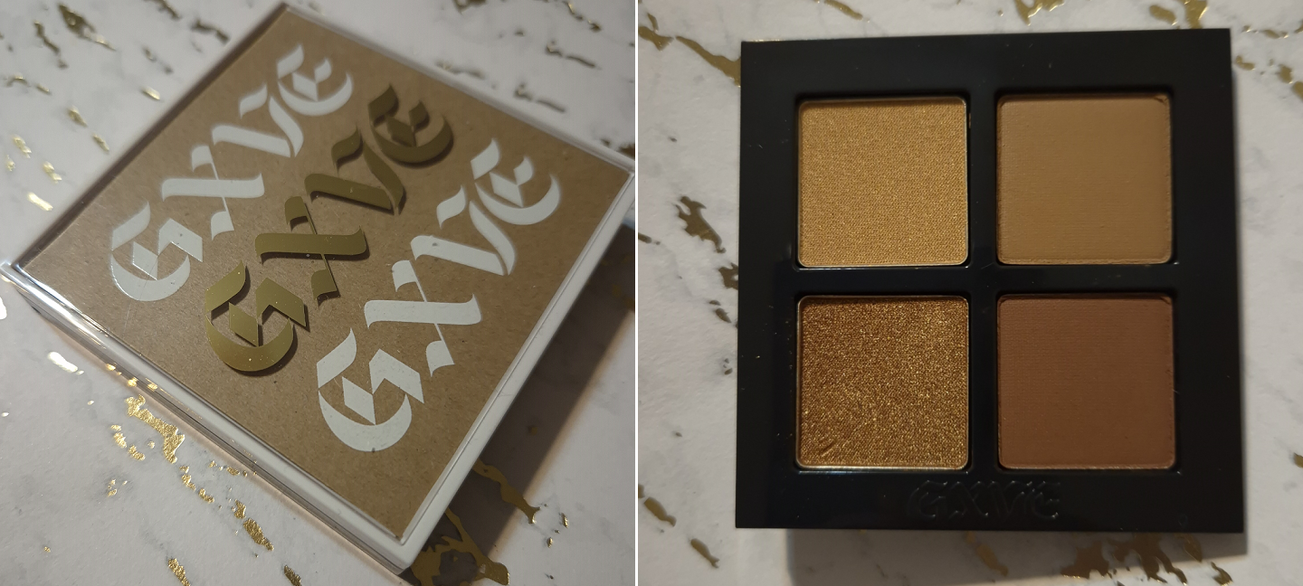
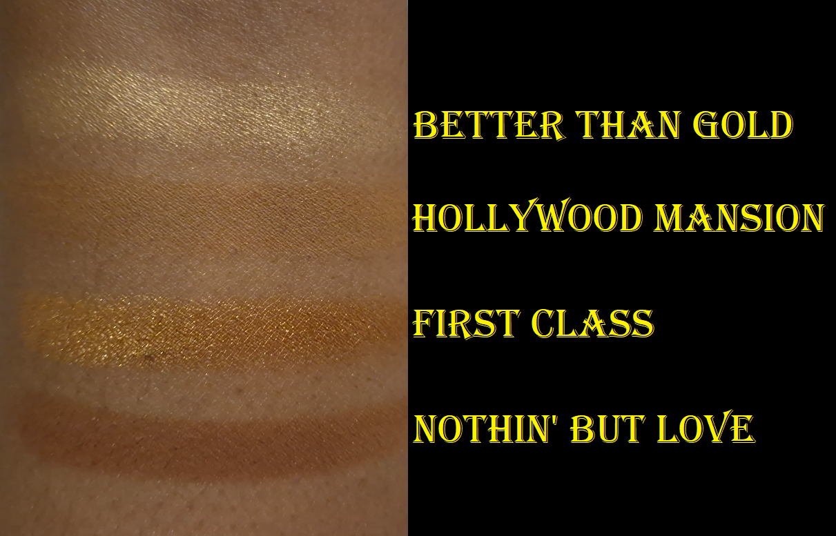
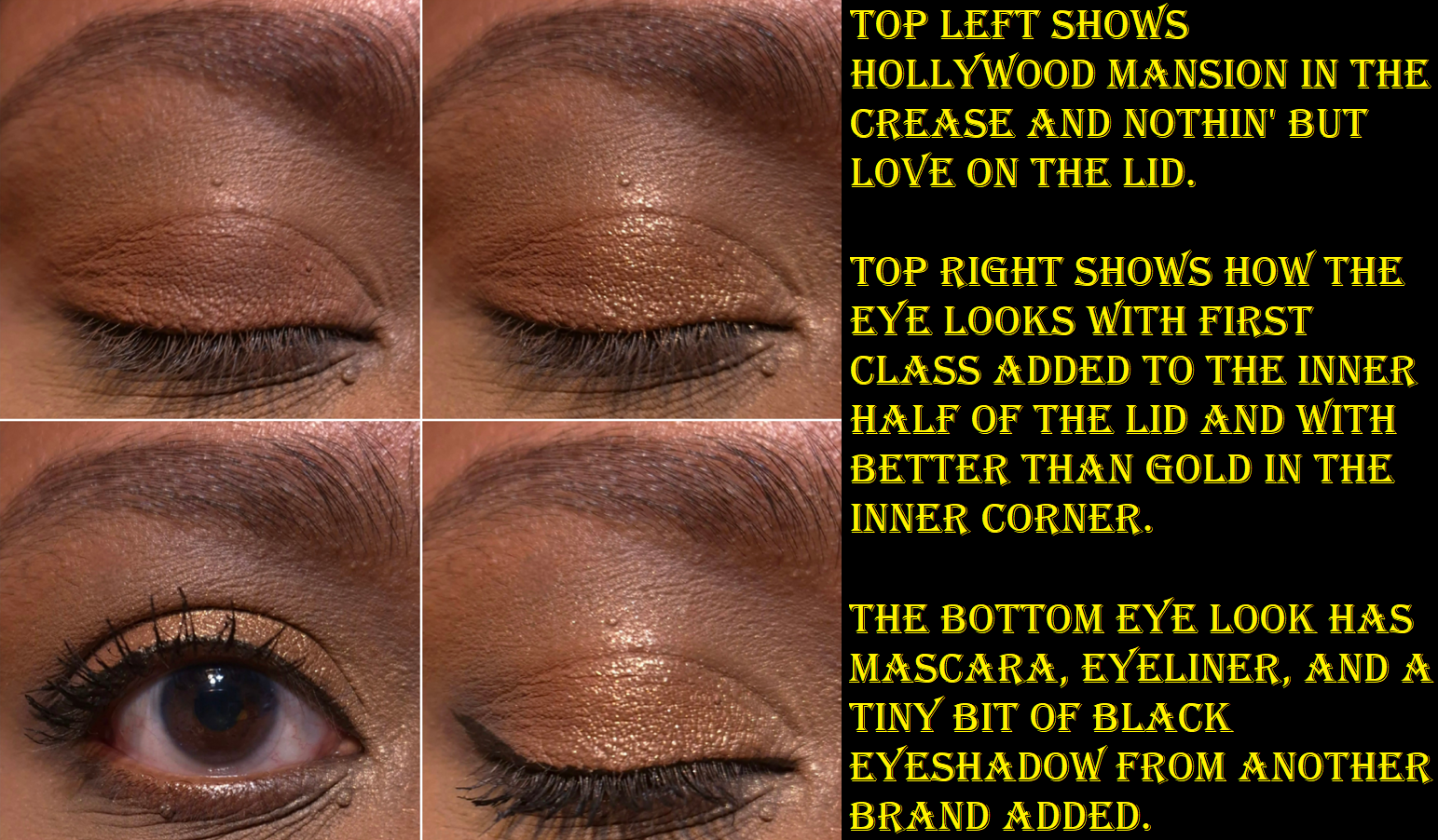
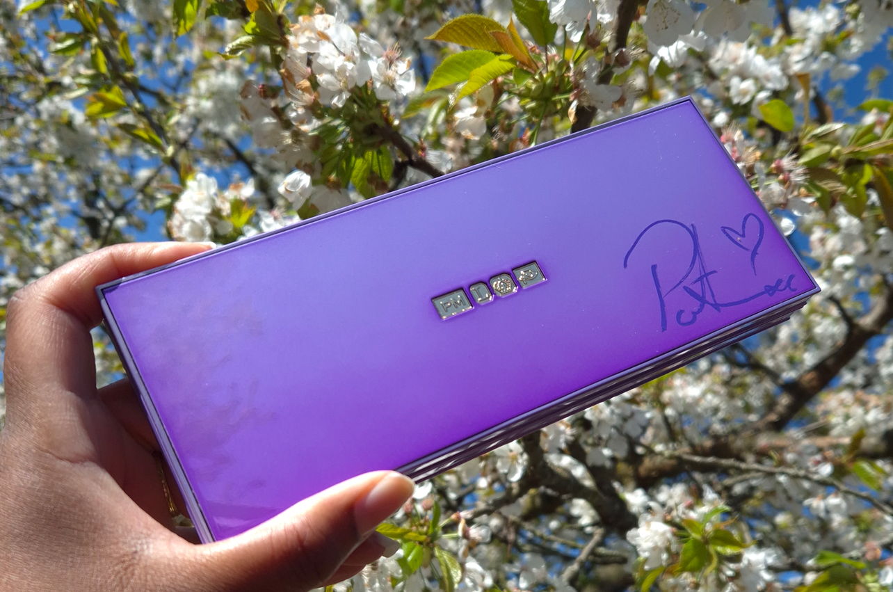
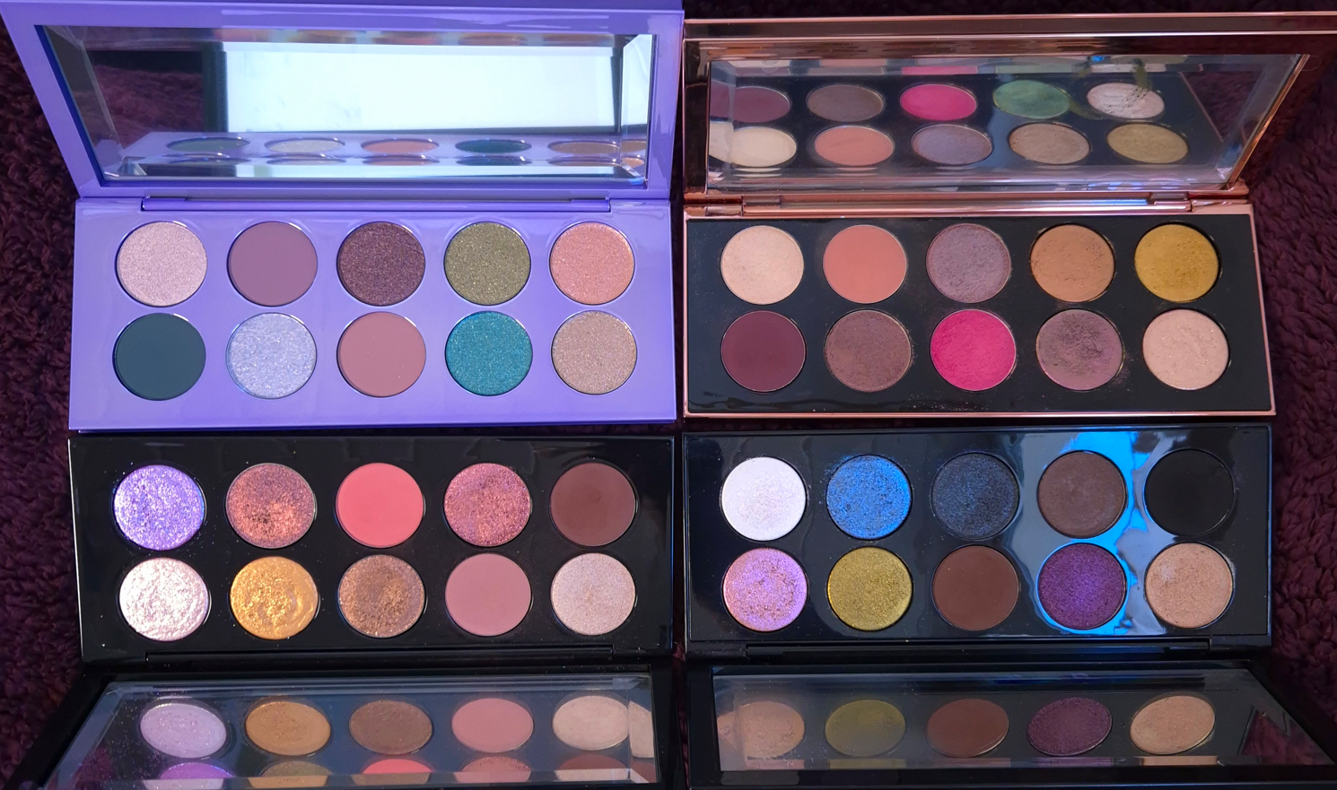
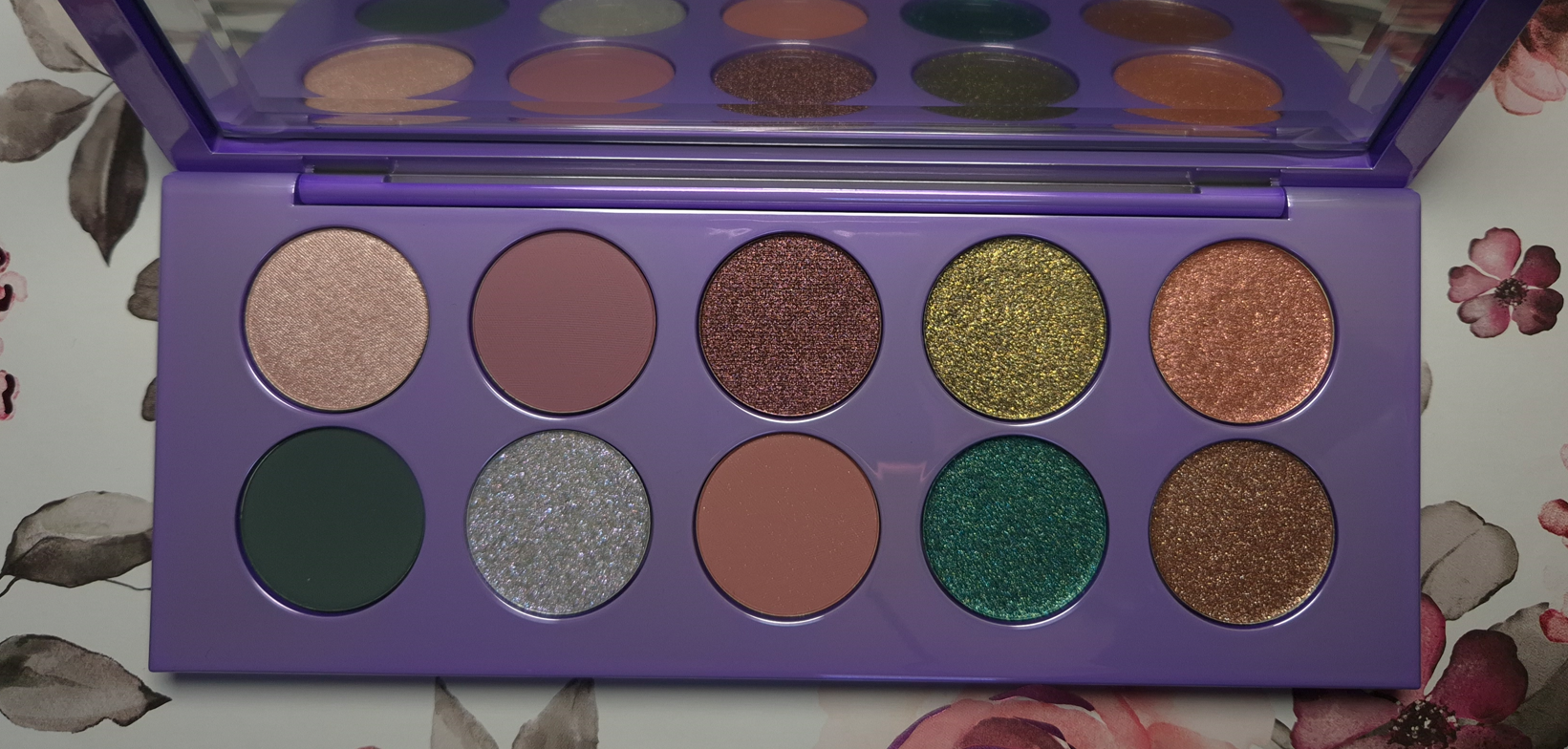
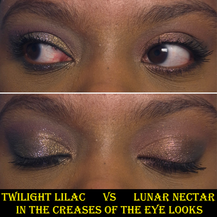
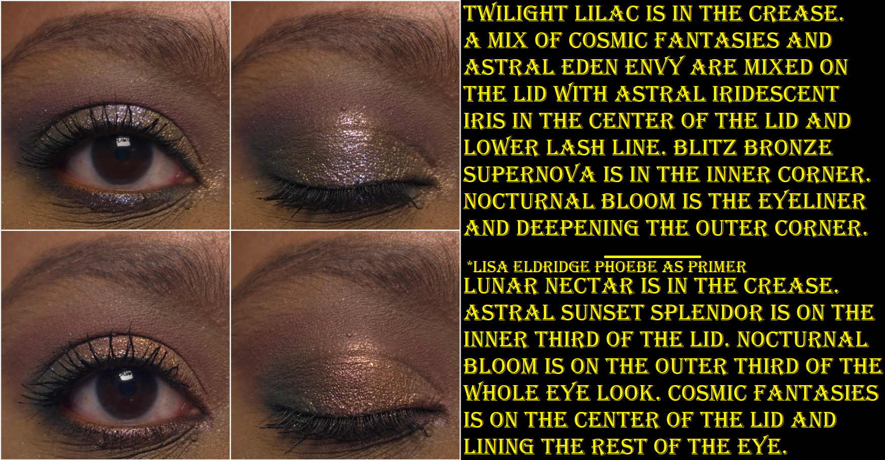
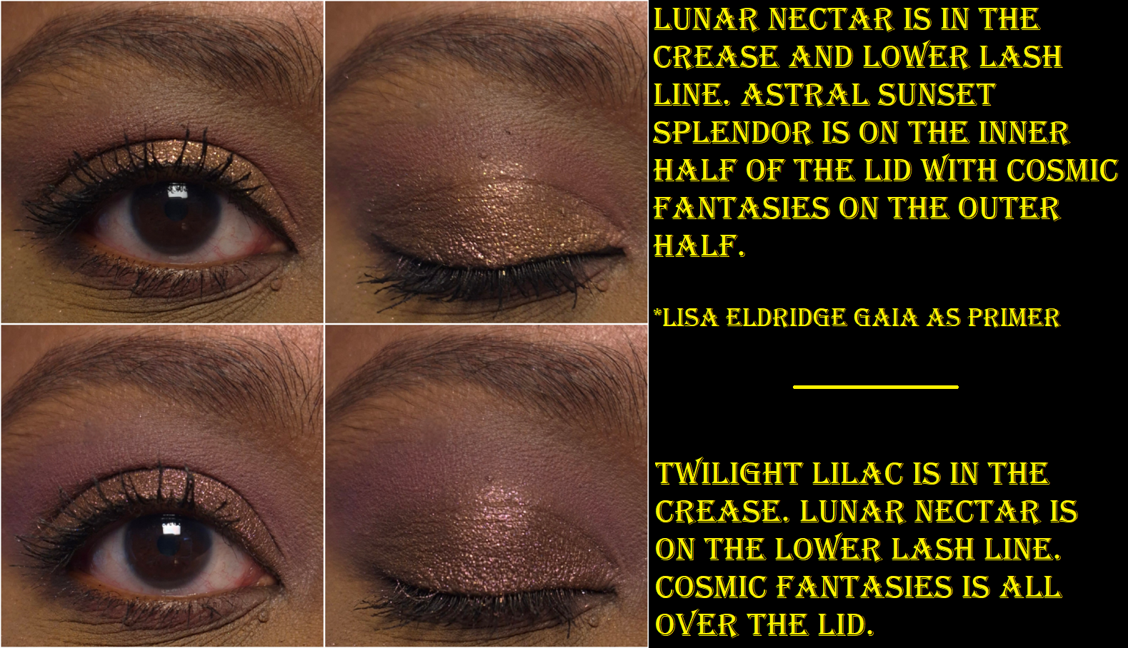
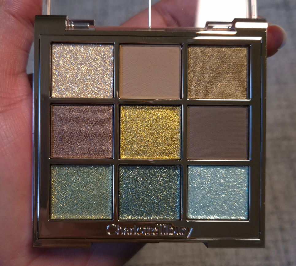
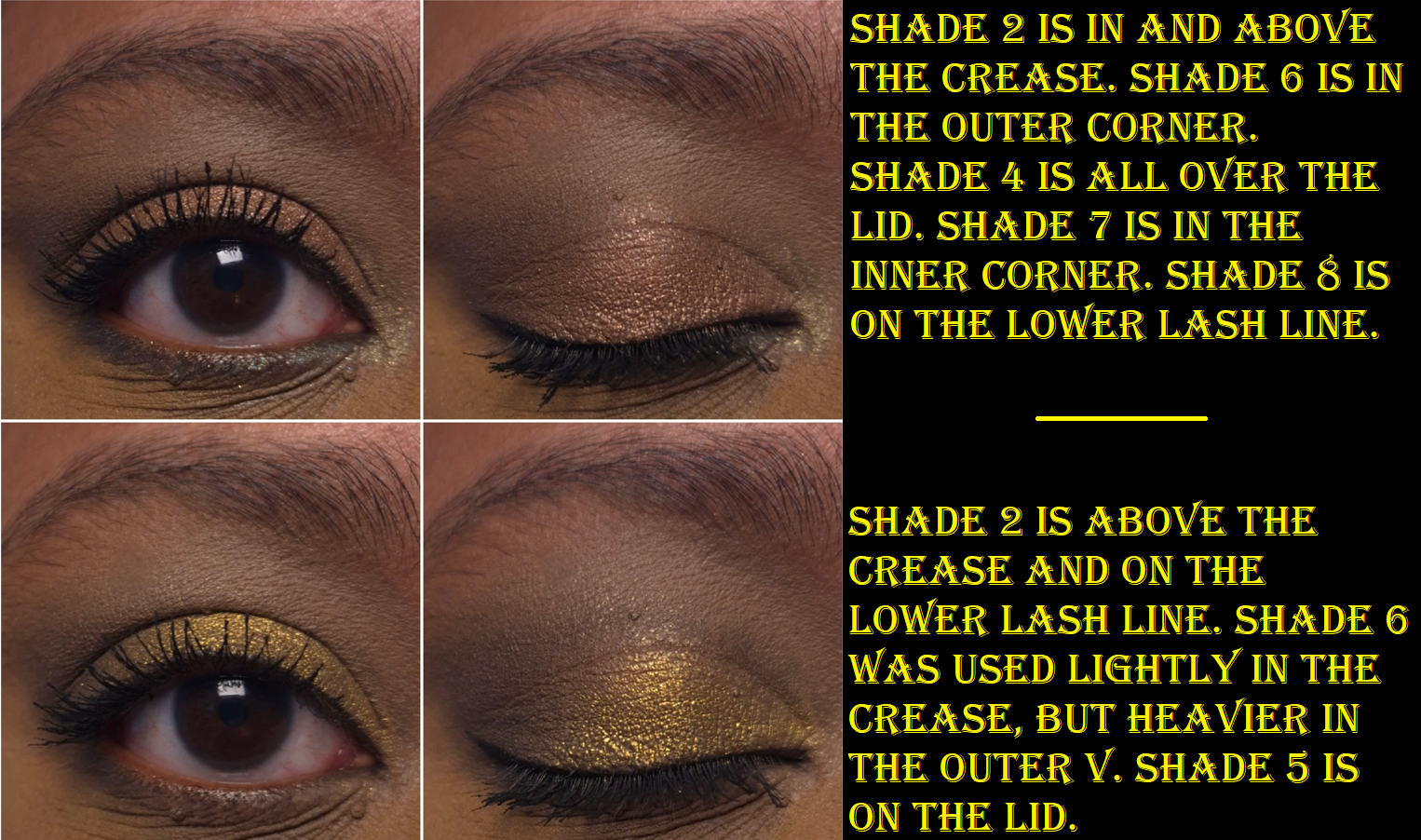
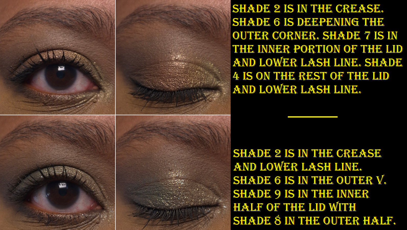
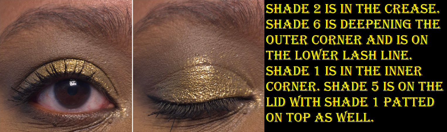
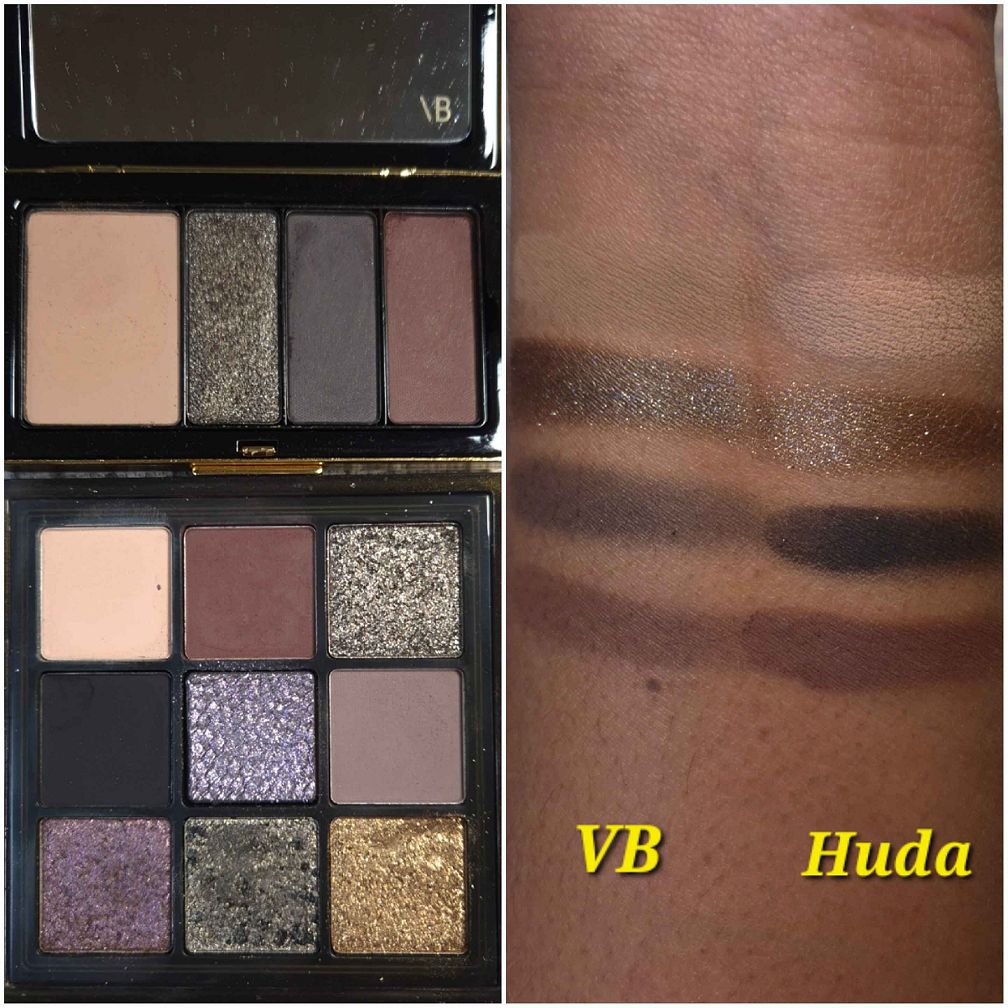
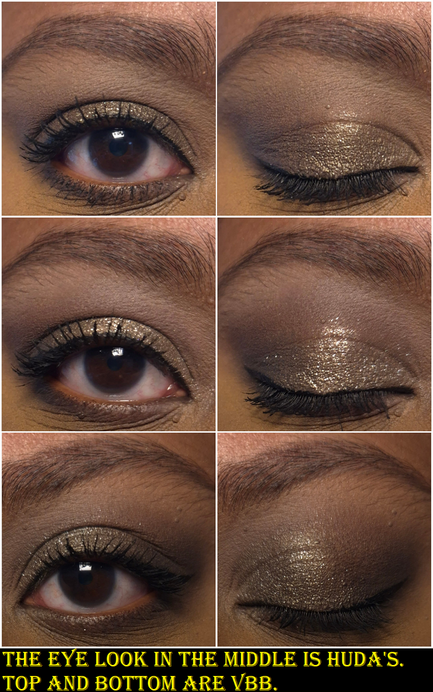
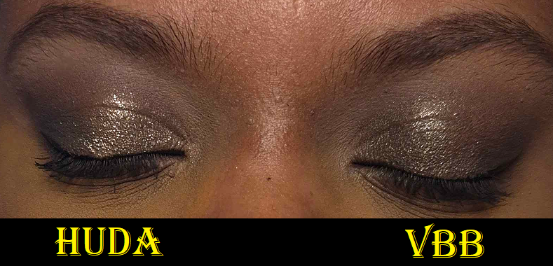
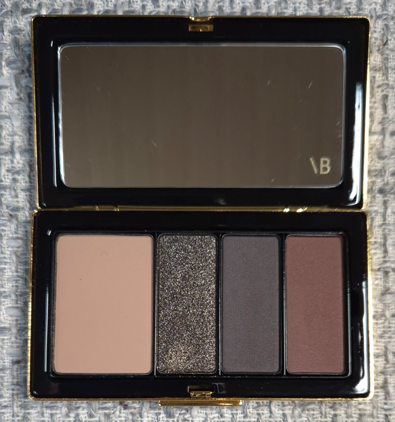
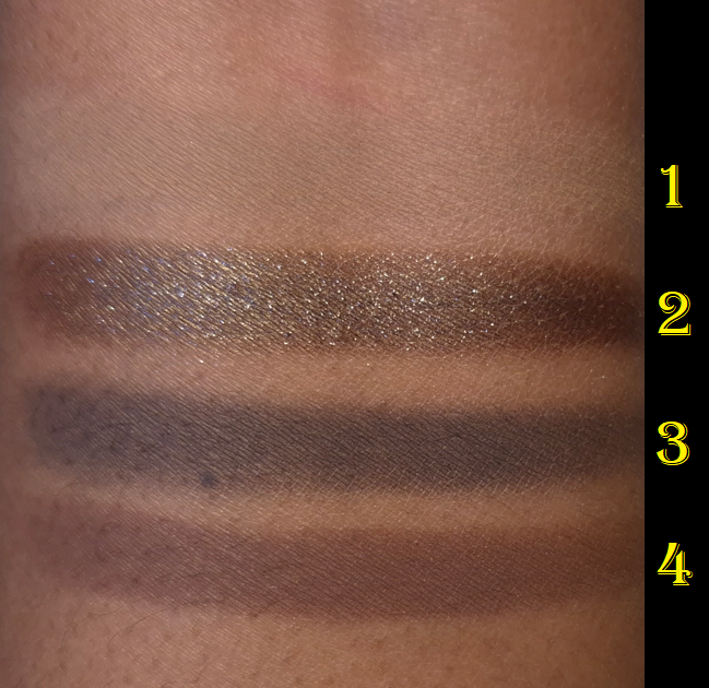
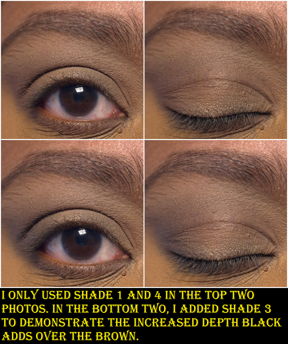
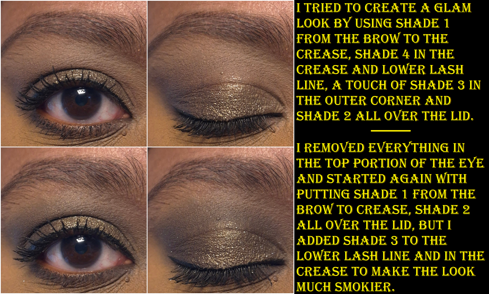
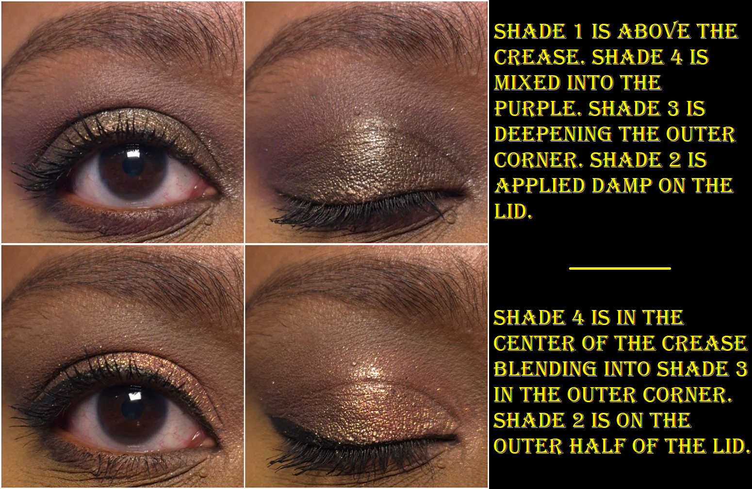
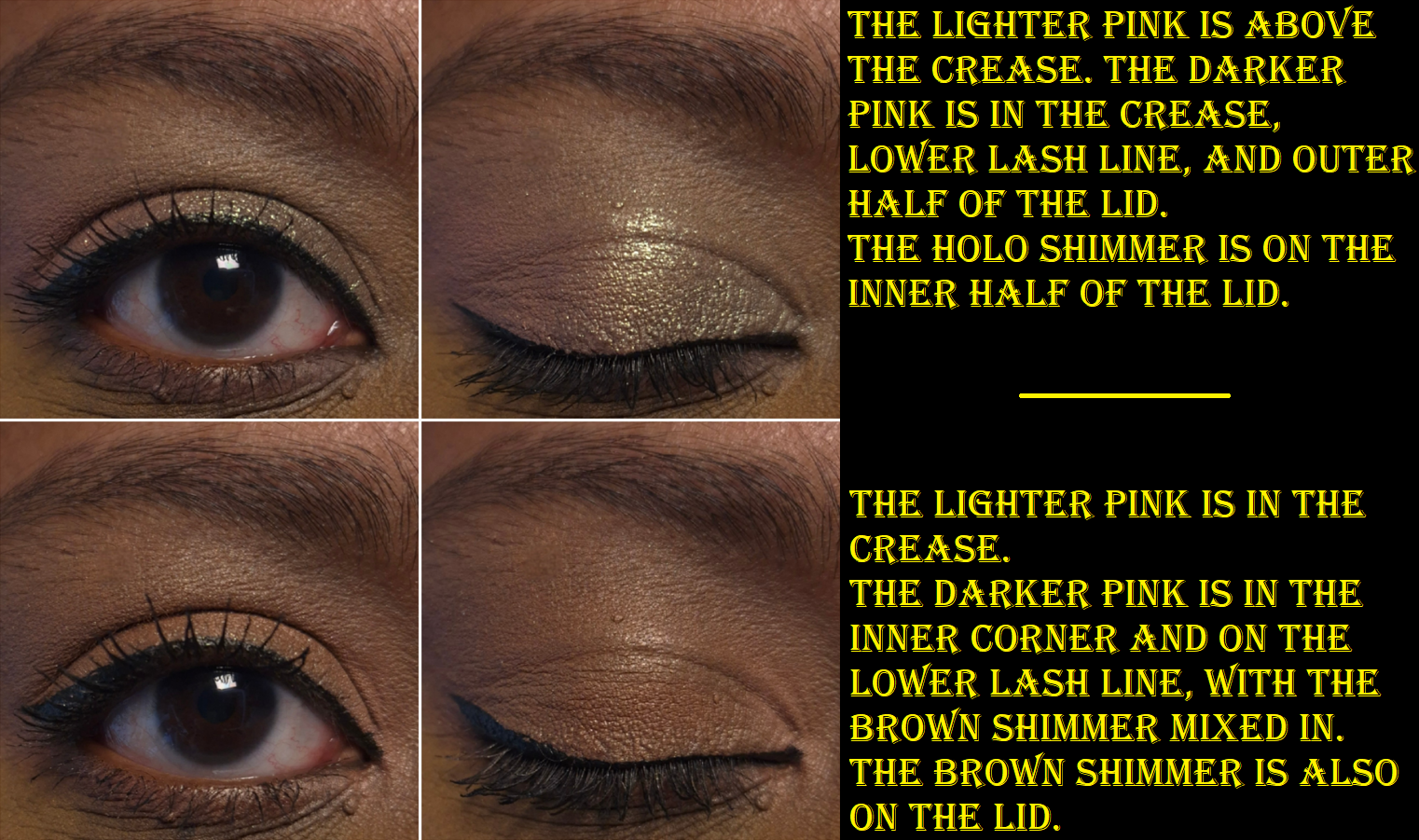
Prada Dimensions Holo Nude Eyeshadow Palette in Pansy
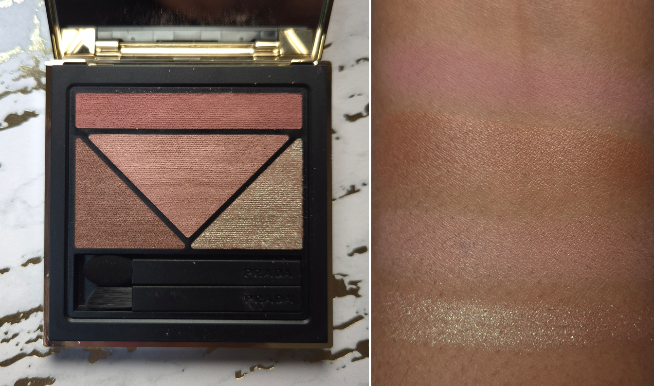
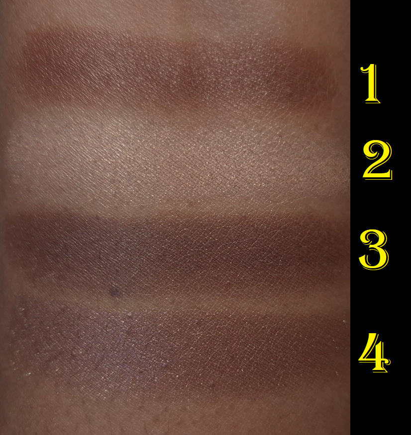
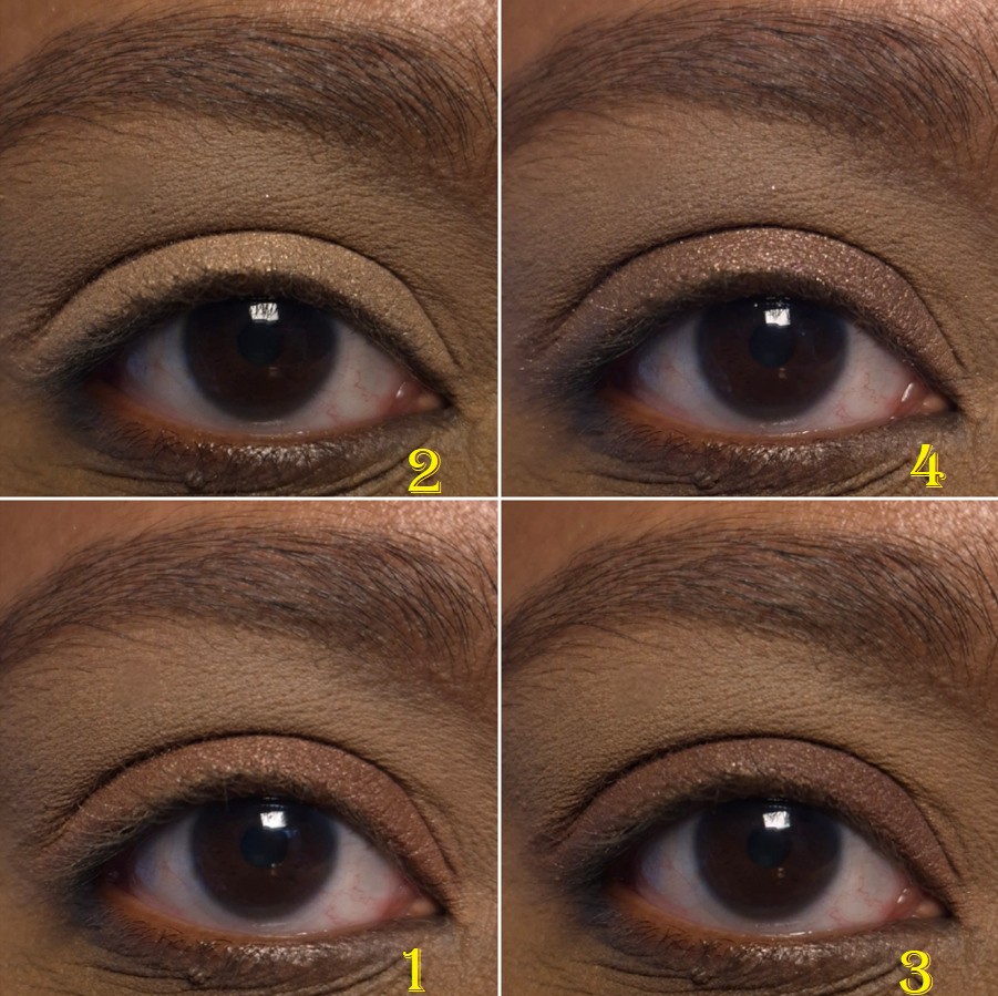
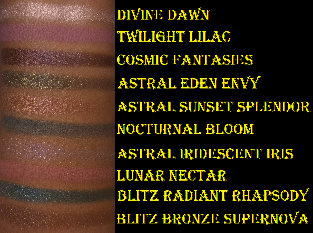
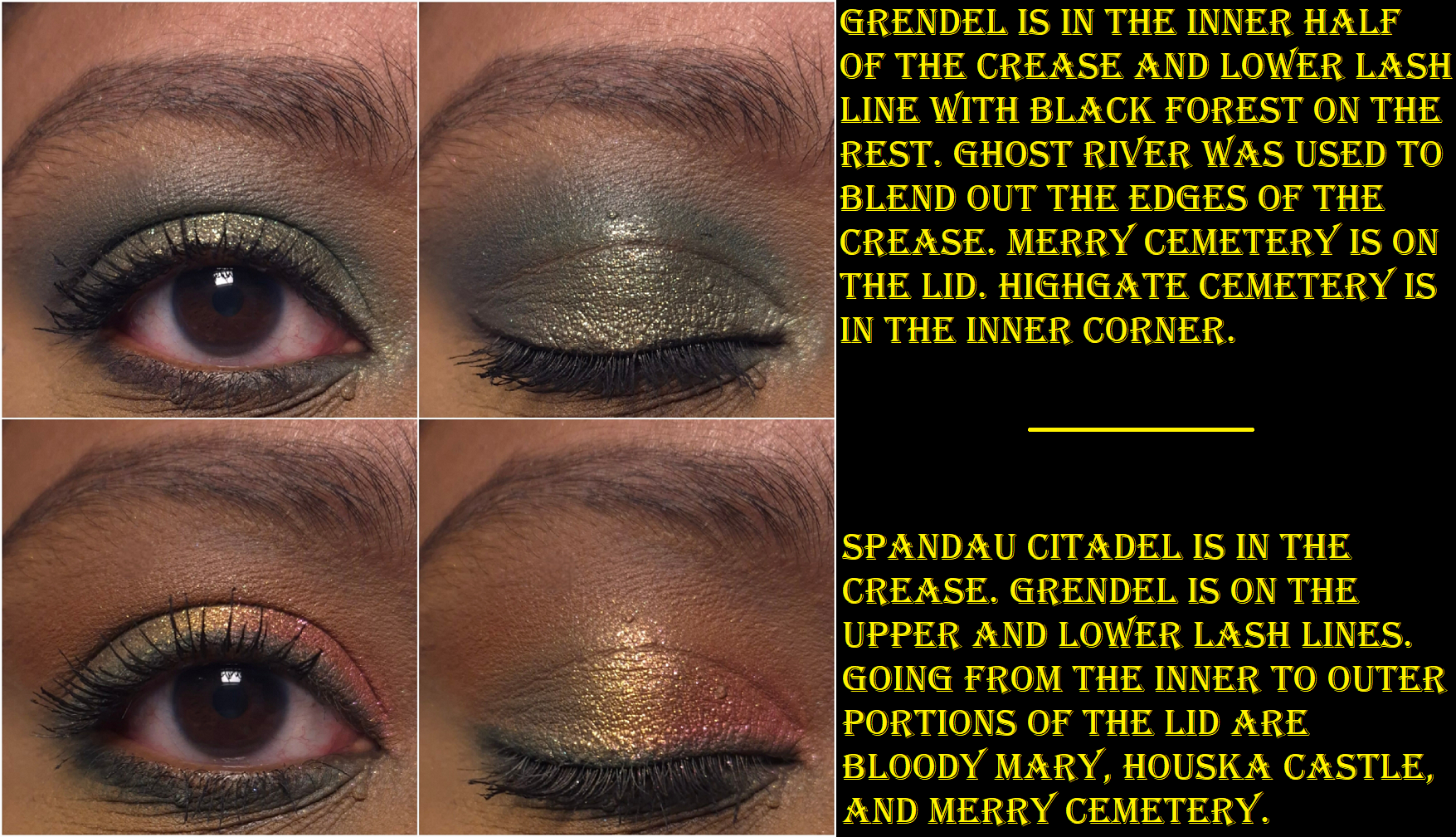
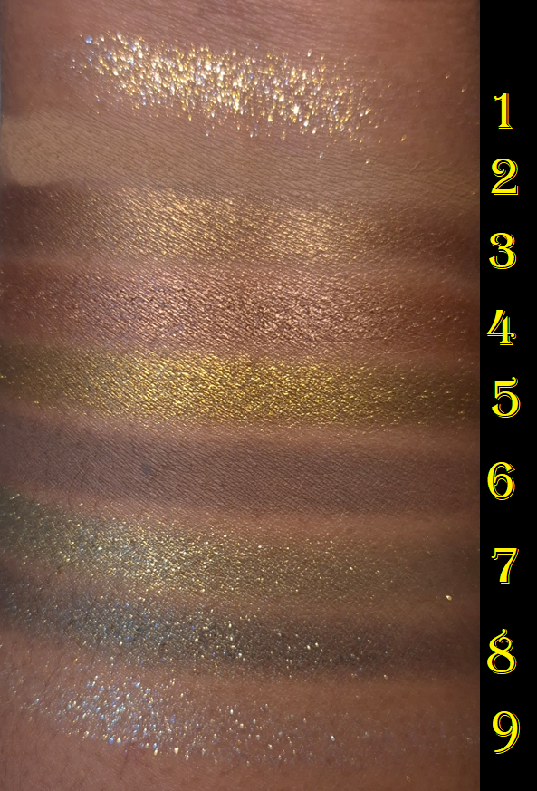
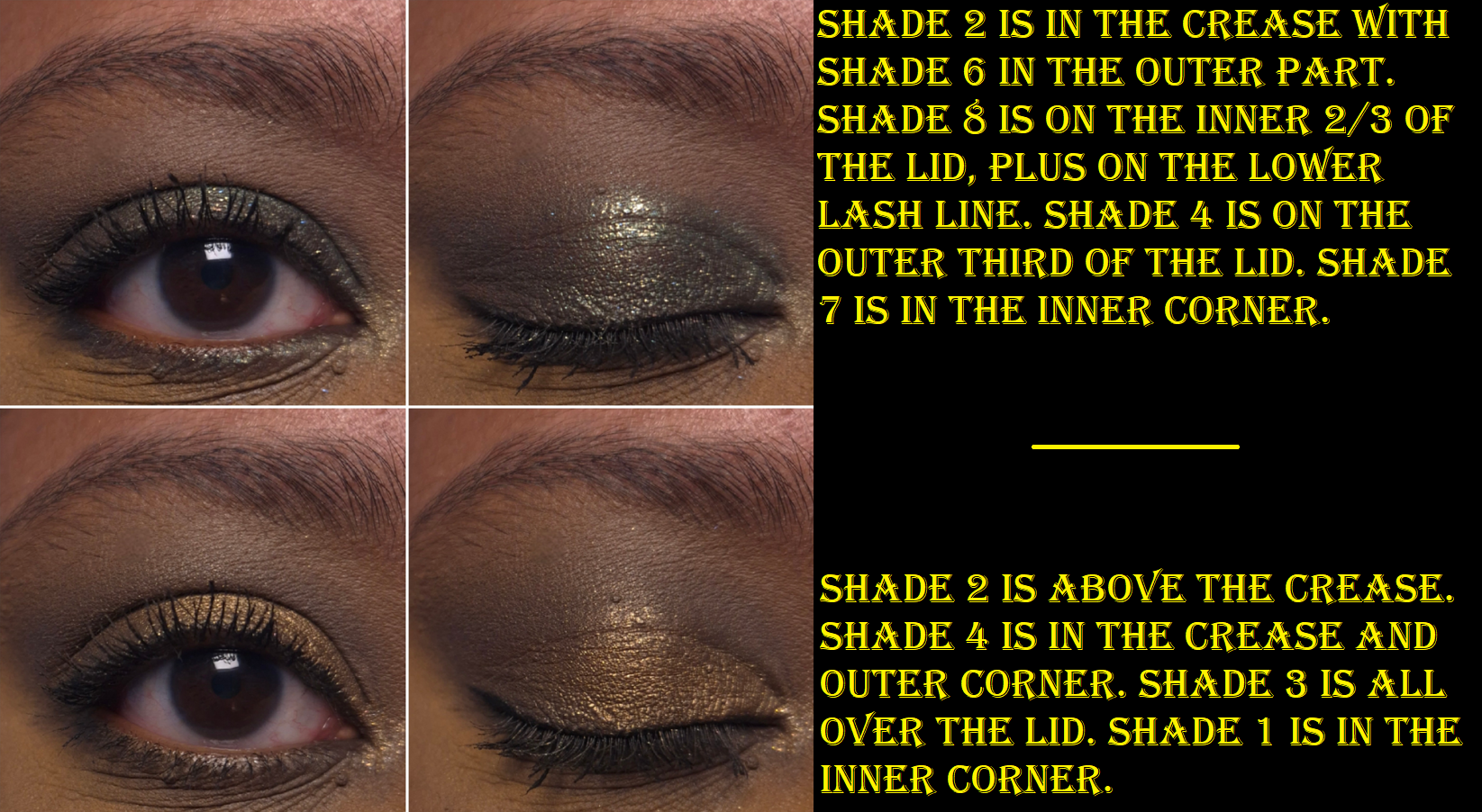
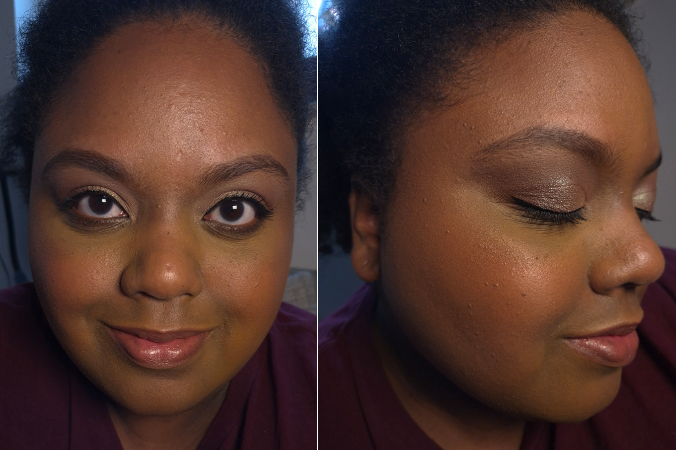
I thought these shades were going to be on the darker side of medium, but the darker pink and shimmery/satin brown are lighter than I expected on myself. I still consider this palette to be pretty, especially the triangular eyeshadows in the bottom left and right sides of the palette. I don’t know how else to describe that shimmery brown, which has a pink tone to it.
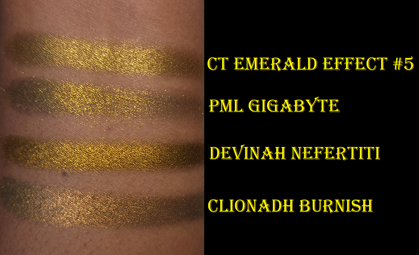
In my previous review, I also said that Primula had the prettiest Holo shimmer among the three quads Prada launched, but I might have to reconsider that statement.
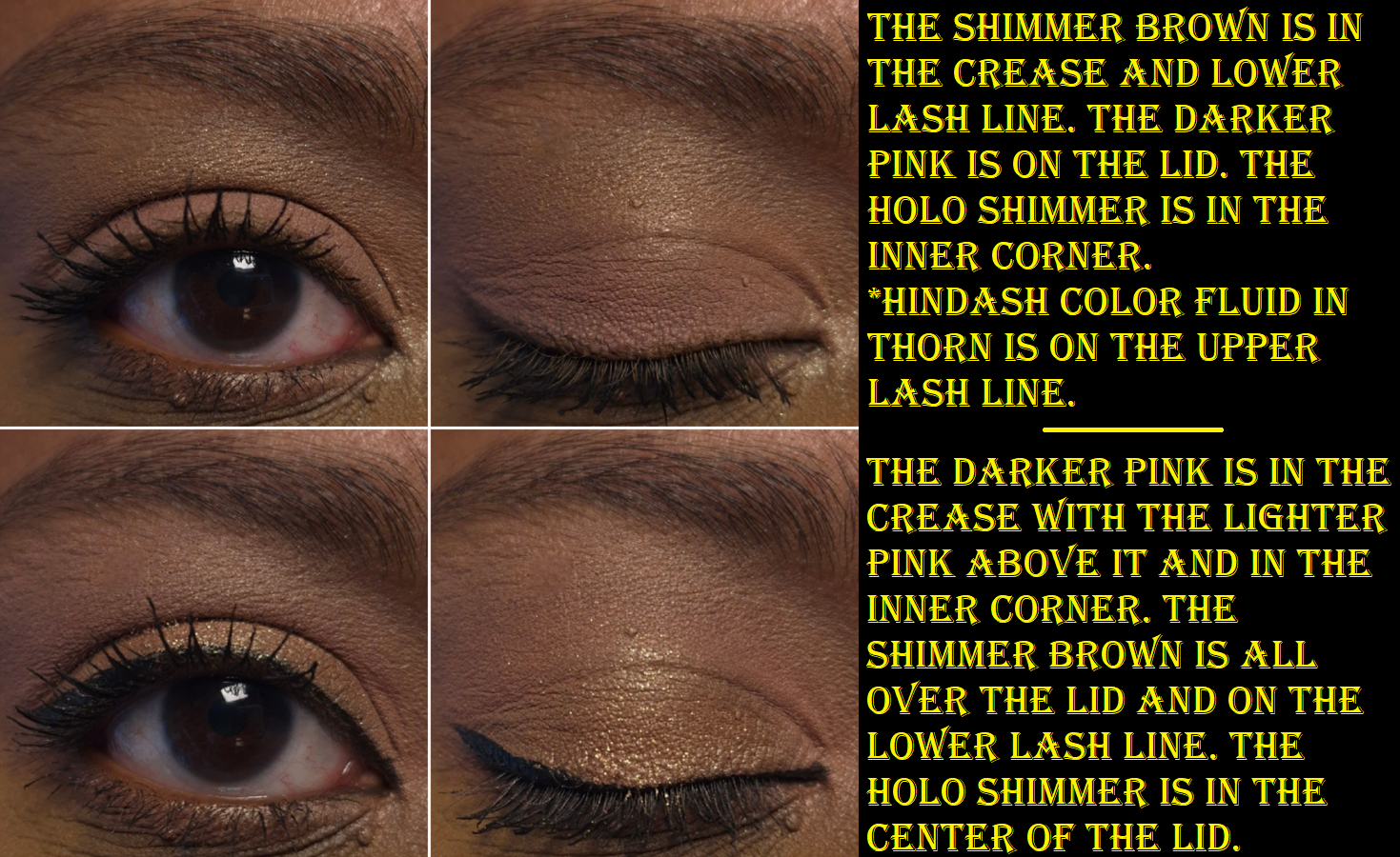
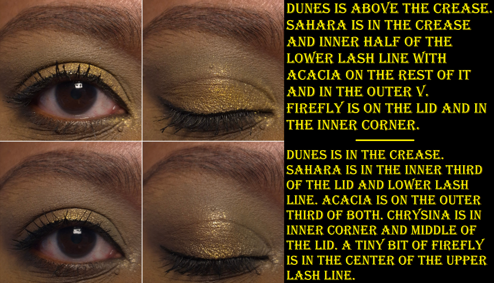
The quality is on par with Primula. The shadows are incredibly creamy feeling, as though it’s a cream-to-powder formula. The eyeshadow payoff is the soft buildable type. I don’t get fallout, fading, or creasing, and they are easy to blend.
The downside, is that I can’t build any depth using this palette exclusively, but I knew that before I bought it, plus I intended to use these shades with Primula.
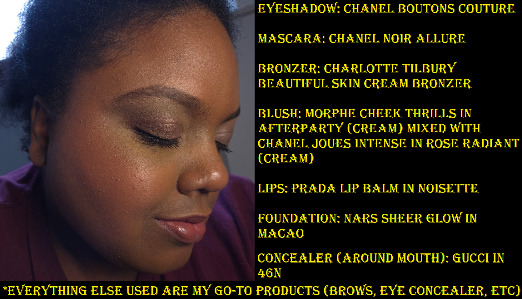
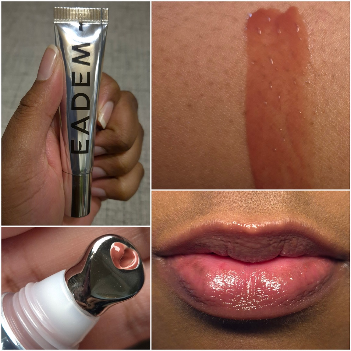
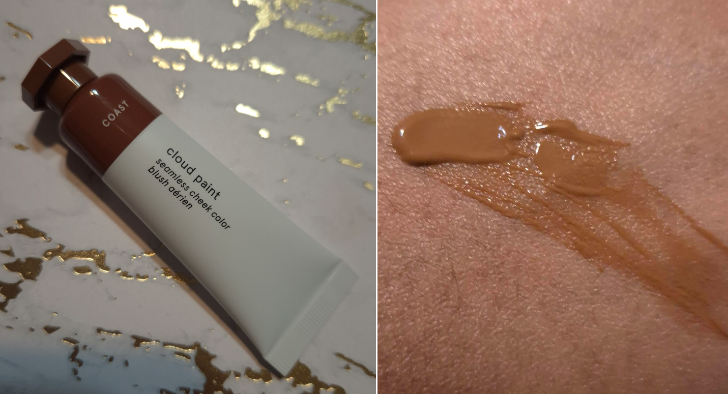
Prada Optimizing Care Lip Balm in 11 Noisette
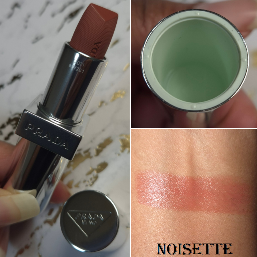
I love how this balm color looks on my lips! It is so rare to find a light shade that is dark enough for me to not need to wear a lip liner with it, without being too saturated/vibrant, and also contains enough pigment to show true-to-color. I’m always looking for a medium-toned pink, but they end up being too cool-toned, have too much mauve, too much of a white base and looking milky or ashy, or too sheer to appear different from my natural lip color.
I am super happy with this shade!
Without eating, and with a normal amount of drinking, this lasts about 4-5 hours on my lips before I feel the need to reapply. My lips feel nicely moisturized and hydrated while I wear it, but I do have lip balms, oils, and glosses that are better at conditioning my lips. However, I’d still place in somewhere in my top 15 or 20. I also don’t consider it to be that sticky.
There are two flaws, with one being far more significant than the other:
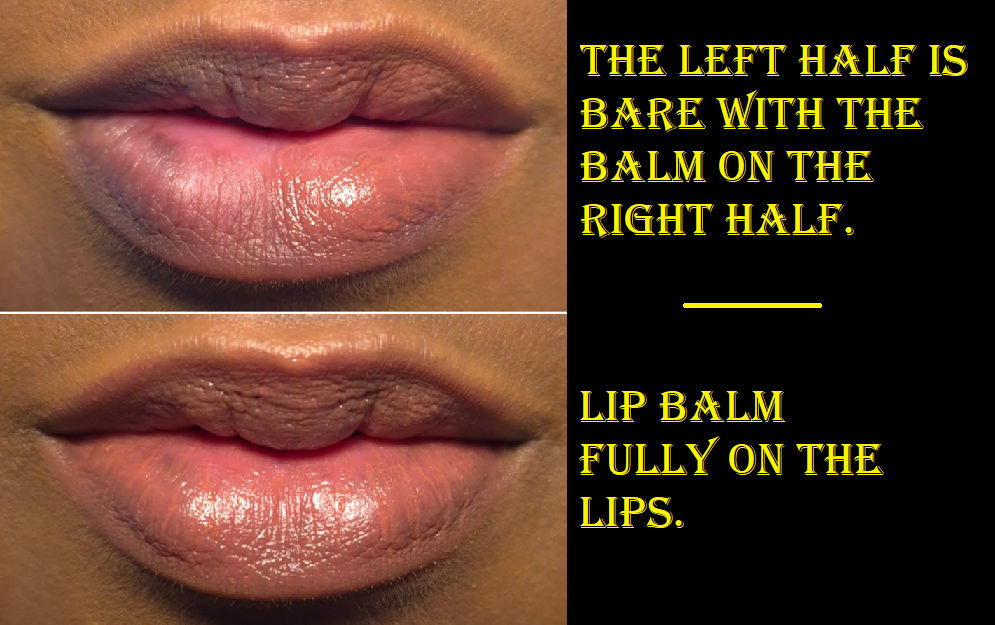
- As beautiful as the color is, it’s not perfectly smooth. The color can sometimes settle into the lines of my lips, so I need to really rub and blend them together to get the color to smooth evenly back out. I notice this during the initial application, and then it’s good until there isn’t as much left on my lips, so I need to reapply anyway.
- My biggest issue with this balm is the added fragrance. It not only smells overpoweringly strong of florals, but I can literally taste the perfume! It even makes my tongue tingle when I accidentally get some of it in my mouth! I try my best to avoid putting the balm too close to the inner rim of my mouth, but I still manage to taste that gross floral perfume anyway.
I admittedly only did four all-day wear tests because I could not handle anymore attempts to eat food while I had remnants of the balm on. Most balms aren’t so gross tasting that I have to bother wiping everything off my lips before eating, but Prada’s is.
After I quit doing wear tests, my M.O. has been to put on the balm for photos and then wipe it off after I’m done. This is the only way I can continue to use this product! The color is gorgeous. The formula is quite nice and cushiony on my lips, but the parfum and additional aroma ingredients (limonene, geraniol, linalool, citronellol, etc) seriously impact my desire to wear this. I don’t understand how this doesn’t bother more people, besides apparently myself and State of Kait.
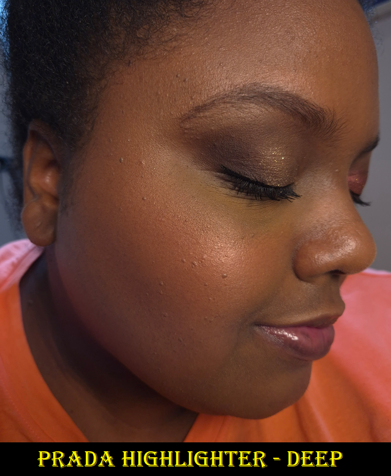
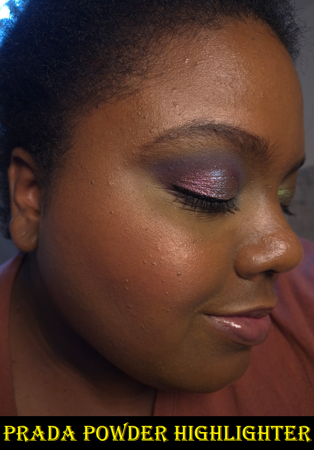
The amount of fragrance in the foundation, I can ignore. The highlighter is powerfully scented, but I power through because it’s unlike any other in my collection. However, the lip balm’s perfume is nearly as strong as the highlighter and I cannot tolerate having them both on at the same time. I get an instant headache.
The packaging is beautiful and luxurious. I love all the details with the logo on the cap, around the sides, the Prada green color on the inside of the cap, the shade name near the opening of the tube, the magnetic closure, and the fact that this is refillable. Sure, the price is high. However, I would have said it was worth it if not for the scented aspect. I cannot recommend this product based on the experience I’m having with it. I seriously hope the fragrance will dissipate over time or that they reformulate these in the same colors, but make them fragrance-free. I bought this at 20% off, but I would repurchase a parfum-free version at full price in a heartbeat. This had the makings of being a holy grail product. What a shame!
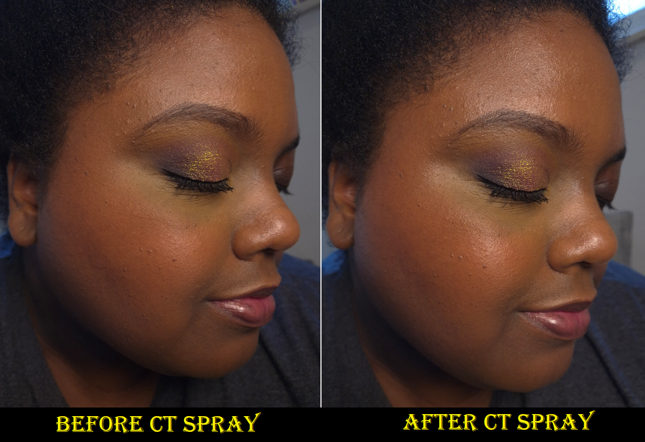
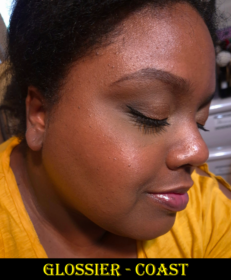
Prada Reveal Skin Optmizing Refillable Foundation (sample) in DN75
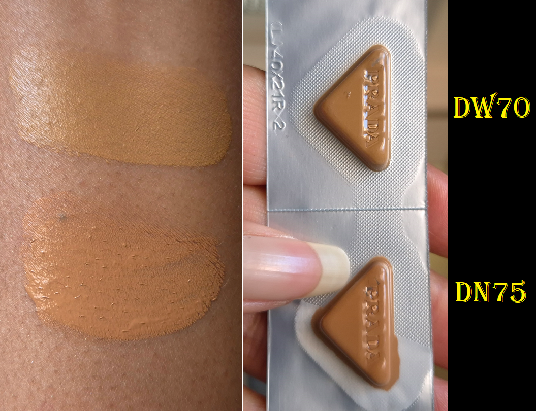
I got a foundation sample card in one of my orders and DN75 was the closest match out of what was available. I would say it’s still a shade too light for me. I assume either DW75 or DW80 would be better for me, but I don’t plan on buying the full-size because the finish is more matte than I would like. It if looks like this on me in the summer time, I can imagine how dry and dehydrated I’d look in winter. My hydrating setting sprays could help, but I will just stick to using the foundations I already have.
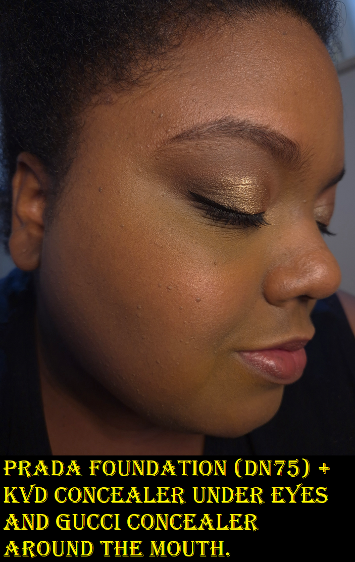
I have noticed during longevity tests that this foundation gets more dewy on me as the day goes on, but I’m not sure if that has to do with the hydrating skincare I use (such as hyaluronic acid) taking effect. This kind of thing happened to me with the Hourglass Ambient Soft Glow Foundation, but I prefer to have a hydrated look from the start and it staying the same all day, instead of having to suffer through looking dry in the morning and then by afternoon I’m glowier in a way that looks worn in, the way this Prada Foundation does.
According to what’s written on Prada’s website, this foundation has, “buildable medium coverage and a long-lasting soft matte finish,” plus, “…the technology-powered formula instantly enhances radiance and hydration with additional overtime care.” So, perhaps this “additional overtime care” explains the dewy phenomenon. Looking more radiant is welcome to me, but I don’t like being able to actually feel the moisture increase on my face. This foundation is not transfer-proof, and I agree with the medium coverage claim.
Because of the fragrance and dewiness throughout the day, I’m glad I was able to use the sample and didn’t have to commit to buying it first.
I tested this foundation 3 or 4 times, as there was plenty in the container and I was able to use tape along the sides to keep it as fresh as possible between uses.
That’s all for today! I truly do think I am slowing down on buying more from Prada, especially if there’s going to be fragrance in those products too.
Thanks for reading!
-Lili ❤