I’ve never been one to fawn over brands. There are some companies whose products I really like, and I speak about them highly, but when it comes to Clionadh Cosmetics I fully acknowledge I am a Stan.

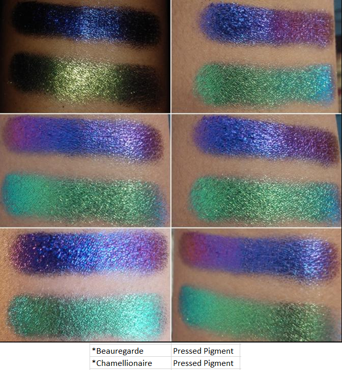
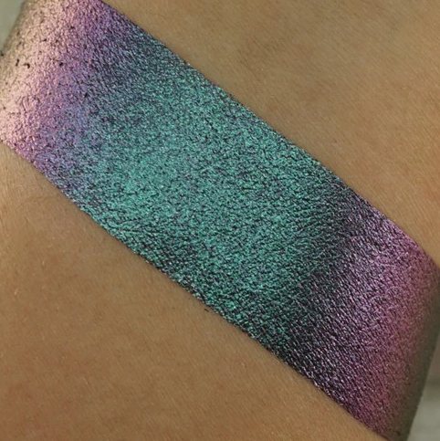
I respect the company so much because of their amazing customer service, social media presence, and support of customers, creators, and even other indie brands. The biggest reason is of course their phenomenal eyeshadows. Their standard eyeshadow collections are fantastic (and underrated) but their Stained Glass Collection is several tiers above the rest. Other brands can make multichromes and do a decent job, but no one has been able to replicate Clionadh’s “mirror” finish in their Jewelled multichrome formula. Leigh and Maggie have created truly extraordinary eyeshadows.
THE ORDERING PROCESS / DELAYS
When I first heard about Clionadh, they were already popular. It was just a two-person team handmaking everything. The processing time was 20 business days and it was not uncommon having to wait 1-2 months for an order to arrive from Canada where they are based. However, they had a huge boom on January 21st, 2020 with their belated Black Friday sale. They had a new workspace and hired a few employees, but the demand was so massive that things were selling out within minutes. In order to give everyone a fair shot, they turned the Stained Glass collection into a pre-order collection and on February 4th they made preorders available and honored the sale price for the first two days. This is the reason why what once took a few months turned into a 2-5 month wait. In one of their updates they explained, “In total, we received more orders from this single restock than we did the entirety of 2019.”
This process became a lesson in patience for me. For the January 21st restock, I checked out 14 minutes after the launch and received my order on February 18th. For the February 4th Pre-Order launch (planned to ship in April), I was better prepared and checked out two minutes after the launch. However, I combined that order with my later February 25th order. So, my package arrived on July 8th. My March 4th order was also part of the April pre-orders and arrived on August 4th.
The COVID-19 pandemic with social distancing restrictions caused a far greater delay than anyone could have anticipated. This is the reason Clionadh didn’t catch up with everything until November 30th. That included closing their store for a month in order to complete the pending orders, build up inventory to reopen, move to an even larger space, hire additional help, order two custom pressing machines, and transfer their website to a different e-commerce platform. They have since reopened and from December 18th – December 31st, their biggest restock/sale yet has been underway. My intention was to post this before the sale, but my final order did not arrive in time for that to be possible.
Regarding the current sale, they plan to ship the standard orders after the holidays (January 2021) for the current inventory they have in stock. All orders containing a pre-order item will begin shipping in late February. This is a reasonable amount of time considering how long it takes to create new shadows, so it appears they won’t be as backed up in 2021 as they were this year.
This post has been many months in the making. I kept debating whether or not to post considering I still had so many pending orders. Ultimately, I decided to work on this a little at a time, as my orders came in, so I could finally make a giant 2020 Clionadh Collection post all in one!
PRICING
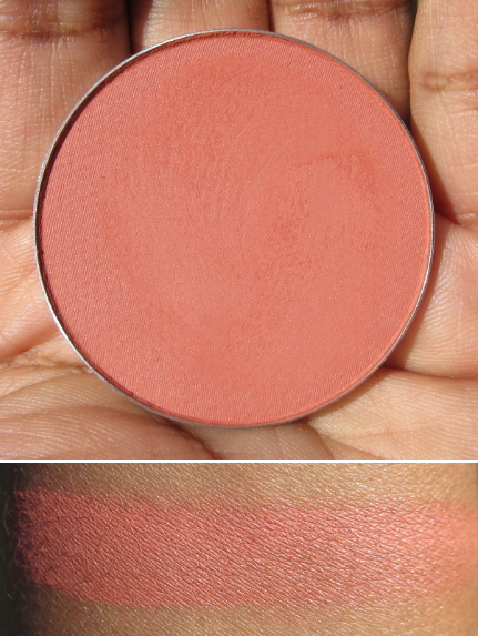
One of my initial deterrents from the brand was the cost of a single eyeshadow. Prior to watching Lauren Mae Beauty’s video, which is when I decided to finally try out the brand during their next sale, I only knew of Clionadh from photos on Instagram. I thought those pictures had been photoshopped or enhanced in some way because I didn’t think eyeshadows could ever look like that in real life. The irony is that they look even more stunning in person! At the time, I didn’t want to spend $25 on a shadow when I’d already been a little disappointed by the $15 multichromes I purchased from Sydney Grace. What I didn’t take into consideration is that the prices listed were in CAD, which is higher than USD. It’s only the most expensive shades, the Jewelled multichromes, which are 25 CAD at full price and $19 USD. Their website now has a conversion changer, which makes things easier to calculate.
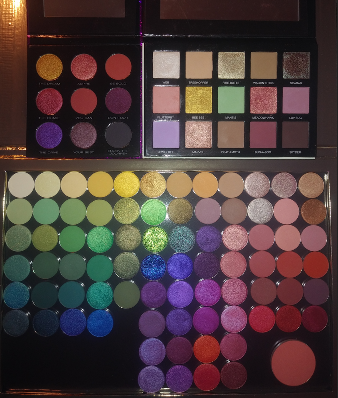
Terra Moons Extreme Multichromes are $17, Sydney Grace Pressed Multichromes are $15, and JD Glow Multichromes are $16. Devinah Cosmetics shadows in the Butterfly Kaleidoscope Collection are $10, but the shifts are a lot weaker than the multichromes from the other brands. Devinah now has Aurorae Flares for $16 which are comparable to Clionadh’s Jewelled multichromes. They are the closest in quality that I have seen, though Clionadh’s are still just a touch better in my opinion due to that mirror shine. However, they are nearly identical enough that I would suggest if you live in the US and don’t already have the equivalent Clionadh shades to the Aurorae Flare shadows, you’d be saving $3 per shadow going with the Devinah options.
Clionadh’s prices for multichromes within the Stained Glass collection range from $8-19 USD. The duochromes from their other collections, which still have strong shifts depending on the shades, range from $5-6 USD. Devinah’s Duochromes are $8 with regular shadows as low as $5. Terra Moons’ are $6-13. Lethal Cosmetics Duochromes are $6.50-7. Give Me Glow’s regular shimmers are $7. JDGlow’s regular shimmers are $7.50. So, Clionadh’s eyeshadows are on par or better price-wise than other indie brands. Other brands have more sales though and some are at deeper discounts, so it just depends.
The cost of shipping to the US is around $11 (15 CAD) but it is tracked and insured. My last Terra Moons order cost me $7.29 insured shipping (free if you spend $65). Considering Clionadh is based in another country whereas Terra Moons is based in Tampa about one hour from where I live, I think it’s a pretty good deal.
In addition, Clionadh knows that it would be so disappointing to wait months and have anything arrive broken, so they pack them the most securely of any brand. It takes me quite a while to unpack the shadows from all the bubble wrap!
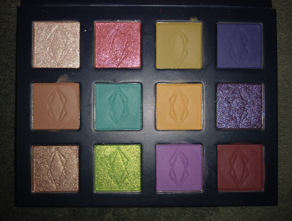
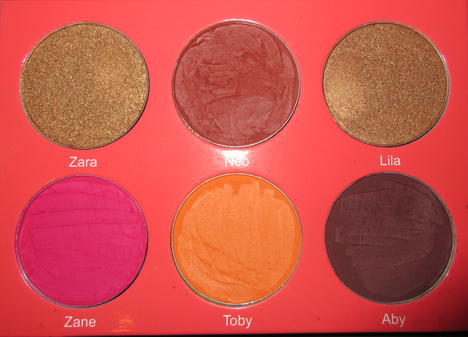
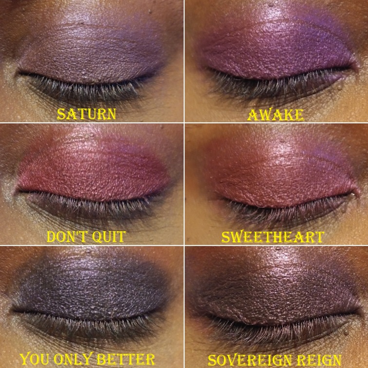
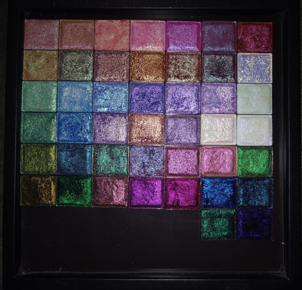
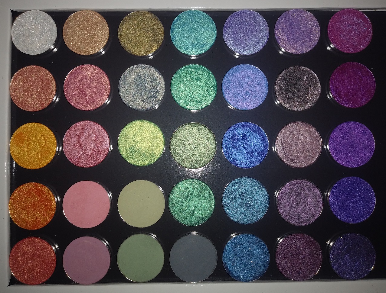
THE STAINED GLASS COLLECTION
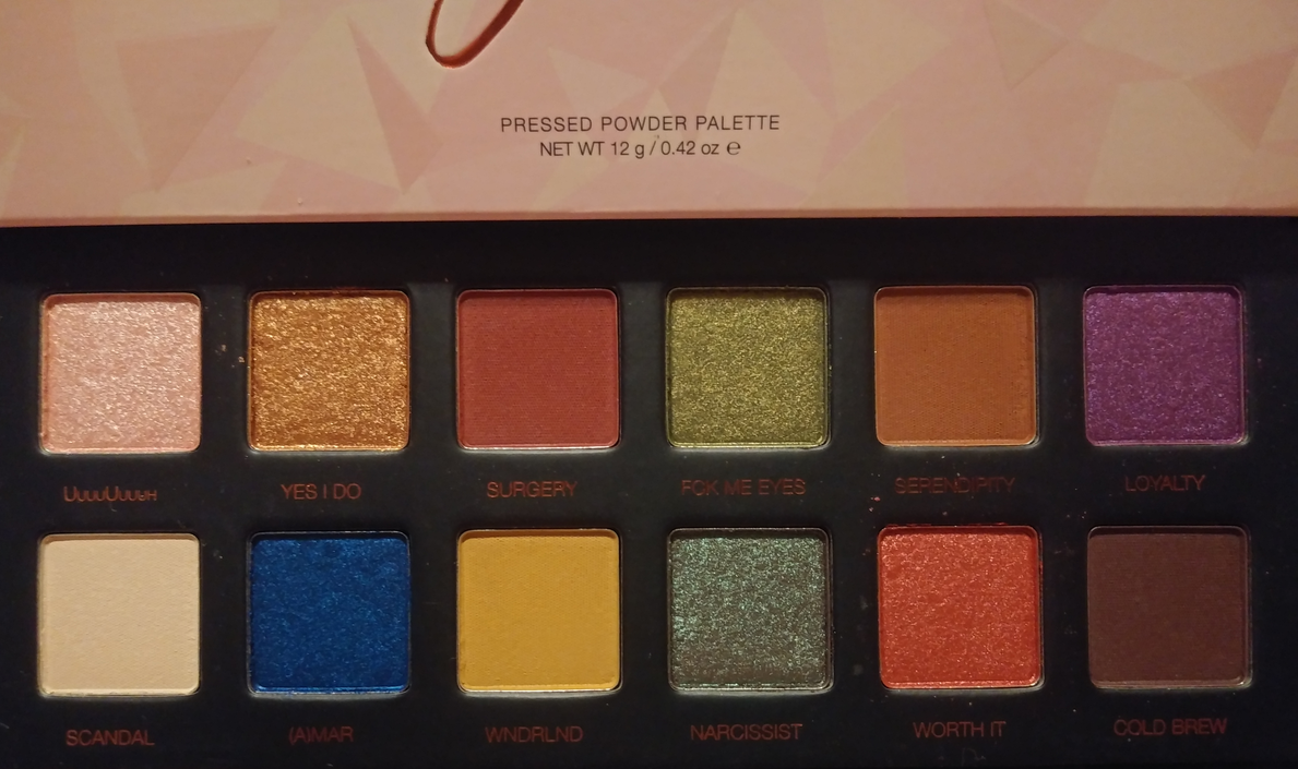
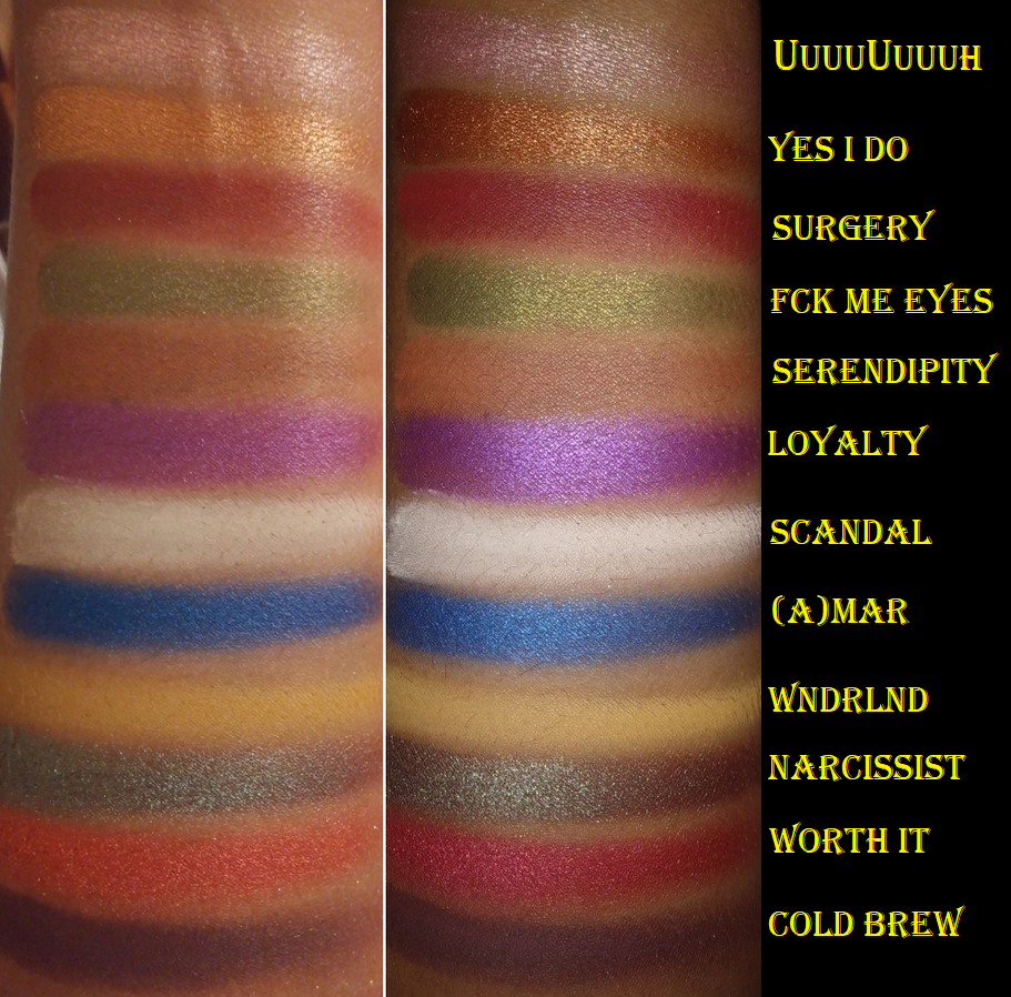
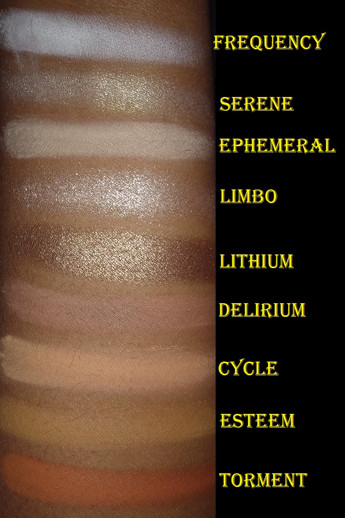
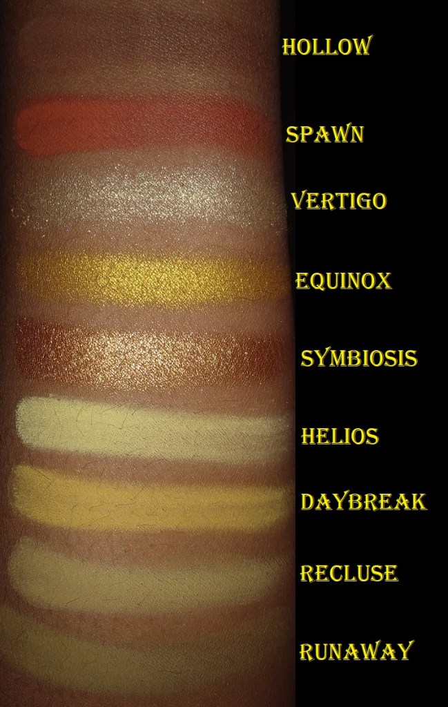
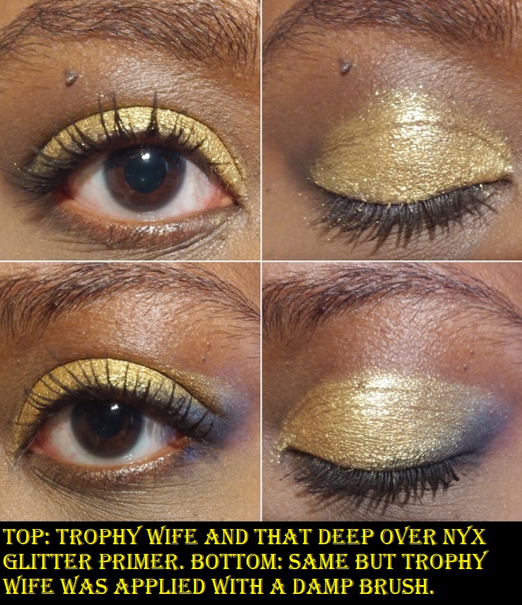
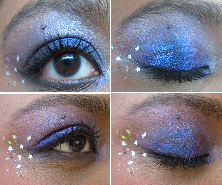
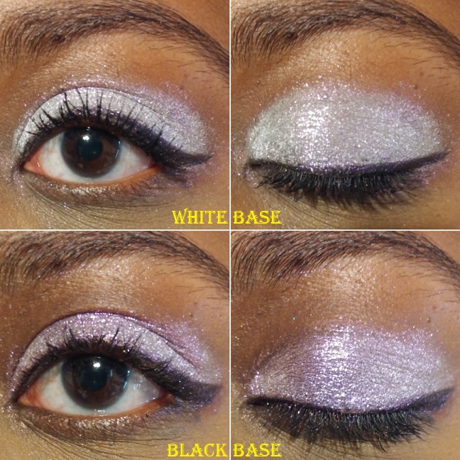
I will be categorizing by formula and showcasing eye swatches. Arm swatches and other comparisons will be towards the end of the post. For eye swatches, I used Nyx Glitter Primer on shimmers and MAC Paint Pot for mattes. For arm swatches, I used Nyx Glitter Primer on the Stained Glass Collection and Urban Decay Primer Potion on the standard collection.
Series 1 Iridescent Multichromes
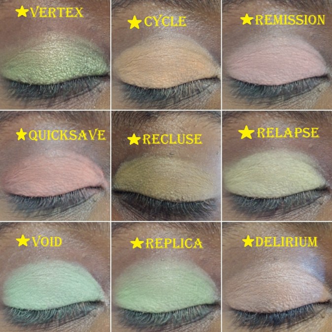
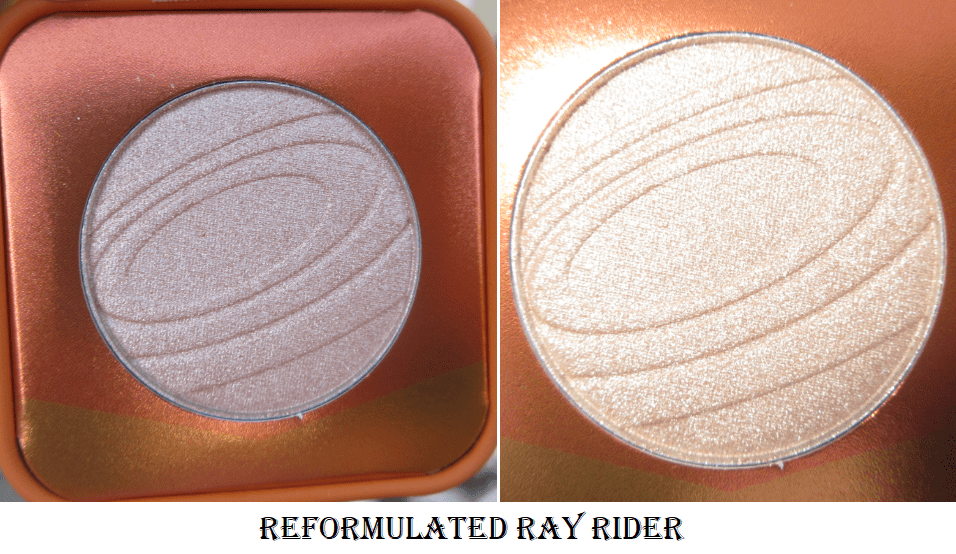
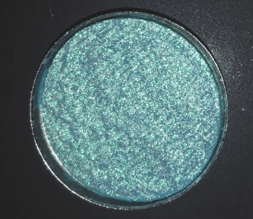
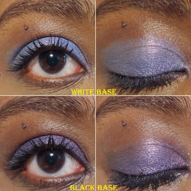
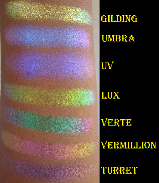
These appear white in the pan but have color shifts and a transparent base. They are recommended to be used as lid topper shades and highlighters for the eyes and face.
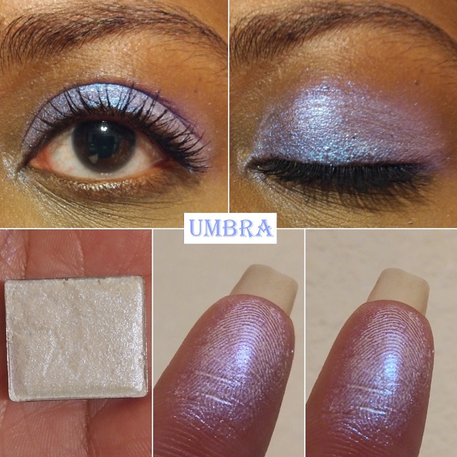
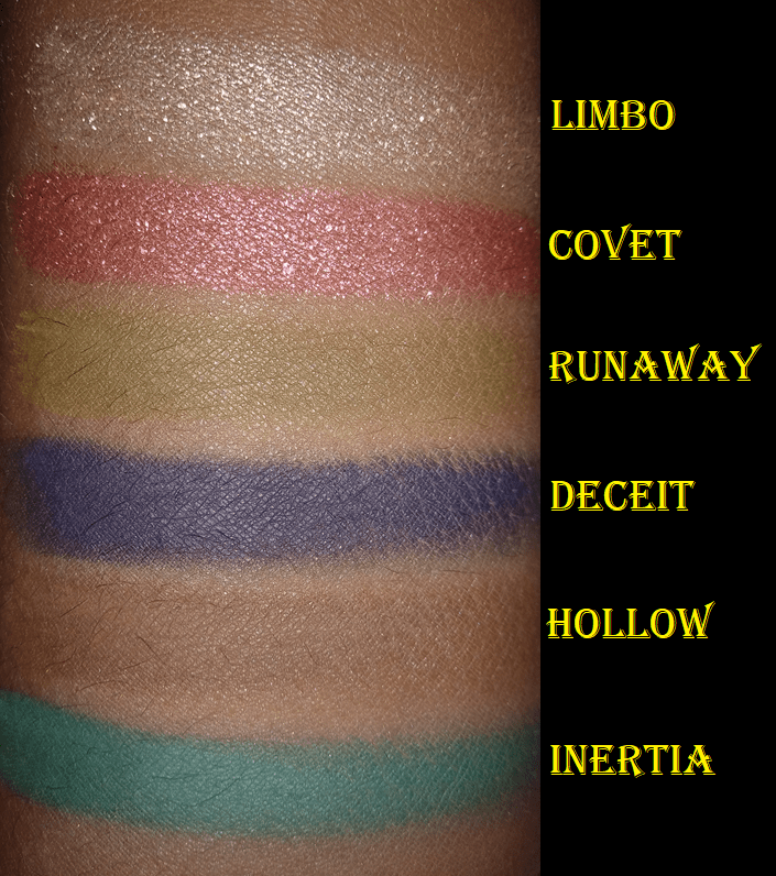
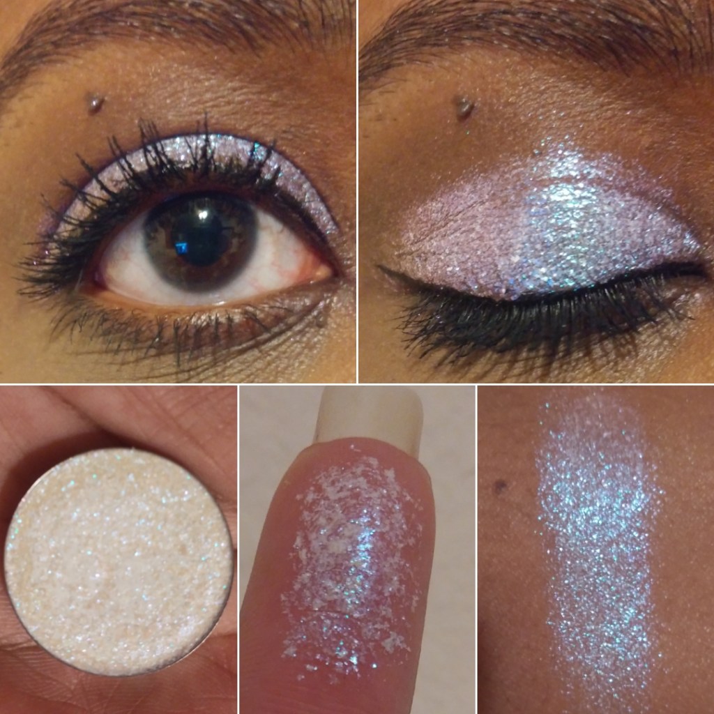
Umbra has “colour shifting reflects that go from blue-indigo-violet-pink.” This is the only one I have in this formula because although this kind of eyeshadow still works for me and is beautiful, it takes a bit of rubbing to make the white part of the powder disappear. It gets messy when I have to rub the shade rather than gently patting it onto my glitter-glue-primed eyes which I use to avoid fallout.
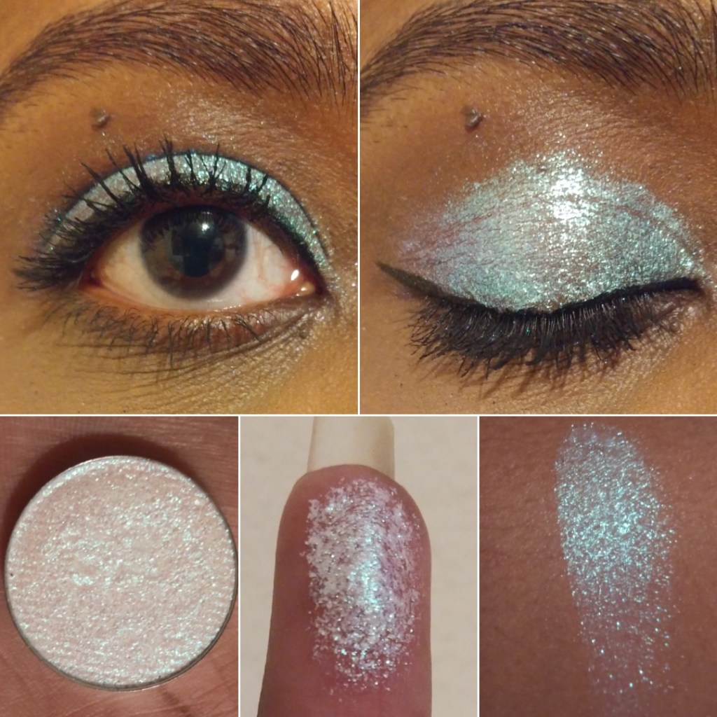
Series 2 Iridescent Multichromes
With Series 2, Clionadh says, “We don’t recommend using these on their own as a shadow because their formula is so thin and slippery, thus it doesn’t have the same adhesion a regular shadow would need on its own. But they certainly are perfect for the inner corner or brow bone.”
Of course, I still put them all over the lid for demonstration purposes. You can see a few sparse areas despite me building up these shades because they aren’t meant to be opaque. I currently have two shades and I was able to buy one more during the sale, which I will review in a future post.
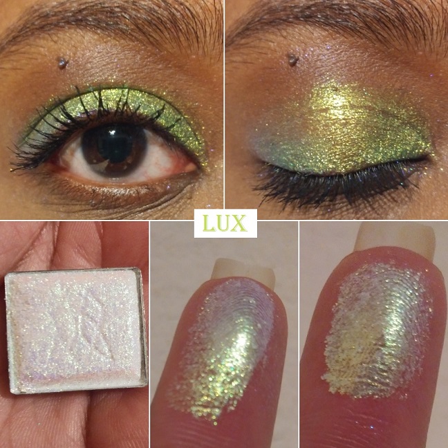
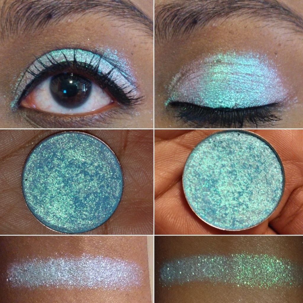
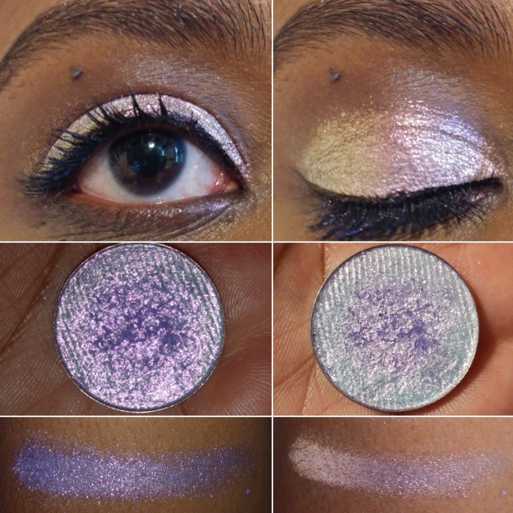
Lux has “colour shifting reflects that go from yellow-lime-turquoise-violet with a slightly more glittery finish.” This shade is so reflective and beautiful that I literally gasped when I first swatched it. My camera doesn’t come close to doing it justice!
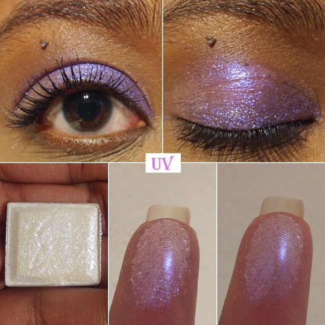
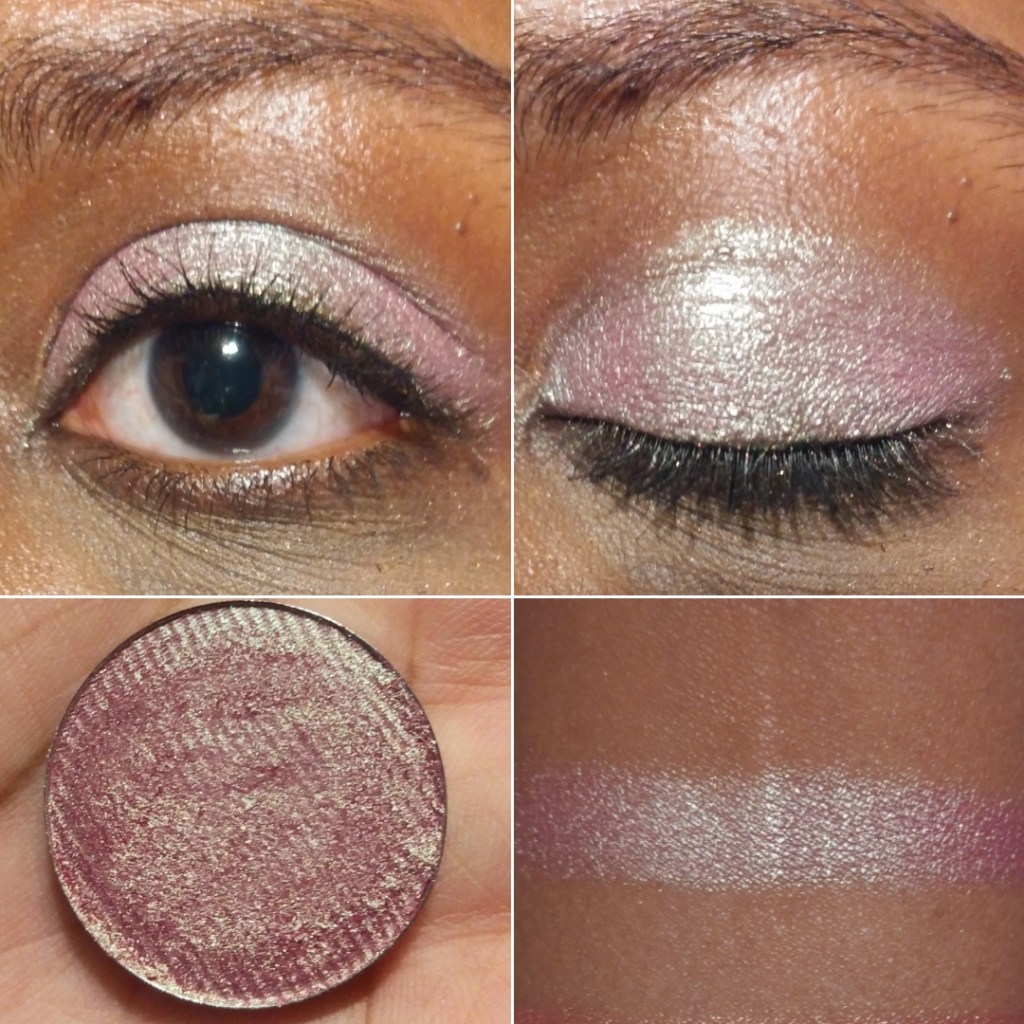
UV has “colour shifting reflects that go from violet-peach.” I can’t really see the peach on my skin tone but the shade of purple is beautiful and I’m happy with how it looks. It practically glows!
Overall, Series 1 feels a little more powdery and Series 2 does appear to have a more invisible base. With Series 2, I don’t have the same issue of needing to rub it in for the color to show. The regular application process is enough.
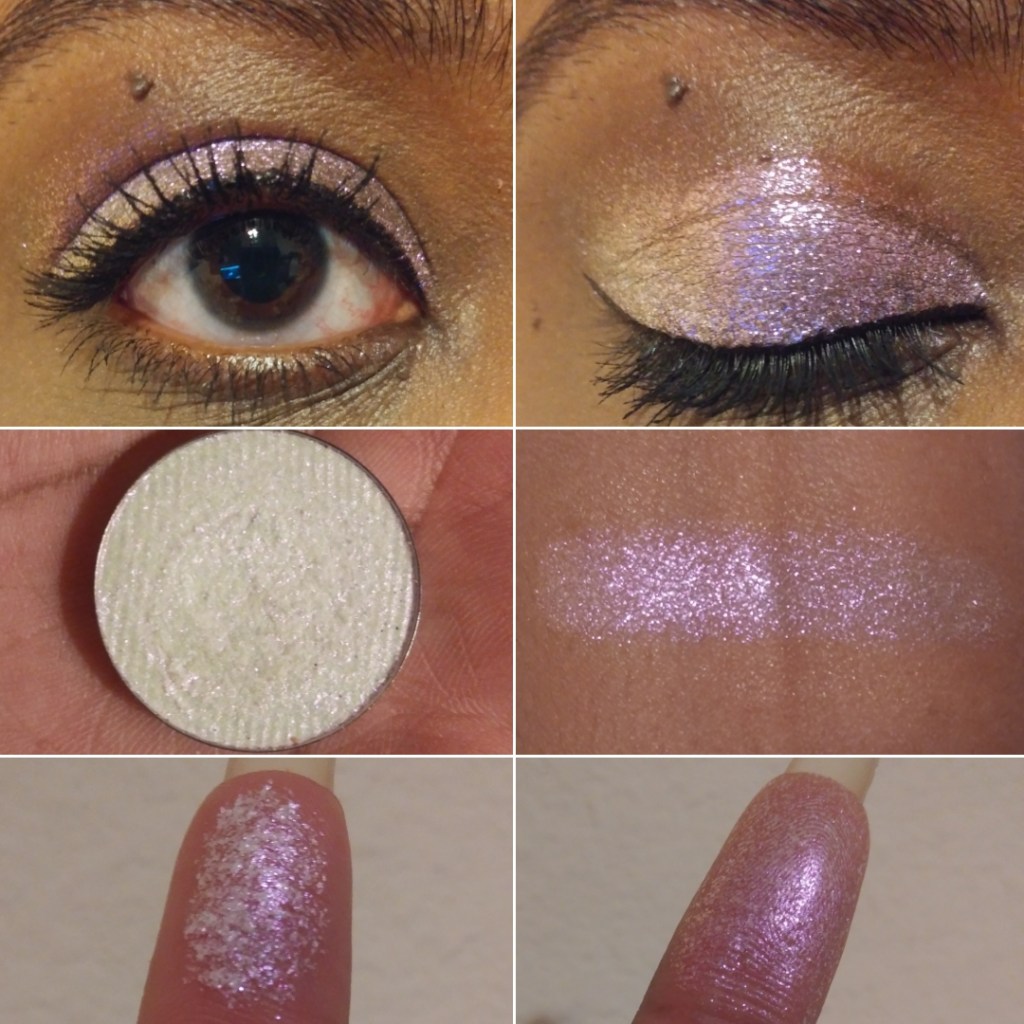
Deep Iridescent Multichromes
The Deep Iridescent Multichromes have a tan base which makes them easier for customers with medium to deep skin tones to wear without a white cast. They still look gorgeous on every skin tone though.
I have 2 of 5 shades but I ordered two more during the restock. Clionadh mentioned plans to add new shades to the Stained Glass collection. I’m hoping they will expand the shades in the Deep Iridescent multichrome range, especially if they create a purple to top the ones I have from the Iridescent Series 1 and 2. A girl can dream!
These shadows go on easily and definitely don’t leave a cast. They look glittery but are super smooth in texture. Of all the iridescent formulas, this is my favorite!
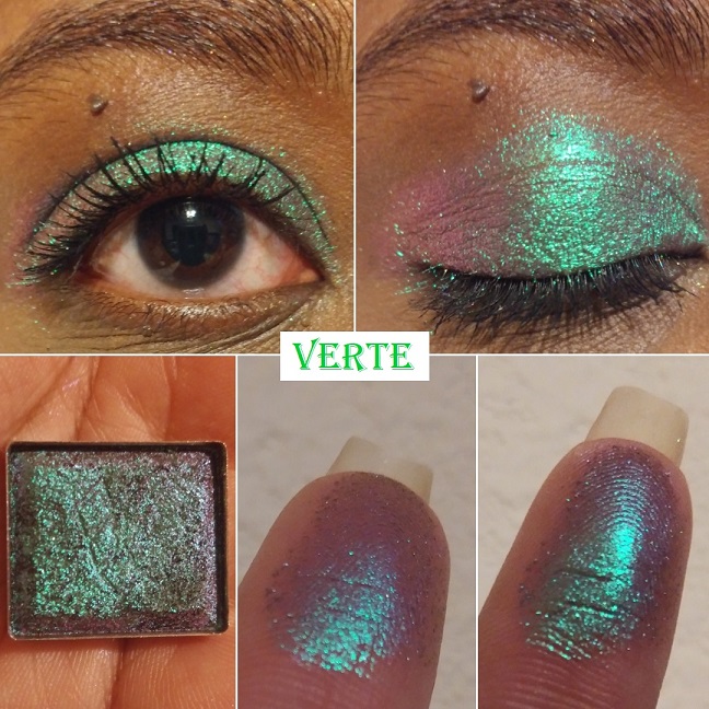
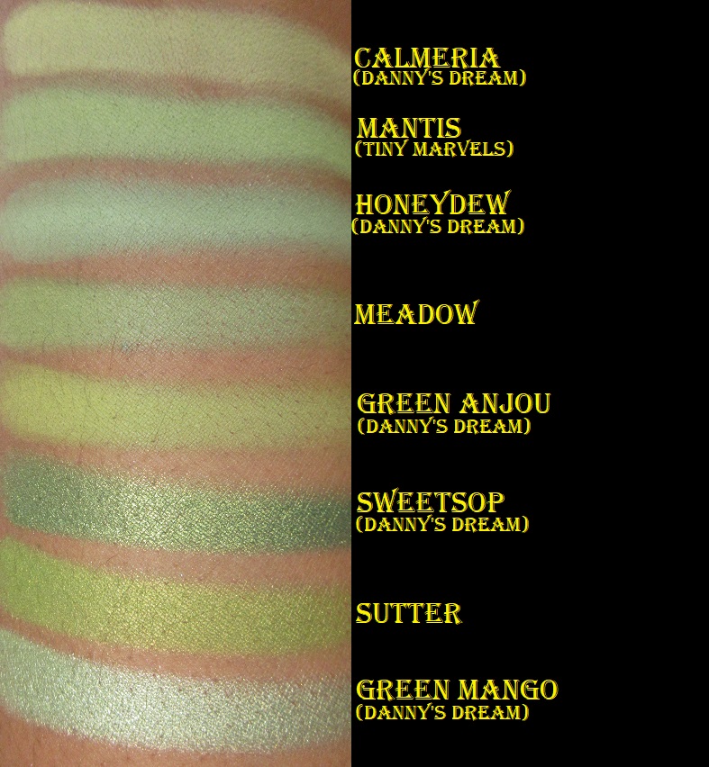
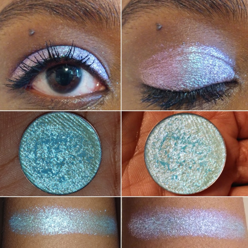
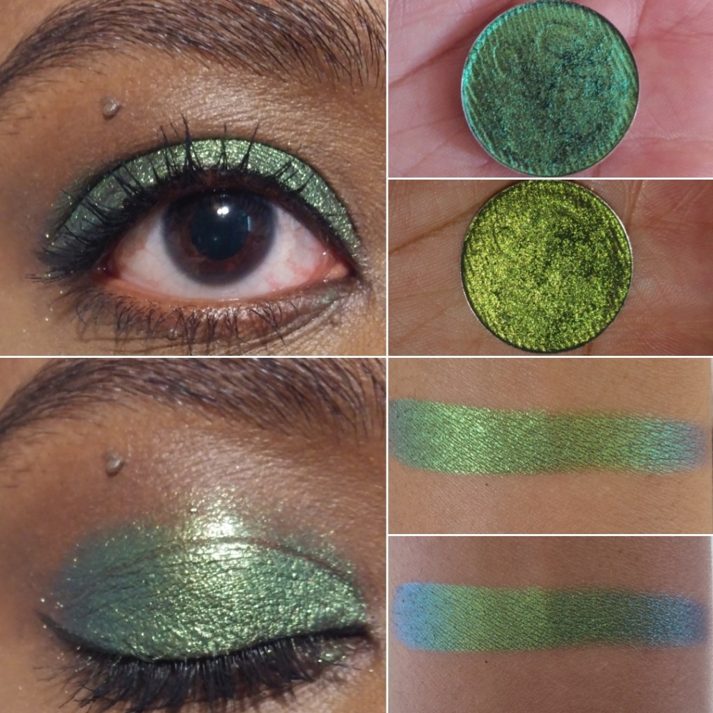
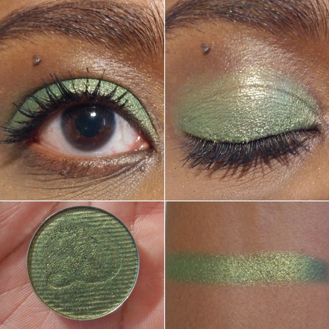
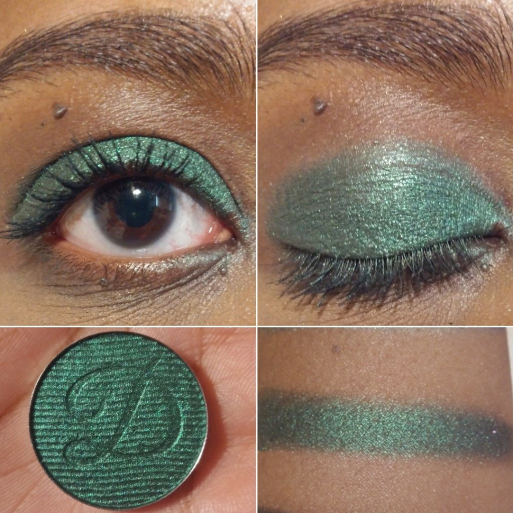
Verte is an “emerald-turquoise-purple-pink shifter with a medium, cool tan base.” This is another shade that made me audibly gasp. It’s one of my favorite shades from Clionadh’s entire collection and just my eyeshadows in general. It completely exceeded my expectations. I have quite a few green to purple shifting shades, but these tones are unlike anything else I’ve seen before!
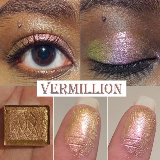
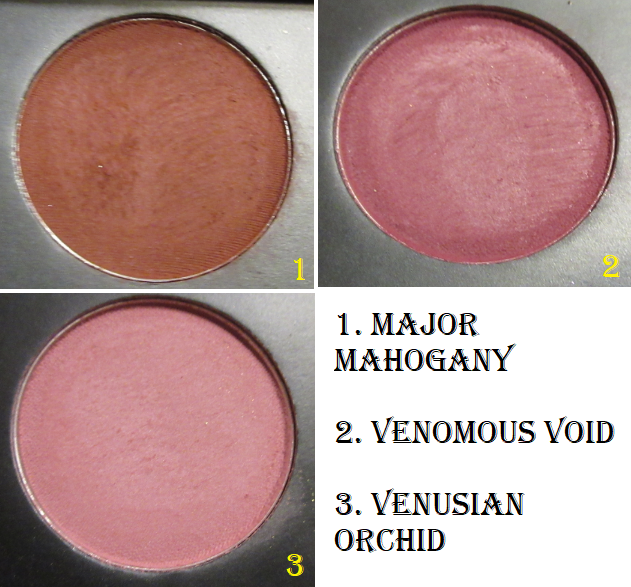
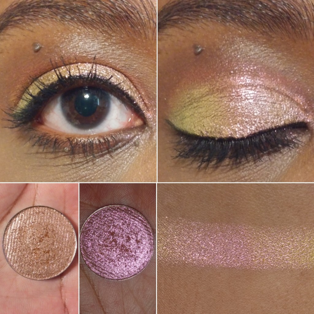
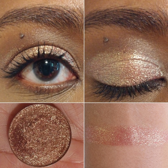
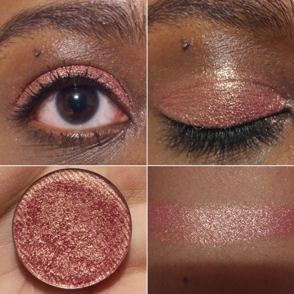
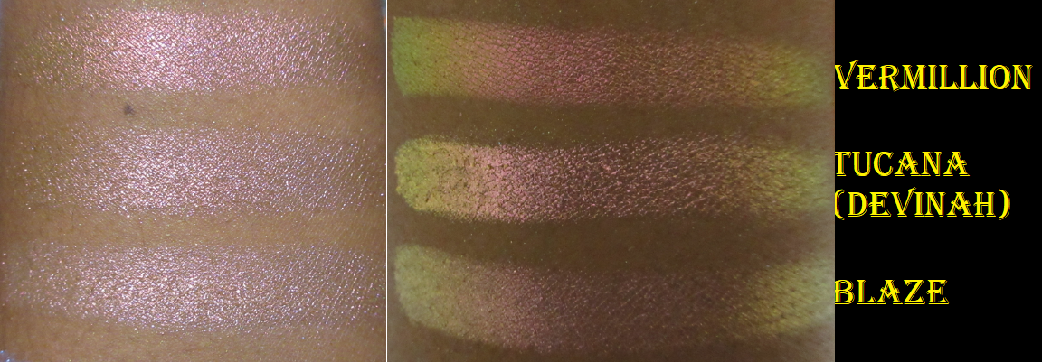
Vermillion has a “light, warm tan base that shifts pink-orange-gold-lime.” It’s not easy for me to be impressed by pink shades but this one is very pretty. It’s a smoother and shiftier version of Devinah’s Tocana.
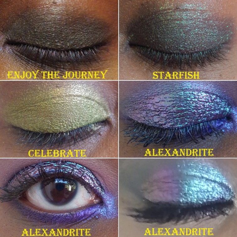
Iridescent Glitter Multichromes
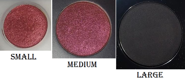
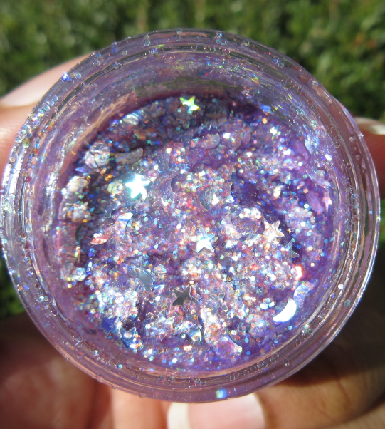
The Glitter-Type Iridescent Multichromes aren’t pressed glitters. They have larger particles than most of the other shadows though, so I highly recommend using a glitter primer/glitter glue. Clionadh recommends this as well, along with, “applying them with your finger or a shader brush sprayed with a setting spray. Don’t swipe.”
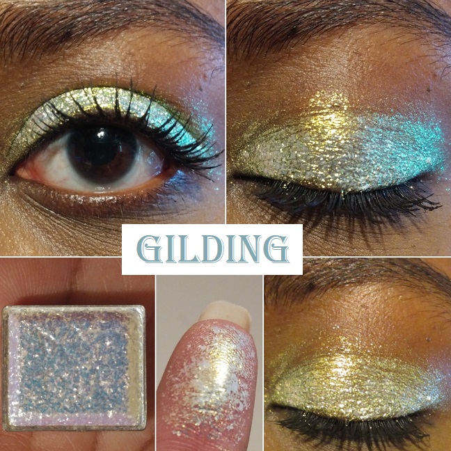
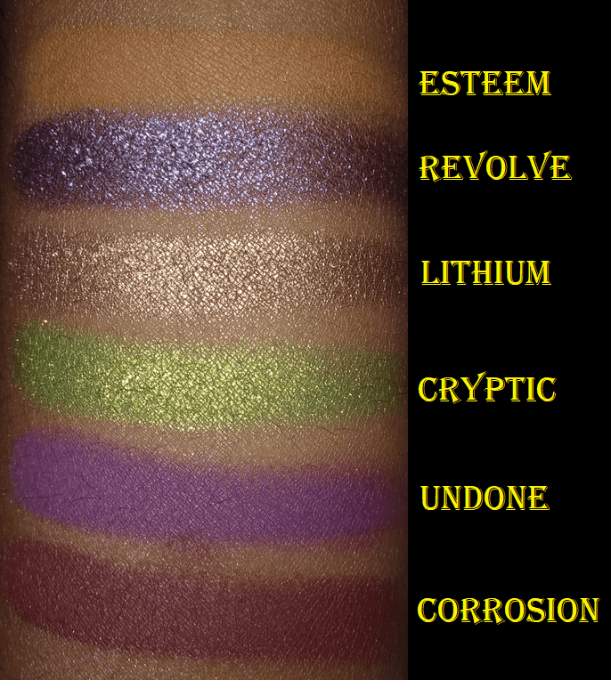
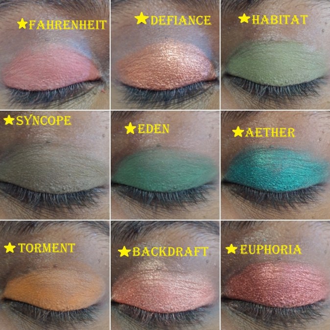
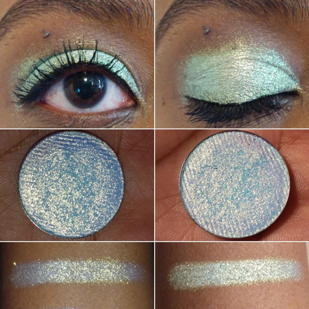
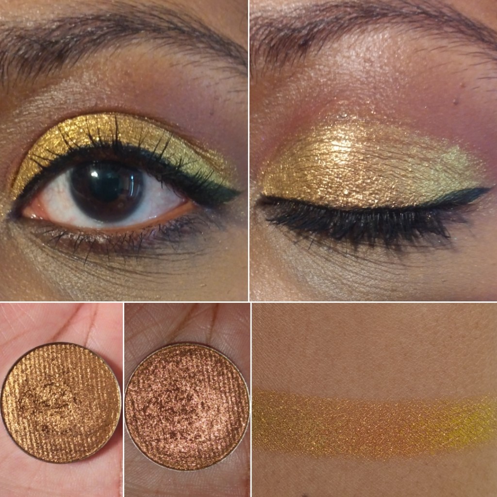
Gilding “has a translucent base that reflects bright gold-silver-green-turquoise.” The eyeshadows in this line are so incredibly beautiful, but because I prefer smaller sized glitter specks, this is the only one I intend to have in this formula. Also, I love how intense this is, but I wish the silver wasn’t there. On my complexion, the silver looks like unblended white powder in comparison to all the gold.
Glitter Multichromes
The Glitter Multichromes are once again not pressed glitters or plastic-based glitters. Clionadh says, “These have varying levels of opacity in the base colour and varying sizes of glitter particles. They are safe to use on the eyes.”
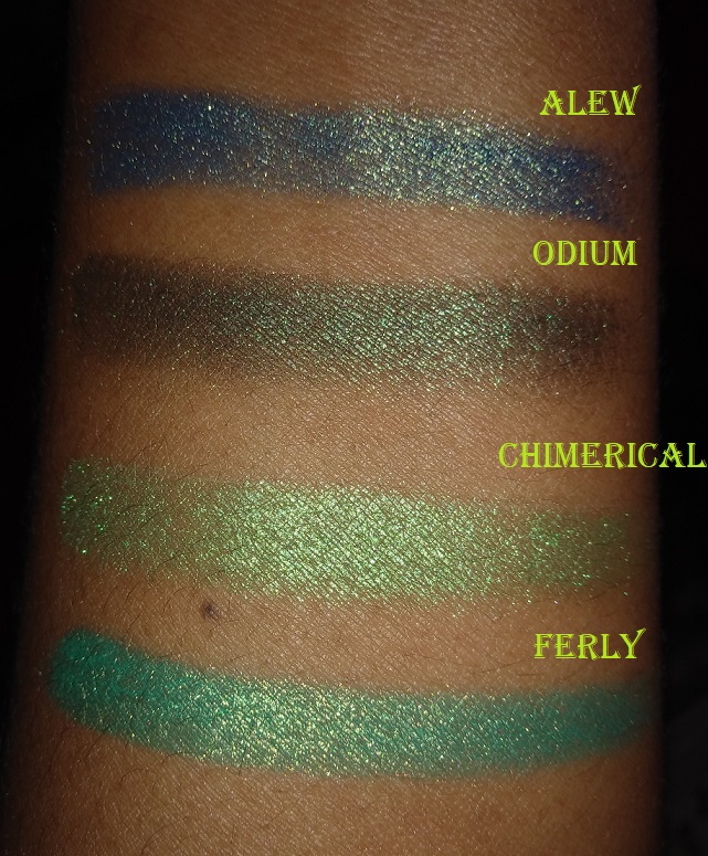
I have 19 out of the 23 currently in the collection. The missing shades are Corrosion, Ornamental, Kaleidoscope, and Engrave. From pictures alone, those four don’t look the most unique or shifty to me, so I decided not to buy them just for the sake of wanting to complete the set.
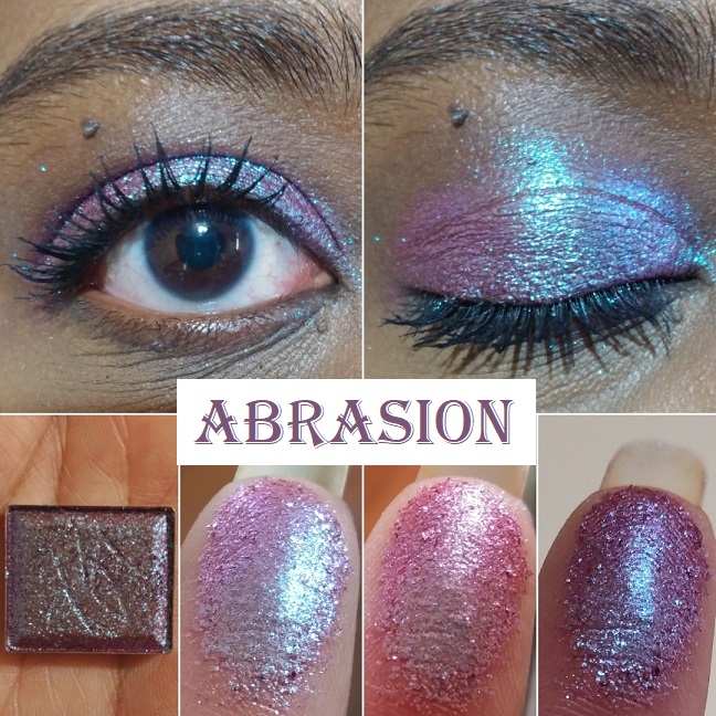
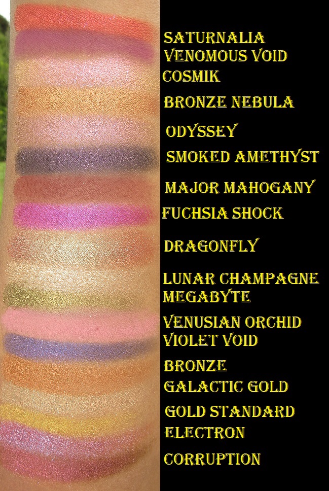
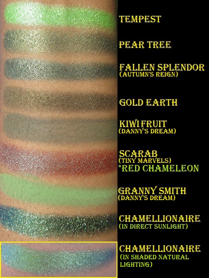
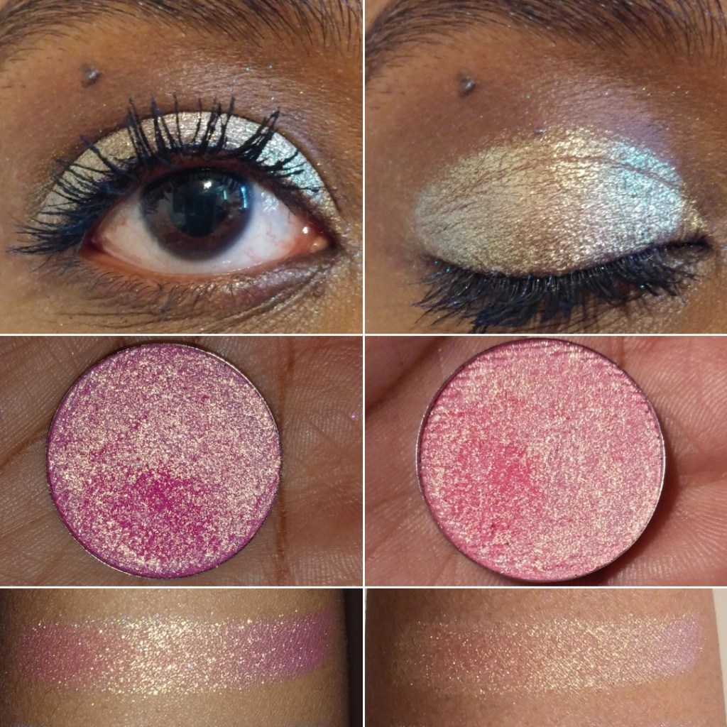
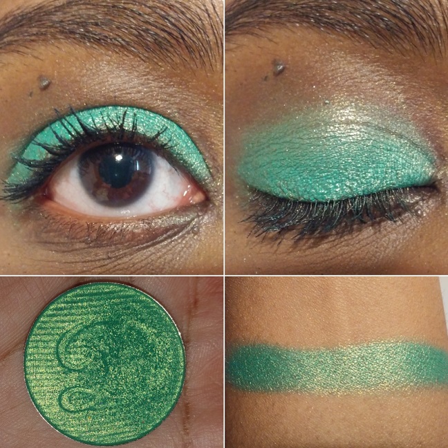
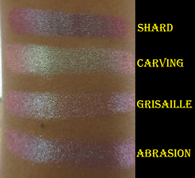
Abrasion “has a semi-sheer burgundy base with large glitter particles that shift turquoise-indigo-violet.” The color it looks in the pan is so similar to a multitude of duochromes I’ve seen before, even from mainstream brands, but when it’s actually swatched and put on the eyes, you can see how multi-dimensional it is. It’s so much more special than I thought!
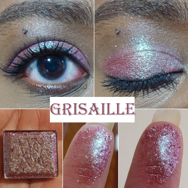
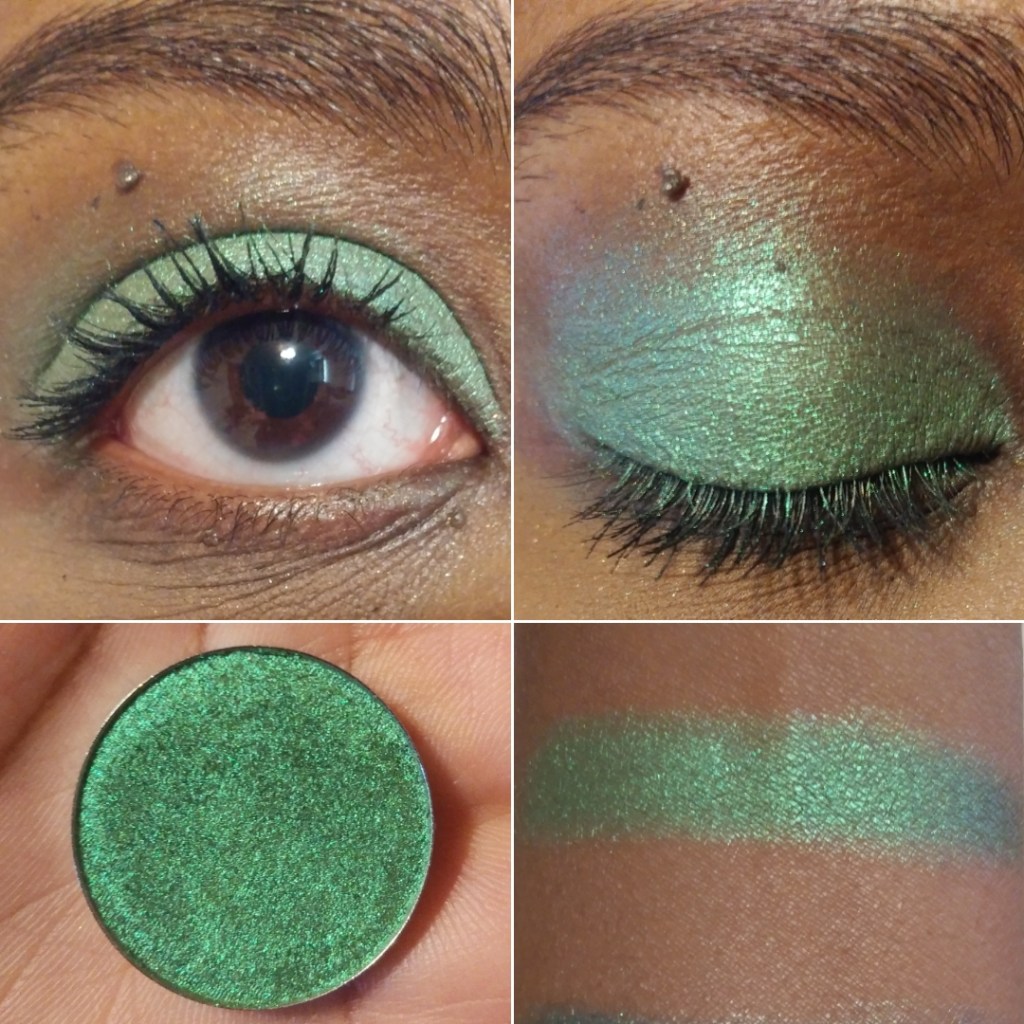
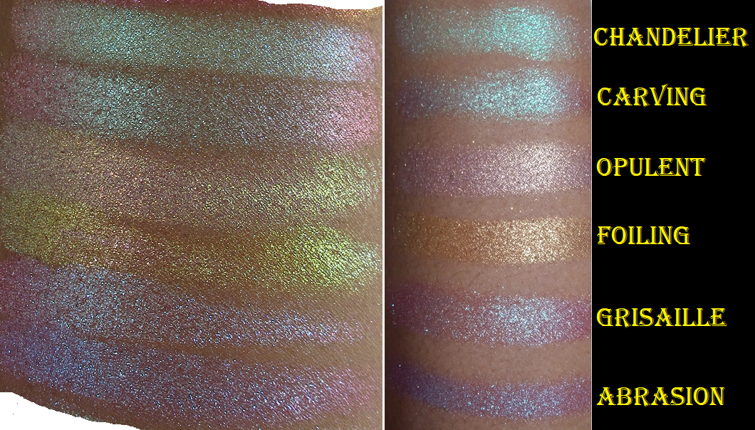
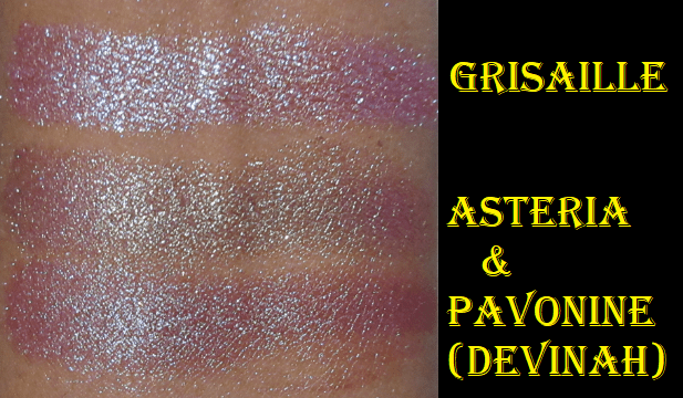
Grisaille “has a semi-pigmented terracotta base with medium glitter particles that shift turquoise-indigo-violet-pink.” This shade looked similar to Abrasion in the pan, but the base color changes the look on the eyes. Abrasion has a stronger turquoise shift whereas the sparkle in this appears more minty green, even though it isn’t described that way on the website. Pavonine from Devinah Cosmetics is a bit similar to this shade.
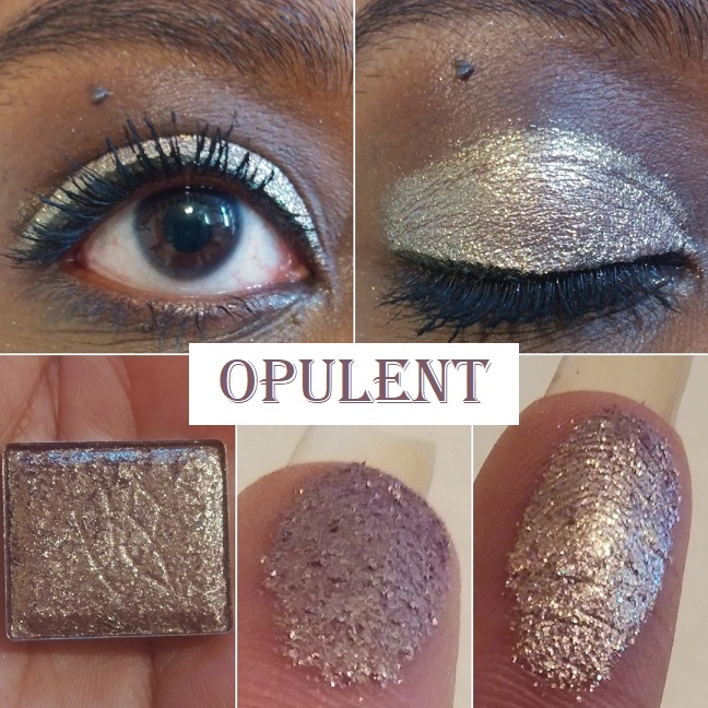
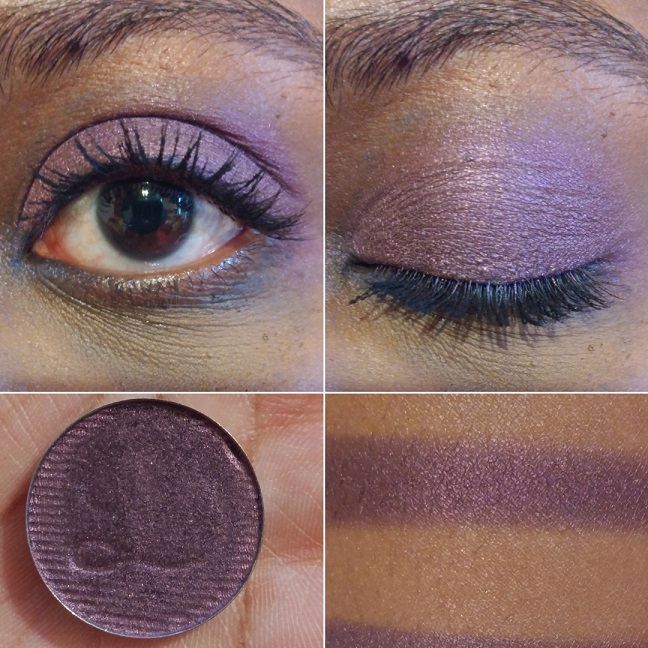
Opulent has “a warm purple-brown base (almost rose gold) with medium glitter particles that shift orange-gold-green-turquoise.” Certain shades don’t shift the way it is described, and I thought it might be due to my darkly pigmented eyelids, but I couldn’t see the other colors on my finger either. When I wear this one, it shifts from dark rose gold to a lighter and brighter gold, but that’s about all I can see. Perhaps the others show in different lighting. As it stands, the tone still makes it unique when seen in person.
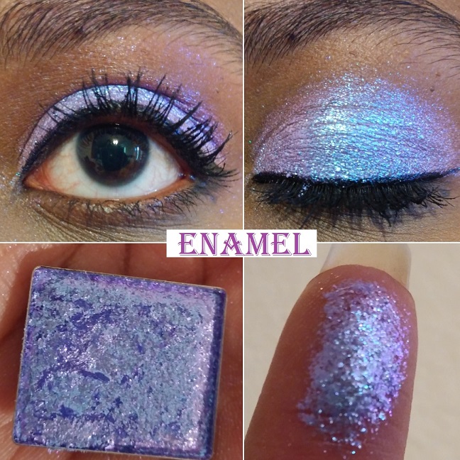
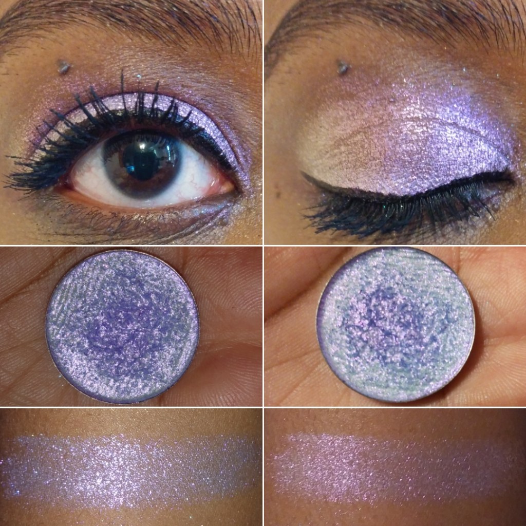
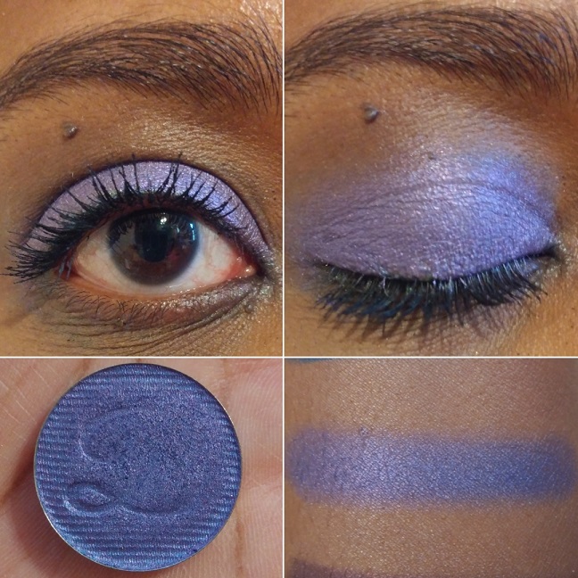
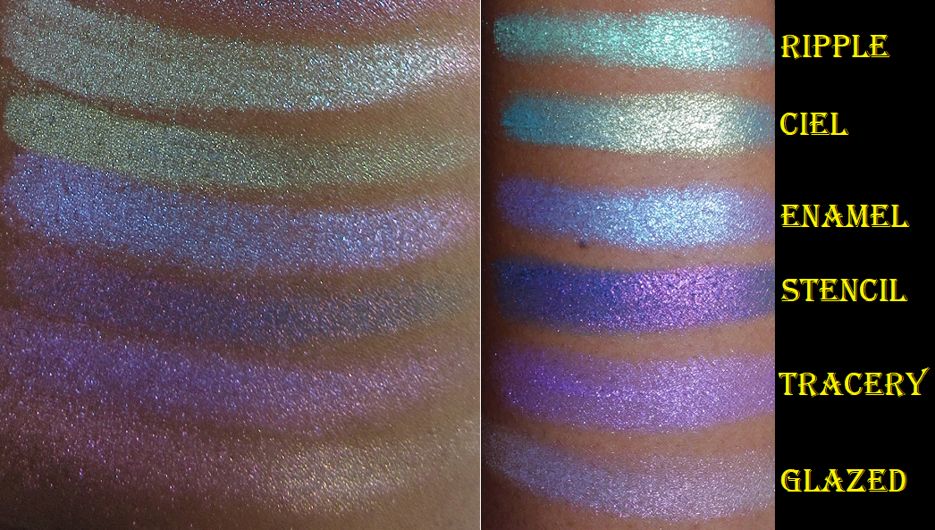
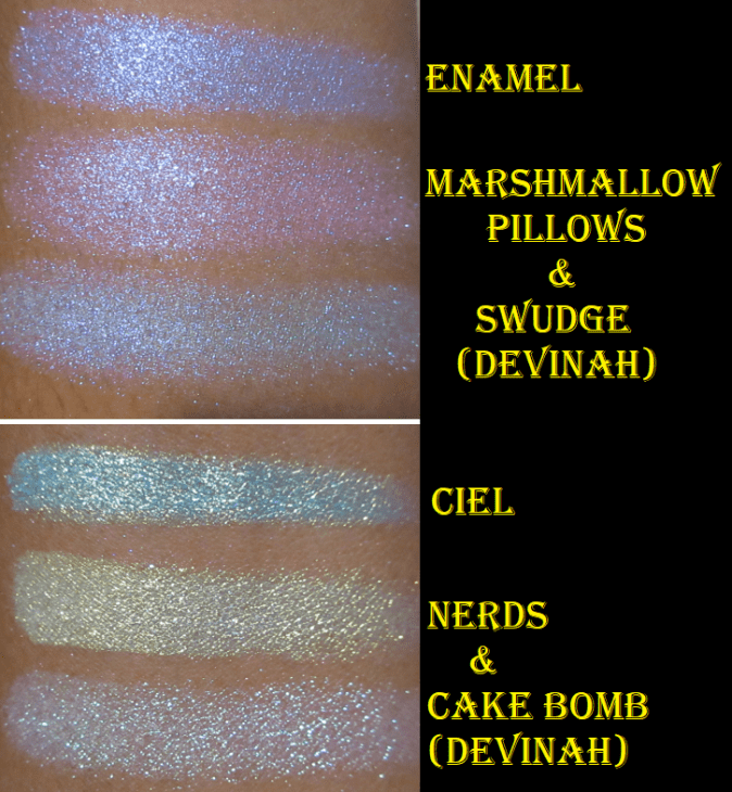
Enamel “has a semi-sheer lavender base with small glitter particles that shift blue-violet-pink.” This shade is gorgeous! I absolutely love the color, but I’ve discovered that thinking a color is beautiful doesn’t mean I’ll love how it looks on me. For my comfort zone, this one is a little too pastel-bright to be used all over the lid. However, when this is patted on top of other eyeshadows in strategic places, I absolutely love how it looks! If Clionadh makes a shade in 2021 that has a deeper purple base (similar to Stencil) with a blue-violet-lavender shift I would be all over it!
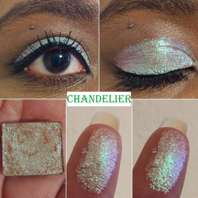
Chandelier has “a sheer pale mustard yellow base with small glitter particles that shift turquoise-indigo-violet-pink.” This shade surprised me. I typically don’t like shadows this light, but the shifts make this so wearable and flattering. It’s such a unique take on what could have been a typical goldish green, especially with how it looks so intensely turquoise at night. This is one of my favorites to wear alone or combined with other eye looks to give it extra oomph.
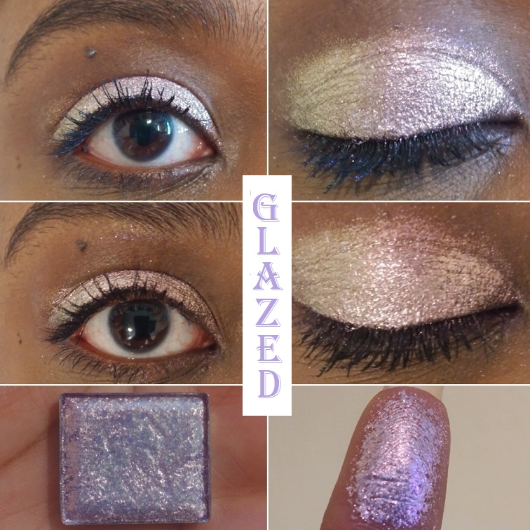
Glazed “Has a sheer lilac base with large glitter particles that shift pink-orange-gold.” I’ve learned that lighter purples are not my favorite and this pulls very white-gold/baby pink on me, which I also don’t like. Combine this with the larger glitter particles, and therefore added mess risk factor, and it becomes clear that this shade isn’t for me. Objectively speaking, it’s a pretty color though. On my eyelid, in this photo, it looks more strongly pink. At night, when the lighting shifts, the lilac is a bit more apparent and looks like the color on my finger.
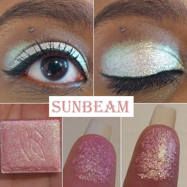
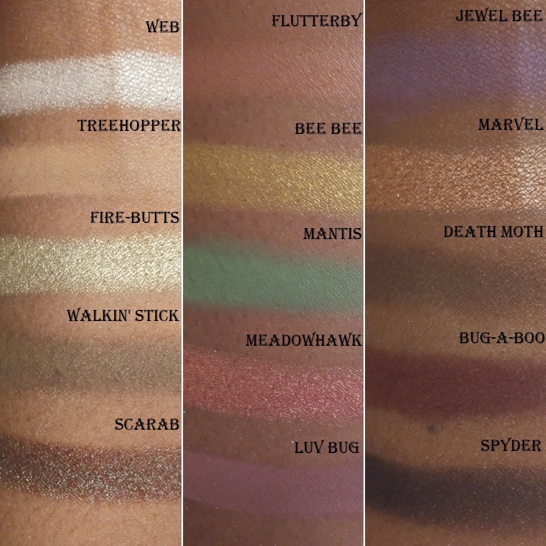
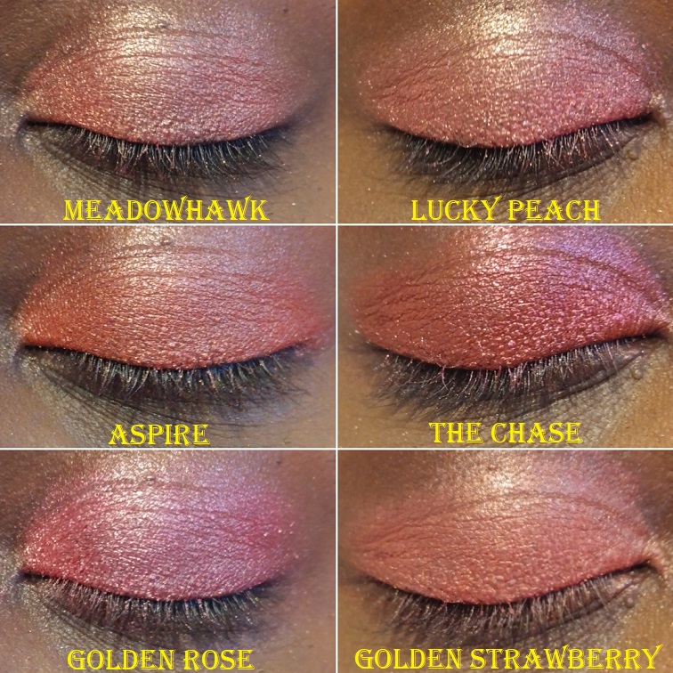
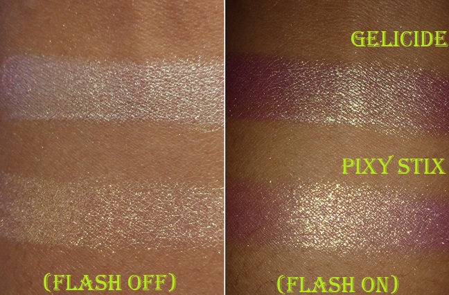
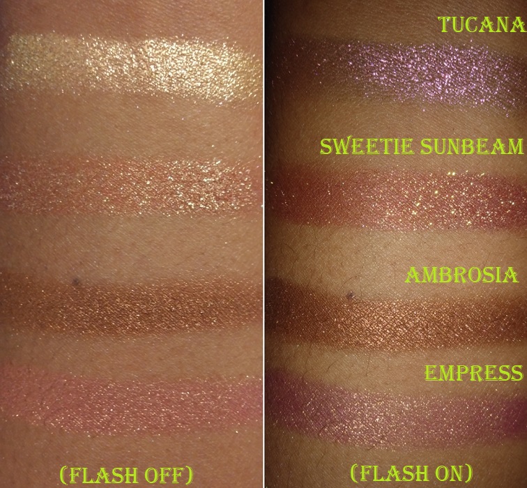
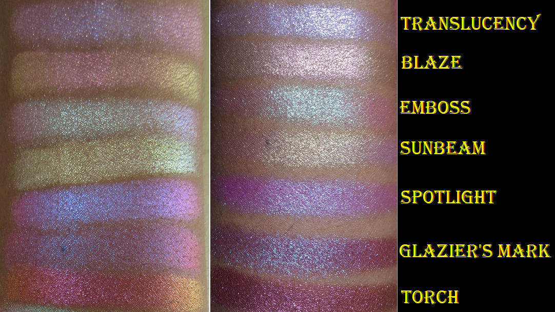
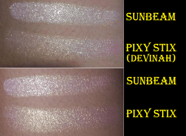
Sunbeam “has a sheer pink base with small/medium glitter particles that shift pale gold-lime-turquoise.” I have a few pink shadows with gold shimmer in my collection that I think are actually quite pretty: Pinkleberry from Coloured Raine, Meadowhawk and Golden Rose from Sydney Grace, and Empress from Devinah. This shade is more like Devinah’s Pixy Stix Xploder where it looks pink on my finger and in swatches, but on my dark eyelids, it looks incredibly light in a way I couldn’t have predicted. I have an easier time seeing the gold lime and turquoise at night when the lighting is different.
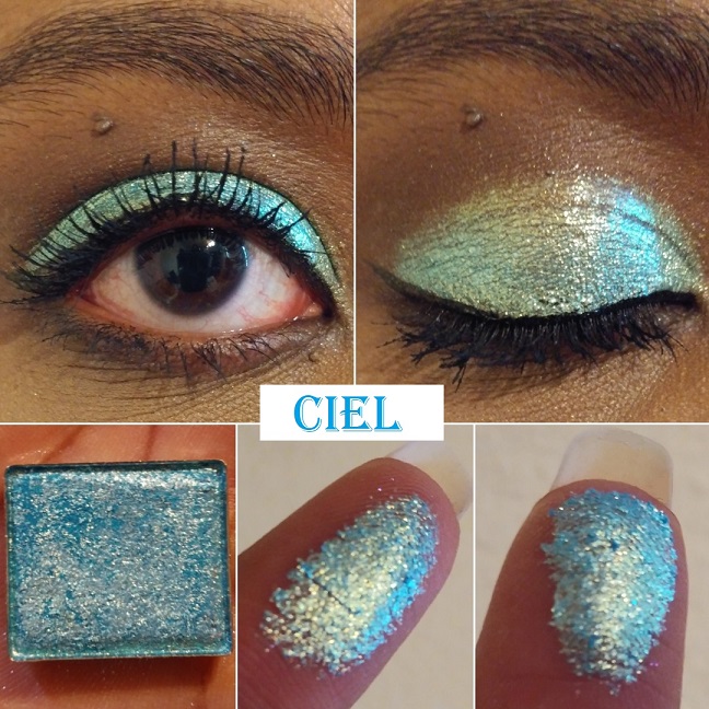
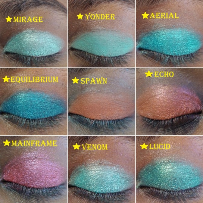
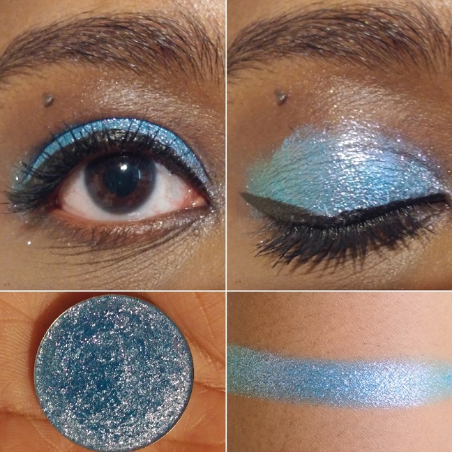
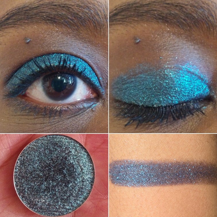
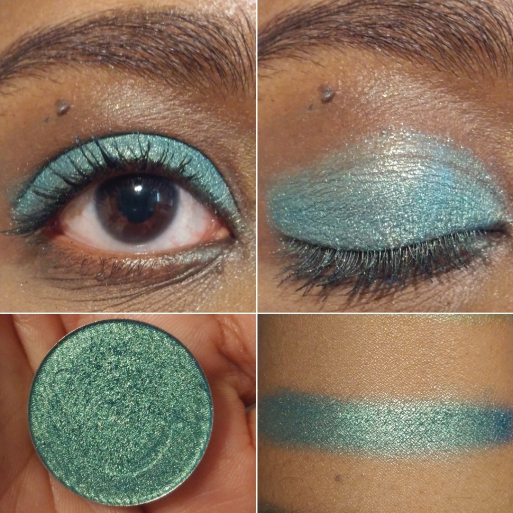
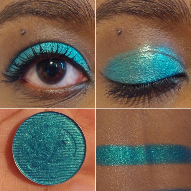
Ciel “has a semi-pigmented sky blue base with large glitter particles that shift gold-green-blue.” Ciel and Ripple aren’t typically the kind of blues that I like, but I thought if anyone could make me like this kind of color it would be Clionadh. Although it isn’t my favorite, I still use it from time to time. In the daytime, the lighter sky blue is more visible whereas, at night, it looks closer to the pan color.
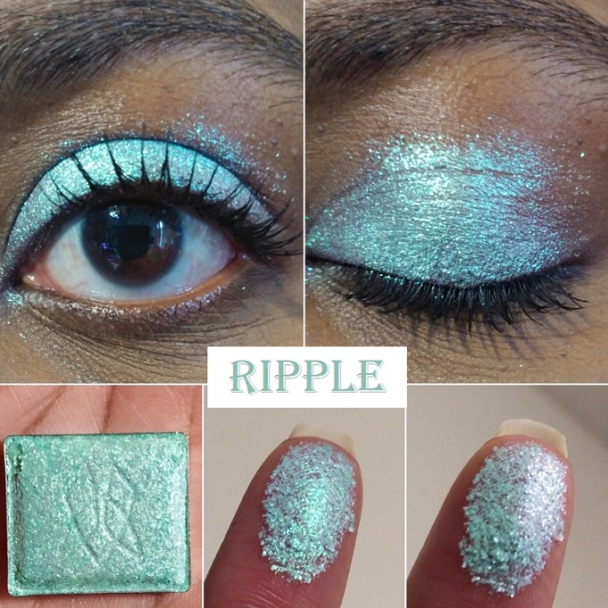
Ripple has “a sheer aqua-green base with large glitter particles that shift turquoise-indigo-violet.” This shade looks similar to Ciel overall, but the shifts are different. It’s not easy for me to detect that shift in person or in photos though. I’ve noticed that quite a lot of the lighter shades look deeper at night, but with this one there wasn’t much of a difference. At sharp angles, I can see the violet, but it’s still just not easy for me to see.
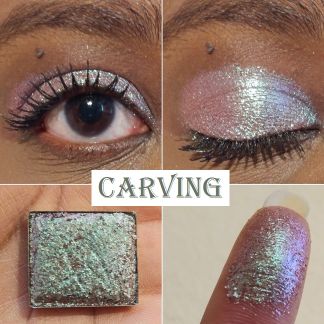
Carving “has a sheer, grungy, light brown base with medium/large glitter particles that shift turquoise-indigo-violet-pink.” I still haven’t decided if I like this shade or not. I’ve only worn it twice, so perhaps I’ll have a stronger opinion once I’ve worn it more. The pinkish turquoise gives it an interesting twist and I don’t recall having anything quite like it in my collection, though it gives me similar vibes to Grisaille and Abrasion.
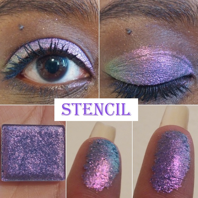
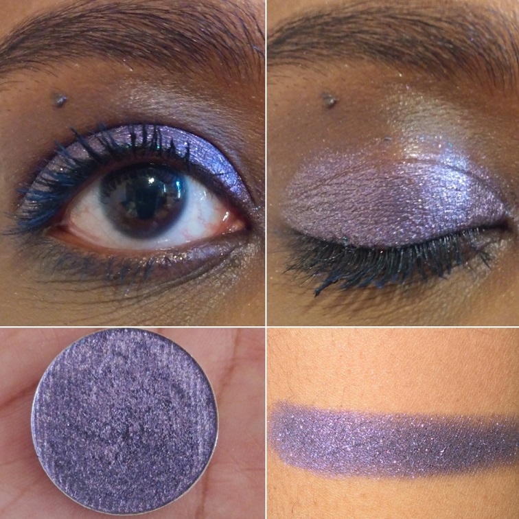
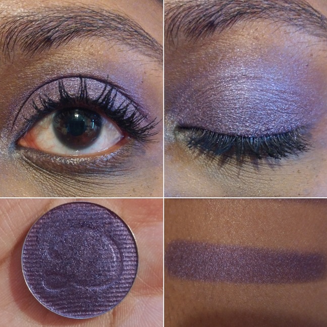
Stencil “has a semi-pigmented deep blue base with medium glitter particles that shift violet-pink-orange-gold.” I have purple-pink eyeshadows but nothing with this exact tone. Wow! It is so beautiful. If you’re a purple lover, this is an absolute must-have!
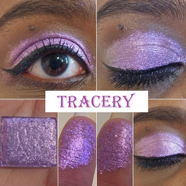
Tracery “has a semi-pigmented purple base with large glitter particles that shift indigo-pink-orange.” The purple and pink in this shade are close in tone, so the shift isn’t as apparent in person or on camera. I can see the variances between the indigo and pink, but I’ve yet to see orange.
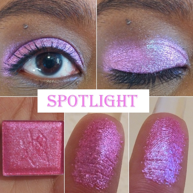
Spotlight “has a semi-sheer hot pink base with medium/large glitter particles that shift blue-indigo-pink.” I didn’t buy this shade based on the color in the pan. It was entirely based on how it looked in swatches where the hot pink takes on more of a purple tone. It still isn’t as purple as I had expected it to turn but, it’s an interesting shade. It’s not my favorite but I don’t hate it.
Translucency “has a sheer baby pink base with small glitter particles that shift blue-indigo-violet-pink, and tiny gold sparkles.” The way it looks in the daytime isn’t my kind of color, but how it looks at night is beautiful to me. It’s the kind of shade I prefer to use as a topper and not as a one-and-done eyeshadow.
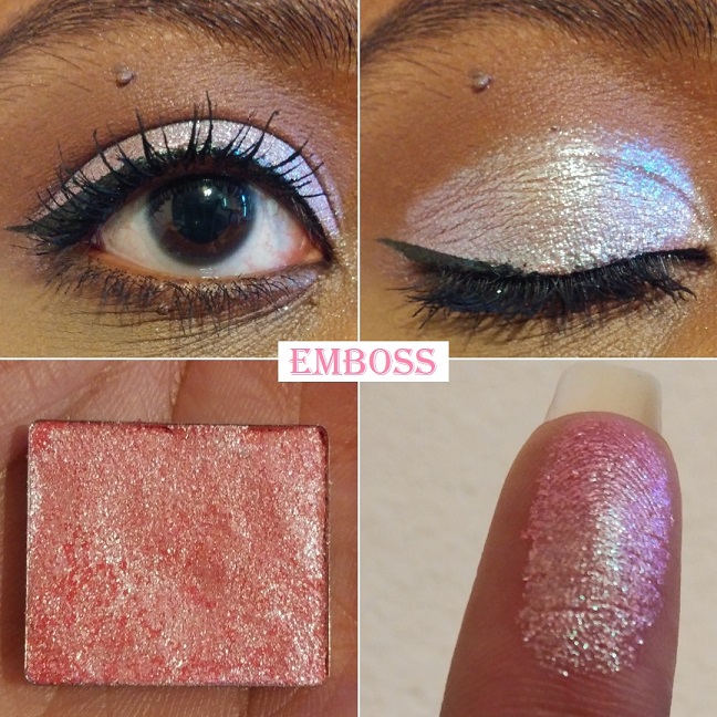
Emboss “has a semi-pigmented salmon base with small/medium glitter particles that shift lime-turquoise-blue.” On my eyelids, this looks a bit similar to how Carving and Sunbeam looked in regular daylight lighting. At night, I have an easier time seeing the lime and turquoise. I think I prefer Carving over Emboss, but I like Emboss more than Sunbeam.
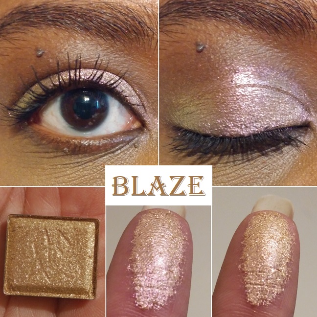
Blaze has “a sheer orange base with medium glitter particles that shift peach-gold-lime.” Blaze reminds me of Vermillion but with a less noticeable shift due to the peach, gold, and lime being all light tones and therefore harder to see without as much contrast in color. This is close to Devinah’s Tocana shade.

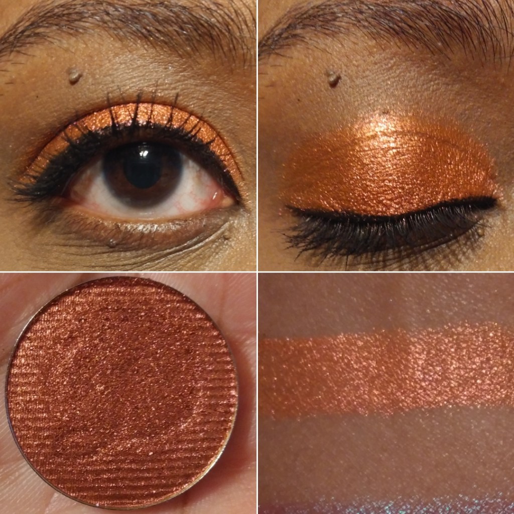
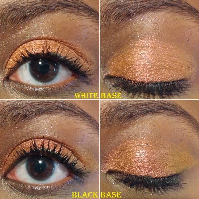
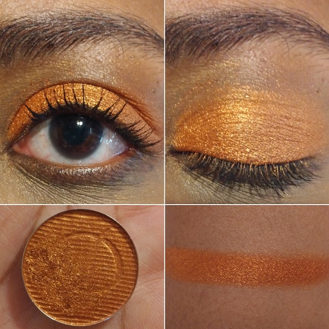
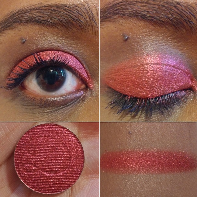
Torch has “a pigmented copper base with medium glitter particles that shift red-orange-gold.” This is very pretty but very hard to see a shift with indoor lighting. While outdoors, it was very easy to see orange and gold. This shade is like a toned-down version of Kiln.
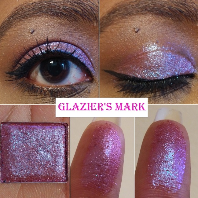
Glazier’s Mark “has a sheer orange base with medium glitter particles that shift indigo-violet-pink-orange.” My brain keeps saying I’ve seen shadows like this before, but everything I’ve tried to compare this to isn’t similar enough. On Temptalia’s blog, Enigma from Lethal Cosmetics and Magenta Dreams from Sydney Grace are some cited dupes that I also thought about based on the color in the pan. The way they look on my eyelids is where the biggest differences between them are seen and why I don’t think I have a close enough dupe. I think the choice to use an orange base, yet maintaining the magenta look, is what makes it a bit more unique.
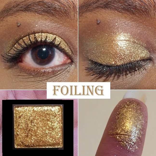
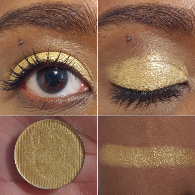
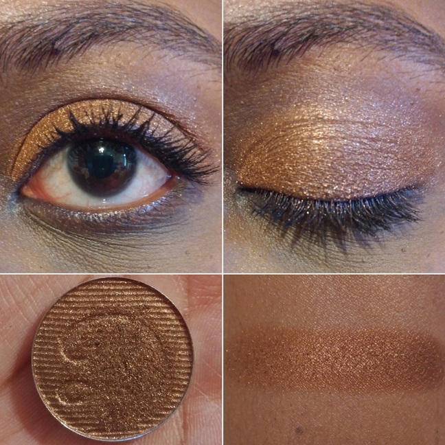
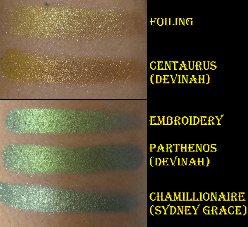
Foiling “has a pigmented warm gold base with medium/large glitter particles that shift orange-gold-lime.” This doesn’t show a shift easily. While outdoors, I can see the orange and gold, but still not the lime. I’m happy to have this because the glitter intensity and level of warmth in this gold shadow still make it stand out in my collection.
Hybrid Multichromes
The Hybrid Multichromes are supposed to be the middle ground between the Jewelled and Glitter Multichromes as they “behave more like the small/medium particle glitters, but with the tones of the Jewelled Multichromes.” They can be applied sheer for a wash of color or packed on for full opacity.
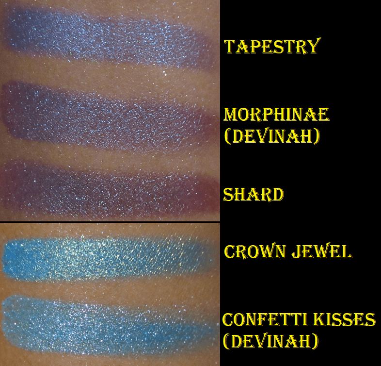
Because these are intended to be similar to my two favorite formulas in the Stained Glass collection, I had high expectations. I thought the shifts would be even stronger than the Glitter formula or essentially Jewelled shades without the black base. Shard, Embroidery, and Rose Line have lived up to that assumption but Medieval and Tapestry need particular lighting and a wet base to stand out like the others. It’s confusing because sometimes I wear those two and I’m amazed by their beauty but other times (again, due to lighting) they look dull and not as shifty.
I like that this collection has smaller particles and the fact that they still have visible shifts. I have five of the eight shades in this formula and while I’m constantly tempted to complete the collection, I keep thinking about my mixed feelings over Medieval and Tapestry, so it holds me back.
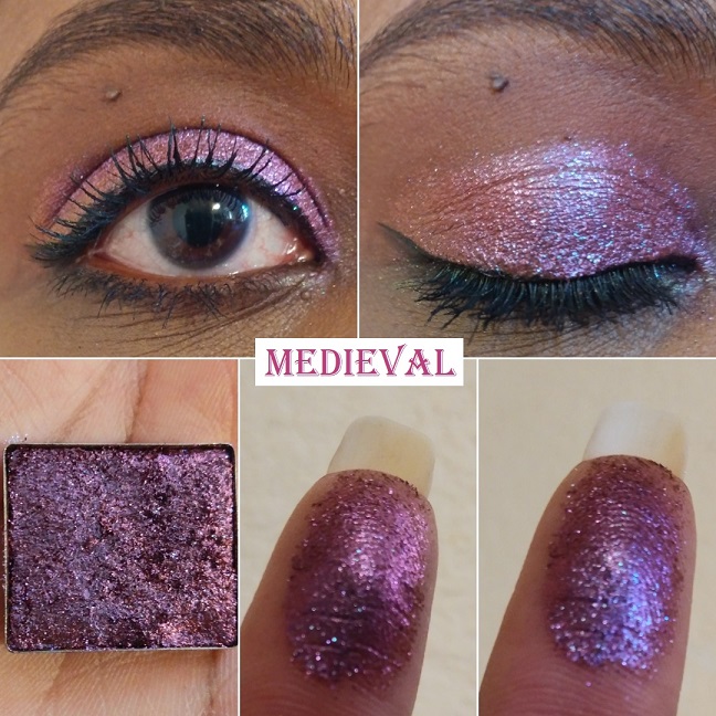
Medieval “has a warm brown base with medium glitter particles that shift indigo-violet-red-orange.” While Glitter Glue isn’t a necessity, I feel that it takes a tacky wet base to have a better shot at seeing all the color-shifting nuances in this shade. I like Abrasion more than Medieval, and that one is less expensive. This is still pretty. I just expected more from it.
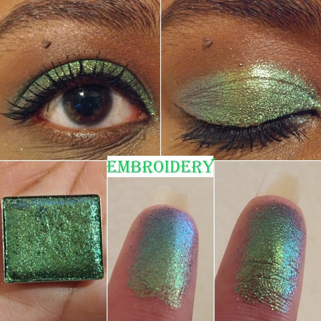
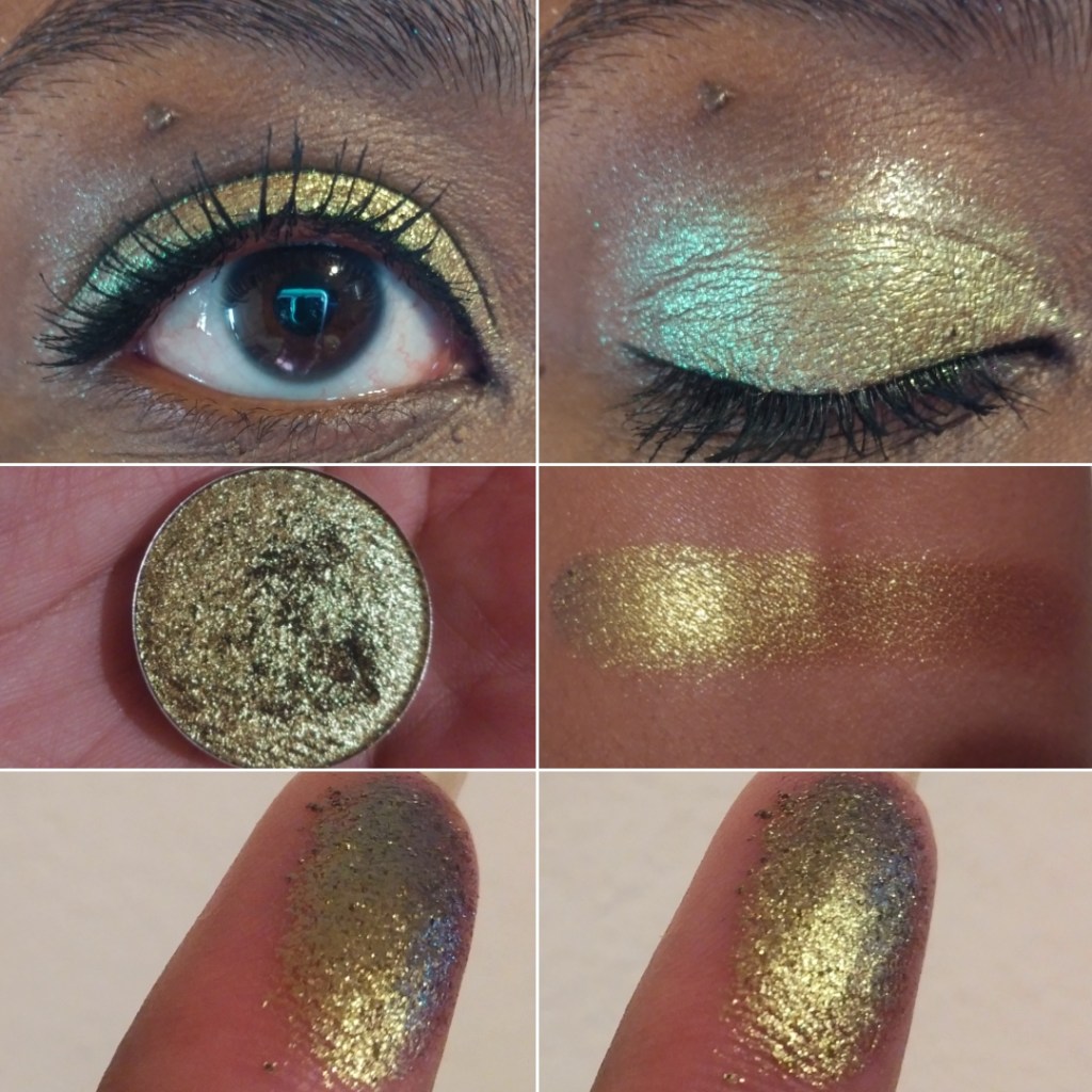
Embroidery “has a grey base with small/medium glitter particles that shift lime-blue-purple. The shift is very clear to see on my finger. On my eyes, it’s just a hint, but it’s such a beautiful color that I don’t mind. You can see just a tinge of blue on the outer corner of my eye in the lid picture.
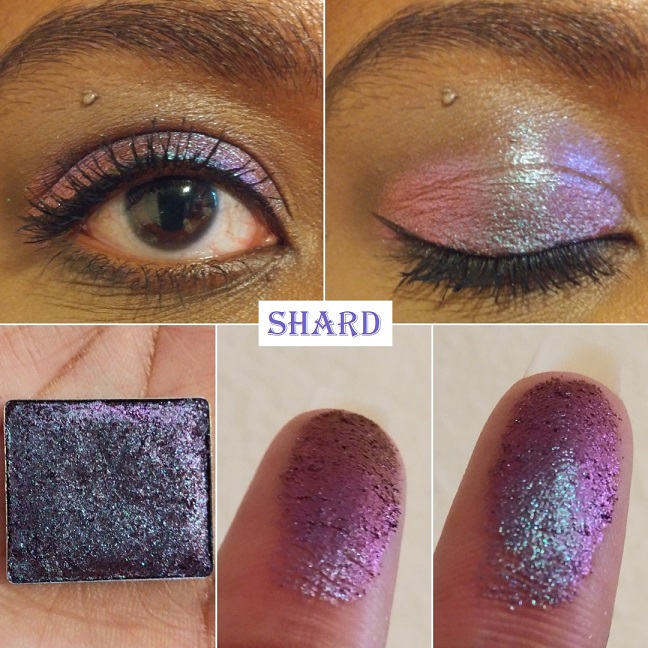
Shard “has a brown base with small/medium glitter particles that shift turquoise-indigo-violet-red.” Look how gorgeous it is on my finger! In some lighting this reminds me of Abrasion and in some lighting, it reminds me of Grisaille. This makes it different and interesting enough that I would probably still buy it if I knew at the time of purchase what I know now.
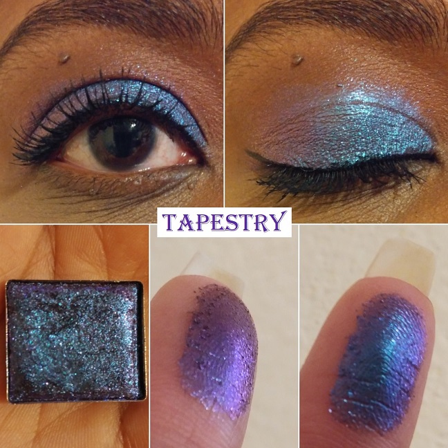
Tapestry “has a grey base with small glitter particles that shift blue-indigo-violet.” Like Medieval, I only like how this looks when applied wet and on a sticky base. It’s a pretty shadow, especially if you like blues with a tinge of purple, as opposed to purples with a tinge of blue. I am admittedly the latter.
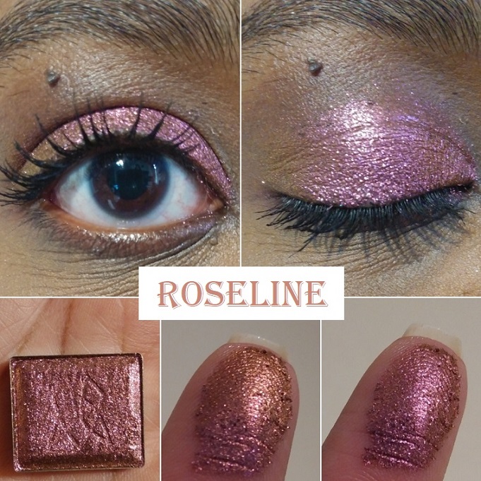
Rose Line “has a brown base with medium glitter particles that shift rose-orange-yellow.” The rose and orange tones are very easy to see. I haven’t been able to see the yellow on my finger, but it’s faintly visible in the outer corner of my eye. Even with just the rose and orange, I’m happy with how it looks.
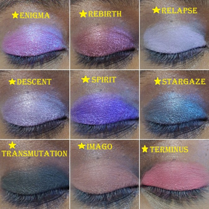
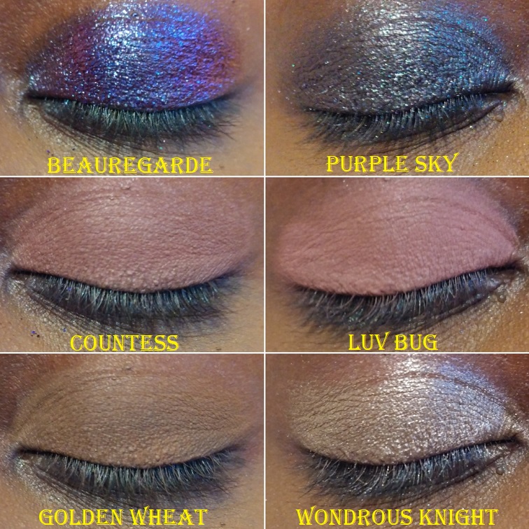
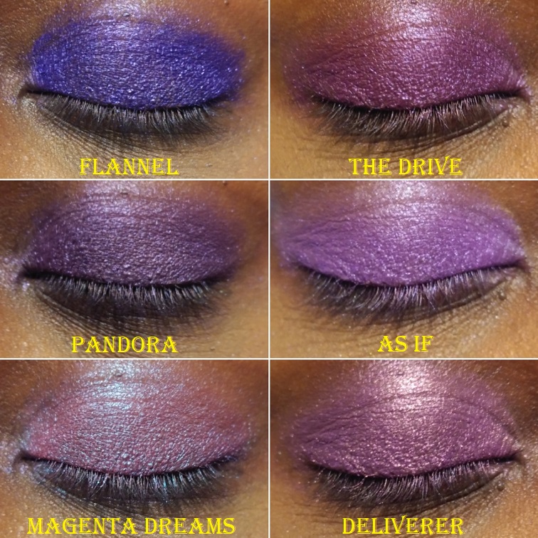
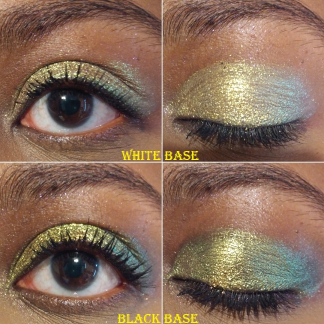
Jewelled Multichromes
These are the crown jewels of Clionadh’s collections and of the Stained Glass formula. They state, “The Jewelled Multichromes are finely milled, ultra rich pigments. They have a black base and intense colour shifting reflects. They’re packed with a high pigment concentration, so the end result is a saturated, vibrantly shifting shadow.”
This is the bar which all other multichromes are compared to for me. They have yet to be surpassed and I have nicknamed them the Rolls Royces of eyeshadows!
I have 9 out of 20. Aside from buying some for my sister, I may get 1 or 2 more in the future. The oranges and yellows are where I have gaps in my Clionadh collection.
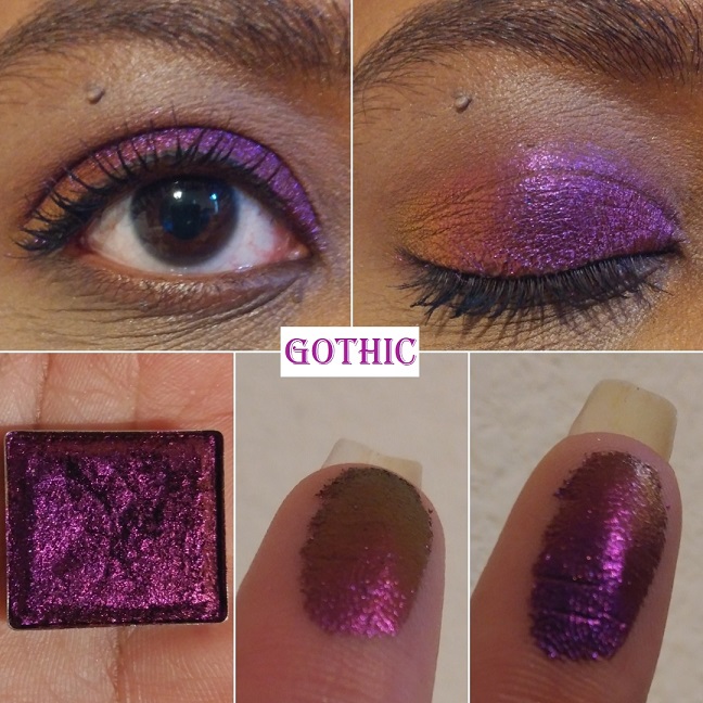
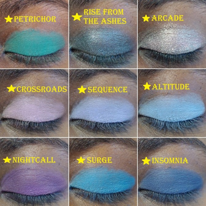
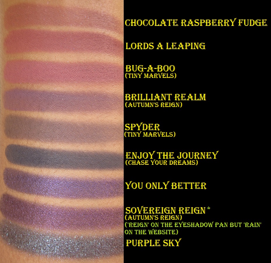
Gothic “shifts violet-pink-red-orange-gold.” This shade reminds me of an oil slick. It’s a beautiful warm purple and the shifts are very apparent in person. This isn’t a unique shade among multichromes, but from my research, this seems to be the best version of this color combo that anyone can buy.
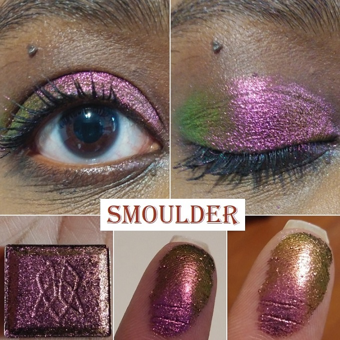
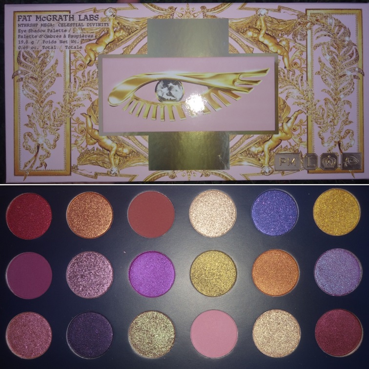
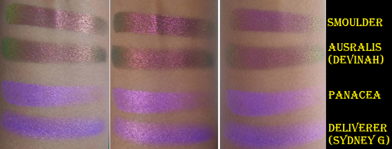
Smoulder “shifts magenta-orange-gold-lime.” The magenta dominates this shade. I found it interesting that I could see the lime and orange on my eye, but I couldn’t capture the lime shade on my finger. The magenta, orange, and gold are very easy to see. It reminds me of Pat Mcgrath’s Sextraterrestrial shade, but replacing the magenta with pink. I’ve heard Forge is a closer dupe to Sextraterrestrial, which is why I didn’t buy Forge. Devinah’s Australis shade is very close to this.
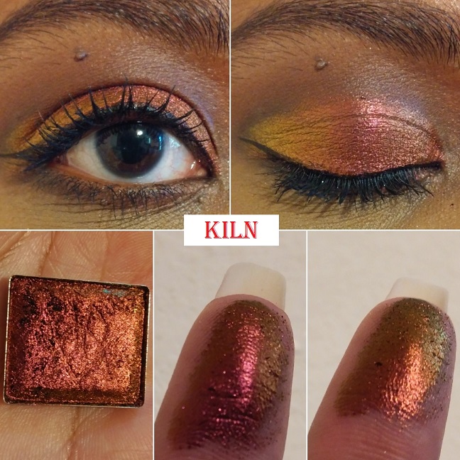
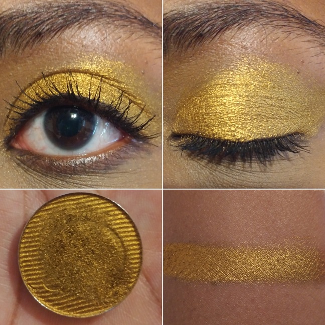
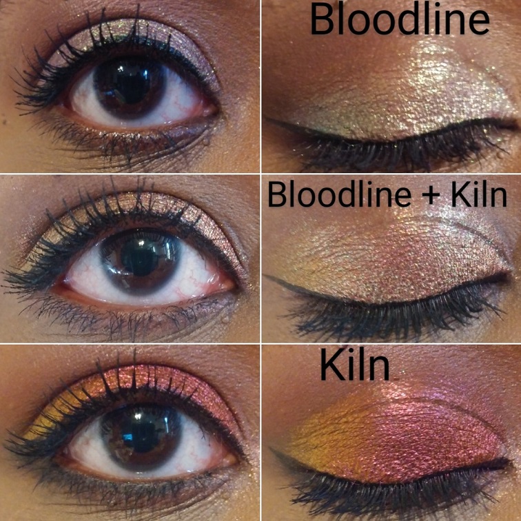
Kiln “shifts red-orange-gold.” Green and purple have always been my favorite eyeshadow colors, so you can imagine my surprise that this shade became my most used shadow from the Jewelled formula. It reminds me of sunsets; which yellow, orange, and red tend to be one of my go-to color combos. This also reminds me of Autumn and beautiful changing leaf colors. The leaves stay green in Florida, so I’ve always been a little fascinated by that process in other parts of the world.
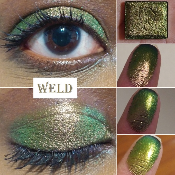
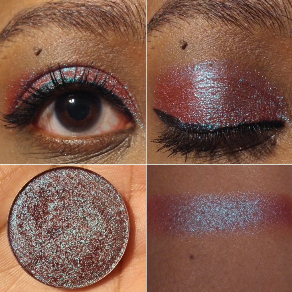
Weld “shifts grungy rose pink-antique gold-lime-teal-navy.” I bought this shadow specifically as a more neutral-leaning shade. I thought it would be cool to have that antique gold, which would look like a brown and blend in with my skin, which could also shift in different lighting to show an intense lime. When I wore this, I could see a little pink mixing in with the antique gold in the center of my lid, which again gave me Sextraterrestrial vibes, but it wasn’t strong enough for me to capture in the pictures.
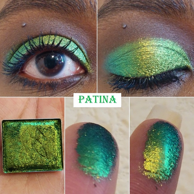
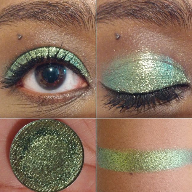
Patina “shifts gold-lime-emerald-turquoise.” There is no doubt that this green is striking. In fact, it’s a little intimidating. I still have yet to use Patina to its full potential because I’ve been drawn to the other greens in this collection. I would say that simple eye looks are better with intensely shifting multichromes because nothing should detract from the beauty of each shade on its own. However, I want to reserve Patina as the surprise pop to a look; to elevate a look that might be otherwise boring.
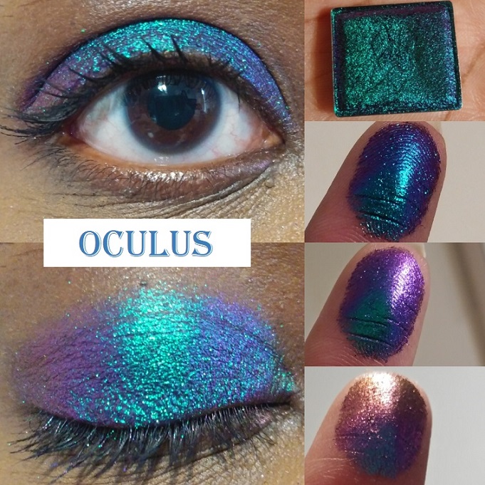
Oculus “shifts turquoise-blue-violet-pink-red-orange-gold.” I can see why this is one of the most popular shades in the Stained Glass collection. It’s one of the most shifty shades of all of them and I could easily see all the colors described on the website!
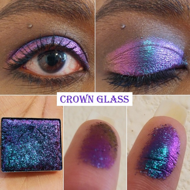
Crown Glass “shifts teal-indigo-pink-red-orange-gold.” This shade and Oculus are very similar in their shifts, but I just could not decide between them. I chose Crown Glass first, but since I wasn’t totally satisfied and kept thinking about Oculus I decided to get that one as well. I thought this would be my favorite of the two because it leans more purple, however, with Oculus I still get purple and I think I favor the turquoise in that one over the teal in Crown Glass. I recommend getting at least one of the two because they are such standout shades in the collection.
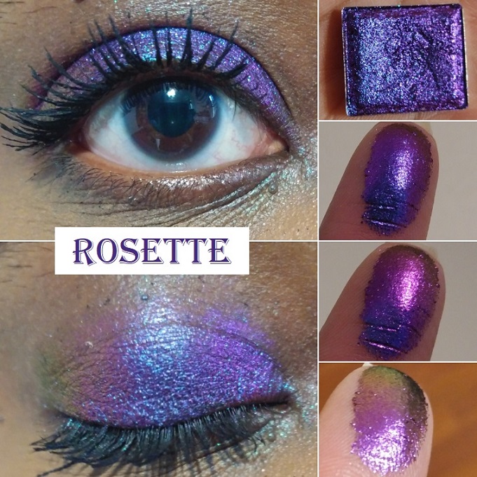
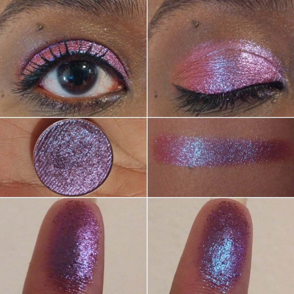
Rosette “shifts indigo-violet-red-orange-gold.” I almost skipped out on getting this shade because I thought I had too many purples and didn’t want to get another one too similar to the others, but this is my favorite purple-dominating shade of them all! It’s what I wanted from the shade Spire, but with more shifts and leaning more purple than blue. I love it!
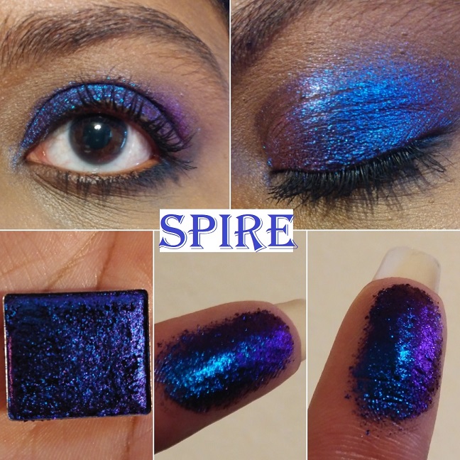
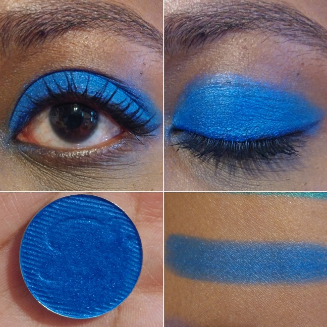
Spire “shifts royal blue-violet-red-orange.” This is actually the first Jewelled multichrome I purchased from Clionadh. Although the purple and blue are so close as to make the shift harder to see, I could still see the potential this collection had. I figured if I was pleased with this less obvious shifting shade, I would definitely love the others. This is great for dark dramatic looks, which I don’t do often, but it’s nice to have it available to me.
Pastel Multichromes
These “have a soft, sheer, grungy, grey base with bright, metallic coloured reflects.” They are a less intense version of the Jewelled multichromes. I like intense eyeshadows, so I honestly just bought one of the four in order to try out the formula in person to see what it was like for myself.
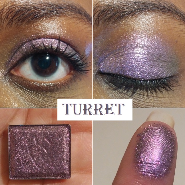
Turret has a “neutral grey base that shifts lilac-pink-orange-gold.” If I hadn’t read the description, I would have never known this was a multichrome. When I study the shade very hard, I can see a bit of a pink hue in the lilac, but the lilac color dominates. Despite this not being a favorite of mine, it still made me curious about the other pastel shades. However, I don’t see myself buying them when I know they aren’t intended to make a statement.
Vibrant Multichromes
Clionadh describes these best: “They behave more like the small/medium particle Glitter Multichromes. They have intense colour shifting reflects and colourful, saturated bases.“
These are extremely sparkly and glittery, even more than the glitter multichromes, despite these having just as small of glitter particles as them.
I have half of the collection, but I think that’s where I will stop. If I get another vibrant multichrome in the future, it would be Majesty.
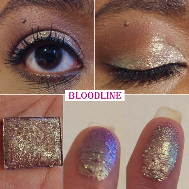
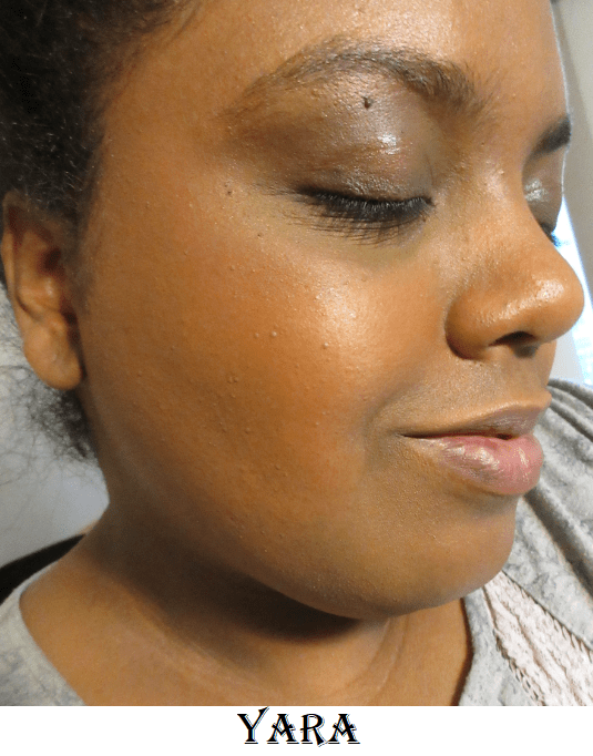
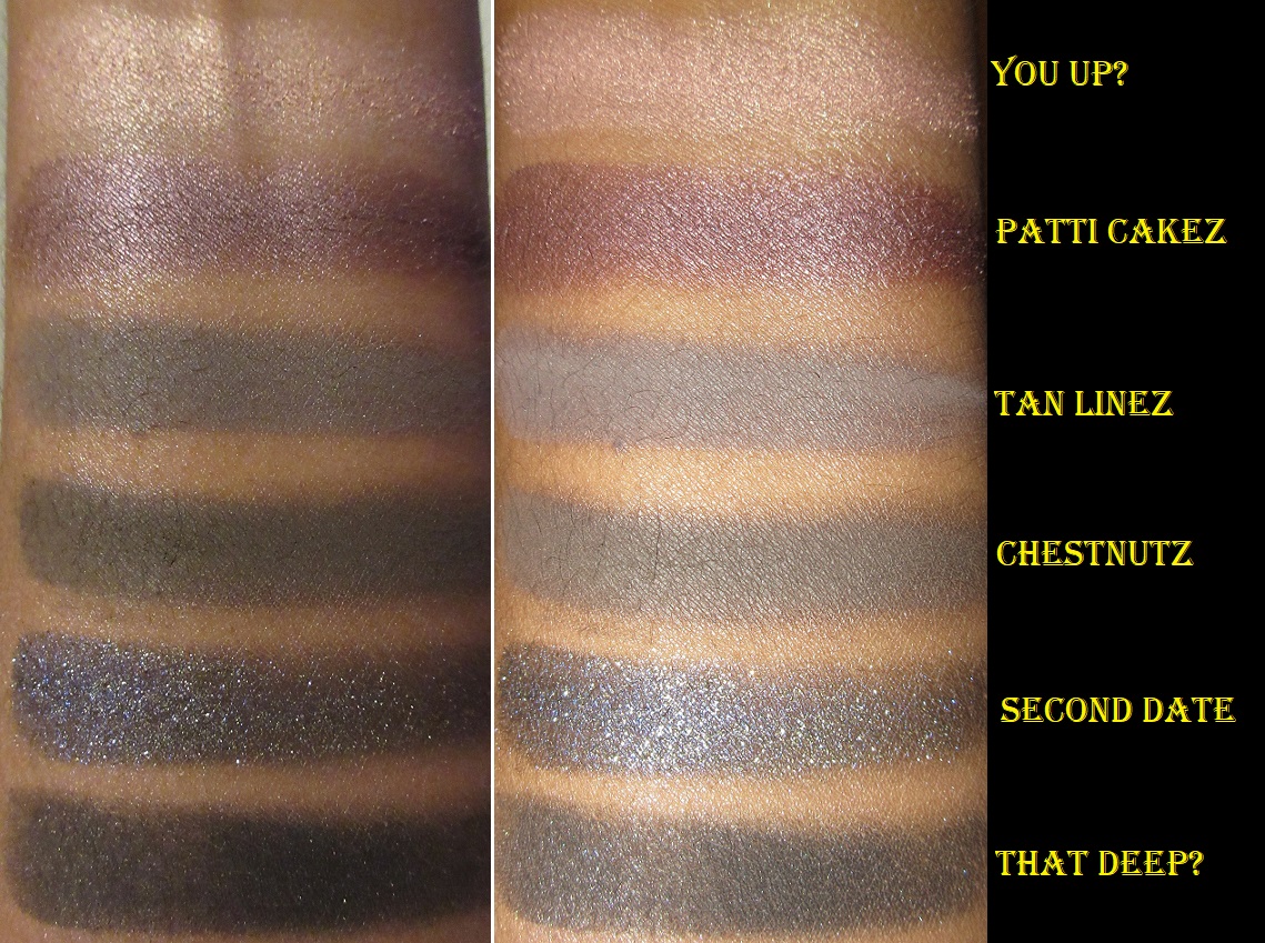
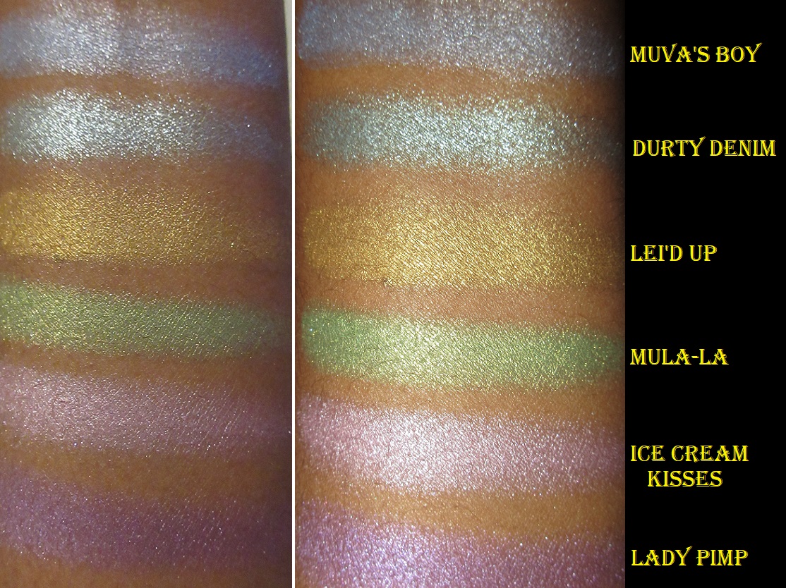
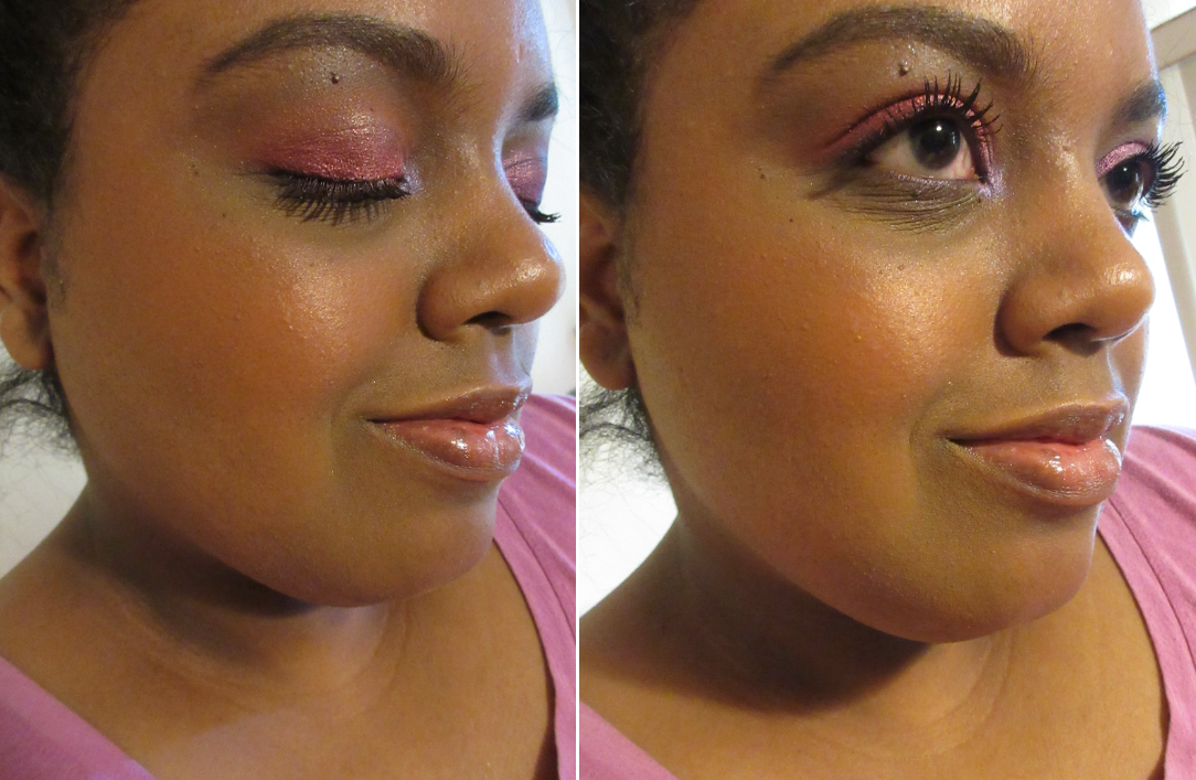
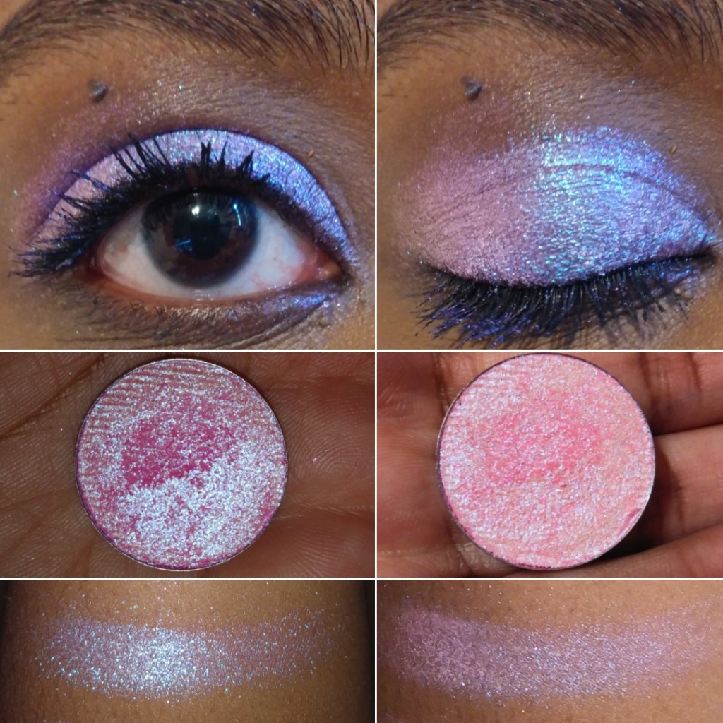
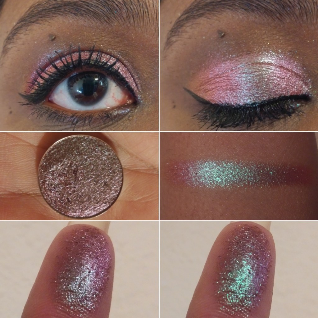
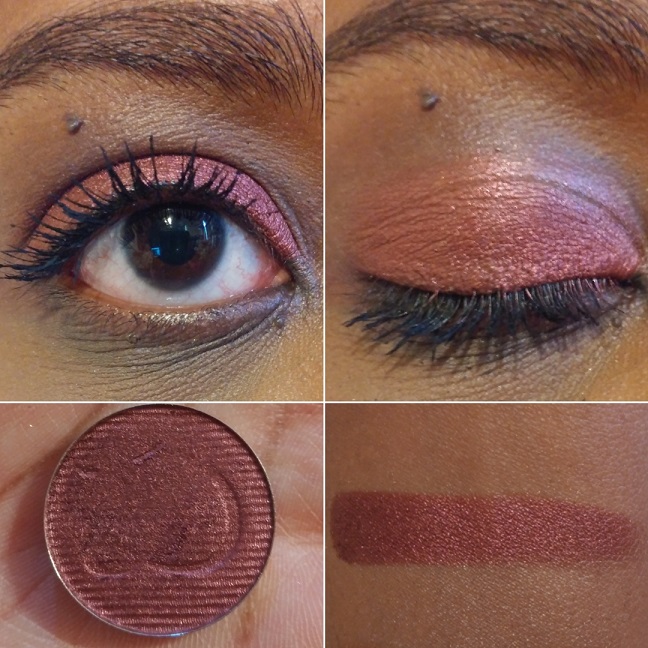
Bloodline “has a burgundy-berry base that shifts gold-green-turquoise-blue-purple.” This is definitely my most used shade of the Vibrant multichromes, and among the top most used of the Stained Glass collection. In February’s preorder sale, this was the second shade to sell out. It’s definitely one of the favorites. The berry tones don’t show on me as much as I expected, but I still love this shade so much. When I’m looking to add a little more red/warmth, I pat a little bit of Kiln on top and it gives me exactly what I am looking for!
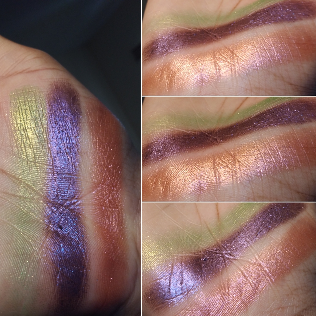
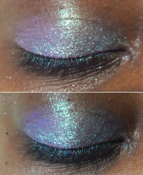
I have an example of this from a photo I uploaded to Instagram as seen above. Perhaps in the future I will make another blog post or a series of photos on Instagram showing new shades that can be created when combining two Stained Glass shadows together.
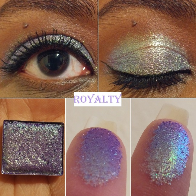
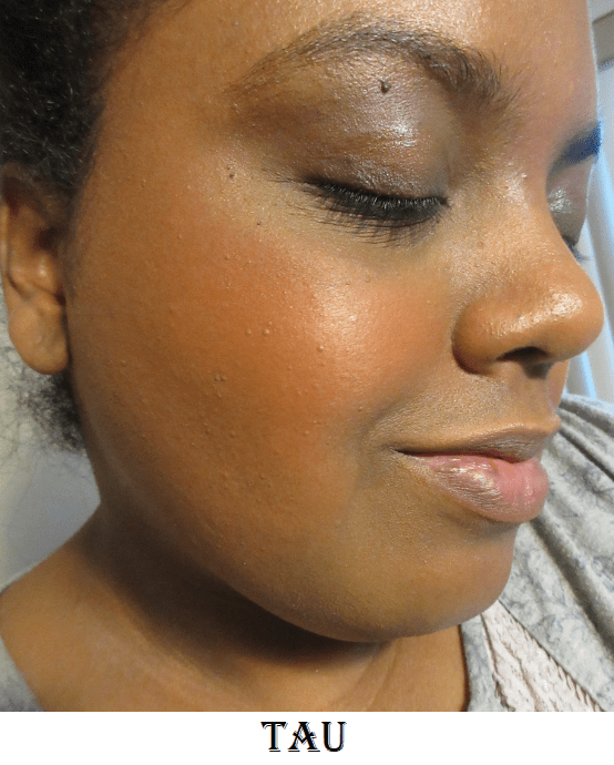
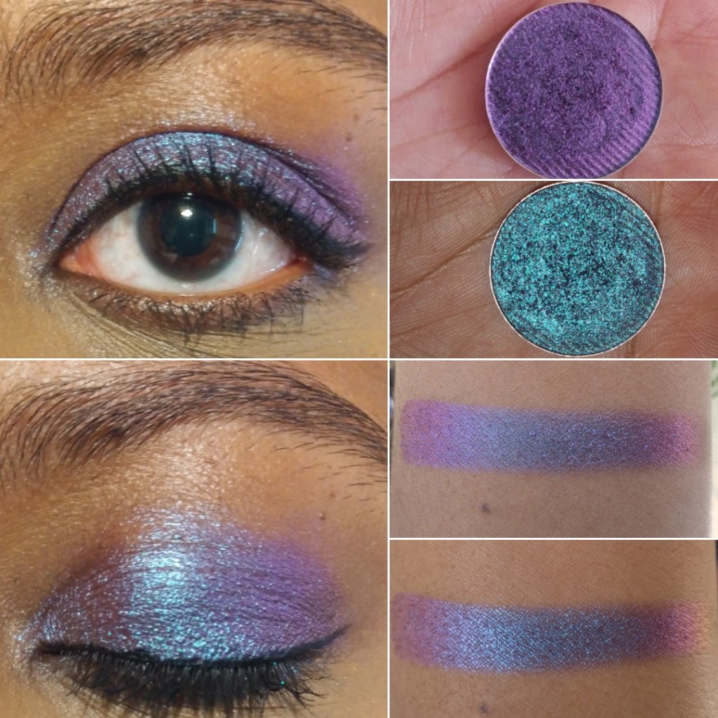
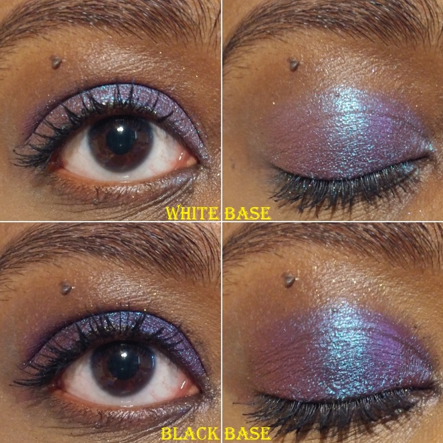
Royalty “has a grape purple base that shifts pink-gold-green-turquoise-blue-purple.” I wish the way it looked on my finger was how it looked on my eyelids. It’s more of a cool purple-blue than the vivid purple I had hoped for. However, this is a beloved shade and it was the first to sell out during the initial round of preorders. I may be able to create the shade I envisioned by patting one of the Stained Glass purples or blues on top, like Crown Glass. During the current sale that started December 18th, Clionadh released a very similar shade to this called Regal which has a blue base.
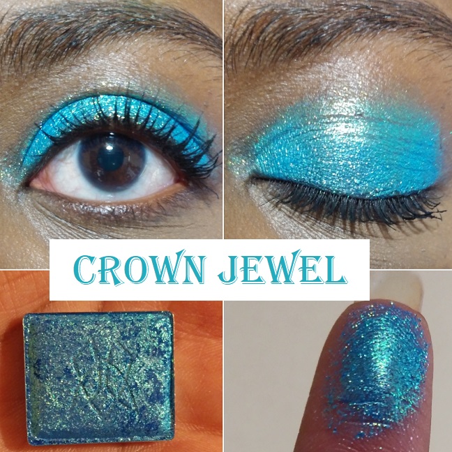
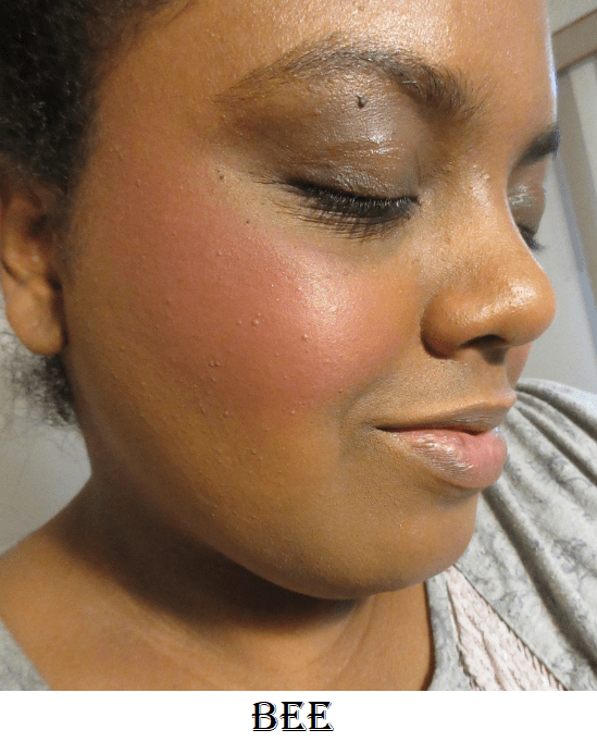
Crown Jewel “has a bright blue base that shifts gold-turquoise-blue.” It’s gorgeous and serves as another example of an eyeshadow shade I don’t wear but bought anyway purely because I couldn’t resist that stunning blue hue!
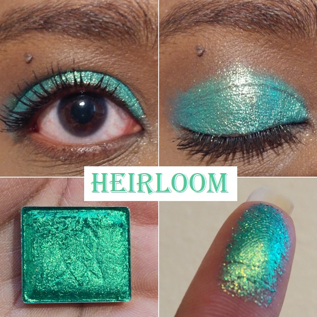
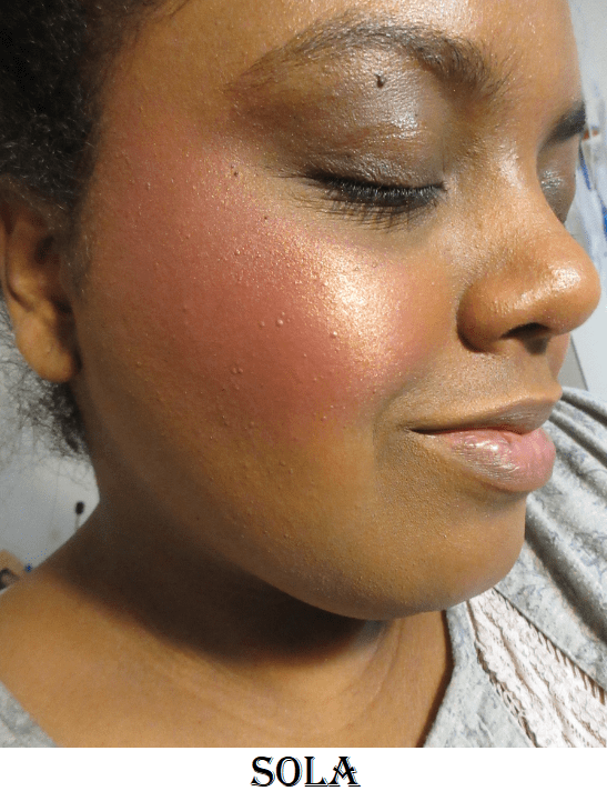
Heirloom “has a teal green base that shifts gold-green-turquoise.” Green and gold is a classic combo, but the base color is what gives this shade a unique twist. It’s such a fascinating shade that I don’t utilize enough.
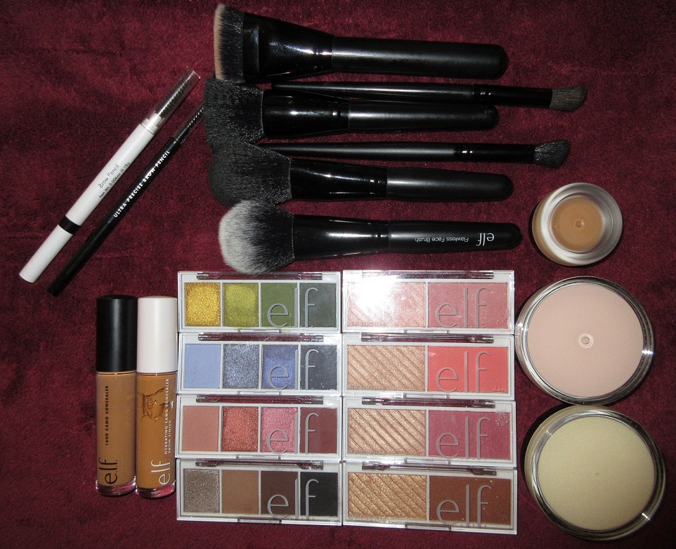
CLIONADH’S OTHER EYESHADOW COLLECTIONS
Before we get into the shades from the different collections, I wanted to mention the Koala Charity eyeshadows that Clionadh said, “100% of the proceeds will be donated. This time to Wires Wildlife Rescue & Wildlife Victoria Emergency Funds, which benefit the wildlife affected by the Australian bushfires.”
They kept their word, and although these shadows are no longer available, Clionadh plans to have another charity to support in 2021.
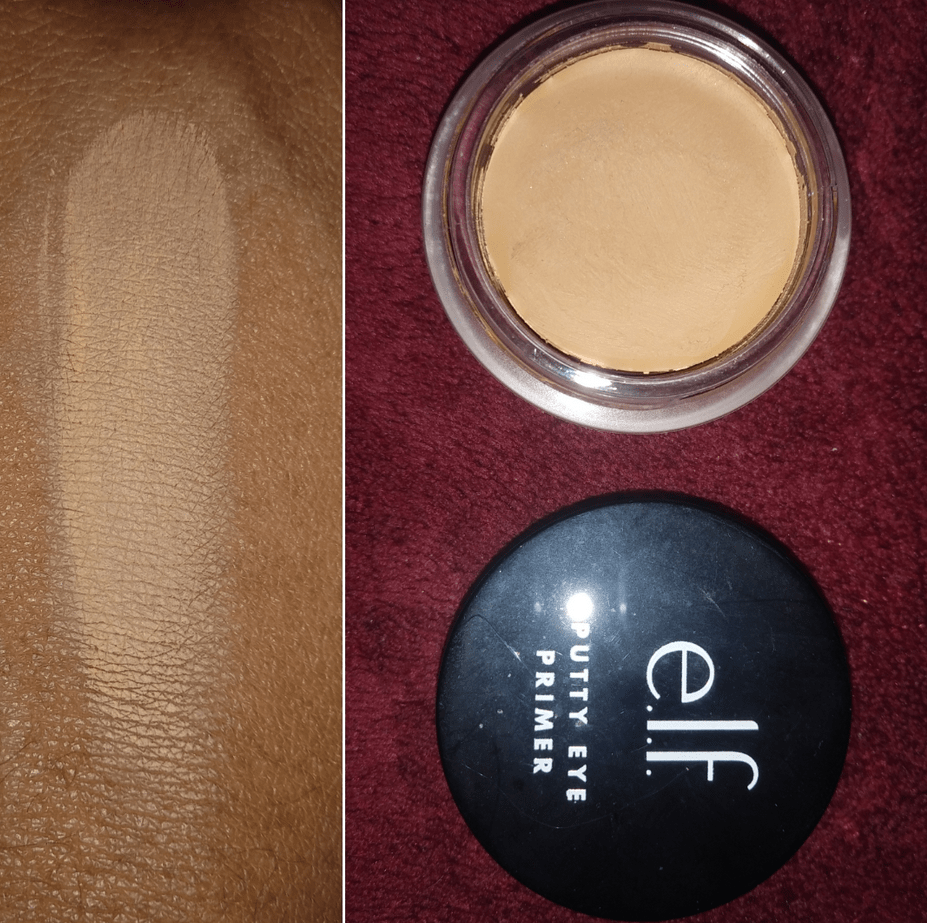
What I also needed to say about the standard eyeshadows is that the mattes are incredibly fragile! One arrived partially broken and one arrived with cracks, two broke when I accidentally dropped my palette (those are on me), but the last one literally shattered apart when I was placing the shadow into my magnetic palette. The draw of the magnet on the pan was so strong it slipped from my fingers a touch too high and that did it. So, please use the absolute most caution when handling the mattes.
Clionadh mentioned at one point debating whether or not to continue imprinting their logo into some of the shadows for fear it would make some of them more fragile and they ultimately decided to just skip imprinting the delicate ones. The nice thing about the mattes is they do press back easily and perfectly using the dry pressing method. The quality of them is really nice. Just use care. If your shadows break in transit, they will replace them for you, but I haven’t gone through that process myself. Considering how busy they are and the shipping cost, I didn’t want to give them the trouble, especially now that I know how to fix them to look brand new.
Lastly, Clionadh updated their Witchcraft vs Alchemy Bundle (the duochrome collection) to include all the shades in the range. The largest one used to be missing a few shades and some shadows in the collection weren’t part of the main bundle or the “Additional Shadows Bundle.” Now you can get all 26 in one bundle. I also saw an option to create your own custom bundle of 6, but it was taken down before the sale.
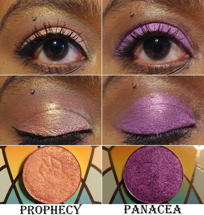
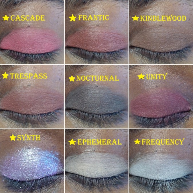
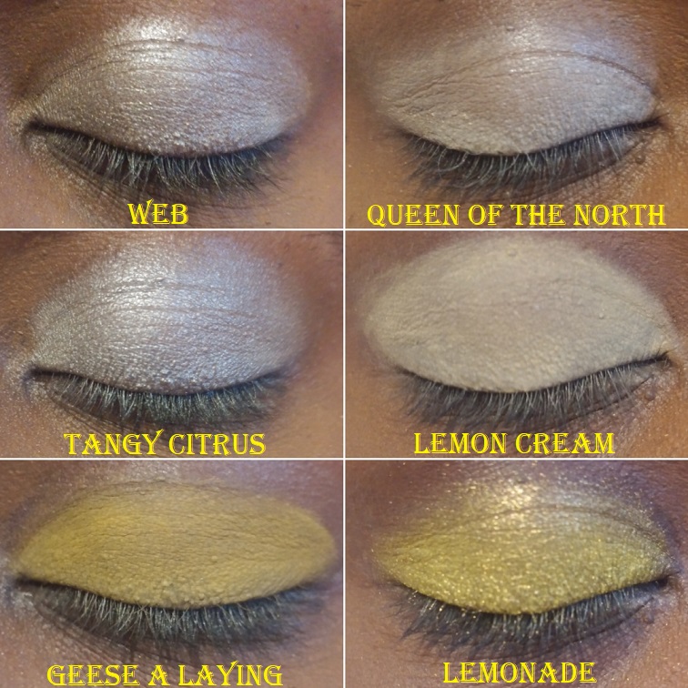
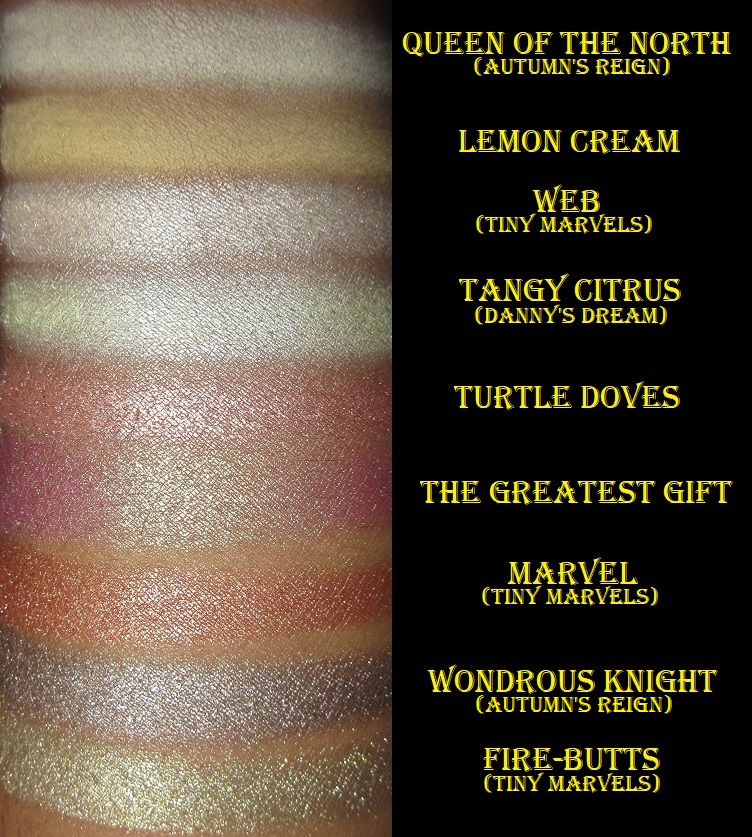
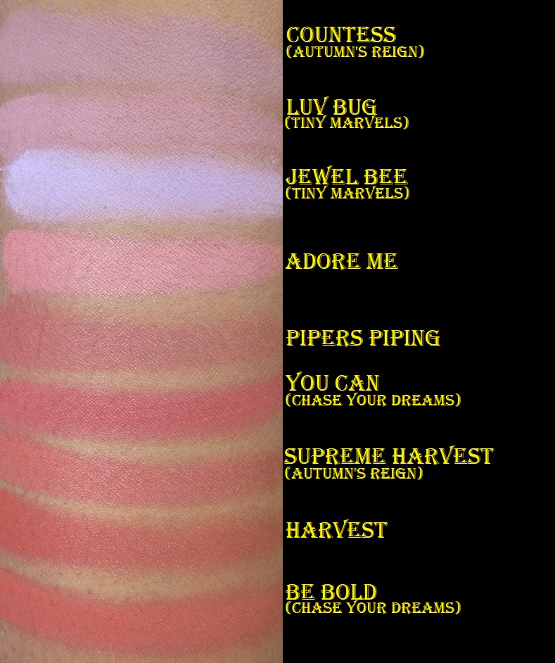
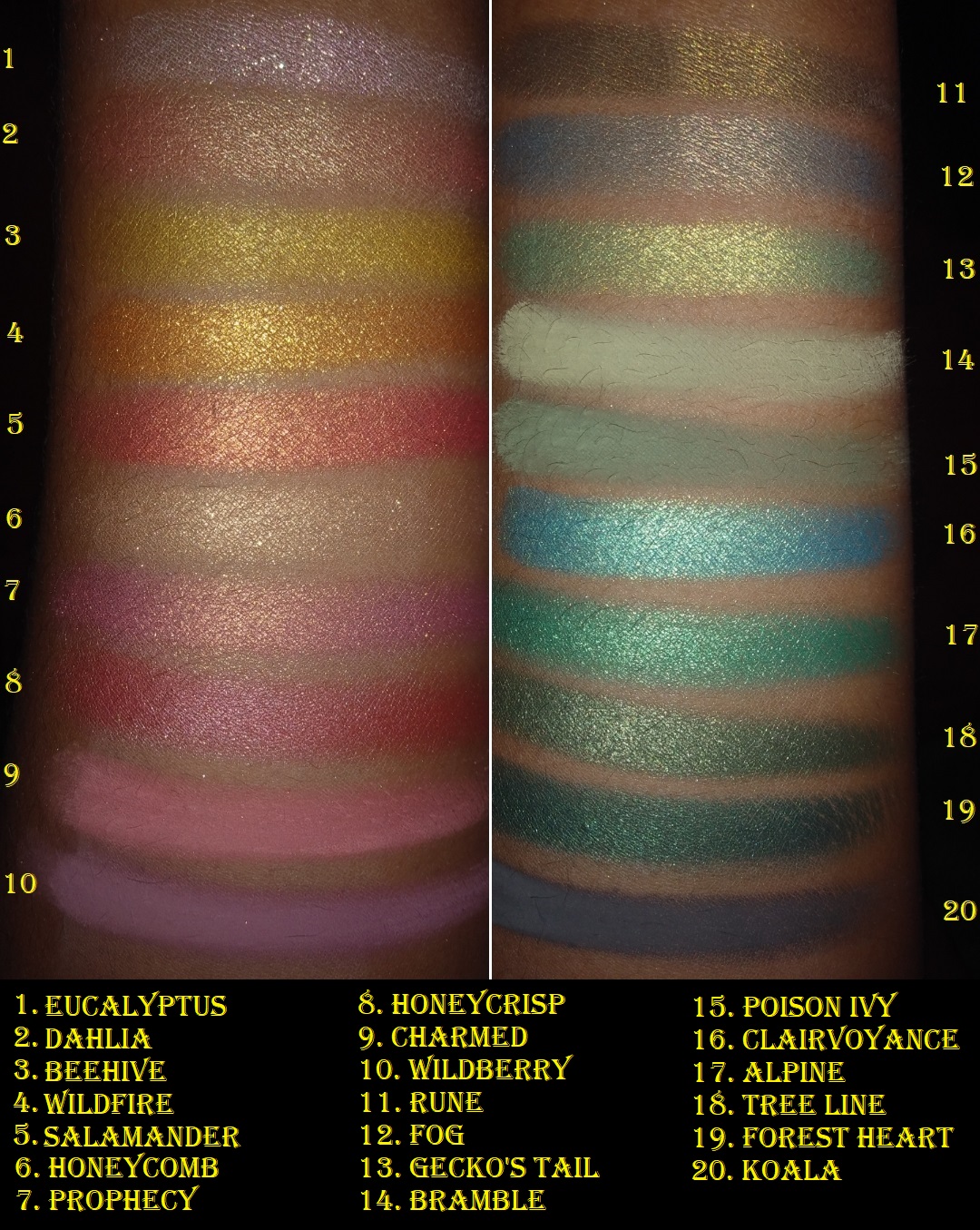
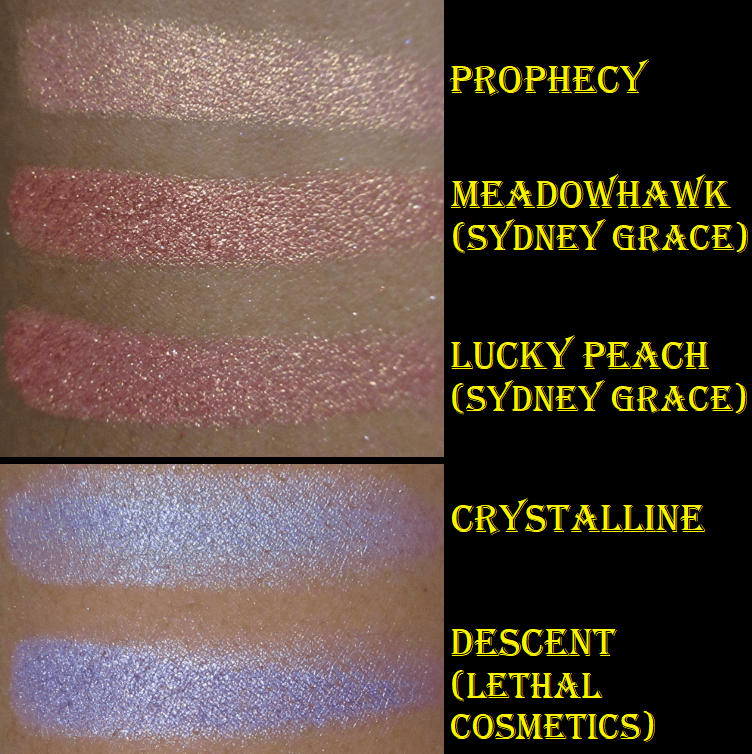
Prophecy – from Team Witchcraft. This is the pinkish gold type of shade I always want, but when some brands make this kind of color, it looks more white than pink on my lids. This one is the same as the pan color, which makes me very happy.
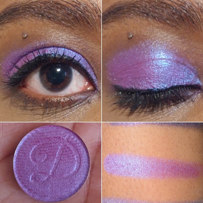
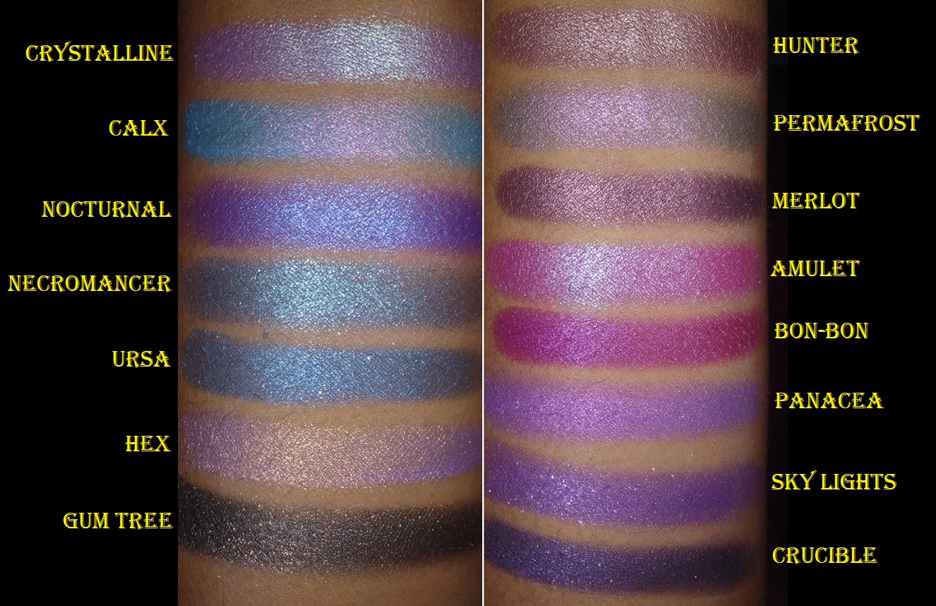
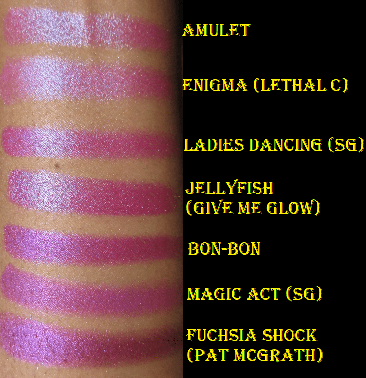
Panacea – from Team Alchemy. It’s a vibrant beautiful “grape purple with pink reflect” that I recommend to any purple shadow lover.
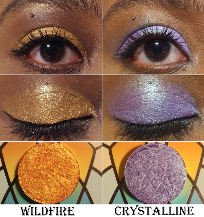
Wildfire – from the Woodlands collection. This is a very sparkly shade that gets most of the intensity from the gold glitter, though I was hoping more of that deep fiery orange base would look stronger on my eyelid. When my next order arrives, I could try putting Burnt Sienna on top to see if it will give me the intensity level I envisioned.
Crystalline – from Team Witchcraft. I normally wouldn’t be interested in this light of a purple shade, but the duochrome aspect made it so much more intriguing of an eyeshadow. The reflect color is lime green but on my lids, I thought it looked aqua.
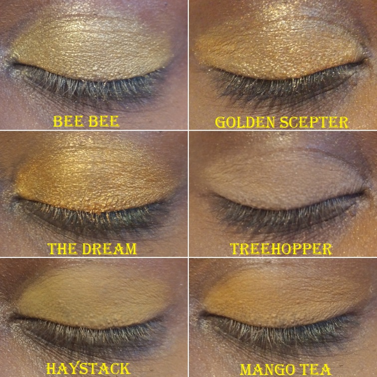
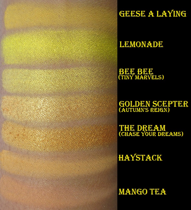
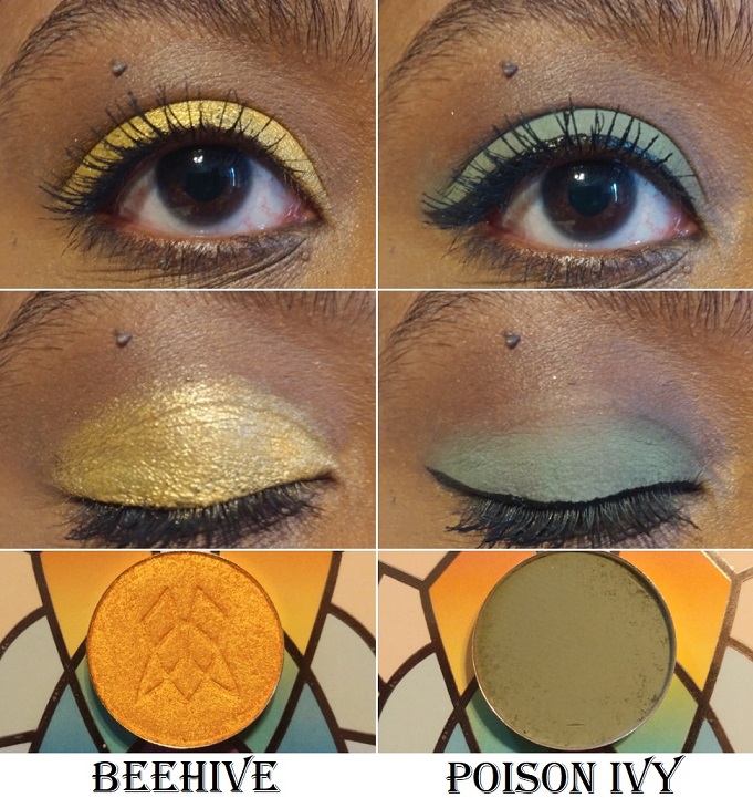
Beehive – from the Woodlands collection. This is one of the prettiest yellow-orange shades in my collection.
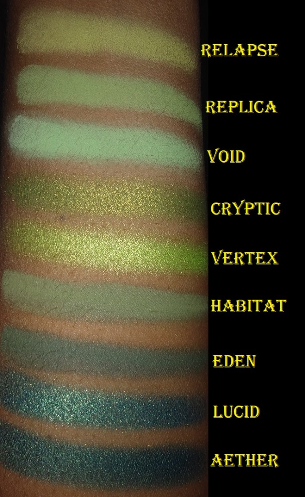
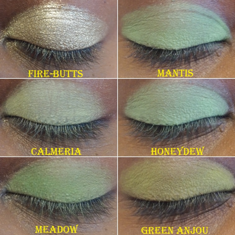
Poison Ivy – also from the Woodlands collection. This color reminds me of the mossy green shade called Habitat from Lethal Cosmetics.
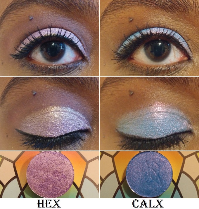
Hex – from the Dreamweaver collection and Team Witchcraft. It’s a beautiful, “mid-toned purple base with a gold reflect.” Hex is lighter and cooler toned than I expected based on swatch photos I saw around social media. It’s not my favorite on me, but the color in the pan is true to what you get on the eyelid.
Calx – from Team Alchemy. Based on swatches, I thought the blue would be at least a deep mid-tone, but the description as a cornflower blue is accurate. Although the reflect is pink, the glitter color over the blue makes it look a little more on the purple side, which I like.
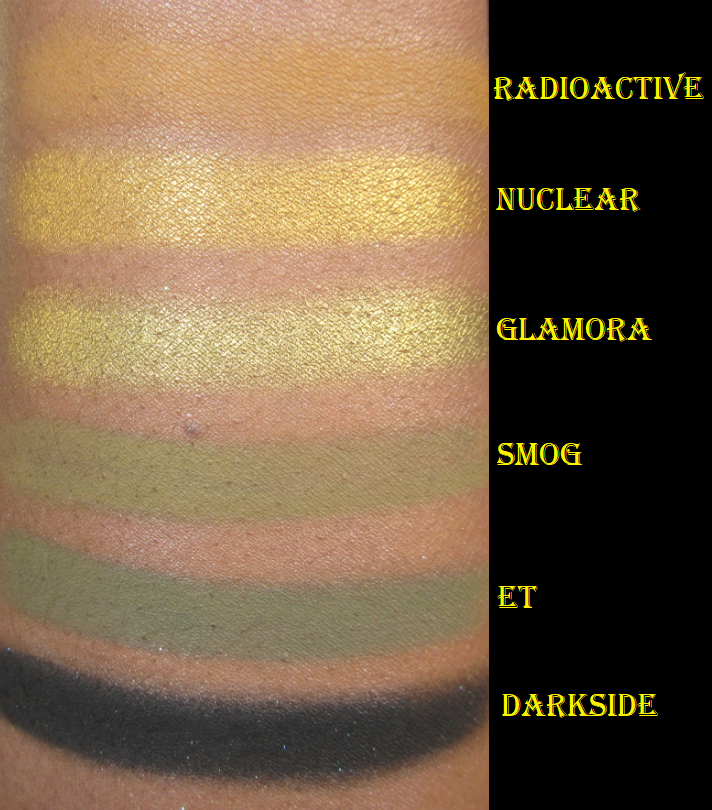
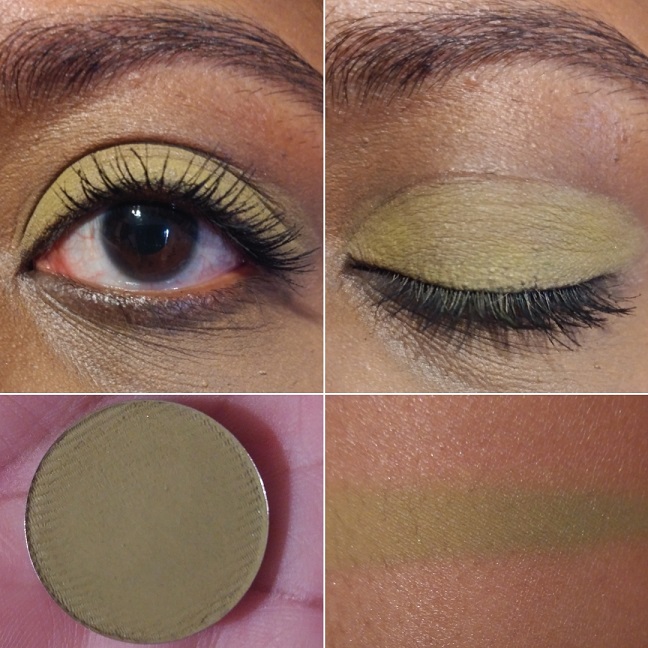
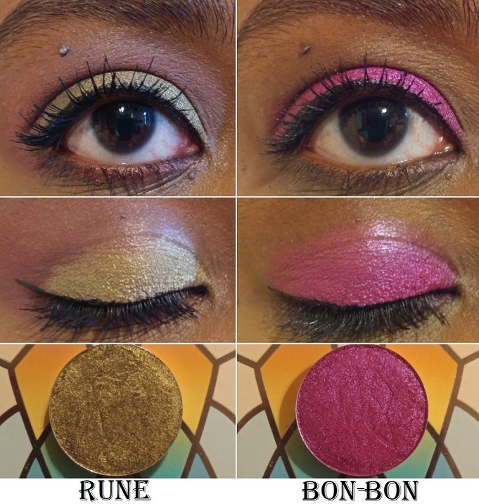
Rune – from the Harvest Moon Shadows and Team Alchemy. It is described as, “a grungy base with a gold-green reflect. This shade pulls more moss green on the eye.” It is so beautiful! I love green-gold, olive-gold, and antique gold type of shades, so this is perfect for me.
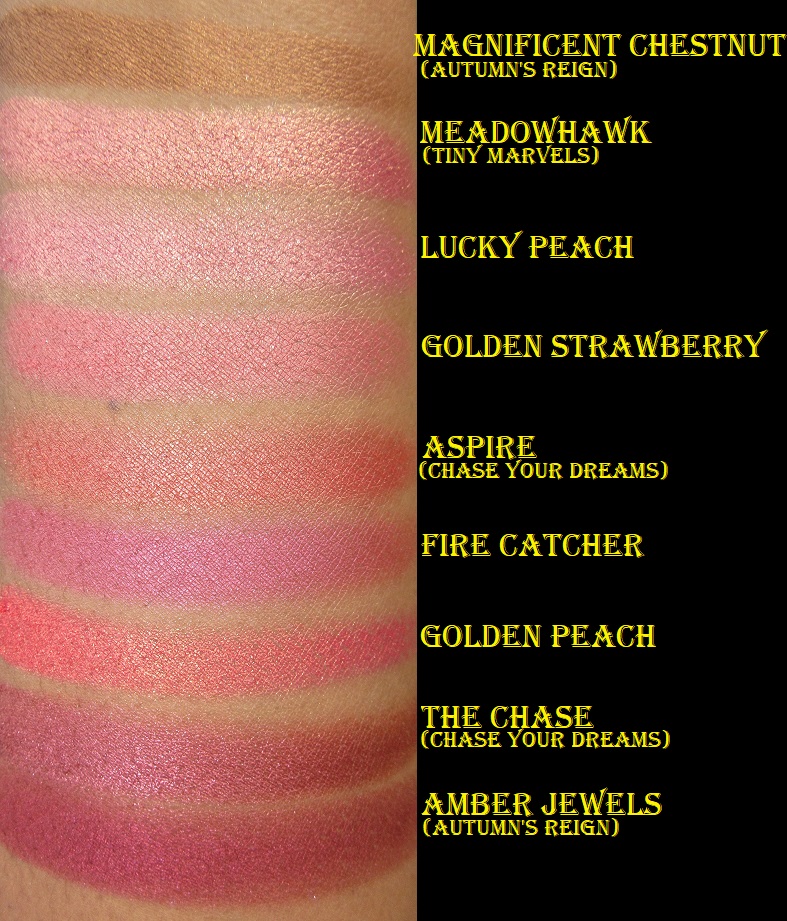
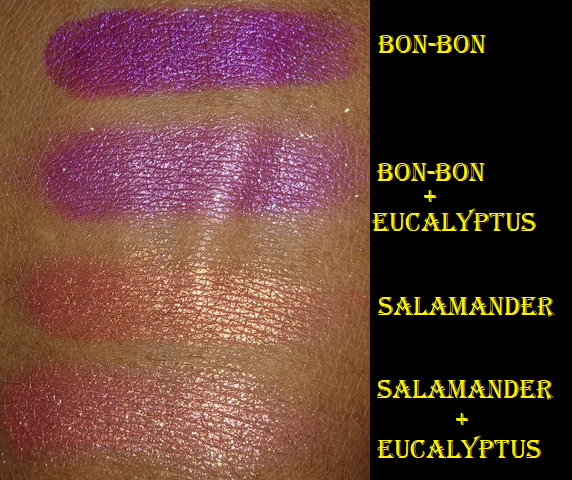
Bon-Bon – from the Dreamweaver Collection. This is a stunning color that’s as vibrant on the lids as it is in the pan! Clionadh describes this shade as, “a rich berry metallic with a cool purple reflect,” which surprised me because the base color is so intense that I didn’t notice the reflect on the eyes. The shimmer is so fine that the particles are undetectable, but it’s visible when the light hits it.
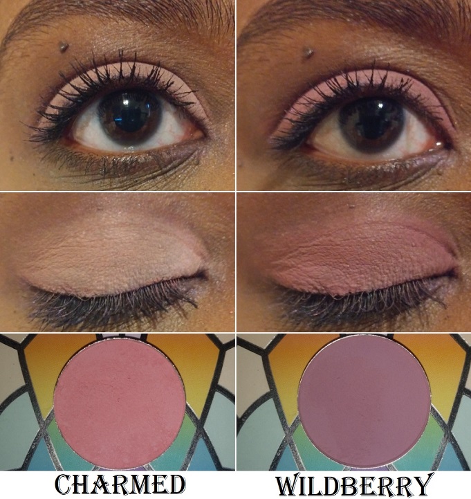
Charmed – also from the Dreamweaver Collection. I bought this shade during a time when I was really into using peachy pink and blushy medium pink shades in my crease for my pink and purple eye looks. Although my obsession with that combo has nearly passed, I still use this shade quite a bit.
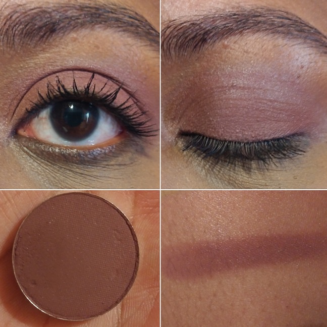
Wildberry – from the Woodlands Collection. I tend to pair with this Charmed to slightly deepen up the outer corner when I don’t want to go for full smoky look. It looks like a mauve-purple in the pan but it shows up dark pink on the eye.
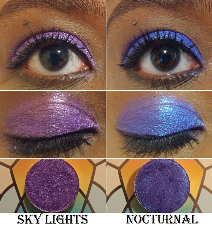
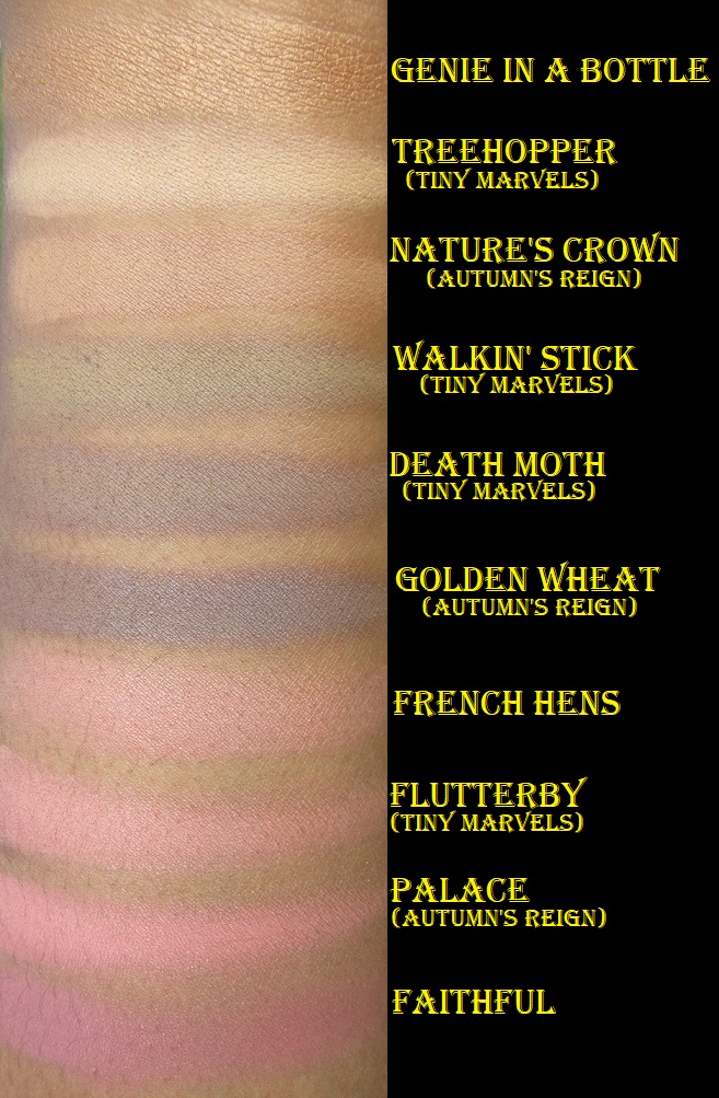
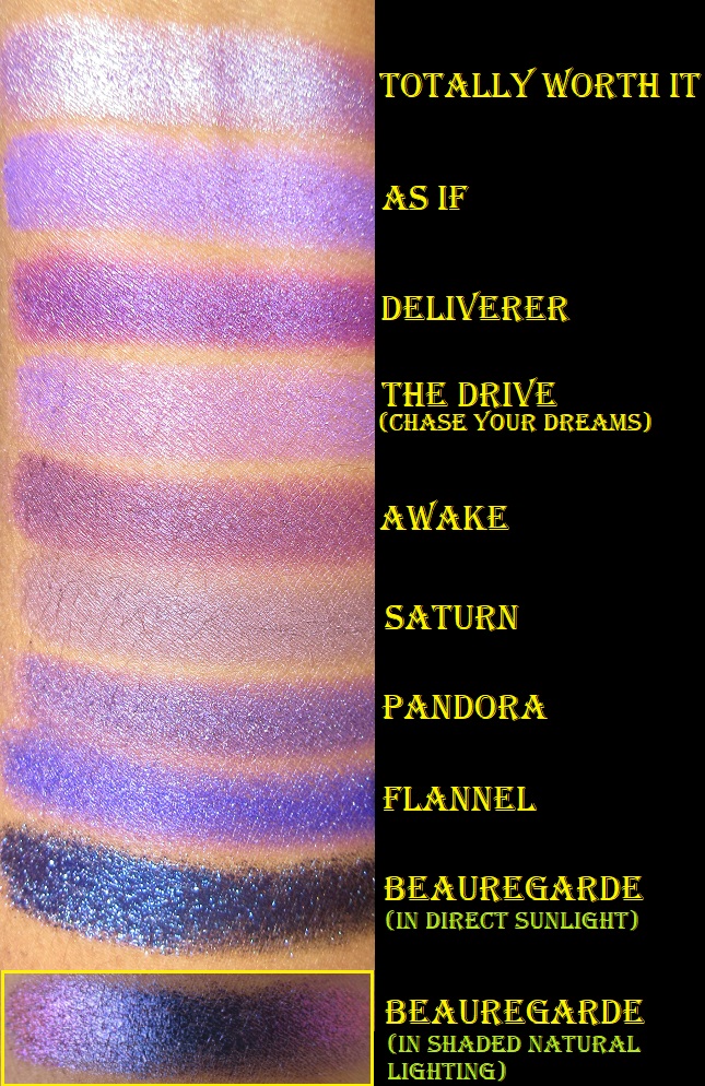
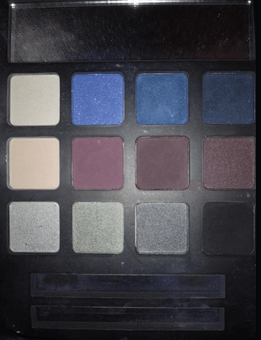
Sky Lights – from the 66.5° N Collection. This is “a shimmery shadow with a royal purple base and purple, blue and pink sparkle.” This was part of my first Clionadh order and it’s one of my favorites from the brand. The multicolored sparkle in person is even prettier than my picture shows.
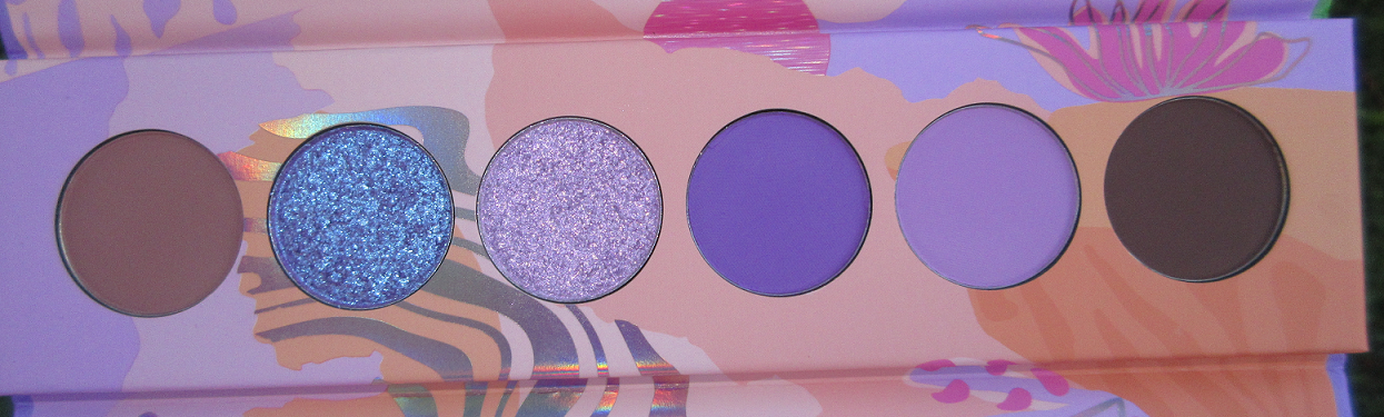
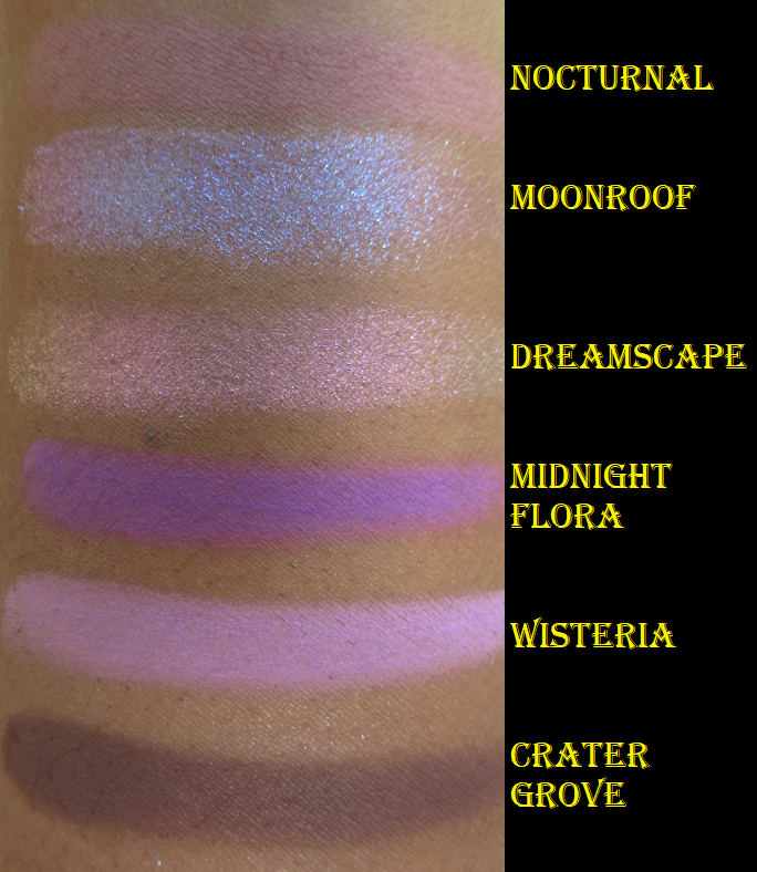
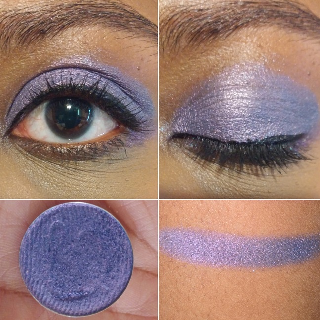
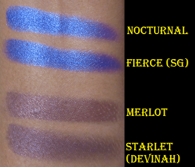
Nocturnal – from Team Witchcraft. This “indigo base with a blue reflect” was also part of my first order. I love bluish-purple eyeshadows but the tones of this seem special. I love vibrant blues and there is nothing subtle about this one!
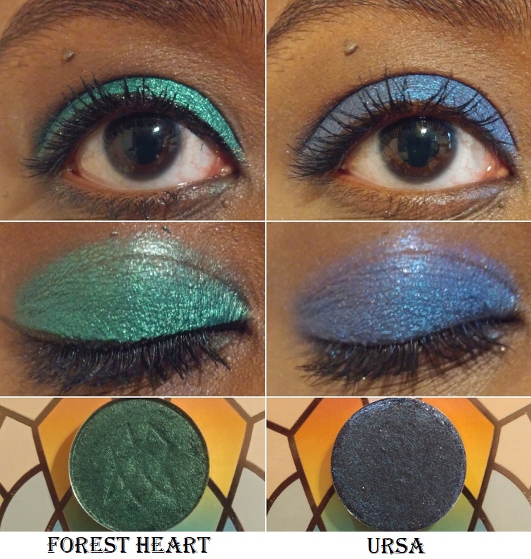
Forest Heart – from the Woodlands Collection. It’s described as a metallic teal-green and I always thought it had a bit of a blue tinge, but it just looks like a medium-deep green on my eyelids. Sky Lights, Nocturnal, and Forest Heart remain my top three favorites out of the standard eyeshadows. It’s very easy to overlook the “regular” shadows when you have the Stained Glass collection available, so if it wasn’t for these three shades blowing me away, I wouldn’t have continued purchasing from the standard eyeshadow collections.
Ursa – from the 66.5° N Collection. This is a “blackened-blue shadow with a blue reflect and gold sparkle.” It’s not as dark on my lids as it looks in the pan, which makes me happy. I like the tone of it on me. The sparkles get a bit lost though and although I can see that lighter blue reflect, it didn’t wow me like some of the other shades. However, Clionadh set a huge bar for themselves and though I wasn’t as impressed, it’s still a beautiful shade.
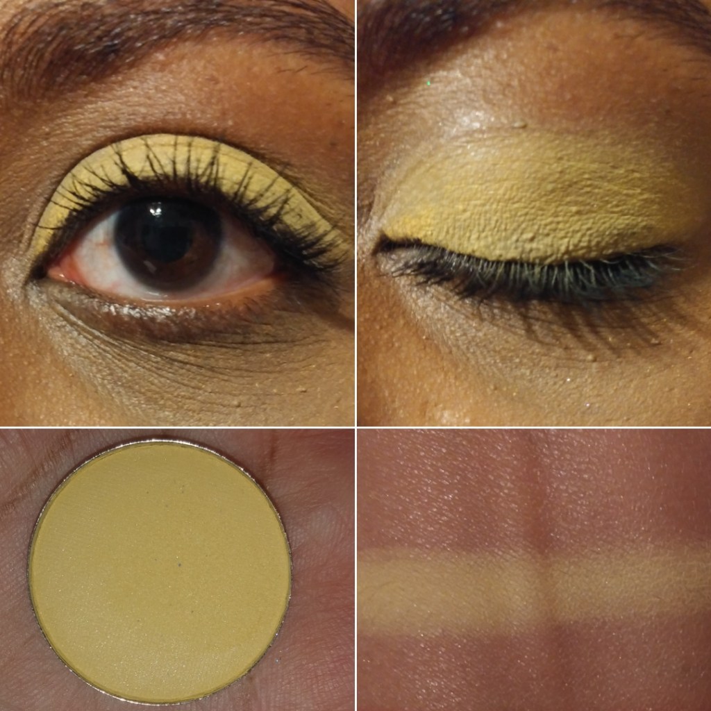
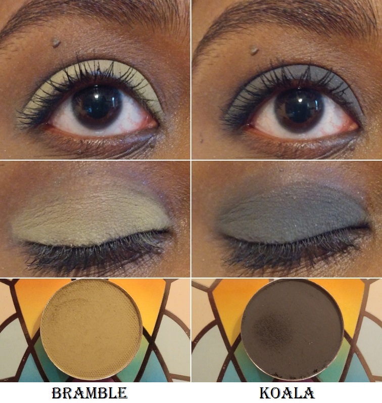
Bramble – from the Woodlands Collection. This is a light yellow-green shade. For some reason, on my camera it comes off looking way more yellow than green. I can confirm that in person it does look more green, but still with a strong yellow tone to it. This is one of the few shadows I wouldn’t miss if it was removed from my collection (based on the color, not performance).
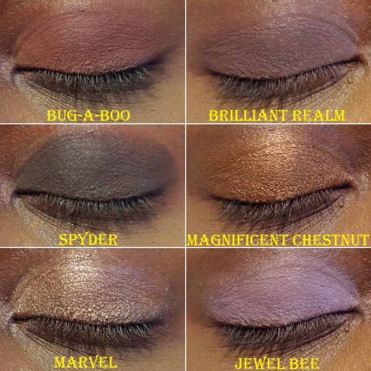
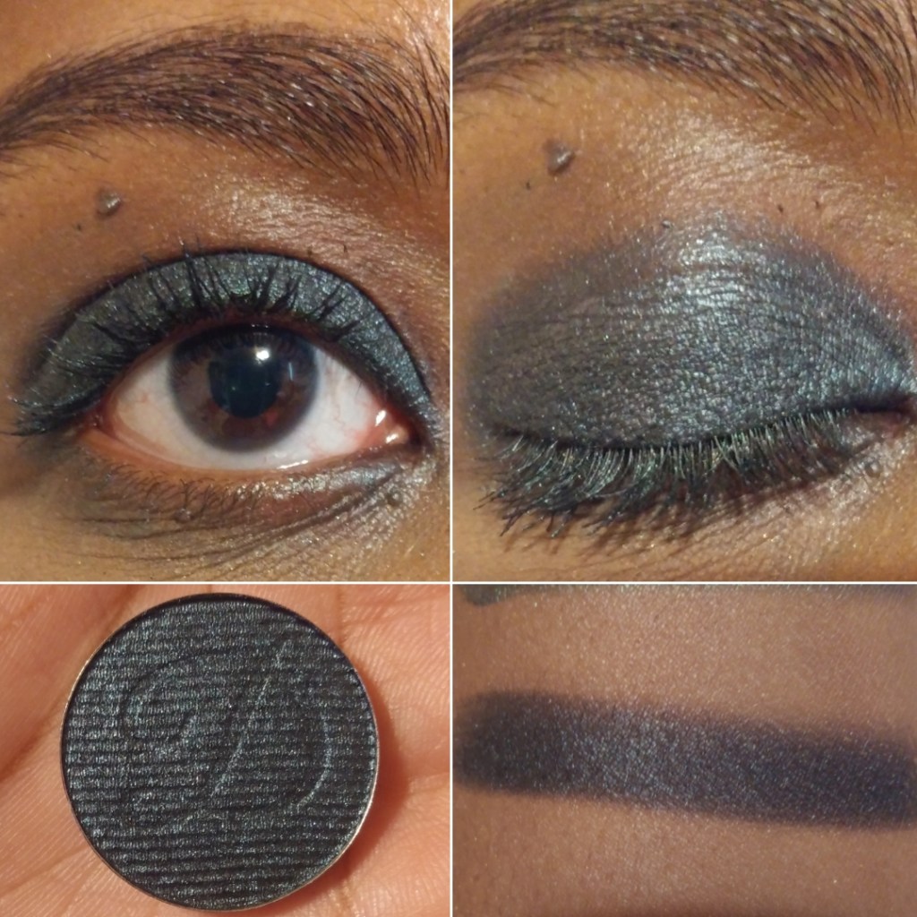
Koala – from the Koala Trio. It’s a charcoal grayish black color, which is typically a shade I don’t like, but my goodness this is amazing! It would be great if Clionadh brought this shade back to be sold individually and not have to be tied to the charity aspect. This is such a perfect shade for creating a smoky eye that isn’t too intense and dramatic, though I’m into that kind of look as well. This pairs so nicely with all the other Clionadh shadows, and for a few weeks straight I used this shade exclusively to deepen up all my eyeshadow looks when using other brands’ eyeshadows too!
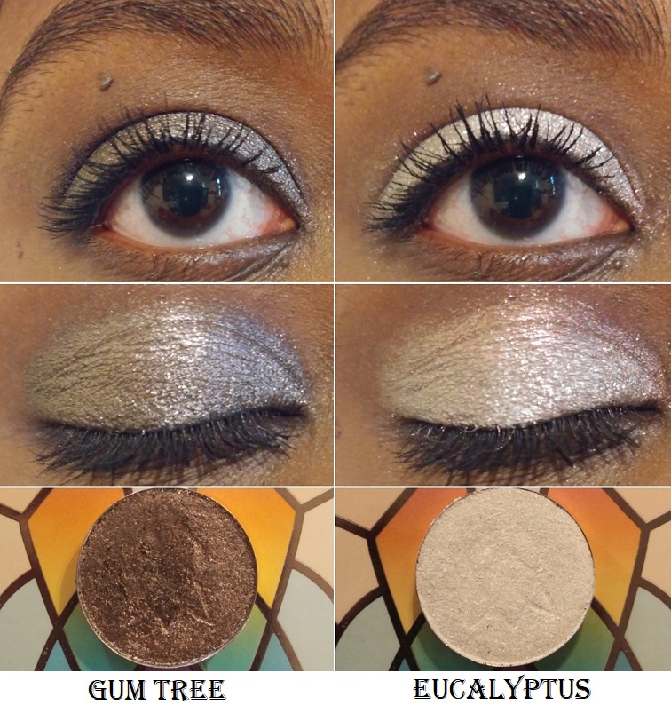
Gum Tree – from the Koala Trio. I definitely don’t have another eyeshadow like this in my collection. It’s like a gunmetal or antique pewter with a bronze-red reflect. It is so beautiful and such a shame it’s discontinued.
Eucalyptus – the last shade from the Koala Trio. It looks just white on my eyelid, but when applied sheer, like a topper, it’s an iridescent shade with red, gold, and a little bit of green reflect. It’s a fun and unique color that amps up any eye look when patted on top.
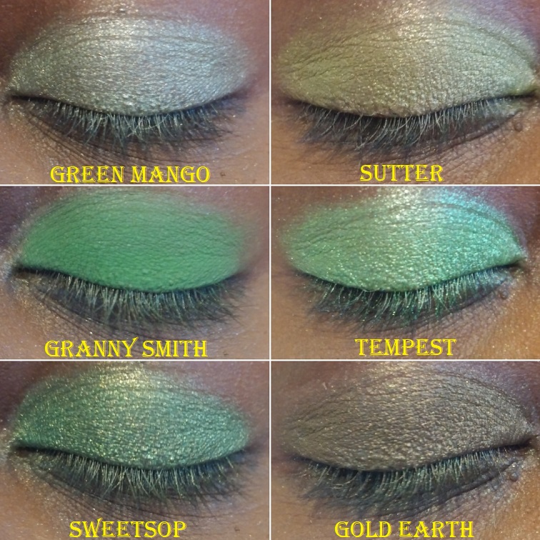
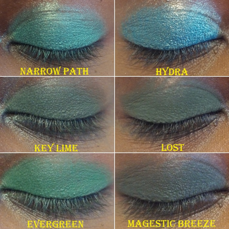
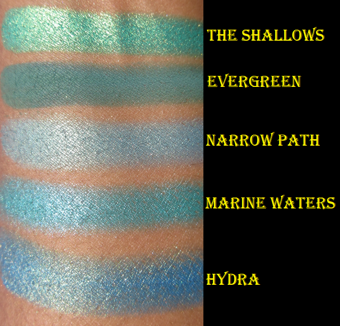
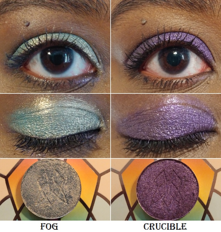
Fog – from Team Witchcraft. I’ve mentioned before that light colors aren’t my favorite, but this blue has enough warmth from the sparkle that I think it looks so pretty! It’s described as, “a dusty, teal base that shifts golden-peach.” It instantly reminded me of the shade Narrow Path from Sydney Grace. They have the same base color but that gold glitter makes me like Fog more than Narrow Path.
Crucible – from Team Alchemy. It’s a deep purple with a subtle “purple shift and gold sparkle.” Sky Lights is my perfect purple, so it’s harder for me to get excited about this shade by comparison. That being said, Crucible is so beautiful that it still deserves appreciation. It’s a great color to use for a purple smoky eye.
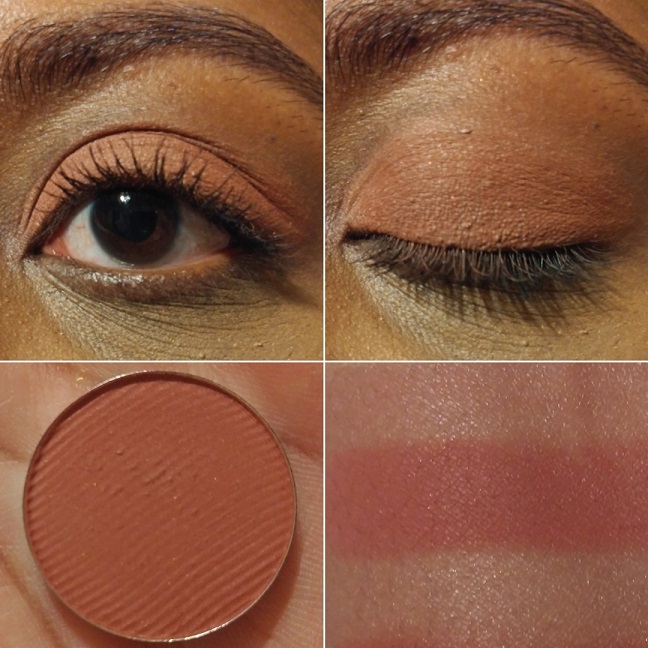
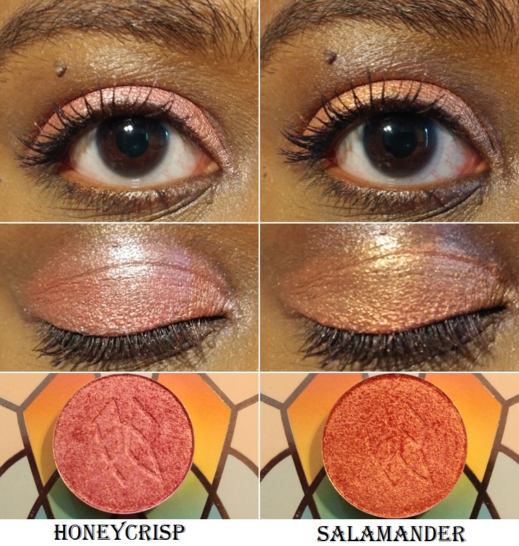
Honeycrisp – from the Harvest Moon Collection. Something about this shade was so alluring to me, particularly around the time I bought it. I was still going through my phase of searching for a golden pink. Honeycrisp is described as, “a coral pink satin with a pearly reflect.” Sydney Grace has a lot of shades along this same vein like Meadowhawk and Golden Strawberry. Even Salamander looks similar, like a slightly more orange toned version, especially in the photo above where I combined Salamander with Eucalyptus. This doesn’t take away from the fact that this is a gorgeous shade and despite having similar colors, I’m still glad I have it.
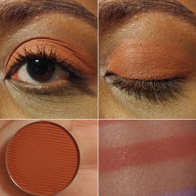
Salamander – from Team Witchcraft. This is described as, “a coral base with a gold reflect,” which accounts for the similarities between this shade and Honeycrisp. It’s like a fiery golden tangerine. I really like it.
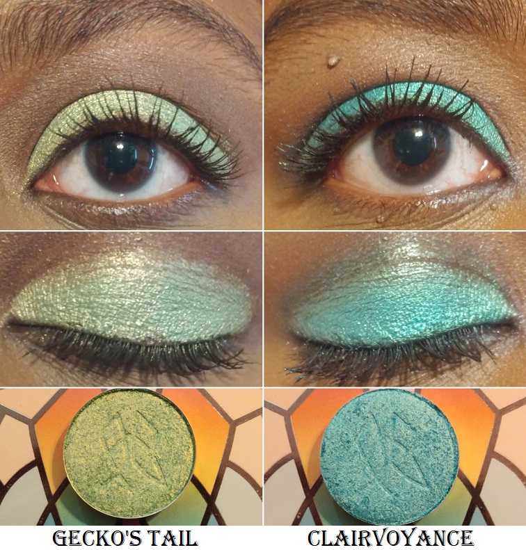
Gecko’s Tail – from Team Alchemy. This shade has an “apple green base with gold reflect.” It’s a lighter tone than a typical Granny Smith Apple shade. I think I would have liked it more if it was a touch deeper, but it’s a fun color.
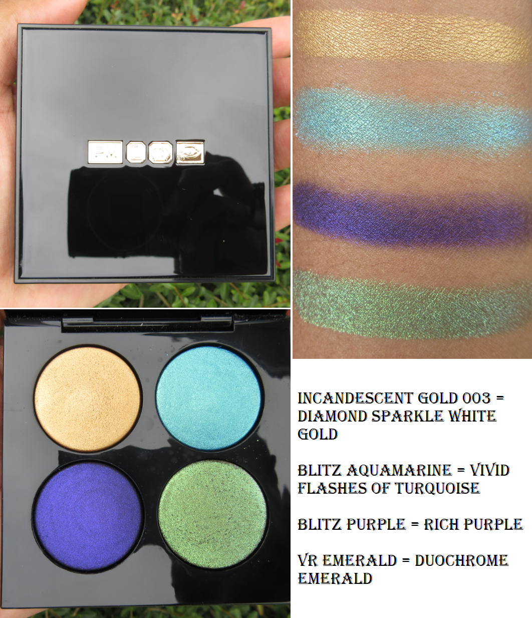
Clairvoyance – from Team Witchcraft. I didn’t expect to like this color, but I couldn’t resist buying it anyway. It’s “a turquoise base with a light green reflect.” It reminds me of Blitz Aquamarine from Pat Mcgrath, but the green reflect is a different twist.
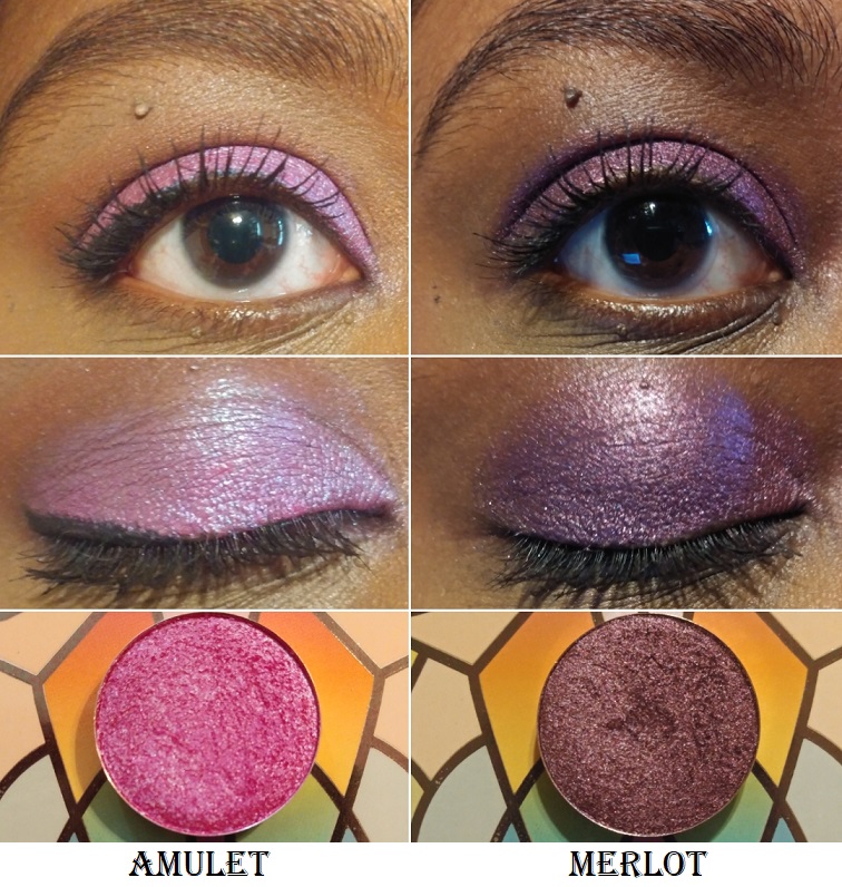
Amulet – from Team Witchcraft. This is a “a bright fuchsia that shifts blue.” This is a very popular type of duochrome shade. The base color is similar to Bon-Bon but Bon Bon is much deeper.
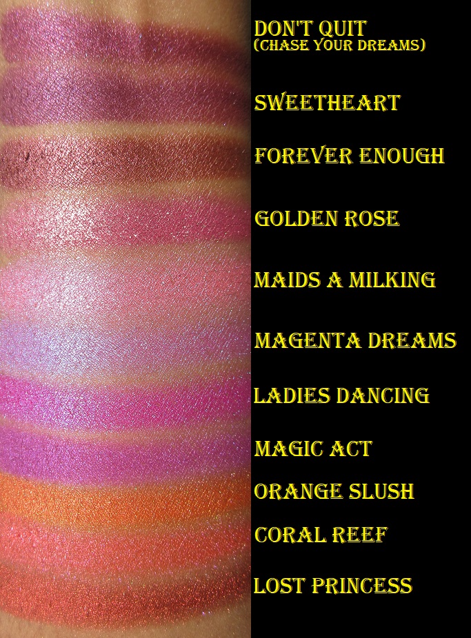
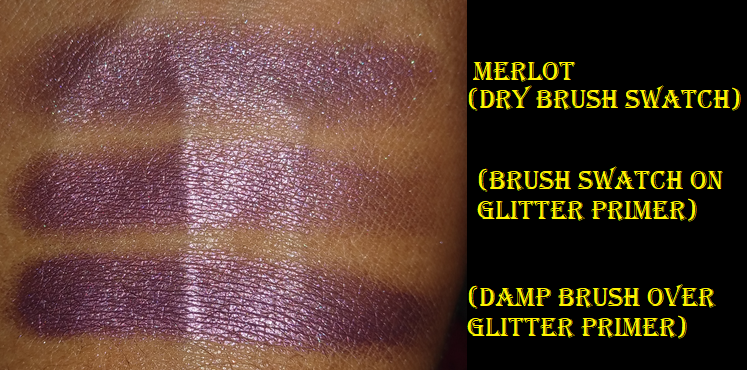
Merlot – This is a metallic plum shade from the Ultra Metals Collection. It looked a little grey in some of the swatches I saw online, so I was much happier with the actual color. It looks very rich in person. It also looks like a regular shimmer or satin shade when applied dry. With a wet brush, this shade looks much more metallic and pretty. This is currently the only shade I have from the Ultra Metals because I was using this shade as a tester before I considered buying more.
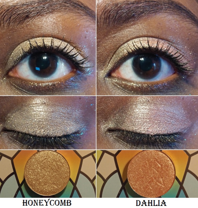
Honeycomb – from the Woodlands Collection. As, “a warm beige metallic with gold sparkle,” I bought this shade to use specifically as an intense inner corner highlight.
Dahlia – from the Woodlands Collection. It’s “a light peach-gold duochrome” that I thought would look a little more different on me than Honeycomb. Between the two, I think I like this shade slightly better for all over the lid because of the pinkish shift. As an inner corner shade, I would prefer a more neutral color like Honeycomb.
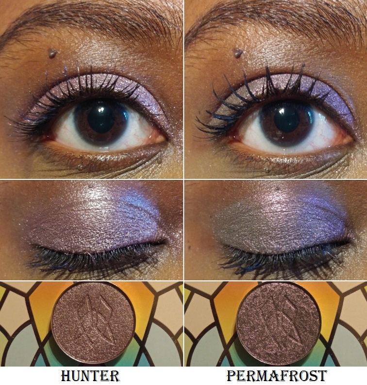
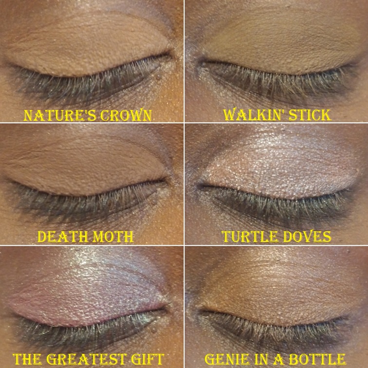
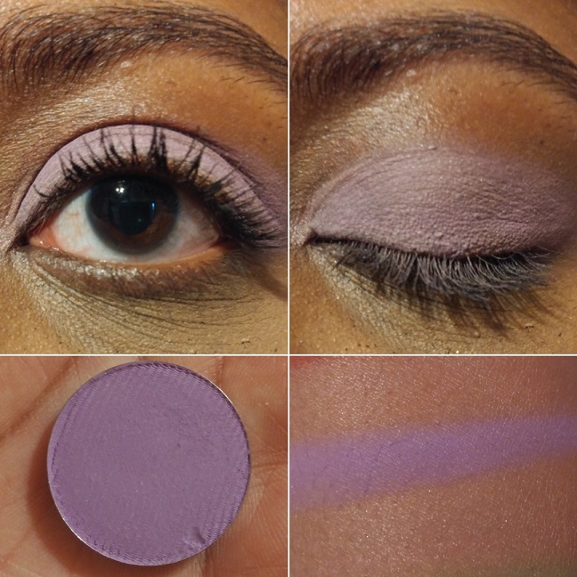
Hunter – from the Woodlands Collection. Hunter is described as a metallic mulberry. The base color is a dark purple but the lighter shimmer prevents it from being a traditional dark purple. It’s like a silvery purple mauve.
Permafrost – from the 66.5° N Collection. It resembles Hunter on the eye, when looking straightforward, because of the grey tone. However, this shade has a noticeable pink shift in person that gives it a grey pinkish purple look.
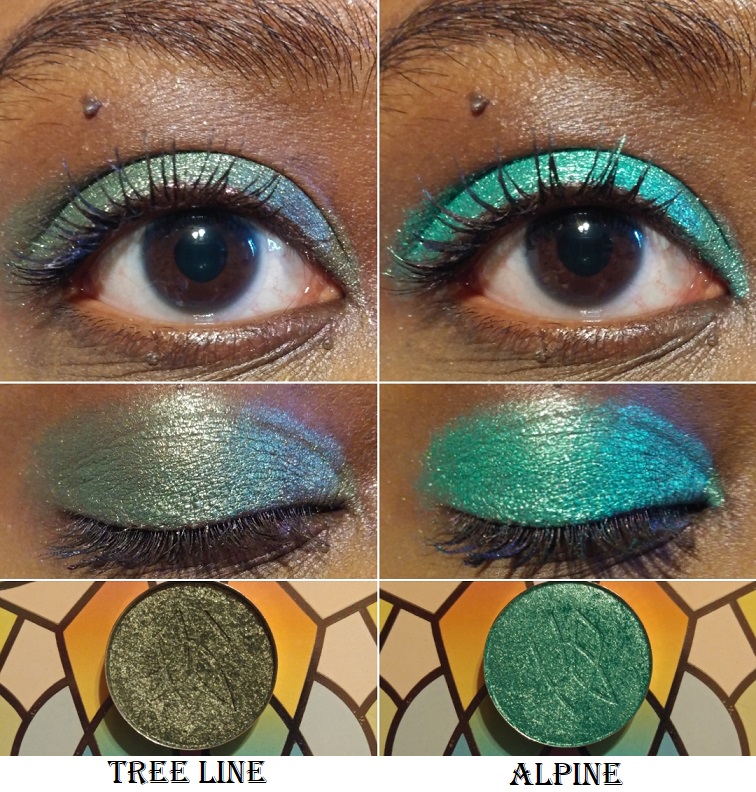
Tree Line – from the 66.5° N Collection. This “sage green metallic” shade looks a bit more blue-tinged on my eyes, though I was expecting a brownish-green. I still like it.
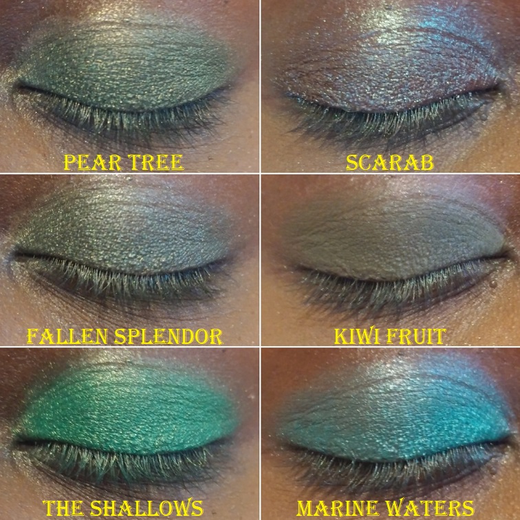
Alpine – from the 66.5° N Collection. This is, “a rich, blue-toned metallic green,” as opposed to the teal-green shade in Forest Heart. This shade is a lot brighter. It’s like a deeper toned version of The Shallows from Sydney Grace.
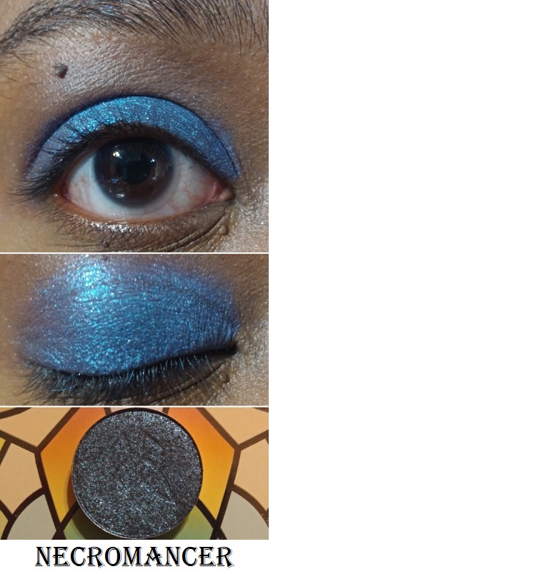
Necromancer – from Team Alchemy. It has a “blackened-blue base with a teal reflect and silver sparkle” that looks similar to Ursa in the pan, but the teal reflect makes it look brighter and more vibrant than Ursa.
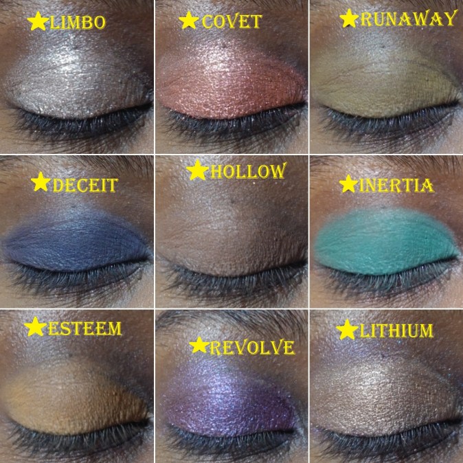
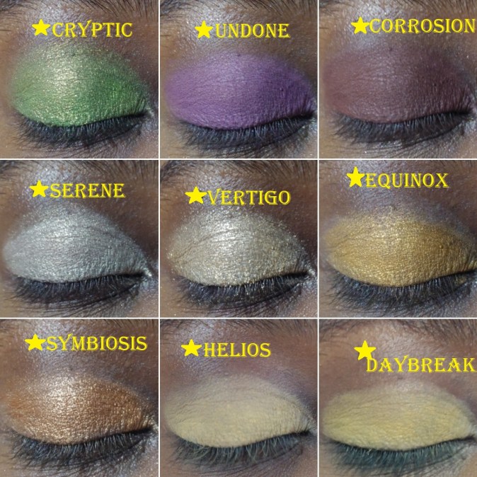
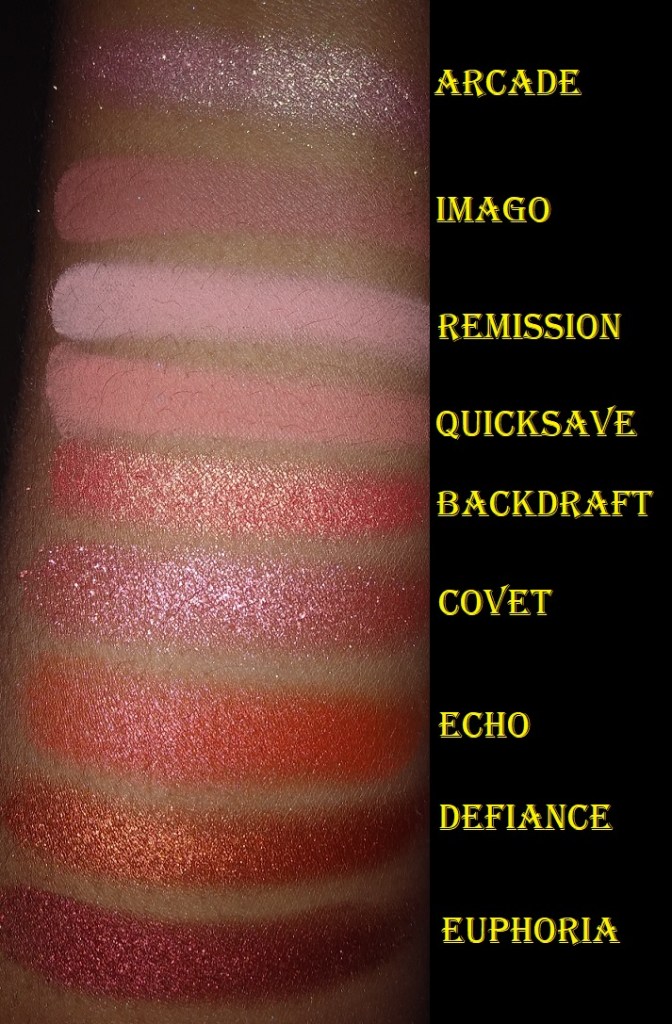
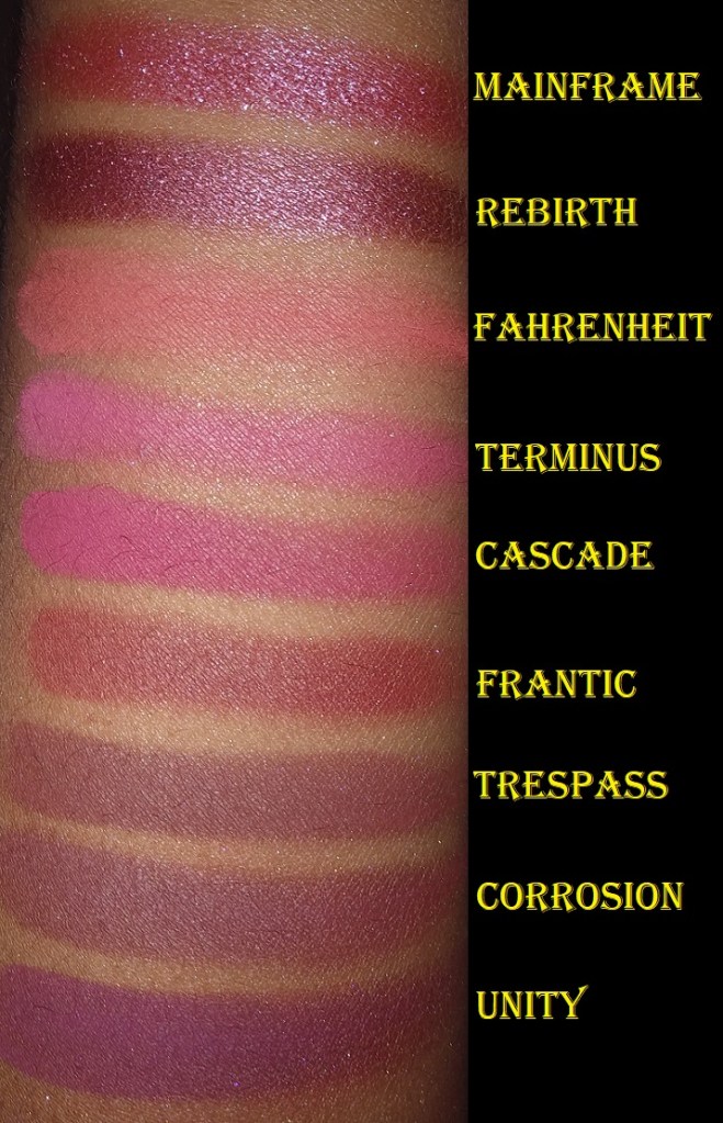
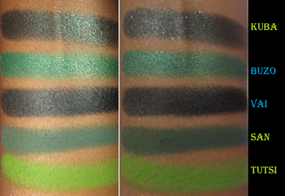
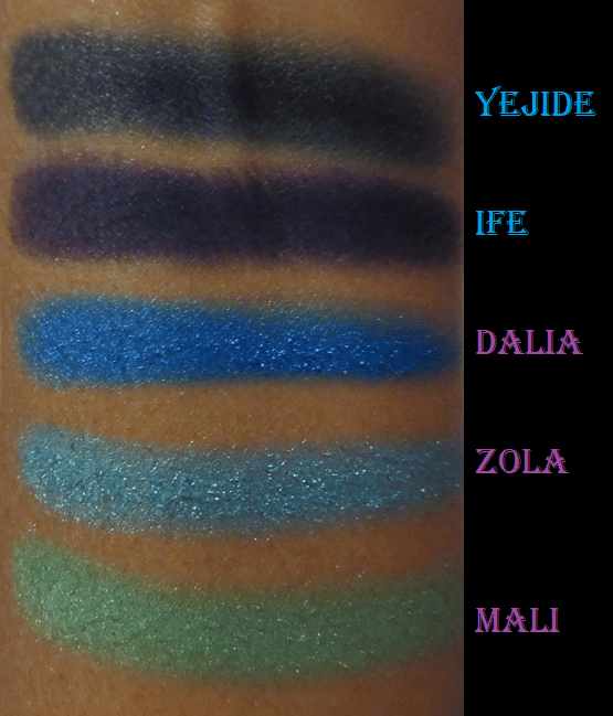
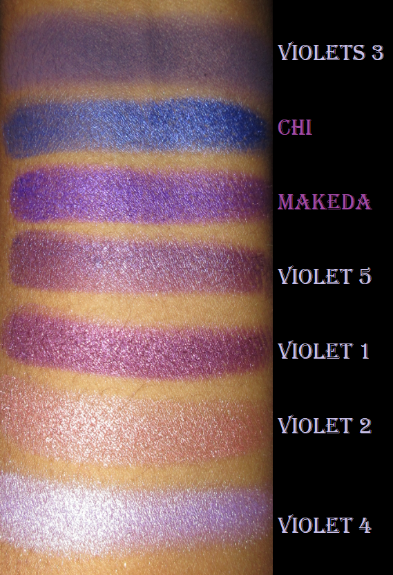
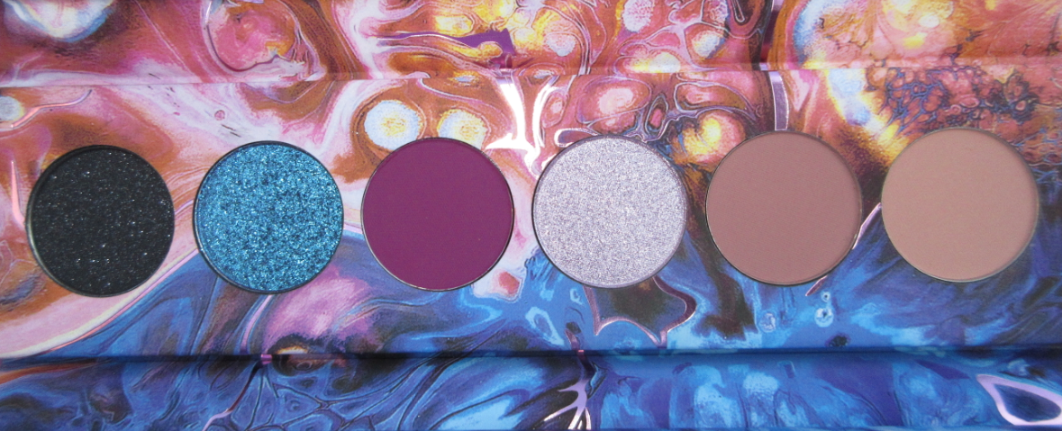
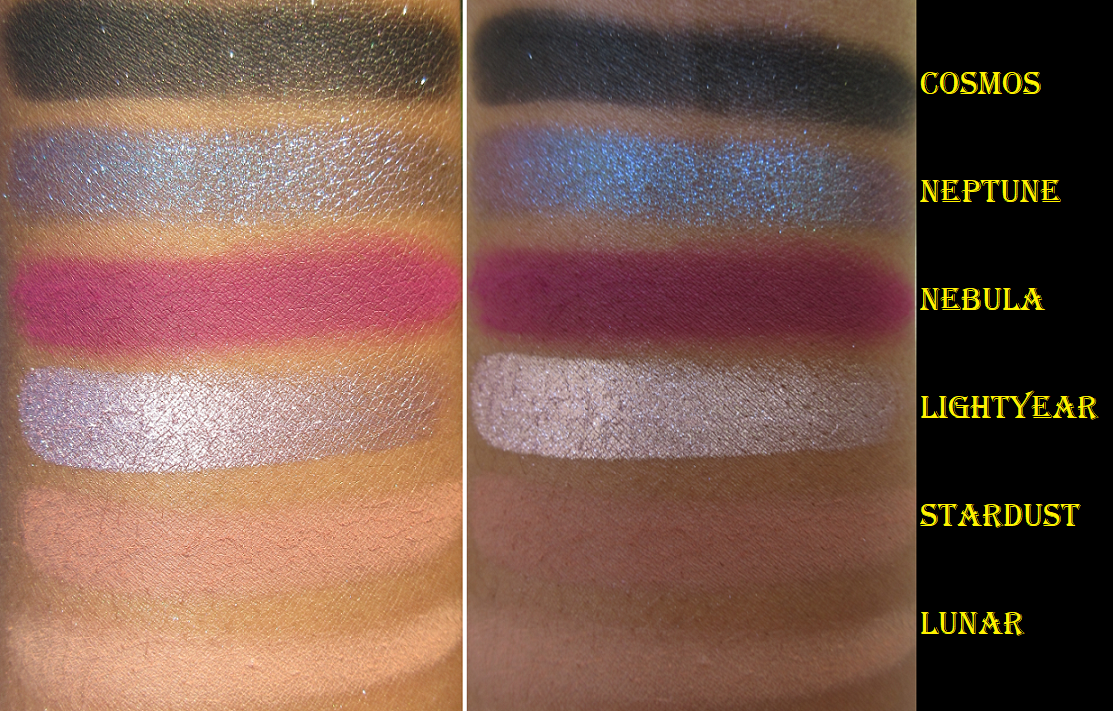
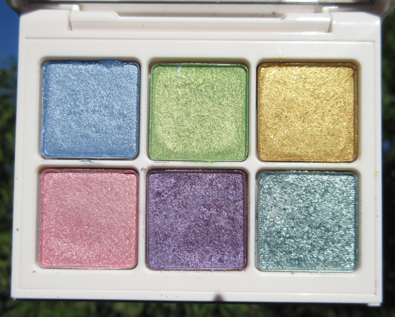
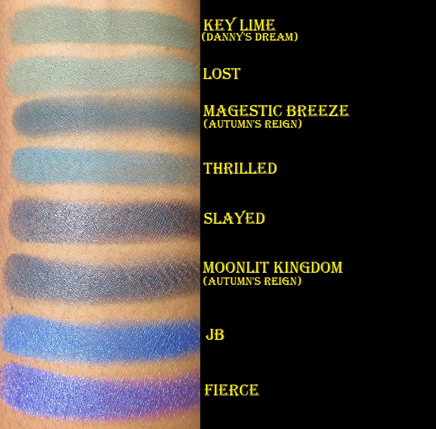
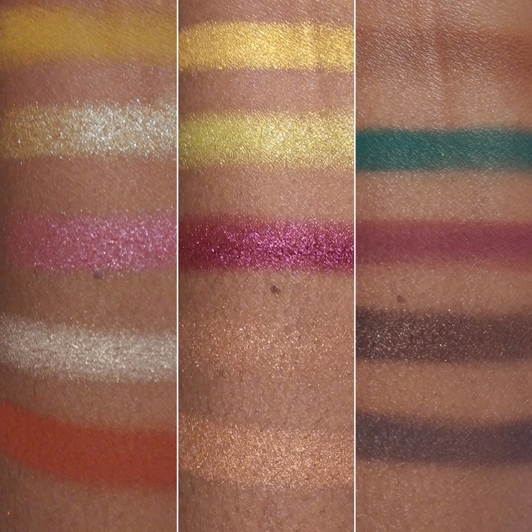
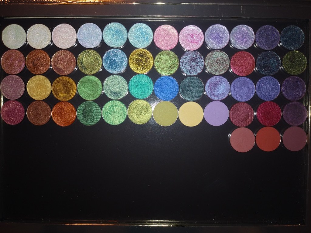
STAINED GLASS SWATCHES
On Instagram, I have videos of the Stained Glass swatches in this post. You just need to scroll sideways to see more.
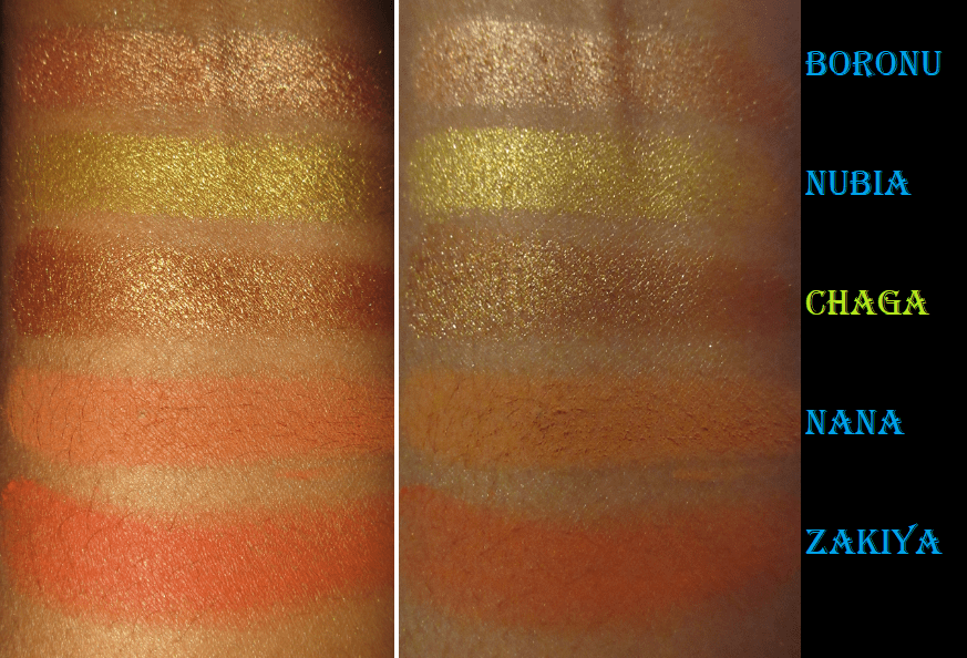
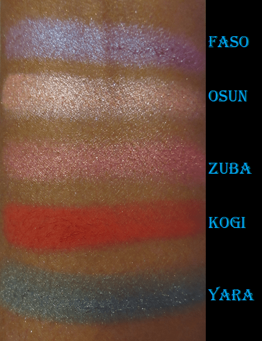
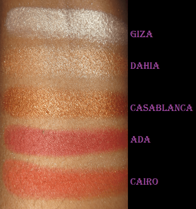
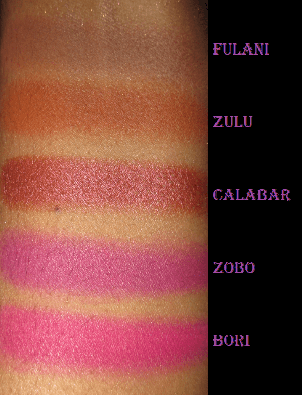
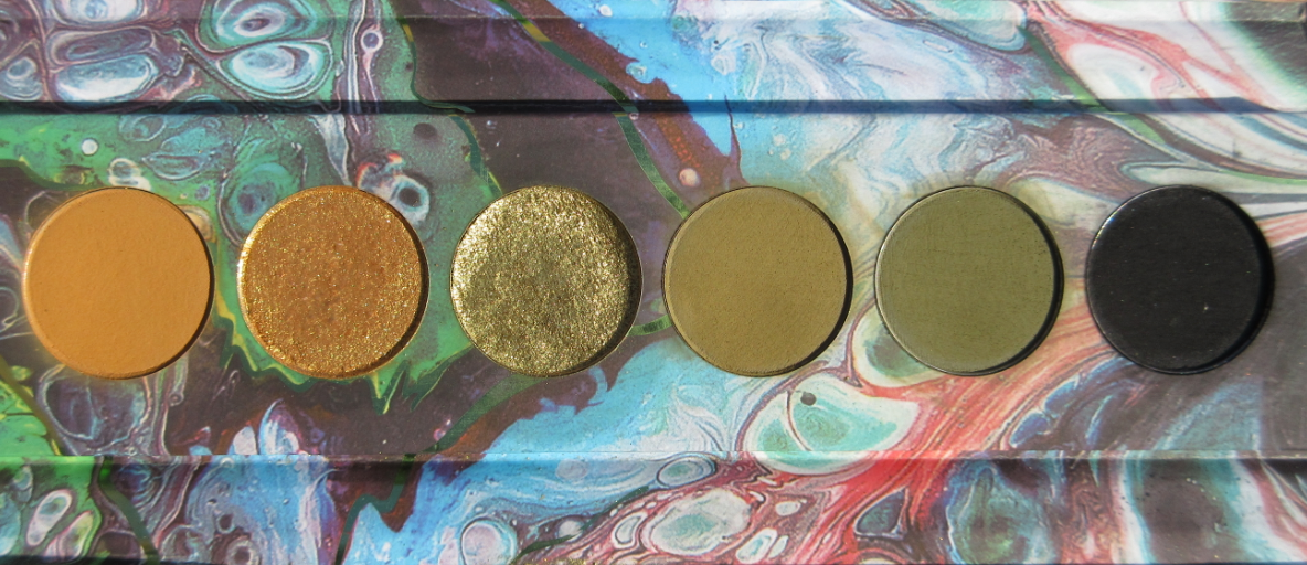
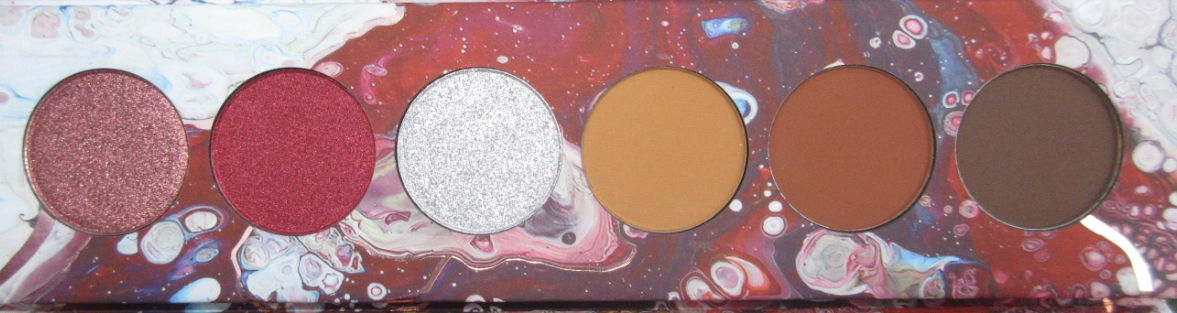
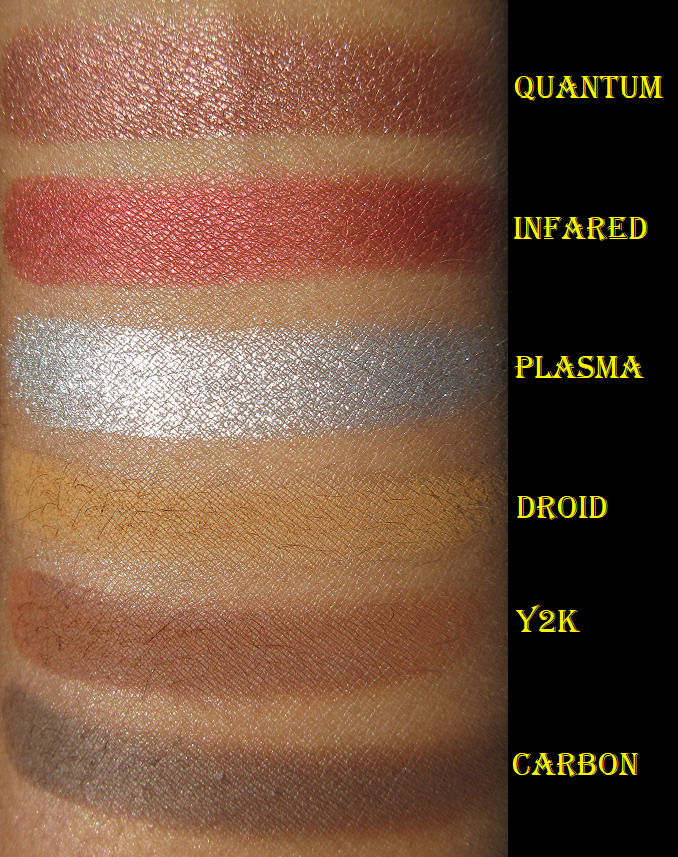
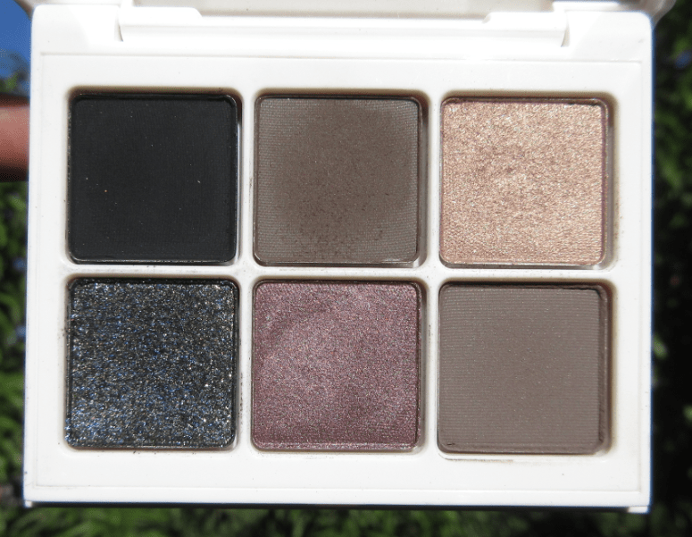
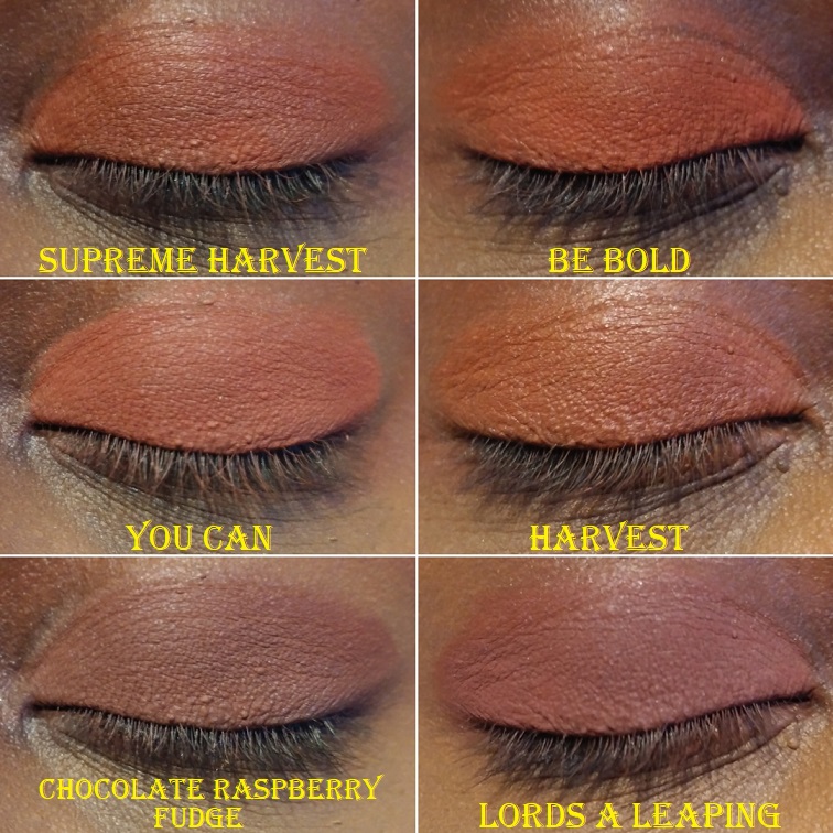
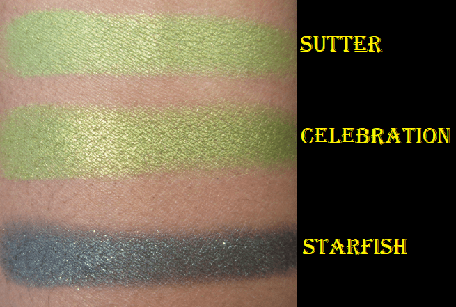
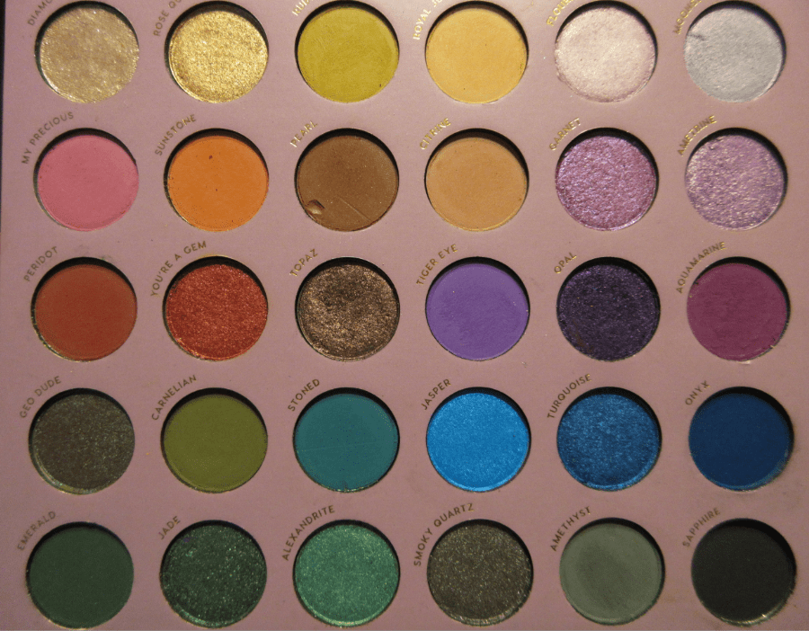
STANDARD COLLECTION SWATCHES
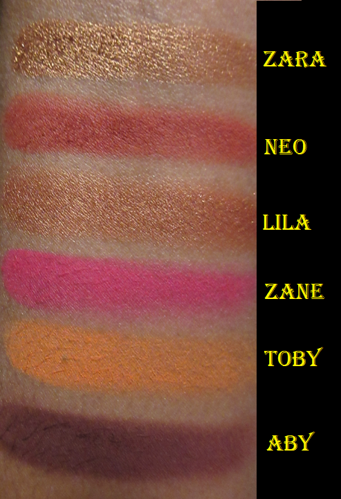
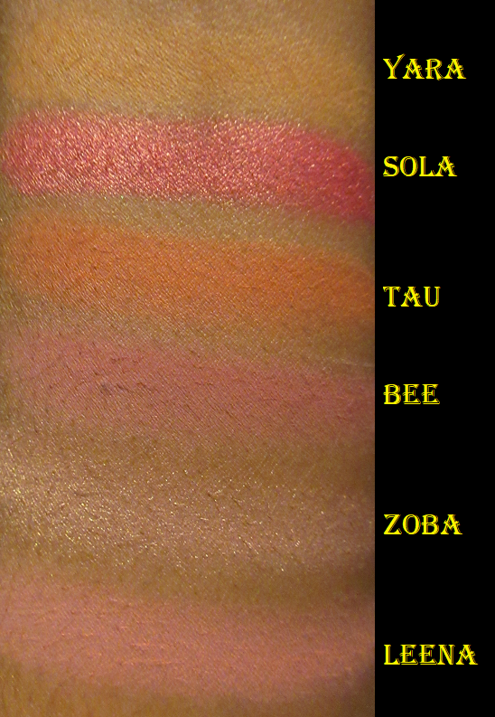
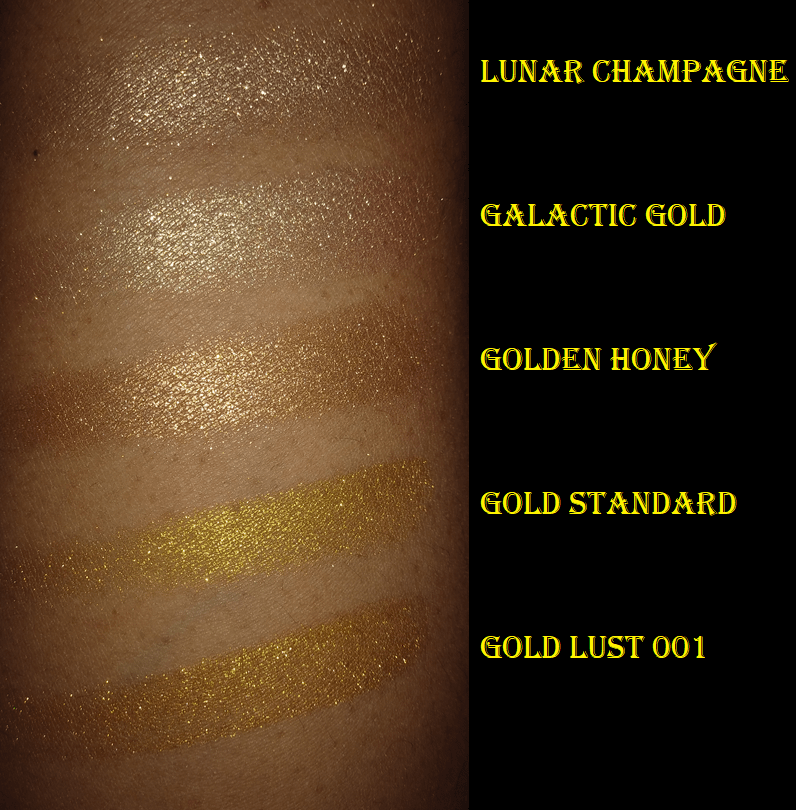
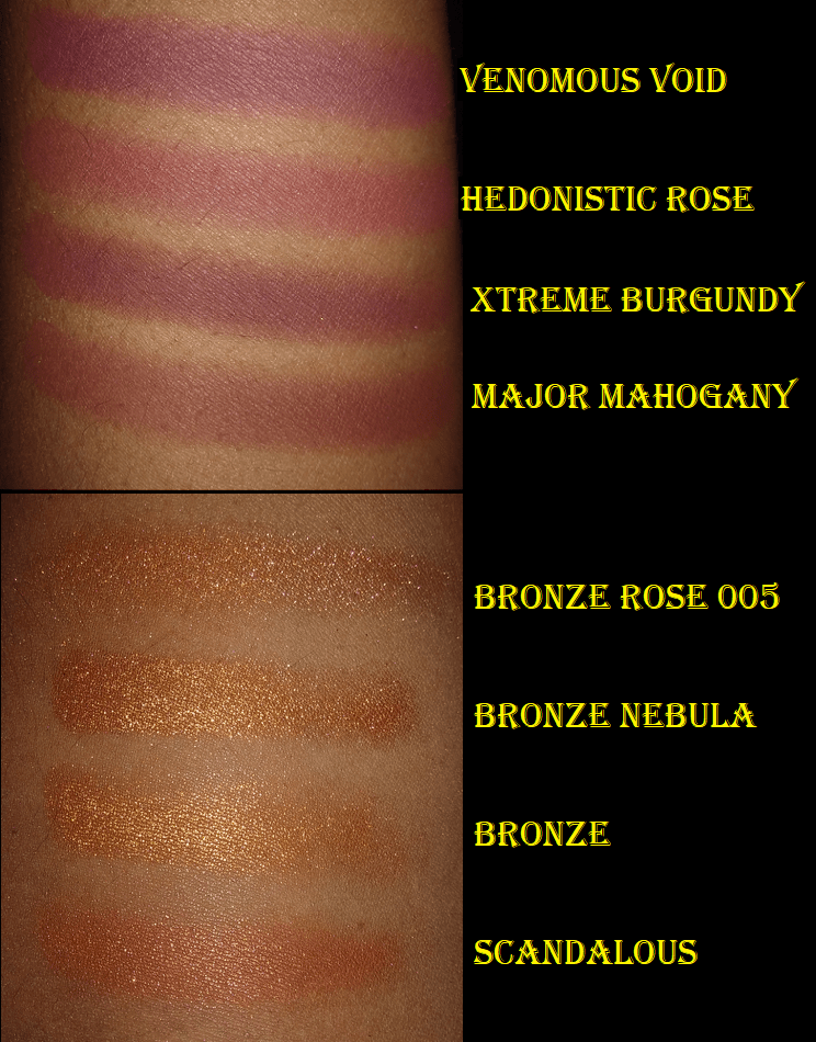
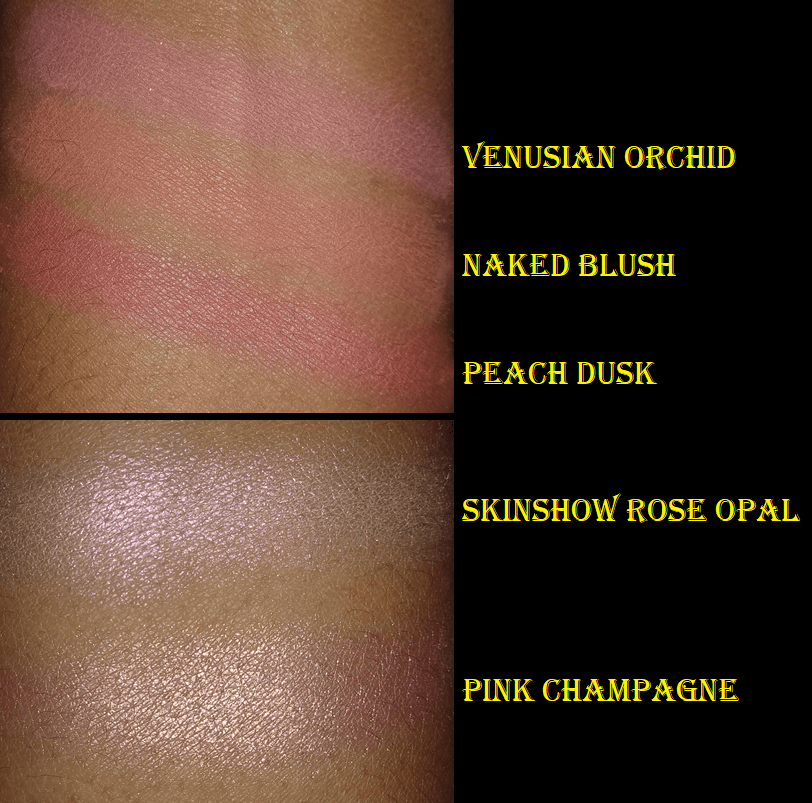
EYESHADOW SHADE COMPARISONS
The hardest parts about comparing multichromes are that the shades in the pans don’t necessarily correlate to how they will look on the eyes, especially depending on the lighting. Sometimes they look similar based on one shift at one angle, or in the dark, or in bright light, or in the pan, or the types of colors that they shift to. Sometimes it’s only the base color that is similar.
I tested out many more comparisons that didn’t make it into this post for the reasons above. Some of the dissimilar ones I kept in order to demonstrate how similar pan shades can differ from the swatch.
The duochromes were easier to find comparisons with other brands, but the level of glitter/sparkle in Clionadh’s shadows tend to be so intense that they ended up not looking the same, despite having similar base colors.
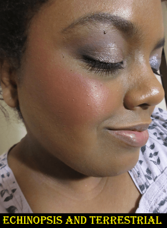
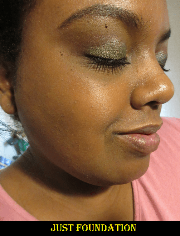
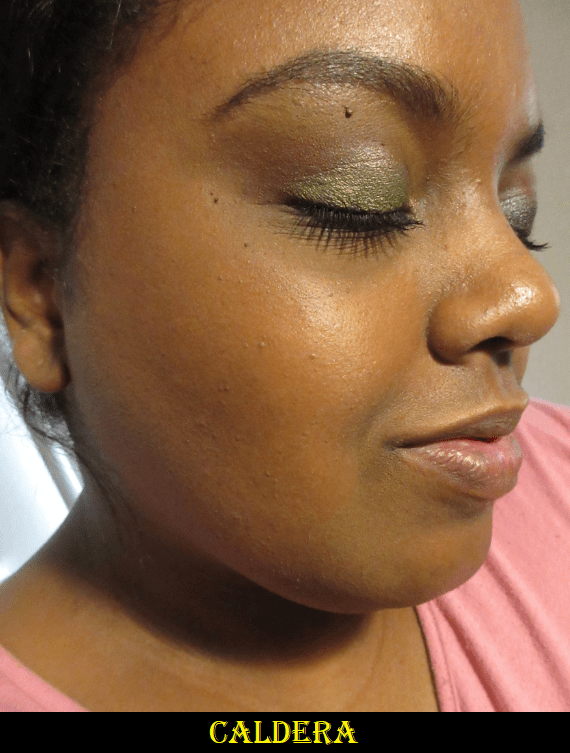
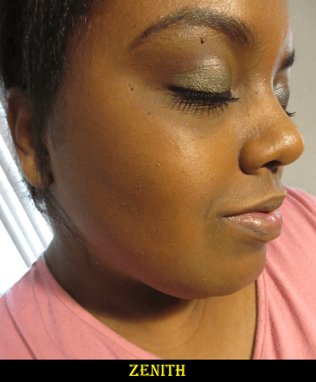
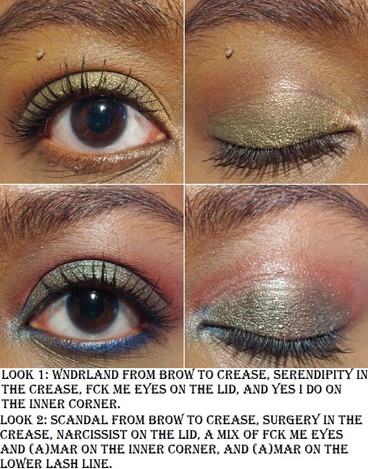
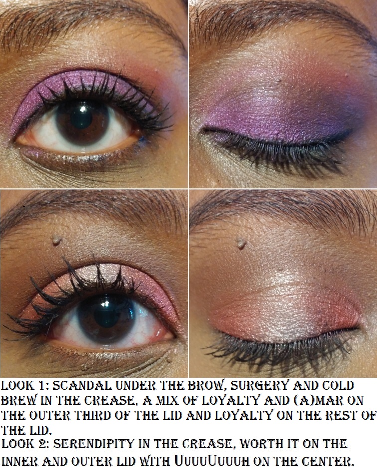
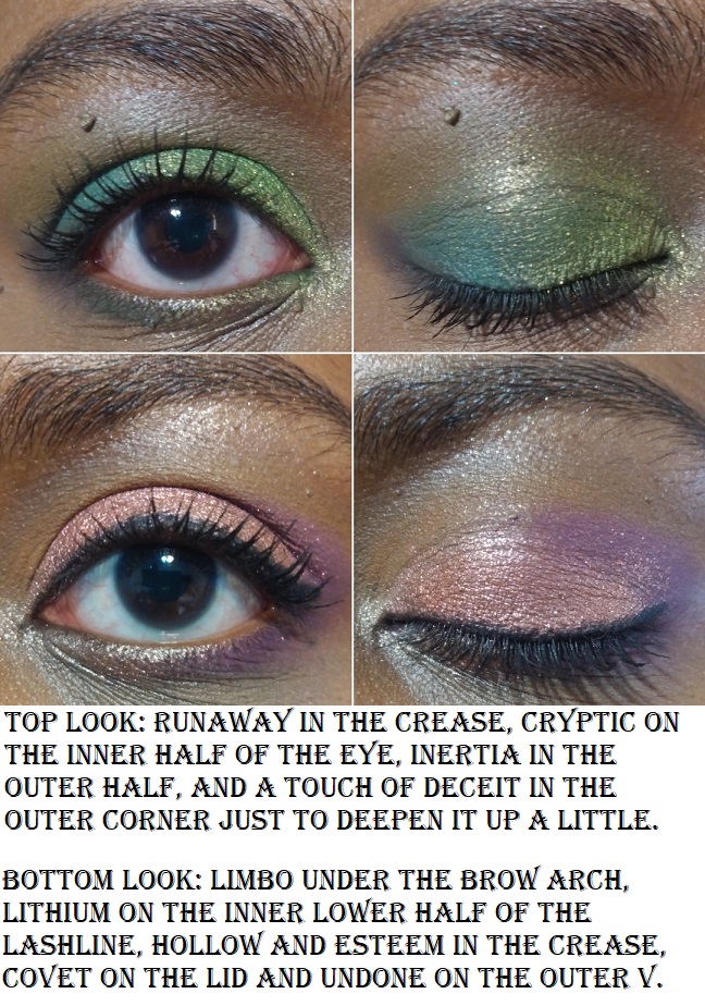
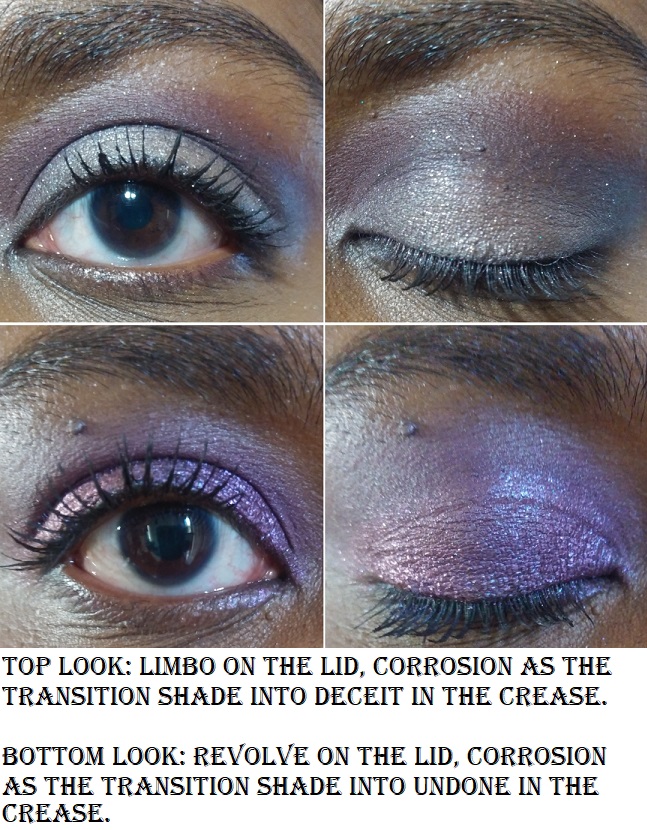
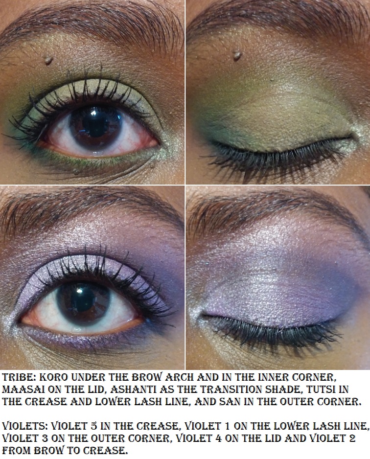
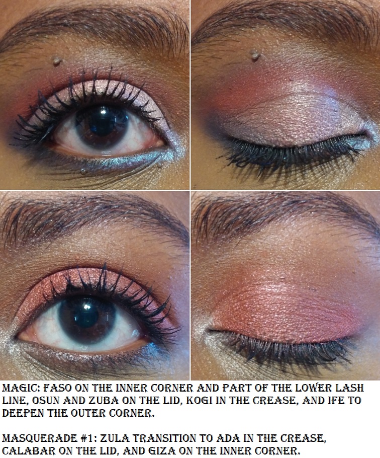
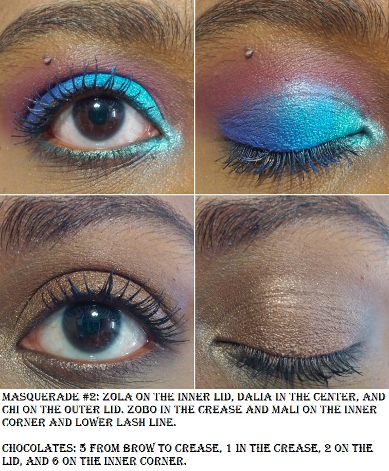
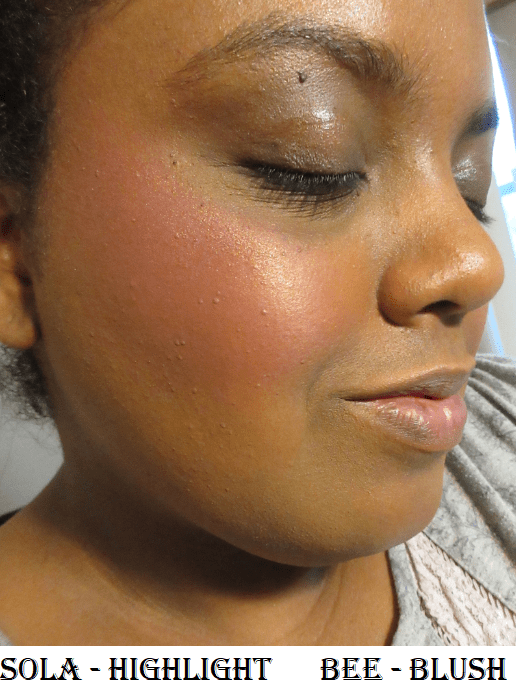
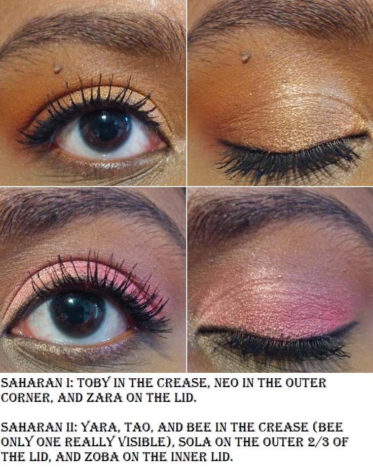
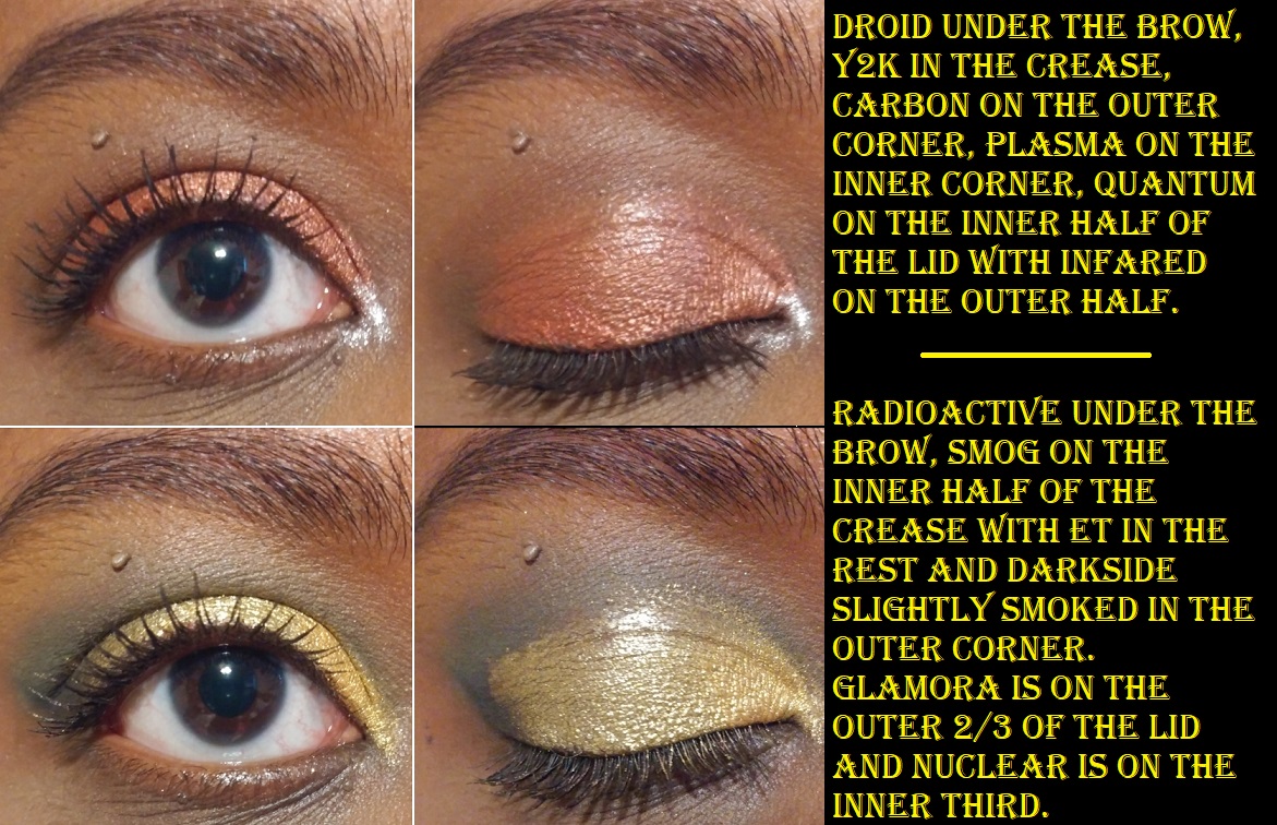
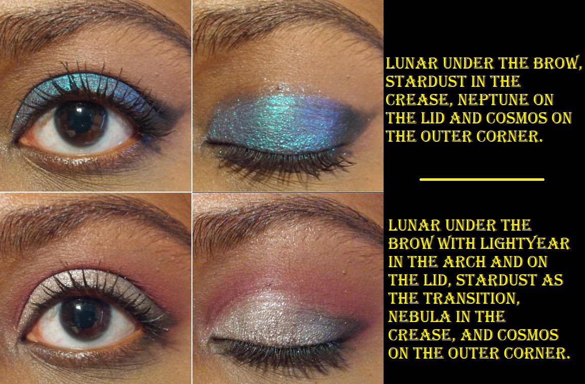
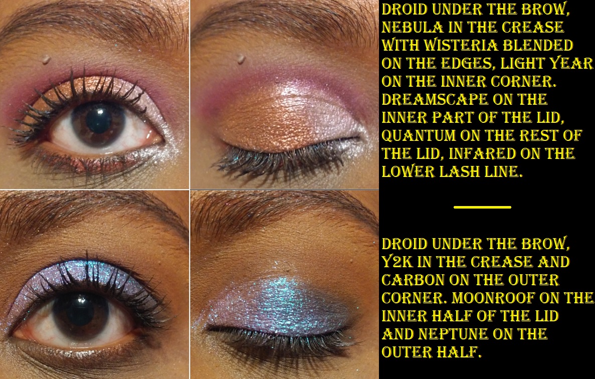
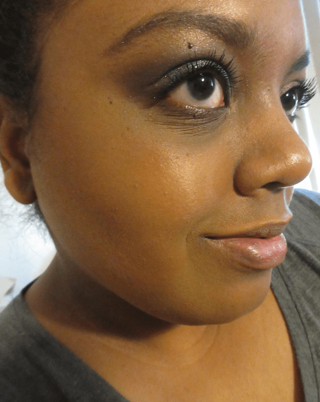
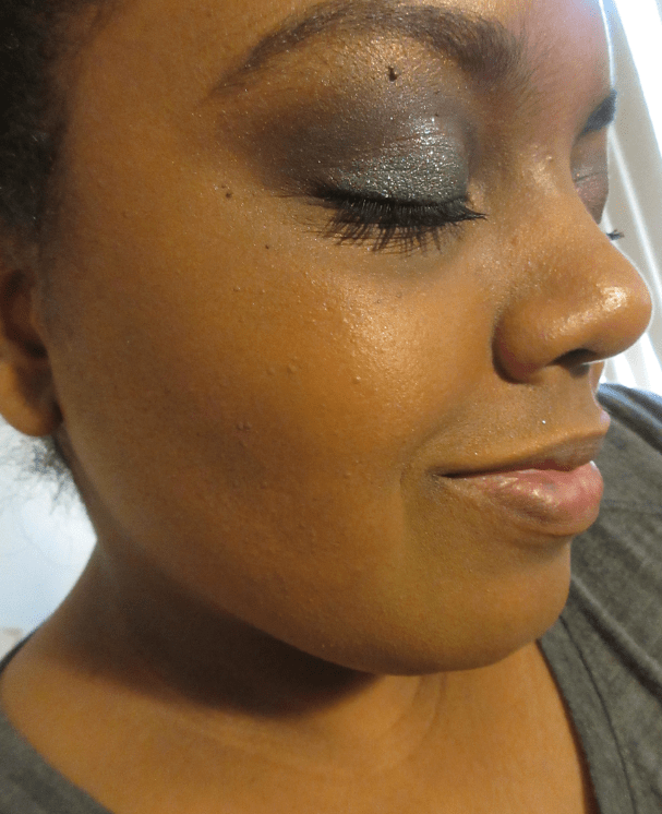
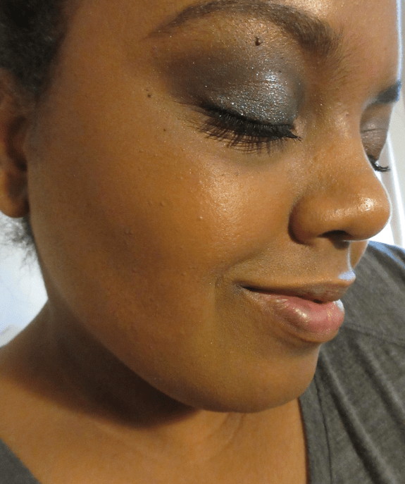
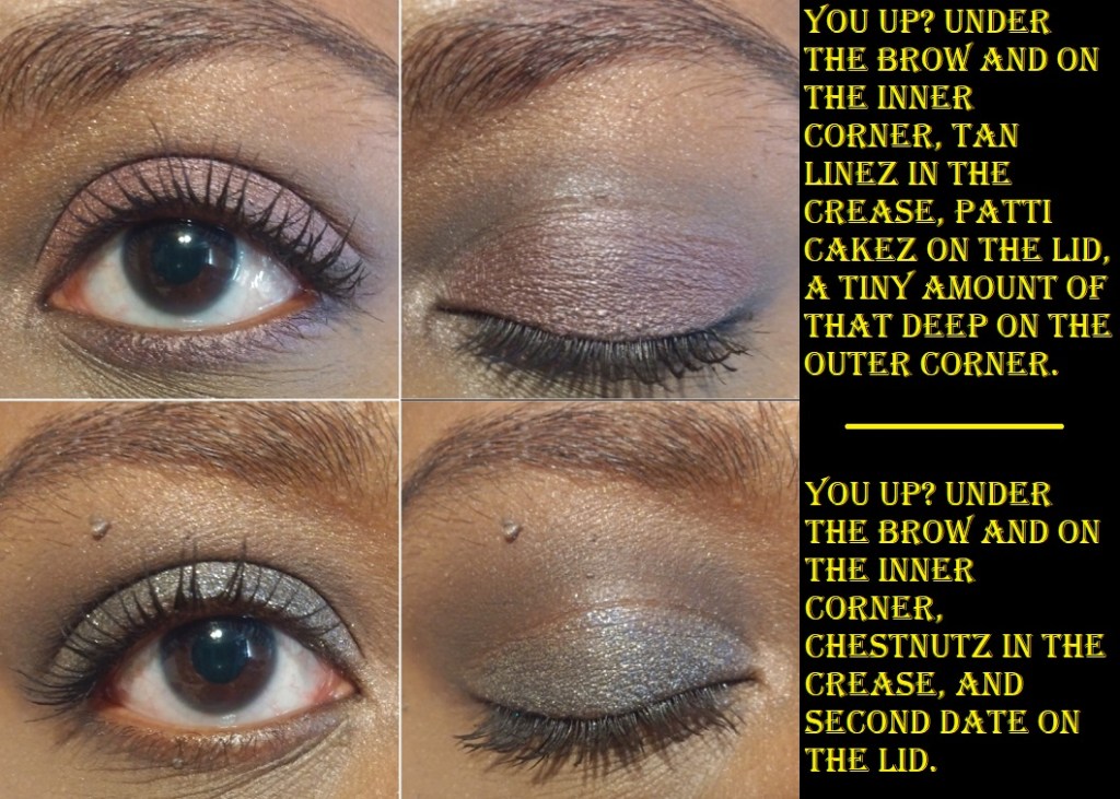
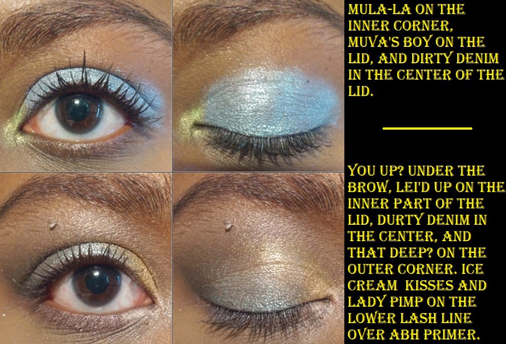
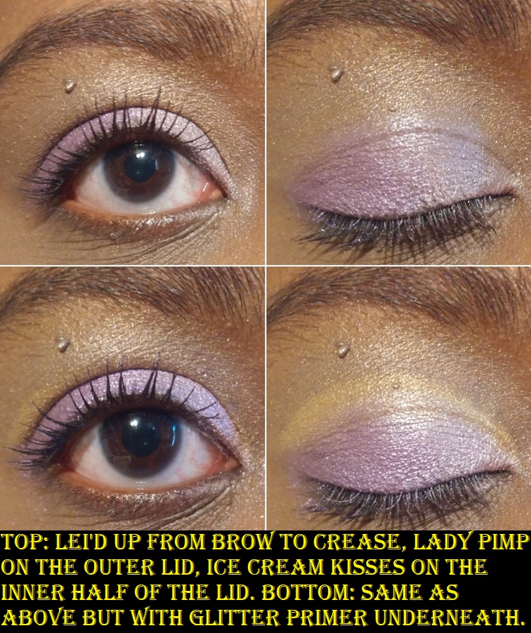
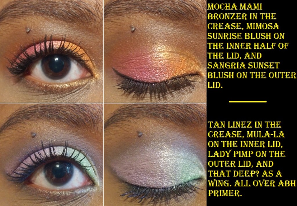
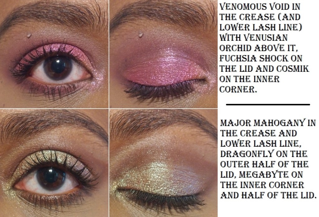
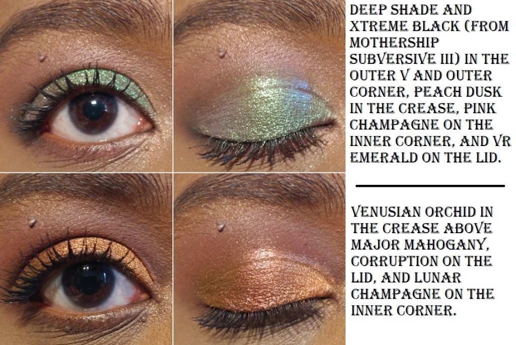
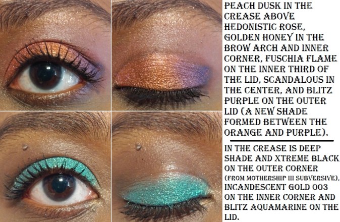
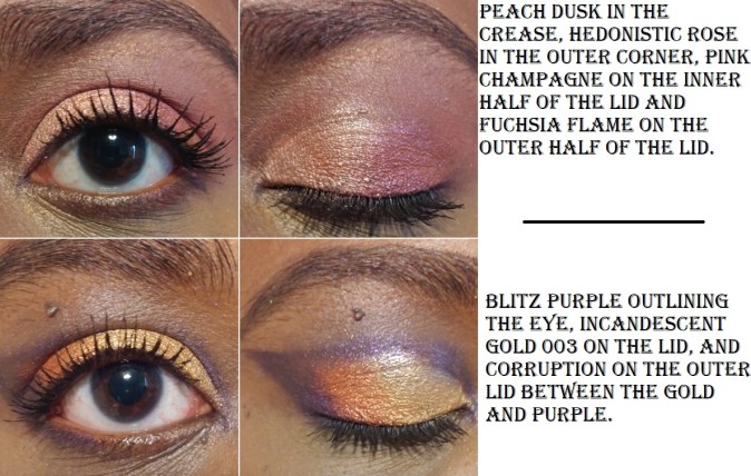
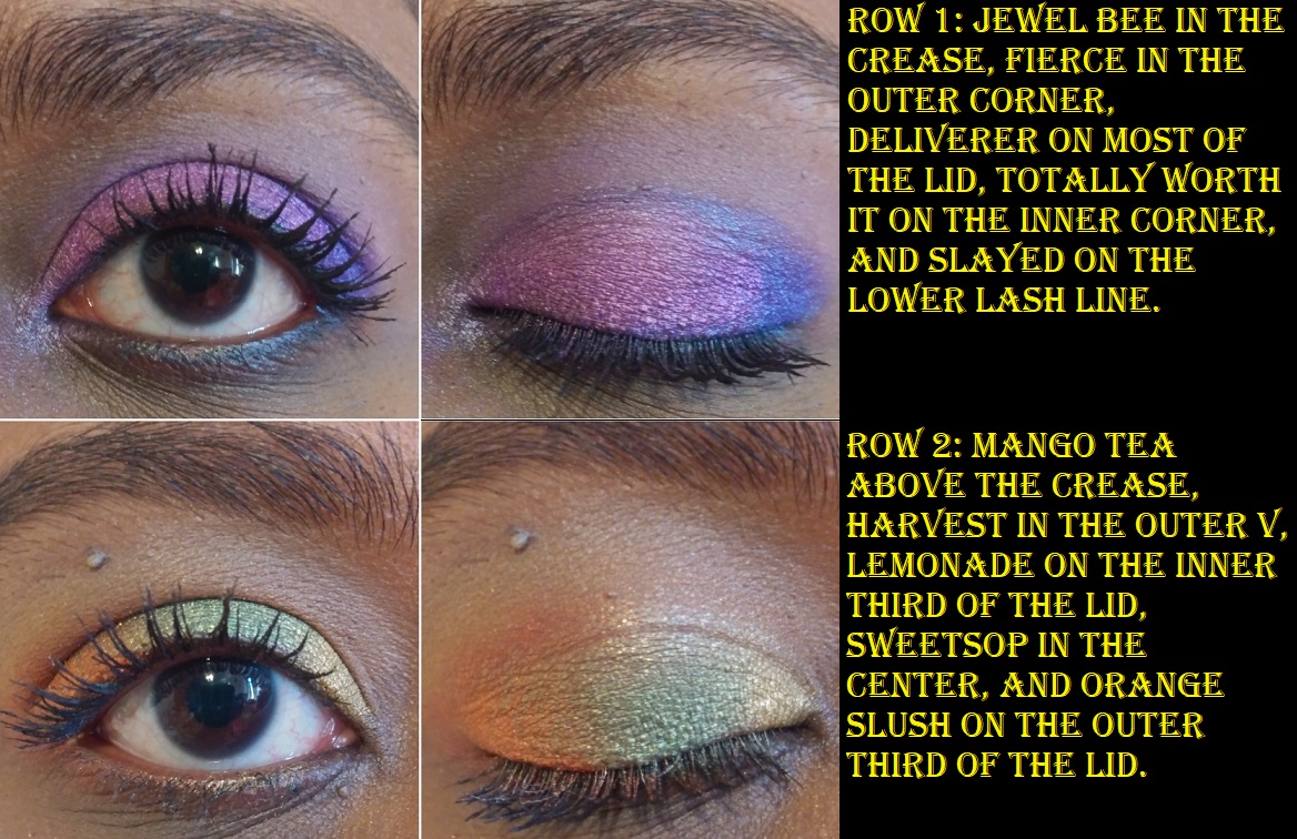
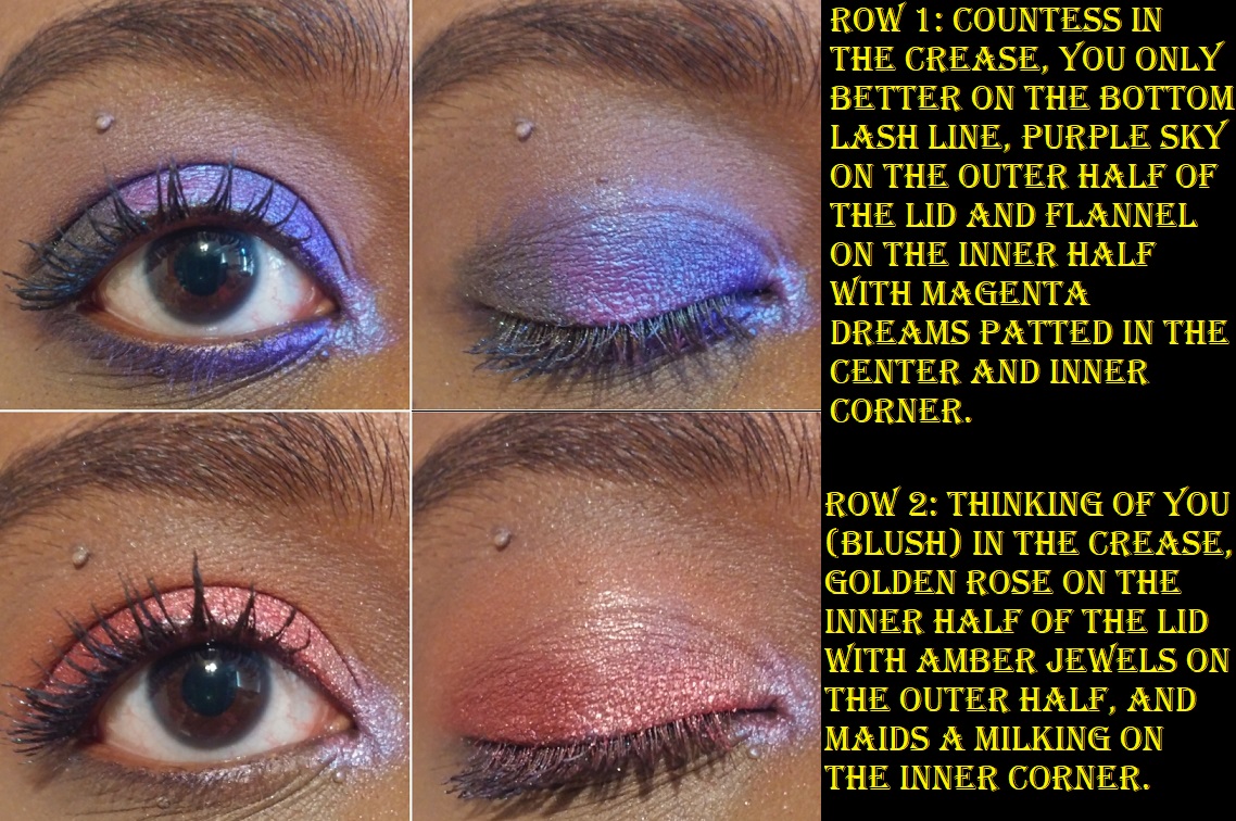
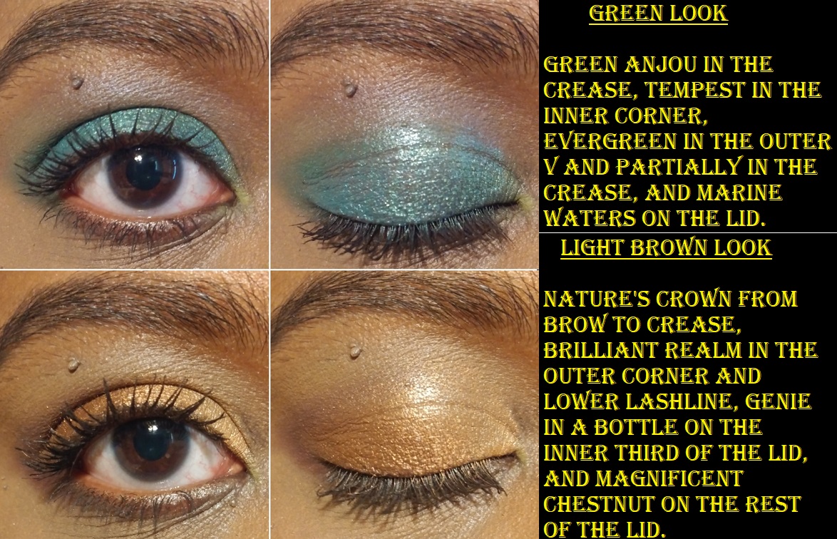
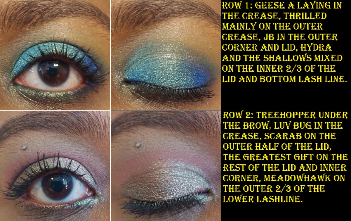
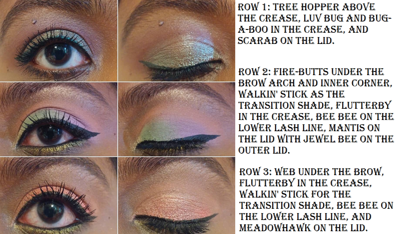
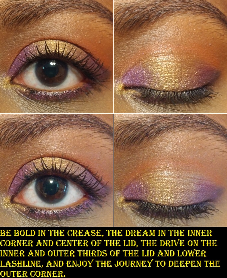
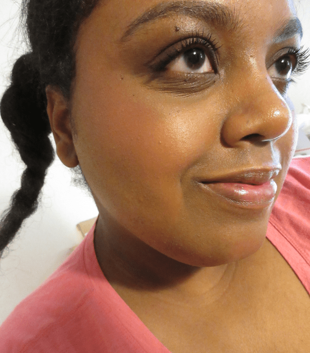
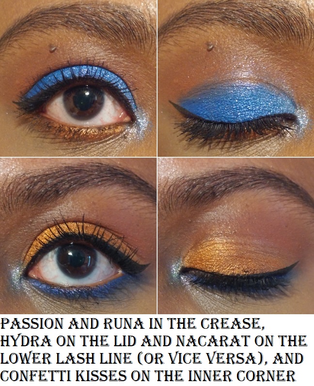
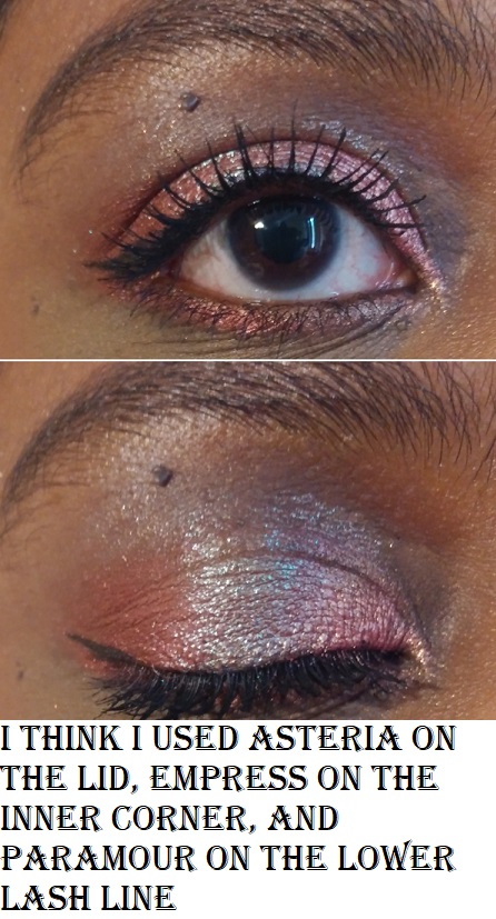
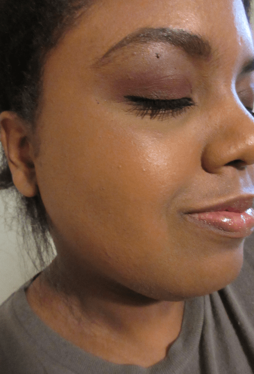
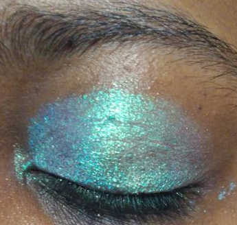
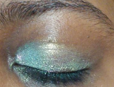
TOP RECOMMENDED SHADES AND EXTRA EYE LOOKS
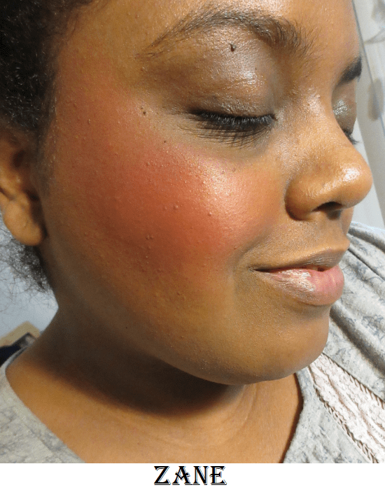
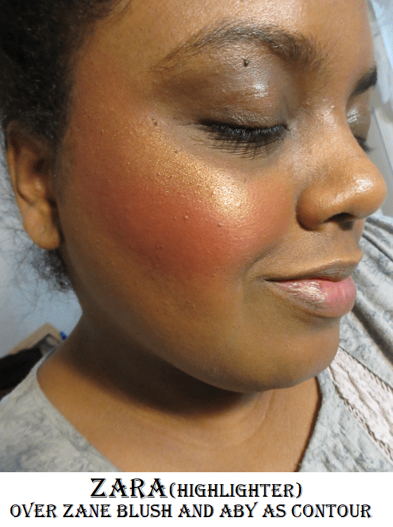
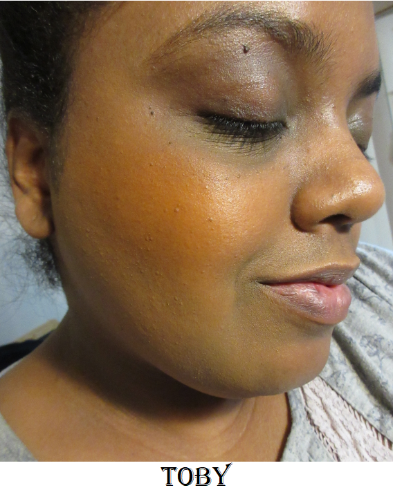
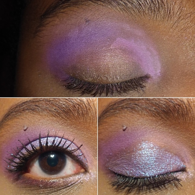
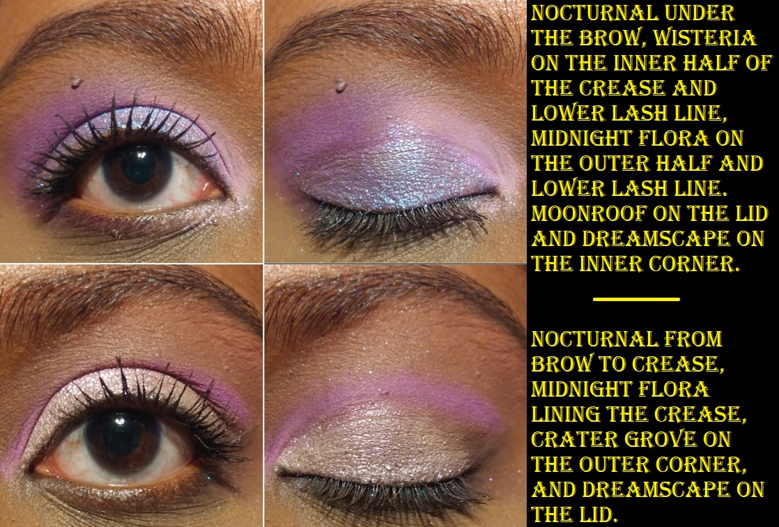
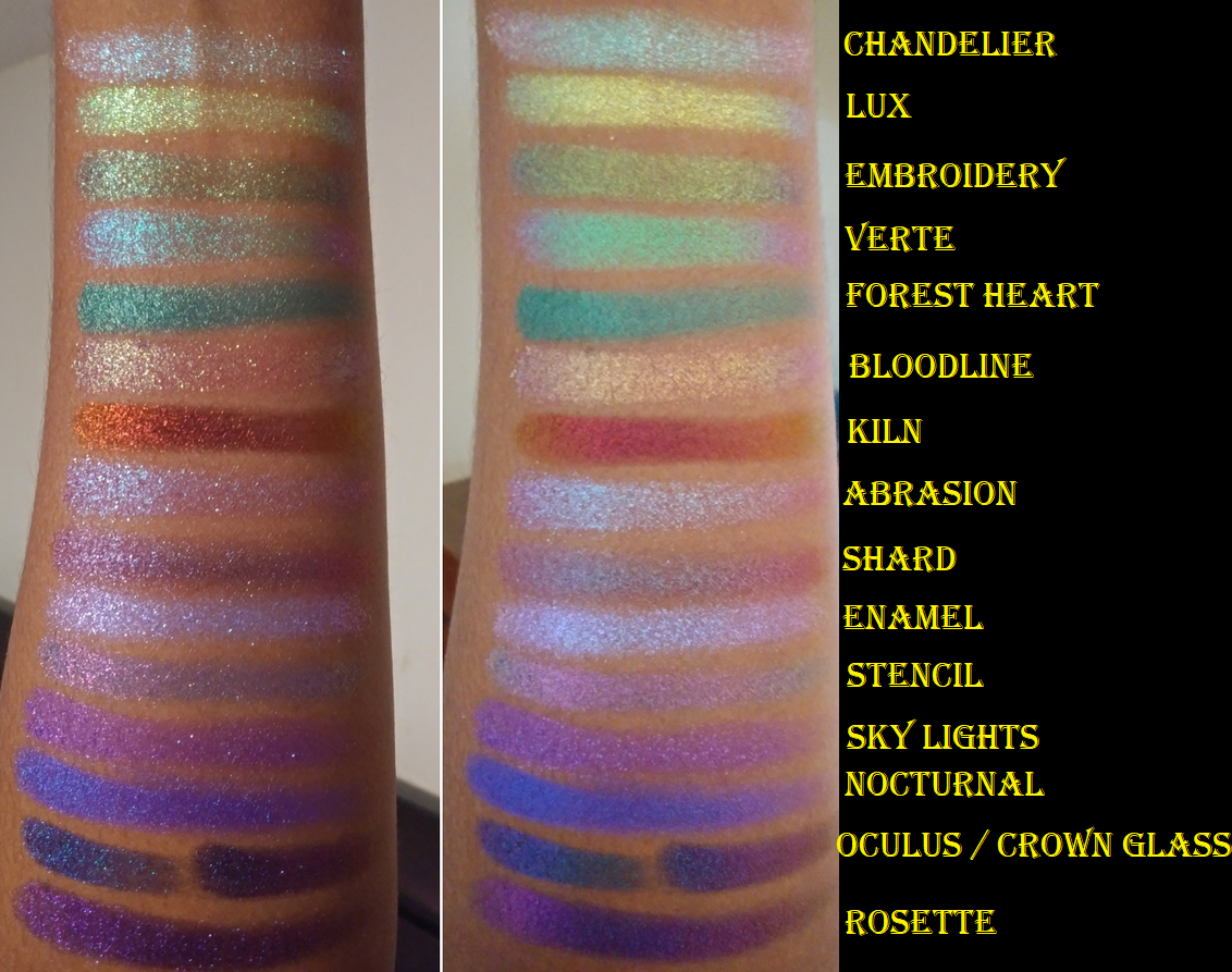
If I had to pick my personal favorite shades they would be Lux, Verte, Abrasion, Stencil, Enamel, Chandelier, Embroidery, Shard, Kiln, either Crown Glass or Oculus, Rosette, Bloodline, Sky Lights, Nocturnal, and Forest Heart.
When it comes to this brand, there really aren’t duds in terms of quality. It’s just a matter of personal preference like colors and particle sizes. I’ve been able to create some gorgeous looks even using shades that aren’t my favorites.
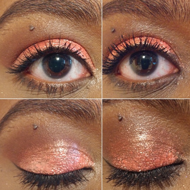
Just one shimmer shade or multichrome patted on top of an existing look can really change the outcome.
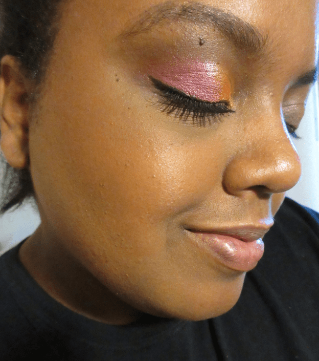
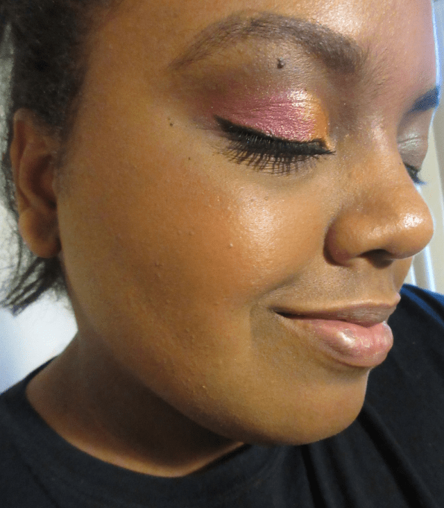
My camera always picks up the green hue in Weld even though, in person, the whole lid looks like the antique pink in the center. That’s what gave me the idea to use a different shadow to tone down the green in the photo below.
That’s everything! I know this was another incredibly long post, but I wanted to be thorough.
Thank you for reading!
-Lili ❤