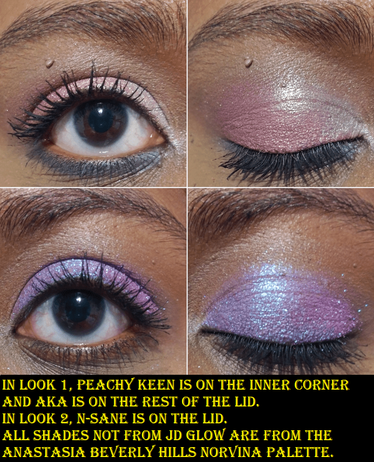
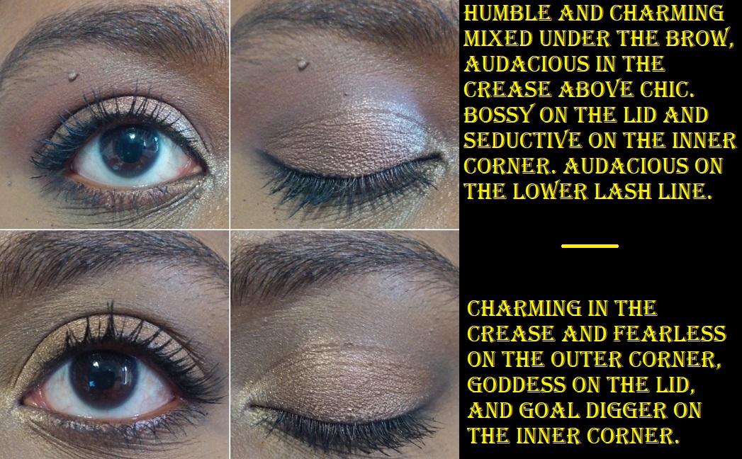
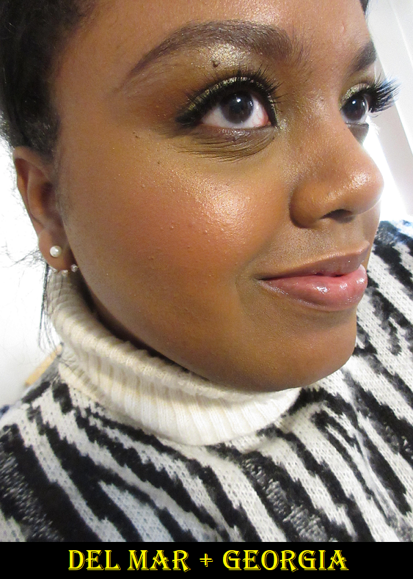
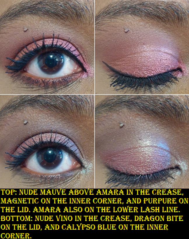
I tend to post my newest purchases far in advance on my Instagram page, so if you’ve found me through there, you may have seen some of these already. However, the majority of these shadows I’m featuring today have not been posted on this blog until now. In addition to arm swatches, I’ve also tried to do eye swatches and some finger swatches as well. Certain multichromes and duochromes look different depending on the light, so the trickiest ones to capture have the most variety of photos. Lastly, unlike my in-depth Monday reviews, the intent of the Swatchfest is to just show how these look on me. I will of course still make mentions of things that I feel are important to note, and may be different from my past reviews of these brands.
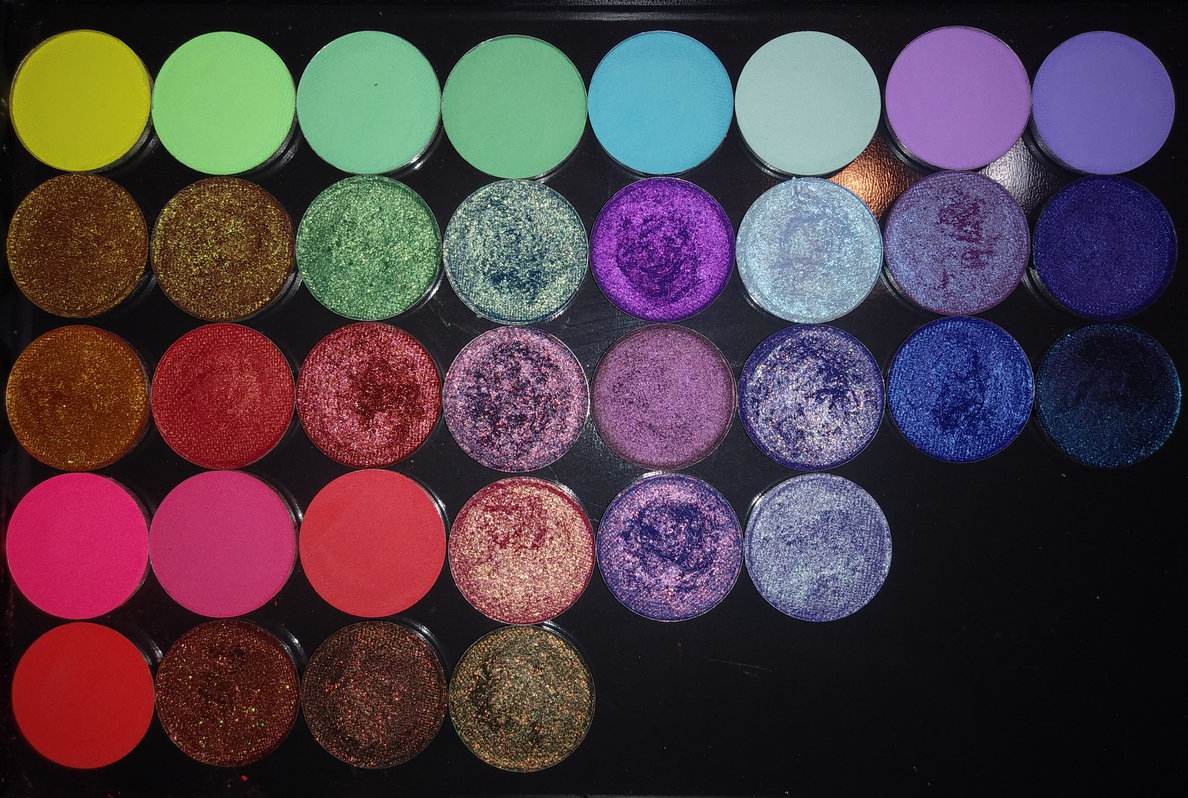
Terra Moons
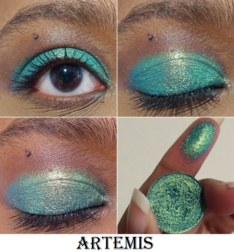
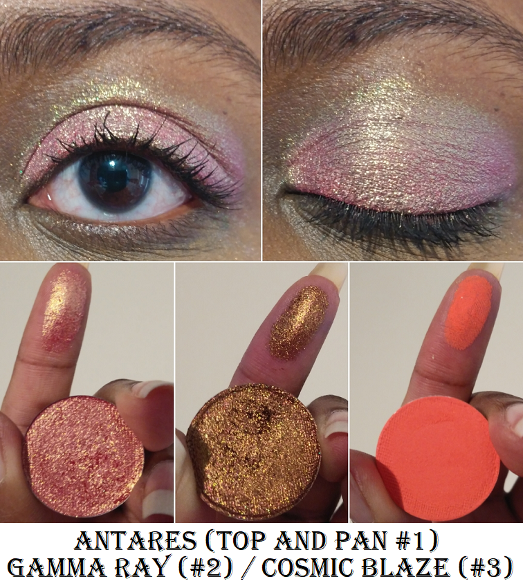
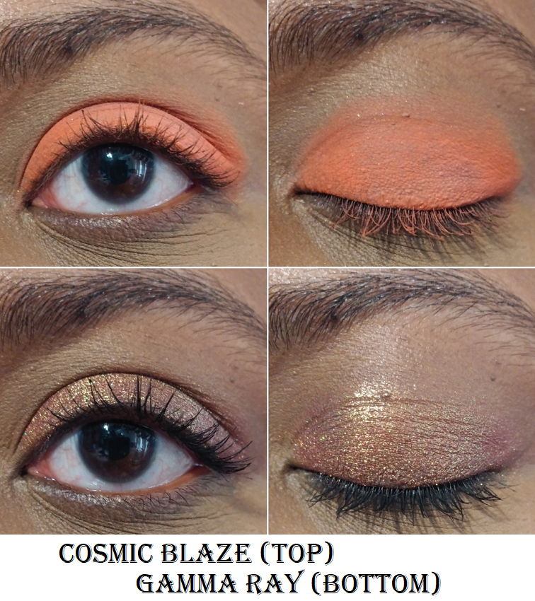
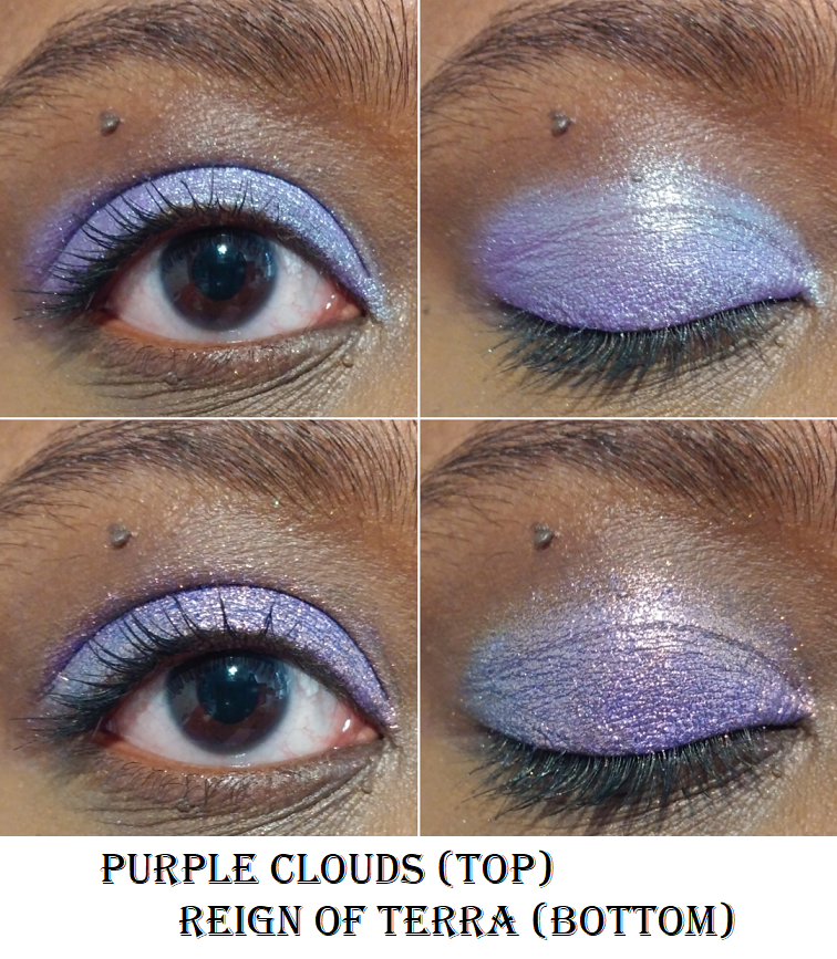
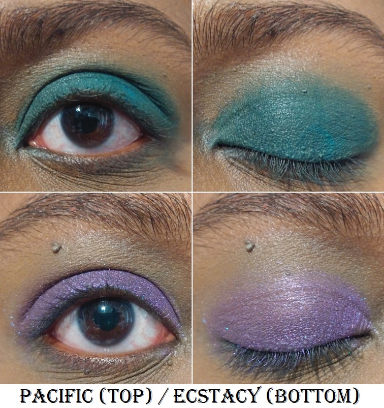
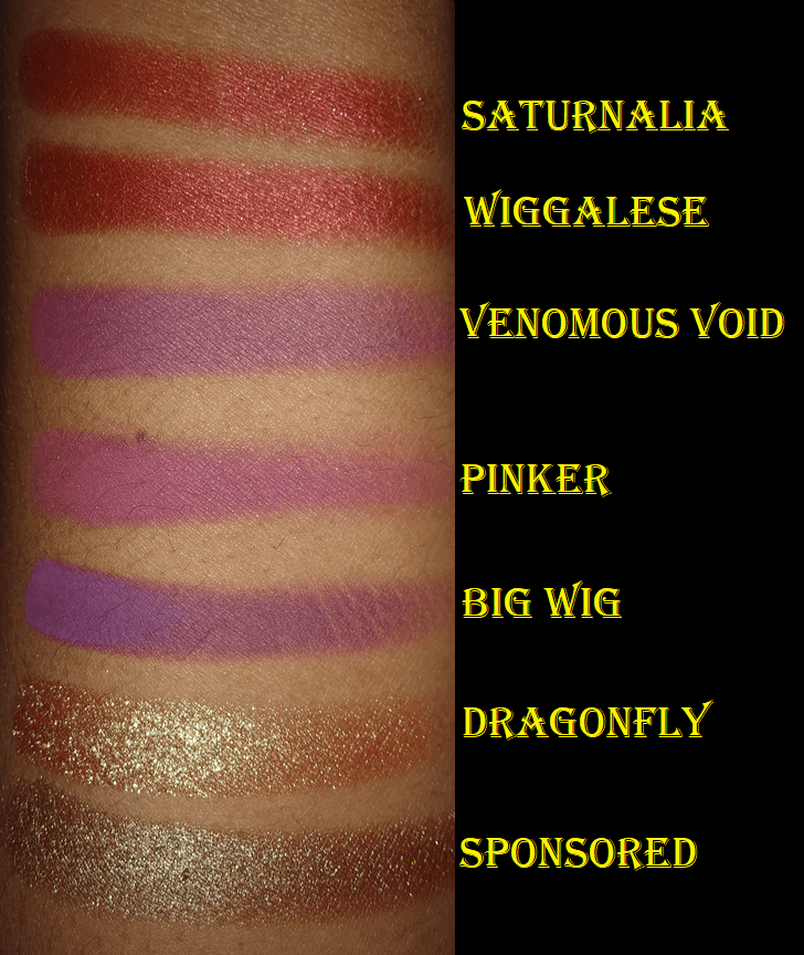
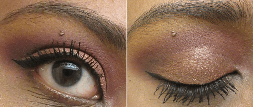
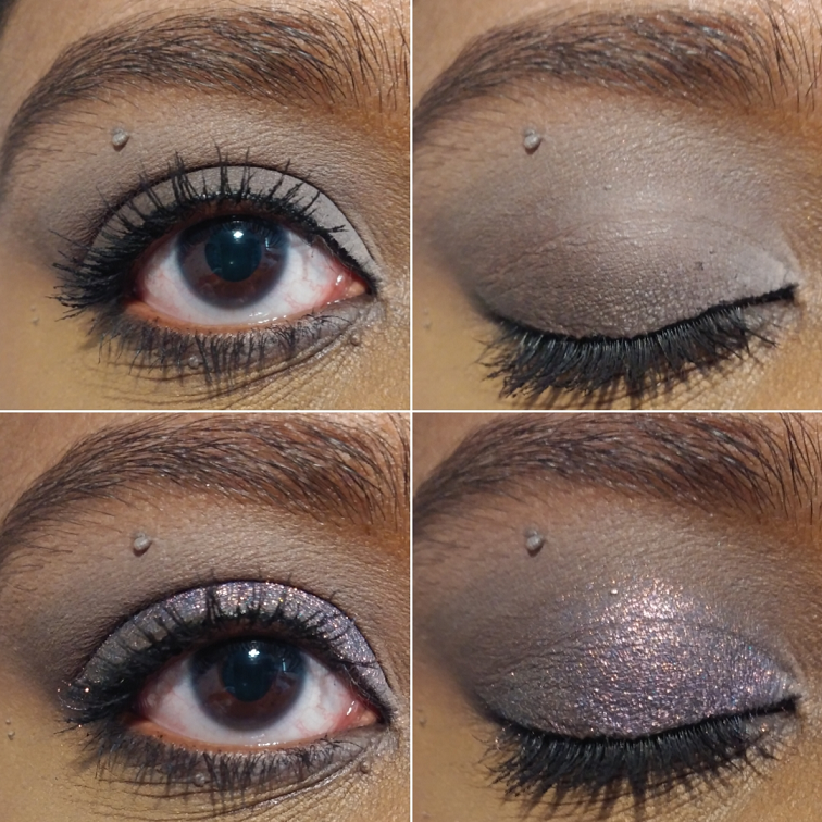
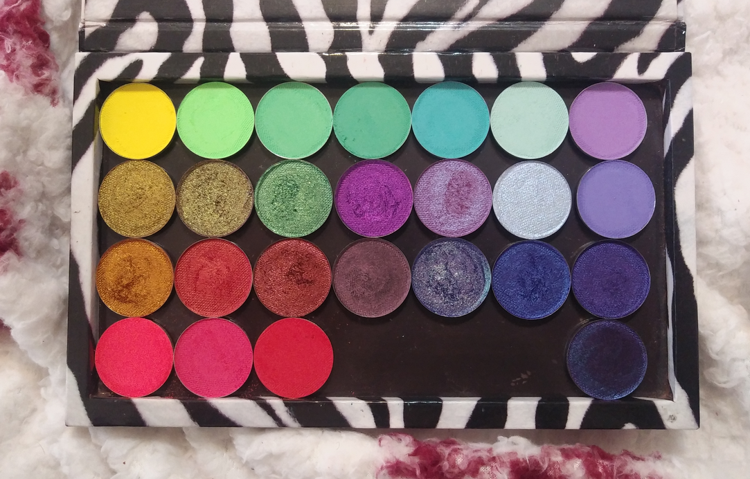
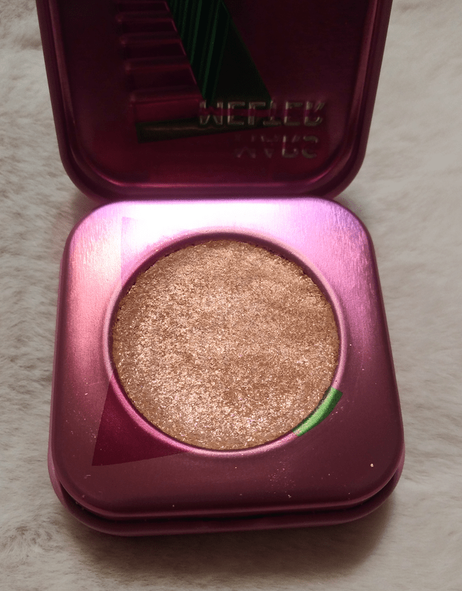
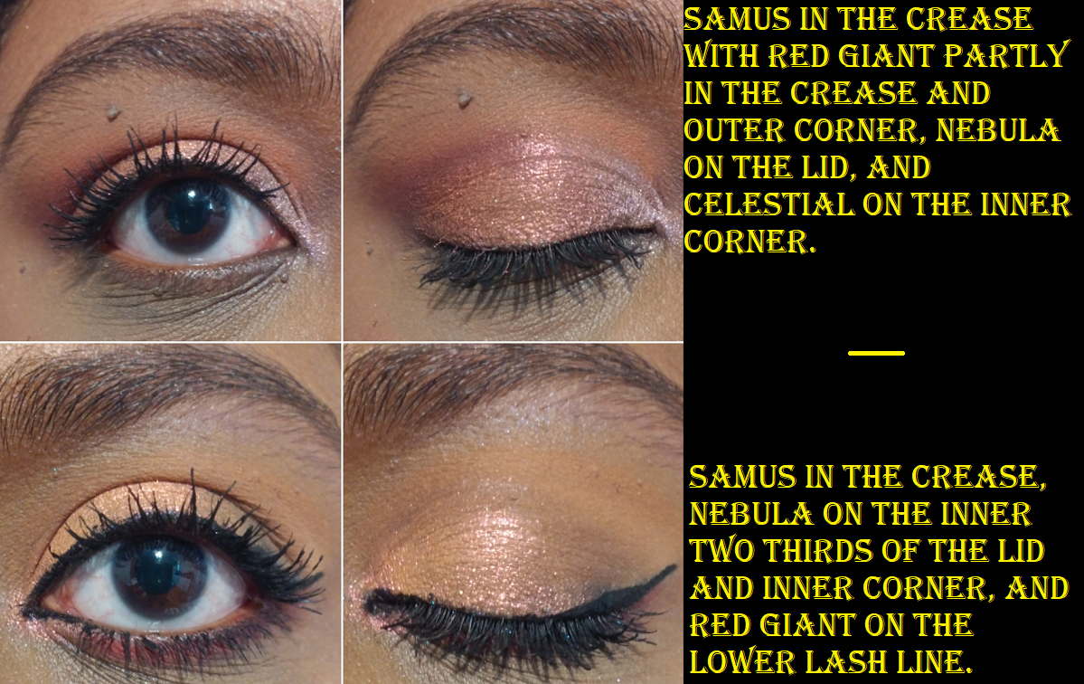
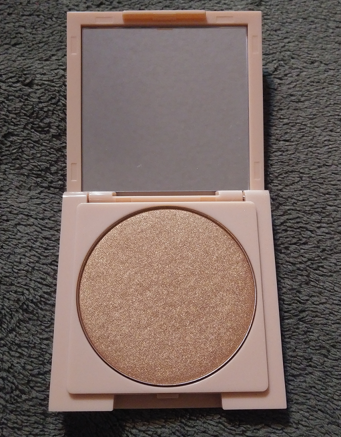
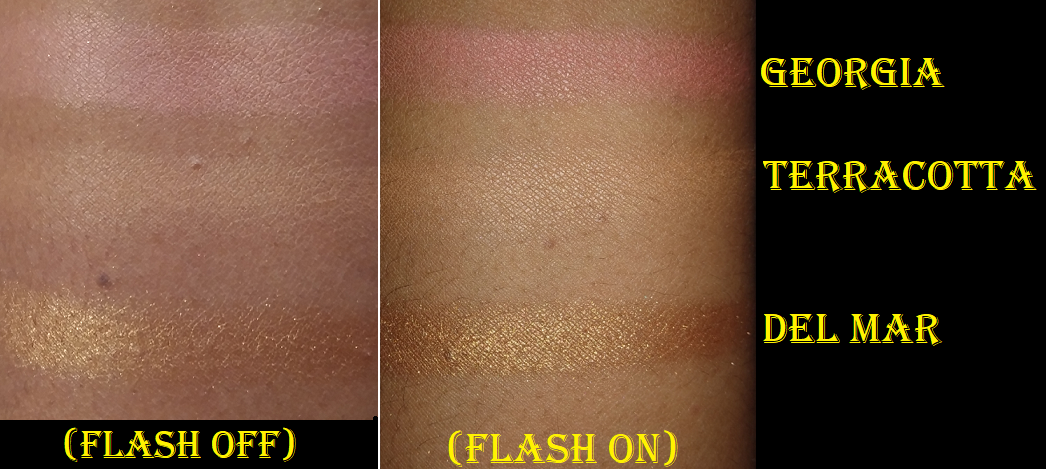
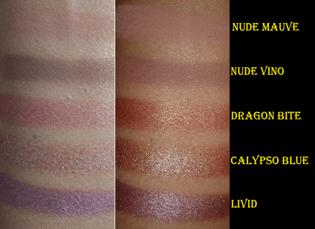
Cosmic Blaze is one more pressed neon pigment I added to my collection. Purple Clouds is a duochrome. The rest of the shadows I purchased are part of the expanded range of Chameleon shadows.
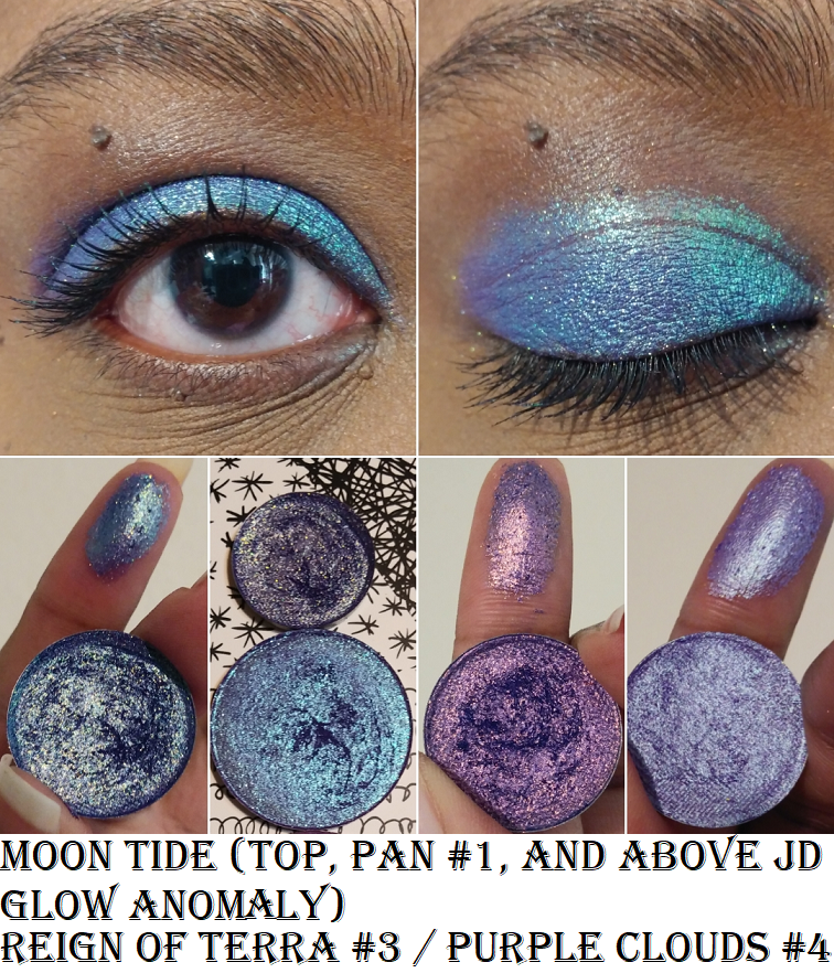
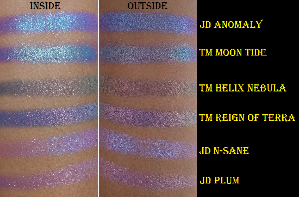
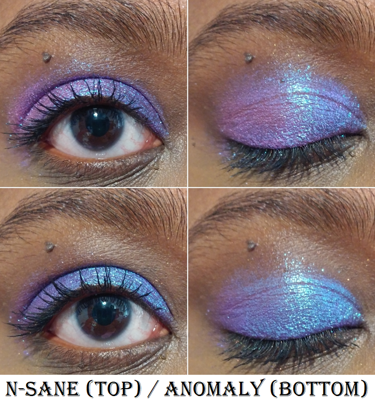
In the comment section of my Hindash review, I offered to compare a few shades in this post today. It’s interesting to see the differences between all the blue-purples. JD Glow’s Anomaly does look a lot like Terra Moons’ Moon Tide depending on the angle and the light. The base color of Anomaly leans purple with blue/aqua shimmer. The base color of Moon Tide is like a navy and purple with very similar shimmer. Moon Tide just has additional colors of shimmers as well. One doesn’t really need both, though differences are more noticeable on the eyelids.
JD Glow
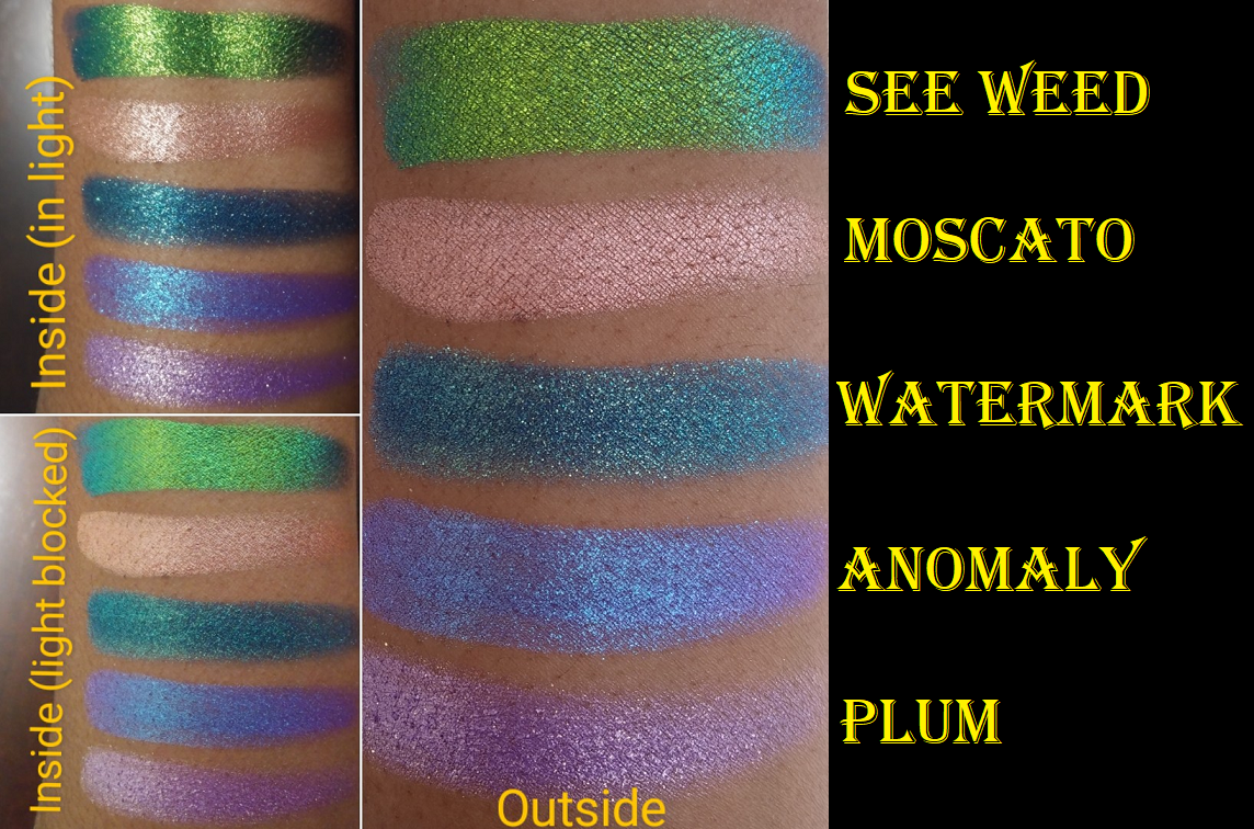
I said I wasn’t going to buy anymore JD Glow shadows, but I saw the words, “30% off sale,” and I couldn’t help myself. I always wanted the shade See Weed and even though the discount didn’t apply to this shadow, I still wanted it anyway. I’d like to say now I’m content with my JD Glow stash.
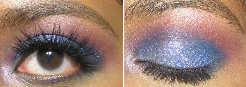
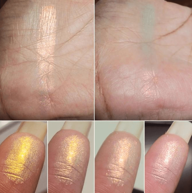
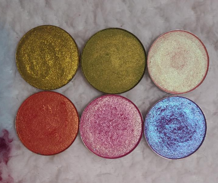
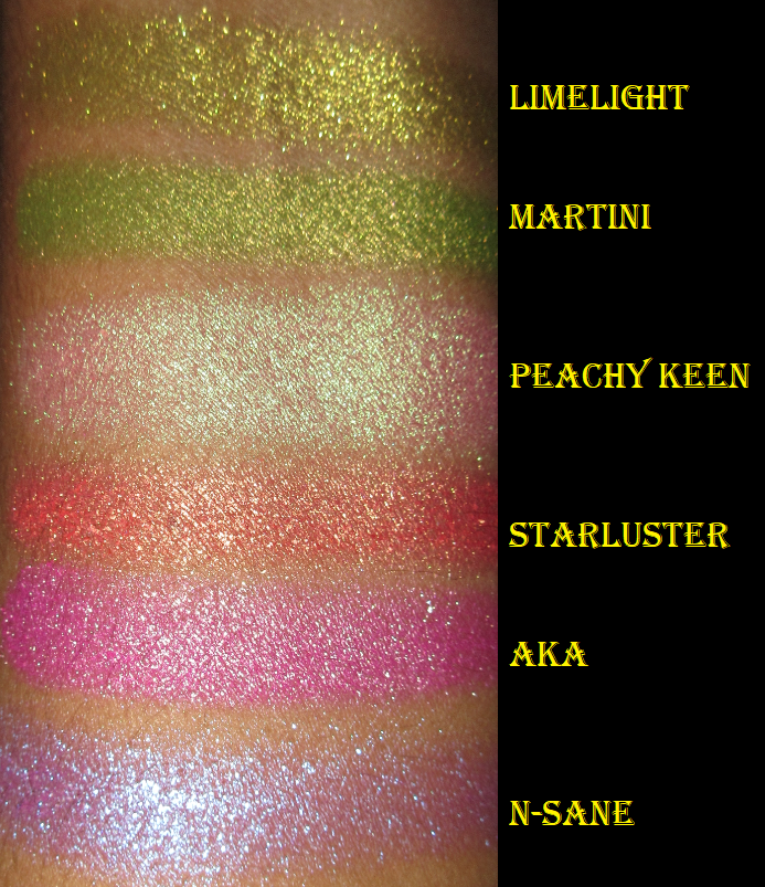
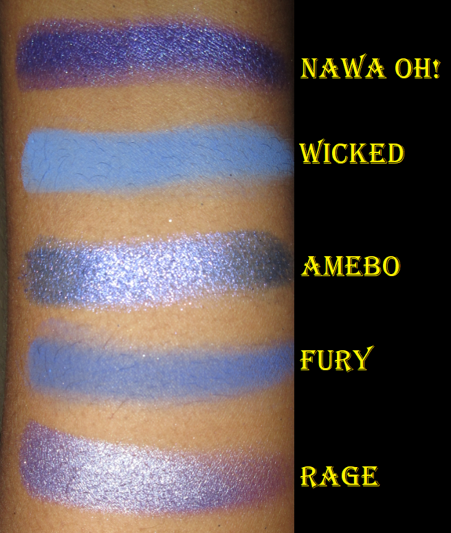
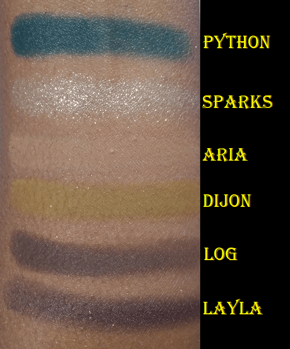
Anomaly is a Galaxy shadow. N-Sane is a Galaxy shadow I reviewed previously, but I wanted to show it again in comparison to Anomaly.
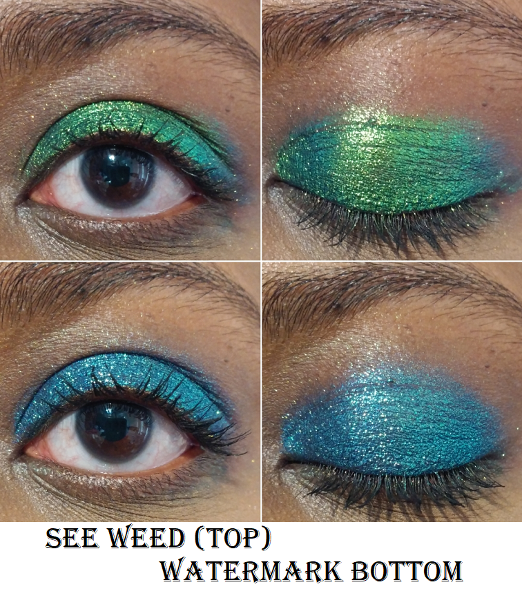
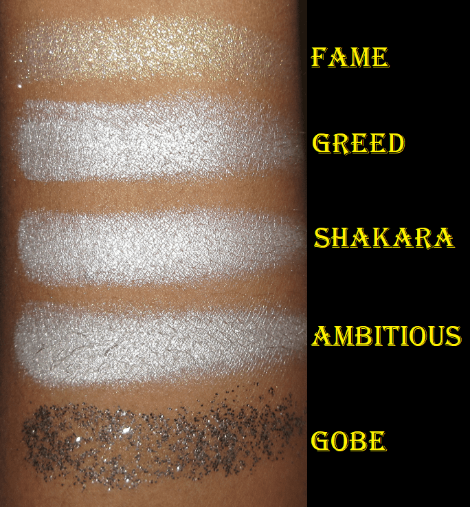
See Weed is a pressed multichrome. It also comes in a loose and liquid form too. Watermark is a Galaxy shadow.
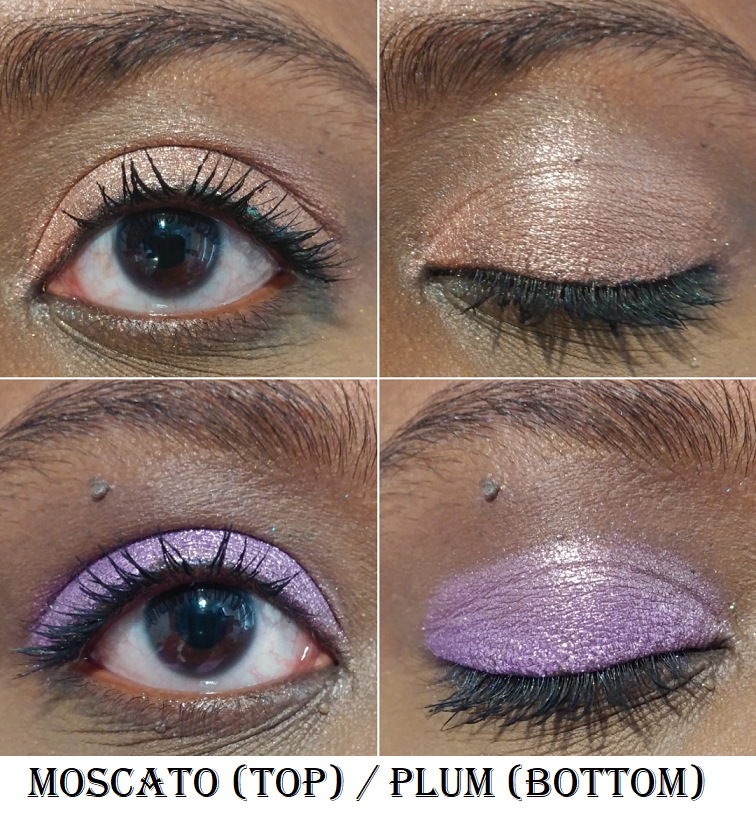
Moscato is part of the shimmer formula. Plum is a Galaxy shadow.
Devinah Cosmetics
At the time of me publishing this post, in one hour from now Devinah Cosmetics will be restocking most of their shadows and releasing their new Halo Moon Collection! I just wanted to let everyone know in case you’ve been waiting to get certain shades. I have a ton of duochromes and multichromes to go through, so I’m skipping the new launch for now.
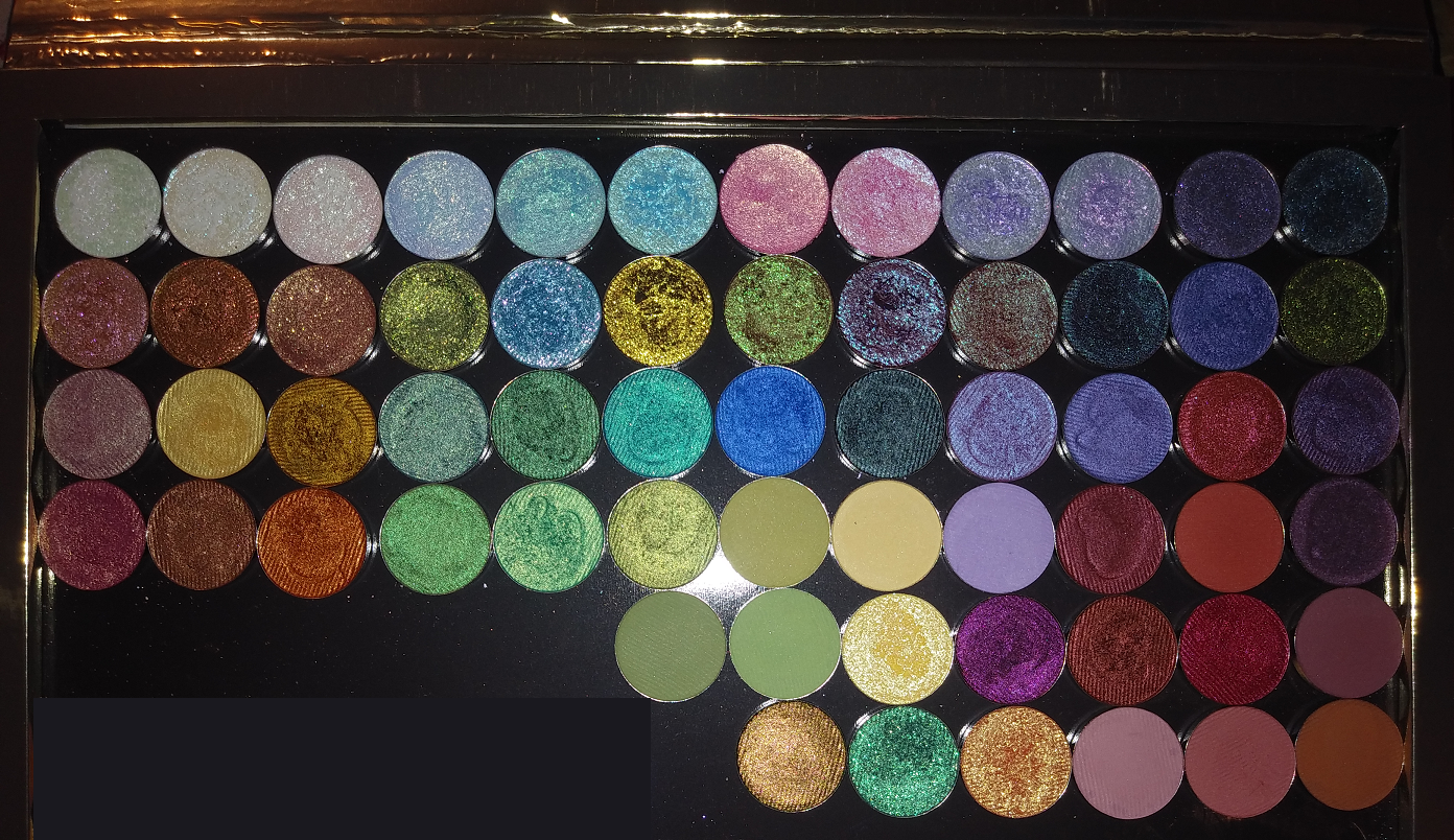
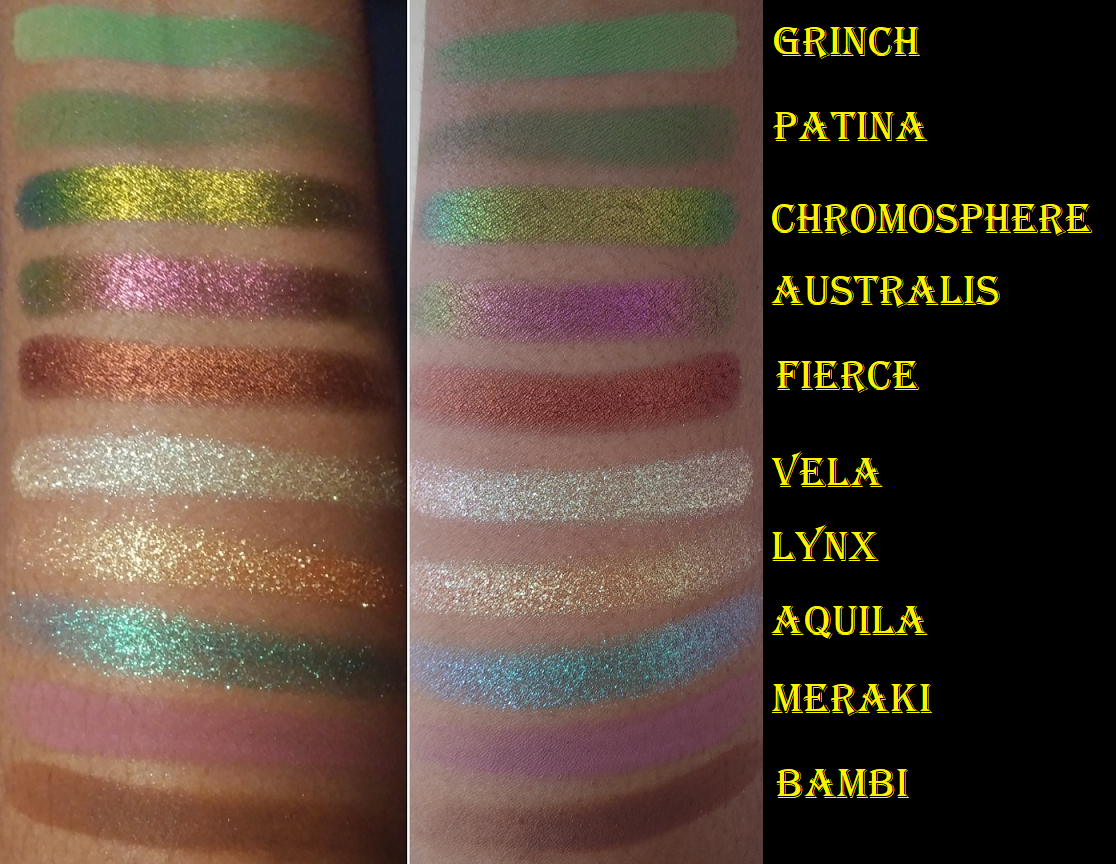
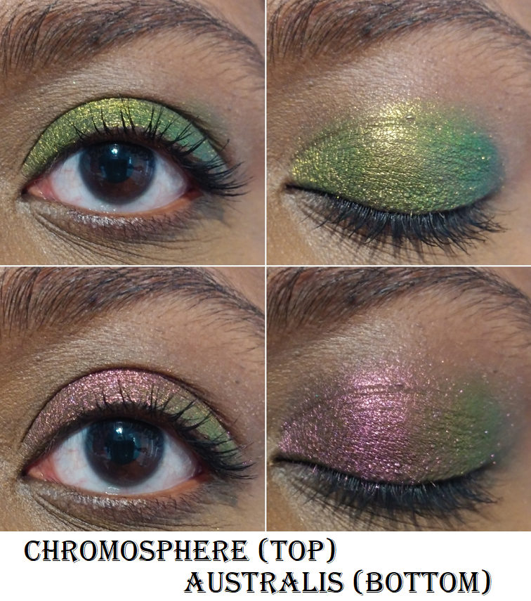
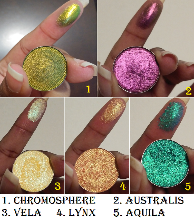
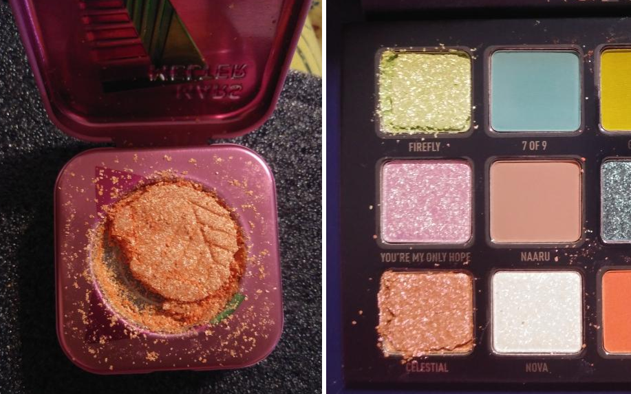
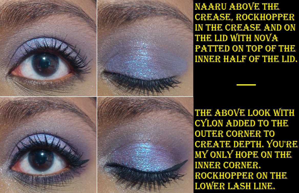
Chromosphere and Australis are Aurorae Flares, the shadows most comparable to the Clionadh Cosmetics’ Jewelled Multichromes. I like the finish of Clionadh’s a tiny bit more, but the ones from Devinah are smoother in texture and easier to apply. I was tempted to get other shades but Australis is already supposed to be a dupe of Smoulder (which I have), Phenomenon to Weathered (also have), Magnetosphere is often compared to Rosette (another I have), Exosphere is like Trefoil (which I don’t feel I need), Hemisphere to Gargoyle (I also don’t need), Thermosphere and Spire (again, already have), Borealis to Castle, and Polaris to Oculus. Oculus and Crown Glass are similar enough, so I didn’t want a third similar shade. Chromosphere is similar to Clionadh’s Patina but apparently not an exact dupe. To see these similarities in action, I will link one of Millie’s videos a.k.a. badtothebrow a.k.a. the Queen of Multichromes.
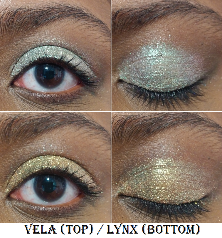
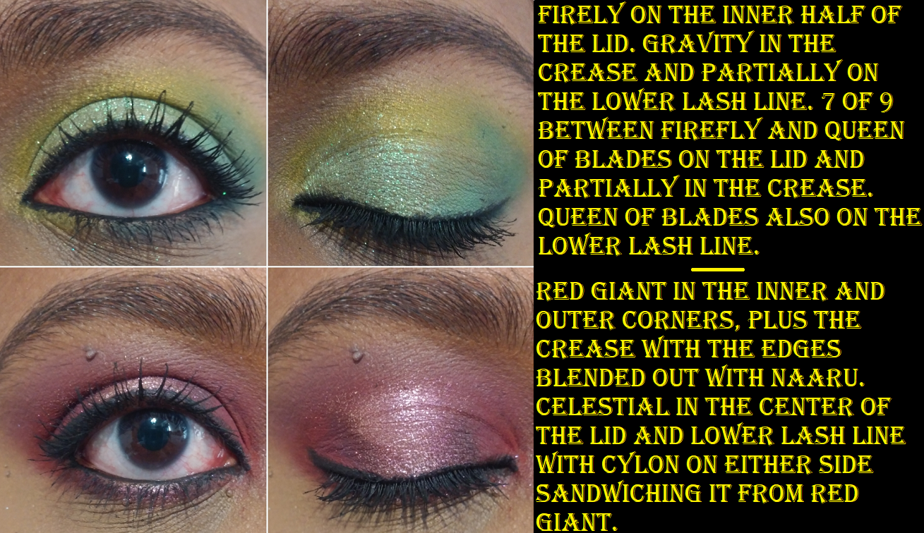
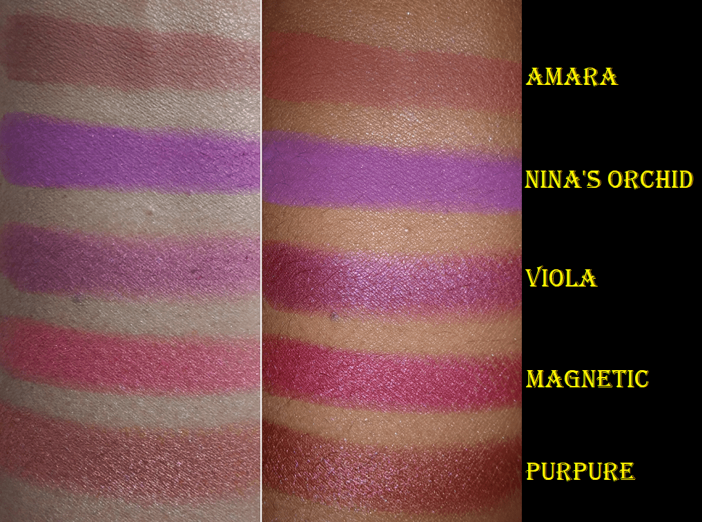
Vela and Lynx are part of the Star Chasers Collection. On my skin, Vela does not look as yellow like the pan. Lynx looks how I expected Vela to look. It’s yellow with only a hint of warm orange that I hoped for. They’re still pretty but I would have skipped buying them if I knew.
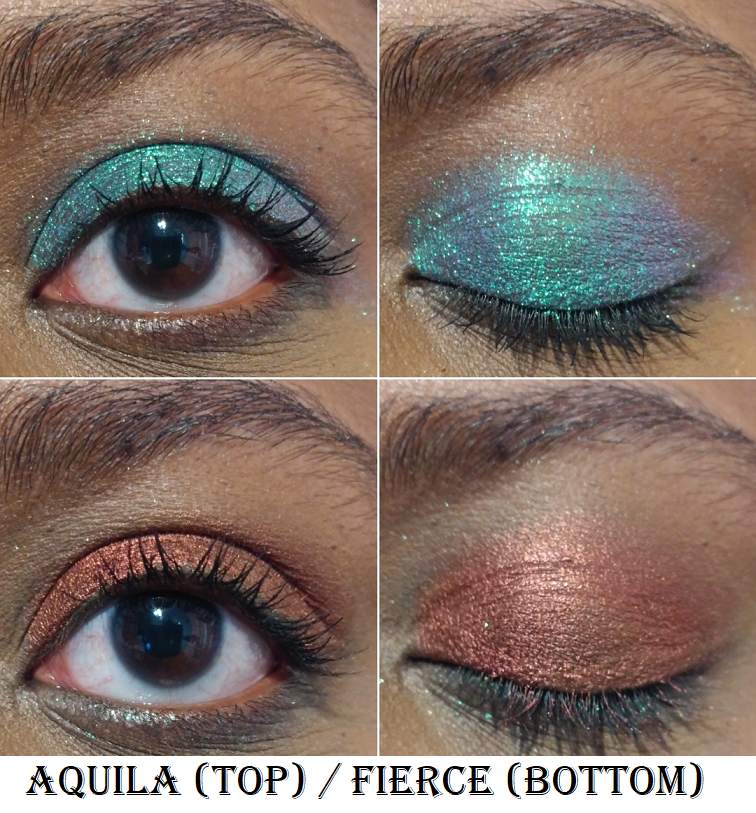
Aquila is another Star Chaser. I was a lot more impressed with this shade. It reminds me of a more sparkly and more blue version of Verte from Clionadh. Fierce is a pressed pigment that may be discontinued as I can no longer find it on the website. It is the perfect copper-red-bronze shade I’ve been wanting!
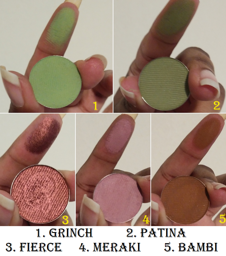
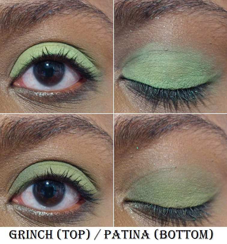
Grinch and Patina are pressed mattes.
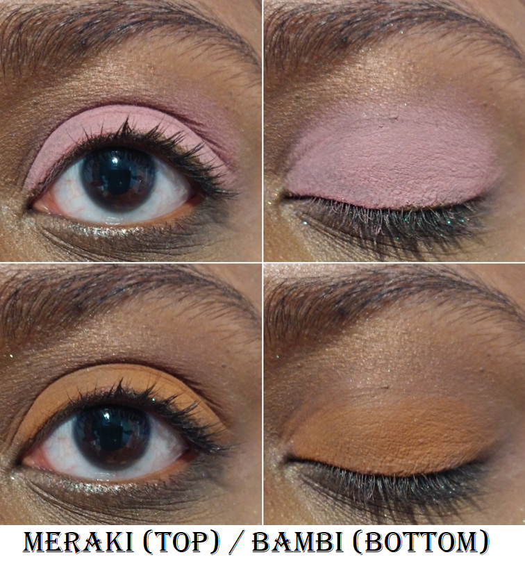
Meraki and Bambi are also pressed mattes.
Clionadh Cosmetics
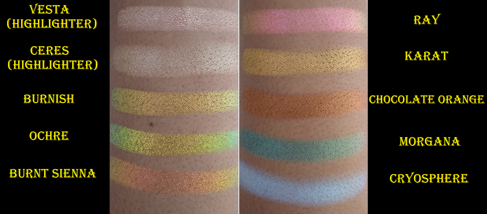
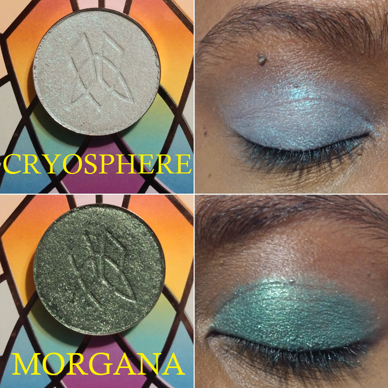
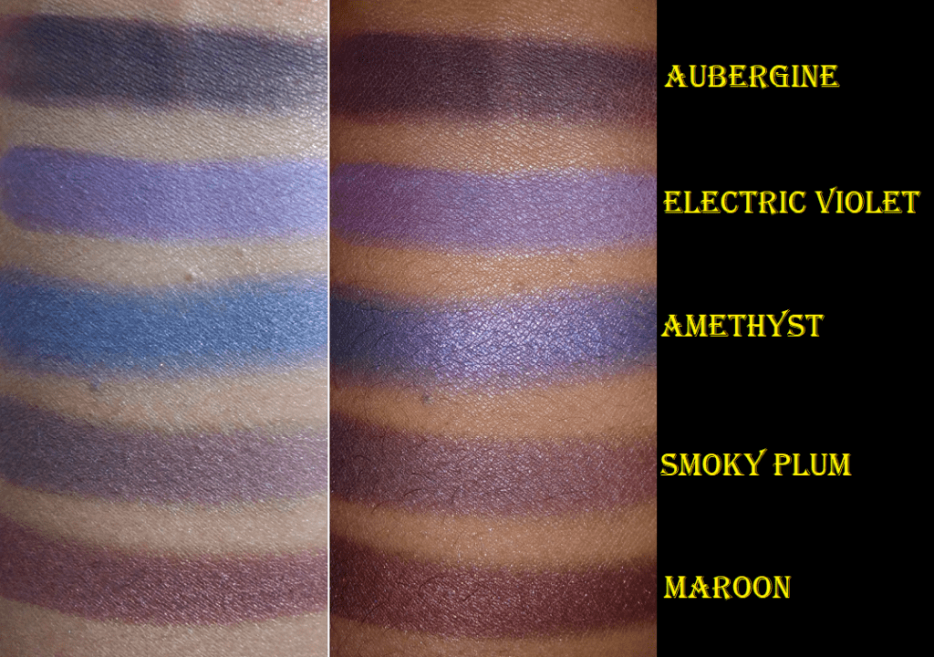
Cryosphere is from the 66.5 N collection. Morgana is from Witchcraft vs Alchemy.
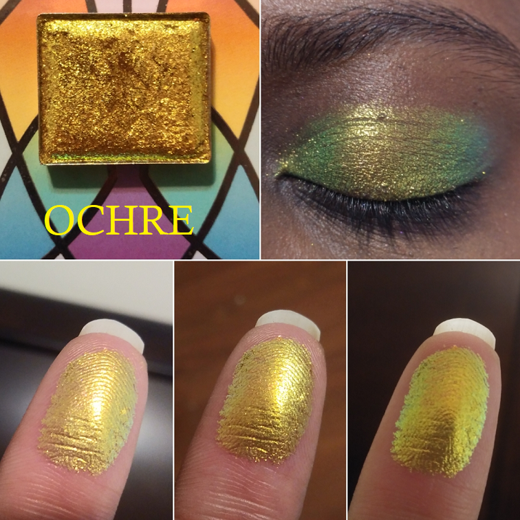
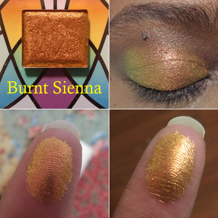
Ochre and BurntSienna are Deep Iridescent Multichromes.
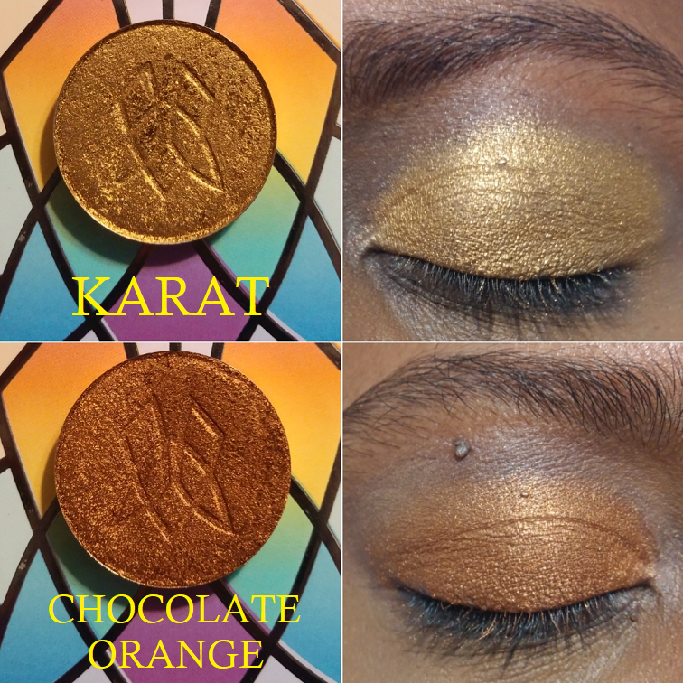
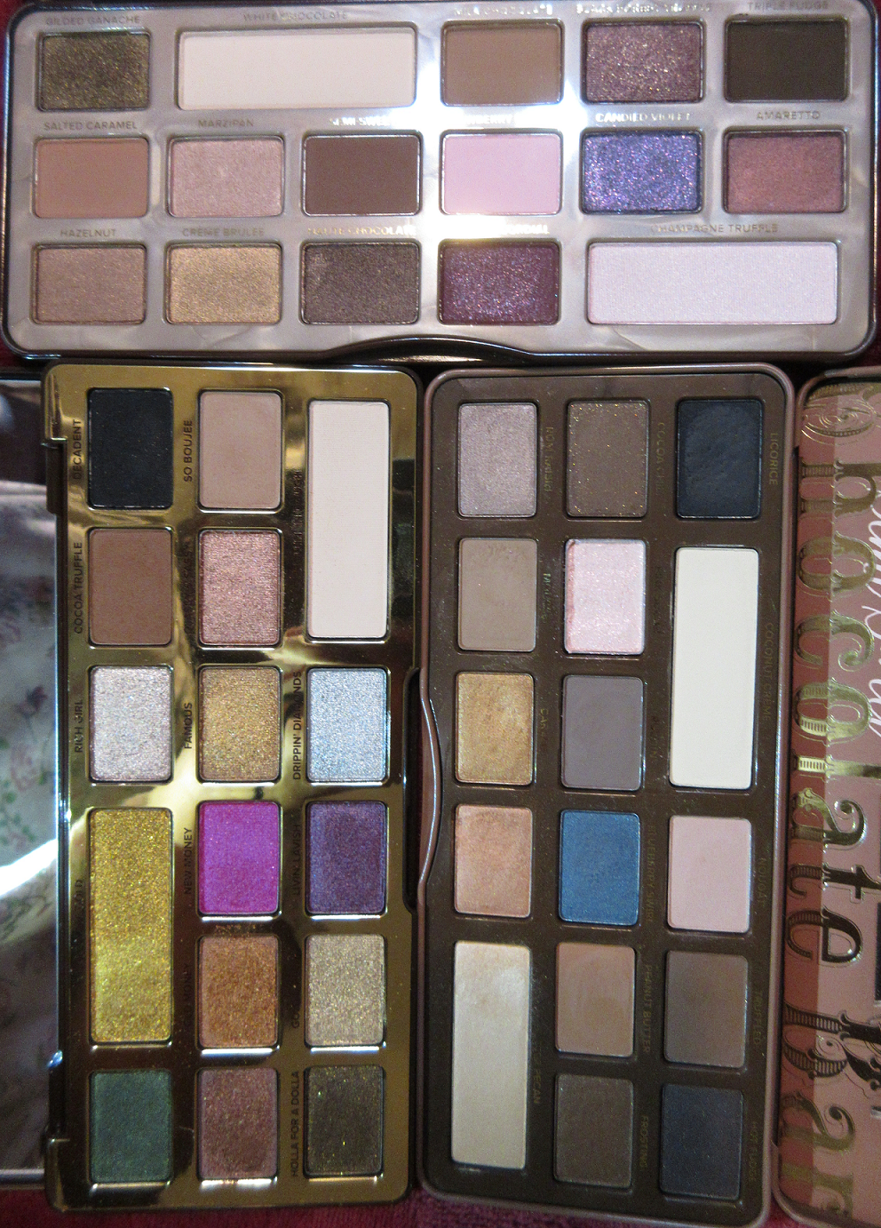
Karat and Chocolate Orange are from the Ultra Metals collection.
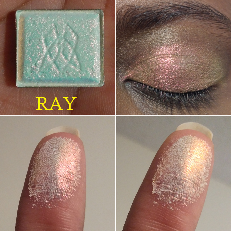
Ray is from the Series 2 of Iridescent Multichromes.
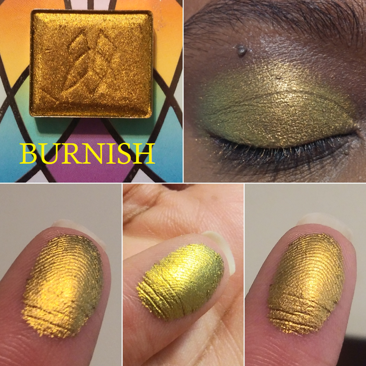
Burnish is a Jewelled Multichrome.
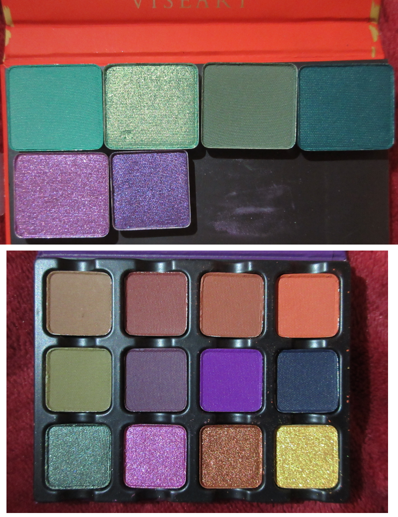
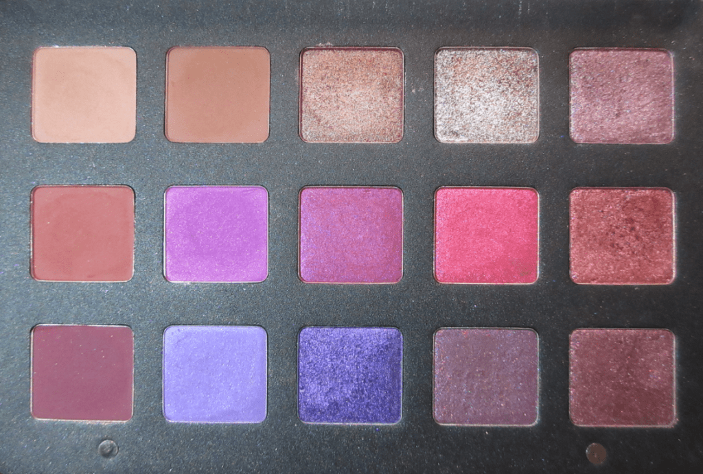
Viseart
Viseart had a spring sale, so I purchased directly from their website. It took nearly a month to arrive and one item was declared as sold out a week after I purchased it, so I’m not sure if they were overselling. It’s also a bit strange to me that they had everything available for purchase as single shadows, but after the sale they wiped everything. Muse Beauty Pro is once again the only place to buy Viseart singles as an authorized seller.
In addition to single shadows, I bought the Dark Edit Palette as a replacement for the shadows in my original Dark Mattes palette which were very old and not performing as well. I haven’t worn any of them on my eyes yet.
The last thing I bought was the BoxyCharm x Viseart version of the Neutral Matte palette because despite it not being my kind of color story, I could never shake my desire for this. It came in the old packaging (with the square edges). I had empty Viseart palettes I wasn’t using, so I transferred them into the nicer custom palette with the rounded edges. I cracked most of the shadows in the process, but I was able to save them as seen in the photo below!
Some of the browns look straight up grey, which I was not expecting. This isn’t a case of the shades getting mixed up together either. They just pull very cool and gray on me. I’ve started to appreciate greys a little more, but I don’t think I’ll get as much use out of this than I hoped. At least I can finally stop pining for it! Also, Viseart matte swatches look terrible, but I’ve tried these on the eyes and can confirm they blend far better than they look.
Anyway, those are all the swatches for today! The next post will be Monday as usual!
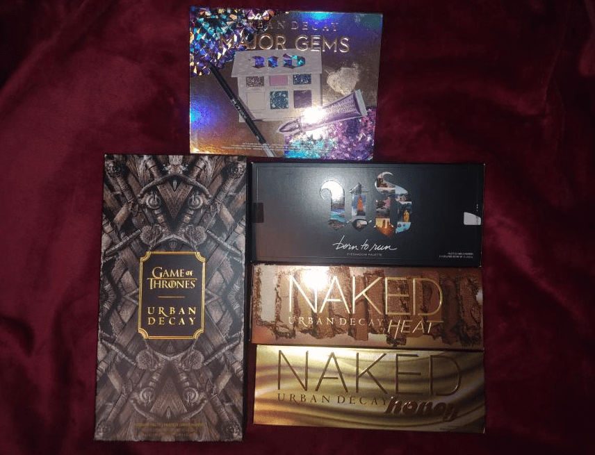
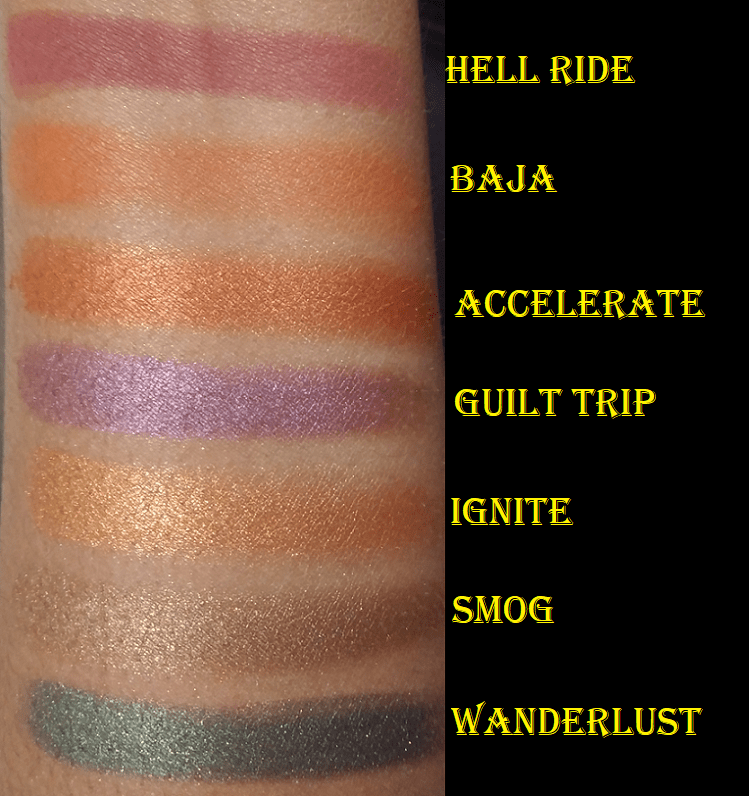
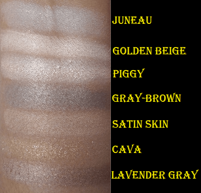
Urban Decay and Anastasia Beverly Hills are two brands whose eyeshadow palettes I continually buy but either only use a handful of times or never even swatch! And aside from the Too Faced Semi-Sweet Chocolate Bar palette, every Too Faced palette I’ve purchased afterwards has been neglected too! Today, I’ll be posting swatches of all the palettes I have left from those three brands. At one time I owned more than these, but they were either partially depotted, sold, or are too old to use. Those retired products that I wanted to keep for collector purposes are stored away and will not be featured here.
URBAN DECAY
With Urban Decay Naked palettes, I always want them badly and but then when I have them in my hand I just cannot bring myself to use them. I don’t know why! That’s how I’ve ended up giving away two of the original Naked palettes and the Naked Smokey.
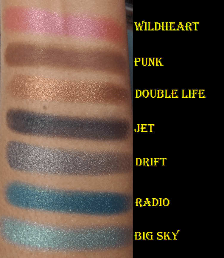
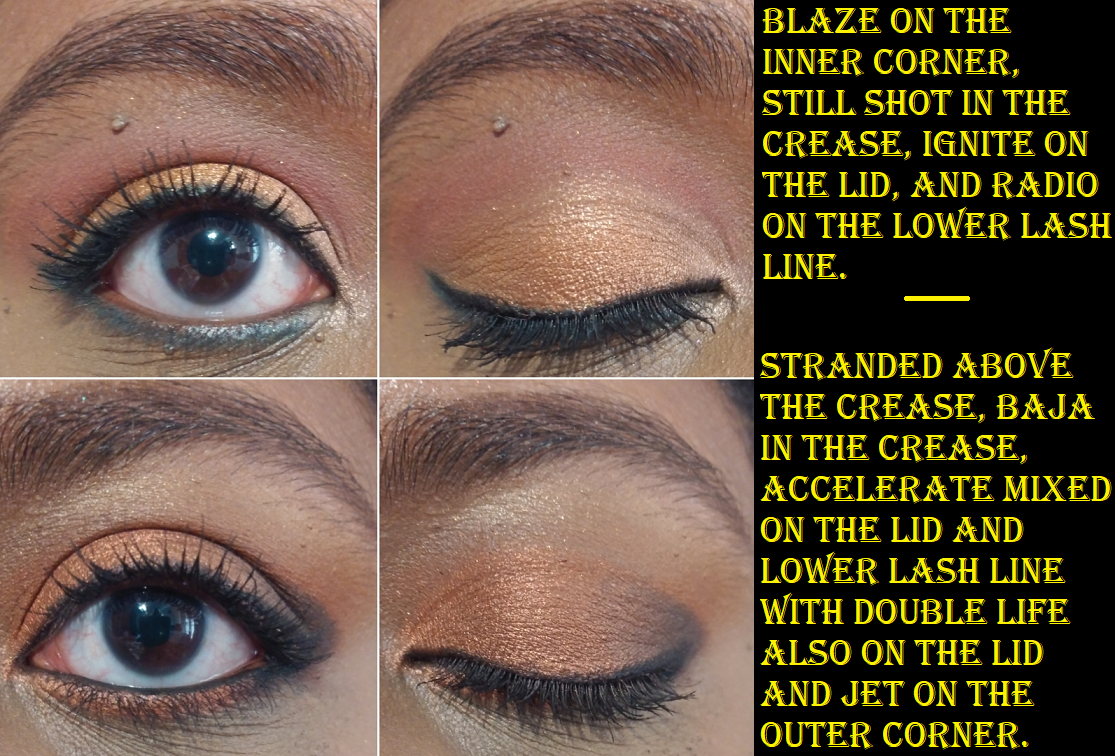
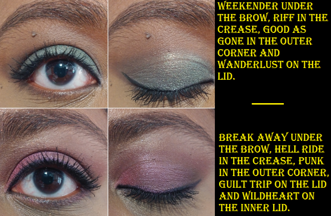
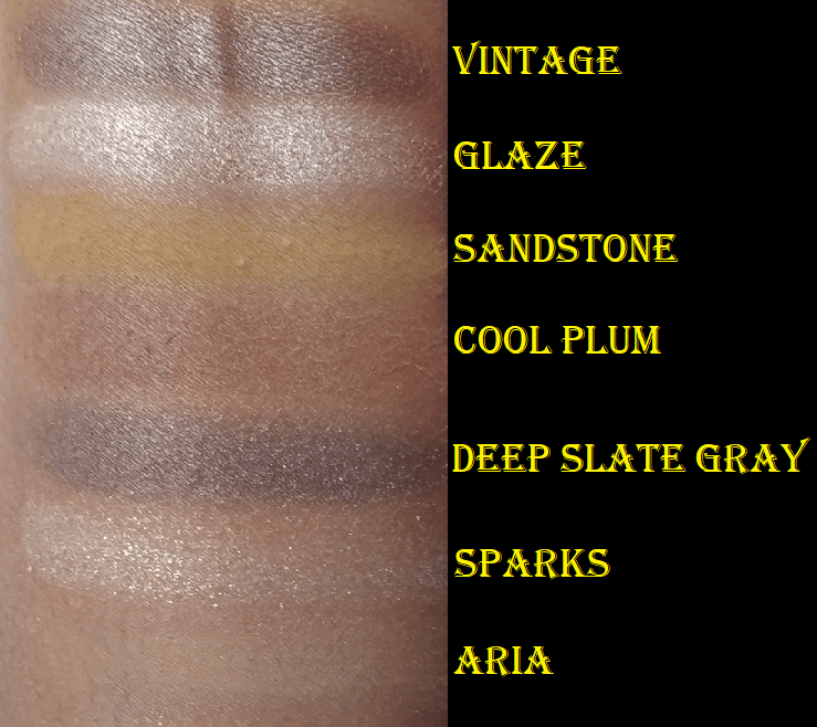
Urban Decay Born to Run
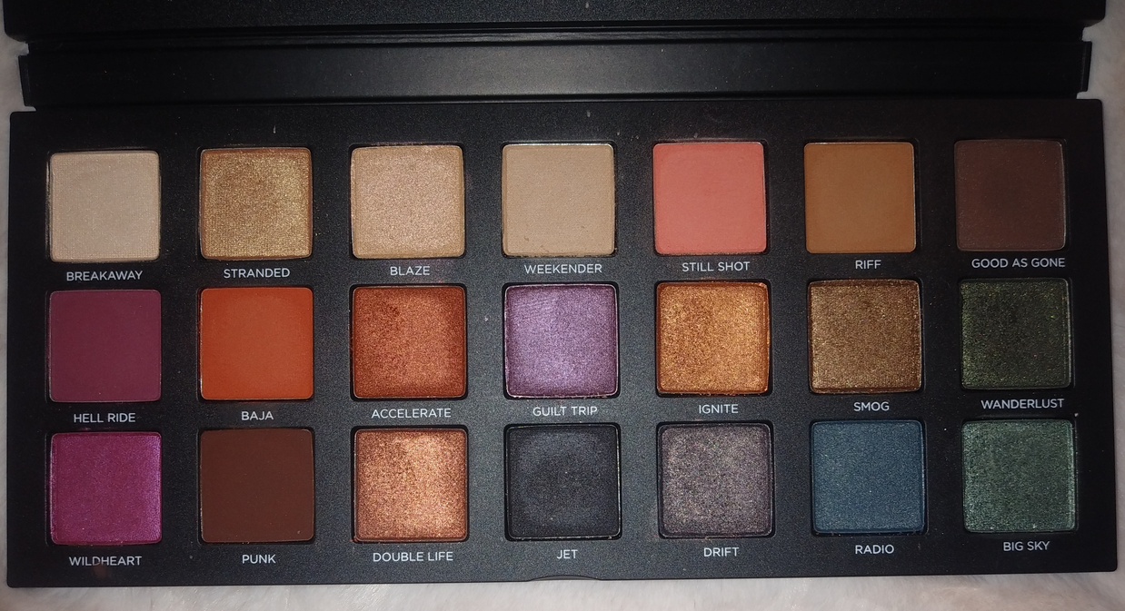
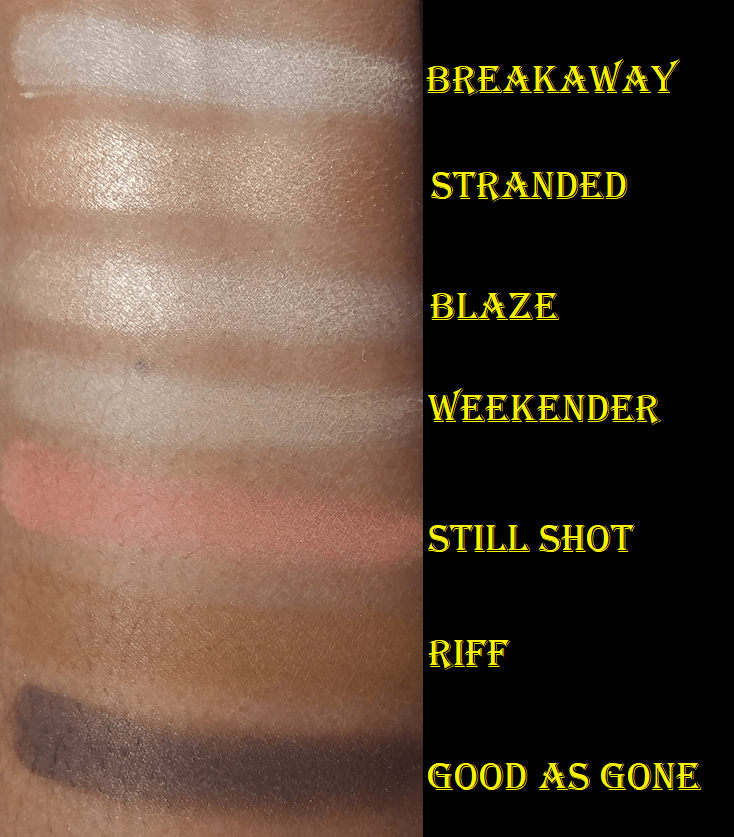
This is one of the most well rounded palettes I own. It has light, medium, and deep depths of shades, warm and cool options, neutrals and colorful shades, mattes and shimmers/satins. I admire the versatility of this palette and the color story. Born to Run accomplished the goal as being a near perfect palette for those who are busy or traveling who want a lot of options in one palette. Born to Run feels lighter than the Naked palettes and it’s nice and compact. The shadows blend well and I can create a look fairly quickly. I get a decent amount of pigmentation with the first dip or two into the eyeshadow pans, but the shadows can be built up even more. Most looks I come up with are on the softer side, but Jet can give me more drama and smoke to a look. I have so many nice things to say about this, yet I have no explanation for why I’ve only used this palette one time prior to working on this post! As to why I don’t use it more often now, it’s because I’ve gotten way more into sparkly shimmers in the past year or so. Satins used to be my favorite formula in the beginning of my makeup journey, which this palette has plenty of, but now I always want a high impact shimmer on my lids. So, for my makeup style now, I prefer to use these shadows for everything else and then pop a multichrome on the lid or add another brand’s topper shade to give the look some oomph. Now that I’ve really given this palette a chance, I expect to use it more often.
I’ve seen this palette go on sale for half price several times (which is the price I bought mine for), but I think it’s actually worth the full price if this color story speaks to you and you don’t need impactful shimmers.
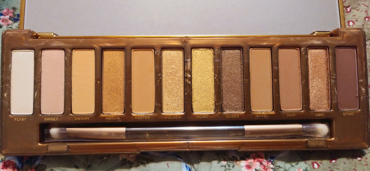
Urban Decay Naked Honey
I bought this palette and the ABH Jackie Aina palette on November 1st 2019 and both of them remained completely unused and even unswatched until I began this post! I wanted the Naked Honey for the packaging and at the time this was extremely hyped as one of the best Naked palettes since the original three. Plus, I was obsessed with the Queen shade which looked like it had a gorgeous olive green tinge to it in so many of the swatch photos I saw online. So, for those reasons, I bought this palette. It’s ironic that the green tinge in Queen is absolutely not visible on my skin. The outer packaging I’d been so in love with looked more dull in person than I expected. At the time this was released, monochromatic palettes were gaining popularity and I thought all these shades looked so beautiful, but I didn’t take into account the lack of depth and the fact that these aren’t different enough to really be worth me buying this at full price.
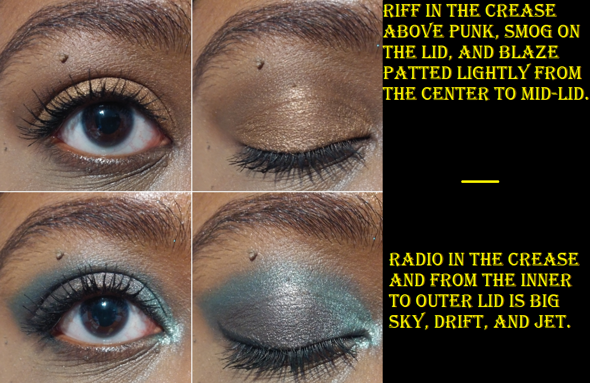
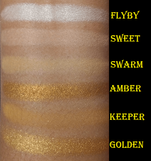
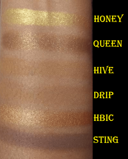
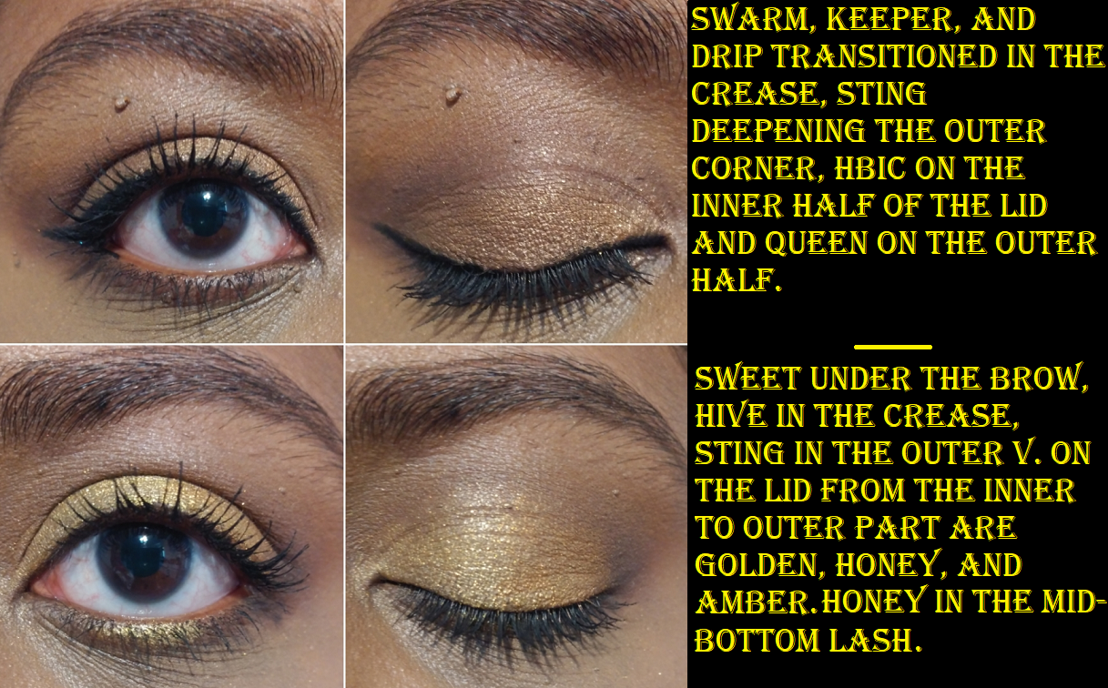
Sweet is the type of pale shade with a pink undertone I generally ignore in palettes unless it’s my only light/blending/highlighting shade option. Swarm will take the job of Sweet since it’s light enough and warmer, but even though it looks different in swatches from Keeper, on my eyes there is very little distinction between Swarm and Keeper. I could use them interchangeably. In swatches, it’s easy to see how Hive and Drip look like the same shade on me, with Hive just being a touch more yellow, though they’re both clearly warm toned browns. I believe these are intended to be midtone shades to add depth for those with skin tones lighter than mine, and I say this because these are too light to add any depth for my eyeshadow look. I could use these as brow bone transition shades because they’re still not far off from Swarm and Keeper. Sting is the only shade that I can use to create some shape but it’s still not dark enough for my taste. It’s darker than my typical mid-tone shade, but it’s also far from being as deepening of a shade as I want. So, I’ve come to realize that this palette doesn’t have as nice of a gradient for my skin tone as it would be for someone pale to maybe even light caramel. The mattes aren’t as pigmented as the Born to Run, but they’re still at a respectable quality and they’re blendable. I enjoyed using them, but to get the kind of look I prefer, I would basically have to use some variation of Swarm-Hive-Sting or Keeper-Sting every time. Regardless of the light to dark mattes I used, it would essentially turn out the same every time with just a different lid shade.
Speaking of lid shades, the shimmers are easy to differentiate in larger areas like a swatch, but if I actually use them next to each other on my lid, it’s hard to see a difference. In this situation, I actually don’t mind that because I usually have a maximum of two shimmers on lid: the main color and the highlighting color. I appreciate that these shades are legitimate shimmers and not satins like the Born to Run, but they still don’t have the full impact that I prefer, so I would only want to use one shimmer from this palette and supplement it by using another brand’s shadow as the highlighting shimmer anyway. I can use Golden next to Amber when I want a light-orange gold to transition into a more orange gold on the lid. I can use Honey when I want a yellow gold, Queen when I want a golden brown, or HBIC when I want a lighter golden brown than Queen.
Overall, this is a nice palette with quality that isn’t mind blowing but it’s at least good. I’d rate it 7 out of 10 (or 6 out of 10 if we take my personal preferences into account). This palette essentially gives me different tones of the same look. That was entirely my fault for not paying close enough attention to the color story.
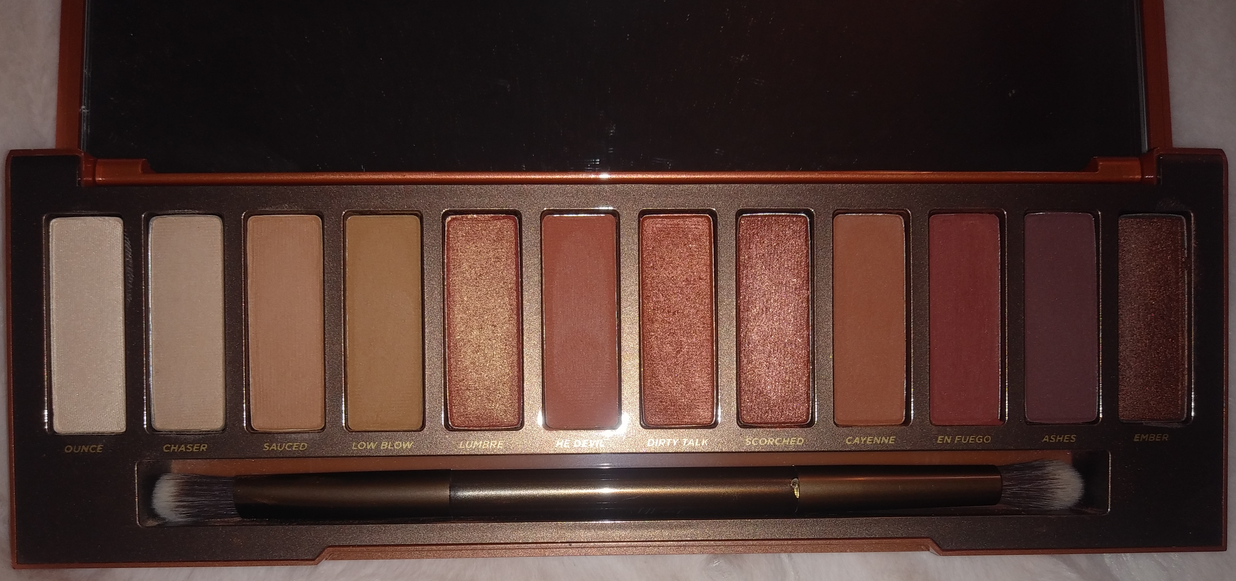
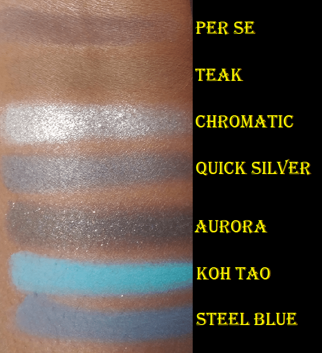
Urban Decay Naked Heat
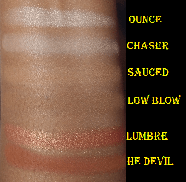
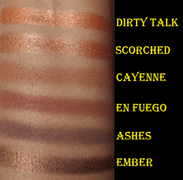
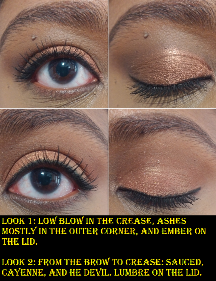
This is one palette I realized fairly quickly was giving me too similar of looks, but I held onto it far too long. I’m actually shocked this palette is still in circulation because I haven’t heard anyone talk about this in literal years. As shown in the swatches, there are many similar colors. Low Blow is my favorite of the first four shades to use as my starting color. Although I usually like an orange crease in a shade like He Devil, I prefer to use Cayenne. I’m limited on deepening shades, so En Fuego is for more colorful warm looks and Ashes for more neutral looks. However, I wish both of those were darker. For my shimmery lid shade, I never want to reach for Dirty Talk or Scorched while Lumbre is in this palette. That golden orange is my kind of shade, though it’s still not as vibrant as I wish. Wetting my brush and/or using my finger to apply or using glitter primer only goes so far. It really just comes down to the ingredient list with the type of shimmers Urban Decay uses (or doesn’t use). I do like Ember. It’s a rich warm brown with enough bronze shimmer to keep it from looking flat.
I’ve wanted to sell this palette for so long but the going rate for this is so low that I decided to just keep it. However, I’m trying to condense my collection to just things I love and will use. I think this is a pretty palette but I’ve only used it a handful of times over the years and although the quality is nice, I have a ton of shades like these but in even better formulas, so I will not be keeping this for much longer if I can help it.
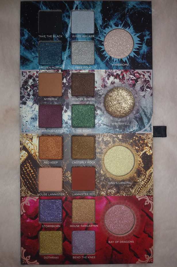
Urban Decay Game of Thrones Palette (DISCONTINUED)
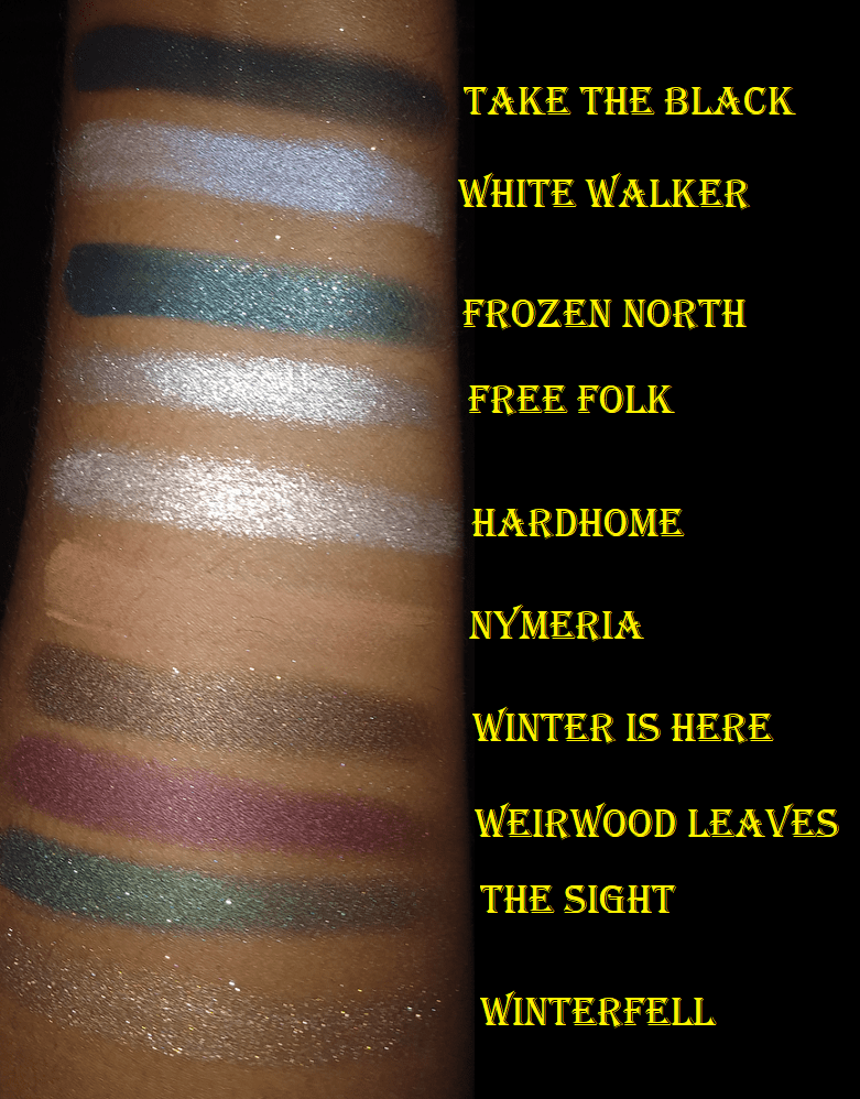
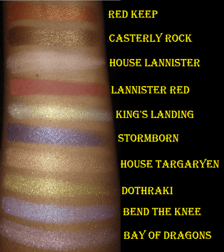
I’m a major fan of Game of Thrones, minus the 8th season that I pretend doesn’t exist. At the time that this collection was released, I was thoroughly unimpressed by the color story of the palette and the bulky packaging. So, I skipped buying it until it came to Hautelook six months later at the $29 price instead of the original $65. The Winterfell shade was broken and created quite the mess inside the slot where the palette comes out, but I was able to save enough of it to repress and cleaned out the inner portion so the remnants of that shimmer wouldn’t continually mix with the other shades.
I find it so funny that I didn’t use this palette and continued to think the color story was ugly until I finally took it off display to use for this blog post. I looked at it for the first time in over a year and it was as if I was seeing it for the first time. The shades are beautiful! Most of these are absolutely my type of colors! I honestly don’t know how I ever thought this was ugly. If this palette had been released for the first time in 2021, I likely would have dropped the full $65 on it. It’s amazing how time can change one’s perspective on things. Plus, I actually don’t mind the bulkiness anymore because it looks nice next to the other book-looking palettes I have on display.
My best guess for not liking it initially is because there are quite a few neutral shimmers, which I tend to not gravitate towards. There are also a fair amount of light shades, but my issue with lighter eyeshadows on the market is that I don’t like how many of them look like there’s color to them in the pans, yet they just look white on my lids. I’ll take a light pink, a light purple, a light peach, etc. as long as it looks like an actual color on my eye and not “whitish-( insert color)” or white with a tinge of another color. I expected these lighter shades to be the kind I don’t like, so I’m happy they’re better.
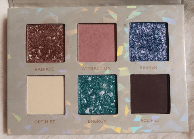
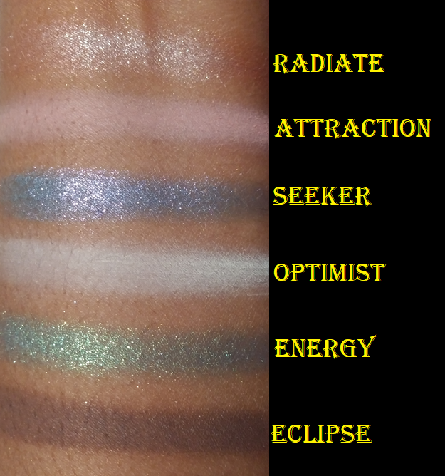
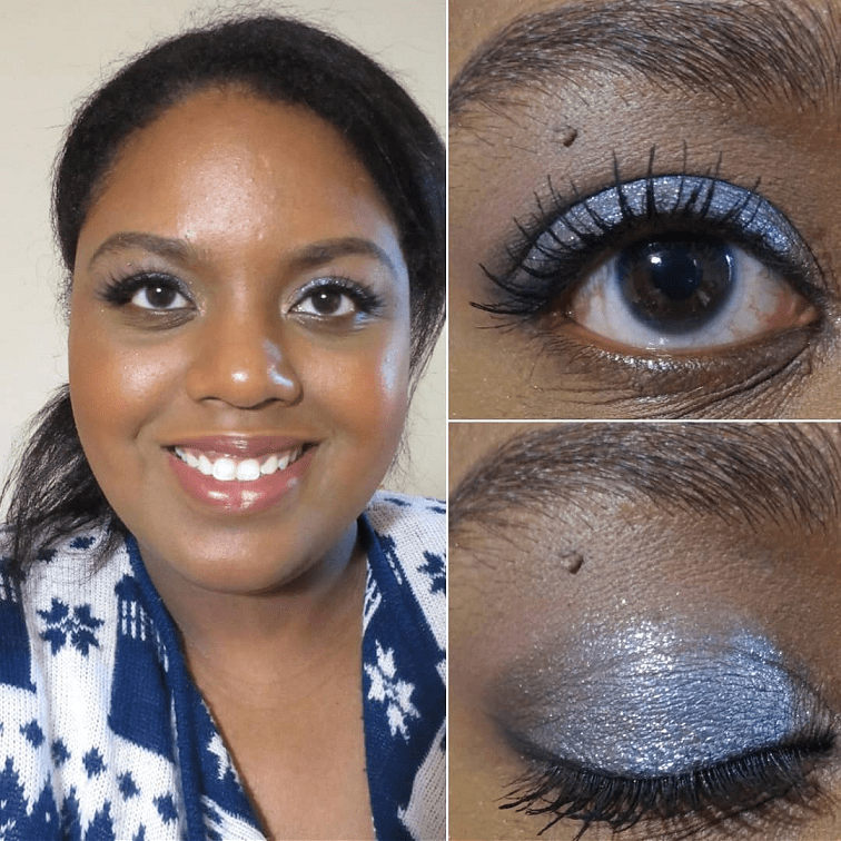
Urban Decay Stoned Vibes Mini Eyeshadow Palette
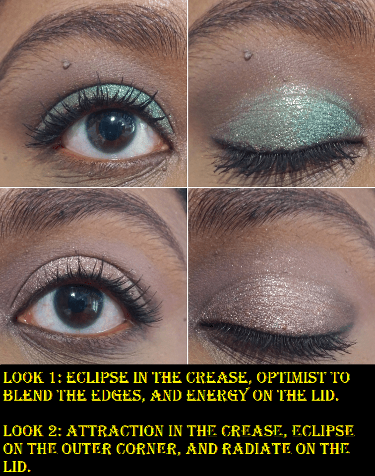
This was a birthday gift from one of my best friends. One of the complaints I’ve had about Urban Decay shimmers is that they aren’t punchy enough for my style. These shimmers are more of my taste, however, the base color of these shades are so vibrant in the pans, but the marbled silver makes each color a lot lighter when actually applied to the skin. Seeker would be so much prettier if more of the purple flecks of shimmer could show through, as well as the lighter and darker blue. Energy is also still pretty, as I can still see some of the gold shimmer with the green, so I don’t mind as much that these two shades are lighter. However, Radiate changes to a light pink which I really don’t care for. This is the reason that even though the Full Size Stoned Vibes palette has been on sale for 50% off, I decided not to get it. I love the shades in the pans but those aren’t the colors that end up on the eyes. As for this palette, I’ll continue to use it and will pretty much have the same 2-3 mattes in the crease (Attraction with Eclipse or Optimist with Eclipse) with either Seeker and Energy. The mattes blend well, but I only like to use Optimist as a shade to blend edges, Eclipse as my deepening shade, and Attraction in the crease of a warmer toned look. The only times I’ve continued to use Energy is when I’ve patted a separate multichrome shadow on top.
Anastasia Beverly Hills
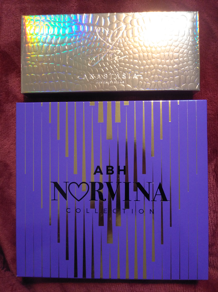
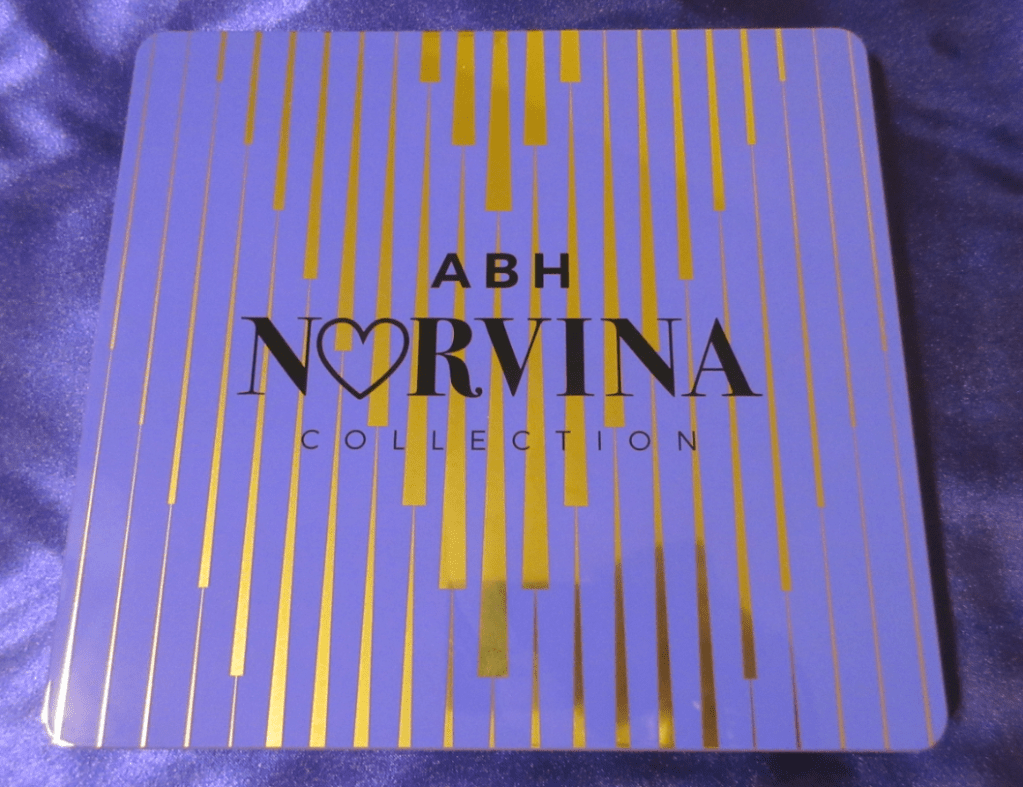
Past palettes I’ve owned from Anastasia Beverly Hills have been the Self-Made palette, Norvina, and Alyssa Edwards. One thing I’ve noticed about the brand’s eyeshadows is that the quality begins to diminish after a year. All the ones I’ve seen have a 12m open canister symbol, so they at least work well for the time frame intended. I don’t know if their eyeshadows are a vegan formula, but I’ve noticed the palettes that start to not blend as well for me are the ones that are vegan. They aren’t unusable, but I just notice the change after a year. Perhaps it’s a climate issue and the high humidity in Florida causes this to occur with vegan formulas. Or it could be an issue with the particular preservatives. I’m not sure. The Norvina Volume One has been the exception so far, but I will discuss that in more detail in that section.
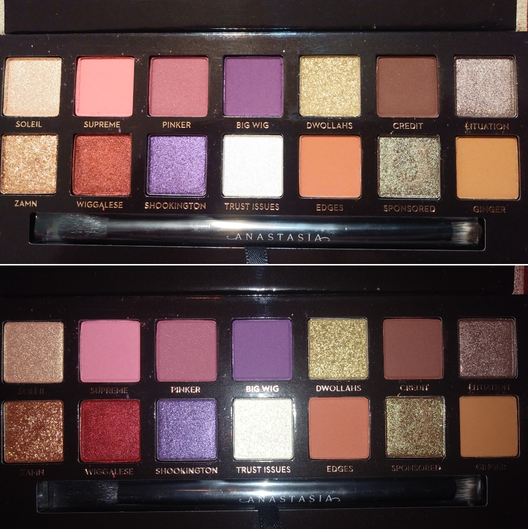
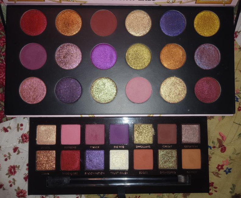
Anastasia Beverly Hills Jackie Aina Palette
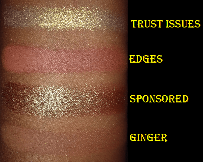
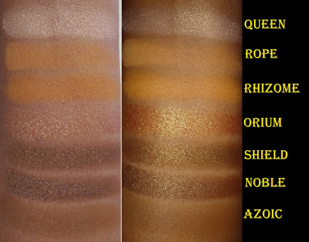
I regret not using this palette sooner, and I say that because I had way fewer purple eyeshadows at the time of purchase. I also had very few duochromes and no multichromes, so shades like Sponsored (goldish olive brown) and Trust Issues (iridescent white in the pan but yellow gold on the skin) would have been so much more impressive to me in 2019 than they are now. They’re still beautiful shades, which I appreciate. I just know I would have had a stronger reaction to this palette if I’d used it back then. There is also the issue of the mattes blending nicely, but I have a sneaking suspicion they would have performed even better if they weren’t 18 months old. While palettes do last longer if they stay unused in the box, I immediately took this out of the box when I bought it and have opened it several times to at least give it a look throughout the time of owning it. So, that exposure to air multiple times started the clock ticking, even though they hadn’t been used on my eyes til now.
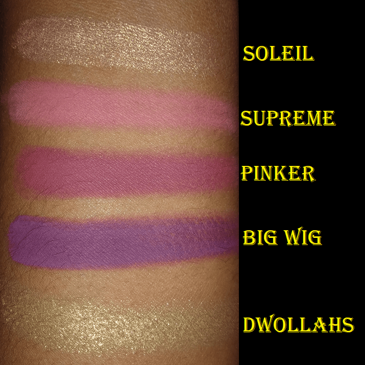
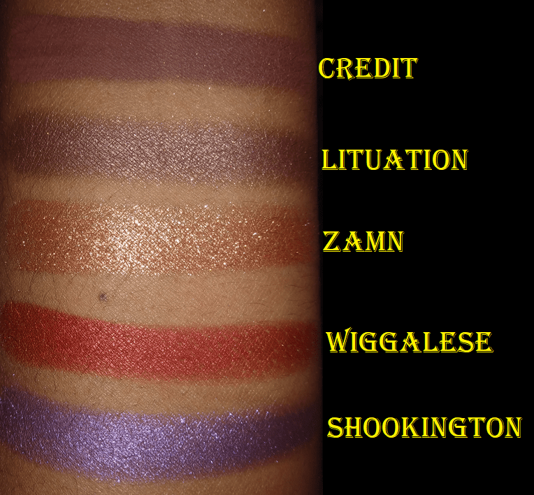
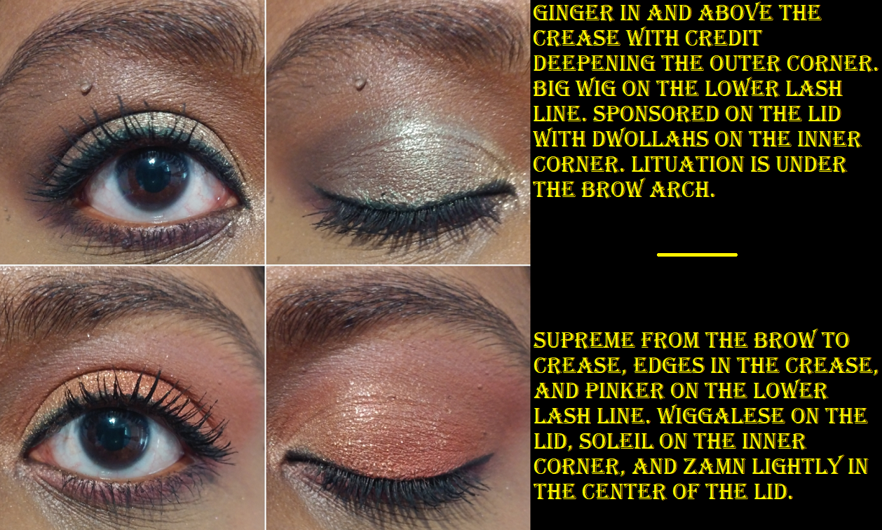
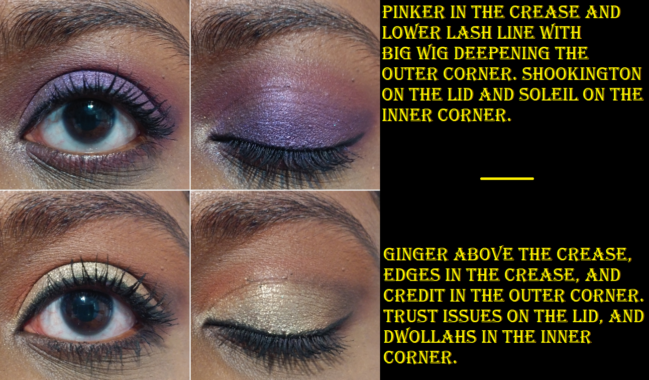
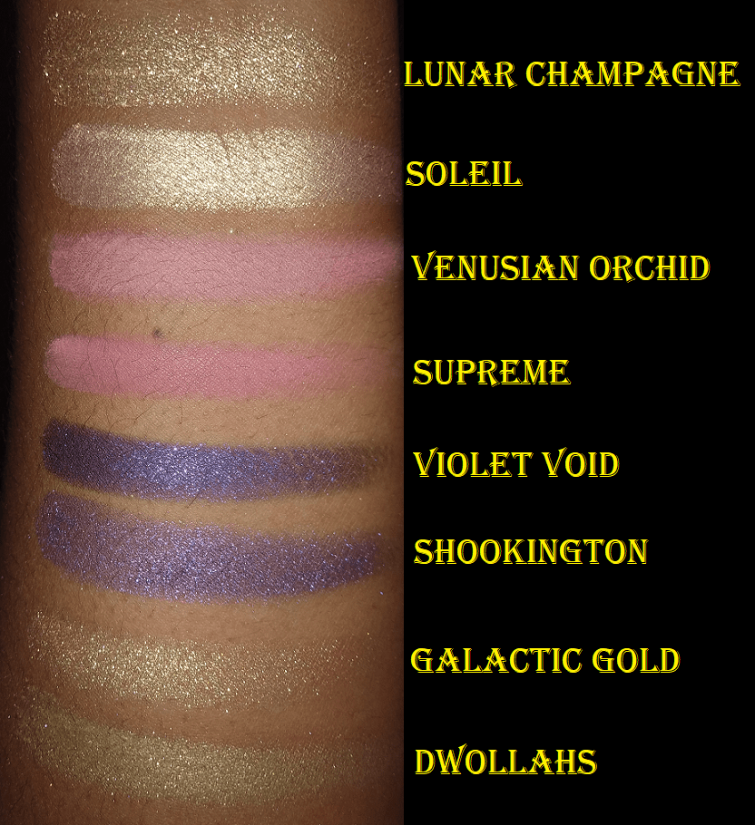
I like all the looks I’ve created with this palette. I have to build up the shade Credit for it to deepen the outer corners the way I like and Ginger doesn’t show easily on my skin, but I like the color variety I get with Supreme, Pinker, Big Wig, and Edges. The shimmers are great. They are definitely a step up from Urban Decay’s shimmer formula. I like that the shimmer particles from ABH tend to be so small but very reflective. Zamn is the exception as those glitter particles are large. Trust Issues and Dwollahs are about medium sized.
I’ve seen this palette go on sale for $31. Something that may be an incentive to getting this palette is that I see similarities in the color stories between this palette and Pat Mcgrath’s $78 Celestial Divinity palette.
The shades aren’t identical, but they were similar enough for me to think about comparing them. If I paid closer attention to the shadows I have in my collection, I may have reconsidered buying Celestial Divinity since that was the later release.
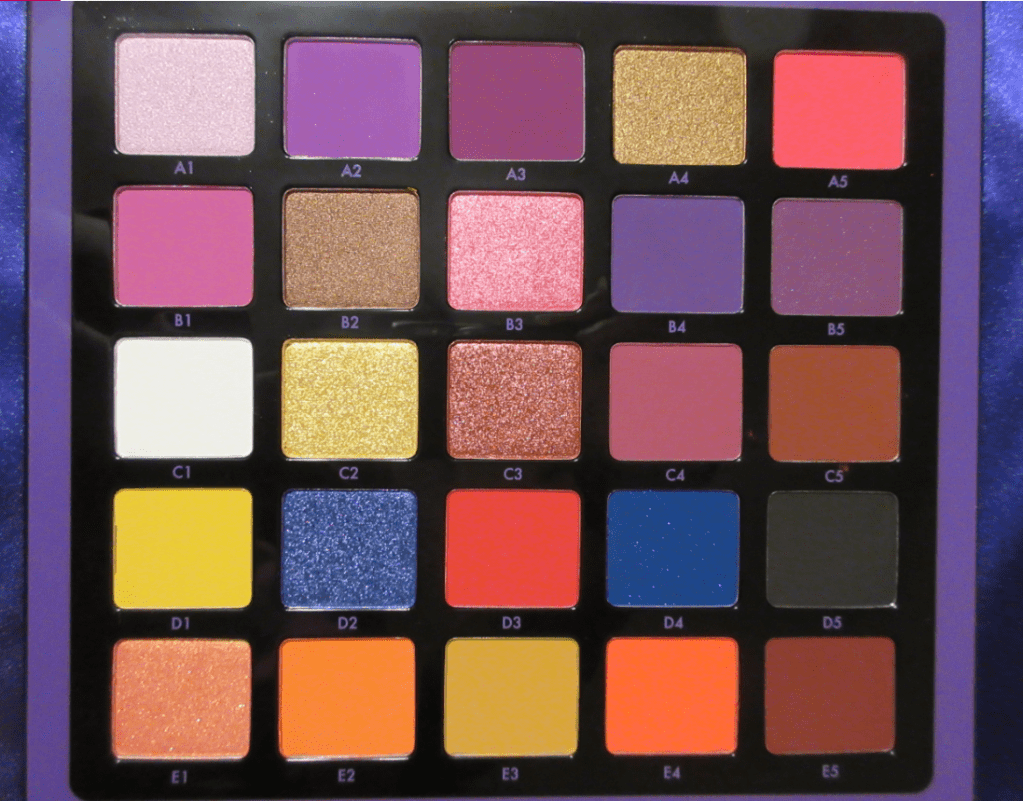
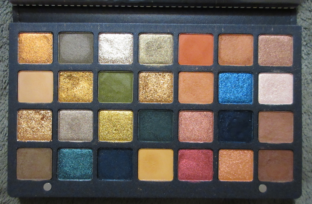
Norvina Vol. 1 Palette
Oh, boy. The story behind this palette’s place in my collection involves so many emotional ups and downs.
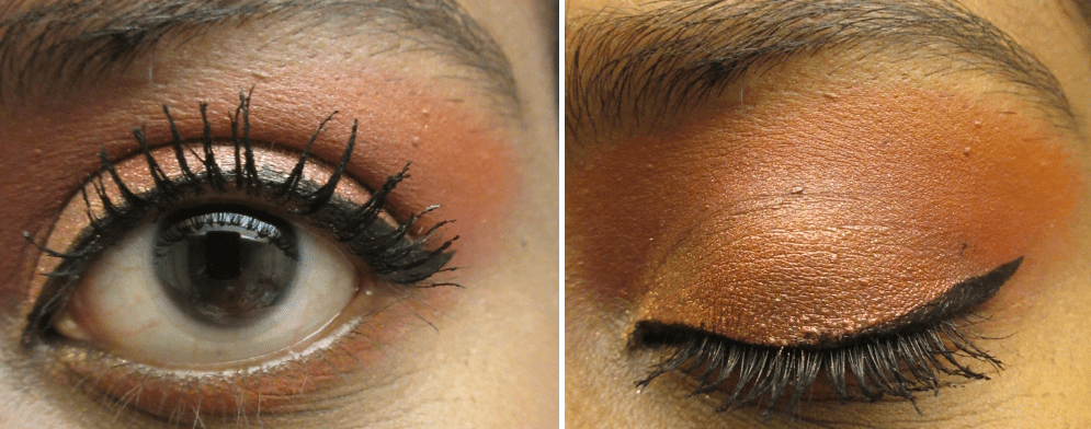
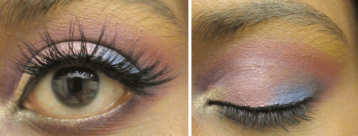
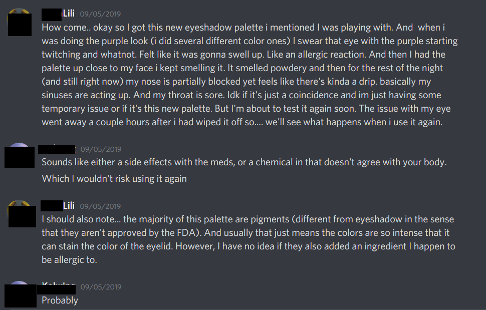
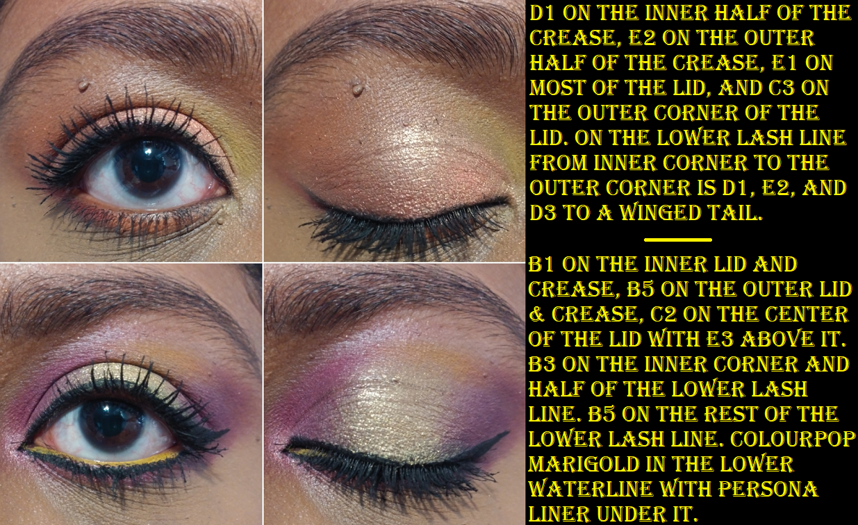
On August 27th 2019, I cashed in 2000 Ulta Reward Program Points in exchange for $125, making this palette and the other items I bought in that order nearly free. I was on an emotional high when I got this palette a little over a week later. I took the palette photos and eye looks shown above on the very first day I had it with the intention of getting a blog post out as soon as possible.
One of the first things I noticed about the palette was the chalky smell, like cheap eyeshadows sometimes have. I was confused because the shadows blended so beautifully and performed so well, so I didn’t think there should have been anything wrong with the ingredients. There was quite a bit of kickup though that dispersed in the air and I did inhale a bit of the shadows. As the night went on, I started having sinus issues that turned into full on respiratory issues. This might sound alarming but I’d been having “incidents” involving excruciating internal pain, struggling to breathe, etc in the six months prior. I was on new medication as well (doctors couldn’t figure out the source of the problem but were giving me meds to try and treat some of the symptoms), which had side effects of their own. I couldn’t tell if I was having a reaction to the shadows or if the timing was coincidentally bad. I actually mentioned it to a friend on Discord.
And later that night I said this…
A little after midnight, I had an incident that wouldn’t stop. It was the worst one I’d ever had and I’ll spare the details but…it was horrific. They generally lasted 2-3 hours but six hours later it was showing no signs of stopping and I had to consider that this was urgent. By 6:30 am I couldn’t stand it anymore. I was physically exhausted from what my body was doing and the lack of sleep, among other things. I drove myself to the hospital (which was admittedly reckless in my condition). I was there for five days while they did tests and it was discovered that my gallbladder was inflamed and I had a ton of gallstones and they were were continuously getting lodged in ducts and it had seriously effected my liver function as well. In the space of those five days I had multiple tests run, my second endoscopy (the first one having only found stomach inflammation because my gallbladder wasn’t checked), and finally the surgery to remove my gallbladder. I was also very unlucky that my uvula had been damaged when I had to be intubated mid procedure when I stopped breathing properly (you can look up uvular necrosis but be warned it looks gross). It took about three weeks to fully heal and be able to eat normal meals again. While I didn’t think my medical issues and the palette were directly related, my liver was compromised by my gallbladder problem, so it’s possible I was having an allergic reaction and my liver wasn’t equipped to deal with the detox. I have no idea. All I know is that I was so freaked out by having to go to the hospital the day after using it that I didn’t touch the palette again until March 2021 when I began periodically working on this post.
I’m happy to report that I now have no issues using this palette! I wish I could remember which purple shade caused the issue originally. I had notes somewhere at one point where I planned all the eye looks I intended to create, but I have no idea where it went or what shades I used in the 2019 pictures, so I did two fresh looks in 2021.
I have a lot of negative associations with this palette, but when I finally opened it up again recently, I felt joy. I felt inspired again. I thought of so many different color combinations I could create. That original excitement about having this palette finally returned. Unlike all prior ABH palettes, the shadows in Norvina Volume 1 hasn’t changed in performance, despite being a few months short of two years old. While I have decided to take the chance and continue to use this palette (at least one more time), the incident still scared me off from trying the other shadows in Norvina’s line. In fact, I’ve decided that I will no longer purchase Anastasia Beverly Hills and Norvina eyeshadows in the future. I prefer to purchase palettes with eyeshadows that can last me far longer than a year.
Too Faced Cosmetics
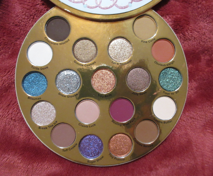
Too Faced Let It Snow, Girl Holiday Collection (Limited Edition/Discontinued)
After many low-quality Christmas releases, Too Faced earned the reputation of having cutely packaged holiday makeup with the quality inside not being on par with their permanent collections. I knew this, however, when I was strolling through Ulta and saw that the palette at least swatched well, I decided to buy it. I believe this was 50% off before Christmas and I think I got an additional 20% off, but I can’t remember for certain. I just know when I bought it was sometime between December 2019 and January 2020. Between needing yet another surgery (this time due to spinal issues) and quarantining due to the pandemic, I didn’t have much inspiration to test out the new makeup I was buying, even though I was depressed and continued making cosmetics purchases as a way to cheer myself up. But now I’m finally getting around to using this palette for the first time!
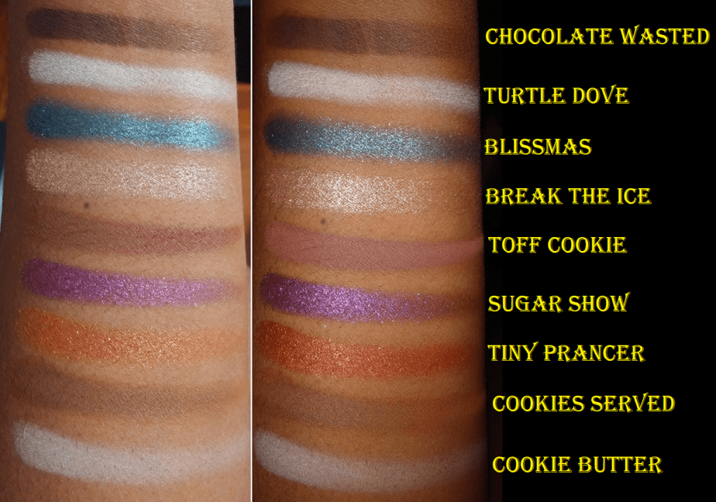
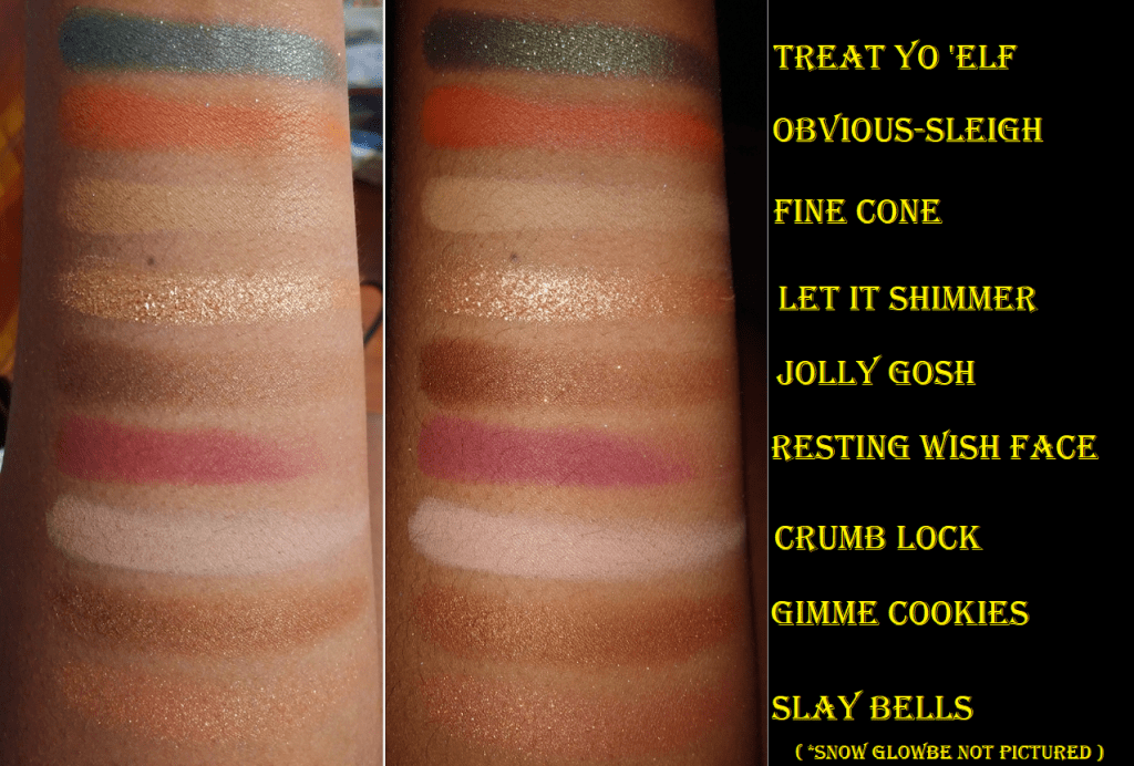
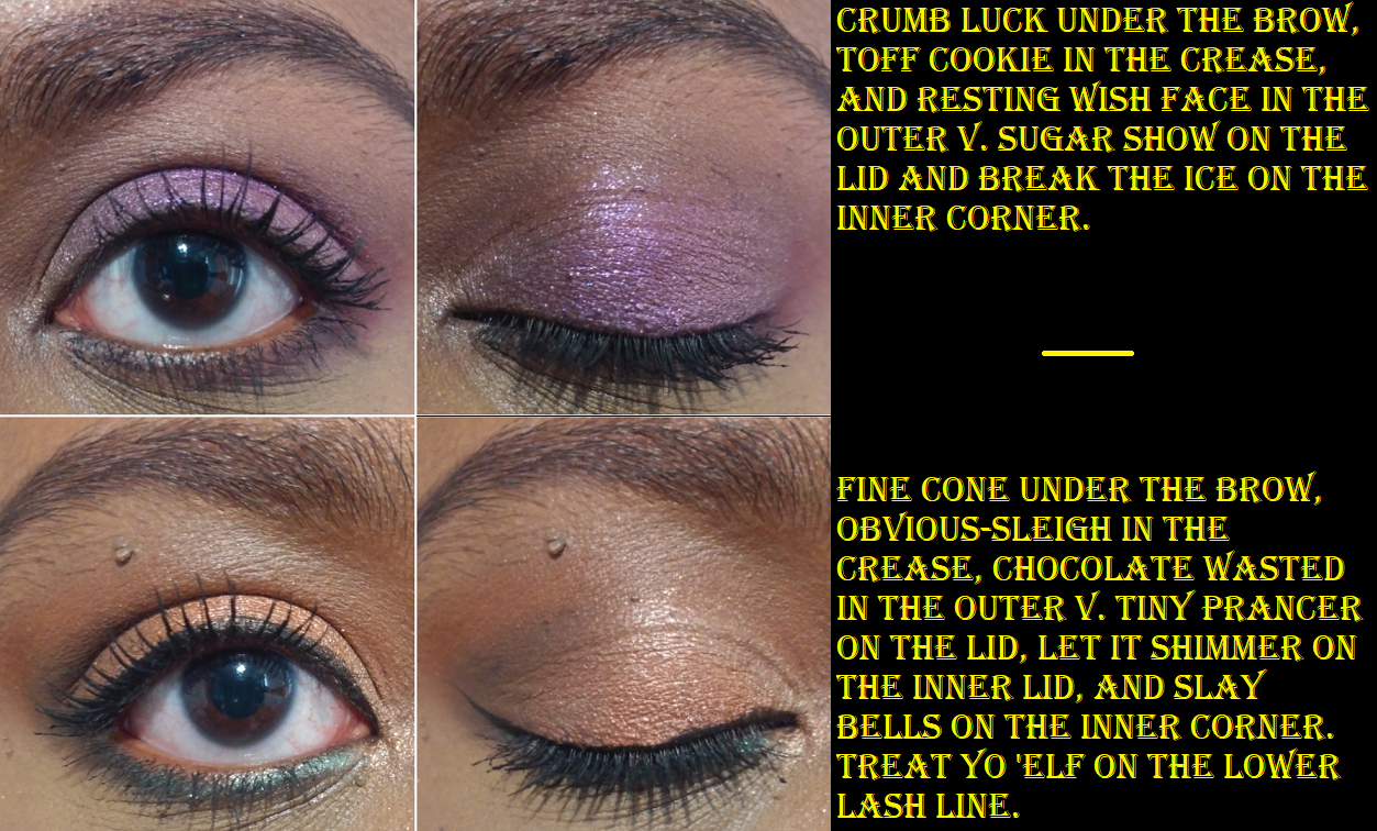
The quality is okay. I can make it work. The mattes are definitely not creamy and the shimmers have a rough texture. The bigger issue is that if I lay down one shade, it goes on the skin fine, but trying to blend another color on top of it is a struggle. Resting Wish Face is patchy on its own, but I definitely had a hard time getting the shade to stick on the outer corner of my eyes in the look below. The same happened with Chocolate Wasted except that it’s nice by itself but as a deepening up shade it did not want to layer on top of Obvious-Sleigh.
Snow Glowbe is a pressed Glitter, so I haven’t messed with that shade at all. While I know I can make this palette work and could see myself using it a few more times, I’m more likely to just put this in retirement. The packaging is cute, which was the main reason I bought it. I’d rather spend my time using better shadows though that bring me joy to use.
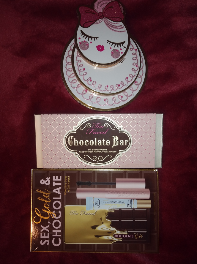
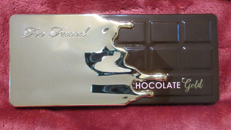
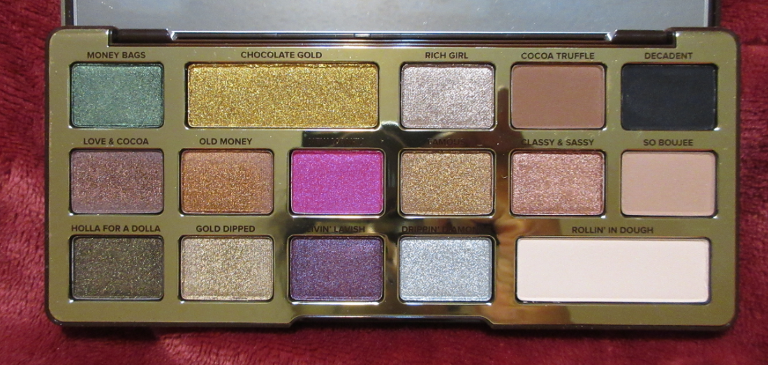
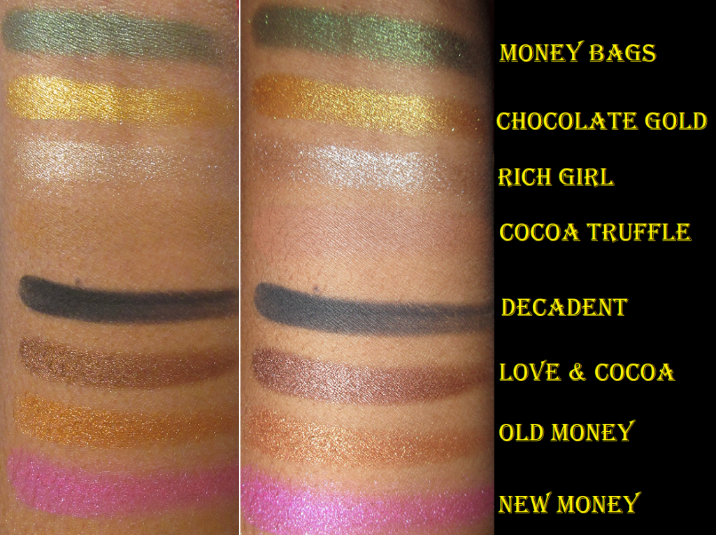
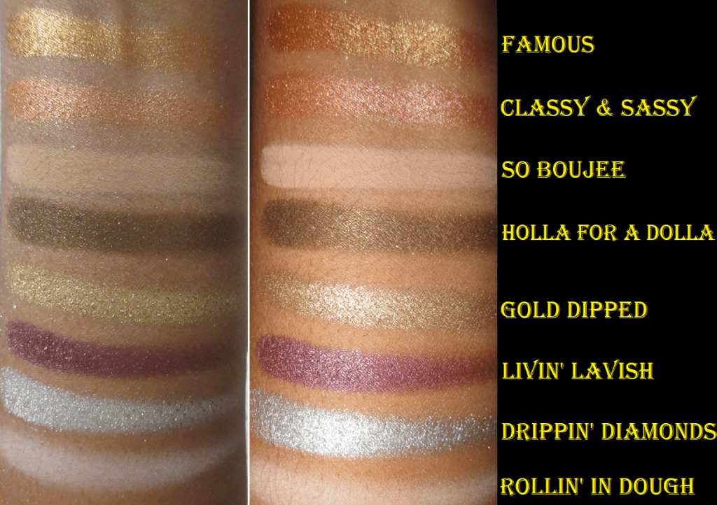
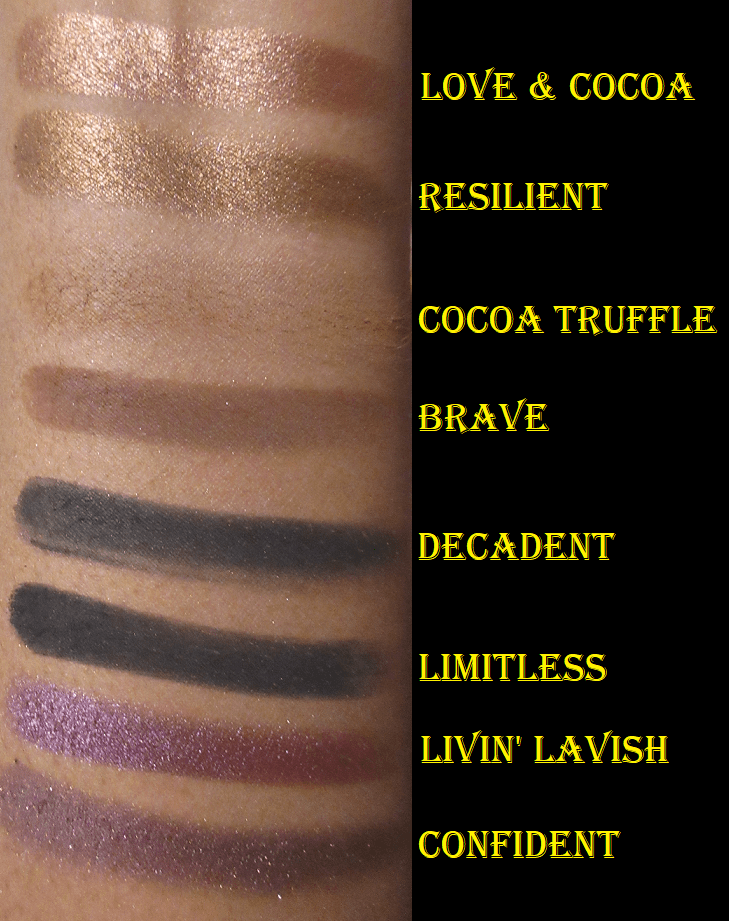
Too Faced Chocolate Gold
Ever since Jackie Aina sneak-peaked this palette, I wanted it. I was very stubborn about not purchasing it at full price though, which is why it was released in December 2017 yet I didn’t purchase it until November 2019. It gives me a rush to get a good deal. The palette alone retails for $49 but Ulta had a set that included the palette, a full size tube of Better Than Sex mascara, and full size tube of the Shadow Insurance primer for only $52. Combine that with a $10 off discount code, $125 point redemption, and $25 gift card, I ended up paying only $3 of my $161 order. And this is why I love shopping at Ulta.
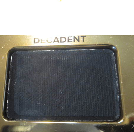
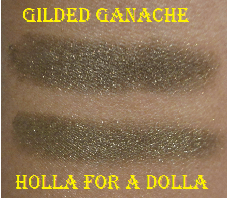
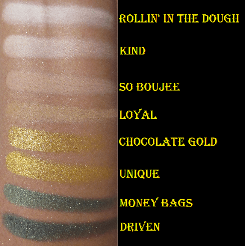
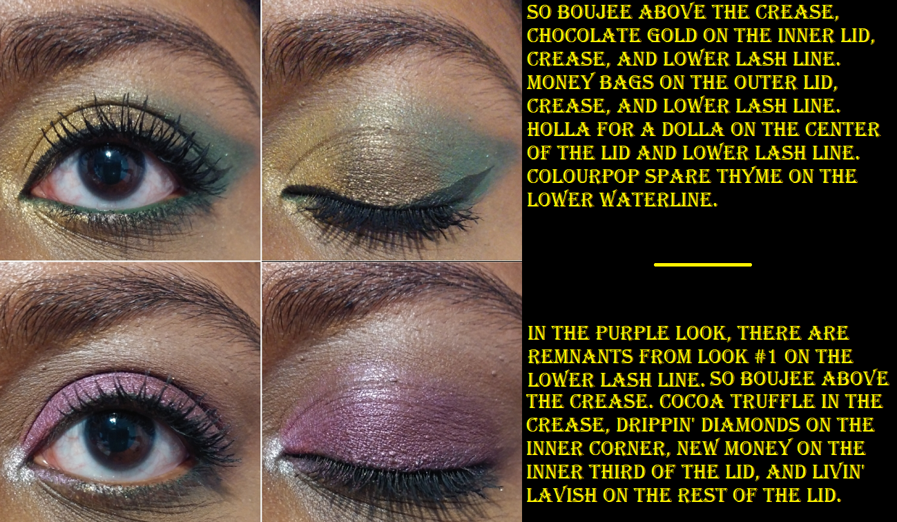
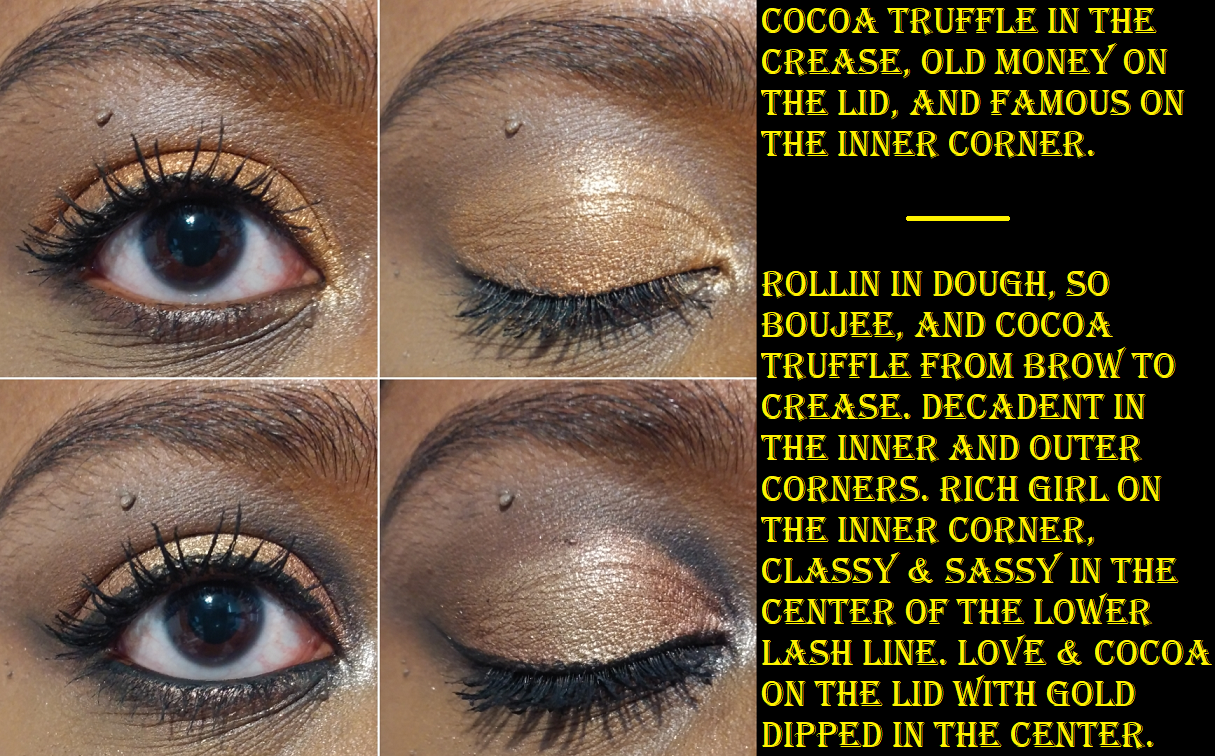
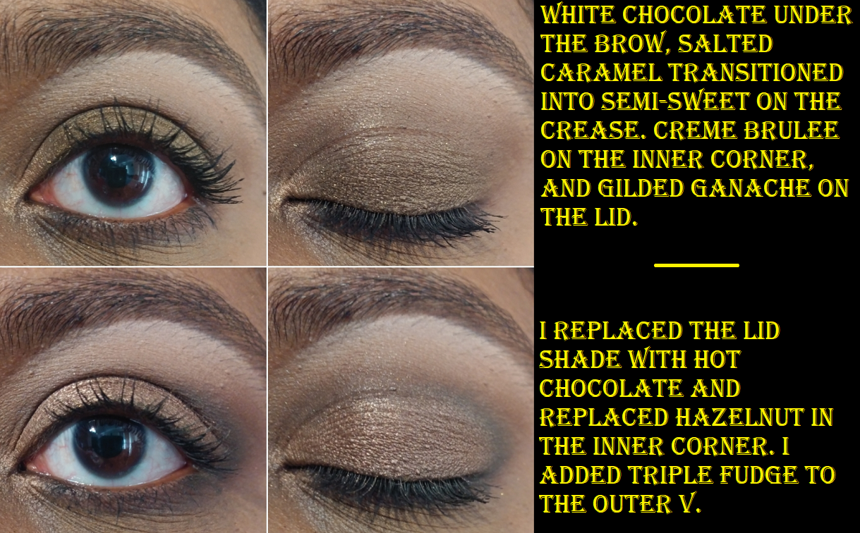
The initial reason I didn’t try this palette right away was because I saw a clear fingerprint in the shade Decadent and it put me off the palette until now. Because I’ve been using all my neglected palettes back to back, the first thing I noticed was that the Holla For a Dolla shade is extremely similar to Gilded Ganache from the original Too Faced Chocolate Bar palette. I think I prefer Holla For a Dolla because it looks slightly more green, but both of these are the kinds of shades I expected Queen from the Urban Decay Naked Honey palette to look like.
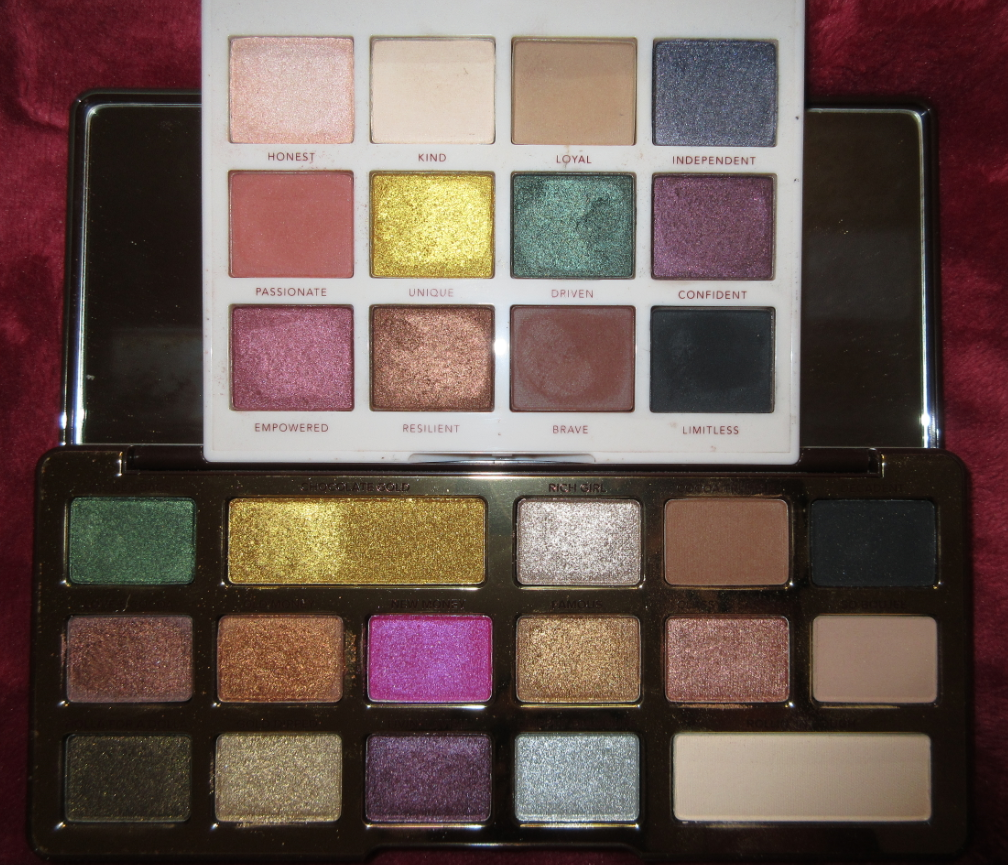
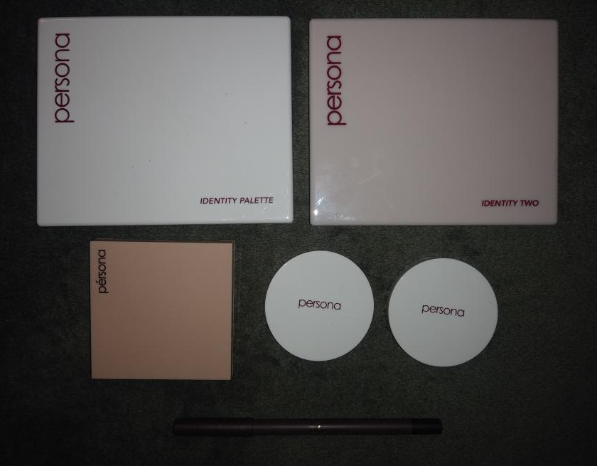
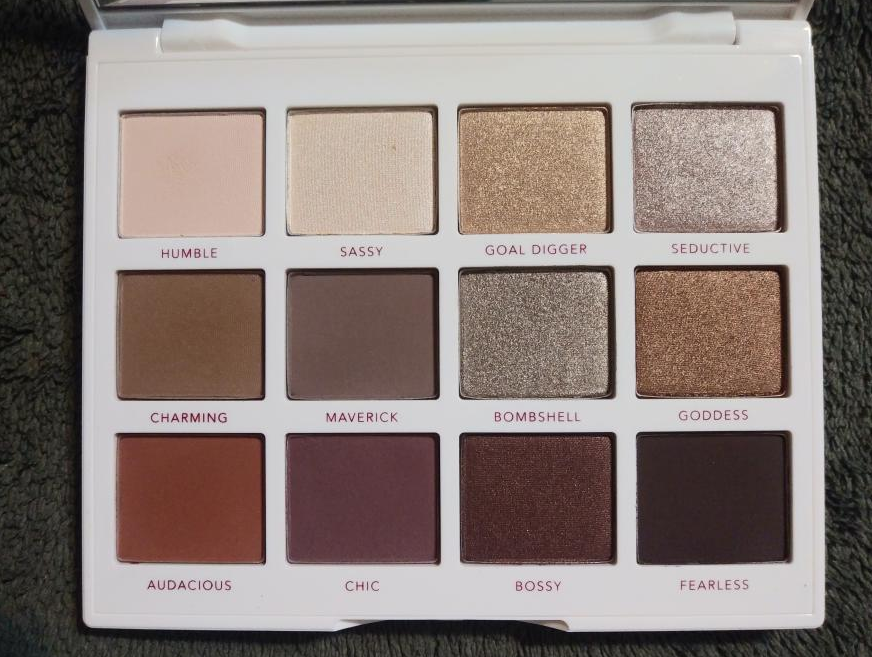
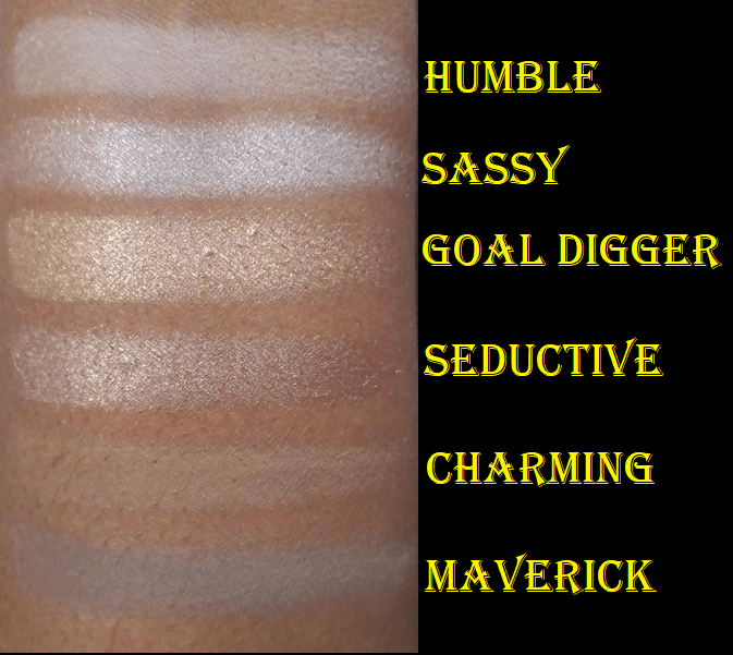
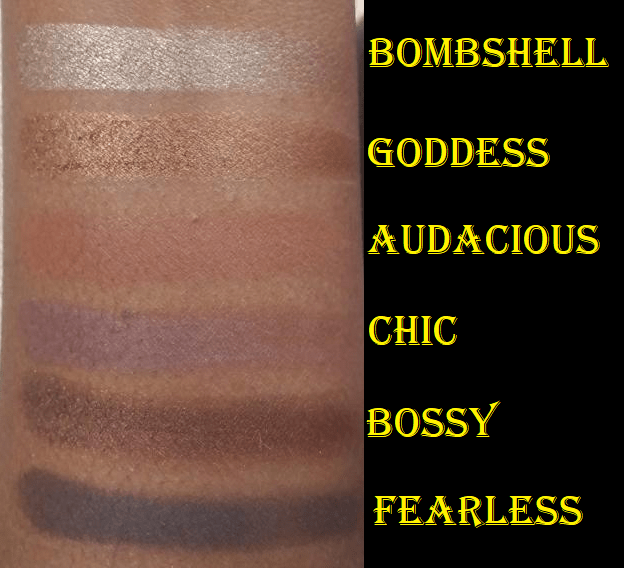
Another thing I noticed as I was creating looks from this palette is how similar the color story is to my Persona Cosmetics Identity Two palette. The Chocolate Gold palette was released two years before the Identity Two, so I wonder if Sona was inspired by it.
There are no exact dupes, but I could definitely get a similar look. It has been no secret that the Identity Two was poised to be my favorite palette of 2020. In comparing them, I definitely prefer the buttery texture and pigmentation of the Identity Two over Chocolate Gold. In each comparison I favor the Persona swatches except when it comes to Livin’ Lavish. I definitely prefer that bright warm purple over the somewhat dull colored Confident.
I clearly have a type, as I do like the color story of Chocolate Gold. I liked the looks I was able to come up with and the quality was decent. It was definitely a step up from the Let it Snow palette in terms of texture and blendability. I would say this palette is of equal quality to the Urban Decay Naked Palettes, but Chocolate Gold has a better shade gradient and shimmers with a little more impact. The one downside is that now that I know how it compares to the Identity Two, I’m going to reach for that palette every time over this one.
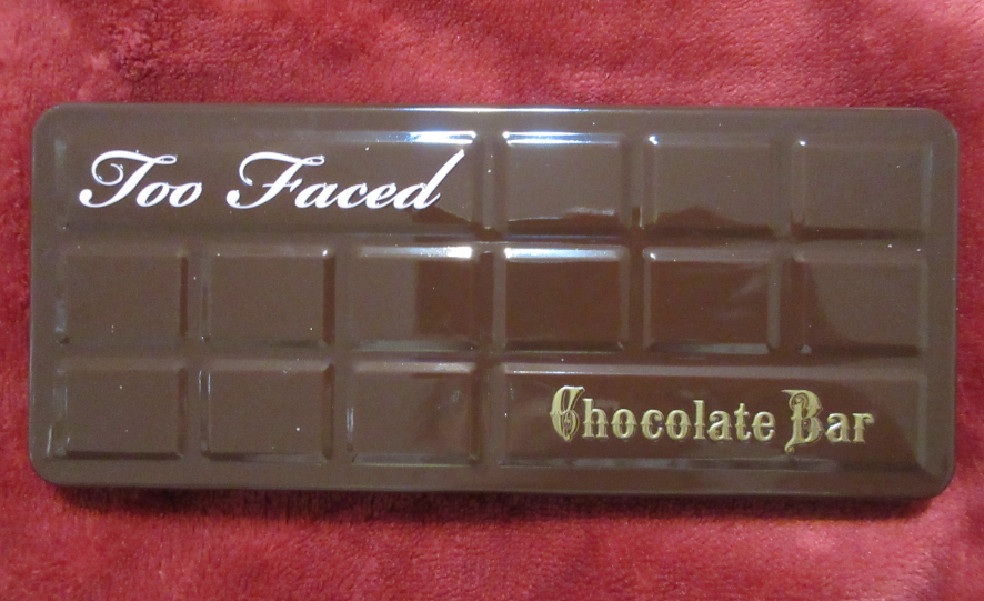
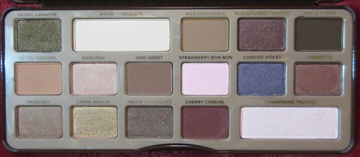
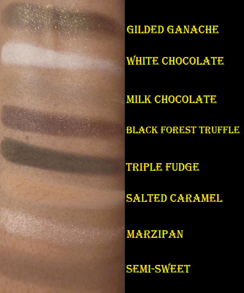
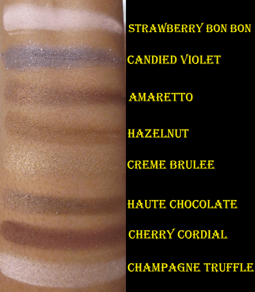
Too Faced Original Chocolate Bar Palette
I knew this palette would be cool-toned but when I purchased it in March 2020 (one of those distraction-from-the-pain purchases) and swatched it for the first time, I realized it was way more cool toned than I thought. I didn’t think they looked as pretty on me as they did on everyone else I saw who had this palette. The one consolation I felt was that I only spent $25 on it due to the “Who Runs the World: Squirrels” set Too Faced had on their website which included this palette, a cute squirrel cosmetic pouch, Full Size Chocolate Gold Bronzer I could use as a highlighter, a mini Better Than Sex mascara, and a liquid lipstick. Aside from the initial swatches, I didn’t touch this palette again until 2021.
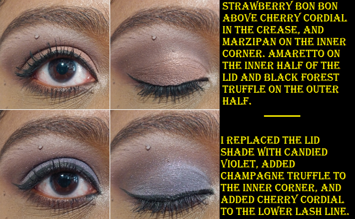
In all the eye looks, I had to switch to my Gerard Cosmetics Clean Canvas in White because I could not get most of the colorful shades to show anything but brown (and similar browns) on my eyes without it. On camera, Black Forest Truffle and Cherry Cordial only show the tiniest tinge of red-purple, but they look even more brown if I use a regular eyeshadow base.
Some of the looks I created turned out alright, and are definitely helped by that white eyeshadow base, but I’m still a bit disappointed that they don’t look the way I hoped on me. My friend, who is of light-medium complexion, always looks amazing while wearing these shadows. Every time I ask her what palette she used on her eyes, I’m shocked when she says the Chocolate Bar palette because the same shades on her do not look the same way on my eyes. At one point I considered selling this palette, but because the market is absolutely flooded with these (and a lot of people are passing off fakes as the real thing too), these go for as low as $9 on Mercari.
I took the Semi-Sweet Palette out of retirement to compare the shades. In doing so, I noticed minor random things about the packaging. The Chocolate Bar has the weakest magnetic closure and the lid of the tin doesn’t lay flat. It remains propped upward like the Pat Mcgrath Celestial Divinity palette. The Semi-Sweet has a slightly stronger magnet and lays flatter back than its predecessor. The Chocolate Gold actually snaps closed and doesn’t rely on magnets at all, but I have to put my nail in the indented space to open it. The palette container/packaging, rather than tin, feels completely made of plastic and it opens flat back so that I can naturally hold it by the edge of the mirror and bring it closer to my face in a way that the others wouldn’t allow. The mirror also takes up the entire space under the lid cover instead of the much smaller sliver of mirror space in the other two palettes. I would actually use the mirror in the Chocolate Gold palette to do my eyeshadow makeup, but not the others.
Final Thoughts
I’m happy that I’ve finally given these ten unused palettes a chance. It has helped me to realize that the palettes I liked still don’t really stack up when compared to my indie brand shadows, even if it has the perfect color story for me. I intend to be even more selective with my eyeshadow palette choices in the future, particularly if they’re coming from a mainstream brand.
That’s everything! Have a great morning, afternoon, or night. Thank you for reading!
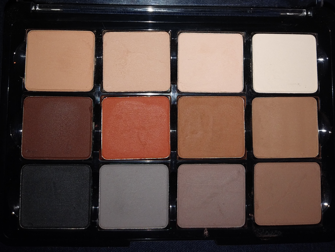
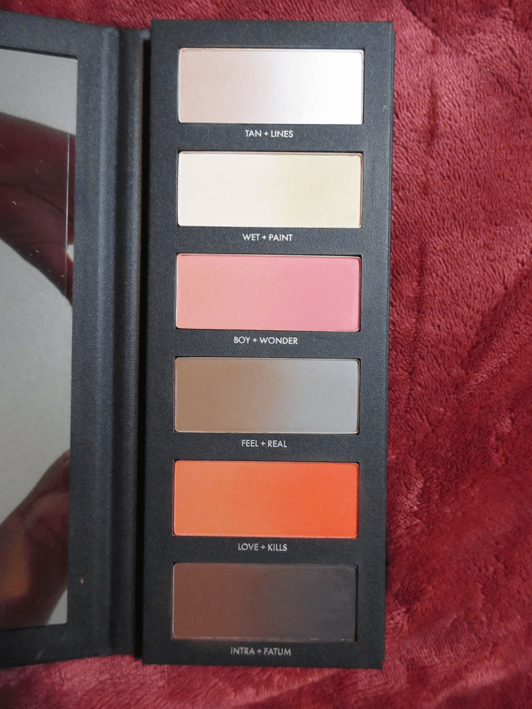
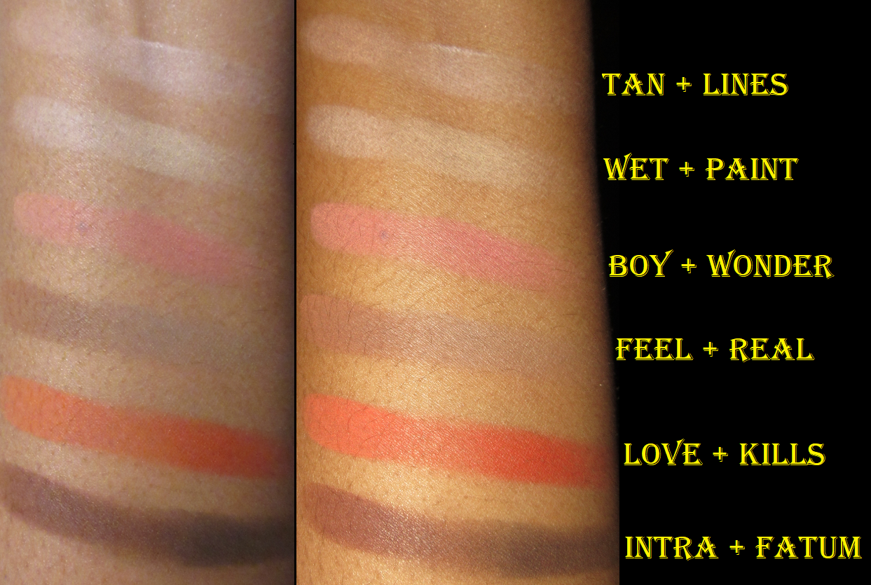
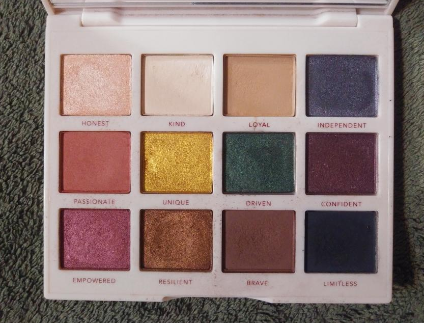
The idea of having a product that I can customize my shade of powder, blush, bronzer, contour, eyeshadow, etc. all in one palette appeals to the wannabe minimalist in me. I call myself a wannabe because I enjoy having a large beauty collection while simultaneously being overwhelmed by the amount I possess. This is why I love the concept of face palettes, but it’s very uncommon for me to find one where the majority of the makeup in it suits my preferences and needs. I’m curious to see if I will continue to like this palette after prolonged use and continuously mixing shades, but so far I am impressed! There’s pretty much no kickup and if I get a lighter imprint on a deep shade, or vice versa, I can sweep it away with a brush and it’s good as new! Perhaps this is possible because I combine shades by tapping into each color I want; I don’t swirl in one and then swirl my brush into the other.
A palette like this can seem intimidating, and I was initially unsure if I would buy it for that reason. Some aspects were as tricky as I expected and some parts were easier than I thought, almost intuitive. For instance, using Beautopsy for blush is pretty straightforward. Boy, Wonder, Love, and Kills are four easy options for that. Overall, while I wouldn’t go as far as to say beginners wouldn’t like this, I think it would be most enjoyed and utilized by those with an intermediate skill level and above.
Brightening andSetting Powder
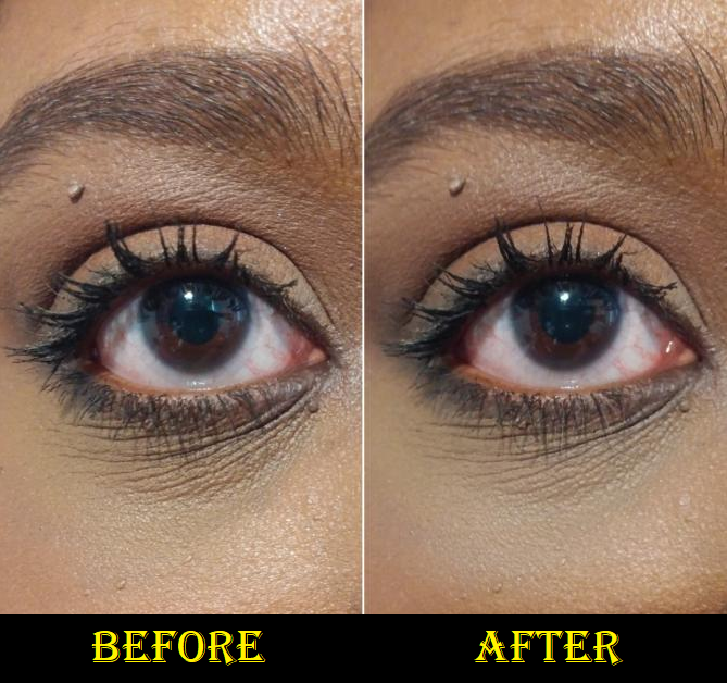
For setting under my eyes, I use the leftmost sides of Tan and Feel and rightmost side of Paint with my usual Real Techniques Setting Brush to create a pale yellow-brown. I was shocked when I realized it actually had a blurring effect and made my under-eyes look smoother! Certain concealers of mine don’t play well with powders, but so far the blurring has been a consistent feature to setting under my eyes with the light shades in the palette! The photo below shows what it did to my Tarte Shape Tape and Pat Mcgrath combo (which was not originally set with powder at all). The lines under my eyes are still there, but less pronounced.
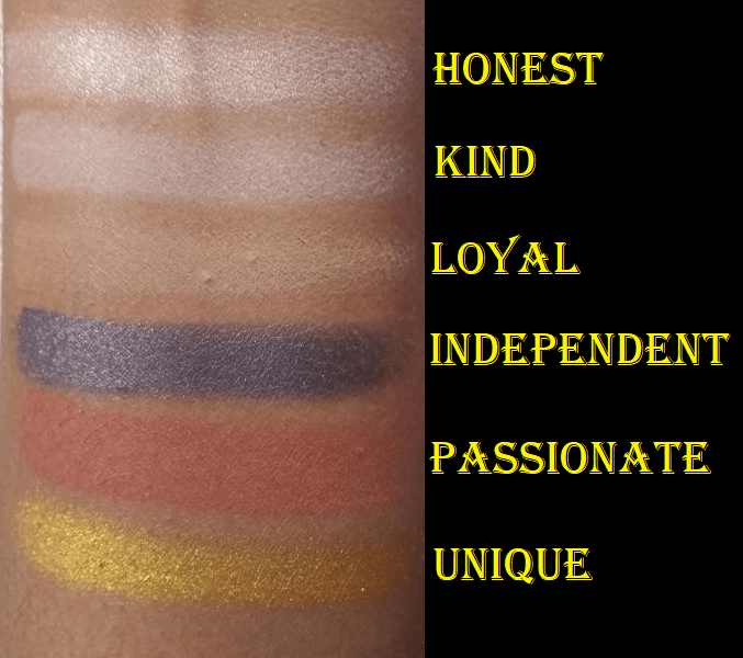
If I want to brighten my under eyes, and not just match my skin tone, I can use pretty much any of the four lightest shades without them looking stark because they blend with the concealer. Additionally, there isn’t much difference between them when applied to my skin. On a lighter skin tone, they are distinct enough, but on me they’re all essentially white with the tiniest differences in tone. That being said, they somehow don’t look ashy on me like other pale shades tend to do, but I still try to use the combinations I think make the most sense based on their color descriptions: Lines as a pure white, Tan as a soft tan, Wet as a beige shade, and Paint as a pale yellow.
While I could probably set my whole face with a mixture of Feel and Paint, I wouldn’t want to use a small brush for that task, and I have dry skin anyway, so I don’t always set my full face. Also, I can technically use this palette to brighten the high points of my face, but I love my shimmery highlighters and I would never be satisfied with using these matte powders to highlight anywhere other than the eye area. So, in a traveling situation, I would probably bring along a separate setting powder, plus my Kaja Play Bento Sculpting Trio for the subtle shimmer highlighter and to have extra variety. The Kaja Bento in Mochamallow was previously the only all-in-one face product I had where I loved and could use every color in it. Beautopsy now joins the ranks of the best suited face palettes in my collection.
Brow Powder and Eyeliner
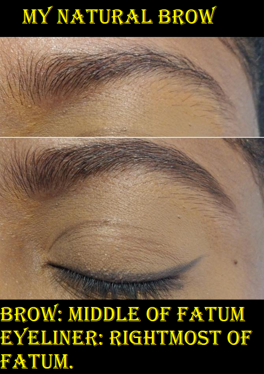
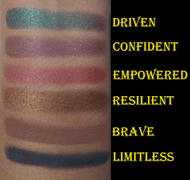
I’ve spoken before about how any dark eyeshadow can be used as eyeliner and for filling in the brows, so it didn’t surprise me how well Fatum worked for that purpose. I used the darkest part of Fatum as the liner. If I want to wear just a liner and no eyeshadow, this isn’t black enough for my preference. However, when I’m trying to deepen up eyeshadow looks, Fatum is dark enough for that, and quite lovely. Hindash mentioned that you can use Fix+ to transform any of these powders into liners, but I haven’t tried that. I like to use dark shades, but not black, to fill in my brows. The middle where Intra + Fatum meet is a shade that works for defining the eye, but was too warm of a brown for my liking. So, I switched to using the center of Fatum where it still has a little of the chocolate brown shade but is also dark enough to use in my brows. I messed up a little spot in the front and didn’t notice it in person, but of course the camera picked it up. I was a bit impatient, which is why my brow isn’t perfect, but it also brings up the point that brow pencils are so much faster for me. I know I wouldn’t use this again in my brows, purely for the time factor, but I’m glad I have the option.
For those who prefer a cool-toned dark brown or soft black for their brows, Fatum mixed with Real could probably do the trick. Real + Feel might look nice on blondes and maybe Feel and Love or Feel and Intra for those with red hair, but don’t quote me on that!
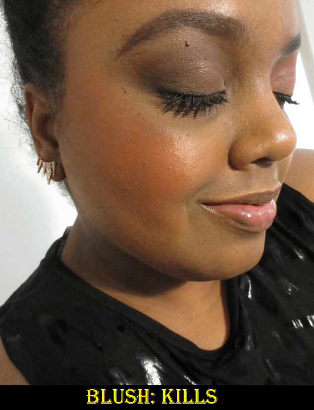
Blushes
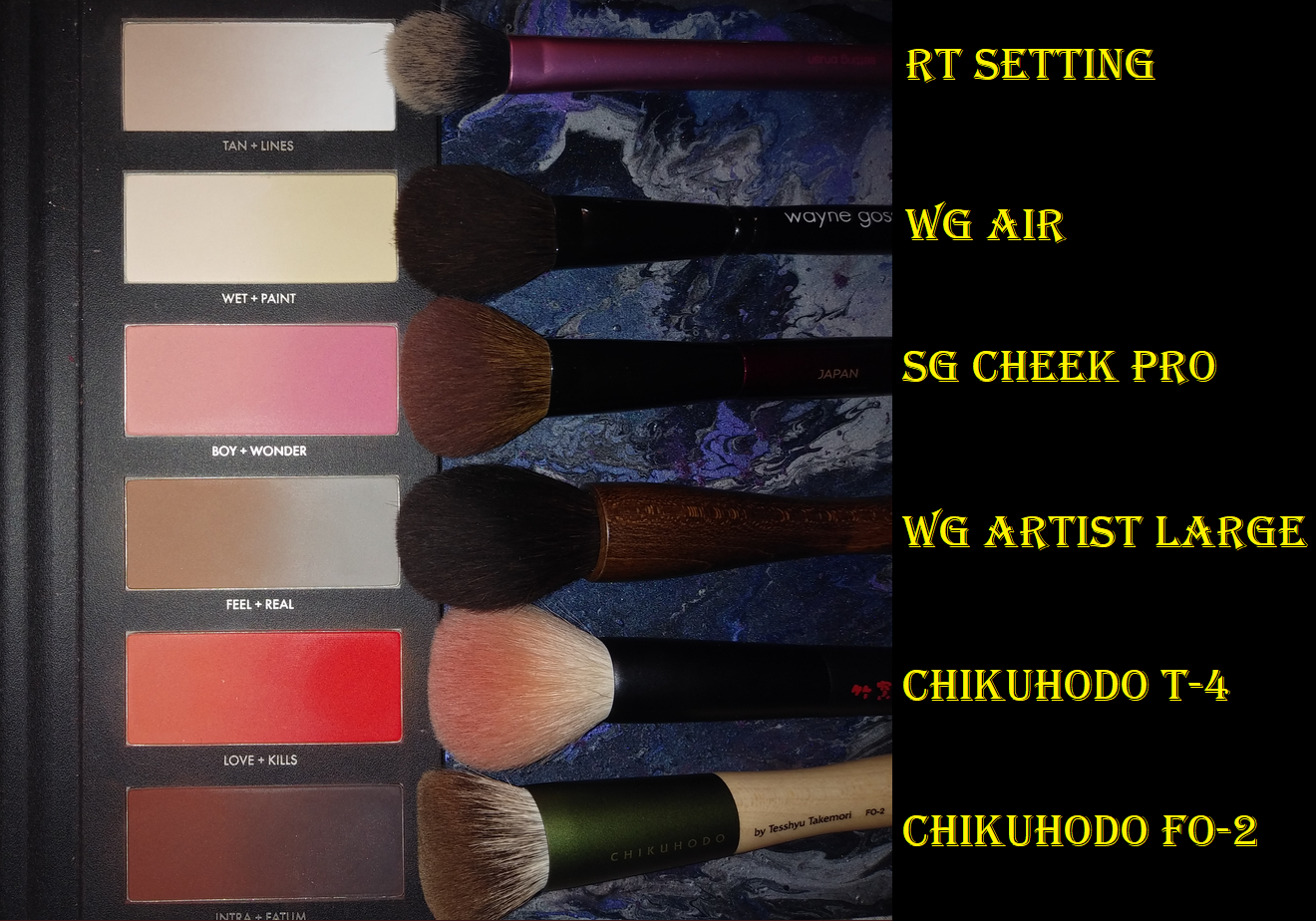
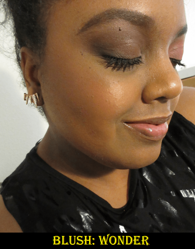
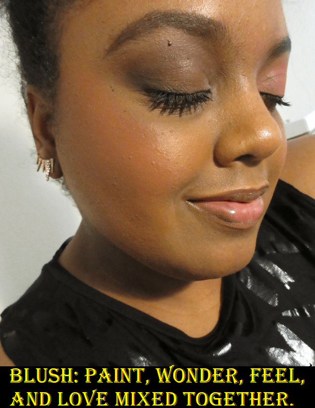
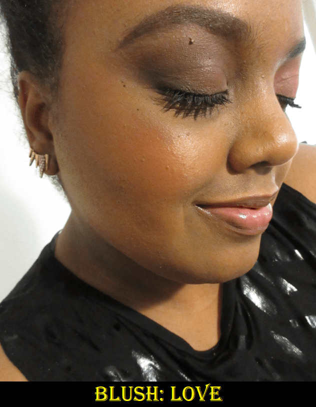
For blush, my favorite shades to use on their own are Wonder, which gives me a light but bright pink flush, and Love, which is a reddish-orange. Kills is a bit too deep for my preference to use alone, but I could always use it if I mix it with something lighter. Boy is a wearable peachy-pink for those with a lighter skin tone than mine. It shows on my skin, but I don’t think it’s as flattering on me as Wonder. If I want to give myself a peachy or coral look, I think of creating a different kind of orange with a little pink. So, I dip my brush mainly into Paint and Love with one extra tap of Wonder and buff it into my cheeks. If I want it a little less bright, I add some of the brown from Feel. I try not to mix more than two colors together because it tends not to look as nice on the skin, but this particular combo of 3-4 still works for me. I’ve enjoyed using my Sonia G Cheek Pro and Wayne Goss The Artist Brush – Large to apply blush, as they aren’t too big for these pan sizes.
The head sizes of my brushes compared to the size of the pans. It’s not a coincidence that my smallest face brushes were all made in Japan.
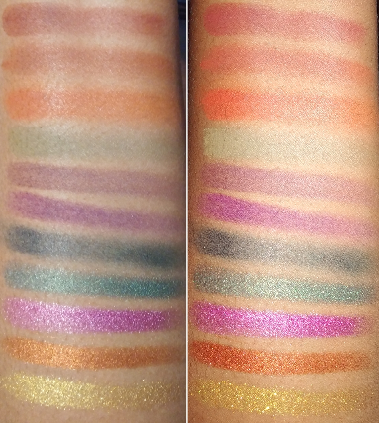
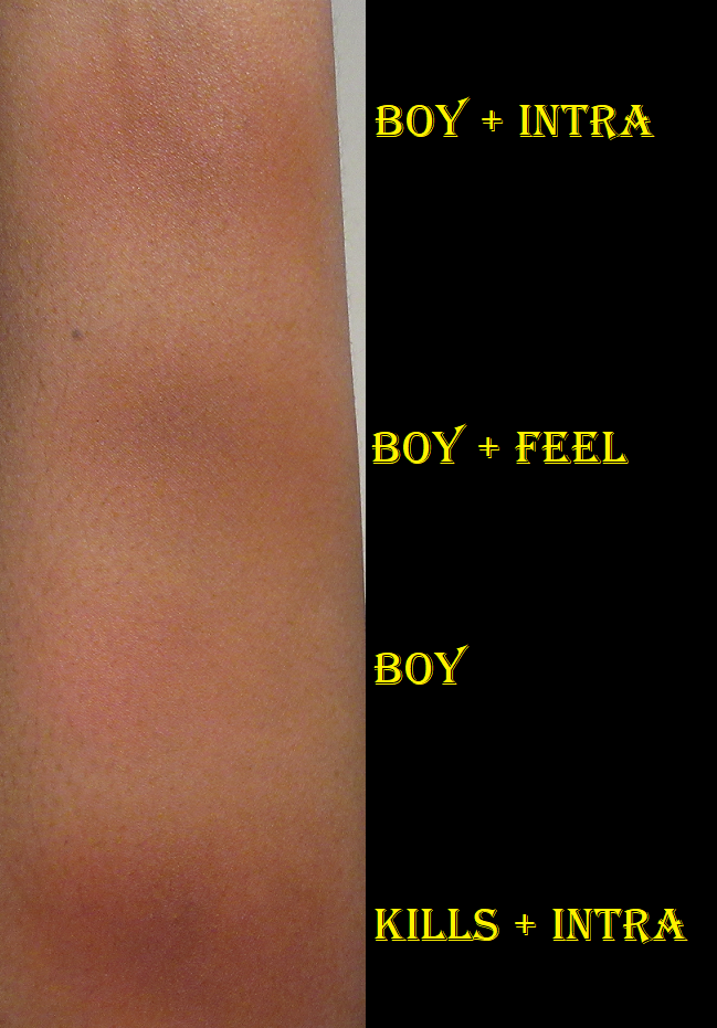
There are so many combination possibilities! I experimented with some on my arm to give more examples. I put them on my bare arm, but the blend would look much nicer on the face with primer and foundation under them.
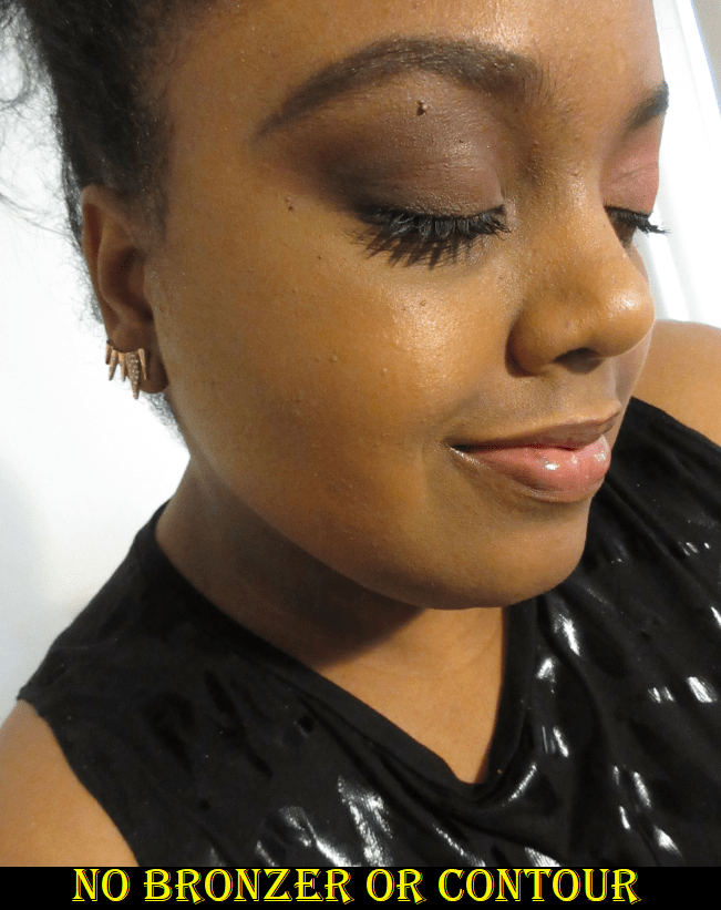
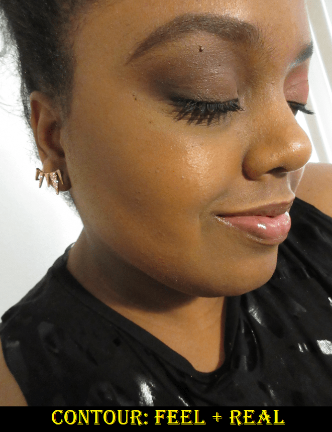
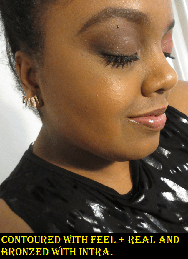
Contour and Bronzer
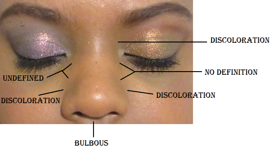
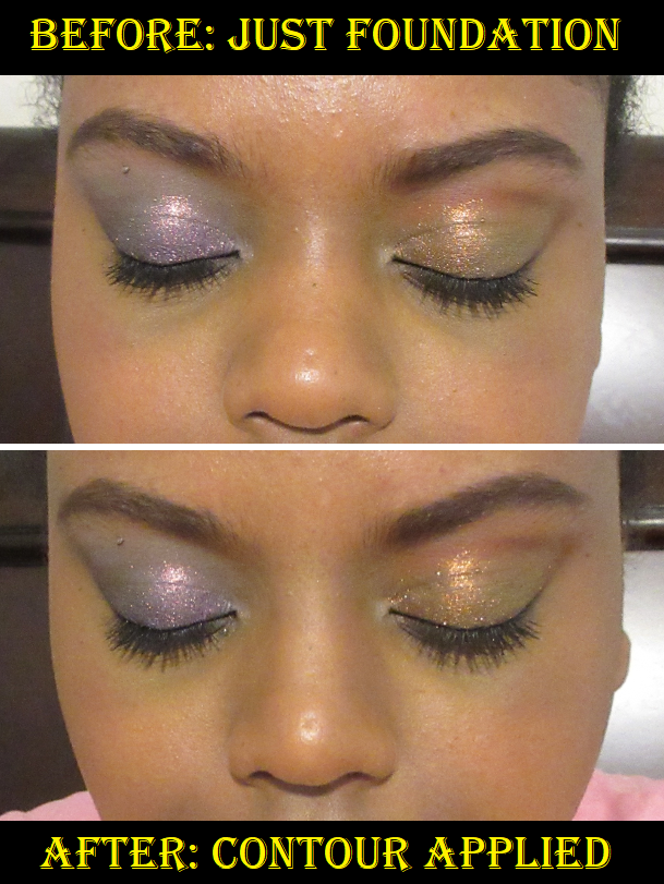
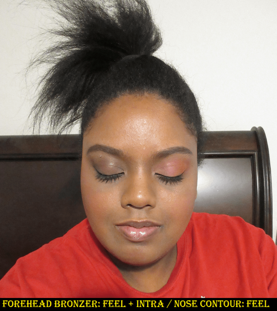
To contour my nose, I can use Feel on its own, but I prefer the look of Feel and Real together to create a proper shadow. I can use pretty much any small brush, but I’ve been liking the Scott Barnes Eye Winger #63 because the unique shape automatically creates a symmetrical line if I contour between the bridge of my nose and my brows. Most of the time I skip contouring my nose, but when I do, I like to keep it as subtle as possible and just add shadow where I need it. For instance, sometimes all I do is add contour powder on either side of the bridge of my nose, just in the middle where there’s no definition. In order to do that though, I definitely cannot use a warm/red toned contour powder, which is often what is available on the dark-deep end of contour shades. I need something cool yet not too dark, which has always been a challenge for me to find.
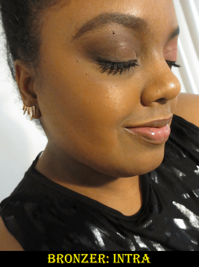
To contour the rest of my face, I tap my brush into the center where Feel and Real meet. I can use something with a flat top like the Chikuhodo Z-3, but I also prefer a brush with a tapered tip like the Wayne Goss Air Brush, Wayne Goss Artist Large, and Chikuhodo KZ-05. For bronzer, I use the leftmost sides of Intra and Feel. Sometimes I use just Intra. I’ve tried different brushes, but the Chikuhodo FO-2 is my favorite to bronze with this palette. Since I only use the leftmost sides of the powders for bronzing, I dip the right half of my brush into the powders (without getting anything on the left side), I can apply with that half of the brush and blend out with the half that didn’t get any product on it. It was a little funny to me when I discovered that the Beautopsy palette wasn’t created with bronzer as much in mind, since Hindash likes to use cream products for that purpose, yet I was able to find a bronzer combination that worked so well for me!
I’ve tested this palette over matte and dewy foundations. When I use them on matte foundations or bare skin, the blend of these powders on the face looks so good! On dewy products, it’s almost as if these don’t want to stick to the skin. It takes longer to blend and the end results looks okay, but not nearly as nice as it looks over a matte one.
Eyeshadows
I believe Beautopsy is foremost a palette for the eyes, and ironically, this is the one aspect that having only mattes as options isn’t entirely satisfactory to me. It has been quite a few years since I’ve created all matte eyeshadow looks on a regular basis. When doing an all matte look, there is no room to hide, nothing to cover up any mistakes or distract from poor blending the way shimmers can. It is a craft that looks so simple but requires immense skill to perfect. Plus, I just love putting a shimmer on my lids, so if I was on a trip, I would have to bring at least a small magnetic palette of shimmer eyeshadow singles with me. As much as I admire sultry smoky eyes, I mainly prefer to do colorful eyeshadow looks, or at least to have a neutral crease with a bright color on my lids. This is another reason I would want a supplemental palette. This also doesn’t give intense payoff right away, and this makes perfect sense for Hindash. As a makeup artist, he would want a product that builds up and blends well. When I say that this doesn’t fully line up to how I like to do my eye makeup, it’s not me saying the palette is bad. It’s just obviously suited for those with a different eyeshadow style than mine. In addition, the buildable nature that I don’t like as eyeshadows is what makes them so fantastic as face powders. Plus, the slow build issue I get is only when I try to use a regular eyeshadow primer underneath. If I use a complexion product as a base, I have no qualms with how long it takes, but more on that in a moment. Regarding the texture of the shadows, these remind me a bit of Viseart. However, Viseart shadows give a little more pigment per brush stroke, but the Beautopsy powders feel a little silkier. Zea Mays is the second ingredient in the Beautopsy palette, and it does have that cornstarch feeling to the touch, which could account for the added silkiness over Viseart’s shadows.
Preferences aside, my biggest challenge was finding the right base for these powders as eyeshadows. I absolutely hated using the Gerard Cosmetics Clean Canvas. I had to keep making alterations because it wasn’t blending the way I wanted and it took so incredibly long to get it in a state that I thought was presentable. I had to start over again several times. I didn’t have much luck with my tried and true MAC Paint Pot either because it was as though the shadows didn’t want to build on the eye and at one point I switched to my finger to try and pack it on. Usually I only have to do that with shimmers. I got better results when using the Urban Decay primer potion, but surprisingly the best results I’ve had were when I used concealers and foundations as bases! I discovered this first when I used the Tarte Shape Tape and then again when I used the Pat Mcgrath concealer, although that one creased badly when I left it unset for too long. I’ve been using the MAC Foundation Stick as an eyeshadow primer, so I wasn’t as surprised to see that the shadows blended well over it. However, out of all the bases I tried, the best results I’ve had were with the Dermablend Flawless Creator Foundation Drops. Those drops are basically a foundation and concealer hybrid. So, if you have this palette and you’re struggling to use these over eye primers, I recommend using a complexion product as primer instead. This discovery changed my opinion of these as eyeshadows for the better and I’ve enjoyed using them so much more!
One issue I still haven’t resolved is that the shades in the top half of the palette disappear off my eye by the 5-6 hour point. It happened regardless of the base I used. The bottom half of greys, black, browns, and reds lasted 9-10 hours before I ended the wear test. Perhaps this is caused by a difference in how the lighter shades are formulated/the amount of pigment in them. That’s my best guess, although the shadows have the same ingredient list, excluding Love, which is listed separately.
I usually go into details about how I create a look and which shades I used in the eyeshadow portion of my reviews, but I mixed so many things that I lost track.
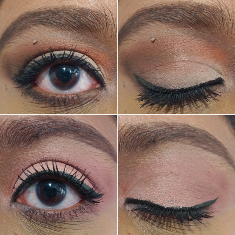
Looks 1 and 2 are both over the Gerard Cosmetics Clean Canvas.
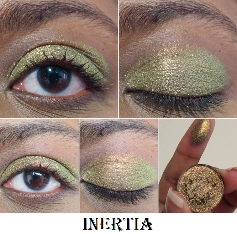
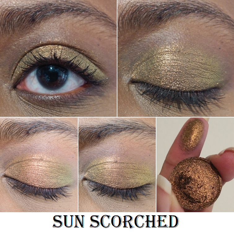
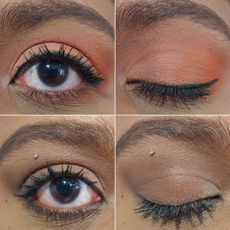
This look is over the Pat Mcgrath Concealer. It was my attempt to recreate what I was trying to do in Look #1. The shimmer in the bottom half of the photo is Sun Scorched from Terra Moons Cosmetics.
The peach-pink-orange-red ombre look is over the MAC Foundation Stick. The look below it is over a MAC Paint Pot.
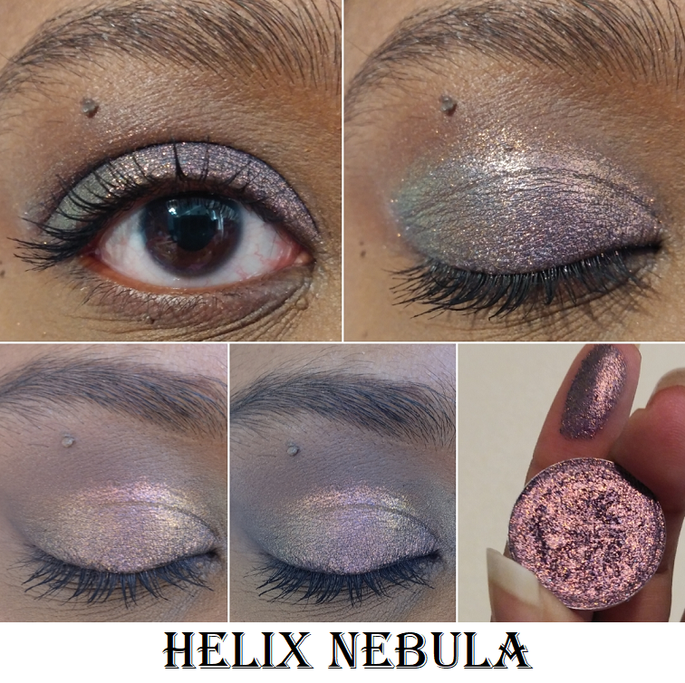
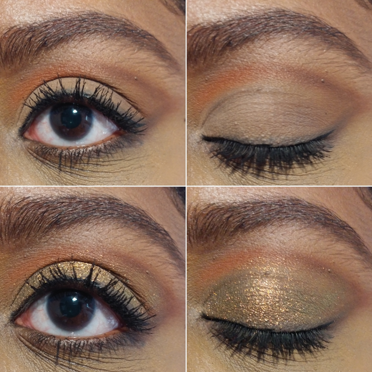
The grey look is over the Urban Decay primer potion. The shimmer on the lid in the bottom half of the photo is Helix Nebula from Terra Moons Cosmetics.
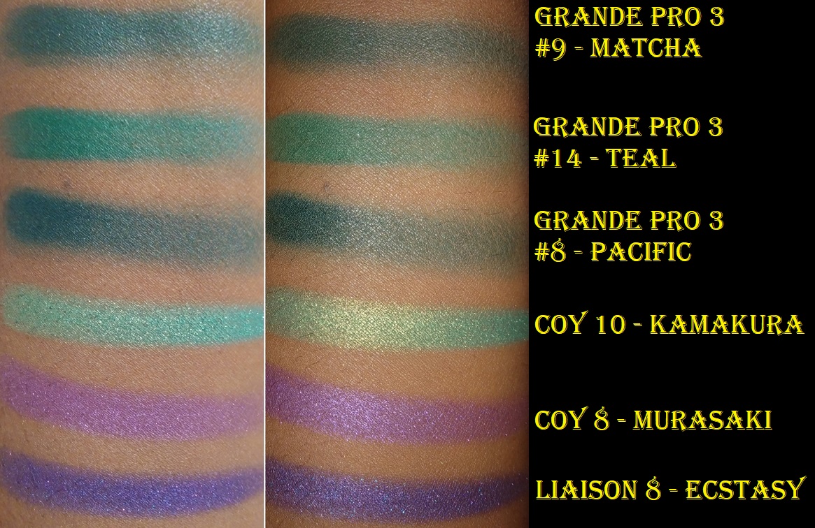
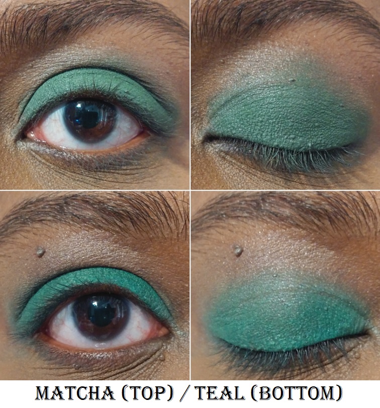
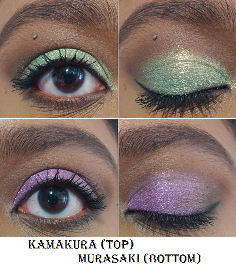
I used the Dermablend Flawless Creator Foundation Drops as the base. This shimmer on the lid is called Kamakura #10 from the Viseart Coy palette that I bought as a single shade. This green look was photographed many hours after I first applied it.
I have used eyeshadows as blushes and blushes as eyeshadows in the past. This palette is the first time I’ve ever preferred the secondary usage over the intended one. I was so surprised at how seamlessly these powders worked together as face products. These were not my first choice for eyeshadows until I found the right base, and now I very much like them too. They are of great quality and I foresee myself continuing to use the last 6 shades as the framework for my shimmer lid shadows.
Overall, the formula of these powders are truly special to be able to be as versatile as they are. In Hindash’s launch video, he said it took a couple of years to create this gradient palette. I tend to roll my eyes whenever influencers say that, but in this case I believe him. I can clearly see the labor of love that went into the Beautopsy Palette. I also say this from the perspective of someone who admittedly didn’t know who Hindash was until the release of this palette. I did a little research for the purpose of this review. I respect Hindash’s artistry and the way he and/or his team has been supporting smaller and larger creators equally, even liking my photo of his palette on Instagram. There still isn’t a parasocial relationship there, so I can say from a fully unbiased perspective that this is a great product and I do recommend it. It’s become for me more than just a cool and innovative release. For the past 6 weeks I’ve had it, I’ve used it for at least one purpose every single time I’ve put on my makeup, whether it was to add depth to an eyeshadow look, do a quick nose contour, to set a cream blush, etc. I store most of my makeup in drawers, but I’ve been keeping it in my train case which holds products I use the most often or am trying to pan, because I want the easy access. Whether the cost is worth it though depends on how often one would utilize something like this for the eyes, face, or both. There are several times I’ve owned something of fantastic quality, but for whatever reason it remained unused. So, that is something that has to be factored into the decision to purchase. I’m glad it worked out for me.
Does this palette interest you? Let me know what you think!
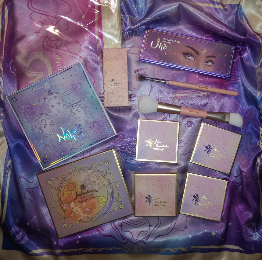
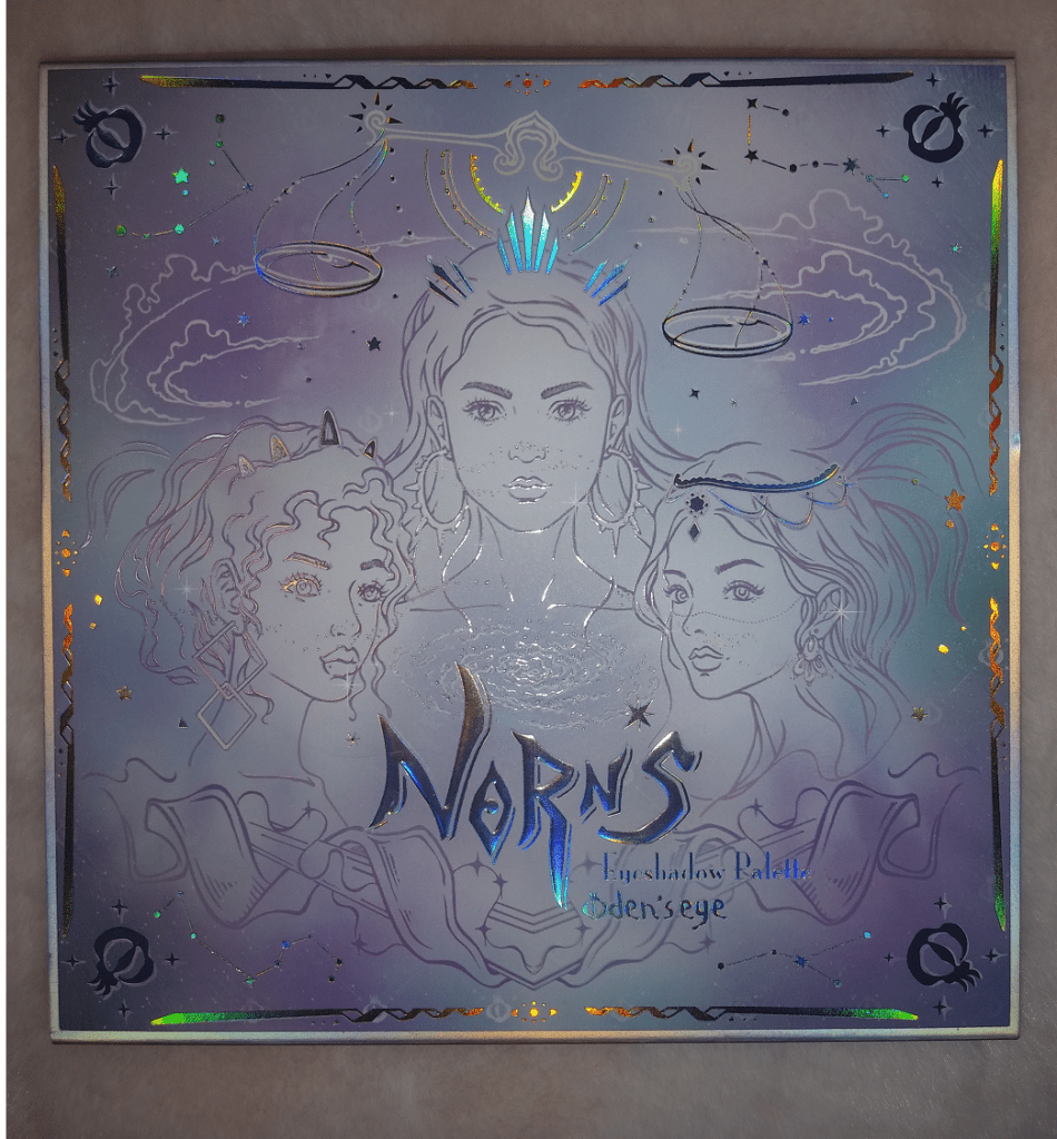
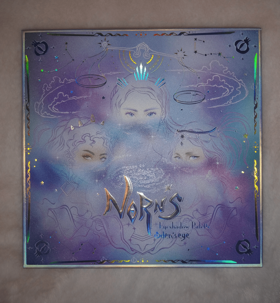
As a lover of mythology, and of course makeup, I’ve been drawn to this company from the moment I heard about it. When the Swedish brand first established themselves, they stated, “Oden’s Eye is inspired by ancient Nordic mythology, and our products and collections will also be built around this theme.” Their initial collections were very light and whimsical with eyeshadow palettes that reflected a too-light color story for my taste. I was so happy to see the release of the Norn’s Collection in their most beautiful palette artwork to date and color stories that have a better range of light, medium, and deep tones. I decided this was the time to place my first order. And second. And third. Then they released Mystery Boxes. I intended for this post to come out in March, but each new order required that I push this back to do further testing, reviewing, and rewriting. Now, it’s finally complete!
Before I get to the few products I bought out of the Norn’s Collection, I will start with their older products in my possession.
Oden’s Eye Blushes
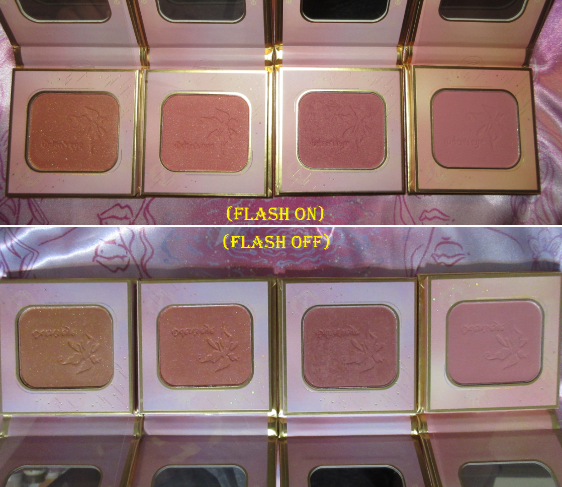
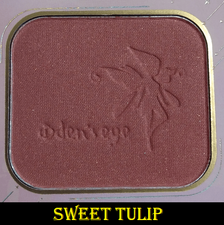
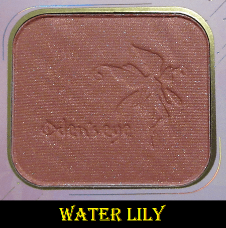
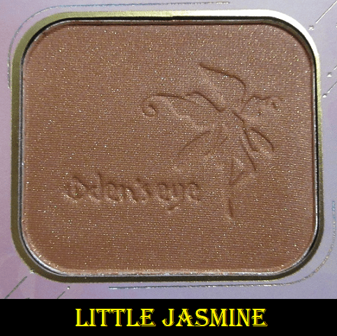
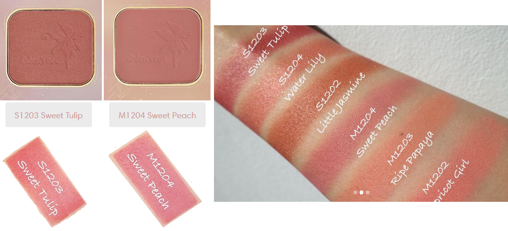
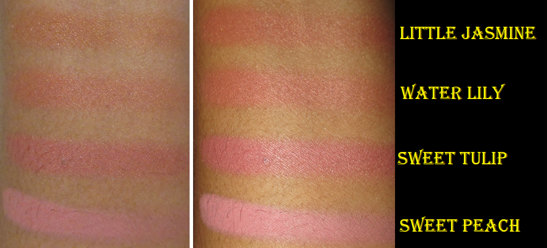
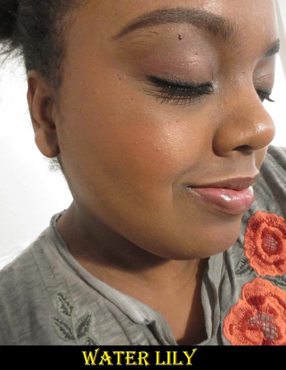
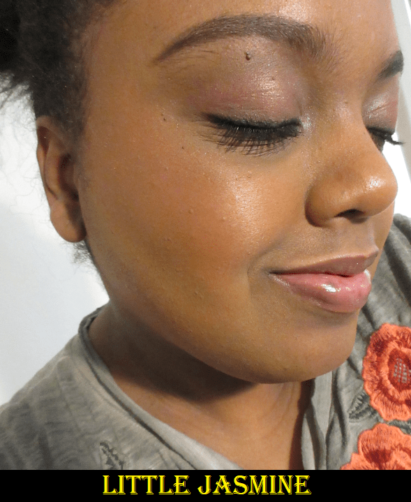
Alva Flower Blushers in Sweet Tulip, Water Lily, and Little Jasmine
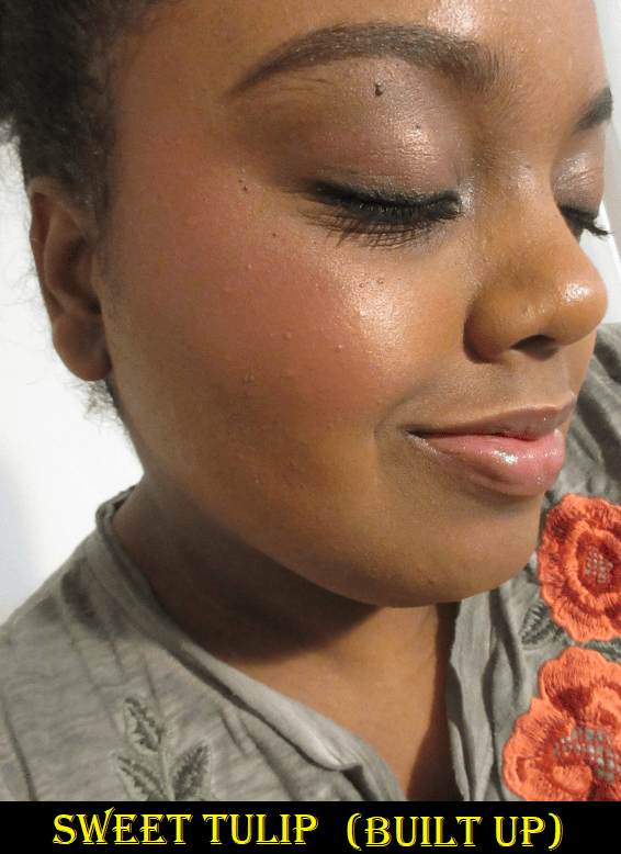
Oden’s Eye currently has three shimmer shades in the Alva Flower Blusher series. Most of the visible glitter specks is on that top layer and they disappears after a few uses. What remains is more of a satin finish with a natural looking sheen. However, the more I try to build up the color, the more radiant and reflective it becomes from the actual shimmer building up on my cheek. So for me, it’s best to stop at a medium amount of blush as building to the maximum payoff results in it looking lighter than before! For example, the shimmer in Sweet Tulip is a bit silvery and looks icier when I’ve packed it on.
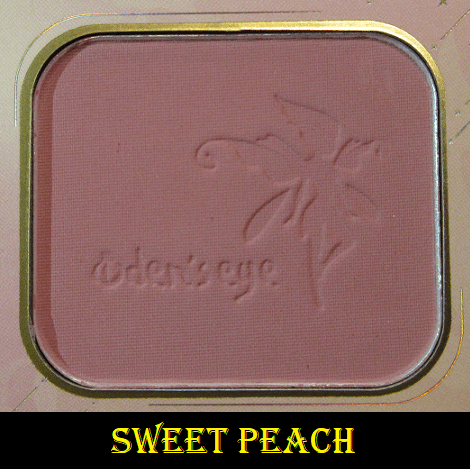
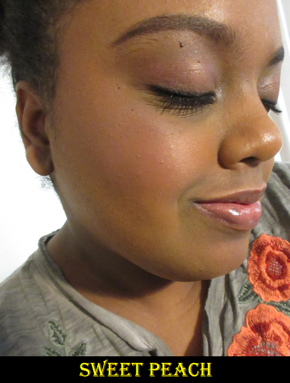
I purchased Sweet Tulip first because it’s the deepest blush out of the original six and I wasn’t certain if that shade would even be dark enough to show on my cheeks. Sweet Peach is the darkest of the mattes, but I couldn’t tell if it was more on the mauve or cool toned side. If a shade is a little too light for me, I can sometimes pull it off if it’s mauve, but the cooler it is the less I like it. It was hard to tell the difference between the shades on their website versus Instagram.
Have I mentioned I have a very bad habit of doing 1-3 am shopping? The majority of my excessive spending happens during that time while I think I’m still capable of making rational spending decisions. Then, after I fall back asleep and wake up later, I realize that it wasn’t the smartest thing to do. This is how I ended up making a third order and then a fourth when they released Easter mystery boxes with free shipping. I purchased the 25 Euro box and was still able to use a discount code on top of that, but more on the mystery boxes later.
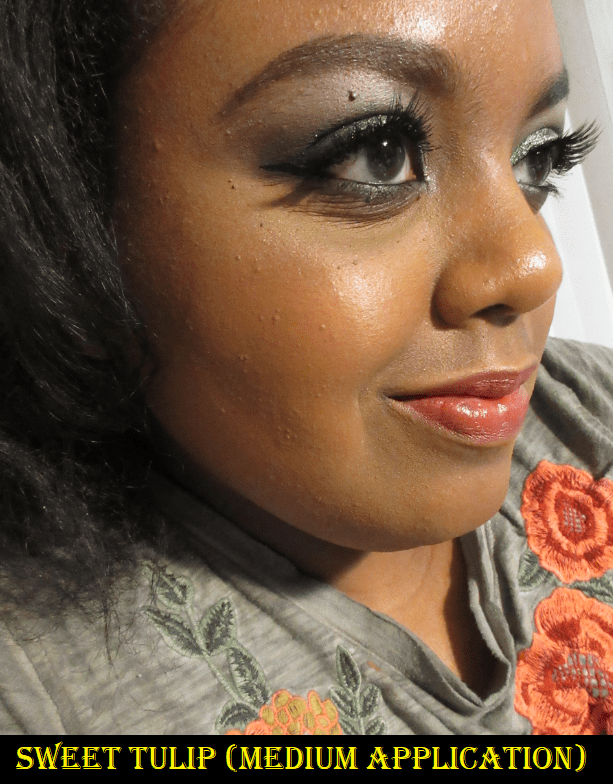
I love these blushes so much! In the Sweet Tulip photo on the left, I do have the tiniest amount of highlighter on my cheekbone, but I could have almost skipped it because I love the gentle glowy sheen that the shimmer in this blush provides. It’s long lasting, pigmented, and the tone is quite flattering! The blending is so quick that I can finish applying color to both cheeks in under a minute! I see the potential for this to be in my top favorite blush formulas. The Little Jasmine shade shocked me that it still showed on my skin tone despite how much brown there is to that shade. It’s my second favorite of the four, and maybe even tied with Sweet Tulip. Little Jasmine is the warmest one I bought and the shimmer shows more golden when built up. Water Lily is darker, yet it took a ridiculous amount of building up to make it visible on my skin. I don’t think it is an issue of the color match or hard pan. I can see the powder getting picked up on the different brushes I’ve tried. I believe there’s just less pigment in the formula of this specific shade. The blushes are good for 36 months after opening, but my Water Lily package was the only one with an actual expiration date printed on it (November 21st 2022). Because I have 18 months instead of 36, I wonder if the Water Lily shade is already performing differently. Regardless of the reason, I appreciate that there’s an actual date on that one so I know not to keep it around as long as the others.
Alva Fruit Blusher in Sweet Peach
There are three matte blushes in the Alva Fruit Blusher line but I purchased only one of them. The Sweet Peach shade looks much more mauve than peach on me. I was pleased to see it show up, but it looks a little ashy. I think this shade is a bit too light for my skin tone. This is the darkest of the Fruit Blushes, so the other two shades in the matte formula would not work for me either. I can at least say the matte formula is nice and if the brand releases dark colors, I would be interested in trying them.
Small Mystery Box
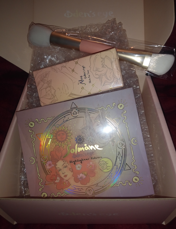
Oden’s Eye released a small (25 euro) and large (55 euro) mystery box in celebration of Easter and the company’s anniversary. Affiliate/Influencer codes worked on the deal, so I was able to get my small box for 22.50 euros with free shipping. The Norn’s collection was excluded, but nearly everything else was a possibility. I anticipated I would get a palette, lip product, and brush. I only hoped the shades would work for me and that I would not get a product I already own, so I was happy that all expectations were met. The brush that came with my order will be discussed in the brush section.
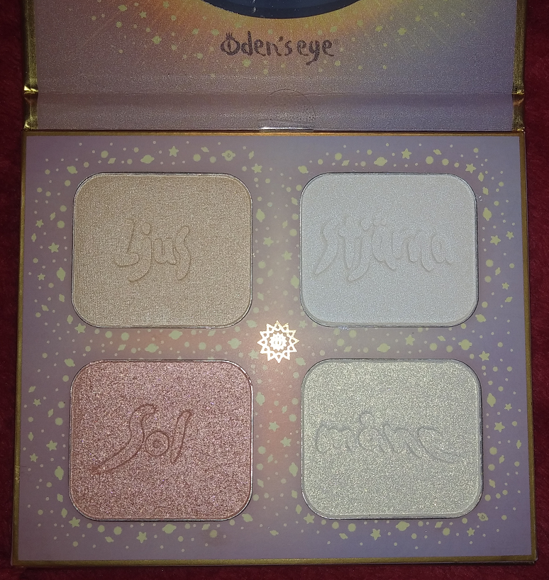
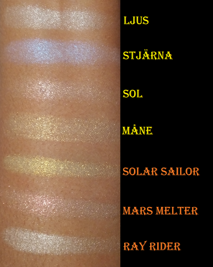
Solmåne Highlighter Palette
Ljus (light in Swedish) is a pale gold and has the smooth shimmer formula I like, but it’s too icy looking on me. Stjärna (star) is a beautiful iridescent shade that looks white in the pan but is blue with a tinge of purple. These two would make beautiful inner corner eyeshadow highlight shades. Sol (sun) and Måne (moon) remind me of the Kaleidos Space Age Highlighters, but with sparser glitter particles, which is not a feature I like in highlighters. I could use them as eyeshadow toppers, but I don’t know if this palette will survive an end of the year declutter. I’m still happy I received it because my curiosity about the formula would have led me to buy it eventually anyway.
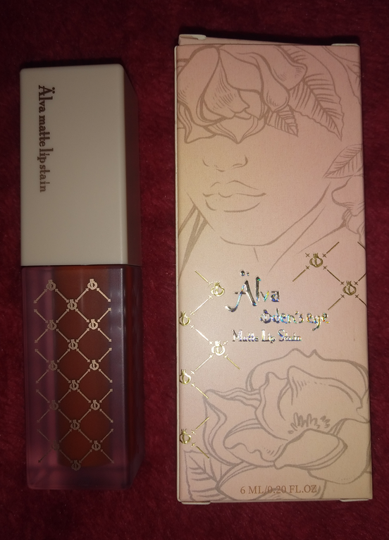
Alva Matte Lip Stain in Ripe Papaya
The first thing I noticed about this lip stain was the strong but pleasant fruit candy smell. Then I realized the formula was not the typical watery texture of a stain that I was used to. The consistency is more similar to a liquid lipstick. I can get nearly opaque results with one layer, but I need a little more to cover the dark patches on my lips. One time I made the mistake of applying too many coats, which turned the smell from nice and fruity to an unpleasant cherry cough syrup smell. On the bright side, I discovered it layers up well. It’s definitely matte and makes my lips look and feel uncomfortably dry. I cannot wear this by itself, but it looks amazing under a thick shiny gloss. In matte form, it’s transfer-proof but comes off with an oil based remover or just some oil. If it’s under a gloss, it will last on the lips if left alone, but it’s easy to transfer at that point. Considering how much I loved the color but needed a more hydrating formula, I wonder if I would prefer Oden Eye’s Cream Lip Stain formula. One day, I will find out!
Oden’s Eye Brushes
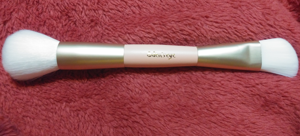
Double-Ended Highlighter Brush
This brush is made of synthetic bristles. The fluffier end is very floppy and loosely packed, but it makes a fairly nice blush brush. The stiffer and tighter packed end is slightly angled. I can use it on its widest side to brush the highlighter in small sections of my cheekbone. With this one, the bristles can rub harshly when I do that. A smooth and soft application occurs when I turn the brush to the side and use one long sweep with the tips of the bristles to spread highlighter across my cheekbones. I don’t foresee myself continuing to use the stiff side, but I will probably use the soft side for blush every now and then.
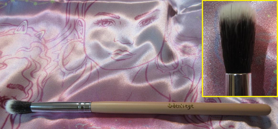
Eyeshadow Blending Brush
This brush was a surprise addition to one of my earlier orders. I’m not sure if there was a deal going on at the time, if it was a mistake or intentionally gifted for free, but I appreciate having it all the same. The bristles are synthetic and balance softness with medium-packed tightness so that I can get a decent blend with this brush in a light to medium application. The bristles are too long to get a really intense blend. It also becomes looser packed with continued use.
Norn’s Series
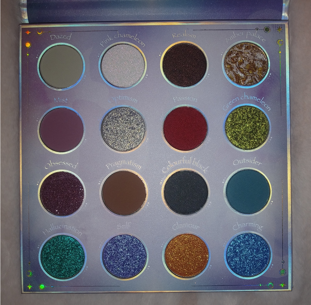
Norn’s Eyeshadow Palette
This palette’s eyeshadows are a wild mixture of different textures, finishes, and levels of opacity. Swatching each shade was like unraveling a mystery; I got quite a few surprises! I instinctively switched between using my brushes of various shapes and fibers and density versus my fingers, when to use a glitter glue, when to spray it, etc. to create the looks I wanted. Although it was fun and not too time consuming to discover the ins and outs of this palette, this is technically not beginner-friendly. The very fact of having a palette with so many different textures lends to the challenge. I think it would be easy for anyone to create a pretty look because the mattes are pigmented while still being super blendable and the shimmers make an impact (by mainstream standards) without extra effort. In that sense it’s beginner-friendly, but maximizing the full potential of this palette takes intermediate level and above. There were certainly times I had to restart an eye look or do swatches on my arm to test how some of the shades paired with each other, since the effects were sometimes unexpected.
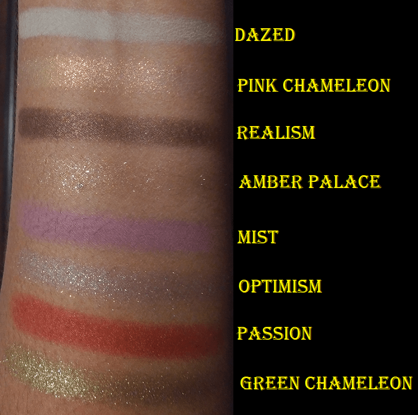
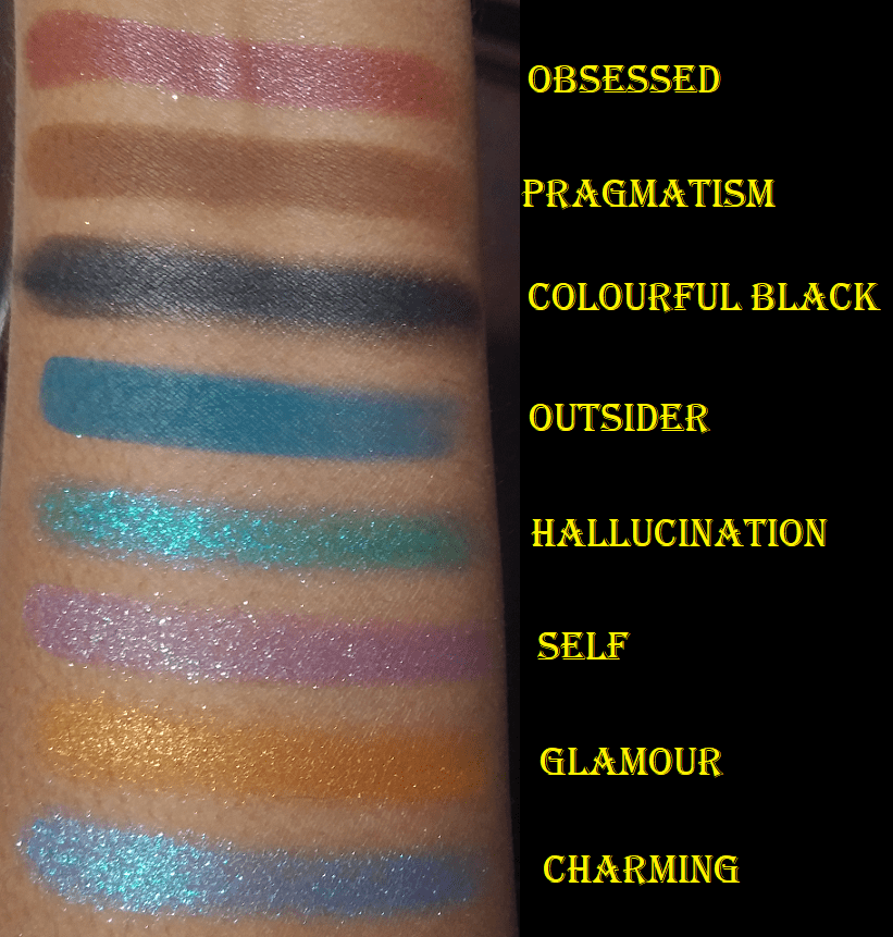
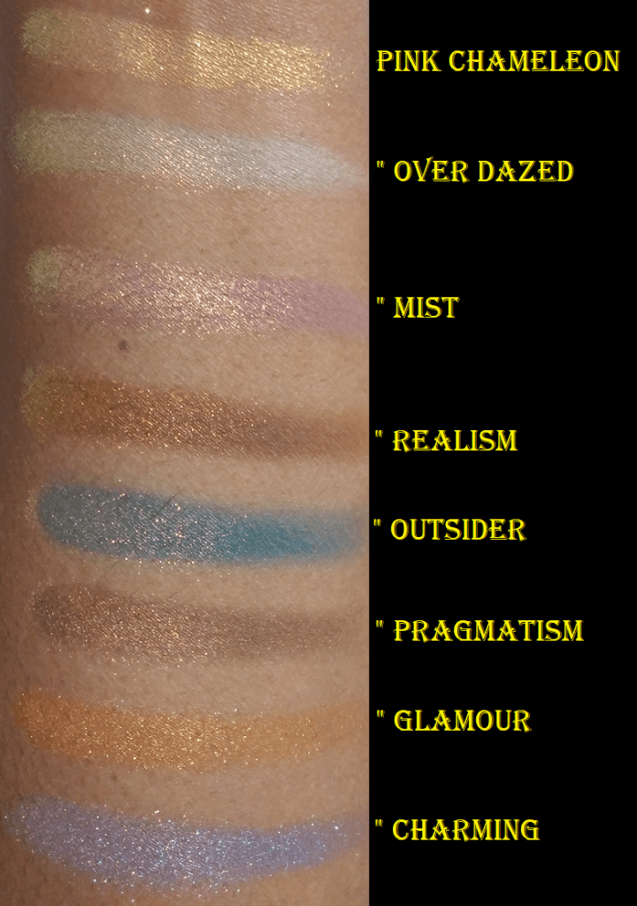
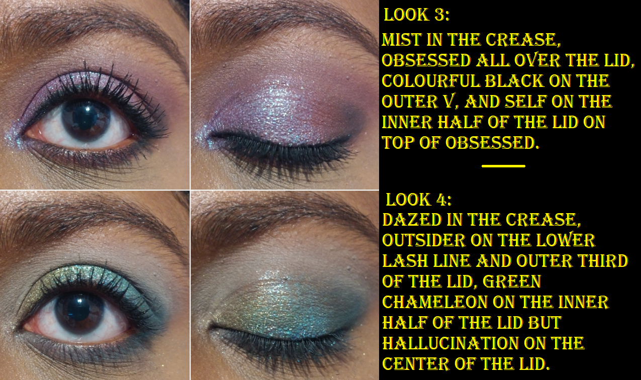
There are four mattes in this palette. Dazed is a cool grey. I was impressed with the level of pigmentation and how a shade like this didn’t look patchy or ashy on me. I think it’s because there is a little green to the tone of that shade which goes well on my warm yellow-toned skin. Mist is a cool light purple. This is another shade that would usually appear a little ashy or patchy on me, but I have zero issues with this one! Pragmatism is a medium brown that deepens up the more it is applied. I prefer to use it in the crease to create depth there, but it’s not quite enough for my tastes to deepen the outer corner. Outsider is a gorgeous peacock blue or ocean blue or medium blue leaning teal. I’m not sure what the best name for this shade is, but I don’t think the description from Oden’s Eye as a, “retro green” is that much better. Sometimes mattes swatch beautifully, but don’t perform as well on the eyes. I’m happy to report that these mattes do both!
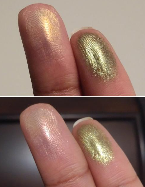
Pink Chameleon is a multichrome! The brand only describes this as having a pink, yellow, and green shift, but I swear it also looks a bit more orange or red or peachy depending on the light and angle. On my finger, this multichrome had clear and obvious shifts. On my eye, this color looked very different depending on which shades I put it next to or on top of. For instance, sometimes it would only pull peachy-pink or yellow-gold, or yellow-pink. In rare occasions I could see pink-green. The green element being the least visible on my skin and especially on camera. I had to do a lot of experimenting with Pink Chameleon to figure out which combos would give me the effect I wanted.
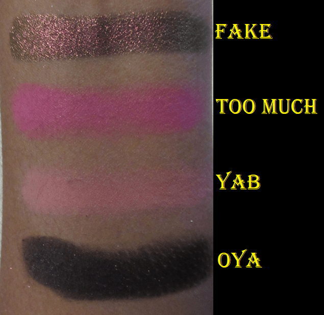
There’s another shade called Green Chameleon in this palette. The website has this listed as an, “Olive green chameleon eyeshadow, multichrome shift,” without describing what what the other colors are. Honestly, I don’t see any shift. The texture of Pink Chameleon is that slick recognizable multichrome texture like Clionadh’s Jewelled formula, Devinah’s Aurorae Flares, the shade called Fake from the Juvia’s Place Wahala 2 palette, etc. Green Chameleon feels like the other four diamond shimmers in the bottom row of the Norn’s palette. The two best ways I’ve been able to detect multichromes is to swatch them on the palm of my hand and rotate my hand around, or to apply them to my fingers and hold them vertically and raise my fingers up and down so that it moves closer then further from the light. All I can see is it going from an olive green to a slightly lighter olive green or a greenish yellow. Its not a difference anyone will notice if you put this on your eyes. It’s still a pretty shade, but I don’t count it as a multichrome or duochrome.
There are two easily recognizable satin shades in this palette, or as Oden’s eye says, “metallic eyeshadows that look like satin.” Metallic shades are different from my perspective, so I’ll just refer to them as satins. One is Realism, a gorgeous medium-dark brown. Realism has visible copper reflects, but I prefer to have more of a contrast in my eyeshadow looks. I don’t mind doing a neutral eye from time to time, but if I’m going neutral I want a bit more sparkle. So, what I love to do is combine this shade with pretty much any of the more sparkly shades in this palette. There are so many options to choose from that are so pretty. The outcomes are different enough that I wanted to demonstrate several of them.
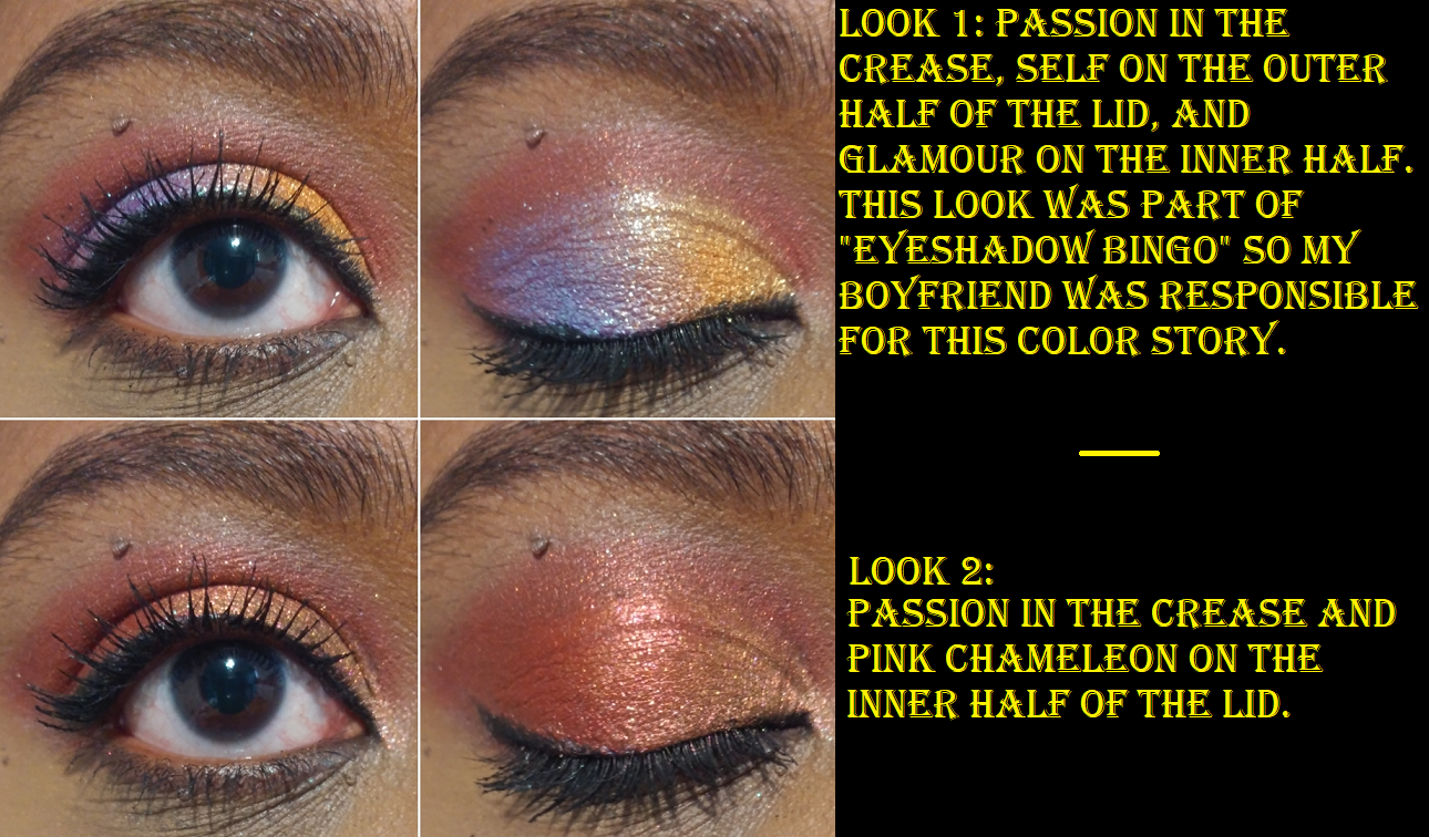
The other satin is a “red velvet” shade called Passion. Although pretty, I don’t think this particular tone of red goes that well with any of the other colorful shades. Even though reds and purples or reds and oranges are usually a match made in heaven, I find that this shade clashes with anything other than the neutrals or surprisingly the Pink Chameleon shadow.
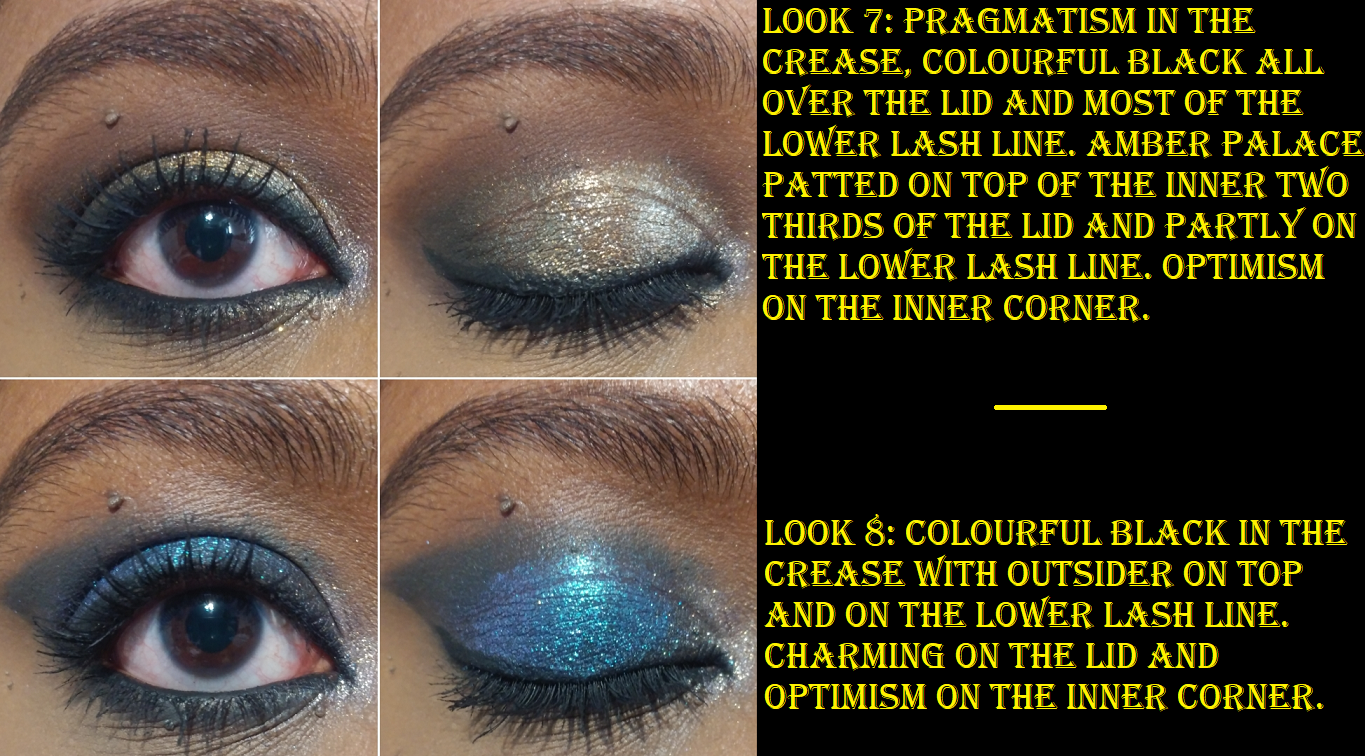
Amber Palace looks marbled in the pan and I’m happy to report that it’s not an over-spray and the pattern doesn’t disappear once you’ve used it a few times. This “sparkling diamond shimmer shadow” is a mixture of gold and silver that runs throughout the entire pan. I consider this a topper shadow because the amber orange-brown base matches my skin tone so much that I just see the sparkle. It doesn’t look like there’s a base at all until I swatch it on my palm.
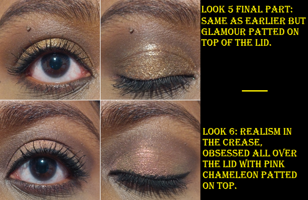
There are five other diamond shimmers listed in this palette. In fact, all the sparkly-glittery shadows in this palette are referred to as diamond shimmers. The first is Optimism, which looks similar in swatches to Amber Palace except the base color is purple. It’s another shade I consider a topper because the base is so sheer. I prefer to use this shade with cooler toned looks and Amber Palace for warmer ones. Next is Hallucination, a blue-green shade that’s like a medium toned turquoise with pink and purple shimmer. The texture of this shade is wetter than the others and doesn’t feel as well bound to the sparkles as the others. It feels like it was intended to be a shimmer version of a cream to powder formula. It leaves a residue behind on the finger, the way cream products do, and takes a bit of smoothing to give it less of a chunky appearance. The color is beautiful but I’m not a fan of this particular formula. It reminds me of the texture my homemade eyeshadows feel like when I use slightly too much liquid binder. Self is a stunning purple with teal, silver, and perhaps green sparkles. It’s very much my kind of eyeshadow shade. Glamour is an orange and gold shadow that reminds me of the pressed glitter shade I wanted from the Juvia’s Place Nubian Glow palette (but depotted and thew away). I’m so glad to have this version as a regular non-pressed-glitter shadow! The eyeshadow palettes from Oden’s Eye’s previous collections had some pressed glitters in them but there are none in the Norn’s Collection. Lasly, Charming is like a blue-purple duochrome with teal, purple, and pink shimmer.
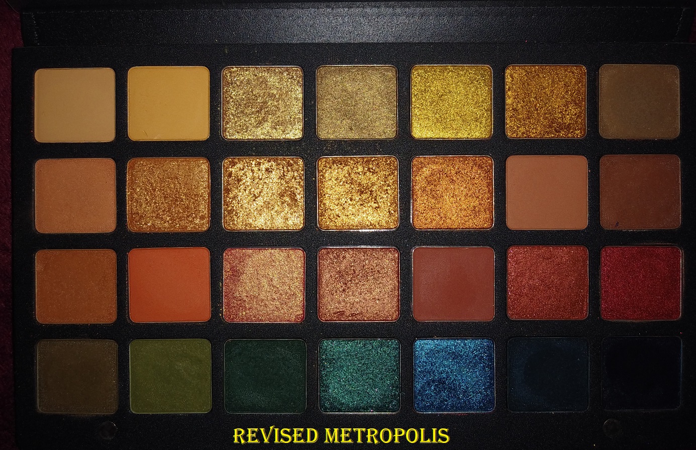
Then there are two other textures that stand out. Obsessed, the “violet with pink and purple diamond shimmers,” feels is like a cream to powder shadow. It feels wetter than the two satin shades in this palette, but not as full on creamy as the cream shadow shades Natasha Denona has in the Metropolis palette. Obsessed takes several dips with a brush to get an opaque layer on the eye. It’s slightly easier with a finger, but the product sticks a bit more to the finger than the eye, so it tugs on my skin more than I’d like. Colourful Black felt like Obsessed in the beginning, but after a week it felt a lot more dry, like a typical shimmer eyeshadow. This goes on the skin very easily with a brush, so there’s no need to use a finger to apply it. It’s very pigmented straight out of the gate, but it can be blended to appear in a lighter and sheerer layer. According to Oden’s Eye, this shade, “…contains all colors of shimmers. Different usage will create different effects.” It makes for an excellent deepening shade, liner, and base. Although I can see the sparkles in the pan, the effect is satin-like with more sheen than a matte but without seeing the glitter particles. Usually all I require for black shadows is for them to be dark enough and blendable. This is one of the few times I can say I actually like the shade for its color and not just about its depth.
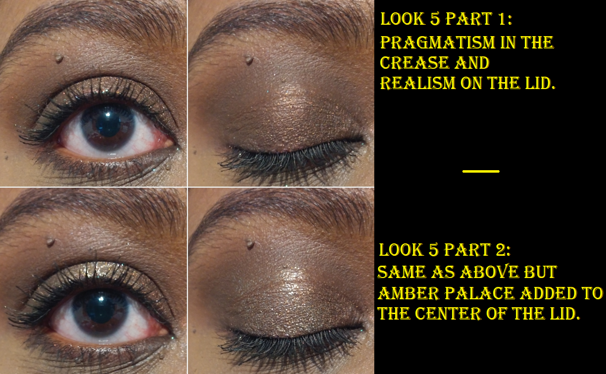
In Look #8 I forgot to mention that Colourful Black was also applied all over the lid before Charming was added on top. This is what caused the stronger blue tone to the shade.
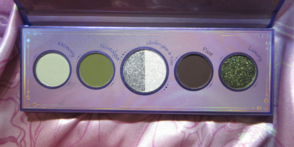
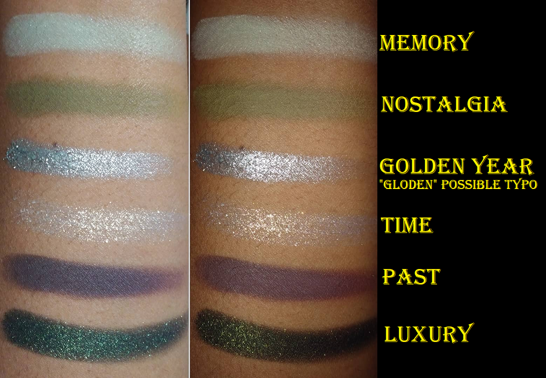
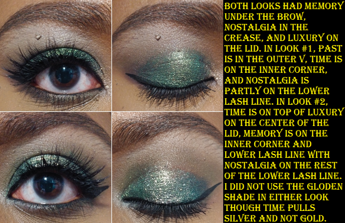
URD Mini Eyeshadow Palette
This palette is gorgeous but all the minis, in my opinion, are overpriced compared to the larger palette prices. You get 6 shades for $21 versus 16 for $36. $3.50 per shadow compared to $2.25 per shadow. For that reason, I had to decide between the Urd palette and Skuld palette. As much as my eyes were drawn to the colorful nature of the all shimmer Skuld palette, I knew I could get a complete look with Urd and that green was irresistible!
This has the same great shadow quality as the Norn’s palette and it was so easy to create a look. I used the same shades for both of the eyes, but the change in technique and color placement made them look surprisingly more different than I expected! The Luxury shade on the lid is gorgeous! It’s mostly green with yellow gold reflects of diamond shimmer. Luxury has a black base which I noticed darkened the crease shade on the eye that I used the MAC Foundation Stick as a primer (look #2). In Look #1, I used a MAC Paint Pot and this did not happen. I also used the Nyx Glitter Primer on both lids.
Memory is definitely a bright “light gray-green matte” but just as it was the case with the shade Dazed, it’s somehow not too stark for me. That green tinge works! Oden’s Eye describes Nostalgia as a “matte grey olive green,” and those grey tones come out on the eye to create more of a khaki green tone. I wish it was a little less grey, but it goes well with the other shades in the palette.
Gloden Year & Time are the split pan shadows. I believe ‘gloden’ was a printing error because the website description says, “Golden year: Silver metallic color, the golden year is just a silver memory in the past” and “Time: Colorful shift of multiple colors against a semi-transparent base.” Golden Year is much smoother and the shimmer particles are much closer together than the shade Time. Time is a chunky flaky topper formula that I can clearly see as gold toned in person, but my camera only picks up a silvery hue.
Lastly, Past is a dark coffee brown matte. It’s a perfect addition to add a bit of smokiness to the look. This color story was well thought out and even though I think $15 would have been a fairer price (more than the $2.25 but less than $3.50 per shadow), I’m happy I bought this.
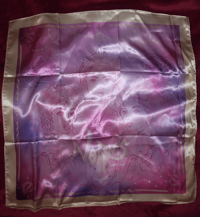
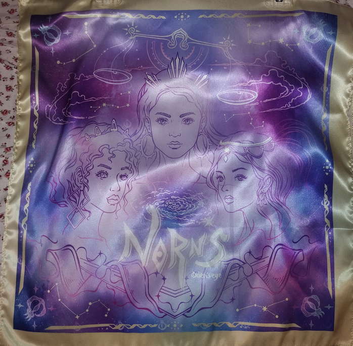
Norn’s Silk Scarf in Pink and Purple
There were pink, purple, and blue versions of this scarf available and Oden’s Eye was adding one for free to any Norn’s Collection order above 50 euros. At the time I bought them, they were on sale for 50% off.
I just purchased these because of the design. The print is so pretty to me and I wanted another item that had it, even though I have zero use for scarves and I never wear them.
Also, I could have sworn there was nothing written about the scarf being “artificial silk” until I made my last order because I remember being surprised at the low cost and wondered why silk would be used by a cruelty-free brand, but perhaps I just missed it.
Additional Information
All of the powder products have a slight powdery talc-like smell. In 2014, I owned a Coastal Scents palette that smelled incredibly chalky. Nothing I’ve purchased since then has ever been that bad, but I try to keep track of that kind of thing and share that information with others.
When ordering from the website, the default prices are listed in euros, but they have a tab at the top where you can change the currency. Although Oden’s Eye is based in Sweden, their products are made and shipped from China. My favorite independently owned brands to support are the ones who make their own formulas like Lethal Cosmetics, Terra Moons, Devinah, Clionadh, (or on the larger side Ofra and Colourpop), etc. For some reason, I was under the impression that these were created-in house, so I was a little disappointed. However, I know this is the norm. Juvia’s Place and Kaleidos palettes are made in China. Even indie brands whose products are formulated in the US don’t necessarily make them themselves. A separate cosmetics lab is usually responsible. With this thought in mind, it bothers me a little less. It’s also pretty neat that some products in their line are still handmade, like the Amber Palace shade within the Norn’s palette and the Norn’s Mesmerizer Highlighters. Oden’s Eye posted a fascinating video showing the Highlighter process on Instagram that can be viewed here.
I’m not sure what the shipping fees are for other countries, but I paid six euros (a bit over $7 USD) the first two times I ordered. They do offer free shipping over 50 euros. My initial order shipped within 24 hours but took exactly 3 weeks to arrive. Oden’s Eye emailed that my package would be delayed due to Chinese Lunar New Year and then there was a delay at customs. They ship through DHL and transfer to USPS and state that 7-14 business days is typical. My second order took 17 days (14 business days). The transition between DHL to USPS is where it was held up quite a bit. The third order only took 8 days of the 8-12 business days if you choose the upgraded USPS first class option for eight euros. Two extra euros for the package to arrive 2 weeks before regular mail is quite a good deal. The Mystery Box took 13 days.
I appreciate that for a small brand, they still make an effort to try and feature a variety of skin tones in their promotional photos and their Instagram. Of course I wish there were more swatches on deeper skin and in a variety of lighting settings, as well as clear pictures of what the products look like on the face, but they put in more effort than some other brands I’ve seen. The Fancy Face has received PR from them, so I recommend viewing her channel for extra swatches with her take on this collection. At the time I started working on this post, she was the only WOC on Youtube with a review of Oden’s Eye beyond reviewing a single palette, and her video was made after I had already placed all three orders. In fact, at the time I started my first draft of this post, she just had this video available with sneak peeks of the review to come. I wish I had this video as a resource before placing my order, but I’m still happy with the items I chose. Sometimes I get lucky and my guesses work out. Tina is close to my skin tone, but a little lighter than me. There’s one other youtube channel I found by someone a little darker than me with several more Oden’s eye products, which can be found here. For anyone wanting to see swatches on a tan skin tone can click here, and for pale to medium skin tones there are a plethora of options to choose from on Youtube like from Amy Loves Makeup, Morgan Turner, and Angelica Nyqvist.
Lastly, about the palettes, the eyeshadow pans are smaller than the standard 26mm. There is slightly more than 1 gram of product per pan, which is what I always like to see. I do wish the pans were slightly larger because most of these shades apply better with a finger and I have limited space to rub and pick up the shadow on the pads of my fingers.
That’s all for today! I hope this was helpful if you were considering placing an order with Oden’s Eye. If you do, don’t forget to use an affiliate code for an additional 10% off! FANCYFACE, MORGANTURNER, AMYLOVES, and ANGESCHKA are a few of them.
Unlike some of the other Indie brands I’ve discussed before, I didn’t feel like I had enough to say about JD Glow or Terra Moons for standalone posts, so I combined them both here today.
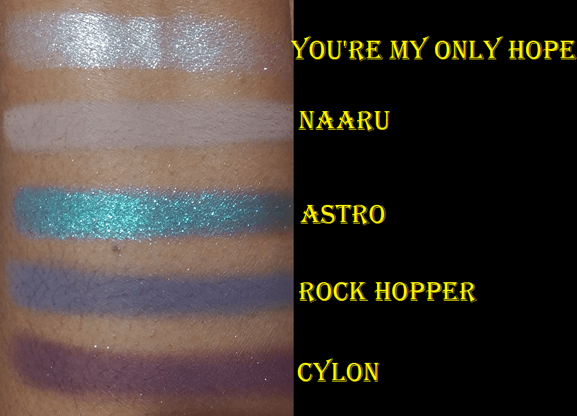
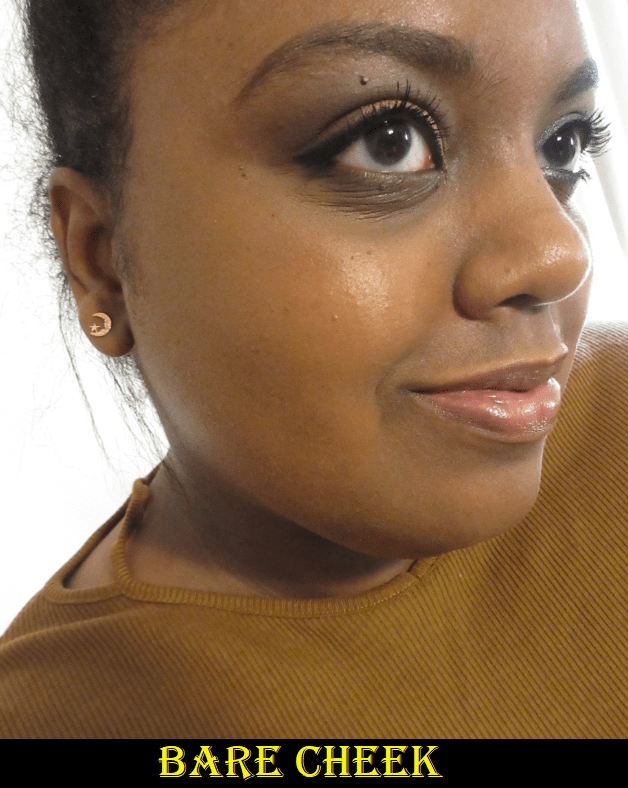
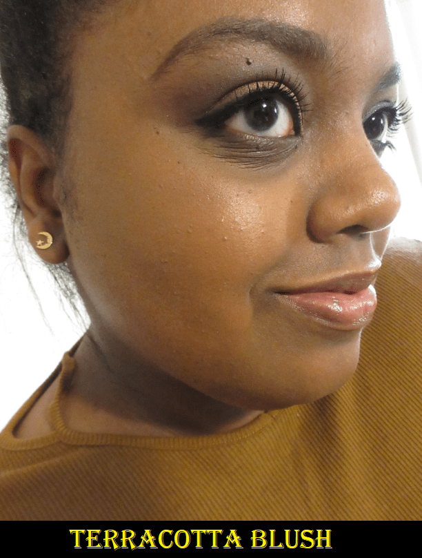
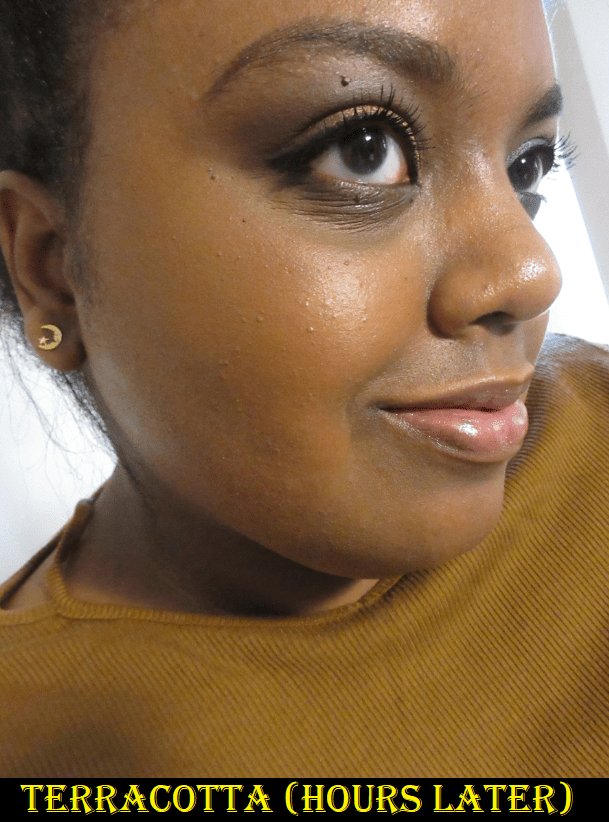
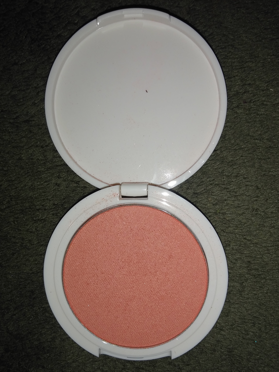
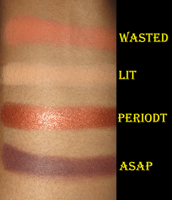
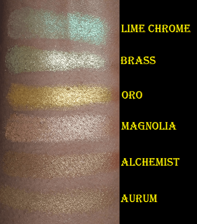
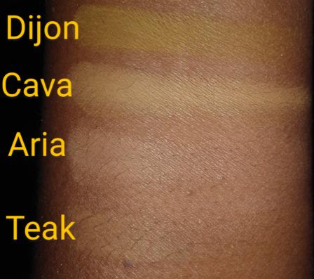
Terra Moons Cosmetics
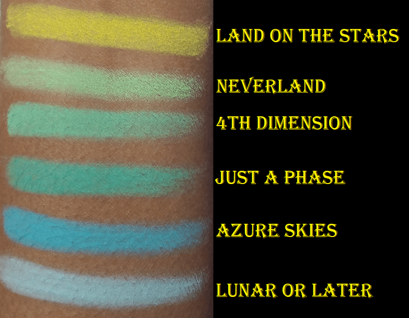
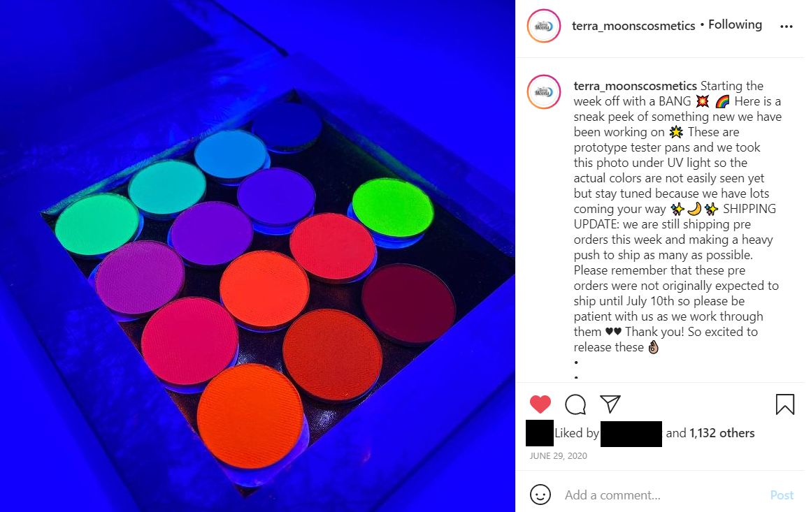
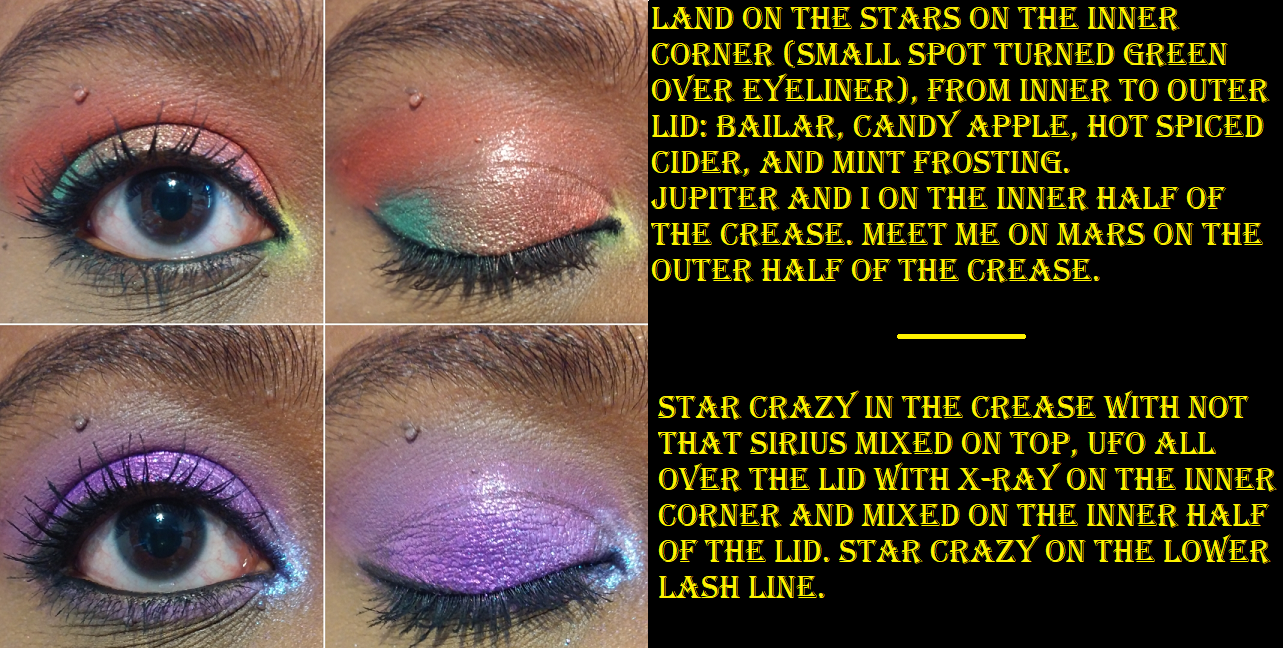
The majority of my Terra Moons mattes are from the Neon Mattes Collection, in which I have 9 of the 14. Neverland is a discontinued traditional neon green shade from the original formula. It isn’t as smooth as the ones available now, but I’m happy I was able to get the last one. It’s very exciting to see these unique tones of neons though. These shadows are thin and powdery, so most of these will not look opaque without being carefully packed on. Shades like Land on the Stars, Jupiter and I, and 4th Dimension are glowy neons. You can see this in TerraMoons’ Instagram post before the launch.
The rest in my collection I’d consider more of vibrant shades on my skin tone. I treat them similarly to the Vivid Pigments from Coloured Raine, so I either have them in the crease or as inner corner accent shades. As these TerraMoons neon mattes are actually the only neon shades I own, I only have experience with these and cannot rank or compare them to others on the market. I can say that I’m happy with these and I don’t feel the need to try any from other brands. They aren’t beginner friendly. I feel as though I’m still learning how best to use them. They aren’t a necessity for me, as I don’t do super artistic editorial looks, so they’re just a fun cool addition to my collection to occasionally use. Also, Lunar or Later is a pastel matte and not part of the neons. It was sent to me by mistake instead of Lunar Haze in my order. Terra Moons’ customer service is great and sent me Lunar Haze right away without any issues and they let me keep Lunar or Later.
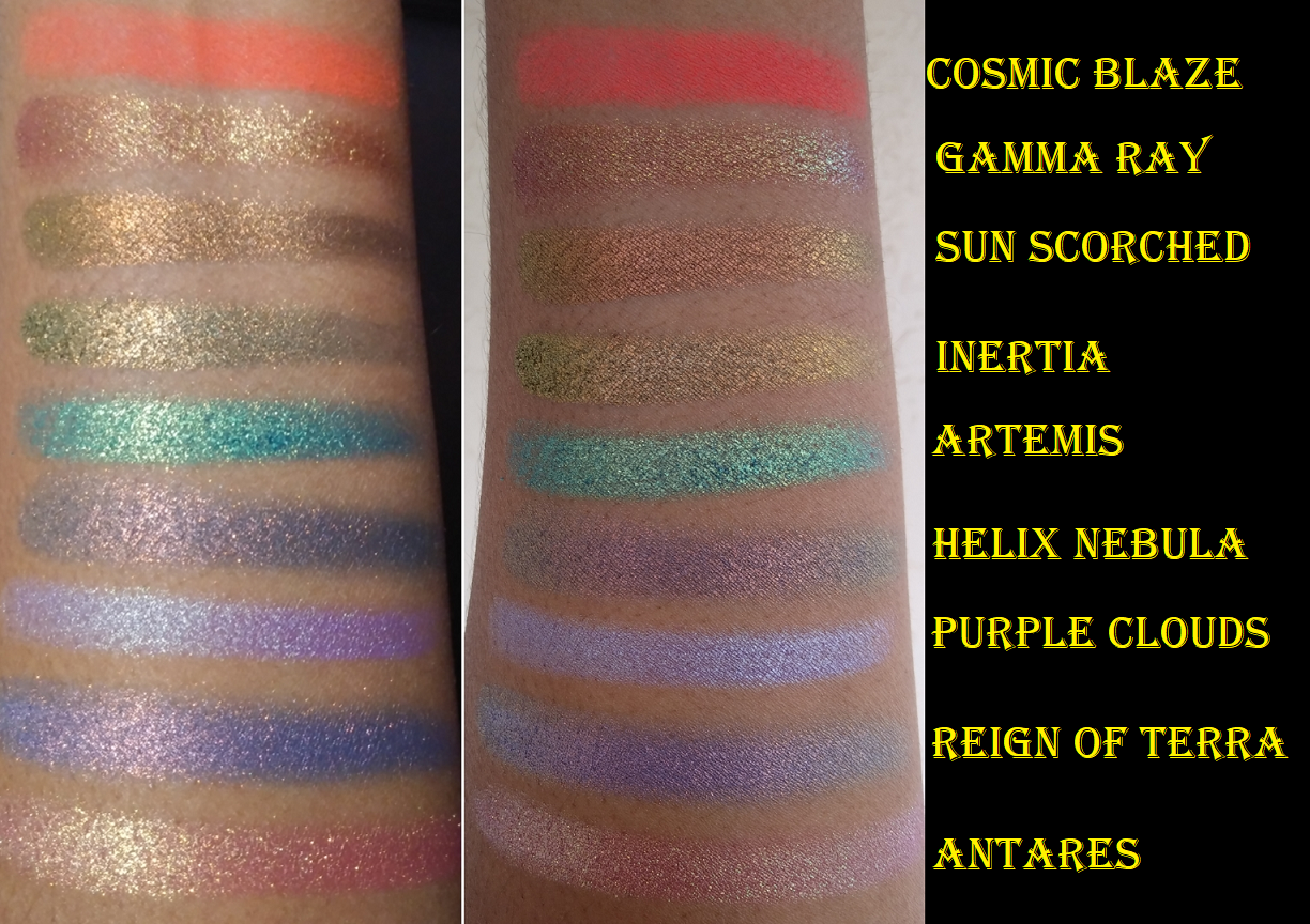
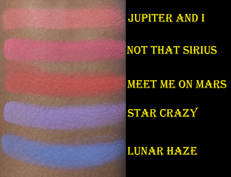
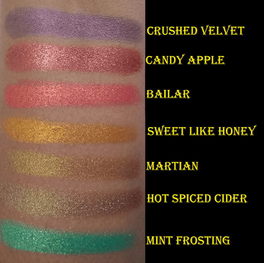
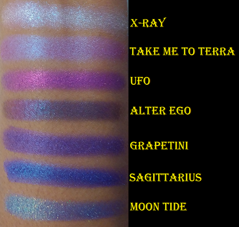
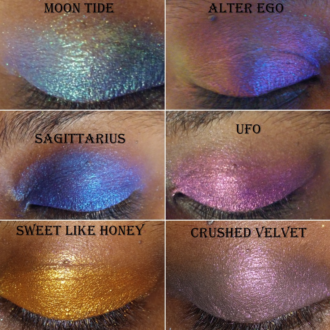
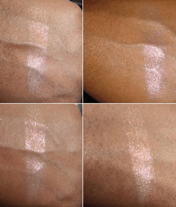
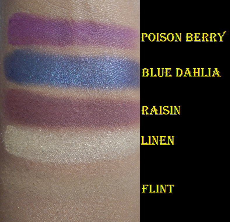
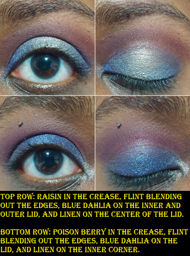
This next section of swatches are a mix of a shimmer, duochromes, and a multichrome. I was unable to find Candy Apple, Sweet Like Honey, Take Me To Terra, and Sagittarius on the website. I bought those in the same order with Neverland (June 2020), so, perhaps these have been discontinued as well. Crushed Velvet is described as, a “wine brown duochrome,” but the dark pink shimmer doesn’t stand out very much and the base color is a bit muted, so I view this as more of a satin eyeshadow. Bailar is one of their newer shades. It was introduced in the El Barrio palette, but it’s also available for sale individually. It’s a beautiful duochrome coral and gold and that combo always attracts me. Martian is a greenish toned gold shade, the kind of shade I also often buy, but after playing with my Natasha Denona mini gold palette more lately, Martian isn’t as much of a standout shade as I thought. On the other hand, Hot Spiced Cider is a much more interesting version of Martian as it has a stronger green tone that makes it more duochromatic. It’s not the most unique shade on the market, as I’m certain I have shades like this in my collection, but the formula is great. I recommend this if you don’t own a shade similar to it. Mint Frosting has an interesting tone of green with gold shimmer that looks warm in the swatch, but has some blue tones to it that can be seen better when applied onto my eyes. X-ray is a blue and purple topper shade. The texture is a bit flaky, so I had a little trouble getting it to stick in my inner corners, especially since I had to really press it to make that white powder blend into my skin the way many iridescent shades do. Grapetini is a pretty purple. It’s not as exciting compared to the others but I wanted it anyway and the formula is nice.
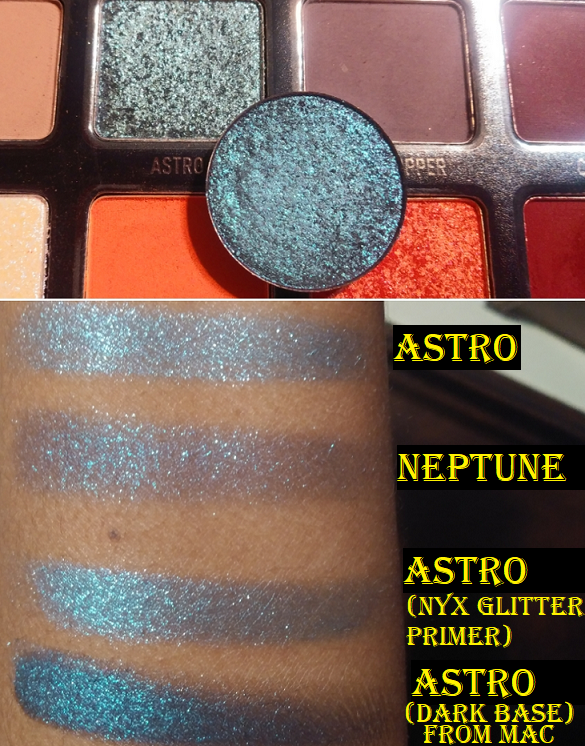
UFO is always on Pre-Order. It’s described as having, “a bright purple base that shifts red, gold and peach.” I just see purple and pink. This shade isn’t very shifty to me, but it is definitely beautiful and I like the level of shine it has. Moon Tide is also a Pre-Order shade with, “an indigo violet base that shifts light blue, lavender and pink with hints of silver.” This one definitely shows all of that. It’s my favorite shadow from Terra Moons. When it comes to duochromes and multichromes, it’s not a secret that I favor Devinah and Clionadh, but Moon Tide is one of those shades that if you want to make a purchase from Terra Moons, I highly recommend trying this one. Clionadh released a new Vibrant mulitchrome called Regal that I believe might be similar to Moon Tide, but I haven’t purchased that shade to see for myself. UFO and Moon Tide are both part of the Cosmic Chameleons collection, which are multichromes with colored bases, not black bases like the Extreme Multichrome line.
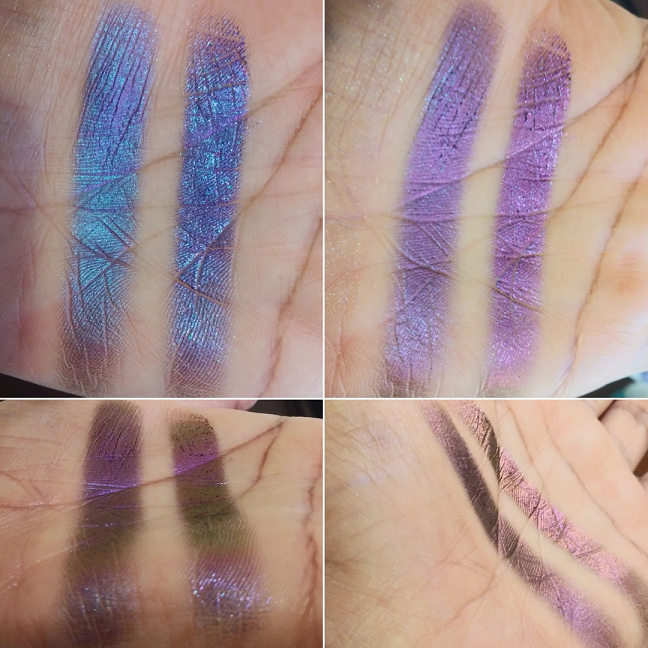
Alter Ego is one of the extreme multichromes. It’s mainly purple with a blue, magenta, orange, and gold shift. It reminds me of Rosette from Clionadh, though not as sparkly of a finish. In the photo below, Alter Ego is on the left and Rosette is on the right.
Considering the number of shades I’ve seen disappear from the website in the last twelve months since I placed my first order, I definitely recommend that anyone who wants some Terra Moons shadows should try to get them while they’re available! I was able to get most products on sale and use an influencer promo code to get them at a discounted price. Waiting is a gamble, but sometimes it pays off. For example, the neons being discontinued in order to come back in a reformulated version. I will say though that shipping is pretty expensive considering it’s only a few dollars cheaper than some of the international shipping fees I’ve paid to get shadows from other countries. It does bug me a bit, considering I live less than two hours away from where Terra Moons ships their shadows, but it’s a nice consolation to be able to support a Florida business.
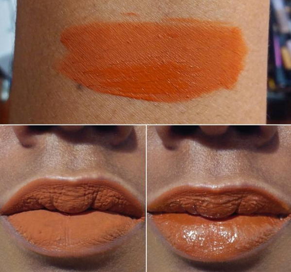
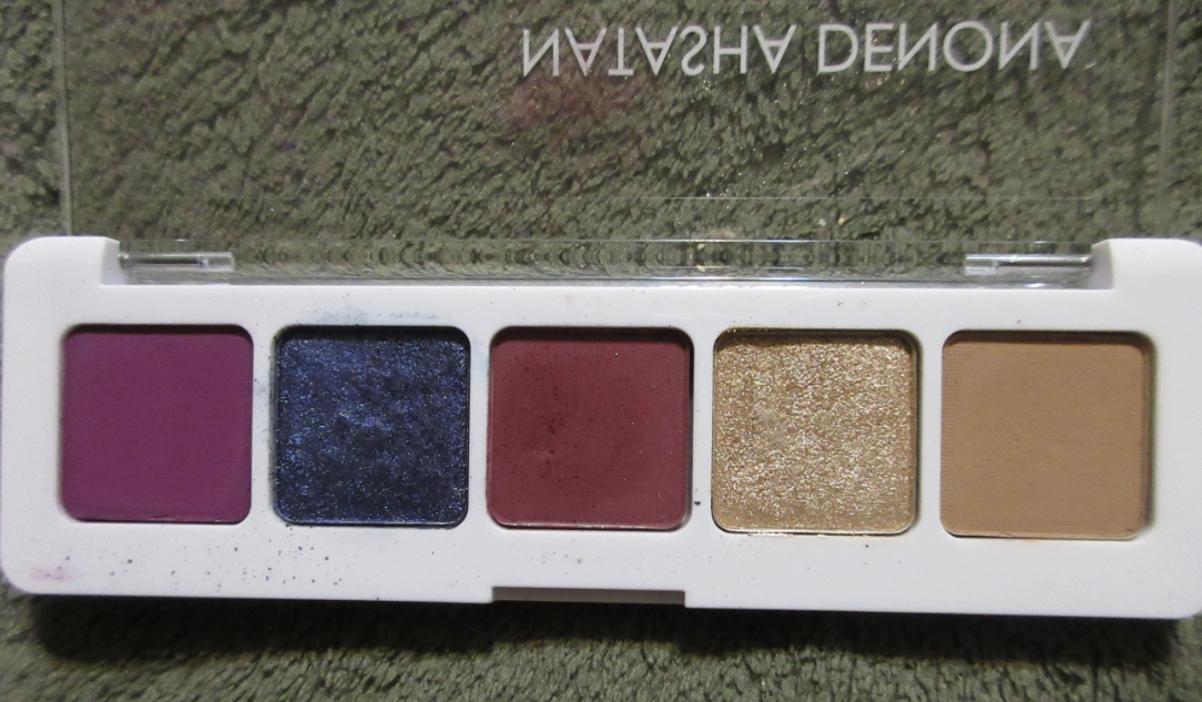
JD GlowCosmetics
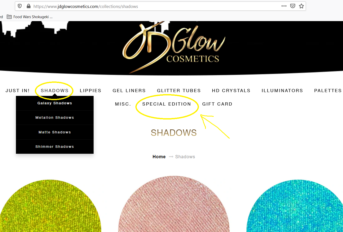
The JD Glow shadows are stunning and I would have been way more excited if I hadn’t been expecting their Galaxy shadows to be like the Clionadh Stained Glass shadows that so many people compare them to. The shades are described as having, “duochrome and triochrome effects,” but they’re more along the lines of intensely sparkly shimmer and duochrome shadows. Because I expected JDGlow’s multichromes to be with all the other shadows on their site, I thought the Galaxy shadows must be the multichromes I saw on Instagram. I later discovered that what I really wanted was under the “Special Edition” section.
Their website is basic, yet not user friendly. I hope this is something they work on soon. This is why I was unable to get the See Weed shade I’d been wanting from them for so long. I also wish they restocked more often, as I’m reluctant to place orders knowing that some of the things I want aren’t available (and would therefore require a second order) while the shipping is not free.
Limelight is from the Metallion line, Martini is a Shimmer, and the remaining four are Galaxy shadows, though Starluster was no longer on the website when I last checked. Despite them being beautiful, and the Makeup Goblin inside me wanting more, I can’t say that there is currently anything else from JD Glow’s offerings that I don’t already have in a similar quality or with a better shift. Especially as most of the shadows I wanted aren’t available anymore. For anyone who doesn’t have shades like theirs, it’s worth trying, even if it’s to compare between all the amazing Indie brands out there.
Today, I’ll be reviewing the Club Nebula palette and showing the reformulated Mars Melter Highlighter.
The reason I’ll just be showing, but not reviewing, the highlighter is because mine was shattered. My usual method of repressing shimmer products is to use a little 91% isopropyl alcohol. While I don’t believe the integrity of the two eyeshadows from the palette were effected, I believe not dry-pressing the highlighter might have compromised the performance. The highlighters in this line are glittery, but they lay on the skin in a way that is right on the edge of my comfort zone. When I do a finger swatch, the highlight looks exactly the way I expect, but when I use a brush to apply this to my cheekbones, the way it picks up the product causes the shimmer particles to be too spread out and uneven. It looks like a glittery mess. Wet-pressing also caused it to shrink so flat. I imagine this highlighter wasn’t meant to be condensed/compressed in such a way. Because I think it would have performed better in its regular state, I feel I can’t properly review it. I could perhaps still find use for it as an eyeshadow topper, but I will not be using this as a highlighter.
If it was just the two shadows in the palette that were broken, I would have left it alone, since the breakage was contained within the pans and I could salvage those. However, the highlighter being broken as well bugged me considering the $10 shipping fee (increased from their previous $8 charge) and the 25 days it took to arrive after it departed Shanghai. For anyone wondering about Kaleidos’ customer service, I received a reply within 24 hours. I was offered a reshipment or to receive a partial or full refund depending on which item(s) I decided not to replace. I hadn’t heard the best things about their customer service, so I was happy that my experience with them was actually pleasant and was resolved quickly. Although I wanted a pristine palette, I felt too guilty at the idea of getting a whole extra palette knowing there were people who still couldn’t get their hands on Club Nebula, even after the restock. After my wet-press mistake, I could have benefited from a new Mars Melter highlighter, but considering my usual view on glittery highlighters anyway, I thought it best to just opt out of the replacements for both.
The packaging was so elaborate and beautiful that I wanted to show how it came to me (the box was wrapped in an air pillow/cushion/pad/pouch roll for extra protection). I usually want smaller packaging for storage reasons, but for something this beautiful I would love to have it displayed after I complete my declutter series and hopefully have spare surface area.
The special custom shipper that is included with the order of this palette comes in the large and small size. I believe mine is the large, the one intended for the set with a deck of cards. The padding for the Space Age Highlighter (plus divider layer of foam and extra tissue paper) caused the highlighter to sit too high for the box and the lid had to be forced down and secured with tape in order to close. The magnets alone weren’t strong enough to keep the lid closed with the excess padding inside.
I think it was an accidental oversight on the part of whoever packed my order, as I suspect the added pressure to force the box to close (forcefully enough to cause the dents in the front corners of the box) is what caused the breakage. Anyway, just a heads up to anyone ordering this palette with an additional item! Let’s proceed to the review!
Kaleidos Club Nebula Palette x Angelica Nyqvist
The swatches above were taken indoors with no flash on bare skin.
I’m very impressed with the quality of the packaging and the designs. It is stunning! I’m incredibly pleased with the smoothness and richness of the matte shades and how deep they go. After being disappointed by the Lunar Lavender mattes and questioning if Kaleidos’ quality was taking a dip, I was relieved to see the mattes in Club Nebula are fantastic. Because I love duochromes and multichromes, buying this palette should have been a no-brainer, but for some reason I wasn’t 100% sold on the color story. Honestly, I purchased this to avoid FOMO (fear of missing out). It was made very clear that this palette was limited edition. I preferred to have it and not use it, rather than skip it and regret it later. I am subscribed to Angelica and I’ve grown to really like and respect her. Of course I felt the tug and impulse to support her collab, but I don’t believe that factored into the FOMO because I know I already support her in other ways by watching her vids, allowing the ads on her videos to play in full, shopping through some of her affiliated links and codes, etc. One thing Angelica said in her launch video did play a factor in my decision to buy the palette. She said to give this color story a try and step outside our comfort zones. I felt that trying to dupe a palette like this wouldn’t be the same. I wanted to see for myself if I could be inspired by something that wasn’t entirely my style. Plus, I figured this many multichromes and duochromes in a palette for $45 was a steal! While I’m thrilled to have Nova and Nebula, and I think Firefly is quite pretty in certain angles, I was a bit let down by the other three.
The swatches above were taken outdoors with no flash on bare skin.
I appreciate the dark mattes, but pale shimmers tend to go unused in my collection. You’re My Only Hope is described as a lavender with a pale blue shift. The purple is so ridiculously hard to see on my skin tone regardless of indoor and outdoor lighting. I had a similar issue with the Lightyear shade from The Futurism III: Astro-Pink palette. Celestial is another one that I absolutely could not see any shift in while inside, no matter if I was under warm or cool light nor the angle in which I held my arm. So, I was surprised to see this one is considered a multichrome, “a radiant hot pink multichrome with decadent fuchsia and golden shifts.” The only way I could see a shift was while I was outside. If I want to wear a shade like this, but with a stronger shift, I’d rather reach for Blaze from Clionadh Cosmetics. Astro is another disappointing multichrome in the sense that the shift between royal blue, teal, and violet are too close in tone and it’s almost a lighter version of Neptune from the Futurism 3: Astro-Pink palette. The upside to this color is that it’s at least very pretty. I can still use it like a statement shimmer even without the shift. I can see the lighter and darker blue particles in the pan but that shift to violet does not show on my lids unless I’m outside.
Firefly has a beautiful mint green and fuchsia duochromatic sheen that is visible in person but harder to capture on camera. I’m at least happy that it’s noticeable at the right angles, unlike the previous three shades I mentioned. Nova is gorgeous! I would have expected this to be the multichrome because of how well it shows up, but this is, “a glistening amethyst blue sparkling duochrome topper with a warm violet shift.” Nebula is my favorite color in the palette, as “a rose-gold red sparkling duochrome with a molten copper shift.” It’s very unique to my collection. The closest shade I have to it is Clionadh’s Torch if Nebula had a darker red tone to it. Surprisingly, I actually prefer Nebula. In one of the looks posted below, you can see that in some lighting Nebula can look nearly as light as Samus. Speaking of Samus, that peachy orange is gorgeous! I have a hard time liking the way it looks when paired with other shades, so I actually prefer to just use this color solo blown out on my eye with some mascara and/or liner and leave it like that.
I mentioned how well the mattes blend, but I am particularly impressed with the four lightest ones because those type of shades are notoriously difficult to show on my skin tone. None of the mattes were patchy. They gave me zero issues when used over the MAC NC45 Foundation Stick as an eye primer, Gerard Cosmetics Clean Canvas, MAC Paint Pot, and Nyx Proof It primer. Naaru in particular is the kind of shade that never looks good on me because there usually isn’t enough pigment and it looks like an ashy gray instead. This shade actually looks on me the way it does in the pan, and for once it looks nice! I also like to blend the edges of darker shadows with Naaru. Gravity is easily the best performing matte lime/chartreuse eyeshadow I own! I have nothing negative to say about Queen of Blades, Void, Cylon, Rockhopper, and Red Giant. They’re top notch! For the shimmers, I apply them wet or on top of Nyx Glitter Primer because as beautiful as they are, they need a little help to really pop on my eyes. I always want more pigmentation than topper shades provide, so those two methods help me achieve more of the look I want. It also helps to lay down a shadow underneath the topper shade first.
I mentioned in my Lethal Cosmetics Velvet Dusk palette review that I only recommend getting the palette if you like the colors as is and aren’t getting them for the multichrome aspect since they’re more like shiftless shimmers or duochromes at best. The shifts were weak in those. I’m going to say the same thing for the Club Nebula palette. Firefly, You’re My Only Hope, Astro, and Celestial have weaker shifts than even the Velvet Dusk shades. They may as well be regular shimmers, though the amount of sparkle in them still puts them above some mainstream brands’ shimmers. Nova and Nebula are true duochromes though. So, if someone doesn’t mind having topper shades or weak shifting shadows or if the duochrome and multichrome aspect isn’t a factor at all, I would easily recommend purchasing this palette. Angelica mentioned there may still be one final restock coming in the future, but beyond one probably depends on how high the demand is. *After my post today I saw in a pinned comment on Angie’s latest video that the restock is in May. **As of April 1st it was announced that the restock was moved up to April 14th.
As much as I wasn’t enthralled by the color story initially (despite being a lover of greens, purples, and oranges), the more I’ve used this palette, the happier I’ve become with my decision to buy it. As one can see from the amount of example looks I showed, I kept reaching for this palette and wanted to try different styles and shadow combos. I’m up to fourteen by now (though not all made the cut for this post)! I love when I can look at a palette and feel inspired to play.
I’d like to begin this post by noting the Georgia Blush, Del Mar Highlighter, and 24Hr Eyeliner were gifted to me by Persona Cosmetics for the purpose of customer satisfaction and not for blog/reviewing purposes. I will go more into detail on that in the Terracotta Blush section.
Prior to January 5th, I only had the eyeshadow palettes. The Identity Two palette specifically had become the closest thing I had to an everyday palette. I loved it so much that I bought the older one, the original Identity Palette afterwards to see how they compared. Ulta briefly listed it for half price and I figured if it had the same formula as the Identity Two, I did not want to miss out, even though the color story isn’t my usual go-to.
Persona Identity Palette
I’m not sure if the formula was changed or updated when Persona updated the packaging of this palette from cardboard to plastic, but I do find these shadows to be a tiny bit on the drier side. The shadows still perform nicely despite being slightly less pigmented (excluding Fearless). I was also surprised to see how grey Maverick looked on me considering how brown it looks in the pan. The overall color story is a little more cool-toned than I expected, but I like having some of these shades anyway. Ironically, I still have to mix Humble and Charming together to highlight under my brows (to avoid looking ashy) like I do with Kind and Loyal. Goddess is a brighter alternative I wanted alongside Resilient. Goal Digger is the more traditional gold shade I wanted alongside Unique. Audacious is the kind of shade I love to have in the crease, so I’m very happy to have that one. It leans more orange than than the shade Passionate which leans more pink. One of the things I really wanted from the Identity Two palette, after using the pink leaning white shade called Honest, was a white leaning gold. When I saw Sassy, I was hopeful this might be it, but it’s more of a silver shade. If Persona ever makes an Identity Three, I hope that pale gold will be in there, though I can still use Goal Digger for the purpose I envisioned.
Persona Identity Two Palette
I raved in-depth about this palette in my 2020 Eyeshadow Tag. If I had to declare a favorite premade eyeshadow palette from 2020, it would definitely be this one. It was one of my favorite palettes to pair with my beloved Clionadh Cosmetics multichromes. Everything I mentioned about the formula of this being creamy, pigmented, blendable, being worth the full retail price, something I can take traveling (which I have by now) and being versatile enough to create simple or complex looks and go neutral or colorful holds true. What I forgot to mention is that Limitless makes an excellent powder eyeliner.
I have additional looks with the Identity Two Palette in the 2020 Eyeshadow Tag post.
Now that I’ve compared both, I can say that the Identity Palette is great, but the Identity Two is the version that suits my preferences specifically: creamier, slightly more colorful, more pigmented, and warmer. If an Identity Three palette is ever released, I will probably purchase it on launch day. The palette would most likely still be neutral, as the owner and brand’s overall aesthetic favors everyday/natural glam.
Persona Superblush in Terracotta
Terracotta is the newest addition to the Super Blush range. As I went completely bananas for blushes last year, I naturally had my eye on them for a very long time. It was difficult to find anyone with a deep complexion wearing Georgia or Carmel via Instagram, Youtube, Persona’s website, or Ulta’s site. There was only one woman I could find, who was darker than me, and I could hardly see the colors on her cheek so I thought perhaps these shades just weren’t meant for me. When Terracotta was released, I had an even harder time trying to figure out if this shade would work for me or not, especially as even the color in the pan looks vastly different depending on the lighting. I watched one of Sona’s videos (owner of Persona) and it looked pretty light on her, but she mentioned that this blush gets much deeper the more it is layered. The website also listed Terracotta specifically as being suitable for medium to dark skin tones. My foundation shade among inclusive ranges like Make Up For Ever, Nars, Fenty, etc tends to be in the beginnings of the dark category and often called medium-dark, sometimes even the tail end of the tan category. So, I figured this should give a subtle color to my cheeks at the very least. Considering how often MAC’s paler shades surprisingly worked for me, I decided to give it a try and purchased the Georgia and Terracotta duo (with the intent to give Georgia to a friend for Christmas).
Unfortunately, Terracotta doesn’t work on me. At the time, I felt duped by the ‘suitable for dark skin tones’ label considering the shade isn’t just faint, it disappears entirely. It’s too close to my skin tone. I have four heavy layers of blush in the photo above, though it looks like nothing. I tried to leave a comment on their website to warn other shoppers about the description inaccuracy, but my comment was never made public. So, I wanted to at least warn those who followed me on Instagram about it. I had no idea Persona Cosmetics would see my post (or I expected it would be ignored by them if they did come across it). Their response was beyond anything I expected. Not only did they change the description from “medium to dark” to “medium to tanned skin tones,” which was the best case scenario outcome I could have hoped for, they also refunded the amount I paid specifically for Terracotta, sent me Georgia (since I had already given mine to my friend) because they were confident that shade could work for me, and sent the eyeliner and highlighter as extra surprises. It became very clear to me that customer feedback is important to them and they didn’t glaze over the situation like plenty of other brands would. It restored my confidence in the brand. It was especially poignant considering a short week later, Hourglass tried to pull the wool over everyone’s eyes with their release of the Ambient Lighting Palette Volume II, promoting it with a photo where the model and palette looked edited to appear deeper. The shades in the trio palette were repromoted ones (two of which I have) and that darkest shade which is considered a bronzer is what I literally use as a highlighter. The response from Hourglass was to simply remove the photo from Instagram and ignore the problem entirely. The different responses between these two companies are night and day, and I have even more respect for Persona Cosmetics when the situations are compared. This is the reason I felt it was important to share this story. If I’ve had a customer service issue in the past that was rectified, I would normally delete my original post since it was resolved. This time I kept my post on Instagram and am talking about it here because I think it’s really important to show the growth and integrity that was shown to me by Persona’s response, and also to present this as an example for how brands should handle things.
The last point I wanted to make is that I’ve tried to use Terracotta many times on my cheeks (and it actually makes a decent under eye setting powder). There was one time that I had it on and a slight tinge of color actually showed on my cheek by the end of the night. I don’t remember what foundation I was using at the time, but it led me to believe that if this shade is applied on foundation that oxidizes or will allow my natural oils to come through, it could potentially show on my skin. I have since tried to recreate that same scenario and have been unable to get the color to show visibly enough on camera (hence the hours later photo in the gallery above). So, I still stand with the fact that this won’t work on someone with my same skin tone. In the best case scenario situation it’s barely a whisper of color.
Persona Superblush in Georgia
Persona was correct. This shade does work for me! Honestly, I was pretty shocked considering my friend who I gave my original one to said it’s perfect for her and she is much lighter than me (though still in the caramel family). It gives a very light flush of pink as if I’ve been out in the cold. If I really layer it on, it’s the type of shade that I think of when anime characters blush, which is super cute!
Persona Del Mar Cali Glow Highlighter
As seen in the Georgia section, the Del Mar Highlighter is perfect for me! It’s close enough to my skin tone to blend in very well, it can be as subtle or as shimmery as I want, and there are no chunky glitter particles! Although I am wearing the Charlotte Tilbury Hollywood Flawless Filter under my foundation on the high points of my cheek, this highlighter looks just as great without it. I need to use it a bit longer to see how often I reach for it, but it could potentially knock Nabla’s Skin Glazing in Amnesia from the top spot on my list of favorite highlighters!
Persona 24HR Waterproof Eyeliner in Black
I’m going through this pencil very quickly as I feel like I lose a lot of product when I try to get the tip sharp enough with my Nars sharpener, which I need to sharpen every 1-2 uses. This formula is very creamy and easily glides across the skin. That softness does make it difficult to sharpen as I previously tried to use it with the sharpener that came with my MILK Makeup Gel Eyeliner, but that did nothing but instantly break off the tip. I like that when this dries it becomes smudge-proof and when I use it at an angle I can make lines in varying thicknesses. I can make a very precise thin line across my lid, but creating a sharp tail has proven immensely difficult due to that blunt tip. So, I just draw a line as well as I can and then use concealer to clean up the outer corner. The fact that this stays so well in the waterline makes this pencil worth it to me and I’m curious to see how long this pencil will last at the rate I currently use it. For the precision issue, I usually have to use a brush with my MILK eyeliner pencil, so the fact that this is nearly as black and budge-proof as that, while still being easy to remove with Bioderma (and the creaminess makes it easier to spread with a brush), makes the potential for me continuing to like and use this very high. I’m glad I have it, but I honestly wouldn’t recommend it in this current form. If Persona comes out with a retractable/twist up version, I’d buy it in a heartbeat.
That’s everything! I will continue to keep my eye on new products from this brand as I am more excited about them than ever. They recently launched lipliners and colored balms, but I’m on a lip product no buy. I’ll keep my eye out for the next new release from them!
In my last Juvia’s Place review, I mentioned that I wasn’t getting anything new lately because of the pressed glitters that Juvia’s Place kept putting in nearly all of their palettes from part of 2019 through 2020. However, there was a big sale during the holidays and I folded.
Nubian Glow Gift Set
This collection consists of the Nubian Glow Palette, the Mango Lip Balm, and Guava Lip Balm. They were all packaged in their own boxes within this set.
Shade 5 is a pressed glitter, so I did not use that in any looks.
I think the shades in this palette are beautiful but I find that the quality of all the lighter mattes in all these palettes I’m reviewing today are not what I’m used to from Juvia’s Place. Although they swatch nicely, they seem thinner and I can see my skin through the shades. It takes a lot to build them up. In the second look above, you can see the section in the crease where I had to use the nearly white ABH primer to keep the shade appearing somewhat bright. What looks to be the darker mustard-orange shade above it is actually still the yellow matte shade just over MAC Paint Pot. It started off looking like the yellow below it but darkened within minutes. The orange shade on the lower lash line is also over the ABH primer because it wasn’t showing as bright as it looked in the pan. I’m used to Juvia’s Place shadows being very pigmented regardless of the kind of shade it is, so I’m a bit disappointed. The shimmer shades look nice, but I had to wet them or use glitter primer to make them stand out. I prefer shadows that make an impact without having to do that. The kind that wetting only intensifies further, not the ones that won’t shine without it. Although I can still make the mattes work, I’d rather not use them again. Without the mattes, which I feel is needed for me to make a complete look, I know I won’t reach for this again unless I depot the palette. I will keep shades 1, 3, and 6. At the reduced price, it still makes the palette worth it in terms of cost, but I really didn’t need anymore golds in my collection. I wanted this for the full color story.
I really wanted to try the lip balms after Angelica Nyqvist’s video describing them as the most realistic smelling mango and guava scented lip balms she’s ever tried. The mango one really does smell nice. I’m not certain if I’m sold on the guava, but at least the smell is pleasant. I like how hydrating these made my lips feel. I applied a lot and within a few hours it actually made my lips prune a bit (the way fingers get pruned when submerged in water too long). The wrinkling effect wasn’t so bad as to look unappealing, but I would probably only wear this at home and as a quick lip prep step before applying a different lip product on top afterwards. The consistency feels like a lightweight version of petroleum jelly, which makes sense since the first ingredient listed for this product is polybutene (a petroleum derivative). Hydrogenated polybutene is the third ingredient as well.
Nubian Royal Palette
Considering how the Nubian Glow went for me, I am surprised to say I didn’t have as much trouble using this palette. It’s a bit funny considering purples are among the hardest shades to formulate. The mattes are still on the thin side, but they remained true to color without needing the ABH primer. I intend to depot this palette as well and keep everything except shade 6 because that’s the pressed glitter. If you like pressed glitters, you might want this palette because shade 6 is the most beautiful one I’ve ever seen, but I’m not going to put my eyes at risk. They’ve gotten irritated too many times from “safe” products, so I’d rather not use things that aren’t considered safe in both the US and EU.
The Mauves Palette
And we’re back to the formula issues. Shade 1 isn’t just lighter than Shade 3; it’s less pigmented too. Shade 4 was a struggle to even swatch because it did not want to go on my finger or on a brush. It’s as if it immediately hard-panned. Shades 2 and 3 show up, but I find that none of the mattes in this palette wanted to be layered over each other. Once the color was deposited onto the lid, any additional shade was a struggle to get to stick. 5 and 6 are beautiful and I’m fine with having to spray them to make an impact. I’ll be keeping shades 5, 6, and possibly 3.
Sweet Pinks Palette
What I find most interesting about these shades is that the mattes have a corresponding shimmer that pairs very well together. Shades 3 and 4 match very well. 1 and 6 have similar pink-coral vibes. 2 and 5 are a bit more on the fuchsia pink-purple side. I haven’t seen matching pairings like these in the other palettes. While I still have the issue of these mattes not showing as well without a lighter base (as can be seen in the crease of the first look versus the second look in the photo below), it’s not as problematic compared to the difficulty level I had with the Nubian Glow or Mauves palettes. Also, while I am happy with the whole corresponding shadow idea, 3 and 5 look so similar on the eye, especially when next to each other in the top look on the lid below. When there are as few as 6 shades, I prefer to not have any duplicates. That being said, when I depot this, I’m planning to keep all 6 shadows.
Wahala II Palette
Besides Gobe, I didn’t swatch any other pressed glitter from the Wahala II palette. Unlike the glitters from Nubian Glow and Nubian Royal, which are pressed tightly together in a sandy texture that isn’t too sticky, these glitters have a stickier base that was so incredibly difficult to remove the majority of the glitter specks off my arm. There was no way I was going to deal with that three more times with Goals, 419, and Kolo (which I touched to be sure they were pressed glitters and removing a tiny amount off my finger still proved difficult).
Yab, Too Much, Lit, and Wasted had the same pigmentation deficiencies I noticed from the other 6 pan palettes. Oya looks dark plum in the pan, but on the lids it’s almost black! I wish it was actually the dark plum shade I expected. Other than those, I really enjoyed the other shadows! I was so happy to have two multichromes (Fake and Money) and surprised to also see three duochromes (Amebo, Dope, and Bold). Even the regular shimmers are more in line with the Juvia’s Place quality I had gotten used to and they didn’t need a spray or glitter glue to make an impression.
Final Thoughts
Sometimes brands change their eyeshadow formulas. That doesn’t necessarily make it a bad thing, as it may better suit the preferences of other people. For instance, I tend to like Natasha Denona’s more recent eyeshadow formulas (post-Lila). On the other hand, I loved Kaleidos’s formulas until Lunar Lavender. I had an easier time using these Juvia’s Place shadows than Lunar Lavender, but I still prefer the formula of their older palettes. Considering the pressed glitter issue and my issue with the lighter mattes in particular, I think I’ll have a little break from Juvia’s Place eyeshadows (or at least the quads and 6-pans).
I forgot to include my Natasha Denona cheek products in my initial photo, but this post will cover everything I own from the brand!
Bloom Blush and Glow Palette
I use the Glow Cream Base as a subtle wet looking highlighter. I also mix it with the dark red Cream Blush to create a medium pink shade, since I don’t like the tone of the blush on its own. Because of the texture and how quickly it sets/stops being as blendable on the skin, I apply a layer of the Cream Base first to my cheek, then I add one tap of the blush on top and swirl it around with my finger until the adequate amount is laid down. I wipe the excess blush off my finger before continuing to blend until I’m satisfied with the look. I’ve tried the Glow Extreme several times but the sparkle level is too glittery for my taste. On the flip side, the Duo Glow is stunning! I imagine this could be a blush on some people but it is a stunning duochromatic highlighter. Being able to utilize so much of a face palette is uncommon for me, so I’m very happy I bought this. Also, I’ve had this for ten months and the creams haven’t dried out. This palette is meant to last 18 months, so that’s also a pleasant surprise!
Blush Duo
I bought this from a Boxycharm subscriber. The main blush shade is called Golden Coral and is described as a, “champagne peach shimmer and warm pink with slight champagne sheen.” This is not to be confused with the Duo Glow shade in the Bloom palette which is a combination of a, “vibrant coral with golden champagne.” The TouTou shade is meant to blend out the edges. On my skin tone, it’s too stark and just makes the edges look ashy. When I look forward, Golden Coral is a bit too bubblegum pink, and when I turn my face to the light it looks like I applied highlighter all over my cheek instead of a glowy blush. I think if I had a different shade, I would still not be a fan of the way it looks on my skin or its satin texture. MAC and Nabla are the two brands I trust to make a shimmer blush I will like. I haven’t had quite as much luck with shimmer blushes from other brands.
I think I will be decluttering this one from my collection since I doubt I will use it again. It looks pretty in the photo, but in person there’s just something about this color that I don’t care for. Despite the warmth from the gold shimmer, the base color of the blush itself is too cool toned for my liking.
The Mini Lila Palette
I purchased this palette when it was on sale and being discontinued about two and a half years ago. I haven’t noticed any changes in the quality because these shades were always very pigmented, but not the easiest to blend. Although Poison Berry (the dark red-toned purple) and Raisin (warm reddish-brown purple) are pretty colors, they look nearly interchangeable on the eye and I have plenty of shades like them. I wanted this palette for the Blue Dahlia shade, which was more unique in my collection when I originally bought it, but I have many duochrome blue-purples in my collection now, such as Nocturnal from Clionadh and Fierce from Sydney Grace. Linen is pretty, but I typically only use that kind of shade to highlight the inner corner of the eye and under the brow arch. Flint is only good for highlighting under my brow (though it barely shows) and blending out the edges of Poison Berry and Raisin.
I’ve tried to use this many times and to love it, but I think it’s best if I declutter it to allow other palettes I’m more excited by to get my attention.
My Revised Lila Palette
The Lila palette is an older one from Natasha Denona’s brand, but I purchased mine from Beautylish in November 2019. Some of these shades from the original palette are so beautiful, but I felt it wasn’t purple enough, which is why I rearranged this palette using six additional purples from the 28 Purple-Blue palette: Calypso Blue, Nina’s Orchid, Aubergine, Electric Violet, Smoky Plum, and Maroon. I am much happier with the results! The colors are mainly midtones and darker shades, so I don’t have anything to give a true pop of brightness in this one, but I tend to just use whatever highlighter I have for inner corner and brow arch highlights anyway.
As a purple lover, if I didn’t have the ability to add more purples to this palette, I honestly think I would have been more disappointed with this purchase and felt it wasn’t worth buying, even though I got it during one Beautylish’s infrequent sales. I still don’t use this palette as much as I should, but it’s aesthetically pleasing to me and I get joy from knowing it’s there in my collection.
The Mini Gold Palette
I purchased this shortly after it was released, which is rare for me to buy anything at full price. However, the color story was calling to me so strongly that I didn’t have the self control to wait for a sale. Lodge hardly shows on my eyes, but I love all the other shades! Dark Sepia is a much needed deepening up shade, even though I typically reserve that task for mattes. I found that it looks great in the outer corner but I can also use it in the crease with Bia on top to give that grungy olive green depth that I need if I want it to look like more than just a soft wash of green. I originally didn’t like the flaky texture of D’OR, but now that I’ve worked with many different glittery shadows for the past year, my experience makes using this shade much easier now. I thought the green would be my favorite shade, but D’or really elevates the eye looks I create with this palette. Antheia is a beautiful duochrome olive-brown with gold and green shimmer. That shadow’s tone doesn’t pop as much on my eyelid as I think it would on someone else, but it’s still pretty and I prefer how it looks as an inner corner highlight.
If I ranked my Natasha Denona palettes in their non-revised forms, this would be tied with the Bronze palette for second place. It’s also a favorite palette in my eyeshadow collection overall.
My Revised Gold Palette
This is another palette that is older, but I purchased it late in 2019. Although I liked the blue shades, I wanted to have all my blues in the 28 Purple-Blue Palette instead. I kept 8 of the original shades and added 4 from Lila (Magnolia, Layla, Helio, Cyclone) and 3 from the Purple-Blue (Rosewood, Golden Rose, and Oxide). This palette holds one of the most amazing nearly-glowing greenish gold shades called Lime Chrome. It’s possibly my favorite eyeshadow color from Natasha Denona! It’s hard to justify the price when I got this palette for a few specific shades, but I can at least attest to the shimmer quality being amazing! The mattes weren’t very well suited for me.
When it comes to doing eye looks, my version of the Gold palette is better for simpler eye looks if used alone or as a companion palette. If I wore Brass one day and Oro the next, I doubt anyone would notice I was wearing a more yellow-toned gold shade that day. Or if I wore Brass one day and Alchemist the next, I don’t think anyone would wonder if the eyeshadow suddenly became less glittery than the previous day. So, really, the differences in gold shades is for the wearer’s knowledge and benefit. Although I don’t mind repetitive golds, there were quite a few light shades that were going to look pretty much the same on my eyes, so that’s why I removed most of those.
For the eye looks, I added Python, Sparks, and Aria back, although I had to use the very pale Anastasia Beverly Hills primer in order for Aria to show at all on my eyes. The last two eye looks were created using the pink shades in my revised palette, which were not part of the original Gold palette, but I included them in this section anyway.
My Revised 28 Purple-Blue Palette
This is the oldest ND palette in my collection, as I received it from my 2018 Lucky Bag. These have under performed for a while now, but I am not ready to put them on the shelf of retired makeup products kept purely for collector purposes. Although this palette has been rearranged, the majority of the shadows are still here. I mainly removed the purple shades to spruce up the Lila palette. This one currently holds all the colors I like the least or would seldom use in my ND collection, which are mainly cool tone shades. Some of the yellows and golds are beautiful, but I wanted to minimize the amount of similarly toned shadows in the other palettes, which is how those ended up here. 19 are from the original palette, 2 are from Lila (Juneau and Per Se), and 7 are from Gold (Cava, Sandstone, Sparks,Aria, Teak, Aurora, Python).
The Metropolis Palette
I love the greens and blues, plus I enjoy enjoy orange shades, so this palette has a lot to offer me. On a lighter skin tone, the subtle nuances and differences in texture and undertone is enough to keep this palette from being repetitive, but I acknowledge a lot of these colors look similar on me. My favorite shimmer from Metropolis is Orium, a duochromatic “coral with light greenish reflects,” which goes well with everything in this palette. That being said, I still haven’t used Metropolis as much as I wanted. I know the shades are arranged in a way that can be complimentary if used in adjacent quads or by rows and columns, but I am unused to these color combinations, so I tend to not know what to do and I reach for something else instead. I was happy to discover that the pans in Metropolis are the same size as the medium 15-pan $65 palettes, so I decided to swap some of my least use shades and replace them with Suntan, Magma, High Degree, Alloy, Gloaming, and Bliss from the Bronze palette. Then I organized them in a way that makes it easier for me to visualize how to pair the colors together on my eyes!
Metropolis launched in September 2019, but I’ve only had this palette for 13 months. I can happily say that the cream shadows have not dried out, although Symbol did feel less creamy than Enigma from the very start. They’re all still blendable and such a pleasure to use. This palette is labelled to be good for 2 years after opening, which is fantastic.
I already reviewed this palette, mini Lila, and mini Gold in my 2020 Eyeshadow Tag post, which included eyeshadow looks, so I wanted to expand on that by creating new looks using different shades for this one.
This is my favorite Natasha Denona palette and a favorite in my collection overall!
The Bronze Palette
This is the newest addition to my collection. I kept telling myself I didn’t need this and that the color story is repetitive, but I caved and bought it. When I looked at this next to Metropolis and saw all the neutral browns and oranges, I was reminded even more how much I didn’t need this palette. It’s so pretty though! Bliss is an amazing dark pink shadow with gold and green sparkle. Deep Dive has the cream to powder formula that’s present in the Metropolis palette which works well to smoke out any look or add a unique twist to any shadow that’s patted on top of it. Gloaming is a stunning, “burnt umber with a light bronze reflect.” Magma is the perfect crease shade for all these bronze and orange tones. The shadow quality is fantastic. They are all pigmented, even if most of the lighter mattes are the same depth as my natural lid shade and they just blend into my skin and become hard to see. The other shadows more than make up for it. Even Rhodium, my least favorite shade because it doesn’t have enough sparkle to stand out on my eye, looks amazing when paired with the more sparkly shades in this palette. What helps differentiate this palette from Metropolis is the fact that the similar orange shades lean more on the pink and brown side of bronze. The oranges in Metropolis lean more yellow and gold. Although I removed the most fun six shades and put them in Metropolis, I’m happy to say that what I have leftover in my revised Bronze palette still looks pretty and I can see myself reaching for it to use True Copper, True Bronze, Sundown, Deep Dive, and possibly even Rhodium again.
I left Bronze as a workable and still cohesive palette, unlike my revised 28 pan Blue-Purple one filled with shades I wouldn’t miss. Although I wanted to put Deep Dive in my Metropolis palette, I needed to keep it here as my main deepening up shade.
COMPARISONS
When it comes to specific categories like inner corner shades, browns, golds, bronzes, and blues, Natasha Denona’s shades are without question very similar. At the same time, I thought a lot of shades were more similar than they ended up being. For example, in my mind I thought Bia and Lethal were similar because they’re both light greens. However, Bia is on the grassy pastel side and Lethal is a more grungy yellow-green. I also thought about the fact that Golden Rose is a duochrome pink shadow with gold shimmer, and the same can be said of Bliss. In swatching them, I realized Bliss is more of a coral than a true pink. So, Natasha Denona’s use of different undertones and levels of glitter really helps shades that would ordinarily be similar look quite different when swatched.
That’s everything! I’ve been wanting to do a post like this for a long time, so I’m happy it’s complete now. Thank you for taking the time to visit my blog!
In order to get more use out of my Viseart shadows, I depotted them from their smaller palettes, then placed them in one custom magnetic palette, and lastly sold the remaining shades I didn’t want in my collection. Muse Beauty Pro sells some shades individually, so I ordered a few of those as well during various sales.
Most of these do not have names, but I labeled some of those according to their positions in the palettes.
The shadows from my Viseart Dark Mattes palette are exactly five years old. I can see the changes in texture, even though they still perform nearly the same way. The oranges and reds were always the best shades in the palette. The blues and the olive shade were always the patchiest in swatches. I honestly only kept the blues because the shades are pricey and many years too old to sell. Since I still love the oranges and purples, but I feel like I need to toss them, I have considered purchasing the Viseart Dark Edit Eyeshadow Palette which has those shades as minis (minus the blue), plus a few additional pretty shimmers. The only reason I haven’t yet is because I won’t allow myself to purchase anymore Viseart shadows unless I prove to myself I’m going to use the ones I currently have even more.
The Pastis shade had to be built up many times. I have a hard time getting that shade to stay vibrant and visible on my eyes. Clover and Forrest don’t look the best in swatches, but they perform better on the eyes. I mentioned the Dark Mattes shades are old, but all my other Viseart shadows were purchased in 2019.
I was a little annoyed when I purchased Bougainvillea as a single shadow and found out how similar it looked to the Lavender shade I already had. The only difference between the two is that Bougainvillea is slightly brighter. It has a more vibrant purple pigment in it.
I didn’t purchase any of Viseart’s new palettes in 2020 because they always mixed light neutral shades I never wear with a few pops of interesting colors I want. The Étendu Violette Palette has some stunning purples, but out of the four shades I want, one looks like Bonbon and one looks like Lavender in certain photos. So, the Viseart no-buy continues.
That’s everything I have for now. Have a fantastic day!