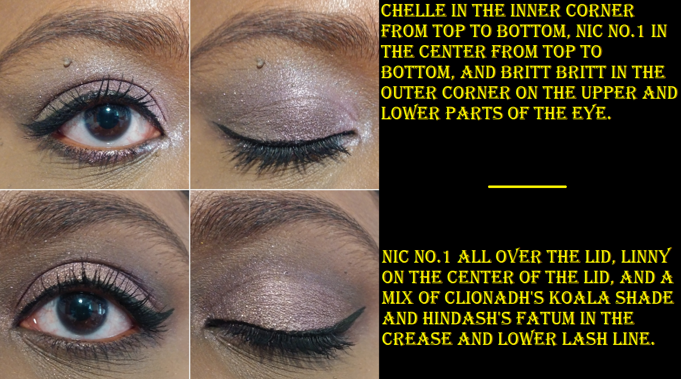
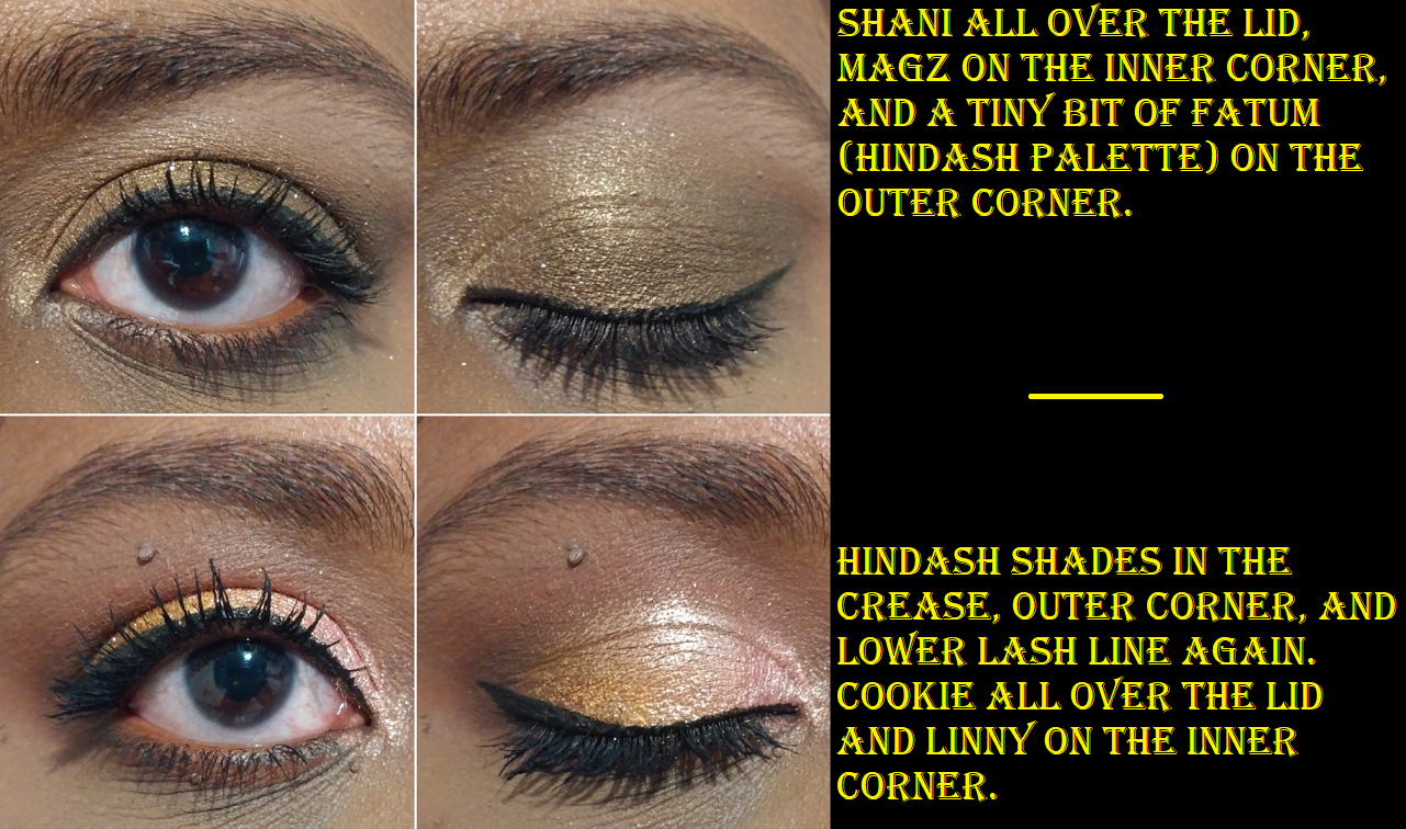
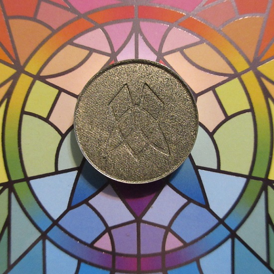
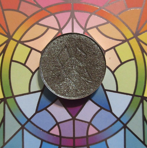
Clionadh is my favorite brand when it comes to duochromes and multichromes. Actually, it might be my favorite beauty brand period. In one of my previous reviews, I combined Kiln and Bloodline to create a gorgeous new shade and wondered what other exciting combinations could be made. Today, I’m showing a few that I experimented with and really like! I’ll also swatch the new Charity Bundle for 2021, along with the latest additions to my single shadow collection.
The Combinations
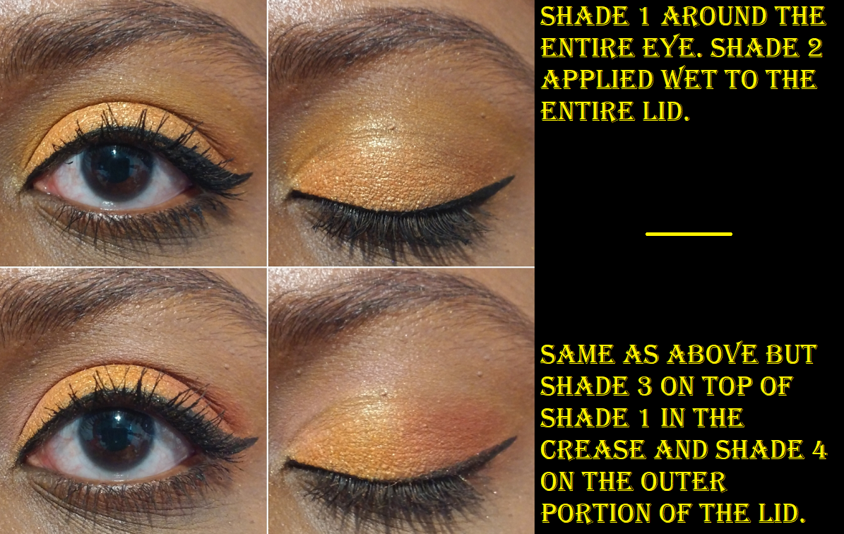
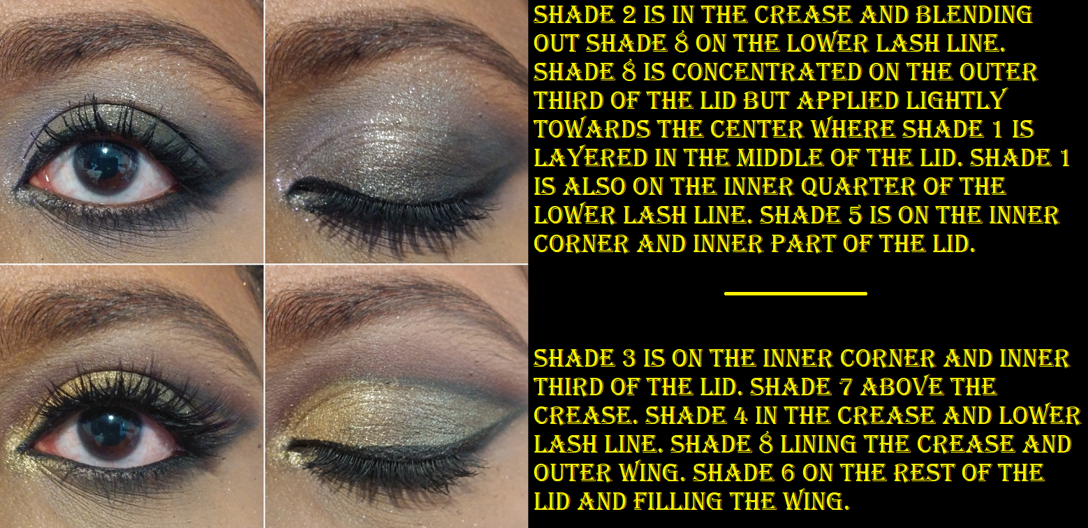
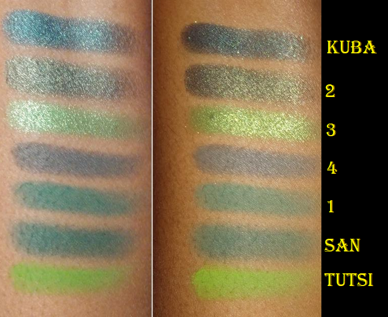
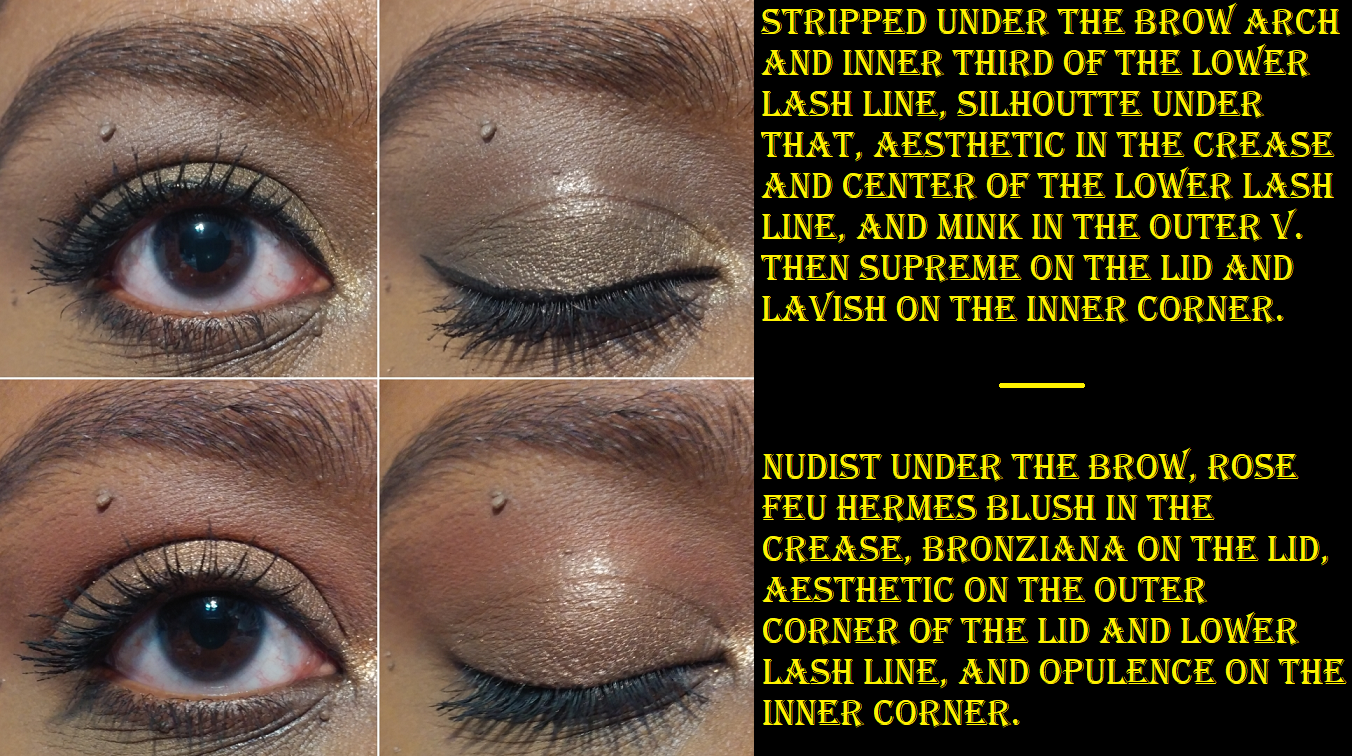
Trial 1
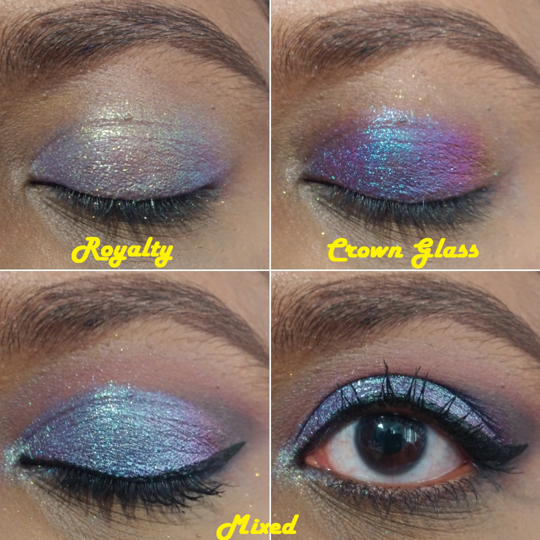
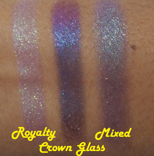
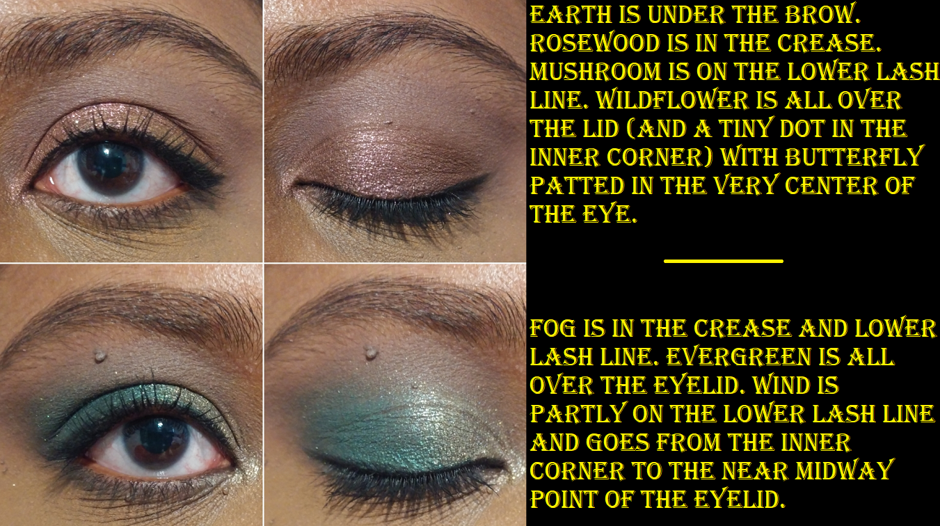
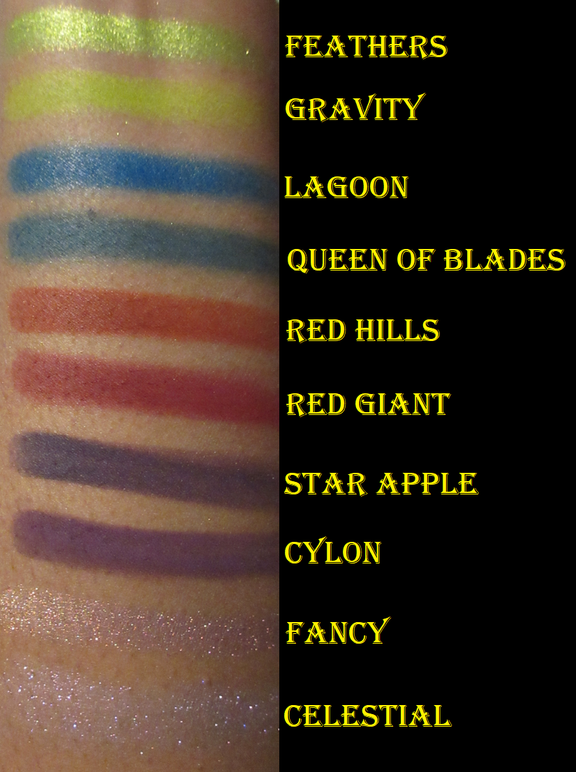
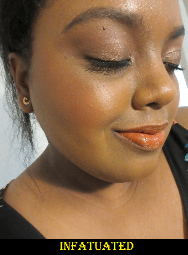
Royalty comes off as an icy purple on me, so I wanted to add more of a purple (with a little blue) tinge to my look. I ended up with more blue than purple, but I still thought it was quite pretty.
Trial 2
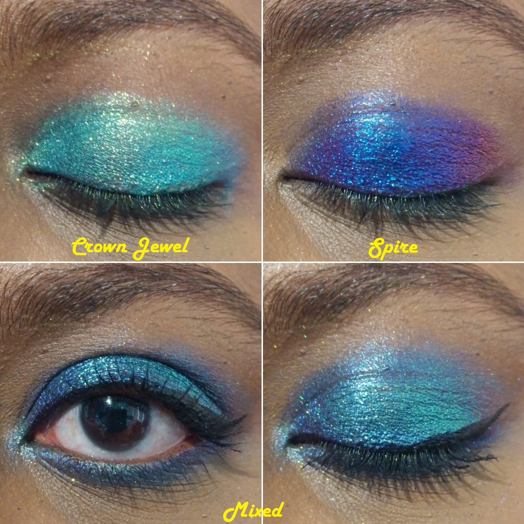
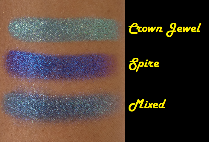
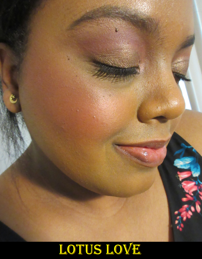
Crown Jewel is such a vibrant blue that I consider it a statement or occasion shade. It’s not something I’d wear on a regular outing. Spire is the dramatic opposite. It’s striking, but very dark, and also a bit much for daytime usage. So, I wondered if I could lighten up Spire and add an extra shift. I love how this turned out! It’s still not an everyday kind of shade but it’s gorgeous! I see myself creating this combination again in the future.
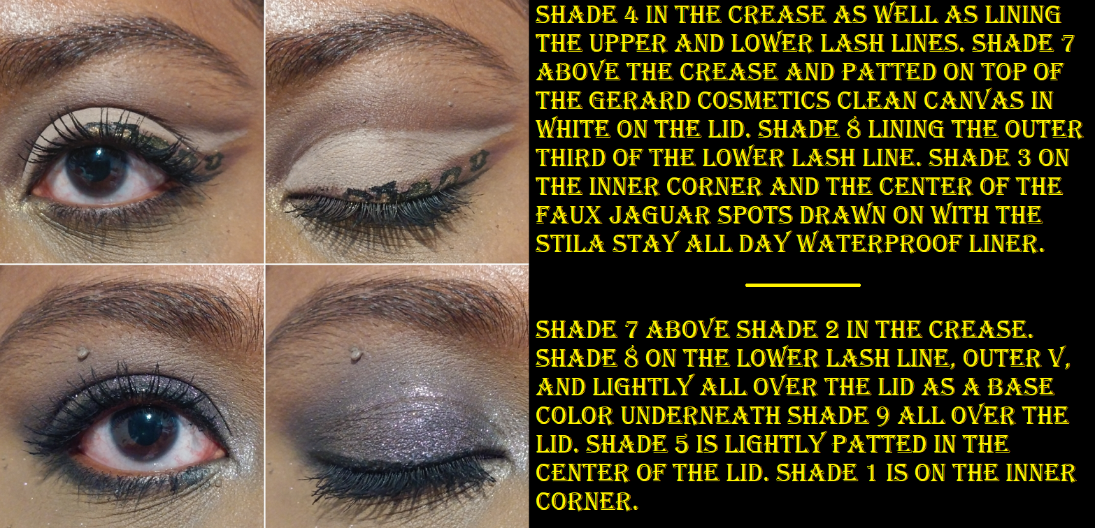
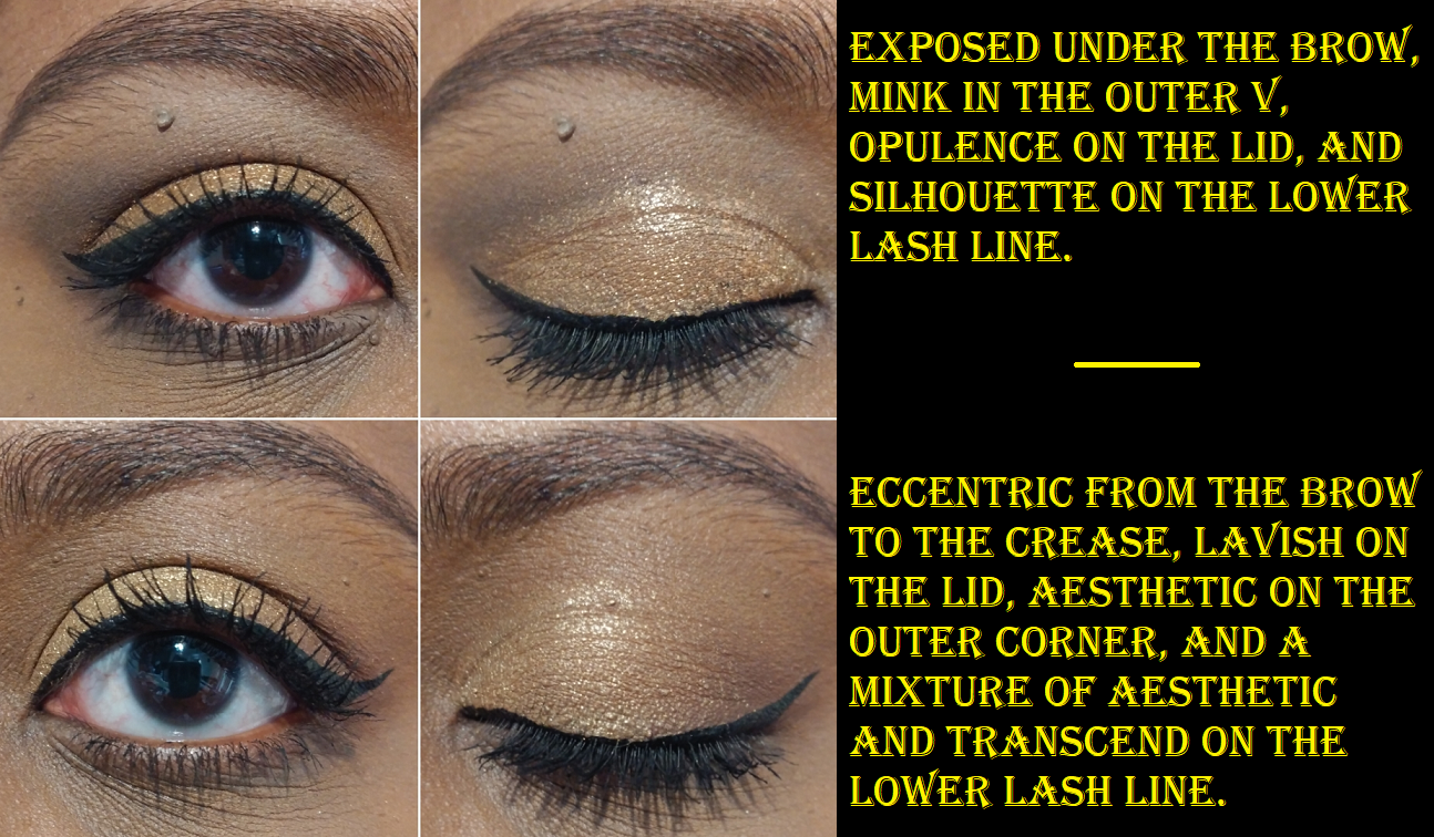
Trial 3
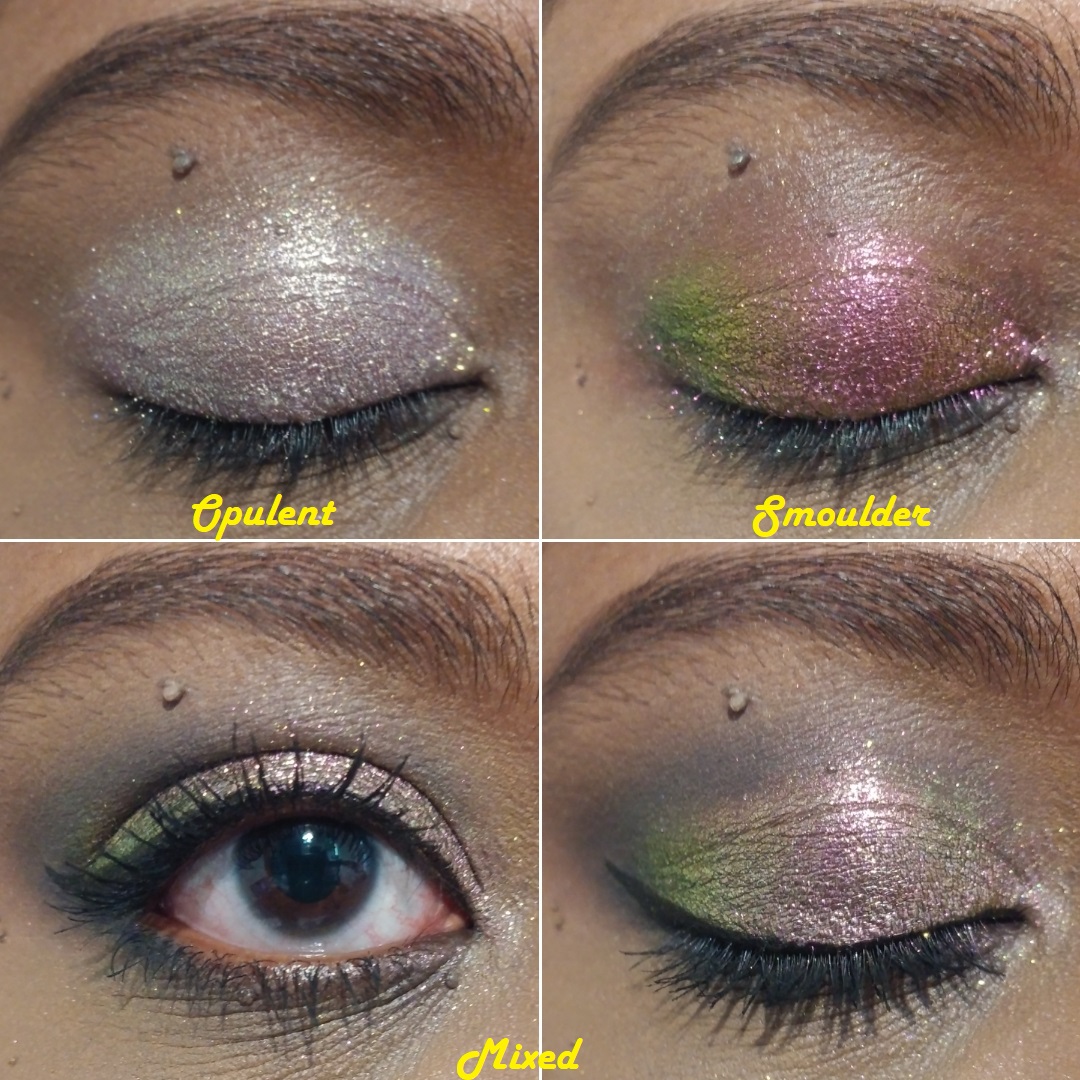
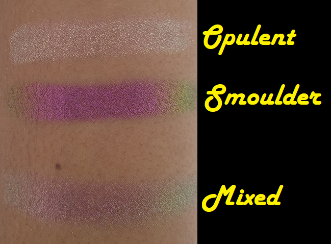
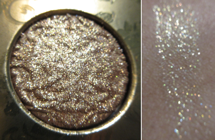
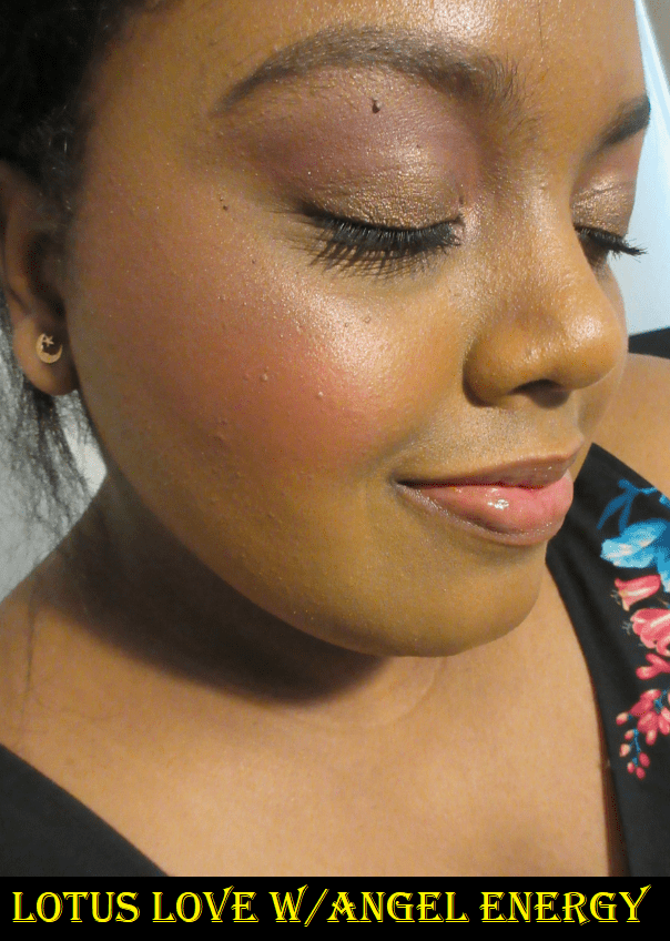
Opulent doesn’t do much for me besides being used as a highlight shade, so I thought if I could add Smoulder, I could perhaps get something a little darker and more pink. I hoped it would look closer to Bloodline, but the color it turned into reminds me of Weld or the Sextraterrestrial shade from Pat Mcgrath’s Divine Rose II (which is supposed to be a dupe for Forge but I don’t own Forge to compare).
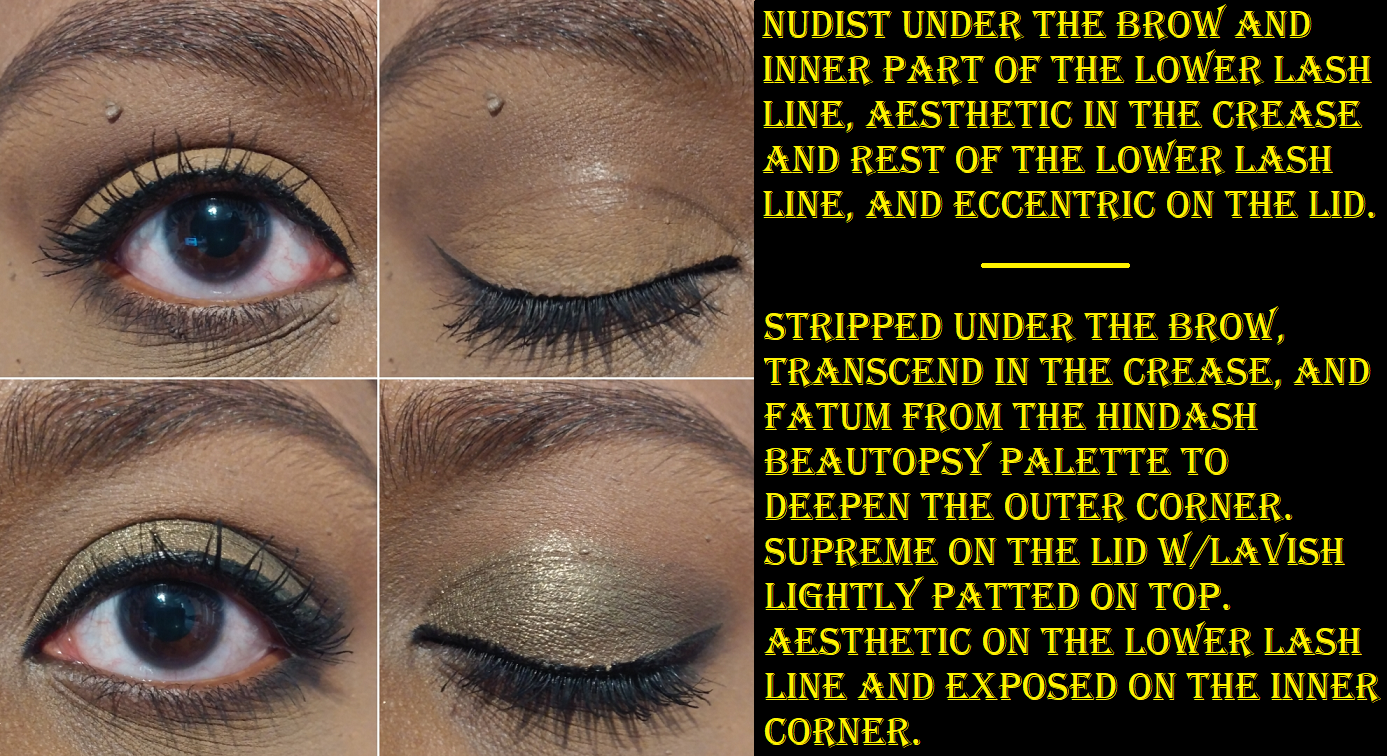
Essentially, the most dramatic changes happen when I pair a shadow with one of the Jewelled Multichromes from the Stained Glass Collection.
I tried many other combinations, but one issue I found is that some of them looked dramatically different on my arm, but on my eye there wasn’t a significant enough difference or the resulting combination looked too similar to one of the shadows already used.
Clionadh announced a shade extension coming to the Stained Class Collection, so I would be curious to see if any of them look like one of the Mixed shades I created!*
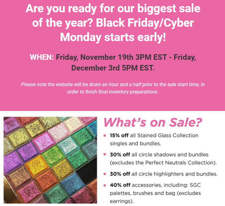
*Note: I completed this post months ago but kept pushing back the publish date. Clionadh originally announced a shade extension in time for Black Friday, but they decided to focus on restocking their current inventory in time for the sale and then afterwards fully focusing on building up the inventory of the new shades to be released in 2022. Their sale is still ongoing until December 3rd.
Collection Update
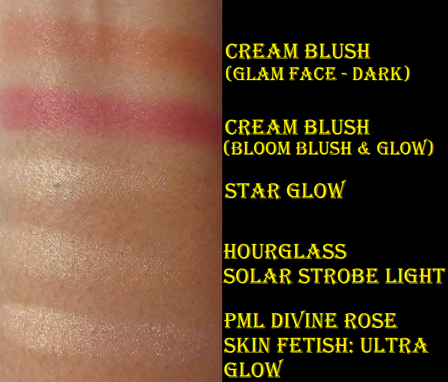
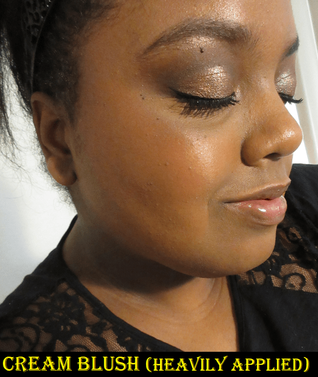
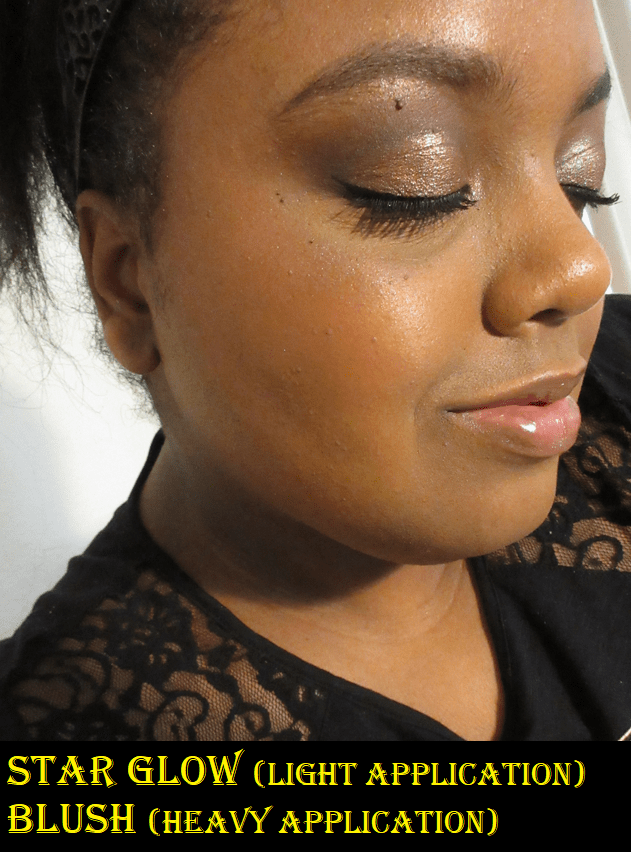
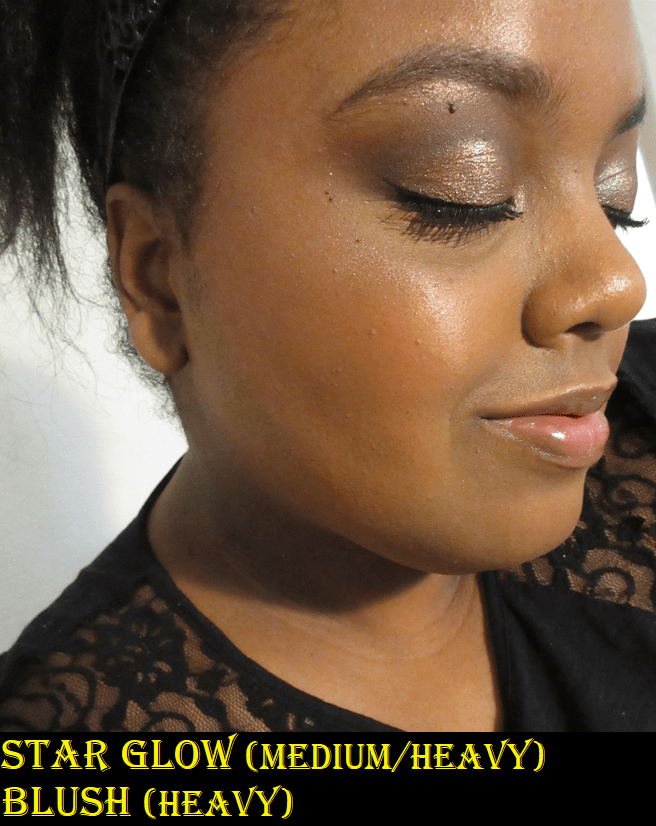
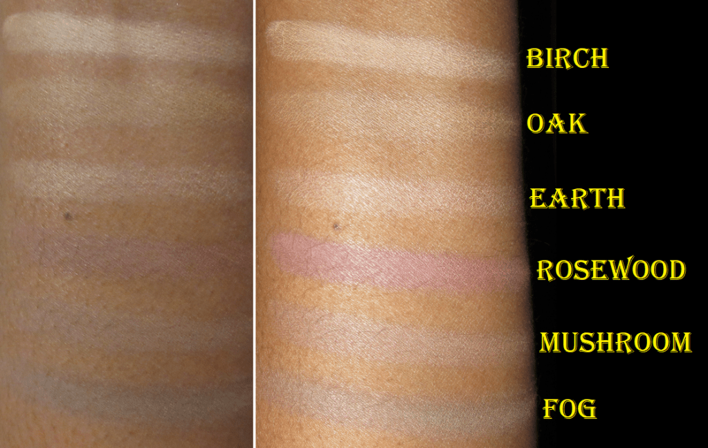
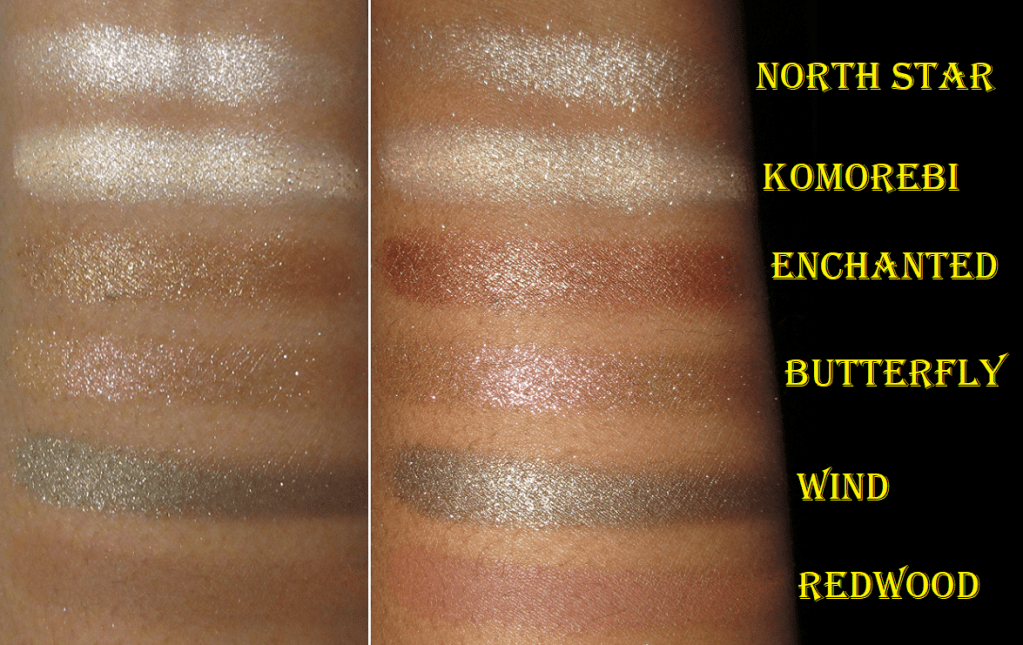
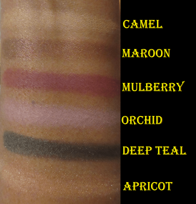
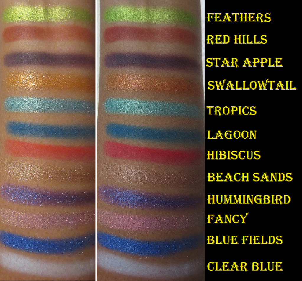
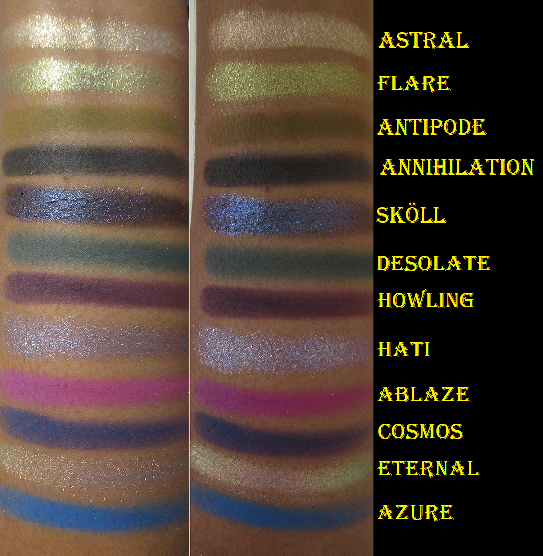
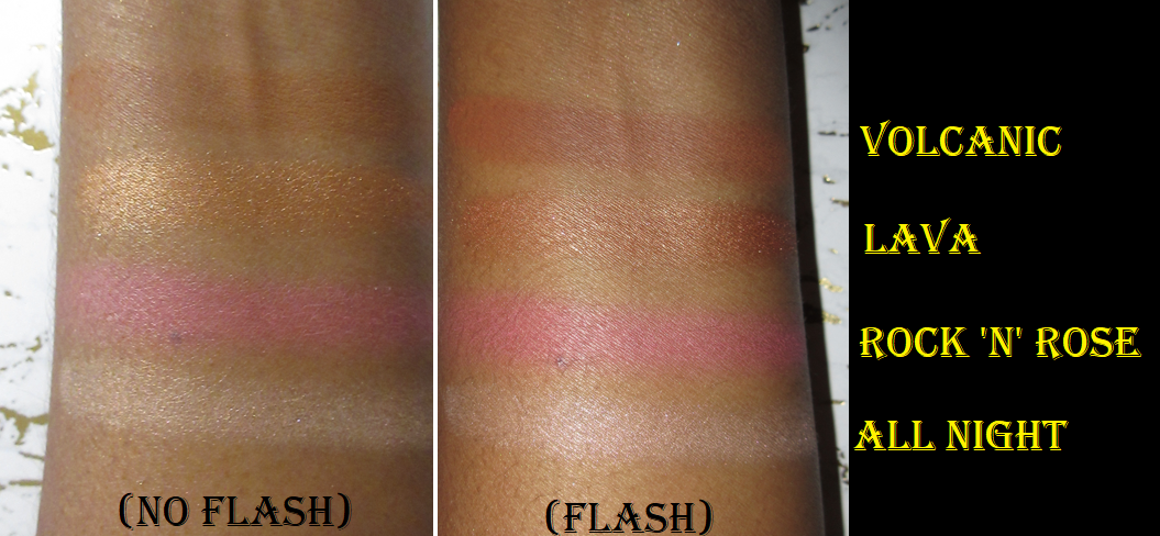
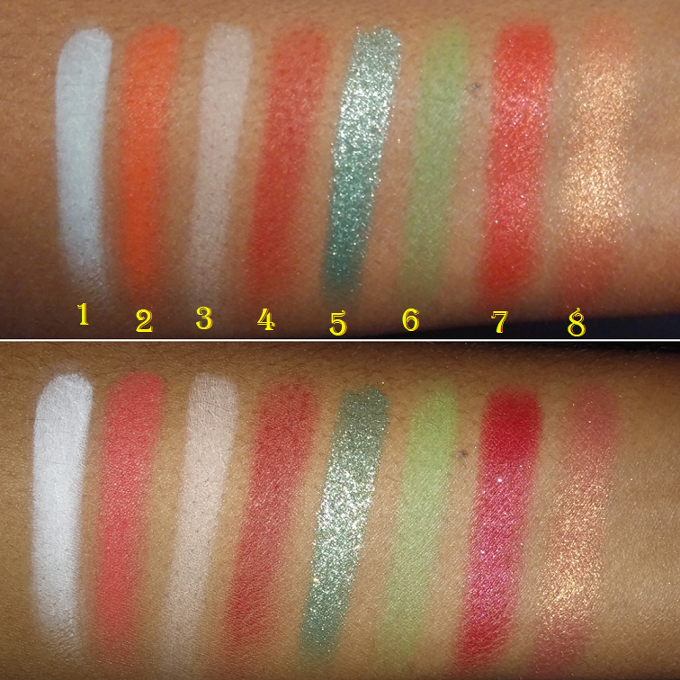
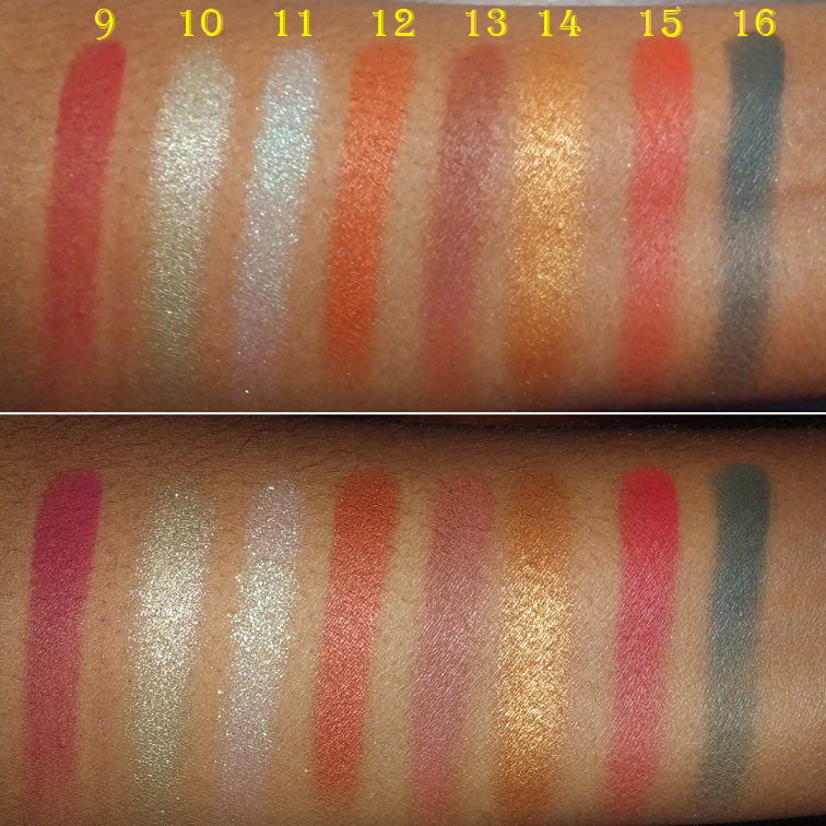
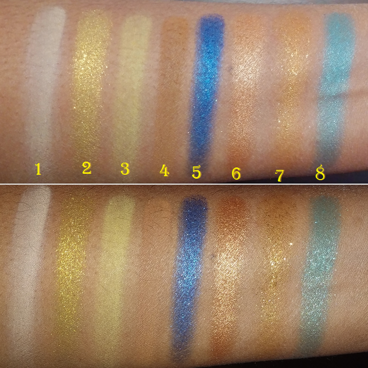
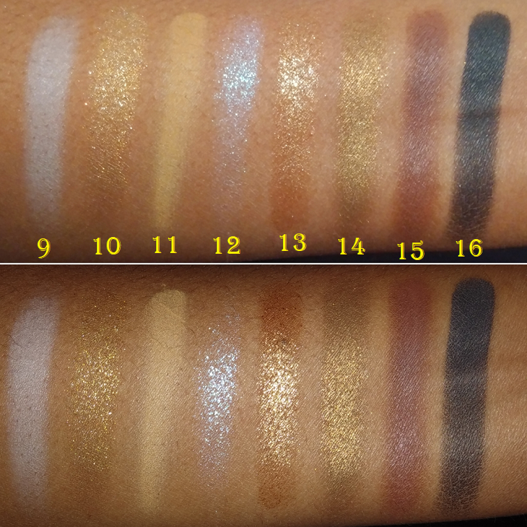
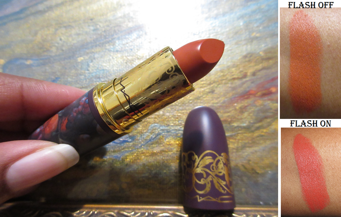
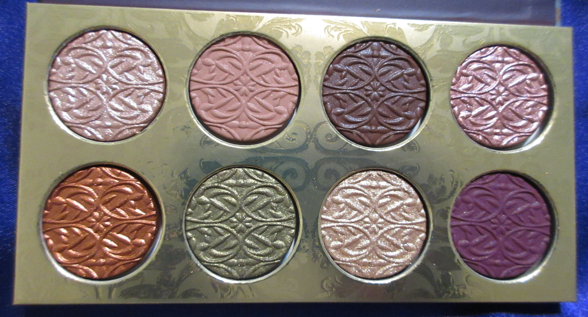
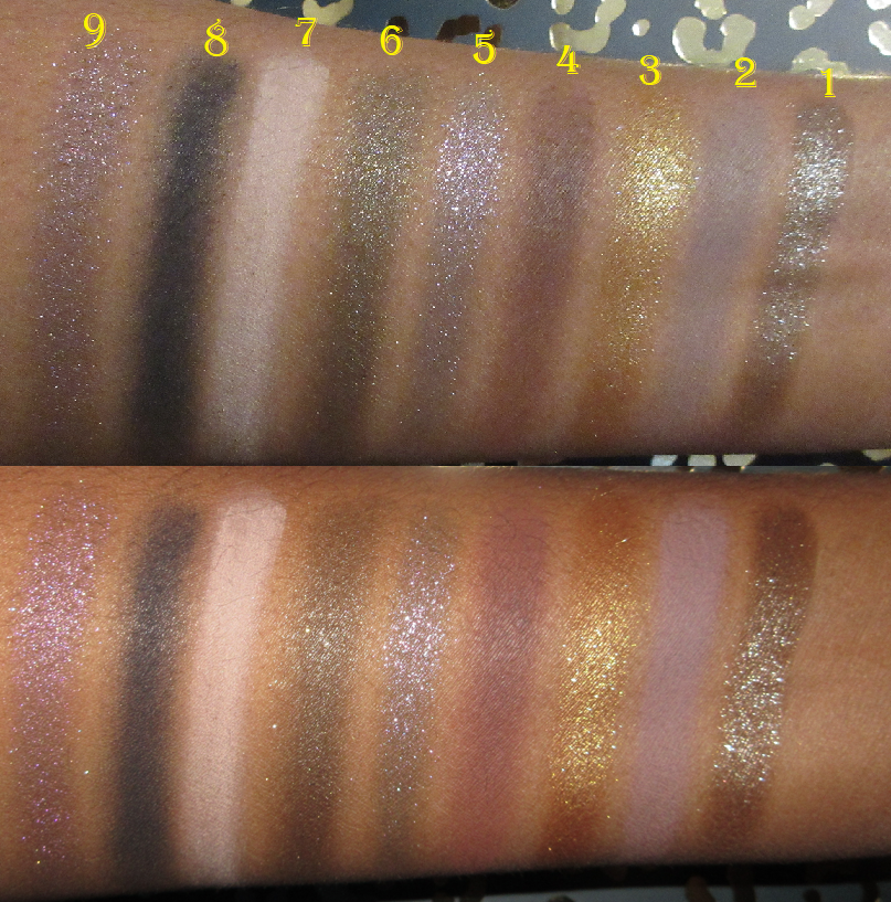
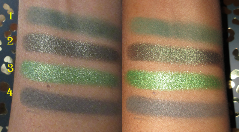
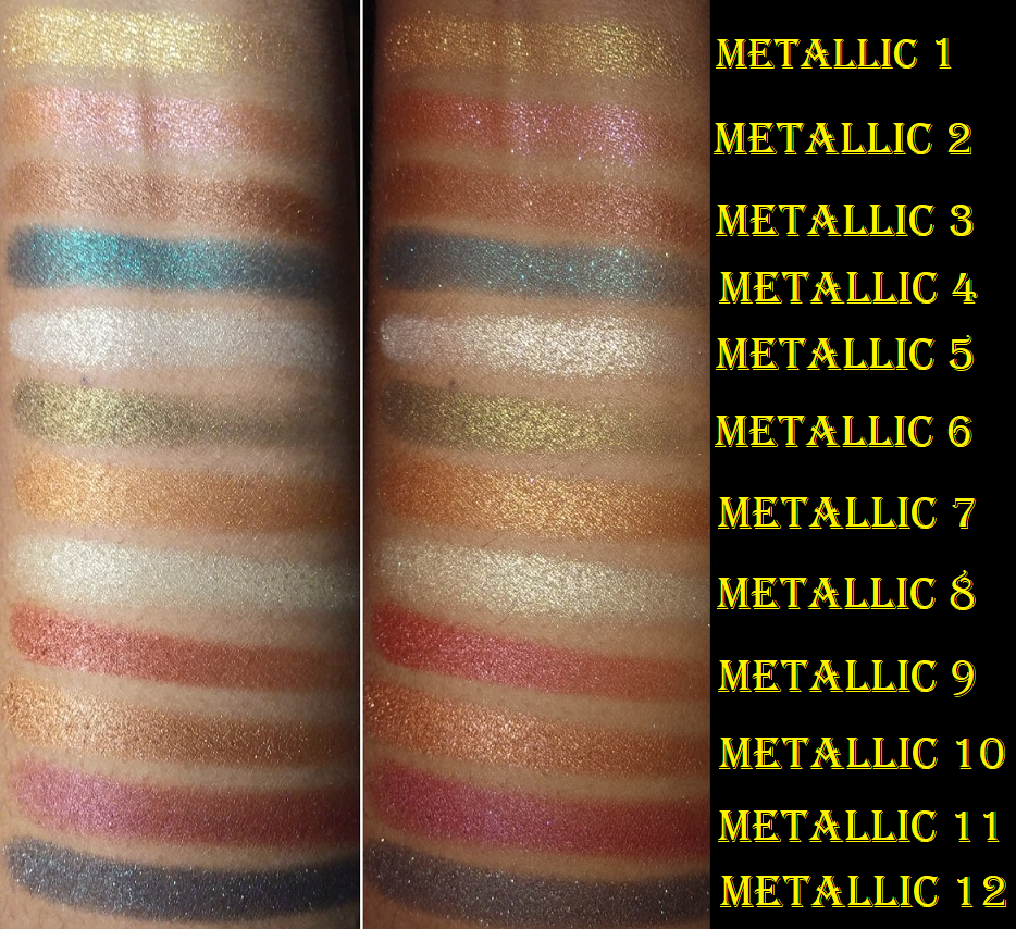
Left swatches were taken with flash off. Right swatches were also taken indoors but with flash on.
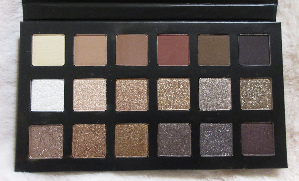
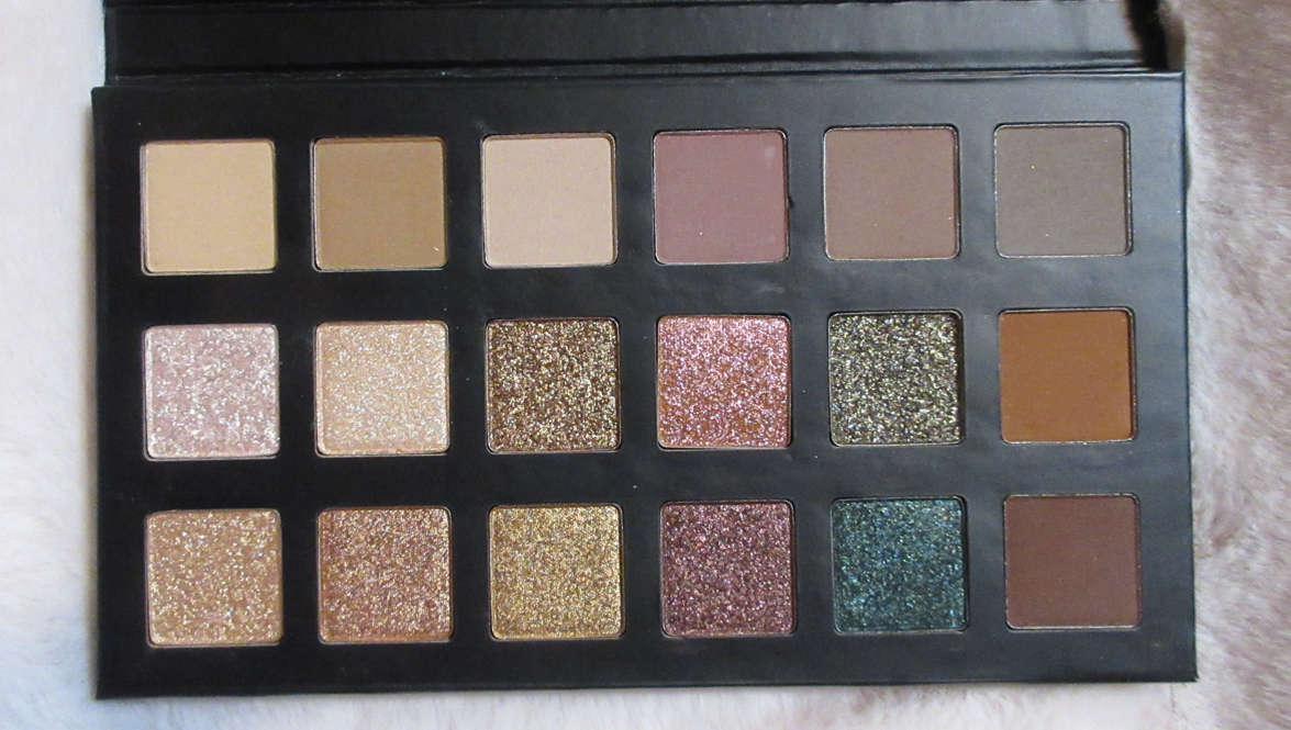
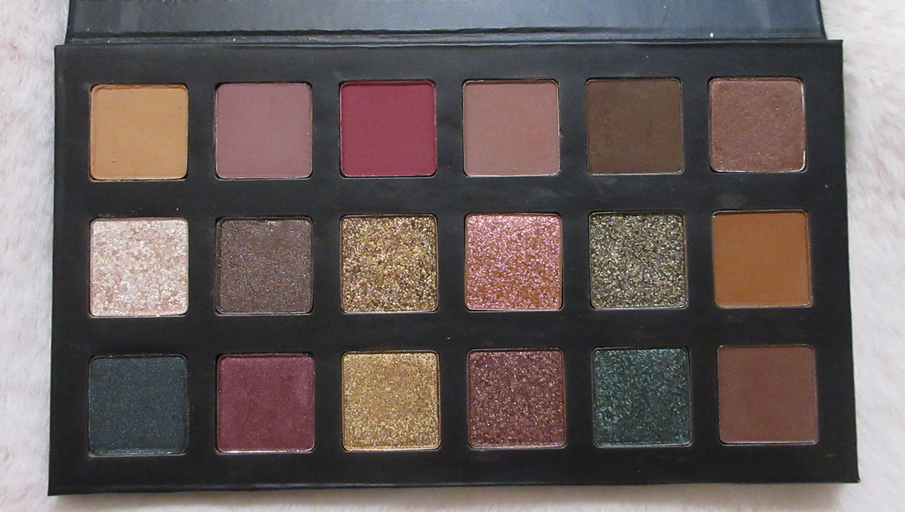
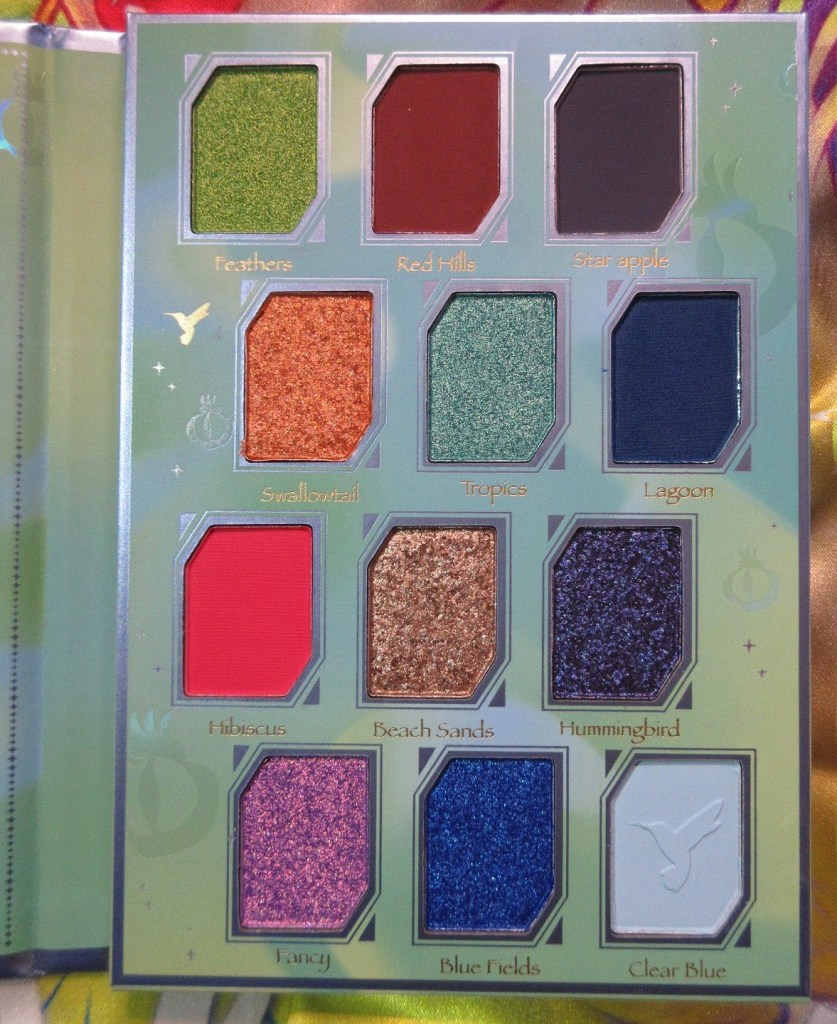
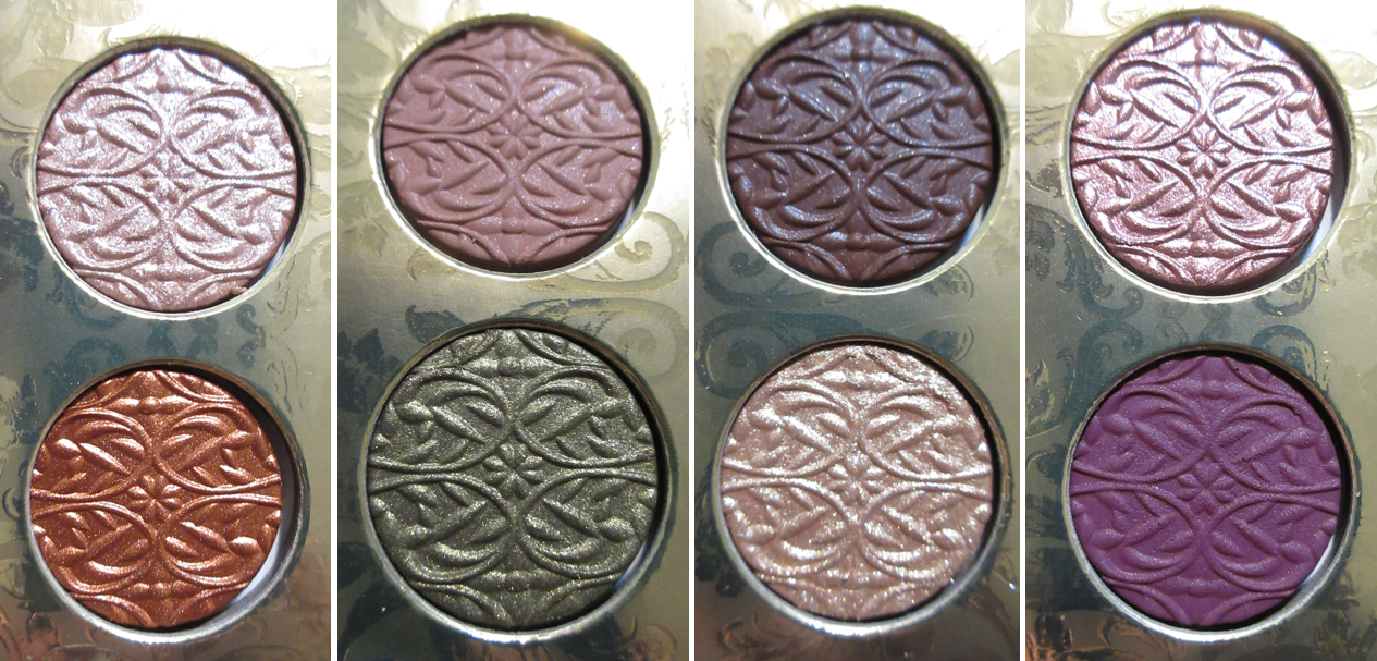
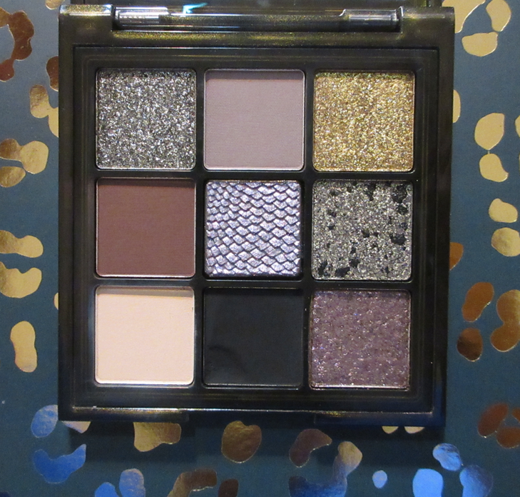
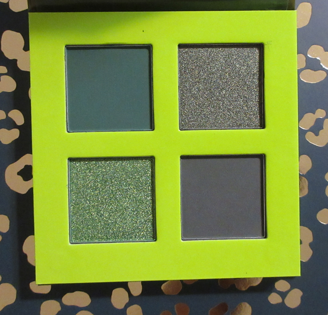
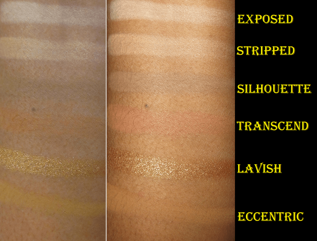
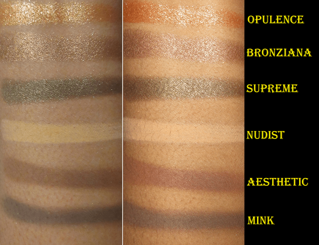
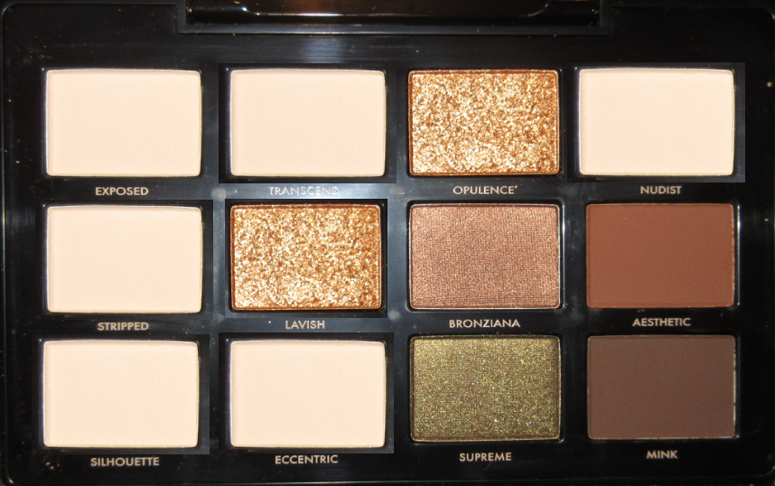
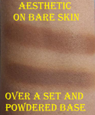
The Perfect Neutrals Collection Bundle
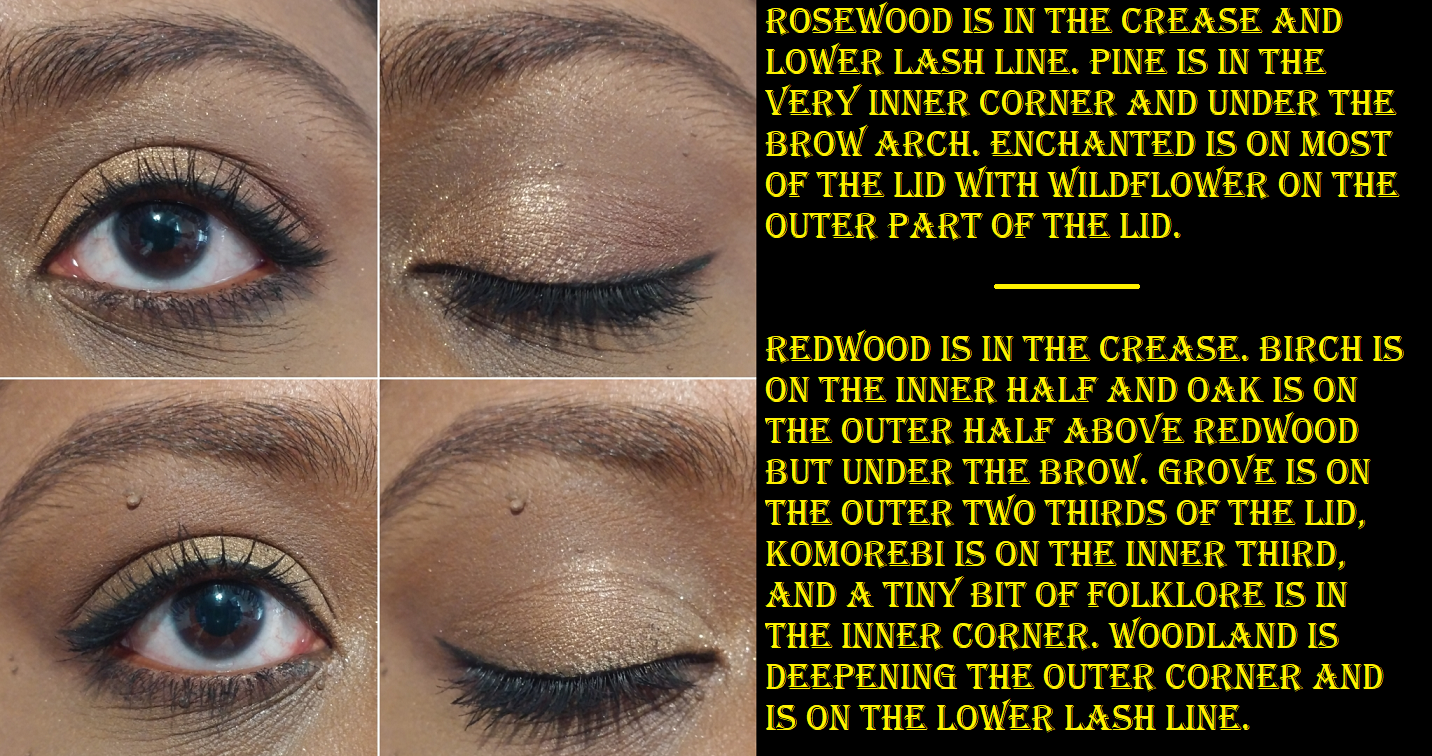
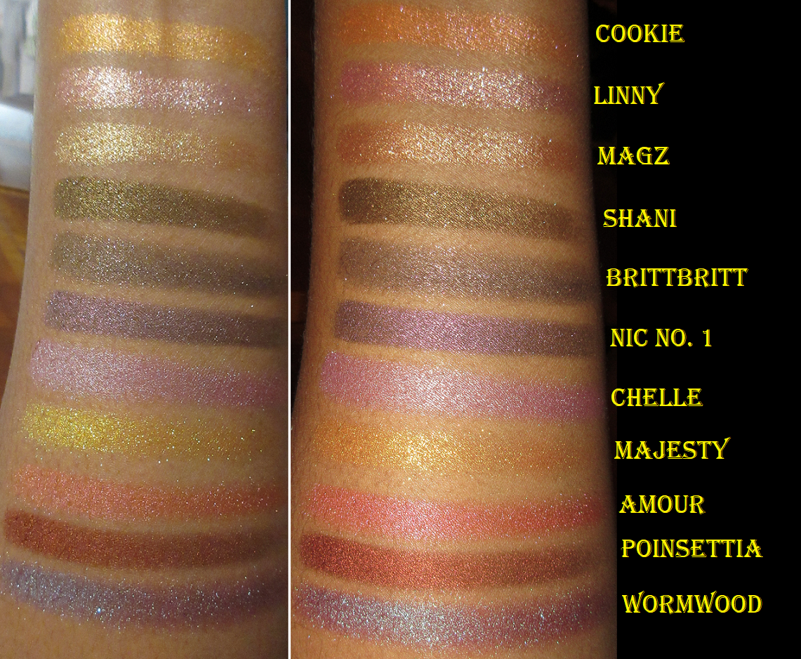
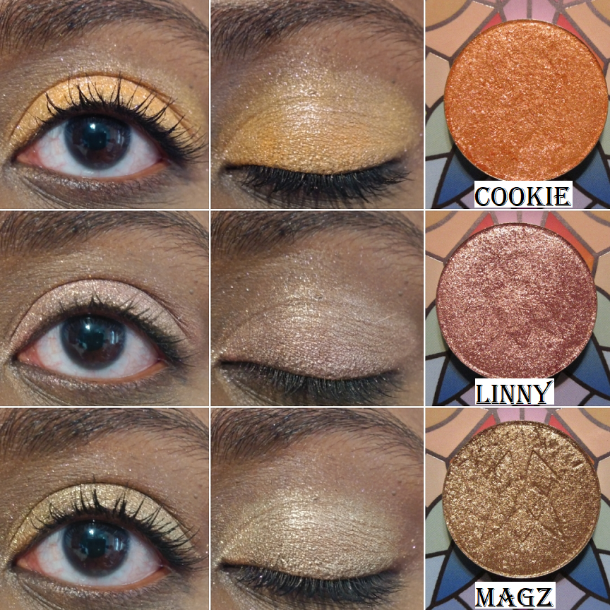
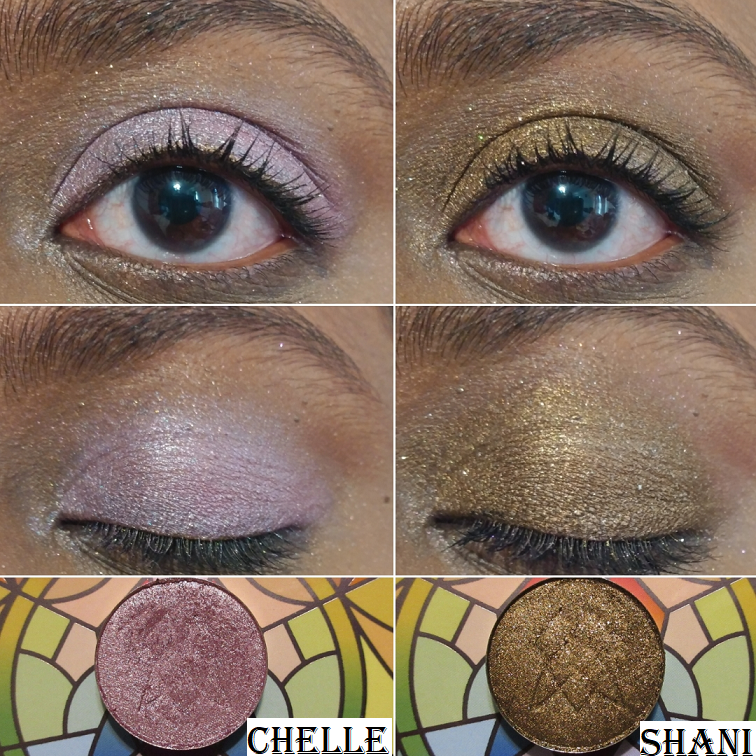
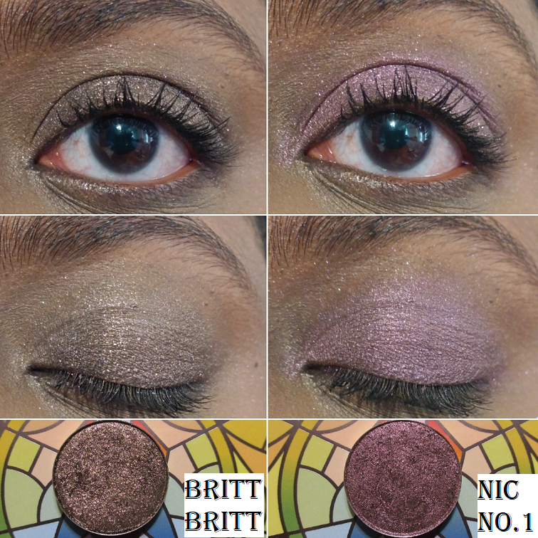
Other than Shani, these are not the types of shades I reach for because they rarely look nice on me. Baby pinks (or in this case rose gold) like Linny tend to look white or silver on my lids, but what makes this different is the gold they have running through it. On Clionadh’s website, Linny looks gold with a hint of rosiness, but the gold blends with my skin and lets the pink really pop. I’m left with a pale pink that actually looks pink on me, which is an unexpected surprise! It’s the same thing with Chelle that it’s supposed to be mauve, but it turns into the only lilac I’ve ever liked!
Although I’ve begun to appreciate neutrals again, I’m not interested in actively purchasing a ton of neutral shadows because they all look the same on the eyes. The reason I decided to add this bundle to my collection is because Clionadh does neutrals in a way that’s unlike the others on the market. The more intense shimmer neutrals tend to be a reflective metallic finish from other brands, rather than having this level of sparkle. The actual shimmer from others tend to be the standard gold or silver, but for instance, BrittBritt has pink, red, and gold glitter. Cookie has a pink shimmer that doesn’t translate as well on my camera but is very noticeable in person. I consider these shades to be spiced up neutrals, which is that much closer to the style of eyeshadow I’m into lately.
The other incentive for purchasing this set is that it’s Clionadh’s second charity bundle. According to their website, “100% of the profits will be split and donated to…True North Aid and The Black Queer Youth Collective.”
The previous charity bundle was limited edition, as is this one. When the Perfect Neutrals were released, the shadows were only available as a bundle, but were eventually listed individually. Some shades are already sold out and I believe I read somewhere that there will be no more restocks for it.
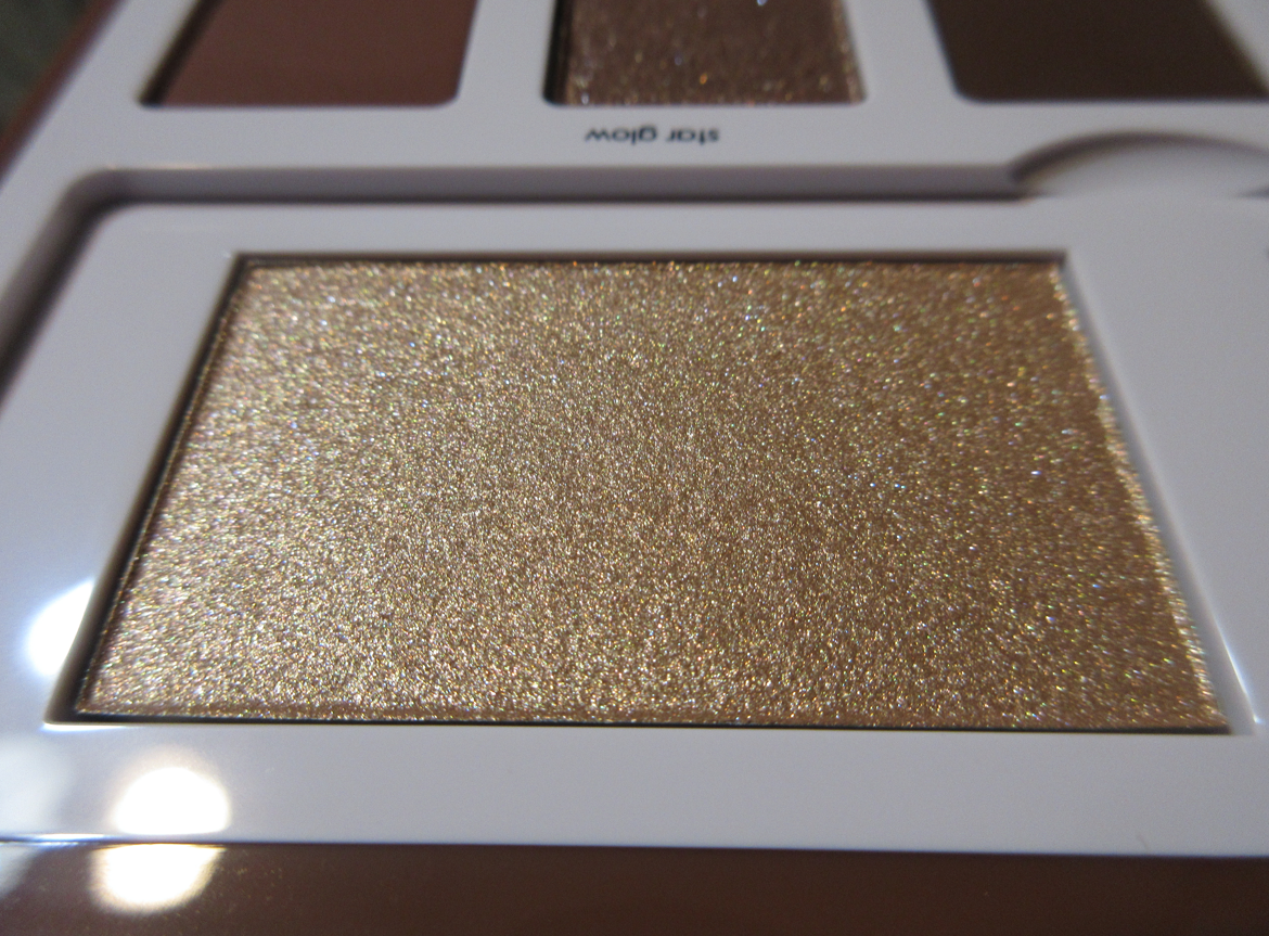
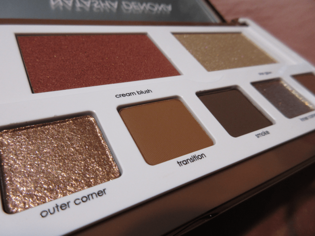
I should also note that the sparkle level of the shimmer shades in the bundle is similar to, but not as intense as Clionadh’s most glittery shadow options. They aren’t as flaky in texture as those and they aren’t as pigmented either. I wouldn’t call them topper shades, but the intensity lies in the sparkle level and not as much in the base pigment. It’s enough to give opaque results, but it’s not 100% opaque on the first swipe. The sparkle level and nuances of the shadows are what make this collection special, but in terms of color payoff and formula, I don’t consider them to be unique. The Stained Glass collection is where the special formula can be found.
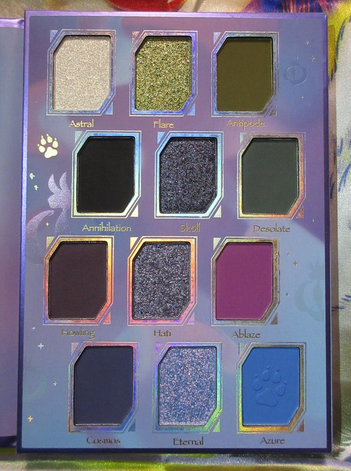
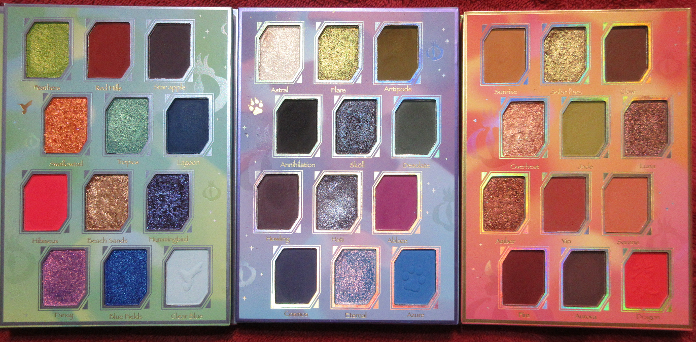
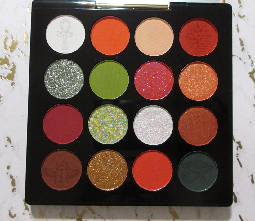
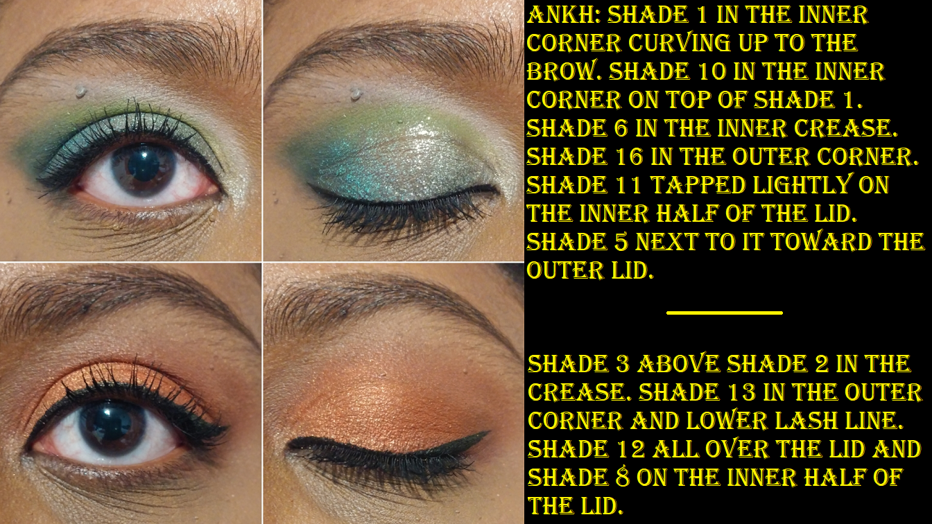
Circle Pan Eyeshadows

Every time I think I’m finished buying non-matte circle pan shadows, I end up getting more! Ironically, I had this post completely finished and then Clionadh had a surprise anniversary sale, so the bottom three are those new additions!
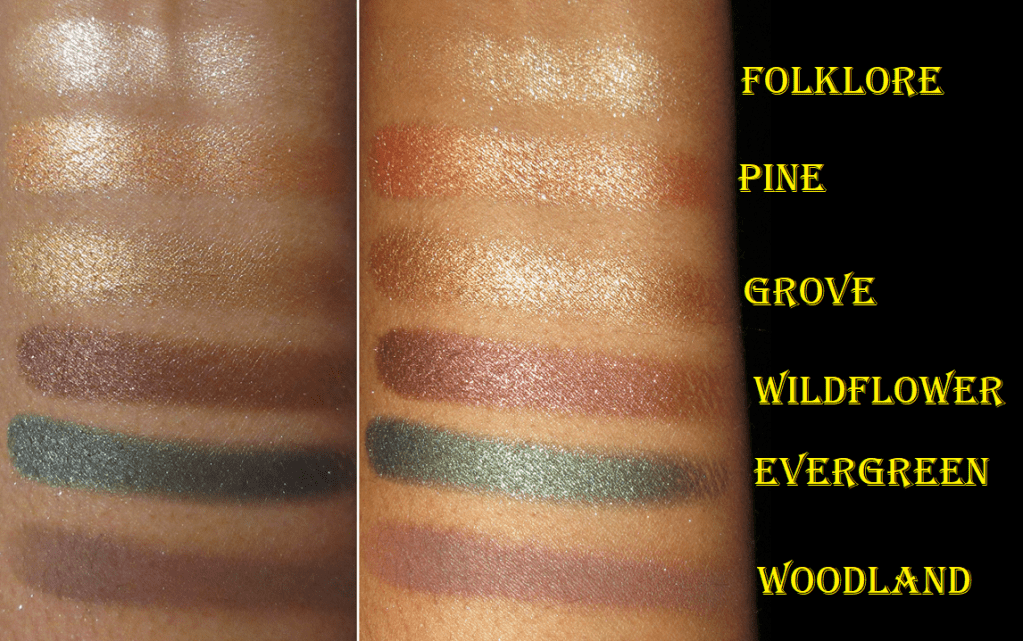
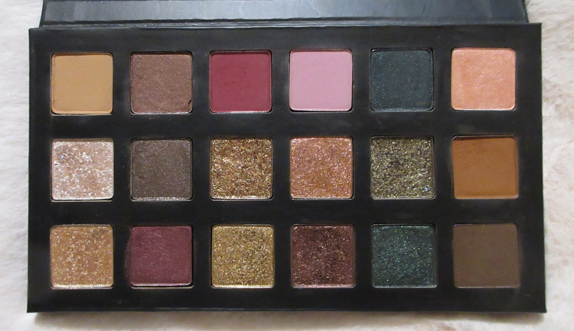
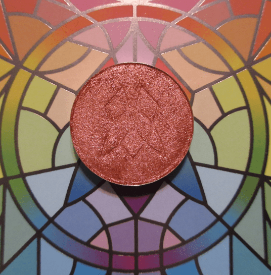
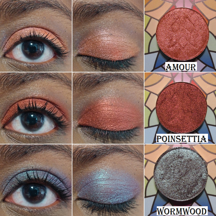
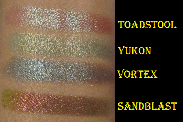
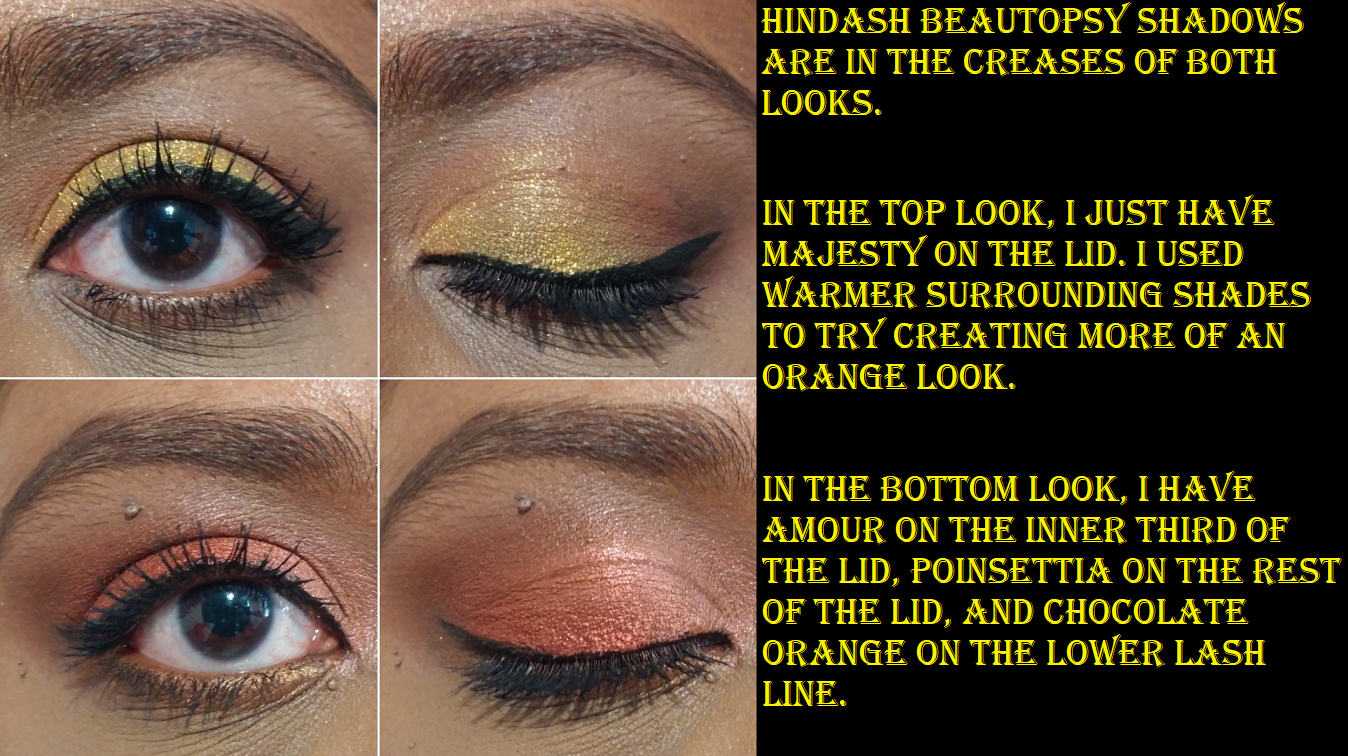
Clionadh brought back four shades from their discontinued Valentine’s Day set. I purchased one, Amour, thinking it would be a deep red-orange. I like it anyway, even though it’s not as deep when compared to the rich coppery red of Poinsettia. I have been very much into rusty red shades like this lately and thought I might have dupes in my collection. They look similar in their pans, but they are definitely not the same as can be seen in swatches.
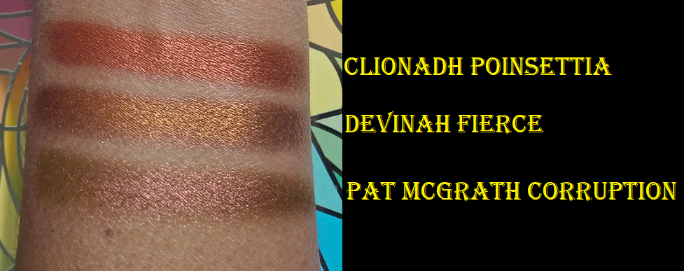
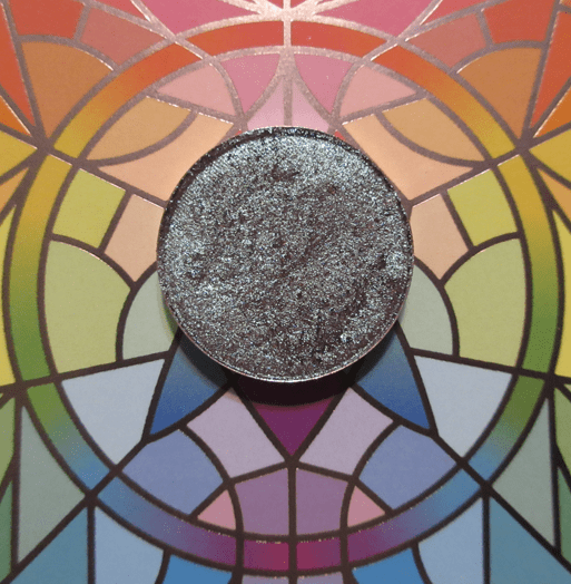
I am also very happy I picked up Wormwood because it’s the type of maroon-brown shadow with blue reflects I used to love in my early makeup days but haven’t worn in ages!
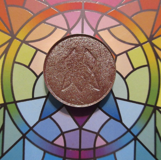
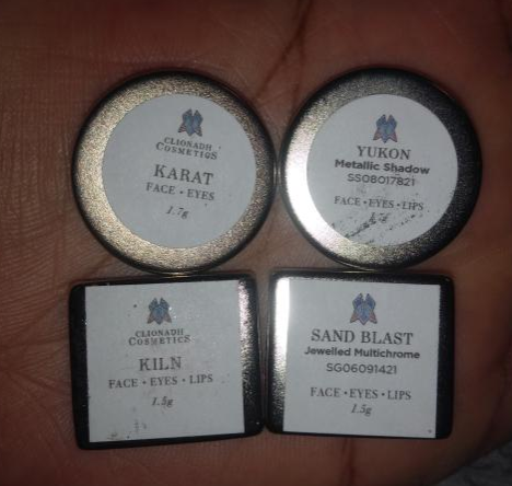
The anniversary sale shades I purchased are Toadstool, Yukon, and Vortex.
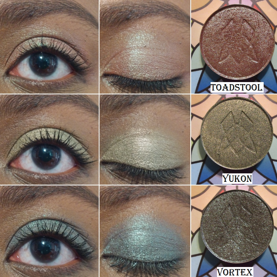
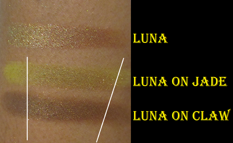
Toadstool is described as, “A rusty red-based duochrome eyeshadow with a bright green reflect. This is technically a tri-chrome shadow that will also shift up to red.” I’ve wanted this shade for a long time but finally took the plunge. Yukon is another one I’ve wanted for a long time, but I thought it might be too similar to Rune, so I didn’t get it until now. The two shades are about the same depth, but Rune has more of a yellow-olive tone whereas Yukon is a light golden green. Vortex is like Wormwood’s cousin. It has a brown base rather than a maroon one and it has green and aqua shimmer.
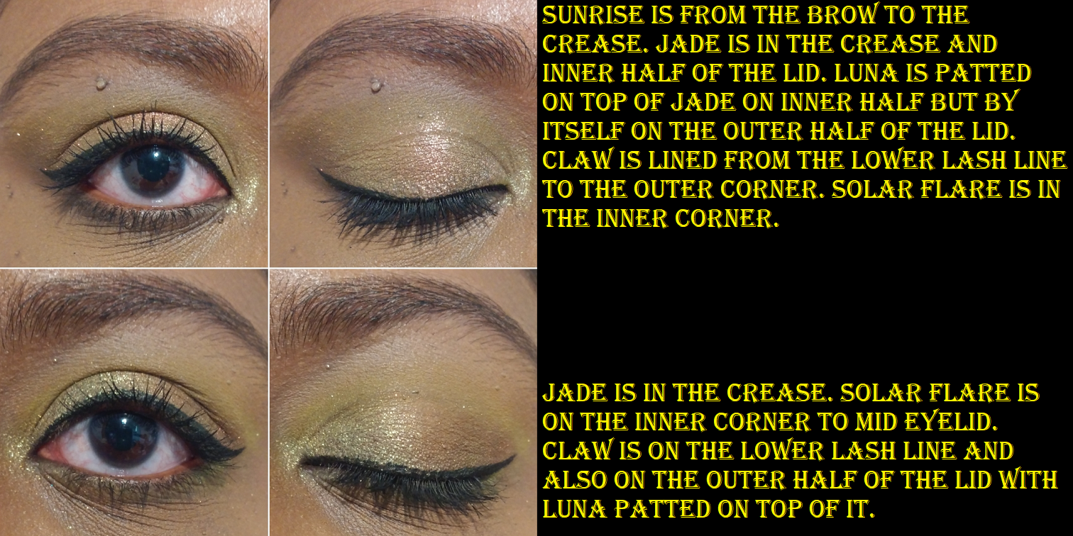
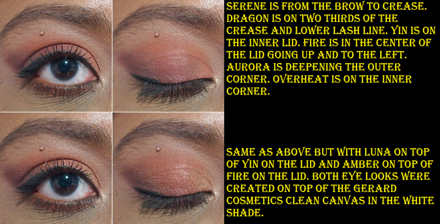
Stained Glass Collection Update
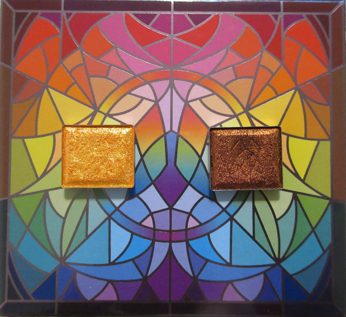
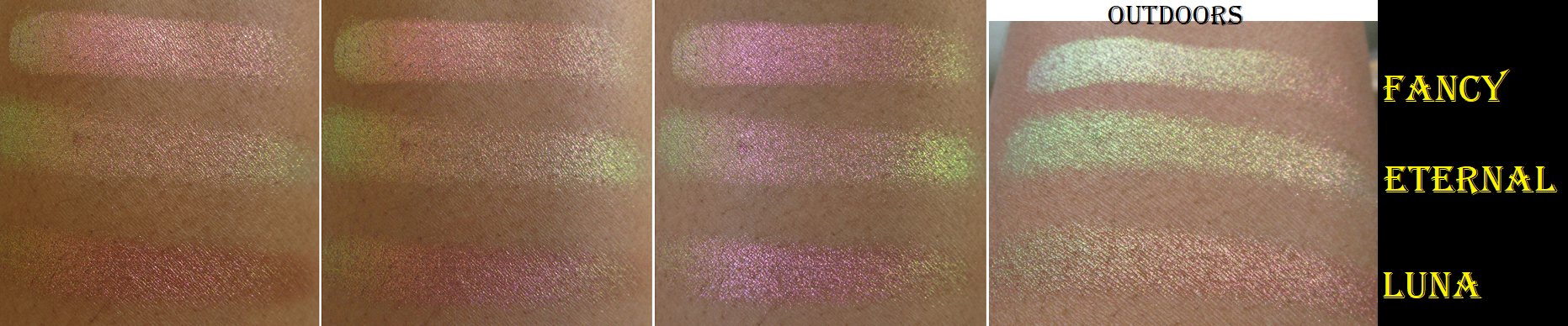
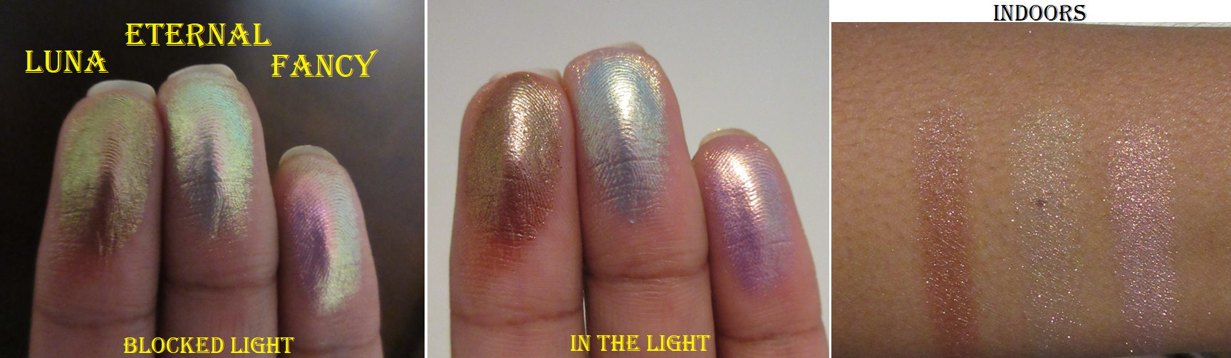
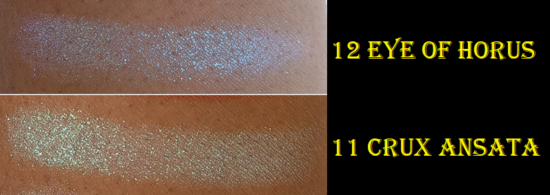
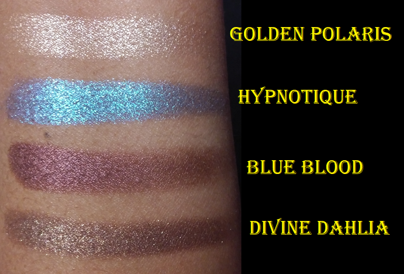
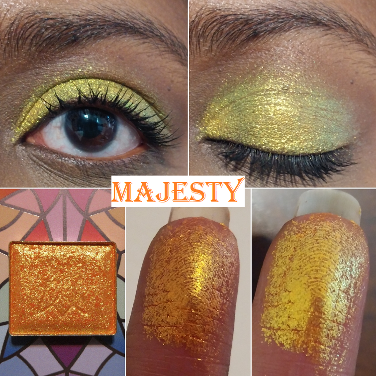
Majesty is described as having, “an orange base that shifts gold-green-turquoise.” I wish more of that orange would peek through on my eyes like it does on my finger and arm swatches. The gold and green are certainly visible though. Out of the five Vibrant Multichromes I have, only Heirloom and Crown Jewel look the way I expect them to on my eyes.
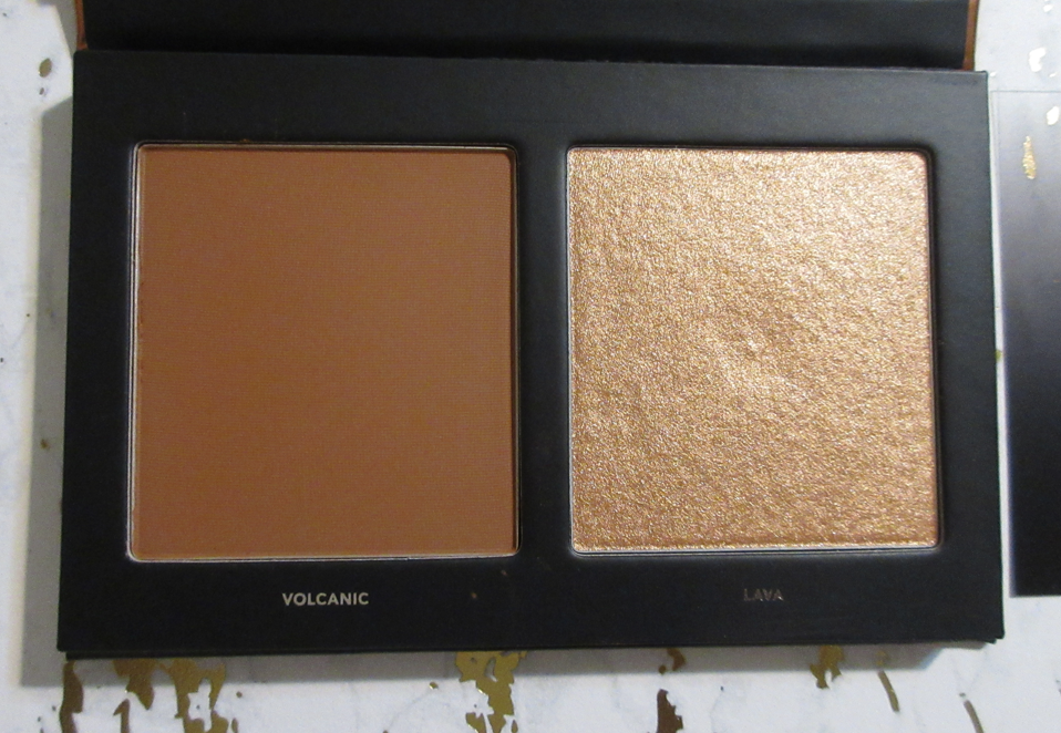
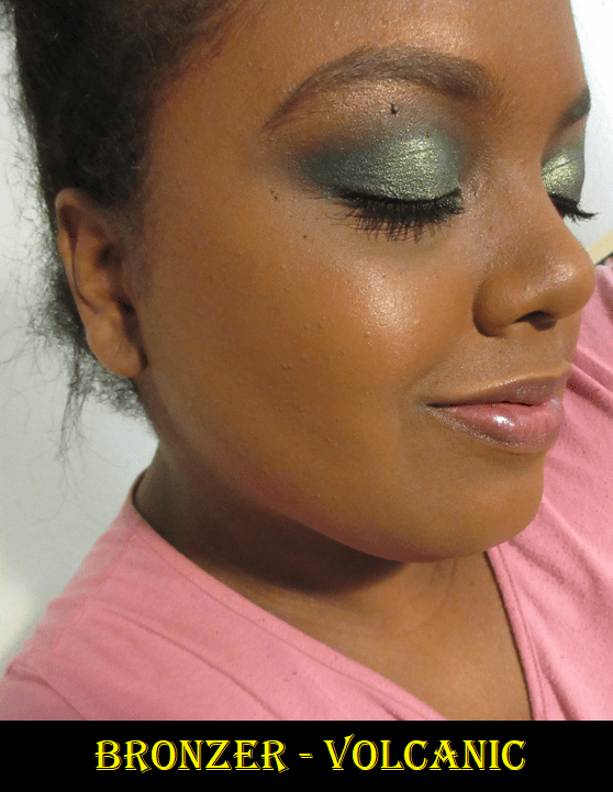
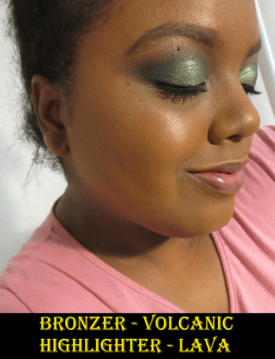
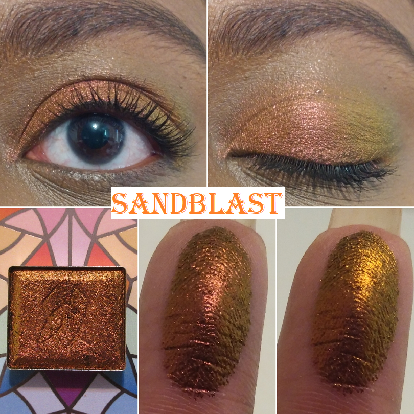
Sand Blast is the most orange in color of the Jewelled Multichrome category. It’s a dark orange with a gold and lime green shift. It’s not too far off from Smoulder (magenta-orange-gold-lime) and Kiln (red-orange-gold), which is why I figured I would like those two shades more. However, I couldn’t escape the feeling of missing an orange shade like this, so it is finally here!
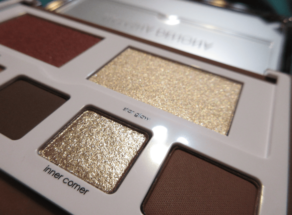
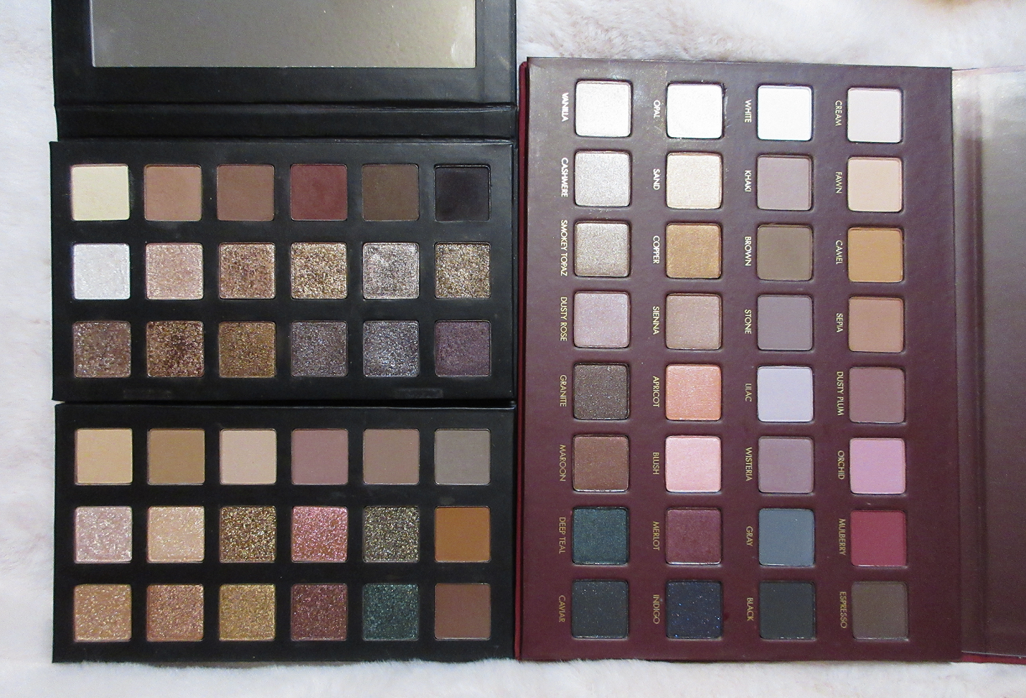
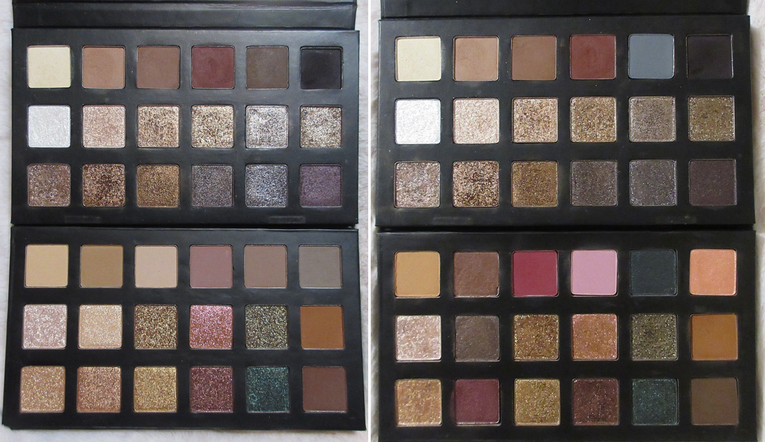
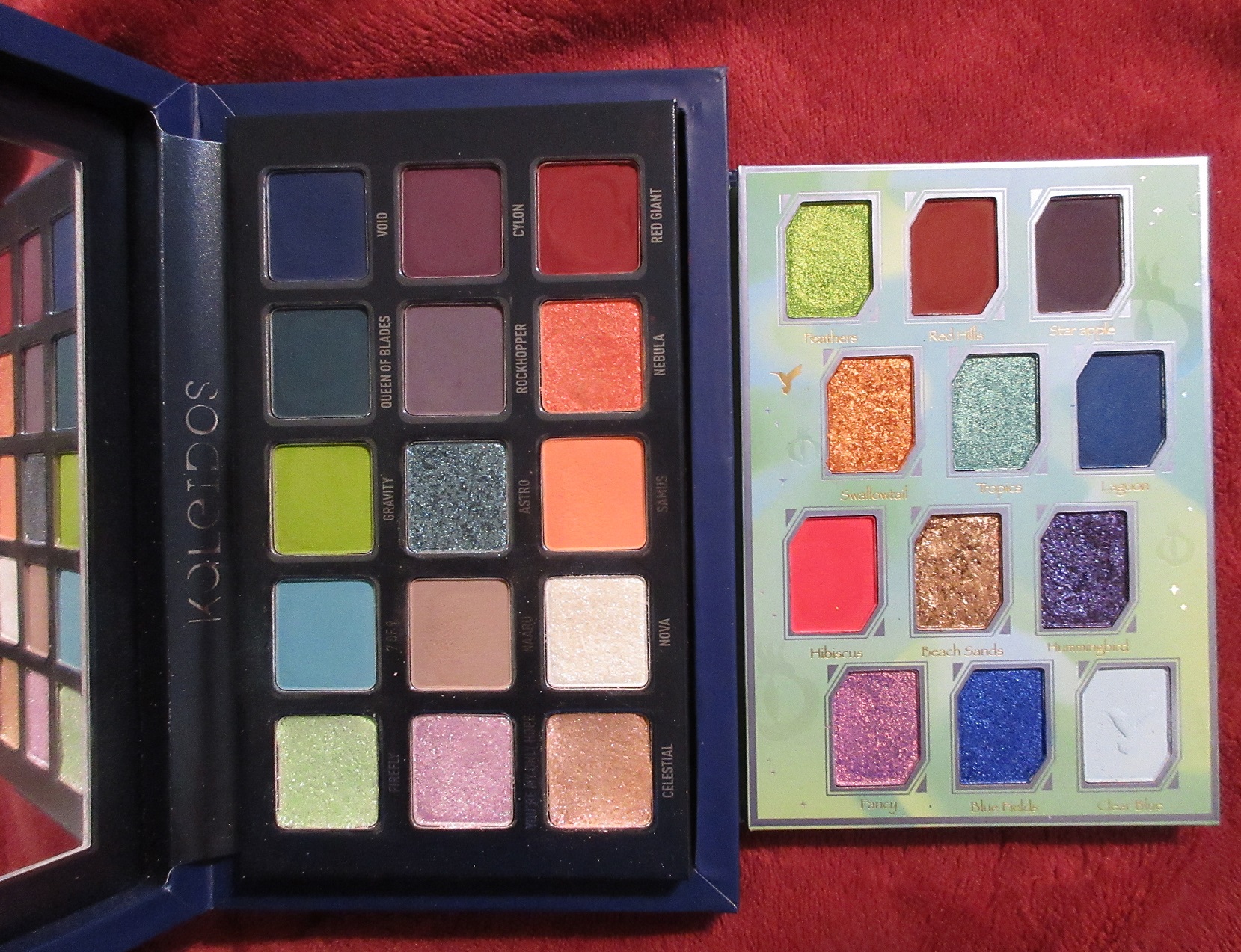
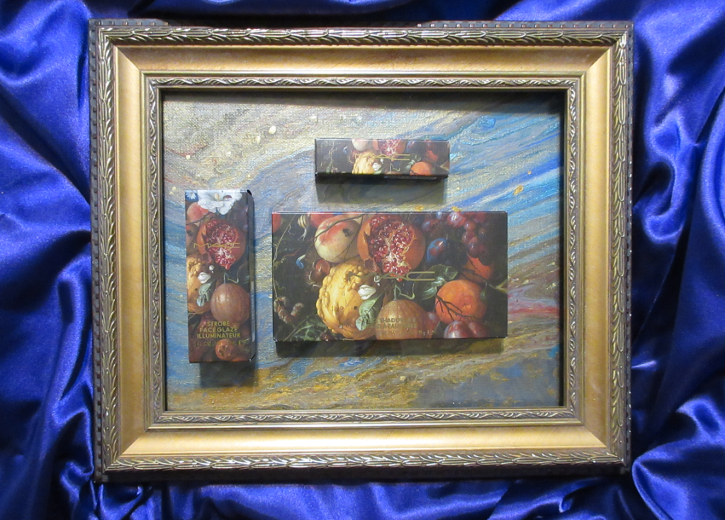
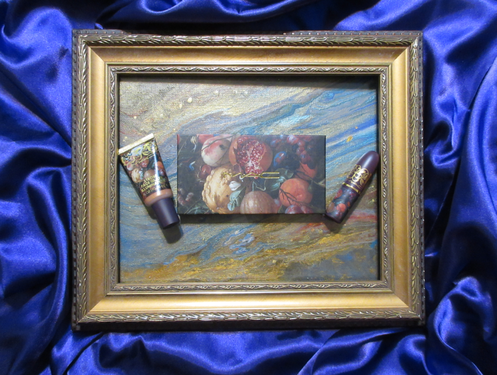
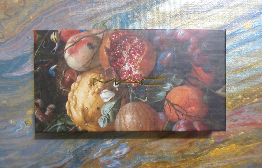
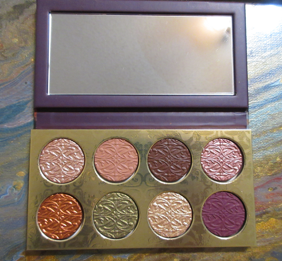
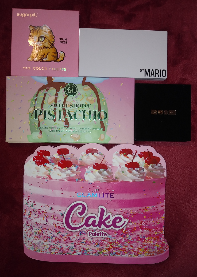
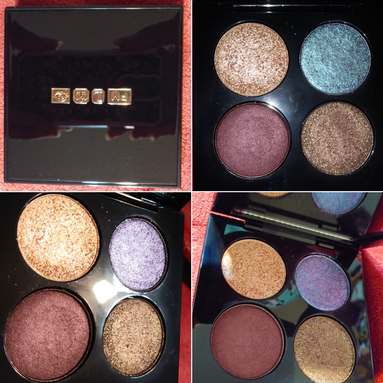
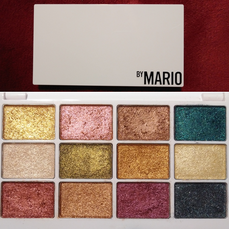
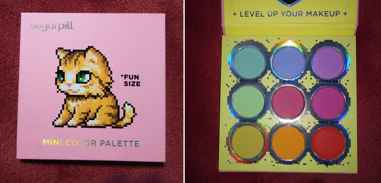
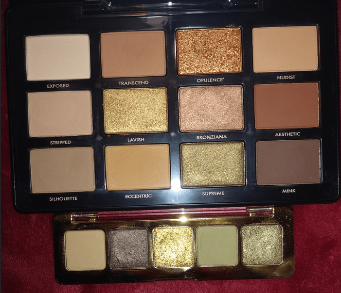
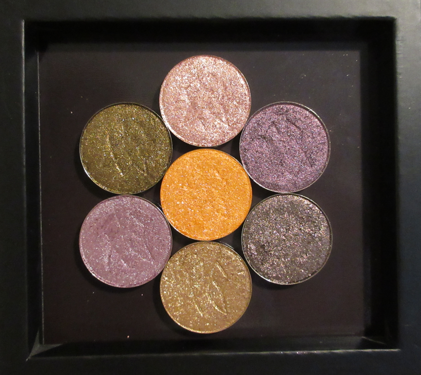
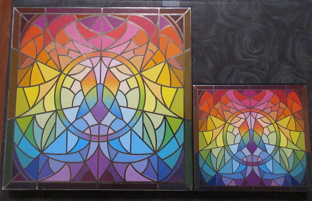
The other Stained Glass addition I purchased is the mini palette! It’s so cute! Even though I have zero plans to travel with my Clionadh shadows, I wanted to be able to keep my Charity shadows separate from the rest of the collection, so I put them in it. Below is a photo showing the size difference.
On Clionadh’s Instagram, I recall seeing a comment about the possibility of a Jumbo size palette in the future, so of course I’d be interested in that as well. Even though I have plenty of Coloured Raine’s gigantic 96 pan palettes, Clionadh’s shadows are so special to me that I want to keep them in special packaging as well. As it stands, my one mini and two standard size palettes are pretty much full.
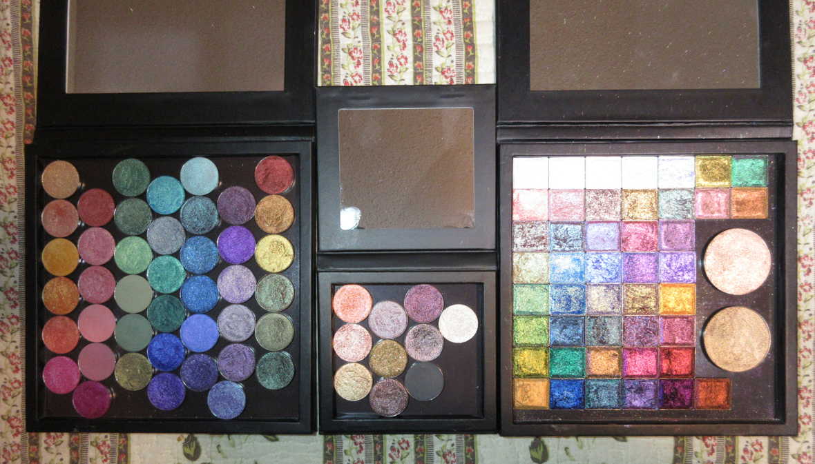
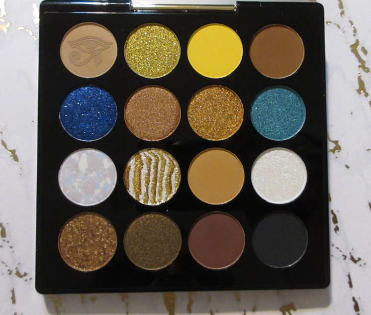
This is what my collection looks like now. I downsized the Stained Glass side by five shadows: Blaze, Sunbeam, Ripple, Spotlight, and Glazed. It was not easy to let them go, but I wanted to only keep shades I could happily use on their own without needing to mix them.
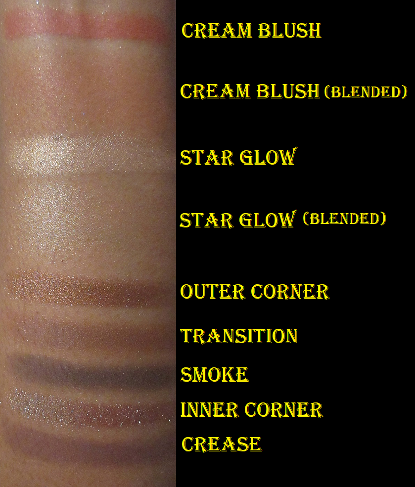
I think I’m finally set on the circle pan shadows unless Clionadh brings back the mattes. Parchment, Nectar, and Raspberry Fudge from the Harvest bundle are still on my wishlist. Halo is the only one left on the list from the Stained Glass collection. If I purchase any of the extended shadows in the future, I’ll make room by placing the highlighters in my custom face palette.
The last thing I want to mention is that Clionadh’s labels have changed since August at the latest, but likely before that. They now list the shadow type and removed the brand name.
Thank you for reading and Happy Shopping this Cyber Monday!
-Lili ❤