Celebrity Makeup Reviewed: Rose Inc, Rare Beauty, Haus Labs, etc.

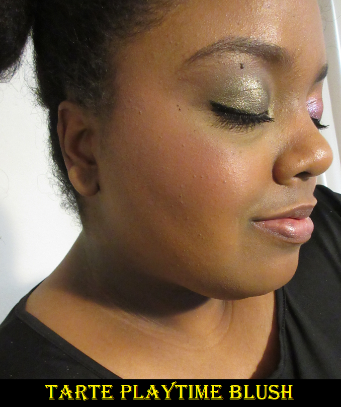
I have no issues with influencer and makeup artist brands, but something about celebrity brands tend to be a turn off for me. With a makeup artist, the passion for makeup is obvious because they made it their career. With beauty influencers, they tend to have enough content on social media for people to be able to tell what their skill level/expertise is when it comes to beauty, as well as being able to see a pattern in their makeup preferences and whether or not it will align with the viewers. Regarding celebrities, I seldom know anything about why they decided to get into the makeup industry until they actually have their own collaborations or start their own brands. The situation with Iggy Azalea and Doja Cat who did hardly anything to promote their collabs with BH Cosmetics, despite Doja Cat at least being known for enjoying makeup, demonstrates how much of a cash grab celebrity involved makeup products can be. This doesn’t mean those brands will forever have mediocre products attributed to their names, like the case of Haus Labs with their terrible run on Amazon, but seemingly successful rebrand at Sephora. So, today I am analyzing a few products I got in 2021 and the first half of 2022 to see if my opinion on celebrity makeup brands and collabs will remain the same by the end of this review.

Rare Beauty

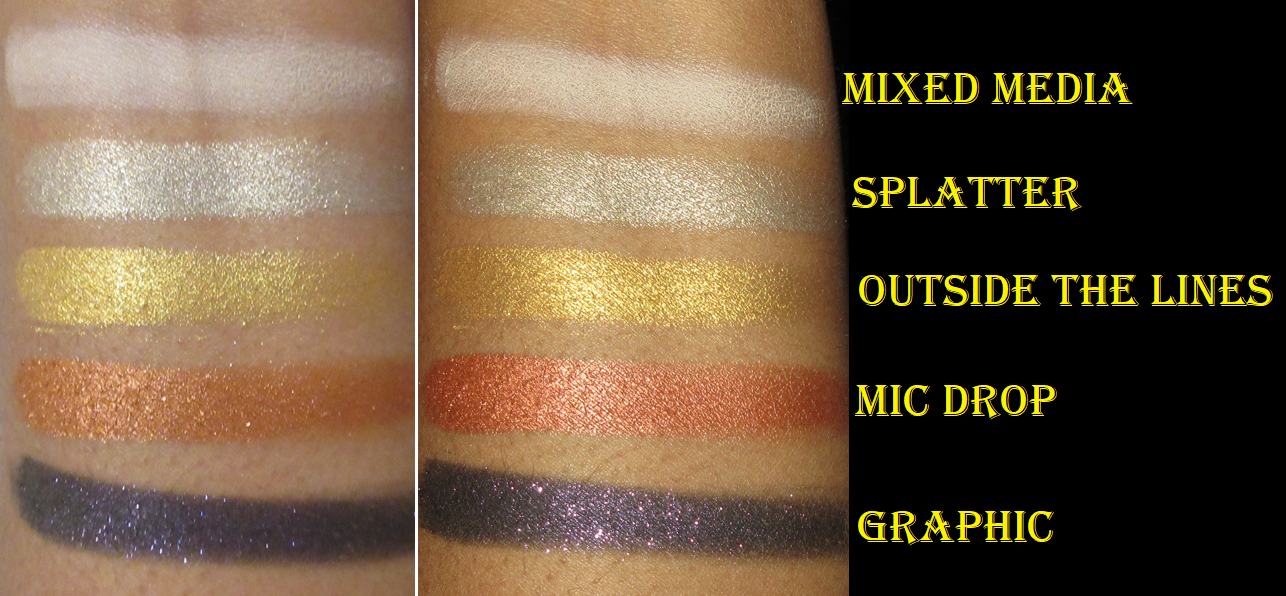
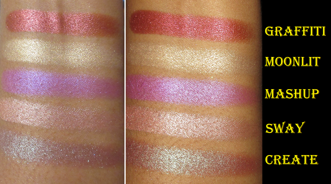
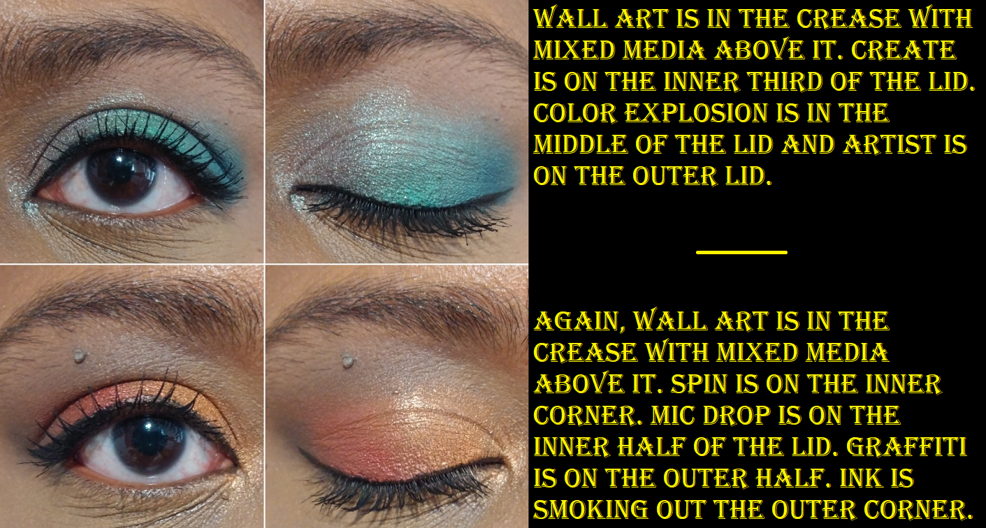
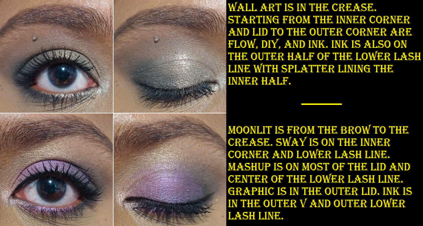
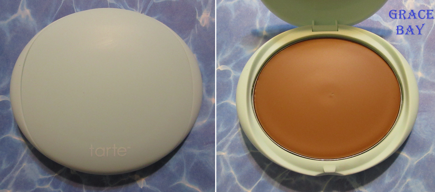
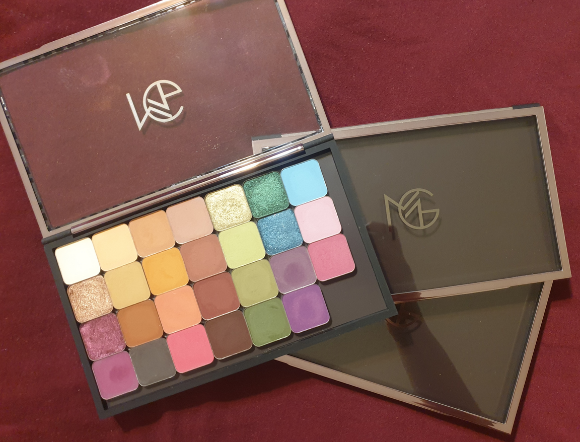
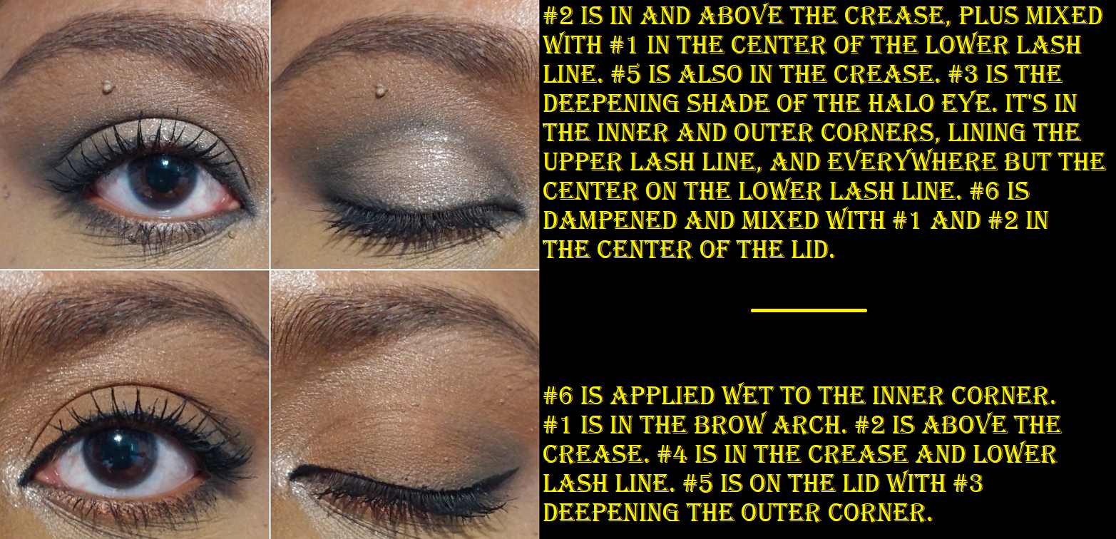
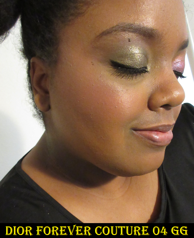
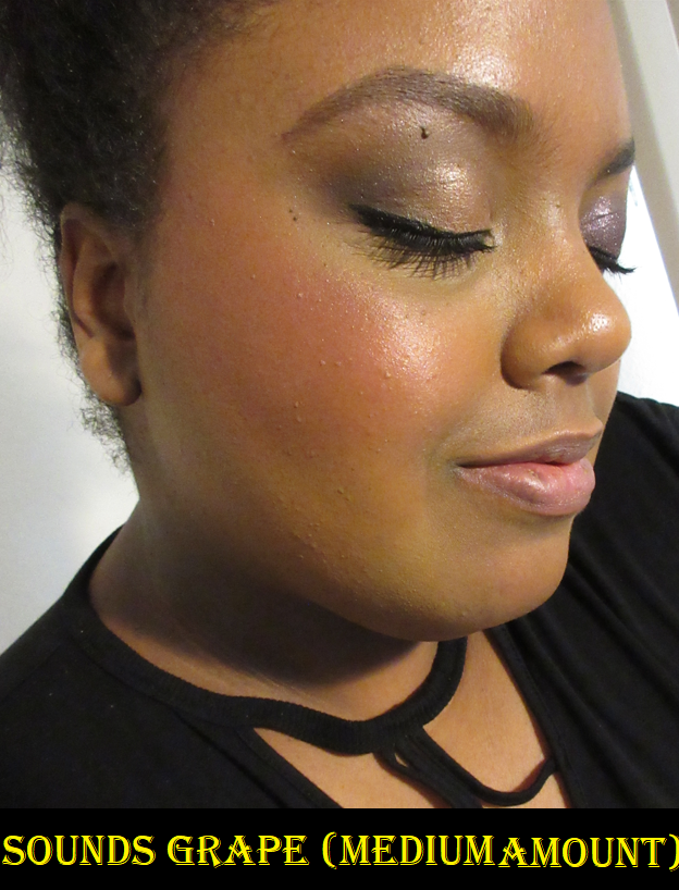
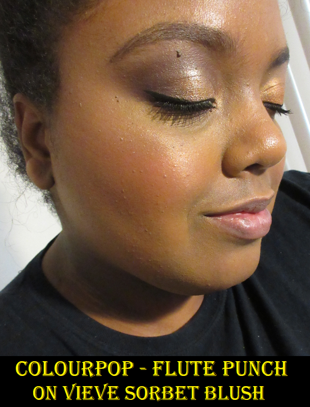
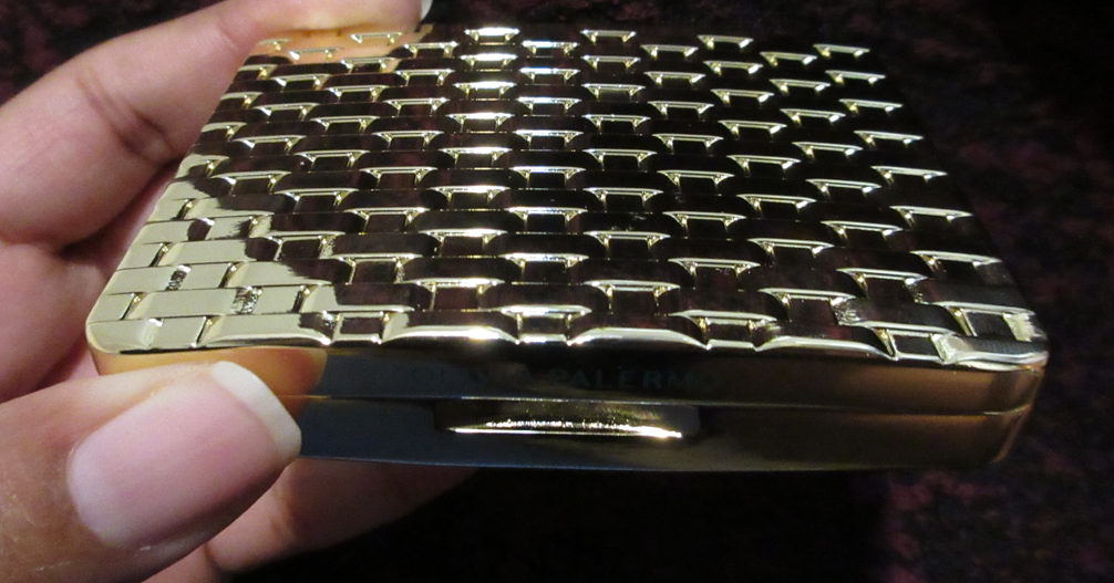
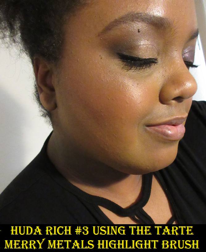
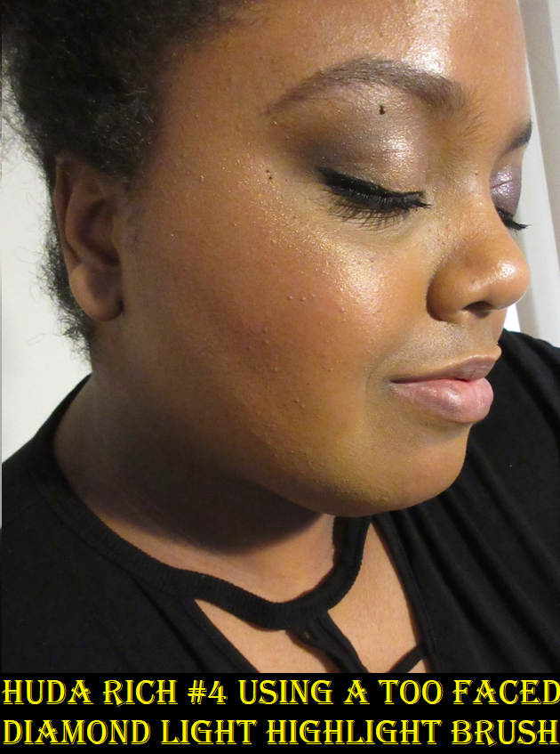
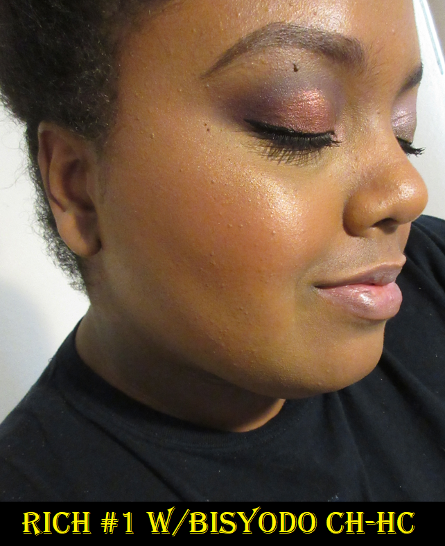
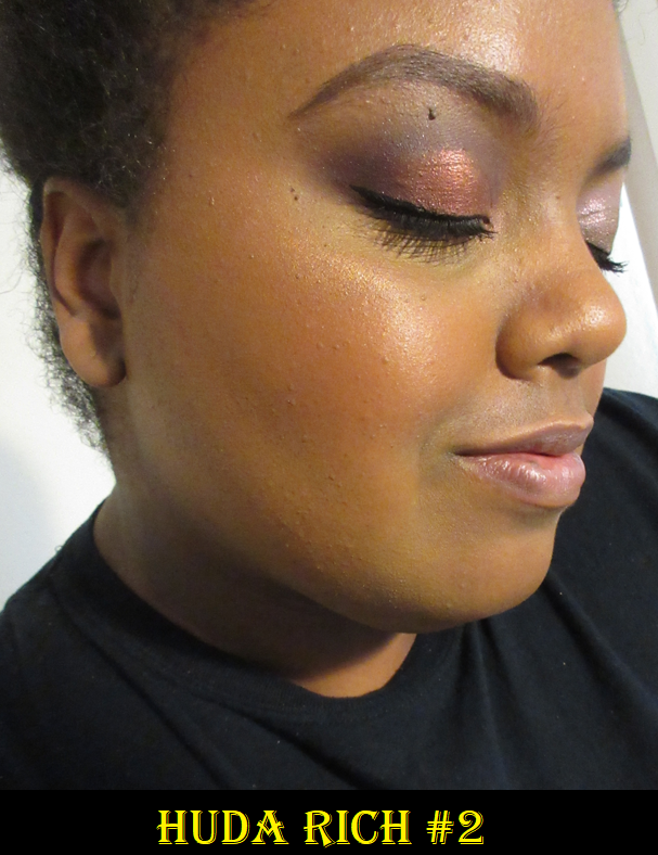
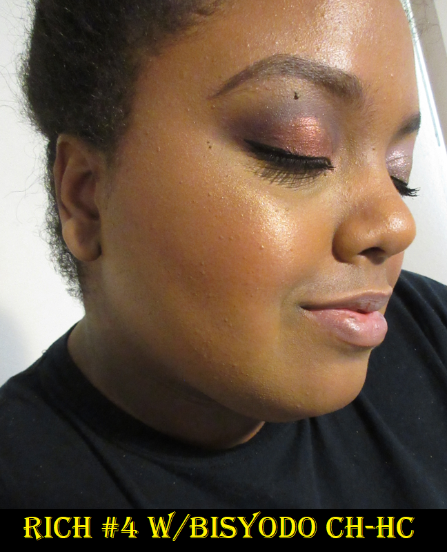
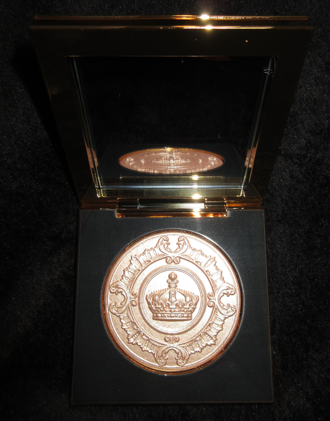
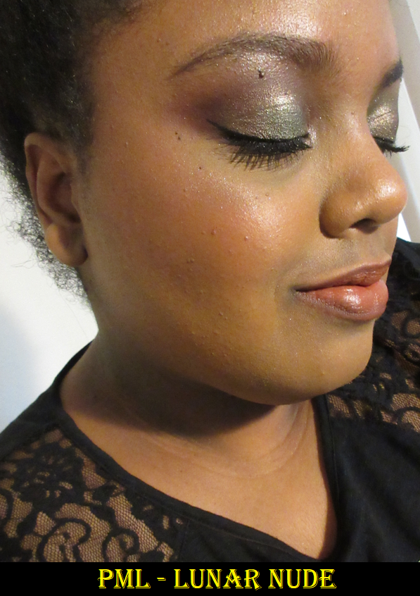
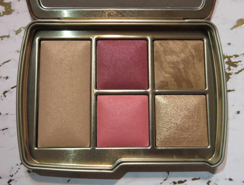
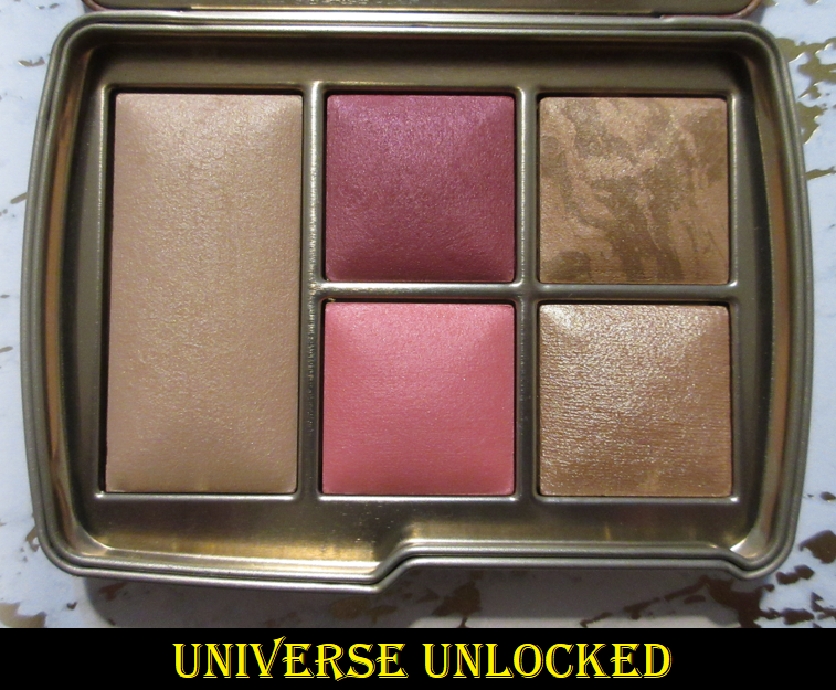
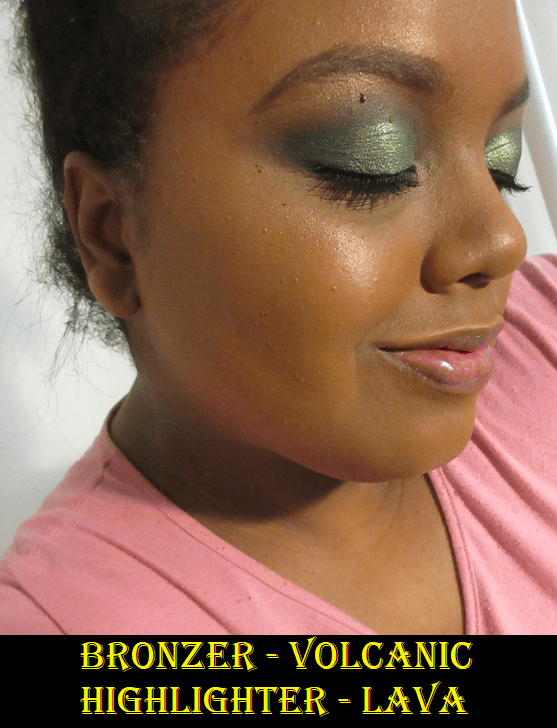
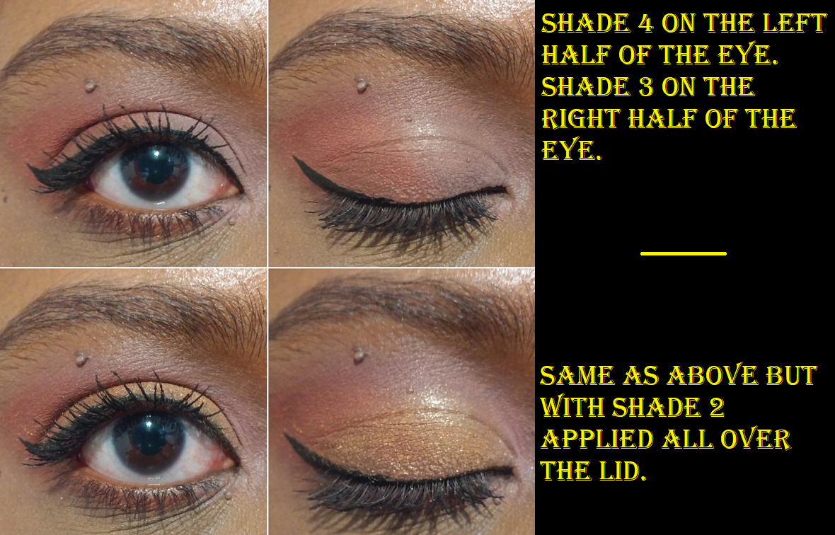
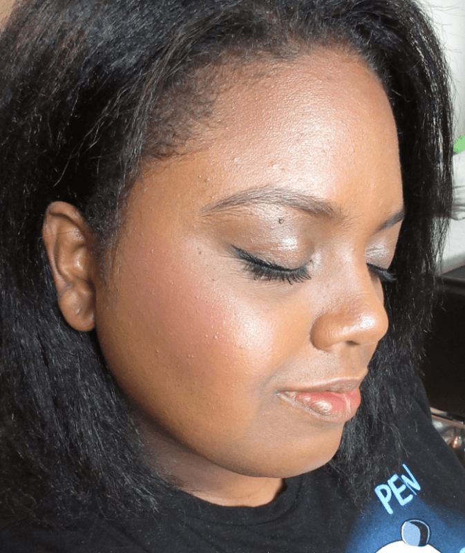
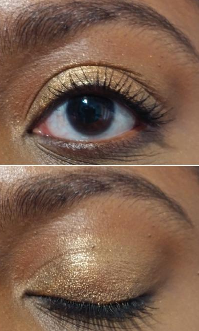
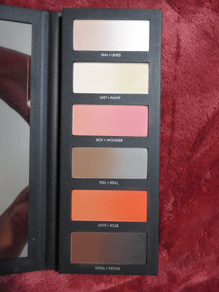
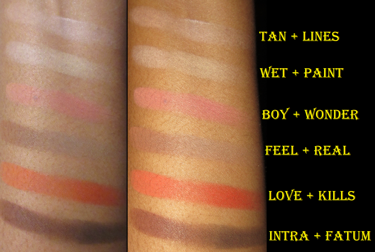
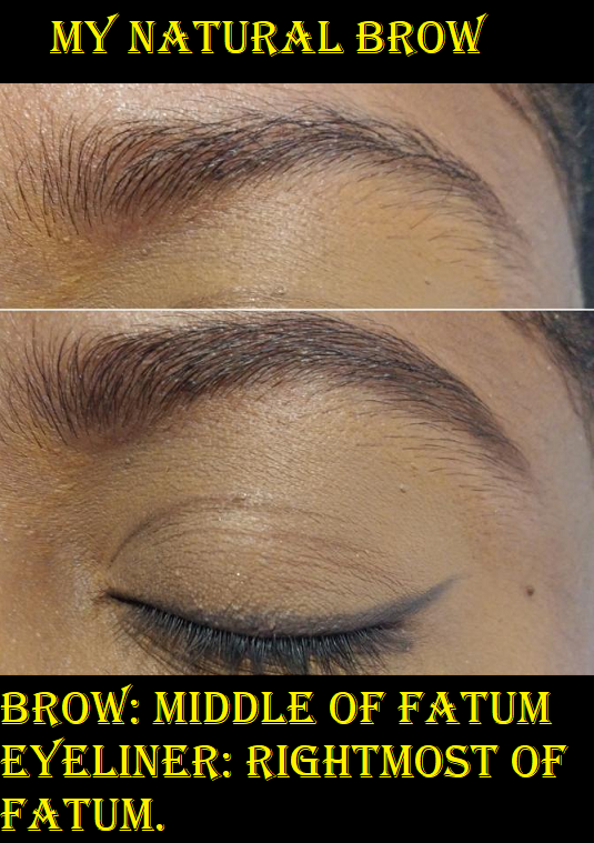
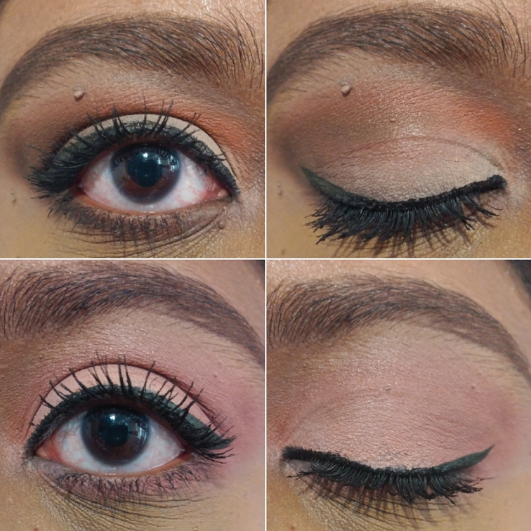
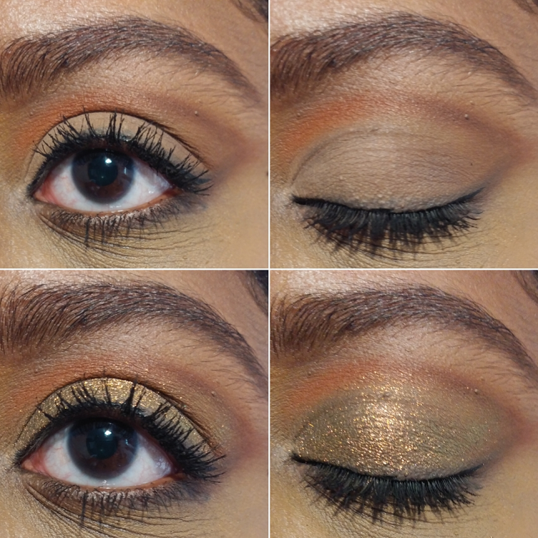
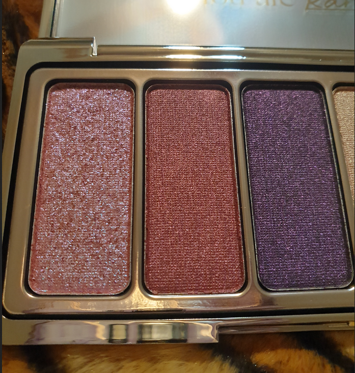
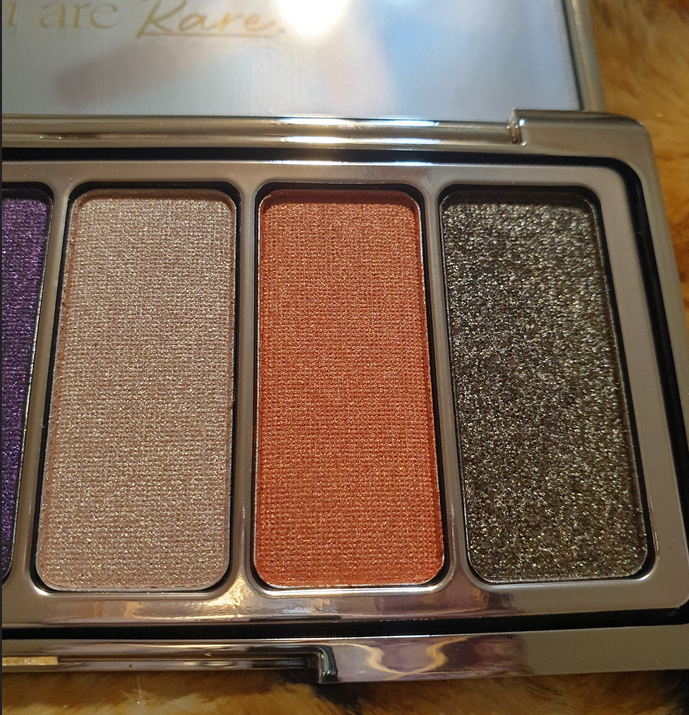
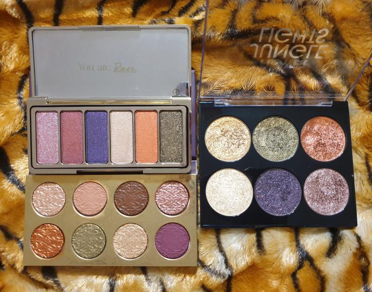
Rare Beauty Magnetic Spirit Eyeshadow Palette

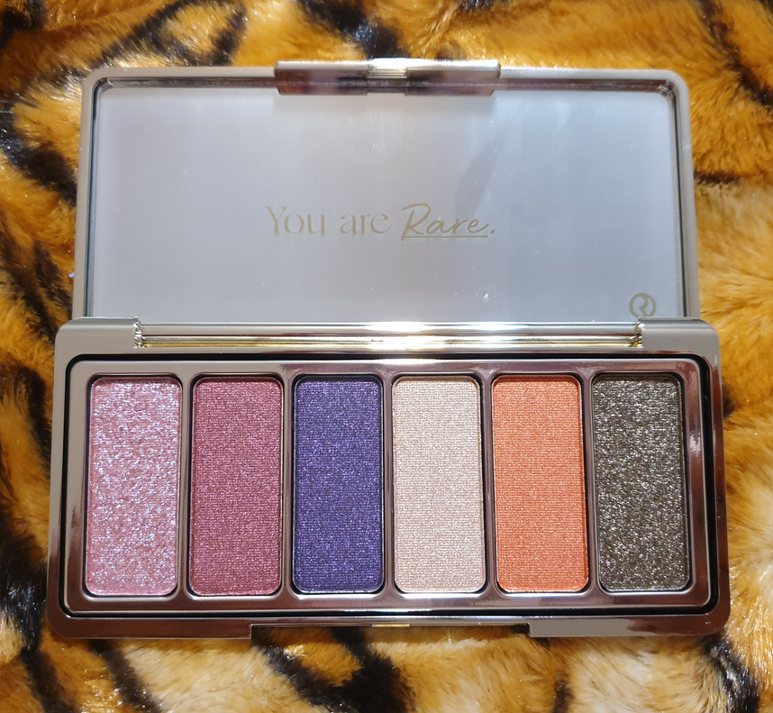
I got this palette as a present from one of my friends. I was always drawn to the color story and had this on my list of things to eventually get, but after buying the MAC Tempting Fate Palette and Flower Beauty Jungle Lights palette, I felt those had too similar of shades for me to purchase this one. So, I skipped getting it, but I’m happy to have it now.

Because this and Jungle Lights are especially similar, I would recommend looking at that post for additional eye looks.

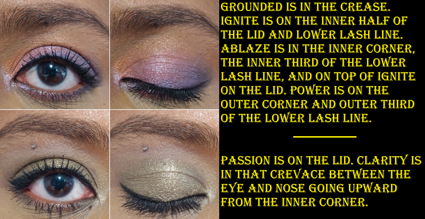
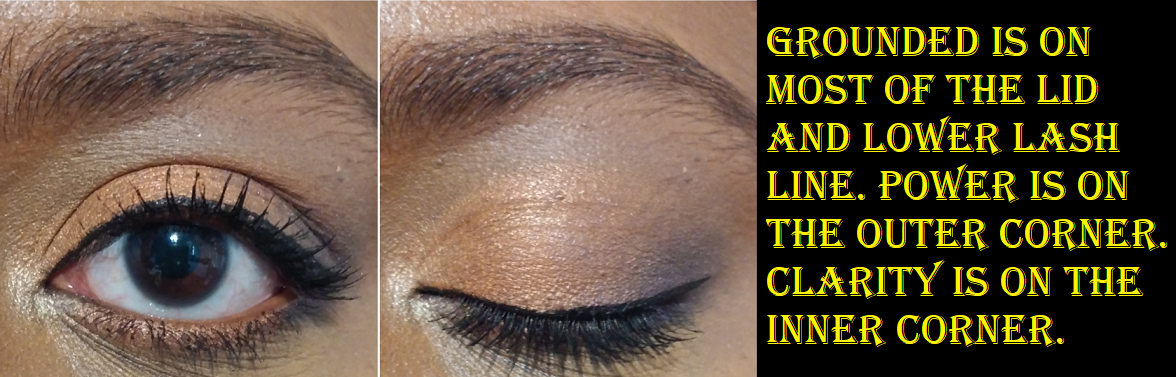
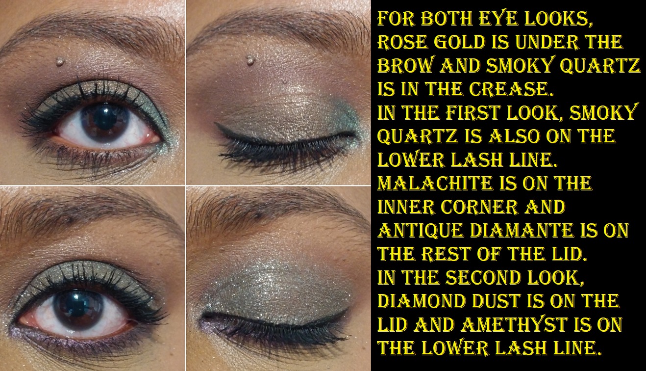
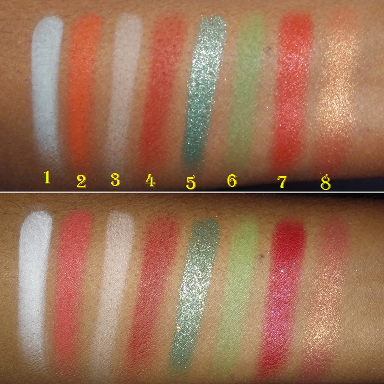
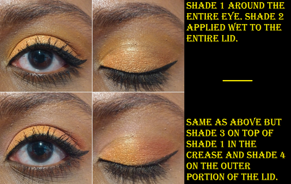
I really wish there were some mattes in this palette, but because the four center shades are satins, those can be used as mattes. The pink base in Ablaze doesn’t show as well on my skin tone, so I essentially use it as a topper shadow. The satins don’t crease, but Ablaze and Passion sometimes settle in the lines of my eyes. I personally prefer more sparkle in my lid shades, so as much as I like this palette and the colors within it, I actually recommend to those who have a similar eyeshadow style as me to get the Flower Beauty Jungle Lights Palette instead. Jungle Lights has less impressive packaging, but the tones in it are more flattering, give more pigment and sparkle intensity, and blend easier so that I can even custom mix shades. The formula of the Rare Beauty eye shadows are more traditional, so it’s not as versatile as the palette from Flower Beauty. It’s ironic that I recommend replacing one celeb item with another as Flower Beauty is also a celebrity brand, but founded by Drew Barrymore. Since Jungle Lights came out first, and several years ago, I wonder if Selena’s creative team was aware of that color story and chose to ignore the fact that they were creating something similar.

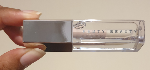
Overall, Rare Beauty is an exception to my viewpoint on celebrity makeup. I have enjoyed the liquid blushes in the past and have heard wonderful things about the other products in the line. I have no opinions about Selena Gomez personally, so that was never a selling point for me, and yet the brand’s marketing and product quality have left me with a very positive impression. Rare Beauty and Fenty Beauty have done things right and have set the bar for other celebrity brands.

Since I mentioned Flower Beauty already, I should probably explain that I like movies Drew Barrymore has been in, but that has never made me interested in her brand. The only products I own from the brand is the Jungle Lights palette, because it has been so hyped up, along with Blush Bomb Color Drops (aka the Glossier Cloud Paint dupes). I also bought one other item a long time ago, which I think was a powder blush. Whatever it was, I just remember that the powder quality was chalky and the shade was unflattering on my skin, so I returned it.

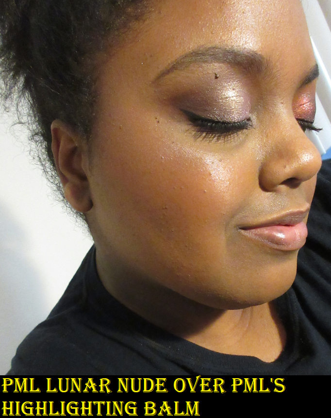
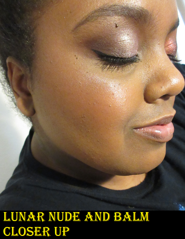
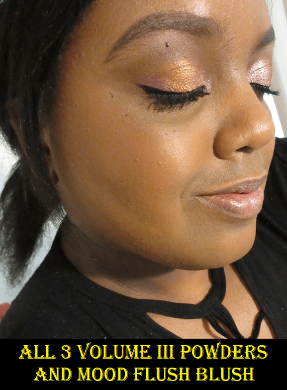
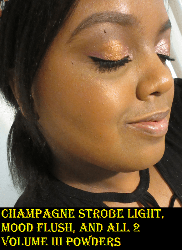
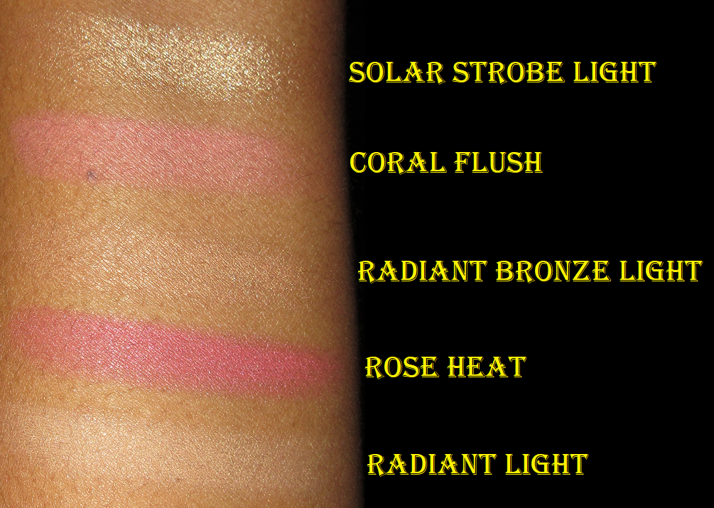
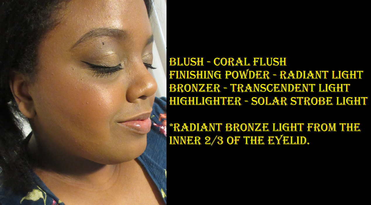
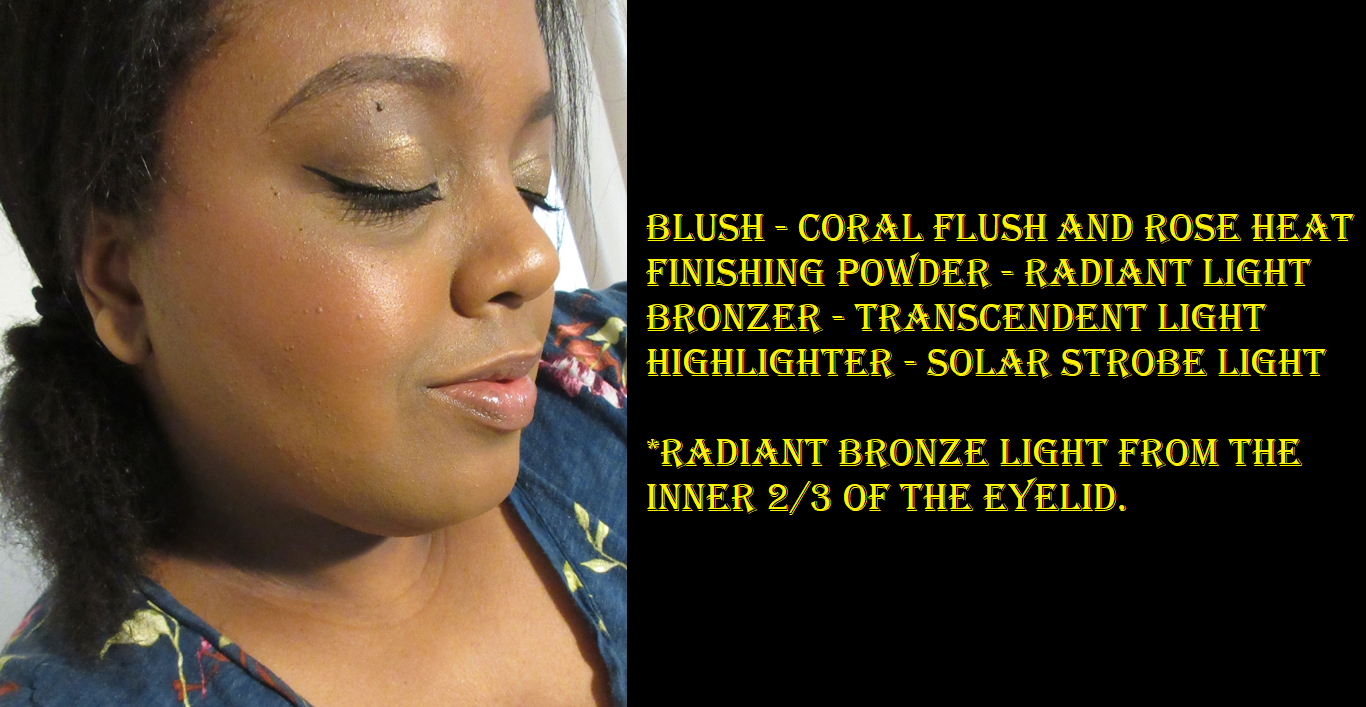
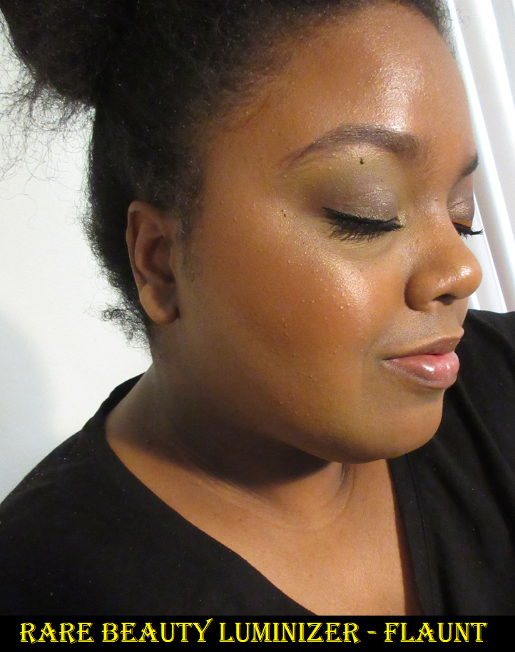
Rare Beauty Positive Light Liquid Luminizer Highlighters (Samples) in Transcend and Flaunt

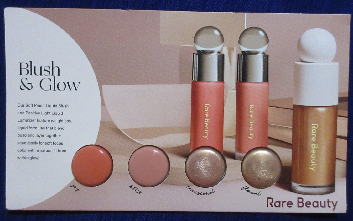
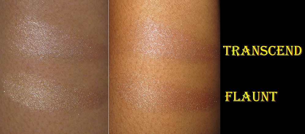
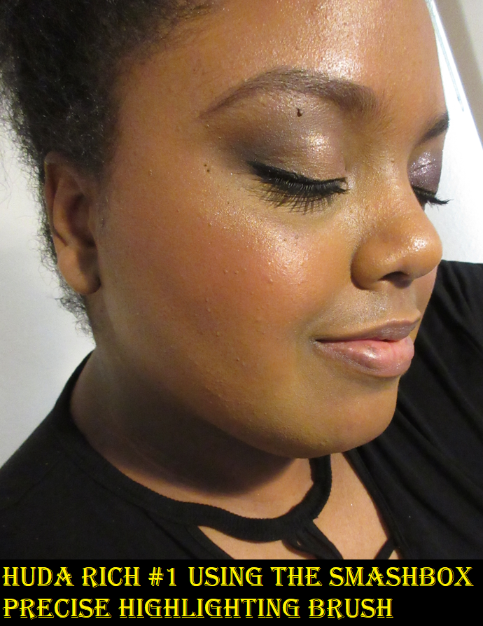
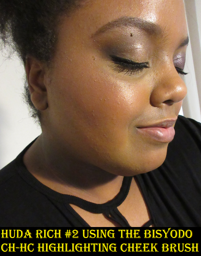
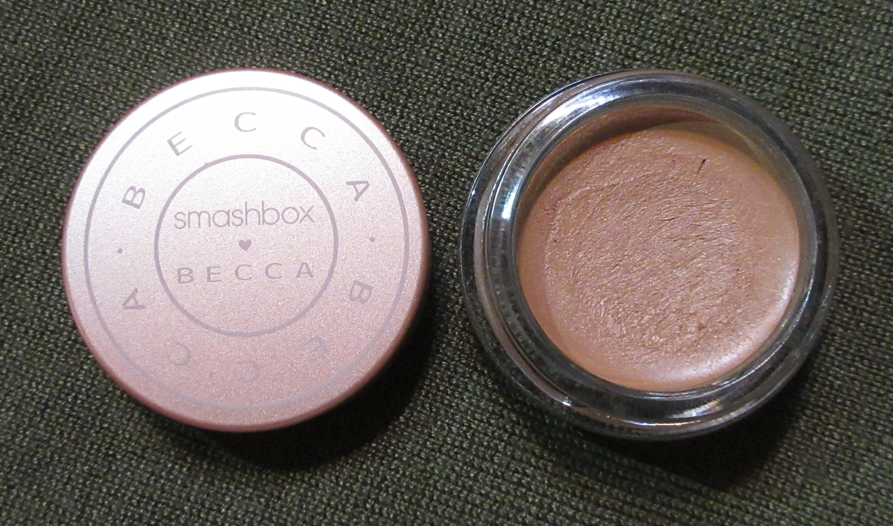
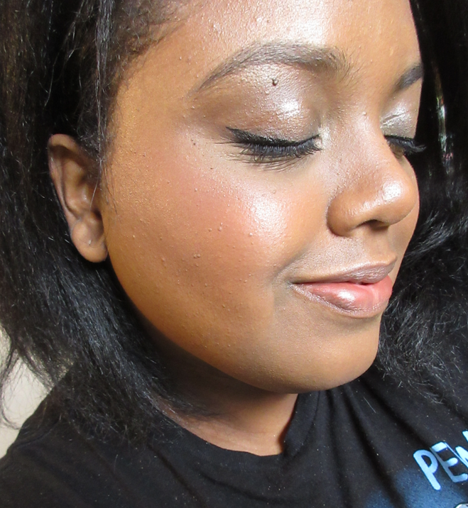
As beautiful as liquid highlighters are, I rarely reach for them, which is why these were never on my list to try unless they got released in mini sets like Rare Beauty has done for the blushes and lip products in the past. I’m happy that I was able to try them because these have been hyped up a lot. What I really like about the formula is that these blend in nicely with my Smashbox Precise Highlighting Brush. I have time to blend it in before it dries fully. It captures that wet gleaming skin look that I love. It’s a bit more metallic than I usually go for, but it’s stunning to look at and I do occasionally like a blingy highlight.

I probably would not have chosen these two shades for myself, but they turned out to be great! Transcend is a rose gold shade, and I usually don’t like the look of pink toned highlighters on me, so I built up my blush in order to hopefully get the highlight to look more natural on me. I think that tactic worked! When it came time to try on Flaunt, I toned down the blush to the level I would normally wear it so I could see the true color of how this “bronze gold” shade would look on me. I think it also looks nice, though it would have been perfect if it was slightly darker. Also, I have to acknowledge that Flaunt doesn’t look quite as smooth because I applied too much and continued to try and blend it out after it had already started to dry. So it looks a little messier than when I tried on Transcend, but that’s user error and not a flaw of the highlighter.

As curious as I am to explore more of the highlighter shades, I’m sticking to my original resolve that I should not purchase makeup I’m not going to use up unless it’s for sale as a mini. It’s nice though!

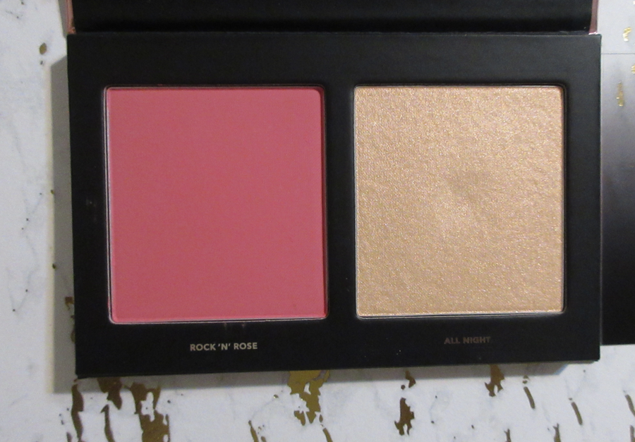
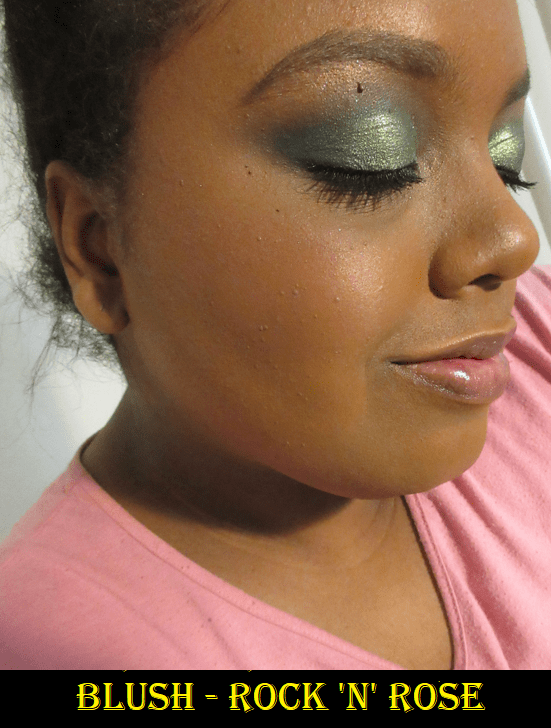
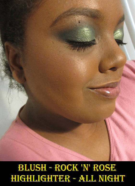
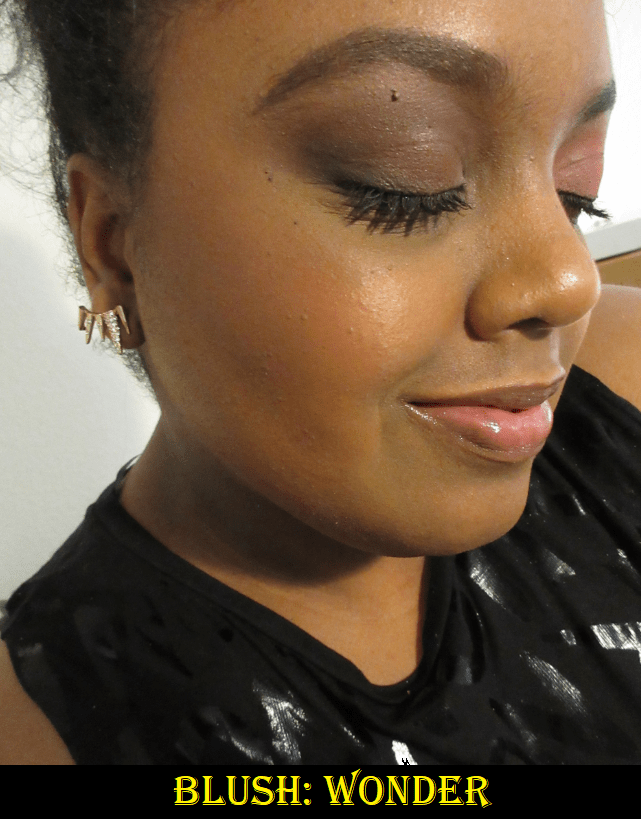
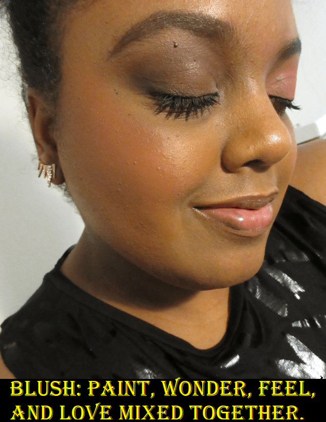
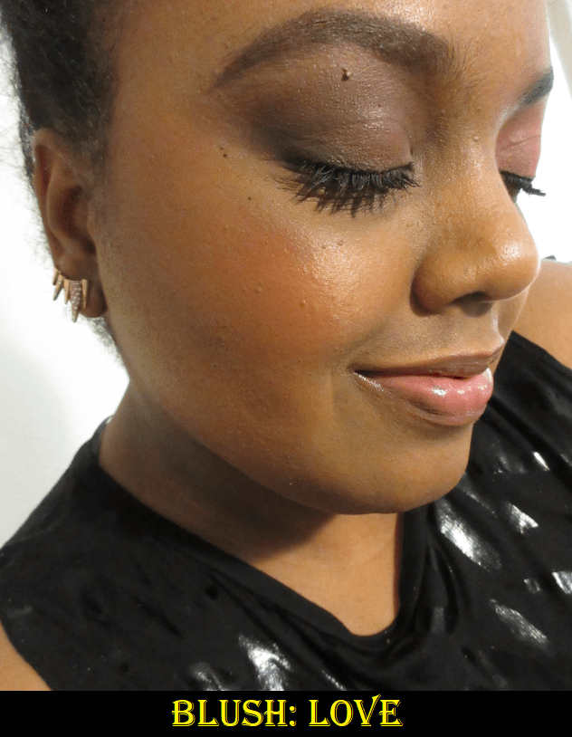
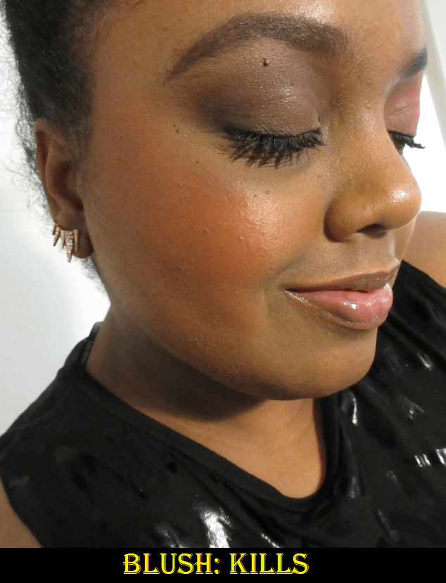
For those interested in the blushes, I reviewed Joy and Love here.

Rose Inc

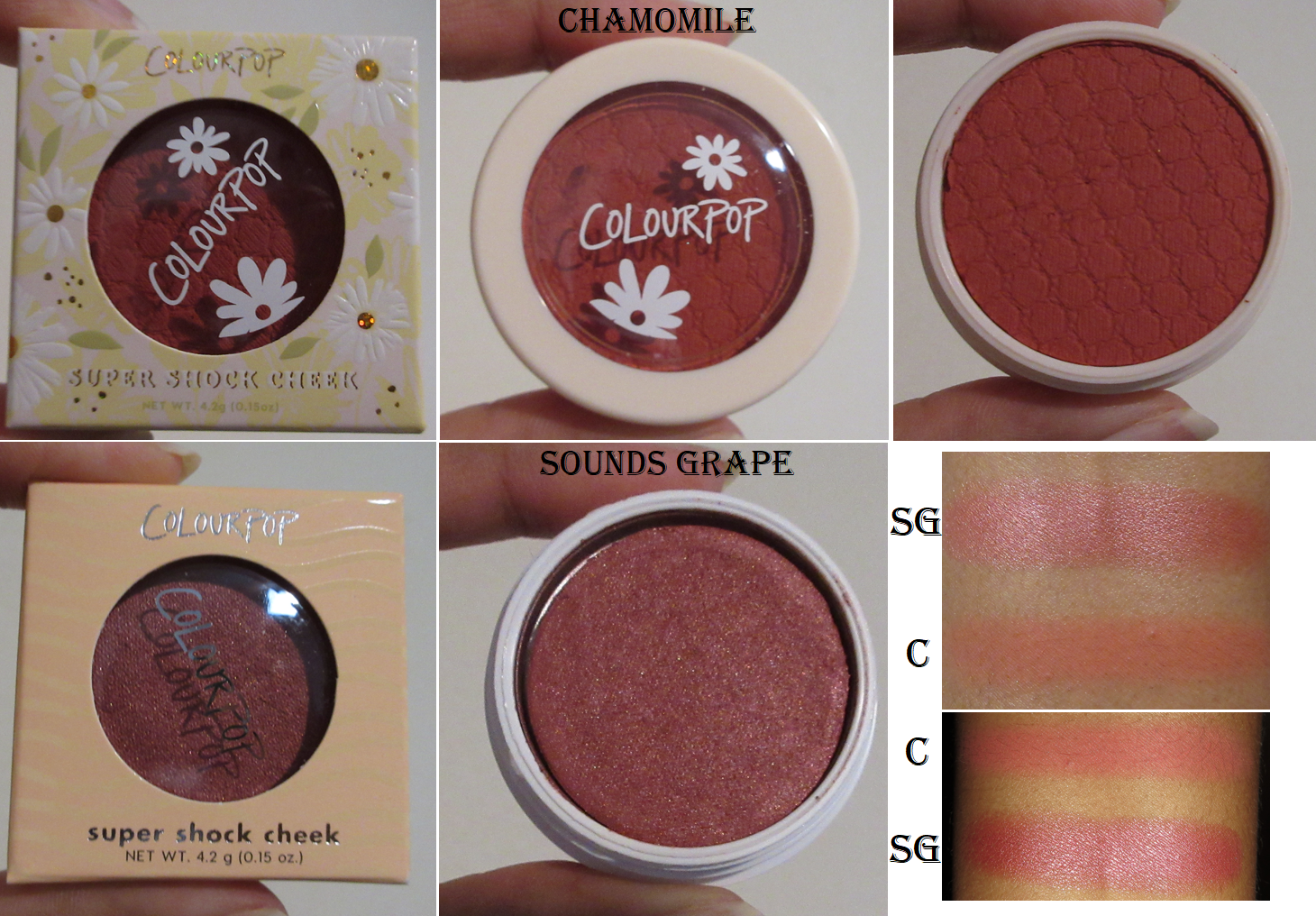
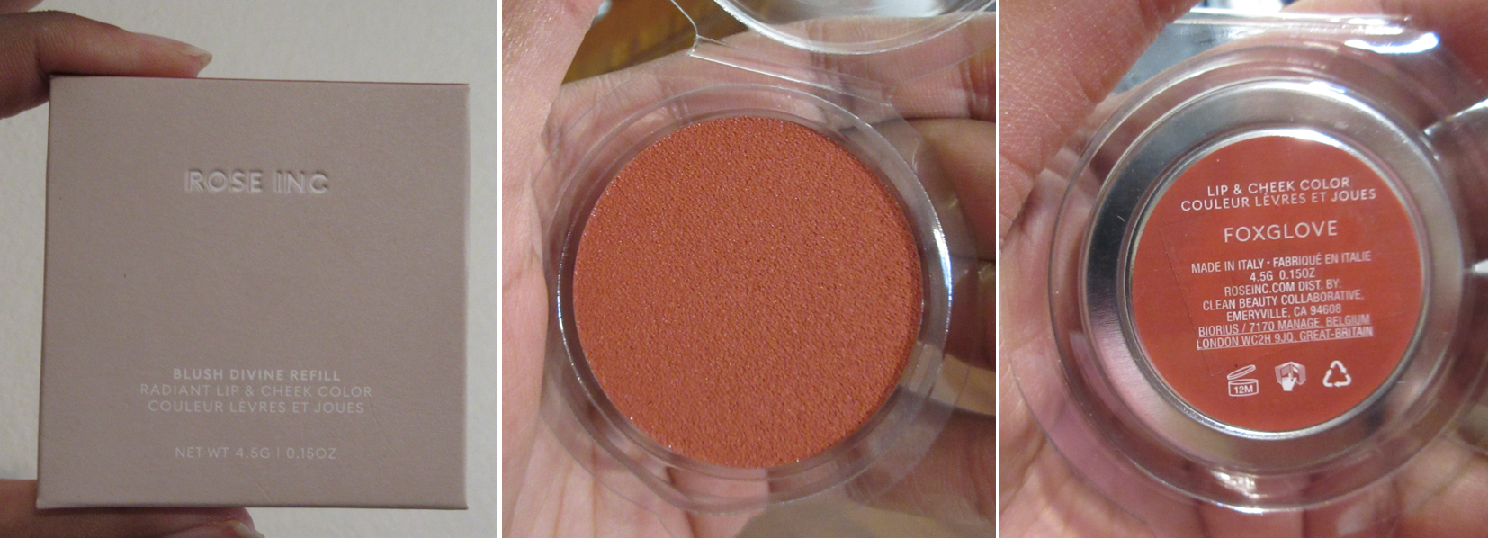
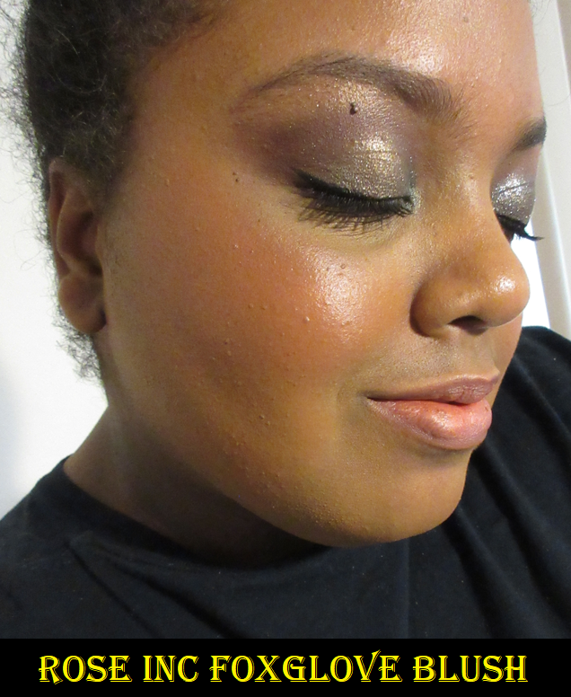
Rose Inc Blush Divine Cream Blush (Refill plus Samples) in Foxglove, Anemone, Azalea, and Dahlia

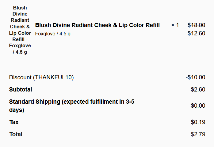
I initially wanted this as soon as it launched, but I saw reviews that this formula was a bit sticky, which is a feature of cream blushes I usually can’t stand. However, on Black Friday when Rose Inc had all products discounted on top of a $10 off promo code and free shipping, there was no way I could pass it up.

Had I known that I would actually like the formula and that this Foxglove shade would actually work on my skin tone, I would have purchased the version of it that came in an actual compact. I have empty magnetic palettes I could put it in, but for now, I’m content with the plastic clamshell and box to limit air exposure for the cream.

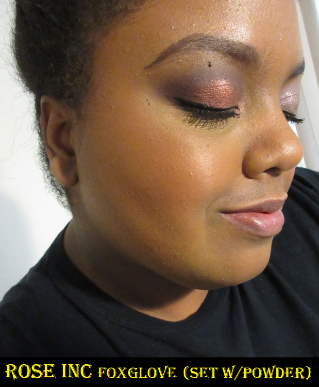
The other reviews I’ve seen were right about this having a sticky texture, but that issue is resolved with a little powder on top of it. In the powder set photo above, I used one that was too dark and covered up too much of the blush, but normally this does the trick. The only unfortunate aspect is that setting with powder loses the flattering dewy sheen that this blush naturally provides, so I would probably continue to wear it without being set for photos, but if I planned to be in public and concerned about accidentally touching my face, I would then set it with powder. It lasts all day and while I wouldn’t personally recommend it at full price considering the myriad of lower priced cream options, I do think this is nice and worth checking out on sale.

I should also note that between using a brush, sponge, and fingers, my preferred method is to use my fingers because I have a lot of control that way. Using a slightly damp sponge is also a great option for packing on the color and blending seamlessly. I don’t recommend using a brush though because that sticky texture coats the bristles and causes them to bunch up, which impedes on being able to get a nice blend on the skin.

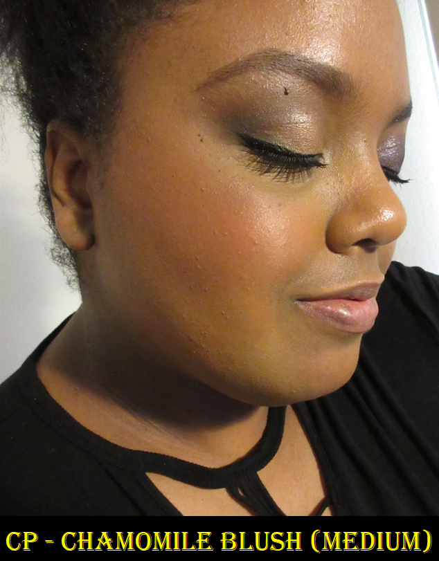
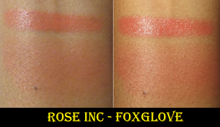
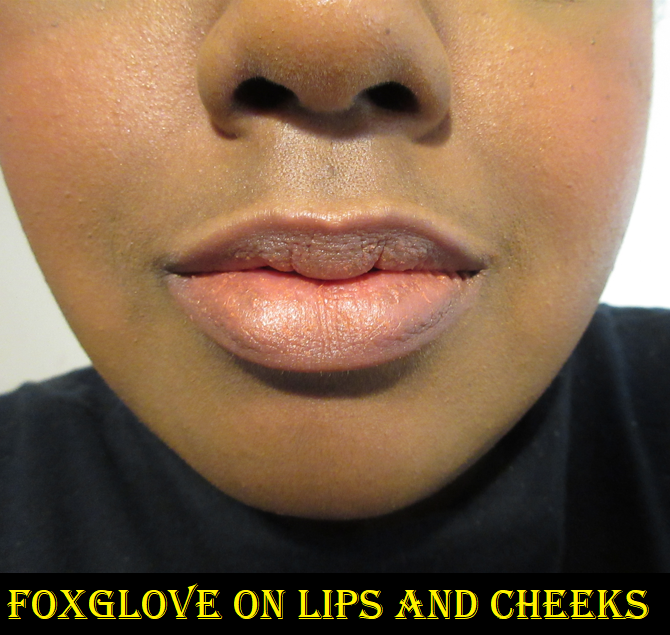
This product can also be used on the lips, but I don’t like how it looks or feels on mine, so I use it exclusively on my cheeks. Foxglove is described as a warm terracotta, but it looks coral on my cheeks.

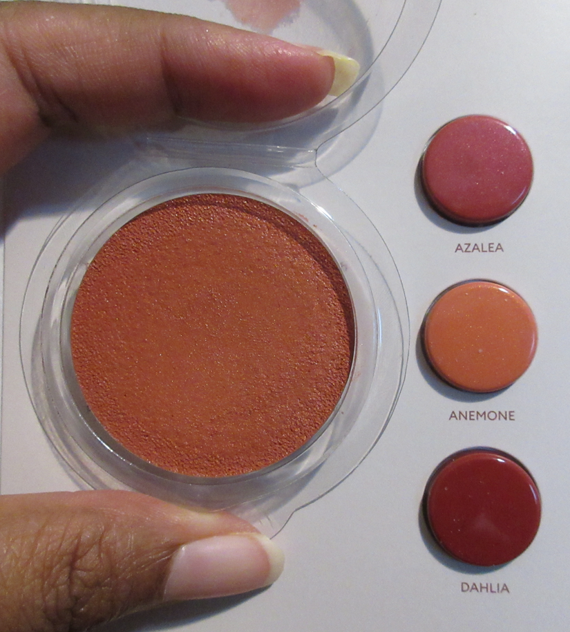
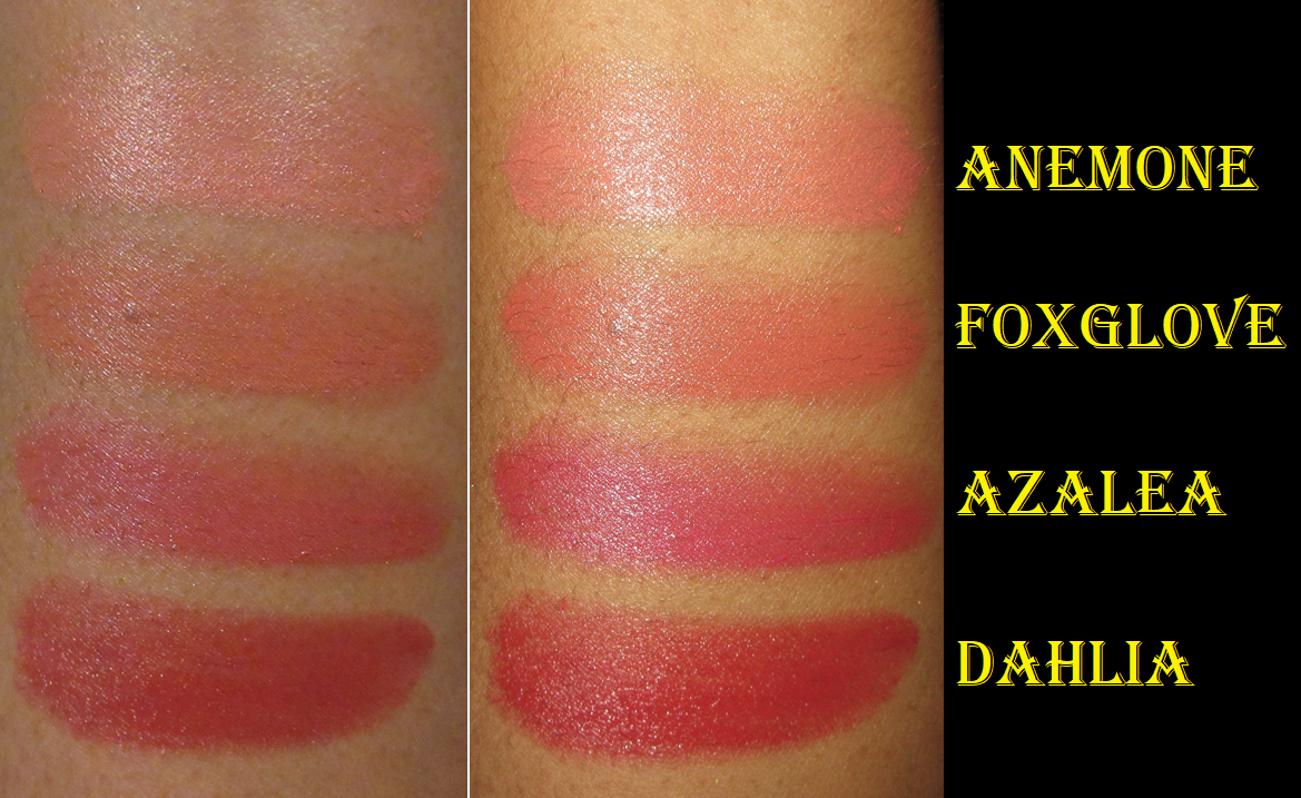
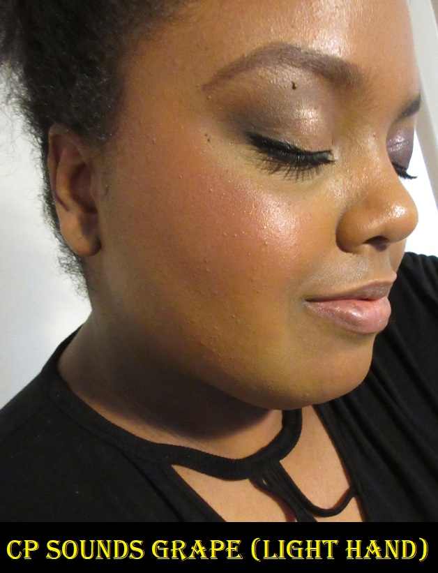
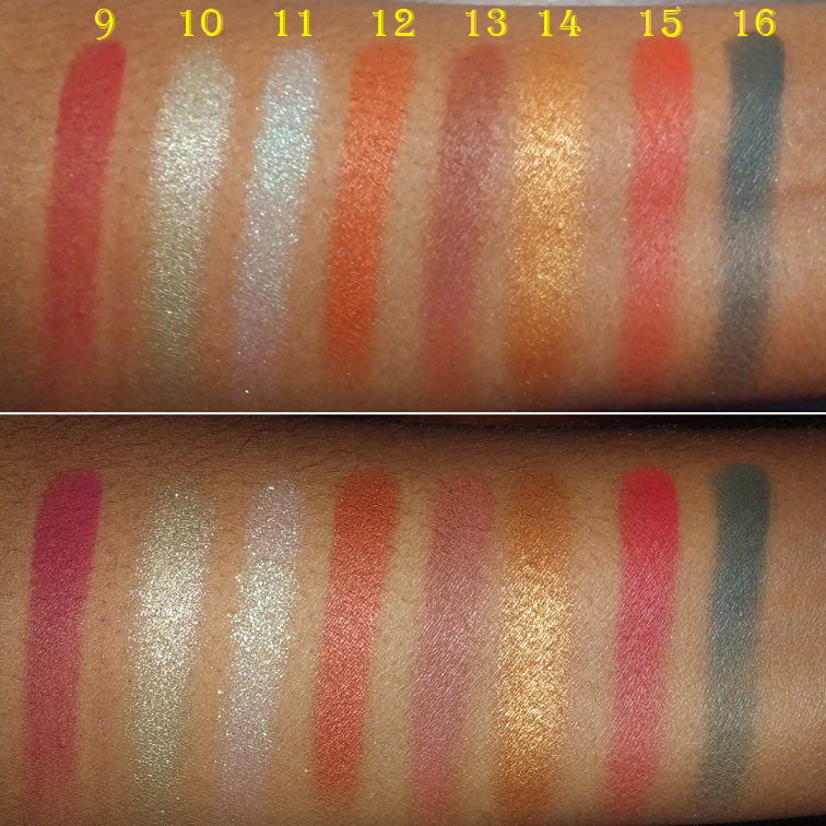
Since I’ve continued to be curious about the blushes, but they aren’t worth full price for me, I’m very happy to have this sample card to try. I’m particularly happy that I’ve been able to satisfy my curiosity about whether Anemone was the type of coral I could pull off or if it would be too light for me. It is indeed too light for me as I have to build it up to an unreasonable amount for it to show. I’m glad I chose Foxglove over Anemone when I was deciding which shade to get. I didn’t expect to like Azalea because it looked like a deep almost magenta pink and is described as a berry, but when used sparingly, Azalea just takes on a nice medium pink tone. It doesn’t look like the type of shade I identify as a berry color. As for Dahlia, which is described as a deep berry, it looks more like a deep red on my skin. If I use the same amount of Dahlia as I do of Azalea, it’s hard to tell a difference on camera, so I had to build up the color way past the amount I would normally use for the Dahlia photo below. I don’t like how Dahlia looks when built up, but I can attest to it being quite pretty when applied in a light layer.

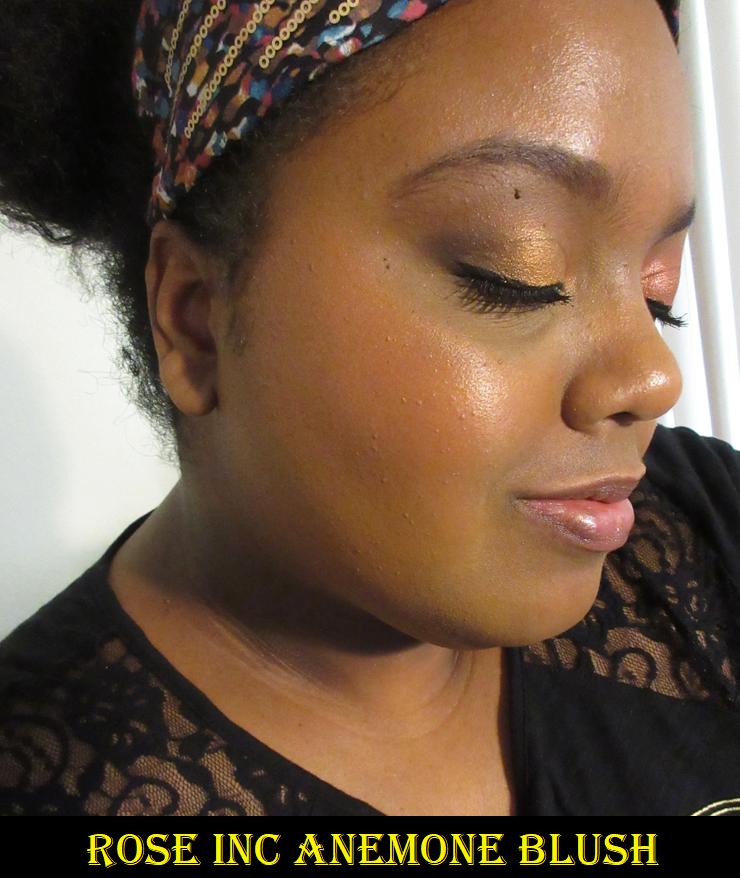
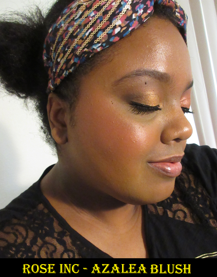
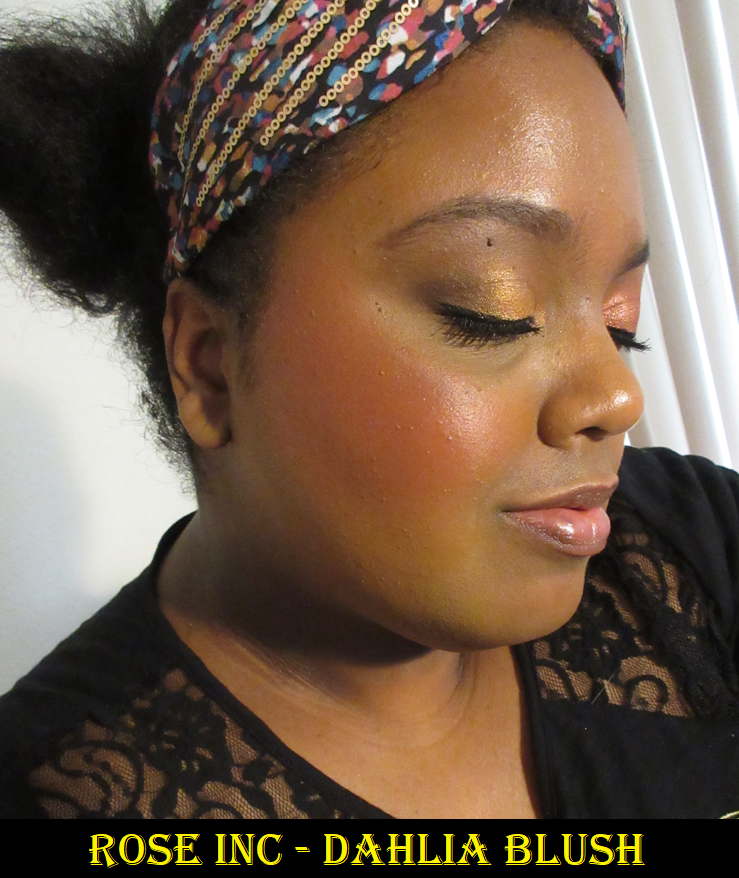
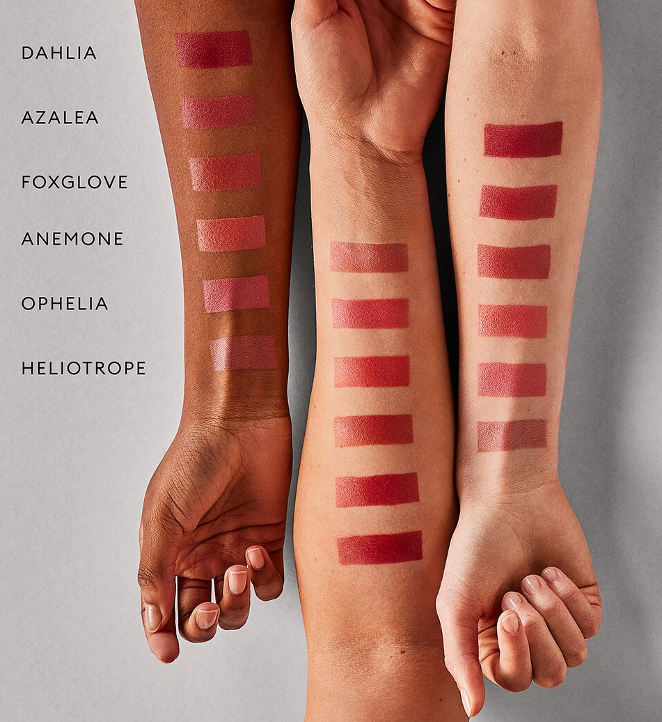
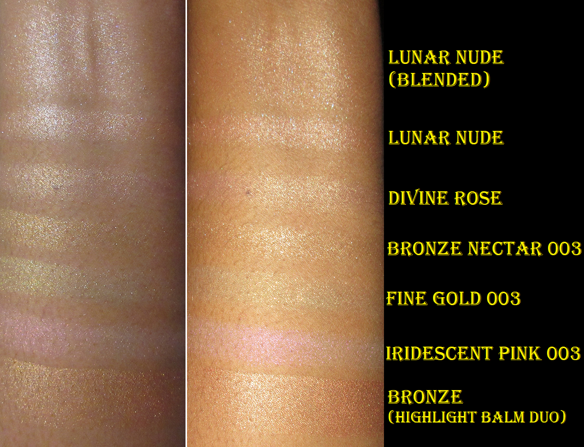
Photo taken from Sephora’s website.

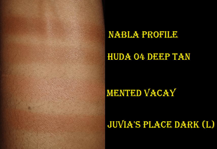
I find it fascinating that in the professional swatch photo, the biggest variation for how the shades look on the skin are on the deeper and paler arms. The swatches look so similar on the tan arm.
I believe the descriptions of the colors are represented most accurately on the darkest arm, so anyone lighter than that model should be prepared for the blushes to look a little different. Since I fall somewhere between the dark and medium/tan toned arm, I guess it makes sense that the blushes don’t quite match their descriptions on me. I ended up scraping out both sample cards of the blushes and putting the shades in small jars in order to continue using them!

I know Rosie Huntington-Whiteley is a model and I liked her in the Transformers movies, but that wasn’t enough to make me interested in her line. What caught my attention was the blush because I am a blush addict. I’ve heard nothing but great things about the other products she launched with, so I planned to continue to try more if there was anything that matched my makeup preferences and came in the kind of packaging that appealed to me. This post would have gone up in June, but then I surprised myself by purchasing the cream bronzer which I liked so much that I bought yet another item from the brand during their Friends and Family sale!

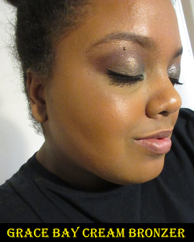
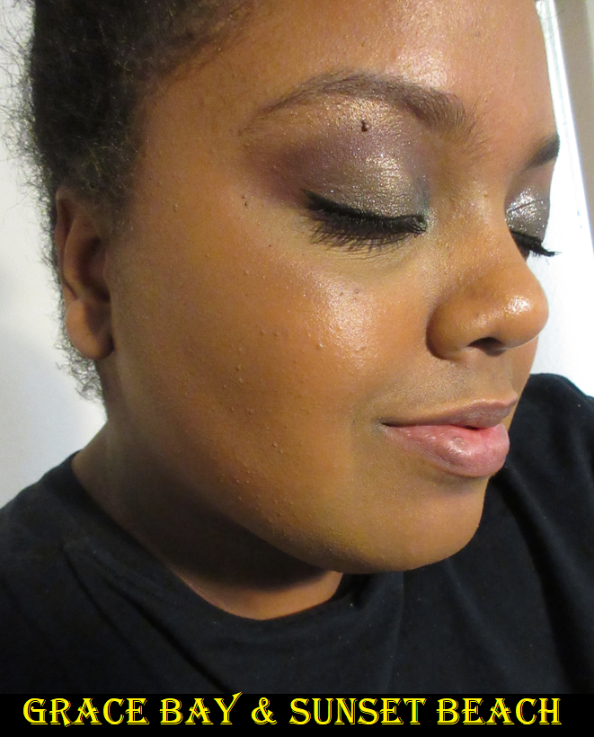
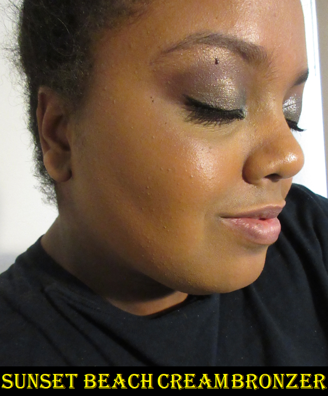
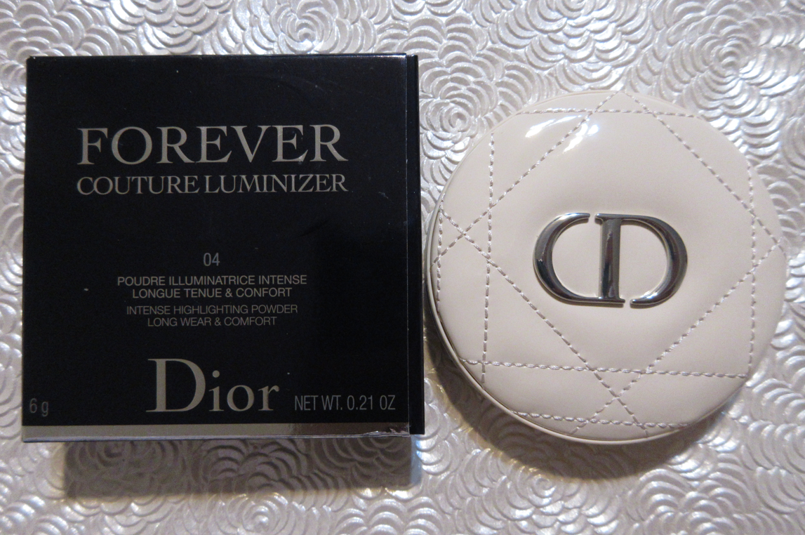
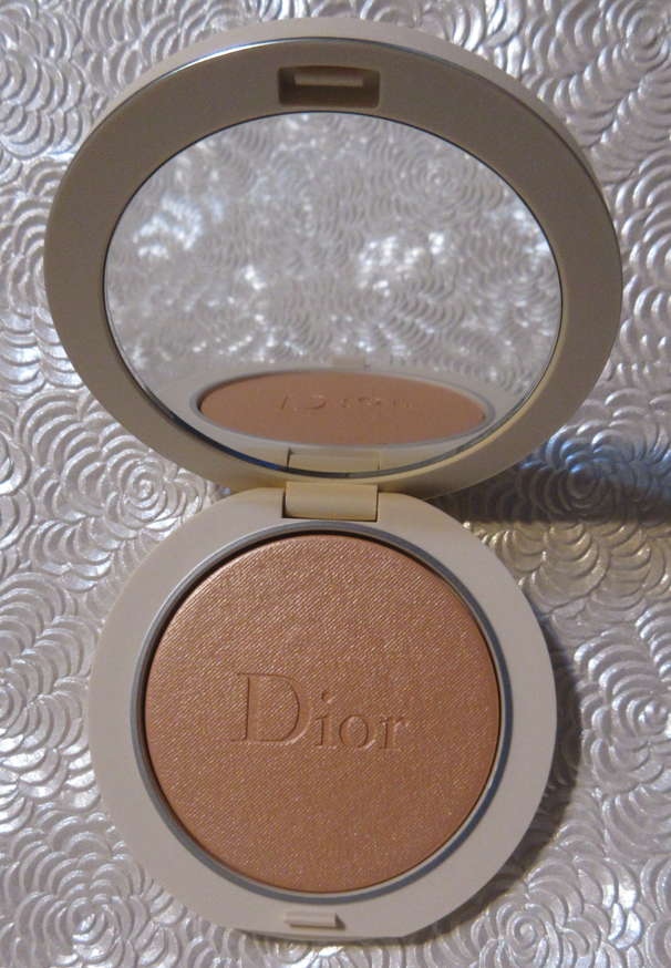
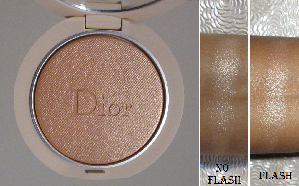
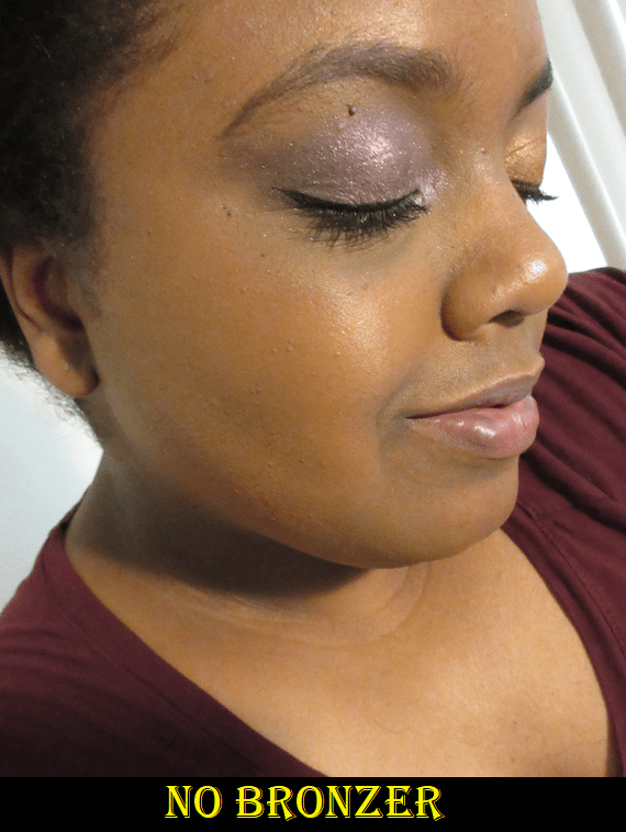
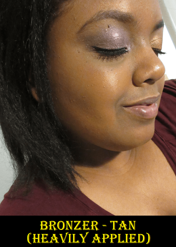
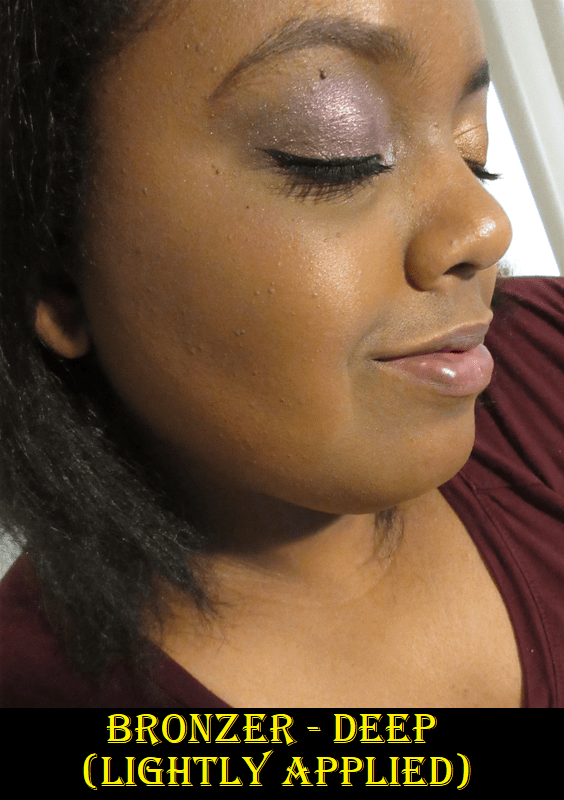
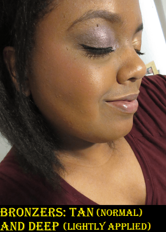
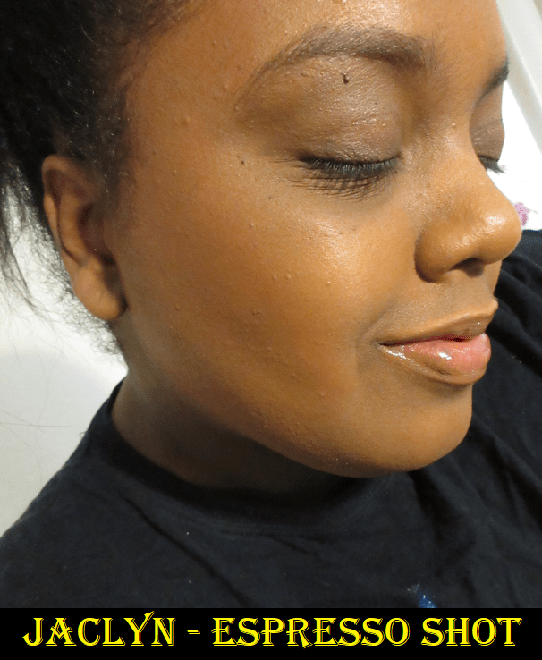
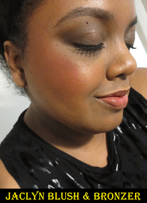
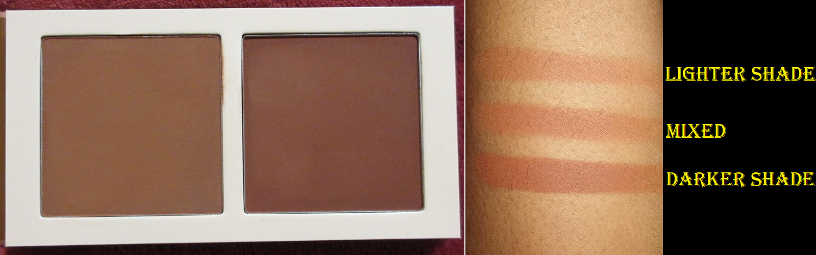
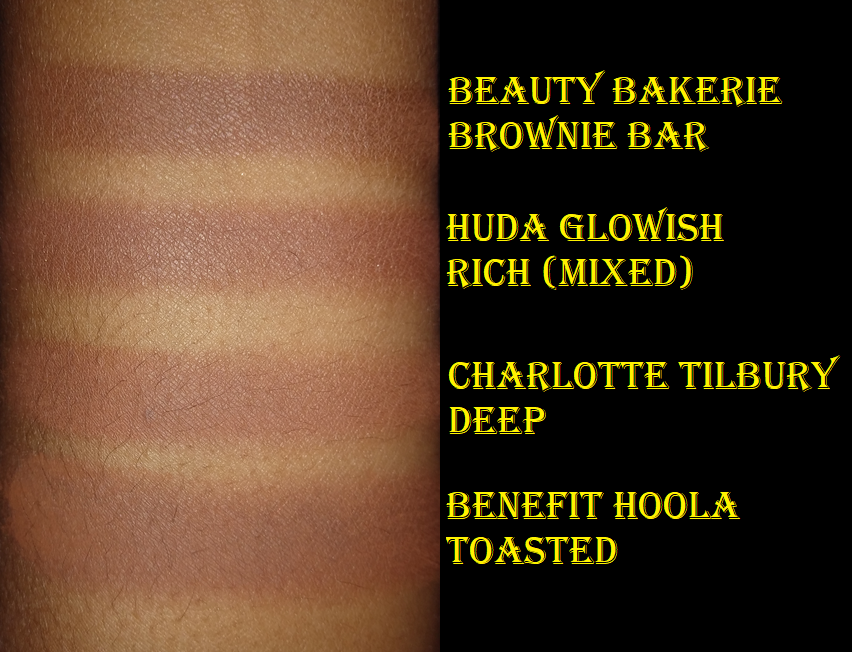
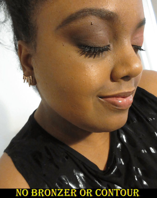
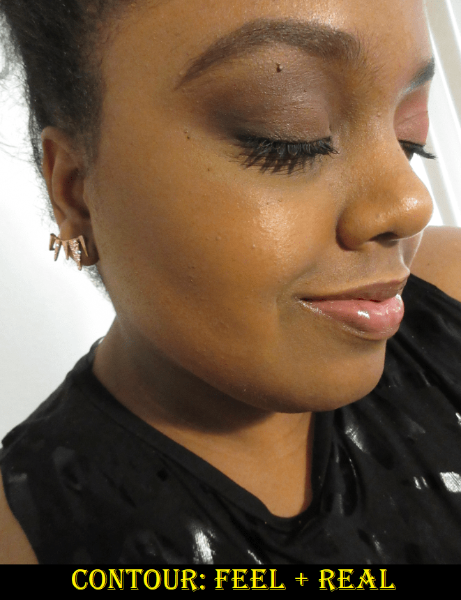
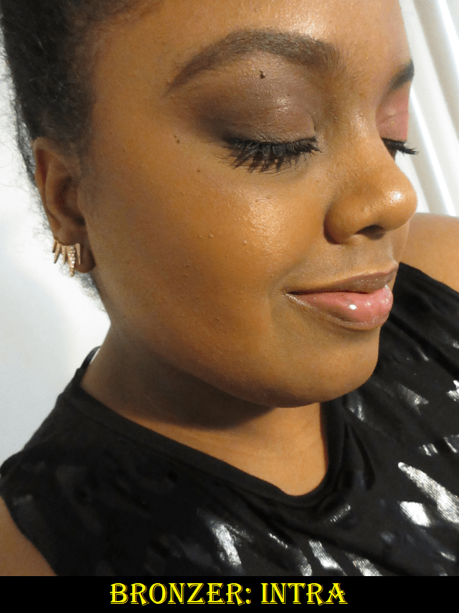
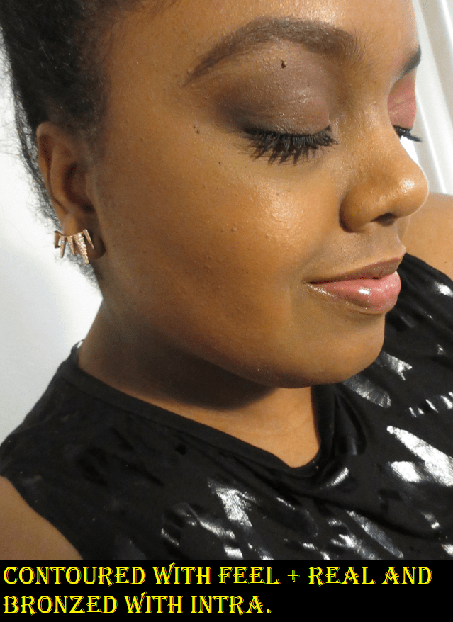
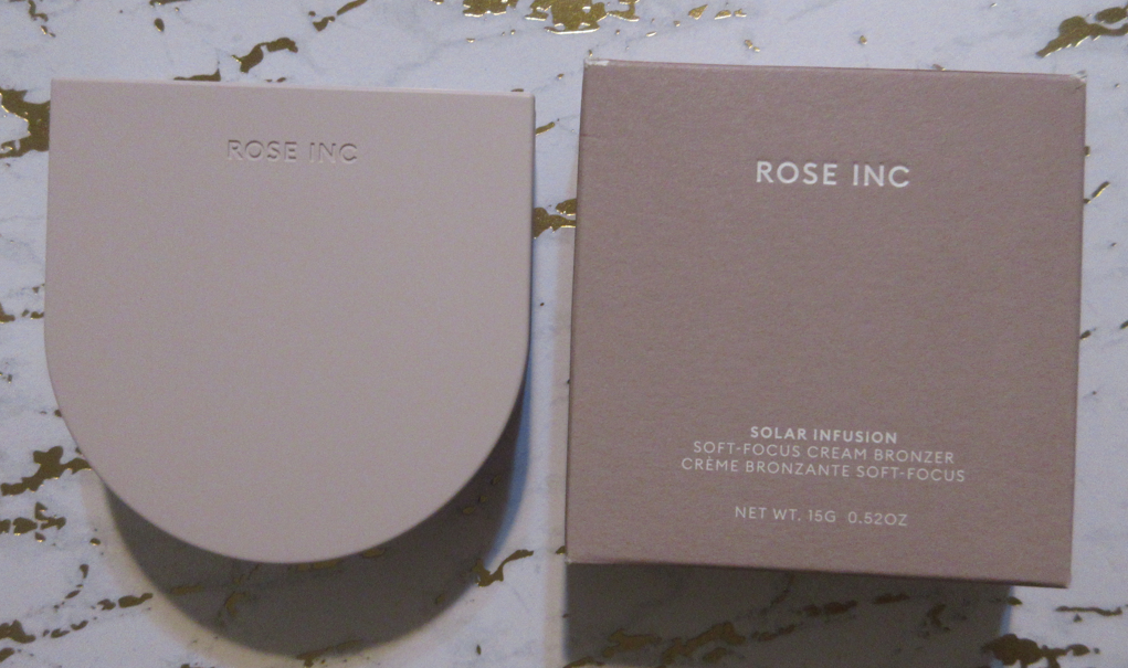
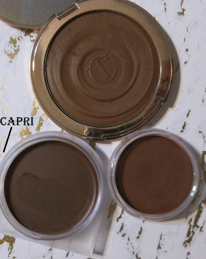
Rose Inc Solar Infusion Moisturizing Cream Bronzer in Seychelles (Returned) and Capri

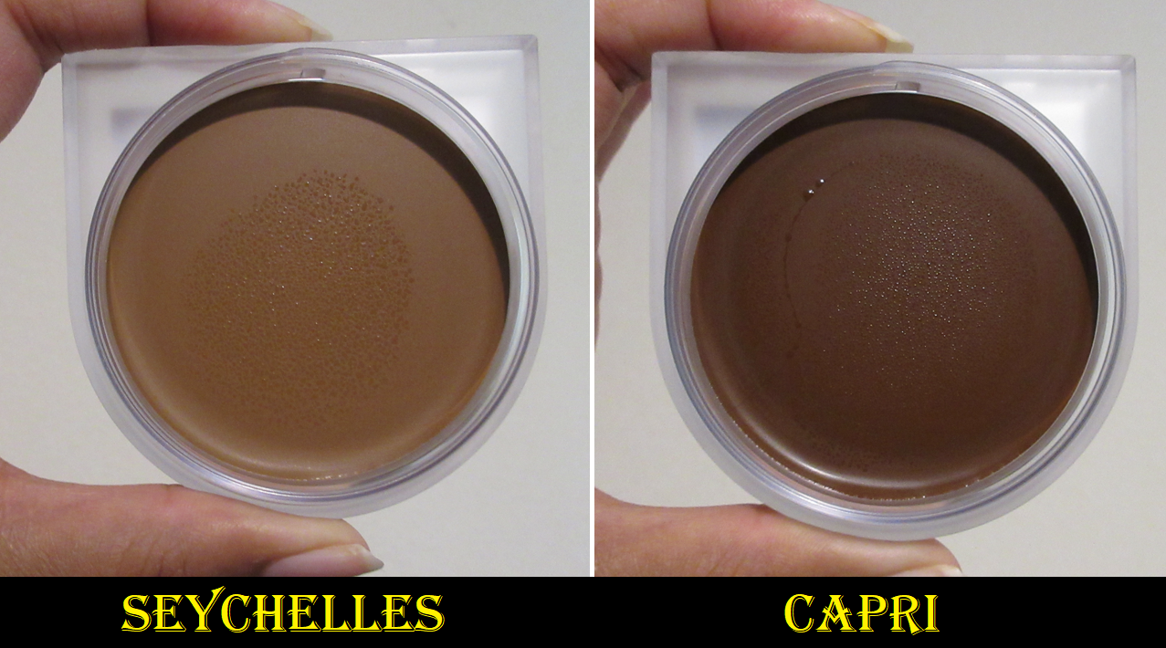
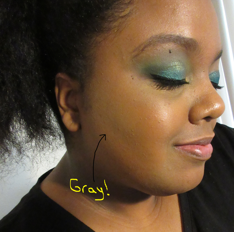
I purchased Seychelles based on photos making it look far warmer and deeper than it actually is. Considering I had been successful with choosing the second to last shade of the Charlotte Tilbury Cream bronzers and Nars Laguna Cream bronzers, I thought maybe the third time would be the charm for the one from Rose Inc. That turned out to be a mistake. It’s too light for me, combined with being such a cool-tone leaning neutral, that it looks grey on me!
The same day that I purchased Seychelles, I saw the true color of the bronzer in this review and immediately realized that it was not going to work for me. I contacted Rose Inc to try and switch the shade in my order, but the customer service rep said it wasn’t possible to alter orders and that I could return it and get my correct shade instead. So, I did just that. The return process was easy and the two times I exchanged emails with customer service, I got responses back quickly and the reps were professional yet friendly. So, that’s another plus in my book for Rose Inc.

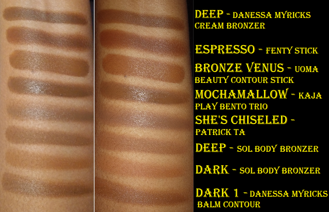
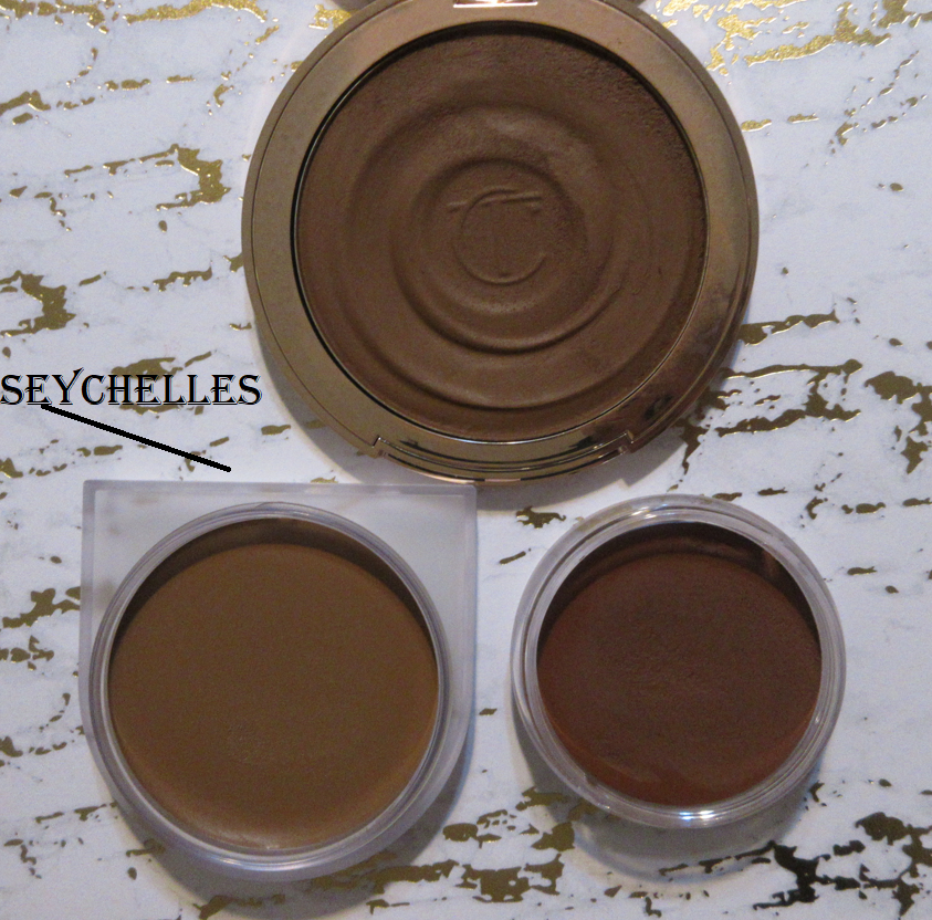
I never had Capri and Seychelles at the same time, so I don’t have photos of them next to each other, but I do have photos of them in comparison to those other cream bronzers I mentioned.

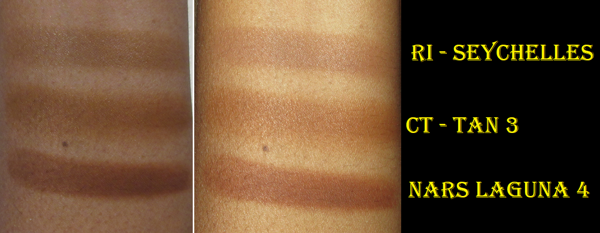
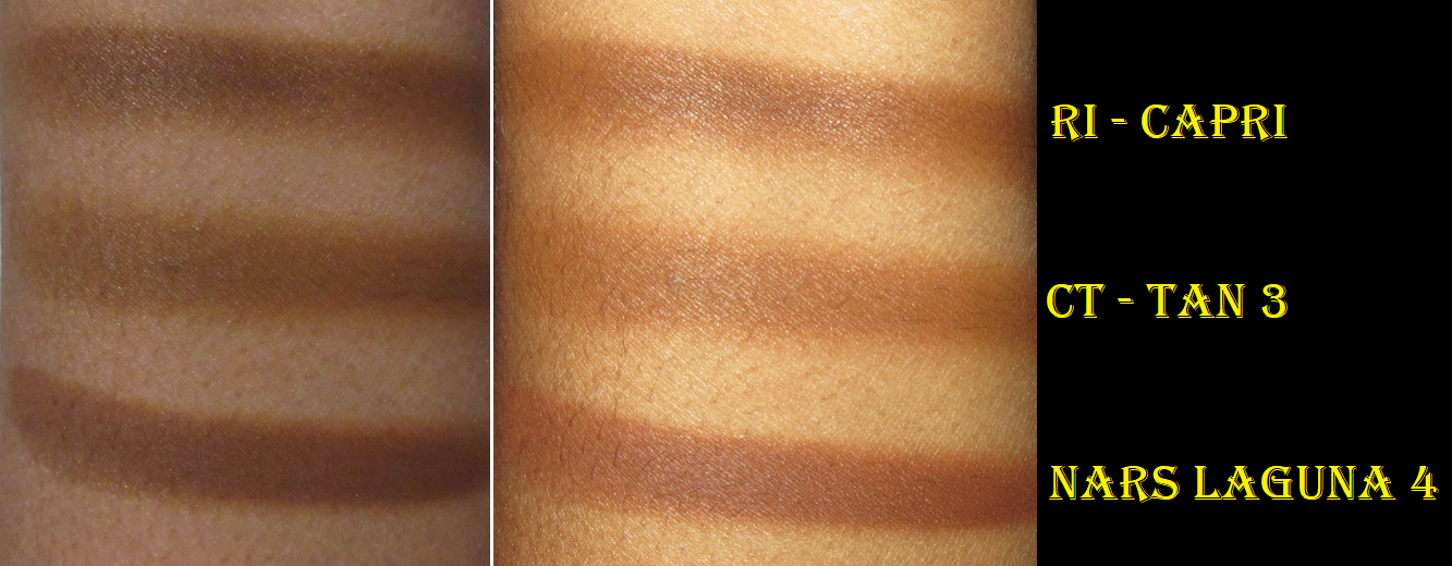
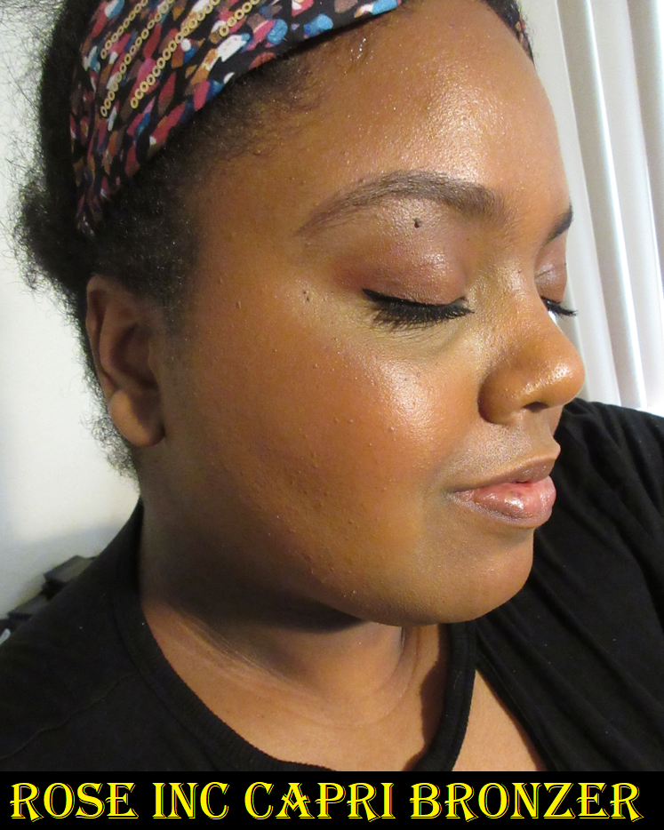
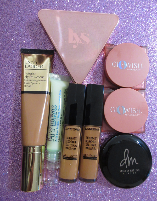
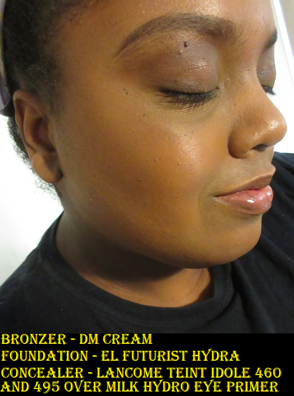
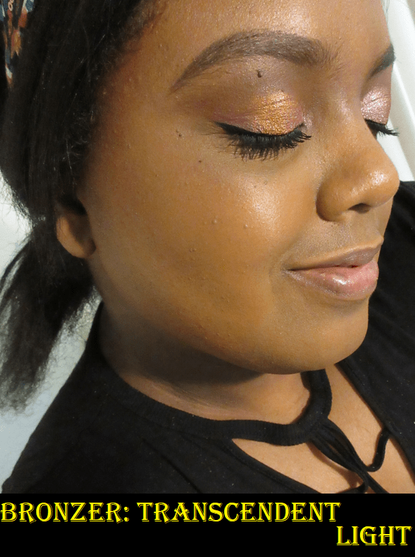
The photos of the Seychelles bronzer are worn on top of the Estee Lauder Hydra Futurist Foundation. The Capri bronzer demonstration photo on the left is on top of the Rose Inc Serum Foundation, and the one on the right is on top of the Charlotte Tilbury Airbrush Flawless Foundation (sample).

In three of the four different shade representations, Seychelles looked warm. It’s the main photo that shows how cool toned it is, but I thought maybe that was a difference in the lighting.

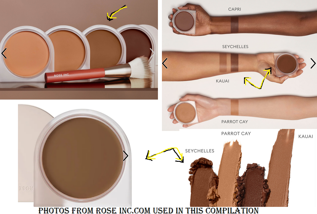
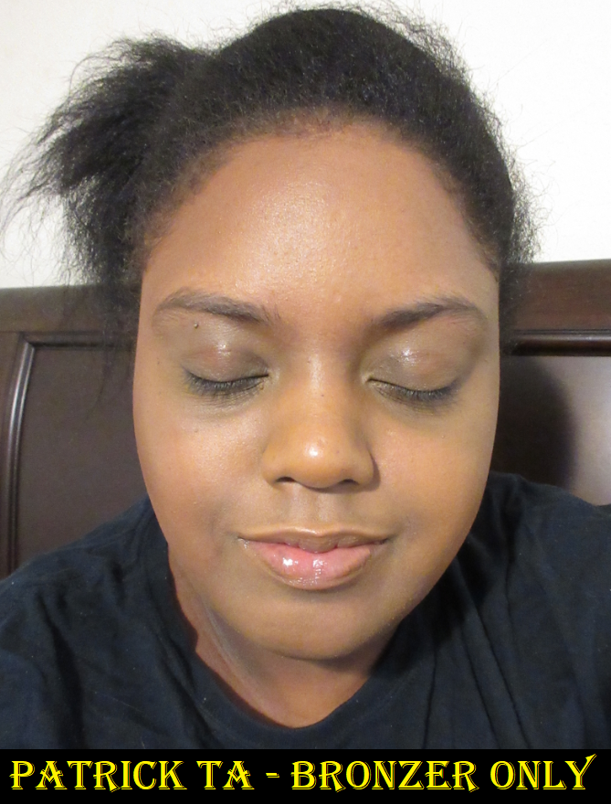
In any case, Capri was definitely the best color option for me. It has some reddish warmth to it that prevents it from looking like a contour. Although this is a good shade for me, it’s the darkest bronzer in their line, which I don’t think goes far enough on the spectrum. Charlotte and Nars have deeper options, and while Rose Inc is still “new,” I believe they should have an even darker option, especially since there are three shades darker than mine in the foundation, yet it’s doubtful Capri will work for those who wear those shades since I still have to build it up for it to work for me.

You can tell I really like a product when I’m extra passionate about the shade options because this is something I want everyone to be able to experience. The formula is very unique in that it looks emollient like a grease product in the container and doesn’t have the typical thick consistency of a cream, but it goes on the skin so smoothly like a medium coverage tint product. I expected a sticky feeling because of the consistency of the cream blush, but this bronzer actually dries down! It’s described as a cream to powder formula, but the finish doesn’t look powdery and still remains skin-like even when it’s fully dry. I like this so much! $36 is pricey, but I had a 15% off coupon and Rose Inc still periodically offers deals. Even if I paid full price, I think I would have felt this was still worth buying, so I do recommend it.

Rose Inc Skin Enhance Luminous Tinted Serum Foundation in 110

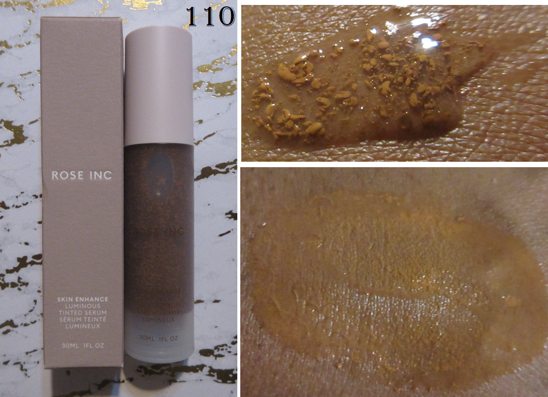
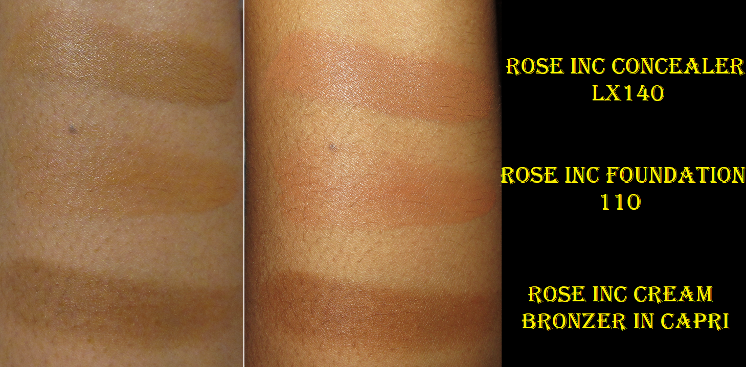
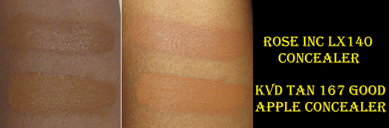
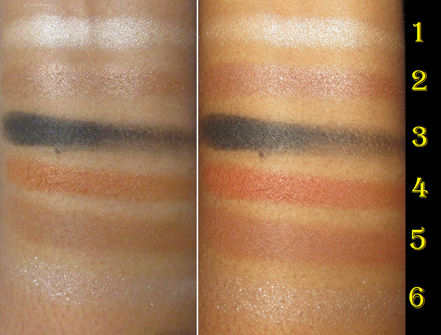
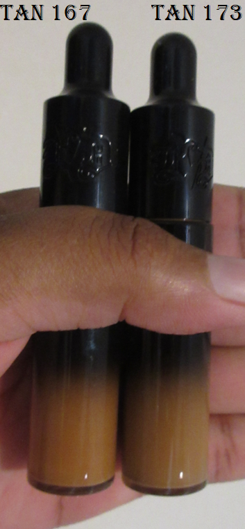
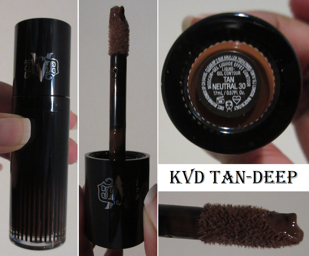
I made a spur of the moment decision to purchase the foundation for 25% off during the Friends and Family sale. I also added a free sample card of concealers to my order, which is how I was able to swatch and demonstrate what LX140, my closest match, looks like on me. I’m glad I was able to test it out because it’s thicker and tackier than I want in a concealer and the neutral shade looks off in the areas of my discoloration where I usually try to cover up. So, it would have been a bad purchase for me, despite the fact that I can build it up to full coverage, which is what I want most in a concealer. LX140 is described as a neutral, and as seen in the swatch next to my go-to KVD concealer in the swatches above, it’s the right depth, but I do need golden warmth for it to match the undertone of the rest of my face. LX130, which would be too light for my style, is a warm golden shade, but the next shade up with that undertone is LX170 which is definitely too dark for me. Also, it creases on me like crazy if I don’t set it with powder. Even still, the lines under my eyes get emphasized more than I’m comfortable with after about an hour or two of wear. So, the concealer really isn’t for me.

The serum foundation is a product that solidified for me that Rose Inc was a brand I should take seriously. I almost always avoid low coverage products because they are either the wrong depth or the wrong undertone, enough to look terrible on me despite the fact that lower coverage products are supposed to accommodate several different shades per color option. I also don’t like them because they don’t do enough to cover my hyperpigmentation, and I prefer buying a medium to full coverage foundation that I can choose to wear sparingly to easily achieve the same effect, whereas it’s harder to build up something sheer. So, what possessed me to spend the $40 discounted price on something I normally hate? My positive experiences with other Rose Inc products was a contributing factor, in addition to the hype of people raving about it and saying it’s a dupe to the $65 Chanel Les Beiges Water-Fresh Complexion Touch. Angelica Nyqvist might be the most responsible with her description of it as, “Your skin looks luminous and fresh like you just applied skincare and for some reason your skincare made you look flawless.”

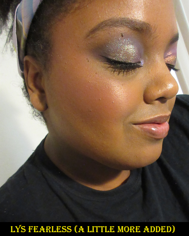
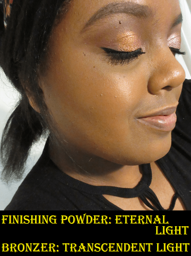
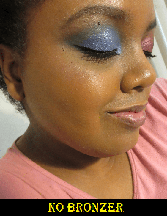
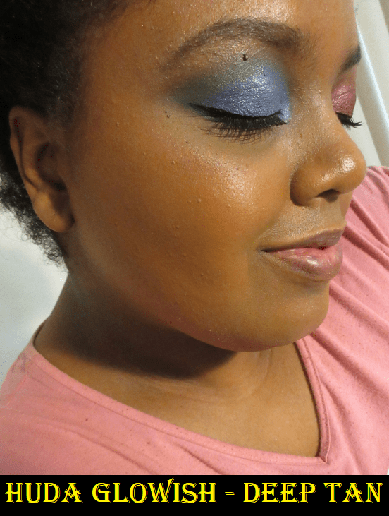
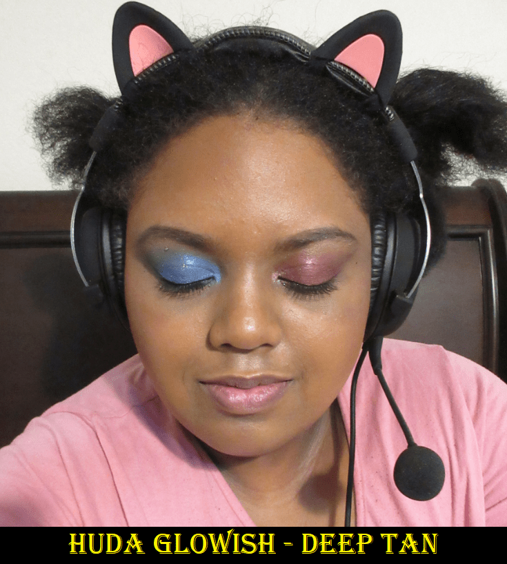
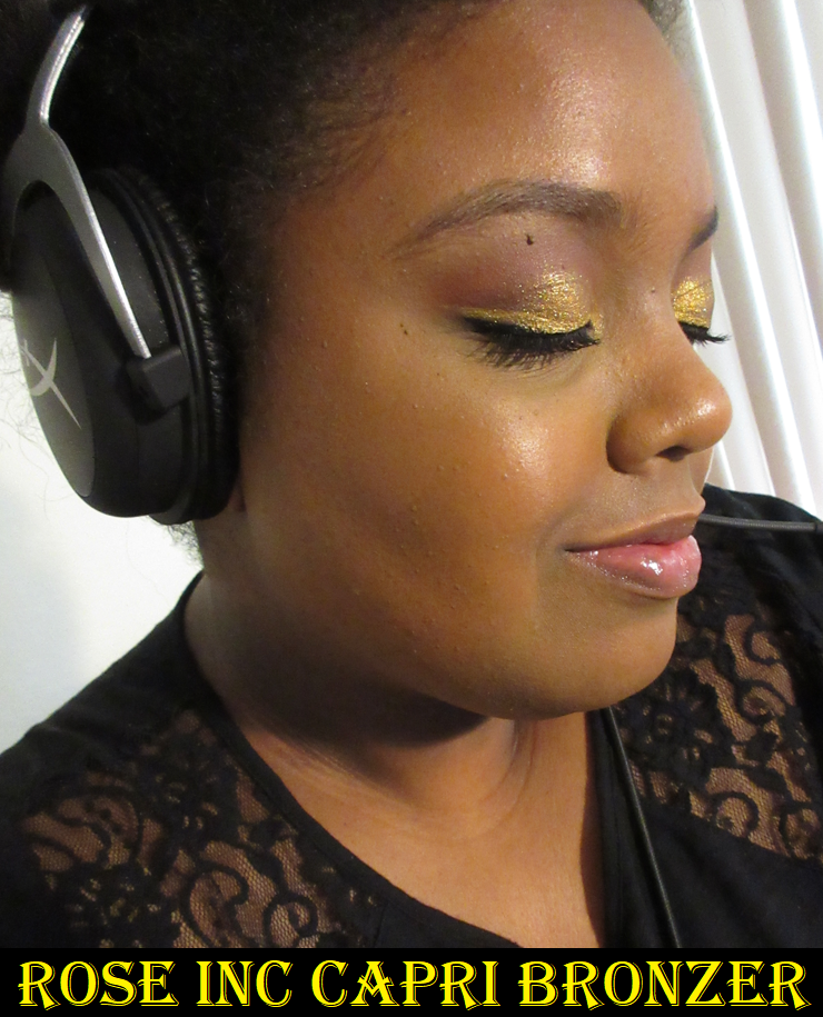
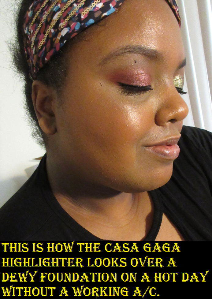
Like the Chanel, it works best if it’s squirted out on the back of the hand or onto a mixing palette and “crush” the pigment into the rest of the serum to mix the two together. I’ve been using my Sonia G Fusion brushes with this to work the product into my skin by using one pump at a time for a total of 2-3 pumps for my entire face. The foundation feels cooling when I initially apply it and it feels as hydrating as it looks. I have worn it without primer and loved the results. I’ve also worn it with the Benefit Porefessional Lite primer and my sunscreen and those three products played well together. I was concerned that too many moisturizing products on my face might cause an issue with transfer or looking too dewy, but it still dried down. In the Capri bronzer section where I’m wearing the headband, there are visible sweat beads on my forehead because the air-conditioner broke that day and it was 85 F degrees in the house while I was taking photos. In that picture, plus the last three blush demonstration photos, I was not wearing any powder on my face. In the photo below, I barely set my forehead, but it’s a more accurate representation of what this foundation looks like in normal circumstances when I’m not boiling. Even while sweaty though, I was impressed with how long wearing it is and that there was low transfer. I have dry skin, so that could be a factor for how well the foundation holds up.

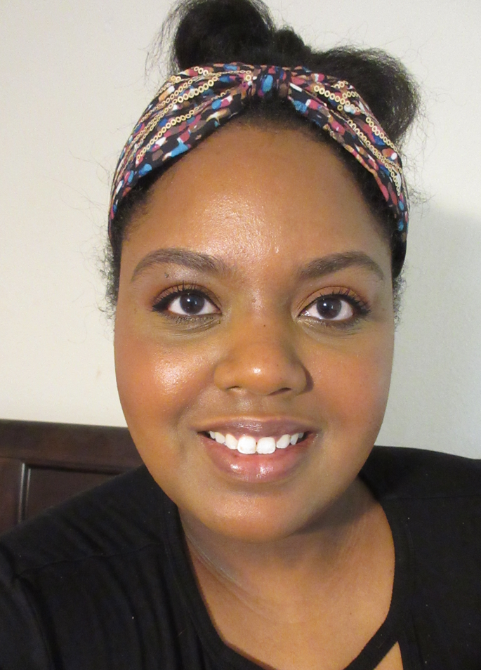
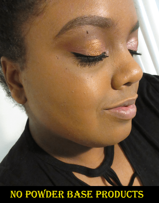
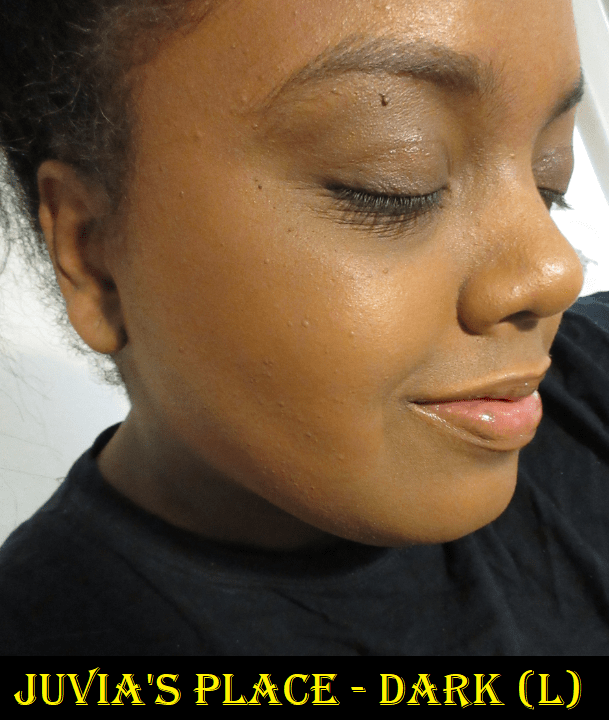
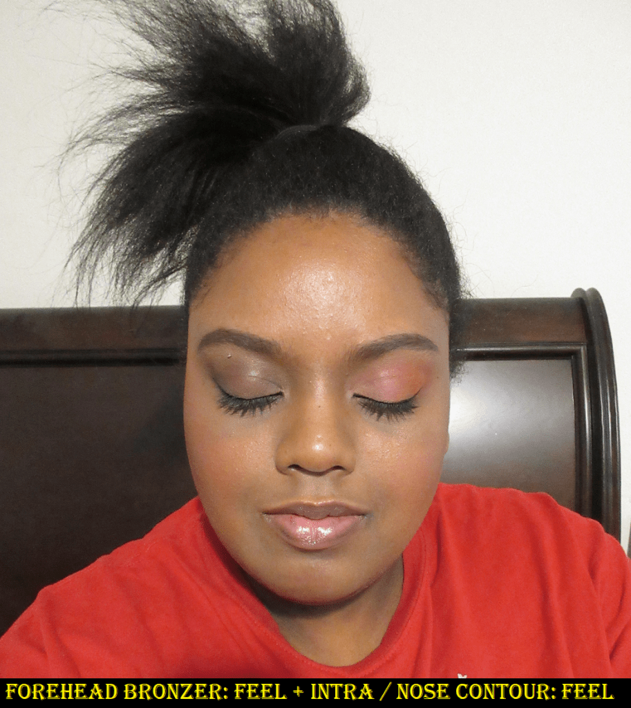
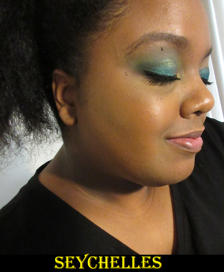
No-makeup makeup look using the Rose Inc Tinted Serum Foundation in 110, a sample of the Softlight Luminous Hydrating Concealer in LX140 under my eyes and on the discoloration on either side of my chin, Anemone and Dahlia blushes mixed on the cheeks, and the Solar Infusion Moisturizing Cream Bronzer in Capri. I applied the barest layer of powder to my forehead area.

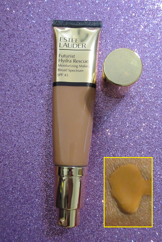
It really does look like I’m just having the best skincare day. It’s as if my hyperpigmentation faded, or I got a facial and graduated to drinking eight glasses of spa water a day. Sometimes, when I don’t feel like putting on a full face, I’ve worn this foundation without even concealer, just to look slightly more put together while on video chat with my boyfriend. I’m so impressed with this and while I’ve rediscovered my love of no-makeup makeup looks, I will definitely be using this a lot in my down time. For blog purposes, however, I prefer to use my other foundations in order to not distract from the products I’m showing off if my discoloration is peeking through. I’m also working on using up my tube of Estee Lauder’s Futurist Hydra Foundation. In fact, I recently tried using 2 pumps of the Rose Inc Foundation as a primer underneath one pump of the EL Futurist Hydra for extra coverage. I immediately set it with powder since it was a hot day and I looked instantly too dewy for my liking, but that combination plus the powder was pretty!

Part of the Rose Inc identity is “Clean” beauty, and that’s a topic that isn’t important to me. I don’t mind if they want to advertise being clean as long as the formula is stable, effective, and won’t expire on me too quickly. They also care about sustainability with their packaging and like to include skincare positive ingredients. Those last two are a nice bonus for me, so I thought it was something I should mention.

Victoria Beckham Beauty

Victoria Beckham Beauty Cheeky Posh: Cream Blush Stick in Miniskirt

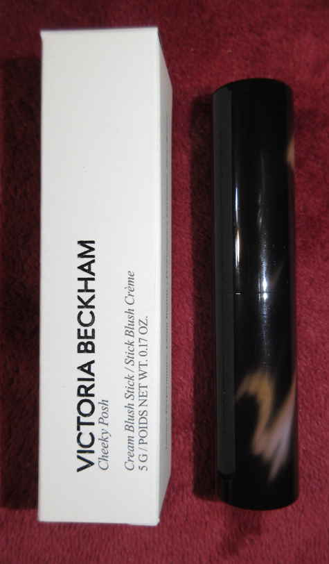
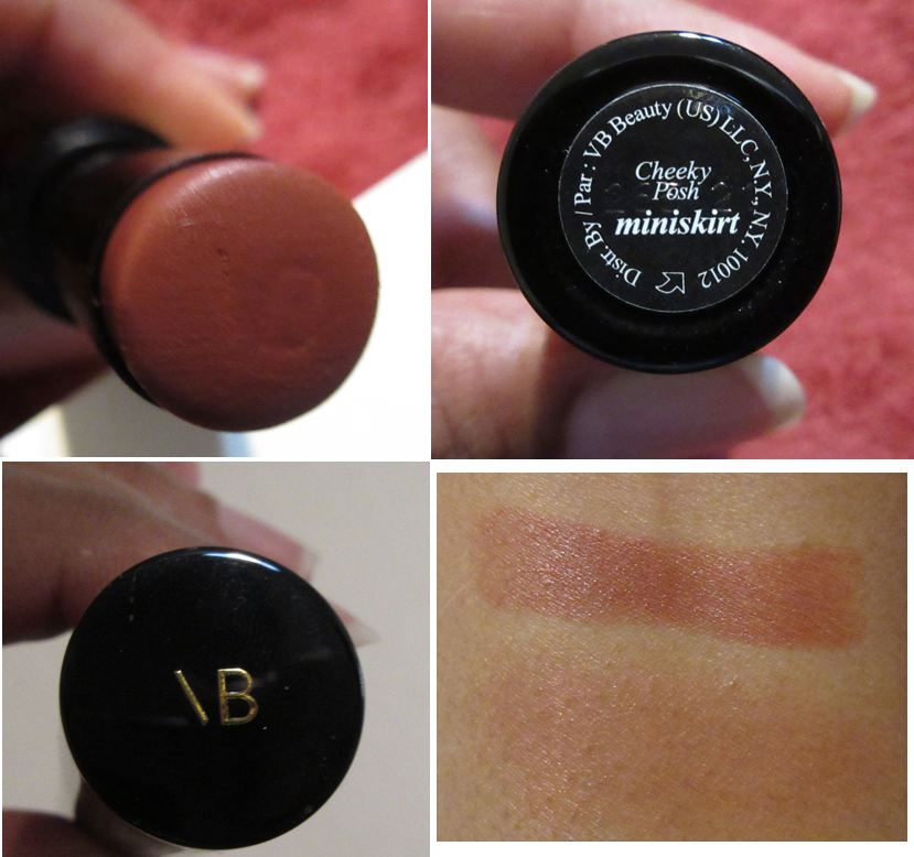
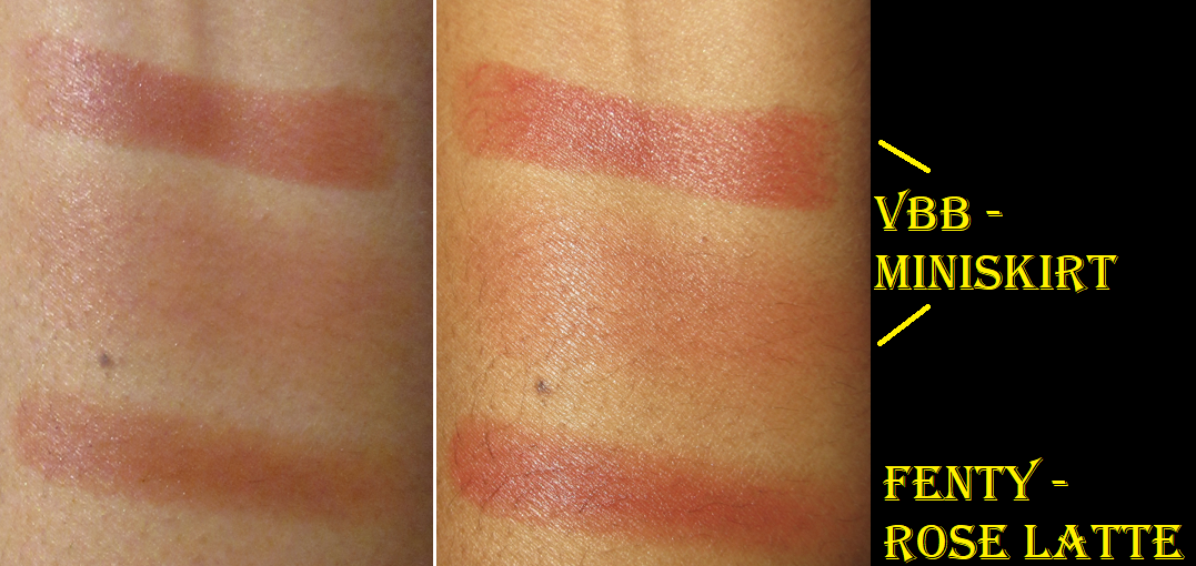
I really like the shade of this blush, but this purchase was also made for the gorgeous, weighty tortoiseshell packaging. Miniskirt is incredibly similar to Fenty Beauty’s Rose Latte, which is why I kept talking myself out of getting this since I already own several similar shades, but when I saw it available on Mercari for a great price and having only been swatched once, I bought it.

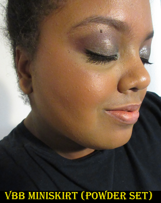
The best way to use this is to swipe the stick directly onto the cheeks and blend it out with the fingers. This formula looks pigmented, but when I start to work it into my cheeks it blends away to nothing and I have to use a ridiculous amount of product to build it back up when I use any other method. It blends away with a sponge if I try it on my cheeks. Getting the blush off the back of my hand and onto my face loses half the product. Trying to swipe it directly onto the sponge or the bristles of the brush also keeps half the product from going onto my cheeks. Sometimes swiping a cream stick product directly on the skin can remove the product underneath, but this one doesn’t do that, which is why using it that way ended up being the best application method for me.

This blush transfers, but it’s minimized if I set it with powder. I like this and will continue to use it, but the luxury packaging and experience is the biggest selling point. Prior to owning this, I really wanted the shade Rollerskate as well, but I’m content to just having one now. However, it did re-spark my interest in the brand’s Matte Bronzing Brick.

Victoria Beckham has cultivated her image for so long as a fashion, style, and classy icon that it seems perfectly natural that her brand took on that same image and became associated with quality and luxury. I was definitely sold on the packaging, but I was still skeptical on the quality front. I’m happy to know that at least this product is good, even though I prefer blushes with more pigmentation. It’s just a matter of whether that quality is worth the price, which I don’t think it is without also factoring in that luxury packaging.

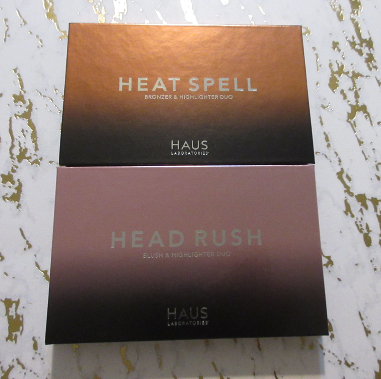
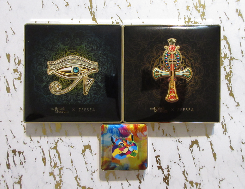
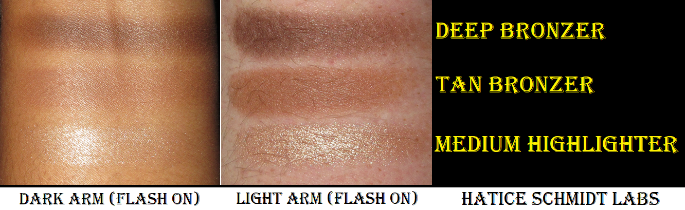
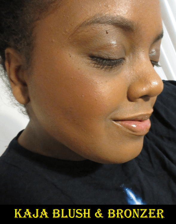
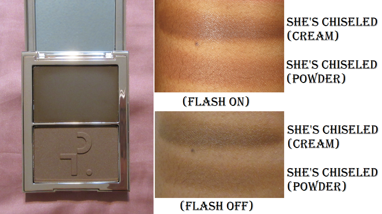
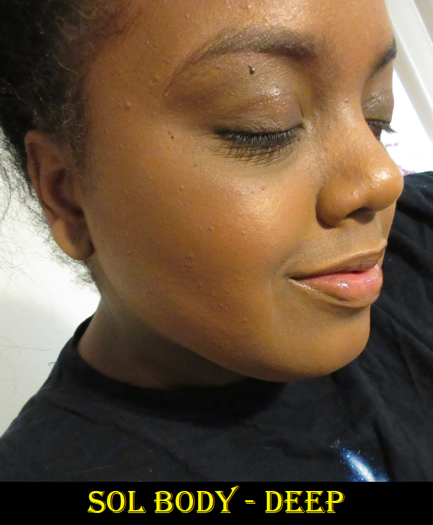
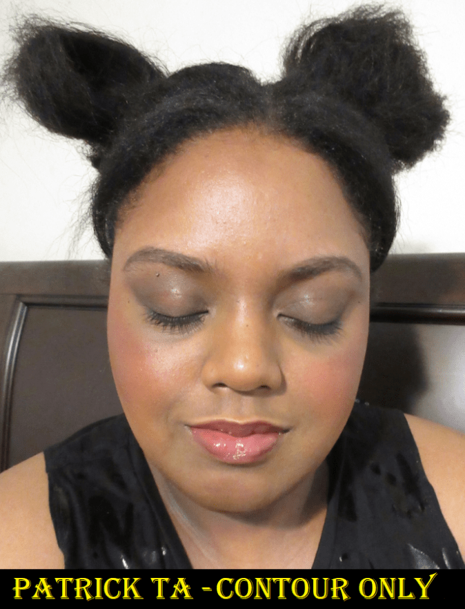
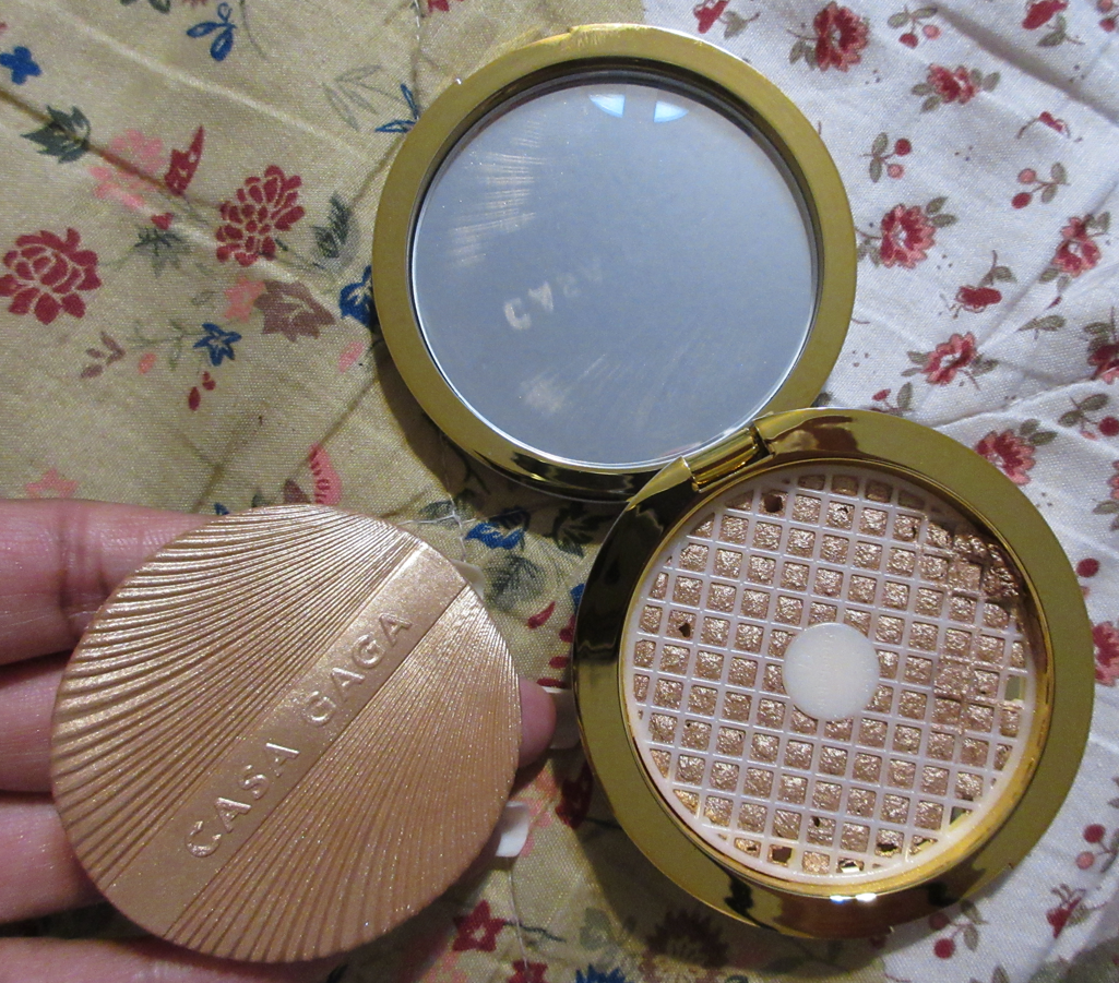
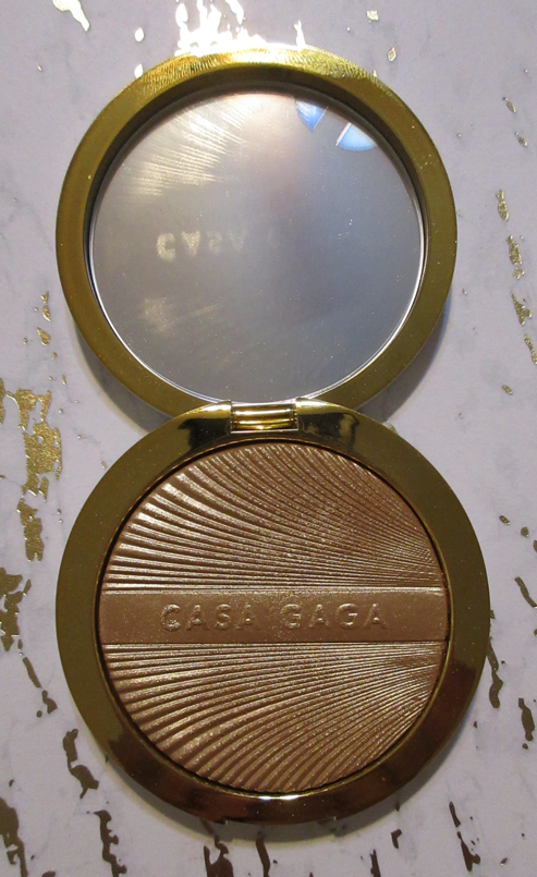
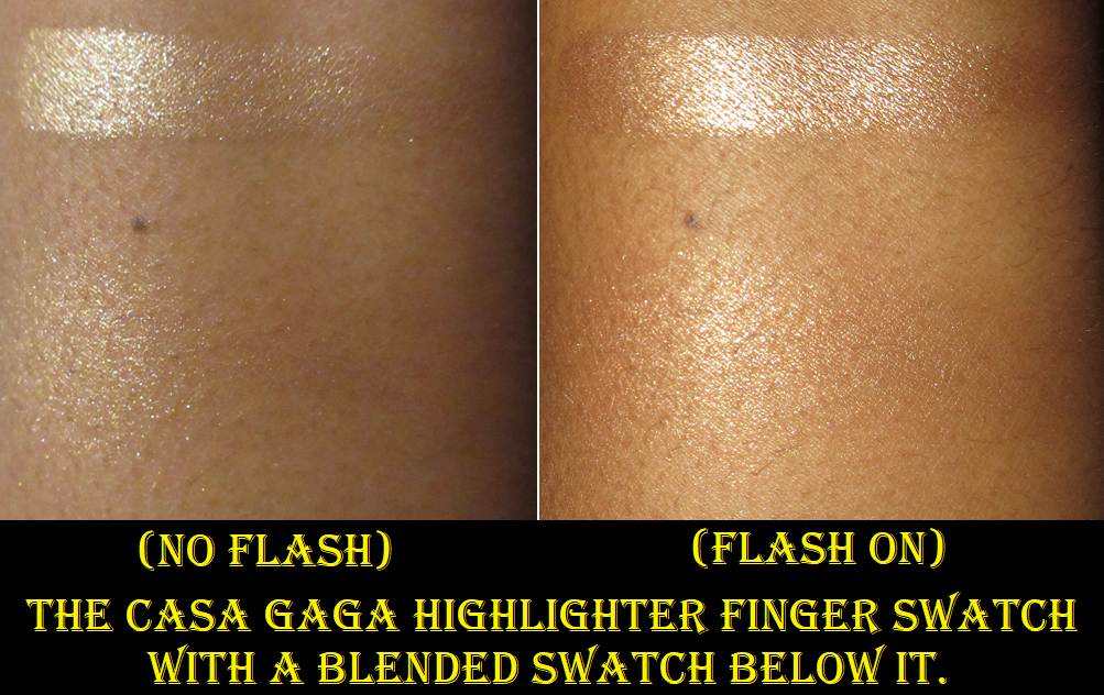
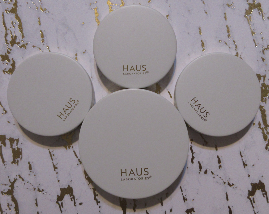
Haus Labs (via Amazon and Sephora)

I was glad to hear that Haus Labs was rebranding through Sephora because I haven’t had the best experience with them while they were Amazon exclusives. I felt that the quality of the products that I reviewed here was nothing special, which was a let down considering the brand’s prices are on the high side of mid-tier. I have since learned that the final Amazon collection, Italian Glam/Casa Gaga, has better quality makeup and packaging than the previous ones. However, Haus Labs raised the prices to account for that improvement and Amazon’s handling of these items is atrocious. The highlighter was off the mesh when I opened the compact. The only surprising part was that it broke off in one solid piece considering the unicarton was dented inside the unpadded poly mailer it came in that’s supposed to be used to ship clothes, not a breakable item. Either the delivery driver dropped it or it was mishandled in the warehouse. It’s at least a good thing that all Haus Labs products come in a thin protective bubble pouch no matter if they end up being shipped in a cardboard box, bubble mailer, or poly mailer.

Weeks later, when I ordered the Spritz blush, they sent me one that someone else had returned to Amazon and already used! The sticker around the unicarton that has to be torn in order to lift the flap was already ripped open. There was a layer of product around the gold rim and the imprint was slightly worn down where it says “Gaga” on the blush compared to “Casa.” Even though I’ve purchased pre-owned makeup before, I think anyone would be displeased if they paid for a new item and received a used one instead. The upside to the mistakes is that they accidentally included the Bellini blush in my box (yes, the products smaller than the highlighter even came in a box). I would never have ordered Bellini because I didn’t think it would show up on me, but it does and it’s pretty.

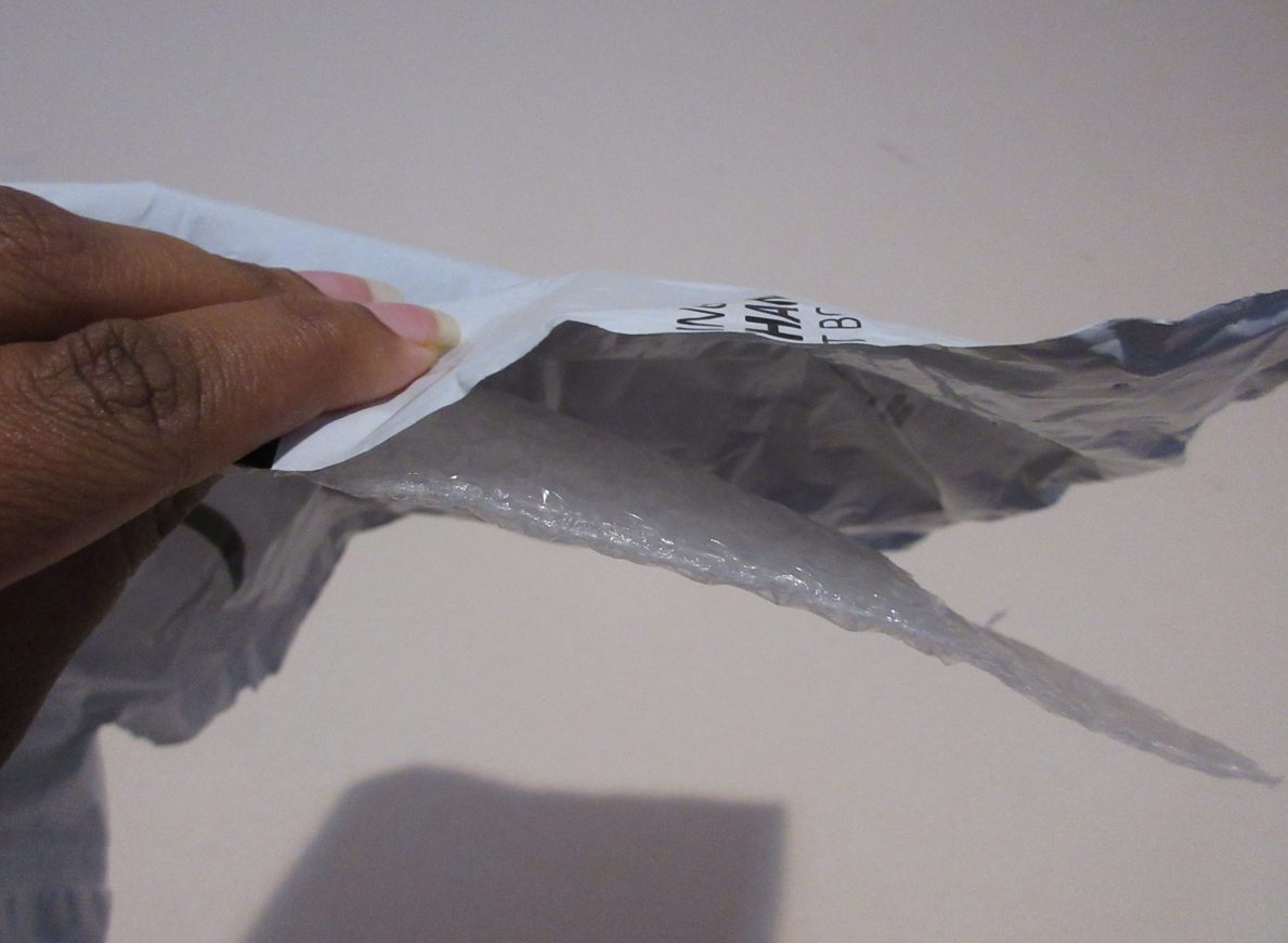
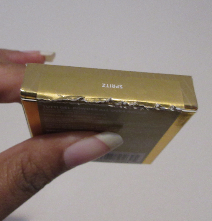
The left photo shows the thin protective bubble pouch, along with the poly mailer bag they chose to deliver the highlighter in, rather than using a box, or at least a fully padded bubble mailer. The right photo shows the sticker that covers the unicarton flap and easily indicates whether or not the product has been opened. Perhaps these kind of mistakes are the result of Amazon overworking and underpaying their employees.

So, for anyone still ordering Haus Labs products through Amazon, be prepared for the possibility of there being issues. These items are eligible for being returned for a refund, but I hate returning things, and I felt bad already for having returned the newly relaunched highlighter to Sephora. I’ll discuss more on that later.

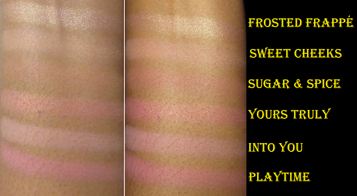
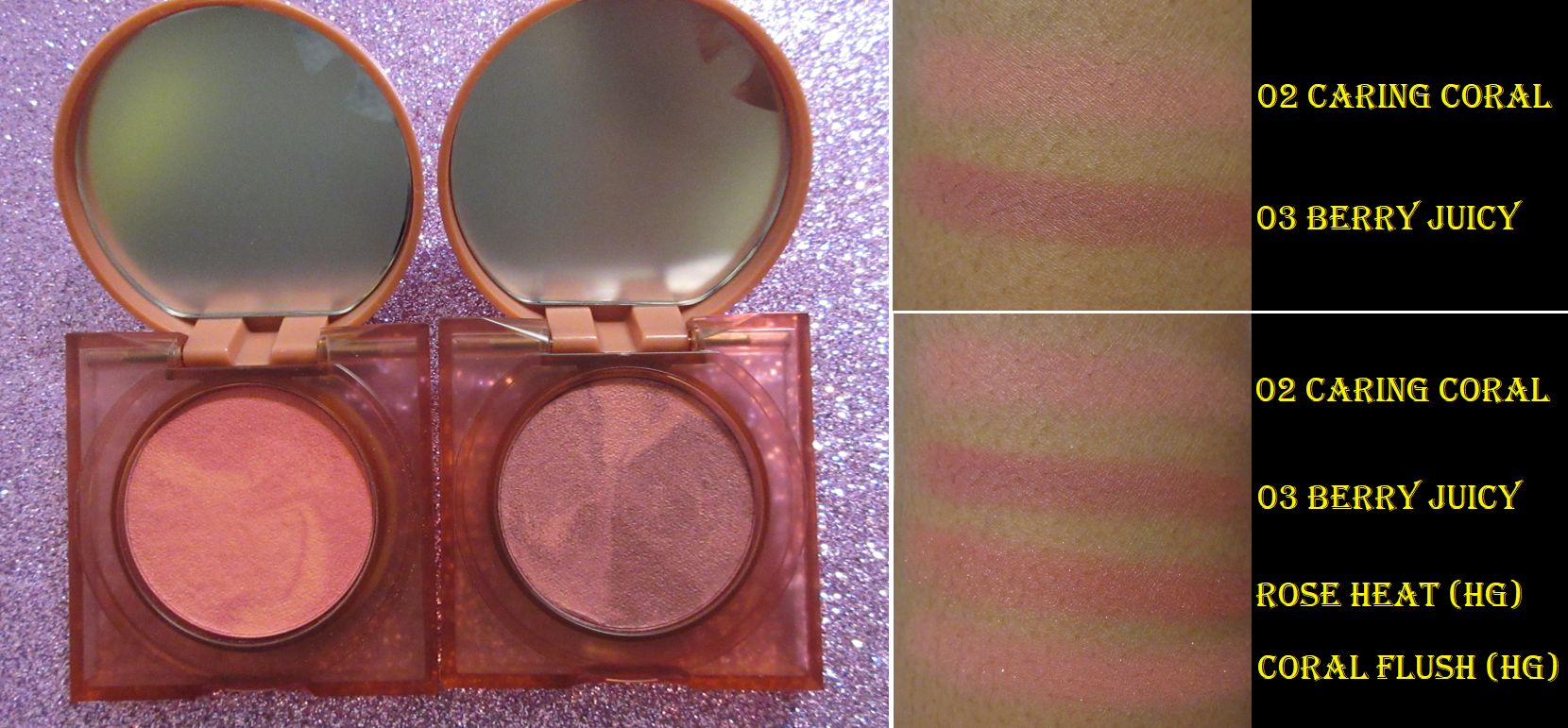
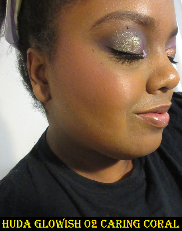
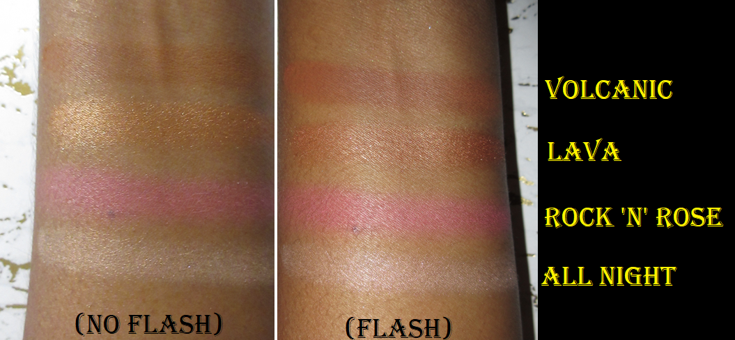
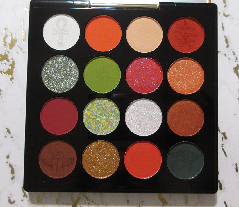
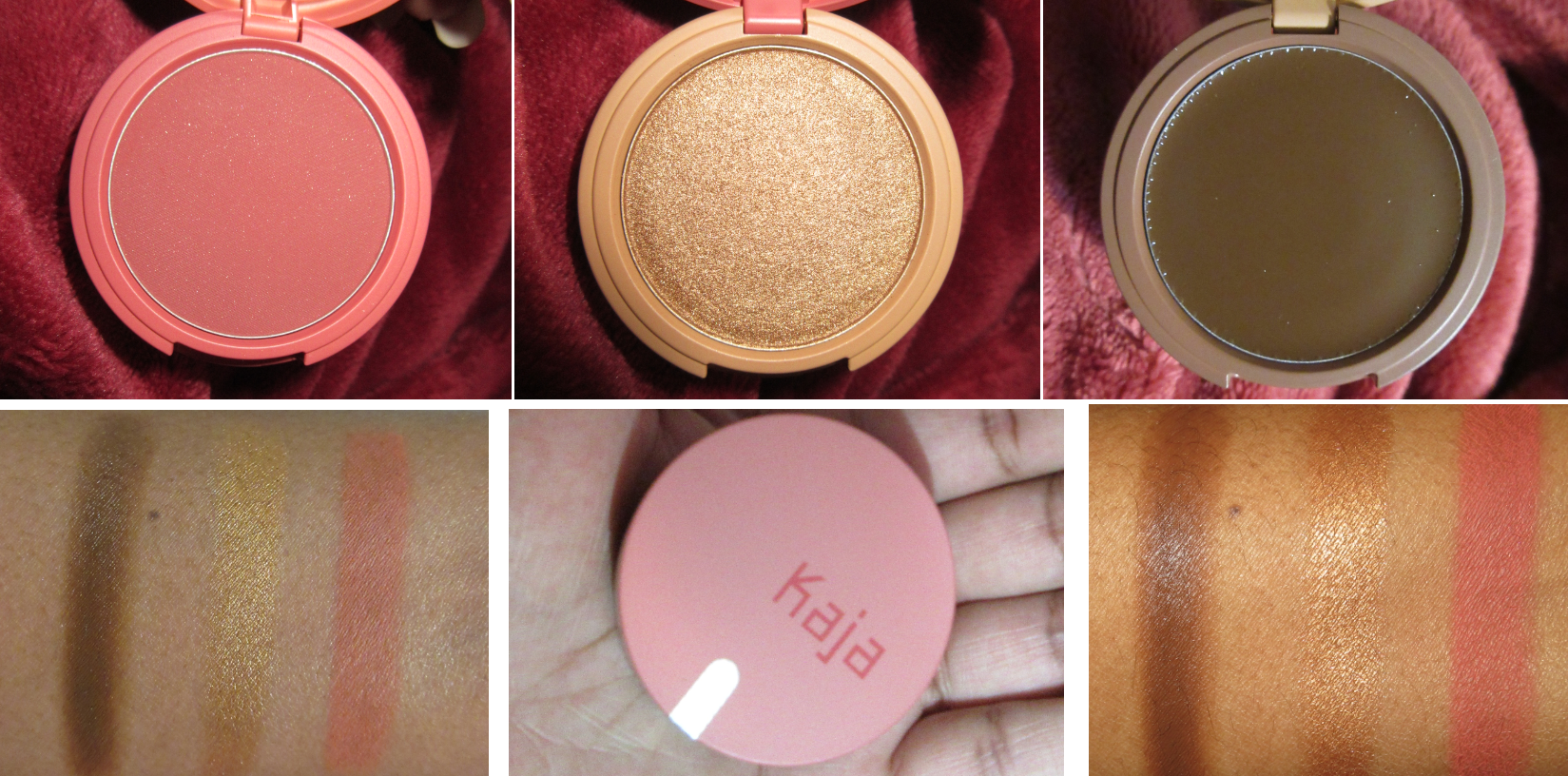
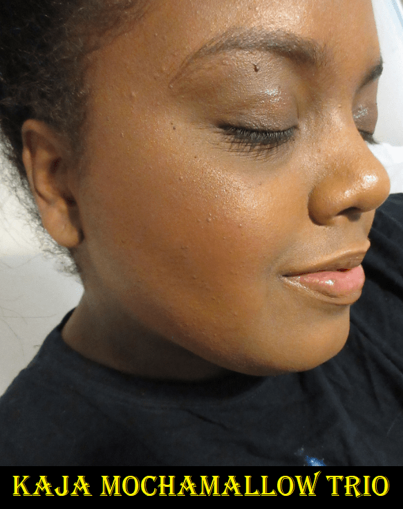
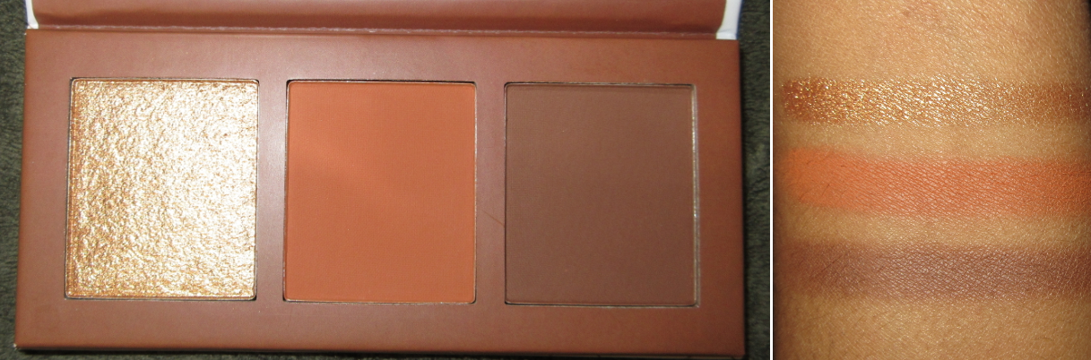
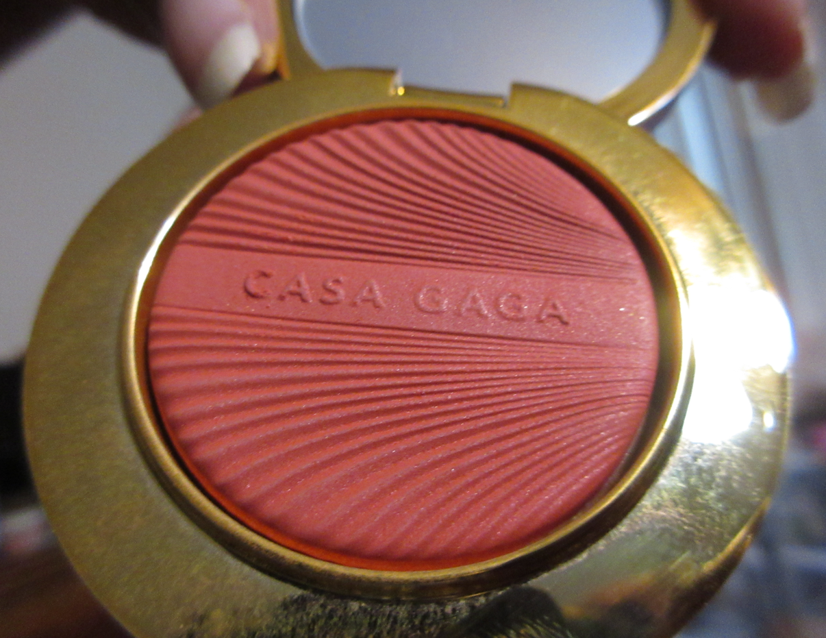
Haus Labs Casa Gaga Tutti Gel-Powder Blushes in Amarone, Spritz, and Bellini

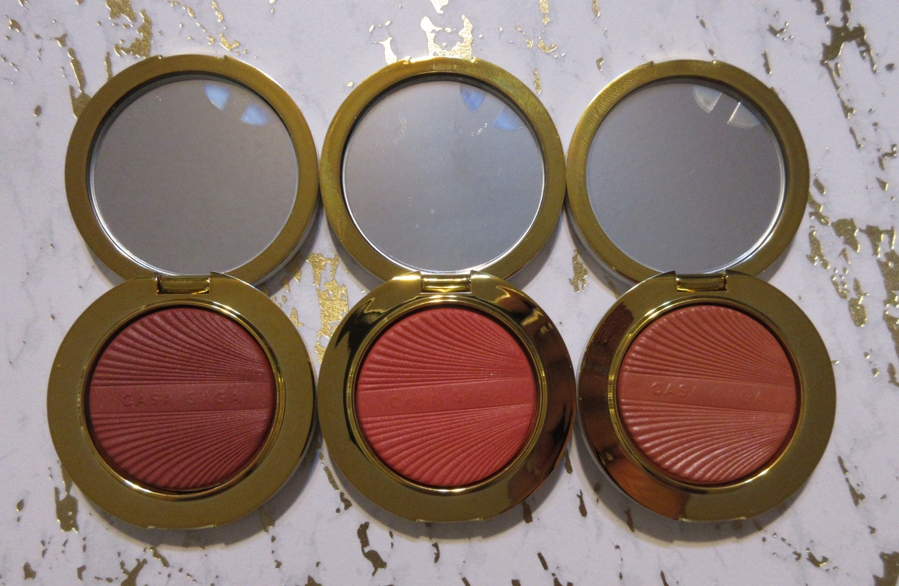
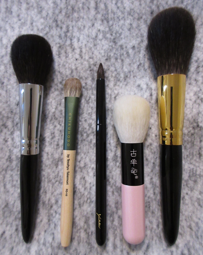
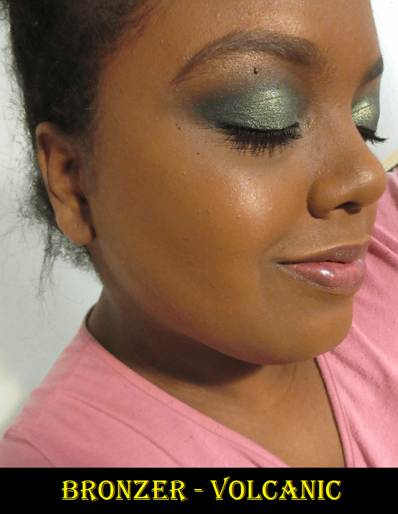
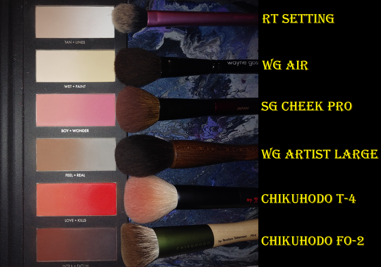
I have three of the four blushes in the line. These are a baked gel-powder formula made in Italy. They are rich in color, but very thin, so they still need to be built up a bit on my cheeks. I also need to dip back in the compact repeatedly because the blush is not easy to pick up with a brush unless it’s made of sturdy bristles. I’ve used this with my Chikuhdo FO-2, which is dense with a wide surface area that allows me to get more product onto my face than a traditionally shaped blush brush. I also have used the Smashbox Precise Blush Brush because the medium-heavy packed synthetic bristles can easily get through that compressed layer. I certainly have had no success using my grey squirrel brushes with them, and am only successful with Saikoho if the brush is medium density and up. Sokoho and Sokoho-mix brushes work decently depending on how tightly it is bundled. So, I recommend using dense brushes in either synthetic or a durable type of natural bristles.

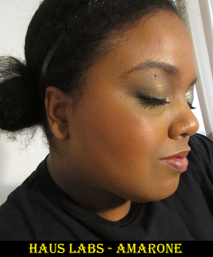
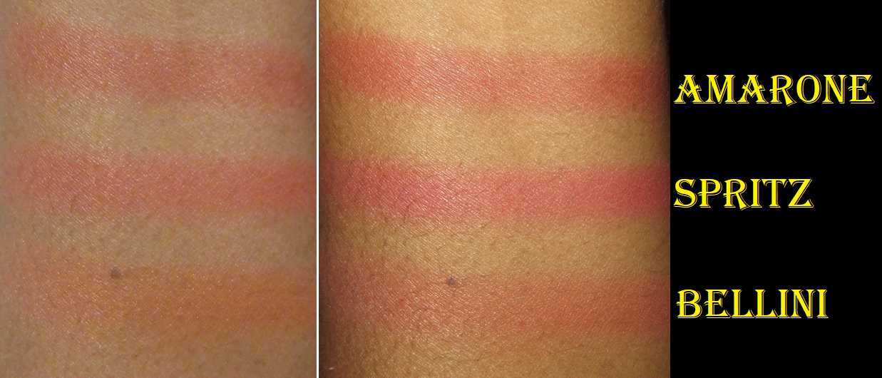
Amarone applied in 3-4 layers with the Sonia G Cheek Pro.

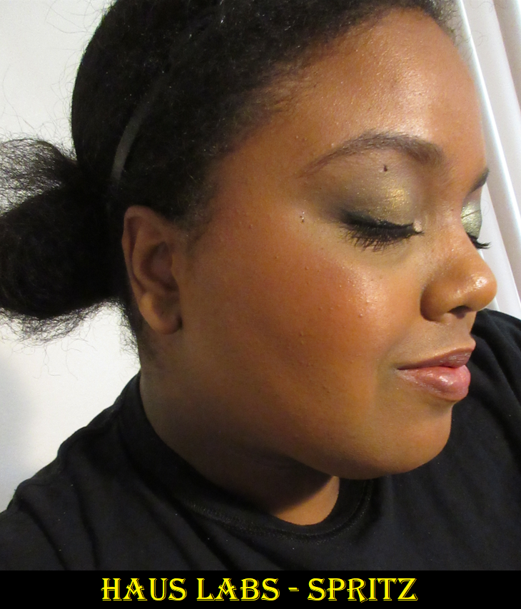
Spritz applied in three layers with the Hakuhodo x Hello Kitty Slide Face Brush L Round & Flat.

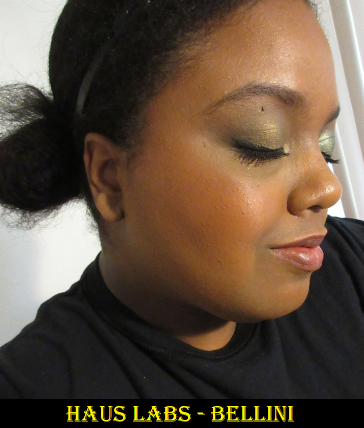
Bellini applied in five layers with the Smashbox Precise Blush Brush.

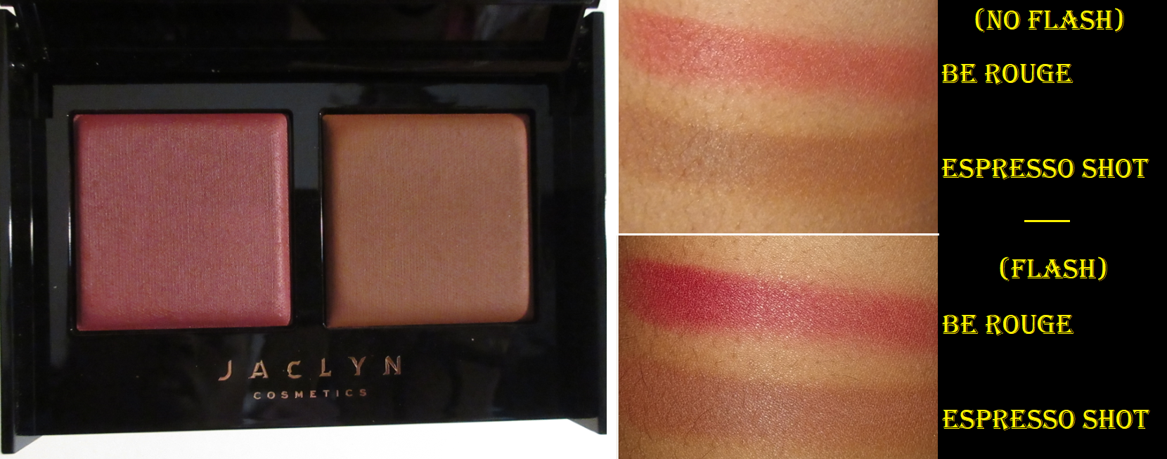
These blushes have a satin finish and a long wear time with or without foundation. I don’t usually have an issue though with powder blushes fading on me before I’m ready to remove my makeup. As for the shades, I like the tone of red in Amarone and the peachy brown of Bellini the most. Spritz, which I was initially attracted to the most, is quite bright on the skin if built up too much. It’s actually very close in color to Pat Mcgrath’s Electric Bloom.

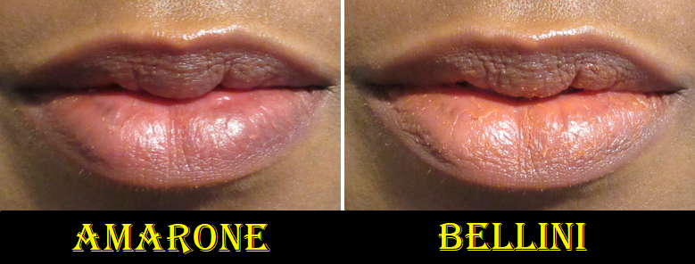
These blushes are intended to be used on the lips as well, but it looks horrendous if you have any spots that need exfoliating. The fact that it’s a powder doesn’t help dry lips look any better. What I tried to do for the pictures below is to apply balm to my lips, pat the blush on the lips with my finger, wipe my finger on a towel, and then pat more blush on until I get the desired amount of color. I only attempted this for blog testing purposes and will not be bothering to use the Casa Gaga blushes in this way. It doesn’t have lasting power and was completely gone after a meal. Amarone is kind of pretty, but Bellini just reminded me of how the Rose Inc Foxglove blush looked on my lips. I did not try out Spritz because I will never put a stranger’s used product on my lips, no matter how much I spray it down with alcohol. That’s where I draw the line.

I like the blushes a lot, but because I’m so satisfied with these, I don’t think I’d be interested in buying the ones that are bound to be released in the future via Sephora.

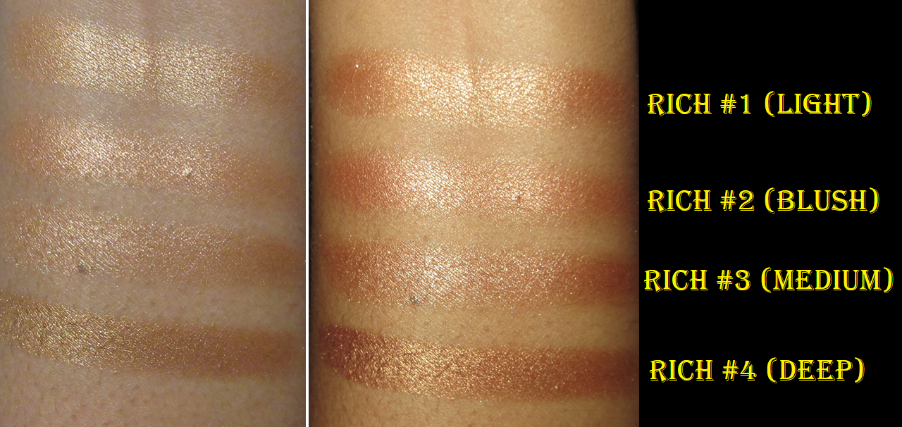
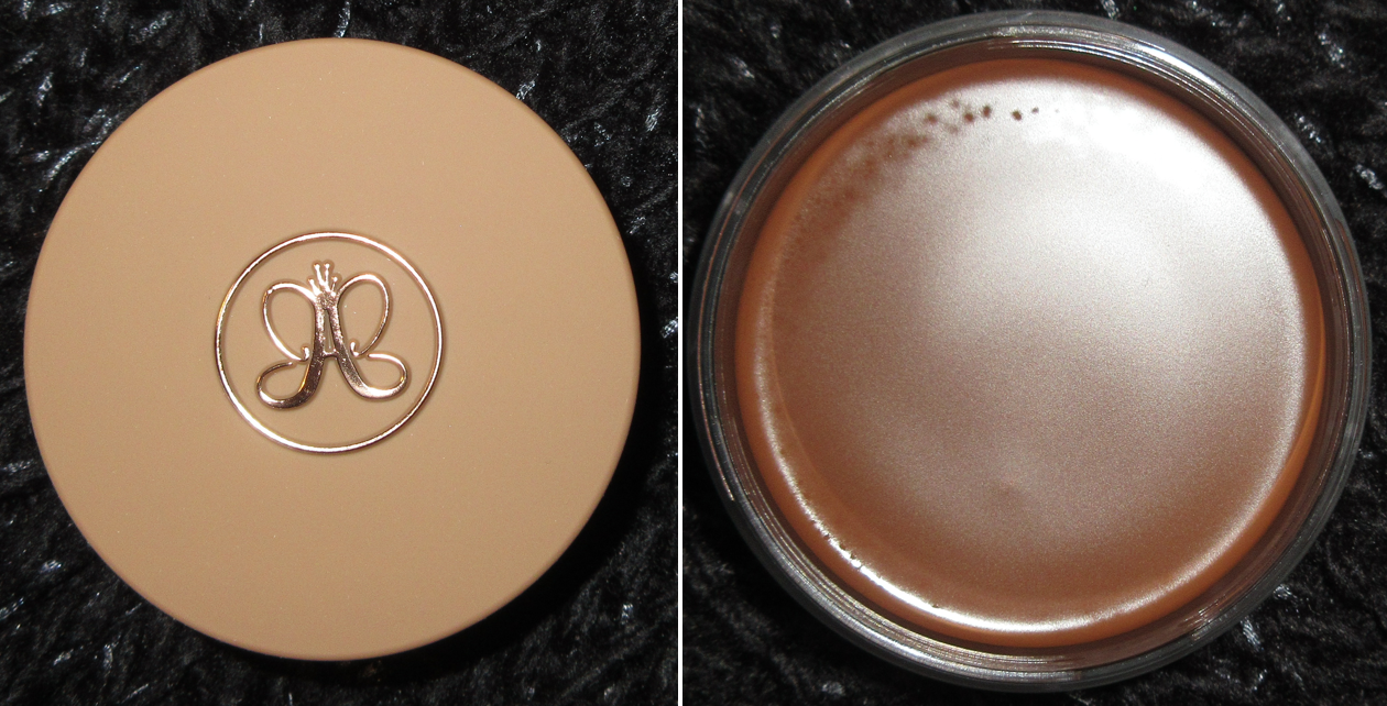
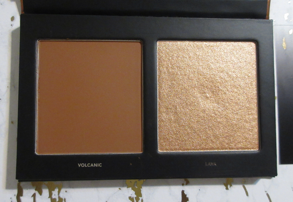
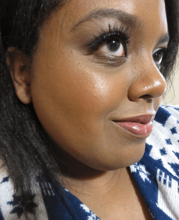
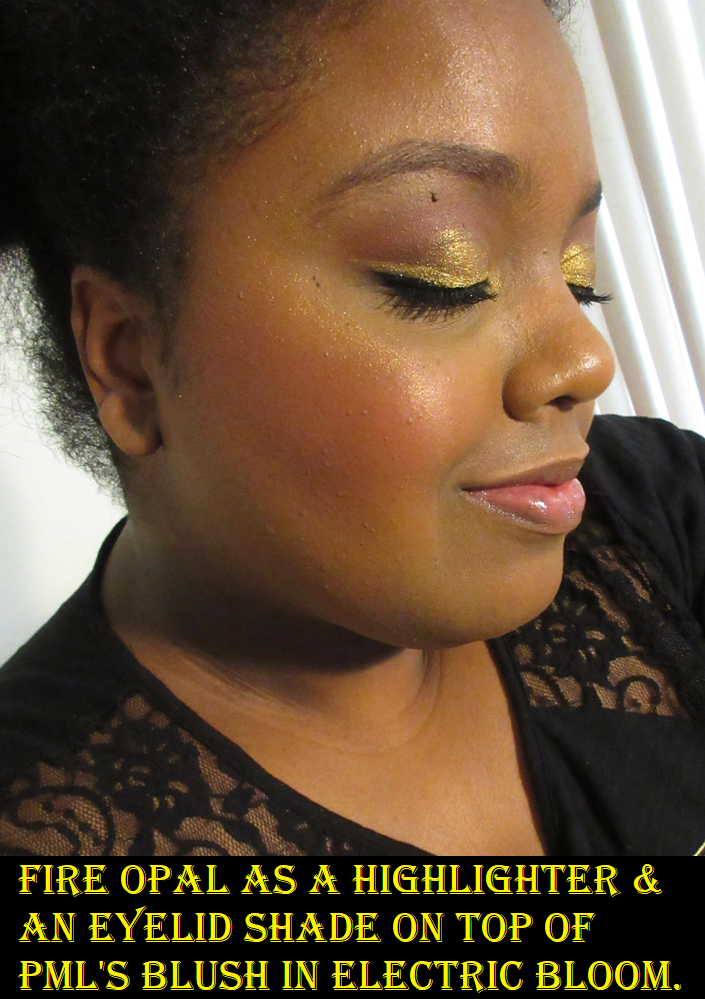
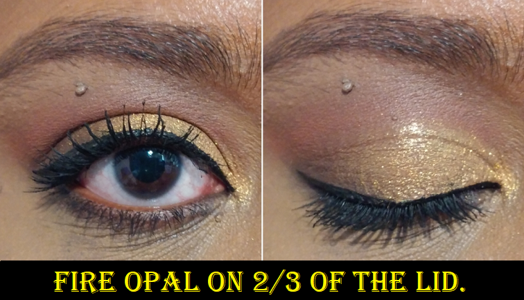
Haus Labs By Lady Gaga Bio-Radiant Gel-Powder Highlighter in Fire Opal

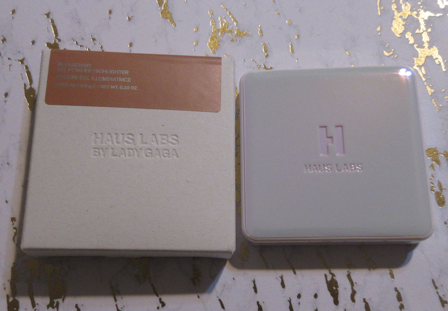
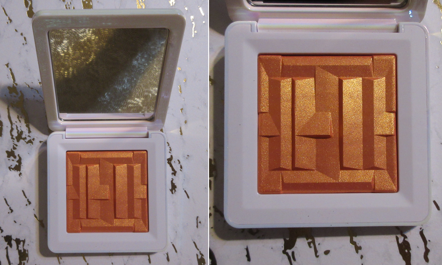
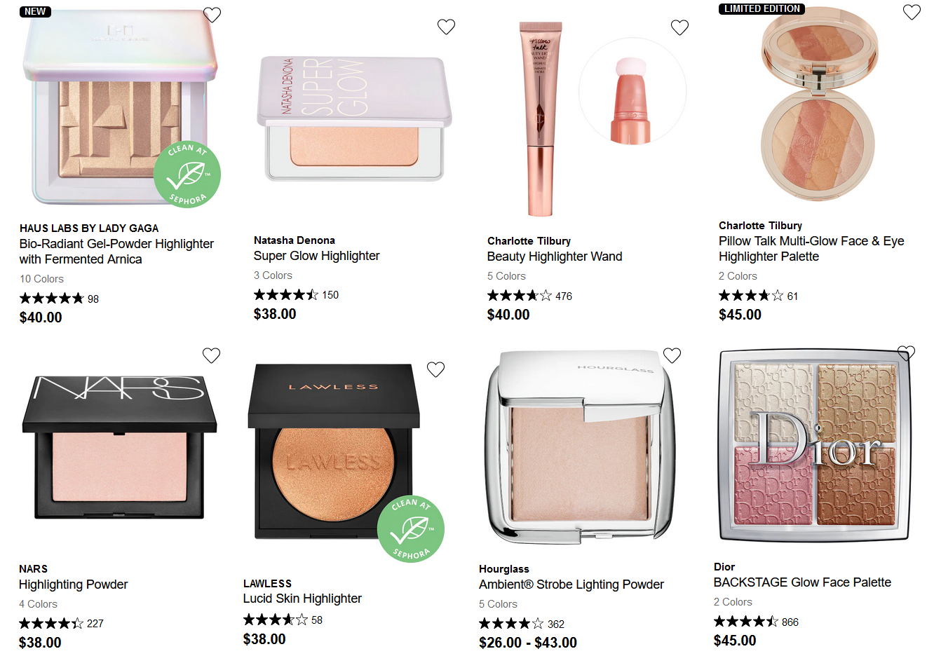
This highlighter is the only product I bought from the brand’s relaunch collection at Sephora. Considering all the previous Haus Labs products I purchased were between 50-70% off, I can’t help but be a little turned off by their pricing. I understand that their high price could actually be worth it now, due to shelving space at Sephora, the “Clean Beauty” formulas (which is an aspect I honestly care nothing about), and the upgraded packaging. The latter is the one that I can get behind the most, but with a price point that is competing with the likes of Natasha Denona, Charlotte Tilbury, Hourglass, etc. my expectations were high.

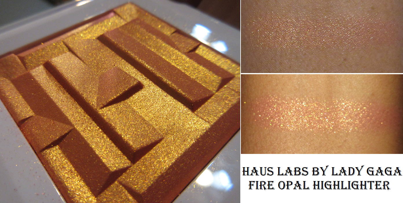
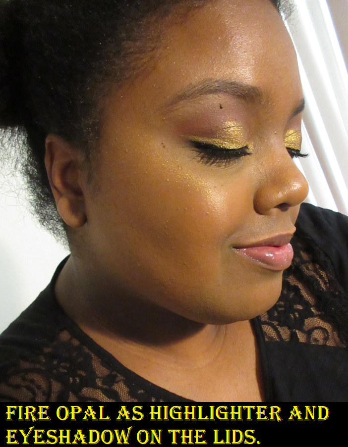
Gel-powder formulas are my favorite and I absolutely loved the new Haus Labs packaging in its shiny shifting opalescent color. I also thought the tone of orange was stunning and out of all the swatches on the website, I thought that the Fire Opal shade was prettiest on every skin tone. So, I expected this shade to be a slam dunk, but it’s sparkly! Broken record here, but I hate sparkly highlighters. It has the wet effect look at certain angles that I love, but what’s the point of a highlighter looking like natural gleaming skin if it’s going to be paired with very obvious glittery looking particles? It also just looks yellow on me, like Fenty’s Trophy Wife, instead of golden orange. I barely get any base color and had to use my hog bristle brush to dig deeper into the powder to get a bit of that fiery coral orange, but it wasn’t strong enough to overpower the yellow shimmer. I even attempted to mix it with PML’s Electric Bloom to mimic the base color of Fire Opal, but it wasn’t successful.

I decided to return this because of how expensive it is for something I’d never use again, and I already own the very similar looking (on the skin) Clionadh Tropico highlighter. In addition, I was on a losing streak of every new product being wrong for me in some way. I couldn’t keep absorbing the cost, so Fire Opal not working out for me was the last straw.

I attempted two wear tests for the sake of the review, and both times I had issues with the highlighter staying on my face for longer than six hours. So, this product was a complete fail for me.

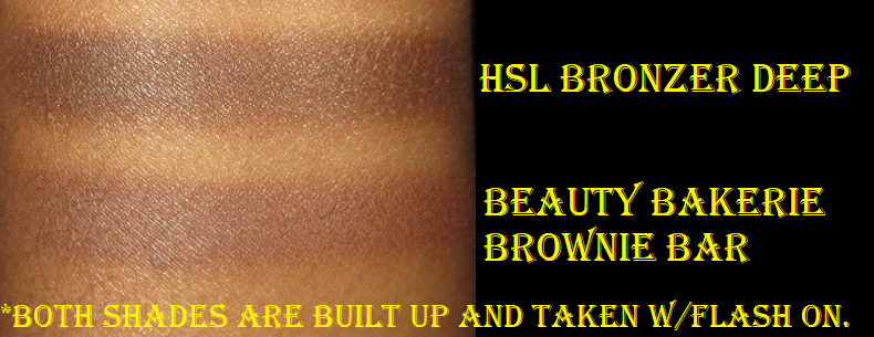
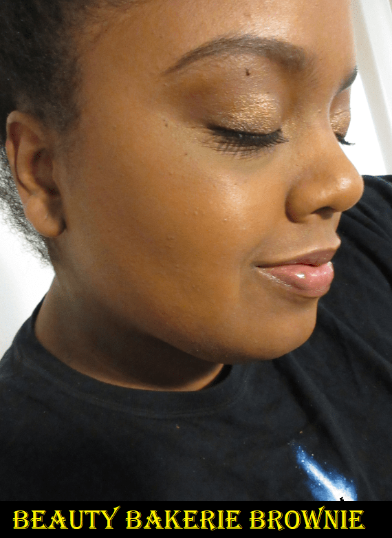
Haus Labs Casa Gaga Tutti Gel-Powder Highlighter in Luce Del Sol

After the disaster that was the newest range of highlighters from the brand at Sephora, I grew curious as to whether the one from Amazon would be better for me. I had originally heard rave reviews about Luce del Sol and couldn’t remember hearing anyone say it was glittery, but the price always stopped me from getting it. Once the price was dropped, my interest returned. I had tried and enjoyed the blushes by then and considering they shared the same formula, I was willing to give it a shot.

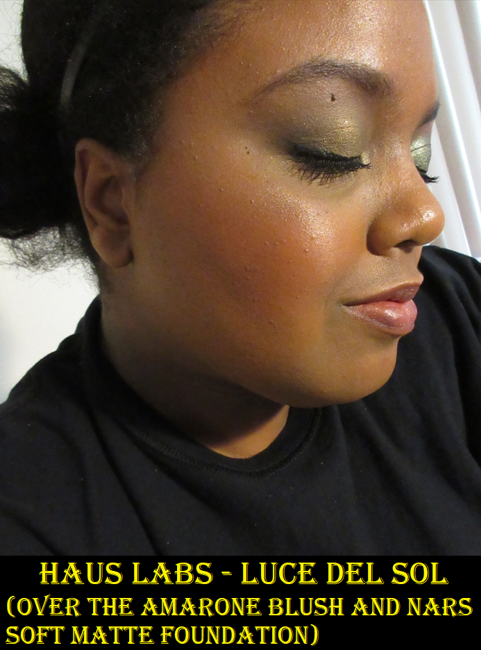
I certainly like this highlighter more than Fire Opal! It’s slightly lighter than I go for, but I just have to make sure I blend it in properly. It has that wet look when it hits the light that I like. It still has a slight sparkle to it, and emphasizes texture a little bit, but nowhere near as much as the other formula! Depending on the brush I use, this can sometimes look like the shimmer is spaced out too far apart for my liking, but then I just spray my face and apply another light layer of highlighter on top to meld it into my skin. Essentially, the dewier my skin is, the more I like it on me. The shine dulls a tiny bit towards the end of the night, but it’s still very present all day. I like it, but the listed price is still too high. Around $30 is more reasonable.

The blushes have a list price of $32 each at 3.5 grams and the highlighter is $42 for 12 grams of product.

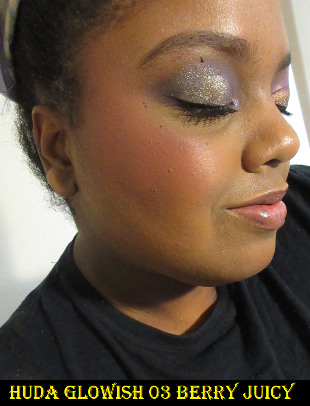
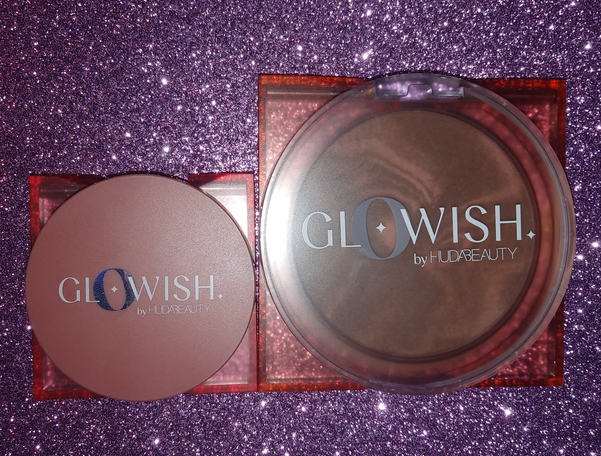
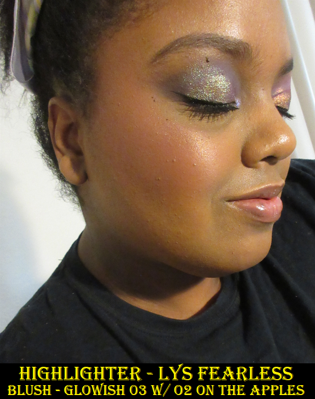
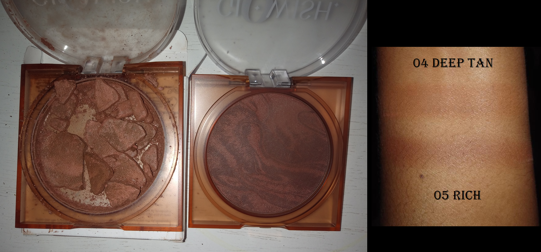
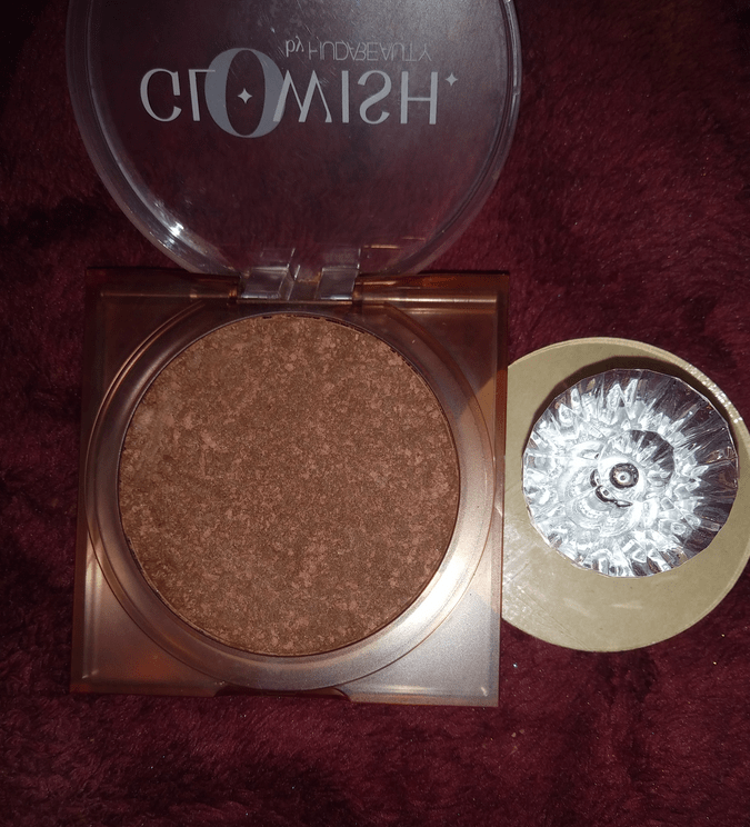
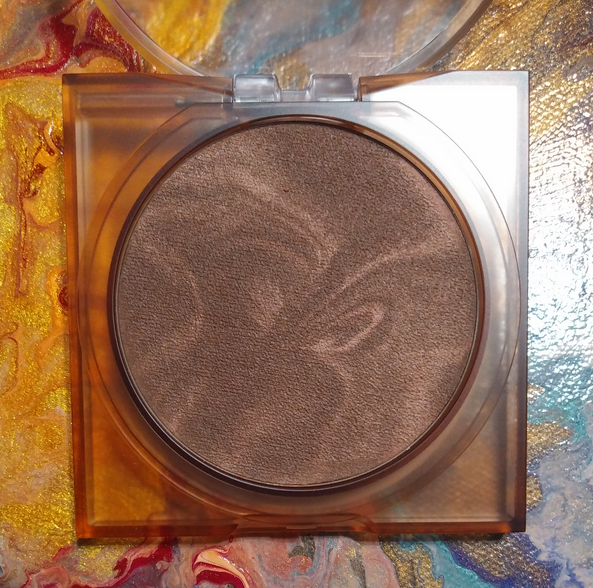
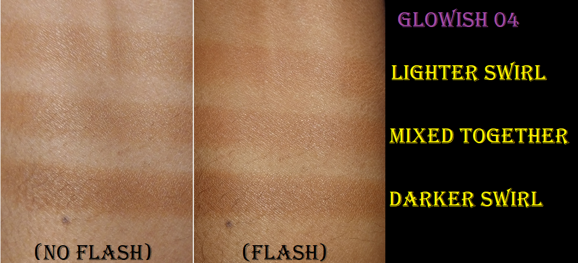
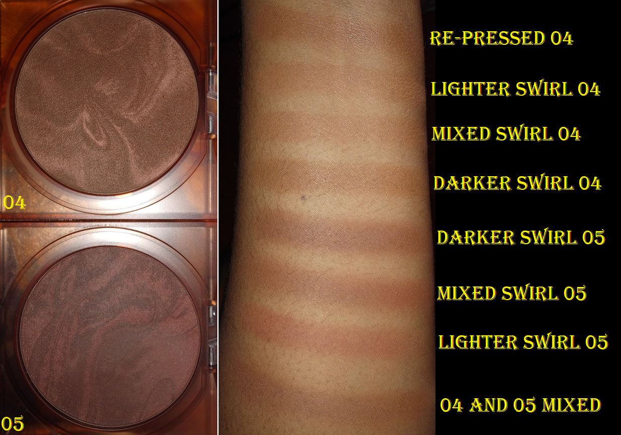
As much as I like the blushes and don’t mind having small ones because I’ll never use up a typical full size blush, the price still needs to be adjusted if there’s that little product. $25 would still be pricey to me, but more reasonable for what the customer gets. To be fair, it’s about the equivalent ppg to the Huda Beauty GloWish blushes.

I’m happy that I didn’t pay full price for the Haus Labs at Amazon products. The Casa Gaga ones specifically helped improve my perception of the brand, but I cannot ignore the quality of their older launches. After my experience with the highlighter from the rebrand, I’ve lost interest in trying anything else from them.
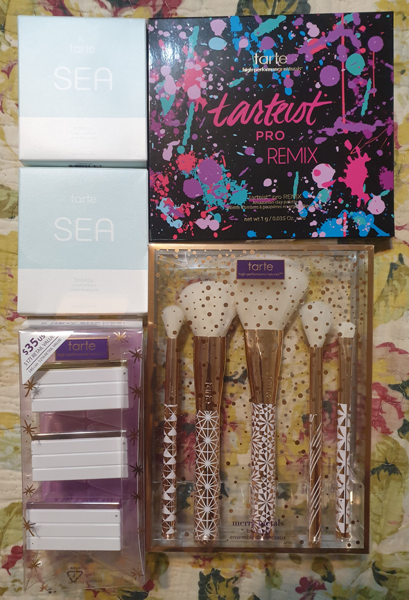
BH Cosmetics

Iggy Azalea x BH Cosmetics Sponge

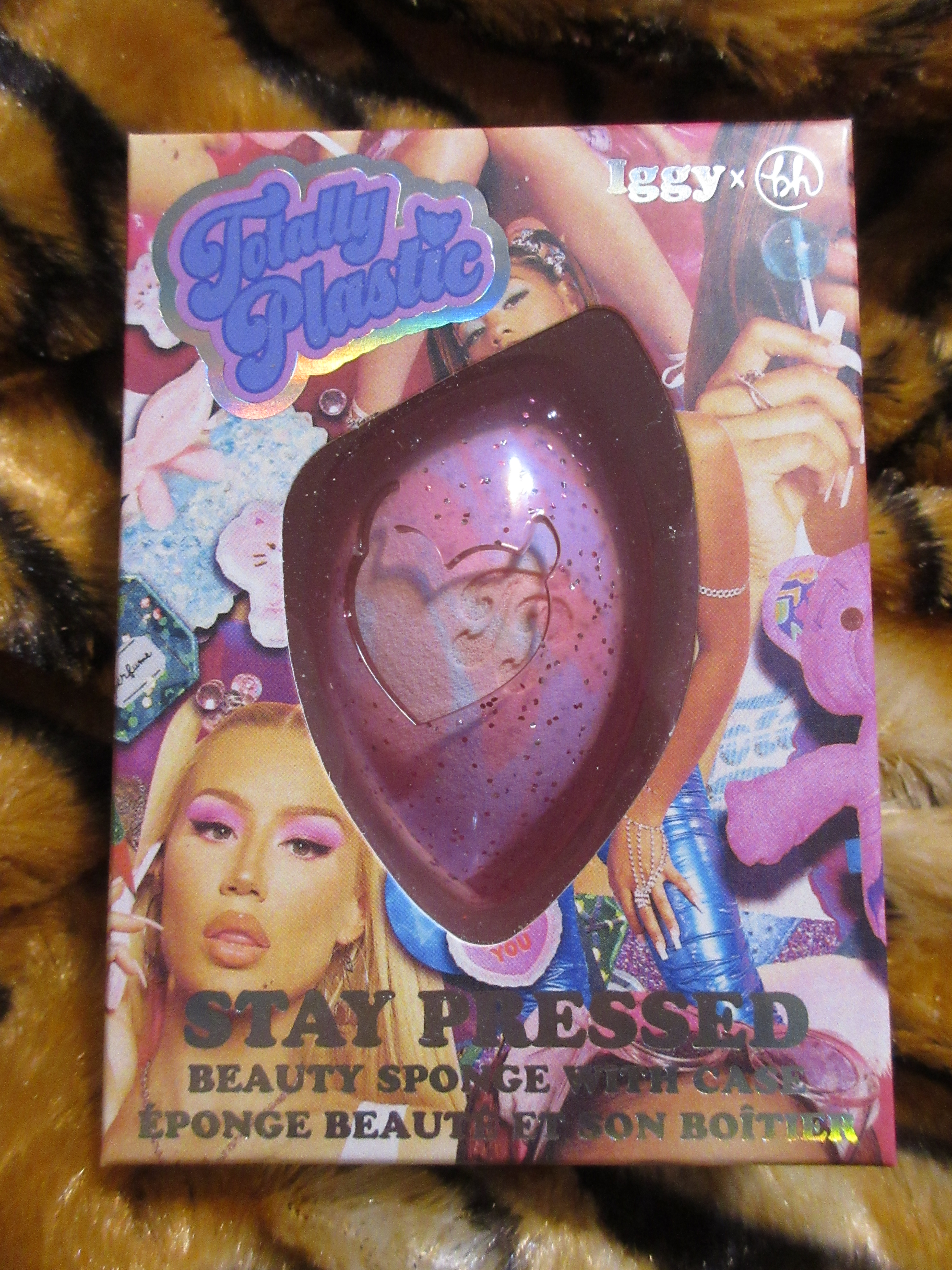
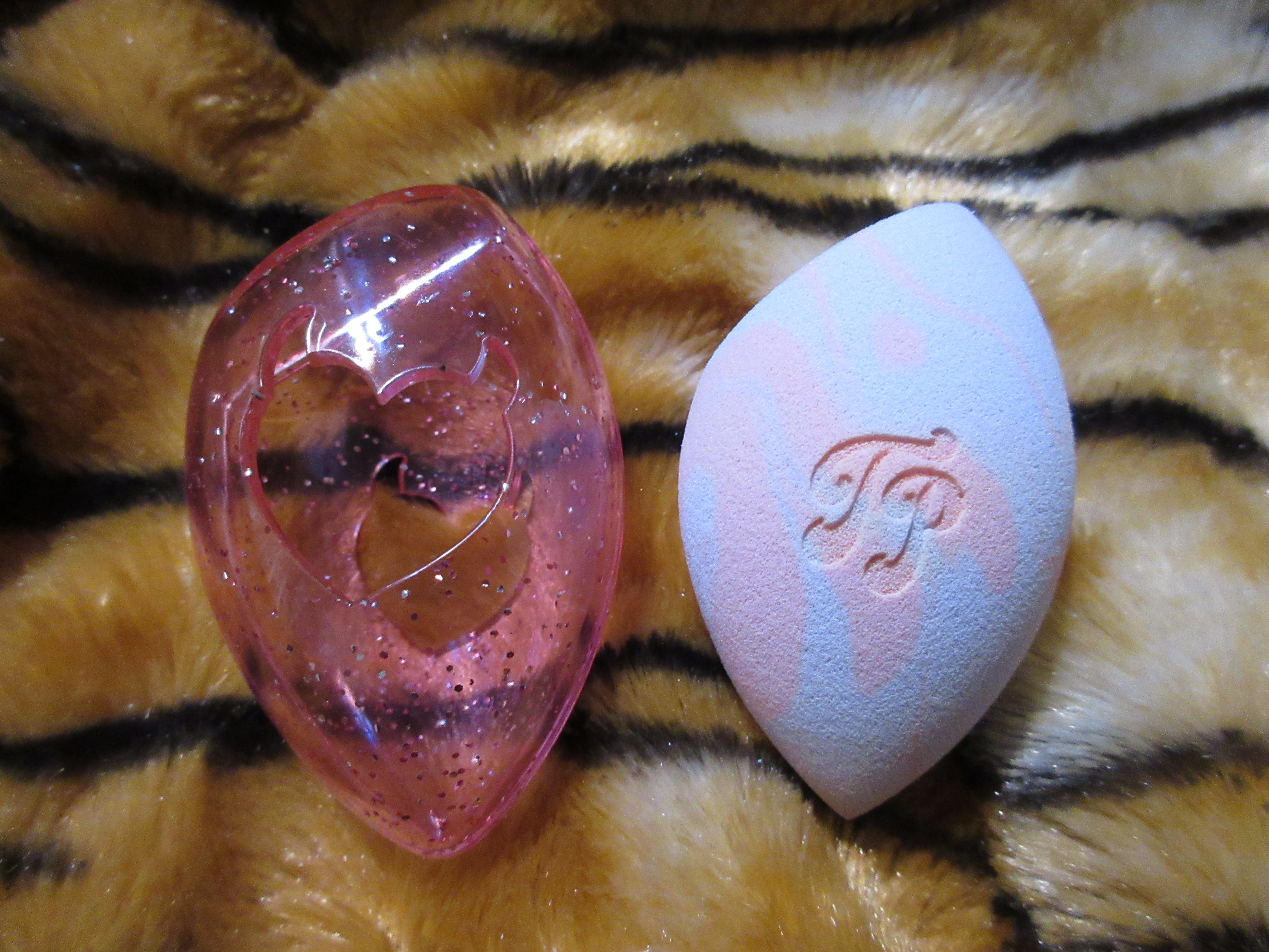
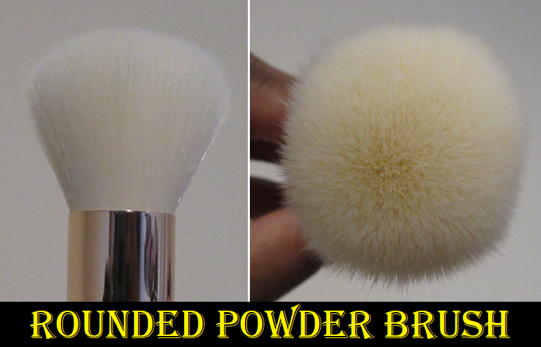
This purchase was discounted to $3 and I bought it purely to meet a free shipping minimum on BH Cosmetics’ website. This was before the announcement that the brand was filing for Chapter 11 Bankruptcy and that Revolution Beauty would be acquiring the brand. I like a few of Iggy Azaela’s songs but that wasn’t enough to make me interested in anything from this 90’s throwback collection (and apparently a ton of people felt the same way). This launch was a flop, but I can attest to the sponge actually being a great purchase. It’s super soft and works just as well as the original Beautyblender for a fraction of the cost. It’s also an incredible deal that this sponge also comes with a case, considering most cases cost more than what I paid for this duo. I’m glad that it has the flat side and pointy side like the Real Techniques Sponges (but less firm). The only downside is that I have a harder than usual time keeping this free of makeup stains, but considering the swirl pattern on this sponge, it looks naturally splotchy anyway.

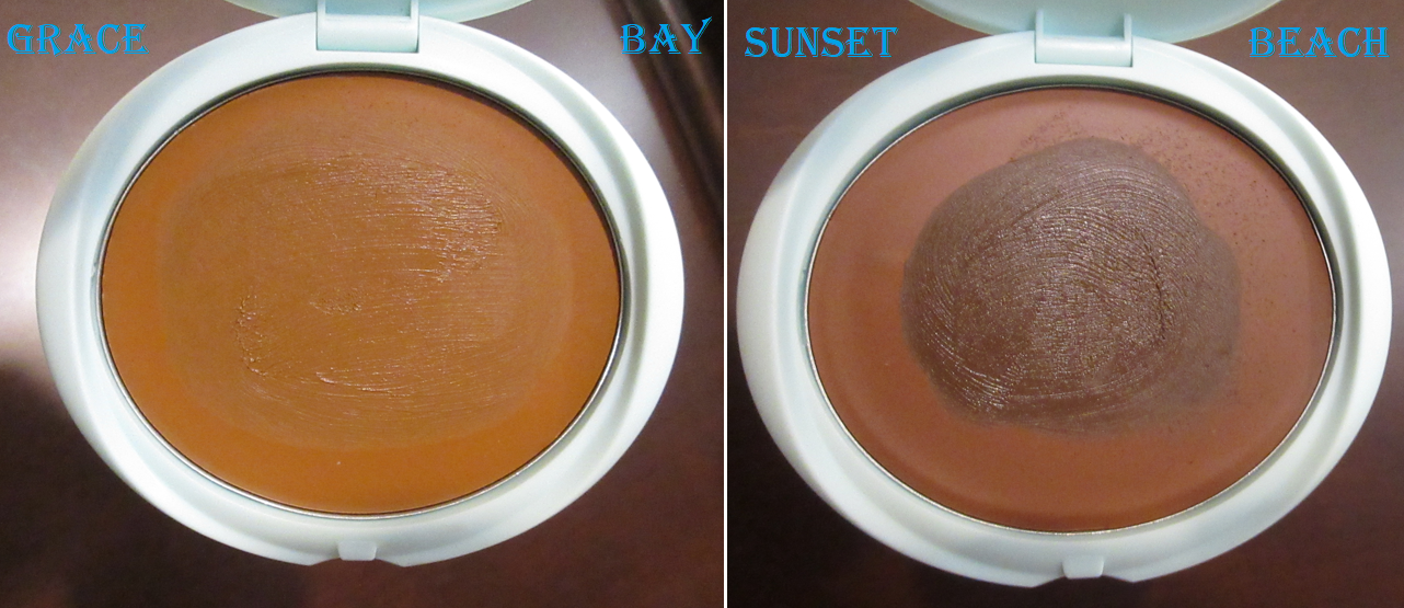
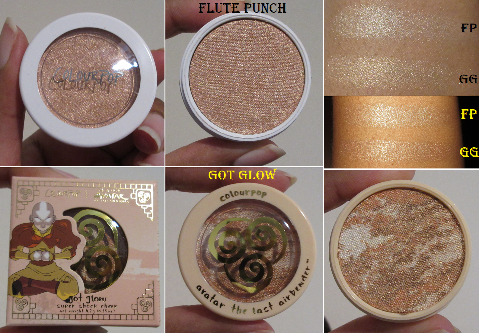
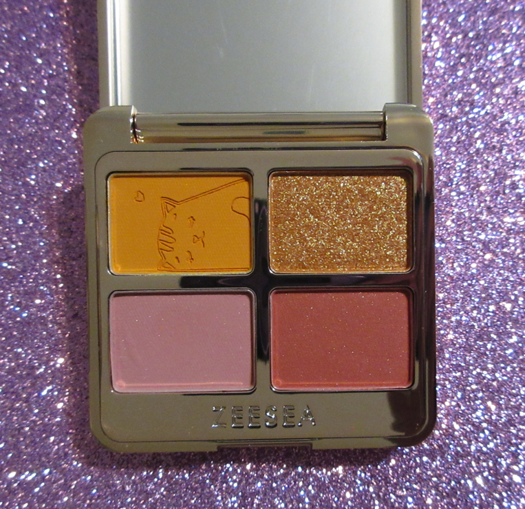
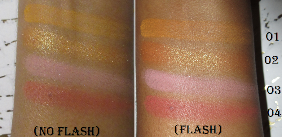
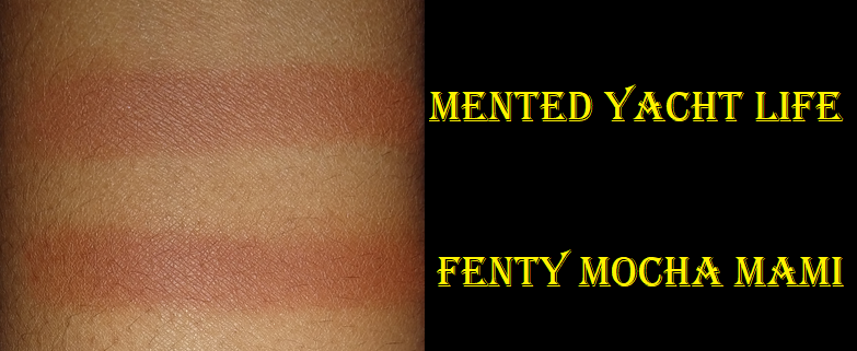
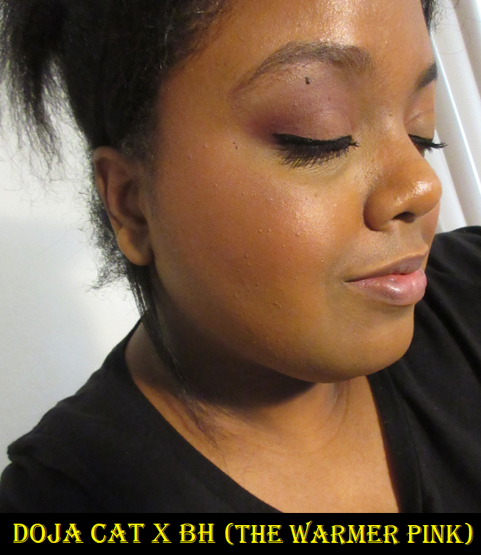
Doja Cat x BH Cosmetics Flora Blush Trio in Rose

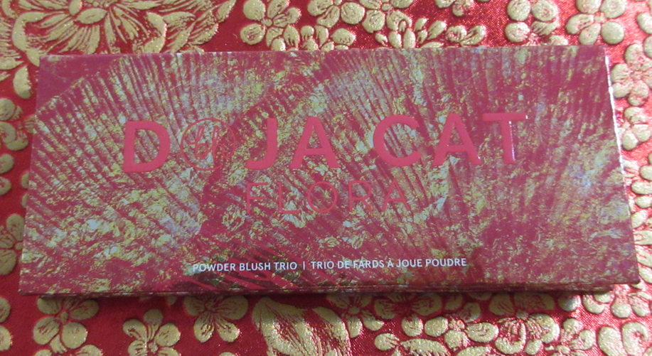
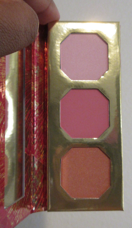
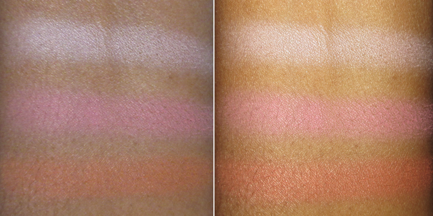
I believe this collection did slightly better than the Iggy Azealea one, and it had a round 2 release, although I’m not sure if that was already agreed upon contractually or if the first did well enough to create round 2 afterwards. I personally suspect it was in the contract. In any case, there were three blush trios in the launch. I bought two, but gave one away. I chose to keep this palette because of that reddish-brown blush with the golden shimmer, which is the type of color I love. The formula is extremely thin though on these blushes, so I have to build up this shade using a dense flat top brush or one of my goat hair workhorse brushes like the Sonia G Cheek Pro. It’s quite pretty though, despite being immensely subtle on me. The darker of the two pink blushes isn’t my favorite tone, but it at least shows on my skin and is slightly more opaque, though it still requires building. As for the lightest blush in the trio, I didn’t bother taking a photo wearing it considering it’s practically white in my arm swatch and definitely only suited for pale to light skin tones. It does have some shimmer to it, but it does not work as a highlighter for me. Overall, I’m not very impressed with the quality of these blushes. I have better from within BH’s own brand, not that they were ever my favorite to begin with, so I can’t recommend these, no matter how low the price is.

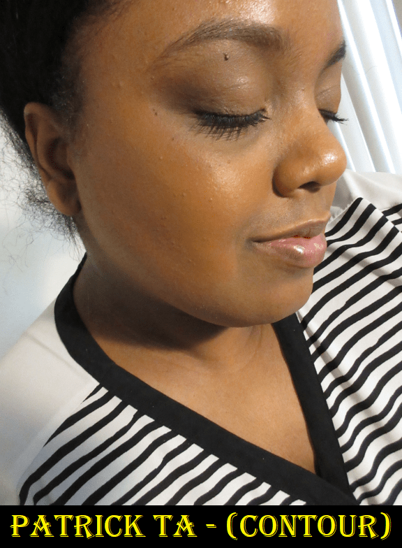
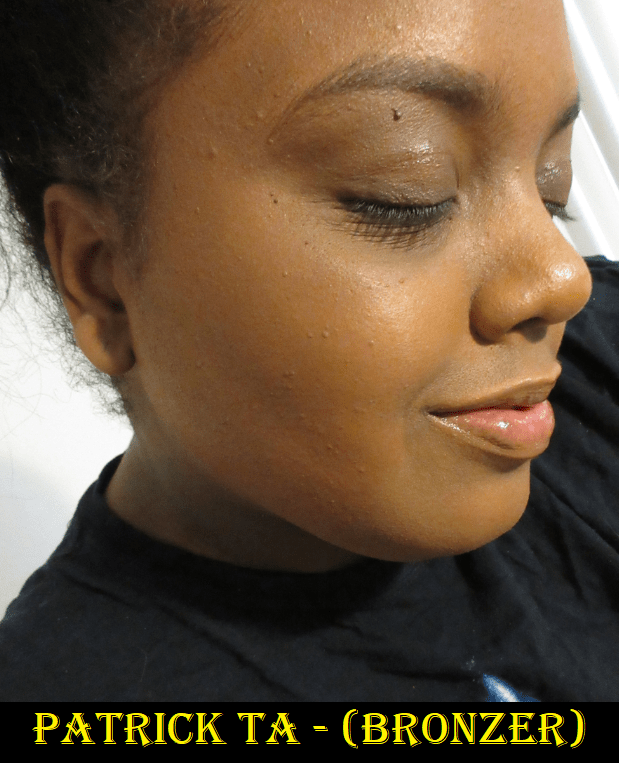
I thought that this post would help me decide whether I should be more open minded to makeup associated with celebrities, but even though I had a good experience with some of these, I can think of so many celebrity lines I happily skipped. If anything, I think I did a good job of picking and choosing which ones to try, which is more of a reflection on knowing my own tastes and less about the celebrity brands. So, in the end, not much changed my viewpoint except that I have a slightly higher opinion of Rare Beauty and Victoria Beckham Beauty. The biggest change was my opinion of Rose Inc earning my respect and successfully making me want to try a few more items from the brand if they expand their shade range of current and future products. If even one product I tried after the blush was a dud, I would have lost interest again in Rose Inc, so it’s only because they put so much thought and innovation into their products that I now see the brand in such a great light. I cannot say that this is the norm for celebrity involved makeup.

That’s everything for this post, but after I finished my final draft I came across a video on YouTube by Mina Le who discussed this topic of the over saturation of celebrity brands. I’m always getting recommended videos by Mina, but this is the first one I’ve watched. I find the sections on the environmental impact, power of celebrity, and downfall sections to be particularly interesting.

-Lili

Testing Out More From Tarte Cosmetics

The Shape Tape Concealer has been the only makeup product from Tarte that I have loved and recommended, but it’s not the only Tarte Product in my collection. For example, I had the Tarte Tarteist PRO Remix Amazonian Clay Palette for well over a year as a gift from a friend, yet I hadn’t even swatched it since getting it even though I’ve always been curious about Tarte’s eyeshadow formula. So, today, I’ll be reviewing several products I acquired last year from Tarte that I haven’t spoken about or even used until now. The Amazonian Best of Cheek Set from last year’s holiday release was supposed to be on this list, but I reviewed that in May, so the Amazonian Clay Blushes finally join Shape Tape as another recommended favorite.

Tarte Tarteist PRO Remix Amazonian Clay Palette

I noticed a chocolate scent as soon as I opened the palette, which surprised me because I wasn’t aware that it’s a common feature of Tarte eyeshadows. It’s apparently supposed to be a vanilla smell, but it smells exactly like Too Faced Chocolate Bar palettes to me.

Another thing that shocked me is the quality of these eyeshadows! I know Tarte has a very dedicated fan base (how else would they be able to sell the same palette slightly tweaked over and over again), but I thought they just loved the neutral aspect. I didn’t realize the shadows were genuinely good! The shimmers don’t have that high intense sparkle to them that I’ve come to enjoy, but they are still shimmery enough, pigmented, smooth, and easy to apply. The mattes are soft and two are blendable. I wish I had more of them in this palette because there are only three: Mixed Media which I can only use to brighten the look or blend out edges, Wall Art which barely shows on my skin and also only works to soften the edges of shades, and Ink which is a stubborn to blend black shadow that requires using the tiniest amount, blending, then slowly continue to build and blend. Working with Ink is too tedious for me. So, I sorely miss having some mattes to use in my crease that will actually show.

I enjoyed this palette so much that I instantly wanted to buy more. However, I remembered that Tarte stepped out of their metaphorical box with this palette and have barely made anymore like it. The most colorful palette they’ve made since that time which almost had my interest is the Tartelette Juicy Amazonian Clay Palette, but Tarte caught me at a time when I’m still sick of pinks, despite how beautiful the shades look. When or if they make a palette that suits my tastes, I won’t hesitate to purchase it.

tarte SEA Breezy Cream Bronzer in Grace Bay and Sunset Beach

I purchased these from Tarte’s website during two different sales. There are three shades in total and they got very little hype, which surprises me because I think this is a solid cream bronzer formula. There’s nothing extraordinary about them, but they do get the job done. They last on me all day and are easy to blend if I use the right brush and don’t spread out the product too far. They’re not transfer-proof, but they set nicely with powder on top and aren’t sticky to the touch.

I typically apply a minute amount of Sunset Beach first, the darkest shade that did not make it to Sephora’s site, to chisel my face because it’s deep enough to have a major contouring effect on me. Then I apply Grace Bay on top to warm it up. Grace Bay is essentially a warmer version of my skintone, so it barely adds any depth. Between the two shades, I can bronze, contour, and brontour. As much as I like them, they take a backseat to the Danessa Myricks cream bronzer and the cream sculpting shade in the Kaja Play Bento trios, so it wasn’t the best decision ordering both even at the reduced price. I managed to get Sunset Beach for 50% off, and at that price I’d recommend these.

Tarte Blush Authority Amazonian Clay Cheek Wardrobe (Holiday 2020)

Rumor has it that Tarte’s holiday blushes aren’t good unless they are the Amazonian Clay formula. This was the main reason, aside from the shade options, that I avoided getting Tarte’s blush/highlighter/bronzer sets despite their great value for the price. This ongoing reputation probably contributed to Tarte’s inability to sell them all at the end of 2020, and even when I bought this in September of 2021 for 50% off, it didn’t sell out until sometime between May and June of 2022.

The shades in the gold compact seemed the least likely to work for me, so I decided to give that one to a friend and just try out the rose gold and purple compacts. Frosted Frappe is a beautiful pink-gold shade that I can only pull off if I use the tiniest amount. I didn’t expect to like it, but it’s a very interesting tone and surprisingly better than the highlighter in the 2021 Holiday Set. The only downside is that it’s not the most flattering on texture and I don’t consider myself as having that big of an issue with texture on my skin, so noticing it says a lot.

Photo showing many different Tarte products applied to my face.

I didn’t bother showing what Sweet Cheeks looks like on the skin because it doesn’t show on me at all. Sugar & Spice gives a faint flush if I build up the hell out of it. I do like it though.

Please ignore the mask indent on my cheek. This is the Sugar & Spice Blush built up heavily.

Into You doesn’t show on my cheeks. Yours Truly is a slightly darker duper for Nars Orgasm and I would use it as a highlighter if the shimmer was more finely milled. The metallic nature of it isn’t flattering on texture. Lastly, Playtime is my favorite of the bunch because it actually shows on me the most and isn’t as bright as I expected from the way it looks in the pan.

I have some longevity issues with these blushes and they are a bit dusty, so I don’t believe they are as good of quality as the Amazonian Clay ones. I might still reach for these every so often, but I did learn that I should probably not get Tarte’s basic blush formula again, nor their highlighters.

Tarte Merry Metals Brush Set

This set was a gift from my friend in 2020 that I only started to test out at the end of March because the bristle splay of those head shapes looked less functional than I like. I really hope she doesn’t see this post because I appreciate the gift, and the handles are all durable and high quality, but the brush heads are flawed.

I remember being so impressed with Tarte brushes up until 2017. They were all the right densities, soft but still with some resilience, and not scratchy. I never had issues with shedding. They actually gave natural hair brushes a run for their money. Where I started to see a decline was the Unicorn horn-handle set of brushes that had inconsistencies of the dye, spots I could see glue, and other minor flaws. However, even those brushes I thought were still pretty good and I still continued to recommend Tarte brushes as synthetic options. So, I was quite shocked with this new experience of bristles that feel barely above old school cheap synthetic fibers before advancements were made.

This brush blends decently, but the trade off is the scratchiness! I don’t consider myself as having sensitive skin around my eyes, but this is too much for me. While it’s true that I’ve gotten used to doing my eyeshadow with high grade goat hair brushes with uncut tips, I still use one or two synthetic eye brushes on a weekly basis and none of them feel like this on my skin. If I was younger, I’d probably use it anyway, but with the collection that I have, there’s no reason for me to subject myself to skin irritation unnecessarily.

This is the best brush in the set, and it’s just okay. It’s bundled to medium density, which makes it the thickest and second most dense one out of the set. This characteristic compensates for the fact that these bristles don’t pick up powder that well, so I can at least get a medium amount of product onto my face per dip into the pan. I can get a little more buffing action out of this brush than the others. The tighter bundle also keeps the brush from splaying as much as the others, so I can have a bit more control and precision for blush, bronzer, and all-over powdering of the face. It feels softer than the others purely because I don’t have to use as much pressure to blend, which means I can hold the brush further back when I use it, which also means there isn’t enough pressure for the bristles to scratch my face. With more pressure, this brush still feels soft at first, but by the time I’m finished buffing, it feels like I just dry-brushed/physically exfoliated my face. Even though this is the most useful of the five, I’d reach for my Real Techniques brushes over this one every time.

Despite the pinched ferrule, this brush is way too loosely packed to be used for anything but a super blendable bronzer or face powder. The bristles being so long, combined with the loose bundling, makes it too floppy and flimsy that I can’t even properly clean the tips onto my microfiber towel between uses. I can only effectively clean off the very tips and not slightly higher, which causes color to be re-deposited onto my face since the wide splay causes so much of the fibers past the tips to be exposed to my face. I tend to use brushes for multiple purposes, so this is a nightmare to try and switch between using it for bronzer then blush without muddying up the cheek and then switching to face powder without getting the pink blush remnants all over the face. In order to try and get a better clean, I’ve tried grabbing the base of the bristles myself and squeezing them together to get the bristles to stand upright without flopping around while I rubbed them on the cloth. This still didn’t feel satisfactory, so I held the brush and put the cloth over the tips and tried to gently squeeze and rub the ends with the cloth like I would if I was getting excess water out of the bristles of a freshly washed brush, but when I did that, it felt like I almost yanked the whole thing out of the ferrule. It’s just an absolutely poorly bundled and constructed brush head.

The state of the Large Powder Brush after two uses.

The reason I don’t recommend this with blush is because of the huge splay and inability to blend properly, so if I were to keep using this brush I would make a decision on whether to use it exclusively for bronzer or exclusively for powder so that I wouldn’t be mixing shades and need to clean off the color in-between uses.

With only light pressure, the splay becomes too wide for me to enjoy this with blush.

The one thing this brush has going for it is the fact that it’s impossible to be scratchy when using because applying pressure makes the bristles practically go flat, so I have no choice but to hold the brush further back on the handle in order to use it. For this reason, I find the best use for this brush would be all over face powder where blending isn’t needed as much and low product pick up is generally a good thing. This brush is recommended by Tarte to be used with loose powder anyway.
I think no one would be shocked to learn I have no intention of using this brush again.

We’re back to another scratchy brush. I guess it’s fitting since it’s basically just a larger version of the blending brush.

I like to apply highlighter as lightly as possible, so at least in this instance, I can use it in a way that keeps things soft. Because this doesn’t pick up much product, and I wouldn’t want to do much blending with it, it’s best with lightly pressed and more powdery highlighters. With thicker formulas or ones harder to pick up, I don’t feel like I get an even coating on my brush which makes for inconsistent application sometimes. The imprecision is a big issue for me since it makes the fact that I have highlighter on even more obvious and goes against the more natural look I try to create, so I will also not be using this brush again.

This is the only truly dense brush in the set and comically one of the most dense shader brushes I have in my collection, next to my other Tarte flat shader brush from the Make Believe In Yourself Magic Wands Brush Set (unicorn handles). It’s also not a bad brush. It picks up a decent amount of product that I’m able to not only pack on shadows with, but also line my eyes and add definition to the crease. If I clean off the brush and turn it on it’s side, I can also use windshield wiper motions to blend with it as well. It’s minimally scratchy (or at least the area I use this brush on isn’t as sensitive) so this is actually a brush I could see myself continuing to use. The only reason I likely won’t is because I still have my natural hair brushes I prefer. This brush would be perfect for spreading on cream shadows and on top of eyes that were prepped with glitter primer that I shouldn’t use with my natural hair brushes. The density makes it great for spreading on an even amount of eye shadow, but that density does prohibit building them up in a thicker layer.

This brush set is no longer for sale, but I went into this much detail because I want to express caution when it comes to Tarte brushes. They apparently are not all the same good quality that they used to be, so one has to be careful when choosing which to purchase.

Despite a few letdowns (mainly the brushes), I think my overall opinion of Tarte has risen. Most of the products are decent quality or better, so this is one of those brands I’ll keep my eye on, but only if the products are on sale. Speaking of sales, I believe Tarte’s Friends and Family sale is still going on at the time that I’m posting this. Shipping is free and code FAM30 will give a 30% off discount. I believe the code even applies to new releases and stacks on top of items already on sale.

That’s all I have for today. Thank you for reading!

-Lili

March Purchases Reviewed: Dior, Colourpop, Vieve, Etc.

This experiment examining my monthly purchases has been fascinating for me to see all grouped together. January was indie and high end. February was indie and drugstore. March has shaped up to be a little of everything! There’s no consistent pattern and that makes me wonder how the rest of the year will be. Will I purchase more things or less things? Will I have an entire month of products solidly within one price range? Is it possible for me to go an entire month without buying a single thing? We will see!

Makeup Geek Empty Magnetic Mega Palettes

It’s quite unfortunate that Makeup Geek Cosmetics is no more. I didn’t add this to my Beauty Resolutions post, but I’m unofficially on an empty magnetic palette no-buy, and have been for years. I have so many unused small ones (25-30 pan ones), or what I refer to as small compared to the Coloured Raine 96 pan palettes. They don’t resell well either, so I try to avoid getting them, but these plastic Mega Vault Palettes from Makeup Geek are such a better and sturdier quality than even Z-palettes (which are already better than other more affordable cardboard packaging alternatives). For this reason, I bought two additional ones at 40% off on Makeup Geek’s website. I suspected prices would be further reduced in April, but I didn’t want to take the chance of these selling out. It’s a good thing I did because they were out of stock within a few weeks.

Wayne Goss The Luxury Eye Palette in Imperial Topaz

Between the Beautylish Lucky Bags and Wayne Goss Lucky Bags, I knew there would be plenty of untouched or only swatched palettes available on Mercari. I’ve wanted to try Wayne Goss’ eye shadows since the beginning, but I couldn’t bring myself to pay full price for six neutral shadows. So, for almost half off, I was finally able to see if playing the long game was worth it.

I didn’t have faith that these shadows would be worth full price, and it’s still not unless at least 4 of the 6 colors are someone’s style, but this really is a high quality formula! Well, the black shade is an exception but the rest are fantastic. Shades #1, #2, and #4 are satins, #6 is a topper type of glittery shimmer, shade #5 is a texturally soft matte, #3 is a very dry and stiff matte. What makes the difference between the mattes is the lack of stearates (which can account for the softness of the texture) and zea mays (oil absorbing but silky feel) missing from the black shadow that were included in the medium matte brown.

The satin shades can be used in the crease in place of a matte, but I have to be careful using #1 anywhere beyond highlighting spots because it’s so light and #2 is practically my skin tone, so it doesn’t show very much beyond adding a sheen to the area. I also wish #5 was a little deeper. I thought I would be able to mix #5 and #3, but #3 is so stiff that it doesn’t mix well with others. It reminds me of the black shade in the Hindash Beautopsy palette in the sense that it looks like it’s going to give a lot of pigment when it first touches the skin, but it’s a buildable formula that requires multiple layers to get something dark and dramatic. I appreciate that this type of shadow is perfect for smokey eye looks, but I’m able to get that effect from Hindash’s palette twice as fast and I consider that a little slow to use!

These shadows have fantastic longevity with very minimal creasing. I was impressed to discover #1 can cling to my inner corner when a lot of other shadows don’t by the end of the day from all the times my eyes get watery or I rub them. #6 also impressed me because I don’t get glitter specks on my cheeks either throughout the day. The glitter is spaced out when applied to the eye, but I can make it look less like a topper if I apply it wet.

Imperial Topaz is supposed to be that go-to palette for everyday quick and easy looks. However, they aren’t the perfect tones and depths for me, the scattered glitter effect from the nicknamed “celestial” shade isn’t my preference, soft satins are generally not my preference anymore either, and the black shadow takes effort to use. So, it’s not possible for this to be an effortless essential palette for me. I can still make nice looks with it, but it wouldn’t be worth me paying $55 for it, and I say that as someone who is willing to spend more than that on a palette if it’s nearly perfect for me. In my opinion, this palette should be $45.

As for those who love satins, celestial shades, creating soft looks and/or glam looks, is of a different skin tone in which #2 could work as a transition shade and #5 could add dimension, I can completely see how this would be an ideal neutral palette for someone. The perfect palette even. Unfortunately, that isn’t the case for me, but I am still going to continue to stalk Wayne Goss launches in the hopes that one day he’ll release my ideal eyeshadow palette! The Tourmaline palette almost got me, but not quite!
This palette takes the third spot in my 24 max goal.

I realize I’ve forgotten to mention something that will only be important to some people, but I will include this note now. Whenever I purchase the first product from someone who is a celebrity, influencer, or public figure, I always disclose my thoughts on them for those who may be worried about whether my review is clouded by personal feelings positively or negatively. When it comes to Wayne Goss, even though I am subscribed to him on YouTube, I only watch 5% of his videos, so I sometimes forget he is technically an influencer. I’ve always put him in the box of Makeup Artist/Industry Professional, which most people typically don’t have parasocial ties to, and therefore wouldn’t need disclosing. So, for full disclosure now, I used to be a big fan of his and that is what got me to first start buying his brushes in 2015. His products were the reason I placed my first Beautylish order. At some point I lost interest in his videos because the reviews are always glowing since he almost never reviews products he doesn’t like, so at that point I stopped thinking of him as an influencer and instead as a brand owner and professional. Certainly, by this point, my opinion of him is neutral.

Dior Forever Couture Luminizer in Golden Glow 04

Well, I said I would eventually get a Dior highlighter in my Beauty Resolutions and here it is! All the luxury beauty channels I watch say that Dior makes the best highlighters, so I’ve wanted this since it launched. I was planning to buy it during any retailer’s 20% off sale, but I happened to find an untouched one on Mercari at a significant discount, so I snapped it up! I just did not want to pay full price for a formula I’ve never tried before and that I honestly didn’t think would live up to the hype.

I didn’t think of the implications when Angela van Rose mentioned that the base color doesn’t show very much in this highlighter. There wouldn’t have been an issue for me if the color in the pan was the tone of the shimmer, but since the base is almost transparent on the skin, I’m left with the actual color of the shimmer which is a bit too light for me. I love how the highlighter melts into the skin. I love how fine the shimmer particles are and how it gives a glassy wet-skin glow to my face. However, I can only get away with wearing it if I take my time to really blend it onto my cheekbones and even then, I’m not sure how successfully I pull it off. The best results I can get (pictured above) is with the Smashbox Precise Highlighting Brush which somehow picks up more of the powder and deposits less of the shimmer onto my cheekbones. If I want to continue using this, I could try to pair it with one of my darker highlighters.

In terms of longevity, this lasts all day without the shine dulling down. It’s absolutely beautiful. I just wish it was a little darker. There are six different colors in the range, but I’m not convinced 05 Rosewood would be any better on me and 06 Coral Glow is supposed to be similar to Pat Mcgrath’s Divine Rose, which I already own. So, I don’t plan on purchasing another one. As for the full retail price, I would say it’s not quite worth $48, but I bought PML’s Lunar Nude at the reduced price of $45, and this highlighter is better than that one. So, if Dior did release a similar formula of highlighter with a gold shade that would work better for me (something like Becca’s Topaz), there’s a good chance I would buy it and possibly at full price.

Also, I didn’t realize this had a scent until I was watching other videos to compare the different shades and someone mentioned it. I checked and can confirm mine does have it too, but I had to put it right up to my nose to detect it. It’s the same fragrance as my Dior Powder No Powder, so I guess it’s the brand’s signature scent for powder products.

Colourpop Super Shock Blushes in Chamomile and Sounds Grape

These purchases, combined with last month’s heart shaped blush, put a big dent in my goal of ending the year with under 15 blushes. Plus, Colourpop is not even on my blush exceptions list! The review for the Super Shock formula of blushes (with some highlighters snuck in) can be found here.

Chamomile is as pretty of a color in person as it looks online, but Sounds Grape is so much darker than I expected!

If I use a heavy amount, it looks similar to the shade Cheerio, so I have to be careful with this one and apply lightly. If I only use a little bit, the look I get is exactly as I hoped and is beautiful. I have no regrets buying these two blushes!

Colourpop Super Shock Highlighters in Flute Punch and Got Glow

Flute Punch was part of my official Colourpop order in March. I bought it so I could have a lighter version of Champagne BB that I enjoyed in February. Both were from the Feelin’ Bubbly Collection, but for some reason, I got Flute Punch in the basic permanent Super Shock packaging and not the special edition one. Colourpop Super Shock Cheeks in the highlighter formula weren’t on my exceptions list because as much as I love them, I wanted to not purchase anymore so I could use up what I have. I caved when I bought these and that was very naughty of me. As for Got Glow, the Colourpop x Avatar the Last Airbender collab, I purchased it from Ulta. I thought the color was beautiful and I wanted to try the tie-dye formula. When the Avatar Collection was released a week after my order, I regretted not waiting for something else I wanted, as this could have been the last item in my official Colourpop order instead of needing a “filler” item. The fact that it was available at Ulta, so I could add it to my order without needing to pay for shipping or meeting the price minimum was why I happily broke my rules and bought it.

The line on my cheek near my ear in the Flute Punch photo is from wearing a mask, not the cheek products.

Colourpop Pretty Fresh Face Powder in Dark 18

Because I had a 25% off coupon that would mean the difference between saving a few bucks after having to pay for shipping or spending a few extra dollars after hitting the free shipping minimum, I decided to add this as a “filler” for my order. The only other items that interested me at the time was a hair accessory or additional blushes and highlighters, which I did not want to add to my yearly tally. So, even though I’m on a definite powder no-buy, I decided to try this one as my first complexion product from Colourpop.

According to the website, this powder can be used on its own as a foundation or as a setting powder. I accidentally chose a shade slightly lighter than my skintone, but when I used this with my natural hair brushes, I get such a thin layer of product that it just blends in and may as well be translucent. As to be expected, I get a lot more coverage if I use the extremely thin powder puff that came with it. The slightly off shade still isn’t noticeable with the puff anywhere except the areas of my face where I have darker discoloration. So, this is only a problem if I’m trying to wear this product on a bare face. There are no issues when I’ve used concealer over my hyperpigmentation and then applied the powder afterwards. After looking at a few videos and seeing shades 19 and 20, I don’t believe there is a shade in the line that would suit me for foundation purposes. So, I will not be trying to get an additional shade.

I like the softness of the powder’s texture, how it helps to even out my skin tone, and it sets my makeup in place. It even works as a setting powder for my under eyes and adds a little extra coverage and brightening if I apply it towards the end of the day if my concealer is starting to fade. I’m pretty happy with this product! The result I get with this is like a less expensive version of MAC’s Mineralize Skinfinish Natural.

Tarte Shape Tape (Original) in Deep Golden

In my Beauty Resolutions, I mentioned that this was one of the rare times I would allow myself to have a backup product. I got it for 50% off during Ulta’s 21 Days of Beauty. I’ve discussed this concealer in so many different posts on this blog. The only thing special about this one is that it’s yet another shade in the same Deep 53 range, but in a different undertone that looks like it will be better for me than Deep. As I’m trying to use up my other concealers, I don’t plan on opening this one anytime soon in order to keep it fresh until I’m ready for it.

Also, I just wanted to show Tarte’s packaging change between the purple box to a clear plastic one.

Stila Stay All Day Waterproof Liquid Eyeliner in Intense Black

This was another Ulta 21 Days of Beauty purchase. It’s a backup item, but I mentioned this was a possible purchase in my Beauty Resolutions and Hyped Drugstore Products posts. This is a long time holy grail eyeliner, so I’ve discussed it plenty of times on my blog.

Covergirl TruBlend So Flushed High Pigment Bronzer in Ebony

Since I got free shipping from buying a Beauty Steal (Shape Tape), and I had some funds left on my gift card, I added this to my order. In my post about Drugstore Items Worth The Hype, I discussed how much I enjoyed the Sweet Seductions blush from this range and wanted to try the bronzer. This is still a breach of my beauty resolutions because Covergirl is not on my list of no-buy exceptions, but I have no regrets because this is such a great bronzer! The way that it is similar to the blush is that it’s very blendable, but rather than shimmery, it adds a pretty sheen to the skin.

If I use a dense brush, I don’t have to build it up as much. The Ebony shade is perfect for my skintone as a true bronzer, rather than all the brontours I’ve been using lately. It’s only a few shades darker, so I don’t get a ton of sculpting with it unless I really build it up, but it matches my undertone so well in providing a very natural looking warmth. I highly recommend it and can easily say it’s my favorite bronzer available at the drugstore as it truly rivals some high end formulas.

The partial indent on my cheek is from wearing a mask.

Olivia Palermo Beauty Eyeshadow Palette in Regalia

Mercari to the rescue again! When Olivia Palermo Beauty launched, I wanted a palette solely for the packaging, which I heard was luxurious and weighty. However, I had enough sense not to spend $58 for color story I hated. The Soirée and O’Naturel palettes were all that was available until February 24th when Regalia was released. I was about to order this from the website with the 15% off coupon for signing up for emails, but the shipping price deterred me. There is a free shipping minimum of $60, but a palette plus the cheapest item in the shop (a $29 lip balm) makes that free shipping minimum really $74 after the coupon. So, I decided to play the long game. What a stroke of luck that I found a seller three weeks after the launch willing to part with one of her unused palettes and for just $28! And in the terms of my eyeshadow palette low-buy, this purchase takes the fourth spot in my 24 max goal.

The first time I tried out this palette, I tested it with the MAC Paint Pot on one eye and no primer on the other. The texture of the eyeshadows felt different from what I’m used to, which is why I wanted to test them without a base to make sure it didn’t negatively impact the shadows. My findings was that the matte shade deepened up quite a bit on the primed side, even though the Paint Pot had enough time to set. I used Smoky Quartz in both creases and the shade was not easy to blend on either eye. The performance of the shimmers were much better. I did not wet my brush or use glitter primer, yet I didn’t see any glitter fallout at the end of the day, only the particles that fell from the initial application. This was shocking considering how packed with sparkle Diamond Dust is! Diamond Dust was even applied on the eye without the primer! As for the primed side, Antique Diamante is borderline a glitter-shimmer shade and that didn’t have fallout either.

Rose Gold is labeled a satin, and I agree with that. Malachite, Antique Diamante, Amethyst, and Diamond Dust are all called shimmers, but Malachite and Amethyst are much more satin-like in comparison to Antique Diamante and Diamond Dust. The four shimmers also have a black base to them. I could see the darkness in the smudges they left on my fingers after swatching them. This helps those shimmers to pop and increases the opaque look to them. I don’t need to load on the shadows to make an impact.

I find it interesting how soft the satin and shimmers feel (minus Diamond Dust), how pigmented they are, and how smoothly they apply. A lot of other formulas have slip ingredients like dimethicone in a higher concentration in order to achieve that spreadability and creamy feel, but because this one doesn’t rely as heavily on dimethicone, it barely creased on me. The fallout-free and crease-free aspects alone might make this palette worth full price for some people. That isn’t the case for me, but as someone with a lot of lines on my eyes and oily lids, it’s an aspect that is gaining importance to me as I get older.

“Glittering gems and precious metals,” are the inspiration for the Regalia palette. For my personal preferences, I would have liked a matte black to emphasize the sultry smoky side of the shimmer shades and give me the level of depth I enjoy most, but I appreciate the fact that having the warm brown gives me something to pair with Rose Gold for a daytime option, and so I don’t feel restricted to just use that shade exclusively for highlighting the eyes. Technically, the shimmers are dramatic enough to wear on their own, so having a color like Smoky Quartz offers more variety to the looks and is probably less intimidating for some people than a matte black would be. I just wish it was a more blendable shadow.

I am of course thrilled with my purchase at the reduced price, but I’m not sure how I would have felt if I paid full price for it. In addition to the creasing and fallout being non-factors, and the tones of the shadows looking flattering on my eyes, this has phenomenal packaging that literally weighs half a pound! The outer shell is metal, which makes up for most of the weight. The inner portion surrounding the pans and mirror feel like plastic, but I’m not certain about that. The total weight of the actual shadows is 7g/2.5oz, which means the packaging alone is over 5.45 ounces. I can see how this palette would be a nice luxury purchase for someone and the experience certainly raises its value. However, for those who don’t care about packaging and just want something nice for a lower price point, the Lorac Pro Fairytale Forest palette isn’t a dupe, but it gives a similar vibe for $39.

Lastly, I remember reading Trendmood1’s post on Instagram for people commenting to be nice when she posted about the brand’s launch. This was during the time of back to back announcements of celebrity beauty brand launches, which people were voicing their displeasure over. I hadn’t heard of Olivia Palermo until that post, so my interest in the brand is purely for the products and not the person.

Vieve Sunset Blush in Sorbet

I’ll get this disclosure out of the way now, since this is my first Vieve Product. I am familiar with the name Jamie Genevieve because of other Influencers, but I don’t know anything about her. I wanted to try this brand because Brit Clarke consistently raves about the products and discusses every new launch. Plus, in one of the focus groups I’m part of, I learned that another beauty retailer is interested in knowing people’s thoughts on the brand, which increased my curiosity as to whether the products live up to the hype since they may eventually become easier for me to obtain in the US. So, my interest is in Vieve, not the owner.

I said in my Beauty Resolutions that I would avoid buying products from brands that are new to me, but the discount on someone’s unused backup blush was too good to miss out on. Being able to determine how good the highly praised blushes are would help me decide whether I should look into the bronzer duos since I’ve had my eye on those but wasn’t sure if I should splurge on the duos from Victoria Beckham Beauty instead. A lot was riding on this!

Once again, the partial indent in my cheek is from wearing a mask. It’s not the makeup.

Sorbet is exactly how I wanted Nars Orgasm X to look on me. Although it’s described on some websites as being a peachy shade, I view this as medium to medium-dark coral shade with super fine gold shimmer that gives a satin appearance when looking straightforward, but gives a golden glow when it catches the light. I believe this shade could work for those several shades darker than me in the “deep” category. It’s firmly pressed in the pan to help minimize kickup and also make it easy for those with lighter skin tones to be able to wear a bold color like this without overdoing it. That said, it doesn’t take much effort to build it up on my cheeks. So, it’s pigmented but buildable. I once made the mistake of rubbing my squirrel hair brush roughly back and forth thinking it wouldn’t pick up that much, but as soon as I put the brush to my face, I immediately got more pigment than I bargained for on my cheeks and had to tone it down with foundation. I prefer to slowly build up three layers for the perfect amount for me.
It lasts on my cheeks all day without fading. Overall, I think it’s a great quality blush and I would be tempted to purchase the other shade that caught my eye, Piazza, but that is supposed to be similar to Mented’s Clay Too Much and Fenty’s Rose Latte, so I will just stick to this one.

Regarding the full price of $32, I think that’s actually fair considering the performance. I also like the effort to make the packaging look luxurious if you don’t stare at it too long. For instance, the black leather with the gold logo/name plate is reminiscent of a designer handbag, but the product is lightweight in the hand and faux/vegan leather wrapped around cardboard and a shiny thin plastic covering on the inside. And what looks to be a metal tag is plastic. It’s pretty, but I can’t help but compare it to Pat Mcgrath’s blushes which perform the same, plus have that pretty rose embossing, as well as the sleek weighty plastic compact. PML’s blushes are $38 but they’re always on sale and the minimum sale discount would make it the same place as the Vieve blushes, so if they had similar shades I would buy the one from PML instead, unless I was going on a trip. Then the Vieve blush would have the advantage. Vieve also has the PETA bunny on the packaging, which the cruelty-free, vegan, gluten-free, paraben-free, and fragrance-free aspect is important to a lot of people. PML doesn’t advertise having all vegan formulas, but I did not see carmine, fragrance, or parabens in the blushes and they say they do not test on animals. Although I’d prefer to purchase PML blushes, I do recommend the Vieve ones and I’m thrilled to have this Sorbet color.

Fenty Beauty Gloss Bomb Universal Lip Luminizer in Glass Slipper

In March, Fenty had their annual Friends and Family sale at 30% off for customers with an account or 25% off for everyone else. This is always the time I get the previous year’s Gloss Bomb holiday set since they tend to always be available beyond Christmas. My two complaints about the Gloss Bombs are that I wish they had more pigment and less visible shimmer. The 2021 Glossy Posse: Fantasy 4Sum Mini Gloss Bomb Collection contained a Cream Color Drip, which is a formula I hate, and even more glittery versions of the gloss bombs. So, I opted out and decided to get Glass Slipper, which is a clear gloss with no shimmer since the original gloss bombs barely change the color of my lips anyway. Although I’m supposed to be on a lip product no-buy, there is an allowance for replacement lippies and things I had to delay purchasing from the previous year (though technically I replaced the replacement option). I have old gloss bombs I need to toss out, so this purchase is allowed, but it’s still subject to my 5 lip product maximum for 2022. This makes number 4. My review of the Gloss Bombs and Cream Color Drip can be found here.

Hindash Monochromance Gradient Palette – I did a dedicated review to this product here. I decided in my Beauty Resolutions that if Hindash released another gradient palette, I wouldn’t count it as part of my eyeshadow tally since I tend to use these more on the face than on my eyes.

Sonia G Cheek Pro – When I bought the Hindash Palette, it was during the Beautylish Gift Card Event where you can get a $20 credit on your account for every $100 spent. This purchase, although it shouldn’t be allowed under the section about not buying repeat products, got me to the $100 threshold. My review for this brush can be found here, though I’ve discussed it multiple times throughout my blog.

KVD Good Apple Lightweight Full-Coverage Concealer in Tan 173

I’m not supposed to be buying backup products, but here I am again! This is a different shade than I reviewed here previously, but it was on sale for 30% off and I used up so much so quickly that it wasn’t unreasonable to have a replacement in this specific instance. Concealers are one of the few makeup products I go through regularly. It takes me 6-8 months to use up a 0.33 oz tube of Tarte Shape Tape, so the same is probably true of the Good Apple since it has the same amount of product and nearly the same coverage. In fact, comparing the weight of my new bottle to my current one, I used up about a third of the product within two months.

KVD Vegan Beauty ModCon Liquid-Gel Contour in Tan-Deep

I didn’t think this kind of product would work for me until I had such nice results from the Glossier Solar Paint bronzer. Then I started hearing more and more people speak highly about this product, so I was curious about it. This was part of the 30% off sale, so I figured I’d give it a try, even though I’m on a contour No-Buy with only Charlotte Tilbury and Pat Mcgrath as exceptions.

Also, I should address the fact that the labeling and everything says Tan Neutral 30, but names in promo images and on websites refers to this as Tan-Deep. They are the same product.

There is a learning curve to this product, which I wanted to show in my swatch photo how I still didn’t manage to get a smooth opaque blended swatch in the first attempt. Essentially, the issue is that this product doesn’t layer well and dries quickly. To get a pretty result, I have to work in one section at a time (one cheek, the other cheek, then the forehead) and make sure I apply enough product to the area. If I apply the right amount, it just takes about 5-10 stamps or swipes to blend it in seamlessly, depending on the brush. If I overapply the product, and therefore have to spend more time blending, spots will start setting while I’m continuing to manipulate the product and that causes it to become patchy. If I underapply the contour, and therefore have to add an additional layer, spots where there is more product from the first layer will be darker and dry unevenly like some liquid lipsticks do that don’t layer well. The KVD contour essentially has to be smoothed out fully and allowed to dry undisturbed in order to look great. When I nail it…I nail it! It looks amazing and is so quick! But when I mess up, I have to literally remove all my makeup in that spot and reapply my primer, foundation, and then try again. I thought I could get better at it over time, but I find myself just not wanting to reach for it and risk the hassle.

I have tried it with a sponge, which is not my usual go-to method. Because of that gel consistency, a damp sponge really lessens the pigmentation and I had to build up multiple layers. Even though I could add layers without the patchy issue, I lost that ability to be precise, so I ended up spending just as much time fixing it. The other issue is that the contour looks more like it’s sitting on top of my skin after using the sponge, wheres the brushes I’ve used let me really press it in, though I have to admit that I can get an even more skin-like finish with my cream contours and bronzers. I’ve used this KVD contour on top of both matte and dewy foundations and I still get random results that are either stellar or needs to be redone, so it may just be an incompatibility thing with my skin since I didn’t get on with the Colourpop Cheek Dew Serum blushes which were a gel formula too. Then again, a ton of people had a bad time with the original release of those serum blushes.

Some positives about this product is that I don’t have longevity issues with it and the color match is great for me. The neutral aspect gives it a slightly cool tone without looking unnatural against the warm undertone of my skin. The great experiences I have with the contour rank so high that I personally still like the product even though I admittedly seldom use it.

Huda Beauty Mini Glow Obsessions Highlighter Face Palette in Rich

I wanted this last year, but the outer packaging was so off-putting that I couldn’t bring myself to get it. I hoped seeing it in person would change my mind. Spoiler alert: it was even worse, especially after seeing how it looked on my camera from the very first shot I took head on. It’s like one of those internet cursed images!

All three quads went on sale at Sephora for $14 and technically this is a face palette, which is allowed for this brand according to my low-buy rules, so I went for it! I no longer have Rouge status, but with the FREESHIP code I was able to get free shipping, claim some point perks, have some samples, and pay for it with a gift card I redeemed from Swagbucks.

I’m glad I was able to get this for a deal because when swatched, these are pretty much the same shade! I literally started laughing out loud as I was swatching them on my arm because highlighters have the issue already of looking too similar on the face despite the tone differences and this one has the added disadvantage of being all coppers. #1 is a light copper, #2 is a pinkish copper, #3 is copper, and #4 is bronze-copper. They’re pretty but they are all the same, which wouldn’t be as disappointing if I hadn’t really wanted more of a real blush shade out of #2. Then again, I don’t think I would have worn any of these as blush or bronzer because of the metallic shimmer being way too strong for anything but highlighting. I basically look at this as having paid $14 for a single large highlighter, which isn’t a bad price.

The formula is quite thick and a little chunky. It reminds me of an eyeshadow, and a bit like the Glowlighters from Coloured Raine. This kind of highlighter requires a brush that can pick up just enough product to spread evenly, but lightly on the high points of the face if you don’t want a blinding look.

I retook these photos to show how Rich #1 can look more seamless and blended in the skin with the right brush, and how Rich #2 and #4 look in daytime lighting as opposed to nighttime when I took those two last time. In the daytime, it’s easier to see the slight pink tinge to the #2 highlighter.

Other than the similarities in colors and the slightly chunky texture, I think this is a beautiful product and I’m thrilled I bought it for this price. I also did a little craft project to make the packaging a bit more palatable for me.

CDJapan Haul

CDJapan had a points-in-exchange-for-reviews event on Chikuhodo and Koyudo brushes purchased from their website (and not other retailers). I was able to accumulate enough points from reviews, my already existing points, my quarterly bonus points, plus use a coupon, to be able to make another order for a really great deal. Since testing multiple brushes usually takes me several months and I like to review a decent number all at once, my review for them will be coming in a future post.*

*DISCLAIMER: I started working on this post in March. All of the brushes shown and all comments above were made prior to me becoming a CDJapan Affiliate. This particular post does not contain any affiliate links.

*

Whew! That was a lot, but we’ve reached the end! This is the first month that I feel I did very poorly with my low buy, but I’m determined to do better next month.
Thank you for taking the time to read! If you like my content, be sure to click the follow button to be notified whenever I post, or you can bookmark this page and return for my weekly posts on Monday 11:30 am EST! If you’re new and would like to see my previous months, January is here and February is here.

– Lili

I Said I Wouldn’t Buy These, But I did!

I admittedly have an excessive makeup collection for a single person. Though it may not seem like it considering all the newly released makeup I purchased in 2021, I actually made a bigger effort to talk myself out of getting makeup in categories I already had favorites of and didn’t need. Each product reviewed today were things I thought I successfully anti-hauled, but all it took was a sale for me to change my mind!

These purchases were all made in 2021, so my beauty resolutions for 2022 are still intact and going strong! If anything, this post is an example of why I had to come up with a better plan for this year.

Anastasia Beverly Hills Cream Bronzer in Hazelnut

This purchase I attribute to Angelica Nyqvist’s many videos talking about how fantastic this product is, including her end of 2021 favorites. I wish I could say I had the same experience, but I just find it to be okay at best. This cream is easy to blend out, to the point that I have to build it back up, but if I overblend while building it up, it starts to look patchy because it’s setting in spots at different times. On the opposite side of the issue, I try not to apply too much at once because the shade is a bit deep for me. The shade jump between Hazelnut and the next lighter shade, Caramel, is huge. Hazelnut was my only color option. So, perhaps if I had a better match that didn’t put me at risk of overblending, I might like it better. As it stands, I prefer the Danessa Myricks, Kaja, and Sol Body/Colourpop cream bronzer formulas above the one from ABH because those three all blend quickly and easily into a skin-like finish. They’re also just as deep, or in some cases deeper, than the ABH without the blending and building troubles.

I’ve used this about ten times, so it’s possible I could find another brush that works better with this bronzer other than the Sonia G Mini Base and Scott Barnes #65 Flawless Face Brush, but between using a sponge, brush, or finger, the end result looks similar for all of them. I’m cutting my losses and rather than figure out how to make this one work better, I can just use my no-fuss cream bronzers that I like instead.

Pat Mcgrath Labs Skin Fetish: Sublime Skin Highlighter in Lunar Nude

I couldn’t resist the gold packaging with that embossing, but I’m at least glad I waited for a sale. I told myself over and over that Lunar Nude would look too light for my skin tone, so I shouldn’t get it. I was half right. The shimmery reflective particles are light gold, but the base color is a copper color. It even looks copper or gold depending on the lighting of the room and the angle. The base tone helps it look a little more wearable on me, but it’s still lighter than I’d prefer in a highlighter.

I can see the shimmer particles on my face, which is also not my preference, but I also realized that certain brushes of mine pick up more of the sparkle than others. On the website, there was a note to pair this with the highlighting balm duo. When I used the balm and then applied Lunar Nude on top, it definitely helped to make the product melt into the skin and look super smooth and achieve that “wet look” that I enjoy. However, it really cranks up the intensity level and the fact that the highlighter is too light for me becomes way more obvious. Since I figured out how to use it to my preferences, I like the formula but not the actual shade. Ultimately though, I don’t think this is worth buying at full price except for collectors and luxury product lovers. For anyone looking for the best highlighter on the market for the best price, this isn’t it. Much better and more affordable options are out there. It’s “pretty good” at best. I personally prefer Pat Mcgrath’s Divine Rose highlighter. That one is listed as a “futuristic gel-powder formula” in the “Skin Fetish: Ultra Glow” line whereas Lunar Nude is a “luxe gel-powder formula” in the “Skin Fetish: Sublime Skin” line. It’s possible they are the same formula, but Lunar Nude leaves more sparkle on the skin, which is the biggest difference other than the color.

Pat Mcgrath Labs Highlighter Comparisons

Different lighting to reveal the color shift of the trio.

Of course, since making this purchase, Pat Mcgrath has released similar highlighters to Lunar Nude’s formula in the Bridgerton collection. I don’t believe either of those new colors would look nice on me. If PML releases a shade variation I like in this same formula with the same special packaging and same or similar embossing, I would most likely sell Lunar Nude and buy that one. As it stands, this one isn’t getting much use in my collection but I still don’t want to part with it without a superior replacement.

Smashbox Loves Becca Under Eye Brightener in Dark

Although Becca Cosmetics is no more, a few best selling products were resurrected through Smashbox. This decision is presumed to be made by their parent company Estee Lauder.

There were originally just two shades: light-medium (now called Fair/Light) and medium-deep. The Smashbox x Becca version has two more in the mix: Medium and Dark. It’s my understanding though, based on a YouTube video by All Beauty by Sarah, that the original medium-deep color is actually close in depth to the current Medium shade with the main difference being that the original had a stronger pink tone to it. The third darkest shade now is called Medium/Dark and is much darker than the original medium-deep. The final shade, and the one I picked up, is Dark. Based on the description and the shade in the pot, I expected Dark to be too dark for me. Technically, as this is supposed to brighten my under-eyes, I should have gotten Medium/Dark. However, I prefer for my under eyes to match the rest of my face rather than being brighter, so Dark works perfectly for that. It’s the best matching color-corrector type of product I have ever used because it has a slight orange tone to hide my dark circles, but there’s also enough brown to make it look natural. I try to avoid showing my skin discoloration as much as possible, but in this instance I felt it was necessary to show a demonstration photo below.

Cream products almost always move in my under-eye area, but what makes this one a little different is the very sticky texture. This product has gripping power similar to the Milk Hydro Grip Eye Primer, but stronger than that one. This makes it ideal for applying a concealer on top, even though based on the color match, I don’t find that to even be necessary. However, it will not set on its own, so I either have to apply a concealer that sets down like the Tarte Shape Tape or apply a setting powder to my under eyes (or both). If I apply the Smashbox x Becca corrector by itself, it will settle badly into creases. So, I need at least something on top to keep it from creasing and to continue looking smooth.

So, I have an answer to using this product to hide my dark circles and keep it looking as smooth as possible considering I have heavy lines under my eyes. This product would be perfect if it wasn’t for the transfer issue. No matter what products I apply on top of the corrector, it will lift off my under eyes if I accidentally touch it or if I try to wipe away shimmer eyeshadow fallout. So, despite being the perfect color match for me, this isn’t a holy grail product. I use it on days when I’m not planning to go anywhere and am just putting on makeup for Instagram and Blog photos. I am at least glad I’m still getting use out of it. This would work wonders for people who don’t touch their face or rub their eyes as much as I do, so I still recommend it, but I would be wary about potential issues. Also, I would use a dedicated brush specifically with this product because it’s a bit of a pain to use with my favorite concealer brushes the way it coats the hairs in its sticky texture.

Flower Beauty Jungle Lights Palette

The release of Flower Beauty’s Desert Lights palette didn’t take away the major hype surrounding the original Jungle Lights palette. That’s what ultimately caused me to finally want to try it out. I’ve also always been curious how it stacked up to the MAC Tempting Fate palette a lot of people were comparing it to.

In the photo above, in the “Flash Off” set of swatches, I put a yellow divider line to help show the differences between the Flower Beauty swatches on the left half and the MAC swatches on the right half. In the “Flash On” set of swatches, I did not put a divider in order to keep it from impeding on seeing how similar the two sets look next to each other in every shade except Amazon (which had no equivalent) and Jaguar.

The Flower Beauty Jungle Lights formula is as creamy as everyone says, except Paradise and Jaguar have less slip and feel a tad more gritty. I also like the sparkle and shine level of these shimmers, which clearly surpass that of the MAC Feast Your Eyes Palette from the Tempting Fate Collection.

They’re as nice as people say, and I appreciate the fact that they last fairly well on my eyes as long as I pack on enough color with my finger (which is the recommended application method) and am content with the colors fading a bit to a duller color by the end of the day.

I think it’s worth looking into, especially at the price point. $17.99 is great already, but between a sale and coupon codes at Ulta, I got this one for $8.68. I still would have thought it was worth it at full price.

One of the most fascinating aspects of this palette was when I came across a reddit post showing 47 different shade combinations that could be made using this palette depending on which shade was on the bottom layer and which one was on top. Of course, the differences aren’t as obvious on my skin tone, but there were enough combinations to leave me thoroughly impressed. I took photos of some of the most obvious color changes with comparisons to the individual shades on their own to make it easier to see the differences.

And then the photo below shows all the individual shades plus my favorite five new shade combinations.

Unfortunately, some of these shade mixtures don’t show as well on my eyes as they did in arm swatches. However, it’s still fun to play around with the combinations. It makes for a more versatile palette.

I wish there were some mattes included, but I could perhaps continue to get use out of this if I remember to pull it out in conjunction with some of my all or nearly all matte palettes.

Sigma Beauty Berry Glow Cheek Duo

I really thought this duo looked nice on my skin in person, but in photos, the blush looks very ashy. The fact that it’s cool toned does look a little off to my own eyes though. I’m torn.

I bought the duo for about 40% off during a Black Friday sale and thought it was an extra great price considering it came with a brush as well. The brush will be reviewed in an upcoming synthetic bristle brush post. Considering the ashy look of the blush on camera, I’m not sure if I’ll continue to use it. I guess as long as it still looks nice in person, and I could potentially mix it with a warmer blush, I still somewhat like it. However, considering I also had mixed feelings about the Cor-de-Rosa blush palette, I think this will be the last blush purchase I get from them. I do like the highlighter, as it’s quite smooth with a small shimmer particle size and it doesn’t look stark even though it’s such a pale highlighting shade. It comes off a little more champagne-gold in person even though it looks almost platinum on camera. I’m almost tempted to investigate Sigma’s Glowkissed Highlight Palette from last year, but I have a full highlighter palette already from Danessa Myricks that I just bought during Black Friday too. I certainly don’t need another.

Those who are fans of the Sigma blush and highlighter formula already will likely enjoy the quality of this duo as well. I will continue to give it a few more tries to solidify my own feelings on it, but it’s just “nice” in terms of quality in my opinion. It doesn’t quite reach the “great” territory.

That’s everything! Out of the five items, I wish I could have successfully anti-hauled the ABH Cream Bronzer, Sigma Duo, and this particular shade of PML highlighter, but I really expected to love them and wouldn’t have known otherwise without having bought them first to try out. I will certainly try harder to stick to my anti-hauls in the future.
Thank you for reading!

-Lili

Reviewing New (to me) Products at Sephora

With the annual VIB sale starting soon for Rouge members, I wanted to post a quick review of the newest items I bought from Sephora that were mostly purchased during the Friends and Family sale last month. To anyone who doesn’t have Rouge status, and therefore wouldn’t get 20% off, I recommend waiting for sales directly from brand websites which tend to be discounted by at least 20%. I personally don’t think 10-15% is that much of a savings unless it’s from one of those rare brands that never put their products for sale or their shipping fees make purchasing from Sephora a better deal.

Danessa Myricks Beauty Power Cream Bronzer in Deep

I officially have a new favorite cream bronzer! Granted, I don’t have that many of them, but this takes the top spot. Formula-wise, I loved the ones from Colourpop/Sol Body but the tones didn’t look as nice when the products were sheered out on my face. This bronzer from Danessa Myricks is such a highly pigmented and smooth cream that melts into the skin. It reminds me of that Sol Body formula but in a tone that works for me and doesn’t have fragrance. Deep looks deceptively lighter in the pan. The true shade is the darker spot where my brush picked up the product in the photo above. If this bronzer wasn’t so blendable, this shade would be too dark for me. However, I just do a single tap into the product with my Sonia G Mini Base brush and I can cover most of my face with it because it spreads easily and I have some time to work with it before it sets. The spreadability is due to having a lot of emollient ingredients in this bronzer. When I first got it, I could even see liquid seeping around the edges of the compact, likely due to the heat while being shipped, but it doesn’t feel oily or greasy on the skin.

It sets to the point of being dry to the touch, even without being set with powder. It doesn’t come off on my finger if I just touch the spot where the bronzer is, but a tiny bit will show on my finger if I rub across it. Also, this is so pigmented that it has a bit of a staining effect on the skin, which definitely aids in longevity but requires more effort to remove from the face.

I didn’t fully blend the bronzer above so it would be more visible in the photo, but in actuality, this cream bronzer looks so natural on my skin! I’m wearing it in every photo in today’s post. I like it much more than the Danessa Myricks Balm Contour, which I have in the shade Deep 1. The Balm Contour is even warmer of a shade and looks like a bronzer rather than a contour, but it’s not as smooth in texture as the actual bronzer formula. I want to keep my cream bronzer and contours to a minimum, so that’s the reason I haven’t tried the Anastasia Beverly Hills Cream Bronzer, Saie Sun Melt Natural Cream Bronzer, or the Glossier Solar Paint Luminous Bronzer that I’ve heard are fantastic quality (well, the last one I just want out of curiosity). However, this one from Danessa has quelled the desire to get anymore…for now at least! I bought this during the Friends and Family sale, but it’s definitely worth full price.

Huda Beauty GloWish Cheeky Vegan Blush Powder in 02 Caring Coral and 03 Berry Juicy

There are four shades total in the new blush line from GloWish. Caring Coral is a “mid tone rosy coral” best suited for up to tan skin, but since mid tone pinks are my preference, I wanted to try it anyway. Caring Coral is interesting because the darker pink swirl in the compact is definitely deep enough for my skin tone but the lighter swirl made my cheeks look visibly ashy when I tried it on my bare skin no matter how much I blended it. However, when applied over foundation, the swirls of colors mix better to create a more even shade that works for me. I was instantly reminded of Coral Flush from Hourglass and those two look quite similar in swatches.
As much as I tend to avoid berry toned blushes, I saw several reviews where Berry Juicy actually had more of a brown-pink look to the skin if applied with a light hand. I can confirm that it looks very natural and more muted pink than berry-pink if I don’t build it up too much, so I’m shocked to say I prefer Berry Juicy on me! I also like the look of using Berry Juicy all over my cheek, but keeping Caring Coral contained to just the apple of my cheeks, as demonstrated in the highlighter portion of this post.

I’m wearing the same bronzer, foundation, and concealer in every face photo.

This formula is supposed to impart a “soft focus glow,” feel buttery on the skin, and last up to twelve hours. I haven’t worn these blushes for that long, but they do seem to be long-lasting. They didn’t fade when I tested them for up to nine hours. I don’t notice that much glow or radiance to these powders; they look satin-matte on my cheeks, or mostly matte. They feel similar in texture to the GloWish bronzers, though slightly less buttery or creamy. I also have to add that the GloWish bronzers impressed me so much and became part of my top three favorites in the powder bronzer category, whereas these blushes are nice but not particularly special. They’re alright for the price. Some customers may be unhappy with their tiny size compared to the bronzers, but I don’t mind because I doubt I would ever hit pan in them anyway. It also helps that I got this for 20% off, but the full price of $21 isn’t too bad in my opinion.

And speaking of the bronzers, if you haven’t tried those, I definitely recommend them! Sephora has a few of the bronzers available in mini sizes, which I assume will be the same sizes as the blushes since they are close to the same price at $19.

LYS Aim High Pressed Highlighter Powder in Fearless

I bought this with my own money from the LYS Beauty website before becoming an ambassador for the brand. I have more details about that in the “Full Disclosure and Affiliations” section of my About Me page if you’d like to know more, along with my link to the brand website (which I’m not sure if it still works in terms of generating a commission) and affiliate code (LYSUNBOXLILI which is no longer active).

I normally go for a lighter shade of highlighter, like a champagne color, but I wanted something less common in my collection. That’s why I bought Fearless, a gorgeous bronze gold pressed powder highlighter. It’s close to my skin tone, so it looks more subtle despite how reflective and sparkly it actually is. I recommend this for someone who likes a strong highlighter, as the other two shades available are quite beautiful. However, it’s commonly known to those who frequently read my blog that I don’t like large glitter particles in highlighters. The smaller the better for me. The particles in this one aren’t so large that I wouldn’t use it, but I admittedly don’t wear it often and the visible shimmer keeps it from being among my favorites. I’ve been tempted to purchase the shade Brave to see if I would like it more, but the particle size keeps me away. It doesn’t look that way on camera but it’s something I see in person.

In addition to the pressed powder highlighters, LYS also released liquid highlighters and a highlighting serum, but I haven’t tried them. In my Glowing Skin post, I mentioned that I don’t use those kind of products enough to justify purchasing anymore in the future, which is why I’m sticking to powder highlighters from now on.

I decided to put my review of the highlighter here because it’s a new release from Sephora, but my actual recommendation for the Sephora sale are the cream blushes. LYS is pretty affordable already for a Sephora brand, but I’m always a proponent of consumers getting the best deals wherever they can. So, the sale is a great time to try the brand’s formula if you haven’t already. The cream blushes have not been surpassed yet in my eyes. I’ve been raving about them ever since I got them, and that was long before I had any connections to the brand.

Milk Makeup Hydro Grip Eyeshadow and Concealer Primer

This primer is so tricky to use, but when I do it right, it’s such a game changer! I’ll just say right off the bat though that I hate it for eyeshadows. In order to get the best results, applying a thin even layer and smoothing it out with the finger is crucial. If it’s too thick, it won’t “dry.” I’m using quotes for the word dry because it’s not supposed to actually feel dry to the touch. When it “dries” it changes from an almost greasy feeling (which is strange for a gel looking texture) to a slightly tacky feeling. With a thin layer, this takes about five minutes to get to this point. If I’m impatient and try to apply shadows before it gets tacky it will just smear and move the eyeshadow around and look extremely patchy. If I didn’t blend out the primer with my finger to create an even layer, it will still smear and move because it would be too thick to dry down at all.

If I follow the instructions and do those steps above, in the best case scenario the shadows will grip to the primer and appear very intensely on the eyes. However, it grips so well that I cannot blend them out! So, if I’m going to use this on my eyes, I keep it concentrated to just the eyelid where I want my shimmer to stick. I haven’t tried this primer with that many different eyeshadow formulas, but in this demonstration using the Urban Decay Born to Run Palette, the primer did intensify the shimmers and mattes, but the matte shade darkened up a lot. The primer itself is clear, so the wet consistency caused this to happen, which some people will not like. I’m not sure if I like that aspect myself. Perhaps this doesn’t happen if I use even less product, but either way, I don’t like that I can’t blend the shadows, so I didn’t continue to try testing it.

What I absolutely love this primer for is to use with my concealers. I have intensely dark brown under eye circles and hyperpigmentation that require the fullest of full coverage concealers to camouflage the darkness. The best results I’ve ever had are from the original Tarte Shape Tape and/or mixing it with the Pat Mcgrath Concealer. Those two are full coverage and last the longest on my skin because I have a second issue of concealers usually getting absorbed into my skin so easily. With the MILK primer, I’ve been able to get full days of wear out of my concealers even though it’s only advertised to last for eight hours! Granted, by the end of the day it certainly doesn’t look fresh, but at least it’s still there! This product even makes concealers that didn’t work for me before to last longer! In order to achieve this, I once again have to apply a thin layer, smooth it out with my finger, wait at least five minutes for it to dry, and then dab/stamp/stipple the concealer over it with my Sonia G Jumbo Concealer brush. Swiping motions will disturb the primer. It needs to be patted on in order to last. I can actually feel the grip as I stamp it into place. I do not set my eye with powder, as that will eventually lead to the lines under my eyes looking even more dried out and emphasized as it wears throughout the day.

This primer touts ingredients like Hyaluronic Acid, Hemp-Derived Cannabis Seed Extract, Niacinamide, and Aloe Water for added moisturization and hydration. I don’t find this to be very hydrating to my under eyes. If anything, it looks just as dry or drier if I don’t prep my skin. I have found that doing my usual steps with the primer but then smoothing the tiniest bit of Laneige Cream Skin Refiner (Moisturizer/Toner) on top of it and letting it dry again before applying one of my concealers, other than Tarte Shape Tape, does make my under eyes look less dry. In my case, this need for an occlusive layer prevents moisture from being taken out of the lower layers of my skin and gives the Hyaluronic Acid something to draw on instead. That’s my best guess. Since the primer is supposed to be applied to clean skin, it’s implied that prepping the undereyes with a cream or something else may not allow the primer to work as effectively. The Laneige Refiner is the most lightweight moisturizing product I have, so it works well. I have not tried to use this primer though with eye creams.

I have seen quite a few negative reviews for this and I understand why. I had to play around with this for weeks to figure out how to get the amazing results that I have with this product. I think whether this product works for someone or not will depend on their skin type, the condition of their skin, if they’re using their regular skin care routine with it, if they’re allowing it to dry first for long enough, the application technique, etc. Now that I have the routine down, this product is absolutely worth it to me for the extra longevity benefits to my concealer. However, I can see how this wouldn’t be for everyone, especially if they want it exclusively as an eyeshadow primer. So, this may be a polarizing primer. This is another one of those products I’d happily pay full price for, but I did get it for 20% off during the Friends and Family sale.

Lancôme Teint Idole Ultra Wear All Over Full Coverage Concealer in 460 and 495

I purchased each of these shades during sales on Lancome’s website ($17 and $20) thanks to Nikki here on the beauty blogosphere and BeautyDealsBFF on Instagram. 495 is darker than my usual concealer shades, but it’s still lighter than the darkness under my eyes. In addiction, it’s very orange toned which works as a sort of corrector color. I prefer concealers to match my skin tone, which is why I bought 460, the next shade down, but not a perfect match. I can wear 460 alone for a brightening effect, but the combination of the two shades is my favorite way to use them.

What I like about this formula is that it’s full coverage, but I’ve used it for weeks now and at best it lasts six hours or at worst my skin just absorbs it shortly after I complete my eyeshadow look unless I really pack it on. Some powders help with longevity but other powders don’t. I was on the verge of giving up and switching back to just using the Tarte and Pat Mcgrath concealers, but I tested it with the MILK Hydro Grip Eye Primer and it works wonders! With that primer, it lasts me all day and it’s less drying than Tarte Shape Tape. Once again though, I do not set it with powder when using it over the MILK primer as that can make it look dried out and emphasize the lines under my eyes. The combination of these two shades, plus the primer, is such an exciting discovery! As a standalone product, I’m not sure if I would recommend it to everyone across the board. There are too many variables when it comes to concealer to be able to say any is universally lovable.

Estée Lauder Futurist Hydra Rescue Moisturizing Foundation SPF 45 in 5N2 Amber Honey

I used to be shade 6W in Double Wear, but when I had a sample card for this particular foundation, the 6W1 shade was way too dark for me. 5W1 was also way too light, so I thought my best hope would be 5N2. It’s the only shade between the two in depth.* When I first pump out the foundation, it looks fairly warm, but it does dry to a more neutral color on my skin. It’s not a perfect shade match but it’s close enough that I don’t feel uncomfortable wearing it in public.

*UPDATE August 30th, 2022: I’m not sure at what point it was added, but there is now a 5W2 shade!

The directions say to shake well, and that’s actually important considering it contains SPF. If I forget to shake and squeeze the tube, sometimes the color will look a bit off, either darker or lighter than it should. So, I make sure to give it a good mix before using it.

For a “moisturizing” foundation with a finish that’s supposed to be radiant, I don’t think it’s that radiant. I’d call it a natural finish, at least on my dry skin. This is more evident in the first photo in the bronzer section before I have any blushes or highlighters on my face. It would look a little more dewy if I built it up, but then it would feel heavier on my skin, so I prefer to use a light to medium amount.
A sheer layer of this foundation provides medium coverage, which impresses me for something that feels so lightweight on the skin. When I wear it, I think my skin looks smooth and even, especially paired with some of my newer finishing powders. I’ve actually been using it more than the Nars Soft Matte Foundation, when I just named that one my new holy grail earlier this year. If this did give full coverage with a sheer amount and was a closer shade match to me, then it would be my absolute favorite. As it stands though, it’s in my top two in terms of formula! The only other negative is that it doesn’t like to stick in my problematic smile line and tends move away from that spot, even if I powder it down. I have to rely on concealer to maintain some coverage there.

I always try to mention if a product has fragrance. I do notice a pleasant skincare type of scent that reminds me of the Fresh Black Tea Instant Perfecting Mask when I first apply it. I actually like this smell because it’s not overpowering and is nostalgic for me. I checked the ingredients and fragrance is there, though almost at the bottom of the list.

I bought this during Ulta’s 21 Days of Beauty when it was 50% off at both Ulta and Sephora. I was always curious about this foundation because of how highly Mel Thompson spoke about it. My goodness, I miss Mel. May she rest in peace.

I think that’s where I’m going to end this post.

For anyone curious about what items I don’t need and am trying to talk myself out of getting during this sale…they would be the Patrick Ta Major Headlines Blush Palette, Smashbox x Becca Under Eye Brightening Corrector in Dark, Guerlain Meteorites in Gold Pearls, Beautyblender Bounce Radiant Skin Tint and Beautyblender Bounce Liquid Cream Blush in Flirty Rose. The fact that I don’t use my current Patrick Ta Blush Duo is why I’m talking myself out of the blush palette. The Estee Lauder Futurist Foundation is why I know I don’t need the Beautyblender Skin Tint (plus I already have two bottles of the regular Beautyblender Foundation). The Lancome 495 concealer shade is why I don’t need the Becca corrector. The new Hourglass powders are why I don’t need the Guerlain Meteorites and the Beautyblender blush is a cream, which I have too many of open currently in my collection. Plus, some of these items I foresee going on sale for more than 20% off in the future.

What products are you thinking of getting during the sale? Is there anything I’m talking myself out of buying that you actually hope I will review in the future? I’d love to know in the comment section. Thank you for reading!

-Lili

Hourglass Ambient Lighting Volume III and Universe Unlocked Palettes Plus More

For today’s post, I swatched and demonstrated how two of the three newest products from Hourglass performed for me. I also included plenty of comparisons between all the Hourglass products in my collection to spot any similarities and show nuances of differences.
After finishing the review portion, I ask you to please take a trip with me through my history with the brand because it will give more insight as to why I’ve been attached to them, how Hourglass lost some of its luster in my eyes, and what I hope for them going forward.

Hourglass Ambient Lighting Palette Volume 3

The swatches are a bit difficult to see, but the left set were taken with flash off and the right set shows the tones of the powders with flash on.

Eternal Light is a golden brown finishing powder that matches my face perfectly! It’s a stunning beautiful color. It gives a luminous sheen but also has a few flecks of gold glitter throughout. I wish those larger gold particles were not there, but I’m willing to overlook it because of how nice the sheen is and the overall effect on my face. If I want to avoid having glitter specks in random places, sometimes I don’t set my entire face with this powder and just apply it in the areas of my face I would normally highlight. I have especially enjoyed using this powder with the Wayne Goss 00 Powder brush.

Transcendent Light is a warm dark brown finishing powder that leans a bit red. The tone isn’t suitable as a finishing powder for me. However, it works as a very subtle bronzer that sculpts a little if I build it up with a dense packing type of brush like the Rephr 17. Unlike Eternal Light, I do not see any visible glitter in this powder.

Prismatic Strobe Light is a dark golden-copper highlighter. I typically prefer using medium-golden and warm champagne highlighters, but I can still pull this one off. It’s quite beautiful on the skin with fine shimmer that isn’t too glittery and goes on the skin smoothly. For my usual preferences though, I would likely mix this with a lighter highlighter to add extra brightness.
*This highlighter contains Zea Mays (cornstarch). Just noting for those who may be allergic.

These are the deepest highlighters I own (excluding Solar Strobe Light) out of the most popular brands I have.

Overall, the formula of these powders is the high quality Hourglass is known to have. They’re smooth and blurring even on my dry skin. They look great in person and on camera. According to Hourglass, this particular palette is “ideal for medium-deep to deep skin tones.” I agree that those with medium deep skin will benefit the most from these shades because they have a choice of using either the golden or red finishing powder as a bronzer. They won’t work as bronzers for someone with a deep skin tone and the undertones of the finishing powders are so different that I’m not certain that someone with a deep skin tone would equally enjoy using both of them to finish the face. The highlighter is a little more geared toward the deeper side, but it can work for medium-deep to deep.

This palette is only available through Hourglass directly and has sold out, been restocked, and sold out again. It’s my belief that limited quantities were made, which is supported by this comment on their Instagram page. It’s nice to know this will eventually come to retailers in 2022, and since it’s in the permanent packaging, I assume this will be a permanent item and not just an extension of a holiday release.

Even though I used a “10% off your first purchase” code on the Hourglass website a year and a half ago, I was somehow able to use another one to get this palette. I would have happily paid full price for this anyway.

Hourglass Ambient Lighting Edit Universe Unlocked Palette

To my knowledge, the Universe and Universe Unlocked palettes this year mark the return of Hourglass’ five powder face palettes since 2016. That one also had a marble print on the packaging, but it was made out of hard plastic whereas Hourglass switched to tin this year.

Radiant Light is a light golden-beige finishing powder from their permanent line. I always assumed it was too light for me, but this shade isn’t visible on my skin. It doesn’t lighten my foundation or anything, which is great, but I don’t notice any difference at all when I wear this besides mattifying the skin. I can’t see a sheen either. It does nothing for me besides depositing the occasional visible glitter particles like Eternal Light. I’m glad it at least doesn’t make anything worse, but I prefer to use other finishing powders that accomplish something I need like blurring, smoothing, or adding a healthy glow.

Rose Heat is the deepest powder blush Hourglass has ever created thus far. It’s a dark pink berry shade that is a vibrant color that keeps it from looking too dark on someone with a tan to medium and possibly light skin tone, but also not too light for someone with dark, deep, and possibly rich skin tone to be unable to wear. It is extremely pigmented and I’m able to use it gently with my usual blush brushes, but I have been loving to pair it with the Smashbox Buildable Cheek Brush I purchased recently. I’ve made it no secret that berry tones are not a preference of mine, but having a shade like this adds to how usable this palette is for me, and I like it more if I mix or pair it with Coral Flush.

Radiant Bronze Light is a medium warm-toned bronzer that is the current darkest shade in the permanent bronzer line. While this “miscelare technique” can cause some people to get more or less of the darker marbled color, overall there seems to be a consensus that the bronzer in Universe Unlocked is lighter than the bronzer in Universe. This is an odd choice considering all the other shades in Universe Unlocked are darker than the powders in Universe, so logically shouldn’t the darker bronzer be in Universe Unlocked too? At the end of the day, this choice doesn’t matter for anyone darker than tan because neither will be usable as bronzers. As I mentioned before, Radiant Bronze Light is the darkest shade in the permanent line, so the only hope people of color had for a product to bronze the skin was if Hourglass released a brand new shade. Golden Bronze Light from the Mini Sculpture Unlocked and Ghost Palette is the tiniest bit darker than Radiant Bronze Light and I use Golden Bronze Light as a subtle highlighter on my skin tone, so that says it all in terms of depth. I’ve tried using this on top of cream bronzers and contours to see if I could somehow utilize that warmth and sheen, but that didn’t work. I also find it interesting that although the Radiant Light finishing powder is a lighter shade than Radiant Bronze Light, Radiant Light blends into my skin with no cast, but Radiant Bronze Light leaves a grey cast over areas that I have hyperpigmentation showing. So, I can’t use it as a glowy face powder and it only works as a subtle highlighter on me that provides a little glow but low reflectivity. I figured this would be the case ahead of time before I made my purchase, so it wasn’t a factor as to why I wanted this palette.

Coral Flush is described as a bright peony and although pigmented, I need several layers with at least a medium-dense packed brush to build it up to the point I like. I can wear Coral Flush on its own, but I prefer to add a little of Rose Heat to give it a tad more depth and turn it from being, “Kind of cute,” to “Nice! I like it!” This shade is more geared for light to medium-deep skin tones. I think someone a few shades darker than me could still pull it off, but not that much darker if using Coral Flush on its own.

Solar Strobe Light is a golden leaning metallic champagne. Somewhere between this shade and Prismatic Strobe Light is where my perfect shade exists, but I’m certainly happier with those two than any other Hourglass Strobe Light product that’s been released by them. In addition to liking the color, I’m happy this isn’t the Metallic Strobe formula because the type of ingredients used to make those so bright are not flattering on deep skin. This shade is best suited for perhaps medium up to my skin tone, but I still don’t think it’ll be as flattering past my shade.
*Unlike the Metallic Strobe formula, the Non-metallic Strobe highlighters contain Zea Mays.

Overall, those with medium to tan (but not dark tan) skin will get the most out of this palette, followed by those with light and dark tan to medium-dark skin. Anyone else could still use perhaps 1-2 shades, but I’m not certain it would be worth getting at that point.
Universe Unlocked mostly works for me, but “working” doesn’t mean it’s as flattering as it could be. I don’t feel that it enhances my makeup the way the Volume III trio did. Even the best blush look I can create with a mix of Coral Flush and Rose Heat doesn’t surpass the way the At Night blush looks on me. So, while this palette is technically still worth the 20% discounted price I paid with a coupon via Ulta, I’m conflicted as to whether it was worth getting for the actual results and how much I will realistically continue using it.

With the exception of the Surreal Light palette, all the powder products I purchased from Hourglass are basically the ones supposed to be usable by me from 2016 until now. I’ll let the swatches speak for themselves as to whether that’s the case or not. And since I believe the finishing powders from Volume III can still work as bronzers, I included them in the bronzer swatch section even though they technically should not be included there.

Hourglass, A History

I first became intrigued by the brand in 2015. Everything was out of my price range, but I purchased a mini of the Veil Mineral primer that was considered one of the best on the market at that time. It really lived up to the claims of being incredibly smoothing and minimizing the appearance of fine lines, but it left a visible white cast so strong that it made my foundation look lighter too. So, I ended up using it as an eyeshadow primer instead.
I believe 2015 was also the year Hourglass started to make the larger holiday face palettes. Their previous holiday releases were in trios, but from 2015 and onward, customers began to expect and look forward to those 5-6 powder palettes. Because it was the best bang for the buck, I hoped with each year that a palette suitable for me would become available and was willing to save up for it. By 2017, when Sephora put limited quantities of the previous year’s palette in the Rewards Bazaar, I snapped it up immediately despite knowing I probably couldn’t use any of them.

Ironically, that 2016 release Surreal Light Ambient Lighting Edit was possibly the lightest palette Hourglass made, so it definitely did not work for me. I got some use out of the powders through “Franken-Makeup” creations. For those who are not familiar with the term coined by Safiya Nygaard, it’s when someone plays Dr. Frankenstein and combines multiple products together in the hopes of making something better by capturing the best qualities of all of them, though one could end up with worse results. I scraped out some of the powders to use as fillers or to sheer out an over pigmented mixture in custom Franken blush, highlighter, and eyeshadow mixtures.
Despite everything in that palette looking like chalk on my skin and rendering it unusable for the intended purpose, I still cherished having it! In the earliest years of my makeup journey, I became obsessed with having a holy grail product in every category and I viewed Hourglass powders as the absolute best in existence (such was the level of hype it got). So even one that didn’t suit me was treasured because it brought me closer to being able to experience what everyone else could.

2015 – Ambient Lighting Edit Palette, 2016 – Surreal Light Ambient Lighting Edit Palette, 2017 – Ambient Lighting Edit Volume 3 Palette, 2018 Ambient Lighting Edit Volume 4 Palette and Unlocked Ambient Lighting Edit Palette, 2019 – Ghost Ambient Lighting Edit and Ghost Ambient Lighting Blush Quad, 2020 – Sculpture Ambient Lighting Edit Palette and Sculpture Ambient Lighting Edit Quad, 2021 – Ambient Lighting Edit Universe and Ambient Lighting Edit Universe Unlocked.

Year after year, I waited for Hourglass to release something where I could use more than just 1 or 2 powders out of the bunch. By 2019, I began to view the brand differently when they continued to re-release shades without even having covered the full color spectrum. That’s like if a brand started releasing monochromatic palettes for the holidays and came out with a purple one, a blue one, and then a green palette. The following year, rather than release an orange, yellow, or red they shift instead to making a purple-blue palette, and then a blue-green palette, and so on. Many customers began to wonder why a particular range of skin tones were being catered to while everyone else was ignored.
Fun facts: Dim Light and Diffused Light were repeated 5 times. Luminous Bronze Light, Iridescent Strobe Light, and Mood Exposure were repeated 2 times. All of the shades in the Sculpture Ambient Lighting Edit Quad were repeated shades from the previous year’s Ghost Ambient Lighting Edit Palette. There are also several shades in the full face palettes that were from the permanent line already. In addition, so many of the powders that are labelled as “new” look similar to what Hourglass has already produced.

In early 2020, I began to research and take a closer look at all the current and discontinued products that were available from Hourglass. I thought to myself, “Their liquid and cream range is inclusive, so surely there has to be something I think won’t work for my skintone but is actually darker than it looks.” After countless videos and swatch comparisons, the only one I could see was the Diffused Heat blush, provided I was very lucky and could get one that had a lot more of the pink shade than the lighter marbled shade. I was fortunate to find one like that, but it is still ashy if I’m not careful about which area of the blush I dip my brush.

Mid-June people really started to draw attention to Hourglass hardly featuring models of color, but this is because they didn’t have many products to showcase that would suit them. Instead of admitting they lacked a good range, Hourglass tried to show things that were supposedly used, but they could not have matched the models without “adjusting” the photos. This was the start of what led to Hourglass coming under fire later in the year.

In late 2020, Hourglass released the At Night shade of blush and I was ecstatic! I still need to focus on the darker marbled section for it to work, but I don’t have to struggle with it as much as other products. I was so optimistic that I took a chance on the 2020 re-release of the 2017 Ambient Metallic Strobe Lighting Palette, but the pearl powder made it looking quite icy on my face if I used too much. Because of At Night, I was still hopeful the actual holiday release for 2020 would finally work for me, but the larger palette did not. The Mini Sculpture Unlocked quad “worked” if I used the bronzer as a subtle highlighter, the blush if I built it up heavily, and if I was willing to have another icy highlighter. I always had to find ways to get my money’s worth out of the Hourglass products I bought and I ended that year sick of it. I’ve already discussed the scandal of the misleading advertising of the Ambient Lighting Volume 2 Palette in the Jasmine Tooks campaign in past posts. I do not appreciate their photos always being more saturated and deeper than the products actually are and using tricks to make products seem to work for more skin tones than they really do. For instance, with their recent line of Vanish Blush Sticks when demonstrating how the shades look on multiple skin tones, for the model with dark skin they put a very light concealer from the under eyes all the way down to her lips. The large triangle concealer technique is still popular with some people, but it’s not supposed to be applied all the way across the entire cheek to the ears. It’s quite apparent that the best way to get Sacred to show on Sydney Harper’s skin was on top of a very light base several shades too light for her. I nearly fell for it! Trickery like this is why my view on the brand took a deeply negative turn in 2020.

Sydney Harper wearing the shade Sacred on Hourglass’ Youtube page.

I personally think having two deep shades out of the six blushes is inclusive enough, so I don’t understand why this decision was made. I like medium toned blushes, but it’s always a hassle to figure out if a medium blush is on that cusp of being too light or actually working for me. How they showed Sacred in the video makes it look like it would work for skin even deeper than mine, which I’m not convinced is actually the case. If the shade doesn’t show up on the model or looks ashy, then I’d rather they just show that so I know not to spend my money on them rather than buy it, find out for myself it doesn’t work, and either absorb the cost or return it knowing it’s just going to be thrown away.

Since I never did review the Blush Stick, I’ll go ahead and say I think it’s nice but nothing special. The majority of the cream blushes I use from other brands are just as good (or better) for at least half the price. I use a light layer of Revel, but it can be built up more intensely and it’s the kind of shade that will work on a lot of skin tones. The other deep shade Hourglass makes is called Adore.

Regarding Hourglass’ tendency to misrepresent shades in their advertising, I think they did a better job of showing Volume III but it definitely needs improvement. I still caution against relying on Hourglass’ images alone for an idea of what the products look like.

The left side is a more accurate photo of Volume III, but both images are from the brand’s Instagram.

Now, in my seventh year of waiting for a dark powder palette, I can finally say I have Hourglass products that I can use (mostly) for their intended purposes! If I’m looking for an all-in-one palette, the most important thing to me is to have a usable blush, highlighter, and bronzer. I don’t believe I am alone in thinking that way. While Universe Unlocked offers the biggest variety to date of who can use the palette, only a limited group can use all three. It’s the bronzer specifically that limits things. Rather than Hourglass making a palette with 2-3 shades for some people and 2-3 shades that will work for someone else, I would have liked to see full palettes dedicated to the skin tone groups who still haven’t gotten a full face palette that will work. I am happy to have Volume III and am glad at the possibility that it’s permanent, but so many of us have been specifically wanting a full size Deep face palette. If they took all the shades from Volume III, Rose Heat from Universe Unlocked, and threw in At Night as the second blush (since they like doing repeat shades anyway) that could have been an amazing third holiday Ambient Lighting Edit palette. Indie brands like Sydney Grace and Adept Cosmetics release dark and light versions of the same eyeshadow palette and I think this would be fantastic for other companies to adopt regarding face palettes. Below are some examples of swaps that could have been made. Creating two versions of Universe Unlocked with even just a bronzer change would have made all the difference in the world.

The third concept palette that I nicknamed “Universe Aligned” is what I proposed above if Hourglass took the three Volume III shades and At Night blush and put it in the Universe Unlocked packaging with Rose Heat.

I’ve heard endlessly, “If a brand doesn’t cater to you, go buy from those who do.” I’ll explain why this doesn’t work so easily for Hourglass: No one else makes powders like Hourglass. If I had an alternative, I would have given up on them ages ago. The silkiness of the powders, the blend, the effect on the skin, etc has not been successfully replicated by anyone else. This is why we “target,” as Hourglass apologists say, the brand specifically more than other non-inclusive ones, because they are the only ones who can do this task. When the Physician’s Formula Butter Bronzer was considered top notch, we wanted an extension to those. When Benefit only had Hoola available, we wanted that as well. I have no problem taking my money elsewhere as long as there isn’t something considered the best of the best that they make. In which case, then there isn’t an alternative. If we want the best, that brand is the only one who can create it for us. This is why so many of us keep hoping to have something that we can use too. We want to have that same experience everyone else that Hourglass caters to gets to experience. Hourglass is inclusive except when it comes to the powder products, but powder is all I really want from them. I like makeup from Asian brands, but I accept that I’m not likely to get a base product deep enough for me because the demand isn’t high enough. When it comes to Hourglass, there is a market and a demand, so it would be financially beneficial to meet those demands. This makes it so obvious they were content in leaving a vacancy in their line while their pockets were still being filled. It was not until enough of us joined in a united front (those who could and could not wear what was available) to make our voices heard, especially those who boycotted them and the Influencers who publicly denounced and cut ties with Hourglass, and news outlets who got us to the point where Hourglass has started to give deeper options. I believe the creation of Volume III was to repair their image after the deceitful misleading advertising of Volume II. This is why I question whether Hourglass is going to continue giving deeper options in the future, or if they feel they’ve done enough now and that this is where inclusiveness ends for them. In 2022, if there is no extension of the permanent bronzers or there’s no Ambient Lighting Edit Face Palette suited for at least tan to deep skin tones, if not deeper, then it will be a clear indication once and for all that they won’t begrudgingly create anything like the Volume III again. Essentially what they do in 2022 will determine whether I continue buying from them or not. Eight years will be plenty of time and they’ve had plenty of chances to prove they aren’t focused on a particular demographic. Hourglass prioritizes being cruelty free, sustainable (with their new overpriced custom eyeshadow system), and finding vegan alternatives (with their patent-pending replacement for carmine). They dedicated so much time and research to these projects in order to be a brand that goes above and beyond others by showing their concern for the planet. It boggles my mind that they don’t care about their reputation when it comes to being exclusionary regarding their customers.

I think I’ve finally said everything I’ve wanted to say about Hourglass in this post. I really do hope they become a brand I can be proud of to say I purchase from in the future. As it stands, I’m almost embarrassed to share how long I’ve been pining for their products and how many of them I bought despite feeling as though they really don’t want to make products for those with dark skin.
That’s all for this week. If you’re still here after reading that full post and you understand my perspective, you’re at MVP status! Thank you for your time and if you’re considering getting these products now or in the future, I hope this has been helpful.

-Lili

Amazon Makeup: Haus Labs and Zeesea Cosmetics

The Amazon Prime deals that started on June 21st included 60% off Haus Laboratory Products and 20% off Zeesea Cosmetics. These deals were enough for me to take the plunge into both brands for the first time!

Also, before we get started, I’m going to address the Oompa Loompa in the room. I took these photos just after I returned from my trip. Because I had gotten darker, I needed to resort to mixing foundations and I did not realize I looked so orange until I finished everything. Sorry about that! I don’t always publish a post in the order that I work on them, so this is why my skin tone looks “warmer” than usual!

Haus Labs

Haus Laboratories Heat Spell Bronzer Highlighter Duo in Volcanic & Lava

This bronzer is the darkest in the Haus Labs line, but it will only show up on someone of my skin tone or lighter. The range could definitely use a darker option, but it’s the perfect shade and depth for me. I was impressed by how smoothly it looked on my skin despite how dry it felt to the touch and how patchy it looked when I first tried it on my bare face. This is one of those formulas that work best over a foundation. It doesn’t take much building to show on my skin, it blends very quickly, and it lasts on my face through a full day.

When using the bronzer, it looks perfect with so few swipes that I get the impulse to continue blending it in (because I’m not used to a product blending so quickly), and that’s when I run into problems. If I keep trying to blend or build up more product, it turns an unflattering darker color and starts to get patchy. The best way to use this is to apply it to the skin and when I blend to the point of, “Wow, this looks nice,” is where I have to stop or things will only go downhill after that.

The highlighter in this duo is the right depth for me too. However, it is very lightly pressed in the pan. It is extremely powdery with so much kickup. It doesn’t make a difference if I use a natural or synthetic brush, the result of the absolute barest touch in the pan leads to my brush being coated in an excess of product. I have to wipe some off my brush every time I use this product or else I will look way too sparkly for my liking. Also, it mostly sticks wherever you first place it, so blending away the edges to avoid a highlighter stripe is not easy to do. My remedy to this is to switch my usual application order and apply the highlighter before my blush, that way the excess of highlighter can be blended out while I’m blending the blush. The blush edge also partially covers it.

This highlighter is a mix of small particle shimmer with some larger shimmer particles spread throughout the pan. Because the larger sparkles are sparse enough to not draw too much attention, I don’t mind as much. I still have to be careful to use the smallest amount on my face though, and an example of a light application is in the photo on the right.

Although I can get really nice results with this duo, I’m not sure if the quality is consistent across the entire Heat Spell line. I can get stellar results if used in the specific manner I mentioned, but the fact that it can easily go wrong is why I would say these powders are similar to what Makeup Revolution and BH Cosmetics produce, but better. They’re both inexpensive brands with face products that aren’t exactly the highest quality, but they will get the job done. This duo at full price is $26, but from the view of these as two separate items at $13 each, it would be in the ballpark of those brands. While I think this is good for the price, the Kaja Bento Trio formula is an upgrade for $1 less for slightly less product spread across three pans. I also think the Beauty Bakerie Bars (Neapolitan, Brownie, and now Lemon) have the better blush and bronzer as well, though there’s way less product at $18.

All that being said, I could see myself reaching for the bronzer again, particularly for a matte look. However, my top favorites tend to have a satin or shimmer sheen which won’t be replaced by this. The highlighter in the duo is also a bit troublesome having to be used so delicately, so I won’t get use out of Lava.

Haus Laboratories Head Rush Blush/Highlighter Duo in Rock ‘N’ Rose & All Night

There is one other blush duo deeper than this one, but I’m not interested in berry tones, so I got this instead. The blush looks pigmented, but the thin powder still requires building up. In addition, it gets muddy when blended too much, especially in the spots where it overlaps with a bronzer regardless of the brand used. For the photo below, I had to wipe some of the Heat Spell bronzer away to get the pink color to show instead of the murky brownish-pink it turns. The blush is pretty, but I think the quality is lacking.

The highlighter shade is pretty interesting. I thought for certain it would look terrible on me, but it’s not too bad! It’s actually a somewhat duochromatic pink and light gold that reminds me of the Kaleidos Space Age highlighters. The Head Rush highlighter did not have the powdery kickup issue like the Heat Spell highlighter, but it’s not as soft either. It’s a decent highlighter/blush topper, but it shows a lot more of the larger shimmer particles, which deters me from wanting to use it.

I had some reservations about recommending the Heat Spell duo, but I can easily say I don’t recommend the Head Rush ones. The market is filled with so many incredible blushes and highlighters that are superior in quality. They might not be part of a duo, but a better blush and highlighter separately can be found at any price point. Nyx, Milani, and Colourpop all make better and cheaper blushes and highlighters. The Maybelline Master Chrome is another highly rated highlighter option. At the very least, the Colourpop Cheek Palette Quads come with three blushes of comparable quality and a better highlighter for $12. For that reason, even at the $15.60 price I paid for this duo, I don’t think it was worth it.

I have no feelings positively or negatively about Lady Gaga, but considering Haus Labs is owned by someone as well known as her, I had an expectation that the products would be on the higher end of drugstore prices but have even better quality. I’m not certain they lived up to even that, so my interest in trying more from the brand has dropped to zero.

Zeesea Cosmetics

The Zeesea palettes I purchased are possibly the most beautifully packaged products I own. The lining around it is a gold color, the top is slightly rounded and shiny enough to see myself in it, the design is partially raised in texture, the background design is an ombre of colors, and the designs are just beautiful. I love ancient history, particularly ancient mythology, so it was an absolute given that I needed something from the Egyptian collection. The Kitty quad I purchased as an inside joke, but I thought the color story was very cute too.

Right off the bat though, I need to give the warning that these palettes contain PET (polyethylene terephthalate) glitter. Although it is “cosmetic grade,” it is still made of plastic which is dangerous around the eye area. I hate pressed glitters because of the sticky formula and the difficulty with removing them. Only one shade in these three palettes have that clumpy pressed glitter formula, but my stance on PET glitter is that I try to avoid all shadows that contain it, regardless of the consistency and formula. When I saw how reflective and sparkly and large the particles were in person, that’s when I suspected these had shadows that were not eye safe. I did a few looks with these palettes, but I will not be using them anymore because I so easily get makeup in my eyes. Even when I’ve used the tape trick to remove the glitter, there’s still always some left behind and one of my eyes was irritated for a few days. So, these are being kept purely as collector pieces. However, I have still played with them enough (especially before I looked up the ingredients to confirm my suspicion about the shimmers) to be able to give a full review.

ZEESEA The British Museum Egypt Collection Eyeshadow Palette in #05 CRUX ANSATA

The Crux Ansata, or Ankh, is one of my favorite Egyptian symbols. This was also the palette with the color story that suited my tastes the most out of all the Zeesea x British Museum collaboration palettes (at least before the release of #09 Crystal Skull).

Shades 1, 2, 3, and 13 are all very soft, smooth, and pigmented. Shade 1 has a lovely ankh imprint in it, Shade 4 has a sphinx imprint, and 13 has a scarab beetle. Shades 4 and 15 are a little drier but still smooth and pigmented. Shade 6 is a thin powder but smooths out nicely. Shades 9 and 16 are a little drier and rougher and tend to stick to the skin where you put them, but they still blend out in a reasonable amount of time and don’t stay patchy. Shade 16 also has an eye of horus imprint in the eyeshadow.

Shade 5 is a stunningly beautiful and softly packed highly reflective glitter shade with the largest glitter particles in the palette. Shade 7 is a creamy satin with a little sparkle and Shade 8 is a reddish orange creamy duochrome with a little gold sparkle. Both 7 and 8 had a sparsely glittery top layer that seems to be mostly gone after using them a few times, so I’m not certain if it was just the top layer only or if the glitter still runs throughout.
Shade 10 is another creamy feeling shimmer with a strange mottled combination of green, blue, pink, white, and yellow which turns into a pale icy green. Shade 11 is mainly a green and aqua blue sparkly duochrome with a slight pink shift. Shade 12 is a beautiful rusty orange-red satin, and Shade 14 is a copper metallic shimmer.

ZEESEA The British Museum Egypt Collection Eyeshadow Palette in #06 EYE OF HORUS

I also chose this palette because of the iconic Eye of Horus symbol and the color story was unexciting but still wearable. I can’t pretend I didn’t want to know what Shades 9, 10, and 12 were like in person.

Shades 1, 4, 11, and 16 were that smooth and pigmented formula I noticed in most of the mattes in the Crux Ansata palette. Shade 1 has the eye of horus imprint. Shade 3 is very powdery and had to be smoothed out. Yellow shades don’t stand out easily on my eyes and this is another example of that. Shades 2 and 5 are creamy shimmers. Shades 6 and 14 are subdued satin shades. Shade 7 is a badly formulated pressed glitter which stuck to itself in the pan and I had to scrape it to get enough product to swatch on my arm. The texture was so unlike other pressed glitters I’ve felt in the past that I didn’t realize it was one at first until it swatched terribly. Shade 8 is not an opaque shimmer and takes some building up, which surprised me considering how pigmented the other shimmers are.

Shade 9 is what I can only think to call a demi-matte white because it looks matte but there’s still a sheen to it, and not strong enough of one to be considered a satin but it looks like the kind you get from mica powder. It’s also the strangest mix of cream, blue, gold/brown spots blanked out in white. I’m not sure what the purpose was in making this shade. I have no idea if they were trying to accomplish something with the pattern or if it’s just to have a different look. Shade 10 is a somewhat putty-like shimmer in lines of silver, bronze, and gold that pulls mostly gold. Shade 12 is another duochrome like in the Ankh palette as an iridescent white to blue but with a light purple shift.

Shade 13 is a super wet (not creamy) thick chunky shimmer. I really did not like the texture of this one. Shade 15 is smooth but not quite as soft as the other mattes. It still performs well though.

ZEESEA Tipsy Kitty Eyeshadow Quad in #03 Fruit Punch

This quad was my newest purchase, which did not come from the Amazon Prime Day sale, yet it was the first one of the three I started using. Shades 1 and 3 take some building up, as these mattes are thinner than some of the ones from the Egyptian palettes, but the end result is pretty and worth the extra effort to have a nice soft look. I had an easier time using Shade 4. These tones are also very nice and complimentary to each other. Shade 2 is a bit wet and a little chunky, but using MAC Fix+ helps it to spread and increases the color saturation.

Because Zeesea is a Chinese brand which creates products for the style that is popular in China, as well as catering to lighter skin tones, I am limited in the types of products from them that I can use. The quality is better than what I expected from the brand, but I can’t in good conscience recommend them beyond purchasing purely for the packaging. The British Museum palettes are pretty enough that if I had a stand to put them on, I would display them in the house, not just with my makeup. However, for those wanting to use the actual eyeshadows, I really caution against those plastic based glitters used. I wish Zeesea would exclusively use the safer alternatives like synthetic fluorphlogopite and sodium or aluminum calcium borosilicate. Even some versions of bismuth oxychloride can be quite reflective and sparkly. When I briefly perused Zeesea’s ingredient list on the website, I could see that they contained some of those alternatives but still had them in addition to the plastic glitters, which is quite a shame.

That’s all for my exploration of makeup brands on Amazon! I don’t think there will be a part 2 to this. I hope you have a fantastic day! Thank you for reading!

-Lili

Hatice Schmidt Labs Highlighter and Bronzer Review

I’ve mentioned in a few posts that I tend to make impulse purchases in the early morning hours, especially when something flares up. This time it was TMJ that kept me awake at 5 am when I decided to place this order. I was less than two weeks away from flying to Germany when I came across an Instagram post, the second one I’d seen, showing the absolutely stunning highlighters and bronzers from Hatice’s brand. I admittedly don’t know much about Hatice, as her videos are in German and even with German closed captioning, my translation abilities aren’t good enough to follow very much of what’s being said. She’s the beauty influencer behind the Becca Berlin Girl collab several years ago, but I know very little else about her. Still, her extremely inclusive range caught my attention and I thought to myself, “Why not order and have it there when you arrive? It will be two less items you have to carry with you!”

So I did. Shipping within Germany is free, whereas shipping to the US is $16 (before the PayPal conversion fee). I watched Hatice’s launch video to help decide which shades to pick and I felt confident about my choices until Angelica Nyqvist posted her video five hours after I ordered and I saw how much lighter Medium looked than I thought. I didn’t want to get the Deep shade because the tone of it isn’t my preference in highlighters. It looked similar to the Lucent Jungle shade from Nabla’s Skin Glazing line, which I decluttered this year, so I didn’t want to take that chance and there was no option in between Medium and Deep.

The products arrived in two days and my boyfriend was able to show me what they looked like from his camera. The official website has several beautiful photos of the product on models of varying skin tones, including arm swatches, but it’s still difficult to guess how it would actually appear in person when you’re not used to that brand’s lighting and editing. At the time of my purchase, there were no tan and darker YouTubers showcasing the products.

The highlighter comes in a white durable compact with a mirror inside. The bronzer comes in an identical compact but in black.

I ended up buying the Deep shade of Bronzer as well. This also took two business days to arrive.

The swatches on my arm were swiped twice, but gently each time with a finger. The swatches on the light arm were swiped once with a finger.

I find it fascinating that the Tan bronzer looks so warm on lighter skin tones, but on my skin it’s more of a neutral shade. When I was taking product photos, I could see that without flash, the bronzers looked much cooler toned in their pans than with flash on. I’ve included multiple photos throughout this post which demonstrates the differences I observed.

BRONZER in Tan and Deep

On the website, these are described as being silky, creamy, ultra blendable, and lightweight with a radiant finish. I could see in photos that the sheen on the product did indeed look like a combination of the Kosas The Sun Show Bronzer and the Nabla Skin Bronzing, which are my favorite bronzer finishes, so I had very high hopes. In Morbus Black’s video, she also compared the finish of Hatice’s bronzer to Nabla’s, though she made the point that Nabla’s bronzer is a little smaller for 22 euros versus 34 euros. For us in the US, we can usually get the Nabla Skin Glazing and Skin Bronzing products for 50% off during Ulta’s 21 Days of Beauty, so it’s an even larger price difference for similar quality.

Besides the price, the main differences between the two brands of bronzers is that the HSL is an even softer powder and is not hard pressed in the pan like Nabla’s, which means it’s much easier to use and layer. HSL’s Tan is a little lighter and not as warm as Nabla’s Profile shade, but Profile is the current darkest in Nabla’s range. HSL goes many steps forward with their shade Deep.

I bought a Korean sunscreen that came with what I thought was a mini version, but the mini did not contain SPF. I didn’t realize this when I took the mini on the trip with me, so I got darker as the trip went on. Tan became too subtle to bronze me enough to show much on camera, so I thought I would give Deep a try, even though it looked like it might be more of a contour for my skin tone. Deep looks like a delicious bar of dark chocolate and is indeed too dark for me to use in a normal application method. In my previous bronzer post, I mentioned that the Beauty Bakerie Brownie Bar contains the darkest bronzer/contour in my collection, but this Deep shade is even richer.

For the time being until my “tan” fades, I can apply a light layer of Deep with a small precise brush and go over it in a larger area with the Tan shade.

In the photos above, I chose to show a heavy application of Tan because it would not be seen on camera otherwise. I chose to use a light application of Deep to show it in the most wearable state on me and how I can make it work despite being too dark for me in a normal amount.

In terms of formula, all the product claims are correct. The powder is super soft, applies smoothly to the skin, has a nice sheen, and is easy to blend. It’s right up there with my top 5 favorite bronzers, though considering I have less expensive options, I can’t say it’s worth getting over the others. This is the second most expensive single bronzer I own, after the Charlotte Tilbury one. At this moment in time, I don’t mind having bought one because I will always associate this product with the memories of my trip. I will eventually declutter the Deep shade, but I’m definitely keeping Tan.

HIGHLIGHTER in Medium

Despite my resolve to no longer purchase highlighters, this one looked like it would give the glass-skin effect, which is my favorite type of highlighter shine. That’s why I lost the will to skip it. It’s described as being long-lasting and able to be worn as subtle or as intensely as someone wants. As quoted from the website, “The special formulation with the luminous finish of a liquid highlighter and the lightness of a powder sculpts, shapes and defines your skin.”

I do love this highlighter. It slightly edges above the Nabla Skin Glazing in Amnesia, which was my holy grail highlighter. I consider them both to be champagne shades, but Medium’s base color is a touch warmer than Amnesia, which makes it better suited to my skin tone. Medium’s shimmer particles are also slightly finer and more reflective. I don’t believe those minimal differences makes the Hatice highlighter hugely better than the one from Nabla, but since I have no other dupes for the Skin Glazing, I’m happy to have it. It was a better purchase than me getting two of the bronzers.

This is a beautiful formula and fans of Hatice Schmidt will likely be very happy with what they have, as well as those who enjoy luxury. The designs in the powder and sleek packaging exude a slightly edgy but high end feel to the products. The only aspect I question is the description as being changeable from subtle to intense. Unless I’m in a spot where the light will hit my face directly, it does not look as variable as that on my skin tone. Whether I use a lot or a little and dry or damp, I find it to be the same middle ground intensity because of the base blending so much in my skin (as if semi-transparent), which is one of the best features of the product. This helps make the highlighter look like a more natural glow, but without a lighter base color, the intensity is dependent on how much it reflects, which means it’s dependent on the lighting someone is in.

The damp brush makes it look a bit stark on my skin, so I prefer keeping it dry and recommend those who want more shine (regardless of the lighting) to layer the highlighter on top of a liquid illuminator. I love the way this highlighter looks on me when I apply a normal amount, so I’m happy with the formula as is and wouldn’t change a thing. On a rare occasion I like to be beaming, but otherwise the way it is now (subtle to nicely highlighted) is perfect for me. The shade looks a tiny bit icier now that I’ve gotten a “tan” but it will match better again when it fades.

The photos in the black shirt were taken during the trip. LED lights were far above with a small amount of outdoor light shining through a window onto my face. I am wearing the Tan bronzer built up heavily and the highlighter on the high points of my forehead, above the brow, in the brow arch, on the center of the eyelid, lightly on the nose, and on the tops of my cheekbones.

HSL has a few other products available, but the ones discussed today are the only products that grabbed my interest. This is a brand I will continue to be curious about, though I may not purchase anything else purely due to the price point. That isn’t to say it’s over-priced as there may be an upcharge due to custom formulas, being made in Italy, the packaging, the embossing in the powder, ingredients, etc. This quality is top notch, but at this point in my journey with makeup, I can always find something similar for a little less. However, I’m glad that I was able to support a company that chose to have an inclusive range.

Thank you for reading!

-Lili

Bronzer Bonanza: The Rest of My Bronzer Collection

I’m Lili, and it has been two weeks since my last bronzer purchase.
This initially started as a declutter post, but I realized there wouldn’t be any point to that since I’m essentially keeping them all. Even the Kiko Milano Dolce Diva Bronzer in Cocoa and the Too Faced Chocolate Gold Bronzer, which are too light to bronze my face, I’m keeping as highlighters. At least for now.

Also, please excuse the fact that I really did not want to do a full face of makeup this week, particularly eye makeup. Or do anything with my hair. In a lot of these photos I just have on the bronzers with concealer and foundation. I try to get blog posts scheduled far in advance so that when I inevitably go through a short 4-7 day period of not wanting to wear makeup, I can skip taking photos. Unfortunately, I ran out of completed posts and I couldn’t afford to wait for it to pass, so I compromised by doing partial makeup looks.

Huda Beauty GloWish Soft Radiance Bronzing Powder in 05 Rich and 04 Tan

I’m in the Deep-Tan category of Huda’s foundations, but I was hesitant to purchase the 04 Deep Tan bronzer shade. I couldn’t tell if the combination would suit me because the darker swirl looked dark enough, but the lighter swirl appeared so light in the promo photos. I didn’t want to end up with another bronzer in my collection that needed to be built up like crazy in order to be seen, so I purchased 05 Rich.

05 Rich isn’t perfect for me, as I can see it’s a bit deep when I get too much of the darker shade on my brush. I have to be mindful of where I swirl it in the pan to get an equal amount of both shades, but my goodness, it’s worth the minor inconvenience! The finish of this powder is so skin-like and gives a beautiful sheen. It reminds me of the same finish the Nabla Skin Bronzing formula gives, but without so much effort getting product off the hard pressed bronzer and without having to build up it up to be seen. This bronzer is definitely pigmented and it gives a natural satin look to the skin even though it looks matte in the pan (likely due to being being a mica-based formula). If the two shades are applied evenly, it looks neutral but leaning red.

The texture is completely unique to anything else I have in terms of the level of creaminess it feels to the touch without actually being wet nor a cream-to-powder formula. It actually reminds me of the way a block of pottery clay feels, and I don’t mean a sticky wet consistency; I mean smoothness when you glide your finger down it.

This bronzer lasts a full eight hours on bare skin and foundation equally.

This is a little on the pricier end of my collection for a single bronzer, but considering it gives Kosas a run for its money and that bronzer retails for $34, I’m okay with this price. Also, because I’m such a fan of this formula, I took the risk and ordered 04 Deep Tan right after I finished the first draft of this post. It arrived on Saturday but unfortunately, came shattered.

Trying to get some product onto my brush out of the broken pieces led to very inconsistent mixtures of color, so I crushed it up even more before re-pressing it (no extra liquid needed). Sephora is sending me a replacement, but in the meantime, this is the best I could do at the last minute*.

04 Deep Tan seems to be my correct shade. It only takes a few dips in the pan to get the amount of bronze that’s slightly darker than my face and looks extremely natural (making it still easier to use than the Nabla Bronzer). When I say 04 is slightly darker, I mean it truly is subtle.
I’ve tested mixing 04 and 05 together, and I had to still be careful about how much of the darker swirl in 05 I pick up with my brush.

In the last minute photos above, I’m wearing a lot of new products including a sample of Make Up For Ever’s Watertone Skin-Perfecting Tint Foundation in Y445, Flower Beauty Blush Bomb Color Drops in Melon, Laura Mercier Roseglow Highlighting Powder, and the Sydney Grace x Temptalia Radiant Reflection (Deep) Palette. I was originally wearing the Danessa Myricks Contour Balm as I just wanted to try some new things in my collection and had no intention of taking photos that day, but when GloWish Deep Tan arrived, I removed it to try that shade out instead.

*UPDATE July 16th, 2021: Here are the additional photos I took after my replacement bronzer arrived.

Jaclyn Cosmetics Bronze & Blushing Duo in Be Rouge / Espresso Shot

I’m one of the lucky people that happened to only purchase the “good” Jaclyn releases that had no scandals attached to them. Because I haven’t been burned by the brand yet, I made the decision to cautiously try the products via Ulta. I’m not a Jaclyn hater, but I feel justified in being wary about Jaclyn Cosmetics considering the ridiculous number of things that have gone wrong with her collabs in the past. I don’t trust Morphe as a brand and Jaclyn Cosmetics is owned by Forma Brands (formerly Morphe Holdings), so that doesn’t fill me with confidence either.

I watched a ridiculous amount of videos to help me decide between the two darkest shade options and ultimately I picked this duo because the bronzer is listed as neutral, whereas the other option is very red. I generally avoid berry blushes, but Be Rouge passes for a dark pink if I use a light hand. So, I picked this one and while I do think this was the best choice out of the two, I was surprised to see that Espresso Shot wasn’t as dark as I’d expect for the deepest shade in the line, plus it’s more red toned than neutral. However, this range is more inclusive than the Patrick Ta and Wayne Goss duo launches, so I give the brand credit for that. Also, the formula really impressed me. When I applied both products over foundation, I was able to get a well blended look very quickly and with minimal fading after 9 hours. The result of the blush was similar to, but not better than, the Makeup by Mario Soft Pop Powder blushes. On bare skin, the powders cling to the moisturized areas and take longer to blend. I would recommend this duo for use over foundation only. I also only recommend this if the bronzer and blush are colors and tones you will like. The blend is flattering, but it’s definitely not worth $36 to only like one shade, and it’s still not worth it to somewhat like each.

Bee Shot is very pigmented. I used a medium amount and it showed this intensely on camera. I would use less on a normal makeup day.

Juvia’s Place Bronzed Duo in Dark

These bronzers look more different in their pans than they do on the face. They also look neutral until they’re actually applied to the skin. The lighter shade in the duo leans golden-orange and the darker bronzer has a stronger orange tinge. I think the lighter one is best suited for me, but it still looks nice when I mix both together. I just wouldn’t use the darker one by itself.

These bronzers are nicely pigmented, smooth, and last beyond eight hours. However, I should note that twice when I used this duo (the light shade alone and then again when both shades were mixed), it completely disappeared off the left side of my forehead. I hadn’t done anything strenuous and I wasn’t out in the heat. It was still going strong on my cheeks, so I think I might have rubbed it off by resting my forehead on my hand while watching a show.
Furthermore, when I swatched both shades on my arm, the lightest shade basically blended away if I kept rubbing at it. The darker shade only rubbed off a little. I found this to be so strange considering there is only one ingredient list printed on the box, so they should basically have the same formula. I don’t know why one shade rubs away and the other doesn’t, but that’s something to consider when deciding if this duo is worth buying. It will certainly last on the skin of someone who doesn’t touch their face a lot. Also, I have no way of knowing if it’s only an issue with the Dark duo or if the other Juvia’s Place Bronzer duos perform like this as well.

When I first bought this, I was very curious to see how it stacked up to the Coloured Raine bronzers. The Juvia’s Place bronzers feel slightly softer to the touch and are pigmented yet buildable (and perhaps too blendable)! The Coloured Raine bronzers are more pigmented and I think Cinna-Bae is the best shade for me out of the four. Also, besides the differences in tone, I think the Coloured Raine bronzers look a little nicer on the skin. Juvia’s Place gives a better deal at $18 for the duo versus $16 for an individual bronzer, but at least I don’t have to worry about Cinna-Bae coming off until I’m ready to remove my makeup.

Kaja Play Bento Cream Bronzer, Powder Blush and Highlighter Sculpting Trio in Mochamallow

This is my first ever Kaja purchase and I couldn’t be happier. I still haven’t gotten over how cute and compact it is. I think all three shades are flattering on me. I bought it during the VIB sale, so it was only $20 and well worth it. The highlighter is reflective from the shimmer but because it’s a somewhat dark gold and close to my skin tone, it’s not intense. It’s a nice middle ground. As the day goes on and the shine diminishes a bit, it looks darker, but still does it’s job as a highlighter. The blush is a pretty shade of dark pink that gives good color payoff. It’s not as smooth as some of my higher end blushes, but I still like it. It fades after about five hours on bare skin, but it doesn’t start to fade until after 8 hours when applied over foundation. The bronzer gives me a realistic looking sculpt. It performs a bit better than the Patrick Ta and gives me no issues for a full eight hours.

Regarding the application process, I prefer to use these with brushes. When I use a damp sponge with the bronzer, it can lift the foundation if I’m not careful. I also tried using the sponge with the highlighter and it gives a gorgeous dewy glow effect. I can’t apply it as precisely with a sponge, but the way it melts into skin makes precision not as necessary.

In the photos, I used a normal amount of everything, but these can all be built up even more. I also applied the three products with brushes only.

The Kaja Play Bento Sculpting Trios come in two lighter varieties as well.

Mented Cosmetics Bronzer in Yacht Life and Vacay

I have reviewed the Mented Cosmetics Bronzer in Vacay before, but I recently picked up Yacht Life on sale. Vacay didn’t have any shimmer, so I was shocked to see the gold colored particles throughout the Yacht Life Bronzer. However, I think most of the shimmer floats away when I apply the product to my skin because I can’t see it on my face when I wear it. It has the same smoothness that impressed me about Vacay, but as a darker shade, this one has a much easier time showing up. It’s also on the orange-red side, but it’s as nice and smooth as I expected.

One of the biggest reasons I held off on buying Yacht Life was that I thought it looked quite close to Fenty’s Mocha Mami. I can confirm that they do look extremely similar, though I like Mented’s formula better. It’s just so silky and easier to blend.

Patrick Ta Major Sculpt Creme Contour & Powder Bronzer Duo in She’s Chiseled

I am so conflicted over this duo. What I do like about it is the end result from combining the bronzer and contour together. The contour alone is a nice consistency and blends very well, but it sheers out a lot no matter if I use a damp sponge or brush. It’s the darkest duo Patrick Ta offers, and in swatches it looks nearly as dark as Kaja’s Mochamallow, but the Kaja cream has more pigment. The best that I’m able to build up the Patrick Ta contour, while keeping it looking blended, still isn’t rich enough in color to live up to the name of making me look ‘chiseled’. It also makes my skin look dull until I add the bronzer on top, which gives my face some life again. Unfortunately, adding the bronzer back loses a lot of the shadow effect, especially as the day goes on because I don’t find the contour to be very long lasting, but I still prefer the combination. The powder bronzer on its own is quite sheer and barely shows on me. I get that softer makeup looks are more on trend now, but I don’t think anyone darker than me will enjoy this duo. Also, the texture is also not very smooth at all. I bought it during the VIB sale and I could swear the powder felt smoother at the time, but now it’s a bit rough. Even the powder from my much older Patrick Ta Cream and Powder Blush duo feels softer and smoother.

Speaking of Patrick Ta’s blush duo, I only find that the bronzer and contour duo is exceptional when combined with it. I built things up in the photo above, but in person when I’m using the amount I normally would, the blend between both cream products and both powder products together is seamless and so beautiful. That’s when it really becomes impressive, and that’s also what has me feeling torn. I know they all work well together, but I don’t think anyone should have to spend a combined $72 to get both duos to make a great look. At this point, I don’t regret buying the contour/bronzer duo because I already had the blush duo in my possession and now I can continue using them both together. However, I really don’t recommend The Major Sculpt Creme Contour & Powder Bronzer Duos unless the shades happen to perfectly match you so the lack of lingering pigmentation isn’t a factor. I also don’t think the quality is there for $38.

SOL Face & Body Bronzing Balm in Deep

This is easily the most emollient of the cream bronzers I have. I bought it because The Fancy Face mentioned this formula is the closest dupe she’s found for the Chanel Bronzing Cream, and in a far better shade range. Though it has a lot of glide, making blending super easy, I still prefer the Kaja Hot Chocolate shade because Deep looks either beautiful and golden when I use a small amount or it turns a bit olive-grey toned if I use too much. It doesn’t look olive in the heaviest swatch above, but it turns that way on my face, which is darker than the inside of my arm where I swatch products. I think golden, neutral, orange, and red bronzers all look better on me than olive. So, I’m really not a fan of how this looks unless I keep it nice and sheer. Also, when I use my neutral color Dior Powder no Powder, it gives the bronzer a cooler toned tinge that looks more like a contour.

I know some people really love the smell of the fragrance in this product, but I wish it wasn’t there. The artificial-coconut-meets-tanning-oil scent reminds me of the Kiko Milano Unexpected Paradise Blush. It even makes me sneeze sometimes, though the smell thankfully doesn’t linger too long on the skin depending on how much I use.

In addition to the fantastic blending power this product has, it also comes with a drawback. It moves around so easily that I lose control of far it spreads and suddenly it’s covering half my cheek or is dangerously close to my jawline and/or my mouth. The Sonia G mini base is actually still too big unless I’m extremely careful about how I apply it. A sponge is even harder to apply precisely with, so I recommend using a very small brush or a flat thin contour brush that’s shaped like the Nars Ita.

One of my favorite aspects of this bronzer is that it completely dries on its own without having to be set with powder (up to 3 layers but the third takes about 45 minutes). I like the look of cream products, but I don’t like when they transfer or remain creamy or tacky feeling on the skin, so I’m happy I don’t need to worry about that. This also lends to it being a very long lasting bronzer, especially for a cream product.

That all being said, the undertone aspect is hard for me to overlook. I did consider getting another shade to see if I would like the tone better, but $15 is a little high for a Colourpop brand regardless of the whopping 30 grams in the jar. It’s certainly cheaper than Chanel, but I don’t use cream bronzers enough to really justify investing another $15* into something that isn’t going to last me as long as a powder. And considering I already like the Kaja cream so much, I’m challenging myself to use that up first. I think if I find a brush I really like for this task, I might continue to use it, but that’s a big if. For anyone else who has the right tools, doesn’t mind fragrance, and likes the undertone of either this shade or the others available, it’s worth checking out.

*As of today, Colourpop is still having a 30% off sale which would bring this bronzer down to $10. At that price, I thought it was worth testing out a second shade (Dark which is lighter and looked more golden toned). However, Colourpop orders take about three weeks to get to me, so I won’t be able to update this post for a very long time regarding how it worked for me. Plus, focusing on the Kaja is still my priority.

Beauty Bakerie Brownie Bar

Technically, according to Beauty Bakerie, the orange shade that I call a blush is supposed to be a bronzer and the darkest shade that I use as a bronzer is supposed to be a contour. For the purposes of this review, when I refer to the bronzer in this palette, I mean the darkest shade. I’m fine with an orange leaning bronzer, but that is a bit extreme! I will only use the orange shade as a blush, even though it looks subtle on the cheek because it blends in a lot with my skin tone. I always have a difficult time finding an orange blush I like, but this is one of them. I just keep forgetting I have it in my collection! On bare skin, none of the three shades last very long. Over foundation, the bronzer has fantastic staying power for 10 hours. The highlighter shine dulls down by the 8 hour point but is still visible. The blush fades a bit but is still there too.

The left photo shows all three together. I took this picture last December when I first got the trio. The right photo shows the darkest powder alone on the cheek, but all three are on my eyes.

The highlighter is super reflective and the glitter particles are very visible on my cheek, just a bit over the line of being too much for my taste. However, I will continue using it on the eyes because my goodness it’s so pretty! My camera doesn’t even do it justice. I may even transfer this face palette to my eyeshadow collection because all three lasted so well on my eyes without me using a primer of any kind. The dark brown didn’t blend as well on top of the orange, but I think a primer would fix that.

The swatches below are showing the four darkest bronzers in my collection. Despite this one being the darkest of them all, it’s a soft thin buildable powder, so it’s hard to over do it. It’s very pigmented in swatches, but it doesn’t go on the face as intensely. Even though Beauty Bakerie calls this a contour, it’s neutral rather than cool, which also helps to look natural on me. They also have a Neapolitan Bar, which they say are universal shades, but in my opinion they suit light to tan skin tones. The Neapolitan Bar actually was intended to have a bronzer, highlighter, and blush.

I would say the quality of the Brownie Bar is on par with the Makeup Revolution Bronzers. They’re surprisingly nice, but they’re not on the same level as some of the other products I’ve reviewed today. Also, $18 for a face palette with three options seems like a really good deal, but you’re getting very little product at a net combined weight of 3.8 grams (estimated 1.26 grams for each pan). To put that in perspective, the tiny $3 ELF Bite Size Face Duos contain a net weight of 4.6 grams. The $18 Juvia’s Place Bronzer Duo contains 32 grams! Will I still ever hit pan on the trio? Probably not. For others who actually use up their makeup, the Bar products from Beauty Bakerie aren’t the cost savings they seem in terms of weight. However, it is a savings in terms of variety, provided someone likes a glittery highlighter and the two other shades.

Comparisons Grouped Together

The bronzers are only applied to one half of my face (your left, my right) so the impact the bronzers make is easier to see. The Sol Body one actually blended too much to be picked up by the camera, so I added another less blended layer so it would be visible.

Update on Other Bronzers

Bronzers Previously Reviewed (and the remainder of my current collection): Makeup Revolution Glow Splendour in Medium, I Heart Revolution Tasty Coffee Bronzer in Mocha, LYS Beauty No Limits Matte Bronzer in Strength, Benefit Hoola Bronzer in Toasted, Nabla Skin Bronzing in Profile, Coloured Raine Bronzers in Cinna-Bae and Naughty Spice, Kosas the Sun Show Bronzer in Deep, Danessa Myricks Balm Contour in Deep 1 (technically a contour but it’s warm like a bronzer and more of a bronzer/contour hybrid), Fenty Sun Stalk’r Instant Warmth Bronzer in Mocha Mami, and the Charlotte Tilbury Airbrush Matte Bronzer in Deep.

As I mentioned before, I still own all the previously reviewed Bronzers. My feelings on them have not changed, though my Hoola Toasted has some hard pan from continually swatching it for comparison purposes and it keeps crumbling with each use because of the crack in the pan I haven’t fixed. It has a 12M POA, and it’s nearly two years old, so I will either re-press it or declutter it. Of the other bronzers listed, I have only continued to use the Nabla, Coloured Raine, Kosas, Charlotte Tilbury, and more recently the Danessa Myricks Contour Balm. My absolute favorites have been the Kosas and Charlotte Tilbury, but I think Huda’s GloWish has overtaken CT for the second place spot! It might still be too soon to say for sure, but we shall see!

When I mentioned that it has been two weeks since my last bronzer purchase, I am referring to the Haus Labs Bronzer duo I purchased during the Amazon Prime Day deals when everything from Lady Gaga’s brand was 60% off. I have plans for an Amazon Makeup post in the future, so I’m reserving that review for another time. Reviewing eight bronzers at once was challenging enough.

That’s everything I have for today!

Actually, that’s everything I have for the next few weeks.
I want to keep the momentum going that I started by consistently posting every Monday since August 2020. However, I have some health/personal issues that I need to sort out which cannot be pushed back any longer. I will also be in Germany for almost the entire month of August. During that trip, I will be bringing very little makeup and will not be doing wear tests, which are required for a lot of the unfinished drafts I want to complete. So, I anticipate that it will take me a while to get back on a consistent posting schedule. My goal is September 13th!

In an effort to not be completely absent for two months, I intend to mix things up with a few article style posts, which are scheduled to publish while I am on my trip. There’s so much I want to write about and review, but my ideas are all very time consuming and I don’t want to rush through them. Hopefully, they’ll be worth the wait to you!

Much love,
Lili

p.s. I may photograph some new purchases on my Instagram for those who are curious about what I’m buying, even without official reviews. I might also post a few travel photos during August. The website allows you to see the page without an IG account (just won’t let you click to see more or scroll through very far).

Hindash Beautopsy Palette Review

The idea of having a product that I can customize my shade of powder, blush, bronzer, contour, eyeshadow, etc. all in one palette appeals to the wannabe minimalist in me. I call myself a wannabe because I enjoy having a large beauty collection while simultaneously being overwhelmed by the amount I possess. This is why I love the concept of face palettes, but it’s very uncommon for me to find one where the majority of the makeup in it suits my preferences and needs. I’m curious to see if I will continue to like this palette after prolonged use and continuously mixing shades, but so far I am impressed! There’s pretty much no kickup and if I get a lighter imprint on a deep shade, or vice versa, I can sweep it away with a brush and it’s good as new! Perhaps this is possible because I combine shades by tapping into each color I want; I don’t swirl in one and then swirl my brush into the other.

A palette like this can seem intimidating, and I was initially unsure if I would buy it for that reason. Some aspects were as tricky as I expected and some parts were easier than I thought, almost intuitive. For instance, using Beautopsy for blush is pretty straightforward. Boy, Wonder, Love, and Kills are four easy options for that. Overall, while I wouldn’t go as far as to say beginners wouldn’t like this, I think it would be most enjoyed and utilized by those with an intermediate skill level and above.

Brightening and Setting Powder

For setting under my eyes, I use the leftmost sides of Tan and Feel and rightmost side of Paint with my usual Real Techniques Setting Brush to create a pale yellow-brown. I was shocked when I realized it actually had a blurring effect and made my under-eyes look smoother! Certain concealers of mine don’t play well with powders, but so far the blurring has been a consistent feature to setting under my eyes with the light shades in the palette! The photo below shows what it did to my Tarte Shape Tape and Pat Mcgrath combo (which was not originally set with powder at all). The lines under my eyes are still there, but less pronounced.

If I want to brighten my under eyes, and not just match my skin tone, I can use pretty much any of the four lightest shades without them looking stark because they blend with the concealer. Additionally, there isn’t much difference between them when applied to my skin. On a lighter skin tone, they are distinct enough, but on me they’re all essentially white with the tiniest differences in tone. That being said, they somehow don’t look ashy on me like other pale shades tend to do, but I still try to use the combinations I think make the most sense based on their color descriptions: Lines as a pure white, Tan as a soft tan, Wet as a beige shade, and Paint as a pale yellow.

While I could probably set my whole face with a mixture of Feel and Paint, I wouldn’t want to use a small brush for that task, and I have dry skin anyway, so I don’t always set my full face.
Also, I can technically use this palette to brighten the high points of my face, but I love my shimmery highlighters and I would never be satisfied with using these matte powders to highlight anywhere other than the eye area. So, in a traveling situation, I would probably bring along a separate setting powder, plus my Kaja Play Bento Sculpting Trio for the subtle shimmer highlighter and to have extra variety. The Kaja Bento in Mochamallow was previously the only all-in-one face product I had where I loved and could use every color in it. Beautopsy now joins the ranks of the best suited face palettes in my collection.

Brow Powder and Eyeliner

I’ve spoken before about how any dark eyeshadow can be used as eyeliner and for filling in the brows, so it didn’t surprise me how well Fatum worked for that purpose. I used the darkest part of Fatum as the liner. If I want to wear just a liner and no eyeshadow, this isn’t black enough for my preference. However, when I’m trying to deepen up eyeshadow looks, Fatum is dark enough for that, and quite lovely. Hindash mentioned that you can use Fix+ to transform any of these powders into liners, but I haven’t tried that.
I like to use dark shades, but not black, to fill in my brows. The middle where Intra + Fatum meet is a shade that works for defining the eye, but was too warm of a brown for my liking. So, I switched to using the center of Fatum where it still has a little of the chocolate brown shade but is also dark enough to use in my brows. I messed up a little spot in the front and didn’t notice it in person, but of course the camera picked it up. I was a bit impatient, which is why my brow isn’t perfect, but it also brings up the point that brow pencils are so much faster for me. I know I wouldn’t use this again in my brows, purely for the time factor, but I’m glad I have the option.

For those who prefer a cool-toned dark brown or soft black for their brows, Fatum mixed with Real could probably do the trick. Real + Feel might look nice on blondes and maybe Feel and Love or Feel and Intra for those with red hair, but don’t quote me on that!

Blushes

For blush, my favorite shades to use on their own are Wonder, which gives me a light but bright pink flush, and Love, which is a reddish-orange. Kills is a bit too deep for my preference to use alone, but I could always use it if I mix it with something lighter. Boy is a wearable peachy-pink for those with a lighter skin tone than mine. It shows on my skin, but I don’t think it’s as flattering on me as Wonder. If I want to give myself a peachy or coral look, I think of creating a different kind of orange with a little pink. So, I dip my brush mainly into Paint and Love with one extra tap of Wonder and buff it into my cheeks. If I want it a little less bright, I add some of the brown from Feel. I try not to mix more than two colors together because it tends not to look as nice on the skin, but this particular combo of 3-4 still works for me.
I’ve enjoyed using my Sonia G Cheek Pro and Wayne Goss The Artist Brush – Large to apply blush, as they aren’t too big for these pan sizes.

The head sizes of my brushes compared to the size of the pans. It’s not a coincidence that my smallest face brushes were all made in Japan.

There are so many combination possibilities! I experimented with some on my arm to give more examples. I put them on my bare arm, but the blend would look much nicer on the face with primer and foundation under them.

Contour and Bronzer

To contour my nose, I can use Feel on its own, but I prefer the look of Feel and Real together to create a proper shadow. I can use pretty much any small brush, but I’ve been liking the Scott Barnes Eye Winger #63 because the unique shape automatically creates a symmetrical line if I contour between the bridge of my nose and my brows. Most of the time I skip contouring my nose, but when I do, I like to keep it as subtle as possible and just add shadow where I need it. For instance, sometimes all I do is add contour powder on either side of the bridge of my nose, just in the middle where there’s no definition. In order to do that though, I definitely cannot use a warm/red toned contour powder, which is often what is available on the dark-deep end of contour shades. I need something cool yet not too dark, which has always been a challenge for me to find.

To contour the rest of my face, I tap my brush into the center where Feel and Real meet. I can use something with a flat top like the Chikuhodo Z-3, but I also prefer a brush with a tapered tip like the Wayne Goss Air Brush, Wayne Goss Artist Large, and Chikuhodo KZ-05.
For bronzer, I use the leftmost sides of Intra and Feel. Sometimes I use just Intra. I’ve tried different brushes, but the Chikuhodo FO-2 is my favorite to bronze with this palette. Since I only use the leftmost sides of the powders for bronzing, I dip the right half of my brush into the powders (without getting anything on the left side), I can apply with that half of the brush and blend out with the half that didn’t get any product on it.
It was a little funny to me when I discovered that the Beautopsy palette wasn’t created with bronzer as much in mind, since Hindash likes to use cream products for that purpose, yet I was able to find a bronzer combination that worked so well for me!

I’ve tested this palette over matte and dewy foundations. When I use them on matte foundations or bare skin, the blend of these powders on the face looks so good! On dewy products, it’s almost as if these don’t want to stick to the skin. It takes longer to blend and the end results looks okay, but not nearly as nice as it looks over a matte one.

Eyeshadows

I believe Beautopsy is foremost a palette for the eyes, and ironically, this is the one aspect that having only mattes as options isn’t entirely satisfactory to me. It has been quite a few years since I’ve created all matte eyeshadow looks on a regular basis. When doing an all matte look, there is no room to hide, nothing to cover up any mistakes or distract from poor blending the way shimmers can. It is a craft that looks so simple but requires immense skill to perfect. Plus, I just love putting a shimmer on my lids, so if I was on a trip, I would have to bring at least a small magnetic palette of shimmer eyeshadow singles with me.
As much as I admire sultry smoky eyes, I mainly prefer to do colorful eyeshadow looks, or at least to have a neutral crease with a bright color on my lids. This is another reason I would want a supplemental palette.
This also doesn’t give intense payoff right away, and this makes perfect sense for Hindash. As a makeup artist, he would want a product that builds up and blends well. When I say that this doesn’t fully line up to how I like to do my eye makeup, it’s not me saying the palette is bad. It’s just obviously suited for those with a different eyeshadow style than mine. In addition, the buildable nature that I don’t like as eyeshadows is what makes them so fantastic as face powders. Plus, the slow build issue I get is only when I try to use a regular eyeshadow primer underneath. If I use a complexion product as a base, I have no qualms with how long it takes, but more on that in a moment.
Regarding the texture of the shadows, these remind me a bit of Viseart. However, Viseart shadows give a little more pigment per brush stroke, but the Beautopsy powders feel a little silkier. Zea Mays is the second ingredient in the Beautopsy palette, and it does have that cornstarch feeling to the touch, which could account for the added silkiness over Viseart’s shadows.

Preferences aside, my biggest challenge was finding the right base for these powders as eyeshadows. I absolutely hated using the Gerard Cosmetics Clean Canvas. I had to keep making alterations because it wasn’t blending the way I wanted and it took so incredibly long to get it in a state that I thought was presentable. I had to start over again several times. I didn’t have much luck with my tried and true MAC Paint Pot either because it was as though the shadows didn’t want to build on the eye and at one point I switched to my finger to try and pack it on. Usually I only have to do that with shimmers. I got better results when using the Urban Decay primer potion, but surprisingly the best results I’ve had were when I used concealers and foundations as bases! I discovered this first when I used the Tarte Shape Tape and then again when I used the Pat Mcgrath concealer, although that one creased badly when I left it unset for too long. I’ve been using the MAC Foundation Stick as an eyeshadow primer, so I wasn’t as surprised to see that the shadows blended well over it. However, out of all the bases I tried, the best results I’ve had were with the Dermablend Flawless Creator Foundation Drops. Those drops are basically a foundation and concealer hybrid. So, if you have this palette and you’re struggling to use these over eye primers, I recommend using a complexion product as primer instead. This discovery changed my opinion of these as eyeshadows for the better and I’ve enjoyed using them so much more!

One issue I still haven’t resolved is that the shades in the top half of the palette disappear off my eye by the 5-6 hour point. It happened regardless of the base I used. The bottom half of greys, black, browns, and reds lasted 9-10 hours before I ended the wear test. Perhaps this is caused by a difference in how the lighter shades are formulated/the amount of pigment in them. That’s my best guess, although the shadows have the same ingredient list, excluding Love, which is listed separately.

I usually go into details about how I create a look and which shades I used in the eyeshadow portion of my reviews, but I mixed so many things that I lost track.

Looks 1 and 2 are both over the Gerard Cosmetics Clean Canvas.

This look is over the Pat Mcgrath Concealer. It was my attempt to recreate what I was trying to do in Look #1. The shimmer in the bottom half of the photo is Sun Scorched from Terra Moons Cosmetics.

The peach-pink-orange-red ombre look is over the MAC Foundation Stick. The look below it is over a MAC Paint Pot.

The grey look is over the Urban Decay primer potion. The shimmer on the lid in the bottom half of the photo is Helix Nebula from Terra Moons Cosmetics.

I used the Dermablend Flawless Creator Foundation Drops as the base. This shimmer on the lid is called Kamakura #10 from the Viseart Coy palette that I bought as a single shade. This green look was photographed many hours after I first applied it.

I have used eyeshadows as blushes and blushes as eyeshadows in the past. This palette is the first time I’ve ever preferred the secondary usage over the intended one. I was so surprised at how seamlessly these powders worked together as face products. These were not my first choice for eyeshadows until I found the right base, and now I very much like them too. They are of great quality and I foresee myself continuing to use the last 6 shades as the framework for my shimmer lid shadows.

Overall, the formula of these powders are truly special to be able to be as versatile as they are. In Hindash’s launch video, he said it took a couple of years to create this gradient palette. I tend to roll my eyes whenever influencers say that, but in this case I believe him. I can clearly see the labor of love that went into the Beautopsy Palette. I also say this from the perspective of someone who admittedly didn’t know who Hindash was until the release of this palette. I did a little research for the purpose of this review. I respect Hindash’s artistry and the way he and/or his team has been supporting smaller and larger creators equally, even liking my photo of his palette on Instagram. There still isn’t a parasocial relationship there, so I can say from a fully unbiased perspective that this is a great product and I do recommend it. It’s become for me more than just a cool and innovative release. For the past 6 weeks I’ve had it, I’ve used it for at least one purpose every single time I’ve put on my makeup, whether it was to add depth to an eyeshadow look, do a quick nose contour, to set a cream blush, etc. I store most of my makeup in drawers, but I’ve been keeping it in my train case which holds products I use the most often or am trying to pan, because I want the easy access.
Whether the cost is worth it though depends on how often one would utilize something like this for the eyes, face, or both. There are several times I’ve owned something of fantastic quality, but for whatever reason it remained unused. So, that is something that has to be factored into the decision to purchase. I’m glad it worked out for me.

Does this palette interest you? Let me know what you think!

-Lili