I made a similar post to this regarding Colourpop’s eye shadow palettes, and just like that one, since 2020 I have had a growing blush and highlighter collection that remained unused and unreviewed. I can at least say my newer blushes and highlighters get some love in the Super Shock formulas, but not the powder ones, even though I keep buying them. Doing the wear tests for this post is going to help me decide once and for all where Colourpop stands among my powder blush and highlighter collections.
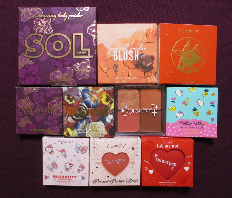
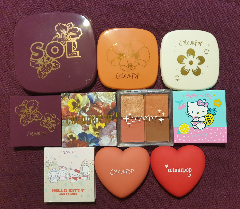
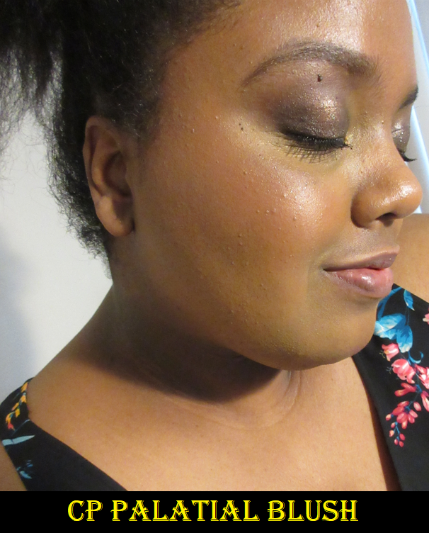
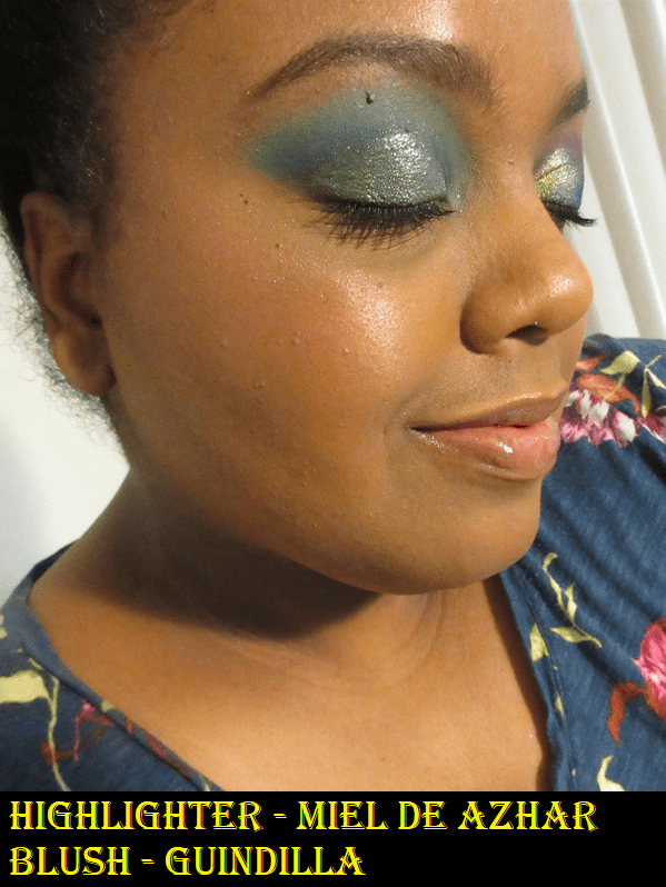
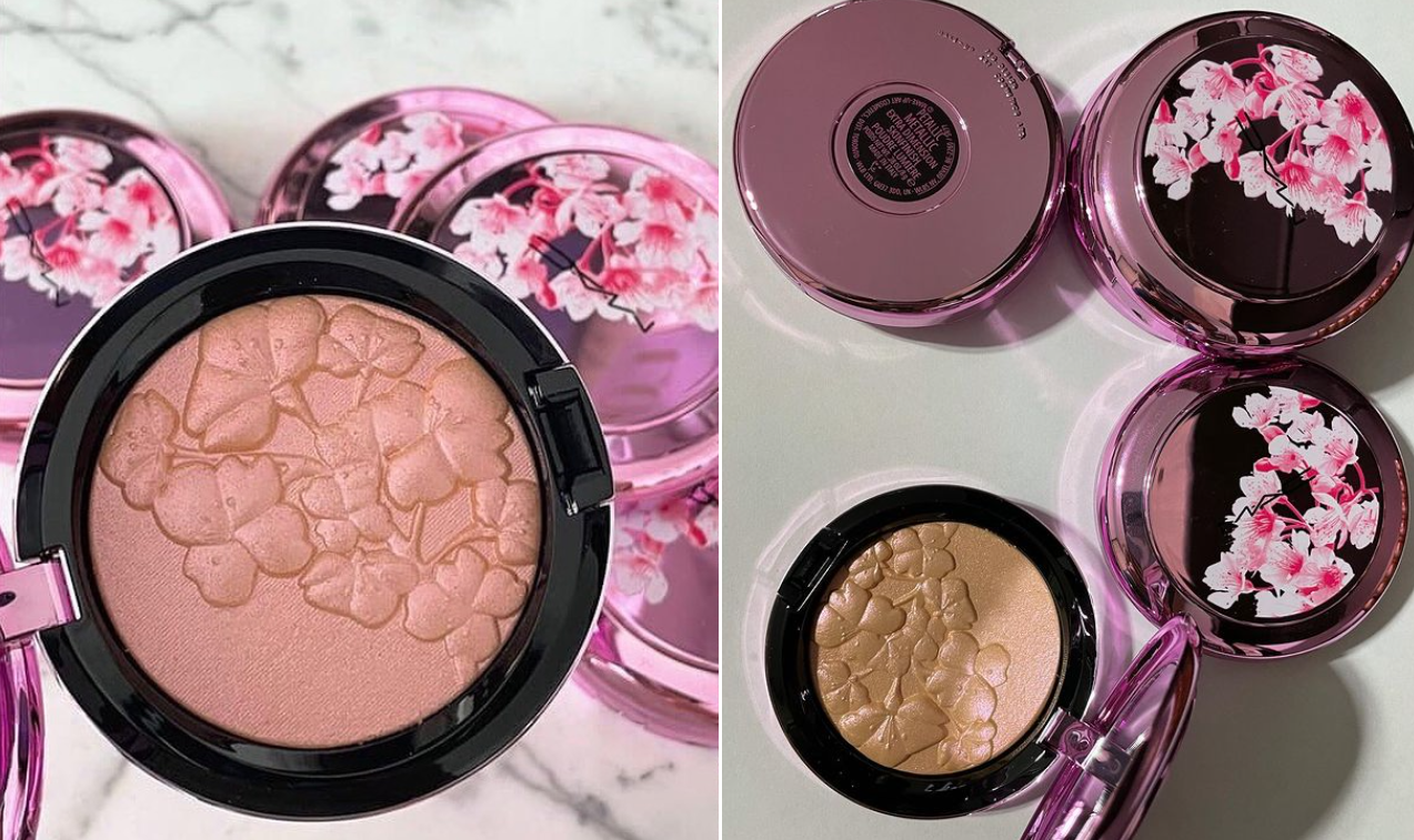
Colourpop Dark Blooms Pressed Powder Blush in Palatial
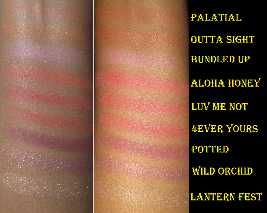
I wanted at least one thing from the Dark Blooms Collection, but the palettes weren’t my kind of color story and Palatial looked like the only one of the blushes that would show up on me. I’m also a sucker for a pretty imprint, so I got it in Dec 2020. Ignoring the highlighter on the top of my cheeks, this is a matte blush. It’s fairly pigmented, but I have to build it up for it to show. Because it’s a terracotta shade, it looks natural enough on me because of the brown, but it still slightly pops from the orange-red. I like it in that barely there kind of way. It’s discontinued, but I’m sure they’ll release something again that’s similar to it.
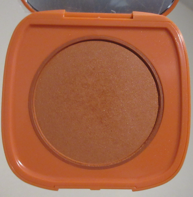
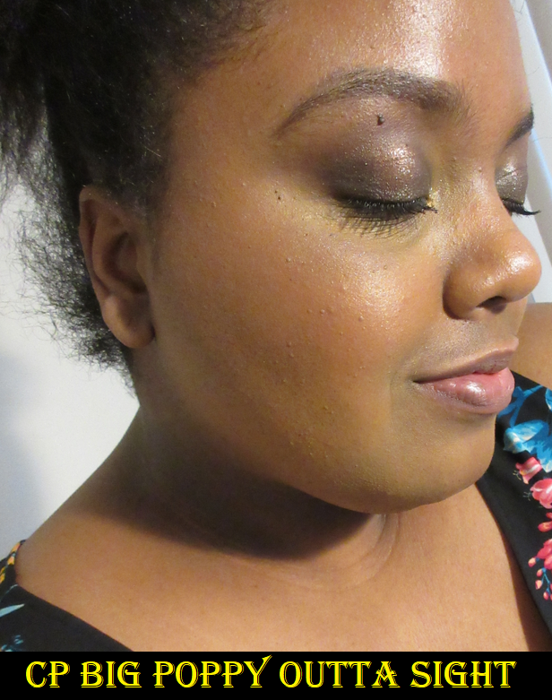
Colourpop Big Poppy Pressed Powder Blush in Outta Sight
I did try this blush once at some point when I was darker and it didn’t show up on me at all. After trying it again now, I can faintly see the coral-orange base color, but the shimmer particles are too large in this one. I really don’t like how it looks when I turn my face and it hits the lights. There isn’t enough color payoff for the amount of shimmer, so I plan on decluttering this in some way. On top of that, it’s another blush that Colourpop discontinued.
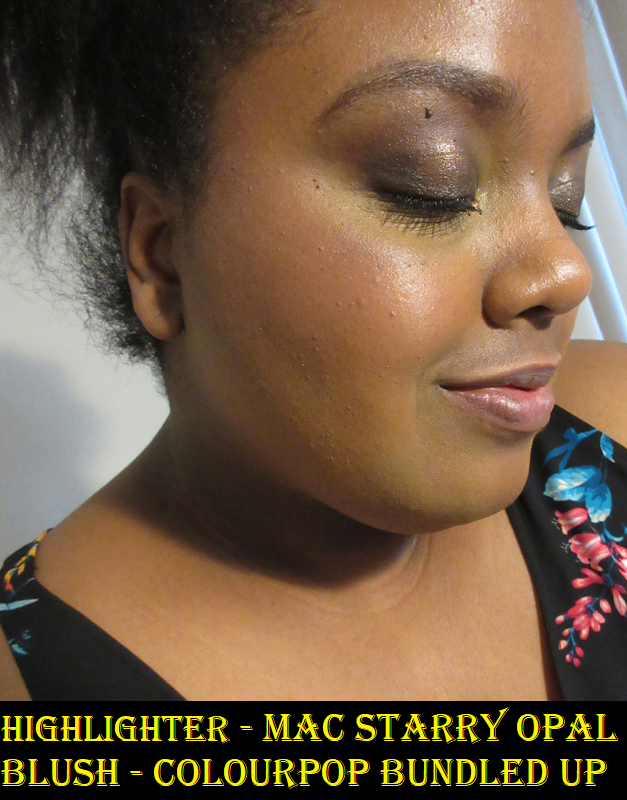
Colourpop x Hello Kitty and Friends Pressed Powder Cheek in Bundled Up
Of the two blushes in the collection, this was the only one with a chance of showing up on me. It’s faint, but once again, I don’t like the shimmer level (even prior to adding highlighter). It’s as if Colourpop only knows how to create blushes with a sheen if it’s in the Super Shock formula. The powder blushes are either all matte or matte with sparkles (like those sequin matte with shimmer/glitter eyeshadows). Colourpop never makes the kind of shimmer blushes I like. In any case, I mostly bought this for Hello Kitty collector purposes, so it will remain in my collection for now.
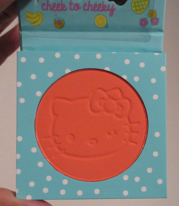
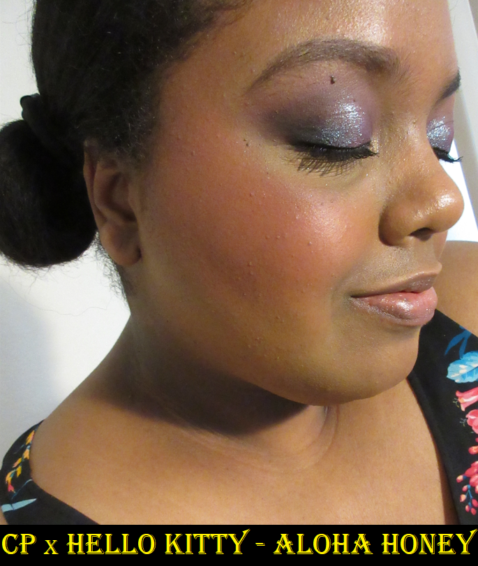
Colourpop x Hello Kitty Pressed Powder Blush in Aloha Honey
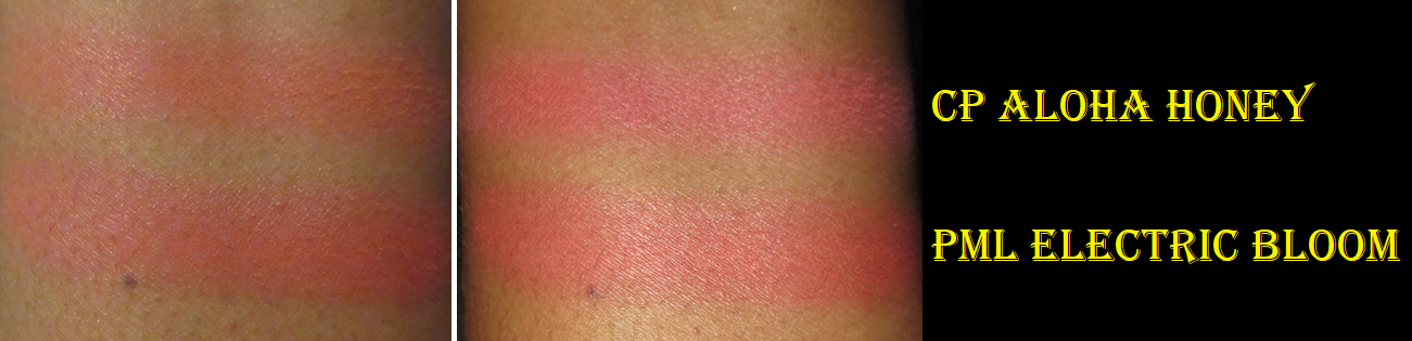
We finally have a product that’s still available for purchase (at least at the time I’m writing this), though I saw it in the sale section, so it’s probably on its way out! Aloha Honey is a pigmented vibrant coral that reminds me of an even brighter and slightly lighter in tone version of Pat Mcgrath’s Electric Bloom blush. Between the two, I prefer the shade of Aloha Honey better, but the Electric Bloom formula more. PML’s non-shimmer blushes are still demi-matte and that slight sheen that it gives makes it look nicer on my dry skin. However, for the $26 full price cost difference, if I had Aloha Honey in my hands first, I would have skipped buying Electric Bloom and just been satisfied with the Colourpop blush.
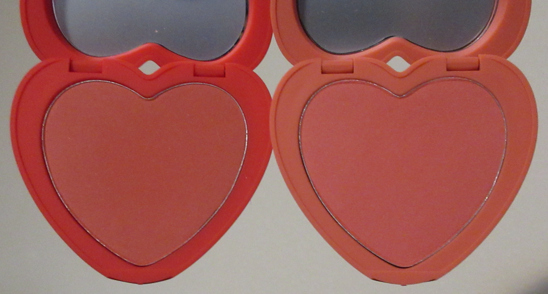
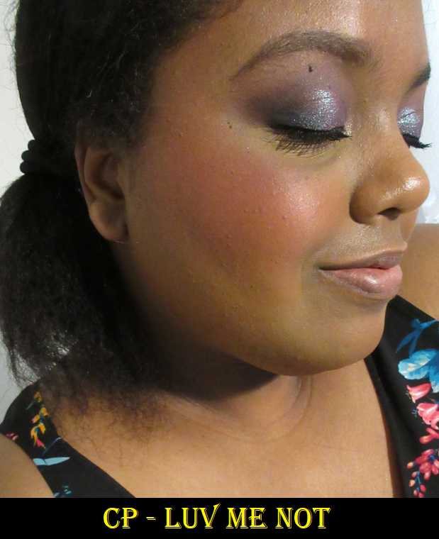
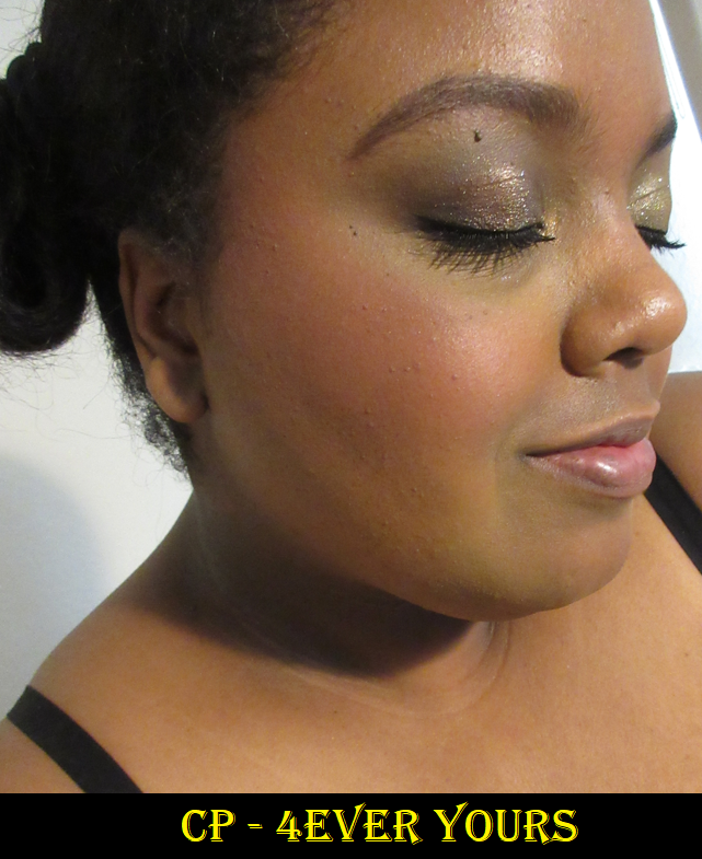
Colourpop Pressed Powder Blush in Luv Me Not and 4Ever Yours
Luv Me Not was part of the 2021 Valentine’s Day collection, but I didn’t get my hands on it until one of the restocks last October. Colourpop’s heart shaped blush was another product I wanted mostly for the packaging, as well as the hype since some people were saying it was Colourpop’s highest quality blush formula to date. For the 2022 Valentine’s Day collection, they released six shades with Kiss n’ Tell as the only returning shade out of the original three. This is when I purchased the shade 4Ever Yours, which looked like a deep coral orange in Colourpop’s photos but it is in actuality way more toned down and pink. If I build up 4Ever Yours, it looks incredibly similar to Luv Me Not. Between the two, I prefer 4Ever Yours just because it’s not as deep of a shade, so I don’t have to worry as much about overapplying. Then again, it is very pigmented, so those lighter than me would still have to be careful using 4Ever Yours as well.
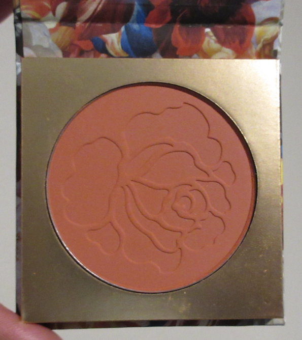
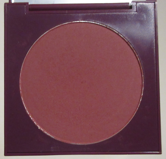
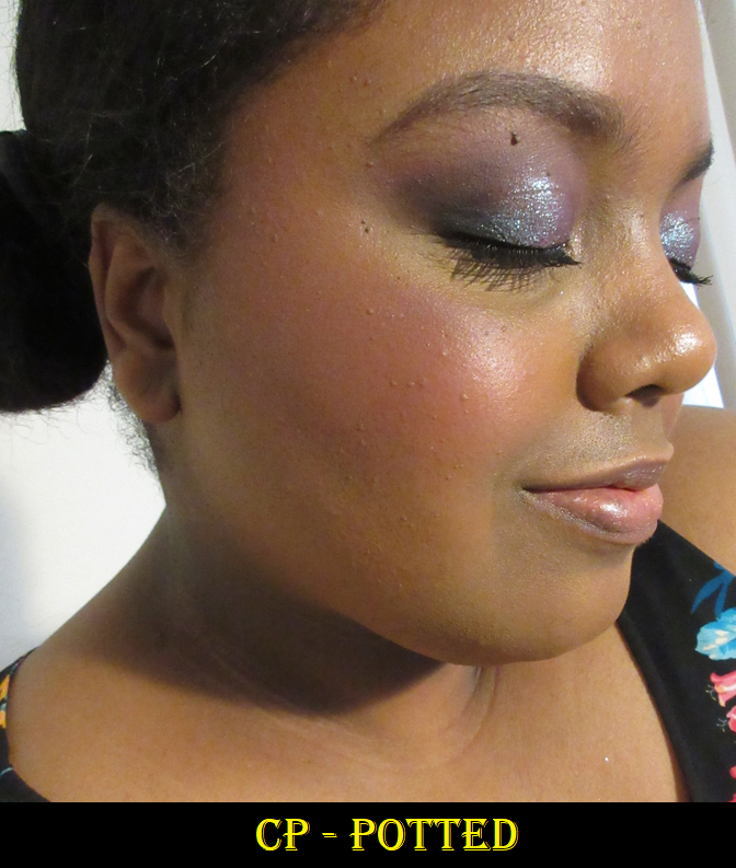
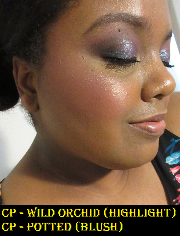
Colourpop Wild Orchid Collection Pressed Powder Blush in Potted
I usually say I’m not into berry blushes, but there’s something about this shade that is so special. Perhaps, it’s because it’s the exact tone of my favorite color (reddish purple). It also helps that with a sheerer application, this doesn’t look too dark on me and I find darker blushes to be aging. Part of what makes picking a berry blush tricky is that I can never tell if it will flatter me or not based on the pan color. I have to actually try them out to know for sure if it’s the kind that could work for me or not, and I’ve had so much bad luck in the past, which is why I rarely take the chance anymore.
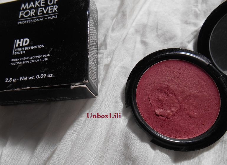
An example of the kind I like is quite the throwback, but it was formerly my holy grail blush back in 2014 or 2015 until probably 2018. The Make Up For Ever HD cream blush in Raspberry 510. I never even considered this a berry blush because it was more like a red with a splash of purple. I have this strange view in my mind of only considering plummy cooler toned type of shades to be berries when that’s not the case in nature.
Shade aside, Potted is yet another matte pigmented blush that’s now discontinued from Colourpop, so I’m glad I snagged it while I could.
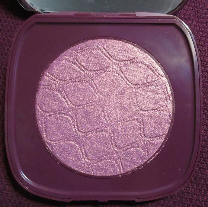
SOL Body Shimmering Body Powder in Wild Orchid
This highlighter has the typical Sol Body coconut/suntan oil smell. I’m not into duochrome highlighters, but I saw Amanda’s (Makeup.Just.For.Fun) YouTube video and it looked so beautiful with the other blush in the Orchid collection that I decided to take my chance on it. This highlighter is unsurprisingly glittery, which is another thing I tend to despise about highlighters, but this is the one exception. The way it looks with Potted is so pretty to me.
When I use this product, I prefer to either apply with my fingers and blend it out with a brush or to use it with a dense brush from the start. The dense brush will pick up more of the shimmer, but at least the base goes along with it. When I’ve tried applying this highlighter with my usual favorite highlighter brushes, they only picked up the shimmer/glitter particles and it looked terrible on my cheeks. I may use this highlighter in the future but solely with blush shades like Potted and most likely for an occasion or event.
Also, I know this is a body highlighter, but I don’t use products like that. I would only use this on my face.
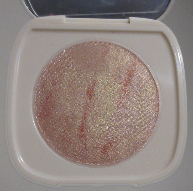
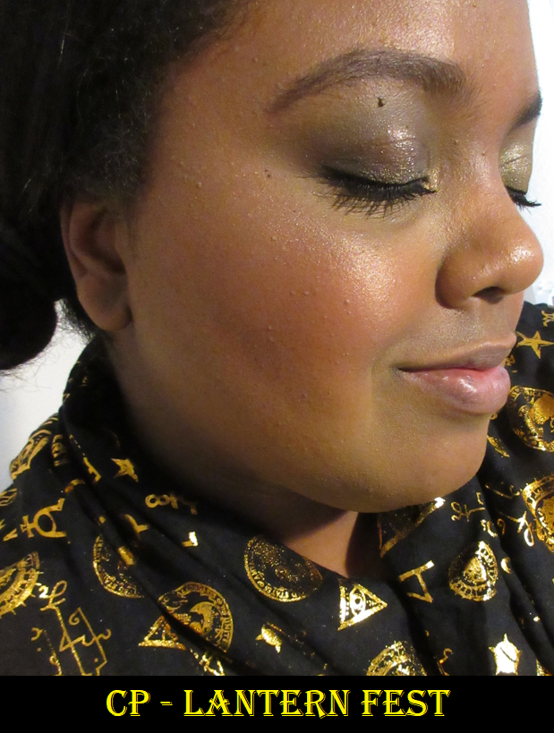
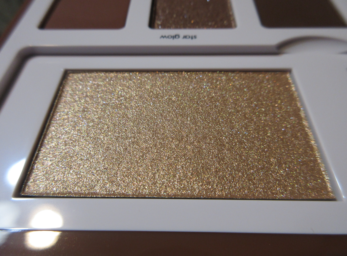
Colourpop Super Shock Highlighter in Lantern Fest
I snuck this one into my powder post. Please forgive me. When I bought it, I thought it was a powder highlighter. I didn’t realize it was the Super Shock formula. I had some blinders on when I bought this because I wanted it for the packaging. It was a Lunar New Year item for the year of the Ox. I have mixed feelings about this on me, but tilted toward the side of not liking it. The specks of shimmer seems to be bigger and more visible in this formula than the other Super Shock highlighters I own. The color is light for me but sometimes I like it and other times I don’t. I’m not sure if that has something to do with the mixture of the red, yellow, and pale pink and preferring when I have more or less of a certain color. This is returning to the back of my collection and is of course discontinued.
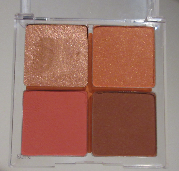
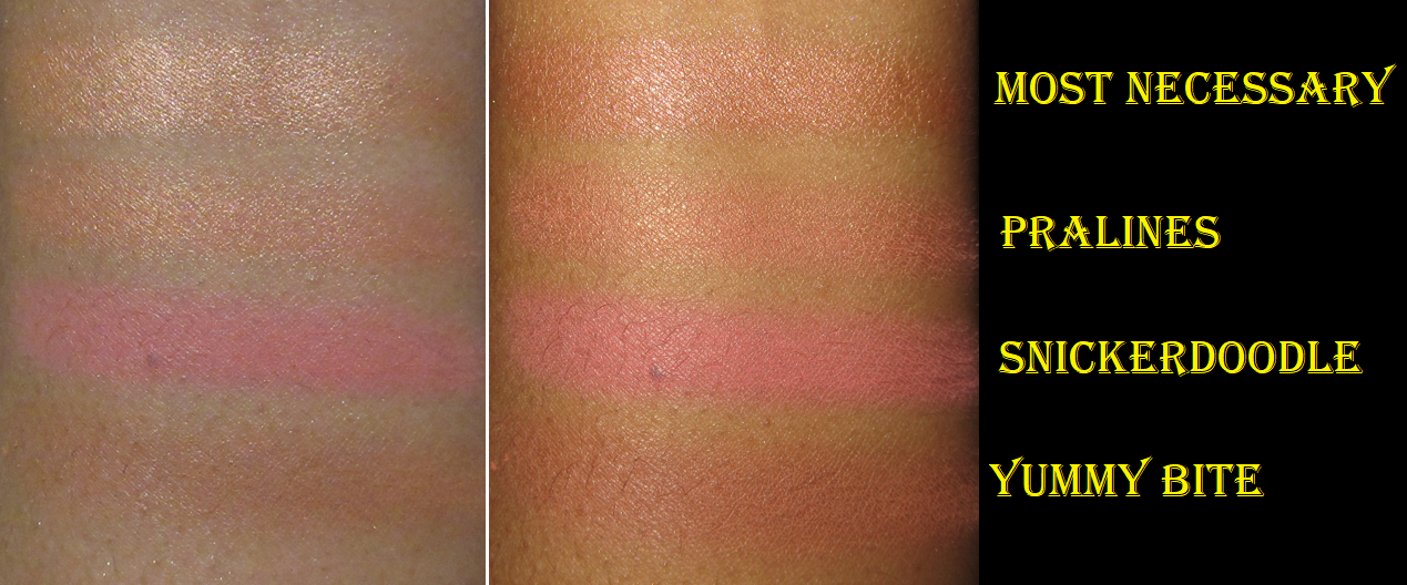
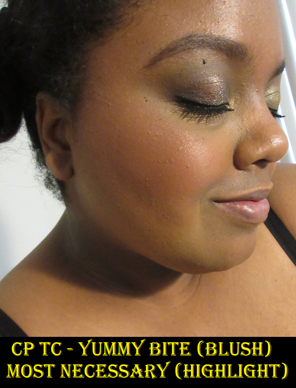
Colourpop Cheek Palette in Tea Cakes
This is the third and last item from Colourpop that is still available for purchase. It’s one of several different cheek palettes they’ve created. The highlighter is in the Super Shock formula, but the three blushes are powder products. Most Necessary is darker and more shimmery than I like to go for in a highlighter, so I don’t intend to use it again unless I’m in a time crunch and I’m already using this palette.
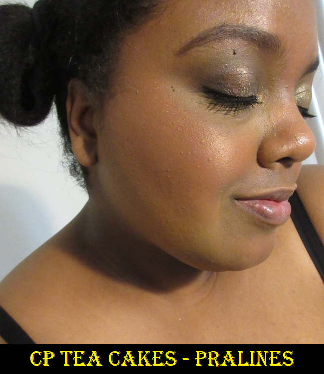
Pralines is like the better version of Outta Sight. Because it’s so reflective, I think it’s best on me as a highlighter. It gives a hint of color, so I could wear it on its own, but I prefer to use it as a blush topper, which is gorgeous with other warm toned blushes. This is the only shimmery powder blush from Colourpop I’ve tried that I like, but again, as just a topper.
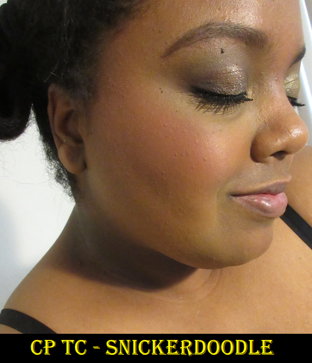
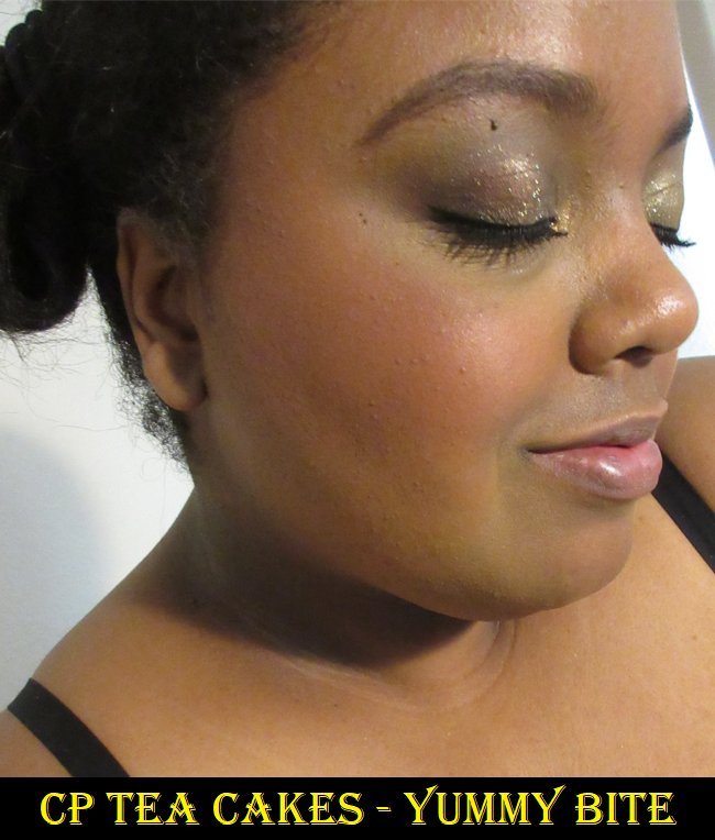
I’ve tried Snickerdoodle and Tea Cakes once before and I didn’t like them. I’m guessing it was when I was darker because trying them again, I find them to be much prettier now. I just wish they weren’t so matte. These two shades remind me of Sigma blushes, but just slightly better. Snickerdoodle goes on the cheeks bright initially, but is toned down when blended into the skin. Yummy Bite has just enough red in it to show as a true blush shade on me, rather than a bronzer or something, which was my initial reservation about having a brown blush in this quad. Again, in my eyes this would be even better if the blushes were semi or demi mattes rather than full on mattes. I still like them though and if I could finally get to a place where I use blush palettes rather than always reaching for my single blushes, I believe I would use this again. This is one of those purchases though that I think is worth getting for the price and not necessarily for how amazing it is. It’s pretty good, but not exceptional.
That’s all for today! After testing these out thoroughly as part of my Shop My Stash for March, I’ve decided that the Colourpop powder blushes and highlighters don’t rank in my top 50% favorite formulas. I really should not get them anymore except in the less common shades, like Potted and Aloha Honey, which are my favorites out of the bunch. Getting those were worth it because they are priced affordably. It’s the everyday wearable kind of shades for me that are worth getting at the top tier level. Most Necessary and Lantern Fest also showed me that even getting the Super Shock highlighter formula doesn’t guarantee the small particle shimmer size I prefer, so I should stop getting highlighters from Colourpop altogether.
Even though the majority of these products are discontinued, I hope this has been helpful.
I’m still playing catch up on things I purchased in 2021 and wish to post about, but today is an update on all my beauty purchases from January 2022. I’d like to show how well (or not) I’ve been sticking to my Beauty Resolutions for the year.
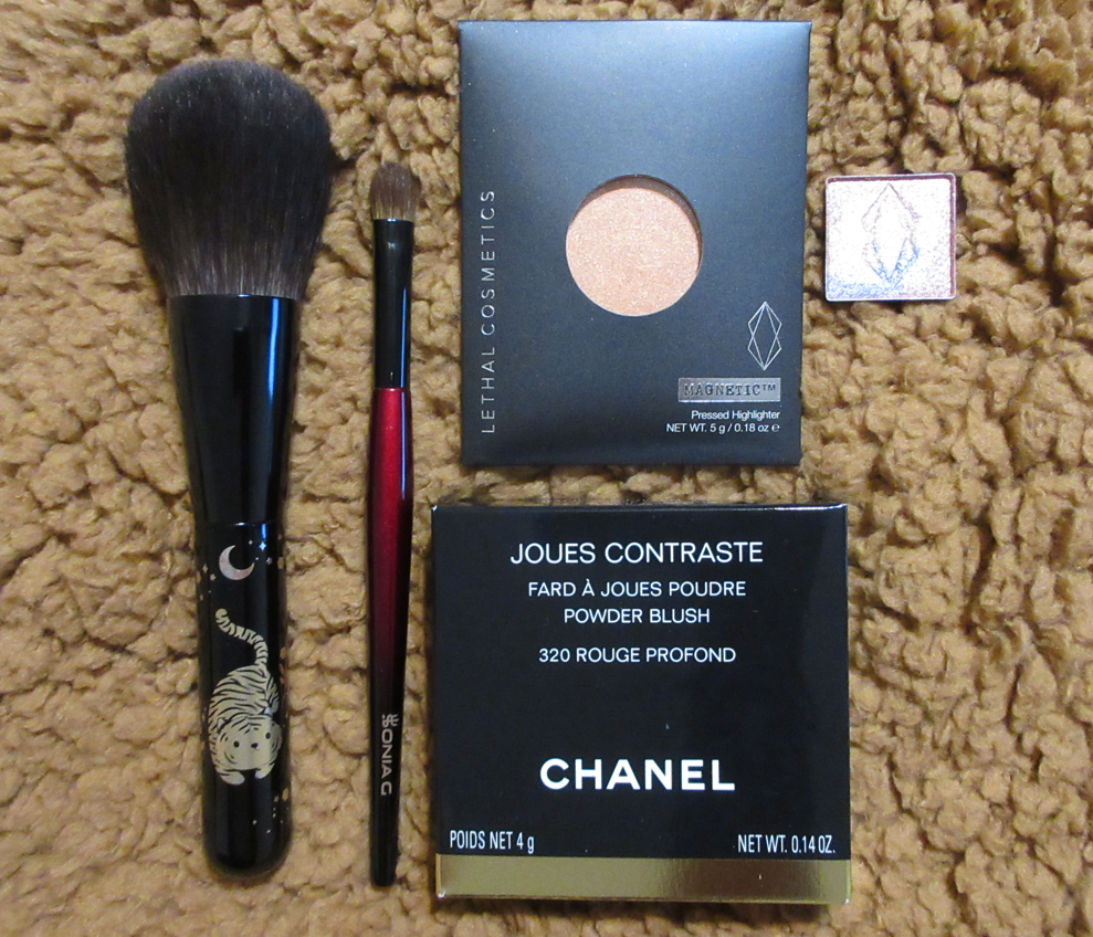
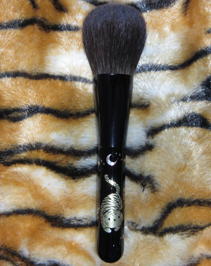
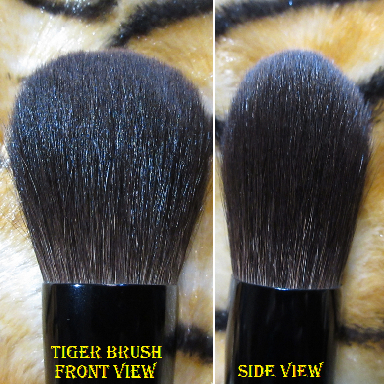
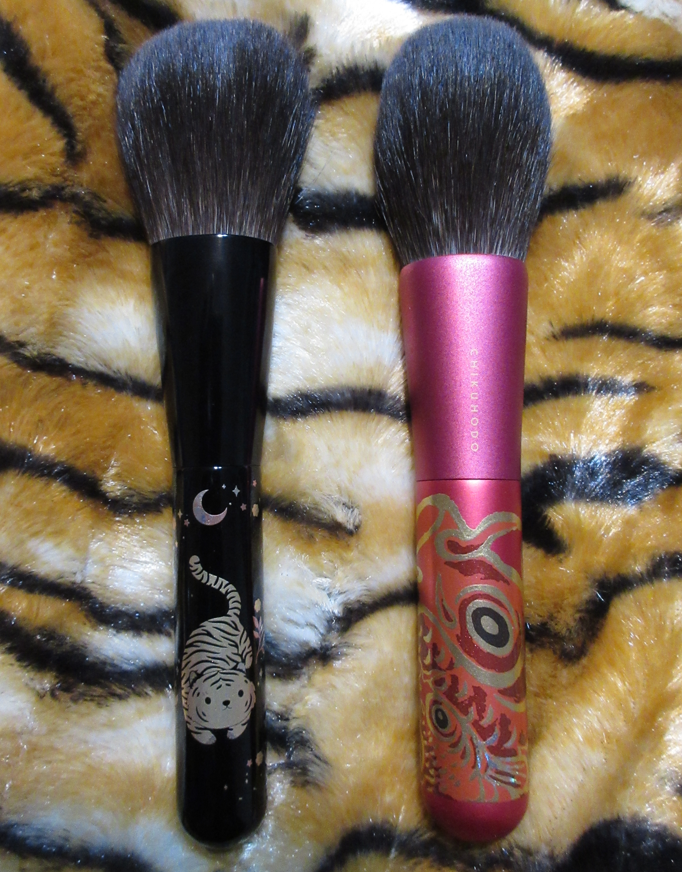
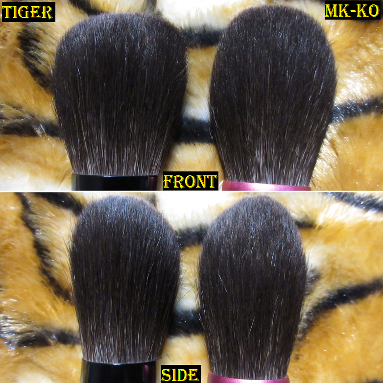
Beautylish Presents the Year of the Tiger Lunar New Year Powder Brush
Full Length: *170mm / 6.69 in
Hair Length: 47.6mm / 1.87 in
Hair Width: *40mm / 1.57 in
Bristle Type: Blue Squirrel
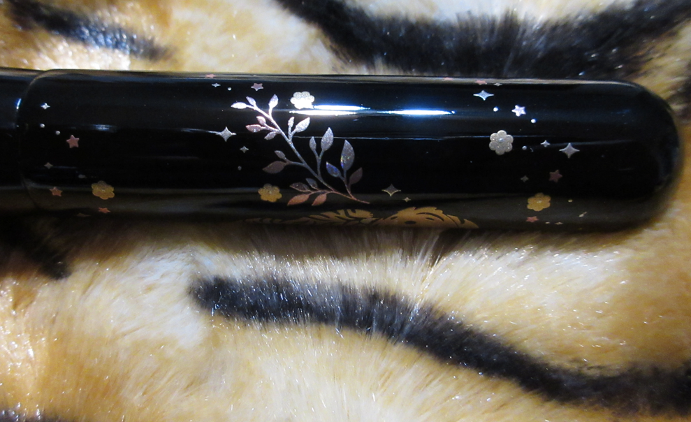
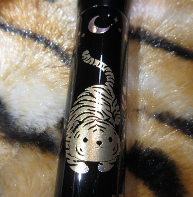
In my Beauty Resolutions post, I mentioned that I should only purchase Lunar New Year items that had personal significance to me (ex: Year of the Dragon). This brush depicts the most adorable chubby kitty with tiger stripes, which does make it significant to me in my interpretation of this design (it’s an inside joke). In addition, for half of my life the Tiger was my favorite animal. This is why I succumbed to the temptation and finally bought one of Beautylish’s collaborative Lunar New Year brushes. They did not announce which brush-maker created this year’s brush, but in the past is was Chikuhodo. Even if another Fude company created this brush, I’m still happy that it has the Chikuhodo aesthetic with the large round shiny handle similar to the Z-series. As long as the brush is high quality, which it is, it doesn’t matter to me which Japanese company created it. This brush is still hand bundled with an exquisitely detailed lacquered handle using the maki-e process.
This brush is unbelievably silky soft and of course perfect for those who want a very sheer application of powder. I can use this for highlighter (when applied just on the very tips), blush (when I use sweeping motions across the cheek), and bronzer, but in my eyes this is a dedicated all over face powder brush. Although it picks up a small amount of product, when that product is very pigmented it takes more effort than I like to buff it out because it’s not dense enough for that. If I use a squirrel hair brush for blush, I prefer one that’s thicker and more round like the Z-1. Anything looser packed than that, I consider to be more ideal for setting/finishing powders. Honestly, this is more of a collector item for me and not one I intend to use a lot. When I do use it, it’s heaven though. It’s so soft and light that I barely feel any pressure on my skin. This is a beautiful powder brush, but if you already own one with grey/blue/ash squirrel hair, you’re not missing out by not having it. For those who don’t and would like a light/medium density powder brush, this might be a good place to start since comparable brushes to this would be a little more expensive. I still recommend this for collectors, but for someone looking for a more functional or versatile brush, I would direct them to Chikuhodo’s Z series and FO series.
At launch, Beautylish also restocked the previous Lunar New Year brushes as well: Pig, Rat, and Ox. As cute as those designs are, those three have nearly identical brush heads which is already practically the same as the Tiger brush, so I didn’t feel any pressure to add those to my cart. Since I already have three close enough brushes as the Tiger, Koi/Carp, and the Z-1 (the Z-9 is a better dupe but I don’t own it), I don’t feel a need to get a backup brush. However, trying to steer clear of a Rabbit next year will be difficult, and I suspect trying to ignore the Dragon will be impossible.
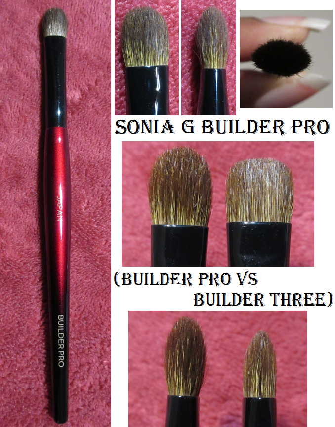
Sonia G Builder Pro Eye Shadow Brush
Full Length: 152mm / 5.98 in
Hair Length: 12mm / 0.47 in
Hair Width: *9mm / 0.35 in
Bristle Type: Dyed Saikoho Goat Hair
The Builder Pro and Builder Three are both brushes that lay product down well but can also be used for blending. I’ve discovered that the Builder Three leans better on the blending aspect because of the flatter top, so I prefer that one for crease work. The Builder Pro leans better on the lay down and building aspect because it’s perfect for applying shadows to the section of my eye between the eyelid and inner corner. I always struggled with that spot, but this brush gets in there easily. It’s also more precise for application to the outer V. I’ve actually been able to do entire eye looks using this brush alone. I’m very happy I decided to finally buy this! The tapered tip that makes the Builder Pro so great for applying shadows also prevents it from blending large areas as quickly as the Builder Three, so I will probably use that one more often when I’m in a rush. However, for when I have more time and want to create a detailed and more skillfully done eyeshadow look, I will definitely grab the Builder Pro instead. They perform differently enough that I feel justified having them both in my collection.
Before we move onto the next topic, I have to acknowledge that I bought a backup of the Builder Three at the same time that I ordered the Builder Pro, which is a breech of my beauty resolutions. Then Sonia G/Beautylish restocked many brushes I wanted, including the Cheek Pro which would have been yet another backup purchase, but I was able to stop myself.
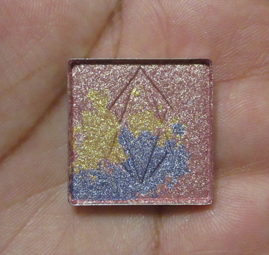
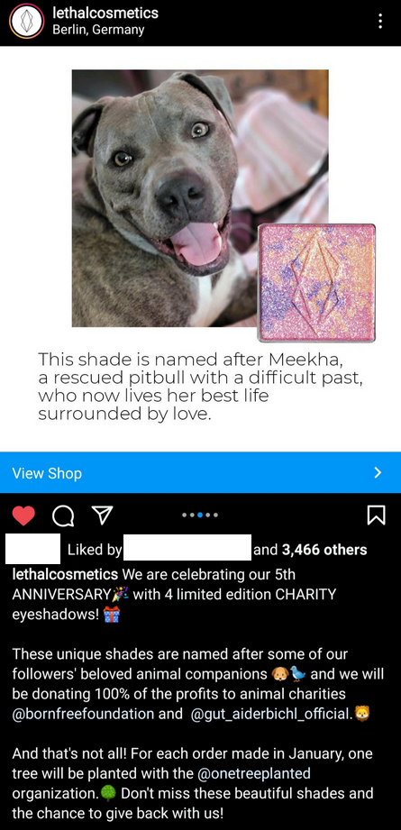
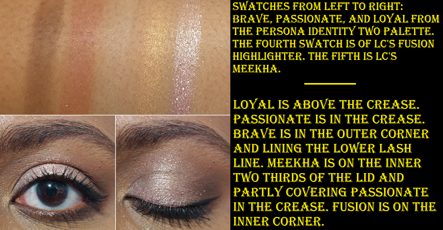
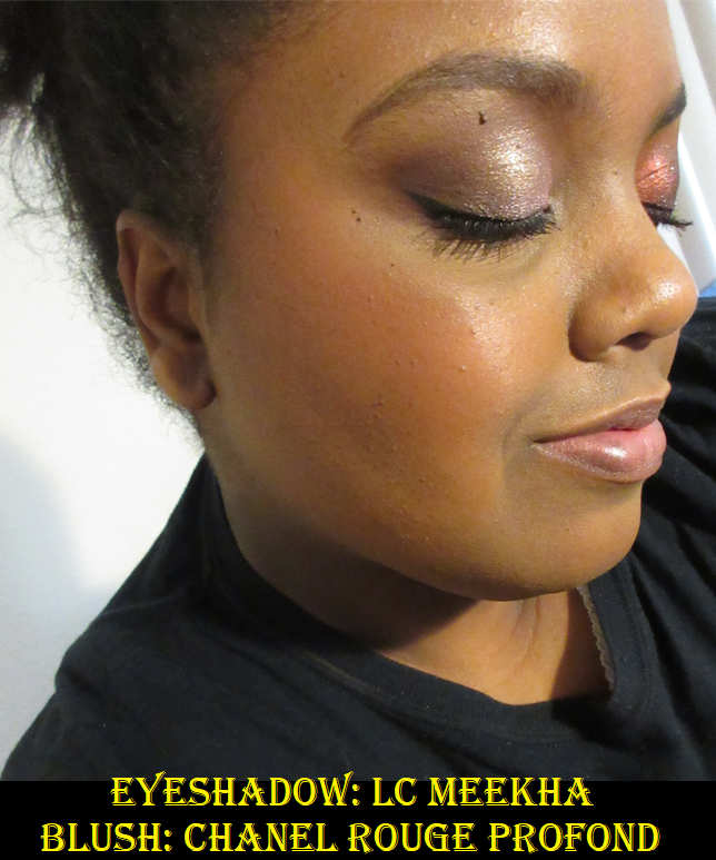
Lethal Cosmetics Charity Eyeshadow in Meekha
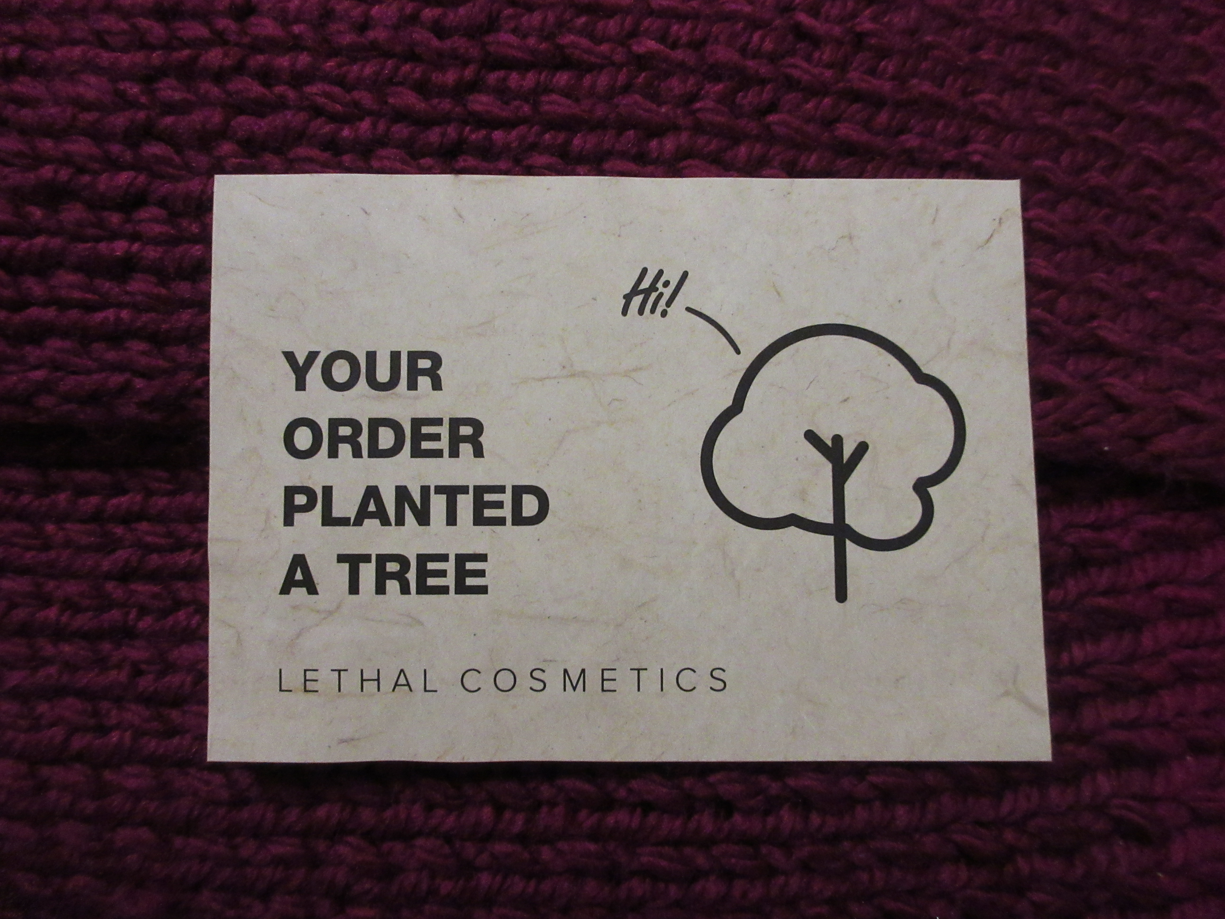
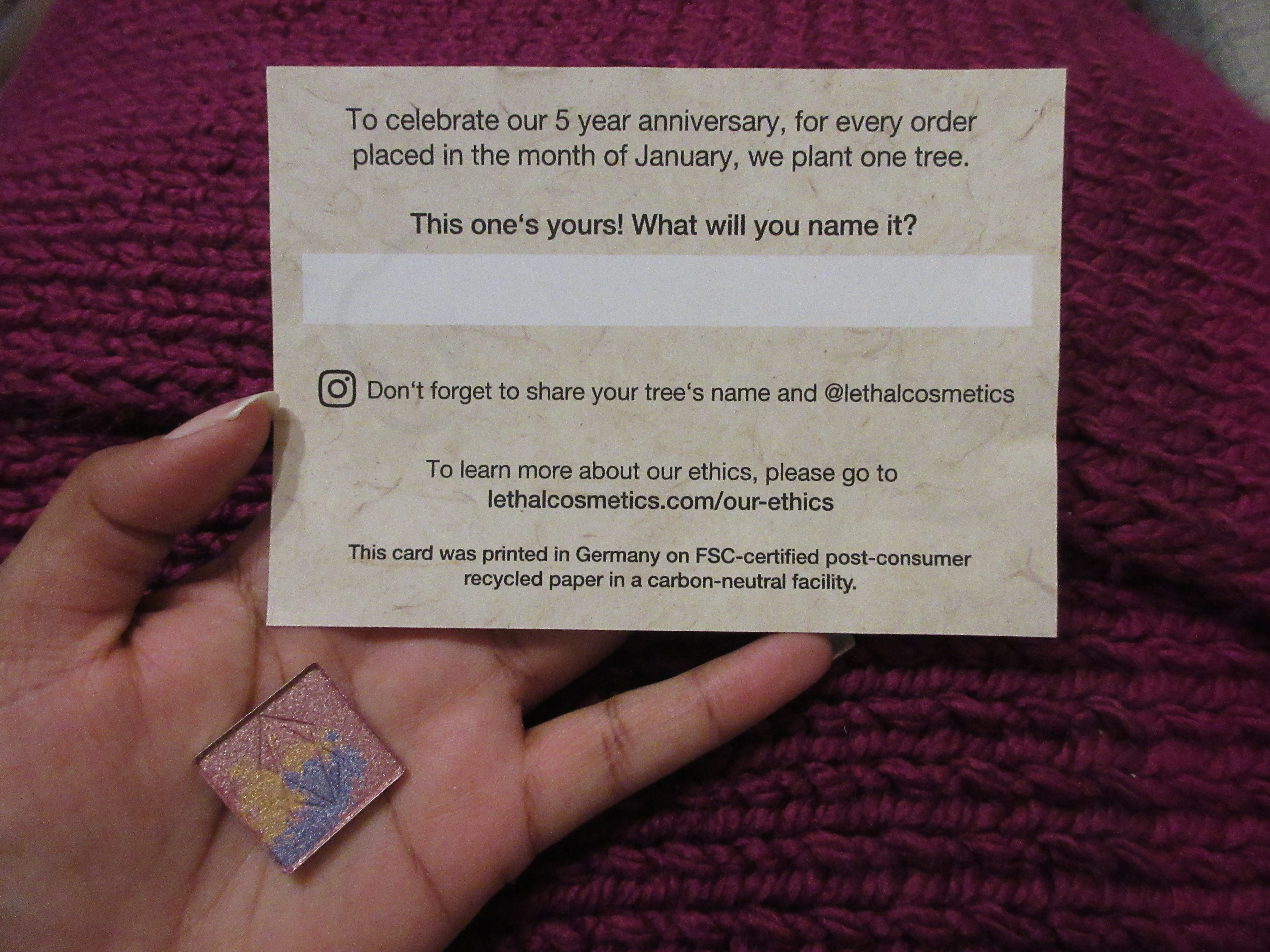
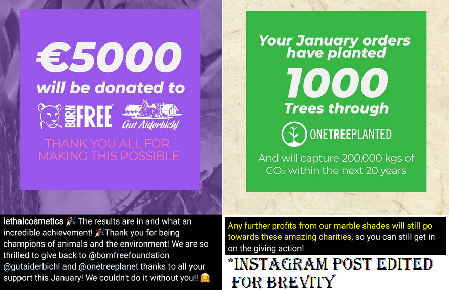
This is one of four limited edition charity eyeshadows released from Lethal Cosmetics. I mentioned liking tigers earlier in this post, but I am dog person and I have a soft spot for pitbulls. It was very lucky that the only eyeshadow that caught my attention happened to be the one named after the sweet rescue pitbull named Meekha. In addition to the animal charities being supported by the purchase, Lethal also committed to planting a tree for each January order. My sister had a pitbull named Radja, so that’s the name I chose for the planted tree in her memory.
This is the second indie brand that I’m aware of who has created limited edition shadows for charity, and I am here for it! For some reason, when larger brands do it, it feels like it’s just for press. Somehow, this kind of thing coming from a smaller brand seems more heartfelt. In any case, I like to see this.
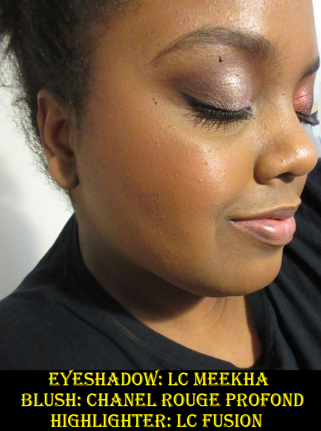
The combination of the colors in the Meekha pan turn into an icy lavender shade on me. I’m not sure how often I will use this shadow, but I was able to create a look that I liked. It even makes for a nice bright inner corner highlight shade for other eyeshadow looks! The eyeshadow texture and performance feels just like other shimmers from the brand. The formula is a bit thick, but they smooth out nicely on the lids and fallout is about what one would expect from a shimmer shadow (present but not too bad especially if applied wet or on top of a glitter primer).
And as a follow-up to the charity aspect, post-January purchases will continue to go to charity. It’s just the tree part that is over now.
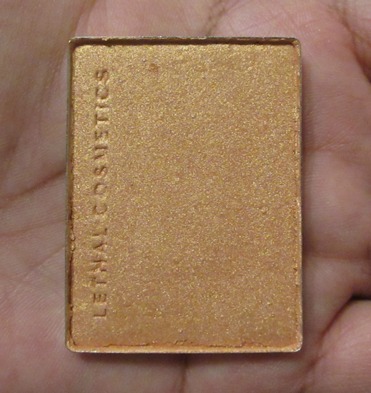
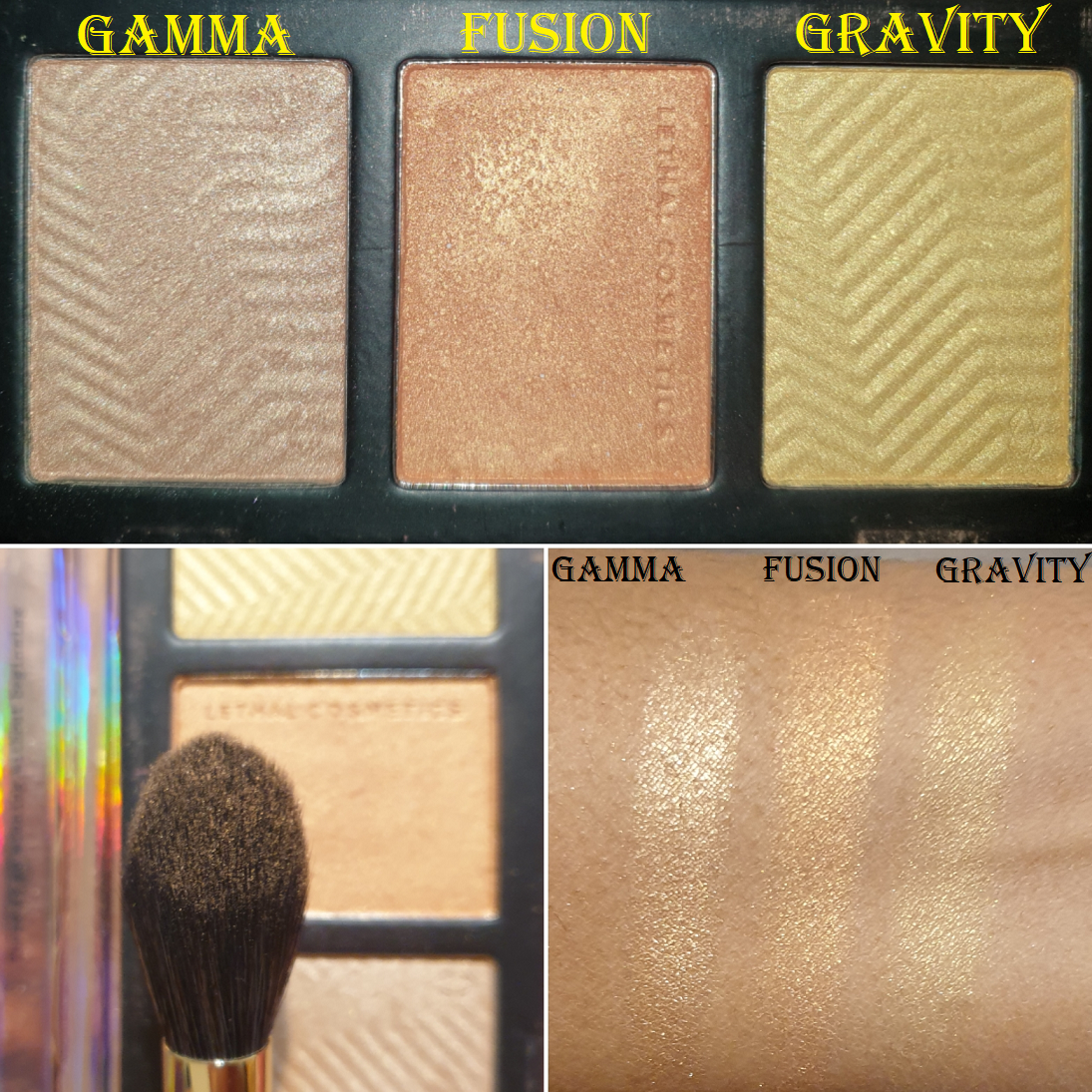
Lethal Cosmetics Highlighter in Fusion
I wanted this highlighter shade for a long time, but it was initially exclusive to the Equilux face palette, which I did not get because the blush and bronzer in the trio were too deep for my skin tone. Since it’s now available as an individual item, and I wasn’t completely satisfied with the highlighter selection I brought with me on my trip to Germany, I figured this was the best time to get it (especially with the lower shipping cost). I am supposed to be on a highlighter No-Buy, but this purchase was allowed as it falls under the category of something I would have bought last year if it was available to me, and in this case, available as a single product.
Unlike Gamma and Gravity, my two other Lethal Cosmetics highlighters, I find Fusion to be quite subtle. Fusion is close to my skin tone, and that could add to how subtle it is, but even the texture feels a bit different than the other two, and not just because of the lack of ridges. Fusion was difficult to show in swatches, even when built up. It feels a bit hard pressed*, and when the highlighter was delivered, it was messy around the pan edges as well as within the packaging. My brushes are able to grab product easily (despite the fact that it looks a bit hard-panned** now too) but perhaps the hard pressing is preventing more of the actual shimmer particles from being picked up. That would be ironic considering if I have an issue with a highlighter it’s usually that my brush is picking up too much of the shimmer.
*NOTE**: I have a few wonderful friends and family members who read my blog sometimes and may not be aware of some of the terms I’ve used. For anyone who needs clarification, the press of a product refers to the force in which a product is physically pressed into the pan (usually with a pressing machine). Makeup that is “Hard Pressed” has powder so compacted together that it becomes difficult to get the product out of the pan and onto the brush. “Hardpan” is when a powder product gets a hard or filmy top layer that also prevents someone from being able to pick up product onto a brush, but it is usually due to oils from the skin getting into the powder and creating that tough layer. Certain formulas of powder products are more prone to hardpanning than others.
Fusion has an orange tinge to it. Although the shine level is a bit low, when it hits the light, the golden-orange sheen is apparent at that point. It’s not what I was going for but mixing it with some of Gamma puts the look back in my comfort zone. I will likely declutter Gravity and Fusion at some point, but testing out these shades reminded how much I enjoyed wearing Gamma, and I will have to remember to use it more often. Anyone interested in seeing those shades on me can check out my previous Lethal Cosmetics post here.
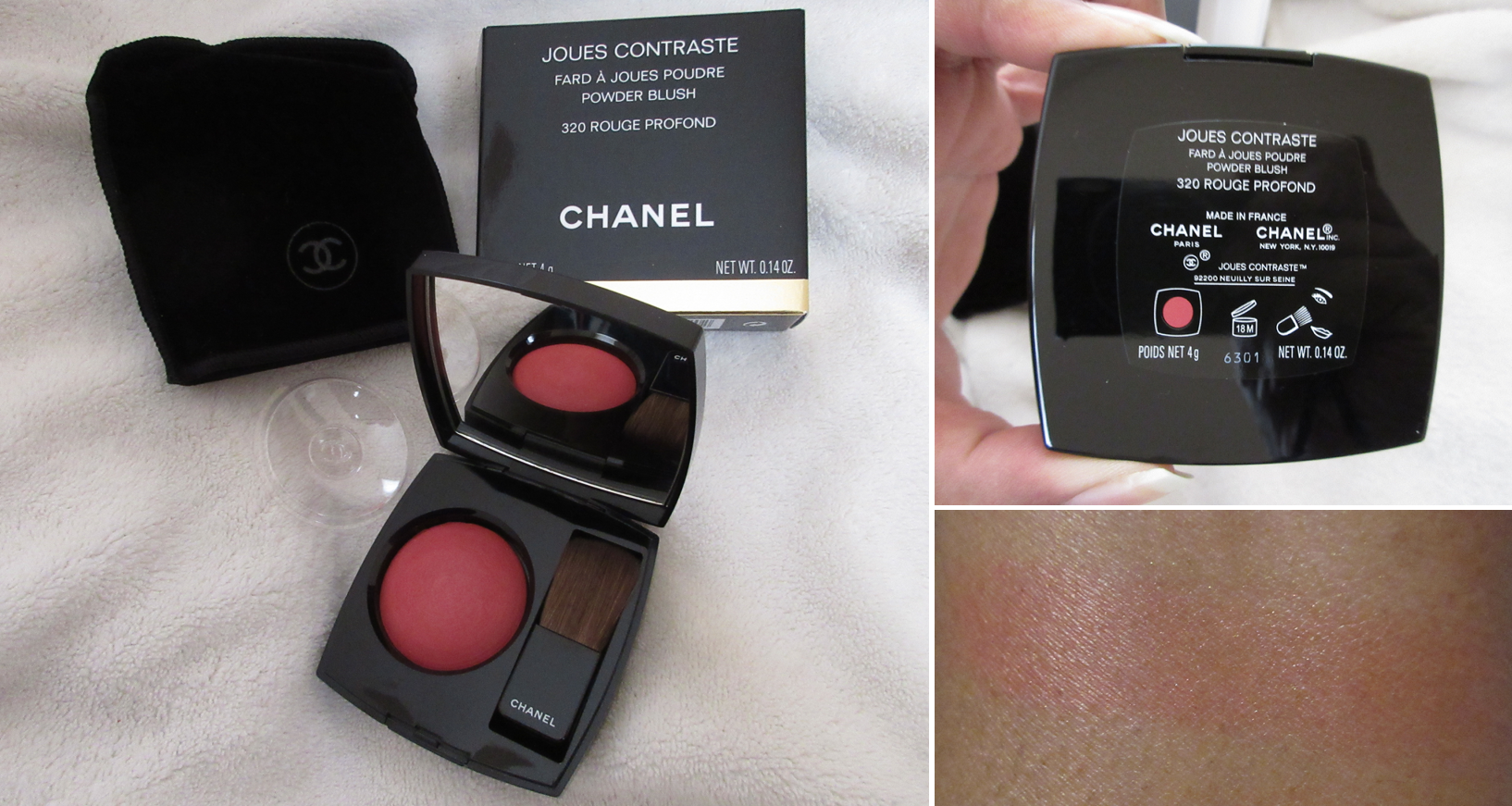
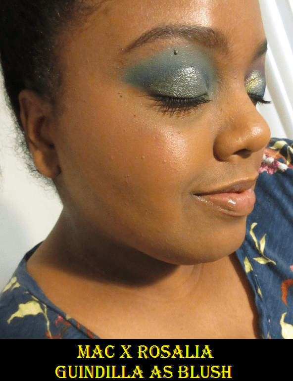
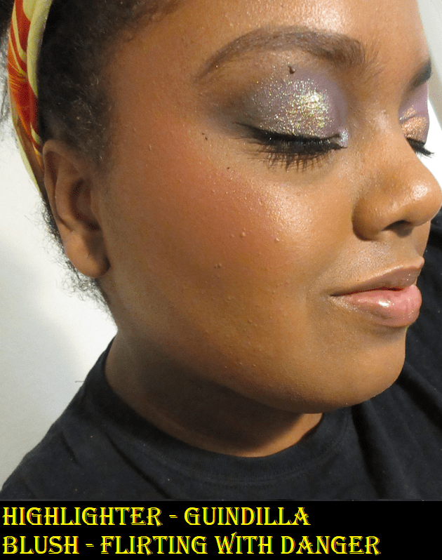
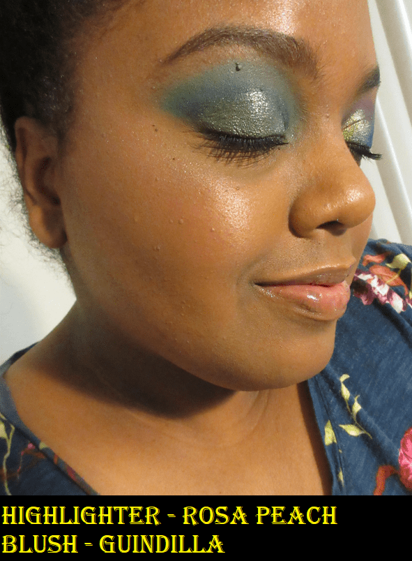
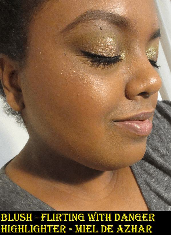
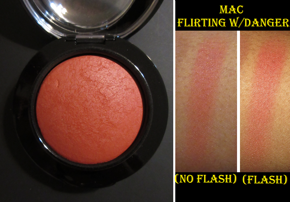
Chanel JOUES CONTRASTE Powder Blush in 320 Rouge Profond
I considered buying a Chanel blush for a long time, although I always expected it to be from one of their limited edition collections. My interest in buying one re-sparked when Ulta started carrying Chanel Beauty products in January (although the brand will probably be excluded from all coupons including prestige). I also really wanted the Blush Lumiere Brun Roussi shade from the Spring 2022 collection, but I wasn’t willing to spend Hermes prices for it. So, when I was browsing the Duty Free section at the Frankfurt Airport, I had an impulsive moment to buy shade 320 Rouge Profond, a shade that is not available at Ulta and is part of their older blush formulation. Chanel changed to the new formula in March 2021, and according to reviews I’ve seen, the new formula is less smooth, less sheen-like, and less pigmented, so I decided to go ahead and get this one in the old formula while it was still available.
The Houkodou Nagi Powder N-F1 Brush fits perfectly around the dome of this blush and applies it perfectly as well. The blush swatch needed to be built up on my arm, but color goes onto the cheek nicely. The perfume scent is very noticeable. The color and performance reminds me of the MAC Mineralize Blush in the Flirting With Danger shade. In fact, as much as I like this blush, it didn’t “Wow” me more than the MAC blush and that one is significantly less expensive. My curiosity is satisfied knowing Chanel’s permanent blushes aren’t superior to products I already have, but there’s still that troublesome part of me wondering if Chanel’s even pricier blushes are better. Either way, at twice the price, I doubt it would be two times better, so it’s best I leave that topic alone.
That’s everything I bought in the month of January! I did not include products I ordered in December that arrived in January. Those items will show up in future posts.
Thank you for joining me today! I hope this has been helpful!
-Lili ❤
*UPDATE: For those on the email list, I apologize for the accidental early release of this post. I’ve been consistently posting at the same time for a reason, but I’m not sure how or when the scheduled time for this one was changed and it completely escaped my notice. Considering we just entered Daylight Savings time in the US, this could be especially early for some people. I plan to resume our regular schedule of Mondays at 11:30 am EST.
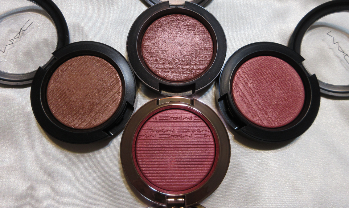
MAC Cosmetics is probably the most reviewed brand on my blog. They frequently release eye catching collections that manage to make me want even their repromoted shades, just to get the limited edition packaging. They often have sales, which plays on my deep love of getting a good deal. Their staple products are top notch and they’ve held onto their generally good reputation for decades. Unfortunately, MAC has made some questionable production decisions in the last few years to the point where I seriously considered taking a break from them. Today’s post is not about that, and is instead about sharing the newest additions to my MAC collection.
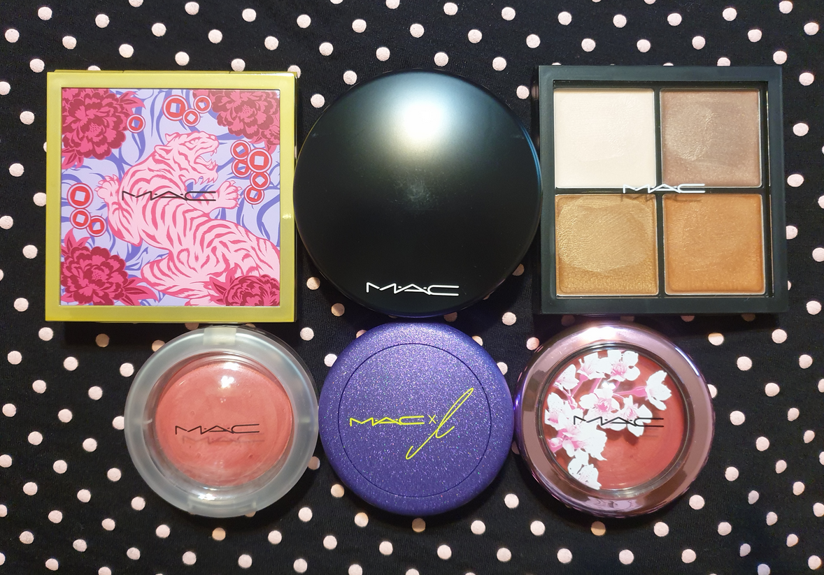
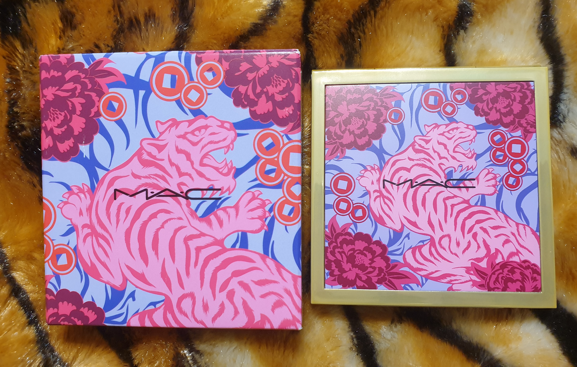
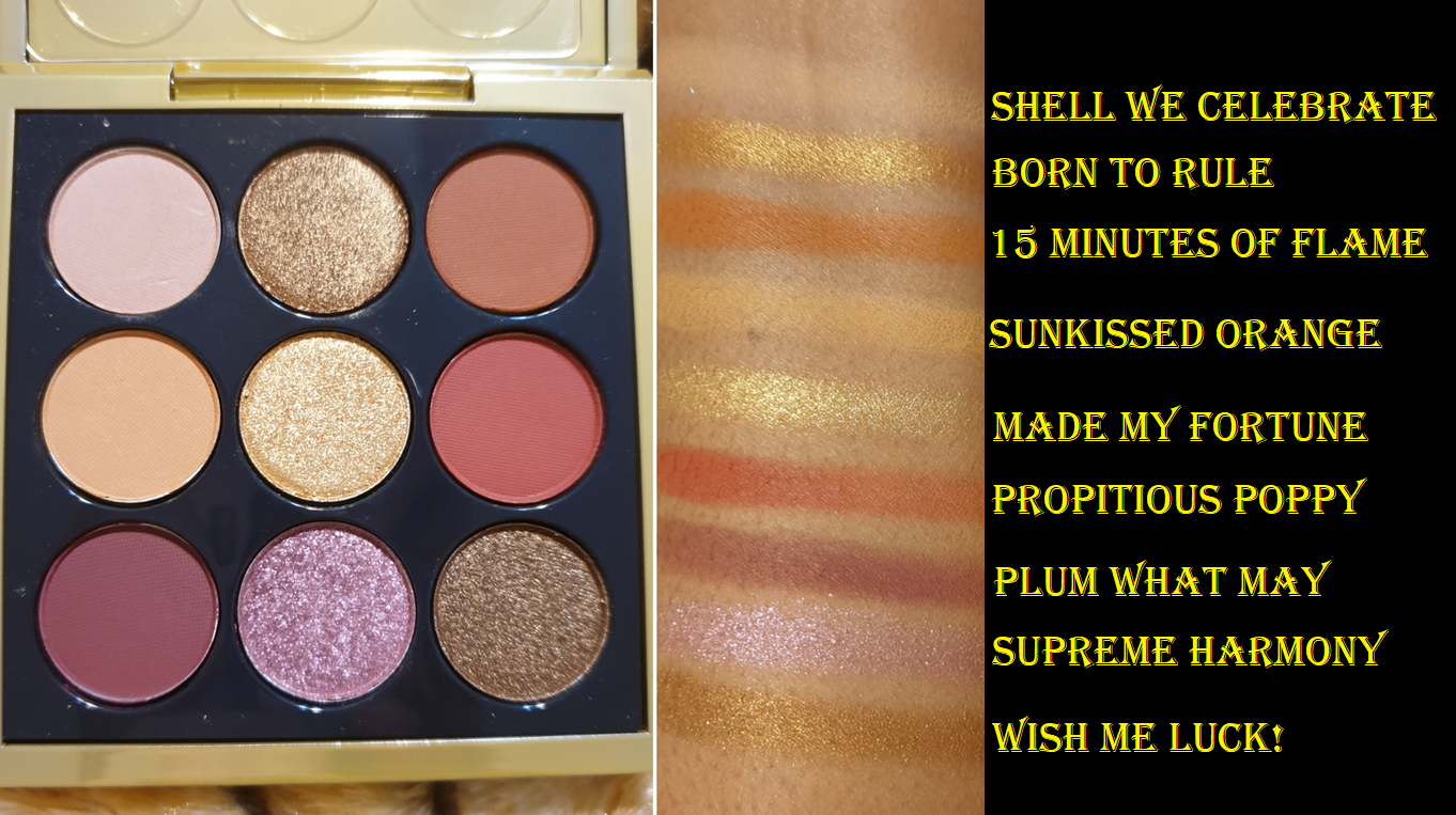
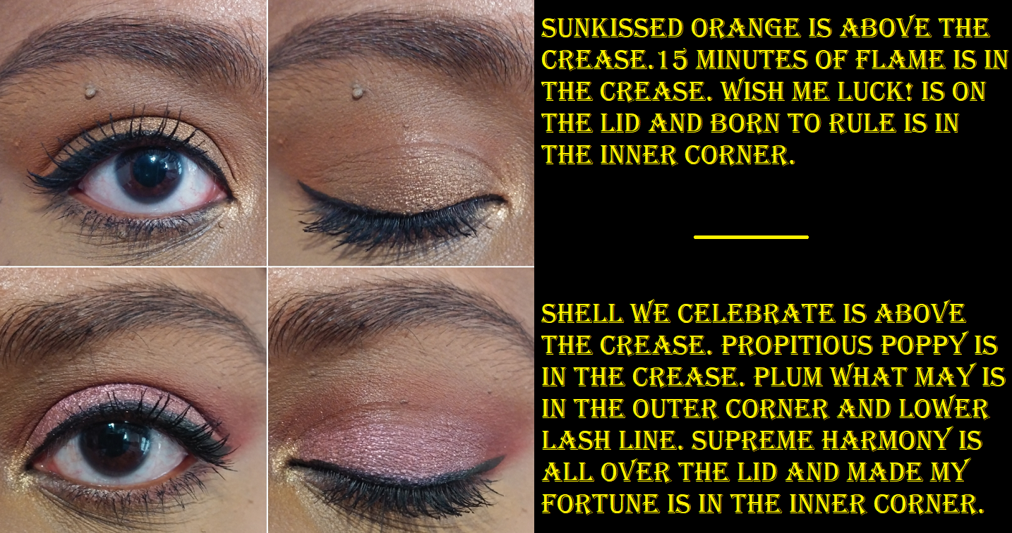
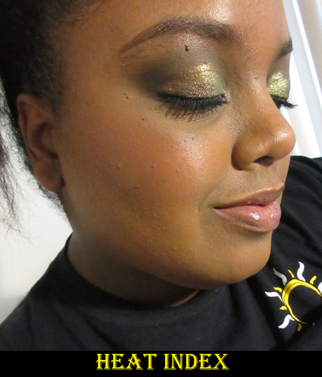
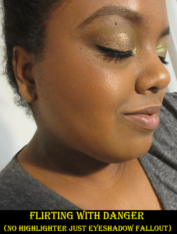
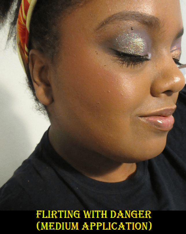
MAC Lunar Luck Eyeshadow x 9: Made My Fortune
This palette was a gift from one of my best friends, and for that reason I will cherish it. It’s one of those things I wanted for the packaging, but not the makeup inside, since I tend to not be the biggest fan of MAC’s eyeshadows. I can at least say the quality of this one is the best I’ve tried from them. The shimmers have pigmented bases, but are a bit tame in sparkle reflectivity, even when used wet. I appreciate that they were easy to apply smoothly to the lids and inner corner. The mattes were also more pigmented than I expected from MAC, and slightly easier to blend than the ones I’ve used in the past. Creating the two looks shown below was enjoyable enough that I may continue to use this palette from time to time, but not enough to make me want to purchase anymore MAC shadows. There isn’t a whole lot of versatility among the two light mattes that hardly show on me (Shell We Celebrate and Sunkissed Orange) and two shades that look nearly identical when used next to each other (Propitious Poppy and Plum What May). The shimmers (excluding Supreme Harmony) don’t look that far off from each other in the pan, but I was pleased to see they are distinctly different on the eyes. Wish Me Luck!, 15 Minutes of Flame, and Born to Rule (as a highlight shade only) are my favorite eyeshadows in the palette. I’ve really been into the brown shimmer eyelid look lately. I still feel $32 is a bit pricey for the quality, so for anyone wanting this palette, I hope you’ll be able to get it on sale!
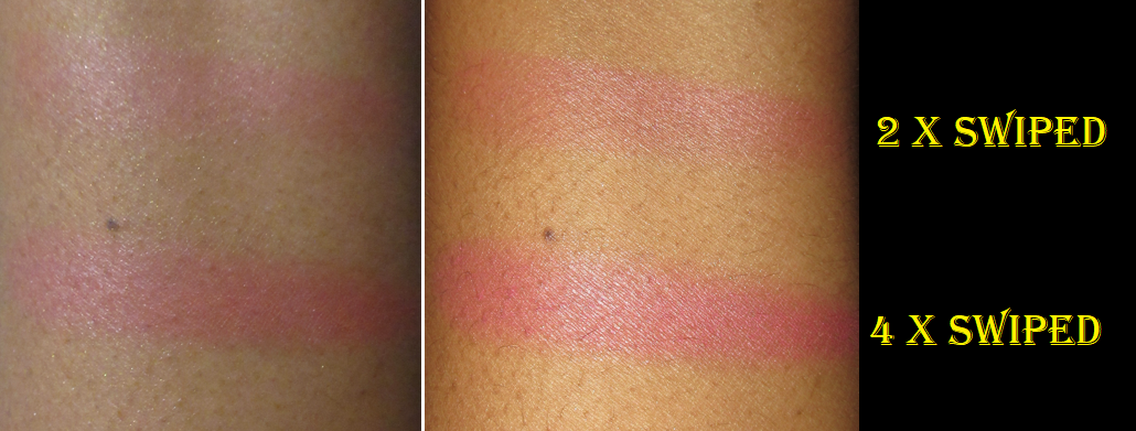
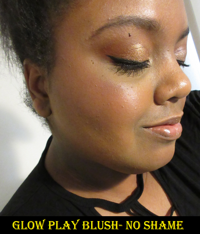
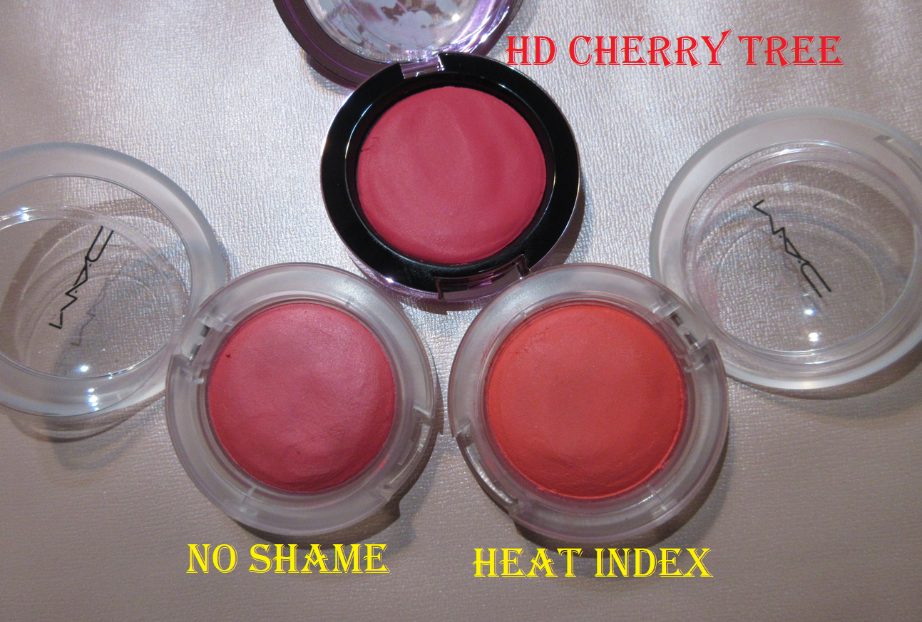
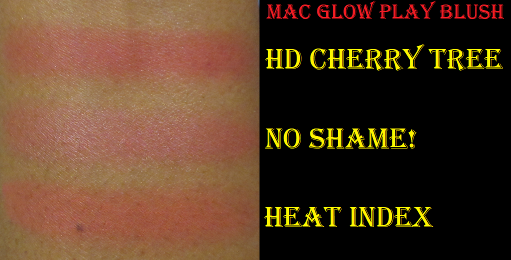
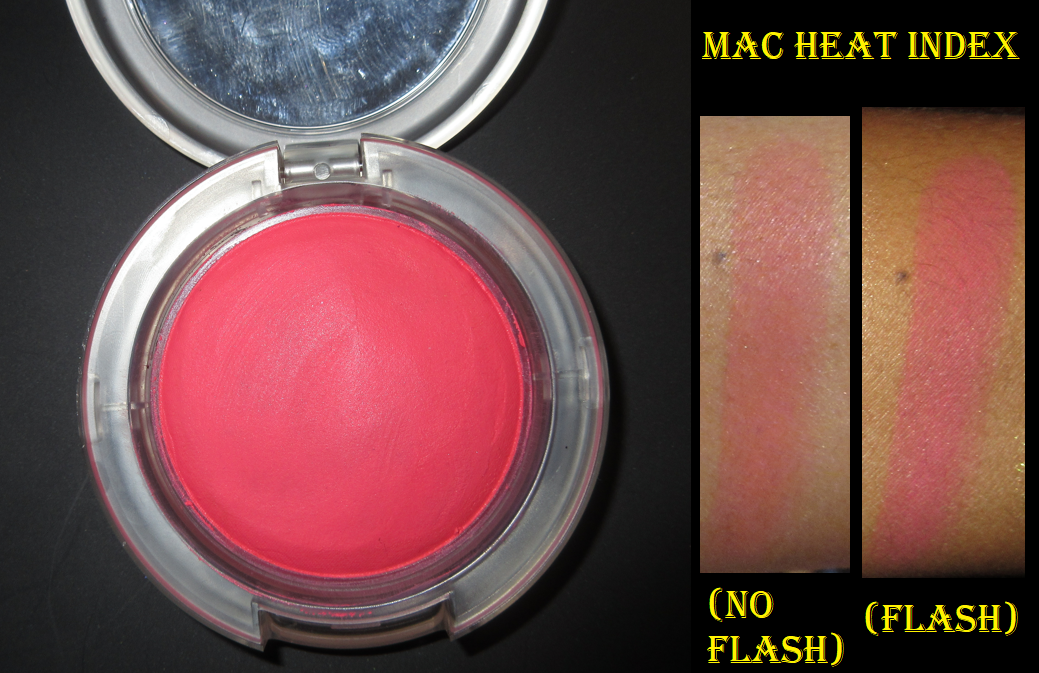
MAC Glow Play Blush in No Shame!
I’m a big fan of MAC’s Glow Play blush formula, so I wasn’t satisfied with having just one from their collection. I got this for 50% off on Black Friday. These blushes tend to look more vibrant and pigmented than they actually look on the skin, which can be tricky in trying to figure out which shades would work for me. No Shame! takes a lot of building up to get it to show on my cheeks, but the end result is pretty. It has that familiar putty-like texture that sets to a natural finish, just like the others.
At the time that I’m writing this, I cannot find this shade on the website any longer. I think it’s safe to assume it has been discontinued, and I believe the reason is because of the release of HD Cherry Tree.
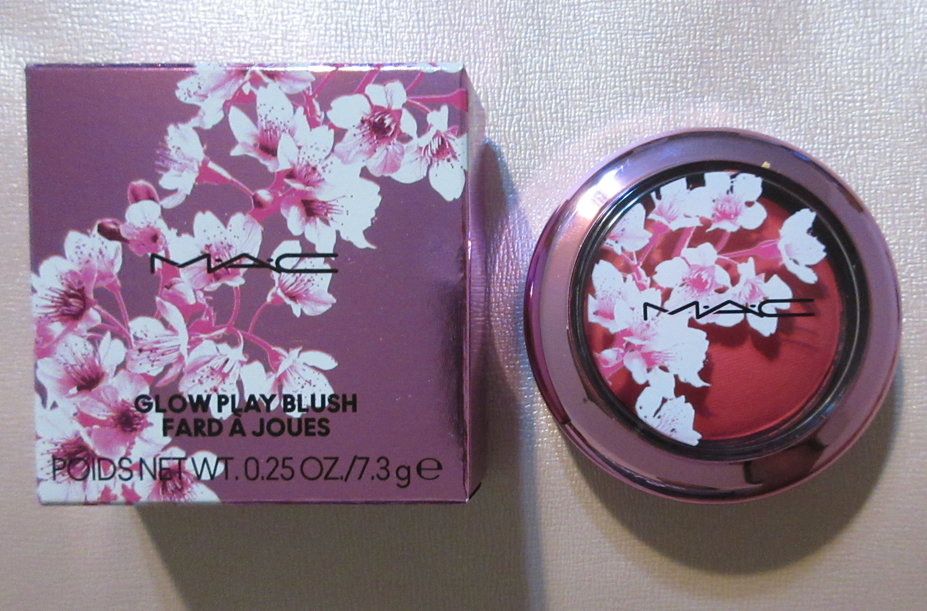
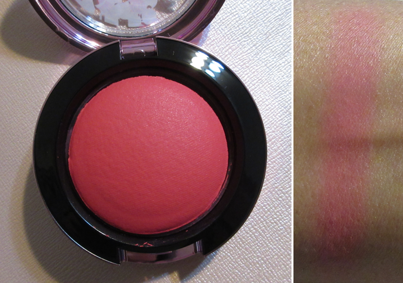
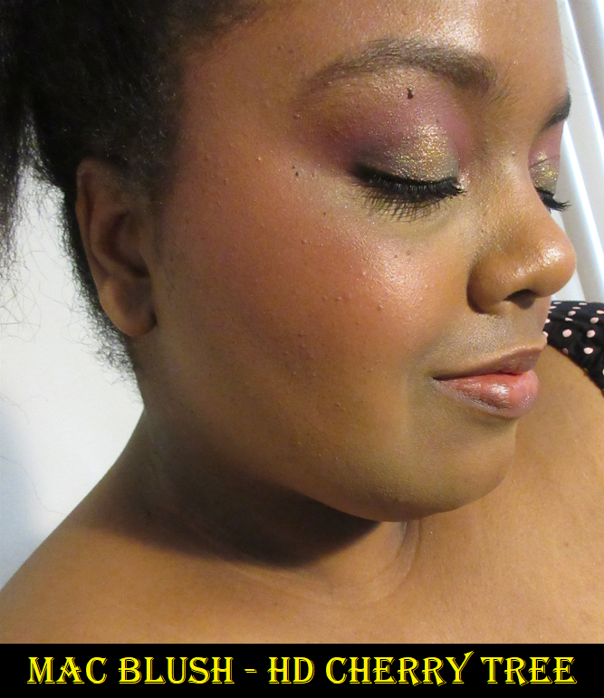
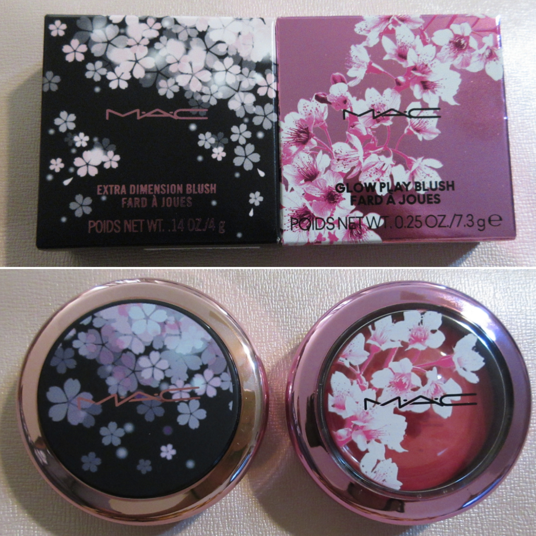
MAC Wild Cherry Collection Glow PlayBlush in HD Cherry Tree
HD Cherry Tree is like a deeper, slightly more berry version of No Shame!. Quite a few people managed to get their hands on this blush before the US launch, so I purchased mine from one of them (and for less than the retail price)! I was unlucky that as soon as I flipped it over to let the plastic protector naturally fall out, the entire blush popped out with it. However, since it’s a bouncy blush, I was able to squish it back in the compact. Good as new!
I’ve only purchased the Glow Play shades that I think would show up on me, and it’s a bit unfortunate that they look quite similar to each other.
My hope is for MAC to expand the range even further to fill in some gaps, like a medium-deep reddish brown, a terracotta, and a deep pink-mauve. Then again, I’m trying to buy fewer MAC products, so maybe it’s good that they don’t have those shade options!
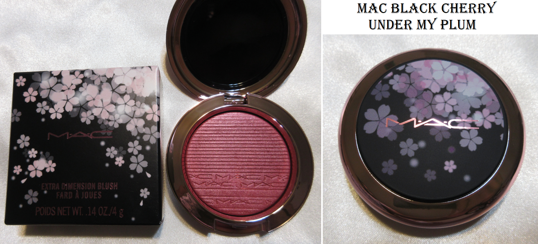
The Wild Cherry collection is limited edition, but I wonder if MAC intends to make HD Cherry Tree a permanent shade in the future, but without the special packaging. There are two other Glow Play blushes in the Wild Cherry line, but I don’t plan on buying them. Between the Wild Cherry packaging and last year’s Black Cherry packaging, I prefer the look of this new one.
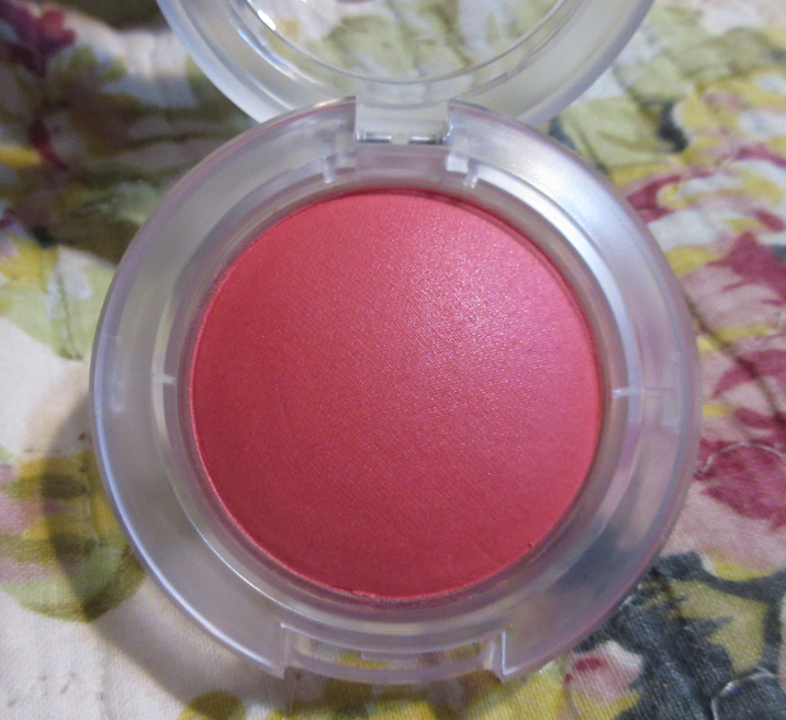
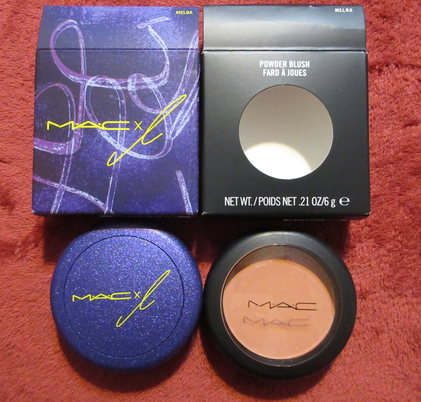
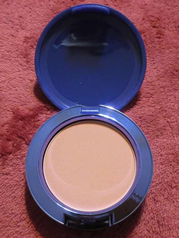
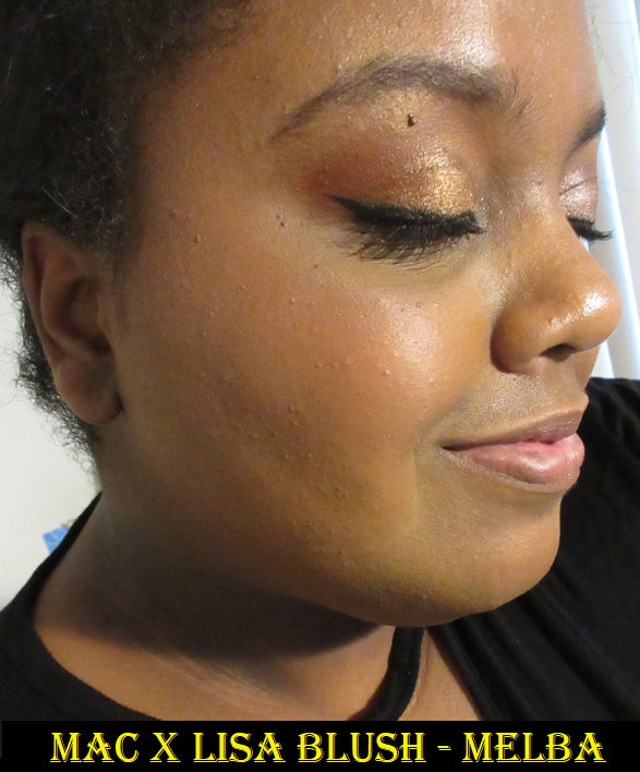
MAC x Lisa Blush in Melba
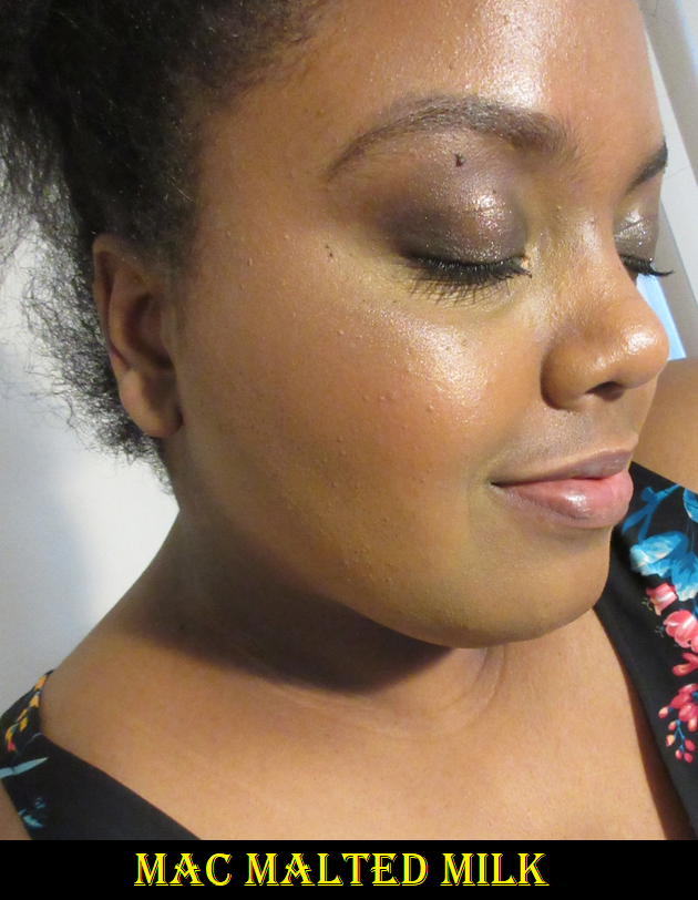
There isn’t much to say about this blush since I already reviewed it before, but I wanted it for the limited edition packaging since purple is my favorite color. I know Lisa is from the band BLACKPINK, but I don’t listen to their music, so the collab aspect didn’t entice nor deter me. Melba only works for me when I’m at my lightest (typically winter), so I gave my original blush to my sister. This color is still so difficult to get it to show on camera*, but it is visible in person. After wanting to repurchase it for so many months, I decided to go ahead and do it when it was 40% off on Veteran’s Day. Around that time or soon after, I saw the sneak peeks of the MAC x L collection, but I had no idea they would repromote yet another product and that it would be Melba! It worked out in the end since I gifted my new and unused standard packaging version of Melba to the friend who gave me the Lunar New Year Tiger palette.
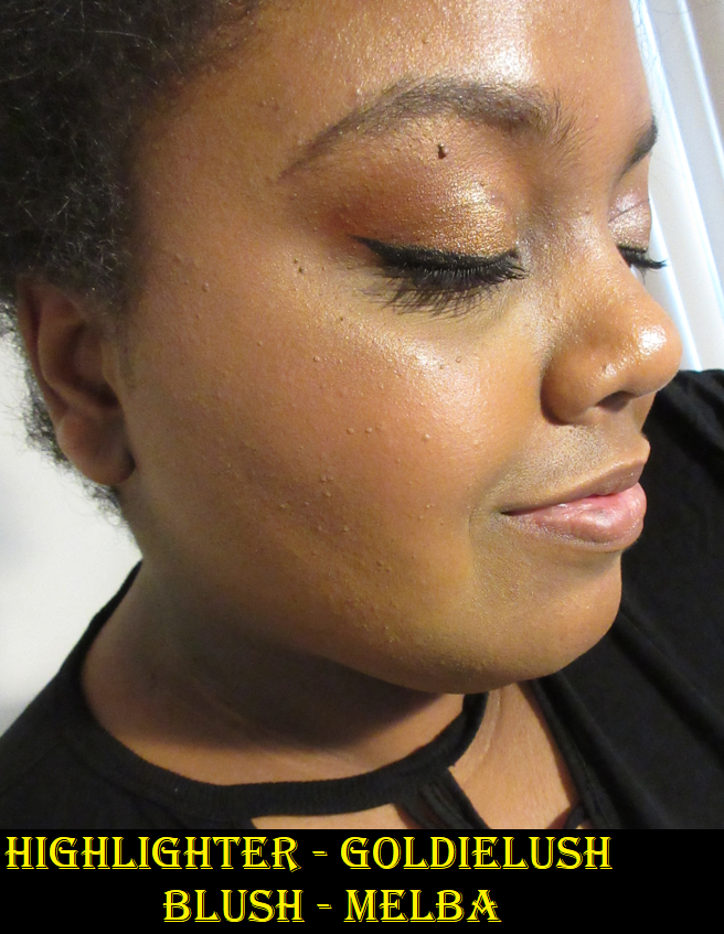
*Another photo showing Melba is in the Illuminate Face Palette section demonstrating how GoldieLush looks on the cheeks.
I’d like to add that my last purchases directly from MAC’s website was last November and December and both of them were listed as delivered according to the tracking history on my account page (I didn’t get shipping confirmation for either one), but they never arrived. I had to contact customer service for reshipment. Prior to that, my eyeshadow palette from the Tempting Fate collection was lost in the mail (after already being delayed for a week before getting shipped). I would typically view the carriers as responsible for undelivered mail, but the lack of shipping confirmation in two of those instances makes me wonder if the fulfillment center nearest to me is having issues and if it’s fixed by now.
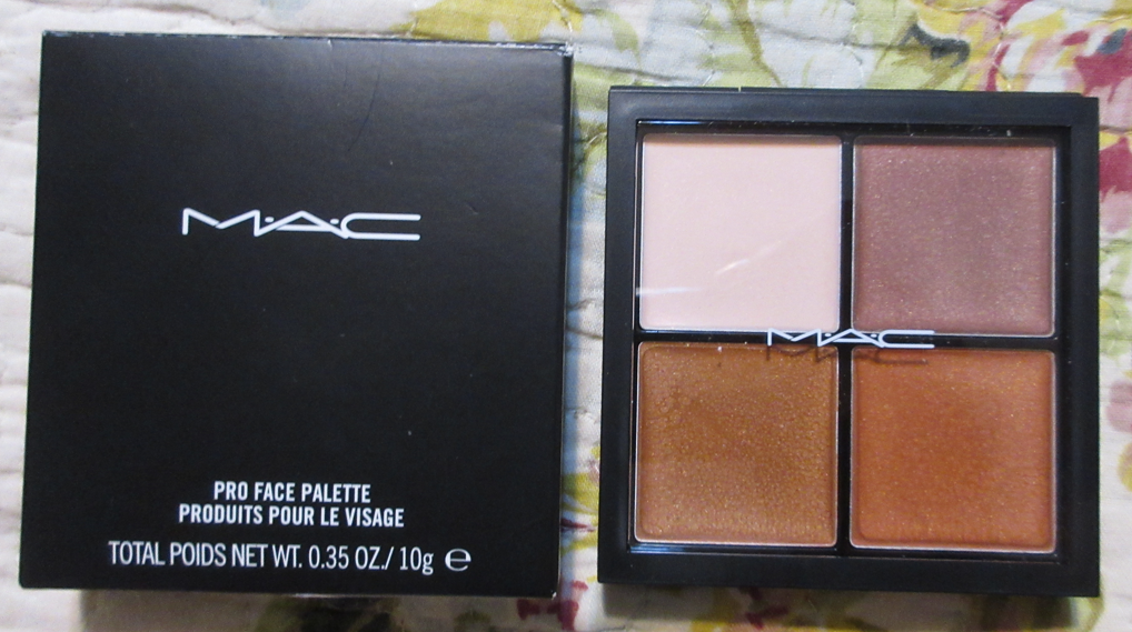
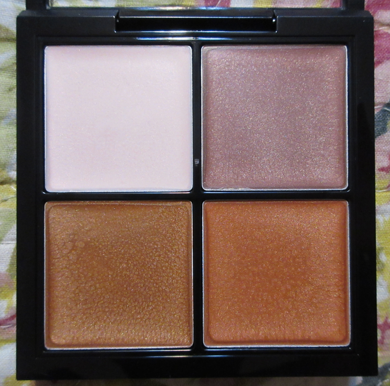
MAC Pro Face Palette: Illuminate
I was eligible for a free birthday gift in November, which was supposed to be an eyeshadow quad. Only three out of four shades were in stock, and it wouldn’t let me add them to my cart without choosing a non-existent fourth available shade. I asked customer service what I should do in this instance, since you can only redeem the gift with a purchase and I only had a few days left before the offer expired. The solution was to send me this palette, which I jumped on since I don’t really like MAC eyeshadows anyway.
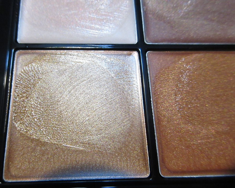
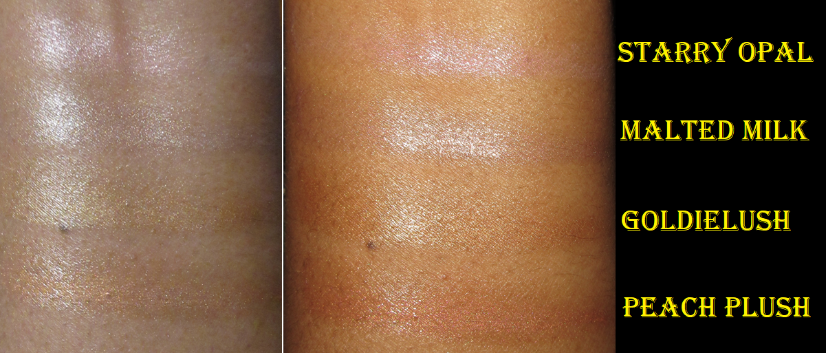
This palette consists of cream highlighters that have an almost waxy texture. It reminds me of both edge gel and the Danessa Myricks Dew Wet Balms. I didn’t have high hopes because products in that consistency tend to remove my foundation underneath it, and this one did too, but it’s easy to apply a little concealer back on top without interfering with the shine level. Unlike the Dew Balm, this gave a perfectly smooth wet sheen without looking greasy. It doesn’t dry completely, but it’s not dewy enough for my hair to cling to it either. I was very happy with the results! It also makes a great base to intensify powder highlighters that are applied on top of it, although I don’t usually go for the super highlighted look. Powder highlighters are my preference, so I don’t know how often I’ll actually use this, but it certainly made a nice birthday gift!
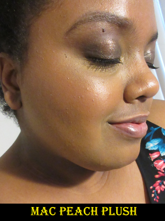
Please ignore the slightly lingering indent on my skin from wearing a mask. I took 3 of the 4 photos on the same day, which is why GoldieLush doesn’t have that mark.
They look nearly identical in photos, but the slight pink tinge in Starry Opal, the light silvery tone of Malted Milk, the traditional medium gold in GoldieLush, and the orange tint to Peach Plush are identifiable in person.
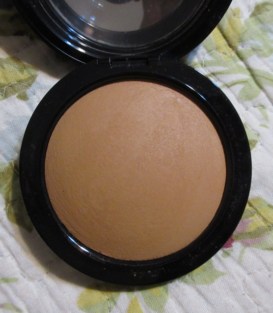
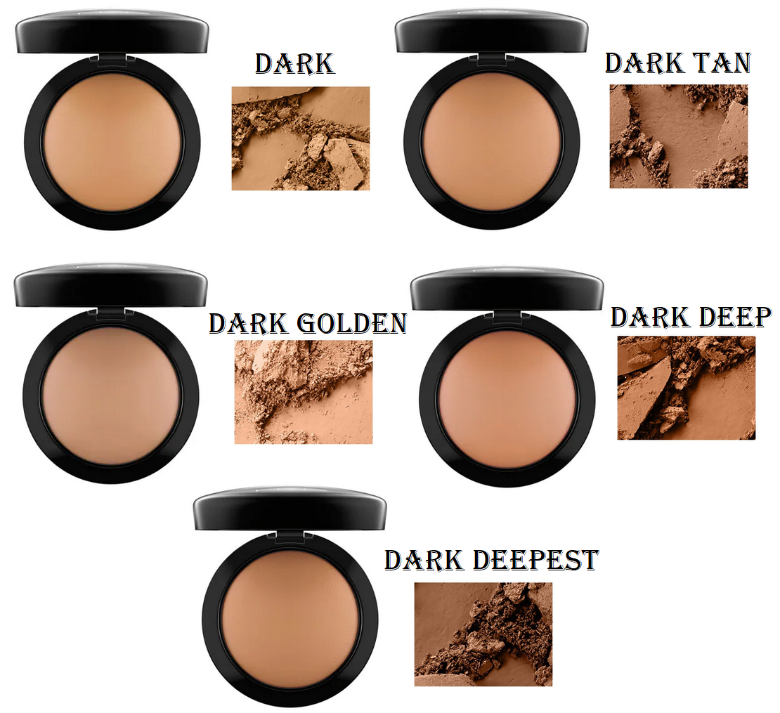
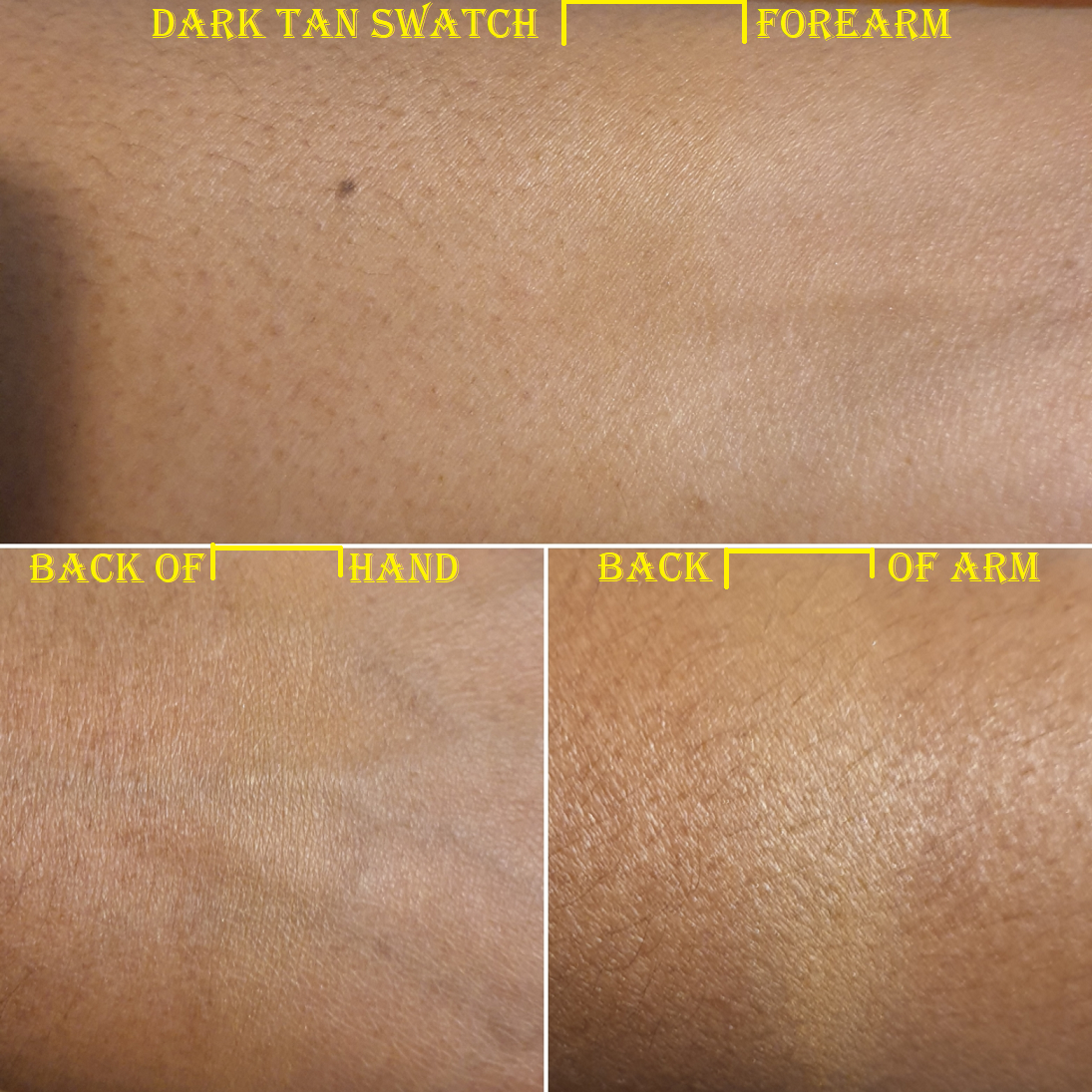
MAC Mineralize Skinfinish Natural in Dark Tan
I wanted to try this powder for so long, but trying to figure out which shade I should choose out of Dark, Dark Tan, Dark Golden, Dark Deep, and Dark Deepest (which didn’t look all that deep in all the photos and videos I scoured the internet to find) was quite frustrating. It’s helpful when brands list their products by order of either lightest to darkest or darkest to lightest, but these didn’t seem to follow that order all the way, which added to my confusion. The biggest difference between multiples of them seem to be the undertone, but MAC doesn’t have any descriptions of these shades. It would be great if the brand created a chart pairing MAC foundation shades with the suggested powder matches.
This powder tends to look lighter on camera, so it took ages for me to get an accurate photo. I can understand now why the same shade looks so different in the photos and videos I’ve seen others take too.
Based on the broken up powder photos from MAC’s website, I thought Dark Tan and Dark Deep were my two best options, but I questioned whether Dark Deep was slightly too dark and possibly a bit orange. Since powders can sometimes deepen on my skin when I wear a dewy foundation, I decided to ultimately get Dark Tan. Dark Tan is admittedly a tad light, but it still works for me. The bigger issue I have is that it looks a little dry on my skin because I grew unaccustomed to having such a matte look to my face, plus it being a bit light. I have only used this a few times, so I will continue to experiment some more using different brushes. It’s possible I applied too much or that it looks better with other complexion products. Because I was so iffy about whether I’d like this powder or be able to select the right shade, I decided to wait as long as it took for this product to finally be on sale for higher than 30%. It took years, but I was thrilled when MAC added this to the 50% off deal for Black Friday. So, that made satisfying my curiosity less of a financial hit!
This is everything new I’ve added to my collection from MAC so far. I do intend to get the Magnificent Moon Extra Dimension x 4 highlighter quad palette when it gets released. Of course, I shouldn’t because I’m on a highlighter no-buy, but this falls in line with one of the exceptions listed in my Beauty Resolutions post. I love moons. It’s one of the central aspects of my one and only tattoo, so that kind of imagery is significant for me. Other than that, I’m going to continue trying to slow down on the frequency of my MAC purchases so I can enjoy what I already have!
I admittedly have an excessive makeup collection for a single person. Though it may not seem like it considering all the newly released makeup I purchased in 2021, I actually made a bigger effort to talk myself out of getting makeup in categories I already had favorites of and didn’t need. Each product reviewed today were things I thought I successfully anti-hauled, but all it took was a sale for me to change my mind!
These purchases were all made in 2021, so my beauty resolutions for 2022 are still intact and going strong! If anything, this post is an example of why I had to come up with a better plan for this year.
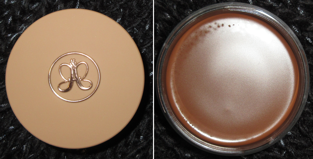
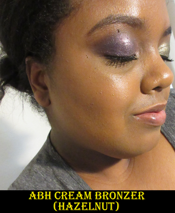
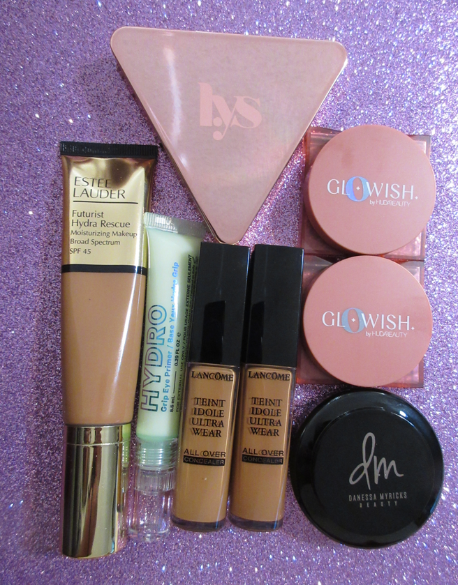
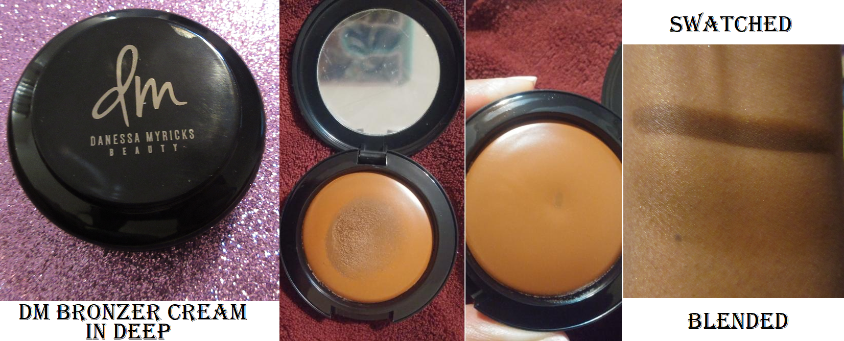
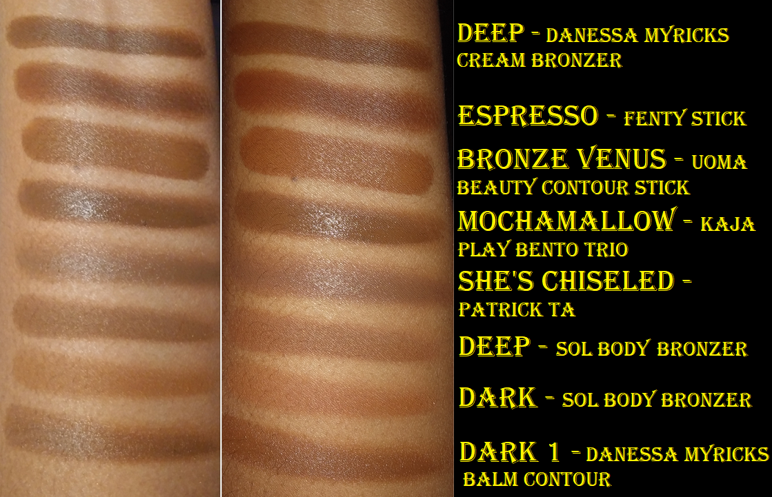
Anastasia Beverly Hills Cream Bronzer in Hazelnut
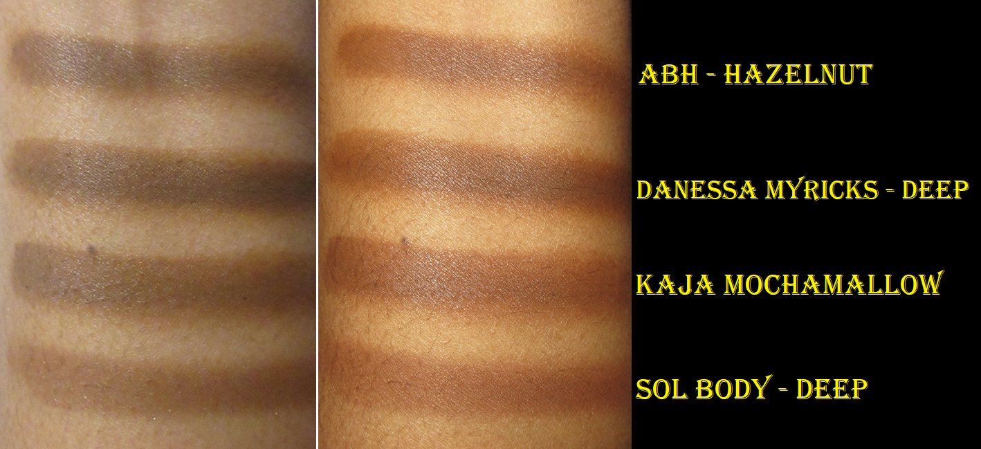
This purchase I attribute to Angelica Nyqvist’s many videos talking about how fantastic this product is, including her end of 2021 favorites. I wish I could say I had the same experience, but I just find it to be okay at best. This cream is easy to blend out, to the point that I have to build it back up, but if I overblend while building it up, it starts to look patchy because it’s setting in spots at different times. On the opposite side of the issue, I try not to apply too much at once because the shade is a bit deep for me. The shade jump between Hazelnut and the next lighter shade, Caramel, is huge. Hazelnut was my only color option. So, perhaps if I had a better match that didn’t put me at risk of overblending, I might like it better. As it stands, I prefer the Danessa Myricks, Kaja, and Sol Body/Colourpop cream bronzer formulas above the one from ABH because those three all blend quickly and easily into a skin-like finish. They’re also just as deep, or in some cases deeper, than the ABH without the blending and building troubles.
I’ve used this about ten times, so it’s possible I could find another brush that works better with this bronzer other than the Sonia G Mini Base and Scott Barnes #65 Flawless Face Brush, but between using a sponge, brush, or finger, the end result looks similar for all of them. I’m cutting my losses and rather than figure out how to make this one work better, I can just use my no-fuss cream bronzers that I like instead.
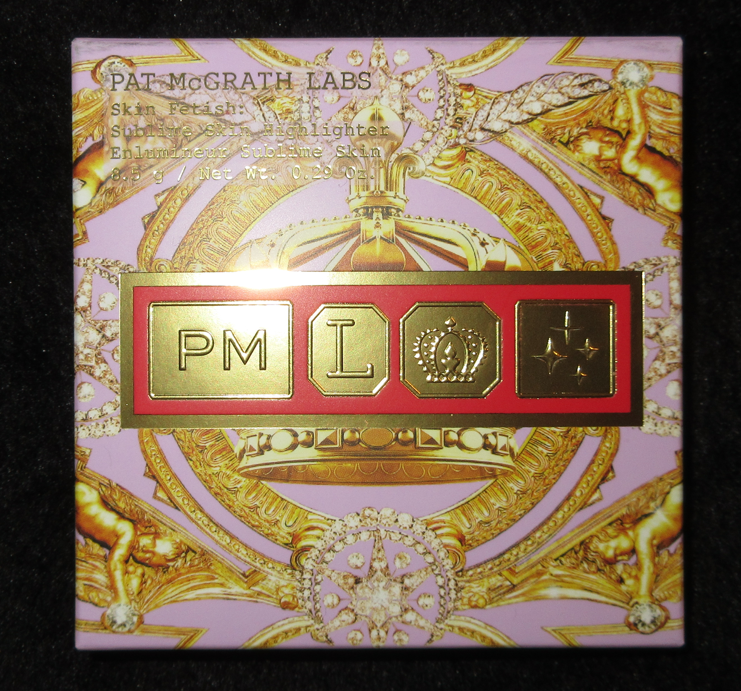
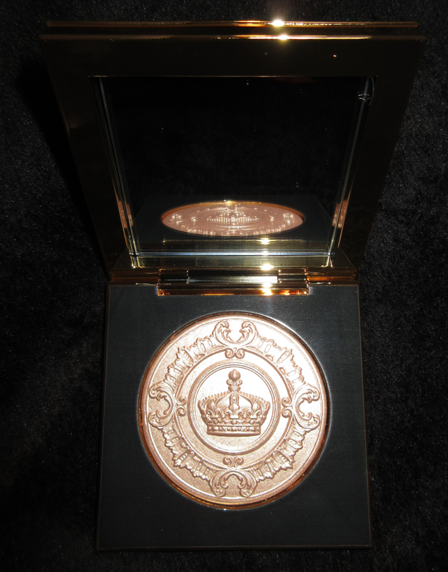
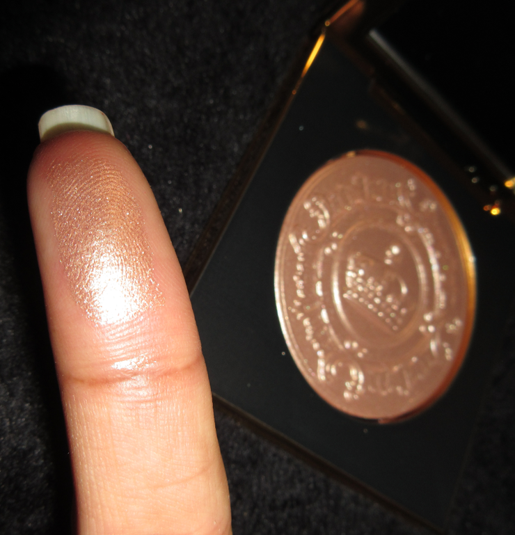
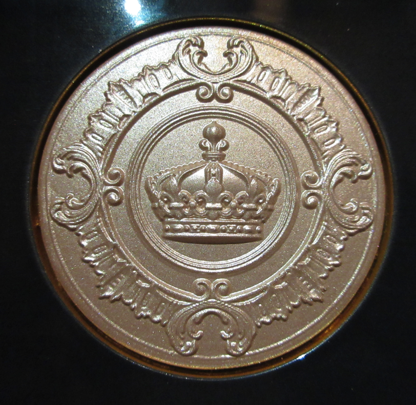
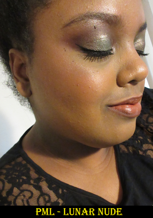
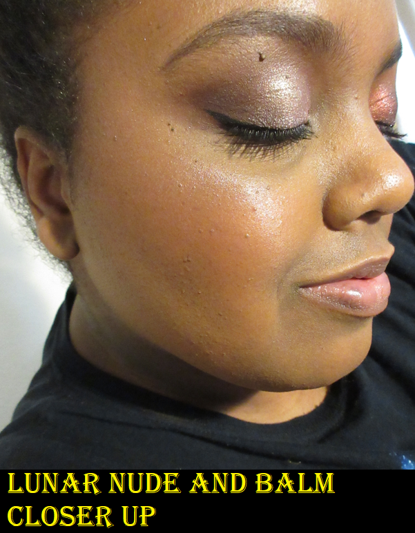
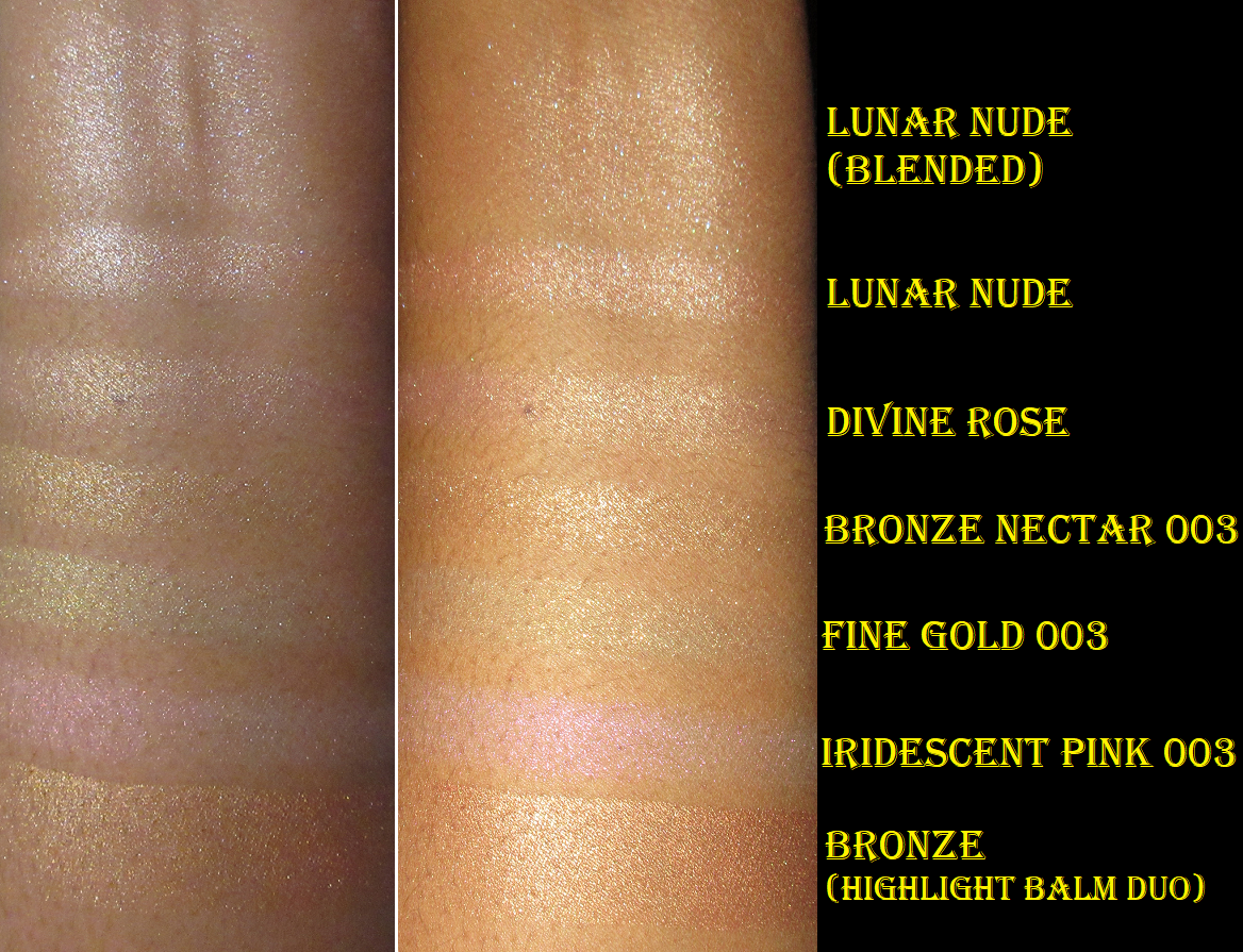
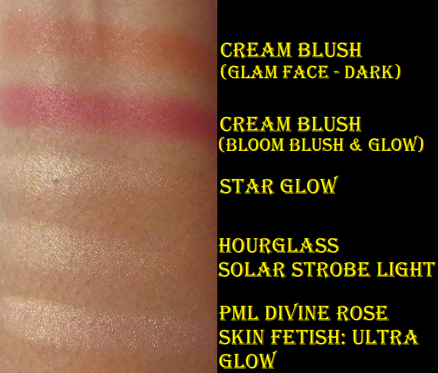
Pat Mcgrath Labs Skin Fetish: Sublime Skin Highlighter in Lunar Nude
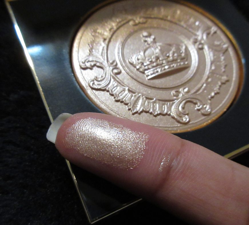
I couldn’t resist the gold packaging with that embossing, but I’m at least glad I waited for a sale. I told myself over and over that Lunar Nude would look too light for my skin tone, so I shouldn’t get it. I was half right. The shimmery reflective particles are light gold, but the base color is a copper color. It even looks copper or gold depending on the lighting of the room and the angle. The base tone helps it look a little more wearable on me, but it’s still lighter than I’d prefer in a highlighter.
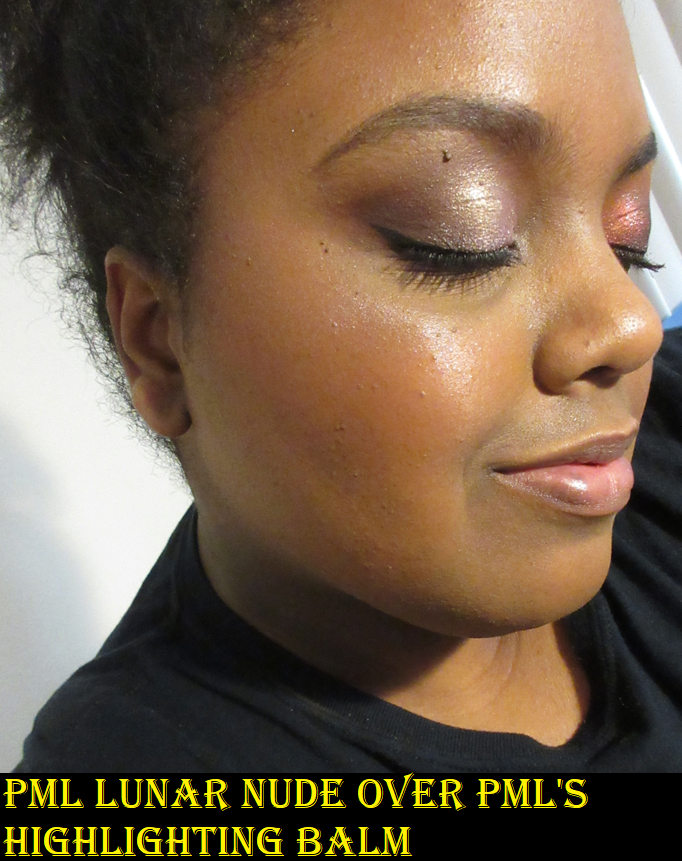
I can see the shimmer particles on my face, which is also not my preference, but I also realized that certain brushes of mine pick up more of the sparkle than others. On the website, there was a note to pair this with the highlighting balm duo. When I used the balm and then applied Lunar Nude on top, it definitely helped to make the product melt into the skin and look super smooth and achieve that “wet look” that I enjoy. However, it really cranks up the intensity level and the fact that the highlighter is too light for me becomes way more obvious. Since I figured out how to use it to my preferences, I like the formula but not the actual shade. Ultimately though, I don’t think this is worth buying at full price except for collectors and luxury product lovers. For anyone looking for the best highlighter on the market for the best price, this isn’t it. Much better and more affordable options are out there. It’s “pretty good” at best. I personally prefer Pat Mcgrath’s Divine Rose highlighter. That one is listed as a “futuristic gel-powder formula” in the “Skin Fetish: Ultra Glow” line whereas Lunar Nude is a “luxe gel-powder formula” in the “Skin Fetish: Sublime Skin” line. It’s possible they are the same formula, but Lunar Nude leaves more sparkle on the skin, which is the biggest difference other than the color.
Pat Mcgrath LabsHighlighter Comparisons
Different lighting to reveal the color shift of the trio.
Of course, since making this purchase, Pat Mcgrath has released similar highlighters to Lunar Nude’s formula in the Bridgerton collection. I don’t believe either of those new colors would look nice on me. If PML releases a shade variation I like in this same formula with the same special packaging and same or similar embossing, I would most likely sell Lunar Nude and buy that one. As it stands, this one isn’t getting much use in my collection but I still don’t want to part with it without a superior replacement.
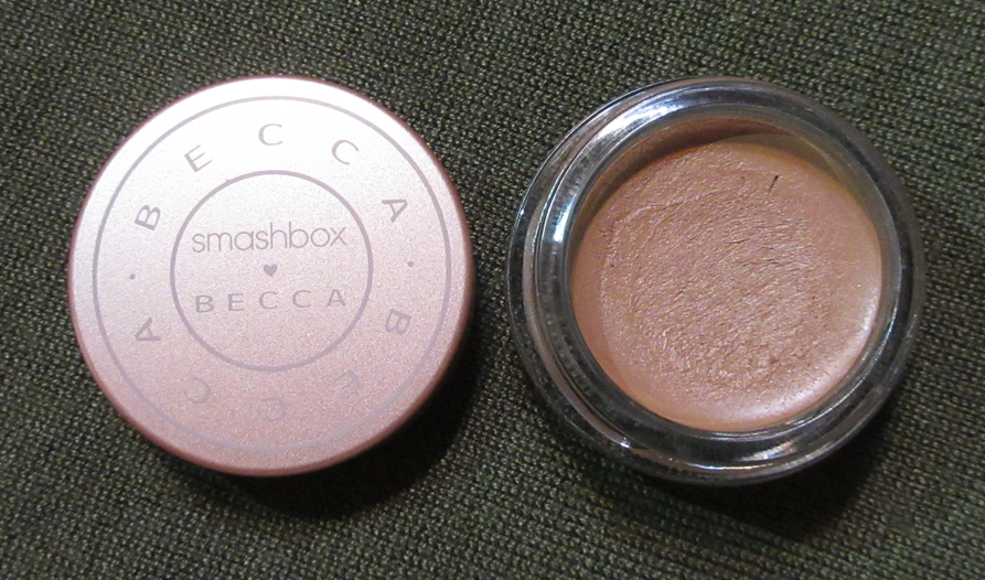
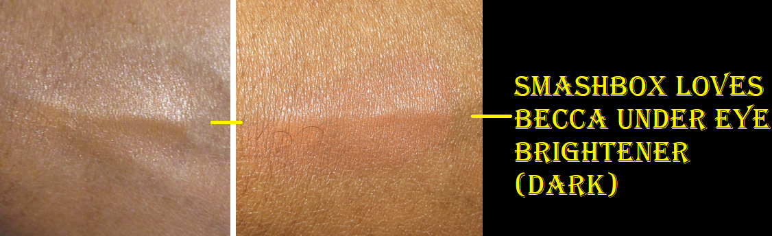
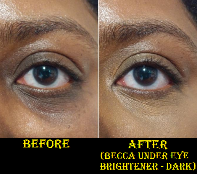
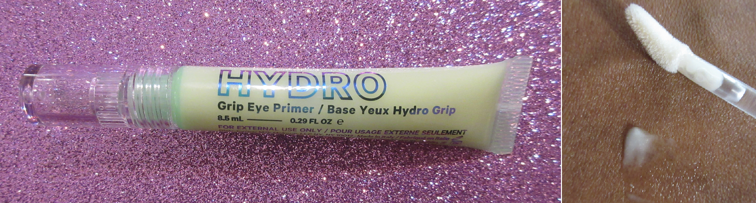
Smashbox Loves Becca Under Eye Brightener in Dark
Although Becca Cosmetics is no more, a few best selling products were resurrected through Smashbox. This decision is presumed to be made by their parent company Estee Lauder.
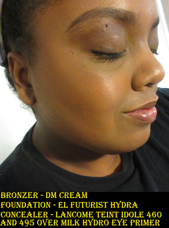
There were originally just two shades: light-medium (now called Fair/Light) and medium-deep. The Smashbox x Becca version has two more in the mix: Medium and Dark. It’s my understanding though, based on a YouTube video by All Beauty by Sarah, that the original medium-deep color is actually close in depth to the current Medium shade with the main difference being that the original had a stronger pink tone to it. The third darkest shade now is called Medium/Dark and is much darker than the original medium-deep. The final shade, and the one I picked up, is Dark. Based on the description and the shade in the pot, I expected Dark to be too dark for me. Technically, as this is supposed to brighten my under-eyes, I should have gotten Medium/Dark. However, I prefer for my under eyes to match the rest of my face rather than being brighter, so Dark works perfectly for that. It’s the best matching color-corrector type of product I have ever used because it has a slight orange tone to hide my dark circles, but there’s also enough brown to make it look natural. I try to avoid showing my skin discoloration as much as possible, but in this instance I felt it was necessary to show a demonstration photo below.
Cream products almost always move in my under-eye area, but what makes this one a little different is the very sticky texture. This product has gripping power similar to the Milk Hydro Grip Eye Primer, but stronger than that one. This makes it ideal for applying a concealer on top, even though based on the color match, I don’t find that to even be necessary. However, it will not set on its own, so I either have to apply a concealer that sets down like the Tarte Shape Tape or apply a setting powder to my under eyes (or both). If I apply the Smashbox x Becca corrector by itself, it will settle badly into creases. So, I need at least something on top to keep it from creasing and to continue looking smooth.
So, I have an answer to using this product to hide my dark circles and keep it looking as smooth as possible considering I have heavy lines under my eyes. This product would be perfect if it wasn’t for the transfer issue. No matter what products I apply on top of the corrector, it will lift off my under eyes if I accidentally touch it or if I try to wipe away shimmer eyeshadow fallout. So, despite being the perfect color match for me, this isn’t a holy grail product. I use it on days when I’m not planning to go anywhere and am just putting on makeup for Instagram and Blog photos. I am at least glad I’m still getting use out of it. This would work wonders for people who don’t touch their face or rub their eyes as much as I do, so I still recommend it, but I would be wary about potential issues. Also, I would use a dedicated brush specifically with this product because it’s a bit of a pain to use with my favorite concealer brushes the way it coats the hairs in its sticky texture.
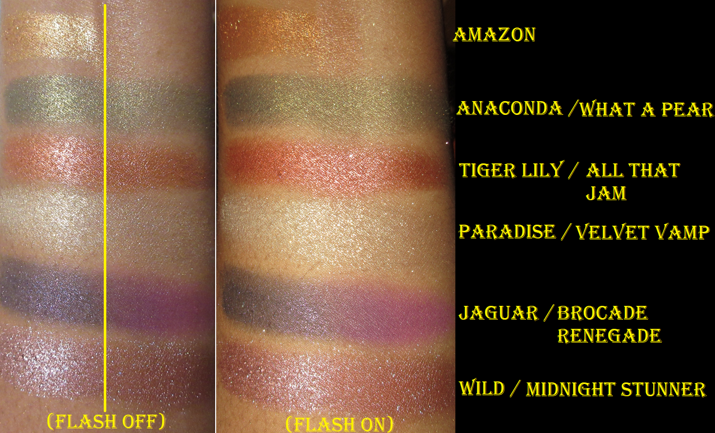
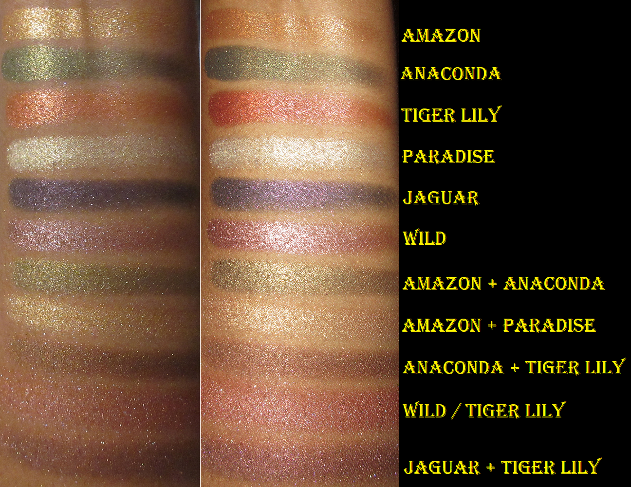
Flower Beauty Jungle Lights Palette
The release of Flower Beauty’s Desert Lights palette didn’t take away the major hype surrounding the original Jungle Lights palette. That’s what ultimately caused me to finally want to try it out. I’ve also always been curious how it stacked up to the MAC Tempting Fate palette a lot of people were comparing it to.
In the photo above, in the “Flash Off” set of swatches, I put a yellow divider line to help show the differences between the Flower Beauty swatches on the left half and the MAC swatches on the right half. In the “Flash On” set of swatches, I did not put a divider in order to keep it from impeding on seeing how similar the two sets look next to each other in every shade except Amazon (which had no equivalent) and Jaguar.
The Flower Beauty Jungle Lights formula is as creamy as everyone says, except Paradise and Jaguar have less slip and feel a tad more gritty. I also like the sparkle and shine level of these shimmers, which clearly surpass that of the MAC Feast Your Eyes Palette from the Tempting Fate Collection.
They’re as nice as people say, and I appreciate the fact that they last fairly well on my eyes as long as I pack on enough color with my finger (which is the recommended application method) and am content with the colors fading a bit to a duller color by the end of the day.
I think it’s worth looking into, especially at the price point. $17.99 is great already, but between a sale and coupon codes at Ulta, I got this one for $8.68. I still would have thought it was worth it at full price.
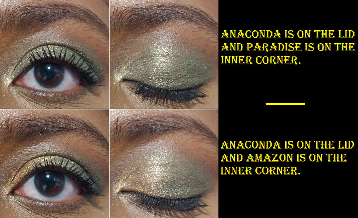
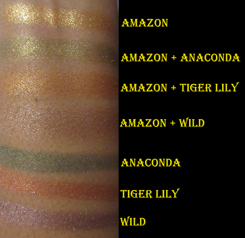
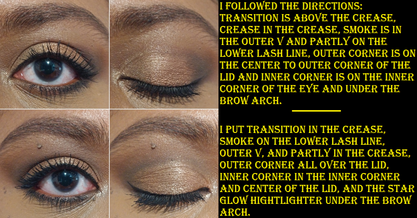
One of the most fascinating aspects of this palette was when I came across a reddit post showing 47 different shade combinations that could be made using this palette depending on which shade was on the bottom layer and which one was on top. Of course, the differences aren’t as obvious on my skin tone, but there were enough combinations to leave me thoroughly impressed. I took photos of some of the most obvious color changes with comparisons to the individual shades on their own to make it easier to see the differences.
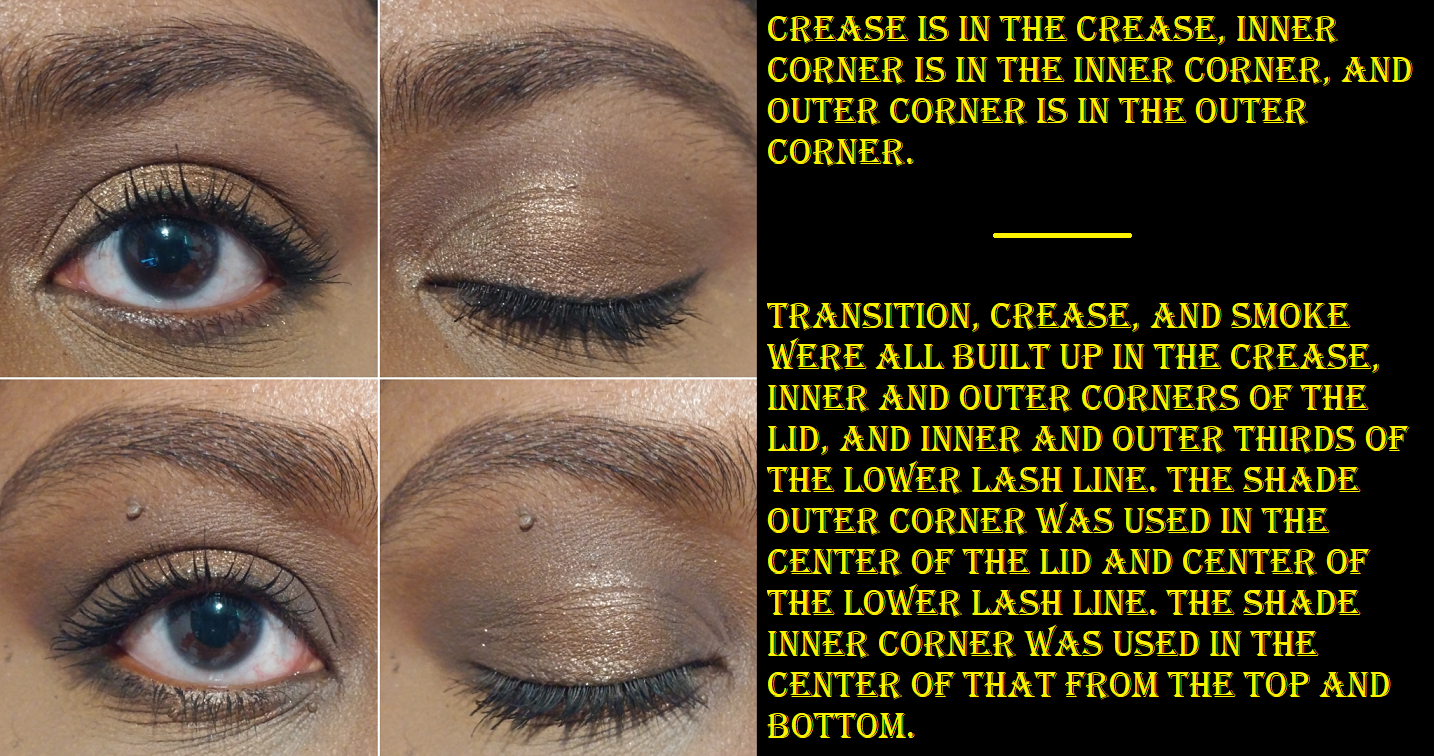
And then the photo below shows all the individual shades plus my favorite five new shade combinations.
Unfortunately, some of these shade mixtures don’t show as well on my eyes as they did in arm swatches. However, it’s still fun to play around with the combinations. It makes for a more versatile palette.
I wish there were some mattes included, but I could perhaps continue to get use out of this if I remember to pull it out in conjunction with some of my all or nearly all matte palettes.
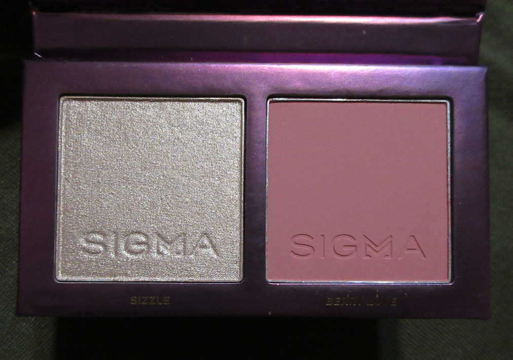
Sigma Beauty Berry Glow Cheek Duo
I really thought this duo looked nice on my skin in person, but in photos, the blush looks very ashy. The fact that it’s cool toned does look a little off to my own eyes though. I’m torn.
I bought the duo for about 40% off during a Black Friday sale and thought it was an extra great price considering it came with a brush as well. The brush will be reviewed in an upcoming synthetic bristle brush post. Considering the ashy look of the blush on camera, I’m not sure if I’ll continue to use it. I guess as long as it still looks nice in person, and I could potentially mix it with a warmer blush, I still somewhat like it. However, considering I also had mixed feelings about the Cor-de-Rosa blush palette, I think this will be the last blush purchase I get from them. I do like the highlighter, as it’s quite smooth with a small shimmer particle size and it doesn’t look stark even though it’s such a pale highlighting shade. It comes off a little more champagne-gold in person even though it looks almost platinum on camera. I’m almost tempted to investigate Sigma’s Glowkissed Highlight Palette from last year, but I have a full highlighter palette already from Danessa Myricks that I just bought during Black Friday too. I certainly don’t need another.
Those who are fans of the Sigma blush and highlighter formula already will likely enjoy the quality of this duo as well. I will continue to give it a few more tries to solidify my own feelings on it, but it’s just “nice” in terms of quality in my opinion. It doesn’t quite reach the “great” territory.
That’s everything! Out of the five items, I wish I could have successfully anti-hauled the ABH Cream Bronzer, Sigma Duo, and this particular shade of PML highlighter, but I really expected to love them and wouldn’t have known otherwise without having bought them first to try out. I will certainly try harder to stick to my anti-hauls in the future. Thank you for reading!
This is an update to my post from September 2020 where I’ll be showing my newest shades of blushes I’ve already reviewed before and loved so much that I wasn’t content with having just one shade. I needed more!
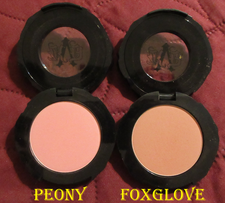
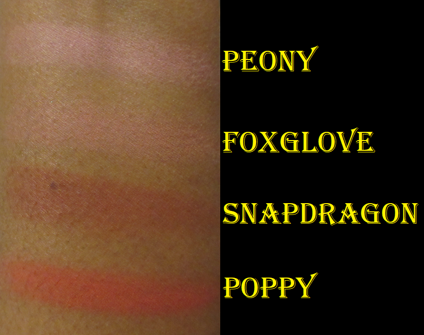
KVD Everlasting Blush in Peony and Foxglove
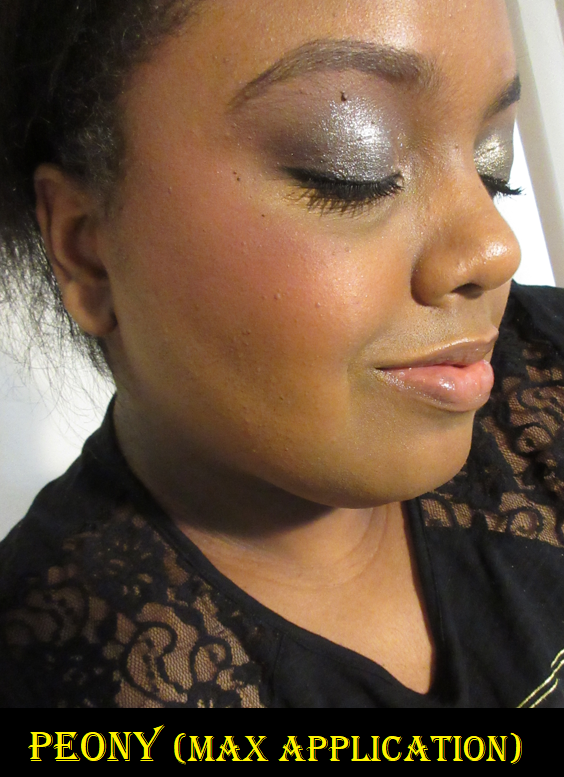
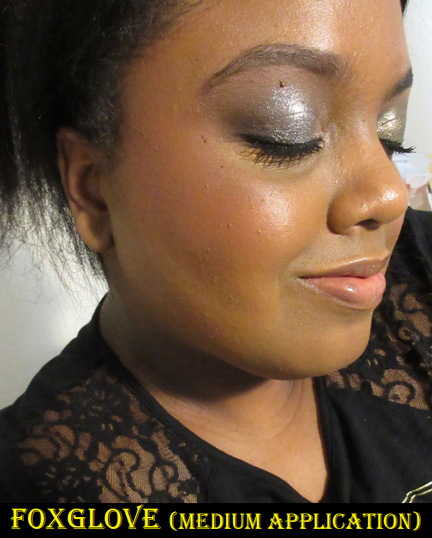
I already talked about how much I liked the shades Poppy and Snapdragon in Part 1 to this post, so I surprised myself that I actually bought two more. I always suspected Foxglove could work for me and Peony looked borderline like I might be able to pull it off during winter or early spring when I’m usually at my lightest. I was shocked that they ended up looking as nice as they do! Those two shades were clearly not intended for someone with dark skin but they have enough pigmentation to make it show and not look ashy!
Peony is cool toned, but this kind of pink still somehow looks nice on me. After about 3-4 layers, it doesn’t show any stronger on my skin tone, but I like how it looks with even just 2-3 layers. Foxglove doesn’t show as strongly in the photo above, but that’s because it’s a more toned down dusty rose type of pink and I prefer not to build it up beyond two layers. While I would say I consider a very pigmented blush to show on me in 1-2 layers, the fact that these are so pale in the pans and swatches, but still show this much on me speaks volumes.
Of the four blushes, I think Foxglove is my new favorite.
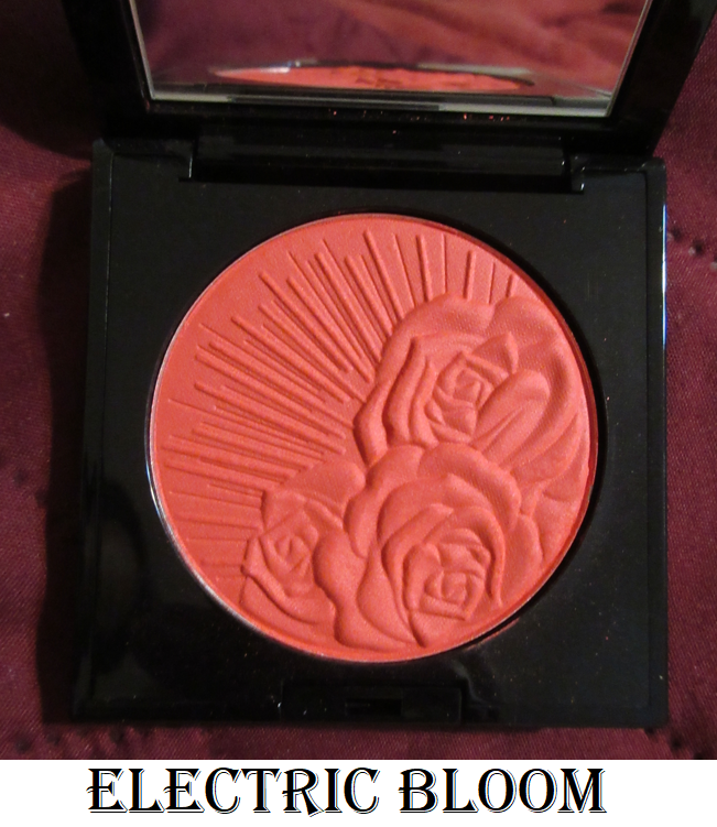
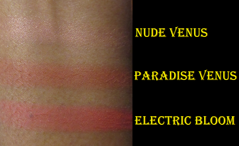
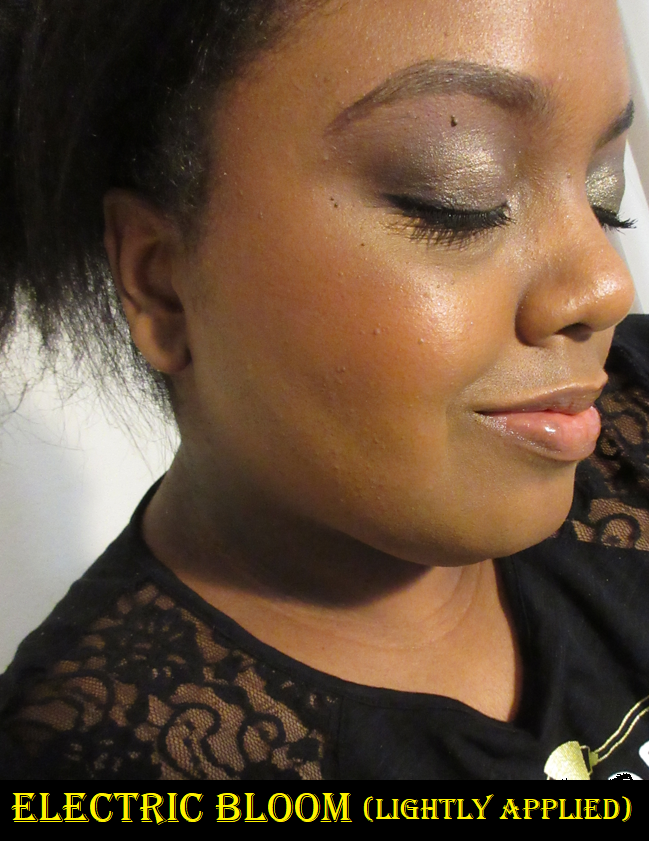
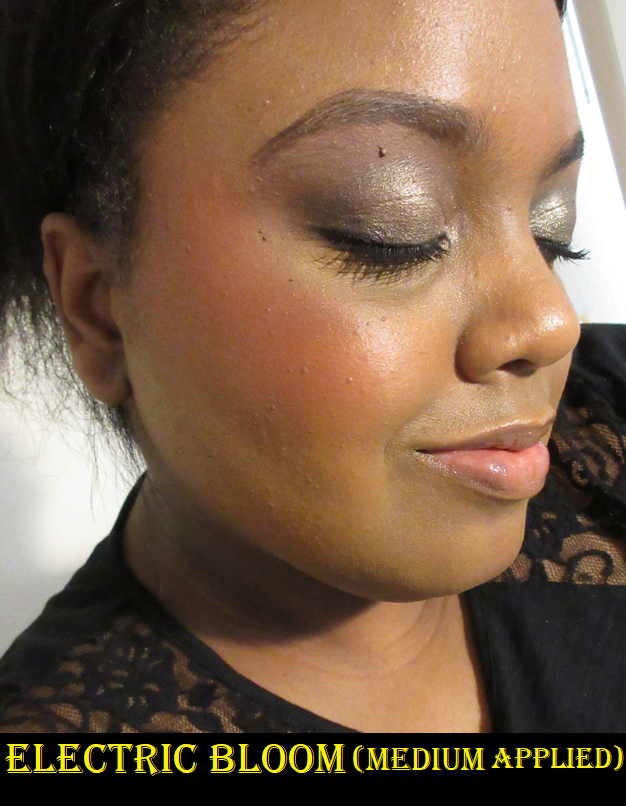
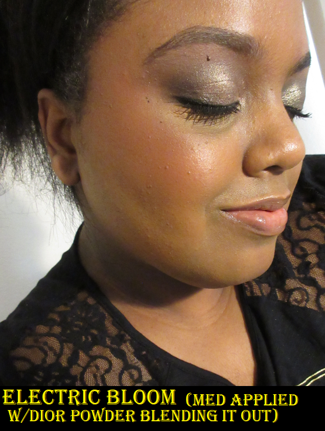
Pat Mcgrath Labs Skin Fetish: Divine Powder Blush in Electric Bloom
I purchased this perhaps a month after the initial blush launch. I wanted so many shades from the collection that I told myself I was only allowed to have one more, so I went ahead and made it this vibrant coral shade. It’s the kind of color that is debatable whether I can pull it off or not, but always calls to me. If I had just waited a little longer, I would have seen that it was listed as a dupe for Colourpop’s Aloha Honey blush shade on Temptalia’s blog and therefore I didn’t need the almost identical blush color. To be fair, I haven’t used the Colourpop blush enough to say how it compares in terms of quality because I always reach for Electric Bloom over Aloha Honey.
Paradise Venus is still my favorite shade of the three I have from Pat Mcgrath.
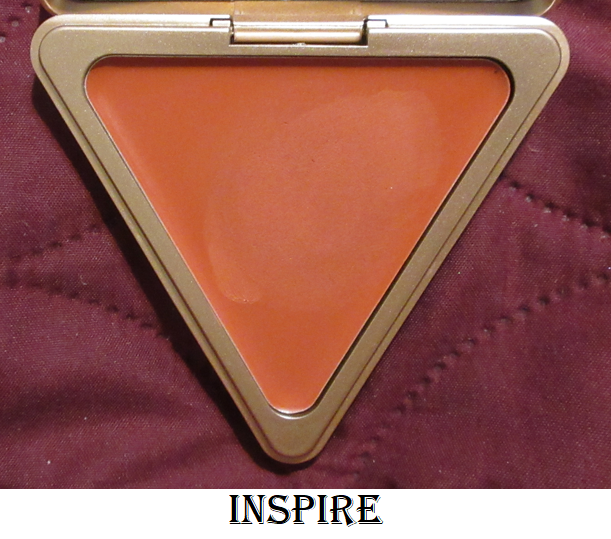
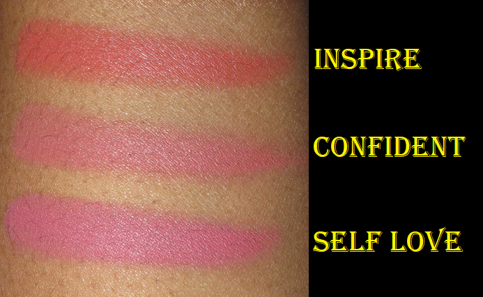
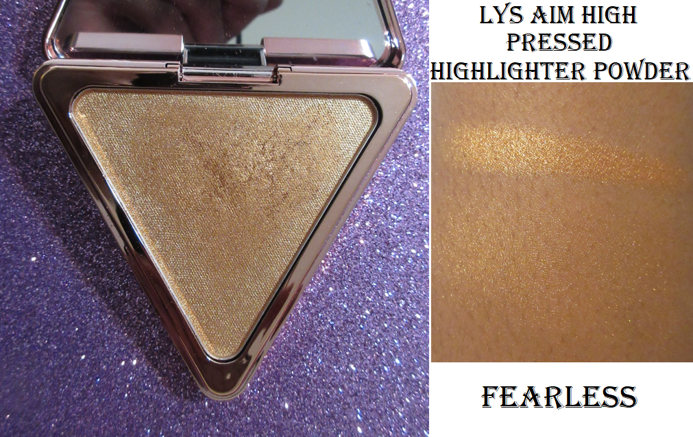
LYS Beauty High Standard Clean Cream Blush in Inspire
I hope anyone who reads my blog regularly isn’t tired of me going on about how much I love this cream blush formula, but I feel it deserves to be gushed over. I always had plans to eventually get this beautiful coral-orange shade, but I wanted to wait until I made more progress in my overall cream blush collection. However, I had some store credit built up via the Ambassador program with the brand, so I decided to go ahead and cross that off my wish list! Half of this blush was paid for via credit and the other half was paid for out of my own pocket. For full details about my affiliation with LYS, please see my About Me page and scroll to the near bottom.
Inspire performs just as well as the others. I cannot decide which of the three is my favorite because I keep changing my mind every time I use a different shade!
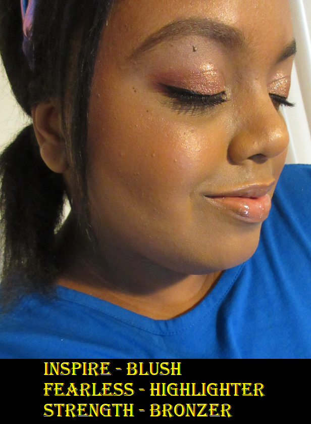
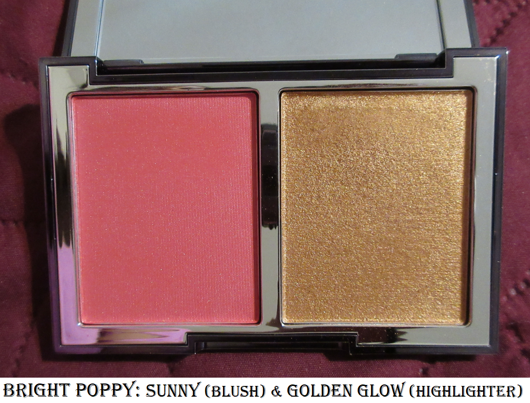
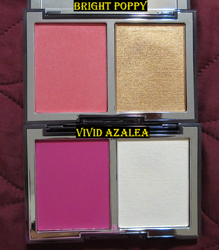
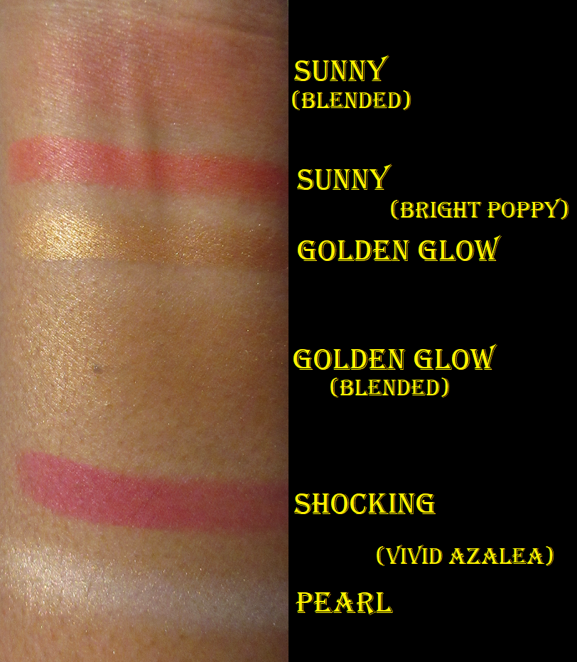
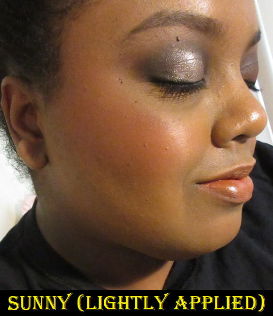
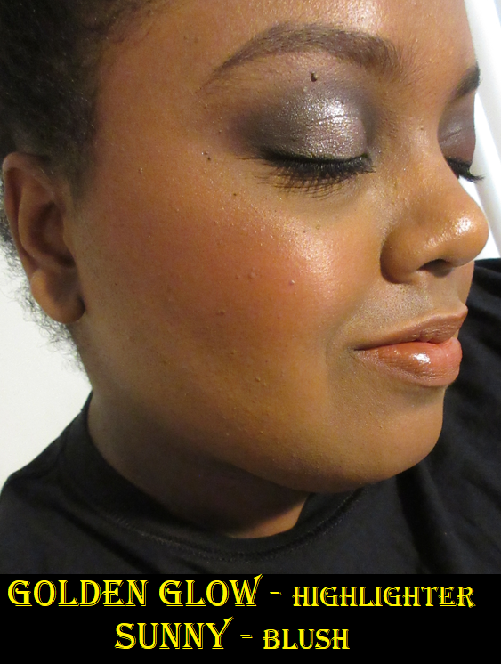
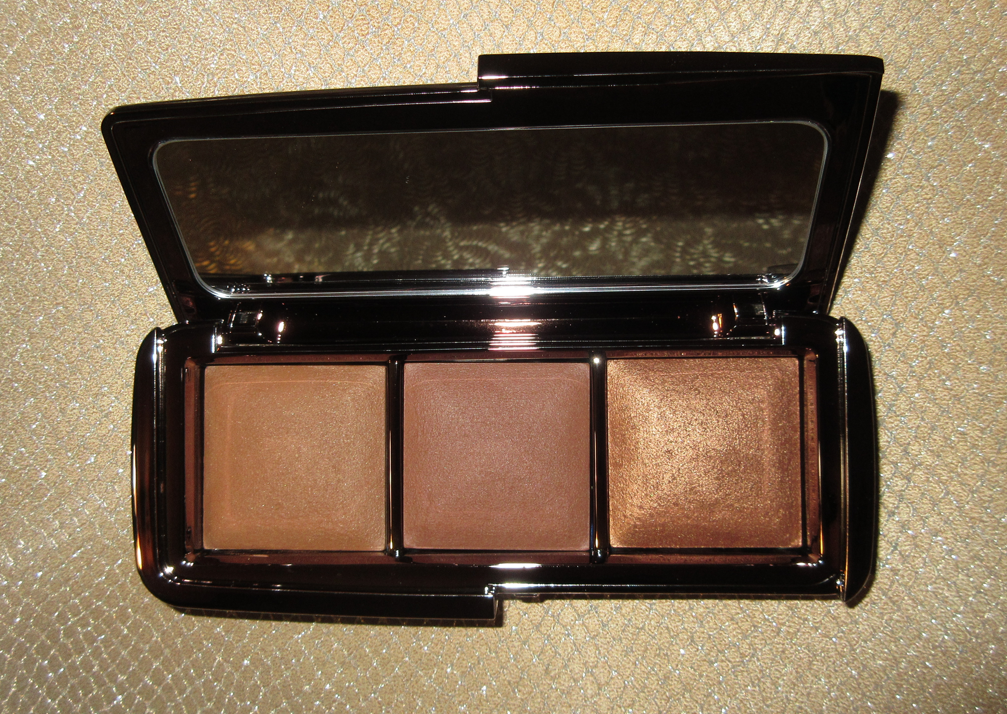
Wayne Goss The Weightless Veil Blush Palette in Bright Poppy (Sunny and Golden Glow)
Unlike the other blushes I’ve listed, which are among my top favorites, I decided to try Bright Poppy because the colors are better suited for me than Vivid Azalea and I wanted an answer as to whether the blush shade would be insanely pigmented in this duo too. Sunny is not quite at the unbelievable pigment level of Shocking, but if I tap once into the blush with my Smashbox Buildable Cheek Brush, it’s enough to thoroughly cover my cheek. An additional half layer is the maximum amount I would want to use. Otherwise, my option would be to tone it back down using a finishing powder on top.
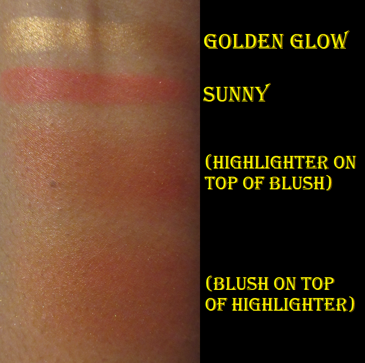
Sunny is pretty on the cheeks. Golden Glow is a nice highlighter formula that is very complimentary to my skin tone. I prefer to apply my blush and highlighter separately, but Wayne suggests that anyone who likes shimmery blush formulas could apply the highlighter to the entire cheek and then blend the blush on top of it. This technique worked for me with Vivid Azalea because the combination of the two shades turned the blush into a lighter color. I tried this with Bright Poppy and did not like it at all because the shimmer color and blush color don’t match. This means the particles in the highlighter stand out a lot more and I don’t like how contrasting it is. Whether I applied the highlighter to the bottom or the highlighter on top, the end result was the same.
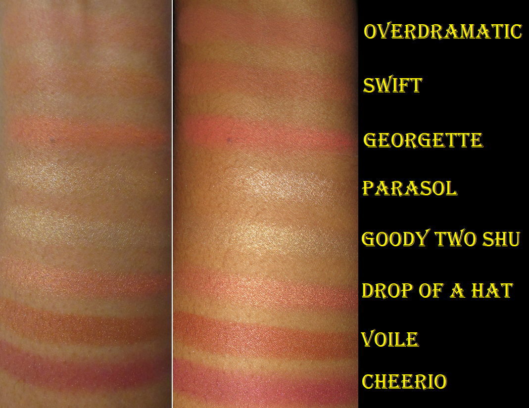
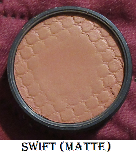
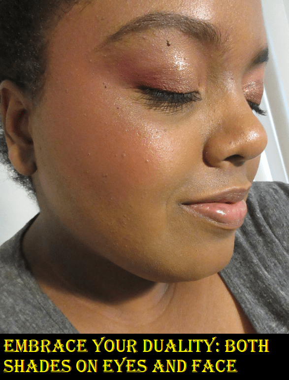
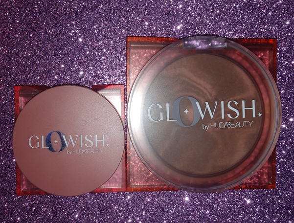
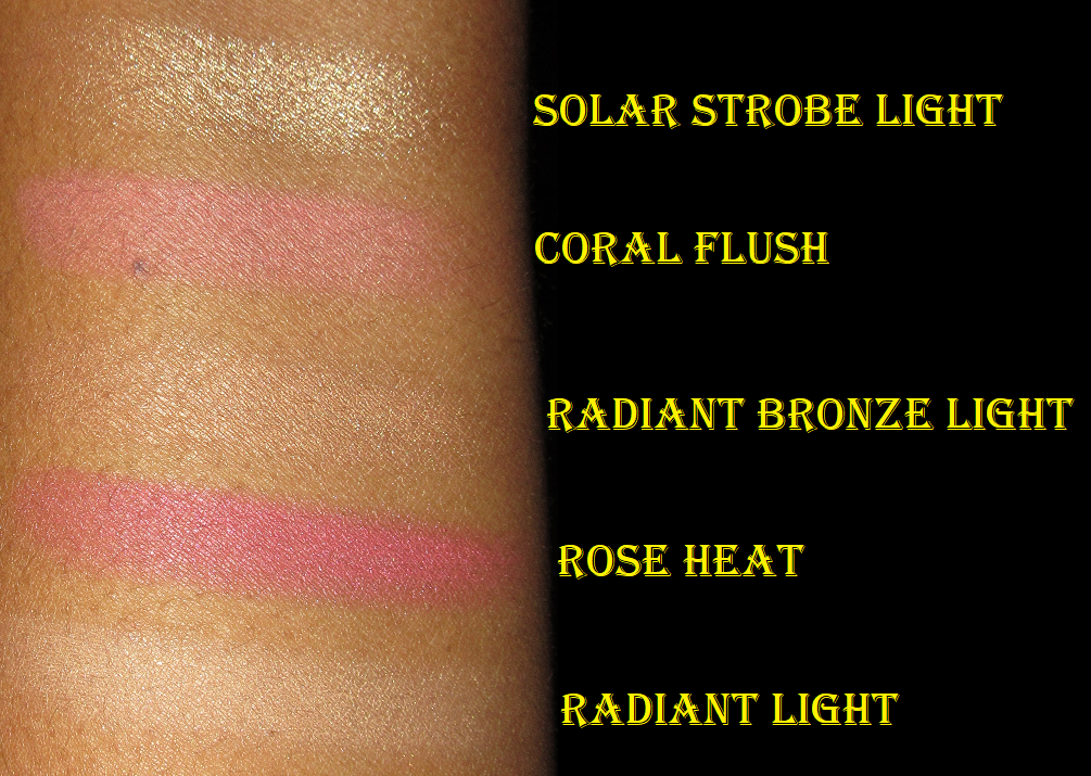
Colourpop Super Shock Cheek in Matte, Satin, and Pearlized finishes.
Colourpop’s Super Shock Cheek line includes both blushes and highlighters, so I decided as a bonus to review all the ones I own here since I’m a huge fan of them. They have the benefit of looking and applying to the skin like creams, but without feeling heavy, sticky, or greasy on the skin like some cream blushes on the market can do.
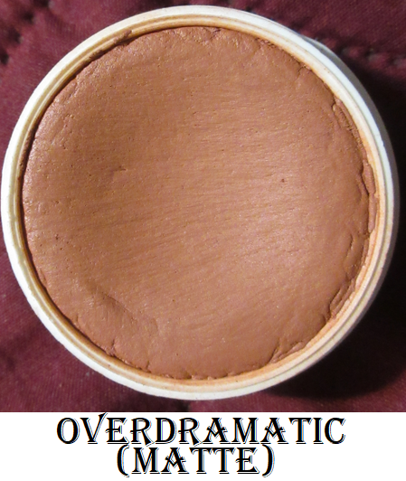
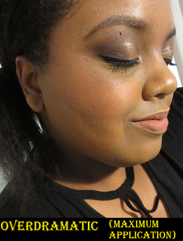
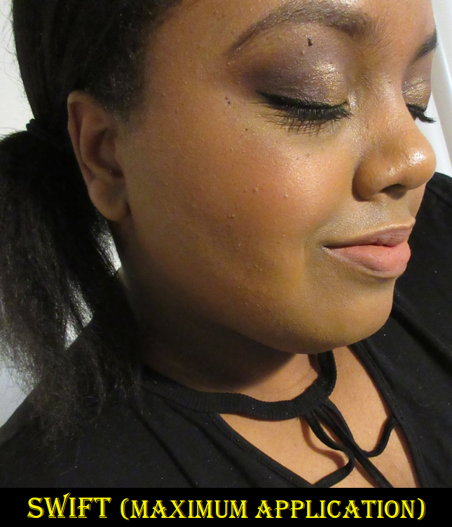
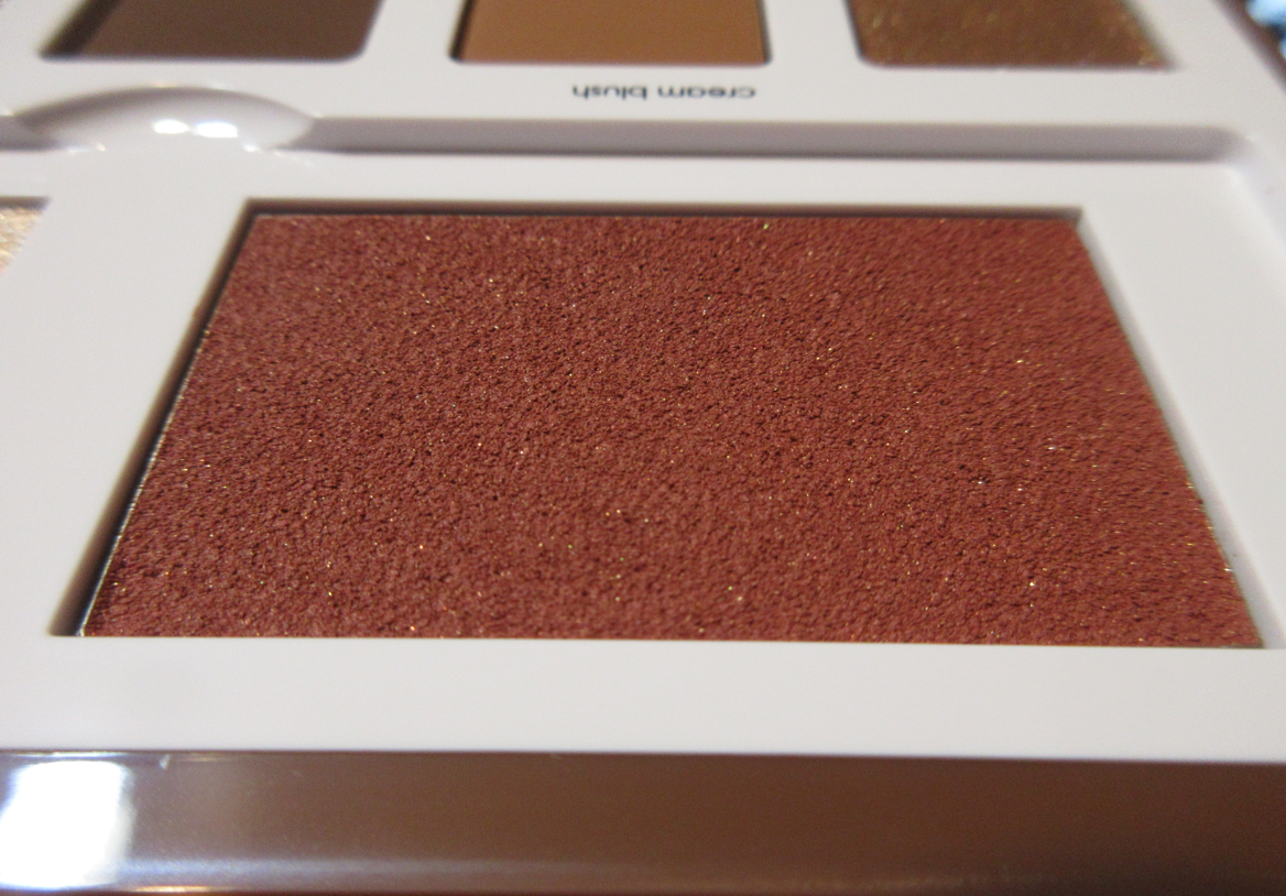
In the Matte finish we have Over Dramatic, a “mid-tone pinky nude,” and Swift, a “rich deep warm brown” shade. Both are very close in color and practically look the same on my cheeks. Calling Swift a deep and rich shade is quite the exaggeration on Colourpop’s part. I have to build them up a lot in order for them to show in photos, but I bought these specific colors so I could have some brown leaning blushes, which aren’t as prevalent in my collection. Swift is from the Make It Black Collection when the brand partnered with Pull Up For Change. It’s a bit stiffer in consistency than Over Dramatic and because Swift is more of an orange-brown than pink-brown, it blends in with my skin a lot more. It’s on the borderline of blending in too much, considering it’s such a nude shade for me already. For that reason, I do prefer Over Dramatic because of my personal preferences.
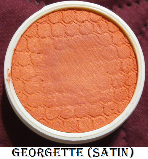
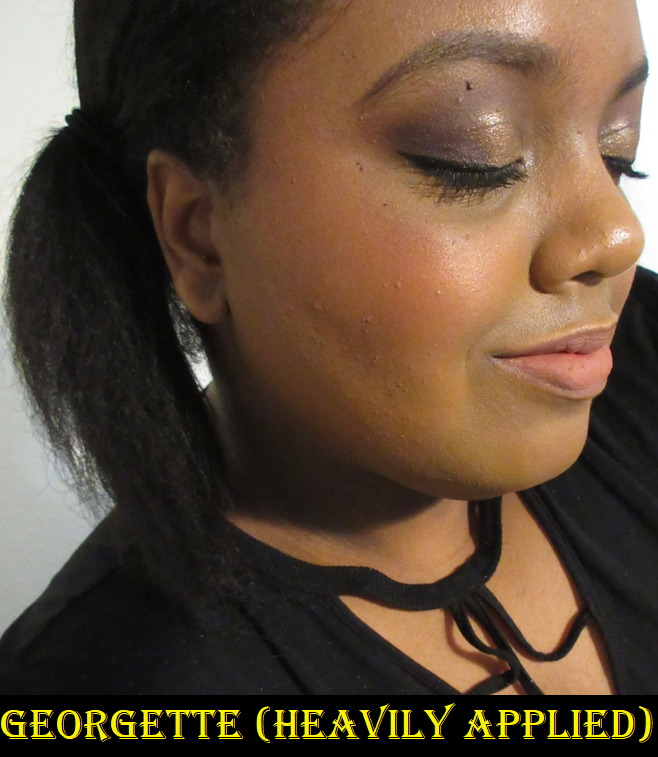
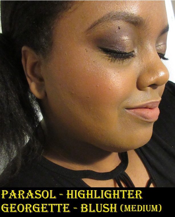
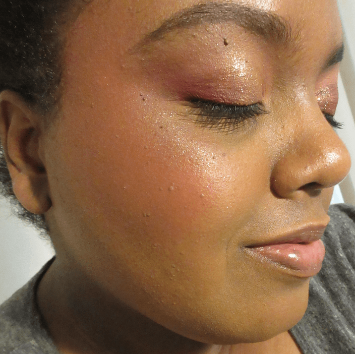
I just have one Satin finish Super Shock Cheek and it’s in the shade Georgette which is described as a “bright apricot with a warm sheen.”
Georgette has the right amount of brightness that isn’t obnoxious. Also, I’ve always struggled to find orange tones of blush that look flattering on my skin tone. I tend to like the ones that lean more red or pink. This apricot shade is more on the yellow side, but I like it. So now, I think it’s just true oranges at the 50/50 split between yellow and red that I don’t enjoy as much. My quest to figure it out continues!
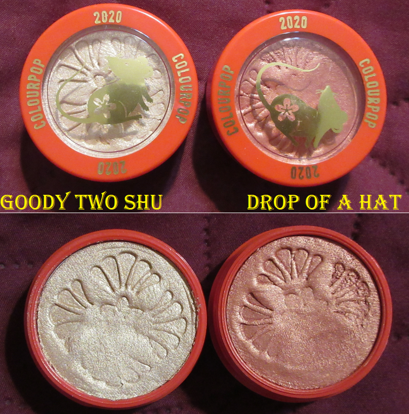
I have five shades in the Pearlized finish, starting with the two that came in the 2020 Lunar New Year set called the Lucky You Super Shock Cheek Duo.
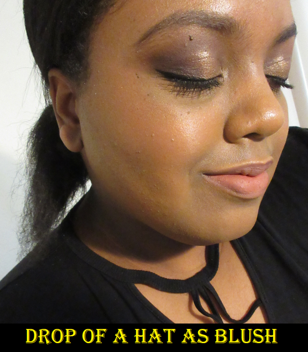
I kept these unused for so long because of the pretty pattern in the Super Shocks. When I finally used them, I was a little disappointed that Drop of a Hat was too sheer to work as a blush for me. It’s better if I consider it a pink highlighter or blush topper. Goody Two Shu is pretty but a little sparkly, so I decided it wasn’t worth continuing to ruin the embossing. I just keep these as collector items now.
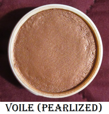
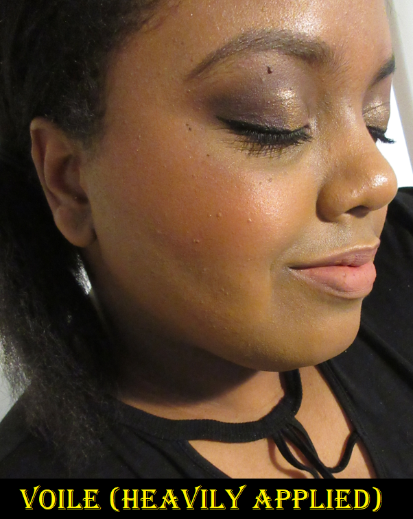
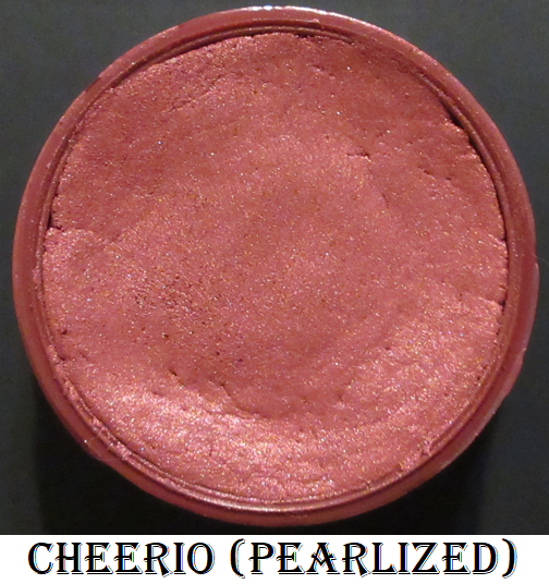
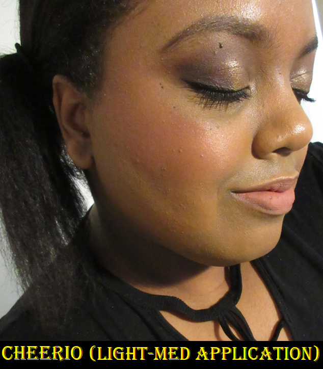
Voile is another Super Shock I stopped using. I kept trying to use it because the shade reminded me of Benefit’s Kiss of Rose and Charlotte Tilbury’s Walk of No Shame, which are both shimmery blushes I find to be beautiful. However, the shimmer level of Voile in person and the way the “copper sheen” sparkles on my cheeks is too much for me. It’s far more sparkly in person than it appears in the photo. I’ve realized that I prefer Colourpop’s matte and satin finishes for the blush shades. The only pearlized blush I enjoy is Cheerio and that’s because it seems to be a pearl-satin hybrid! Cheerio is a repromoted shade, which I bought from the Wine & Only Collection. The back label on my blush has “Pearlized” printed on it, but on Colourpop’s website it’s listed as a satin and it doesn’t have as many sparkles as the others in that formula. Or, perhaps I can’t see them if most of the sparkles match the color of the blush. What I see are some silver flecks.
I have to use a very small amount of Cheerio because it’s a deep shade. It’s easy to overapply and my specific blush arrived partly shriveled (which I pressed back into the pan). So, it’s a little drier than it should be and not as easy to spread evenly on my cheeks, but I can still make it work. Colourpop did send me a replacement, but I realized I preferred the cream blush from Natasha Denona’s Bloom Cheek palette a lot more, and that color is similar to this one, so I gave the replacement to my sister.
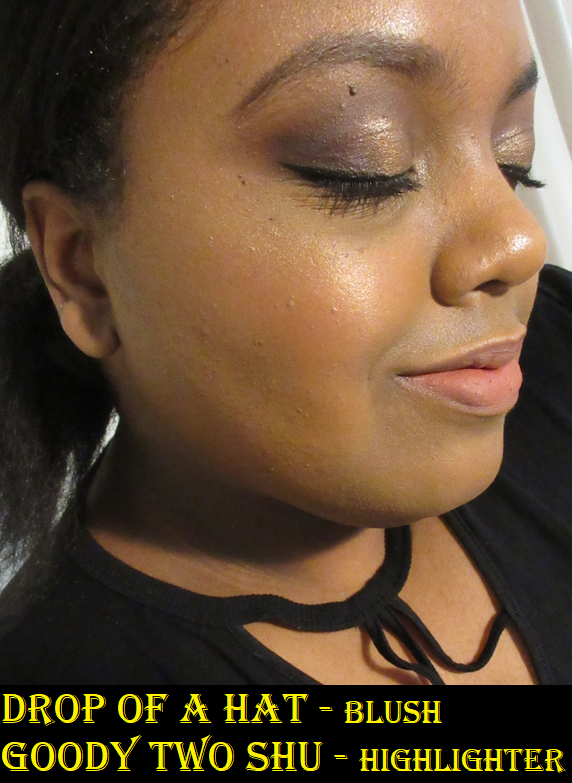
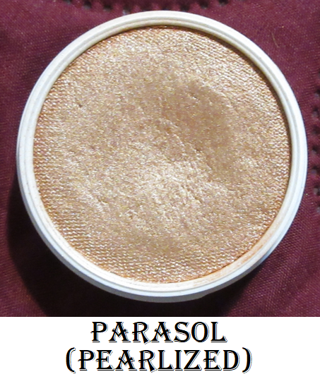
Lastly, we have my absolute favorite Colourpop Super Shock Cheek. It’s a “peachy gold” shade that I use for highlighting called Parasol.
It looks extra sparkly in the photo above because I used it over the Georgette blush which also has a sheen, but this highlighter is very smooth and wet looking. It blends into my skin very well and is the kind of tone I like for highlighting. I’ve used it quite a bit, even though it doesn’t look like it in the photo from the top down angle, but it actually has a dip in the center.
This concludes the post! I tried to keep it short since all of these (minus Colourpop) have been reviewed on this blog before.
Are there any blushes you have been loving at the moment? The blush and highlighter categories are the reason I haven’t been able to post Best of 2020 and Best of 2021 posts. I was constantly trying new products, loving the majority of them, and not able to use what I consider my favorites consistently enough to rank some over others. This year, I’m committed to getting a lot more use out of my older products. There are still plenty I haven’t even reviewed yet! I hope you’ll return to see the progress on that! Thank you for reading!
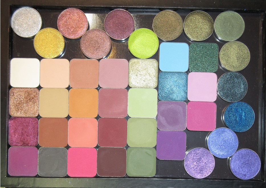
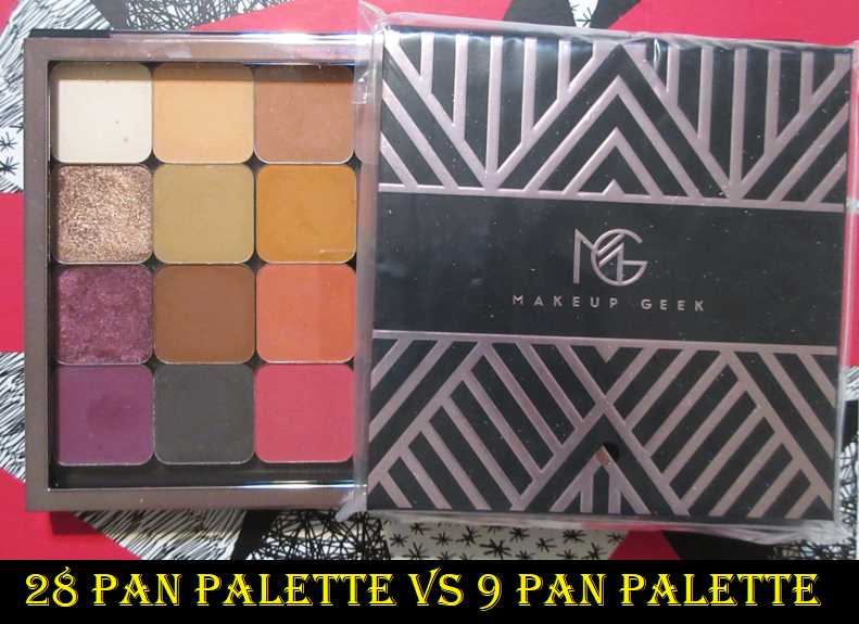
In under a month it will be two years since Marlena Stell rebranded Makeup Geek and two years since I started purchasing their products. I have some experience with the original shimmer eyeshadow formula, thanks to a sale they were having of their older products, but I cannot compare the original mattes to the ones now. For some reason, I use these shadows once and then go 3-4 months before I use them again. The cycle of use and disuse continued until September 2021 when I committed to thoroughly testing them once and for all.
About half of the square pan eyeshadows were purchased within a few months of the rebrand. The remainder were purchased during new launches like the Soft Focus Colors Collection and Fall Scenes Collection. The face products were purchased at different points in 2021, but I consider them fairly new, especially the bronzer since the shade I purchased was just released in September.
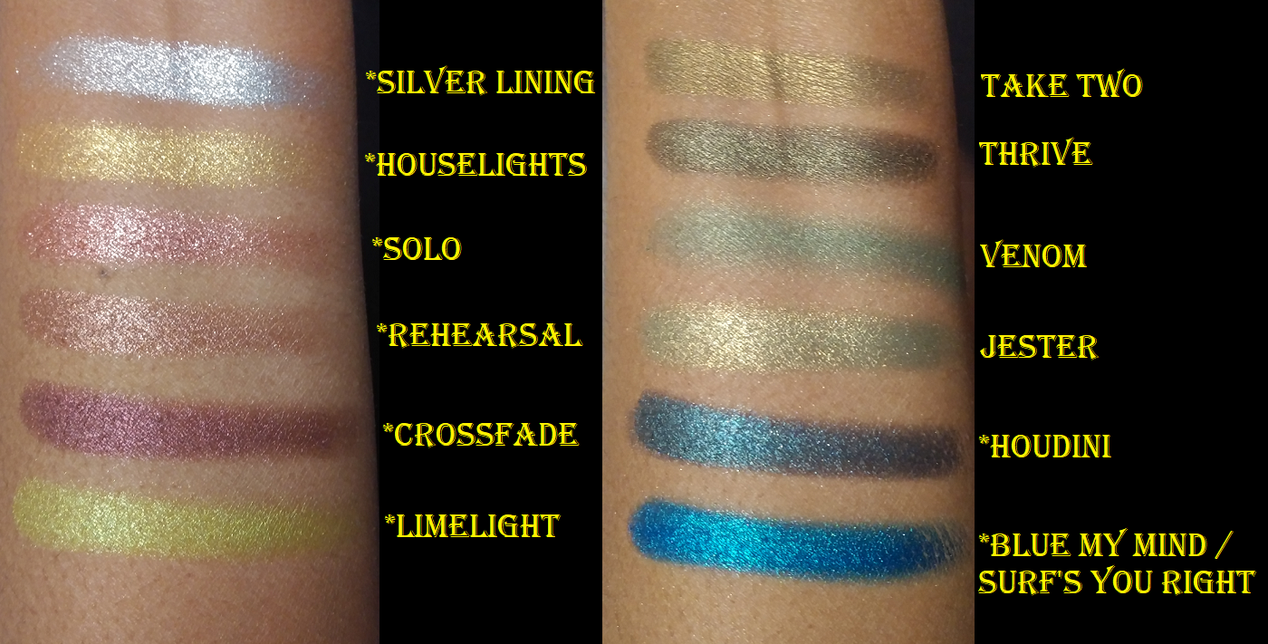
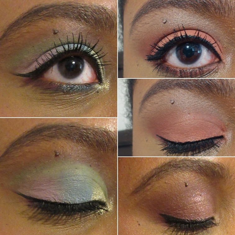
Makeup Geek Individual Shadows (old and new)
All swatches above Caitlyn Rose are from the older collection. The shades with an asterisk in front means it came from the All That Glitters Palette, which I depotted. The “Blue My Mind” color is stated as the name on the palette, but the actual name printed on the bottom of the pan (which I saw when depotting) is “Surf’s You Right.” I don’t know if this was a simple name change at the last minute or if it’s an example of quality control issues Makeup Geek may have had in the past.
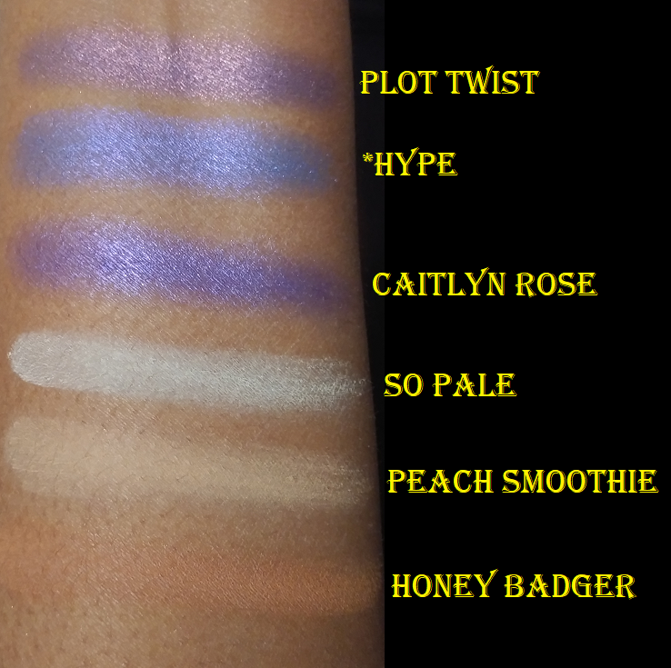
I haven’t worn all the older shadows, but I’m very impressed with the ones from the All That Glitters Palette. The exceptions are Venom and Hype which are satin shades and they don’t feel as nice as they did when I first bought them, so I think it’s actually time to toss them. Same goes for Plot Twist and Caitlyn Rose which are beautiful but crumbly now.
I have to also mention the pigment in Blue My Mind is insane! The formula feels wet like a cream to powder shadow, but I have no idea if it’s supposed to be like that. It’s so opaque, sparkly, and intense, but the texture makes me a little concerned as to whether it’s time to throw that out as well. I purchased all the older circle pan shadows in March 2020, so it’s not unrealistic for them to be going bad by now.
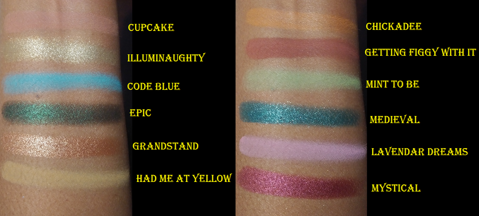
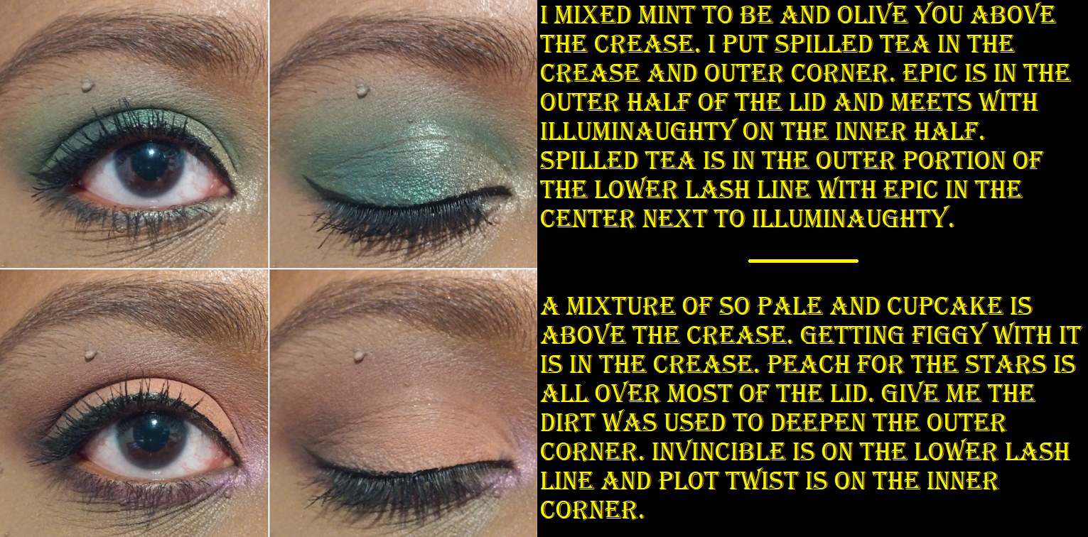
I don’t have many of Makeup Geek’s current foils, but I actually prefer the sparkle and shine level of the original foils over the new ones. I even like the older formula better because I have creasing issues with Mystical and especially Medieval. Medieval isn’t as smooth as Mystical either. Illuminaughty, Grandstand, and Epic don’t crease as much. I really like those shades. The foils are described on the website as being a cream and powder hybrid. Perhaps the cream element is what gives it the tendency to crease. While I’ve always had some deep lines around my eyes which is natural to crease a little, Mystical and Medieval move so much to the point of leaving blank spots. It’s quite disappointing since they were the two shades in the rebrand I was most excited to buy. One issue all the new foils have though is that the shimmer dulls after a few hours. This isn’t completely unusual for me, but when they aren’t super sparkly to begin with, they basically look like satins by the end of the day.
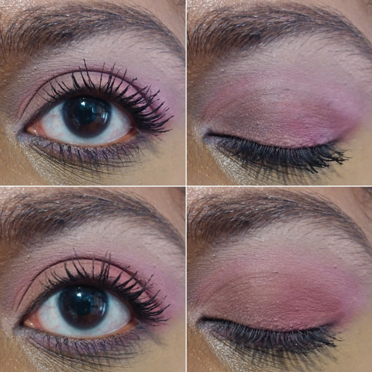
Regarding the mattes, the only eye base I’ve tried that works well with them is the MAC Paint Pot. In the photo below, the top half shows where the mattes patch off the lid after being worn for less than an hour. The bottom half shows how the shadows looks after the same length of time when redone over MAC Paint Pot. It’s not perfect, but it’s much better. I don’t remember which shades I used here because the eye photos were taken at least six months ago.
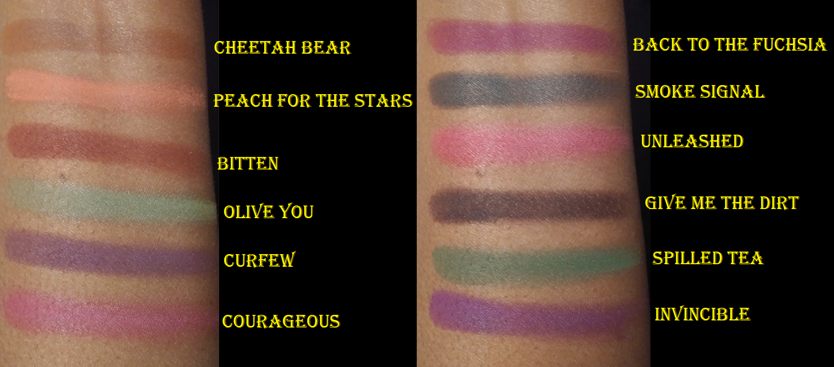
Most of the mattes don’t have pigmentation issues. A few that I own are a thinner more powdery formula than others (like Chickadee and Peach For the Stars), which do fade me on quickly. Even those that fade will still leave a hint of color all day if I use the Paint Pot as a base. I learned though that the absolute best results are just like the face powders and look better if the eye has been set with a powder layer first. These are definitely not creamy mattes, so my eyes can look extra dry and ashy with some of these lighter shades. I think the dryness is what I initially couldn’t pinpoint as to why I was underwhelmed by MUG shadows.
These are some of the looks I’ve done prior to reviewing. I don’t remember which ones I used. I had a few additional shadows that didn’t make this review because I didn’t like them or they were too similar to other shades I purchased. I sold Daydreamer, Wine and Dine, Creme Brulee, Current Obsession, and Latte as Usual.
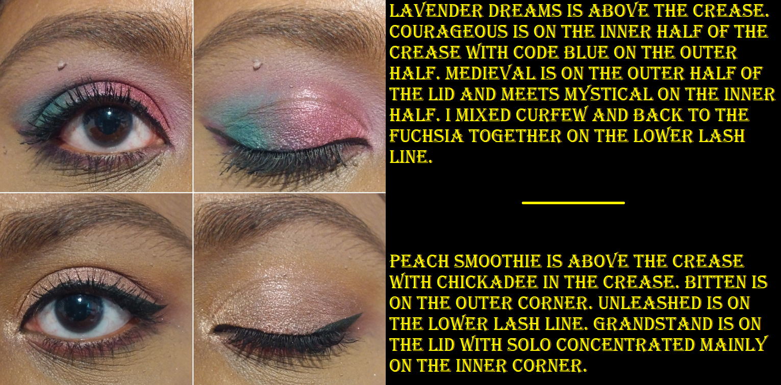
The best of the Makeup Geek mattes blend nicely and easily and show up opaque the way I like. The downside is that whatever shade it looks initially will turn into a darker variant of brown after a few hours. Had Me At Yellow turns into a mustard yellow-brown. Back To The Fuchsia turns purple-brown. Curfew turns dark brown almost black. I don’t mind these changes as much considering the brown-blends still look pretty and they mostly last all day.
Courageous, Unleashed, and Invincible are part of the Power Pigments formula which are supposed to be the most saturated and most pigmented mattes Makeup Geek have. They give more opaque results right away compared to the other mattes, they are more vibrantly colored, and they have a drier rougher texture. The last one is to be expected when using actual pigments over micas and dyes. The Power Pigments used to be more expensive than the regular mattes at $7.99, but were lowered to $5.50. I think this was a good decision because I don’t believe they are that much more special than the regular mattes considering most of them can be built up to the same level of opacity.
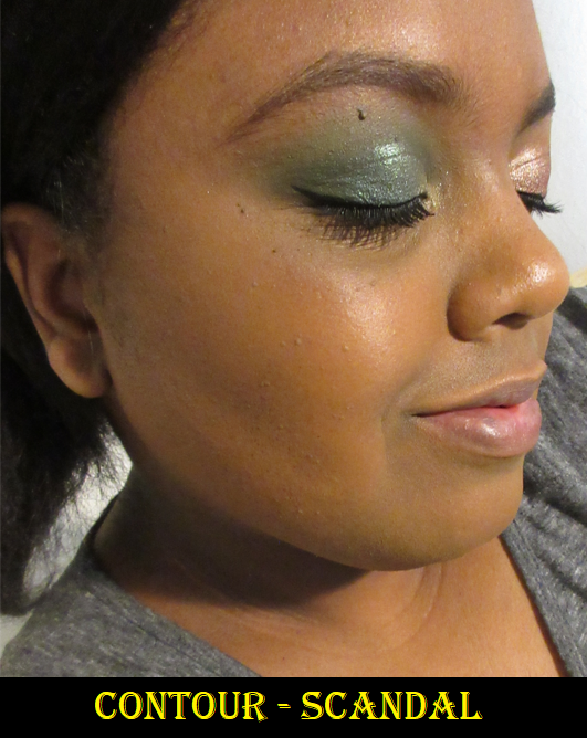
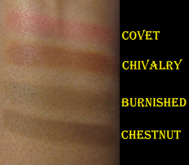
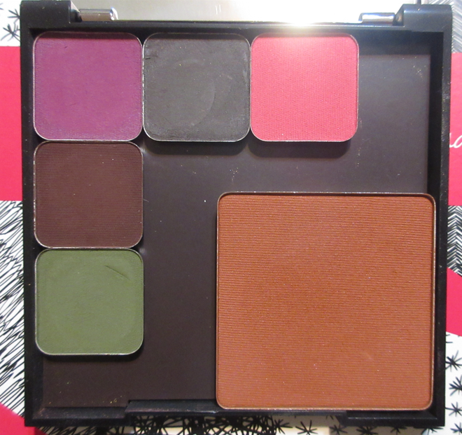
Contour in Scandal (discontinued)
Makeup Geek does not currently have contour products available for purchase, but I got it during a sale shortly after the rebrand. This is a great contour color for me, however, this product doesn’t blend very well. Wherever the powder first touches my skin is where it will stay. Every time I use it, I have to apply a finishing powder to blend out the edges or foundation to sharpen where it got too spread out from me trying to blend it. It still looks heavy even when applied with my softest most loosely packed brushes. This product was probably created at the height of contouring when it was popular to be ultra pigmented, sharp, and intense. If Makeup Geek brings the contours back, I hope there’s a formula change to produce a more natural or airbrushed look. I can make it work, but I likely won’t use it again. The sale price was under $2, so I can’t complain too much.
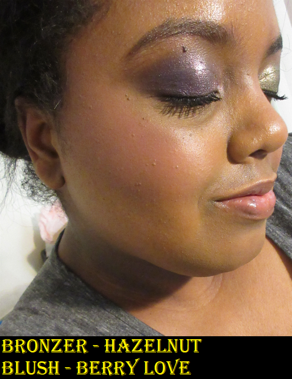
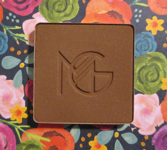
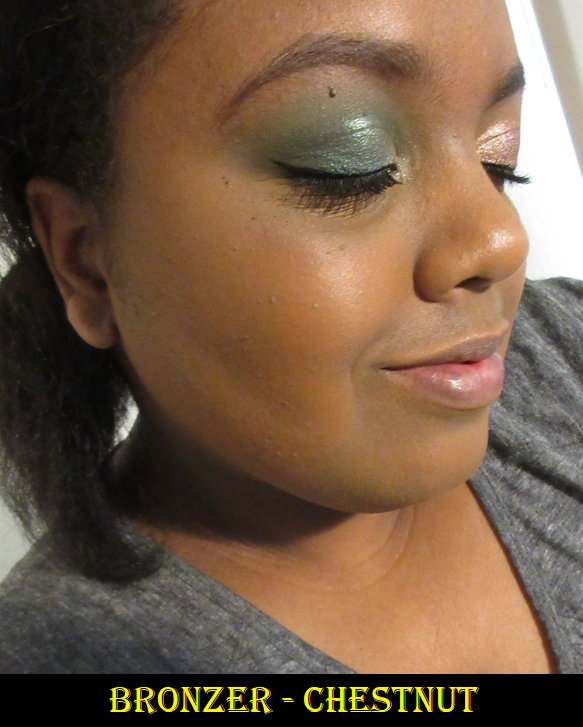
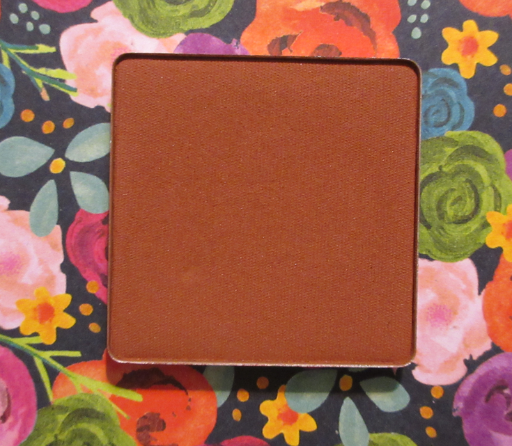
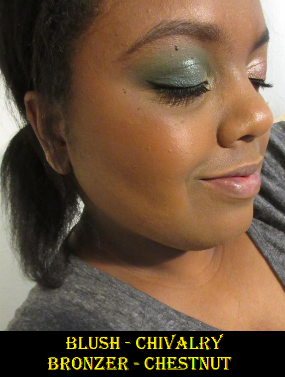
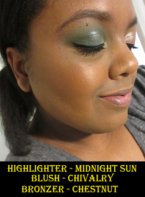
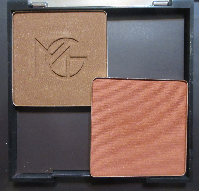
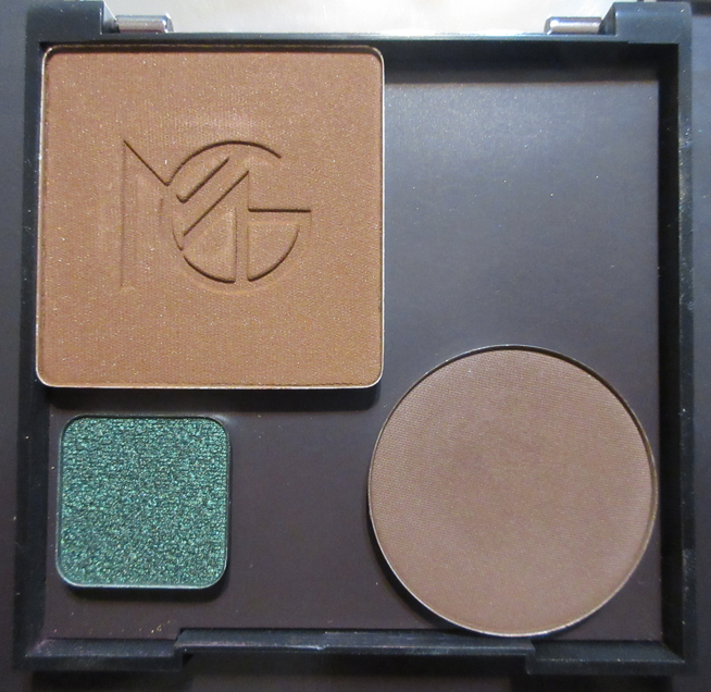
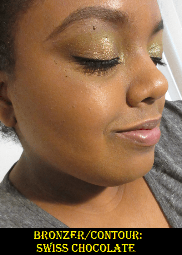
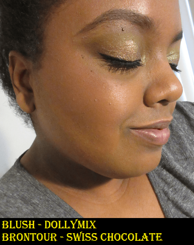
Bronzer in Chestnut
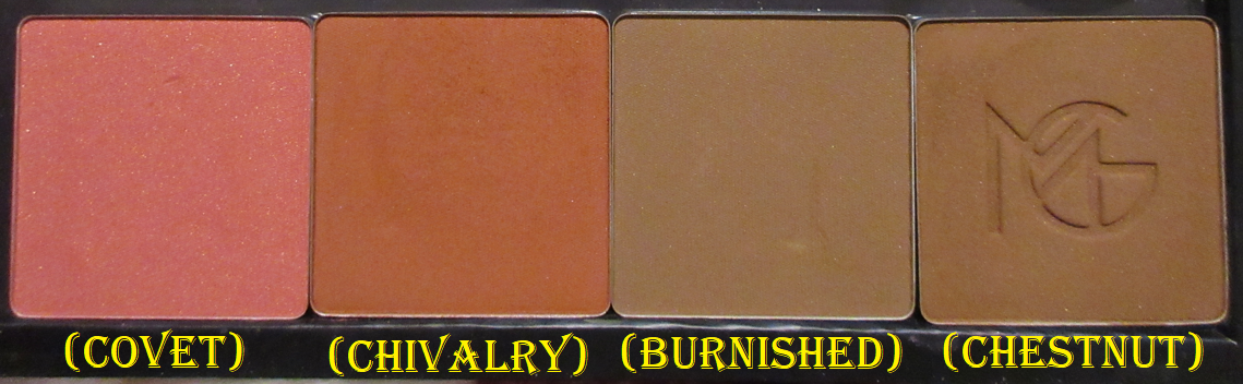
The color in the pan looks great for me. Unfortunately, this shade looks almost identical to the contour when I actually apply it to my skin. It has a golden sheen with fine gold specks throughout, which gives it the appearance of warmth, but the actual base color is deeper and neutral toned at best. When I apply this, most of the gold is brushed off the skin and what I’m left with creates a shadow and very little warmth. The swatch photo in the blush section shows how similar Chestnut and Scandal look when blended.
The bronzer blends easier than the contour, but the only way it looks nice is if I’ve set my face with a layer of powder first before I blend the bronzer on top. Powdering first gives a softer nicely blended look that I want. However, since 2020, I pretty much stopped using setting powders except under my eyes. If I use a powder at all, it’s a finishing powder which is the last step in my makeup routine. Because it’s not my usual style to set my foundation before I apply the rest of my face products, I don’t see myself reaching for this over the other bronzers I own. However, if I was willing to switch up my style, I know I could get a really beautiful end result. I did end up purchasing the shade Burnished during Black Friday, which is much more cool toned of a shade and just barely deep enough to show on my bare face. I have not yet had the chance to try Burnished over foundation.
Blush in Chivalry
Chivalry is a pretty terracotta brown shade. It performs better than the bronzer on unpowdered skin, but I’m still not completely impressed with the finished look unless it has that powder layer underneath it. Then it looks quite beautiful and almost airbrushed. This technique reduces the amount of pigment I get on the cheeks at once, but it also prevents me from getting darker patches where my brush first touches my skin. In the photo below, the left set of swatches were done with my finger and the right set were blended with a brush to demonstrate the blend without powder (though the sticking issue would have been more prominent if the swatches were applied on top of foundation).
Because powdering isn’t an absolute necessity with the blush and I can still get it to look nice if I take my time blending and use fluffy airy brushes, I could see myself continuing to use this beyond testing purposes. It has good staying power and can be applied lightly for a subtle flush (if powdered first), medium intensity on unset foundation, or built up to a fairly deep shade.
I purchased Covet during the Black Friday sale and I like it even more than Chivalry because medium pinks tend to be my favorite.
Also, unlike the bronzer and contour, the blush leaves a bit of kickup in the pan.
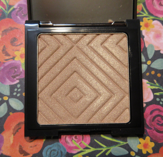
Highlighter in Midnight Sun (discontinued)
This highlighter color is discontinued, but I very happy I could get it because I think it’s a flattering shade on me. It’s quite funny that I like it so much considering this is listed as being best suited for fair skin tones. It does look pale in swatches, but as the cheek photo shows, a highlighter for someone lighter than me should look way more bright and stark. Then again, this isn’t a blinding type of formula. A shade actually geared toward my skin tone would probably not stand out on my cheekbone as much as this color does, which is just the right amount for my taste. Of all the face products, I like the highlighter formula the most.
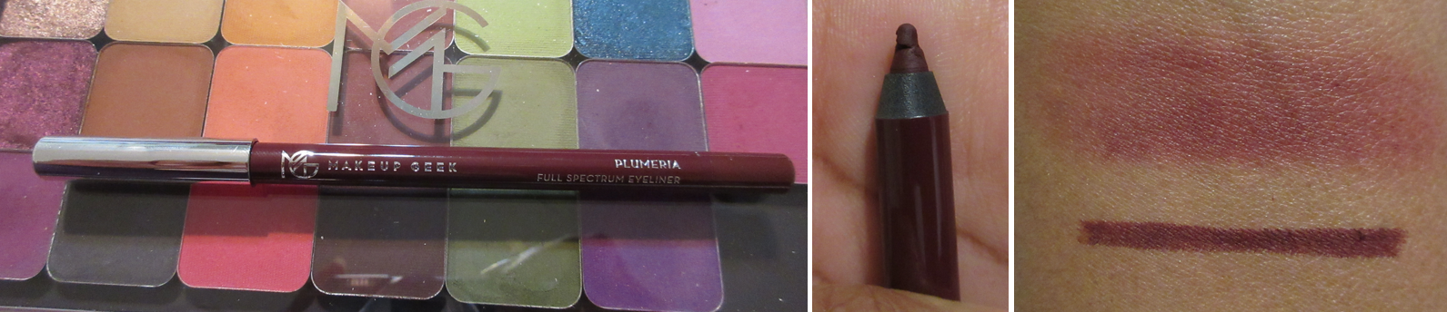
Full Spectrum Eye Liner Pencil in Plumeria
This is another last minute Black Friday addition to this post. It did not arrive early enough before my trip for me to thoroughly test it. I watched how Marlena used this pencil and was drawn not only to the color, but the fact that it could be smudged out as a shadow color or base and is supposed to be almost water resistant. That element worked well on my arm. After giving it some time to dry, it couldn’t be moved by rubbing it with my finger. Even after wetting it, it didn’t smudge, smear, or run. However, for some reason this pencil did not last on my eyes for even an hour. I do have oily lids, so perhaps this is the reason. I tried it one time on bare eyelids with no primer or other eyeshadows. I put it all over the lid, blended out on my eye like a cream shadow. In an hour, about a third was gone. When I checked a few hours later, there wasn’t any of it left. Since it worked on my arm, I’m guessing this is a “me” problem and anyone who does not have oily eyelids will be able to use this pencil. In the future, after testing it thoroughly, I will update this post if I found a way to keep it on my eyes.
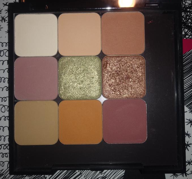
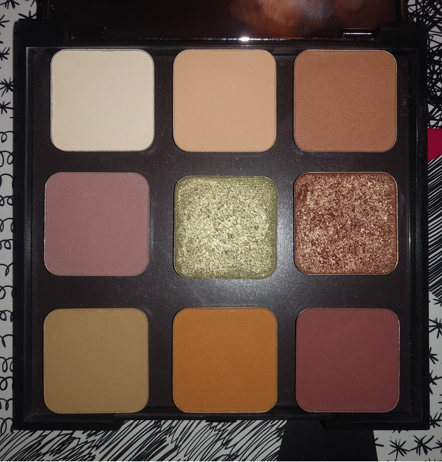
Customizable Compacts
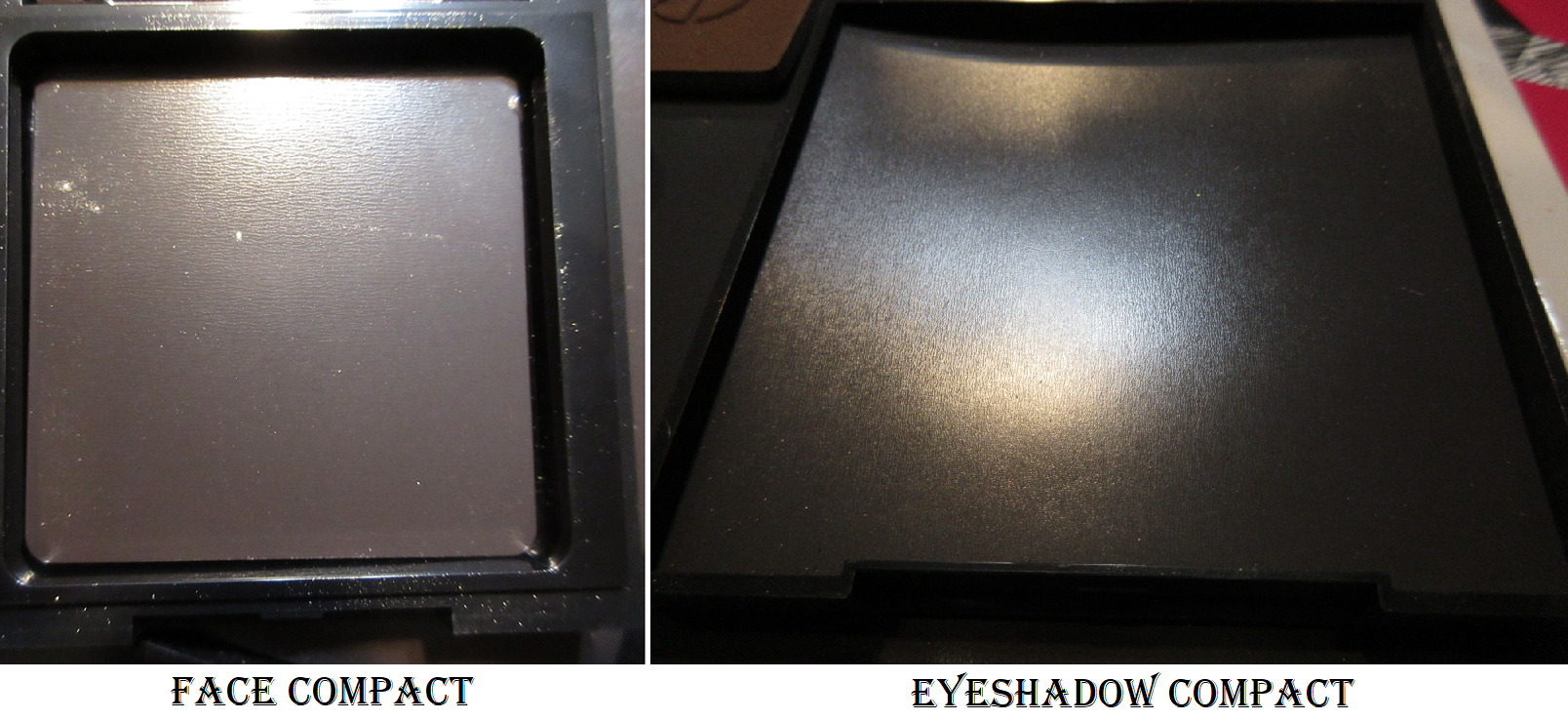
I couldn’t end this review without discussing some of the things I noticed about the compacts offered by Makeup Geek. Whether you get the clear or gunmetal lid of the mini palettes, they both have a magnet of standard thickness and rounded edges. The square pan face powder singles fit perfectly inside them. On the other hand, the “Travel Vault Palette” with the gunmetal lid that anyone who makes a custom 9-pan palette will get, has the kind of magnet I get from the craft store in thin sheets with the peel off sticker on the back. As can be seen in the photo above, mine was not cut properly to the size of my palette. It arrived with the edges lifted up and when I press to stick them back down, they still don’t lay perfectly flat and are curved. When I watched reviews during the rebrand, I saw plenty of other people had warped magnetic bottoms like mine. The actual palette packaging is well constructed, sturdy, and beautiful. The mirror in the lid is a nice quality and a great size. However, I believe Makeup Geek cut corners (literally and figuratively) with the magnets. At one point I had four of these palettes and three out of four were not cut, laid, and stuck properly. When you have expensive eyeshadows, the last thing you want is to have to worry about the whole sheet lifting off and your shadows breaking. I have two of the travel palettes left and I took the better glued one on a trip with me and had no issues. However, I cannot say what would happen if someone keeps their shadows in there at all times.
The main reason I don’t keep my Makeup Geek pans in there is because of all the wasted space. I can understand the older circle pans not fitting better into the palettes considering their shape, but I expected the rebranded new shadows in their mostly square shape should be made to fit the palettes. They still only fit 9 shadows. I understand wanting enough space to be able to easily take the shadows in and out, but it doesn’t look good in my eyes. It looks like I took another brand’s shadows and tried to put them in Makeup Geek’s palette because they’re so ill-fitting. It bothers me when a pre-made palette is larger than it needs to be, but having dividers between the shades indicates it was intended to be that way. Custom palettes without those dividers look untidy on the part of the one who made the palette. Me.
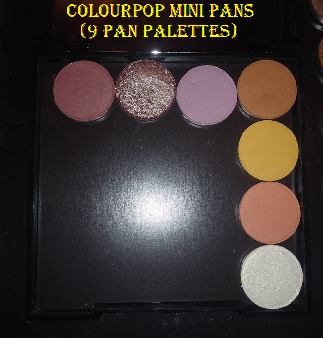
In addition to the eyeshadows not fitting well, there is only room for one face product; if you put one face product, you can only add a maximum of 5 eyeshadows that are still widely spread out. One of the things I love about making custom palettes is having things line up and looking orderly. If it can’t be orderly, I enjoy at least filling up as much space as possible, so it’s a pet peeve of mine that they are this way. The only brand’s shadows that fit nicely in the Makeup Geek palettes are the mini circle shadow pans from Colourpop such as the pans from the Blue Moon, Lilac You A Lot, Star Wars The Mandalorian The Child palette, etc.
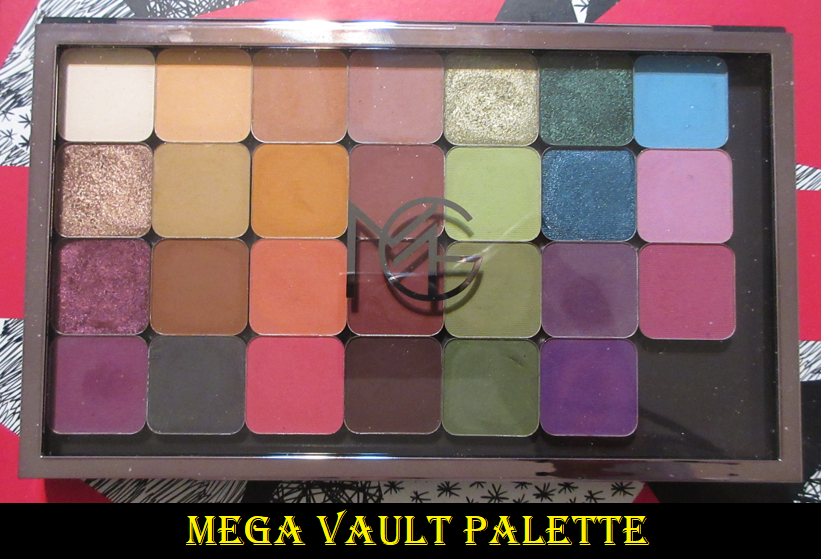
There is one other palette type for sale called the Mega Vault Palette. It’s the Matrix Shadow Palette that holds 28 shadows, and those at least fit nicely on all sides with a reasonable amount of extra space. When comparing the 9 pan palettes (whether old version or travel vault version) to the Mega Vault, it’s clear to see a palette of that size should have been made to hold 16, not 9. Marlena has expressed her struggles keeping her brand afloat, so I can see the desire to reuse packaging or try to drum up buzz by announcing a rebrand. I just wish the shadows-to-palette aspect was better planned out for the 9 pan palettes. Then again, perhaps this is why the custom palettes are so deeply discounted. In case anyone is wondering, I kept my Makeup Geek shadows in a custom magnetic Juvia’s Place palette, which I don’t believe is available for sale anymore. I kept them there until I bought the Mega Vault.
Whenever I review a brand from an Influencer, I disclose whether there are any personal feelings involved. I started following Marlena on YouTube shortly before her rebrand and although I only watch a quarter of her videos, I do like her as a person and I’ve improved my eyeshadow skills because of her live demonstration videos. At the same time, I was also very unhappy with the situation between her and Tina (The Fancy Face) which played out after I already made my initial purchase from the brand. Because of that incident, I did not want to review the products on my blog. However, this was two years ago and my opinion of Marlena returned to a neutral state. I wish her and her brand success. Even though the products aren’t a perfect match for my skin type or my application style, I’m still interested in seeing what else they create in the future and am likely to continue purchasing from them.
That’s all for today! I’mgrateful you’ve taken the time to read my review and I hope the information was useful.
-Lili ❤
*UPDATE: MARCH 4th, 2022 It is quite sad to see that Makeup Geek Cosmetics is officially closing in April. Even though I didn’t love a lot of the products, I wanted to see the brand grow and improve. I wish Marlena the best with her next endeavor as she is the type of person who doesn’t give up on pursuing her passions (as even stated by her in her brand closing video). In the event that someone new has come to my blog in search of recommendations on what to purchase before the items are gone forever, I easily recommend the highlighters and the Mega Vault empty magnetic palettes. Perhaps even the blushes, but that’s all. I know the brand is best known for their eyeshadows, but I personally think they’re just okay. Since my review, MUG has released a primer, mascara, and brushes but I haven’t tried those, so I cannot say anything about their quality.
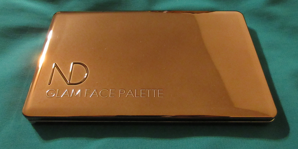
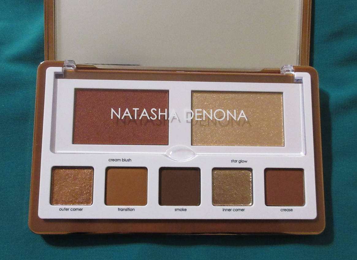
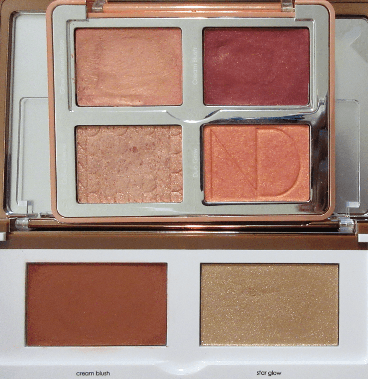
The annual Sephora VIB sale ended last week and this was one of only three items I purchased. The Glam Face Palette appealed to the resurgence of my interest in neutral eyeshadows, my strong love of blush, and my attraction to highlighters. I did not enjoy Natasha Denona’s original blush duos that were part of her brand launch, but I’m a big fan of the Bloom Blush & Glow Palette, so I had high hopes.
I could see from videos that the back of the face palette did not have designated holes the brand sometimes includes for ease of popping shades in and out, but I hoped that with a magnet I could still pull the shadows out and be able to interchange them with any ND mid-size pans I wanted, since they’re the same size. Unfortunately for me, these pans are glued down to the palette, and since it’s metal glued to plastic as opposed to metal glued to cardboard, the pans would not pry loose no matter how much pressure I applied with my box cutter (which I use to depot shadows sometimes). I own a Z Potter, which theoretically is supposed to allow me to depot eyeshadows without destroying the palette, but the settings needed to melt glue in thick packaging has caused me, in the past, to accidentally melt and warp the packaging of things I wanted to reuse. So, I don’t want to take the chance of using it on this palette. In my eyes, this is the prettiest Natasha Denona packaging she’s ever made with such a sleek smooth mirrored bronze surface and those rounded edges. It looks and feels luxurious. Even though being able to customize the eyeshadow shades would be a game-changer, the price of the palette prohibits me from wanting to make further depotting attempts.
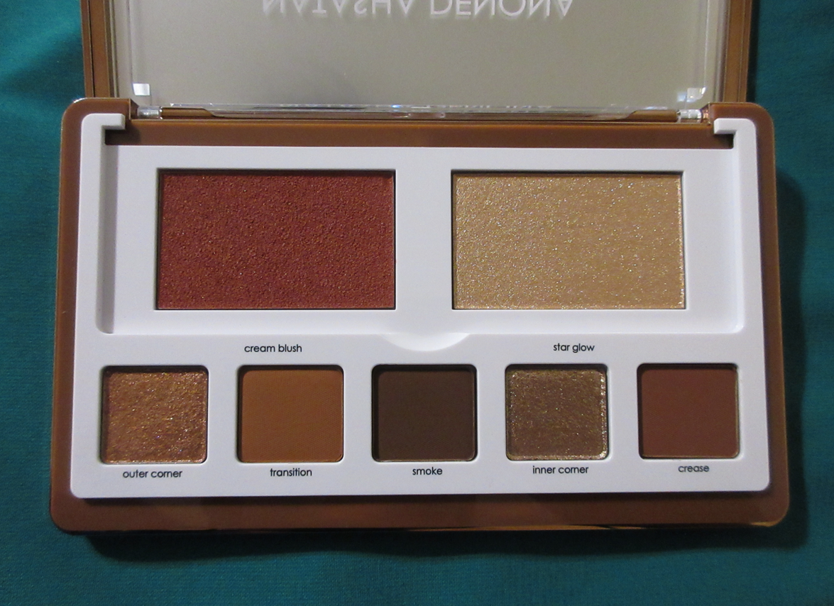
The plastic flap covers the blush and highlighter, so it’s natural to assume both are cream products, but it’s just the blush that has a creamy texture. The highlighter is a pressed powder in a formula that’s new to Natasha Denona’s brand, “that uses Japanese technology to deliver an extreme glow.” The way it looks in the pan with that texture instantly reminded me of the highlighter from Beauty Bakerie’s Brownie Bar.
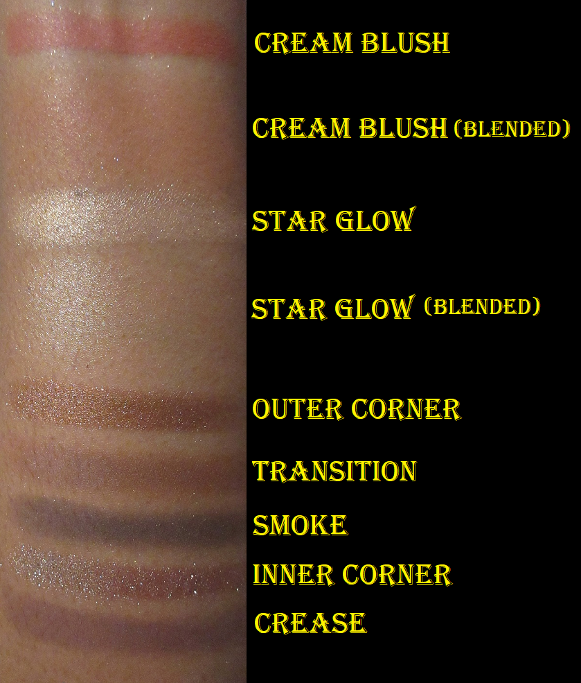
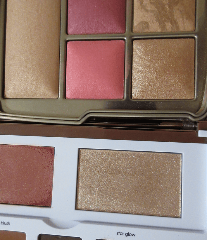
The Glam Face Palette comes in a Light and Dark version, but choosing between them isn’t as straightforward as using only the Light palette if you have light skin and the Dark palette if you have dark skin. Those with light to medium skin could easily pull off wearing either palette because the face products in both are essentially in the medium zone. Ignoring what the shades look like in the palette, the Light version contains a light champagne highlighter with a blush that spans from light pink up to medium pink. The Dark version contains a medium champagne highlighter with a medium pink blush that can be realistically built up to medium-dark pink. I would describe the color itself as dark coral, which is akin to medium red in terms of depth, but just with a slightly different undertone. In fact, neither cheek shade in the Dark palette is actually in the dark range, which is why choosing which palette works best for those with light to medium skin could come down to the eyeshadows and whether someone prefers lighter or deeper toned eye looks. The highlighter doesn’t have a strong base color and the shimmer particles are so bright and reflective that it looks even lighter on the skin than it does in the pan. It may still leave a cast, but not as much as it would if it had a more opaque base. The blush is a buildable formula that blends out quite sheer depending on the application tool used, but even if I get the most concentrated amount of blush onto my cheek, it doesn’t look as dark as it does in the pan. That’s what also adds to the wiggle room as to which palette works best for someone. In Natasha’s own words, the Light palette is best for those with “light to medium” skin tones and the Dark palette is best for those with “medium or tan to deep skin…but both palettes wear beautifully on all skin tones.” However, I think someone with deep to rich skin tone might want to check what the palettes look like in-store because even the Dark palette doesn’t run all that dark in my opinion. The blush swatch in the photo above was done with two swipes with my finger, which kind of says it all. I also compared it to the blush from the Bloom Cheek palette further down and that took just one swipe of the blush from that palette. That one is what I consider to be an actual dark blush.
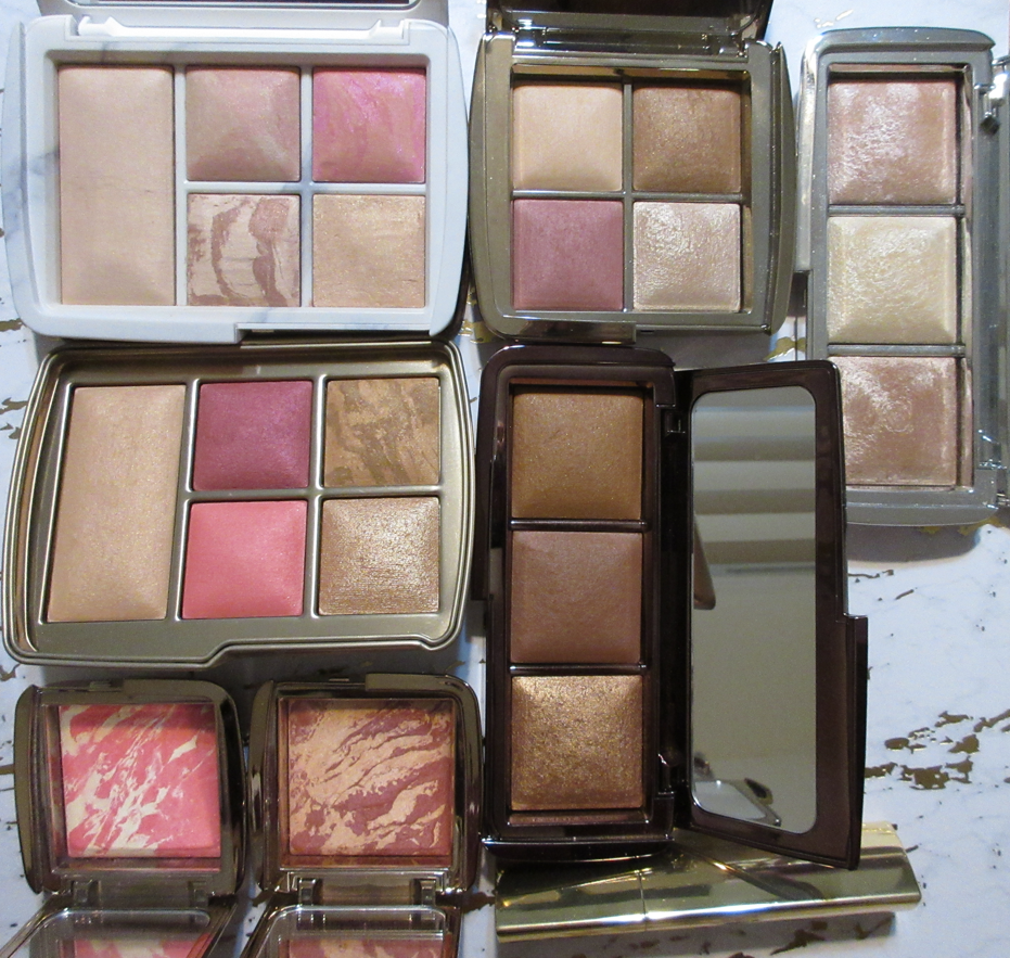
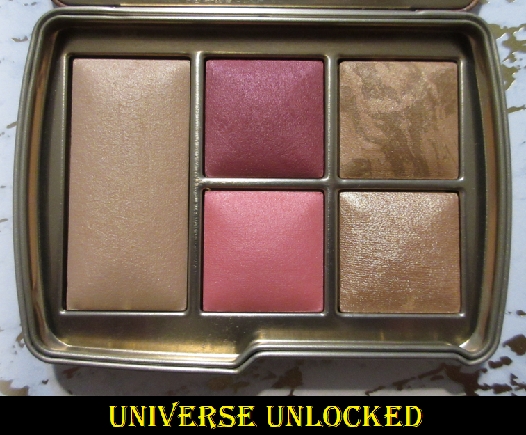
The Bloom Cheek Palette and Hourglass Ambient Edit Universe Unlocked Palette compared to the Face Glam Palette.
While I’m comparing palettes, I should add that the cream blush from the Bloom Cheek palette is a traditional cream formula, though it sets quickly and I definitely need to use it with the cream base to tone down the color. The cream blush from the Glam Face palette is cream to powder and doesn’t feel like anything on the skin until about the third layer, which is the minimum I need to get it to show as pigmented as I want. Using the Sonia G Classic Base, I’m not satisfied with the look of the blush until I’ve applied at least three layers, but it doesn’t get much deeper than that with even a fourth or fifth attempt using that brush. If I use my fingers, I get a lot more color payoff, but because the surface of my finger is so much smaller, I still need to apply three times to cover one cheek. So, I may as well use my brush which gives the smoother blend. When I try this with a denser flat top brush like the rephr 17, I’m able to build up the color to my satisfaction in 2 dips instead, but it’s definitely still not dark. With that brush I can achieve medium-dark level with about 4 layers. A sheer layer of this blush will set to the skin and be dry to the touch, but the more layers are added, the creamier it remains. In the amount I wear, it is not sticky but it’s also not transfer-proof.
With a sponge, I’m able to get the brightest color and most color payoff with the least amount of product, but as I continued to blend, it always moves the foundation and concealer I have in my cheek area on the left side of my face that’s covering up hyperpigmentation. So, my preferred method is using a dense brush. Another nice thing about the blush is that it lasts all day.
This buildable blush takes some effort to use, but I don’t mind because the result is so pretty! It’s the kind of shade I love where I get a natural flush without it being too bright, too dark, too light, too warm, or too cool. The color is perfection. The formula is almost perfect. There are random specks of shimmer in the blush, which I’m guessing is there intentionally to aid in the shine. I think I would have preferred if this had a sheen without the flecks, but at least the particles are on the smaller side and the area looks no more shimmery than I usually have on my cheeks anyway from shimmer eyeshadow fallout.
That ties in with another major thing to know about this palette. The top of the blush has a textured film over it which will make it a struggle to get any product onto the brush bristles. I recommend wiping off the top layer first before use. I think this is something that could affect many customers’ first impressions if this isn’t done.
There’s no kickup when using the highlighter, which is nice. I can get Star Glow to look quite subtle using the Wayne Goss #15 Fan Brush and Smashbox Precise Highlighting Brush. With those brushes, I can dip into the pan multiple times to control how much I put on. However, when I use the Koyudo La Fuga del Gato highlighting brush, I gently tap my brush into the highlighter one time, yet that amount always lays an intense amount on my cheeks. Brushes make a big difference in look and performance with this highlighter! Star Glow is high shine. Even though the particles are very fine, it’s so reflective that it still gives me a sparkle effect. Sometimes I like it and sometimes it’s too much for me.
The amount of blush in the photo above is the most I can get if I’m not using a very dense brush. I would have to really go out of my way to successfully overapply the blush. The amount of highlighter in the rightmost photo was created with two passes from an brush that doesn’t pick up much product and one pass with a brush that picks up a lot. I would not want to build it up any further or it would start to look ill-suited for me.
As for the eyeshadows, I first tried following the guide based on their names. Because Transition and Crease are so close in depth with Transition being orange-brown and Crease being the slightest bit darker but red-brown, it was hard to see the distinction between them on my eyes, especially after adding Smoke. They just blended together without much of a gradient effect. I’m used to using transition and crease shades that are a little further apart in depth, so it took several tries to get used to having to be so careful where I place the shadows and how I blend where my eyes are partially hooded.
So far, I’ve used the shadows with the Gerard Cosmetics Clean Canvas, MAC Paint Pot, and Urban Decay Primer Potion. Although Cocoa and Layin’ Low aren’t darker than my natural eyelid color, I found that Transition shows the best when I use the clear-ish primer from Urban Decay. The shade Crease blends well on all of them. Smoke is a great deepening up shade, but I have to be careful to remember to give Paint Pot some time to dry down before applying the eyeshadows, or else the shades I lay down will darken up and be more difficult to blend. I don’t have to set Paint Pot with powder before using it with the eyeshadows in this palette, but it allows me to get started quicker. Another thing I observed is that I need to be careful in which direction I blow away the powder kickup. Sometimes the leftover matte eyeshadow dust goes into the pans of other shades and then when I dip my brush in there, I get a mix of another matte color.
The shimmers aren’t very intense unless they’re applied with a damp brush. Using my finger somewhat works for Inner Corner, but the shimmer from Outer Corner doesn’t stand out much without being foiled. Even if applied wet, I was still expecting something more sparkly like the shadows in the Lorac Noir palette. In order to create that effect, I have to pop Inner Corner on the center of the eyelid.
For my eye shape and considering the eyeshadow colors available, I will probably end up using Transition or Crease, but not both of them in the same look. I foresee myself using the mattes to create structure and then pulling a lid shade from another palette to complete the look, so some of the blend work will probably be covered up by my lid shade and the hooded skin anyway.
The eyeshadows are beautiful. From the lens of a neutral wearer or someone who loves wearing the same go-to eye look on a daily basis, I can see how this palette would be a beloved staple in their collection. I am absolutely crazy about the blush. The highlighter is nice, though not my favorite formula. Overall, this palette was completely worth the price at 20% off. It’s aesthetically pleasing on the outside and inside, and every single pan of product in this palette is usable for me. Even if it’s not my favorite, I can still use it all. I love it and I have no regrets purchasing it, but it doesn’t top the Hindash Beautopsy Palette in terms of the color variety I can get, the multiple types of uses, and being travel friendly. I can do my brows, eyeliner, blush, bronzer, contouring, setting powder, and eyeshadow with that one. Even though the Glam Face Palette has shimmers, I know I would still get bored of just having those two shades and would need a supplemental eyeshadow palette to use with it, just like I need with Beautopsy. The only thing Natasha’s palette has Hindash’s palette beat on is that it includes a highlighter, but since that doesn’t crack my top favorites list, I would want to bring a different highlighter if I took it traveling anyway. This wasn’t the most practical purchase for me, but I wanted it regardless. It brings me joy! In any case, this is going to be a more all-encompassing palette for a lot of other people, so if you were thinking about getting this one, I do recommend it.
That’s all for today! My next post will be after Thanksgiving, so for those who celebrate it, I wish you a happy time and I appreciate you stopping by my blog!
After the slightly disappointing Tempting Fate release, I wasn’t sure if I should get anything from the MAC x Rosalia Aute Cuture Collection. However, the gorgeous face palette just named “EXTRA DIMENSION SKINFINISH X 4: R PICKS” was calling to me. I love the Extra Dimension formulas and MAC tends to nail their staple products and long standing formulas, so it was a little lower of a risk to purchase it. Today, I’m reviewing the quad from the collection, showing how the shades look on me, and giving some comparison swatches. I’m also going to review other MAC products I’ve purchased but haven’t featured here until now.
I should also mention that three products I’m reviewing today are collaborations, but I have very limited knowledge of the artists and designer MAC chose to work with, so I’m focused on the products and not the celebrities.
MAC x Rosalia Extra Dimension Skinfinish x 4: R Picks (Limited Edition)
My very first thought when I saw this palette was how much it reminded me of the Dior Backstage face palettes that also come in four shades and have a very similar embossing in the pans. Dior’s is $45 for 10 grams ($4.50 per gram) and MAC’s is $60 for 16 grams ($3.75 per gram). A higher than usual price is to be expected with collaborations, and MAC’s palette still has a better price per gram, but I wasn’t planning to get it without a discount. Ulta released a $15 off a $50 purchase coupon, so that’s how I ended up with this product and I’m so happy I did!
For those interested in details about the packaging, this palette is made of cardboard but there is a thin plastic layer around the edges of the pans and mirror. This makes it look more sleek, glossy, and gives the illusion of being made out of a solid sturdy plastic on the inside, even though it is not. I don’t mind the cardboard, so I think adding the thin plastic covering was a clever move to elevate the packaging in a cost effective way. I also like the texture of the raised “R” pattern I can feel on the outer print of the palette.
I was thrilled to see the peachy pink blush tone shade, Guindilla, is wearable on my skin despite being such a light color. I have to build it up in order to get it to show, but it still works without becoming too glowy because this shade has less shimmer in it than the other three and it has more of a satin texture to the powder than the others. It’s also less shimmery than the line of Extra Dimension Blushes. I’m very glad it doesn’t have a harsh metallic reflect that some blush-highlighter hybrids possess, such as the Coloured Raine Glowlighters. I can wear this as a blush, but it also makes a nice blush topper. I’ve only tried it once as a standalone highlighter. It works but the shine is subtle and has to be built up.
The one I thought I would get the least use out of is Rosa Peach, the “tan gold” shade. It’s a bit light for my skin tone, but it doesn’t look as off if I apply it closer to where my blush starts on my cheekbone. I really don’t like Rosa Peach on my bare skin or non-blush areas because the blush is what keeps it somewhat matching in tone. I use a small amount and try to really blend it in to make it work.
The shade I figured would best suit me, and it does, is Miel de Azhar. It’s not as dark as it appears in the pan. A small amount of Maca or Rosa Peach will pop on my face, but with this bronze color, I can keep it looking subtle with a light layer or build it up to medium intensity. I can only guess that perhaps a shade like this could be used to bronze someone with a lighter skin tone, but the shimmer level might be too much for some people for bronzing purposes.
The yellow coloring of Maca works better with my undertone, but it’s still a bit light for me. So, I use it sparingly and blend it in. My preference though is to apply Miel de Azhar to my face and then use Maca for strategic highlighting where I want even more brightness.
My shirt color (in conjunction with lighting) can sometimes throw off what my skin tone appears like on camera, so I made sure to post additional photos wearing the shades from this palette. Black clothing tends to have the best results, but I don’t like wearing the same thing all the time. Between the face photos and swatches, I hope these are still helpful.
MAC x Teyana Taylor Mineralize Skinfinish in House of Petunia (Limited Edition/Discontinued)
I missed this when it initially launched, so I was surprised when MAC restocked it earlier this year and it coincided with either a big sale or it was in the “goodbyes” sale section. I can’t remember. It’s a light warm gold in the Mineralize Skinfinish formula with a pearly sheen and larger visible shimmer particles randomly throughout. Sometimes it looks nice on me but sometimes my brush picks up too much pearl and/or glitter particles and then I don’t like the effect. So with each use I never know if I will like how it looks on me or not. For that reason, I don’t wear it as much as I originally hoped. I try to use a little and keep it sheer but it can be intensified with a heavier application and especially if applied on a damp face (like with MAC Fix + sprayed first).
MAC x Harris Reed Embrace Your Duality Palette (Limited Edition)
It really looks like it says “Harry” on the cover of the compact, but it is indeed “Harris.” One of my best friends purchased the eyeshadow palette and wasn’t thrilled with the quality, so I didn’t get anything from this collection at first, even though I really wanted the packaging. When this was in the “Goodbyes” section (where MAC has products discounted before being discontinued) for $10, I thought I might as well get it and see if I had better luck with the colour bases than my friend had with the shadows.
These bases can be used on the eyelids, cheeks, and body. On the eyes, these crease on me within minutes, so it’s a no-go. With the Tempting Fate collection, I found that adding a layer of powder over the creamy Leather Lustre shades helped with creasing, so I’ve tried that with these bases as well. It helps for about an hour, so that’s not long enough for me to want to use it again unless it’s strictly on the lid and away from the crease of my eyes and where it’s partially hooded.
The pink shade, Over Ambitious, feels like a cream blush and applies beautifully to the skin. It’s not completely transfer proof, but once it sets it will mostly stay in place and hair won’t stick to the face. I attempted to do a blush-draping look with it and really liked how it turned out! The glittery yellow gold shade, called Be Your Own Light, is greasier in consistency with a gritty texture. It looks pretty from afar but it’s way too sparkly for my liking up close.
I’m not interested in putting makeup on my body, so I haven’t tried these anywhere other than my face. This product is no longer on the US website, but the last time I checked, I saw it was still available on MAC’s Canadian website. Perhaps it’s also still for sale in other parts of the world. Although I don’t like these on the eyes or the yellow shade as highlighter, I love the pink shade as blush, so I do recommend it at the discounted price for anyone who may come across it.
MAC Glow Play Blush in Heat Index
This was one of two blushes in the Glow Play line that I debated getting, but ultimately, the blog post from Nikki is what helped me decide to go with the Heat Index shade instead. When I became interested in MAC products again, her blog was especially helpful, so I recommend any MAC lovers to check it out! I am such a fan of this Glow Play formula and wish MAC would extend the shade range. They do have quite a few already, but most are on the light side or are tones I don’t wear. The texture of this blush is most similar to the Stila Heaven’s Hue highlighters. It’s a buildable formula that works well with my Sonia G Mini Base brush. I’ve also successfully used it with my fingers, but I have not tried it with a sponge. MAC frequently has deals going on and the most recent one of 30% off just ended a week ago. With so many brands now with so many good cream formulas at affordable prices, I can’t say I recommend getting this at full price, but it’s absolutely worth it for 30% or more.
MAC Mineralize Blush in Flirting with Danger
The last time I reviewed the Mineralize Blush line, I wasn’t a fan of how dry the shades looked on my skin. I decluttered all of them except Love Thing and was determined to keep away from this formula of blush. However, when I saw Flirting With Danger in person at the MAC store, I couldn’t get it out of my mind and ended up purchasing it during one of the sales. I love this blush so much! It’s the perfect mix of red and orange but in a wearable natural tone, as opposed to something hot and poppy like Electric Bloom from Pat Mcgrath. I like vibrant blushes sometimes, but I also appreciate a version that’s a bit more toned down like this one. I will probably still avoid getting anymore Mineralize Blushes in the future, but I’m happy to have this one and Love Thing.
Also, this shade is quite pigmented, so I use a small amount and love the sheered out look on my cheeks. I’m not restricted to using a light fluffy brush. I can use a dense one with it as well, as long as I just use one tap and really work it into my skin.
MAC Extra Dimension Blush in Under My Plum (Limited Edition from the Black Cherry Collection/Discontinued)
For some reason I thought I already reviewed this on my blog! I posted about it on Instagram ages ago and I took all the product photos and even had comparison photos ready, but I don’t know what happened. In any case, Under My Plum performs just like all the other Extra Dimension blushes, but I think it’s a little less shimmery (or at least the shimmer in it is darker and less noticeable). It’s distinctly different in color to the other shades I own, but on the cheek it really isn’t that much different than Faux Sure or Sweets For My Sweet. It’s even listed as a dupe on Temptalia’s blog for the shade Wrapped Candy in this same formula.
This isn’t available for purchase anymore. If you skipped it, but you own any of the other shades I mentioned, I don’t think you’re missing out. I used it a few times and then went right back to wearing Faux Sure, my favorite in that line. If it’s the packaging you feel you missed out on, MAC will apparently be bringing a similar shiny pink compact back in 2022. I’ll link my source. Petallic Metallic is not a new shade, but I don’t believe they’ve done this exact packaging before. I’m also not sure if they’re only doing Extra Dimension Skinfinishes for Spring or if they will have blushes in the collection as well.
Photo credit: to Angelnaked_1 on Instagram. That user’s original account (Angelnaked1) was reported so many times by brands that Instagram removed it. The person returned now as Angelnaked_1.
MAC Pro Refill Blush in Dollymix and Swiss Chocolate (Discontinued)
Earlier this year, MAC really whittled down their permanent blush collection. Before that happened, I was able to get Swiss Chocolate, which I realized I could possibly use it as either a bronzer or contour. In person, I saw it was too warm for contouring, but it’s dark enough that it still sculpts a little. So, I use that shade sometimes as a brontour, but not a blush. It was part of the Powder formula and is unfortunately discontinued.
I also bought Dollymix, in the Sheertone Shimmer blush formula, which is still available at MAC. It’s like a less pigmented and shimmer version of the shade Fleur Power. It’s pretty, but I’m not likely to reach for it over my go-to MAC favorites.
That concludes the review! For anyone wondering what my total MAC blush collection is looking like now, I’ve sold or given away 7 but I still have 29! I have to admit, it’s pretty insane, but that’s how much I love their blushes!
I know there are a few more collections that will release this year from MAC (like the upcoming MAC x Lisa in early December), but I don’t think I’ll purchase anything else from them until 2022.
Thank you for reading! This is actually my 100th post! Even though I’ve had this blog since 2015, the bulk of my posts have been from 2020 and onward. That’s why it took so long to reach this milestone, but we’re here! Have a great week and I hope you’ll come back again next Monday!
With the annual VIB sale starting soon for Rouge members, I wanted to post a quick review of the newest items I bought from Sephora that were mostly purchased during the Friends and Family sale last month. To anyone who doesn’t have Rouge status, and therefore wouldn’t get 20% off, I recommend waiting for sales directly from brand websites which tend to be discounted by at least 20%. I personally don’t think 10-15% is that much of a savings unless it’s from one of those rare brands that never put their products for sale or their shipping fees make purchasing from Sephora a better deal.
Danessa Myricks Beauty Power Cream Bronzer in Deep
I officially have a new favorite cream bronzer! Granted, I don’t have that many of them, but this takes the top spot. Formula-wise, I loved the ones from Colourpop/Sol Body but the tones didn’t look as nice when the products were sheered out on my face. This bronzer from Danessa Myricks is such a highly pigmented and smooth cream that melts into the skin. It reminds me of that Sol Body formula but in a tone that works for me and doesn’t have fragrance. Deep looks deceptively lighter in the pan. The true shade is the darker spot where my brush picked up the product in the photo above. If this bronzer wasn’t so blendable, this shade would be too dark for me. However, I just do a single tap into the product with my Sonia G Mini Base brush and I can cover most of my face with it because it spreads easily and I have some time to work with it before it sets. The spreadability is due to having a lot of emollient ingredients in this bronzer. When I first got it, I could even see liquid seeping around the edges of the compact, likely due to the heat while being shipped, but it doesn’t feel oily or greasy on the skin.
It sets to the point of being dry to the touch, even without being set with powder. It doesn’t come off on my finger if I just touch the spot where the bronzer is, but a tiny bit will show on my finger if I rub across it. Also, this is so pigmented that it has a bit of a staining effect on the skin, which definitely aids in longevity but requires more effort to remove from the face.
I didn’t fully blend the bronzer above so it would be more visible in the photo, but in actuality, this cream bronzer looks so natural on my skin! I’m wearing it in every photo in today’s post. I like it much more than the Danessa Myricks Balm Contour, which I have in the shade Deep 1. The Balm Contour is even warmer of a shade and looks like a bronzer rather than a contour, but it’s not as smooth in texture as the actual bronzer formula. I want to keep my cream bronzer and contours to a minimum, so that’s the reason I haven’t tried the Anastasia Beverly Hills Cream Bronzer, Saie Sun Melt Natural Cream Bronzer, or the Glossier Solar Paint Luminous Bronzer that I’ve heard are fantastic quality (well, the last one I just want out of curiosity). However, this one from Danessa has quelled the desire to get anymore…for now at least! I bought this during the Friends and Family sale, but it’s definitely worth full price.
Huda Beauty GloWish Cheeky Vegan Blush Powder in 02 Caring Coral and 03 Berry Juicy
There are four shades total in the new blush line from GloWish. Caring Coral is a “mid tone rosy coral” best suited for up to tan skin, but since mid tone pinks are my preference, I wanted to try it anyway. Caring Coral is interesting because the darker pink swirl in the compact is definitely deep enough for my skin tone but the lighter swirl made my cheeks look visibly ashy when I tried it on my bare skin no matter how much I blended it. However, when applied over foundation, the swirls of colors mix better to create a more even shade that works for me. I was instantly reminded of Coral Flush from Hourglass and those two look quite similar in swatches. As much as I tend to avoid berry toned blushes, I saw several reviews where Berry Juicy actually had more of a brown-pink look to the skin if applied with a light hand. I can confirm that it looks very natural and more muted pink than berry-pink if I don’t build it up too much, so I’m shocked to say I prefer Berry Juicy on me! I also like the look of using Berry Juicy all over my cheek, but keeping Caring Coral contained to just the apple of my cheeks, as demonstrated in the highlighter portion of this post.
I’m wearing the same bronzer, foundation, and concealer in every face photo.
This formula is supposed to impart a “soft focus glow,” feel buttery on the skin, and last up to twelve hours. I haven’t worn these blushes for that long, but they do seem to be long-lasting. They didn’t fade when I tested them for up to nine hours. I don’t notice that much glow or radiance to these powders; they look satin-matte on my cheeks, or mostly matte. They feel similar in texture to the GloWish bronzers, though slightly less buttery or creamy. I also have to add that the GloWish bronzers impressed me so much and became part of my top three favorites in the powder bronzer category, whereas these blushes are nice but not particularly special. They’re alright for the price. Some customers may be unhappy with their tiny size compared to the bronzers, but I don’t mind because I doubt I would ever hit pan in them anyway. It also helps that I got this for 20% off, but the full price of $21 isn’t too bad in my opinion.
And speaking of the bronzers, if you haven’t tried those, I definitely recommend them! Sephora has a few of the bronzers available in mini sizes, which I assume will be the same sizes as the blushes since they are close to the same price at $19.
LYS Aim High Pressed Highlighter Powder in Fearless
I bought this with my own money from the LYS Beauty website before becoming an ambassador for the brand. I have more details about that in the “Full Disclosure and Affiliations” section of my About Me page if you’d like to know more, along with my link to the brand website (which I’m not sure if it still works in terms of generating a commission) and affiliate code (LYSUNBOXLILI which is no longer active).
I normally go for a lighter shade of highlighter, like a champagne color, but I wanted something less common in my collection. That’s why I bought Fearless, a gorgeous bronze gold pressed powder highlighter. It’s close to my skin tone, so it looks more subtle despite how reflective and sparkly it actually is. I recommend this for someone who likes a strong highlighter, as the other two shades available are quite beautiful. However, it’s commonly known to those who frequently read my blog that I don’t like large glitter particles in highlighters. The smaller the better for me. The particles in this one aren’t so large that I wouldn’t use it, but I admittedly don’t wear it often and the visible shimmer keeps it from being among my favorites. I’ve been tempted to purchase the shade Brave to see if I would like it more, but the particle size keeps me away. It doesn’t look that way on camera but it’s something I see in person.
In addition to the pressed powder highlighters, LYS also released liquid highlighters and a highlighting serum, but I haven’t tried them. In my Glowing Skin post, I mentioned that I don’t use those kind of products enough to justify purchasing anymore in the future, which is why I’m sticking to powder highlighters from now on.
I decided to put my review of the highlighter here because it’s a new release from Sephora, but my actual recommendation for the Sephora sale are the cream blushes. LYS is pretty affordable already for a Sephora brand, but I’m always a proponent of consumers getting the best deals wherever they can. So, the sale is a great time to try the brand’s formula if you haven’t already. The cream blushes have not been surpassed yet in my eyes. I’ve been raving about them ever since I got them, and that was long before I had any connections to the brand.
Milk Makeup Hydro Grip Eyeshadow and Concealer Primer
This primer is so tricky to use, but when I do it right, it’s such a game changer! I’ll just say right off the bat though that I hate it for eyeshadows. In order to get the best results, applying a thin even layer and smoothing it out with the finger is crucial. If it’s too thick, it won’t “dry.” I’m using quotes for the word dry because it’s not supposed to actually feel dry to the touch. When it “dries” it changes from an almost greasy feeling (which is strange for a gel looking texture) to a slightly tacky feeling. With a thin layer, this takes about five minutes to get to this point. If I’m impatient and try to apply shadows before it gets tacky it will just smear and move the eyeshadow around and look extremely patchy. If I didn’t blend out the primer with my finger to create an even layer, it will still smear and move because it would be too thick to dry down at all.
If I follow the instructions and do those steps above, in the best case scenario the shadows will grip to the primer and appear very intensely on the eyes. However, it grips so well that I cannot blend them out! So, if I’m going to use this on my eyes, I keep it concentrated to just the eyelid where I want my shimmer to stick. I haven’t tried this primer with that many different eyeshadow formulas, but in this demonstration using the Urban Decay Born to Run Palette, the primer did intensify the shimmers and mattes, but the matte shade darkened up a lot. The primer itself is clear, so the wet consistency caused this to happen, which some people will not like. I’m not sure if I like that aspect myself. Perhaps this doesn’t happen if I use even less product, but either way, I don’t like that I can’t blend the shadows, so I didn’t continue to try testing it.
What I absolutely love this primer for is to use with my concealers. I have intensely dark brown under eye circles and hyperpigmentation that require the fullest of full coverage concealers to camouflage the darkness. The best results I’ve ever had are from the original Tarte Shape Tape and/or mixing it with the Pat Mcgrath Concealer. Those two are full coverage and last the longest on my skin because I have a second issue of concealers usually getting absorbed into my skin so easily. With the MILK primer, I’ve been able to get full days of wear out of my concealers even though it’s only advertised to last for eight hours! Granted, by the end of the day it certainly doesn’t look fresh, but at least it’s still there! This product even makes concealers that didn’t work for me before to last longer! In order to achieve this, I once again have to apply a thin layer, smooth it out with my finger, wait at least five minutes for it to dry, and then dab/stamp/stipple the concealer over it with my Sonia G Jumbo Concealer brush. Swiping motions will disturb the primer. It needs to be patted on in order to last. I can actually feel the grip as I stamp it into place. I do not set my eye with powder, as that will eventually lead to the lines under my eyes looking even more dried out and emphasized as it wears throughout the day.
This primer touts ingredients like Hyaluronic Acid, Hemp-Derived Cannabis Seed Extract, Niacinamide, and Aloe Water for added moisturization and hydration. I don’t find this to be very hydrating to my under eyes. If anything, it looks just as dry or drier if I don’t prep my skin. I have found that doing my usual steps with the primer but then smoothing the tiniest bit of Laneige Cream Skin Refiner (Moisturizer/Toner) on top of it and letting it dry again before applying one of my concealers, other than Tarte Shape Tape, does make my under eyes look less dry. In my case, this need for an occlusive layer prevents moisture from being taken out of the lower layers of my skin and gives the Hyaluronic Acid something to draw on instead. That’s my best guess. Since the primer is supposed to be applied to clean skin, it’s implied that prepping the undereyes with a cream or something else may not allow the primer to work as effectively. The Laneige Refiner is the most lightweight moisturizing product I have, so it works well. I have not tried to use this primer though with eye creams.
I have seen quite a few negative reviews for this and I understand why. I had to play around with this for weeks to figure out how to get the amazing results that I have with this product. I think whether this product works for someone or not will depend on their skin type, the condition of their skin, if they’re using their regular skin care routine with it, if they’re allowing it to dry first for long enough, the application technique, etc. Now that I have the routine down, this product is absolutely worth it to me for the extra longevity benefits to my concealer. However, I can see how this wouldn’t be for everyone, especially if they want it exclusively as an eyeshadow primer. So, this may be a polarizing primer. This is another one of those products I’d happily pay full price for, but I did get it for 20% off during the Friends and Family sale.
Lancôme Teint Idole Ultra Wear All Over Full Coverage Concealer in 460 and 495
I purchased each of these shades during sales on Lancome’s website ($17 and $20) thanks to Nikki here on the beauty blogosphere and BeautyDealsBFF on Instagram. 495 is darker than my usual concealer shades, but it’s still lighter than the darkness under my eyes. In addiction, it’s very orange toned which works as a sort of corrector color. I prefer concealers to match my skin tone, which is why I bought 460, the next shade down, but not a perfect match. I can wear 460 alone for a brightening effect, but the combination of the two shades is my favorite way to use them.
What I like about this formula is that it’s full coverage, but I’ve used it for weeks now and at best it lasts six hours or at worst my skin just absorbs it shortly after I complete my eyeshadow look unless I really pack it on. Some powders help with longevity but other powders don’t. I was on the verge of giving up and switching back to just using the Tarte and Pat Mcgrath concealers, but I tested it with the MILK Hydro Grip Eye Primer and it works wonders! With that primer, it lasts me all day and it’s less drying than Tarte Shape Tape. Once again though, I do not set it with powder when using it over the MILK primer as that can make it look dried out and emphasize the lines under my eyes. The combination of these two shades, plus the primer, is such an exciting discovery! As a standalone product, I’m not sure if I would recommend it to everyone across the board. There are too many variables when it comes to concealer to be able to say any is universally lovable.
Estée Lauder Futurist Hydra Rescue Moisturizing Foundation SPF 45 in 5N2 Amber Honey
I used to be shade 6W in Double Wear, but when I had a sample card for this particular foundation, the 6W1 shade was way too dark for me. 5W1 was also way too light, so I thought my best hope would be 5N2. It’s the only shade between the two in depth.* When I first pump out the foundation, it looks fairly warm, but it does dry to a more neutral color on my skin. It’s not a perfect shade match but it’s close enough that I don’t feel uncomfortable wearing it in public.
*UPDATEAugust 30th, 2022: I’m not sure at what point it was added, but there is now a 5W2 shade!
The directions say to shake well, and that’s actually important considering it contains SPF. If I forget to shake and squeeze the tube, sometimes the color will look a bit off, either darker or lighter than it should. So, I make sure to give it a good mix before using it.
For a “moisturizing” foundation with a finish that’s supposed to be radiant, I don’t think it’s that radiant. I’d call it a natural finish, at least on my dry skin. This is more evident in the first photo in the bronzer section before I have any blushes or highlighters on my face. It would look a little more dewy if I built it up, but then it would feel heavier on my skin, so I prefer to use a light to medium amount. A sheer layer of this foundation provides medium coverage, which impresses me for something that feels so lightweight on the skin. When I wear it, I think my skin looks smooth and even, especially paired with some of my newer finishing powders. I’ve actually been using it more than the Nars Soft Matte Foundation, when I just named that one my new holy grail earlier this year. If this did give full coverage with a sheer amount and was a closer shade match to me, then it would be my absolute favorite. As it stands though, it’s in my top two in terms of formula! The only other negative is that it doesn’t like to stick in my problematic smile line and tends move away from that spot, even if I powder it down. I have to rely on concealer to maintain some coverage there.
I always try to mention if a product has fragrance. I do notice a pleasant skincare type of scent that reminds me of the Fresh Black Tea Instant Perfecting Mask when I first apply it. I actually like this smell because it’s not overpowering and is nostalgic for me. I checked the ingredients and fragrance is there, though almost at the bottom of the list.
I bought this during Ulta’s 21 Days of Beauty when it was 50% off at both Ulta and Sephora. I was always curious about this foundation because of how highly Mel Thompson spoke about it. My goodness, I miss Mel. May she rest in peace.
I think that’s where I’m going to end this post.
For anyone curious about what items I don’t need and am trying to talk myself out of getting during this sale…they would be the Patrick Ta Major Headlines Blush Palette, Smashbox x Becca Under Eye Brightening Corrector in Dark, Guerlain Meteorites in Gold Pearls, Beautyblender Bounce Radiant Skin Tint and Beautyblender Bounce Liquid Cream Blush in Flirty Rose. The fact that I don’t use my current Patrick Ta Blush Duo is why I’m talking myself out of the blush palette. The Estee Lauder Futurist Foundation is why I know I don’t need the Beautyblender Skin Tint (plus I already have two bottles of the regular Beautyblender Foundation). The Lancome 495 concealer shade is why I don’t need the Becca corrector. The new Hourglass powders are why I don’t need the Guerlain Meteorites and the Beautyblender blush is a cream, which I have too many of open currently in my collection. Plus, some of these items I foresee going on sale for more than 20% off in the future.
What products are you thinking of getting during the sale? Is there anything I’m talking myself out of buying that you actually hope I will review in the future? I’d love to know in the comment section. Thank you for reading!
For today’s post, I swatched and demonstrated how two of the three newest products from Hourglass performed for me. I also included plenty of comparisons between all the Hourglass products in my collection to spot any similarities and show nuances of differences. After finishing the review portion, I ask you to please take a trip with me through my history with the brand because it will give more insight as to why I’ve been attached to them, how Hourglass lost some of its luster in my eyes, and what I hope for them going forward.
Hourglass Ambient LightingPalette Volume 3
The swatches are a bit difficult to see, but the left set were taken with flash off and the right set shows the tones of the powders with flash on.
Eternal Light is a golden brown finishing powder that matches my face perfectly! It’s a stunning beautiful color. It gives a luminous sheen but also has a few flecks of gold glitter throughout. I wish those larger gold particles were not there, but I’m willing to overlook it because of how nice the sheen is and the overall effect on my face. If I want to avoid having glitter specks in random places, sometimes I don’t set my entire face with this powder and just apply it in the areas of my face I would normally highlight. I have especially enjoyed using this powder with the Wayne Goss 00 Powder brush.
Transcendent Light is a warm dark brown finishing powder that leans a bit red. The tone isn’t suitable as a finishing powder for me. However, it works as a very subtle bronzer that sculpts a little if I build it up with a dense packing type of brush like the Rephr 17. Unlike Eternal Light, I do not see any visible glitter in this powder.
Prismatic Strobe Light is a dark golden-copper highlighter. I typically prefer using medium-golden and warm champagne highlighters, but I can still pull this one off. It’s quite beautiful on the skin with fine shimmer that isn’t too glittery and goes on the skin smoothly. For my usual preferences though, I would likely mix this with a lighter highlighter to add extra brightness. *This highlighter contains Zea Mays (cornstarch). Just noting for those who may be allergic.
These are the deepest highlighters I own (excluding Solar Strobe Light) out of the most popular brands I have.
Overall, the formula of these powders is the high quality Hourglass is known to have. They’re smooth and blurring even on my dry skin. They look great in person and on camera. According to Hourglass, this particular palette is “ideal for medium-deep to deep skin tones.” I agree that those with medium deep skin will benefit the most from these shades because they have a choice of using either the golden or red finishing powder as a bronzer. They won’t work as bronzers for someone with a deep skin tone and the undertones of the finishing powders are so different that I’m not certain that someone with a deep skin tone would equally enjoy using both of them to finish the face. The highlighter is a little more geared toward the deeper side, but it can work for medium-deep to deep.
This palette is only available through Hourglass directly and has sold out, been restocked, and sold out again. It’s my belief that limited quantities were made, which is supported by this comment on their Instagram page. It’s nice to know this will eventually come to retailers in 2022, and since it’s in the permanent packaging, I assume this will be a permanent item and not just an extension of a holiday release.
Even though I used a “10% off your first purchase” code on the Hourglass website a year and a half ago, I was somehow able to use another one to get this palette. I would have happily paid full price for this anyway.
To my knowledge, the Universe and Universe Unlocked palettes this year mark the return of Hourglass’ five powder face palettes since 2016. That one also had a marble print on the packaging, but it was made out of hard plastic whereas Hourglass switched to tin this year.
Radiant Light is a light golden-beige finishing powder from their permanent line. I always assumed it was too light for me, but this shade isn’t visible on my skin. It doesn’t lighten my foundation or anything, which is great, but I don’t notice any difference at all when I wear this besides mattifying the skin. I can’t see a sheen either. It does nothing for me besides depositing the occasional visible glitter particles like Eternal Light. I’m glad it at least doesn’t make anything worse, but I prefer to use other finishing powders that accomplish something I need like blurring, smoothing, or adding a healthy glow.
Rose Heat is the deepest powder blush Hourglass has ever created thus far. It’s a dark pink berry shade that is a vibrant color that keeps it from looking too dark on someone with a tan to medium and possibly light skin tone, but also not too light for someone with dark, deep, and possibly rich skin tone to be unable to wear. It is extremely pigmented and I’m able to use it gently with my usual blush brushes, but I have been loving to pair it with the Smashbox Buildable Cheek Brush I purchased recently. I’ve made it no secret that berry tones are not a preference of mine, but having a shade like this adds to how usable this palette is for me, and I like it more if I mix or pair it with Coral Flush.
Radiant Bronze Light is a medium warm-toned bronzer that is the current darkest shade in the permanent bronzer line. While this “miscelare technique” can cause some people to get more or less of the darker marbled color, overall there seems to be a consensus that the bronzer in Universe Unlocked is lighter than the bronzer in Universe. This is an odd choice considering all the other shades in Universe Unlocked are darker than the powders in Universe, so logically shouldn’t the darker bronzer be in Universe Unlocked too? At the end of the day, this choice doesn’t matter for anyone darker than tan because neither will be usable as bronzers. As I mentioned before, Radiant Bronze Light is the darkest shade in the permanent line, so the only hope people of color had for a product to bronze the skin was if Hourglass released a brand new shade. Golden Bronze Light from the Mini Sculpture Unlocked and Ghost Palette is the tiniest bit darker than Radiant Bronze Light and I use Golden Bronze Light as a subtle highlighter on my skin tone, so that says it all in terms of depth. I’ve tried using this on top of cream bronzers and contours to see if I could somehow utilize that warmth and sheen, but that didn’t work. I also find it interesting that although the Radiant Light finishing powder is a lighter shade than Radiant Bronze Light, Radiant Light blends into my skin with no cast, but Radiant Bronze Light leaves a grey cast over areas that I have hyperpigmentation showing. So, I can’t use it as a glowy face powder and it only works as a subtle highlighter on me that provides a little glow but low reflectivity. I figured this would be the case ahead of time before I made my purchase, so it wasn’t a factor as to why I wanted this palette.
Coral Flush is described as a bright peony and although pigmented, I need several layers with at least a medium-dense packed brush to build it up to the point I like. I can wear Coral Flush on its own, but I prefer to add a little of Rose Heat to give it a tad more depth and turn it from being, “Kind of cute,” to “Nice! I like it!” This shade is more geared for light to medium-deep skin tones. I think someone a few shades darker than me could still pull it off, but not that much darker if using Coral Flush on its own.
Solar Strobe Light is a golden leaning metallic champagne. Somewhere between this shade and Prismatic Strobe Light is where my perfect shade exists, but I’m certainly happier with those two than any other Hourglass Strobe Light product that’s been released by them. In addition to liking the color, I’m happy this isn’t the Metallic Strobe formula because the type of ingredients used to make those so bright are not flattering on deep skin. This shade is best suited for perhaps medium up to my skin tone, but I still don’t think it’ll be as flattering past my shade. *Unlike the Metallic Strobe formula, the Non-metallic Strobe highlighters contain Zea Mays.
Overall, those with medium to tan (but not dark tan) skin will get the most out of this palette, followed by those with light and dark tan to medium-dark skin. Anyone else could still use perhaps 1-2 shades, but I’m not certain it would be worth getting at that point. Universe Unlocked mostly works for me, but “working” doesn’t mean it’s as flattering as it could be. I don’t feel that it enhances my makeup the way the Volume III trio did. Even the best blush look I can create with a mix of Coral Flush and Rose Heat doesn’t surpass the way the At Night blush looks on me. So, while this palette is technically still worth the 20% discounted price I paid with a coupon via Ulta, I’m conflicted as to whether it was worth getting for the actual results and how much I will realistically continue using it.
With the exception of the Surreal Light palette, all the powder products I purchased from Hourglass are basically the ones supposed to be usable by me from 2016 until now. I’ll let the swatches speak for themselves as to whether that’s the case or not. And since I believe the finishing powders from Volume III can still work as bronzers, I included them in the bronzer swatch section even though they technically should not be included there.
Hourglass, A History
I first became intrigued by the brand in 2015. Everything was out of my price range, but I purchased a mini of the Veil Mineral primer that was considered one of the best on the market at that time. It really lived up to the claims of being incredibly smoothing and minimizing the appearance of fine lines, but it left a visible white cast so strong that it made my foundation look lighter too. So, I ended up using it as an eyeshadow primer instead. I believe 2015 was also the year Hourglass started to make the larger holiday face palettes. Their previous holiday releases were in trios, but from 2015 and onward, customers began to expect and look forward to those 5-6 powder palettes. Because it was the best bang for the buck, I hoped with each year that a palette suitable for me would become available and was willing to save up for it. By 2017, when Sephora put limited quantities of the previous year’s palette in the Rewards Bazaar, I snapped it up immediately despite knowing I probably couldn’t use any of them.
Ironically, that 2016 release Surreal Light Ambient Lighting Edit was possibly the lightest palette Hourglass made, so it definitely did not work for me. I got some use out of the powders through “Franken-Makeup” creations. For those who are not familiar with the term coined by Safiya Nygaard, it’s when someone plays Dr. Frankenstein and combines multiple products together in the hopes of making something better by capturing the best qualities of all of them, though one could end up with worse results. I scraped out some of the powders to use as fillers or to sheer out an over pigmented mixture in custom Franken blush, highlighter, and eyeshadow mixtures. Despite everything in that palette looking like chalk on my skin and rendering it unusable for the intended purpose, I still cherished having it! In the earliest years of my makeup journey, I became obsessed with having a holy grail product in every category and I viewed Hourglass powders as the absolute best in existence (such was the level of hype it got). So even one that didn’t suit me was treasured because it brought me closer to being able to experience what everyone else could.
Year after year, I waited for Hourglass to release something where I could use more than just 1 or 2 powders out of the bunch. By 2019, I began to view the brand differently when they continued to re-release shades without even having covered the full color spectrum. That’s like if a brand started releasing monochromatic palettes for the holidays and came out with a purple one, a blue one, and then a green palette. The following year, rather than release an orange, yellow, or red they shift instead to making a purple-blue palette, and then a blue-green palette, and so on. Many customers began to wonder why a particular range of skin tones were being catered to while everyone else was ignored. Fun facts: Dim Light and Diffused Light were repeated 5 times. Luminous Bronze Light, Iridescent Strobe Light, and Mood Exposure were repeated 2 times. All of the shades in the Sculpture Ambient Lighting Edit Quad were repeated shades from the previous year’s Ghost Ambient Lighting Edit Palette. There are also several shades in the full face palettes that were from the permanent line already. In addition, so many of the powders that are labelled as “new” look similar to what Hourglass has already produced.
In early 2020, I began to research and take a closer look at all the current and discontinued products that were available from Hourglass. I thought to myself, “Their liquid and cream range is inclusive, so surely there has to be something I think won’t work for my skintone but is actually darker than it looks.” After countless videos and swatch comparisons, the only one I could see was the Diffused Heat blush, provided I was very lucky and could get one that had a lot more of the pink shade than the lighter marbled shade. I was fortunate to find one like that, but it is still ashy if I’m not careful about which area of the blush I dip my brush.
Mid-June people really started to draw attention to Hourglass hardly featuring models of color, but this is because they didn’t have many products to showcase that would suit them. Instead of admitting they lacked a good range, Hourglass tried to show things that were supposedly used, but they could not have matched the models without “adjusting” the photos. This was the start of what led to Hourglass coming under fire later in the year.
In late 2020, Hourglass released the At Night shade of blush and I was ecstatic! I still need to focus on the darker marbled section for it to work, but I don’t have to struggle with it as much as other products. I was so optimistic that I took a chance on the 2020 re-release of the 2017 AmbientMetallic Strobe Lighting Palette, but the pearl powder made it looking quite icy on my face if I used too much. Because of At Night, I was still hopeful the actual holiday release for 2020 would finally work for me, but the larger palette did not. The Mini Sculpture Unlocked quad “worked” if I used the bronzer as a subtle highlighter, the blush if I built it up heavily, and if I was willing to have another icy highlighter. I always had to find ways to get my money’s worth out of the Hourglass products I bought and I ended that year sick of it. I’ve already discussed the scandal of the misleading advertising of the Ambient Lighting Volume 2 Palette in the Jasmine Tooks campaign in past posts. I do not appreciate their photos always being more saturated and deeper than the products actually are and using tricks to make products seem to work for more skin tones than they really do. For instance, with their recent line of Vanish Blush Sticks when demonstrating how the shades look on multiple skin tones, for the model with dark skin they put a very light concealer from the under eyes all the way down to her lips. The large triangle concealer technique is still popular with some people, but it’s not supposed to be applied all the way across the entire cheek to the ears. It’s quite apparent that the best way to get Sacred to show on Sydney Harper’s skin was on top of a very light base several shades too light for her. I nearly fell for it! Trickery like this is why my view on the brand took a deeply negative turn in 2020.
Sydney Harper wearing the shade Sacred on Hourglass’ Youtube page.
I personally think having two deep shades out of the six blushes is inclusive enough, so I don’t understand why this decision was made. I like medium toned blushes, but it’s always a hassle to figure out if a medium blush is on that cusp of being too light or actually working for me. How they showed Sacred in the video makes it look like it would work for skin even deeper than mine, which I’m not convinced is actually the case. If the shade doesn’t show up on the model or looks ashy, then I’d rather they just show that so I know not to spend my money on them rather than buy it, find out for myself it doesn’t work, and either absorb the cost or return it knowing it’s just going to be thrown away.
Since I never did review the Blush Stick, I’ll go ahead and say I think it’s nice but nothing special. The majority of the cream blushes I use from other brands are just as good (or better) for at least half the price. I use a light layer of Revel, but it can be built up more intensely and it’s the kind of shade that will work on a lot of skin tones. The other deep shade Hourglass makes is called Adore.
Regarding Hourglass’ tendency to misrepresent shades in their advertising, I think they did a better job of showing Volume III but it definitely needs improvement. I still caution against relying on Hourglass’ images alone for an idea of what the products look like.
The left side is a more accurate photo of Volume III, but both images are from the brand’s Instagram.
Now, in my seventh year of waiting for a dark powder palette, I can finally say I have Hourglass products that I can use (mostly) for their intended purposes! If I’m looking for an all-in-one palette, the most important thing to me is to have a usable blush, highlighter, and bronzer. I don’t believe I am alone in thinking that way. While Universe Unlocked offers the biggest variety to date of who can use the palette, only a limited group can use all three. It’s the bronzer specifically that limits things. Rather than Hourglass making a palette with 2-3 shades for some people and 2-3 shades that will work for someone else, I would have liked to see full palettes dedicated to the skin tone groups who still haven’t gotten a full face palette that will work. I am happy to have Volume III and am glad at the possibility that it’s permanent, but so many of us have been specifically wanting a full size Deep face palette. If they took all the shades from Volume III, Rose Heat from Universe Unlocked, and threw in At Night as the second blush (since they like doing repeat shades anyway) that could have been an amazing third holiday Ambient Lighting Edit palette. Indie brands like Sydney Grace and Adept Cosmetics release dark and light versions of the same eyeshadow palette and I think this would be fantastic for other companies to adopt regarding face palettes. Below are some examples of swaps that could have been made. Creating two versions of Universe Unlocked with even just a bronzer change would have made all the difference in the world.
The third concept palette that I nicknamed “Universe Aligned” is what I proposed above if Hourglass took the three Volume III shades and At Night blush and put it in the Universe Unlocked packaging with Rose Heat.
I’ve heard endlessly, “If a brand doesn’t cater to you, go buy from those who do.” I’ll explain why this doesn’t work so easily for Hourglass: No one else makes powders like Hourglass. If I had an alternative, I would have given up on them ages ago. The silkiness of the powders, the blend, the effect on the skin, etc has not been successfully replicated by anyone else. This is why we “target,” as Hourglass apologists say, the brand specifically more than other non-inclusive ones, because they are the only ones who can do this task. When the Physician’s Formula Butter Bronzer was considered top notch, we wanted an extension to those. When Benefit only had Hoola available, we wanted that as well. I have no problem taking my money elsewhere as long as there isn’t something considered the best of the best that they make. In which case, then there isn’t an alternative. If we want the best, that brand is the only one who can create it for us. This is why so many of us keep hoping to have something that we can use too. We want to have that same experience everyone else that Hourglass caters to gets to experience. Hourglass is inclusive except when it comes to the powder products, but powder is all I really want from them. I like makeup from Asian brands, but I accept that I’m not likely to get a base product deep enough for me because the demand isn’t high enough. When it comes to Hourglass, there is a market and a demand, so it would be financially beneficial to meet those demands. This makes it so obvious they were content in leaving a vacancy in their line while their pockets were still being filled. It was not until enough of us joined in a united front (those who could and could not wear what was available) to make our voices heard, especially those who boycotted them and the Influencers who publicly denounced and cut ties with Hourglass, and news outlets who got us to the point where Hourglass has started to give deeper options. I believe the creation of Volume III was to repair their image after the deceitful misleading advertising of Volume II. This is why I question whether Hourglass is going to continue giving deeper options in the future, or if they feel they’ve done enough now and that this is where inclusiveness ends for them. In 2022, if there is no extension of the permanent bronzers or there’s no Ambient Lighting Edit Face Palette suited for at least tan to deep skin tones, if not deeper, then it will be a clear indication once and for all that they won’t begrudgingly create anything like the Volume III again. Essentially what they do in 2022 will determine whether I continue buying from them or not. Eight years will be plenty of time and they’ve had plenty of chances to prove they aren’t focused on a particular demographic. Hourglass prioritizes being cruelty free, sustainable (with their new overpriced custom eyeshadow system), and finding vegan alternatives (with their patent-pending replacement for carmine). They dedicated so much time and research to these projects in order to be a brand that goes above and beyond others by showing their concern for the planet. It boggles my mind that they don’t care about their reputation when it comes to being exclusionary regarding their customers.
I think I’ve finally said everything I’ve wanted to say about Hourglass in this post. I really do hope they become a brand I can be proud of to say I purchase from in the future. As it stands, I’m almost embarrassed to share how long I’ve been pining for their products and how many of them I bought despite feeling as though they really don’t want to make products for those with dark skin. That’s all for this week. If you’re still here after reading that full post and you understand my perspective, you’re at MVP status! Thank you for your time and if you’re considering getting these products now or in the future, I hope this has been helpful.