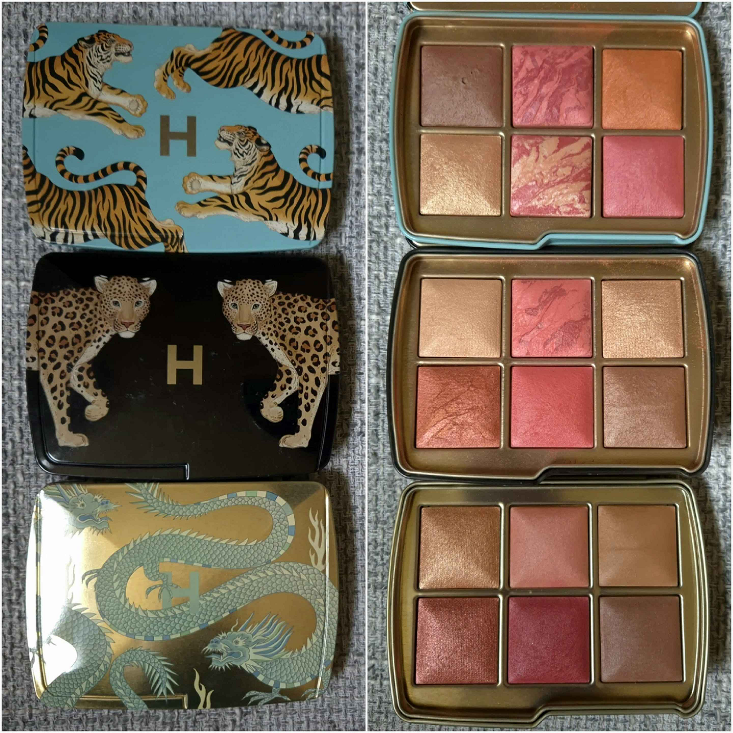
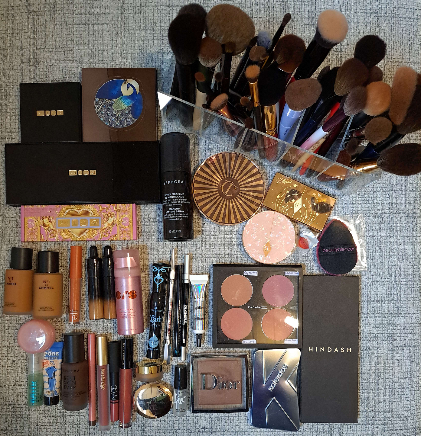
My collection of Chanel products has grown since moving to the EU and having access to the products at reduced prices via the retailer Parfümerie Pieper. If I was still in the US, I would have tried to redeem them with reward points via Ulta.
*DISCLOSURE: Non-highlighted links in bold blue font (Example) are standard non-affiliate links. Links marked in bold black font with a light blue background (Example) are affiliate links. Affiliate links allow me to get a commission if purchases are made directly using my link. The only affiliate links in this post are brush related. I have no ties to Chanel. All products were purchased by me and my opinions are my own.
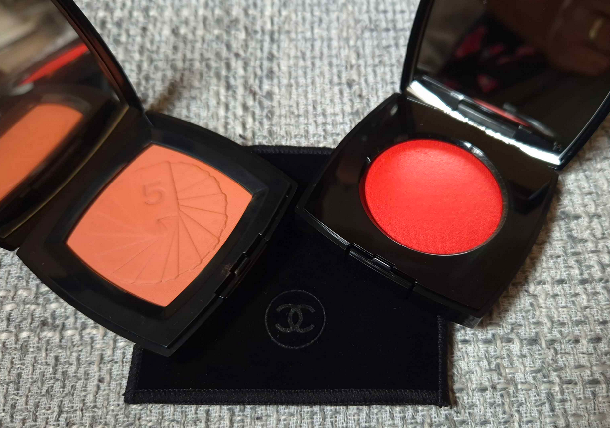
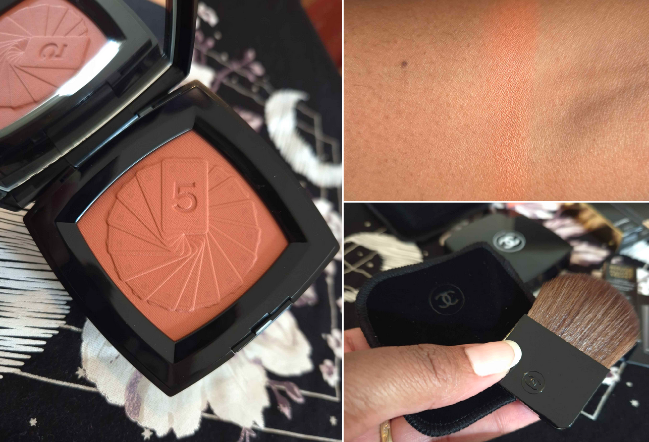
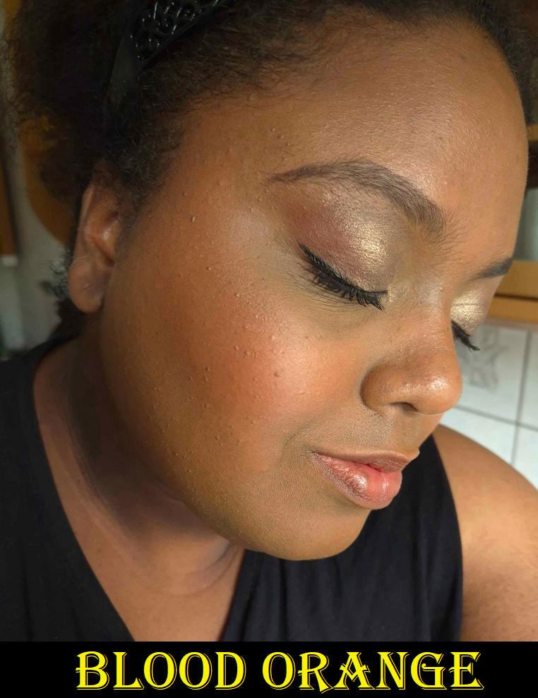
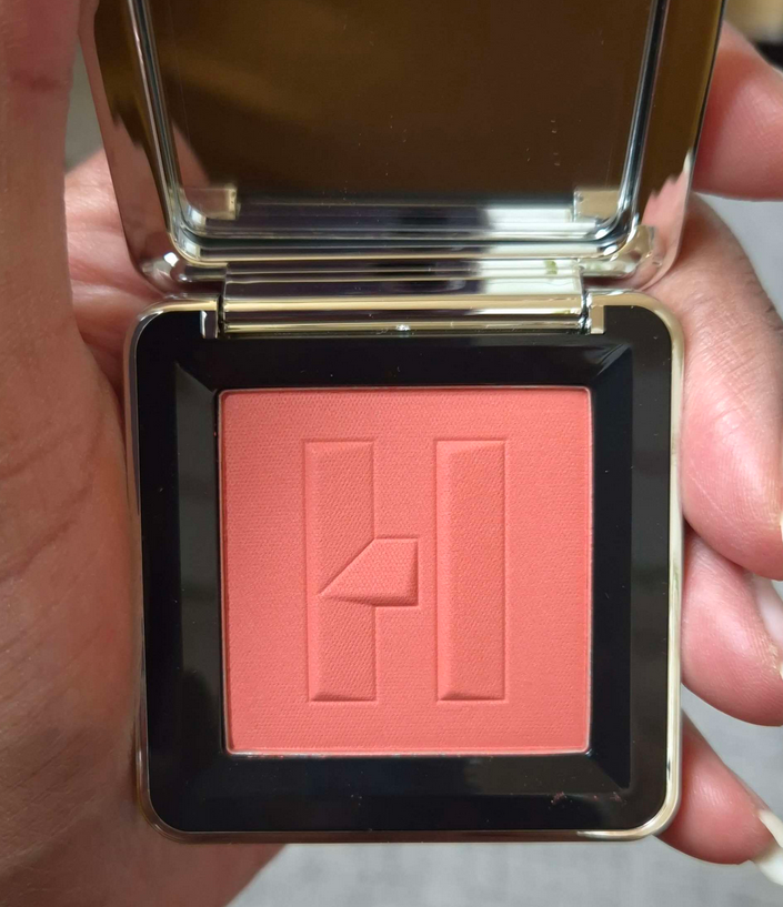
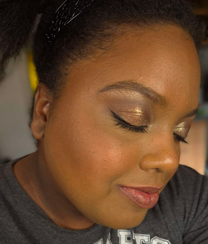
The Tarot of Chanel Matte Powder Blush in Blood Orange
My desire to buy this partly stems from my fascination with the occult (from the fantasy sense and not actually taking it seriously), and partly from my desire to have an easier-to-apply orange blush from Chanel. Last year, I purchased Beige et Corail, but it wasn’t easy to wear between not being pigmented enough and the firmness in which it was pressed.
The color surprised me, because on my skin tone it looks more like a peach than a blood orange. It at least appears slightly darker on my cheeks. I’ve had this for over a month and honestly haven’t used it much outside of testing purposes. I am still glad to have an easier shade to wear, but I think I’m all set on blushes within the orange family from the brand.
Regarding the quality, it is nice. I like it much better than the blush in the Les Beiges trio containing a blush, bronzer, and highlighter. The powder is much softer and easier to pick up with any of my brushes. It’s blendable and buildable with a soft matte finish.
The quality is there, but I would not have been missing much if I skipped on this one, though it is a limited edition collection item. Chanel tends to be out of my budget, but for anyone that considers their products to be worth the price, as long as it’s the “good Chanel quality,” then I don’t think they’d be disappointed.
Since I nearly accidentally threw out the brush, I should note that Chanel does include a brush with this blush. It doesn’t fit inside the compact, and is instead housed in its own velvet pouch that is inside the unicarton/box. The blush comes in a pouch as well and seems to be fragrance free.
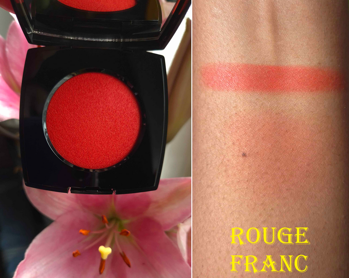
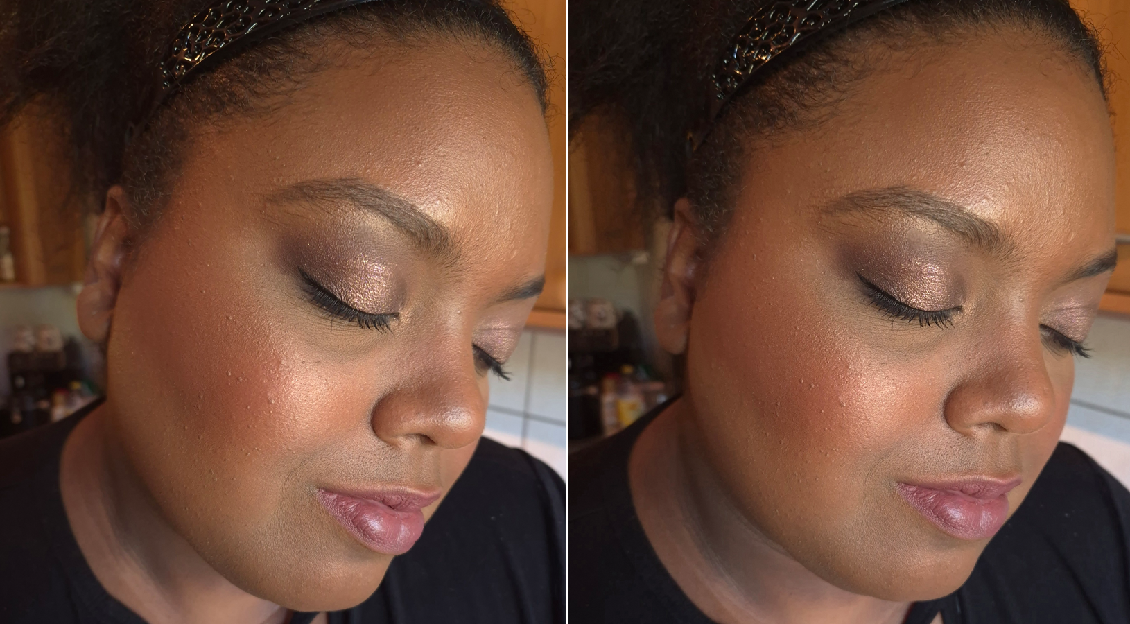
Chanel Joues Contraste Intense Cream-to-Powder Blush in Rouge Franc
I’ve heard that is one is a permanent edition to the Chanel line. Out of the five colors, I was drawn to Rouge Franc (purely for its eye-catching vibrance), Rose Radiant (the type of warm pink I like), and Grenat Profond as a gorgeous deep berry. I think the latter would have been too cool for my skin tone, and Rose Radiant didn’t look pigmented enough to be able to appear true to color on my cheeks. So, I only purchased Rouge Franc.
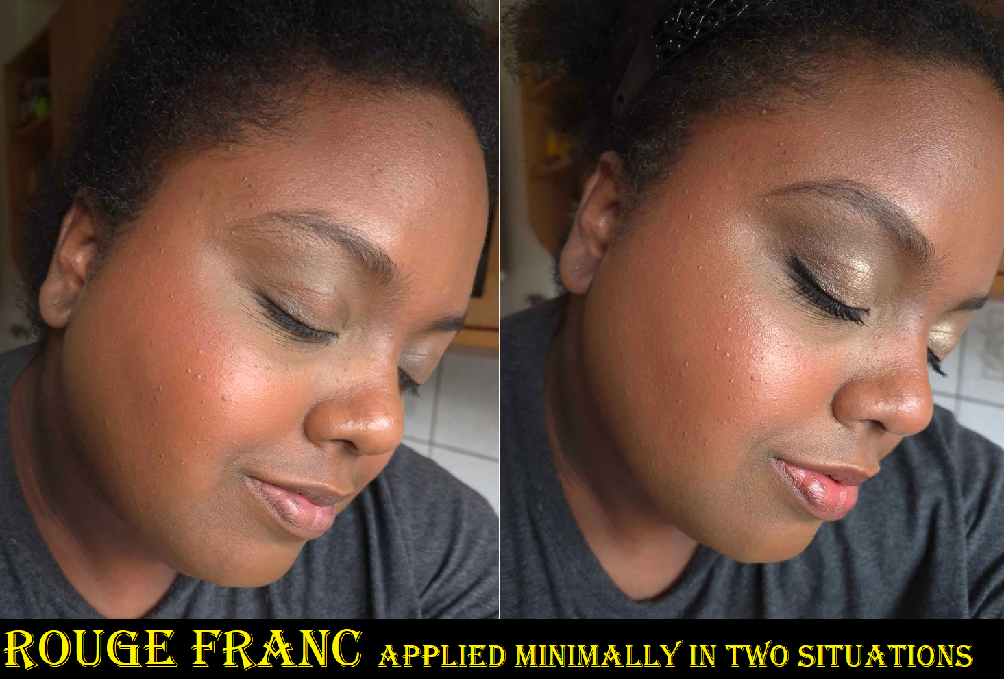
I bought this at the beginning of the month. In contrast to the Tarot blush, I’ve used this one surprisingly more than I expected. I can achieve a somewhat sunburned or flushed look to my face. At times, it looks more orange-red. Other times, perhaps when paired with cooler makeup or pink tones, it looks deep reddish-pink. In any case, I like the color more than I expected.
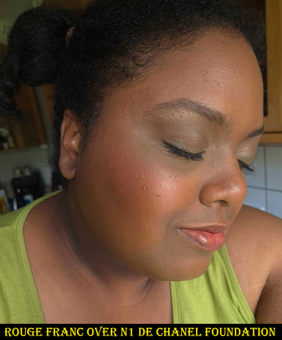
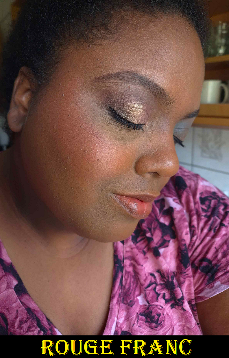
In the first series of photos, it’s applied over Huda Beauty’s Easy Blur in 440G. With the green tank top, I’m wearing the N1 de Chanel Foundation in BD91 mixed with some of the 440 Easy Blur on the outskirts of my face. In the last photo, I’m using the HB Easy Blur in 450G. I wore it during different times of day with varying amounts of sunlight. This product can look way more punchy in person than how it looks on camera when I tried to build up the blush in the last two photos. However, I enjoy when it looks more subtle, so how it’s depicted in the first two photos is the look I try to achieve each time. The point is that for such a strong color, it can be sheered out. The formula is also not as “intense” as the name suggests. There’s pigment, but it’s not opaque as one blends it into the cheeks.
When I watched reviews to decide if I wanted to get this product, I heard that it’s best to use a synthetic brush and to watch out for the intense rose fragrance added to the formula. Regarding the scent, I weirdly mostly smell it from the outside of the compact. If I put my nose directly up to the powder, it’s not any more intense than when it’s further from my face. It has also lessened over time, but parfum is listed high in on the ingredient list, so those that avoid it should be warned. As for the brush situation, I haven’t had problems using the Bisyodo CF-FD Brush (Sokoho goat hair) nor the Sonia G Mini Base (a mix of synthetic and natural). In fact, the denseness of the Bisyodo brush really helps to pick up enough product and sheer it out to a thin even veil. I think the important thing to note if you’re not using a synthetic brush is to make sure the brush is a densely packed goat, fox, or perhaps even kolinsky. I wouldn’t try it with a squirrel brush or even a goat one if it has too much bend or give to it.
This is a cream to powder formula. Although I agree with others that the closest comparison is to the Armani Neo Nude Melting Colour Balms, these are still different enough that I would not call them dupes. The Chanel blush is more solid in texture than a cream, and if I press down hard enough I can leave an imprint. However, it’s not as squishy as the MAC Glow Plays either. Product can be picked up much easier onto the fingers or a brush than the Armani and MAC blushes. Also, if I don’t clean my brush enough between uses, I start to see some of my foundation come onto the surface of the blush the way it does with the MAC Glow Plays too.
I like the way cream blushes keep my dry skin looking hydrated, but I hate when they don’t set down on the skin. Using this Chanel formula avoids that problem as it doesn’t feel wet or oily on my cheeks. It also is marked to last for at least 18 months after opening, which is longer than a lot of cream or liquid products. The color fades a bit, but will still be visible all day, as long as I am wearing a foundation that is transfer resistant.
If Chanel expands the range, I know I will want to buy more. However, the colors would need to be different enough from what I already have from Armani, MAC, and Suqqu (discontinued Melting Powder Blush formula). The blushes from those three are the most similar to the look I get on the cheeks. Chanel’s formula is the easiest to apply of them all, but the price difference for the ease of use doesn’t completely even out. It would have to be the most perfect color ever for me to get another. However, I’d still recommend it to luxury lovers.
That’s everything for this week! Thank you for reading!
It’s that time of year again! The holiday makeup launches have started rolling out and this is the first of them that I’ve purchased! Let’s get right into the review, and I’ll save my overall thoughts, suggestions, and discuss my ordering experience towards the end.
*DISCLOSURE: Non-highlighted links in bold blue font (Example) are standard non-affiliate links. Links marked in bold black font with a light blue background (Example) are affiliate links. Affiliate links allow me to get a commission if purchases are made directly using my link. The only affiliate links in this post are brush related. I have no ties to Hourglass. All products were purchased by me and my opinions are my own.
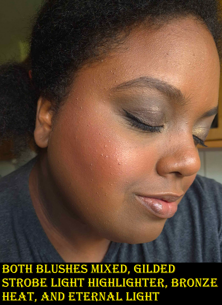
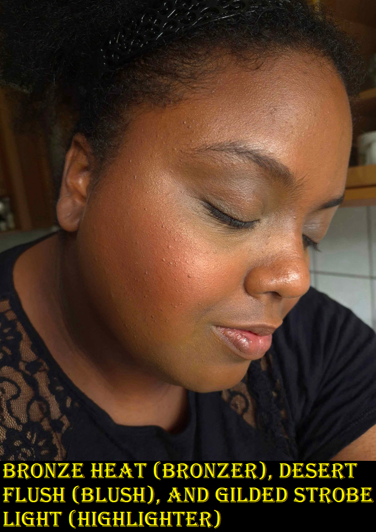
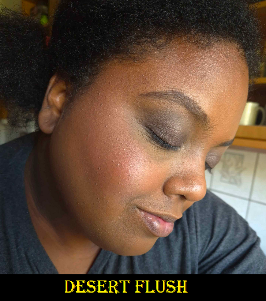
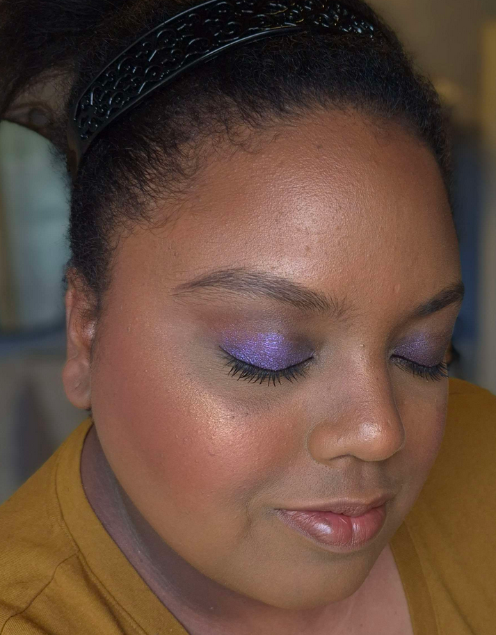
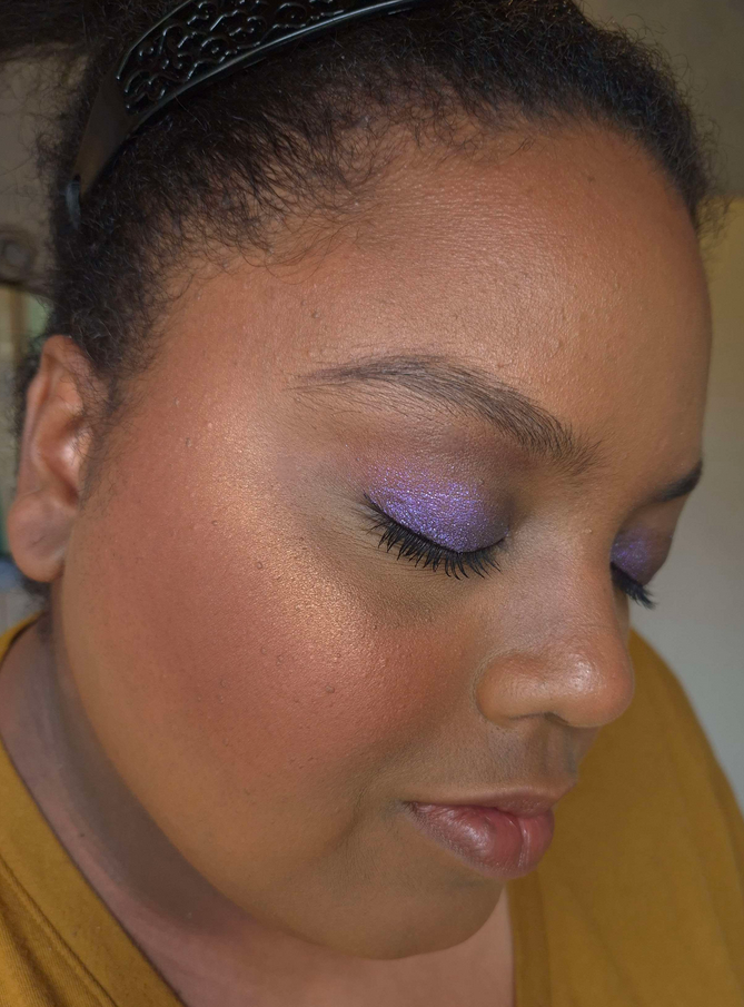
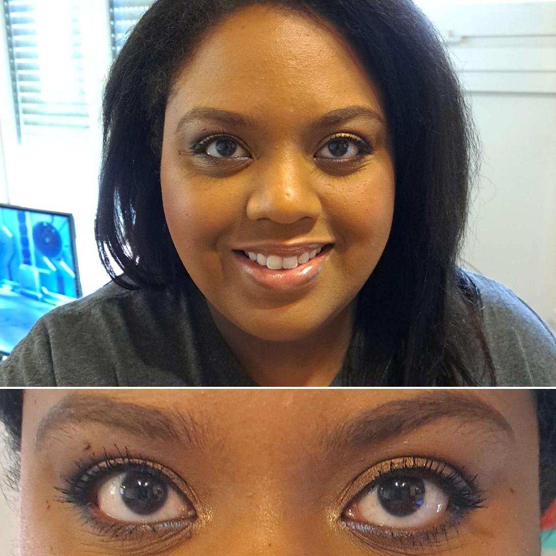
I am including some demonstration photos. In the photos with the black shirt, I’m wearing the Huda Beauty Easy Blur Foundation in shade 440 G Cinnamon. I used Eternal Light to set the concealer under my eyes. In the photos with the dark gray shirt, I’m wearing the Hourglass Ambient Soft Glow Foundation in Shade 14. In these pictures, I’m wearing Eternal Light all over the face, so the pictures with the blush (and no highlighter added) still look a bit highlighted due to the use of that finishing powder. I’ve gotten a little darker this summer, so I wanted to show how the products look on different foundations and with lighting coming in from different times of the day.
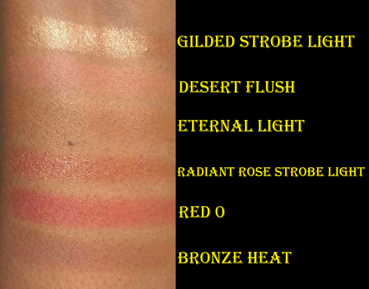
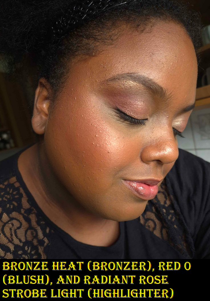
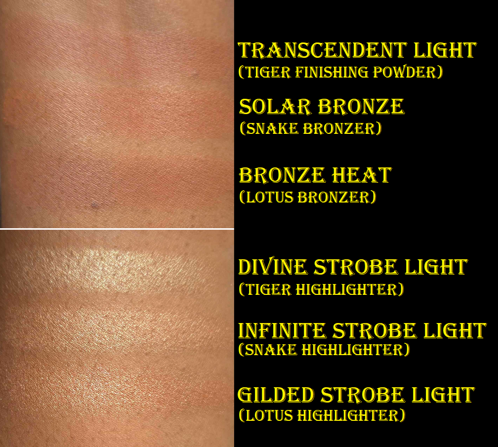
GILDED STROBE LIGHT – Hooray! Hurrah! Finally, the right highlighter color for me from Hourglass! I had said that Divine Strobe Light from the Tiger palette was “perfect,” but I don’t wear that depth of highlighter anymore, and prefer for it to basically be a shimmery version of my skin tone. Prismatic Strobe Light from the Volume III trio was too dark, so I’ve been hoping for the brand to release something in-between. I’m so glad that day is finally here! That being said, this strobe line is beautifully reflective, but it enhances texture more than I’d like. The powder is ultra smooth with fine shimmer, but the shine effect can be a bit much for me if I’m not careful and over apply. However, I’m still happy to have this. I have ways to tone down highlighters and I could always just use it to bump up the intensity of other highlighters if I want.
DESERT FLUSH – A dark medium muted option! Hurray! Thank goodness this blush is one solid color combining “deep beige” with “peach”, because this is already on the cusp of what should be included in this palette in terms of depth (not in terms of color because a peach was absolutely needed in the line). It’s a buildable shade that shows up on me, but I have to use my dense brushes to pack on the color so I can wear it on its own. One such brush is the Sonia G Cheek Pro. In winter-spring, this color should be easier to wear. In any case, I find this shade useful to tone down or pair with Red 0. I am sometimes in the mood for a light blush, but this is pushing the limits of what I’d feel comfortable wearing in public by itself. I foresee myself combining this with other blushes from other brands.
ETERNAL LIGHT – I’m going to repeat what I said about Eternal Light from a previous review. This finishing powder is a golden brown color that matches my face perfectly! It gives a subtle luminous sheen, but also has a few flecks of gold glitter throughout. The difference this time, in the Lotus Palette, is that the larger gold specks seem to be way smaller than they are in the Volume III trio palette. In the past, the specks forced me to use it as either a mixer shade with bronzer or as a barely there highlighter. I’m thrilled I can actually use this shade as a setting powder now! I don’t know if it’s just my palette, or if all Eternal Light shades are now made with more refined shimmer.
As mentioned earlier, I set the concealer under my eyes with Eternal Light in the photos with the black lace shirt, and used it all over my face in the photos with the dark grey shirt. The matte blushes can look a bit flat on my dry skin, but using the finishing powder all over imparts some glow and makes them look more flattering.
RADIANT ROSE STROBE LIGHT – I normally don’t like pink highlighters, but this is actually pretty! It pairs so beautifully with the Red 0 blush. When used sparingly, this looks a bit gold too (or at least golden copper). I had to actually build up the color in my face demo photo for the rose tone to be clearly visible, which of course increased the emphasis on texture. Contrary to how it appears in my photos below, the reflectivity of this shade isn’t as strong as Gilded Strobe Light when used in smaller amounts. I like that part about it.
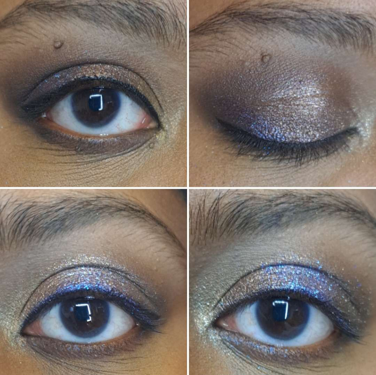
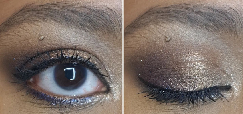
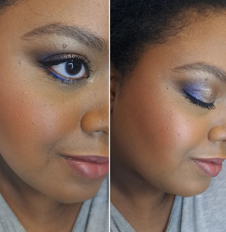
I used all the shades from the palette on my eyes in this photo above.
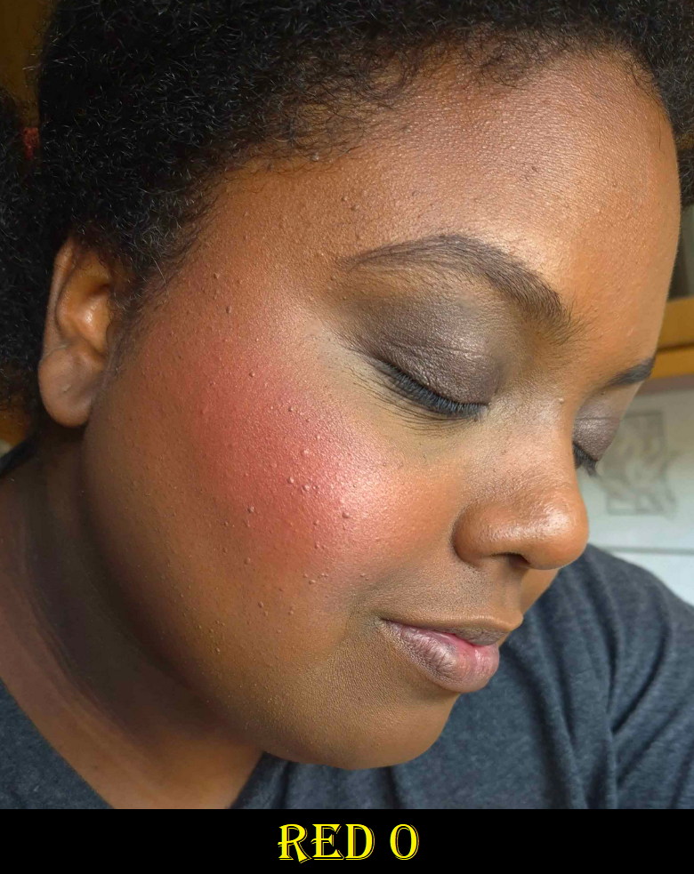
RED 0 – I’m honestly shocked that this shade is in this palette because Red 0 is such a special color for Hourglass. It’s their “exclusive pigment replacement for carmine.” They’d been working on the formulation of this color for years, first introducing it in their lipsticks. I would have expected them to pull the same stunt as Butterfly and put it in Dragon, but they didn’t. I give major kudos for that.
The description calls this a brick red, but I don’t agree. It’s a deep reddish/pink or deep rose. How it appears on my skin can be affected by my undertone, but it doesn’t look brick red in color when eyeballing it in the palette either. This shade is ultra pigmented, and I have to use a light hand and airy brushes to wear it subtly, the way I prefer. For example, with the Chikuhodo REN-7. I also want to note, regarding the color, that this is quite similar to a lot of blushes I’ve gotten recently (Chanel’s Deep Rose from the trio and Guerlain’s Deep Nude), but the tone is the slightest bit different. It makes me like it that tiniest bit more.
Of all the shades in this palette, I think this has the most potential to be added to the permanent blush line. If they do, I’d recommend swatching it in stores because it wouldn’t surprise me if they alter it to make it less pigmented, so that it’s easier for a wider range of people to be able to wear it. It’s already intense on me if I use even an airy goat brush and apply two light layers instead of a single one with squirrel or fox.
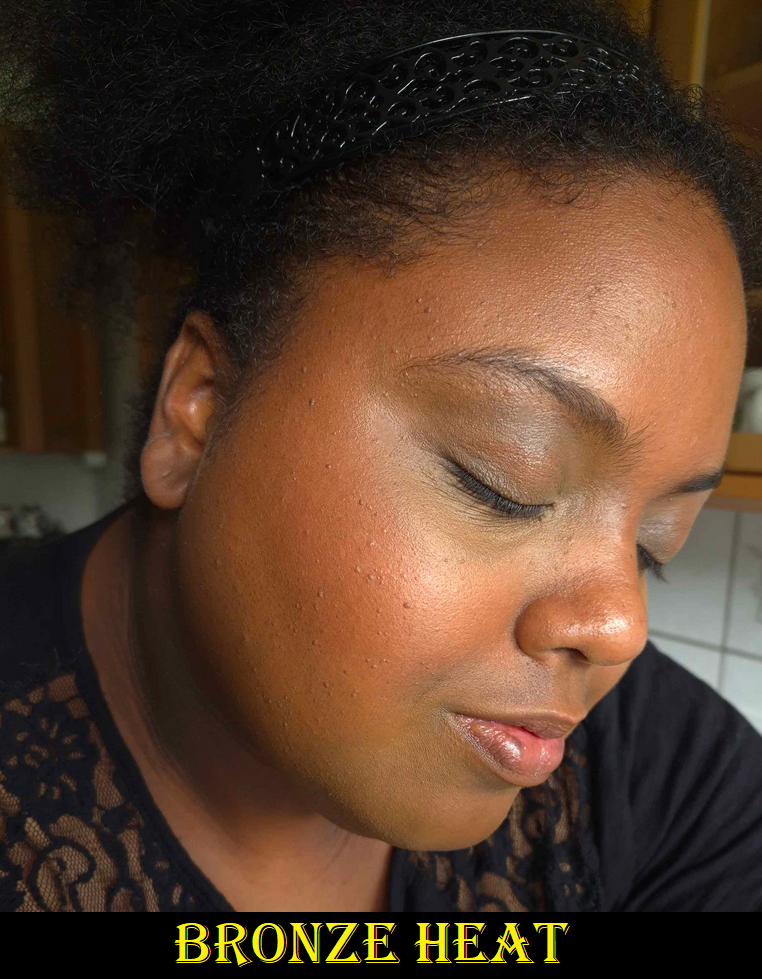
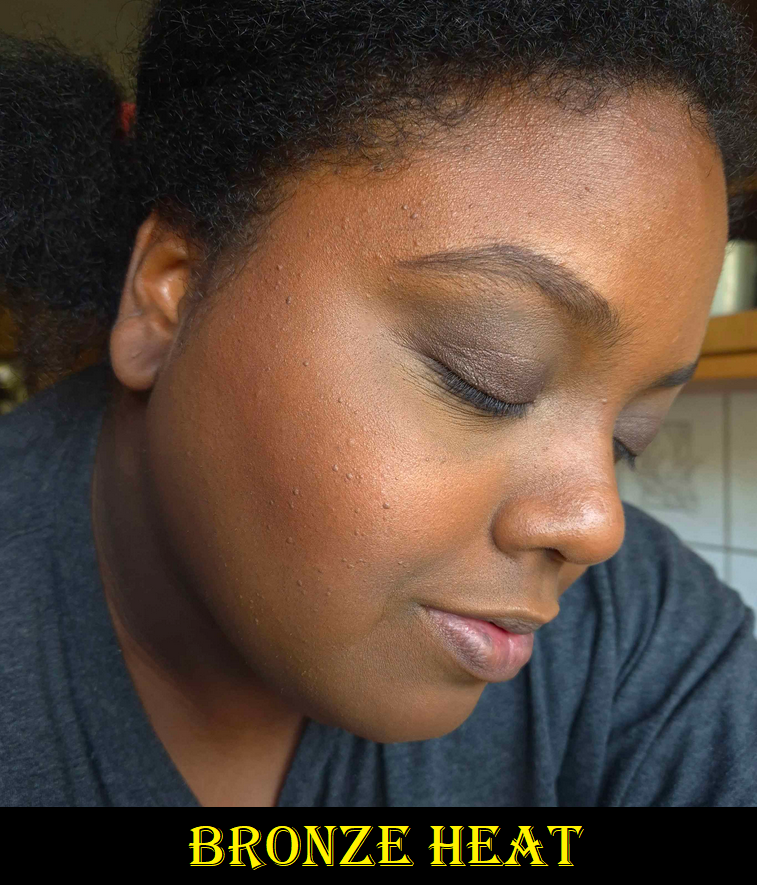
BRONZE HEAT – This is the darkest bronzer created by Hourglass thus far. It’s slightly darker than the Transcendent Light finishing powder, but it’s more of an undertone difference than depth difference. Transcendent Light looks deep brown – pink on me. Bronze Heat is neutral brown with a splash of red. Even though I prefer yellow/golden bronzers, I think Bronze Heat still looks good. I’ve gotten some sun this summer though, so the tones in my face have some red to it right now, which is probably helping it to match. I’m curious to see if I’ll still like it when I’m back to my normal skin tone. Solar Bronze, though lighter, is still my favorite bronzer from Hourglass so far. I’d love a deeper version though. In general, I’d still love to see a truly rich bronzer option, but the tweak to this year’s color is enough that people I follow that are a little darker than me that couldn’t wear last year’s bronzer have reported being able to use this year’s. So, even a small change made a difference. I can’t discredit that.
In these photos though, I had to pack on the product to get it to show. My favorite brush to use with these Ambient Lighting Edit Palettes, ever since I got it, is the Eihodo No. 153 which I used in the left picture. For the right picture, I switched to the much more dense Chikuhodo FO-2. They both fit so well into the size of these relatively small face powders.
Overall, I’ve noticed no differences in quality between the powders in these palettes and the ones in the past. The matte ones can look a bit too matte, which is when pairing them with the finishing powder helps. They’re all so smooth with the benefits that come from being a baked powder. I have no longevity issues. These continue to be lovely powder products! The consistent performance of these products year to year is how I’m able to confidently post this review after having used it for barely more than a week, instead of my longer testing process.
COMPARISONS
I don’t have access to my full Hourglass collection, so I could only compare things to my Tiger-Butterfly custom hybrid palette, the Snake palette (in Leopard packaging), and Lotus (in Dragon packaging). This year’s deep blushes are finally distinctly different from each other, and previous years. The highlighters and bronzers are super similar though, with just slight undertone differences.
The list of all my previous Hourglass reviews and rants (especially the Holiday palettes), can be found HERE.
HOW DID HOURGLASS DO THIS YEAR?
Before I can begin to answer this question, I wanted to point out some things I mentioned wanting over the years to see how Hourglass answered or ignored feedback from plenty of customers that shared the same thoughts as me.
2021 I hoped for less repeat shades, I believed there should be 3 palettes per year with one of those clearly designated as suitable for tan to deep skin tones (or darker, or for there to be at least a deeper extension of the permanent bronzer range). I also wanted more accurate representation of the shades in promotional images. 2022 I wanted a true bronzer for dark skin tones and not a translucent powder than could be used as bronzer. I didn’t mind if the brand released a mini or repeat of At Night in the deeper palette. I mentioned being willing to spend $100+ instead of $85 to make every shade in the palette customizable. I mentioned that it would be nice if they used their “miscelare technique” to mix two medium or darker colorful shades in a series of blushes instead of pale beige bases with a single color. 2023 I wanted a deeper bronzer option (since so far the depths are similar and the undertone is just changed), a dedicated true Deep/Rich palette option (even if it’s too much for someone like me), and some dark brown blush color options (less pinks and corals with the occasional orange). I hoped they would continue with palette cover customization, though choosing individual shades is still the ultimate dream. I also wished for a rabbit and/or panda cover art which would tie-in with the brand’s collaboration with the Nonhuman Rights Project.
So what did we get in 2024?
We got almost no repeat shades!
We have 3 palette options again with better designated colors per category (fair/light, light/medium, and tan-deep). Not being able to choose all 6 shades is okay if presets will continue to be good (ex: not having deep blushes in the fair palette like they did with Butterfly).
The brand decently represented the accuracy of shades in their website photos.
Hourglass gave us another dedicated deep bronzer, though it’s barely darker than Transcendent Light, and mostly another tone change.
They opted out of using the miscelare process, ensuring that every tan-deep palette will work the same for everyone instead of some people, who would normally be able to wear the shade, being unable to because their swirl had too much of the lighter color.
Hourglass gave everyone a peach and/or nude option. Everyone seems to love that. The Evil Eye colors had the typical Hourglass pinks and were too similar to each other in one palette. The Dragon and Lotus palettes were better at having distinctly different shades.
What are my hopes for 2025?
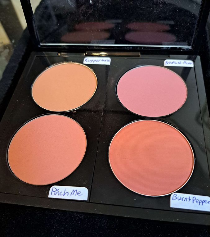
I would love if the brand would continue with adding more nude blush options (especially a deep skin friendly one with some brown along the lines of Chanel’s Brun Roussi Lumiere, MAC’s Coppertone, Format, and Burnt Pepper). All the reviews and comments I saw were positive regarding having less vibrant options. The only semi-negative part was Desert Flush not being deep enough to use alone for those with deeper skin tones, so ensuring they are at least dark medium in depth would be great.
I am still looking for Hourglass to make an ultra deep bronzer in at least the permanent collection, if not the Ambient Edit Palettes. I’m not that much darker right now, yet the bronzers are close to being too subtle on me, so this still isn’t dark enough for a ton of people.
I’d still be fine with Hourglass making At Night a repeat in the palette or for them to release a mini. Better yet, I would love the two colors within At Night to be mixed into one solid color and with an increase in pigmentation. That would be fantastic!
I would still love a rabbit and panda themed cover art.
That’s it! I really don’t have any major criticisms or requests. I think this is the best the brand has done so far. Back in 2021, I was worried that listening to customers was just performative and that we wouldn’t continue to see much work towards inclusion. I’m happy to say that someone over there seems to be putting in effort regarding this topic. It’s not even about wokeness. It makes financial sense to create products for customers when the demand is clearly there.
LOGISTICS
This was the first year I had to order my palette outside of the US. I’m happy to say it went smoothly. It cost €90 (VAT included). Influencer promo codes were able to be applied to the order. Shipping was free, but I added €5 for expedited shipping. I wanted to buy a gift box and gift bag in Dragon print, but they kept getting taken out of my cart on the payment page, so I assume they aren’t offered outside of the US. My package was delayed a few days, but that was due to the weather conditions in Germany at the time and not the fault of Hourglass.
If Hourglass continues with this upward trajectory, I will likely purchase next year’s iteration of holiday palettes too. Now that I have to spend even more than usual for these palettes, it’s that much more important for the brand to nail the colors and also offer shades different enough from previous launches.
That’s everything! Thank you for reading! Be sure to click the follow button if you’d love to be updated whenever a new post from me drops!
I reviewed the first launch of Hermès Blushes (found HERE) when the brand released only matte finishes. Then, during the Summer of 2023, they added three shimmery blushes to the Rose Hermès line. Considering I felt that the matte blushes were equal to, but did not surpass my favorites, I was unwilling to pay full price to try a new one. All of my blush favorites are under $40, so the refill price of $48 was pushing my limit. I waited months for the refills to be released so that I could add a metal sticker to the bottom and pop it in a magnetic palette, but it took so long that I stopped checking for them by the end of 2023. Imagine my surprise when I stumbled upon it on the Selfridges website and saw it was finally available!
I have to admit that sometimes my inability to purchase something (sold out, limited edition, early teased product that won’t be released for months, only available in certain countries, etc.) intensifies my feeling of missing out. With enough time, I can reason with myself that I probably won’t love the item enough for it to be worth buying. That logic didn’t work in this instance, but I am very lucky that the outcome was in my favor! I actually like this blush so much more than I expected and I feel like it’s at least more worth the high price than the matte ones!
Hermès Silky Blush Powder (refill) in 58 Rose Cuivré
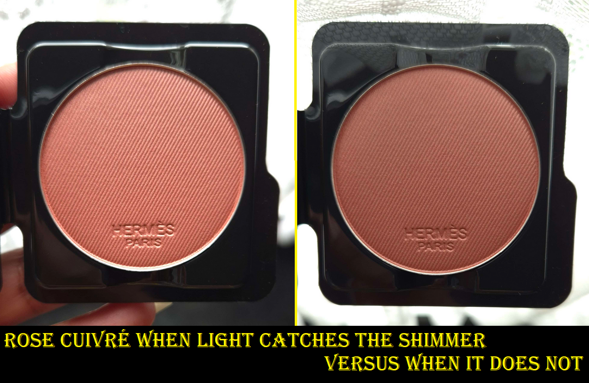
The shade that I purchased is the deepest of the three shimmery blush options. The right half of the photo above shows that the base color is medium-dark. When the light hits the shimmer, the blush looks medium peachy-pink instead, depicting how much the shimmer can lighten the overall look of the blush. This is one of the reasons I wasn’t certain if this shade would be too light for me. Shimmery blushes can sometimes look too ashy or like a pure highlighter on me, regardless of how deep the base color is, such as Nars’ Orgasm X.
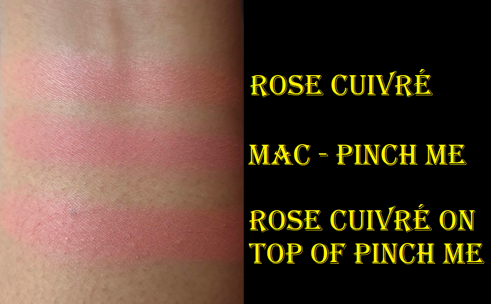
Upon swatching Rose Cuivré, I discovered that it looks similar to MAC’s blush shade in Pinch Me, which was also similar to the first Hermès Blush I bought called Rose Feu. At least, Pinch Me and Rose Feu looked similar when applied on bare skin. When applied over foundation, Rose Feu darkened and looked slightly more red and less of a deep pink.
One of the things that I’ve come to realize is that Hermès makes the silkiest and softest feeling pressed powder products. Their bronzer is still my number one favorite in my collection. The matte blush was very good, but on par with my other favorites. This iridescent formula though is the silkiest feeling shimmer blush I own. It’s even softer than the Gucci blushes. The particles are so finely milled. There are no large sparkle or glitter particles. Visually, it looks like the MAC Sheertone Blush formula, except so much softer and more refined. I can also use my softest blush brushes, such as my grey squirrel ones that don’t pick up as much product as goat, because it’s still able to grab a decent amount of product and it doesn’t require a dense brush to buff the blush smoothly into my cheeks. Lightly sweeping the product into my cheeks produces a beautifully blended result. It adheres well to my skin and lasts all day.
I skip wearing highlighter when I use this because the glow is easy to see. It gives a pearly effect, but thankfully does not look too silvery for me to wear. It’s right on that cusp of looking slightly cool, but still flattering on my warm undertone complexion. I could possibly still enjoy this blush if I was a few shades darker, but I don’t know if this is deep enough for someone in the deep-dark category or beyond.
The sheen from this is what I imagine it would look like if my beloved Dior Powder No-Powder was made into a blush formula. The textures are not the same, since the Dior powder is much harder pressed in comparison. It just has the slightly blurring quality and is one of the few other products I can think of that gives off a sheen that’s nearly pearly-looking, yet works for my skin tone. Considering the Dior powder has holy grail status with me and is my favorite finishing powder of all time, that’s high praise for the Hermès blush to conjure that image for me. I figured this product would make a great blush topper, but as one can see in the swatch photo, the luminosity lessens considerably on top of another blush. I think it becomes an issue of too much pigment and not enough of the shimmer in the mixture. If I add more of Rose Cuivré on top, it turns too deep and intense. So, this blush looks better when used on its own.
When it comes to luxury goods, there are a lot more factors to consider than just the performance or quality as to whether it’s “worth the price.” As much as I am enamored by this blush and impressed by the quality because it’s the finest shimmer powder one I own, it’s not the absolute perfect color tone for me. I intend to get a lot of use out of it, just like with the brand’s bronzer, but I still have blush colors that are my favorites from other brands. It was worth it to me to buy this refill, and I will probably even put this in the Hermès blush compact that currently houses Rose Feu when I get it back from the US. However, I still wouldn’t be able to justify the $84 for this. Good lord, did the price go up since last year? Weren’t they $77? Hermès being the luxury brand that it is, the price could be considered next to nothing for their regular customers. So, it’s all about perspective.
I hope this has been helpful to anyone still curious about this shade. Technically it has been out already for a long time, but at least now the refill option keeps the cost down for those more interested in the product itself. One final note is that this contains fragrance.
That’s all for today! Thank you for giving this review a read!
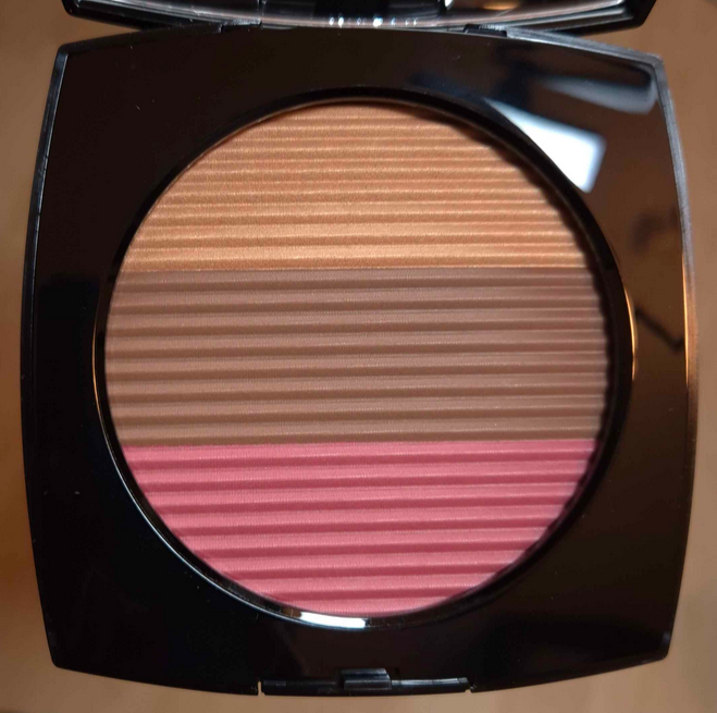
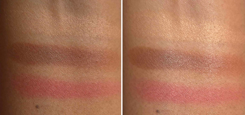
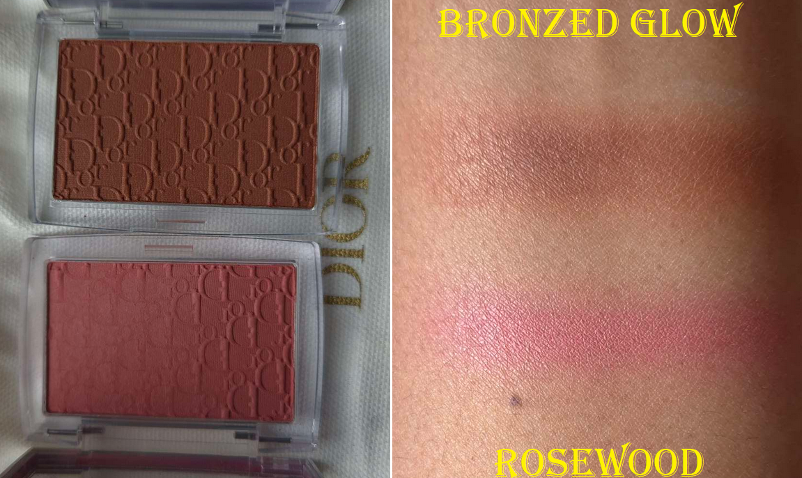
The compact photo above is better at showing the depth level, but the compact photo below is more accurate to the undertones.
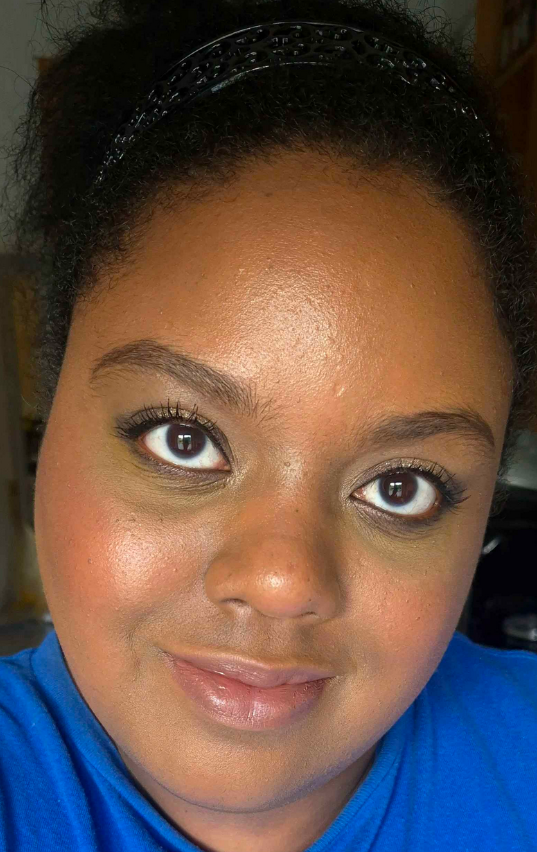
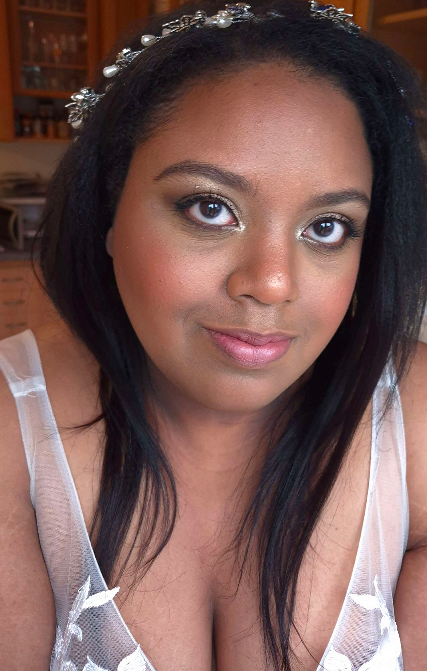
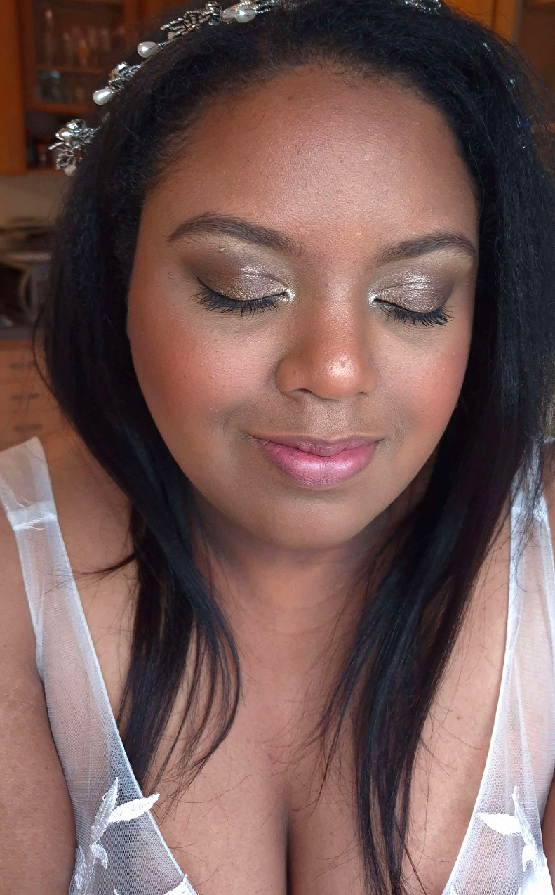
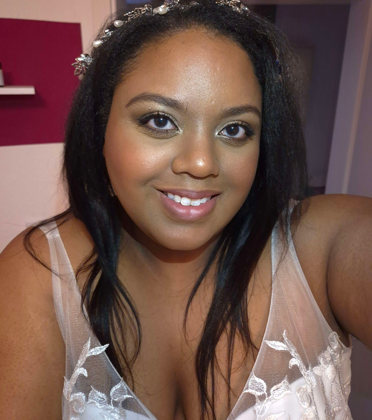
I have more than enough makeup for one person, even though I currently only have access to about a quarter of my collection. For that reason, I tried my hardest to not be tempted into buying this Chanel product. I love their blushes, but I don’t use them enough. I have heard fantastic things about their highlighters, but most are too light for me (and the one I bought wasn’t as refined as I expected). I don’t own any bronzers from the brand, so that would be a new experience.
I watched a video from French for a Day to talk myself down from Chanel products in general, but even she seemed excited for the trio. It was ultimately the assurance that this would work on my skin tone from watching the video from I Am Jamila that kept me interested in this product. In addition, so many people I follow on YouTube and Instagram continued to rave about it even beyond the initial release, indicating that it’s not just temporary hype. The final nudge I needed was a small discount from the retailer Parfümerie Pieper, and I was sold!
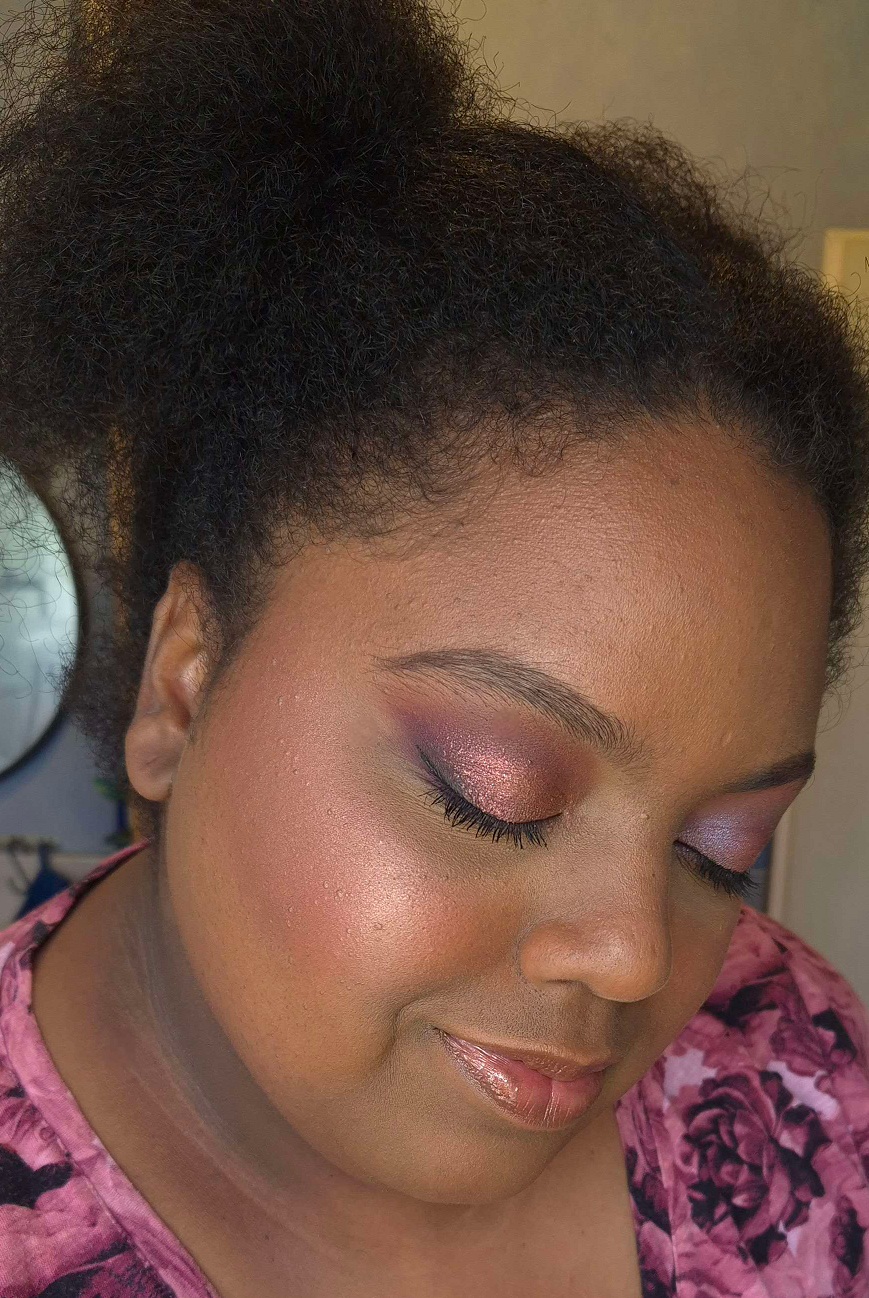
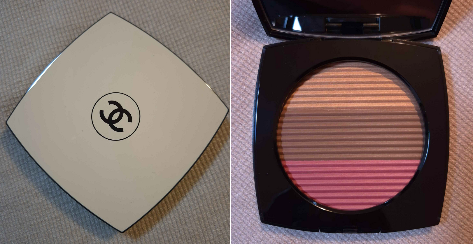
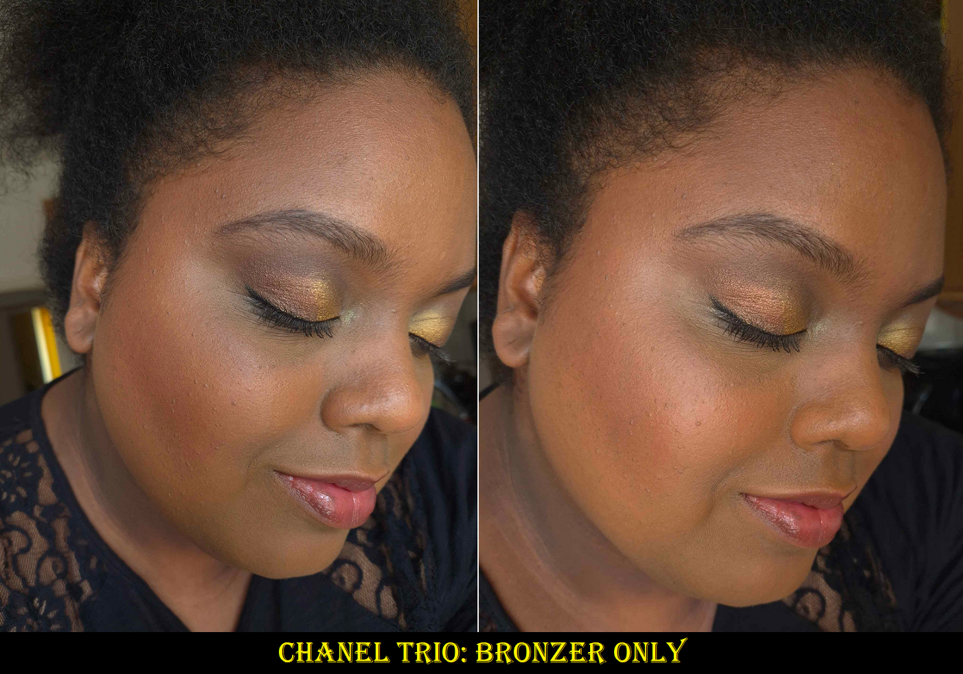
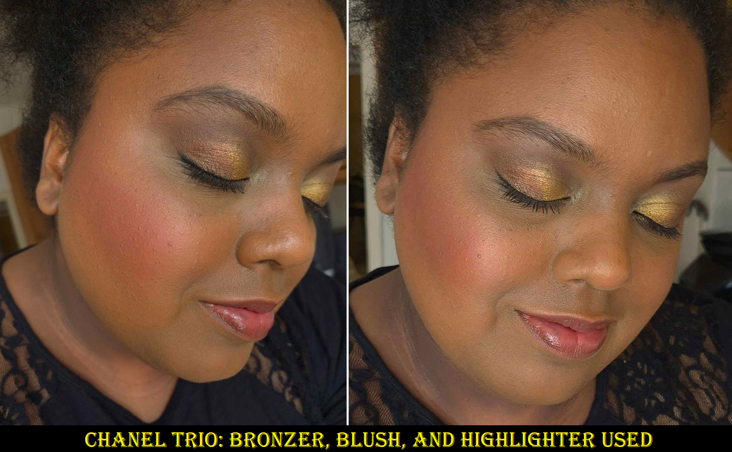
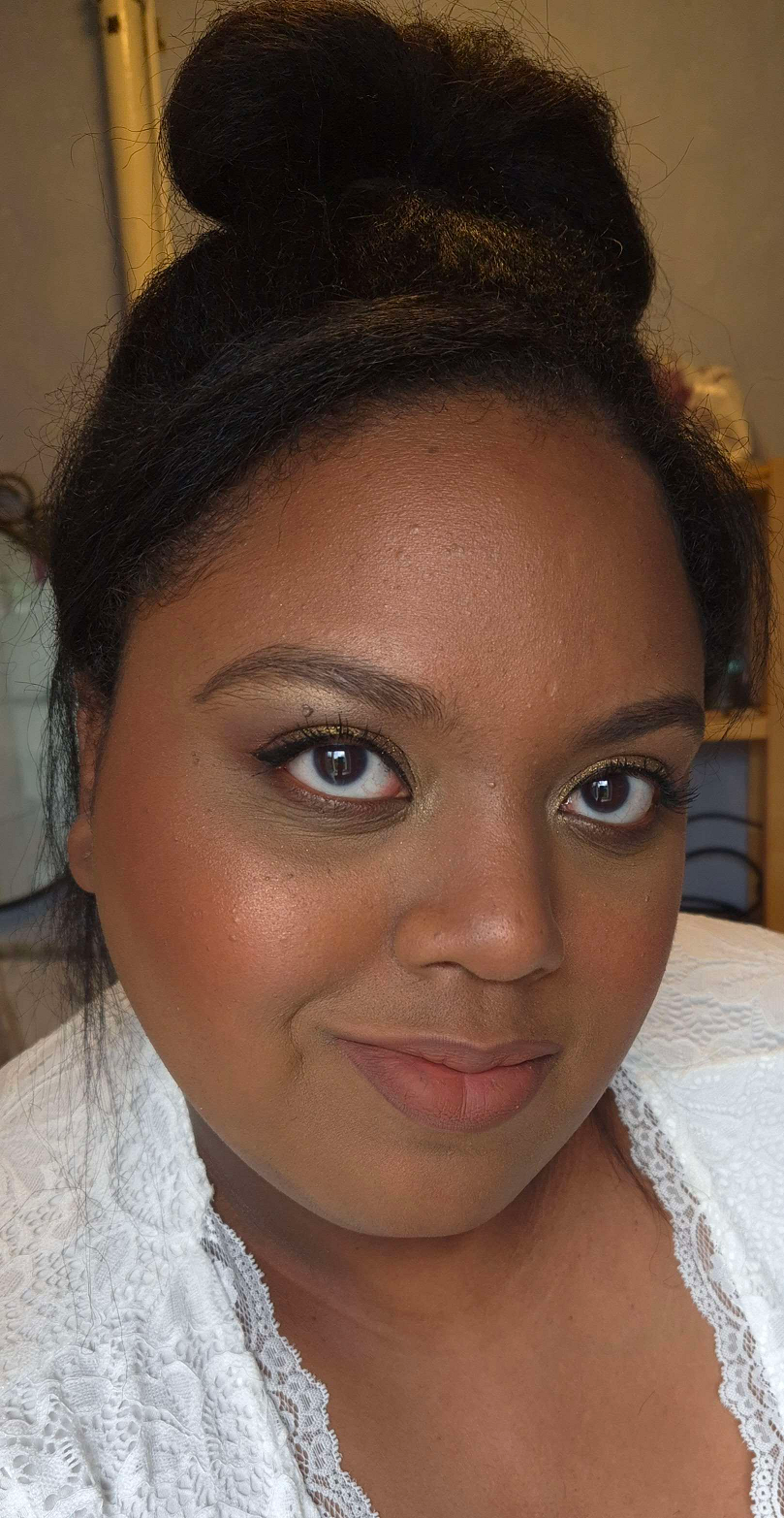
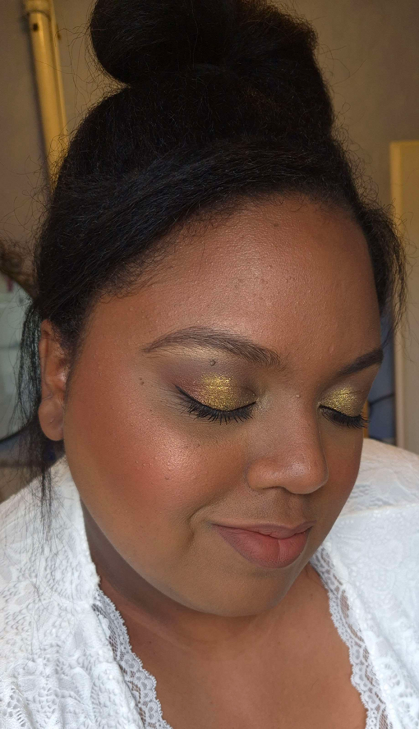
Chanel Les Beiges Poudre Belle Mine Ensoleilleé in Deep Rose Gold
The blush is nice. It’s not difficult to nail a blush formula though, so I expected it would be good. It’s not my favorite tone of pink, but it’s pretty. For those that have the Guerlain Terracotta blush in Deep Nude, this is basically the same color.
The bronzer is also pretty good. If you’ve seen my ranking of bronzers that I purchased in 2023 exclusively, I would say it performs as well as MAC’s Sunstruck bronzers, Pat Mcgrath’s Divine Powder bronzers, and perhaps even Nars Laguna Talc-Free Bronzing Powders. This means that it’s among bronzers I like a lot, but not quite enough to make the top 10. I didn’t watch French for a Day’s actual review of the trios until I finished my first draft of this post, and in her opinion the powders are average quality for Chanel. That doesn’t make them bad, just not the best that the brand is capable of producing. I felt strangely reassured when hearing this because it matched my feelings, after using this product for a while, that perhaps this being called “phenomenal” is an over-exaggeration.
I had mixed feelings about the highlighter initially. I love a subtle highlighter, but this is too subtle for me to want to use alone. It’s along the same vein of the Guerlain Météorites, but even less shimmery. I built it up as much as I could in the photos above. What made me start to like this highlighter is that it offers something I don’t have in my collection, which is the ability to turn the bronzer and/or blush into a glowy one without changing the color or making it overly shimmery. It lightens the color, but not by much. I have a few products that I mix with others to achieve this effect, but they are pigmented products that will alter the final color by adding more of a brown tone, warmth or make it cooler toned, etc. This one is sheer enough to transform other products too. In practical usage, I don’t know how often I would pair this with other products besides the ones in this compact, but the option is there.
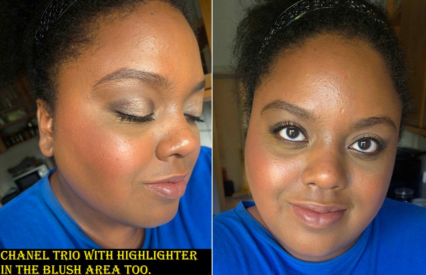
In the previous photos, I was wearing the Lisa Eldridge Foundation which is a little dark and leans orange on me. In the photo with the blue shirt above, I’m wearing a combination of the Givenchy and Armani foundations, which are a better match (and it’s also a slightly sunnier day, so this is why I look a bit lighter). As for the Chanel products, I wore the amount I normally would, rather than building it up for photos, like the previous ones. The sheerer application of blush with the highlighter on top accounts for the depth differences in the photos.
I have no issues with fading or longevity with this product. These aren’t the smoothest powders I’ve used, but they blend pretty well, especially with a fox or saikoho goat brush. I also have some smaller sized brushes that can fit well in the compact, so it isn’t too much of a hassle having all three colors that close together. A tip I learned for getting into the blush easier is to turn the compact 180 degrees so that it’s the top stripe and the highlighter is on the bottom instead. Then I can dip the angled part of my brush into the blush and can see what I’m doing from top to bottom rather than trying to avoid the brush getting into the bronzer while having the back of the brush hitting the edge of the compact.
Sometimes luxury products look pretty, but don’t feel luxurious. This does feel like a luxury product in the hand, and because the retailer I purchased from included a few Chanel samples, just like the official Chanel website does, I still had the luxury experience.
Having three products in one feels like the pricing is appropriate, especially for a brand like Chanel. I posed the question in the title as to whether this was worth me buying. Considering the discounted price I paid, I think it technically was. However, from a personal standpoint looking at all the makeup I own and factoring in how often I’ll use this palette, perhaps it wasn’t. Time will tell, but for now, I am happy I made this purchase.
DISCLOSURE: I posted several links, including the retailer, but they are normal links, not affiliate links. I paid for these myself and these opinions are my own. At this time, I have no personal or professional connections to the companies or influencers mentioned.
Thank you for reading! I hope it has been helpful.
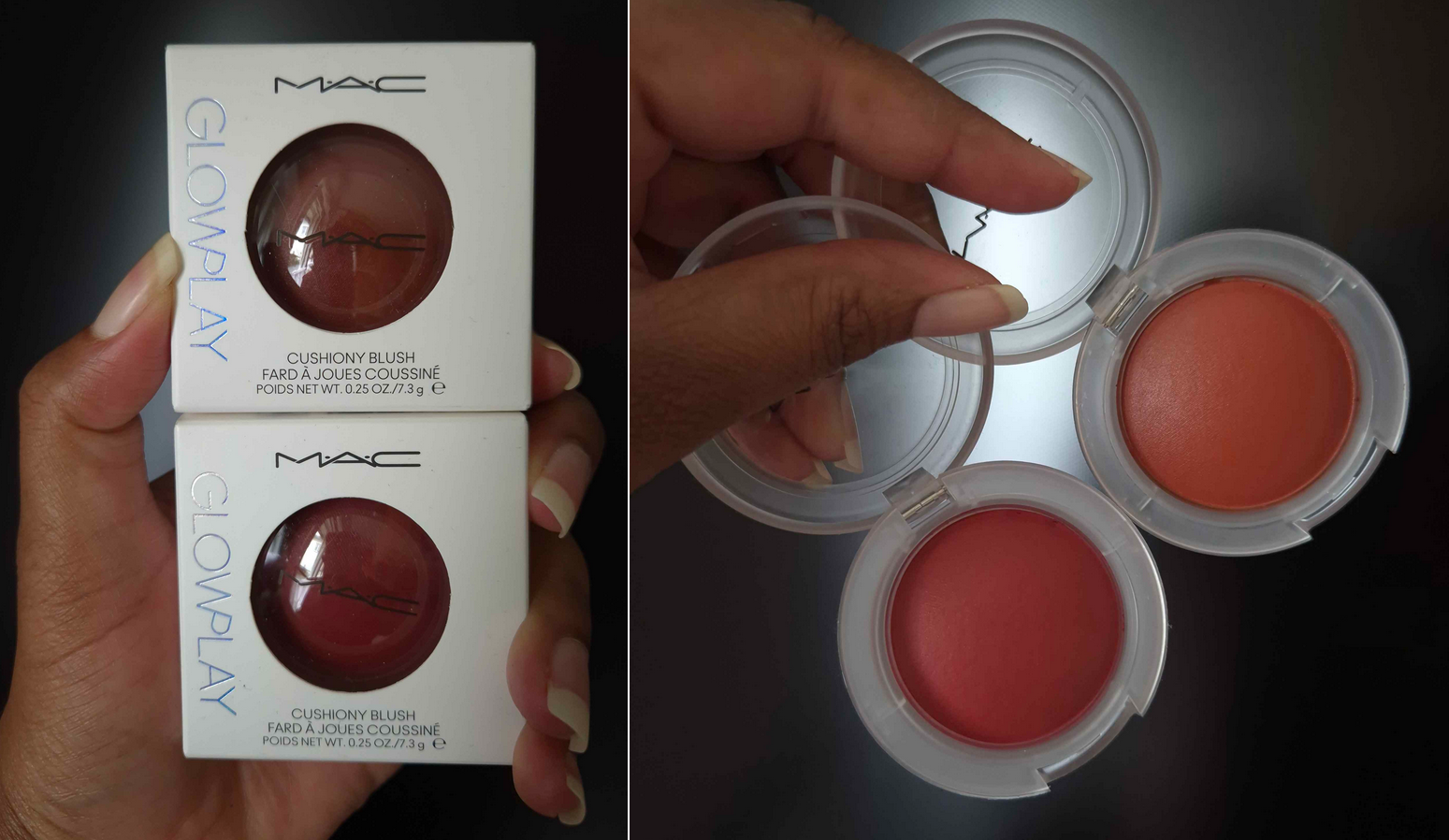
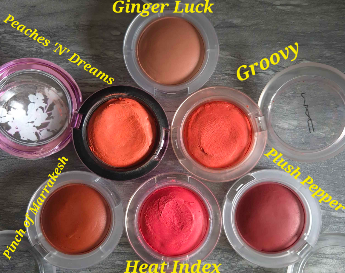
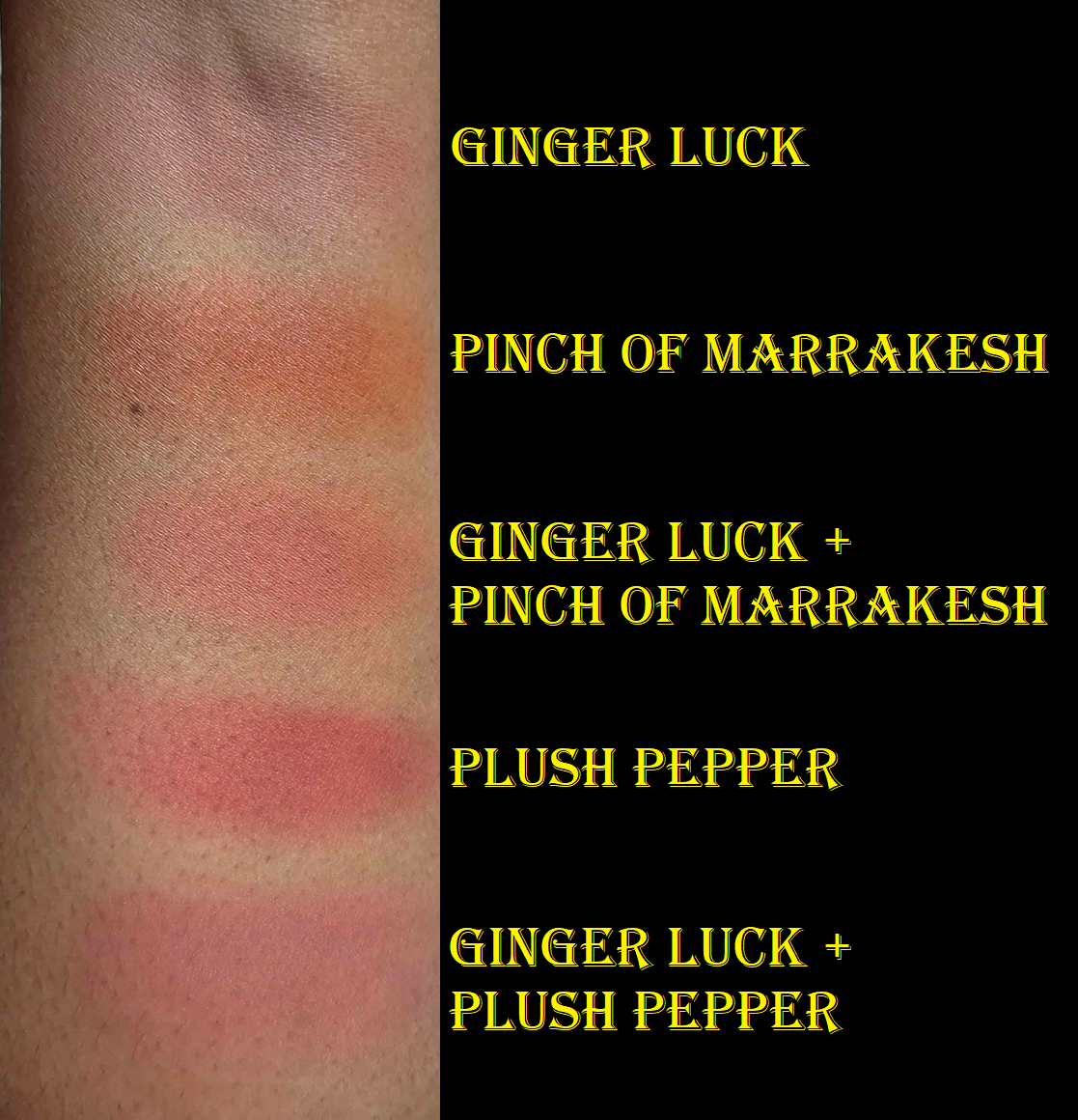
To call myself a “fan” of MAC blushes would be understatement, and the Glow Play line of blushes are among my favorites. I was so excited to see MAC expand the line, although they discontinued a few shades like No Shame and Rosy Does It. As soon as it was available, I bought two of the three darkest colors: Pinch of Marrakesh and Plush Pepper. The one I opted out of getting is called Big Diva Energy, because it seems like a deeper version of Plush Pepper, and Plush Pepper is plenty deep on me already. A week later, I found a 28% off discount code, so I bought Ginger Luck too.
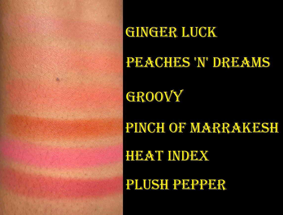
For anyone curious how the colors compare to their older shades, I have a photo below. I also have a close-up video of them on my Instagram. Unfortunately, as discussed in my MAC Blush Declutter post, I had to temporarily leave the others in my collection behind.
These swatches look intense, but they look much tamer when blended out.
I saw a YouTube video from Dear Eva Hansen comparing the old and new version of Totally Synced, and they are not the same. I don’t know if any other shade went through changes, but that’s something to keep in mind if you’re making a repurchase.
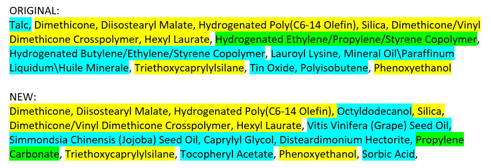
Aside from the added colors, the whole line has been reformulated. I don’t have any of the original boxes with me to compare, but I have the ingredient list from the Incidecoder website that has not been updated yet. Setting the “may contain” portion aside, the most notable changes seem to be the removal of talc and replacement of mineral and synthetic oils with naturally derived oils.
From a performance standpoint, I haven’t noticed that much difference between the old and new ones. I find it easier to pick up color on my brush with the new ones, but I assumed that was because they were fresher. After seeing the ingredient list, it might really be the case that the new formula is slightly more emollient and therefore having less of the drawbacks of some putty style blushes. MAC does tout that this is a finger-friendly formula, and it’s true that it doesn’t take much effort to apply these to the cheeks for a natural look. I’ll always prefer using a brush though.
This might sound absolutely crazy, but I actually liked the way I had to load up my old Glow Play blushes on my brush because it required me to dig more into that putty. The ads I keep seeing for the reformulation shows finger indents to indicate how “bouncy” or “cushiony” these are, but I just lightly pass over the surface with my Sonia G Mini Base, Sonia G Jumbo Worker, or my finger, and I’ve got enough product to cover at least one cheek, if not both. There hasn’t been any situation where I needed to push into the product enough to form a dent, except with the original line. I’m not actually complaining, just pointing out that the marketing is trying to appeal to Gen Z, TikTokers, etc with “fun” makeup. Whereas dents in mine were created out of necessity, now you can do it voluntarily to play with it? That’s an option I guess. As much as I liked the imprint from my brush, I will grow to enjoy how much quicker I can apply them even more.
They have the same lasting power as always and I don’t need to set them with powder on my dry skin. They also aren’t as glowy as the name suggests. It has that cream-putty type of glow to it, not the shimmery or mica kind.
About the colors specifically, I wanted to note that Pinch of Marrakesh is nearly identical to Armani’s Neo Nude Color Melting Balm in 30 Warm Coral. Since that’s another formula I’ve loved and raved about, I wanted to mention that for anyone who already owns it. I also couldn’t help noticing the similarity in names of the new colors. I suspect Pinch of Marrakesh is inspired by the brand’s Marrakesh lipstick shade, since it’s an orange-red type of color. I wouldn’t be surprised if Plush Pepper was supposed to be a sister shade to Burnt Pepper, which looks slightly more red on the cheeks, whereas Plush Pepper has a bit more rose pink tone to it. For some reason, it’s the opposite when I swatch it on my arm, but on my cheeks that’s how it looks. One of the reasons I initially skipped getting Ginger Luck was because even though I figured it could work as a mixer to turn some of the more vibrant shades into a more nude one, the description of the color reminded me of Gingerly, which barely shows up on my cheeks. Coppertone is the lightest nude from MAC that I can pull off. Just for fun, I’ll link a comparison between the two from Temptalia’s Blog HERE, though I have pictures wearing both in one of my many MAC Blush posts HERE.
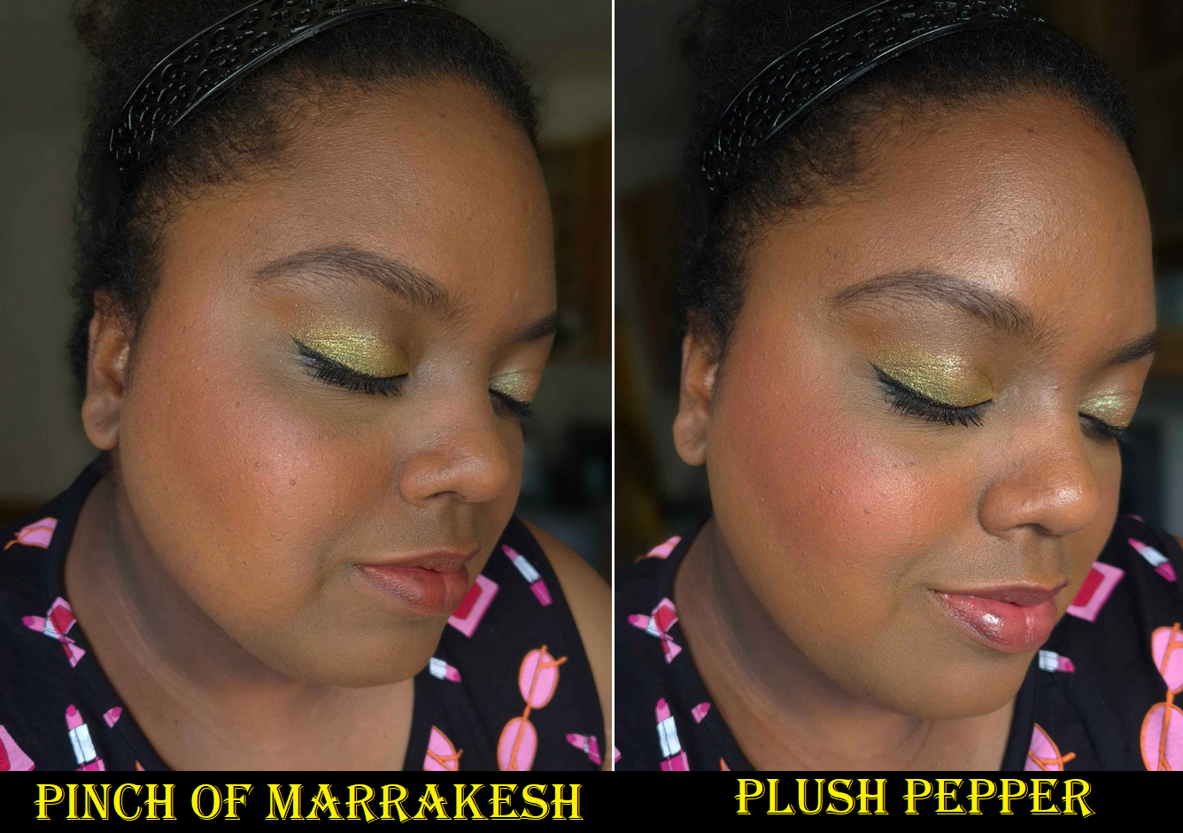
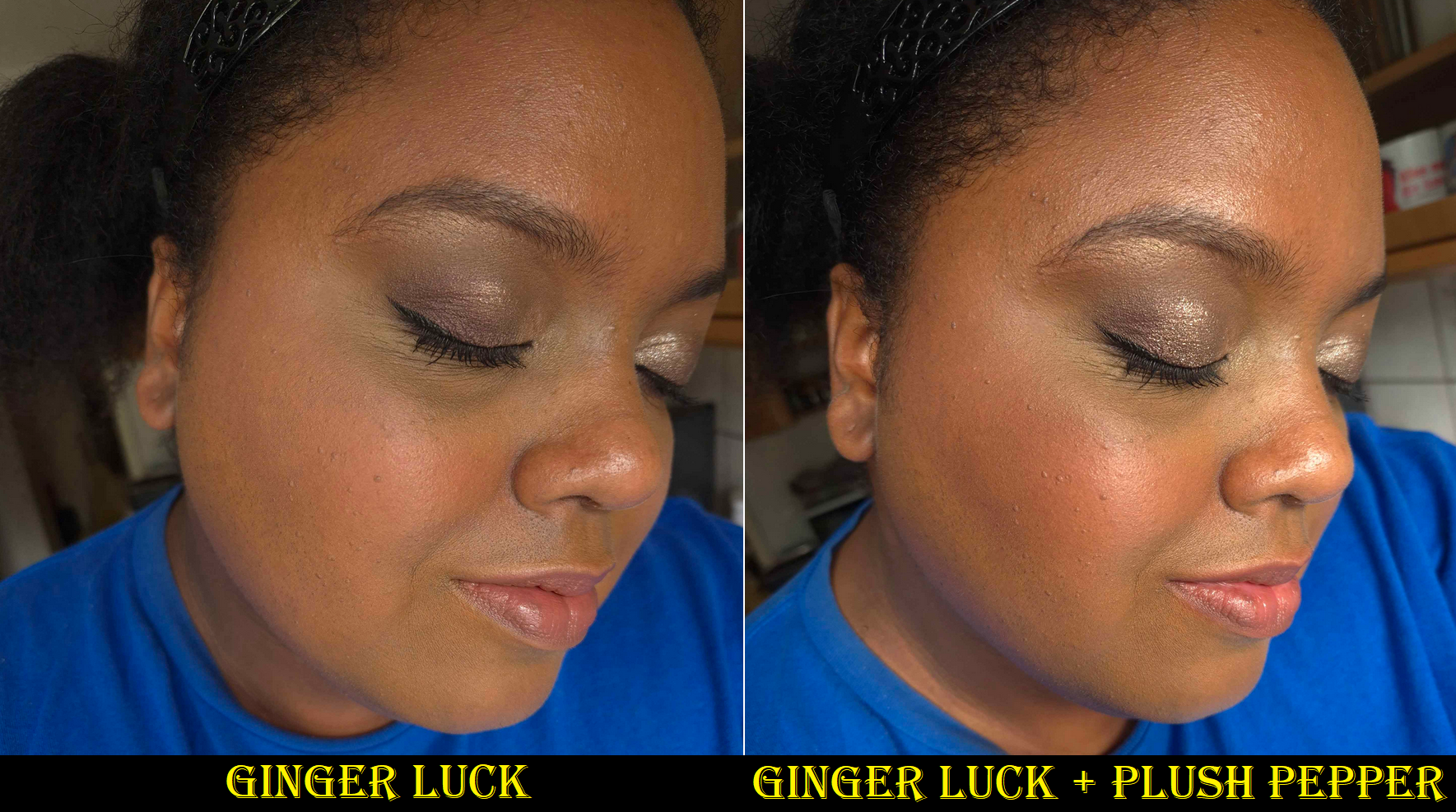
As you can see, Ginger Luck faintly shows up on my cheeks and looks the tiniest bit ashy because it’s too light for my complexion. Adding a little Plush Pepper on top creates exactly the kind of look I was hoping for. The combination is still a sheer light-medium pink shade on me, but the slight boost of rose-red helps it to pop more.
Having Ginger Luck essentially tones down vibrancy while adding a touch of brown to it. It’s a similar process when I try to tailor the color of my colorful Glossier Cloud Paints with Dusk.
I’m very happy MAC extended the Glow Play color range to include more options for those with dark skin and in less vibrant colors. I’m still waiting for true dark nude shades as well, like a darker version of Ginger Luck (True Harmony isn’t dark enough). They’ve created limited edition shades before, so I’d love for that to happen again.
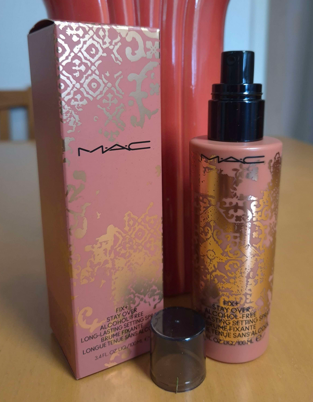
In addition to getting the Glow Play blushes, some of my other MAC purchases have been yet another Fix+ spray in the mini size with the original sprayer, another Fix+ Stay Over Setting Spray from the Teddy Forever Collection since my other one is still in the US, and the Lash Dry Shampoo Mascara Refresher. I also bought two limited edition lipsticks, so I thought I would review those here as well.
Fix+ Stay Over Alcohol-Free 24HR Setting Spray
This bottle has a limited edition design, but MAC has now equipped all their Fix+ sprays in bottles with this type of sprayer. I liked the power and wide spray range of the previous ones, but I admit the new ones do a better job at creating a fine mist, with one exception. Every time I use it, there are between 1-3 larger size droplets on my face. This isn’t a colorless spray. It’s milky, so after I spray, I look in a mirror and try to tap out the obvious droplets.
Aside from that, this is a very interesting setting spray. I’ve accepted that setting sprays are going to increase makeup longevity, make it water-resistant, but won’t be transfer-proof. The MAC Stayover Spray is a whole different thing. It increases the longevity, but is not water-resistant, though it’s better at being transfer-resistant.
I tested it with foundations that transfer fairly heavily and it was alternating throughout the day from not transferring to only lightly transferring depending on the moisture level of my skin. Whenever my face was shiny, I knew those spots would leave a slight imprint of color on my finger, but it was like this spray continued to try setting my face. If I stopped sweating or my face started to be dry again, lightly touching my face would not get foundation on my fingers. It might be the film-former particles at work that MAC describes in the product description on their site! When I perform a waterproof test for sprays, I wait until the end of the makeup day and splash my face with water. I can usually see the droplets rolling down the surface and not leaving a trail. With the MAC spray, it left a trail. I rubbed the spot to try and fill in the void, but it looked messed up. So, I went to go get my Makeup Eraser cloth, but when I returned to look in the mirror I noticed my foundation looked perfect. It’s like it set itself again! This spray doesn’t contain upsalite, the special oil absorbing ingredient that are in a lot of Danessa Myricks products, but the way it performs throughout the day reminds me of that one. I don’t like upsalite because it makes my skin feel tight, and this spray does have a little bit of a stretching sensation, but not full on tightness.
The transfer-resistant nature of this spray is obviously more effective with my foundations that are less prone to transferring, plus factoring my dry skin type. I don’t know how effective this would be for those with other skin types or dewy foundations. The formula is alcohol free and intended for those with hydration needs, so I recommend taking that into consideration if you’re interested in buying this product.
There are so many factors that impact how effective a spray will work for me (the skincare I used, the products I used, the humidity levels, the overall weather, etc.). Even my once tried-and-true Urban Decay All-Nighter wasn’t always fool proof. So, I’ve always taken a “better than nothing” approach to setting sprays. I use it when I know I’ll be hugging other people or out in the elements, so I just hope for the best. However, I do feel a little more confidence in at least minimizing the possible transfer when I use this spray, so I’m happy with it.
One more thing to note is that this doesn’t leave a glycerin-looking shine to the skin the way that the normal MAC Fix+ spray does. It looks that way while it’s still wet on the skin, but the dry down is just natural looking.
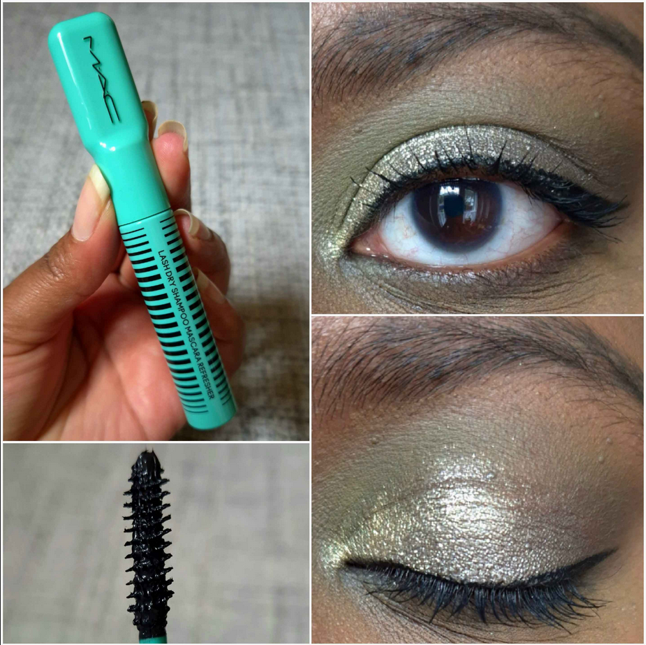
MAC Lash Dry Shampoo Mascara Refresher
When this product first came out, a lot of people were saying it was just a gimmick and that if a mascara needs refreshing at any point in the day, then it’s a bad mascara. I had a bit more faith in MAC because they’ve come out with some really unique formulas over the years and have been innovators. Just in case though, I waited for a sale before buying it. I’m glad I did because the naysayers seemed to be right about this one!
I wondered how I should even go about testing these claims since none of my mascaras need touching up throughout the day. I decided that I should at least see what this could do on its own. So, I applied one coat to my lashes, seen in the photo above. It’s certainly not pretty, but adding a second coat makes them look too clumpy and spidery, which is not my preference. It also doesn’t add much extra length, just volume.
I tried to use it as a “refresher” for my MAC Stack Mascara, but that mascara was unchanged by the end of the night. I still applied the Lash Shampoo on top of it and I noticed a significant boost in volume and a bit more length, but I can also achieve that by adding a second coat of MAC Stack Mascara. In fact, one of the reasons I love that one is I can build it up as much as I want and it won’t harshly tug at my lashes. It applies layers very well. So, using the Lash Shampoo didn’t go above and beyond the norm.
In the photo above, the top left and right photo is what the MAC Stack looks like freshly applied. The bottom left and right is what it looked like at night when I topped the MAC Stack with the Lash Shampoo.
I figured it would be better to test this product with a different mascara, so I picked the L’Oreal Telescopic Lift. This is technically a sneak peek of eye looks for an upcoming review (most likely to be published in October) using the LH Cosmetics Reload Palette. In the top left and right burgundy eye look, I’m wearing the L’Oreal mascara. In the bottom left and right green-brown-blue eye look, I wiped away some of the L’Oreal mascara and then topped my lashes back with the MAC Lash Shampoo.
The whole reason I was interested in this mascara in the first place is because I would often do back-to-back eye looks when testing larger eyeshadow palettes. I would do a different eye look on each eye, then remove the eyeshadow with micellar water and a cloth so I could create two new looks. In the process, sometimes the mascara would come off with it. Some mascara formulas wouldn’t reapply that nicely after having micellar water partly on the lashes (would form clumps or turn spidery), or were the type that was too stiff to add additional layers after it dried. So, I thought the Lash Shampoo could be the answer to that issue. Again, it adds volume and length, but it’s easily prone to turning the lashes spidery. It takes so long to wiggle the wand and comb through over and over to unclump the lashes. Plus, the end results are no different that trying to recoat the partly wiped off lashes with the Telescopic one. Two coats of the L’Oreal mascara gives me a similar look.
So, it may be the case that if I remember what the “bad” mascaras were or ever come across some new ones in the future, this product could be useful. However, if I just stick to my favorites, I will have no need for a second mascara to go with it.
I don’t know if MAC intended for this to be a gimmick, but it’s at least not useful for me. When I remember how half-assed they did the Sims 4 collab, I can’t put anything past them. It’s humorous that the brand that brought me Glow Plays is the same one that cooked up the Lash Shampoo.
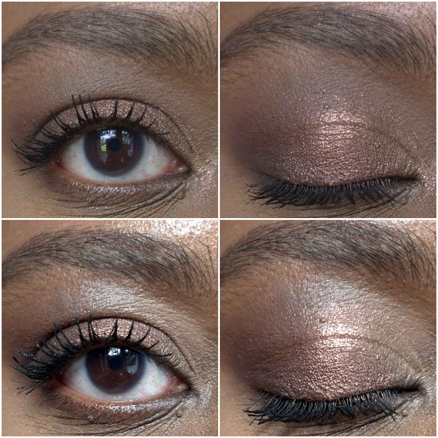
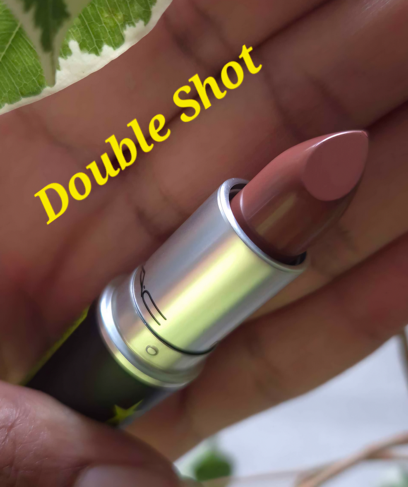
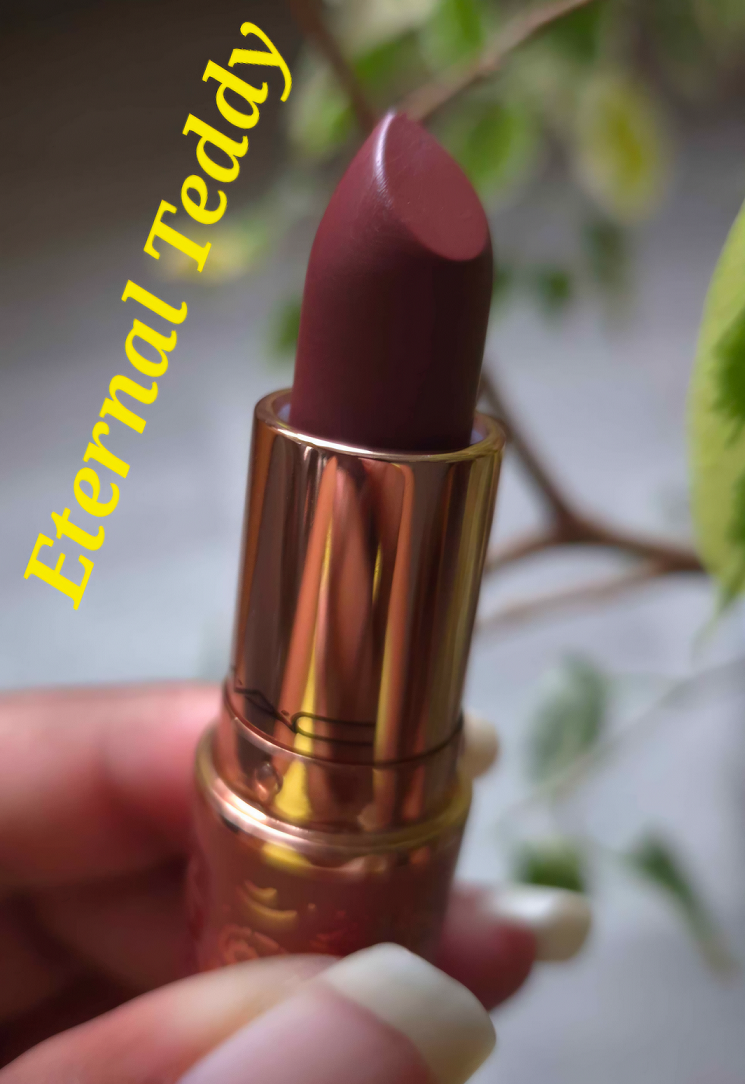
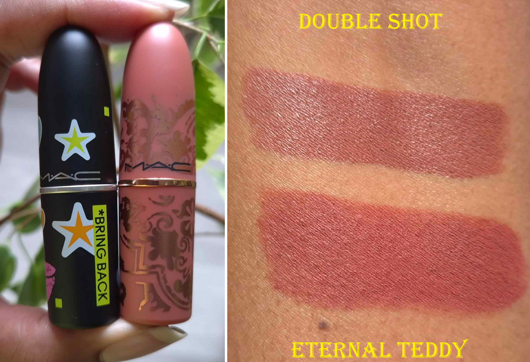
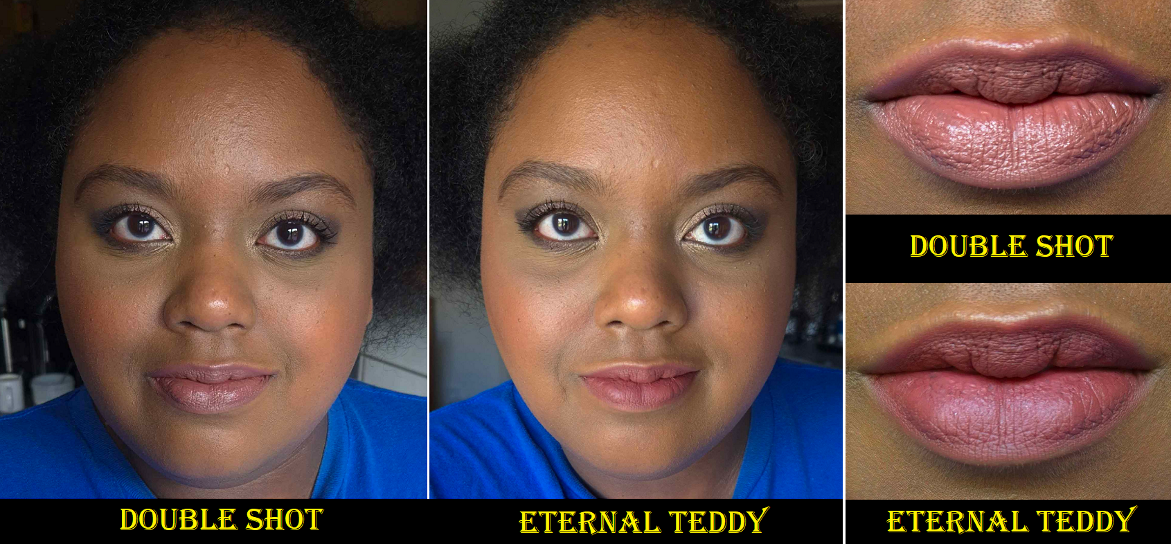
MAC 40 Year Anniversary “Bringback” Amplified Creme Lipstick in Double Shot and the Teddy Forever Collection Retro Matte Lipstick in Eternal Teddy
Once again, I’m dealing with constantly shifting natural lighting and my artificial lights wash me out too much, so these lipstick shades are hard to capture accurately. I did my best. Even though I’m wearing the same shirt as the Ginger Luck photos, which were added to this review a week before publishing, these pictures come from day 2 of trying to work around the constant fading in and out of light due to the cloudy weather here. I tried a third time (also in the same shirt) with at least Double Shot, but lipsticks look different on everyone anyway depending on their skin tone and the pigment level of one’s lips.
Eternal Teddy is my first Retro Matte lipstick, and my goodness it is too much for my dry lips! I have to wear a balm underneath to manage the discomfort, but this color isn’t quite what I expected, so I don’t think I’ll be wearing it again anytime soon. I’m a sucker for that packaging though. As for the amplified lipstick formula, I still suffer dryness, but it’s a far more comfortable formula to wear. Double Shot is described as a mid-tone mocha brown. On my lips, it appears a little more mauve and brown than my natural lip color, and slightly lighter, but I like it. It looks great paired with a darker lip liner! This shade reminds me of a few others in my collection, but I left them in the US, so I can’t compare them. In any case, I have a lot more of a chance to wear this color. I’m glad I bought it.
I hope this has been helpful! If you’re a lover of all things MAC or just makeup in general, please consider checking back every Monday, or clicking follow, as to not miss out on any posts!
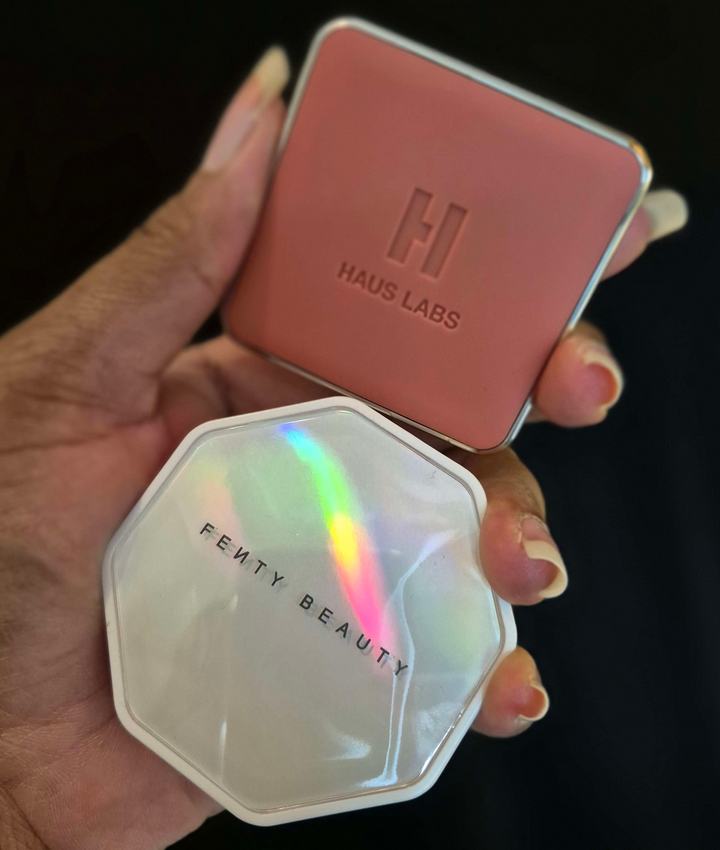
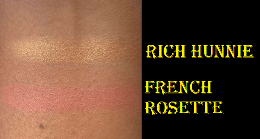
Haus Labs Color Fuse Talc-Free Powder Blush With Fermented Arnica in French Rosette
When Haus Labs launched their initial blushes, I purchased the shade Pomelo Peach. It looked very ashy and dry on my skin, so I ended up giving it to my friend who is lighter than me instead of reviewing it. I realize that sometimes if blush colors are unsuited for my skin tone, it can look ashier than it should be. So, I hoped that was the issue with the previous one and gave French Rosette a try. I’m so pleased with this shade! It’s a soft matte that melts well into my skin, even though it’s dry (and not a creamier feeling powder). The color is subtle, but can be built up. When built up it has just enough punch of color that it looks vibrant on my skintone without being garish. It also has good longevity. Because the previous color made such a big impact on how it looked in terms of texture on my skin, I can only recommend it with the caveat of trying it first in store.
Although I love this color, I admit this is still not a favorite formula. It blends well, but I prefer a less matte finish. It has the fermented arnica that keeps getting touted by the brand as a special ingredient, but I don’t have redness, so this isn’t a selling point for me. It also has squalane for hydration, but I don’t see it doing very much when I have experienced softer feeling and creamier powder formulas from other brands. Considering the price, I’m going to be content with this particular shade and not purchase additional ones in the future, unless Haus Labs makes a satin or shimmer finish. It’s nice, but not a necessity.
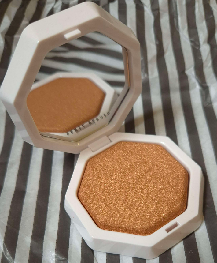
Fenty Beauty Demi’Glow Light-Diffusing Highlighter in Rich Hunnie 06
Fenty’s past highlighters tended to be far too glittery or have too large of glitter particles for my liking, so the idea of the Demi’ Glow having “superfine pearls…to give a lowkey glow” appealed to me. I have to say, this highlighter truly is smoother than their past releases and with smaller than their usual shimmer particle sizes, but it has a strong reflect. So, this highlighter is still quite intense considering the small amount of it I try to use. I like it enough to keep using it occasionally, but it’s still not for subtle-highlight lovers.
Although my highlighter arrived in perfect condition, I’ve seen photos of other people on social media receiving theirs with cracks in them. The formula seems to be fragile, just like the previous highlighters/Toast’d Swirl Bronze Shimmer Powder everyone was receiving broken despite it being a squishier formula. In fact, in the earliest promo photo, I saw a crack in the corner of one of the highlighters. That indicates how prevalent this issue is if even the brand’s marketing team had it happen to them before or during the photo shoot. Also, unlike the Toast’d Swirls, the Demi’ Glow are baked on terracotta/clay tiles.
For those who love a strong highlighter, this may be worth the price. The custom packaging is nice and these are baked products, but the intensity of the reflect reminds me of less refined products despite how fine the shimmer actually is. This is purely a perception thing, so I recognize it’s likely an unpopular opinion. The same issue that makes me like it a bit less is the same reason others would be racing to the store to buy multiples.
The shade range is great though, especially for highlighters. I have to give them that credit. And it does look pretty. It just isn’t going to be for everyone. I took the photos below on a cloudy day and the fact that it’s still so clearly visible is a testament to its radiance.
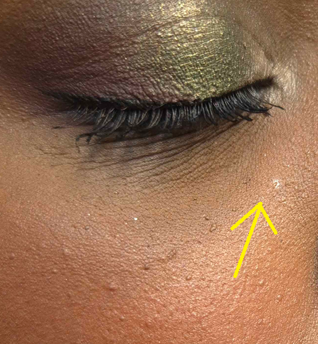
In the photos I’m wearing the Haus Labs Blush and Fenty Highlighter. The only digital edits made were to blur the background and remove some moles that I find can be distracting.
A way that I’ve found to use these and have it look more my taste is to apply the highlighter first and the blush after. That way parts of the highlighter get some extra blending and dispersing along the cheekbones.
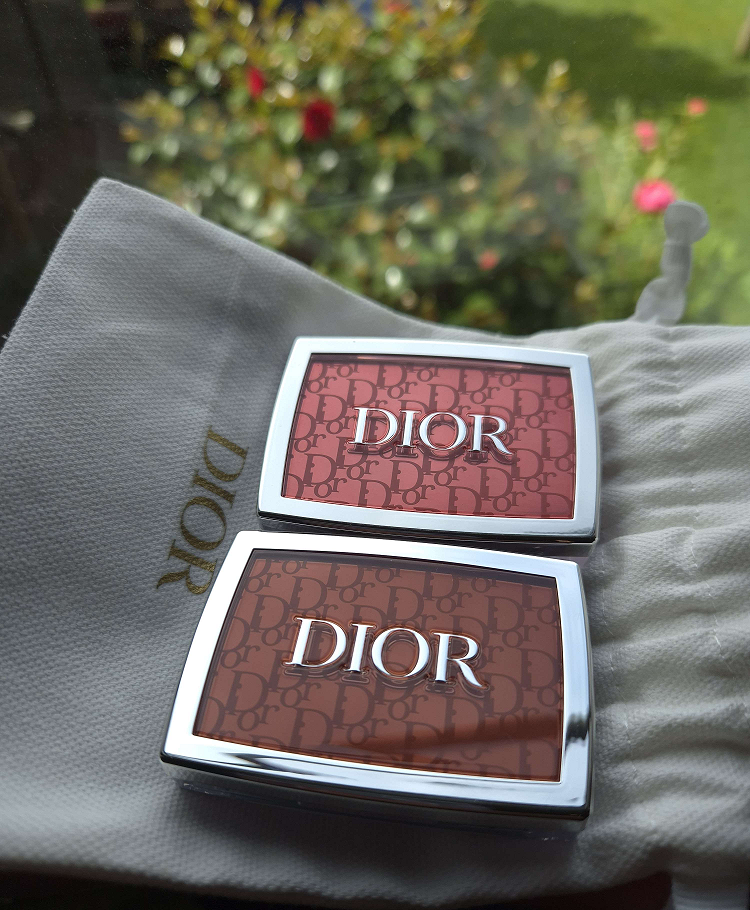
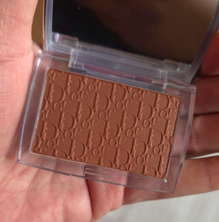
This is less of a review and more of a showcase for one of the three newest blush shades added to Dior’s Rosy Glow line. The color Rosewood shot to the top of my blush favorites and is the only one of the three I brought with me to Germany. The original Coral was too light for my taste, whereas Mahogany was too deep. This new Bronzed Glow shade is a lighter version of Mahogany and includes visible shimmer in the pan that not only makes this formula easier to pick up with a brush than the others, but also adds a subtle glow. The previously released shades were not flat matte, but didn’t have any shimmer that I could see. I would call Bronzed Glow the first actual satin blush. My review for the original Coral, plus Rosewood and Mahogany can be found HERE.
I didn’t pick up the new Coral shade because it doesn’t look, in my estimation, different enough from Cherry (which depending on one’s skintone, is like a deeper Rosewood). So, I stuck to buying Bronzed Glow from Dior’s website and it shipped to Germany from France. Bronzed Glow is a beautiful nude-brown red. Rosewood is still my favorite, but I’m thrilled to have this second shade. Also, this formula doesn’t swatch well, but looks beautiful on the face.
I know some people had issues with patchiness from the previous releases, but I think the added shimmer will help with that for more skin types. I personally find that as my skin is drier here than it was in Florida, the longevity of this shade is slightly shorter because there isn’t as much moisture to grip to even with liquid makeup and skincare on my face. However, it lasts long enough for me to be happy with it. I also commend Dior for finally being inclusive with this range. For once it was actually the tan and medium-dark range with less options since Berry and Mahogany came first. Now, there’s something for everyone.
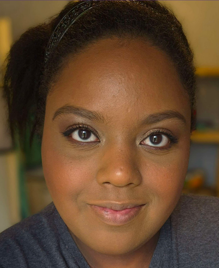
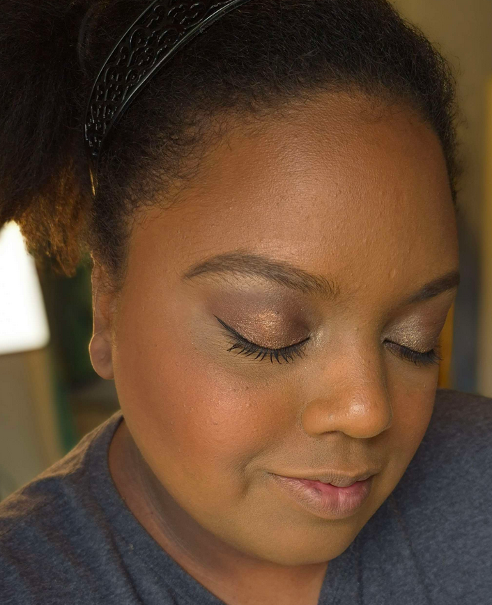
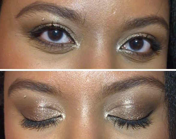
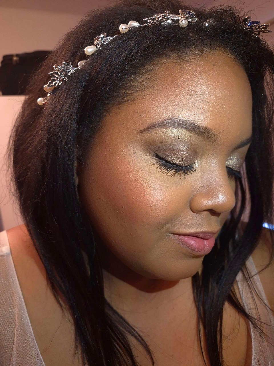
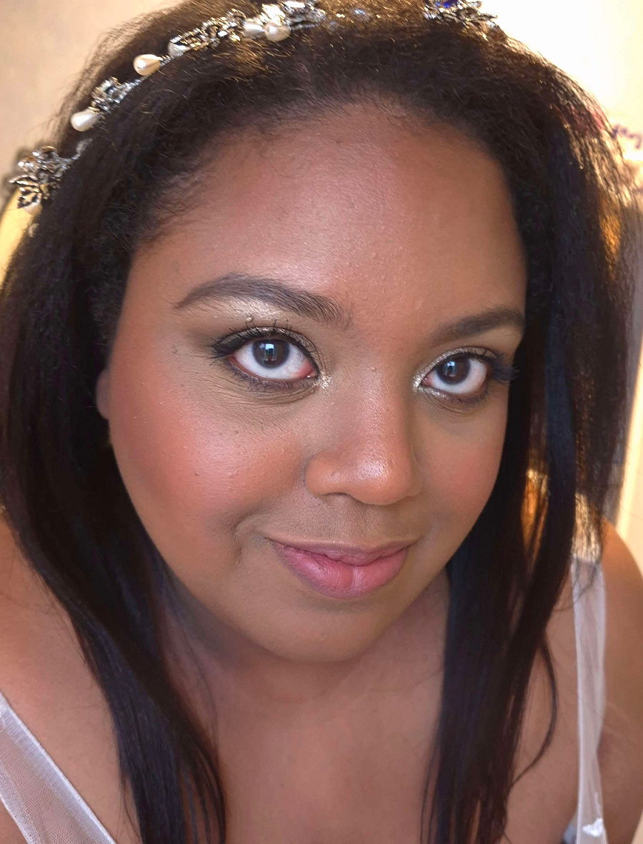
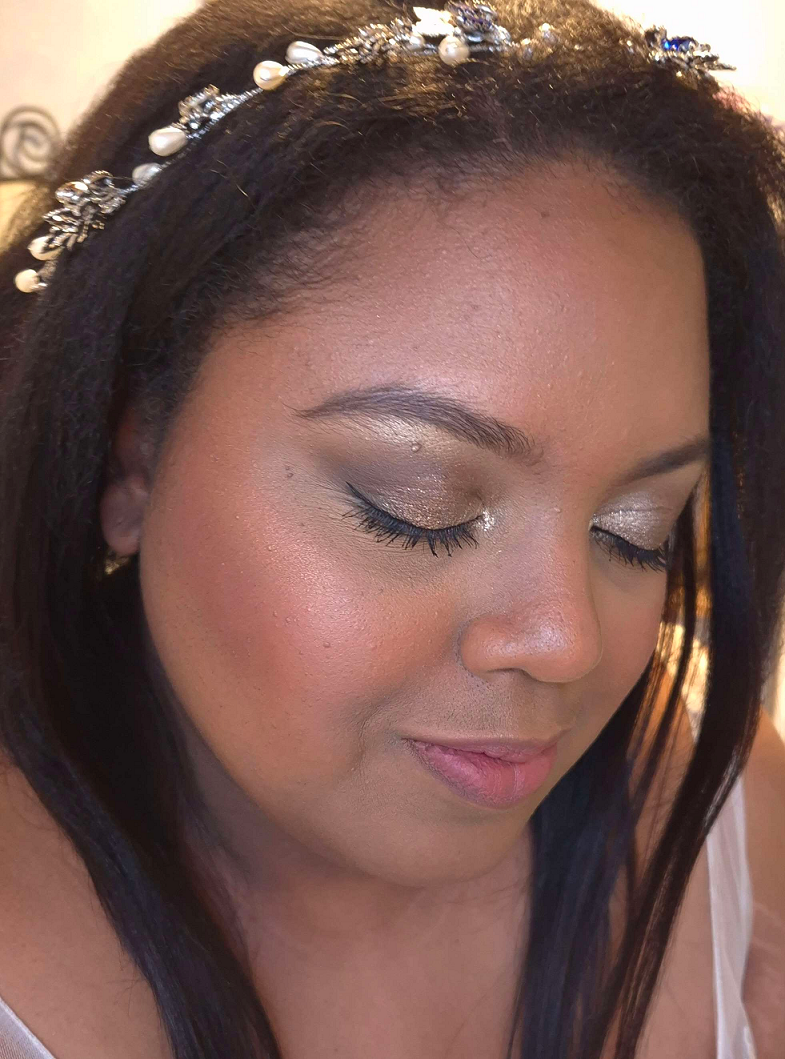
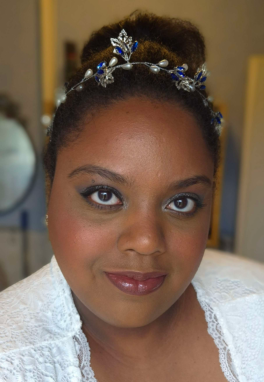
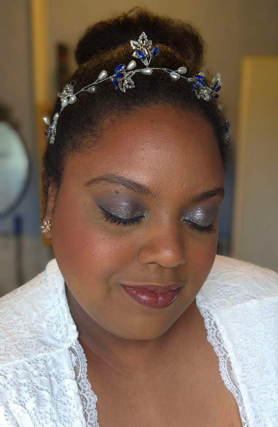
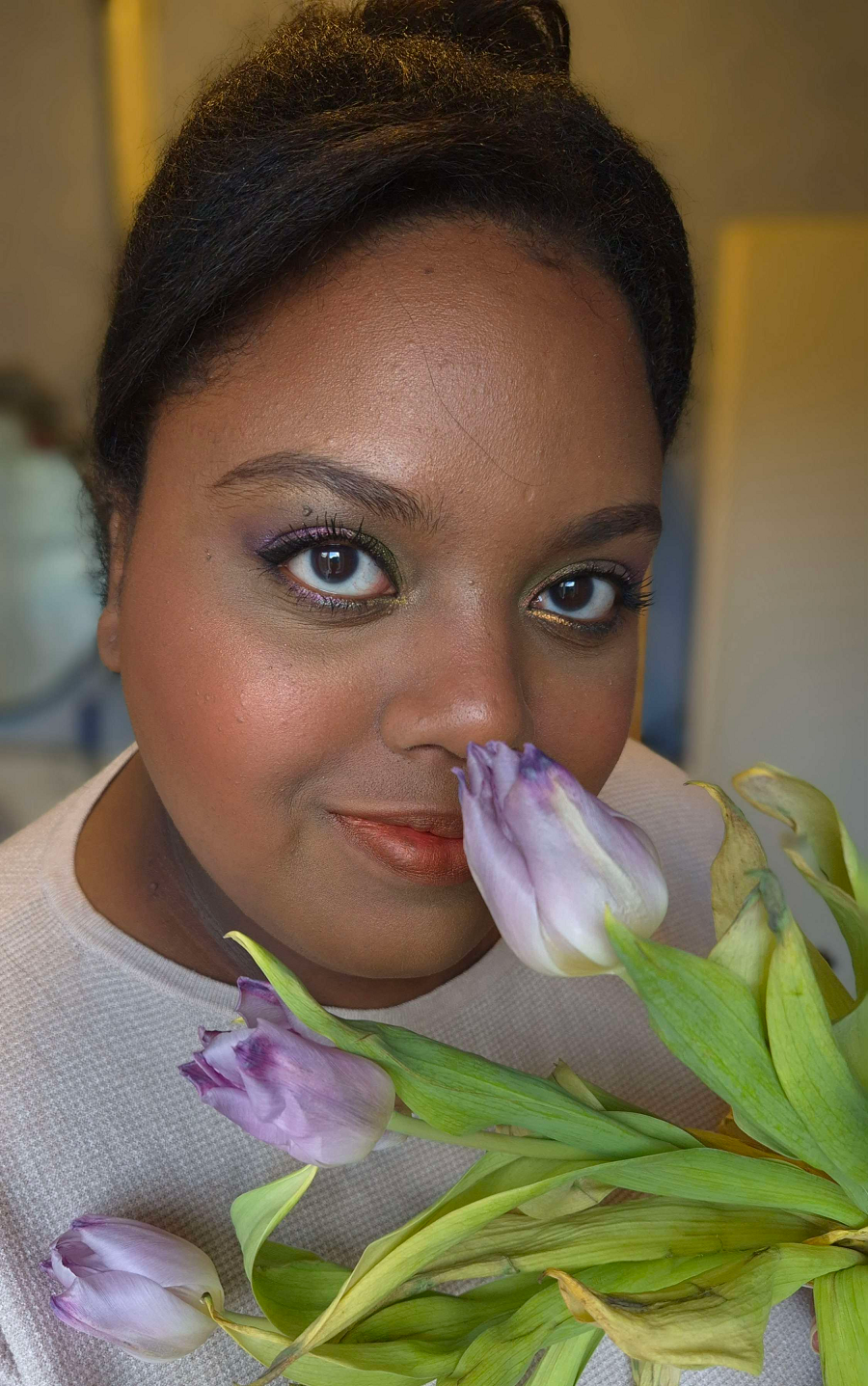
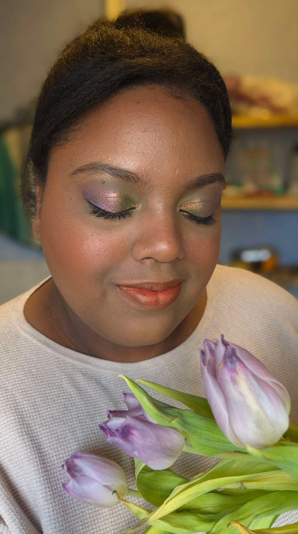
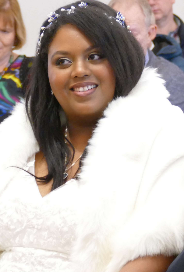
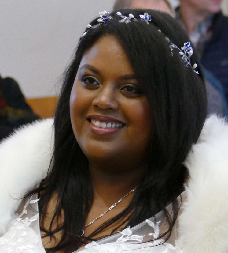
The photo above demonstrates some of the various stages that I was testing different makeup products and practicing techniques in the weeks prior to the wedding. The very first example is what I would consider my typical amount of makeup, versus the last photo where I put in way more effort with a ton of extra steps that were necessary to create the look I envisioned for myself.
In Part 1, I explained which strategies I chose and showed the specific makeup products used. In Part 2, I’m going into greater detail listing the actual order of the steps I took. That includes all the details about the eyeshadows that I left out of the previous wedding post. I will also include photos of alternative wedding/special occasion looks in both the cold winter theme, classic looks, and a few colorful ones now that we’re in spring.
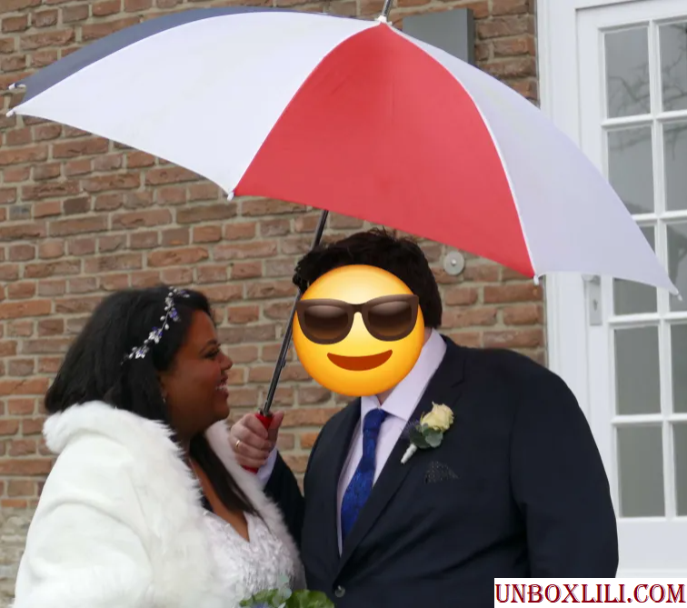
The makeup artists were upfront about either not being available on the day of the wedding or not having their own products to match me. I was a bit nervous about having to do it on my own, considering I’m just a makeup enthusiast, but many loved ones reassured me that I knew my own face better than anyone else and they were confident I could pull it off. I hope that this post will be inspiring to anyone else in a similar situation where you have an important event coming up and aren’t sure where to start or would just like to see extra ideas.
My Wedding Makeup Step-By-Step
First, I applied skincare (and this would normally include sunscreen though I skipped it), allowing ample time for everything to absorb in the skin before moving onto applying primer(s).
I then applied color correctors to the spots I have discoloration, put on the liquid contour for my nose and under the cheeks, and added liquid blush. I left them only halfway blended since the foundation would go over everything anyway as part of the underpainting technique.
I made a mixture of foundation shades and applied it to the outer perimeter of my face. The lighter foundation color, I applied to the central zone of my face.
The eye primer came next before I filled in my brows with my brow pencil of choice.
I applied my skin tone shade of concealer to my under eyes and areas of discoloration. I applied a combination of my skin tone shade and a lighter color to my under eye area again, the bridge of my nose, center of my forehead, and chin. I use the lighter concealer color alone to highlight under my eyebrows.
After setting those concealer areas with powder, I did a first round of setting spray to lock those in.
In the photo series above, I saved my eye makeup for last, but I switched the order on the day of the wedding to do the eye makeup next in case I had a mishap with eyeliner, if mascara got on the lids, etc.
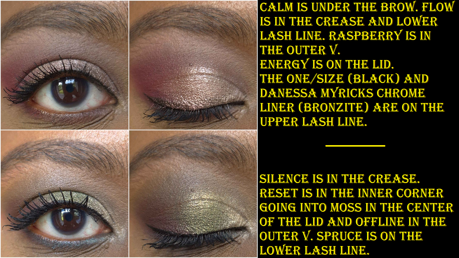
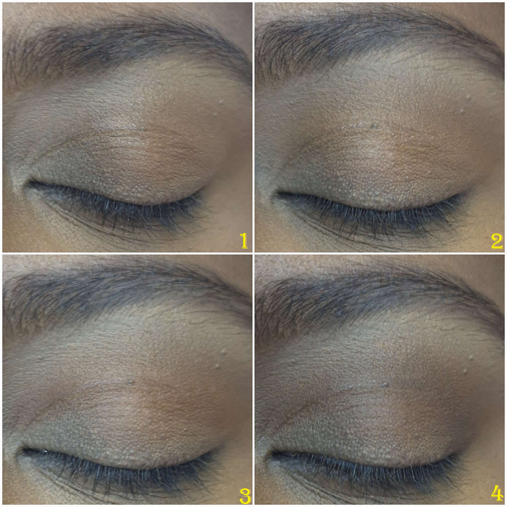
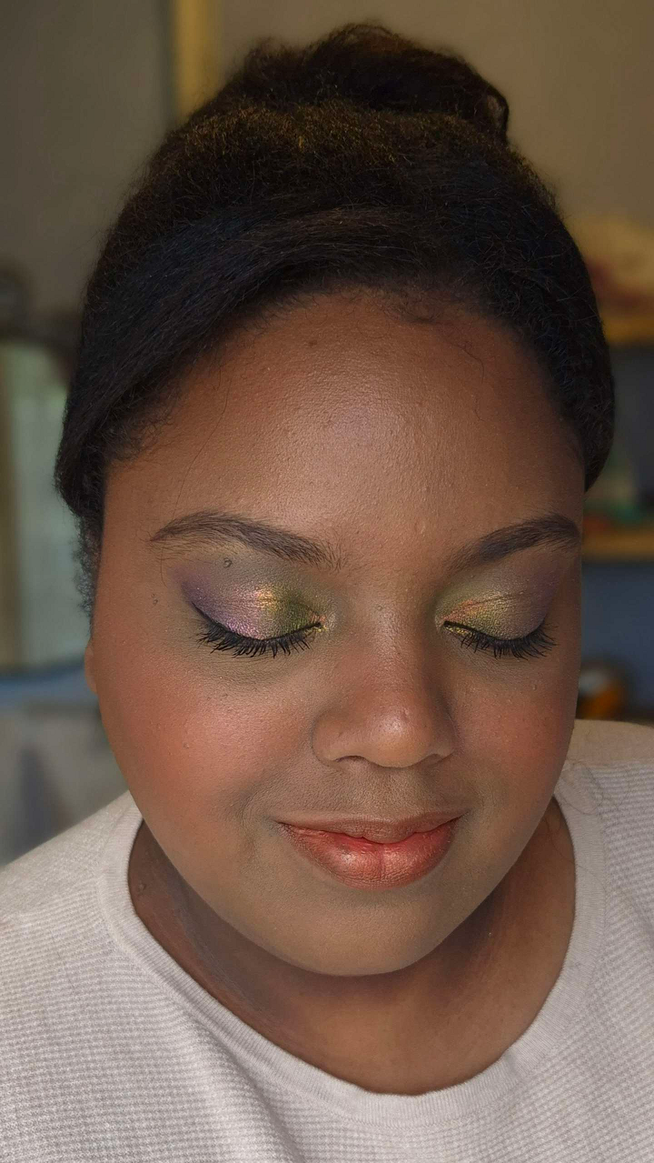
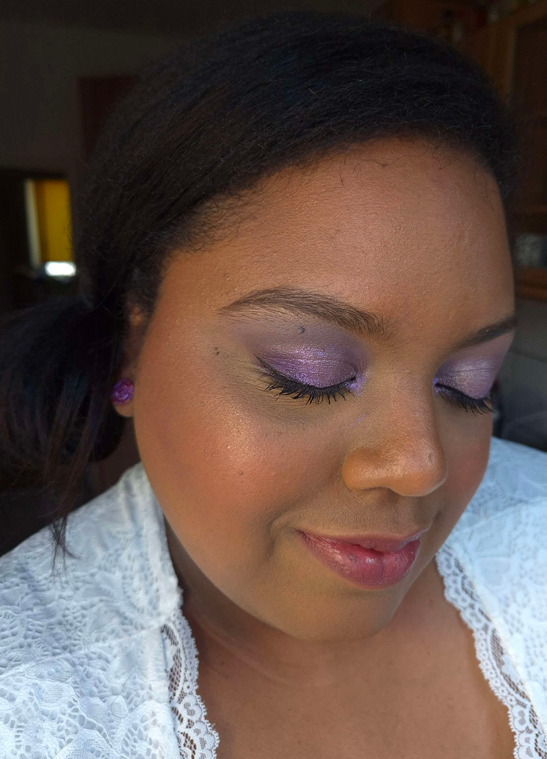
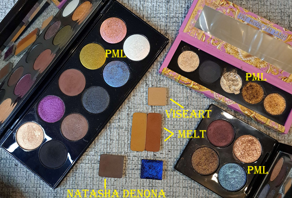
1. First, I applied Viseart’s Illusion shade from the Peridot quad under my brows on top of where I laid down the lighter concealer shade.
2. Then I applied Melt’s Rubbish shade from the Rust palette in the space under the Viseart shadow, but above the crease.
3. Next was Melt’s Rust shade from the same palette tightly in the crease, not going past the previous shade.
4. I lightly added Log from Natasha Denona’s Gold Palette, building up the outer corner and moving halfway inward. I chose this placement because of my particular eye shape.
5. I then built up the depth and smokey factor in the outer v area using Xtreme Black from Pat McGrath’s Mothership III: Subversive palette.
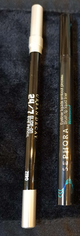
6. I smudged the Urban Decay 24/7 Glide on Pencil along the outer quarter of the lower lash line before using Deep Shade (actual name) from the same PML palette on the rest of the lower lash line.
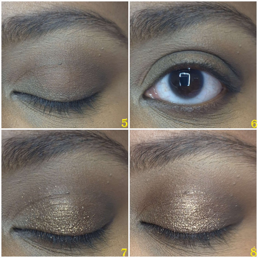
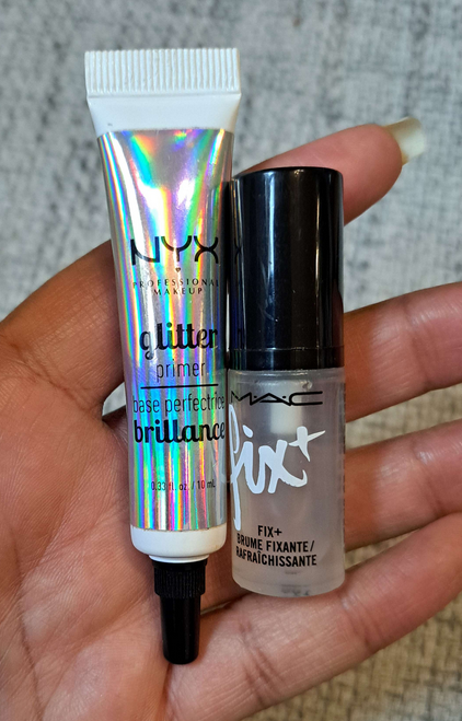
7. I smoothed on the Nyx Glitter Primer to the empty space on my lids and applied Bronzed Mink from PML’s Bronze Bliss palette to the outer half of the lid, taking care to not cover up the dark shadows in the outer corner.
8. I added Divine Dahlia from PML’s Interstellar Icon Quad on top of Bronze Mink to tone down the warmth of that shade.
9. The next step was picking up Nude Moon from Bronze Bliss on my brush, spraying it with MAC Fix+ and applying it to the inner half of the lids.
10. I placed Skinshow Fever from Mothership III: Subversive in the inner corner, under the brow arch, and the inner third of the lower lash line for highlighting purposes.
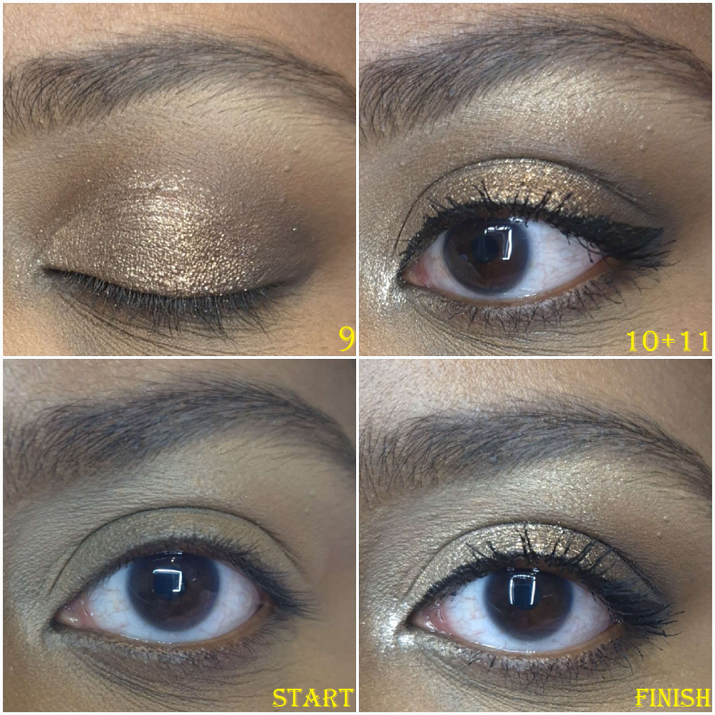
11. For extra sparkle, I added Lunar Luxury damp from Bronze Bliss to the inner corner. I applied the waterproof eyeliner to my upper lash line, along with two coats of waterproof mascara to my upper lashes, but only one coat on my lower lashes. Had I used the Clionadh multichrome, I would have placed a small dot that was eyeliner width to the center of the upper lash line.
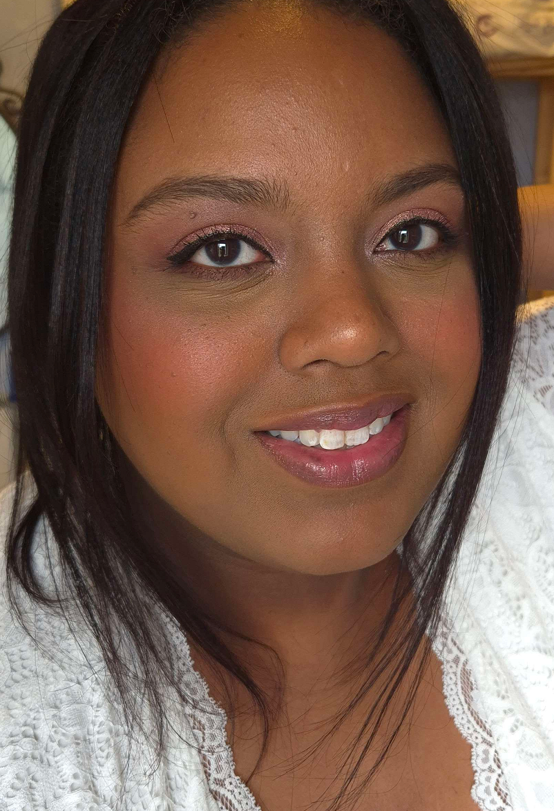
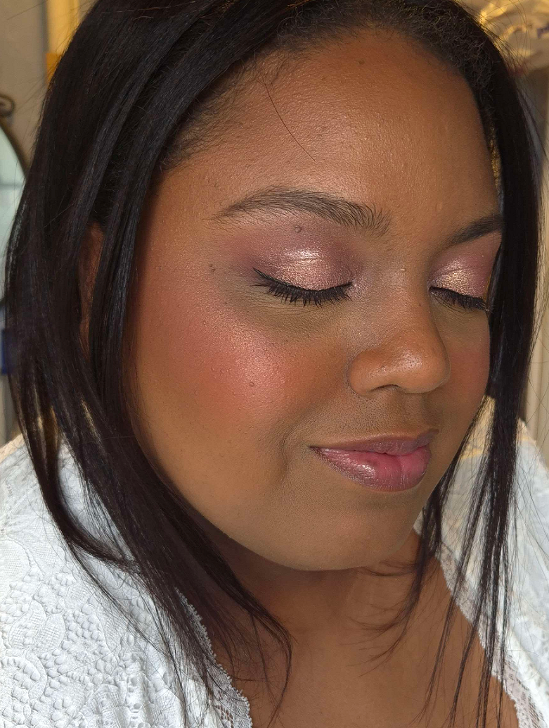
Going back to my base, I applied powder contour under the cheeks and along my jawline. I applied a cooler toned contour to my nose, and on top of the other contoured spots.
I applied bronzer along my forehead and slightly above the contour under my cheeks.
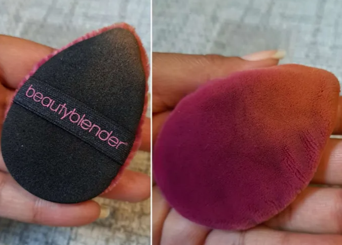
I used my face powder and the Beautyblender Puff to clean up a small section of my sculpting work without going too far in. Just about one inch inward from my ear.
I applied my intense highlighter to the tops of my cheekbones.
I applied the mixture of powder blushes to my cheeks.
I applied my more subtle highlighters to the top of my cheekbones again, bridge of my nose, above the brows, and any remaining product on the brush to my forehead and chin.
I used my blurring finishing powder in any areas that needed extra blending/blurring.
I lined my lips with the lip liner of choice, filled it in with liquid lipstick, and added a lighter lip product to the center of my lips. During trial sessions, I even added highlighter, but didn’t end up doing it on the wedding day.
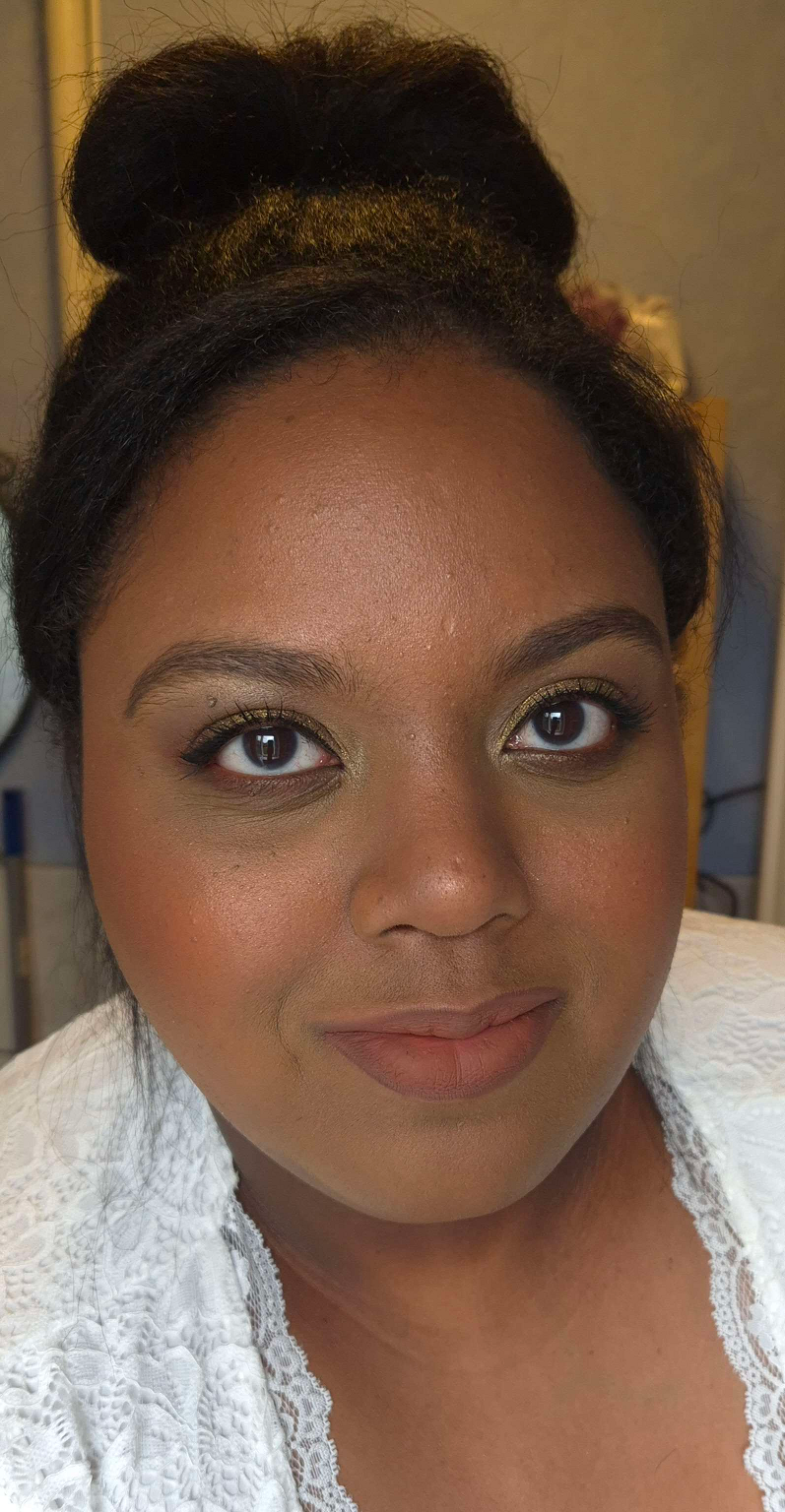
I put the leftovers of foundation from my brush and applied it to the spots on my neck that would be seen.
I applied highlighter to my collarbones and shoulders.
Lastly, I finished up with a generous amount of setting spray to my face. Had I remembered, I would have sprayed my neck and the spots I applied body highlighter.
And that’s everything! It’s a lot of steps, but worth the time and effort for one of the most important days of my life!
Just as unexpected problems can arise on important days, unfortunately, nearly every day that I set aside free time has been a dark day. I’ve done my best to play around with artificial light, take photos during the brightest part of the day for natural light, and do some color adjusting with the photos, but I’m dealing with cloudy days constantly over here. Times like these, I miss Florida haha.
Recreation of my Wedding Makeup/Neutral Glam: Used all the products I still have on hand. Photo Setup: (1) In front of an open window on a cloudy day. (2) In a room with warm light and a second cell phone’s flashlight was lit behind the camera. (3) In front of an open window with warm white bulbs overhead.
Here are the additional looks!
Frost Queen: Milky Hydro Grip Primer and Armani Luminous Silk Hydrating Primer, Armani Luminous Silk Foundation in 10, Hourglass Cosmetics Vanish Airbrush Concealer in Maple and Umber, Chantecaille Perfect Blur Powder in Med/Deep, r.e.m. Beauty Hypernova Satin Matte Bronzer in Cocoa-Nut, REM Beauty Highlighter Topper in Miss Mars, Hindash Beautopsy Palette (nose contour), Armani Neo Nude Melting Color Balm in 60 Warm Plum and Hourglass Ambient Light Blush in At Night, ELF Instant Lift Brow Pencil in Deep Brown, Stila Stay All Day Waterproof Liner, KVD Full Sleeve Mascara, Juvia’s Place Lip Liner in Brownie, Lisa Eldridge True Velvet Lip Color in Sorcery, Colourpop Hocus Pocus 2 So Glassy Lip in Boys Will Love Me, the eyeshadow shade Memory (Metallic) from the Tati Beauty Textured Neutrals Volume 1 palette, and shades Nowhere, Christmas Eve, and Snowflake from the Oden’s Eye Christmas Eve Palette. Photo Setup: In front of an open window with a warm white bulb overhead on a partly sunny day, but near sundown.
Playful Pinks: Milk Hydro Grip Primer, Nars Light Reflecting Foundation in MD3.3 Caracas, KVD Good Apple Concealers, Huda Faux Filter Corrector in Mango, Nars Soft Matte Advanced Perfecting Powder in High Tide, GloWish Soft Radiance Bronzing Powder in 04 Deep Tan, Dior Backstage Powder No Powder, Hindash Beautopsy Palette (nose contour), Dior Rosy Glow Blush in 012 Rosewood and Nabla Skin Glazing in Lola, Pat Mcgrath Labs Skin Fetish: Ultra Glow Highlighter in Divine Rose, Suqqu Treatment Wrapping Lip in 05, Coloured Raine Lip Liner in Decadent, Benefit Precisely, My Brow Pencil in 05, KVD Full Sleeve Mascara, Stila Stay All Day Liquid Eyeliner, MAC Fix+, Melt’s eyeshadows from the Gemini II Palette with shades Bela, Sweetheart, Gemalas, and LX Queen, and the Rust palette with shade Antique. Devinah Cosmetics Eyeshadows in shades Empress, Pixy Stix, and Gelicide. Pat Mcgrath Labs’ eyeshadows from the Mothership III: Subversive palette in VR Pink and from the Celestial Nirvana 5 pan Palette in Nude Allure in the shades Mercurial Rose and Coral Kiss. Photo Setup: In front of an open window on a less cloudy day, but during late afternoon hours and a warm white bulb overhead.
Chocolate-Gold Glam: Milk Hydro Grip Primer, Armani Luminous Silk Hydrating Primer, Hourglass Ambient Soft Glow Foundation in 13.5 and 14, L’Oréal Infallible Full Wear Waterproof Concealer in 415 Honey, Huda Beauty Easy Bake Loose Baking & Setting Powder in Blondie, Gxve Beauty Check My Glow Multi-Dimensional Illuminating Highlighter in Karat Country, Anastasia Beverly Hills Cream Bronzer in Terracotta, Dior Powder No Powder, Chanel Blush Lumiere Illuminating Blush Powder in Brun Roussi, ELF Instant Lift Brow Pencil in Deep Brown, MAC Macstack Mascara, One/Size Waterproof Liquid Eyeliner Pen, Palladio Waterproof Lip Pencil in Coffee, and Kaleidos Cloud Lab Lip Clay in Sienna. Hindash Beautopsy Palette (nose contour and no contouring anywhere else). Viseart’s Illusion shade from the Peridot Quad, Deep Shade (actual name) and Gigabyte from Pat Mcgrath Labs Mothership III: Subversive, Clionadh Cometics’ shade Lux, and Devinah Cosmetics’ shade Ambrosia. Photo Setup: In front of an open window on a less cloudy day with a warm white bulb overhead.
Flower Garden: Haus Labs by Lady Gaga Triclone Skin Tech Foundation in 425 Medium Deep Neutral, Tatcha the Liquid Silk Canvas Fenty We’re Even Concealer in 410 W and 385W, Givenchy Prisme Libre Powder in 5 Popeline Mimosa, Dior Powder No Powder, Hindash Beautopsy Palette (nose contour), Victoria Beckham Matte Bronzing Brick 05 (regular contour), Gucci Bronzer in 04, MAC Glow Play Blush in Peaches N Dreams, Sephora Blush Duo in 02 Peach Blossom, Tom Ford Shade and Illuminate Highlighting Duo in Tanlight, Benefit Precisely, My Brow Pencil in 05, L’Oreal Telescopic Lift Macara, Stila Stay All Day Waterproof Liquid Eyeliner, Danessa Myricks Infinite Chrome Micropencil Eyeliners in Jade, Amethyst, and Lemon Quartz. Devinah Matte Eyeshadows in Courtney and Meraki, Clionadh Cosmetics Stained Glass Shadows in Mural, Patina, Quest, Noble, and Spire. Coloured Raine Lip Liner in Pine and Suqqu Sheer Matte Lipstick in 112. Photo Setup: In front of an open window with the sun poking out randomly on and off from behind the mostly cloudy sky, and a warm white bulb overhead.
Spring Purples: Milk Hydro Grip Primer, Glossier Futuredew, Lisa Eldridge Seamless Skin Foundation in 27, KVD Good Apple Concealers, ELF Camo Color Corrector in Orange, Charlotte Tilbury Airbrush Flawless Finish in 2 and 3, Hermès Plein Air H Trio Healthy Glow Mineral Powder, Dior Backstage Powder No Powder, Hindash Beautopsy Palette (contour), ColourPop Pressed Powder Blush in Potted and Gucci Cheeks & Eyes Powder Luminous Matte in 06 Warm Berry, Hourglass Metallic Strobe Powder in Infinite Strobe Light, Lisa Eldridge Enhance and Define Lip Pencil in Sorcery and Lisa Eldridge Luxuriously Lucent Lip Colour in Painterly, Benefit Precisely, My Brow Pencil in 05, KVD Full Sleeve Mascara, Stila Stay All Day Liquid Eyeliner, Melt’s eyeshadows from the She’s In Parties Palette with shades Total Immortal and Last Caress. Clionadh Cosmetics Multichromes in shades UV and Tracery. Sydney Grace Eyeshadows in Dear Reader, Flannel, and Sovereign Reign. Photo Setup: (1) In front of a window on a partly sunny day. (2) Same as the first, but from the opposite direction. (3) In front of an open window on partly sunny day and a warm white bulb overhead.
That’s all for today! Thank you for stopping by! I hope you’ll click to follow or bookmark this page to come visit again!
Also, I seem to be having an issue with WordPress. For some reason, images have a hard time loading for those viewing my blog within Germany. The customer service advisors were unhelpful and the only way that even I was able to get around loading issues was to use a VPN. If you live in the US or most other countries, it should be working fine. The issue, as far as I’m aware, is a DE issue for some reason.
Since the brand’s highlighter is one of my favorite products, I was excited to see the release of their new blushes and bronzers in similar packaging with the same pattern and soft looking texture. I won’t harp on the highlighter because I reviewed it in-depth in my Best Highlighters Showcased post just a few months ago, but I wanted to at least show it again in different lighting.
Although the texture isn’t exactly the same as the new products, because it’s a shimmer that feels slightly emollient to the touch, the others are a soft matte that feel like they still have a bit of slip to them.
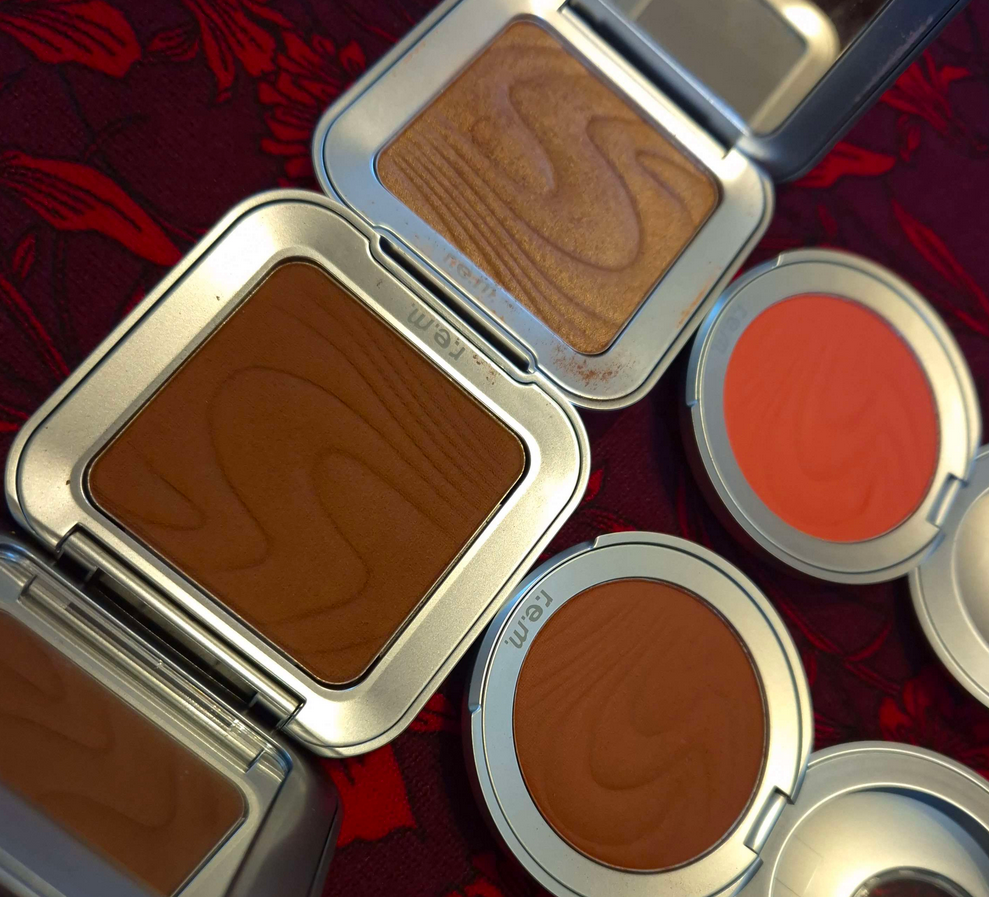
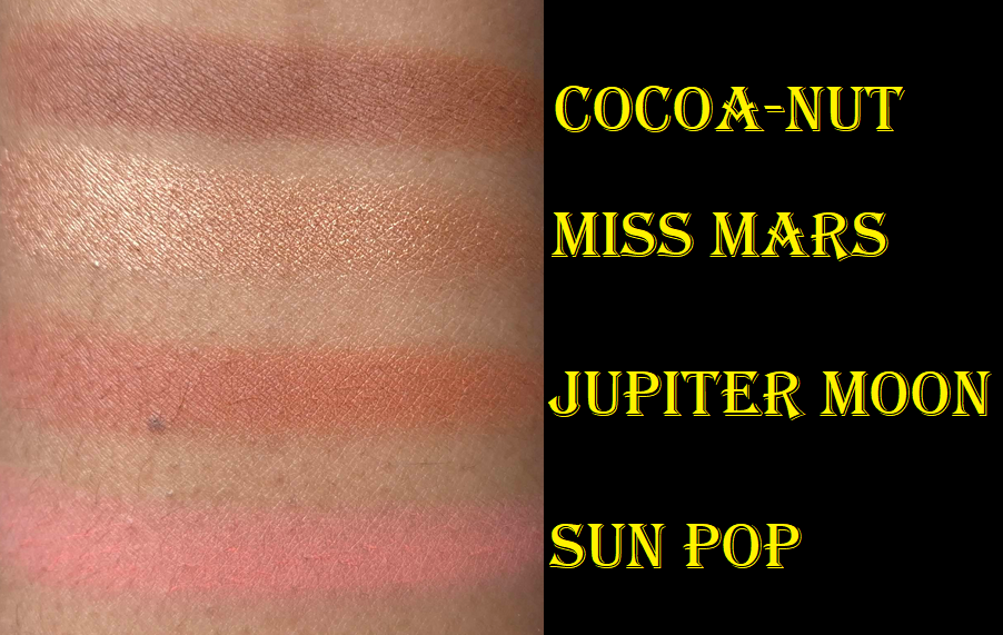
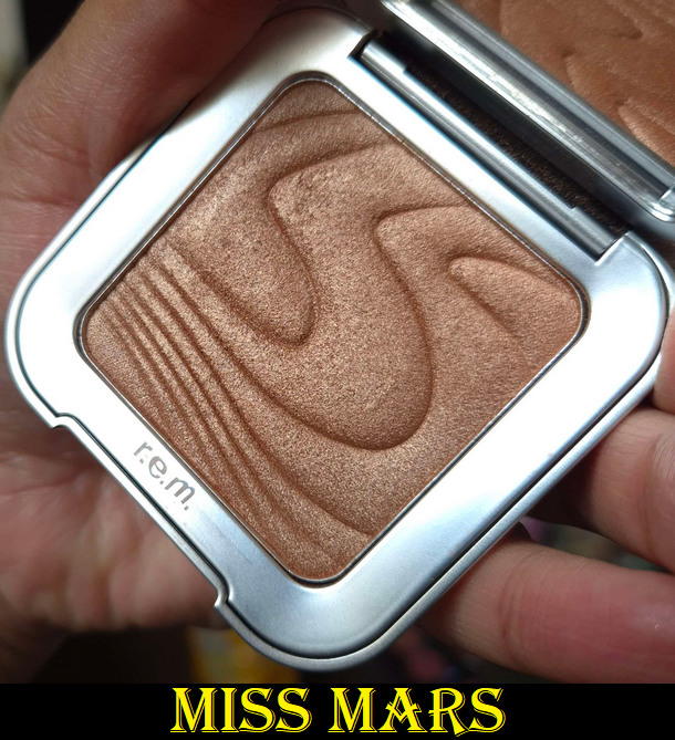
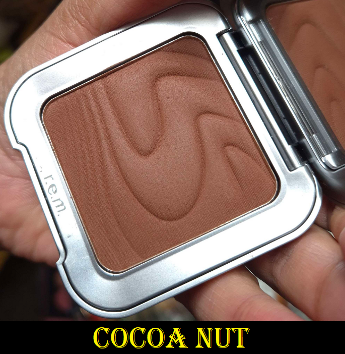
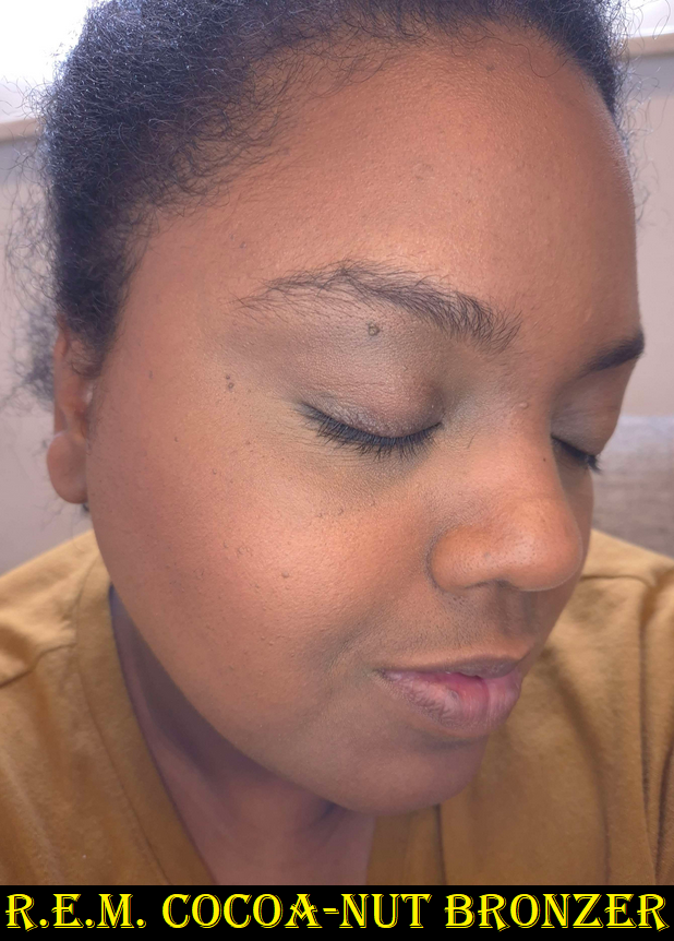
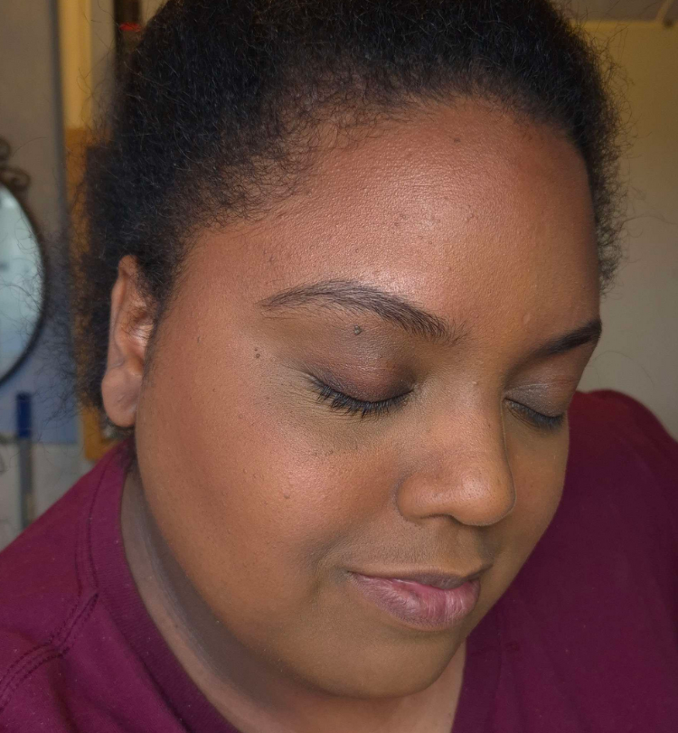
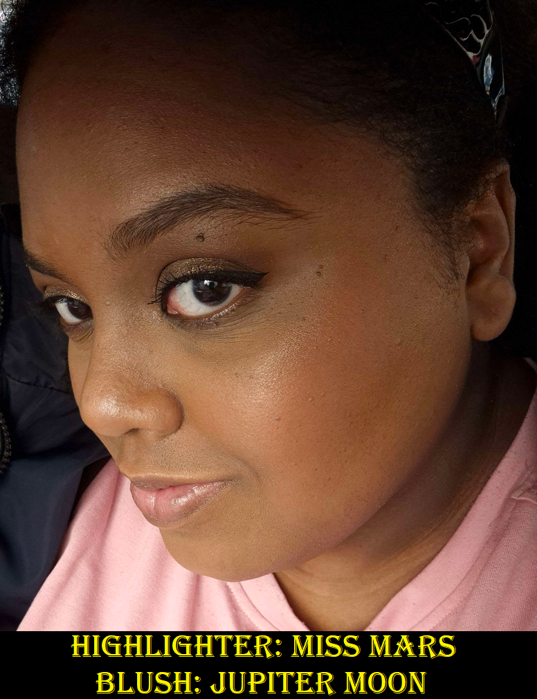
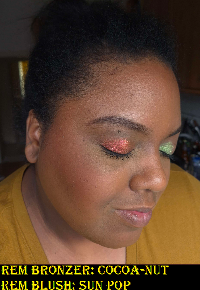
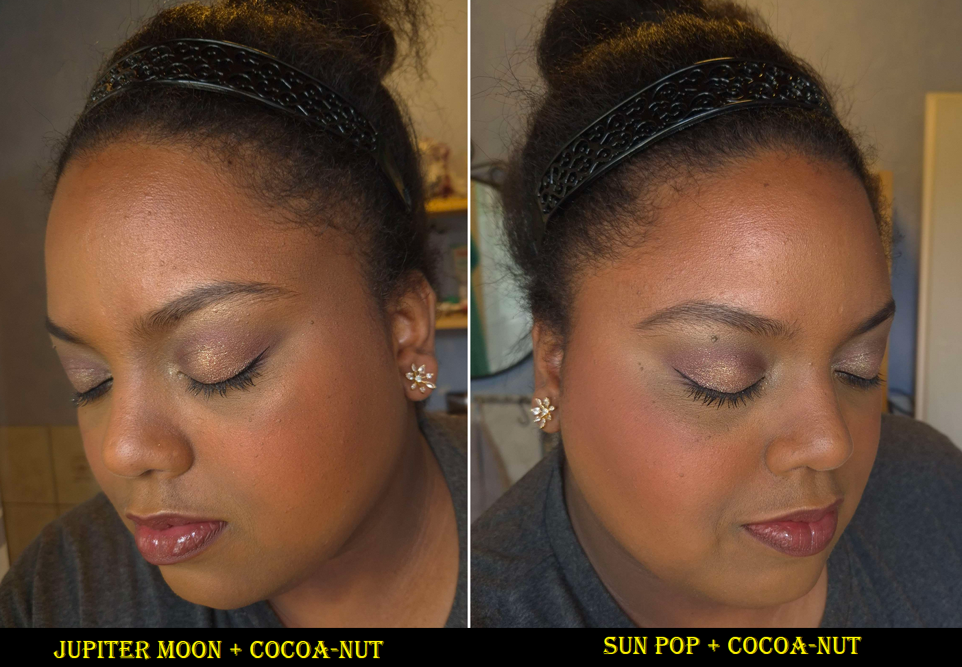
r.e.m. Hypernova Bronzer in Cocoa-Nut
This is the fifth shade option out of six bronzer colors. Cocoa-Nut is described as, “very deep with warm undertones.” Warmth can mean it has anything between a yellow, orange, or red undertone. In this case, it’s red and a bit warmer than looks natural on me. I can still pull off this shade if I use it sparingly, but the color does impact my enjoyment of this bronzer. It’s possible the 4th shade called Solar Storm described as, “tan with warm undertones,” might work better for me, or just as easily could be too light.
I purchased this from Selfridges because, at the time, Sephora DE only carried the four lighter shades.
I recommend using an airy brush with this because it’s quite pigmented. It blends well, but it doesn’t have the best sticking power (which shortens how long it lasts throughout the day). Although I love the soft texture and it has a natural looking finish, I prefer bronzers with a little more of a satin sheen to them. I’ve also been spoiled to own so many bronzers that have an even more effortless blend.
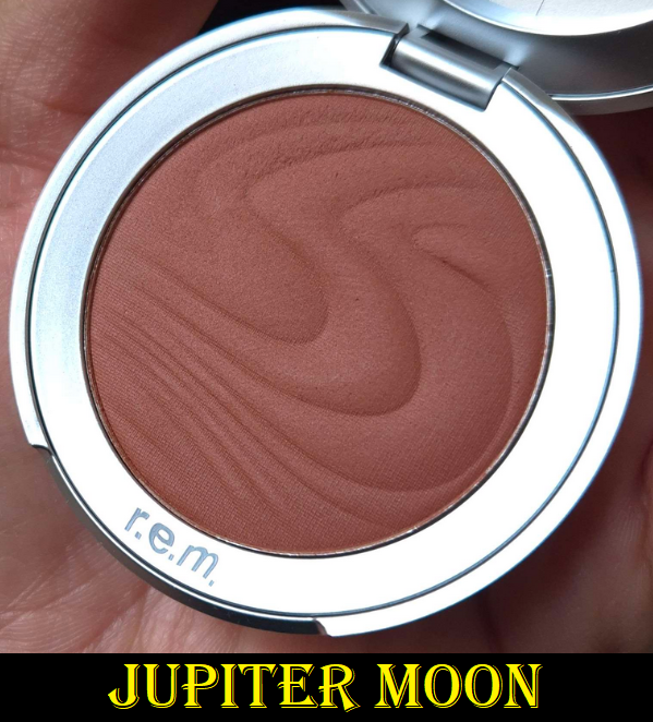
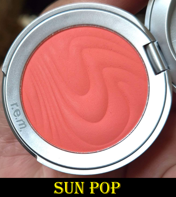
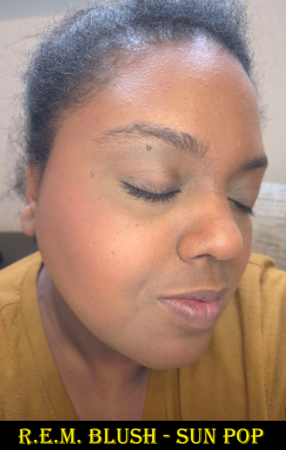
r.e.m. Hypernova Blushes in Jupiter Moon and Sun Pop
The blushes perform identically to the bronzers, though they have slightly less pigment. For that reason, although they are nice, I’m even less impressed. The blushes eventually become one with the skin, melting into my foundation, which looks pretty while it lasts, but it does fade as the day goes on. I love the Jupiter Moon shade because it’s in the family of reddish brown blushes, which I can pull off as long as it isn’t too red. I can list some that I still love more in terms of finish and performance such as Benefit’s Terra and Pat Mcgrath’s Paradise Venus. It’s still nice and I plan to continue using it on and off. In this case, I recommend using a medium density brush like the Sonia G Cheek Pro so that it has enough blending power while remaining buildable if you have a lighter skintone. The shade Sun Pop, however, looks ashier on my skin and even looks more powdery in the swatch. I think it has to do with the vibrancy of the pigment as it’s akin to neon/fluorescent oranges/corals. All the promo images I saw in the beginning show this shade as looking orange, but in person it’s clear to see it’s coral. To be fair though, I had a hard time capturing the color accurately on camera because it does tend to pull orange in photos.
Just like the bronzers, I’m intrigued to see if there are more out of the eight options I’d prefer on myself. However, my blush collection is too large to justify buying more and at full price. Ironically, these I bought via Sephora DE because none were available at Selfridges on launch day.
I don’t usually include so many photos of the same products, but I was unsatisfied with how the pictures turned out. Every day I attempted to take pictures was a cloudy day. So, they were either too dark or too washed out with the lights I tried to use to compensate. Below are the newest ones and most color-accurate.
You can click on any image to enlarge them.
That’s all I have for today. Thank you for reading!
There were a lot of factors to consider when it came to doing my own wedding makeup. I scoured the internet for tips and tricks, but at times the answers were contradictory. I thought I had a good plan in the beginning, but as I practiced doing multiple looks, I realized I needed to make some changes along the way.
Today, we’ll cover the things that should be decided on in advance and what I ultimately chose to do. The conclusions I came to won’t be the same for everyone since it depends on each individual’s personal tastes, skin type, skin texture, skin tone, undertone, priorities, etc.
Although I was inspired to create this post with weddings in mind, this topic is for anyone with an upcoming special event/occasion where photographs will be taken. I was not in a position where I could afford to forget something and run to grab it at the last second, so hopefully these topics will help others avoid having to make last minute decisions and purchases too.
DISCLOSURE: All makeup products in this post were purchased by me with my own money. The only affiliate links in this post are for a few of the brushes mentioned towards the end. Non-highlighted links in bold blue font (Example) are standard non-affiliate links. Links marked in bold black font with a light blue background (Example) are affiliate links. This means that I would make a commissionif purchases were made directly using my link. Whether you click to shop through them or not, I appreciate you visiting and I hope you find the information I’ve provided to be helpful!
Red – Titles/Topics, Purple – Products Used, Green – Additional Options to Consider
Deciding Between Looking Better in Person or Looking Better on Camera
We had a micro wedding (less than 25 people) and the majority of the guests were non-makeup wearers or neutral-color wearing minimalists. I was concerned with looking overly made up in person compared to the group, but also recognized that full coverage and full glam faces result in the most photogenic pictures. I would love to look as natural and fresh-faced as possible, but I think I look the prettiest with “a beat face,” so to speak. So, I decided that I ultimately would start researching ways to look best in photography since pictures last longer and can even serve to replace memories in the minds of those who see them. If it was possible, my plan was to still try and find a balance between the two goals. This balance involved using other techniques such as color-correcting so I could use less concealer and foundation to hide my skin discoloration, using underpainting techniques to have my sculpting attempts look as natural as possible and reduce the need for as much powder on the surface layer, using full-coverage makeup paired with brushes that apply less product so that I could build up to the minimum amount of makeup I needed in small layers instead of packing it on heavily all at once.
In the age of social media, it’s safe to assume the majority of people prioritize how makeup will look on camera versus how it looks in real life, as discussed on the Mixed Makeup YouTube Channel. However, this is still a question everyone has to ask themselves because the degree to which direction one leans will dictate how they have to proceed with the next steps.
After Choosing to Prioritize How One Looks on Camera…
When I do a full-face in the type of soft tones that are typical of bridal makeup, I don’t feel satisfied with my appearance. So, looking natural was less of an option for me. In addition, if I wanted things like blush to be seen on camera, I had to get comfortable packing on way more than usual because blush gets washed out so easily. As described by Kackie of Kackie Reviews Beauty, the key is applying makeup in a way to add more dimension that the camera can pick up even when pulled back. I had to practice applying more than usual, taking pictures, and then adding more and photographing that to learn how much would actually be needed on the day. Blush, highlighter, and eyeshadows were the things I had to work on amplifying dramatically in order to get photos I was satisfied with (at least on my own camera).
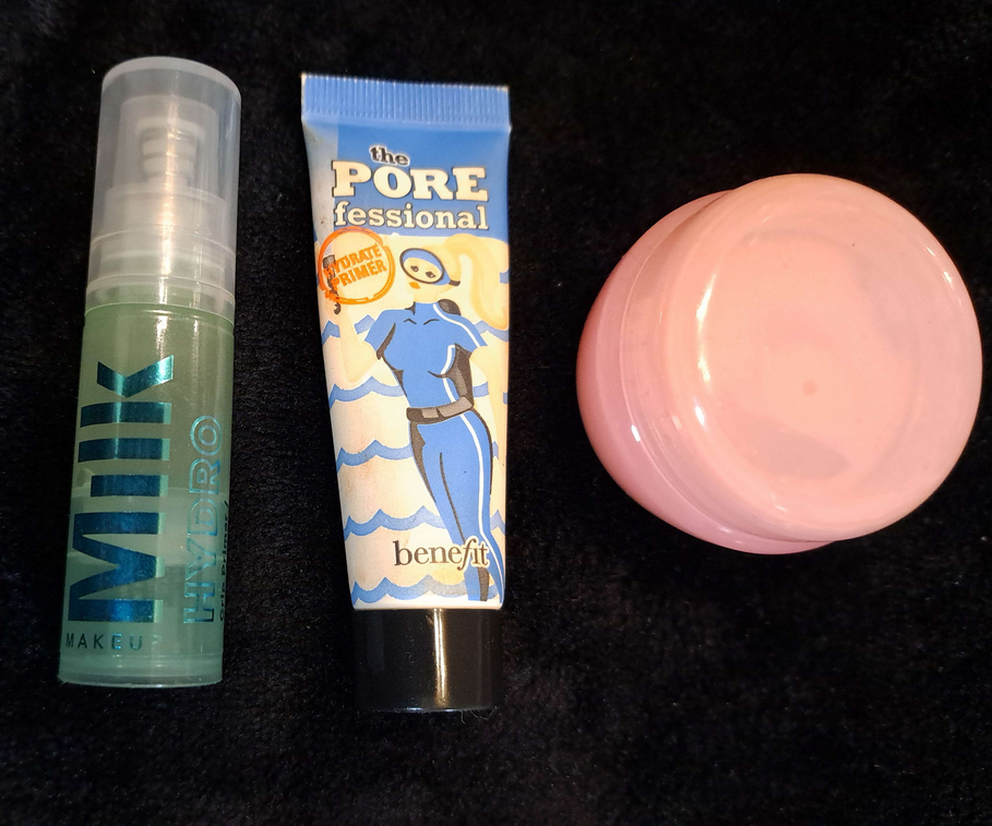
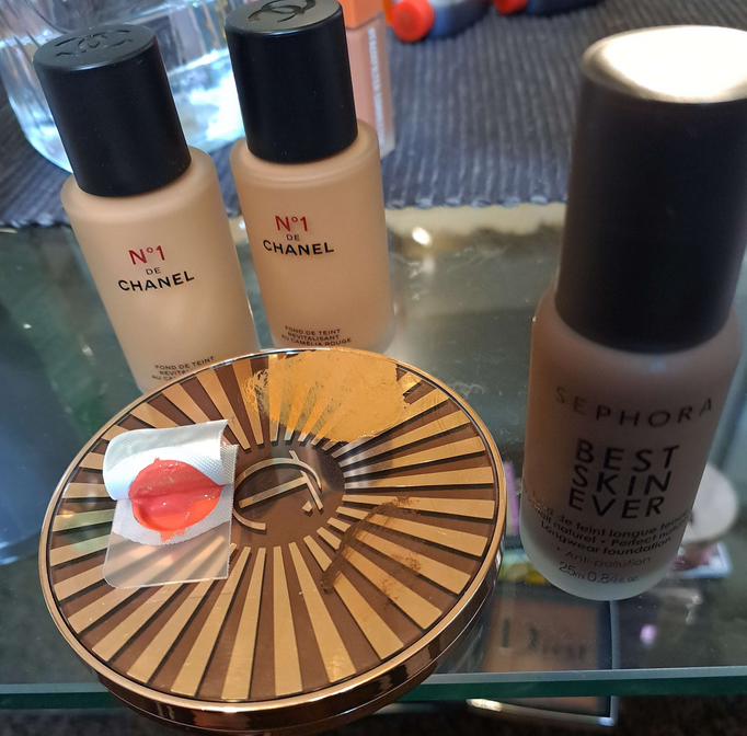
One of the first big decisions I had to make was deciding what finish I wanted for my skin. A matte base with strategically placed glow seems to be the consensus for what photographs the best. However, I did not anticipate the climate when I chose what products to bring with me when I moved overseas. The products that looked the best on camera for me in Florida were extra dry looking on me in Germany and I didn’t bring my dewier foundations because I have them in my darker summer shade. This led me to buy a new foundation (N°1 DE CHANEL Revitalizing Foundation), the only one that mimicked the appearance of natural oils peaking through my face, and it remained that way through the end of the night. It basically looked like a natural-finish foundation on my dry skin. I used the Glossier Futuredew, to ramp up the glow in typical places I highlight, the MILK Hydro Grip primer for hydration and lasting power, and the Benefit Porefessional Hydrating primer in my T-zone for a smoothing effect without a silicone texture. I have all three of these products in minis (and a travel container).
I did have the Nars Light Reflecting Foundation with me, but my research scared me away from using it. Since Nars is an artist brand, I always assumed their products looked fantastic on professional cameras, but I kept coming across warnings against using too many light reflecting products. Considering how dark it is in Germany, I knew the chances of flash being used was high, so I didn’t want to look crazy on other people’s cameras either (even though Nars’ foundation is supposed to be photo-friendly and produce no flashback, but I didn’t know if that would still be the case if paired with other light reflecting products). So, I didn’t use that one just to be safe. Skipping it turned out to be necessary because I tried using it in strategic spots and it still wasn’t luminous enough for my liking while not in Florida. Lisa Eldridge was one example of someone who discussed light reflecting products in flash photography and Pete Coco Photography cautioned against using shimmers in studio settings, but I saw more mentions of light reflection from various articles and blogs.
For those curious, the top foundations I wanted to use if the climate was more like Florida would have been the Lisa Eldridge Seamless Skin Foundation or Hourglass Ambient Soft Glow Foundation (this one only starts to look good for me if oils break through and my skin is prepped for maximum hydration including using a facial oil). The Lisa Eldridge foundation is extremely similar looking to the Chanel one I opted for, but without as much luminosity. I also own two lighter coverage products that make my skin look beautiful in person: the Fenty Eaze Drop Blurring Skin Tint in Shade 18 and the Rose Inc Skin Enhance Luminous Tinted Serum in Shade 100. I was looking for high coverage, but if I had to recommend another option it would be the one from Fenty. I normally dislike their foundations, but this newer one finally agrees with my dry skin. The Rose Inc one unfortunately can come off extra warm colored on camera. Sometimes I look orange in photos even though I don’t in person. It’s also random when it happens as well. I’m not sure if it’s some interaction with a specific product I might sometimes pair with it. So, that’s why I don’t recommend that one.
Deciding On the Color Scheme and Undertones of the Makeup
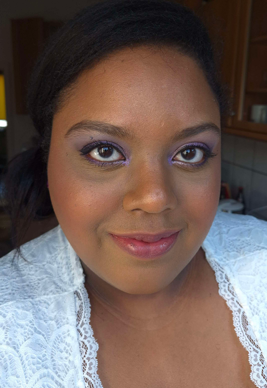
I had quite the dilemma trying to figure out what colors I wanted to use as a person with warm undertones who was planning to wear cool toned accessories and have blue and purple flowers in my bouquet. I like wearing eyeshadow that matches what I’m wearing in some way, whether it’s clothing, a purse, jewelry, etc but I never like how cool toned eyeshadows look on me as much as warmer ones. At the same time, I didn’t want the winter aesthetic I planned for my look to clash with my natural warmth and make me look extra warm by comparison. I did a test run using my go-to makeup and just switching to a cool toned blush, but I didn’t like the outcome. My second solution was to wear neutral makeup to bridge the two types of looks, but after doing another test run, I just didn’t feel my makeup was as pretty as it usually would be.
Experts say that although anyone can wear any color they want, we tend to find shades in our undertone to look prettiest on ourselves. For instance, Lisa Eldridge says it’s nice to match the wedding scheme/theme, but not if it’s against your coloring. Ultimately, I felt that if I didn’t wear the kind of shades that were natural for me, I would have regrets looking back at pictures thinking my everyday makeup looked somehow better than what I chose for my own wedding.
Many makeup artists recommend trying to look like an enhanced version of yourself, and not looking like someone else. This concept is what helped me solidify the decision to use warm tones, just ones that didn’t veer too far off from neutrals. This idea of trying to look like myself also had me wondering how I could possibly incorporate a pop of color into my look because that’s “me” too. Even when I’m on a nude colors kick, I still end up popping on a multichrome or some other colorful indie brand’s eyeshadow. Considering the wedding colors were blue, purple, and ivory/cream/whitish (we couldn’t really nail that one down), I thought it might be a good idea to add a blue-purple multichrome into the eye look. I really wanted for it to be one from Clionadh Cosmetics like Etched or Spire, since it’s my favorite brand, but the reason I love theirs is how intensely they stand out. In this situation, every technique and position I tried to place the multichrome was just too much.
Because all my other makeup was in natural tones, my eyes were instantly drawn to the spot with the multichrome and stole attention from the rest of the look. Eventually, I was recommend by someone on Instagram to try putting the tiniest dot in the center. This worked in low light in a very pretty way, but the second actual lights hit my eyes, it was still too much for what I wanted. Ultimately, as much as incorporating color into my looks is something I’m known for doing, I wanted something classic and timeless for my wedding. So, I decided to go back to the neutral glam idea for eyeshadows and using my slightly warm tones of makeup for everything else. My blush was still a mix of everything. I used a liquid blush and then ended up using powders on top further into the makeup process. For those curious, it was three shades from MAC: a whisper amount of Breath of Plum for a slight cool-toned wintery cheek look, a normal amount of Pinch Me as the main color and a natural looking pink on me, and the tiniest bit of Burnt Pepper to add a little more warmth that compliments my undertone and depth of my skin color.
The eyeshadows I ended up going with were mainly from Pat Mcgrath Labs. I intend to do a part 2 to this post, which I can hopefully complete and upload within a few weeks. In there, I’ll post more details on the step-by-step process.
Making Sure Base Techniques are Down Pat
After using my various primers, the next step for me was to color correct the areas of hyperpigmentation. Most of the time, I don’t bother with color correcting because I prefer to just lean on full coverage concealers for that job. However, I wanted to avoid my base makeup looking heavy, since I knew I would be putting more layers of product than usual. I only had two options with me: the E.L.F. Camo Color Corrector in Orange and the Huda Beauty #Fauxfilter Color Corrector in Mango. Although I prefer Huda’s on a regular basis, the ELF one worked better with the KVD concealer, as well as me wanting more intense color-correcting from using a darker color.
I would normally recommend using a color-corrector under the eyes too for those who have intense dark circles like I do. In my particular case though, I already know the ELF formula creases/gathers like mad in areas with lines, which is why I only use it in smoother areas of my face. So, I had no choice but to skip that step on myself. For those that don’t have discoloration issues like I do, color-correcting is not a necessary step. The most coverage one can achieve using the least amount of products is better, so if you can skip it, then please skip it. Ultimately, even I would have skipped this step, but I tested out how my makeup looked with color correcting versus going without it and the results spoke for themselves. I decided it was a step worth doing because I wanted as close to a flawless base as possible.
Although I settled on a foundation, the color match wasn’t as spot-on as I hoped, considering it was a bit more orange rather than yellow/golden and just slightly darker. I had purchased shade BD121, so my only other option was to buy BD91 to mix with it. The brand makes shade BD111, but it’s exclusive to the Chanel website and was sold out. Thankfully, using a ratio of roughly 2 parts BD121 to 1 part BD91 gave me a better color match. At least, that’s the mixture I used on the outer perimeter of my face and then used BD91 by itself in the central part of my face for a more natural gradient of color. My foundation application did not come first immediately after priming and color correcting though.
The other technique I wanted to utilize was under-painting. I have a naturally round face, besides it being chubby. Trying to create a chiseled look is by nature going to be easier for those with a clearly visible bone structure. Although I still have slight indent in my cheek area, I have an undefined jawline made weaker by having a rounder face. There’s only so much one can do to make a believable contour on a face like mine. One of the most believable options, if done correctly, is underpainting: to do the contouring and highlighting as a cream or liquid step first before applying foundation on top (and following it up with powder products afterwards too). Funnily enough, I learned about this technique about ten years ago when under eye concealers weren’t full coverage enough for me. I don’t think it’s necessary to do a full-face of underpainting like you see in TikTok and around social media as a fad, only the specific areas that need extra help to again minimize product usage. So, I bought the darkest shade of the most affordable foundation I could get my hands on (that I knew would work well). This was the Sephora Best Skin Ever Foundation in 68N. I would have preferred for it to be cool-toned, but “cool” shades in the darkest colors tend to be red instead of blue-grey so I figured neutral would be good enough. I could have used a concealer as well, but considering how much I spent on those Chanel foundations (even though they were discounted), I wanted to save as much money as possible. I could have also tried to use an actual cream contour, but I figured using a foundation would look even more natural on the skin and potentially blend better as cream contours can sometimes be too emollient. The 68N shade worked well enough for my cheekbone and jaw area, but since my nose is a lot more yellow than brown, it looked a little more red in that spot that I like. So, I just had to apply the product even more sparingly and make sure to use more greys when I contoured with powder later.
Besides applying contour, I also used a Rare Beauty Soft Pinch Liquid Blush sample of Joy as an underlayer of blush to help ensure longevity for the whole day. Plus, this particular shade is bright without being overly vibrant, which tends to work well for me. Using this underneath wasn’t overkill when I used the MAC blushes later. In fact, I still had room to go heavier with my blush.
After the liquid blush is when I would apply my foundations. I think some people recommend doing highlighting with concealer (product several shades lighter to bring those areas forward and not the shimmery type of highlighter) underneath foundation, but the KVD Good Apple Concealer formula that I used can sometimes melt/fade away with other products. The foundation on top of this one would have been covered up too completely, so I applied the mixture after foundation. I could have tried to use a different concealer for underpainting, but I was running out of time and just wanted to stick to what I knew. I began practicing applying the makeup on an off nearly two months before the wedding (with more consistent daily testing in the final three weeks). It’s not useful to test out all new products at once, since it would be too hard to tell which products were interacting badly with others, or were only working well depending on what it was paired with. I could only test a few combinations at a time. So, even the two months wasn’t as much time as I thought. In retrospect, three months would have been ideal for me.
The theme of this sections is to make sure the base techniques are nailed. Part of that was my realization that in all the bridal makeup photos I liked, they really utilized highlighting for color in addition to the glow factor. However, I’ve never liked an overly brightened under eye on myself. When I was younger without so many lines to worry about drawing attention to, that was a different story. So, I had to think about what’s more natural for myself and my style rather than just sticking to the template of instructions on how most people do wedding makeup. I thought perhaps I could use my typical Tan 167 all over and apply my new Tan 161 (this specific shade was on sale which is why I chose this one for my highlight option) on top in strategic spots to highlight with, but I didn’t like the outcome. It was still too stark of a contrast for me to be comfortable with no matter how great it could have potentially looked on camera. What worked best for me was applying my near skin-tone shade 167 and then using a combination of 167 and 161 mixed together as the highlighting concealer color on top. The transition was more natural, which I ended up liking a lot better than using 161 alone (though I did use 161 alone to highlight my brow bone area). I then set my concealer with the Charlotte Tilbury Airbrush Flawless Finish Powder in either Medium (which I bought in the travel size) or a combination of Medium plus my usual shade in Tan. I tested out plenty of different powders and the one that worked the best to keep the KVD concealer creasing the least and not fading at the end of the night was this Charlotte Tilbury powder. The Huda Beauty Easy Bake Loose Powder was a close second since it worked so well with other concealers I was testing at the time (Fenty We’re Even Concealer and L’Oréal Infallible Full Wear Concealer). However, the results of the KVD and CT combo won out.
I would normally use the back of my hand as a spot to mix shades, but since I wanted to have leftover mixtures reserved on the side for touch-ups, I started to wish for a makeup mixing palette or plate. Since I didn’t bring any with me and didn’t want to buy one, I used the top lid of the Charlotte Tilbury Cream Bronzer compact (pictured in the foundation photo above). It has a surface that’s easy to wipe down with a makeup wipe or makeup eraser cloth. Also, when I mixed with my brushes, I got too much product on the bristles, so I started using the brush handle to mix shades and then wiped off the handle onto my microfiber cloth. That way, I’m able to pick up smaller amounts of product with the bristles and even switch to a smaller brush for spot applications where needed.
Securing the base is important, but so is recognizing whether the recommended techniques have to be tweaked to your specific preferences and what makes you the most comfortable. It’s okay if you hate contouring to skip doing it. It’s okay to go with a sheer coverage foundation and then just use concealer in areas that require more coverage. The most important thing to do is to practice techniques as much as possible before the wedding or special event if you’re doing your own makeup. Sometimes products don’t perform the way we remember them and the last thing you want is to discover that on an important day. You want to thoroughly test your full look in every step in order to make sure you can replicate the same results every time, in every type of lighting, and in every weather scenario.
To Bake or Not to Bake, Setting Spray vs Fix+
Continuing the theme of getting used to wearing more makeup that usual and utilizing techniques I normally don’t, I had to decide whether or not to utilize the baking technique. Since I already narrowed down my concealer, it was just a matter of doing a wear test all day to see if my makeup looked better with or without baking. As it turned out, with my products and my skin type, baking really wasn’t necessary, or at least not in the traditional sense of loading a ton of powder on and then dusting it away after five minutes or so. I ended up not even needing to powder my whole face since I was utilizing setting sprays too.
My process was applying my concealer to my under eyes and face area before using my normal brush to powder-set those spots. As the days were counting down to the wedding, I started to utilize more skincare such as using the Lisa Eldridge Skin Enhancing Treatment Cleanser as a mask, which made my skin more hydrated and strangely enough need more setting powder under my eyes. So, after setting my concealer I would wait until I noticed creasing before patting the creases back out with my Sonia G Jumbo Concealer Brush, and then using the Charlotte Tilbury powder with my Beautyblender Power Pocket Puff to lightly apply a thin layer in the areas I highlighted with the concealer mixture (skipping hyperpigmentation areas that didn’t need extra powder) and also slightly under my contour to sharpen those spots and “clean them up.” The puff still came in handy because some days during the trials it was even necessary to go as far as to spray the silicone side of the BB puff with setting spray, press that into the concealer creases, reapply a little more concealer, and then set it with powder using the velour side of the puff. This was during the trial days I started using different skincare that I should have been testing much earlier in the process. So, this is all I need in terms of baking, but those that have combo or oily skin will probably need to take additional steps to lock the makeup into place. The puff also comes in handy while on-the-go. Instead of me needing a face powder brush and an under-eye powder setting brush (plus technically I could use other areas of the puff for other types of powder products), I just needed this on hand in the “Emergency Bride Kit” for touch-ups.
After I apply my liquid and cream layers, I set my face with setting spray, finish applying all my powder products, and then set my face again. I tested a few sprays before I moved, but the only one I brought with me was the One/Size On ‘Til Dawn Waterproof Setting Spray. I had the mini size and as I started testing, I got paranoid that I would end up using it all before the wedding and it’s not available for purchase in Germany. So, I ended up buying the Sephora Makeup Setting Spray for my trial runs. What I like more about the Sephora spray, besides the lower price, is that it’s unscented. The One/Size spray has a slightly floral, but not overwhelming smell.
I’ve tested both of the waterproof claims by splashing water on my face and have seen how the water rolls off my face without leaving streaks in my makeup. In terms of making things transfer-proof, that wasn’t the case with One/Size unless I just wasn’t using enough of it. The Sephora Spray only seemed to make my makeup transfer-proof that was in lighter layers and on lighter makeup days. It didn’t seem to work with a full face of everything. I haven’t tested the One/Size spray in the same scenario of a lighter makeup day, so perhaps they are equal. On my actual wedding day, I still stuck with using the One/Size product. We ended up doing a second day of photos, so the picture below shows what I looked like by the end of the night. On my wedding night, I got home at nearly 3 am, so I don’t have a photo for that. All things considered, I think it held up pretty well. It rained on the actual wedding day, but my makeup didn’t budge. I just transferred some of my nose contour onto my husband’s nose. I had to wipe it off him a few times, but it didn’t transfer any further after that.
I always use MAC Fix+ if I want to dampen my shimmer eyeshadows. It can make the face look hydrated, which is what I need, but sometimes it can cause makeup to not last quite as long and break down a little faster. So, I was too scared to use it on my face (nor did I have the time to test it with everything), so I just used it for my eyelid shades. At one point during my trials, I tested spritzing my highlighters with setting spray and my sample of Fix+ to see if I could intensify the look without leaving a stripe on my face. I ended up deciding to just skip that step as the Charlotte Tilbury Face Architect Glow Glide Highlighter worked well enough as a base highlighter. Others might prefer using a liquid highlighter, but powder products are always easier for me and I was planning to do a technical enough makeup application, so I’d accept easier options wherever possible. Throughout the practice days, I used some combination of multiple other highlighters shown below. On the actual day, I ended up sticking to just Charlotte Tilbury by adding the Pillow Talk Multi-Glow highlighter and I used the Tom Ford Shade and Illuminate Highlighting Duo on my shoulders and collarbone. Since I ended up wearing a faux fur shawl/stole and my hair was down, that final step ended up being pointless. It couldn’t be seen on my body. I also forgot to spray setting spray to those spots on my body afterwards, which could have potentially helped lock the highlighter into place.
Although I didn’t end up glowing as intensely as the models in the inspiration photos I procured from Google, seen below, I was still happy with my makeup choices. I applied highlighter to my brow arch, slightly above the brows on either side of the forehead, one specific spot on the bridge of my nose that I build up with contour and another spot lower down, and the tops of my cheekbones.
I mentioned earlier that I used the underpainting technique to contour. Then I used the powder contour in the Kaleidos Symphony Trio for more depth. It’s not grey toned enough to give an actual shadowed effect, so I added a mix of Feel + Real from my Hindash Beautopsy Palette to create the shadowing for my jawline, under the cheekbones, and nose contour. I didn’t use the Kaleidos powder on my nose, only Hindash’s product because I didn’t want it to be overkill in person.
When it came to bronzer, I was dead set on using the Hermès Plein Air H Trio Healthy Glow Mineral Powder because it’s the highest quality powder one that I own. However, in test photos I kept feeling like I was looking too warm toned. With a few days to spare, I tried some of my other top powders like the Glowish Soft Radiance Bronzer Powder, but that one was too red toned. Ultimately, the one best suited for my undertone is the Charlotte Tilbury Beautiful Skin Sun Kissed Glow Bronzer in Tan. Even though it’s a cream product, it went next to and slightly on top of my powder contour with no issues. This meant that my bronzer was going to be natural looking in person and likely too subtle to see much of it on camera, but it was a better alternative for me than having my face pull too orange.
I finished my face with my Dior Face & Body Powder No Powder. It blurs imperfections and helps blend the makeup seamlessly into each other. I didn’t use it all over my face, just in key areas that I wanted to touch up. If I had a sparkle-free version of Ambient Lighting Finishing Powder from Hourglass in my shade, I would have considered using that instead or in conjunction with the Dior product. Finishing powders can do wonders for a makeup look, but be sure to test in photos whether the sheen might or might not be too reflective for flash photography!
Waterproof Tests are Required
I’ve always hated waterproof mascaras because of what a pain they are to remove, but I was so certain I would need one for the wedding. I have plenty of favorite mascaras, but according to customer reviews I’ve seen online, apparently getting a waterproof version doesn’t mean it will perform as well as the normal formula. Some of the most beloved mid-range and high end mascaras have terrible reviews for their waterproof counterparts. So, I decided to try exploring the higher rated drugstore waterproof mascaras that I was familiar with in the original form. In my testing, the L’Oréal Voluminous Lash Paradise gave volume, but not as much length and was prone to clumping. The L’Oréal Bambi Eye Mascara gave length, but not much volume. I was debating whether or not to try using both, but it ended up not being necessary because I got the results I wanted from the Essence Lash Princess Waterproof Mascara.
Another alternative I considered was the KVD Beauty Full Sleeve Long + Defined Tubing Mascara. I love the length and volume of that one, and in theory tubing mascaras aren’t supposed to come off easily unless under warm water. While the KVD one seems to be harder to remove than other mascaras with regular temperature water, it can still be done. So, I didn’t want to risk a circumstance where I would have even the slightest chance of having my mascara come off. So, I stuck with using the Essence mascara.
When it comes to using eyeliner, I have a few that are supposed to be waterproof (Stila Stay All Day Liquid Liner and One/Size Point Made 24-hr Liquid Eyeliner pen), but they aren’t as effective when my eyelids get too oily. I’ve always had great results from Sephora’s waterproof liners, so I purchased the Sephora Collection Hot Line Brush Tip Waterproof Liquid Eyeliner. It definitely did the job. I didn’t end up crying, but there was a bit of rain and both the mascara and eyeliner held up completely all day and night.
For the tiny spot I wanted to smudge on my outer lower lash lines, I used the Urban Decay 24/7 Glide-on Eye Pencil. I don’t find them to be as waterproof as my other liners, but I can’t get the smudge effect with those, so this was my best option. One thing I should have considered was getting colorful eyeliners to put on my lower lash line instead of regular eyeshadows. It’s possible I could have still ended up with a mess if I had actually gotten teary-eyed. I lucked out, but that might be something to consider.
I’d like to note here that another option for waterproof eyeliners could be those false lashes eyeliner pens. I went back and forth debating whether or not I wanted to wear fake lashes for the wedding. They look amazing on camera, but they are an absolute nuisance for me to wear, especially for an extended period of time. My eye shape, with my super rounded upper lash line, doesn’t hold onto even extreme lash glues very well. Within an hour max, either the inner or outer corner will lift up. The majority of lashes are too short (in width) for my eyes because I need extra length to account for the higher degree angle of the rounded curve of my eye. If I want to rock a half-lash, I have to use 3/4 length lashes. Then, even if I put the eyelashes properly on my lash line, I can still see them in my field of vision. I still thought that if I practiced putting them on enough times, I could make them work. I also heard of the recommendation to cut the lashes into 3 pieces (also from Mixed Makeup) instead of 2. Since splitting them in half never worked for my eye shape, I was willing to give smaller ones a try. My lashes ended up looking like the Cynthia doll’s hairline from Rugrats! Even when I tried to use the pieces just on the outer lash line, it was so hard to get them to look even since I don’t have perfectly symmetrical eyes. Plus, it’s my inner lashes that need the most help, but it would look just as strange if I had lashes there and nowhere else.
Ultimately, for all the hassle it would cause me on the wedding day, I decided to skip the false lashes. I figured I could just try to cheat the look with more coats of mascara and extending the eyeliner out a bit more. This trick worked well enough for my satisfaction. From all the trials though, I did figure out that the House of Lashes Lash & Dash Glue Liner pen makes for a tough to remove waterproof liner even without putting lashes on top of it.
Brow products are never exciting to me, so I almost forgot to mention that the brow product I used is the Benefit Precisely, My Brow PencilWaterproof Eyebrow Definer in shade 5. Although I don’t recall if I’ve purposely tested the waterproof claims, I know from experience that I’ve never had my brows run or smudge when using this product, so I didn’t think twice about using it on the day.
The last waterproof or transfer-proof thing to consider is the lip product. I’m sure most spouses-to-be would be grateful not to have lipstick transfer onto them. However, I didn’t go that route because my lips were in too poor of condition, even with using masks. There are some great waterproof lip liners that I could have used to cover the entirety of my lips instead of opting for a liquid lipstick, but I decided I didn’t want to go that route either.
My lip combination was to use the Coloured Raine Botanical Collection Lip Liner in the shade Decadent. It’s darker than my natural lip line to give me a slight shaping effect. I consider it a transfer-resistant product, but it only claims to be long-wearing. I then filled the insides with the Lisa Eldridge Velveteen Liquid Lip Colour in Muse. This isn’t like most liquid lipsticks that dry out the skin like crazy, but that also means it’s a low-transfer product rather than transfer-proof or even transfer-resistant. The brand claims it’s “smudge-proof and budge-proof,” but that hasn’t been my experience. The final step for slight shine is from using my Nars Satin Lip Pencil in Rikugien. Unfortunately, it doesn’t last very long, but I wanted a little bit of shimmer and a slightly creamy look to the center of my lips. My husband hates lip gloss or any kind of sticky balmy product on my lips (which makes keeping them conditioned even more of an uphill battle). So, for his sake, I held off on using any gloss products until later in the night.
Many makeup artists commented that having some color and shine on the lips looks beautiful on camera. For that reason, I wanted to make sure I carried the Pat Mcgrath Lip Gloss in Bronze Temptation in my makeup touchup kit. On the second day of taking photos (because the weather was bad), I didn’t bother with the other products and just applied this gloss.
I chose the other three products because their tones of pink looked so complimentary with my blush. My PML lip gloss shade is a warm toned one, so that was something easy to carry with me to warm up the look if I wanted. The other lip product I considered swapping out instead of Lisa Eldridge’s was the Kaleidos Cloud Lab Lip Clay in Sienna. That shade went very well with my skin tone, but looked almost too natural. I wanted more of an impact since I don’t often wear colored lip products and usually stick to clear or slightly tinted glosses and balms. The Kaleidos product is also long-wearing and not completely transfer-proof.
Considering the amount of kissing throughout the day and night, the transfer onto my husband’s lips was minimal. It also helps that I was wearing pinks that weren’t ultra vibrant. Food was the culprit that removed most of my lip products.
Tools and Extra Makeup Helpers
I mentioned the MAC Fix+ as something I always have on hand, but another one is the Nyx Glitter Primer to help make my shimmer eyeshadows pop and better adhere to my lids. For any mistakes that need to be cleaned up, I have Q-tips, but for more precise spots I like to use these tiny fine point cotton buds from MyKitCo called the My Small ‘On Point’ Buds. I dip them in a little micellar water, which my tried and true is the Bioderma Sensibio H2O. These are the types of things that are easy to forget when getting ready, that is, until they’re needed.
For my touch-up bag, I kept my skin-tone matching concealer and brush, the BB puff, the travel size mini CT powder, and the lip gloss. I was also gifted a slim compact with a magnifying mirror. I didn’t end up doing any makeup touch ups at all on the wedding day, but it’s nice to have things on hand in case there is an accident. Other random products in my Emergency Bride Kit were bobby pins, safety pins, band-aids, ibuprofen and pain meds (in case my back decided to act up which thankfully weren’t needed), hand lotion because of the constant dryness on my knuckles in this weather and taking pictures up close of the rings, eye drops with a backup pair of contacts, and tissues.
The photo above shows all the brushes I used on the wedding photo days!
Sonia G Mini Booster – Used for darker eyeshadow shades on the outer corner. Needed a small size blender brush for precision and for it to be not too dense to build up the color slowly. Mizuho MB123 – For applying the transition matte eyeshadows. Smashbox Double-Ended Smudger Brush -Used to apply shadows to the lower lash line, smudging the UD liner with the rubber side, applying the shimmer highlight shades to the brow arch and inner corner. Wayne Goss 08 – Applying concealer under the brows and to clean up any other spots around the eye makeup. Sonia G T4 – Extra blending to the eye look with no product on the brush plus blending out the nose contour. Sonia G T2 – Applying/stamping powder nose contour. Real Techniques Brightening Concealer – Used on the first day used to apply highlighter on the collarbone and shoulders, but the next was was used to set my under eye concealer with powder. Bisyodo B-ES-08 Eye Shadow – Was intended to apply the Clionadh multichrome. Real Techniques Setting – My usual under eye setting powder brush. MS-4 Mai Sakura Eyeshadow – Brush to apply shimmers to the lids prior to using my finger afterwards to build up eyeshadow in strategic spots.
Sonia G Jumbo Concealer – My holy grail concealer brush because it gets the most coverage by packing on a lot of product at once, but it can still smooth things out. Amazon Brush? – Used to apply eyeshadow primer to the lids and touch up concealer in other places. Chikuhodo FO-2 – Used to apply the Dior Powder No Powder. Eihodo WP PC-1 PUFF Makie Powder Brush Goldfish – Used to stamp on foundation mainly on the outer perimeter and over under-painted creams and liquids. The denseness and surface area size help with quick blending if needed and also aid in giving maximum coverage from not soaking up as much product. OdensEye Blush – Used to whip across the face the lighter shade of foundation. Functions like a stippling brush. Sonia G Soft Cheek – Applied powder blushes lightly, which was needed since I was building up three shades. Patrick Ta Contour – Applied the CT cream bronzer and is a holy grail product for sculpting around my face. Bisyodo CH-HC – Used to apply highlighter to the face in a light non-concentrated way, but without being dispersed in too wide of an area. Sephora Concealer Pro Concealer #71 – Used to apply liquid contour (the deep foundation shade) around the face. The angle of the brush was helpful, but technically many other brushes could have been used. Eihodo Outlet 153 Highlighting/Blush – Used to apply the contour shades from the Hindash Beautopsy palette over the areas that already had the Kaleidos contour. Was very useful for it’s small size considering the shape of the Beautopsy pans. Wayne Goss F3 – Used to lightly apply the Kaleidos Symphony Trio contour under the cheekbones and along the jawline. Sonia G Mini Base Keyaki Version – Used to apply the Rare Beauty liquid blush for under-painting. Bisyodo B-F-05 Perfect Fit – Intended to apply powder bronzer in a slightly concentrated amount under the cheekbones, but I used it instead to do slightly more blending to the contour areas. Sonia G Jumbo Bronzer – Intended to apply a lighter application of powder bronzer around the forehead, though on the actual wedding day I changed plans and opted for a cream bronzer instead.
Using the correct tool for the job is extremely important. To make things easier, I started narrowing my collection down ahead of time so that I wouldn’t be wasting time digging around looking for specific brushes. I knew which one (or ones) I wanted for each specific type of makeup. This came from practicing those makeup looks as often as I did. The backup brushes I also had on hand, but didn’t end up using, are in the photo below.
Another very important tip is to make sure the brushes are clean or “clean enough” before the big day. Gunked up old product on brushes can effect the performance of the makeup. Things can be harder to blend, not be color accurate, not apply as smoothly or in the right amounts.
All this being said, and for all the effort and planning I did…the funny thing is that I don’t have up-close shots of my face! The photos below are the best I’ve been able to produce. We couldn’t get a professional photographer in time and a coworker of the family graciously offered to take pictures on her high quality camera for us. The pictures were often dark or on some setting I’m not sure what (I’m not very knowledgeable about photography myself). My focus was to apply makeup in a way that would stand out at far distances, and it’s a good thing I did because most of the pictures were taken from father back and the quality dips when trying to zoom in closer. I have some wedding photos that I ended up liking or loving after tweaking them a little, so I’m happy about that. However, I don’t have ones for blog usage that specifically showcase the makeup except the two below. Sorry about that! I had too much on my mind to really think about how the pictures would turn out after a while.
Like I mentioned in the eyeshadow section, I plan to post a Part 2 with step-by-step details on how I completed my wedding look. Over the next few weeks, I plan to create a few alternative makeup looks as well. I hoped to get it finished sooner, but I got bronchitis and was feeling sick for over a week. Then, I took two weeks off of blogging to finish the wedding planning. Unfortunately, we all got Covid immediately after that, which put me out for a while too. And now, since the beginning of March and for the next eight weeks I’m taking an intensive course so I can get A1 certification in German language, as is required for me to have in this moving process. So, my usual Monday postings will likely be interrupted again. I’ll be back as soon as I can!