Fenty Beauty Review

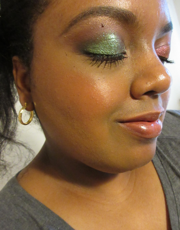
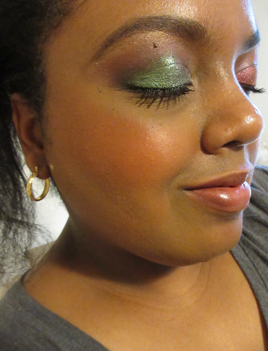
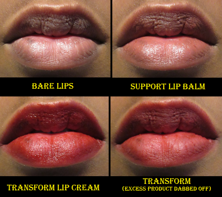
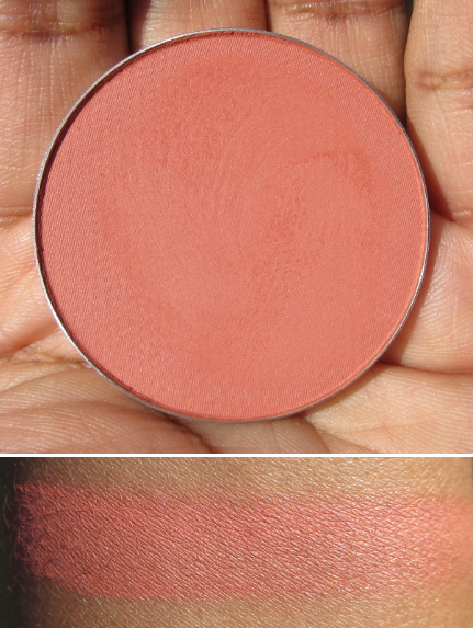
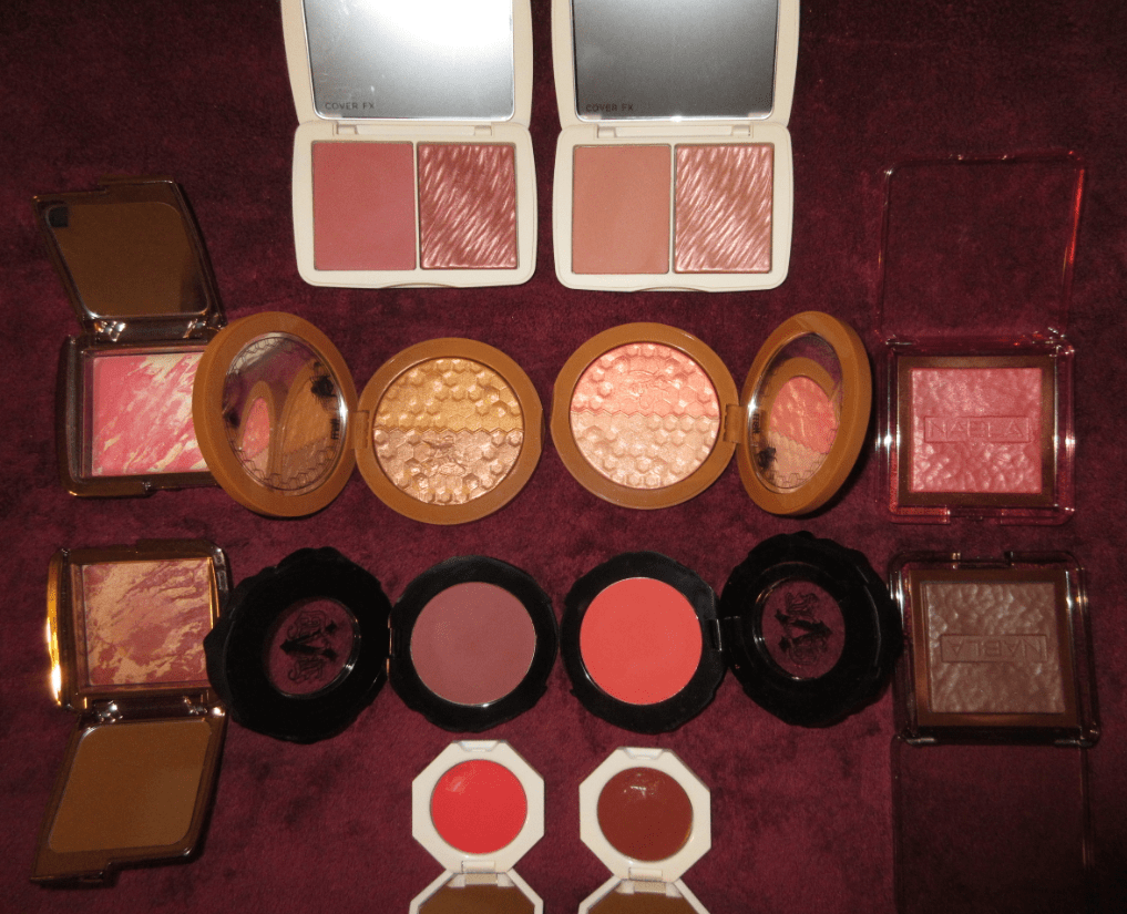
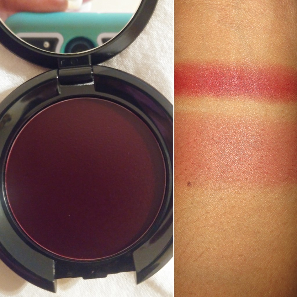
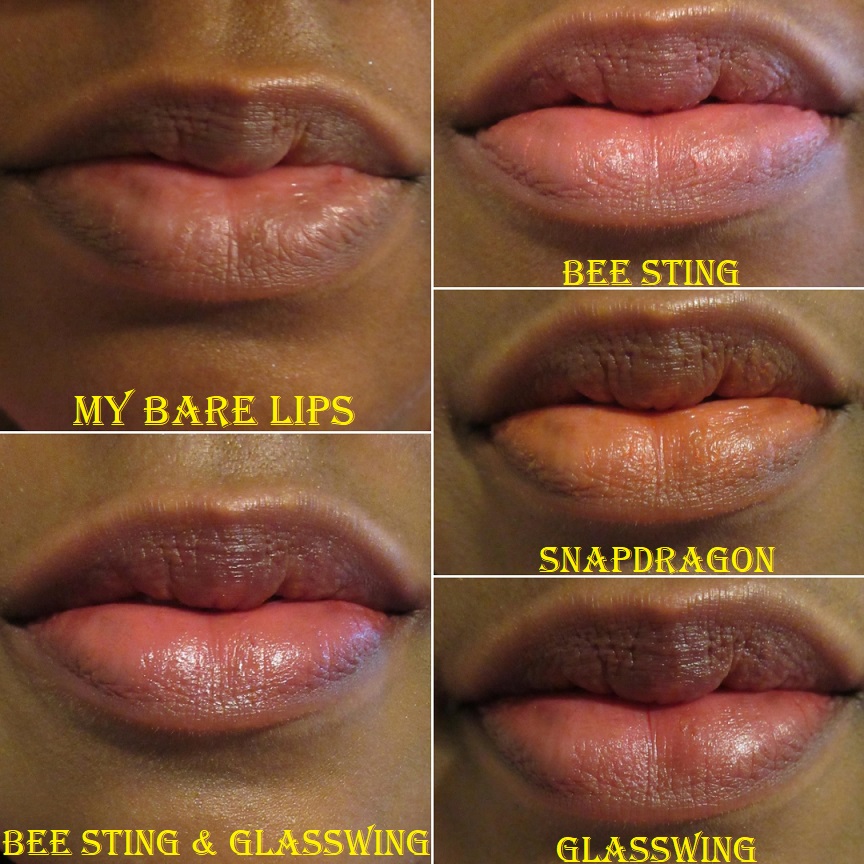
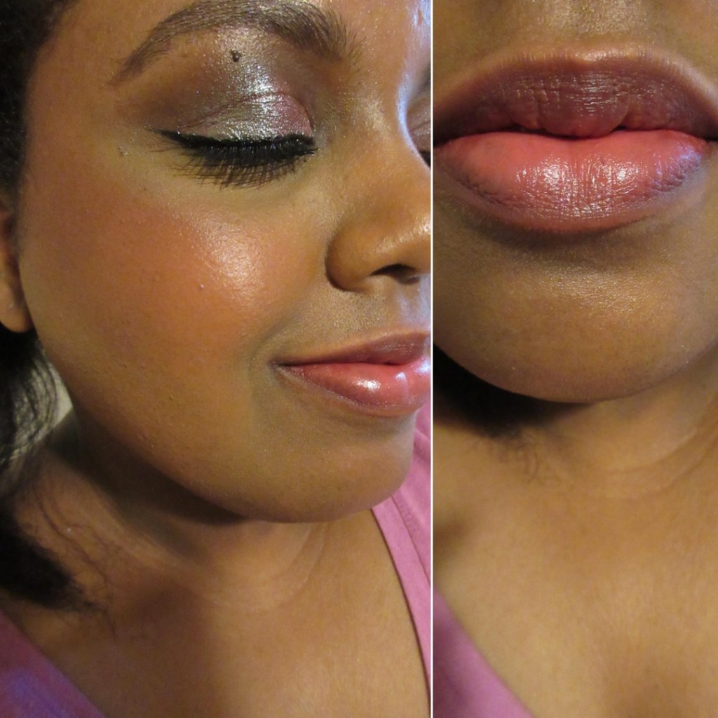
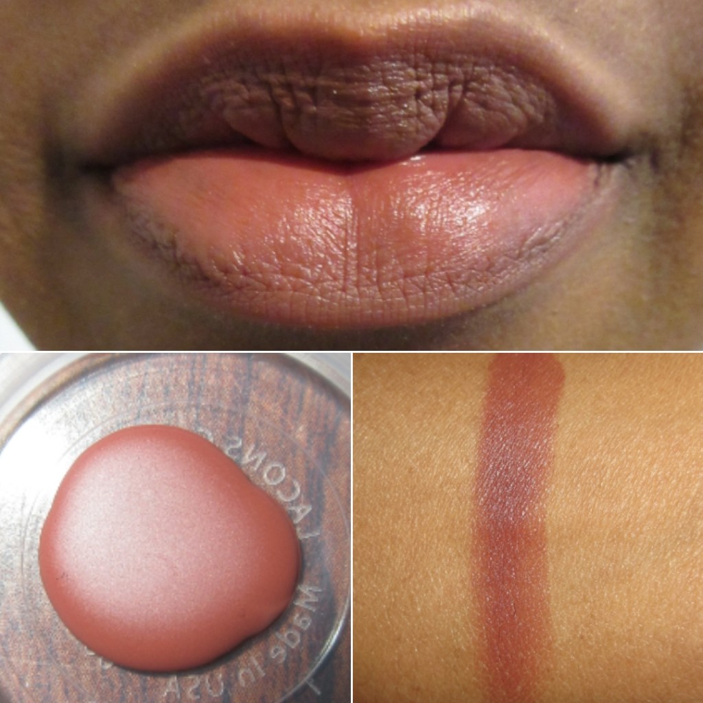
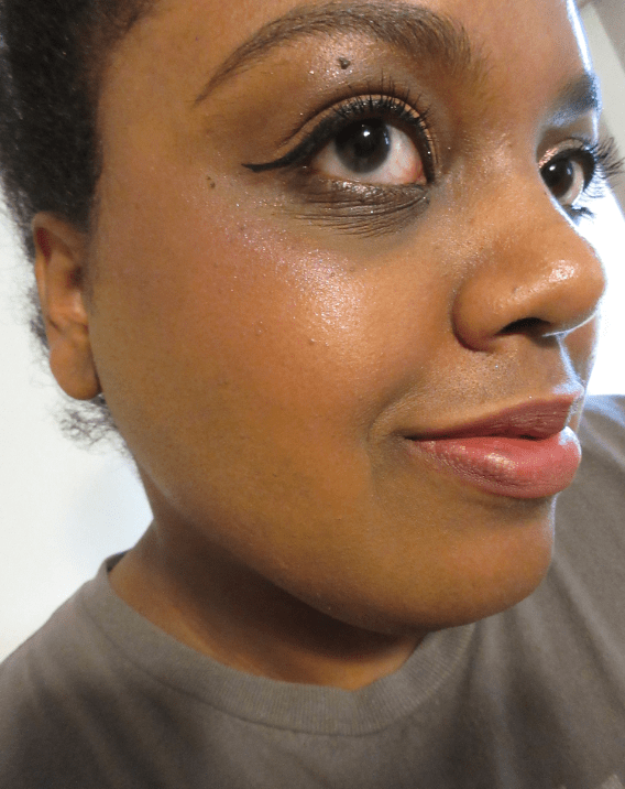
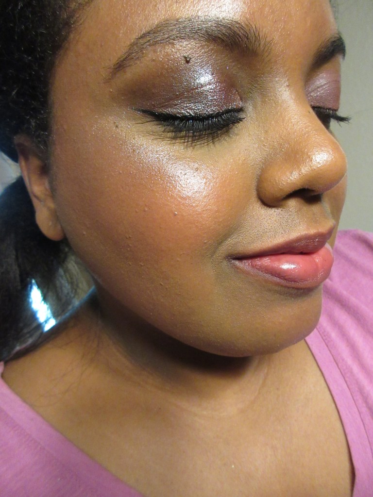
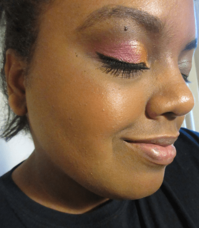
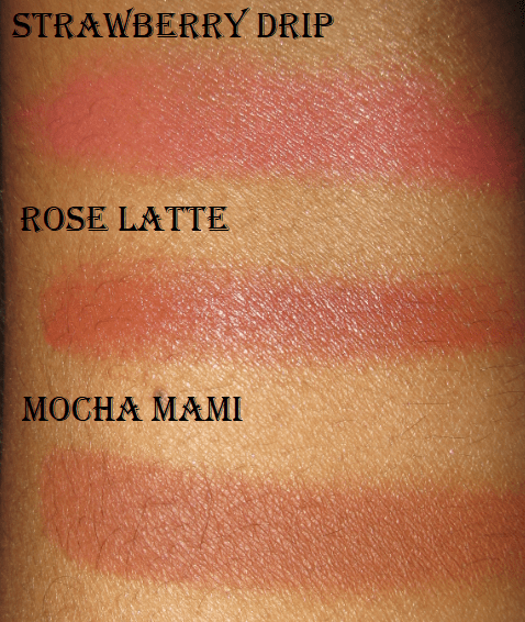
I already posted about the Fenty Sun Stalk’r Bronzer here and the Cream Blushes here, but these are additional photos of those products. Mocha Mami is in the first picture alone and in the second photo is a lightly applied mixture of Strawberry Drip and Rose Latte along with Mocha Mami. I’m a fan of all three products.

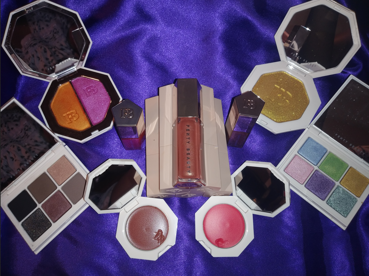
Today, I will be focusing on the other Fenty Products in my collection!

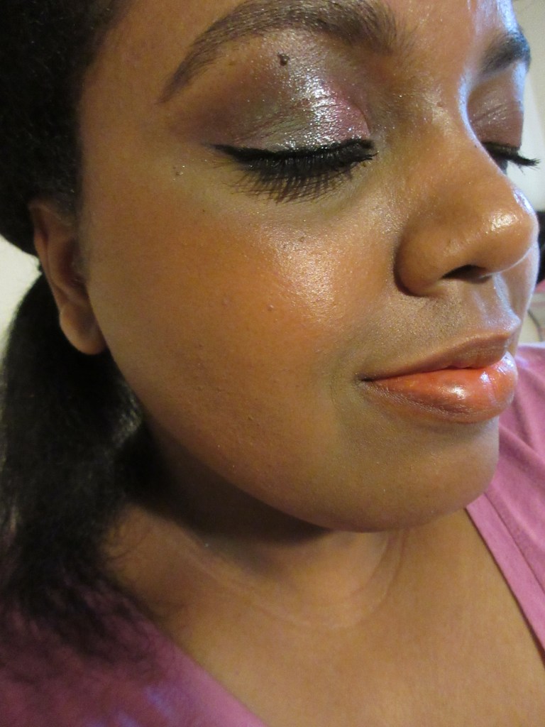
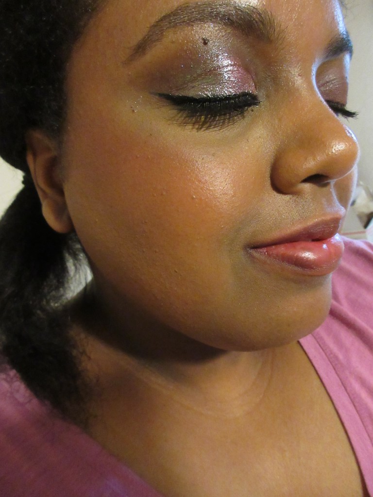
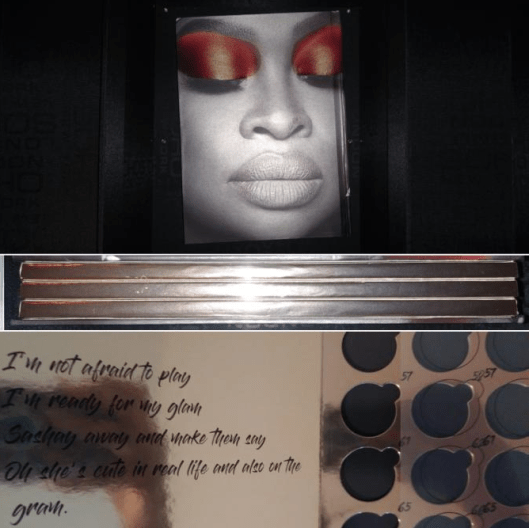
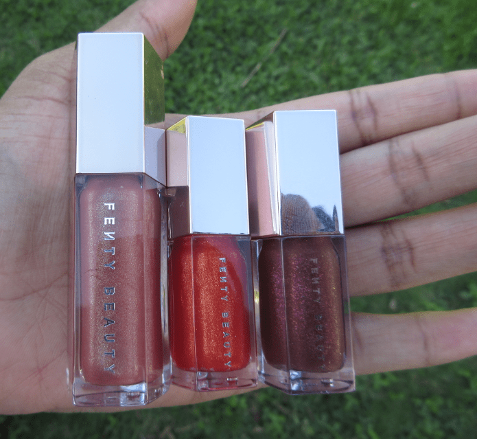
Gloss Bomb Universal Lip Luminizers and Mattemoiselle Plush Matte Lipstick

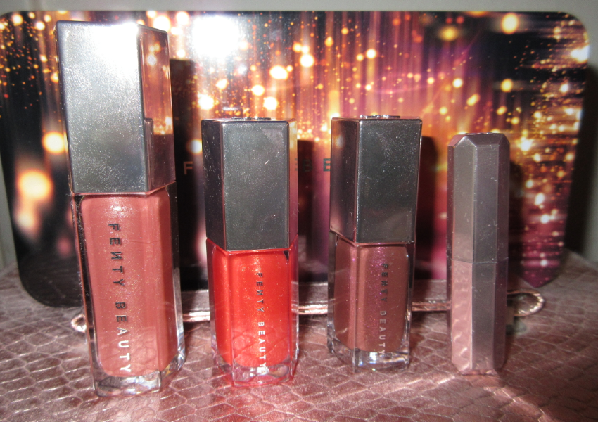
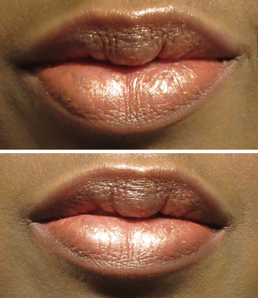
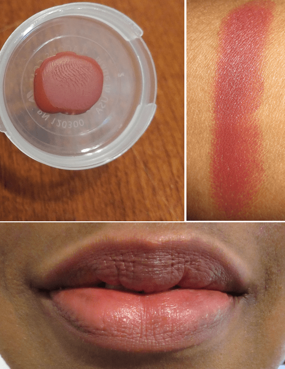
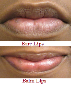
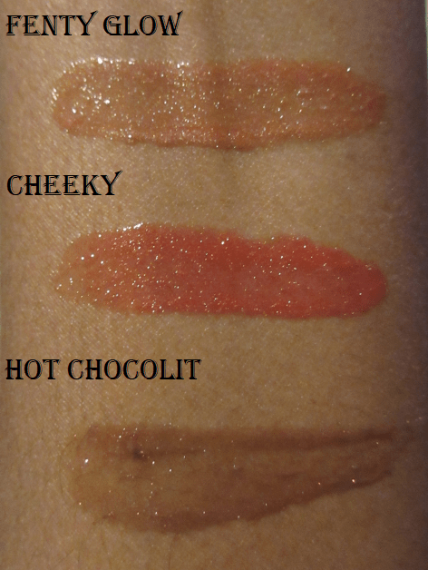
Fenty Glow – (shimmering rose nude) I have this shade in the full size. During the initial launch, the gloss bombs were, and I believe still are, very hyped up. Fenty Glow is specifically marketed as a universally flattering shade. I do love the way it looks on me! The gloss bombs are thick without being goopy. It’s the kind of formula that clings to the lips and will last longer than thinner gloss formulas. If your hair gets in your face, it will stick to the gloss, but when I open and close my mouth, I don’t get that sensation of my lips getting stuck the way some sticky glosses can.
The sparkles in this are nice and fine. All three of my gloss bombs have a sweet fruity scent.

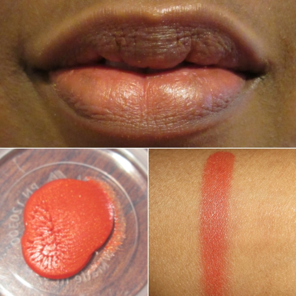
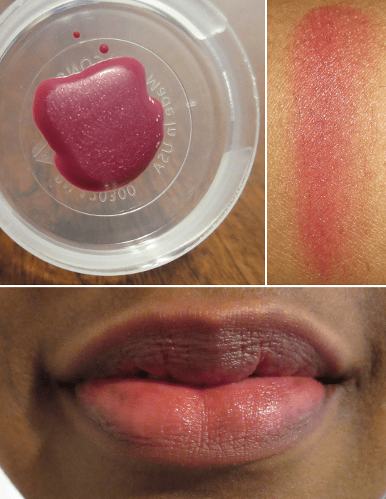
Cheeky – (shimmering bright red-orange) I have this in the mini size from the mini gloss bomb set that was released for Holiday 2019. I wanted Cheeky and Hot Chocolit the most, so I gifted the other three shades. Cheeky is available in the full size exclusively on the Fenty website.

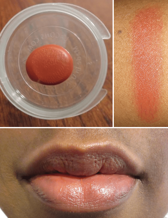
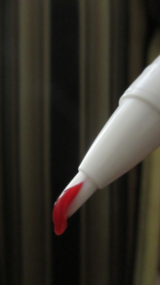
Hot Chocolit – (shimmering rich brown) I expected to love this shade the most, but it’s my least favorite of the three. I tend to only wear it on top of another lip product that is too light of a shade in order to deepen it up. Hot Chocolit has bright red glitter, which is pretty in the tube, but I don’t like it on my lips. Also, the glitter particles in Cheeky and Hot Chocolit are larger and more noticeable on the lips, which is not my preference.

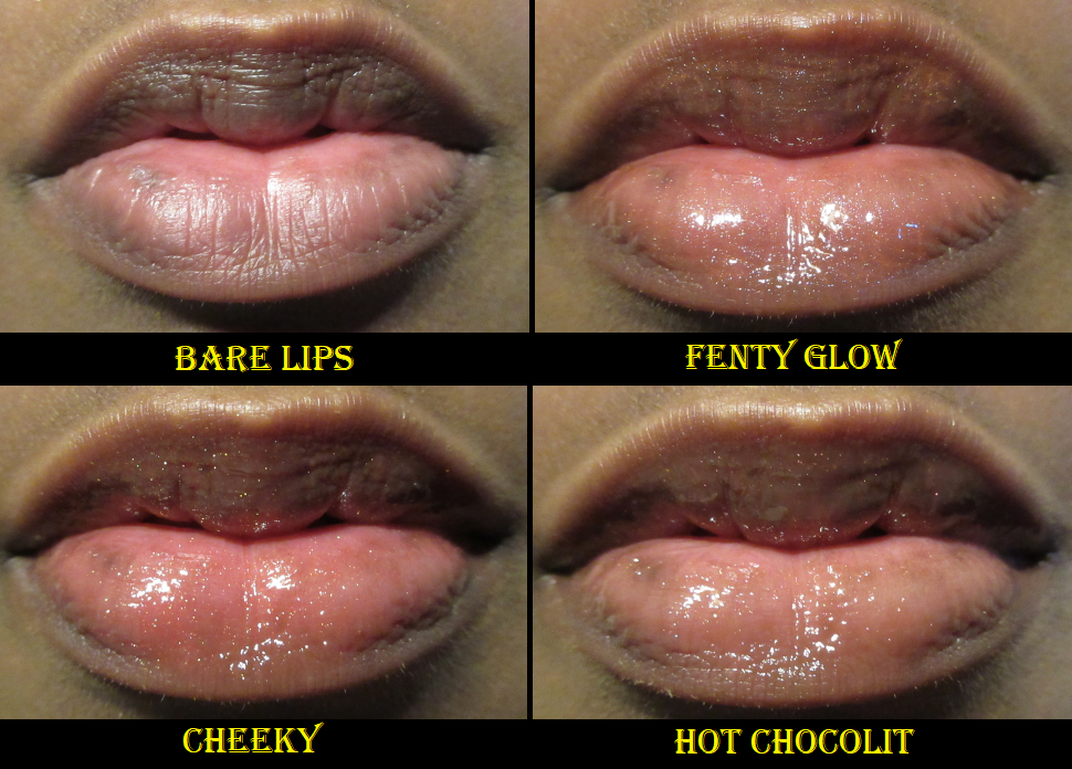
I wish there was a bit more color pigment to Cheeky and Hot Chocolit. I was tempted to get this year’s mini set, but because the shade differences are so subtle on my lips, I don’t think it’s worth getting more when the current ones I have will suffice. Tower 28 glosses have now reached the hype of the gloss bombs, so I’m more likely to try those in the future than get the new gloss bomb mini set. The gloss bombs are still my favorite glosses in my collection and my overall favorite Fenty Beauty product.

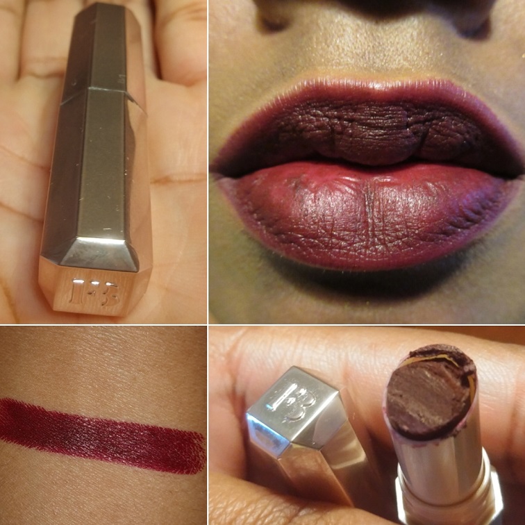
Griselda – (bold burgundy) I have this Mattemoiselle Plush Matte Lipstick in a trial size. It had the Fenty logo on the bullet, but I cut off part of it to be used in some DIY lip projects of mine. It’s such a beautiful color, and although mine is getting old and the consistency isn’t quite the same, I remember enjoying how smooth it was and thinking that if I wore lipsticks more often, this is one of the shades I would get for some gorgeous vampy looks. I tend to prefer this kind of purple with a red tone over more blue toned purple shades.

Match Stix Matte Contour and Shimmer Skinsticks

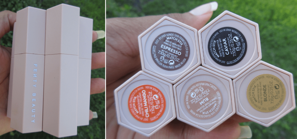
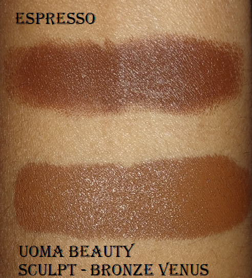
Espresso – (contour for medium deep skin tones, cool undertone) This was my favorite contour product in 2019. It’s creamy and blends out nicely. Even though it’s described as cool, it pulls a little warm on my nose which is why I only used this for contouring other areas of my face.

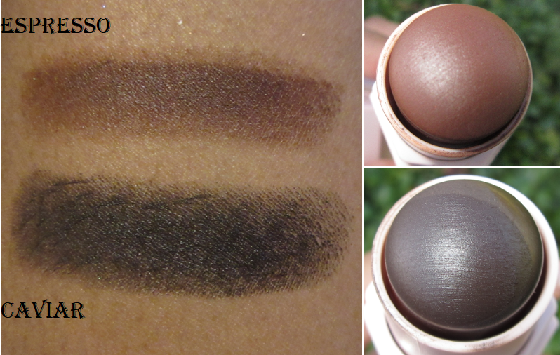
Caviar – (contour for deep skin tones, cool undertone) this is one of the two deeper shades that were introduced to the line in 2020. I bought this because I wanted something cooler-toned, but I underestimated how rich of a color it is. Contour products are ideally only a few shades darker, so this one is too intense on my complexion. It’s not that I can’t wear it at all, but it takes a lot of extra time to sheer and blend it out so it won’t look too harsh on me.

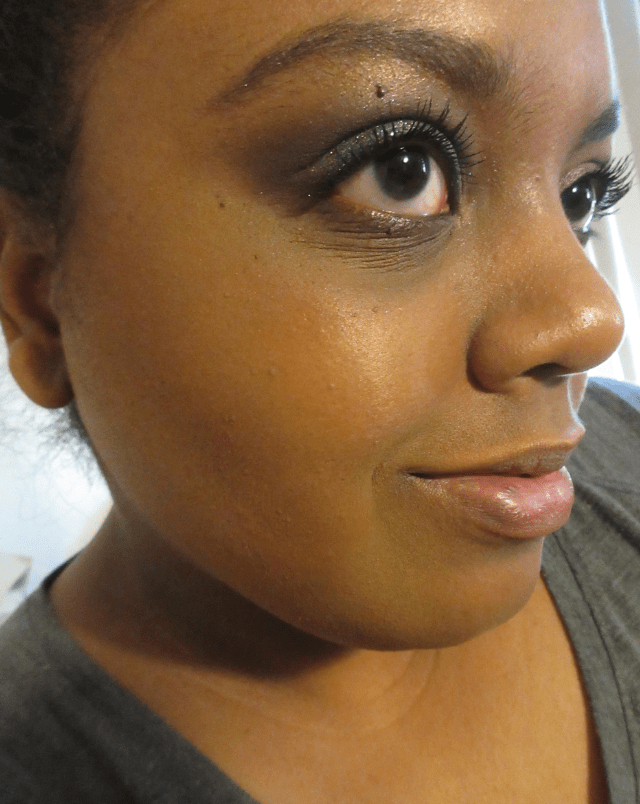
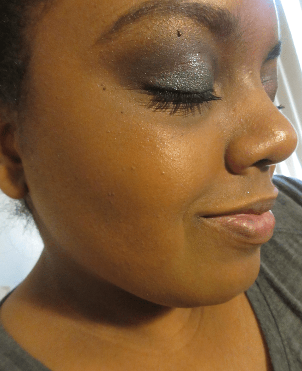
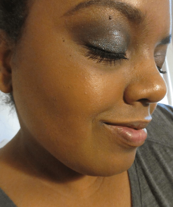
In the photo on the left, I’m wearing Espresso. I’m wearing Caviar in the middle picture and in the last one I have the two shades blended together.
I still like this product, but love the Uoma Beauty Double Take Sculpt + Strobe Duo Stick even more. #3 Bronze Venus is a better shade match for me and the formula is creamier, which makes it easier to blend. Bronze Venus is neutral-warm for a contour but it’s deep enough to still have a chiseling effect, even without having enough grey to create an actual shadow effect.

With the contour sticks, I typically draw a line and blend it out with a dense synthetic brush or the mini Tati Blendiful. Occasionally, I blend with a damp sponge, which leads to gorgeous results but I’ve never gotten into the habit of using a sponge consistently.

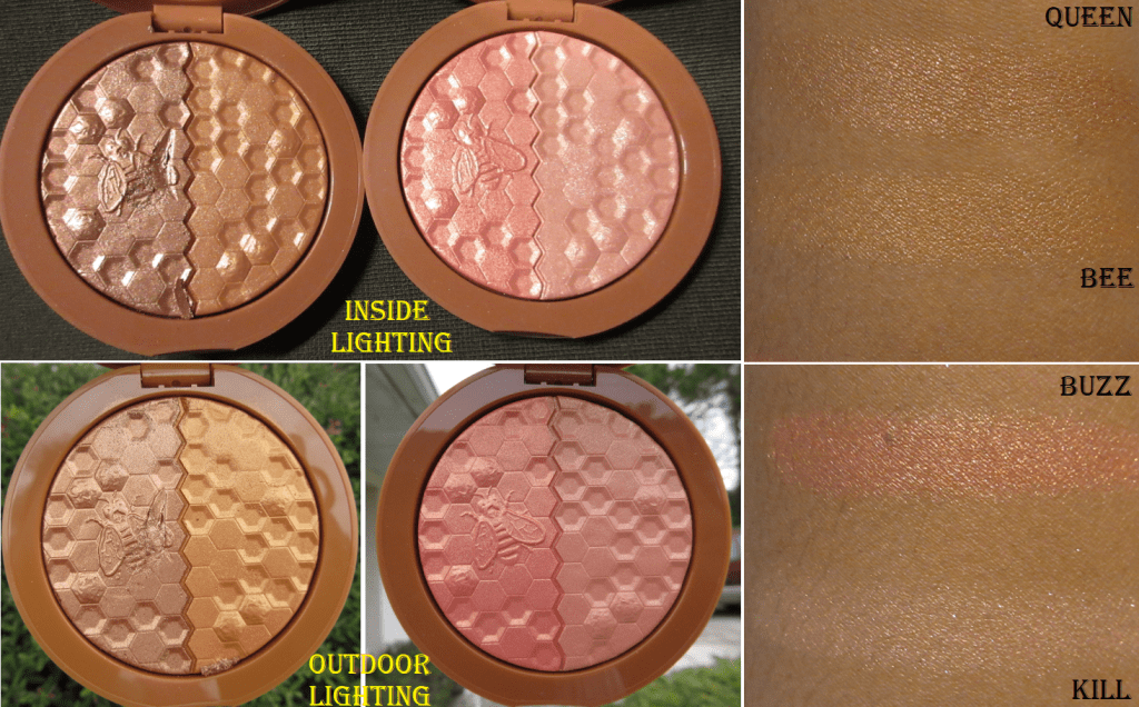
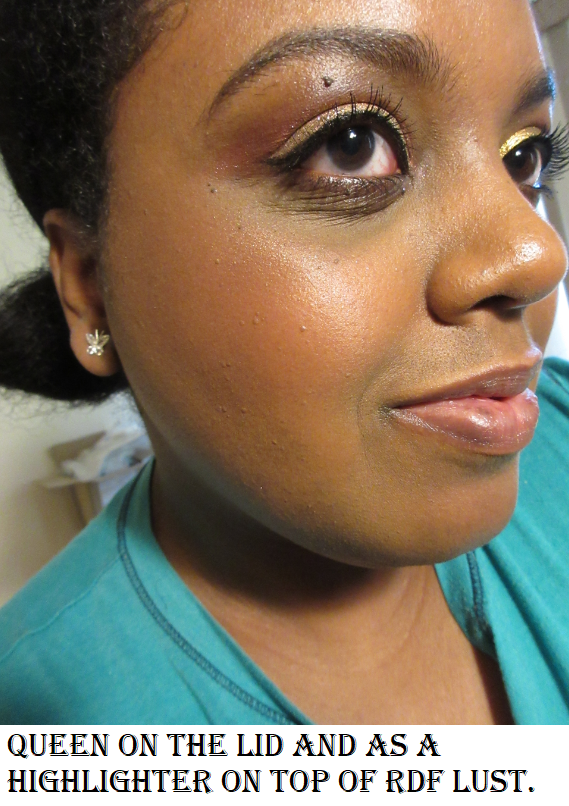
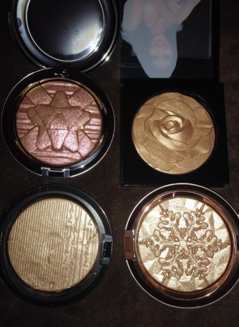
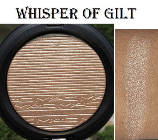
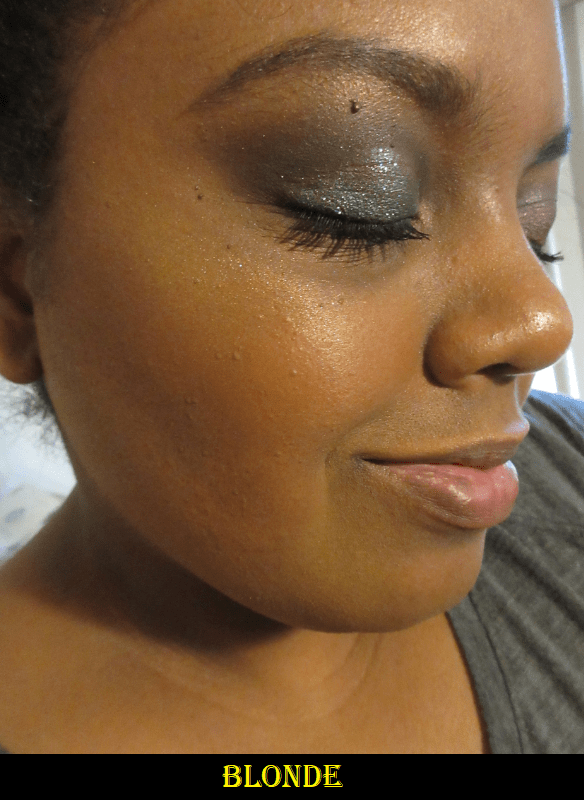
Blonde – (glimmering gold) I’ve only used this twice and never in public. I like some strong yellow-based highlighters, like Becca’s Champagne Gold, but this one I feel stands out in an unflattering way on my skin tone. It also has very noticeable glitter up close.

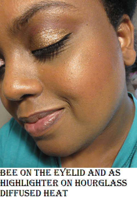
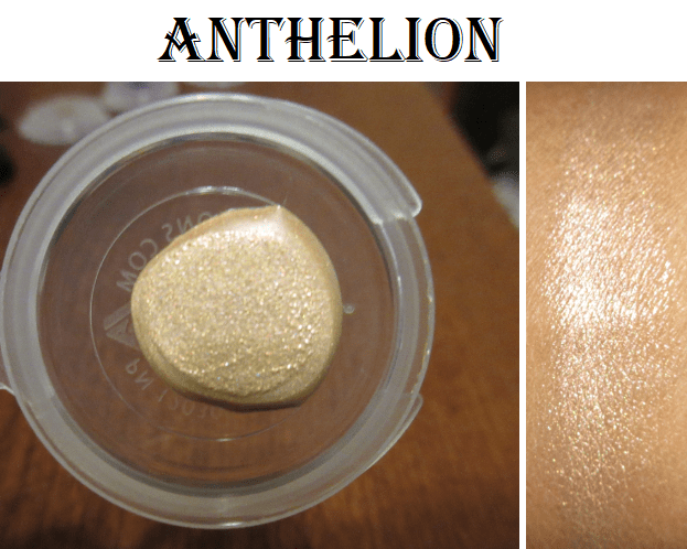
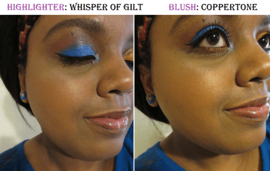
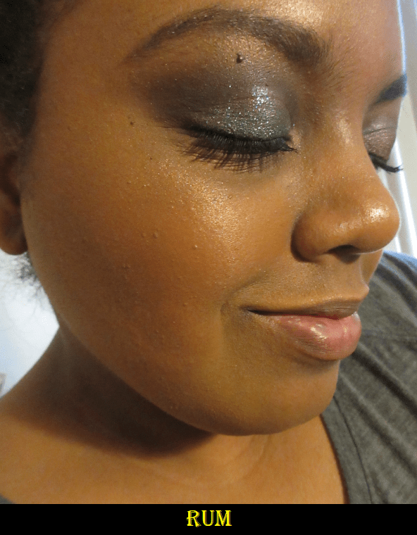
Rum – (gilded bronze) This is my favorite of the three because it blends in well with my skin tone and is a traditional highlighter shade. Because it matches so well, the glitter is less noticeable. It just has the appearance of a shimmery sheen. Unlike the contour sticks, I prefer to apply the shimmer sticks to my face by rubbing some of the product onto my fingers and dabbing it onto my skin. I think it looks more seamless when I use a sponge, but I dab the product onto my cheeks first with my finger, just to place it, and then blend with the sponge. When I rubbed the sticks directly onto the sponge and then blended it onto my face, I felt that I ended up with a thicker area of highlighter than I normally would have. I was also unsuccessful in being able to completely remove the stain from Chili Mango off my sponge.

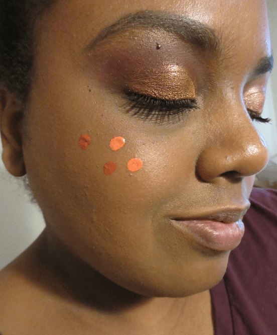
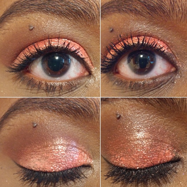
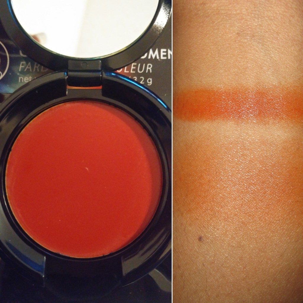
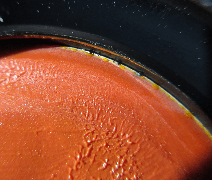
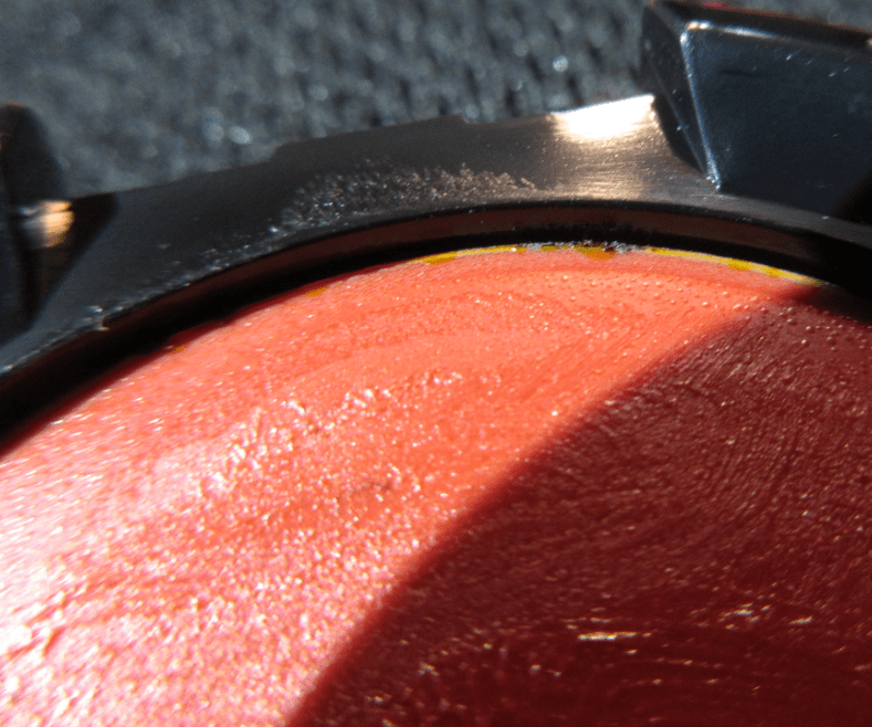
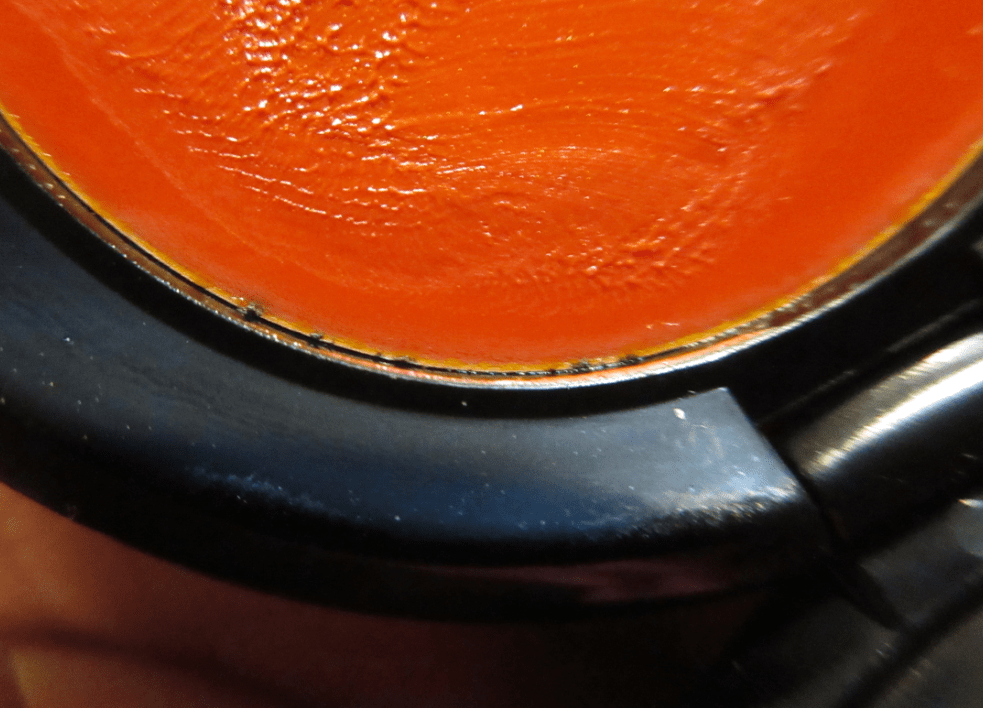
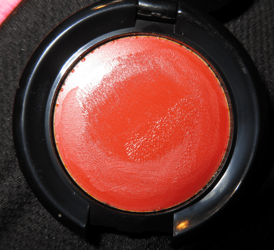
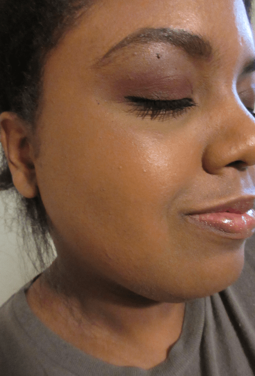
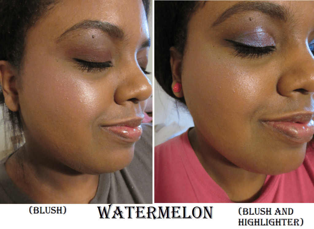
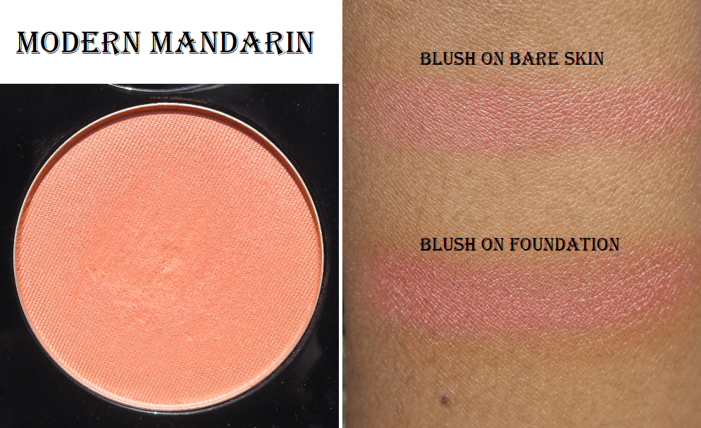
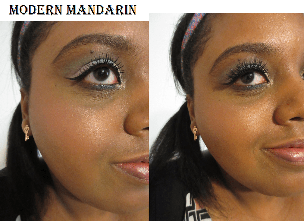
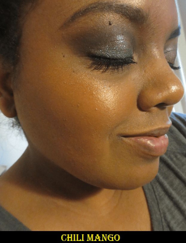
Chili Mango – (sun-kissed orange sheen) I bought this during my search for the best traditional orange shade of blush. I don’t really like how it looks as a blush on me (more sheen than base color), but I do like it as a highlighter.

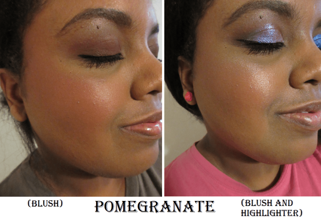
I have to admit that although these are three very distinct shades, the differences aren’t as pronounced on the cheeks. I always knew this was the case logically, but as I’ve taken a closer look at all the highlighters in my collection (especially Becca Shimmering Skin Perfectors which I have plans to blog about in December), it has finally begun to sink in that most highlighters will look the same. Variety is extremely limited in terms of color and being able to identify what brand or shade a highlighter is by the way it looks on the face.

Killawatt Freestyle Highlighters

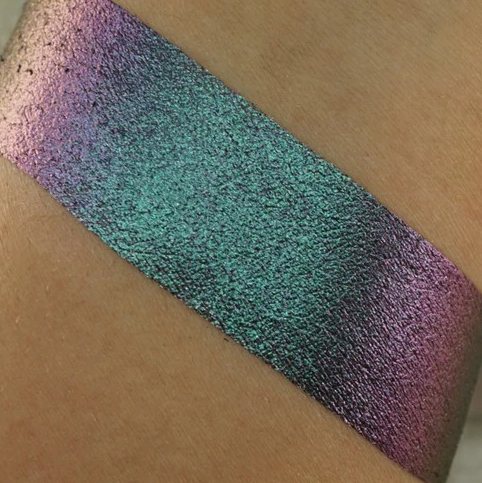
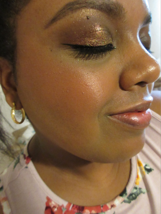
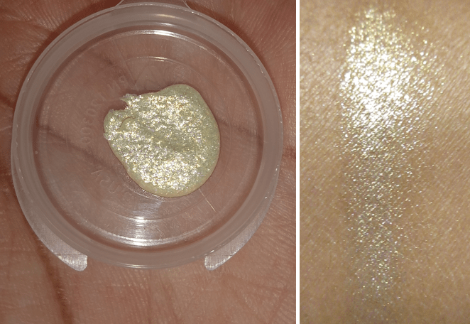
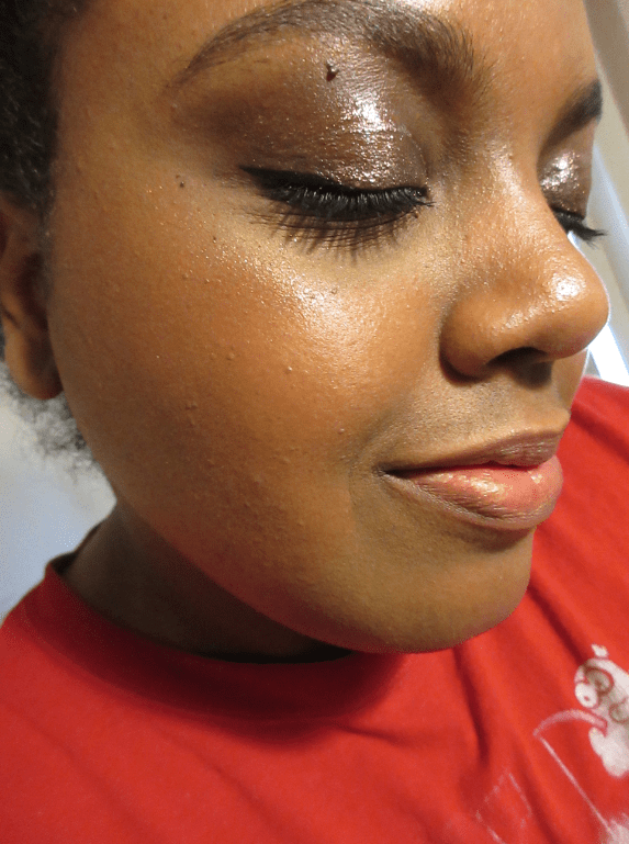
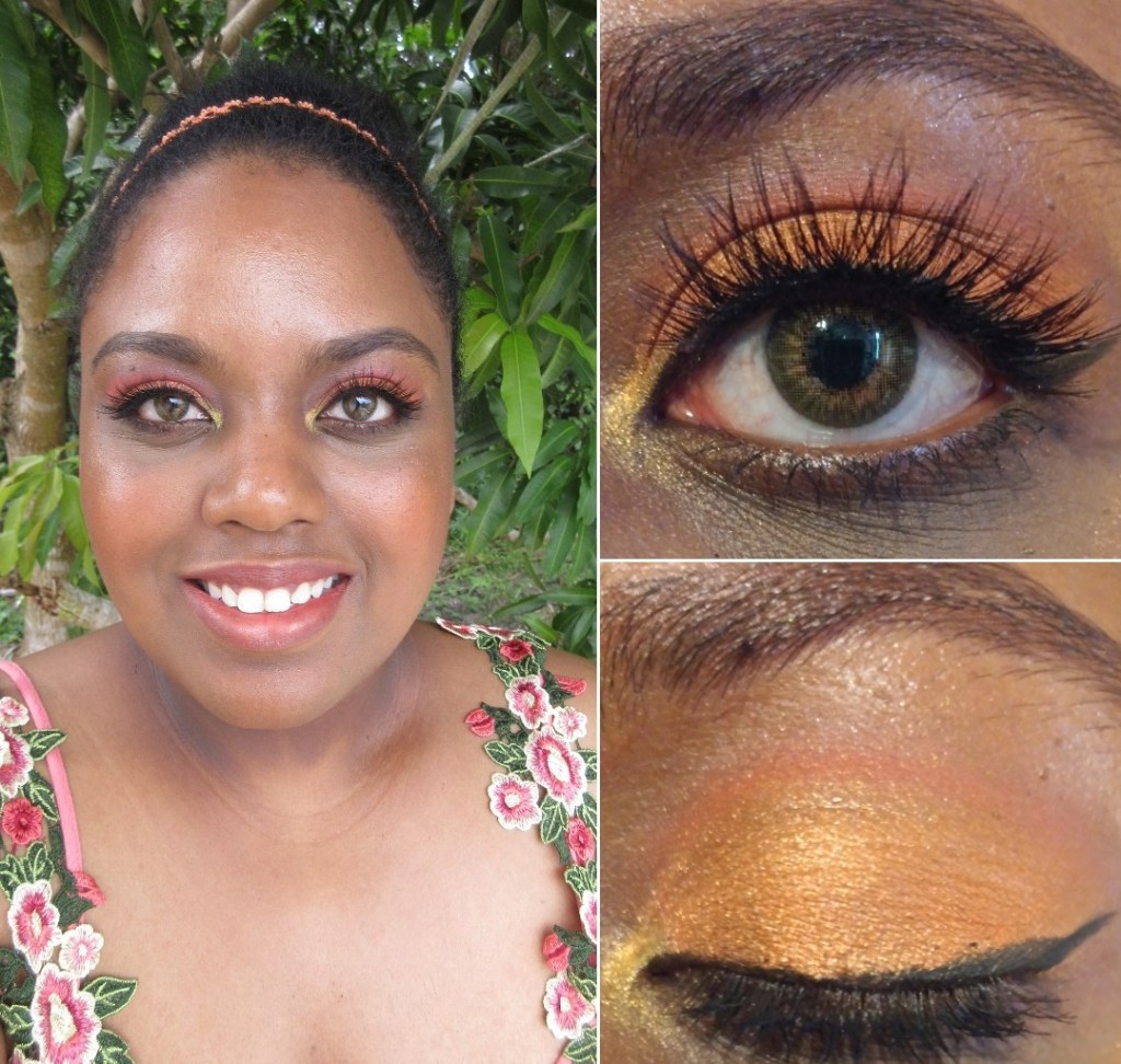
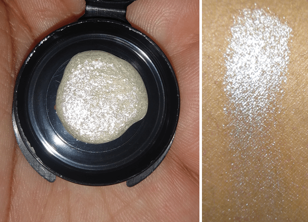
Trophy Wife – (3D hyper-metallic gold) Sometimes I want things because they are pretty, even though I know full well the product isn’t something I would actually like to use. This highlighter is the perfect example of that because it is the epitome of glittery. It’s an intensely more sparkly version of the Blonde Match Stix.

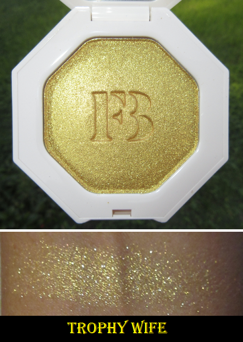
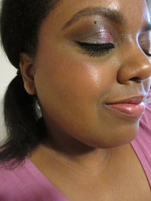
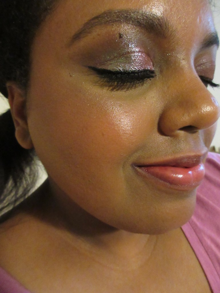
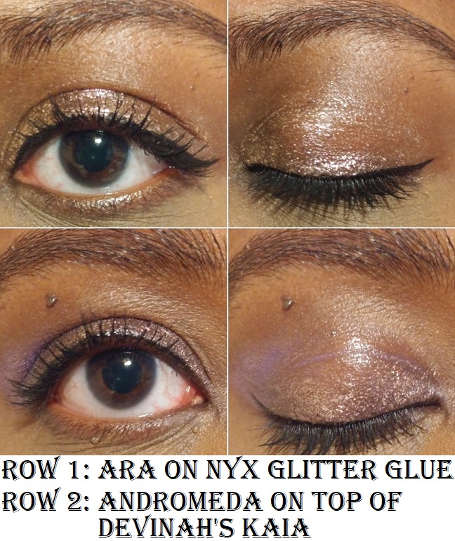
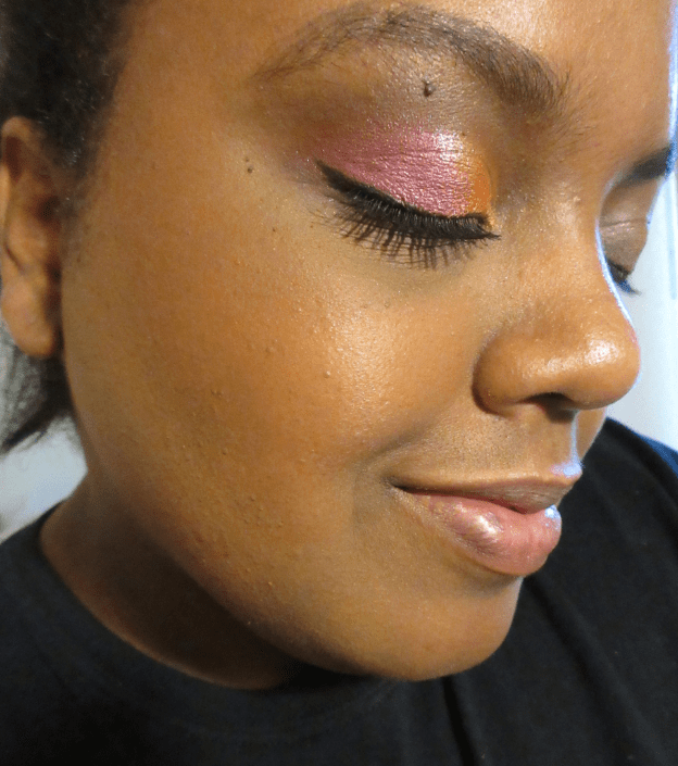
I wouldn’t wear this as a highlighter, but it makes for a beautiful eyeshadow.

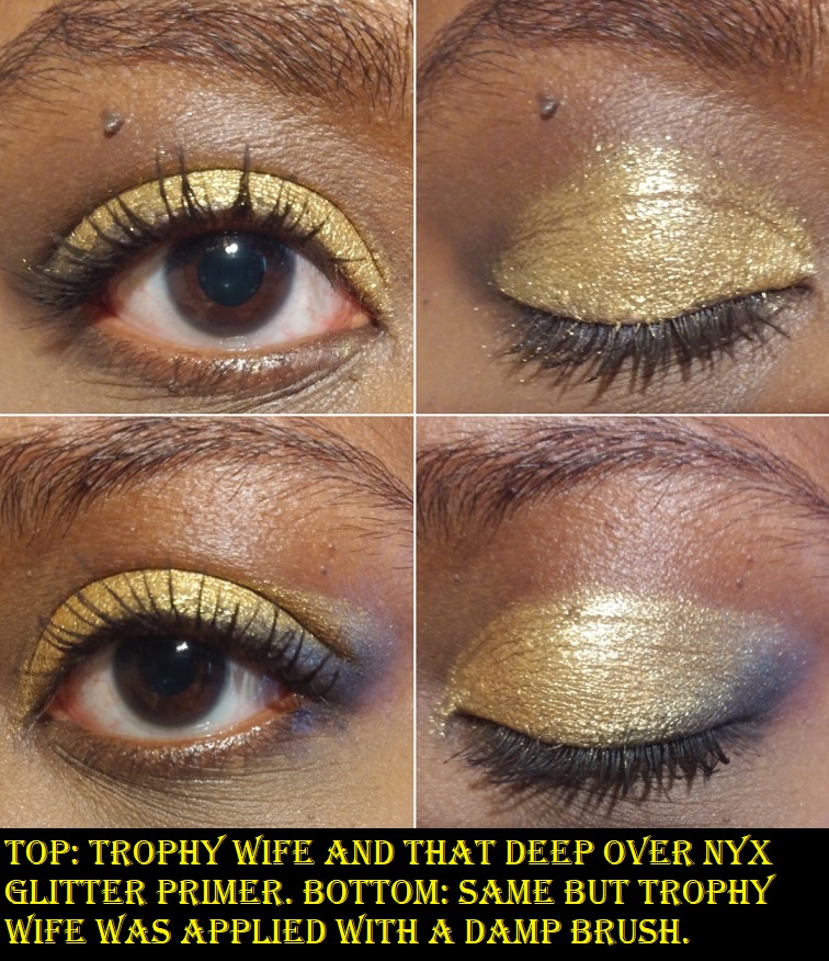
I wear it dry over Nyx Glitter primer and the glitter remains textured but highly reflective. If I use a damp brush, Trophy Wife turns a lighter and brighter yellow but smooths out and looks more metallic. I wore it dry on one eye and wet on the other, and was surprised to discover the difference was immediately recognizable in a video chat. It looked like I used two different yellow eyeshadows. Even my boyfriend (who I was in the chat with) noticed!

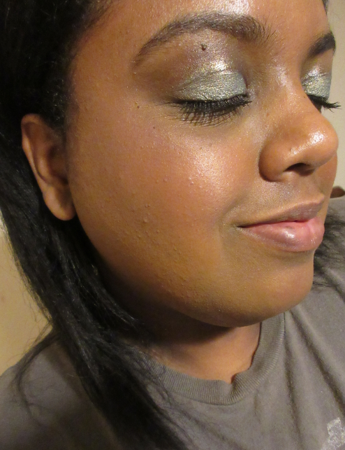
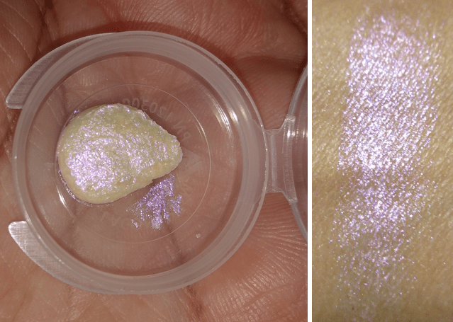
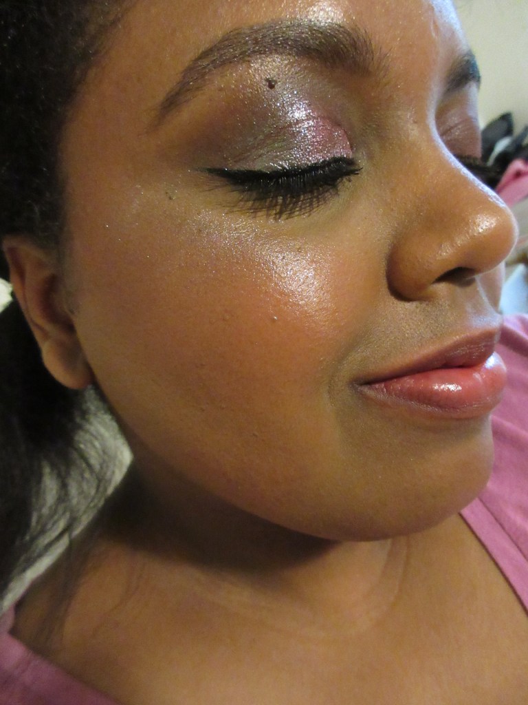
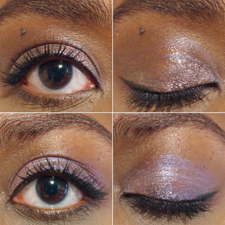
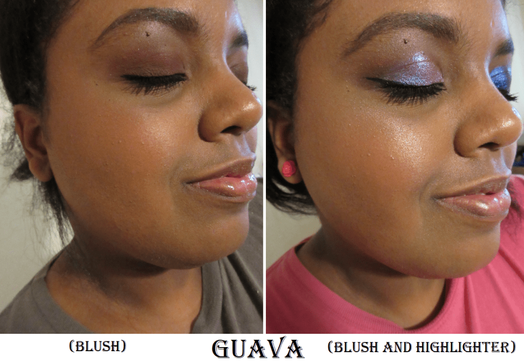
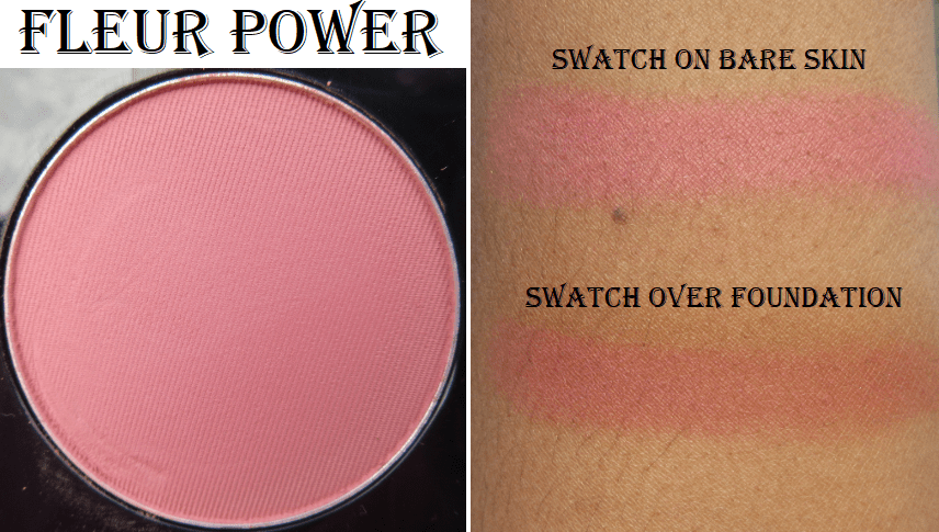
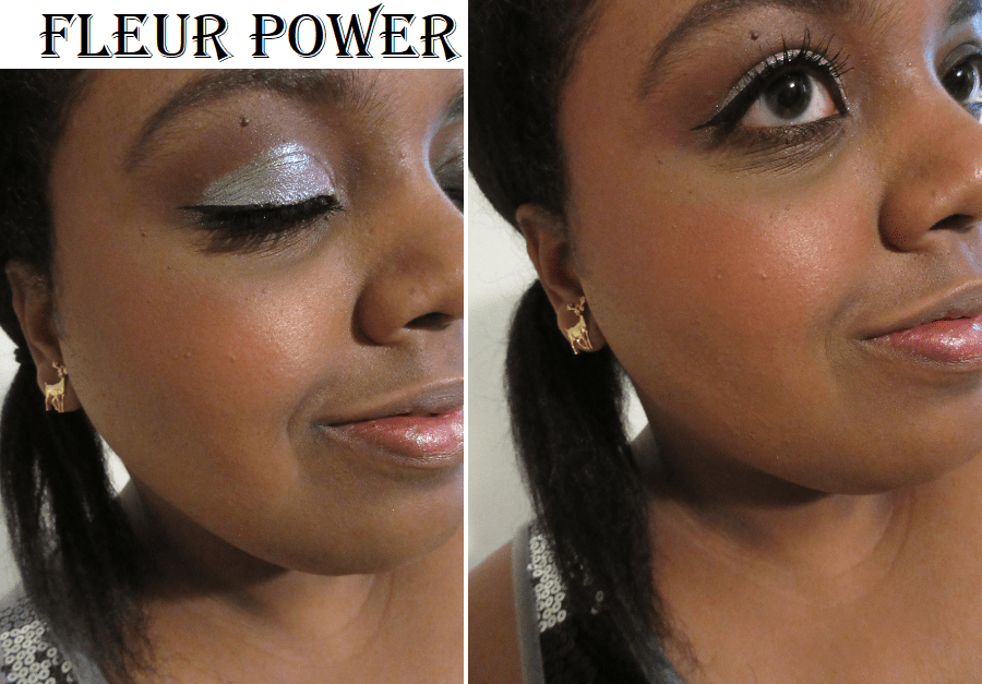
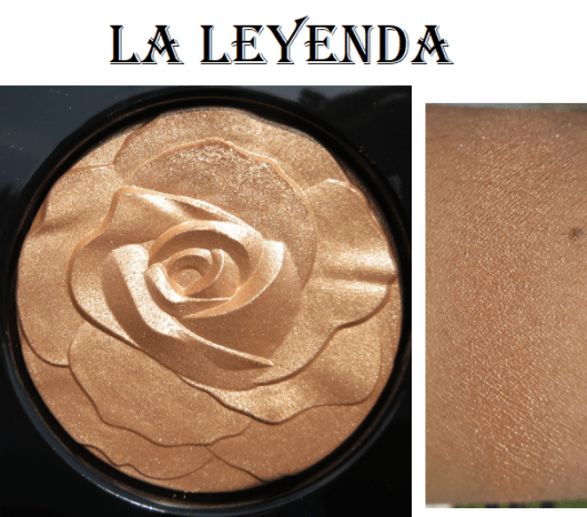
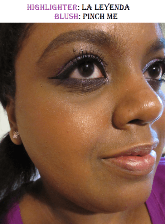
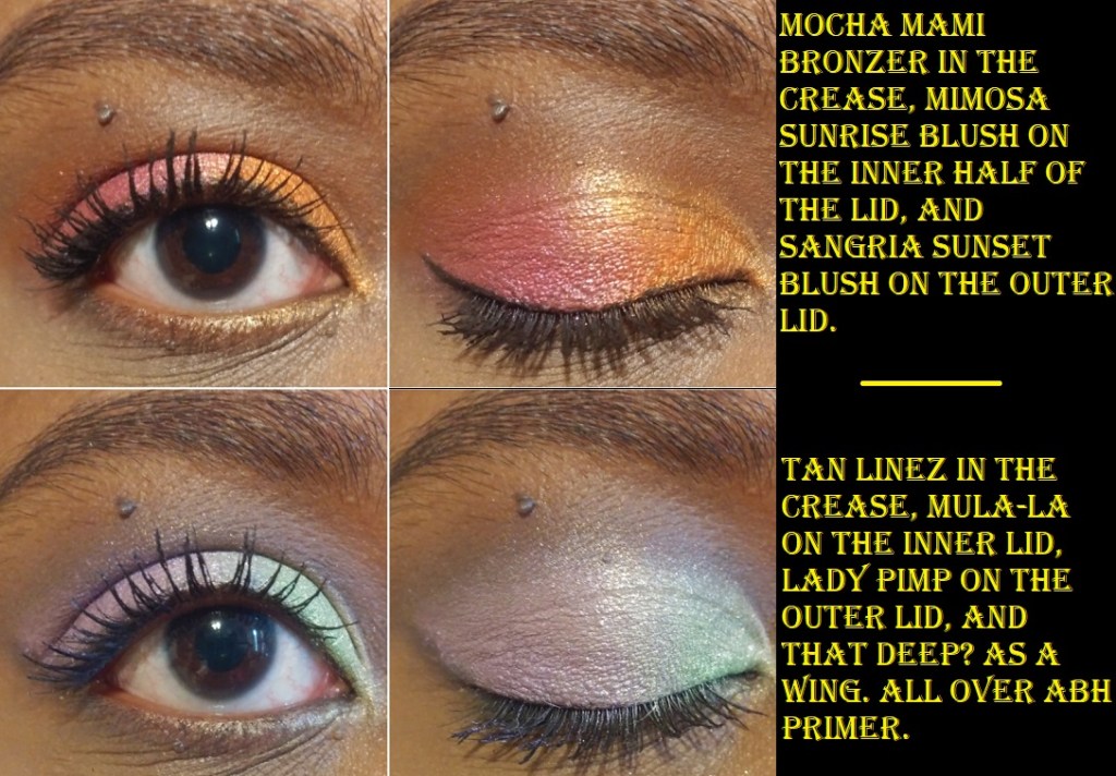
Mimosa Sunrise (metallic tangerine) / Sangria Sunset (metallic magenta) – This is from the Foil version of the Killawatt Freestyle Highlighters. It’s not glittery the way Trophy Wife is; it has more of a satin texture. I bought this for the orange shade when I was looking for that perfect orange blush.

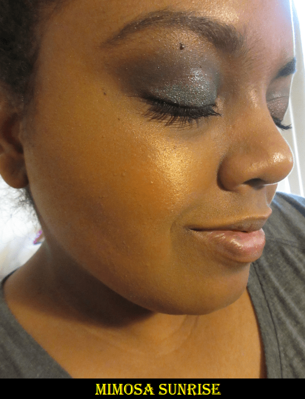
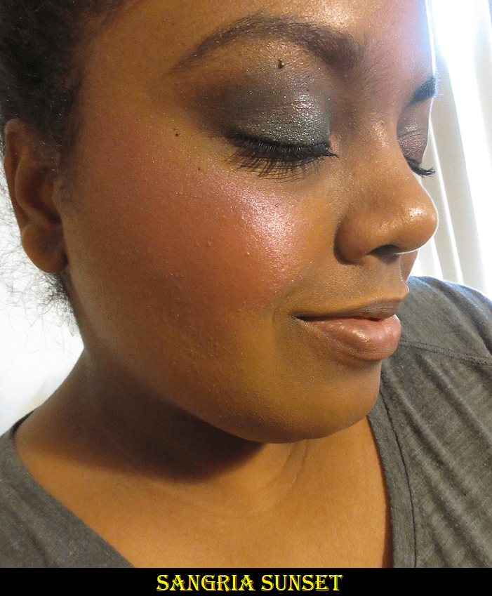
I think they’re pretty, but I don’t like them on my cheeks. They’re too dark for highlighters but I can use them as eyeshadows and they are stunning together! They’re actually not the most opaque. They give a wash of color but I can see my skin underneath unless I build up a few layers. To use them as eyeshadow, I recommend dampening the brush. Since this is specifically in the Foil line, the name suggests that using the wet brush to foil it is expected of the product.

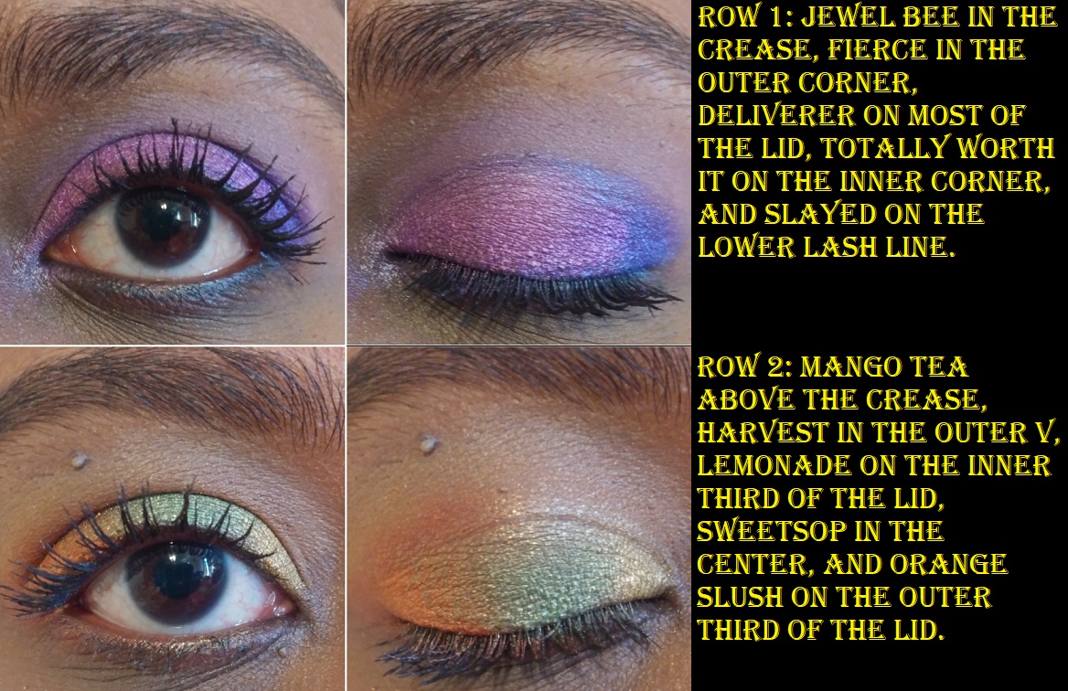
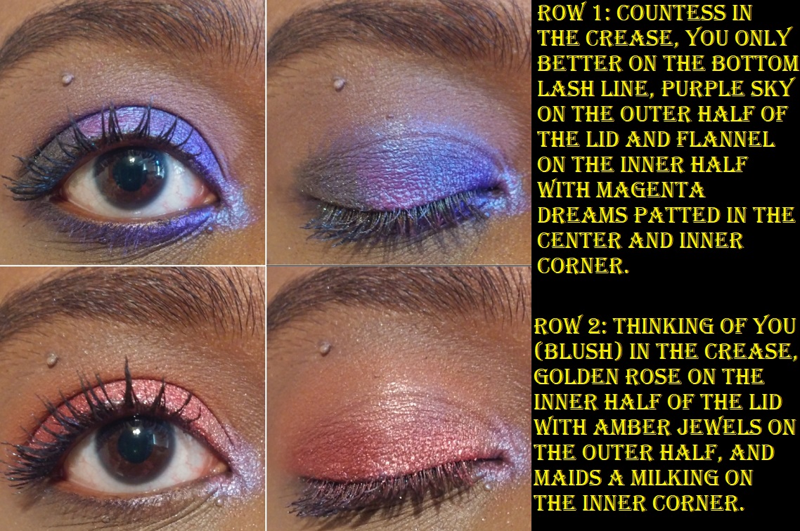
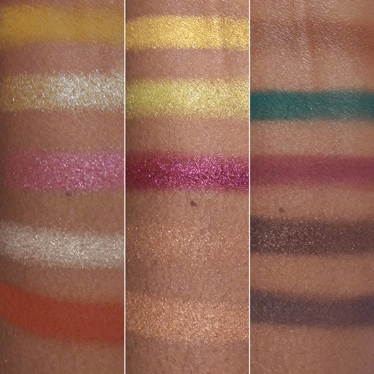
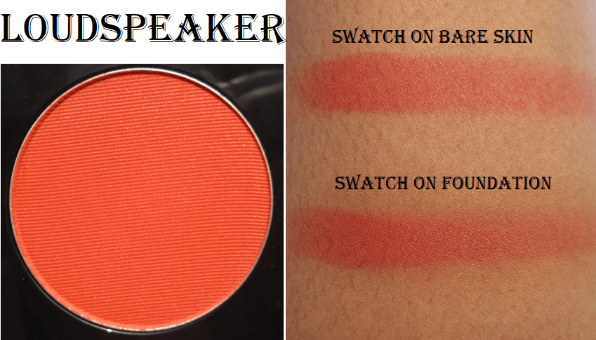
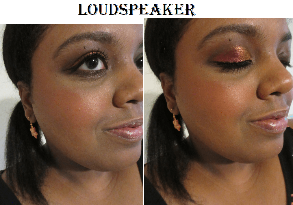
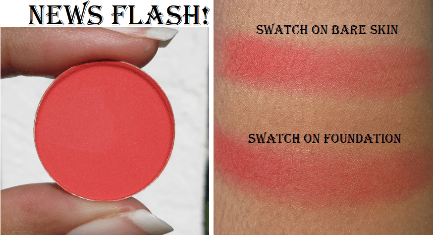
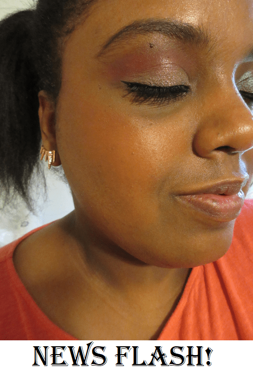
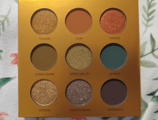
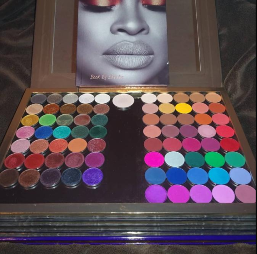
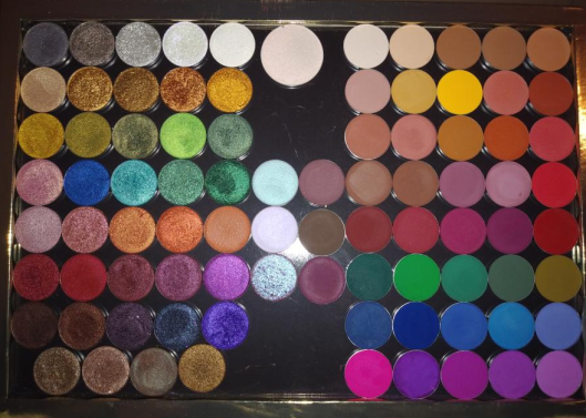
Snap Shadows Mix & Match Eyeshadow Palettes

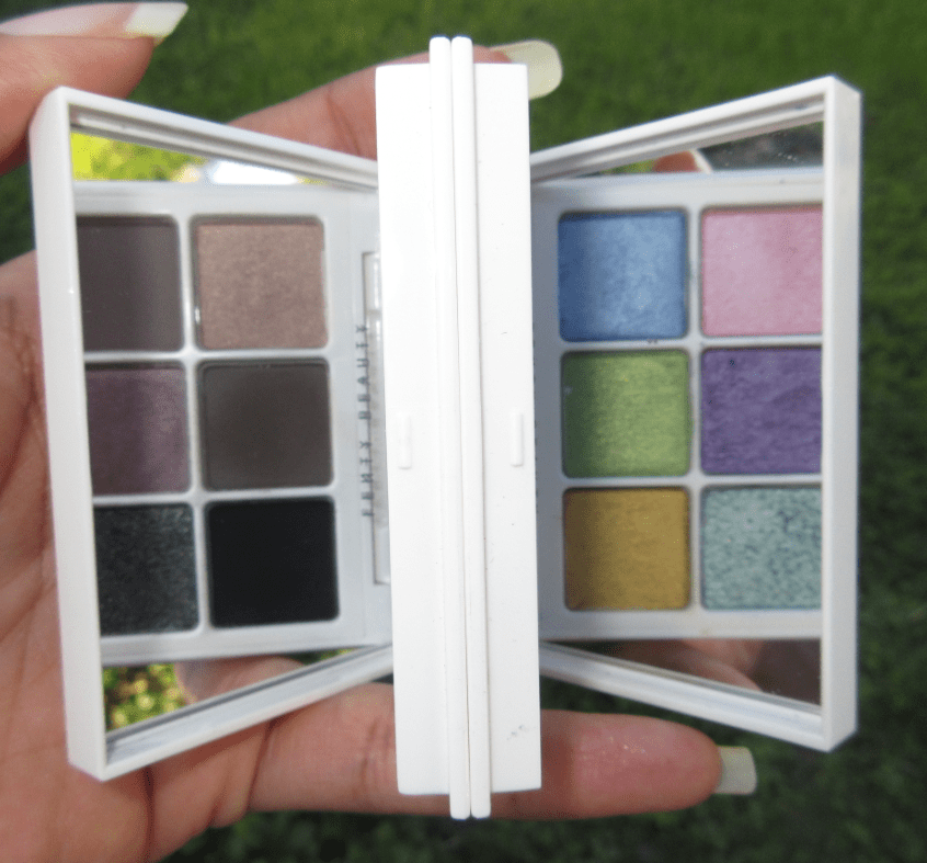
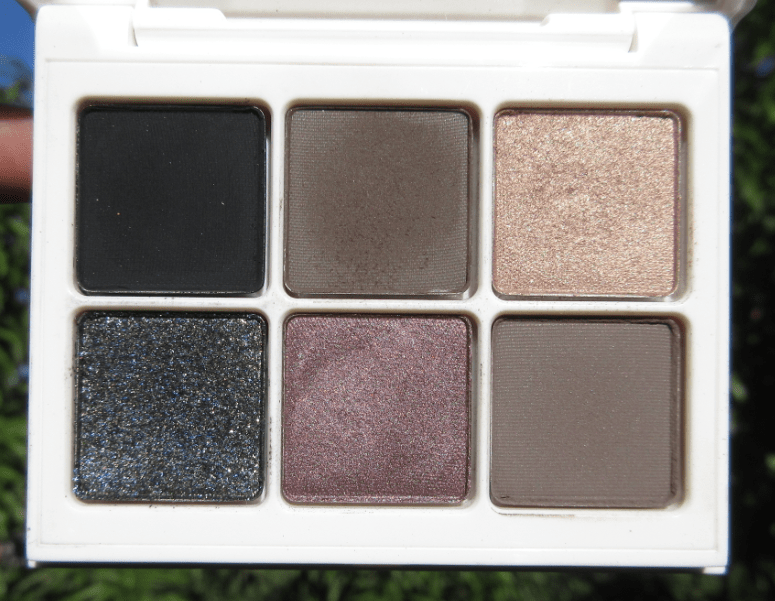
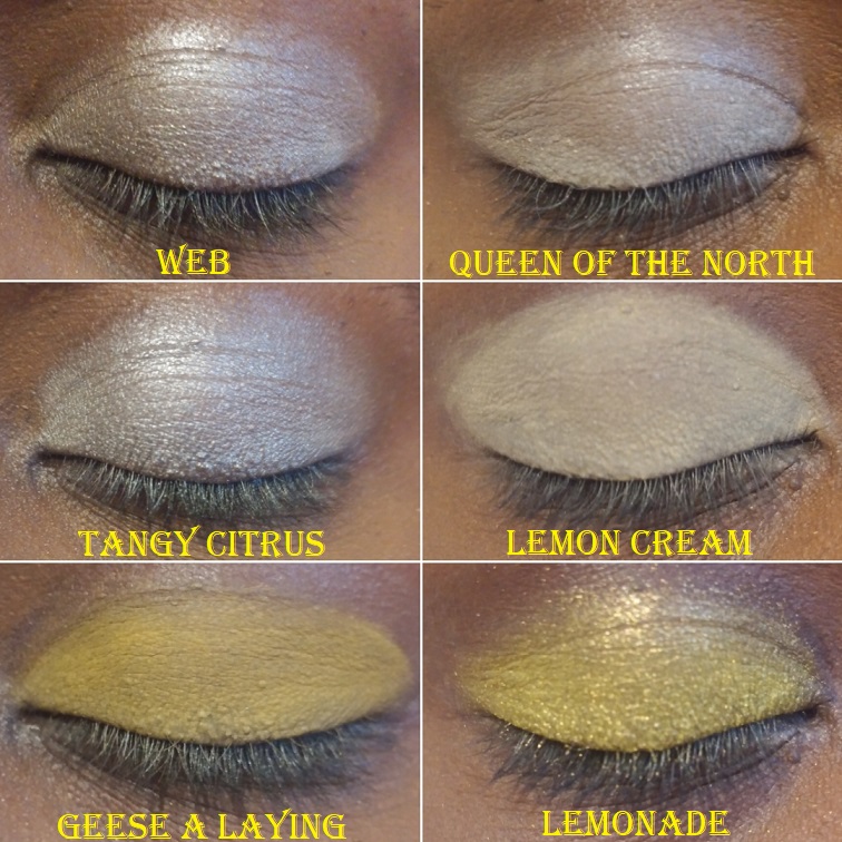
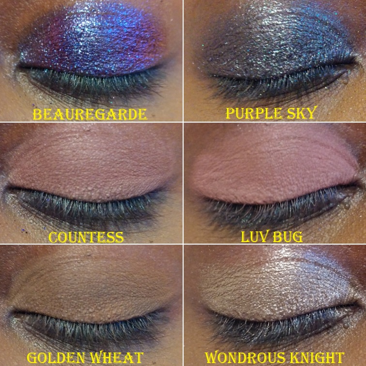
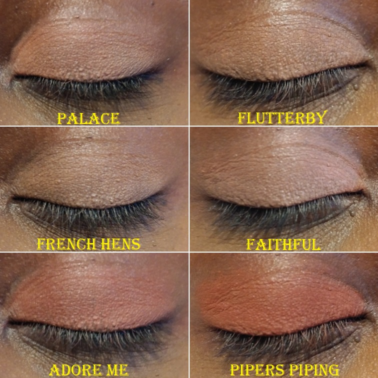
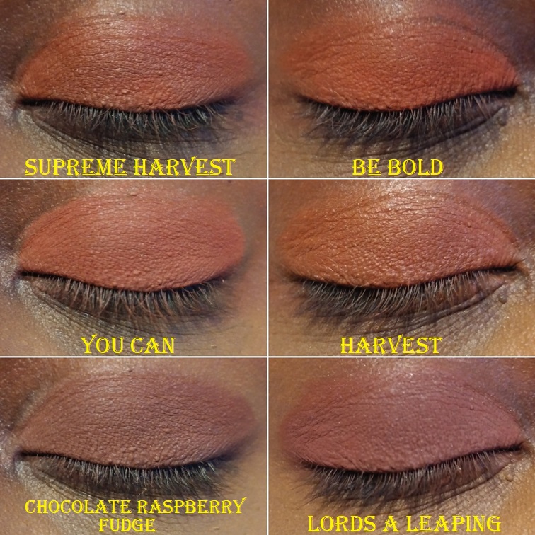
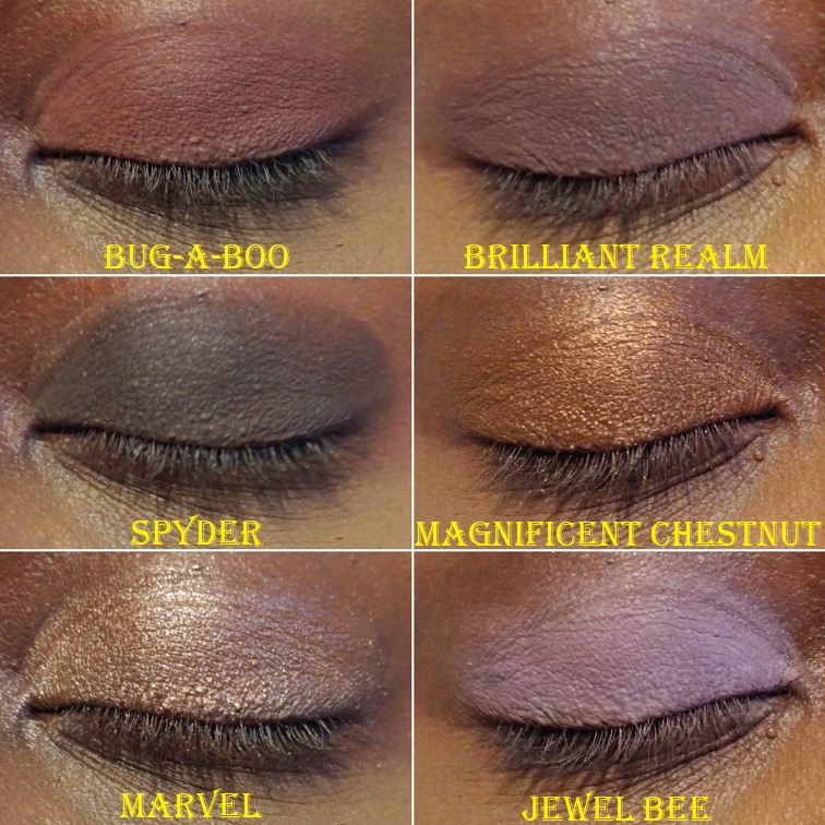
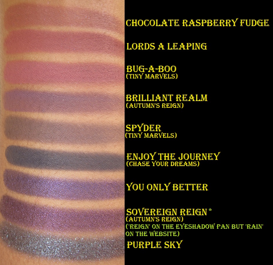
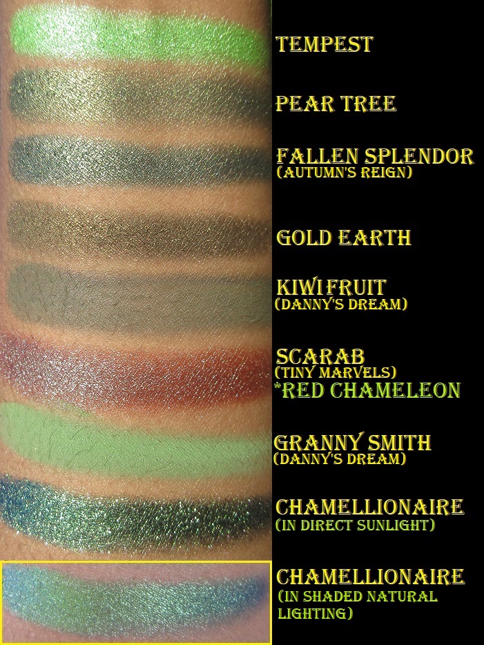
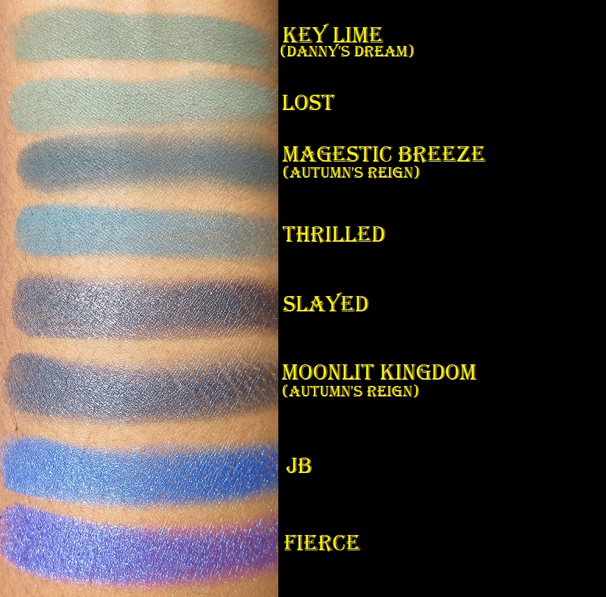
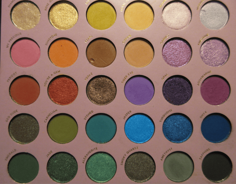
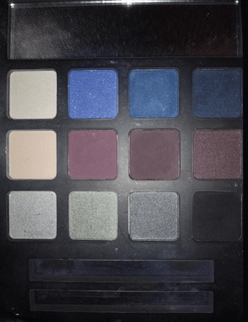
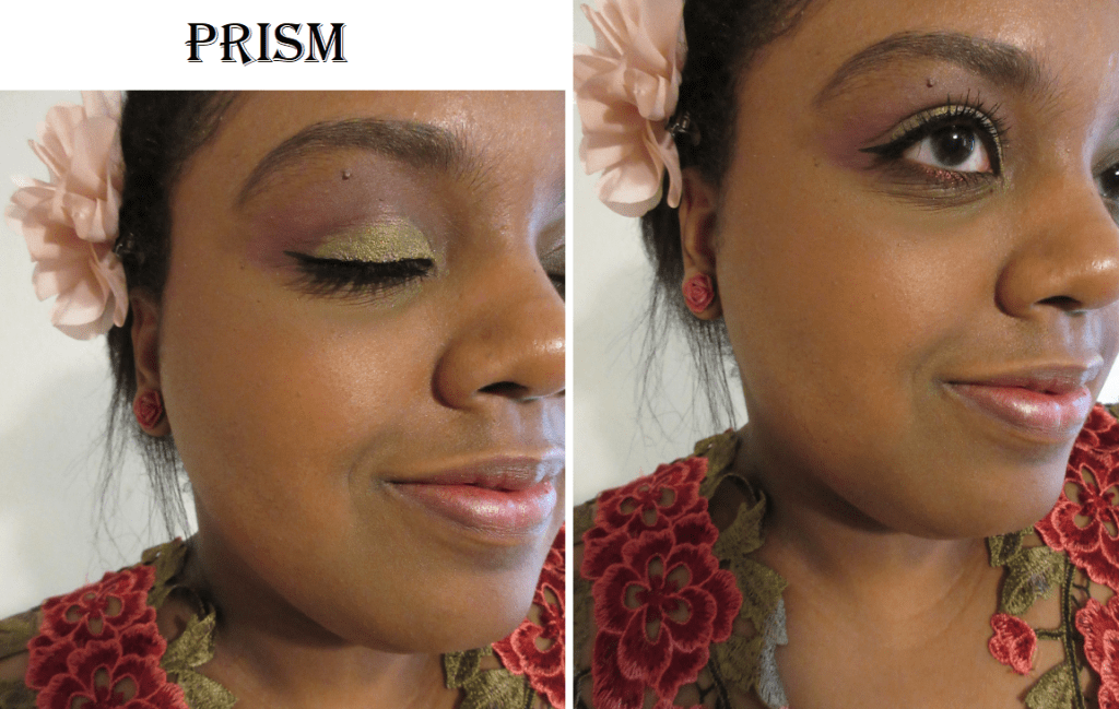
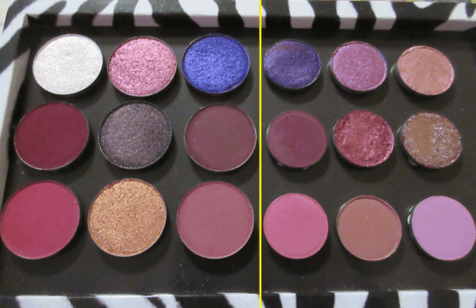
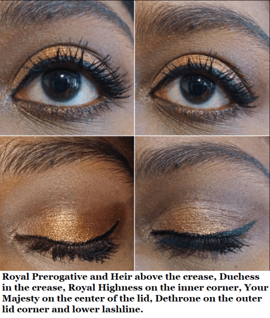
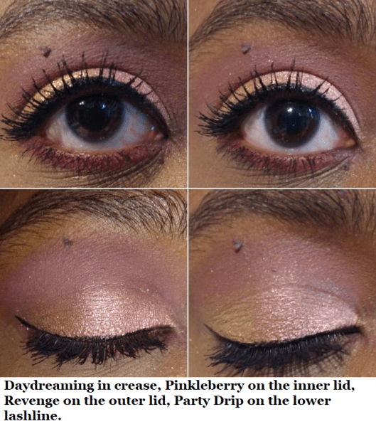
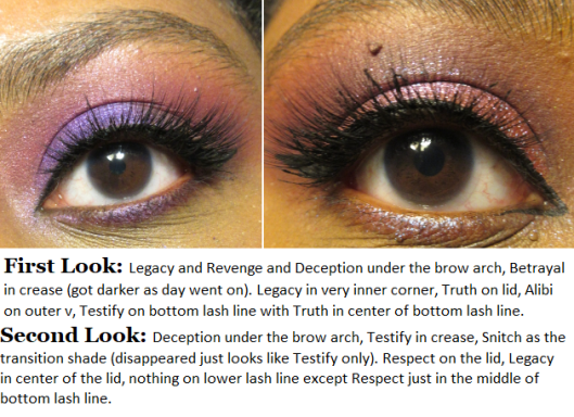
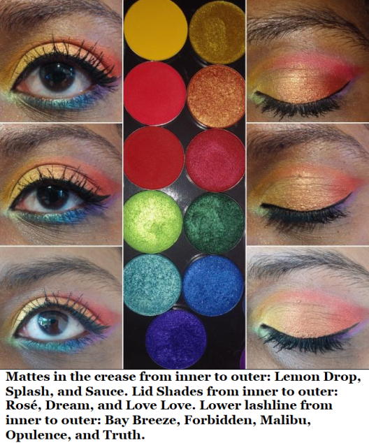
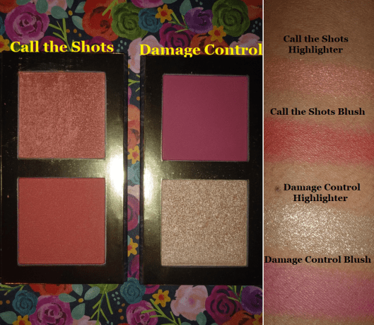
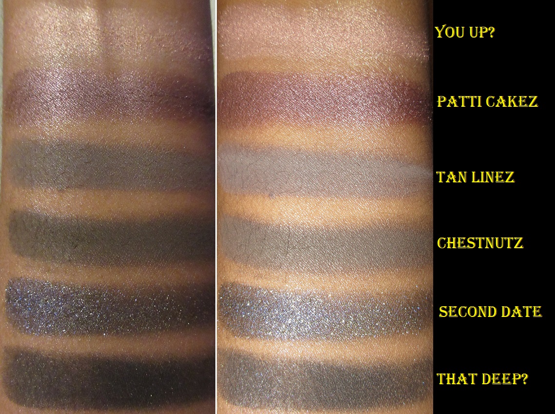
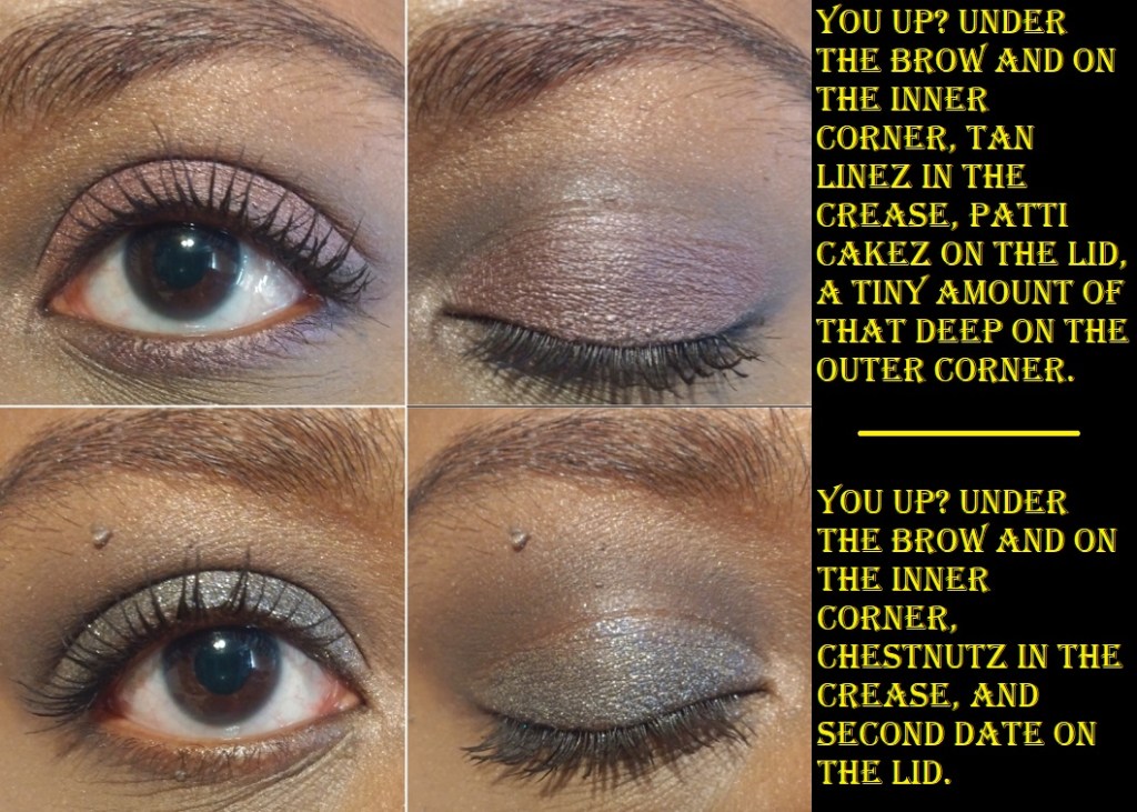
6 Smoky – I love the concept of these palettes with their convenient packaging, but the eyeshadows are lacking for me. The pigmentation level is okay, but the tones are so soft and subdued, which is just not my preference. The difference between Tan Lines and Chestnutz is so minimal on the eye that I don’t recommend bothering to use both at the same time. Also, despite these having warm sounding names, those two shades are way cooler toned grey instead of brown. Patti Cakez was less purple than I wanted and had more of a brown maroon tone. The mattes overall are okay and blend fine, but if I use glitter glue to get the shimmer shades to show up a little better on the lid or try to foil it, it changes the ability for That Deep to build on top of the shadows. To avoid this, I apply That Deep first but if I accidentally cover too much with the lid shade, it’s very difficult to build That Deep back up. The other mattes have the same issue, but since I only use them in the crease, I’m less likely to get my lid shade on them.
Second Date is the only shadow that exceeded my expectations. It’s like a sequin shade done right. It feels dry like a matte but there’s so much glitter in it that it looks like an actual shimmer shade on the lid without any sparse areas. The downside to this shadow, at least for some people, is that it’s made with the plastic-type of glitter (Polyethylene terephthalate) and not synthetic fluorphlogopite or other plastic alternative glitters.

Swatches were applied over Nyx Glitter Primer.

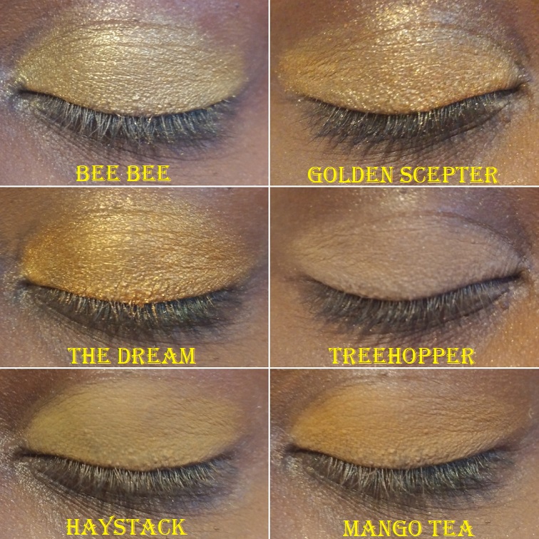
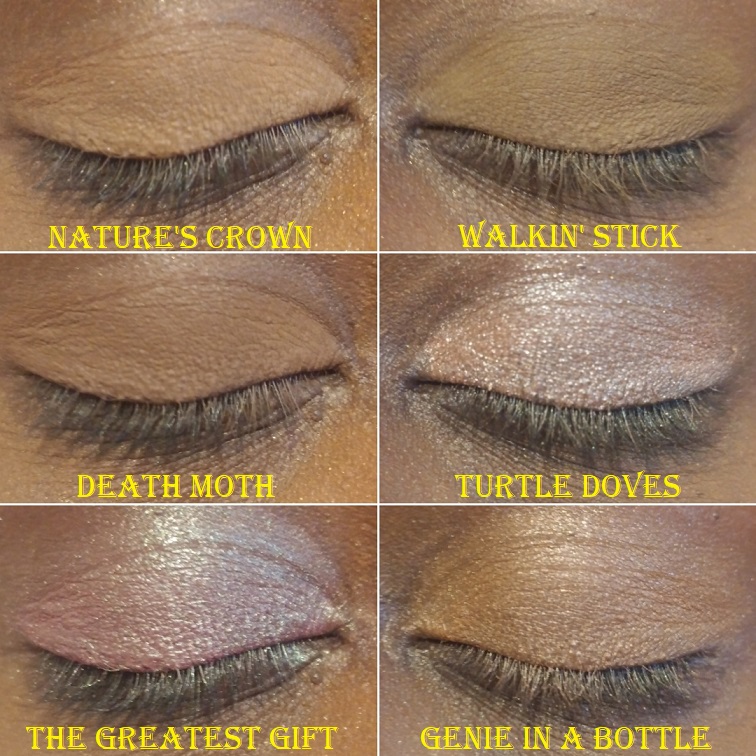
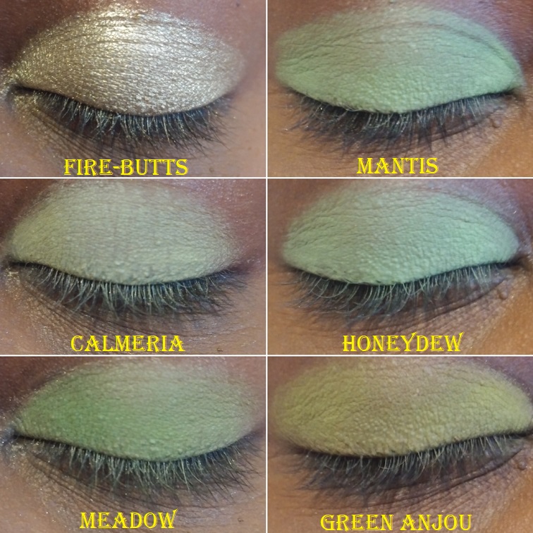
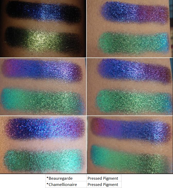
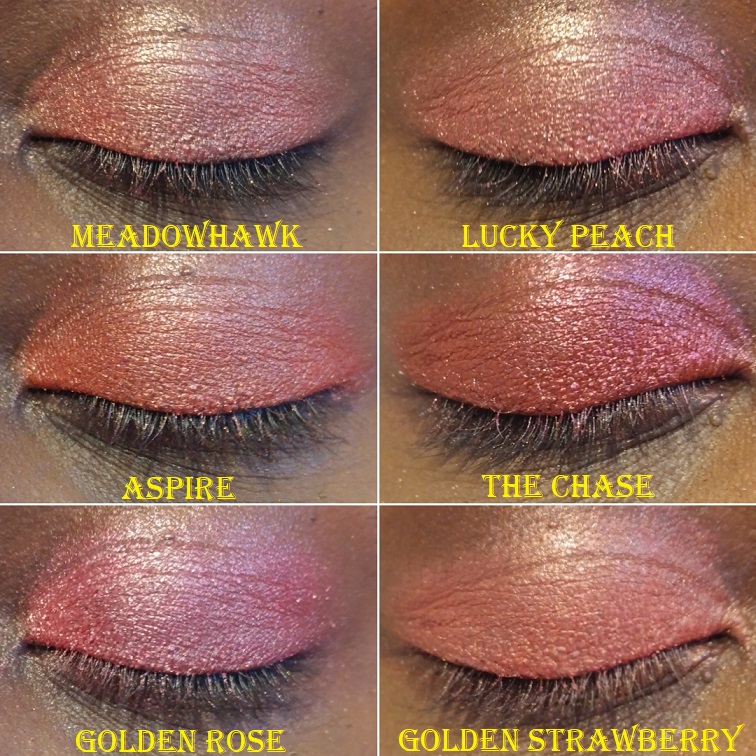
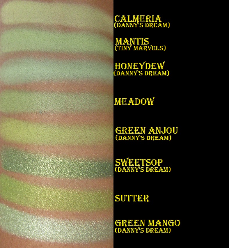
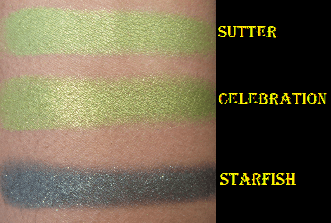
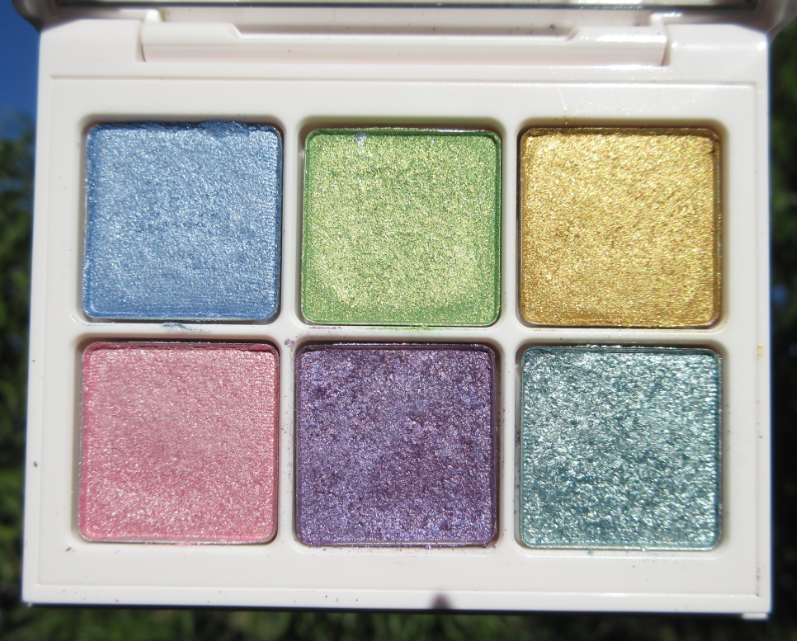
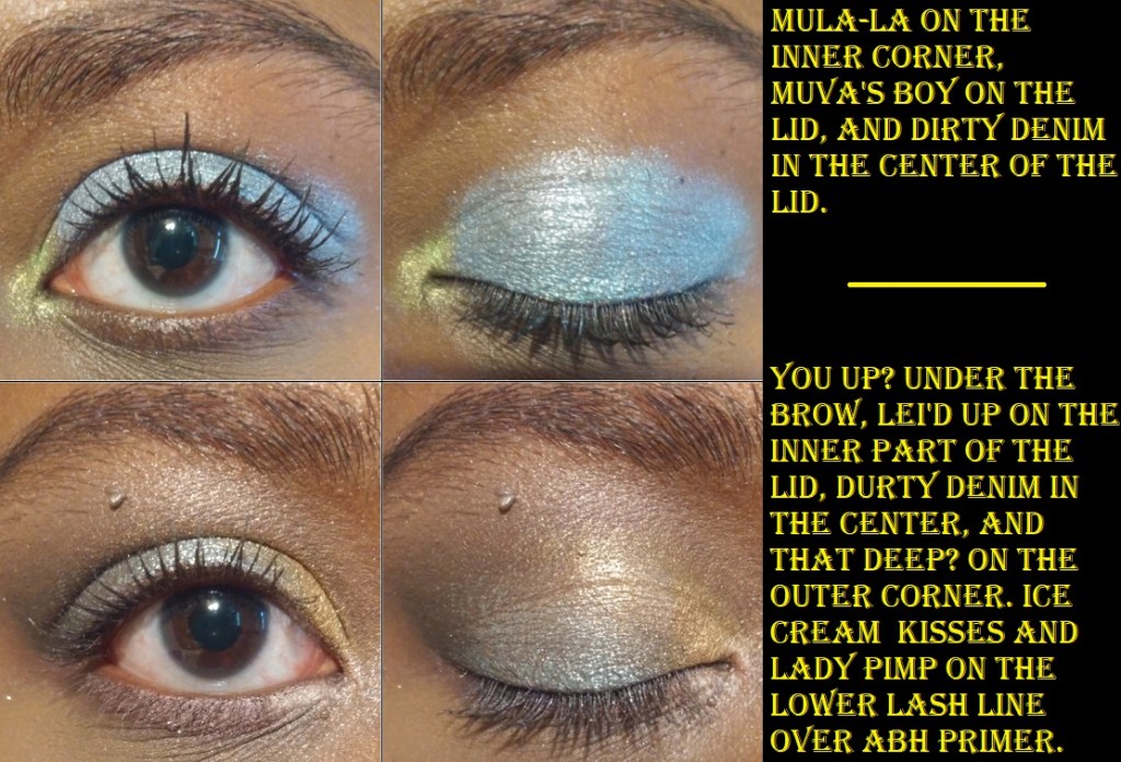
8 Pastel Frost – In bare skin swatches, the shimmers are lackluster, and using MAC Paint Pot does nothing to improve the way they look. I used glitter primer to get them to show their maximum potential in these swatches.

Swatches were applied over Nyx Glitter Primer.

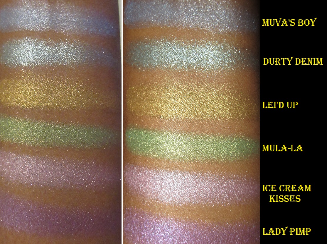
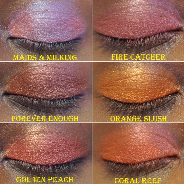
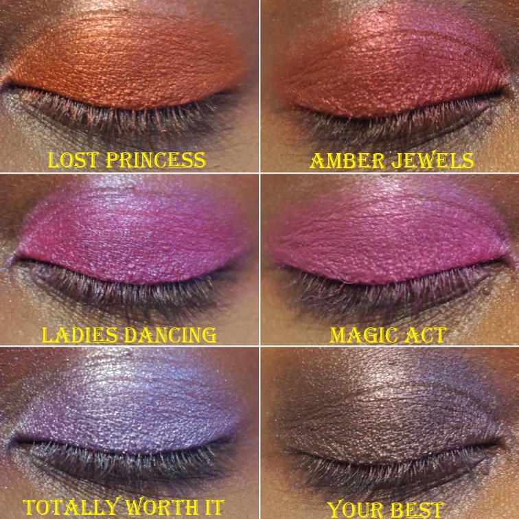
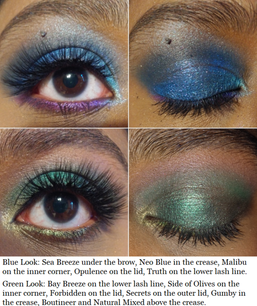
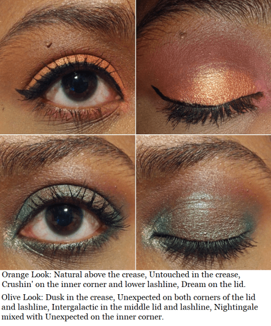
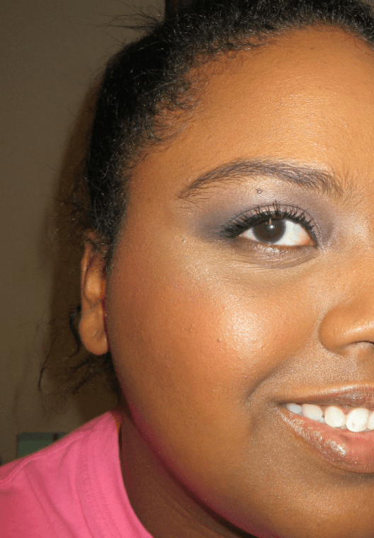
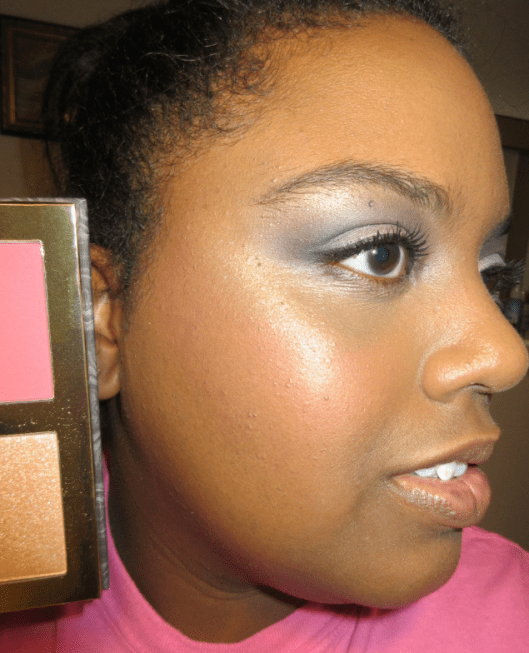
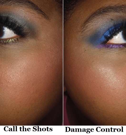
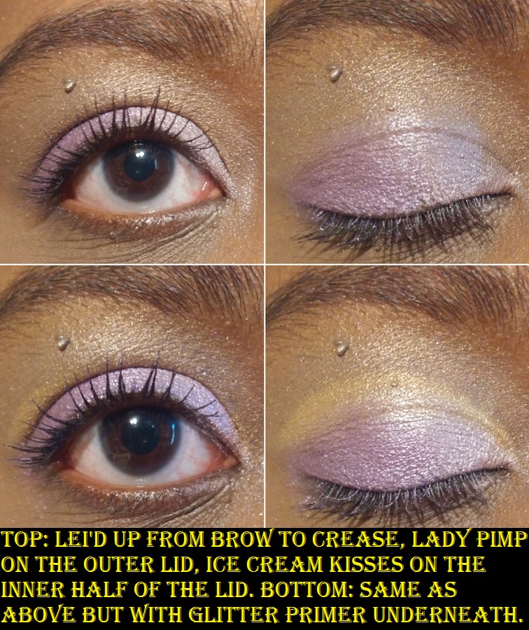
Using the two blues next to each other looks like the same shade, except that Durty Denim is more reflective/sparkly. I have some eyeshadow looks coming up which demonstrates this issue. Lei’d Up and Mula-La also look too similar on the eyes, as well as Ice Cream Kisses and Lady Pimp. If these colors weren’t so soft, perhaps this wouldn’t be as much of a problem. Another thing that bothers me about the shimmers is that although I enjoy eyeshadows with dimethicone or other silicone derived ingredients which give it some slip, since I have to use glitter glue, the two products combined actually become too slippery. If I manipulate the shadow too much, it moves and I end up having to apply layer upon layer of eyeshadow to make it opaque. I even tried this over the Anastasia Beverly Hills primer, which typically works very well to make pastel shades show up better. This works with a very thin layer and just patting it on instead of blending (plus you have to apply it wet). However, I learned that applying too much ABH primer just makes these Fenty shadows turn even lighter and harder to see.

Being softer colors isn’t inherently bad, but it drives me nuts that unlike other brands of eyeshadows, trying to intensify them via glitter primer and wetting my brush only has a minor impact. It’s only slightly more improved. I also don’t like the fact that trying to make the shimmers pop prevents me from being able to easily go over those shades again with mattes.

I’ve heard that the new palette additions 9 and 10 are a bit better quality, though they still have shades too close to each other. When you only have 6 eyeshadows in your palette, you don’t want interchangeable shades.
It’s not just me that doesn’t like the Fenty Snap Shadows. I tried selling both these palettes at a combined $25 price with free shipping included. I had this deal for 4-6 months and no one wanted it, even at 50% off. It’s one of the only makeup products I’ve been unable to sell on Mercari, even in used condition and even during the pandemic.
Softer colors are not my preference, but even that aside, I don’t believe these palettes are worth $25 each. I recommend the $3 ELF quads over Fenty Snap Shadows.

Additional Notes

Fenty launched with foundations, but I don’t own any. According to Sephora’s shade matching Color IQ system, 420 is my shade. However, it was slightly too dark and too orange on me when I tried it in-store. 400 and 410 were still too orange or red, despite them being listed as my undertone. 390 was my closest match, but the matte formula was too drying on my skin. I was very excited when Fenty released their hydrating formula, but when I tried the shades in store again, I ran into a similar shade matching issue and for some reason 390 was more on the pink side than the matte formula. The hydrating foundation still wasn’t hydrating enough and emphasized texture on my face, so I gave up trying.

Although I didn’t have success with the foundation, the product this brand has been highly praised for and made a huge impact on the cosmetics industry, I’m glad I’ve been able to find other products from Fenty that I love. Even when certain products aren’t made for me, I’m always excited to hear about the new launches from this brand.

Thank you for reading!

-Lili

Best of Rare Beauty Lip and Cheek Set

When Rare Beauty first launched, I couldn’t decide between Joy and Love blush shades and I didn’t want to have so many cream and liquid products all being opened at once. So, I held off buying them and I’m glad I did because this 4 piece set is perfect for me! At these sizes, I don’t feel as guilty about how often I’d get the chance to use them. Plus they’re in the shades I wanted, so I didn’t have to choose one over the other!

When the holiday sets launched, I noticed a discrepancy in the descriptions on Sephora’s website.

In the “What Else You Need to Know” section, one blush is listed as Bliss, but in the “This Set Contains” portion, the blush is listed as Love. Those are two very different shades and was the determining factor for whether I was going to make my purchase or not. When I checked the official Rare Beauty website, that particular set only had Bliss and Joy listed, yet it was clear to see in the product photos that neither blush was light enough to be the Bliss shade. I figured since Rare Beauty was most likely to have the answer, I contacted their customer service phone number and the person I spoke with was very surprised by this. She thanked me profusely for letting them know, took my information, and said she would get back to me with the correct shades as soon as possible. True to her word, I did get an email a few hours later letting me know the blush shades were indeed Joy and Love. She gave me a free shipping code as a thank you, but I purchased the set via Sephora since I already get free shipping and had a Friends and Family sale code to use.

During that sale, I also purchased the Liquid Touch Concealer Brush, which I will talk about now before we move to the set.

The bristles are soft and densely packed. The unique shape and design of the brush allow me to really get into the contours of my face. Although synthetic bristles aren’t supposed to absorb product, I still find myself using more concealer than usual, but the trade-off is worth it considering how quickly I finish applying and blending. When the brush is freshly washed, it glides effortlessly under my eyes and in the corners between my eyes and nose.

After a few uses when there is a little more product buildup on the brush, it doesn’t glide as smoothly, so I switch to a tapping motion to apply my concealer, which works just as well! I thought that because the head size is very large for a concealer brush that it would be too big to apply product precisely, but the head and ferrule shape causes it to squish into the contours of my face. The large surface area also ensures the application process goes quickly. At the $12 discounted sale price, I am quite happy with this purchase! I’ve only washed the brush twice so far, so I don’t have any news to report on the longevity of the brush. Perhaps in a year I will update this post if there is anything to report about how it has held up so far, considering this is now my new favorite concealer brush and I foresee myself using it at least 4 times a week.

Joy on the cheeks and Support on the lips.

Joy is one of the four dewy blushes currently in the line. In the swatch photo, I had Joy on my arm for about five minutes and it remained wet looking. Essentially, the more product that’s packed on, the dewier it will look. Realistically, you wouldn’t apply that much product in one spot onto the cheeks. So, it ends up more matte than one would expect.

Something about this shade appeals to me so much! Despite being such a bright coral shade, I was surprised to see how wearable it is when used sparingly. These liquid blushes are extremely pigmented. A single drop could be the difference between looking flushed and looking clownish.

Both blushes are long-wearing (I stopped testing after 8 hours). Neither moved my foundation underneath. I could still blend them out after leaving them untouched on my cheek for a minute, though I would recommend working one cheek at a time. They do set to the point of being dry to the touch and no product transferred onto my finger or when I pressed a napkin to my face. Using my finger is my preferred application method, but using a brush or sponge works just as well to create a non-streaky perfectly blended look. A brush will give the most color payoff though, not that it’s necessary considering the amount of pigment these already have.

Love on the cheeks and Support on the lips.

The shade Love is also very beautiful and is one of the four blushes in the matte formula. You can tell Love and Joy are completely different shades in swatches, but once blended on the cheeks, Joy just looks like a lighter and slightly brighter version of Love. This is the case in both photos and in person and it might have to do with being warm-toned shades on my warm tone complexion.

I thought it would be fun to see how Joy and Love look together. In an effort to apply the same amount of product, I used 4 dots instead of my usual 3, which was blush overkill. So, I used what was left of my foundation on my Blendiful and patted that on top of the blushes to tone it down a little. I really liked the end result! It created a nice in-between shade that looked fully matte.

Support is surprisingly pigmented for a “balm.” It’s almost enough to fully cover the dark pigmented patches on my lower lip! It’s more like a sheer lipstick, as the first thought that came to my mind was how similar it felt to Urban Decay’s Vice sheer lipsticks. It’s comfortable on the lips, and although super creamy, it’s not emollient enough to give me that true balm feeling. Regardless of what it is by definition, I love it and will continue to use it! It’s so natural looking on me, which is definitely my preference with lip colors! There is only about half an inch of product in this mini, so when I run out, I might actually buy the full size. It has been a long time since I’ve been excited by a lip product, but this one managed to impress me!

Edit: I forgot to mention this has a scent, but I can’t pinpoint what it smells like. It’s not the same as the lip cream. It’s a mix of sweet and floral. I don’t smell it once the product is on my lips but I don’t know if the fragrance is stronger in the full size.

The lip cream is indeed creamy and comfortable to wear. Although Transform is supposed to be a matte shade, it stays dewy looking if too much product is applied. And if you want it to be more opaque, multiple layers are required. After removing the excess product, it still doesn’t dry down to the point of being transfer-proof. It will remain creamy and transferable on the lips. The flat paddle applicator was also too difficult for me to get to the inner corners of my mouth precisely, so I had to switch to a lip pencil brush. If you like lip creams, you will probably like this product. However, I’m extremely picky about red lippies and although it’s a pretty color, I don’t like it on myself. So, I will not get use out of this product. Even if this was a more natural shade, the balm texture is more of my preference than the lip cream. This has a scent that reminds me of cocoa butter.

Overall, I’m very happy with this purchase! It’s exciting to find a set where all 4 shades are wearable on me and to love 3 of the 4 products. This brand has exceeded my expectations, and I’m looking forward to seeing what else they have in store for us!

Thank you for reading!

– Lili

INDIE BRAND SPOTLIGHT: Sydney Grace

I placed my very first order with Sydney Grace in November 2019, but the majority of my collection was purchased during their annual Christmas in July sale. The deals were so good, I couldn’t pass them up!

Along with the eyeshadows, I will also discuss one of their blushes and their empty magnetic palette. Overall, Sydney Grace makes beautiful high-quality products. I believe they are worth the prices as is, but if you’re looking for the best deals, they happen on Black Friday and in July. You can also find affiliate codes on many different Youtubers’ videos for 15% off year-round.

Tiny Marvels Palette by Mel Thompson

The quality of the shadows in this palette is the same you can expect from Sydney Grace’s singles. Every shade has a high level of pigmentation. The mattes feel soft and perform like Viseart shadows on the eyes, making them easy to blend, but with the added bonus of swatching well too. Some important things to note are that Scarab is called Red Chameleon as a single, but the other 14 shades are exclusive to this palette. Flutterby seems to be more fragile than the other shadows because it was the only shade that came with a piece cracked off in my palette, and I saw a few others on social media where that was the only broken shadow as well. Pressing it back with liquid works to an extent, but I recently learned in an interview on Behind the Beauty that the binders Sydney Grace uses in their matte shadows are powder only (no liquids)*. So this makes their mattes perfect for the dry-press fixing method.

*July 4th, 2021 UPDATE: I was browsing the website and noticed the ingredients of the mattes I saw had fractionated coconut oil listed, which is a liquid. I don’t know if this is the sole exception to their original statement or if the addition of liquids is a new formula change.

Lastly, Jewel Bee is the only shadow in the palette that I feel underperforms. It looks great on those with lighter skin tones, but there isn’t enough depth in the shade to make an impact on me. It admittedly still works slightly better than pastel purples from most other brands.

*October 1st, 2021 UPDATE – I felt compelled to update this post to say that although I didn’t know Mel Thompson personally, she will be missed dearly. As a subscriber of hers on YouTube, it hurt my heart to learn of her passing and I can only imagine how much worse it has been for her friends and family. I treasured those few moments I had communicating with her via Instagram and the comment section of her YouTube page. It means even more to me now. May she rest in peace.

Chase Your Dreams 9 Pan Palette

This is a great smoky eye or companion palette. The color story isn’t exactly what I expected after seeing photos online versus what it looks like in person, but it is still fairly versatile. The two red/pink and two orange shades are a bit redundant to me, so I foresee myself depotting this into my larger custom palette. The only reason I haven’t yet is because I like the purple glitter print packaging so much.

Eye Swatches: Palettes, Bundle Exclusives, and Individual Shadows

All the eyeshadows come from the Danny’s Dream Bundle, Autumn’s Reign Bundle, Chase Your Dreams Palette, Tiny Marvels Palette, and all the individual shades I own. In the arm swatch portion that I’m including later in the post, I have it noted which shades are part of a collection.

I used MAC Paint Pot in Groundwork for all of the eye swatches (excluding Beauregarde and Chamellionaire which are over Nyx Glitter Glue). If I used a primer with a white base, perhaps certain shades would look less similar. In my opinion, Sydney Grace is the most consistent brand I know in terms of eyeshadow quality. So, when it comes to choosing which eyeshadow to purchase, it’s more about the particular color and less about performance. However, I will note that Queen of the North and Lemon Cream were a little patchy on me. I don’t plan to keep them in my collection after this review.

This brand makes arguably the best green eyeshadows (though nothing tops Forbidden from Coloured Raine). Among this batch of shadows are Chamellionaire and Beauregarde, two out of the three pressed multichromes Sydney Grace currently offers.

Compared to Devinah, Clionadh, Terra Moons, and other brands’ multichromes, I honestly like these the least. All multichromes show their black bases/look darker in too much direct sunlight or with flash on. These are beautiful in the right lighting but are the most finicky to capture in photos and the least forgiving in the Florida sunlight. These were the first multichromes I ever owned and the difficulty of use made me better appreciate the formulas of the other brands’ multichromes I tried later on. The texture of these are a bit strange. I don’t know how to describe it. They don’t pick up very well on a brush and they look terrible over bare skin or regular eyeshadow bases I’ve tried. Applying them with my finger on top of Nyx glitter glue is the only way I’ve found to successfully show off their beauty.

I have to admit, I bought certain eyeshadows purely for their names! I know it’s silly, but there were enough shades I wanted that were named after the 12 Days of Christmas song that I decided to get all the ones available on the website: Pear Tree, Turtle Doves, French Hens, Geese a Laying, Maids a Milking, Ladies Dancing, Lords a Leaping, and Pipers Piping. I have no idea if Calling Birds, Five Gold Rings, Swans A Swimming, or Drummers Drumming are discontinued shades in Sydney Grace’s collection (or Feather River Body as they were formerly called) or if they were just never made.

In addition to powder multichromes, Sydney Grace also has cream shadows and cream multichromes. Though I don’t like the pressed multichromes, I can vouch for the cream formula being much nicer to work with. However, I’d still prefer to use a Clionadh pressed multichrome over the cream and pressed ones I’ve tried from Sydney Grace.

When I bought the Alexandrite cream multichrome, it came in a 10 ml tube for $25. The period after opening (open-jar symbol) was only six months. Since that time, the brand has released smaller 5 ml tubes for $15 and they say it has a longer shelf life. Shelf life and period after opening are different terms, so I don’t know if they mean to say that the p-a-o date is longer. It’s great to know that they can stay in inventory and be unsold for longer without any fear of it expiring or drying out before you get a chance to purchase them, but I would be curious to know if it still lasts 6 months before it goes bad after you first open it. In any case, this is quite competitive pricing for Natasha Denona’s new Chromium liquid eyeshadows at 2.5 ml for $28 and the same 6 month p-a-o.

It took me so long to do this post that, unfortunately, I have no good photos of Alexandrite. The blurry picture in the bottom right corner in the eye swatch gallery above is what it looked like while the shadow was still good. I only have that photo from my former cell phone with terrible quality megapixels and lighting. Hopefully, you can see that it was smoother while it was still good. My tube of Alexandrite lasted 9 months before it started to have an odd fish oil smell so I stopped using it (excluding this one time for this review). So, on the bright side, it does last a little longer than 6 months after you open it. The other two eye swatches of Alexandrite show what it looks like after 11 months. That’s why it looks strange and scaly. And yes, now that I finally finished this post I have thrown it away. I wanted to at least show that in this instance, regardless of your skin tone, the shade will look pretty much the same on everyone.

Official Swatch Picture From the Sydney Grace Website.

Arm Swatches: Palettes, Bundles, and Individually Sold Shadows

I tried to group these swatches together by color but Celebration and Starfish are not with the other greens because I had already decluttered these two shades (and remembered to rescue them just before making this post). The base color in Starfish was too dark for my liking. As for Celebration, I like it as much as Sutter (and actually think it looks more flattering on me) but I thought they were too similar to keep both. Also, back in January when I only had 30 SG eyeshadows, I asked 8 of my guy friends which purple and green shades they liked the most. Although their responses might be different if they saw my entire collection now, the shades that got 4 or 5 out of 8 possible votes were Totally Worth It, As If, Flannel, Evergreen, Thrilled, and Sutter. Between Sutter and Celebrate, Celebrate only received 1 vote. That’s why I chose to declutter that one, but I have now returned it to my collection!

Eyeshadow Looks

Thinking of You Blush

I didn’t have the self control to take a photo of this blush before swatching it. It’s such a pretty, soft, pigmented, and blendable blush. If I wasn’t already swimming in blushes I would be tempted to try more shades from the brand. This reminds me of MAC’s powder matte formula, which I love, but this only costs $9 as opposed to MAC’s $17 pro pan-only blushes. MAC has had at least four blush sales this year at 30-40% off, so I have been able to get some as low as $10.20.

All blushes in the “Deep” category on the brand’s website are currently sold out. Sydney Grace is still a small company, so it takes them a while to restock items. Due to COVID-19, there are also delays in pigment manufacturing and just a shortage of certain pigments in general.

Sydney Grace Large Custom Palette

I have this Large 40-48 pan Sydney Grace empty magnetic palette on top of my 96 pan Coloured Raine palette for comparison purposes. It has a mirror inside and the outer design has light-reflective rose gold lettering. The same print is sold in 9 pan and 12 pan palette sizes. Since I have too many SG shadows to fit in a palette of this size, it’s currently holding my non-Stained Glass Clionadh eyeshadows. I’ve had no issues with it so far.

Favorite Shadows

I mentioned at the end of the arm swatch segment which shades were the favorites among my guy friends, but my favorite Sydney Grace shadows are a combination of shades that I think look most flattering on me, as well as shades that are just flat out gorgeous and/or unique to my eyeshadow collection.

  • Geese A Laying – “A medium matte yellow bright matte”
  • *The Dream – Warm Gold
  • Mango Tea – “Yellow with an orange undertone”
  • The Greatest Gift – “Light pink with a green shift”
  • *Mantis – Deepened pastel green
  • *Granny Smith – Vibrant grass green
  • *Sweetsop – Medium green with gold shimmer
  • The Shallows – “Green with a blue shift”
  • Evergreen – “Medium green”
  • Thrilled – “Dark matte teal”
  • Fierce – “Medium blue with purple undertone”
  • JB – “Royal blue”
  • *Supreme Harvest – Dark terracotta
  • *Be Bold – Vibrant terracotta-orange
  • Lords A Leaping – “Deep red brown matte”
  • *Bug-A-Boo – Matte maroon
  • Magnificent Chestnut – warm metallic golden brown
  • Golden Rose – “Medium pink with a gold shift”
  • Maids A Milking – “Bubblegum pink with a strong blue shift”
  • Forever Enough – “Medium burgundy red with a satin finish”
  • Orange Slush – “Vibrant Orange with a metallic finish”
  • Golden Peach – “Deep peach with a golden shift”
  • Lost Princess – “Red with an orange undertone”
  • *Amber Jewels – Metallic Cranberry Red
  • *Don’t Quit – Metallic Burgundy
  • Flannel – “Bright medium purple”
  • *The Drive – Warm purple
  • Magenta Dreams – “Magenta with a blue shift”
  • Deliverer – “Vibrant violet with a red undertone”
  • Celebrate – “Yellow Green”

The final important note is that if you’re interested in purchasing from Sydney Grace and are trying to find specific shades via the search bar, just note that it’s extremely inconsistent. For example, if you type “Deliverer” you will get that shadow as the only result. If you type “Orange Slush” exactly as the shadow is called, you will find it on page 4 of the search results.

That’s all for this week! Thank you for reading!

– Lili

Colourpop Garden Variety, Sailor Moon, and Mulan Collections

Since the end of 2019 until the time of me starting to work on this post, the collections from Colourpop haven’t been dark-skin friendly (or at least the items I’ve wanted haven’t been). Today, I’ll be discussing the bits and pieces from different collections I have purchased that work for me, to an extent.

GARDEN VARIETY COLLECTION

Garden Variety Palette

The design of this collection is so beautiful! Colourpop really excels at that. The succulents and lettering on the cover of the eyeshadow palette (and even the carton) are raised! I love the packaging and don’t see myself ever getting rid of it, even though I am not a fan of the shadows inside.

The color story is what I expected from the product photos. However, I made the mistake of not recognizing Herbivore, Over the Bloom, Succa 4 U, and Clay Day are a sequin formula, which I despise. It’s unfortunate because I love the base matte color of those shades. I just cannot stand the random “pearl” glitter specks embedded in the shadows.

The shade “Don’t Leaf” is a supershock formula. This was my first time experiencing a supershock shadow in a palette, so that was fun! This particular shade doesn’t make much of an impact on my lids though.

Although I knew the palette would lean on the light color spectrum, I figured I would be able to use them anyway due to Colourpop’s usual pigmentation level. However, these are not as pigmented as I’m used to and I find the shimmer quality to be lackluster compared to my other Colourpop shadows, even the oldest ones. The mattes are better, but they don’t deepen up the look as much as I need in my eyeshadow looks.

From my disappointment, inspiration struck! I decided to swap out most of the shades in this palette for similar, yet better performing Colourpop shadows. I am much happier with the selection I chose!

Whole Nine Yards Blush

I purchased the darkest shade of the four blushes in the Garden Variety palette. It looks extremely subtle on camera, but it shows enough in person that I can use it. I appreciate that despite being so light, it doesn’t have a grey tone or leave a cast on me. I do wish this was matte. It’s a “warm pinky terracotta with gold pearl,” and the gold specks are larger than I’d like in a blush. I prefer smaller refined pearl pigments like the kind in MAC blushes, but I’m glad Colourpop chose gold rather than silver glitter for this blush. Also, Whole Nine Yards is similar to a sequin eyeshadow in the sense that it is primarily matte when applied to the skin, as most of the glitter gets brushed away when blended. So, it isn’t enough to make me stop using it. It just isn’t going to be the first blush I reach for. Plus, I like being able to see the beautiful flower imprint in the powder. That kind of thing gets me every time!

Whole Nine Yards on the cheek with no highlighter, bronzer, or contour. Just the blush over Nars Sheer Glow.

She Grown Pink Jelly Much Eyeshadow

This “warm peachy pink with a gold shift” eyeshadow is stunning! On the innermost part of my arm, which is lighter than my eyelid, you can see the pink tones a lot better. In direct sunlight, it looks even darker pink than in swatches, but on my eye, the peach and gold overtake the look. I still love the way it looks. It takes a little finesse to smooth out the shadow in a nice even layer of product, but the effect is worth it.

The left column shows what it looks like upon initial application. The right column shows how it looks 8 hours later.

I noticed it first started to break apart around the six hour mark, so I would only use this if I was making a quick trip out or didn’t plan to stay long at an event. Of all the products mentioned today, I’ve used this the least, so I don’t know if there are tricks to make it last longer. I will continue experimenting to find out, but I’m happy with this item as it is.

There are three other Jelly Much shades in this collection, but She Grown was the most unique to me.

SAILOR MOON COLLECTION

Moon Tiara Ultra Glossy Lip

I purchased the Daylight kit, which included Moon Tiara and Usagi. The Moonlight kit has cooler-toned versions of these shades.
Moon Tiara is described as a “Yellow Orange with Gold and Pink Pinpoints.” I was worried this would look milky, but thankfully it does not. I still wouldn’t wear this on its own, but I enjoy how it looks over more pigmented lippies.

The formula is a bit sticky and has a pleasant sweet smell. The brush tip applicator was so stiff that I thought it was a solid bit of plastic until I used it enough times for the bristles to loosen up. I don’t mind that it’s not a doe foot, now that the brush tip is more flexible.

Usagi Ultra Blotted Lip

The designs on these lip products are so pretty! I rarely buy lip products because I’m mostly a balm or gloss kind of chica, but I couldn’t skip out on this packaging! Unlike the gloss, this has a doe-foot applicator.
Usagi is a mid-tone pink, and I honestly didn’t expect to like this. I’m very picky about lip colors and this is almost too bright of a shade, but it’s right on the cusp. I could wear this on its own without feeling insecure, however, I prefer the way it looks with Moon Tiara on top.

This is my first experience with the Ultra Blotted Lip formula. It is intentionally sheer. To my knowledge, it was originally marketed with the popsicle lip trend in mind. Now, their selling point is that it’s a “buildable diffused matte.” Even though it dries matte, it feels comfortable on the lips.

It’s an interesting formula that I do like. One thing I learned is that if I accidentally touch my lip while it’s half dry, trying to cover the bald spot back causes an oddly noticeable demarcation between the newly covered spot and the surrounding area that overlapped with additional product. What you see in the image above of the blotted lip alone is the best I could do to cover the naturally darker spot on my lower lip. I have extremely dry lips that are difficult to care for without a consistent lip care routine. This blotted lip formula isn’t something I would use on its own if I haven’t created a completely smooth canvas that day. That’s why I like pairing it with the gloss because the shine distracts the eye from noticing color inconsistencies and hyperpigmentation.

Moon Prism Power Glitter Gel

This is pretty. This is also a jar of evil. I’ve complained in the past about my dislike of glitter, but using glittery eye shadows and highlighters this year made me start to like them a little more. However, using this product three times now reminded me why I used to HATE glitter. When I think it’s all off my face, I find more.

I bought this with the intent of using exclusively the larger crescent moon and star shapes. I thought I would be able to separate them from the jar easily. My assumption proved incorrect. This would be fine if I could successfully remove the glitter from my face without finding little specks everywhere for the rest of the day and even the next, despite multiple face scrubbings and showers.

In the photo below, I kept the glitter to the outer corner of my eye. I didn’t want to take a chance putting it anywhere closer to my eyeball since I am a contact lens wearer and the glitters are not eye-safe. By the time I finished taking pictures, the glitter somehow moved to the inner corner of my eye, my cheek, my chin, etc. I will continue to use this in the future, but on very special occasions or special eye looks. This is just my personal issue. This isn’t a bad product. If you like glitter, you will probably enjoy this.

Cat’s Eye Blush

Right away, I have to talk about how cool the packaging design for this blush is! I don’t recall what this type of image effect is called, but it shows three different images when you turn it at different angles. It’s so fun! And the imprint of Luna in the powder is ridiculously cute! I bought both shades, but From the Moon looked too light for me, so I sold it. It’s unfortunate because that shade was matte and I generally prefer a matte blush. Cat’s Eye is a, “pearlized rosey pink with silver pinpoints.” The color is warm, which I like, but the silver glitter isn’t as flattering. I don’t mind because I just wanted this for collector purposes anyway. I have enough blushes that I won’t miss using this if it’s strictly for display only.

Cat’s Eye on the cheek.

MULAN

Gold Lip Mask

The multicolored pattern on the jar is a reflection of the shirt I was wearing when I took the photo. It’s actually a beautiful mirrored gold shade. The mask itself looks pretty in the jar and goes on the lips clear with fine gold sparkles. It does not have a scent. Even though the consistency is thicker than the Moon Tiara gloss, it’s less sticky and feels lighter on the lips. I use this like I would any other balm by wearing it alone.

Jasmine Face Milk

I was initially annoyed that I couldn’t get the lip mask without buying it in the set with this, but I’m glad I finally tried the face milk formula! It’s lightweight and feels hydrating on the skin. The jasmine scent is mild, which I’m glad about. I don’t enjoy heavily scented skincare. I liked this product so much that I bought a different full-size face milk!

CUSTOM PALETTE AND FINAL THOUGHTS

Aside from my Kathleen Lights x Colourpop So Jaded palette and the Garden Variety palettes which are currently holding eyeshadows in the color stories of my choosing, I put all my depotted and single Colourpop shadows in one gigantic magnetic palette. The depotted palettes are: Semi-Precious, Element of Surprise, All I See Is Magic, It’s My Pleasure, Lilac You A lot, Blowin’ Smoke, Blue Moon, Just My Luck, and Uh-huh Honey. The unused shades from the So Jaded and Garden Variety palettes are here as well.

My reimagined So Jaded palette.

I respect Colourpop for staying with the trends and for their business savvy, marketing, and ingenuity. However, my last few purchases have been purely for packaging. I want to keep my collection manageable and buy things I will actually use. Colourpop has made it a bit easy to stay away while they aren’t making things brown-skin friendly. However, I am actively going to try and limit my purchases from them, as I’ve never been blown away by Colourpop’s quality. It’s okay or good most of the time, but I have too many products from other brands of excellent quality to want to settle for just “okay.”

That’s all for today! Thank you for reading!

-Lili

Blushes So Good I Needed Another

2020 has been the year of blushes for me. I’m not sure why, but my blush obsession has surpassed even my eyeshadow obsession! That being said, I always buy one blush to start with from a brand, even if they have multiple colors I want. If I end up loving the formula, I still tend to stick with that single shade (or buy a better-suited shade to use instead). However, these are the exceptions to that rule; the blushes I loved so much that I felt compelled to buy another!

I will be excluding MAC, NYX, and Rituel de Fille from this list, as I’ve discussed them in posts before and we know I didn’t stop at just two with those brands!

HOURGLASS AMBIENT LIGHTING BLUSHES

Swatches in different lighting

These are the blushes that inspired this post! Hourglass is notorious for having a stunning powder formula but making shades suited primarily for pale to medium skin tones. Diffused Heat was the first one I bought. It takes a lot of building up to show on my cheeks but despite how many layers I have to add, it still doesn’t look powdery! The poppy color gives a healthy youthful flush that I love. It imparts a subtle glow without looking shimmery or glittery due to the finely milled powder Hourglass is famous for.

A heavy application of Diffused Heat on the cheeks

Since their initial blush launch in 2014, medium tone pinks have been the darkest shades Hourglass has been willing to make. Besides being uninclusive in their powder range, the other issue with making multiple medium tone blushes is that they end up looking too similar on the cheeks. Below is an example of their six darkest blushes using Temptalia’s swatch comparison feature. It should be noted that Vibrant Flush and Mood Flush are only available in limited edition quads/palettes with other products too light for my skin tone. So, to even have access to these blushes, I would’ve had to pay $60-$80. Vivid Flush was the limited edition 2019 Lunar New Year shade that was sold individually but is no longer available.

Photo Credit: Temptalia

After buying my first Hourglass blush, I only had to wait six months for a shade different enough from Diffused Heat to be worth purchasing.
At Night is described as a brick red. The dark maroon marbling gives the impression that it will be a deep shade, but when mixed with the lighter base powder, it turns it into a warm medium to medium-dark pink. I love this shade, perhaps even more than Diffused Heat because I don’t have to work as hard to get the color to show.

A heavy application of At Night on the cheeks
At Night Again

To see how the original Hourglass blushes look on someone with a complexion closer to mine, I recommend this video by The Fancy Face.

10/11/2020 Update: I purchased Radiant Magenta thinking that if Diffused Heat worked on me then this shade would as well. I was mistaken. Despite the gold shimmer, this shade appears too cool-toned on my cheeks and is too light for me. I don’t like the way it looks, so that was unfortunately a bad purchase. At least I got it at a reduced price.

This brand has a decent range of complexion products, so it’s very strange to me that for the past six years I’ve seen customers implore Hourglass to make deeper blushes, bronzers, face powders, and highlighters. The demand is so high, yet Hourglass ignores it. After the release of At Night, I was hopeful that the brand would finally fulfill the barrage of requests for a light version and dark version of their holiday face palettes this year. Instead, they repromoted old products and paired them with “new” powders that look like the old ones, just half a shade darker. I give most brands who promised to be more inclusive in the future some leeway because of COVID-19. However, Hourglass has had over five years to make it happen. It’s disappointing because I like the brand. I like their products. I wish more people were able to use them.

FENTY CHEEKS OUT FREESTYLE CREAM BLUSHES

The left column shows how they look in natural lighting.

My Fenty blushes are like deeper cream versions of my Hourglass blushes! I bought Strawberry Drip during the initial product launch and loved it, then immediately purchased two additional blushes. I don’t like to return things, but Daiquiri Dip was too bold of a red shade. I’ve kept plenty of items I don’t care for, but if there’s something I know I will literally never use again, that’s when I will make a return. Thankfully, I loved Rosé Latte and kept that as my second shade. There are several more colors that appeal to me from the line, but cream products don’t last as long, so I stopped at these two.

Strawberry Drip is described as a “soft coral pink” but is a bright intimidating looking shade to me, so I was surprised how much I liked this one!

Rosé Latte is described as a “soft bronzed nude,” which doesn’t look very special in the pan. On the skin, you can see the subtle red tone that gives this shade it’s oomph.

Because the formula isn’t as pigmented, but still buildable, a wider range of people can use these shades. Though they can be built up, I prefer to wear them on natural makeup days. These mostly set, and although they aren’t transfer-proof, I can still rub my finger over my cheek without it turning patchy. It also doesn’t disturb my foundation using the two methods I have tried: scooping out some product onto the back of my hand and warming it up with my finger before applying with my fingers or a sponge.

This was taken earlier in the year. I’m wearing Rose Latte towards the back of the cheek and Strawberry Drip on the apples of the cheek towards the front. This is my preferred combo.

KVD VEGAN BEAUTY EVERLASTING BLUSH

My goodness, I haven’t discussed any KVD products since the Mi Vida Loca Remix Palette from 2015! Controversies aside, I wasn’t interested in anything from “Kindness Vegan Discovery (Doing Good) Vegan Beauty” until the blush release in January 2020.
I have to address the name change. Did they really need to put Vegan in there twice?

This is an actual banner used in the past by KVD Vegan Beauty. I just added the Meme-ish caption.

I bought Snapdragon at full price shortly after the product launch. At this time, everything else from KVD was going on sale, but I couldn’t resist that rose packaging. I intended to get another blush when I thought it would inevitably go on sale too, but as of September 21st, it still hasn’t. Excluding the new eye primer that was released a month or so ago, the blush is the one item that hasn’t gone on sale yet. What I also find interesting is that these blushes are the only items in the brand that isn’t available at Ulta. Even the new primer is available there.

*DEC 26th, 2020 UPDATE: The blushes are finally available at Ulta!

*MARCH 2021 UPDATE: KVD now stands for Kara Veritas Decors (latin for Value, Truth, and Beauty) in the latest “brand reinvention.” They are to be known as KVD Tattoo Inspired Vegan Beauty.

As you may know, LVMH (Louis Vuitton Moët Hennessy) is the parent brand of the beauty retailer Sephora. They also own Kendo Holdings, which owns KVD Vegan Beauty. It makes sense that KVD products would be exclusively sold at Sephora and their own website. Ulta Beauty, Sephora’s competitor, now carries KVD products. This is highly unusual. The only other LMVH brand allowed to be sold at Ulta, to my knowledge, is Benefit Cosmetics. Many speculate that this addition to Ulta is because KVD is struggling with their sales and they hope working with Ulta will change that. Because of Sephora’s marketing structure and trying to maintain a high pricepoint as to not devalue their products, things only go up to a certain percentage on sale before they offload everything else to TJMaxx (where makeup goes to die). Because Ulta carries drugstore items, as well as prestige, they can offer products at prices Sephora is unwilling to sell for. So, to have the blushes kept from Ulta leads me to believe that it’s the top-selling KVD item and probably the only real money maker the brand currently has. They’ve revealed a new holiday palette that I think is beautiful, so perhaps they can turn things around. Anyway, back to the blushes.

KVD was always known for making a statement, so I expected these blushes to be pigmented, but dang! I have to use a light hand with Snapdragon, but especially with Poppy. Poppy creates a lot of kick-up in the pan. The Everlasting Blush formula is very smooth and of good quality. It just comes down to deciding which shade one prefers.

I included comparisons to Lolita because it is so similar to Snapdragon. Lolita eyeshadow/blush was released in 2017. I bought it back then, returned it when I discovered a long hair/fiber embedded in the powder, and then didn’t repurchase it until 2020. The difference between Lolita and Snapdragon is that Snapdragon is slightly darker and redder. Snapdragon is also a smoother powder. Even though I bought this is 2020, Sephora has had issues in the past of keeping products in the sale section for much longer than they should. I remember when Sephora added some KVD eyeshadow trios I hadn’t seen before. The pigmentation was awful, so I did my research and found out that not only were the trios supposed to be discontinued, they were originally released 4 years prior. I have no way of knowing if the Lolita shade I have is from a new batch or the first restock after it became permanent. KVD’s vegan eyeshadow formula tends to worsen in performance quicker than other brands of eyeshadows I have, and since Lolita is technically also considered an eyeshadow, it’s possible that it doesn’t feel as soft in comparison or as easy to blend because of its potential age. However, my hypothesis is just that the Everlasting blushes have a better formula.

MELT DIGITAL DUST DUO BLUSHES

Melt Cosmetics recently released their Royal Blush collection. There are three duos in total. I started with buying Queen Bee with the intent of using both shades strictly as highlighters. MAC taught me how to love brown blushes, but the left side called Queen is a warm bronze that doesn’t have enough depth or richness of brown I’d consider flattering as a blush. It’s perfect as a highlighter though. The same can be said of the lighter honey gold shade on the right side called Bee. It reminds me of the Topaz shade from Becca Cosmetics, and although yellow-toned blushes are very popular this year, I don’t like the way it looks on me as a blush alone. I prefer it as a highlighter or blush topper.

After seeing some swatches online, I thought Buzz Kill might still work for me despite looking light in the pan. Though it does look darker and more pigmented in swatches, on my cheeks I get much more of the golden shimmer than the pink pigment, making this not really a blush for me either. Here are swatch comparisons to other light pink blushes with gold shimmer I have in my collection.

Different lighting and over Nars Sheer Glow Foundation in Macao.


The Kill side has bigger glitter specks than any of the three other shades and would only work as a highlighter for me. I wouldn’t even try to use it as a blush topper.

The shade I didn’t buy is called Raw Honey. The Raw side is a mauve bronze. The Honey side is a pink beige. I didn’t think those would work as blush or highlights for me, so I skipped it.

The first digital dust formula I heard about from Melt were highlighters, and these all have that highlighter quality to them. I wonder if Melt marketed these as blushes because the “Glass Skin” trend made products that use glitter/shimmer for shine instead of creating a wet sheen, traditional highlighters, and blinding highlighters drop in popularity. However, blushes have remained popular, if not risen in popularity. I don’t think this is an instance of trying to release unconventional blush shades to be different. Although I can see this being trendy on Instagram, and the packaging/imprint/design is aesthetically pleasing, I don’t know how many people would consider these staple blushes in their collection. I do like the Queen Bee duo, though, as highlighters and eyeshadows. I will continue to use it. Buzz Kill is an example of loving a blush so much I had to get another…but the other didn’t work for me.

COVER FX MONOCHROMATIC BLUSH DUOS

These blushes were initially released in April 2019, but I didn’t buy my first one until that August during Ulta’s 21 Days of Beauty sale when it was half off. I bought Spiced Cinnamon and loved it, but didn’t get Warm Honey until this year’s 21 days of beauty at half price again.

I can see why these duos were so hyped last year! The mattes aren’t quite as smooth as KVD’s everlasting blushes, but they are less powdery and very pigmented! The shimmers in the duo remind me of a less glittery version of Melt’s Digital Dust blush formula.
For Spiced Cinnamon, I typically use the matte side alone or mix the two halves together. As I mentioned before, it is very pigmented and just two swirls of my brush in the powder are enough for me.

For Warm Honey, although the matte half is pigmented, the shade is closer to my skin tone so it takes a few more layers of building up to get it to show on me. It’s great for days when I want a more neutral looking flush of color. The shimmer side doesn’t have enough pigmentation for me to use on its own and I don’t like the way it looks as a highlighter.

I love the mattes from both duos. The shimmer sides, although nice quality, are not in my preferred shades. The mattes are comparable to MAC, but MAC blushes range from $25-$30. If you like both shades in Cover FX’s duos, then the $39 price is more reasonable since you’re getting two products in one. If you only like one side, I recommend waiting for a sale. I should note that I’m unsure if these duos are being discontinued. Sephora had them on sale for $19 before removing them from their site. It’s possible the brand as a whole is being removed from Sephora (since all Cover FX items have been on sale there for a while) and that these blushes will continue being available at Ulta.

NABLA SKIN GLAZING AND SKIN BRONZING

I mentioned in my 2019 favorites how much I loved the Nabla Skin Glazing Highlighters. I bought Amnesia and followed that up with Lucent Jungle, which is a bit too dark for me, but I kept it anyway. In 2020, Nabla released two blushes which were still given the same Skin Glazing name and packaging. The shades Adults Only and Truth were part of their original launch, but the blushes released this year are called Lola and Independence. I purchased Lola, which Nabla refers to as a “watermelon with amber and peachy reflects” shade of blush. It looked and sounded so beautiful that I had to get it. It’s on the lighter side of blushes, but it still works for me. I really like the way it looks and am happy I bought it. As with the other Nabla products in this formula, these are harder pressed than regular powders. If you like using natural brushes like I do, then I suggest a goat hair brush, although my squirrel-goat mix HS-2 Hana Sakura Blush Brush does the job well. I’m not sure if this will cause some long term damage to the bristles though, so just be careful!

My curiosity got the better of me, and even though I don’t need more bronzers, I picked up the darkest shade called Profile. The packaging on the Skin Bronzing is a slightly different color to distinguish from the two product types. The product swatches of Profile looked so dark that I contemplated getting the lighter shade called Revenge. However, in-person, Profile was nowhere near as dark as I expected. It works for me but I’m not sure how well it would work on someone even a few shades darker. Since this is a blush post, I’m saving a more in-depth review of the bronzer for the bronzer post I have scheduled next week.

Picture using Nabla’s Profile Bronzer, Lola Blush, and Amnesia Highlighter.

This concludes the post! I was debating adding the monochromatic Patrick Ta blush and the Headliner Blush to this review, but they didn’t fit the theme. Although I have two Patrick Ta blushes, I only stuck to one shade from each formula. So, I may save those for the future in a dedicated post or another themed post. I’ve been so inspired this Summer and Fall that I have plenty of reviews planned. It’s just a matter of having the time for this hobby of mine!

Thank you for reading!

-Lili

Rituel de Fille Nectar Balms and More

*APRIL 23, 2021 UPDATE AT THE END OF THIS POST!

In addition to the Nectar balms, I will briefly discuss the other items I bought in custom sample packs that Rituel de Fille offers on their site. What I like most about the samples, besides getting to try 5 products for $15, is that they email a code for $10 off your next full-size purchase. It isn’t restricted to the shades you specifically sample.

Before we get into the review, I also want to note that the Nectar Balms, Inner Glow Crème Pigments, and Rare Light Crème Luminizers contain lanolin. It is an amazing ingredient, but I’ve had strong reactions to products with lanolin in the past (so much that I had to stop using the original formulations of the Bite Beauty Agave lip mask and glosses, Jack Black lip balms, etc). Before I try on new lip products, I usually check the ingredient list. Because these are made for cheek and eye use as well, I didn’t think to view the ingredients beforehand. Ironically, the RdF lip-specific products I sampled do not contain lanolin, but most of the cheek ones do. Luckily for me, I haven’t had any reactions beyond slight tingling while wearing the products and skin tenderness when I rub my cheek while removing my makeup at night. So either my skin reacts less strongly to lanolin now, the concentration of lanolin used is lower than I’ve experienced in past products, or the grade of lanolin makes a difference. It’s possible I may experience stronger reactions with continued use over time, as has happened to me in the past, and if that ends up being the case, I will make note of it in this post in the future. I won’t take the chance using them on my eyelids though, so I apologize if you came looking for eye swatches of the nectar balms as well. If you have a lanolin sensitivity too, please be careful when using the aforementioned products. And of course, if you’re Vegan you wouldn’t like this brand as many products contain both lanolin and carmine.

Color Nectar Pigment Balms

The balms and samples came in reusable ziplock pouches. My guess is that this is an added measure to ensure they will not dry out! My cream formula compact came in a box though, so perhaps this is something new they’re doing?

Bee Sting – Bee Sting is a surprisingly very pigmented rose-pink. In fact, I think this is more pigmented than even the darkest shade I bought! Because the nectar balms are intended to be sheer, I was worried it wouldn’t show up on me, but it does! It builds very well on top of itself without looking textured as it melts into the skin. This is also the first time I’ve ever been able to wear the lightest shade in a blush/lip collection and have it work for me, while still looking light on lighter skintones. This formulation is the traveling pants of makeup! Is that reference too old?

Also, with flash on, the pan color looks way lighter than it does in normal lighting. That’s what kept throwing me off about Bee Sting in photos online. They all look darker in the pan than they will be on the skin, so the pan color isn’t a good indication as to which shades will be better matches.

Snapdragon – This shade looks so red in the pan, but it has a lot of yellow to this orange shade. RdF describes this as “kumquat,” which does mimic the yellow-orange tone of the fruit. This one takes the longest of the three to build up in color, perhaps due to the yellow tone of the blush blending in too much with the yellow undertone of my complexion. I think it looks decent as a blush, but I prefer this as a lippie. In order to wear it in the way I like, I started using a lipliner to cover the pigmented spots on my lip and then I pat Snapdragon on top. Doing this gives me the I-just-ate-a-popsicle effect that I like, which was very on-trend last year (and still popular overseas).

Glasswing – This grape shade can be built up very dark, though nowhere near as dark as it looks in the pan. So for the cheek photo, I built up Glasswing only to the pigmentation level I would realistically wear.

Here are the three cheek swatches side by side: Bee Sting, Snapdragon, and Glasswing.

There was a limited edition shade I missed, called Ladybug, which is a “raspberry punch pink.” I thought mixing Bee Sting and Glasswing would give me a similar enough effect, though, without the exact magenta-fuchsia tones Ladybug possesses. Here are how the two look combined, which is my most preferred look using the nectar balms. It’s the best of both worlds: bright but still has some depth to it. Glasswing is applied in a heavier concentration towards the back with Bee Sting added to the apples of my cheeks. On the lips, I have Glasswing everywhere with Bee Sting applied more to the center (and to cover my darker pigmented spots on my bottom lip).

I really love the shades of these Nectar balms. And the jelly texture is so fun and unique feeling! It’s a little embarrassing to admit, but after applying them to my lips, I instinctively want to lick my fingers as if it’s real fruit jelly/jam. They have a light sweet smell to them too, so for a split second, I forget it’s not food! These feel comfortable on the lips and slightly moisturizing (though not as much as regular balms) since they still somewhat dry down to the touch.

I like that these don’t lift up my foundation. They don’t feel completely set on the cheek, but they are dry enough that they won’t leave a heavy or sticky feeling. Your hair won’t stick to your cheek on a windy day (though I should note I rarely wear my hair down anyway)!

I’ve tried using the Nectar Balms with a synthetic brush, which leaves behind a heavier look, almost like it sits on the skin more than the other application methods. These look stunning when applied with a sponge! It deposits a lot of color quickly onto the cheeks but the blend is so natural looking. My preferred method is still using my fingertips to apply, as the size of the blushes are so small (slightly smaller than the Fenty Cream Blushes) that my brushes are too big for the pans. Plus, I feel I get the most precision with my fingers than even the pointy end of my sponge provides. I also don’t feel comfortable with the idea of continuously tapping a wet sponge directly onto the product. Though perhaps I could use it the same way as some of my other cream blushes and scoop out the product onto the back of my hand with a metal spatula. That way I can limit the introduction of moisture to the blush.

Ritual de Fille products have a reputation of being long-lasting, but that doesn’t seem to be the case with my thirsty skin, unless I set it with a powder. Sometimes I use the Nectar balms as a base shade and apply some of the sheerer powder blushes from my collection on top.

If you’re not sensitive to lanolin and not vegan, I recommend trying these!

Inner Glow Crème Pigments

Lust – This color is described as the “richest of rose shades” and is meant to be used anywhere on the face (mainly eyes, lips, and cheeks). The texture reminds me of a creamy lipstick. They call this a “dewy matte,” as there’s no shimmer in it, yet it stays looking creamy on the skin. This doesn’t dry down completely; it’s enough to not be sticky, but it can still transfer. Other products from the line don’t dry down completely either, but this particular shade fades fast on me. I think the color is stunning though! If I did not already have Fenty’s Cream Blush in Rosè Latte, I would have been tempted to buy the full-size.

Rose Latte is lighter, but they’re both deep rosy brown shades. If I’m going for that kind of look, they’re similar enough that I would be happy with either one and I don’t feel the need to have both.

Delirium – I ordered this in the full size immediately upon trying it out (which was also before I realized it contained lanolin). I don’t have a blush shade quite like it. It is so much prettier in person than I can capture in a photograph. This is the kind of shade I wanted Snapdragon from the nectar balms to be. It’s also the tone of orange I’ve been wanting in a powder form. It’s a coral-nectarine with golden highlights. The shimmer is very subtle though, as I don’t see any when I put it on.

In addition to being blendable and buildable, the Inner Glow Creme pigments were formulated to mix well with the Forbidden Lipsticks, Enchanted Lip Sheers, and Ash and Ember Eye Soots.

Rare Light Crème Luminizer

I wanted to try Stellaris the most, but they ran out of samples. I was informed that that shade is being discontinued, so if you love it you should grab it in the full-size while you can!

Anthelion – This shade is a “gold nude…that shifts with a subtle red-orange highlight.” This formula is right up my alley in terms of a cream highlighter. The shade match is great; the shimmer is more refined and tighter packed.

The only downside is that a little bit of wax can show on my cheek if I apply too much in one spot (rubbing it in doesn’t do much by this point). If it wasn’t for the lanolin, I still would have bought the full size of this shade.

Metemorphic Highlighters

I was very interested in the newest shade called The Chimera, but it sold out long before my first order and has not restocked yet. In a way, I’m glad that happened because these highlighters, although beautiful, are out of my comfort zone with the glitter level. It also still has the issue of being visibly waxy if overapplied (and it is very easy to over apply if you want the sparkles to be closer to each other).

The High Priestess – This lilac shade is especially pretty when paired with a brighter pink blush underneath. Also, this shade on the lips is stunning! It almost glowed when I paired it on top of MAC’s Versicolour Lip Stain in the shade Perpetual Holiday.

In this picture, I’m using High Priestess on the cheekbones and on the lips. Glasswing is my blush. The Sorcerer is the inner corner highlight. I also have to mention I used Clionadh Cosmetics’ Crown Glass on the inner 2/3 and Gothic on the outer third.

The Siren – This shade is described as “blush-gold with a sunlit shift.” It’s the most natural-looking highlight of the bunch for those who want sparkle without the wild shades.

In this picture, I’m wearing Siren on the cheekbones and have the tiniest amount under the brows. I also have Delirium on the lips and a mixture of Delirium with Snapdragon as my blush. For anyone wondering, I’m wearing hazel contacts since I like how orange brings out the green in the contacts. I think it gives a more unconventional look to match the vibe of this unconventional brand.

The Siren also looks pretty patted on the center of the lips. I forgot to do it in the photo above, but this is what it looks like on top of Delirium.

Delirium is supposed to have gold tones to it already, so the two are a natural pairing.

The Sorcerer – This silver shade was an added free sample that was included in my order. It came attached to a card, which I misplaced. So for the cheek swatches, I patted it on top of Anthelion as I mistook it for the Alchemist Highlight Intensifier. But I found the card and confirmed it is indeed the shade The Sorcerer. Silver isn’t as flattering on me as gold, but I was impressed with how much it gleamed. The left photo in the gallery shows off the highlighter in the typical spot where I stand to take pictures. You can see the waxiness further back on the cheekbone. It also looks a bit patchy due to it being iridescent without a base color, combined with the lighting. The gallery photo on the right shows how the highlighter looks when I’m closer to the light in order to show how much more blinding it gets.

Forbidden Lipstick

Carnal – This medium-dark rosy brown lippie doesn’t look like there’s much color, but that’s because it’s such a close match to my natural lip color, or rather, “my lips but better.” My darker pigmented spots are still a bit visible towards the edges, but Carnel covers it up more than Snapdragon and Glasswing nectar balms. I haven’t purchased any traditional lipsticks this year because I don’t wear them enough, but if I did, this would be the one to get. Carnel still doesn’t get as deep as it looks on Rituel de Fille’s website, even when I add additional layers. It can be layered to nearly full opacity but it’s still not enough to hide the darkest parts entirely.

Enchanted Lip Sheer

Rue – This “electric pink” shade does look bright, but still somewhat natural in person. I can see the glitter on the product but not on my lips. The regular lipsticks can be worn in a sheer fashion, so I’m not sure how necessary it is to buy an intentionally sheer lipstick from RdF, except perhaps to layer on top of a more pigmented shade. I was curious to see what it would look like anyway, and at least these have more pigment to them than other brands’ sheer lipsticks I’ve used in the past.

Bittersweet – This “dusty papaya” shade is very interesting. I like it; in this case, I think a more pigmented version would look strange on me. If I was going to purchase a lip product, I would still prefer the Forbidden lipstick formula over the Enchanted lip sheers.

Celestial Sphere Eye Soot

Rituel de Fille has Ash and Ember Eye soots which are a cream/powder mix, but I haven’t tried those. The Celestial Eye Soots have a gelée formulation. They also contain waxes and oils which are an extremely bad combination on my eyelids.

Andromeda – This shade is so stunning! It is a “shimmering oil slick shift, transforming from red to gold with slight glimpses of blue in a black gelée base.” I was very impressed with how shiny and beautiful the sparkles are. It doesn’t make for the best swatches, however, because there isn’t a base color. They are intended to be sparkly and transparent, which let’s you see how spread out the glitter is, making this better as a topper shade. I tried this on its own and when my eyes are open it looks beautiful but with my eyelid closed it looks terrible.

I have textured/lined eyelids that emollient products like to settle into. This, combined with how widely dispersed the sparkles are, makes the shadow look extra patchy. This was the most pigmented I could build up the color. I could also see semi-white waxy patches on the lid immediately upon putting it on. At the 5 hour mark, it faded and looked even worse. I think my eyelids are naturally oily, so the formulation does not work for me. Also, the other products have a pleasant smell, but the eye soots have a slight fish oil smell to them. At least, both of these samples do.

Ara – Everything said about Andromeda is the same as Ara but in a different shade. It’s described as, “an iridescent red-rose with a vibrant gold shift—with the subtlest hints of teal.” Because I knew my lids were too oily I applied Ara to my bare lid and patted a matte shadow on top to set it, but that severely dimmed the sparkle.

My next thought was to use a glitter glue with Ara. This produced better results, but it still doesn’t set (and product came off when I accidentally touched my eyelid) and continued to look more patchy the longer I wore it.

I also tried applying Devinah Cosmetics’ matte shadow called Kaia to my bare eyelid. Then I patted Andromeda on top, which completely removed the matte shadow and I was left with a bare looking lid again wherever I placed the product. This also resulted in patchiness as I wore it (the photos are taken directly after applying).

I didn’t give up when I had issues with the Nomad Harajuku palette, so I continued trying to find the best way to use this. I thought about how multichromes tend to be a little oily and maybe that would mix better with the eye soot, so I put Devinah’s Morphenae on the lid with Andromeda on top. It ended up making Morphenae disappear just like the matte shadow.

Lastly, and what turned out to be the best way I’ve found, is to apply this on top of a shimmer formula. In the last row of the next photo shows what Andromeda looks like on top of Devinah’s Charmed shadow.

The shimmer formula still helped Andromeda to set a little (but it remained easily transferable), lasted the longest without fading, and overall just looked the best out of the previous attempts at using the celestial soots. It’s still visibly patchy looking though. Out of everything I tried, this is the only product I absolutely cannot recommend. Besides, even if the quality was amazing, $38 for a single shadow is outrageous. The only justification is the price per gram. At $38 for 3.8 grams, it’s basically on par with Natasha Denona’s eyeshadows at $27 for 2.5 grams. In my opinion, Natasha’s formula isn’t even worth that price, so RdF’s definitely isn’t either. To each their own, I guess.

Moon Drops, The Ordering Process, and Final Thoughts

One of the more fascinating aspects of this brand is that they have a very ethereal/celestial/New Age editorial aesthetic. Their Instagram page exemplifies this, as well as the product names and descriptions on their website.

I recommend signing up for their emails because not only do they thankfully not spam you on a regular basis, they let you know when their next Moon Drop is coming. “Moon Drops” is what they call their release day. It falls once a month at 12:00 pm PST on the day of the full moon. Releases could be anything from new products, new shades, gifts with purchases, sales, etc. So far, the Moon Drops I’ve seen has been a limited edition shade and early access to a sale. I will definitely keep my eye out on more in the future.

My ordering experience has been great so far, though when I get the notice that my order has shipped, they actually don’t get it to USPS until 5 or so days later. I’m unsure if this is the normal practice or due to the pandemic slowing everything down.
I’ve also spoken with customer service twice. Once was because they let me know a sample shade was out of stock and let me choose something else. The other time was to get a new discount code when mine didn’t work. Both times, the responses back to me were incredibly fast (under 30 minutes). And the people I spoke to were very friendly.

Overall, despite some of the products being complete misses for my style, other products I absolutely love! I really enjoy the overall branding and philosophy. They make you feel like you’re part of something mysterious and exclusive as a customer, yet still approachable in their vibe and versatility of their products. I simultaneously feel like certain products are too advanced for me, while others are simple and user friendly.

I highly praise them for having sample packs. Their return policy (according to their site) is that only regularly priced items lightly used items can be returned. The initial shipping fee will be deducted from the refund (even if you qualified for free shipping) and you have to pay to ship the item back yourself. So, for example, if you bought a nectar balm for $24, you might only refunded $18-$19. And if it costs around $6 to return it to them… you’re really only getting back $12. So, the sample packs help to avoid making returns or being stuck with something you don’t love. This brand really excites and inspires me, so I look forward to keeping an eye on what they’re doing (and will purchase again if there’s no lanolin)!

Thank you for reading!

-Lili

04/23/2021 UPDATE: 1 of my 4 full size blushes (Snapdragon) grew mold in the edges of the pan. This occurred despite the fact that after posting this review, I never used the full size blushes again (only the samples). They remained closed and in the large Rituel de Fille ziplock pouch. There is a period after opening (open jar symbol) of 12 months. I bought the blushes 8 months ago. Rituel de Fille is a brand that embraces natural ingredients and things that don’t preserve very well, so if you are thinking of purchasing from the brand, please keep in mind that the products may not last very long. I expect a short shelf life for cream and liquid products, but this is the first cream/balm product I’ve ever had that grew mold, let alone in under a year.

I also mentioned in my original review that I would update if my lanolin sensitivity increased, and yes it has. This is the main reason I tested the samples a few more times before I quit using the RdF products altogether.

ELF Cosmetics Bite Size Face Duos and More

2014 was the year my obsession with makeup really started, but my history with E.L.F. began in 2011 at the latest. My Aunt bought me one of their Smoky Eye books that had a step-by-step diagram of how to achieve a smokey eye. I don’t believe I used it that often but compared to the chalky eyeshadows I’d been experiencing at the time, I thought it was amazing. This was the period when I was still using sponge tip applicators and I’d never heard of actually blending eyeshadows!  

Elf Cosmetics, and myself, have come a long way since then. They managed to produce some nice quality products at very affordable prices long before Colourpop. Despite having incredible Japanese brushes of the highest quality, I still use some of my ELF brushes that have lasted me years!

But I’ll try to keep this post on the short side for once. I have 4 out of the 8 Bite-Size Face Duos, the newest additions to their line of minis. I also recently purchased another Bite-Size eyeshadow quad, making my total of those 4 out of 8 as well.

At the cost of $3, they’re definitely worth checking out. I recently did a massive MAC blush and highlighter post, so the quality of these duos don’t blow me away when compared to MAC’s formula. However, the color combinations are pretty; they’re lightweight but still decently pigmented, and they blend into the skin nicely without being patchy. I can’t ask for more at this price point. An odd bonus point for me is that I’ll finally have the satisfaction of hitting pan on a blush because the pans are thin and I could definitely get through one eventually.

I will be posting cheek swatches, but because some of the shades are so light, I wanted to show what my bare cheek looks like with just foundation for comparison purposes. I’m wearing the Shiseido Synchro Skin Self-Refreshing foundation with SPF in 440 Amber. In the grey shirt, I have the original ELF poreless primer. In the pink shirt, I’m using the MILK Hydro Grip primer.

Watermelon – This shade is too light for me, and it’s emphasized by the white/silver shimmer in the blush. It looks matte based on website photos, but it’s far from it. I was also disappointed by the highlighter shade, which is a beautiful salmon color in the pan but just comes off icy on my cheeks. I don’t see myself reaching for this one anymore, or even repurposing the blush because of the shimmer. Even though it doesn’t work for me, it would look beautiful on someone of a lighter complexion (especially neutral to pink undertone).

Guava – This is the only matte blush out of the four duos I have. It’s just dark enough for me to be able to wear this, but I think the buildable nature also helps me to pull it off. It looks brighter and more coral in the pan, but that doesn’t translate to my cheeks. In swatches, it looks very similar to Watermelon, but thankfully without the frosty shimmer.

The highlighter in this duo is the most flattering of the four for my complexion. The Guava duo is one I will keep using.

Pomegranate – This is the one duo made for darker complexions. On the day I wore the pink shirt, I wanted to show how sheer the blush could be applied, because I knew it was pigmented enough that I could actually overdo it. In the grey shirt, I used a denser brush for stronger impact with just a few swipes.

Even though this one is better suited for my skintone, it still comes off a little darker than I prefer. So, I’ll continue to use this with either a very light application or by combining it with a lighter blush nearer to/on the apples of my cheeks.

Coconut – This shade is a little harder to blend than the others, but the formula feels slightly creamier and less powdery (satin finish). I believe this shade was actually intended to be more of a bronzer shade for light-medium skin tones, rather than a blush for tan, dark, or deep complexions, but I decided to try it as a blush anyway. It reminds me a bit of the Format shade from MAC. I like this one, but I’d love it if it had a slightly reddish tone. I’ve worn this shade the most so far, but since I already own a similar shade that I like better (Format), if I continue to use it, I would use it as a blush topper over blushes with some red in it. For example, I’ve worn it with MAC’s Burnt Pepper shade to tone it down a bit, and it looked pretty nice once I was able to blend it in properly, which took a while. I haven’t decided if it’s really worth it trying to use up or not. TBD.

For some reason, the highlighter formula in this duo is different from the others. The glitter is much chunkier, and I’ve never liked sparkly highlighters. It’s a shame because gold is my most loved shade of highlighter among any brand. I was really looking forward to this one until I saw the texture in person.

Berry Bad – In my pictures wearing a grey shirt, I wore the lightest and darkest shades in this palette. The lightest one doesn’t show up on me. It’s a buildable shade but still not opaque enough. The second shade is a more metallic formula compared to the rosy shimmer in the third pan. When I put the two next to each other on my lids in the photo below, I could barely see a difference in person, let alone on camera. And the combination of textures when I applied both shades with a wet brush looked odd and did not blend together seamlessly, so I reapplied the rosy third shade with my finger all over the lid to get that original dull dry texture back. Then I applied the metallic shade wet to the lower lash line so I could still show it in this look, although dampening that shade made it look reddish copper instead of orange copper. In my crease, I have the darkest shade. Basically, the last two in the quad are the most pigmented, but still look very light.

For now, I like it enough to keep using the last three shades. It’s still better than the Acai palette, but not as good as the Jalapeño or Truffle. I’ve discussed the other three mini palettes in this post if you’re interested in seeing more about them.

ELF’s Instant Lift Brow Pencil was in my favorite products from 2019 post, and I still love it and have continued to use it consistently since then. I recently bought the Ultra Precise Brow Pencil with my ELF website order because Ulta only sells the 4 lightest shades.

The Instant Lift Brow is 0.006 oz. Not only is the Ultra Precise Brow Pencil much smaller in packaging size, it actually contains a third of the product at 0.002 oz. What I love about the Instant Lift is how creamy it is, though that also means it only stays put as long as you don’t accidentally rub your brows. The Ultra Precise Brow is a bit stiffer, as is necessary to maintain the precision, but it’s not as stiff as all the other brow pencils I’ve used. It’s also not quite as easy to remove.

Both shades are in Dark Brown. The Instant Lift is $2 whereas the Ultra Precise is $5. Despite the Ultra Brow being more expensive for less product, I never go through my brow products before having to toss them, so I think I will continue purchasing the Ultra Brow in the future because I really enjoy how sharp I can make my brows look! That being said, I still love the Instant Lift and will continue to use it up until it’s finished or it’s time to throw it out.

The original Poreless Putty Primer has been touted as the dupe for Tatcha’s Silk Canvas primer, but I can tell the difference. The ELF primer is more emollient and actually easier to blend into the skin than the Tatcha primer. On the smooth areas of my face, they perform similarly. However, my favorite place to put the Tatcha primer is under my eyes, because I noticed it helps my Tarte Shape Tape to look a little less dry and minimizes the look of creases under my eyes. They’re still obviously there, but when I tried to ELF primer under my eyes, within hours they drew attention to them in the worst way. It made the concealer slide away in some spots and gather up in the creases instead. It basically looked worse than if I’d used no primer at all with Shape Tape. I can still recommend this primer (and I will still use it) on the rest of my face, as it worked nicely everywhere except the under eyes.

I think the original is a great option, but I absolutely hate the Luminous Putty Primer. At the time I bought it, I didn’t realize the luminosity was due to shimmer particles; that it would leave visible glitter specks randomly dotted all over my face, even under the foundation, and look like I had glitter fallout from eyeshadow before even doing my eye makeup.

The Putty Eye Primer that I own is in the shade Sand. These eye primers are often compared to the MAC paint pots. It does feel similar straight from the eyeshadow pot, but as it’s applied to the eyes and dries down, it takes on a very stiff texture that is similar to the feel of the ABH eye primer. MAC paint pots stay a little more creamy on the skin.

I enjoyed the Putty Eye primer for about four months until my eyeshadows were no longer sticking to my lids as well when I used this product. The formula became drier over time and a week after I started writing this, I checked again and it’s even drier than before. I no longer have the original box to confirm, but I believe it has a 6 month or less period after opening suggestion. Some products perform well for much longer than the PAO number, but this one didn’t. There are youtubers I admire who like this product (though the videos were first impressions while the pots were still fresh), but I don’t think it’s worth getting when there are other brands who make affordable eye primers too which last longer.

Lastly, I have the Deep Chestnut shade of the 16HR and Hydrating Camo concealers, yet they look like different shades. The original camo concealer has an olive undertone, but the hydrating version is lighter with a very yellow undertone. This difference in color was also noted by Samantha March who wears a very different shade than me, yet still encountered this issue. When you look at the consistency of both concealers, the hydrating one does look more fluid and has a creamier feel under my eyes when it’s freshly applied. After it sets, it continues to look dewy but it feels just as dry as the original. This doesn’t seem to be the case for everyone, but it is for me. I was hoping at least one of them could be an inexpensive replacement for my Tarte Shape Tape, but I can’t find a color to suit me.

In addition, these concealers also have the problem of not lasting as long. Granted, they lasted longer than the PAO date, but still quicker than any other concealer I’ve purchased. The 16HR Camo concealer has spots where the color is starting to separate in the tube. The Hydrating Camo concealer, which I’ve had an even shorter time, is definitely separating. I only used it perhaps five times in the seven months I’ve owned it, so I can’t even say it’s due to overexposure of oxygen from opening and closing the tube. Even if they did last longer, I don’t like the formula of the hydrating one anyway. I do prefer the original, but the shades and undertones in the range are a bit strange to me. I will be tossing them both out, but I at least showed swatches in the gallery further up in the post, even though I didn’t demonstrate them under my eyes.

That concludes this post! I hope it has been helpful. Thank you for reading!

-Lili

MAC Cosmetics Blushes, Highlighters, and Powders

My MAC products are scattered throughout my collection, so I didn’t realize how many different items I had until I started looking. I initially wanted to review everything from MAC that I own (much more than what is pictured above) but the post was getting absurdly lengthy. So, I will likely do a second MAC post in the future.

BLUSHES

MAC has five different finishes of powder blushes: matte, sheertone, sheertone shimmer, satin, and frost. They are sold in compacts for $25 or the Pro refill pans for $17. Some Pro refill shades are only available in the refill form (like Ambering Rose) and some blushes are only available as compacts (like Format). They also have Extra dimension, Mineralize, and Glowplay (bouncy) blush formulas. I only own two Extra Dimension blushes and then the rest are Powder blushes.

MAC is an artist brand that works with professional makeup artists. Pros who meet the necessary requirements get a discount on products. Because of this, I thought the items in MAC’s Pro line such as makeup refills, empty palettes with custom inserts, etc. were exclusive to MUAs, but anyone can buy them. I’ll discuss inserts, palettes, and refills more in-depth after the blush section is completed.

*IMPORTANT NOTE: All the individual product shots of the blushes and swatches were taken outside in natural lighting. I could hold the blush pans and my arm at whichever angle I needed to get the sun to hit it directly, without casting any shadows. However, I was unable to do that with my own face. The weather is also an issue as it’s either too cloudy and raining (we’re in hurricane season) or it’s too sunny and I start to sweat profusely in just minutes of being outside. Florida summers are brutal!
Because I took my face pictures indoors, sometimes my skin tone looks lighter or darker due to the lighting. However, I kept the photos that show the blush as closely to how it actually appears in person. This wasn’t as much of an issue with the matte shades but the shimmery ones, which reflect differently in the light, were trickier. This is why I made this post so picture heavy to be as helpful as possible; it’s not easy to figure out which blushes will work best based on the photos on MAC’s website.

BLUSH BRUSHES USED: I only used squirrel and goat blush brushes for my cheek swatches. Each brush was wiped clean between uses and only used for a maximum of two blushes to ensure there was no shade mixing.

FOUNDATION AND PRIMER USED: I’m wearing Nars Sheer Glow foundation in Macao as well as MILK’s Hydro Grip primer in every photo for consistency. The finish of this glowy foundation, plus the hydrating primer, accounts for the dewy shine in the photos with even the matte blushes. I considered using a matte foundation but the Nars one is my best current shade match. I expect the matte blushes to stay matte on a matte foundation, but I thought it would be interesting to see how much a dewy foundation might affect mattes.

I’m not wearing any contour, bronzer, or setting powders either in order to show the blushes on their own.

Melba is described as a matte soft coral-peach. This blush highlights the reason I wanted to do this post. Based on the shade in the pan, I would never expect a shade this light to be in any way flattering on my skin tone. There’s enough peachiness to keep it from appearing ashy on my skin tone the way other blush shades that are too light would look. Although this is extremely subtle on camera, it’s more noticeable in person as a natural-looking slightly pink flush. Melba isn’t as pigmented as some of the other matte blushes, so it takes quite a lot of building up in order to be seen on my skin tone, but I find the effort is worth it.

About two months ago, MAC had a deal to choose 7 products (out of a gigantic selection) for $63. This was why I decided to give this shade a try. I don’t know why I like this shade so much, as I prefer blushes that make a little more of an impact, but I’m glad I have it.

Prism is a muted pinkish-brown matte. It looks a little more mauve on bare skin, but over my warm foundation, the pink in the shade is more visible. I’ve had this sitting in my collection for a while, expecting to give it away because I didn’t think it would work on me. After seeing some swatches on others and noticing how many times a blush I thought was too light ended up working for me, I decided to give it a try. It’s a nice subtle buildable blush.

Coppertone is a matte peach brown and another shade I’d assume wouldn’t work for me due to the color in the pan. Just like the previous blush, this leaves a very subtle flush as the brown blends into my foundation but the peachiness pokes through just enough to look natural and beautiful. The pigmentation level makes it easier to build up than the other more natural blushes. Melba and Prism are intended for light to medium skintones, whereas Coppertone is probably best for medium and up. I spoke with a MAC representative via live chat who said “Our blushes have a small amount of grey in them to ensure they work for a variety of skin undertones and saturation.” I was always under the impression that white or grey additions to blushes is what makes them ashy, but I’m just the messenger! I don’t know how MAC does it, but their range is phenomenal.

Desert Rose is described as a matte soft reddish-burgundy. This blush is even more pigmented than the others, so I wanted to show how sheer it could be applied. It looks quite cool-toned in the pan, but it warms up when applied over my foundation. I like this shade more than I expected.

Burnt Pepper is a matte warm rich terracotta. I enjoy this shade with a light application (a little lighter than pictured here). It’s a flattering tone but when built up too much I look like I have a sunburn. I believe I used the Chikuhodo Z-1 brush for this picture, but less dense brushes like the Z-8 and FO-3 are perfect for this blush. They deposit the exact amount of color I want. I do think a sunburnt look can actually be cute, as long as the rest of my makeup is on the minimal or neutral side so I can avoid looking clownish.

When searching for blushes best suited for dark skintones, Raizin was the most suggested shade I saw. It is a golden reddish-brown matte and very pigmented. I dipped my brush into the pan once and this is the amount of color that was deposited onto my cheek. With just one application!

This blush is better suited for someone of a darker complexion than me, but I think it still looks nice as long as I apply it with the lightest hand and a brush that’s not very dense. I used Chikuhodo’s KZ-04 which doesn’t get much airier than that, yet it still deposited quite a bit of product! I will continue to use this blush in the future by applying a sheer layer and then adding a lighter and/or brighter shade just on the apples of my cheeks.

Gingerly is described as a sheertone capri bronze. I have no idea what that means, but in any case, it is another very natural looking blush on me. Although there is a slight difference between this shade and Coppertone, I wouldn’t be able to identify which was which when applied to my cheeks. They’re both matte brown shades that blend into my skin, so if I had to choose between the two, I would pick Coppertone purely because of the pigmentation level. Since Gingerly is the sheerer shade, it takes longer to build to the same pigmentation level as Coppertone. It’s pretty, but because I have so many brown blushes that suit me better, this one wasn’t worth me buying. Those with NC/NW 45 and lighter complexions likely enjoy this blush more than me.

Pinch Me is a sheertone rosy-coral. It’s the most “me” kind of shade as I’m always looking for blushes in this tone. I didn’t buy this shade sooner because I assumed it would be a touch too light. Again, I was tricked by the pan color. It’s also quite pigmented for a sheertone formula.

Sunbasque is a “gilded peach with pearl” sheertone shimmer. To me, it’s the shimmer version of Coppertone. While writing this review, I was frequently mixing up their names because the tones are so similar. You can mostly see the sheen as the base color is faint on my skin. Now that I have Peachtwist and Format, I don’t see myself reaching for this anymore.

I have Kelsey Brianna Jai to thank for giving Peachtwist a try, because the way it looked on MAC’s website, I didn’t think it would be dark enough for me. It’s another sheertone shimmer blush and described as a light peach with gold pearl. As I mentioned before, I prefer this shade over Sunbasque because it’s slightly darker and I think the gold pearl in Peachtwist compliments my yellow undertone a bit more. This is easily one of my top favorite MAC blushes.

Ambering Rose is a muted rose sheertone shimmer. It’s currently only available as a pro refill and not in compact form. It’s darker than Peachtwist, though it still has that gold pearl. Between the two, I still prefer Peachtwist because I tend to like lighter and brighter blushes over darker ones, but if I use a light application with Ambering Rose, I can see myself continuing to use this.

Style is a coral-peach with gold pearl and a frost finish. I consider this shade the shimmer version of Melba. Although it also works as a beautiful highlighter or blush topper, I’ve never worn this alone as just blush in public. It’s definitely not made for my skin tone, but I’m drawn to it anyway.

Format is described as a pinkish brown, but I can see golden pearl on my cheeks from this frost finish blush. This blush is only available in the compact form. It reminds me a lot of the Coconut shade in the ELF Bite-Size Face Duos recently released (which I intend to review next month). I would consider this to be a much darker shimmery version of Coppertone.

Modern Mandarin is a satin blush only available as a pro refill. It looks light orange in the pan and is described as a red-orange shade, but it looks so pink! I’m not opposed to the shade, but out of the nineteen blushes in this post, I find it to be among the least flattering on me. This is also the only MAC blush that gives me trouble picking up powder on my brush. The scrape marks are visible on the pan where I’ve tried to clear off some of the top in case there was hardpan, but it didn’t help. It continually gets hardpan as it feels like the formula of this particular satin shade is wetter/creamier than the others. I don’t have an issue swatching this blush with my finger, but for some reason, it’s harder with a brush (even when switching to a dense synthetic one).

I want to love it and keep using it myself, but I can’t recommend it due to the formula issue.

Fleur Power is a soft bright pinkish-coral satin finish. It’s a pretty shade and very pigmented! It looks and performs more like a matte than a satin. It also deepens up a lot when applied over foundation. I made sure to give adequate time for the foundation to set before I put Fleur Power on top (in case it was too wet and therefore causing it to darken so much), but it did not change the result. It deepens the more it’s rubbed into the skin.

It’s the kind of shade that will work on a wide spectrum of skin tones, and works for me, but it’s not particularly exciting. This kind of color is commonplace, though perhaps not usually in a dark-skin friendly formula. Between this and Pinch Me, which has similar tones, I prefer Pinch Me; though it doesn’t change the fact that I still think Fleur Power is pretty and I’m happy to have it in my collection.

Loudspeaker is described as a bright orange coral satin blush, but it’s definitely a reddish orange color. This blush was formerly named ‘Devil,’ which was among the most recommended shades for darker skin tones. I’ve been looking for the perfect orange that everyone says looks so beautiful on deeper skin, but I’m starting to think whether it’s a lighter or darker orange, orange shades just aren’t a good match for me. So far, I haven’t liked the results of oranges from MAC, Fenty, Natasha Denona, etc. The only one I’ve liked is Benefit’s Majorette Blush (of course discontinued now) which was on the coral-orange side.

I only used one or two swipes to get this level of pigmentation on my cheeks. I can see the shimmer particles in the pan, though it just looks matte on my skin. I would say this blush is intended for NC/NW 50 and above, but really it’s for anyone who wants to make a statement. I consider this and News Flash to be useful on the more editorial/artistic side and less every day wear (except on deep skin tones).

News Flash! comes up as a matte in the search bar, but is referred to as a “red-orange with pearl.” I can’t see any shimmer in the pan or swatches, so the matte description is more accurate. I double-checked to ensure I read the website correctly, as I think the Loudspeaker and News Flash descriptions are reversed. News Flash seems more orange-coral to me with Loudspeaker being red-orange with visible shimmer specks in the pan.

I don’t believe this blush was ever sold in the regular size blush pans. It’s the size of a MAC eyeshadow at 26mm, but it sure does pack a punch! What you see on my cheek is what a single dip in the blush with my Koyudo Somell Garden Blueberry Brush can produce! This shade is so bright that it’s almost neon. I predict I’ll only use this blush on rare occasions, as it’s still a bit much for my tastes.

Cheeky Bits is a mid-tone pinky coral in the Extra Dimension finish. I was surprised to see it’s less shimmery than the other sheertone shimmer and frost finish blushes, but perhaps I’m meant to use it on a wet brush for more impact (which I don’t want anyway). Regardless, it’s a beautiful shade and reminds me of a more user-friendly Modern Mandarin.

Hushed Tone is described as a neutralized pink peach. It’s like a peachy bronze with just a hint of pink that I absolutely love! It doesn’t make as much of an impact in terms of color, so this is great for a more natural day. What makes it special to me is the gorgeous sheen that it has in person.

Hushed Tone is extremely close to Peachtwist. I find it difficult to properly describe how the shades look similar but the effect is so different. Hushed Tone has more base pigment color whereas Peachtwist has a stronger sheen. The way the glitter reflects is a little different. Hushed Tone’s powder looks like a more refined shimmer and Peachtwist gives a stronger highlighted effect, though I would still call it shimmery, not glittery. For someone with a lighter complexion than mine, the color differences between the two will stand out more. As the shades look similar enough on me, if I had to choose one, it would come down to a preference of sheen. It isn’t subtle for either blush but Hushed Tone is a little more natural-looking because of those finer particles. However, I could not part with either one.

Matte blushes were always my preference, but I’m tempted to try more of the Extra Dimension blushes because I really love how refined the shimmer in this formula is. What stops me (besides having nineteen MAC blushes already) is that this doesn’t appear to be in a pan. If it’s like the Extra Dimension highlighters, then it’s attached to a plastic mesh, and after having so many mesh products fall out, break, or arrive broken on me, I’m trying to avoid buying those kinds of products as much as possible.

BLUSH SIDE BY SIDE COMPARISONS

For an additional resource that helped me decide which blushes I wanted to buy, I recommend The Fancy Face’s MAC Blushes Video .

From what I can tell, Melba is pinker, Gingerly is a little more orange, Prism has more brown, and Coppertone is redder. But Gingerly, Coppertone, and Prism look virtually identical on my cheeks.

Hushed Tone, in terms of color, is a mixture of Sunbasque and Peachtwist though leaning more heavily on the Peachtwist side.

The Sheertone Shimmers are from lightest to darkest: Sunbasque, Peachtwist, and Ambering Rose. The differences are barely detectable while looking at the pans (particularly between Peachtwist and Ambering Rose), but on the cheeks, it goes from too light, then perfect, to too dark.

Fleur Power and Pinch Me are quick and easy to use because they are suited for me, but Desert Rose, Burnt Pepper, Raizin, News Flash, and Loudspeaker all require a light hand.

Even though some of the blushes I own are better suited for the lighter or darker ends of the spectrum, it’s amazing how many I am still able to pull off, and that’s a testament to MAC’s formulas. They really spent time over the years curating the best selection. There are some discontinued blush shades I wish they still offered, but with how many blushes look similar on my cheeks, I know I don’t actually need more.

INSERTS

The top 12-well in the picture is the larger insert for creams, gels, lipsticks, etc. Below that is the 24-well smaller insert. Lastly is a two-blush insert inside my MAC double-sided palette. Each side holds three blush inserts for a maximum of six blushes per side. I have one double-sided palette that currently holds MAC blushes. The other I turned into a regular magnetic palette to hold other brands’ products by placing magnetic sheets inside. Some people don’t know this, so I think it’s very important to state that MAC refill products only stick properly to MAC palettes because the refills all have magnets attached to the bottoms of them.

Magnetic palettes (like Z palettes) have a magnet sheet on the bottom that tin eyeshadow pans can stick to. MAC palettes have a metal sheet within the plastic that the magnets attached to the eyeshadow or blush can stick to. I can confirm that my single MAC eyeshadow refill stayed put in a regular magnetic palette if I had it squashed by other tin pan eyeshadows on all sides, but it would otherwise slide and fall on its own.

Also, the refills do stick to the MAC palettes on their own, but the inserts feel a lot more secure, as I believe the inserts have metal in them as well.

Highlighting Palettes

This is the Get it Glowin’ Hyper Real Glow Palette. This trio contains the highlighter shades Gold Coasting, Get It Glowin’, and Rosy Cheer. They are a bit on the golden side. MAC sells a pale pastel version (Get Lit), peach version (Shimmy Peach), and pink version (Flash + Awe). I currently own the latter and will include a photo, but I don’t have swatches as I intend to give this away or sell it.

Although the golds in the Get it Glowin’ palette look distinctly different in swatches, I can’t tell the difference on my cheeks. In fact, spoiler alert, I can’t tell the difference among any of the gold highlighters in terms of the color. It just comes down to how smoothly they apply, how intense they can get, and how sparkly or fine the glitter particles are. Within this palette, I did notice the actual Get it Glowin’ shade was more subtle than the others, despite it being the iciest one that should have stood out the most against my skin tone. Out of the three shades, Rosy Cheer seemed the smoothest and most flattering on me.

Extra Dimension Skinfinishes

I first owned Whisper of Gilt in the limited-edition snowflake imprint that was a holiday release a few years ago, and now in the regular packaging. I loved the shade but was so worried about ruining the shape that I hardly used it. Now that I have the “less exciting” imprint after including it in my 7 items deal, I will start using this one.

Unlike the highlighting trio, which didn’t appear that much more intensified when applied to wet skin, the formula of this shade allows it to be built up a lot more. But I’ve never been interested in rocking a blinding highlight, so I’ll continue to use it dry the way I normally do. I would describe the shade as a light gold, but MAC says it’s a, “light soft white with shimmery sheen.”

I don’t think it looks the best on me on camera, but I love how it looks in person and will keep wearing it whenever I won’t be taking pictures.

I used the tiniest amount of La Leyenda because I didn’t want to ruin the rose. I mostly collect MAC highlighters for the limited-edition packaging. There are so many other highlighters that I love, that I don’t feel like MAC’s formula is so amazing that it needs to be used, except perhaps Whisper of Gilt, which is the standout for me. I don’t have much to say about La Leyenda other than it is fine as a highlighter but stunning for packaging, presentation, and representing Selena.

MAC had a gorgeous holiday eyeshadow called Stylishly Merry (version 2, not the original purple one) that I missed out on getting. So, when they released the Snowflushed highlighter the following year, it was the closest dupe I could find. It has a beautiful coral pink to gold shift in the pan but it is unfortunately too glittery for my taste as a highlighter. I wore it as a lid shade in the same photo, and the color shift doesn’t translate on my cheeks or eyes, so that’s a little disappointing. However, it still makes me happy to own for collector purposes.

Mineralized Skinfinishes

Gold Deposit is a golden-bronze shade I wanted for so long, but when I finally bought it, I only used it a few times because I found it to be too much for me.

When testing it out again for this post, I’ve realized that I can get a more subtle application when I use my Kumano-fude brushes. It still makes quite the impact, but it’s toned down enough for me to feel more comfortable wearing it in public.

The best use for Sunny Side I have found is as a color-correcting setting powder under my eyes. As I’ve gotten down to the last bits of my Tarte Shape Tape concealer, it hasn’t been covering my dark circles as well. This powder is perfect for brightening up and covering up darker patches. I’m not sure how well I captured it in the photo, but it’s a very noticeable difference in person.

Also, although it is in the normal Mineralize Skinfinish packaging, this particular shade was limited edition.

Limited Edition Powders

The Archie’s Girls Collection Flatter Me Pearlmatte Face Powder and MAC x Chris Chang Prep + Prime Transparent Finishing Powder are both items I purchased purely for packaging. In fact, I even bought a second Chris Chang compact (each compact is unique in pattern) so I could remove the actual product inside and put one of my DIY blushes or highlighters inside. That way, I could keep one in nearly pristine condition (the original translucent powder was too stark on me), and the other I’d be able to use without worrying about damaging it.

FINAL THOUGHTS

I will list my favorite blushes and highlighters from this post, but this list is purely subjective because it comes down to my own personal preferences. The quality of MAC’s permanent collection is of very good quality and I would confidently recommend them to anyone. It’s just about finding which ones suit your needs best. Although there are plenty of shades I enjoy in my collection, my list will include the blushes and highlighters that if they disappeared today I would repurchase immediately.

BLUSHES: Hushed Tone, Coppertone, Peachtwist, Burnt Pepper, Pinch Me, and Format. I would be tempted to, but probably not immediately repurchase Melba, Desert Rose, Fleur Power, and Cheeky Bits. The blush Style is so beautiful that I would probably repurchase it for blush topper/ highlighter purposes.

HIGHLIGHTERS: Whisper of Gilt and Gold Deposit.

That’s all for today! Thank you for reading!

-Lili

INDIE BRAND SPOTLIGHT: Coloured Raine Review

My first Coloured Raine purchase was in November 2017. For two years, their eyeshadow formula was in a league of its own at the top. I even preferred it over my expensive Viseart, Natasha Denona, and Pat Mcgrath shadows! This year, I took a deeper dive into other indie brands’ makeup. Although I no longer know which brand can claim the #1 spot in my collection, Coloured Raine is still tied at the top. Their gorgeous forest green shade, Forbidden, is my all-time favorite eyeshadow (not counting duochromes or multichromes). I purchased nearly all their eyeshadows, and I even have a few duplicates, because I love them so much! However, rather than trying to complete my collection, this post motivated me to pull a Marie Kondo on all my single/depotted shadows and just keep the ones I love.

Because the quality of Coloured Raine shadows are so consistent across the board, there isn’t much to say about them except that they’re highly pigmented and blendable with the smoothest creamy texture. This is the case among all types: mattes, shimmers, metallics, etc.

I will make note of any shades that stand out for negative or especially positive reasons. I will also be discussing more than just eyeshadows. This review will include comments on a few blush/highlighter duos, sponges, and empty magnetic palettes.

THE EYESHADOWS

There was a time when I purchased Coloured Raine shadows to make quads as Christmas gifts. Your Majesty (which I somehow had three backups in my collection) and Malibu from this set of swatches were among them. I should note that I did take Super Star out of my collection since it was so similar to Rosé. I parted with Nightingale as it is too common of a color. Paradise Isle looks like a more sparkly version of Unexpected, yet I couldn’t part with either shade. I was also surprised to discover the Blue Magic shade I’ve purchased for others, I didn’t have in my own collection. I kept seeing Opulence and assumed it was Blue Magic. In the pan, Opulence has a purple tinge that doesn’t translate to the eye, as the purple disappears once it’s rubbed onto the skin. Since I’m just left with bright blue on my skin, I wonder if I’m still missing out by not having the Blue Magic shade. It looks like it might just be a darker version. If I get it in the future, I will update this post as usual.
I also have to comment that Legacy is such a cool shade! It’s whitish-pink in the pan but pinkish purple on the eye, making it a nice topper shade. As with other iridescent shades, I wouldn’t use this on its own, except for the inner corner or as an interesting brow highlight.  

I have enough dark greens, so I removed Grandeur from my collection. Noblewoman won over Passion. And even though Smoke Screen was the only black shade with gold shimmer in my collection, I rarely use any form of black other than matte, so I took that out as well. I would like to reiterate that this had nothing to do with an issue of the formula. I was so tempted to keep them all, but I needed room to add Safari Raine and the upcoming Juicy Boost collection. I could have used another empty magnetic palette (I have so many) but I don’t think I need over 100 eyeshadows from any single brand.

I got rid of all the white shades in this set. I’ve never had use for a white eyeshadow, and I prefer using highlighters to highlight under the brow or to use a cream shade to blend out shadows. Choosing between the dark brown shades was surprisingly difficult, so I only removed Chocolate since it looks like the kind of brown I have the most repeated in my collection.

I got rid of Snitch and Torch for the same reason as Chocolate in the previous round of swatches. I noticed that the palette with the most shades I decided not to keep was from Smoke Show. Prior to getting the Safari Raine palette during the last restock, Smoke Show was the last palette I added to my collection as it had the least appealing color story for me. The shade I wanted most, Showtime, I didn’t keep either as it couldn’t compete with those stunning Vivid green pigments.

Side Note: I’ve always wondered if Coloured Raine is the reason Colourpop had to discontinue selling their Smoke Show palette and rename it Blowing Smoke. Coloured Raine’s palette came first and the name is trademarked. Even though the color story between the palettes is different, I believe one of the stipulations of a trademark breech is if it would cause confusion. Since they both have ‘Colour’ in their names, to have the same palette name on top of that seems like sufficient grounds to me! 

I purchased the shade Chameleon with my Safari Raine order, so I’m including it here as well. It’s a purple iridescent shade that I don’t think looks that nice on its own. When used as just an inner corner highlight, it had an interesting darker purple glow, but it’s not the texture or pigmentation that I’m looking for. The swatches for this shade I intentionally built up to see what’s the maximum pigmentation I could get when certain spots refused to deposit color, and I was still not happy with the results. I would rather reach for an iridescent from other brands over this one. It’s one of the few shades in their entire collection that I wouldn’t recommend. The one application I’ve found to be somewhat useful for this is adding a lighter pearly finish when topped on other shades. I recommend just skipping this one.

The Celebration palette had the second most eyeshadows I decided not to keep, having decluttered 5 out of 13, which is still a decent amount to have kept. Raise a Glass, Flammable, and Misty Nights were removed. As a purple eyeshadow lover, I would love having a lot more purple shimmers from Coloured Raine. The Power palette definitely satisfied some of my purple eyeshadow needs, but I will always want more, even though I have plenty of purples from other brands. Here is a comparison of CR’s Power Palette to CP’s As You Like It palette.

And here are some eyeshadow looks!

SAFARI RAINE

CR had one final restock of this palette, so I have it in my collection now! They’re also selling the shades individually, which is appealing since I planned to depot the shadows anyway. However, at $6.99 each, that would cost $62.91 to get them all when the palette is just $29. I have no issues with Coloured Raine charging them at their standard eyeshadow price. I just made the most cost-effective decision and I’m glad they kept the original Palette price instead of raising it due to the hype that Jackie Aina played a part in restarting.

Although I’ve only had time to use this twice, I would say that the quality is on par with the other shadows. The only shade I had a little trouble getting to show on my skin was Congo Basin (even after trying with the ABH primer which I use to make shadows really stand out). Even to the touch, it felt a little grittier than the others. It reminded me of the texture of the Snitch from the Power palette that I didn’t like. Purples of that shade do tend to have that texture, but I’ve never had a green eyeshadow feel like this. Regardless, I did manage to get it to show a little.

Because the palettes were so sought after, I felt bad about completely getting rid of mine after depotting it. So, I turned it into a magnetic palette. I removed the shadows from the palette, colored the wells with black marker (I didn’t want to wait for black paint to dry) just to make it look more aesthetically pleasing. You can cut around the magnet to fit the size of the wells (keeping the sticker on the back) and place the pan inside to make sure the magnet isn’t too thick. Although I had thinner magnets and magnetic sheets, I wanted to use up my thicker ones, so I used them anyway. It made the pans stick out from the top a little, but the lid still closes, which is most important. I stuck all the magnets in the wells and that’s it! When depotting, I always clean off the glue (this time using Parian spirits) and place a sticker label on the bottom so I can remember the shade name and palette it came from.

The Blush/Highlighter Duos

I have 2 out of the 4 Blush and Highlight Duos from the Power Collection. I didn’t buy the one called Prove My Loyalty because it has an icy white highlighter best suited for pale-light skin tones and a dark red matte best suited for dark-deep skintones. Anyone can wear any makeup they want, but the pairing of those two was…an interesting choice in my opinion. I’m not sure how many people can find use for both of those together. I also didn’t purchase My Day One because both the highlighter and blush looked like they might be too dark for me.

I purchased Damage Control first. Here are some old photos with it.

I like the blush portion. It’s very pigmented, so it requires a light hand or very fluffy brush with it. The highlight shade is beautiful, but too glittery for my taste. I prefer finer shimmer particles in my highlighters.  

The other duo I purchased is named Call The Shots. The blush has a little more warmth to it, which suits me a bit better, although the color difference between this blush and the previous one isn’t that obvious when I use a sheer application. This highlighter has more of that shimmer finish I prefer, but I typically don’t reach for this shade. I love golds. Lately, I have been more interested in blush toppers, which this color is great for, meaning it won’t go to waste. I just know I won’t use it as often as I should.

These duos are fine, but don’t really ‘wow’ me. Although I don’t think $25 is too much considering what you’re getting, if you can snag them for 50% off (as they’ve been on sale multiple times) then I’d be more likely to say they’re worth checking out at that discounted price. 

THE SPONGES

I don’t know why I keep buying sponges when I’m 90% more likely to use a brush to apply my foundation and concealer. If I don’t use a brush, I use the Blendiful from Tati Beauty because I can get my products on and blended in half the time.

In any case, the only traditional beauty sponges I have used so far are from Beautyblender, Real Techniques, and Coloured Raine. The Real Techniques sponge is nice, but the one from Coloured Raine easily surpasses it. I cannot decide which I like more, though, between BB and CR because they both are better at different things.

Softest: When it comes to the softest sponge, Beautyblender wins. The Coloured Raine sponge feels a bit dense when dry but softens up after it is damp. It swells to the largest size among the three sponges. The Real Techniques sponge is a lot harder and remains a bit hard even after being wet.  

Precision: The pointy tip of the CR sponge fits perfectly in the crevices around my eyes when applying concealer. It easily wins, followed by the RT flat edge and finally the BB which has no flat edge and the tip is still a bit rounded, which impacts the precision. That being said, I don’t often use a sponge with my concealer, as I want the most coverage under my eyes and a sponge does sheer things a bit. So, this benefit isn’t the most useful in my everyday life. However, when I was on vacation last year and wanted to bring minimal brushes and wanted a backup sponge, I took the CR sponge instead of a BB.

Smoothest Foundation Application: A nice blended look can be achieved with all the sponges, but the BB does it the fastest, followed by the CR one.

Easiest to Clean: The BB and RT sponges take about the same time. They work well with the Beautyblender solid soap. The CR sponge is the hardest to clean and doesn’t work as well with the BB Solid. I have better results when I use my regular makeup removing face wash on it. It’s possible that I perceive it as being more difficult to clean because I’m using the yellow one, which is probably easier to see stains. I won’t know until I start using my orange (or green if I can find that one) CR sponge in the future.

Most Durable: The CR sponge definitely lasts the longest and hasn’t torn on me yet. My RT sponges start to get tears in them after the first 3-5 uses thanks to my long nails when I’m washing them. My BB sponges tear on me between 1-3 uses. I don’t know if there has been any changes to the beautyblender because the first two I ever had years ago had to be thrown out before it ever tore. But now my beautyblenders don’t last as long.

Prices: RT = $5-$6. CR = $6. BB = $20.

Side note: BB sells silicone (or silicone-like) cases to put sponges in to let dry and keep away from dust and other particles. You can find adorable dupes for 50-75% cheaper on sites like Amazon and Ebay. I have the official one along with the dupes and although the official one is thicker/sturdier with more breathable holes, there isn’t that much of a difference. My kitty ones get the job done and they even have ridges on the bottom that lets them stand upright, unlike the official one.

EMPTY MAGNETIC PALETTES

I have the Book of Shades (which holds 72 standard size eyeshadows), four of the 96 pan Power palettes, and one purple 96 pan palette. The collector in me still wants the pink one I don’t have.

On my previous trip, I made use of one large z-palette, but I missed having an even wider variety. That’s why I bought the Book of Shades. I wanted it for times I plan to travel for longer than a week.

The Book of Shades fits comfortably at the bottom of my makeup train case and is a safer way to house my shadows than carrying multiple palettes separately. It’s heavy but that’s the tradeoff for being so sturdy and keeping the eyeshadows secure.

There are 3 pages (each page holding 25 pans) and each page has removable plastic sheets that you can write the shade names on with a dry erase/washable marker. Or perhaps in permanent marker if you don’t intend to swap them out. I’m not sure. I don’t have a need for the sheets since my shadows are all labeled on the bottoms of the pans, but it’s a nice addition. There’s also a mirror on the other side of the cover.

I’ve talked about the 96 pan palettes multiple times on my blog. I can’t take it traveling, but I prefer having these over the book of shades because of the freedom of being able to place any sized eyeshadow pan I want in them, it holds more shadows, and I can see everything at once. It’s harder for me to figure out what shades I want to use when I have to flip back and forth between pages. That’s why I also prefer this over the smaller sized flat empty magnetic palettes. The last photo is what my palette looks like now.

That’s all I have for today’s post! I tried to keep it short after my massive Japanese brush review. Although I enjoy making large comprehensive posts (for ease of keeping everything in one place), it means they end up being incredibly long. That’s why I decided to wait until I could at least include Safari Raine in the review, though not long enough to wait for the Juicy Boost collection. At the time that I’m writing this, we haven’t seen anything yet besides the outer packaging.

Thank you for reading!

– Lili

Arrow, a New Beauty Brand

birstufYou may have heard of Birchbox’s first cosmetics line called LOC (Love of Color) which launched in 2015. They partnered with Tati the GlamLifeGuru in their initial release of lip crayons and eyeshadow sticks. This year, Birchbox created their second brand called Arrow, which has nothing to do with the CW Television show or DC comics.

arrowmemeWhat makes this one so special is that all the products in the line are vegan, paraben-free, cruelty-free, and gluten-free.

I purchased the starter kit as soon as it was available on the Birchbox website. Everyone received a $10 off promo code from their December Birchbox and I had 100 points on my account. That means I received this kit plus the mystery pack for only $16!

 ARROW BOOST Color Enhancing Lip Balm

lip1Price: $14

In my early high school years, I was obsessed with mark Glossblossom Ripening Lip Tint. A clear gloss came out of the tube but turned pink on contact with the lips. The ARROW balm brings me the same joy but is prettier and has much better ingredients. To quote the product page, “Formulated to adjust to your unique pH, it enhances each wearer’s natural lip color to create the perfect, just-for-you hue. Nourishing ingredients like mango seed butter hydrate and protect lips, and the lightweight, subtle formulation allows it to go wherever you do…”

I put this on and went about my day, which involved eating, drinking, and licking my lips (the lippie isn’t flavored). The actual balm wore away after a few hours but the color stayed put for the rest of the night! And since my lips weren’t dried out, I didn’t feel the need to reapply. I was very impressed by the performance of this balm and it has become a new favorite! It brings out the natural pink in my lips!

drylip

ARROW REVIVE Cooling Cheek Tint

cheek3Price: $18

This line caters to people on the go, and this is why the creators decided to put this cheek stain in a clickable pen with a brush. The concept is smart but the packaging…

Pros: The actual cheek stain is fantastic quality. It glides over the skin, is buildable, and long lasting. The formula isn’t sticky. It comes in two colors: Pink Punch and Berry Flush. The one I bought is Berry Flush. It can be used under the ARROW lip balm for a bolder lip shade. It does feel comfortably cool on the skin. When it comes to the actual stain, I love it!

Cons: On the first day I used this, I only clicked until a tiny dot was visible on the brush.

noclickclickThat tiny dot grew to the size of a nickel which is way more product than necessary. Part of my Instagram photo (pictured above where I listed the price) shows how much came out from holding it upside down for just a few seconds. I chalked it up to first time use, wiped the tip of the brush until it was clean, then put it in my blush drawer.

The next day I opened the cap to find this.

insideAgain, I thought it was a fluke and wiped the top but I noticed it continued to pump out gel without any clicks at all. I put it on the counter in the upright position and it continued to come out. That’s when I realized there must be a problem with the inner mechanism of my product. I don’t know if it happens to be just my pen, or if all the cheek tints are like this.

I continued wiping until the pen went a solid ten minutes without leaking. That’s when I tried my last test. Whereas my other pen products only require 2-3 clicks, this one needs at least 6 before it starts to drip. And it drips at a snail’s pace. The drip is far too slow to be practical. So then it takes an additional 3 or more to get a tiny dot. By that point, the same overflow issue happened again. I took a five minute video to show the progression of the leak. Some stills are below.

zoom1zoom2zoom3zoom4zoom5This is a very big issue for someone on-the-go to deal with a cap full of blush stain. Where should they put the excess product? That style of brush is good for packing on color, which isn’t what most would want to do with a stain. So the packaging is a fail but the actual gel was worth saving for me. So I took one of my sample jars and clicked out all the remaining product.

fullstainI don’t know how long my little jar will last me before it potentially dries out but if I kept it in the pen, I wouldn’t use it anyway. Now, it’s exclusively a lip brush!

endARROW PROTECT Aluminum-Free Deodorant

deo2 Price: $9

Finding the right deodorant is a very individual experience. Some sweat more than others. Some produce stronger odors. Unfortunately, I require heavy duty deodorant. So when I say that I went two hours with solid protection but needed to reapply after 3-4 hours, that happens to be my personal experience with it.

Less subjective comments about this deodorant is that it looks clear in the tube and applies clear as well under the arms. It’s made without alcohol and aluminum. It does have a fragrance which reminds me of an Arnold Palmer beverage, which I love. The actual notes are pink grapefruit, mint leaf, ginger flower, and sea spray.

I should also note that it’s the same size as the $8 travel size of LAVANILA. I like the scent of the ARROW deodorant better, although the actual performance is nearly identical.

deoARROW Makeup Bag

bagPrice: $12

My bag smelled like a mix of chemicals and gasoline. I’m accustomed to Ipsy’s bags occasionally smelling like this, so I immediately put it in a corner to air out. It should take several days before the smell dissipates. I believe it comprises of a vinyl water-resistant material. One could easily find a larger, cuter, and cheaper makeup pouch but the water-resistance is what this bag really has going for it.

There are additional products coming to the Arrow line. The one I’m most excited about is the facial mist, since I’m looking for something which can replace my beloved Aloe Water Mist from The Skin House. Overall, I am still happy with my purchase. The Arrow lip balm is a sample choice option for February’s Birchbox, so you could potentially try it for yourself if you’re a Birchbox subscriber!

❤ Lili

Note: The link provided is a referral link, not an affiliate link. This is not a sponsored review.