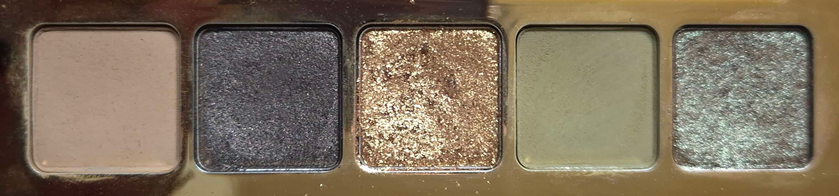
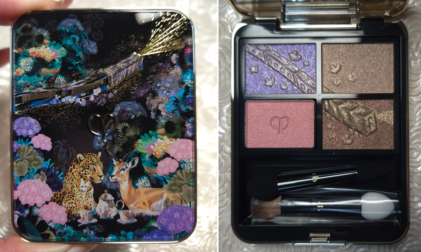
I’ve loved Clionadh Cosmetics eyeshadows from the moment I first tried them at the start of 2020. Their Stained Glass Collection is ever growing, and it’s their claim to fame for good reason. Other brands have eyeshadows that use some of the same pigments and have the same shifts, but I have yet to see anyone replicate the slick “mirror finish” of the Jeweled Multichromes. I was never a big fan of iridescent eyeshadows because of the way they can look dusty and dry on my skin tone, but Clionadh thought about those with more melanin and created the Deep Iridescent Multichromes with different colored bases (instead of white) to fix this problem. They created Glitter and Dimensional Multichromes for people that adore having maximum, but still eye safe, sparkle. Vibrant and Electric Multichromes are for true color lovers. Earth Vibrant Multichromes are for those that prefer muted tones, but still want easy-to-see color shifts. There are even combination types such as Glitter-Vibrants and Hybrids.
Clionadh has multichromes to suit everyone’s tastes.
As I mentioned before, the brands get their multichrome pigments from basically the same place, but Clionadh has perfected the art of combining them with various base colors to create a decent amount of eyeshadows that haven’t been duped. So, there are still some that are completely unique colors.
There are some duochromes within the Stained Glass line, but they also exist in the “standard circle” format, along with more traditional shimmer eyeshadows. These are less expensive and I find them to still be very nice quality. The mattes weren’t perfect, but I still like them when they used to be sold individually.
The only reason I haven’t talked about Clionadh as much within the last year is because of the difficulty I have in getting products in Germany. Their website doesn’t collect VAT/taxes/customs, so DHL (who did the final part of the delivery) demanded exact cash payment in person (which included the missing VAT plus their fee), without letting me know the amount in advance. If I want to know ahead of time, I would have to pay the $42 (36 Euro) shipping option on top of the VAT and extra fees, which I just haven’t felt was worth the added costs. I hope Clionadh will work out some kind of deal with Monolith EU again, as that would certainly make things easier for me!
I have some Clionadh eyeshadows that are getting close to turning six years old. Some of them don’t feel quite as smooth and creamy, but they still perform beautifully and haven’t gone bad yet. I’ve had eyeshadows that didn’t even last beyond a year (admittedly mostly vegan eyeshadow formulas like from KVD, Urban Decay, Coloured Raine’s different formula, etc). So, that makes me happy considering how expensive Clionadh eyeshadows can be. If you take four of Clionadh’s most expensive eyeshadows, it would be slightly more expensive than many luxury brand quads (but justifiable in price considering they’d be all multichromes).
Clionadh has a relatively small team, and I respect the fact that they make their eyeshadows in-house in Canada.
Oden’s Eye
Oden’s Eye is a favorite because they have every type of powder finish eyeshadow I could want: multichromes, duochromes, sparkly shimmers, smooth metallics, pastels, and just lots of colors in interesting tones. The variety is great and the quality is mostly good. Some palettes are randomly not as good, and I can’t explain why. For instance, I like the colors in Makeup Just For Fun’s palette, but the shadows were more powdery and the shimmers are thinner. I can only guess it’s due to what the creator requested of the formula. Fantasy Cosmetica has shimmers and mattes on par with Odens Eye, but I get 1 or 2 duds from the 9-pan palettes I’ve tried, which isn’t the case for my top 5 Odens Eye palettes. So, Fantasy Cosmetica ranks lower for that reason.
These shadows are also more suited for color lovers, but Oden’s Eye tries to appeal to neutral and color lovers by giving softer and non-grungy options sometimes within the palettes.
It’s a Swedish brand, but their eyeshadows are made in the PRC.
Fantasy Cosmetica
This is the brand I have the least experience with, as I only started buying their palettes in 2024. However, I love the color offerings among all the palettes and their theming. Even when they make brown shades, there’s nothing basic about them. They have very interesting tones. The Fighter Palette is a dream for those that prefer glam style neutral eyeshadows. Pat Mcgrath fans would probably like them, but the quality isn’t quite as refined as PML’s. The big price difference puts that in perspective! Some of their eyeshadows/pressed pigments are ultra vibrant. They’re all pigmented and opaque shadows. Most of them blend well. I usually have at least one troubleshade shade in every palette, but it’s rarely one of the shadows I was looking forward to using anyway. This brand does cater mostly to color-lovers, and they’re known for their intense shimmers, but I even like some of their smoother satin shades too. They find a way to make the toned down shadows appealing for me.
I believe these eyeshadows are made in the PRC.
Devinah Cosmetics
Devinah has my second favorite multichrome and duochrome formula, but their normal shimmers are just okay, which is why the brand doesn’t rank higher overall. Their mattes are also decent, but not the easiest to blend and use. In fact, they probably have the “worst” mattes of all the brands I’m mentioning in this post. However, they don’t make pre-made palettes, so customers can skip buying their mattes altogether.
I started purchasing from them in April 2020, and all but one eyeshadow (it’s a discontinued formula) is still in perfect condition. The performance, look, and feel of the shadows hasn’t changed. So, I can confirm mine have good preservatives in them!
It’s because of the fact that I had to acknowledge their multichromes and duochromes as coming second to Clionadh that I stopped buying from them in early 2022. However, to still maintain that number two spot is impressive. The custom palette I created with mostly Devinah shades has come with me on several trips and there are shades I’ve used in there even more frequently than Clionadh. So, if you live in the US and are dealing with the tariff situation, this could be a nice US-based brand to check out.
I don’t know if all of Devinah’s eyeshadows are made in-house, and if only some of their catalogue isn’t made in a lab, but I can confirm that at least the mattes are made by them.
Sydney Grace
Sydney Grace isn’t really in the multichrome game with powder eyeshadows, but they have a gigantic selection of standard shimmer eyeshadows in unique tones. They have many colorful sparkling eyeshadows, but the brand puts a lot of focus on natural/neutral and more muted types of shades. They also have a lot of satins that appeal to fans of luxury eyeshadows who prefer a smoother texture-friendlier look, but just crave more pigment than most luxury eyeshadows provide. The Sydney Grace eyeshadows are pigmented, opaque, and also thick. I like my finished eye looks with them, but I tend to prefer my even more blingy, shiny, and exciting eyeshadows from other brands. Also, their mattes are pretty good. They are almost on the same level as Odens Eye, but Sydney Grace’s best mattes are typically in boring colors I can get from any brand. So, I tend to not use them.
Sydney Grace eyeshadows are made in the USA. I’m fairly sure they made their own eyeshadows and formula in the early days. I don’t know whether they have continued to make them in-house.
I have three honorable mentions.
For starters, Melt Cosmetics is technically an indie brand, but I have seen their products available at different retailers and they seem to be a much bigger business, so I have a hard time putting them in the same category. Considering how many huge sales I’ve seen in the last three years, and the lack of interest from among beauty lovers, I honestly wonder how long they will stay in business. In any case, the brand’s mattes are in my top 10 favorites. I love the colors, tones, pigment level, layerability and blendability. The shimmers are okay at best. They have such a big issue with mold or things growing on other people’s palettes that I always feel uncomfortable recommending the palettes, even though mine have been fine.
The second honorable mention is Kaleidos. I haven’t tried many of their palettes, but I loved the mattes in Club Nebula and Futurism 1: Sci-Fi Green. The shimmers are nice, but not super special. I can’t include them on the list because I haven’t tried any of their “newer” eyeshadows in the quad format, and it’s only recently that they launched their first new products in the last two years. So, it’s been quite a few years in total since I’ve been interested in their eyeshadows.
Terra Moons is an honorable mention mainly to address the fact that I’ve often said their multichromes are my third favorite formula. However, the normal shimmer and matte quality pulls them below being in my favorite indie brands. There is also the fact that I hardly use my Terra Moons shadows because I think to myself, “Why use these when I could use my Clionadh and Devinah?” So, I only use the shades I don’t have a close match for in the other brands, but then I think about how the eyeshadows made by the others are still good enough and I don’t need this unique one! The mattes I bought from Terra Moons are unique to my collection, but I wish the quality was better. So, I can’t call this brand a favorite if I don’t use them.
This isn’t an honorable mention, but I feel compelled to explain that I like Lethal Cosmetics a lot as a brand and I respect what they create. Their eyeshadow formula is a bit chunky. The multichromes are on the weaker side. The mattes are fine. I like the eyeshadows with uncommon tones, but I just don’t think about them often enough. I feel like I’ve moved on from their eyeshadow formulas.
So, this is my list! I hope this is helpful to fans of small independent businesses, and to anyone curious as to which brands to start with if you’re trying to move away from paying for mainstream eyeshadows.
This is one of the posts I’ve held as a backup. I have a lot going on in my personal life, plus with the holidays. So, this will likely be my last post of 2025. I wish you a happy holiday season and I hope to see you in the New Year!
Three years ago, I created a post called 10 Things I Purchased Purely For the Packaging. These were items I loved, even though in most cases I hadn’t even used the makeup inside. My typical gauge for determining whether a product had been worth buying in the long run, is to calculate how frequently I use it. So, those items in the post should have fallen into the category of purchases I regretted, but they didn’t.
Keeping my Project Pan and Low Buys in mind, there have been so many times in my reviews this year that I’ve written, “I like this, but I could have skipped buying it,” or “this doesn’t add much to my collection.” This has been my attempt to counterbalance some of the hype out there and help others feel less FOMO over things that aren’t as special in person. However, there are still products from time to time that I acknowledge as something I’m still glad I bought, even though I won’t get much use out of them.
My purpose for this post is to feature the products in my collection that are no longer available to purchase, but they had such good formulas that I wish everyone could have tried them. These are products that if I had a much smaller makeup collection, or if the shades were perfect, I probably could have hit pan on them.
Essentially, I want to focus on makeup that still brings me joy to own, even if I stopped using them today. In doing this, I hope it will serve as a reminder to myself of what kind of products ended up being worth it to me under different criteria.
I won’t be including items from defunct brands, or else Becca’s Skin Perfectors and Bite Beauty lipsticks would be on this list.
Armani Neo Nude Melting Color Balm Blushes – Original Review
This launch is still one of the weirdest I’ve ever experienced. From Armani barely giving these any promotion, the consistency of each shade being different, one of the pans falling out, retailers getting only certain shades and them being added and removed within days from websites, etc. However, the best formula (which was for Shade 30), was so creamy, blendable, and truly melted into the skin. The range of colors were subdued and natural, which is actually not as common to find, especially for those with dark skin.
Initially, I thought the reason Armani put hardly any effort into marketing these was because of a combination of formula production issues (Shade 60 was hard as a rock) and low inventory (not even Armani’s site ever had all nine in stock at the same time). Upon reflection, these blushes were released around the same time as Suqqu’s Melting Powder Blushes, which the brand announced shortly after would be discontinued due to raw materials shortage. The shades between Armani and Suqqu were not dupes, but at least close enough for me to notice similarities, not just with their names. They might not have been made by the same lab (Armani’s were made in Korea vs Suqqu’s in Japan), but perhaps they shared some of the same ingredients with sourcing issues.
It may be foolish, but I still have hope that Armani will reformulate these and bring them back. If they don’t, I am at least happy that I have a few in my collection as a reminder of this product’s strange place in makeup history!
Pat McGrath Skin Fetish: Ultra Glow Highlighter (Divine Rose) – Showcased Here
Excluding the Skin Fetish Sublime Skin Highlighter (aka The Hockey Puck), I have tried every Pat Mcgrath highlighter formula. The one above is the best they’ve ever made, but it was limited edition and only came in one shade.
There are a lot more baked gelee products available these days, so perhaps I should just be content with the few I have that are a better shade match for me. However, I think it’s normal for someone to want a holy grail product to be made by their favorite brand because it’s their favorite brand.
This may be a strange analogy, but if we put this in terms of Harry Potter (and let’s leave the conversation about JK Rowling aside), if someone gave me Hufflepuff merch, I would be happy because it’s something from the world of Harry Potter. If someone gave me Ravenclaw merch, I would be even happier and more excited because Ravenclaw is my favorite of the Houses within Harry Potter, so it has overall more value and meaning for me. Even though I own Tom Ford’s Shade and Illuminate Highlighting Duo in Tanlight, which is super close to the quality and performance of Pat Mcgrath’s Divine Rose highlighter, I would still absolutely love my perfect shade to come from Pat Mcgrath. Not only was hers less expensive than Tom Ford’s, but it also comes in a compact I consider to be prettier. The other highlighters from PML are nice, but if someone asks me to recommend the most standout products from the brand, it wouldn’t be them. It’s a shame that their best highlighter formula could only be experienced by a small range of people. The current Pat Mcgrath highlighters are likely less expensive to make and they’re certainly easier for other brands to replicate.
Pat Mcgrath Baked Blushes (from the Bridgerton 2 Blushing Delights Blush + Highlighter Palette) – Original Review
I honestly believe the only reason this product flopped was because it came in bulky packaging. Even I felt the need to depot the blushes and highlighter!
What’s disappointing about us never getting additional blush shades, or even singles of the blushes, is that PML could have competed with Hourglass on the baked blush front. With the exception of At Night, I like PML’s Aphrodisia more than all of the Ambient Lighting ones from Hourglass. I continue to buy Hourglass holiday palettes each year because I like their baked products, so imagine if Pat Mcgrath gave us the kind of colors I am still itching for Hourglass to make, and in a gorgeous shimmery finish that I prefer. I would buy them so fast!
The Hourglass At Night blush is the only baked blush to make it into my Project Pan (of favorite products). The reason Aphrodisia didn’t is because I didn’t have it at the time. I left it in the US out of fear of breaking the delicate powder in my luggage. I also assumed PML’s baked blushes would eventually make a return in normal palettes or single form. I’ve given up that dream by now, so I finally have Aphrodisia back with me (as of April 2025). My reason for bringing this up is that I am not a baked blush lover (not including baked gelee). I often have a problem with them looking too pearly on my skin and/or too dry. I only like specific shades of MAC’s Mineralize Blushes. Ilia’s Soft Focus Blurring Blush has potential, but they don’t have the exact tones of the kind of shades I like. Sephora was onto something with their Microsmooth Baked Blushes, but they don’t have a lot of shade options either. So, the fact that PML had my favorite, but kept an entire formula limited edition is truly unfortunate!
I’m sure there will be people surprised that PML’s baked special eyeshadows are not on this list, but I don’t enjoy their flaky texture. I liked them being in the palettes because it felt like their presence justified the cost, and the finished looks on the eyes were beautiful, but I didn’t enjoy actually using them. So, I don’t mind them being gone.
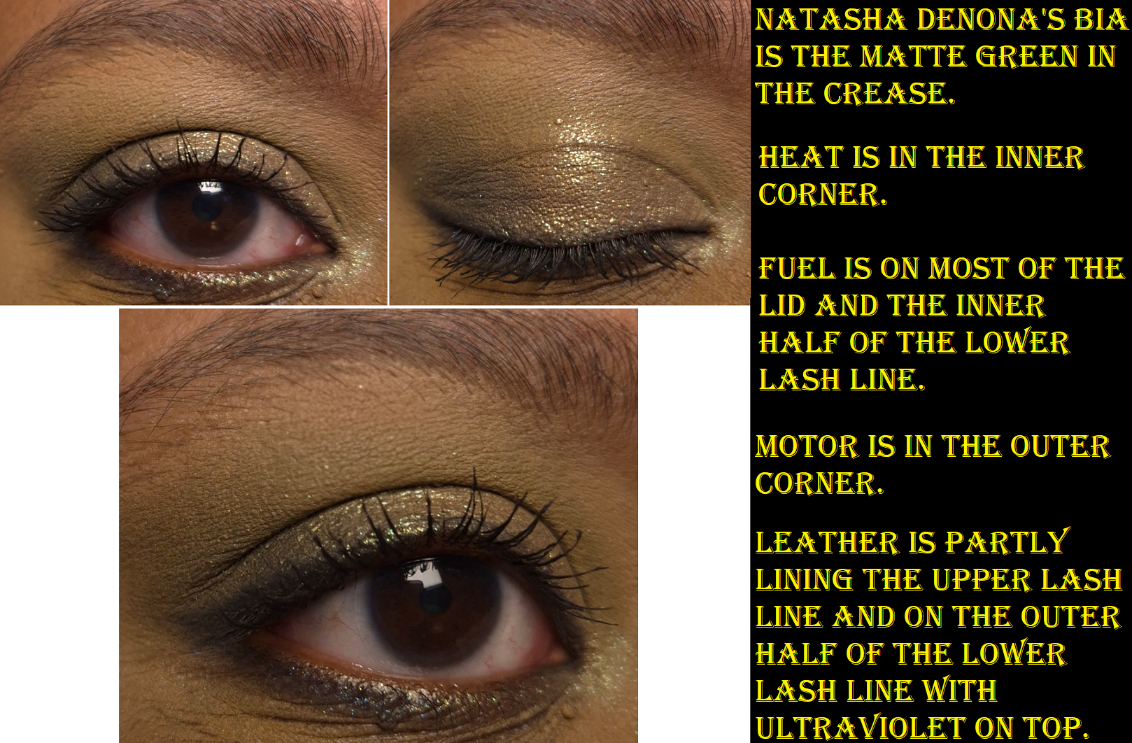
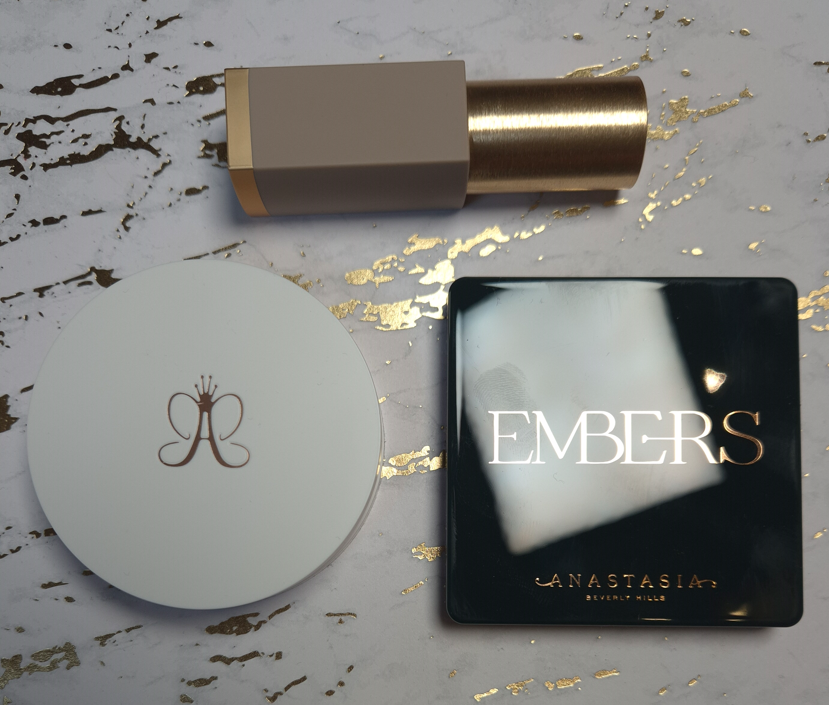
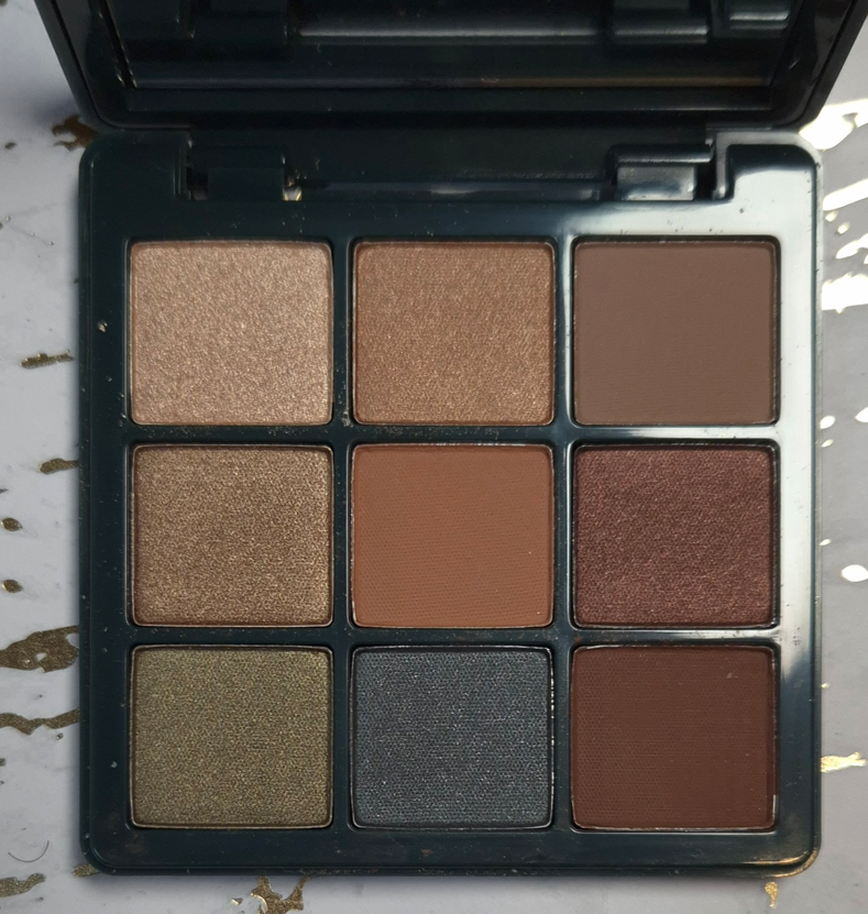
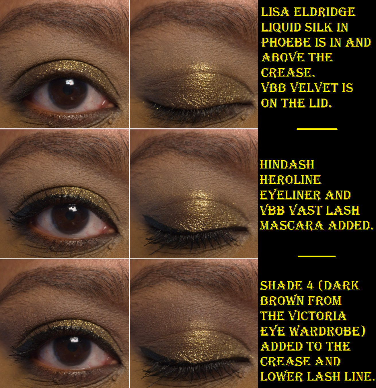
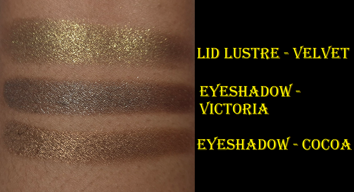
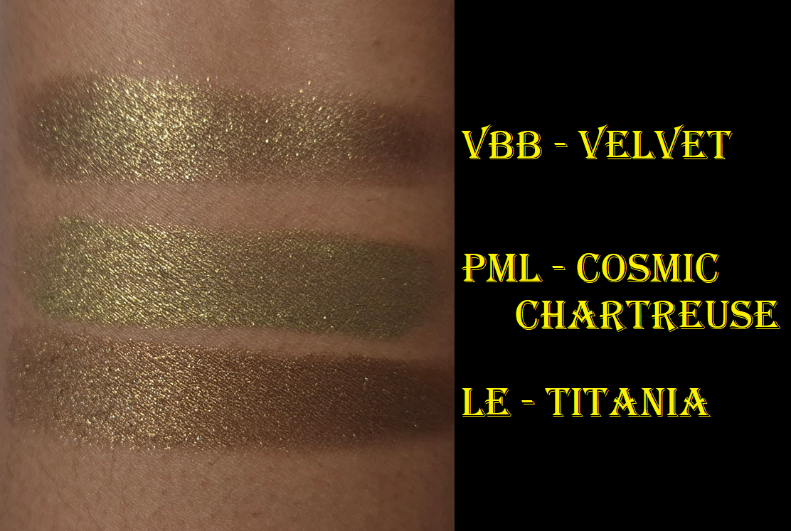
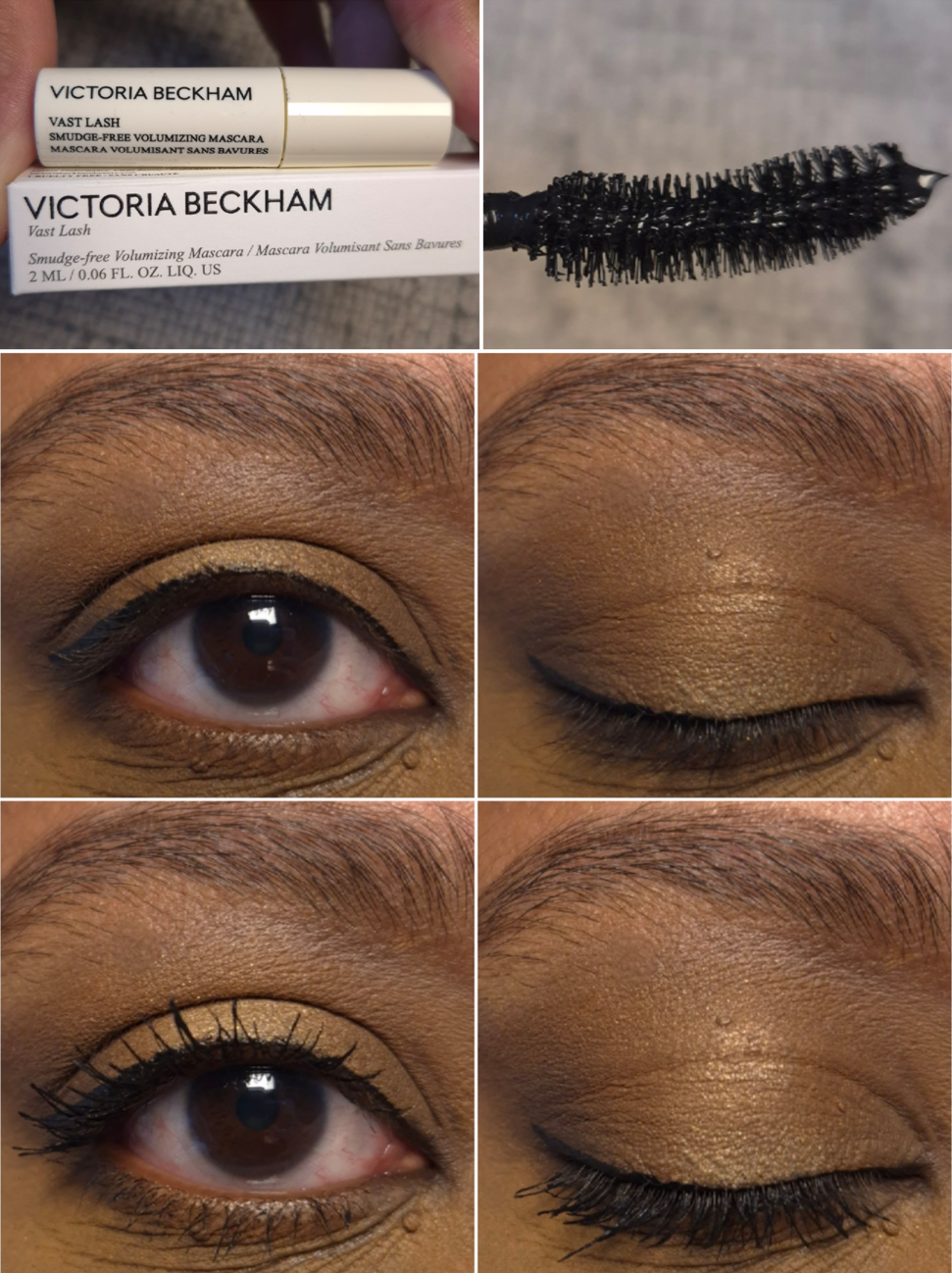
This palette represents everything I love about eyeshadows. There’s the brow and edge-blending neutral shade, a deepening shade in a stunning brown color, a beautiful gold, a wearable green, and a fun dimensional shimmer. It’s versatile enough because I can create multiple types of eye looks, it’s in a mini size which keeps the cost of the palette low, and the gold toned trim makes it aesthetically pleasing to look at. I can use the gold for an intense sparkly look or keep things subtle by sticking with the mattes and dark satin brown. The eyeshadows are blendable, buildable, and soft. They last all day without fading, have a normal amount of kickup, I don’t get much fallout (I just need to spray the gold), and there’s no creasing. There’s a reason this ranked at the top of my Natasha Denona Palette Post.
I don’t wear makeup enough days out of the week to have hit pan on this or any of the eyeshadows in my collection, but I can see where there are indents. Anyone who has the Bobbi Brown Jadestone palette might not need something like this, and this year has been the year of the green eyeshadow. The Mini Gold color story isn’t as unique, but that shade Antheia still is! That color is one of my favorite greens in my entire collection, so this is why I wish this color story hadn’t been discontinued. Mini Gloom might actually be a better mini representation of the original Gold Palette, but Mini Gold is still the best suiting color story for me from ND.
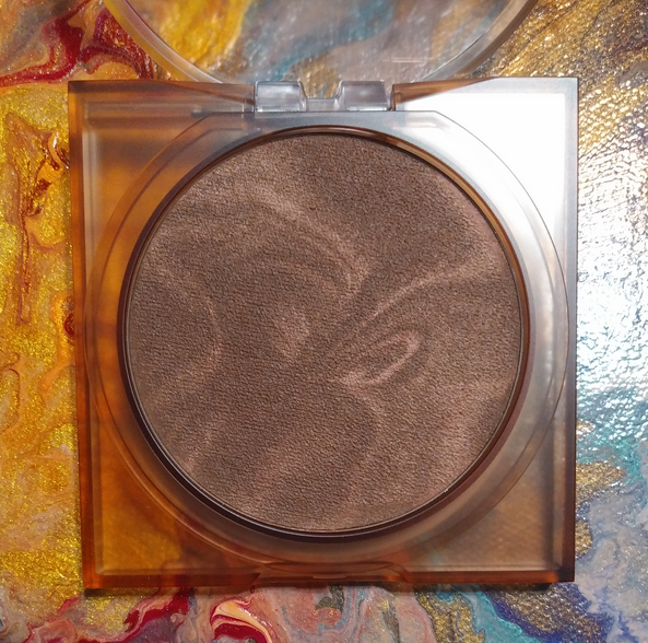
I said I wouldn’t include defunct brands on this list, but because Glowish was under the Huda Beauty umbrella, I’m allowing it. I assume they own the rights to the formula and could still bring it back if they wanted to, but who knows. I’m not sure if these sold well enough to make a return.
What I liked about these bronzers were the tones and depths available, the colorful swirl pattern (which added to the ability to slightly tailor the shade), and the fact that these felt and performed similar to baked gelee powders, even though they weren’t. I liked this formula more than so many other traditional powder bronzers. It was priced at $31, but they released a few shades of mini sizes when the brand was nearing its end.
From what I recall, people who tried these liked them, though I don’t know if they liked them to the same level as me. Had these been in higher end packaging, I think they still would have been better received. Perhaps even a wider shade range or different combination of swirl colors could have gotten more people to like these. This product had so much potential!
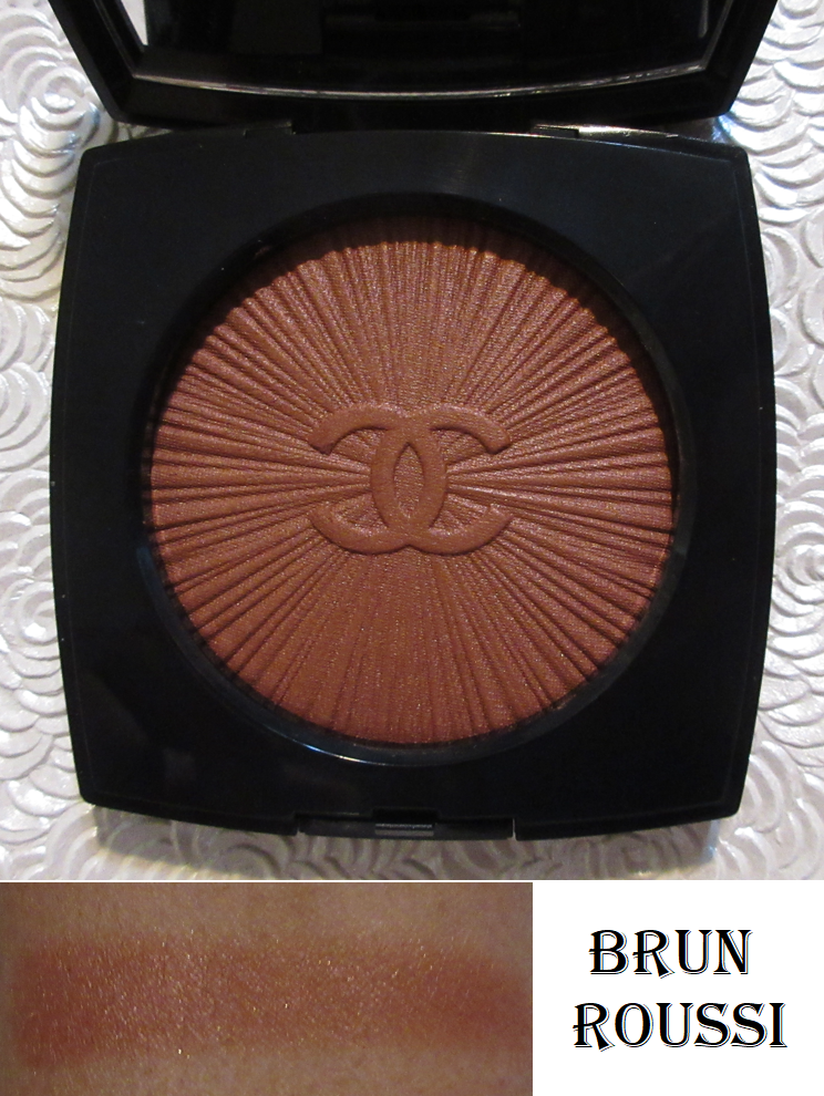
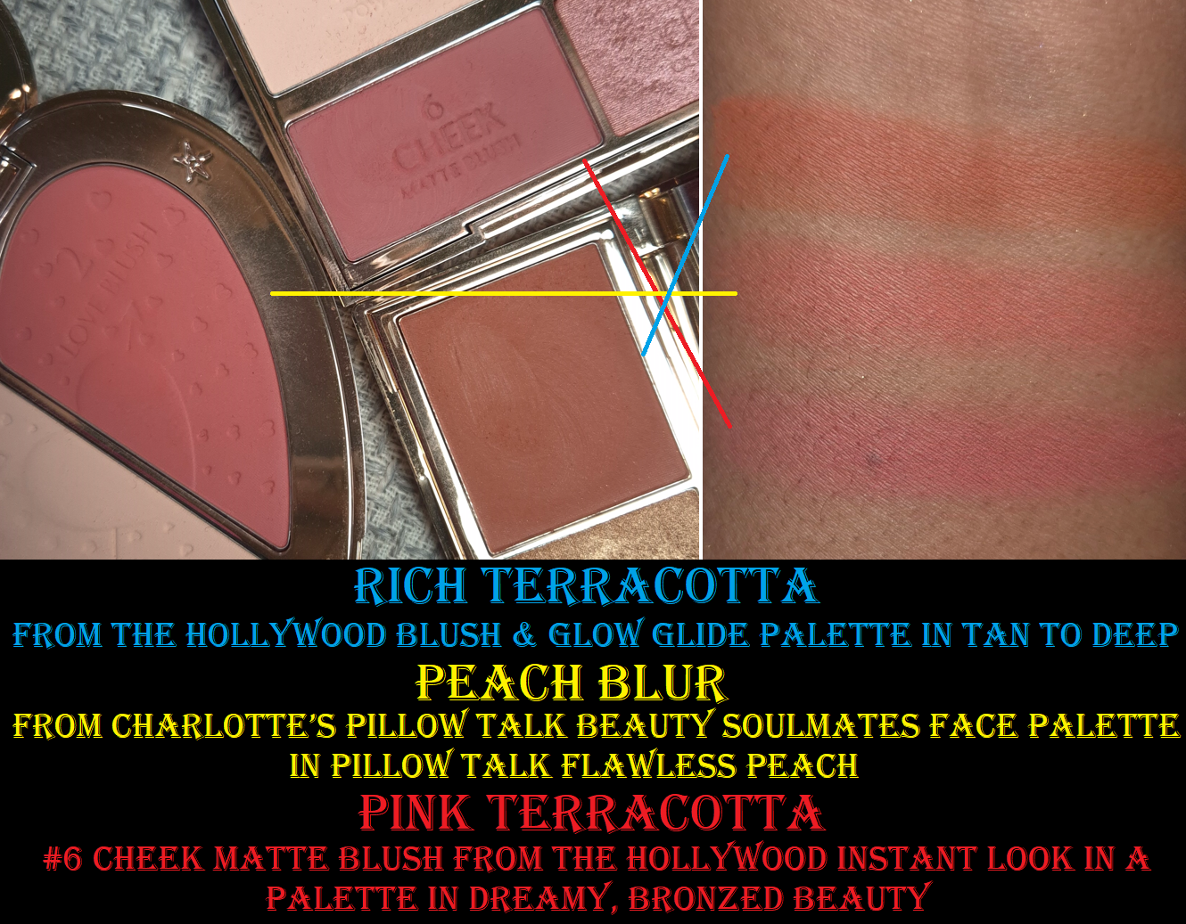
I’ve reviewed blushes from seven different Chanel collections, and this one consists of my favorite formula (tied with the Joues Contraste Intense Cream to Powder blush). It is a little harder to pick up with a delicate natural hair brush, but my densely packed fox and goat ones work wonderfully. This is one of Chanel’s more pigmented blushes, but the amount of powder that coats my brush enables me to build up the color in a controlled fashion, so I never overdo it.
This lasts all day on my cheeks without fading. I love the deep red-brown color and that gorgeous warm gold finish. Nowadays, it’s uncommon for Chanel to give us a shimmery blush. So many of the ones intended for those with deeper skin tones have been orange and berry colors. There is actually a void that the return of this blush would fulfill. There are so few deep nude blush colors, and even fewer that are still available for purchase.
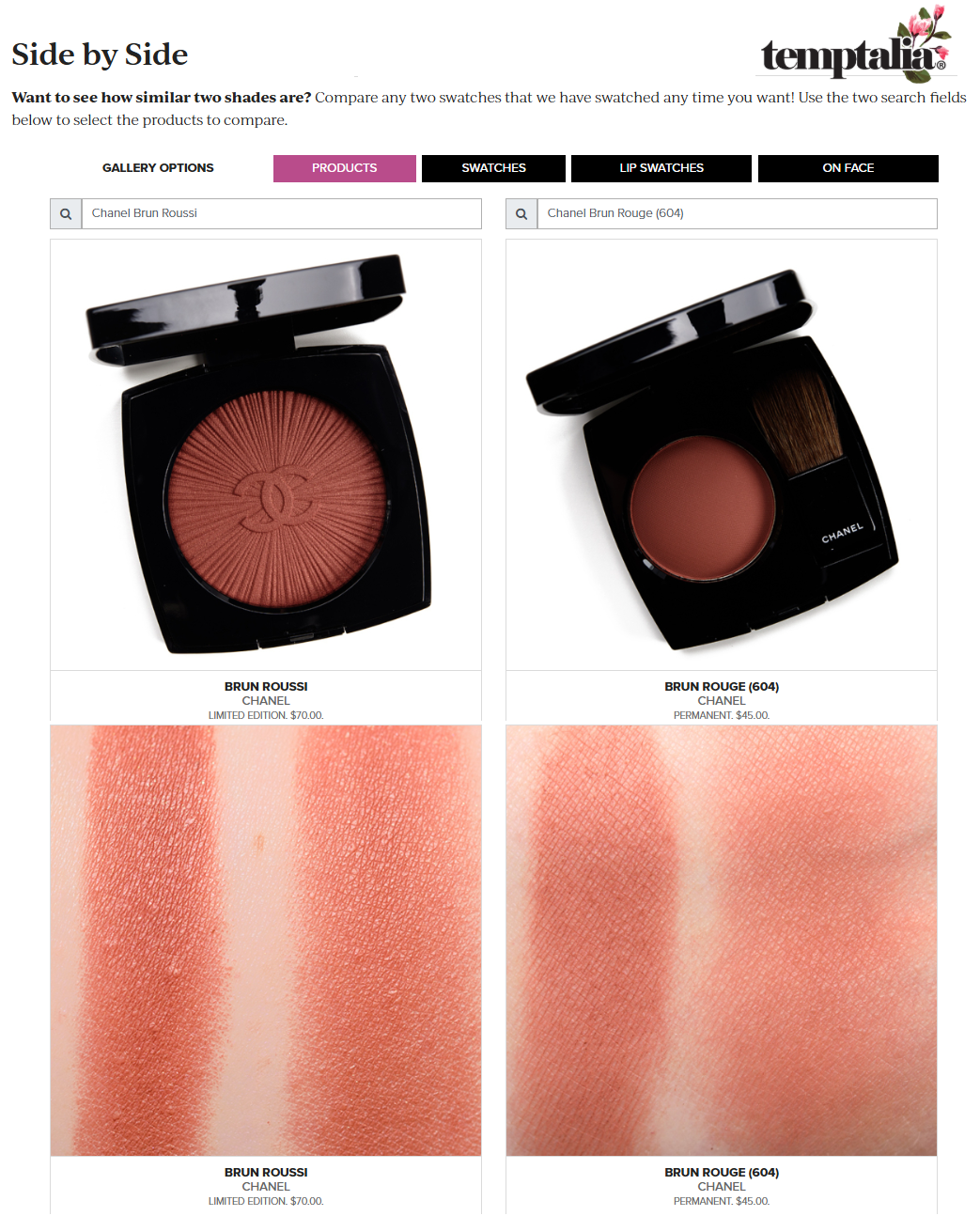
I don’t own the blush called Brun Rouge from the brand’s permanent line, but based on photos I saw on Temptalia’s website, it’s the closest option Chanel currently has. To me, this isn’t a good enough substitute because the finish is matte, it’s slightly lighter, and I have found the formulation of Joues Contraste Blushes to get harder to pick up on my brush after a year or two. My Lumiere blush still works perfectly three years later. So, it’s the superior formula.
Even if Chanel decides not to rerelease this particular color, I would still love to see additional dark-skin-friendly shades with this formula.
Kosas The Sun Show Moisturizing Baked Bronzer (Original Formula) – Featured Review
There was a point in time that this was my number one favorite bronzer! I was obsessed with the glowy sheen it had. I liked how well it blended into my skin. The color was a bit strong on the orange side, but I loved it anyway. So many people loved this too, but it was the strong frying oil smell that turned everyone off to this product. One of the more troubling aspects was the inability for anyone to tell when this “clean beauty” product had gone off, if it didn’t have a pleasant smell to begin with!
When Kosas reformulated these bronzers into the yellow packaging, I was disappointed by the return of the smell (just less intense) and the huge shade gap between Escape and Paradise, making my old shade in Deep (which fit right between them) still the best color match. Plus, the new ones had so much more shimmer that it was too much for me.
I love this original bronzer so much that I couldn’t bear to get rid of it, even though I’m afraid to use it. The lack of preservatives in Kosas products is the downfall of this product. I could bet money that if they fixed the smell issue, it would be a huge hit again and then more people would be willing to experience it.
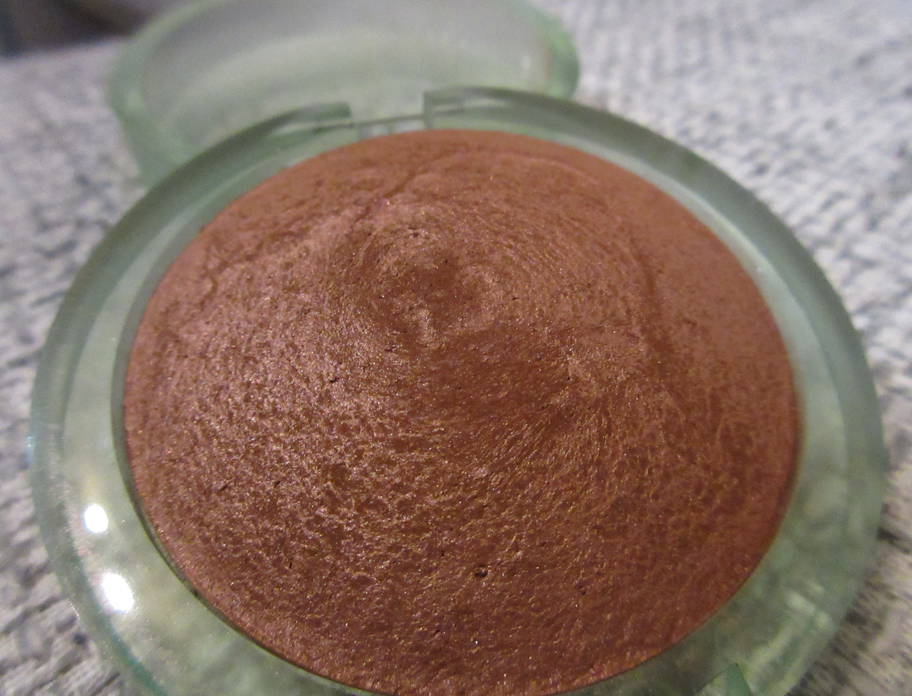
*Honorable Mention #1 – Clionadh Cosmetics Mattes – First Mention
This makes the list on a technicality. Clionadh still has matte eyeshadows in some of their palettes, but they haven’t brought back their matte singles in quite a few years. The initial reason customers were given as to why the brand stopped making them was because the eyeshadows were breaking too much during transit. The eyeshadows were being hand-pressed at the time and they wanted to find a way to keep the logo embossing on the eyeshadow without compromising the stability. Eventually they bought two (I believe) pressing machines. They hired a few additional workers. I recall seeing a comment on Instagram that they were close to being able to bring them back. Well, I’m still waiting!
They didn’t have the best formula on the market, but I liked how uncommon it was. The eyeshadows were pigmented, but buildable. They were incredibly soft (probably due to how they were pressed), finely milled, and felt slightly dry yet silky. They had such interesting tones in colorful, yet muted shades. The mattes from many indie brands are fully saturated and tend to be pressed pigments, for the most intensity on the eyes. Clionadh’s mattes were thin and a little powdery, but also opaque.
I wholeheartedly believe this deserves to be on the list of makeup that should be brought back, but I didn’t want it to be featured front and center out of acknowledgement that there were a significant number of people who didn’t get on with this product. It was surprisingly polarizing, with most shoppers either absolutely loving it or thinking it was terrible.
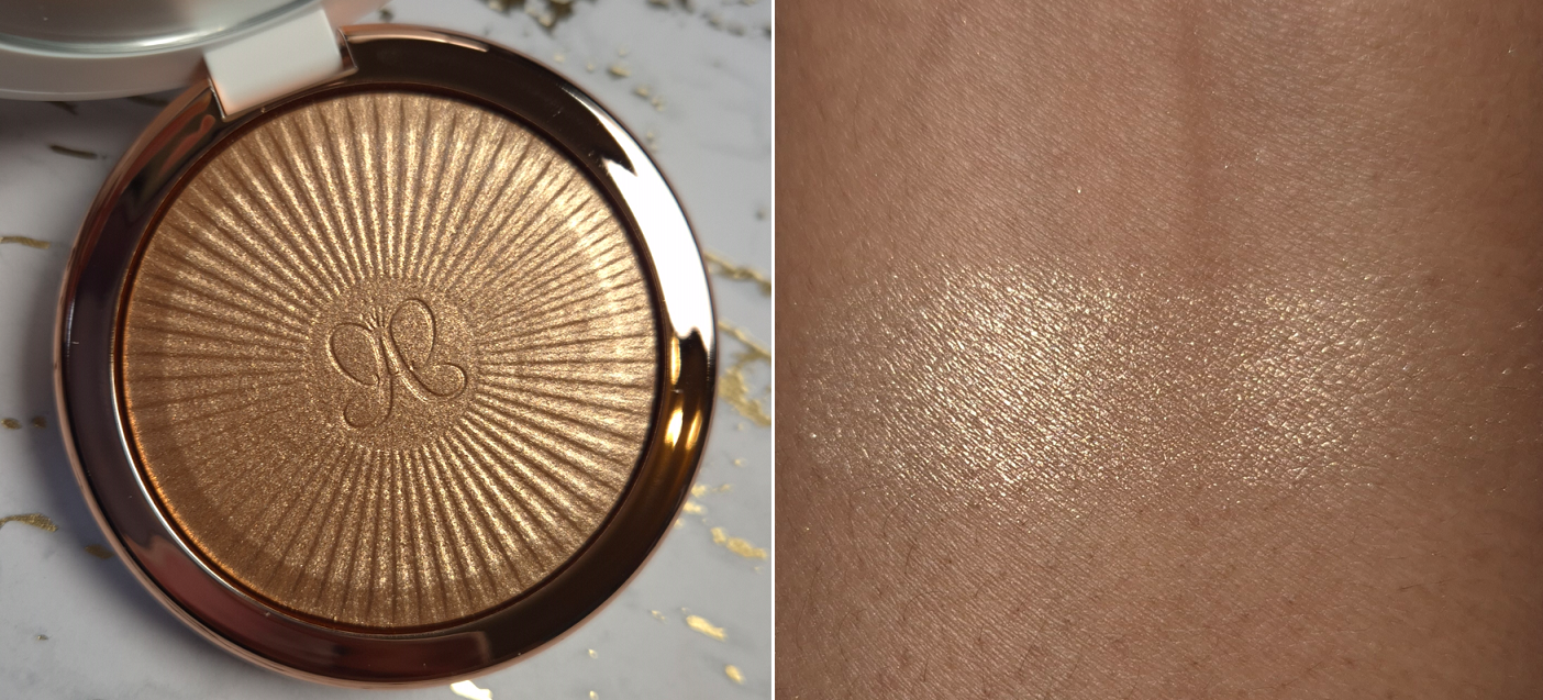
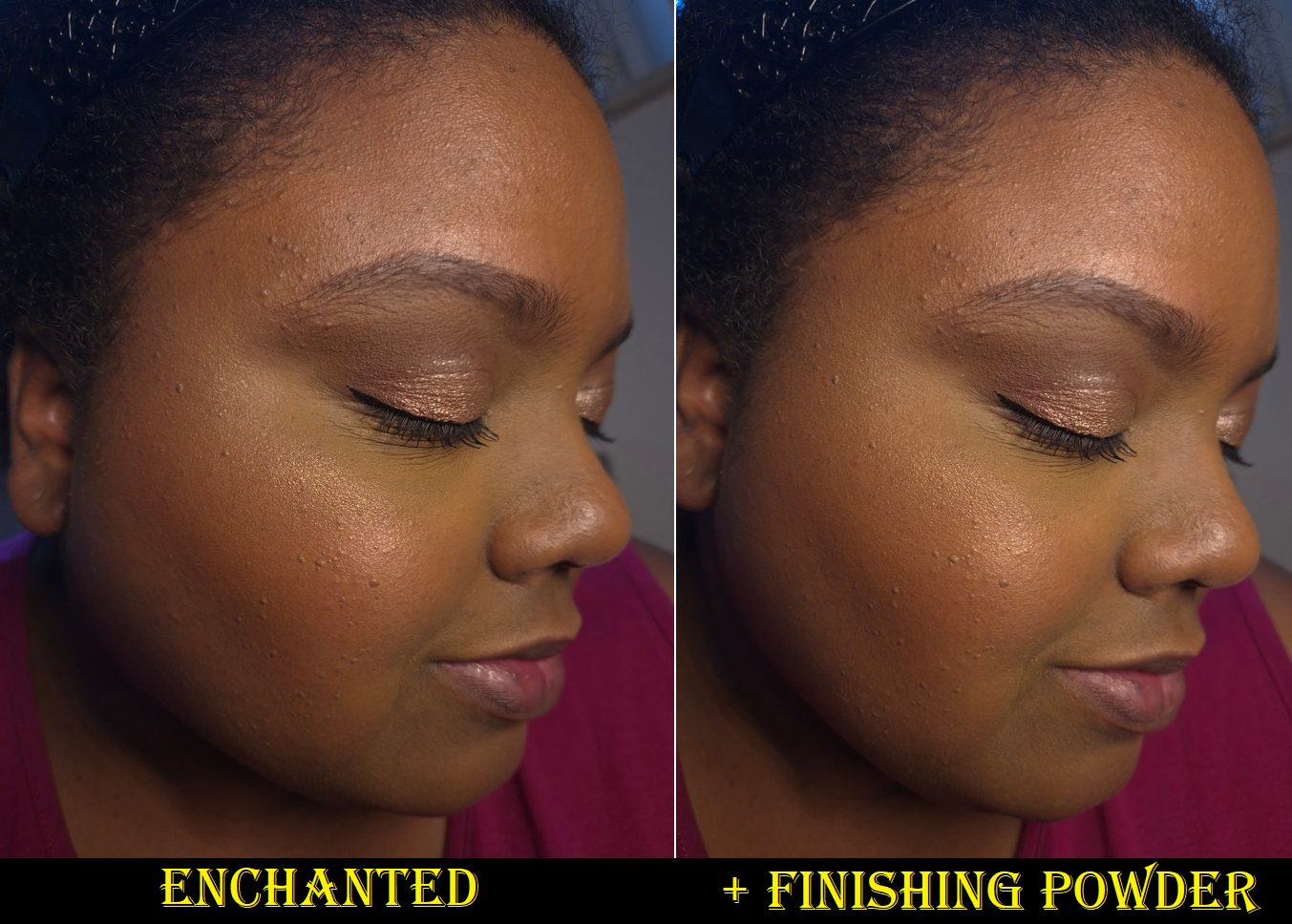
This has been my holy grail finishing powder for so many years now. It’s the only powder I’ve ever hit pan on, let alone been close to using up completely. I’m obsessed with the amount of sheen and blurring this product is capable of producing.
I wish it had no scent, but this fragrance is at least tolerable. I think it’s pleasant.
I have backups of this powder, so I don’t have to be without it for many more years to come. However, I still consider it unfortunate that one of the greatest makeup items in my collection isn’t available for new people to be able to discover and potentially love (or hate)!
This ends today’s post. I hope it was enjoyable to read and that you’ll join me again next week!
Although I’ve been curious about Isamaya Beauty since its launch in 2022, this is finally my first purchase! I thought the green and brown shades from the first Industrial Palette looked pretty, but I heard mixed reviews about the formula. I also had a difficult time trying to justify the price, coming from a startup brand. So, I added it to my Anti-Haul. By now, the Isamaya brand is a bit more established, especially since creating a line for retail stores like Sephora. I have heard the eyeshadow formula of the Core Palettes are better, and they added purples! Throw in the coupon code I could use via Niche-Beauty, and that was enough to get me to finally take the plunge!
Before we get into the review, I’d like to make it known that the information I have about Isamaya Ffrench is that she’s a makeup artist, is or was at some point the creative director at Byredo, and she had an edgy, quirky, and somewhat controversial vision for the initial Isamaya capsule collections. I don’t have any affiliations with the brand, nor personal feelings about the founder.
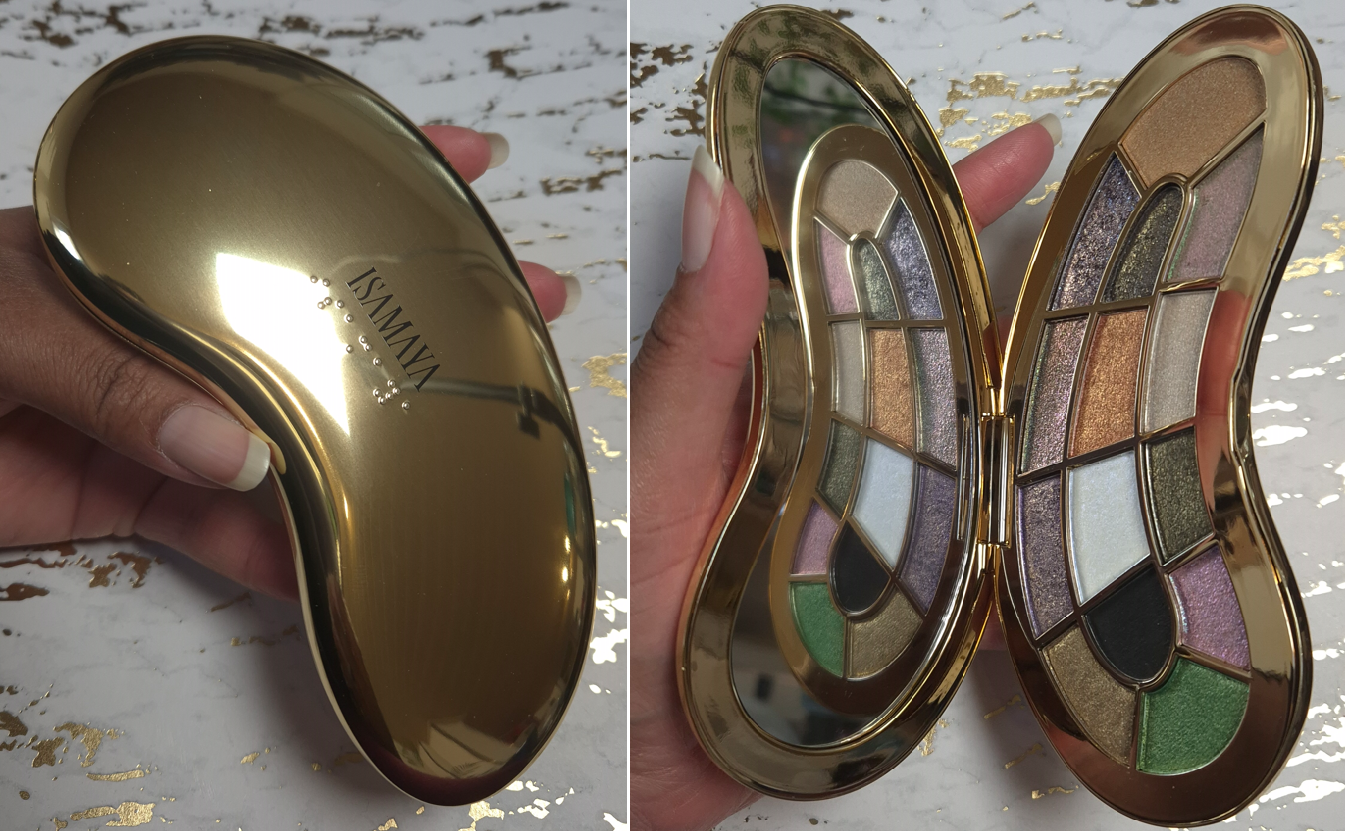
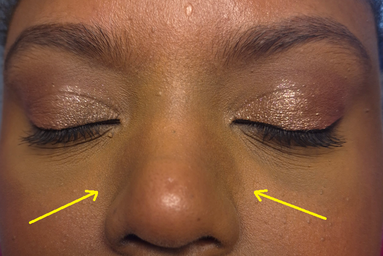
Isamaya Core Palette 1.0
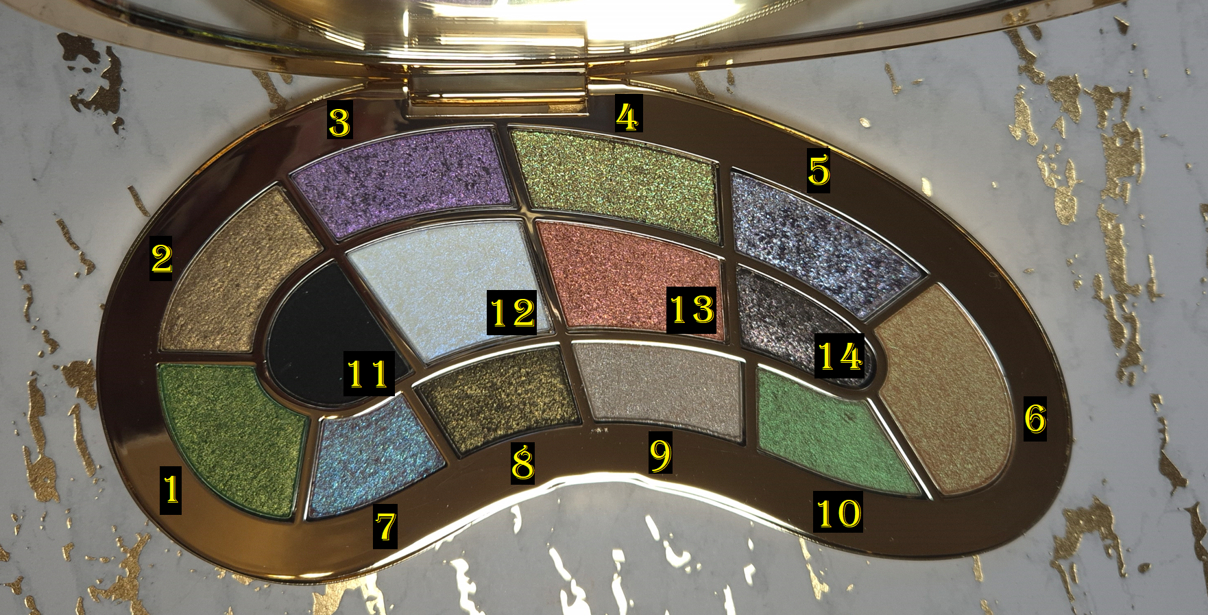
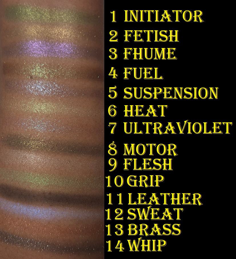
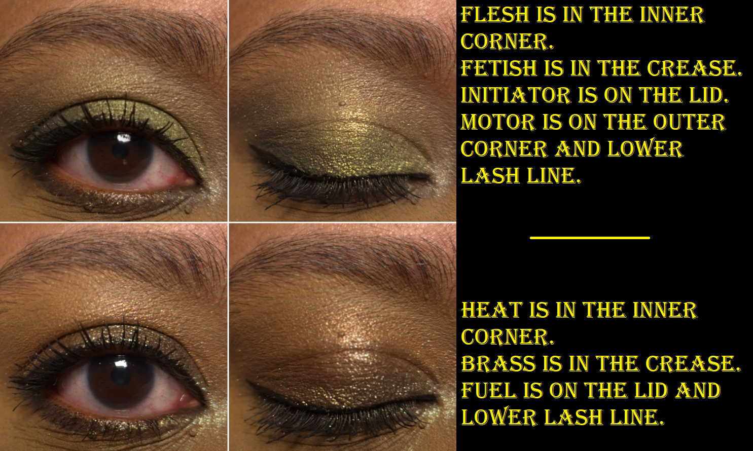
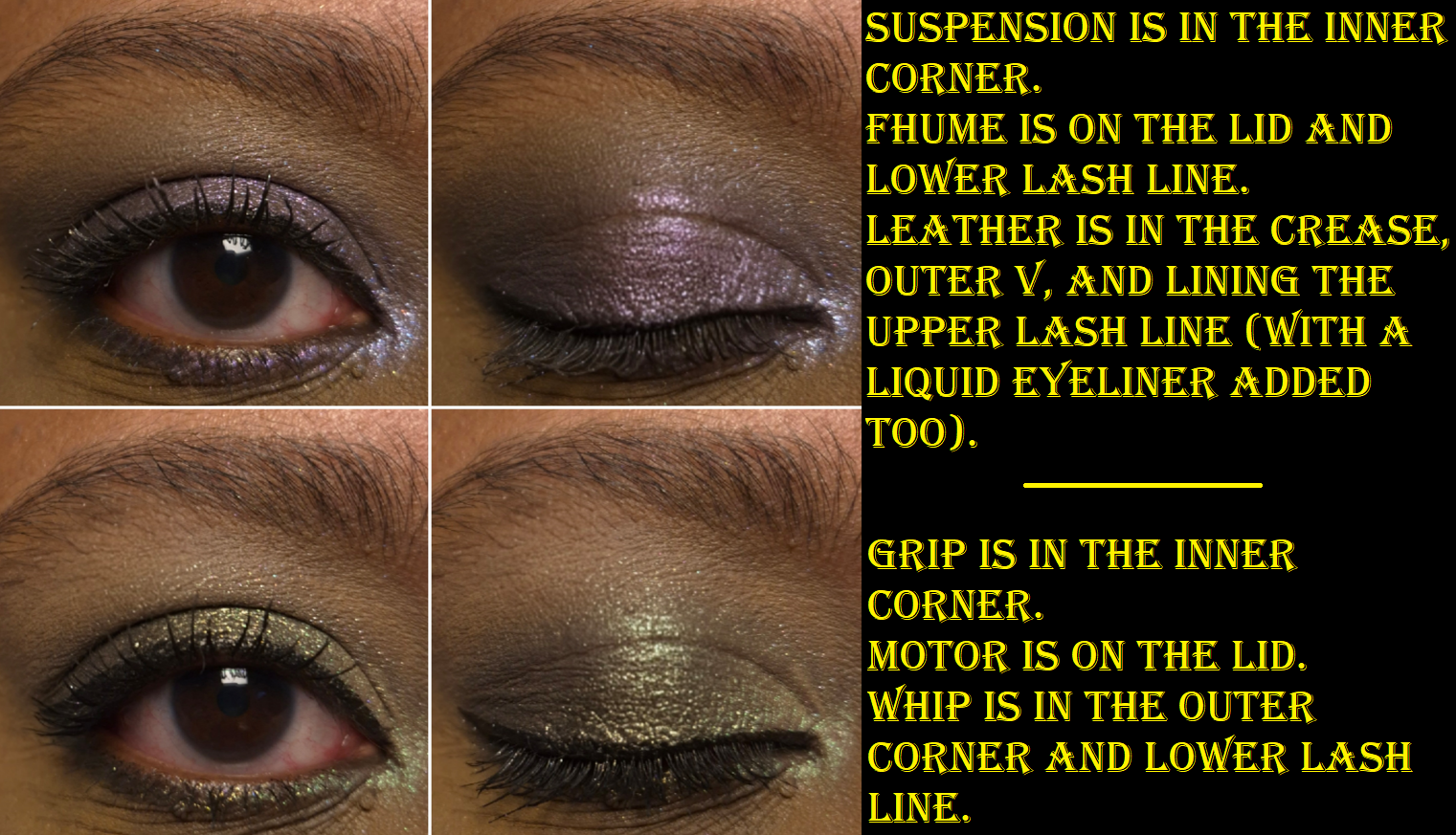
The official numbering system of the brand begins at Fetish (my #2) and continues clockwise to end at Initiator (my #1). Then, #11-14 are the same. I did not discover this until after all my photos were taken and labeled, so this is the reason for the difference.
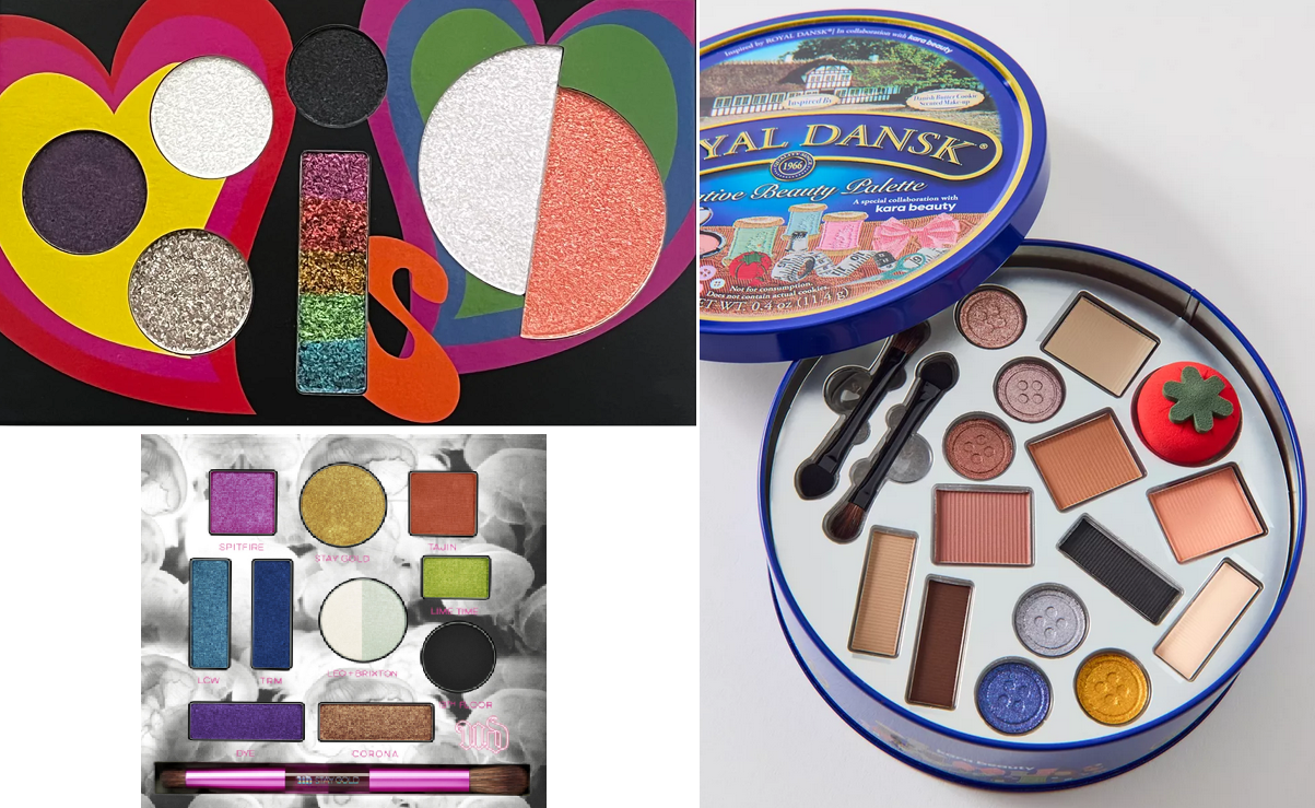
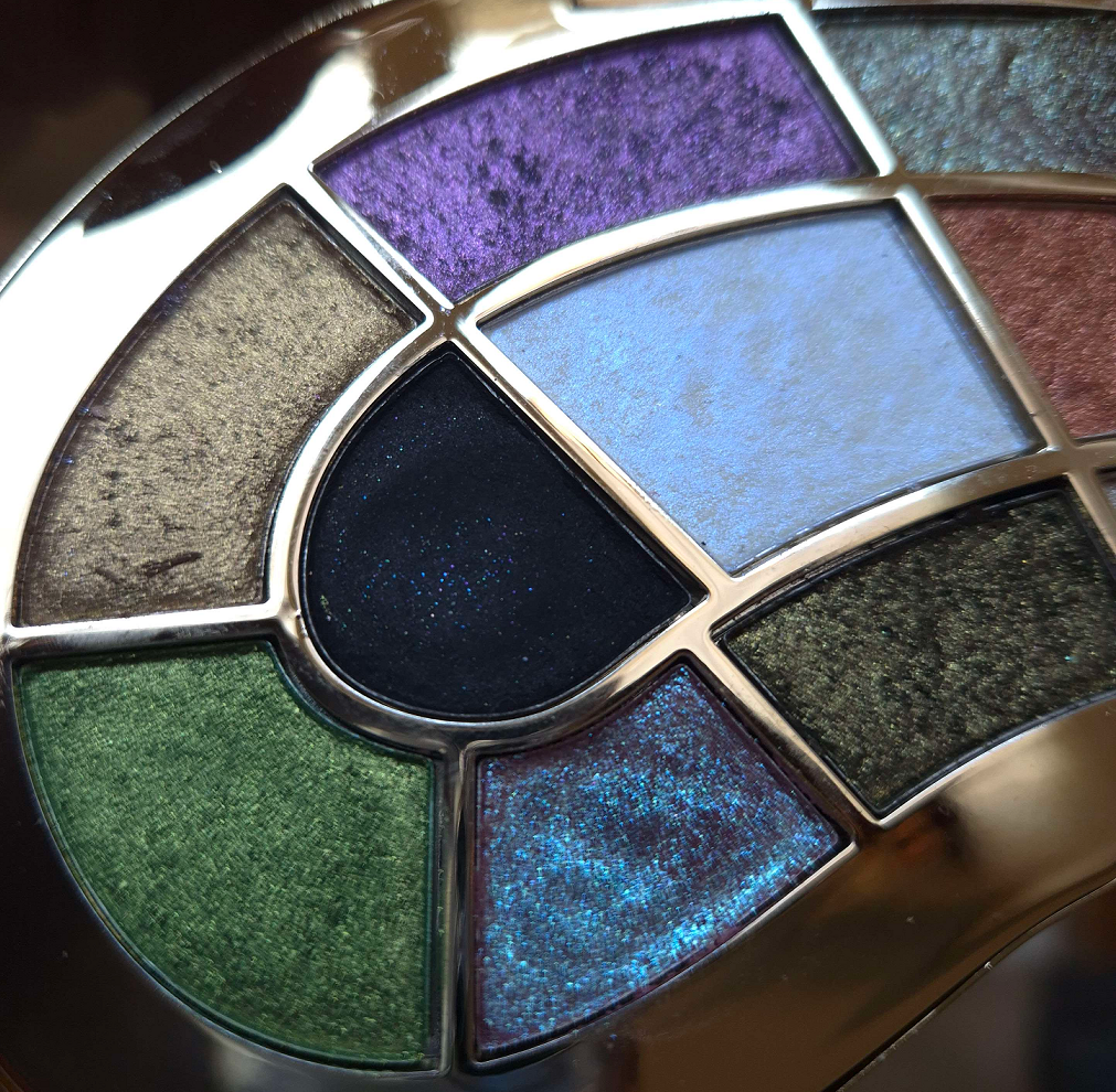
The first unique aspect of Core 1.0 is the emesis basin/kidney dish-shaped packaging with 14 custom eyeshadow pans. No two eyeshadow pan sizes are the same. This is well designed, and although I usually dislike non-uniform pans in palettes, the fact that the symmetry makes sense with little wasted space is why I like it. The downside is that I like to apply shimmers with my fingers, and so the smallest pans are a bit difficult to get into. It also means that shade names could not be printed on the palette directly, but at least the brand included the names on the protective sheet that was inside.
Below are some examples of palettes by Danessa Myricks Beauty, Urban Decay, and Kara Beauty that I would never buy because of the maddening eyeshadow pan layout.
When the Core palettes are turned sideways and opened, they almost look butterfly shaped!
Another uncommon feature of the Core palettes are the various consistencies and finishes of the eyeshadows. Even though nearly all are shimmers, I will discuss each shade individually because their performances on me and my experiences with them are not the same across the board.
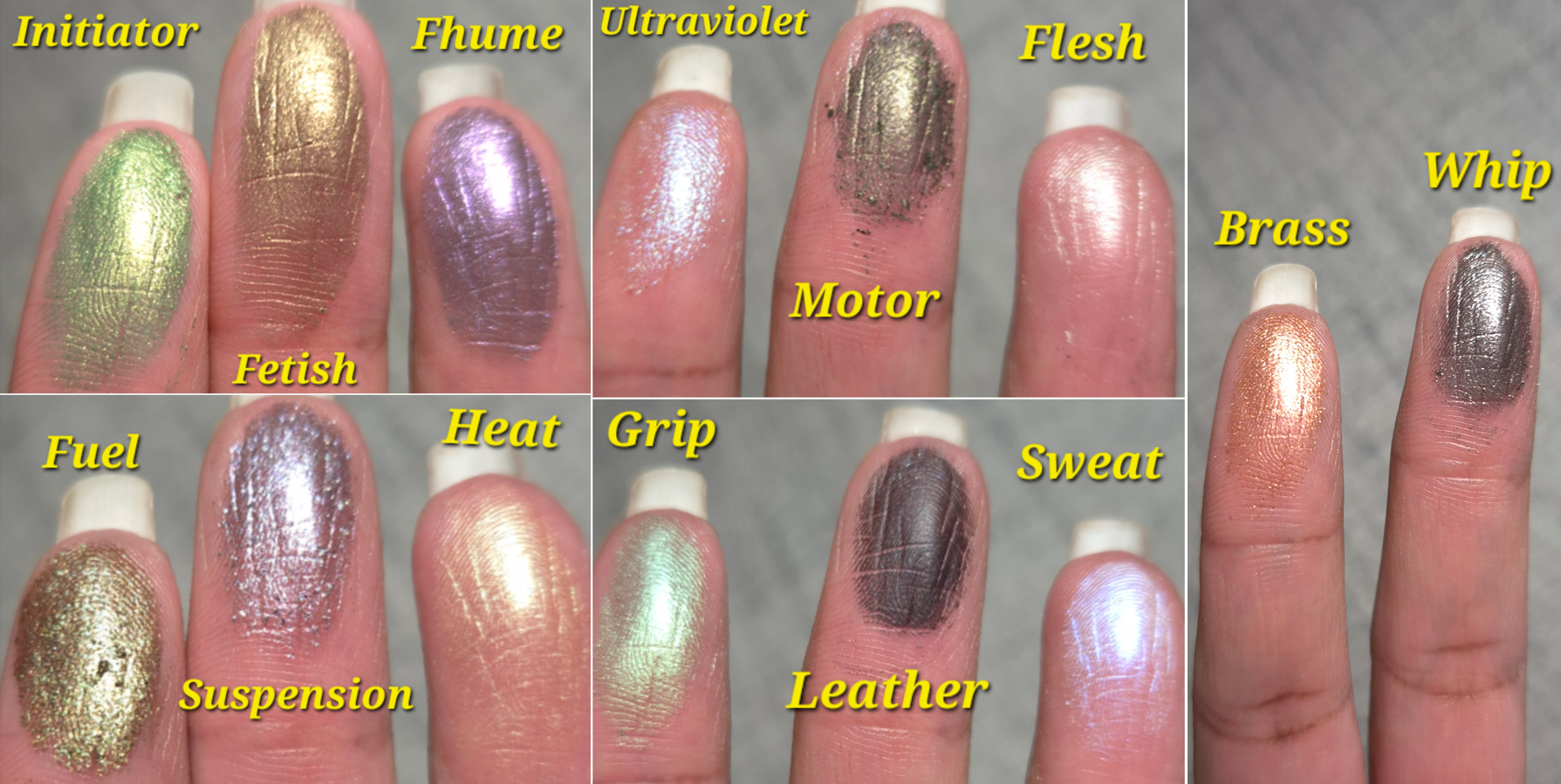
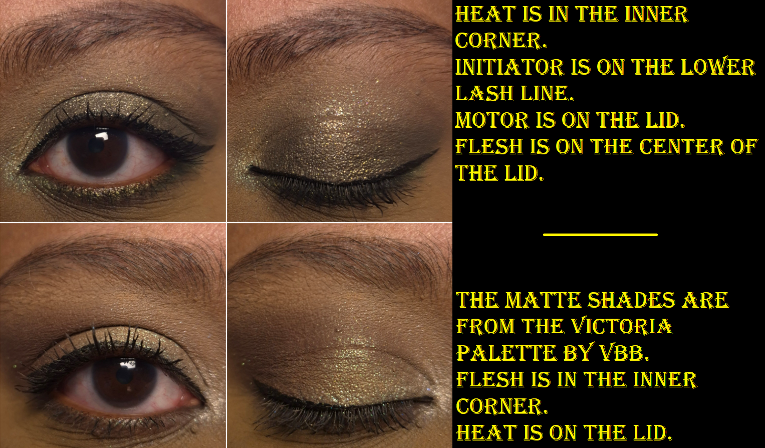
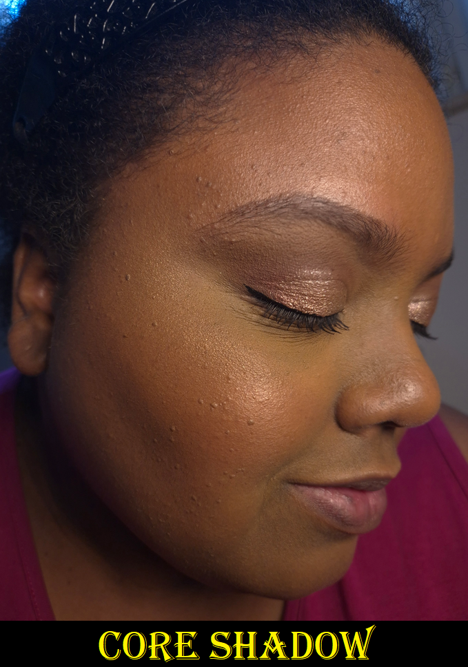
Initiator is one of the most opaque eyeshadows in the palette, but I still wouldn’t consider it to be heavily pigmented. Medium-high pigmentation is more accurate. It’s described as a metallic green, and although it’s a warm color with pretty yellow-golden flecks, I feel this is one of the less exciting shades in the palette. It’s smooth and easy to pick up with a brush and fingers. It’s definitely not thick, but most of the eyeshadows in this palette are thinner.
Flesh is the lightest, thinnest, and sheerest shade in the palette. It’s even listed as a “loose clear shimmer.” It looks a bit frosty on my skin, but it’s still one of the better shades for me to use to brighten the inner corners of my eyes. This isn’t the type of topper that relies on having a medium or larger particle size to create an instant impact. Flesh has a small shimmer size, so adding it (dry) on top of another eyeshadow won’t show much of an effect without light hitting it. Under the right conditions, it’s twinkly in a very refined way. To make it work in all lighting situations, I wet it to intensify the white color, and that contrast gives the brighter appearance. Now, I’m not sure if it’s solely my fingers or using a damp brush that causes this particular eyeshadow to form hardpan, but it’s easy enough to remove.
Fetish is described as a “pure ancient gold.” It’s a little less opaque than Initiator, but still less topper-like than the majority of the rest of the eyeshadows in this palette. It’s soft, a little powdery, and the darker base makes it a tad too dark for me to use as an inner corner highlight. It’s also thin enough to easily create a wash of color if a want, like how I used it in my crease in the first eye look below.
Brass is a shimmery orange-red color that looks like it’s going to be richly pigmented from how it appears in the pan, but it’s another medium opacity type of shade. I use it in a similar way as Fetish, which is to be a transition eyeshadow. Its texture is similar to Initiator and less powdery than Fetish.
The brand describes Fuel as a dark grey with green shimmer. I’ve been honestly a little disappointed by this shade because of how prominent the green looks in the palette compared to how much of the grey shows (grey in photos but it looks brown in person) on my eyes. The texture of this shade is the wettest by far and close to me considering it a cream eyeshadow. To pick up enough product on my finger, I have to practically scoop out a small amount and then smooth that over my eyelids. It looks wet and goes well with an editorial look, but it creases and breaks up terribly on me, no matter what primer I’ve used.
I can get this shade to last 5-6 hours before the crease area starts to look noticeably worn in, provided I set my primer with powder and reinforce that spot with a powder matte eyeshadow to act as the first layer the oil eats up. Using the powder trick, I can finish the day without it looking anywhere near as bad as I photographed above. Fuel is fine on my lower lash line, but I try to keep it out of my crease where there’s too much movement.
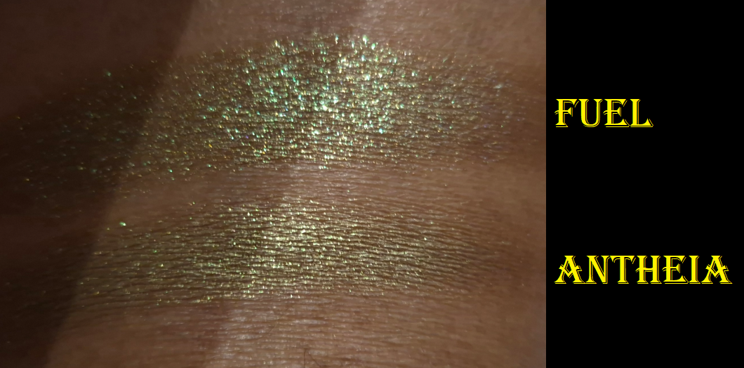
Fuel was one of the shades I looked forward to the most because it’s like a roided up version of Natasha Denona’s Antheia, which is one of my all-time favorite eyeshadows. Antheia is a duochrome and Fuel is a multichrome. It’s quite the shame that it’s too emollient of a shade to last on me, but I’m glad Antheia is still performing beautifully all these years later!
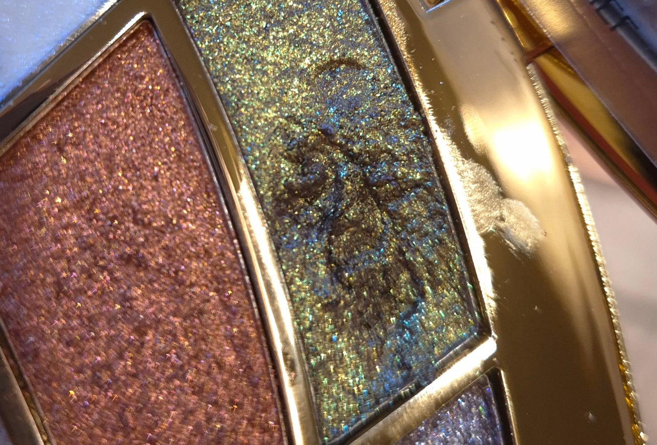
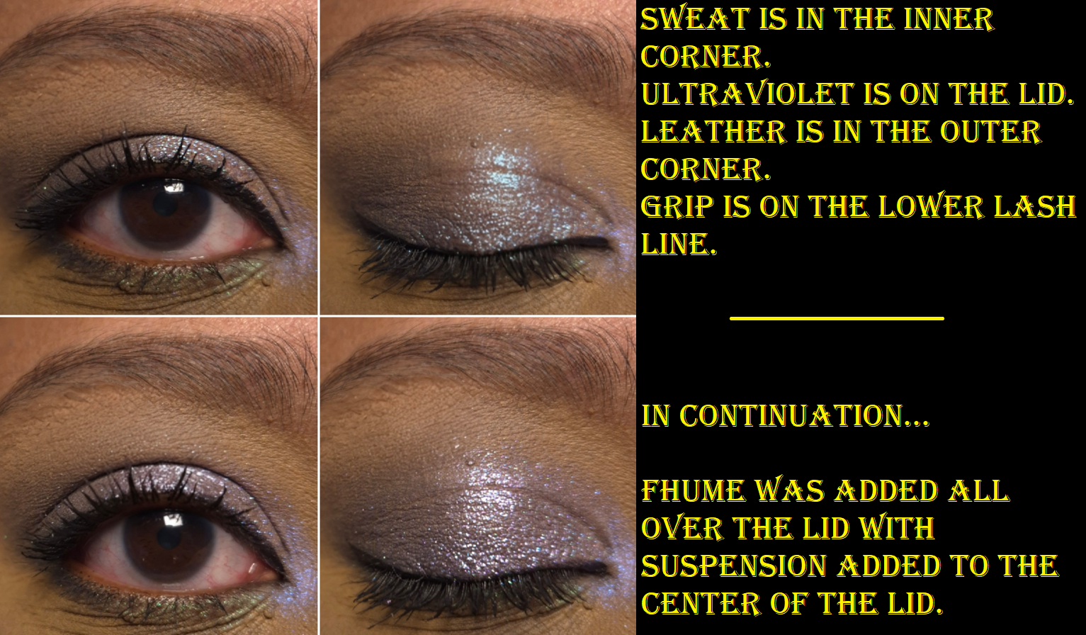
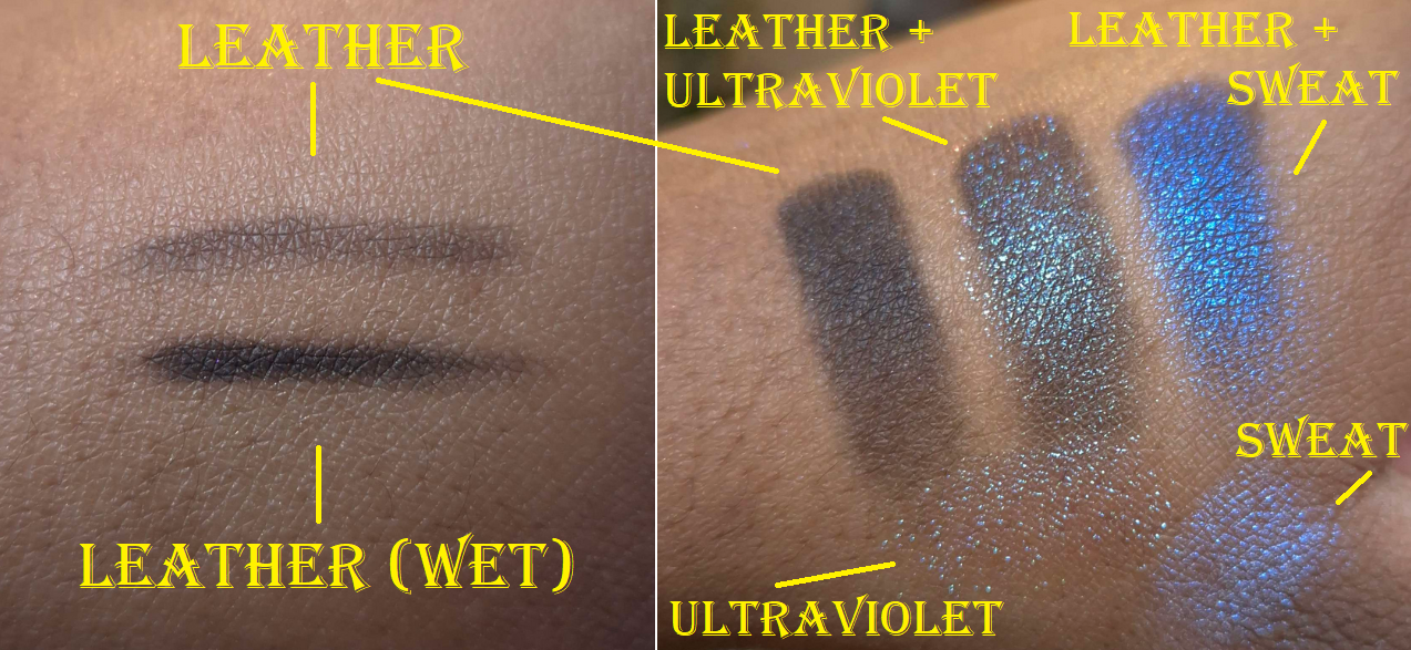
Sweat is a purple and blue iridescent eyeshadow. It’s thin and a bit slick feeling. The color reminds me of the shade UV from Clionadh, but Sweat is way less powdery with better adherence and with an even more translucent base. I honestly feel this is a more refined and modern formula than Clionadh’s, which is the highest of praise. To be fair though, Clionadh’s formula for the Series 2 Iridescents is at least five years old.
Ultraviolet is another purple and blue eyeshadow, or more specifically, “violet with bright cyan shimmer.” It’s a gorgeous dimensional multichrome, but it doesn’t look good on me as a lid shade with such a sheer base. So, I have to use this on top of other eyeshadows or keep it to the inner corner in order for me to be happy with it.
Grip is described as a grungy iridescent green. In the daytime, it looks magenta and green. At night, I have an easier time seeing blue and a cooler-toned purple as well. It’s quite sheer and also soft to the touch. It has a similar vibe to Viridian by Clionadh, which happens to be one of their most affordable shades in the Deep Iridescent Multichrome line. Grip has stronger shifts, but takes twice as many layers to build up to the same opacity level as Viridian. I still prefer Grip because it looks green head-on, whereas Viridian leans more aqua.
The brand says that Leather is a, “smokey black putty.” I can create a small indent in the surface, like with putties, but the performance is more like a cream-to-powder. It’s drier than Natasha Denona cream-to-powders, and the black shade from Pat Mcgrath’s Bronze Bliss palette, but wetter and much better performing than the black shade from Guerlain’s Ombres G Quad in Royal Jungle. The formula is such that I can create a thin hazy veil of smoke or build it up to use as a liner in daytime looks. However, it’s not quite enough to satisfy me if I’m going for maximum drama, unless I treat it like a cake liner and dampen my brush. Also, this isn’t 100% waterproof, but there seems to be a little bit of water resistance, along with it being budge and smudge resistant once it has had a minute or two to set. It’s easy to remove though with my Bioderma micellar water.
Some of the sparkles from Ultraviolet and/or Sweat have gotten into my pan of Leather, but I haven’t noticed it effecting other looks. Those shimmer particles don’t seem to transfer easily back out.
Fhume is purple with magenta shimmer specks. I would call this one a high pigment eyeshadow that is opaque like Initiator. It’s soft and easy to pick up on my brush without being powdery. It’s not too thick in consistency, nor too thin. Fhume looks pretty in the pan, but I think it’s even nicer on the eyes.
I’m the most confused by the description of Suspension as a, “plum with soft gold shimmer,” when it looks purely silvery to me. Perhaps they mean white gold? It’s a bit thicker of an eyeshadow and grittier. I definitely need to wet this or use glitter glue. It’s one of the most glittery shades in this palette and contains slightly larger shimmer particles than the others. Even though it has a dark base, that reflect is so sparkly and bright that I can use it like a highlighting shade to amp up the overall bling level of the eye look. I’ve tried using it in the outer corner and utterly failed to create depth there.
Whip is a charcoal color with purple and silvery sparkle. It’s a bit on the grittier and drier side than the others, but still has good adhesion and spreads very well. At least, I can get it onto my eyes without it looking messy. If I want to minimize the fallout, I do still need to use either a glitter glue and/or apply it damp. Despite this having a dark base, the shimmer is so bright that I could use it all over the lid instead of condemning it to only be used in the outer corner, as can sometimes be my instinct.
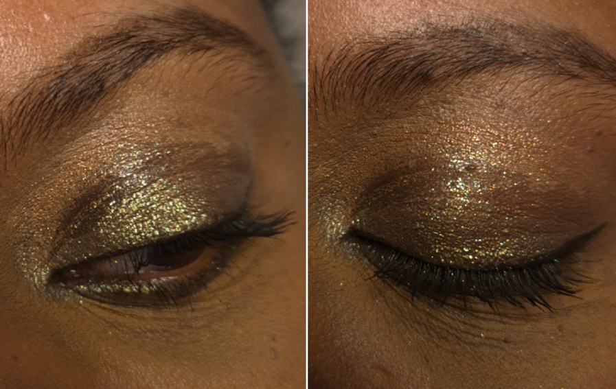
Motor is a dark antique gold that flashes olive green. It’s chunky in the sense that it’s thicker than many other eyeshadows in this palette, and little parts of it crumble off when picked up, but it’s too emollient feeling for me to call it crumbly. I like this color, but I wish it looked even more olive.
If Heat is a, “champagne with green shimmer,” just note that it has a warmer undertone than most eyeshadows that are referred to as champagne. It’s super thin, very sheer, and a little dry. It goes from a yellowish color to looking green under the light, but it doesn’t have as strong of a shimmery reflect as the majority of the other shades. It’s like a duochrome satin.
I figured I could create monochromatic all-shimmer looks that I liked, but I was surprised to see how many variations of eyeshadow pairings I enjoyed using together from Core 1.0. The avant-garde makeup aesthetic isn’t really for me, but I love purples and greens, which is why I was so attracted to this palette. I like to incorporate fun pops of color into my looks, so it’s more practical for me to view this as a supplemental palette to use in conjunction with other palettes.
I appreciate the freedom one has to apply these as washes of color or to layer up the color. There’s clearly a market for people who want duochromes and multichromes, but in subtler and more refined versions. This isn’t too difficult of a palette to use, but it’s not beginner friendly either. For example, some shades don’t build up that much stronger even if applied damp or over glitter glue. Some look better with an actual mixing medium. Then again, at this pricepoint, I don’t think many beginners would start with something like this anyway.
My hope for every palette I buy is for the eyeshadows to be of high quality and perform the way I want. It’s an extra treat when those eyeshadows also come in various textures and finishes that I get to play with. It was difficult at first to remember the different ways I had to treat the various eyeshadows, but by now, I can recall just by seeing how they look on the surface. This has eliminated some of my earlier frustrations trying to use certain shades as a topper, and didn’t realize they were too thin to make a color difference on top of the thicker shades. Learning which order to layer them took some time (about a month with sporadic usage).
If I’m going to buy a duochrome or multichrome, I typically want full pigment right away. I want impact. So, it’s quite a new experience for me to find enjoyment in these kind of eyeshadows. The Isamaya brand managed to create something quite niche, even though it’s something I’m pretty familiar with from my experience exploring various indie brands’ eyeshadows. Danessa Myricks Lightwork Palettes are probably more in line with my preferences, yet I still haven’t shelled out the money for any of those, and they’re similar to the price range of a Core palette. That being said, as much as I like Core 1.0, I still wouldn’t pay full price for it precisely because it’s something I want for specific moods and occasions rather than being an everyday kind of product. I say this even if the high price-point can be justified for the custom packaging, where it was made, the formula and pigments, etc. If the branding and these eyeshadows fit someone’s vibe, I can see it being worth full price. I don’t think someone expecting Clionadh, Devinah, and other high impact indie brand shimmer quality would like this palette, unless the plan is to use it with mixing mediums. For me, I can only recommend this on sale. In previous years, I’ve seen Isamaya products listed at 30% off. This past Black Friday/Cyber Monday, the Core Palettes were also reduced to 30% off from the brand’s official website. That’s definitely a more palatable price.
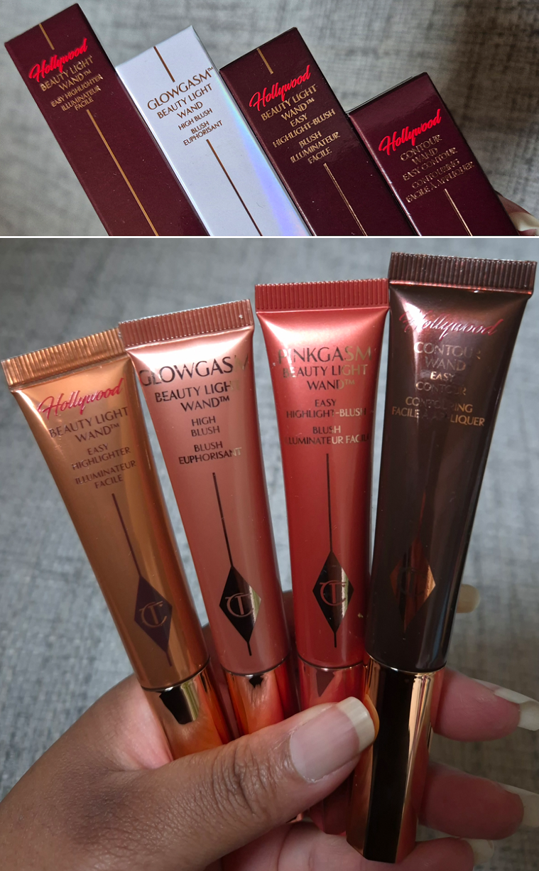
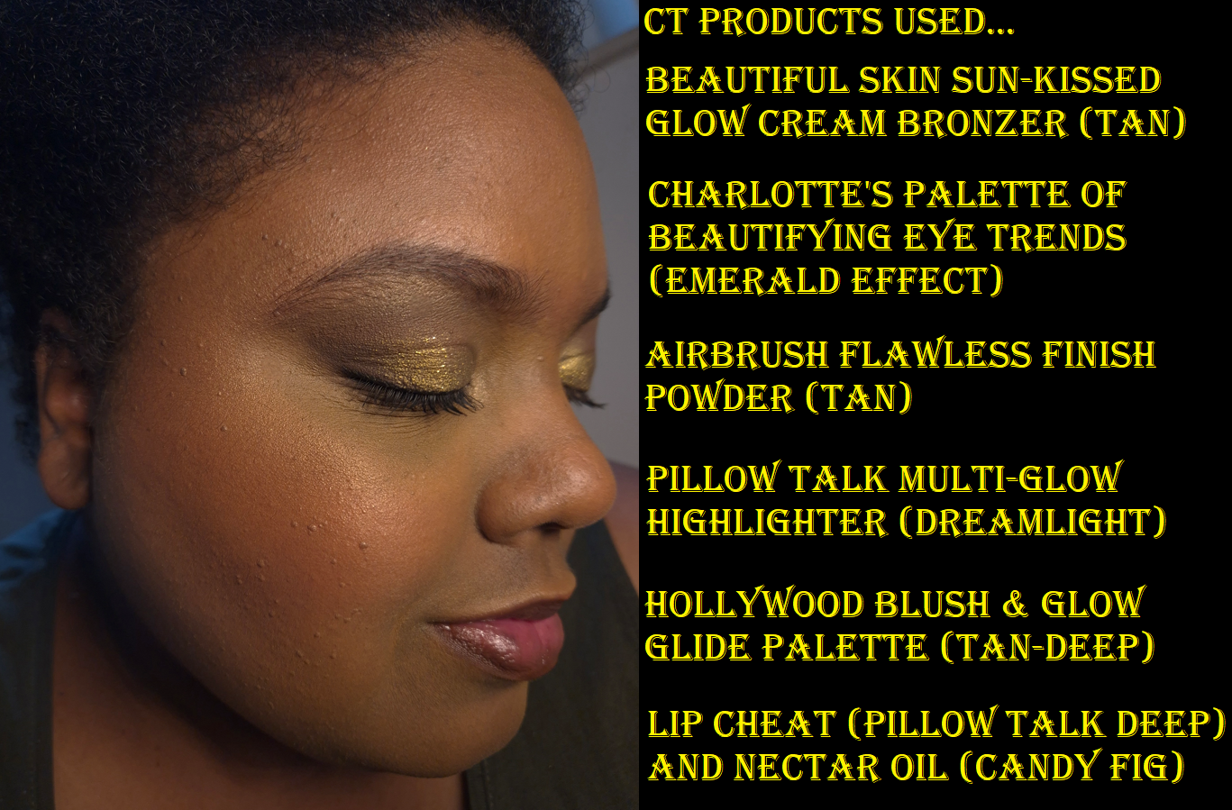
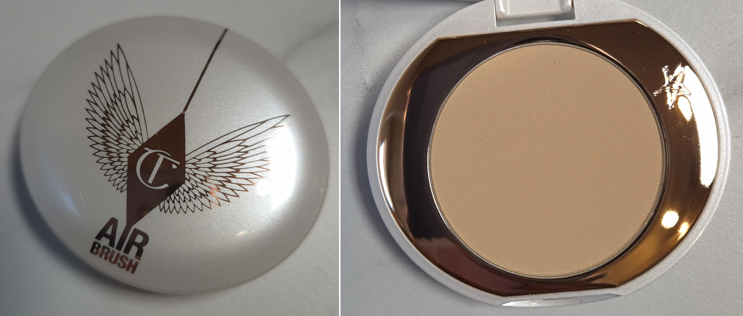
I wasn’t always a fan of Charlotte Tilbury makeup. In fact, I didn’t like the first two items I got from them (the Bar of Gold Highlighter and Fallen Angel Eyeshadow Palette). So, it took a long time before I was willing to buy additional products from them.
In the year that I became interested in the brand again, their top five makeup products were the Airbrush Flawless Filter Powders, the Beauty Wands, Matte Revolution Lipsticks, Cheek to Chic Blushes, and still that Bar of Gold Highlighter. Between 2016 until now, I have tried all of these iconic products except the wands. I have long been tempted to satisfy my curiosity, but the shade ranges were a lot more limited in the past, plus I rarely use liquid forms of blushes, highlighters, etc.
The reason I own them now is because two of them were part of a bundle deal last summer and the other two were free gifts with purchase!
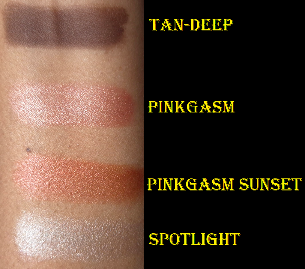
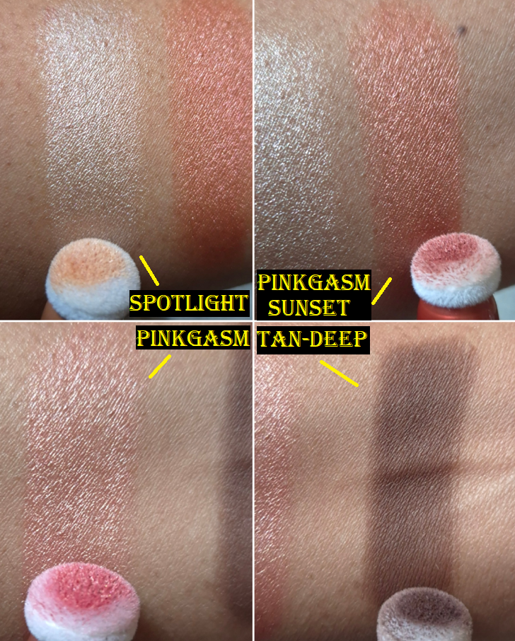
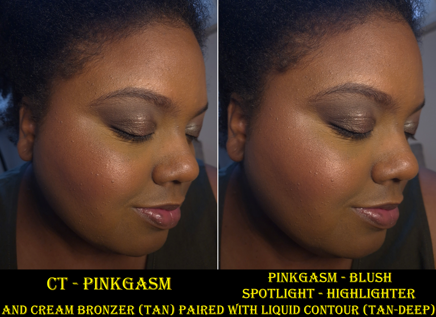
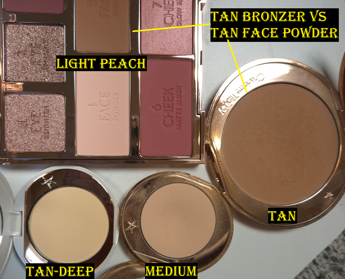
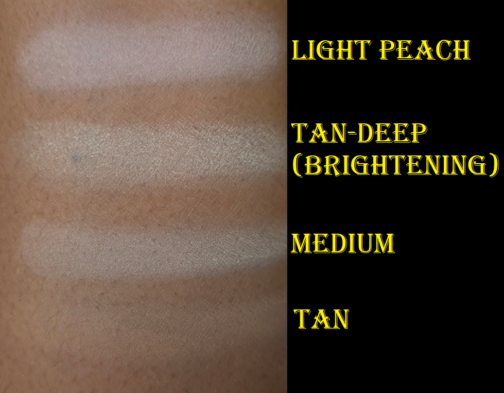
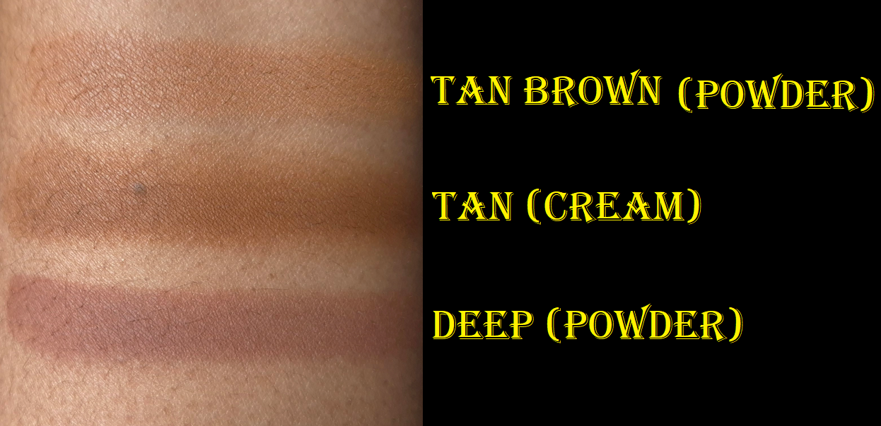
The first thing I noticed is that the lighter shades in the range (Spotlight and Pinkgasm) appear even lighter on my skin than how it looks coming out of the tube. The darker shades (Pinkgasm Sunset and Tan-Deep) look as expected. The photo below demonstrates how much darker the light shades are on the puff compared to my arm swatch.
The Contour Wands
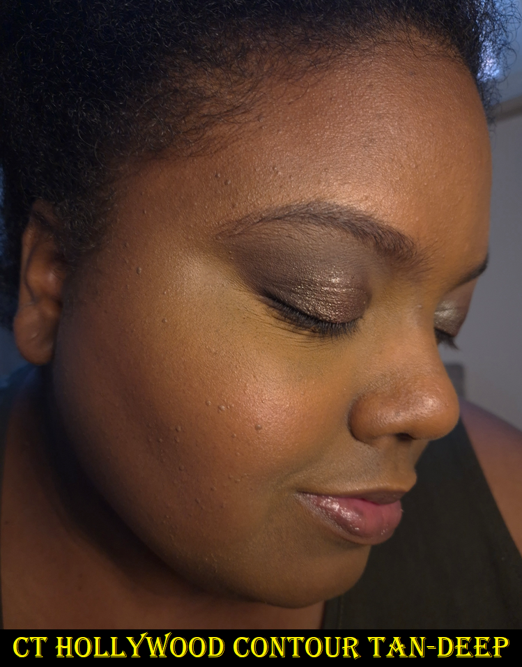
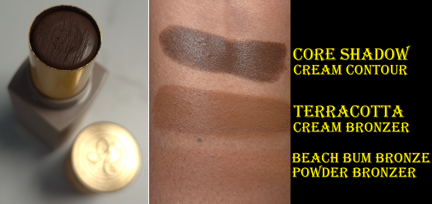
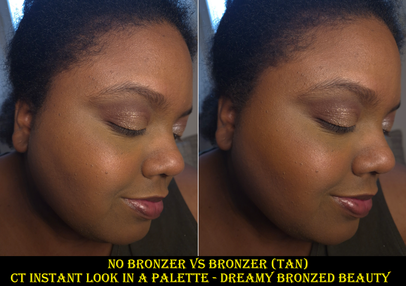
Charlotte Tilbury Contour Wand in Tan-Deep
I waited ages for the brand to release shades darker than the original Medium-Deep, but someone decided it was a good idea to make Tan and Tan-Deep warm toned, as seen in a YouTube Short by Tammi Clarke. I didn’t want a liquid bronzer and the undertone of Tan seemed too red to look like anything but a bronzer on me. That’s why I picked Tan-Deep in the hopes that even if it was too warm to create a shadowy affect, I could still create the illusion of depth based on the amount of shades darker it is from my skin color. Having another Brontour in my collection isn’t so bad.
Well, I wish my plan was more successful in practice. With my skills, it’s a bit difficult to spread such a small amount of product evenly everywhere and have it look natural with such a big jump between this shade and my skin tone. If this was the type of blendable formula that sheers out while it’s being applied, it would look a lot better. However, that’s the kind of trait that’s easier to find in cream form. The advantage of liquid contours is how well they set down and how incredibly long-lasting they are on the skin. So, I don’t expect the Contour Wand to perform that way. It’s just unfortunate that I don’t have a closer shade match from the line, so that I can get the same results from this product as other customers will. For others, the amount of time you have to blend before it dries is likely good enough. The spread-ability is also less likely to be an issue for someone who has their correct shade. The pigment level could still be too high for the type of person who prefers subtle and skin-like complexion products, but maybe the natural girlies prefer to just skip contouring anyway! The Charlotte Tilbury brand isn’t known for championing barely-there type of makeup.
I compiled these photos from the images on Beautylish.com
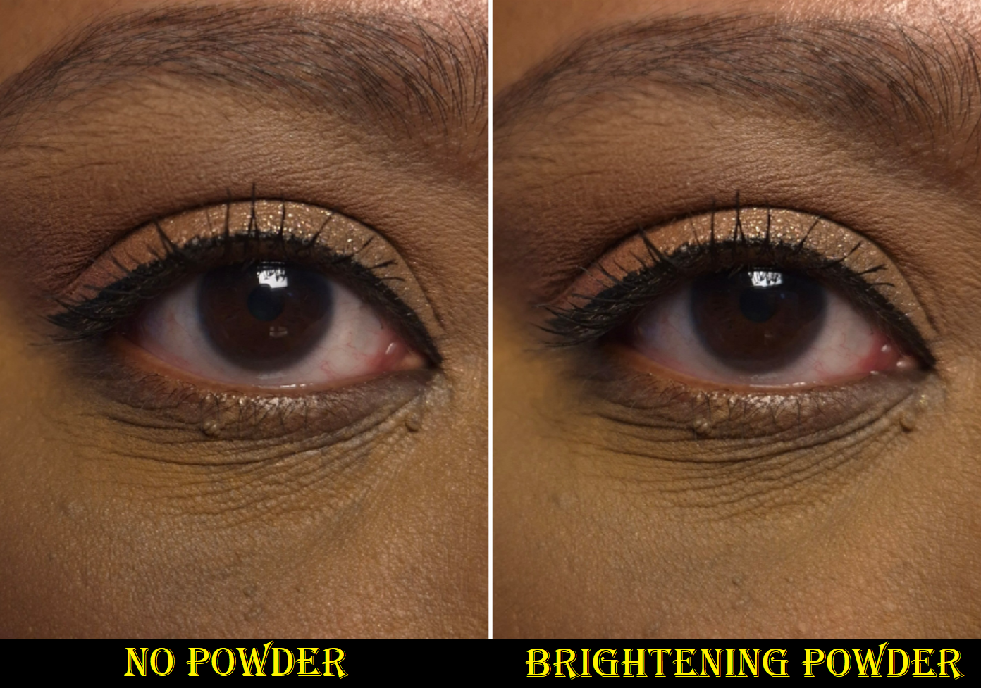
Of course, there are still tricks to better merge this into my foundation. I can apply leftover foundation between the edges. I can also use a blurring or brightening finishing powder to tone down the color and also clean up the edges. Plus, once blush is on top, the slight splotches aren’t as noticeable.
If I actually wanted a liquid bronzer, I could buy the Tan shade of Contour Wand. However, I feel pretty confident I would still prefer to use Charlotte Tilbury’s Beautiful Skin Sunkissed Glow Bronzer, which continues to remain the top cream bronzer in my collection. I highly recommend it, though there aren’t many shades to choose from. If I had to pick, I would also select the Airbrush Bronzer over the Contour Wand.
The Beauty Light Wands
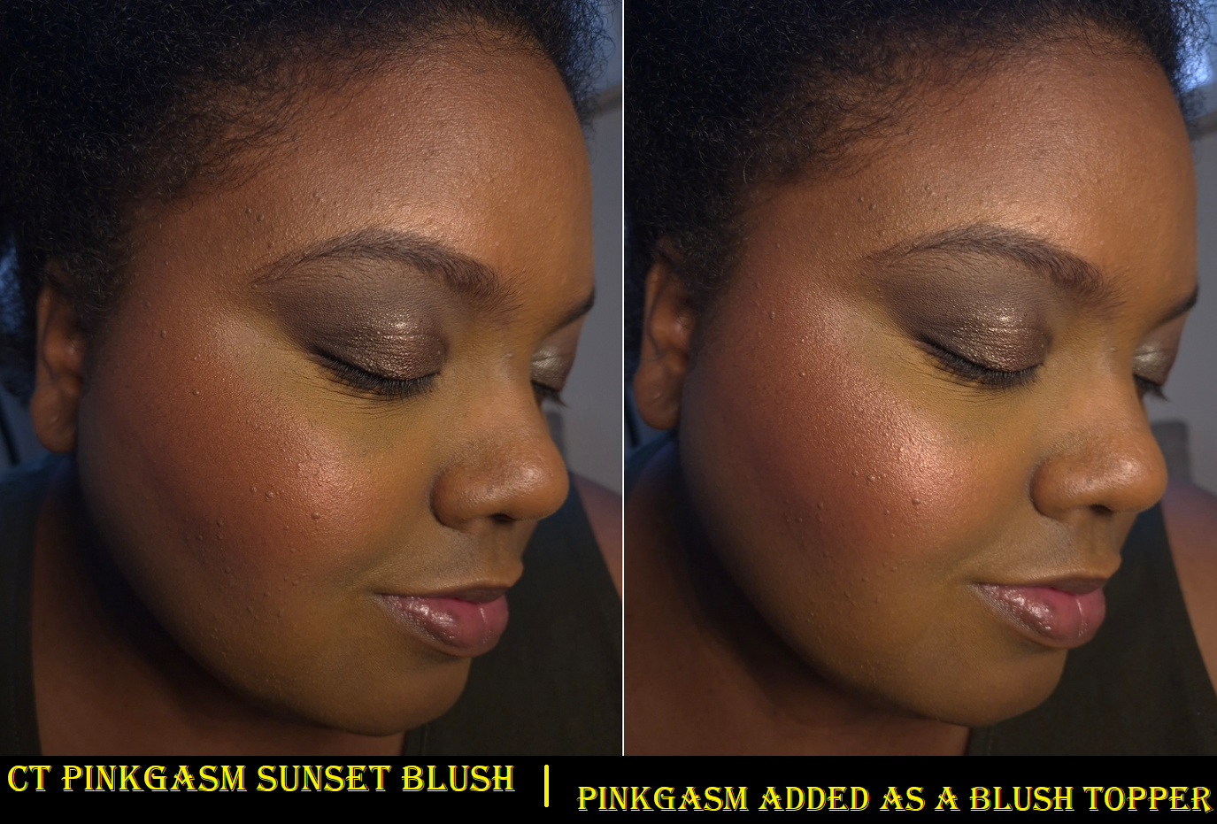
Charlotte Tilbury Easy Highlight Blush in Pinkgasm Sunset and Charlotte Tilbury High Blush in Pinkgasm
I’m not sure what the distinction is supposed to be between the “high blush” and “highlight blush” considering both are shimmery. Pinkgasm looks shinier and brighter than Pinkgasm Sunset, but it’s probably just due to it being a lighter color.
I have a much easier time blending these in than the Contour Wands, but that’s because I don’t have to be as careful with the application. In the beginning, I struggled to figure out how much product to let out during the twist process before toggling the arrow back to the “off” position. I would sometimes let out an excess amount of product, which is the only time I’d be in danger of applying too much as I dotted it directly to my cheeks. However, that’s something I got used to with time. My tube of Pinkgasm Sunset isn’t leaking to the point where it fills the cap, but despite me keeping it permanently in the “off” position, there is still always product in the sponge tip. My other tubes haven’t had that issue.
I love the color and the glow from these blushes, but it’s definitely not a natural appearance. It borders the line between looking shimmery and looking metallic. It also doesn’t fully sink into my skin. Bold makeup wearers may not mind, but this could be a drawback to others. If I’m creating a dramatic and full coverage kind of look, these blushes don’t seem out of place.
In most situations, these blushes fully dry down on my face. Once it sets, it doesn’t budge all day. However, if I’m wearing extra moisturizing skincare in combination with a dewier foundation, the blushes get a slight tacky feeling. I rarely powder my entire face, so it’s possible that could be a simple solution for when this happens, or to use a setting spray. I wasn’t home when I noticed this, so I just made sure not to press my cheek against anyone!
My favorite way to use these shades is to apply Pinkgasm Sunset on most of my cheek area and concentrate Pinkgasm on the apples and top of my cheekbones in place of highlighter. Texture is enhanced a little, but I won’t be fooling anyone into thinking my shiny cheeks are natural anyway! I can somewhat get away with wearing Pinkgasm by itself on my cheeks, as seen in the photo lower down, but I think it looks best when paired with Pinkgasm Sunset.
Between the Blush Wands and Blush Sticks, I prefer the look of the Blush Wands on my cheeks and how they set down fully. Due purely to the shade options, I might even prefer the Blush Wand over the Cheek to Chic Blushes. However, my top blush format from Charlotte Tilbury are their powder blushes that end up in limited edition products, but are not yet available as singles.
Charlotte Tilbury Easy Highlighter in Spotlight
There isn’t much to say regarding the highlighter. There are times that I could swear the product seamlessly blended into the liquid blush and didn’t look so stark, but I was not able to capture those moments on camera. Perhaps it had to do with the lighting I was under.
Trying to use Spotlight very sparingly, and keeping it strategically placed, is a little challenging. Pinkgasm is bright enough that I don’t even feel the need to apply a true highlighter on top after. There is also the advantage that if I apply Pinkgasm in too wide of an area, it looks as if I intentionally blended it into my blush like a blush topper. Unfortunately, if I apply too much of Spotlight, I need to cover it up or start over.
Essentially, this is more of a preference note and not a critique of the formula. It is pretty much the same as the blushes, so those that like the blushes will probably enjoy the highlighters as well, provided it’s a suitable color for the individual.
By now, it wouldn’t surprise anyone to know that I prefer the brand’s powder highlighters, specifically, the Hollywood Glow Glide Face Architect Highlighter and the Pillow Talk Multi-Glow Highlighter. For ease of use of a liquid and for a subtler glow, I even prefer the Hollywood Flawless Filter. I also use the Unreal Skin Sheer Glow Tint Hydrating Foundation Stick as a highlighter. I’d choose all of these options over the Beauty Light Wand Highlighters.
These Beauty Wands didn’t turn me into a liquid makeup lover, but it’s nice to see the hype wasn’t unwarranted. I think out of everything, I’m the most likely to use the Blush Wands every now and then. To be fair, the contour and highlighter aren’t the right shades, so there isn’t as much chance of me getting use out of them.
If I had to choose my favorite liquid contour, it might be Charlotte’s (because I have tried less than a handful). My favorite liquid blushes are by Rare Beauty and Glossier, but I feel like the Huda Beauty Blush Filters have some shimmery shades that are better than the Blush Wands. I don’t have a favorite liquid highlighter, but it might be the Dior Forever Glow Star Filter. So, even though I’m not a liquid lover, the Beauty Wands still wouldn’t be at the top of my list. They’re decent products, but just not for me.
Lip Products
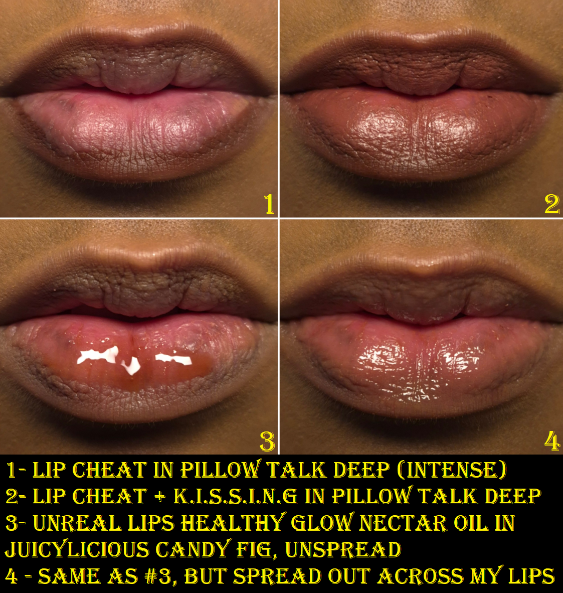
Charlotte Tilbury Unreal Lips Healthy Glow Nectar Oil in Juicylicious Candy Fig
This feels like a gloss and oil hybrid, rather than a traditional lip oil. It has a non-runny consistency that isn’t too thick or too thin either. It grips the lips quite well and doesn’t come off my lips completely even after a meal. Of course, I still need to reapply it at least 1 or 2 times in the day, but I’m impressed with its adherence level.
In terms of how nourishing it is for me, it doesn’t improve the condition of my lips as much as my favorite lip-caring products, but it at least doesn’t make them worse. It’s essentially the kind of product I grab to just keep my lips moisturized in the moment, to have the glossy shine, and perhaps for the slight twinge of reddish-purple and brown color. If I want to actually combat any chapped spots, rather than just camouflaging and soothing them, I need to use something else.
This has a nice sweet fig scent. The applicator is a great shape to help spread a semi-thick product like this evenly. I can feel a bit of tack when I wear the Nectar Oil, but I don’t consider it to be noticeably sticky until it starts to wear off.
The Nectar Oils were released around the same time as the Dior Lip Glow Butters. I haven’t used the Dior ones consistently enough to have my thoughts formed on them, but I like them both. Considering the price difference, I should like the Dior significantly more, but they’re about even for me. Dior’s is €44 at full price for 10ml and Charlotte’s is €26 for 14ml. Dior’s has a cool-minty feeling in the beginning. Charlotte’s has more color payoff, depending on the shade. They both come in plastic tubes and have identically shaped applicators. In fact, I can even swap the caps on both of them, even though they are different lengths. I will review the Dior product at some point in the future and revisit these comparisons.
I like the Charlotte Tilbury Nectar Oil, but it’s not a game-changer.
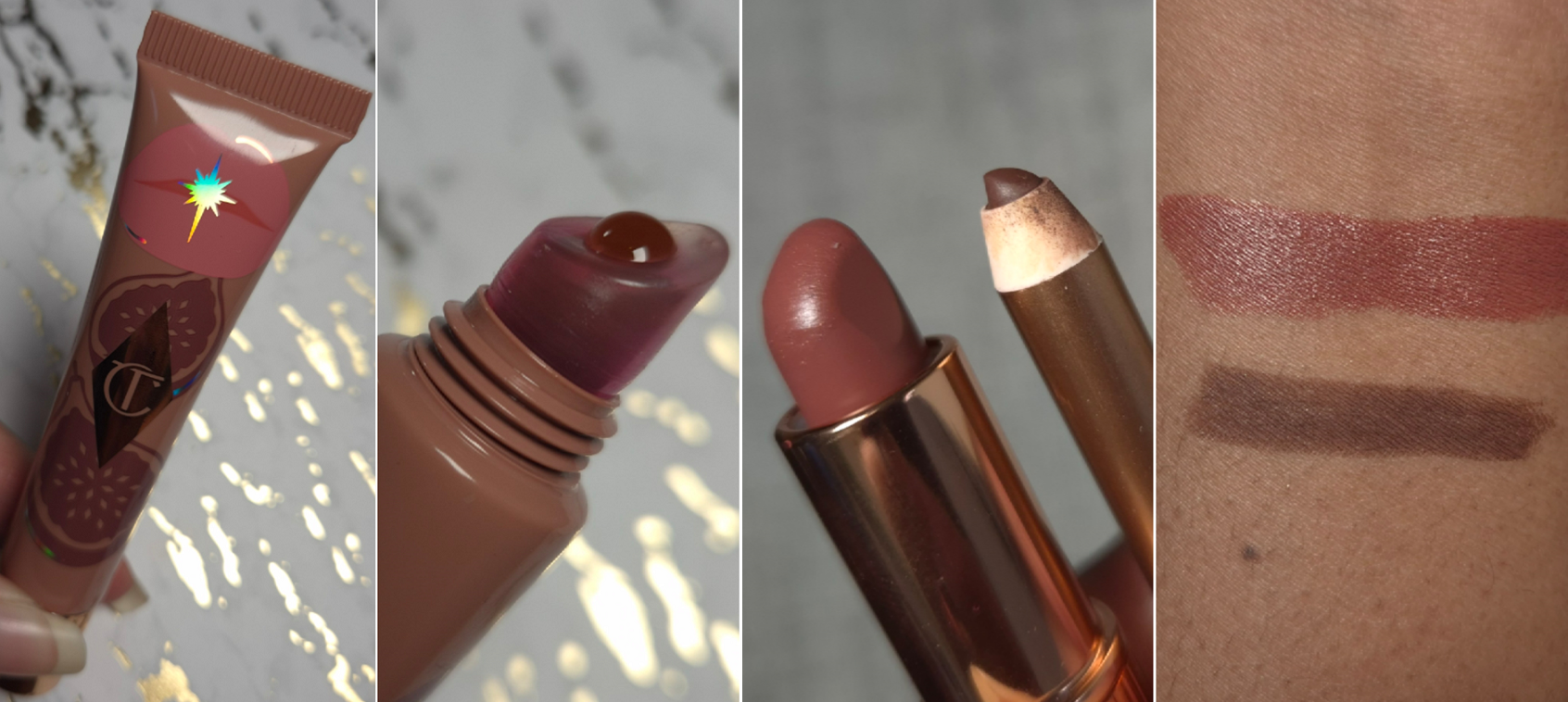
Charlotte Tilbury K.I.S.S.I.N.G (mini) in Pillow Talk Deep (Intense) and Charlotte TilburyLip Cheat(mini) in Pillow Talk Deep
I bought these as part of a set called Mini Pillow Talk Lip Kit in Pillow Talk Deep. “Intense” and “Deep” are used interchangeably and are listed as either one depending on the website. With just a few swipes of the lipstick, I can completely cover the darker pigmented spots on my lips. I like the color, but it’s a hair darker than I hoped. Perhaps I would like the color of Pillow Talk Medium more on myself, but that shade is in a different formula (Matte Revolution).
This K.I.S.S..I.N.G Lipstick is a comfortable satin formula that leaves some initial imprints on glasses and whatever it touches at the start of the day, but I’m still left with quite a bit of color that clings well to the lips even after most of the sheen is gone. This needs to be touched up after meals, but if I’m just drinking, I can go 3-4 hours before getting the sensation of needing to apply more to get back the moisturized feeling (and not because of the color being gone/faded). If only drinking, six hours is around as much as the color lingers before I consider it pretty much gone. There are some remnants on a napkin when I wipe my lips, but what’s left is the equivalent of a light tint barely darker than my natural lip color.
This doesn’t contain parfum, but it has Ethyl Vanillin which is used as a flavoring agent and fragrance. When I lick my lips, I don’t taste vanilla. When I smell the bullet, I can faintly detect something, but it may just be that my small mini isn’t as strongly scented as the full-size.
I have used this lipstick on my best conditioned days (after 24-48 hours of my best balms and glosses) as well as less than ideal days. This lipstick works great on the best days, but that sensation of needing to reapply is unsurprisingly stronger during the times when my lips are quite dry from the start. So, on those days I typically wear the lipstick for half of the day before switching to something more nourishing. That’s the best way I can wear this lipstick for multiple days in a row.
So, overall, I like this lipstick and the formula. I would consider buying more in the future, but I’m not interested in other shades at the moment.
The Lip Cheat is a creamy liner that glides over the skin easily, and there is enough time to soften and the edges before it locks into place, but not a whole lot. The longevity is quite good, as it has lasted through meals (except if I wipe my mouth too much with a napkin), and it remains on my lips even after my lipstick is gone.
The brand claims the formula is waterproof, smudge-proof, and transfer-proof. It certainly is long-lasting, but I tested that even after having it on for 10 minutes, I could still partly wipe it away with water. So, I’d call it water-resistant instead. I can also wipe it away with a dry makeup eraser. This doesn’t smudge on me once it’s set, and it’s transfer-resistant on my dry bare skin. However, if I’m wearing a moisturizing formula of lipstick or more emollient product such as a lip gloss or lip oil on top, it is definitely coming off if it makes contact with the surface of something. That being said, this is still one of the better lip liners in my collection.
I like this particular color, though it’s darker than what I usually wear. Still, it fills a void.
I like the Lip Cheat enough that I would be willing to buy more. However, since I hardly use lip liners, I just don’t have a need for additional shades at this time.
So that is everything I have for you today! Thank you for reading!
MAC always has these huge holiday collections filled with limited edition shades of products, new formulas, minis, and plenty of value sets. Unlike other brands, whose holiday items tend to be cheaper quality, MAC’s standard seems to be the same across the board. The brushes are the only things I’ve heard negative things about, and I’ve liked the holiday makeup I’ve bought over the years. This time, I decided to pick up just a few things.
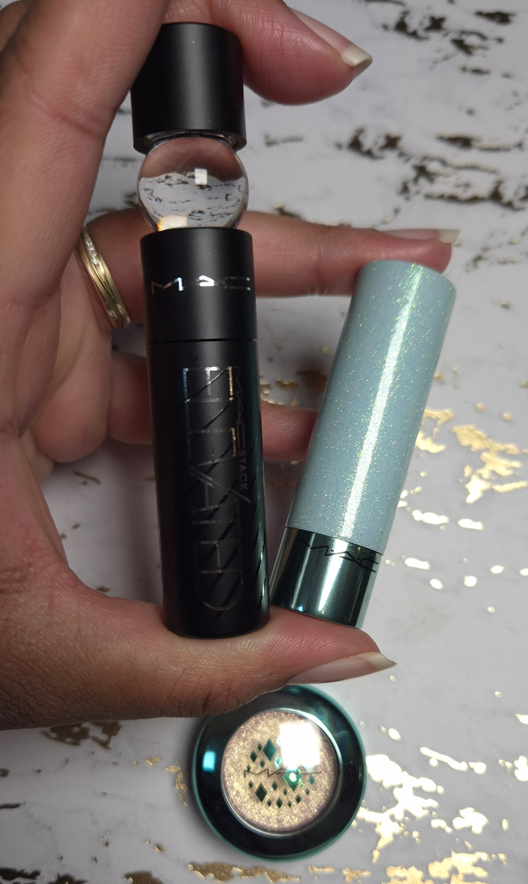
Sugar Crystal Lip Oil Stick in Glisten Up
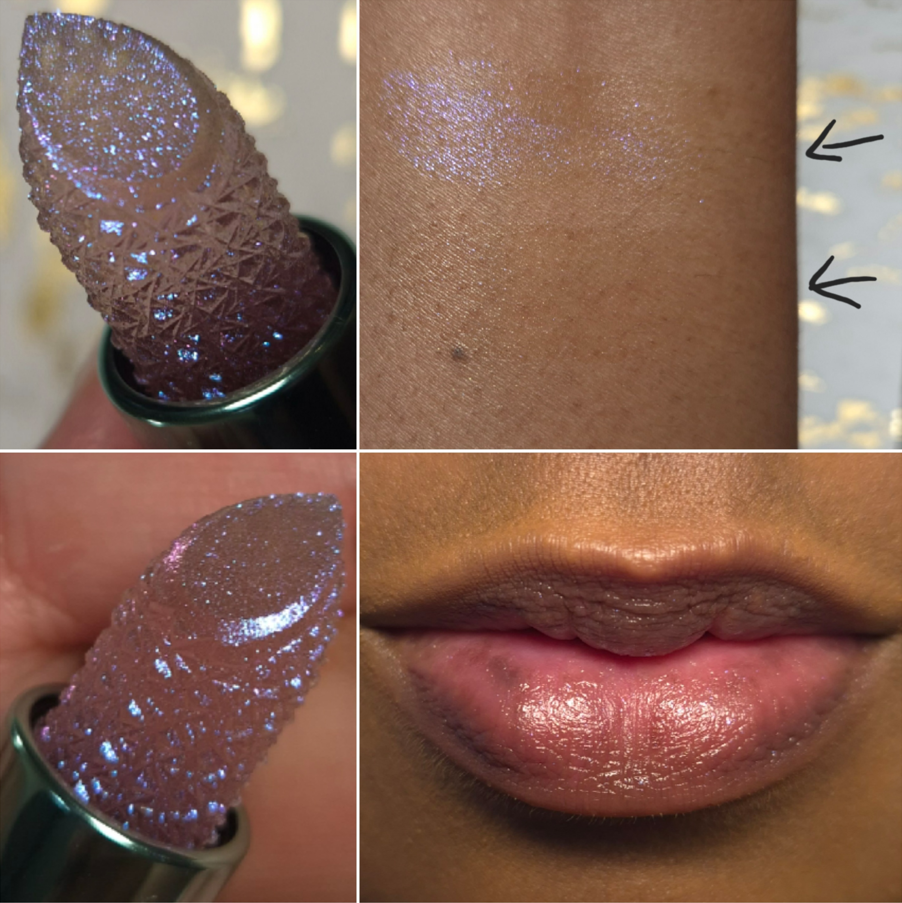
The cute packaging and uniquely shaped bullet with the gorgeous oil-slick colors is so enticing! I was very curious to experience this formula, because it’s a new innovation for MAC.
As seen in the swatches, the purple-blue-pink shimmer specks are an overspray. One swipe was enough to remove it completely from the slanted portion, and I can see that it’s clear from the inside, similar to the look of the Winky Lux Flower Lip Balms. I believe MAC’s formula is a little more complex and modern than those. I am at least happy that the sides of the lipstick will continue to look sparkly as long as I don’t touch it. I honestly didn’t want that shimmer on my lips. I get a particle or two each time I wear it, but it’s essentially a clear product. It has a pretty shine, but it’s not very glossy or oily looking.
The surface feels gel-like, soft, and comfortable as I move it across my lips. The bullet doesn’t tug and I get a similar sensation to the k-beauty melty formulas, but the bullet continues to hold its shape and doesn’t look overly emollient on the surface.
I have super dry lips, so I’m always happy to have a product that deeply nourishes and hydrates my lips, in addition to making them look supple and moisturized. Unfortunately, this is not one of those products. It keeps my lips moisturized on the surface for a couple of hours, but it’s not that much better than a typical lip balm and my lips lose that hydrated feeling much quicker than my regular lip oils. I have to reapply a lot throughout the day.
Although I don’t see parfum listed on the website ingredient list, this contains Citric Acid and Vanillin, and it has a mild candy gumdrop type of smell. I get enjoyment from looking at it and using it, but it’s not going to become a staple product in my collection. I think this would make a fun gift for someone, but more as a novelty item. Perhaps others with less severely dry lips will consider the formula to be good enough. I can only speak about my experience using it.
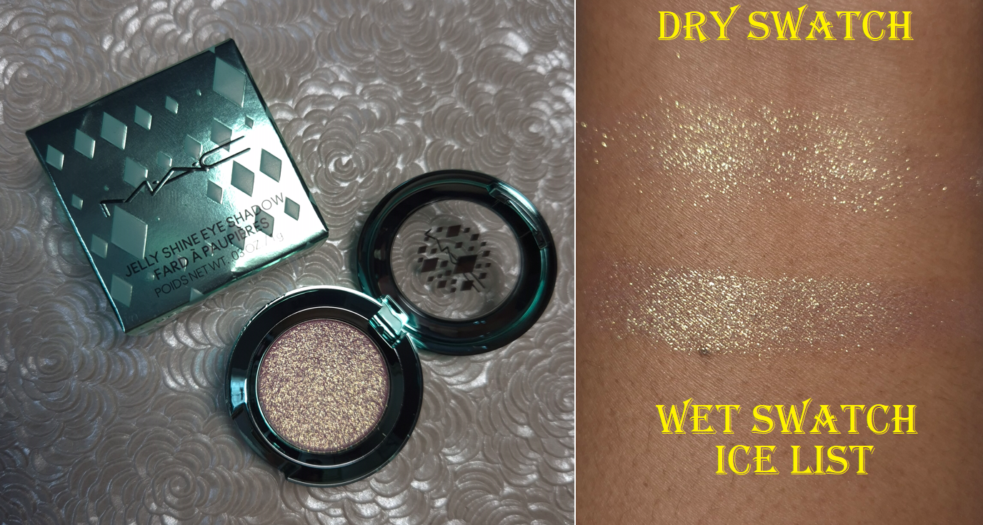
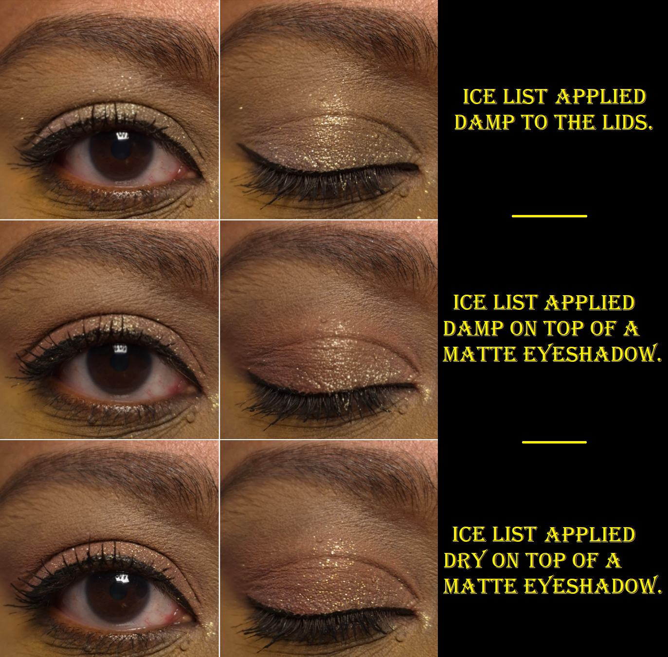
Jelly Shine Eye Shadow in Ice List
Based on the name alone, I was expecting a gel wet-feeling product. It’s supposed to have a “hybrid, jelly-like texture,” but the shimmer particles make it so that it feels dry to the touch with every swipe. I honestly would have called BS on the texture if I hadn’t been able to scrape the product out with my nail and then completely smooth it back out on the surface of the pan with my finger. It has some slip to it, but it’s not wet like the Colourpop Jelly Much eyeshadows, it doesn’t have the creaminess of a MAC Paint Pot, nor the softness of the MAC Glow Play Cushiony Blushes.
As someone who enjoys an interesting tactile experience combined with high performance, I was a little disappointed by how this felt. The results made up for it though. Ice List doesn’t look that impressive on me when I use it on my bare lids, but it really sings when paired with other eyeshadows!
When applied straight from the pan to my lids, it has a scattered effect type of look. I cannot get an opaque application without applying the eyeshadow damp first. I think this is a good quality for a topper to have, so that it suits more people’s eye makeup preferences. I’m not the biggest fan of toppers, but if I can get one to show less of my skin or eyeshadow underneath, I’m fine with that.
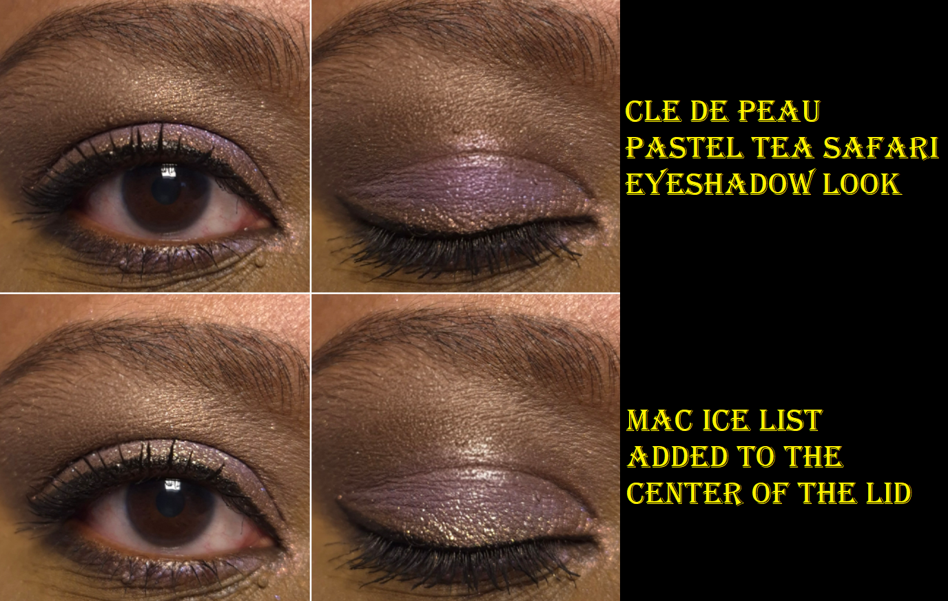
I have a lot of impressive sparkly eyeshadows from indie brands, so my expectations were low. I didn’t think a product like this would make such a difference, but it’s great for bumping up the impact and drama of an eyeshadow look. One such example is when I was completely satisfied and happy with my eye makeup using Clé de Peau eyeshadows, but when I added Ice List on top, it took the look to a whole new level!
This can be a little messy to use if an extra chunk comes off, as I sometimes get it in my lashes. It adheres well (I always wet it though), so I don’t notice much fallout throughout the day. However, when I have to take it off is when the sparkles go everywhere and it’s so difficult to get every speck off my face despite using my tried and true Bioderma micellar water with a Makeup Eraser cloth.
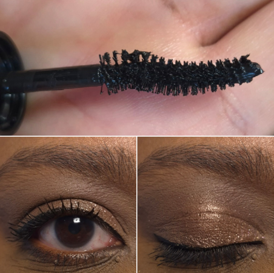
M·A·CStack Elevated Mascara (travel size)
MAC has the Foreseeable Future Eye Kit that includes a full size of this mascara, plus full size of the Colour Excess Gel Pencil Eye Liner. I did not buy that set, but I figured I could include this mascara review as part of the holiday collection because of that kit.
The M·A·CStack Mascara is one of my favorites, so I was eager to try this one because I assumed it would be a similar formula, just with a curved brush instead. There are actually more differences than that. For instance, the first M·A·CStack has a “mousse-like texture…for endless stackability” and the Elevated M·A·CStack has a wetter formula “featuring argan oil.” The M·A·CStack has a silicone brush and the Elevated M·A·CStack has a bristle brush.
In the beginning, I really did not like the Elevated M·A·CStack because I felt the formula was too wet and thin. It wasn’t sticking as well to my lashes, so I was lacking volume and couldn’t build it up that much. After about a month or so the mascara liquid became thicker and/or less wet (it gained more grip), and then I started to like how it looked. Although my preferred technique is to build up a lot of mascara in one go, with the Elevated mascara I got better results by applying a first coat and waiting for it to mostly dry before adding a thicker second coat.
Below is another example of how it looks on my lashes. It’s from my Cle de Peau post.
Although this mascara works better for me now than it was in the beginning, and it does a decent job of lifting the lashes, I still prefer the normal version of M·A·CStack. The M·A·CStack is quicker to apply and get the volume and length I like. The only thing to note is it may not be suited to those with sensitive eyes. I have no issues wearing that mascara unless I lay down to take a nap. Then, my eyes get irritated. Although I don’t see flakes on my face when I wear the M·A·CStack, I can only assume that some of it gets in my eyes when I’m in a laying position and causes irritation. Also, when I’m trying to remove the mascara, my eyes are fine as long as I get all of the particles completely out. If a dot of it gets in the back, my eyes will again feel uncomfortable and a little irritated until I remove it. I don’t know if the Elevated version does this as well, considering I have tried my best to just not nap while I’m wearing makeup. I do not wish to intentionally test this out either.
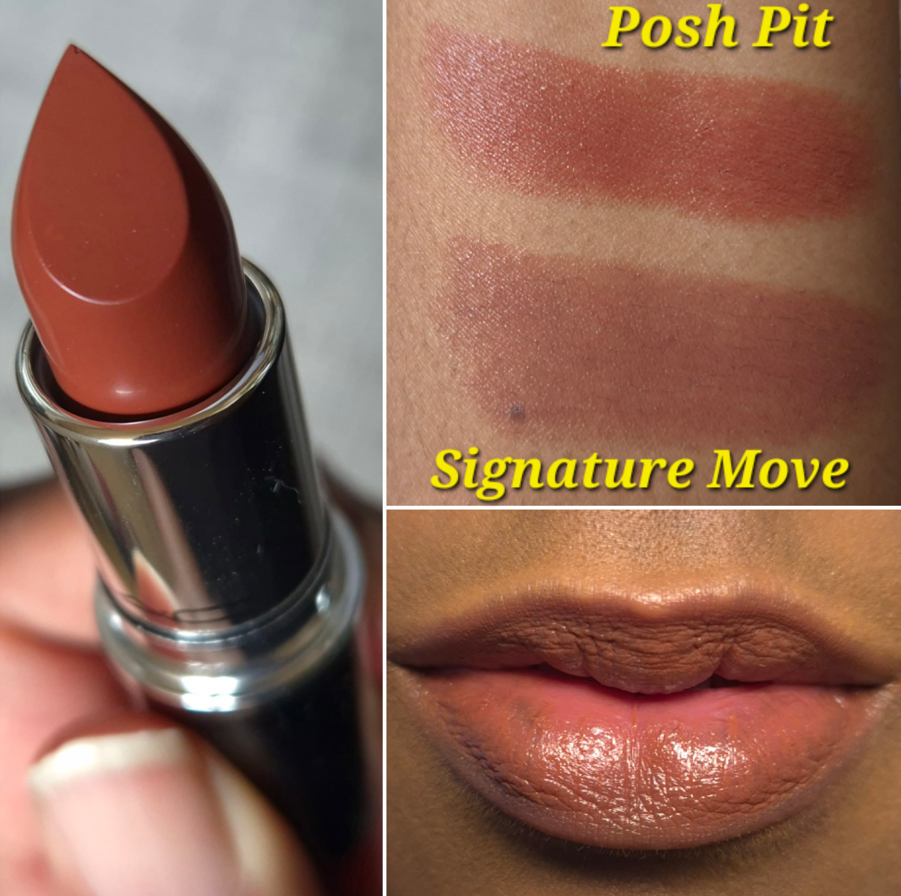
MAC Lustreglass Sheer-Shine Lipstick in Posh Pit
Since this is a MAC centered post, I figure it’s a fitting place to add photos of this lipstick. It was not included in my first review of the Lustreglass lipstick formula from my Makeup So Good I Had to Buy More post. I bought this shade in April, but I don’t see it on the US MAC website, so I’m not sure if it’s discontinued. It’s listed as out of stock on the MAC DE site, but I can still find it at other German retailers.
A short summary of my thoughts is that I consider the Lustreglass formula to be a more emollient version of the Lisa Eldridge Luxuriously Lucent Lip Colours. The amount of color this gives can be built up, but not to full opacity. The texture is light and buttery feeling and the shine level looks beautiful when first applied, but it’s not that long lasting on me. The tradeoff for this remaining comfortable on my desert dry lips is the fact that I have to reapply a lot.
Final Thoughts
This marks the end of the reviews. If these products were amazing and staple-worthy, I would consider the holiday collection to be brilliant. As it stands, this isn’t a bust either because MAC is holding true to what they usually do. This is the brand that released the Snowflushed duochrome highlighter in 2019, and chose to make a minty shade of highlighter this year. They tend to take more risks with the colors in their holiday collections, and I too am more prone to trying things outside of my comfort zone during this festive time.
The products I got were fun, and it helps that I got them on sale too!
That’s all for today! Thank you for checking out my blog! Also, I’m wishing anyone who celebrates it an early Happy Thanksgiving!
For those only interested in the review, feel free to scroll further down to that specific section.
My History with Clé de Peau
In 2011, I was not interested in luxury makeup. In fact, makeup didn’t play as large of a role in my life until several years later. Despite that, it was still impossible to avoid hearing about how, “Kim Kardashian loves Clé de Peau’s concealer.” Mario Dedivanovic’s “triangle concealer technique” was the talk of the makeup, fashion, and celebrity gossip world.
Being the curious person I am, I did some research and was absolutely floored by the prices of everything. At that time, drugstore makeup was all I had experienced, and MAC was considered the crème de la crème among my circle of friends. We were all broke college kids and I didn’t dare look at the legacy brand makeup behind the beauty counters of our mall because they were so far out of my price range. I was shocked to discover brands like Clé de Peau existed with price-points surpassing even those!
Since Clé de Peau was the first non-designer luxury brand I’d ever heard of, the name stuck with me. It wasn’t until the end of 2013 that my makeup obsession began. I started dabbling into mid tier and prestige brands, but beauty subscription boxes are how I was able to try a lot more products in those days (and this is where the “Unbox” part of my blog name comes from as I used to make unboxing content). In 2015, I tried my first Cle de Peau product via the Choix subscription service. I had a small container of the brand’s translucent loose powder. I remember it working so beautifully, but I only used it on special occasions because I knew I would always have a hard time justifying spending over $100 on any single makeup item. I have the majority of my YouTube videos listed as private, but I’ll make the Choix and Clé de Peau unboxing temporarily visible through the link for those who would like to see it HERE. Also, perhaps 1.5x or 2x speed for the video would be best.
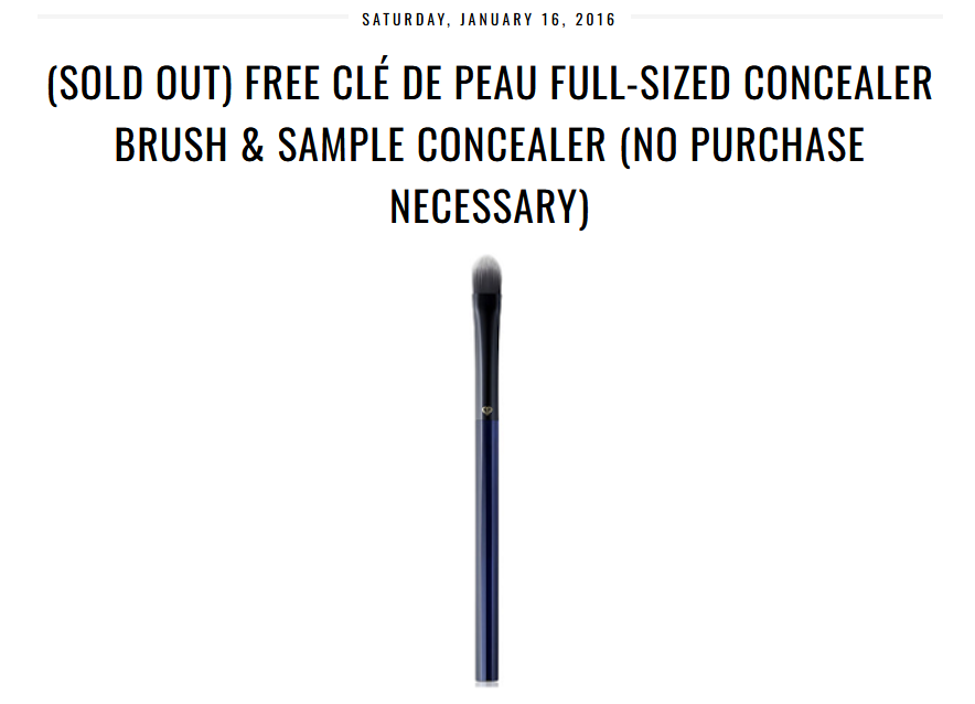
In 2016, I received the Clé de Peau concealer brush and a tiny sample of the concealer in the shade Beige. This was thanks to the blogger nouveaucheap (who unfortunately passed away).
I’m not a fan of paddle shaped flat concealer brushes, so I rarely used this, and stored it in its original box as if it was a collector item. I guess it technically is one now because this style of brush has been discontinued. As for the concealer, it was too light, so I didn’t bother putting it on my face.
2019 was the year I finally started hearing about the Clé de Peau holiday launches. The packaging was always gorgeous, but it wasn’t until 2021 that I started pining after the Luminizing Face Enhancers.
The standard packaging for those highlighters was beautiful enough, but the limited edition ones were truly exquisite. Because the finish is glittery and the brand doesn’t make any in my shade anyway, I didn’t buy them. To clarify, pretty much every reviewer I have seen talk about the highlighters say they look smooth and have such fine shimmer particles that they don’t look glittery. However, what I see in their videos under their lights from my computer screen still looks too visible in my book. Apparently the double digit numbered luminizers are subtler than the triple digit ones, so 22 is the darkest one I could potentially try. Perhaps the luminizer would be like Guerlain Météorites (04 Amber) and surprise me, but I don’t want to spend a minimum of $70 on a refill to test it out. The only place I’m aware of that ships those refills to Germany is YesStyle, and not even on the official CPB website.
At some point the brand started releasing eyeshadow quads as part of the holiday collections, but the options didn’t appeal to me. To spend so much money on a color story I didn’t like would have been no different from buying it for the packaging alone.
In 2023, I started to get my hopes up because Clé de Peau launched a full permanent line of refillable quads. This meant that even if I didn’t like what was in the holiday cases, I could replace it with a more appealing color story. If I didn’t like the options in the permanent range, I could still wait for an expansion to the line and buy a prettier refill in the future.
There was still an issue of the price. In 2023 and 2024, the products sold out before I could catch them on sale. Although customers can purchase eyeshadow refills and the standard case separately, CPB does not sell the limited edition cases on their own. $116 for a quad is still a threshold I’m not willing to cross. It pained me enough to buy the Chanel Boutons quad at full price.
This year, luck was on my side! Douglas started carrying Clé de Peau products, so I kept my eye out in the hopes that they would stock the holiday collection. They do, but the launch didn’t coincide with the timing of any discounts, and the items became unavailable after a few days. Although I was disappointed, this turned out to be a good thing because I remembered that Niche-Beauty also carries Clé de Peau. So, I was able to buy the quad at 20% off, in addition to using reward points. Sometimes this retailer offers 25% off promo codes, but I didn’t want to take my chances on it selling out, which it did a week later! I felt even more confident that I made the right call when I saw the quad return to the Douglas website for €13 higher than the price was before! So, I’m ecstatic to have this quad at a price that I’m at least able to swallow. It’s less than the Chanel Boutons quad, which I am still salty about paying full price for! Or as they say in Germany…
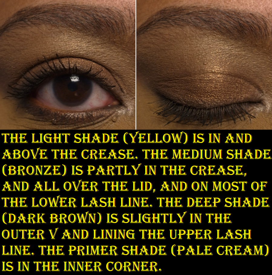
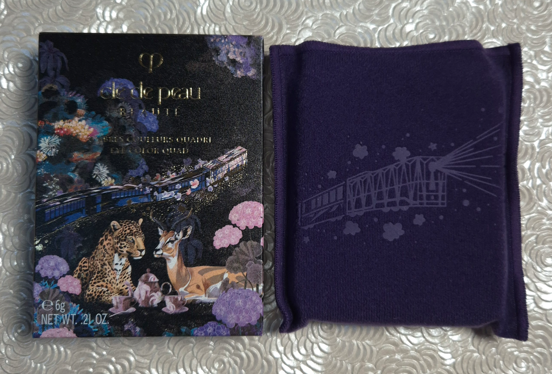
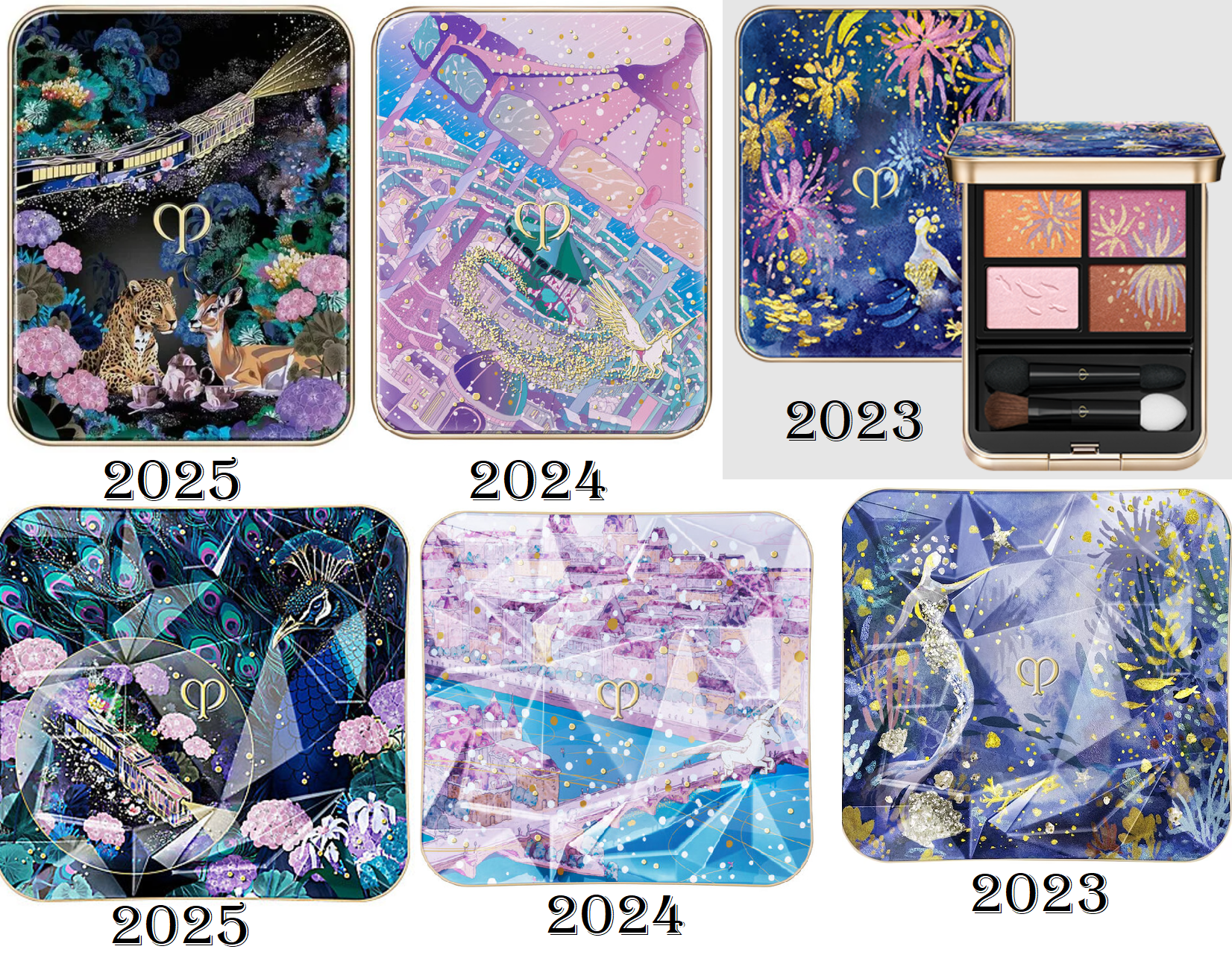
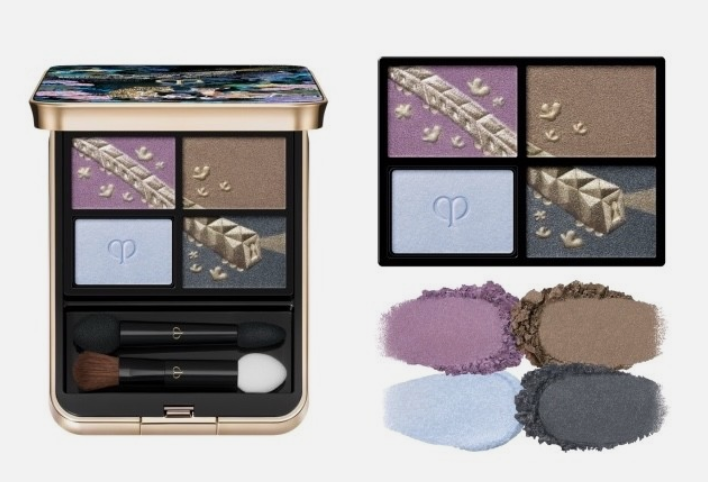
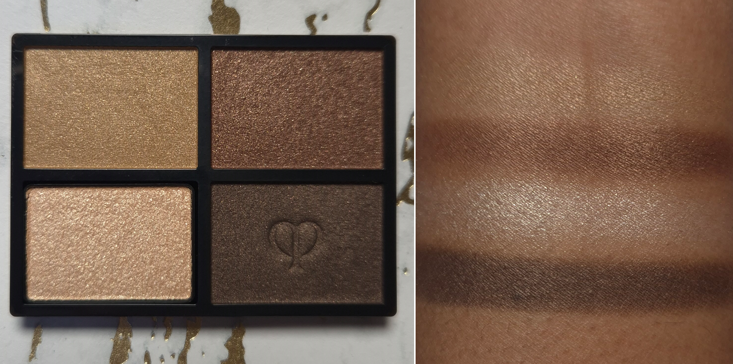
Clé de Peau Beauté Dreams Express Eye Color Quad in 504 Pastel Tea Safari
This isn’t a color story I would normally gravitate towards, but I saw some interesting eye looks on the website, especially on the model whose foundation shade could be in the NC46 range from MAC. I figured that as long as the brown shade was truly as dark as it appeared in photos, I could probably make these colors work together. So, checking the pigment level of these eyeshadows was the first thing I did.
Also, I am aware of the Asia-exclusive version of this holiday quad with the 505 Jeweled Horizons color story, but I prefer the one I bought.
I found this photo from a seller on Ebay, but I’ll also link a video by Serina.
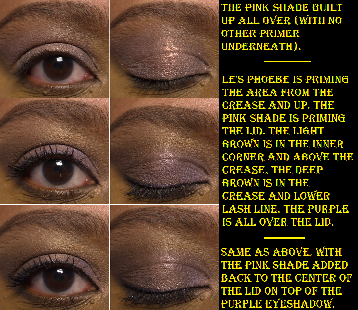
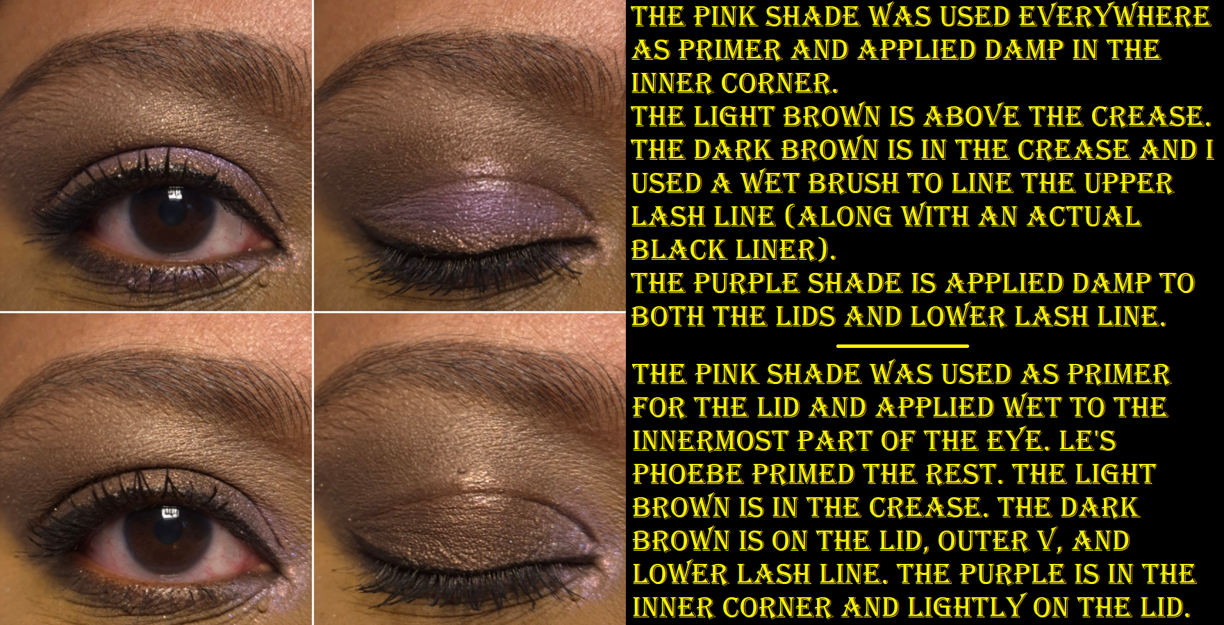
On dry skin with no primer (which is the condition I always swatch eyeshadows in), 3 of the 4 shades look as weak as I feared. Thankfully, there are two ways to get them to show up better. The first is to use the priming shade, always located in the bottom left corner of the Clé de Peau quads. The second way is to apply them damp, like I did in the right half of the photo above.
The brand refers to the pink color as “pink sparkle.” It’s easy to see those shimmer particles on my bare eyelids because there’s so much darkness underneath, but if I try to apply it on top of the other shades in the same way I use a highlighter to amp up the shimmer, it can barely be seen. The only way for me to use this as a topper, and get some impact, is to wet it.
When I use Pink Sparkle as a primer, as intended, I get more color payoff and shine from the other eyeshadows. This also makes the colors look more cool-toned though.
The texture of Pink Sparkle reminds me of Surratt’s duochrome formula within their Artistique Eyeshadow line because of how much creaminess it has. Pink Sparkle doesn’t have as much slip as a Colourpop Super Shock eyeshadow, but I can tell by touch alone that it’s a dimethicone-forward formula. I’ve been happy to see that it’s not emollient enough to cause the eyeshadows to crease. The other shades don’t crease either, even though they contain argan oil.
Some of my dark discoloration still shows underneath Pink Sparkle, and doesn’t get covered up enough if the eyeshadow on top is light, like the light brown shade. Putting my usual Lisa Eldridge base down first will cause Pink Sparkle to pill off. So, I found it best to either keep the two separate, having just Pink Sparkle priming the lid and the Lisa Eldridge product priming the area between the brow and crease, or to just put Pink Sparkle everywhere and apply the Lisa Eldridge product on top (instead of underneath). That adds the necessary coverage and doesn’t negatively impact the performance of the other eyeshadows.
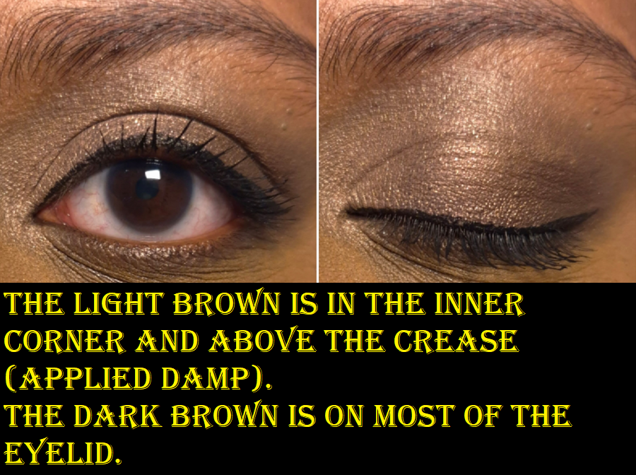
Even if I do wet the light brown eyeshadow, which is referred to as a “golden beige,” it’s too close to my skin tone to look vivid on me. I’m fine with this because it makes a perfectly good low-impact brightening shade and is a useful transition for the edge of the dark brown.
The darkest eyeshadow is called a “walnut brown,” and can create just enough depth for me to be satisfied. If I don’t use Pink Sparkle underneath, I’d say it leans neutral or just a touch warm at most. Pairing Golden Beige and Walnut Brown together makes for a simple, but pretty, eye look.
The purple eyeshadow is described as “lavender purple” and it’s what I rely on as the statement color. It pairs very well with the dark brown and pink shades in this palette. This isn’t my favorite tone of purple, but I think it looks quite nice!
The pigment level, texture, and performance of these eyeshadows remind me of Surratt and Suqqu eyeshadows. I linked my reviews for both, but I have additional Surratt eyeshadows (including a duochrome) that I haven’t posted about yet.
Surratt, Suqqu, and Clé de Peau eyeshadows are all made in Japan. One big difference, at least from Suqqu, is that I can lightly dampen Clé de Peau eyeshadows without it ruining the look of them in the pan or changing the texture. So, I can continue practicing my usual methods in intensifying these eyeshadows to the level that I prefer. This allows me to use this palette in a wider variety of looks than I believed I’d be able to get. I thought I would want to replace these eyeshadows with a different refill, but I like Pastel Tea Safari enough to want to keep it in this case! Between Surratt, Suqqu, and Clé de Peau, I like CPB’s eyeshadow formula the most.
These don’t produce a lot of kickup. They stick well enough to my eyes. Blending is no issue. Essentially, the quality is very nice. It’s just a matter of preference regarding buildable eyeshadows that don’t pack a punch right away (or at least not this year’s holiday quad without help). I consider these to be amped up satins, and the results I get from this quad is what a lot of luxury brands aim for. Like a lot of luxury brands, these eyeshadows contain fragrance. I’d call it a mildly sweet and slightly floral soapy scent, which is faint enough that I don’t always notice it.
Because I tend to wear smoky and dramatic looks, intense sparkle, and very pigmented eyeshadows, paying the full €92 ($106) price for this quad or even €59 for the refill, will never be worth it to me. €59 EUR is around $67 USD, but Clé de Peau actually charges $78 for the refills on their US website. So, I don’t think I would buy more if I had to order them in the US. It’s not that the quality isn’t worth the price, but rather the price isn’t worth the amount of disuse I expect to have. There are times when I’m in the mood for these kind of eyeshadows in their non-dampened form, but it’s so infrequent that I can’t justify getting them. If I will only use something occasionally, I want the cost to be lower too.
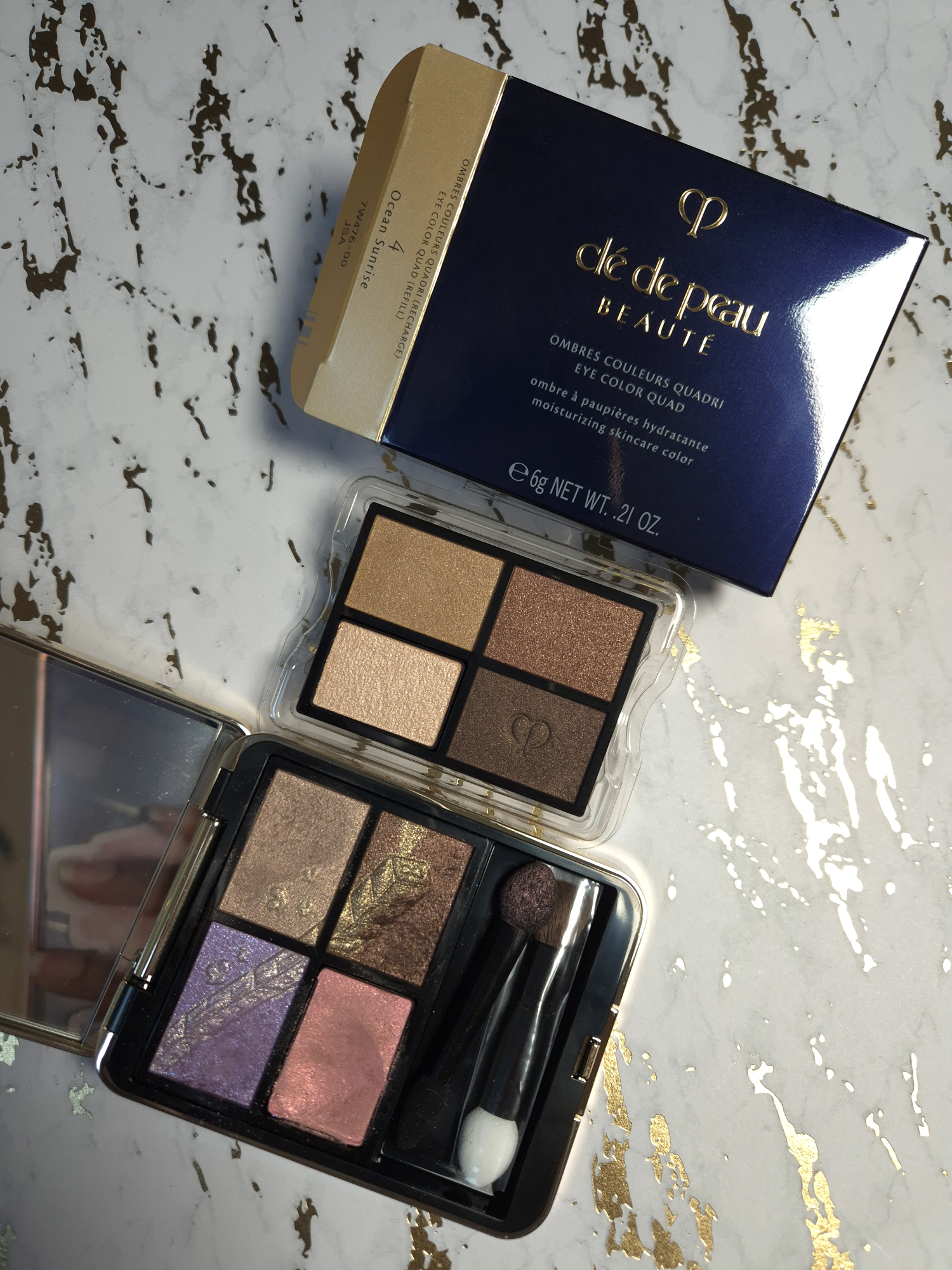
I wouldn’t put as much pressure on myself to “get my money’s worth” out of CPB quads if I could buy them at 25% off. So, this was my initial thought process regarding any new color stories in the future that may catch my eye. For a long time, I only found the 10 Sea Grass quad appealing, but those aren’t the tones of greens I love. Lately, 4 Ocean Sunrise has been on my mind. Merely one week before this post was set to be published, Niche-Beauty sent out 25% off codes via email. So, I ended up buying another quad.
It’s my birthday month! What can I say?
Lastly, considering my previous post, I feel compelled to mention that the packaging is gorgeous, but it is also lightweight. What makes this feel luxurious is the unicarton, the soft purple dust sleeve, large size push-click button, gold tone elements with concave sides and rounded edges, and the fantastically strange yet wonderful artwork on the lid.
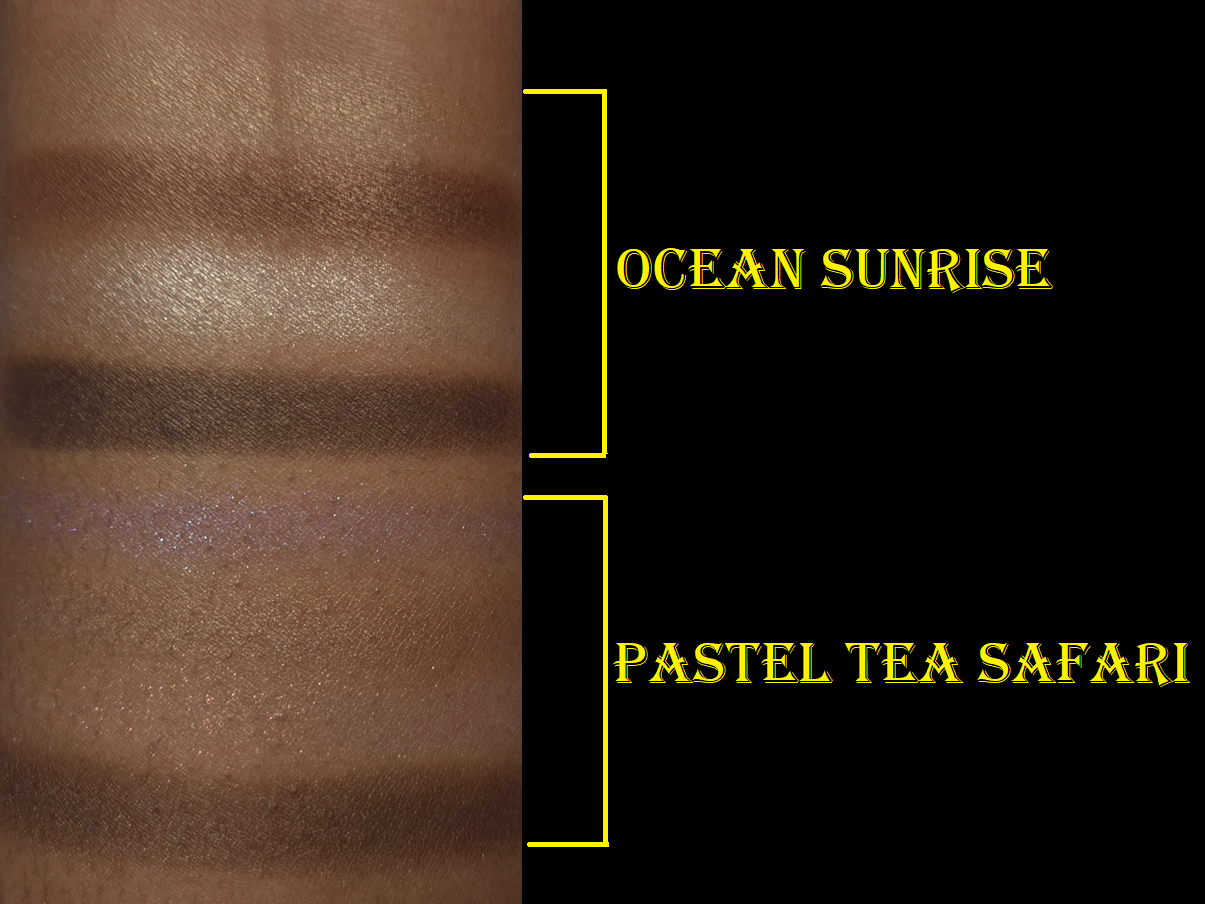
Clé de Peau Beauté Eye Color Quad (refill) in 4 Ocean Sunrise
I get way more pigment with this quad than Pastel Tea Safari! The only eyeshadow that didn’t swatch as well is the first one, and it’s also the only shade that needed to be applied damp in the eye look below. The primer color is icy on me despite looking warm in the pan. It still has a pretty highlighting effect when applied dry, but I applied it wet in the eye look to create a stronger pop of brightness.
I’m pleased to see that the browns between both of my quads are not the same. The darkest color from Pastel Tea Safari looks like a combination of the two darkest shades in Ocean Sunrise.
For now, I intend to just keep the refill in the plastic holder and use it from there. Also, I intend to preserve the pattern in the holiday quad as long as possible by digging my brushes and fingers into specific spots (as seen in the pictures).
Since I bought the holiday quad and refill quad at a discount, I don’t have any regrets. However, I don’t think I can give a completely impartial opinion on whether this would be worth it to other people, considering this purchase has fulfilled a six-year desire to own a CPB holiday item and satisfied over fourteen years of curiosity about the brand. As a general rule though, I prefer not to spend over €50 for a quad that isn’t on my list of top 10 favorite brands’ eyeshadow formulas. That’s why getting a color story I liked, at that lower price, was good enough for me to be content with my purchases.
Blog Updates
If you’ve been visiting my blog for a while, you’re probably aware that I continued my second Project Pan into the remaining half of this year. Even though there are certain products I am trying to avoid buying, I have exceptions to every rule, particularly if it’s something I’ve been wanting for years. Some of the reasons I might have an exception is because the item finally restocked, I’ve been waiting for a color story that would suit me, the product was only sold in a region of the world I couldn’t access, the price was too high at the time, etc.
Based on the details in the history section, Cle de Peau clearly falls into this category of exceptions.
My idea for the “Wish Fulfillment” series is to separate my normal purchases from the products I’ve had on my makeup bucket list. These are products I’ve always wanted to buy, but couldn’t because of some circumstance. Within the “Table Of Contents By Topics” bar of my blog, where one can select a category of posts from the drop down menu, I have added, “Wish Fullfillment/Makeup Bucket List,” so anyone can easily find the series.
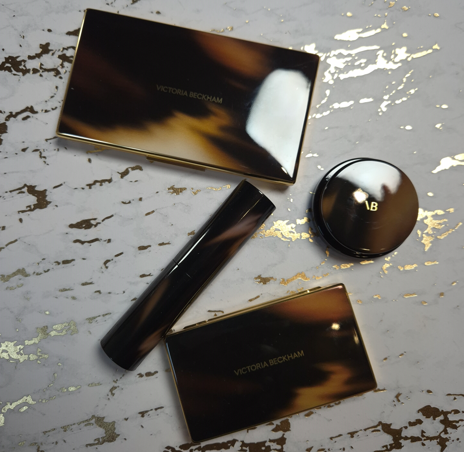
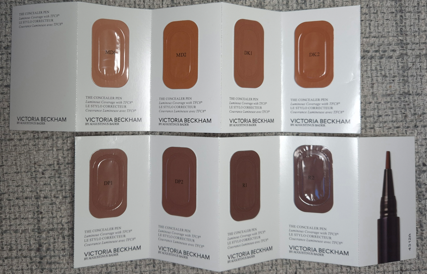
The D&G Blush, ABH Highlighter, VBB Lid Lustre, and PML Quad are not pictured here, but they will be discussed in this post.
After the bombshell that was dropped regarding the Louis Vuitton Beauty line and their prices, I started to think about which items in my collection were the most expensive, which ones I thought had the prettiest packaging, if the prettiest was actually the most luxurious looking, and which ones had the most weight. I was surprised to discover that so few items fit into all of these categories.
I was happy to see the people I follow enjoying their La Beauté Louis Vuitton products, but some felt they needed to justify their reasons for making the purchase beyond just stating, “I wanted it, so I got it.” Across the board, customers who thought the items were or were not worth buying seemed to at least come to the consensus that the price (besides paying for the brand recognition), was largely due to the packaging. The lipstick components were said to be fully metal, along with the bespoke metal packaging of the eyeshadow quads. “You could hurt someone if you hit them with this,” was stated more than a few times by various people.
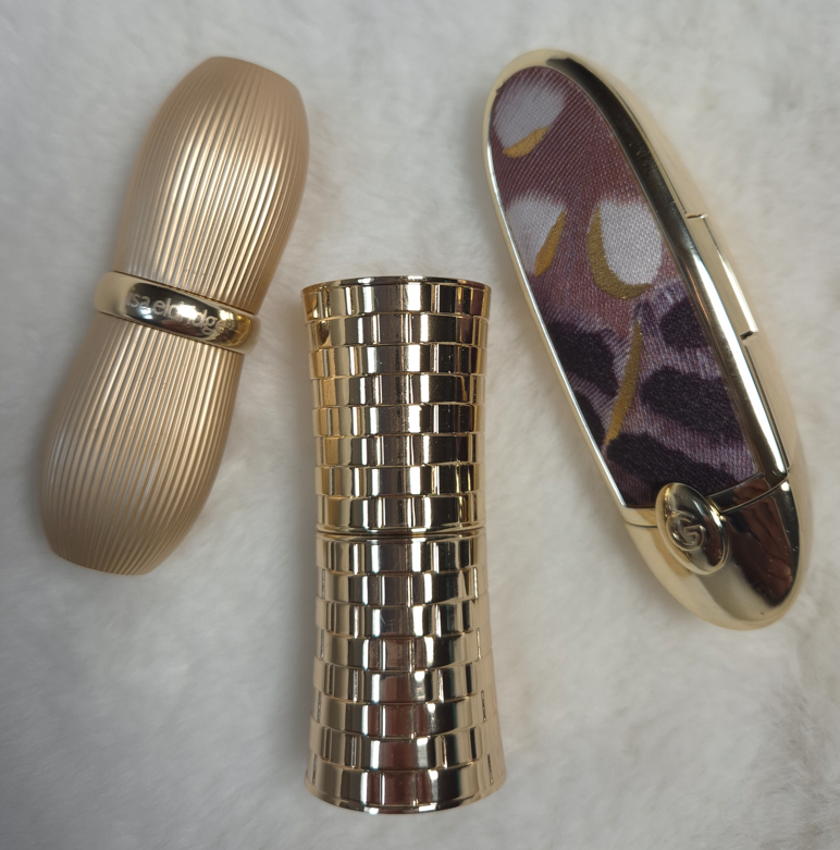
How a product looks and its weight are my top two criteria for feeling like the item I own is luxurious. Looks are subjective, but weight can be measured and precise. I started to think about the heaviest packaging in my collection (proportionate to its size dimensions) in order to answer the question…are these automatically the most lux?
Lisa Eldridge Rouge Experience Refillable Lipstick (68 grams)
In order to highlight how great this packaging is, I need to do a deep dive into comparing it to another brand. Please, bear with me on this, especially if you’re a fan of LV. I don’t judge anyone on how they spend their money, and this is just me working out why I am perfectly satisfied with Lisa’s lipstick being the height of luxury for me.
Lisa Eldridge took great pride explaining in her launch video how her refills were mono material, made of 100% aluminum and could therefore be recycled without degrading once repurposed, unlike the vast majority of other brands’ refills that have mixed metal with plastic.
According to Google: “You cannot usually recycle a lipstick refill that has both plastic and metal components together, as most curbside recycling facilities cannot separate the mixed materials and are not equipped to handle small, complex items.”
There is plastic inside the forever case by Lisa Eldridge, as this has a click closure, but she wanted the actual refills to be sustainable.
I cannot compare the LV lipsticks from personal experience, but it is my understanding that the refills are all metal as well and come with plastic caps that can be removed when recycling. The lipstick cases have an aluminum shell and brass detailing, but the magnetic closure that is so satisfying to use (and adds to the weightiness of a product) keeps it from being recyclable as well.
Summarized from Okon Recycling: Recycling magnets is technically possible, but challenging as it involves disassembling the magnet and removing any non-magnetic materials. However, there are some magnets that cannot be recycled.
So, it sounds as if both LV and Lisa Eldridge have cases that aren’t realistic to recycle but have refills that are fully recyclable. The LV lipstick case has a lot of expensive details like the product names and logo being etched in, the monogram flower-shaped refill bottom, etc. Lisa Eldridge has her logo etched at the top of the cap, allows the customer to personalize the base of the case with their initials etched in (up to three letters), and the case shape had to be custom made as well. Perhaps some prefer the sleeker LV design while others appreciate the vintage inspiration of Lisa’s more.
LV’s Lipstick Case + Refill is $160 and the refill alone is $69. Lisa Eldridge’s Lipstick Case + Refill is $63 (engraving price included) and the refill alone is $30.
Sure, LV’s refill costs the same amount as other high end and luxury lipsticks in their completed form, but considering the details I listed above, is the LV case really $100 better that other brands’ cases, particularly Lisa Eldridge?
It can’t come down to the actual lipstick formula, because that’s part of LV’s $69 refill price.
At the time that I bought the Lisa Eldridge lipstick, I felt it was incredibly expensive. It is still the most expensive lipstick in my collection, based on what I paid and not the retail price. I rationalized my purchase because of the sustainability aspect, all the custom elements, the personalized touch, and how heavy it felt.
Taking branding completely out of the equation and thinking about the components alone, I do feel like this product by Lisa Eldridge is among the most luxurious out there, and I am no longer gritting my teeth at the price.
It would be nice if I liked the lipstick formula more, but there is some hope for me! I wrote a comment on Instagram that the brand responded to, and while the Velvet formula won’t be put in the refillable form, there might still be the possibility of the Lucents that I enjoy so much!
There are other things they’ve been “working on” that has taken years, such as making the empty eyeshadow palettes available for purchase alongside the eyeshadow singles, the return of the liquid blush in better packaging, etc. So, I’m prepared for this to take a while to happen.
If I can get the Luxuriously Lucent Lip Colours and/or Baume Embraces as refills, I will definitely get more use out of mine!
Whenever I think about heavy makeup packaging, the Olivia Palermo Eyeshadow Palette immediately comes to mind. I’ve had it for years, yet I’m still not sure how I feel about the pattern, and I’m not sure what it’s technically called (perhaps wicker, woven link, basket weave, oyster strap, etc.). It just makes me think of the types of patterns I’ve seen for watch straps, which isn’t too terribly off track. Apparently Olivia drew inspiration for the packaging, “by a vintage Art Deco bracelet she was given for her 21st birthday.”
The eyeshadow palette has a magnetic closure and mirror, which further increases the weight, on top of the fact that the packaging is metal.
Although I’m not sure if they could have created a different pattern that I would like more, I can say it’s at least cool, unique, and easily recognizable. Plain flat gold is always beautiful to me, but this packaging looks different from any other I’ve seen. Well, almost. As of a year ago, Hatice Schmidt released a refillable lipstick range called, “The Gift,” with a case inspired by jewelry and the pattern reminds me of a curb chain/Cuban link style. So, there are at least two jewelry inspired components from brands that I know of.
I bought the Olivia Palermo lipstick at the reduced price of €32 (originally €40) from Niche-Beauty, and the eyeshadow palette for $28 (originally $58). I’ve discussed how I procured the eyeshadow palette in a past review, but it was during the time that I started working on this post that I felt the compulsion to finally get the lipstick. I have checked in on the brand on and off over the years, waiting for them to release additional products. Earlier this year, I saw a notice on the official website that the beauty products would no longer be sold and that they were turning the website into an influencer style page (oliviapalermo.com now redirects to her affiliate shopmy page). I assumed that meant the brand was shutting down, especially since I’ve only heard two beauty reviewers reference the brand one time each within the last three years. However, I was shocked to see the products appear on the Douglas website in either August or September, and then I saw them at Niche-Beauty as well. I don’t know if Olivia has better sales in Europe, or Germany specifically. I’m not even sure if she still has products available elsewhere in the US.
I felt Lisa Eldridge’s lipstick deserved to be in the post, but Olivia Palermo’s lipstick is the only one in my collection that is heavier. OPB’s lipstick is less expensive, but it isn’t refillable and the central part of the lipstick component is made of plastic. The outer packaging is what makes this seem so fancy.
Regarding the eyeshadow palette, it definitely screams luxury. It isn’t something you want to carry around in your purse or travel with it. Olivia wanted the old Hollywood glamour look and feel to her products, so this is something that you would want to keep on a vanity.
This is by far my most luxurious palette, and though it doesn’t have some of the additional premium features of the LV Quads, it makes me feel a lot more content about my collection and avoid FOMO. If I want heavy eyeshadow packaging, I certainly have it with this product!
This is my golden pebble! It is tiny in size but mighty in weight!
Chantecaille is another brand with nicknamed “pebble” packaging, but theirs is plastic, thin, and it doesn’t feel substantial, even though they cost the same amount!
I bought my WA bronzer at 20% off, so the title of most expensive bronzer in my collection belongs to Hermes, even though I only bought the refill. Had I paid for the compact too, that wouldn’t have helped it to feel more luxurious than the Westman Atelier bronzer, considering Hermes’ thin plastic packaging.
This has a tiny mirror that I don’t use, and a magnetic closure. The brand has highlighters and face powders in this same style of packaging. I haven’t used their cream sticks or drops, but they don’t look as luxurious to me. The only other Westman Atelier packaging I have handled are the powder duos, which are certainly substantial and pretty to look at, but I don’t think it compares to this gold compact.
When it comes to the prettiest bronzer packaging, I think of Gucci’s and Charlotte Tilbury’s powder one, even though they are much lighter in terms of their size. However, I would never call something that’s a solid gold color ugly. So, it may as well be my most glamorous bronzer.
Fara Homidi Essential Bronzer Refillable Compact (106 grams)
This compact is about the same size and weight as the Westman Atelier Butter Bronzer. The amount of product from FH is 3.5 grams and the amount of product from WA is 8 grams. That is close enough to accounting for the 6 gram difference when I weighed the two products, which is why I’m still including it in this post.
Aesthetically, I find the Westman Atelier bronzer to be more appealing. Shiny things get me. However, I still think Fara’s is classy and pleasing to hold in the hand. Her other products come in red and blue packaging of the same weight. I don’t like the red, but the blue is very eye-catching. If the next product she releases is in purple or green packaging, it just might surpass WA’s as a favorite compact for bronzers.
D&G Cheeks&Eyes Match Blush (91 grams)
I have plenty of blush packaging that is bigger than this, and therefore heavier. However, for this small size, this is very heavy! Nothing really comes close to the weight, but I have to say that Gucci’s powder blush packaging is quite nice too, even if it’s lighter. Visually, I like Gucci’s more as well. In fact, I have a lot of blushes that aren’t luxurious feeling, but I love them anyway (such as YSL’s Make Me Blush Bold Blurring Blushes and Too Faced Cloud Crush Blushes). So, this is one of the few categories where my heaviest blush might be the most luxurious, but it isn’t necessarily my favorite packaging. I do like it a lot though!
I have to add that this packaging feels like a mixture of plastic and metal components. I believe there’s something in the base of this compact adding weight artificially, especially since it doesn’t even have a magnetic closure. It has a push button instead.
Victoria Beckham Beauty Products: Matte Bronzing Brick (166 grams), Eye Wardrobe (116 grams), Cheeky Posh (37 grams), and Lid Lustre (41 grams)
Similar to Olivia Palermo Beauty, VBB has a certain aesthetic that they maintain across most of their products. I like the horn brown/tortoise pattern, and it can be fashionable, but I don’t automatically associate it with luxury because of how many cheap products I’ve seen made in tortoiseshell style. The gold colored trim helps to elevate the look of the packaging, but it is the weight and feel of these components that make them undoubtedly luxurious.
The Bronzing Duo and Eyeshadow Quad are among my heaviest based on size. The Cheeky Posh blush is small and doesn’t have that much extra weight, but I figure that’s because the component isn’t refillable like the other two. I’m including it because it has the same style of packaging as the others, and I still feel bougie when I handle it.
I rarely buy single eyeshadows, so I don’t have much to compare in terms of weight. The prettiest I own is probably the Charlotte Tilbury Hypnotizing Pop Shots, but those have lightweight plastic packaging and they are powders, which I don’t believe is fair to compare. It would be interesting to see how the glass packaging of Charlotte’s Eyes to Mesmerise stacks up, but I don’t own that. I no longer have the glass packaging of Maybelline’s 24 HR Color Tattoo, but the best I’ve got is Melt’s Gel Liner (47 grams) and a MAC Paint Pot (56 grams). I like glass as a component material, but it’s not uncommon to find for eye products. The Lid Lustre packaging has an elevated look compared to MAC’s, for example. The Melt Cosmetics Gel Liner that has the gold lid and butterfly print around the rim with the glass base is prettier to me, while also being slightly heavier. However, the font for the brand logo makes it look less sophisticated. I don’t think eye related categories of makeup follow the trend of weight indicating how luxurious a product will look and feel.
One thing about VBB packaging that does take away from the experience is the issue with the closing mechanism. I heard this was a problem in the past, and I never had an issue with my Bronzing Brick, but my eyeshadow quad doesn’t always stay shut when I snap it closed. Sometimes it’s fine, but other times it likes to pop back open with the slightest touch. I haven’t heard about anyone else having an issue with the quads, so perhaps I’m unlucky in getting one of the few faulty ones.
Pat Mcgrath Mothership Palettes (392 grams) and Eyeshadow Quads (122 grams)
All the previous components I’ve discussed had metal or a mix of metal and plastic packaging. The Mothership Palettes are fully plastic, but they are quite hefty in weight. The palettes are big for only holding ten eyeshadows, but that black shiny lacquer with the gold bottom still look lux to me. My Victoria Beckham and Olivia Palermo palettes are the only ones I can recall from my collection that aren’t made of plastic or cardboard. In fact, the Victoria Beckham Eye Wardrobe quad is only six grams less than a Pat Mcgrath quad, but Victoria’s compact is almost half the size! I still chose these PML products as the next heaviest in the luxury category, though I have to admit that I have some lightweight quads that look fancier because they are gold colored. For example, Tom Ford (the trim technically), Guerlain, YSL (trim), Prada (mixed gold and silver), Lisa Eldridge, etc. I find it difficult to equate weight with luxury in the eyeshadow category because of how many bulky heavy palettes brands have released over the years. So many of Jeffrey Star’s earliest palettes, Plouise, and Glamlite’s Food palettes were huge. I also recall when Stila had the Luxe Eye Shadow Palette in Happy Hour, which was a similar weight and size to the Mothership Palettes, but I bought it for $36. I can’t remember what the full retail price was, but it cost nowhere near the same amount as a Mothership.
So, I’ve come to the conclusion that weight doesn’t automatically equate with luxury in this category either. However, because of how uncommon it is to find hefty quads and palettes that are reasonably sized (Olivia Palermo, Victoria Beckham, and Pat Mcgrath), the ones that are weighty feel extra special to me.
Beekman 1802 Milk Tint SPF 43 Tinted Primer Serum
I didn’t want to include skincare, but this technically falls under the makeup umbrella. If I count it as a primer, it might be the heaviest I ever owned (even heavier than the glass bottle of Rituel de Fille Thorn Oil). Beekman’s looks like ceramic, but it’s colored glass.
I have to say “might be the heaviest,” because I don’t recall how it compares to the Guerlain L’Or Radiance Primer (now called the Guerlain Parure Gold 24K Radiance Primer), which is definitely the most luxurious looking primer I ever bought. The look of the Beekman product doesn’t appeal to me at all, but I was so impressed by how it felt in the hands. I had to leave it behind though because it was so heavy that I didn’t want to bring it back in my luggage.
If this counts as a skin tint, then it’s a lot less special. Plenty of brands make glass bottle complexion products. That’s why I didn’t include any true foundations or concealers in this post, because the prettiest bottles in my collection tend to look and weigh around the same.
When it comes to heavy primer packaging being the most luxurious, I have to say the Guerlain primer squashes that theory.
This bronzer is larger than the one from Westman Atelier, but it weighs the same. The reason I decided to include it anyway is because it’s still substantially heavier than the remaining bronzers in my collection. Plus, the highlighter component is a similar size and even weightier. I cannot think of a single highlighter I own that comes in heavy packaging, other than this one.
I have noticed over the years that ABH has gradually been upgrading the packaging of most of their products. Their two most recent mascaras felt like either super heavy plastic or a mix of metal and plastic. The Smooth Blur Cream Contour Stick has a brushed gold colored metal cap and additional gold details. The Smooth Blur Matte Bronzer and Glow Seeker Highlighter have a magnetic closure and they feel quite substantial in the hand. I’m impressed with the packaging and find it to be quite pretty, but this is still another example of how weight doesn’t necessarily equate with a luxurious look. This packaging feels so much more substantial to hold and interact with than pretty much all others in the drugstore, mid-range, and high end categories. It feels like it should cost more than it does, and it looks appropriately high end to me, but not quite broaching luxury territory. I still think the Gucci Bronzer packaging tops it, despite it being lighter in weight, because it looks classier overall. As another example, MAC’s Sunstruck Bronzers look so beautiful, even though they are in lightweight compacts as well.
Final Thoughts
Based on my own personal collection, I’ve confirmed that in certain makeup categories, the most luxurious packaging is the heaviest. At the same time, I have many other products with a timeless and elegant look to them that are lightweight and made of plastic or other inexpensive materials. Essentially, the weight of a product enhances the luxury experience, but it does very little to elevate plain looking packaging. The best example of this is the Beekman 1802 Tint.
If I can get an Olivia Palermo palette that retails for $58 and feels ultra lux, but I can also buy a limited edition plastic Chanel quad for $86 and still feel like that’s luxurious as well, would that be considered silly? Should I be raising my expectations for all luxury brands? At the beginning of this experiment, I would have said yes. However, I now see that if Chanel, Dior, Gucci, and other designer brands used higher quality materials, their products would likely fall in the LV Beaute range of prices (if not more). Some examples of that are the Chanel 31 Le Rouge lipsticks in the glass case, Dior Rouge Premier Lipsticks with the ceramic case and “formula infused with 24k gold,” along with the Guerlain Rouge G Exceptional Piece lines. There is only so much a person is willing to pay for a product from a luxury brand if the materials are the same as a mid-tier brand. So, that keeps designer brands from going overboard with their prices. There are also advantages to using lightweight materials, such as them being more convenient to take on-the-go for customers or makeup artists with large kits, sitting at attainable prices for aspirational shoppers, thinner packaging contributing to less waste of materials and sustainability efforts, etc.
So, when I really think about it, I wouldn’t be able to buy as many products in the luxury category if the components were more expensive to make or if they were made from higher quality materials. In fact, the majority of the products in this post were purchased with some kind of discount. Of course, I would love to have all my luxury goods in weighty packaging, but if that means I would have to accept those products being less likely to go on sale and/or accepting that the prices of them would double or triple, I am unwilling to do so.
The Dior Powder-no-Powder is one of my favorite makeup products of all time, yet the most I was willing to spend was €45 (essentially just paying full price) to get my name etched onto the compact. If I had the opportunity to buy it in a gold colored compact with a magnetic closure or some stunning limited edition pattern for €100, I don’t think I’d be willing to do that. This tells me that despite a product having a holy grail formula that is unable to be duped, I still have my limits. Some makeup will just never be worth it to me to buy, past a certain pricepoint, no matter what it’s made of. That means I cannot use the product’s weight, materials (including formula), or looks to justify a super high spend amount. However, I know that when a product gets hyped up, it can be much easier for me to consider crossing that price threshold if I can make a case for it being top tier from every other angle. I bought one of the Chanel Boutons quads directly from Chanel because so many influencers were told by their SAs that the collection would be extremely limited, and I feared missing out. Less than one month after launch, I found the quads at multiple retailers for a minimum of 30% off. FOMO works similarly to getting caught up in the hype of a product. I sometimes make purchasing decisions that I normally wouldn’t.
This is why I decided to make this post. I know there are others like me who enjoy luxury makeup and don’t have the biggest budget to work with. There are those who will be tempted by the exclusivity of a certain new beauty line and would normally not even consider getting anything at those prices, but the hype may be wearing down that resolve. To those that want to be talked out of buying makeup at $100 or more…just remember that luxury makeup with fantastic formulas and high quality packaging can be found at a lower price. This post is full of examples of this. If one brand is out of your price range, you might be able to get similar products from another prestige brand. Other amazing and beautifully packaged products are just around the corner.
I hope this topic has been interesting, and even helpful.
I remember a time when everything this brand launched with had a ton of hype surrounding it. The pace of their new releases slowed in recent years, so much so that I didn’t even buy anything from them in 2024.
When I think about my ABH purchases in 2025, I’ve realized that nearly all of them were bought to replace something I missed out on. I didn’t get the brand’s first iteration of powder bronzers because I didn’t think the darkest shade (Mahogany) would work for me. I ended up buying their Smooth Blur Bronzer instead. In 2016, I wasn’t interested in the Anastasia Beverly Hills Master Palette by Mario, but later regretted not buying it. So, Embers seemed like the next best thing. I also always wanted a dark skin friendly version of the Anastasia Beverly Hills Amrezy Highlighter, but they didn’t create additional colors. So, I hoped the newest shade of Glow Seeker Highlighter could fill that role. I finally bought the Stick Blush four years after it launched, figuring ABH had no plans to expand the range further. I feel like the production of the Magic Touch Blush Trios are confirmation of that. Lastly, the only product I didn’t buy to fill a void of something I missed out on, is the Smooth Blur Contour Stick. I liked the cream bronzer so much, along with the powder bronzer from the “Smooth Blur” line, that I eventually caved and bought the contour in the hopes I’d like it too.
Let’s dive into the reviews and see if these products ended up being worth getting!
Embers Mini Eyeshadow Palette
I acknowledge that this is a soft color story, and that soft tones don’t pop as easily on dark skin. However, I expected these muted eyeshadows to still be pigmented, along the lines of the Nouveau Palette. Most of the swatches in the photo above needed to be built up in 3-5 swipes instead of my usual 1-2. I have five other ABH palettes and none of them require the amount of building up I’ve had to do to with Embers. I have to be so precise with my placement of the deepest shades in order to avoid the other eyeshadows blending into it and lightening it up too much in the process. I have to actually dampen my brush when using some of the satins in order to aid in packing on the color.
I was looking forward to having a subdued and earthy palette, but these shadows are more gently pigmented than I could have anticipated. After all, according to the brand, “Anastasia Beverly Hills Embers Mini Eyeshadow Palette was designed to spark artistry with depth, warmth, and intensity. Featuring 9 full pigment shades—including rich, blendable mattes and molten metallics that glow like firelight…”
I’m sorry, but to call any of these non-mattes a molten metallic is wild! Which of the shades in my swatches are rich or intense? Is the “full pigment” in the room with us?
Anyway, because it’s so easy to create toned down looks, I did my best to show the maximum color payoff I can get with this palette. The end result is at the subdued level I wanted, so my only issue is how much effort it took to create the three looks below.
Creating a bold look isn’t going to be a problem for someone within the fair to medium skin tone range, but those expecting high-shine metallics (instead of sooty satins and low impact shimmers) might still be disappointed.
To anyone who was hoping to achieve the kind of look that’s featured on the official website, I recommend managing your expectations. I couldn’t get that depth of color from the browns, so I checked the brand’s YouTube page to see what kind of techniques were used. I am fairly certain the “Terracotta Spice Fall Eyeshadow Look,” is the one used. How the makeup appears in the video looks washed out, but how the photo is depicted on the Anastasia Beverly Hills site looks manipulated to appear bolder. The truth might be somewhere in the middle!
The mattes blend and layer decently, but I had a hard time creating depth with C3 and struggled to have B2 show up. I expected B2 to be like Metro from Nouveau, but it’s not. When I think about that palette compared to Embers, I start to feel like perhaps I should have just stuck with the former!
If the Master Palette never existed, I would have thought Embers was meant to be a companion palette and/or a softer version of Nouveau.
A1, A2, and B1 are the inner corner type of shades, which I’m satisfied with. C1, C2, and B3 are the visual standouts, but they have a sooty quality to them that I can easily see when I rub them into my skin. I’ve seen this kind of effect from multichromes, duochromes, and sparkly formulas to look even more intense. With the type of finish these have, I feel like these colors veer away from the muted category and closer to dull. I wish these had more of a wet metallic finish instead.
On the bright side, I don’t have issues with creasing or fading throughout the day. I get quite a bit of kickup in the pan, but I feel that’s pretty normal for ABH. The shadows are soft to the touch, but not creamy or buttery. The eyeshadows don’t feel like they were pressed hard into their individual pans, so it makes sense that it’s easy to pick up a lot onto my brushes.
The Nouveau Palette is more to my liking because of the formula. The Nars Climax Palette has a similar vibe to Embers, but the mattes are more pigmented and the shimmers have so much impact. Metaphorically, Climax and Embers aren’t sisters, but they could be cousins! Climax is also a light neutral palette with pops of green and blue!
Joking aside, I don’t feel as bad about making this purchase considering I didn’t pay full price for it. I’ve had far worse performing palettes in my collection: ones that stick in one place and are patchy, ones that don’t layer well on each other, some that don’t adhere to the lids, etc. So, I consider the quality to be at least “okay.” I don’t know how this formula compares to the other minis in the 9-pan format, but I don’t consider it to be as good as the brand’s larger palettes (excluding Fall Romance).
A final point I should mention is that I had the worst experience with these eyeshadows when I applied them on skin primed with the MAC Paint Pot. Using the Lisa Eldridge Liquid Silk Eyeshadow as a base gave better results. Perhaps the Embers Palette would look even better on top of ABH’s own primer, but I no longer have that one.
Smooth Blur Cream Contour Stick in Core Shadow
I’m the one in my friend group that everyone comes to for beauty product recommendations, but this cream contour was actually recommended to me instead! I held off on buying it because I felt unsure if Core Shadow would be the right shade for me, in addition to me being on a cream product low-buy.
It turns out this shade is great around my cheekbones and jaw, but I can see a touch of red when I apply it along my nose. The consistency of the cream also breaks down my concealers. In addition to the bridge of my nose, I usually also apply a little on both sides where I have discoloration. Putting product on these particular spots gives the illusion of pushing those spots back, which makes my nose look less flat. Unfortunately, this trick just doesn’t work with this shade of contour and this kind of cream formula.
When I tried to take a photo of the contour below my cheekbone, it looked too natural. So, I drew on more product and left it unblended so it would be easier to see the sculpting power of the Core Shadow shade on my skin tone.
When I use my go-to cream and liquid contour brush (by Patrick Ta), it’s too easy to go overboard. If I use a small amount of the cream contour and try to build it up, it doesn’t look as well blended in the end because some parts have dried at different times and other parts have a heavier look from the overlapping of layers. If I use a normal amount, it looks better blended, but it’s more intense than I want. So, I end up having to use leftover foundation from my brushes to try and tone it back down. It’s an extra step in my routine that I would rather not have to do.
This product isn’t as stiff as the Milk Makeup Sculpt Cream Contour Stick, but it’s stiffer than the one from Uoma Beauty that I used to use, and it’s a little drier than the Fenty Match Stix Contour Skinstick. I hoped this would be more like the Rare Beauty Warm Wishes Effortless Bronzer Stick that is so easy to blend and melts into the skin. Even the Anastasia Beverly Hills Cream Bronzer is easier to spread. While it’s typical for a stick version of something to be firmer and less emollient than a pot version, I didn’t expect this one to be more difficult to blend than the Anastasia Beverly Hills Stick Blush. Perhaps this is a tradeoff for longevity, because this contour at least lasts on my face all day.
I don’t have a lot of contours (compared to my collection of bronzers), so even though this isn’t perfect for me, I’ve continued using it beyond the testing phase. At the discounted price I paid, I don’t regret buying it. However, I still think there are better options out there, especially at a lower price. It gets the job done with extra effort, and the packaging is nice to look at, but I’m a little reluctant to recommend it. Between the cream stick blush, cream bronzer, and now cream contour stick that I’ve used from ABH…the best product is definitely their Cream Bronzer.
Glow Seeker Highlighter in Enchanted
I can’t think of another highlighter that has received as much long term hype and praise as the ABH x Amrezy Highlighter from 2018. It was the standard by which all highlighters were compared for so many years. Even Champagne Pop from Becca x Jacyln Hill in 2016 didn’t manage to stay relevant for quite as long. Becca’s highlighter (technically now Smashbox x Becca) might have made more sales overall, but Amrezy’s continues to be referenced more in the makeup zeitgeist of the past decade.
When ABH released the “Iced Out” highlighter four years ago, so many influencers were claiming it was the same formula as Amrezy’s. I was suspicious when I found it online for 25% off in just the first few weeks of launch. Then, I understood. It is pretty, but dry, and the color is yellow gold with a slightly greenish tinge (thankfully the green didn’t show up on my cheeks). To me, it wasn’t similar enough to the Amrezy texture to feel like my wish was fulfilled. I was so annoyed by the intentional or unintentional trickery that I never ended up reviewing it on my blog.
Now, we have the Glow Seeker Highlighters that everyone has been saying is practically the Amrezy formula. I can’t help but feel slightly led astray again. This highlighter has a lot more of a shimmery mica sheen, and it doesn’t have as much of the wet-look shine that I associate with gelee formulas like the Amrezy one. The Glow Seeker formula seems to have less squalane and more glycerin. It’s at least less dry than the Iced Out highlighter, but I still wish there was more slip considering I have dry skin and prefer highlighters to look slick and smooth. I can admit that I’m extremely picky about highlighters, so other people will probably say the two products are similar enough to be dupes. This is most likely also the closest ABH will get to making the Amrezy highlighter without recreating the formula completely. Someone who likes high impact and shimmery (but not glittery) highlighters will probably be pleased with this. The brand launched a single shade at first, called Sun Idol, but now there are two additional shades: Ethereal and Enchanted.
I like glow, and I’m glad this isn’t sparkly with large shimmer particles, but the shimmer isn’t quite as refined enough for me to like this as is. However, there is a bright side. I have found that when I use a finishing powder on top, it tones things down and makes my highlighter application look smoother. Typically, I use a finishing powder first before adding highlighter as the final step in my makeup routine to avoid dulling down the shine, but it works better for me to swap the order in this case! Using this method has made me like the highlighter a lot more. I don’t like adding extra steps to my routine, but since it’s merely adding finishing powder to a spot I usually skip, I don’t consider this to be a problem.
I unfortunately can’t do comparison swatches with either of the previous ABH highlighter formulas because I left them in the US.
Color, finish, texture, and all other preference things aside, I don’t have any issues with this product. I can pick up the amount I want easily on my brushes, it adheres and blends well enough on my cheeks, and the glow doesn’t dim or disappear until I’m ready to remove it myself.
I didn’t pay full price for this, and the full presentation of the weighty packaging and embossed highlighter surface is beautiful, so I wouldn’t regret buying something like this under normal circumstances. However, I can’t feel like it was a great purchase if it hasn’t surpassed my top highlighters (Hindash and Prada included). I was only interested in this highlighter for nostalgic reasons, wishing I could capture the Amrezy excitement that I didn’t get to fully participate in because the color of that highlighter was too light for me. So, this wasn’t a good buy for me personally, but it’s nice enough that I wouldn’t discourage someone else from ordering it.
I would say the quality is on par with Nars, and theirs is $42. I’m more inclined to recommend Hindash’s Gradiant Highlighters, which cost the same $40, but ABH does have better packaging. My highlighter favorites tend to be quite expensive, but I’d rather buy something with worse packaging if the tradeoff is an amazing formula.
As a side note, Amrezy debuted her own brand in August. They only have lip products at the moment. I’m guessing Amrezy doesn’t have the rights to ABH’s formula, but I wonder if she will try to capitalize off of the past hype and come out with her own highlighters too.
So, that’s all I have for today! I’ve been impressed by this brand stepping up their packaging and releasing decent products, but they haven’t really become staples for me. I would say perhaps others will have an even better experience with the makeup than me, but I don’t think the brand is doing so well right now. After all, Anastasia Beverly Hills’ credit rating was downgraded after missing their payment to their creditors in August. So, that’s not a good sign regarding the brand’s finances.
In any case, I hope this post has been helpful. My opinions of these products may seem a bit critical to some, but there are plenty of other reviews going around the web singing the brand’s praises. I wish someone had told me some of the downsides to these products before I bought them. They’re not bad, but they’re not going to be right for everyone.
I love the brand’s Eye Wardrobe in the shade Victoria, so when they released the Cocoa collection, I thought I would love this color story even more, particularly because I prefer how warmer tones of eyeshadows look on me.
Before we get into the review, I wanted to take the time to describe my order experience for those who have never ordered directly from the website. I used to get my VBB products from Selfridges, but the regulations are back with Selfridges being unable to ship food and cosmetics to Germany. So, I created an account to join the V-Suite, the brand’s Loyalty Program. When you join, that makes you eligible to add a free sample in your order, but I happened to sign up during the time when there was a glitch that didn’t allow that option to pop up in the cart. After missing out on a second order, I contacted the brand, and they were kind enough to send the ones I requested in a separate shipment. I will share details about what I got at the end of this post. Also, I checked the website a week later and the glitch was fixed.
The dust pouch comes with all orders and standard shipping is free over €70. Paid standard shipping to me costs €5 and they ship to Germany via UPS. Each time has been an interesting game of receiving the shipment confirmation within a day or two, getting an email the day after that stating that my order will arrive the next day, then the next day getting an email about the delivery being postponed/delayed, and then the product arriving after that. I’m happy that VBB ships fast, and now that I know things will not actually come the first day it’s expected to be delivered, I can just anticipate the actual date of arrival and plan accordingly. Whenever I get a package that ships out of Netherlands via other carriers, it usually takes 3-5 days or more. So, I’ve been really pleased to get my VBB orders from Netherlands to Germany in two days.
The price listed on the website includes VAT already and I have not encountered any additional fees after ordering.
Eye Wardrobe in Cocoa
The leftmost shade, which I call Shade 1, is the first satin I’ve used from the brand. Applying a normal amount looks opaque at first, but when I blend it lightly to smooth it out, it becomes a lot more sheer. If I don’t perfectly even out the discoloration around my eyes with primer, the pearly mica within this eyeshadow creates an unflattering grey tinge (due to the level of darkness underneath). So, I have to really pack this on to use it in larger areas, I must ensure that the eyeshadow primer I’m using will create a completely blank canvas, or I just need to use it strategically in smaller areas where I want to add brightness. The latter is the easiest option for me.
Shade 2 looks super warm when applied heavily, but if I’m just using a normal amount, it doesn’t look as bold. If I blend it out too much, it doesn’t stand out enough on my skin tone. That’s just the nature of having brown skin with a warm undertone, then trying to add a warm brown eyeshadow on top that isn’t too different in depth! So, I try my best to pack this shade on, and I’m glad that it’s buildable.
The photos above and below are the 4 steps to creating a single eye look. I wanted to show the process because of how easy it is for Shade 1 and 2 to get lost in the overall look.
I like how the eye makeup turned out in the photo, but this was actually my third attempt. I didn’t like my previous looks for several reasons, the first being that I used Shade 1 from the brow to the crease, which made everything that I tried to layer on top of it look a lot more muted. I tend to dislike my eye looks if there isn’t much of a gradient or distinction between colors, so the look became murky and unflattering. Even when I used less of Shade 1, I really did not like having it and Shade 2 blending into each other. The base color of Shade 1 is warm, but its semi-frosty sheen from the mica clashes with the intense warmth from Shade 2. I usually start my eye looks from lightest to darkest, but I found it was better to use Shade 2 strongly built up in the crease before adding Shade 1 in my usual highlighting spots. That way, I could add enough of Shade 1 for it to stand out in the look, but not in a thick enough layer to turn frosty-looking. My final reason for disliking my earlier attempts is that I didn’t use enough of the darkest shade, which is needed to create that gradient and sculpt out the outer corner. Attempting a light, everyday type of look just isn’t my style. I wanted to celebrate having some lightness because these Eye Wardrobe color stories tend to be smoky and glam, but that’s what appealed to me in the first place. I just needed to embrace the drama, and that led me to finally creating a look that I liked.
Speaking of drama, the star of the show is supposed to be the bold warm shimmery brown in this palette. As seen in the photo below, it was really not that impactful in the beginning! I liked the shine a little more when I applied it wet, but I was quite disappointed to discover that Shade 3 didn’t have the same level of sparkle as the shimmer shade in the Victoria palette. The mattes from VBB seem to be generally good, but the standout formula for me are the shimmers. When I feel the texture of the Cocoa shimmer, it isn’t as creamy or chunky as the shimmer from Victoria.
This may have just been an issue in the beginning of the testing process because some of my recent looks have been more to my preference. I guess I just needed to use the quad enough times to dig those shimmer particles out of the pan and onto my eyes. Granted, Cocoa is still smoother and drier than the Victoria shimmer by comparison, and since it’s a dark gold on top of a medium-dark bronze, the sparkles don’t stand out quite as much as silver on a blackened taupe.
In the swatches below, Cocoa looks a lot more impressive than in the beginning.
I’m not sure if my photos are good enough to be able to tell, but Shade 4 is not as smooth as the mattes in the Victoria palette, or even the terracotta color in Cocoa. It’s not rough or dry, but it just doesn’t feel as silky to the touch, and I’m not sure why considering the ingredient list isn’t any different. It’s quite surprising that Shade 3 from Victoria is much darker and smokier, yet quicker to blend out without patches than Shade 4 in Cocoa. I thought it might just be that Shade 4 doesn’t layer as well over Cocoa’s shimmer, but I didn’t use that shimmer in the mascara section and it still just doesn’t build up the same way. Perhaps the choice to make Shade 4 require more building was intentional. I haven’t seen anyone else mention this, but none of the creators had the same skin tone as me, so it doesn’t require as much product to build up this shade on them.
I’d like to clarify that I don’t think this shade is a dud. It’s not as if I can’t get it to work. It’s just not effortless on me, which I can’t help but notice because of how much use I get out of the Victoria Eye Wardrobe.
Additional information about Shade 1 that I want to share is that although I wish the base color was stronger, it’s still less sheer than the lightest shade in the Chanel Boutons Quad I reviewed a few months ago. Also, a benefit to it being somewhat translucent is that it makes a surprisingly pretty highlighter on me! I don’t know how often I’ll use it this way, but it makes me less disappointed by this shade.
I wouldn’t want to get anymore satin eyeshadows from the brand, since I doubt I would find them to be more useful than this.
Overall, it’s still a very usable palette. I’ve just ended up preferring to pair this with Victoria rather than using it alone. The shimmer in Cocoa being on the smoother side, but still reflective, leaves me feeling satisfied…enough. I have to admit that I’m just not as in love with the palette as I would have been if there was more bling, or rather, if it was easier to transfer the blingy bits from the pan onto my eyes. The only feelings of regret I have is when I think about the other neutral luxury quads I already own, but then I don’t feel as guilty for spending the money on Cocoa after making another look with Cocoa and Victoria together. So, perhaps it was still worth it in the end.
Lid Lustre in Velvet
So many people were praising the shimmer formula of the Eye Wardrobes when they first released, particularly the one from Victoria, because they said it was like having a Lid Lustre in a pan instead of a pot. Some even said the Lid Lustre formula is superior.
I am not a single eyeshadow type of person, but I find the idea of being able to buy additional shimmers without them being tied to a full quad quite enticing. So, I bought Velvet as my first one to try out!
Velvet is described as, “a golden olive with antiqued pearl, infused with Malachite.” Many high end and luxury brands like to tout their crushed pearls, diamond powder, and whatnot as the key ingredient of their shimmery eyeshadows, despite the fact that we know it’s most commonly mica and/or synthetic fluorphlogopite doing the heavy lifting. In the case of the Lid Lustres, they are supposed to be “crystal infused,” with the ingredient lists citing the stones as extracts. For example, there’s “malachite extract” in Velvet, “amethyst extract” in Midnight, “citrine extract” in Starlight, “opal powder” in Honey, quartz in Tea Rose and Mink, and so on. Since these crystals are so far down in the ingredient lists while synthetic fluorphlogopite and/or mica are right at the top, I feel like the contribution of these crystals is almost negligible except to New Age crystal therapy believers. However, I cannot deny how great the formula is, and how much shine and sparkle I get from Velvet, which is the most important thing.
I think it’s evident in the swatches of the shimmer eyeshadows compared to the Lid Lustre that the Lid Lustre is indeed more sparkly with a wet-look shine. I had assumed the Lid Lustres would feel like a cream eyeshadow, but it’s nowhere near that level of wetness. However, there’s still water, squalane, hydrogenated vegetable oil, glycerin, caprylyl glycol, caprylate, and propanediol in the formula, so the brand included a plastic protective lid within the jar to prevent those moisture elements from drying out.
I mentioned that I’m not a single-eyeshadow type of person, especially when it comes to cream and liquid formulas, but I thought it would be interesting to compare the Lid Lustre shine level to the Pat Mcgrath’s FetishEYES Longwear Liquid Eye Shadow and Lisa Eldridge’s Liquid Lurex.
I’ve always been impressed with the Lisa Eldridge liquid eyeshadows because they tend to be a little more impactful and set better than the ones from Pat Mcgrath, plus they happen to be less expensive as well. While they’re $30 for LE vs $32 for PML in the US, the prices in Germany are €25 for LE vs €34 for PML. So, it’s easy to see why Lisa Eldridge became my go-to if I want to use liquid eyeshadows. VBB Lid Lustres are $38 in the US or €42 in Germany. The Lid Lustres are more impactful, but they also cost a lot more money. In Germany, the price of two Lid Lustres is the same as four eyeshadows in the Eye Wardrobe. I could spend €42 on a Lid Lustre or €55 for an Eye Wardrobe refill. So, as much as I like the idea of being able to just buy a single, the Eye Wardrobes are arguably a better value. Then again, if future Eye Wardrobe shimmers aren’t going to have as much bling as the Lid Lustres, the money may be better spent on the Lid Lustres instead. For all I know, there could be some tamer shades of Lid Lustres too. I haven’t seen the full range in person.
Since I’ve only had this pot eyeshadow for a few weeks, I can’t say how long this will stay fresh. I can only say that the formula adheres well to the lids, although it works much better when I apply it with my finger instead of a brush. I haven’t noticed any fallout. I don’t get creasing.* There’s no fading. I am very satisfied with the sparkle and shine level. If I apply these with a damp brush, the surface looks smoother, but the overall effect doesn’t change a whole lot.
*UPDATE: NOVEMBER 10, 2025 – I have to specify that I don’t get creasing or fading in the usual way I wear a Lid Lustre, which is with a primer of some kind underneath. Typically, I use the Lisa Eldridge Liquid Silk Liquid Eyeshadow to conceal the discoloration around my eyes, and it’s also a good barrier to prevent the oils from my eyelids from breaking down my eyeshadow. Since it’s second nature for me to prime my eyes before using a Lid Lustre, I didn’t realize that using a Lid Lustre on my bare oily eyelids will cause creasing before it starts to break down fully. So, please be aware that if you have oily lids too, a good primer is likely necessary.
If I were to store this in a drawer or someplace other than right where I do my makeup, I would not get enough use out of this product for it to be worth it. However, I have been keeping it next to the Victoria Eye Wardrobe, so when I want to use that palette, it’s not too much extra trouble to dip into Velvet as well. I definitely would like to have more of these, but I will think it over when Black Friday rolls around because the brand usually has 20% or 25% off products during that time.
One final thing I wanted to mention is that I have been very tempted by the Olive Eye Wardrobe color story, but a few people were disappointed with theirs, stating they didn’t like the satin and the shimmer didn’t have enough oomph. This is why I bought Velvet instead, and I feel like I made the right choice.
Website Samples/V-Suite
Victoria Beckham Beauty Vast Lash Mascara (Deluxe Sample)
I love the richness of the black mascara, and I could definitely use some volume, but I still prioritize length over volume. I used this in the Lid Lustre demo photo, and my lashes could hardly be seen above my eyeliner. So, I made sure to do as thin of a line as I could in the photo above, so the effects of the mascara can be seen. I have only used this twice and I didn’t have issues with clumping or smudging, though I did find a mascara flake under my eyes one of those times.
I know VBB has another mascara called Future Lash, which might be more my speed. I hope it will one day be a free sample option or that the brand will make a travel size.
The Concealer Pen (Sample Booklet 2: Medium Dark to Rich)
I’m mostly just sharing what the shades look like. There wasn’t enough product in the foil samples to try more than once, and I had to cut the wear test short.
I was pleased with the amount of coverage I got. There was a tiny bit of fading early on (perhaps I didn’t apply enough), but then for the next six hours it continued to look the same and didn’t fade any further. When choosing a concealer for my under eye area, I want it to match the color of my skin above my brows and my cheek area since my eyelid discoloration will be covered up with a primer, eyeshadows, etc. MD1 was too light and MD2 was too dark and too strong of a peachy-orange color and turned olive looking on me. I was going to give up there, but decided to try DK1 anyway, and it was definitely the closest match of the bunch! It’s still a bit neutral compared to the warmth of my surrounding skin color, but I think I can still pull it off when the rest of my makeup goes on.
There is a shade called MD1.5 that was not part of the sample pack, but it’s available on the website. It is described as having a golden undertone, which sounds like it would be better for me than a peach or neutral that the majority of these medium dark to dark shades have. However, since MD1 was too light and MD2 was dark, There’s no way for me to know if MD 1.5 could still be too light, or if it could be perfect. I don’t usually buy brightening shades of concealer because it makes my under eye circles underneath look grey.
From my limited experience with these samples, I’m interested enough to want to buy one during a sale, but I don’t know if I should take the chance on MD1.5 for the undertone or play it safe with DK1 for its depth. Perhaps I should not get one at all, though I want this concealer not just for the makeup aspect, but also the advertised skincare benefits. I’m working on a big concealer post that will probably be ready by December or sometime in the early months next year. So, if this doesn’t make it into that post, you’ll know I decided to skip it.
Well, that’s all I have for today! I hope this post has been helpful!
I don’t usually post referral codes, but I wish I had known about it to get 20% off my first order. According to the website, clicking this link, gives customers 20% off their first order of $75 or more. If you’re not interested in this method, the brand also offers 15% off for signing up to their emails. I used the code HELLO15. My internet searches say at some point WELCOME15 and/or GLOW15 worked as well.
I’ve been using the Hollywood Instant Look in a Palette (in Dreamy, Bronzed Beauty) sporadically over the past two weeks, so I feel ready to share my thoughts.
Before we start the review, I’d like to highlight the fact that Charlotte Tilbury used to have annual face palette launches, but they were usually not deep-skin friendly. The photos below are of the three darkest palettes the brand created until this year. I didn’t end up buying the one on the left because of how light it looked on tan reviewers I saw on YouTube. I didn’t get the one in the middle because I feared none of the cheek products would work on my skintone, especially since I was darker in 2021. I didn’t buy the one on the right because I rarely reach for blush and highlighter palettes. A face palette doesn’t feel complete to me without at least a blush, bronzer, and highlighter together.
In 2023 and 2024, the brand took a break from making larger face palettes, so I’ve been waiting at least six years to finally try one! That’s why, despite my pledge to quit buying face palettes, I made this exception.
I wanted to acknowledge this history because I have always been critical of Hourglass for their limited shade selections in Ambient Edit Palettes, yet I haven’t said nearly as much about the Charlotte Tilbury ones. I think it’s because as much hype as Charlotte Tilbury powder products get, it’s never to the level of Hourglass. So, I was far more disappointed when I could not use an Hourglass Palette vs one from Charlotte Tilbury.
Starting with the eyeshadows, the 1 Brighten shade is described as a warm tan with silver shimmer. On my skin tone, the tan color is only visible if I apply it wet (as seen in the photo above), and technically on top of a darker shadow. So, if I just tap it on top of my lids without dampening it, only the silver particles show in a scattered-effect-topper kind of way.
2 Enhance is described as warm copper with pink shimmer. As seen in the second pair of eye looks, it is difficult to tell the difference between the two shades on my lids. In real life, if I put Enhance on one eyelid and Brighten on the other, my eyes wouldn’t be closed long enough for anyone to be able to spot the difference. So, I can’t help but feel like I got a duplicate eyeshadow in this palette. I don’t mind having what amounts to one topper shade, but to have two out of three is a bit disappointing. That being said, they’re at least pretty. If I want a sparkly and slightly less scattered look, I reach for Enhance instead of Brighten. It is also true that I can get a slightly pinker look when I dampen this eyeshadow shade, or much pinker when I use the blushes on my eyes too.*
*If you’re concerned about whether or not the face products are considered eye safe, based on your government’s regulations, I recommend checking the official Charlotte Tilbury website and ingredient lists for information regarding that. I have not looked into this, and have tried them at my own risk.
Regarding fallout, applying the shimmer eyeshadows damp ensures that I don’t have too many particles under by eyes by the end of the day, especially if I also use the Nyx Glitter primer. Plus, I get the bonus of these methods intensifying the amount of sparkle that’s on my lids.
3 Smoke is described as a rich burgundy matte. It is indeed dark enough that I can be satisfied with creating eye looks using only this matte and one of the shimmers. I don’t like how rounded my natural eye shape is, so I prefer to use at least three eyeshadows to create a high contrast look with a sculpted outer corner in an almond shape that detracts attention from how rounded my upper lash line is.
I get decent pigment from this shade, though I still have to build it up a little to be satisfied. Layering and blending with it is fine, but not super quick. Basically, this isn’t an amazing eyeshadow quality, but it’s nice enough. I at least don’t have issues with patchiness. For those wondering, I use the Lisa Eldridge Liquid Silk Eyeshadow as my main eyeshadow base.
I have attempted to create eyeshadow looks using the bronzer and blushes as well, but they are not deep enough to give me the depth I require in my eye looks. I have to end up using Smoke or reaching for a different palette to finish the look.
So, if I include the brown bronzer as a blending out or softening shade, the face powder as a brightening shade, the raspberry-pink matte blush and shimmery glow blush as ways to intensify the pink elements of eye looks, the Smoke shade for dimension, and I use the two shimmers damp, I’m content enough with the variety of pink and purple eye looks I can create.
Moving on to the face products, I thought it was a good opportunity to show the differences between the Flawless Finish powder shades.
The swatches look quite stark and ashy, but all of these work for me under my eyes. In fact, Tan looks the best suited for me in the swatch, but I rarely use it on its own because it darkens the look of my under eye concealer if I’m using one that’s already a skin-tone shade. My go-to combination has been to use a mixture of Medium and Tan together. When I’ve used Light Peach, it has been for its color-correcting elements, lightening a blush, or if I’m in a hurry and don’t feel like reaching for a different powder shade while I already have this palette open. This also applies to when I’m using the Soulmates Duo, which is where Light Peach (it may also be referred to as Flawless Peach) was first debuted by the brand. It’s the same great quality I’m used to from the permanent line of face powders.
As for the Tan-Deep shade in the brightening formula, I bought a mini for color-correcting purposes once again. I have only used it once, so I don’t feel comfortable posting a full review. However, I wanted to at least demonstrate how it looks for anyone curious.
I have a bigger Charlotte Tilbury post I’ve been working on for a while, so if there is any information I need to update, I will post about it at that time. That post might not be ready until next year though. There are a lot of other reviews I’d like to complete first.
Next up to discuss is the bronzer. When I heard it was the shade Tan, I was a bit disappointed because that shade has never worked for me in the past. However, the one in this palette does faintly show up!
I wish I still had my older version of Tan to be able to compare it to the new one and see if there has been a slight color change. The reason I think it’s possible is because it’s stated on the website that this bronzer is actually a new powder formula. So, maybe the brand made this version the tiniest bit darker. Maybe it’s not actually darker, and is just easier to see because it’s a warmer tone of orange that stands out more on my skintone. The third possibility is that I might be lighter now than when I was in Florida, so I have no idea if the older powder version of Tan would work for me by now. The cream version of Tan has always worked though.
Shade match aside, I do believe there is a difference between the old powder bronzer and new one. My powder version of Deep is fairly old by now, so I don’t know if that could account for the new one feeling the tiniest bit softer and creamier, whereas the older one has a more powdery consistency. The older one had a beautiful airbrushed finish, which also accounted for a more obvious makeup look. The newer one has a more skin-like finish, which I would normally consider a great thing. However, I reach for Charlotte’s bronzer specifically when I want a slightly heavier glam look. The airbrushed blur is what made it stand out from most of my bronzer collection. As nice as this bronzer finish is now, it’s not as unique.
The reformulated version matches the quality of many of my high-end and luxury products, which makes it a great addition to this palette. The blendability is nice. I have no issues with longevity. So, I wouldn’t go out of my way to reach for a different bronzer if I’m already in the process of using this face palette. This difference might just effect whether I would buy an individual compact of the brand’s reformulated bronzer if they do end up launching them, considering it wouldn’t be giving me something different from what I already have from Hermes, the older Dior bronzer formula, etc. Powdery airbrush type of bronzers I love are by Victoria Beckham, Gucci, Vieve, etc. It’s just that Charlotte’s ranked above all of them for this specific look. The new formula is still good, but I would want it when I’m in the mood for a different makeup style (like neutral or natural).
Moving onto blushes, I don’t think Charlotte Tilbury has expanded their permanent powder blush range since the addition of Pillow Talk Intense in 2020. There have been limited edition powder blushes, but it’s interesting that the brand’s focus for the past several years has been to extend the options of Beauty Wands and various cream formulas. The limited edition powder blush shades intended for those with medium, tan, and dark skin have been just different enough for me to justify owning them all. However, I can understand some of the frustrations I hear my fellow makeup lovers talk about regarding the options. People are ready for something distinctly different, and not just in liquid or cream form.
Blushes are still currently my favorite category of makeup, although eyeshadows are getting close to reclaiming their former position. So, these blushes were what I was the most excited to try. When I saw 6 Cheek Matte Blush in person, I was nervous because it reminded me of YSL’s Berry Bang that I got in August. However, I was very happy that I find Charlotte’s to be a prettier tone on me. It’s pigmented, soft, and buildable. To have a little more control of the matte blush and get it to have as light of a layer as it appears in the demonstration photos above, I used the Sonia G Soft Cheek Brush.
This blush lasts all day without fading. It also doesn’t look too matte for my dry skin, although I prefer to add a little of 7 Cheek Glow Blush on top to make my cheeks appear a bit more supple.
I was surprised to see that the Cheek Glow Blush is the only one not inside a pan. It feels like a gelee or slurry formula on top of plastic netting/mesh. Some products like this can be hard pressed, but this one is not. I have no issues getting enough product onto my brushes, but since it’s not as pigmented as the matte blush, I like to cut to the chase and use a brush that’s a bit denser and picks up more, like the Hakuhodo G6440.** One other brush I’ve been loving with it is the Bisyodo B-P-03 Perfect Fit Powder Brush.* I haven’t written an official review for it yet, but I want to share the fact that it lays down these blushes so well and it’s great to blend with. Despite being large, I can dip the lower angled portion of the brush onto the surface of the blushes, and then when I blend, there is a portion of the brush that doesn’t have product on there. So, I can diffuse the blush without packing on additional product in the process.
*DISCLOSURE: Every link (in thisBoldBlue Font) is a regular non-affiliate link. The brush link (in thisBold Black Font With a Blue Background) is the only affiliate link in this post. This means I would get a commission from anyone who decides to make a purchase from CDJapan after clicking my link.Athough chances are slim that anyone who has used my links in the past will see this message in a post that isn’t dedicated specifically to Japanese Fude, I still want to show my thanks and appreciation. As someone with such a tiny blog, it’s still a shock to me whenever I see that someone has used my link, or even to just see the number of people who have clicked them. Thank you very much. ❤
**Side Note: I feel compelled to point out that when I bought the Hakuhodo brush almost a year ago, it was listed at 19,000 YEN. Between Black Friday discounts and the shipping fee via shopping through Fude Bobo, I ended up spending a little less than that on the brush, and it still felt like quite the splurge for a brush of that size. Four months ago, Hakuhodo raised their prices again, so this brush costs 26,000 YEN now! As much as I love this brush, I cannot recommend Hakuhodo anymore at these prices.
Returning to the subject of the glowy blush, one downside is that it emphasizes texture a little bit. It’s not as intense or metallic looking as certain shades of the brand’s Blush Wands can appear, but it could still be too much for some people’s makeup preferences. Also, this blush shade shows up enough on me to consider it a usable standalone blush, but I find it more practical to regard it as a blush topper. It’s shiny enough to add glow like a highlighter, but the tone matches so well with the blush that I feel it doesn’t stands out enough or draws enough focus to my cheeks like a traditional highlighter would. So, I prefer to add the Cheek Glow Blush to the apples of my cheeks and/or the top of my cheekbones, but still apply a real highlighter on top to finish the look. Perhaps I would feel differently if my undertone wasn’t golden, since pink highlighters don’t pass for natural on me.
The YSL All Hours Couture Palette in Golden Oasis still feels new to me, so it’s natural to want to compare these two products. In USD, YSL’s face palette contains three blushes and three highlighters for $85. Charlotte’s face palette contains three eyeshadows, two blushes, one face powder and one bronzer for $69. The differences in Germany were much smaller as it’s €72 for YSL and €69 for the Charlotte Tilbury palette. I essentially liked half of the YSL palette, but would only really use two blushes (and I already owned one of those two). With the Charlotte Tilbury palette, I can use everything in multiple ways and I like all of the shades. I can finish a good portion of my makeup by whipping out this single palette. I like it more than the YSL and more than the Nars Hot Escape Cheek Palette. I still stand by my thoughts that the ones from YSL and Nars could be good in particular circumstances, and what I actually paid for them was a pretty good deal. This one just turned out to be even better.
I don’t believe it’s recency bias if I consider this to be among my most useful face palettes: Hindash Beautopsy, Sephora Microsmooth Multi-Tasking Baked Face Palette, Hourglass Ambient Edit Palettes, and now the Charlotte Tilbury Instant Look in a Palette. Considering the fact that I don’t like to use any of the others on the eyes, this palette has that edge. Hindash’s still has my best contour color, Sephora’s has a true highlighter, and Hourglass’ has a glowy bronzer option. So, I like and use these on different occasions. I believe the reason I would end up getting a lot of use out of the Charlotte Tilbury palette is for convenience. It’s just easy to have so many usable pretty products in one palette, which is the whole appeal of having a face palette in the first place. I am glad that this one turned out to be such a good purchase!
That’s everything for this week. Thank you for reading!