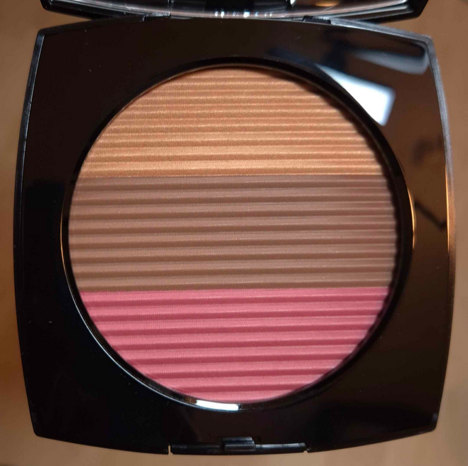
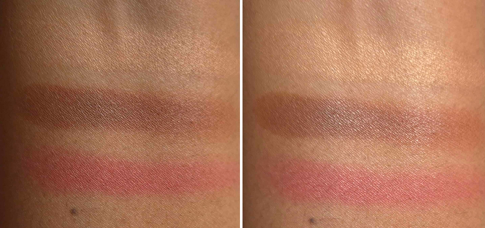
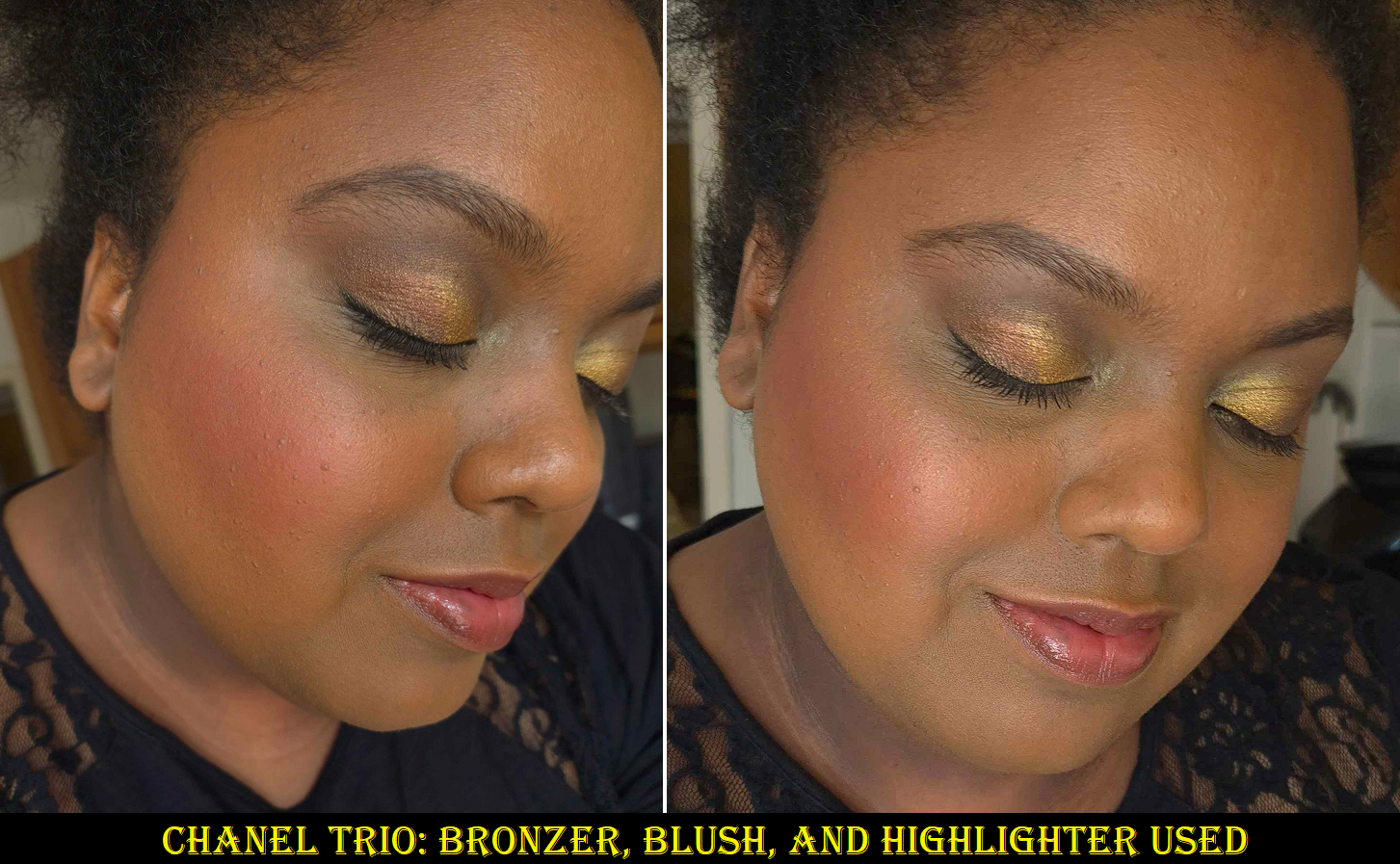
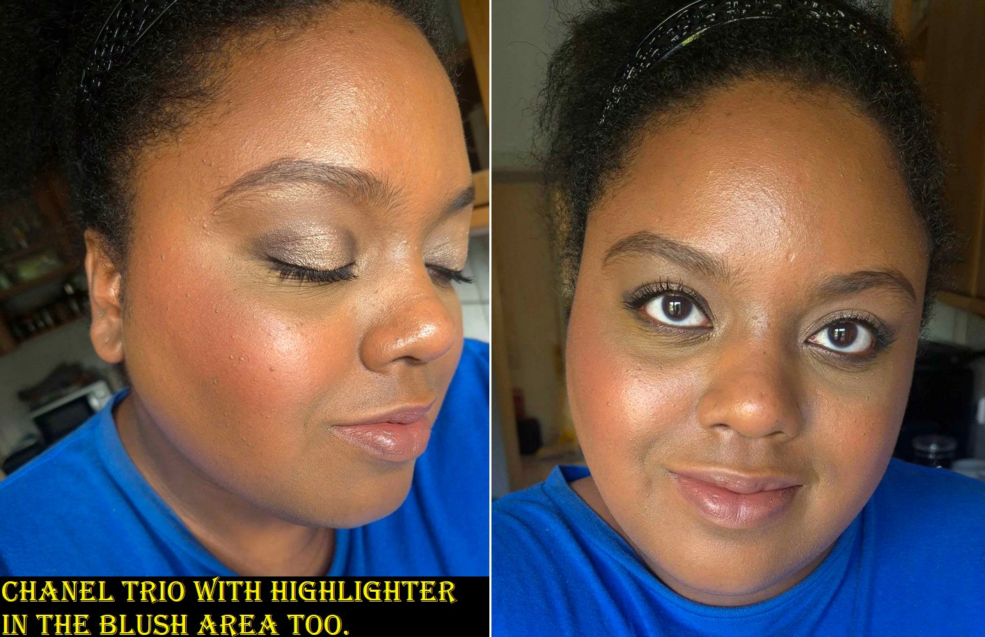
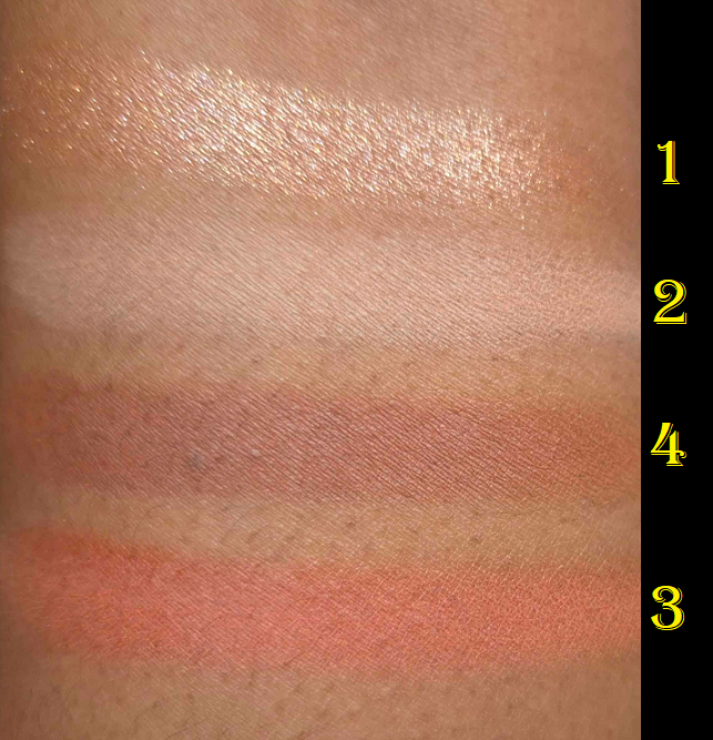
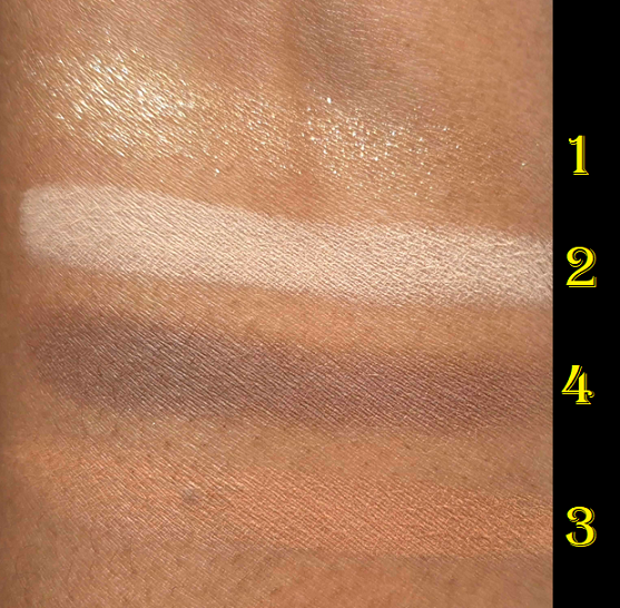
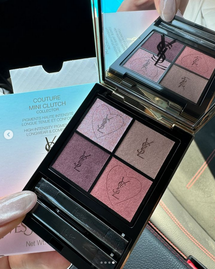
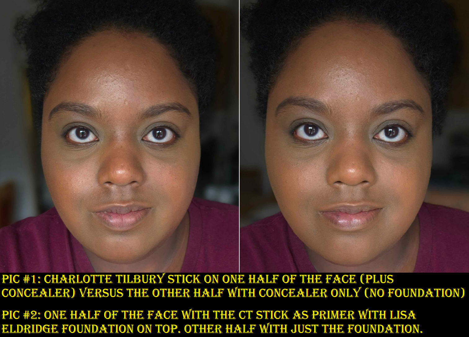
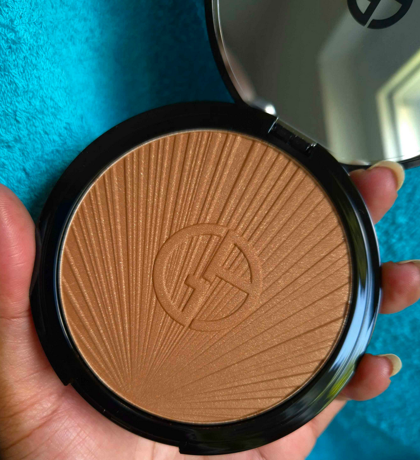
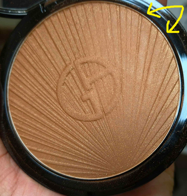
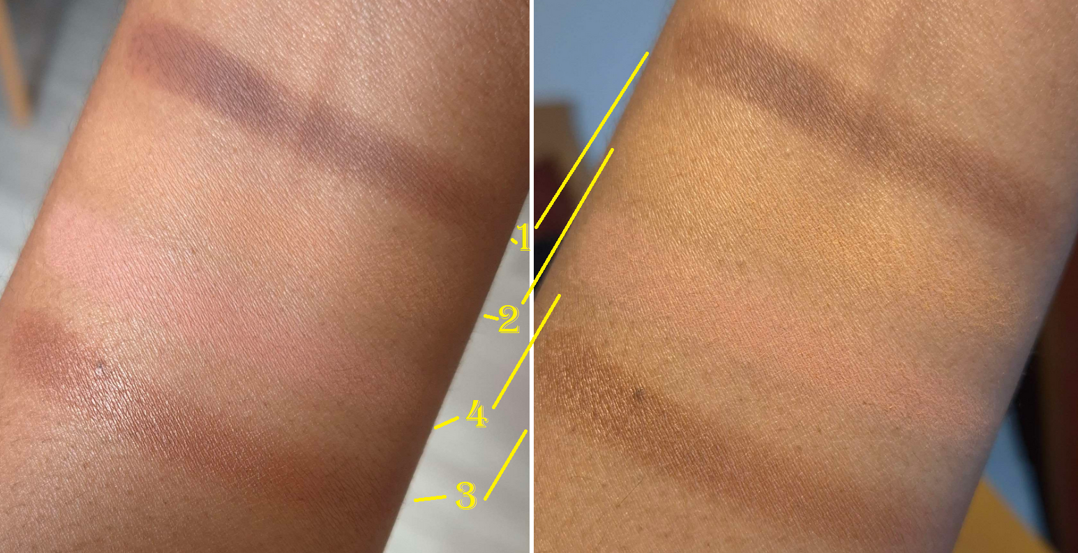
The compact photo above is better at showing the depth level, but the compact photo below is more accurate to the undertones.
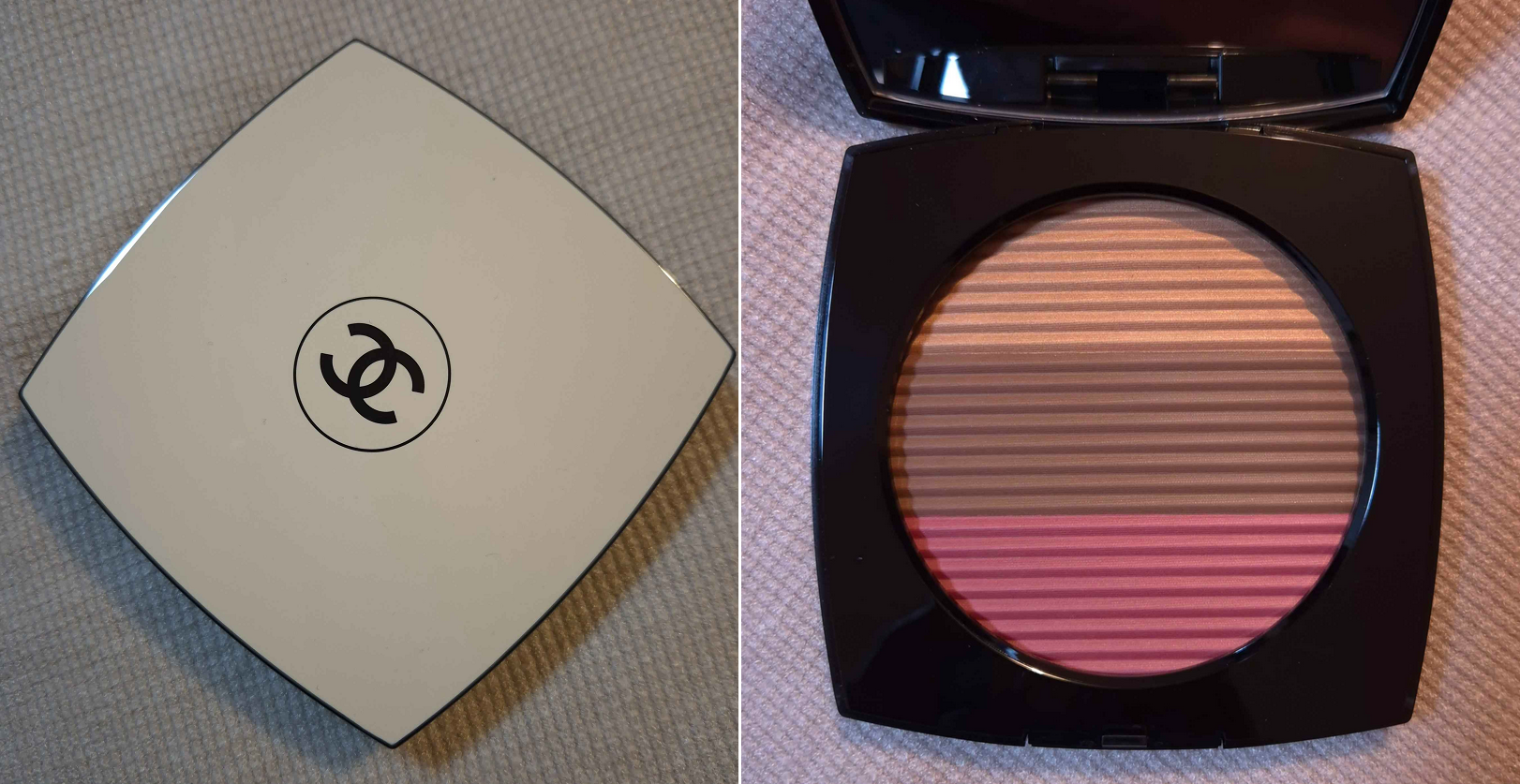
I have more than enough makeup for one person, even though I currently only have access to about a quarter of my collection. For that reason, I tried my hardest to not be tempted into buying this Chanel product. I love their blushes, but I don’t use them enough. I have heard fantastic things about their highlighters, but most are too light for me (and the one I bought wasn’t as refined as I expected). I don’t own any bronzers from the brand, so that would be a new experience.
I watched a video from French for a Day to talk myself down from Chanel products in general, but even she seemed excited for the trio. It was ultimately the assurance that this would work on my skin tone from watching the video from I Am Jamila that kept me interested in this product. In addition, so many people I follow on YouTube and Instagram continued to rave about it even beyond the initial release, indicating that it’s not just temporary hype. The final nudge I needed was a small discount from the retailer Parfümerie Pieper, and I was sold!
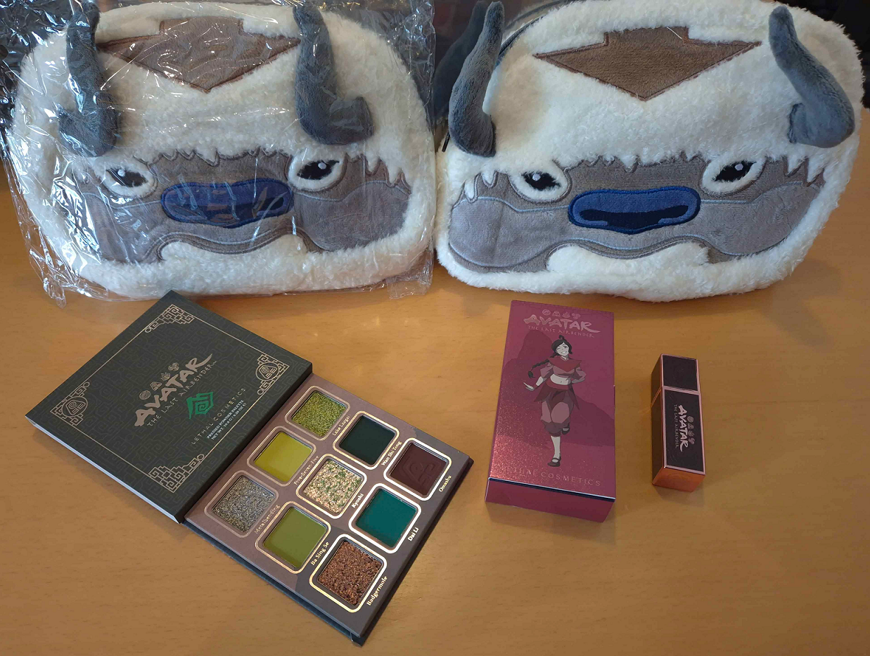
Chanel Les Beiges Poudre Belle Mine Ensoleilleé in Deep Rose Gold
The blush is nice. It’s not difficult to nail a blush formula though, so I expected it would be good. It’s not my favorite tone of pink, but it’s pretty. For those that have the Guerlain Terracotta blush in Deep Nude, this is basically the same color.
The bronzer is also pretty good. If you’ve seen my ranking of bronzers that I purchased in 2023 exclusively, I would say it performs as well as MAC’s Sunstruck bronzers, Pat Mcgrath’s Divine Powder bronzers, and perhaps even Nars Laguna Talc-Free Bronzing Powders. This means that it’s among bronzers I like a lot, but not quite enough to make the top 10. I didn’t watch French for a Day’s actual review of the trios until I finished my first draft of this post, and in her opinion the powders are average quality for Chanel. That doesn’t make them bad, just not the best that the brand is capable of producing. I felt strangely reassured when hearing this because it matched my feelings, after using this product for a while, that perhaps this being called “phenomenal” is an over-exaggeration.
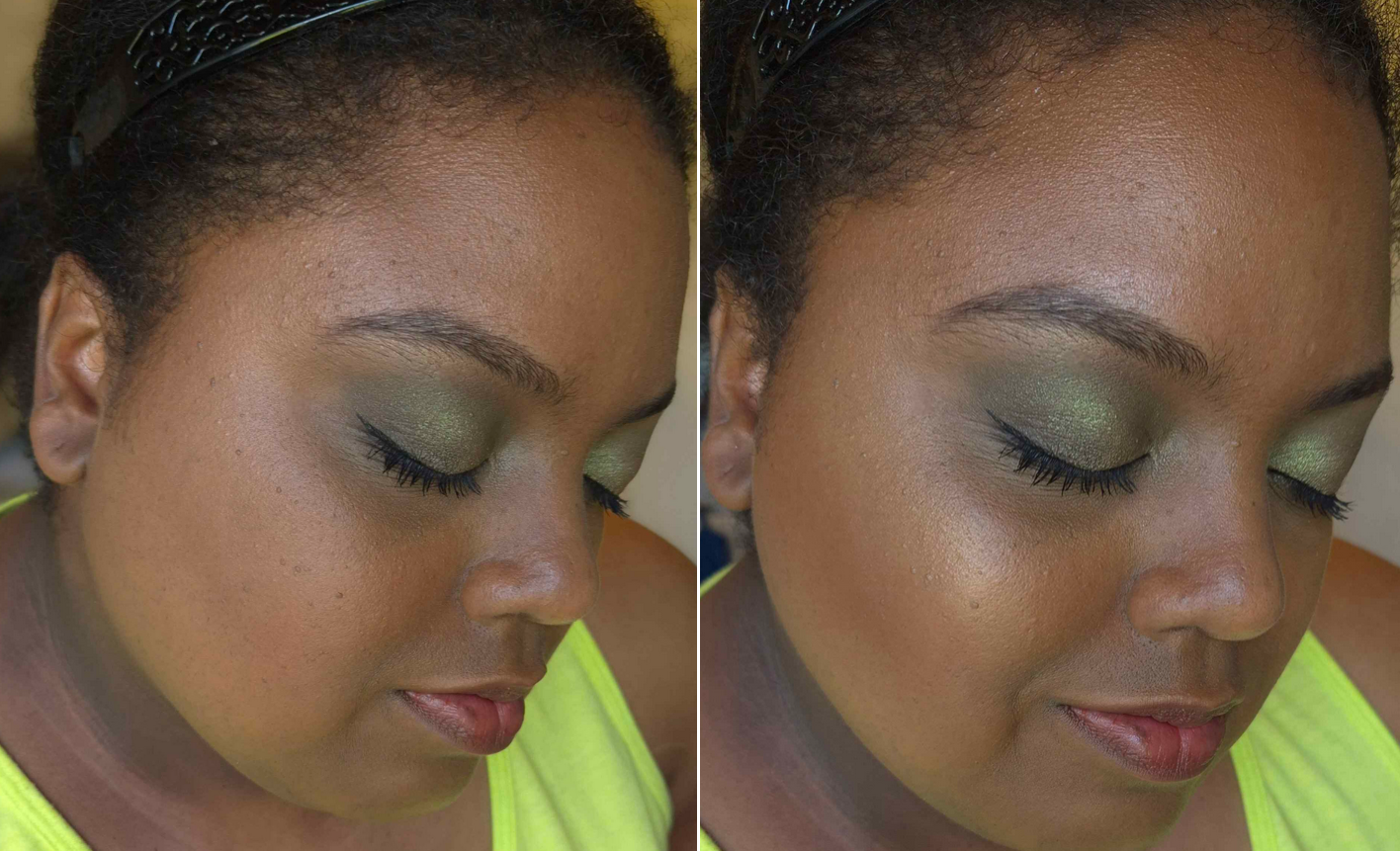
I had mixed feelings about the highlighter initially. I love a subtle highlighter, but this is too subtle for me to want to use alone. It’s along the same vein of the Guerlain Météorites, but even less shimmery. I built it up as much as I could in the photos above. What made me start to like this highlighter is that it offers something I don’t have in my collection, which is the ability to turn the bronzer and/or blush into a glowy one without changing the color or making it overly shimmery. It lightens the color, but not by much. I have a few products that I mix with others to achieve this effect, but they are pigmented products that will alter the final color by adding more of a brown tone, warmth or make it cooler toned, etc. This one is sheer enough to transform other products too. In practical usage, I don’t know how often I would pair this with other products besides the ones in this compact, but the option is there.
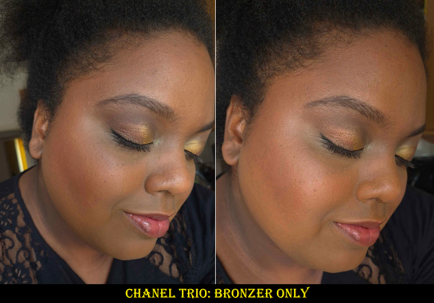
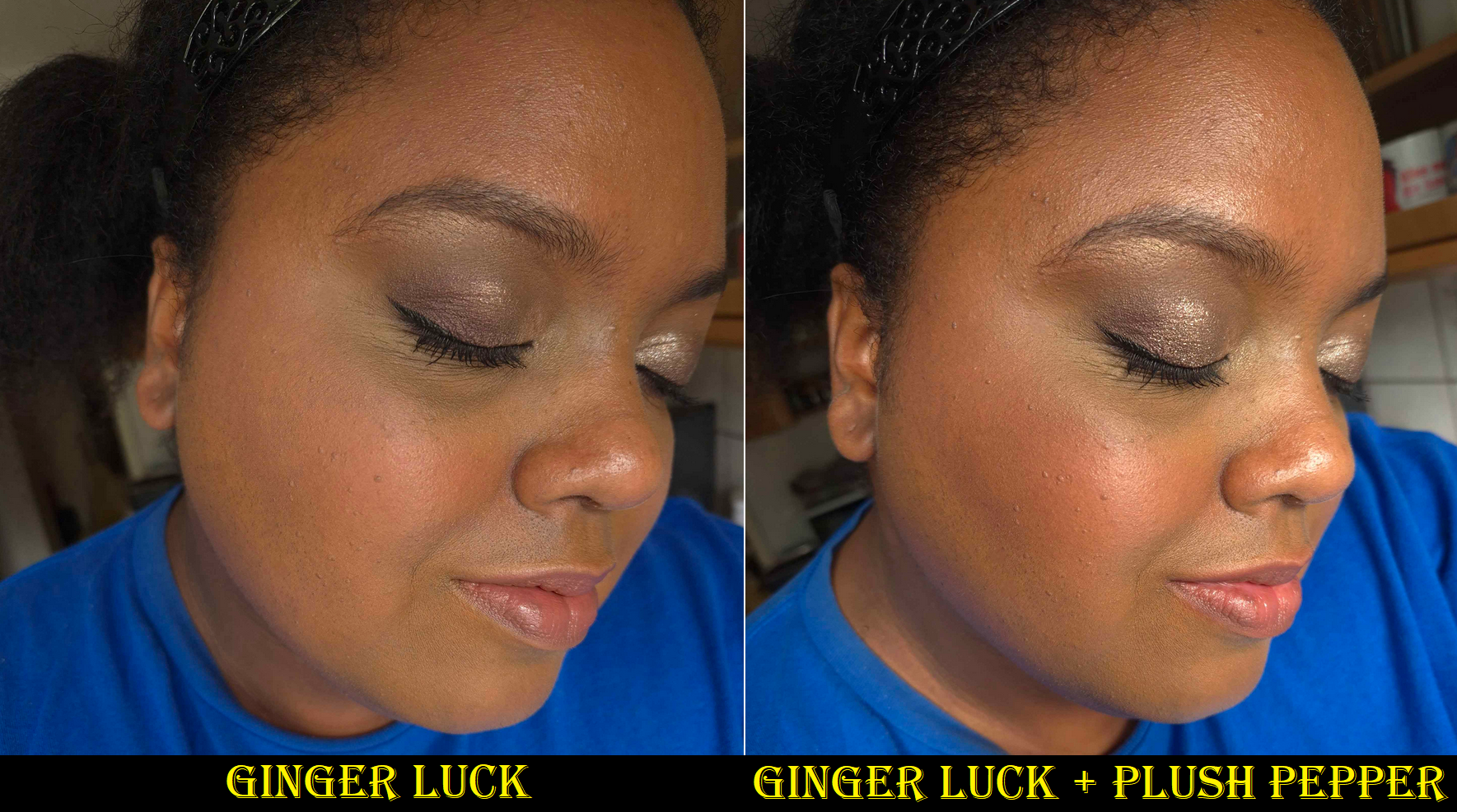
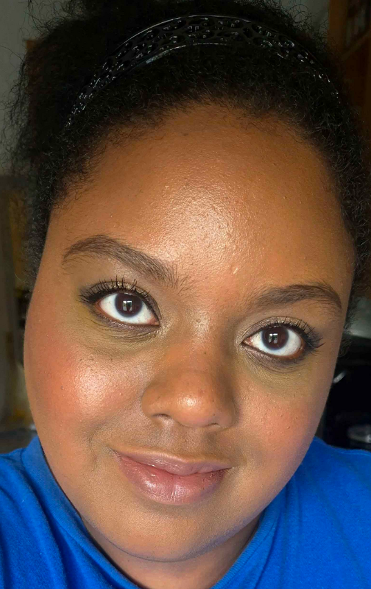
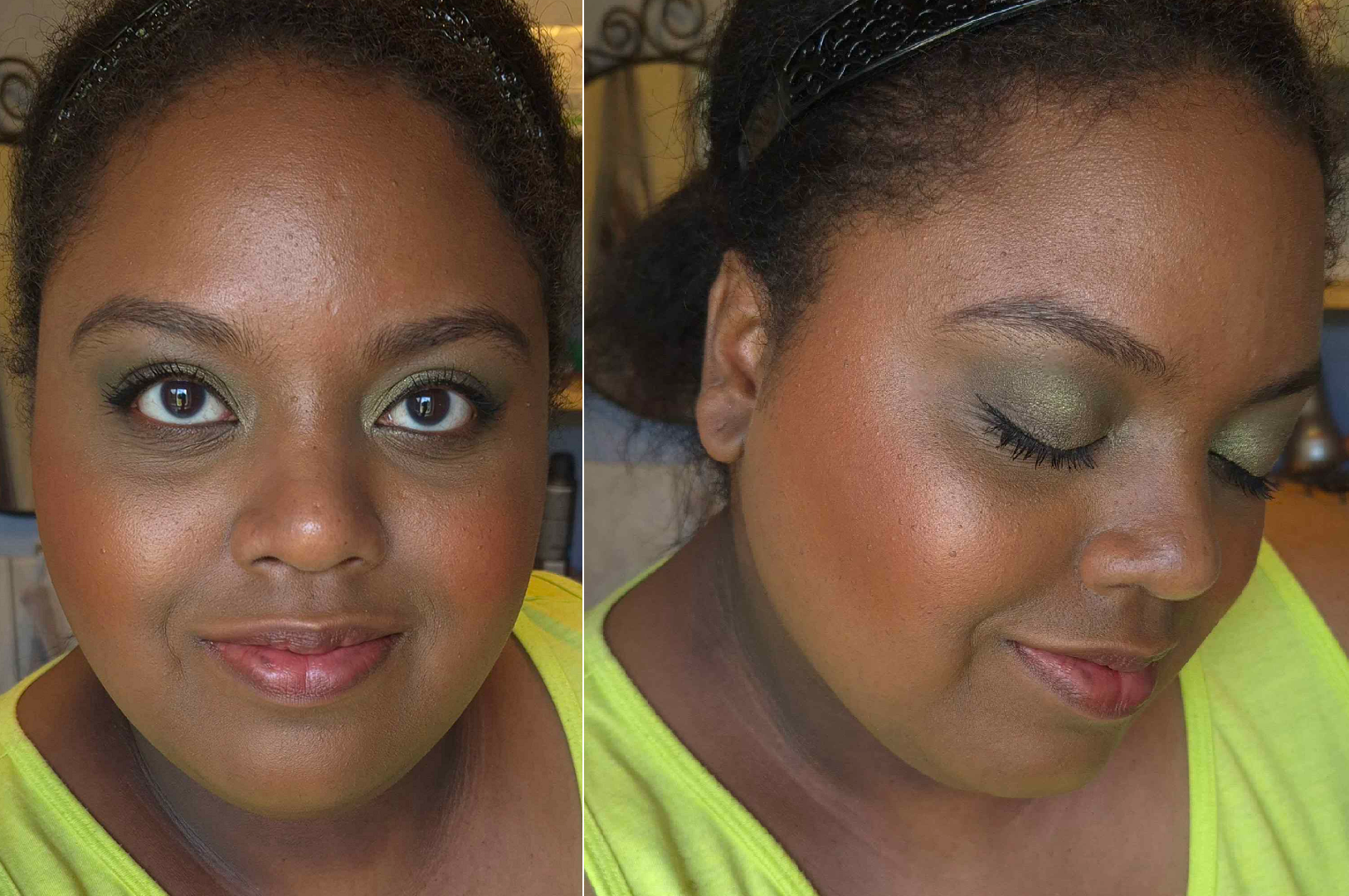
In the previous photos, I was wearing the Lisa Eldridge Foundation which is a little dark and leans orange on me. In the photo with the blue shirt above, I’m wearing a combination of the Givenchy and Armani foundations, which are a better match (and it’s also a slightly sunnier day, so this is why I look a bit lighter). As for the Chanel products, I wore the amount I normally would, rather than building it up for photos, like the previous ones. The sheerer application of blush with the highlighter on top accounts for the depth differences in the photos.
I have no issues with fading or longevity with this product. These aren’t the smoothest powders I’ve used, but they blend pretty well, especially with a fox or saikoho goat brush. I also have some smaller sized brushes that can fit well in the compact, so it isn’t too much of a hassle having all three colors that close together. A tip I learned for getting into the blush easier is to turn the compact 180 degrees so that it’s the top stripe and the highlighter is on the bottom instead. Then I can dip the angled part of my brush into the blush and can see what I’m doing from top to bottom rather than trying to avoid the brush getting into the bronzer while having the back of the brush hitting the edge of the compact.
Sometimes luxury products look pretty, but don’t feel luxurious. This does feel like a luxury product in the hand, and because the retailer I purchased from included a few Chanel samples, just like the official Chanel website does, I still had the luxury experience.
Having three products in one feels like the pricing is appropriate, especially for a brand like Chanel. I posed the question in the title as to whether this was worth me buying. Considering the discounted price I paid, I think it technically was. However, from a personal standpoint looking at all the makeup I own and factoring in how often I’ll use this palette, perhaps it wasn’t. Time will tell, but for now, I am happy I made this purchase.
DISCLOSURE: I posted several links, including the retailer, but they are normal links, not affiliate links. I paid for these myself and these opinions are my own. At this time, I have no personal or professional connections to the companies or influencers mentioned.
Thank you for reading! I hope it has been helpful.
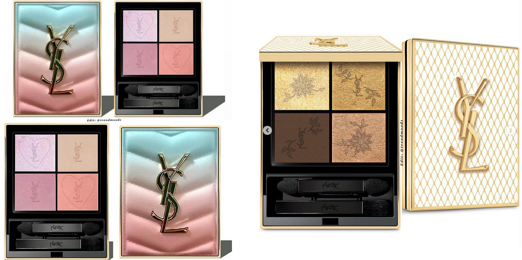
YSL Beauty has been making eyeshadows for years, but I heard they were mediocre. It wasn’t until they created smaller versions of the Couture Clutch palettes in 2023 that my YouTube and Instagram feed became flooded with posts about them. I could not escape the hype for these. Praises were thrown all year after they launched, many calling them the best luxury eyeshadow formula, so I believed there had to be some truth to it.
The two factors holding me back from buying any were the color selections and the price. So, when the brand released four new quads, I was very interested in Over Brun, which is basically the warmer version of Stora Dolls. Only a few weeks after they launched in Europe, all the quads (including the new ones) were discounted at various retail websites. The lowest I saw, in the month of July that I started working on this post, was 32 Euros for the older ones and around 38 for the new ones. That was the push to get me to finally try these eyeshadows out!
*DISCLOSURE: A highlighted word section like this indicates that it is an affiliate link. If you click it and choose to make a purchase, I will get a commission. Words that are bolded in blue font alone like this are regular non-affiliate links. I have no affiliations with YSL, no affiliate links with the brand, and I purchased all products discussed in this review with my own money. My opinions are my own. I feel it’s important to clarify this, especially since I hold the product in high regard.
I purchased my quads in four separate orders through the retailer Beautywelt DE. The packages came with a few free samples, shipped the same day of ordering (except the last one that took a week to be shipped), and arrived the next day! They had a discount code featured at the top of the website, but I found a better one on the first Google search results page and it was not a one-time-use code. What luck!
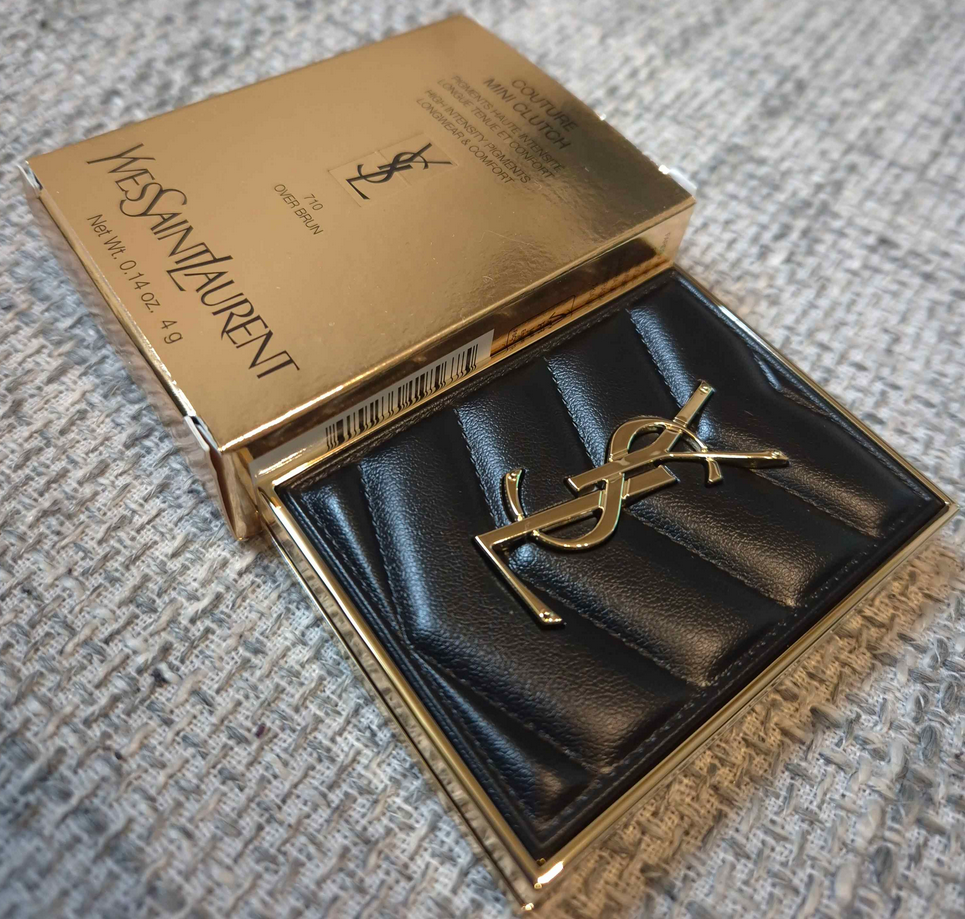
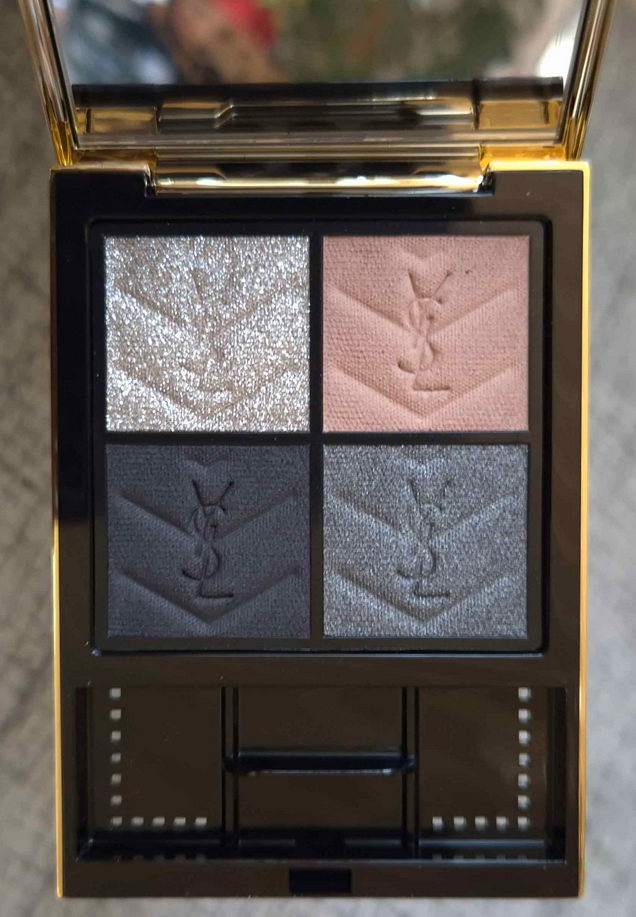
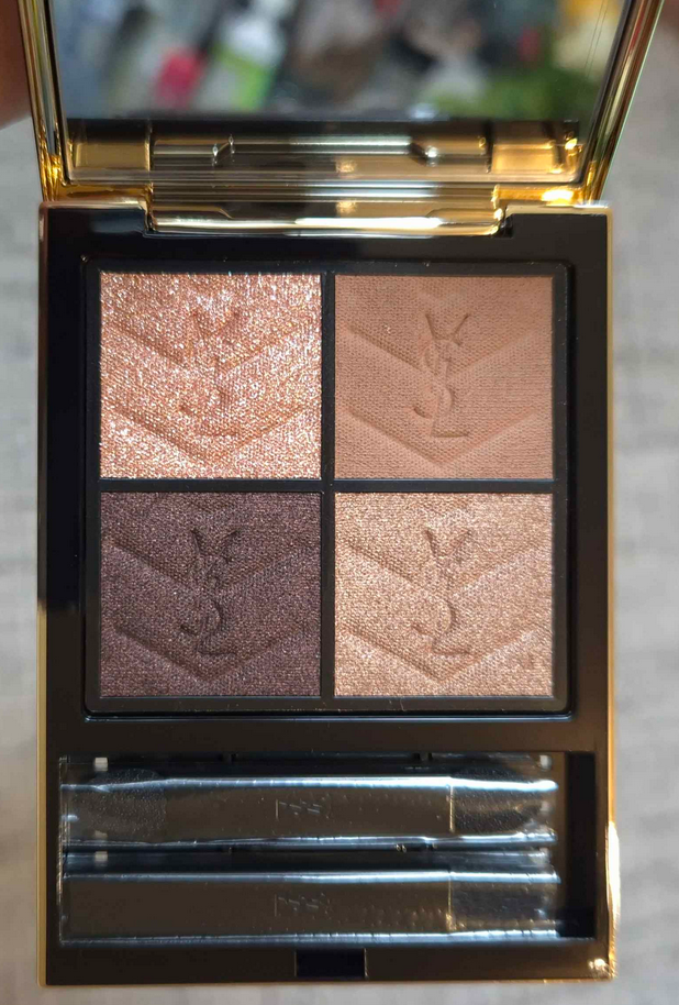
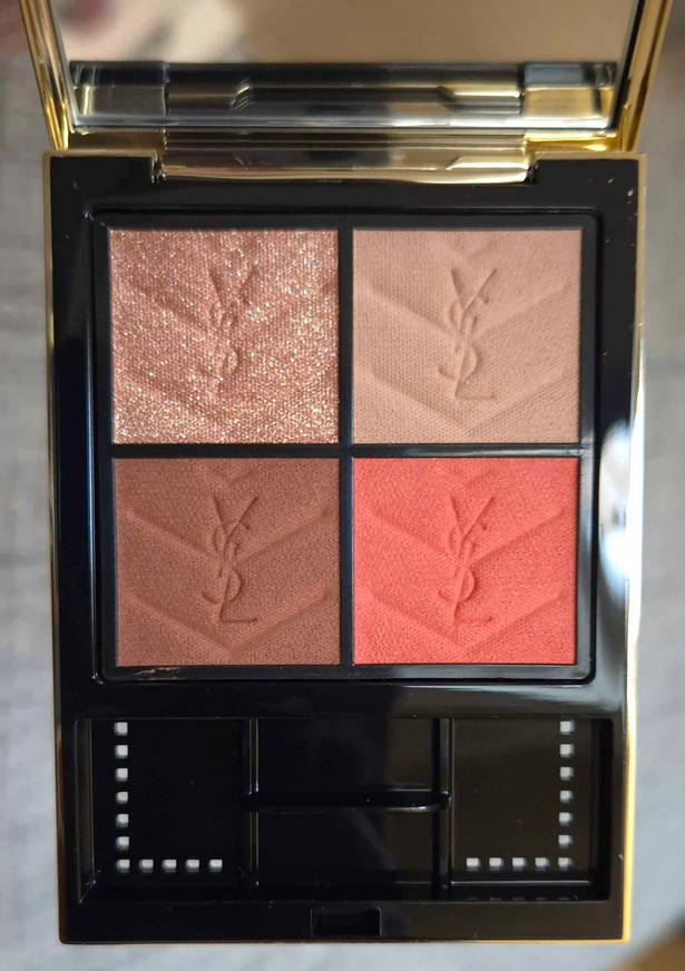
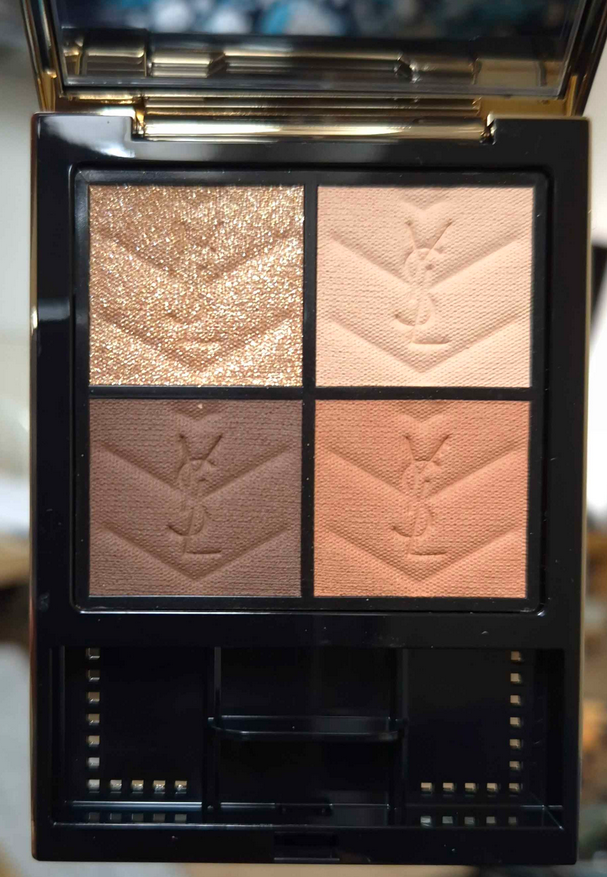
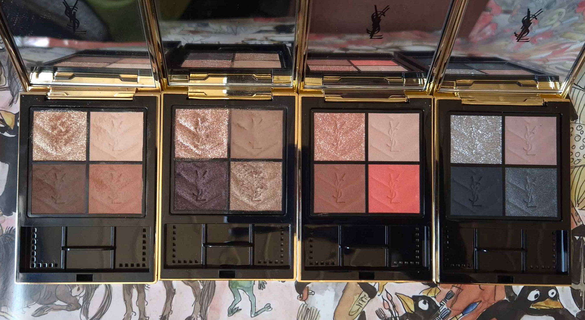
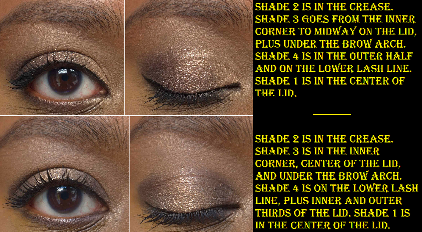
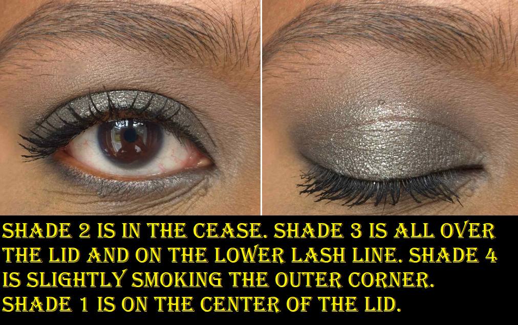
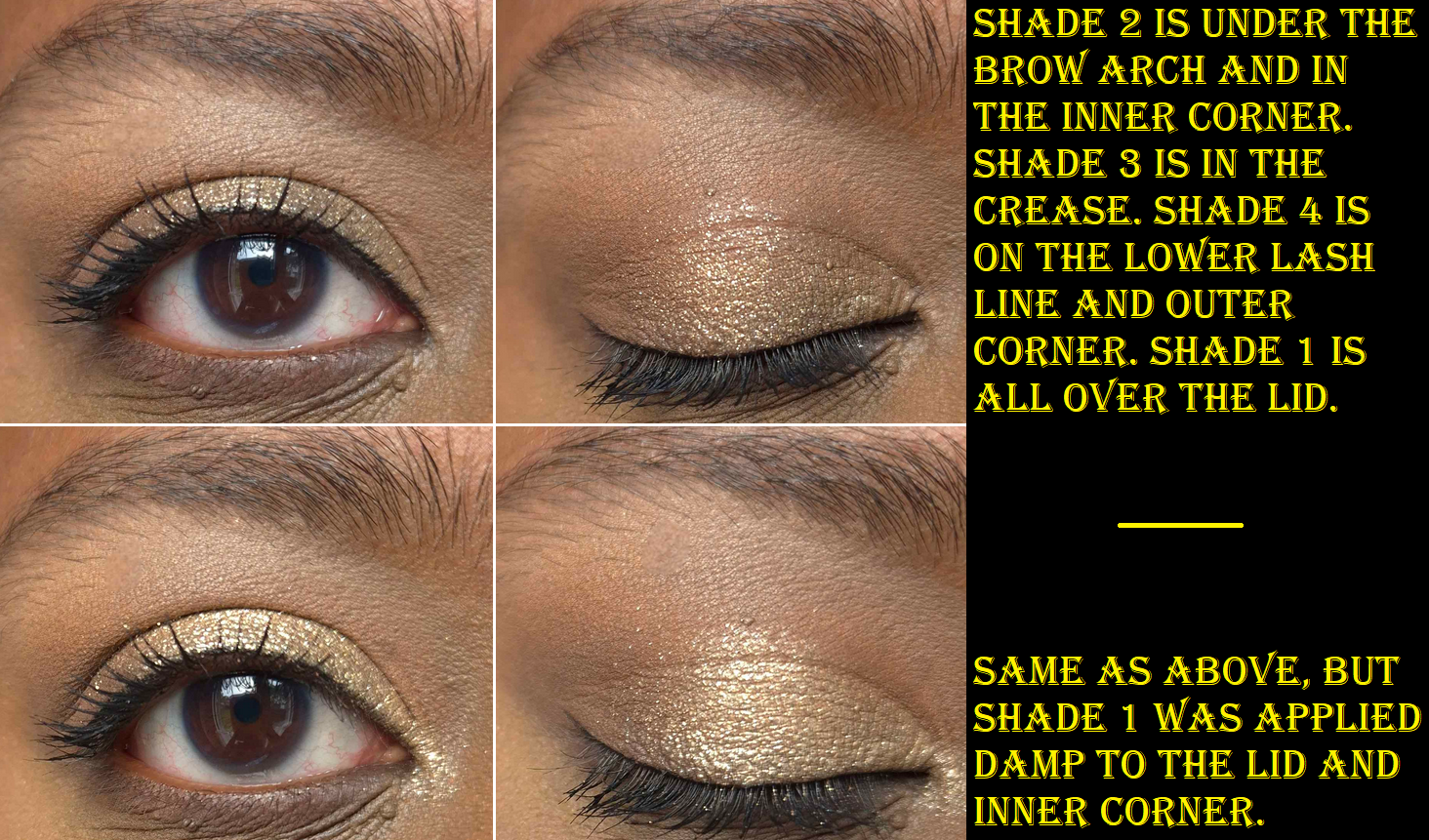
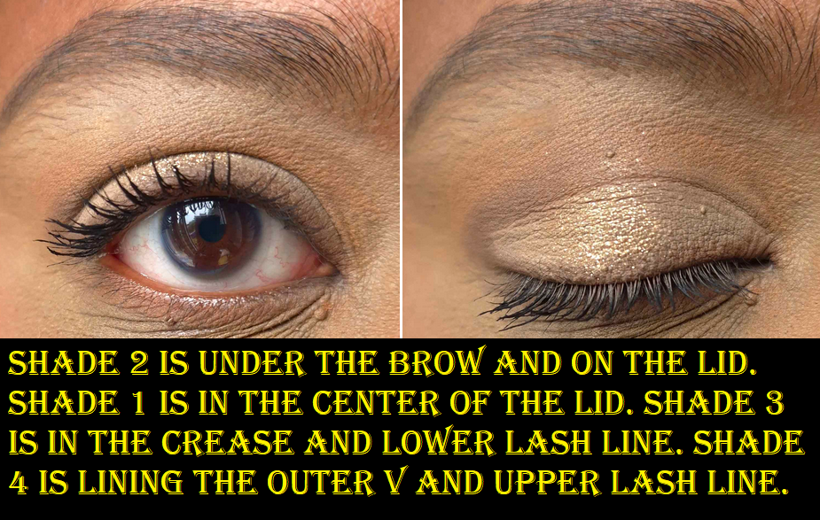
Yves Saint Laurent Couture Mini Clutch in 700 Over Noir, 710 Over Brun, 810 Over Orange, and 300 Kasbah Spices
Over NoirOver BrunOver OrangeKasbah SpicesOver NoirOver BrunOver OrangeKasbah Spices
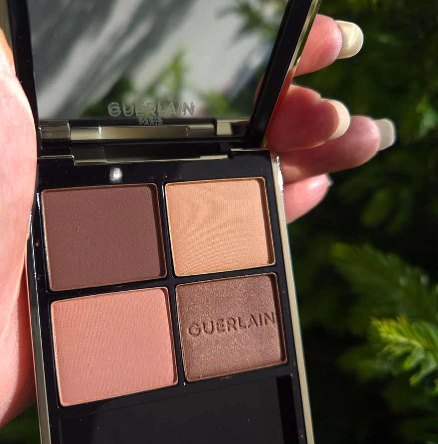
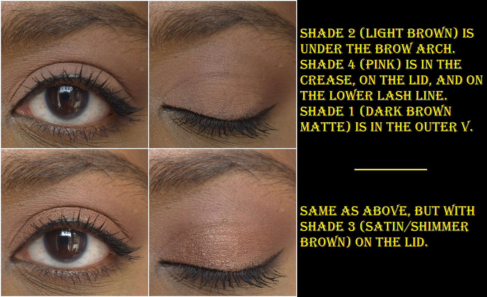
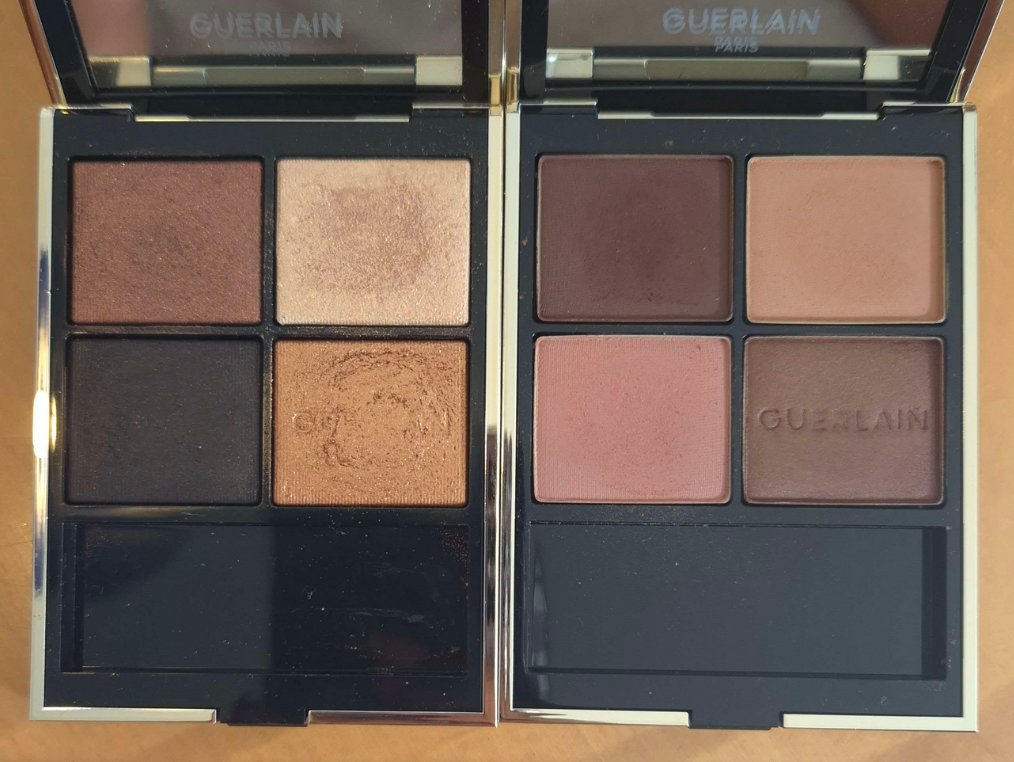
Like the Guerlain quads, the shades are numbered in a clockwise direction instead of up and down from left to right.
Kasbah Spices, Over Brun, Over Orange, and Over Noir from left to right.
I didn’t anticipate needing to review these individually, but my experience has not been the same! So, we’ll start with the best one.
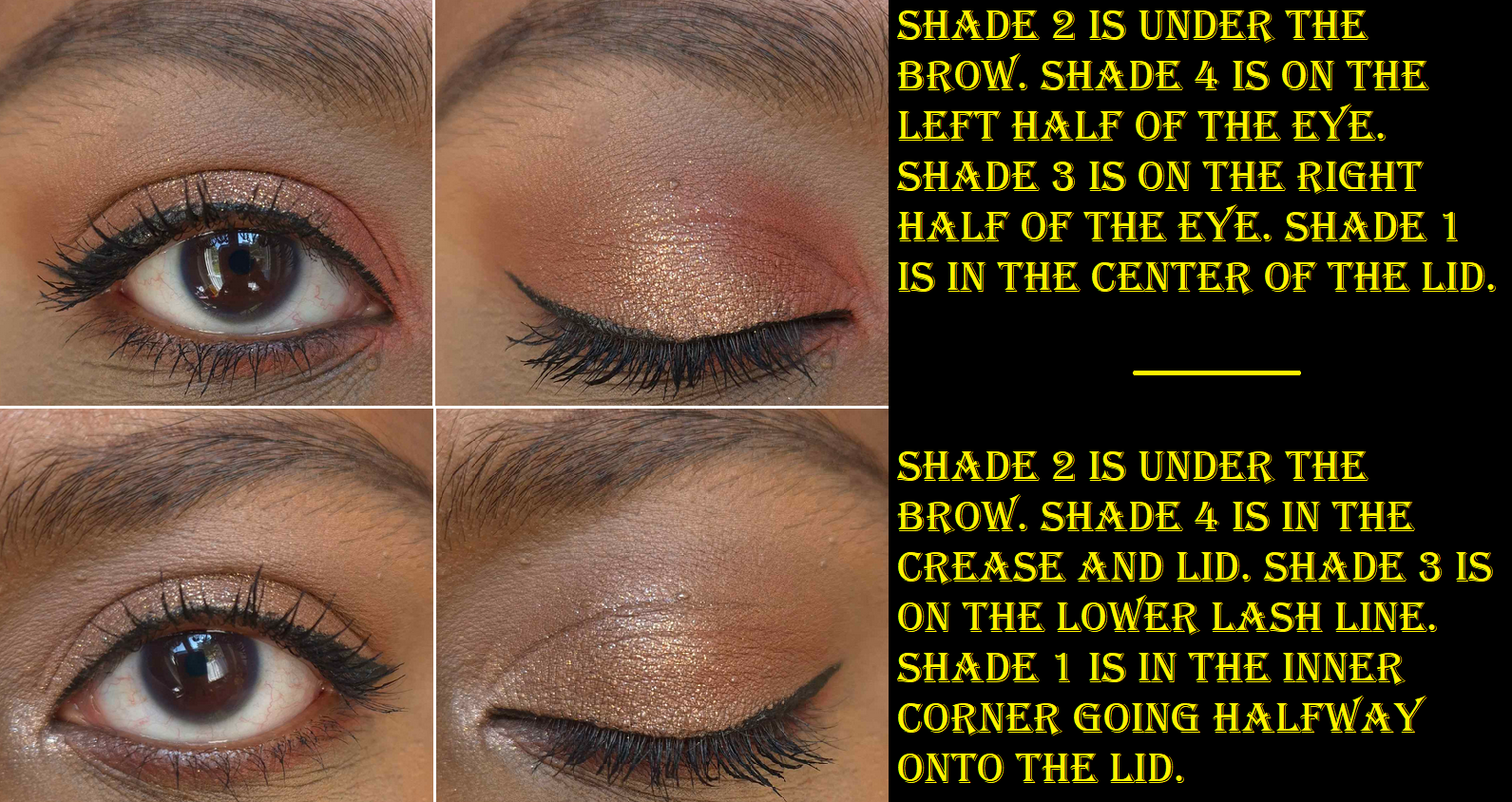
Over Brun is practically perfect. I’ve testedit with concealer as primer, MAC paint pot, and an eyeshadow base. It performs the same with all of them. I have no issues with longevity. There has been no fading, creasing, or fallout even with the sparkly shade! I’ve had no need to spray my brush to get the sparkly shadow to stick to my eyes or be intensified. The eyeshadows are all easy to pick up on my natural hair brushes, even squirrel ones. If I’m applying shadows to my lower lash line, I don’t need to press hard or make multiple passes due to the lash hairs being in the way. The shadows adhere on the first go. They blend well and quickly.
I should specify that I use laydown/packing brushes with this formula, such as the Koyudo Pine Squirrel Eyeshadow Brush. I’ve seen some people talking about issues with fallout while they’re using fluffy crease brushes or synthetic ones. Using different tools could effect the experience. It also depends on which quad one buys.
The texture of these shadows (shades 2, 3, and 4) are like a more buttery version of Pat Mcgrath’s cream powders from the 5-pan palettes that I was obsessed with. These are more buttery than Suqqu eyeshadows, more powdery than Surratt eyeshadows, and more pigmented than both. They’re not damp like a cream, just incredibly smooth. The brand describes the texture as silky. The closest comparison I can think of to describe the consistency of it is the Westman Atelier Butter Powder Bronzer.
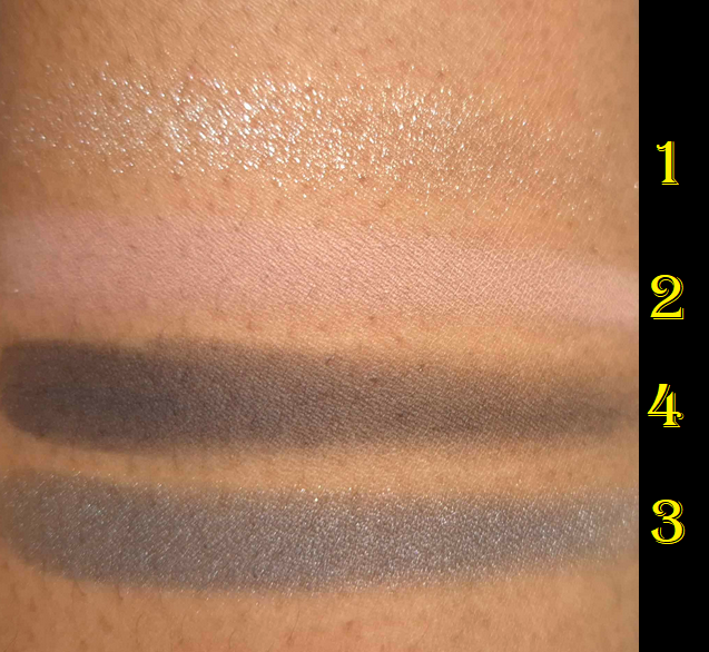
In theory, I love that each quad contains a sparkly shade to amp up the drama. These are all called Shade 1 in the top left position. However, I still want a more pigmented glimmer shade for their palettes going forward because I don’t need multiple semi-sheer base eyeshadow toppers when there are only four options to choose from per palette. This was my one complaint when I only had the Over Brun palette. Little did I know that all the other Shade 1 eyeshadows in the YSL quads have even sheerer bases and perform like true toppers! Shade 1 in Over Brun and Over Orange are the odd ones out in a good way. It’s still a bit unfortunate for me that those colors are so similar on my skin.
Over Orange has all the positive qualities that Over Brun has, except when it comes to Shade 3, the vibrant pop of Orange. This particular shade is a bit more powdery, it takes a little more effort to apply evenly without sparse portions. If I’m using a primer that’s on the drier side, I sometimes have to reapply it so I can pat the orange shade back on and have it stick. The way pure pigments and neon eyeshadows tend have rougher texture and have to be handled a bit differently, like the Terra Moon Neon Mattes, explains on the smallest scale what is happening with this shade. It’s the tradeoff for getting this kind of vibrancy. This is me nitpicking a bit though. When the shadows are all working so well, I can’t help but notice the slightest difference. The amount of work I have to put in is still fairly low effort because I don’t use my driest eyeshadow base that often.
I love the terracotta eyeshadow (Shade 4), but the depth level and strength of the orange tone within it make it less easy to differentiate when used right next to Shade 3. So, placement is key when it comes to making distinctly different looks using every shade in the quad.
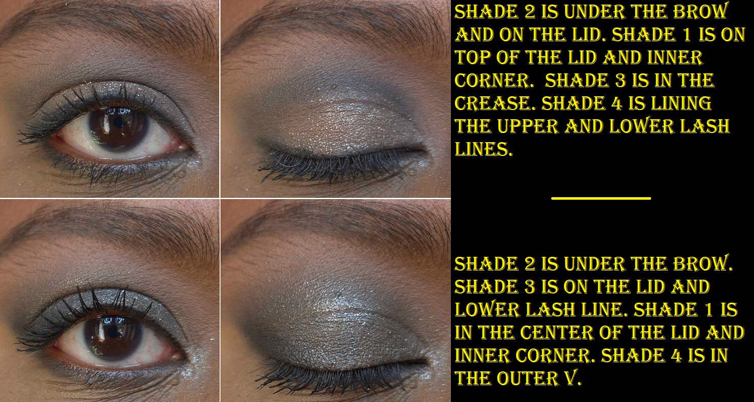
As for Over Noir, it performs identically to Over Brun, except with Shade 1. As I mentioned earlier, it has a clear base. Unlike the previous formulation, this particular color looks wet and reminds me of the original Fenty Diamond Bomb Highlighter (How many Karats). I rarely enjoy wearing silver or cool toned shadows on my eyes, but this shade is stunning! It also adheres just as well to my eyes as the other new ones. I might sometimes get a few particles that fall on my lashes or under my eyes while applying, but whatever is on my lids or inner corners stay there without giving me more fallout as the day goes on. Although I don’t own Over Dore, I assume this is a feature of all the new quads and part of the slight tweaks they made to the formula when they supposedly reformulated them.
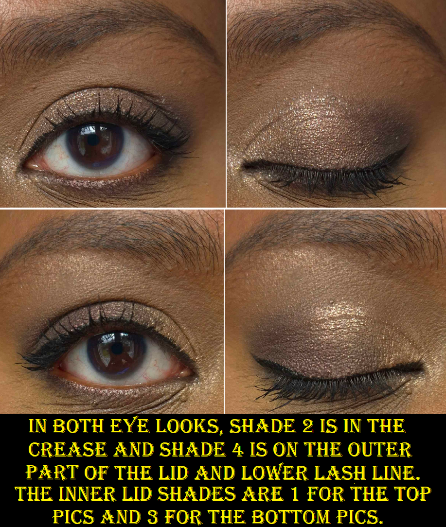
The first two Noir eye looks were done in a rush. I am attending Sprachschule again with limited time during the week to do makeup looks with access to natural light directed through the window. I basically wanted to show what could be done in a rush versus the third one with a little more time. I was also rushing through the eye looks for the Over Orange quad, but since those tones are warmer and not as deep, it’s a lot more forgiving. So, when I say all the YSL quads are quick and easy to blend, there is the tiniest caveat which is that I shouldn’t be heavy handed with any black or dark gray eyeshadow no matter what brand it’s from. I’d also done multiple looks on the same eye with micellar water used in-between. So, the fact that they turned out okay is a testament to the quality.
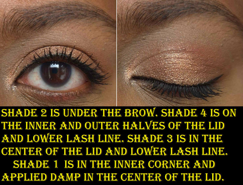
The new round of YSL quads are phenomenal. However, I have to review Kasbah Spices differently. Starting with Shade 1, I get fallout. Using the same brushes I mentioned earlier doesn’t make it better and applying it damp doesn’t. The only thing that helps is glitter primer, and even then I still get some fallout as the day goes on. Glitter primer is still the better option than how my eyes look without it. This shadow feels smooth to the touch like all the other sparkly shimmers, but it doesn’t adhere the same way. It has more of a scattered effect on the eye, which I usually don’t like. I can change that entirely by wetting my brush at least (seen in look 2 of 3 below). The downside again is that it settles awkwardly in the deepest line in the crease of my eyes.
The rest of the shades in the palette are mattes and they also don’t adhere as well. I’ve tried various primers and bases, just like with the other quads, but eyeshadows in Kasbah Spices performs differently with each primer. The drier the better, it seems. Less dry primers cause settling in my deeper eye crease.
The strangest part about this all is that they feel no different to the touch than the newer launched quads, but they obviously are different. The Kasbah Spices mattes also look dustier on my eyes. The warm orange-brown gave way less depth than I expected. It reminds me of a creamsicle/dreamsicle type of color. I have to spend so much time packing on that color and Shade 2 in the looks above. Shade 4 gives me hardly any depth. I have to basically leave it partly unblended so it can be more visible in photos.
Other than these problems, which might be less of an issue for someone with a lighter skintone, these aren’t the worst eyeshadows I’ve ever used. The fact that I can still get a nice sparkle and enjoy the outcome if I resign myself to making a soft glam type of look makes this an okay quad for me. Ironically, the Shade 2 (all brow bone shades for me) in this quad is my favorite, but I intend to eventually declutter this palette. The equivalent light shadow in Over Orange is a very good alternative option. In fact, I consider Over Orange to be the Kasbah Spices for those with darker skin.
The packaging for all these quads is lightweight, but it still feels luxurious because of the black and gold coloring. Also, I love quilt patterned faux leather purses, so I find the lid appealing, and the bonus is that the raised parts are squishy. It’s a pleasant feeling gripping the quad in the hand. If they made a compact mirror like this, I would want to buy it to keep in my purse because of how enjoyable it is to handle!
Going back to these new eyeshadows, I don’t think there is a more perfect eyeshadow formula out there for me and my needs. They nailed every type of finish. My biggest complaint is the lack of colors available beyond neutrals. Even if this is the best version of them, the colors aren’t different from a ton of other neutral palettes I own. I was already content with Guerlain’s Royal Jungle, Pat Mcgrath’s Bronze Bliss, Tom Ford’s Honeymoon, etc. YSL has a Europe exclusive blue palette, but that’s my least favorite color in the rainbow. So, if the brand comes out with colorful quads that are more to my style, they will have truly done something in my book. It’s one thing to have the best formula, but quite another to have enough shades in that formula to make more than just a few looks. Even if I wanted to use YSL eyeshadows exclusively from now on, I couldn’t because of the limitations. Owning 4 out of the current 12 still hasn’t added enough variety for me to be fully satisfied. I think 12 of the 12 would not either, so I’m still looking to other brands for my eyeshadow desires.
Of the newest two I saw sneak peeked, I think the pastel packaging is stunning, but not my kind of color story inside unless the shades are more saturated in person. The upcoming holiday quad is gorgeous, but I would need to see swatches to know if those shimmer shades will have enough pigment to look different enough from what I own.
Photo Credit of Quad #125 Blooming Lust: Trendmood1 Photo Credit #024 Golden Lace: Trendmood1
Photo Credit of Quad #125 Blooming Lust: Sharonrulala
Regarding my purchases, the only one I regret is Kasbah Spices. At the same time though, I would have never known about the performance difference if I hadn’t tried it for myself. I watched a lot of reviews (trying to be an informed consumer too) and most people could not tell a difference at all. The few that did only noticed it with the sparkly shades. So, it might be the case that it’s only noticeable on someone with oily lids or just eye skin like mine.
I love Over Brun, and that’s what got me into this, so I have no regrets there. Over Noir is the quad I bought specifically to wear for my husband. I had a smokey gunmetal eye look on my first “fancy” date with him. Ever since then, smokey colors with gunmetals or pewters have been extra appealing to him. Ironically, I rarely wear those and don’t have many of them in my collection. I have one particular eyeshadow I saved specifically for those looks, but it’s quite old by now. Over Noir has been hubby-approved as a replacement.
I edited this post to include a photo from that date night I mentioned with the smokey eye look!
Over Orange is one that I like, but technically I could have skipped. It really wasn’t a necessary purchase, but I’m happy with it! I can enjoy using it on its own, but I’ve been liking how it pairs with Over Brun and sometimes use them together. It’s, once again, what I originally hoped I could do with Kasbah Spices, but am using Over Orange for instead.
That’s all for today! I hope this has been helpful. Knowing what I know now, I would have still bought Over Brun and Over Noir at full price because of how strongly I feel about them for myself and for nostalgia. However, I always recommend trying to get things discounted if possible! I would not have gotten the others otherwise.
Welcome, lovers of Japanese makeup brushes! If this is your first time visiting, I’d like you to know that I have a page that’s accessible on the left menu bar with every Fude post linked, as well as a description of the topics discussed in those posts and a list of which brushes are in which posts. For cell phone users, this page is visible by clicking on Navigation. If this is not your first time here, welcome back!
Regarding my measurements, “hair width” is measured from the widest part, regardless of the overall brush shape. I don’t measure thickness. Anything with an asterisk indicates that I had to measure that one myself as those numbers were not listed on the website. All figures listed in inches are converted estimates.
With costs of materials ever increasing and supply of certain hair types being harder to acquire, brush prices also increase. So, the prices I’ve listed might not reflect what is current, though I will do my best to keep them updated.
*DISCLOSURE: Non-highlighted links in bold blue font (Example) are standard non-affiliate links. Links marked in bold black font with a light blue background (Example) are affiliate links. Affiliate links allow me to get a commission if purchases are made directly using my link. Whether you click to shop through them or not, I appreciate you visiting and I hope you find the information I’ve provided to be helpful!
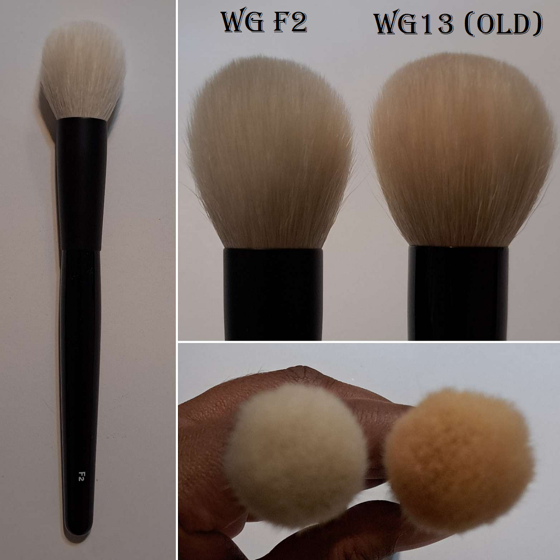
EIHODO
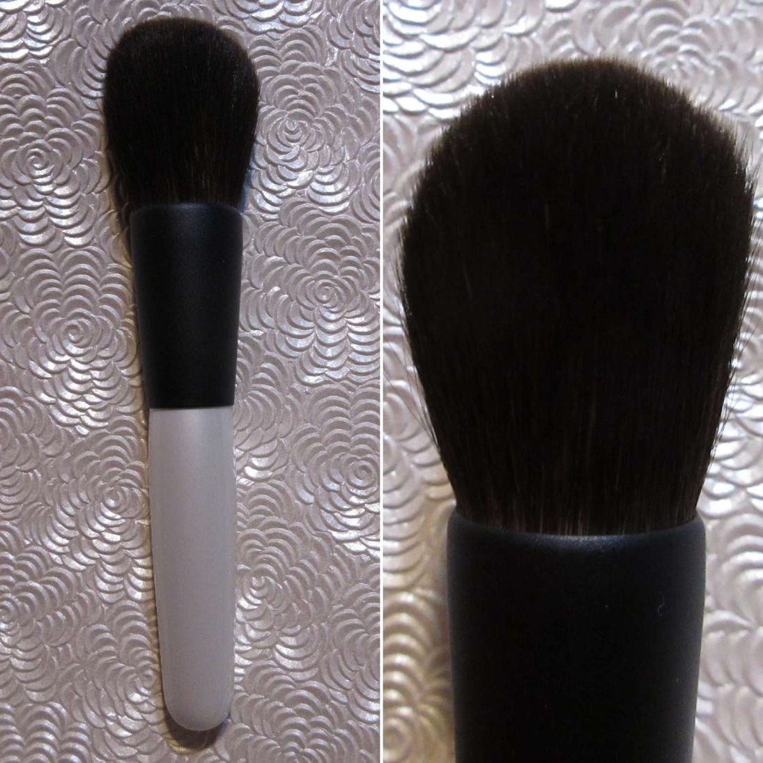
Eihodo NO.324 Eyeshadow Brush L [Outlet]
Full Length: 135mm / 5.35 in
Hair Length: 10mm / 0.4 in
Hair Width: *9mm / 0.35 in
Bristle Type: Saikoho Goat
I don’t own the Chikuhodo T-12, but this brush reminded me of that one based on the T-12 photos. I purchased this mainly for the great price, the sleek look to it, and to see how it compares to my favorite packing brushes.
It’s great for picking up eyeshadow and packing it on, but the bristles come to a thin taper towards the tips and the longest hairs bend quite a bit while I’m applying the product onto my eye area. So, it’s not as comfortable on my eyes when I use this brush because I can feel the dragging of it across my lids. It still gets the job done, but I’ve come to realize I prefer thicker brushes of this type.
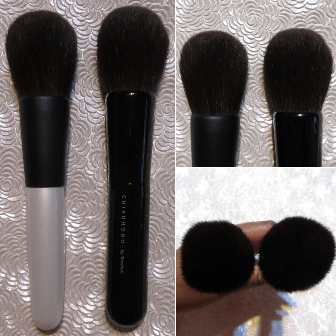
I wanted this brush badly because of how much it reminded me of the Chikuhodo Z-1, which costs practically 10,000 YEN more than what I paid for this outlet brush! Based on the website photo, I expected them to look a bit more different, but they’re not! What a happy surprise! The hair feels the same. They’re practically the same lengths for the heads, ferrule, and handles. The only difference I can detect is that there’s more hair bundled in my Z-1. The Z-1 is slightly more dense and the No.390 bends a little more while using it and covers a slightly smaller surface area. I feel perfectly content with that!
The soft silky bristles, gentle pickup of product, and wispy nature of this brush makes it great for applying a thin layer of face powder and a sheer application of bronzer. Sweeping gestures and circular buffing motions both feel natural with this brush. Because of the generally large size and wide splay area, if someone wants to use this brush with blush, I recommend holding the brush further back on the handles in order to apply less pressure. Doing that allows one to maintain a bit more precision for blush application, but this one is best suited for light applications of face powder and bronzer.
I paid 9900 YEN for this brush, so I don’t know when there will be another deal quite like it. However, the link for it can be found HERE.
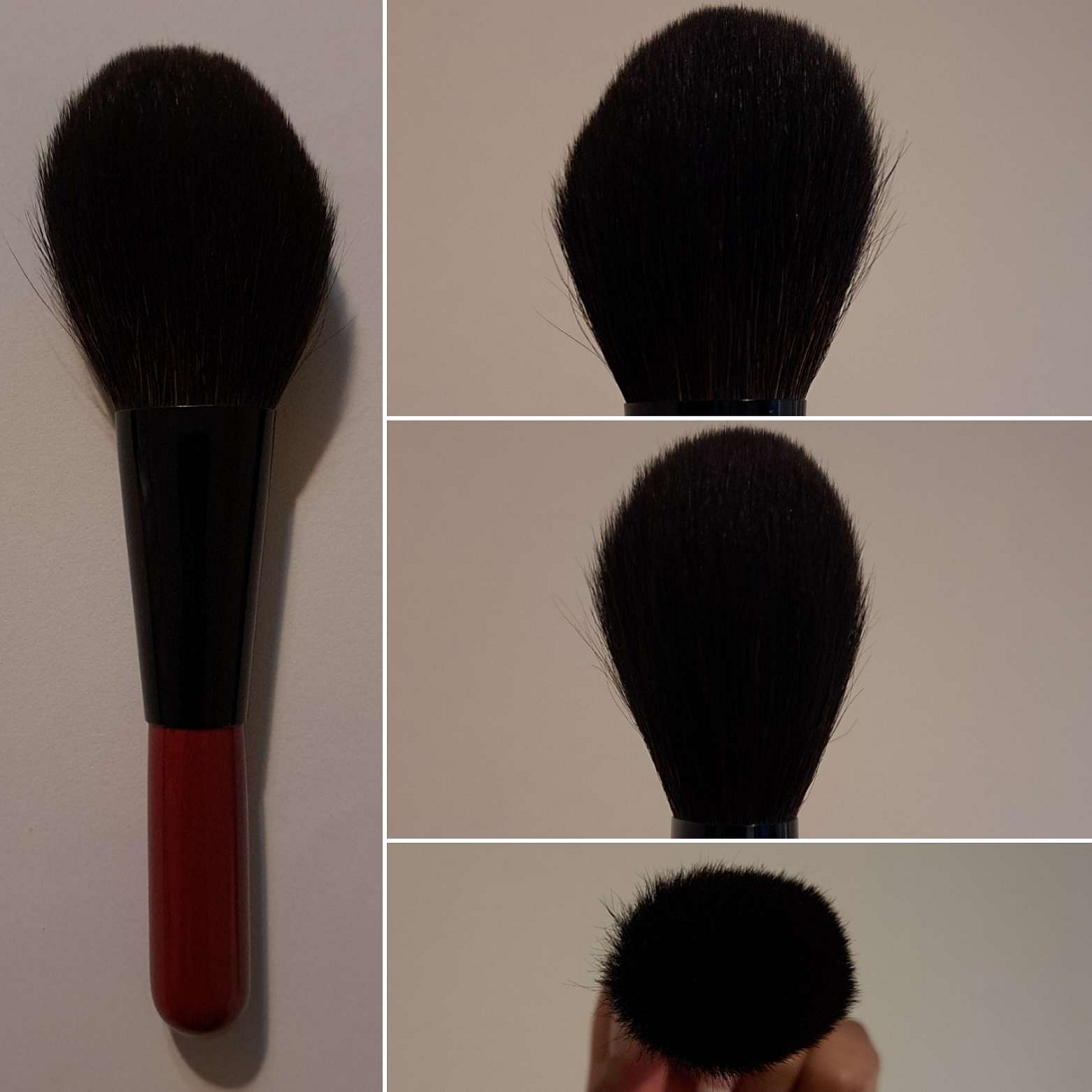
Eihodo NO.400 Powder Brush [Outlet]
Full Length: 150mm / 5.9 in
Hair Length: 50mm / 1.97 in
Hair Width: *40mm / 1.57 in
Bristle Type: Saikoho Goat
This brush is so unexpectedly soft and plush feeling! I love the ferrule color chosen for this, which reminds me of the Chikuhodo MK-KO. Per usual with the outlet brushes from CDJapan, I can’t find any flaws.
The brush is ovular shaped, not perfectly round. The head tapers to a smaller point so that I can apply bronzer to the perimeter of my face with the tips using short sweeping strokes. However, when I’m using it to apply face powder, I press it down parallel to the pan so that product gets covered on one side, and then I use sweeping motions across the face. This brush has such a wide splay that I lose a bit of control of the placement if I try circular buffing around smaller areas. That’s why I still end up using sweeping or pouncing motions so that the hair moves in the same direction and it gives that soft cushioned feel while I’m applying product. Because I have my favorite powder bronzer brushes already, I use it as intended as an all-over face powder brush. It feels very airy, but it can pick up a sizeable amount of product, so I wouldn’t say this is for someone who wants the barest veil of powder (like someone could get from a squirrel brush). This gives medium pressure buffing and the amount of hair in this brush makes it feel a little more dense and tighter packed than it feels on the skin in practice.
This brush was absolutely worth the 6600 YEN I paid and was available HERE. Sometimes they restock sold out outlet brushes. Sometimes Eihodo puts the same brush heads on a different color ferrule and/or handle, so I hope anyone interested in this brush will still be able to get their hands on it somehow. It’s very nice!
Eihodo NO.446 Blush Brush [Outlet]
Full Length: 143mm / 5.63 in
Hair Length: 40mm / 1.47 in
Hair Width: *30mm / 1.18 in
Bristle Type: Gray Squirrel / Goat Sokoho
I actually forgot this brush had mixed hair because mine feels fully squirrel-filled. This brush is lightly packed and that aspect, combined with the chosen hair length and low to medium amount of pickup, aids in giving sheer washes of product. It’s useful to ensure that pigmented powders won’t be overapplied and can be built up slowly. It’s also best to use it with loose powders or ones that aren’t hard pressed. For my preferences, I only find this brush convenient to use with blush since it’s too small to satisfy me as a powder brush and gives too light of an application with my most used bronzers.
I paid 3700 YEN for this brush and it was available HERE.
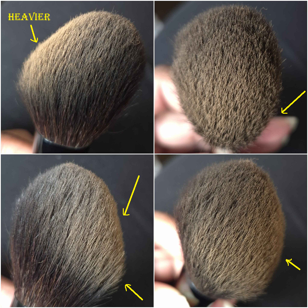
Eihodo No. 844 Powder Brush [Outlet]
Full Length: 140mm / 5.5 in
Hair Length: 53mm / 2.09 in
Hair Width: *38mm / 1.5 in
Bristle Type: Gray Squirrel / Goat Sokoho
This has one of the most uniquely shaped brush heads in my collection. From the base to the tip, the widest part is about three quarts of the way up, on one side, before forming a rounded top. The other side is widest at around the halfway point and then angles gently, getting smaller toward the top. When I pick up product along the angled side, the majority of product collects lower down and has less product in the tip area. In the demonstration photo below, I purposely rubbed my brush vigorously into the powder in order to show how heavily it can get coated in one particular spot, whereas there’s a light application’s worth on the longest section.
I make sure to start wherever I want powder to be applied most concentrated and press that part of the brush to my skin and then drag the brush along that angle in long sweeps. Because this brush is not dense, I get an airy looking application. I can use this with pigmented bronzers to apply product lightly. I can use this to build up blush. However, I’ve been using it mostly to apply face powder for products that need to be set down. The sokoho hair within this brush is good for that, though it might be tough on the grey squirrel strands long term. It’s a risk I’m willing to take since it wasn’t expensive and I enjoy the softness of this brush.
This brush is huge for eyeshadow use! The bristles are longer than most brushes I see in this shape (as long or even longer than many fluffy crease blending brushes). It’s also wider too, making it too imprecise for my liking. Someone can use it to quickly cover the eye area for a one-and-done eyeshadow look. However, I actually bought it to use with highlighters! I wanted a brush that could pick up even hard pressed powder highlighters, and small enough to fit into products with multiple colors next to each other without mixing into other shades (such as the Charlotte Tilbury Pillow Talk Multi-glow highlighter). Even though it’s a bit imprecise for my eye area, it’s small enough that I can control highlighter placement. So, I’ve been enjoying this brush for that purpose. I still don’t use it more than my holy grail Bisyodo CH-HC brush, but it’s still useful for the second purpose: nose contour. It works perfectly for the sides of my nose, though it’s a bit wide for the bulbous part of my nose (the tip). I just have to put more effort to use the brush carefully there, so it gets the job done. Essentially, this brush is a temporary replacement when my favorites for highlighter or nose contour need to be cleaned. So, it gets a decent amount of use in my collection, just in shorter stints.
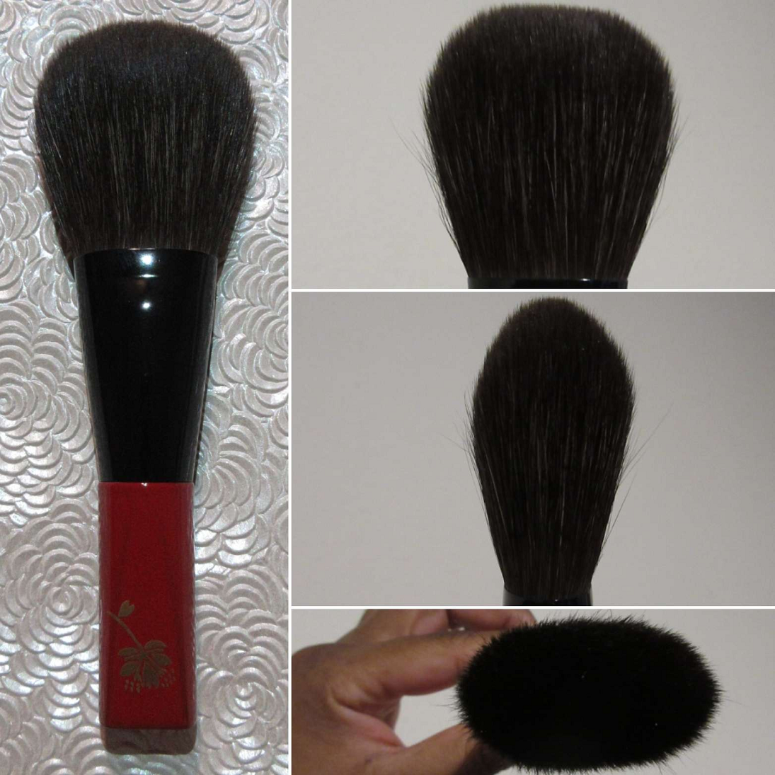
Koyudo Makie Gray Squirrel Powder Cherry Blossom Red
Full Length: 140mm / 5.5 in
Hair Length: 50mm / 1.97 in
Hair Width: *47mm / 1.85 in
Bristle Type: Gray Squirrel
I have only ever used this brush for face powder purposes because it’s the most expensive (at full retail price) brush I own and I don’t want to risk damaging it from rough usage. This is a brush I coveted for so long because it was always out of my price range, so I immediately jumped when it became available during CDJapan’s brush sale at the end of 2022. I didn’t even want to use it to set wet products, so it became a finishing brush for me just long enough to test out, and then it returned to being just a collector’s piece.
The hair feels super silky. There’s enough hair to understand it being expensive (though I believe the majority of that is for the maki-e handle), but it’s not as full as I expected or hoped. It’s not dense. It has a light airy feeling to it and is luxurious when used across the skin. In my opinion, this is an “experience” and “for show” brush more than an everyday one for practical usage. That’s just my opinion considering how delicate the hairs are and my makeup needs. I’m absolutely happy to own it, but I could never recommend it, except to those for whom price is no issue.
I paid 18,000 YEN for this brush that was regularly sold at 30,000 YEN and was available HERE. On rare occasions, this brush comes back in stock in limited quantities, so I don’t know when or if it will return.
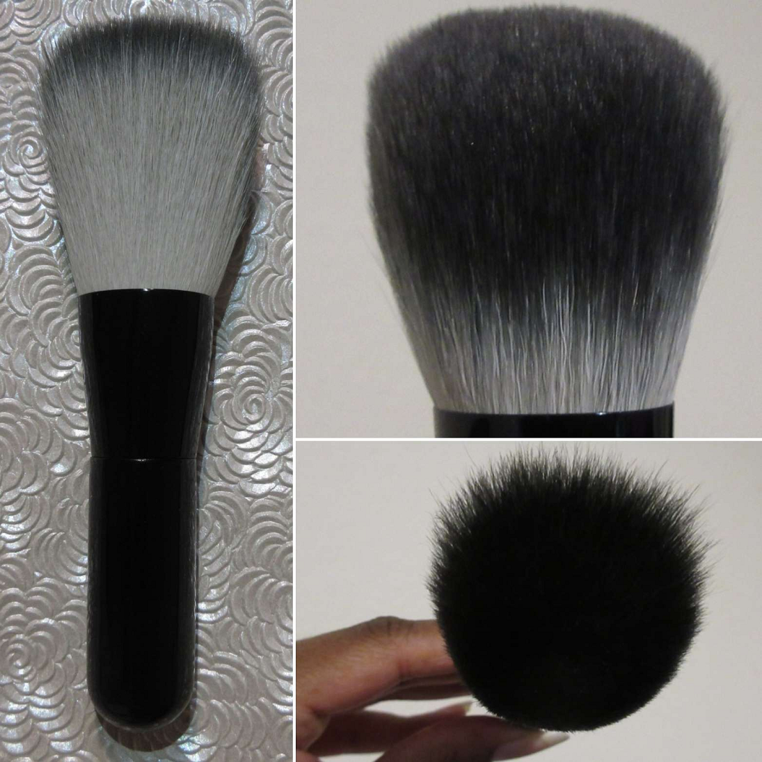
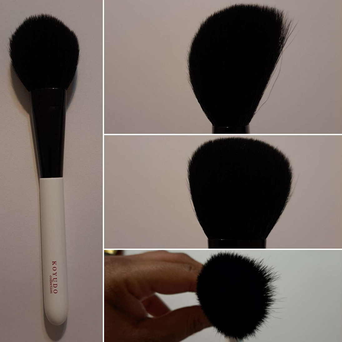
Koyudo Saikoho 3D Powder Brush Black Gradation Ver. Black [No Logo]
Full Length: 130-136mm / 5.12-5.35 in
Hair Length: 45-51mm / 1.77-2 in
Hair Width: *43mm / 1.69 in
Bristle Type: Saikoho Goat
I “blame” Tina for wanting this brush. I prefer long handles, so this hadn’t appealed to me prior to seeing her video. When the brand released the gorgeous dyed tips versions, I had to get it! The hair on this brush is so soft. It’s a huge version of cat-paw shaped brushes, which I tend to like. I love the way the contours of this brush hugs my face when applying powder. It can be used to set the face, but I typically use it as a finishing powder brush to smooth everything out.
As a 3D brush, there are zones A, B, and C that they say this brush can be utilized (photos are on the website). I can use smaller 3D brushes to apply highlighter from zone C and bronzer or contour with zone A and blush along the unmarked slanted edge between A and C. For a brush this large though, I agree with being able to use zone A for bronzer and contour but I personally have not tried it. Also, I haven’t ever used zone B no matter what size the brush was. It just doesn’t come naturally to me to think to use that section.
Because this brush is considered precious to me, and I did not want to travel with all my most precious brushes at one time in case my luggage got lost, I left this one behind. I was more prone to leaving powder brushes behind since I use them less often than other styles since I have dry skin and don’t always powder my face. However, I can attest to missing it sorely! If it ever comes back in stock, I recommend getting it!
I paid 5950 YEN for it. The link for it was HERE. The non-outlet version for 8000 YEN was HERE.
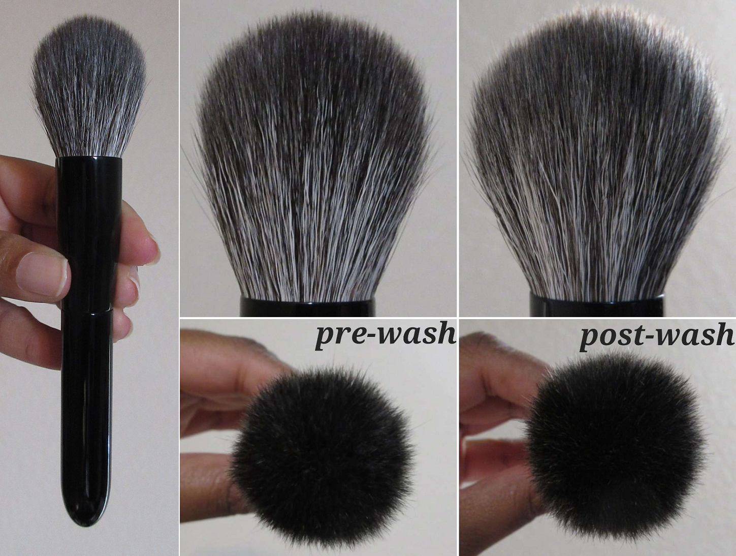
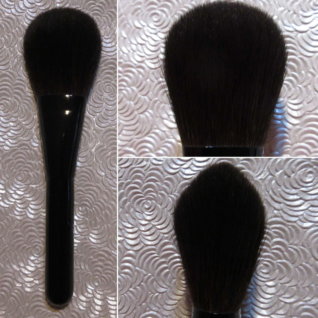
Koyudo Blush Brush [No Logo]
Full Length: 155mm / 6.1 in
Hair Length: 40mm / 1.57 in
Hair Width: *30mm / 1.18 in
Bristle Type: Gray Squirrel and Goat
The hair blend reminded me instantly of Koyudo’s discontinued Premium Series, which I was unable to ever purchase, so that prompted me to want to buy this one. It is such a beautiful brush with the shiny lacquer black handles. I believe the labeled version of this brush is called the Koyudo Monochrome Cheek Brush and came in black and white handle versions via the Fude Beauty website. I’m not sure why CDJapan only had unlabeled ones (that still came in a black Koyudo box), especially for the same price as the ones from Fude Beauty. In any case, I still preferred being able to buy this beauty from CDJapan because of points I had accumulated there.
When I posted this brush on Instagram, I was asked how it compares to Hakuhodo’s mix of Gray Squirrel and Goat. Hakuhodo’s mix feels softer because I believe the quality of their goat hair is higher than what Koyudo used. However, I am still very happy with this brush’s softness level. It can be used for bronzer around the perimeters of the face, but I prefer using this mostly for applying and buffing blush. If I need to buff a less blendable bronzer (ones that aren’t within my top 20), then this brush is extra useful for that as well. It has strength from the goat and picks up a nice amount of product, but diffuses beautifully. That’s why I like it with blush as well, for managing to produce a semi-airy effect considering it’s not bundled in an airy fashion. It starts off with a medium application of product rather than light or sheer, while maintaining the look of being well blended. This also makes a fantastic finishing powder buffer brush for someone who prefers a large (but not jumbo), controlled shape.
Owning this brush is like having a backup Sonia G Master Face brush, only softer with slightly longer hair, a wider splay, and a little less dense.
I love ball/pom shaped brushes. These two are a few of the larger sized ones in my collection. I grew to like the Master Face over time, but I like this one from Koyudo even more. Besides the aspects that I like more, factoring in the increased price for the Master Face, it makes it easier to recommend this one over Sonia’s (which is a rare thing for me to say).
This brush restocked a few times, so it’s possible it could come back. I paid 13,300 YEN for it from HERE. At the time that I’m posting this, it’s out of stock at other retailers too.
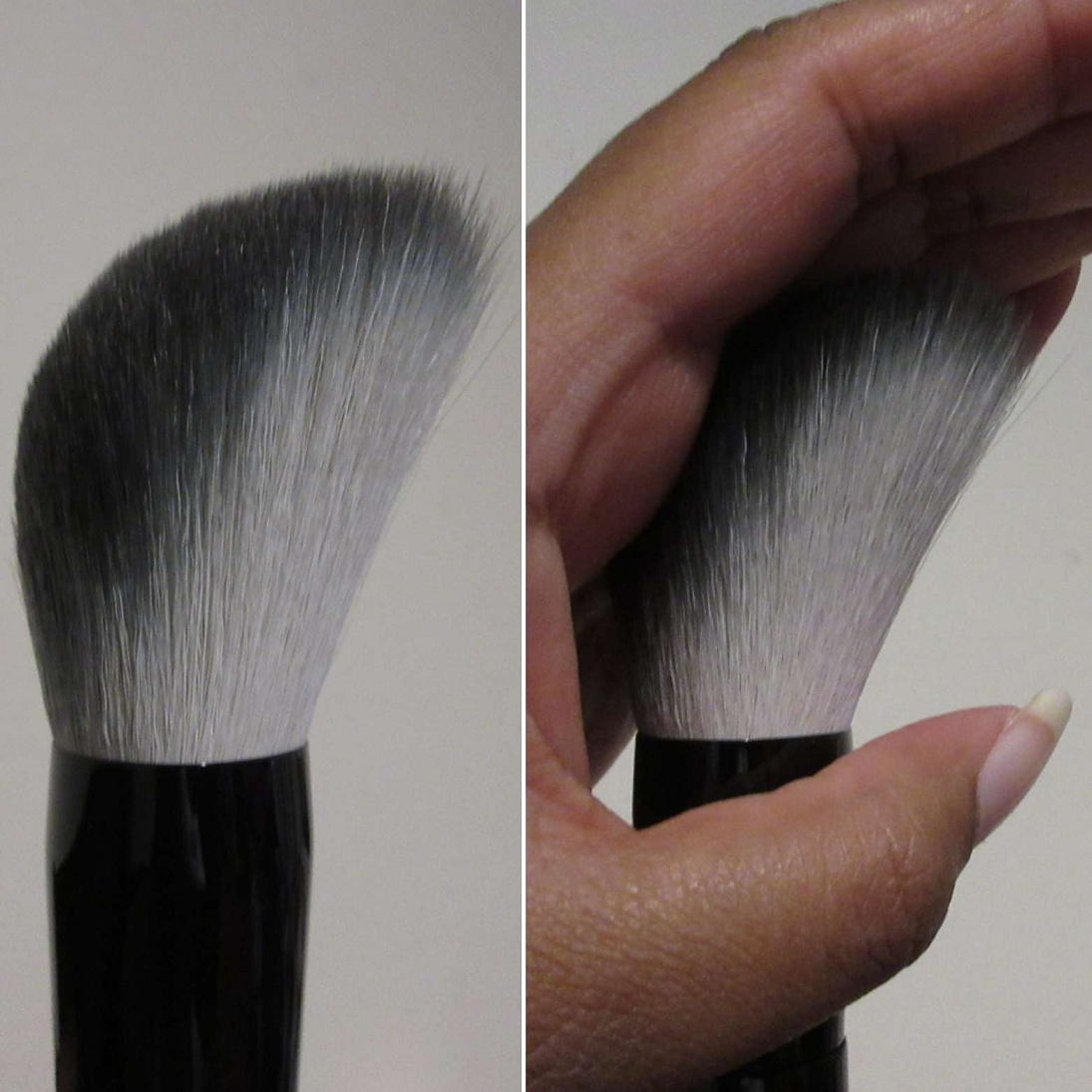
Koyudo Blush Brush Black Flat Handle [Outlet, No Logo]
Full Length: 165mm / 6.5 in
Hair Length: 50mm / 2 in
Hair Width: *44mm / 1.73 in
Bristle Type: Gray Squirrel/Goat
This brush is so fantastic and I loved it so much that I ended up purchasing two more to gift to loved ones. It feels wonderful to the touch and across the skin. The goat gives the brush a little resistance, making it great to pick up some firmer pressed products. It’s a medium density brush that despite having such long hairs isn’t floppy. It’s not a workhorse brush, but it blends very well during the application process. It’s a good middle ground between softness of squirrel, with only slightly less silky feeling hair and pickup power capabilities of goat. I love that they added these angled tips on both sides for a more pigmented approach to a powder brush.
It’s great for powder foundation (not that I use powder foundation very often), setting and especially finishing powder, bronzer/contour, and blush. With blush application, I use it a little more carefully due to the width since the angled edge prevents me from needing to worry about it getting dragged down too far. I can sweep on the perfect amount of blush I want. For bronzer, I mentioned in the Sonia G section that I have my top two favorites. This is another brush I love for bronzing purposes, but I do admittedly own some that I like for that better. This is beloved as a finishing powder brush and one that I also wish I had taken with me. Even though I prefer it to some of my more expensive finishing powder brushes, I simply couldn’t take everything with me when I moved. So, I will be happy to be reunited with this brush when I return to the US for a visit.
I paid 6400 YEN, which was absolutely well worth the price, and I’d have been willing to pay the full 8000 YEN for it HERE.
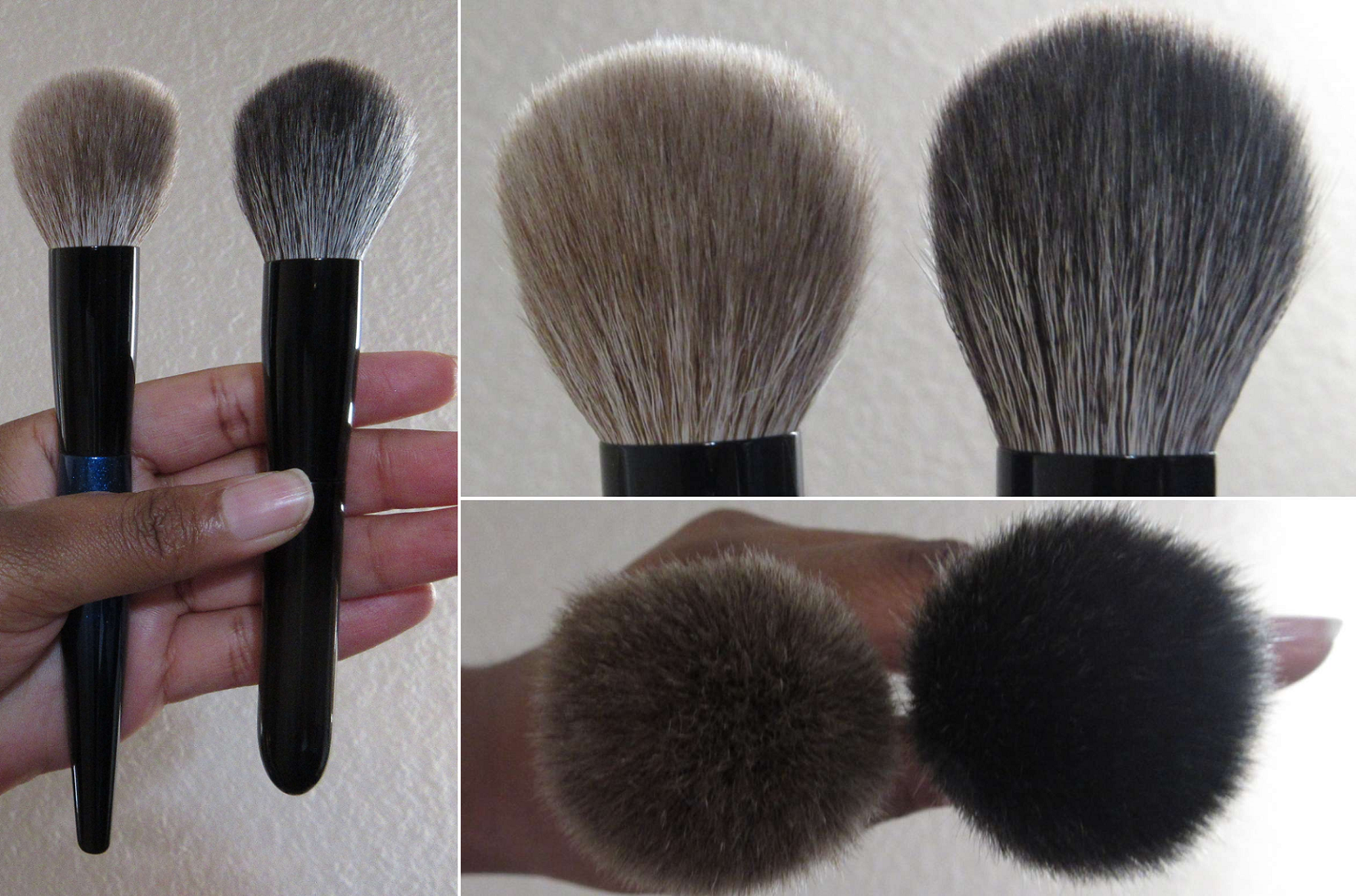
Koyudo BP019 Blush Brush [Outlet]
Full Length: 162mm / 6.4 in
Hair Length: 37mm / 1.46 in
Hair Width: *34mm / 1.34 in
Bristle Type: Sokoho
This is a classic brush from Koyudo’s discontinued line that I was shocked to see return to the website, even as an outlet brush. I felt compelled to get it because of the unique head shape. It doesn’t say it on the outlet page, but this is one of Koyudo’s “3D series” brushes. It’s listed as being intended for blush, which it’s absolutely well suited for, but it can apply highlighter using the tips. It also makes an interesting bronzer and contour brush when product is picked up along that angled slant. Shape-wise, this brush is fantastic. The only downside is that it’s made with Sokoho hair. Brands like Eihodo and Bisyodo have much softer Sokoho that I can tolerate, but Koyudo’s is too scratchy for me on the face, even though it doesn’t feel like it would be by just touching the tips of the brush.
I don’t know how often I will use this brush, now that the review is completed. I paid 4104 YEN for it from CDJapan. If this ever returns with saikoho hair though, I will absolutely buy one. Anything with the 3D description from Koyudo has my interest, especially if it’s made with a soft hair type like the Saikoho 3D Powder Brush Black Gradation brush.
BISYODO
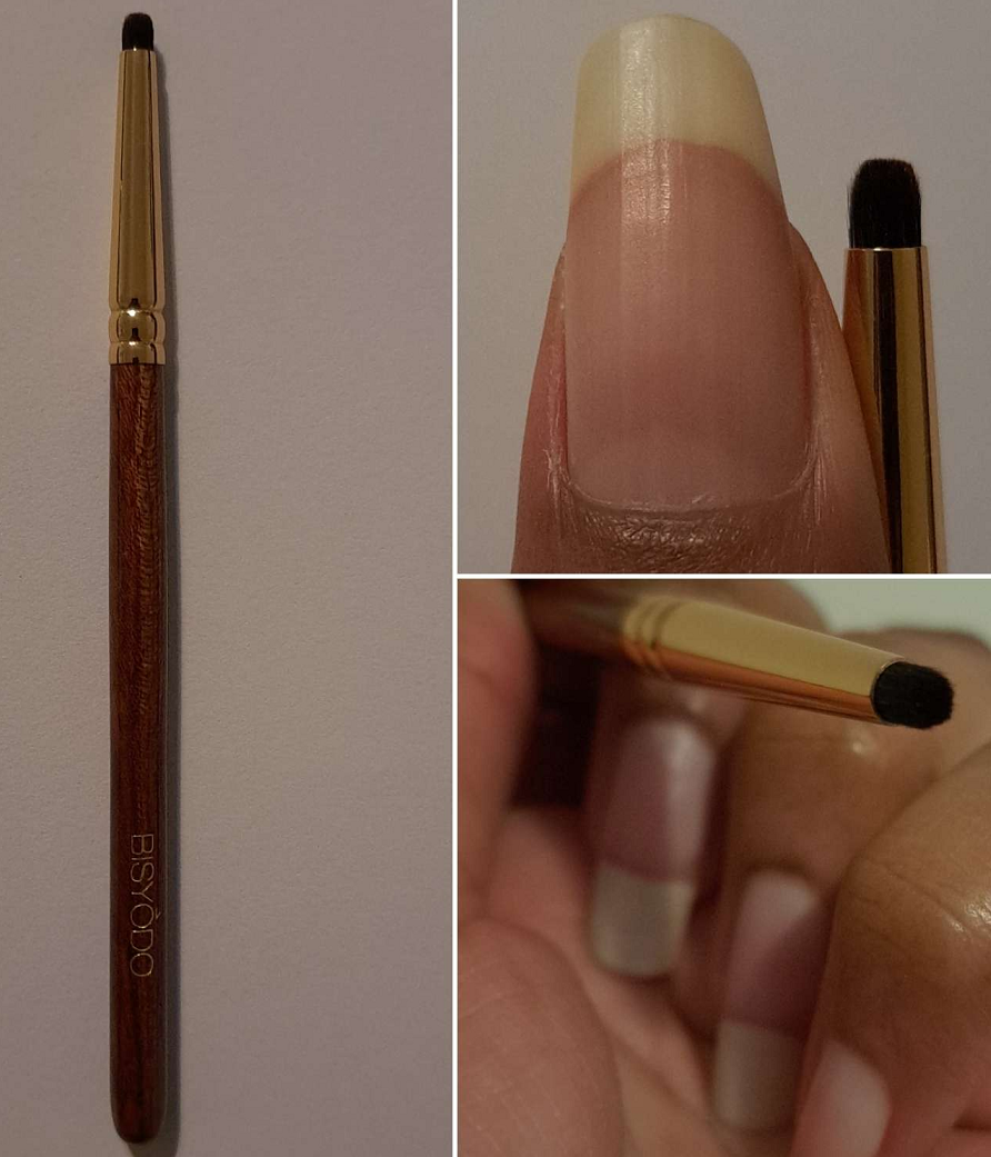
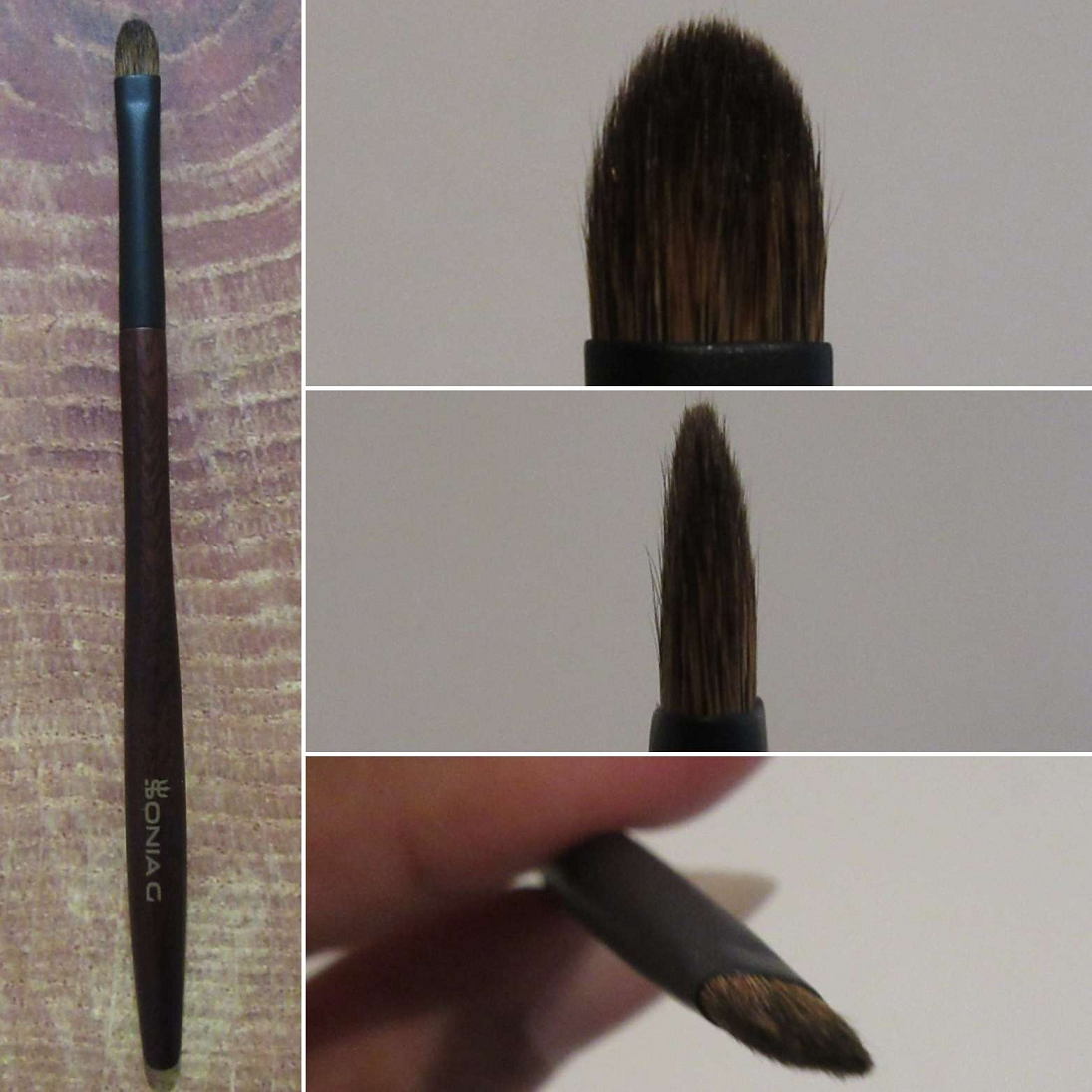
Bisyodo B-ES-08 Eye Shadow Brush
Full Length: 133mm / 5.24 in
Hair Length: 4mm / 0.16 in
Hair Width: *3mm / 0.12 in
Bristle Type: Tamage
Handle: African Rose Wood
Ferrule: 24KG
This is more of a liner brush, than for eyeshadow, because it’s so tiny! While it gets the job done, I discovered that I prefer more traditionally shaped liner brushes that are thin (and especially if they have an angled edge). Because this is roundly shaped, I end up stamping and slightly dragging the product in short strokes rather than using longer strokes that I can get from a thin flat brush. The hair feels soft to the touch, but it’s firmly bundled with not much movement. The website states that one could use this to darken the outer V, but it’s too small and too firm for my liking. I don’t like how it feels while trying to apply it that way.
What I found this brush to be most useful for is applying shimmers to my inner corner, highlighting under my brow arch, and stamping on color to a specific spot. When I was considering spicing up my wedding makeup look with the tiniest dot of a multichrome eyeshadow in the center of my upper and lower lash lines, this was the smallest size of brush I could use. So, even though I rarely need a brush like this, it can do what no other brush can. That makes it still worth having in my collection.
Hair Width x Thickness: 8.2 x 4.5mm/ 0.32 x 0.18 in
Bristle Type: Pine Squirrel, Raccoon
Handle: African Rose Wood (Bubinga)
Ferrule: 24KG Plated Brass
This brush is an interesting combination of softness from the pine squirrel and added springiness from the raccoon. The hair is firmest in the center and fluffier around the shorter edges where the tips only reach the middle.
This looks like a standard shaped packing brush, just small in size and slightly fluffy. However, when turned to the side, one can see that the middle is the widest part before the hairs taper to a point. This means it doesn’t pick up as much product as I expected, just on the tips which isn’t that much surface area. It’s good for lightly picking up and blending eyeshadow in one spot, but it’s too small to work across larger zones, like the crease for instance. So, instead, it’s nice to use for deepening and blending out shadows in the outer corner. It’s also good for blending different shades next to each other for a seamless ombre look.
I paid 4000 YEN for this brush and it’s available HERE.
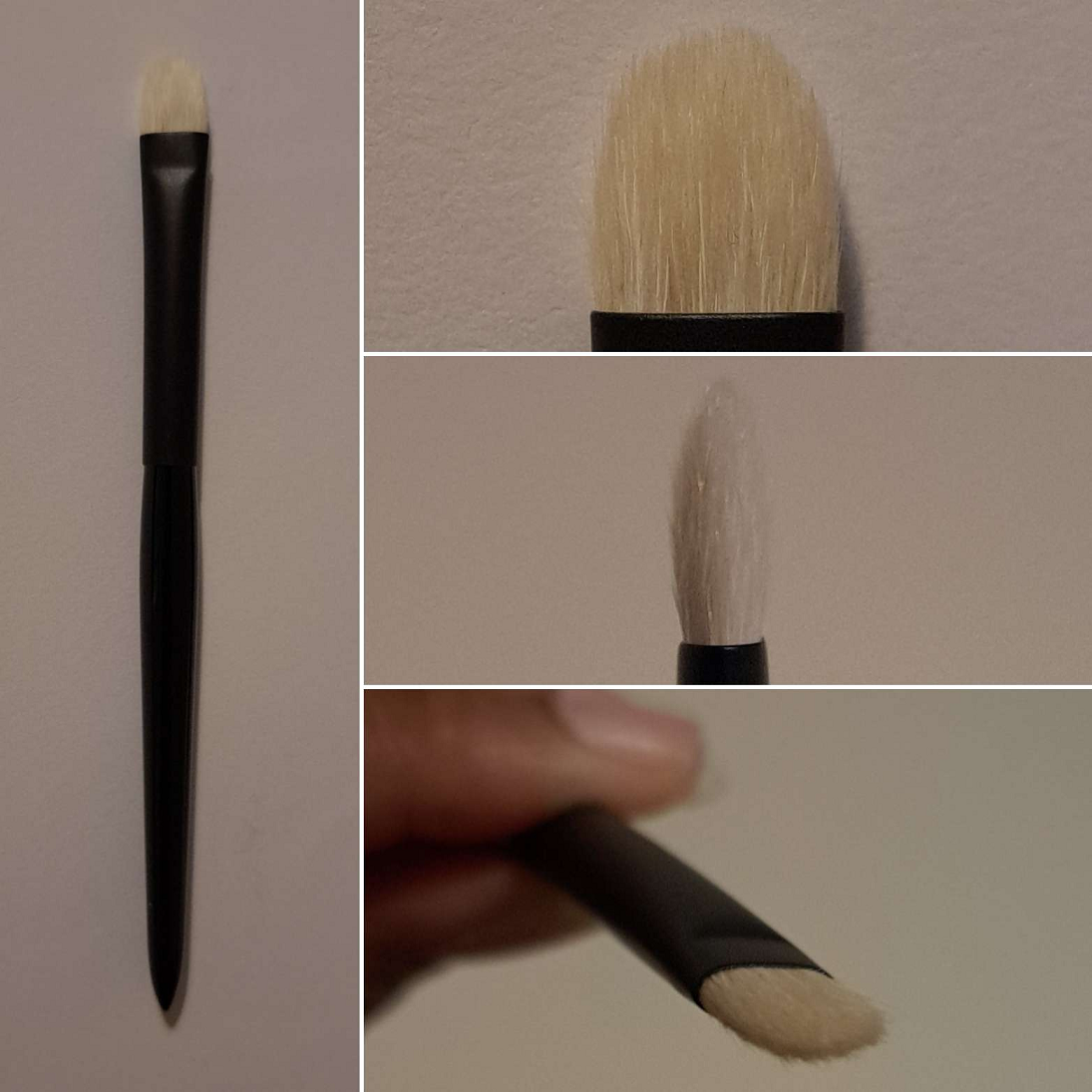
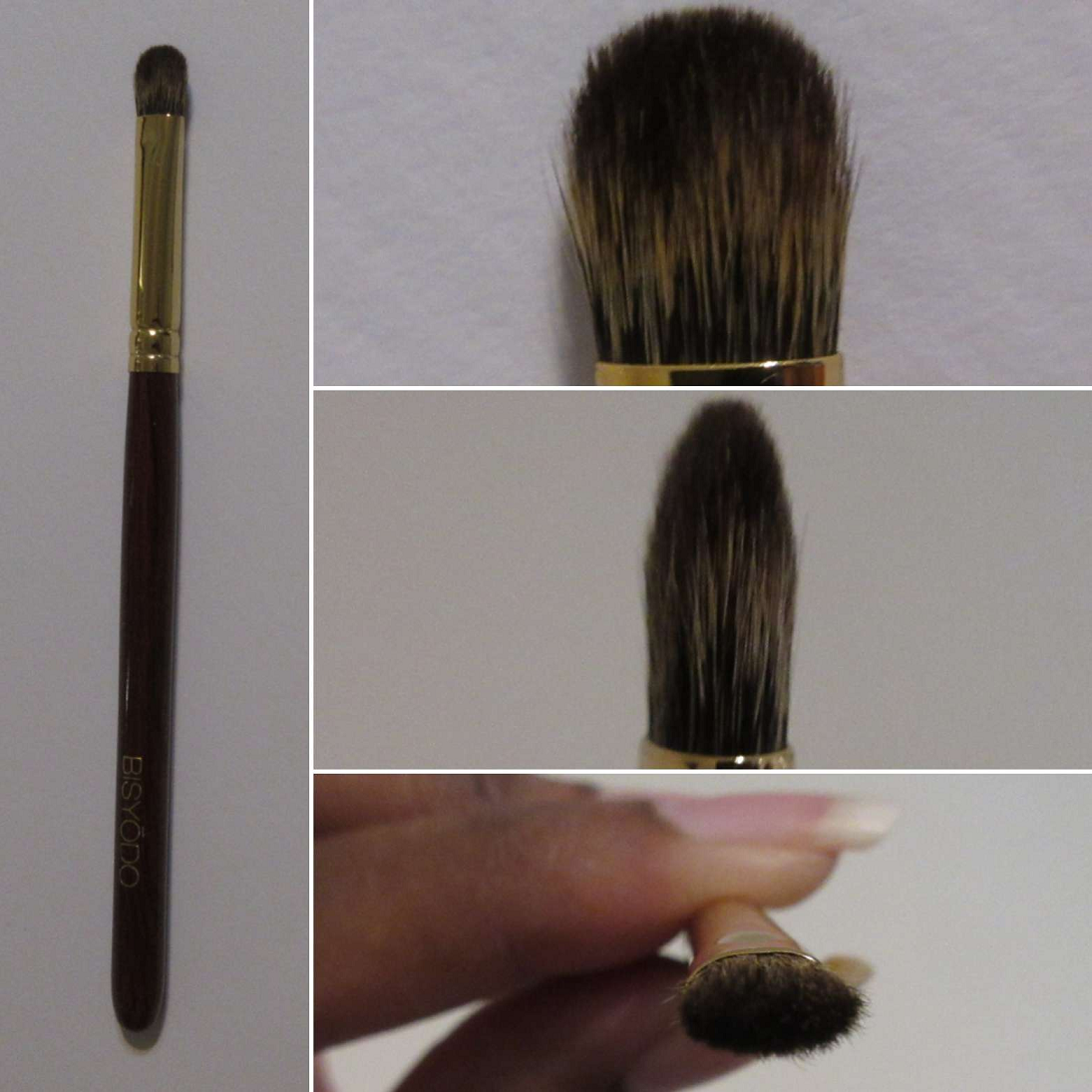
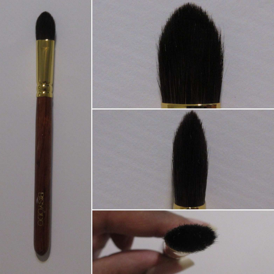
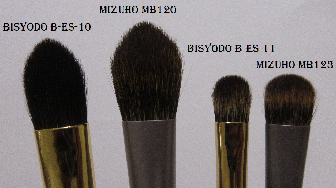
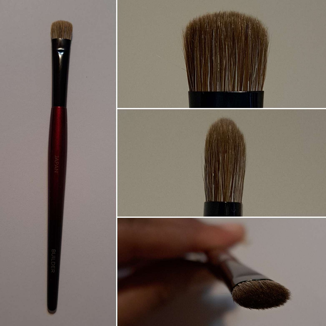
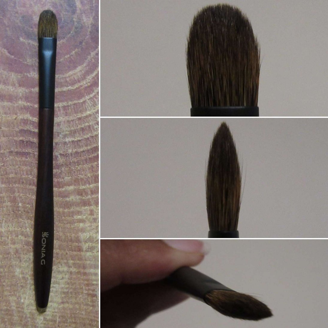
Bisyodo B-ES-11 Eyeshadow Brush (Triangle)
Full Length: 149mm / 5.87 in
Hair Length: 18mm / 0.71 in
Hair Width x Thickness: 12.3 x 6mm/ 0.48 x 0.24 in
Bristle Type: Fox, Raccoon
Handle: African Rose Wood (Bubinga)
Ferrule: 24KG Plated Brass
This brush is good for laying down both mattes and shimmers since it has a nice grip on product. It blends out color well for those with larger eye space, is good for applying crease eyeshadow from the tips or when the brush is used turned on its side. It can also be used for targeted highlighting and nose contouring. The point formed by the tips and firmness of the bristles allow me to apply shimmer to my inner corners without needing to switch to a smaller brush. It’s a soft brush, but the tanuki hair might be too abrasive for people with super sensitive eyes. However, it’s still softer Kolinsky, so I don’t think most people will have issues. My brushes closest to this shape are better for building up color gradually, so it’s nice to have an option that’ll pick up firmer pressed products and deposit it more heavily if I want to build eyeshadow quicker.
Because of the pointed tip, it reminds me of the Mizuho MB120, but this brush is much firmer and applies product more precisely and more concentrated.
I paid 6500 YEN for it at the time (the prices will increase in October 2024) and it’s available HERE.
MIZUHO
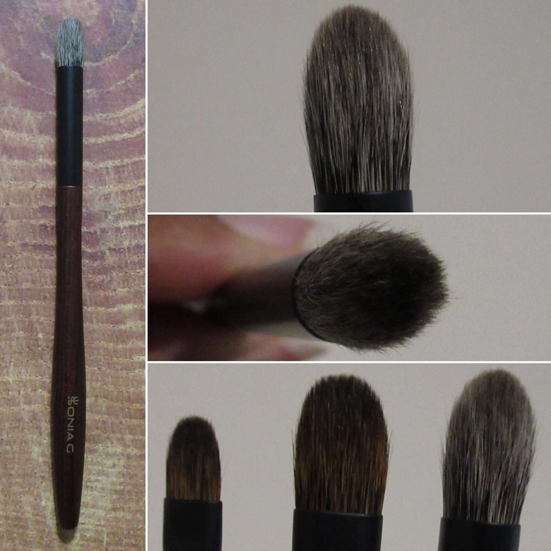
Mizuho MB120 Large Eye Shadow Brush
Full Length: 146mm / 5.75 in
Hair Length: 20mm / 0.79 in
Hair Width: 6mm / 0.24 in
Bristle Type: Pine Squirrel
This is another one-eyeshadow style brush, but even with the pointy tip, I can’t easily get into my inner corners precisely enough. It’s great for picking up matte eyeshadow, but picking up shimmers applies too little to my eye at a time for my taste. It’s better suited for someone who likes a thin veil of shimmer or using topper shimmer eyeshadows. I’ve used this for nose contour and like that I can turn it on the side for creating a little sharpness in terms of applying a thin more concentrated line (medium application) than applying with the flat of the brush that gives a light-medium layer of product. It’s the right amount for blended contour and not an actual opaque line.
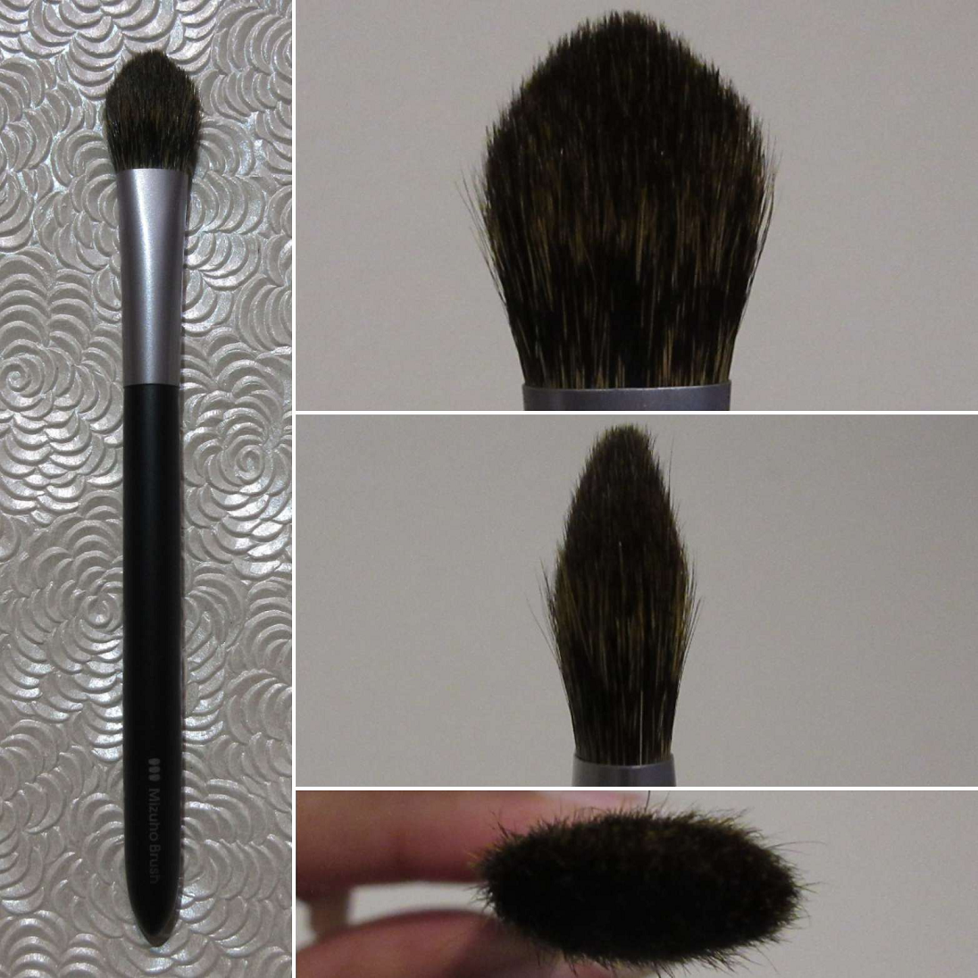
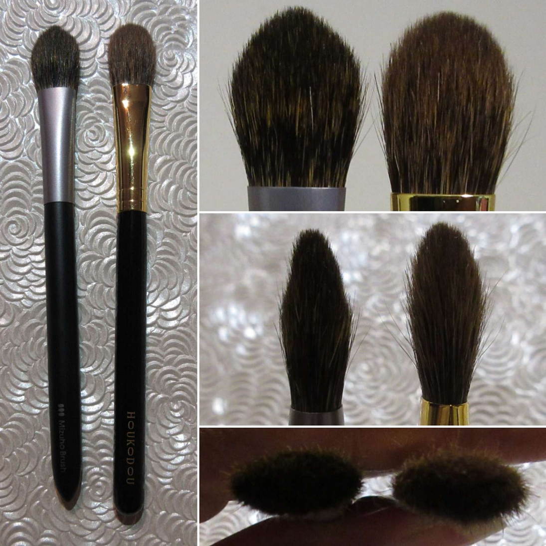
This brush reminded me of the Houkodou GS-1 for its size, but it’s not as soft and the GS-1 is better at both applying and blending eyeshadow.
I paid 3500 YEN for this brush and it’s available HERE.
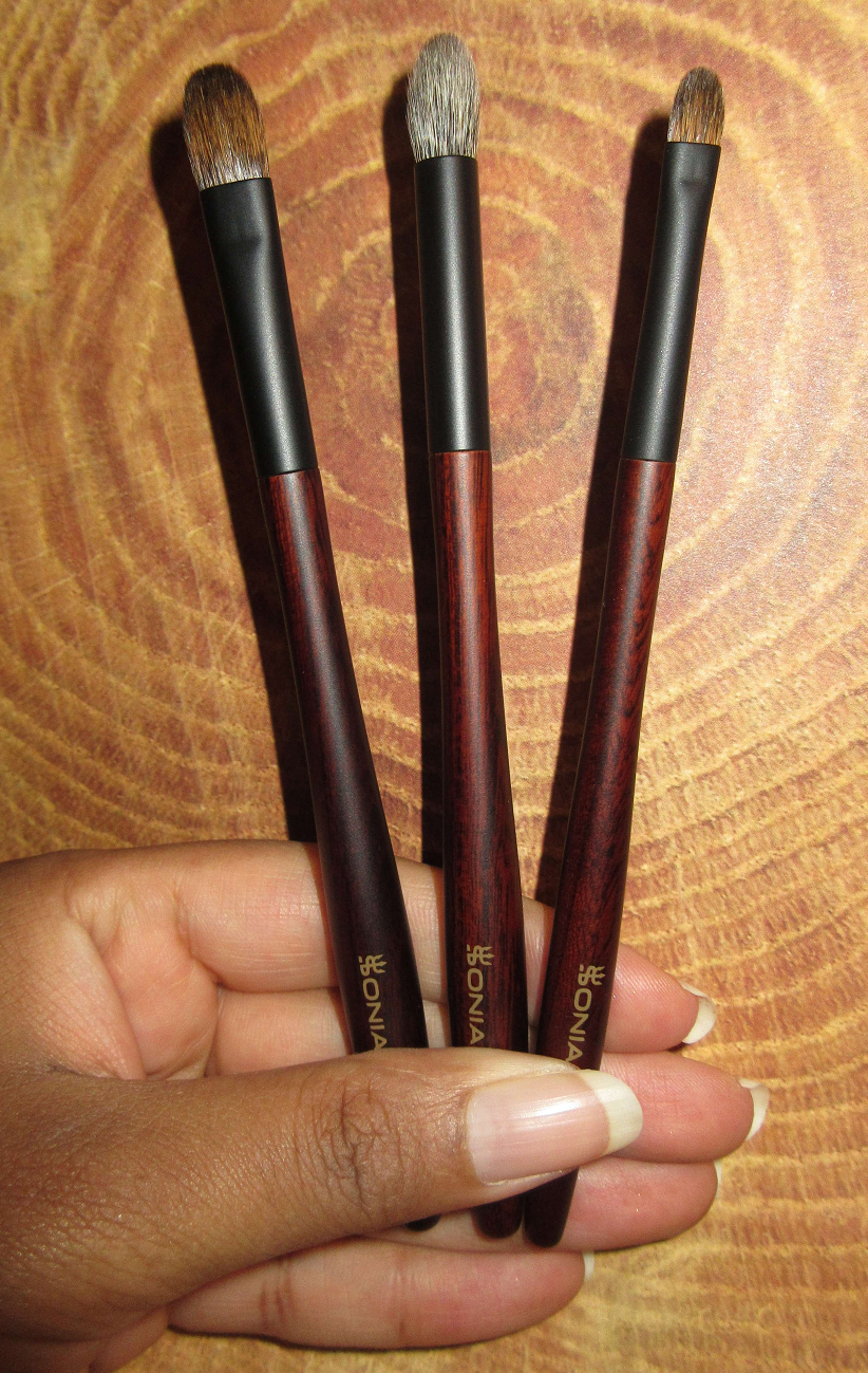
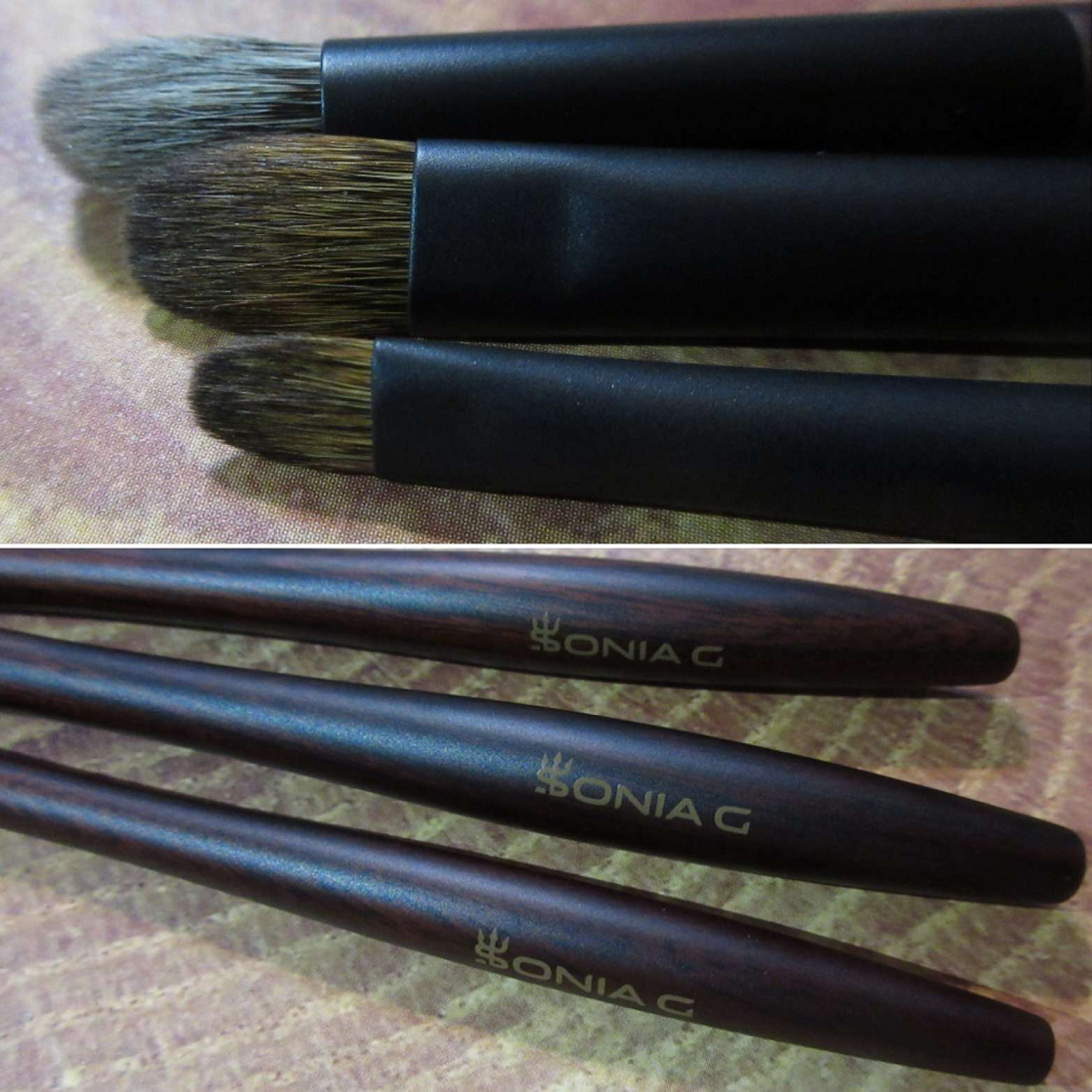
SONIA G
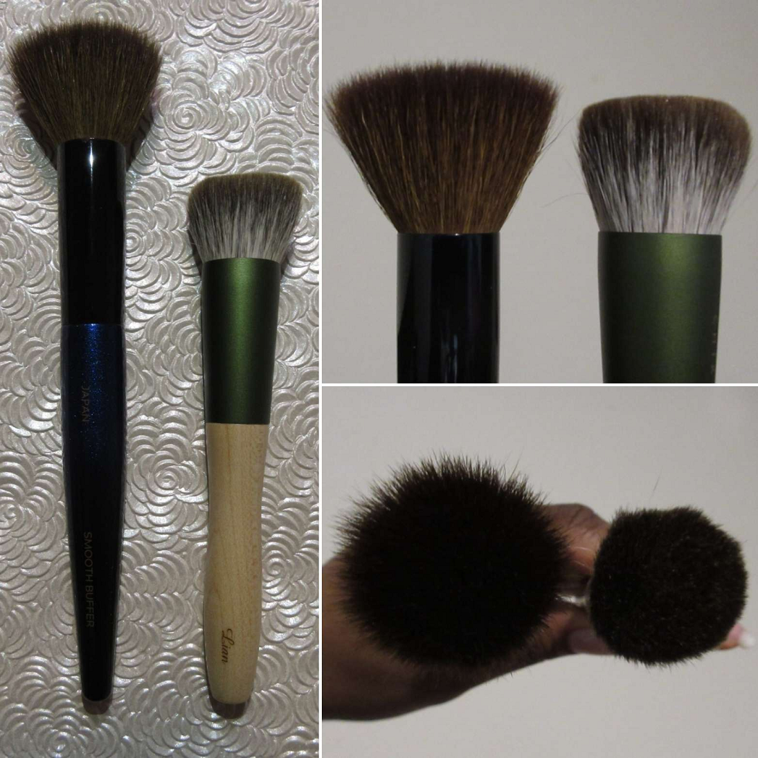
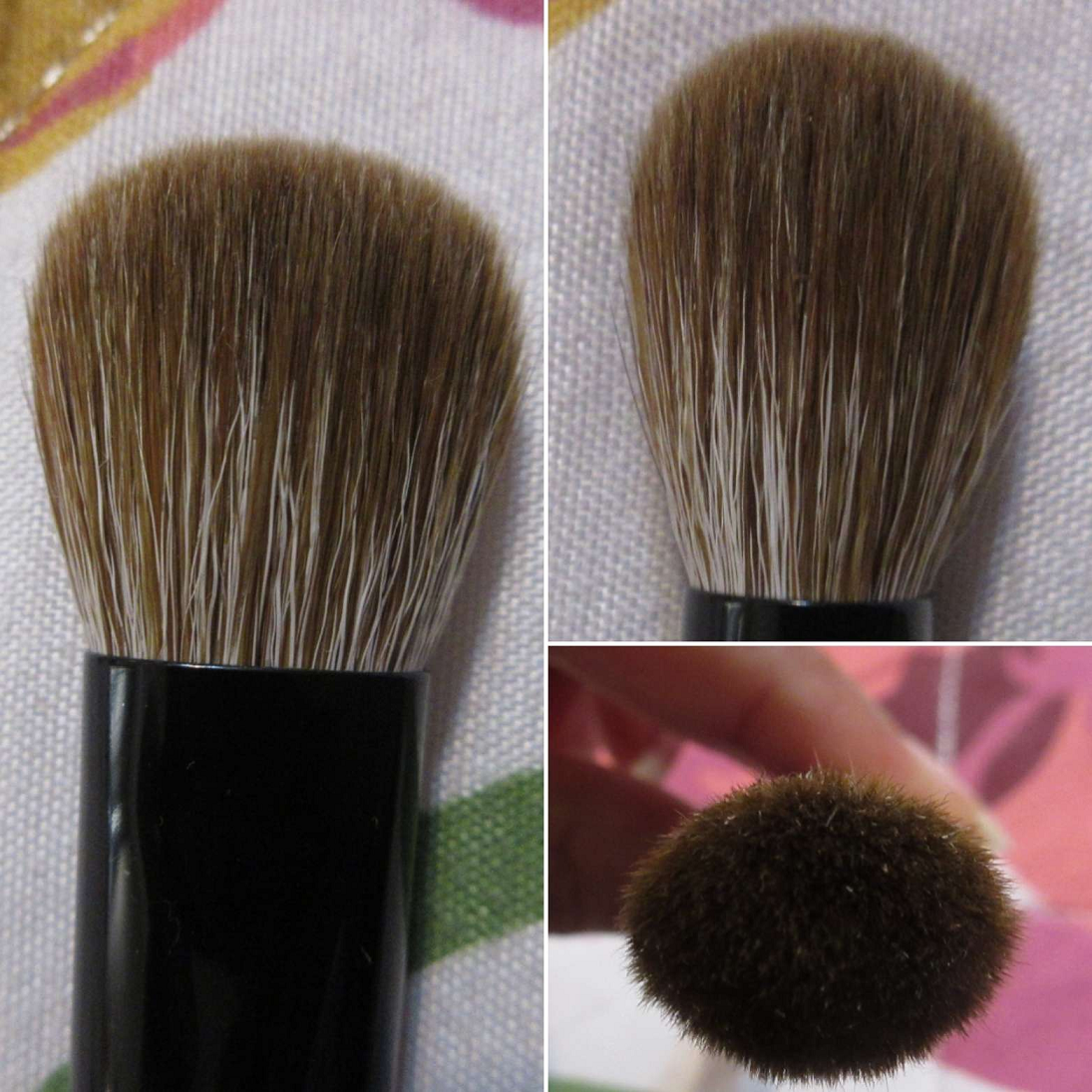
A video of the bristles’ thickness, shape, and so on of the Jumbo Bronzer brush first and then the Smooth Buffer brush after can be found on my Instagram page HERE.
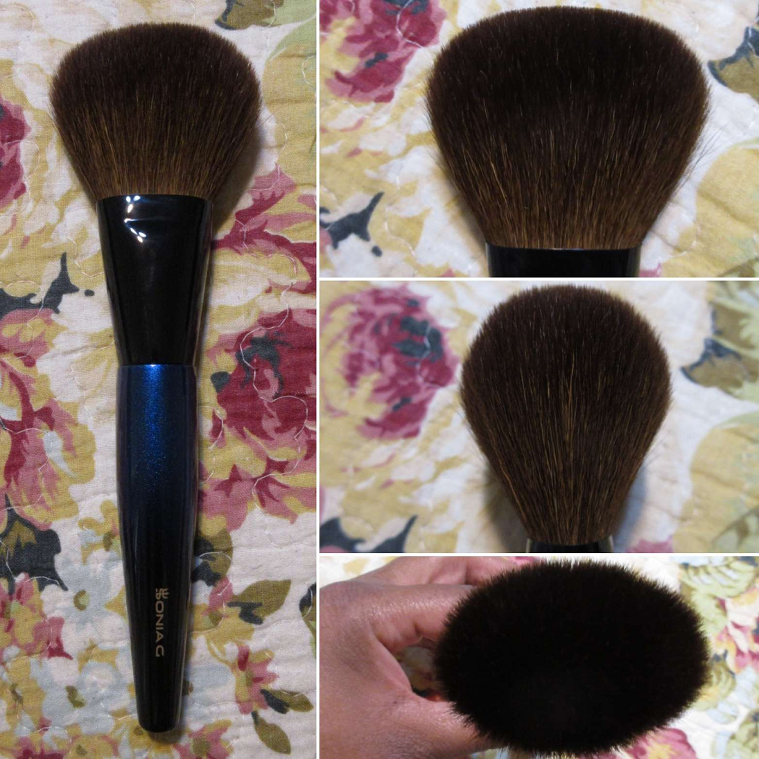
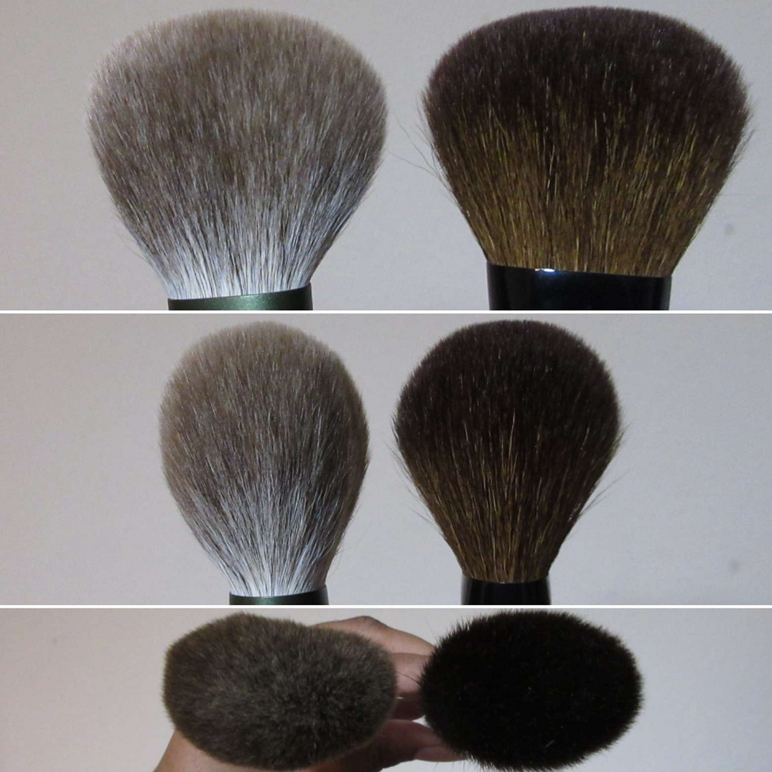
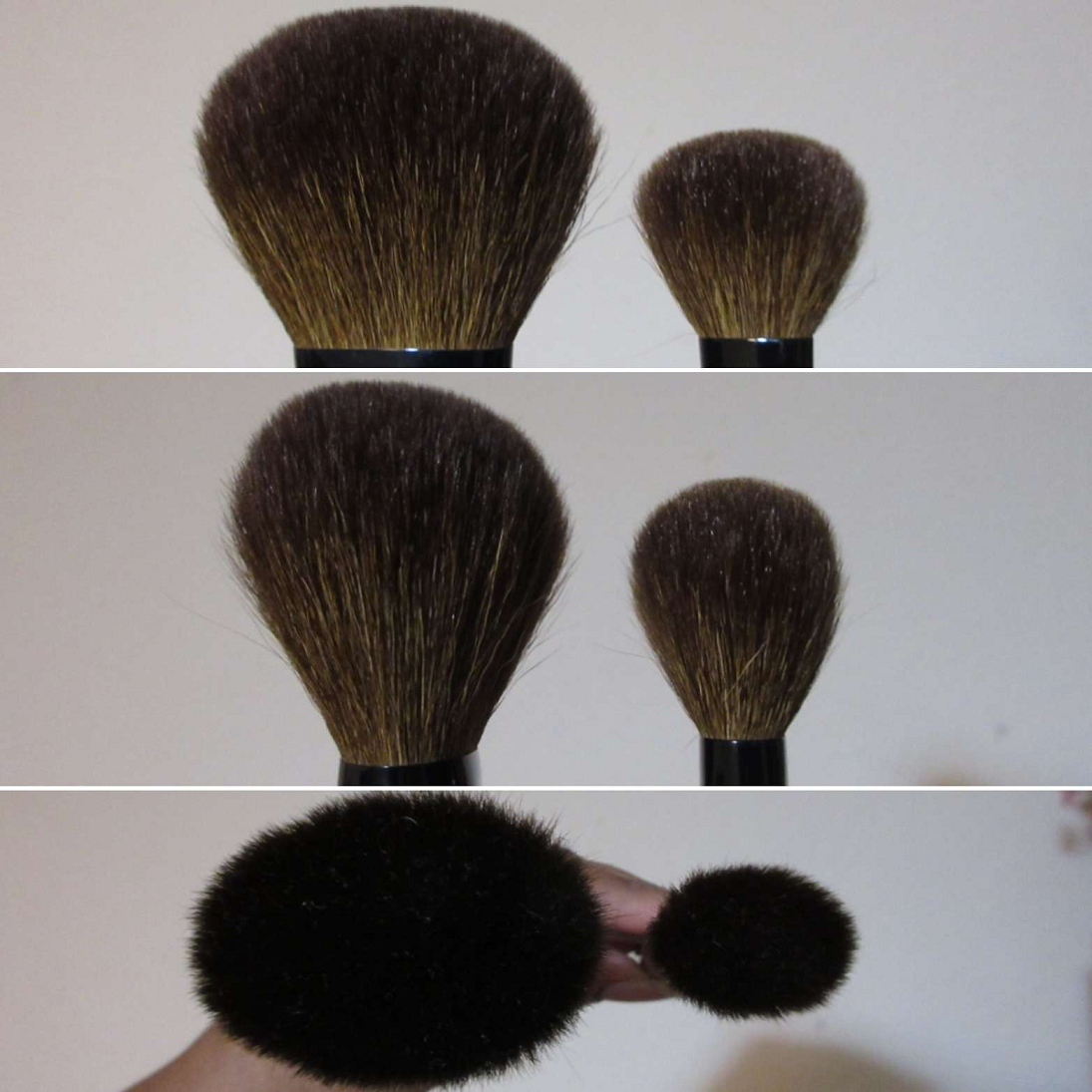
Sonia G Jumbo Bronzer
Full Length: *185mm / 7.3 in
Hair Length: 47mm / 1.85 in
Hair Width: *58mm / 2.3 in
Bristle Type: Dyed Saikoho Goat
I very much appreciate the fact that Sonia was transparent about the bristles of this brush being very soft, but a little less silky than her other saikoho brushes. She cited, “The softness of this saikoho is not going to be super silky because the quality of saikoho with that specific length of bristles has decreased since 10 years ago, while the cost has very much skyrocketed.” To me, this brush is just as good anyway. In fact, from September 2022 until October 2023, it became my favorite brush to use with powder bronzers. After that point, a new brush came into the picture, but they’re tied for first place. I love them both.
This brush is stellar because it’s soft on the skin and holds firm while working in the product, but it has such a gentle splay that it makes things look airbrushed. For such a big brush, the shape of it allows me to get around the edges of my face with more precision than one would expect. It’s a brush for someone who wants to build up bronzer and not have a concentrated application, but wants it applied to a large area so it won’t take as long to do the full face. Basically, it’s perfect for someone like me who doesn’t want a sharp edge (no detectable lines or stripes) without putting in that much time or effort into blending.
Although I only ever use this brush with bronzer, the softness on the skin and overall shape makes this a great finishing face powder brush as well, to blend everything together.
The comparison photo on the left is of the Chikuhodo FO-9, one of my biggest face brushes. These are similar in size, but the Jumbo Bronzer brush is denser and therefore feels firmer as it glides across the skin. The FO-9 is my main finishing powder brush of choice (when not using the Dior Powder No-Powder), so that’s why the Jumbo Bronzer is one of my two main powder bronzer brushes. The photo on the right is a comparison of this brush with the Sonia G Cheek Pro. That is one of my favorite brushes, so it makes even more sense why I love this brush too, considering it’s basically a gigantic version of that one. Although I use the Cheek Pro exclusively for blushes, there have been a few times I’ve used it with bronzer when the others needed to be cleaned.
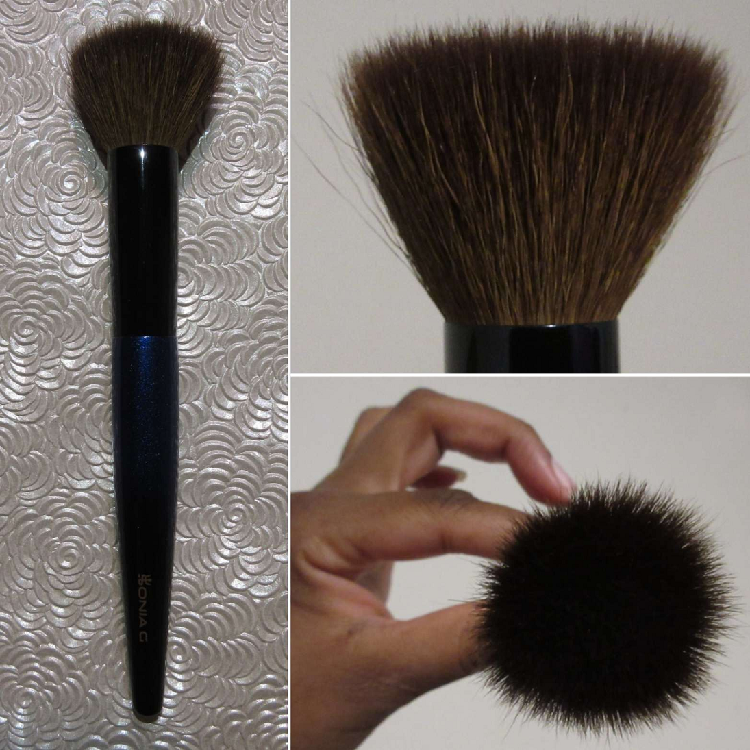
Sonia G Smooth Buffer
Full Length: 166mm / 6.53 in
Hair Length: 26mm / 1.02 in
Hair Width: *38mm / 1.5 in
Bristle Type: Dyed Saikoho Goat
As much as I love the Jumbo Bronzer brush, it’s too big for some of my products. For instance, I can’t use that brush with my Hourglass Ambient Lighting Edit Palettes that have highlighters and blushes next to the bronzers. That’s where this brush comes into the picture. The surface area of this brush is still big, to the point where I still have to be careful how I angle it when I use it with the Hourglass palettes, but at least it works. It picks up a good amount of product and buffs well. The outer edge of hair within the brush isn’t as tightly packed as the core, so that can help with achieving a dispersed airier finish despite there not being as much bending or splaying while being buffed in. So, it has the buffing power of a firm brush while giving close to airbrushed results on the face, and packing on quite a bit of pigment at the same time. This cuts down the time I have to spend building up sheer or lightly pigmented products. For that reason, I like using this brush with blushes just as much as bronzer. For bronzer, I tend to use long swiping/sweeping motions around the perimeter, but with blushes I pounce it on or buff in circular motions. Both techniques work just as well.
For comparison purposes, the Chikuhodo FO-2 is denser, has shorter hair, and a smaller surface area. For quite a while now, I started using that brush exclusively for the Dior Powder No-Powder. So, the Smooth Buffer has become my flat-top brush of choice instead. I could use it to buff face powder as well, but my preference for face setting powder is a large airy brush since my dry skin doesn’t need more than a thin layer of product, if at all. With finishing powders, I can apply them a little heavier, but I still don’t prefer to use this brush for that.
I have to add that if you have sensitive skin, even though this brush has saikoho hair, it can feel a little more abrasive than other Sonia G face brushes. Perhaps it’s due to the “newer” long hair quality or the general nature of flat-top brushes with added pressure. Maybe it’s even a combination of both. I bought my brush in October 2022, so it didn’t come from the original stock that was launched in 2020. That being said, I started to notice the occasional poking feeling (it’s not every time, mostly just when I’m in a rush and buffing roughly) around four months ago. So, it’s also possible a few tips on my brush have snapped from admittedly hard use over time. I can’t feel anything but softness when I rub my fingers across the surface of the tips. It’s only when it’s on my actual cheek that I can feel it sometimes.
Sonia G Fusion Eye Jumbo Worker
Full Length: 155mm / 6.1 in
Hair Length: 20mm / 0.79 in
Hair Width: *20mm / 0.79 in
Bristle Type: goat and synthetic
I’ve used this for concealer, but it’s a bit large for that and looser than my beloved Sonia G Jumbo Concealer brush. More specifically, it’s dense due to how many bristles are bundled together, but it splays a lot more around the outsides. This brush will not be replacing it.
I’ve used this to set powder under my eyes. The Real Techniques Setting Brush has been my ultimate choice for that purpose for so many years now. This might be my next favorite (after the Real Techniques Brightening Concealer/Kitten Paw Brush), as it feels super soft and plush under the eyes, but the extra density (medium versus light) helps to further press the powder into the skin.
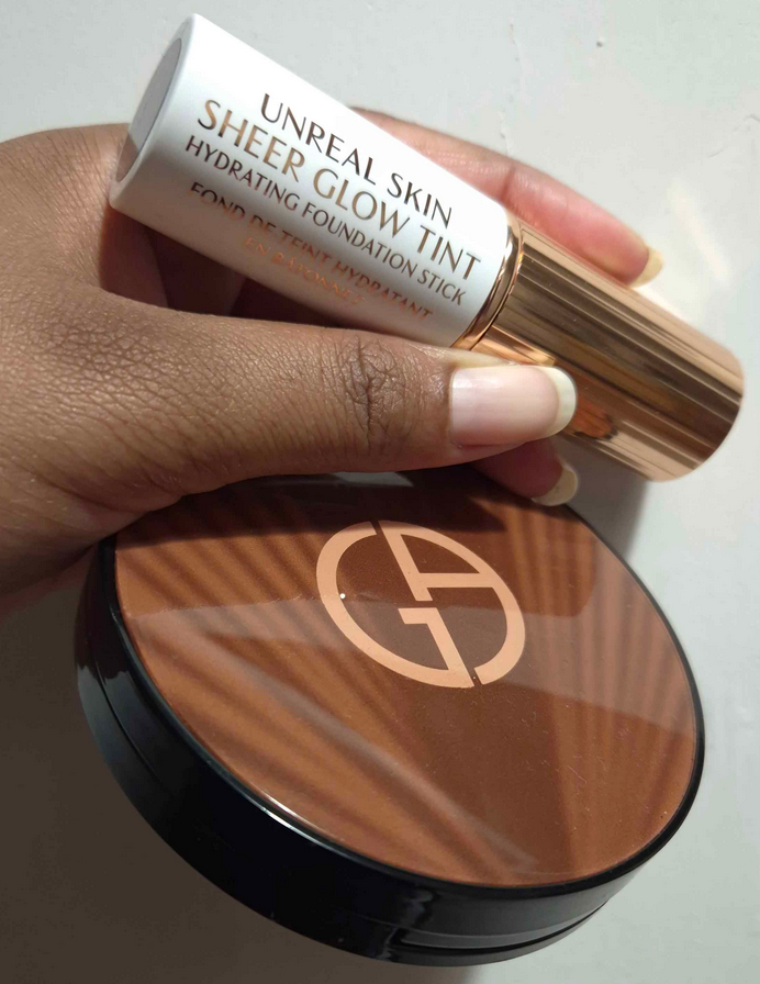
I’ve used it to blend out the Charlotte Tilbury Unreal Skin Tint that I use as if it’s a cream highlighter. It works, but I prefer other brushes because this one takes longer to blend the edges. It’s much easier using this brush with powder highlighter, such as the Charlotte Tilbury Pillow Talk Multi-Glow Highlighter.
When it comes to cream bronzer use, I prefer the Sonia G Mini Base over this one because the Jumbo Worker doesn’t pick up nor deposit as much to the face. Considering it’s smaller than my holy grail cream bronzer brush (Patrick Ta’s Contour 1 Brush), it takes too much time to build up what I can get from the PT brush in the first pass around the face. With the Mini Base, it’s useful for when I’m looking for a pigmented yet softer looking application instead of a sharper one, whereas the Jumbo Worker is too gentle.
Where the Jumbo Worker has the advantage is with blushes. I didn’t think it could top the Mini Base, which I have loved for cream and liquid blushes since early 2021. However, I think the Jumbo Worker might be doing that! The Mini Base gives maximum color payoff that can be smoothed and blended out to a sheerer more natural look. The Jumbo Worker gives less color, but still a good amount, that allows for more control in actually building it up. The finished result is a smooth seamless blend onto the cheeks, and quite fast considering it’s tiny for a blush brush! For lighter colors, I would still reach for the Mini Base, but with darker or more pigmented liquid and cream blushes, I would use the Jumbo Worker. Another example is that when I’ve used the limited edition shade Rust from Glossier’s Cloud Paints, the mini tube squeezes out too much product and I end up having to wipe some away or I end up with a heavier application of it with the Mini Base. With the Jumbo Worker though, it’s perfect. It took some of the excess away and left me with a look that was so natural, exactly as I wanted! This brush also has the advantage of applying powder blush beautifully as well, but I don’t like using the Mini Base with powder. I think it’s due to the Jumbo Worker’s shape having more of a splay with diffuses the powder a lot better.
I admittedly have not tried to use this brush with foundation, even though Sonia G has mentioned that it’s a possibility with this brush. I’m too impatient and prefer large base brushes. And even though I knew I wouldn’t like it, I had to test this with liquid eyeshadow, since this is technically an eyeshadow brush. As predicted, it’s just too huge for my eye area. It brings eyeshadow too high up to look flattering for my eye shape. It fits into the socket well, but some of the shadow gets on the inner lower lash line too because of its size. It also diffuses the eyeshadow too much for my liking, leaving me with a non-opaque application. Someone who wants to have a big wash of color on the eyes would enjoy this brush though.
So overall, this brush is super versatile and would be fantastic to take traveling. I didn’t like it in the beginning, but after figuring out so many great ways to use it, especially with blush, I love it now.
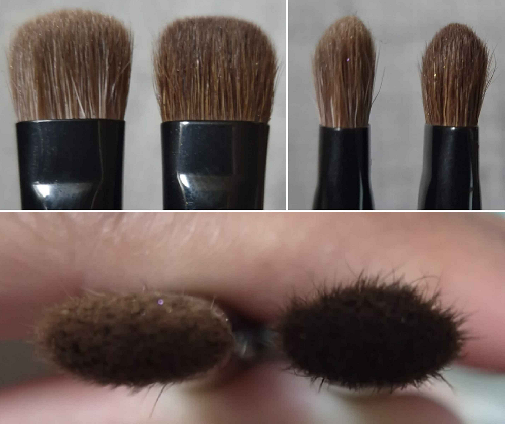
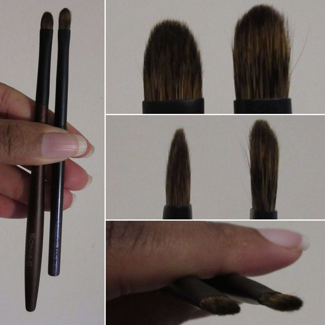
Sonia G Fusion Eye Builder
Full Length: 150mm / 5.9 in
Hair Length: 10mm / 0.39 in
Hair Width: *11mm / 0.43 in
Bristle Type: goat and synthetic
Since the Builder Three (which this brush is intended to be similar to) and Builder Pro are among my all time favorite eye brushes, it made sense that I would be interested in trying a version intended for creams and liquids. The few liquid eyeshadow formulas I have are fantastic, so it’s not a surprise to say that my eyeshadow looked nicely smoothed out after being applied with the Fusion Builder. In addition, this brush got into the inner corners easily, which is definitely impressive, and the edges were blended super well without harsh lines either. I’ve been using the Singe Beauty brushes for this purpose, but this brush does the job better and faster, all while feeling gentler on the eyes.
When it comes to using this brush with powder products, I definitely prefer the Builder Three because it’s the tiniest bit fuller and the way it moves in the crease feels nicer. The Fusion Builder is a bit stiffer, so it doesn’t glide around the contours of the eye with as much ease. One of the benefits of this though is that it picks up harder pressed products better. The black shade in one of my Guerlain quads is notoriously difficult to pick up on a brush and is still not great even with a finger. However, I could get more of it into my brush and onto my outer corners better with this than any other natural hair brush (which I assume is thanks to the synthetic bristles within it).
The Fusion Builder is the left one in each photo. The Builder Three is on the right side of each.
I prefer to use a smaller brush for my lower lash line, but if I wanted to, I have even more control applying eyeshadow there with the Fusion Builder over the Builder Three. I still don’t think I’ll use this with powder eyeshadows, but this will be my go-to brush for liquid and cream eyeshadows instead.
Sonia G The Traditions Holiday Trio
Traditions S1
Full Length: 148mm / 5.83 in
Hair Length: 8mm / 0.3 in
Hair Width: *6mm / 0.24 in
Bristle Type: Yellow Canadian Squirrel
Considering this is a squirrel brush, I was impressed by how much eyeshadow can be picked up and deposited with this brush. It even worked well when I used it with Natasha Denona’s cream-to-powder eyeshadows. I gather up the product and deposit it precisely where I want it to be before switching to larger brush to blend the powder in. Due to its flat shape, it works well for precision application of eyeshadow to my lower lash line. The softness of the hair guarantees a pleasant experience for that delicate area.
When I’m doing an eye look with multiple shimmer shades on the lid and want to blend them into each other to create a fake multi-chrome type of look, it’s particularly good for that. Blending the shimmers into each other nearer to the inner corner and not getting the outer corner messy is harder to do with the fingers, so this brush has a leg up in that regard.
Sonia G Traditions S1 compared to the Surratt Artistique Classique Shadow Brush Petite
Traditions S2
Full Length: 154mm / 6.06 in
Hair Length: 14mm / 0.55 in
Hair Width: *10mm / 0.39 in
Bristle Type: Yellow Canadian Squirrel
This is suited for building up gradual intensity of eyeshadow, but to larger areas at once. It’s relatively thin, whereas I prefer thicker packing brushes. Sonia G already has brushes suited to my style in the form of the Builder Three and Builder Pro, so this still fills a void in her line. Because of its medium size, it can be a one-and-done eyeshadow brush for someone with smaller eyes.
Comparison to the Houkodou GS-2
Traditions 3
Full Length: 155mm / 6.1 in
Hair Length: 15mm / 0.59 in
Hair Width: *8mm / 0.3 in
Bristle Type: White Canadian Squirrel
The way this is tapered, plus the hair type, gives a diffused application to a smaller area than a more traditionally shaped fluffy blender brush would. This makes it handy in the crease for more intricate looks layering multiple eyeshadows while keeping them distinguishable in the gradient, though the amount that gets picked up on the hair and the spring of the bristles won’t apply things completely opaquely on the first attempt. That might be a good thing for those preferring to build up eyeshadow. In my case, I like it more for use in the outer corner since that’s a spot I would use a darker eyeshadow and want to be more careful about how heavy the pigmentation is. Even though it’s useful there, my preference is still a smaller brush such as my holy grail Sonia G Mini Booster.
So, overall, this collection has its uses. It’s less functional for my particular style of makeup application, but I still wanted this as a Fude collector. The handles are beautiful and the hairs are not easily sourced. So, these are more for my enjoyment of just owning them.
That’s all for now! I’m so sorry it took a year to post between Fude 5 and Fude 6. I tried to make it quicker to get out Fude 7, but it still took a long time. Fude 8 is in the works, and I do believe I can get it posted sooner, though it will likely be several more months again. Please consider following this blog so you can be notified as soon as it comes out. I do also post photos on Instagram of new brushes, and sometimes give a first impression. More thorough reviews are exclusive to this blog though.
I hope you have a great day! Thank you for your continued patience.
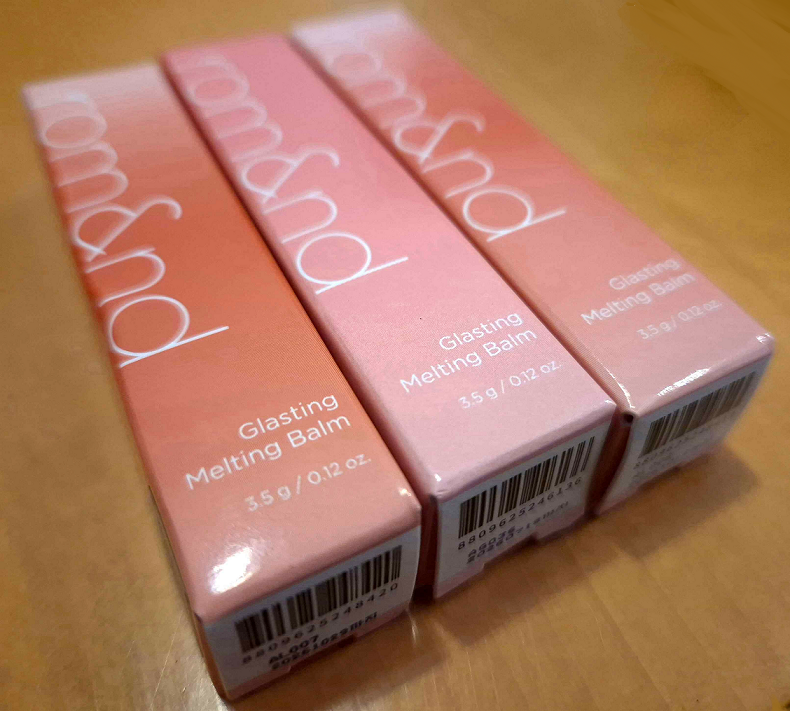
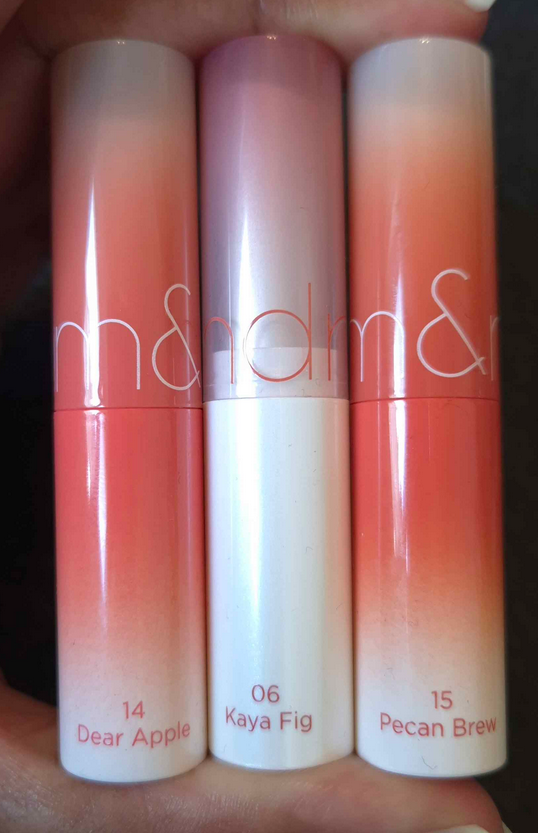
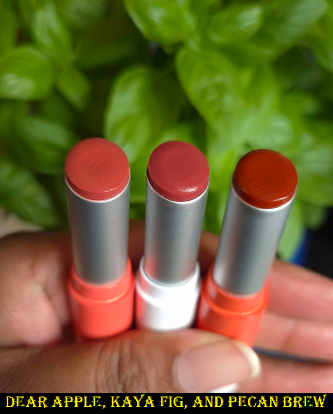
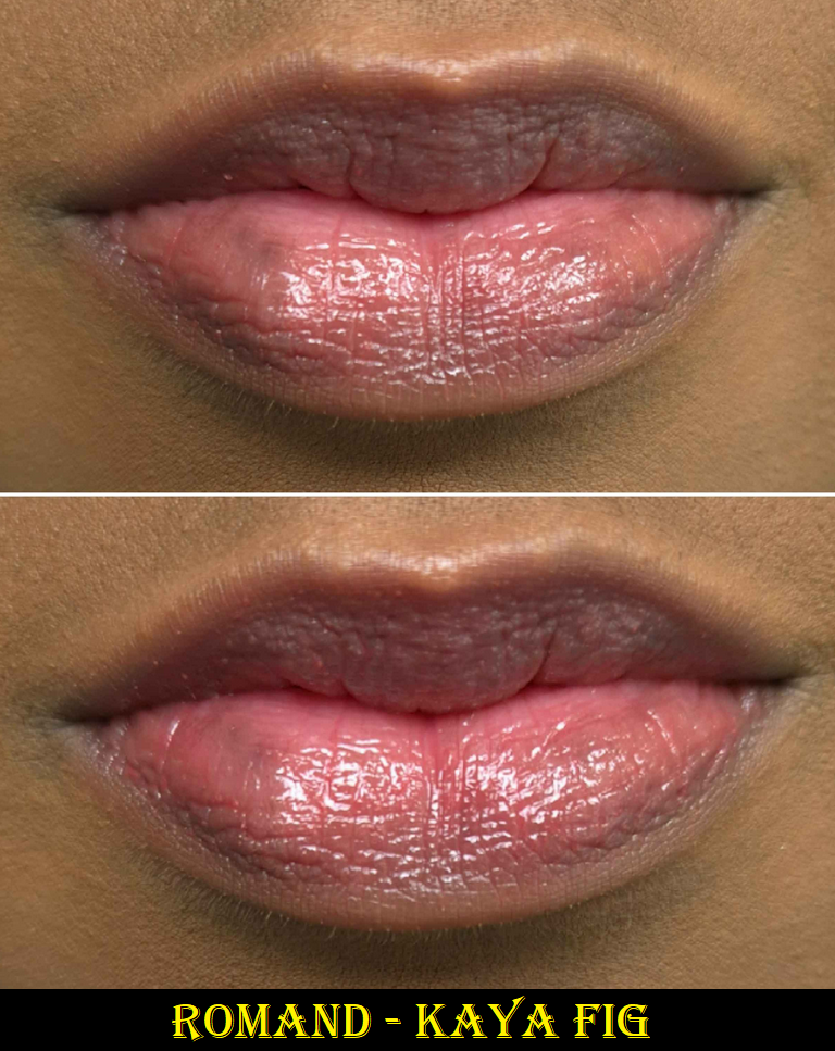
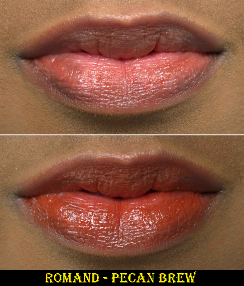
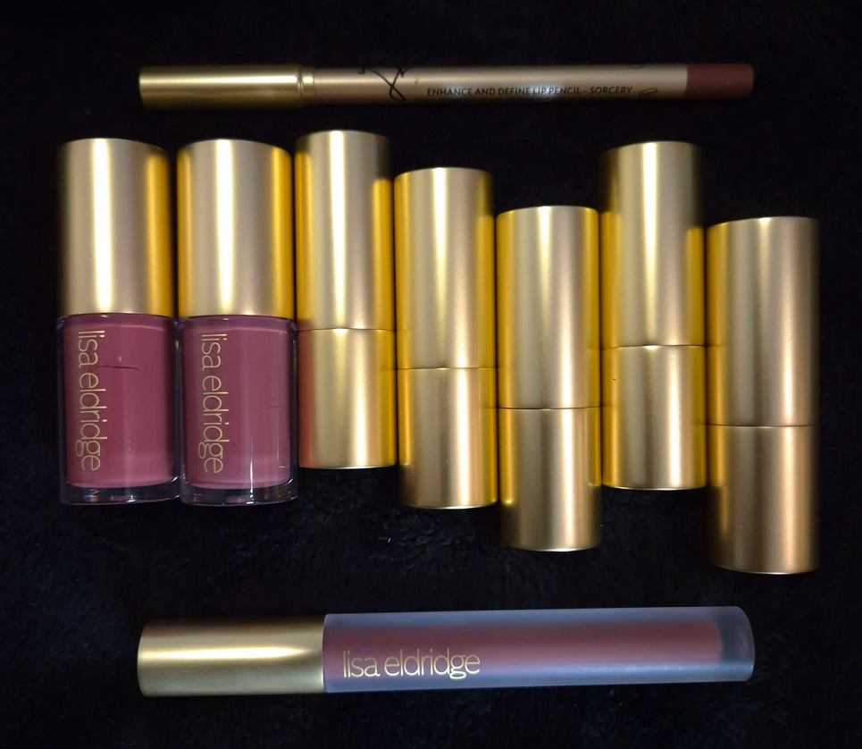
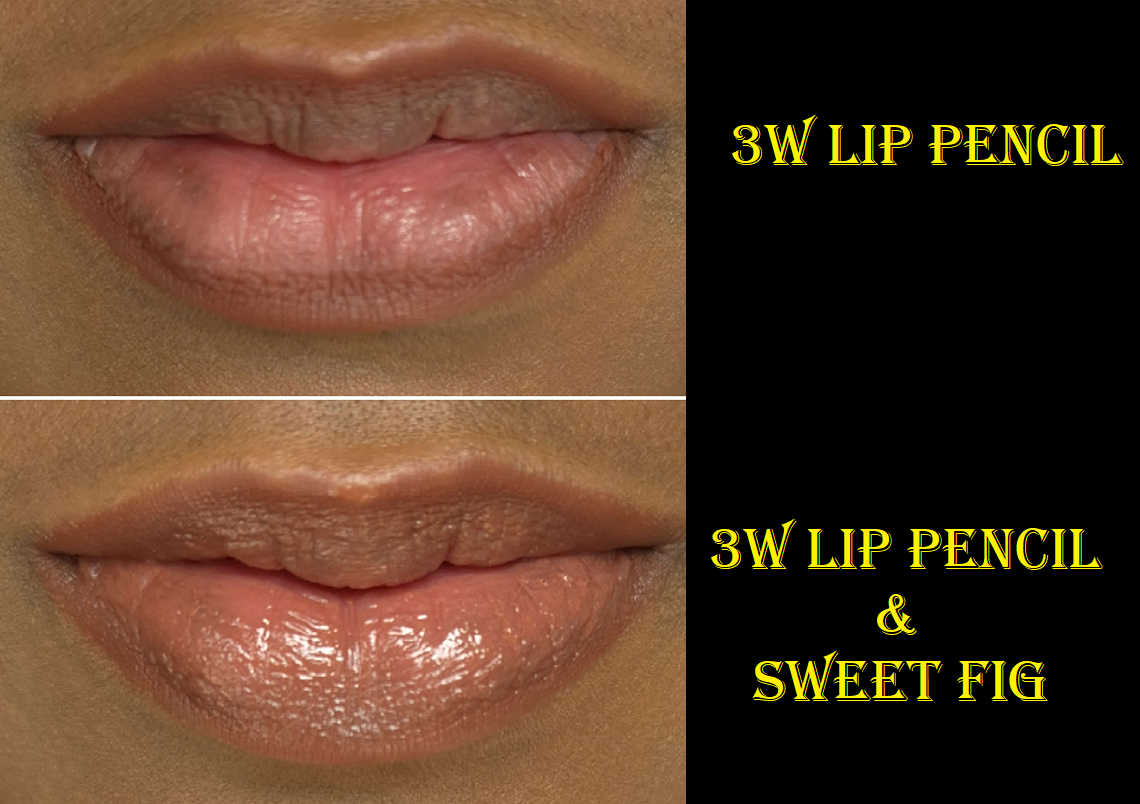
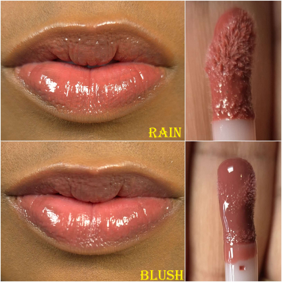
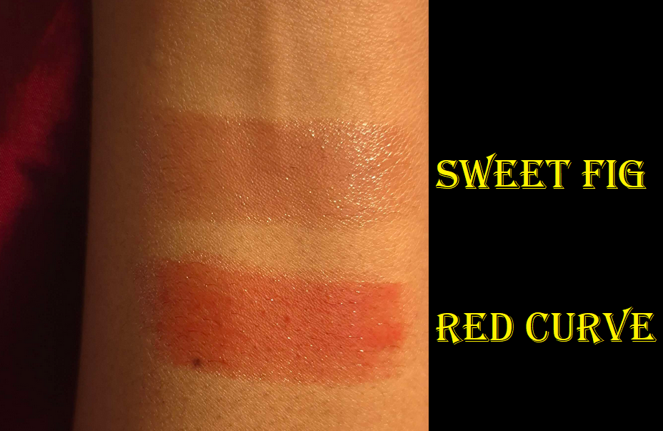
I have to give credit to The Makeup Archives on YouTube for this purchase after she mentioned these balms are comparable to the Lisa Eldridge Baume Embrace Melting Lip Colours. I purchased the shades Kaya Fig, Dear Apple, and Pecan Brew. I believe the first is from the main collection whereas the latter two are Dusty On the Nude Editions.
These have a lot of ingredients my lips like, but they’re closer to the bottom of the list, and are therefore in smaller amounts than the bulk of the formula makes up. The list also has some ingredients that have the potential to dry my lips depending on the amounts, so I didn’t expect them to condition my lips over time when I bought them. I would be satisfied if I could at least wear them comfortably and have them not make my lips worse at the end of the day, so that was my goalpost for them. Plus, I was curious how similar they truly felt to Lisa’s considering I bought 3 Glasting Melting Balms for less money than a single Baume Embrace.
Before we get into the review, I feel it’s important to talk about how I acquired them. I always want to know if there’s anything I need to watch out for regarding shipping times, customer service, etc. So, I assume most people are like me and want to know as well. I ordered these from YesStyle. I’ve had an account with them for years, but this was my first time actually purchasing. My full order exceeded $55 USD, since I added extra items to my cart, so I was eligible for free shipping. I was allowed to pay with US Dollars instead of Euros and still have it shipped to Germany with VAT included. My order was “shipped” within two days, but the warehouse is in Hong Kong, so it took 9 days to be in possession of the carrier Hermes. Therefore, tracking was unavailable until it reached the hands of Hermes, which was by then when it was in Germany. The following day it was scheduled for delivery. So, it took a total of 12 days to arrive. According to information I found online, some people get their orders fast (in under 10 days) whereas some people could get it after nearly a month. For those saying it took longer, I’m not sure if they bought items that had the “Usually ships within 24 hours” marker on them or if a longer time frame was written. My Oden’s Eye and Kaleidos orders usually take between 2-4 weeks to arrive, as well as anything I order from Ebay or Amazon listed as coming from China (no matter if it’s going to the US or Germany), so it’s possible that’s just how it can be sometimes via YesStyle. Because my order went smoothly, I had no interactions with customer service.
Also, the packaging says “Rom&nd,” but the descriptions all say, “Romand.” I guess that’s to avoid it looking like there’s a typo and keeping it easier to find or to use hashtags and whatnot.
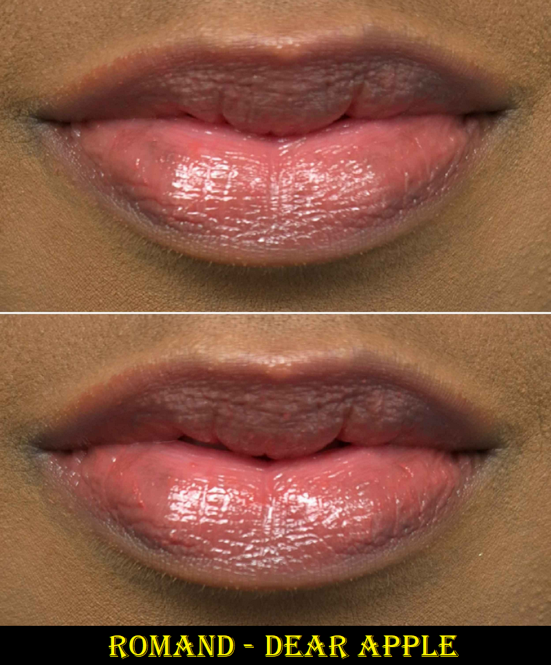
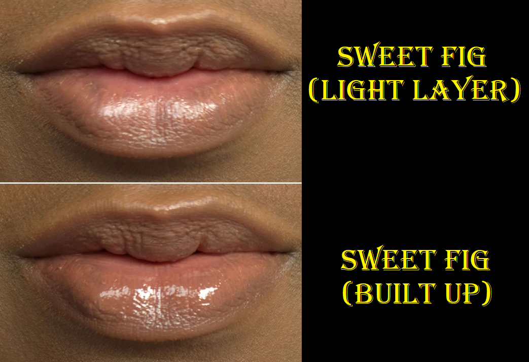
The first thing I noticed when putting this on my lips is that it’s not a lightweight feeling formula. It’s very emollient feeling, but not full-on oily. It’s got a bit of tack to it. When I first apply it, it feels like my lips are heavy and speaking is a bit difficult because of the partial stickiness. The benefit though is that this feels very much moisturizing and hydrating. My lips feel conditioned after wearing it.
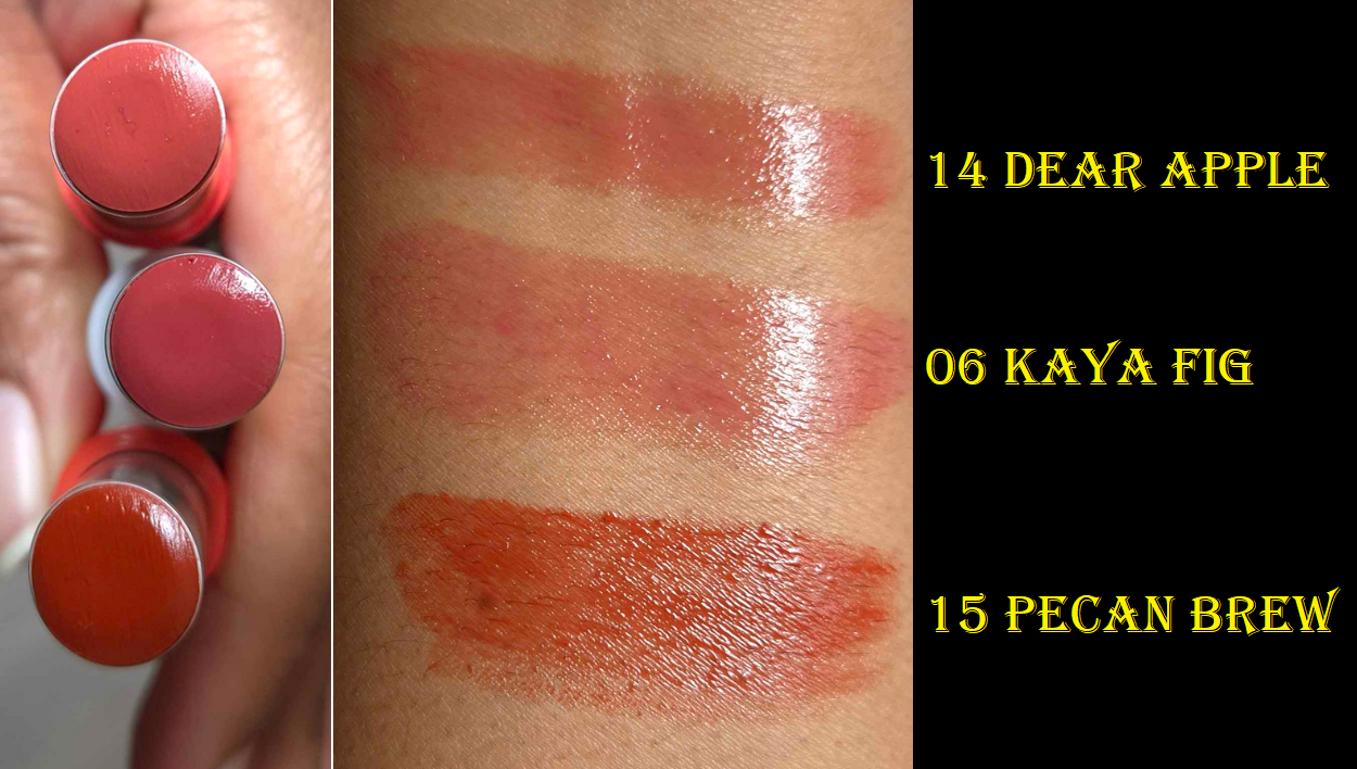
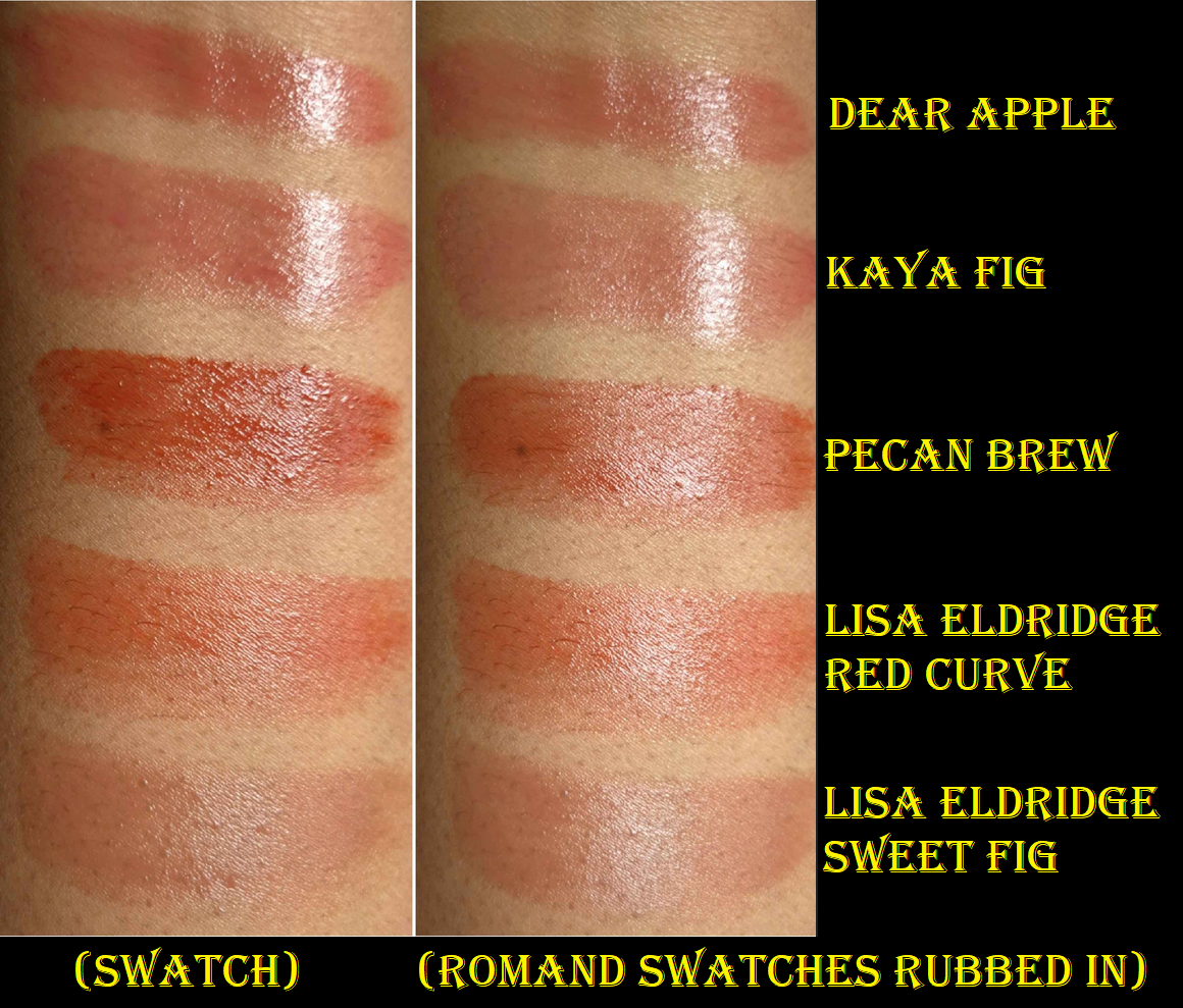
These are quite pigmented for balms, though Pecan Brew has probably twice the amount of pigment. It’s not easy to get a sheered out look with that shade. I love that the other two look quite natural. The downside to the pigment part of the balms is that it clings to every dry and peeling patch. I have to pull off strings of color to get it to look smooth and not textured. It’s evident in the swatch picture how building up the color didn’t go on my arm evenly and I had to use my finger to smooth it out. Also, the top layer of product is so easy to transfer, but the closest layers on the skin having a clinging quality that lasts a pretty good amount of time as long as drinking and eating aren’t in the equation. I’m able to apply this before bed, like an actual lip treatment, and there’s still some on my lips in the morning.
Fragrance is listed in the ingredients, and I can smell something, but it’s not a clearly identifiable scent. The closest I could describe it as is vaguely fruity.
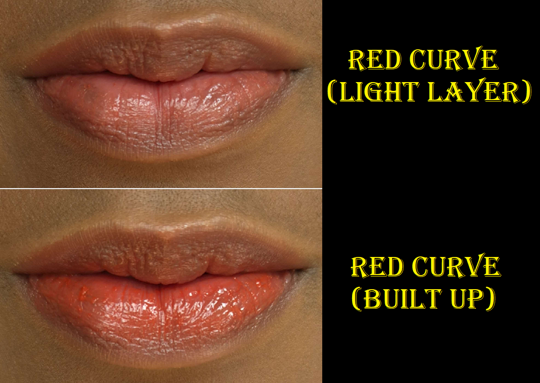
These are actually nourishing, which makes them instantly worth me buying! The downside is that my husband hates kissing me with them on. They’re too goopy for his liking. This is why I still prefer the Lisa Eldridge Baume Embraces, though I will definitely keep using this product for the makeup qualities. I don’t often wear lipsticks because of my dryness issue, so to be able to have colors that will actually improve the state of my lips is a very welcome option. I plan to keep using Dear Apple and Kaya Fig, but I prefer how Lisa Eldridge’s Red Curve looks on me over Pecan Brew. Based on photos I’ve seen online, I assume Scotch Nude is more similar to LE’s Sweet Fig, which is why I didn’t buy that one.
Colors aside, Lisa’s formula is less emollient and a little less nourishing. They end up lasting the same amount of time on the lips as Romand’s during the daytime, but can’t last through sleeping. The LE lippie’s color applies much more smoothly. My lip lines look smoothed out, whereas with the Glasting balms they have a slightly pruned look to them the way fingertips look when soaked in water for too long. I feel the Baume Embrace has a more sophisticated formula in terms of being a makeup-skincare hybrid. Romand’s feel more like a treatment, even with the amount of coloring agent used. I also like being able to put on the Baume Embrace and forget I’m wearing it because it’s not so heavy on the lips. The comfort from not having the sensations of needing to wipe off the edges of my lips every so often makes me more willing to wear LE’s over Romand’s.
I can see why the YouTuber said the Romand Glasting Melting Balms reminded her of the Baume Embraces, but the way they feel on the lips is too different for me to consider them dupes. There are a lot of other melting type tinted lip balms on the market (Tarta Maracuja Juicy Lip, Makeup by Mario Moisture Glow, Nivea Melty Lip Balms, etc.). I even saw plenty of other “melting balms” on YesStyle. The amount of color, the ingredients used, and texture/consistency are the qualities that differentiate one balm from another. I think the Baume Embraces stand on their own enough that they were worth it for me to buy. However, for the lip conditioning aspect and having additional shade options, I’m also glad to have bought these from Romand. They’re a third of the price as well!
That’s all for this week! Have a good one, and thanks for reading!
-Lili ❤
DISCLOSURE: Apparently, I have a referral code with YesStyle which is available for all customers to share. I don’t really know much about it, but I figured I would just link it anyway. The reward code isG9UHT8. I did not sign up for the official YesStyle Influencer Program though. As my love of beauty revolves mostly around makeup, but I never buy makeup from YesStyle, it didn’t seem like the right fit for me. Sunscreens, Hair Care, and Skincare are what I like to use YesStyle for now, but I rarely post about those topics. Anyway, thanks for reading!
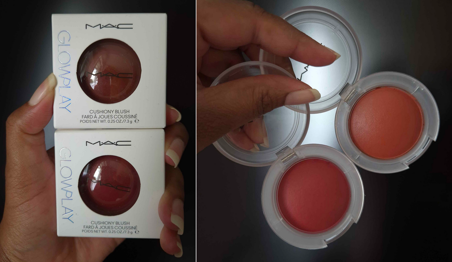
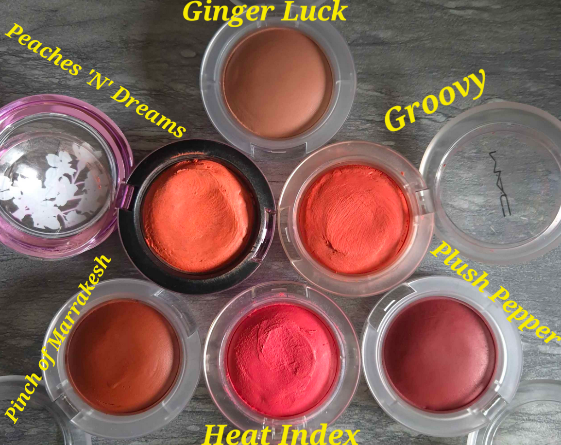
To call myself a “fan” of MAC blushes would be understatement, and the Glow Play line of blushes are among my favorites. I was so excited to see MAC expand the line, although they discontinued a few shades like No Shame and Rosy Does It. As soon as it was available, I bought two of the three darkest colors: Pinch of Marrakesh and Plush Pepper. The one I opted out of getting is called Big Diva Energy, because it seems like a deeper version of Plush Pepper, and Plush Pepper is plenty deep on me already. A week later, I found a 28% off discount code, so I bought Ginger Luck too.
For anyone curious how the colors compare to their older shades, I have a photo below. I also have a close-up video of them on my Instagram. Unfortunately, as discussed in my MAC Blush Declutter post, I had to temporarily leave the others in my collection behind.
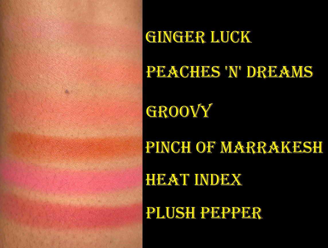
These swatches look intense, but they look much tamer when blended out.
I saw a YouTube video from Dear Eva Hansen comparing the old and new version of Totally Synced, and they are not the same. I don’t know if any other shade went through changes, but that’s something to keep in mind if you’re making a repurchase.
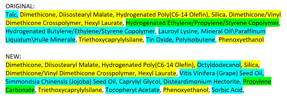
Aside from the added colors, the whole line has been reformulated. I don’t have any of the original boxes with me to compare, but I have the ingredient list from the Incidecoder website that has not been updated yet. Setting the “may contain” portion aside, the most notable changes seem to be the removal of talc and replacement of mineral and synthetic oils with naturally derived oils.
From a performance standpoint, I haven’t noticed that much difference between the old and new ones. I find it easier to pick up color on my brush with the new ones, but I assumed that was because they were fresher. After seeing the ingredient list, it might really be the case that the new formula is slightly more emollient and therefore having less of the drawbacks of some putty style blushes. MAC does tout that this is a finger-friendly formula, and it’s true that it doesn’t take much effort to apply these to the cheeks for a natural look. I’ll always prefer using a brush though.
This might sound absolutely crazy, but I actually liked the way I had to load up my old Glow Play blushes on my brush because it required me to dig more into that putty. The ads I keep seeing for the reformulation shows finger indents to indicate how “bouncy” or “cushiony” these are, but I just lightly pass over the surface with my Sonia G Mini Base, Sonia G Jumbo Worker, or my finger, and I’ve got enough product to cover at least one cheek, if not both. There hasn’t been any situation where I needed to push into the product enough to form a dent, except with the original line. I’m not actually complaining, just pointing out that the marketing is trying to appeal to Gen Z, TikTokers, etc with “fun” makeup. Whereas dents in mine were created out of necessity, now you can do it voluntarily to play with it? That’s an option I guess. As much as I liked the imprint from my brush, I will grow to enjoy how much quicker I can apply them even more.
They have the same lasting power as always and I don’t need to set them with powder on my dry skin. They also aren’t as glowy as the name suggests. It has that cream-putty type of glow to it, not the shimmery or mica kind.
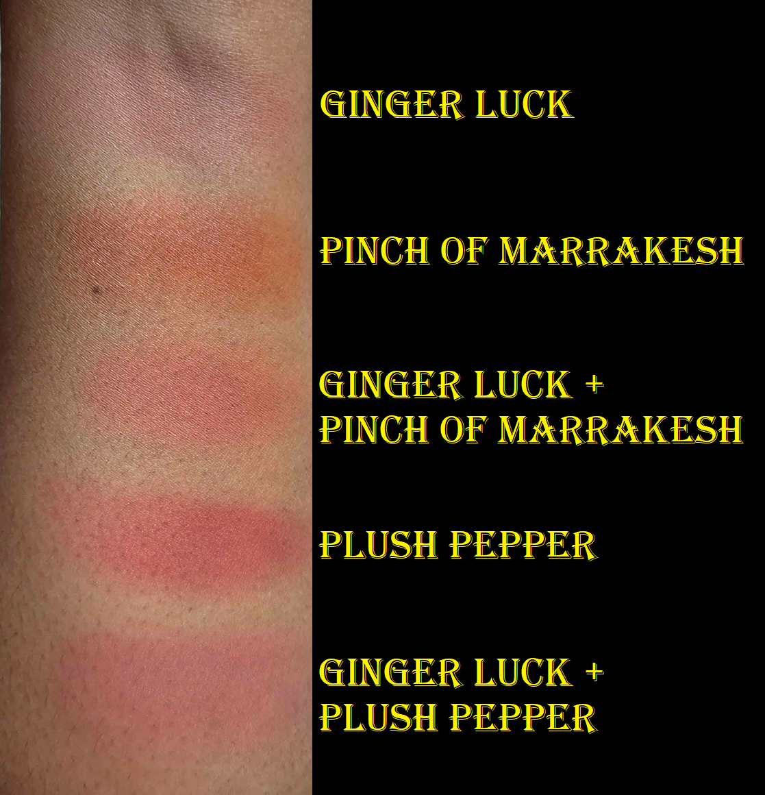
About the colors specifically, I wanted to note that Pinch of Marrakesh is nearly identical to Armani’s Neo Nude Color Melting Balm in 30 Warm Coral. Since that’s another formula I’ve loved and raved about, I wanted to mention that for anyone who already owns it. I also couldn’t help noticing the similarity in names of the new colors. I suspect Pinch of Marrakesh is inspired by the brand’s Marrakesh lipstick shade, since it’s an orange-red type of color. I wouldn’t be surprised if Plush Pepper was supposed to be a sister shade to Burnt Pepper, which looks slightly more red on the cheeks, whereas Plush Pepper has a bit more rose pink tone to it. For some reason, it’s the opposite when I swatch it on my arm, but on my cheeks that’s how it looks. One of the reasons I initially skipped getting Ginger Luck was because even though I figured it could work as a mixer to turn some of the more vibrant shades into a more nude one, the description of the color reminded me of Gingerly, which barely shows up on my cheeks. Coppertone is the lightest nude from MAC that I can pull off. Just for fun, I’ll link a comparison between the two from Temptalia’s Blog HERE, though I have pictures wearing both in one of my many MAC Blush posts HERE.
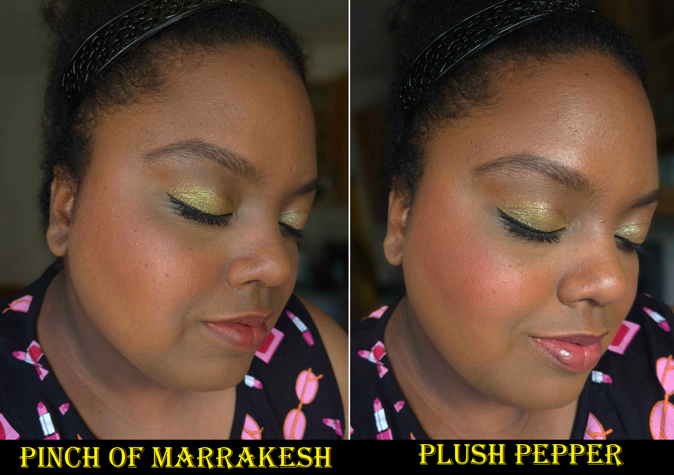
As you can see, Ginger Luck faintly shows up on my cheeks and looks the tiniest bit ashy because it’s too light for my complexion. Adding a little Plush Pepper on top creates exactly the kind of look I was hoping for. The combination is still a sheer light-medium pink shade on me, but the slight boost of rose-red helps it to pop more.
Having Ginger Luck essentially tones down vibrancy while adding a touch of brown to it. It’s a similar process when I try to tailor the color of my colorful Glossier Cloud Paints with Dusk.
I’m very happy MAC extended the Glow Play color range to include more options for those with dark skin and in less vibrant colors. I’m still waiting for true dark nude shades as well, like a darker version of Ginger Luck (True Harmony isn’t dark enough). They’ve created limited edition shades before, so I’d love for that to happen again.
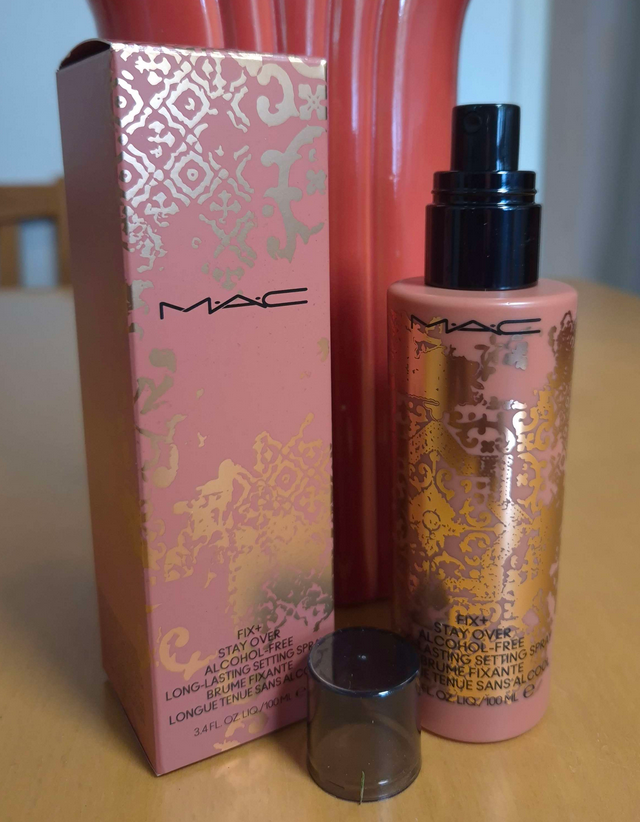
In addition to getting the Glow Play blushes, some of my other MAC purchases have been yet another Fix+ spray in the mini size with the original sprayer, another Fix+ Stay Over Setting Spray from the Teddy Forever Collection since my other one is still in the US, and the Lash Dry Shampoo Mascara Refresher. I also bought two limited edition lipsticks, so I thought I would review those here as well.
Fix+ Stay Over Alcohol-Free 24HR Setting Spray
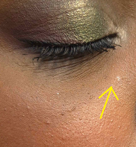
This bottle has a limited edition design, but MAC has now equipped all their Fix+ sprays in bottles with this type of sprayer. I liked the power and wide spray range of the previous ones, but I admit the new ones do a better job at creating a fine mist, with one exception. Every time I use it, there are between 1-3 larger size droplets on my face. This isn’t a colorless spray. It’s milky, so after I spray, I look in a mirror and try to tap out the obvious droplets.
Aside from that, this is a very interesting setting spray. I’ve accepted that setting sprays are going to increase makeup longevity, make it water-resistant, but won’t be transfer-proof. The MAC Stayover Spray is a whole different thing. It increases the longevity, but is not water-resistant, though it’s better at being transfer-resistant.
I tested it with foundations that transfer fairly heavily and it was alternating throughout the day from not transferring to only lightly transferring depending on the moisture level of my skin. Whenever my face was shiny, I knew those spots would leave a slight imprint of color on my finger, but it was like this spray continued to try setting my face. If I stopped sweating or my face started to be dry again, lightly touching my face would not get foundation on my fingers. It might be the film-former particles at work that MAC describes in the product description on their site! When I perform a waterproof test for sprays, I wait until the end of the makeup day and splash my face with water. I can usually see the droplets rolling down the surface and not leaving a trail. With the MAC spray, it left a trail. I rubbed the spot to try and fill in the void, but it looked messed up. So, I went to go get my Makeup Eraser cloth, but when I returned to look in the mirror I noticed my foundation looked perfect. It’s like it set itself again! This spray doesn’t contain upsalite, the special oil absorbing ingredient that are in a lot of Danessa Myricks products, but the way it performs throughout the day reminds me of that one. I don’t like upsalite because it makes my skin feel tight, and this spray does have a little bit of a stretching sensation, but not full on tightness.
The transfer-resistant nature of this spray is obviously more effective with my foundations that are less prone to transferring, plus factoring my dry skin type. I don’t know how effective this would be for those with other skin types or dewy foundations. The formula is alcohol free and intended for those with hydration needs, so I recommend taking that into consideration if you’re interested in buying this product.
There are so many factors that impact how effective a spray will work for me (the skincare I used, the products I used, the humidity levels, the overall weather, etc.). Even my once tried-and-true Urban Decay All-Nighter wasn’t always fool proof. So, I’ve always taken a “better than nothing” approach to setting sprays. I use it when I know I’ll be hugging other people or out in the elements, so I just hope for the best. However, I do feel a little more confidence in at least minimizing the possible transfer when I use this spray, so I’m happy with it.
One more thing to note is that this doesn’t leave a glycerin-looking shine to the skin the way that the normal MAC Fix+ spray does. It looks that way while it’s still wet on the skin, but the dry down is just natural looking.
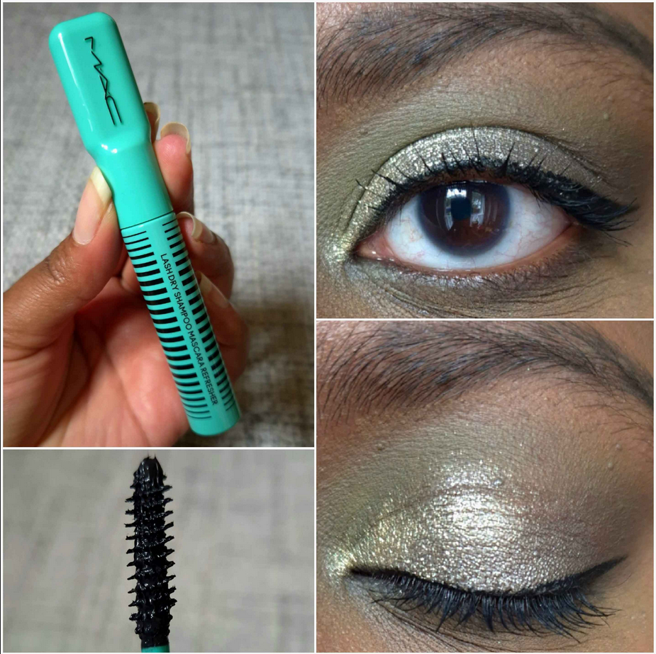
MAC Lash Dry Shampoo Mascara Refresher
When this product first came out, a lot of people were saying it was just a gimmick and that if a mascara needs refreshing at any point in the day, then it’s a bad mascara. I had a bit more faith in MAC because they’ve come out with some really unique formulas over the years and have been innovators. Just in case though, I waited for a sale before buying it. I’m glad I did because the naysayers seemed to be right about this one!
I wondered how I should even go about testing these claims since none of my mascaras need touching up throughout the day. I decided that I should at least see what this could do on its own. So, I applied one coat to my lashes, seen in the photo above. It’s certainly not pretty, but adding a second coat makes them look too clumpy and spidery, which is not my preference. It also doesn’t add much extra length, just volume.
I tried to use it as a “refresher” for my MAC Stack Mascara, but that mascara was unchanged by the end of the night. I still applied the Lash Shampoo on top of it and I noticed a significant boost in volume and a bit more length, but I can also achieve that by adding a second coat of MAC Stack Mascara. In fact, one of the reasons I love that one is I can build it up as much as I want and it won’t harshly tug at my lashes. It applies layers very well. So, using the Lash Shampoo didn’t go above and beyond the norm.
In the photo above, the top left and right photo is what the MAC Stack looks like freshly applied. The bottom left and right is what it looked like at night when I topped the MAC Stack with the Lash Shampoo.
I figured it would be better to test this product with a different mascara, so I picked the L’Oreal Telescopic Lift. This is technically a sneak peek of eye looks for an upcoming review (most likely to be published in October) using the LH Cosmetics Reload Palette. In the top left and right burgundy eye look, I’m wearing the L’Oreal mascara. In the bottom left and right green-brown-blue eye look, I wiped away some of the L’Oreal mascara and then topped my lashes back with the MAC Lash Shampoo.
The whole reason I was interested in this mascara in the first place is because I would often do back-to-back eye looks when testing larger eyeshadow palettes. I would do a different eye look on each eye, then remove the eyeshadow with micellar water and a cloth so I could create two new looks. In the process, sometimes the mascara would come off with it. Some mascara formulas wouldn’t reapply that nicely after having micellar water partly on the lashes (would form clumps or turn spidery), or were the type that was too stiff to add additional layers after it dried. So, I thought the Lash Shampoo could be the answer to that issue. Again, it adds volume and length, but it’s easily prone to turning the lashes spidery. It takes so long to wiggle the wand and comb through over and over to unclump the lashes. Plus, the end results are no different that trying to recoat the partly wiped off lashes with the Telescopic one. Two coats of the L’Oreal mascara gives me a similar look.
So, it may be the case that if I remember what the “bad” mascaras were or ever come across some new ones in the future, this product could be useful. However, if I just stick to my favorites, I will have no need for a second mascara to go with it.
I don’t know if MAC intended for this to be a gimmick, but it’s at least not useful for me. When I remember how half-assed they did the Sims 4 collab, I can’t put anything past them. It’s humorous that the brand that brought me Glow Plays is the same one that cooked up the Lash Shampoo.
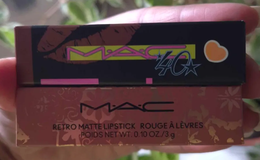
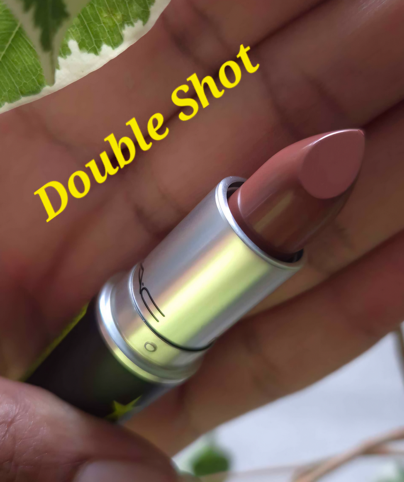
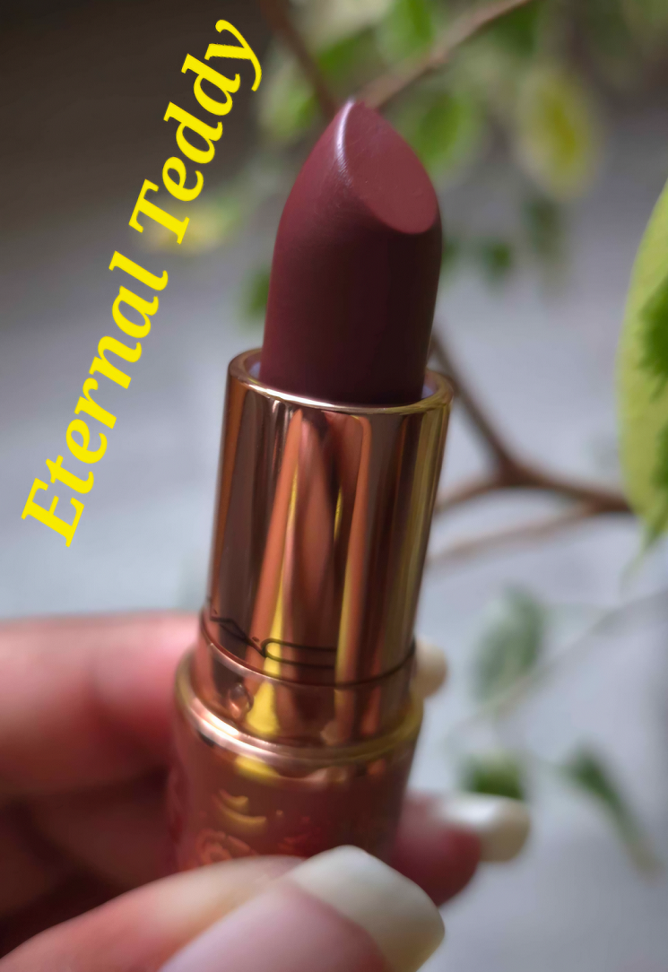
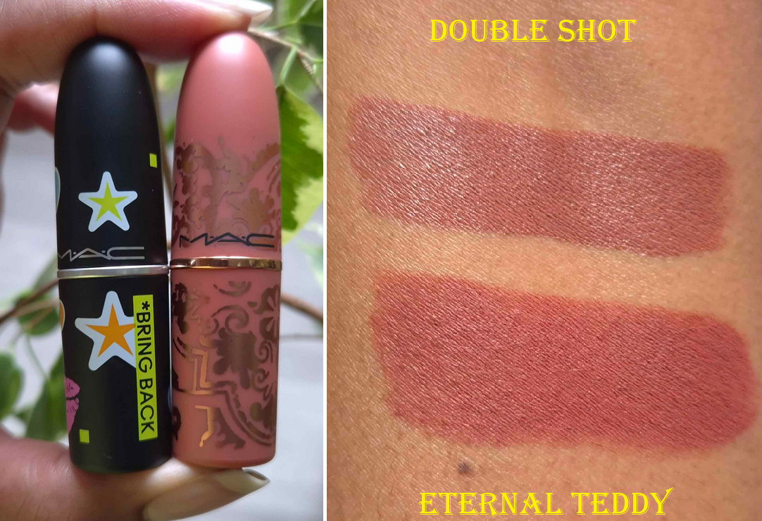
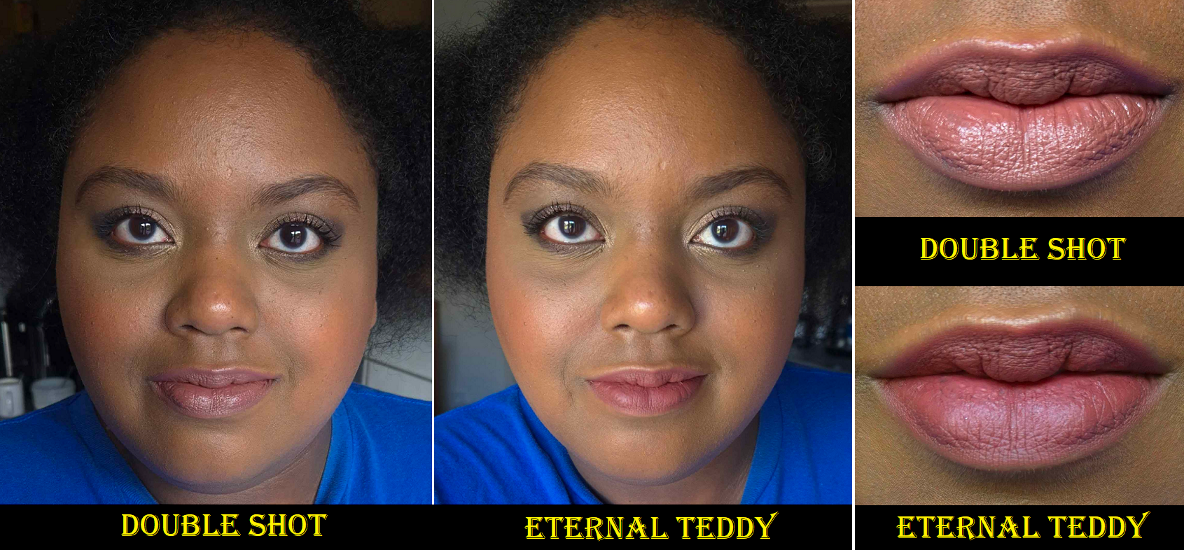
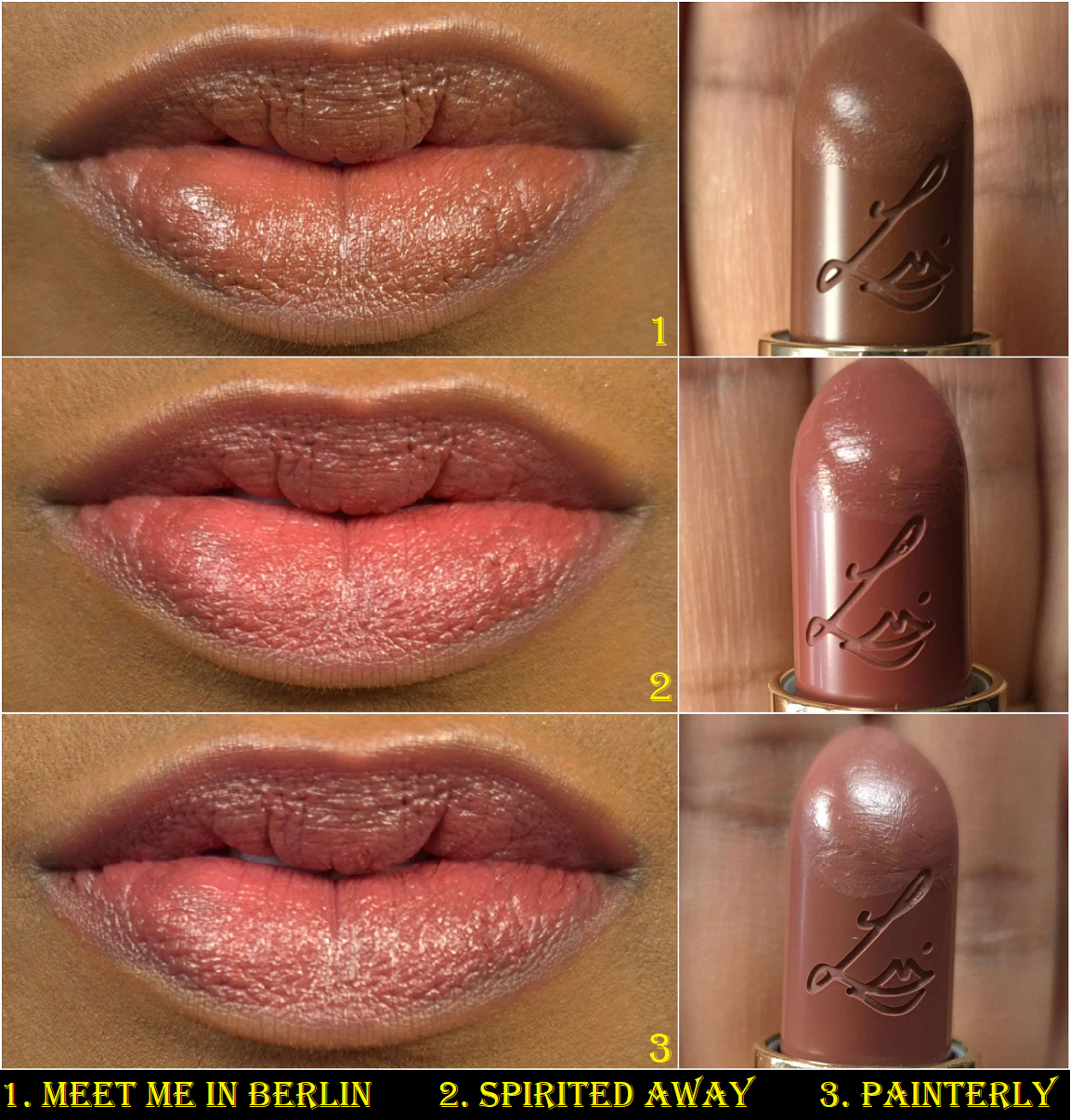
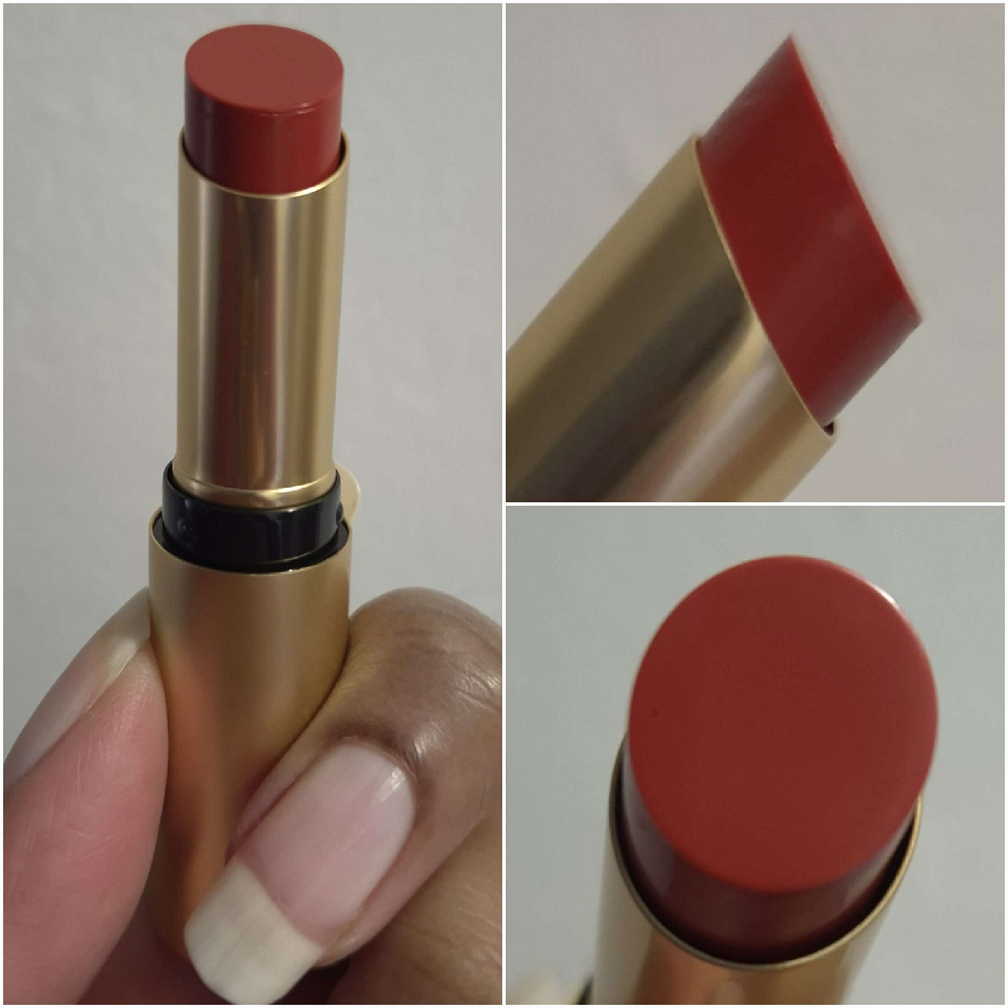
MAC 40 Year Anniversary “Bringback” Amplified Creme Lipstick in Double Shot and the Teddy Forever Collection Retro Matte Lipstick in Eternal Teddy
Once again, I’m dealing with constantly shifting natural lighting and my artificial lights wash me out too much, so these lipstick shades are hard to capture accurately. I did my best. Even though I’m wearing the same shirt as the Ginger Luck photos, which were added to this review a week before publishing, these pictures come from day 2 of trying to work around the constant fading in and out of light due to the cloudy weather here. I tried a third time (also in the same shirt) with at least Double Shot, but lipsticks look different on everyone anyway depending on their skin tone and the pigment level of one’s lips.
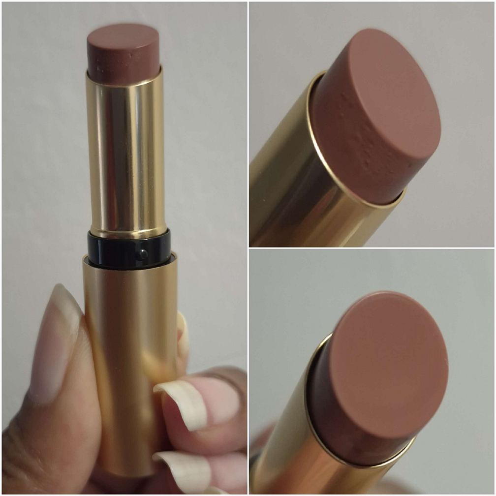
Eternal Teddy is my first Retro Matte lipstick, and my goodness it is too much for my dry lips! I have to wear a balm underneath to manage the discomfort, but this color isn’t quite what I expected, so I don’t think I’ll be wearing it again anytime soon. I’m a sucker for that packaging though. As for the amplified lipstick formula, I still suffer dryness, but it’s a far more comfortable formula to wear. Double Shot is described as a mid-tone mocha brown. On my lips, it appears a little more mauve and brown than my natural lip color, and slightly lighter, but I like it. It looks great paired with a darker lip liner! This shade reminds me of a few others in my collection, but I left them in the US, so I can’t compare them. In any case, I have a lot more of a chance to wear this color. I’m glad I bought it.
I hope this has been helpful! If you’re a lover of all things MAC or just makeup in general, please consider checking back every Monday, or clicking follow, as to not miss out on any posts!
Oh boy! I can’t start this review without talking about the insanity of this launch. There was so much traffic to the website that it went down even before the starting time (4:00 pm Central European Time). There were continuous 500-504 Gateway errors. US shoppers had the option to try their luck with the retailer Camera Ready Cosmetics, but the rest of the world only had the official Lethal Cosmetics website to be able to purchase from. After about 40 minutes, the brand announced on Instagram that they would need time to fix things and for everyone to try again at 5:30 pm CET. They specifically mentioned they would hold the stock back so that even if someone was able to get on the site, they wouldn’t be able to purchase until the appointed time as to make it fair for the ones who got off the website. It was clear they needed less people overloading the servers. The website was still giving the same errors until 5:36 pm, which is when the queue page appeared for me.
I took a screenshot, but the numbers were counting down so quickly that I couldn’t capture my true number in line (a little over 2000), but it did say 55 minutes and took close to that long to get on the main website. I added things to my cart, but the checkout process was constantly producing those same gateway errors again. The saving grace was that I didn’t need to go back in the queue or add things to my cart again. Refreshing over and over eventually got me back to the checkout page at the points where I last left off.
The most confusing part of this process was when I finally returned to the PayPal page and clicked to submit the order, it started loading, and then brought me to the error message again. I had a moment of hope when I could hear my cell phone buzz and saw I had the PayPal confirmation notification and email confirmation from Lethal Cosmetics. Just to be even more certain, I continued to refresh the page in the hopes that I could get back on the website and check the order status through my account information. However, when it finally loaded, it said the items sold out in my cart. My cart had been emptied though, so I added everything back to the cart and noticed that this time the Appa Bag was listed as “preorder.” I checked my confirmation email, but it didn’t have a preorder description. So, I think I may have been one of the very last people to get the remaining stock! Lethal Cosmetics set the limit of 3 of the same type of item per person, so I had added a second bag to my order so I could gift one to my sister-in-law. I wanted the Appa Cosmetics Bag because it’s adorable, but my Schwägerin is an actual fan of the show and she was thrilled to have it! Her toddler was instantly attached to it as well and started filling it with toys. Thankfully, anyone unable to get this collection was able to pre-order for what is estimated to be a July/August shipment.
It took 2 hours and 40 minutes for me to complete my order. I nearly missed getting the items I wanted as non-preorder. My order took over two weeks to get shipped and delivered. Let’s see if it was worth it!
Earth Palette
For starters, I am so on board with this color story! If I’m going to wear yellow leaning greens or blue leaning greens, these are the shades I prefer. I love how bright Dai Li looks, although it darkens on my lids if used with other dark shadows or on one of my wetter primers. I’m not sure if Metalbending is technically a duochrome, but at the very least it has a beautiful yellow-green shimmer on what looks to be purple-grey base. I’m not the most knowledgeable about color theory, but on my eyes it looks like it leans on the cooler side of yellow. It has been a long time since I’ve used Lethal Cosmetics shadows and the shimmers seem more to my preference now than before. They don’t feel as thick, but they go on smoothly and opaque. I don’t know if the brand necessarily increased the sparkle level; it appears the particle size of the shimmers are just bigger. Kyoshi is a somewhat flaky multichrome. I have minimal fallout applying the shimmers with my brush and fingers, but Kyoshi gets messy if I try to apply it to my inner corners without dampening the brush.
I get a little creasing near the inner corners where my eye line is the deepest. Wherever I place the shimmer has a tendency to move up a bit higher on my eyes over time (basically covering up some of the crease). So, if you have oily eyelids, these might be a potential problem depending on the severity of it. The amount I get doesn’t deter me from using this palette.
The mattes are closer to how I remember them always being. With Lethal shadows, they’re going to pack a punch! They are pigmented and a bit on the dry side, not the soft nearly creamy feeling powder mattes that have become my preferred formula. I like that these apply opaquely. They require some work to blend, but the end result is beautiful. They adhere well and don’t fade throughout the day. I recommend not using a tightly packed brush and applying with something that won’t put on a ton of product at once. I recommend also using a resilient type of bristle for blending, though it being dense isn’t required per say. This isn’t the kind of formula where I can easily blend it out by working the edges back and forth repeatedly. It sticks too well to the skin, which ensures no patchiness and no fading, so the tradeoff is just needing to switch up my technique. I have an easier time applying a lighter color, darker color, and then applying the lighter color back on top to blend and create that gradient.
I used the Earth palette, plus a beige shade under the brow bone (Lodge) and shimmery greenish gold (Antheia) in the very inner corners of the eyes from Natasha Denona’s Mini Gold palette. So the majority of the eyeshadows used in the look are from Lethal Cosmetics.
If you’re a fan of depotting palettes to create custom magnetic ones or rearranging shadows, these pans are magnetic and able to be removed.
I have a gigantic Lethal Cosmetics eyeshadow collection. They’re one of the first indie brands I tried, and there was a time when I had nearly all of the shadows. I love their color stories and the way that they’ve grown as a company. Everything I have praised them for in the past holds true today. Their eyeshadows, though better than before, haven’t been my preference for a few years now. However, I have no regrets buying this palette. I don’t like to switch up my makeup applying techniques just to use specific products, but I don’t mind for this one.
Ty Lee Lipstick
Lipsticks are less exciting for me than other forms of makeup, but there was no way I could resist that component and with the intricate design on the bullet. It’s just so pretty! I like that it has a magnetic closure, but the magnets are on the weaker side. I would feel nervous chucking this in a purse with other objects for fear the top would come off. However, I assume it would be just fine in a pocket of a purse.
The lipstick bullet appears quite dark. All three shades in the collection looked to be the same depth with just different undertones in the marketing images. However, when applied to actual skin, this lipstick reveals itself to be a medium-dark pink. I understand the confusion about this shade though because Lethal’s Instagram page was flooded with comments about how “the Ty Lee lipstick should be pink” and “I wish these lipsticks weren’t all red.” The brand responded by telling people it was pink and that there was a softer option, but the color in the tube is not how it will actually appear when worn. It even looks dark and red in the brand’s swatches, but it appears much brighter on me. I can’t even say it’s a skin tone difference because they have swatches on an arm that’s similar in color to mine!
Regarding the formula, it has a creamy finish. It feels soft and the tiniest bit waxy (like a Burt’s Bees balm) as it spreads across the lips. It has a little shine, but it’s closer to a satin than a glossy formula. It feels comfortable in the beginning, but is drying over time. The shine lessens after several hours and although the lips continue to have some slip to it when I rub them together, I can still feel it drying beneath the surface.
It has medium pigmentation, so if I want the color to look opaque, I have put at least four layers to cover the two spots on my lips that are naturally darker than the rest. For this reason, I have the urge to want to pair a lip liner with this lipstick so that the outer edge remains defined and opaque, plus to fill in those darker spots so I could use less product. Despite it not being fully opaque, it has a slight staining effect. If I try to wipe it off after it’s been on for at least four hours, there will still be some color left behind, especially between the cracks of dry patches. It doesn’t take much to remove the stain though. Just a little water on a cloth will do the trick.
At the time that I took these photos, it had been cloudy all day for a full week. The pictures above were the better ones I could capture between using my artificial lights versus the natural light available to me. Videos of the products can be found on my Instagram post HERE.
Now that I’ve finished the testing phase, I’m going to stop using this lipstick. It’s not because it’s a bad formula; it’s because this shade of pink is a bit bright for my taste. I like the design and packaging of the lipstick, so I plan to keep it shelved as a collector’s piece instead.
Appa Makeup Bag
I wanted this because it’s cute! Don’t throw tomatoes at me, but I’ve only seen the M. Night Shyamalan version of The Last Airbender. I haven’t seen the Nickelodeon show*, nor the Netflix live-action show. However, it is on my list of things to watch. I have a feeling that once I do, I will be even more happy to have this bag. Cute creatures in anime always become my favorites like Chopper from One Piece, Happy and Frosh from Fairy Tail, Chiaotzu (technically human) and young Dende from Dragon Ball Z, etc. Call it FOMO, but I couldn’t shake the feeling that I would regret not getting one even though I have no need for more makeup bags.
This is another product that’s going to stay on a shelf for collector purposes! The “fur” is soft and seems pretty well made. I think $25 was a very reasonable price for it. It looks like it could hold a fair amount of makeup, but it doesn’t have a handle, which is what I would prefer to have for a functional cosmetics bag. Don’t be surprised if I end up stuffing this with soft accessories like scarves and wool caps and using it as a pillow or stuffed animal instead!
Yes, I still like stuffed animals.
Anyway, I think Lethal did a fantastic job with this collab. Even without me knowing very much about the series, it seems like they worked really hard to do this franchise justice. I would love for them to tackle another IP or do a Round 2 for this collection!
That’s all for today! Thank you for reading!
-Lili ❤
*UPDATE: I finished watching the animated series (not the Netflix live action), and although I didn’t like the show as much as I hoped, I did end up being happier with my decision to buy the Appa bag.
I thought of this title because most products take me a long time to decide how I feel about them. Whether my initial impression is good or bad, I always get the feeling that the results could be better if I test them under various conditions and with different techniques. So, that’s why it takes me quite a while to solidify my thoughts. However, with the two makeup items I’ll be featuring today, my thoughts haven’t changed from that first use and onward!
Charlotte Tilbury Unreal Skin Sheer Glow Tint Hydrating Foundation Stick in 12 Tan
First of all, what a mouthful of a name! Charlotte Tilbury certainly likes her over-the-top names and product descriptions on her website, but I’m not complaining. It’s funny to me.
I’m going to start off by saying that I do not use this product as a foundation. I’m an avid beauty YouTube watcher and saw a ton of reviews for this before it became available at Sephora’s Deutschland website (and on sale, hurrah!), so I saw how greasy looking this was on anyone who put it all over the face prior to powdering. Regardless of the reviewers’ opinions, I thought the glow looked beautiful on everyone, which is why I wanted to buy this…as a highlighter.
It’s important to explain that while I lived in Florida, I had dry/normal skin. Now that I’m living in Germany, with much less humidity (so drier air) and colder temperatures for the majority of the year, my dry skin issues exacerbated to the point where my natural finish foundations and slightly dewy ones look matte on me. Some of my products would turn glowier as the day went on while in Florida, thanks to sodium hyaluronate/hyaluronic acid, but moisture never broke through during German winter, no matter how long I wore them. The only foundation I have with me currently that makes my skin look glowy, but still takes several hours to happen, is the N°1 de Chanel Revitalizing Foundation. My desire was to find a product that would give me glow at the very beginning, so I could enjoy my Chanel foundation more and start using my other foundations again.
That’s where this Charlotte Tilbury product comes to play. I’ve been using powder highlighters to try and get a glassy wet-skin looking glow. It’s a decent solution now that we’re in summer, but it’s not as effective when my skin is extra dry in winter (plus fall and spring really). I’ve always hated cream highlighters because they tend to be too emollient and remain dewy feeling on the skin, as well as disturbing my makeup underneath. Liquid highlighters I’ve used don’t disturb things as much and most dry down fully, but they also tend to look super shimmery or metallic, which can look too obvious/stark on a minimal makeup day. I am so happy to say the Unreal Skin is the product I’ve been waiting for all this time!
It wasn’t too long ago that I reviewed Dior’s Forever Glow Star Filter, with the comparison to the Charlotte Tilbury Hollywood Flawless Filter. Dior’s product was the closest I’d ever come to perfection, but the drawback was having to use specific techniques to make it work because it’s technically darker than my skin tone and the next available shade up is too light. So, despite thinking I could stop looking for a glow product, I took one more chance by getting the Unreal Skin Tint.
I am typically within the 12 to 13 shade range of Charlotte Tilbury complexion products, depending on the line, as well as the time of year. I had a difficult time deciding whether to get shade 12, 12.5, or 13 in the foundation stick, but decided upon the lightest of the three since it’s a sheer and therefore flexible coverage product that I wanted to highlight with anyway. 12.5 could have possibly worked too, but I think I made the right call choosing 12. When I did a swatch with my finger and rubbed it in, the darker base color became visible. The lighter sheen and that base combine to form a better shade match for me than all the liquid highlighters I own. It never looks that dark when I put it on my skin because I use a brush to blend it in, which doesn’t completely remove the reflective layer. The difference can be seen in the top swatch of the third column of the photo below. I reapplied that swatch with my brush instead of my finger.
My reasons for preferring this product over the Hollywood Flawless Filter is that the color suits me better, the amount that I use is self-setting and dries down with almost no transfer, it looks more skin-like even though it’s a shinier and a more reflective product. It feels lightweight on my skin, so that I completely forget it’s there on minimal makeup days. Neither product disturbs my makeup underneath, but I’m impressed by the fact that I don’t have to warm up the product on the back of my hand first, nor rub the stick onto my brush bristles before applying it to my face. I can just drag the stick directly onto my skin and then blend it out with my brush without ruining even my KVD Good Apple Concealer, which notoriously doesn’t play well with a lot of my products.
The left photo has no bronzer, no highlighter, and just a thin layer of the Chanel foundation. The right photo has the Armani Bronzer on and the Charlotte Tilbury stick as highlighter on the cheekbones and above the brow.There’s also the tiniest bit on the cupid’s bow, chin, and nose.
The Unreal Skin looks a bit more pearly in photos than in person, but it’s also more detectable without blush. I used a combination of a Glow Play blush and Powder blush from MAC in the photo below and then it took on a more natural appearance, despite having applied the CT stick to such a large area on my cheeks (mainly for demonstration purposes). If I was going to use this product while skipping blush, I would have applied it more precisely to a smaller zone. I wanted to be able to show that even if it’s in a larger section of the cheek, using a powder product of any type on top will tone down the glow.
This is the completed makeup look. These last photos were taken a bit later when the sun wasn’t shining as brightly through the window, so I look a bit darker overall and warmer in color with the addition of blushes and bronzer built up. Plus, I usually skip wearing my Dior Powder-No-Powder for review pictures because Shade 5 warms up and slightly darkens on me too (I don’t have Shade 4 with me), but I wanted to depict what I interpret as a minimal makeup look and show how finishing powder differs from the CT glow on me.
I have to add that because of my dry skin, the type of skincare I use, and the small amount of the stick I end up applying, this product dries down enough that I don’t need to powder it. For those that use dewy primers, dewy foundations, have oily skin, or end up with thick skincare products that sit on top of the skin instead of fully sinking in, the results could be very different. Those that live in humid climates may also need to set it, which would diminish most of that shine.
Purely for testing purposes, I confirmed that using the Unreal Stick as a skin tint is too shiny for me. As a primer, putting a natural finish foundation on top (may as well be matte on me) tones down some of the shine. However, it’s still too much for my liking. Adding some face powder to strategic areas gave me the appearance of a natural finish foundation, but I still prefer how it looks when I just use this product as highlighter. Using it as primer makes the end result feel heavier on my skin and is just enough extra emollience to make the foundation transfer more heavily than usual, as my husband can attest to after I greeted him on the testing day!
The amount of glow in the completed look photo (in the neon tank top) might be too much for some, but I absolutely love it because I don’t get any shinier throughout the day. There was a heatwave and it was 87°F /31°C at the time I took those photos, but that didn’t effect the performance at all. The Chanel foundation does its thing and will make other spots more glowy, but I don’t get oily looking or greasy when I apply the amount that I do. This isn’t the type of product I think anyone would enjoy the look of when built up, unless it gets powdered after.
Technically, the Unreal Stick emphasizes texture, but it’s nearly negligible, especially for how glowy the product is overall. It’s not much of a problem for me because the areas I apply the product to aren’t wrinkly spots, though I do have some bumps and moles. I’m only mentioning this because it may be more of an issue for someone trying to use this product as intended, as foundation. In my case, I avoid applying it to my forehead, since the bumps there become more noticeable if it’s not powdered down (as seen in the maroon shirt photos). I’m happy with this product because it still emphasizes less than many other highlighters I’ve used, and even less than the Dior Forever Glow Star Filter.
So, now, I can genuinely say that I’m finished looking for a skin-glow-aiding product. In the event that I notice any changes over time, such as the stick drying out in the tube or the product expiring before its 12 month period-after-opening, I will update this post.
The final aspect I wanted to mention is that the component isn’t weighty, but it’s not cheap feeling to me either. I heard some complaints about the packaging not being luxurious enough, but I see Charlotte Tilbury as a high-end brand and not completely in the luxury sphere. I think the packaging is pretty. I also think the component comes apart based on the rattling sound it makes when it’s not fully twisted down. I wouldn’t be surprised if there becomes a refill option in the future. Quite a lot of Charlotte Tilbury products are refillable.
Armani Luminous Silk Bronzing Powder in 110
This product has been out for a while now, but I really thought 110 would be too close to my skin tone and that 120 looked too much like a contour color, based on photos I’ve seen online. I still think 110 isn’t that far off from my skin tone in terms of depth, but the undertone makes it to stand out more. More specifically, on my bare skin it stands out a lot. On top of foundation, especially mine that are a little darker and more golden-orange, the color appears subtler. This bronzer can be intensified by building up a few layers though. I’m also glad it shows up significantly more than the Armani Luminous Silk Glow Liquid Bronzer Drops in 110 ever did!
No bronzer in the left photo compared to a normal bronzer application in the right photo. A heavier bronzer application can be seen in the Charlotte Tilbury section further up.
The section I used a few times, seen in the photo below, doesn’t look as sparkly compared to the untouched areas in the pan. I began to wonder if the shimmer ran all the way through the product or in smaller amounts the further down one goes. It looked like the sparkle was solely on the outermost layer, but after a few additional uses, I started to see shimmer again. So, even though the very prominent gold specks can be partly rubbed away in the pan, it will return. What’s most important to me is that this powder imparts a sheen, which I love my bronzers to have. I’m not a fan of obvious shimmer particles in places other than my eyes. However, like those “sequin” eyeshadows that are matte formulas with random shimmer specks that get flicked off the skin when blended in, some of the gold particles in this bronzer don’t stick to the face. If I’m not in a bright setting, the shimmer that does linger around isn’t that noticeable. So, I’m accepting of this, but I know in the back of my head it will remain a point against this bronzer compared to others in my collection that I love. This type of issue is why I ended up not keeping Yacht Life from Mented (matte with golden shimmer) over Vacay (warm tone pink leaning soft matte bronzer). Armani’s bronzer having a sheen, which Mented’s does not, is the saving grace.
I like the smoothness of the powder, how easy it blends in, the sheen-like appearance on the skin. It adheres well and doesn’t fade all day. I even applied this to my forehead while I was sweating and I was worried that my brush would create hard-pan on the surface or that it would look textured on my skin, but it applied normally. The powder is easy to pick up, even with my delicate squirrel hair brushes. I just lightly tap into the compact and can get plenty of product on the bristles. If I’m wearing a foundation that requires me to to build up this bronzer to get it to show, then I switch to a larger saikoho goat hair brush to pick up even more product, but it doesn’t necessarily need to be a dense brush.
The compact is pretty on the outside and has a big heavy mirror housed under the lid which makes the packaging feel weighty overall. It certainly exudes luxury to me. For size reference, it’s about two millimeters smaller in circumference than the Charlotte Tilbury Beautiful Skin Sun-Kissed Glow Cream Bronzer packaging.
The only drawbacks about this bronzer for me are the gold particles and the color. I wish it had slightly less of an orange tone, because it looks even warmer on my complexion once it’s actually on my face. That’s all. Otherwise, I have no complaints about the formula. It’s far too soon to rank it with my other bronzers, but what I can say is the consistency feels like a mix between a soft matte, like the Hermes, and the almost clay-like appearance of the Glowish and Hatice Schmidt Labs bronzers. I don’t consider this a holy grail product, but I like it and I feel like it was a good purchase. I should preface though that I did not pay the full 52 Euros for it. I got it on sale for 37 Euros, thanks to an “Armani Cosmetics Promotion [for] Europe” via Selfridges.
I hope these reviews have been helpful. Thank you for reading!
This quad was on sale via Douglas, and I’ve wanted it for ages, so I snapped it up! I had completely forgotten that the eyeshadows in here were set into pans and are not the same eyeshadow formula as the initial Ombres G launch from the permanent range. If you look at marketing images, they look like baked eyeshadows without a pan, but only the original releases are this way. It’s a big deal for me because the non-pan eyeshadows are a more special texture and typically cost more to make. The baked gelee formula helped make the hefty price more palatable, so when I learned the newer launches weren’t the same, I said I wouldn’t buy them. Oops!
The colors are pretty, though very soft, muted, and natural on me. Shade 2 doesn’t really show on my eyes. I hoped Shade 1 would give me more dramatic depth. Shade 4 is quite pretty. Even though I have to be in a specific mood to want to wear pink, this is at least one of the types of pink I like. Shade 3 is pretty, but I can’t help but compare it to Shade 1 in the Royal Jungle palette that I love way more! It’s because the color in the Royal Jungle palette has a lot more pigment and sparkle. Wetting it makes it even more intense. Shade 1 from Wild Nudes is a satin and I will almost always prefer a shimmer over a satin.
Because the colors don’t show up intensely on me, I can’t really get much variety. I’m actually okay with that because I don’t expect too much from a quad. If I can get one very pretty look and wear that repeatedly, that’s fine with me. The unfortunate aspect is that Royal Jungle does that for me already, so I should have just stuck to using that one.
Guerlain Royal Jungle Compared to Wild Nudes
In terms of this eyeshadow formula, it’s a very smooth, finely milled powder. I definitely like this more than Tom Ford’s standard powder formula. However, I do still like Tom Ford’s wet/dry formula over Guerlain’s baked gelee one. I also still prefer Guerlain’s first release of permanent eyeshadows over the more normal powder one. My original review of Royal Jungle can be found HERE.
The Wild Nudes eyeshadows blend easily. They are opaque, though with a medium amount of pigment that’s slightly buildable, but not by much. They are soft to the touch, but not creamy and doesn’t have slip to them, so I don’t have to worry about creasing. There are no longevity issues either.
When I did an eye look combining shades from both palettes, I realized that other than the pink, the parts I liked about it were mainly from Royal Jungle. It’s only the black shade that is a bit of a dud in my quad. So, I also get some use out of having Wild Nudes to be able to use the dark brown matte even though I’d prefer if it was deeper.
Overall, this palette is nice, but not entirely worth the price I paid for it (even on sale). However, eyeshadow minimalists might love this one. For those wondering how I feel about Royal Jungle since my last review, I can say that I still enjoy it and that one was at least worth the discounted price.
As a bonus unofficial review, I wanted to mention that I’m wearing the Tower 28 MakeWaves mascara in all the eye photos. I purchased a travel size mini six months ago, but only started using it a few times within the last few months. It was such a hyped up mascara in 2023 that I could only deal with FOMO by stating I’d get it when it released in a smaller size. I have to say that I was not impressed. The formula was on the dry side, or rather, I couldn’t get much product on the mascara wand and had to dip in repeatedly. And then in order to get my lashes to look how they did in photos, I had to build up three layers (which I normally stick to one or two at most). Even with the extra layers, the end result wasn’t better than what I can get with my other mascara favorites in terms of length and volume. Granted, it’s possible that the full-size gives better results if the stopper isn’t so tight on that tube or perhaps mine partly dried already. Some mascaras in the travel size can perform differently than the full-size. I won’t be investing more money to try and investigate further though. I give allowance to the possibility that it could be different, but I’m personally going to treat this as an accurate representation of the full-size. On the positive side, I give credit for it not clumping or flaking, even with extra coats. Plus, the brand states that this mascara is intended to give “amped-up, natural-looking lashes” when I prefer more dramatic lashes. Influencers are the ones that hyped it up to be more my style. For those that want length and volume while also looking more on the natural side, I recommend Benefit Cosmetics Bad Gal Bang. It’ll give similar (but even prettier to me) results in less coats.
I’m not sure what else to call what’s going on with the Wayne Goss beauty line except a “relaunch,” since none of his previous brushes are available for purchase. On his YouTube page, he has discussed past financial and business mishaps with his brand, whereas now he has his own website and continues to partner with the retailer Beautylish. He promised that many brushes his customers loved in the past will eventually return, but this year he started off with launching the First Edition Collection. Those are the Saikoho goat hair artisan brushes. Next, he launched the White Gold Collection which are not Japanese handmade brushes, but he assured fans that the chosen manufacturer makes top of the line synthetic brushes. Today, I will be sharing my thoughts about both collections.
DISCLOSURE: All brushes discussed today were purchased by me with my own money.This review contains only one affiliate link.Non-highlighted links in bold blue font (Example) are standard non-affiliate links. The link marked in bold black font with a light blue background (Example) is the affiliate link. Affiliate links allow me to get a commission if purchases are made directly using my link. Whether you click to shop through them or not, I appreciate you visiting and I hope you find the information I’ve provided to be helpful!
The White Gold Collection
I’m going to start off by saying that I believe the purpose of this line is to provide pretty looking brushes at a relatively affordable price. His sets contain useful shapes and is great for someone with a small brush collection with a lot of needs to fill. I think this line will be less impressive to the experienced fude lovers because I don’t see how these are more special than other synthetics I own. Granted, a lot of the synthetics I use are more expensive than his, like Smashbox, Patrick Ta, Scott Barnes, etc. So, I respect what he’s done in giving more functional shapes at prices that are competitive with mid-range synthetic brush brands, and certainly less expensive than brushes from luxury brands usually cost.
I acknowledge that I am not the target customer for this line because I prefer natural hair brushes and I already have pretty much all the synthetic brushes I need. For new synthetics to remain in my collection, they must be practically tailored to my face shape and to my preferences for how I like to apply my makeup. Japanese-made synthetic brushes tend to cost nearly the same amount as their goat hair brushes. Considering Wayne and I seem to share the same sentiment that synthetic artisan brushes just aren’t worth the price, despite how far the technology has come to mimic natural hair, I was curious to see what he considered a worthy alternative. So, I had to try some out for myself!
#2 Angled Cheek Brush – Intended for Bronzer/Contour, Blush, and Highlighter
With bronzer, this worked beautifully. This brush has medium density and splays a bit when pressed into the skin, which helps to diffuse the product. When using a brush in this shape (such as the Sonia Kashuk Starstruck Angled brush), I usually put cream bronzer on the thickest part, towards the back where the brush starts angling upward, but this isn’t packed firm enough there to stamp into the hollows of my cheeks. So, I prefer to dip the brush into bronzer along the angled edge and pounce it around the perimeter of my face while it diffuses from the splay and gives me a light-medium even application. I apply bronzer with this brush in this way no matter if it’s a powder or cream formula. This brush is suited for someone who wants to cover a big area quickly, but maintain control of how much product is built up at a time. The angle also allows some amount of precision application. It’s not a small concentrated application, but also not a large airy one either.
With blush, it didn’t feel intuitive to swirl or sweep. Tapping/Pouncing it along the cheeks works great. The end result looks well blended, smooth, and diffused. It also feels very pleasant on the skin because of how soft and bouncy the fibers are.
For Foundation, this does the job well enough. Since these bristles don’t have the slick slippery feeling to them (the slipperiness being something I don’t like from a lot of synthetic brushes), this has a little more grip on the skin and therefore doesn’t glide across my skin with ease. Instead, it works better when I use short quick sweeping strokes across my face. The large surface area at least let me finish covering my face quickly, but I can see why it wasn’t advertised for this purpose. When I use foundation brushes in this shape, I expect it to be ultra dense like the Smashbox Full Coverage Brush or the Sonia Kashuk one I mentioned. The longer hairs and the way it splays lends itself more to suiting someone who likes buildable face products and is uninterested in full coverage makeup.
Yes, this works for highlighter as listed within the product description on the website, but it feels strange to hold it in the necessary position for me to apply it precisely. I’d rather use a dedicated highlighter brush, although that extra function makes this a great travel brush since it’s so multipurpose.
#6 Fan Brush – Intended for Highlighter and Blush
The original natural hair WG 15 Fan Brush set the bar for all other fan brushes. When I use that one, it picks up my Charlotte Tilbury Pillow Talk Multi-Glow highlighter with ease, but with the new #6, it can’t pick up that much even when I rub it vigorously into the pan. I actually preferred using Brush #2 for highlighter over this one! Most of my favorite highlighters are in a baked gelee formula that are picked up easier with my goat hair brushes. The amount of highlighter I manage to get on the bristles of #6 blends well, but this brush is easier to use with looser pressed highlighters. This one is helpful to apply a semi sheer layer of an intense highlighter, like the Fenty Demi’Glow.
When I try to tap the brush and rub it into the product, the strands bend too much and don’t dig into the product enough. Maybe I need to adjust the pressure I use and work it at a different angle to get it to pick up more, but I wanted this to perform like the original natural hair fan brush, so changing my application method from how I use that one isn’t intuitive. This synthetic brush is similar in size and shape, but wispier than the original.
Also, when I got this brush, one strand came out and two strands were longer than the others. I resorted to plucking them out rather than cutting them. So, I wasn’t too pleased about that. Regarding using this brush for sheer blush applications, I started to test out that technique and then stopped. It was far too tedious and felt unnecessary for me because not getting enough pigment from a blush is way more prone to happen to me than needing to sheer one out. So, this brush can be used for adding a whisper of blush, but I’m more likely to just grab a normal-sized cheek brush to get similar results much quicker.
Honestly, I could have skipped getting this brush.
#7 Hooded Eye Brush – Intended for Blending and Packing on Eyeshadow, plus Concealer Use
I tried this first with concealer. It blended it in very nicely, but it’s for someone who likes a thin layer, as opposed to me who is used to the Sonia G Jumbo Concealer Brush who wants to pack on product and get maximum coverage.
This brush gets into corners nicely since the bristles are long, flexible, and splay a bit without going into the category of being floppy. This allowed it to work great for nose contouring because it diffuses while being worked into the skin. I also tried this with eyeshadows. Again, this brush is more for diffusing. It picks up a lot of product, but it doesn’t pack it on intensely enough for my preference. In the comparison pic, it’s next to the Sephora 71 brush purely to show a size comparison. It’s a big brush to use on the eyes, which is ironic since it’s being marketed to those with hooded eyes. Hooded eye brushes tend to be smaller, but I think it’s in this category because of how well it gets into crevices and is gentle on the skin.
For eye primer application, it doesn’t feel firm enough to blend such a thick product and flops around. Diffusing can be good, as to not use too much product on the eyelids, but I feel it takes too much away.
#15 Push Liner Brush – Intended for Liner and Brow Use
For starters, this brush feels gentle when pressed along the lash line, but it’s very firm and tightly bundled, which can be felt when I run my finger across the bristles. It doesn’t bend as much either.
It’s a bit wider than I’m used to, so it can be little tricky to use in my inner corners as I line my eyes with powder eyeshadow, but I can manage. I also use this to highlight under my brow arch. For cleaning up the edges of eyeshadow with concealer, this brush applies it sharply. However, it’s hard to then blend it and spread it with that same brush. I prefer using a brush that I can complete both tasks with such as the Wayne Goss 08 from his original line prior to this year.
I have not tried to use this with brow products since I currently have no brow pot products. I also don’t have pot eyeliners with me. I have tried to line my eyes with a cream-to-powder eyeshadow though and it worked. I could create a nice sharp line. So, I expect it should have no issues with gels, actual creams, or liquids.
The Push Liner brush can be used as a lip brush as well, but I’m not interested in using it this way. This brush has practical use, but doesn’t seem different from any other synthetic liner brush, excluding the fact that it’s one of the widest in my collection. Perhaps someone else would like that attribute.
When it comes to washing these, I only had trouble with 7 and 15 that came in contact with my KVD Good Apple Concealer. I had to wash it 3 times to get the brown out. So, if you like keeping your white brushes spotless, be mindful of what products you use with them and the intensity of the pigments. I don’t have my usual cleaning arsenal at my disposal, just the Beautyblender Pro Soap. Also, these brushes don’t bloom after being washed, which is to be expected of synthetic fibers. The size they are upon being removed from packaging is the size they should stay. I just wanted to add this note because I’m so used to using natural hair brushes that I almost forgot this fact myself.
I purchased the UNITS 305 Highlighter Brush because I wanted to see how it compared to Wayne’s line. Visually, the bristles are a slightly darker whitish color. The ferrules are rose gold compared to the yellow gold color of Wayne’s brushes. I chose the 305 brush specifically because I figured it was more fair to compare something whispy to the fan brush, and the other Units brushes on the Beautylish website looked too different in shape from the WG brushes. The Units brush has strands that are slightly silkier. It’s like Units ones feel softer but slightly more synthetic whereas Wayne’s feel like they’re intentionally less silky to be able to mimic the sturdiness of goat. I’m curious to see what other UNITS brushes are like, but I have no need for more synthetic brushes.
In addition, the extra crimping between the ferrule base and the handle, plus the thickness of WG’s handles and rounded shape make them feel a little more luxurious and substantial. Holding the UNITS brush feels like holding a pencil.
Another side note is that this brush reminds me of the Wayne Goss Air Brush, just slightly smaller in width and thickness besides also being synthetic.
For someone looking for a special experience, that’s what Wayne’s natural hair line is for. I think these are nice quality synthetic brushes, and I don’t think there’s any harm in recommending someone try out a few. However, I can’t pretend that they’re super unique or vastly different from others I’ve tried. Perhaps if they were more suited to my preferences, I would be a lot more excited about them, and I can see how other people would be thrilled with these.
Lastly, I find it interesting that these brushes are less expensive than the First Edition line, but they come much more securely packaged. Each brush comes in their own box with a thin plastic holder that is fitted to hold that specific brush. It has an additional plastic sleeve over the bristles, although the fan brush came in a thicker plastic fan shaped guard, and the large angled face brush was in one of those mesh looking plastic brush guards. It further drives home my assumption that Wayne wanted to provide a luxury experience even though the brushes cost less than his other line.
The First Edition
I’m just going to acknowledge the long-standing rumor that Hakuhodo used to make Wayne’s original brush line. I personally have a hunch that even if they were before, I don’t believe they are anymore. That being said, this line of brushes has hair that is even softer than the original ones. I think Hakuhodo fans will still like Wayne Goss brush quality and shapes. Considering how high Hakuhodo has marked up their own goat hair brushes, while still mixing the majority of them with synthetic fibers, I believe Wayne Goss’ brushes have become the better option. Well, at least with some of them!
F2 Cheek Brush
This shape is my favorite type for blush. The F2 feels amazing and is even softer than my number 13 from the original line. The downside is it still sheds just as much! It actually didn’t shed in the first five uses, but after that it kept happening even after being washed several times by now. I lose about 2-4 hairs with each use, which got to the point when after several months I just stopped using it altogether. The shedding issue seems to be a trait of this particular shape and how it’s bundled. It happens with the F2, happened to the extremely similar Wayne Goss (original) 13, and even what I call the dupe from Rephr (number 37). My recommendations for ones that don’t shed on me at an abnormal rate are the Hakuhodo J210 and Chikuhodo T-4.
F3 Powder Brush
This is a fairly big brush, but fantastic. It blends everything well. It’s super soft and, just like the F2, it feels softer than my other WG goat brushes. It produces a normal amount of shedding, meaning I’ve probably lost up to 5 hairs in the initial few uses and washes, but now it’s only every so often that I’ll lose one. It doesn’t have an exact dupe (from what I can tell) from the original line, but it’s almost a mix between his Artist Large and original 00 Holiday brush since it tapers towards the top, but is a bit more rounded rather than pointy towards the tip.
I’ve continued to have this brush in my rotation since November 2023 and use it mainly for bronzing and contouring. The way that if fluffs around the widest part picks up the perfect amount of product for laying down the color, but not depositing it all at once. It builds as it continues to be worked back and forth. The brush gives an airy effect without being too widely dispersed on the skin.
This works nicely as well for targeted face powder application and with blush. However, I still really love it particularly for contouring. The F3 is what gives me hope that the rest of the Fundamental face brushes are great and in line with WG original brushes and quality. I know my own preferences. The only reason I haven’t purchased more is because I have less use for the other face brush shapes, and the eye brush ones aren’t my style either. Wayne mentioned some of his original brushes may return in a different form, and I am hoping that means the Air Brush will be back! I would also be tempted to get another natural hair fan brush, not the synthetic one. More reviews for past Wayne Goss brushes can be found on this list with links HERE.
That’s everything! Thank you for checking out this review!
Not pictured, but included in the review, are Lisa’s new balms and newer lip pencil.
I don’t know how my lip collection from this brand grew to be so large, considering I’m pretty basic when it comes to what I use on my lips. Lisa Eldridge just has a knack for making everything sound glorious and I can’t help but be curious, even about products that don’t typically suit my makeup preferences. Today, I’ll show all the lippies I own from Lisa Eldridge, discuss my experience, and reveal which line is my favorite.
It figures that I would have this review ready to go, only to find out five days prior to the publish/posting date that Lisa Eldridge would be launching a new lip balm line. So, I decided to postpone this review until I could add the additional items.
Velveteen Liquid Lip Colour in Muse
I appreciate that this is a liquid lipstick that doesn’t feel like every bit of moisture gets sucked out of my lips. I agree with the brand that it doesn’t crumble or get chalky, and I guess it’s technically smudge-proof, but it’s definitely not budge-proof for me. The color clings very well to my lips, but it still transfers. That being said, it was good enough for me to wear on my wedding day in combination with other lip products. It layers well between applications. The dry down color is a bit darker than how it first looks when applied, but that works in my favor since I would not be able to wear other iterations of the shade Muse because (based on model photos) it appears too light to look flattering on me. Overall, this Velveteen Liquid Lip line isn’t for me, but I don’t regret getting one to try out. I continue to use it periodically.
True Velvet Lip Colour in Velvet Sorcery and Velvet Affair
I reviewed one of these before, and my opinion hasn’t changed. The True Velvets are comfortable feeling all day, which is an achievement for matte lipsticks, and quite a bit is able to linger on the lips after a meal. However, despite it not giving me the sensation of feeling like my lips are getting dried, my lips are still sensitive enough that they get a tad drier after wearing them. The various colors are pretty and they stay put on the lips so that lip liner isn’t technically necessary. However, I recognize that this isn’t the right formula for my skin type nor preferences. The Luxurious Lucent line is though.
Enhance and Define Lip Pencil in Sorcery
Sorcery’s Lip Pencil is a bit lighter than the lipstick, which is an interesting choice. This comes from the Enhance and Define line, as opposed to the newer Sculpt & Shade lip pencils. I have to say that I had such a hard time sharpening this one. My Nars sharpener, which hasn’t given me issues with any other pencil, nearly destroyed this one. It constantly kept making sharp edges and never smoothed out no matter what I tried. In order for this pencil to be usable to me, I had to buy the Charlotte Tilbury sharpener. I was happy that I could finally sharpen this thing properly. Of course, I had no idea that a mere few weeks after buying the CT sharpener, the brand would release a new line of pencils that come with a sharpener. I can confirm that the Lisa Eldridge sharpener does also work for the pencils in this line. Thank goodness!
I like the way this pencil glides smoothly around my lips, but then quickly becomes budgeproof and waterproof. The sharpening problem really turned me off to this product because it was unusable for so long. However, I now like it enough again that I considered buying more. The main reason I don’t is because I prefer my Coloured Raine lip pencils and would rather save the money for something else from the brand that’s more unique of a product. It’s easy to get a nice lip liner from plenty of companies.
Sculpt & Shade Lip Pencil in 3W
My, how things can change in a matter of weeks! In the previous paragraph, I said I would hold off on buying more lip pencils from the brand, but here I am updating this post! So, I purchased this right after watching Lisa’s YouTube video showcasing the Baume Embraces. I figured, let’s just put this curiosity to bed.
I had assumed the formula between this pencil and the previous line of pencils were different based on the Sculpt and Shade pencils looking like standard wood ones and coming with a sharpener versus the Enhance and Define having a gel formula. I can say now that this one feels less dry on the lips and I can achieve a blurred soft-matte look to my lips, but it’s not budgeproof. I had it on for about fifteen minutes and then rubbed my finger across it. Even though it didn’t completely wipe away, it still smeared. It’s a formula that can survive even through eating one meal, but it’s more prone to being moved around than the Enhance & Define ones due to it’s more moisturizing formula. When I did a swatch comparison on my arm to test how easy or not they stay put, the Enhance & Define swatch was way more difficult to remove even with Micellar water.
Having tried both lines, I like how well the Sculpt and Shade pencils blend into other lip colors and I like the natural tones, but I prefer the spreading ease and smudge-resistant nature of the Enhance & Define Lip Pencils instead. However, if I want to fill in my lips completely before adding another lip product on top, the Sculpt and Shade formula is kinder to my dry lips. I can use them both, but if I had to only choose one, it would be the Enhance & Define.
Luxuriously Lucent Lip Colour in Meet Me in Berlin, Spirited Away, and Painterly
This is one of my favorite lip lines from Lisa Eldridge and the one I’m constantly tempted to purchase more of! For starters, it’s moisturizing. It feels good on the lips. I like shiny/satin lipsticks, so the finish is right up my alley. It’s not that I’m interested in sheer lipsticks per say. I like the kind that deposit color that soak into my lips and doesn’t have the color sitting on top of my lips. It’s hard to explain. It’s as if I applied a lip stain to my lips that got soaked up, but then added a shiny balm on top. Normal lip stains or tints dry out my lips too much though, which is why some semi-sheer/buildable color lipsticks are what I prefer to use to achieve this type of look. Often times, if something is colorful with a balmy texture, it has trouble showing enough of that color on naturally more pigmented lips like mine. There usually isn’t enough color in the balm itself. With the Luxuriously Lucent Lip Colours, they’re pigmented enough to look like separate distinct shades on my lips with some of my natural color peeking under. It’s the “your lips but better” type of situation on me. And though it’s emollient, it isn’t so much that it smears everywhere. There’s still a little grip to it on the lips. They remind me of the Urban Decay Vice Lipsticks in the sheer formula I used to be crazy about before they were discontinued.
I should note that after about five hours, it loses most of its shine and then starts to feel a bit drier from then onward, but it’s still comfortable to wear. It goes from looking like a strongly colored balm to a traditional creamy lipstick finish.
I’m continually tempted to buy the shade Rose Official to complete my collection (out of what’s currently available), but I fear it might be too similar to Spirited Away on me. Plus, I’d like to get more use out of the three I currently have, so I’m holding off.
Gloss Embrace Lip Gloss in Rain and Blush
The two shades I purchased have been categorized as “light natural pigment level,” which explains why they look so similar just with different undertones. There are currently six glosses that have stronger opacity levels than mine. I purchased Blush first, but realized that a shade with a warmer undertone would look more flattering on me, which is why I purchased Rain.
These live up to the claim of being nourishing, as it’s a bit like a makeup-lip care hybrid or a lip oil and gloss hybrid. It leaves a sealed hydration effect on the lips, even after the top layer of the gloss is gone. They’re not super sticky, but they aren’t all that lightweight either. I don’t forget that I’m wearing it while it’s on. I reviewed one of these before in December of 2022, and since that time I have found colorful glosses that are slightly more conditioning (like Suqqu’s Treatment Wrapping Lip and Too Faced’s Hangover Pillow Balms) or both conditioning and glossier, such as the Ami Colé Lip Treatment Oil. The Ami Colé ones specifically are why I stopped buying the Gloss Embrace, but I can at least vouch for these being nice and that I still use them from time to time.
Baume Embrace Melting Lip Colour in Sweet Fig and Red Curve
And now for the newest release! As I mentioned in the Luxuriously Lucent Lip Section, I like having color on my lips if I can still get moisturizing benefits and have not be fussy with the color sliding all around. Tinted balms usually don’t have enough pigment in them to show up as a different color on my lips, so I was extremely curious to try out this formula. Lip care is even more important to me than showing color because of how sensitive my lips are to drying out. I sometimes use the Lisa Eldridge Treatment Cleanser as a mask for my lips, and have wished I could keep that product on my lips for an extended amount of time (it doesn’t cling to well enough to be able to wear it like Vaseline or something). Considering this product has Meadowfoam Seed Oil that’s also used in the cleanser, plus different butters that work fairly well for my lips, I was too impatient to wait for reviews and felt compelled to buy them right away.
I wore these every day for a week, and I’m quite pleased! I bought Sweet Fig to have as a “my lips but better” option, which turned out exactly as I hoped. I rarely wear a bold red lip, and the ability to have the barest tinge of red using Red Curve was super appealing to me. I love how it looks in a light layer! When it’s built up, it’s like a warmer version of Tarte’s Maracuja Juicy Lip Balm in the shade Strawberry. They both look beautiful paired with Lisa’s lip pencils.
The consistency is even more balmy than how the Luxuriously Lucent Lip Colours feel. It’s more moisturizing, hydrating, and shinier. The shine lasts longer. The color takes a minimal amount of pursing of the lips and working it in to look smooth and even. I was impressed how nicely it looked, even in swatches, without needing to blend it by rubbing back and forth with a finger or lip brush. It’s nowhere near splotchy like Fenty’s Cream Gloss Bomb formula or Tarte’s. I am very glad that even when I wear a light layer, the product lasts on my lips until my next meal. If I wear it before bed, it is gone by morning, but at least the hydrated effects continue and I wake up with less peeling/chapped lips than usual. It’s not the most moisturizing product in my collection, but it does a great job. Plus, it’s the most color in a product I’ve been able to get on my lips without dealing with dryness that usually eventually comes with it. An even better bonus is that my husband, who hates kissing me when I’m wearing sticky or creamy lip products, admitted he didn’t mind it when I wore the Baume Embraces! He’s happy that even though it transfers, it’s sheer enough to not be noticeable on his lips, and that it’s not sticky or wet feeling (at least not in the amount I use). If I take sips of my drink repeatedly and have only worn a light layer, or if I’m extra dehydrated, I have to pack on many more layers for it to last a long time before requiring a normal amount to reapply with.
These balms don’t contain fragrance, but the ingredients used have their own natural smell which is mild and pleasant (light Shea Butter smell plus the tiniest bit fruity).*
*UPDATE DECEMBER 12, 2024: I just wanted to include the note that five months after I started using these, the nice natural scent turned into a “makeupy” smell. It smells like a waxy lipstick, which is not as pleasant as before, but I try to ignore it because of how much I like the formula.
The components of the balms are longer, but skinnier, and contain a little less product than the normal lipstick tubes. It closes with a click instead of magnets. Some people don’t like this change, but I theorize that the tradeoff for having a slightly less expensive tube is getting the more skincare-rich lip product. Skincare formulas tend to be more costly than makeup formulas. I imagine adding more skincare to the line, for nearly the same price, required cutting packaging costs. The metallic gold still feels substantial and not cheap, so I don’t mind the change. I can’t pretend it’s not still expensive for a balm though. In my case, with my lips being so temperamental, I don’t regret these purchases at all. Once the brand expands the range, I might be in trouble wanting to buy them all!
I held off on posting this review not only to include the newest purchases, but also because I heard of a product that’s supposed to be very similar to these Baume Embraces. However, they didn’t arrive until two and a half days ago, so I need more time to test them. From the first impression, they’re not a close enough dupe. So, I decided to save that comparison for another time.
My holy grail lip product right now are the Ami Cole lip oils. They condition my lips better than these balms, but this is still a good product and one I will use a lot more since my hubby prefers these. That doesn’t mean I will stop using the Ami Cole product, just that the Lisa Eldridge balm is a nice compromise if I don’t want to wipe off my lip product before I see him.
I feel it’s too soon to decide if I like the Baume Embraces more than the Luxuriously Lucent Lip Colours. I can at least say this is a favorite from the brand. It feels like the answer to me wanting a more moisturizing version of a Lucent, and with more control in building up the color as well!
It has long been debated whether high end and luxury lipsticks are worth buying over drugstore options. I believe that the packaging (in color, weight, magnetic closure, etc), bespoke components (like the lipstick bullet designs), and ingredients justify the prices of these lipsticks, balms, and glosses. I’m not as certain about the lip pencils though.
It’s no surprise that the Luxuriously Lucent Lip Colours and Baume Embraces are my favorites, but I believe everything from Lisa Eldridge’s line has objectively good quality and performance. It’s just a question of whether the brand carries something that suits your particular needs and that can’t be found elsewhere. Only you can answer that one!
By now, there is only one Lisa Eldridge lip formula I haven’t tried: Insanely Saturated Lip Colours. I don’t believe this line is intended for me, so I have continued to skip it.