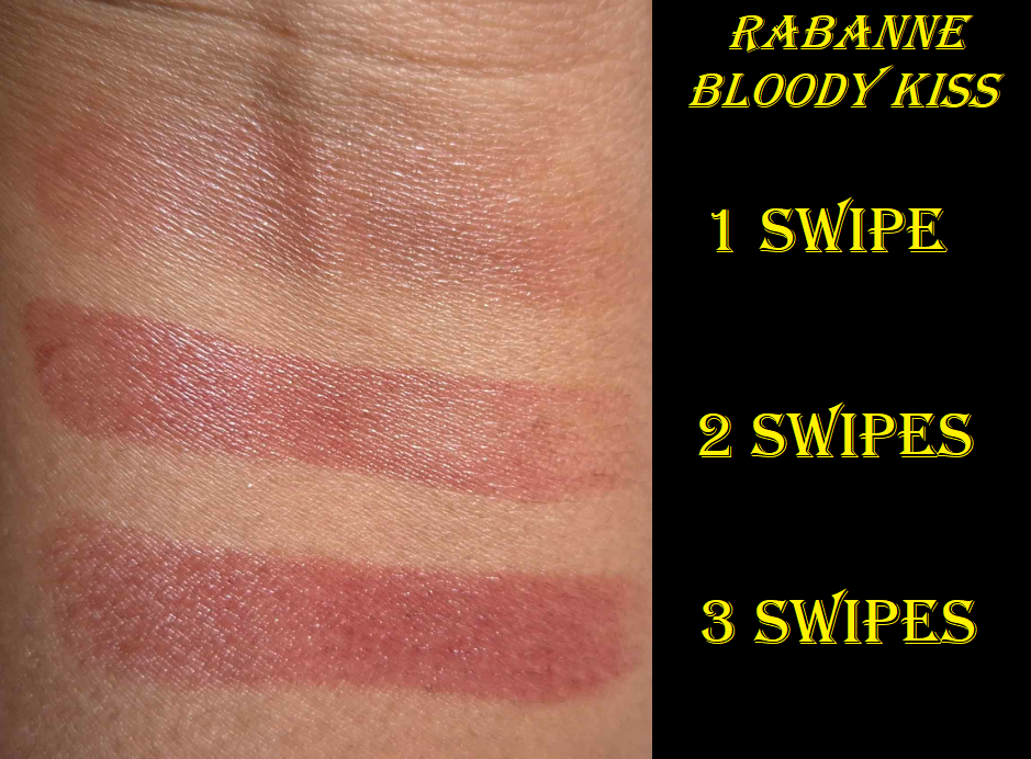
I don’t have any interesting tidbits to open this post with, so I’ll just get right into the review.
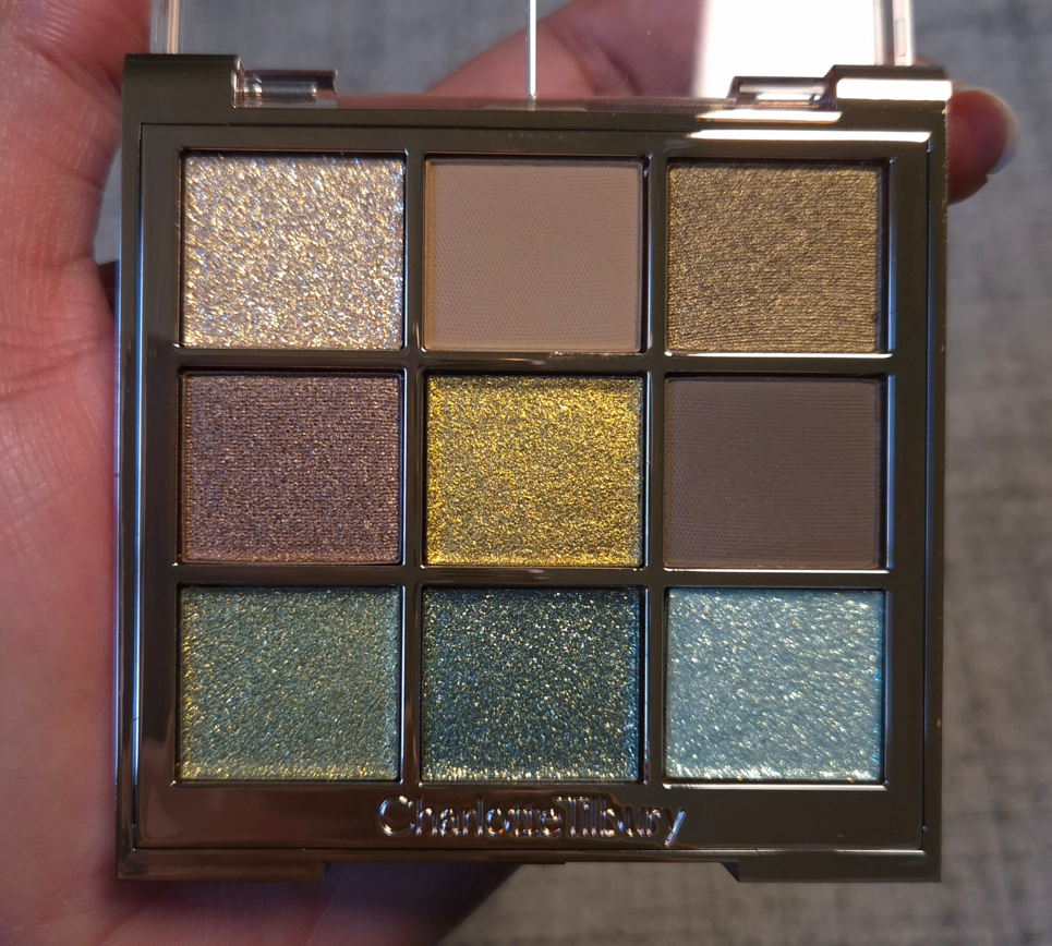
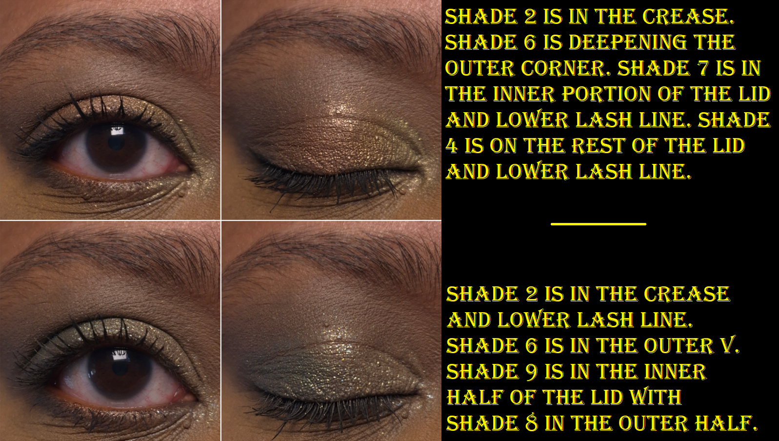
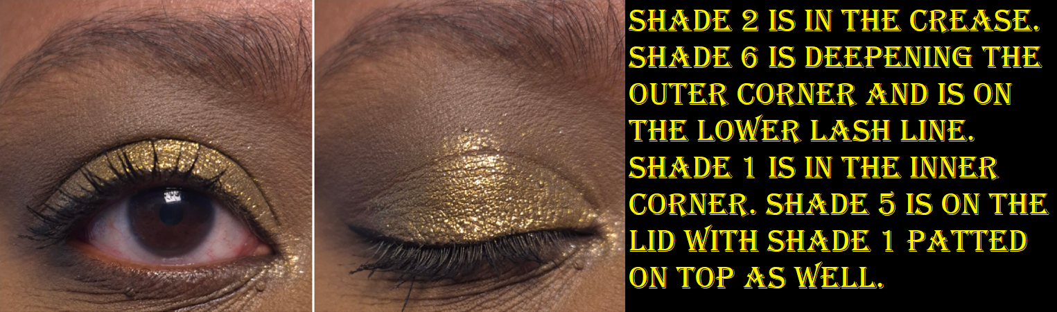
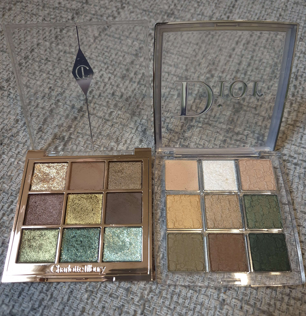
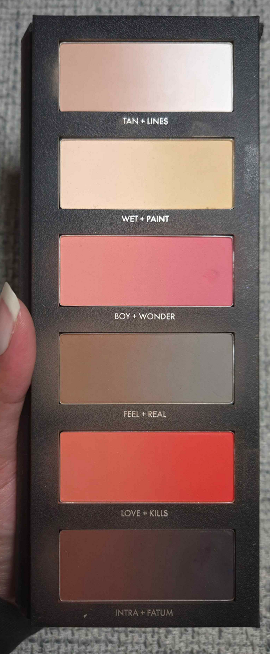
Charlotte’s Palette of Beautifying Eye Trends in Emerald Effect
The first thing I noticed was that the Matte Silk eyeshadows feel like the mattes from Natasha Denona’s midi palettes (within the last couple of years). They are silky feeling rather than creamy. They are pigmented and blendable, but not my absolute favorite. They are great, but not superb. Shade 2 is a light beige brown that doesn’t show up strongly on me, but I can see it in my eye looks. Shade 6 is the depth creating neutral brown shade, which is dark enough to work, but I do wish it was a touch deeper. I used both of these eyeshadows together nearly every time I created a look with this palette, but now that the testing process is over, I’m going to use something else instead of Shade 6.
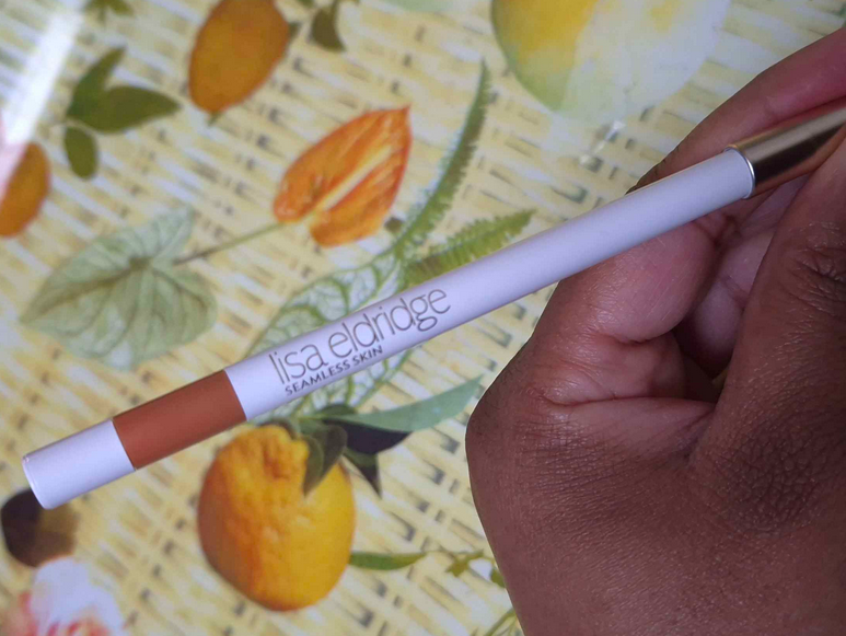
I’ve used these eyeshadows with concealers as bases and it works as long as there’s a thick enough matte powder layer in my crease before adding the shimmer. By “working,” I mean that the migration/creasing in my deepest line is at acceptable levels. However, my KVD Good Apple Concealer doesn’t play well with a lot of products and has more obvious issues with these eyeshadows than when I used the Natasha Denona Hy-Gen concealer as primer. I tend to blend excess concealer into the inner corner of my eyes, so even if I use a regular primer from my lids and upward, I still have to be careful about my concealer placement or else it could interfere with the eyeshadows. In general, I just recommend using a regular eye primer. These worked nicely with MAC Paint Pot and the Lisa Eldridge Silk Canvas as bases.
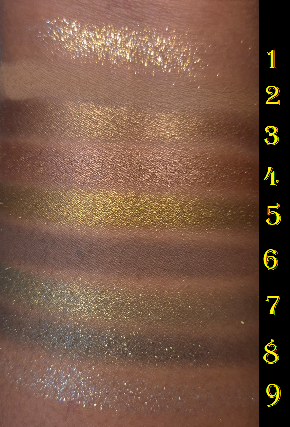
Shade 7 (spring yellow-toned green) and Shade 8 (dark blue-based green) are Crystal Pops. I wondered if they are supposed to be similar to the formula in the brand’s Pop Shot singles, but I don’t have those with me to confirm. Based on what I remember of them though, I think these don’t pop as much on the eye as the Pop Shots.
I had to redo three of these eye looks because the Crystal Pops did not want to show true to color in photos. I think it has to do with the type of shimmer used and how it reflected from my lights, combined with them not being fully opaque.
The Diamond Dimensions are softer pressed, flakier, and are basically sheerer toppers, so I expected to have a hard time seeing the blue tinge from Shade 9. Shade 1 looks white in the pan, but it has a gold reflect.
I can get stronger color payoff from the Crystal Pops and Diamond Dimensions if I apply them with a dampened brush, but I don’t do it to intensify the appearance of the sparkles. I am satisfied with the shimmery effect of all of them in their dry state. Also, the Diamond Dimension shadows remind me of the topper shade from Guerlain (#2 from Royal Jungle) because of the flaky glittery high shine nature to them, but Guerlain had it in a baked formula, which solidified it in a way that made it harder to pick up. I’d rather not have topper eyeshadows in palettes, but I at least prefer the way Charlotte Tilbury made these.
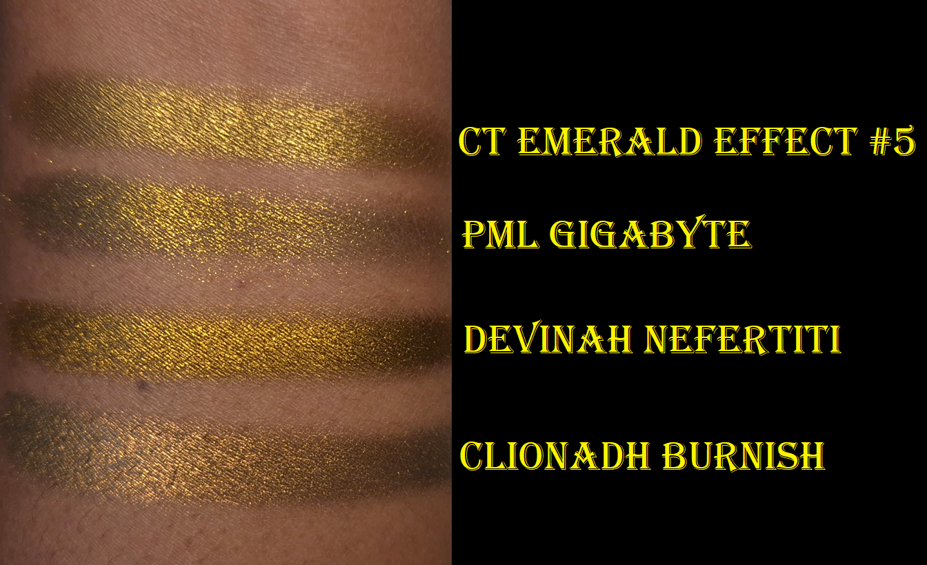
Shade 5 (antique gold/borderline chartreuse) is the Crystal Chrome which seems like a more opaque, smoother, wetter version of the Crystal Pop. Both eyeshadow types stand out on the eyes, but the Crystal Chrome achieves that effect without the large shimmer/glitter particles. This is the standout eyeshadow in the palette and it made me think of other shades similar to this that I have in my collection (photo below).
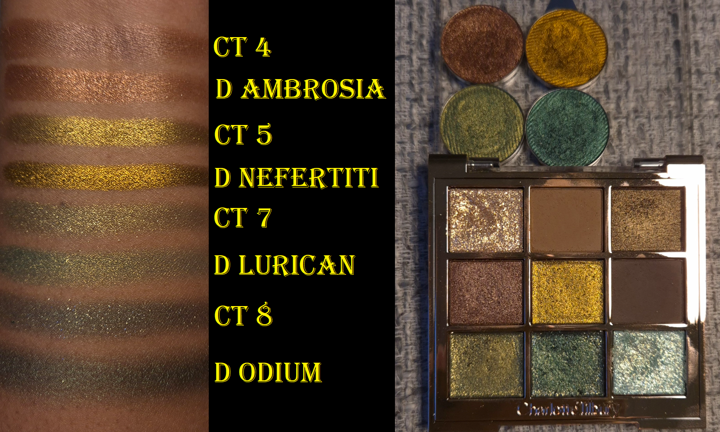
The light golden brown color called Shade 3 and chocolate brown Shade 4 are called Molten Satin. They feel like the Crystal Chrome, but with slightly less slip to them. From name alone, the Crystal Chrome is clearly intended to be more impactful as a shiny metallic. Although I usually prefer the wow factor of a great shimmer on my lids, if I’m in the mood for wearing brown, it’s usually because I’m going for a low-key look. Shade 3 is something I’d use in my inner corners or under the brow arch, and I prefer for shades used there to be smooth. So, I’m pleased with these being in the palette.
The most similar feel and finish of an eyeshadow to the Crystal Chrome comes from Devinah Cosmetics. Devinah’s is insanely smooth, but I believe it has a little bit of a darkened base to help it look more intense, plus it’s just overall more pigmented. That swatch went on so far for such little product. Nefertiti leans more golden-orange than Shade 5’s kind of antique gold. Pat Mcgrath’s Gigabyte is one of the baked special shades, so it is drier and flakier, so it looks less opaque unless applied damp or on a glitter primer. Clionadh’s Burnish is one of the Stained Glass Multichromes, so it has a dark base, is smooth, but has a slightly more shimmery finish. The fact that this shadow can even compete with indie ones proves to me that some of the high price tag went to the formula. I don’t think Charlotte Tilbury cheapened out on the formula, even if the brand reduced costs with the packaging.
I love greens, but I realized this palette has some similarities to some of the Devinah shadows I keep in one of my custom travel palettes. This is probably why I couldn’t let my desire for getting the Charlotte Tilbury palette go despite owning similar things. These are some of my favorite types of colors!
When I compare the swatches, I honestly do prefer Devinah’s over these. Shade 4 is the most different. Lurican is more pigmented and less sparkly. Odium is also far less shimmery, but since I would typically use this on the outer portion of the lid, I’d prefer for it to be this way. Devinah has discontinued some of their older shades (like Odium and Nefertiti), so I guess it’s a moot point. I just figured it would be interesting to compare because it’s not everyday when high end or luxury shimmers are even worthy of comparing their eyeshadows to ones from non-mainstream brands.
What is shown above is ultimately why I ended up buying this palette despite my best efforts to tell myself I didn’t need it. I already had the Dior Backstage 008 Khaki Neutrals palette that I hardly used after the review. There are way more interesting green palettes in my collection. The color variety still interested me, but these satins and “glitter” eyeshadows were just too subdued for me. I wanted so much more shine and impact. In trying to use the palette again, I realized Charlotte’s might be the version I wished for. The perfect combination for me in Emerald Effect would have been if the brand replaced the light green or the flaky pale blue with a light green matte shade like Shade 6 from Dior. Or, since the dark green shimmer from CT isn’t fully opaque, I’d have liked a dark green matte as well. Perhaps since I have both palettes with no intention of getting rid of either, I could just use them both together.
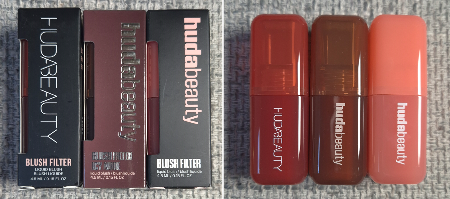
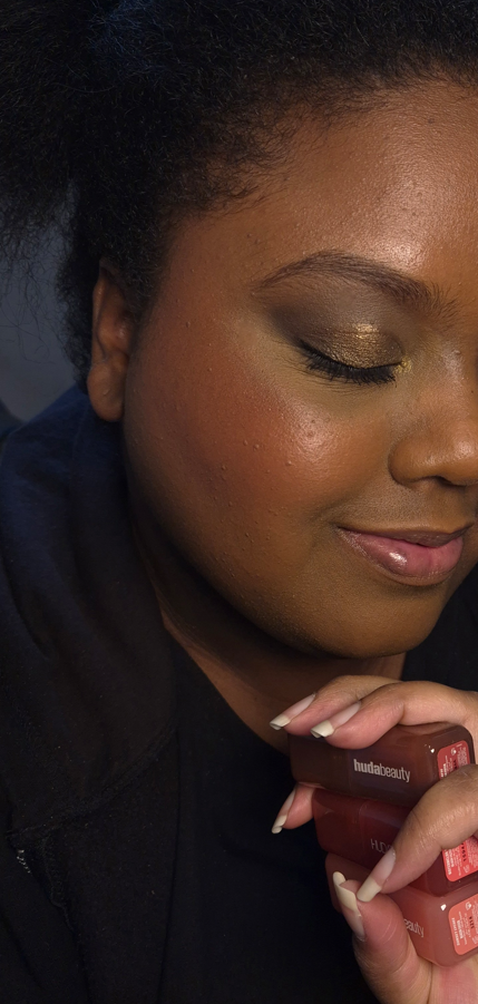
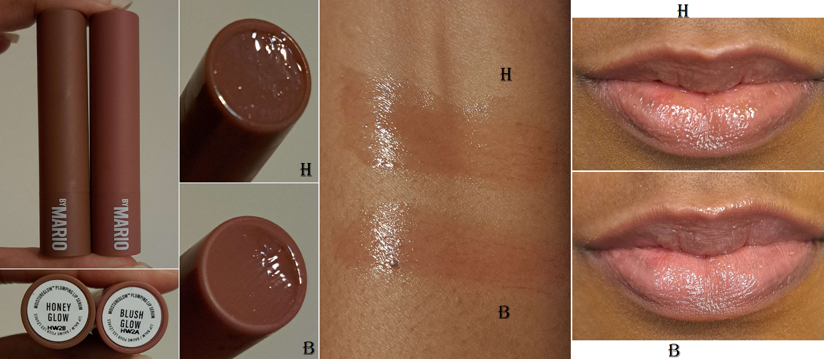
I have been on a no-buy for liquid and cream blushes since August 2023. The immense hype surrounding these Blush Filters had been steadily chipping away at my resolve. After eight months of resisting, I finally caved.
It’s convenient that the three shades I was most interested in buying were from the original launch, the Icy Nude Collection launch, and the newest “Blush Crush” or “Vibrant” Collection. I was able to see the changes that coincided with the brand revamping their logo and packaging. I was also curious if the formulas would be different between them, but they’re all the same from what I can tell.
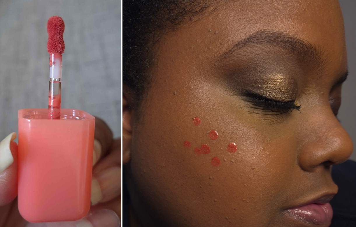
The first thing I noticed was the fruity candy smell. It smells delicious, but it is a bit strong in the initial few minutes that I have the container open, and as the blush dries on my cheeks. A thin controllable amount comes out of the stopper and with the small applicator.
The Blush Filters are less pigmented than the liquid blushes from Rare Beauty and Juvia’s Place, but still a lot more pigmented than Glossier’s Cloud Paints. With the amount shown in the photo above, I get about 80% opacity, but these can be built up.
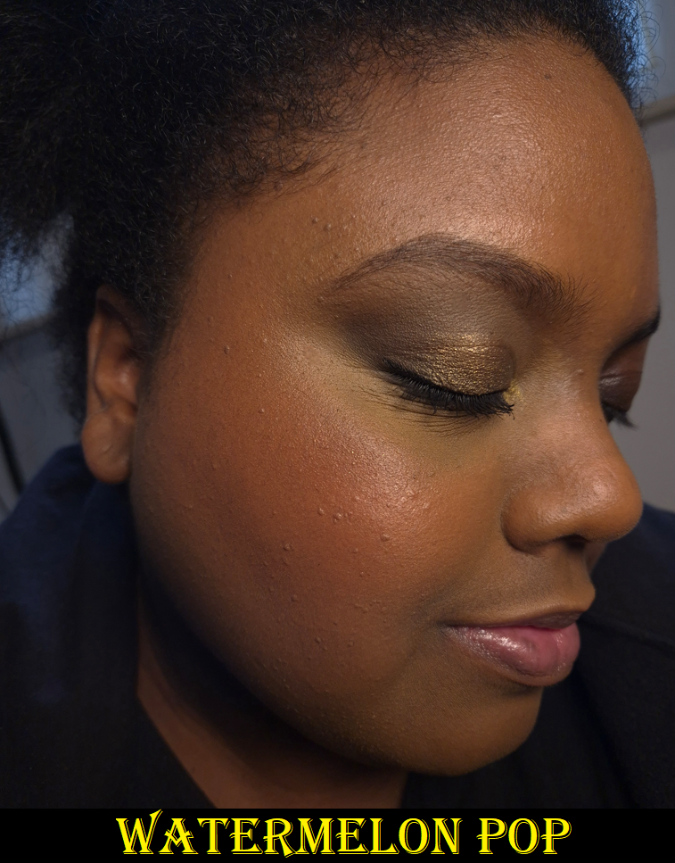
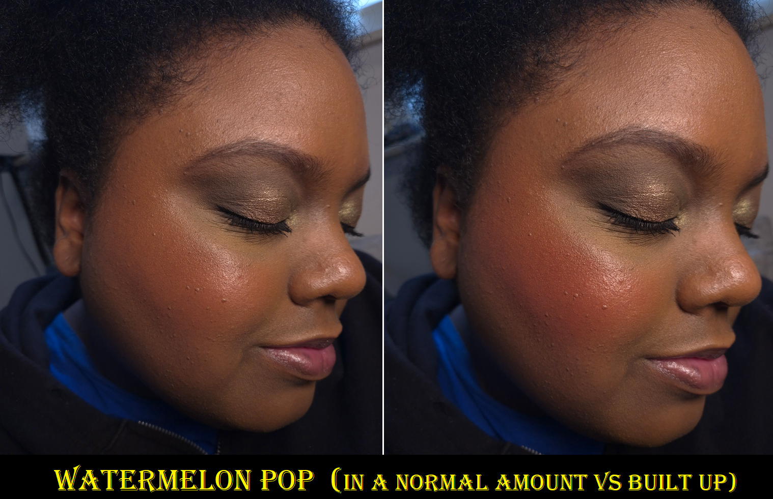
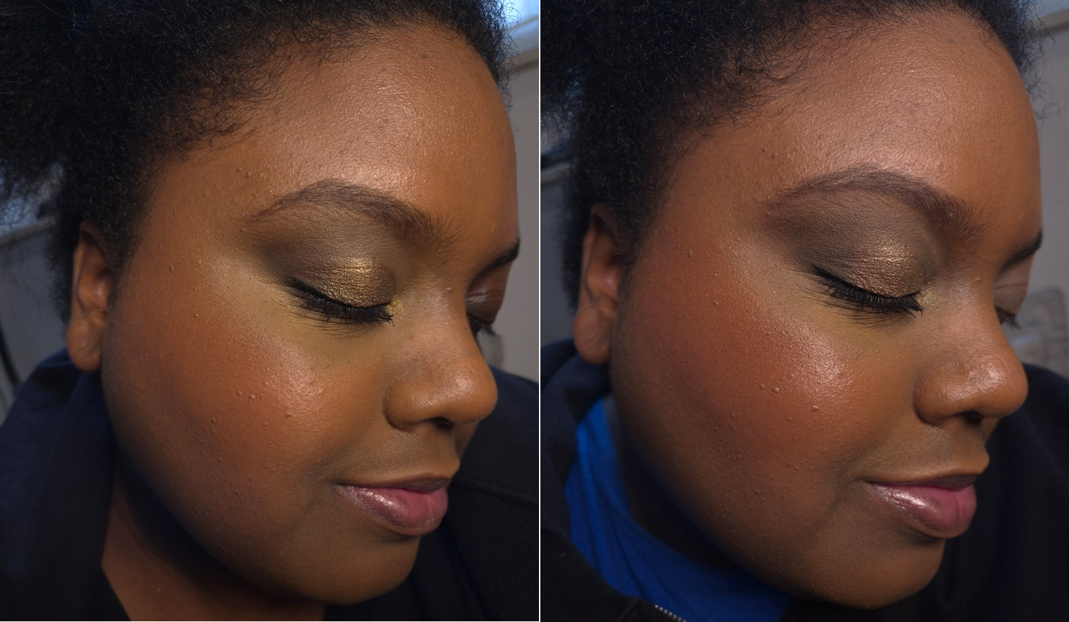
The blush doesn’t immediately set on the skin, but I still work on one cheek at a time because it doesn’t have an emollient consistency (nor gel-like or watery), so they don’t look like they’re spreading enough at first, but I just trust the process and keep moving my brush around and the blush does fully blend out and is streak-free. It doesn’t disturb makeup underneath either. Once it dries down, it’s fairly budge-proof and there’s no fading by the end of the day. I’ve been impressed by its hydrated look, even though it’s completely dry to the touch, but I think that can be attributed to the “micro pearls” in this product. When I first tried it, I thought my glowy toner combined with a hydrating skin tint was the reason it looked luminous, but when I looked very closely at the swatches, I could see a faint gold sheen in Watermelon Pop. It’s too difficult to see the individual particles within the other shades, and it’s something I can just barely see when light hits it. The radiance is subtle, but enough to keep my cheeks from looking matte and flat. It looks great on minimal makeup days, but even better when it blends into my foundation to melt into the skin, turning even the more vibrant colors into wearable shades.
The glow combined with my lights actually made them look subtler in pictures than in person, so I built them up much heavier when I did a second round of photos. I don’t think my attempts made much of a difference, except with Watermelon Pop.
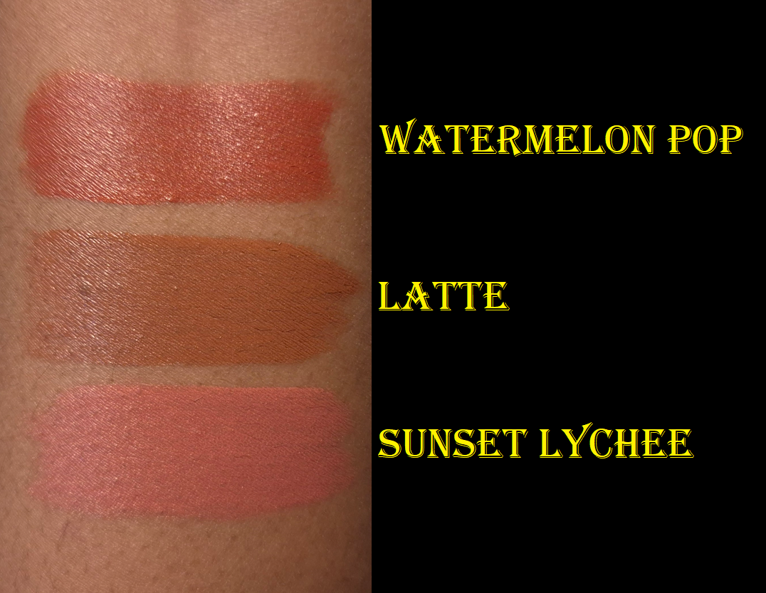
Watermelon Pop is a warm red that made me instantly think of the shade Love from Rare Beauty and Lily Love from Juvia’s Place. This isn’t a very unique color, but the warm golden micro shimmer makes me like this even more!
Latte is a medium reddish brown that looks redder on my cheeks than I expected, but it’s pretty and the kind of blush that’s right up my alley.
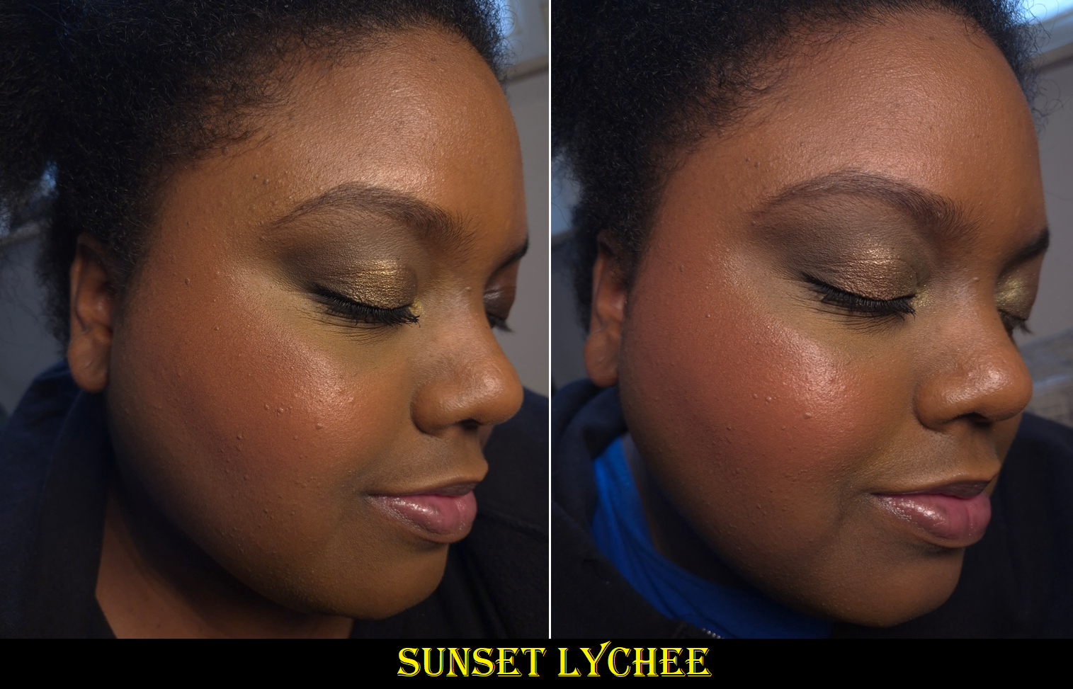
Sunset Lychee is described as a “Rosy Orange” and I’ve seen it look closer to orange on some people, but it is very much pink on me. It reminded me a bit of Rare Beauty’s Joy, but this one has more pink and less apricot.
These shades work out for me on their own, but they also layer well together.
I think this is a great product. Great products deserve to be raved about, but because there are plenty of fantastic liquid blushes out there that are blendable, set down, and are available in gorgeous colors, the Blush Filter’s level of hype seems to have been cultivated in part by very smart marketing.
I’ve always liked nice packaging, but now I’m even more aware of how non-luxury goods can still be very pleasing to look at and interact with. The Blush Filters’ rounded square shapes with their vibrant and semi-transparent packaging combined with the fruity-candy scent remind me of popsicles. There is also the collectable factor since each blush packaging matches the color on the inside. This makes the Blush Filter even more memorable and desirable. When there exist similarly performing blushes, packaging can make all the difference in choosing one brand over another. I have no regrets ordering these, even though I have reinstated my liquid and cream blush no-buy. The fact remains that I still don’t use them as much as powder blush no matter how amazing they are.
It’s a nice bonus that I got 30 Euros knocked off the price because of the reward points I accrued on my Huda Beauty website purchases over the past year. In that same order, I got samples of the #Fauxfilter Color Corrector, so I thought I would include swatches of those as well. My review of the full-size product can be found HERE.
The shade I own is Mango, which I like a lot. I have always gotten shades like Papaya in the past, and it works, but never 100% perfectly. Mango is essentially a pink-orange, which apparently suits me very well, but is a hair on the light side for me. At least, that’s what I thought until I had the idea to mix Mango and Papaya together, which I think looks the best out of all the options!
I still think it’s fantastic that Huda Beauty offers more nuanced shades of color correctors than I’ve seen from other brands. For instance, I don’t know anyone else who makes as dark of a pink as Lychee! Because of the effectiveness of Mango on me, I wondered if perhaps pink was a better corrector color shade and that brands just didn’t make any dark enough. It’s nice to confirm that Lychee doesn’t suit me. My correct corrector should be a fine line between pink and orange.
I should also point out that the demonstration photo of Cherry Blossom looks better than it actually should be. That was my mistake not cleaning my concealer brush well enough and the two colors mixed, so it doesn’t look as stark white as it should be (which is to say even paler on me than Pink Pomello). I couldn’t redo the photo because I didn’t have enough product left from the sample card.
This is technically a review of some of the Yummy Skin line.
I admire Danessa Myricks’ artistry and her dedication to her brand. Even when she comes out with a product that isn’t necessarily new to the market, there’s always an innovative twist to it. For this reason, her products have always either worked exceptionally for me or really didn’t suit my needs. This is why I’ll never be the first to review something by the brand and why I don’t have as many things to post about despite how closely I pay attention to their releases.
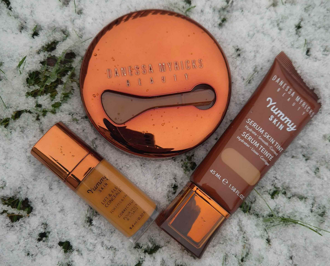
I’m sharing my thoughts about these products now, but the timeline of my purchases are as follows: Yummy Skin Microfiber Velvet Sponge – June 18, 2023 Yummy Skin Moisture Repair Balm Serum – July 5, 2024 Infinite Chrome Pencil – July 5, 2024 Yummy Skin Lift & Flex Hydrating Concealer – July 10, 2024 Yummy Skin Serum Tint – November 8, 2024
Some of these items I’m still using today. Some of them, I had to redo the testing process because I forgot how they performed! Anyway, onto the reviews!
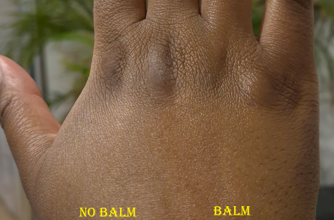
Yummy Skin Moisture Repair Balm Serum
The texture of this balm is like a firmer version of Vaseline. I despise having products that don’t set down to a dry touch on my face, but I was so desperate back then to find a product that would lock in moisture on my skin that I was willing to take the risk, at least when a sale rolled around.
Excluding the hottest days of summer last year, natural finish foundations looked matte on me and dewy ones looked satin due to my skin being drier than usual in a new climate. Using the tiniest amount of this balm, where barely any residue is left on the skin, results in foundations looking the proper finish they’re supposed to have. With my small amount, any foundation that sets without needing powder will still do that.
I saw the amount that Danessa Myricks uses, thanks to Instagram, and it’s way more than I use. When I try to use closer to the recommended amount of balm, my skin feels heavy at first, but I eventually get used to it. After adding foundation on top, my face looks like it has more than a natural finish, but it doesn’t get to dewy levels until somewhere between 3-5 hours of wear depending on the weather and how much sweating I’m doing. Once it gets to that dewy point, it makes my foundation much easier to transfer. It also won’t set to a fully dry finish on me, even in the beginning and even with powder on top.
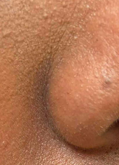
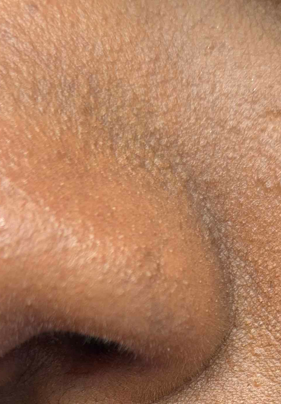
I also continually have problems with my nose area and it making my foundation there look patchy or broken down. So, even on my driest skin days, I avoid applying it to this area.
If I apply more than a tiny amount, my foundation will eventually get oily looking and become easier to transfer. My makeup everywhere starts to break down around the six or seven hour mark.
The photo above is the only example I have of this. I’m sorry that it’s a washed out photo and that I didn’t want to take additional pictures. I did not want to deal with the transfer issue and heavy feeling again.
So, essentially, I like this product if I use it super sparingly in the high points of my face where I don’t mind having some glow. Starting to use milky toners again was actually the solution to my dry skin issue, and made it unnecessary for me to apply this all over. Now, I pretty much use this product more on the back of my hands than on my face!
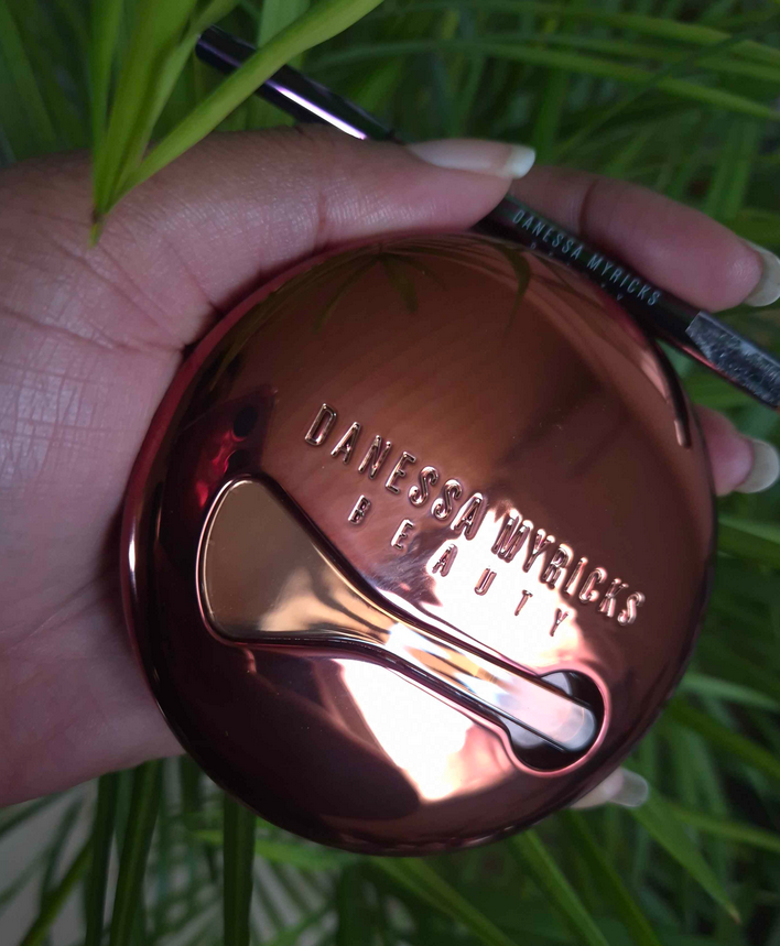
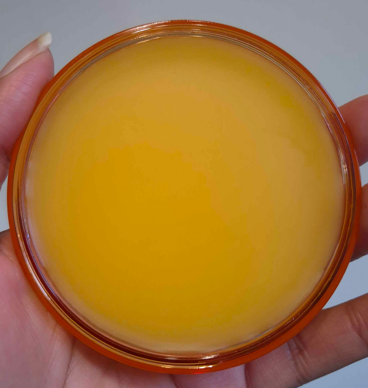
I’d also like to mention that I find the packaging of this product very satisfying to interact with. I like the addition of the spatula at the top, the beautiful bronze lid with a semi transparent jar, and the balm color that reminds me of orange juice despite actually being colorless on the skin. It’s fragrance-free and smells like a mix of wax, oil, and petroleum. I normally don’t advocate for scents in my products, but I could have made an exception for this one considering how it smells.
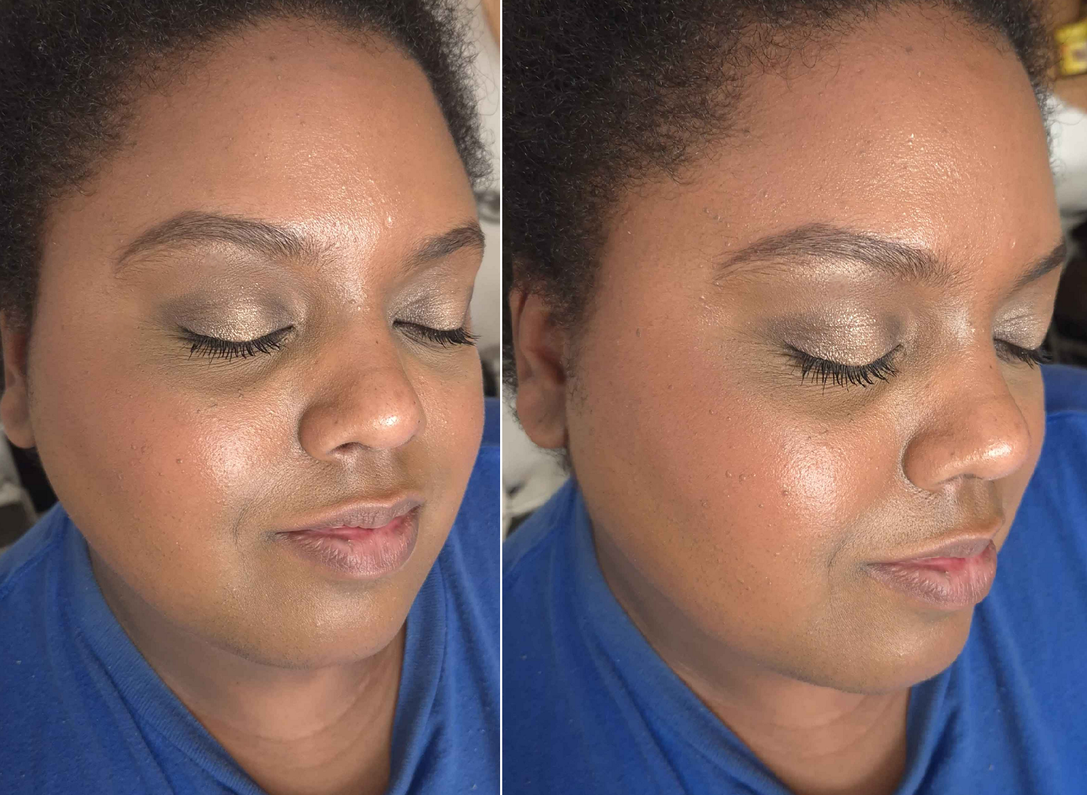
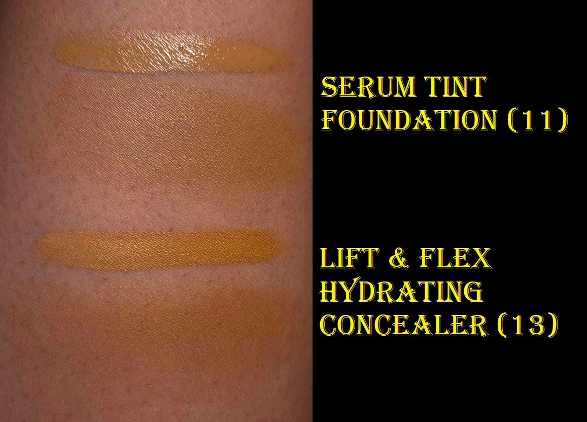
Yummy Skin Serum Skin Tint in Shade 11 and Yummy Skin Lift & Flex Hydrating Concealer in Shade 13
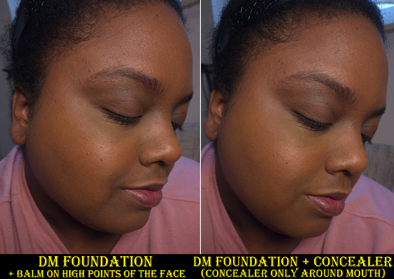
As seen on the timeline, I purchased the concealer first. I chose number 13 because the model showcasing it looked closest to my skin tone. As it turns out, the depth is about right, but it’s quite orange. So, it doubles as a corrector and concealer for me. If this product worked as well as my other concealers under my eyes, I would have considered buying number 12. Unfortunately, it creases too much (moving out of my under eye lines) and disappears too quickly. My under eye area produces oil between some of the wrinkles, but is dry elsewhere. So, it’s a tough spot for a lot of concealers to handle. However, this product works perfectly fine on the rest of my face that’s smoother. So, I use it mostly around my mouth area and spots with darker discoloration. It’s nice that it has high coverage and that I’m still able to make use of it. A concealer that doesn’t work under my eyes doesn’t have much chance of being considered part of my favorites though by default.
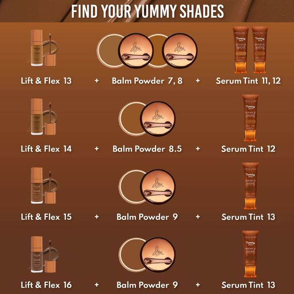
Purish had a fantastic sale on Danessa Myricks products, so that’s why I finally gave the Serum Tint a try and chose my color based on the concealer match recommended by the brand. I’m very happy with Shade 11 and think it’s the best match. I consider it a golden color because it’s a good balance between yellow and orange. Even though I’m still a bit darker than usual, the coverage being light (or on the lighter side of medium if applied with a brush) allows for wiggle room. It’s called a Serum Tint, but it gives me similar coverage as Fenty’s Liquid Eaze Drops and almost as much as Nars Sheer Glow. I like the nozzle because it makes it so easy to control how much or little I want to squeeze out. And even though the product is thick enough that when I draw lines across my face it doesn’t drip or move in the slightest, it’s not so thick as to feel heavy. The consistency feels like applying a skincare moisturizer.
I would call this a satin finish foundation on me as it’s not as glowy as I expected. It does look even better when I use a sparing amount of the Yummy Skin Balm with it, and it feels more hydrating than it looks outwardly. If I want my skin to look truly luminous, I just need to apply a very generous amount of my glowiest milky toners as part of my skin prep.
Overall, my skin looks smoother with the tint on. I like that it fully sets down without needing to be powdered and it doesn’t transfer much. The thickness of the tint can basically withstand the consistency of the balm. This lasts all day and I think it’s very skin-like.
I don’t know how effective the infused skincare ingredients are in the long-term, but I can agree with the hydration and moisturizing claims. This doesn’t have any fragrance and I like this packaging as much as the packaging of the Yummy Skin Balm. Besides the convenience of the squeeze tube and nozzle, the cap’s color and shape is aesthetically pleasing.
I’m very happy that this turned out to be a good purchase. Even though I got it on sale, I think it’s definitely worth buying at full price. It performs and feels like high-end and luxury foundations. I mentioned in my Project Pan post that I may end up adding this to the bunch after reviewing it. Since I kept it in my foundation rotation even after the testing phase, I think it’s safe to include it in there.
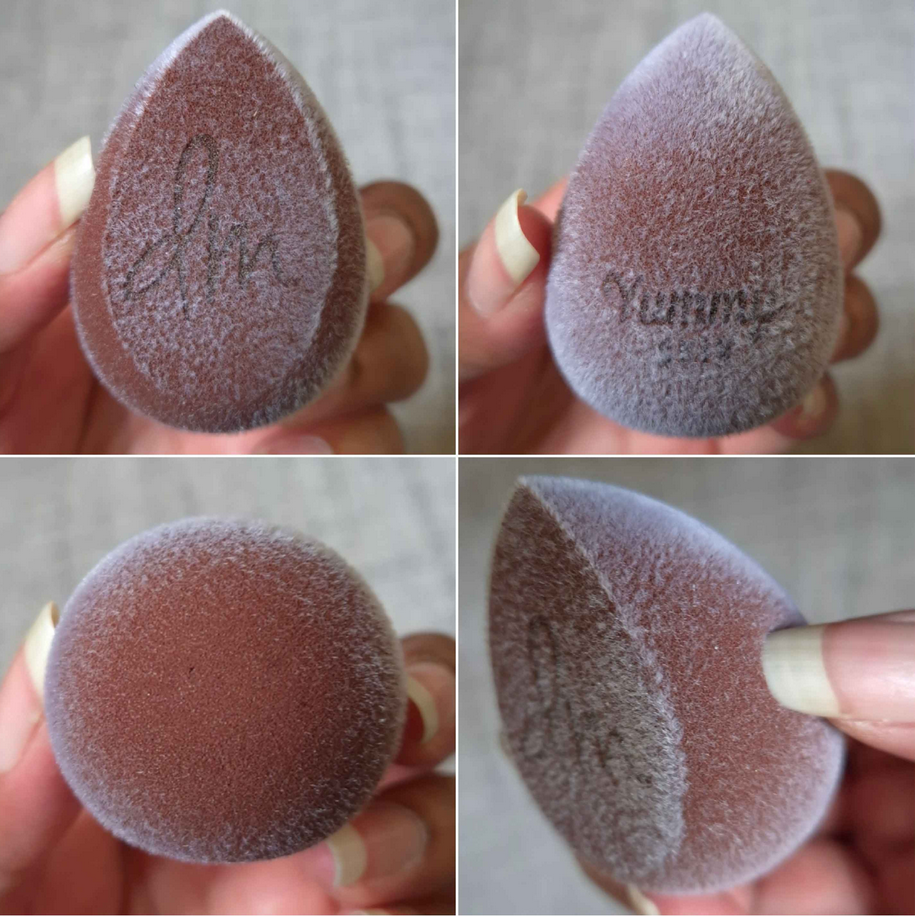
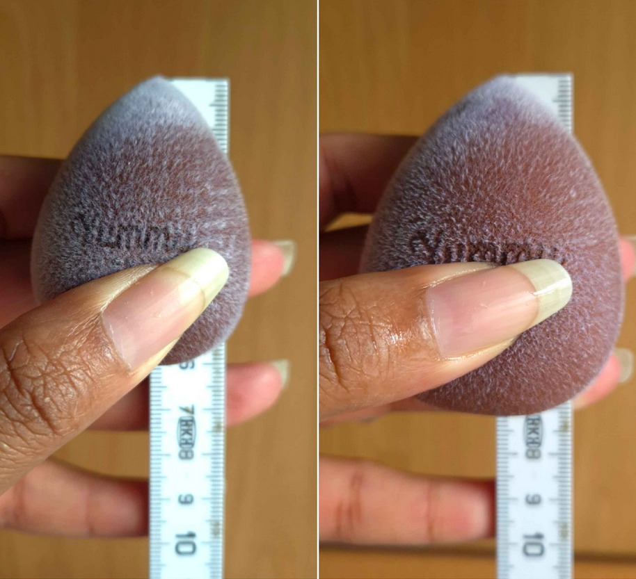
Yummy Skin Microfiber Velvet Sponge Dark Chocolate
I’m fairly certain I used this sponge once or twice when I first bought it, but then did not use it again until February of this year. Since sponges are intended to be thrown out every few months, is this still considered hygienic if I only used it a few times and then kept it in a bag away from dust and other elements for over a year and a half? I don’t know, probably not, but I did this for science (and not wanting to buy another one)!
The sponge in dry form versus damp
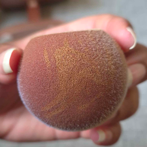
This feels very firm in its dry form. It’s softer after being wet, but is still firmer than other sponges I’ve used. The microfibers make it feel slightly velvety, like applying my makeup with a cloth. However, it’s not the same as when I’ve used my Blendiful in the past. The end result is the same as with other sponges though, only differing in the way that I need to use this. With most sponges, I’m used to pouncing it all over my face and the sponge pushes the product in a wider, diffused, and partly diluted area. This sponge does a bit of diluting and soaking up of product, but if I apply foundation to my face first and tap this over it, it just spreads more dots wherever the sponge touches instead of spreading it out. When I use the Danessa Myricks Serum Tint, I usually draw lines on my face and use a brush to spread it around. As seen in the photo below, there are a bunch of lines on the bottom of the sponge were the lines just stayed on there and didn’t spread out.
So, the technique I have to use with this sponge is to spread foundation across my face with the flat edge and then tap it to blend after. If I still want to use the bottom, I have to do a drag and then bounce motion, not quite the same as a press and roll with other beautyblenders.
When it comes to cleaning this sponge, it takes much longer to dry and I can’t get it spotless, although the color makes that hard to see (which I like about it). I can only really tell that it has a stain when I run it under water. Another benefit is that it’s more tear-resistant.
I go through brief phases trying to use sponges and it’s just not for me. The look and feel of this sponge is different from any other I’ve used, but the end result isn’t any different. So, I don’t feel the need to repurchase something like this. It’s a nice product, but I much prefer more affordable sponges, or the classic original beautyblender.
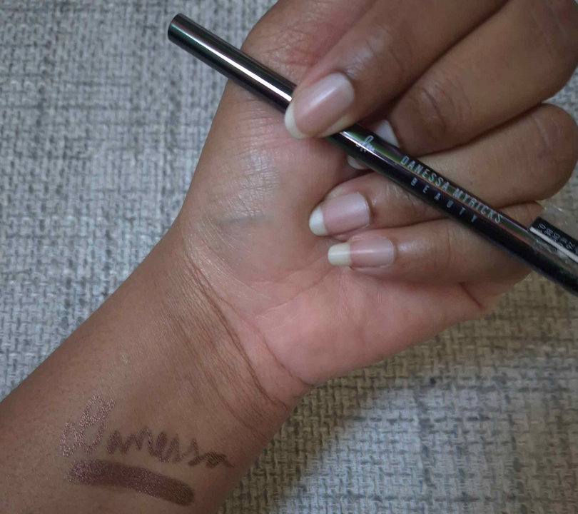
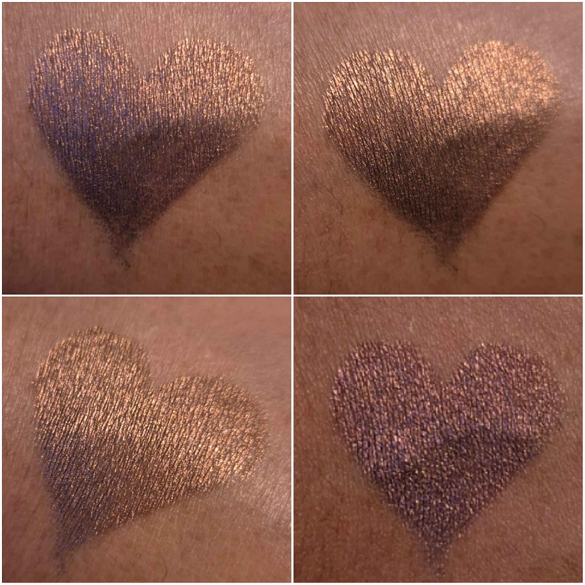
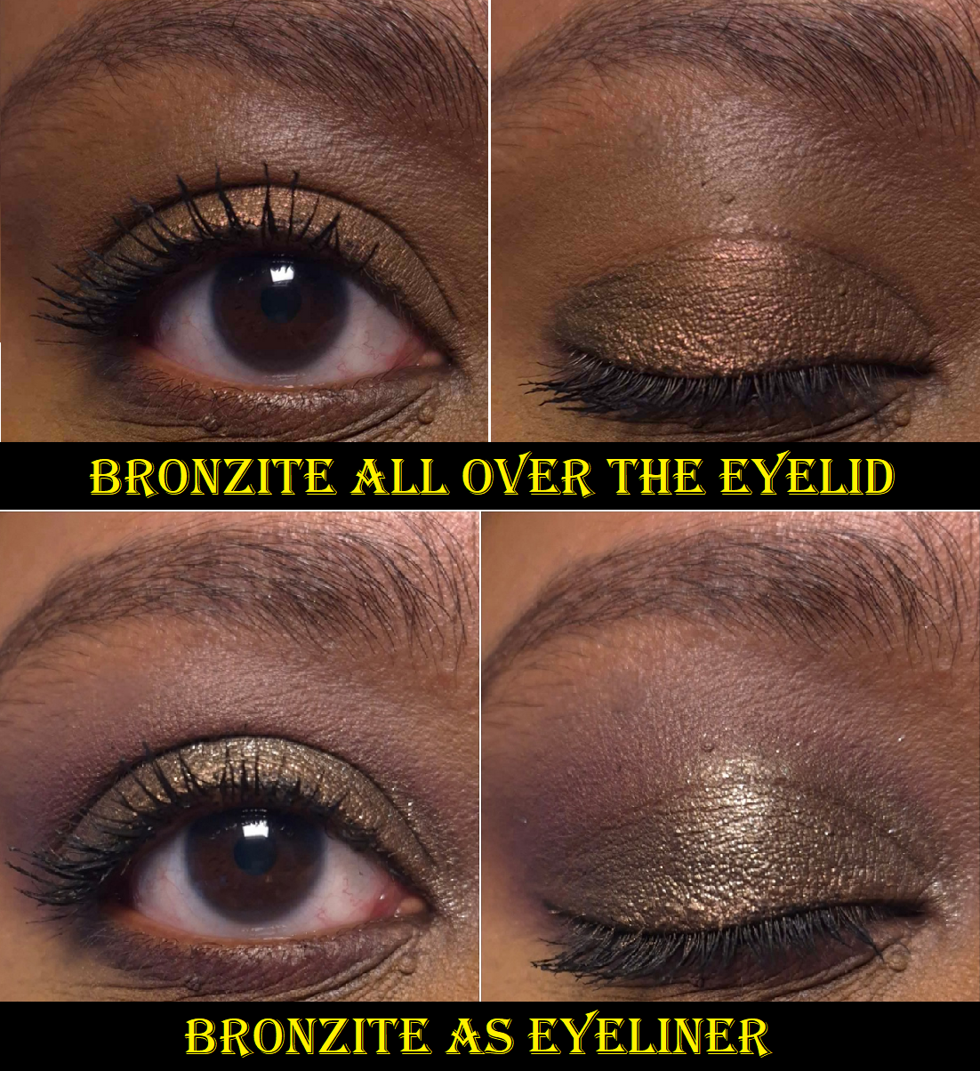
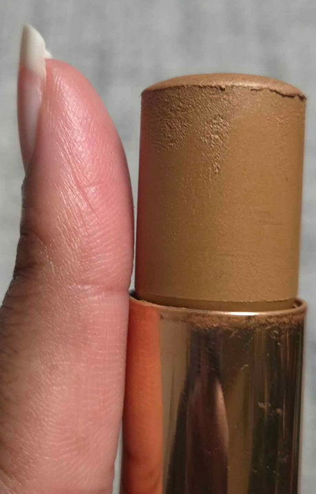
Infinite Chrome Pencil in Bronzite
Heart shaped swatch at different angles.
I have discussed this formula of pencil already, but this is the only additional one I have purchased since then. It’s waterproof, thin enough to be used precisely, and the strength of the shift depends on the shade. Bronzite is probably the hardest to see, as it has only ever looked bronze on my eyes.
This, at least, has more impact than the Golden Brown liner from Oden’s Eye. I also only paid 9 Euros for Bronzite on sale. Black eyeliner is my go-to, so I don’t use this very often, but I don’t mind having it in my collection. It still gets used once every 2-3 months.
Everything I reviewed today are products I will continue to use until they go bad (excluding the sponge I’m tossing for being old). However, the only one I would consider repurchasing is the Yummy Skin Serum Tint. I like that one a lot. The rest are good, but able to be substituted by other makeup I own.
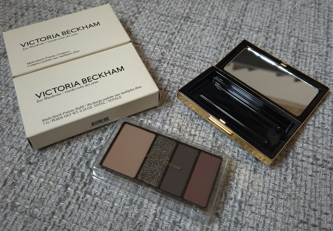
I’m no stranger to luxury eyeshadows, but I usually wait until I can buy them at a discounted price. I don’t know how to explain why I chose to purchase the compact and refill at the upcharged price from Selfridges. Call it temporary insanity I guess.
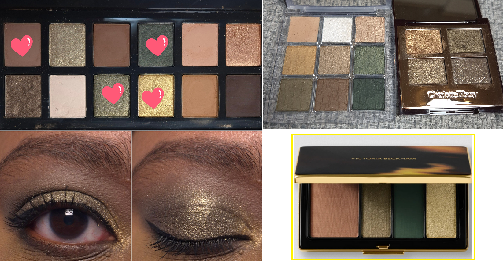
I was very interested in the Victoria color story, which is the only one I purchased, and the palette called Olive. This is finally the year of greens with Charlotte Tilbury releasing the Beautifying Eye Trend in Emerald Effect and Tom Ford launching Olive Smoke at around the same time. I painfully held off on buying them because I already have the Viseart Peridot quad, Dior Backstage Khaki Neutrals, Bobbi Brown Jadestone, Melt Gemini II, Natasha Denona Mini Gold and other of ND’s greens, plus all of Oden’s Eye’s greens, etc. I’m trying my best to use the makeup I already have, but I was super curious to find out whether I would like this brand’s eyeshadows or not. Although I know I could find similar shades to Victoria across all my palettes, I didn’t think I’d have them all in one place and one quad. So, this felt like the best choice for me out of the four available.
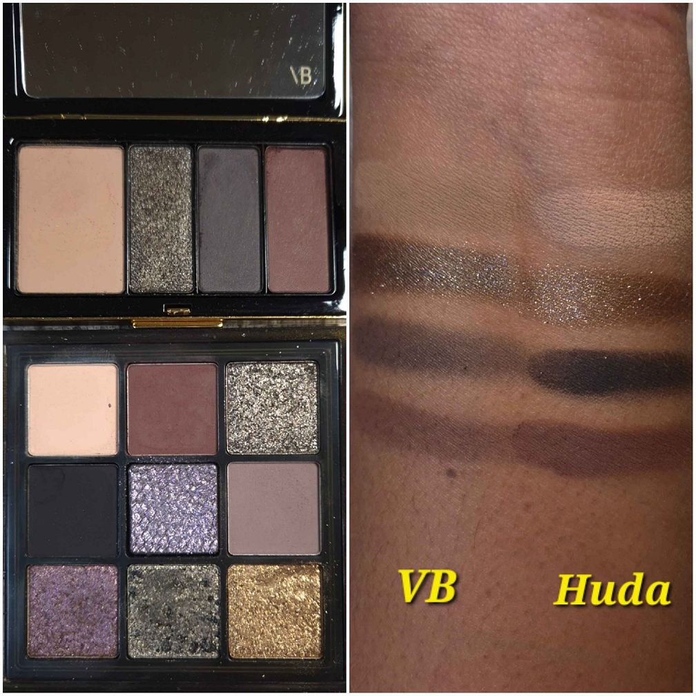
After seeing Victoria in person, I realized that I do have a palette that gives a similar vibe. It’s the Huda Beauty Wild Obsessions Jaguar palette.
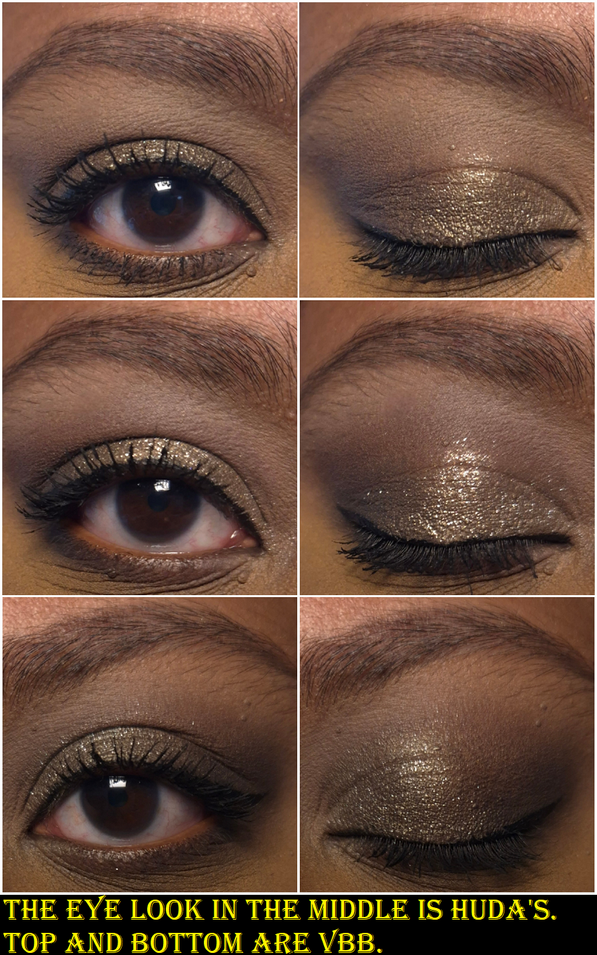
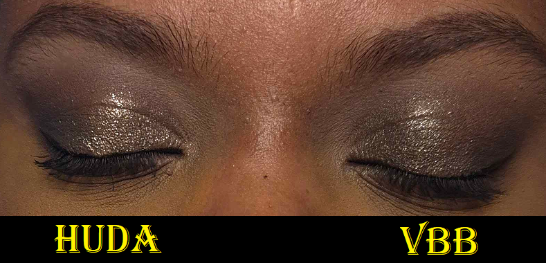
The biggest difference between the two is certainly the quality. With Huda’s palette, it gives off a lot more pigmentation and opacity. It blends well, but noticeably takes longer to complete the look than Victoria’s. In the grouping of three photos below, the eye looks on the top and bottom are with VBB shadows, but the one in the middle is with Huda shadows. Even when I build up Victoria’s shades to be more dramatic, the color values and depths from Huda’s colors are more distinctly different from each other, so they naturally pop and stand out more. Huda’s shimmer particles are also much larger. The finished looks are both beautiful to me and have their place. It’s a matter of whether someone wants more impact or wants more seamlessness.
The Jaguar palette is still available for $35 at full price, versus Victoria for $75 (or $50 for just the refill). In my Huda Beauty Palette Ranking post, Jaguar took and still holds the top spot. So, I just wanted to offer this alternative for anyone who wants similar colors at a more affordable price.
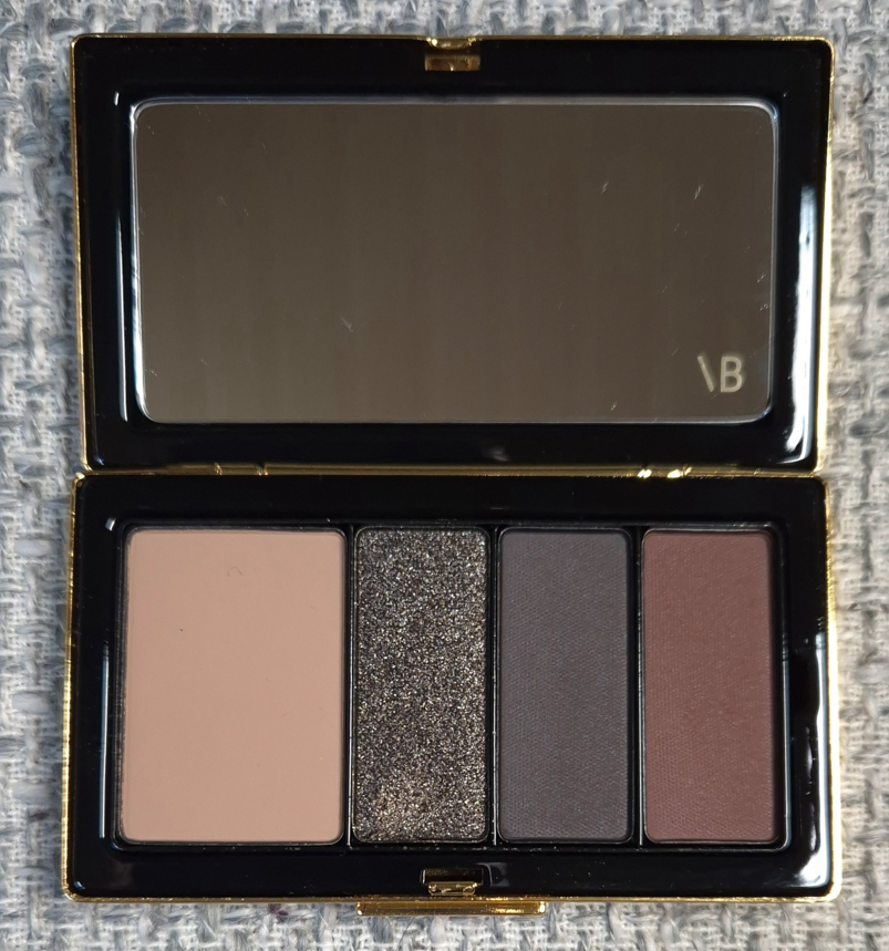
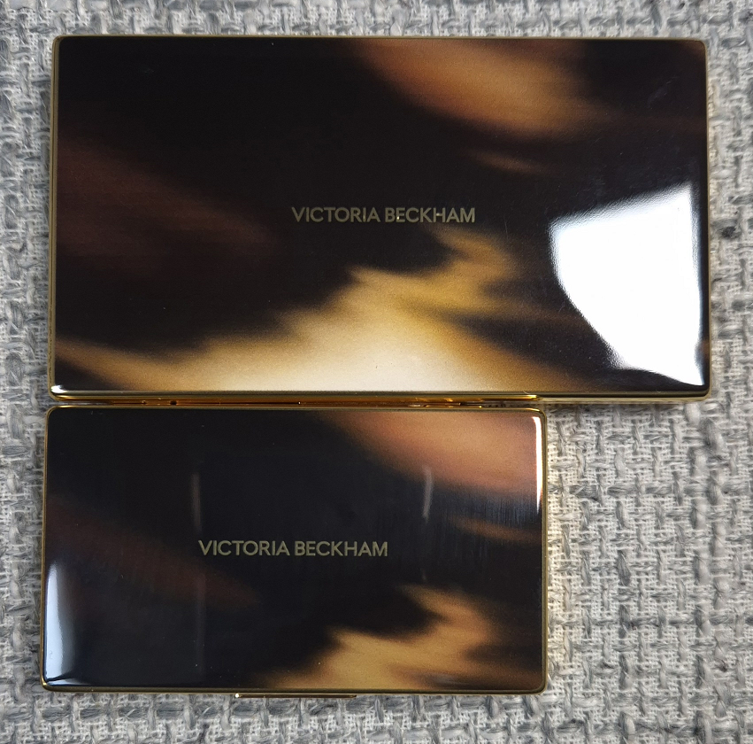
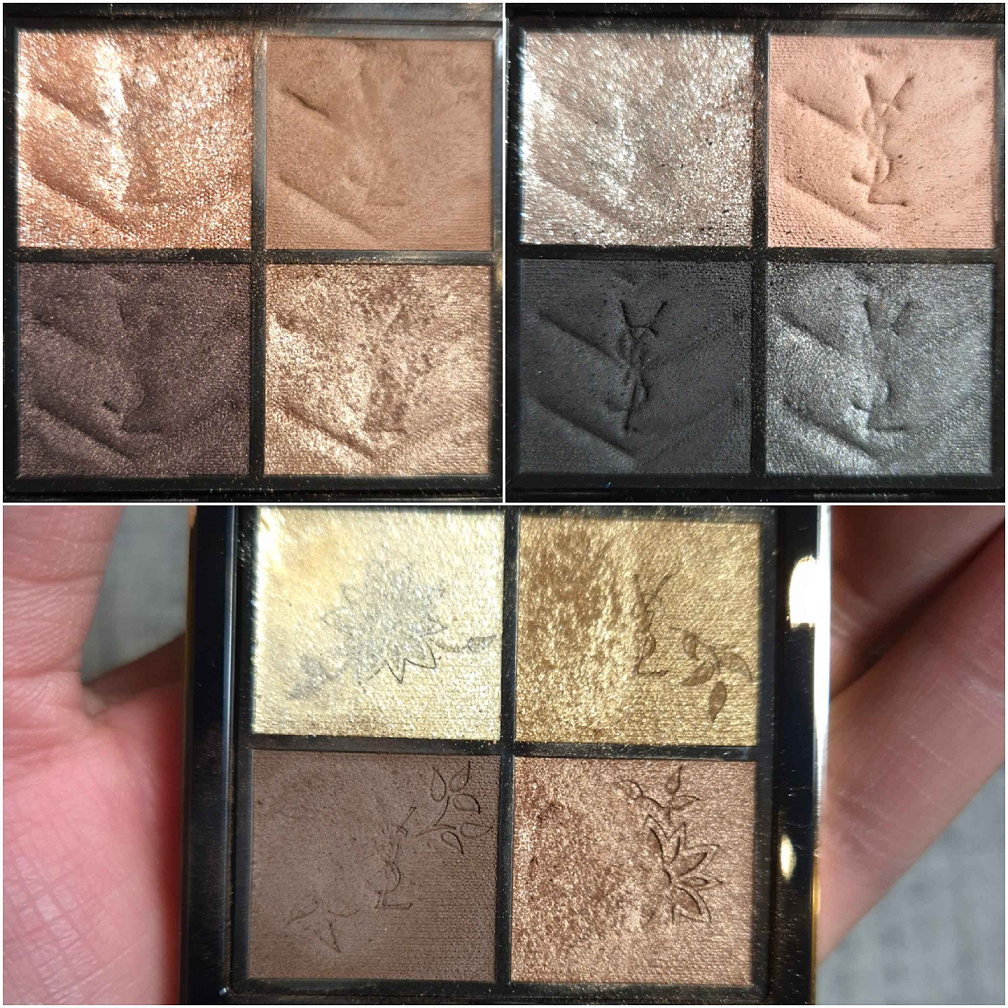
Victoria Beckham Beauty Eye Wardrobe in Victoria
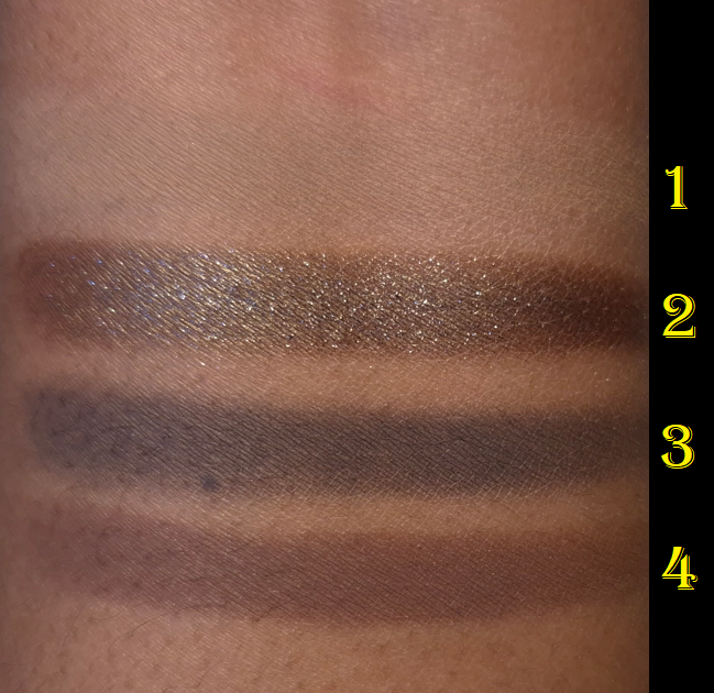
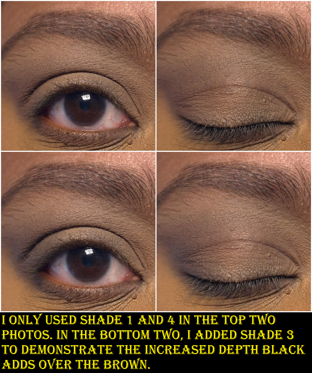
This is described as a neutral palette, but my eyes are picking up a little warmth to the shades. The first one in the biggest pan is what I would consider a beige-taupe. It looks like a pale brown, but it goes the tiniest bit grey on my skin, so I would consider it neutral. The shimmer shadow has a dark brown base with a little red that adds the tiniest of warmth underneath the silver (and maybe even fine gold?) sparkle. The third color and neutral is what I would call a soft black or an incredibly deep purple-tinged brown that is practically black. The last shade is a near-neutral warm-leaning dark brown or mahogany.
These eyeshadows are soft to the touch and create low or medium kickup depending on the brushes used. They’re not quite as buttery as YSL’s eyeshadows, but these are still incredibly good quality! They are pigmented, but so easy to control. They give enough pigment for me (excluding Shade 1 that doesn’t show up as much) right from the start and can be built up a bit. There is just enough difference between the shades to avoid feeling redundant in the palette, but they also blend seamlessly into each other and create a smokey hazy effect without putting much effort. I am so impressed!
I’ve tried this on three different eyeshadow primers/bases and had no issues with longevity. How my eyeshadow looks in the morning is exactly how it will look at night. These don’t fade on me. I don’t get creasing from the shimmer, which surprised me because it feels creamy and that can sometimes lead to migration on my lids from other brands’ eyeshadows. I also get very little fallout from the shimmer. It adheres well to my eyes without needing a glitter primer and I haven’t felt the need to spray my brush with it either. If I do want more impact and for the shadow to look more silver, applying the shadow to my lids with a damp brush turns it creamier, smoother, and opaque. Although I usually prefer a more intense shimmer eyeshadow, it’s nice to have one that is a bit…demure.
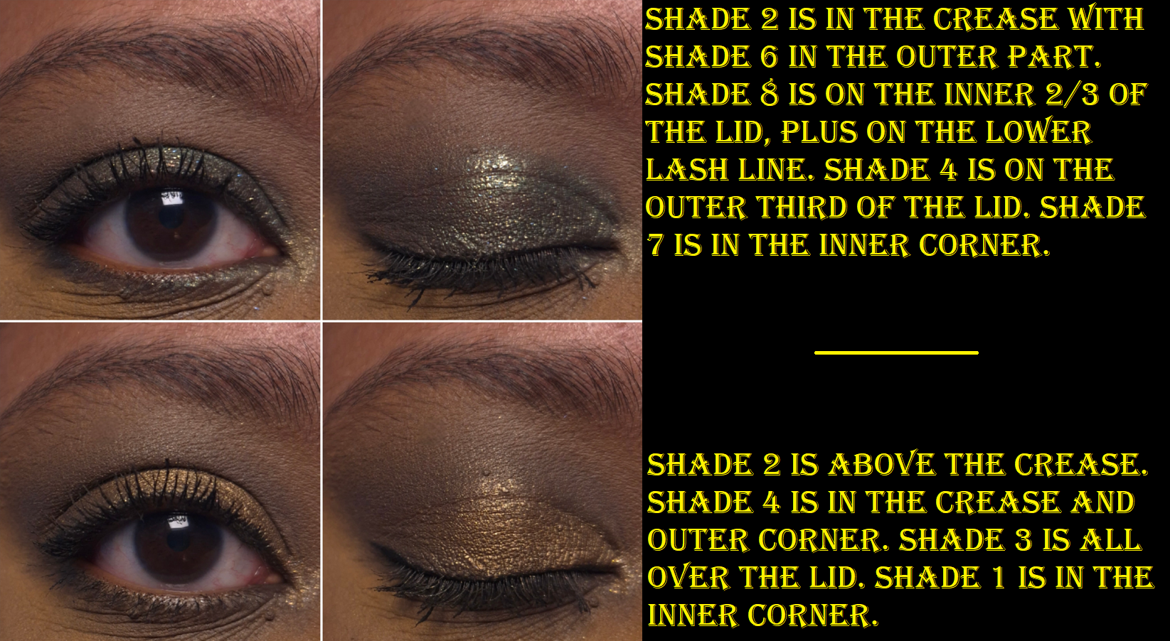
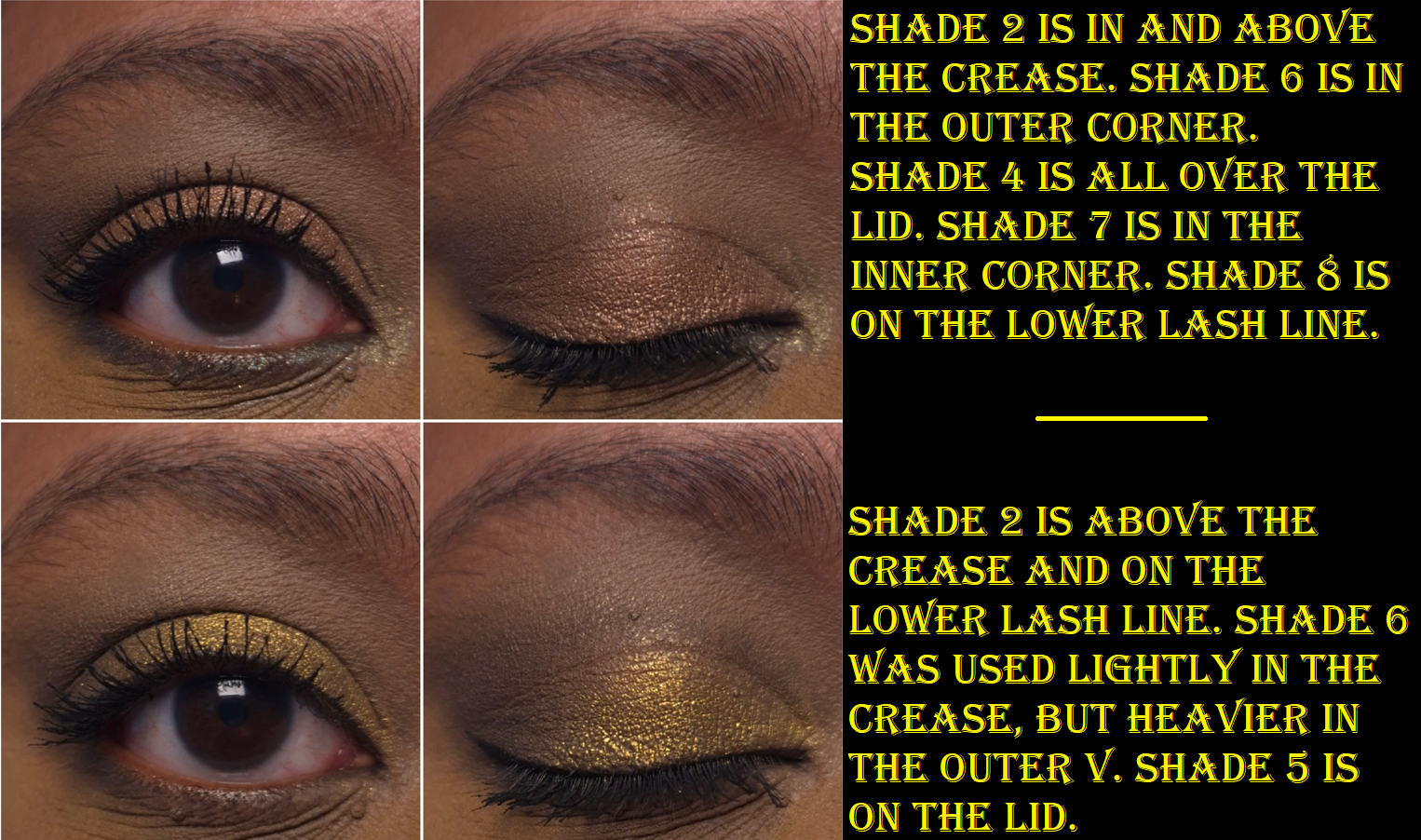
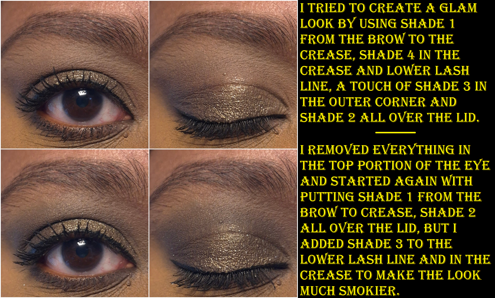
For more impact, one can start with the darkest color first and then work from lightest to darkest again.
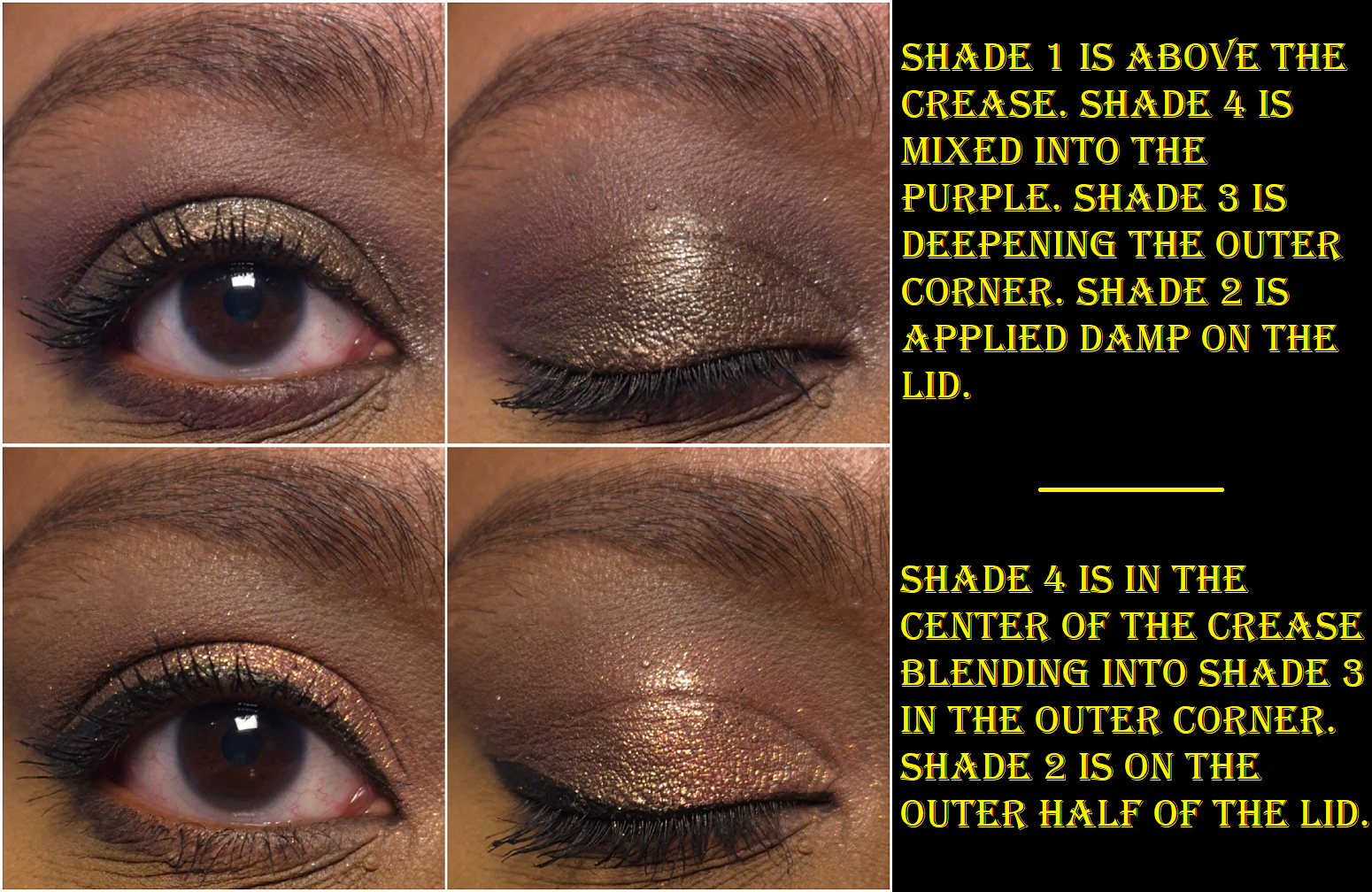
When I did a side by side comparison of Jungle to Victoria, it made me think about how well this palette would look paired with a purple, so I tried that and liked how it turned out. For Valentine’s day, I combined the colors in Victoria with eyeshadows from other brands as well, and can confirm that they all play well together.
I may have similar colors to the Victoria Eye Wardrobe, but the ease of use and control that I have on building up the colors makes this palette much more valuable to me. YSL makes my favorite matte formula, but I can’t build up depth in the same way because the only shade deep enough is the black shadow from Over Noir and that is much more intense than Shade 3 in this one. My best palette for that task was previously the Hindash Beautopsy palette, but this one has an even easier formula to work with. Victoria, for my skintone, is still best for building subtle depth and not for intense drama. There will be times when I want more out of my black eye shadows.
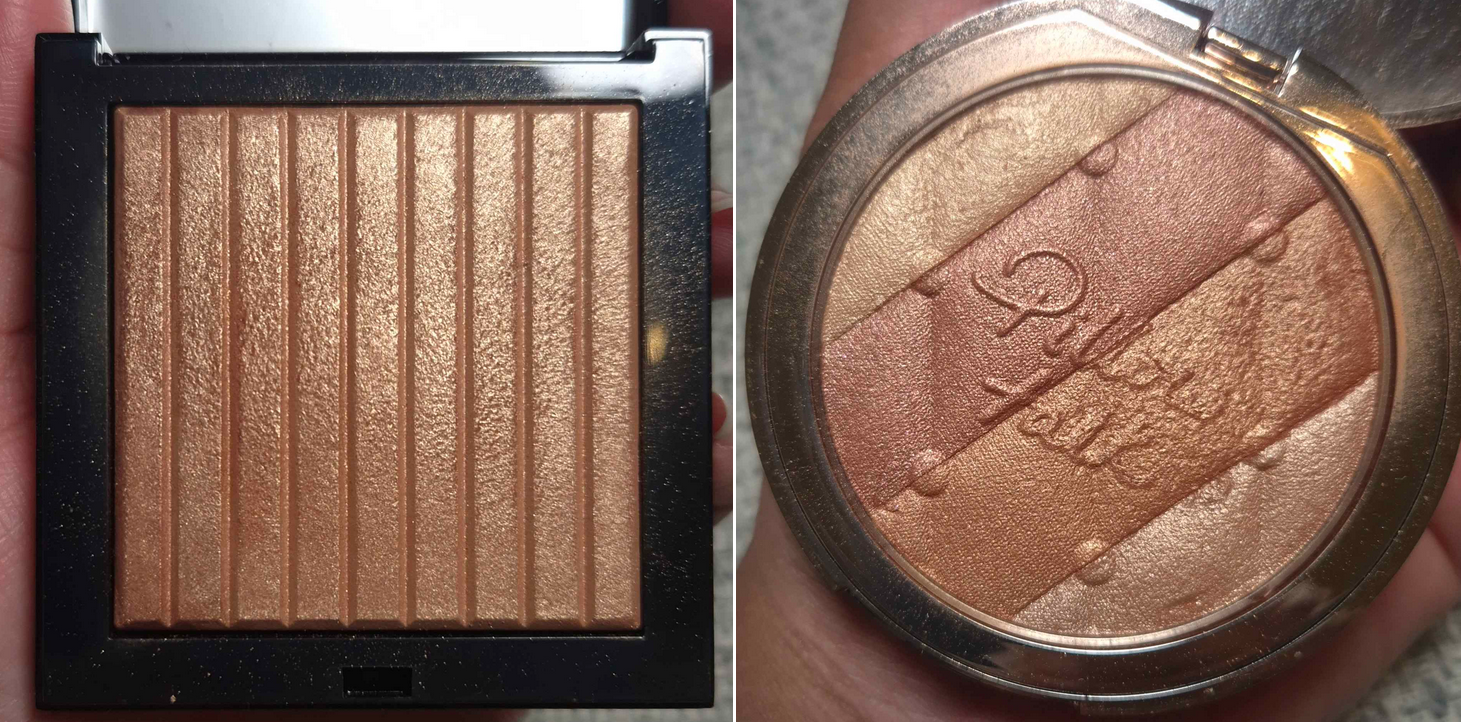
Regarding the size, the eyeshadow palette is significantly smaller than the bronzing brick.
The bronzing brick compact is also way easier to open and close. I can open it with one hand, whereas it’s much harder to try that with the eyeshadow component. I don’t know if my empty palette is supposed to have such a stiff hinge, but I know for sure that I shouldn’t be having so many issues with mine closing and staying closed. There appears to be a slight defect because mine clicks back open again and I have to press it back down 2-3 times before it will remain closed. However, I can also press or hold the front part of the compact (not touching the button) and sometimes the pressure of just picking it up makes it pop open. The Selfridges rep agreed with me upon reviewing the video I submitted to them and they reimbursed me for the cost of the empty palette. So, if mine continues to get worse with repeated use (it went from needing to be reclosed 50% of the time to now 100% of the time) or I’m unable to shut it at all, I could try my luck and buy another one. There is another option, which is to stick this in a regular empty magnetic palette because the refill works in those. However, the reason I bought it is because I specifically wanted the luxury packaging.
In my review of the Lisa Eldridge Pinpoint Concealer Pencils, I explained that it performing better on my smile line than any other concealer is the only reason it was worth buying for me. In the case of this palette, the eyeshadow quality is among the crème de la crème in my collection. However, how much I like this or will use this depends on my mood. I might reach for a Pat Mcgrath eyeshadow instead because it delivers stronger pigment. I could choose a Natasha Denona shimmer because it’s more eye-catching. The best quality doesn’t automatically mean it’ll suit someone’s preferences. So whether this palette is worth buying is going to be subjective and up to each individual shopper.
I think the quality is top notch. I think the compact is elegant and weighty (although I was unlucky to have an issue). I am still open to the possibility of buying refills in the future, but I don’t know how likely that will be considering I still prefer YSL’s formula and I can find their permanent quads for at least 10-20 Euros cheaper. Those compacts aren’t as heavy, but they are still luxurious to me. I would rather wait around and hope for YSL to release a color story similar to Olive. Tom Ford is the most comparable brand I can think of in terms of pricing, and I prefer VBB quality over theirs (excluding the wet/dry formula), but even Tom Ford’s quads can be found at a CCO/CCS for 40% off or more. I prefer VBB over Lisa Eldridge, Guerlain, and Gucci palettes that are comparable to the price of VBB’s refill alone, but it’s not always about quality. There are some shades I love that I know I will never see made by certain brands, so I will continue to seek out eyeshadows from other cosmetic companies.
I’m content with my singular Victoria Beckham Beauty Eye Wardrobe, but if they release a breathtaking color story, I could be swayed to purchase another.
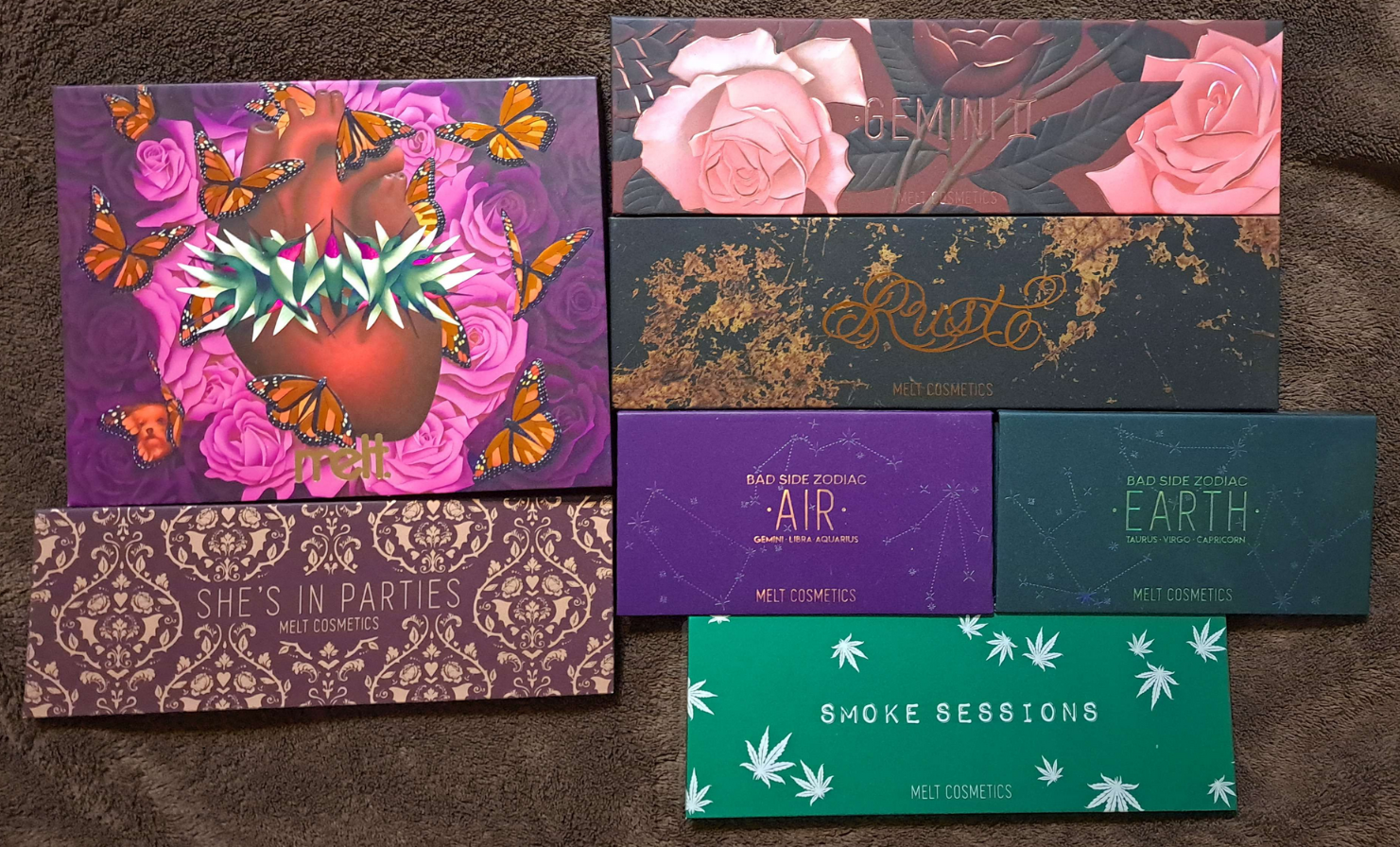
Continuing with my Eyeshadow Palette Brand Ranking Series, we have Melt next! This was very tough because the quality is so similar across the board. It really comes down to color story for this one and how often I actually use the eyeshadows, not just look at them admiringly.
Melt Cosmetics Eyeshadow Palette Ranking: (Most Favorite to Less of a Favorite)
Being in the bottom three of something never sounds good, but I had very few issues with these palettes, save for Smoke Sessions. Melt Cosmetics is known for having, at the very least, a stellar matte formula. It’s a bit ironic that the most hyped non-limited edition palette from the brand is the one that is the worst performing on me. That being said, I still consider it a decent product. The reason it’s on the bottom is because it’s the only palette from Melt (in the rectangular pans) that had mattes that are stiff and took a bit of time to blend. The shimmers are not impactful without being dampened and are the only ones from Melt that give me any creasing. As for the color story, I love half of the palette and completely ignore the other half (the cool-toned blue-green shades). The first two photos at the top of the page were taken before I left the US. Because this particular palette is known for having the most problematic formula in terms of how long it can last before it goes bad, I was worried it wouldn’t last. However, I haven’t had any issues with any of my Melt palettes all this time. I consider myself lucky!
The Zodiac palettes have only the slightest lower matte quality than the top 4 in the ranking. The color stories are beautiful, but not unique, which is why I didn’t reach for them as often as the others. The shimmer quality of these is actually better, but having a good shimmer isn’t as impressive of an achievement as a good matte. These are the only reasons I put them lower. They just have so much competition in my eyeshadow collection that they are the last palettes that come to mind when I think to reach for some Melt shadows.
Mi Amor
I like the performance of the shimmers in the Amor y Mariposas palette more than the top 3, but that wasn’t enough to get the palette to be bumped up higher on the list. 4 of the 14 mattes take extra time to blend because they are pressed pigments. They aren’t shades I use that much, so it isn’t as strong of a negative point against this palette. The color selection is beautiful. The pans in this palette are the same size as the Zodiac ones. I had the idea to depot them into those smaller palettes a bit too late. As much as I liked the colors, I didn’t reach for the palette as often because of its large size and how I inconveniently stored it. I didn’t use this palette enough, which is quite telling where it stands with me.
The Top Three
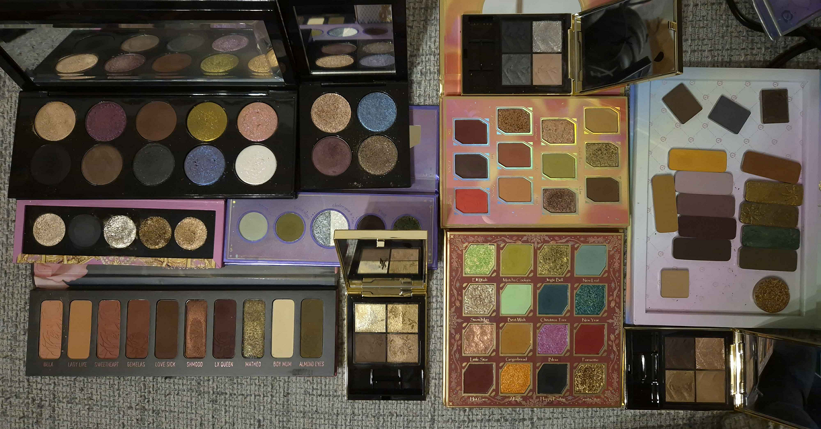
The palettes in this category have all been partially depotted at some point during my ownership of them, and I’ve taken them traveling as part of custom magnetic palettes. In fact, the flatlay photo above shows which ones were taken from a previous trip.
Rust is a beautiful warm neutral palette. I love the mattes in there to use as the transition and crease shades for a starting eyeshadow look. I usually pair them with a Clionadh shadow or other special shimmer, duochrome, or multichrome shade from my collection. The reason it’s number three is because the shimmers don’t give enough impact, even when applied damp, and I have sealing issues with the shades Tarnish and Ravage.
I love purples, so it makes sense that I like She’s in Parties. However, it’s warm purples I prefer and this palette has a mix of both cool and warm shades. The matte quality is fantastic. The shimmer quality is fairly decent in terms of performance and with passable levels of sparkle. This palette has light and dark shades, but it’s hard to get something in the middle. I may not use She’s in Parties as much as Rust, but the quality is overall better. So, it ranks second best.
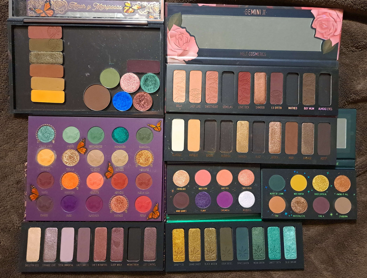
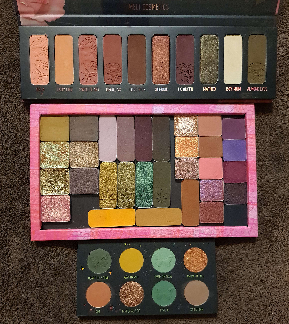
Gemini II has green shades that I adore! Almond Eyes and Matheo are some of my favorites from my entire collection! I can also get tired of pinks pretty fast, but the ones in this palette are the kind I love! Warmer pinks are great! The matte quality is superb, blendable, and pigmented. The shimmers are as good as it gets from Melt.
When it comes to using the Gemini II palette, I never use the pinks and greens together. Technically, that means I don’t consider it as cohesive of a palette, but I get a lot of use out of it by pairing it with other palettes and single eyeshadows. This gets the number one spot due to having the best quality and me liking every color in this one.
Another indication is that I only depotted Love Sick and Boy Mum, then took the entire rest of the palette with me when I moved! My most used shades from She’s in Parties and Rust came along in a custom palette as well, but the largest number of Melt eyeshadows came from Gemini II. The photo below shows all the long rectangular pan eyeshadows I ended up taking with me to Germany.
I created the custom palette as well with a mix of Zodiac Earth and Amor y Mariposas shades, but when my luggage went over the weight limit and I needed to leave some makeup behind, that one was unfortunately the one that had to stay back.
What can also be spotted are four Smoke Sessions shades. This is because those were my favorite colors from the palettes, but mostly also because I waited so incredibly long to buy that palette. I did not want to leave all of them behind. So, it’s a matter of principle and less about thinking I would miss them. My top three are the ones I would miss most because of the mattes. Melt’s mattes are within my top five favorite formulas of all time! It’s a shame I don’t feel the same way about most of their shimmers, but I have more than enough shimmers I love. It’s much harder to get me excited about mattes, which this brand certainly nails most of the time.
The final point I wanted to discuss is the acknowledgement that I have zero palettes from Melt that came out between 2023-2025. The only two that interested me were Smoke Sessions II and The Bride of Frankenstein. I skipped getting Smoke Sessions II because those are still not the kind of purples I wear often enough, plus my concern that the quality could be similar to the original Smoke Sessions that ranked last on my list. I would have absolutely bought The Bride of Frankenstein Palette if it was available to purchase in Germany. The only retailer I know that sells Melt Products is Purish, and they did not stock that one. I looked into international shipping from Melt’s own website, and it’s just too costly. So, only the future will tell if I ever get my hands on that one.
The first pencil I bought has been in my hands since January 9th, so I’ve had enough time to test this out in various ways and solidify my thoughts on this product.
The primary purpose of my posts are to show how products look on me in order to help someone get a better idea of how the shade(s) might look on themselves. Let’s do that right now.
There aren’t any exact matches between the pencils and the base products I have from the brand, but I don’t mind since I don’t have a perfect foundation shade from them either. They’re all just close enough.
The charts can be found by scrolling to the bottom of theirproduct page.
My secondary goal is to give as much information as I can to help anyone on the fence trying to decide whether they want to buy the product right away, skip it without the fear of missing out, or figuring out if it’s worth waiting for a sale. I try to factor in the ingredients, talk about the accuracy level of the brand’s claims, mention anything strange I’ve noticed, etc. Right out the gate, I’m going to say that this pencil was worth it to me to buy for a very specific task. I do not know how many people reading this will feel the same way, but I will describe the pros and cons I experienced.
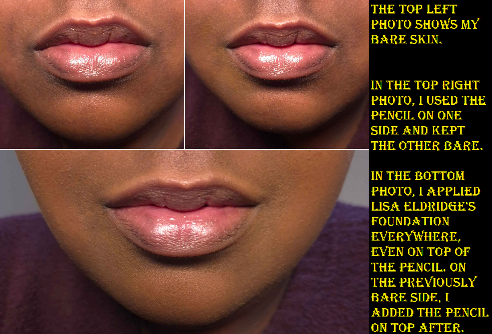
For starters, I watched Lisa’s video on how to do the pinpoint technique using her product. I think that her way is in fact the best way to utilize it. I don’t have acne, but I have moles, scars, and a ton of discoloration. She says that this product is not meant for large areas and not intended for full-on concealment of dark under eye circles. Considering those are usually my biggest concerns, I thought this might be a makeup release that I should skip. However, two aspects really sold me on this product: the idea of being able to use it on bare skin to metaphorically erase blemishes in a less detectable way than traditional means and/or with a full face of makeup to perfect any areas that need additional help with concealing.
To satisfy my curiosity, I still used this on the lowest section of my under eyes to see if it would last, and although it works, it looks and feels too drying there. So, I must patiently wait for the brand to release other forms of concealer better suited for my dark circles.
The photo above demonstrates how I can get the product to look how I hoped. On barely moisturized skin, the side that I used the concealer pencil looks improved and is very hard to tell makeup was used. On a face with a buildable coverage foundation, the pencil is able to camouflage the areas where darker discoloration was still partly visible underneath. I also don’t recommend putting other products on top of the pencil. It worked best for me to put foundation and liquid concealer first before adding the pencil as the final concealing step.
The brand website specifically states that this is good for, “camouflaging broken capillaries and blemishes to lifting micro-shadows….waterproof, budgeproof, all day wear.”
The issue I ran into is that I can only get all day wear on bare skin, and even then it’s not always perfect. If my dry skin has the minimum amount of moisture (and by that I mean that it just has a serum, hydrating spray, essence/milky toner, or a lightweight moisturizer on it), I can use this pencil with no issues. If my dry skin has some flaky parts, this concealer will cling to it in an obvious and unflattering way. It looks scaly.
So, I have to balance between having enough moisture on my face for the product to glide onto the skin smoothly, but not too much moisture that would cause it to not adhere as well to my skin or accidentally make the product break down quicker. Sure, it’s waterproof when it’s not in contact with that many other products. However, waterproof products are susceptible to oil breaking them down. If my moisturizer, primer, foundation, or accompanying concealer contains too much oil, I cannot get this to last on my face for as long as it should.
Getting it to last all day on emollient skin is one challenge, but it’s even harder to get it to stick to the spot in the first place. I draw over the discoloration, tap it with my finger to blend, it melts too much into my skin and I have to draw over it again, tap it and the tiniest bit stays put but most is gone again. I essentially have to draw, tap, and blend on repeat 3-5 times for it to be fully covered. Now, it becomes even more clear why this isn’t supposed to be used in large areas. I was concerned I might run out of product in just the testing phase alone!
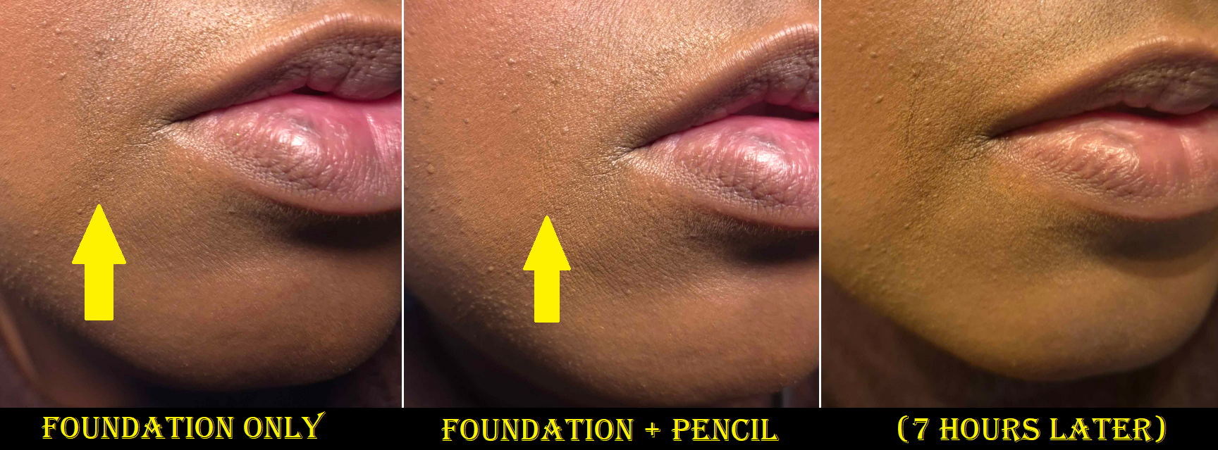
Using this on dry skin with minimal skincare gives me the best outcome. If I want to use this with other makeup products as the final perfecting step, I have to be careful about which products are used so it can actually last. That being said, the best I’ve been able to get on a full face of makeup is 4-6 hours. I have a stubborn smile line that all other concealers migrate from within a few hours, re-exposing the shadow. The coverage I get with the concealer pencil lasting double or triple the length of time I usually get when trying to cover that line is the sole reason I bought additional pencils and felt this expense was justified.
Being able to practically scribble away imperfections seems like a dream, but it triggers my perfectionist side in a way that is really not good. Obviously, this product will be a godsend for some people. For me, when I finish tackling the darkness around my mouth, then I look at the birthmark spot under my eye (another fairly large spot) and cover that. Then I start covering each individual mole, every scar spot, and then suddenly I’m spending fifteen to twenty minutes being hyper focused on my flaws that my eyes normally just glance over. If I put makeup on and look better than before, I consider that a success and I’m usually happy enough with just making improvements. During the testing process though, I felt so compelled to keep going and scribble out every little spot, to try and photoshop myself in real life. I cannot afford to spend so much extra time inspecting and correcting my face. Nor do I think it’s good for my mentality to fixate so heavily on imperfections and how choosing not to make those corrections left me feeling dissatisfied with my makeup overall. This is why I love my favorite finishing powder so much, because it creates a blurred veil that I know if I’m in a rush and didn’t blend my makeup perfectly enough, I can just quickly buff it everywhere and don’t have to think any further about it.
So, I decided to set limits for myself so that I could incorporate this pencil into my routine in a realistic and positive self-image affirming way. By making my main target the smile line, I am making myself happier to be able to improve that spot while only adding an extra minute or two to my makeup application time, and I get satisfaction from having found a use for this product that it excels at above all other concealers.
This circumstance with fixation is not going to be a problem for the majority of people, but in this day and age with social media and how it can affect people’s perception of themselves, I felt it was important to include in this review. I’m forewarning that this is not the low effort product that it’s proclaimed to be.
Regarding the issues of applying this on bare skin versus skin with product on it, as well as the time consuming nature, I recommend watching Hannah Louise Poston‘s review. She also has dry skin and is able to demonstrate and explain so well the phenomenon I experienced.
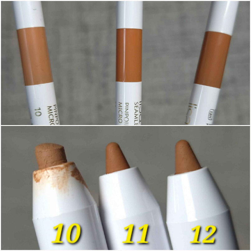
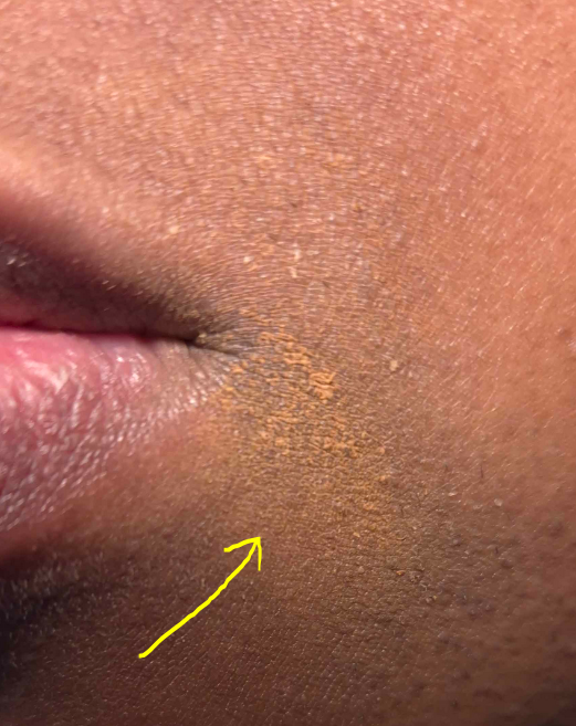
I chose Shade 11 with a “Neutral Terracotta Undertone” because it leans orange, which has color correcting effects for my areas of discoloration. As I mentioned before, I have chosen to keep its task limited to covering my smile line.
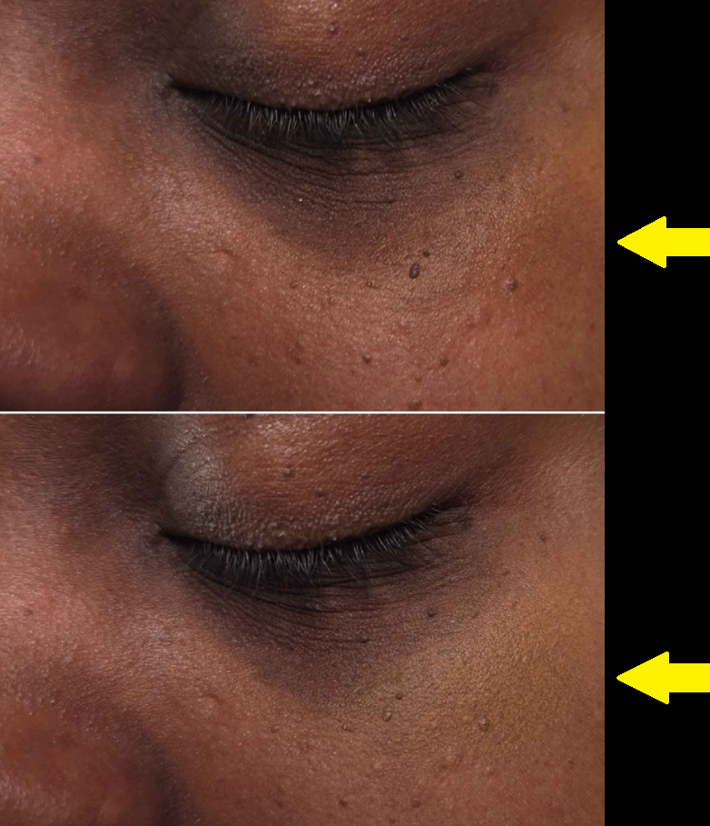
Shade 10 with a “Neutral Golden Undertone” only works on the lightest areas of my face. Since these pencils can be used to lift shadows, highlight areas, or clean up spots, I have additional uses for this specific color. Essentially, Shade 11 was too dark and warm toned to look natural on top of my birthmark in that lighter surrounding area, so I designated Shade 10 for this task. I prefer to use my normal liquid concealers for cleaning up edges, and I also prefer highlighting or cleaning up the brow area with the Lisa Eldridge Liquid Silk eyeshadow in the shade Phoebe. It feels a lot more comfortable because the dry down isn’t as stiff. In fact, the Liquid Silk eyeshadow is the reason I got so excited for the brand to release concealers because it has a wonderful smoothing quality, self sets, and doesn’t budge. If they can put those same qualities into a liquid concealer, I’ll be over the moon with happiness! But as I was saying, Shade 10 is for my birthmark (plus a bit of 12) and if I tried to use it for the other aforementioned tasks, I’d run out of product absurdly fast.
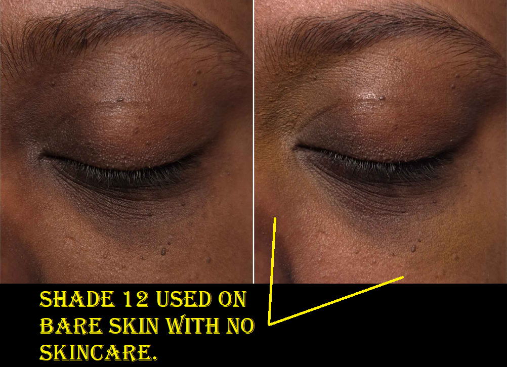
I purchased Shade 12 in a “Neutral Undertone,” (plus a backup of Shade 11) from Niche Beauty during one of their sales. 12 has a similar depth value as 11, and it’s still a bit warm, just not as warm as 11. Although it makes for a better skintone match, I have to use even more product to cancel out the darker spots on my face, particularly without the color correcting aspect that Shade 11 provides. As seen in the photo below, using it in my eye area that is void of skincare means dealing with the unflattering texture problem.
What this color is good for is doing touchups on the go. It can make a good skin match for areas where my liquid concealer is starting to fade or even when I need to touch up wherever I added Shades 10 or 11. Having product already underneath it allows Shade 12 to fill in the gaps in coverage and glide on more smoothly than it does on bare skin.
The reason I needed a backup of 11 so soon was actually due to my own mistake. It’s a bit embarrassing, but maybe sharing this will prevent anyone else from doing it too!
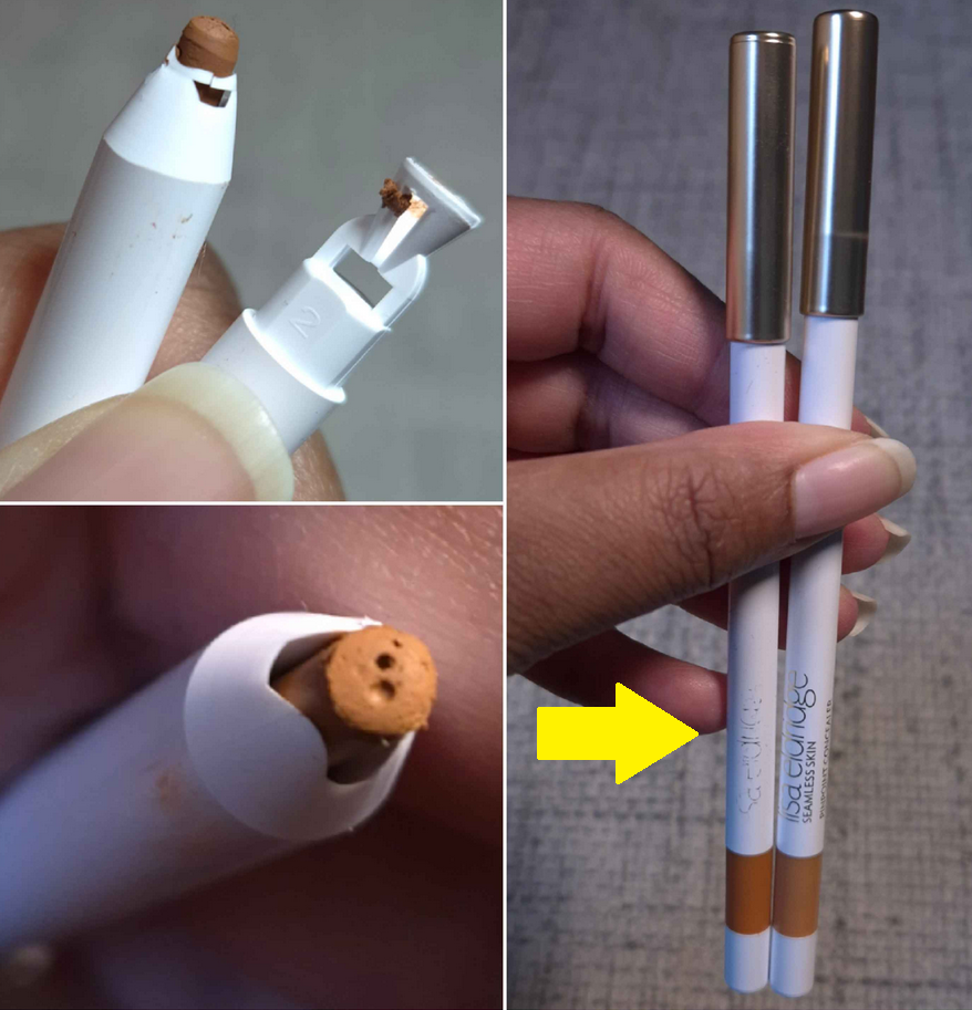
I didn’t know until it was too late that these are twist up pencils!
Lisa Eldridge’s lip pencils require sharpening, and the twist up ones I use from other brands are in the kind of plastic packaging that is way more obvious that they can’t be sharpened. I knew the white “sharpener” at the end was just for getting a crisp tip, but I didn’t know the shade colored strip rotates! I thought it was just a clever design feature to distinguish between the shades without having to uncap them all. And to be clear, I only used the white piece one time for science. I will never use it again because it removes too much product, precious product that this pencil has so little of already.
Because these pencils are intended to be waterproof and the exposure to air should be limited, I was concerned that mine would dry out much faster, despite how careful I am to keep them capped tightly, so that’s why I bought the backup of Shade 11. Thankfully, my butchered pencil is still working perfectly fine.
In that photo I included, you may have noticed the severely faded lettering on the pencil. The logo and details on the other side rubbed away by day two. I don’t know why or how it happened, but it did! So, I’ve been handling the rest with kid gloves!
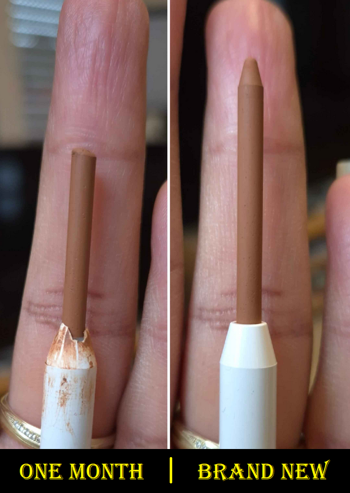
Onto the topic of how quickly someone can go through this product, the photo above shows what a brand new pencil looks like compared to the one I used on and off for about a month. One third of the concealer is gone, however, a lot of it was wasted during the sharpening debacle. I was also testing it in large places sometimes, which is not recommend. So, I believe one sixth of it being gone would have been the expected result after a month of use.
I wore makeup about 2-4 times a week in January. My best guess is that I used that pencil twelve times between January 9th and February 4th. I estimate that a single pencil could give me at least 72 uses total. If I wore makeup every day, this would be unacceptable and I would never buy it again. Since those 72 uses should get me though six months, which is the same amount of time it takes me to use up some of my liquid concealers and liquid eyeliners, this is acceptable for me. My situation will not be the same for everyone, and I think it’s 100% understandable and fair enough that a lot of people don’t think it’s worth the price per grams, don’t think it’ll suit their needs, or say that they already have products that accomplish these tasks, etc.
I like this product, but I cannot give a sweeping glowing recommendation to someone when its usefulness to me is so specific. I won’t be replacing Shades 10 or 12 when they run out, and I already have my backup of 11, but how embedded into my routine this product gets will determine whether I’ll keep repurchasing Shade 11 indefinitely.
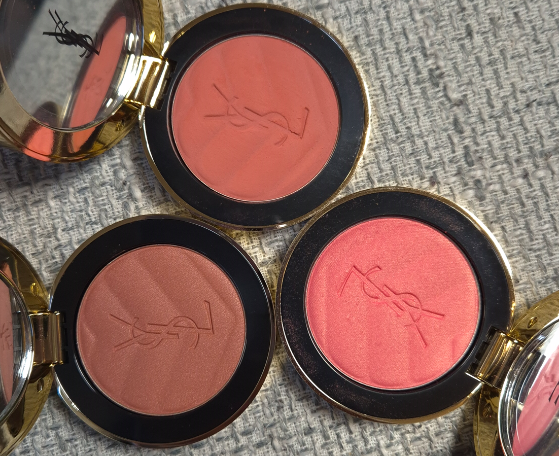
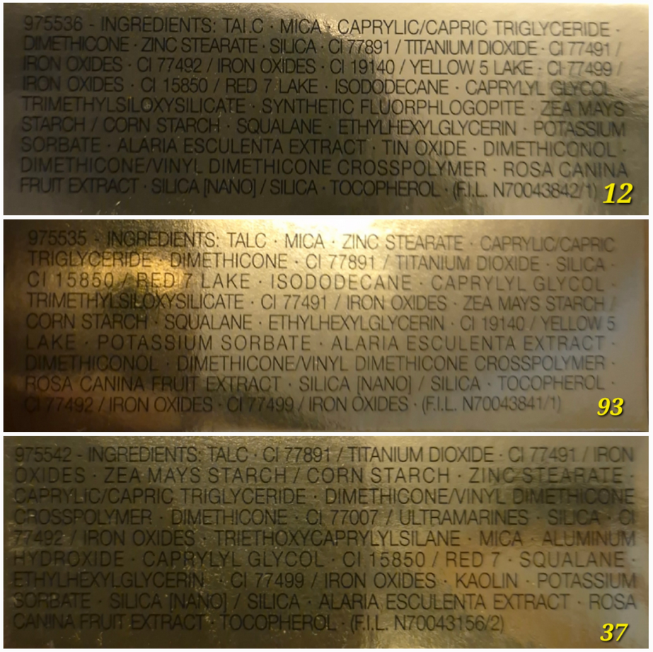
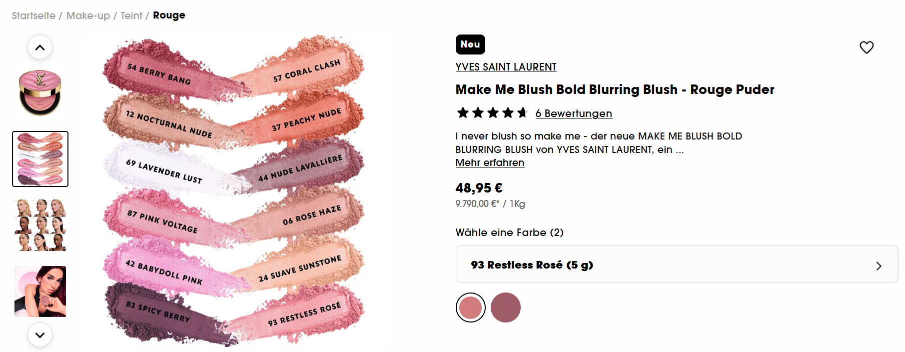
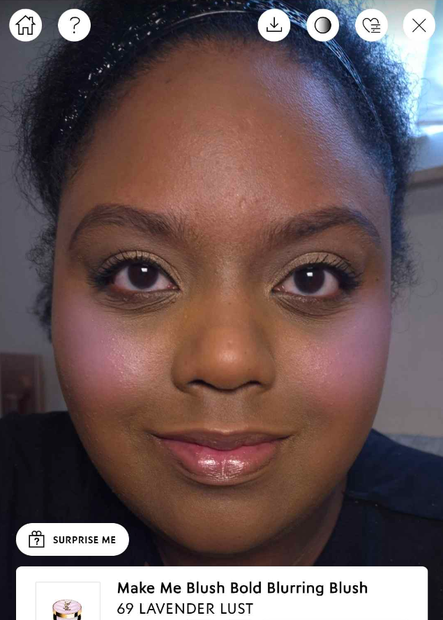
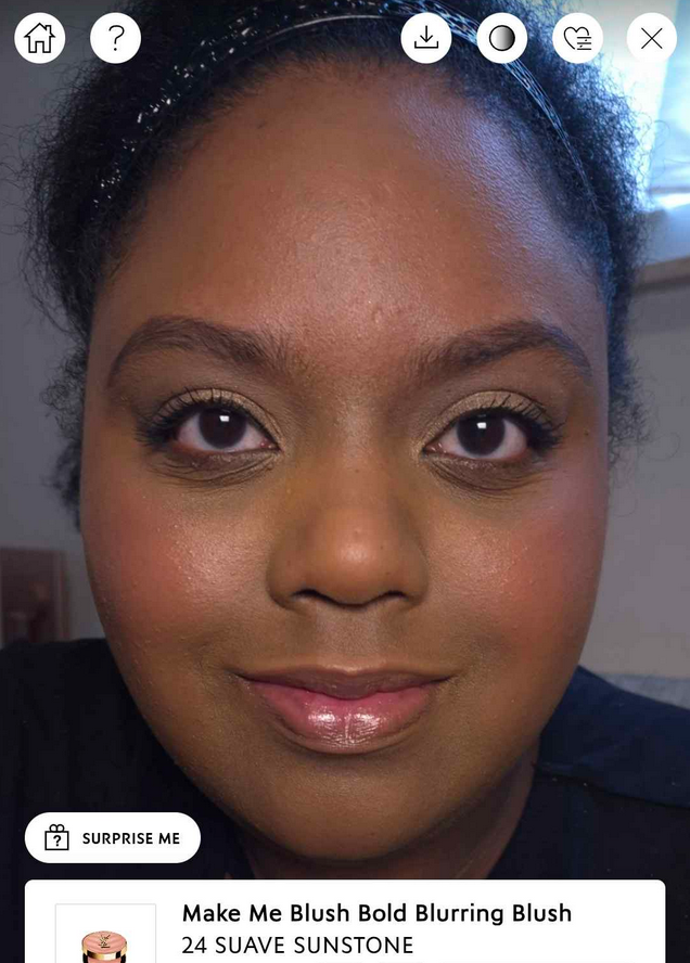
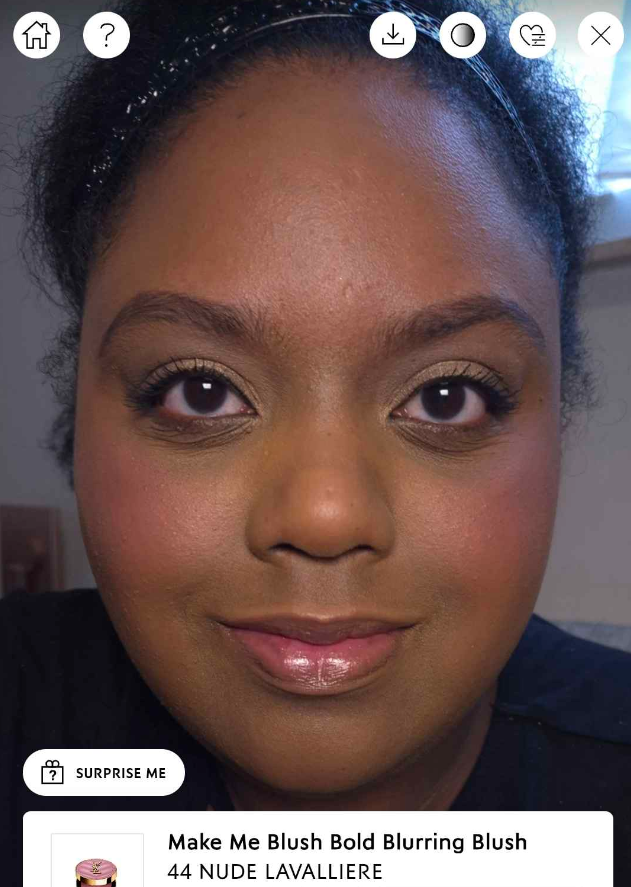
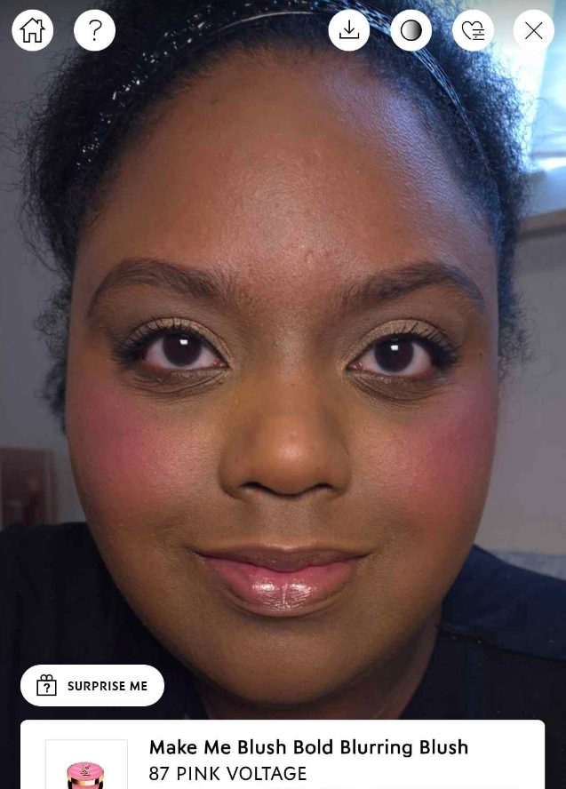
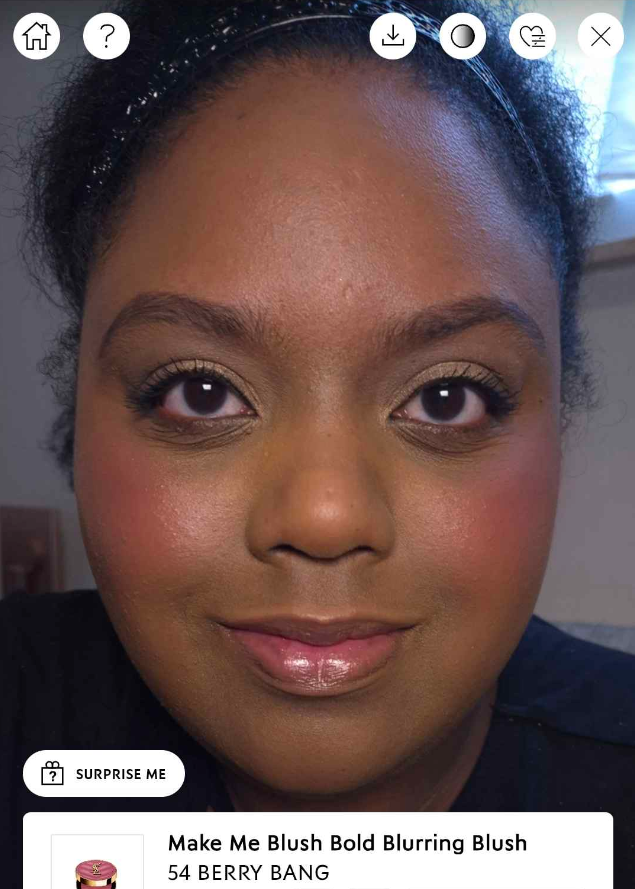
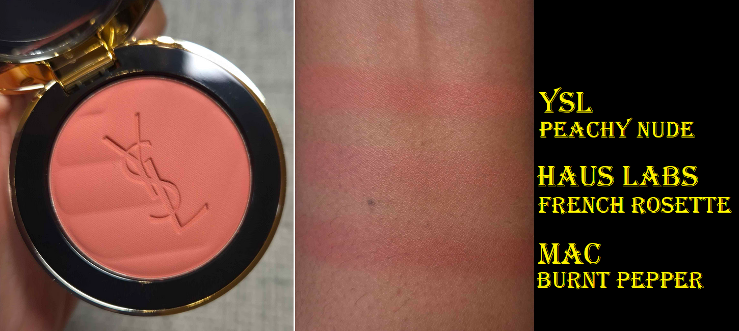
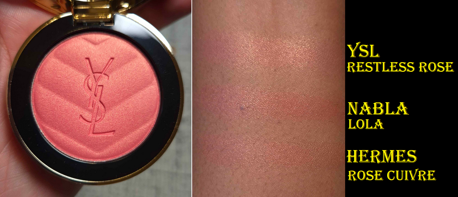
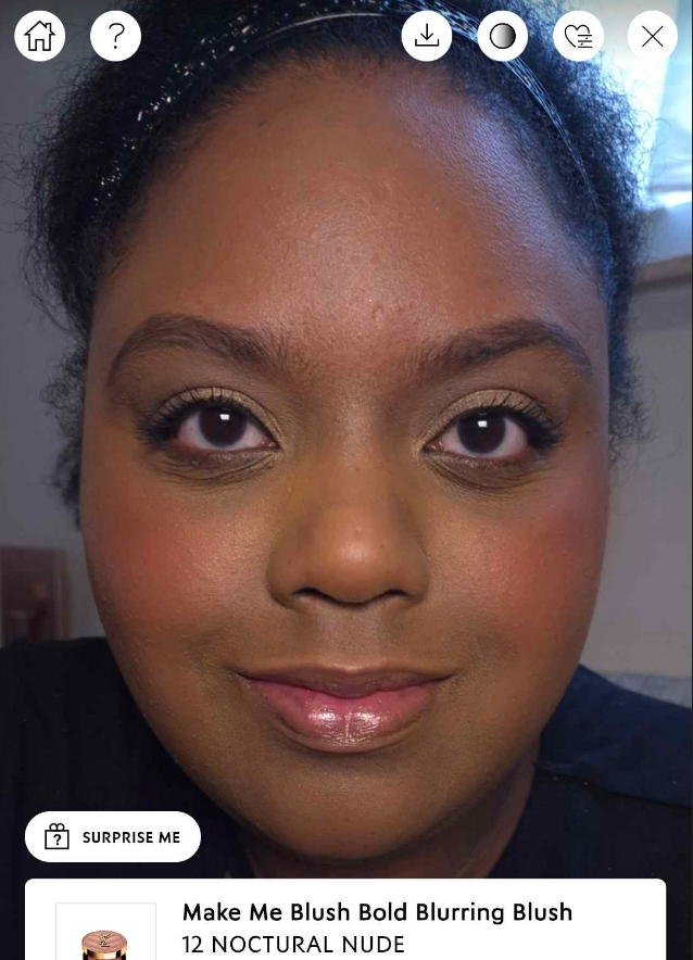
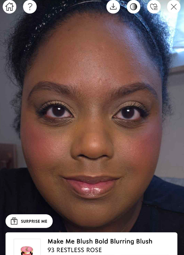
Yves Saint Laurent created this powder blush line with 12 blushes in total, and in two finishes, although I would argue there are three. I would consider 69Lavender Lust (based on photos) and 93 Restless Rosé to be shimmer blushes considering they have the strongest reflect and shine compared to the other satins: 12 Nocturnal Nude, 42 Babydoll Pink, 44Nude Lavallière, and 83 Spicy Berry. The mattes are 06 Rose Haze, 24 Suave Sunstone, 37Peachy Nude, 54Berry Bang, 57Coral Clash, and 87 Pink Voltage.
*The names in bold above have a liquid counterpart. 66 Fuchsia Fling is not listed as a powder blush.
At the time of me working on this blog post, I’ve been unable to find each individual ingredient list (the YSL-DE site has a blank space and the YSL-US only lists the matte formula), so I cannot compare more shades to confirm. From the boxes I have, I noticed Nocturnal Nude has both mica and synthetic fluorphlogopite while Restless Rosé does not. Since Restless Rosé is the one with more obvious shimmer, I’m not sure what to make of that. At the very least, I think it supports my idea of there being a slight difference within the satin range.
The reason I wanted to go into the specifics of the shades is because YSL did not make all 12 available at the same time on any website, including their own. Even if all twelve were shown, nowhere during the first two weeks of launch had the full dozen listed as “in stock.” In fact, I only saw Spicy Berry (the darkest shade) available on US websites and the US was missing some of the lightest shades that were only in Europe and Asia.
I’m going to put my tin foil hat on for a moment.
Considering I saw sneak peeks for these blushes all the way in August 2024, and YSL’s parent company is the multi-billion dollar L’Oréal, I believe they were capable of producing the full range right at launch if they wanted. This should be the case especially because these blushes are intended to be part of the permanent range and are not limited edition. The liquid blush counterparts to these powder ones received both glowing and damning reviews, not just because of the controversy of misrepresenting how Lavender Lust would look on tan and darker models (before they replaced the promo photos), but also because the blushes have a lot of white in the base that make them appear ashy on people with dark skin, even in the tones of blush that would have normally looked flattering. Considering how quickly I saw the liquid blushes on sale, I wouldn’t say they flopped, but they might have under-performed.
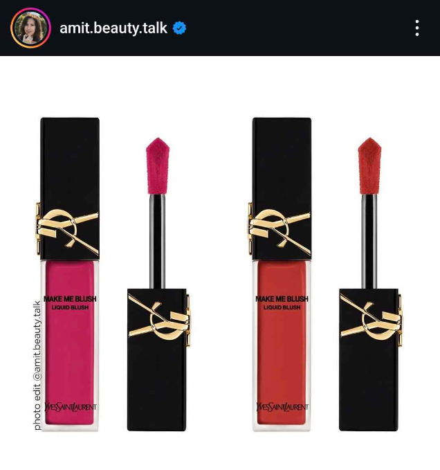
Speaking of the liquid blushes, there will be a shade extension with 03 Mischievous Magenta (left) and 15 Chili Crush (right).
Anyone interested in seeing more photos can visit Amit’s Instagram, which is where this one came from, as well as Trendmood1.
It is possible that YSL felt it best to release the powder blushes quicker than planned. It’s possible they also wanted to play it safe and make blush color availability based on their demographic data per region. I’ve seen this happen before, but usually companies make at least their own website the place to get everything. YSL choosing not to do that makes me wonder if it’s a partial scarcity tactic. Many retailers, such as Sephora Deutschland with only two shades, still had the image below on their sites, which leads me to believe the intent is for YSL’s blushes to eventually be available everywhere.
Brands also tend to make every shade available to the US because it’s such a melting pot, so the fact that they did not have the lightest blushes at launch (especially Lavender Lust) feels intentional. However, I’d bet they will get there eventually. In the countries that did have Lavender Lust and Spicy Berry, those shades went out of stock the fastest, so I wouldn’t be surprised if those were produced in even smaller quantities compared to the rest.
I used the brand’s virtual try-on tool to show how the blushes I didn’t buy could potentially look on me. Spicy Berry was not an option.
It is my preference to wear warm toned blushes in color depths that are medium or medium-deep. Even though Berry Bang and Spicy Berry are the most dark skin-friendly options, I did not buy them because I’m so picky when it comes to the kind of berry tones that I like on myself. I don’t know any retailer in Germany that allows returns once the makeup has been opened/touched/used, so it’s a bit expensive to take the risk.
For those with a different skin tone than mine who want to see seven or more shades compared, I recommend these videos on YouTube that I still found to be helpful: Fabi Madeup, Dams Beauty, and Dear Eva Hansen.
Before we move onto the review, I’d like to be transparent in saying I tested these blushes for a shorter time than I normally give per product. I’ve had Peachy Nude and Restless Rose for just under two weeks and Nocturnal Nude for one week. However, the performance has been so consistent no matter the brush type, applications on bare skin and the various finishes of multiple foundations, that I felt confident in my experience enough to post this “early.”
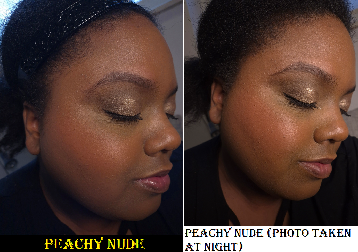
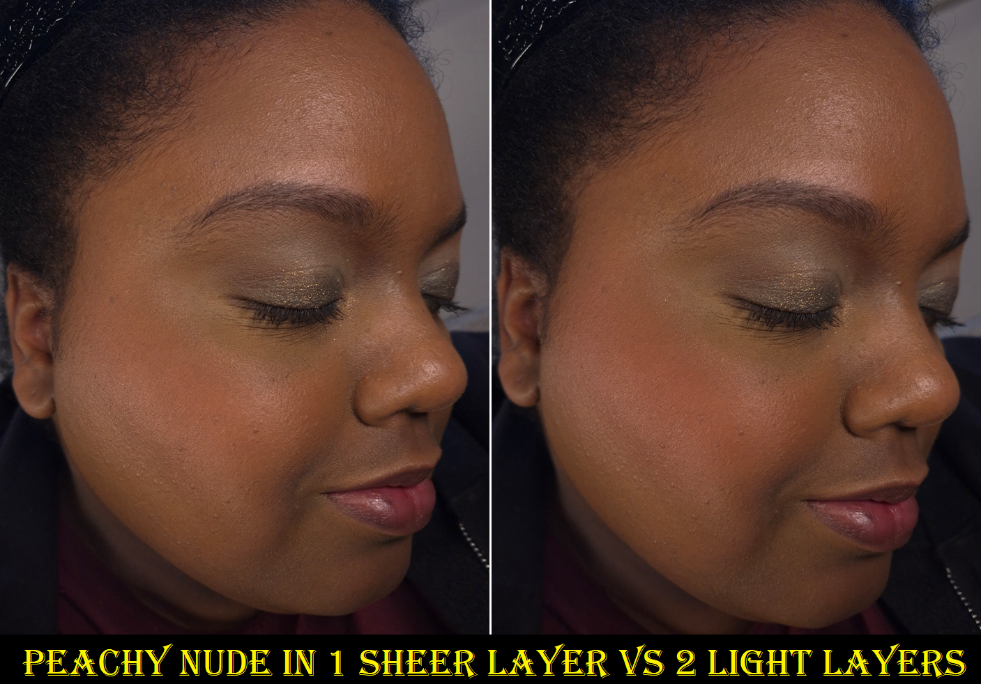
37 Peachy Nude
Despite this having a matte finish, it’s not flat. When I wear a luminous foundation or one that’s verging on dewy, the blush looks like it has a slight glow to it as well, even though there aren’t any shimmer particles. This makes it look more natural on the skin, in addition to being slightly blurring. These blushes have “blurring” in the name, but Suqqu’s blushes tend to be more blurring, plus Armani’s Luminous Silk Blushes and Too Faced’s Cloud Blurring Blushes are both significantly more blurring than these. In certain places within North America, it seems the YSL blushes are called, “24H Buildable Powder Blushes.” So, the blurring claims aren’t supposed to be the main selling point worldwide.
This powder is super soft and reminds me of the buttery feeling that the brand’s matte eyeshadows have in their quads. None of these blushes fade on me. They’re all pigmented, yet blendable. Between the two finishes, I still prefer the shimmer ones. However, I like Peachy Nude a lot and considering I’m less impressed with matte blushes these days, the fact that I like this one so much is a good sign.
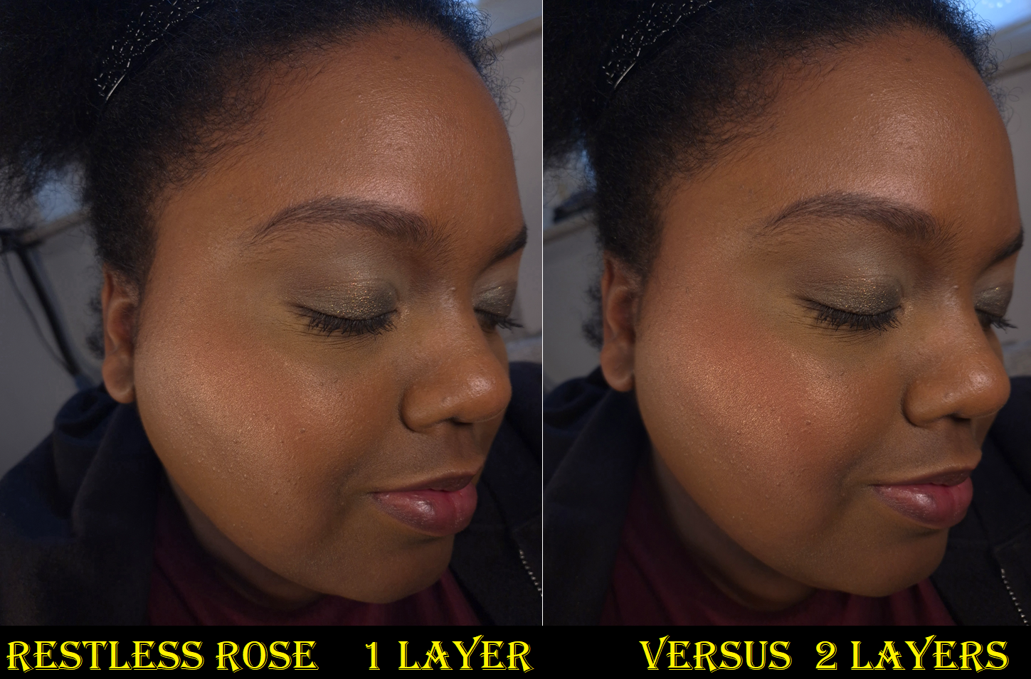
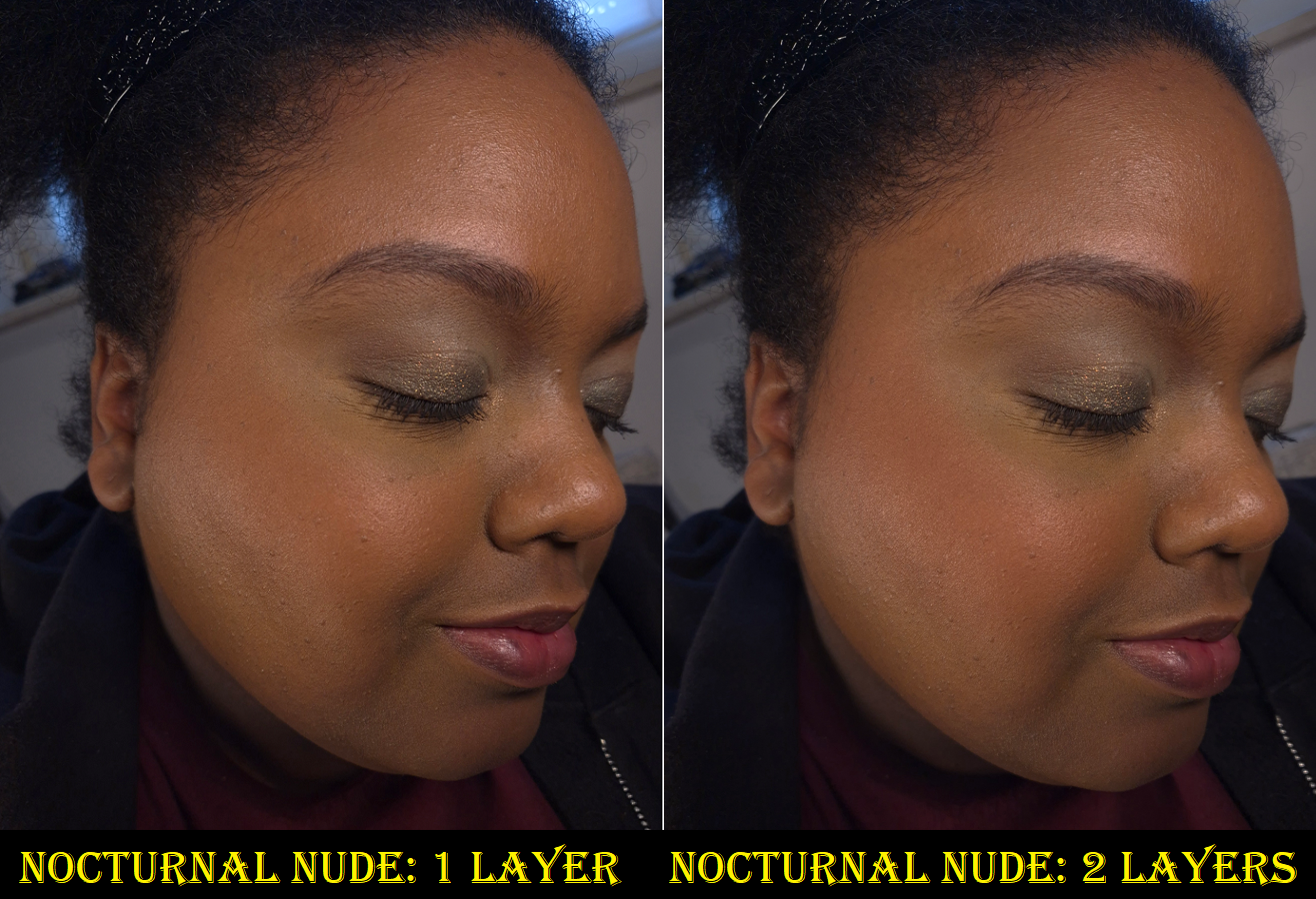
None of the blushes are firmly pressed, so even the softest and airiest brushes will be able to pick up product easily, and there will be kickup. Because they’re all so pigmented, plus easy to put a lot of product on the brush, I have to be careful not to overdo it with Peachy Nude. My camera refuses to capture how much more intense it looks in person. As for the other two shades, they are light enough on my skintone that I don’t need to worry about overapplying, but this could be an issue for other people.
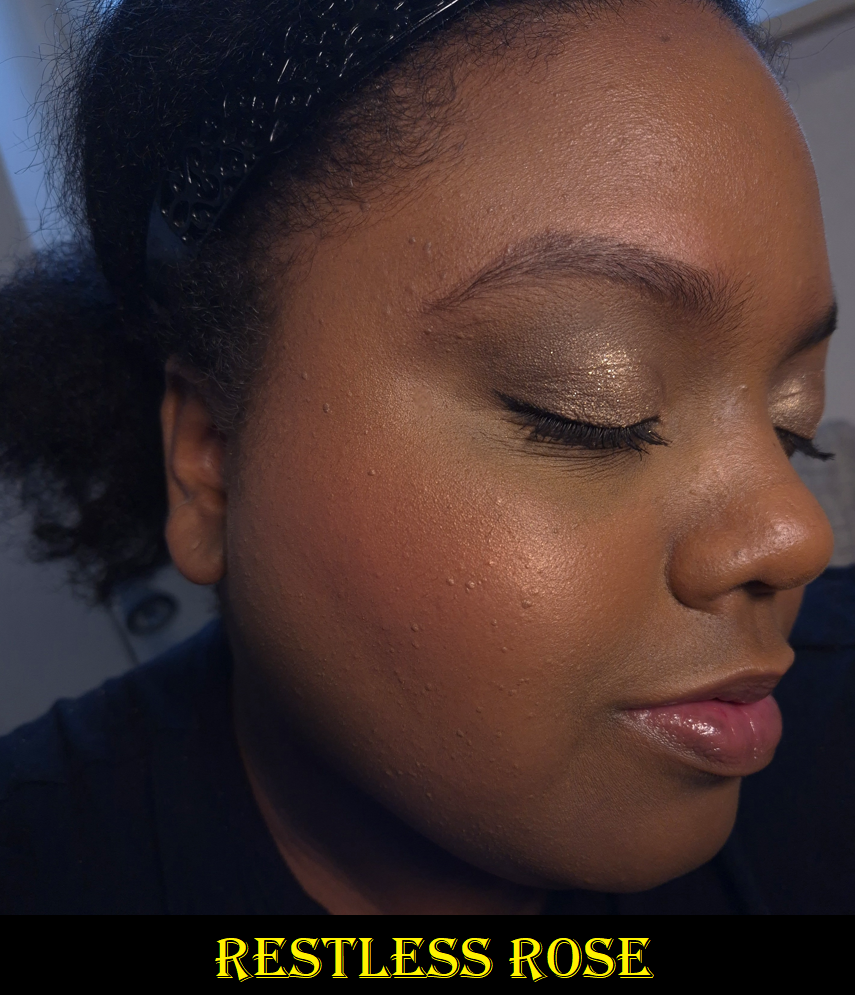
93 Restless Rosé
This is the most shimmery of the three YSL blushes I currently own. The medium-dark pink with gold shimmer made me instantly think of the Nars Orgasm X shade. I wish I could compare them, but I left that shade behind in the US because the reflect of that one is so strong and the base color is sheer enough that it looks like I just have highlighter on my cheeks when light hits it directly and at certain angles. This blush can do that too, but I discovered that if I build it up enough, the pink will still be visible.
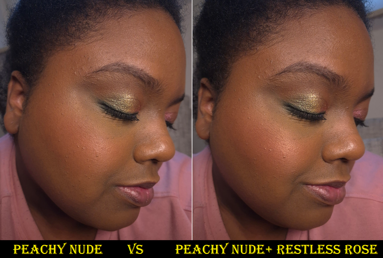
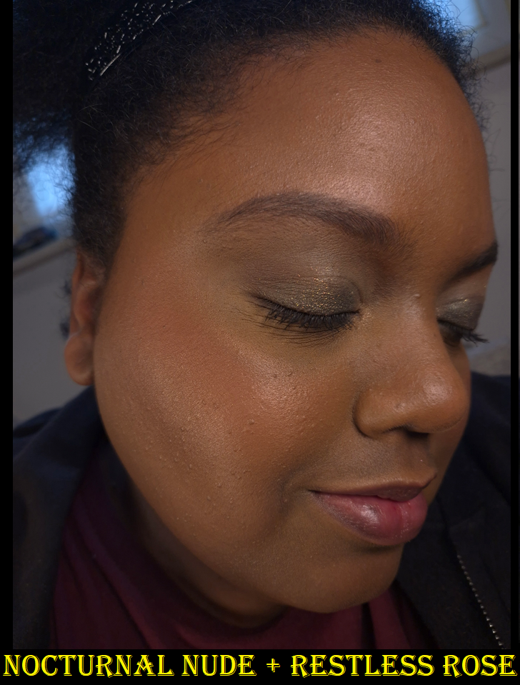
Besides working as a standalone blush, this also makes a beautiful blush topper. I love adding this on top of Peachy Nude to give my cheeks extra glow. Pairing it with Nocturnal Nude gives it a brighter pop.
The shimmery glow is satisfactory enough for me that I even skip putting on highlighter when I wear this.
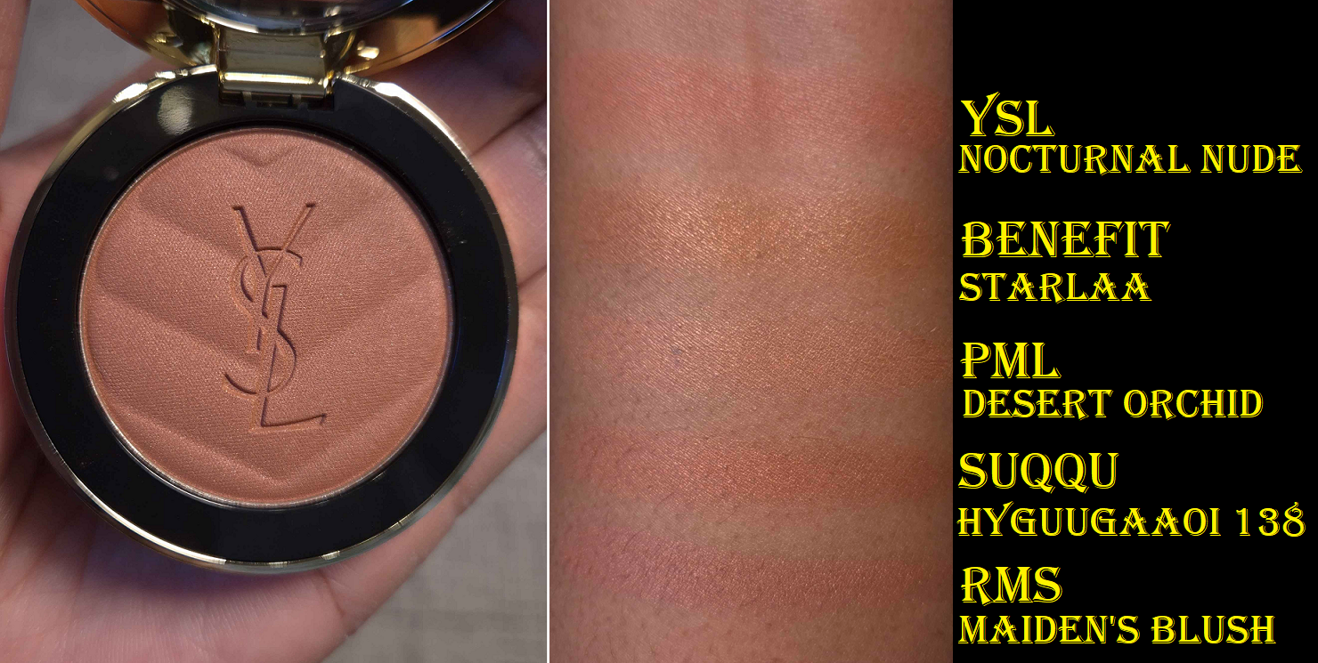
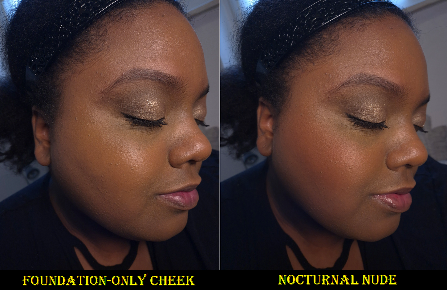
12 Nocturnal Nude
This blush has super fine shimmer without the kind of reflect that is present in Restless Rose. Because of my skin’s color depth and undertone, it looks similar to Peachy Nude. However, Peachy Nude has more pink and no actual shimmer. Nocturnal Nude has more brown, which blends into my skin, and it leans slightly orange. I’d actually call it a coppery color and it reminds me so much of my much beloved Suqqu 138 Hyguugaaoi blush that is part of my Project Pan. The main difference is that Suqqu’s has more shimmer.
I am very pleased that unlike the liquid blushes, the powders don’t have that same ashy problem, which makes this range more inclusive.
Comparing my virual try-on results to my own experiences with three shades, I would say that it’s at least good at getting an idea of how natural or not each shade looks on me. It shows the colors at a little stronger pigmentation level than I’ve been able to build up, but it’s not that far off. Based on these results, even though I can see color on my cheeks for the photos of Suave Sunstone, Rose Haze, and Coral Clash, I don’t think those would stand out enough on my skin tone. My skin is also so warm that I think Nude Lavallière could look ashy, even if it’s not as crazy looking on me as Lavender Lust and Babydoll Pink. So, if you’re interested in these blushes but don’t have the ability to see them in-store, I recommend trying the brand’s tool before ordering.
If you’re on a low-buy or a budget, it can be helpful to remember that this line is supposed to be permanent and therefore part of sales at some point. I was able to get these discounted despite them being so new. My Origines and Parfum Dreams had them in the 35 Euro range and Flaconi had brief 10% sales, which is when I picked up Nocturnal Nude. In the US, there will be a spring sale at Sephora and it’s possible the official site might have bigger discounts once the blushes have been out for much longer.
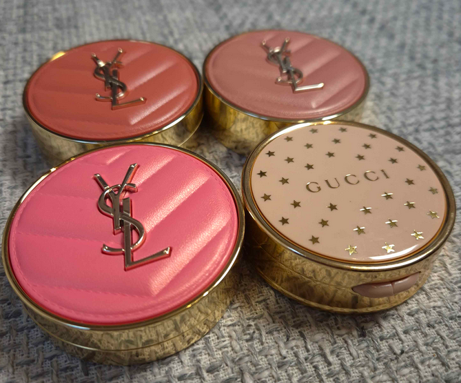
I really like these blushes. They aren’t revolutionary, but they’re on par with many of my favorites. I’m very excited to have them and they will be included in my Project Pan. From a packaging standpoint, I love the various colors with those appealing quilted squishy tops and beautiful gold colored trim. The size reminds me of Gucci Blushes, but even though YSL’s components are lighter, they are still substantial enough to feel like a luxury product.
The brand is releasing highlighters next, but I’m on a highlighter no-buy and will be skipping them. YSL’s bronzer shade range looks limited, so I don’t have plans to buy that either. I can only vouch for the blushes being wonderful.
That’s all for today! Thank you for reading and please consider clicking the follow button if you’d like to be notified whenever I post!
2024 was an unusual year for me because I had just moved across the world and only brought one quarter of my makeup collection with me. I had already decided which items I couldn’t be without, and so it became my goal to get as much use out of those items I took with me as possible.
Although I purchased way less makeup in 2024 than in previous years, and I had a comparatively smaller collection, I still ended the year with plenty of products that went untouched for twelve months! I wasn’t as hard on myself about it considering I had prioritized some makeup favorites, but a fact that I knew to be true in theory became much clearer to me:
When I buy new makeup, it takes time away from using what I already own.
When I focus on using neglected makeup that’s great quality, even that detracts from my ability to use my actual holy grails.
So, I came up with a different plan.
The Project Pan videos I’ve seen on YouTube centers around makeup that went unused for months or years, old favorites that got pushed to the back of drawers, products close to being panned already so the person wants to finish the job, etc. I have attempted this format unofficially a few times in the past, but I felt too restricted and ended up temporarily buying more makeup because I started to feel like there were pieces missing in my collection. I also prioritized creams and liquids (since those go bad faster) even though that sometimes meant I was using products that were just okay, instead of ones that I loved, so I could feel like “I’ve gotten my money’s worth” and could justify having purchased it.
In the US, I rarely returned makeup unless it was unusable for me in some way (like having an allergic reaction) or I really didn’t like it enough to be worth how expensive it was. Living in the EU, where I can’t return those pricey mistakes if I’ve already tried it and disliked it, changed my perspective a bit. I can do a ton of research beforehand, but I could still end up with makeup that just doesn’t work for me. At that point, the money is already spent. I don’t need to waste further time trying to use up something I like less than what I’ve already got. I don’t want to fall prey to the sunk-cost fallacy. I can’t get back my money, but my time is the next most precious thing. That time is better spent on the things I love.
I have this innate curiosity to try everything out there and to know which makeup items are of the highest tier. I don’t know what that is for every category, but I know what has worked the best for me specifically. There are certain items I feel just can’t be topped. So, why don’t I use those items exclusively? I wondered if the quest to search for something better comes from the fact that I don’t use my holy grails every single time. I have an enjoyable enough experience using makeup, but if I felt thrilled from start to finish, could that quench my thirst to consume more?
That’s the purpose of this six month Project Pan I’m putting into action. I have identified the top 2-5 items I consider holy grails from many different categories and I am going to try to use those products every time I do my makeup! In come cases, a product might not be my favorite formula, but it ranks at the top for being in my favorite color. This is a bit unconventional because there theoretically shouldn’t be trouble panning one’s most beloved makeup, but having a huge makeup collection is not the norm either.
In order to not feel constrained, I’m allowing myself to reach for anything I want outside of the Project Pan too. My goal isn’t really about hitting pan on specific products as much as it is about only using the things I’m craving to use. I want to feel guiltless and not worry about which products are oldest and need more attention, which products I said I liked but still haven’t used after reviewing it, or anything else that keeps me from using what I want in the moment.
I imagine that I won’t be able to avoid desiring exciting new makeup. For example, there are things I already saw sneak peeked on social media that I still want to purchase. I will buy things I want, and test them for this blog, but my hope is that I won’t be as tempted if I’m feeling fully satisfied with the makeup in my Project Pan. I also have some year long low-buys that are enacted, such as my self-imposed ban on buying cream and liquid color products, no highlighters, and only getting lip products from five chosen brands.
I’m going to show the condition of the items I chose at the start so that I can keep track of my progress until the six months are over. I will also show a few items that are not holy grails, but I already know I will want to get at least a little more use out of them before I put them away.
Foundations
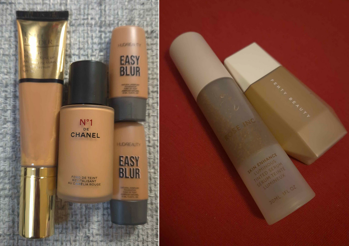
My chosen foundations for the Project Pan are the Chanel N1 de Chanel, Estee Lauder Futurist Hydra, and Huda Beauty Easy Blur. The ones from EL and Chanel are the glowiest and dewiest in my collection, which is needed because this is the time of year when my skin is the driest while in Germany. I included Huda’s foundation because of the different shade options in those minis, and to layer with the others if I want extra coverage.
Some other foundation loves are the Hourglass Ambient Soft Glow, Nars Light Reflecting, Armani Luminous Silk, and Lisa Eldridge foundations, but those all require me to pair them with the Charlotte Tilbury Unreal Skin Sheer Glow Tint to look less matte, but my CT product is a bit light for me right now. I am still including the CT in my Project Pan, but under the highlighter category.
The foundations that I know I will use a few more times are from Rose Inc (Tinted Serum) and Fenty (Liquid Eaze Drops). I like those two enough that I just wouldn’t feel satisfied if I didn’t get more use out of them, though they also aren’t hydrating enough for my skin.
One other thing to note is that I’m still using the Danessa Myricks Yummy Skin Serum Skin Tint until the review goes up. Depending on how much I like that one, it might or might not join the others.
As for the conditions of everything: Estee Lauder’s is my backup bottle that I opened a few months ago, Chanel’s is one of two shades that was purchased almost a year ago and was the foundation I used the most in 2024, and Huda’s are minis in three shades, but I have no clue how much is left of any of them.
Concealers
My chosen concealers are the KVD Good Apple for under my eyes and the Hourglass Vanish Airbrush Concealer for my face. I always put the KVD concealer on top of the Milk Hydro Grip Eye Primer (and there’s about half left in my current tube). I am pretty sure I finished at least 2/3 of this concealer, but I have a backup. I also have an additional shade that I use on the rare occasion to mix for brightening.
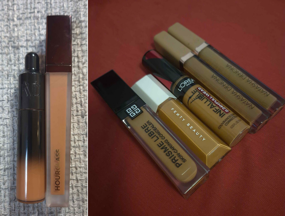
Other concealers for my under-eyes that I might want to switch to depending on what foundation I’m wearing in order to match in tone are the L’Oreal Infallible, Fenty We’re Even, and my two Prisme Libre Skin-Caring ones.
The Hourglass one was chosen because it has the most coverage of the face concealers and the tone of it acts like a color corrector. I could have picked the Danessa Myricks Yummy Skin Lift and Flex or the Natasha Denona Hy-Glam for that purpose as well, but this was the best choice of the three. I have a full size and travel size in different shades. Neither were used much.
Powders
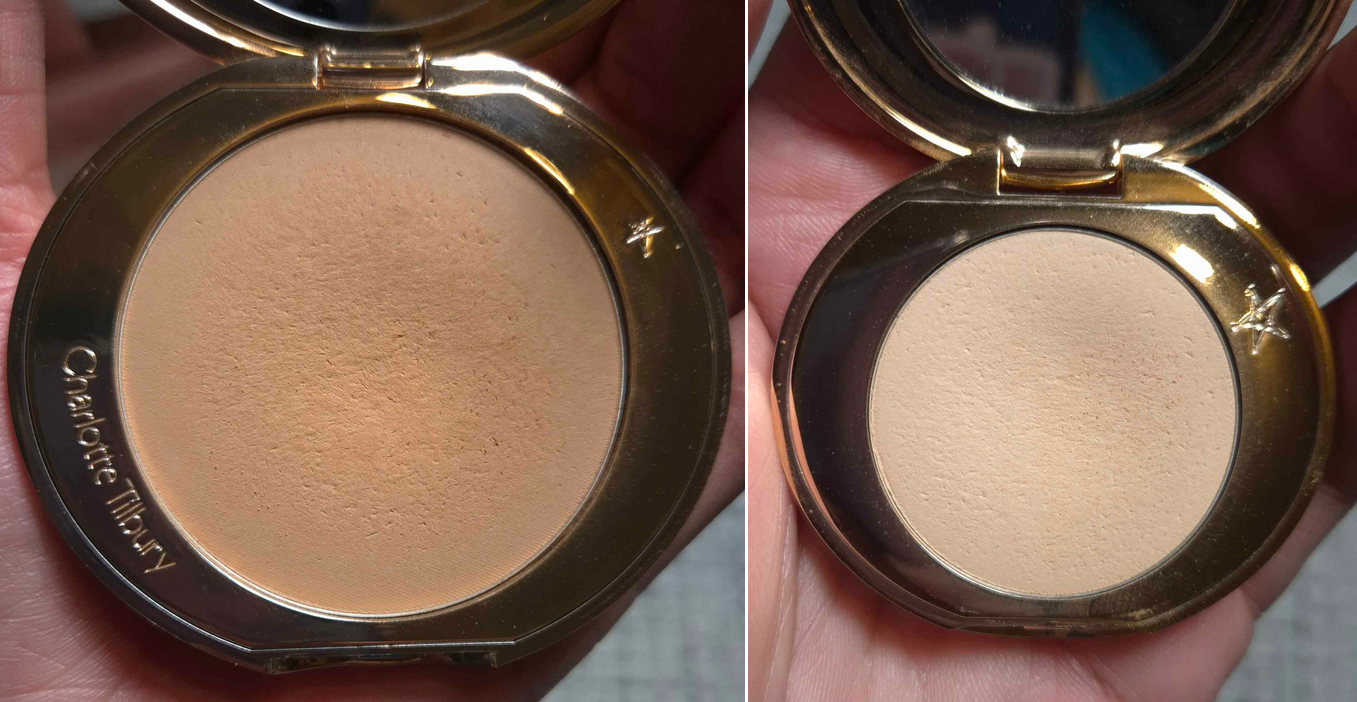
The Charlotte Tilbury Airbrush Flawless Finish Powders are what I use to set my under eyes (especially with the KVD concealer). In my Powder Collection Update and Declutter post from March 2024, I showed the original Deluxe sample I was using and the travel size I had in the wrong shade. I’ve been using this new travel size (shade Medium) and the full-size (Tan) for about a year. Occasionally, I’ve used this all over my face, but the dips in the pan were primarily from under-eye setting. I’m proud of the progress I’ve made, but if I’m going to use the KVD concealer, this powder is required to be part of my Project Pan too.
The Dior Powder No-Powder is my holy grail finishing powder that I’ve talked about endlessly on this blog. In the Powder Update/Declutter post I mentioned above, you can see how much progress I made in a year. This is one of the few products that the Project Pan won’t change my habits on. My rate of usage will stay the same as always, so I estimate that I’ll be finished with this powder by the end of the Project Pan, and I do have a backup to replace it.
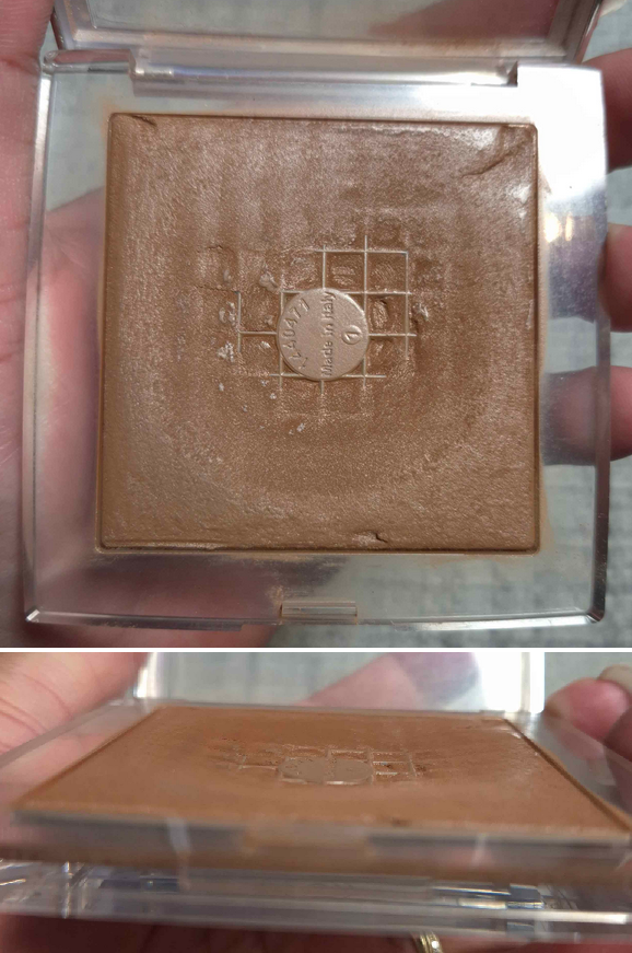
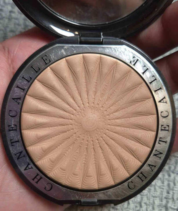
The Chantecaille Perfect Blur Finishing Powder went untouched for another whole year! I am determined to get some use out of it considering how expensive this product is (even though I bought it for $33). It’s technically a finishing powder, but I’m going to use it like a setting powder for my face. I don’t expect to use it much in the dry winter, but maybe in spring.
Contour
I’ve been using the heck out of this Hindash Beautopsy Palette for years, but its number one usage is for contouring. I have only managed to make the barest dents into these pans (not including accidental scratches) because there’s so much product and I need to use so little of the powders each time I do my makeup! Again, this is something I don’t expect my Product Pan to really change my usage of too much. However, I still wanted to show its beginning state.
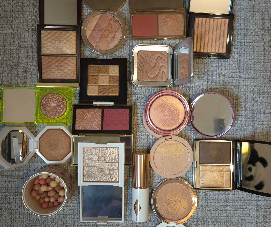
Bronzers
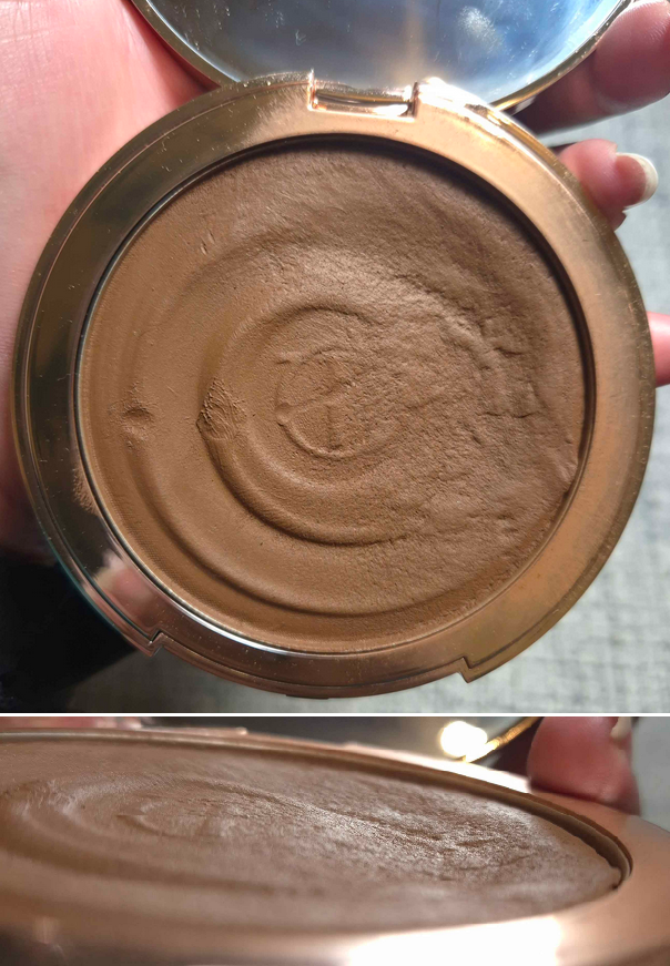
My chosen cream bronzer is the Charlotte Tilbury Beautiful Skin Sun-Kissed Glow Bronzer. I have purposely tried to keep picking up product from the same spot so I can retain some of the original pattern on the surface. This is a gigantic product, so I don’t expect to finish even half of it by the end of six months, but I do want to prioritize it again.
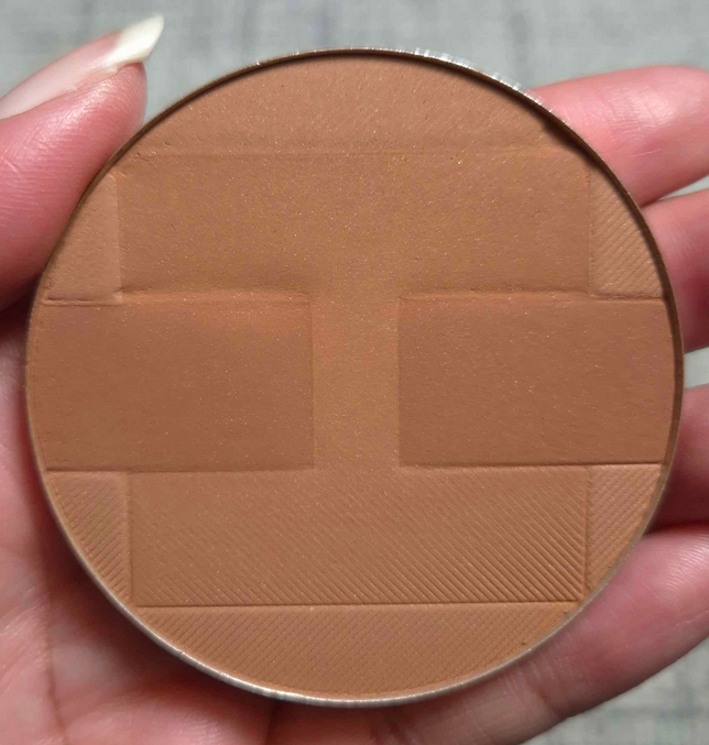
My chosen powder bronzer is the Hermès Plein Air H Trio Healthy Glow Mineral Powder. I absolutely prioritized this product last year, and I also kept dipping my brush into one half of the pan to retain some of the pattern, but this is another huge bronzer with so much product that it hardly looks used.
This is an easy one for me to want to use all the time, but it’s a very warm orange-toned bronzer, so I might use others in my collection during times when I’m in the mood for either a neutral or a pinky brown. Essentially, the parts that form the ‘H’ are yellow and the center portion of space between the ‘H’ is red. If I want to avoid the orange by using less of the darkest color, the yellower portions don’t have enough depth for my skin tone to be able to show up as clearly. So, other powder ones might be required.
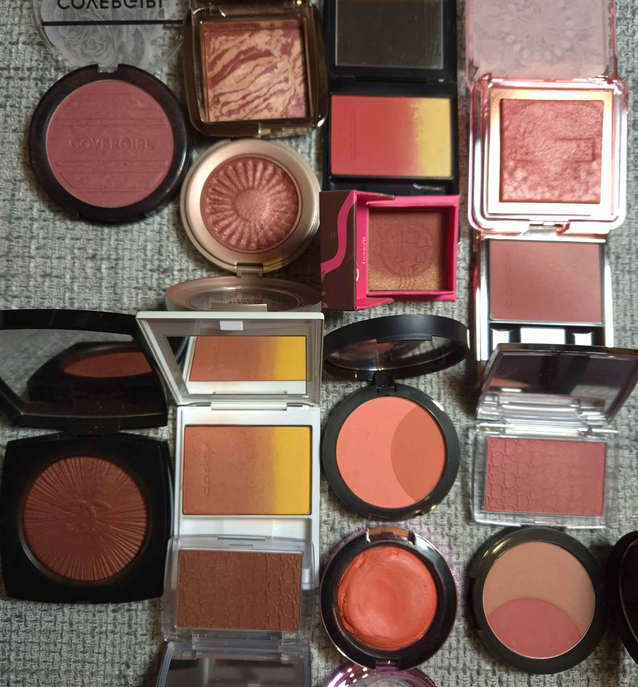
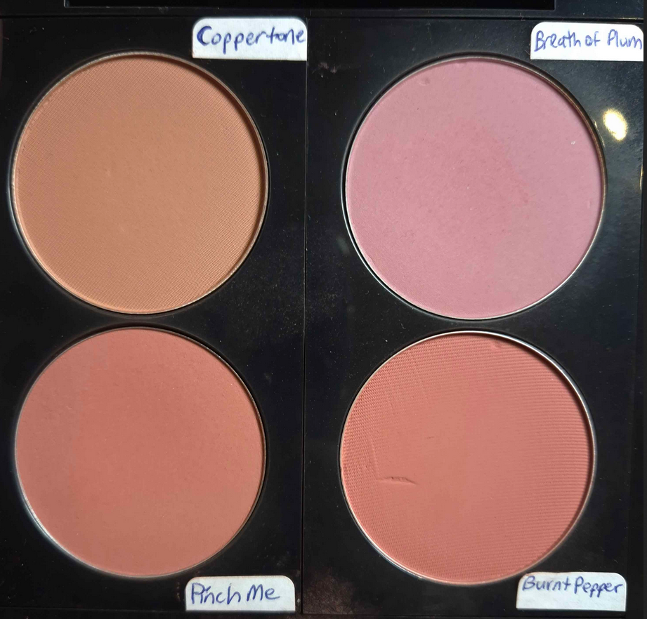
Blushes
This is the second biggest category, aside from eyeshadows, though I can at least show these all in one photo!
I contemplated doing this by brand, but the truth is that I don’t have some of my favorite shades in my holy grail formulas. Once I decide I like a blush, I will wear it based on the color and finish. I won’t be thinking about how easy it is to blend and I will adjust my brushes accordingly based on how saturated or not I want my cheeks to be. The majority of blushes I own have fantastic quality, so selecting by favorite shades and then the top formulas among the similar colors was how I decided upon the group.
I will note that there are so many more I wanted to include, but these are the kind of colors I’ve been wearing the most over the past year. So, if I’m suddenly in the mood for an electric orange, I will allow myself to reach outside of this collection. The chances of that happening though are pretty low. There are very specific products not included here that might get one or two uses out of to satisfy the craving before they return to the back of the shelf.
The only time I think about the inconvenience level with blushes is in regards to liquid blushes. That’s why none of them are on the list, even though I think the Glossier and Rare Beauty ones are phenomenal.
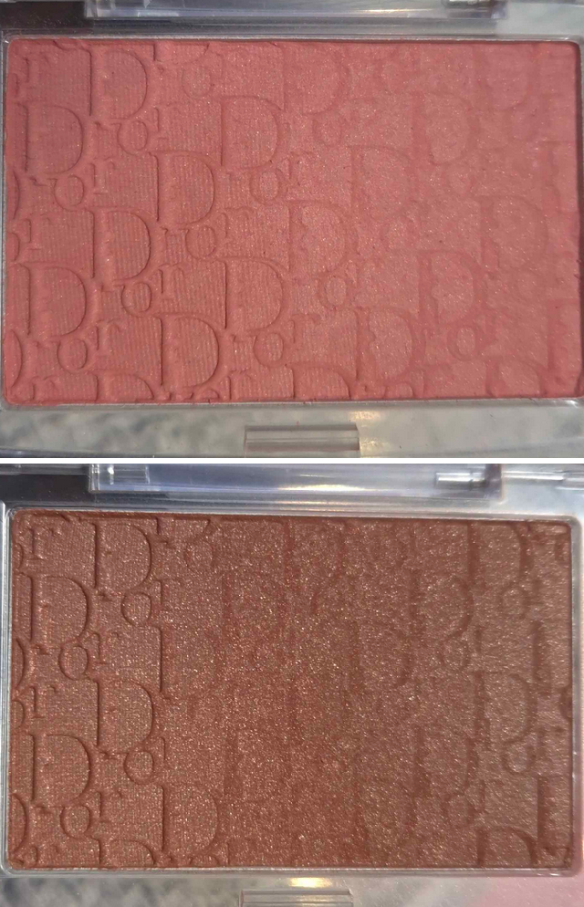
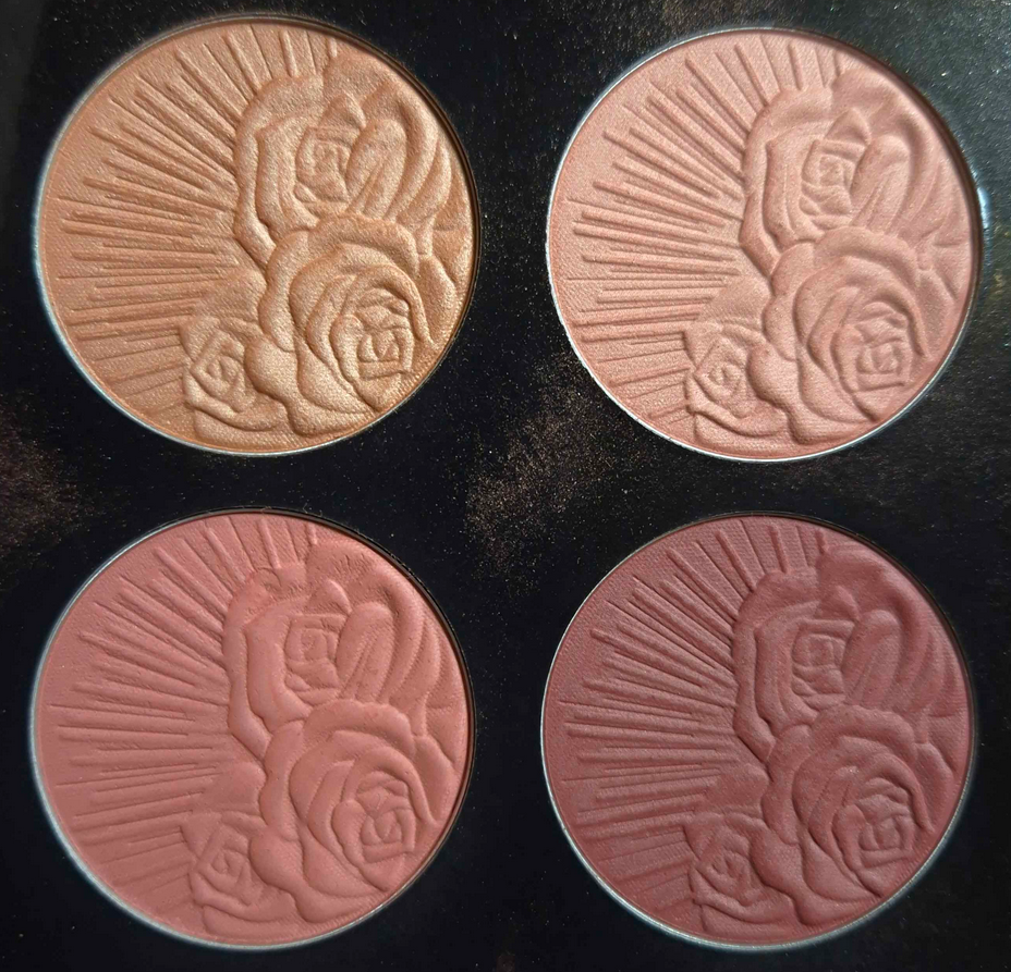
The Dior Rosy Glow Backstage Blushes are an absolute favorite. I was pretty obsessed with Rosewood and it was the only one I brought with me to Germany. However, after Bronzed Glow was released in that stunning shimmery finish, I admittedly stopped using Rosewood. The chances are high that I’ll start using it again though, so both are being shown above.
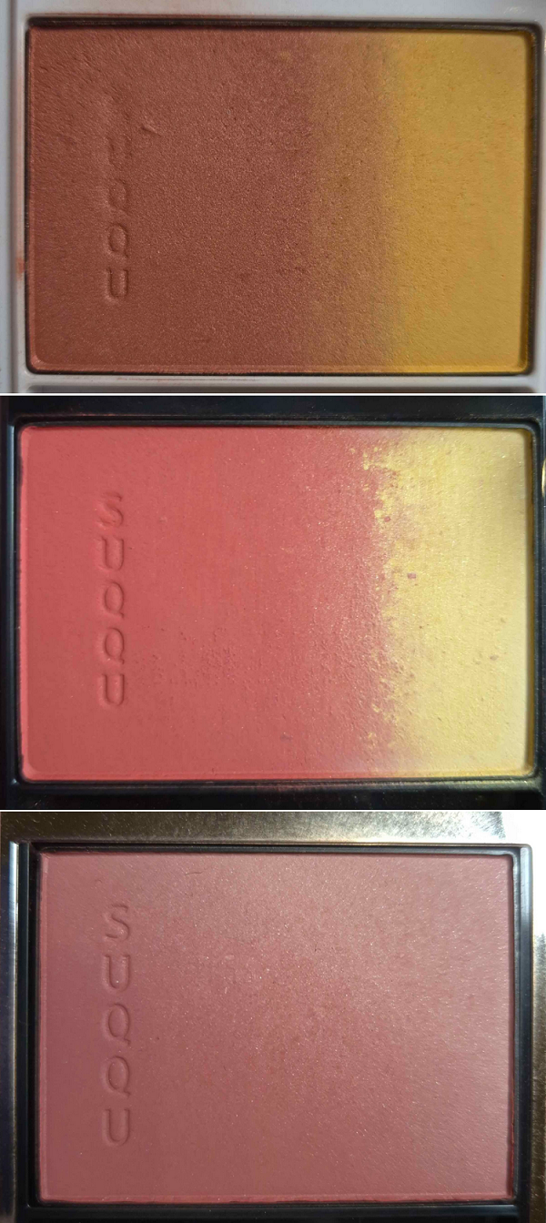
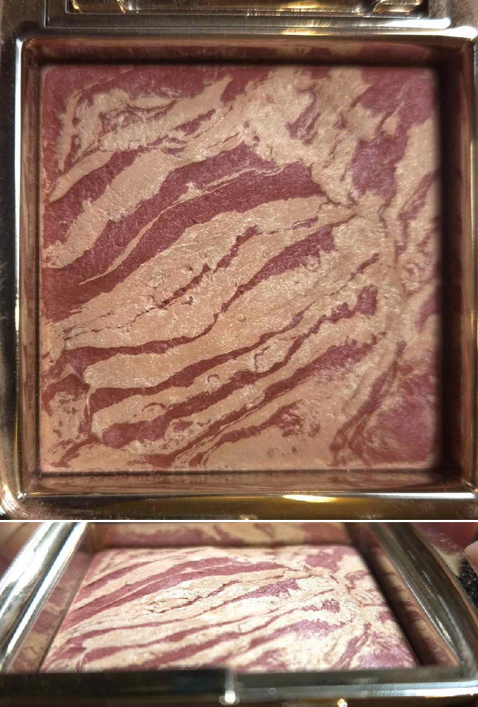
The five Suqqu blushes I brought with me, plus the newest one from the Holiday ’24 collection, can be seen on my Instagram. I used a fair amount of the top two shown above, though it doesn’t look like it based on the pan. The third blush, 105 Akanezome, was purchased in November, but it quickly became a favorite. It’s one of the rare deep colored blushes from the brand that remains muted in tone without being ashy.
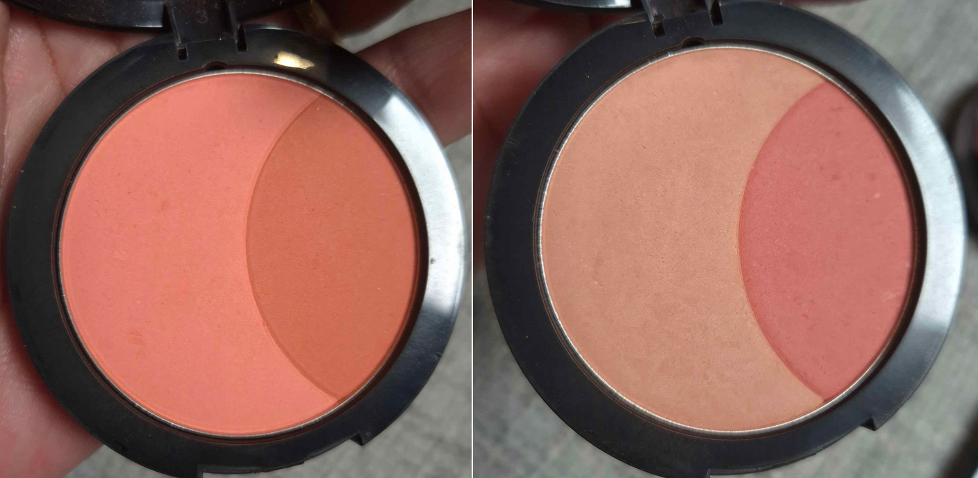
These Sephora Soft Matte Duos are another obsession. Tigerlily and English Rose are my favorite two. I have used them a decent amount, considering the size of my collection, but not as much as I would like. These are one of the prime reasons for me starting a Project Pan in the first place. Actually, that can be said for the blush category as a whole. If I wear makeup a few times a week, but I have 100 blushes I want to wear, I could only wear each blush 1-2 times a year. So, I’m forced to narrow down the choices (and increase how often I wear them) if I want to enjoy a good portion of them at least 10 times a year!
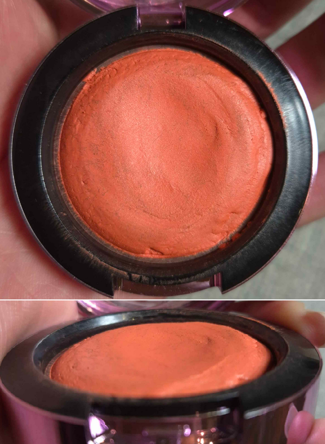
My MAC Blush collection alone is already out of hand. I decided to showcase my most used Glow Play out of the six I currently have with me, along with the custom blush palette I used a ton last year. It is so crazy to me how barely touched the pans appear despite my efforts. I have a few other MAC blushes I love that aren’t being shown here purely because they are shades or finishes I used a lot in the past, but less often nowadays.
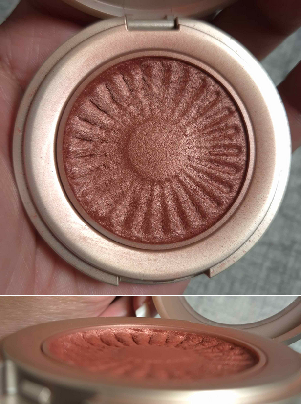
My other blush palette being included is this one from Pat Mcgrath. The blushes show very little signs of use because I really haven’t used it much in 2024. Prior to owning this pan of Desert Orchid, I was using the Paradise Glow Duo which contained Desert Orchid and Paradise Venus. Prior to owning this pan of Nude Venus, I was using the single compact of it before gifting it to a friend. Prior to owning this pan of Paradise Venus and the half shade within Paradise Glow, I also had the single compact before gifting it to my sister. So, it’s no surprise that all my PML blushes look new when I keep switching to new pans of the same thing. The one I used the most from this palette is Divine Rose III specifically because I didn’t have it in any other form. I love these shades though, and took an unintentional break from them because I used them so much in their other compacts between 2022 and 2023. So, I would like to finally get back into using them. Also, I would have loved to bring my depotted baked shade Aphrodisia, but I was too afraid it would break in my luggage. So, I’m still waiting with bated breath to see if the brand will release more of the baked blushes in a different packaging (and I would actually welcome a repeat of Aphrodisia).
All of my Hourglass Blushes are fair game, but At Night is my favorite color by a long shot. This is the only one I really want to focus on from them, at least until I get access to Mood Exposure and Diffused Heat again (in the Ambient Lighting Edit palettes I left behind).
I think the BareMinerals Blonzer is the blush with my biggest pan dip, although it’s hard to tell in photos. There were times I used this exclusively for months! I traveled with it. I stopped using certain MAC blushes because of this one. Although I get more excited by some of the other blushes I mentioned, I know I will end up circling back around to using this. So, I officially included it.
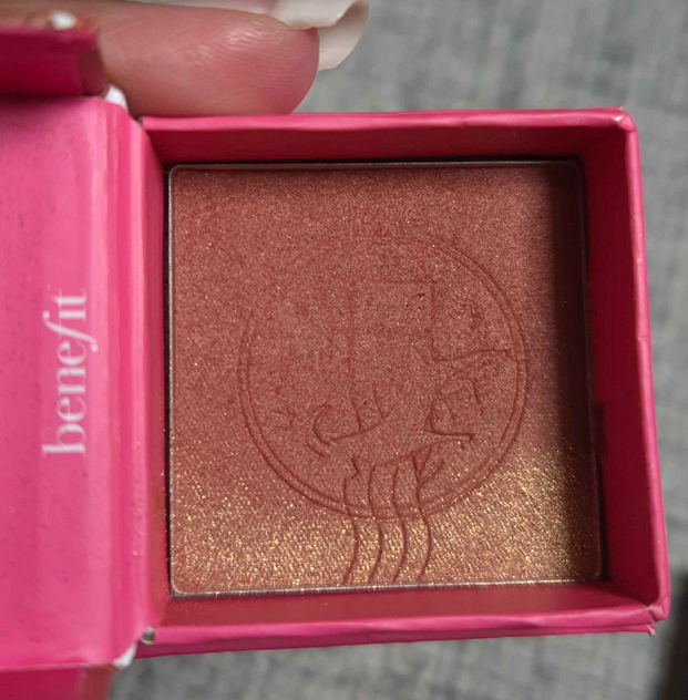
In the case of the Benefit Wanderful World blush mini in Terra Spark, it doesn’t look all that worn because I was previously using the mini of the original Terra. I brought this blush and the shade Pom Pom, but I missed Starlaa and Java a lot. The only reason I left them behind was because I thought I’d use a similar color from Suqqu and the Chanel Lumiere Brun Roussi or Vieve brown blushes more often. That didn’t end up happening! I have to be in the right mood to wear Pom Pom, so it’s just Terra Spark in the Project Pan for now.
I started working on the details of this post in November. By the time it was Cyber Monday, I missed Starlaa so much that I repurchased it in the mini form. As Java is only available in the full-size, I held off on buying it. So, Starlaa is unofficially part of the Project Pan too.
I feel like I’ve used Chanel Blush Lumière in Brun Roussi a decent amount because I subconsciously replaced it with MAC’s Faux Sure blush, so that one took a backseat instead. For now, I’m continuing to work on this one over that one.
The last two are my drugstore options. I never forgot about these in my collection. It was always the situation that I considered using them more, but would be lured in by the luxury ones instead. The fact is though that I don’t have a mauve this good from other brands besides the Covergirl Trublend and I don’t have a light shimmery pink that doesn’t just look like a highlighter other than from Nabla’s Skin Glazing line. I still think these will only be occasionally used in the Project Pan, but I felt strongly compelled to include them for extra variety.
Highlighters
I truly cannot go through a highlighter if this is the state of mine from Charlotte Tilbury (on the right) that I’ve used at least 75% of the time in 2024. I used the 1st and 3rd strips exclusively. I can see where they’ve been worn in, but I don’t have any significant dips. Wild! The ability to kind of fine-tune the color and intensity is why it’s the top highlighter in my collection.
The Hindash highlighter in Peak Heat (reviewed HERE) is a newfound love. This was not easy to get and I waited so long for a new Hindash product to fall in love with, so I’m absolutely putting this in the Project Pan.
Above is what I currently have left of the Charlotte Tilbury Skin Tint I talked about in the beginning. I probably only used about a half centimeter of product, but it’s still a decent amount considering my record. The pause on using it was from getting darker in the summer and wearing naturally glowier foundations. With the weather change, I’m bound to start using it again, but I’m not in a rush to finish it. This item is here purely for when I need it, so I just want to see how much gets used at the end out of curiosity.
Eyeshadows
There was no way I could pick just one palette for this category. The whole reason my eyeshadow collection got gigantic is because of my desire to have every color under the sun, including shades that shift. I thought it might be best to instead figure out the five brands whose eyeshadows I love the most and/or use the most. For example, I think Natasha Denona has fantastic quality eyeshadows, but I only use about 15 shades regularly out of my entire collection. It’s the same story for Viseart. I love all the colors available to me, but I keep going for the same ten or so shades. For this reason, choosing one palette from each of the five brands would still feel too restrictive because of the color stories (my top ones are mainly greens and neutrals). So, as far as I’m concerned, my entire eyeshadow collection is part of the Project Pan, but I will put my favorite three palettes from Pat Mcgrath, Oden’s Eye, Melt Cosmetics, and YSL Beauty in my makeup area so they’ll be easily within reach. My custom Clionadh Stained Glass palette hasn’t left that spot in over a year.
Regarding taking starting photos, the state of my palettes haven’t changed enough since doing those ranking posts, with the exception of YSL‘s (that I only reviewed and didn’t rank). So, I’ll show the state of those here. I will also note that the Natasha Denona Mini Gold Palette is one that I’ve tried to prioritize using in the past, so I know it’s going to be on my mind to try and make more significant dips into the eyeshadows than was seen in that ND ranking.
I still have some new-to-me indie palettes I’ve been using that have yet to be reviewed, so I will be posting about those in the future. It will also be difficult for me to resist buying a palette from any of my top ten favorite eyeshadow brands if they release a color story I love.
Everything Else
When it comes to face and eye primers, mascaras, eyeliners, brow products, and lip products, I’m just going to use everything I currently have. Excluding the lip category, all the others I listed contain items I love, but are replaceable. I have repurchased them many times, but there’s always something else I could like just as much because they aren’t radically different from each other.
The only difference between my 2021 Primer Declutter and current collection is that I whittled it down even more. The only face primers I still have is a fresh deluxe sample of the Milk Hydro Grip and mini of the Benefit Porefessional Hydrating Primer. What’s left of my eye primers is a fresh MAC Paint Pot, old Gerard Cosmetics Clean Canvas, fresh Nyx Glitter Primer, and the Lisa Eldridge Liquid Silk Eyeshadow that I use as a base. Technically, the Milk Eyeshadow Primer is included, but I use that with concealer. The Milk face primer is a “like” not “love,” so I might buy a new primer when I finish the Benefit one. That’s iffy because I pretty much stopped using primers again and rely on skincare for my prep.
I always give a shout out to my Stila Stay All Day Waterproof Liquid Eyeliner, but I can get along just fine with others. My current two black liners I’m using are from One/Size and Stila, but they’re both almost out, so I have a Nyx and Sephora one waiting in the wings. I also have colored liners in gel pencil form, but I rarely use them, so I try to avoid buying more.
I’m really not picky about my brows. I’ve liked nearly everything I’ve tried. I am currently using up my last Benefit Precisely, My Brow Pencil and I interchange using it with the e.l.f. Instant Lift. It’s literally just a matter of grabbing whichever I see first. After both of those go, I have an e.l.f. backup.
My current mascara obsessions are the MAC MACStack and KVD Full Sleeve Mascaras, but I have so many I could name that I’m happy with and love. I believe I’m on my second full-size one from MAC and I have a backup. I’m nearly done with my current KVD one, but I have a backup here and in the US. I have a lot of other mascaras I brought with me still, so I just want to use them up while I can.
As for lip products, I found a ton of formulas this year that give me color without drying out my lips. I want to use what I’ve got and enjoy having the ability to switch between a bunch of different shades depending on my mood. So, there isn’t any one thing I’m going to focus on. My most used up lip products at the moment are the Ami Cole Lip Oil Treatment and Lisa Eldridge Baume Embraces. I have a backup Ami Cole lippie in the US.
So, that’s my list of products I’m focusing on! I’m not sure if I’ll do a midpoint check-in. I guess it depends on the number of views of this post so I can gauge the interest level. If there isn’t much interest, I’ll at least post my final results at the end of six months, even if it’s just for my own eyes.
Today, we’ll be looking at seven lip balms I’ve yet to review on this blog! As it’s winter time and most people’s lips on this side of the globe tend to be in a more vulnerable state, now seemed like the right time to tackle this topic! Hopefully it will be helpful for anyone with lips as difficult to keep conditioned as mine.
Before we start, I’d like to share photos and a first impression of one more lip balm: The YSL Valentine’s Day Loveshine Candy Glow Collector that I’ve only had for four days by this point. The shade 7b Nude Pleasure is not a new color. It’s just the packaging that is limited edition. It’s made of the same material as the other lippies, but the pink and blue outer portion feels like a soft touch matte. The only other shade available in this packaging is another repeat color called Nude Lavallière.
I have now experienced all of YSL’s Loveshine formulas. This has the thinnest consistency, is moisturizing, but not the best at hydrating. It doesn’t last on the lips as long as the others and I have to reapply quite a lot. It has the sheerest amount of pigment, but still bestows more color to the lips than I expected. At least, this particular shade does. This also has the signature fruity scent that I find very pleasing. I consider this formula to be a sheerer, balmier, and lightweight version of the Loveshine High-Shine Caring Lipstick in Caramel Swirl #122.
My favorite of the YSL lip formulas are still the Candy Glazes. This specific balm is nice, so I don’t regret buying it. However, I don’t need more than one from this line in my collection; I bought it out of curiosity and for the limited edition packaging. I am on a lip product low-buy, but this was something I planned to get when I saw the sneak peeks six months ago, so it’s an exception.
Summer Fridays Lip Butter Balm in Sweet Mint
Summer Fridays’ range has different scents and colors. I wanted one that was essentially clear, so I chose Sweet Mint. The scent is weak in the tube, but once a thick enough layer is dispersed onto the lips, it’s much more apparent. I also get a minty tingling sensation from the combination of menthone glycerin acetal and peppermint oil that are in this formula.
The consistency isn’t sticky. It has a nice level of shine. There’s more reflect than a traditional balm, but much less than a gloss. I think it’s interesting that this balm contains some mica, which possibly adds to the reflectivity.
The brand says that this can be worn overnight as a lip treatment, but it doesn’t have enough grip to last the whole time. I have to reapply throughout the day and at the end of the night I have a mix of plumped soft hydrated spots and a few dry spots where the product couldn’t stay on the lips as long. This result is quite similar to the Lancôme balm I will discuss later, but this one works better as a conditioning agent for my lips. It hydrates my lips a tad more and holds on a little longer, making my lips softer overall.
I’ve had this since November 2023, and unlike many other lip balms I’ve used that come in squeeze tubes, the formula hasn’t separated. My luck might start to run out since it’s good for up to 12 months after opening, but I’m planning to keep this around a bit longer. In fact, it’s my replacement “bag balm” for when I forget to put on a lippie after leaving the house and have to grab one from my bag.
I am curious as to whether I would like the other shades, but I’m not going to buy more while I have so many other lip products to go through. This doesn’t get holy grail status with me, but I at least understand the hype. I also find it interesting that Morgan Turner didn’t think these were anything special, while living in Florida, until she moved to a colder climate. I had the exact same experience where I thought this was just fine while I was in Florida, but enjoyed it way more once I moved.
One other thing I discovered as a major reparative combination is applying the Clarins Lip Oil to my lips and then adding a bit of this on top. The Clarins works quicker at nourishing my lips than a lot of other products, but suffers from not having enough grip to stay on my lips for longer. Although the Sunday Fridays doesn’t have a lot of grip either, adding it on top helps the Clarins stay on longer overall and form a better occlusive layer. Having Clarins underneath also prevents me from feeling the cool-tingling effects of the Sunday Fridays balm.
Makeup by Mario MoistureGlow Plumping Lip Serum in Honey Glow and Blush Glow
At the time I bought this, I didn’t realize it was a plumping formula (which I usually avoid). Thankfully, it’s the cooling type rather than the burning one. The cold sensation lasts for two hours before it starts to fade away. I think it makes my lips slightly bigger, but it’s hard to tell as I already have full lips.
This has a click mechanism to propel it upward, but it can’t go back down, and because it’s a melting type of formula, it is very easy for this tube to get messy. I didn’t think anything about how light the component felt in the beginning, but after splurging lately on high-end and luxury lip products, I started to dislike the Makeup by Mario one. Comparing it to drugstore priced lip products in my collection, this is cheaper feeling than some of them and nearly all my mid-range lip products have more substantial packaging. There’s something sleek about it and appealing in a minimalist way, and I’m sure it cost more money to make every tube match the balm color, so I’m not disappointed visually. I’m only disappointed once I pick it up and hold it.
The balm smells sweet, but I can’t put my finger on what it’s supposed to smell like. It contains Vanillyl Butyl Ether as well as fragrance. After a few hours some of the layers sink into my lips, so there’s less on the surface, but the balm hangs on until I eat food.
When it comes to products creating a white rim around the mouth, I assumed it was from formulas that were too emollient. I don’t apply what I consider to be too much, yet I still get the white ring sometimes. Also, this doesn’t feel sticky when I first apply it, but after it has time to settle on my lips, it does become stickier. It’s nice to be occlusive, but watch out on a windy day if you wear your hair down or get too close to someone else’s hair!
It looks shiny on the lips at the start too, but when some of it is gone, it doesn’t look much different from a regular lip balm. Even though this product is hydrating and does a decent job maintaining moisture on the lips, I hate having to reapply because it feels cold for so long. It’s hard to forget it’s there, which is somewhat uncomfortable especially as I live in a cold climate. It’s the reason I try to avoid wearing the Too Faced Hangover Pillow Balm in winter (though the cooling only lasts 45 minutes to an hour, which is more tolerable). If the brand made a non-cooling/non-plumping version, I would consider buying one of those instead. This range has a ton of colors, but they’re too sheer for me to feel like I need more than one.
Fantasy Cosmetica x Makeup Just for Fun Tinted Lip Balm in Pomander
According to the website, this particular shade is “spiced orange scented” and the color is described as “sheer dusty orange.” Both the color and smell actually remind me of persimmons and cinnamon. I’m not surprised that I like the scent considering Fantasy Cosmetica has delved into fragrances already in the form of perfumes and candles. I haven’t purchased those, but I heard only positive things, so I expected scented balms from them to be just as good.
This particular product is part of a collab with Makeup Just For Fun and comes in four other shades and scents. I honestly bought it because I wanted to hit the free shipping minimum through Monolith EU and it had a good review from I Am Jamila.
I think the slight tint of color is very pretty. To me, this is a little sticky, but that helps to keep it on the lips longer. It works better as a moisturizing product for me than a hydrating one. Essentially, it smooths out and softens my lips, but once it wears off it doesn’t have lingering effects that prevent my lips from starting to dry. For example, the top conditioning products in my collection make it so that I can go 1-3 days without wearing anything on my lips before they start to chap. Because it can’t do that, I just won’t consider it a lip treatment. As a normal balm, it feels soothing the whole time I wear it with the extra benefits of a glossy appearance, flattering color, and smoothing aspect. It can’t survive past me eating a meal or drinking too much throughout the day, but I reapply less often than I would assume based off the consistency of the balm. I should specify that after eating and drinking a lot, I have to apply more because the emollient layer is easily removed, but I’m left with a sticky coating on my lips that’s not as comfortable to wear in that barely-there state. The balm technically hangs on, but realistically should be reapplied. I have to also be careful how much product I squeeze out of the tube. It’s not difficult to accidentally squeeze out too much.
I like this enough that I would have considered getting other shades/scents if I wasn’t on a low buy. I’d rank this product somewhere among the upper middle of my lip collection. It’s not a favorite, but I like it more than I thought I would.
Rabanne Lovebalm in Bloody Kiss 068
I didn’t have the patience to wait and take photos first before using this because I was so excited to immediately try it out. I had no interest in this product until Kackie Reviews Beauty talked about it in her video Testing 45 Lip Balms. In September, Ulta had 10x reward points on Rabanne Beauty, so I bought the shade called Kiss My Neck and had it shipped to good old USA thinking I would still be going to Florida. Unfortunately, plans changed, so I don’t have that shade to showcase here today. However, I will update this post in the future to show pictures of the color (though I expect it to basically be clear).
That’s where I thought things would end, except that Hannah Louise Poston ranked it as the best luxury lip balm in her Epic Lip Balm Search video, and curiosity turned me rabid. As soon as it was on sale at Sephora’s German website, I bought Bloody Kiss, which was the only other color I wanted.
I usually avoid buying dark lip colors (especially cool toned ones), but because this can be applied in an ultra sheer layer, I was intrigued to have a balm that could leave me with a light tint or create a wintery-cold type of look.
Unlike my Ami Cole and Too Faced Pillow Balms that are effective at quickly nourishing my lips no matter what state they’re in, this one works slower. My lips look smoother when I apply the Rabanne Lovebalm, but I can see the color gathering in the crevices between chapped skin. In times like that, it’s best that I don’t try to do a sheer layer and to obscure the look by building up its maximum opacity. In the example below, it was nighttime and was wearing off, which was how I could see the spots that color gathered up.
Going back to the treatment aspect, this feels moisturizing from the balmy/waxy consistency and it isn’t oily or sticky. It clings to my lips well enough that eating is all that forces me to reapply (though I can usually get through breakfast without needing to). This grip is a good thing because I can wear the balm overnight and it can continue to hydrate at that slow pace. It takes nearly 24 hours, but by then my lips will be in better condition than the previous day. If my lips are in decent condition at the start, this balm keeps it that way and I have no problems. If my lips are in bad shape, even though this can improve them in 24 hours, I’m going to reach for something else that’s more moisturizing and hydrating to soothe my lips much quicker. So, I like this product a lot and consider it one of my favorites, but it’s not enough to make my top 5. Perhaps it would be in the top 10. Maybe my other shade will rank even higher.
I consider this on the heavier side of lightweight because I can sometimes forget I’m wearing it, but it’s not as light feeling as my other waxy (and admittedly inferior) balms. As a makeup product, the gathering of color in chapped spots isn’t great, but that can be worked around, and lighter shades in the line might not show this problem as easily. I like being able to control the color intensity. This has some shine, but it’s far from glossy. I give the brand kudos for creating a nice makeup/skincare hybrid. What comes to mind is the Lisa Eldridge Baume Embraces, which I think is an even better formula for my lips than the Rabanne Lovebalm. They are similarly priced, but Lisa’s is 2.8 grams and in a melty formula that I’ll use up way quicker than Rabanne’s at 3.4 grams. Both packaging is luxurious looking, but LE’s is gold toned and lightweight whereas rabanne’s is bigger, heavier, and has the really pretty pink ombre into silver tube. Rabanne’s feels more luxe in the hand, like a taller and skinnier YSL Loveshine tube.
At the start of the Lovebalm review, I mentioned Kackie and Hannah who raved about this product, but in the shade Soul Kiss. Even though I like this balm, I will be sticking with the two shades I have currently.
Lancôme Lip Idôle Squalane-12 Butterglow Hydrating Lip Balm in 53 The Tea is Hot
This product feels like I’m applying a satin lipstick, but it isn’t until I rub my lips together that I can feel the balminess. The finish has some shine, but it’s definitely not glossy. The consistency leans more creamy-waxy than oily-emollient. It’s lightweight enough that I keep forgetting I’m wearing it until I accidentally lick my lips and get the waxy-chemical taste. The scent is candy-like mint, the kind that reminds me of buttery after dinner mints. In addition to fragrance, the formula contains peppermint oil, but I assume it’s intended to give a plumping or cooling effect, though I don’t detect either in practice.
This has a slight sticking quality, but not enough for me to call it sticky. My lips look smooth and I love the color I chose! It’s pigmented enough for me to be satisfied with the coverage, but the other colors I’m interested in would be of similar depth and just different in tone, making it not worth it to me to buy more shades (even at the discounted price I got).
It’s decently moisturizing and hydrating while it’s on my lips, but the issue is that it’s not long lasting. By the end of the day filled with several reapplications, the spots where my lips had the product on longest remain soft, but places where the balm kept wearing off first (ex: corners of my mouth) were dry. Lancôme heavily advertises the 12% squalane and inclusion of ceramides, but I’ve never been able to tell how effective those ingredients are for my lips. I’ve worn products with both of those ingredients that either did nothing or worked well, so it’s impossible for me to know how much of a role they played versus the contributions from the other ingredients. In this particular case, Lancôme’s balm also contains shea butter that I know my lips enjoy, sunflower seed wax that I only know my lips enjoy in oil form but can’t tell if the wax would be as effective, as well as castor oil, canola oil, and jojoba butter and oil that I also haven’t been able to isolate and rate.
Since this works well when it’s on my lips, but I’m very bad at remembering to reapply, I won’t think of this as a lip treatment product. Instead, I will look at it as a makeup product with a few benefits. So, I am happy with my purchase.
Nivea Deep Moisture Balms (Melty Type)
I showed the photo of the unscented above, but I bought the honey “flavor” afterwards, since people were heavily praising the scented ones. The honey balm is yellow, but doesn’t leave any color on the lips. It’s called a flavor, but doesn’t actually have a taste, and its honey smell makes using this far more enjoyable.
It feels nice wearing this and isn’t too sticky, plus it has a nice glossy effect when I first put it on. However, as I wear it and talk, it likes to gather in the corners of my mouth and also form a white ring. Every so often I get the sensation of needing to rub my lips together to smooth the balm layer back out. It’s moisturizing, but it doesn’t have enough grip to stay on the lips past having several drinks. Another reason I have to reapply more frequently is because I have to wipe it off where it gathered in excess and then reapply to the spots I want.
Besides having several ingredients my lips like, the second best benefit to this balm is the 26 SPF PA++. Though direct sunlight isn’t as much of a problem for me anymore, it’s a general rule that I like to have at least one lip product with sun protection in my collection at all times. Lip skin is delicate for everyone, and my lips have their sensitive moments, so it’s especially important to have if I’m going to be outdoors for long periods of time, especially when I go back to Florida. This is the most conditioning formula of the SPF lippies I’ve used in the past, so this was worth it to me to buy this specifically for the SPF.
Labello (Original)
This product is a classic in Germany and maybe even the equivalent fame here as Chapstick brand of Chapstick is in the US. I’ve seen men and women using this around town and even my husband knows about it! I had so many reasons to expect to love this, but it’s just okay. It doesn’t last the longest on my lips. It doesn’t feel that it’s really penetrating deeply enough to hydrate. The ingredient list for this balm is simple, but it contains shea butter, sunflower seed oil, and vitamin e, which should all be things my lips like. Perhaps it needs additives to help make the star ingredients absorb into the skin better in order to work for my lips. Perhaps the added aroma and natural fragrance ingredients (Linalool, Citronellol, Citral) are drying my lips and counteracting the positive effects. I just know that this feels nice in the beginning, but within 3-5 hours I feel the urge to switch to a different balm because my lips feel dry. Within that time frame, the product needs to be reapplied anyway, but that sensation of dryness continues even after adding an additional layer. So, this unfortunately is the worst balm of the bunch for my lips.
Since I called this a battle in the title, I declare the Rabanne and Summer Fridays balms to be the victors! Third place goes to Lancôme.
I was beside myself with excitement over this release! It’s not that I was in any need of another highlighter; it was because it had been so long since the brand released a new product! I’ve been tempted so many times to buy the Color Fluids and Heroline Eyeliner, but with so many good affordable options in that product category, I couldn’t justify the prices. Regarding the Color Fluids specifically, the shades are liquid versions of what I already have in the Beautopsy palette, and powders are already the medium I use most. An amazing highlighter though is something I can consider. Let’s see if it was worth it!
Hindash Gradient Highlighter in Peak Heat
What makes this product special, to start off with, is the hybrid gel-powder formula. Nearly all of my holy grail highlighters are baked gelee or gel-powder hybrid too. This helps it to look skin native while having a wetter looking shine on the skin.
The particles in this highlighter are very refined. I can wear this subtly or add more for extra intensity, particularly if I spray my face afterwards. However, how reflective it will look is largely dependent on the surrounding light. It will not look blinding without being directly hit, or at least not with this shade. As someone who prefers sheer to medium intensity, I’m perfectly content with not beaming!
I have no fading or longevity issues with the highlighter. The only thing to note is that it works perfectly fine over foundation, but it doesn’t adhere as well on my bare dry skin. So, adding anything moisturizing to my cheekbones on a low makeup day will help it stay on.
It’s easy to say this is an amazing product, but I wanted to be sure that it wasn’t a recency bias. So, over the course of a few weeks, I started analyzing my powder highlighter collection all over again!
The Charlotte Tilbury Pillow Talk Multi-Glow in Dream Light has prettiest subtle glow, but it can be built up more intensely. It’s the friendliest on texture. It has ultra refined shimmer (except strip #2). The strips give me the ability to customize the color (although I don’t use #2 because of the larger sparkles). One negative is that it can look powdery, so using less is more. As long as I avoid trying to build up too much intensity, it is gorgeous.
The r.e.m. beauty Interstellar Highlighter Topper is super smooth, but shows the tiniest bit more particles compared to CT’s Dream Light, and it has more base color which means there’s a higher chance of it being harder to color match depending on the time of year. So, getting the right color is that much more important. That’s why my other shade (Miss Saturn) was good enough for the top favorites, but didn’t rank as high as Miss Mars because the color was off. Compared to many other highlighters I’ve owned, I still consider this to have a semi-sheer base enough to be a great “filler” highlighter to apply on top of scattered sparkles types of highlighters without increasing the intensity. This is slightly more reflective than CT’s Dream Light though.
Hindash’s highlighter is smoother than r.e.m beauty, but I can see it on the skin more than CT’s Dream Light only because the hybrid gel formula looks wetter, which is naturally more apparent. This can make it rank better or worse to me depending on my mood. When I do want more bling, Hindash’s can be sprayed to look even better, but CT’s doesn’t have the proportional improvement. It still looks great, but there’s only a minor difference. So Hindash’s is better at being intensified than CT Dream Light. These are the tiniest nitpicks! All of them are fantastic products!
Tom Ford’s Shade and Illuminate Highlighting Duo is the most reflective of the Top 5 and intense, so that can sometimes be great or not so great. The darker color is smoother. The lighter one has some slightly larger sparkles, which is why it dropped below Hindash in the ratings. It being hard pressed makes picking it up with certain brushes more challenging. Having the custom color is a good thing, though I’m forced to use the lighter color if I’m my winter shade, which might make the overall look have more obvious sparkle.
Charlotte Tilbury Hollywood Glow Glide Face Architect Highlighter is the wettest powder highlighter in my collection, but it has a strong base color. I used to consider this better than Dream Light because of the wet effect and reflectivity. Swatching them side by side, the Glow Glide looks more impressive. So how did it drop this far down? The base color strength. I said in my original review how important getting a matching color is for this formula to look good and not textured. Over time, I got lighter, so I started using Dream Light more, to the point where it became my number 1! In revisiting this Glow Glide, it looks gorgeous again because I’m back to being a little darker from the summertime.
The Gxve Beauty Highlighter is thinner than TF’s, and so the customizable color makes it the best color match within the top 10. It’s smooth, but others are smoother. It’s more reflective than the top 3, but also has slightly more noticeable shimmer particles. The scent is strong! It has the same drawback as CT Dream Light, that it can look slightly powdery on my dry skin if overapplied. I always do a subtle layer to avoid an intense bling anyway, so I don’t usually have this problem.
PML’s Divine Rose Highlighter is thin like Gxve and smooth in texture, but the shimmer reflectivity is more intense, which makes the particles more apparent than the ones ranked higher. I wish the brand made a deeper color in this formula because it’s a little pearly despite the gold color. It had the potential to tie with Tom Ford, if not for the color, since they have similar texture, finish, and intensity.
Dior’s Highlighter has the thinnest texture with a deep yet translucent base, but the shimmer color itself is too light for me right now. The shimmer is so refined and the formula is so smooth. It would be absolutely amazing if I could get a less pearly shimmer shade!
So, that’s the Top 8 powder highlighters re-ranked!
Below is the ranking list from highest to lowest of the holy grail highlighters I brought with me compared to all the individual highlighters or from duos that I bought in 2024. This is not a complete ranking of my entire highlighter collection though because I have plenty of highlighters still in the US that would have placed between the Hatice Schmidt one and Fenty’s, such as Becca Cosmetics Highlighters, Persona Del Mar Cali Glow Highlighter, MAC Extra Dimension Skinfinish Highlighters, Colourpop Supershocks, Melt Digital Dust Highlighters, etc. Even my nine year old version of Guerlain Meteorites would have ranked higher than the version I have with me currently.
Charlotte Tilbury Pillow Talk Multi-Glow
r.e.m. beauty Interstellar Highlighter Topper
Hindash Gradient Highlighter
Tom Ford’s Shade and Illuminate Highlighting Duo
Charlotte Tilbury Hollywood Glow Glide Face Architect Highlighter
Gxve Beauty Highlighter
Charlotte Tilbury Unreal Skin Sheer Glow Tint Hydrating Foundation Stick
Pat McGrath Divine Rose Skin Fetish Ultra Glow Highlighter
Highlighter from the Dior Rouge Contour & Glow Palette
Highlighter from the MAC Golden Hour Glow Face Palette
Guerlain Météorites Light Revealing Pearls of Powder
The only highlighters I purchased in 2024 that are worth buying, because they topped my original list, are from Hindash and Dior. I’ve said before that I don’t need more highlighters, but this truly hammers this idea home.