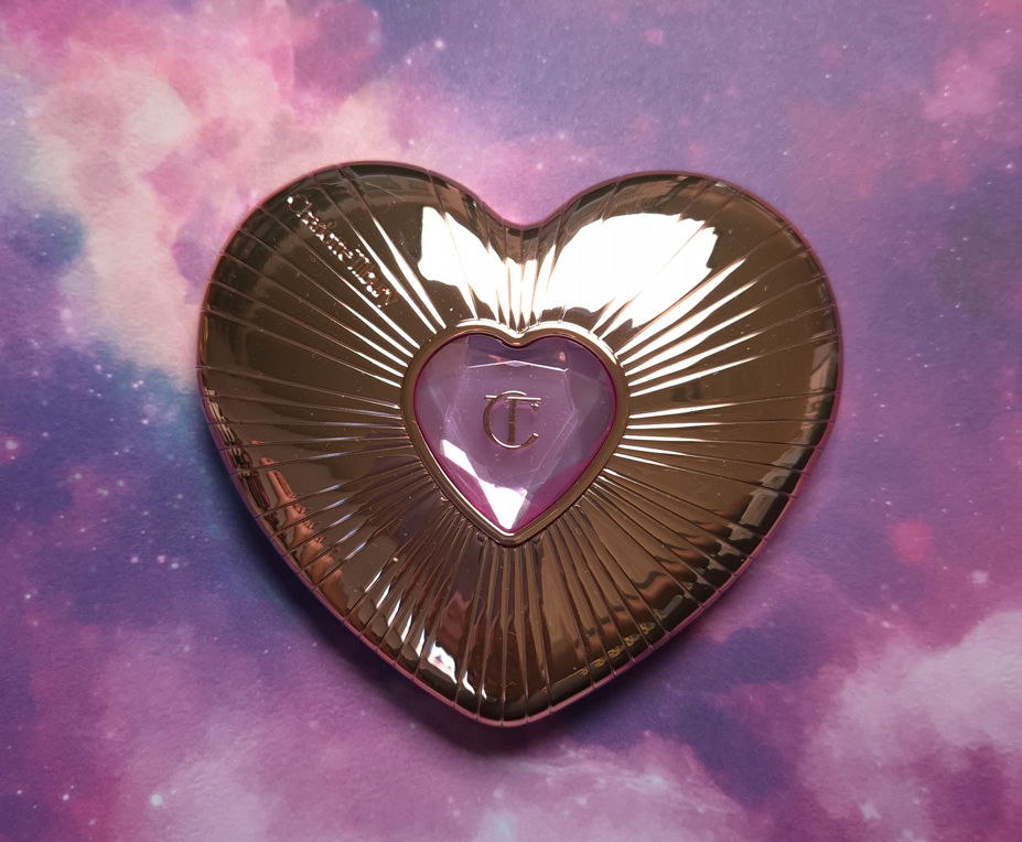
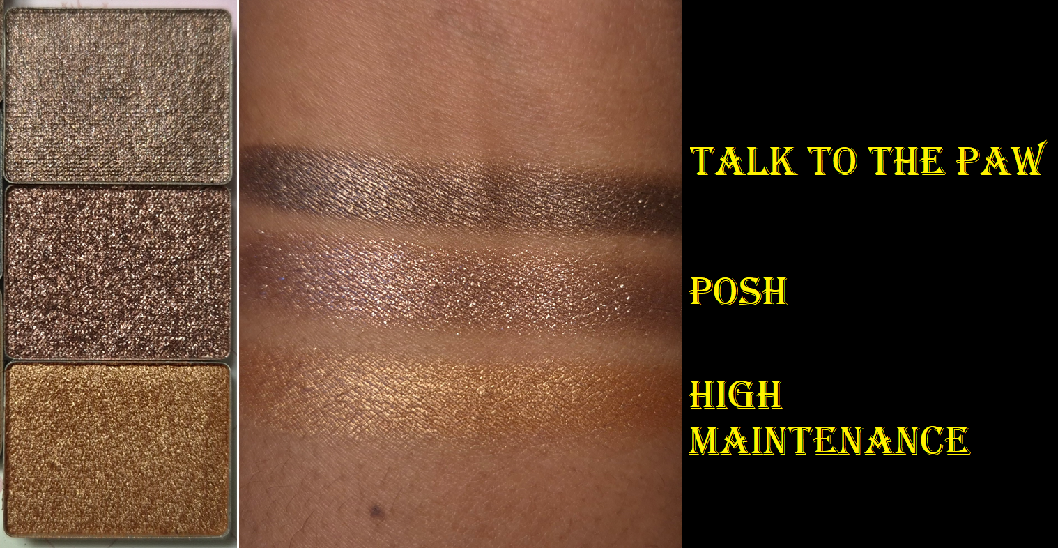
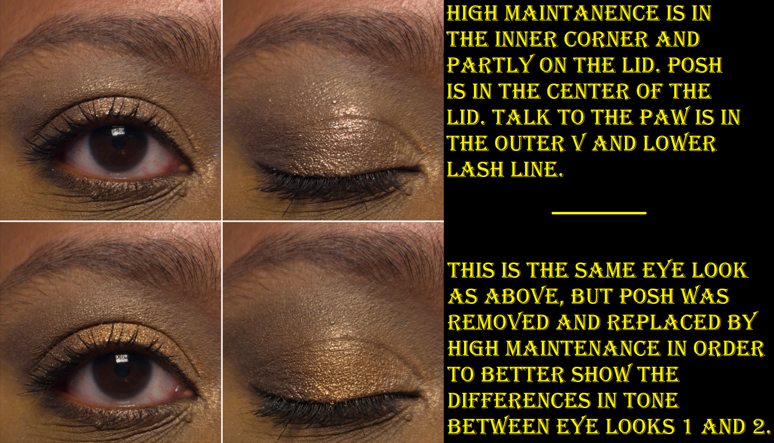
I could not get into the Sailor Moon anime, but I love the art and style of everything in that world! This product looks like it could be Sailor Moon merchandise, but without feeling like children’s play makeup. This compact has some weight to it, even more than the compact of the brand’s powder bronzer. Since I like Charlotte Tilbury setting powders and blushes, this was not a launch I could skip.
Charlotte’s Pillow Talk Beauty Soulmates Face Palette in Pillow Talk Flawless Peach
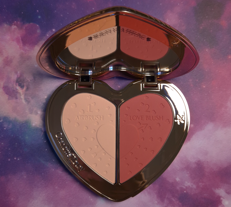
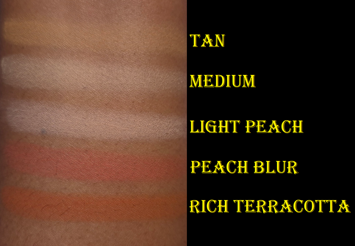
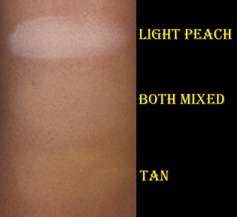
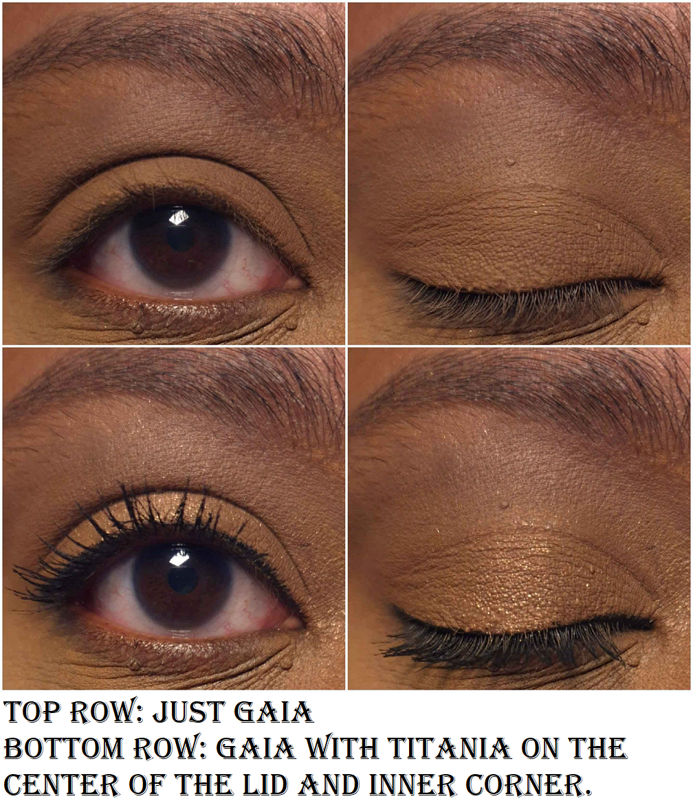
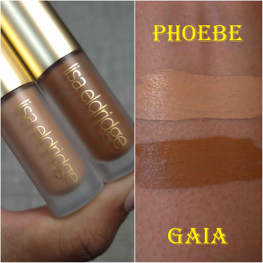
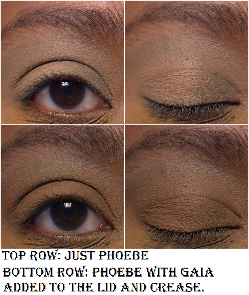
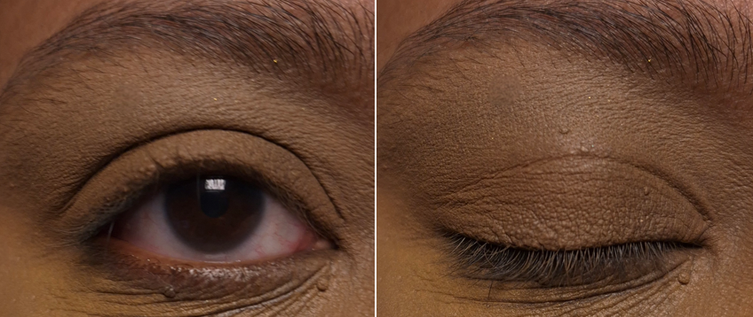
From what I can tell, the setting powder in this compact is no different from the permanent line. According to the website, the name for it is Light Peach, but everywhere on the packaging only refers to it by “powder” with no other name. I guess it could technically be called Flawless Peach Powder, and the blush could be called Flawless Peach Blush, but I’ll continue to refer to it as Light Peach.
I haven’t hopped on the pink setting powder trend because of how it usually turns out on someone of my skin tone and color depth, but I was intrigued by this peach option. I can sometimes get away with using the Medium powder on its own, and I’m happy to say that I think I can wear Light Peach on its own as well! It looks crazy when I first apply it, but after sweeping to blend it in, I think it looks pretty good and has a brightening effect!
Most of the time, I mix Medium and Tan together to get a more natural effect instead of brightening. I found that I’m able to do the same with Light Peach.
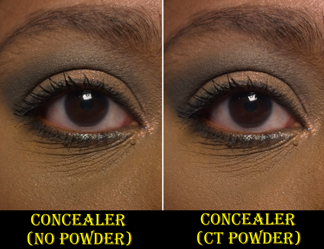
Per usual, this powder is mattifying without being too drying. It makes the undereyes look smoother. It helps to set my concealer in place and lock it in. I only use this powder under my eyes, so I haven’t tried it on my face, but since it brightens, I can guarantee I wouldn’t want to use this color all over. For my needs, this is great! I’ve made a small dent in my travel size of Medium, so I no longer have to consider buying a replacement when I use it up.
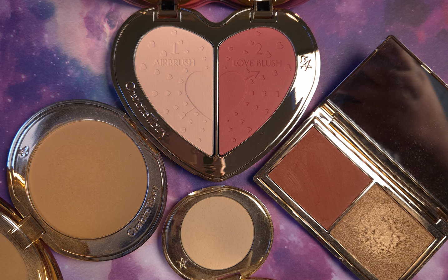
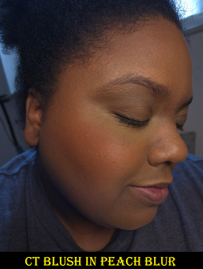
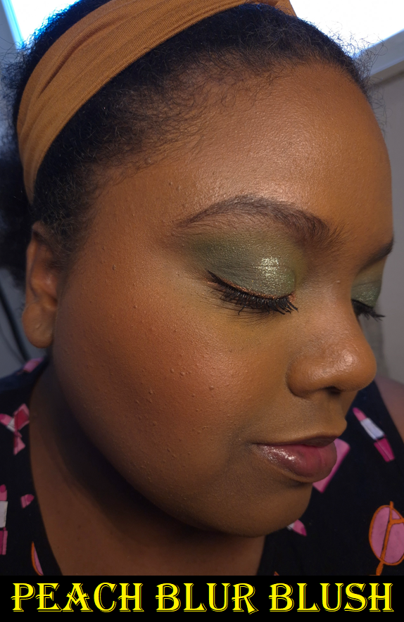
Just like the 2023 Mini Duo Charlotte Tilbury released that had a powder blush and highlighter, there were no names for them on the packaging, but the website referred to the blush as Rich Terracotta. This year’s blush is called Peach Blur on the website.
I really like this blush! It’s a great color and looks airbrushed on the skin. The texture for the blush actually reminds me of the setting powder, but in a richer color with a lot more pigment. That’s surprising considering they share 6 out of 15-18 of the same ingredients.
This year’s matte blush is still less pigmented than Rich Terracotta, which I consider a good thing because that one was easy to overdo. I have a lot more control with Peach Blur because of its buildable nature. One advantage to having a setting powder and blush in the same compact is the opportunity to use the setting powder to tone down the blush if I go overboard in applying it, but it’s easy to avoid, so I don’t need to do that. I guess this is more helpful for someone with a lighter skin tone than mine. The only time so far that I’ve applied the blush too heavily was when I added a second layer of Peach Blur on top of my foundation that hadn’t fully dried down yet. Even then, it was easy to buff and blend out the blush.
When it comes to longevity, I have noticed some minor fading, but there’s still enough on at the end of the day for me to be satisfied with it. This also comes off my cheeks if I take a nap, but that’s a bit more understandable!
I also have to note that I’m very much in my glowy blush era, so the fact that I’m this happy with a matte blush is impressive in itself. This is a pricey product (I got it for 20% off), but I’m very happy with it. Sometimes brands make limited edition products that are cashgrabs, and I’m glad to know Charlotte Tilbury isn’t one of them. Whether the Genshin Impact Collab falls into that category is debatable, but I don’t consider this to be a cheap product or a gimmick. The duo includes the brand’s number one best-selling product in a new shade, along with matte powder blushes that she has yet to release as a permanent item. Perhaps that time will come!
I hope this has been helpful. Thank you for reading!
For such an unexpected collaboration, I decided to make this bonus post! If you’re looking for a super detailed review, you’ve come to the right place!
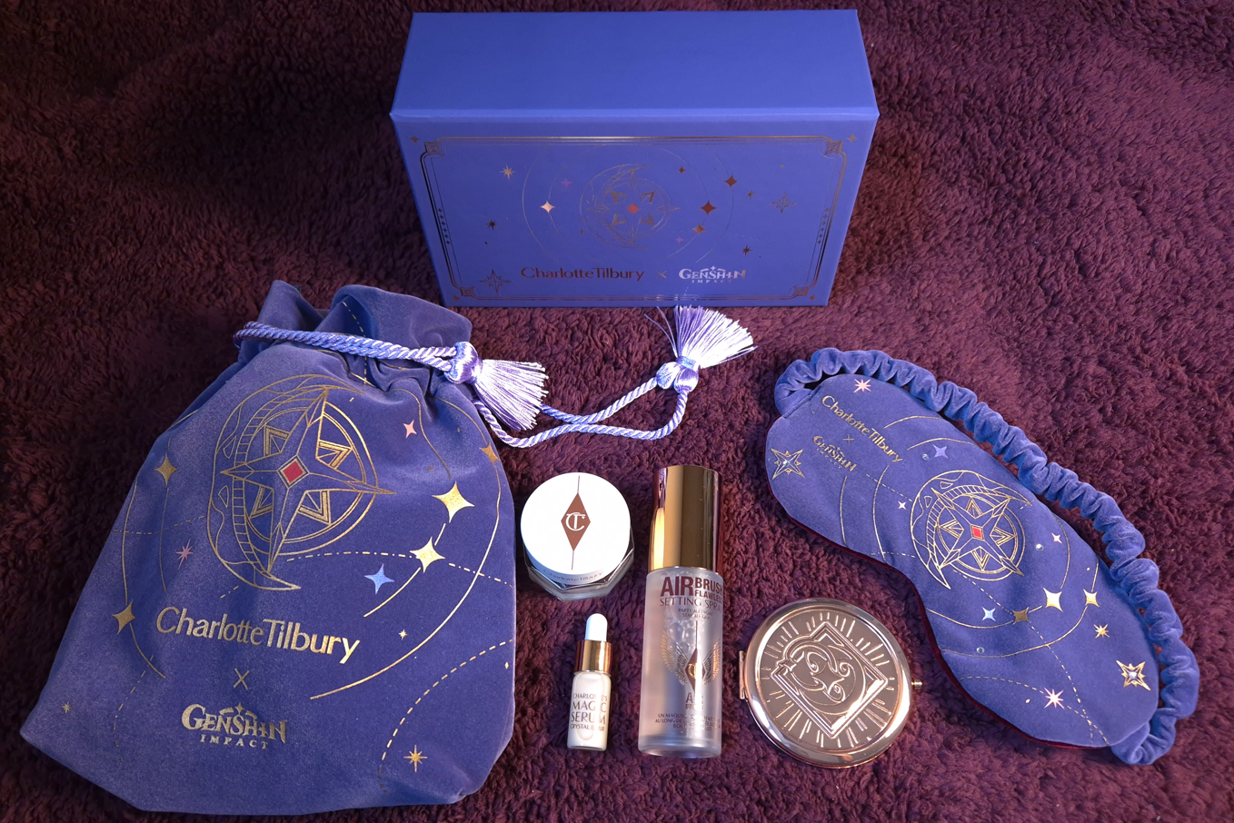
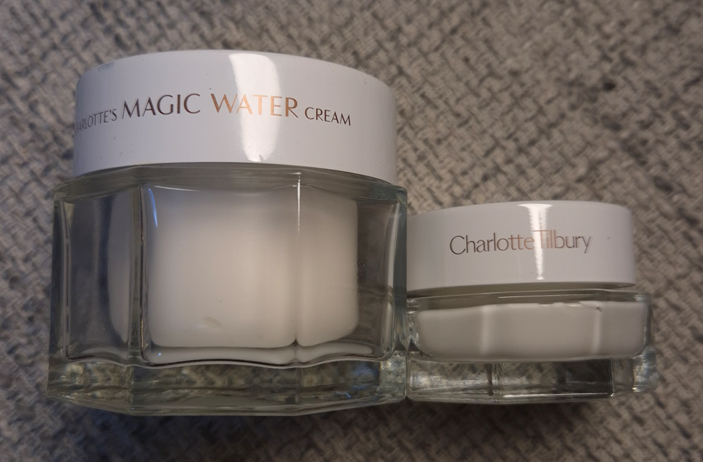
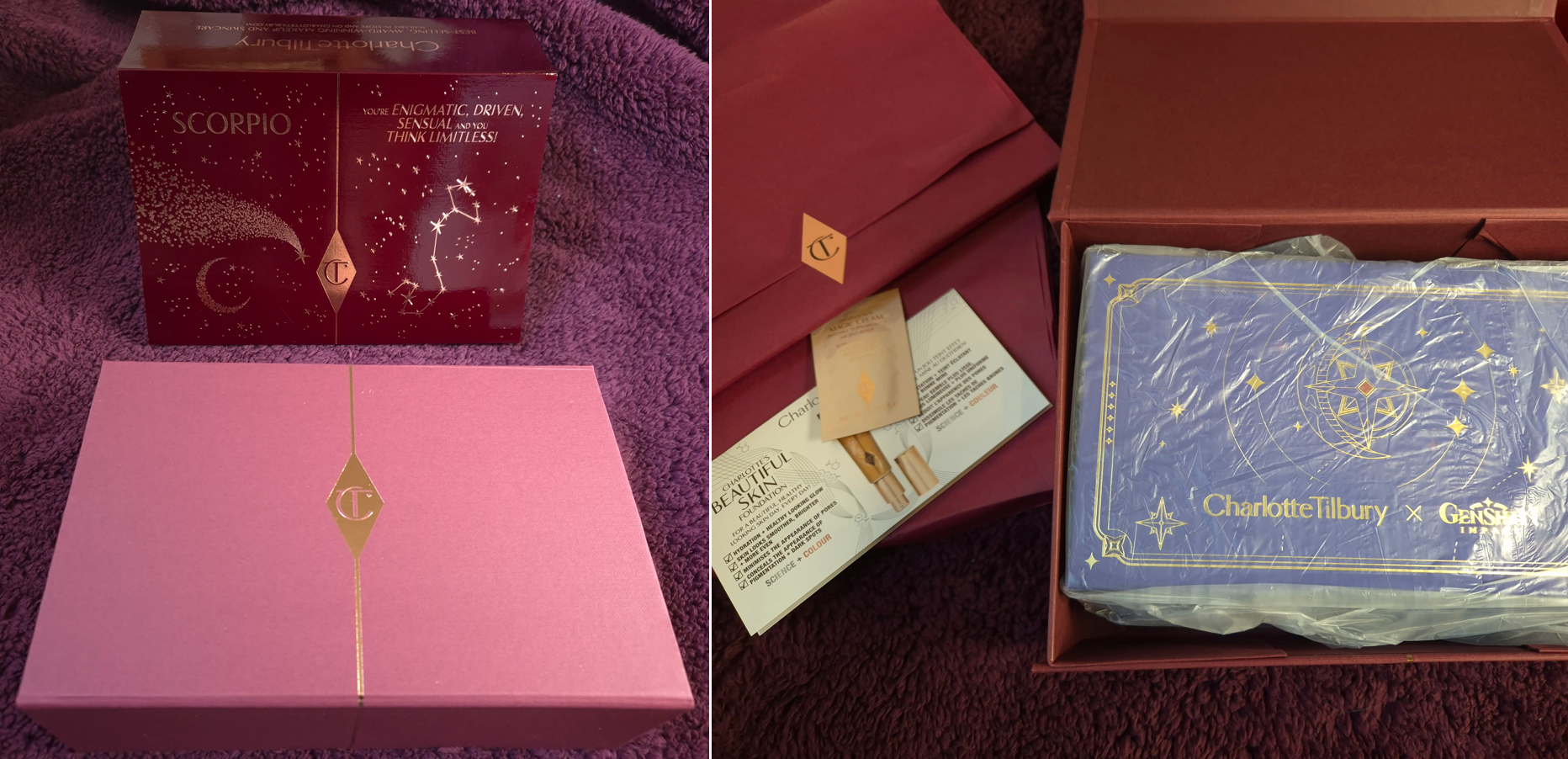
I purchased, or one could say I fell for, the Starfell Treasure Limited Edition Kit which is the smaller of the two options on the Charlotte Tilbury website.
This kit includes:
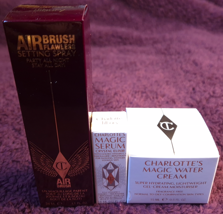
The Magic Water Cream (15ml)
The Airbrush Flawless Setting Spray (34ml)
The Magic Serum Crystal Elixir (Deluxe Sample)
Charlotte Tilbury X Genshin Impact Eye Mask
Charlotte Tilbury X Genshin Impact Compact Mirror
Charlotte Tilbury X Genshin Impact Small Pouch
Genshin Impact In-Game Rewards: Primogems *160, Hero’s Wit *5, Sanctifying Unction *5, Mora *50000 (Code to redeem valid from 30th April 2025 – 30th July 2025)
I don’t play Genshin, so that code went straight to my husband. According to him, the value of the in-game rewards isn’t worth that much comparatively to the price paid for the physical items. So, I considered it more of a free gift with purchase instead of something to be factored into the retail price. The code is supposed to be sent, “within 8 days by email to ensure that your order arrives first,” though the FAQ section of the website clarifies that it could be 8-10 days. Mine landed in my indox on day 9.
I created my first Instagram Reel of the unboxing, which can be seen HERE.
DISCLOSURE: I am not an affiliate of Charlotte Tilbury nor miHoyo. I bought this with my own money and all thoughts are my own.
Please note that all photos can be clicked to see a larger version on one’s desktop!
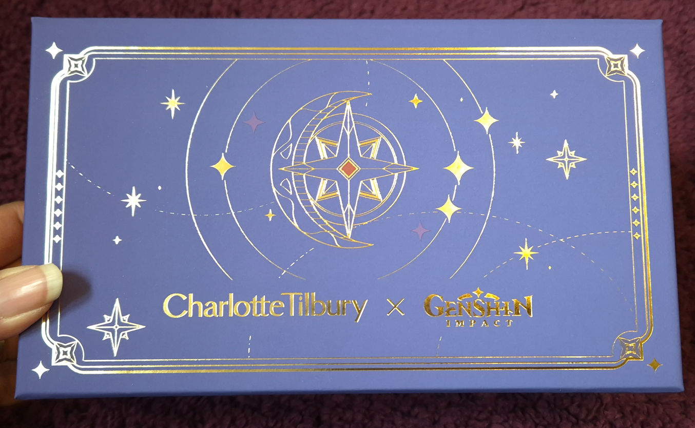
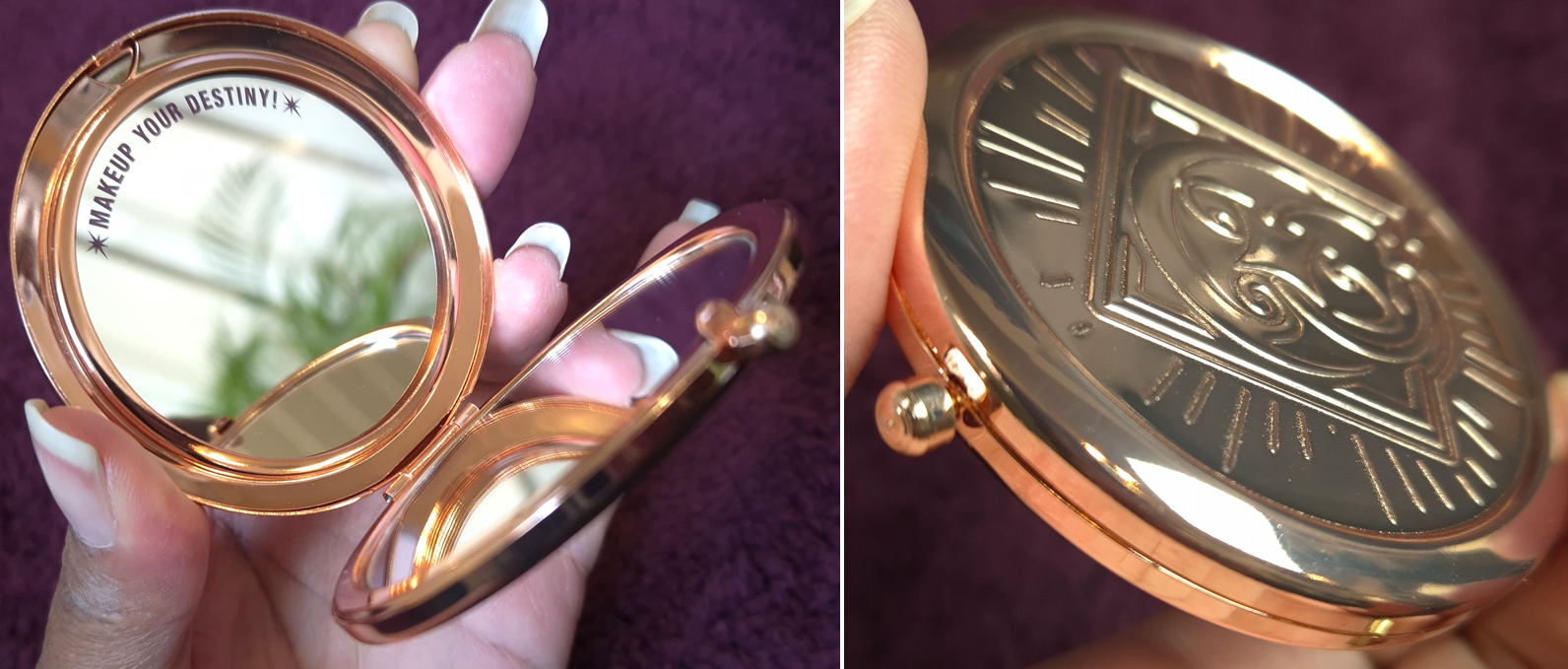
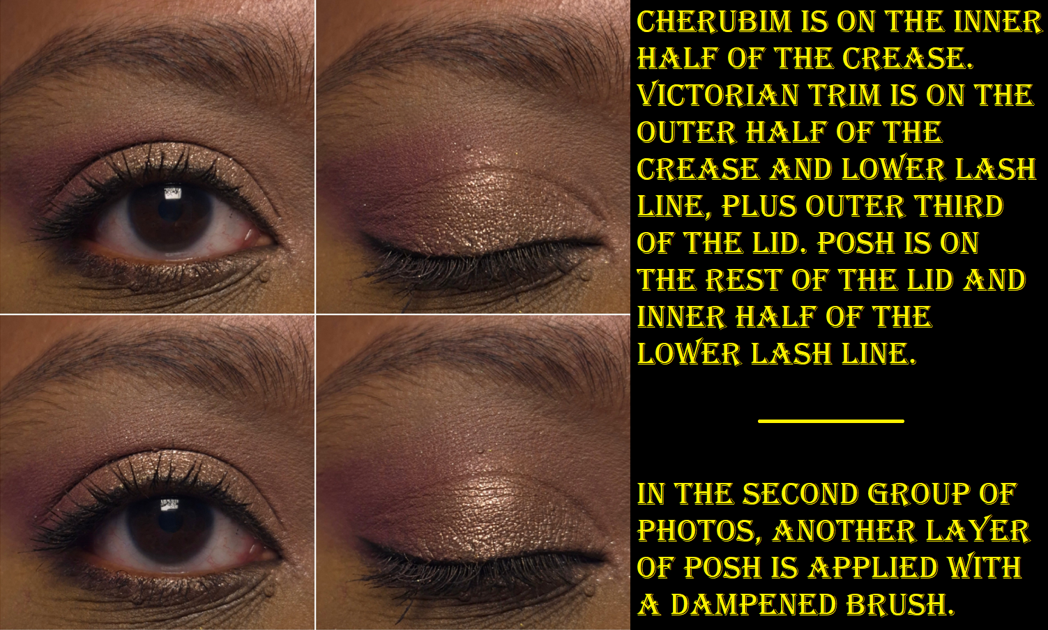
Let’s start with the Keepsake Box! The section that folds over is blue, but my eye can detect that the tone is verging on purple, like a dark indigo. It has a soft touch coating, for a more luxurious feel, with gold lettering on top. The inner lid also has gold designs and the trademarked phrase, “Makeup Your Destiny.”
I had a hard time getting my camera to show the slight purple lean of that blue color.The next photo below shows the color better.
The inner portion of the box that houses the items is more of a maroon or bordeaux color and soft touch lamination. I’m no printing expert, so this is just to the best of my knowledge based on the differences of how they feel.
The closing flap is a thick paperboard type of material that tucks into the space between the blue and bordeaux portions on the bottom.
As far as cardboard keepsake boxes go, I think this is well made.
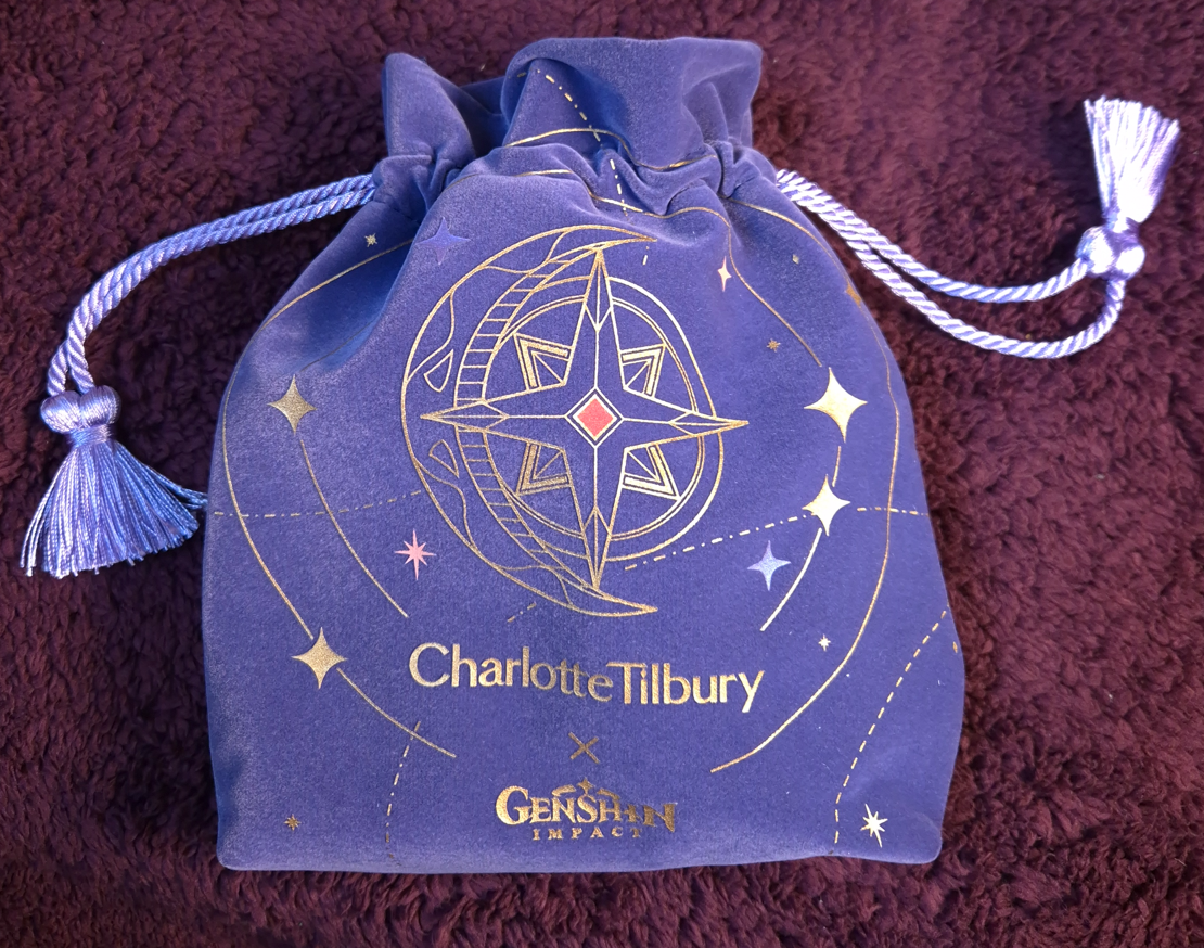
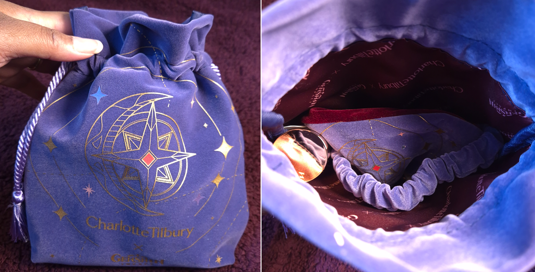
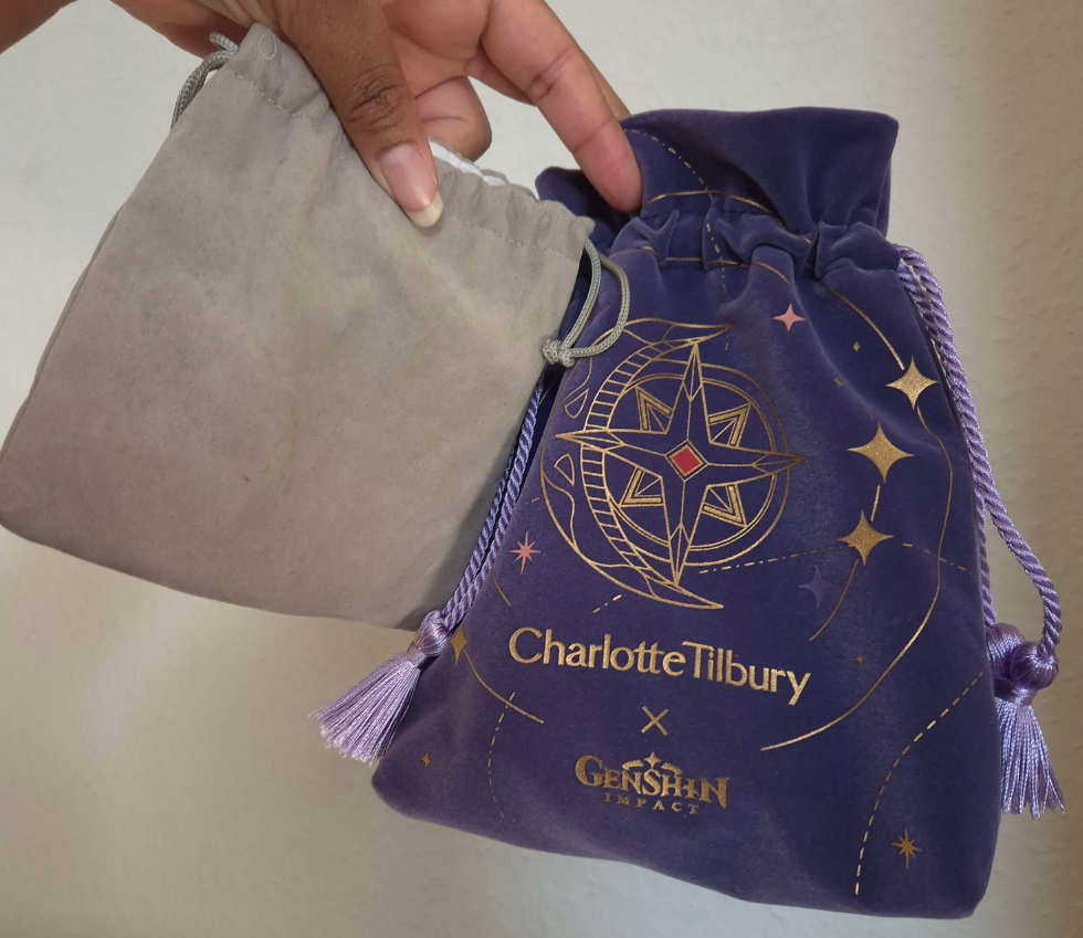
The first item I pulled out of the box was the “small” drawstring tasseled velvety pouch that ended up being larger than I expected. My rough estimates for the size is 23 cm high, 17-19 cm long as it gets a little wider towards the bottom, and 5 cm wide (9H x 7L x 2W inches).
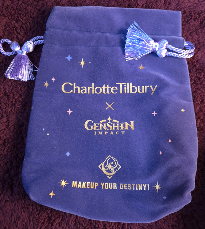
The bordeaux colored inner lining is polyester with both Charlotte Tilbury and Genshin Impact logos. I don’t know the technical term for the kind of printing that’s on the outside in the gold design, but I can feel it on the fabric.
Despite its size, I still intend to use this as my dice bag for Pen-and-Paper RPG nights. I currently have three sets of dice. This thick high quality pouch is going to be so extra for that purpose…and I love it!
My old pouch vs the upgrade.
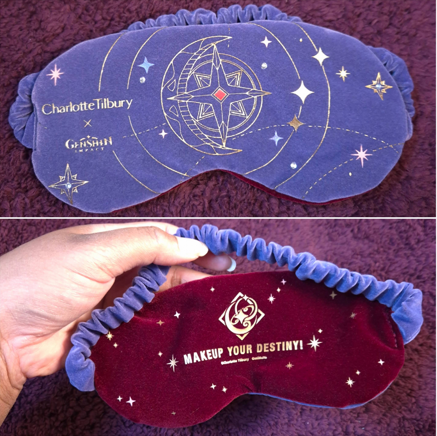
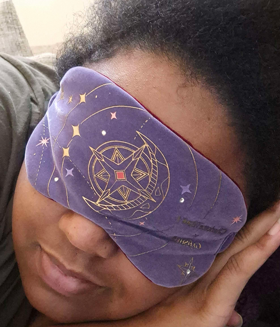
The next item is the velvety sleeping eye mask. I have a big head, so it fits a bit tight despite the strap being stretchy. This didn’t bother me while I was playing around with it in an upright position, but at night with how often I move my head around, the straps were tugging too much on the back of my head and on the sides, which pulled the mask tightly against my eyes. The pressure to my eyes was too much for me and I took it off after less than five minutes of wearing it. It’s a shame, but perhaps my sister-in-law who plays Genshin will want it. I could also potentially use this on flights since I would be in the upright position.
The underside of the mask has the same gold patterns and letters, which means I can feel that it’s scratchy when I run my fingertips over it. I was concerned that I would feel it against my eyelids and face while I wore it, but it wasn’t an issue. To be fair, I haven’t been able to wear it long enough to confirm if laying down with it while tossing and turning would pose an issue.
Unlike the pouch, this eye mask has a few flatback acrylic rhinestones embedded on it. They don’t feel like they would come off easily. I think they’re pretty secure.
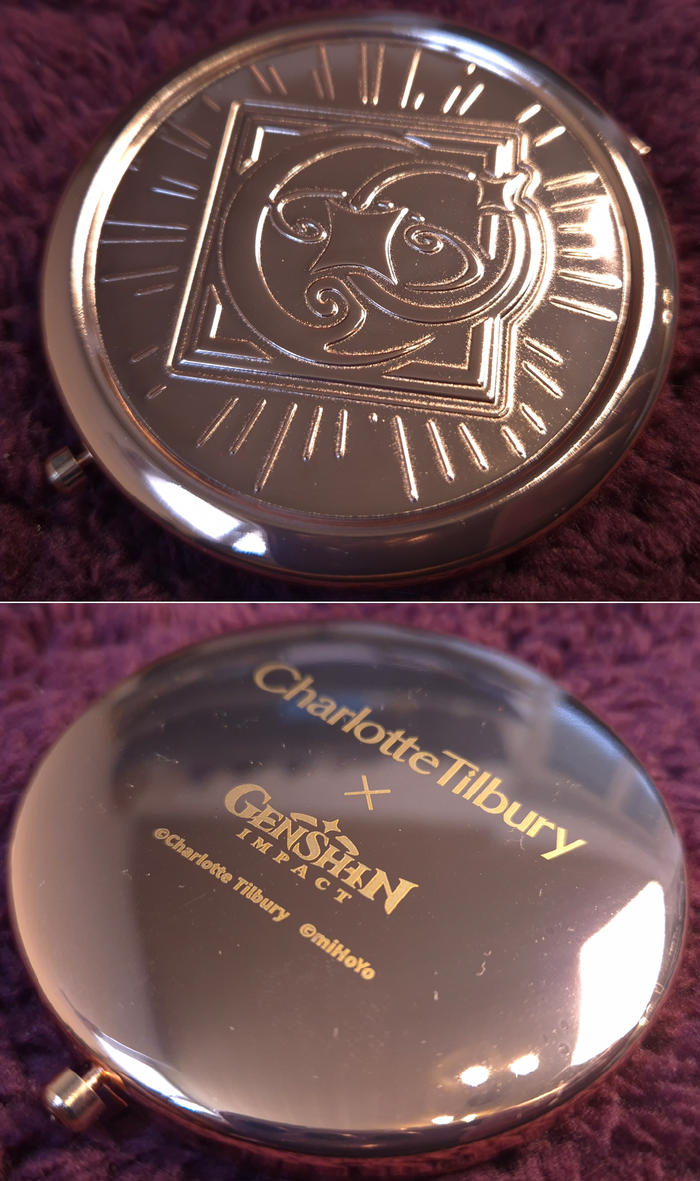
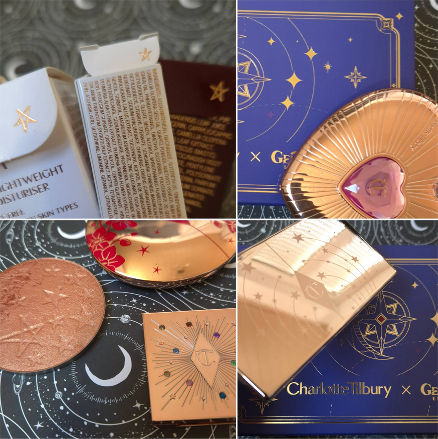
The most exciting item for me in this box was the compact mirror. It’s shiny, rose gold colored, and has a cool celestial design. My husband said something about an “Astrolabos Constellation,” which I guess is what this represents.
The mirror with the “Makeup Your Destiny” phrase is the normal one. I’m not sure what level of magnification the other side is, but I’d guess it’s just double.
Parts of this feels like aluminum and parts feel plastic. I couldn’t find any specifics on the website, nor on the paper included in the box with extra information. It just has a warning to clean the compact with a soft cloth and to keep it away from moisture, especially creams. So, basically someone shouldn’t try on the Magic Water Cream and then pick up the compact without washing their hands first!
I will admit that I don’t know if I will actually put this in my purse. I used to collect compact mirrors and I always carry one around, but I also always select the lightest ones to avoid the extra weight in my purse. The heavier ones just stay in a drawer for me to admire, and this may end up being the case with this Genshin compact as well. It’s not that heavy, but heavier than what I’m currently using and at least twice as thick.
The small box has three products that are normal within the Charlotte Tilbury line. There are no special Genshin Impact themed details on the packaging or the products themselves.
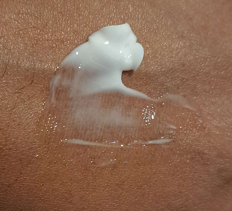
The Magic Water Cream is something I have reviewed a sample of before, though I was living in a different climate.
The summarized details is that it’s a fragrance free gel-cream hybrid that fully sinks into the skin, feels lightweight and was able to keep my face hydrated all day. I loved this product, but couldn’t justify buying it at full price considering all the other moisturizers I had and loved. I ended up getting it anyway in the Volume 23 Trendmood Box last year, but that box was shipped to the US. So, I hadn’t been able to use it until a month ago.
The 50ml jar on the left in the photo above is the full-size that retails for $100 (I paid $49 for that Trendmood Box). There is also a 30ml jar for $65, which is the size anyone who buys the larger Starry Miracle Limited Edition Kit will get. The smaller jar in the photo is the one included in my box, which is 15ml for $30.
I have dry skin and this cream was perfect for me while I lived in Florida. The original Magic Cream was too thick. Now that I live in Germany, I’m not sure if the Magic Water Cream will be potent enough for me when winter rolls around. I will probably just have to pair it with a milky toner.
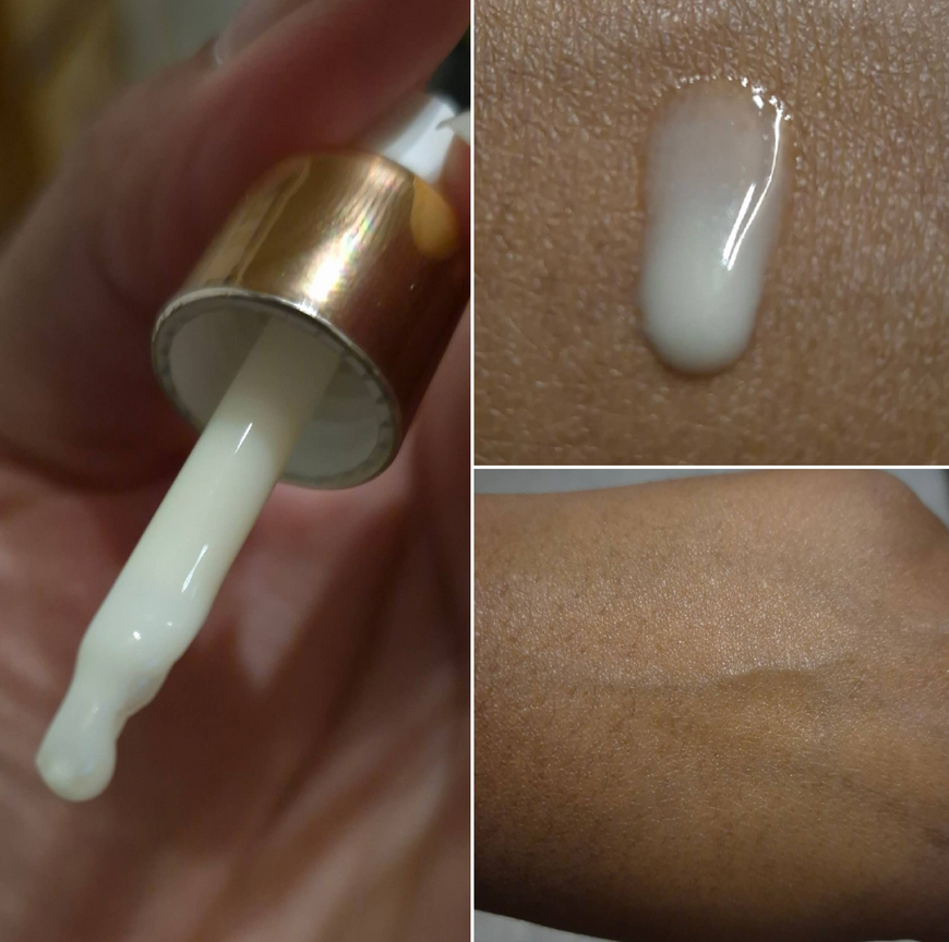
The tiny sample size of the Magic Serum Crystal Elixir is one I’ve used only once so far. I honestly can’t review something like this considering how long skincare usually takes to make any changes to someone’s skin. The website lists a lot of great ingredients, including some trademarked ones. I’m not a fan of the herbal smelling parfum in this, nor the extracts that have strong scents to them.
This soaks immediately into my skin. The consistency of the product reminds me of the Farmacy Honeymoon Glow AHA Resurfacing Night Serum (replaced by the Honey Glow 17% AHA + BHA Resurfacing Acid Serum), though Charlotte’s product doesn’t make my face feel as tingly/burning as Farmacy’s. These two products aren’t meant to do the same thing; I just wanted to give a texture comparison.
The second item that I was the most excited for in this box was the travel size setting spray. I wanted to try it ever since it came out, but I rarely use this kind of product, so I’m doing my best to resist buying them. It’s even more difficult now that so many brands are launching setting sprays this year. Receiving it in this box was a loophole around my lowbuy and made it okay…because Girl Math!
I have only used the setting spray over the course of two days, but I’ll share my early thoughts about it. I want to review the setting spray again after doing lengthier wear tests, but it will probably be months before that happens. If you’re interested in Charlotte Tilbury makeup, I have another review coming on Monday, so stay tuned for that!
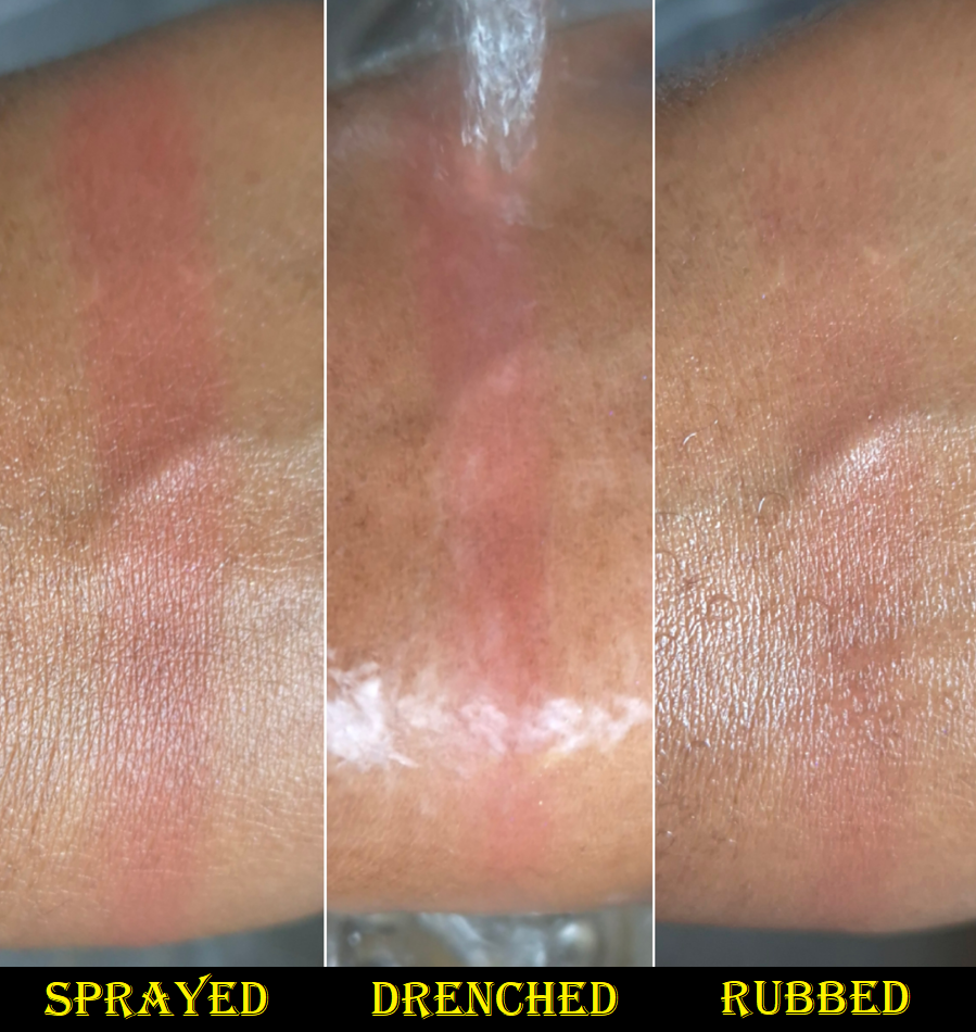
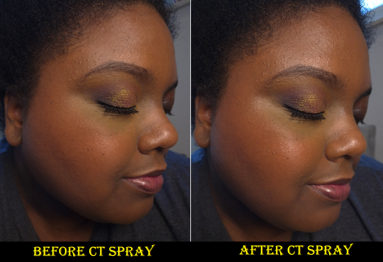
The photo above shows the amount of foundation that transferred onto the paper towel pieces after I pressed it against different parts of my face. It was a warm-ish sunny day when I’d gone out, so I sweat a bit. On the half of my face that I used the Charlotte Tilbury setting spray on, it clearly had less transfer. Based on the website description, I couldn’t find any transfer claims other than promising this will “lock in” makeup. However, the brand says this is waterproof. I did a test using the Rare Beauty Bouncy Blush on the back of my hand and sprayed it with the CT Spray, giving it ample time to dry. Then, I ran it under water for some time. The swatch was completely unaffected. I know the rule of thumb is to not rub one’s face if using waterproof products and just let the water slide off. I was still curious and rubbed the swatch hard while there was still water present. I was surprised to see how much of the swatch was still visible. As far as testing the waterproof claims on my actual face, the most I can say is that I spilled a little water on my chin while I was drinking and it didn’t leave any streaks. So, as far as I’m concerned, this appears to actually have waterproof capabilities, though I haven’t done intense additional tests.
This setting spray smells nostalgic to me, though I can’t remember what it reminds me of specifically. The closest I can come up with is a mojito. I think the citric acid in this reminds me of limes and this does contain alcohol. The brand describes the parfum as a “fresh floral scent,” and it is admittedly quite light and pleasant. As much as I prefer not to have fragrance in my makeup and skincare products, I’ve smelled setting sprays that were awful, so I’d rather have it smell nice over it having a potentially bad odor. To clarify, the reason the smell is nostalgic for me is because I stopped drinking anything carbonated for at least twelve years. Bubbly drinks (even non-alcoholic ones) hurt my stomach.
The sprayer on this is quite powerful. A lot comes out at a time and pretty much douses the face. Considering this is a waterproofing product, I guess it makes sense to not come out in a gentle mist and potentially miss covering some spots.
The brand says this is a hydrating spray, which I agree with. My skin looked glowier immediately after spraying my face, and after it dries down it remains looking that way. The shine from the glycerin looks great and it definitely helped to make my makeup look smoother and less powdery. It reminds me of MAC Fix+, but with stronger setting properties. Products with film formers usually work well on my face, and it seems to be the case with this spray too. I heard complaints from people that this makes the face sticky, but that didn’t happen to me when I used it. Even after spraying it on the back of my hand to check, it still wasn’t sticky. On my second day of trying it, I sprayed prior to applying makeup as a primer and then finished off my completed makeup look by spraying it again. There was a little bit of stiffness, as if I was wearing the world’s stretchiest peel-off-mask, but that sensation eventually went away. And, it still wasn’t sticky to the touch.
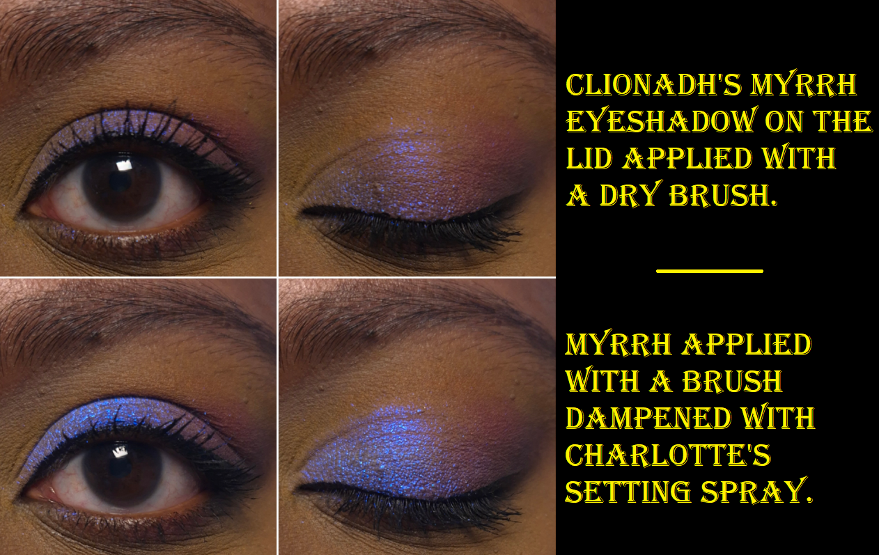
And then regarding using this to dampen and intensify non-matte eyeshadows, I’ve tried this once. It works, but so does everything else I’ve used for this purpose. I would have to test it longer and with some of my most fallout prone and flakiest eyeshadows to find out if it offers better adherence.
Some things that I can try to test for in an update in the future is how this performs with more than just two different foundations. Depending on how long this takes, I can also see if there is a difference between how it performs in summer versus winter.
Mona is the Genshin Impact character that this collection is supposed to be inspired by. I think it’s less about her personality and more about her design. Charlotte Tilbury has included stars and other celestial objects on packaging since the start of her brand. Lift up the flap of any unicarton and there will be a star there. Her limited edition products often had stars imprinted on the powder surface. I don’t know if they are supposed to be orbit lines, sun rays, or something else, but there is plenty of packaging from Charlotte Tilbury that has lines on them. She does Lunar New Year Collections. Products have names like “Cosmic Rocks” and “Magic,” so it’s no surprise that she’d want to choose a character that represents astronomy, astrology, and magic. As I mentioned before, I don’t play the game, but my husband encouraged me to watch a ton of videos with him of every Genshin Character in a series of fan-made videos. So, I’ve seen all of their designs. From what I recall, Mona is the best fitting for star representation. If there is a character who is a better fit, I’d love to hear more about it in the comment section or any other thoughts about this collection.
Some of the many stars designs from the Charlotte Tilbury brand.
Regarding the logistics, I started with a US account. I couldn’t log in for some reason, so I registered a new one with the same email for a German account and it worked. I can still see my previous orders if I change my region to the US. For Germany, they have Deutsch or Englisch language options. Sometimes if I click on English, it doesn’t show me my German orders, so I have to switch to German language and then back to English again for it to load. Just wanted to point out those website hiccups. My package was delivered through the UPS shipping service and shipped out of Poland.
I wanted to have the full experience ordering from the website, so I paid a little extra to get the Large Gift Box. It’s a nice box, although it doesn’t have the soft touch coating. There was an option to choose a ribbon or a sleeve to go around it. I picked the Scorpio Sleeve (another tie to Charlotte’s love of constellations and the cosmos). I also received my two free gift with purchase samples. Shipping was free (normally under 4 Euros if the minimum purchase subtotal hasn’t been reached) and I was able to use the welcome code (Darling15) to save 15% off my order!
When it comes to deciding whether this collection is worth getting, I can say that the price of the travel setting spray and moisturizer comes to $53. Even if I hadn’t used the brand’s code, there are influencer/affiliate codes floating around the internet that will drop the price to $51. So, I got a lot of extra products that would raise the total if I had to pay for them outside of this collab. I didn’t need the moisturizer and I could have bought the setting spray from a retailer for 20% off, but as long as I feel the Genshin items are worth a minimum of $10 each, I can easily feel like this was money fairly spent! It would have been nice to also have the type of collab where Charlotte Tilbury created limited edition makeup with color stories and special packaging for the Mona theme, but I’m happy with my purchase. You won’t catch me buying the larger kit though! That’s for someone who is an insanely dedicated fan of CT, Genshin, or both.
That’s about everything I can think of to include! Thanks for visiting my blog!
The bronzer should be available in the US by June. The pressed powder is already available worldwide.
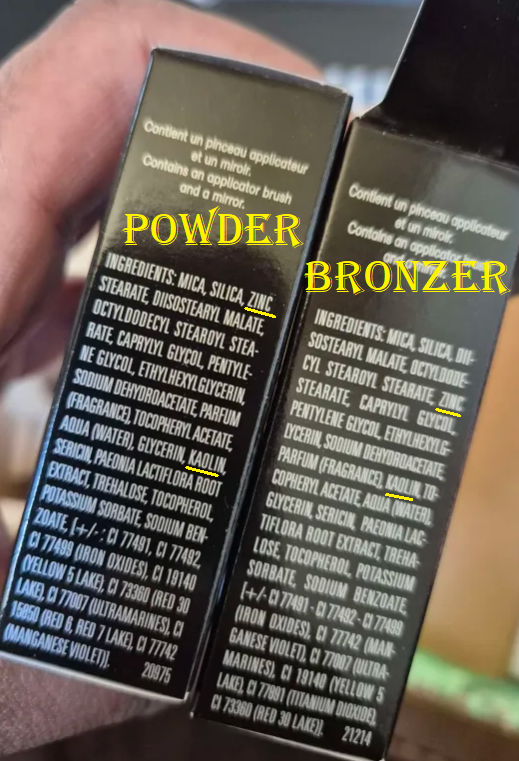
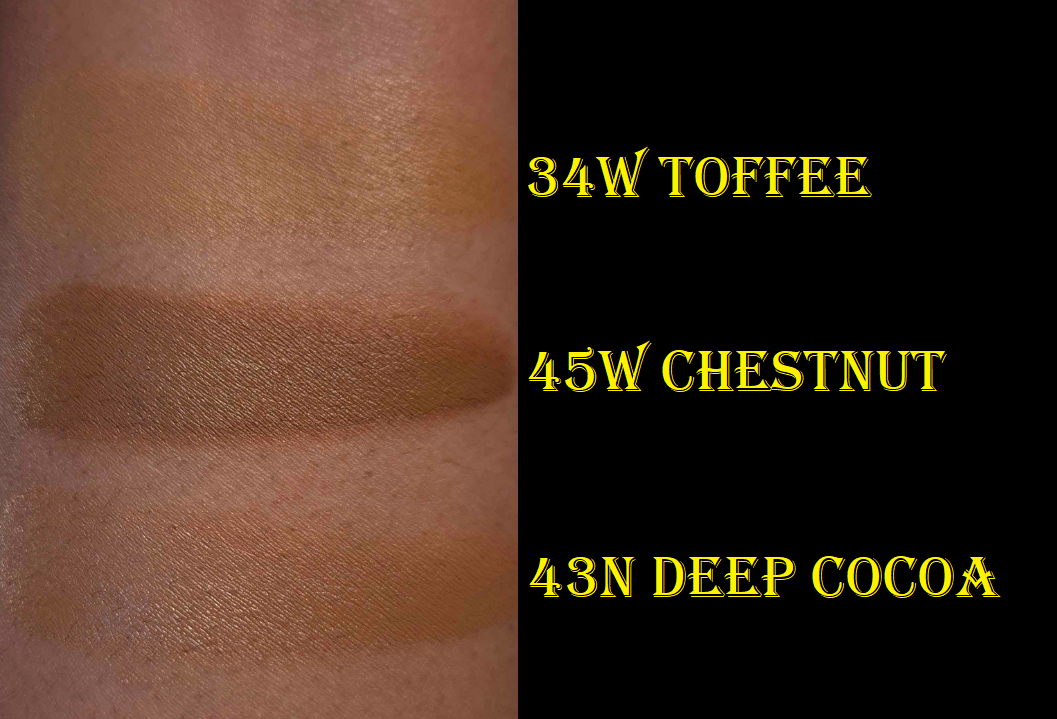
The luxury beauty community was up in arms about Givenchy reformulating their loose setting powder because it left a sheen on the skin (which emphasized texture and wasn’t as blurring). From what I’ve heard, it sounds like the loose powders intended for fair to medium skin tones contained a lot more Synthetic Fluorphlogopite, but mine called Popeline Mimosa seemed to only have shiny particles in the darkest square, which is practically the only section of the container I use. I put tape over the lighter squares, and only have a few holes open for the orange color. It bothered me that I could essentially use only 1/4 of the product, and I prefer using pressed powders over loose ones. When I heard about the brand’s new pressed version that is supposed to be more similar to the original formulation, I was interested.
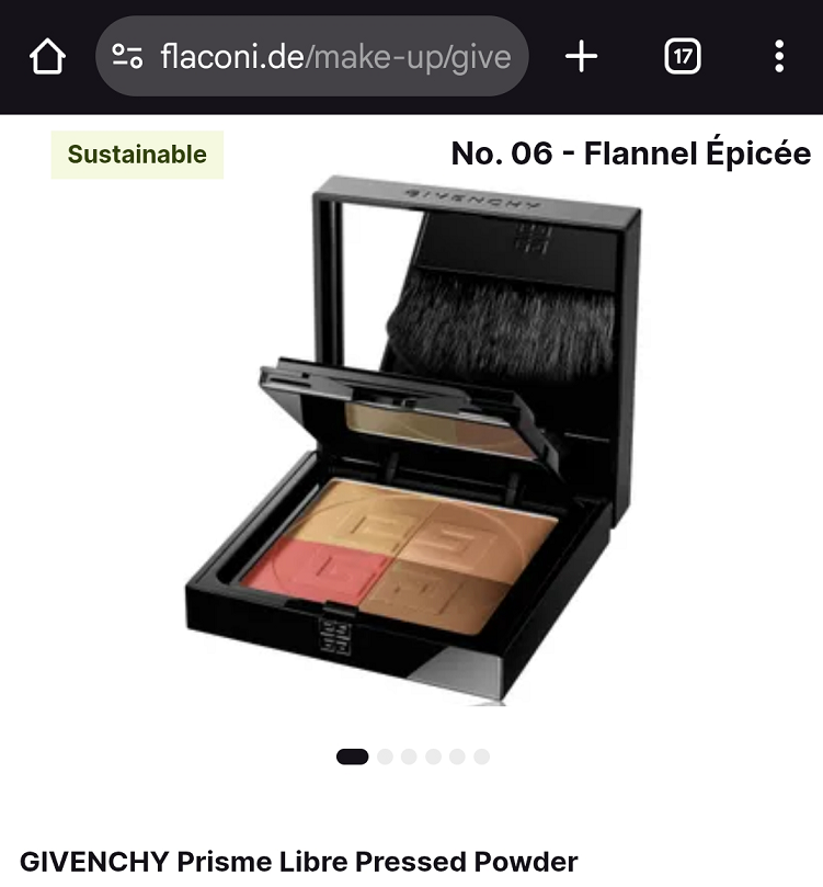
I’m not sure if the original pressed powders were ever available in the US, but the deepest shade in that line was called 06 – Flanelle Épicée and is still available via the retailer Flaconi. In the current version, the deepest is called 06 Organza Ambré and I was willing to give this powder a try considering the original bright pink corner was replaced with what I thought was a peach color. It turned out to be closer to salmon.
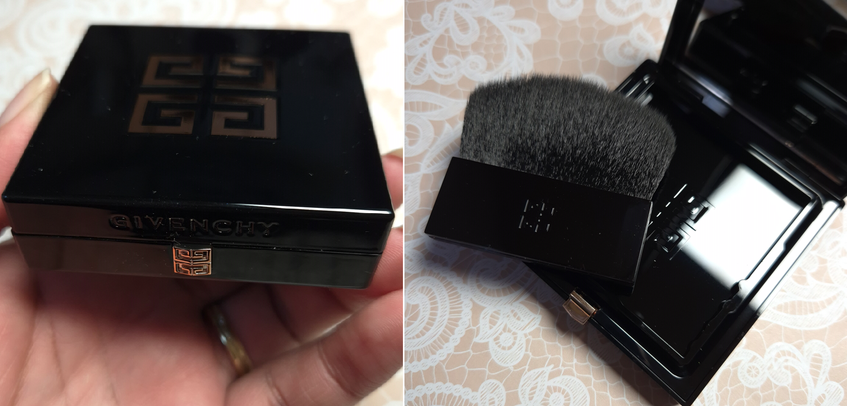
The brand also resolved the issue of the brush-holding flap lifting upwards and covering the mirror, because it now flips to the side.
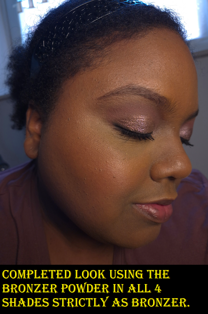
I’ll discuss the powder more a bit later, but I’d like to first talk about the Bronzer because it’s the product I actually bought first. I enjoyed the silkiness of it and ability to customize it so much that I had hope that the pressed powder could be even more useful to me than the loose one.
DISCLOSURE: All products in this post were purchased by me with my own money.Unhighlighted links in bold blue font (Example) are normal non-affiliate links. Links marked in bold black font with a light blue background (Example) are affiliate links. Affiliate links allow me to get a commission if purchases are made on the website after being redirected there. The price of the product is not affected by these links, and anyone who uses them would be supporting this blog. Sorry for this interruption, but an explanation about affiliate links are required by the FTC whenever they are used. The only affiliate links in this post are for brushes through CDJapan, not Givenchy. And for anyone else wondering, I usually reserve non-link font colors like (Orange) for updates, (Red) for subject titles, and (Purple) for product titles.
Givenchy Prisme Libre Bronzing and Sculpting Powder in 003 Organza Bronzé
Organza Bronze is currently the darkest of the Bronzer Powders available. It works for me, but I think this really doesn’t go deep enough, and I’m hoping they will expand the range. It has been out for a few weeks already in Europe, but I heard it will come to the US by June.
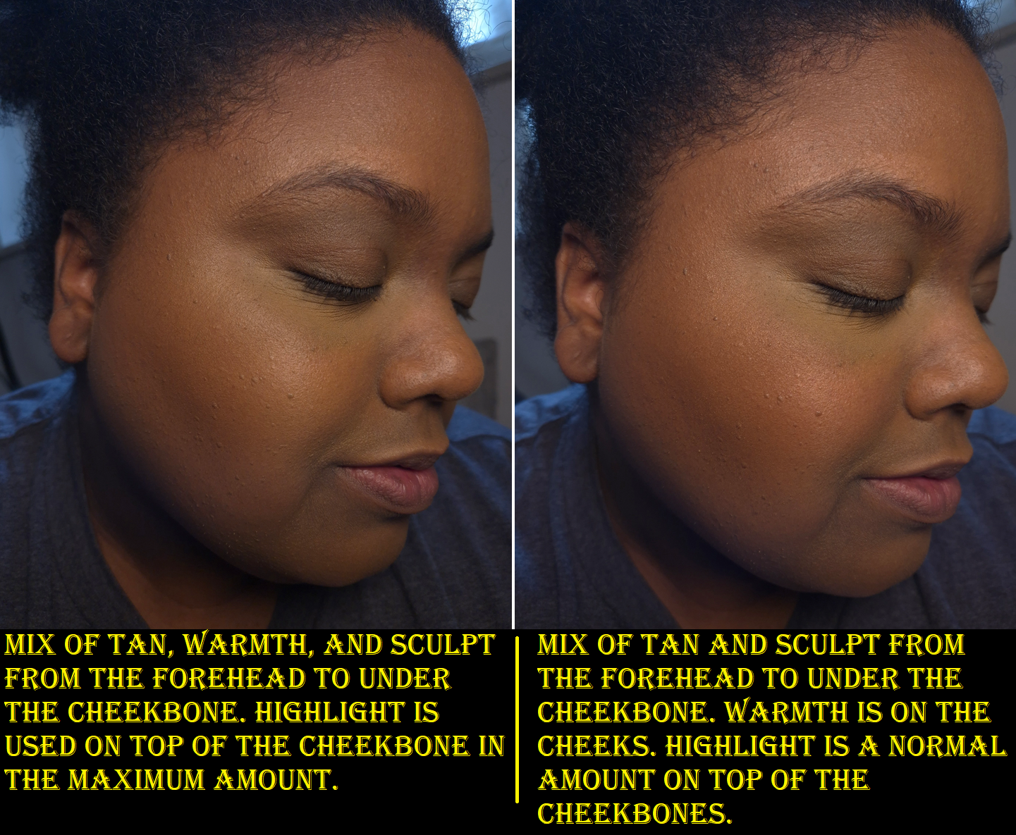
The four colors are supposed to allow one to, “add tan, warmth, modeling, and brightening.” In the top left corner is supposed to be the bronzer shade, which is basically my skin tone. I can’t use this as a bronzer unless I mix it with the darkest block. Then, it does add subtle bronzing. I’m glad this is such a blendable product that layers and builds well because I have tried other “customizable” powders in the past that formed uneven mixtures that didn’t look seamless on the skin. This product really is customizable.
In the bottom left corner is the brightening square. I have tried using this as a highlighter before, and it adds a super subtle sheen, but isn’t enough for me to replace using an actual highlighter in my routine. As a glow enhancer to turn this soft matte product into a radiant bronzer, this doesn’t do a whole lot either. It makes it less matte, but I don’t think there’s enough oomph to satisfy a true shimmer-bronzer lover. What this does is literally lighten the color of whatever mixture I try to create. So, if I go overboard on the darkest color, adding this will lighten it up, but so will the bronzer shade.
In the bottom right corner is the modeling or sculpting block. It is the darkest section of the pan and is a cool-leaning neutral shade. It works perfectly as subtle contour in the sense that it isn’t overly gray. This color choice aids in the ability for it to mix with the other shades without going muddy. This isn’t guaranteed to be the case with Mousseline Bronzée or Popeline Bronzée though.
In the top right corner is the warmth-adder. If I want my bronzer to be less subtle, then I must rely more heavily on the darker quarter. That dark powder has just enough coolness that mixing it with the lighter browns combine into a neutral shade. If I’m feeling like having a little extra warmth, I can easily add this burnt red color to the mix. However, it works quite beautifully as a blush, which I first discovered when watching Brie Moore use it that way in her YouTube video.
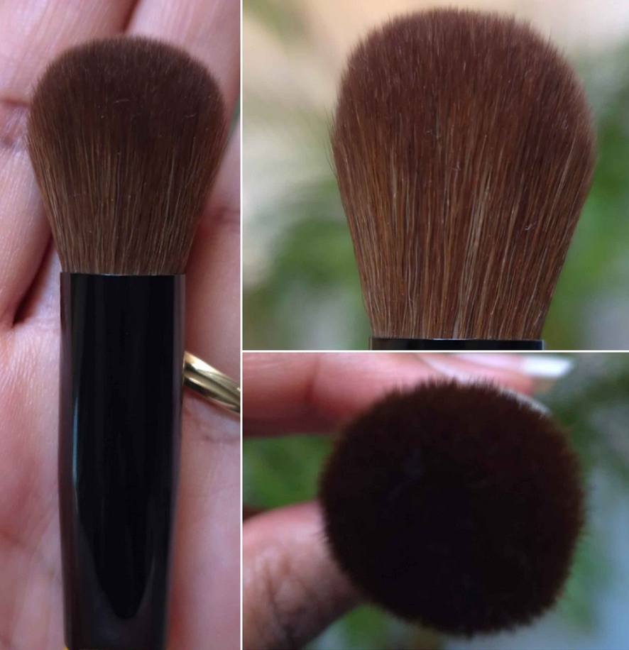
How I’ve been using this the most has been to contour with the darkest shade, then mix all the browns together for a subtle bronze, and finally using the red color as blush. This tailored approach is much better suited for me than swirling all four colors together. The combined color is a bit too light for me anyway. This means that the nice and soft synthetic brush Givenchy includes in here has very little purpose for me. The shape makes it very cumbersome to try and isolate one of the four shades alone. It can be done, and I’ve used it in the darkest square to contour under my cheekbone, but I’d much rather stick to my Face 11 brush from the brand called Number Eight. The candle tapered shape is ideal for dipping into a small section, but dispersing the product in a wider area. Small cheek brushes also work, like the HSC-2 Hana Sakura Brush for those that want an even subtler application or the Chikuhodo FO-2 that will give a stronger application and still fits in each square despite being a flat top brush with a decent amount of surface area.
I think this is a great product. The powders are super refined, blendable, soft, layer well, and last all day without fading. They’re not splotchy, they’re multi-purpose (I’ve even seen someone use them as eyeshadows), and I think the black packaging with the bronze details makes it look luxe even though it’s so lightweight. Only time can tell whether I will continue to find the customization element necessary or if I will go back to using my individual makeup favorites. The one major negative for me is simply the fragrance in here. This bronzer is so heavily perfumed and even though it’s not a bad smell, it’s stronger than I want in a makeup product and I can still smell it briefly while it’s on my face. I hope the scent will dissipate within the package over time.
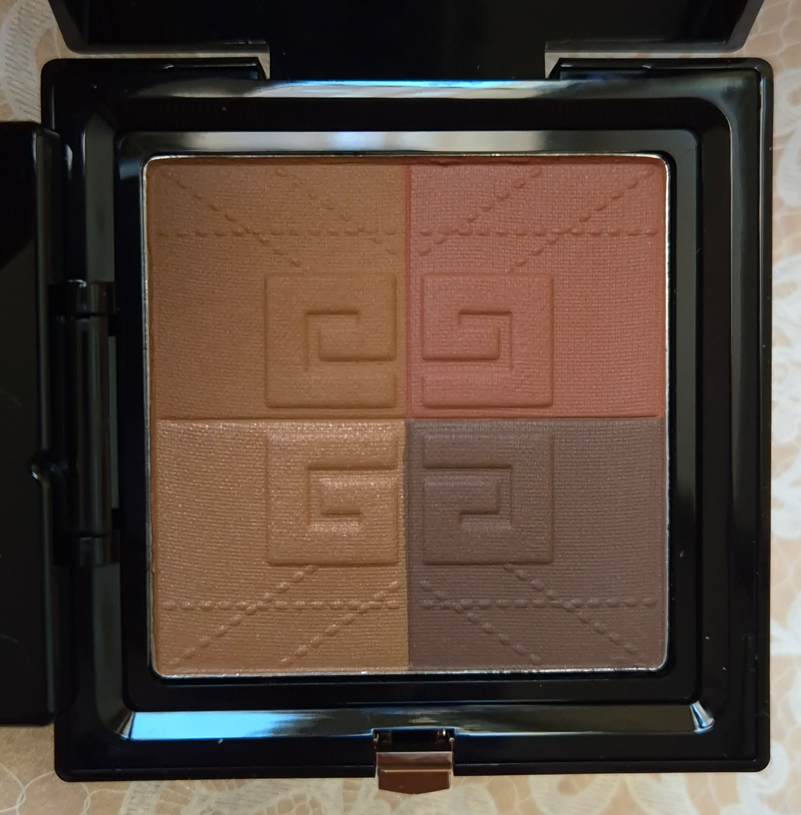
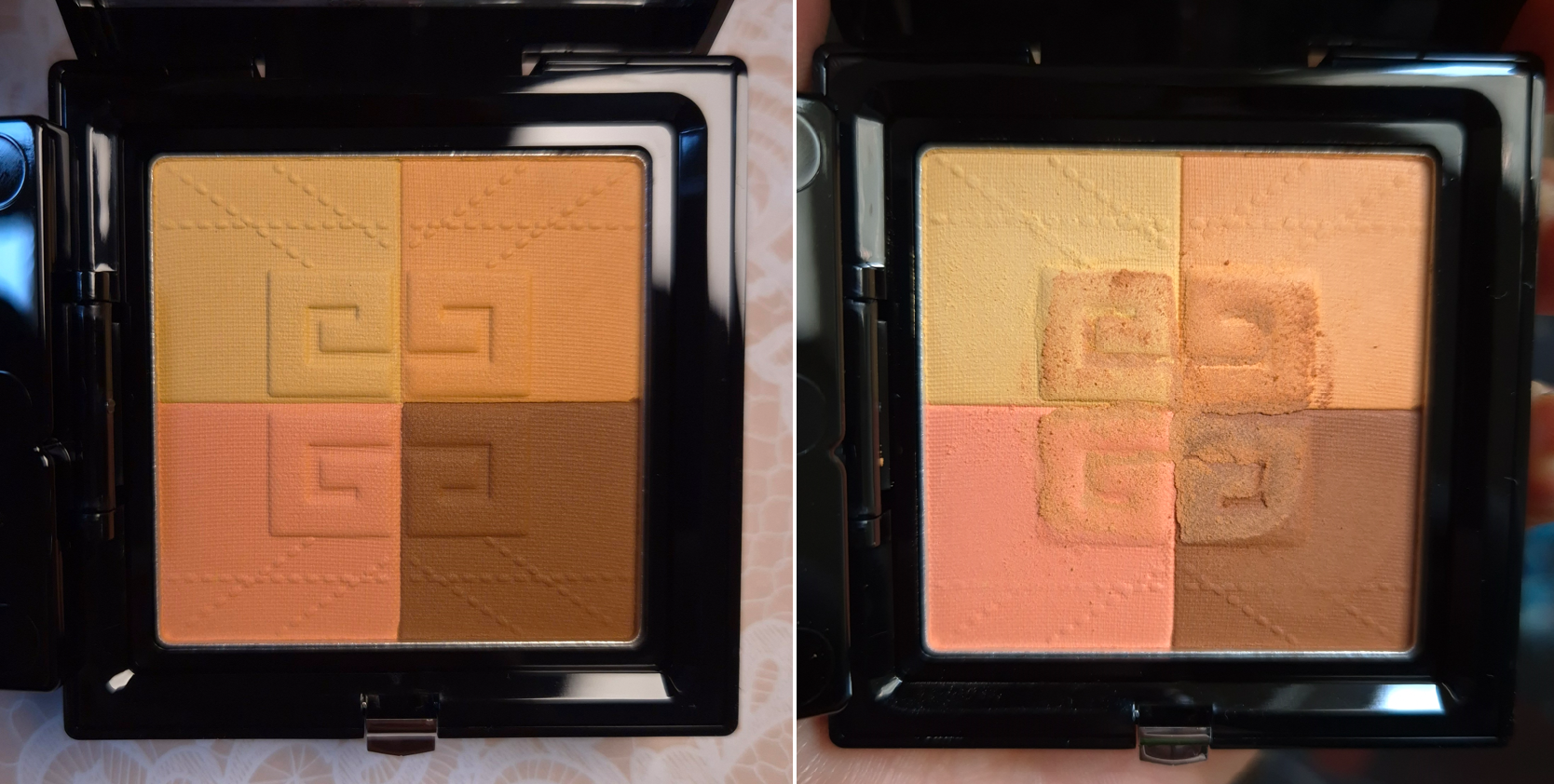
Givenchy Prisme Libre Pressed Powder in 06 Organza Ambré
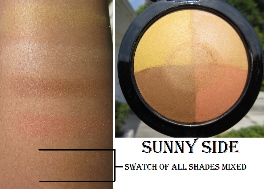
The first thing I thought when I saw the four colors for this shade of pressed powder is how it reminded me of my MAC Mineralize Skinfinish in Sunny Side that was a limited edition product first released in 2016. The photo below is from my review from 2020.
I contemplated bringing Sunny Side back to Germany with me after seeing it again in person in the US, but considering this is 9 years old, it has no functional use except for nostalgia and collecting purposes. It can remain where it is on my “retired products” shelf for things I loved but will not use on my face.
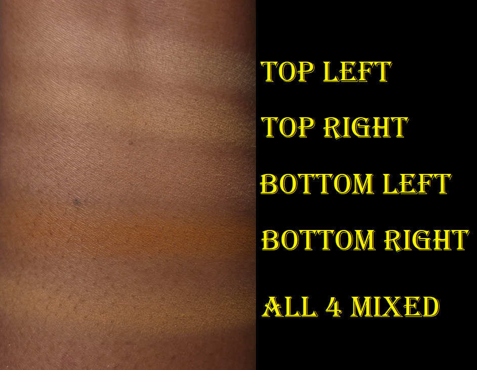
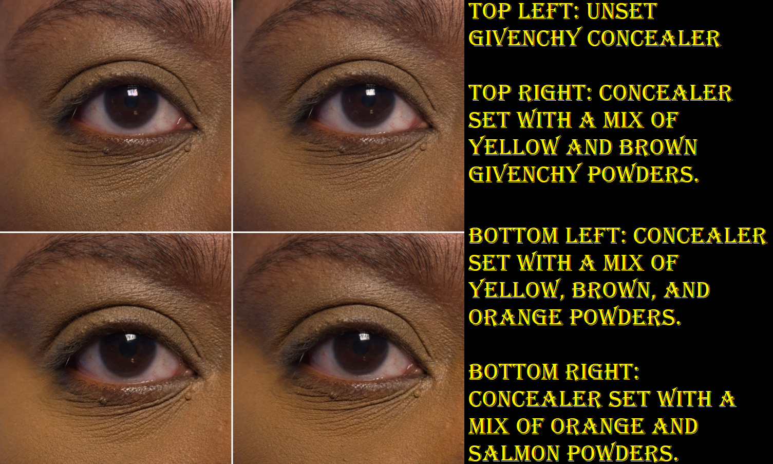
Unlike Popeline Mimosa that was too light for me to use all 4 shades together, I am able to wear the four shades combined from Organza Ambré (at least under my eyes).
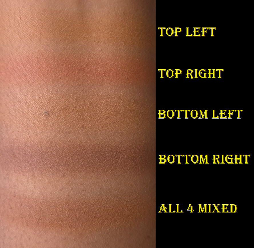
The salmon color in the bottom left of the compact doesn’t look strong in swatches, but it can clash a bit with my undertone if I accidentally use too much of it. Givenchy included that color to, “correct and conceal shadows.” I played around with different combinations blended onto my arm to see which ones had the highest likelihood of suiting me. In that process, and then confirming it under my eyes, I discovered that combining the yellow in the top left with the deep caramel brown on the bottom right looked the best for brightening. According to the brand, the yellow is intended to, “correct blue tones,” while the brown, “unifies the skintone.” The combination of the yellow, brown, and a bit of that orange (reminds me of the Crayola shade Macaroni and Cheese) is semi color-correcting. However, the orange, which the brand says is supposed to, “boost the skin’s radiance,” isn’t deep enough to be successful using it on its own on top of my Givenchy concealer. Combining the orange and salmon though works. My favorite combination is simply the yellow and brown together.
I’m quite satisfied with this powder, paired with the Prisme Libre concealer, but it doesn’t do as nice of a job on top of some of my other concealers (for instance the KVD Good Apple). Also, the only difference I can see between this powder and the reformulated loose one is the lack of sheen. It looks nice and blurs a little, but it doesn’t have noticeable extra blurring or anything special enough for me to see what all the hype was about. I’m honestly not even sure if this reformulated, but fully matte, powder is as close to the original as some people have been saying it is, considering how similar it is to the mini I own.
This isn’t the kind of powder I want to put all over my face because it’s too mattifying for my dry skin. However, I did it for the sake of this review. Even though combining the four shades works under my eyes, it’s still too light for my whole face. It doesn’t look drying on the majority of my face, but it’s unflattering in areas that are my most dry and have the most fine lines. It’s mainly around my mouth that the powder actually emphasizes texture.
It’s interesting that I like the bronzer so much, but not the powder, considering they are practically the same formula. The only notable differences is that Zinc Stearate is higher up the list for the pressed powder and Kaolin is higher on the list in the bronzer.
The reason the bronzer doesn’t look too drying is specifically due to the areas I use it, which is the perimeter of the face and cheeks. If I tried to use the bronzer all over my face, and especially around the mouth, I would probably dislike it too.
So, this continues to be a powder that I only use under my eyes to set concealer and pretty much only with the Givenchy concealer. Though I got this for 20% off, I wish my curiosity hadn’t gotten the better of me and that I skipped buying this powder entirely. I like the Guerlain Parure Gold Powder more than this! That one felt drier, but at least it didn’t look dry.
Since the bronzer and pressed powder have nearly identical ingredients, I feel validated in assuming that if I liked the bronzer formula then I should like the pressed powder too. My mistake was not taking placement into consideration.
That’s all for today! Thank you for reading. I hope you’ll join me again for next week’s post!
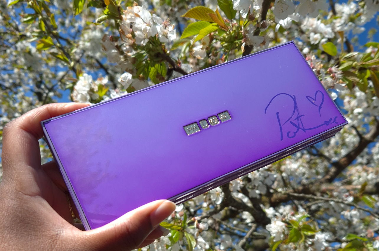
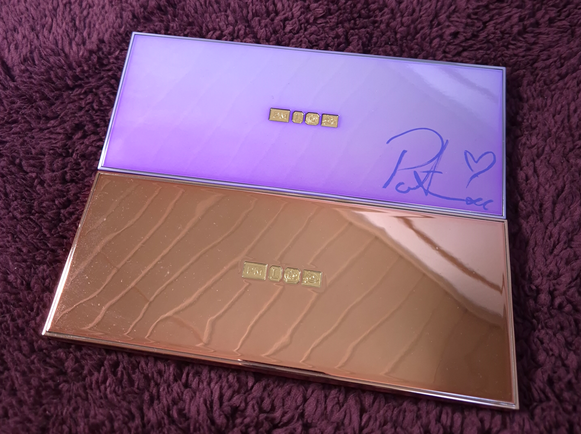
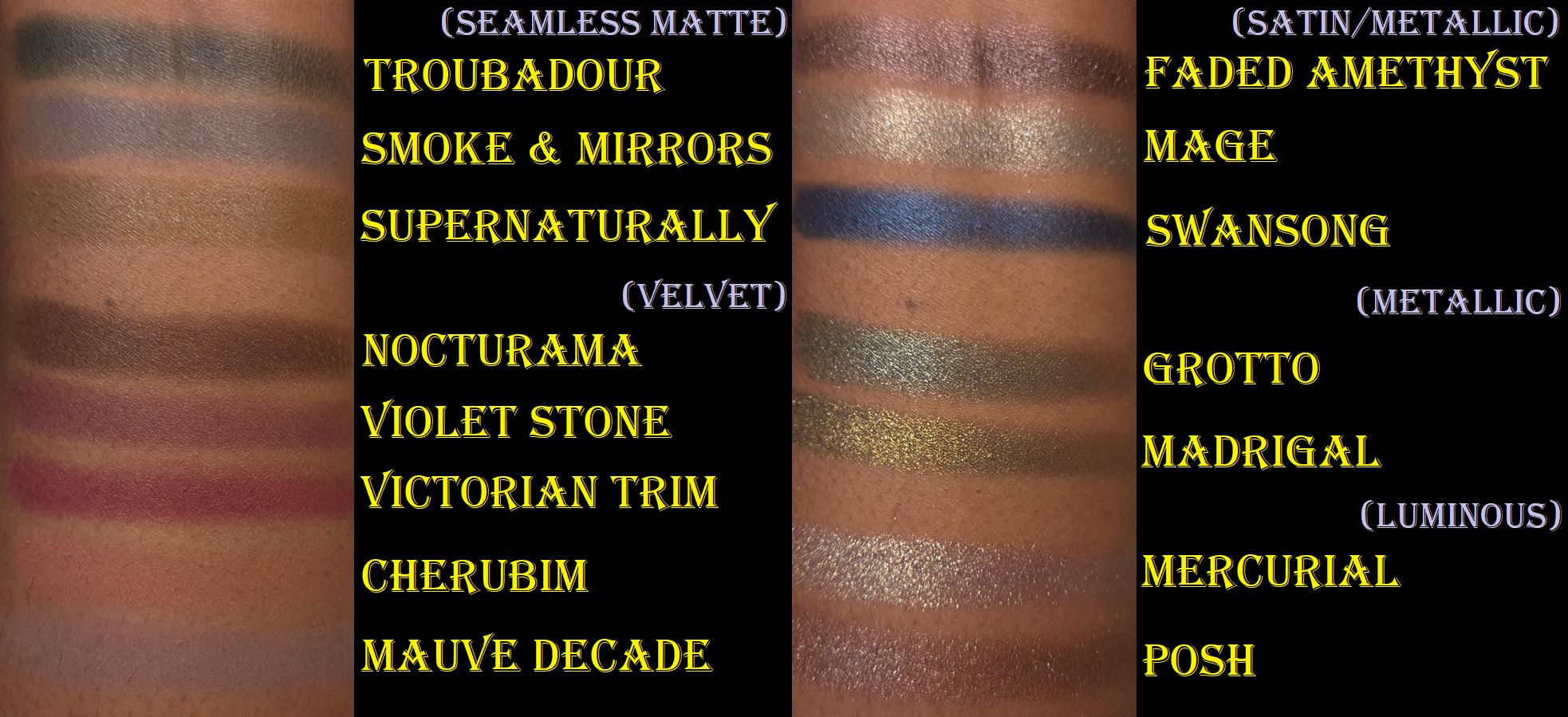
This palette is my first Pat Mcgrath purchase in the year 2025, and also the first thing I’ve bought from the brand in the past fifteen months. I usually encourage everyone to wait for a sale when it comes to expensive makeup, but once PML says something is limited edition, I don’t take chances. Prior to getting this palette, my most precious Pat Mcgrath item (and one of the most precious makeup items in my entire makeup collection) was the Divine Rose II palette in the limited edition pink chrome packaging. This limited edition lavender palette with Dame Pat Mcgrath’s signature on it is priceless to me!
For those wondering how I got a signed copy, there was no announcement from the brand ahead of time. I logged into their website prior to the palette launch time and saw that it was already available to purchase. There was a box on the product page with a check mark indicating that I was opting in for the chance to win a signed palette. Later, I noticed that box was actually edited to clarify that the first 100 people buying the Lavender case (not the permanent black version) would be getting it. I had already assumed it would come down to whoever checked out first, so I completed my purchase even though the discount code didn’t work prior to 8:00 am EST. I didn’t notice until later that my palette was purchased at the US equivalent price, but it rose 9 Euros the very next day. So, I didn’t bother contacting customer service as I had already technically gotten a deal. It was also the next day that I received an email confirming I was one of the lucky ones!
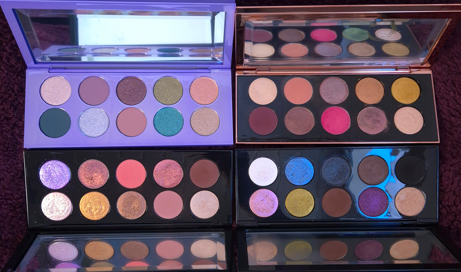
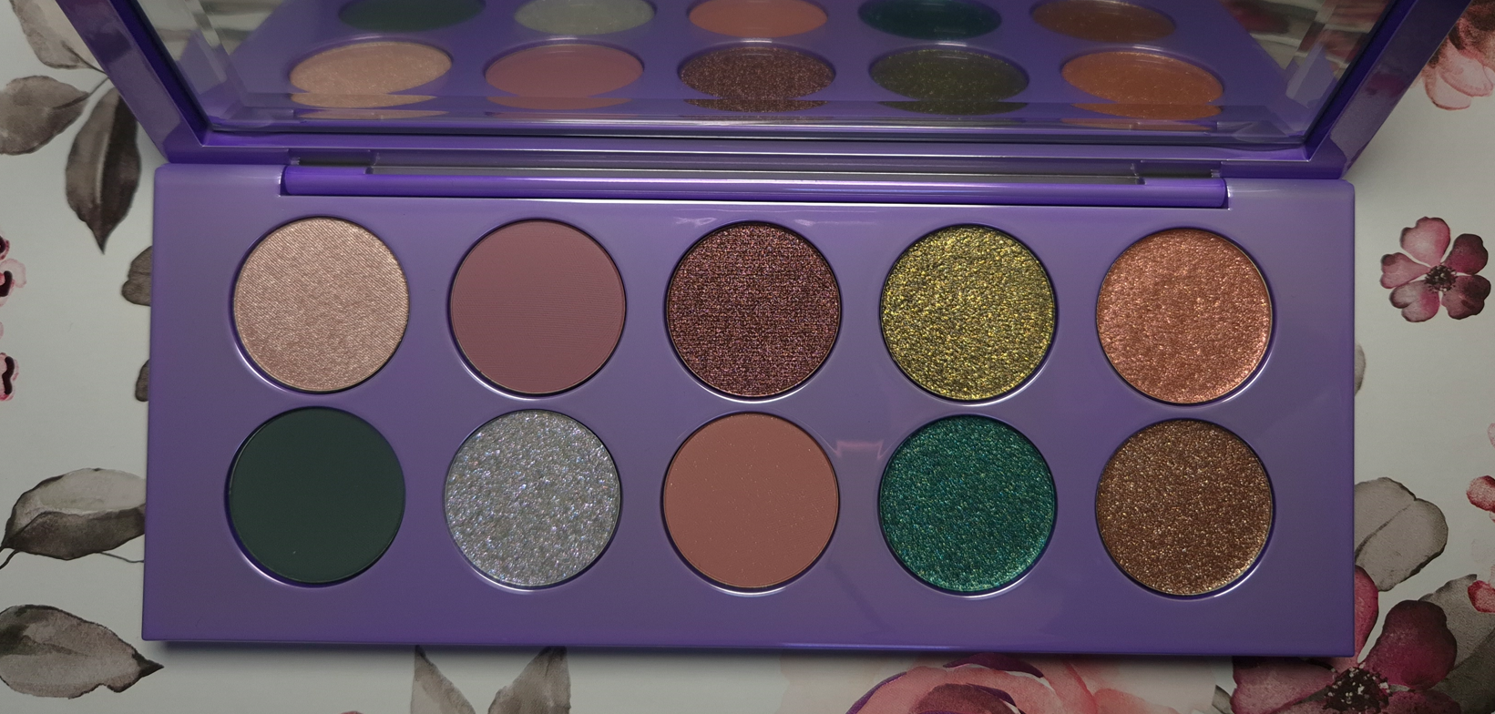
What I found appealing about this palette is the colorful nature, the inclusion of greens, and there technically being less pinks and golds (a peach, a pink-mauve, and a black-based yellow is admittedly not that far off).
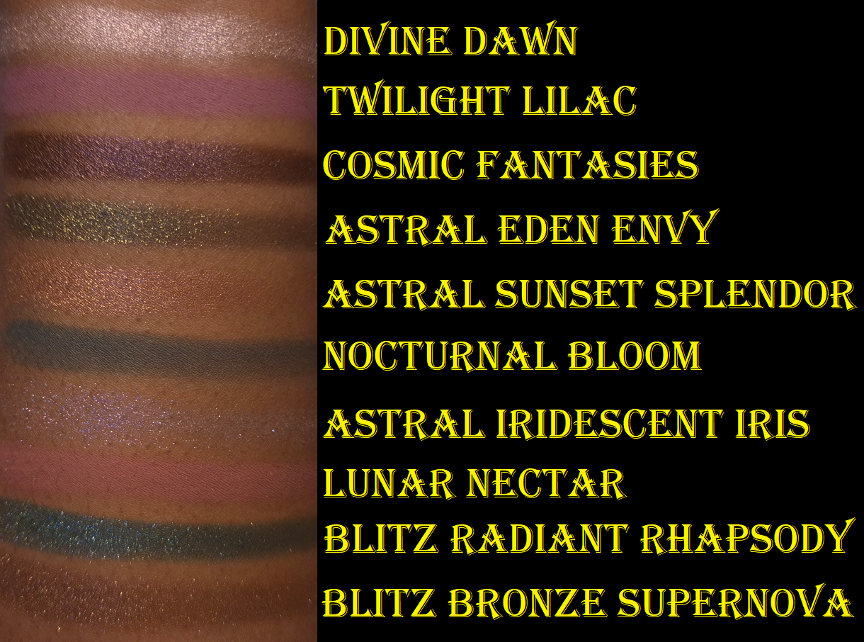
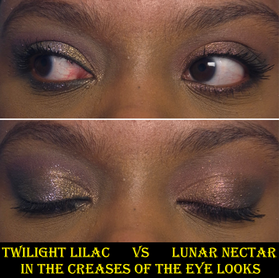
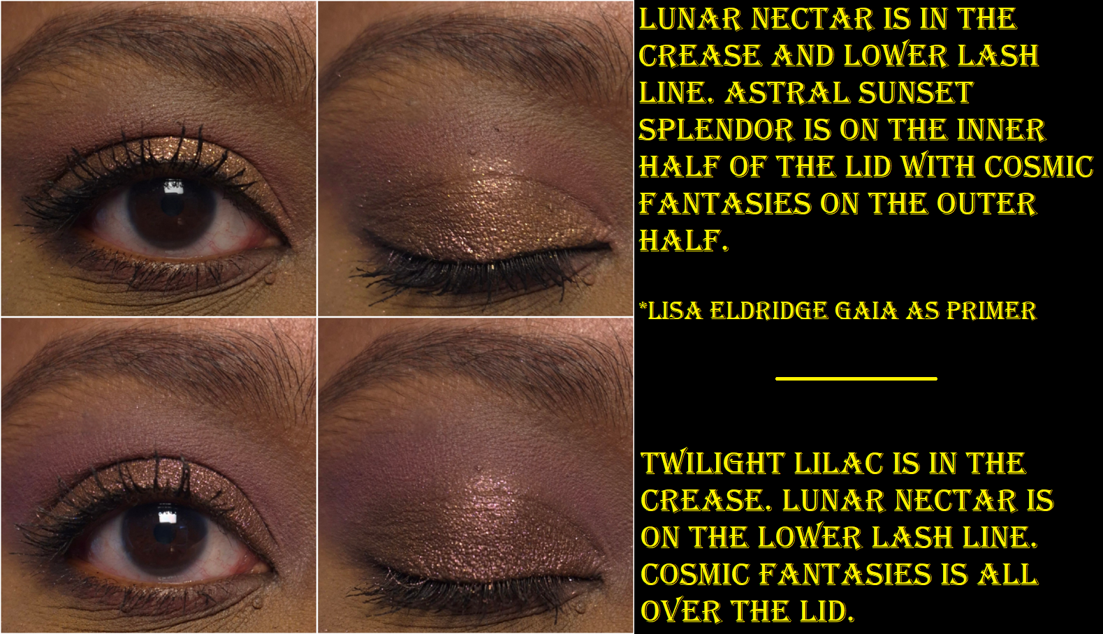
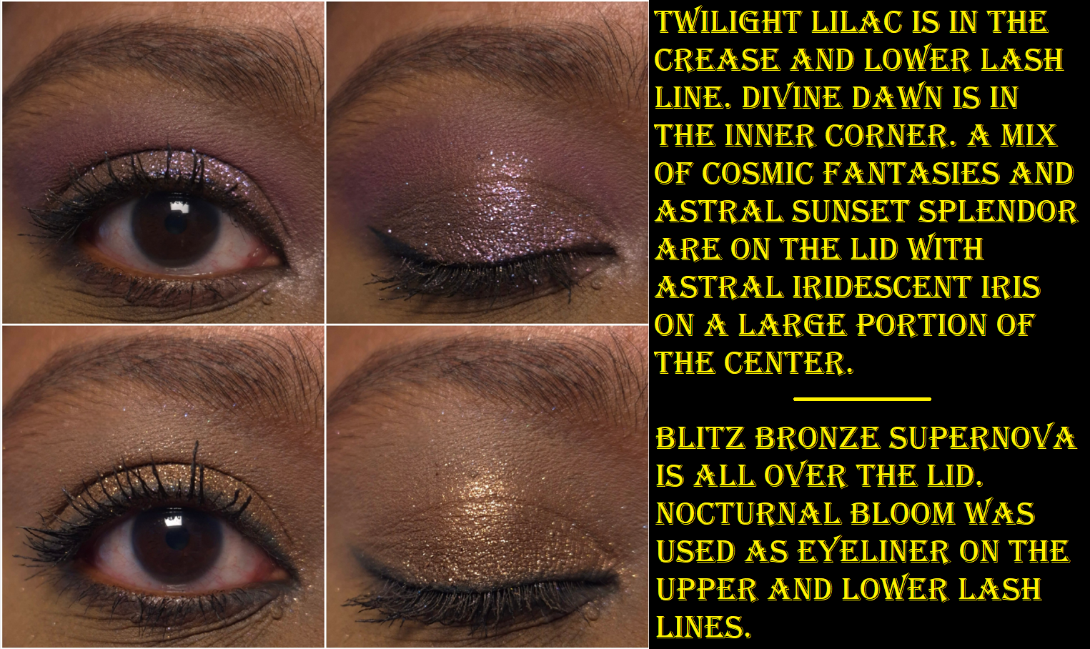
Although I’m very happy to have this palette, and I’m happy that PML gave us a palette different enough for me to justify finally buying another Mothership, I do have a few critiques about the colors chosen. For instance, there are only three mattes. Technically, Lunar Nectar is one of those sequin/matte-with-glitter-specks eyeshadows that look fully matte on the eyes because the glitter gets dusted away while blending. I hate that type of eyeshadow, but I can put that feeling aside. What I have an issue with is how similar Lunar Nectar and Twilight Lilac are. At least they are distinct enough that I can tell them apart on my eyes (when used separately), but orchids and mauves being in the same color family means one of them would be good enough alone to pair with the purple-pink shimmers in this palette. I don’t see why having both was necessary.
That being said, the quality of both of these shadows are nice. They feel a touch silkier than the mattes in my older Mothership palettes, making them slightly closer feeling to the Natasha Denona mattes (but thankfully not that far, as I still prefer Pat’s to Natasha’s). Even though they’re both pigmented, I find myself having to build up more layers to get Lunar Nectar to show on my eyes to the same level as Twilight Lilac.
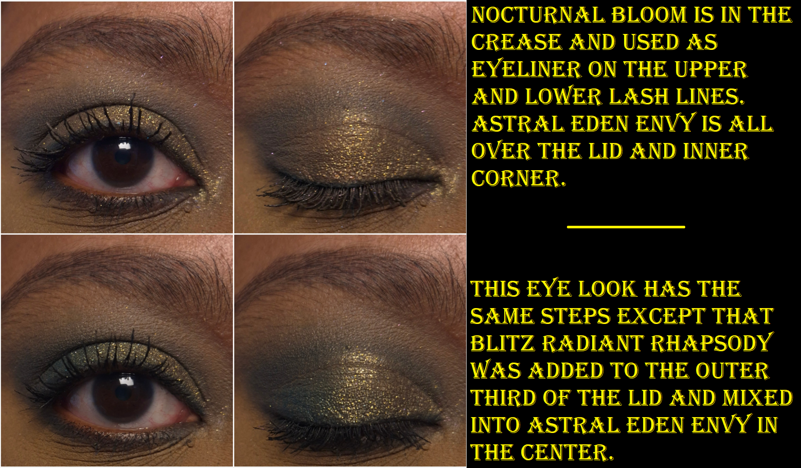
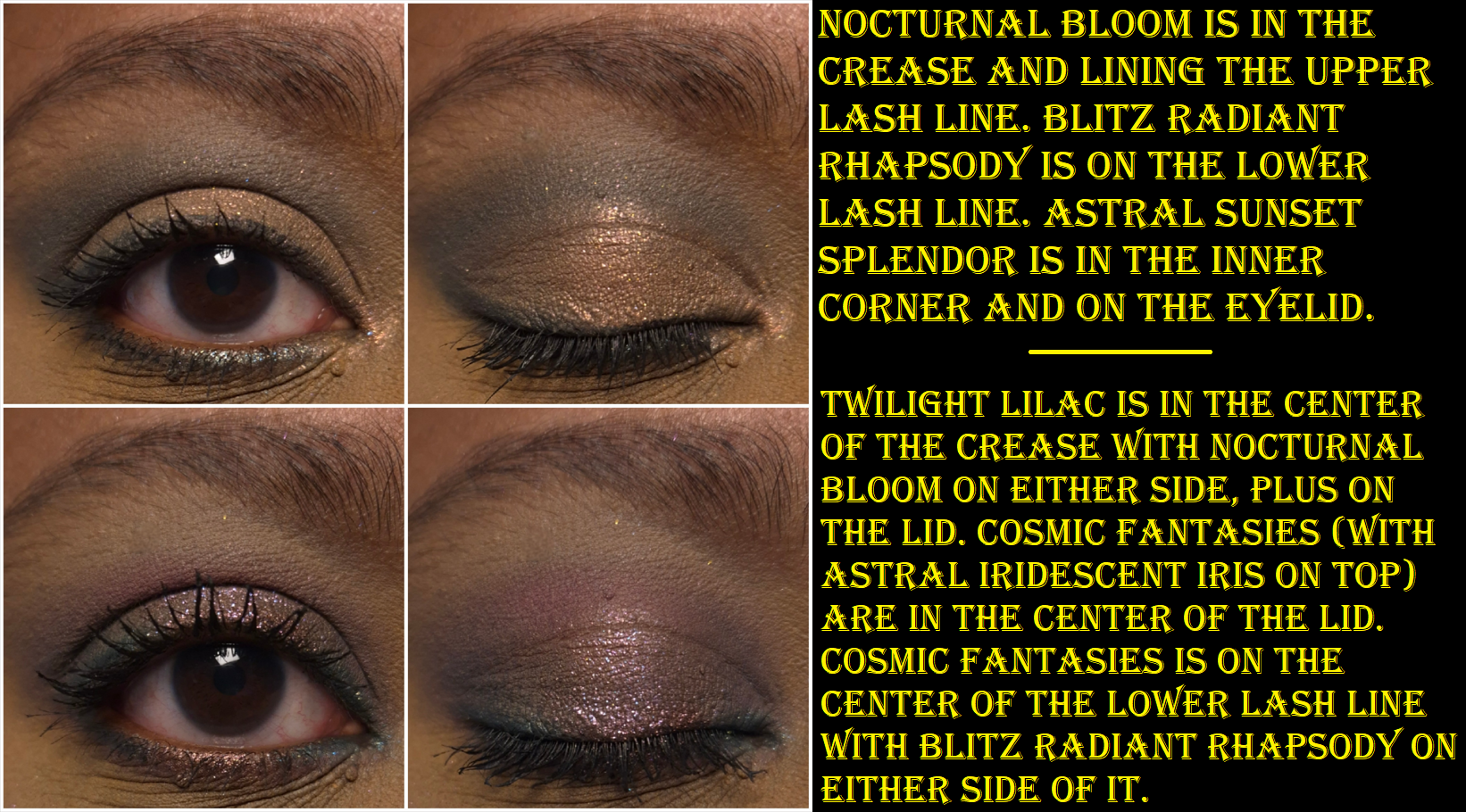
My second color issue is that so many of us have been begging for greens, but putting Nocturnal Bloom and Blitz Radiant Rhapsody together in the same palette is like including a duplicate despite them having different finishes. When I use Nocturnal Bloom as an eyeliner on top of Blitz Radiant Rhapsody or using it in the crease with the shimmery green on the lid, it looks like I used one single eyeshadow instead of two. There’s not enough definition and distinction between them when used together in a look. I believe that Nocturnal Bloom is the more useful of the two. It serves as the deepening and smokey element in the palette. It can be used as liner. The blendability and smoothness is on par with the other mattes, which is great considering what a disaster of a shade that deep green called Altered State was from the Mega Mthrshp Celestial Nirvana palette. This shade layers well on top of the mattes and shimmers equally. Both Blitz Radiant Rhapsody and Astral Eden Envy are a little thicker than the other shimmers in the palette and seem to have stronger adhesion, which requires a little more work to get those two shades to merge seamlessly into any other shimmer. Particularly with the former, I have to pack on additional layers and mix with my fingers to create an even and well blended gradient of one shimmer going into Blitz Radiant Rhapsody. Plus, cool greens are less loved by me than other tones of greens. So, I wouldn’t have minded having a green multichrome (like a green-purple-blue or green-yellow-gold to match the theme) or a different toned deep green as a replacement eyeshadow. Even a light spring matte green or matte chartreuse would have been welcome to me.
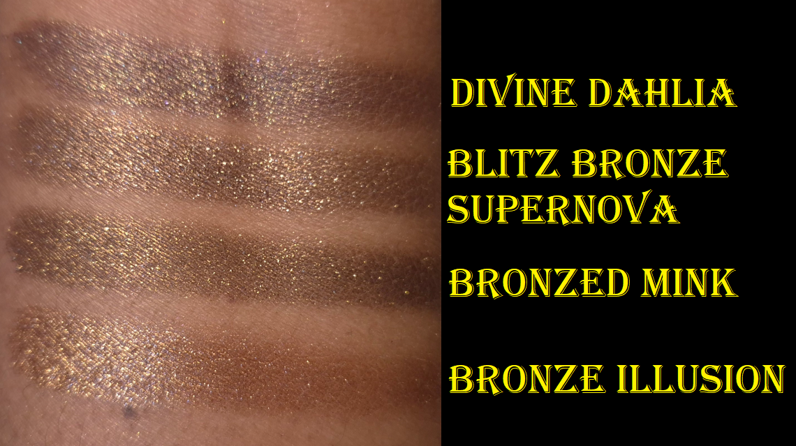
I find it interesting that Astral Eden Envy looks so yellow in the pan, but it looks like an antique olive on my arm, while being gold (or at least golden-olive) on my eyes. I was concerned that it would be too similar to Pat’s iconic shade Gigabyte, but thankfully they are different.
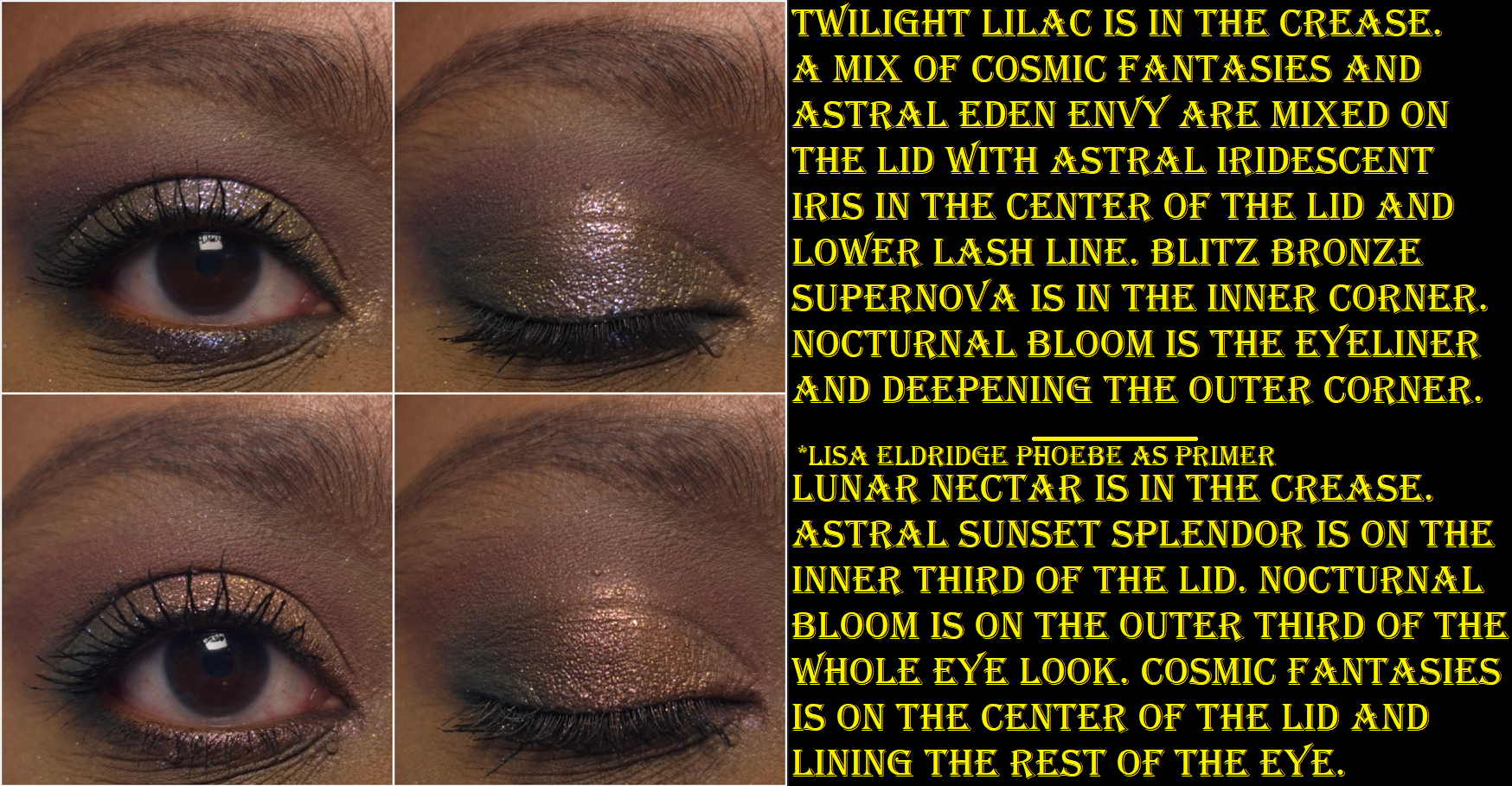
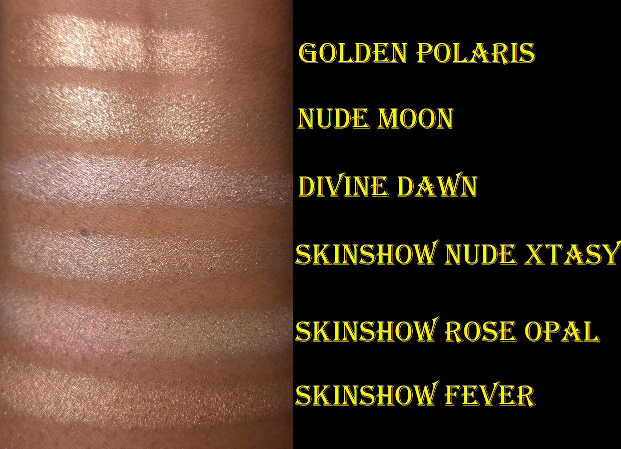
Divine Dawn fills the position of Pat’s typical Skinshow type of shadows that are most often used in the inner corner, to highlight the center of the lid, or brighten under the brown arch. Even though this kind of shade is typically on the thicker and squishier side, Divine Dawn feels even thicker and grips the skin more, making it less easy to spread as smoothly as the Skinshow shades of the past.
If eyeshadow is going to disappear on me, it’s most likely going to happen to my inner corners, so perhaps this slight change of formula is a good thing. For my own personal use though, I can’t recall ever having an issue with longevity when using PML eyeshadows including in my inner corners. So, I would have preferred for this shadow to be a little creamier. Also, this looks like a pale cream in the pan, but it’s more of a silvery pink-purple on my eyes.
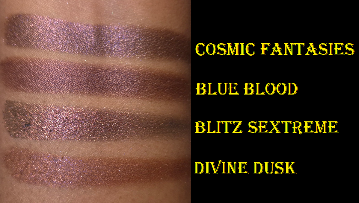
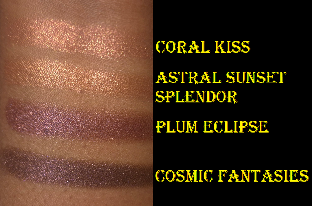
Cosmic Fantasies is quite possibly my favorite eyeshadow in this palette, which I never saw coming. It’s a beautiful reddish purple with a dark base and no chunky glitter particles. It is a smooth metallic with enough binder that I can use it as an eyeliner without worrying about fallout. It layers easily with the other shadows and is the only other deepening shade in the palette. At the same time, the shine is just enough that I can use this eyeshadow solo and it doesn’t feel like a smokey shade on my skintone, even though it pairs well with those kind of looks. This doesn’t feel super unique because there are similar shades to this in some of my other palettes from the brand, but Cosmic Fantasies has the tone, depth, and finish to help it stand out.
Blitz Bronze Supernova is the most neutral shade in the palette, but it’s far from boring. This shadow is super sparkly with a mix of different shimmer particle sizes. In order to make it look smoother and to minimize the fallout, I apply it with a damp brush. Although it doesn’t surpass my two ultimate PML browns (Divine Dahlia and Bronzed Mink), it’s still a very pretty color and a great addition for the lighter eye looks.
While I have some misgivings about some of the shade choices, I think all of them are pretty. However, when it comes to the one that is actually the hardest for me to incorporate into my eyeshadows looks, it has been Astral Sunset Splendor. By the time I started working on the first draft of this post, I’d done 15 eye looks (some of them repeated on different days). Six of them involved using this peachy shade and three times I had to cover it up with another shadow because I didn’t like how it turned out. It pairs very well with Cosmic Fantasies, but it’s such a thin shadow that it gets overpowered by some of the more pigmented shimmers. Three failed attempts really isn’t a lot compared to the number of shades I could still try it with, plus with eyeshadows outside of the Petalmorphosis palette, so it’s possible I could like this color a lot more in other scenarios. I just typically prefer fully opaque eyeshadows, so this is currently more of an inner corner kind of shade for me when I apply it damp to control fallout. I think the shade Coral Kiss from the Nude Allure 5-pan palette is a much more interesting eyeshadow, and it’s not even an Astral!
The star of this palette that adds the most drama and color impact is Astral Iridescent Iris. This is a topper kind of shadow that looks silvery lilac in the pan, but pops to a brighter cool purple and silver on the eyes. The texture of this is closest to how the “special” shades in the Mothership palettes usually feel, which is to say on the drier side and a gritty-flaky kind of feel to them that will absolutely have fallout unless applied damp or over a glitter glue. I’ve dipped my finger into the pan at least six times, and I worry that it could be starting to hardpan. It feels like it’s starting to compact or compress itself into the pan, but so far I am not having issues picking up the product. This is something I will continue to monitor and will update if it becomes a problem.
Overall, I think the quality of this eyeshadow palette is great. I’ve had no issues with creasing or longevity. I have no patchy issues and most of the shades are super easy to blend (the worst performing ones are simply “easy” instead of “super easy”).
I know there is a huge debate going on about the “special baked formula” that the brand abandoned in Mothership X and onward. While it is likely that the process of making those four pan-less eyeshadows in that particular Italian formula might have contributed to the higher cost of the palette, I was never a fan of the texture and consistency of those eyeshadows. I loved the effect, but did not enjoy the dryness or fallout. The effect of these new Astral and Blitz formulas feel similar to the OG, but with more binders that make them easier to use. Some people, like me, prefer that. Others swear this new version isn’t as impactful and are willing to put in the extra effort to work with the OG eyeshadows we’ve been accustomed to over the course of seven years.
I think the OG lovers have some valid points in wanting there to be “special shades” in every palette, especially with price increases, but I don’t think the Motherships need to have baked shades in order to fulfill that wish. Ultra shifty multichromes are some of the most expensive pigments to make into an eyeshadow and having some in Motherships should at least satisfy the ones that want to feel their expensive palette isn’t expensive just for the packaging alone. This is coming from someone who refused to buy the beautiful Decadence palette because it contained solely metallic shades. In comparison, I think Petalmorphosis formulas are at least more expensive than Decadence. But for anyone who feels the Motherships are only worth buying if there are baked shades, then by all means don’t buy Petalmorphosis. Vote with your dollars! It’s odd to see Influencers and other Enthusiasts with the same complaint about three or more PML palettes while continuing to buy every single one. Then of course the brand won’t change course if they’re still making money off these “inferior” palettes! No judgements to anyone who wants to buy them all as a fan or collector. I’m just saying hurting a brand’s wallet has more impact than hurting their feelings. Influencers who talk about losing their love for PML while still buying all the products are sending mixed messages to their audience. In my opinion, giving a brand no attention is worse than talking badly about them. “All press is good press,” is a saying for a reason.
Two of the most interesting and contrasting viewpoints on the topic have been by the YouTube channel Alexis and Christina (I believe formerly known under the handle Lipstick Lesbians) and Mariam A also on YouTube.
I did a Pat Mcgrath Palette Ranking post last year and if I were to include Petalmorphosis among the rankings, it would probably be at #5, just barely above Nude Allure purely because this palette has additional shade options. I would also move Huetopian Dream to 7th place, just under Nude Allure as #6, because over the course of time, I missed having that palette more than the other two quints.
Pat Mcgrath Labs is one of my most loved makeup brands. I have been quite critical about certain decisions they’ve made, and therefore skipped many releases, but I haven’t given up on them just yet. I was worried when nothing interested me from them in all of 2024, but I’m hopeful this is just the start of exciting launches in 2025.
Thank you for reading. I hope this has been helpful and that you didn’t mind my unfiltered opinions!
For the last several years, blush has been my #1 favorite category of makeup to purchase and wear. I have a similar taste in blushes as Angeschka Nyqvist, especially when it comes to shimmery ones, so it made sense for me to try some from her own brand. There are currently four shades in the range. I have three, but I did not buy Riveting Rhubarb under the assumption that it won’t be as flattering on my skintone as the others.
DISCLAIMER: I purchased all of these products with my own money. All thoughts and opinions are my own.
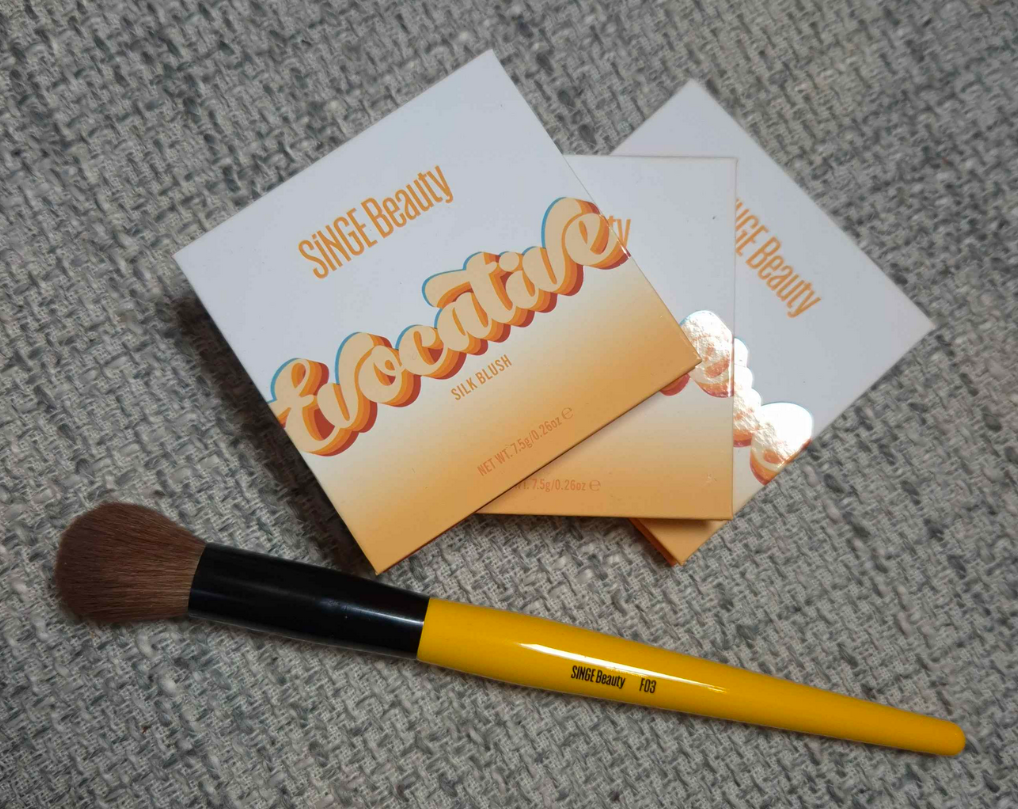
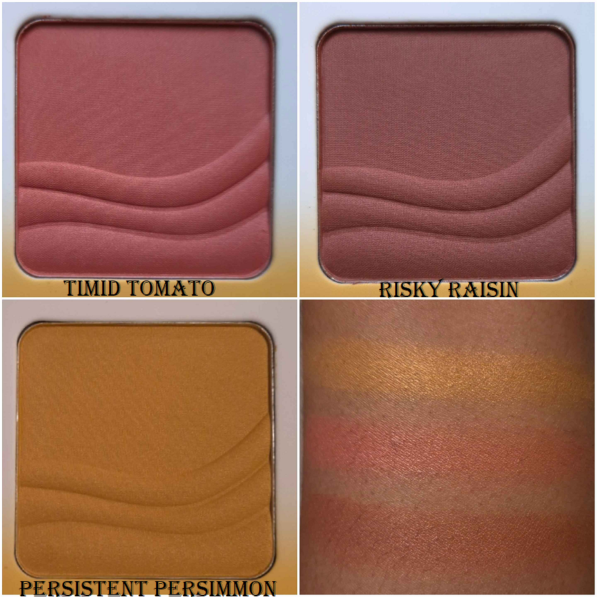
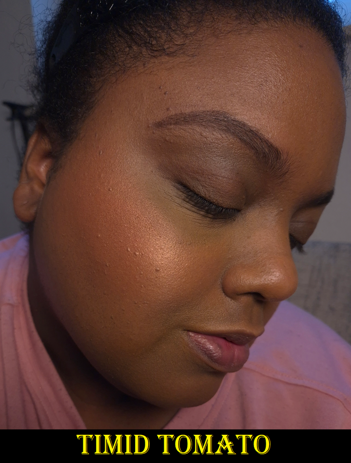
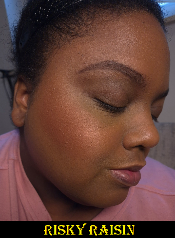
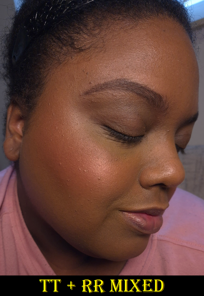
Singe Beauty Evocative Silk Blushes in Timid Tomato, Risky Raisin, and Persistent Persimmon
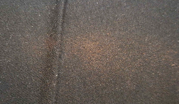
These blushes are pressed firmly enough to maintain the shape of that embossing, but they are loose enough to be easily picked up with any brush I own, whether they’re a delicate natural hair brush or a sturdier synthetic type. I get kickup in the pan, but it’s an acceptable amount most of the time. I got it on my clothes once from a brush that picked up a bit too much!
To the touch, these powders are soft and have a slightly silky feel to them. It’s difficult to see shimmer on the surface in normal lighting. The blush has to have light shining directly onto it to spot it easily. This makes me happy because when I say I want a shimmery blush, I don’t really wish to see large individual shimmer particles. I just want a sheen, or an ultra refined reflect to make my skin have a bit of glow to it. I’m not looking for a highlight-blush hybrid, so I’m pleased with the way these blushes are.
They are all quite pigmented. I prefer to use a medium density brush or one that is on the light side to have better control over how much I put on. It’s quite easy to get carried away and find myself saying, “slow build…gradual build…oh, gosh too much!” The blushes blend easily, especially with each other, but it still requires using a light hand. I’d rather they be pigmented over having the problem of being sheer because Timid Tomato is my favorite of these shades, but the inclusion of shimmer could have had the Nars Orgasm effect on me (that when the light hits it, the shine obscures the base color and then it looks like I just have highlighter on my cheeks instead of blush).
I have no longevity issues with this blush, as long as it’s on top of skin that is moisturized in some type of way (via skincare or foundation).
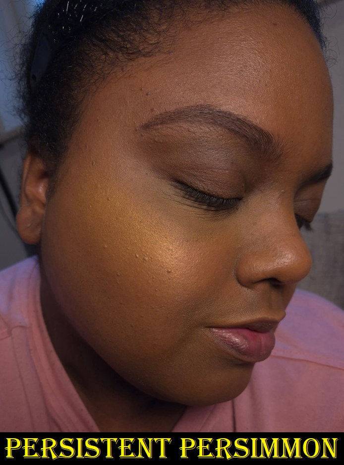
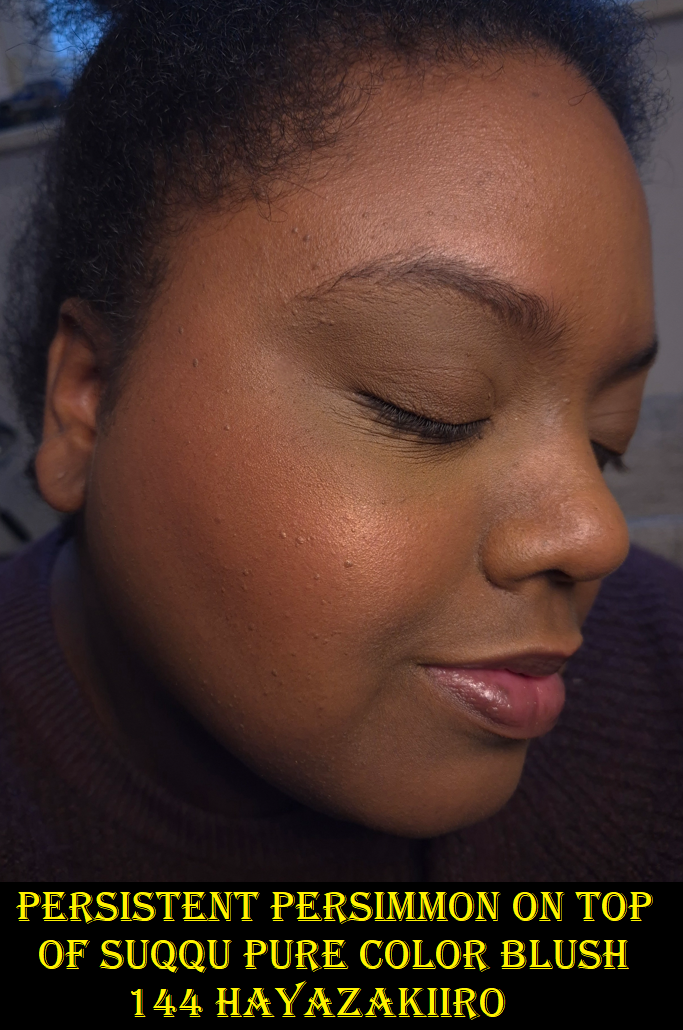
I bought the other two blushes in October 2024, but I didn’t get Persistent Persimmon until December of that same year. I kept seeing people use this blush to create a sunrise cheek type of look, which was pretty enough to make me reconsider. I knew this was too light to be a standalone color for my cheeks, but I remembered how Scott Barnes had a yellow blush in his Chic Cheek palette that could be used to add warmth to blushes if they were leaning too cool toned on someone. I’m less into matte blushes now, which is why I didn’t bother to keep that one with me, but I thought having a shimmery version could be perfect! Below are some examples of cool and/or berry blushes I don’t like as much and how Persistent Persimmon added on top turns them into a somewhat coral color that I like way more!
Besides using this shade for adding shimmer and warmth, I can partly lighten blushes that may be too dark for my liking. So, I’m happy that this turned out to be another “fixer” type of product in the same way that I use the Dior Powder No-Powder for blurring and blending or the r.e.m. beauty Interstellar Highlighter Topper to fill in the gaps of scattered effect highlighters.
I have considered the possibility that Singe’s pink blush could have the same role as Persistent Persimmon, except to cool things down, but my need for that is so rare that I don’t think it would be worth the purchase for that purpose.
As I mentioned before, these blushes look different in natural or indirect light compared to light hitting it straight on. This shade is like my version of Nars Orgasm X, but better.
Risky Raisin looks a bit close to Timid Tomato on my skin. The difference is that it’s a touch darker with some brown and is a less saturated color overall. The red tinge in Timid Tomato pops a little more.
Overall, these are nice shimmer blushes. I like them, but there are blushes in my collection that I’m crazy about. I don’t have the same level of excitement using them as I do with, for example, Dior’s Rosy Glow Blush in the shade Bronzed Glow or Benefit’s Wanderful World Blush in the shade Terra. Those two are also twice the price as the ones from Singe, so I can at least say these blushes are among the top shimmer formulas I’ve used for under $20 USD. Because of VAT, the price I paid is around 23 Euros each.
On a less important note, I’ve been spoiled by luxury packaging, but I don’t mind Singe’s cardboard packaging or the absence of a mirror. I like that these details have kept the cost down. However, I’d actually prefer if these were available as refills. I would like to keep them in one single custom magnetic palette, so I’ve considered depotting them. The only reason I haven’t is that I also like how lightweight this packaging is. All of the custom palettes currently in my possession feel heavier in their empty state than the weight of these three blushes in one hand. I still don’t have a proper makeup area (renovations are still taking place), so it’s easier for now to carry these around in their current packaging until I have a more permanent setup.
Singe Beauty F03 Brush
I’ve found Singe’s eye brushes to be useful, but not as enjoyable of an experience compared to my fude brushes. I decided they weren’t for me and assumed the face brushes would be the same. However, from one brush snob (I say this with love) to another, Tina the Fancy Face has given Singe’s face brushes a more positive review than the eye brushes. So, I assumed I would prefer them too.
This brush feels wonderful when I rub my fingers across the fibers, but it’s similar to rubbing Sokoho level goat across my cheeks. It feels nice at first, and certainly fine with the brand’s own blushes, but if I try to use a makeup product that requires additional blending time, it can irritate my cheeks a bit. My skin has admittedly gotten more sensitive with age (or perhaps I’m just so used to using ultra soft brush hair), so this won’t be a problem for everyone. I just wanted to put it out there that if you’re the type that uses mostly natural hair brushes and only loosely packed synthetic ones, you might not want to buy this brush. But I’d like to reiterate that it’s only if I have to spend a long time blending that it starts to agitate my skin.
The Singe blushes are pigmented, but I don’t have to worry about overapplying as much when it’s on my bare skin. The product looks so skin-like and I can use this specific brush in a heavy-handed way. However, when my face has a little dew to it, the application of blush with this brush can be too concentrated if I’m not careful. I have to dip the brush lightly onto the surface of the blush, tap off excess, and sweep it on first before attempting to do the full on circular buff.
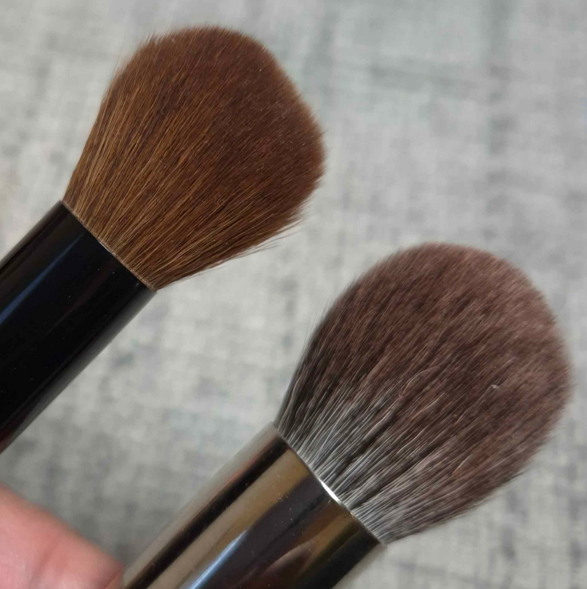
Because of these two potential complications, it’s just easier for me to not reach for this brush with powder products. What it’s fantastic for are creams and liquids. The size and shape is somewhere in the middle between my holy grail Sonia G Mini Base and the Classic Base that was too big to be a multi-purpose brush for me. I have enjoyed using this brush with Glossier Cloud Paint blushes, the Chanel cream to powder (Joues Contraste Intense) blushes, the Charlotte Tilbury Unreal Skin Foundation Stick (that I use as highlighter), etc. Those are products that I pounce on and they practically blend themselves. The way this brush moves ensures I still get good color payoff without the product getting absorbed into the bristles or dispersed into too wide of an area. I will probably continue reaching for the Mini Base over this one, but the Sonia G brush is almost double the price, so perhaps the Singe F03 would be a good alternative for someone.
Because of my enjoyment of this brush, but my desire to have it in a softer hair/bristle type, I purchased the Hakuhodo G6440 from Fude Bobo’s website and it is so wonderful! It’s only for use with powders (as it’s a blue squirrel/goat mix), but I’m thrilled to have it! I got mine during Black Friday, but it was still super expensive. It might only be worth buying for people who are lovers of pom pom style of brushes.
That’s all for today! Thank you for reading and I hope this has been helpful.
In 2020, I reviewed my first Nomad Cosmetics product: the Tokyo Harajuku Palette. It is one of the worst palettes I ever owned, which is a shame because the palette art was so cute and I tried so hard to make it work on me. It was bad enough to scare me away from purchasing anything else from the brand. However, in the last 2-3 years I’ve heard nothing but good things about the brand’s eyeshadows. Beauty Influencers and other makeup enthusiasts that I trust all seemed to like their palettes. Granted, not a single one of them ever reviewed the Tokyo palette and even the people who owned nearly all of them coincidentally were only missing that one. I always found that to be strange considering the Tokyo palette was extremely hyped up when it first came out and it was the reason I even discovered that Nomad Cosmetics existed.
Pastels are notoriously tricky to make look good on dark skin, so I was willing to accept that factor could account for the particularly bad experience. I had also heard their formula “got even better” over time. So, at some point I made up my mind to give them another try, especially since I felt bad that their only review on my blog was a negative one. The problem was that none of the color stories were of interest to me until the launches of the Haunted Europe and Royal Europe palettes. I also didn’t want to spend so much money on a palette when the potential was high that I might not like it. So, I finally caught Haunted Europe in stock during Black Friday/Cyber Week!
Before we get into the review, I just wanted to mention that this palette was delivered to me in Germany via GLS. This was my first and hopefully last time having to deal with that service. I was literally looking out the window as the delivery van passed my building and stopped somewhere else to deliver a package, then continue driving away. At the end of the work day, they updated tracking with a note that my package couldn’t be delivered because I was on vacation, instead of them just admitting they forgot to stop at my place.
I sent an email to GLS customer service. My package was delivered the next day, but they never responded to that email. I found plenty of complaints about GLS online, so this wasn’t an isolated incident. If you’re ordering something that uses them as delivery partners, just be forewarned!
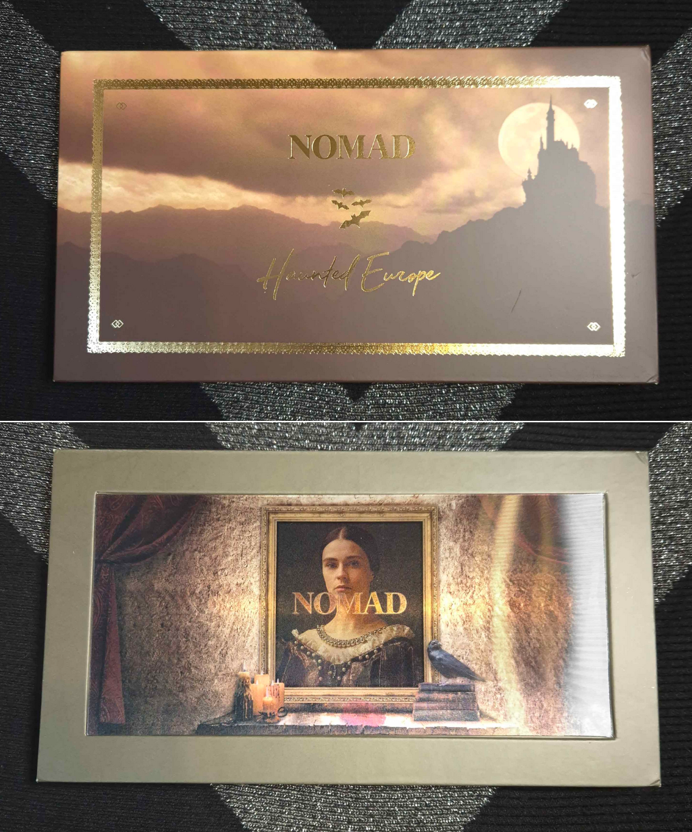
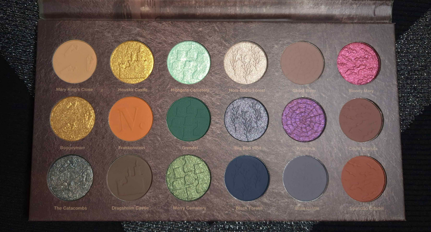
Haunted Europe Palette
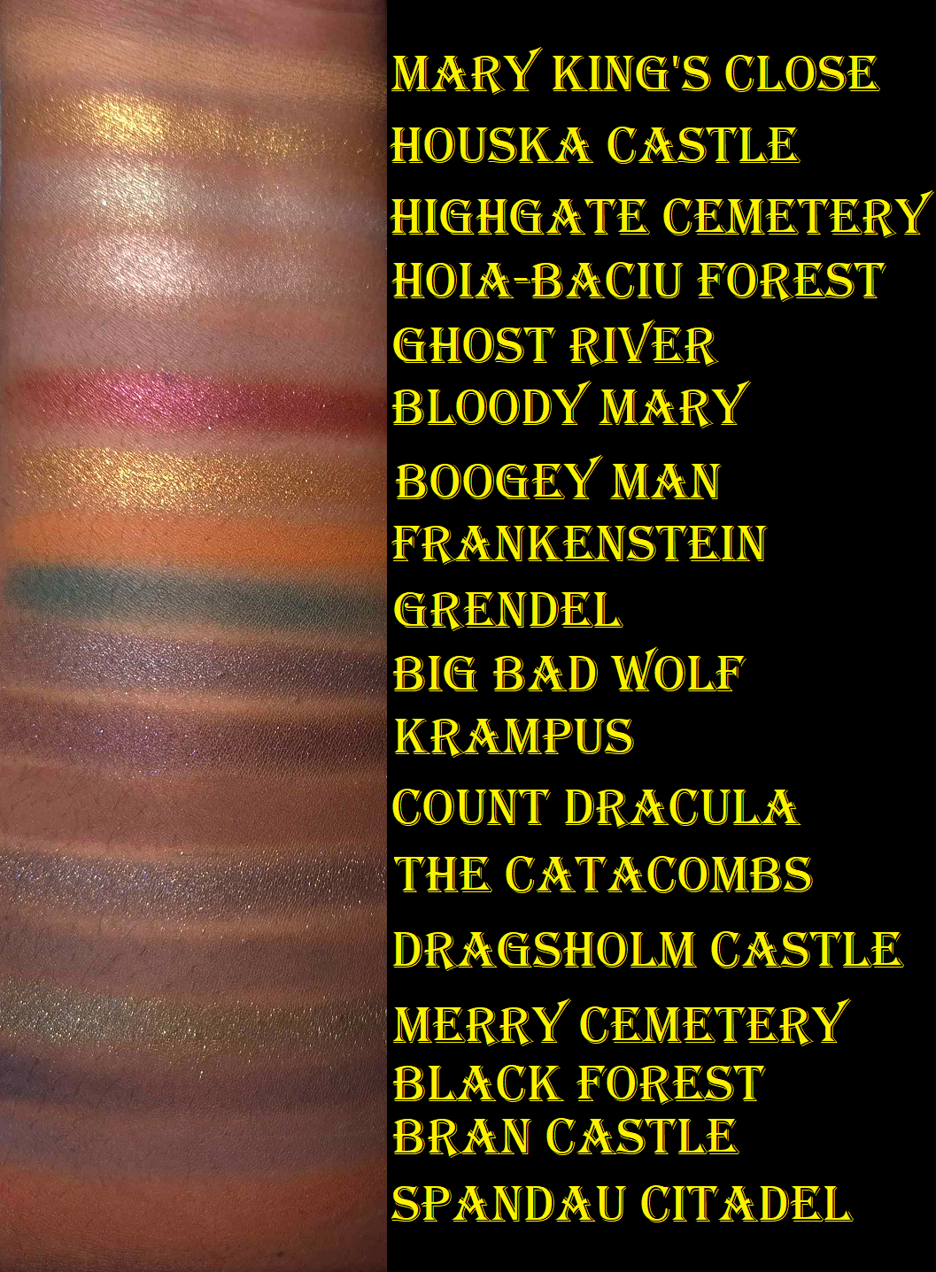
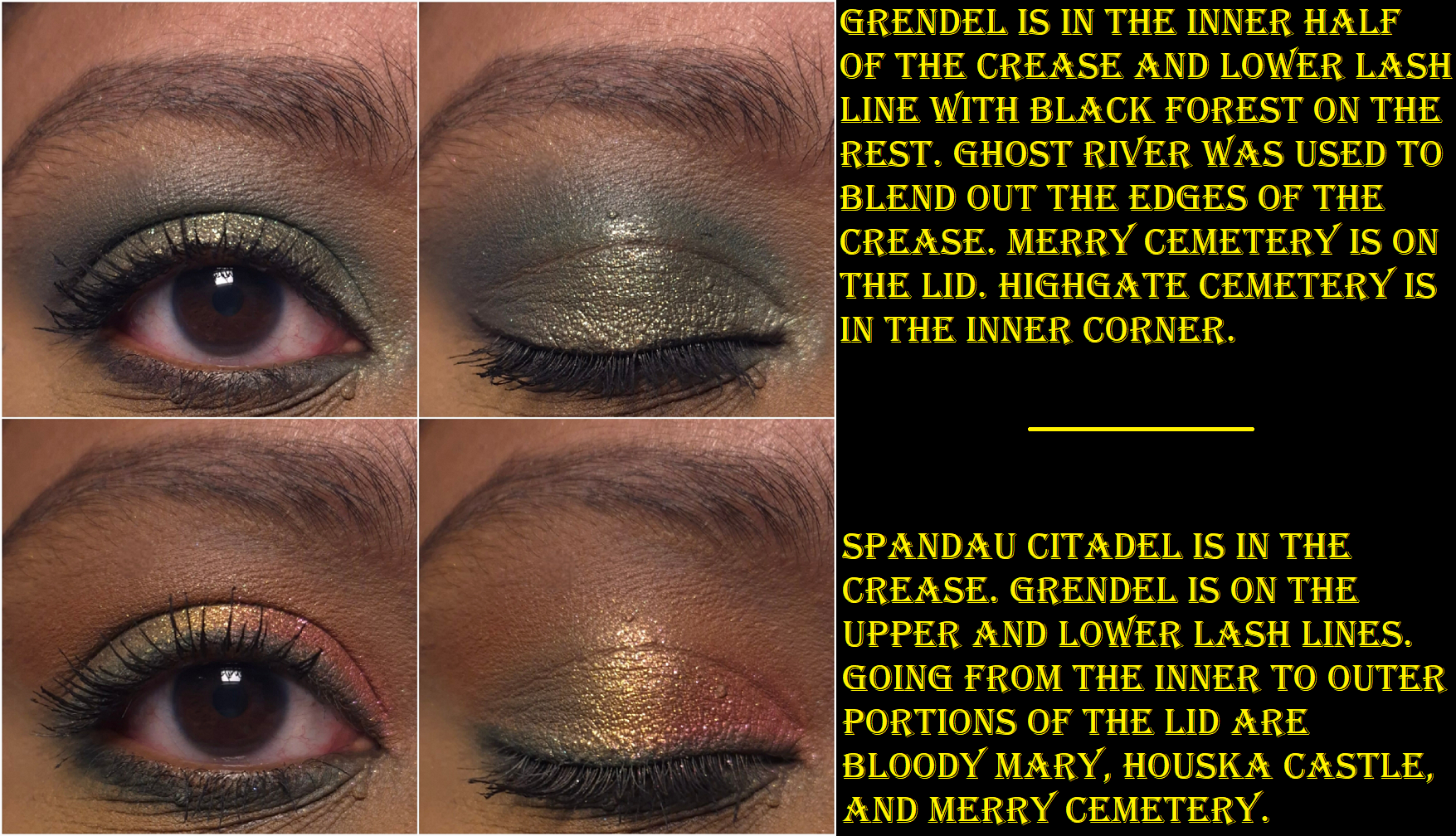
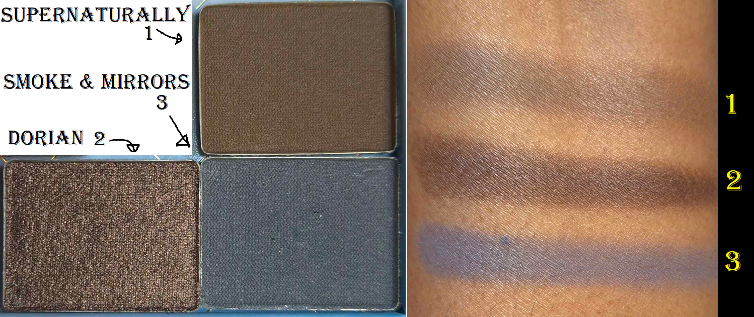
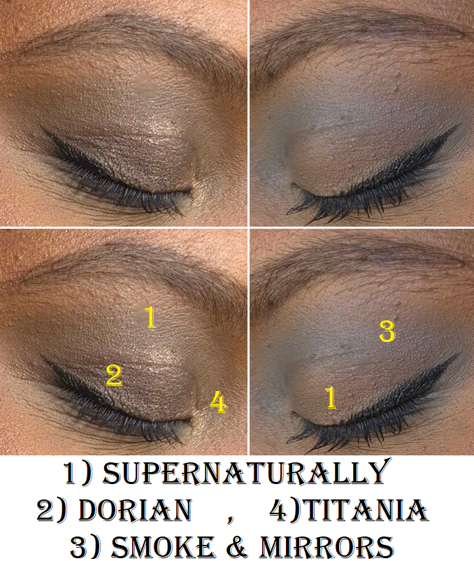
I was so relieved to discover that this palette is leaps and bounds better than the Tokyo palette!I’ve been able to create quite a few pretty eye looks. This has a nice mix of neutral and colorful shades, but the matte colors are a bit muted. The mattes are soft to the touch and powdery. They are all opaque and apply smoothly without being patchy, but they create a soft and hazy kind of look. The brand describes all their palettes as “intense,” including this one, which surprised me because these aren’t vibrant colors. I can’t think of a single indie brand whose eyeshadows are less saturated than these. For example, Spandau Citadel looks reddish brown in the pan, but it’s a medium pinky-orange on my eyes! Bloody Mary looks so promising in swatches, but it’s so much less impactful on my lids.
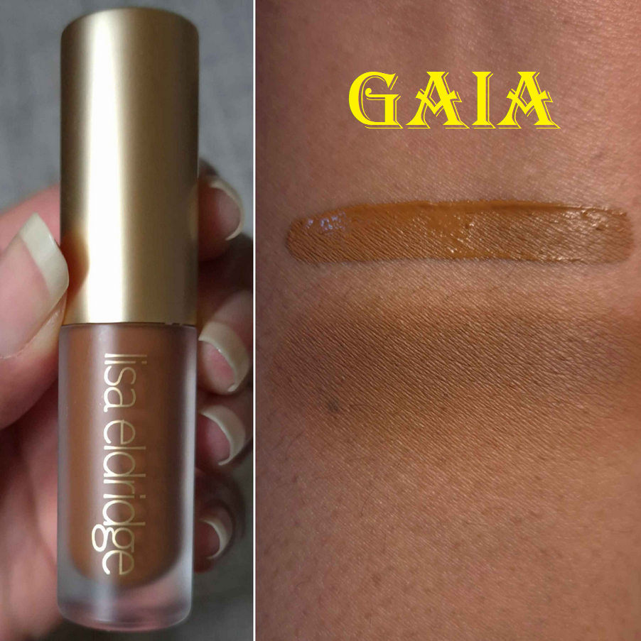
I’d like to clarify that I don’t think this is inherently a bad thing. It’s about preference and I think a palette like this is perfect for the neutral lover who wants to dive into color, but gets easily intimidated. This could also work for someone who likes to combine neutrals with colorful shades and without the overall look being too bold. Someone that likes smokier type of colors might enjoy this as well. It could also be the case that these look more intense on people with lighter skin or someone who uses different primers or bases. The ones I use with this palette are MAC Paint Pot and Lisa Eldridge’s Liquid Silk.
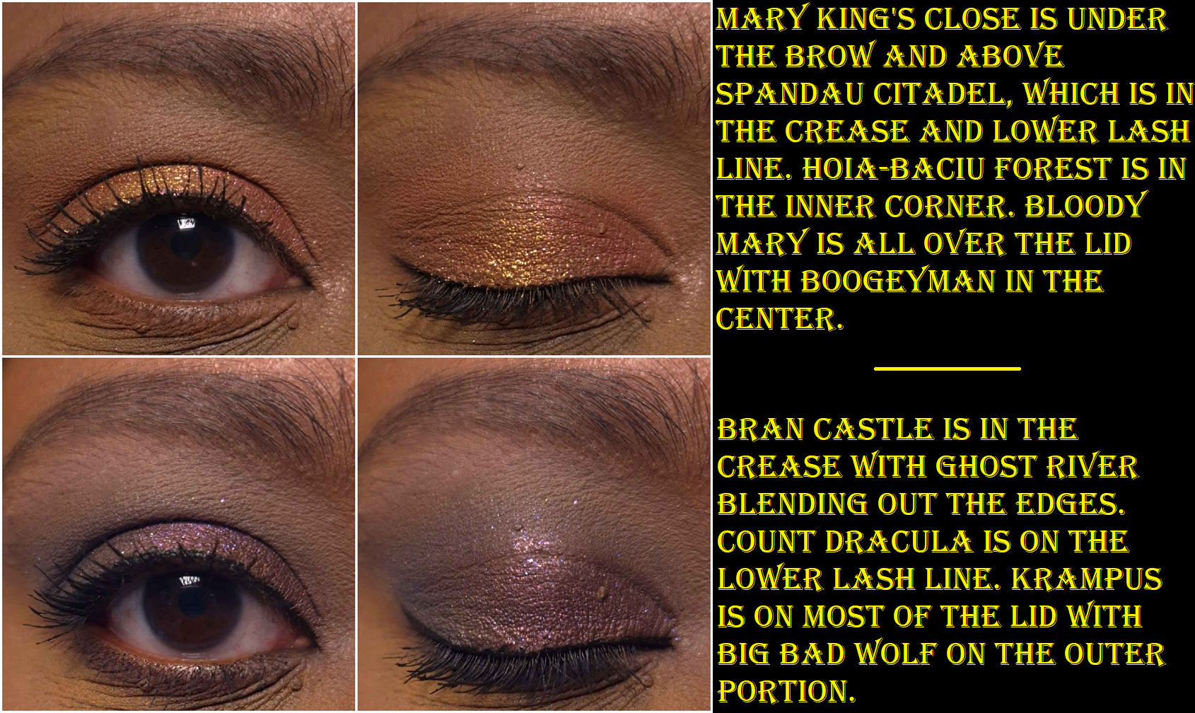
These mattes have a hazy effect that make them look well blended. It is easy to get a gradient look from a single shadow, but they aren’t easy to build up, nor to they layer well on top of each other. If I want real depth, I have to start with the darker shades first and work backwards from my usual order of eyeshadow application. Black Forest is the most pigmented shade in this palette and is the one that layers the best. Using that shade or the dark shimmers is the quickest way for me to deepen my looks with the least amount of effort. Grendel has the second strongest amount of pigment, but it’s not as easy to blend as Black Forest.
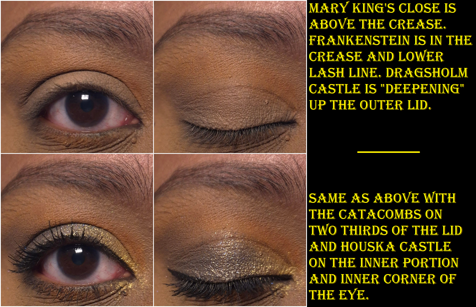
Houska Castle is a yellow-gold and Boogeyman is orange-gold. To keep them from feeling redundant, I think Nomad could have benefited from giving them different finishes instead of making them both smooth metallic shimmers.
The golds are fairly smooth, opaque, and vibrant. Highgate Cemetery and Merry Cemetery have bigger sparkle particles, but I can see my skin through them. I can fix that by wetting them so that they apply more compact on my lids. TheCatacombs and Bloody Mary have more opacity and more obvious shimmer, but they’re not able to complete with brands like Pat Mcgrath or Natasha Denona with intensity, let alone other indie brands. Big Bad Wolf and Krampus stand out because of the multi-colored shimmer, but they aren’t duochromes and they look smoother than the previous four I mentioned. Hoia-Baciu Forest is the smoothest of the shimmers and what I prefer to use as the highlighting shade, especially in the inner corner. It pairs well with nearly all the eyeshadows in this palette. To me, the shimmers are just fine. They don’t crease on me though, so that’s a plus. I also get an acceptable amount of fallout throughout the day, as it adheres to my lids pretty well, but after that it’s impossible to remove all the shimmer particles with micellar water and a microfiber cloth alone.
Since the theme of Haunted Europe is supposed to be spooky and smokey, I assume this is why the colors are muted and that Nomad’s other palettes are more saturated. That could mean that I still have gaps in my knowledge regarding the brand’s eyeshadows, and therefore shouldn’t assume the others perform like this one.
Haunted Europe is good enough to have redeemed Nomad Cosmetics in my eyes, and I can see how people would like the quality, but this is still in the middle of the road among the palettes in my collection. There are too many aspects that aren’t a perfect fit for my makeup preferences, so this is probably where the journey ends between Nomad and myself. My curiosity has been sated.
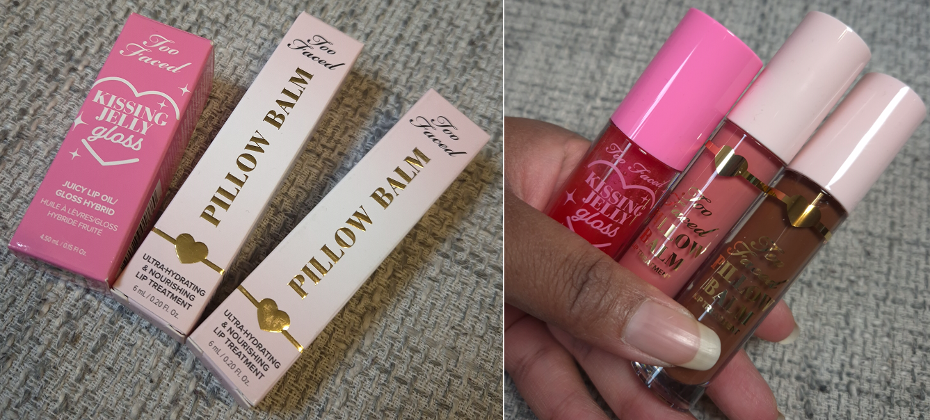
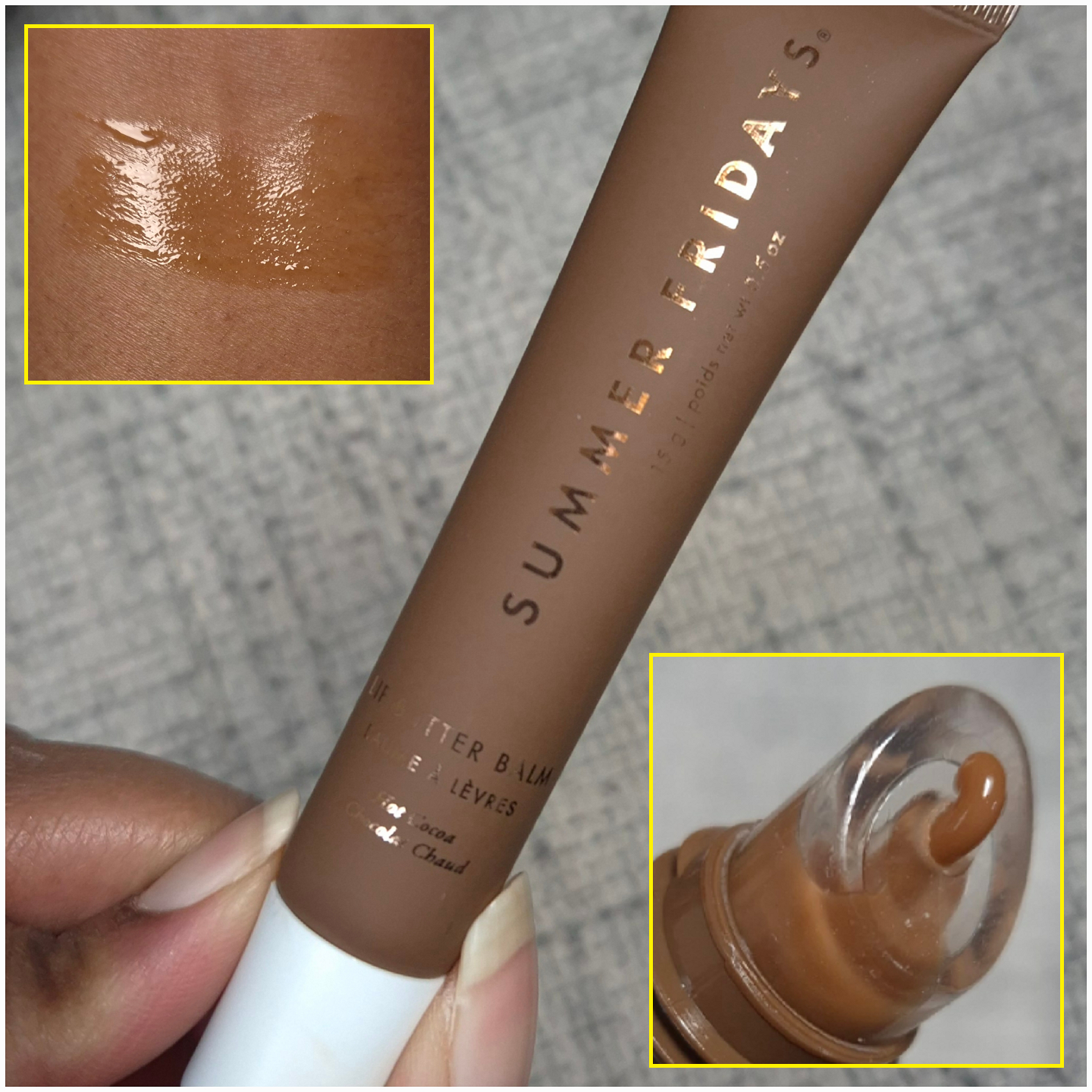
I owned and reviewed eight of the brand’s Hangover Pillow Balms prior to Too Faced dropping them from the Hangover line. They renamed them just Pillow Balms, redesigned the packaging, and revamped some shades while introducing a few new colors. Besides the two I’ll be reviewing today, I also purchased the brand’s Kissing Jelly Gloss, which I believe they released in 2023, but I didn’t buy it until late last year.
Too Faced Pillow Balms in Pink Pineapple Kiss and Hot Cocoa Kiss
I enjoy the formula of the balms, but I only brought the original clear version with me when I moved because the other shades I owned were a pale milky color that was not all that flattering on my lips, or they were sparkly with no base color. However, when I recently returned from visiting the US, I brought Vanilla Kiss and Holiday Wine back with me. Holiday Wine is the most pigmented of all that I’ve tried and Vanilla Kiss had the prettiest sparkle.
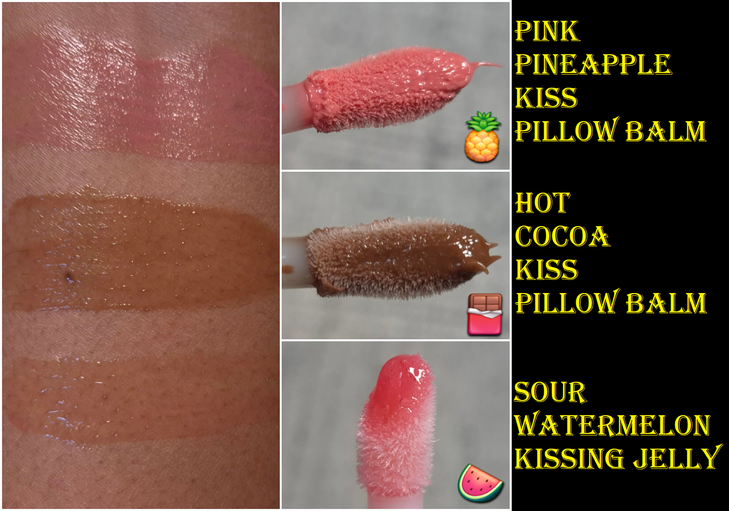
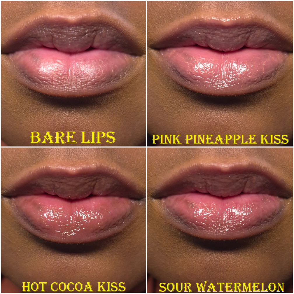
When the new ones launched, I was excited to potentially own some with more pigment. As it turned out, Pink Pineapple Kiss is still a bit light for me, but at least it doesn’t look milky, so it’s an improvement. I would consider this a neutral light-medium toned pink. It is supposed to smell like tropical fruit, but to me it smells more strongly of mango than the original Mango from the previous line (and that shade/scent was discontinued).
Cocoa Kiss from the prior line was much lighter than the new Hot Cocoa Kiss. It is a much better color on me! The brand states that this has a chocolate smell. I think this smells exactly like a Tootsie Roll! It’s very nostalgic for me, but considering how artificial Tootsie Rolls are, I can imagine that a lot of people who didn’t grow up with those candies might find the smell unpleasant. Chocolate is one of those things that a lot of people hate when it smells artificial, but then again, Too Faced gained notoriety with their Chocolate palettes and bronzers, so they have been known to produce that scent well enough. I think the scent is still an improvement from how the previous Cocoa Kiss smelled.
I don’t own Juicy Watermelon Kiss, but based on the website photos, it appears to be a richer and more vibrant version of the old Watermelon shade. Banana Kiss doesn’t seem different from Banana, but I cannot confirm. I don’t own either one.
Even though the Pillow Balms have deeper color options now, these are still lightly pigmented lippies. I don’t think it’s necessary to own more than a few unless you want a larger scent variety.
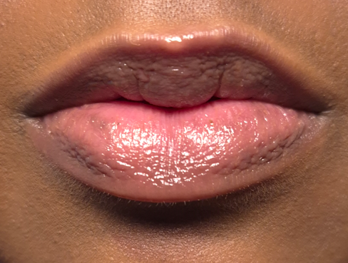
The original formula and this one seem identical to me. They still have the minty-cool sensation when first applied. There’s still a tiny bit of flavoring. These hydrate quite well and are a bit sticky because that top layer locks in the moisture. I am relieved to say Too Faced didn’t ruin a good thing. In fact, they made a few minor improvements with the scents and colors, so this is a product I can still recommend.
Too Faced Kissing Jelly Gloss Juicy Lip Oil/Gloss Hybrid in Sour Watermelon
The scent of this is like a Watermelon Jolly Rancher, which I like. My lips get smoother quicker with this lip oil than the Pillow Balms, but it doesn’t feel as deeply nourishing as I wear it despite it containing so much sunflower seed oil that my lips love. I don’t know how well the good ingredients are actually penetrating the skin of my lips. It’s certainly moisturizing, but it isn’t long wearing. Lip oils typically lack longevity, but the hybrid ones I own from other brands (like Ami Cole) have better adherence. So, the fact that this is a little less sticky as the Pillow Balms and other hybrid lip oil/glosses explains the weaker lasting power. It grips the lips at least well enough to not give a runny or dripping sensation if this was an oilier product.
The Kissing Jelly glides smoothly across the lips, but it can feel goopy if too much is applied. The Pillow Balms can cause that white ring around the inner lips if there’s too much, but an uncomfortably wet feeling is the worst that I’ve had with the Kissing Jelly. No white ring.
One of the downsides to this product is that despite there being so many “shade” options, it looks pretty much clear on the lips. So, the color is negligible and I chose mine based on the scent I wanted and trying to avoid getting one with glitter. Otherwise, I would have gotten the Piña Colada scent. The other thing I don’t like is the packaging design, which looks a bit juvenile to me. It’s supposed to be cutesy, but I think the Pillow Balms are a better reflection of how to do cute packaging while still looking like the pricepoint that was paid. The Pillow Balms are only $3 more than the Kissing Jelly, but they also contain 1.5 more ml of product. The Pillow Balms look on brand, but the Kissing Jelly look like they could have been made by Colourpop.
Essentially, I think the Pillow Balm is better for someone like me with extreme dry lips. The Kissing Jelly is better for someone who wants a thinner product and whose lips are still dry, but at manageable levels.
That’s all for today! I hope you’ll stop by again to read more posts written by me!
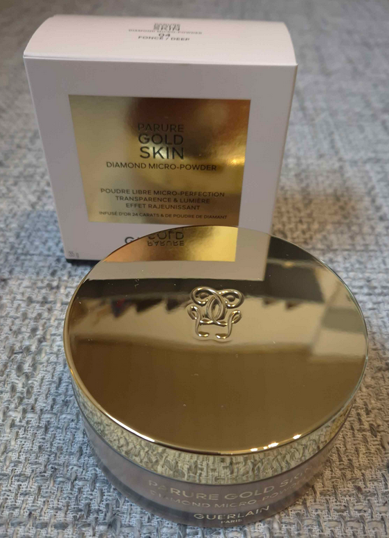
When the Guerlain Parure Gold Skin Diamond Micro Powder launched in September 2024, it was not even on my radar because of the price alone. However, over time, so many luxury beauty reviewers were praising this powder as the best alternative to their holy grail face product: the iconic and now infamous Givenchy Prisme Libre Loose Powder.
When my makeup obsession began in 2014, I only cared about face powders to set my concealer and help lock in my makeup for longevity purposes. I had closer to normal skin at the time, so as the years went on and my skin became drier, I only needed powders to set the concealer under my eyes. Every so often I would fall prey to the hype surrounding a powder, but there was never one that I fell in love with for putting all over my face until the Dior Powder No-Powder. I had several that I really liked, but Dior’s was an actual love. That product caused my interest in powders to soar, but none since then have even come close to surpassing that one. This is largely in part to the sheen of the powder and how intensely it blurs and evens out my skin.
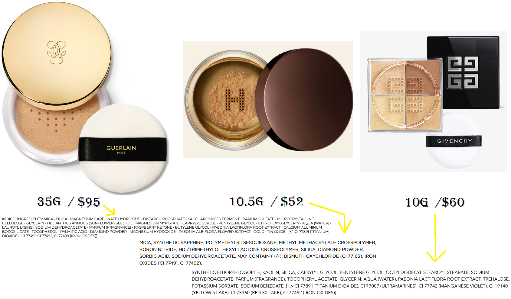
The reason this is important is because the most I ever spent on my precious powder was $45 for 11g. Because I was working through two different shades, I have not yet panned one, and it has taken me nearly four years to get this far with the Dior powder. So, there was no way I was going to spend $95 on something else, even if it turned out to be the most magical makeup product on the planet. I waited, very impatiently, until this powder could be found for a deal greater than 20% off. I was so excited when that eventually happened via Flaconi and I snagged it for 56 Euros!
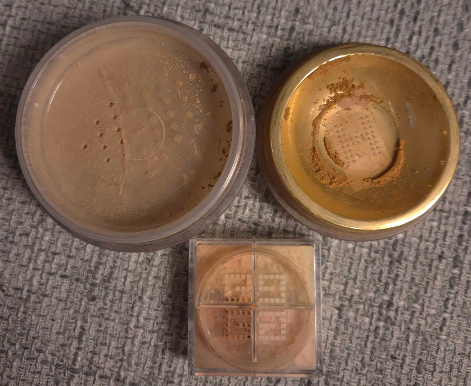
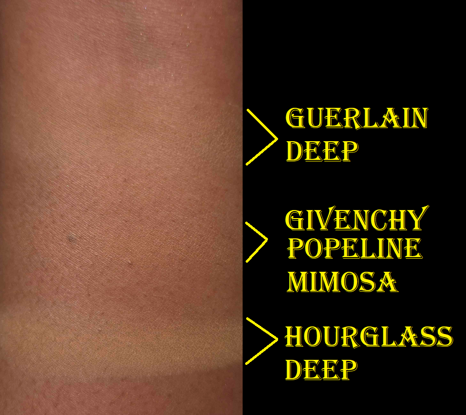
The photo below shows how it looks (top left) compared to the Hourglass (top right) and Givenchy powder (mini on the bottom). Please ignore the tape covering the holes. This is my way of maintaining control over how much comes out at once.
The texture of the Guerlain powder is very fine and smooth, but dry feeling. Despite the product name, which sounds like it should be super radiant, I cannot see any shimmer nor sheen when I apply this to my skin. This powder completely mattifies without the skin looking dry. It also leaves a slight veil of color and is a little blurring.
I was pleasantly surprised that Deep works for me, even though it’s a neutral color (warmth would suit my undertone best). I kept hearing how comparable Guerlain’s powder was to Givenchy’s, and they do feel similar to the touch, but the way it actually looks on my skin reminds me more of the Hourglass Veil. The main difference though is that the Hourglass Veil isn’t as translucent and it provides some coverage to aid in creating a smooth canvas, moreso than through means of blurring. Because it’s easier to see the Hourglass powder on my skin, it’s less forgiving during the times of the year when I’m at my lightest. Because Guerlain’s is similar to Hourglass, but sheerer, it’s like having an even better suited replacement.
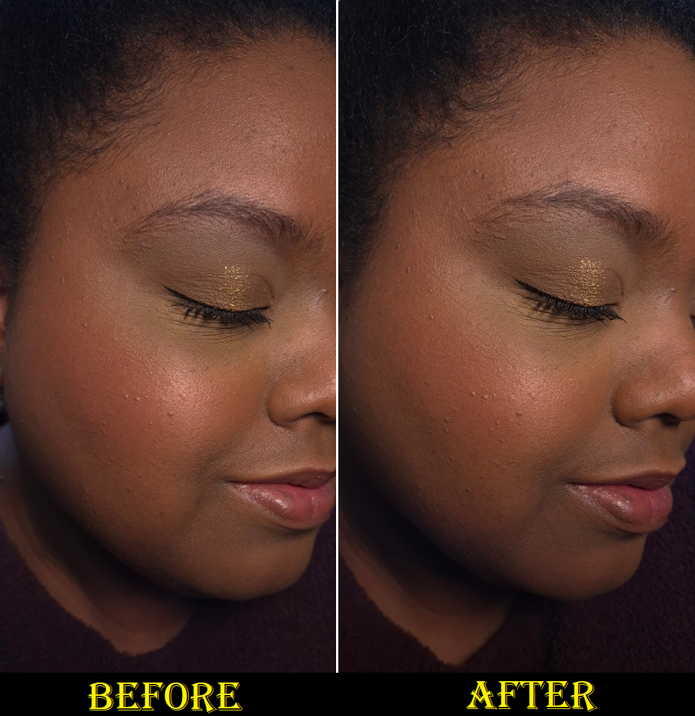
My most blurring powder is the one from Dior, second comes Chantecaille’s Perfect Blur, and then Guerlain’s is third. Technically, the reformulated Givenchy Prisme Libre Powder has the same amount of blurring capabilities, but I only liked it under my eyes as it left my face looking too matte. When it comes to the kind of finish I want on my skin, I still prefer a product with a sheen. Even though Guerlain’s powder is mattifying, if my foundation is hydrating enough, this powder eventually allows for the oils to come through as the day goes on in a controlled manner that allows for some glow, but never enough for my naturally dry skin to appear oily.
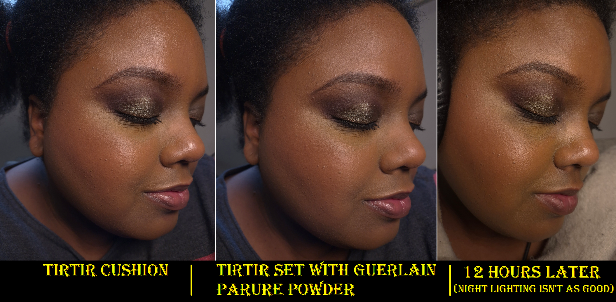
I always applied the Milk Hydro Grip eye primer to my under eyes and then put the KVD Good Apple concealer on top before setting it with the Charlotte Tilbury Airbrush Flawless Finish powder. This trio of products was the best way for me to keep my dark circles covered all day. When I tested out my usual pairings with the Guerlain powder instead, I was shocked to see that it held up nearly as well as Charlotte Tilbury’s. When I tried the KVD concealer with just the Guerlain powder, it lasted longer than if I use KVD together with Charlotte’s without the Milk primer. The more I used Guerlain’s powder, the happier I became with the results and being able to skip the step of using Milk’s primer! The Charlotte Tilbury powder is part of my Project Pan, so I am continuing to stick to my usual routine, but every so often I’ve been using the Guerlain powder for my under eyes as well. Although I still wish the Guerlain powder had some sheen, I recognize the fact that it might not have looked as nice under my eyes if this was the case.
As much as I like this powder, I still keep circling back to the price and being unable to understand why the hype for this is so intense. There aren’t a ton of reviews on YouTube, but I see a lot more of my fellow makeup lovers championing it on Instagram. This is a great product, but I just don’t see how it’s $95 kind of great. Perhaps I just don’t get it because I don’t have the right skin type to be able to fully appreciate its capabilities. So, I’m going to try and look at its worth from different angles.
The easiest defense for the cost of this powder is the price per grams. This contains a whopping 35 grams. The Hourglass and Givenchy powders would cost way more money if they had the equivalent amount of product. The Guerlain Parure Powder has enough powder in the jar to last me a lifetime, but will it? It has a PAO symbol representing 12 months. In addition, I start to get squeamish about using any makeup older than five years old. If it looks, smells, and performs the same, I might continue to use it a few more years after that, but I do not use makeup indefinitely. The “it’ll last me forever” line is one that I say sometimes, but it isn’t an actual selling point for me. If I’m able to use this powder happily for 5 years, it would essentially be like paying $19 a year to use it. That still seems steep to me considering I like this, but I’m not in love. Since I bought this at the discounted price of 56 Euros or $58 USD, that’s about $11.60 per year. Factoring how little product I use and how many other powders I have in my collection, this is more acceptable to me. I am satisfied with the powder for the price that I paid.
Another contributing factor to the high price tag could be the expensive ingredients. There’s supposed to be real ground up 24 karat gold, crushed diamond powder, and perhaps they are even charging more money for the fragrance that’s included considering how expensive Guerlain’s perfumes are. My counterpoint to those is that gold and diamonds are so low on the ingredient list that they have no actual impact on the overall look of the product on the skin. They are too small to contribute to the radiance level and they don’t give any benefits to the skin. Their only purpose is to add to the luxury factor of just knowing it’s in there. As for the parfum, it’s not the signature violet smell that I loved in the original meteorites, but it’s still nice. However, I prefer for my makeup to not have any scent at all, so this is actually one point against them. There are times when I was going to reach for the powder, but my husband was in the room, so I didn’t. He’s sensitive to smells and opening the jar causes powder to permeate the air, which lingers for 5-10 minutes. So, the perfume in there actually prevents me from using it as often as I would like.
As for the packaging contributing to the price, this is just plastic. It has a pretty gold colored lid and comes with a thick luxurious puff. In fact, Guerlain’s puffs are the nicest ones that I own (that come included with the makeup I bought). Considering Guerlain has such stunning Meteorite tins, I can’t imagine the Parure packaging being more expensive than those. So, I don’t think the packaging is enough of a factor either.
There are other points that could be made, but the bottom line is that even if I can calculate how it adds up to $95, I don’t see the value for myself. At a sale price though, I kind of get it. I’m content with my purchase, though I still believe they should sell a mini.
That’s all for today! I hope this has been helpful or at least an interesting addition to the growing debate regarding luxury goods in this economy. Thank you for reading!
I’m calling this a Part 3, even though Parts 1 & 2 were solely about blushes (plus one more about the fails). This post is intended to showcase additional colors of products I’ve already reviewed before. If this is your first time visiting my blog…welcome! Herzlich Willkommen! I will have links to the original reviews in each section (ex: in bold blue) if you’re looking for in-depth information about each product. In a way, this particular series is for the email followers and regular visitors to get any updated information and see how additional colors look.
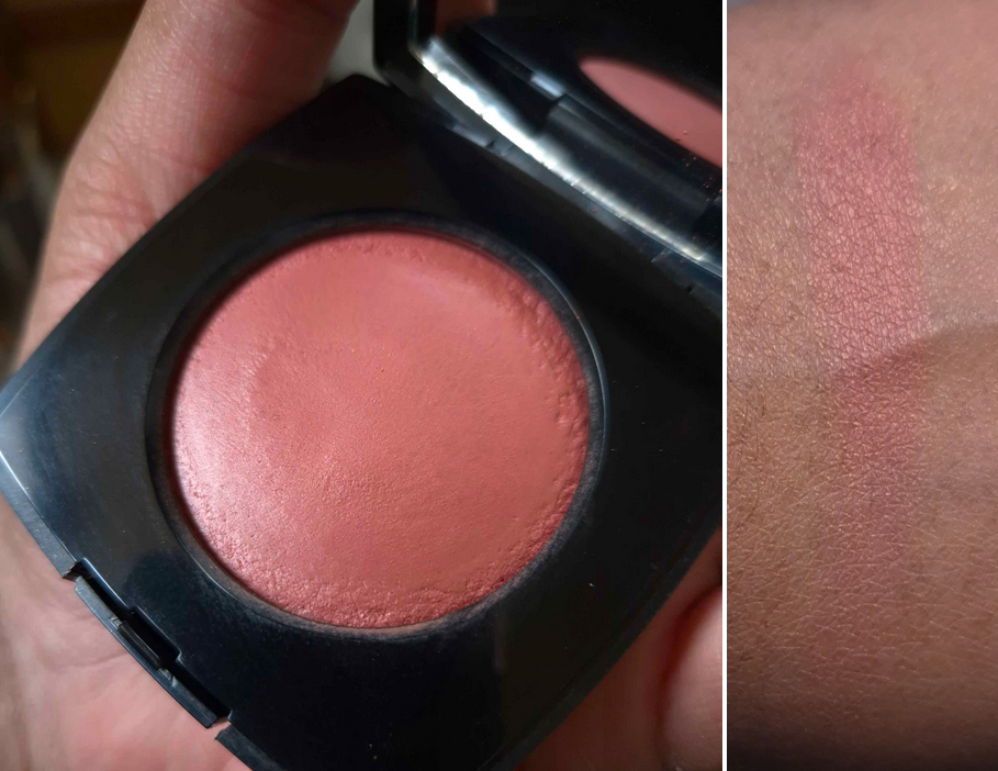
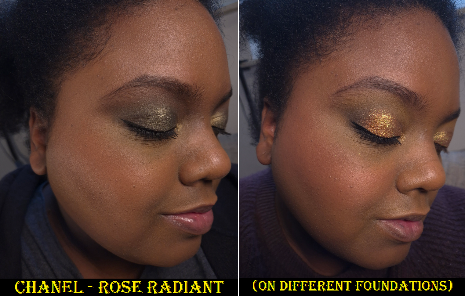
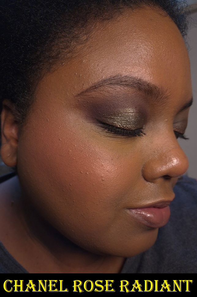
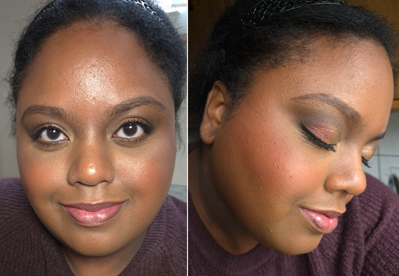
Chanel Joues Contraste Intense in Rose Radiant (Rouge Franc)
I was so eager to try this on, that I only took one good photo of this in new/untouched condition. Unfortunately, it was in a room with ultra warm lighting. Once I realized this, I tried very hard to color correct the picture, but I couldn’t get it to look accurate enough and had to take a new photo instead.
This is the color I wanted most all along. I just didn’t think it would show up on me until I saw how it looked on someone a little darker than me. I’m very happy with this blush and I like that its appearance is subtle. Although I still like Rouge Franc, I didn’t like it enough to put it in my Project Pan. This one, however, is included in it.
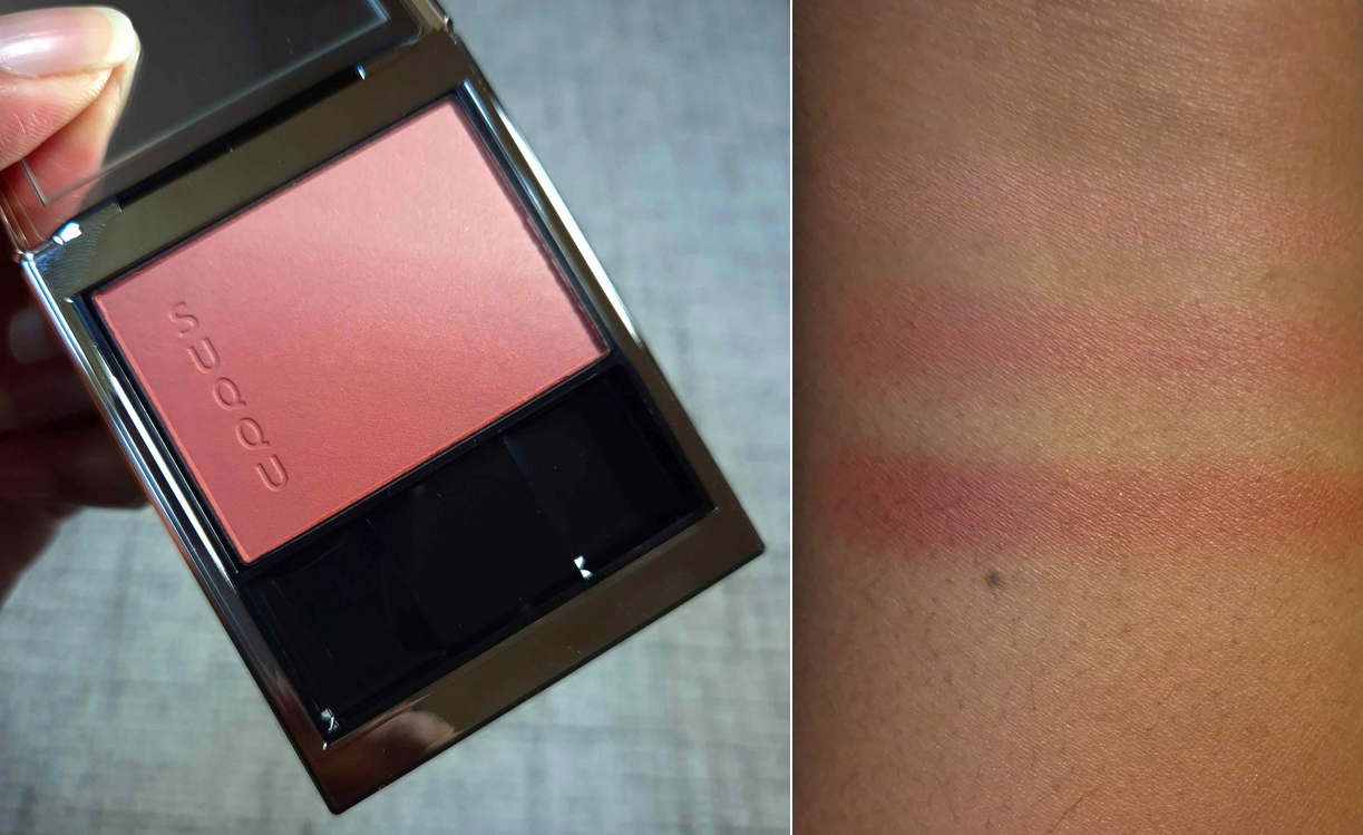
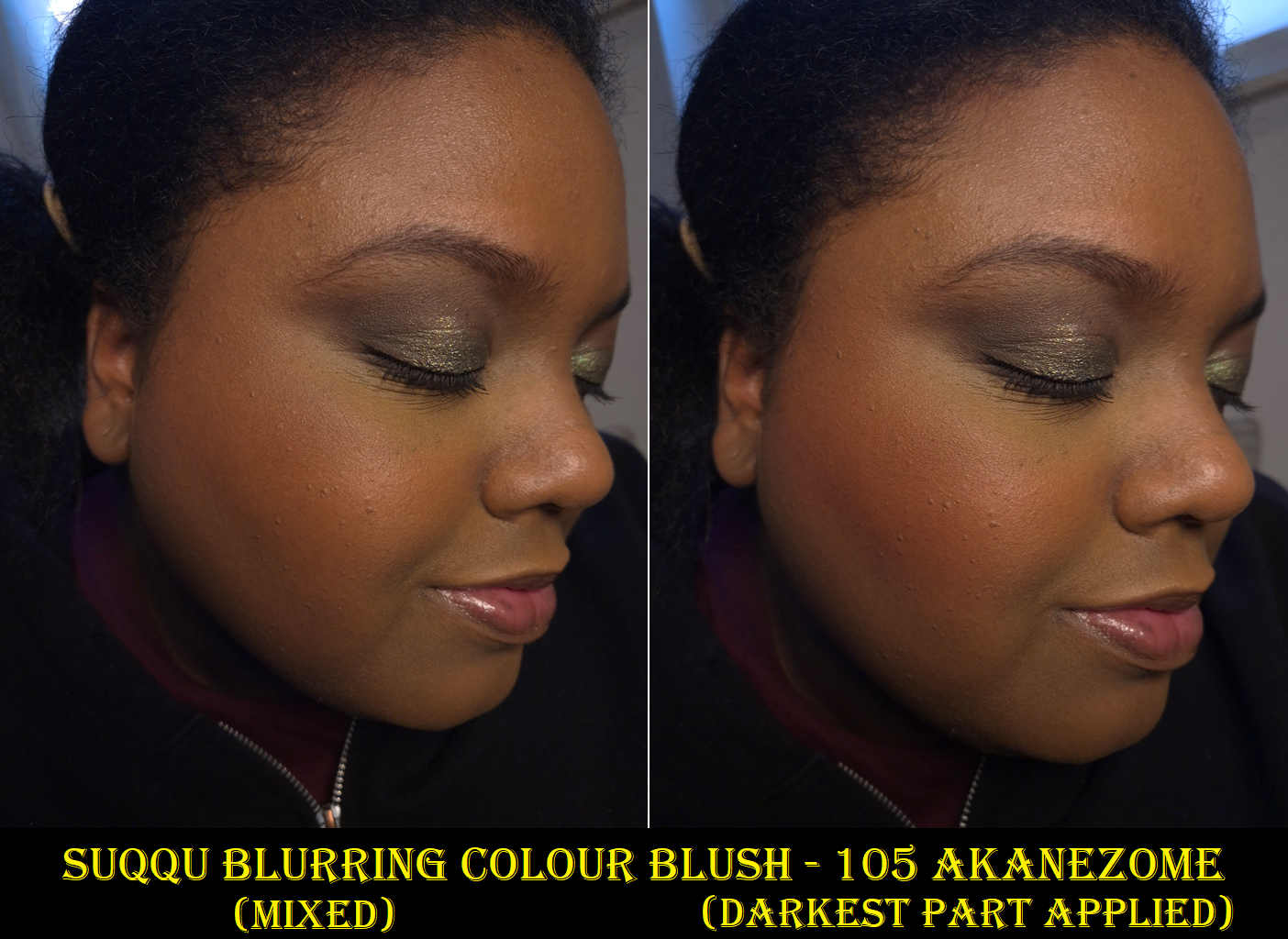
Suqqu Blurring Colour Blush in 105 Akanezome
I’m including this here because I have so many Suqqu blushes, but this is technically a new formula and Akanezome is the only color I have in the Blurring Colour Blush line. My list of various Suqqu Collections, which consist mainly of blushes, can be found HERE.
I gave up on trying to take photos in front of the window. Time with sunlight streaming in is too limited in Germany and my pictures get washed out. The part that is important to see among the various photos is that this blush shade works for me despite how light it looks in one half of the pan. I do mostly concentrate on swirling my blush brush into the darker corner for more impact.
Suqqu’s Blurring blushes are in the same compact as the Pure Color ones and discontinued Melting Powder blushes, but they are matte black on the outside instead of shiny black. Regarding the quality and performance, I really can’t tell a difference between the Pure Color and Blurring Blush formulas. My guess is that the Blurring Blush line just has more subdued tones, especially with the kinds of shades that are available to mix with in the compact.
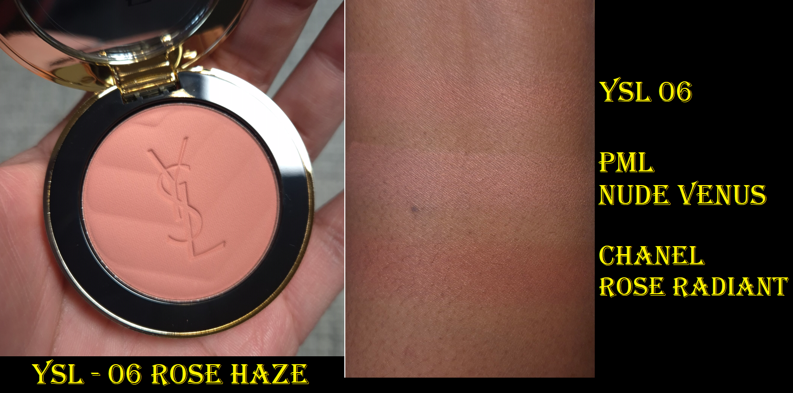
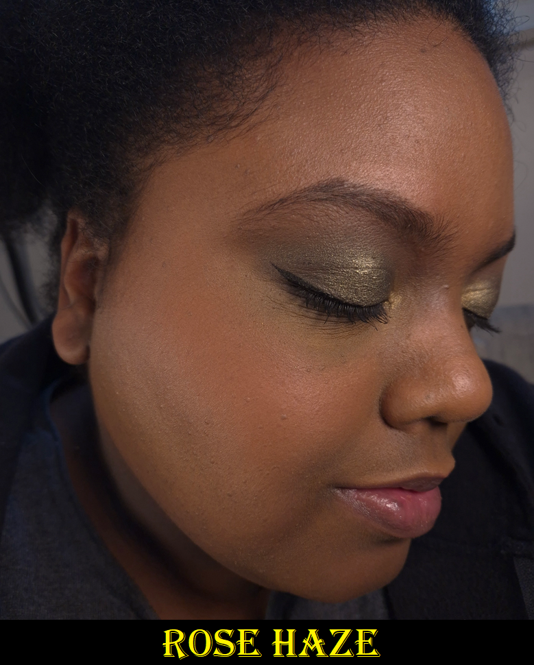
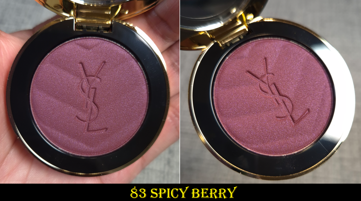
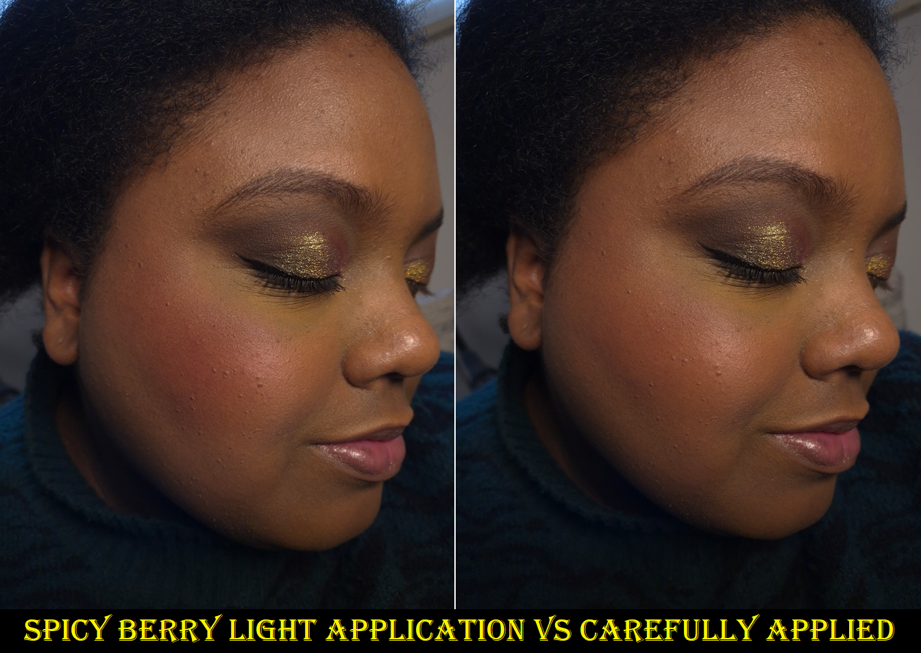
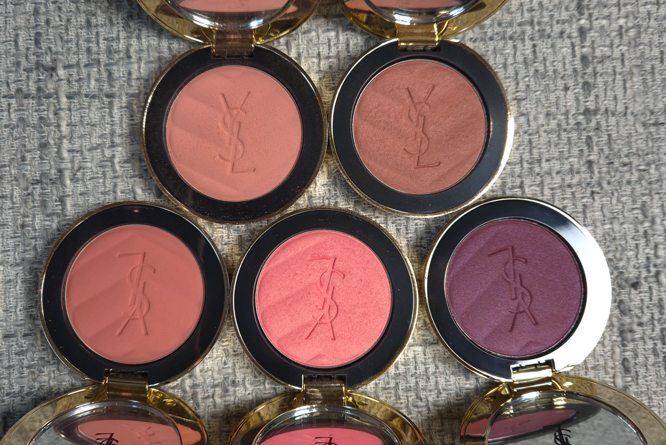
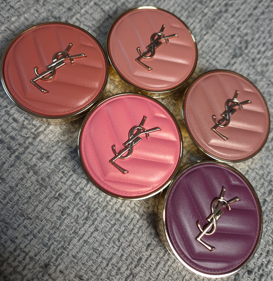
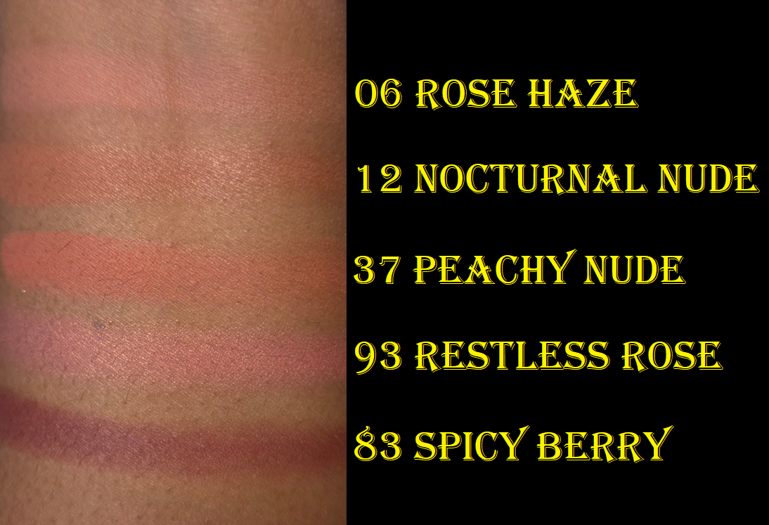
YSL Make Me Blush Bold Blurring Blush in 06 Rose Haze and 83 Spicy Berry
The review containing Peachy Nude, Restless Rose, and Nocturnal Nude can be found HERE.
Because of the way Rose Haze looked on me when using the virtual try-on tool, I just couldn’t let this color go. It still looks pretty and is visible on my cheeks (even more so in person than in photos), but the light color combined with the matte finish makes this look a little less appealing on my dry skin than if it had a shimmery finish. Peachy Nude, being a little darker, doesn’t look as dry on my skin from my perspective.
Sometimes I want a light and subtle blush. It happens so infrequently though that there isn’t a reason for me to have too many of them. If I didn’t have a color like this from Sephora, Nabla, Chanel, and Pat Mcgrath already, I’d have felt more content in adding this to my collection. By now though, I do feel a twinge of regret, although the consolation is that I got it deeply discounted.
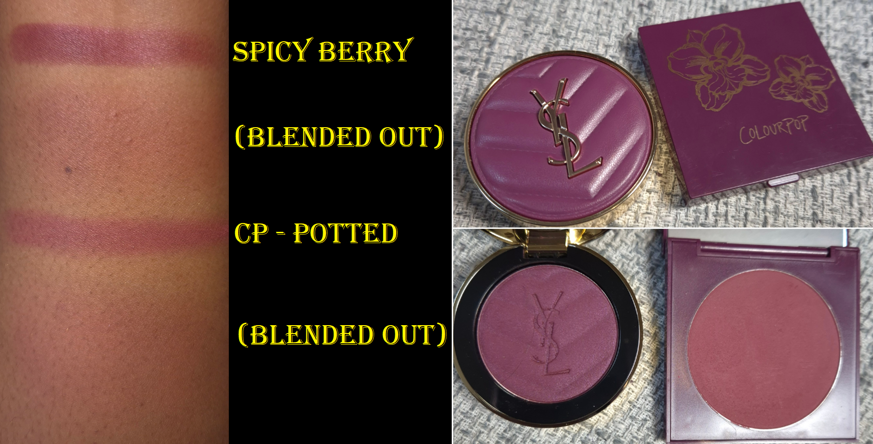
The scarcity tactic for this shade absolutely worked on me. It was the last thing I purchased from Selfridges before my Selfridges+ subscription ended. I must also admit that my discussion with Olive Unicorn Beauty about purple blushes led me down the path of wanting a higher quality and newer replacement for the singular purple blush I owned, my four year old blush called Potted from Colourpop. I have raspberry colored blushes and mauves, but Potted was my only true purple. I loved it, but the formula became less smooth over time and it’s a matte blush. Spicy Berry is a satin, which I prefer, so I bought it.
When I look at Spicy Berry up close, it looks cool toned and I could almost swear I see the faintest tiniest tinge of blue shimmer. However, when I hold it at a different angle, it looks more like a dark raspberry or deep magenta. Warm purples suit my skin better. Because my foundations are a bit golden and I discovered that orange mixed with purple or mauve turns into more of a pink color on me, I wasn’t that surprised to see how the blush shade appears on my cheeks.
All of these YSL blushes are pigmented, but Spicy Berry is extra pigmented. The photo above on the left shows how my cheek looked with just two taps of the blush onto my cheek with the rephr Koyo brush, which is a relatively airy squirrel and saikoho goat mixed brush. In the second attempt on the right, I made sure to tap just once at the top and apple of my cheeks and then switched to a clean brush to buff everything in. The result from that is exactly how I hoped this would be and it looks more like Potted this way. If I want a more visible color, I can just add Nocturnal Nude or another orange leaning blush on top because of color theory and how purples and oranges mixed together turn dark pink on me. The other alternative is applying a little more, but toning it down with the remnants on my foundation brush or using a blurring finishing powder.
I am very happy I bought this shade, but be forewarned that at this level of color intensity, it does have a tendency to look a little patchy. Blending it out or mixing it with other things can cover up it and fix it.
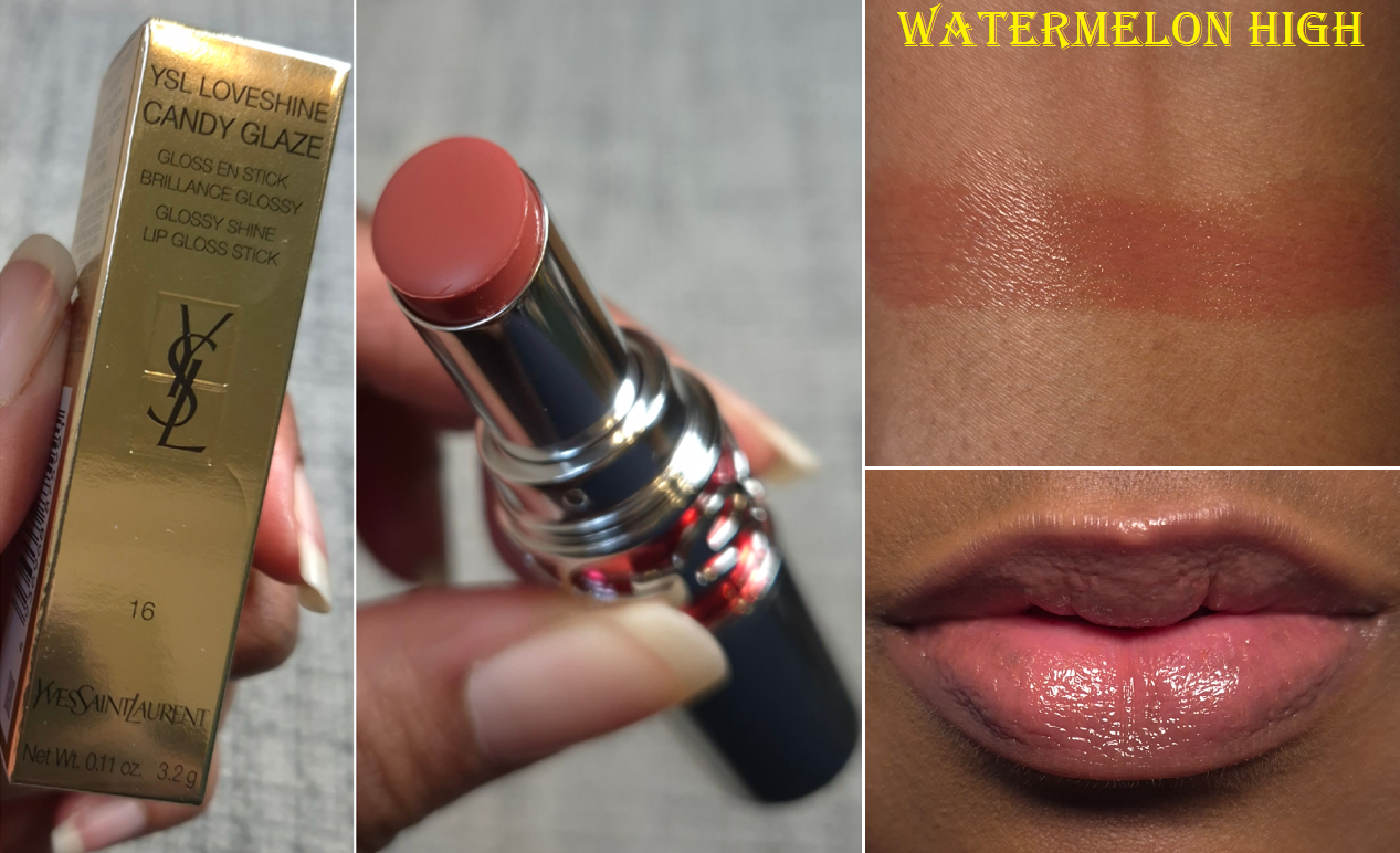
YSL Loveshine Candy Glaze Stick in 16 Watermelon High (YSL Lippies)
The Candy Glazes are my favorite of YSL’s lip formulas. I knew I should have stopped at buying number 14 and 15 because these are so sheer, but I couldn’t help myself once I saw 16 (which was part of this year’s shade expansion). It’s basically how I wanted 15 to look on me, but that one is a little light and milky on my pigmented lips. This color is a perfect light-medium pink nude for me! So, even though I know I could have gone without having this, I don’t actually regret buying it.
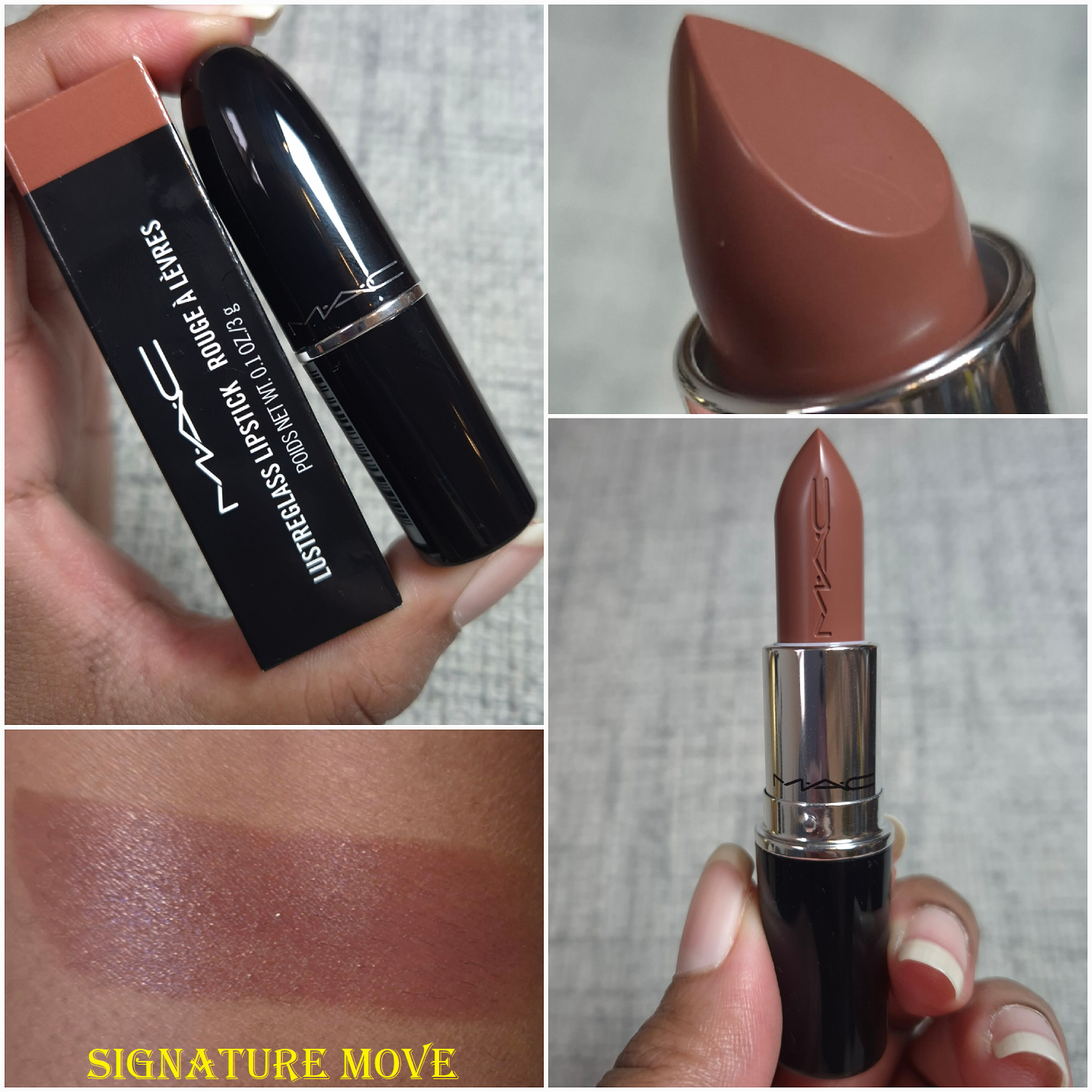
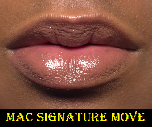
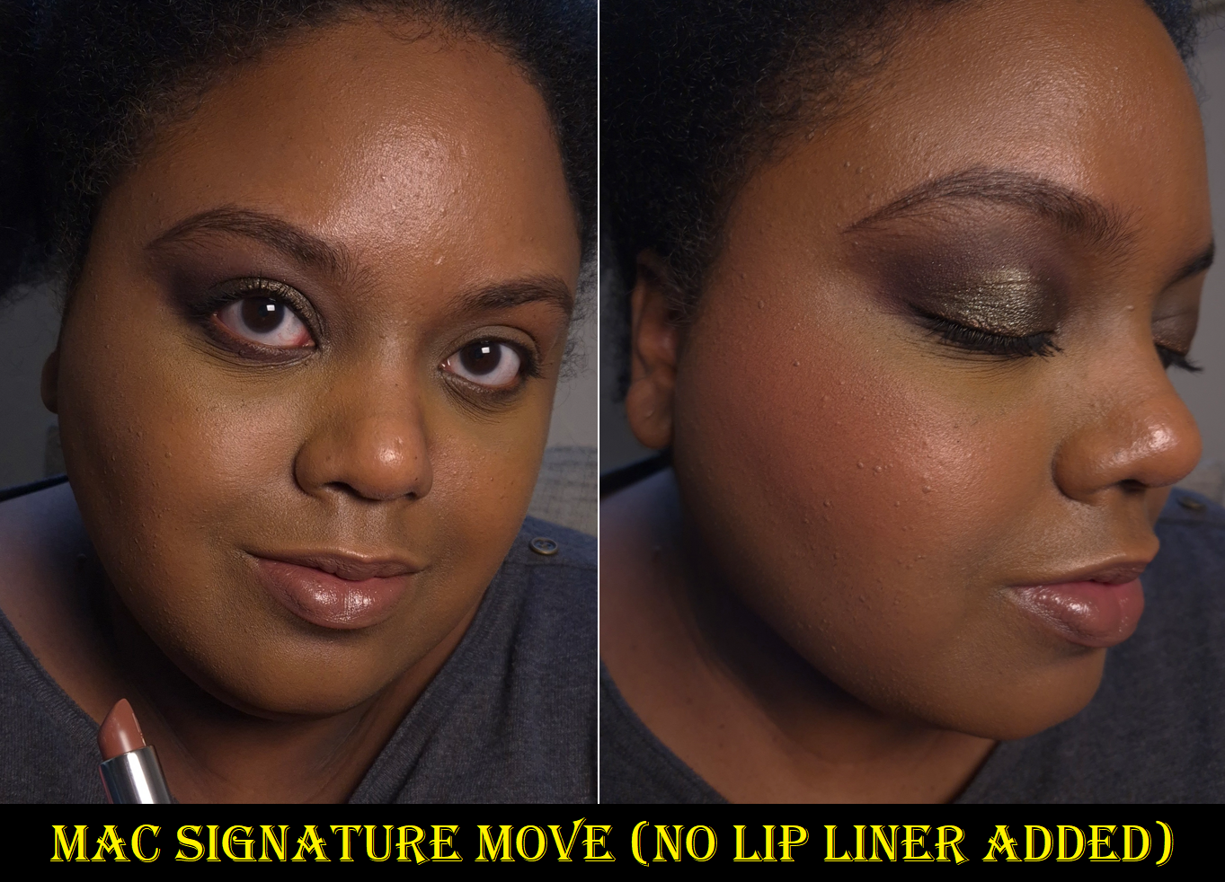
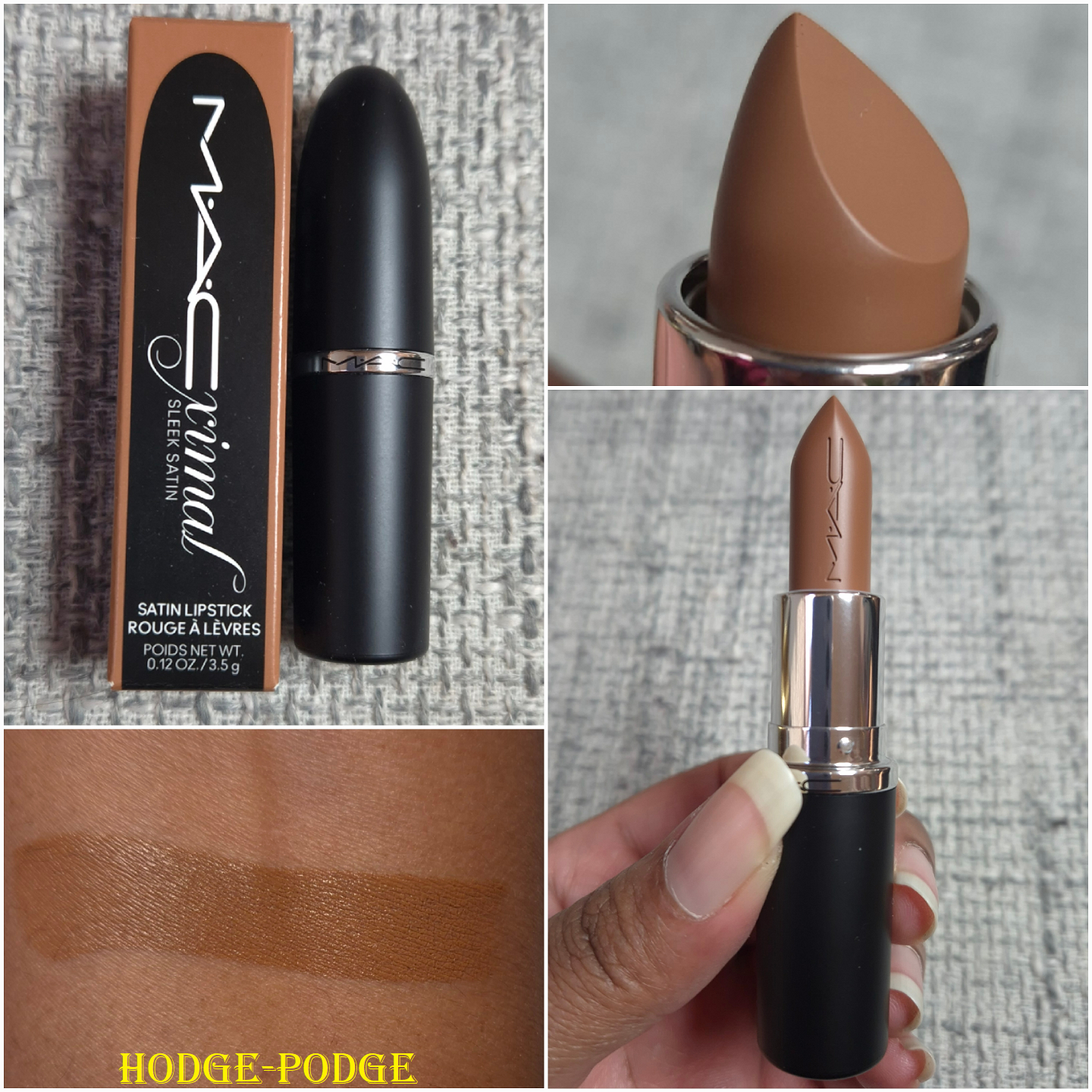
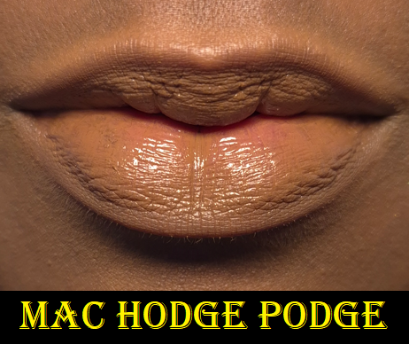
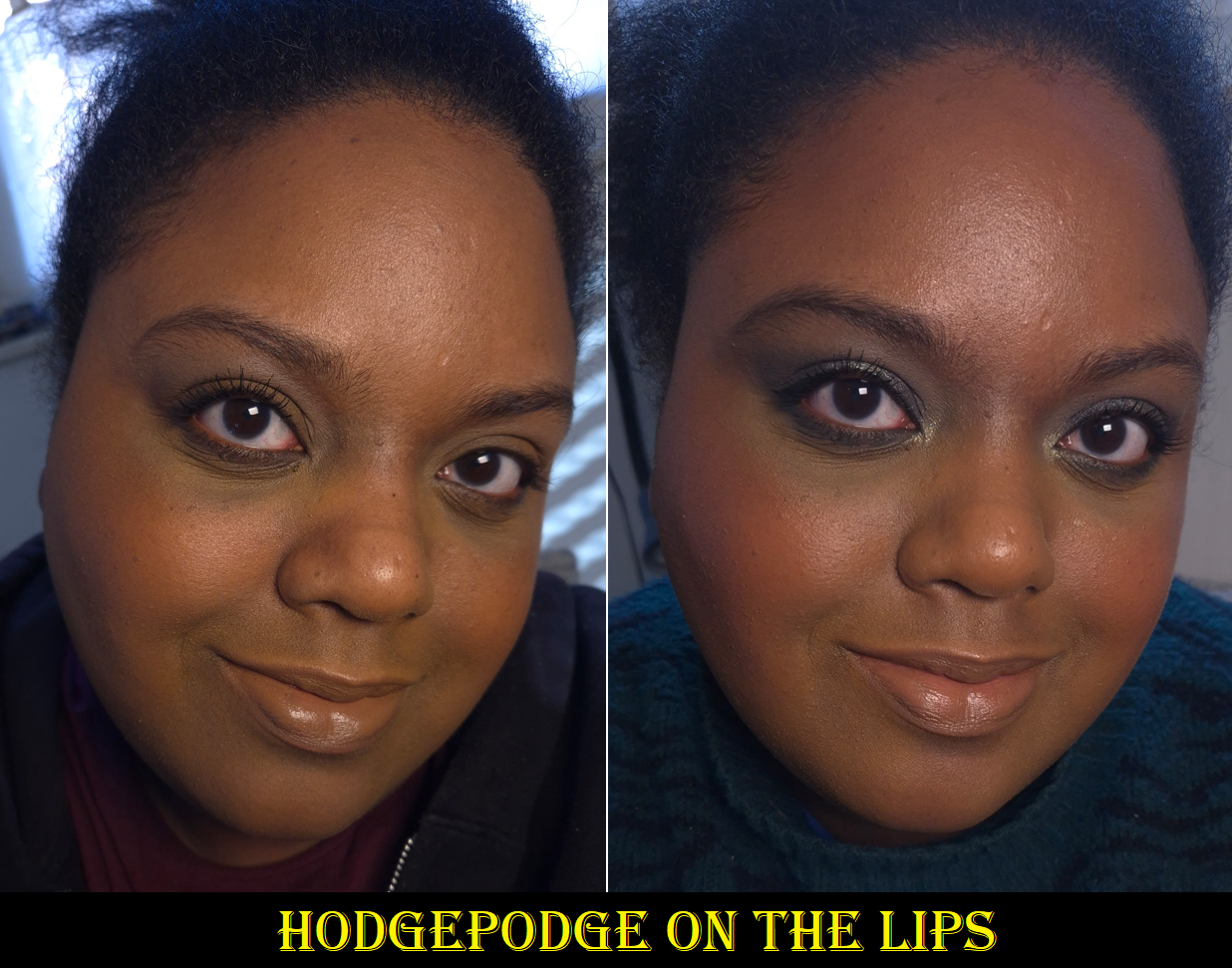
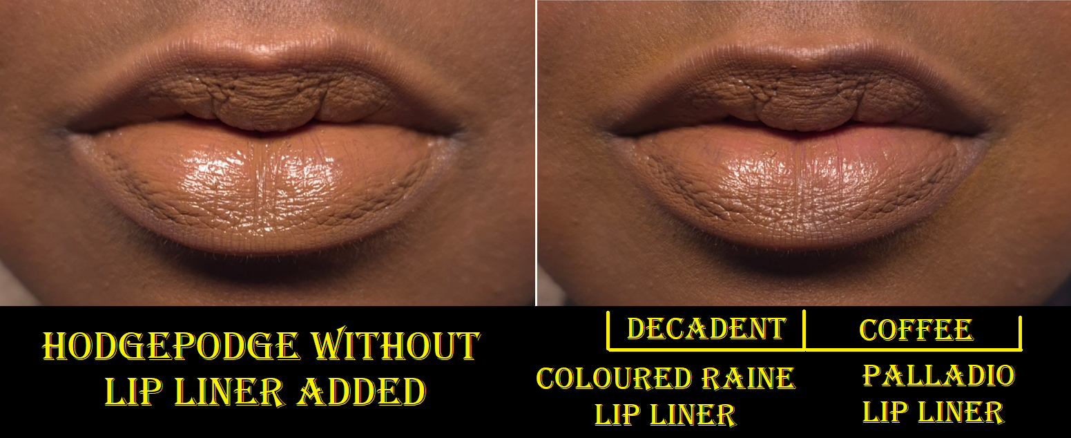
MAC Intimate Nudes Collection: MAC Lustreglass in Signature Move and MACximal Sleek Satin in Hodge-Podge
Both of these lipstick formulas are new to me and I only have one of them in each formula. However, they’re both from MAC’s Intimate Nudes range of lipsticks. After loving the way Signature Move looked on me, I purchased Hodge-Podge next because it’s a unique color for my collection. So, I think this can count for being in the category of a lipstick so good I had to buy another!
I love the shine level (when first applied) and the lightweight buttery feel of this lipstick. In addition to the sheer partly buidable coverage this has, these attributes remind me of the Lisa Eldridge Luxuriously Lucent Lip Colours. This just feels like an even more emollient version. I find that this has more pigment than the Lucents, but no matter how much I try to build up color over the darker pigmented spots on my lips, this does not cover it completely. I don’t mind this, but I wanted to be clear that the buildable aspect has limitations. This MAC formula also does not have the same staying power as the Lisa Eldridge Lucents.
After only an hour, my moisture-greedy lips absorb some of the lipstick and I can feel that there is less slip when I rub my lips together, in addition to the shine having dulled down. Even though there is less lipstick on the surface, my lips continue to feel moisturized. However, if I want the color to be noticeable, I definitely have to reapply after eating, and sometimes after finishing 1-2 cups of water. This is definitely not a long lasting formula. I end up feeling compelled to do touch ups every 3-4 hours (more or less frequently depending on my eating/drinking habits). By the end of the day, there are only the subtlest signs that my lips are drier than before. I can wear this a second day with no issues, or wear a lip treatment to bed to return my lips to a well conditioned state. So, that makes this one of the better lipstick formulas I’ve encountered, but the shorter wear time is a big tradeoff. Because I can get lip nourishment and sheer color from products like the YSL Candy Glazes, I feel like I own enough of these types of products. I foresee myself buying one or two additional shades in the future, but only if they are part of a limited edition collection or have some type of special packaging.
To me, this color is a muted yellow-brown. However, sometimes I could swear it looks a bit olive or that it leans a stronger grey depending on the lighting. How we perceive color is in relation to other colors, so sometimes I think Hodge Podge looks good when I have no other makeup on versus my foundations that tend to lean even warmer. The tones and depth of this shade is like a desaturated version of my skin, so it doesn’t look like full on concealer-lips/foundation-lips, but I don’t feel confident enough to wear this in public without a lip liner. Maybe it’s due to my preference for high contrast looks on myself, and Hodge Podge looks too flat.
In the second photo above, I demonstrated how this pairs with my two darkest brown lip liners. The one from Coloured Raine is warm, so it looks like a better compliment for my undertone. Palladio’s is cool, so I think it pairs better with the actual lipstick.
Although I can get this to fully cover the darker spots on my lips after I first apply it, the color wears down just enough to faintly see those spots after a lot of talking or repeated lip movements over time. So, the coverage level on me is high, but not full.
Regarding the performance, I don’t have to worry about reapplying anything from just drinking, though it will leave obvious imprints on surfaces and will not make it past a meal. After about two hours, similarly to the Lustreglass, some of the lipstick gets absorbed and it feels noticeably less creamy, though not to the levels of being considered drying. It feels super comfortable to wear, but I can still see that at the end of the day my lips show the beginning stages of wear before chapping. So, it still dries my lips like nearly every bullet lipstick formula on me, but at least while I’m wearing it, it looks smooth and shiny to the eye. In fact, my lips look smoother wearing this formula than the Lustreglass after several hours of wear (even though the Lustreglass is actually more moisturizing).
I like this lipstick formula, and it’s a relief to finally have some MAC lippies I’m not afraid to wear for fear of having my lips dry out. However, I don’t feel the need to purchase anymore (unless it’s part of an eye-catching limited edition collection).
Summer Fridays Lip Butter Balm in Hot Cocoa (Vanilla Mint)
I said in my Battle of the Lip Balms post that I wouldn’t buy another of these because my collection is so large, but I wanted one with a yummier scent and with a bit more color. Plus, there’s a 12m PAO, which mine has passed, so getting a discounted replacement during the holidays wasn’t quite so bad.
This has flavoring and smells like a tootsie roll, hot chocolate from a powder pack, or some other kind of highly processed chocolate. I don’t recommend licking this, but I did it for science and it does taste like a tootsie roll (plus Vaseline and wax)! I think it’s fun to have a hot cocoa scented lip balm, and I enjoy it. My husband doesn’t agree.
Lisa Eldridge Eyeshadow Singles: Supernaturally, Smoke & Mirrors, Dorian, Talk to the Paw, Posh, and High Maintenance
I was actually working on a Lisa Eldridge post separately, but then realized this was a better place to put the content since I have reviewed at least the eyeshadows before.
I’ve had Smoke & Mirrors from the Vega palette for over a year. Dorian and Supernaturally are from the Fawn Palette and I’ve had them since September 2024, but I didn’t start using these three until December last year. I was honestly a bit disappointed by the ones from Fawn, and it almost stopped me from buying Talk to the Paw, Posh, and High Maintenance from the limited edition Betty palette. However, I had hope the formula of those would be better after watching a few reviews on YouTube, like this one from Beauty with Substance.
Supernaturally is a Seamless Matte, just like Smoke & Mirrors, but it’s so much stiffer, drier, and less pigmented. Even though it’s natural for certain brown shades to have a hard time showing on my brown skin, this color is even sheer when I swatch it on the palm of my hand. Fired Earth and Troubadour are others in my collection that have better color payoff as well. So, I don’t know if Supernaturally was intended to perform, apply, and feel differently than the others.
Dorian is a Lustre, yet it is so dull! It looks like a matte shadow until light hits it directly at the perfect angle. Based on the website description of this formula, it seems like this is supposed to be the most subtle of the shimmer types. Based on my experience (and photos of Taffeta Fan) it seems like Dorian is the only one that can’t take on a pearly effect and isn’t as shiny as even Talk to the Paw despite it being a deep brown as well.
As I mentioned before, Talk to the Paw and High Maintenance are Lustre shadows. As seen in the swatch photo below, they are clearly less shiny and shimmery than Lisa’s Luminous formula, but they still pack more of a punch than Dorian.
I wanted a deep smokey shimmery brown all over my lids, so Talk to the Paw fulfilled the wish (though technically a taupe) that Dorian could not.
Posh is a Luminous shadow. It has the shine factor I want (once it is applied damp and/or with my fingers), but this particular shade has a hard time appearing pink (or mulberry mink) in tone on me unless I pair it with other shades in the same color family. This is not unusual for me when it comes to light pink shimmer eyeshadows looking more like a silver instead.
In the dry application, the individual shimmer particles are easy to spot. In the damp application, the shimmer looks smoother.
Below are swatches of the other shades in my collection that I kept with me.
And here are the swatches of the shadows I left behind.
I went through my Clionadh eyeshadows and found similar shades to the purples from the Betty palette, but nothing close enough to call a dupe because my Clionadh ones are duochromes and multichromes with strong shifts. I learned from Fedaro Beauty that there are much closer similarities within the Viseart Coy palette, but I left those shades in the US. What this indicates to me is that I don’t currently have those colors for a reason. The types of purples in Betty are just not my favorites. It was definitely for the best that I focused on the three shades I wanted most. I probably could have talked myself out of getting the three I did anyway, but because these shades are limited edition, I did not want to miss out.
Lisa Eldridge Liquid Silk Eyeshadow in Gaia and Phoebe
I planned to only get Gaia, but I enjoyed it so much that I felt compelled to own at least one more too.
Gaia works as a subtle one-and-done liquid eyeshadow, but I was more entranced by the color because it reminded me of one of my favorite eye bases from a brand I don’t support anymore. It’s so smooth on the lids. I have enough time to blend out the edges before it fully sets and it mixes well with other shades. It doesn’t crease, nor fade, and it doesn’t look drying on my lids. It usually stays put very well in my deepest eye wrinkle/crease. This formula is the reason I’m excited to try the brand’s upcoming liquid concealer!
Since I reach for powder eyeshadows 49 times out of 50, buying a lot of these wouldn’t be practical for me. I use matte liquid and cream eyeshadows even less than shimmery ones. However, when I tested this out as an eyeshadow base and it worked wonderfully with no issues, this became my replacement for the product that shall not be named! The only downside is that I needed a lighter shade to prime under my brows. That’s why I purchased Phoebe, but since it’s less pale than I expected, I have mostly been using Phoebe as an eye base/primer by itself. Gaia doesn’t get used as much anymore, but Phoebe is now a staple in my collection!
I have additional pictures of both of them used together in the Benefit mascara section, but I realized everything I photographed was during the testing phase, so I didn’t have any of me actually trying to create a seamless transition between the two shades.
The photo above is that demonstration. I have to put in more effort to get 100% full coverage considering the super dark sections in my eye area, so how this looks in this quick low effort example is satisfactory for me. There are plenty of great matte liquid eyeshadows at a lower price from other brands, so I consider this a semi-splurge type of product unless you’re someone with mature eyes. Then spending this amount of money for this product might be well worth the cost. There are also great primers available for a cheaper price, but since I prefer having an eyeshadow primer that covers the discoloration around my eyes (in a shade that isn’t that crazy far off from my skin tone) without having to resort to using an actual concealer, this product is doubly important to me.
*JUNE 29, 2025 UPDATE: I started using Gaia almost exclusively and within three months I was struggling to get product out. I had to uncork the stopper and mix it a little to start reaching product again. It still periodically moves to a spot along the sides that I cannot reach with the applicator, so I have had to uncork it an additional two times, which is not an easy task! I had to use tools because it’s very tightly in there to keep the product from drying out. So, if you think you might have used yours up quickly, I recommend removing the stopper and checking. By this point, six months after purchasing it, I estimate I’ve used up half of the product.
Benefit Cosmetics BADGal Bounce Mascara
I’m reaching a bit on this one to have this fit the theme, but I’ve been a fan of the original Benefit BadGal mascara, so I felt compelled to give the new Bounce version a try!
I conveniently had a free mini of the original from a past purchase, so I was able to compare it to the travel size of Bounce. Both are dry formulas. The original Badgal Bang has a plastic applicator that starts with a small round tip that gradually widens. It also has a bendy part on the wand that allows me to better angle the applicator to avoid accidental smudging of the mascara. The Bounce version has one side with a bunch of brush bristles that curve and another side with straighter spikes that act a bit like a comb. I’ve tried to figure out how best to apply mascara with it, but I just prefer the original wand. The Bounce wand creates a fluffier wispier look, but it takes so much time to build up the length and thickness I want. It’s also tricky applying the mascara to my lower lash line because the brush part is too thick to get that close, but the comb part has more gaps, making it easier to miss the finer thinner hairs of my lower lashes with repeated swipes. I can get it to look good, but it takes extra time. I wonder if adding a bendy portion to this wand could have made it better.
I don’t recall my past minis and full-size tubes of the original BadGal Bang having an issue of flaking, but this newest tube does flake a little. However, the Bounce one flakes even more. For this reason alone, I don’t intend to wear the Bounce anymore and if I had to choose a winner, it would be the original!
That concludes everything in today’s post. I hope this has been helpful!
As a lover of medium to full coverage liquid foundations, I had a difficult time understanding the appeal of cushion foundations. I can see the theoretical benefits regarding ease of use, the finish, texture, and so on, but for every pro I can also list a con. Regardless, no brand made my shade, so it was a category of makeup I mostly ignored.
The hype surrounding TIRTIR’s original cushion foundation, however, was inescapable. My social media feed was flooded with videos of people putting a single swipe of the sponge across their skin and being shocked by the instant full coverage. Again, I wasn’t all that impressed because this feature is only “special” in a cushion form of complexion products. What started piquing my interest was the news that TIRTIR was rapidly expanding their range, and I started to see influencers with dark skin trying them out. Not only did the brand potentially have a shade that could work for me, the finish was supposed to be radiant (it also says semi-matte in some descriptions), have high buildable coverage while being long-lasting, budge-proof, and it contains skin-caring ingredients, as well as SPF that supposedly doesn’t look grey or ashy on dark skin. It sounded like one of the best products out there, and for much less money than than I usually spend on foundations. Upon further reflection, I think it’s important to take into account that I bought it from YesStyle for $22, but it has 0.63 ounces of product compared to the standard 1 ounce liquid foundation. The minis cost $11 for a minuscule 0.15 ounces.
So, I bought the TIRTIR – Mask Fit Red Cushion in 34W Toffee. It was way too light on my skin and at the time this was the darkest of the warm shades. With this much coverage, trying to get one in an undertone that didn’t match me seemed like a bad idea. So, I put it aside and waited until I heard news of another expansion to the range. Eventually, 45W Chestnut became an option in that same red cushion, so I bought it this time in the mini size during Black Friday. By this point, the brand released two new finishes of cushions in pink and silver packaging. I chose to buy the TIRTIR – Mask Fit Aura Silver Cushion Mini in 43N Deep Cocoa because this formula is supposed to be the dewiest and actual radiant one of the three. My skin needs the hydration, so even though there are currently no warm undertone options for the darker spectrum among the silver cushion range, I wanted to at least see if I liked these enough to continue waiting for more shades.
As it turned out, Red Cushion 45W is too dark. I could probably mix 34W and 45W together, but since they are in a semi-matte finish (and flat out matte in this cold not-as-humid climate I live in), I don’t plan on using them all over my face anyway. I like the high medium to full coverage that it offers, but it doesn’t suit my skin type and conditions. The only time I get use out of 45W is to add shape back to my face in the areas where I normally add bronzer and contour. Since I don’t need shine in those areas, it works as a Brontour and melts into the skin surprisingly well combined with other foundations, including the Silver Cushion.
Silver Cushion 43N is the closest match and certainly close enough for me to do wear tests and not look crazy. It is a touch lighter and visibly not warm enough for my complexion, as seen by the borderline grey tinge. If the brand releases a 43W or 44W, I think that would be my correct shade. Then again, I’m a bit darker than usual as I still have a little extra color from summertime. I would ordinarily blame the SPF for the color being slightly off, but I really think it’s an undertone issue.
The best part about this Silver Cushion’s formula is that my skin looks and feels hydrated. Dewy foundations can sometimes feel heavy on the skin, but this one feels fairly light. Testing it throughout winter confirmed that all I need is a few minor hydrating skincare products underneath to prevent my skin from looking dry. The luminosity increases slightly as the day goes on, but not enough to look oily. The amount of transfer I get is mild and it sets well, but it takes much longer to set on its own than the red cushion. Thankfully, it is still long lasting on me, even without using powder. I’m not certain how much someone with oily or combo skin would enjoy this one, though. This also isn’t suitable for someone trying to avoid products with fragrance, as this has a very noticeable perfume-like floral scent.
The slightly off match isn’t as noticeable when I put on the rest of my makeup, at least when I’ve used a foundation brush that isn’t dense so I can apply the product sheerer than it would look with TirTir’s sponge. However, compared to something else that also isn’t full coverage such as the Danessa Myricks Yummy Skin Serum Foundation, other products look noticeably better purely because they’re a better shade match.
For this reason I still can’t say whether the crazy hype is warranted or not. The Red Cushion gives relatively full coverage, but the finish isn’t as flattering on my dry skin. The Silver Cushion has buildable medium to full coverage, but since it’s also not a perfect shade match, it doesn’t look as good on me if I try to reach medium or higher. So, I’m unable to wear it in a way that has the potential to be something I really like, and therefore I prefer many other foundations over this one. However, I have used it around my mouth area, as if it was a concealer, and it works wonderfully for that purpose since it blends in very well with whatever foundation I’m wearing underneath it. I can at least answer my own question in the title of this post and say that the TirTir foundation does not work for everyone, but they’re getting there. This is at least the first cushion foundation I can wear out in public, which counts for something.
That’s all for today. Thank you for stopping by! And consider clicking “follow” if you’d like to be notified when I publish my next post!