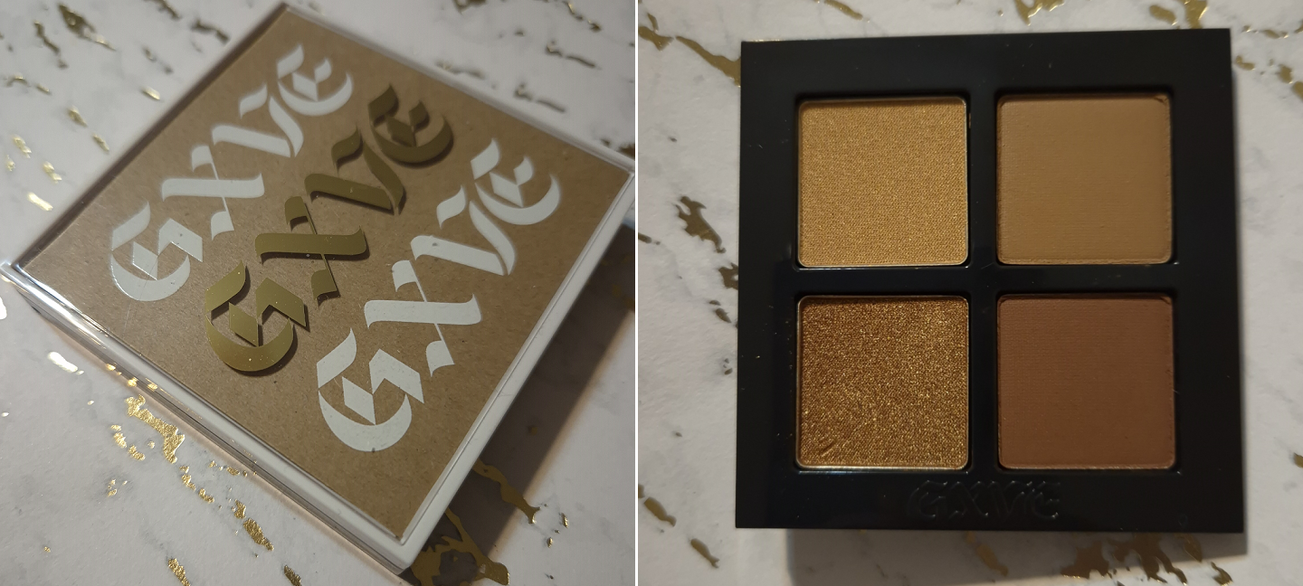
I have my fude manufacturer favorites, so it’s rare that I feel compelled to give another brand a try. The hair types used in these brushes and the more affordable price were some of my biggest motivators for wanting to try Number Eight brushes.
Other than the brand’s Instagram, which links to their official Japanese website, the only place I could find information about Number Eight was from the FudeBobo website. What is written there can be summarized as this: Number Eight belongs to a well-known fude manufacturing company (nicknamed Brand H) and their many characteristics are visible in these products, including the signature scent of goat hair.
Some OEM companies proudly list on their websites who their top clients are. When it comes to “H,” the Number Eight brand is now the third unannounced brand I know they’ve made brushes for. It remains a badly kept secret, but because they wish for it to be kept that way, I won’t explicitly list the name of the company here.
The reason I personally like knowing the manufacturer is because it helps me gauge whether or not I will be happy with the brushes I’m purchasing online that I’m unable to see and handle in person. For instance, I don’t like Sokoho goat hair from Koyudo, but I don’t mind Sokoho if it’s from Bisyodo. I know that Koyudo’s Silver Fox hair is similar in feel to Chikuhodo’s version of Premium Silver Fox versus their regular Silver Fox brushes. When I don’t know who the brush maker is, I’m taking an expensive gamble in the hopes that I won’t be disappointed with the products. For brands like rephr or Sonia G, they have hype from thousands of customers and plenty of influencers to vouch for the products. However, Number Eight is relatively new with extremely limited availability online. If I was unable to figure out the manufacturer, I would not have taken the chance on these brushes, and I would have definitely been missing out, because they are lovely!
The major companies usually have a “more affordable” line on offer. For example, it’s the Cheri line for Bisyodo, the Regular Series for Chikuhodo, the Koyudo BP Collection while it was around, and the J series from Hakuhodo. Those that like Hakuhodo’s J series will likely be pleased with the brushes in this post today.
*DISCLOSURE: The links in bold blue font (Example) are standard non-affiliate links. Links marked in bold black font with a light blue background (Example) are affiliate links. Affiliate links allow me to get a commission if someone clicks them and then makes a purchase. All of my officially labeled Number Eight brushes were purchased with my own money from the Fude Bobo website, which I am not affiliated with.
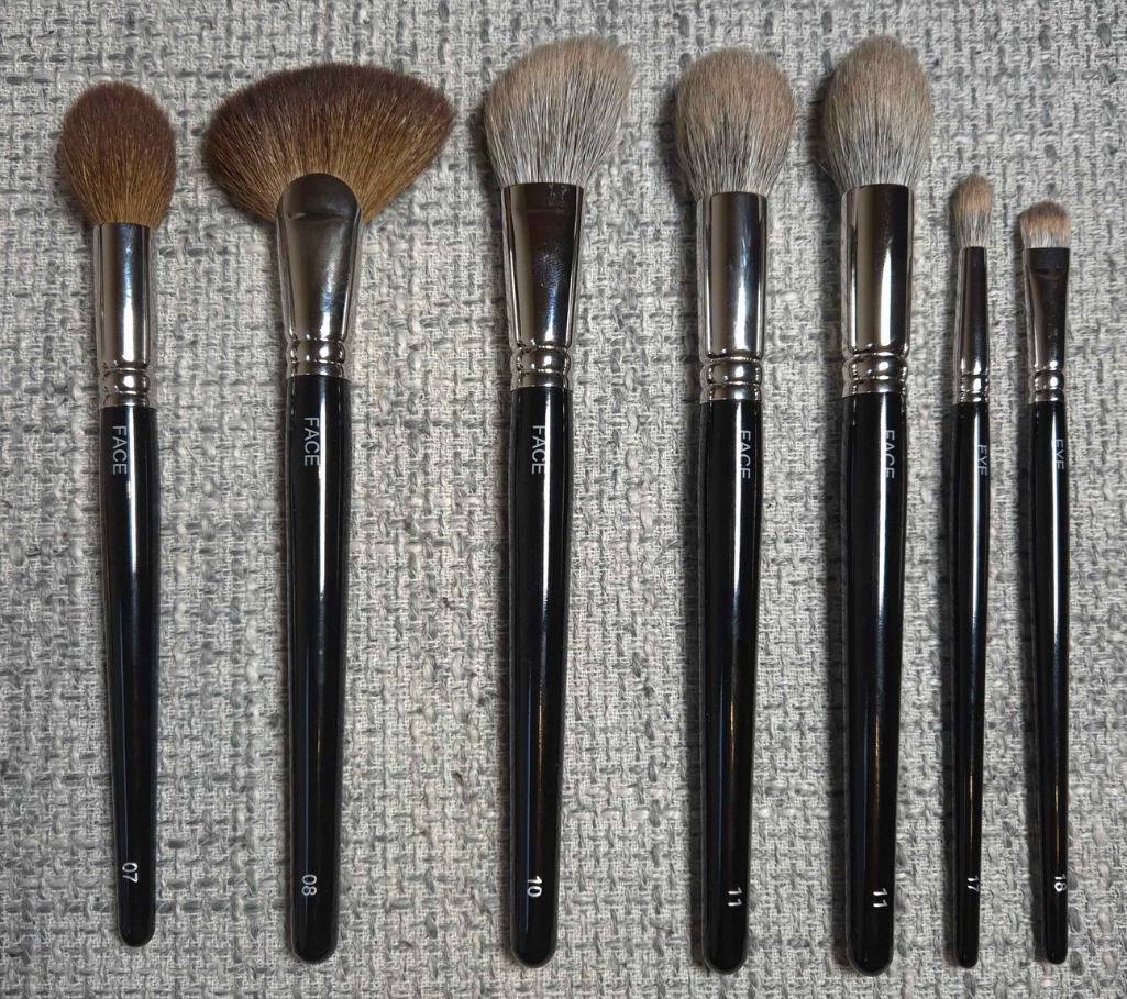
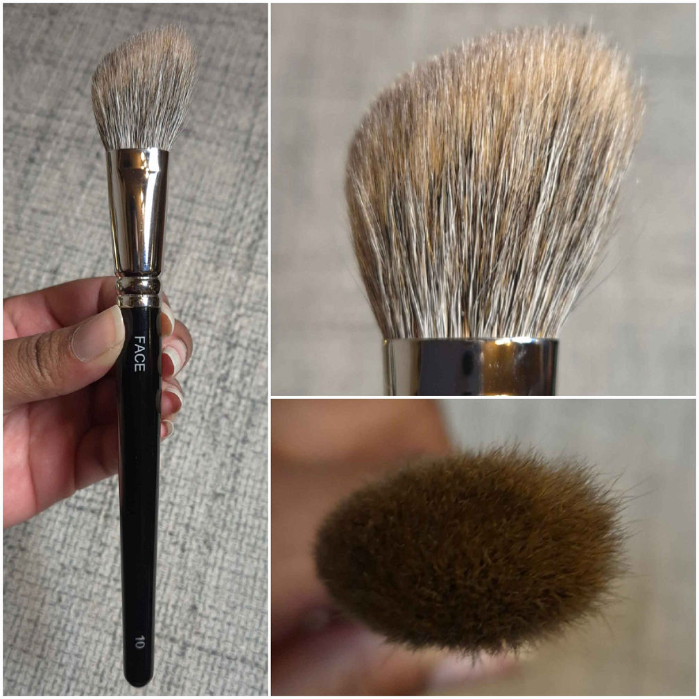
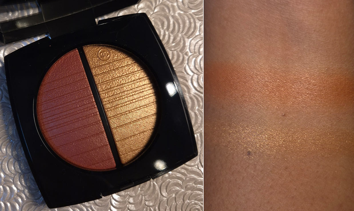
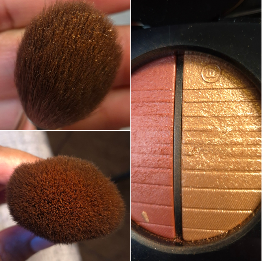
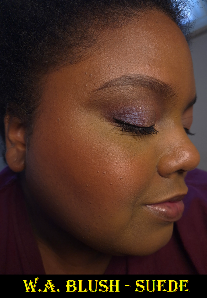
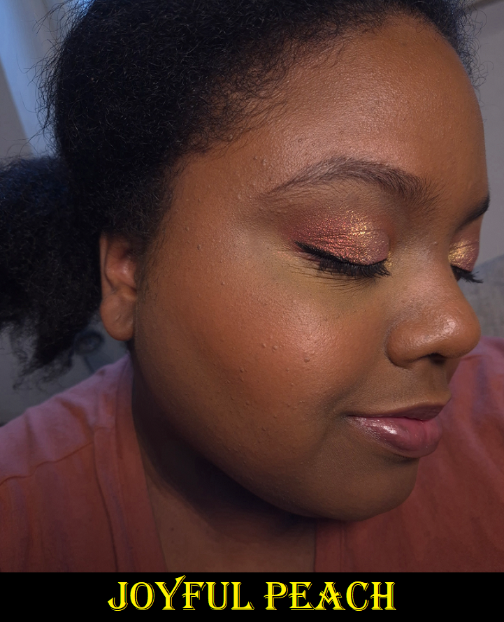
Number Eight Face 07 Cheek
Full Length: 192 mm / 7.56 in
Hair Length: 32 mm / 1.26 in
Hair Width: 13 mm / 0.51 in
Bristle Type: Dyed Saikoho
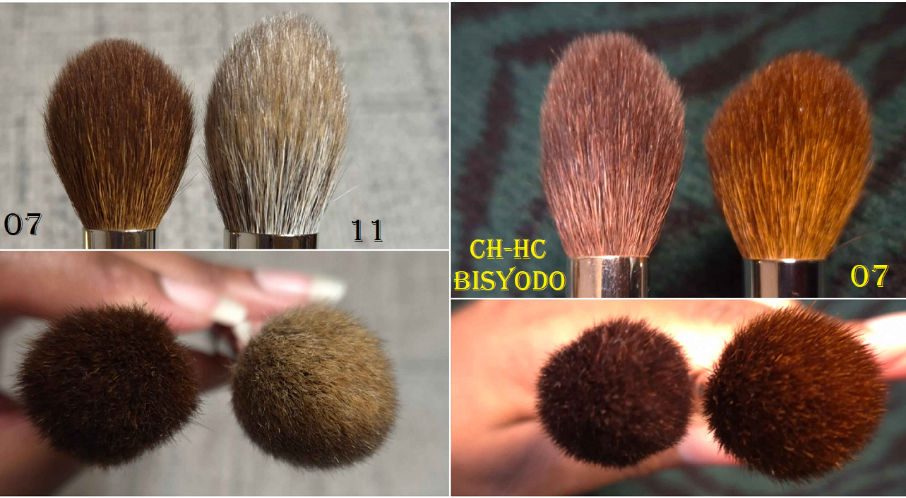
The reason I wanted this brush is because of how much it reminded me of Bisyodo’s CH-HC brush, which has been my holy grail highlighter brush for years. I have a backup brush that I once painted in order to make the handle look prettier, but I wanted to get the one from Number Eight in the hopes that it would perform similarly while having a thicker sturdier handle. It’s also the case that when I bought my first CH-HC it was listed as Saikoho hair, but CDJapan eventually changed the listing to Sokoho. My backup CH-HC felt different and could be Sokoho (albeit the softest Sokoho ever), but I still don’t know if my original is Saikoho or not. This was another reason I didn’t mind getting the 07 brush, so that I could have a Saikoho backup. As it turns out, they are shaped differently. Bisyodo’s brush head comes to a longer pointier tapered tip. It’s much more of a candle shape. The 07 reminds me of the shape of my Hakuhodo 5521, but in a dyed saikoho version instead of my original blue squirrel goat mix. The brush had also grown wider over time and was never as pointed as it looks in website photos.
Even though the head shape is rounder, the hair staggers up towards the tip, so it functions as if it’s at an angle from the way product gets picked up. For that reason, this still allows me to precisely apply highlighter. It admittedly gets dispersed in a slightly wider area than the Bisyodo brush, and my original Bisyodo brush hairs feel a little softer. For that reason, I started using the 07 to apply bronzer around the perimeter in a smaller than usual area, contour in a softer diffused fashion, and when mixing blushes if I want another color just on the apples of my cheeks.
I’m pretty set in my ways, so even though I found multiple uses for this brush, I just go right back to using my favorites. This is a decent brush, but if someone has a similar brush already, getting this one isn’t necessary.
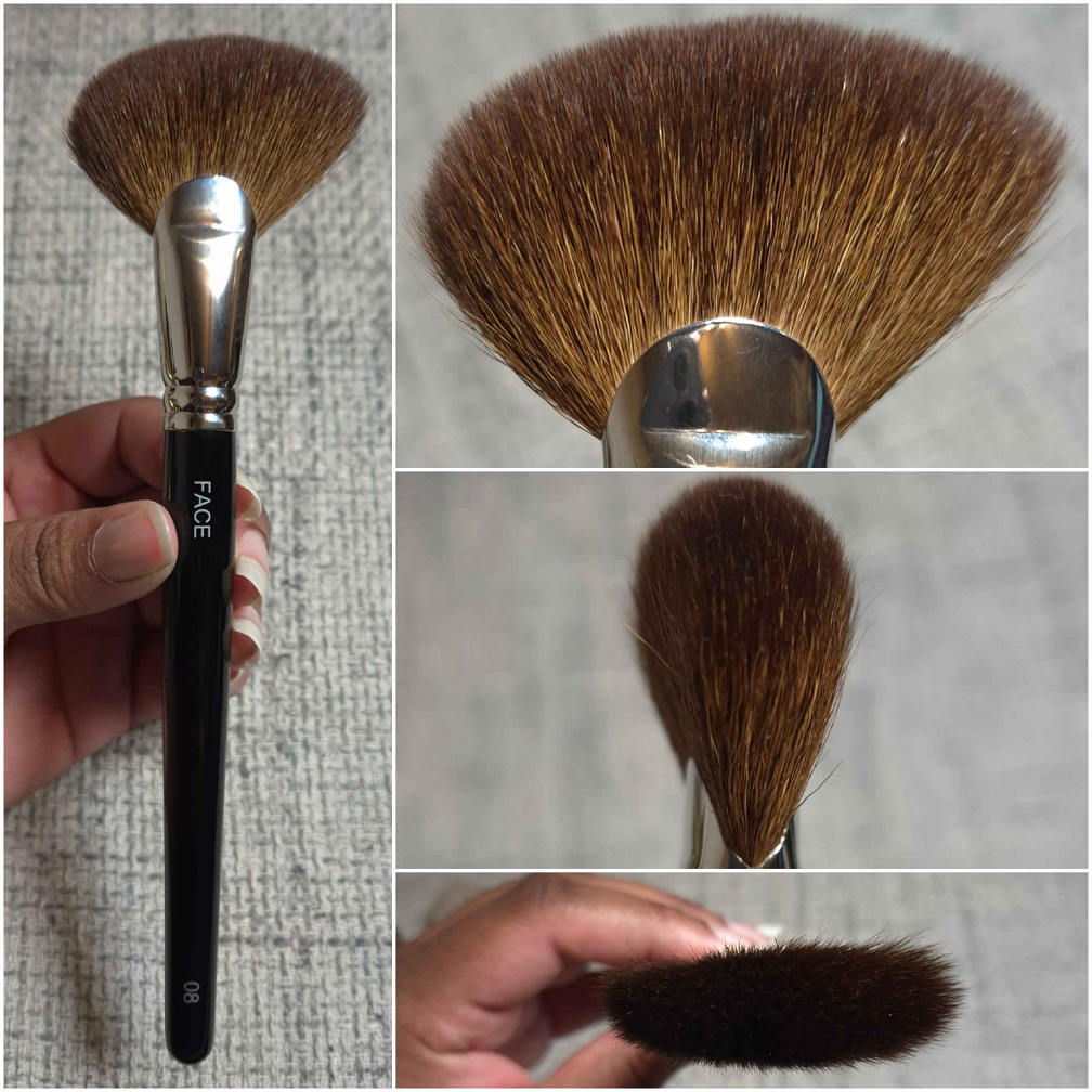
Number Eight Face 08 Fan
Full Length: 193 mm / 7.6 in
Hair Length: 28 mm / 1.1 in
Hair Width: 18mm x 12mm / 0.71-0.47 in
Bristle Type: Dyed Saikoho
The reason I wanted this brush is because the Wayne Goss original Fan 15 is the best fan brush in my collection, but I don’t have a backup of that one. It was a happy mistake that this brush turned out to be way thicker. This is packed with a lot of hair, but I consider it to be a medium density and flexible bristle brush the splays widely enough to diffuse nicely without losing too much precision or applying too lightly. The Number Eight 01 Highlight Fan brush is probably more similar to Wayne’s Fan 15, though I don’t have it in person to know for sure. This 08 brush is like having a smaller, airier, and natural hair version of the Patrick Ta Contour Brush (another holy grail). I am absolutely thrilled to have this! I can pick up bronzer with one side for more precision in a smaller area, like going around the sides of my face and under the cheeks, or turn the brush sideways to apply to a wider zone. I can apply contour in a small, but partly diffused way. This also works for applying highlighter to a wider than usual, yet diffused, area.
Even though this has the same hair type as the 07, I wonder if the hair in this one came from another batch or supplier, because it’s significantly softer. For anyone who likes thick fan brushes, I recommend giving this one a try.
Number Eight Face 10 Contour Angled
Full Length: 201 mm / 7.91 in
Hair Length: 35mm-20mm / 1.38-0.79 in
Hair Width: 18mm – 22mm/ 0.71-0.87 in
Bristle Type: Squirrel mix Saikoho goat
The Face 11 is what set things in motion regarding me wanting to try this brand. I love the hair mixture so much that I wanted to give the Face 10 a try, even though I’m very picky when it comes to angled brushes.
My favorite uses for this brush are for blush and bronzer. I can technically use this with highlighter as well, but this splays even more than the Face 08, so I don’t bother. This is also why I don’t contour with it either, but that splay diffuses products so beautifully! It’s like having a bigger and softer version of the Sonia G Lotus Detail Brush! It makes applying blush easy to keep contained to the area I want by sweeping it along the cheekbones. It’s on the lighter end of medium density with enough squirrel hair (I believe pine) to feel pillowy soft, but with enough goat to add shape and structure that’s capable of quickly blending and buffing. It picks up a nice amount of product and disperses it so evenly on the cheeks, which also adds to the swiftness in which I can finish applying blush or bronzer. The only reason I end up using this brush proportionally far more times with blush than bronzer is because the Bisyodo B-F-05 Perfect Fit Brush is still my holy grail bronzer brush.
For anyone who loves the Sonia G Lotus Detail Brush or angled brushes, I recommend trying this one!
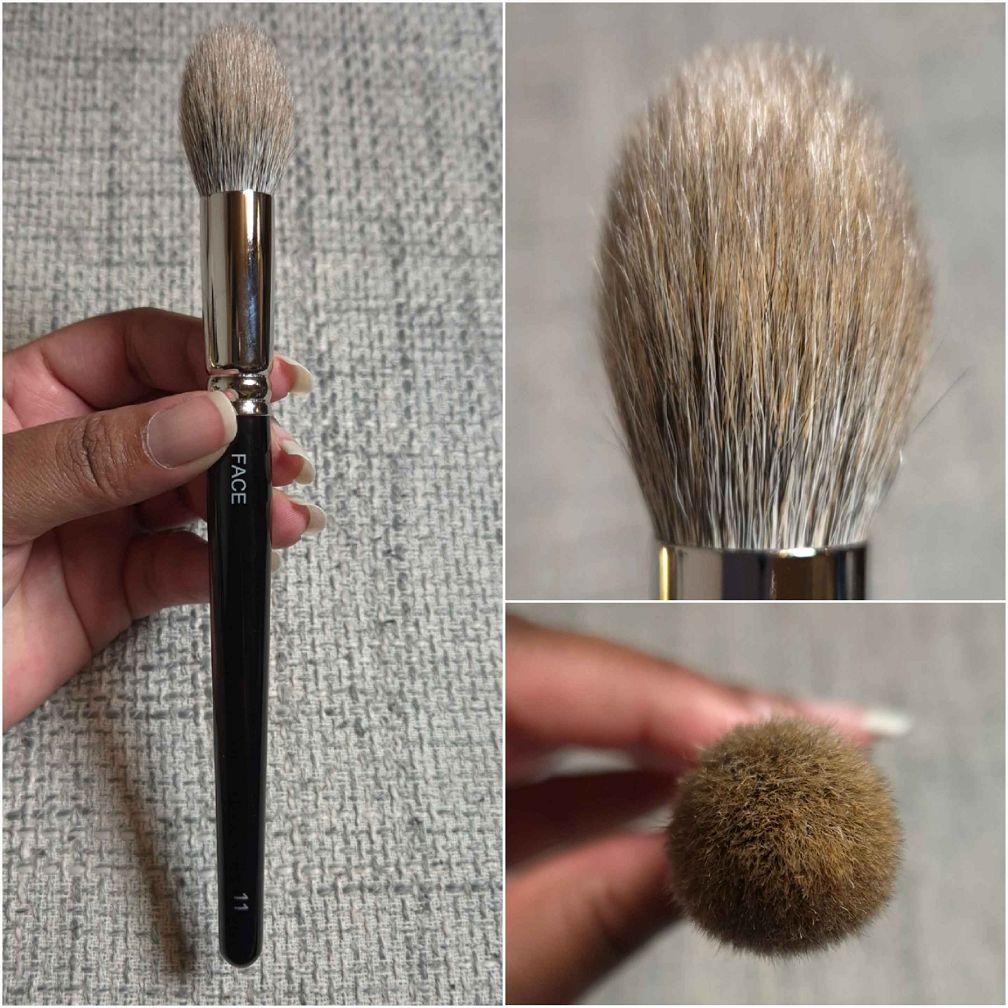
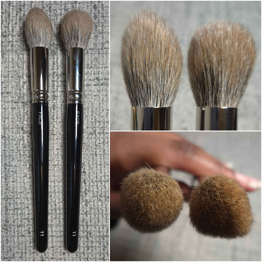
Number Eight Face 11 Cheek/Highlight
Full Length: 201 mm / 7.91 in
Hair Length: 35 mm / 1.38 in
Hair Width: 16 mm / 0.63 in
Bristle Type: Squirrel mix Saikoho goat
In my Fude Collection Part 8 post, I mentioned that I had a brush called the Eihodo No.153 Highlighting/Blush Brush. It was listed as an outlet brush from Eihodo, but it had the same hair type and labels (Face 11) as the Number Eight Face 11, including an identical looking ferrule and handle. The reason I was incredibly confused was because it was under the Eihodo name on the CDJapan website instead of Number Eight or even “Brand H” whose brushes they only sell via proxy. Then, I thought about the fact that Eihodo is a producer and not manufacturer, so any company’s brush could be listed under them as long as they were the ones who procured them.
The bottom line is that I loved this brush so much and wished for CDJapan to release more. I vaguely remember seeing other brushes of this hair type being released in the outlet, but I didn’t buy them because I wanted larger face brushes instead. I waited for the brush to restock, but it never did. I still held onto hope that more would come, but CDJapan actually deleted the product pages for all of brushes that look like they came from Number Eight. So, I lost hope. However, when I realized these brushes were available through the Fude Bobo website, I had to try more, including buying a backup!
In the photo below, my official Face 11 is on the left and is much pointier in shape. My unofficial Face 11 is on the right. I am assuming the reason the unofficial one ended up being sold as an outlet brush is because of the fact that it’s not as candle-shaped as it was supposed to be.
In terms of performance, I do notice a difference. At first I preferred my outlet version because the more evenly shaped tips form a more even distribution of pressure on the face. The size is perfect for small pans like in the Hourglass Ambient Edit Palettes. However, I’ve gotten some new makeup that have even smaller sections of product, such as the Givenchy 4-Color Pressed Bronzing and Sculpting Powder. The non-outlet brush’s pointier tip makes it easier to dip into such small blocks, so I can apply the contour shade more precisely. It still has the benefits of dispersing product in a way that isn’t too harsh, nor too soft, and is still gentle on the skin.
The Face 11, in the way it was intended, is technically a more useful brush, so I’m glad I bought it too.
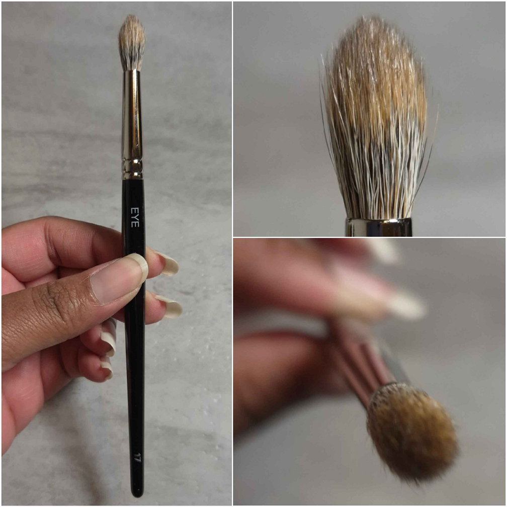
Number Eight Eye 17
Full Length: 173 mm / 6.8 in
Hair Length: 18 mm / 0.71 in
Hair Width: 5.5 mm / 0.21 in
Bristle Type: Squirrel mix Saikoho goat
Sonia G makes my favorite eye shadow brushes, but considering the maker of these and the hair type, I thought chances were high that I’d like the ones from Number Eight.
Through prolonged use, this brush is a little fluffier in width, so the point doesn’t look as pronounced. However, I’m still just not a fan of this brush purely due to the shape. I like my tapered blending brushes to be rounder for a wider area of blending pressure. When it’s pointed like this, the strongest pressure is mainly at the highest point in the center, which means it takes longer for me to blend with that smaller surface area. I see how it’s supposed to be useful for getting in the crease for hooded eyes, but then I prefer to just use a smaller brush in the shape I like, such as the Sonia G Mini Booster. I find myself repeatedly squashing the Eye 17 into my skin to try and increase the pressure to increase the blending power. Every time I’ve used this brush, I wished to swap it with something else.
I apologize, but my preferences are too strong to be objective on this one. I only own a few of these type of brushes in my collection because I always end up casting them aside in favor of a different shape. I’m sure there are people that will use and love this brush. It feels soft and non-irritating on the skin. I just don’t like it for myself.
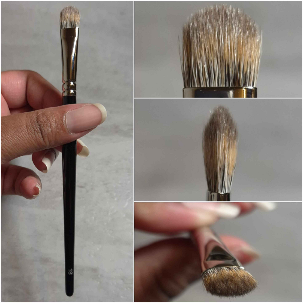
Number Eight Eye 18
Full Length: 166.5 mm / 6.55 in
Hair Length: 11.5 mm / 0.43 in
Hair Width: 10mm-3mm / 0.39-0.12 in
Bristle Type: Squirrel mix Saikoho goat
I have a ton of flat shader brushes, so I don’t feel I’m being biased when I say I dislike this brush too. I can name at least four that I like better, including the Sonia G Builder Pro that comes to a taper too. This brush head is too stiff for me. It applies product to the lids well, but it’s uncomfortable if I try to use it to apply eyeshadows to the crease, the way I have been doing a lot lately with my Muragishi Sangyo MS-4 Mai Sakura Brush, Sonia G Builder Three, Mizuho MB123 Eye Shadow Brush, etc. So, I can accomplish my tasks with it, but it’s never an enjoyable experience. Because of the discomfort from the stiffness, I like the Eye 18 even less than the Eye 17. Something like the Eye 8 would probably be more to my preference, but it’s not available in this squirrel-goat mix, so I didn’t buy it.
This concludes my venture into the world of Number Eight brushes! I hope this has been helpful!
TLDR: *Ban on cream and liquid blushes and bronzers. *No highlighter purchases. *Only allowed to buy lip products from Lisa Eldridge, Ami Cole, Too Faced, Fenty, and Pat Mcgrath, but I am allowed to swap out PML with MAC. YSL was always in my head as a potential number six, but I wanted to keep it down to five. *Trying to avoid buying anything in the primer, brow, mascara, and liner categories.
Reason to Buy Less Makeup: New products take time away from using the older ones that I love.
Additional Reason for This Experiment: Seeing if using only my holy grail products will make me less interested in new makeup. Will this Project Pan make me feel satisfied enough that I don’t want to add more to my collection.
Foundations
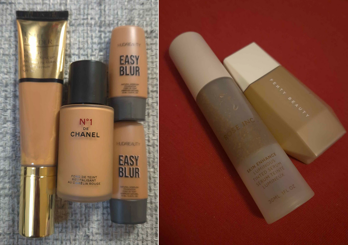
My Estee Lauder Foundation went bad. The oil parts took my makeup back off and was being weirdly patchy, plus the tube was too difficult to shake and mix properly. I didn’t start using it that long ago, but the backup was purchased on sale at the beginning of 2023, so it’s possible this tube had already been on the shelf for a long time prior to then. I replaced it with the Danessa Myricks Yummy Skin Serum Tint and I feel like I got my money’s worth out of that Tint by now.
As much as I like the Fenty Eaze Drop Liquid Foundation, it being more transfer prone than everything else in my collection made me not want to use it more than a few times. The Danessa Myricks Tint was a good replacement for that too. The Rose Inc Serum Tint oxidizing made me skip using it as well. Huda’s foundations were only really meant to mix with things to get a better shade match or increase the coverage, so I only used one a few times and I’m okay with that.
I will say that I got a whole lot of use out of the Chanel foundation, and it was the one I used most during this six month time period. I didn’t use my darker shade of this foundation at all, so I think in the year and a half that I’ve been using it, it has oxidized a little. I’m not sure how much longer it will be good for, but I foresee myself eventually repurchasing it when the time comes. It’s still my favorite in my collection and I would not want to be without it for long. This is one of the instances where using a holy grail product did in fact curb my appetite for buying more foundations. I believe my mini of the MUFE Ultra HD Foundation is the only one I purchased in these past six months, and I still haven’t worn it! I was definitely tempted by new ones from Guerlain, Givenchy, and Nyx, but being at my foundation maximum also helped. Not counting multiple shades of the same foundation, I have around 20 foundations in my current collection. My goal is to have only 5, but the lowest I’ve ever gotten my collection down to is around 10. So, I give myself kudos for holding strong against buying more. However, I still feel some guilt knowing I won’t ever use them up before they go bad. I’m only about halfway through the bottle of the Chanel foundation even though it’s the one I used the most in the past 18 months, not just during this project. So, I’m more determined than ever to keep a much smaller collection of foundations and I’m less interested in buying new ones because if they don’t top my Chanel, they will instantly go to waste because I cannot return them to the store.
Concealers
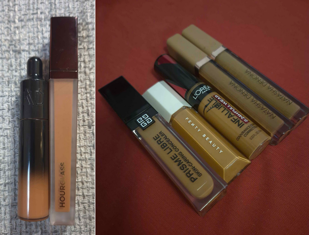
The Danessa Myricks Yummy Skin Lift and Flex concealer snuck its way in too and was used more than the other honorable mention concealers. I used Givenchy’s a few times and Natasha Denona’s more than I expected, but did not use Fenty’s or L’Oreal’s even once. Ultimately, for concealing around my mouth, I stuck with Hourglass and Natasha Denona. I like my two ND shades, but the packaging of one of them leaks and it drives me nuts! I’ve been very close to tossing it out, but I like having a somewhat color correcting yellow and brown in those tones. So, I try to put up with it and I keep the leaky one stored upright in a cup.
I got to about a quarter left of my tube of the KVD Good Apple Concealer, but tossed the rest because it darkened in color. So, I started using one of my two backups. Because I’m not using any other concealer under my eyes, this fresh tube is getting a lot of use! I would say I’ve used up about a third of it, but this isn’t a surprise. Whichever concealer I deem my number 1 will always get used up and repurchased!
I did not purchase any other liquid concealers during the Project Pan until June when I was recommended to try out the Gucci concealer. Earlier in the year though, bought three shades of the Lisa Eldridge Pinpoint Concealer pencils. I don’t consider this wasteful per say, since I bought them for purposes that I wasn’t using my liquid concealers to do. However, I admit that I don’t use them as much as I thought I would. Making sure I build up my foundation around my mouth means I use less concealer there, sometimes skipping it entirely. I also couldn’t be bothered to always fill in my smile line, so that’s how my interest in the pencils started to fade.
I’m not feeling as tempted to get more concealers. I must admit though that the only reason I haven’t bought the new Estee Lauder Double WearStay-in-Place 24-Hour Concealer is because every retailer I’ve found in Germany has 11 or fewer of the shades out of the 30 that exist. The deepest color I’ve seen listed is either 5C or 5N. So, I am literally unable to try it.
If Lisa Eldridge releases a liquid concealer or if Estee Lauder finally has a shade for me that I can try, those would most likely be my next purchases. However, I’m still very content with my KVD Good Apple and feel disinterested in trying most of the others.
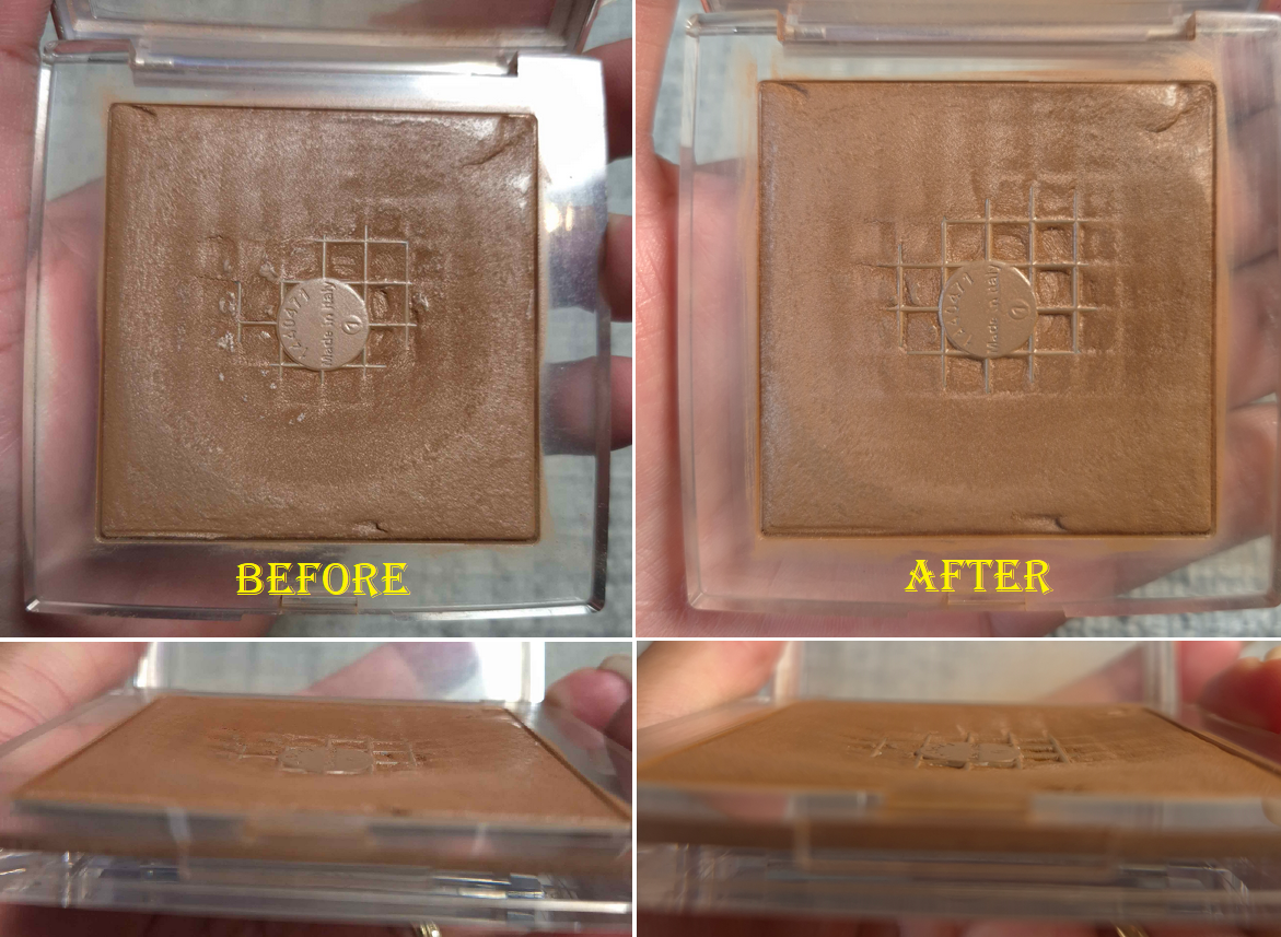
Powders
I didn’t do too badly in terms of adding new powders to my collection. I bought the Givenchy Prisme Libre Setting Powder, Guerlain Parure Diamond Powder, and ELF Halo Glow Pressed Powder. They’re good, but they were unnecessary purchases. They didn’t beat out my Dior Powder no Powder, nor the Charlotte Tilbury Airbrush Flawless Finish Powders (technically Guerlain tied in performance but I don’t use it as often because of the added fragrance). So, I shouldn’t have bought them.
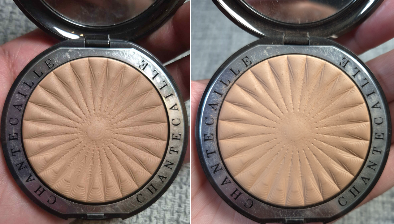
I also only used myChantecaille Perfect Blur Finishing Powder in the month of June, so it looks largely unchanged. In general, during these six months I hardly powdered my face. So, I didn’t finish the Dior Powder No Powder as I expected. I even brought my lighter shade back with me from Florida, so I have that one again, plus the spare I bought before it was discontinued. I also got back my Laura Mercier and additional Hourglass baked powders too.
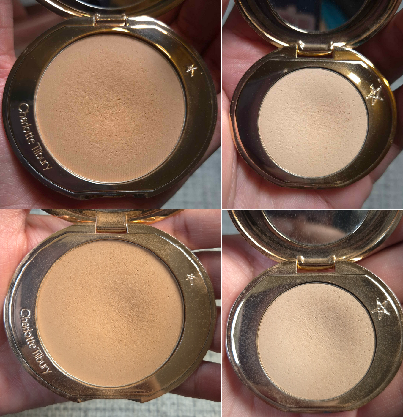
I continued to wear concealer, so the Charlotte Tilbury powders were used at the same rate that I expected. The only disrupting factor is that I bought the Soulmates duo, which had the light peach Charlotte Tilbury powder. So, I started to rotate between three of them in the last few months.
I no longer have an interest in buying new powders between the semi wasted new ones I bought already, older powders I have access to again, and the ones in this Project Pan.
Contour
I technically have a new contour out of the Givenchy Prisme Libre Bronzing and Sculpting Powder that comprises of four different colors. However, there are no other new ones. I used my Hindash Beautopsy palette a handful of times, but I mostly just skipped contouring. I did some jaw and cheekbone brontouring at most, so new things weren’t of interest at this time purely because of my current habits and preferences. The only temptations were Charlotte Tilbury’s Contour Wand, Anastasia Beverly Hills Smooth Blur Contour Stick, and the Rare Beauty Soft Pinch Liquid Contour. I had doubts about getting a good shade from the first two (plus they’re creams), and I never use liquid ones. So, that was an additional reason to skip purchasing them.
I have access to Monochromance again, and I’m debating whether I want to risk depotting the pans so I can have my most used shades in Beautopsy and hopefully get even more use out of it due to the increased convenience.
I’m a bit reluctant to take that step though out of fear of messing them up without my Z-Potter, especially with the bottom being a bit thick. I’m not sure how well the heat would flow through. Even more reason for me to not want to potentially damage or ruin the powders is that I feel like any day now there should finally be a dip in these pans. I’ve used them a ton, but there’s so much product that they look new endlessly!
Bronzers
This is where things start to fall apart a bit!
I mentioned buying the Givenchy Prisme Libre Bronzing and Sculpting Powder already, but I also bought the Benefit Powder Bronzer, Benefit Hoola Wave Cream Bronzer, Laura Mercier Bronzing Duo, Fara Homidi Essential Bronzer (refill), Anastasia Beverly Hills Smooth Blur Bronzer, and Kess Berlin 365 Bronzer. Benefit’s was for nostalgia reasons as I like the quality, but it was just too red toned, so I stopped using it. The brand changed the deepest color a bit, so I was curious to see if I would like it enough to be able to start using it again. I kind of broke my no-buy with the Hoola Wave Cream Bronzer though. Oops!
I at least resisted getting the Dior Forever Nude Bronzers, reformulated Haus Labs Bronzers, and the Too Faced Chocolate Soleil Cream Stick. Chanel also expanded the range to one additional darker cream bronzer, but it’s not available at any German retailer (for me to get a discount), so I managed to avoid the purchase for that reason.
The point is that I have grown to love bronzers, so I am frequently tempted, especially if it comes from a brand that has always been hyped and they finally expand the range. It’s like when someone reaches the drinking age and goes overboard on the alcohol because they are so overeager to do what they couldn’t before. Choosing to skip on a purchase requires discipline, but being forced into missing out doesn’t allow one to build up that resistance. So, lifting the restriction without having built up defenses against it is hard.
Because I had so many new bronzers to test, I only used my Charlotte Tilbury Cream Bronzer a few times. The Hermes Bronzer was used in-between testing, but not enough to bother showing progress photos. For that reason, I feel like I failed in this category.
Blushes
Well, I definitely broke my cream/liquid ban by buying three Huda Beauty Blush Filters, a Rare Beauty Soft Pinch Matte Blush, an Anastasia Beverly Hills Stick Blush, one Dior Rosy Glow Cream Blush Stick, and two Charlotte Tilbury Unreal Blush Healthy Glow Sticks. I’m not totally upset by it because of how long I resisted getting the Huda ones and the one from ABH.
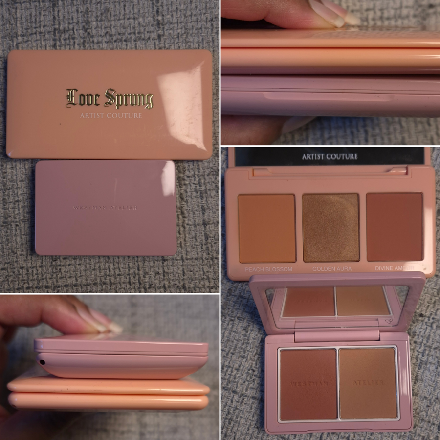
Where I feel like I went way overboard is buying 5 YSL Bold Blurring Blushes (and later sold Rose Haze on Mercari while on vacation). I also bought the Charlotte Tilbury Soulmates Face Palette that had a blush half of the duo. There was also the Westman Atelier Powder Blush Duo, Chanel Les Beiges Healthy Golden Glow Powder that had a blush and highlighter, a By Terry Tea to Tan Blush Powder, and two of the seven shades in the newest reformulation of Dior Rosy Glow Blush.
Considering my past history of buying an absurd number of blushes, this is actually a huge improvement for me. However, the goal during this time period was to get more uses out of what I already have. I had the same issue as the bronzers; having so many new blushes took time away from using anything older. I had 14 blushes in my Project Pan, and I used most of them at least 1-3 times, which means I have almost nothing to show in terms of progress pictures.
I was supposed to be using holy grail blushes to curb my blush buying appetite, but I don’t have one specific holy grail. There are so many that I love equally, and I think that’s why it’s harder for me to resist buying more because the chances are so high that I’m going to enjoy whatever else is new too. I am subconsciously still looking for one to be better than everything else. I also get the impulse to rotate through all of them rather than just sticking to using a few. I’m not sure how I can resolve this without figuring out where each blush ranks in my collection.
I’m not going to be too hard on myself over this category, but this was very much a fail.
Highlighters
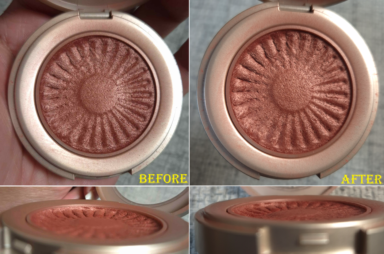
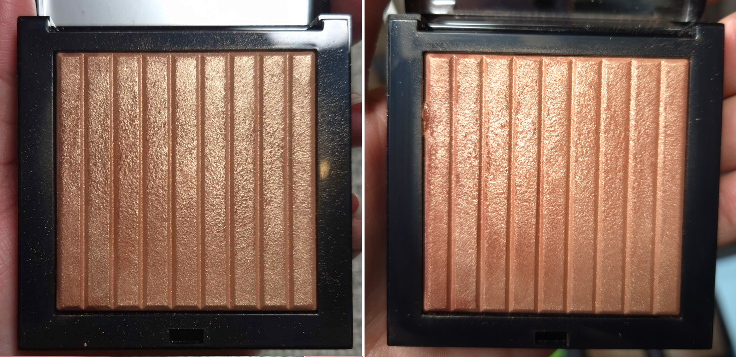
There is no point in showing the progress of my Charlotte Tilbury Foundation Stick that I use as highlighter, nor the Charlotte Tilbury Pillow Talk Multi-Glow Highlighter Palette because I used them less than a handful of times during the Project Pan process. In fact, I used way less highlighter than usual because I relied on my glowier blushes for shine. When I wasn’t testing the highlighters from duos or quads that I bought, I was wearing the Hindash Gradient Highlighter. So, that one has visible wear on the surface, but it looks hardly any different. Highlighters are probably the hardest for me to make a dent on in my collection.
I barred myself from buying individual highlighters in any form, and almost succeeded until I succumbed to the Benefit Glow La La highlighter and the Prada Light Glowing Highlighter in June. I waited over five years for Benefit to make one darker than Tickle, so if it turned out to be amazing, I wouldn’t have chastised myself over it. As for Prada, it was at least less expensive because I only bought the refill.
I must also confess that I was extremely interested in the highlighters from Nars. Technically, if I had been able to make a custom Hourglass quad or palette, there would have been a highlighter or two in there as well. It might be considered a loophole, but I don’t recall placing a limit on face palettes. I did get a Nars highlighter within the Medium Deep Hot Escapes palette. Despite all this, I’m going to give myself kudos anyway. In addition, I am more committed than ever to let the Prada highlighter be my last highlighter purchase for at least an additional year, or perhaps even forever. The only temptation I could see going forward is if Pat Mcgrath releases a deeper shade in the Ultra Glow Divine Rose Highlighter formula or a limited edition launch with packaging that I want and the makeup inside happens to be a highlighter.
Eyeshadows
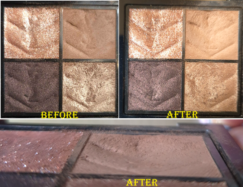
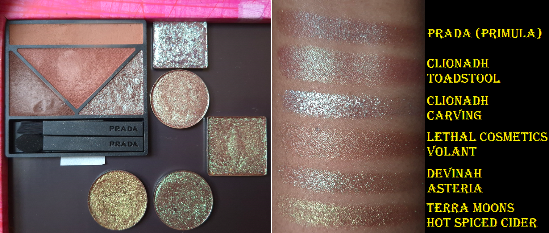
I bought the Lisa Eldridge Liquid Silk Liquid Eyeshadows (technically just Phoebe in January), but since I use those as bases/primer, I’m not counting it towards this category. What does count are the four Clionadh Cosmetics multichrome singles plus the Garland and Garden Quad, a Victoria Beckham Eye Wardrobe palette, three Pat Mcgrath Motherships, three eyeshadow singles from the Lisa Eldridge Betty palette plus the Desert Gleam palette, one of the Charlotte Tilbury Palette of Beautifying Eye Trends, the YSL Unexplored Garden quad, and one of the Prada Holo Nude Eyeshadows in 09 Primula. I consider this to be a mixed bag of reasonable and less reasonable purchases. For starters, Clionadh is an exception to everything as my favorite indie brand of all time. I’m halfway inclined to give the same leeway to Pat Mcgrath as my favorite “mainstream” brand, and considering I bought nothing from them in 2024. However, it was still a bit impulsive since I had gone all these years without wanting the first Divine Rose and Bronze Seduction palettes, but suddenly I couldn’t help myself.
I’ll give myself a pat on the back for sticking with one VB Eye Wardrobe instead of the two others I wanted, one palette from CT and not the second one, plus buying half of Betty so that I wouldn’t be stuck with 3 extra eyeshadows I wouldn’t use. I also skipped many more launches I wanted such as the Tom Ford Olive Smoke quad, the four other new YSL quads, and a few indie palettes.
I would have had room to review the new palettes and still focus on a few of my old ones, but I had so many eyeshadow purchases from 2024 to catch up on testing that I was unsuccessful in making many dips in the pans. My most used eyeshadows during this Project Pan were likely the lightest shade in the YSL Over Brun quad and darkest shades in the VBB Victoria quad because I used those the most to pair with other palettes and eyeshadow singles.
Everything Else: face and eye primers, mascaras, eyeliners, brow products, and lip products
I did end up buying a mini set of the Milk Hydro Grip that contained the original and glow version, though that might have been just before my low-buy started. I honestly can’t remember. Then, my old Gerard Cosmetics Clean Canvas started to change consistency, but it was nearly empty anyway, so I tossed it out. I still have my MAC Paint Pot and Nyx Glitter Primer, but I felt more comfortable having a third option. This is how I ended up using the Lisa Eldridge Liquid Silk for eye primer purposes. Speaking of which, I ordered Gaia in November 2024 and Phoebe in January 2025. I was paring them both in the beginning, but soon started using Phoebe exclusively. I was shocked that within only 3 or so months of use, I was struggling to get product out. I had to uncork the stopper and mix it a little to start reaching product again. Product still periodically moves to a spot that I cannot reach with the applicator, so I have had to uncork it an additional two times, which is not an easy task! I had to use tools because it’s very tightly in there to keep the product from drying out. So, if you think you might have used yours up quickly, I recommend removing the stopper and checking. I estimate that I have used up half of the tube by now.
I ended up buying more mascaras, but the high end ones were minis on sale and the full size were from Essence and at least very inexpensive. I managed to use up a few older mascaras, so that was nice.
I bought one brow pencil, and it was the waterproof version of Elf’s Instant Lift, which I won’t use until I finish my current ones. As for eyeliners, I hadn’t bought any until June. I’d been waiting ages for Hindash to have a sale that also included free shipping. So, I bought 3 Color Fluids and the Heroline eyeliner pen.
I didn’t set a hard stance for myself against buying setting sprays, because going overboard hadn’t been much of a problem. I think prior to this year, the most I ever had at the same time were three. I was unprepared for so many brands coming out with their own this year, so I fell victim to a lot of hype. I ended up buying the one from Huda, Tir Tir, Pat Mcgrath, and I got the one from Charlotte Tilbury in my Genshin Impact collab box. That means I now have seven! Most of them are travel sizes at least. There are several more I was interested in trying, but I will now ban myself from buying more for at least a year.
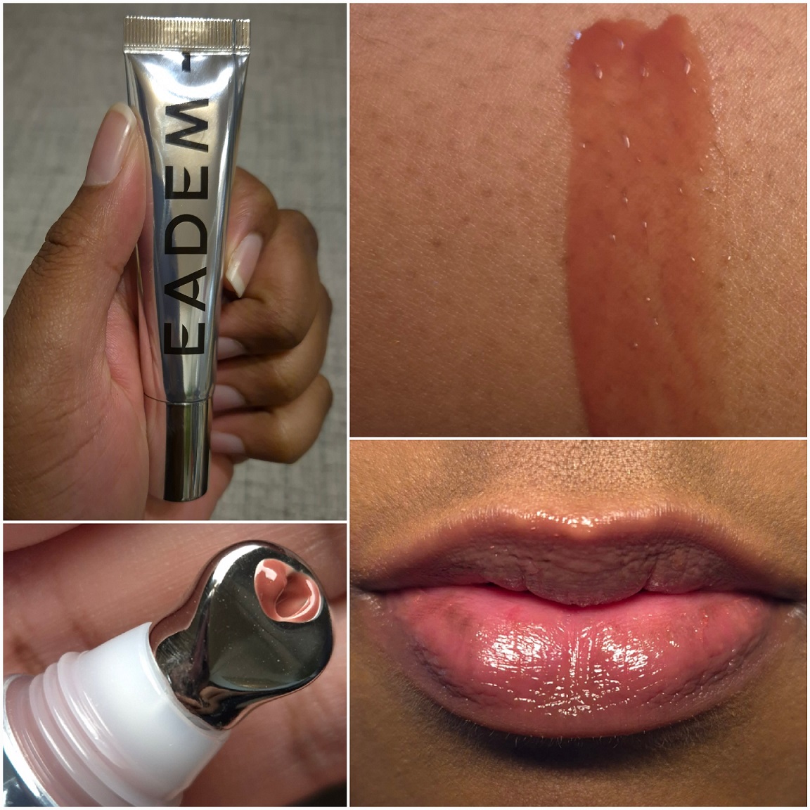
Regarding lips, I mostly stuck with the designated brands. I have three lippies from MAC, two from Too Faced, and two refills from Lisa Eldridge. I swapped out PML for MAC, as I made an allowance for, but technically YSL wasn’t officially on the “allowed” list, even though I mentioned them. So, I’m not sure if I should admonish myself for buying two YSL lippies. One allowance I had in my head, but didn’t mention in the Project Pan, was the lip balm from Eadem. I wanted to buy that well before my Project Pan, but could not get it because the brand doesn’t do international shipping. So, I bought it while in the US. Lastly, I wasn’t supposed to get another Summer Fridays balm, but I couldn’t resist.
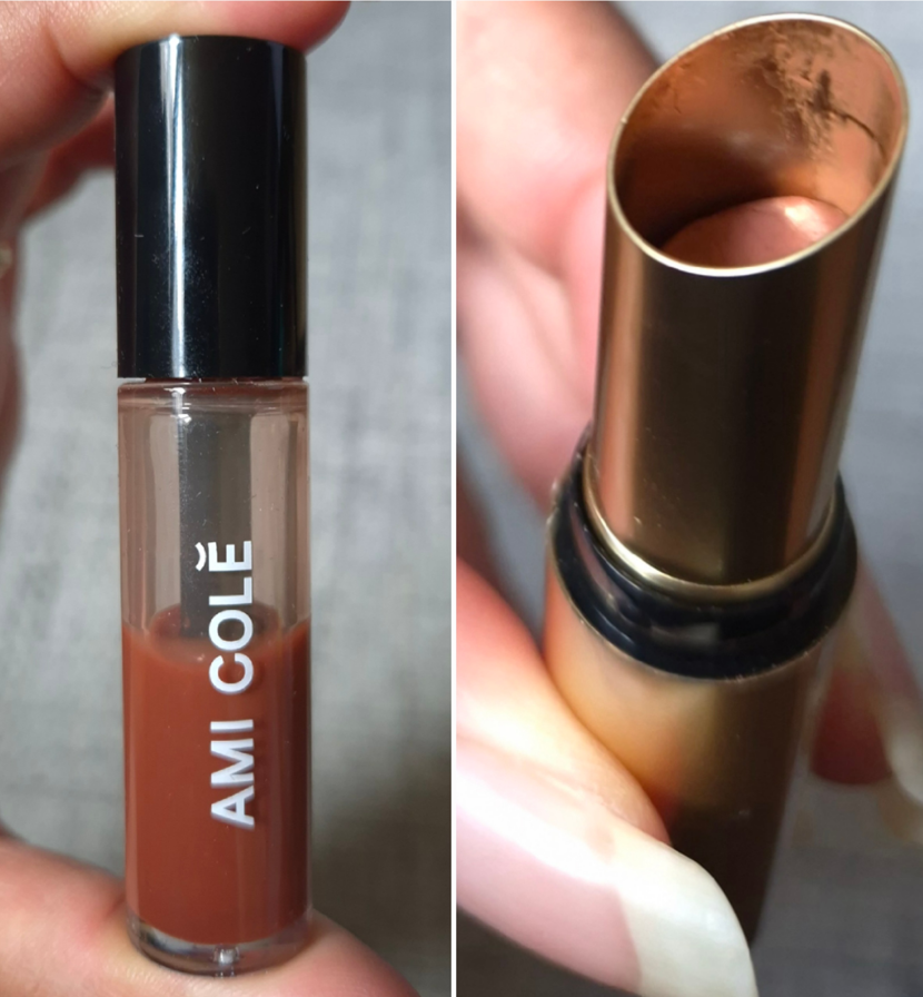
I rotated through a lot of my lip products, but I can say the top two I used the most were the Ami Cole Lip Treatment and Lisa Eldridge Baume Embrace.
And that is everything!
I could have done a lot better, but for me this was a semi successful endeavor. In fact, I want to stick with this same Project Pan idea for another six months. I want to see if I can be even stricter with myself, especially now that I have twice as many items in my collection between getting some of my old makeup back and adding so many new ones in the first half of the year. The goal was to use more of my holy grail makeup in the hopes that it would curb some spending urges. However, the amount of time I designated to reviewing my stack of unreviewed makeup took enough time away from my holy grails that I don’t think I was able to give a strong enough effort.
I have been purchasing more luxury makeup than usual over the past year and a half, but there are some brands I have tried to avoid for fear of liking them too much and not having the self-control to stop myself from buying everything they make! Prada is one of those brands that every single release has been hyped on social media as “the best on the market,” but as long as I didn’t take that first step in trying something, I was safe.
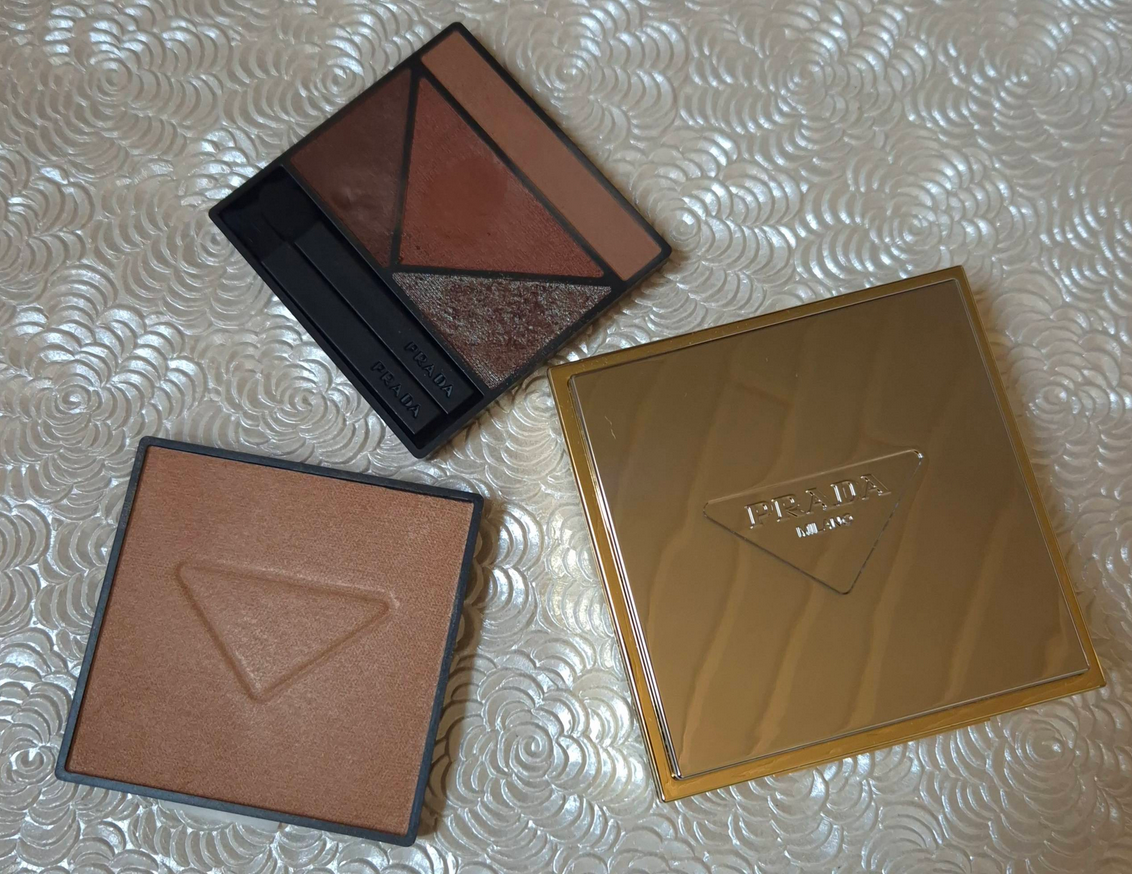
Well, I am no longer safe! I finally bought the eyeshadow palette that appealed to me most, and then shortly after bought the highlighter in the refill form.
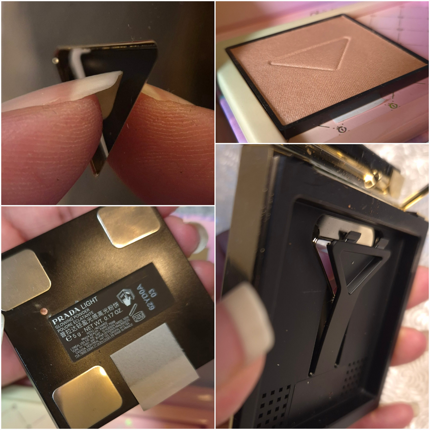
Before we get into the reviews, I want to discuss the logistics of this refill system because many Influencers have been saying, “If it’s too expensive, you can save money by buying one with a compact and getting refills of the rest,” without even checking what that actually entails for the customer.
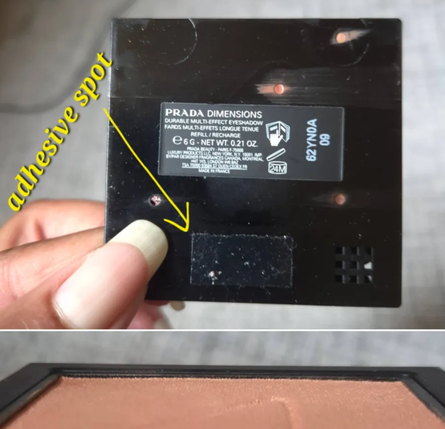
For starters, this is not like Charlotte Tilbury refillable products where the compacts have magnetic bases with metallic pans that are easy to pop in and out. The Prada “pans” are made of plastic. There is a triangular shaped gap in the back of the compact that one can press through to lift out the plastic pan. On the bottom of the pan is a rectangular section with adhesive on it. This adhesive is what holds these pans in place within the compacts.
The bottom photo shows how flush the pan is to the surface, so adding a magnetic sheet to the bottom to turn it into a magnetic compact is not possible.
That adhesive will be exposed to the air and other elements if removed from the compact and set down on top of an object. So, something (perhaps scotch tape or the paper from another refill) will be needed to cover the sticky section. If the plan is to swap out products repeatedly, the cover piece has to be easily removable and not lessen the sticky power over time. The adhesive isn’t that strong to begin with. I’ve seen two people whose pans immediately fell out of their compacts, and mine continues to as well.
When one purchases an individual refill, it does not come in a plastic case/clamshell. There is the cardboard unicarton and the extra bit of cardboard on the inside that keeps the product stable during transport. That’s it. There is a square paper tab on the bottom that keeps the adhesive section from sticking to anything else. Alicia Archer demonstrates how the refill is stored here.
With mine, I placed metal stickers on the bottom of the plastic refill pan, so I could store it in any of my custom magnetic palettes. When using the square size metal stickers, at least two are required for it to cling well enough to the palette. The idea was to place them in areas that would not interfere with the lifter tab in the compact if I decided to swap out the eyeshadow palette and put the highlighter there instead. For anyone who only wants to buy refills and put them in custom magnetic palettes, adding metal stickers and keeping the adhesive spot covered is simple enough.
When I was ready to transfer pans, I stuck to the plan of covering the eyeshadow palette’s exposed adhesive spot with the new sticker off the highlighter refill, and then added metal stickers to the back of the eyeshadow palette. So far so good! I placed the newly exposed highlighter pan into the compact and pressed down to secure it. It worked, but the extra weight of the metal stickers combined with the fairly weak adhesive power made it easier for the pan to plop back out if shaken not-so-gently upside down. I ended up removing the metal stickers off the back of the highlighter to give it its best chance to stay stuck in the compact. It does still pop out with every few uses, especially when jostled in my makeup bag. So, even if the goal was to make these easier to recycle, it’s an annoyance for the customer. When spending this kind of money, it should be securely in there. I wish they had just used magnets.
I am used to depotting things, so I have the necessary supplies. However, the typical customer might be surprised to find out there are more steps to the process than just pressing the back and popping out the pan. One can use the refills to replace an empty pan, use it in and out of the original cardboard packaging, or find a way to house it in a magnetic palette. Exchanging multiple products in and out of the Prada compacts though is not realistic.
I am at least glad they didn’t go the Hermes route (and other luxury brands). Hermes sells refills in pans, but the pans are aluminum and therefore not magnetic. I’ve had to add metal stickers to the bottom of mine. In addition, if one buys a compact with a product already inside, the compact is not magnetic and the pan is pre-glued. So, once you take out the original pan for swapping purposes, you will have to do something to either cover the glue or remove it. Then you’d have to glue in the next refill and hope you can still take it out once that replacement is done.
In some compacts, I have been able to place a magnet sheet on the inside and turn it into a custom magnetic compact, but if the sheet is too thin the magnetic hold might not be strong enough to support the weight of the pan. If the sheet is too thick, the pan could be raised too high up and one can’t close the compact. The Prada compacts, for example, are too flush with the surface and cannot be turned into an empty magnetic palette like how I’ve done with Hourglass palettes.
So, sometimes refillable makeup has limitations on the various ways someone can use them depending on how the brand does their packaging.
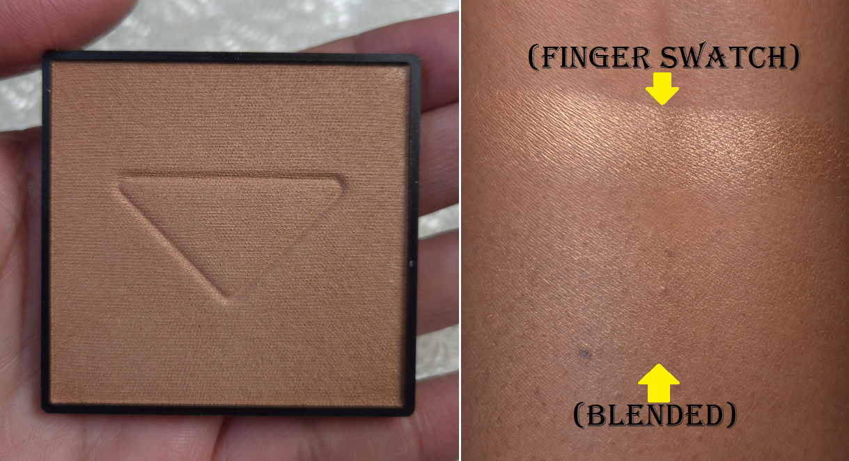
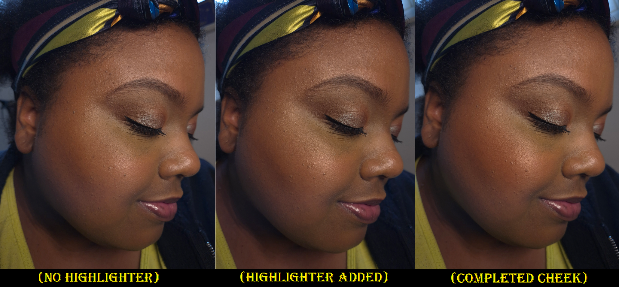
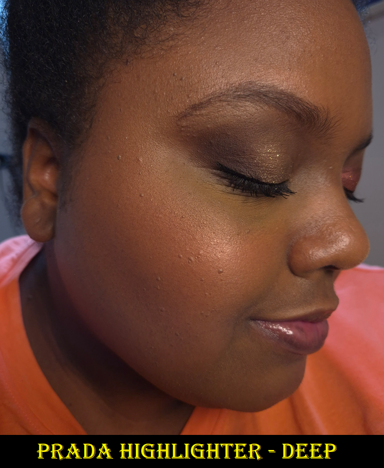
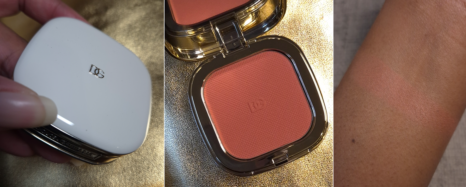
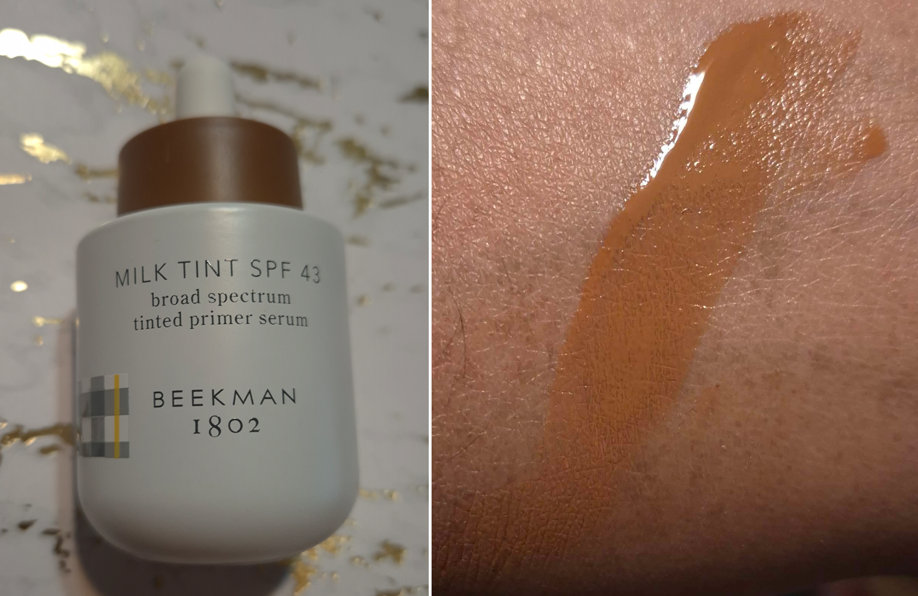
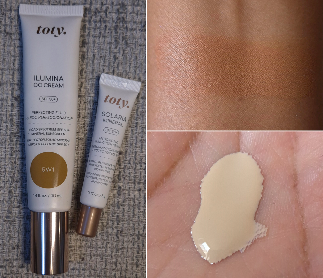
Prada Light Glowing Highlighter Powder in 03 Deep
A highlighter’s core function is to brighten the skin wherever it is used. Even a matte product can serve that purpose, as long as it’s lighter than a person’s skin tone. Therefore, additional attributes such as the consistency, finish, reflect level, etc are completely subjective. If someone has a list the traits that they seek in a highlighter, the product that checks off most of those boxes is considered to be “the best.” What is best for one person could be the worst on someone else’s list!
I can say right now that the Prada highlighter is among the best for me, and perhaps even in the number one spot!
There are three shades currently available: Champagne, Pink, and Deep. I don’t consider Deep to be that dark, but it works for my skin tone. I would like to see the brand expand the range in both directions because I don’t think these three shades are that flexible. I have a cousin who would probably love this highlighter, but she’s considerably darker than me. There wouldn’t be a point in me recommending this to her because it would probably look grey on her skin from being too light. So, I think it’s important for brands to offer a wider variety of highlighter colors within a line, especially if it’s a more opaque type or if the pearlescent finish is strong.
This highlighter is satin-like to the touch. Most powder highlighters that achieve this level of smoothness are hybrid cream-powder ones or putty-like. They basically feel wet. The Prada highlighter is different because it still feels like a powder, but in the smoothest form. When applied to the skin, it practically melts in to the point that I can hardly see individual shimmer particles. It is ultra refined with the brand’s trademarked “Micro-Pixel™ Pearls”. The effect is as close to the performance of a cream or liquid highlighter without it actually being liquid. The moisture level within this product is perfectly balanced. I cannot imagine how a powder could be any more hydrating from the jojoba butter, maracuja oil, and squalane without venturing into dewy territory. Kudos to the lab that formulated this!
I’ve only used my natural hair brushes with this highlighter. They all pick up the right amount of product to start me off with a beautiful subtle layer, but I can build it up to the lighter side of medium intensity. When I swipe it across my skin, I don’t even need to blend it. It doesn’t leave a visible stripe. If I build it up, it still requires such little effort to blend. This highlighter has no problem sticking to my bare skin on low-makeup days and still doesn’t look extreme over a dewy base. It lasts all day without diminishing in brightness.
I have always wanted a powder highlighter with the smallest possible shimmer particles that would provide the most natural lit-from-within glow. My perfect highlighter couldn’t be too pearly or metallic. I would have no other issues with the performance, and the packaging would look luxurious. These are all reasons why the Prada highlighter should be perfect for me. There is just one flaw for me, and it’s the added fragrance!
This highlighter contains parfum and naturally fragrant ingredients (limonene, geraniol, citronellol, and linalol). It’s not an unpleasant smell, but I can’t enjoy it either because of how strong it is. It hits me as soon as I open the compact, and it continues to linger in my brushes for a while. I can smell it on my face for several hours too. I hope the scent will dissipate and air out over time because it only takes me using it with one or two other strongly perfumed products, such as the Guerlain Parure Loose Powder, to induce a headache. The parfum is bad enough, but to have all those potentially skin sensitizing essential oils too is a huge drawback for me. I will continue using this because, if not for the fragrance, it would be my number one holy grail highlighter. Unfortunately, it’s just not the kind of scent that is easy to ignore.
I want a subtle highlighter 80% of the time. The other 20% of the time, I want medium intensity at most. So, there are still moments that I reach for the Hindash Gradient Highlighter and Charlotte Tilbury highlighters instead. However, we have now reached the point where the Prada formula is so good that I cannot justify buying another highlighter ever again. The only time it would make sense for me to get a new one is for limited edition packaging or if I hear someone has identically duped the Prada one in a fragrance-free version. This is it for me!
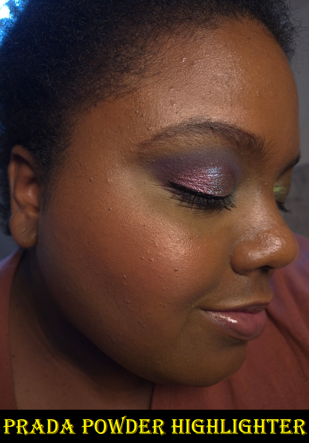
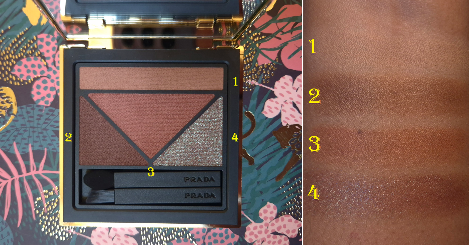
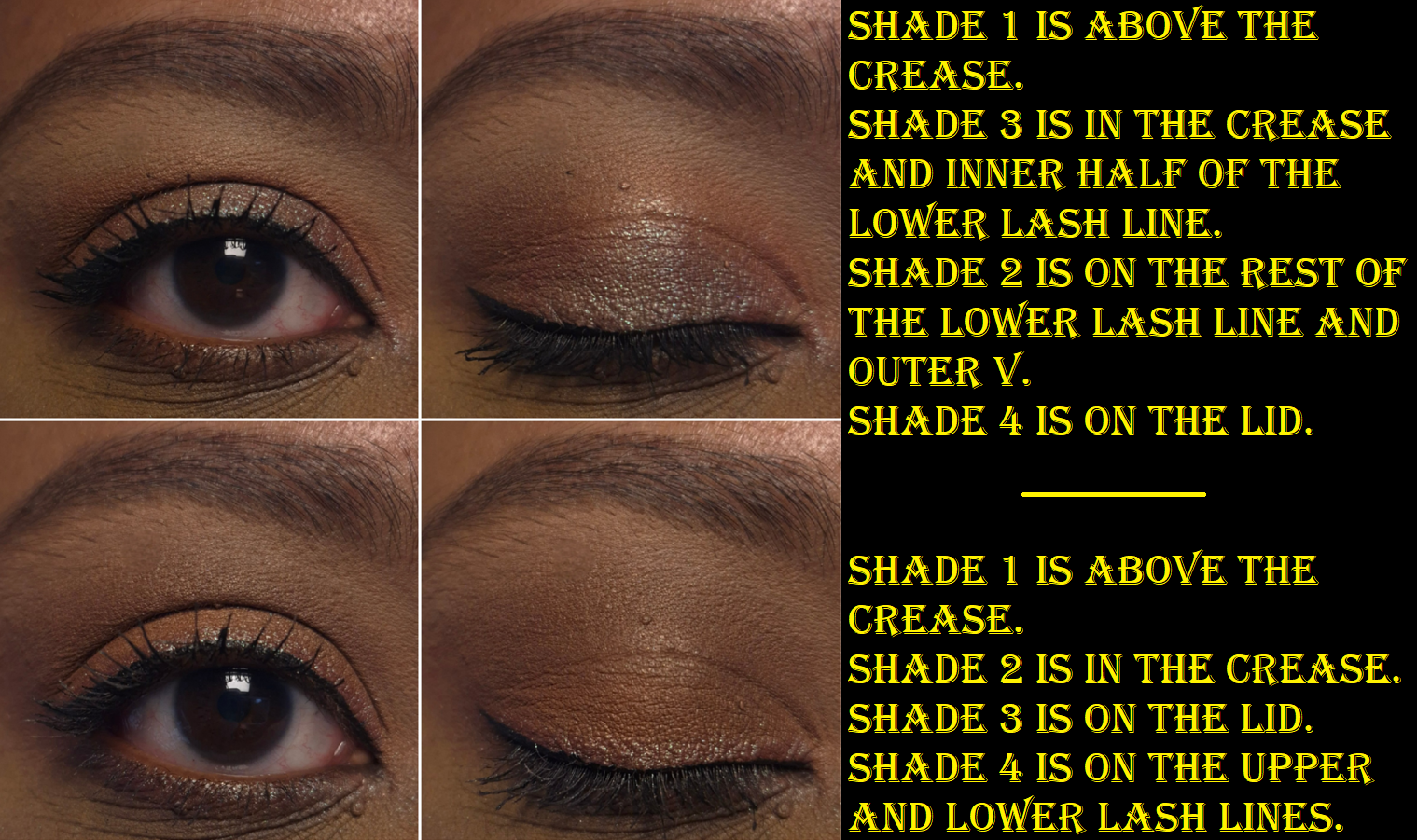
Prada Holo Nude Eyeshadow in 09 Primula
Everyone said this formula is creamy, but my goodness, they were not exaggerating! They feel like cream-to-powder formulas. In fact, they’re so creamy that I’m amazed they are still solid powders. The most comparable eyeshadow formula I can think of that’s not technically cream-to-powder are the ones from YSL, but the Prada eyeshadows are more moisturizing and creamy. These have a pigment level that’s between Lisa Eldridge Velvets and and her Seamless Mattes, but these don’t feel as firm/compact in the pan. I use natural hair packing shader brushes and the Sonia G Fusion Eye Builder to speed up the process of loading on the color, as the eyeshadow payoff is the soft buildable kind, but I also want a diffused edge without needing to spend as much time blending it out.
I am very unlikely to hit pan on these, but I would like to point out that the long rectangular strip across the top is quite annoying to fit my brushes into there. I hope Prada will come out with a different pan layout in the future.
I like that this color story is a bit sultry, but I can’t create as much depth and dimension as someone else could who has a lighter skin tone than mine. Primula still looks pretty on me, but after the testing phase ended, I started using the darkest shadow from VBB’s Victoria palette in the outer corner, but just enough to keep the overall look still soft by my standards.
Shade 1 is useful in blending out edges and keeping the area looking clean between the crease and brows. Shade 2 adds depth. If that color couldn’t be deeper, then I wish the brand made Shade 3 a little lighter for a greater difference in color value and not just Shade 3 being warmer. Shade 4 looks gorgeous in the pan. Based on photos I’ve seen, I do believe the shimmer in Primula is the prettiest of the three palettes in the Holo collection. However, even if I wet the eyeshadow, I still find it to be a little less impactful, shimmery, and shifty than I hoped. The red base just kind of blends in too much with the two warm toned shades, especially Shade 3. I like a gentle gradient sometimes, so this palette is great for those moments. In the phase I’m in currently, it’s a little less suited to my eyeshadow preferences.
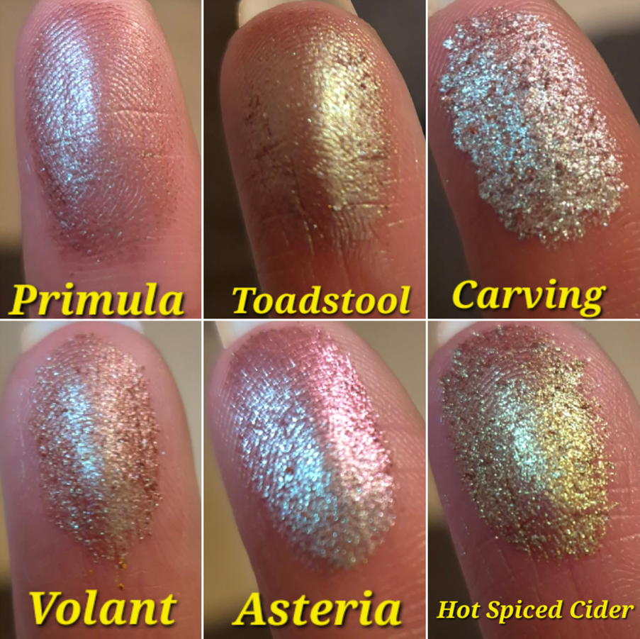
I don’t want to take away from how happy I am that a luxury brand is including atypical colors in their palettes. And I do understand that putting a shade like Asteria by Devinah Cosmetics instead might be too bold for the kind of customer luxury brands try to sell to. I just don’t want to overlook the fact that what drew me to this palette in the first place can still be found in my collection. I can’t find mattes of Prada quality from indie brands, but the shimmers are another story. I don’t have to pay Prada prices to get it.
Because these eyeshadows are smooth, but not reliant on overdoing it with dimethicone to get that smoothness, I don’t have issues with creasing. I don’t have any problems with adherence or longevity either.
Overall, the quality is fantastic. I purchased this at a discount from Douglas, but it’s still quite expensive for a quad. I won’t say that I’m never purchasing another one, considering I’ve purchased Gucci and Guerlain palettes for a similar (discounted) price, and the Prada quality is superior to theirs. I would just need to stick to my normal criteria in being excited about the majority of the palette colors, if I were to buy one more.
I mentioned that I am no longer safe from being tempted into buying more makeup from Prada, but that’s in the future. For now, I’m content with the two products I have, especially the highlighter.
That’s all for today! Thank you for reading and I hope this has been helpful.
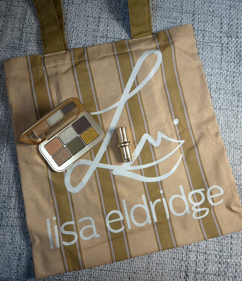
Lisa Eldridge recently launched her summer collection consisting of an eyeshadow palette, three lipsticks, and two tote bags. The only items I’m missing are the Toasted shade of lipstick and the Olive/Lavender tote.
There are currently three tiers in the brand’s reward program, with Emerald being the highest. Emerald members were able to shop a day early and could add one of the bags to their orders for free without a minimum spend amount. Otherwise, all other customers could get the tote for free with a purchase of €90 or by paying for it outright at the cost of €18. So, I ordered the Desert Gleam palette and Rae from the official website and added the free Olive/Camel tote.
Niche-Beauty sells Lisa Eldridge products, and frequently has 20% off codes available, but one can only get a tote there by hitting that €90 minimum spending price. So, it turned out for the best that I placed my original order with the Lisa Eldridge website, and then when the new products launched at Niche-Beauty a week later, I bought Lili.
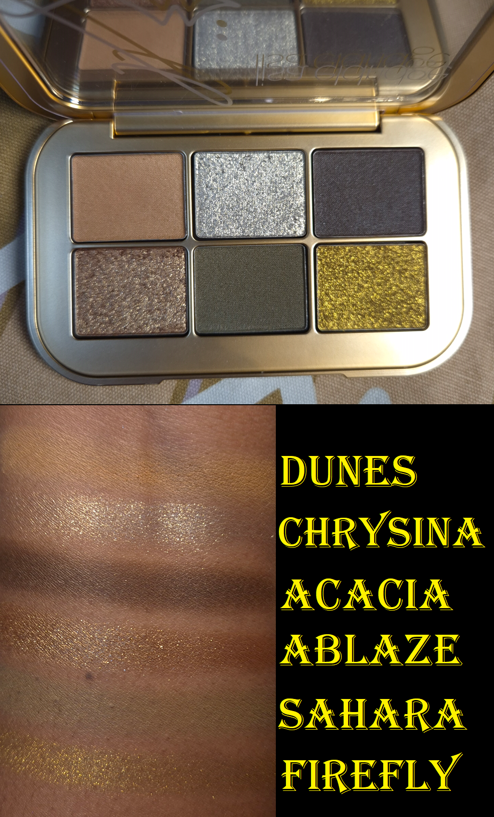
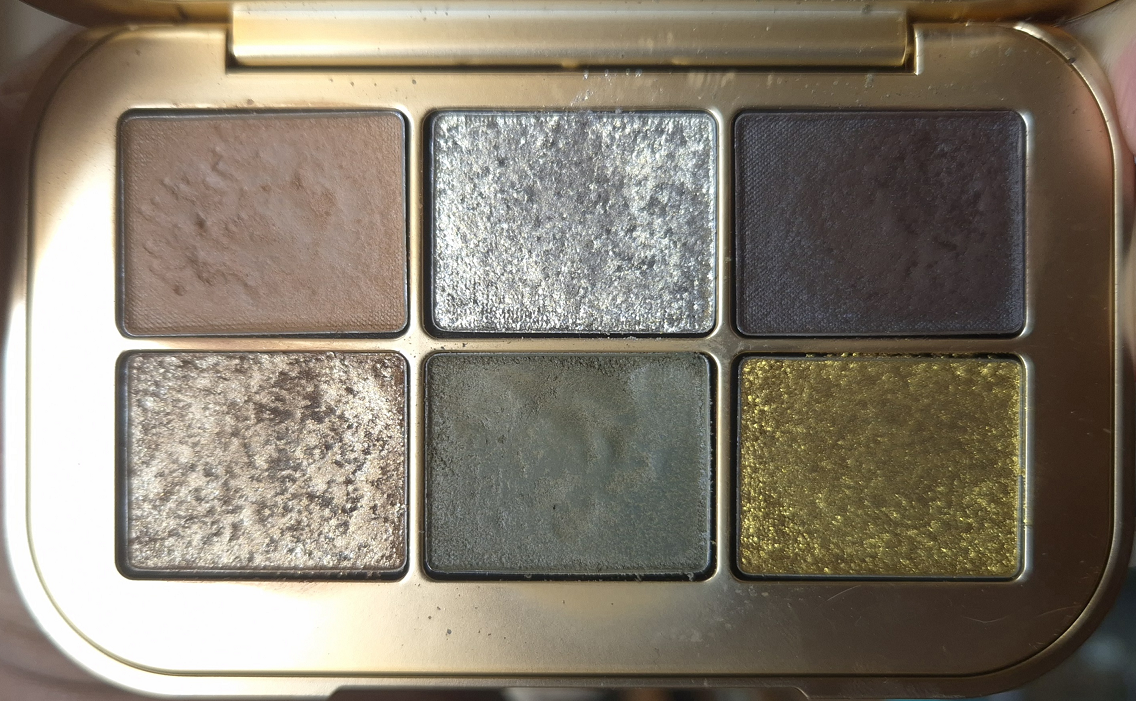
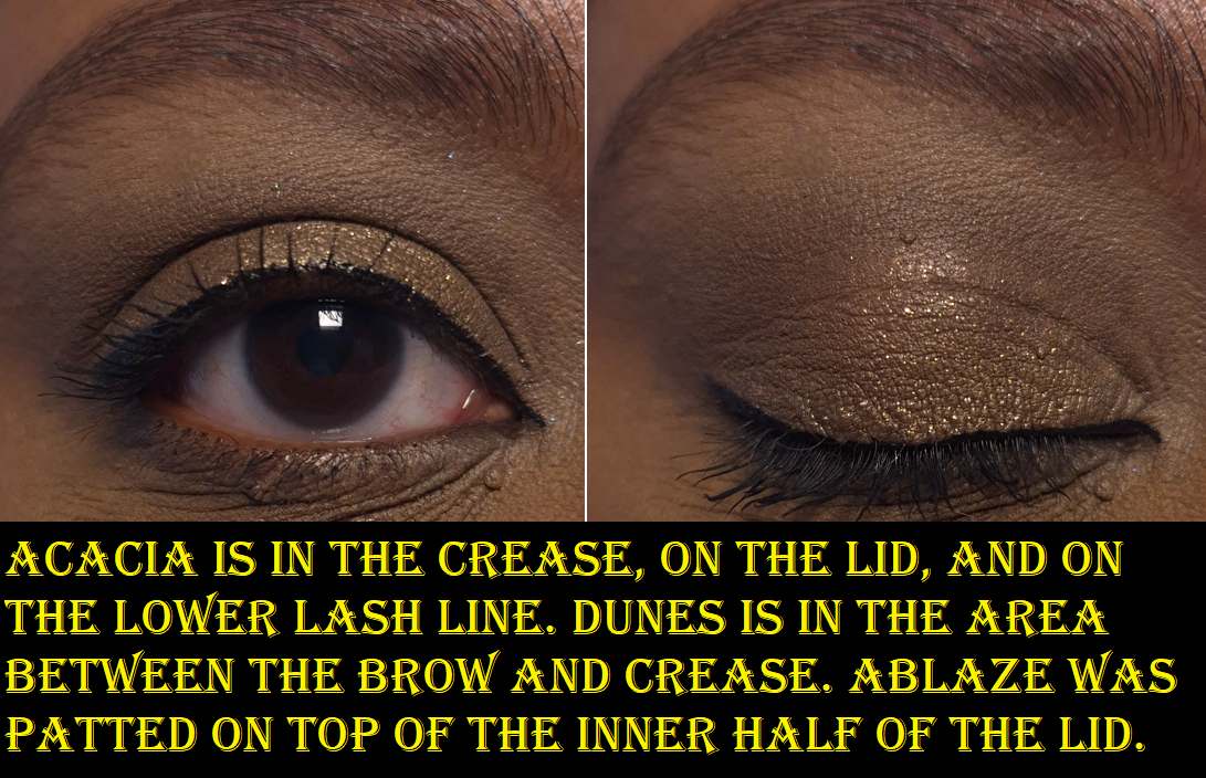
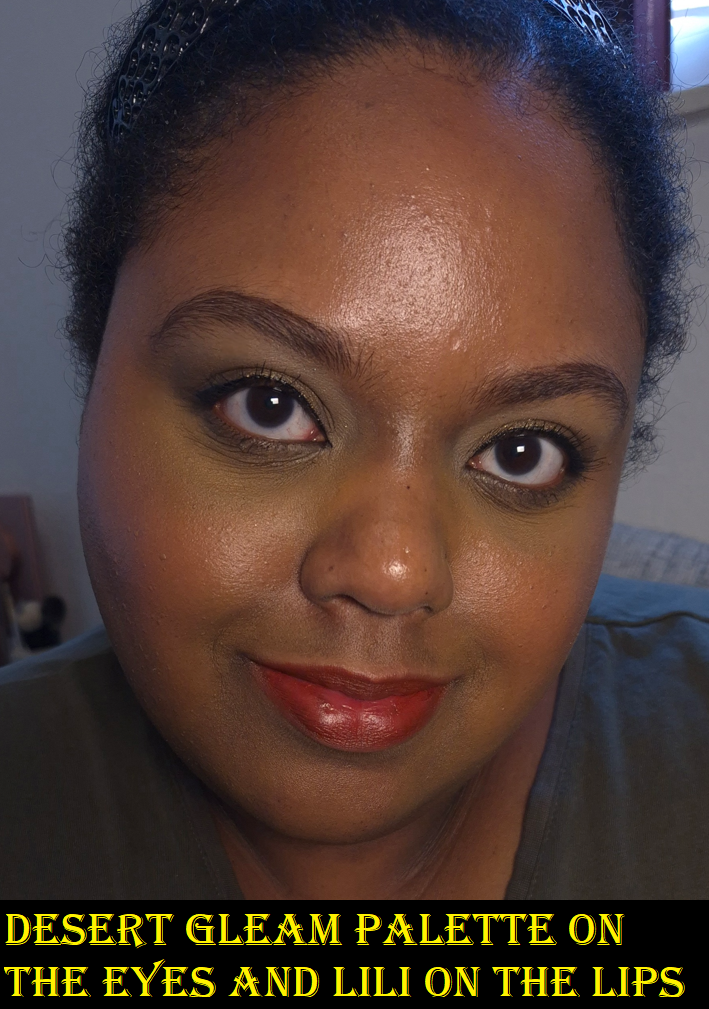
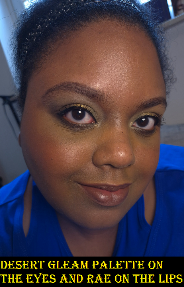
Desert Gleam Palette
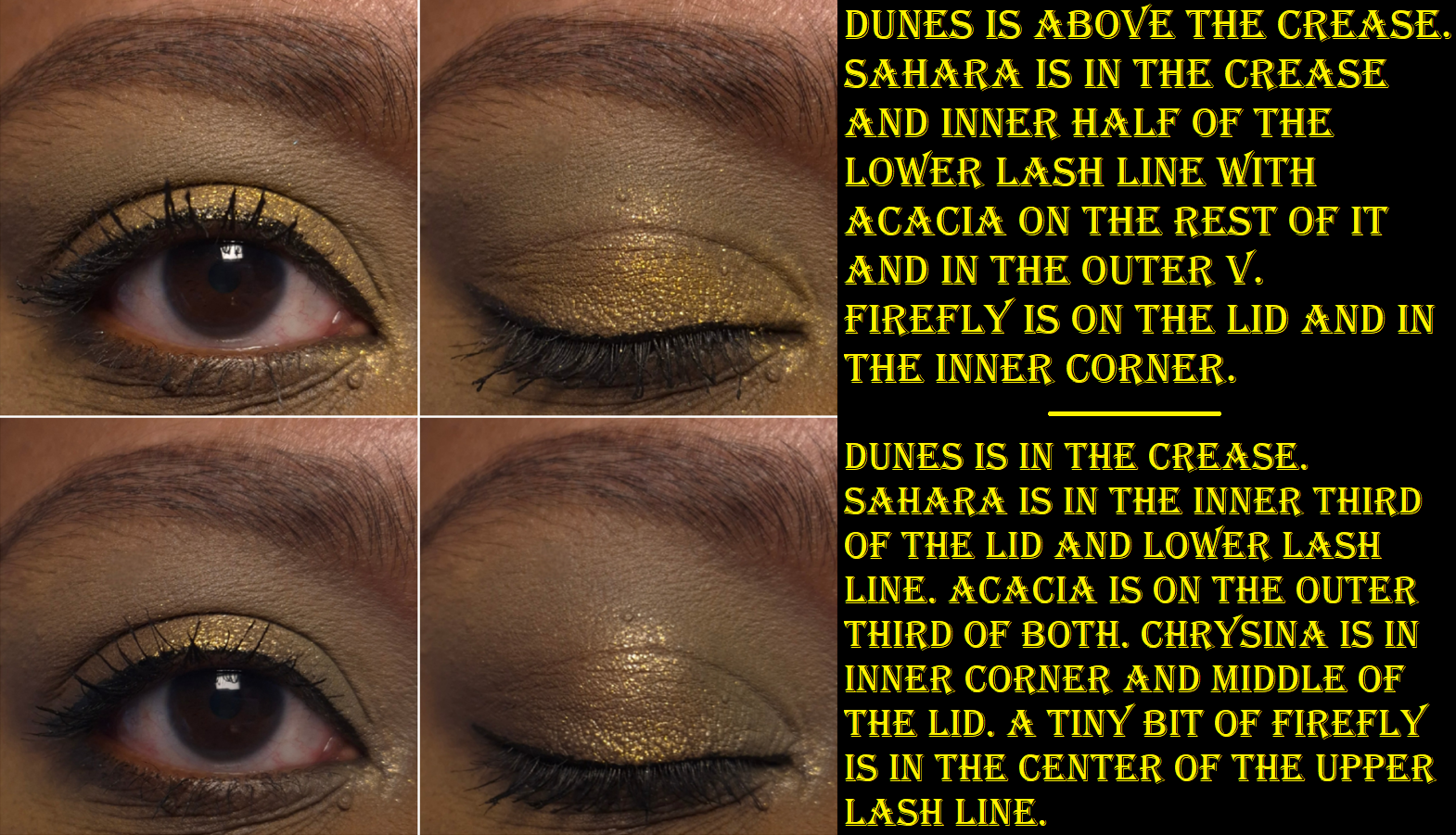
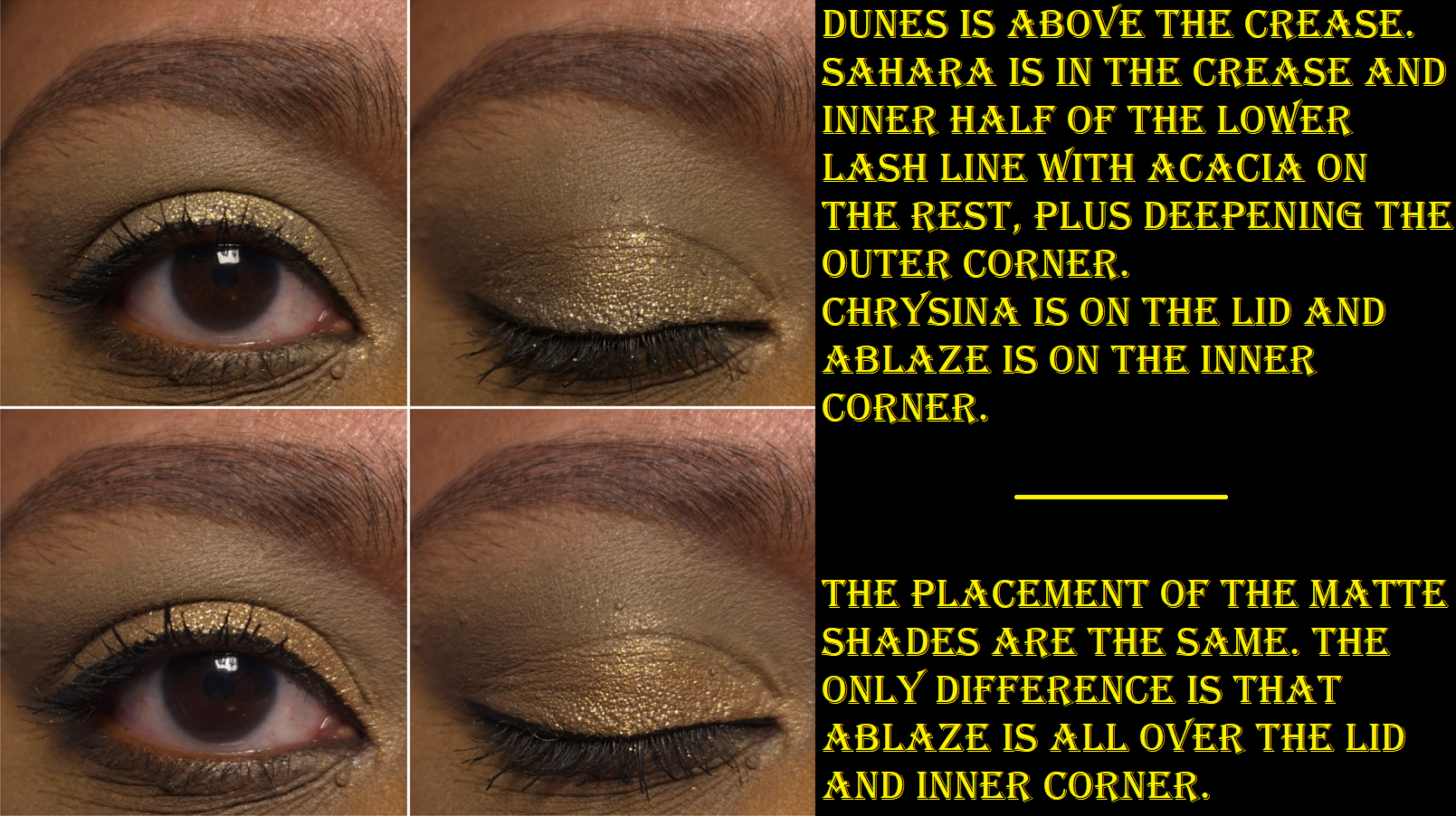
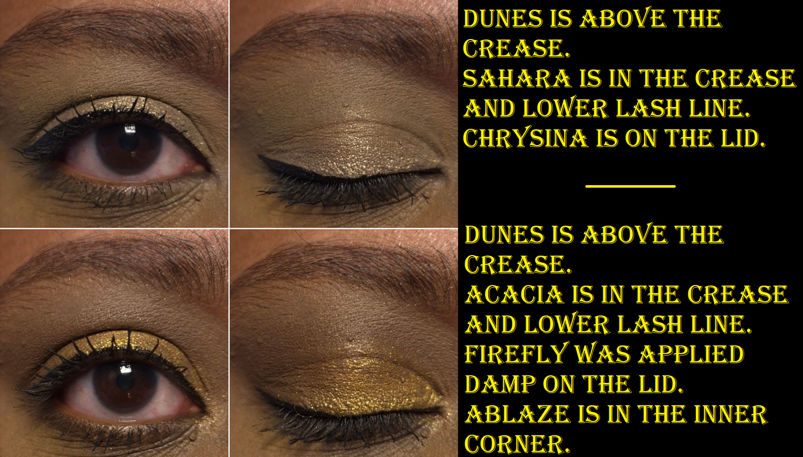
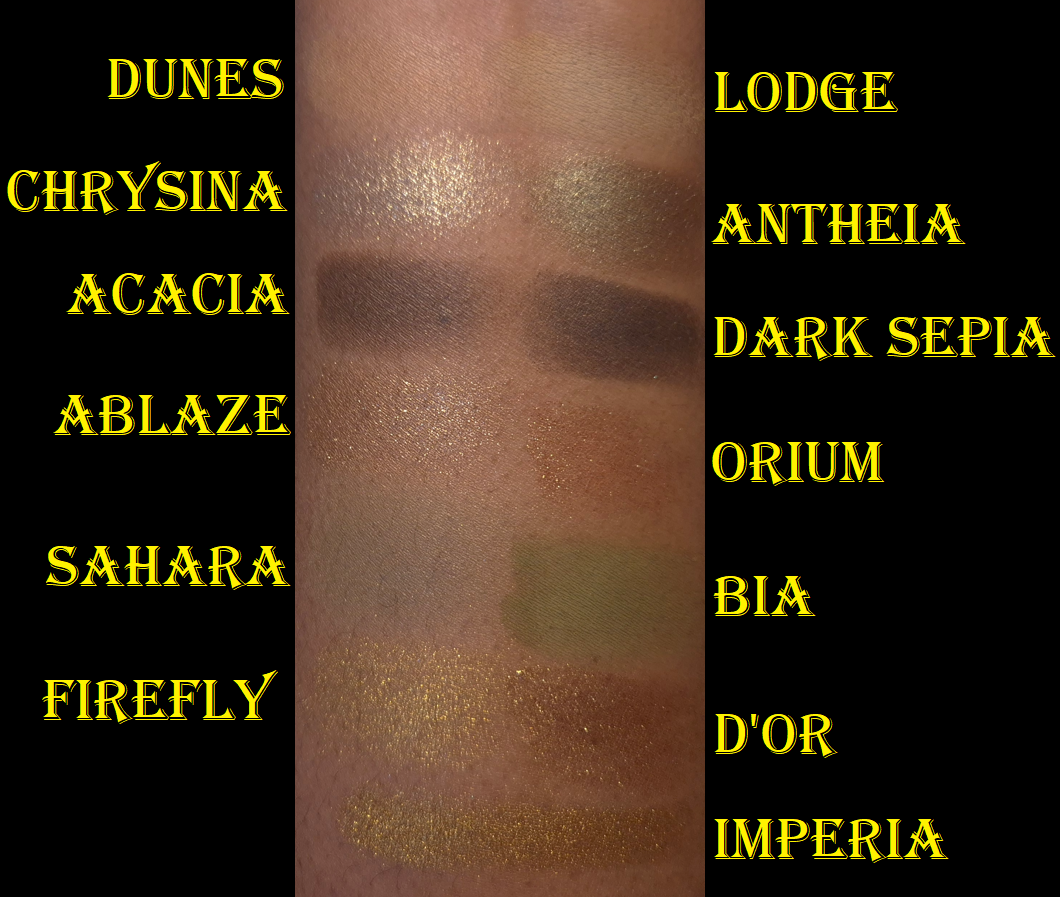
Dunes and Acacia are Seamless Mattes. I wrote in-depth descriptions of the different formulas in a past review, but the short version is that these mattes are similar in texture to Natasha Denona’s cream to powder formula, they are more pigmented than the Velvets, and have the tiniest bit of a wet (but not shimmery) sheen. Dunes is very difficult to see when applied to my eye area because of my skin tone, but I can tell it’s there because of the blurred look it has, especially when applied to the edges of a darker shadow to soften it up. Acacia is now my darkest matte from Lisa Eldridge. Although I wish it was the tiniest bit darker, it at least successfully adds depth to my eyeshadow looks and I can build up the intensity.
Most of the time, the Seamless Mattes are creamy and a joy to work with. However, the shade Supernaturally from the Fawn palette was stiffer, drier, and less pigmented. So, that shade is one I stopped using out of frustration. Within the Desert Gleam palette, I got hard-pan on Dunes*, and I’ve had to scrape off some of the surface after just a week of use. It is normal for all the mattes to look like they’re going to hardpan, but this is the only time I’ve actually been unable to pick up product and needed to clear off the surface. I alternate between using brushes and my fingers with all Lisa Eldridge eyeshadows, but this is the first time I’ve encountered this problem. Going forward, I will just use brushes with this shade to try and mitigate the issue. I’ve had no troubles with Acacia though.
*Update: I was chatting with Fedaro Beauty, who has reviewed this collection as well, and I remembered one change I made this week that could have affected Dunes. For many years I’ve been using the officially branded Makeup Erasers that are microfiber cloths. However, I switched to using Marushin cotton cloths that were free gifts with purchase from my Fude Bobo orders. Microfiber absorbs more oil than cotton, so it is actually possible my fingers had more oil residue left on them between uses than usual and could be responsible for the hard-pan on Dunes. This may be a long shot in providing an explanation, but since this is a possible cause, I felt it was important to share this theory.
Dunesafter I scraped off some of the surface.
Sahara is in the Velvet formula, which gives an even and soft layer of color. I prefer to use my brush to pack on the shade and build it up. I’m honestly surprised it shows up as well on me as it does, because I thought it might be too light of a color. I’ve also seen how this shade can look a lot more khaki-yellow on some people, but it’s greener on me. The Velvets are smoother in feel, and swatch beautifully, but over an extended amount of time, I have noticed mine got drier. Sahara is too new for me to have this problem, but it’s something I wanted to mention that I have noticed out of my oldest Velvet eyeshadows. I can still use them, but building up the color to get the payoff I want takes more effort than before. For those that enjoy soft or muted eyeshadows, this is unlikely to be an issue.
I forgot to mention that in the first eye look in this photo, Sahara was used on the lid before I added Chrysina on top. So, it looks warmer and slightly darker than the first eye look in the photo below where only my eyeshadow primer is under Chrysina on the lid.
Chrysina is a Luminous shadow. It looks silvery green in the pan, but there’s still a touch of gold that I can see at certain angles in the light. For this reason, I like this shade more than I expected. I would go as far as to call this a duochrome, though it’s nowhere near as intense as Mercurial, which is another Luminous eyeshadow.
Ablaze and Firefly are Metallics, but Firefly looks so much smoother in the pan, as seen three photos higher. The textural differences don’t affect anything. I just thought it was interesting. Ablaze is an easily wearable golden brown that is perfect for creating neutral eye looks. I have a lot of warm golds in my collection, but I don’t have many shades of gold with this tone, as silly as that might sound. It’s still not a necessity for me to have in my full collection, but I think a shade like this aids in keeping the palette color story versatile. Firefly seemed intimidating to try and incorporate into my eye looks, but as long as it’s framed by Sahara or Acacia in the crease, it works. Ablaze is also neutral enough that it doesn’t clash if they are used next to each other.
I have no issues with longevity or creasing, I can use these with any of my eyeshadow primers, and I can use the shimmers with a damp brush to build intensity. I have no problems with these eyeshadows, other than what I already described with the shade Dunes and the Velvet formula in the long-term.
When I first saw the Desert Gleam palette, there was no way I could talk myself out of getting these shades, despite it reminding me of my eyeshadows from Natasha Denona. It has a similar vibe to the Mini Gold, it reminds me a lot of my custom version of Metropolis, and I also have the Yucca palette. However, when I actually swatched the shades and compared them, they were different enough on my skin tone for me to not consider them dupes.
Please excuse the fact that the skin under Bia wasn’t completely dry, so it looks a little more intense than usual.
If I’m being 100% honest with myself, I prefer the Natasha Denona Mini Gold Palette over this one. I’ve come to accept that high contrast makeup looks better on me, and there are greater depth differences and more color/shade distinctions between the eyeshadows in Mini Gold than Desert Gleam. I’m still attracted to the Desert Gleam colors, and I’ve gotten quite a lot of compliments while wearing the products in this collection. However, I think the ND shades are even more my style. In terms of performance, the Mini Gold eyeshadows aren’t creamy feeling, but they still blend very well, layer well, and build quicker because they’re more pigmented. It’s kind of a moot point because I believe the Mini Gold has been discontinued, so it’s not an option to purchase for anyone who doesn’t have it already. What I’m essentially trying to say is that even though I have products I technically like more than Desert Gleam, I would still feel like I was missing out if I didn’t pick up this palette.
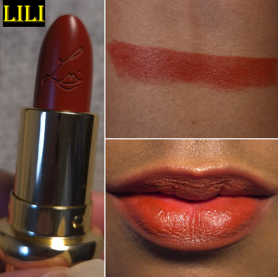
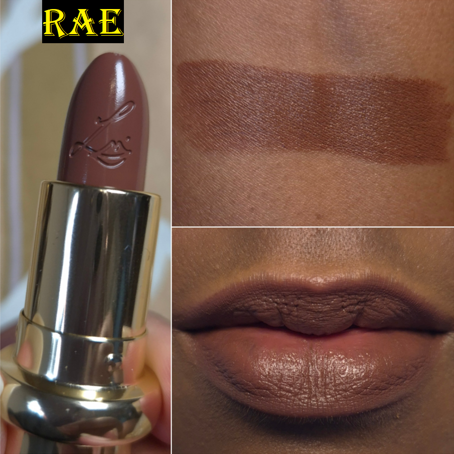
Rouge Refillable Lipsticks in Lili and Rae
Lisa Eldridge and I share the same nickname! Even though I rarely wear red lipstick, I still wanted this one for the name. What can I say! I’m easily swayed!
The way this lipstick performs is no different from the first round that launched at the beginning of this year. They glide over the lips easily and feel like a cross between a balm and a lipstick. This shade is vibrant, but I can still see the discolored/darker pigment spots on my lips underneath if I stick with only one swipe. So, an additional pass or two is needed to be opaque. It feels quite comfortable on my lips, though I get minor chapping by the end of the day.
I own an engraved lipstick case already, so I only needed to purchase these in refill form. My cap/lid for Lili is very loose, so I keep it stored in all the original packaging to prevent any accidents in my makeup pouch, but I’m contemplating raiding my husband’s tools to find pliers that will tighten the cap a little (hopefully not too tight to the point that I can’t pull it back off)!
For some reason, Rae feels much creamier than the other four lipsticks I have from this line. It feels more moisturizing as well, which increases my comfort level while wearing it. However, this one does not have the same kind of grip to it that keeps it longer-lasting like the others. Even if I’m not eating or drinking, within a few hours there is noticeably less lipstick on my lips. I think my skin absorbs it. So, I find myself needing to reapply more frequently. I can’t explain why this is happening because Rae has the same ingredients as all the rest. It’s my favorite shade though, so I’m going to just deal with it! I normally don’t like wearing dark lipsticks because I feel like most of them age me, but this is an exception!
So, that is everything reviewed except the Tote bag. I don’t have much to say about it except that it’s made of a nice material, feels sturdy, and it has a cute and functional zip pocket on the inside. It terms of size, it’s a few millimeters smaller than my smallest canvas shopping bag. I wanted a fancy reusable grocery bag, but this looks almost too nice for that purpose. That’s all I use totes for, so perhaps I could reserve it for times I shop at the city market instead.
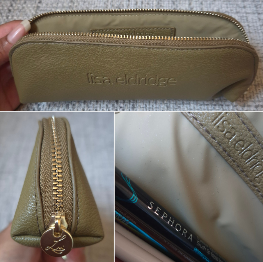
I don’t think I’ve shown the pencil case before, which I also like from the brand. I find myself using and liking the Lisa Eldridge accessories, so it’s a big draw for me continuing to purchase from the official website to get them.
Now, that’s everything! I hope this post has been helpful. I tried to complete it as soon as I could, and it helps that I’m already familiar with these formulas from Lisa Eldridge, so I don’t have to test them for as long.
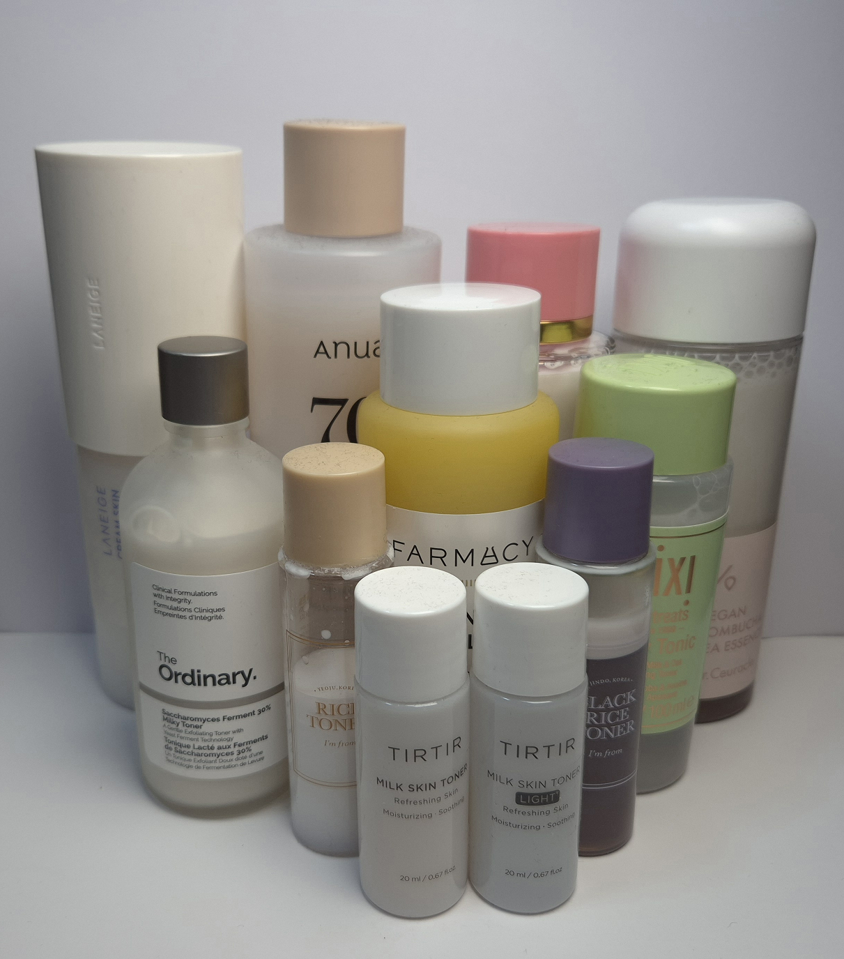
I contemplated making a post like this a year ago, but I wasn’t putting as much effort into it until December 2024. My plan was to make a super detailed in-depth analysis of every product to decide once and for all which of these reigns supreme. The honest truth is that nearly all of them are good. The differences that I can see and feel are minor between them. The bottom line is that if someone is only concerned with hydration and skin softening (which was a big issue for me in winter), nearly anything labeled a “milky toner/essence” will do. Some of these are new purchases that I’ve only had for a few weeks, but the rest range from three months, six months, and a year+.
STATS: I had normal skin when I was younger, normal-to dry in my 20’s, and now in my 30’s I have just dry skin. I don’t have a set skincare routine. The only product types I use consistently are cleansers and sunscreen. I double-cleanse with Bioderma Sensibio H2O Micellar water and Lisa Eldridge Skin Enhancing Treatment Cleanser. For years I used the Round Lab Birch Juice Sun Cream SPF 50+ PA++++ (Korean version not US), although I’ve been testing two other sunscreens this year instead. I use a toner or essence several times a week (many different ones) and add a moisturizer whenever it feels necessary (many different ones as well). Even though I have dry skin, it’s easily prone to pore clogging if the moisturizer I use is too thick and heavy. So, I need truly hydrating ingredients to seep into the layers of my skin and also have a thin occlusive barrier that lasts all day. My second problem with traditional moisturizers is that most of the ones that don’t clog my skin also don’t remain on the surface for that long. Hence my absolute love of milky skincare!
TESTING PROCESS: The products in the rankings (excluding Pixi) went through at least 1-2 rounds of being used for one week straight. In addition, I did a ton of side by side tests, putting one toner on one half of my face and another toner on the other side to be able to compare them in real time from morning until night. The toners went head to head with the same brands for a minimum of three consecutive days. I did some tests on bare-face days and others underneath makeup. To test the effectiveness on even more dehydrated skin, I would sometimes apply the product to my legs, arms, knees, and elbows. There were plenty of breaks between tests, as it’s a struggle for me to be consistent with a skincare routine.
Ultimately, I’m not a scientist or dermatologist. I don’t even consider myself to be a skincare enthusiast. However, I still want to have good and effective products, so I’m forced to try out a lot of different skincare to find what will work the best for me. I’ve done this process to the best of my ability and the best ways that I know how, but this is still not a guarantee that others will have the same negative or positive results as me. I normally don’t post about skincare, but since I was taking on this project for myself, I figured it could still potentially help others who are interested in Milky Toners, but don’t know why to choose one over another.
DISCLOSURE: There are no affiliate links in this post. I am not being sponsored by any of the brands mentioned. I purchased everything with my own money except the TirTir Milk Skin Light which was a free gift with purchase from YesStyle when I was buying makeup on the website. The only thing I have is a referral link and the reward code G9UHT8 that was generated for me as a regular customer that YesStyle creates for every account holder. I think the codes gives a 5% discount, but I have often found codes floating around online or in the email newsletter that give 8-15% off. So, I encourage anyone to look for better codes instead.
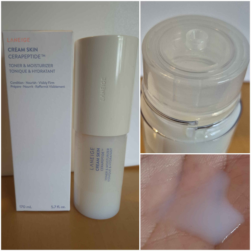
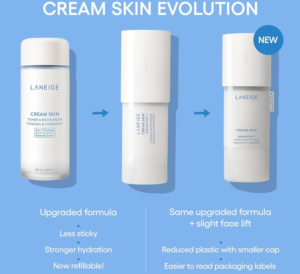
This product has undergone so many name changes, reformulations, and packaging updates, but the only change I’ve been able to detect is that it’s slightly lighter in consistency. I’ve been using it since at least 2021 and it’s one of those skincare products that actually makes a huge difference in my skin.
This is the product that sparked my curiosity about all of the others, and when it comes to deciding which milky toner fits my needs the best, it is this one from Laneige.* What puts it above the others is the longevity factor and it being emollient, but not sticky. I can still feel it on my skin when I wear it overnight. It clings to my face and keeps the surface continually moisturized, which is a godsend in winter in Germany. Even though it’s able to hydrate and moisturize, it’s particularly great at locking in that moisture. So, anyone who hates feeling product still on the skin might not enjoy this one. However, the residual product on the skin doesn’t bother me the way it can with some of the other milky toners I’ve used.
One other thing I want to point out is that if you buy this product, make sure everything is properly tightened. I thought my latest bottle had a leak, but even though the outer cap was on tight, the innermost cap was actually loose. Once I twisted that to tighten it, everything was fine.
Some of the ingredients in this worth highlighting are the Glycerine and various Glycols, Meadowfoam Seed Oil, Squalane, Hyaluronic Acid, Ceramides, and Camellia Sinensis Leaf Extract.
*While I have technically found a product I like more than the toner from Laneige, I am hesitant to demote it to second place because I haven’t tried the other one long enough to stand the test of time. I need to at least try it in winter to know for certain.
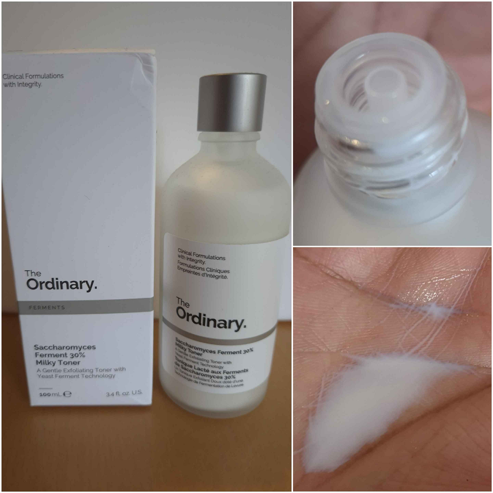
The Ordinary Saccharomyces Ferment 30% Milky Toner
This is the second oldest product I have in the bunch. From a sensory standpoint, I love that this was the most milk-like. It has a very weak natural scent, a bit like bread, which is probably from the yeast extracts. It keeps my skin moisturized and soft, but it’s supposed to be exfoliating and brightening as well. I don’t know for certain if it actually brightens, but I can at least vouch for having less dry patches the next day after I use this. And it still does an overall decent job of making my skin feel less dry. It also doesn’t leave a film behind once enough time has passed for it to fully soak in. So, I like this product and the clinical-looking semi-frosted glass bottle that it’s in. It’s just not what I turn to during the months when the weather is especially cold and dry.
The hero ingredients are Yeast Extracts and Squalane.
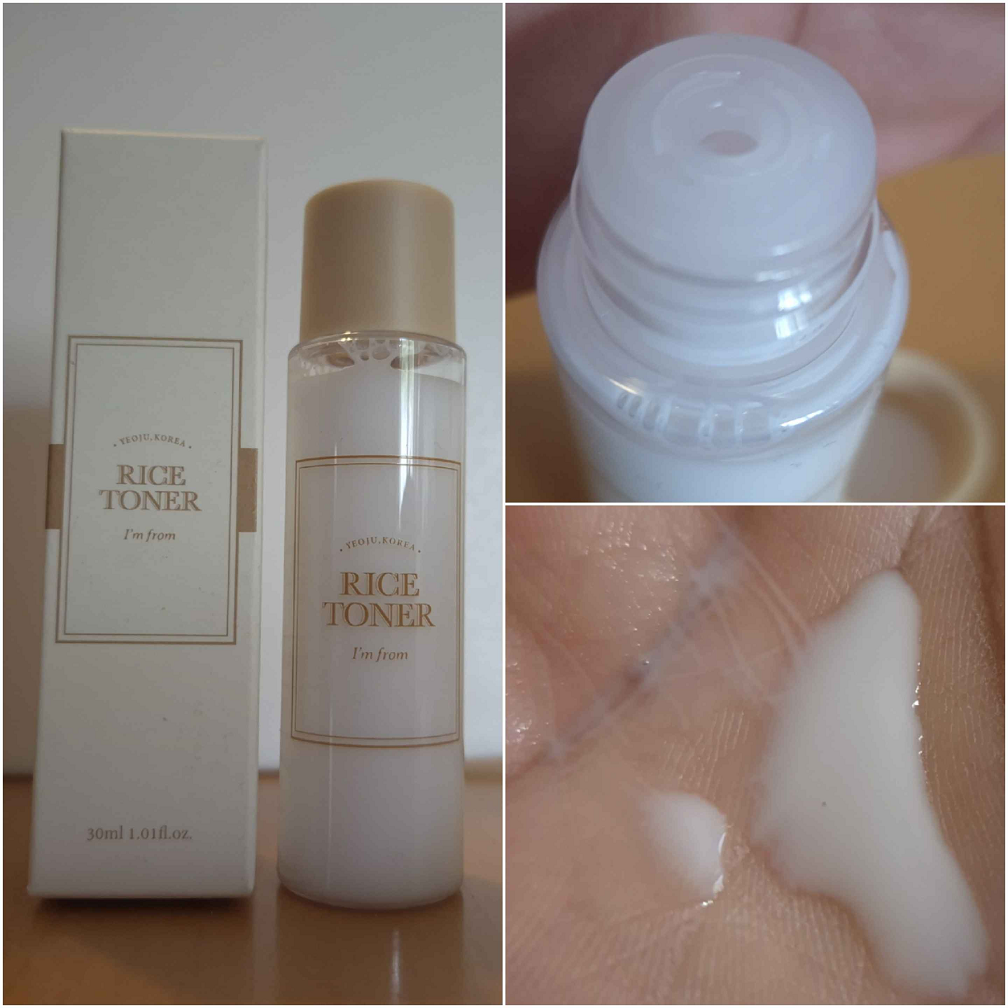
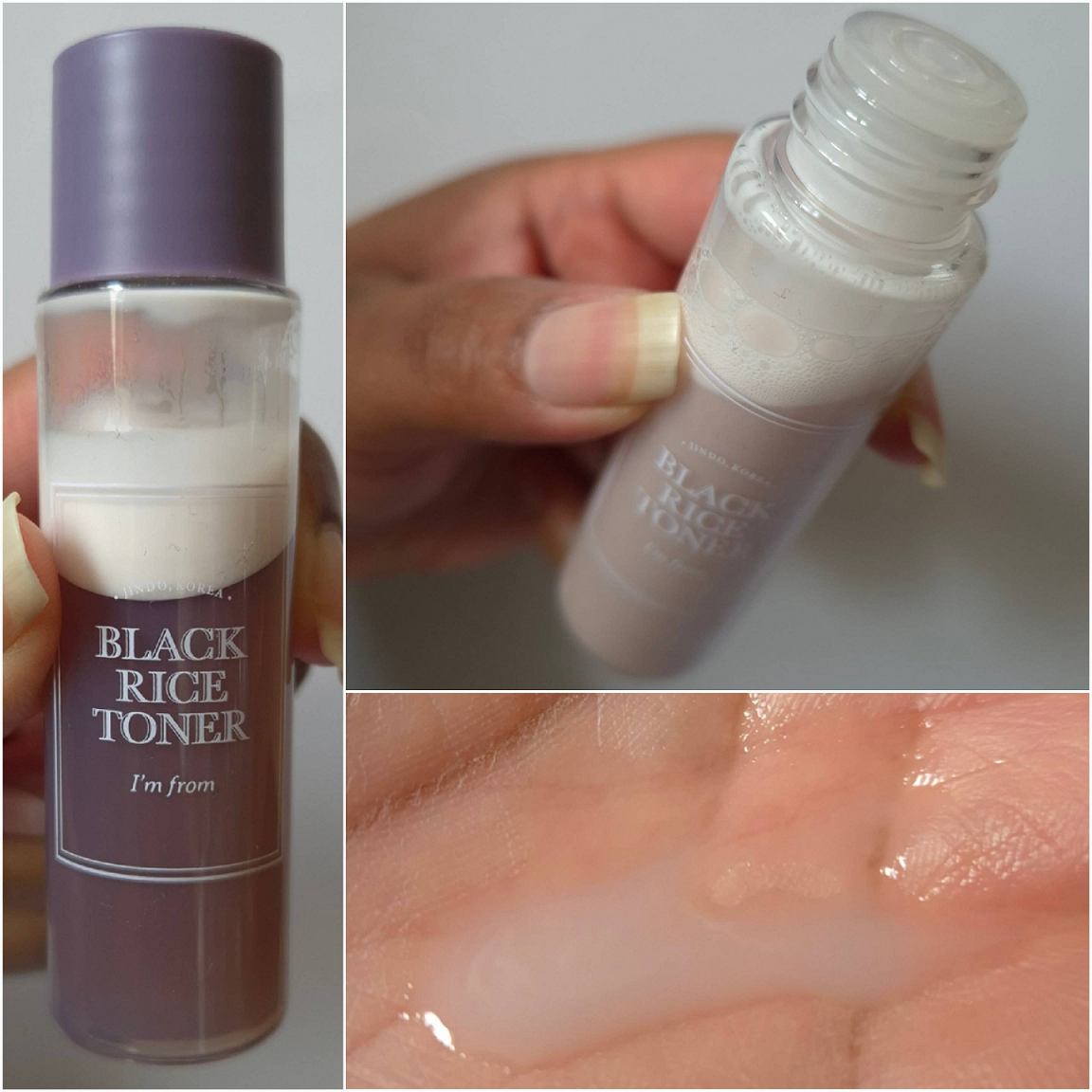
I’m from – Rice Toner (original and Black Rice version as minis)
These look like they are made up of one solid solution, but due to the bi-layer/phase, both versions need to be shaken up before every use.
Regarding the classic formula, I really like this toner as an all-rounder type of product. It seems to do a bit of everything in terms of skin softening, moisturizing, and hydrating, but also soothing. If my face feels a little irritated, I’ve noticed I’ve instinctively reached for this product over some of the others. So, this rates highly for me in the soothing department, but it performs a little weaker than the others at fulfilling the other tasks. While it works for my dry skin, I think other skin types might enjoy this too because it leaves only a small amount of residue behind on the face. This is also supposed to brighten, but I don’t notice that happening. Perhaps just a little.
With the new Black Rice formula, it is very clearly marked as being for those with oily skin. It’s supposed to control sebum production, increase skin’s radiance, soothe, balance moisture, etc. Because of the beneficial ingredients, I figured perhaps this would be something I like in summer when I want to wear only lightweight products.
Whenever I apply the Black Rice Toner, I can feel slight oiliness in random spots, whereas the rest of my face has no residue and just feels like hydrated skin. I’ve tried to shake up the bottle very well, but it might be impossible to get the two layers properly blended so that my face feels the same everywhere I touch. Any spots with the extra moisture will feel like the rest of my skin within a few hours as it gets absorbed. After several more hours, I get the impulse to want to apply more products on top. It’s just not a hydrating enough or a moisturizing enough product on its own, but it feels better in conjunction with the rest of my skincare (moisturizer, sunscreen, and so on). There could be an occasion where I still like it during summer, but I would say this is indeed not suited for dry skin.
The aspect I find strangest is that despite the Black Rice Toner not feeling hydrating enough for me, I’ve noticed I get an increased amount of closed comedones when I use this for several consecutive days. My best guess for the cause of this are those spots on my face that feel oilier than the rest because the solution isn’t mixed evenly. Perhaps I could try to rubbing the liquid in my hands first before applying it to my face, but I honestly don’t want to spend more time figuring this out considering how much happier I am using other products. For instance, the Pat Mcgrath Essence seems to contain more oil, and yet I don’t have this issue with it.
Some of the key ingredients of the original formula are Rice and other types of Extracts, Niacinamide, and various Glycols.
Besides Rice Extracts, Niacinamide, and Water, the Black Rice Toner has either different forms of similar ingredients or different ingredients entirely from the classic rice version. Some notable ones are Glycerin, Sodium Hyaluronate, Glycolic Acid, Dicaprylyl Ether, Adenosine, Polyglutamic Acid, and Panthenol.
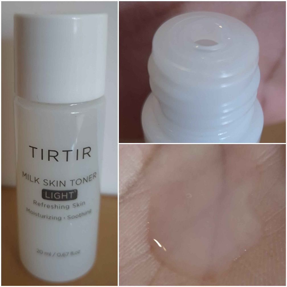
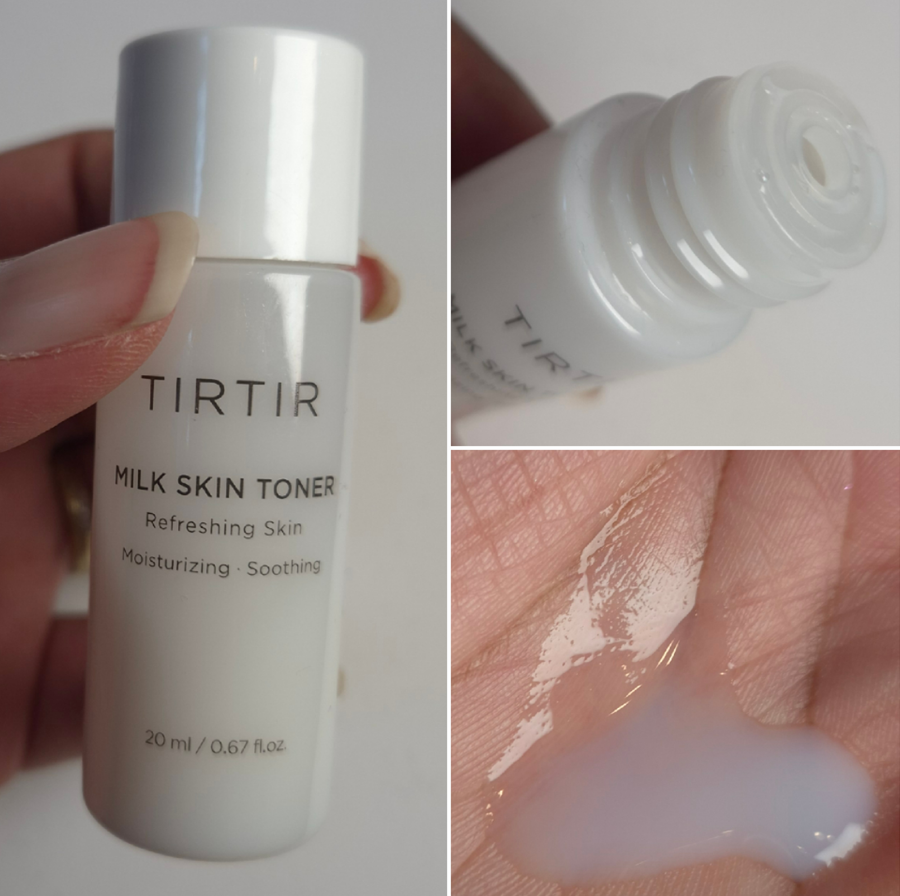
TIRTIR Milk Skin Toner (original and light version as minis)
These toners from TirTir taught me that ingredients aren’t everything. How one uses them matters. These formulas are stacked with amazing things my skin loves, but there seems to be something in them that prevents me from liking them as much as the others. Both contain extracts like Witch Hazel, Anise, and Peppermint, but I don’t know if those are enough to put them at nearly the very bottom of the list. There may be other ingredients I’m unfamiliar with preventing my skin from feeling moisturized or hydrated enough when I use them. One such possibility is the fact that I sometimes use milky toners insteadof, and not always with, moisturizer. This contains Sodium Hyaluronate, which is wonderful in humid climates, but can have opposite effects in dry ones. Where I live in Germany, and during most times of the year, it is not as humid as Florida. So, I have experienced some problems when I don’t prep my skin properly and something I used contains this ingredient.
It’s no surprise that the Light version is less suited for my dry skin than the regular version. It doesn’t have as much of an occlusive layer as some of my other milky toners (which will be a positive thing for some other people). So, even though these great main ingredients are being put on my skin, the potential water loss happening simultaneously might be working against it. However, the original doesn’t cut it for me sometimes, depending on what I use it with. When I use a normal amount of the original Milk Skin, it has the same issue as the Light version, but if I use a lot, my face feels sticky. I dislike the feeling more than the residue and film other toners leave behind. I could just change my habits and always use this with a moisturizer so I can put on a normal amount, but that’s easier said than done. For now, I prefer to keep using my milky toner favorites and then perhaps I’ll circle back to the TirTir Milk Skin original, as it’s one of the “newer” ones I’ve had (for at least three months).
Some of the ingredients worth mentioning from both versions are tons of extracts (like Rice, Licorice Root, and Oat), Glycerin, Niacinamide, Sodium Hyaluronate, Panthenol, Ceramide NP, and multiple Peptides (most interesting of them for me being Copper).
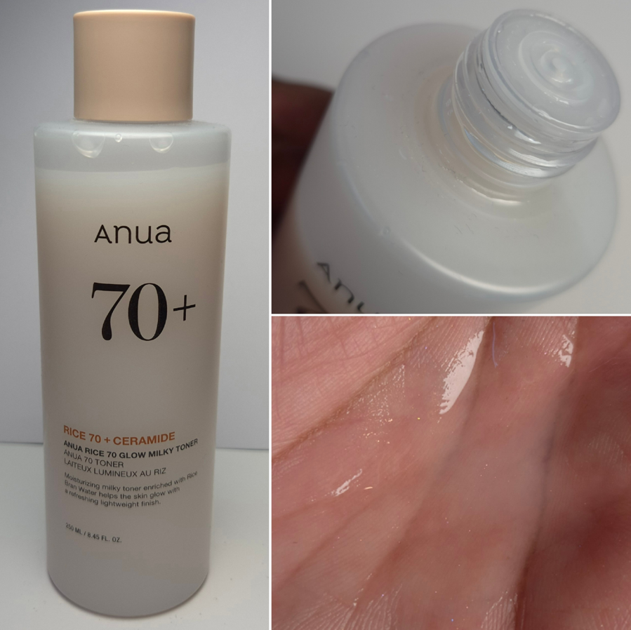
Anua Rice 70 Glow Milky Toner
This has the same issue for me as the TirTir Milk Skin. If I use too little, it doesn’t feel moisturizing enough, but if I apply too much then it feels uncomfortably sticky. This doesn’t matter as much if I apply other products on top, but it becomes an issue on my no-makeup days.
I was attracted to this product because of the mention of glow in the name. I hoped it would give me a glass skin effect, but it’s a glycerin type of shine and not the kind one gets from makeup that would have at least mica in it.
This formula is packed with a lot of great ingredients and unlike TirTir’s toner, I haven’t noticed anything in this that would be a potential issue for my skin. So, I’m a bit confused why I only like it instead of loving it considering this is among the most hyped up milky toners of the bunch. The reason it still manages to rank high for me is because of how it feels over time with back to back uses compared to others. For example, the I’m From Rice Toner feels more enriching to my skin in a side by side battle, but given enough days using the Anua Toner consistently, my skin ends up looking better on the Anua side.
Some of the interesting ingredients in this bottle are Niacinamide, Oryza Sativa Rice Seed Protein, Arbutin, Glycerin, Sodium Hyaluronate, Hyaluronic Acid, Ceramide NP and AP, Panthenol and Ascorbic Acid.
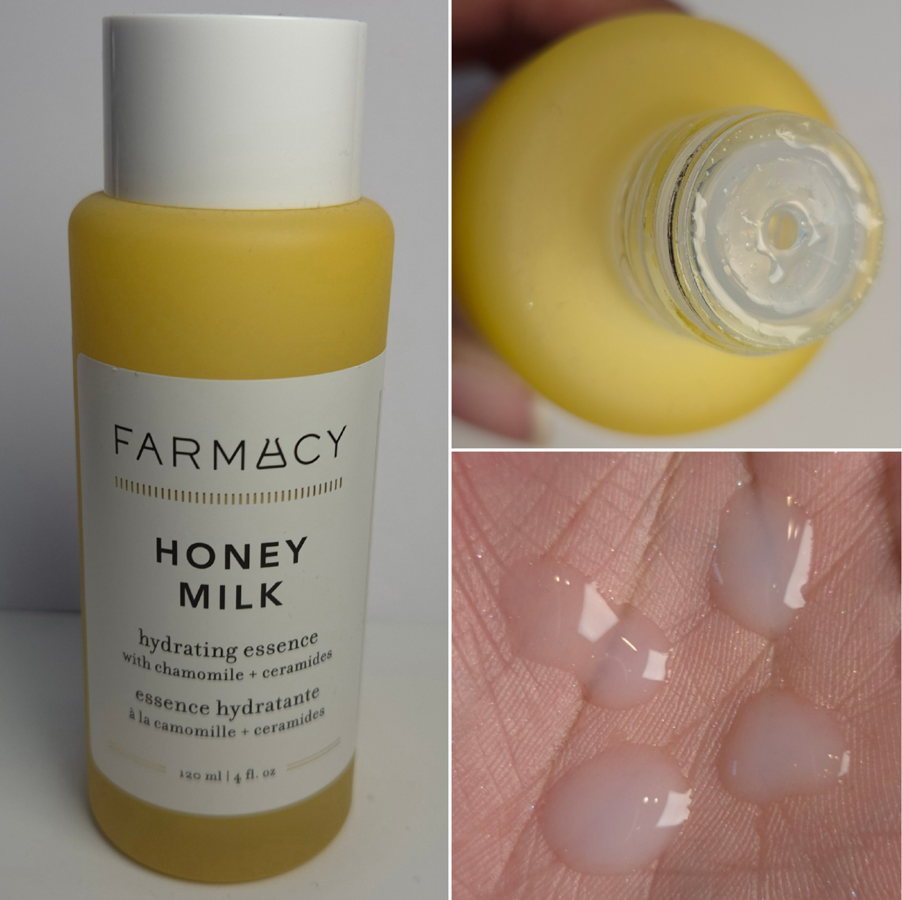
FarmacyHoney Milk Hydrating Essence
This took me a long time to buy because I was waiting for it to go on sale at the Douglas retailer. It’s one of the more expensive toners, but has definitely been worth it to me. This essence feels thick and luscious on the skin, like an actual skin treatment. The design is simple, but the yellow frosted glass bottle feels like I’m handling a luxury product.
This smells like chamomile, but for some reason the information my olfactory neurons signal to my brain registers the scent as eggnog! I have to keep smelling it for a few seconds longer to then correctly identify the chamomile. It’s very strange, but I love the smell of eggnog, so I’m glad that this is my experience without any added parfum.
My skin easily soaks up the product. Depending on my hydration level prior to use, it may or might not leave behind some residue, but it’s never an excessive amount and it doesn’t feel sticky. My face feels so soft and supple that it really gives my Laneige Toner a run for its money. I started using this in February 2025, so I haven’t been able to test this out yet in all four seasons. It’s possible this could become my new number one favorite. For now though, it’s still Laneige.
One other thing I wanted to point out is that despite my dry skin, Aloe Leaf Extract or Aloe Vera can sometimes trigger my skin to start excessively producing oil. I assume it depends on what other ingredients it is paired with, but I’ve never fully figured this out. Two products I vividly recall having this issue with (and being forced to stop using them) were the Covergirl Clean Fresh Skin Milk Foundation and the Rephr 1.0 Gentle Cleanser. Aloe Leaf Juice, which is what the Farmacy Essence contains, does not seem to have that extreme of an effect. Thank goodness!
Some of the important ingredients are Aloe Barbadensis Leaf Juice, Saccharomyces Ferment Filtrate, Glycerin, Honey Extract, Ceramide NP, Panthenol, Squalane, Arginine, Anthemis Nobilis Extract and Citric Acid.
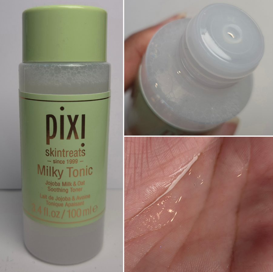
Pixi Milky Tonic Soothing Toner (travel size)
So many people love Pixi skincare, particularly their toners, but what usually keeps me away are all the potential skin sensitizing ingredients. I made the mistake of assuming there wouldn’t be any in their “soothing” milky product. Bad assumption on my part, but at least I only have the mini!
I tried this as soon as it arrived and was surprised by the soapy-herbal and partly astringent smell. It’s not a bad smell, but it’s very strong. I put it on my face and it felt soothing for about five seconds before my face started to tingle and it got a bit warm. The warm sensation only lasted around ten seconds, but the tingling persisted for a few minutes. I was surprised and alarmed by that first experience, but I thought perhaps the product was intended to have this effect. The fact that there was a slightly oily residue on my skin lulled me into a false sense of security, assuming a product with oil would only be soothing. I had completely forgotten about how easily my pores get clogged. I tested this product for another day and noticed I had some whiteheads, but didn’t figure out the connection until the third usage. Ultimately, I was still bothered by the tingling and worried it could be my skin reacting to whatever was inside, so I started doing research at that point and realized how many potentially irritating things are in here like Orange Peel Extract, Lemon Peel Extract, Mandarin Orange Fruit Extract, Citric Acid, and Sodium Citrate. There are also Clove and Lavender extracts.
There are nice things in here too, but I’m not surprised anymore why my skin was tingling. For a time, I tried to at least use this on the roughest spots of my body (like knees and elbows), but the fear of developing contact dermatitis made me ultimately stop using this.
Some people love scented products. Some people are against them to a extreme degree within clean beauty. The bottom line for me is that the uncomfortable oily film left on my skin, the strong smell, warm-tingling sensation, and pore clogging are reasons enough for me to not recommend this to anyone, no matter the skin type.
Some of the interesting things contained in here are Glycerin, Jojoba Seed Oil, Sodium Hyaluronate, multiple fatty acids, Citric Acid, Benzyl Alcohol, and tons of extracts.
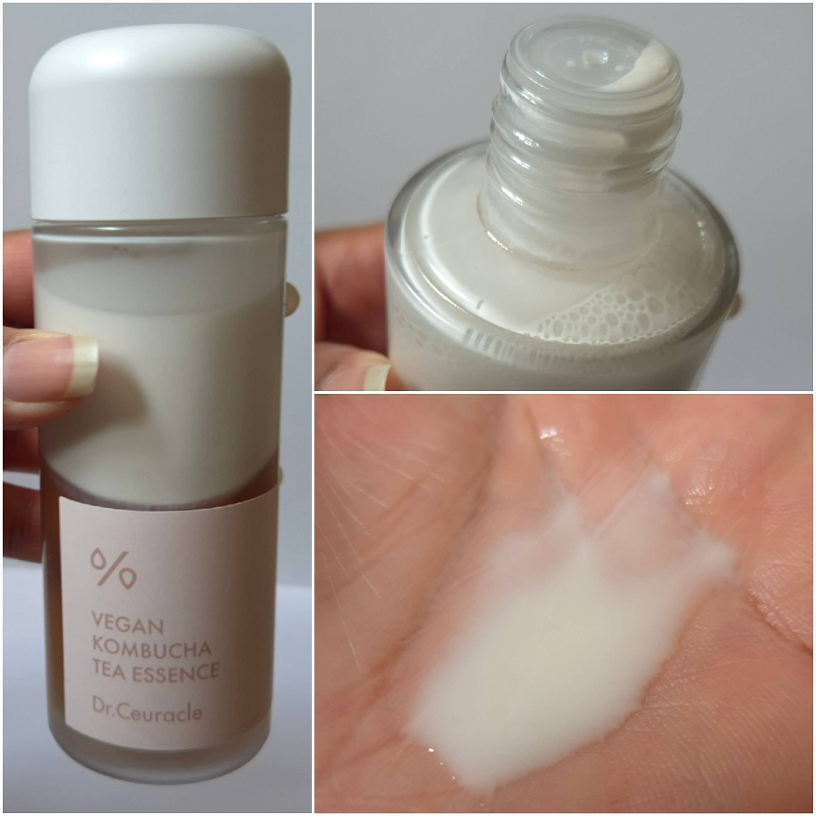
Dr. Ceuracle – Vegan Kombucha Tea Essence
I’m including this in the milky toners category because it can be thought of as a “Milk Tea” and it looks milkier after I shake the bottle to get that bi-phase mixed together properly.
I’ve wanted to try this product for a very long time, but it was always out of stock whenever I checked YesStyle’s website. So, it’s the newest one to my collection along with the I’m From Black Rice Toner that I purchased in early May.
I talked about the possibility of the Farmacy Honey Milk surpassing the Laneige one some day, but this one from Dr. Ceuracle technically has already. I’m just reluctant to say it’s definitely better without being able to confirm how it’ll perform in winter time when my skin is at its driest.
This essence feels even more nourishing than Laneige’s Milky Toner, but with an even thinner occlusive layer. I can only really feel residue if my skin is already at a good moisture level due to having used the Lisa Eldridge Cleanser Treatment. Otherwise, the Kombucha Essence seeps quickly into my skin and the surface just feels normal, healthy, and hydrated without noticeable residue. The feeling persists the entire day, and when I apply it overnight, it continues to make my skin soft and supple. It’s a small performance difference between the two, but I can at least say Dr. Ceuracle is a winner in the springtime, and most likely will be better for the summertime as well. This is also why I’m not sure if its barely-there moisturizing barrier will be strong enough to keep away my dryness in winter.
I find it interesting that the Anua toner is touted to be glowy, but hardly has that effect on my skin, whereas the Dr. Ceuracle essence provides more noticeable shine. It’s also a bit funny that the glass bottle and cap look exactly how the older Laneige packaging used to be!
One of the big selling points for this product (other than the detox claims that I’m not so sure I believe) is the balancing aspect. I do think this essence manages to do that, so this could be great for more skin types than just dry. However, if you’re someone that has above average dryness, Laneige might be the safer bet.
Some of the many interesting ingredients in this formula are Glycerin, Camellia Sinensis Leaf Extract, Saccharomyces Ferment Filtrate, Sunflower Seed Oil Unsaponifiables, Sodium Hyaluronate, Centella Asiatica Extract, and Ceramide NP.
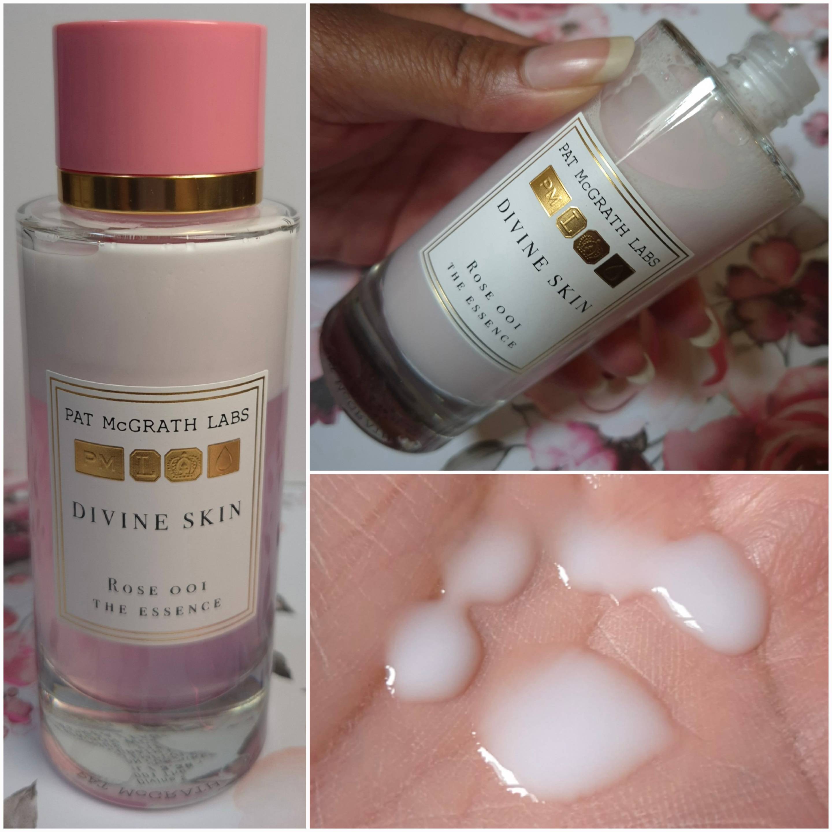
Pat Mcgrath Labs Divine Skin: Rose 001 The Essence
I reviewed this in the past, as much as one can review a deluxe sample. This reminds me of a non-greasy, yet oilier (and therefore more intensely moisturizing), version of the Laneige Cream Skin Toner. It’s a bi-phase toner that needs to be shaken up. It felt fantastic and unctuous on the skin, the bottle looked beautiful, and it smelled luxurious, but that perfume and the price is why I ultimately hadn’t purchased the full-size (until now). I didn’t think the benefits were worth the money compared to other options on the market, especially with some of its ingredients I wasn’t so fond of.
Some of the many interesting ingredients in here are Glycerin, Almond Oil, Macadamia Nut Oil, Sea Buckthorn Berry Oil, Ceramide NP, Squalane, and Panthenol, but also Rose Water and Rose Extract, Hexyl Cinnamal, Parfum, and Red 33.
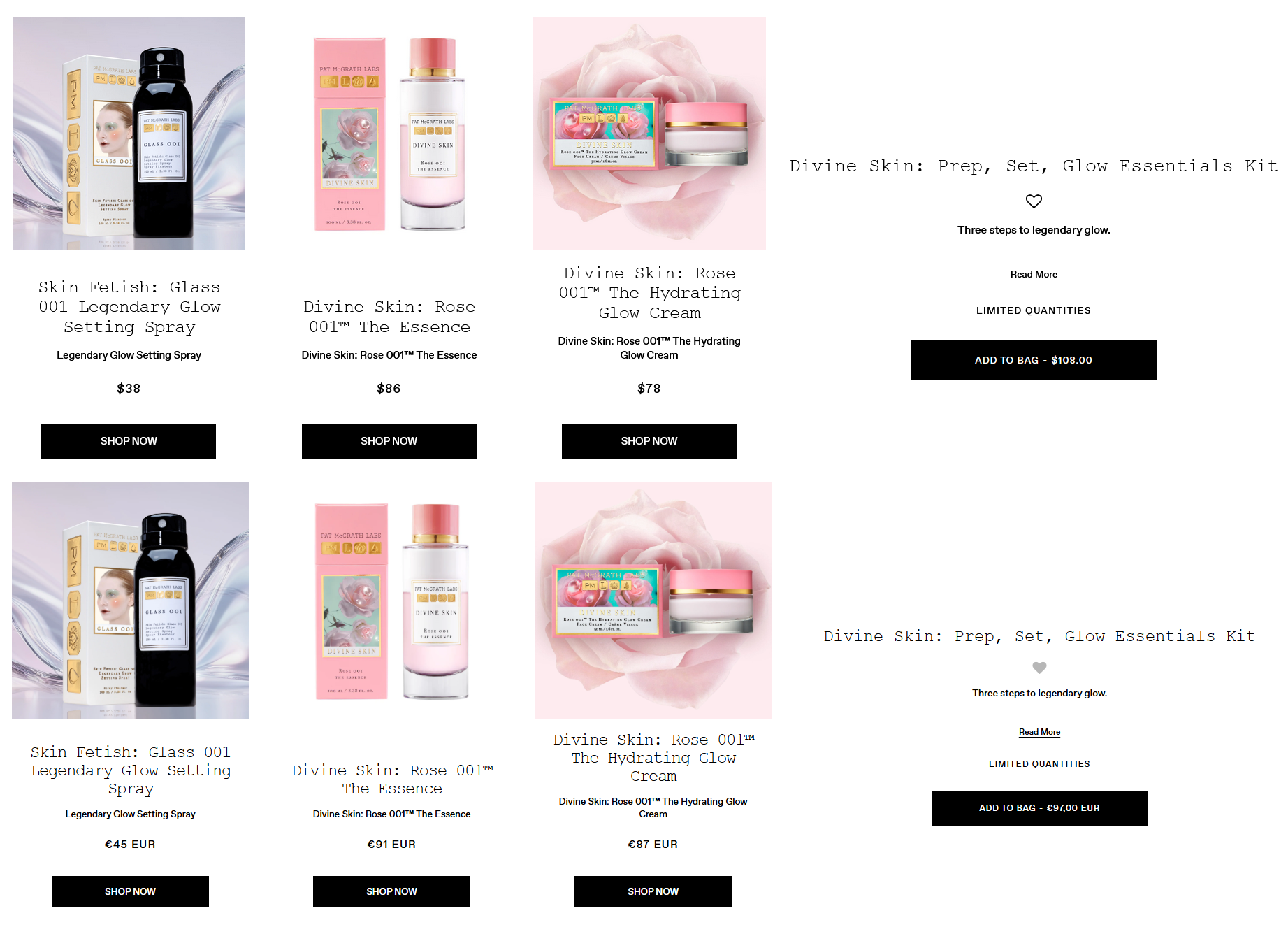
The reason I have it now is because the brand created the Divine Skin: Prep, Set, Glow Essentials Kit which costs $108 and includes full-sizes of the Glow Setting Spray, Essence, and Hydrating Glow Cream. The site lists the value at $124, but I’m not sure where that number came from considering the cost of all three items separately is actually $202. This bundle is an even better savings for anyone in the EU because of the existing surcharges. The price of the three items sold individually comes to the US equivalent of $253 (€223), yet the bundle price is nearly the same at €97. The way I look at it, I basically paid $36 (€32) for each item. At that price, the essence was absolutely worth it to me to get!
For those only interested in skincare, Pat Mcgrath also has the Divine Skin: Rose 001 Signature Glow Duo Kit (essence and cream) for $141. The VIP Sale dropped the price to $98.70. I preferred the kit I bought because for ten extra dollars I could get the setting spray too. Without this kind of bundle discount, I wouldn’t have been able to justify spending so much on this essence. It’s like my secret guilty pleasure skincare product! I try to avoid some of these ingredients, but it feels so nice!
Even though this contains fragrance, it’s the second to last ingredient. I remember how strong and beautiful the smell of rose was in my sample, but I can barely smell any of it in my full-size bottle. I wonder if the Essence has always been this way (and if it was just my sample that had a strong scent of rose), or if the brand uses less parfum in the newer bottles.
Since my previous tests of this was in a very humid climate, and now it’s springtime in a less humid climate, I can’t say with certainty how this will fare during a dry winter. However, this being the “oiliest” (but not greasy) of the bunch gives me more confidence in saying this will work well during that time too. Many of my favorite milky toners are hydrating enough that I can skip putting on a moisturizer, but this essence is a step further in feeling like I put on a thin layer of facial oil. My dry skin really seems to love this product!
I like pairing this with the PML Hydrating Glow Cream because even though the texture looks thick and stiff, it spreads easily and absorbs fairly fast. As long as I don’t use too much of both products, it doesn’t feel heavy on my face. I’m quite impressed with these products, though I would still never repurchase them without a big discount or bundle deal like the one I got.
This doesn’t have “milky” in the name, but it pretty much is a milky toner/essence. It leaves a semi-sticky layer on the skin for a while, but then fully seeps into the skin, leaving only a little bit of residue behind. This has the texture/consistency and looks of the Laneige toner, but it doesn’t have that long lasting moisturizing layer that protects the skin from water loss. So, one would definitely need to follow this one up with additional skincare after.
There are a lot of nice ingredients in here, and in good amounts. On the website, Rephr highlights the 3% Glycerin, 2% Niacinamide, 2% Meadowfoam Seed Oil, 1% Panthenol, the 1% blend of Betaine and Allantoin, 0.5% Squalane, and 0.2% Madecassoside.
It’s a good essence, but I prefer other milky products that have more of the hydrating, moisturizing, and skin softening properties. I stopped using it sometime in 2023, which is why I put it in the honorable mention section, since I can’t test this head to head with my toners. From memory, I would say this essence is most like if there was a middle product between the TirTir Skin Milk and TirTir Skin Milk Light.
My review of Rephr Skincare moved to the archives which can be found HERE.
This is not part of the toner section because it’s so lightweight that I didn’t think it would be fair to include it. I bought it with the intent of giving the milky toners an extra boost in hydration during the later hours of the day, but the ones I used most often didn’t need it!
My second reason was to use this on makeup days if my face was looking a bit dry, similar to MAC Fix+. Unfortunately for me, I didn’t see any changes to how my makeup looked. The bottle mists the product fairly well, with me being able to see only a few moisture droplets here and there, but once they dried my makeup continued to have the same finish as before. My face didn’t look dewier or glassy. This might be a fantastic aspect for a matte-lover or someone with oily skin who still wants to use moisturizing products without adding extra shine or sheen.
This mist can be soothing, although sometimes it’s still not enough if my skin reaches a certain threshold of irritation. If I completely douse my face to try and use it as the sole milky product, it can get the job done in the warmer months, but not in winter. If I douse my face to use overnight (again during the warmer months), I wake up with my skin feeling silky smooth and just incredible. So, I like this product as a milky toner booster in winter or as an extra lightweight moisturizing option in summer. However, it really isn’t necessary. I’m mostly using it to use it up because I bought it. When I finish this product, I won’t be repurchasing it purely because my milky toner favorites are already fantastic and don’t need extra help.
Some of the beneficial ingredients are Glycerin, Panthenol, and three different Ceramides. What I’m a bit wary of are the various citrus products such as Bergamot Fruit Oil.
So, that is everything! Eleven toners/essences have been put to the test! When it comes to ranking them though, I didn’t think grading them from best to worst would be fair, considering the best milky toner for me will not be the same as the best one for someone who has oily or combination skin. Using numbers or stars didn’t feel fair either, so I decided to put these into categories!
Group S: Laneige, Dr. Ceuracle, and Farmacy These are the holy grail products that I would easily repurchase, even at full-price.
Laneige gets my personal award: “Stands the Test of Time.” Dr. Ceuracle gets a medal for being, “Even Better than People Say.” Farmacy gets the trophy for being the, “Most Soothing and Nourishing.”
Group A: Anua, I’m From (white rice), and The Ordinary These are all toners that are good and work. They will do at least the very basics of keeping the skin soft and moisturized. If someone’s skin really likes a particular ingredient in these toners, that could determine whether it works even better than normal for some people.
I’m From (for the original formulation) is the, “Best Beginner/Starter Milky Toner.” The Ordinary wins, “Favorite for Gentle Exfoliation.”
Out of everything I’ve tried, I think choosing I’m Rice is the best place to start for someone who wants to dive into Milky Toners. Like Laneige, it has been around and loved for a long time for a reason. It’s more soothing than some of the others, and it’s the perfect middle ground to figure out if something more moisturizing/occlusive is needed, if less is better, or this could be just right at the start.
Group B: Pat Mcgrath This is my, “do as I say, not as I do,” controversial category. I should stay away from the fragrance, but there’s so little in here that it might not pose a problem. It’s way too expensive, but my skin loves it! Between the smell (if both the essence and cream are used together), the touch, and visual appeal of the packaging, this really engages my senses. I want to recommend it, but the price and some of the ingredients are holding me back. This deserves to be in Group A, at the very least, but my inability to recommend it with confidence is why it’s in its own category.
Group C: TirTir (original), TirTir (light), and Im From (black rice)
I don’t think these three are bad at all. The last two are clearly just the weakest ones for someone with very dry skin. The regular TirTir Milk Skin has a plethora of nice ingredients, but doesn’t feel like it’s working as well for me as plenty of others on the market. So, I can’t recommend it based on my own preferences and experience, but I can’t write them off either. They are bound to be fantastic for someone with another skin type. Between the TirTir Light and I’m From Black Rice, I would guess the one from TirTir is probably the best for oily skin between the two.
Group D: Pixi If this product was a movie, it would win the Razzie award in the category, “Why Must You Hurt Me?” It’s not a complete failure because the tingling and warming could be the favorite thing someone likes about this. Someone could also enjoy the scent as much as I enjoy the essence from Pat Mcgrath. This also can’t possibly clog everyone’s pores. I consider most of my pores to be on the smaller side, so perhaps it’s just a me problem for it being easier than it would for someone else. This at least felt good enough that I would have continued trying this out if it only had one or two cons for me. So, I can understand why this is popular, even though I can’t personally recommend it.
I hope this has been fun and helpful! Thanks for reading!
I visited the US in April and was reunited with the rest of my makeup collection, along with all the things I shipped there during 2024. Those products consisted of Japanese brushes that I didn’t want to pay extra customs fees for, reward point and gift card redemptions only applicable to US sites, products only sold within the US, etc. I had older makeup I still wanted to bring back to Germany, but I needed to decide which of the newer ones were worth coming along too. That’s how the idea for this post began! However, some of the makeup I brought back will be discussed in other posts, and I added some of my newer makeup purchases to this review instead.
Rare Beauty Soft Pinch Matte Bouncy Blush in Worth
It was difficult to photograph this color accurately because it looks darker in the pan than it actually is. I own the liquid version of Worth, and have reviewed it before, but I left it in the US. Since the liquid is sheer, I wasn’t surprised that I also needed to pack on a lot of this cream-to-powder version to get it to show up on camera.
I’ve been into subtle and/or nude blushes lately, so I expected to love this. I tried pairing it with so many different things expecting that perhaps my foundation shade mattered or that the undertone was clashing, that the color of my eyeshadow looks could be throwing it off, etc. I just wasn’t enjoying wearing it. The answer I settled on as to why that was the case is that it’s matte. I knew it would be from the name, but I’ve used shimmer-free creamy and bouncy type of blushes before that still had a natural emollient gleam to them from just being a cream product. Examples of this are the MAC Glow Play Blushes and Armani Neo Nude Color Melting Balms. Even within the Rare Beauty Soft Pinch Liquid Blush line that comes in dewy or matte finishes, the matte one still has some life to it. So, I wasn’t expecting this blush to have zero shine, especially from a product that has Synthetic Fluorphlogopite as the first ingredient.
The longevity is fine. The blush blends into and becomes one with the skin. For the best results, I use my densest synthetic brushes with it.
I borrowed the photo above from my Charlotte Tilbury x Genshin Impact post where I reviewed the Airbrush Flawless Setting Spray. By the time I started using that spray, I already knew that my issue with the Rare Beauty Blush was the fact that it’s matte. However, I was still taken aback when I saw with my own eyes how much of a difference some extra shine truly makes. I love how this blush looks when I use Charlotte’s spray over it. So this product changed from a miss to a hit for me!
Eadem Le Chouchou Exfoliating + Softening Peptide Lip Balm in Fig Sauce
I mentioned in my Project Pan that there are only 5 brands I’m purchasing from in the lip category this year. One exception was this balm because I would have bought it ages ago if it was sold in Europe. I could only find one website that would ship it to me, but then I would have had to pay at least double the price. The tradeoff for having to wait a long time to get it from USA’s Sephora was that I could buy it on sale and with a gift card.
I have to talk about the metal applicator because it feels amazing applying this lip balm! I don’t like when products have a cooling ingredient that makes my lips feel cold for 30 minutes to 2 hours depending on the brand. Instead, I only get that wonderfully cold sensation during the application process and then I can go about my day. This really adds to the experience, so much so that I’ve even put other products on my lips and then used this applicator to spread it out! Perhaps one day I’ll buy some empty tubes off the websites I’ve found by typing, “metal applicator cosmetic tube” into Google and transfer some other glosses into them.
This is a very nourishing product and lives up to its reputation as a lip treatment. It fills the lines and smooths over the lips. It’s thick, but not goopy in a gel or oil way. It has more of a creamy-waxy feel. It adheres fairly well to the lips, which helps it to last longer before needing to be touched up or reapplied. I still consider this a little sticky, but it’s not to Ami Cole levels. It has decent color payoff, enough for me to understand someone wanting to buy multiple shades, but I wouldn’t want to buy more than one extra.
The results I get are similar to Ami Cole glosses, which is to say my lips feel softer and more hydrated the next day, but this does not completely remove all of my chapped skin. I can always spot a few areas on my lips that are still chapped the next day. So, this hasn’t claimed a spot in my top five, but I still like it a lot.
Gxve Beauty Eye See in Color in Rich Girl
This was the only quad from the brand that I found appealing, but my immediate issue is that I don’t get enough depth from the darkest brown in this palette. While it theoretically shouldn’t be a problem to grab a dark eyeshadow from any other brand, I know I will subconsciously not reach for this palette since it is technically incomplete for me.
The completed look is pretty, but I couldn’t bring myself to choose this to pack in my suitcase over my many other options.
If the eyeshadow formula was superb, I would have considered taking this with me anyway. My issue is that the shimmers are a bit lackluster. There is still beauty in a lower impact shimmer if the intended eye look is supposed to be sophisticated or demure. I think the quality is fairly good, though it could have benefited from being a bit creamier. The mattes were fine. My brush picked up a lot of product, but with how soft they look on my eyes, I think someone would be surprised to know how much I tried to build up these eyeshadows. They are drier shadows that appear to be finely milled, but something about the formula just doesn’t feel modern.
This palette is long-lasting on me. It doesn’t take long to get a blended look. However, this isn’t for me. I do appreciate that the holder of the pans is easy to remove, so I could technically keep the compact or turn it into an empty magnetic palette if I inserted a magnetic sticker sheet. I could also technically add metal sticker pans to the bottom of the eyeshadow holder to pop it into a larger empty magnetic palette. Removeable packaging is always interesting to me.
In any case, this quad wasn’t a flop, but it also wasn’t good enough to keep around.
As a random side note, the Gxve Beauty website used to sell merch as well. I ordered one of the Signature Hoodies during a 50% off sale (just like I did with the palette). It has fleece lining on the inside, so I’m excited to wear it come winter. The website says products are now exclusively at Sephora and things are so frequently for 50% off that I really don’t know how the brand will continue to stay afloat.
I don’t know where these are being sold now. If they are discontinued, I’m glad I was able to snag one as a piece of makeup history.
Glossier Cloud Paint Bronzer in Coast
I liked the Glossier Solar Paints, but wished to have a version without shimmer. The Cloud Paint formula is one of my favorites for cream blushes, so to have a matte Cloud Paint in a bronze color seemed like it would be an instant win.
I picked Coast because it is the second darkest option and has a golden tone, which I wanted. The darkest color, Drift, looked like it would be too red for me despite being labeled by the brand as a deep neutral bronze. Coast is just too subtle for my skin tone right now. While I was in Florida, I didn’t do a good job of reapplying sunscreen. My skin had a slightly redder tone and was darker, so the bronzer really isn’t visible in photos as it was already so subtle in person. I have a photo below, but I apologize for the lighting being very off. I couldn’t get a clearer picture during the trip and my skin looks even redder in the photo than it was in real life (plus I was wearing the Beekman 1802 skin tint that’s red).
I don’t mind having a subtle bronzer, but my biggest issue wasn’t the color. I felt it just didn’t blend seamlessly enough into my skin. While it’s true that I didn’t bring my holy grail synthetic bronzer/contour brush with me, I came to realize that the watercolor kind of finish that’s beautiful and natural in a blush isn’t what I want in a bronzer. So, I left this behind. What a shame!
Tarte Tartelette Tubing Mascara vs Too Faced Ribbon Wrapped Lash Tubing Mascara
Back in 2014, during my short lived time making YouTube videos (all listed as private now), I kicked off my Mascara Showdown Series with a battle between Tarte’s Lights Camera Lashes and Too Faced Better Than Sex Mascaras.
I determined that Tarte was the winner because of the length, but the mascara I actually repurchased the most was from Too Faced. I don’t know if it’s because I ended up preferring the balance between length and volume or if I was just able to get the Too Faced mascara on sale more frequently. I eventually stopped buying the one from Too Faced because I started to get clumping and flaking issues that I never had before. I don’t know if the formula changed or there was a switch in manufacturers, but I moved on from that mascara.
The KVD Full Sleeve Long + Defined Tubing mascara made me interested in tubing mascaras again. I had a deluxe sample of the one from Tarte, so when Too Faced released theirs I thought why not…let’s do another showdown between these brands over a decade later!
I never curl my lashes, so sometimes the mascaras look better or worse depending on how my eyelashes are naturally shaped that day. I’ve used the Tarte mascara five times and I can say that even if it had amazing results, what puts me off from it is how long it takes to dry. If I try to layer up even more product, then it takes even longer. I can touch my lashes thirty minutes later and it still doesn’t feel fully set. This is a big problem when I’m trying to photograph multiple eye looks in a day and in the process of removing my eyeshadow with a Makeup Eraser cloth and Bioderma, my eyelashes clump together, the color smears, and the stickiness makes it difficult to remove the rest. Part of the benefits of tubing mascara is the ease in which one can remove it with warm water. I can remove them with micellar water as well, so I’m not surprised that some of the Tarte mascara comes off. The annoying part is the weird middle ground where some of it comes off and smudges while the rest still clings on with a tight grip. It makes it so that I am forced to fully remove it every time when I want to do a new eye look, whereas with other tubing mascaras and even regular mascaras, it’ll come partly off and I can easily reapply more mascara because they didn’t turn my lashes spidery and hard. This is a makeup reviewer problem, but having to wait so long for it to fully dry is an issue overall. One time I made the mistake of applying this mascara not far enough in advance of watching a heartfelt scene in a show. The side with the Tarta mascara was a mess and got in my eyes. The side with Too Faced did not.
I didn’t like the Too Faced Ribbon mascara when I first tried it, but every time after that (at least 15 times so far), I have enjoyed it. Just like the showdown from many years ago, I found that Tarte’s mascara was better at lengthening, whereas Too Faced’s mascara was better with building volume while still giving nice length. It can start to clump if I build this up a lot, so I have to be careful about finding the balance between satisfaction and knowing when to stop.
I like the one from Too Faced, but I think I still prefer my tubing mascara from KVD. It gives better length than Tarte and if I’m patient enough I can build up the volume to similar results as Too Faced, though it can also start to form clumps if I take things too far.
The Tarte mascara is a miss. The Too Faced mascara is a hit.
Dior Backstage Rosy Glow Blush in 077 Candy
I reviewed the cream blush stick version of Candy already, and updated the original post, but this still feels like a good place to talk about the powder blush since it’s a miss for me.
This new powder formula is definitely an improvement on the original formulation and first reformulation, in terms of being more pigmented and less hard-pressed. I also think this square packaging is cuter and easier to use with larger cheek brushes. The reason it’s a miss for me is purely due to the color. I loved the addition of shimmer in the Bronzed Glow shade from version 2 of these blushes, but the base color of Candy being so light means that it unfortunately does the same thing as Nars Orgasm on me. I can see the pink shade at one angle, but when it hits the light, the gold reflect is nearly all I can see. So, it appears as if I tried to use a highlighter as blush! This kind of shimmer is not that refined either, which makes it unsuitable for my preference as even a blushlighter or blush topper.
The saving grace for me is that I can add the Candy blush stick on top to help the shimmer become one with the skin, plus boost the appearance of the pink color.
I’m happy using the Candy shade of Glow Stick on its own, but going forward, I will never wear the powder version of Candy by itself. Based on my continued enjoyment of the previous powder blush reformulation, and acknowledgement that the new one has improvements, I still recommend the powder blush. I just can’t recommend Candy or Toffee to anyone close to my skin tone because of that highlighter effect. Bronzed Glow still gives me hope that Dior can nail a shimmery blush in this new formula in the future if the base color is darker.
That’s everything I have for this week. Thank you for visiting and reading!
One of the benefits of living in Europe is the access one has to so many beauty retailers of various sizes, which means many more chances to find deals on luxury makeup. I’m still in the midst of a multi-year blush obsession, so today’s post is a review of some of the latest ones I’ve added to my collection.
Chanel Les Beiges Healthy Golden Glow Powder in Soleil Couchant
This comes with a brush, and it works, but I prefer to use my fude favorites with it.
The included pouch has a fun limited edition double C design, though the compact itself has the standard look for the Les Beiges line.
I like orange colored blushes from Chanel in the beginning, but I eventually stop using them after the review is completed. The Chanel Fleur de Printemps highlighter side was a bit light for my taste while the blush side was very subtle. Chanel Beige et Corail had the awesome fall design imprinted, but I got frustrated with how much I had to build up the color on my cheeks. Finally, Les Tarots de Chanel in Blood Orange had enough pigment, but the matte finish kept me from using it, so I gave that one to a friend.
Soleil Couchant is definitely shimmery and is in the baked-gelee formula that I prefer, so I was willing to give an orange blush from Chanel one more try. The 22% off discount from Parfum Dreams helped sweeten the deal.
The blush side looks like an actual Blood Orange shade in the compact, but it’s a true orange color on my cheeks. I am admittedly disappointed that the red tones don’t show as strongly in this blush, but it’s still pretty. What makes up for it is the gorgeous gleaming finish that is shimmery enough for me to sometimes skip wearing highlighter. It’s not a metallic kind of shine either. The powder has ultra refined shimmer and looks smooth on the cheeks.
The highlighter is a beautiful color that suits me very well with its depth and tone. What is surprising and fascinating to me is that although I can see the individual sparkles, I really like how it looks when paired with the blush! I typically hate glittery highlighters because they look like I got fallout from my eyeshadow instead of being intentionally placed. I prefer highlighters that give a glassy glow and look like my skin is naturally luminous with undetectable shimmer. This highlighter from Soliel Couchant somehow doesn’t emphasize texture and adds a soft twinkle. I don’t know why this is different from other glittery highlighters to me, but it is!
Though I’m faced once more with a blush that’s on the sheer side, I have an easier time picking up product and building up the color now that I have been using the Bisyodo Cheri Series CH-FD Foundation Brush. Soliel Couchant is also less hard pressed than Beige et Corail, so that will reduce some of the potential frustration over time. The photo below shows some of the flaky bits of the highlighter as it comes off the surface onto my holy grail highlighter brush that’s also from Bisyodo’s Cheri Series, the CH-HC Highlight/Cheek Brush.
DISCLOSURE: By linking these brushes, I am obligated to state that any unhighlighted links in bold blue font (Example) are normal non-affiliate links. Links marked in bold black font with a light blue background (Example) are affiliate links. Affiliate links allow me to get a commission if purchases are made on that website after using my link.
I think this will finally be an orange blush from Chanel that I will continue to reach for, but only time will tell. I like this duo a lot, but I love the Brun Roussi Blush Lumiere and Joues Contraste Intense Cream-To-Powder Blush from Chanel even more.
Extra bits of information to note is that I can use my normal highlighter brushes to pick up product, so the firmness level isn’t an issue for that side of the duo. This doesn’t have a fragrance and I’ve had no problems with longevity.
Westman Atelier The Powder Duo in Suede/Sable
I like the Westman Atelier Butter Powder Bronzer, so I assumed the powders in this duo would feel the same because they have identical ingredients, just in different quantities. The blushes are soft, very finely milled, and have a slightly velvety feel, but I wish they were a touch creamier.
The high quality of the blushes is undeniable. They have a soft matte finish, but I would have loved this product if there was more of a sheen. Suede is exactly the kind of shade I’m interested in right now. It’s a warm pinky rose color with some brown, making it a great nude blush for many people, though perhaps not someone more than a few shades darker than me.
They blend well into the skin and don’t fade. I’d say these are medium pressed. I get hardly any kickup, yet the powders coat my brushes easily. I am not forced to use a dense brush in order to build up color, which is great! Despite these being pigmented and buildable, there’s still a limit to how intense they can become.
Sable doesn’t work for me as a blush, but I figured that might be the case when I bought it. It’s a little lighter than my skintone, so it makes Suede look ashier if I try to combine the two on my face. I can theoretically use it to tone down vibrant blushes in my collection, but I haven’t tested that yet. I’m more likely to just use my Dior Powder No Powder for that purpose.
I took the risk getting this shade of duo because I wanted Suede so much. Ganache was the only other color I was interested in, but that’s paired with Poppet, which I wouldn’t want anyway.
Because I got this at a discount from Niche-Beauty, paying a high price for essentially one blush helped lessen the blow to my wallet, though not a lot. I have a feeling it’s going to be forgotten among my collection because as pretty as it looks, I can list at least 20 other blush shades in my collection that excite me more.
I feel this product could have been more beneficial if it was in a trio, like the Artist Couture palettes.
I also wish the pans were customizable so I could have ensured I received two usable products.
I can recommend the powder duos because of the quality. However, it’s only worth it if both shades are a perfect match. There are so many amazing quality blushes on the market at various price points that I don’t consider this one from Westman Atelier a must-have product.
Dolce&Gabbana CHEEKS&EYES MATCH Blush in Joyful Peach
There was a point last year when I wanted to play with makeup that had weighty and luxurious packaging. I was missing my Westman Atelier Butter Powder Bronzer, Olivia Palermo Beauty eyeshadow palette, etc. So, when I saw the D&G line was on sale, I went for something that had the highest chance of being a success for me in a category I clearly love.
The packaging is as lovely and as heavy as people have said. I like the round-edges with the white top that resembles enamel, and the gold metallic details. Everything on the outside feels plastic, so I’m not sure what material was used to add the artificial weight on the bottom. The weight in the lid, I believe, comes from the mirror.
I wouldn’t call this a highly pigmented blush, but it’s not sheer either. My brushes being able to pick up a lot of product adds to the illusion that it’s more pigmented than it is. Thankfully it is buildable, so a shade this light on me can still show up. It’s also surprising how little kickback I get considering how much product coats my brushes.
Per usual with most blushes on my dry skin, I experienced no fading. It’s unscented, so one doesn’t have to deal with the parfum that designer brands love to add to their makeup lines. Joyful Peach leaves a slightly blurred soft matte finish on the skin. The dewier one’s face is, the more it melts in.
The beautiful formula, the blendability, and ease of building up color are reasons why I was tempted to buy more of these blushes, but as someone with as huge of a collection as mine, I decided to refrain. For example, Playful Rose is one of my favorite types of blush shades, as I love a brown nude with a hint of rosiness. However, I already have Vieve’s Sunset Blush in Piazza and Benefit’s Wanderful World Blush in Java, which are also mattes that I enjoy. I tend to prefer glowy blushes over matte ones, so this is another reason I resisted.
The Westman Atelier powder blushes and this one have a similar look on the cheeks, though D&G’s becomes one with the skin more, especially as the day goes on. So, I think I prefer the blush from D&G the tiniest bit more. It certainly has the more upscale looking packaging. However, I still don’t think this is a must-have product. If someone is in the mood to splurge though, this is a nice option.
Before we move on to the last blush, I wanted to add that I’ve worn this as eyeshadow several times, since it’s intended to be used on both the cheeks and eyes for monochromatic looks.
The issue for me is the same across the board with using bronzers, blushes, and highlighters that excel in looking smooth and refined around the face, that they create too soft of a look on my eyes. With Joyful Peach, I can only build up to medium opacity. I have to make sure my eyeshadow base/primer completely obscures my skin discoloration before adding this shade on top, or else the darker spots show through underneath. Pigmentation issues aside, this doesn’t seem to have an issue with fading, adherence, or layering with other eyeshadows. So, this can work for eyeshadow purposes depending on someone’s style/preference.
The eye look on top shows Joyful Peach used in the crease and lid. The eye look below it is the same, but with a shimmer eyeshadow added to the lid.
Gucci Luminous Matte Blush De Beauté in 11 Intense Ruby
I reviewed this blush formula before HERE, but this particular limited edition shade and packaging was part of a holiday collection that I also reviewed HERE. It bothered me that the blushes were so much more expensive in Europe (or at least Germany) than it was in the US. So, I purchased it during last year’s Sephora sale and finally have my hands on it after my visit back to Florida in April.
I see no difference in terms of formula. The performance is the same as the permanent blushes and only the packaging design is different. Speaking of which, Gucci has another limited edition packaging design throughout Asia. I discovered it from amit.beauty.talk and a few other sneak peek accounts on Instagram. It is finally supposed to be available in two re-promoted shades for the rest of the world sometime in July.
The formula is silky to the touch, goes on the skin smoothly, and has a soft satin sheen. It has a lot of pigment, so using the right brushes is key to how much or little effort it will take someone to blend. The color Intense Ruby is quite similar to Intense Plum, but I find Intense Ruby to be slightly less pigmented and therefore easier to work with. The slight difference in undertone is another reason I actually like Intense Ruby, whereas I’m pretty sure I already decluttered Intense Plum (I couldn’t find it among my things).
I would also like to say that I have come around a lot on Warm Berry and despite preferring the Armani Luminous Silk Glow Powder blushes in my past review, the Gucci blushes are the ones I’ve been using more out of the two. However, given enough time, that could reverse again! They are pretty on par with each other.
And that’s everything for today! Thank you for reading.
I was very eager to get this post out, so I’ve only used the Dior Backstage Rosy Glow Stick in 077 Candy six times so far. This hasn’t gone through my usual amount of testing rounds, but I feel that I have a good handle on how this blush performs.
I must admit the chances are high that I will eventually buy something else from the collection of new powder blushes, cream blush sticks, and lip butters. Whether that happens or not, I still intend to update this post if there is anything noteworthy I’ve forgotten to mention or that I’ve discovered after using this product for a longer period of time.*
*JUNE 14, 2025 UPDATE: I bought the powder blush version of this shade as well. The review is at the end of this post.
The swatches are slightly washed out, but this was photographed in natural light from the window.
The Reformulation History
Before we get into this, I just wanted to point out that the original Backstage Rosy Glow Blushes were Pink and Coral. In 2023, the brand dropped “Backstage” from the name and relaunched Pink and Coral, along with the new shades Rosewood, Cherry, Berry and Mahogany. In 2024, they expanded the Rosy Glow range by adding Bronzed Glow, Pink Lilac, and Poppy Coral. Bronzed Glow was the first blush to have visible shimmer particles and it was much easier to pick up product onto a brush. The “Backstage” name was added back to the Rosy Glow Blush line in 2025, after a second reformulation and new packaging. I don’t know if this means Dior was going to drop the Backstage line, then decided against it. From what I hear, this line is much more popular with the younger generation on TikTok, so that could account for the reconsideration.
The new line of cream blush sticks and second round of reformulated powder blushes comprise of the shades Pink, Pink Lilac, Rosewood, Cherry, Berry, Toffee, and Candy. So, there is currently no Coral, Poppy Coral, Mahogany, or Bronzed Glow.
As I mentioned, Bronze Glow already had visible shimmer and was easier to work with than the others, so I would not have repurchased it just to get the cute square packaging even if it was an option. However, it’s tempting to pick up the new Rosewood. I can’t justify getting it though because my old one is only hard-pressed and still doesn’t have hard-pan on it. I have plenty of brushes that can pick up product decently enough.
If I were to buy one of the powder blushes, it would be Candy, Cherry, or Berry. The older version of Berry looked way deeper than is my preference, but the new Berry’s tone looks prettier to me.
The Performance
Candy has turned out to be a very interesting shade for me to wear! The base color is bubblegum pink, but the golden shimmer makes the blush shade appear warmer. In addition, the ph-adjusting pigment turns the blush a little darker on my cheeks, which prevents it from looking ashy on my skintone while also helping it to actually show up. Without it, I don’t think I would have been able to pull off a color as light as this and in a formula that blends out to be as sheer. Of the available colors, this is the closest thing to a coral shade that they have.
This isn’t a stiff blush stick. The product glides easily so that I can draw a line of product directly onto my skin without disturbing my makeup underneath. It’s also easy to blend in, leaving no harsh edges and it doesn’t require warming the product up on the back of the hand or via the fingertips to make it easier to spread. So far, my favorite way to apply this has been using angled synthetic brushes and the Singe Beauty F03.
I watched a lot of videos to try and figure out which shades I wanted, and in the process I heard every reviewer talk about this cream being a bit sticky or dewy. This was not the case for me within the first four days. So, I assumed either mine is drier than everyone else’s or my dry skin type plays a part in how this blush sets down on my face. After putting on the blush and touching my cheeks, the most I saw and felt on my fingers was the same amount of moisture as I would get from a full face of skincare and nothing else.
It wasn’t until a different testing session when I applied and blended out this blush with my fingers that I was left with dewy cheeks. My theory now is that because I usually draw or place dots onto my cheeks and then use my brush to blend it out, the wetter elements of the blush get picked up and hold onto the fibers of my brush, so that it’s mostly just the color that is left behind. The little dew that remains gets pushed deeper into my dry skin, so I’m left with hydrated and moisturized feeling cheeks that still don’t require powder to set it! This might not be the same scenario someone with oily skin will experience. Dior does specifically state this contains cherry oil and is intended to be dewy.
I wonder if the minimal amount I use also plays a part. Because this is not a bold color, I can see the temptation to build up a lot of swipes on the cheeks right away. However, I’ve learned from using Rosewood to just give those Red Lakes time to do their thing and darken. So, I tend to not add that much product and I’m still given enough color for the blush to be seen in person (though not as prominently in photos).
My favorite way to use this, other than by itself, is to apply it on top of a matte blush for added opacity and that pretty golden glow. I think it looks better when the cream stick is on top of powder, instead of underneath it.
The worst wear time I’ve had so far was when I used my most moisturizing milky toner as part of my skincare routine, wore my dewiest and most transfer-prone skin tint that provided light-medium coverage, and I did not set my face with powder. The blush faded to the point of having noticeably less color within two hours and I could see my skin underneath. However, there was enough blush to look like I had used a cheek stain. By the end of the night, it was still present and there was still a little glow.
The best wear time I’ve had, without relying on powder, also involved a hydrating milky toner and my glowiest foundation with high coverage. In this scenario, I don’t see fading until five hours in, but I have plenty of color remaining. My longest wear test under these conditions was 12 hours and the blush was still there.
I know firsthand that setting the blush with translucent face powder extends the wear, and it definitely won’t be a problem if paired with another powder blush. It’s also possible that the darker blush stick shades with more of the ph-adjusting pigment could be longer lasting.
An additional note is that this product contains fragrance. It smells like a combination of vanilla, candy, and mint. It’s like a milder version of the Dior Addict lippies. I don’t really enjoy there being menthol and peppermint oil, as it makes me instinctively want to keep it away from my eyes. It doesn’t burn, but I associate the smell with Vicks Vaporub.
The Packaging
I’d just like to throw out there that the packaging is genius! I love that I can stick the handle down into the blush cap for it to be held securely while I twist it and then apply the product! I can even set it down on the table without fear of it tipping over.
For those who have purchased multiple glow sticks, it’s nice that every blush has a corresponding cap color to make it easier to determine what shade it is without having to read the label on the bottom. The silver handle with the Oblique print is a very classy design touch as well.
Comparisons
This photograph was taken under artificial light, but it better represents how the colors will look on my face.
Although they look very different in the swatches, YSL’s Restless Rose looks quite similar to Dior’s Candy when applied to my cheeks. The difference is that Restless Rose’s glow comes from the reflect of the shimmer, and Candy has a wetter looking sheen.
I can’t think of a better analogy other than to say Dior’s Rosewood (in the older formula) and Candy look close enough to be sisters. Rosewood doesn’t have visible shimmer particles, but it has a soft sheen and they are both pinks. The shade differences are easier to see when they’re built up, but if I’m aiming to get a sheer amount of color from both of them, it would be difficult for someone to be able to tell they weren’t the same (other than the shine levels). This is why I’m trying my best to resist buying more.
Ordering Process
Before we close out this post, I just wanted to talk about the very different experiences I’ve had between ordering from the US and Germany. I’ve seen plenty of influencers saying, “Always buy directly from Dior for the luxury experience and perks.” However, only select regions have the Dior Beauty Loyalty Program. Within Europe, it’s just France, the United Kingdom, and Spain even though my orders to Germany are shipped from France anyway. I can choose the Couture gift packaging, get two free samples, and on the rare occasion one can choose an additional deluxe size mini sample if the purchase is over 100 Euros, but that’s it.*
*Technically, this time the box was a little different, as it had the Dior Dioriviera/Toile de Jouy print on the inside (I think leftovers from Mother’s Day). Usually the carboard box is plain, but I turned this one inside out so I could repurpose it!
When I ordered from the US, I was part of the reward program. Besides the various gifts at different tiers, there are always different free gift with purchase codes floating around that include bigger things than just perfume samples. I’ve seen others get charms/ornaments, pouches/makeup bags, etc.
According to Dior Deutschland, the blush sticks and lip butters are exclusive to their website. This is why I bought mine at full price. Since there’s not much incentive for me to buy anything else directly from Dior, my plan is to wait for the powders to come to retailers in Germany so that I can accrue points from those reward programs and most likely get 20% off as well. As of this very morning, all three product types are available at Douglas. So, the “exclusive” element was only for a short time.
Dior Backstage Rosy Glow Blush in 077 Candy
It didn’t take long for me to do exactly as I said. I bought this at 20% off from Douglas and I’m updating this post with my review of the powder blush!
The aspects that Dior improved with this new powder blush formula over both previous versions is that this is more pigmented and less hard-pressed, though it’s still dry to the touch. I also think the square packaging is cuter and I can use larger cheek brushes with it. The downside for me is with this particular shade. It unfortunately does the same thing as Nars Orgasm where I can see the pink color at one angle, but the gold reflect is nearly all I can see once light hits it. Then it appears as if I tried to use a highlighter as blush! This kind of shimmer is not that refined either, which makes it unsuitable for my preference as even a blushlighter or blush topper.
The saving grace for me is that I can apply the Candy blush stick on top to help the shimmer become one with the skin, plus increase the amount of pink color that can be seen.
I’m happy using the Candy shade of Glow Stick on its own, but going forward, I will never wear the powder version of Candy by itself. Based on my continued enjoyment of the previous powder blush reformulation, and acknowledgement that the new one has improvements, I still recommend the powder blush. I just can’t recommend Candy or Toffee to anyone close to my skin tone because of that highlighter effect. Bronzed Glow still gives me hope that Dior can nail a shimmery blush in this new formula in the future if the base color is darker.
And that’s everything for today! Thank you for reading.
Mineral sunscreens can leave a strange-colored cast on the face and body that is especially visible on people with dark skin. The higher the SPF protection, the more obvious it looks. This is why I rely on chemical sunscreens for sun protection. However, companies have developed new innovations to combat this issue. They are all aware of the dreaded “casket-ready” grey look that can happen when someone with brown skin puts on a foundation product that has a high level of mineral SPF. The ones I tried in the past were terrible, but I decided to give some new ones a chance.
Beekman 1802 Milk Tint SPF 43 Tinted Primer Serum in Deep
The promo photos clued me in that I would not find my perfect shade in this range. However, I’ve long been intrigued by Beekman 1802 and knew that if I had the opportunity to stack Ulta rewards with a 20% off coupon, then I would take it. That happened, and that’s why I was able to finally try it! For once, this was something I wanted that had zero hype. If anything, the most I heard people saying about it was that they were putting it in their anti-hauls, including me! That’s right! Two years ago I actually said I wouldn’t buy it.
This tint has a runny consistency and it ranges between sheer to medium coverage depending on how many drops are used. It’s very wet on the skin for a while, but given enough time it actually can set on my face without powder. This may be because I have dry skin. I initially tested this out on bare skin. Once I started putting skincare underneath, it took much longer to set. When I use this as a primer, even if I pair it with a foundation that is self-setting, it will no longer set on its own completely and it won’t be transfer-proof. Adding powder then helps to lock it onto my face. My skin feels nicely hydrated with this on, including after being powdered so long as that powder I use isn’t too mattifying or too drying.
My biggest problem area though is my nose. For some reason, I have a hard time getting it to stick there, but longevity isn’t an issue anywhere else. Also, my concealer notoriously doesn’t play well with a lot of other makeup. If I apply the KVD Good Apple Concealer first and then this Beekman product second, it won’t blend into the concealer and I get a harsh line that’s also patchy. So, I have to reapply additional concealer where the two edges meet.
I think this tint looks fantastic and smooth alone, and it can make my foundations that I add on top look better because it’s adding extra hydration. However, because it can also increase the amount of makeup transfer and become too emollient if there are too many products underneath and on top, I prefer not to risk using it as a primer except on my driest of days. That emollient issue can shorten the wear time, which a primer at its core is supposed to extend above all other functions.
The amount of product needed for full 43 SPF protection isn’t realistic to put on one’s face. It would look too foundation-heavy and feel uncomfortable as well. I learned from my mistake when I applied the usual amount needed to get medium coverage and then tried to add foundation on top, then had to redo my look because of how overdone my face looked and felt. Essentially, I find it best to apply a slightly less than normal amount of facial sunscreen so that the amount needed for adequate tint coverage can finish providing the remaining necessary sun protection.
The undertone of the Deep shade is red, but I’ve been a little red this summer, so it doesn’t look that off. However, the photo below shows how the color can look very different (orange) when I forget to shake it. Though the combination turned into my usual color match that time, I don’t want to risk throwing off the proportions of ingredients. This product comes in an extremely heavy ceramic-looking glass bottle and there is an agitator ball inside. When I decided to take this back overseas with me, I transferred it into a clean airless pump bottle and forgot that I would still need to shake it to ensure the pigments were evenly dispersed with every use.
While we’re discussing the bottle, I think I should mention that even the brand site lists a warning that the bottle can leak, especially during travel. So, luggage weigh limit aside, this was another reason I thought it best to change bottles. It’s quite a shame though because it felt so nice and high-end.
As a skincare and makeup hybrid, I think Beekman 1802 succeeded in making a good product. I will enjoy this while I have it, but I most likely won’t repurchase it. My reasons for that are that I prefer higher coverage makeup, I don’t see myself switching to a new concealer anytime soon, and it’s not going to be a good undertone match when my skin starts to return to its normal shade after summer.
Toty Ilumina CC Cream SPF 50+ Perfecting Fluid in 5W1
The swatch is the CC cream, whereas the liquid is from the sample of the Solaria Mineral SPF 50+ Sunscreen Serum that looks awful on me, so I chose not to wear it more than once, and I could also not review it.
This is essentially a foundation that the brand describes as giving a “medium, buildable flawless coverage with natural luminous finish.” When I use a dense brush, I can get high to full coverage. Achieving low coverage is doable, but more difficult because the formula isn’t the easiest to spread thinly. It’s a thick liquid that kept breaking the tips off my sokoho goat brush, so I recommend using synthetic bristles only. I thought using my fingers could help, but the spread is actually harder to control that way and missing spots are easier to see because of the coverage level. I like what this provides, so this isn’t a problem for me, but someone wanting sheer to light coverage out of this “CC cream” might want to reconsidering buying this.
I can squirt this onto my face and it will not start running down my cheeks. It stays put.
Shade 5W1 doesn’t look too unnatural for me, though it’s better if I apply as thin of a layer as possible. It appears matte on my face, though it can look more natural if I use hydrating spray on top and/or illuminating primer underneath. This admittedly looked less matte the one time I tried it in Florida when I first bought it, so the change of climate is a factor in this difference.
I give this brand a lot of credit for having some deeper options with SPF 50+ mineral sunscreen without it going grey. It’s honestly not pushing the envelope though in terms of shade range considering there’s currently only one option darker than mine (5W2). I can admit there were zero mineral skin tints that worked for me a decade ago, and now there are some, but does that technology really stop at one shade darker than mine? Merit recently launched their mineral tinted sunscreens in SPF 45, and their range goes a lot deeper than Toty’s. However, I’ve heard Merit’s gives practically no coverage, so I guess the two lines can’t really be compared.
I noticed MAC Fix+ can break this down a bit, as I had to pat the product back in with my brush, but all was fine after that. The finish looks very smooth and nice, not just because of covering imperfections. I think part of the reason why there is difficulty spreading it is because as it dries it turns into a velvety/powdery finish and texture. This is a very low transferring foundation that sets on me without requiring powder.
Some products Toty sells are fragrance free, but this foundation is not one of them. It was a nice floral-soapy kind of scent when I first had it, but by now it’s starting the change a little a year and a half later. It doesn’t smell off, but it is noticeably a little different. This has a 12 month POA date, but I want to keep using it on and off for a while longer to feel like it wasn’t a waste of money. I didn’t realize before I left that I wouldn’t be able to order it again in Germany, knowing this product was made in Spain and they’re partnered with Cantabria Labs. Shipping within the EU is usually easy. However, the Toty brand itself is US based and they don’t do international shipping at this time. So, I wouldn’t be able to repurchase it even if I wanted to. I’m happy something like this exists, but I will just stick to using my daily sunscreen and adding foundation on top afterwards.
May is Skin Cancer Awareness Month, so this is my PSA to remind everyone to wear at least some form of sun protection! That’s all I’ve got for today! I hope this has been helpful.
Hourglass Ambient Powder Collection (some already rearranged). The palette missing in the photo is Lotus.
I’ve been wishing desperately for Hourglass to make their Ambient Edit palettes fully customizable. And now they finally are…if you live in the United States!
In this post, I’d like to share what my curated palette options would look like based on what is currently available, in addition to sharing some swatches and face demos. At the end of this post, I will also explain why anti-hauling this launch might be the best thing for me!
For those who don’t know, I’ve done in-depth Hourglass posts every holiday for several years. The list with links to them all can be found HERE. I have also depotted and rearranged some of my Hourglass palettes, so I have experience creating my own custom palettes already!
What I Wanted to Buy
This first photo shows what I would have purchased if given the chance. Oasis Glow is technically a blush for someone with a lighter skin tone than mine, but I am extremely curious how this would look as a highlighter and I want to use it for that purpose. Lucid Glow is a color I wish to get even more than Oasis Glow because there is a higher potential for me to be able to use it as a blush, something to mix with darker blushes, a blush topper, or a highlighter. At Night is my favorite blush from Hourglass, but I only have it as a full-size single. So, getting it in a size to fit into my Ambient Edit palettes is very important to me and something I’ve been waiting years for specifically. When I get a smaller size of that blush, it will become possible to create my true “perfect” Hourglass palette, even if I need to depot it myself. And then finally, Iridescent Coral is another blush that I’m not completely sure if I can use or not, but I’d like to find out.
This custom option would give me 3 products I don’t already own and 1 product that I wanted a duplicate of anyway. It would cost a lot more money if I had to buy other palettes in order to acquire them. If I like all 4 colors, I could keep them in this quad. If I don’t, I can depot them and put them in other palettes using magnetic sheets and metal stickers, but the packaging would be warped on the bottom if this is made of plastic. Based on videos I’ve seen, I do believe it’s plastic which tends to be much harder to depot than when Hourglass has these powders in their metal packaging.
Best of Each Category
This second palette is the best possible combination I can create for myself out of what’s available on the Hourglass website, and it’s still not perfect. Dim Light only works for me as a brightening powder under my eyes. The lightest finishing powder I can use from Hourglass is Radiant Light, which was not a custom option. Soft Light is too light for me and Transcendent Light only works for me as a bronzer because it’s too deep. At Night was of course chosen because I want it in the Ambient Edit palette size. Infinite Strobe Light looks better or worse on me depending on the time of year. I assume Beaming Strobe Light and Opal Strobe Light would be too light for me, and I already own Celestial Strobe Light, which is a little too pearly for my liking. Solar Bronze is the darkest available bronzer option, if we don’t count Transcendent Light, but it’s the shade that fits me best from Hourglass anyway. The only deeper color Hourglass has created is Bronze Heat from the Lotus palette.
I would not purchase this second palette because I own all of these shades already, and it still would not be my perfect palette out of all the Ambient Edit powders that have existed.
My “Perfect” Custom Quad
What I’m showing above is the best selection of colors for me out of everything that Hourglass has ever made. Eternal Light (without the larger random shimmer particles) is the best finishing powder option despite it being a little darker than my skintone, so I just use it sparingly. For bronzer, I would stick to my favorite Solar Bronze. I put At Night as the perfect blush, but I also really like Diffused Heat (with more of the colored marbling), Mood Flush, Mood Exposure (to tone down vibrant blushes), and Sunset Glow more than the rest. Gilded Strobe Light is the second darkest highlighter I’ve seen from Hourglass, with Prismatic Strobe Light being the darkest.
I never reviewed the Sculpture Quad because Mood Flush was the only shade I could use, so I figured I could post a photo of how it looks here.
I noticed Diffused Heat and Prismatic Strobe Light were not part of the lineup. In general, quite a few of Hourglass’ darkest powders didn’t make the cut. I have a hunch it’s because they will make a reappearance in this year’s holiday palettes.
Since 2 of the 4 shades I would want to put in my ultimate Hourglass Edit Palette aren’t options, it doesn’t really make sense for me to order one at this point. The benefit, had they been available, would be that I wouldn’t have to depot what I currently own and rearrange them myself (sans the mini of At Night). As it stands, the first variation I came up with that had all blushes is all that would have been worth getting.
In my eyes, buying the Dusk and Sunset curated quads to get 3 of the 4 blushes I want isn’t a good option either. For starters, that would leave me with too many repeat shades and the whole point of wanting to customize palettes is to avoid owning more duplicates. The shades I’ve depotted that I didn’t want, I have put together and sold on the Mercari app a few times, but I don’t have my Z-Potter with me and I can’t use Mercari where I live either. I will not be in the US again until close to a year and a half from now, so buying a custom one so far in advance doesn’t make sense for me.
The more I think about it, the more I realize having a quad isn’t necessarily what I want. A palette with one finishing powder, one highlighter, one bronzer, and three blushes sounds like heaven! These custom and curated palettes have a beautiful, but basic design. Hourglass hooked me with their marbled palettes and Katie Scott’s animal designs. There is a possibility that if the brand continues their streak of launching limited edition holiday packaging at the end of the year, and if they make it customizable, I would want that way more! What if they release additional new shades? What if I want more than one packaging design? That happened the last two years when I had to decide between Lotus or Dragon and then Leopard or Owl (though I ended up buying both). In the same year as I’m doing a Project Pan, to end up potentially buying 1-2 quads and then 1-2 palettes (if customizing remains exclusive to the US) would feel wasteful. Especially when I barely used my Hourglass palettes this year because I set them aside to prioritize the makeup in my Project Pan.
I don’t believe Hourglass would introduce customizable quads for them to be just a limited time option. Especially not after the success of all 5 curated quads selling out. I’m also convinced that custom 6-pan palettes will be available in the future. So, there isn’t any rush for me to buy new powders now. It’s not as though I’m lacking in powder products. Waiting to see what comes during the holiday season is probably the smartest move for me.
My mother loves to say, “Every disappointment is a blessing.” When Hourglass made the announcement, I had my mock palette ready so I would know exactly which shades to buy and which color arrangement would look most aesthetically pleasing. Being forced to wait could be that blessing in disguise.
Well, that was me trying to talk myself out of buying extra Hourglass powders! I hope this conversation was helpful to anyone else on a low-buy, living outside of the US, or even just to see my comparison swatches to help someone decide what shades they might or might not want.
Thanks for reading! I don’t think I’ll have to time to do additional bonus posts for a while, so we will return to our regular Monday-only posting schedule.