What’s New with Benefit Cosmetics? Review!

For the last couple of years, Benefit has been mainly releasing sets containing already existing products. Surprisingly, in the first half of 2025, we already got reformulated Hoola bronzers, an additional bronzer formula, a new line of highlighters, an additional shade of the Wanderful World blushes, a shade extension for the Benetints, a new mascara, and the Porefessional Foundation.

I got swept up in the excitement and purchased three new products from the brand (not including the Badgal Bounce mascara I reviewed in March). Two are hits and one is a miss.

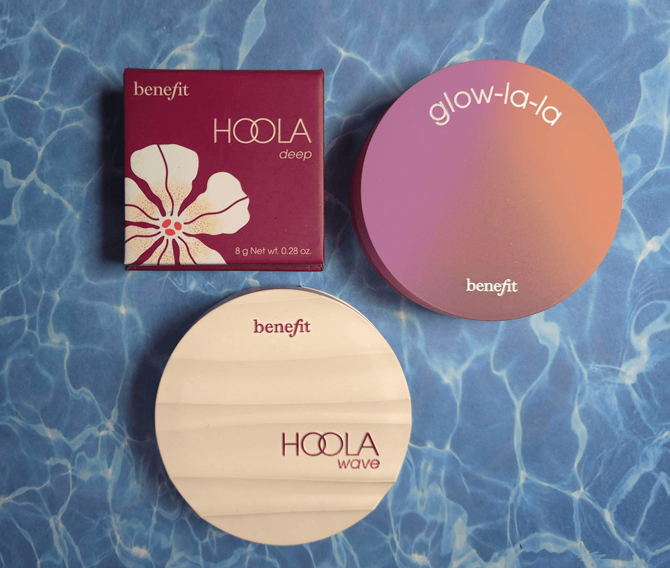
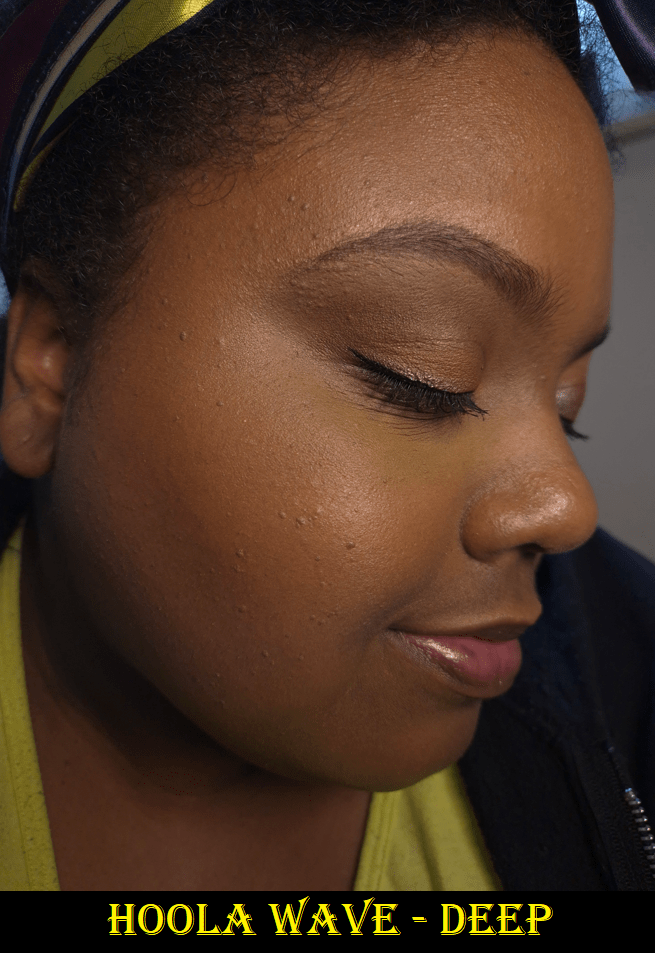
Benefit Hoola Wave Cream Bronzing Balm in Deep

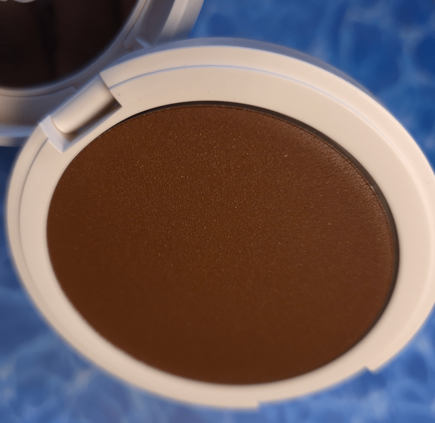
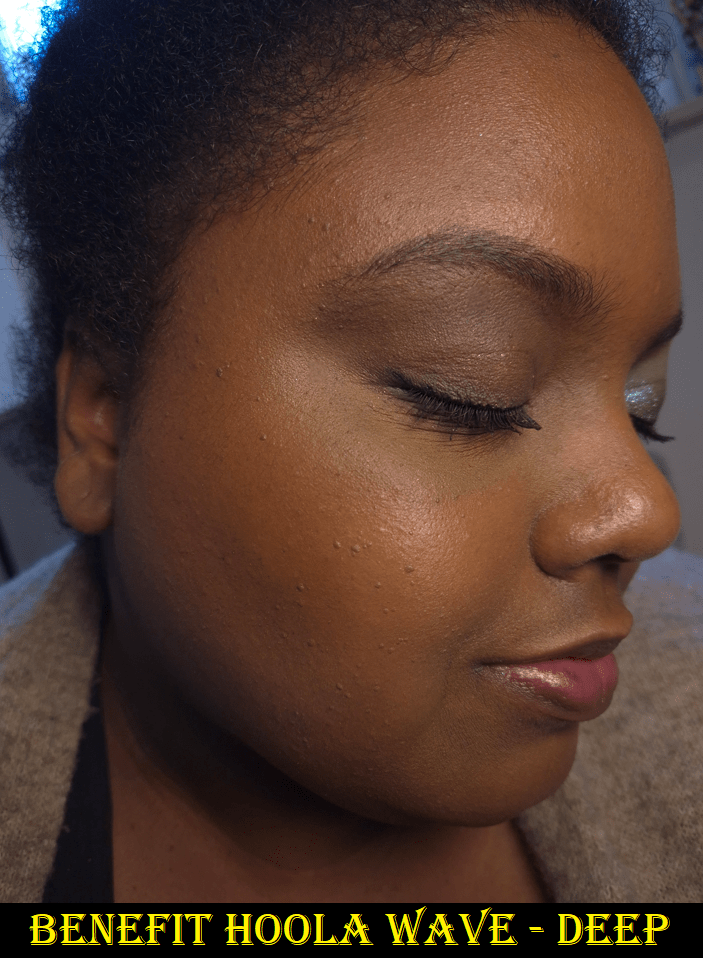
I immediately spotted the gold shimmer particles in the pan, and was concerned that this formula might be like the Juvia’s Place Bronzed Cream Bronzer that looked ridiculous on my skin. I was very happy to see that the shimmer is not noticeable in swatches or on my face. It makes my skin look hydrated with a natural-finish type of glow.

This product sheers out fairly well, so I consider it a blendable formula that can build up in color intensity, but it’s not the slow building type. I get a lot of pigment right away. With my holy grail cream/liquid bronzer brush, the Patrick Ta Contour 1, I have to be careful not to overapply because it’s such a dense brush. However, I don’t get as smooth of a blend when I try to use looser packed brushes.

What works best for me is to tap the bristles into the pan once and then stamp it along the perimeter of my face in big enough gaps so I have room to blend and spread the bronzer out without having too much concentrated in one area.

The texture of this product is not one that I encounter that often. It’s emollient like a cream, but it’s slightly stiff and doesn’t melt as quickly into the skin like the Rare Beauty Warm Wishes Effortless Cream Bronzer Stick or Anastasia Beverly Hills Cream Bronzer. It blends well, but it just doesn’t spread in the same way as the others. It has “balm” in the name, but that makes it sound like it will be sticky, dewy, and/or waxy, which this product is not. The formula consists of silica, waxes, and oils, but it feels balanced in a way that doesn’t lean too much in either of those directions.
Essentially, the most comparable product to this one is the Rose Inc Cream Bronzer that I loved enough to consider one of my top five in the cream and liquid bronzer category, until it dried up unexpectedly quick.
Benefit and Rose Inc’s bronzers don’t have the same formula and this product isn’t as stiff as the one from Rose Inc, so I am hopeful that I will not run into the same issue six months from now. If it does, I will update this post with the details.

The Hoola Wave feels weightless on the face and sets on its own, so I don’t need to powder it, and it lasts all day. If I had to put it on my Bronzer Ranking List, it would be the new #26. That puts it below the Nars Laguna Cream Bronzer and Powder Bronzer, but still above the one from Rose Inc. I like it a lot, but there are many I like even more, including affordable ones. For instance, I think the Colourpop Supershock Bronzer is even better.

I also want to clarify that my ranking list is of all the bronzers I like, not all the bronzers in my collection. So, 26 is still high in the grand scheme of things.

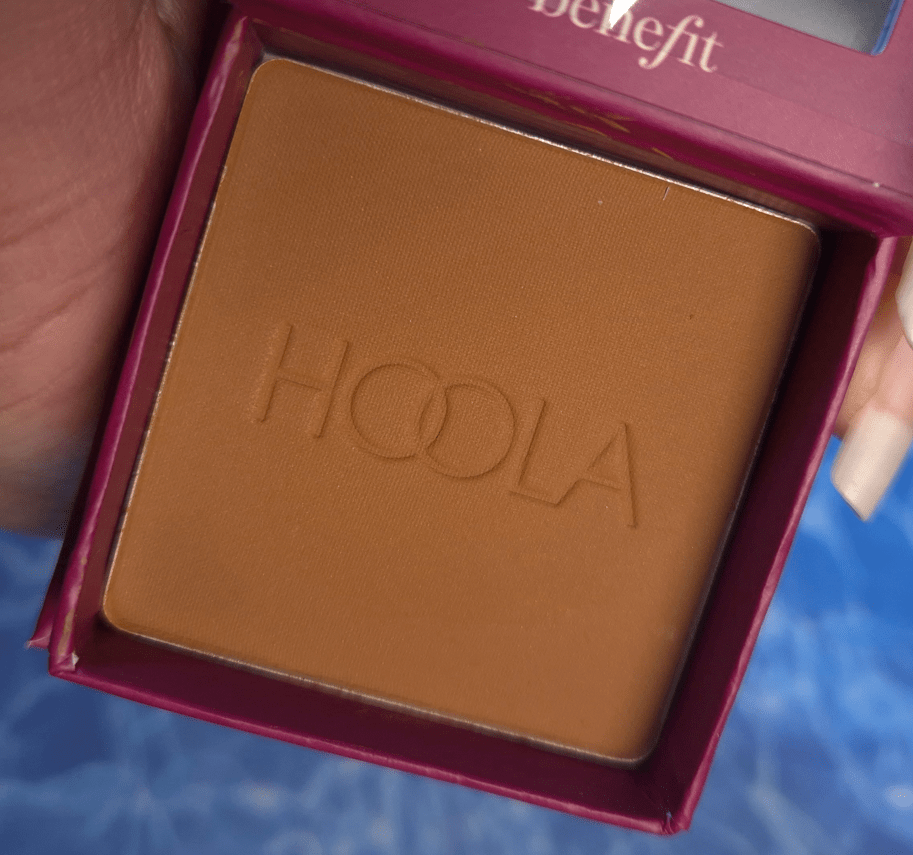
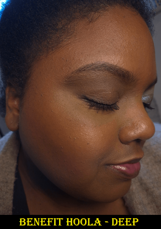
Benefit Hoola Bronzing Powder in Deep

I owned and decluttered Hoola Caramel for being too light and Hoola Toasted for being too red and deep for me. I thought the bronzer quality was fantastic, but whenever my skin would get lighter, I couldn’t use it. Plus, it would get hard pan every time I needed to do comparison swatches. I gave up on it, but continued to wish for a shade between Caramel and Toasted.

So, when I heard about the reformulation and packaging design change, I still wasn’t excited until I saw the shade range. Deep looked, and actually turned out to be, less red than before. I think it’s also a hair lighter, but I don’t have Toasted anymore to be able to compare. As for “medium deep,” which I believe is supposed to be the same depth as the old Caramel, they made it cool toned instead. So, that was definitely not an option for me.
While I’m happy to have a better suited color in a formula that performs just like the old one, it means those that used the old Toasted might not like or be able to wear the new version of Deep.

As I mentioned, the performance is just how I remember. It’s pigmented, but buildble, and it’s easy to achieve an airbrushed look (though not quite as airbrushed as the Charlotte Tilbury powder bronzer). The blend is so smooth and never patchy. There is no added fragrance and I have no issues with longevity.

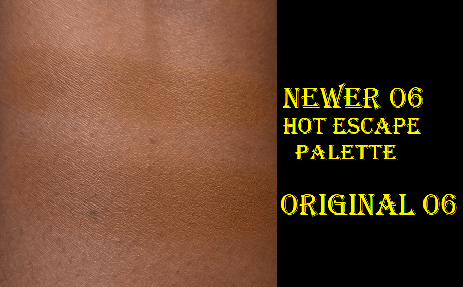
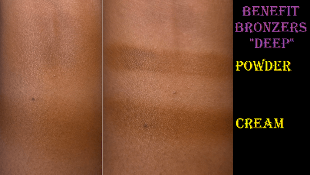
I’m still not pleased with the box packaging, though it’s at least slimmer and matches the size of the Wanderful World blushes. As to whether or not these new ones hardpan quickly, I can’t say because I refuse to put my finger in it, even for science. That’s why the swatches are in the Hoola Wave section and was applied with a brush to confirm Deep is the same shade in both formulas.

In the photo above, I applied it heavily so it would show up for review purposes. However, I can get a sheerer application if I use my airier brushes. In fact, it’s easier to apply a sheer layer of this powder than with Benefit’s cream bronzer.

If I needed to put this on the Bronzer Ranking List, it’s hard to say whether it tops #12 Dior Forever Natural Bronzer or #13 Vieve Modern Bronzer Duo, because I haven’t used those two in quite a while.

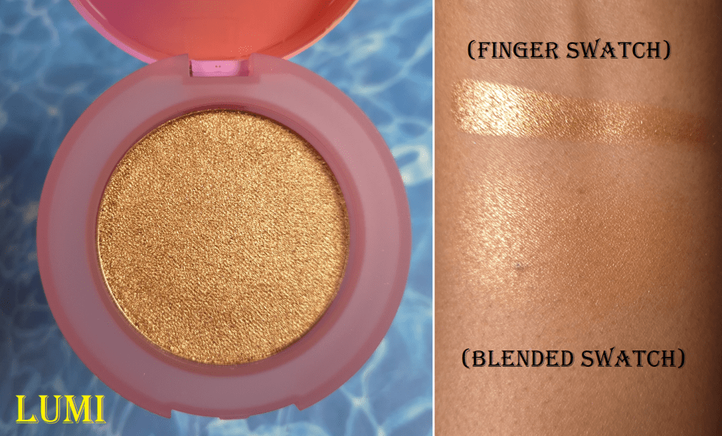
Benefit Glow-La-La Powder Highlighter in Lumi

I waited over five years for Benefit to make a highlighter darker than Tickle, so even though I am supposed to be on a highlighter no-buy, I made an exception for this release.

There are six highlighters in the line (which is more shades than the bronzer), and the one I bought is the second to last color. It makes me glad to see Benefit with an inclusive set of highlighters, especially considering how long they took to create.

This feels as wet and smooth as the Natasha Denona Hy Gen highlighters, and they also turn dry once contact is made with the skin. It’s thankfully also fragrance-free.

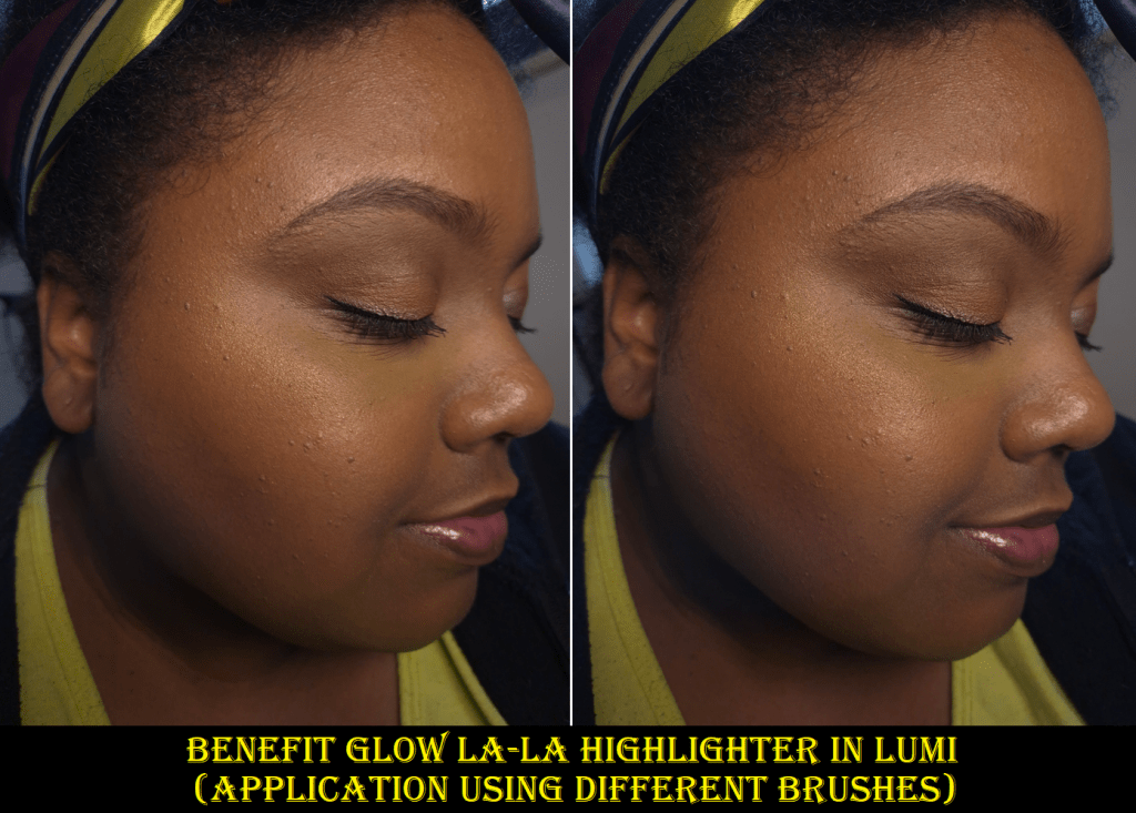
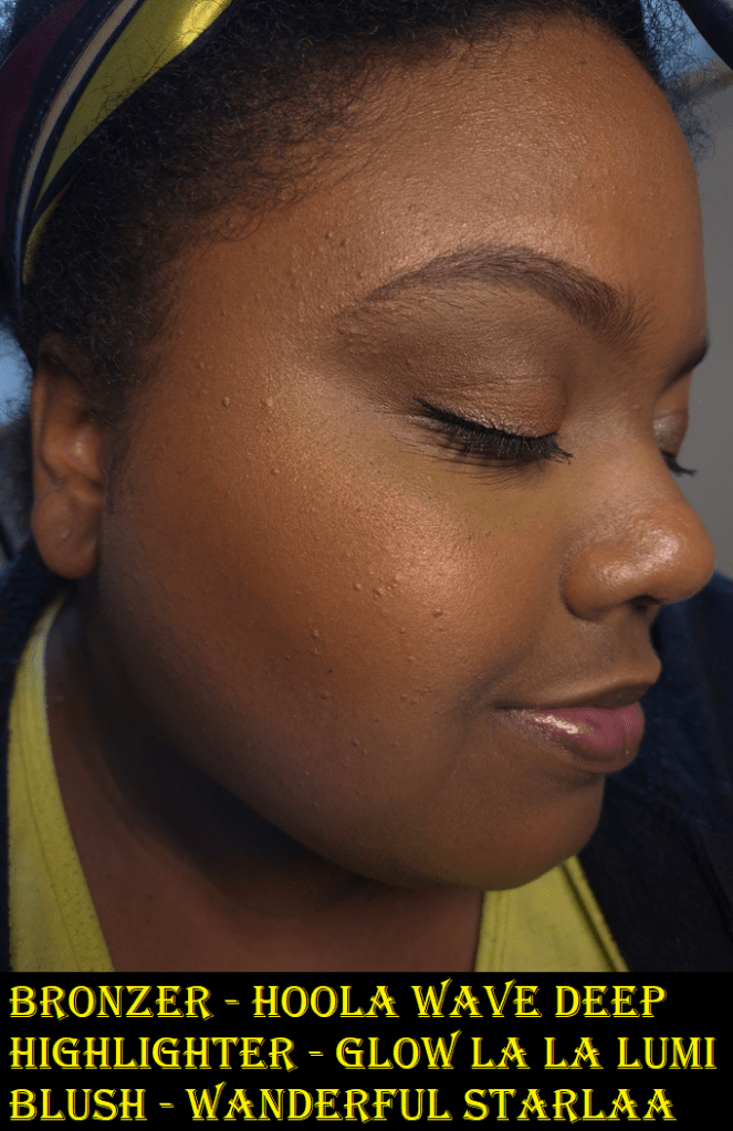
Based on how smoothly Lumi swatched, I thought for certain I would love this. However, when I use this with my holy grail highlighter brush, it looks terrible! It’s pretty from far away, but up close I can see all the individual shimmer particles. I was very unhappy with it in the beginning, so I switched to the Bisyodo B-ES-03, which has denser sections, but it’s thin enough to apply precisely. Using a denser brush to pack on more product helped to alleviate the scattered look effect. Then taking time blending the highlighter (more than any other highlighter I’ve owned) helped to disperse the highlighter more evenly and have the shimmer sparkles closer together so that the overall look is smoother.

I found a way to make this highlighter work, but I don’t foresee myself getting much use out of it if I can’t use it with my favorite brush. I also don’t want to have to put as much effort blending my highlighter as I do when I’m blending eyeshadows.

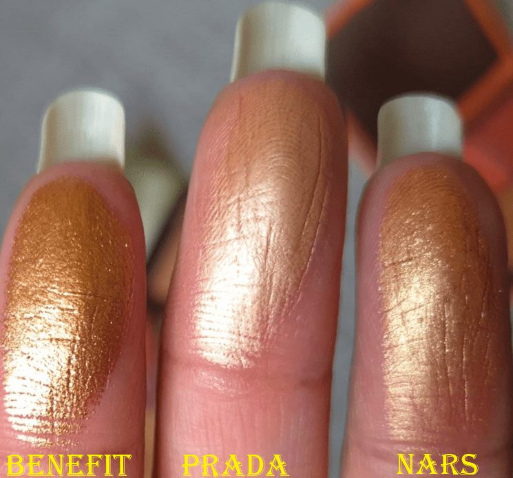
The brand succeeds in creating a “wet look,” which is a positive thing, but visible shimmer is a stronger negative in my book. I purchased the Prada highlighter a week or two after this one, and the differences were even more glaring. Quite a few of my friends on Instagram like this highlighter from Benefit, and it’s made in Italy, so the brand probably spent quite a bit of money in the formula. It’s still just too far from my preferences.

Also, I don’t think this should be priced over $30. Yes, this is coming from someone who spent a lot on a Prada highlighter refill.
I’ve been glad to see plastic packaging instead of cardboard from Benefit, but it feels so cheap in the hand! It’s still way bulkier than it needs to be.

I can recommend the bronzers, but not the highlighter. The blushes are still some of my favorites too, so I still recommend those!

That’s all I have for today! Thank you for reading.

-Lili

Laura Mercier Bronze Color Infusion Review

This is number 3 of 4 in the Summer Bronzer Series where I post a bonus review every week in the month of July! The links are in blue to Part 1 and Part 2.

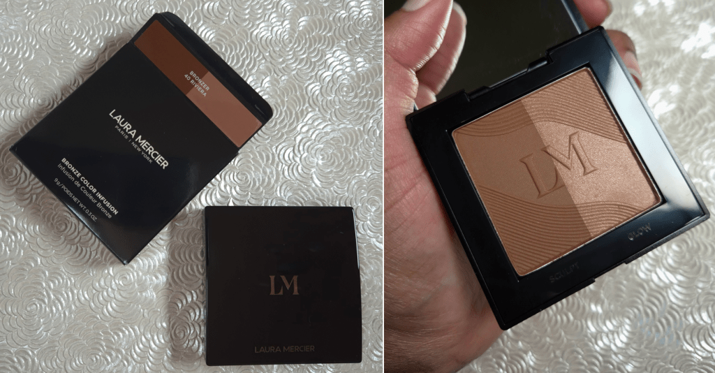
Laura Mercier Bronze Color Infusion in 40 Riviera

There was a lot of buzz surrounding this product within the first few weeks of being released, but so many bronzers have launched since then that have maintained their hype for longer.

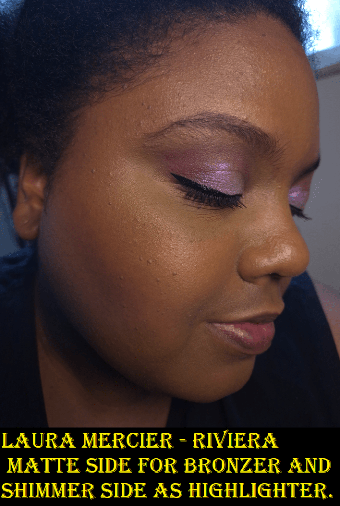
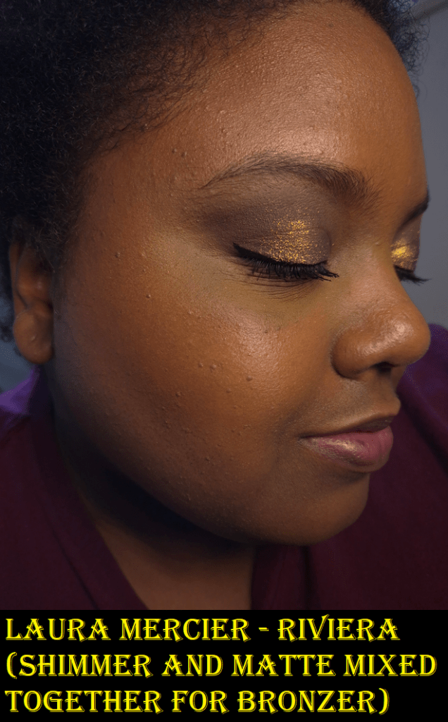
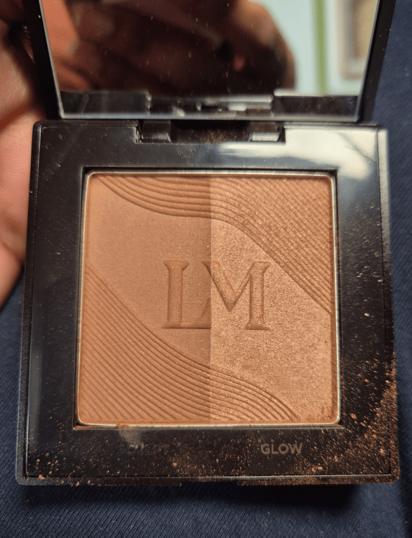
What appealed to me is the ability to use the sculpt side if I’m in the mood for something matte or the glow side if I want some luminosity. I go through phases of wanting both, so a product like this seemed brilliant. It can be a staple in someone’s collection, so long as the colors are a good match. For example, I cannot use the glow side by itself because the base color is light on me, in addition to the way light reflects off of it. I can still use it as a highlighter, plus mix both halves of the compact together to create a glowy bronzed look, but if I found no use for one of the two products, then it would be the same as using an individual bronzer anyway and lose its advantage over single bronzers. I hold this product in high regard, but neither half is impressive enough on their own to enter the top 30 of my ranking list, but the combination could.

There can be quite a bit of kickup, so I never swirl my brush in here. I use some of my smaller light-medium density brushes if I want to use each half separately, or the Sonia G Smooth Buffer to pick up product by tapping the brush into both sides.
In order to continue being able to use them separately or together, I try to reserve putting my brush into the top half of the pan for mixing, but sometimes I forget.

The matte side feels soft, is pigmented, and blends nicely (though I have some that are even more blendable). It becomes one with my foundation and can look quite natural.
The shimmer side is finely milled with very tiny shimmer specks that are subtle enough to remind me of my favorite set of Guerlain meteorites. Despite how refined it looks to my eye, when light shines on it, it emphasizes texture a little more than I prefer.
It’s like a subtler powder version of the Glossier Solar Paint, which I decluttered for the same reason. Both formulas have synthetic fluorphlogopite in common, which is an ingredient that can look stunning in products, but I think the brand used too much of it in here, especially coupled with mica too. Basically, the color is subtle, but the reflect can be intense.
Since my texture isn’t too bad on the top of my cheekbones, I still don’t mind using the glow side as highlighter. It’s just when I use both sides of Riviera as my bronzer that I feel it looks beautiful, but I also just try to ignore the fact that the bumps around my face are more pronounced.
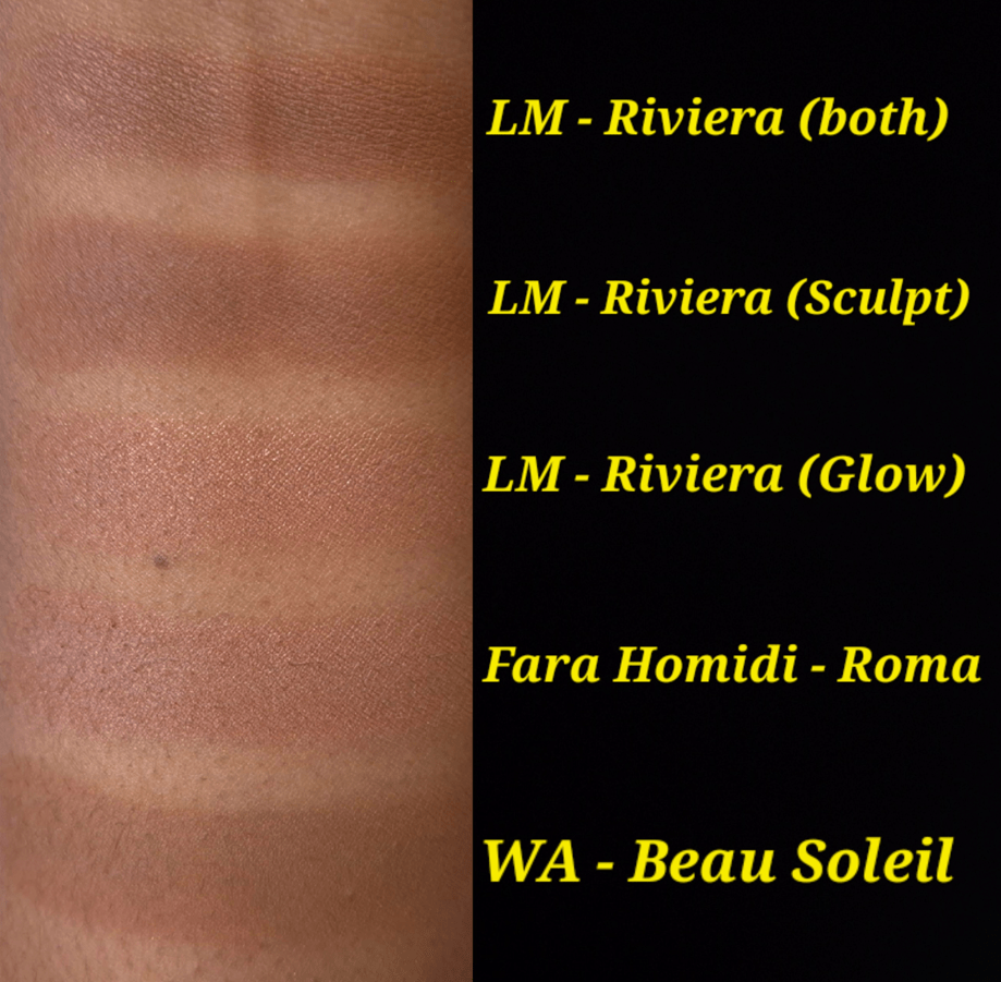
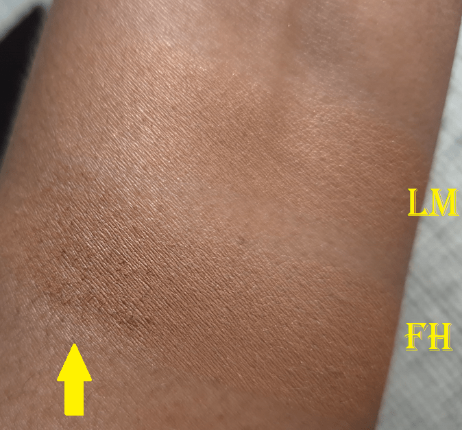
The swatch section shows some of the shimmer particles in Riviera (Glow) compared to Fara Homidi’s Roma, which has a lumi-matte finish. Roma doesn’t draw the same kind of attention to texture on my face.

One other thing to note about the shimmer is that if one’s face is too dry, it has a harder time adhering. On minimal makeup days, when I’ve skipped foundation and my skincare was dry to the touch, the glow side that I used as highlighter would disappear in under two hours. So, I had to start either spraying my face to give it something to grip onto, or only using this product on days when I’m wearing foundation. Then I no longer had issues with longevity.
The matte side was long lasting in every situation.

Another customizable product released this year was the Givenchy Prisme Libre Bronzing and Sculpting Powder. In my review for it, I mentioned that time would tell whether I would embrace the customizing aspect or revert back to using my individual favorites. The reality is that I only used it about three more times after the review. That was a great product, and so is this, but I foresee myself also setting aside this bronzer in favor of my individual bronzer and highlighter holy grails.
I’ve come to realize that trios or other kinds of face palettes rarely get used by me for long. The only exception has been the Hourglass Ambient Lighting Edit palettes. Even my Sephora Collection Microsmooth Multi-Tasking Baked Face Palette that I used for a few years has taken a back seat to the Hourglass ones.
Since the Laura Mercier Color Infusion is a duo, there is still hope it won’t be wasted in my collection!

Before we end this, I do want to point out that I’m surprised this release hasn’t gotten more hype. Right now, people are still raving about the Fara Homidi bronzer in the shade Bois for being a fair skin person’s dream bronzer in terms of color. To me, this range from Laura Mercier doesn’t have standard colors. Riviera is listed as a neutral, but it’s a bit pink on me. The lighter shades, in order, are described as peachy bronze, rosy bronze, and caramel bronze. The darkest shade would be a blush on me because of how red it looks, but at least it’s something I haven’t seen before.

This bronzer is nice, but not a necessity for someone with a large bronzer collection already.

That’s all for today! Thanks for reading!

-Lili

E.L.F. Halo Glow Powder

I’ve always liked this brand, and their products are good, but they don’t end up being staples in my collection. The makeup I like most from e.l.f tend to be dupes for higher end products, which I consider to be nearly as good, but not better. This is the only reason I don’t review e.l.f products as frequently on this blog, because I already own the makeup they’re creating alternatives for.

I didn’t realize a loose powder version was released long before this pressed one. In Germany, the loose powder is €9 for 6.8 grams and €16 for 10 grams.
I’m not certain if this is supposed to be similar to anything else on the market, but I was intrigued enough to want to give it a try.

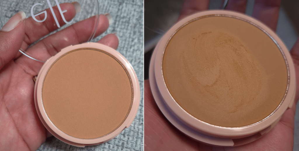
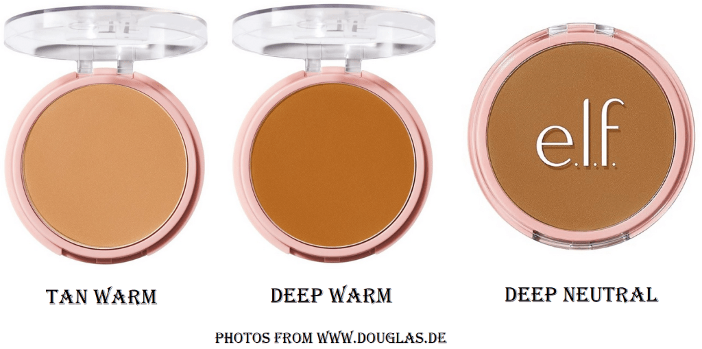
e.l.f. Cosmetics Halo Glow Powder Filter in Tan Warm

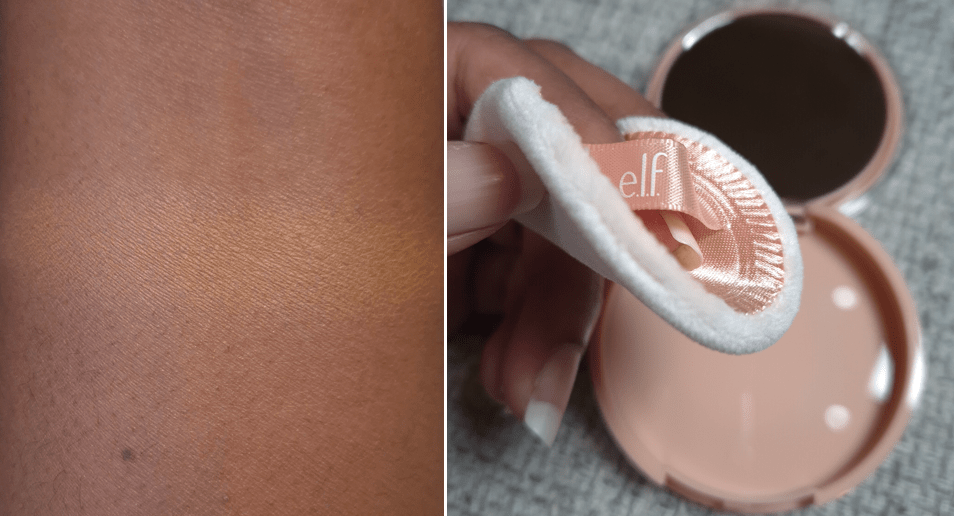
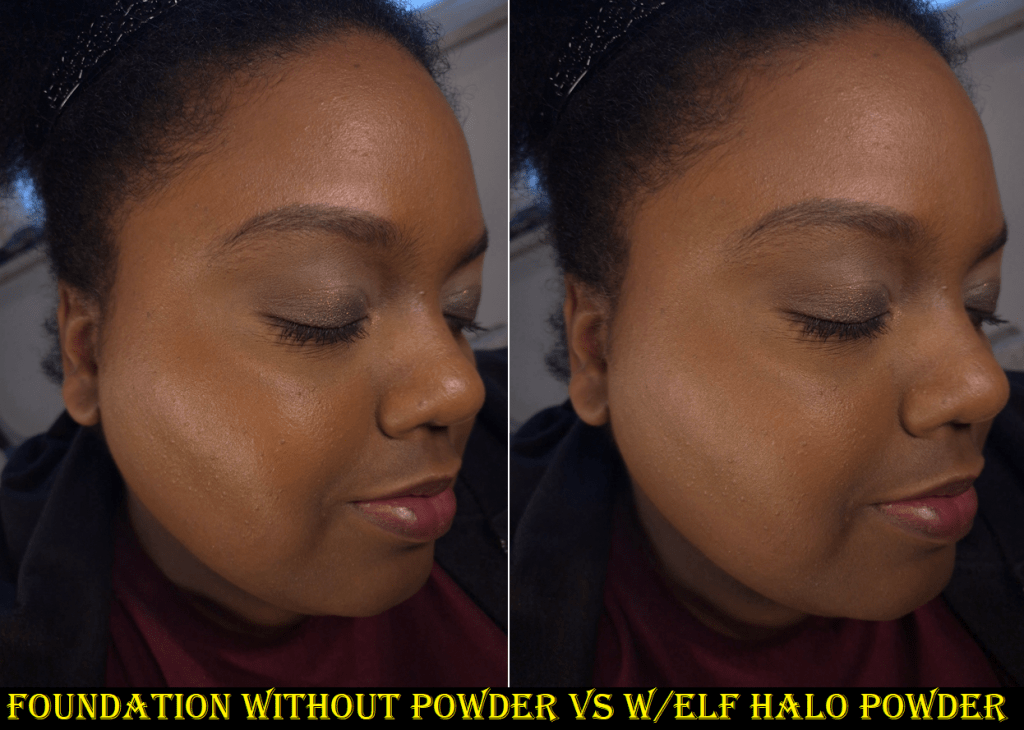
This gave me quite the great first impression! It’s not a weighty product, but I was pleased to see that it had a mirror, as well as a velvety puff. The powder is so soft to the touch and is not hard-pressed, so one has to be careful not to pick up too much powder with a brush. This isn’t translucent and slightly lightens my foundation, so I prefer using a brush with this rather than the puff that packs on a lot of product. That way, the color isn’t a problem for me. Based on the photos I’ve seen, I still think I picked the best one for me.

This looks beautiful over a moisturized base, but it doesn’t look that smoothed or blurred over dry patches. It sets my face in the sense that it dries the emollient spots, while still allowing for some luminosity (that I assume is from the Synthetic Fluorphlogopite), but it doesn’t really control oil. If I’m using emollient skincare, my face will start to get that wet-shine look again as the day goes on. This is a great thing for me and the kind of look I try to achieve in the wear of my makeup. I figure this could be a problem for others though.

I’ve used this once to set down my concealer, but it got broken down around 4-5 hours in. So, I haven’t used it that way again. A finishing powder isn’t really intended to set, but I wanted to test it anyway. The Charlotte Tilbury Airbrush Flawless Finish Powder has “finish” in the name, but I only like to use it under my eyes because it’s too drying for me elsewhere, and acts more like a setting powder on me. So, I can’t always judge products based on their name.

I think this is a good pressed powder for someone with dry skin who uses products that will allow glow to shine through, but doesn’t want to look overly luminous.
It’s probably not fair to compare this to my Dior Powder No Powder that’s like 4 times more expensive (and seems to be discontinued), but I prefer the sheen in that one way more. In fact, there are several other high end products that I prefer over ELF’s, but I can’t think of a single other drugstore finishing powder with a texture and performance as nice as this one.

Huda Beauty created something similar with their GloWish Luminous Pressed Powder, as well as Melt with their Glazed Skin Sheer Finishing Powder. Both were so glowy that I could only use them as highlighters. I believe ELF has done a better job. Even though this product has not become a staple in my collection (because it couldn’t compete with my holy grail finishing powder), I recommend it as a budget-friendly alternative for someone without a lot of uneven skin texture. That part is key.

Thanks for reading!

-Lili

Fara Homidi Essential Bronzer Review

This is number 2 of 4 in the Summer Bronzer Series where I post a bonus review every week in the month of July! Part 1 can be found HERE.

A few months ago, I was unfamiliar with Fara Homidi and her brand. However, their bronzers started to get incredibly popular due to the luxury makeup reviewers with fair and light skin raving so enthusiastically about the color Lumen and most especially the shade Bois.
I became more and more curious to see if anyone would go crazy over Roma and Ombra too. I waited for weeks and still couldn’t find a single review from someone with a tan or darker skin tone. So, I purchased the refill to try it for myself and see if the hype was justified.

Fara Homidi Essential Bronzer (refill) in Roma

Packaging/Refill

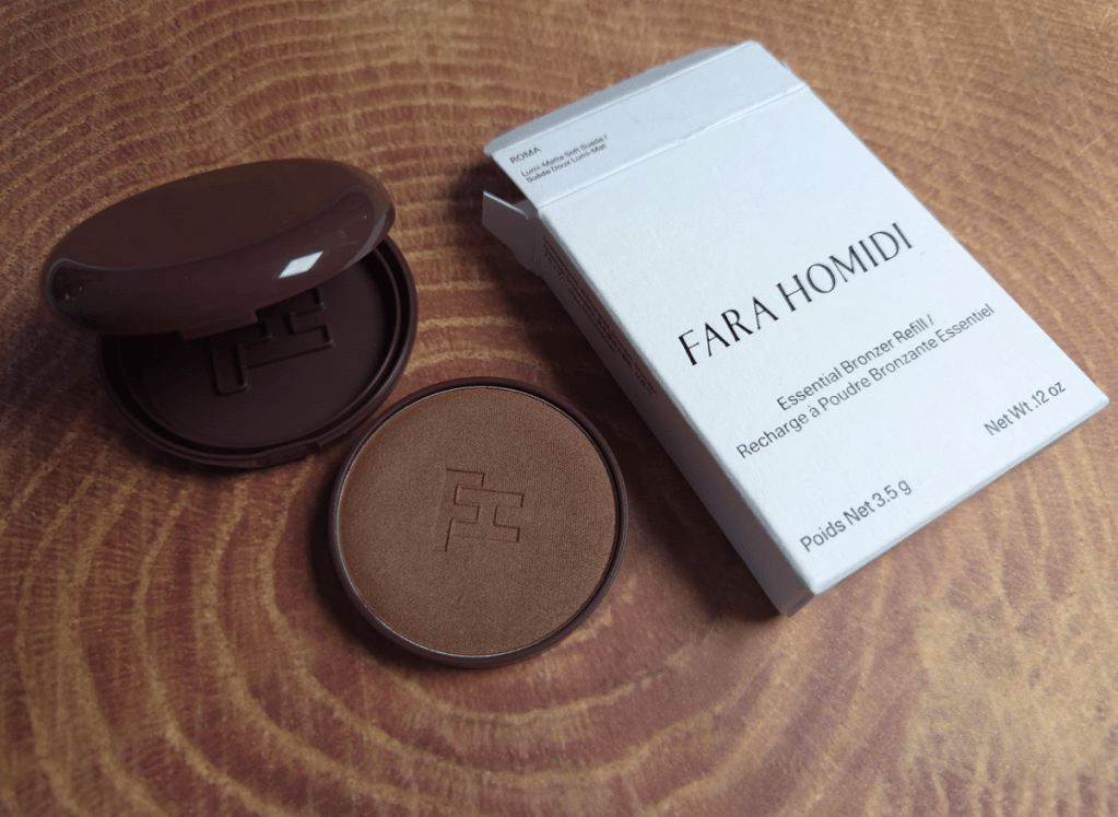
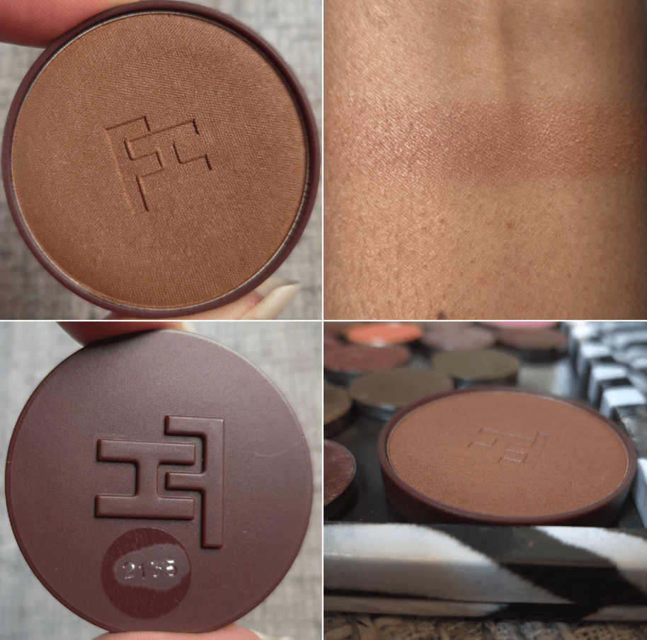
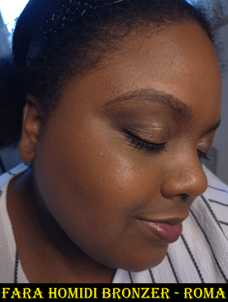
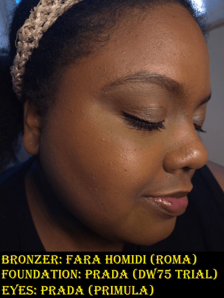
I was pleasantly surprised that this refill came in a thick plastic clamshell that mimics the real packaging in shape and color. The real compact is matte brown and made of “hand-polished lacquered metal,” but the refill packaging is shiny, as seen in the first photo of the post.

The outside of the refill is made of “42% cellulose-based plastic,” and underneath are the raised letters ‘FH’ that fits into the ‘FH’ on the bottom of the clamshell container. The bronzer is actually pressed inside a metal pan, but it has that brown colored plastic encasing it.
So, the compact and refill pans are magnetic, but the magnetic pull is not strong enough for the pan to adhere to a separate Z-palette on its own. I have heard that the Fara Homidi compacts are weighty, so I assume the strong magnet is what locks the pan in place while contributing to the packaging feeling heavy.

I am pleased enough with the plastic case to keep the refill in there, but for anyone intending to add a metal sticker to the bottom and put it in a standard empty magnetic palette, just know that the refill height is above the edge, as seen in the bottom right corner of the second photo above. My example is how it sits in a large Z-palette. I can still shut the lid, but I recommend that someone place it in a deeper type of custom palette specifically made to house large domed products to ensure the sides are high enough.

Choosing a Shade

Regarding the color, I thought Roma was unique in my collection until I compared it to the “glow” half of the Laura Mercier Color Infusion Bronzer in the shade Riviera. The base color is deeper and more red in Roma than Riviera, which is why I can actually use the shimmery side of Riviera as a highlighter, but I cannot do that with Roma. They look so similar in natural light, but at night under daylight lights that wash it out, the difference is far more obvious.

When I pick up the product without rubbing, it looks darker. Once it’s smoothed out, it looks lighter. I think that has to do with the ingredients used to make the Fara Homidi Bronzer look luminous (mica, boron nitride, or the combination of both), which also lightens the overall appearance. It’s why the bronzer looks different in the pan depending on how much light is shining on it. I cannot see any shimmer specks, but there is a beautiful sheen that is very much apparent when blended in.

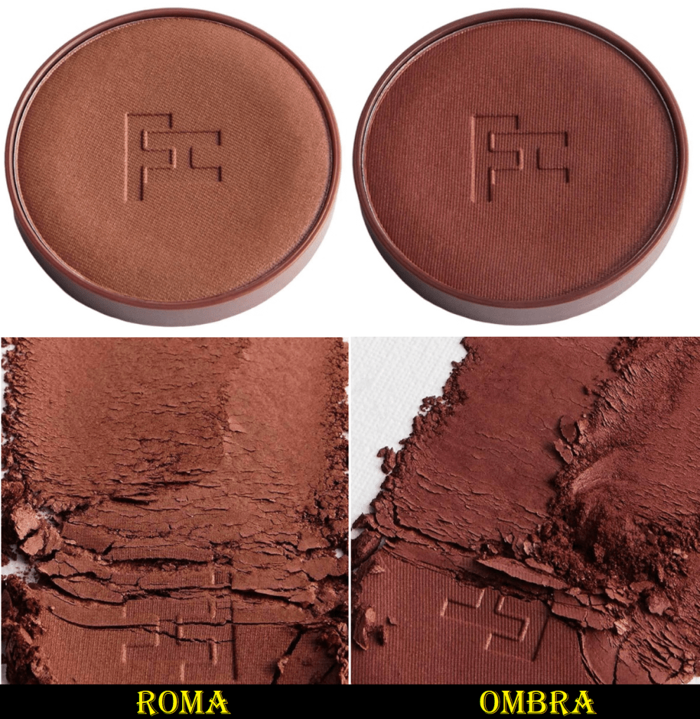
I feel confident in my choice to pick Roma over Ombra, but I have to share the photos from the Niche-Beauty website to explain my point.

Photo Credit: Niche-Beauty

The scraped pictures shows the undertone of the bronzers the best, even though it will appear a little lighter on the skin. Ombra looks almost purple with how richly red it is. I’m sure it would look gorgeous on someone else, but when my skin burns it turns more like the color of Roma.
That being said, I’m still not sure if I’m in love with this color. It’s not the kind of red that I flat out dislike (such as the original Benefit Hoola Toasted bronzer), but my favorite bronzer colors are yellow/golden, golden-orange, or neutral-brown that appears deep pink rather than red. There was a time when I liked the sunburned look, so when that inevitably becomes favorable to me again, I think I will appreciate the tone of Roma a lot more. This is especially coming off the heels of disliking how red I became while in Florida three months ago.

I mentioned that at the time I made my purchase, there were no reviews of the darkest two shades. It takes me ages to test and complete my posts, so there are videos available on YouTube by now. I’ve seen people much lighter and much darker rocking Roma and being happy with their shade selection, so the limited range seems to stretch quite a bit at least. I’m still not completely satisfied, so if the brand extends the shade range and releases another deep option in a different undertone, I would be tempted to buy it.

Performance

The brand calls this bronzer a “soft suede,” which perfectly describes the softness level of the powder. It has a slightly clay-like feel from how smooth it is, but it’s far softer than even the Glowish Bronzer that comes first to my mind when I think about clay-like textured bronzers. The product picks up easily on my brush, and I get kickup, but I can apply such a thin even veil of color to my face. The healthy look that my skin has, after I’ve applied hydrating skincare that leaves me with a subtle glow that is fully dry to the touch, is the kind of lumi-matte finish that this bronzer bestows to my skin.

Even though the powder is so thin that it doesn’t look like I’m wearing any on my face, it’s still quite pigmented. Trying to find the right brush in the beginning was tricky because I knew that this bronzer should be capable of giving me an airbrush finish, but even my top five favorite bronzer brushes were too dense. I can blend this product out, but the bronzer looks more natural on my skin if I build it up instead. I went as far as to use this bronzer with my Hakuhodo 2025 Gradation Sakura Limited Edition Brush that is partly synthetic and most similar in shape that I have to the one sold by Fara Homidi, but I needed something even airier to make this particular shade look natural on me. The rephr kōyō brush turned out to be the winner! It makes this bronzer perform to its full potential! A good color match and the right brush is key. If these two conditions aren’t met, I don’t think this bronzer will be enjoyable to the purchaser.

Issues

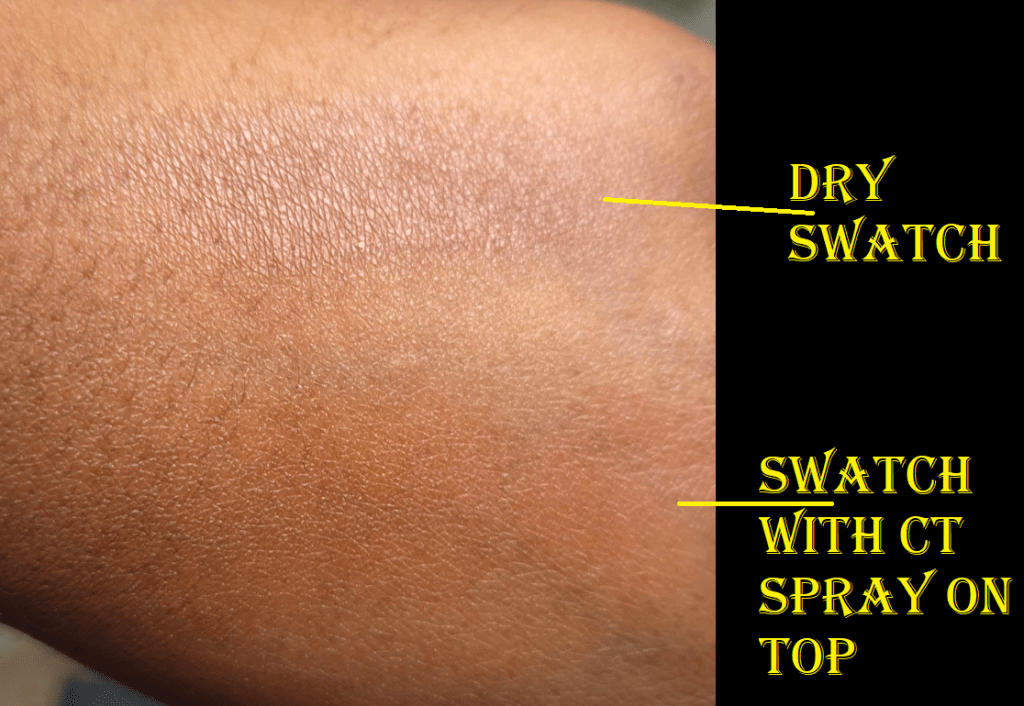
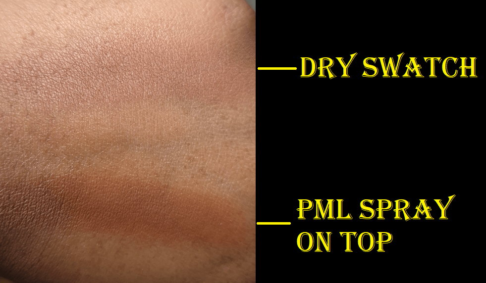
This bronzer is long-wearing no matter if I put it on top of bare skin or a full face of makeup. One minor inconvenience is that it turns unnatural looking again if I use one of my glowy setting sprays on top of it because it intensifies the color, which draws attention back to the fact that it’s not the perfect undertone for me. Imagine my surprise when my bronzer looked blurred with a slight veil of reddish brown, only to turn into a higher saturated red after I sprayed my face!

This change in color happened with Charlotte Tilbury and Pat Mcgrath’s glowy sprays, plus MAC Fix+, but it only happened with the Huda Easy Bake Setting Spray when I held the bottle too close to my face. It’s a problem I can easily avoid by just not using a setting spray, but I do count this as a point against the bronzer. Some people will use sprays with this product, and perhaps it will be fine if the tone of red is flattering for them, but for others it could ruin the whole makeup look.
Also, when my face was a bit dewier, or when I put skincare and still-wet foundation on the back of my hand to test how it looks if I applied the bronzer on top of a wet base, the color didn’t change as much. So, it seems to be a problem with moisture hitting the top of it and not moisture from underneath, as if it removes the sheen to unveil the base color within.

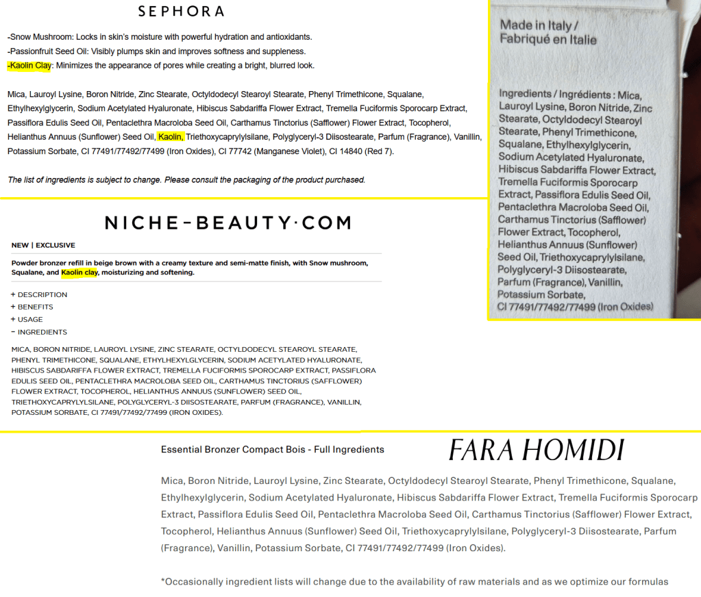
This has a very creamy and moisturizing formula with the Squalane, Sodium Acetylated Hyaluronate, Snow Mushroom (Tremella Fuciformis Sporocarp Extract), Ethylhexylglycerin, and various oils. One thing that has me a bit confused is that Niche-Beauty also includes Kaolin Clay as a key ingredient, and there is a description about it in the “benefits” section. However, I don’t see kaolin clay or its various alternative names on the full ingredient list on my unicarton or the Niche-Beauty website, and kaolin is not mentioned on the Fara Homidi website. However, it’s there on the Sephora US website between the Helianthus Annuus (Sunflower) Seed Oil and Triethoxycaprylylsilane.

Since the official website states, “Occasionally ingredient lists will change due to the availability of raw materials and as we optimize our formulas,” it makes me wonder if kaolin is actually in here and someone forgot to list it on the unicartons and every website, or if an earlier version of this product had kaolin, but what’s on the market currently does not.

It’s not unheard of for a hydrating formula to still have kaolin clay, zea mays, or some other dry ingredient to help balance things out. It doesn’t effect me whether that ingredient is in here or not, but I’m including this information since it could be important to someone else.

Another thing to note is that this contains Parfum and Vanillin. It has what I associate as a “beachy” smell in the tropical sense. It smells a bit like coconut and vanilla. I think it’s a pleasant scent and it’s not very strong, so I don’t mind it being in here.

Final Thoughts

I have a small twinge of regret in not buying the full compact because I like weighty makeup packaging. However, what I might do is wait for the brand to release blushes or some other product and see if the packaging for that one is even prettier.

Overall, I think it’s a very beautiful product and I don’t regret buying it. I understand the hype. This has the makings of being a perfect product for a select group of people, but it’s not going to be universally loved. As unique as the texture is, the performance and results are able to be matched by other bronzers. It’s not going to be an effortless blend for those that don’t have the right tools, and even if this had the best formula in the world, it doesn’t matter if it’s not the right color for the user. Then, of course, is the setting spray issue. For these reasons, I don’t feel that it’s amazing enough to be worth a casual makeup wearer saving up their money to buy it (unless the shade match is stellar). However, I think luxury makeup lovers and enthusiasts may see value in a bronzer like this. For some people, the packaging alone makes it covetable.

I feel it is too soon to rank this bronzer among my collection because I can’t make up my mind on how much weight to give the pros and cons. I have tried to be as fair as possible in this review, but I want to see how I feel several more months from now. I love the texture, I like the performance, but I need to see if my uncertainty about the color will lower my opinion of it over time.

*UPDATE AUGUST 4th, 2025 – I reevaluated my bronzer ranking list and this bronzer is currently sitting at 7 out of 49.

That’s all for today! If you like this kind of content, be sure to click follow to be notified the next time I post! Thank you for visiting!

-Lili

Indie Brand Spotlight: Fantasy Cosmetica

I’ve always liked the fantasy genre, so this brand intrigued me from the moment I first heard about it. What took me so long to finally make a purchase was just the fact that my obsession with eyeshadows calmed down ever since my botched Low-Buy in 2022. It was easier to avoid overspending if I ignored trying new-to-me brands. Leaving the US also played a role, since I had less access to a lot of indie brands. However, I finally looked into Monolith EU’s website, and started trying different indie brands again through that online retailer.

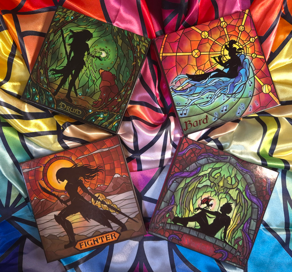
I purchased the Druid Palette in September last year and loved it so much that I considered buying additional eyeshadows. The issue was that I didn’t love a lot of the full color stories of the others palettes enough to be worth the upcharge from Monolith beyond the 19% VAT. Although Fantasy Cosmetica sells eyeshadows individually on their own website, Monolith does not.
When Black Friday rolled around, I considered ordering their single eyeshadows and have them shipped within the US, but the discounted prices were such that it made more sense to actually buy the palettes in full! During my two week vacation, I tested out the Fighter, Warlock, and Bard palettes so that I could decide which of the eyeshadows I’d keep and which ones I’d leave behind, but I took them all!

All four palettes discussed today are part of the “Classes” series. At the time that I’m writing this, there are nine in total. I’ve played a few MMORPG’s in my early years, and it’s a bit funny to me that none of the characters I’ve been are in this collection of nine!
I love playing a healer type in any game whether it’s a main healer like a Cleric, a partial tank-type like a Paladin, or a damage dealer like a Mage or Psychic. I’ve played a Shaman, which I guess is closest to a Druid. I’ve also been an Archer and low level Hunter, which is closest to a Ranger. Mage is probably closest to the Wizard.
My point is that I’m shocked there still hasn’t been a Cleric, Paladin, or Priest! Perhaps one of those could be coming next.

First, let’s talk about the palette that turned me into a fan of this brand, which is Druid.

Druid Palette *NEW stained glass style*

I put “new stained glass style” in the title because that’s how it was listed via Monolith. However, I don’t know what the original palettes used to look like. The oldest videos I’ve seen have palettes that look similar to mine, so I don’t know what the differences are supposed to be.

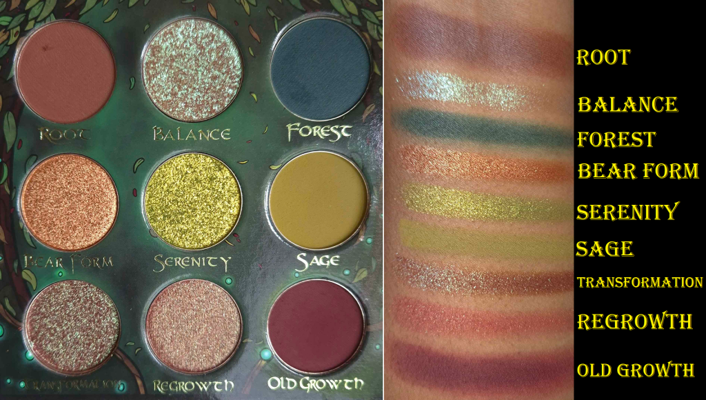
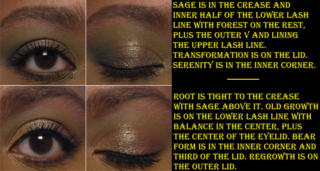
I have learned, based on these four palettes, that the Fantasy Cosmetica formulas has the kind of balance I love between high pigment and ease of use. The mattes are opaque, easy enough to blend (minus Old Growth) and layer well on each other. It’s not on the same level as Pat Mcgrath or YSL, but it’s almost on par with Oden’s Eye, which is great. The array of colors in this palette excited me as much as the Earth Palette from Lethal Cosmetics, but I prefer how these eyeshadows from Druid perform way more!

Some of the shimmers are on the satin side, but always in interesting shades to create a statement in at least that way, while the other shimmers are sparkly and impactful without looking chunky. They are creamy enough to spread easily and smoothly, but not emollient or slippery enough to crease on the eyes. How the eyeshadows look at the start of the day is how they’ll appear at night.

As I mentioned, the only matte that is harder to blend out is Old Growth. Wherever the shadow gets placed, it doesn’t really want to move from that spot. I remember the time period when Colourpop used to make this kind of shade a lot, and many of them had this issue as well. I think it has to do with the red-brown pigments used.

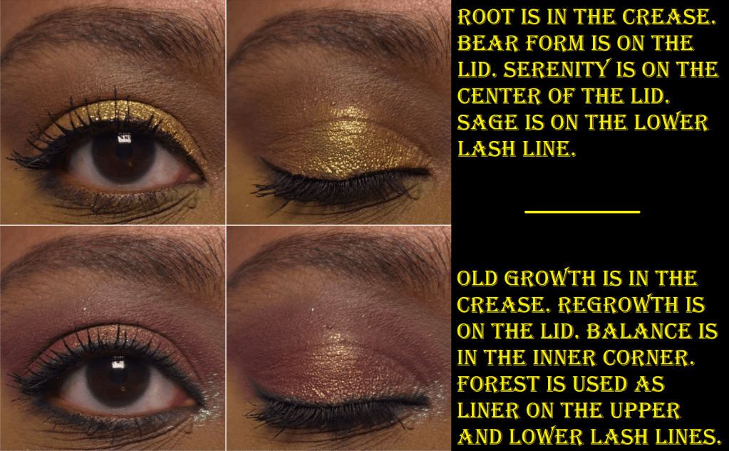
The only shimmer to give me an issue is Regrowth, which has a tendency to try to hard-pan. This eyeshadow has a red base and gold shimmer, but the hardpan is how I ended up with a matte looking outer corner in the 4th eye look above.

The most “boring” shimmer is Bear Form which is a metallic brownish orange. It’s pretty, but doesn’t have any special effects. Another one that appears like it should be straightforward is Serenity, but it has a yellow to green shift. It looks lime green in the pan, but it looks very yellow on my eyes.

One of the stars of this palette is Balance, a transparent-based eyeshadow that can be used like a topper. It has pinkish-purple, aqua, and green shimmer. The other star is Transformation, the multichrome that goes from red to purple and then greenish blue. Green is the predominant color on my eyes.

This isn’t a perfect palette, but I really like it.

Fighter Palette

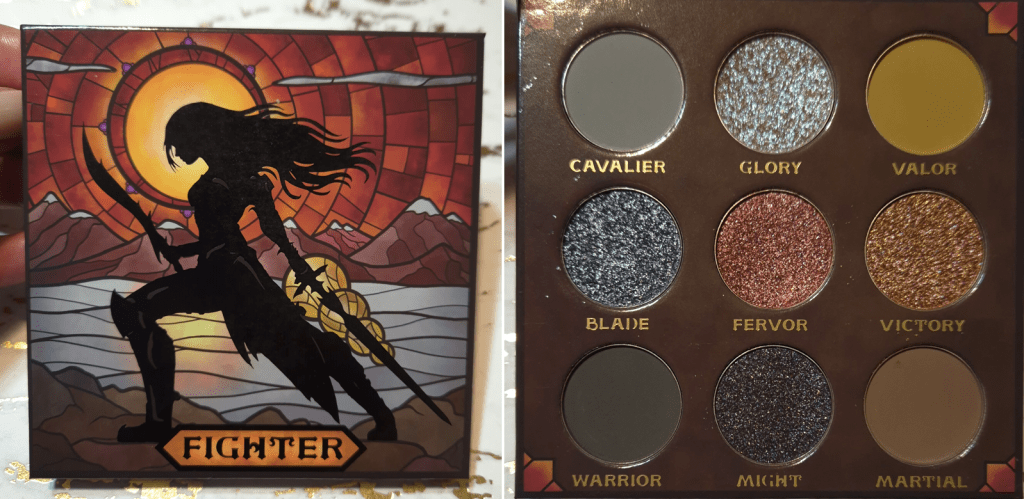
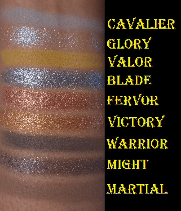
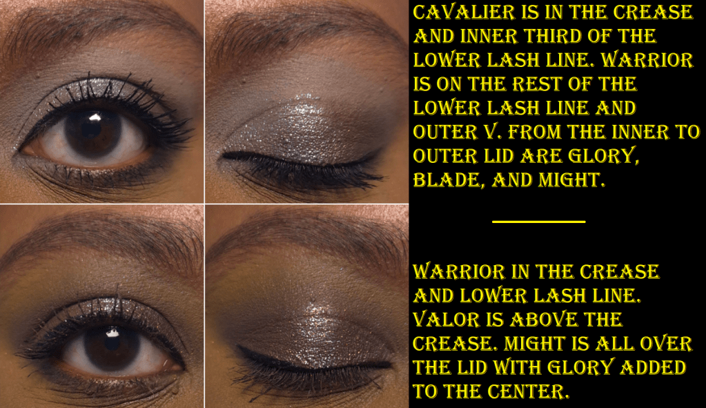
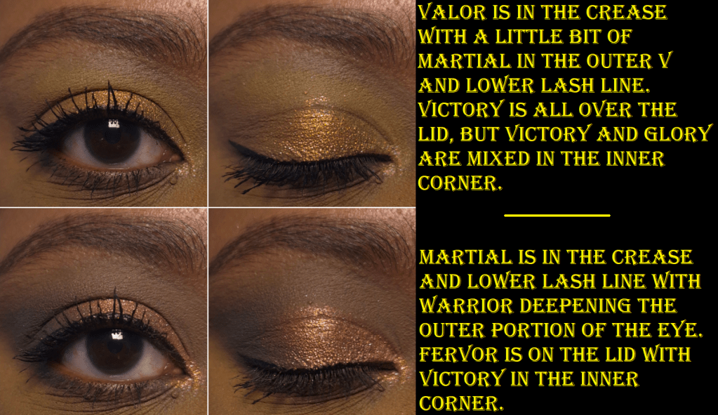
This is the most neutral color story available out of the Classes palettes. Therefore, I’m not surprised that this is also the palette with the most “traditional” type of shimmers. Glory is very much the standout. The base color is very sheer, but I can faintly see it’s yellow-brown, and the shift goes from pinkish-purple to blue. Might is also a fun color with its dark purple base and gold shimmer, but it looks like a very blackened purple when I use it on my eyes. I’ve noticed it hasn’t been as easy to see the gold on my eyes, and it looks like it’s wanting to hardpan like Regrowth in the Druid palette.

The three shimmers in the middle row of the palette are wetter and fairly thick. According to the brand’s description, Blade is a, “multidimensional shimmer – silver base with green and purple shifting sparkles.” Realistically, it’s a dark silver. I can faintly see purple specks if I rub the eyeshadow across my skin super thinly to sheer it out. I don’t think anyone would be able to tell there was any nuance to the silver when it’s on my eyes.

Fervor is a red with silver sparkles. The silver gives this eyeshadow more of a twinkling effect, but it’s still my least favorite color in the palette. It’s objectively pretty, but I’m not a fan of these kinds of reds.

And then finally, Victory is a, “multidimensional shimmer – warm brown with pink and silver sparkles.” Again, it looks pretty much orange to me. I can see some of the pink at a very sharp angle that I’m not so sure anyone else would be looking at me from.

Once more, the mattes are wonderful. Warrior is a little less blendable than the others, but it’s still good enough for me.

I go through phases of liking neutral palettes. Something about the curation of these colors and the way they look on the eyes paired together is very intriguing to me, no matter what my mood is. The only outlier for me is Fervor, but I can always swap it out with an eyeshadow single from another brand.

Warlock Palette

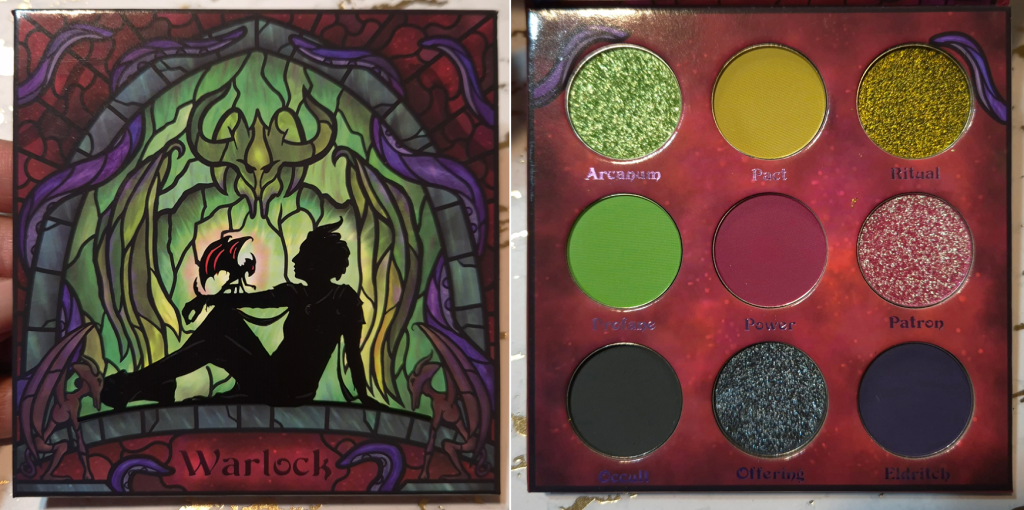
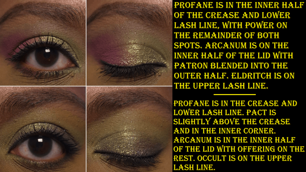
This palette is a surprise hit for me! Six of the shades are the kind of colors I only like when paired with certain other shades. This color story is thankfully grouped in a way that makes them all work. This was one of the biggest reasons I couldn’t just depot a few shades when I was planning which palettes to bring back with me.

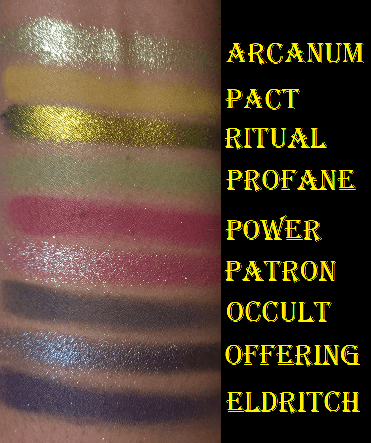
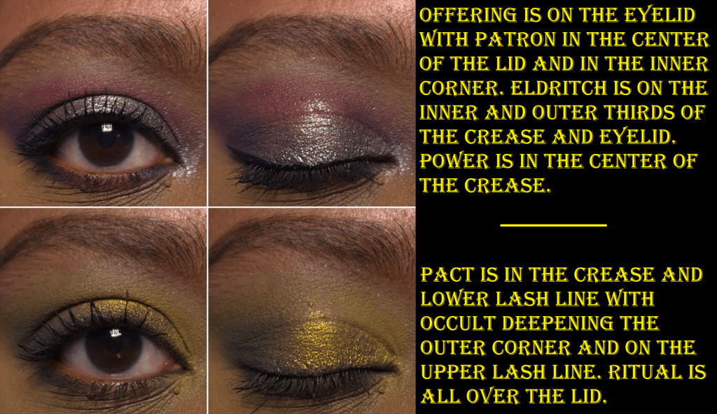
The shade I was pining for the most was Ritual, a true multichrome that shifts yellow, green, and blue. It reminded me of a Clionadh shadow, but nothing I swatched looked close enough to it. It had a similar flip but didn’t look the same head-on. I think perhaps it’s like Weathered, but I don’t own that shade from Clionadh. In any case, it’s a gorgeous color!

The greenish shift that Patron has reminds me of Transformation from the Druid palette, if that one had a dark pink base instead. I’m not always into pinks, but this is the kind I can get behind!

Arcanum, with its “acid green to light blue shift,” and Offering, with its “deep blue to pink shift,” are listed as duochromes, but they’re not as nuanced on my eyes. When I hold Arcanum at a sharp angle, I guess I can see blue, but on my eyes I can only see yellow and green. Regarding Offering, I consider it a deep steel blue-grey with purple shimmer. I really can’t see pink.

There’s usually at least one problem child in the palette, and in this one it is Eldritch. It’s the same issue with it just having a lot of pigment and requiring a bit more time to blend. Technically, Profane is also not perfect since it’s thin and I have to build it up, but colors that are practically neon tend to be like this for me.

Overall, this is probably the palette that intimidated me the most, but I think it’s my second favorite (Druid is at the top).

Bard Palette

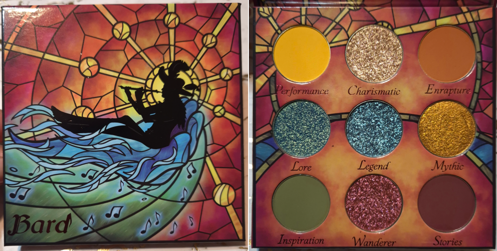
Bard might not look like a rainbow palette because of the way the eyeshadows are arranged, but it may as well be.

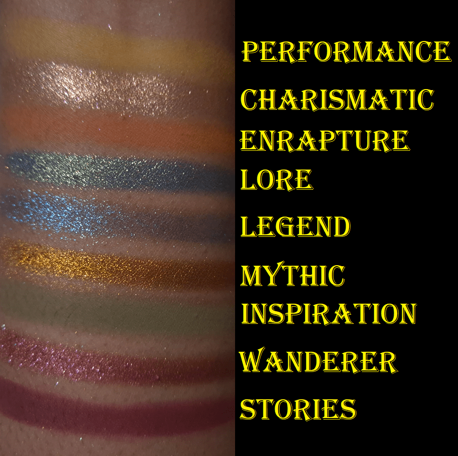
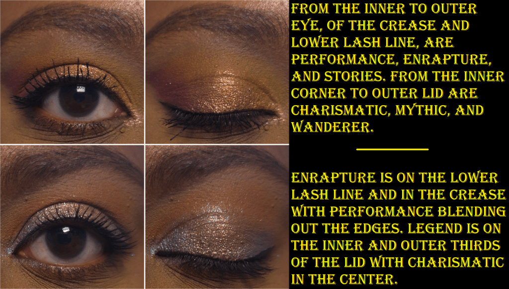
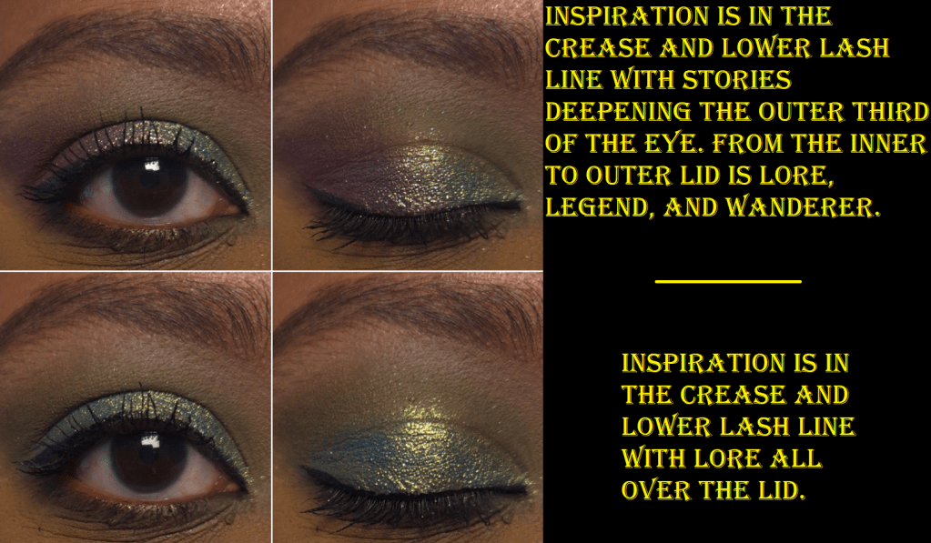
I still appreciate the brand’s choice in veering away from standard primary and secondary colors. For example, Performance is more of a golden and slightly orange leaning yellow. It’s similar to the Singe Beauty brand color. Stories is a super rich red, that is on the verge of purple. Enrapture is like a slightly toned down desaturated orange and Inspiration is a kind of murky muted green. Aside from needing to build up the yellow a green a bit, I have no issues with these mattes.

Mythic is a stunning orange color in a smooth texture. If Pat Mcgrath wanted to make an orange version of Gigabyte, I feel it would turn out looking like this.

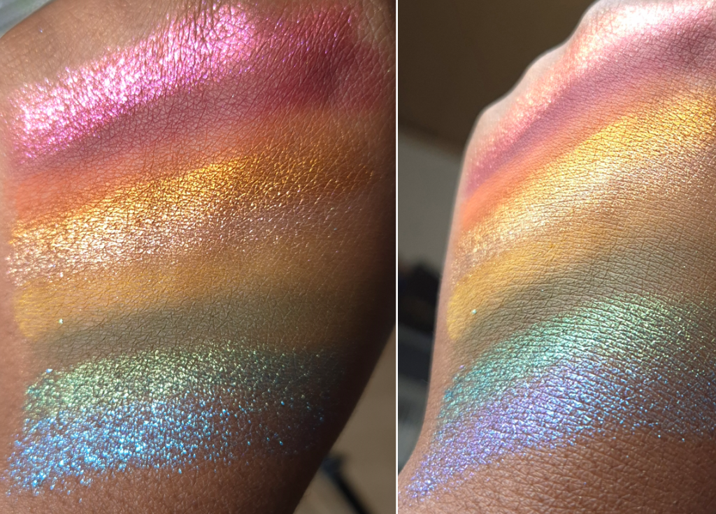
Wanderer has a bronze base with red and pink shimmer. It’s thick with a squishy consistency. Legend has the same texture, but with a sheer purple base and blue shimmer.

Charismatic is a pretty peachy color that shifts from pink to gold. A color like this is common among indie brands and even mainstream ones, but I like this opacity level. Sometimes brands have an iridescent version of this color that I don’t think looks as flattering on me. Unfortunately, this is another shimmer that’s starting to form hardpan.

The final showstopper in this palette is Lore, which goes from a bright golden green, to greenish-blue, and then a darker cool blue.

I don’t know how frequently I will use this palette, but I am still glad I bought it. I’m pleased with having all four, though dealing with the shadow sealing or forming hardpan might start to annoy me in the future. I can try to avoid it by strictly applying shimmers with my brush, but the habit to apply shimmers with my finger is very strong.

Bonus Shades and Enchanted Autumn Tinted Lip Balm

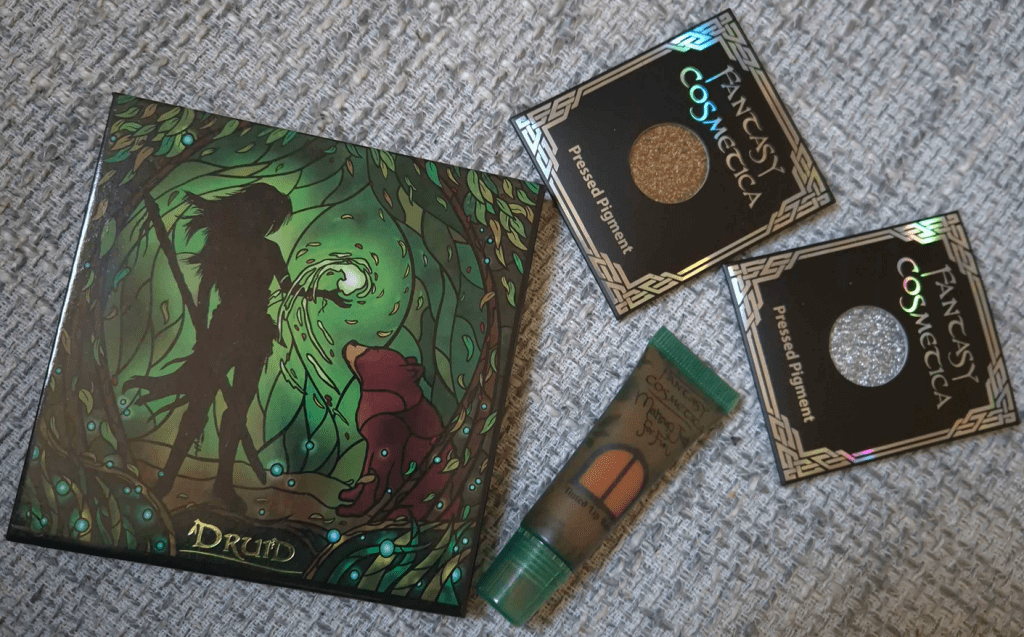
Before we bring this review to a close, I just wanted to mention that I received two Fantasy Cosmetica singles from Monolith as a free gift when my Singe Beauty blush order was delayed. As I mentioned before, Monolith doesn’t sell singles, so it was interesting to receive them. They unfortunately don’t have names written on the sleeves, nor the pans. At first, I thought they were the gold and silver from the Fighter palette, but they aren’t the same. Now, I’m wondering if they are from the Enchanted Autumn palette that I believe launched around the same time. Perhaps they are the shades Libra and Harvest Moon. In any case, the beautiful colors are another reason I was so interested in trying more Fantasy Cosmetica eyeshadows.

I included a photo of Pomander, which I’ve reviewed before in my Battle of the Lip Balms post, mainly because it is still a Fantasy Cosmetica product and should be part of this brand spotlight. They have brushes, fragrances, lip products, and candles. So, Fantasy Cosmetica is branching out.

This has been a great experience. Among all the indie brand eyeshadows I bought between 2024 and 2025 (Nomad Cosmetics, Cosmic Beauty, Lethal Cosmetics, Fantasy Cosmetica, and ShellWe Makeup), the Fantasy Cosmetica quality is my favorite of the five, and will be a brand I continue to keep my eye on. Since their products are made in China, I hope they will be able to manage through this tariff situation. I heard they were among the first indie brands to alert customers of potential issues via social media.

That’s all for today! I hope you’ve found this post to be helpful!

-Lili

Anastasia Beverly Hills Smooth Blur Bronzer

Welcome to 1 of 4 Summer Bronzer Bonus reviews!

I like to group multiple products in a single post if I feel they are relevant to each other in some way, but there are times when this caused me to delay on publishing.
For example, my Battle of the Milky Toners post was supposed to be about toners in general, featuring four milky toners and three “regular” ones. However, I kept hearing about other milky toners that were popular, so I would buy them, wait a month or more for it to arrive from YesStyle, then test it extensively before hearing about another hyped up toner, and repeat the cycle. This is how I ended up making a milky toner post specifically, with 11 compared, and it took over one year to complete!

It’s summer! Now is the perfect time to chat about bronzers. So, I thought it would be nice to have a bonus post each week in the month of July, guaranteeing that I won’t have to delay reviewing these any further because of a last minute addition, wanting to replace or add extra photos, etc.

So, here we go!

Anastasia Beverly Hills Smooth Blur Bronzer in Beach Bum Bronze

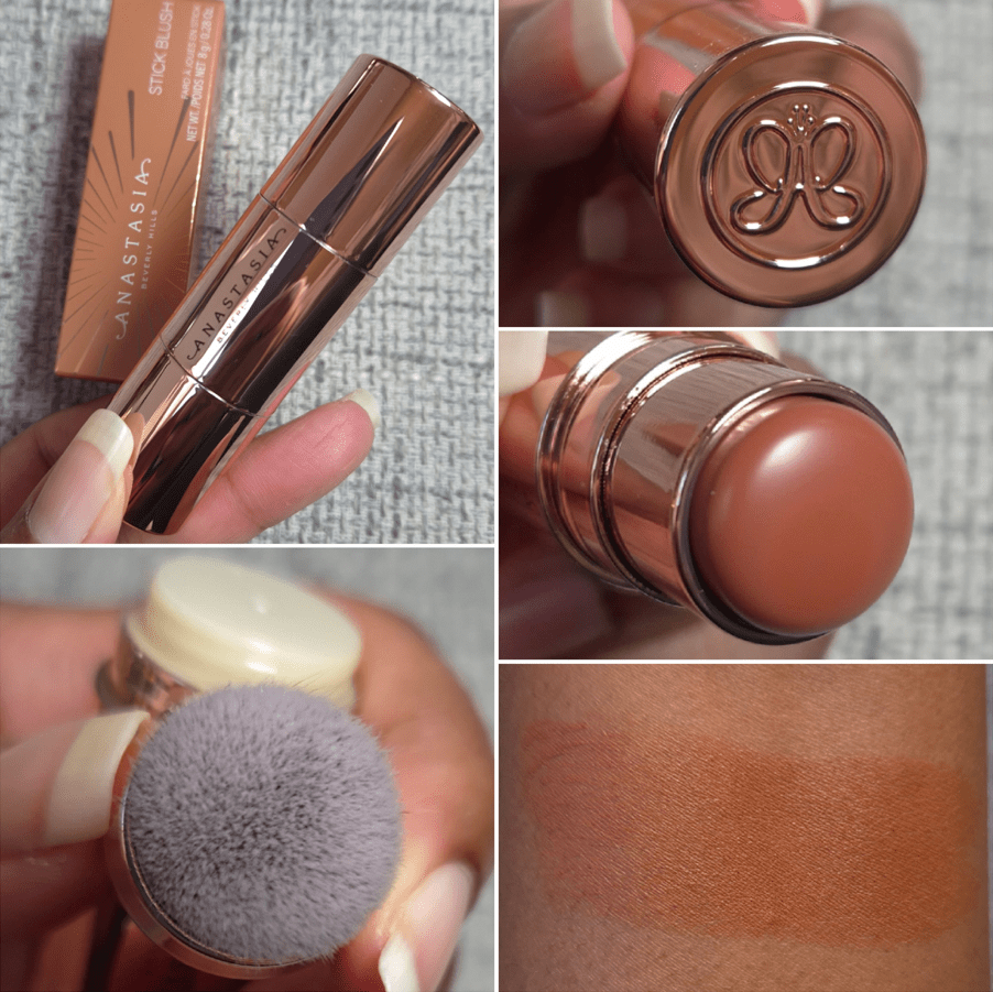
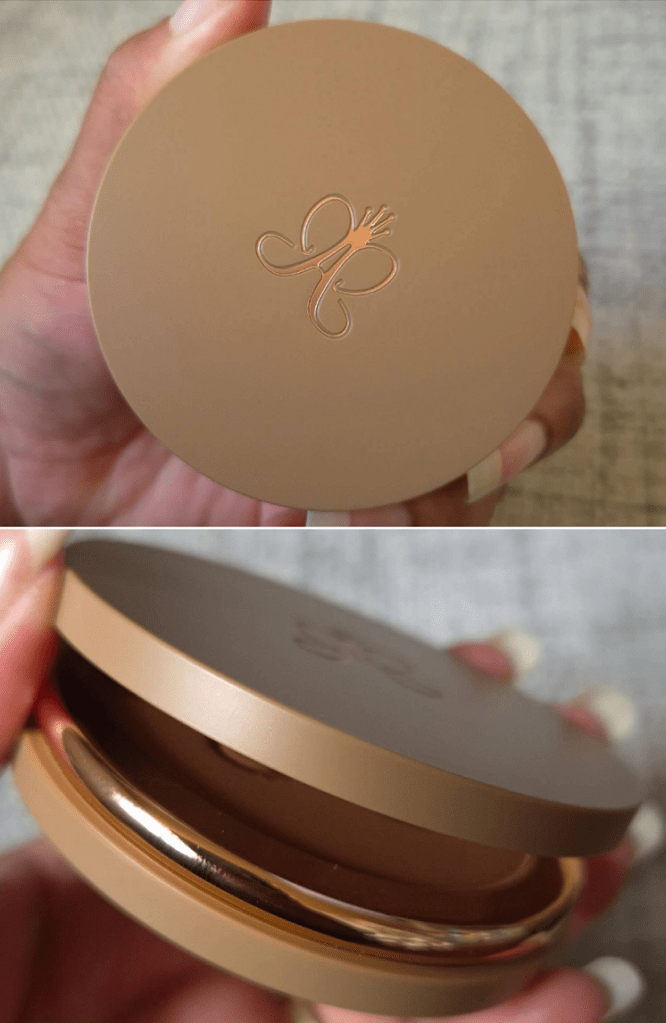
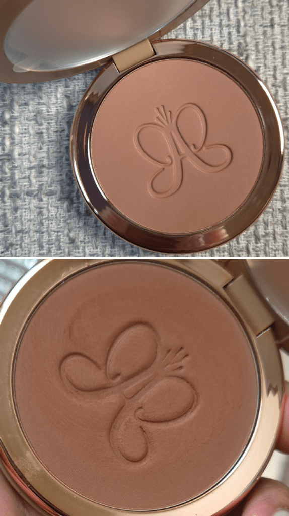
This packaging is beautiful! It’s weighty, has a mirror, and is a magnetic closure type. I love the rose gold details in the logo and around the pan. I first noticed ABH stepping up their packaging with their mascaras, and now this one.* The packaging upgrade has to factor into the price.

Although I don’t own a bronzer from their first line, I know that it has the same weight of 10 grams/0.35 oz and cost $28, versus this new one at $38.

*UPDATE: October 9, 2025 – I didn’t realize the brand’s Glow Seeker Highlighter is in similar packaging as the bronzer, but weighs slightly more!

Beach Bum Bronze

I have to address the color options because it is very important for anyone to know when buying these. This range of bronzers is not intended to be cool-toned, but they might still appear ashy.

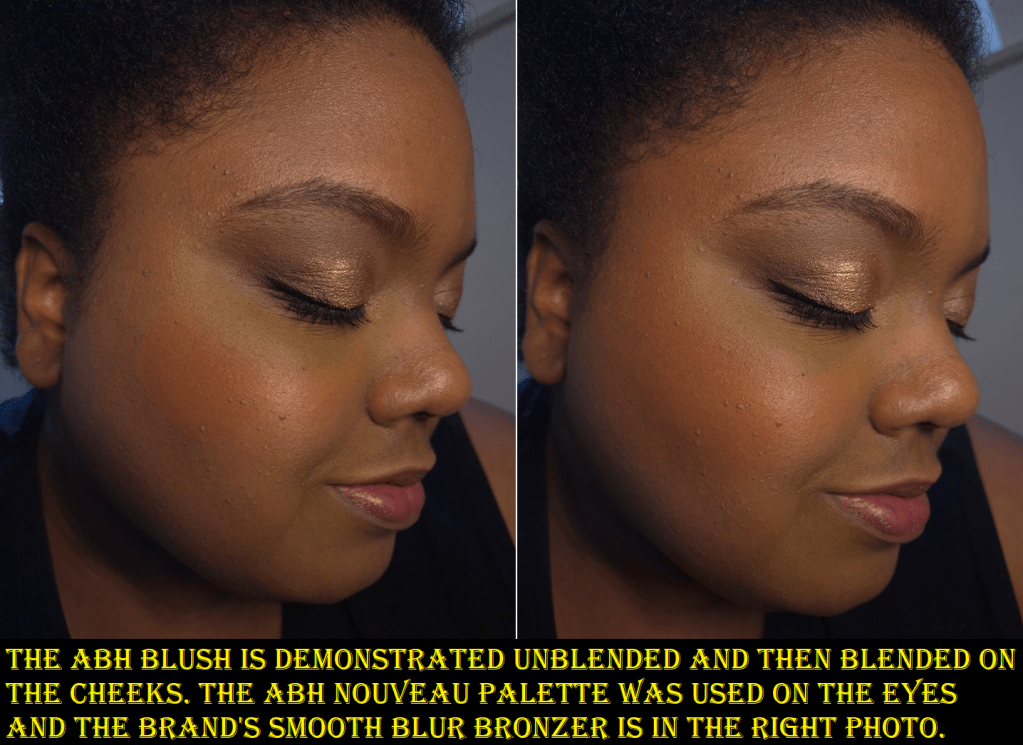
In the photos above, the picture with the untouched surface is color accurate in looking a bit dusty, cool, and as though it should be too light for my skin. Once I rubbed it, the true color showed as darker and warmer. I don’t know what causes the surface to appear different in color; perhaps because of whatever blurring properties are in this. Sometimes when a product has too much mica (especially paired with silica) or other ingredients that create a luminous or pearly sheen, it can look ashy/gray on someone even if the base color is dark. For example, the last three shades of ABH’s bronzers look a bit dusty in swatches by Angela Denise, despite her having a similar skin tone to mine. My skin’s hue is more saturated than hers, which I can only guess is why they wear differently on the both of us. Regardless of the cause, this problem has contributed to a lot of disappointment and backlash online, such as this scathing review from Robert Welsh.
Examples of other products that had this problem are the original launch of Fenty Cheeks Suede Powder Blushes and the darkest shade of RMS Beauty ReDimension Hydra Bronzer.
This differs from when a brand puts too much white in the formula of their product, which goes unnoticed for those with lighter skin, but is super ashy on dark skin. An example of that is YSL’s initial launch of shades in the Make Me Blush Liquid Blushes line.

So many people were thrilled to see photos of bronzers looking so cool toned that they should be labeled contours. Others were appalled. I would have completely skipped this release if not for the brand’s founder stating in Trendmood1’s comment section that the range was actually warm and she faulted Sephora’s photography (even though these were the same photos used by other retailers and they look the same as what’s on the official Anastasia Beverly Hills website).


Anastasia was correct in saying the bronzers look ashy in the photos, but some of those photos appear to be correct in showing how the bronzers look in the pan. It’s more useful for customers to know how they look on real skin. Where they went wrong is that too many of the models look sculpted instead of bronzed, so it doesn’t seem to accurately portray the color it should be on the skin. Then again, there are some people who this bronzer will look that gray on.

My original guess was that the makeup artist for the models didn’t use the bronzer alone in the photo shoot, and paired them with the brand’s Smooth Blur Contour Sticks. Perhaps too much of the contour was used, or the photos could have just been manipulated in post.
This is the grey area where the brand’s photos can be interpreted as misleading.
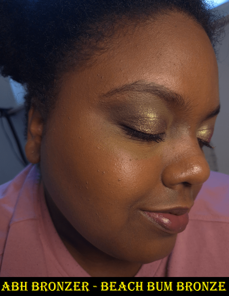
I’m happy with how Beach Bum Bronze looks on me, but I can understand why some people would feel let down, while others will be pleasantly surprised by the amount of warmth.

The thought crossed my mind that maybe it’s just my shade that is warm, but hanbeauty101 on YouTube bought the two lightest colors (Sun-kissed Dreams and Warm Sand Vibes) and was disappointed to see that neither were cool toned. In a contrasting reaction, Angelica Nyqvist happily confirmed that the shade just before mine called Tropical Tan is neutral-learning warm and golden.

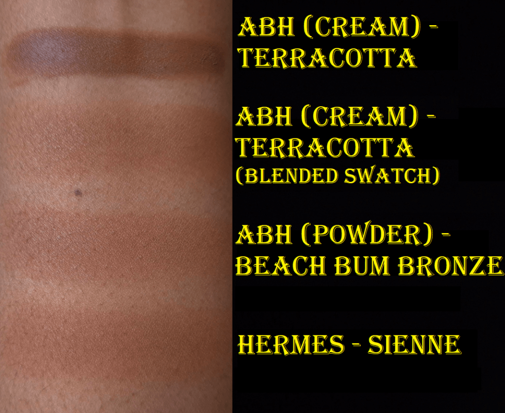
When it comes to choosing a shade, I like that this one functions the way it should, by being warmer than my natural skin tone and only a little darker. I have many bronzers that are deep enough to be brontours, so having a subtle color is more desirable for me at this time. Beach Bum Bronze looks neutral-leaning-warm compared to the amount of orange in the shade Terracotta, which is my best match among Anastasia’s cream bronzer line.

Because Beach Bum Bronze is so similar to the color of the darkest section of my Hermès bronzer in the color Sienne, I can’t help but compare them. The ABH bronzer is the tiniest bit deeper with a little more red. Even though the powder is incredibly silky to the touch, I could see how much smoother the Hermès bronzer was when swatching the shades, and how it distributed the color evenly without skipping. To clarify, the Hermès’ bronzer is very soft to the touch, but doesn’t feel the same as Anastasia’s. It’s just the colors that are similar. If I mix in the the lighter two shades within the Sienne trio, the color turns more golden-orange.

The way the texture of the Smooth Blur Bronzer looks when rubbed reminds me of the ELF Halo Glow Pressed Powder, which is less than half the price of the bronzer from ABH. So, this kind of smooth and silky texture is achievable for drugstore brands too. The ELF powder doesn’t use Zea Mays (corn starch) like ABH, but it does have Aluminum Starch Octenylsuccinate.

E.l.f. Halo Glow Pressed Powder

Even though this cannot beat the #1 bronzer in my collection, the Smooth Blur Bronzer has still impressed me immensely with the texture, the blurring capability, how easily it blends and builds, and the finish. However, this can stick in one place and be harder to blend when applied on top of a dewy base. The only time I had a problem blending this bronzer was on a day when I was testing out a new foundation and skincare combo (one that I won’t be repeating). So, this formula may not be suited for someone who likes to use dewy foundations or moisturizing/emollient skincare. Someone with oily skin might still be able to enjoy this bronzer if a layer of powder is applied to the bronzer areas first before adding this on top.

Another difference between this bronzer and my Hermès is that the Plein Air Healthy Glow Mineral Powder blends perfectly with every brush I’ve used. The ABH Smooth Blur looks good with most I’ve tried, but light to medium density ones give more of the airbrushed look. A denser brush combined with the level of pigment in this range can be a bit overkill, and even if I try to blend it out, the end result isn’t as clean as I would want. Essentially, this bronzer doesn’t look great if overblended. Trying to build it up is better.

I’ve had no longevity issues, but this is usually the case with me.

This is a shimmer-less product with many potentially drying ingredients in the formula such as corn starch and kaolin clay, but it still has a natural looking sheen from the mica and silica. Even though this sticks too much on a wet base, I have no issues blending cream blushes on top of it. Those dry ingredients are why I think people with oily skin could still like this. I was worried I might have a problem with it, as someone with a dry skin type, but it hasn’t felt drying on my face. I use hydrating skincare, but my face is still usually dry to the touch. This is why the dew problem isn’t a big one for me, I know which brushes will work well with this, and the color is quite good.

Under my usual conditions, this bronzer works so well for me that I would place is somewhere within my top 15. However, I’m still hesitant to recommend it because of the number of potential issues I’ve detailed in this review. No product performs the same universally, but this has a bit too many outliers. I recommend that anyone interested in getting this should see it in-store if possible.

I hope you’ve found this post to be helpful. Thank you for reading, and be sure to click follow if you’d like to be notified of my next review, including the next bonus post!

-Lili

Hidden Gem Fude Brand: Number Eight

I have my fude manufacturer favorites, so it’s rare that I feel compelled to give another brand a try. The hair types used in these brushes and the more affordable price were some of my biggest motivators for wanting to try Number Eight brushes.

Other than the brand’s Instagram, which links to their official Japanese website, the only place I could find information about Number Eight was from the FudeBobo website. What is written there can be summarized as this: Number Eight belongs to a well-known fude manufacturing company (nicknamed Brand H) and their many characteristics are visible in these products, including the signature scent of goat hair.

Some OEM companies proudly list on their websites who their top clients are. When it comes to “H,” the Number Eight brand is now the third unannounced brand I know they’ve made brushes for. It remains a badly kept secret, but because they wish for it to be kept that way, I won’t explicitly list the name of the company here.

The reason I personally like knowing the manufacturer is because it helps me gauge whether or not I will be happy with the brushes I’m purchasing online that I’m unable to see and handle in person. For instance, I don’t like Sokoho goat hair from Koyudo, but I don’t mind Sokoho if it’s from Bisyodo. I know that Koyudo’s Silver Fox hair is similar in feel to Chikuhodo’s version of Premium Silver Fox versus their regular Silver Fox brushes.
When I don’t know who the brush maker is, I’m taking an expensive gamble in the hopes that I won’t be disappointed with the products. For brands like rephr or Sonia G, they have hype from thousands of customers and plenty of influencers to vouch for the products. However, Number Eight is relatively new with extremely limited availability online. If I was unable to figure out the manufacturer, I would not have taken the chance on these brushes, and I would have definitely been missing out, because they are lovely!

The major companies usually have a “more affordable” line on offer. For example, it’s the Cheri line for Bisyodo, the Regular Series for Chikuhodo, the Koyudo BP Collection while it was around, and the J series from Hakuhodo. Those that like Hakuhodo’s J series will likely be pleased with the brushes in this post today.

*DISCLOSURE: The links in bold blue font (Example) are standard non-affiliate links. Links marked in bold black font with a light blue background (Example) are affiliate links. Affiliate links allow me to get a commission if someone clicks them and then makes a purchase. All of my officially labeled Number Eight brushes were purchased with my own money from the Fude Bobo website, which I am not affiliated with.

Number Eight Face 07 Cheek

  • Full Length: 192 mm / 7.56 in
  • Hair Length: 32 mm / 1.26 in
  • Hair Width: 13 mm / 0.51 in
  • Bristle Type: Dyed Saikoho

The reason I wanted this brush is because of how much it reminded me of Bisyodo’s CH-HC brush, which has been my holy grail highlighter brush for years. I have a backup brush that I once painted in order to make the handle look prettier, but I wanted to get the one from Number Eight in the hopes that it would perform similarly while having a thicker sturdier handle. It’s also the case that when I bought my first CH-HC it was listed as Saikoho hair, but CDJapan eventually changed the listing to Sokoho. My backup CH-HC felt different and could be Sokoho (albeit the softest Sokoho ever), but I still don’t know if my original is Saikoho or not. This was another reason I didn’t mind getting the 07 brush, so that I could have a Saikoho backup. As it turns out, they are shaped differently. Bisyodo’s brush head comes to a longer pointier tapered tip. It’s much more of a candle shape. The 07 reminds me of the shape of my Hakuhodo 5521, but in a dyed saikoho version instead of my original blue squirrel goat mix. The brush had also grown wider over time and was never as pointed as it looks in website photos.

Even though the head shape is rounder, the hair staggers up towards the tip, so it functions as if it’s at an angle from the way product gets picked up. For that reason, this still allows me to precisely apply highlighter. It admittedly gets dispersed in a slightly wider area than the Bisyodo brush, and my original Bisyodo brush hairs feel a little softer. For that reason, I started using the 07 to apply bronzer around the perimeter in a smaller than usual area, contour in a softer diffused fashion, and when mixing blushes if I want another color just on the apples of my cheeks.

I’m pretty set in my ways, so even though I found multiple uses for this brush, I just go right back to using my favorites. This is a decent brush, but if someone has a similar brush already, getting this one isn’t necessary.

Number Eight Face 08 Fan

  • Full Length: 193 mm / 7.6 in
  • Hair Length: 28 mm / 1.1 in
  • Hair Width: 18mm x 12mm / 0.71-0.47 in
  • Bristle Type: Dyed Saikoho

The reason I wanted this brush is because the Wayne Goss original Fan 15 is the best fan brush in my collection, but I don’t have a backup of that one. It was a happy mistake that this brush turned out to be way thicker. This is packed with a lot of hair, but I consider it to be a medium density and flexible bristle brush the splays widely enough to diffuse nicely without losing too much precision or applying too lightly. The Number Eight 01 Highlight Fan brush is probably more similar to Wayne’s Fan 15, though I don’t have it in person to know for sure. This 08 brush is like having a smaller, airier, and natural hair version of the Patrick Ta Contour Brush (another holy grail). I am absolutely thrilled to have this! I can pick up bronzer with one side for more precision in a smaller area, like going around the sides of my face and under the cheeks, or turn the brush sideways to apply to a wider zone. I can apply contour in a small, but partly diffused way. This also works for applying highlighter to a wider than usual, yet diffused, area.

Even though this has the same hair type as the 07, I wonder if the hair in this one came from another batch or supplier, because it’s significantly softer. For anyone who likes thick fan brushes, I recommend giving this one a try.

Number Eight Face 10 Contour Angled

  • Full Length: 201 mm / 7.91 in
  • Hair Length: 35mm-20mm / 1.38-0.79 in
  • Hair Width: 18mm – 22mm/ 0.71-0.87 in
  • Bristle Type: Squirrel mix Saikoho goat

The Face 11 is what set things in motion regarding me wanting to try this brand. I love the hair mixture so much that I wanted to give the Face 10 a try, even though I’m very picky when it comes to angled brushes.

My favorite uses for this brush are for blush and bronzer. I can technically use this with highlighter as well, but this splays even more than the Face 08, so I don’t bother. This is also why I don’t contour with it either, but that splay diffuses products so beautifully! It’s like having a bigger and softer version of the Sonia G Lotus Detail Brush! It makes applying blush easy to keep contained to the area I want by sweeping it along the cheekbones. It’s on the lighter end of medium density with enough squirrel hair (I believe pine) to feel pillowy soft, but with enough goat to add shape and structure that’s capable of quickly blending and buffing. It picks up a nice amount of product and disperses it so evenly on the cheeks, which also adds to the swiftness in which I can finish applying blush or bronzer. The only reason I end up using this brush proportionally far more times with blush than bronzer is because the Bisyodo B-F-05 Perfect Fit Brush is still my holy grail bronzer brush.

For anyone who loves the Sonia G Lotus Detail Brush or angled brushes, I recommend trying this one!

Number Eight Face 11 Cheek/Highlight

  • Full Length: 201 mm / 7.91 in
  • Hair Length: 35 mm / 1.38 in
  • Hair Width: 16 mm / 0.63 in
  • Bristle Type: Squirrel mix Saikoho goat

In my Fude Collection Part 8 post, I mentioned that I had a brush called the Eihodo No.153 Highlighting/Blush Brush. It was listed as an outlet brush from Eihodo, but it had the same hair type and labels (Face 11) as the Number Eight Face 11, including an identical looking ferrule and handle. The reason I was incredibly confused was because it was under the Eihodo name on the CDJapan website instead of Number Eight or even “Brand H” whose brushes they only sell via proxy. Then, I thought about the fact that Eihodo is a producer and not manufacturer, so any company’s brush could be listed under them as long as they were the ones who procured them.

The bottom line is that I loved this brush so much and wished for CDJapan to release more. I vaguely remember seeing other brushes of this hair type being released in the outlet, but I didn’t buy them because I wanted larger face brushes instead. I waited for the brush to restock, but it never did. I still held onto hope that more would come, but CDJapan actually deleted the product pages for all of brushes that look like they came from Number Eight. So, I lost hope. However, when I realized these brushes were available through the Fude Bobo website, I had to try more, including buying a backup!

In the photo below, my official Face 11 is on the left and is much pointier in shape. My unofficial Face 11 is on the right. I am assuming the reason the unofficial one ended up being sold as an outlet brush is because of the fact that it’s not as candle-shaped as it was supposed to be.

In terms of performance, I do notice a difference. At first I preferred my outlet version because the more evenly shaped tips form a more even distribution of pressure on the face. The size is perfect for small pans like in the Hourglass Ambient Edit Palettes. However, I’ve gotten some new makeup that have even smaller sections of product, such as the Givenchy 4-Color Pressed Bronzing and Sculpting Powder. The non-outlet brush’s pointier tip makes it easier to dip into such small blocks, so I can apply the contour shade more precisely. It still has the benefits of dispersing product in a way that isn’t too harsh, nor too soft, and is still gentle on the skin.

The Face 11, in the way it was intended, is technically a more useful brush, so I’m glad I bought it too.

Number Eight Eye 17

  • Full Length: 173 mm / 6.8 in
  • Hair Length: 18 mm / 0.71 in
  • Hair Width: 5.5 mm / 0.21 in
  • Bristle Type: Squirrel mix Saikoho goat

Sonia G makes my favorite eye shadow brushes, but considering the maker of these and the hair type, I thought chances were high that I’d like the ones from Number Eight.

Through prolonged use, this brush is a little fluffier in width, so the point doesn’t look as pronounced. However, I’m still just not a fan of this brush purely due to the shape. I like my tapered blending brushes to be rounder for a wider area of blending pressure. When it’s pointed like this, the strongest pressure is mainly at the highest point in the center, which means it takes longer for me to blend with that smaller surface area. I see how it’s supposed to be useful for getting in the crease for hooded eyes, but then I prefer to just use a smaller brush in the shape I like, such as the Sonia G Mini Booster. I find myself repeatedly squashing the Eye 17 into my skin to try and increase the pressure to increase the blending power. Every time I’ve used this brush, I wished to swap it with something else.

I apologize, but my preferences are too strong to be objective on this one. I only own a few of these type of brushes in my collection because I always end up casting them aside in favor of a different shape. I’m sure there are people that will use and love this brush. It feels soft and non-irritating on the skin. I just don’t like it for myself.

Number Eight Eye 18

  • Full Length: 166.5 mm / 6.55 in
  • Hair Length: 11.5 mm / 0.43 in
  • Hair Width: 10mm-3mm / 0.39-0.12 in
  • Bristle Type: Squirrel mix Saikoho goat

I have a ton of flat shader brushes, so I don’t feel I’m being biased when I say I dislike this brush too. I can name at least four that I like better, including the Sonia G Builder Pro that comes to a taper too. This brush head is too stiff for me. It applies product to the lids well, but it’s uncomfortable if I try to use it to apply eyeshadows to the crease, the way I have been doing a lot lately with my Muragishi Sangyo MS-4 Mai Sakura Brush, Sonia G Builder Three, Mizuho MB123 Eye Shadow Brush, etc. So, I can accomplish my tasks with it, but it’s never an enjoyable experience. Because of the discomfort from the stiffness, I like the Eye 18 even less than the Eye 17.
Something like the Eye 8 would probably be more to my preference, but it’s not available in this squirrel-goat mix, so I didn’t buy it.

This concludes my venture into the world of Number Eight brushes! I hope this has been helpful!

-Lili

End of the Project Pan – How did I do?

For those who haven’t read my Project Pan Introductory Post, below is a small summary.

TLDR:
*Ban on cream and liquid blushes and bronzers.
*No highlighter purchases.
*Only allowed to buy lip products from Lisa Eldridge, Ami Cole, Too Faced, Fenty, and Pat Mcgrath, but I am allowed to swap out PML with MAC. YSL was always in my head as a potential number six, but I wanted to keep it down to five.
*Trying to avoid buying anything in the primer, brow, mascara, and liner categories.

Reason to Buy Less Makeup: New products take time away from using the older ones that I love.

Additional Reason for This Experiment: Seeing if using only my holy grail products will make me less interested in new makeup. Will this Project Pan make me feel satisfied enough that I don’t want to add more to my collection.

Foundations

My Estee Lauder Foundation went bad. The oil parts took my makeup back off and was being weirdly patchy, plus the tube was too difficult to shake and mix properly. I didn’t start using it that long ago, but the backup was purchased on sale at the beginning of 2023, so it’s possible this tube had already been on the shelf for a long time prior to then.
I replaced it with the Danessa Myricks Yummy Skin Serum Tint and I feel like I got my money’s worth out of that Tint by now.

As much as I like the Fenty Eaze Drop Liquid Foundation, it being more transfer prone than everything else in my collection made me not want to use it more than a few times. The Danessa Myricks Tint was a good replacement for that too. The Rose Inc Serum Tint oxidizing made me skip using it as well. Huda’s foundations were only really meant to mix with things to get a better shade match or increase the coverage, so I only used one a few times and I’m okay with that.

I will say that I got a whole lot of use out of the Chanel foundation, and it was the one I used most during this six month time period. I didn’t use my darker shade of this foundation at all, so I think in the year and a half that I’ve been using it, it has oxidized a little. I’m not sure how much longer it will be good for, but I foresee myself eventually repurchasing it when the time comes. It’s still my favorite in my collection and I would not want to be without it for long. This is one of the instances where using a holy grail product did in fact curb my appetite for buying more foundations. I believe my mini of the MUFE Ultra HD Foundation is the only one I purchased in these past six months, and I still haven’t worn it! I was definitely tempted by new ones from Guerlain, Givenchy, and Nyx, but being at my foundation maximum also helped. Not counting multiple shades of the same foundation, I have around 20 foundations in my current collection. My goal is to have only 5, but the lowest I’ve ever gotten my collection down to is around 10. So, I give myself kudos for holding strong against buying more. However, I still feel some guilt knowing I won’t ever use them up before they go bad. I’m only about halfway through the bottle of the Chanel foundation even though it’s the one I used the most in the past 18 months, not just during this project. So, I’m more determined than ever to keep a much smaller collection of foundations and I’m less interested in buying new ones because if they don’t top my Chanel, they will instantly go to waste because I cannot return them to the store.

Concealers

The Danessa Myricks Yummy Skin Lift and Flex concealer snuck its way in too and was used more than the other honorable mention concealers. I used Givenchy’s a few times and Natasha Denona’s more than I expected, but did not use Fenty’s or L’Oreal’s even once. Ultimately, for concealing around my mouth, I stuck with Hourglass and Natasha Denona. I like my two ND shades, but the packaging of one of them leaks and it drives me nuts! I’ve been very close to tossing it out, but I like having a somewhat color correcting yellow and brown in those tones. So, I try to put up with it and I keep the leaky one stored upright in a cup.

I got to about a quarter left of my tube of the KVD Good Apple Concealer, but tossed the rest because it darkened in color. So, I started using one of my two backups. Because I’m not using any other concealer under my eyes, this fresh tube is getting a lot of use! I would say I’ve used up about a third of it, but this isn’t a surprise. Whichever concealer I deem my number 1 will always get used up and repurchased!

I did not purchase any other liquid concealers during the Project Pan until June when I was recommended to try out the Gucci concealer. Earlier in the year though, bought three shades of the Lisa Eldridge Pinpoint Concealer pencils. I don’t consider this wasteful per say, since I bought them for purposes that I wasn’t using my liquid concealers to do. However, I admit that I don’t use them as much as I thought I would. Making sure I build up my foundation around my mouth means I use less concealer there, sometimes skipping it entirely. I also couldn’t be bothered to always fill in my smile line, so that’s how my interest in the pencils started to fade.

I’m not feeling as tempted to get more concealers. I must admit though that the only reason I haven’t bought the new Estee Lauder Double WearStay-in-Place 24-Hour Concealer is because every retailer I’ve found in Germany has 11 or fewer of the shades out of the 30 that exist. The deepest color I’ve seen listed is either 5C or 5N. So, I am literally unable to try it.

If Lisa Eldridge releases a liquid concealer or if Estee Lauder finally has a shade for me that I can try, those would most likely be my next purchases. However, I’m still very content with my KVD Good Apple and feel disinterested in trying most of the others.

Powders

I didn’t do too badly in terms of adding new powders to my collection. I bought the Givenchy Prisme Libre Setting Powder, Guerlain Parure Diamond Powder, and ELF Halo Glow Pressed Powder. They’re good, but they were unnecessary purchases. They didn’t beat out my Dior Powder no Powder, nor the Charlotte Tilbury Airbrush Flawless Finish Powders (technically Guerlain tied in performance but I don’t use it as often because of the added fragrance). So, I shouldn’t have bought them.


I also only used my Chantecaille Perfect Blur Finishing Powder in the month of June, so it looks largely unchanged. In general, during these six months I hardly powdered my face. So, I didn’t finish the Dior Powder No Powder as I expected. I even brought my lighter shade back with me from Florida, so I have that one again, plus the spare I bought before it was discontinued. I also got back my Laura Mercier and additional Hourglass baked powders too.

I continued to wear concealer, so the Charlotte Tilbury powders were used at the same rate that I expected. The only disrupting factor is that I bought the Soulmates duo, which had the light peach Charlotte Tilbury powder. So, I started to rotate between three of them in the last few months.

I no longer have an interest in buying new powders between the semi wasted new ones I bought already, older powders I have access to again, and the ones in this Project Pan.

Contour

I technically have a new contour out of the Givenchy Prisme Libre Bronzing and Sculpting Powder that comprises of four different colors. However, there are no other new ones. I used my Hindash Beautopsy palette a handful of times, but I mostly just skipped contouring. I did some jaw and cheekbone brontouring at most, so new things weren’t of interest at this time purely because of my current habits and preferences. The only temptations were Charlotte Tilbury’s Contour Wand, Anastasia Beverly Hills Smooth Blur Contour Stick, and the Rare Beauty Soft Pinch Liquid Contour. I had doubts about getting a good shade from the first two (plus they’re creams), and I never use liquid ones. So, that was an additional reason to skip purchasing them.

I have access to Monochromance again, and I’m debating whether I want to risk depotting the pans so I can have my most used shades in Beautopsy and hopefully get even more use out of it due to the increased convenience.

I’m a bit reluctant to take that step though out of fear of messing them up without my Z-Potter, especially with the bottom being a bit thick. I’m not sure how well the heat would flow through. Even more reason for me to not want to potentially damage or ruin the powders is that I feel like any day now there should finally be a dip in these pans. I’ve used them a ton, but there’s so much product that they look new endlessly!

Bronzers

This is where things start to fall apart a bit!

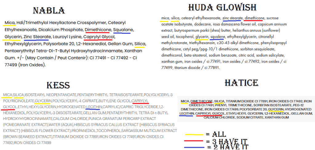
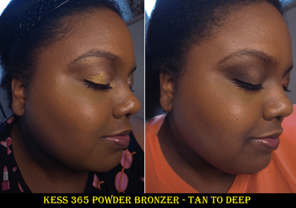
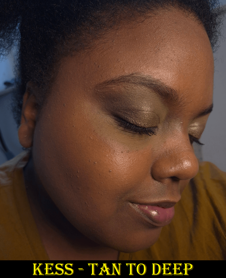
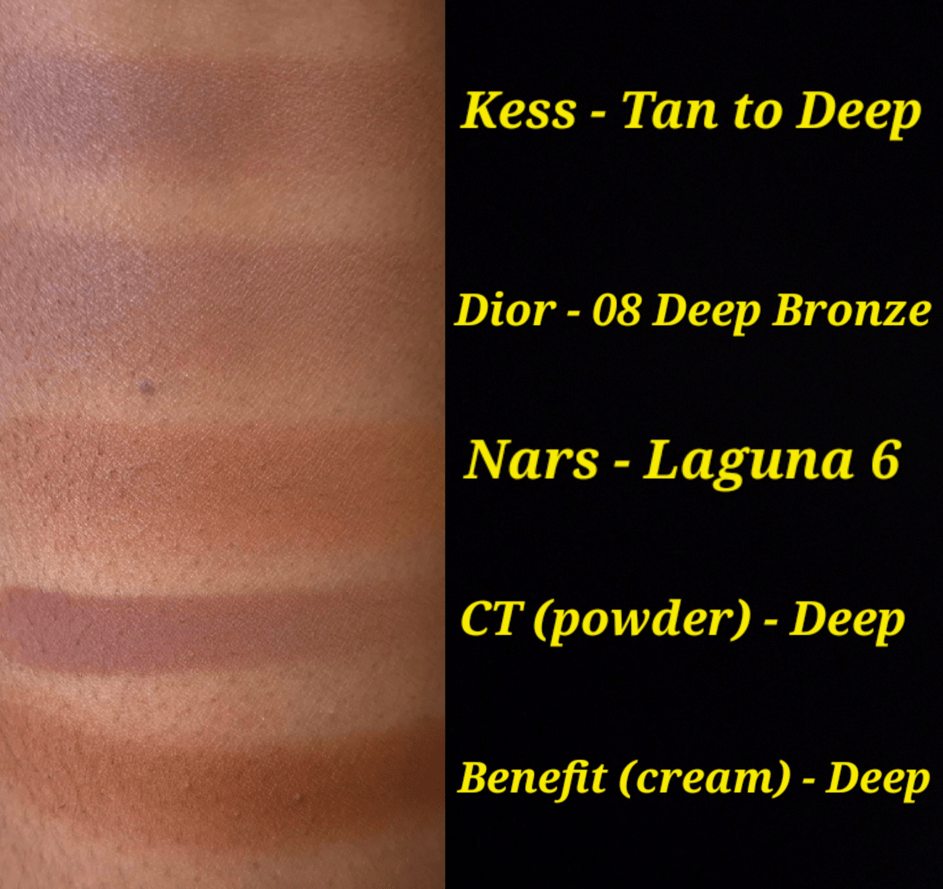
I mentioned buying the Givenchy Prisme Libre Bronzing and Sculpting Powder already, but I also bought the Benefit Powder Bronzer, Benefit Hoola Wave Cream Bronzer, Laura Mercier Bronzing Duo, Fara Homidi Essential Bronzer (refill), Anastasia Beverly Hills Smooth Blur Bronzer, and Kess Berlin 365 Bronzer. Benefit’s was for nostalgia reasons as I like the quality, but it was just too red toned, so I stopped using it. The brand changed the deepest color a bit, so I was curious to see if I would like it enough to be able to start using it again. I kind of broke my no-buy with the Hoola Wave Cream Bronzer though. Oops!

I at least resisted getting the Dior Forever Nude Bronzers, reformulated Haus Labs Bronzers, and the Too Faced Chocolate Soleil Cream Stick. Chanel also expanded the range to one additional darker cream bronzer, but it’s not available at any German retailer (for me to get a discount), so I managed to avoid the purchase for that reason.

The point is that I have grown to love bronzers, so I am frequently tempted, especially if it comes from a brand that has always been hyped and they finally expand the range. It’s like when someone reaches the drinking age and goes overboard on the alcohol because they are so overeager to do what they couldn’t before. Choosing to skip on a purchase requires discipline, but being forced into missing out doesn’t allow one to build up that resistance. So, lifting the restriction without having built up defenses against it is hard.

Because I had so many new bronzers to test, I only used my Charlotte Tilbury Cream Bronzer a few times. The Hermes Bronzer was used in-between testing, but not enough to bother showing progress photos. For that reason, I feel like I failed in this category.

Blushes

Well, I definitely broke my cream/liquid ban by buying three Huda Beauty Blush Filters, a Rare Beauty Soft Pinch Matte Blush, an Anastasia Beverly Hills Stick Blush, one Dior Rosy Glow Cream Blush Stick, and two Charlotte Tilbury Unreal Blush Healthy Glow Sticks. I’m not totally upset by it because of how long I resisted getting the Huda ones and the one from ABH.

Where I feel like I went way overboard is buying 5 YSL Bold Blurring Blushes (and later sold Rose Haze on Mercari while on vacation). I also bought the Charlotte Tilbury Soulmates Face Palette that had a blush half of the duo. There was also the Westman Atelier Powder Blush Duo, Chanel Les Beiges Healthy Golden Glow Powder that had a blush and highlighter, a By Terry Tea to Tan Blush Powder, and two of the seven shades in the newest reformulation of Dior Rosy Glow Blush.

Considering my past history of buying an absurd number of blushes, this is actually a huge improvement for me. However, the goal during this time period was to get more uses out of what I already have. I had the same issue as the bronzers; having so many new blushes took time away from using anything older. I had 14 blushes in my Project Pan, and I used most of them at least 1-3 times, which means I have almost nothing to show in terms of progress pictures.

I was supposed to be using holy grail blushes to curb my blush buying appetite, but I don’t have one specific holy grail. There are so many that I love equally, and I think that’s why it’s harder for me to resist buying more because the chances are so high that I’m going to enjoy whatever else is new too. I am subconsciously still looking for one to be better than everything else. I also get the impulse to rotate through all of them rather than just sticking to using a few. I’m not sure how I can resolve this without figuring out where each blush ranks in my collection.

I’m not going to be too hard on myself over this category, but this was very much a fail.

Highlighters

There is no point in showing the progress of my Charlotte Tilbury Foundation Stick that I use as highlighter, nor the Charlotte Tilbury Pillow Talk Multi-Glow Highlighter Palette because I used them less than a handful of times during the Project Pan process. In fact, I used way less highlighter than usual because I relied on my glowier blushes for shine. When I wasn’t testing the highlighters from duos or quads that I bought, I was wearing the Hindash Gradient Highlighter. So, that one has visible wear on the surface, but it looks hardly any different. Highlighters are probably the hardest for me to make a dent on in my collection.

I barred myself from buying individual highlighters in any form, and almost succeeded until I succumbed to the Benefit Glow La La highlighter and the Prada Light Glowing Highlighter in June. I waited over five years for Benefit to make one darker than Tickle, so if it turned out to be amazing, I wouldn’t have chastised myself over it. As for Prada, it was at least less expensive because I only bought the refill.

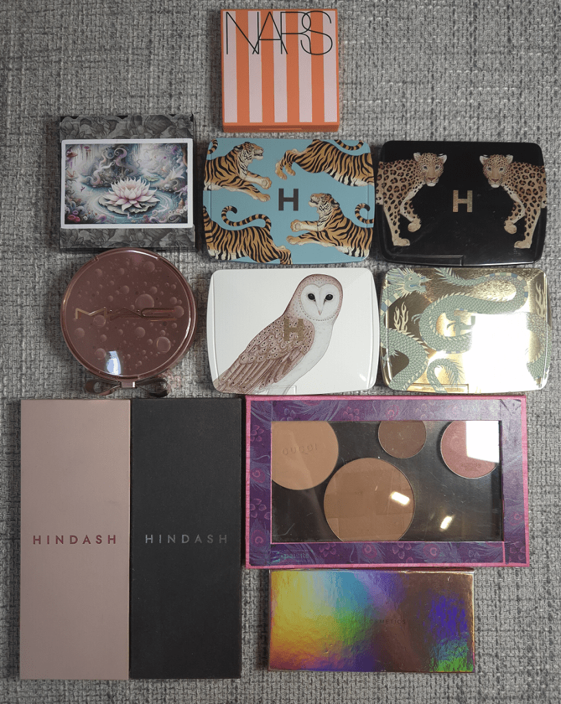
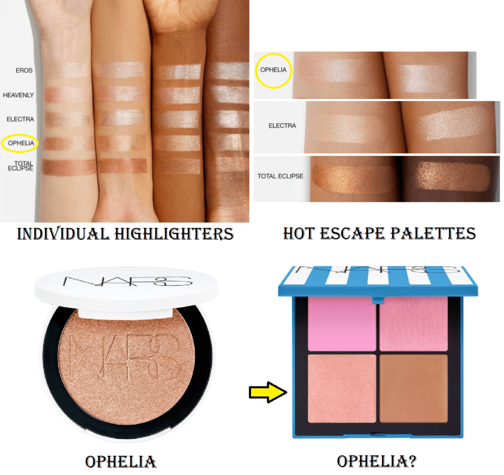
I must also confess that I was extremely interested in the highlighters from Nars. Technically, if I had been able to make a custom Hourglass quad or palette, there would have been a highlighter or two in there as well.
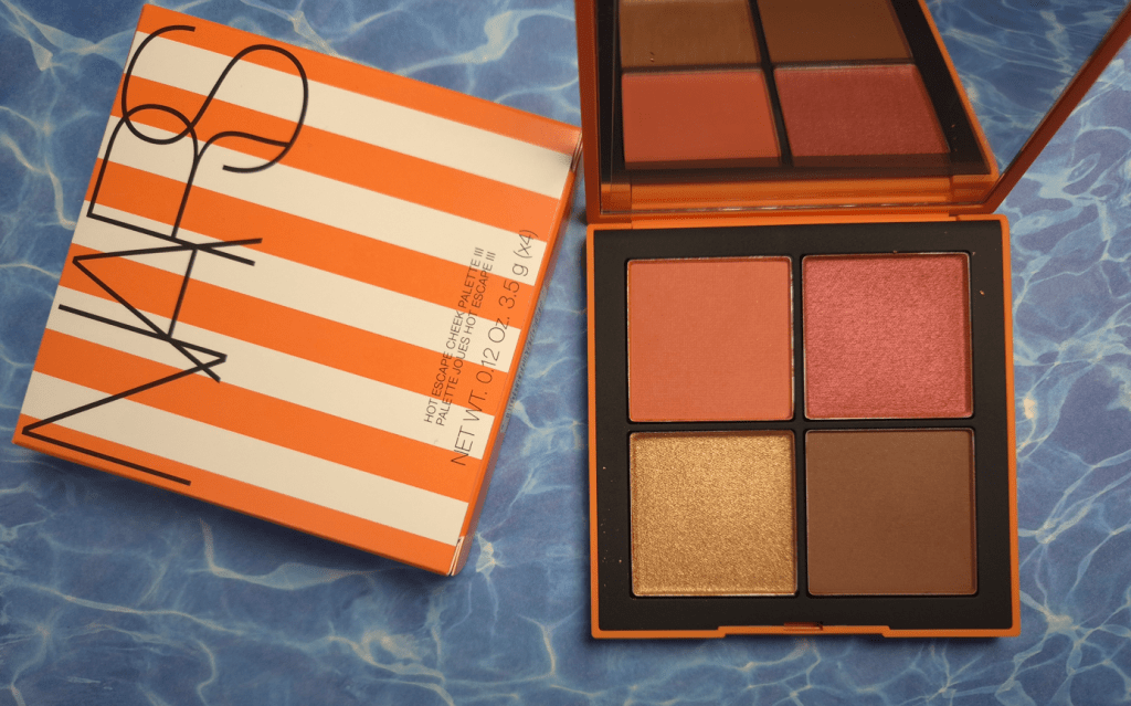
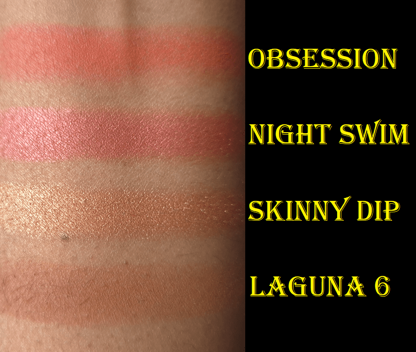
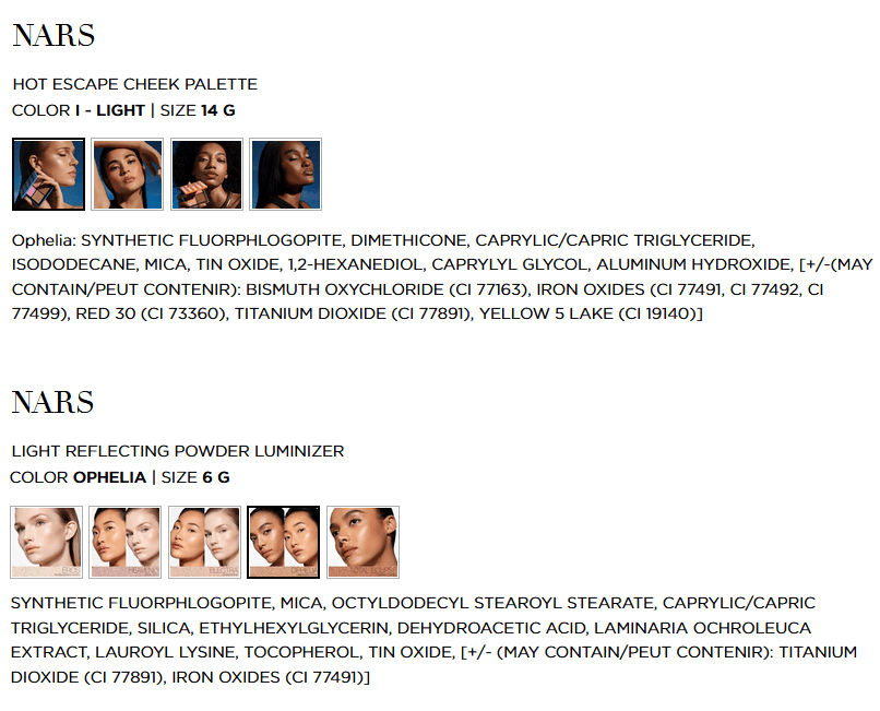
It might be considered a loophole, but I don’t recall placing a limit on face palettes. I did get a Nars highlighter within the Medium Deep Hot Escapes palette. Despite all this, I’m going to give myself kudos anyway. In addition, I am more committed than ever to let the Prada highlighter be my last highlighter purchase for at least an additional year, or perhaps even forever. The only temptation I could see going forward is if Pat Mcgrath releases a deeper shade in the Ultra Glow Divine Rose Highlighter formula or a limited edition launch with packaging that I want and the makeup inside happens to be a highlighter.

Eyeshadows

I bought the Lisa Eldridge Liquid Silk Liquid Eyeshadows (technically just Phoebe in January), but since I use those as bases/primer, I’m not counting it towards this category. What does count are the four Clionadh Cosmetics multichrome singles plus the Garland and Garden Quad, a Victoria Beckham Eye Wardrobe palette, three Pat Mcgrath Motherships, three eyeshadow singles from the Lisa Eldridge Betty palette plus the Desert Gleam palette, one of the Charlotte Tilbury Palette of Beautifying Eye Trends, the YSL Unexplored Garden quad, and one of the Prada Holo Nude Eyeshadows in 09 Primula.
I consider this to be a mixed bag of reasonable and less reasonable purchases. For starters, Clionadh is an exception to everything as my favorite indie brand of all time. I’m halfway inclined to give the same leeway to Pat Mcgrath as my favorite “mainstream” brand, and considering I bought nothing from them in 2024. However, it was still a bit impulsive since I had gone all these years without wanting the first Divine Rose and Bronze Seduction palettes, but suddenly I couldn’t help myself.

I’ll give myself a pat on the back for sticking with one VB Eye Wardrobe instead of the two others I wanted, one palette from CT and not the second one, plus buying half of Betty so that I wouldn’t be stuck with 3 extra eyeshadows I wouldn’t use. I also skipped many more launches I wanted such as the Tom Ford Olive Smoke quad, the four other new YSL quads, and a few indie palettes.

I would have had room to review the new palettes and still focus on a few of my old ones, but I had so many eyeshadow purchases from 2024 to catch up on testing that I was unsuccessful in making many dips in the pans. My most used eyeshadows during this Project Pan were likely the lightest shade in the YSL Over Brun quad and darkest shades in the VBB Victoria quad because I used those the most to pair with other palettes and eyeshadow singles.

Everything Else: face and eye primers, mascaras, eyeliners, brow products, and lip products

I did end up buying a mini set of the Milk Hydro Grip that contained the original and glow version, though that might have been just before my low-buy started. I honestly can’t remember. Then, my old Gerard Cosmetics Clean Canvas started to change consistency, but it was nearly empty anyway, so I tossed it out. I still have my MAC Paint Pot and Nyx Glitter Primer, but I felt more comfortable having a third option. This is how I ended up using the Lisa Eldridge Liquid Silk for eye primer purposes. Speaking of which, I ordered Gaia in November 2024 and Phoebe in January 2025. I was paring them both in the beginning, but soon started using Phoebe exclusively. I was shocked that within only 3 or so months of use, I was struggling to get product out. I had to uncork the stopper and mix it a little to start reaching product again. Product still periodically moves to a spot that I cannot reach with the applicator, so I have had to uncork it an additional two times, which is not an easy task! I had to use tools because it’s very tightly in there to keep the product from drying out. So, if you think you might have used yours up quickly, I recommend removing the stopper and checking. I estimate that I have used up half of the tube by now.

I ended up buying more mascaras, but the high end ones were minis on sale and the full size were from Essence and at least very inexpensive. I managed to use up a few older mascaras, so that was nice.

I bought one brow pencil, and it was the waterproof version of Elf’s Instant Lift, which I won’t use until I finish my current ones. As for eyeliners, I hadn’t bought any until June. I’d been waiting ages for Hindash to have a sale that also included free shipping. So, I bought 3 Color Fluids and the Heroline eyeliner pen.

I didn’t set a hard stance for myself against buying setting sprays, because going overboard hadn’t been much of a problem. I think prior to this year, the most I ever had at the same time were three. I was unprepared for so many brands coming out with their own this year, so I fell victim to a lot of hype. I ended up buying the one from Huda, Tir Tir, Pat Mcgrath, and I got the one from Charlotte Tilbury in my Genshin Impact collab box. That means I now have seven! Most of them are travel sizes at least. There are several more I was interested in trying, but I will now ban myself from buying more for at least a year.

Regarding lips, I mostly stuck with the designated brands. I have three lippies from MAC, two from Too Faced, and two refills from Lisa Eldridge. I swapped out PML for MAC, as I made an allowance for, but technically YSL wasn’t officially on the “allowed” list, even though I mentioned them. So, I’m not sure if I should admonish myself for buying two YSL lippies.
One allowance I had in my head, but didn’t mention in the Project Pan, was the lip balm from Eadem. I wanted to buy that well before my Project Pan, but could not get it because the brand doesn’t do international shipping. So, I bought it while in the US. Lastly, I wasn’t supposed to get another Summer Fridays balm, but I couldn’t resist.

I rotated through a lot of my lip products, but I can say the top two I used the most were the Ami Cole Lip Treatment and Lisa Eldridge Baume Embrace.

And that is everything!

I could have done a lot better, but for me this was a semi successful endeavor. In fact, I want to stick with this same Project Pan idea for another six months. I want to see if I can be even stricter with myself, especially now that I have twice as many items in my collection between getting some of my old makeup back and adding so many new ones in the first half of the year. The goal was to use more of my holy grail makeup in the hopes that it would curb some spending urges. However, the amount of time I designated to reviewing my stack of unreviewed makeup took enough time away from my holy grails that I don’t think I was able to give a strong enough effort.

So, Round 2 starts now!

-Lili

Prada Beauty Eyeshadows and Highlighter

I have been purchasing more luxury makeup than usual over the past year and a half, but there are some brands I have tried to avoid for fear of liking them too much and not having the self-control to stop myself from buying everything they make!
Prada is one of those brands that every single release has been hyped on social media as “the best on the market,” but as long as I didn’t take that first step in trying something, I was safe.

Well, I am no longer safe! I finally bought the eyeshadow palette that appealed to me most, and then shortly after bought the highlighter in the refill form.

Before we get into the reviews, I want to discuss the logistics of this refill system because many Influencers have been saying, “If it’s too expensive, you can save money by buying one with a compact and getting refills of the rest,” without even checking what that actually entails for the customer.

For starters, this is not like Charlotte Tilbury refillable products where the compacts have magnetic bases with metallic pans that are easy to pop in and out. The Prada “pans” are made of plastic. There is a triangular shaped gap in the back of the compact that one can press through to lift out the plastic pan. On the bottom of the pan is a rectangular section with adhesive on it.
This adhesive is what holds these pans in place within the compacts.

The bottom photo shows how flush the pan is to the surface, so adding a magnetic sheet to the bottom to turn it into a magnetic compact is not possible.


That adhesive will be exposed to the air and other elements if removed from the compact and set down on top of an object. So, something (perhaps scotch tape or the paper from another refill) will be needed to cover the sticky section. If the plan is to swap out products repeatedly, the cover piece has to be easily removable and not lessen the sticky power over time. The adhesive isn’t that strong to begin with. I’ve seen two people whose pans immediately fell out of their compacts, and mine continues to as well.

When one purchases an individual refill, it does not come in a plastic case/clamshell.
There is the cardboard unicarton and the extra bit of cardboard on the inside that keeps the product stable during transport. That’s it. There is a square paper tab on the bottom that keeps the adhesive section from sticking to anything else.
Alicia Archer demonstrates how the refill is stored here.

With mine, I placed metal stickers on the bottom of the plastic refill pan, so I could store it in any of my custom magnetic palettes. When using the square size metal stickers, at least two are required for it to cling well enough to the palette. The idea was to place them in areas that would not interfere with the lifter tab in the compact if I decided to swap out the eyeshadow palette and put the highlighter there instead. For anyone who only wants to buy refills and put them in custom magnetic palettes, adding metal stickers and keeping the adhesive spot covered is simple enough.

When I was ready to transfer pans, I stuck to the plan of covering the eyeshadow palette’s exposed adhesive spot with the new sticker off the highlighter refill, and then added metal stickers to the back of the eyeshadow palette. So far so good!
I placed the newly exposed highlighter pan into the compact and pressed down to secure it. It worked, but the extra weight of the metal stickers combined with the fairly weak adhesive power made it easier for the pan to plop back out if shaken not-so-gently upside down. I ended up removing the metal stickers off the back of the highlighter to give it its best chance to stay stuck in the compact. It does still pop out with every few uses, especially when jostled in my makeup bag. So, even if the goal was to make these easier to recycle, it’s an annoyance for the customer. When spending this kind of money, it should be securely in there. I wish they had just used magnets.

I am used to depotting things, so I have the necessary supplies. However, the typical customer might be surprised to find out there are more steps to the process than just pressing the back and popping out the pan. One can use the refills to replace an empty pan, use it in and out of the original cardboard packaging, or find a way to house it in a magnetic palette. Exchanging multiple products in and out of the Prada compacts though is not realistic.

I am at least glad they didn’t go the Hermes route (and other luxury brands). Hermes sells refills in pans, but the pans are aluminum and therefore not magnetic. I’ve had to add metal stickers to the bottom of mine. In addition, if one buys a compact with a product already inside, the compact is not magnetic and the pan is pre-glued. So, once you take out the original pan for swapping purposes, you will have to do something to either cover the glue or remove it. Then you’d have to glue in the next refill and hope you can still take it out once that replacement is done.

In some compacts, I have been able to place a magnet sheet on the inside and turn it into a custom magnetic compact, but if the sheet is too thin the magnetic hold might not be strong enough to support the weight of the pan. If the sheet is too thick, the pan could be raised too high up and one can’t close the compact. The Prada compacts, for example, are too flush with the surface and cannot be turned into an empty magnetic palette like how I’ve done with Hourglass palettes.

So, sometimes refillable makeup has limitations on the various ways someone can use them depending on how the brand does their packaging.

Prada Light Glowing Highlighter Powder in 03 Deep

A highlighter’s core function is to brighten the skin wherever it is used. Even a matte product can serve that purpose, as long as it’s lighter than a person’s skin tone. Therefore, additional attributes such as the consistency, finish, reflect level, etc are completely subjective. If someone has a list the traits that they seek in a highlighter, the product that checks off most of those boxes is considered to be “the best.” What is best for one person could be the worst on someone else’s list!

I can say right now that the Prada highlighter is among the best for me, and perhaps even in the number one spot!

There are three shades currently available: Champagne, Pink, and Deep.
I don’t consider Deep to be that dark, but it works for my skin tone. I would like to see the brand expand the range in both directions because I don’t think these three shades are that flexible. I have a cousin who would probably love this highlighter, but she’s considerably darker than me. There wouldn’t be a point in me recommending this to her because it would probably look grey on her skin from being too light. So, I think it’s important for brands to offer a wider variety of highlighter colors within a line, especially if it’s a more opaque type or if the pearlescent finish is strong.

This highlighter is satin-like to the touch. Most powder highlighters that achieve this level of smoothness are hybrid cream-powder ones or putty-like. They basically feel wet. The Prada highlighter is different because it still feels like a powder, but in the smoothest form. When applied to the skin, it practically melts in to the point that I can hardly see individual shimmer particles. It is ultra refined with the brand’s trademarked “Micro-Pixel™ Pearls”. The effect is as close to the performance of a cream or liquid highlighter without it actually being liquid. The moisture level within this product is perfectly balanced. I cannot imagine how a powder could be any more hydrating from the jojoba butter, maracuja oil, and squalane without venturing into dewy territory. Kudos to the lab that formulated this!

I’ve only used my natural hair brushes with this highlighter. They all pick up the right amount of product to start me off with a beautiful subtle layer, but I can build it up to the lighter side of medium intensity. When I swipe it across my skin, I don’t even need to blend it. It doesn’t leave a visible stripe. If I build it up, it still requires such little effort to blend.
This highlighter has no problem sticking to my bare skin on low-makeup days and still doesn’t look extreme over a dewy base. It lasts all day without diminishing in brightness.

I have always wanted a powder highlighter with the smallest possible shimmer particles that would provide the most natural lit-from-within glow. My perfect highlighter couldn’t be too pearly or metallic. I would have no other issues with the performance, and the packaging would look luxurious. These are all reasons why the Prada highlighter should be perfect for me. There is just one flaw for me, and it’s the added fragrance!

This highlighter contains parfum and naturally fragrant ingredients (limonene, geraniol, citronellol, and linalol). It’s not an unpleasant smell, but I can’t enjoy it either because of how strong it is. It hits me as soon as I open the compact, and it continues to linger in my brushes for a while. I can smell it on my face for several hours too. I hope the scent will dissipate and air out over time because it only takes me using it with one or two other strongly perfumed products, such as the Guerlain Parure Loose Powder, to induce a headache. The parfum is bad enough, but to have all those potentially skin sensitizing essential oils too is a huge drawback for me. I will continue using this because, if not for the fragrance, it would be my number one holy grail highlighter. Unfortunately, it’s just not the kind of scent that is easy to ignore.

I want a subtle highlighter 80% of the time. The other 20% of the time, I want medium intensity at most. So, there are still moments that I reach for the Hindash Gradient Highlighter and Charlotte Tilbury highlighters instead. However, we have now reached the point where the Prada formula is so good that I cannot justify buying another highlighter ever again. The only time it would make sense for me to get a new one is for limited edition packaging or if I hear someone has identically duped the Prada one in a fragrance-free version. This is it for me!

Prada Holo Nude Eyeshadow in 09 Primula

Everyone said this formula is creamy, but my goodness, they were not exaggerating! They feel like cream-to-powder formulas. In fact, they’re so creamy that I’m amazed they are still solid powders. The most comparable eyeshadow formula I can think of that’s not technically cream-to-powder are the ones from YSL, but the Prada eyeshadows are more moisturizing and creamy.
These have a pigment level that’s between Lisa Eldridge Velvets and and her Seamless Mattes, but these don’t feel as firm/compact in the pan. I use natural hair packing shader brushes and the Sonia G Fusion Eye Builder to speed up the process of loading on the color, as the eyeshadow payoff is the soft buildable kind, but I also want a diffused edge without needing to spend as much time blending it out.

I am very unlikely to hit pan on these, but I would like to point out that the long rectangular strip across the top is quite annoying to fit my brushes into there. I hope Prada will come out with a different pan layout in the future.

I like that this color story is a bit sultry, but I can’t create as much depth and dimension as someone else could who has a lighter skin tone than mine. Primula still looks pretty on me, but after the testing phase ended, I started using the darkest shadow from VBB’s Victoria palette in the outer corner, but just enough to keep the overall look still soft by my standards.

Shade 1 is useful in blending out edges and keeping the area looking clean between the crease and brows.
Shade 2 adds depth. If that color couldn’t be deeper, then I wish the brand made Shade 3 a little lighter for a greater difference in color value and not just Shade 3 being warmer.
Shade 4 looks gorgeous in the pan. Based on photos I’ve seen, I do believe the shimmer in Primula is the prettiest of the three palettes in the Holo collection. However, even if I wet the eyeshadow, I still find it to be a little less impactful, shimmery, and shifty than I hoped. The red base just kind of blends in too much with the two warm toned shades, especially Shade 3. I like a gentle gradient sometimes, so this palette is great for those moments. In the phase I’m in currently, it’s a little less suited to my eyeshadow preferences.

I don’t want to take away from how happy I am that a luxury brand is including atypical colors in their palettes. And I do understand that putting a shade like Asteria by Devinah Cosmetics instead might be too bold for the kind of customer luxury brands try to sell to. I just don’t want to overlook the fact that what drew me to this palette in the first place can still be found in my collection. I can’t find mattes of Prada quality from indie brands, but the shimmers are another story. I don’t have to pay Prada prices to get it.

Because these eyeshadows are smooth, but not reliant on overdoing it with dimethicone to get that smoothness, I don’t have issues with creasing. I don’t have any problems with adherence or longevity either.

Overall, the quality is fantastic. I purchased this at a discount from Douglas, but it’s still quite expensive for a quad. I won’t say that I’m never purchasing another one, considering I’ve purchased Gucci and Guerlain palettes for a similar (discounted) price, and the Prada quality is superior to theirs. I would just need to stick to my normal criteria in being excited about the majority of the palette colors, if I were to buy one more.

I mentioned that I am no longer safe from being tempted into buying more makeup from Prada, but that’s in the future. For now, I’m content with the two products I have, especially the highlighter.

That’s all for today! Thank you for reading and I hope this has been helpful.

-Lili

Lisa Eldridge Summer Colour Story Collection

Lisa Eldridge recently launched her summer collection consisting of an eyeshadow palette, three lipsticks, and two tote bags. The only items I’m missing are the Toasted shade of lipstick and the Olive/Lavender tote.

There are currently three tiers in the brand’s reward program, with Emerald being the highest. Emerald members were able to shop a day early and could add one of the bags to their orders for free without a minimum spend amount. Otherwise, all other customers could get the tote for free with a purchase of €90 or by paying for it outright at the cost of €18. So, I ordered the Desert Gleam palette and Rae from the official website and added the free Olive/Camel tote.

Niche-Beauty sells Lisa Eldridge products, and frequently has 20% off codes available, but one can only get a tote there by hitting that €90 minimum spending price. So, it turned out for the best that I placed my original order with the Lisa Eldridge website, and then when the new products launched at Niche-Beauty a week later, I bought Lili.

Desert Gleam Palette

Dunes and Acacia are Seamless Mattes. I wrote in-depth descriptions of the different formulas in a past review, but the short version is that these mattes are similar in texture to Natasha Denona’s cream to powder formula, they are more pigmented than the Velvets, and have the tiniest bit of a wet (but not shimmery) sheen. Dunes is very difficult to see when applied to my eye area because of my skin tone, but I can tell it’s there because of the blurred look it has, especially when applied to the edges of a darker shadow to soften it up.
Acacia is now my darkest matte from Lisa Eldridge. Although I wish it was the tiniest bit darker, it at least successfully adds depth to my eyeshadow looks and I can build up the intensity.

Most of the time, the Seamless Mattes are creamy and a joy to work with. However, the shade Supernaturally from the Fawn palette was stiffer, drier, and less pigmented. So, that shade is one I stopped using out of frustration. Within the Desert Gleam palette, I got hard-pan on Dunes*, and I’ve had to scrape off some of the surface after just a week of use. It is normal for all the mattes to look like they’re going to hardpan, but this is the only time I’ve actually been unable to pick up product and needed to clear off the surface. I alternate between using brushes and my fingers with all Lisa Eldridge eyeshadows, but this is the first time I’ve encountered this problem. Going forward, I will just use brushes with this shade to try and mitigate the issue.
I’ve had no troubles with Acacia though.

*Update: I was chatting with Fedaro Beauty, who has reviewed this collection as well, and I remembered one change I made this week that could have affected Dunes. For many years I’ve been using the officially branded Makeup Erasers that are microfiber cloths. However, I switched to using Marushin cotton cloths that were free gifts with purchase from my Fude Bobo orders. Microfiber absorbs more oil than cotton, so it is actually possible my fingers had more oil residue left on them between uses than usual and could be responsible for the hard-pan on Dunes. This may be a long shot in providing an explanation, but since this is a possible cause, I felt it was important to share this theory.

Dunes after I scraped off some of the surface.

Sahara is in the Velvet formula, which gives an even and soft layer of color. I prefer to use my brush to pack on the shade and build it up. I’m honestly surprised it shows up as well on me as it does, because I thought it might be too light of a color. I’ve also seen how this shade can look a lot more khaki-yellow on some people, but it’s greener on me.
The Velvets are smoother in feel, and swatch beautifully, but over an extended amount of time, I have noticed mine got drier. Sahara is too new for me to have this problem, but it’s something I wanted to mention that I have noticed out of my oldest Velvet eyeshadows. I can still use them, but building up the color to get the payoff I want takes more effort than before. For those that enjoy soft or muted eyeshadows, this is unlikely to be an issue.

I forgot to mention that in the first eye look in this photo, Sahara was used on the lid before I added Chrysina on top. So, it looks warmer and slightly darker than the first eye look in the photo below where only my eyeshadow primer is under Chrysina on the lid.

Chrysina is a Luminous shadow. It looks silvery green in the pan, but there’s still a touch of gold that I can see at certain angles in the light. For this reason, I like this shade more than I expected. I would go as far as to call this a duochrome, though it’s nowhere near as intense as Mercurial, which is another Luminous eyeshadow.

Ablaze and Firefly are Metallics, but Firefly looks so much smoother in the pan, as seen three photos higher. The textural differences don’t affect anything. I just thought it was interesting.
Ablaze is an easily wearable golden brown that is perfect for creating neutral eye looks. I have a lot of warm golds in my collection, but I don’t have many shades of gold with this tone, as silly as that might sound. It’s still not a necessity for me to have in my full collection, but I think a shade like this aids in keeping the palette color story versatile.
Firefly seemed intimidating to try and incorporate into my eye looks, but as long as it’s framed by Sahara or Acacia in the crease, it works. Ablaze is also neutral enough that it doesn’t clash if they are used next to each other.

I have no issues with longevity or creasing, I can use these with any of my eyeshadow primers, and I can use the shimmers with a damp brush to build intensity. I have no problems with these eyeshadows, other than what I already described with the shade Dunes and the Velvet formula in the long-term.

When I first saw the Desert Gleam palette, there was no way I could talk myself out of getting these shades, despite it reminding me of my eyeshadows from Natasha Denona. It has a similar vibe to the Mini Gold, it reminds me a lot of my custom version of Metropolis, and I also have the Yucca palette. However, when I actually swatched the shades and compared them, they were different enough on my skin tone for me to not consider them dupes.

Please excuse the fact that the skin under Bia wasn’t completely dry, so it looks a little more intense than usual.

If I’m being 100% honest with myself, I prefer the Natasha Denona Mini Gold Palette over this one. I’ve come to accept that high contrast makeup looks better on me, and there are greater depth differences and more color/shade distinctions between the eyeshadows in Mini Gold than Desert Gleam. I’m still attracted to the Desert Gleam colors, and I’ve gotten quite a lot of compliments while wearing the products in this collection. However, I think the ND shades are even more my style. In terms of performance, the Mini Gold eyeshadows aren’t creamy feeling, but they still blend very well, layer well, and build quicker because they’re more pigmented. It’s kind of a moot point because I believe the Mini Gold has been discontinued, so it’s not an option to purchase for anyone who doesn’t have it already. What I’m essentially trying to say is that even though I have products I technically like more than Desert Gleam, I would still feel like I was missing out if I didn’t pick up this palette.

Rouge Refillable Lipsticks in Lili and Rae

Lisa Eldridge and I share the same nickname! Even though I rarely wear red lipstick, I still wanted this one for the name. What can I say! I’m easily swayed!

The way this lipstick performs is no different from the first round that launched at the beginning of this year. They glide over the lips easily and feel like a cross between a balm and a lipstick. This shade is vibrant, but I can still see the discolored/darker pigment spots on my lips underneath if I stick with only one swipe. So, an additional pass or two is needed to be opaque. It feels quite comfortable on my lips, though I get minor chapping by the end of the day.

I own an engraved lipstick case already, so I only needed to purchase these in refill form. My cap/lid for Lili is very loose, so I keep it stored in all the original packaging to prevent any accidents in my makeup pouch, but I’m contemplating raiding my husband’s tools to find pliers that will tighten the cap a little (hopefully not too tight to the point that I can’t pull it back off)!

For some reason, Rae feels much creamier than the other four lipsticks I have from this line. It feels more moisturizing as well, which increases my comfort level while wearing it. However, this one does not have the same kind of grip to it that keeps it longer-lasting like the others. Even if I’m not eating or drinking, within a few hours there is noticeably less lipstick on my lips. I think my skin absorbs it. So, I find myself needing to reapply more frequently. I can’t explain why this is happening because Rae has the same ingredients as all the rest. It’s my favorite shade though, so I’m going to just deal with it! I normally don’t like wearing dark lipsticks because I feel like most of them age me, but this is an exception!

So, that is everything reviewed except the Tote bag. I don’t have much to say about it except that it’s made of a nice material, feels sturdy, and it has a cute and functional zip pocket on the inside. It terms of size, it’s a few millimeters smaller than my smallest canvas shopping bag. I wanted a fancy reusable grocery bag, but this looks almost too nice for that purpose. That’s all I use totes for, so perhaps I could reserve it for times I shop at the city market instead.

I don’t think I’ve shown the pencil case before, which I also like from the brand. I find myself using and liking the Lisa Eldridge accessories, so it’s a big draw for me continuing to purchase from the official website to get them.

Now, that’s everything! I hope this post has been helpful. I tried to complete it as soon as I could, and it helps that I’m already familiar with these formulas from Lisa Eldridge, so I don’t have to test them for as long.

Thank you for reading! Tschüss!

-Lili