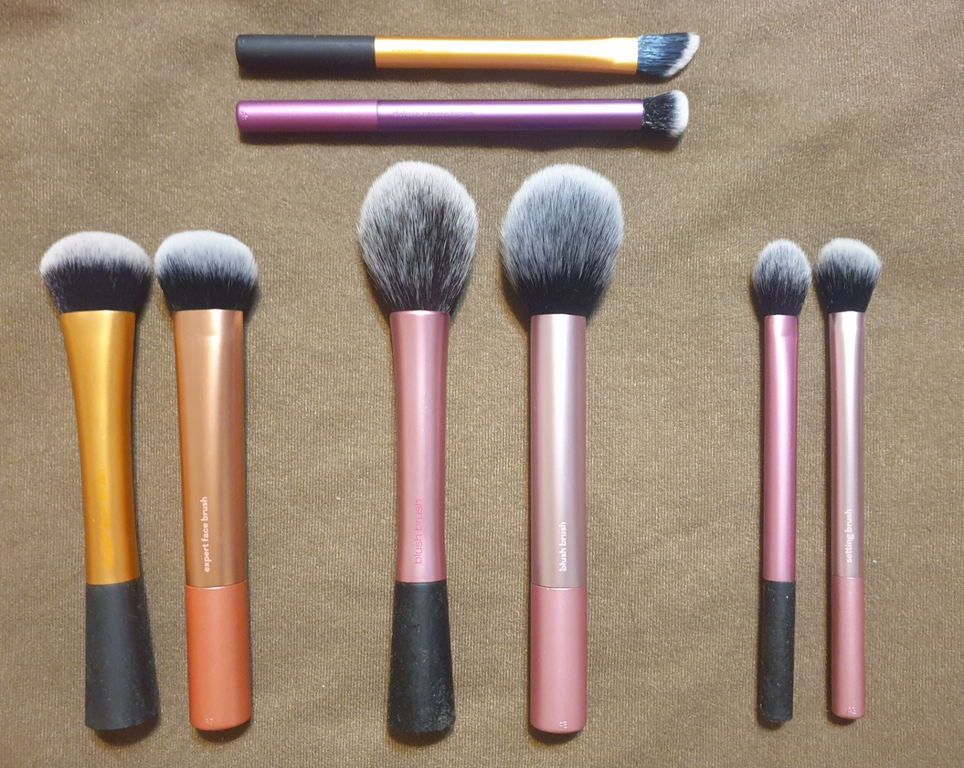
I purchased the Real Techniques Everyday Essentials Kit at Ulta last November, which included all the new brushes I’m reviewing today, as well as RT’s classic shaped original Miracle Complexion Sponge. After the sale price and additional promo code discount, this $19.99 set went down to $9.64. I couldn’t pass that up! All of the handles of the original brushes have a soft touch rubbery portion that after many years eventually became sticky and impossible to fully clean off that stickiness. I welcomed the solid new handles of the current RT brushes, but I did not realize that the head shapes were all slightly different to their original counterparts. This set includes one brush I don’t have a match for, and I don’t have the new version to compare to some of my other old real techniques brushes, but I have tested these thoroughly to determine whether or not I can still consider Real Techniques a good drugstore option for brushes.
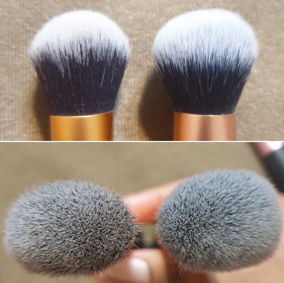
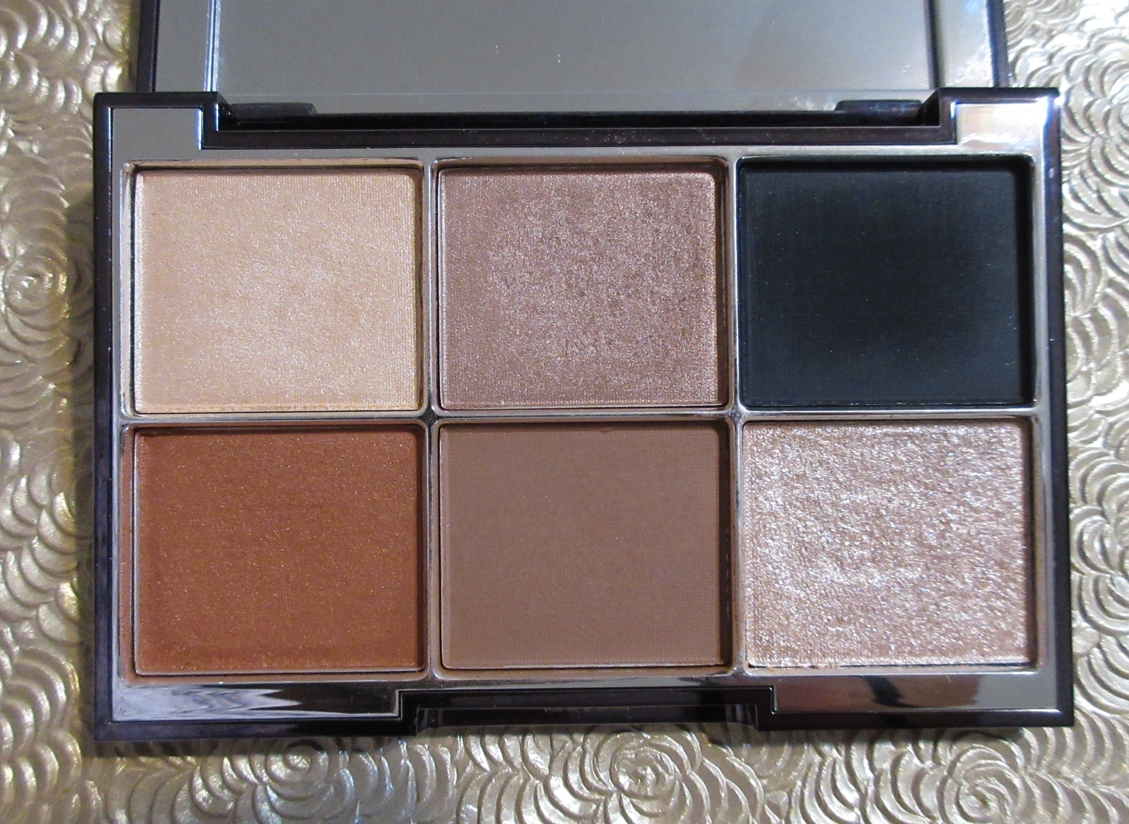
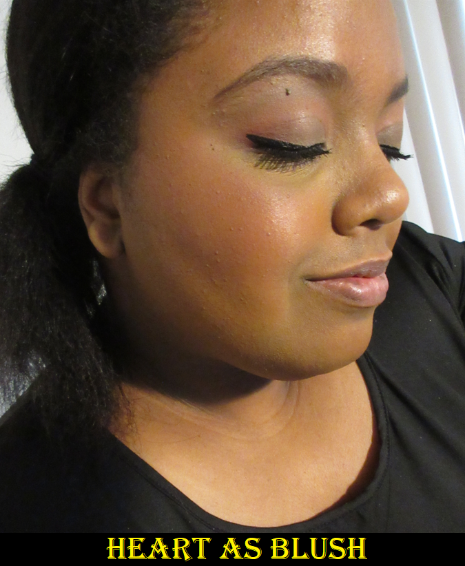
EXPERT FACE BRUSH
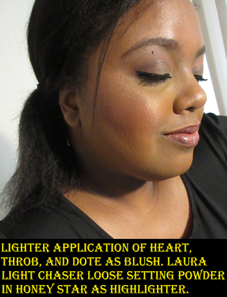
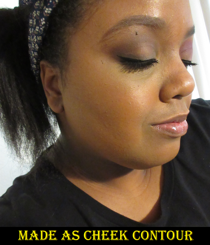
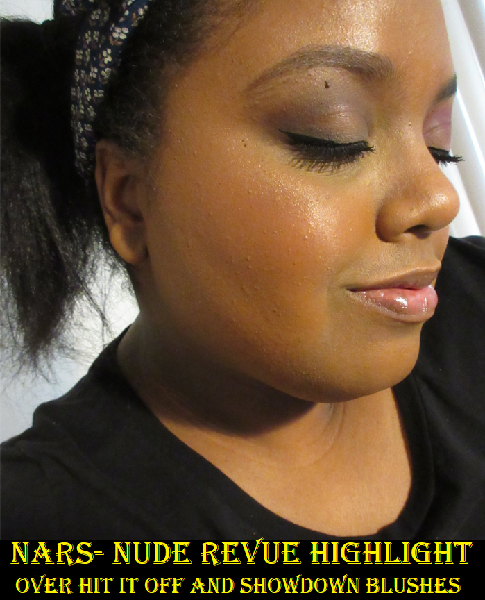
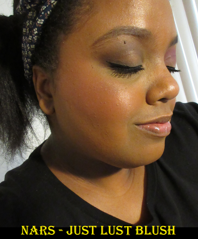
This brush is intended for foundation, but I’ve also used it for blushes and bronzers. When it comes to foundation, I haven’t noticed any differences between the performance of the two. Where they start to diverge is that the original brush offers more precision because the fibers are more compact. With powder products, this is perfectly fine, but liquids and creams are by nature easier to spread too high or low already, so with the new brush I tend to accidentally place blush too far down because of its larger circumference. Typically, blushes are less opaque than bronzers, so I load up my brush in an effort to not spend ages building up a cream/liquid blush. That’s how it’s so easy for this issue to occur for blush, but not bronzer. Since I just need a tap or two into the pan of my cream bronzer, there’s less product to spread out. With less product, I’m actually able to take advantage of the fluffier head of the current brush and really work it into the contours of my cheek to get an almost airbrushed blend. The bristles of the new brush are also noticeably softer, which makes it more enjoyable to use.
So, while the old brush does have a leg up in one aspect, my holy grail cream blush brush is the Sonia G Mini Base. This removes the only reason I’d keep the old brush over the new one, so the new one is staying in my collection!
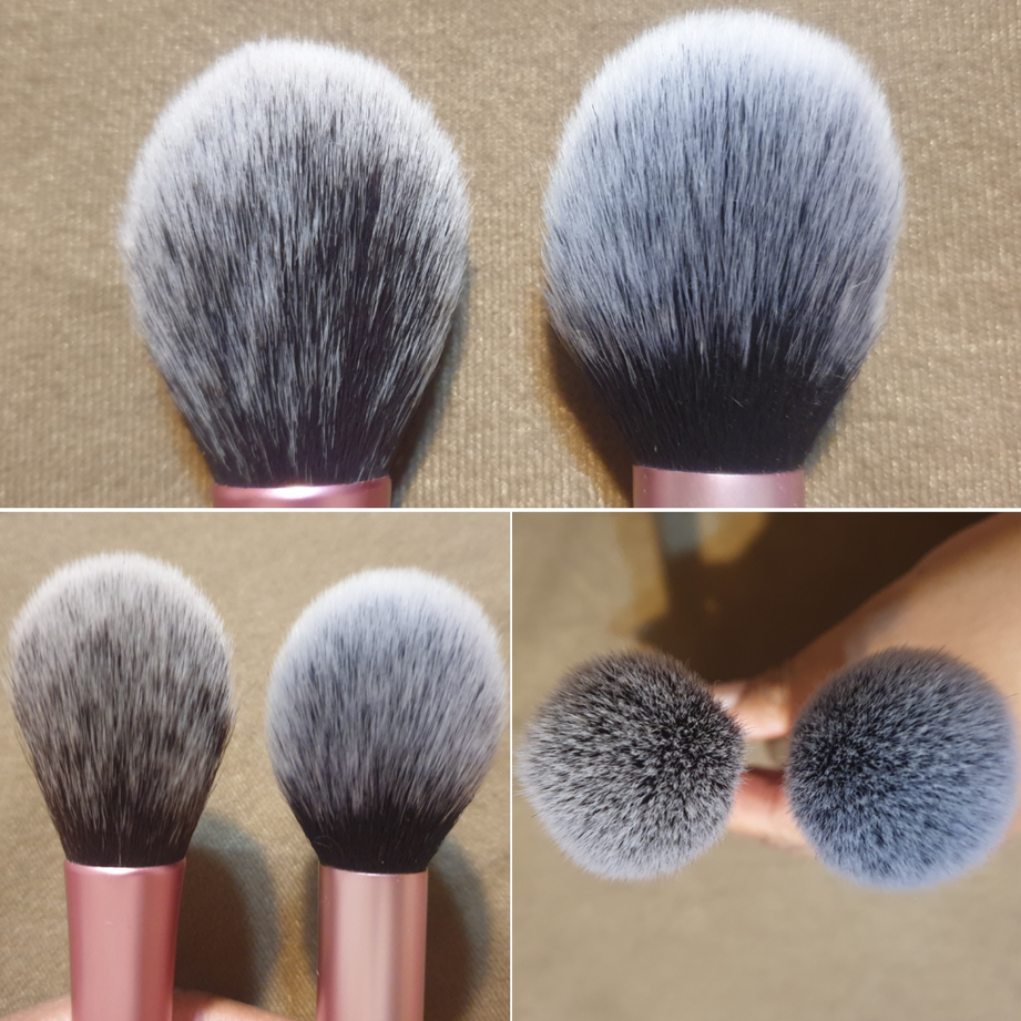
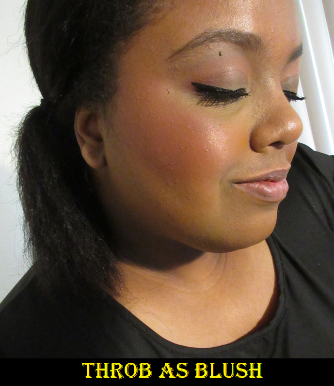
BLUSH BRUSH
Early in my makeup journey, the original blush brush used to be my favorite. It was especially great for carefully building up pigmented blushes, since it was packed at a medium density but with such long bristles that the pressure was far lighter at the tips. As my collection grew and I was purchasing more fude that could accomplish similar or better results with the softer bristles, I stopped using it.
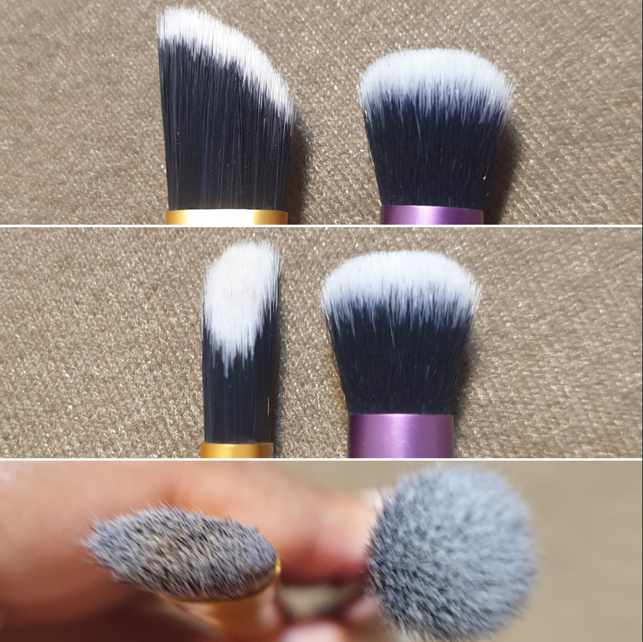
The original brush has wavier bristles and is narrower than the new version of the blush brush. I expected to find major differences in the performances of these brushes, but the end result of each brush looks exactly the same. The only difference is the new one is softer, so the new blush brush also wins.
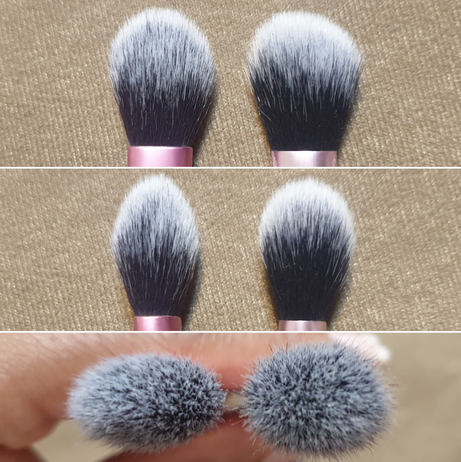
SETTING BRUSH
The older brush isn’t as thick and the tips come more to a point, making the original shape better at getting into the inner corners, crevices, and fitting under the eye. This brush has been the only one I’ve used to set powder under my eyes ever since I bought it. I even have an original backup brush, so I am the most particular about not wanting this brush to change. I will say that the new brush being more round and fluffy does make me have to work harder to avoid getting powder accidentally swept too high and into my eyes. I also have to angle the brush a bit awkwardly to get into certain crevices of my eye area. Other than that, the new brush is okay. It’s 85% as good, but the older one was perfection with my eye shape. For that reason, I don’t think I’ll be able to let go of my original ones just yet.
CONCEALER BRUSH (Original) vs (New) CREASE BRUSH
These are two completely different brushes, but they can accomplish similar tasks. The concealer brush has rough plastic bristles to start with, but it at least is better about not holding as much concealer within the fibers. It’s also good at getting into the contours of my eye area. The crease brush excels at getting a smooth even application, so that makes it quicker to blend out liquid products. I prefer to use the new brush with eye primer and neither brush comes anywhere near topping my Sonia G Jumbo Concealer brush for concealer application. So, I could easily get rid of the old concealer brush and still keep the new one for priming my eyes.
Although, I was intially nervous to see the changes between the shapes of the old and new brushes from Real Techniques, the new ones still get the job done well. I’m happy to be able to still recommend them as affordable synthetic brush options.
That’s all for today! Thank you for reading! And speaking of synthetic brush options, I’m not sure how long it will last, but Smashbox Brushes are 50% off today and possibly stacks with an extra 15% off with promo code SPCSMASHBOX. Big thanks to TheBeautySteal who posted it in their IG stories.
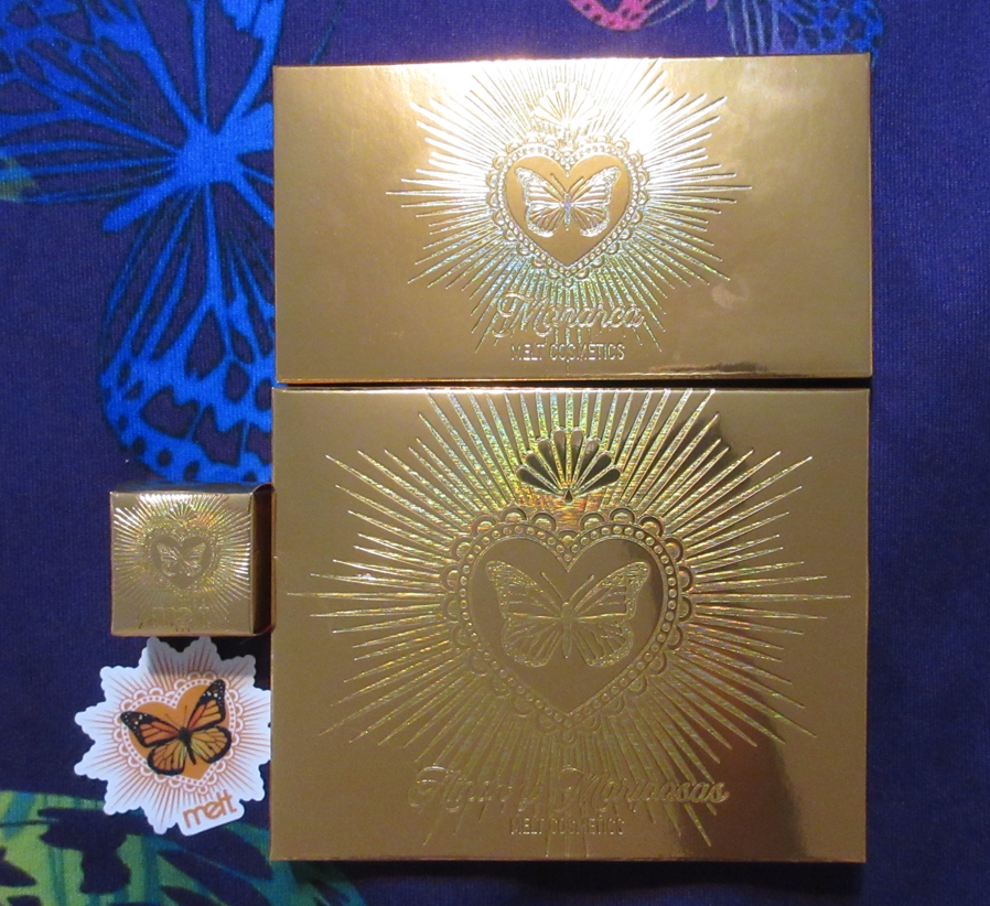
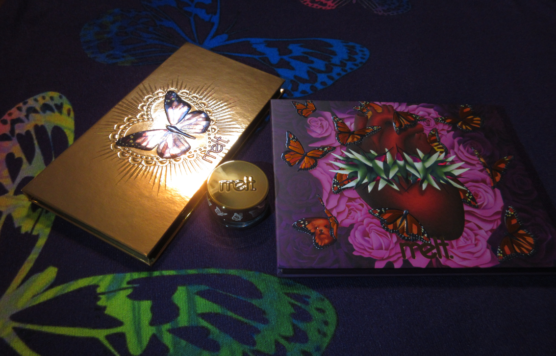
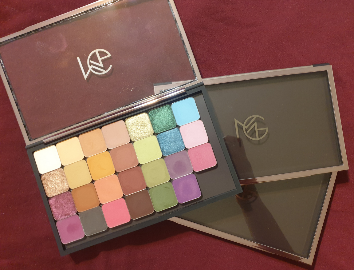
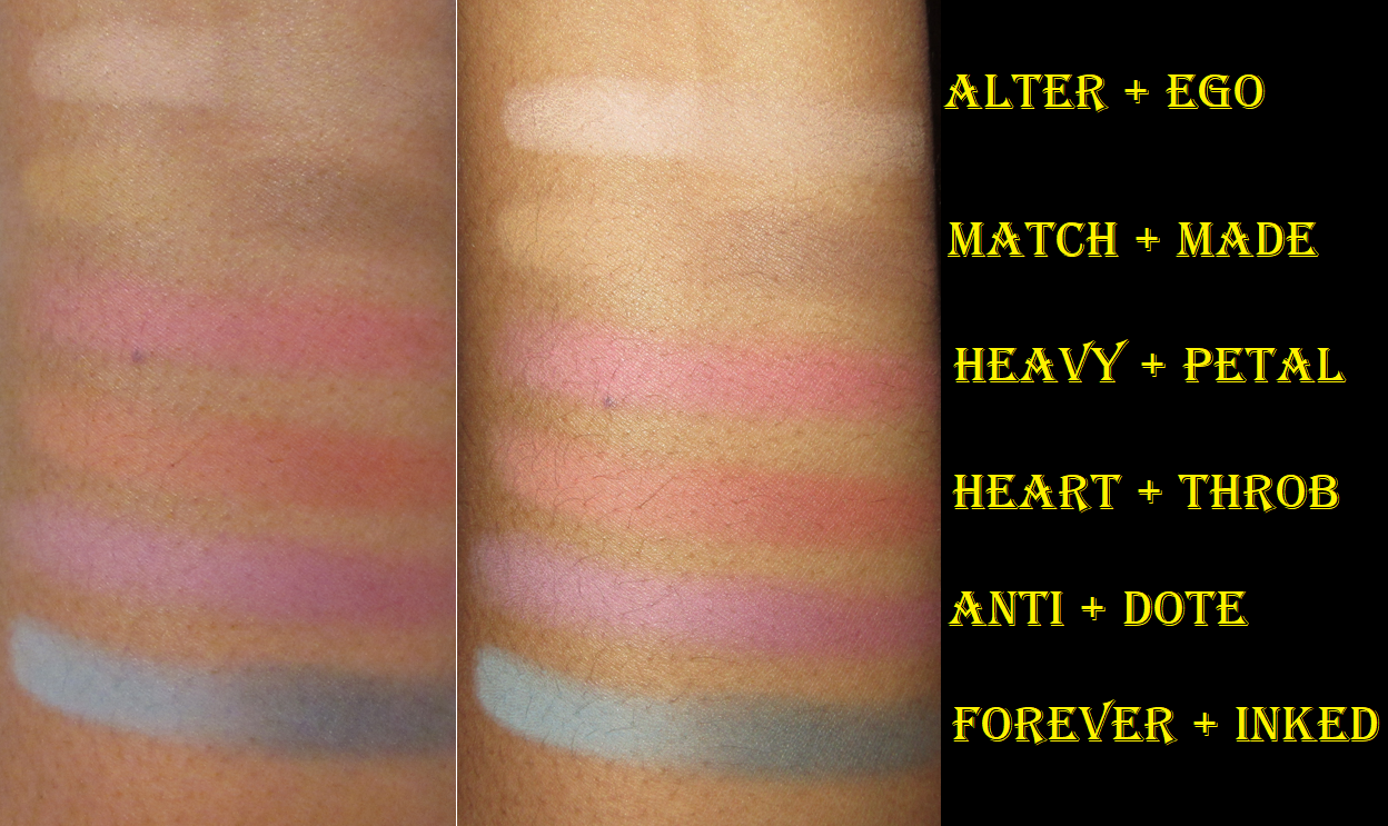
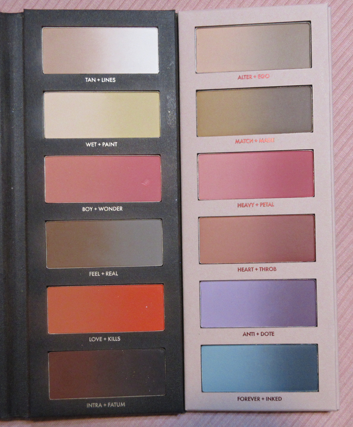
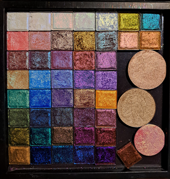
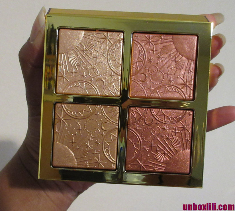
Starting on the birthday anniversary of Melt Cosmetics, the brand put this collection on sale for 60% off. With the Amor y Mariposas Palette Set bundle deal, I technically got 70% off if we factor in the full retail price of the items individually. The brand also temporarily offered free shipping with no minimum spending amount. I decided not to go overboard and just purchased the items I’d been wanting most out of the collection since its release for the holidays last year: the pressed pigment palette, blush palette, and two gel liners. I initially just purchased one liner, but at the last minute (after loving the deep greenish blue one) I decided to grab the gold as well. The notice for the free shipping minimum returned to $75, but for some reason, I was still able to select free shipping at check out.
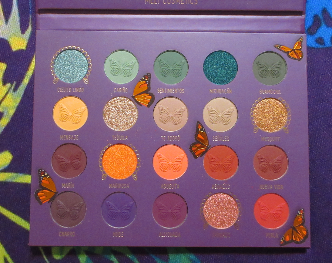
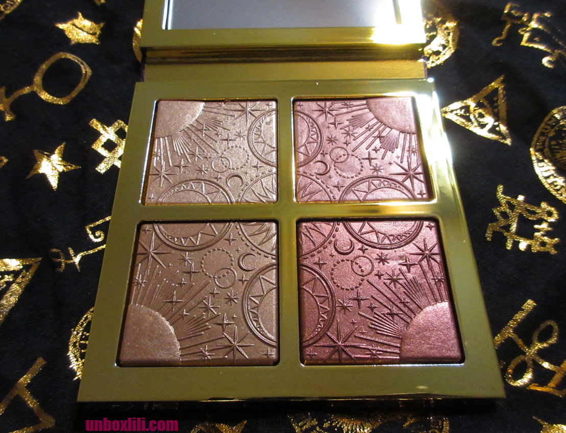
Amor y Mariposas Palette
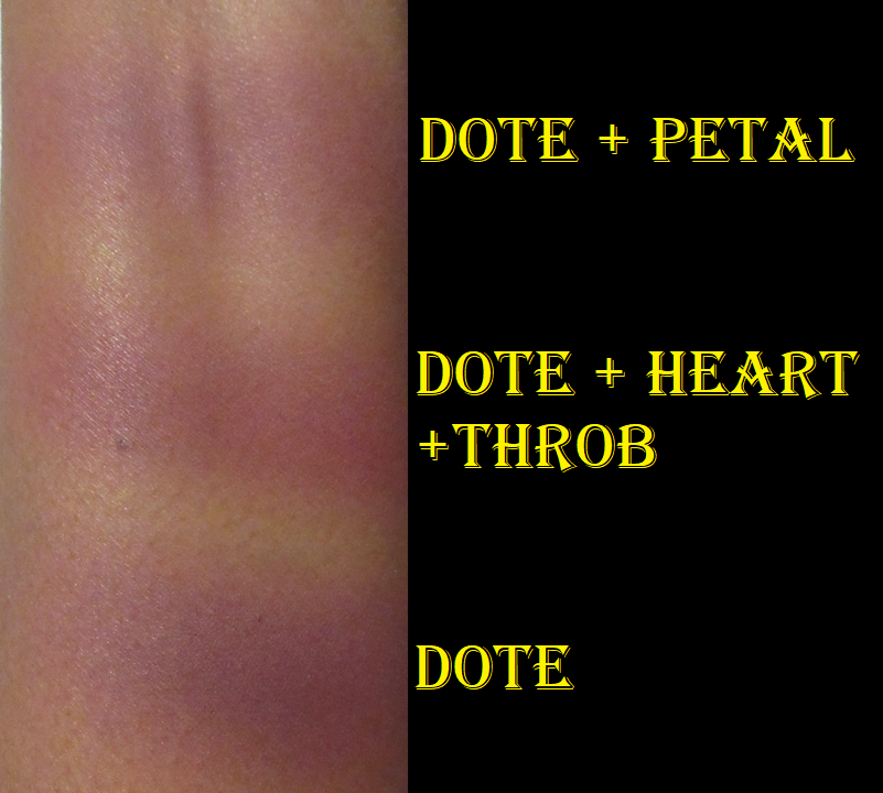
Before I slipped back into my neutral phase, this was absolutely my kind of color story for eyeshadows! Purple and green eyeshadows are my top favorite colors, but I didn’t purchase this when it was first released because of the $70 price and Melt’s reputation of inconsistency with their shadows. Either the palettes are fantastic or terrible, and sometimes even the good ones end up having a formula issue of mold growing in the pans or the shimmers having a strange chemical reaction and begin expanding and puffing out of the pans after 2-6 months. I haven’t seen anyone saying that about this palette, so this appears to be Melt’s “good” formula not only in reactions not happening, but also in the performance I have noticed from using it for the past month. I only have one other palette from the brand that I can compare it to, which is the She’s In Parties palette that I got from one of Melt’s Mystery Boxes last year which I still need to review sometime. That palette has more of a shimmery satin formula, along with what felt like traditional mattes. Most of the mattes in this palette are pressed pigments, so they are way more pigmented and slightly less smooth. The shimmers in this are larger and a thicker formula.
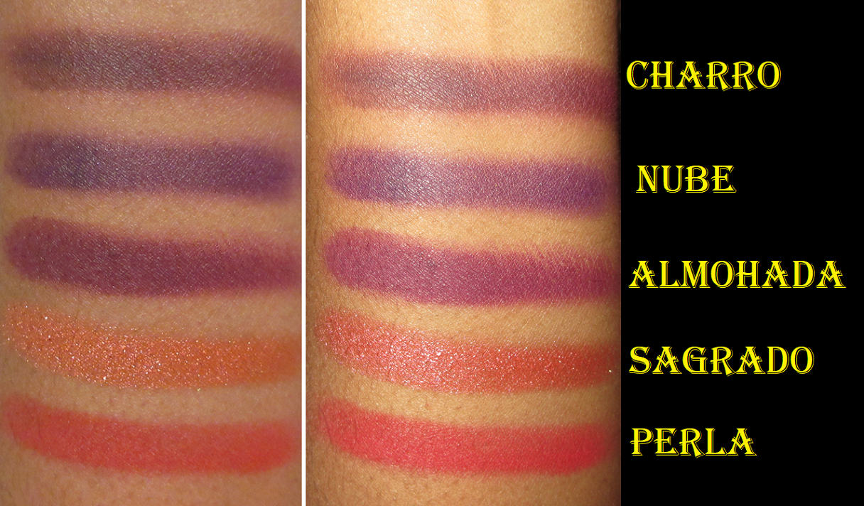
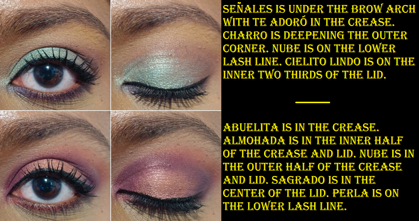
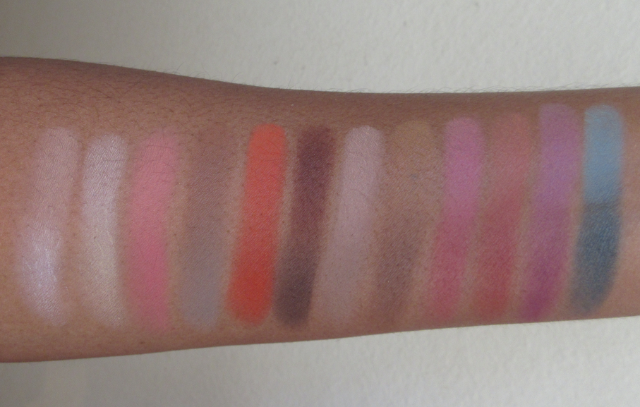
These first two rows are my favorite in the palette. The greens are perfection. The golds are complimentary. My only complaint is having such similar shades in Te Adoro and Señales, which the latter is the same color as my MAC Paint Pot, so it doesn’t look like anything on my eyes. Te Adoro barely shows on me, but I use it if I need to blend out an edge or put something under the brow bone. Having two isn’t useful for me, but the tonal differences may benefit those with lighter skin who can pair Te Adoro with the shadows in the red family and Señales with the ones in the yellow family.
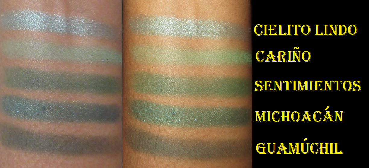
From photos online, I thought Cielito Lindo was going to be a light green, but it’s actually more of a shimmery sky blue. Although Cielito Lindo translates to something along the lines of “sweetie” or “cutie baby,” the word “ciel” has roots in French and Spanish relating to the sky, so I’m not sure if that’s supposed to be a pun on the name to the color of the shadow.
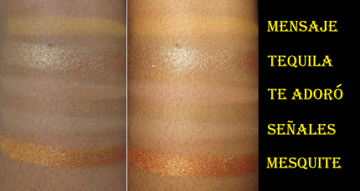
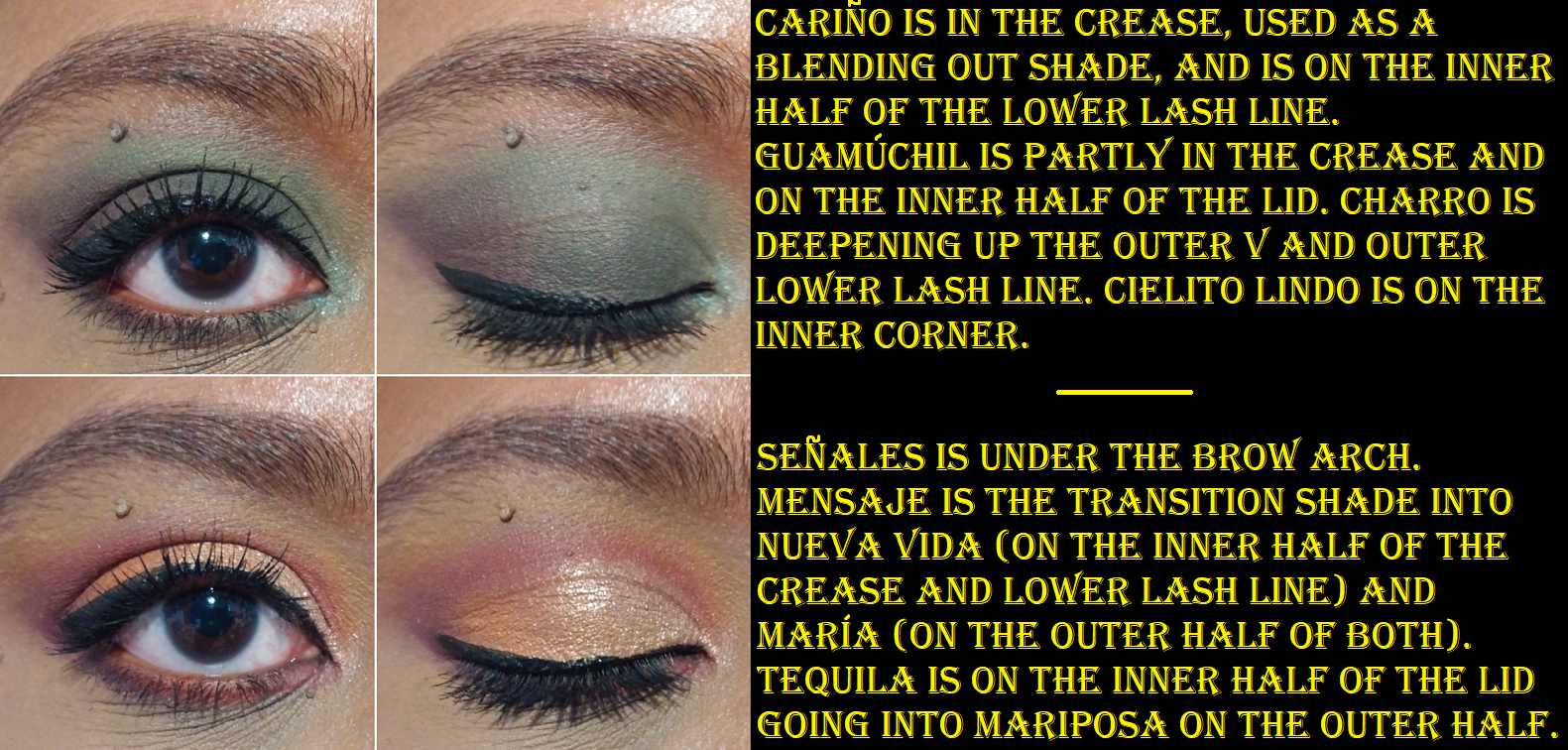
Yellow shadows can also be tricky getting to show on me, but I’ve been so impressed with Mensaje. Mesquite is the only shimmer that’s a bit flaky, whereas the rest are on the thicker side.
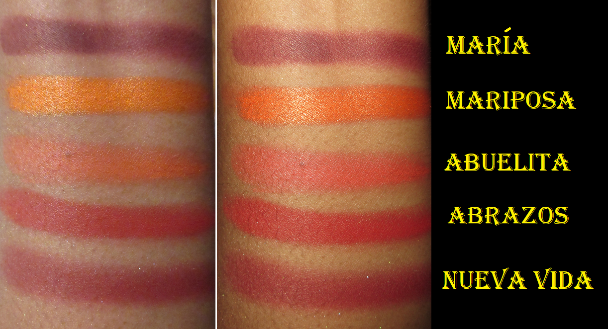
Maria, Nueva Vida, Nube, and Almohada are the ones that take more time to blend. They want to stick a little where they are placed, but unlike other pigment-heavy eyeshadows that do this, I can still get them to look how I want with the right brushes and some time. But really, I’m not the biggest fan of red eyeshadows so I wouldn’t use those much. Also, dark purple mattes I typically reserve for the outer corner and/or lower lash line, so it’s not going to be as much of an issue as it would for being a transition, crease, or lid shade.
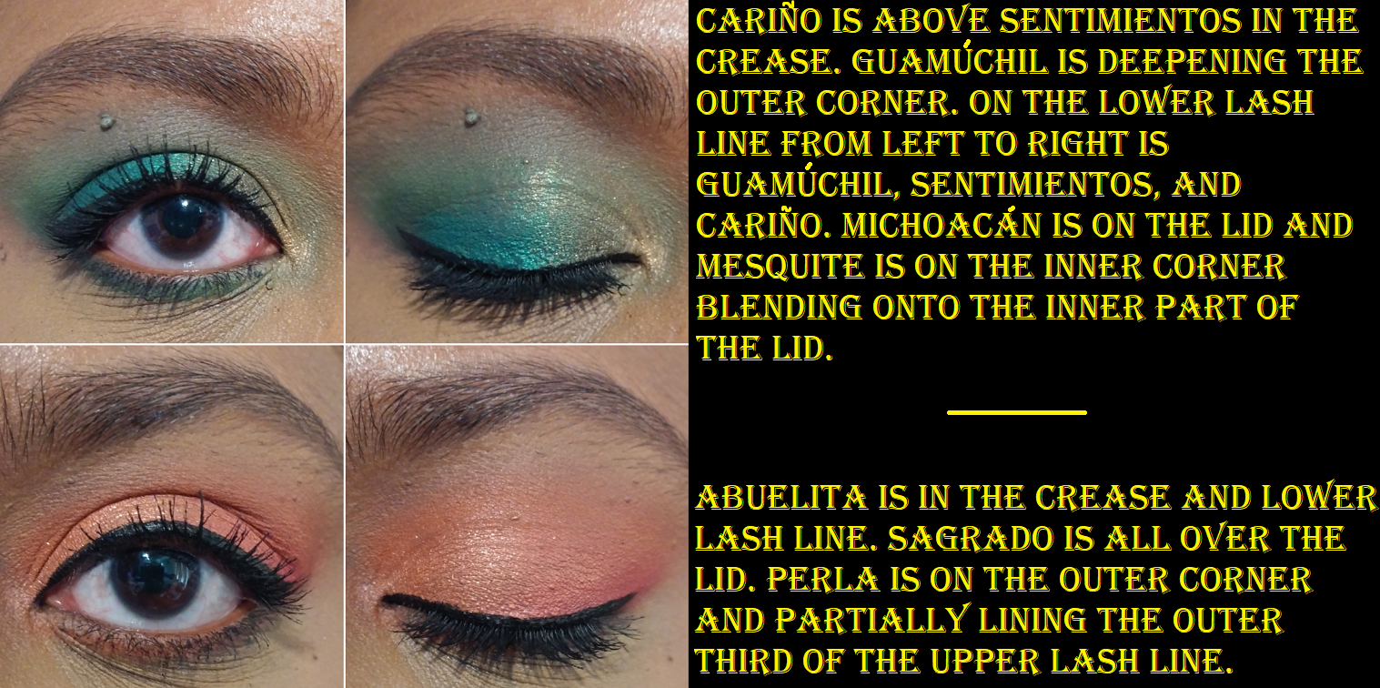
Abuelita looks like a coral orange or perhaps salmon color in the pan, but it deepens up more than I want on my eyes. It’s still a pretty color.
Overall, I really like this palette and I’m happy to have it in my collection! The pretty packaging and imprints in the pans are an added bonus to its beauty! I can use these shadows with any of my primers and I get very minimal creasing.
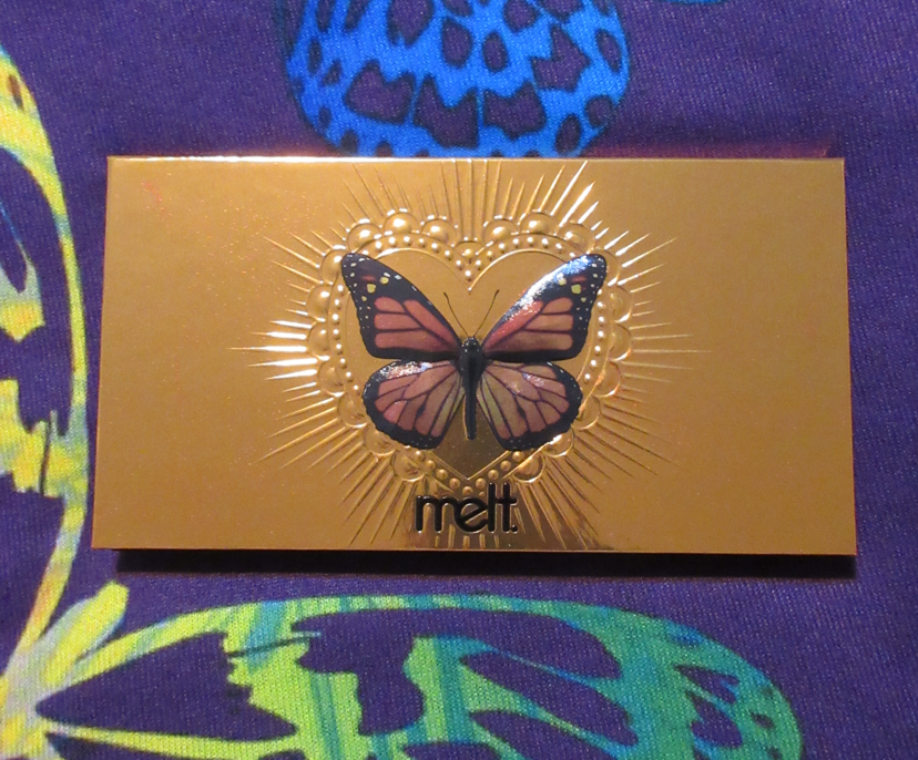
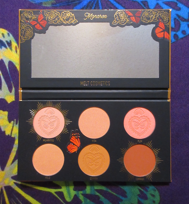
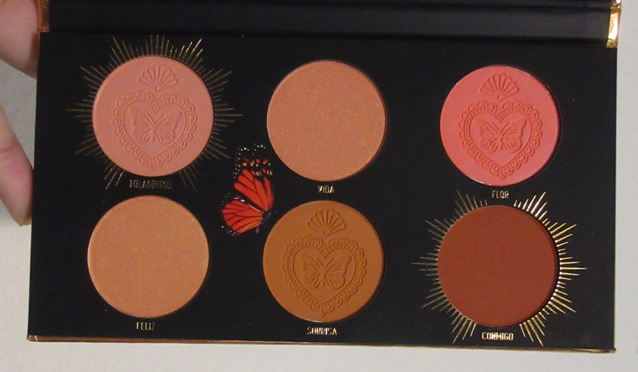
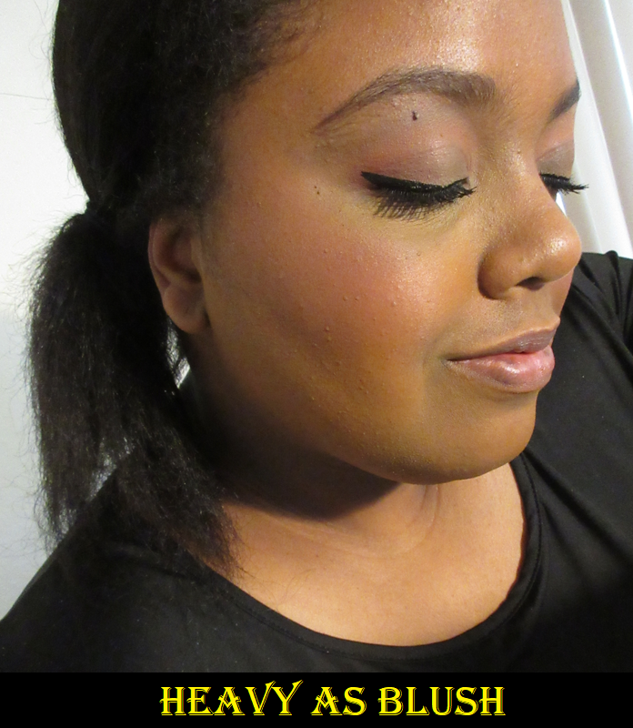
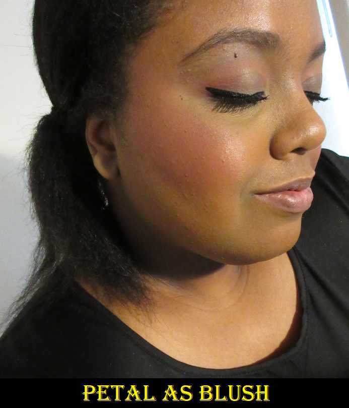
Monarca Blush Palette
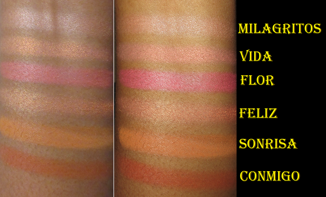
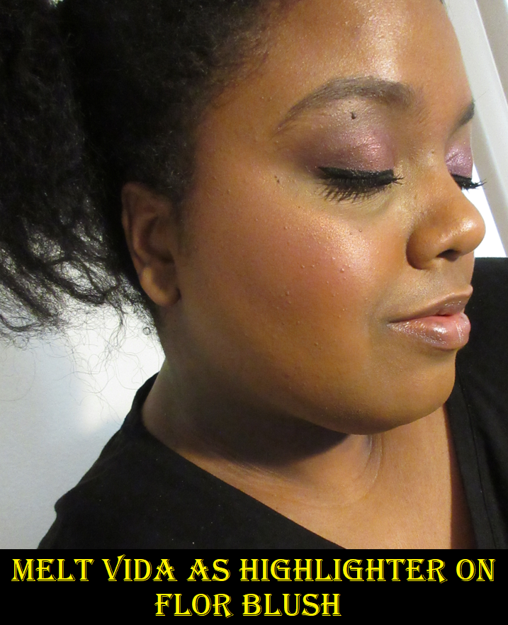
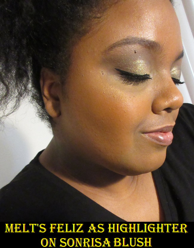
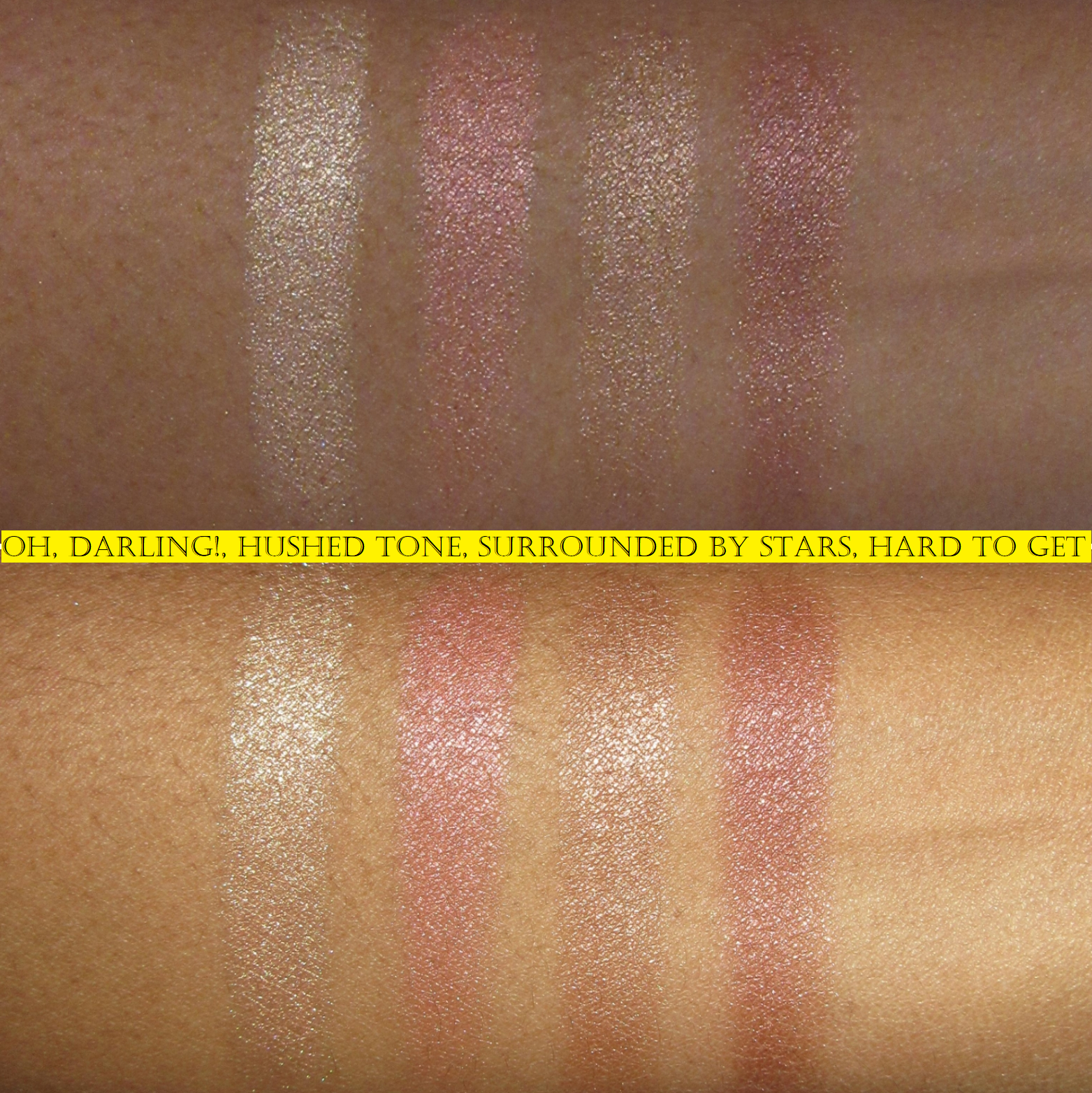
I’m a blush fanatic, but I assumed I would only be able to use two of the shades in this palette, which is what stopped me from buying it when it launched. However, I can happily say I have use for 5 of the 6! The one I can’t use at all is Milagritos, which just looks ashy on my face. Vida is such a beautiful rose gold that I use as highlighter. I normally don’t like pink highlighters, but I discovered Melt is the exception when I used the Afterglow Sex Foil that was in my Mystery Box. Feliz is the other shimmery blush that I use as highlighter. It has a peachy-orange tone and golden shift.
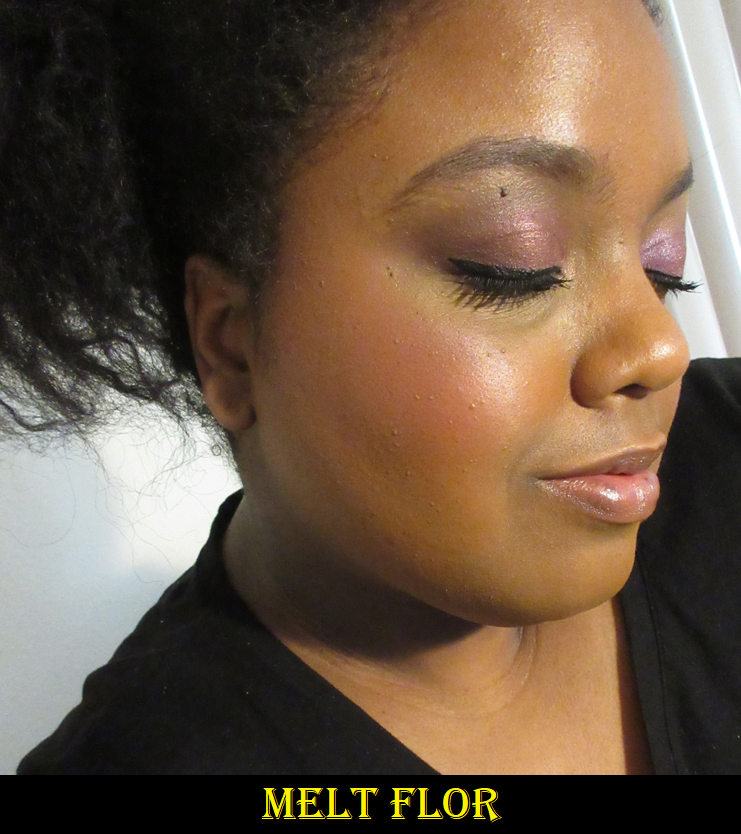
Flor is a bit of a curve ball because it gives me a bright flushed look to my face in the beginning, but it deepens up to a less vibrant medium pink on my cheeks. I’ve only ever worn this on top of a dewy foundation so I’m not sure if it’s the moisture level of my foundation with this particular blush that’s doing it. It’s possible that the color wouldn’t change on a matte foundation or if I powder set my cheeks first before applying the blush. I still like it though.
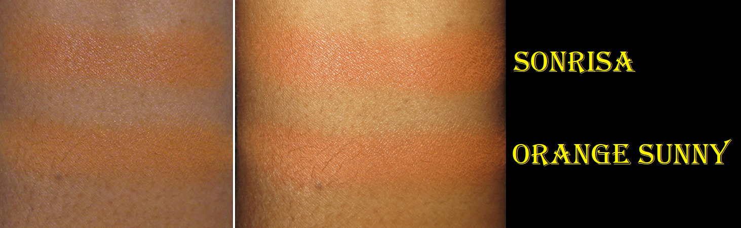
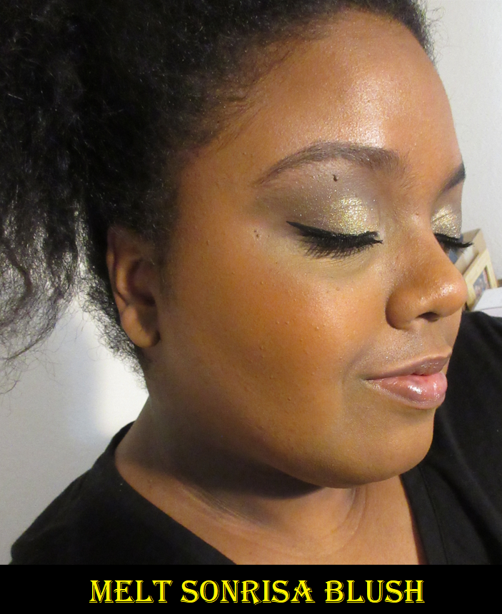
Sonrisa was an absolute delight and surprise! Prior to owning Orange Sunny from Oden’s Eye, I didn’t have a blush in quite this tone in my collection. Melt describes it as a “soft burnt orange” which I think that “soft” aspect is due to a bit of yellow in it, but the one from Oden’s Eye leans even further on the side of yellow-orange. Because of the subtle difference, plus it having a slight sheen, I still feel like Sonrisa is a unique shade and I’m happy I get to experience it in this palette. According to Melt, Sonrisa can also double as a bronzer.
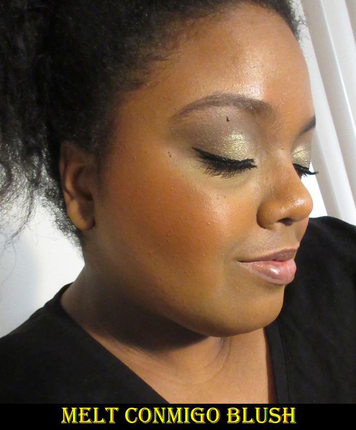
The final blush is Conmigo, a rusty red-orange, that can be built up to a very rich color on the cheeks. I prefer to use a light hand, but if I do, it looks similar to Sonrisa. So, to help make the distinction between the two clearer, I built it up a bit in my photo further below.
They’re all so easy to use and blend and the tones are so different from the typical blush palettes produced. I love this one and I completely recommend it if it’s still available!
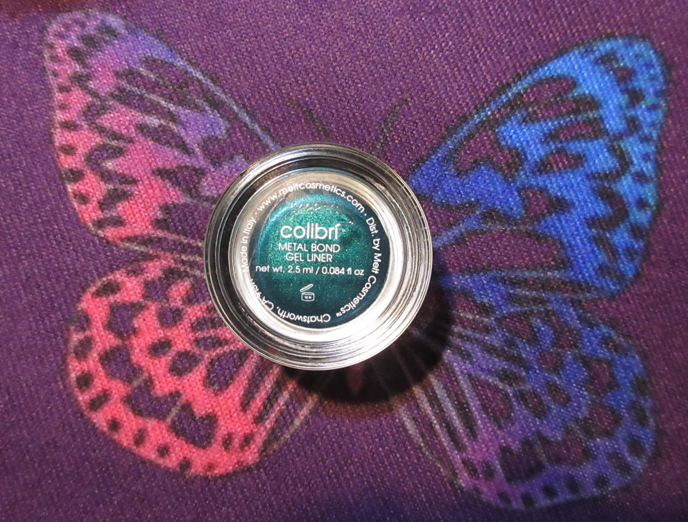
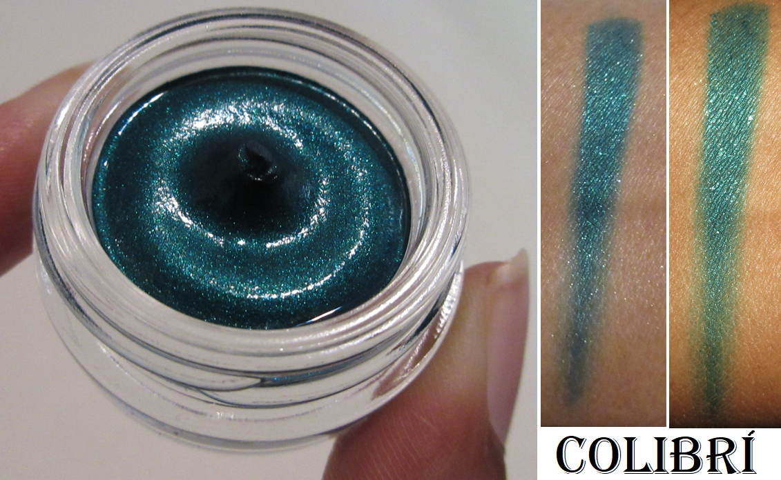
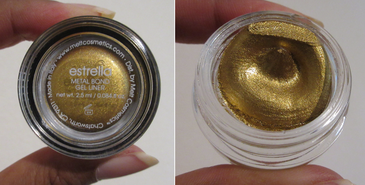
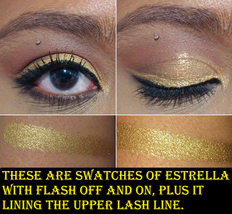
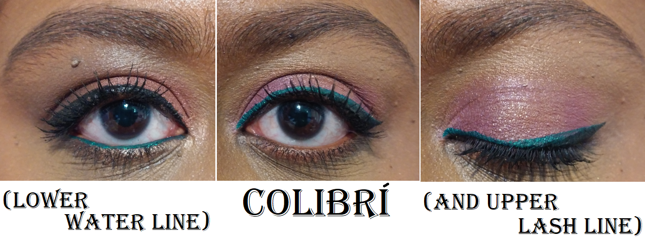
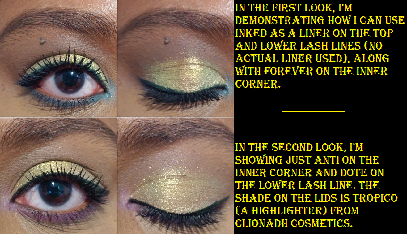
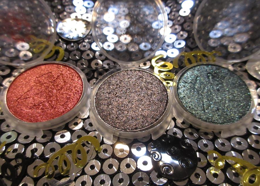
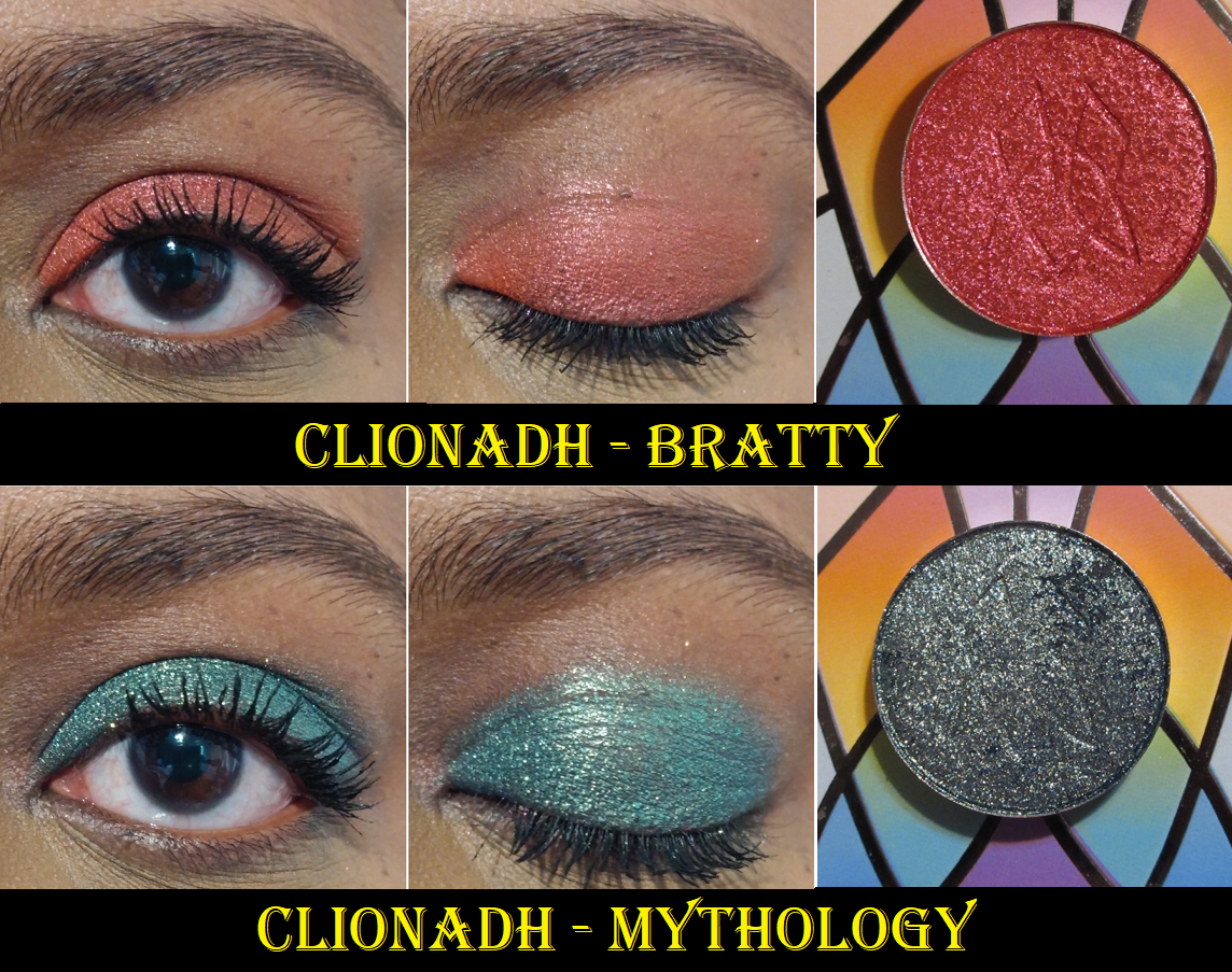
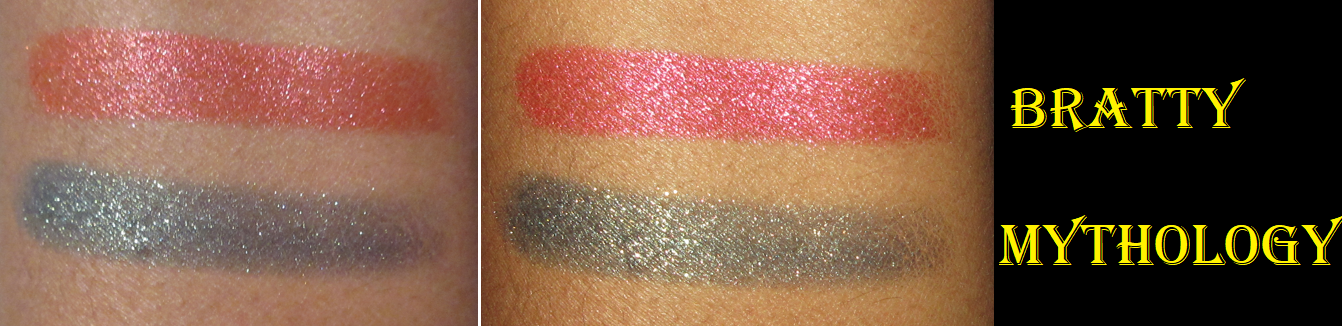
Melt Gel Liners in Colibri and Estrella
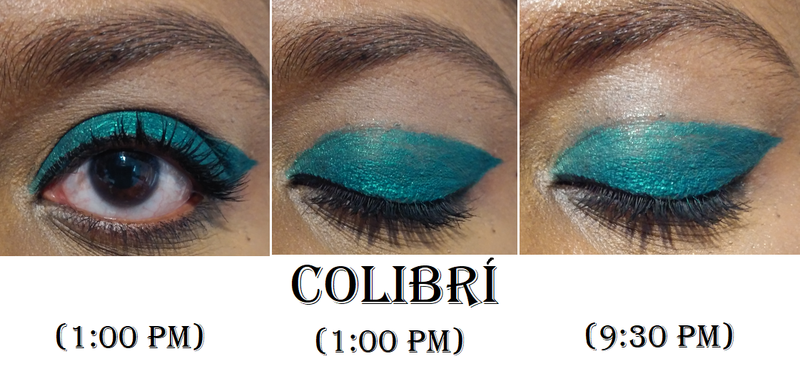
These gel liners are incredible! Now I understand the hype! They spread so easily and smoothly without being difficult to control, like spreading beyond where I touch the color to my skin with the brush. When they dry down, they are basically budge-proof. The only area I have trouble with it is in my waterline, but it still holds on better than every other liner I’ve tried for that spot. After a nine hour wear test, Colibri was only gone from the inner and outer corner of my eyes where I get the most watery (outer corner when laying down and inner corner from my sensitive tear duct). It was perfectly in place solely in the center of my lower lash line, which still impressed me.
Because Estrella was a last minute addition, I don’t have as many photos to show of it. So, Colibri is what I used in some demonstration photos below for the different areas I’ve tried this liner out on.
Yet again, I am just so impressed with the things I purchased from the Amor y Mariposas collection. At the time that I’m writing this, it’s still available at a heavy discount on Melt’s website as I assume they are trying to get rid of their final stock in time for their next holiday drop (which may be announced around October-November if the trend continues).
I have to admit, I still cannot fully let go of my fear of Melt eyeshadows having weird things happen to them, as demonstrated in the video by Karen Harris with Melt’s newest release, so I still don’t intend to purchase Melt eyeshadows as soon as they launch. However, my love of this collection has definitely increased my interest in the brand overall.
Thanks for reading! Happy 4th of July to all who celebrate it. And speaking of Independence Day…Melt’s 30% off sale ends today, though it does not include the products from this specific collection. However, it might be a nice time to purchase for those who want both the Amor y Mariposas items, plus other collections from Melt’s site in one purchase.
-Lili ❤
*DISCLOSURE: All products in this post were purchased by me with my own money.Links in bold blue font (Example)are standard links. Links in bold black font with a light blue background (Example) are affiliate links.There are no affiliate links contained in this specific post.
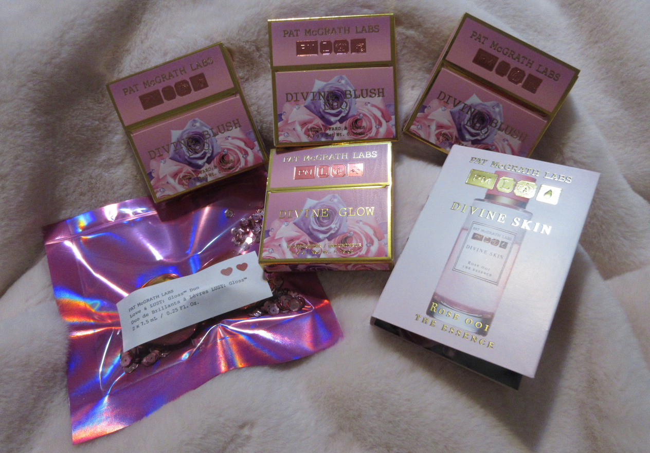
I was set to finally post my PML x Bridgerton 2 review when it was announced that Pat Mcgrath would be releasing blush duos and expanding her range of highlighters. So, I decided to combine both sets of reviews in this post today!
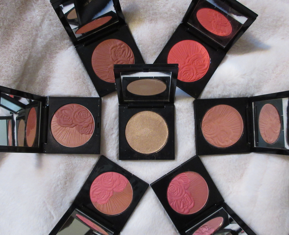
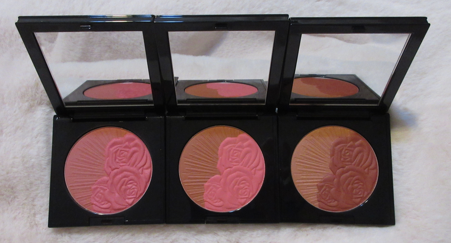
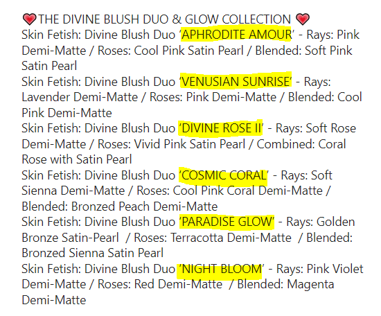
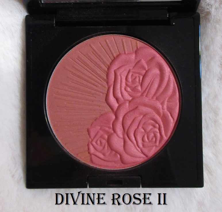
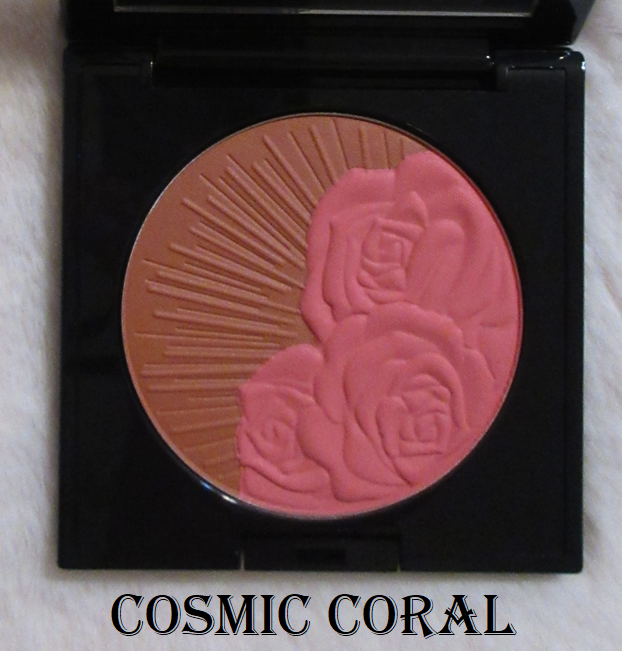
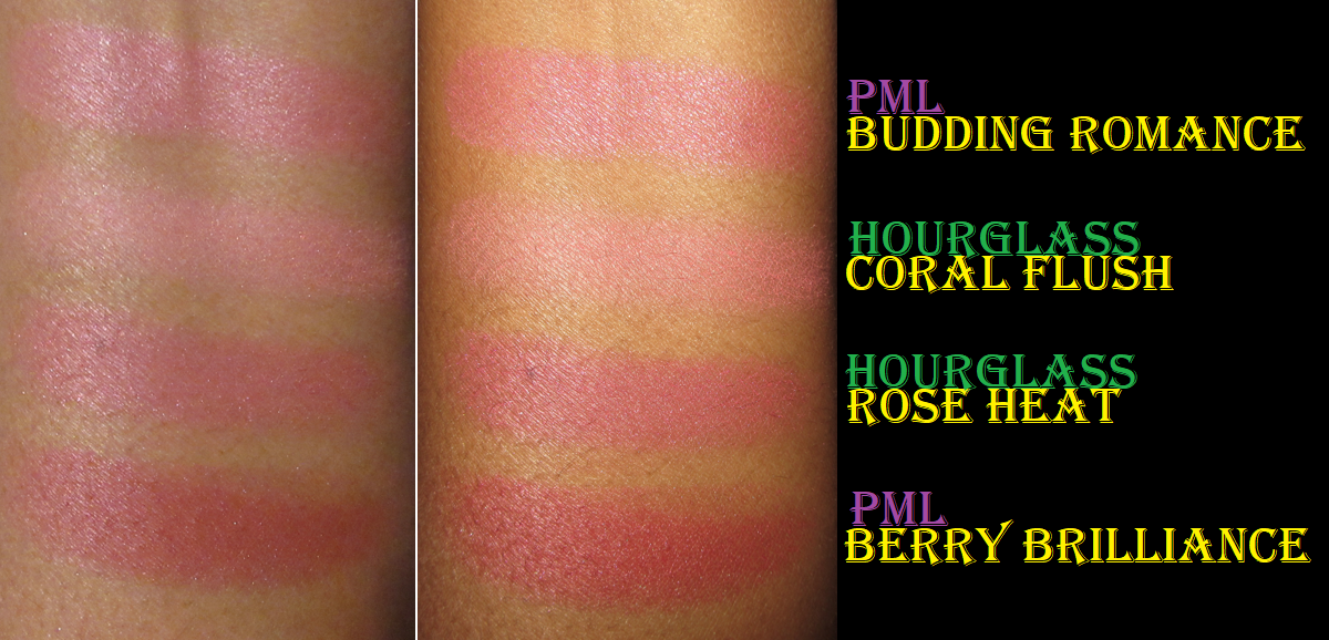
Pat Mcgrath Skin Fetish Divine Blush Duos in Divine Rose II, Cosmic Coral, and Paradise Glow
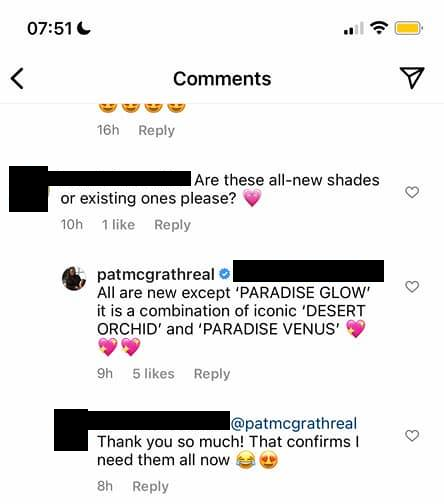
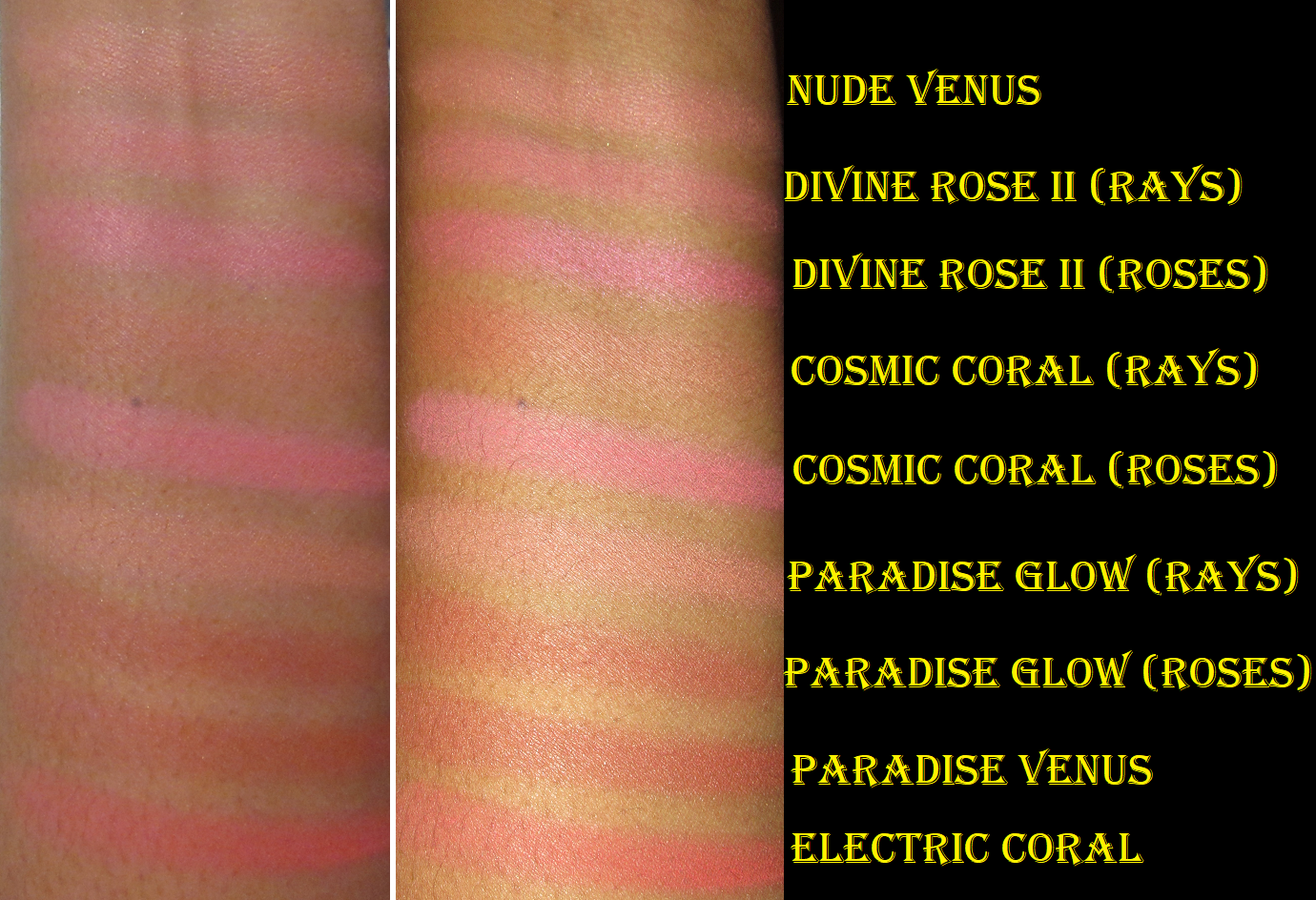
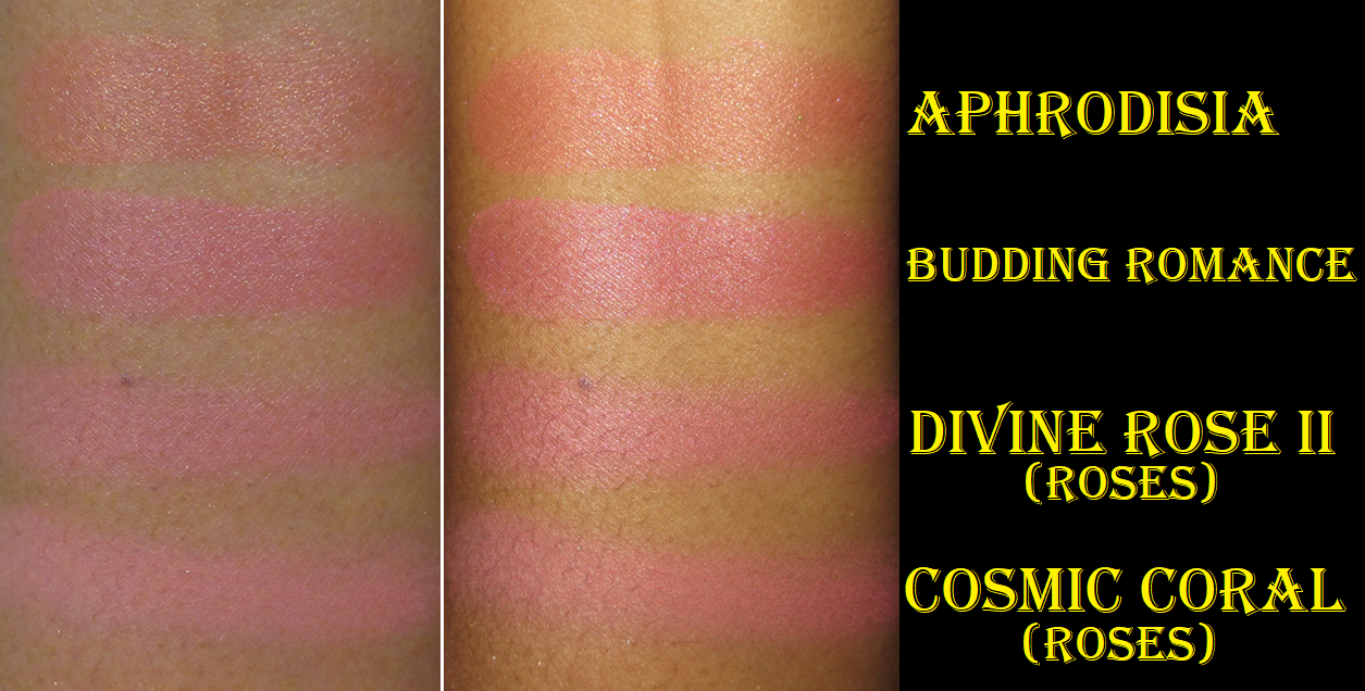
Pat Mcgrath Labs is one of my favorite brands, and medium tone blushes are my preference, so I could not resist getting the three medium duo offerings. Because these are so expensive, I tried to justify my purchases by saying I’m getting three shades in each singular compact: the roses alone, the sun rays solo, and the two mixed together. However, by picking all the medium color options, I’m getting very similar looks. The swatches below show that both halves of Divine Rose II are only differentiated by the lighter pink rays and the cool-toned more vibrant pink roses, that the Cosmic Coral and Divine Rose II roses look similar with Cosmic Coral being slightly brighter, and that the Paradise Glow roses side is identical to the Paradise Venus individual blush. In fact, it was only when I saw a screenshot in a Facebook Group of Pat Mcgrath’s comment on Instagram that I learned Paradise Glow is supposed to be a combination of Desert Orchid and Paradise Venus. However, based on a few videos I’ve seen online, it appears the rays side of Paradise Glow has a little bit of a brick tone added to it. This will probably not be a detectable difference on those with dark skin tones, but perhaps it would be distinct enough on those who are lighter. I do not have Desert Orchid to be able to compare them myself.
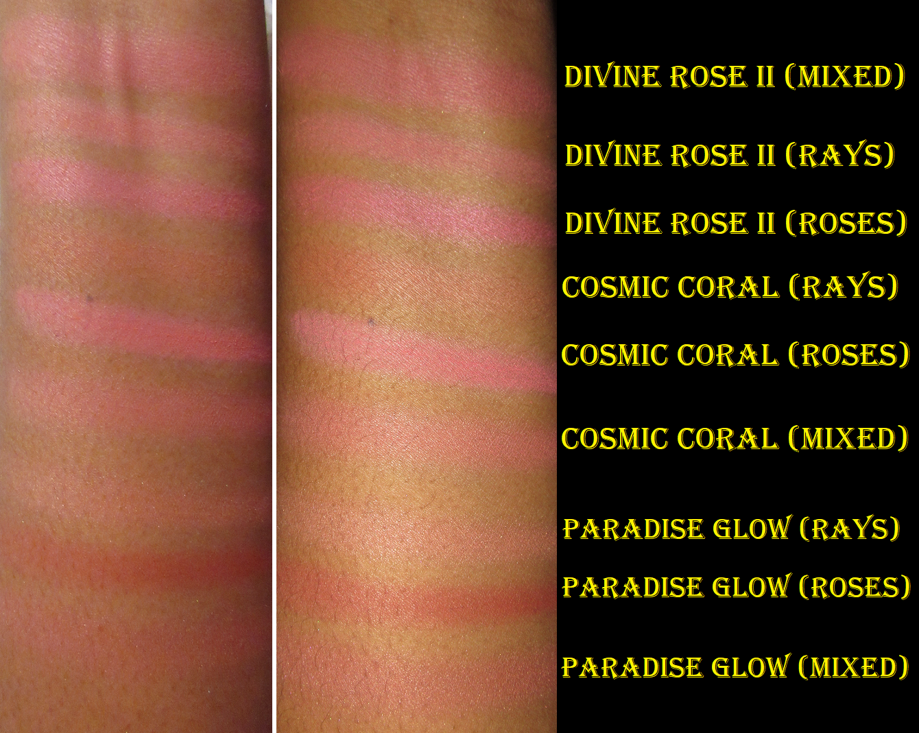
The swatch photo above shows the similarities among the individual and half blushes. The photo below includes swatches of the duos mixed compared to their halves. Because the rays side is hard pressed and the roses side is softer and more pigmented, if I try to combine them together equally, the shade from the roses will always dominate and not give the appearance of a true mixture. I have found that in order to produce a new color, I have to use a ratio of 2 swipes of the rays to every 1 swipe of the roses. With this method, I can see that Paradise Glow mixed is a shimmery version of the rays side of Cosmic Coral. In my swatch photo, the Paradise Glow mixture is slightly darker than Cosmic Coral’s rays, but if I use less of the roses of Paradise Glow, they’re practically the same. It also cannot be ignored that Cosmic Coral rays and Paradise Glow rays look similar in tone (though not depth) to begin with.
The screenshot above is how the Pat Mcgrath brand describes these shades and their mixtures.
I admittedly hated Divine Rose II in the beginning. I did not like how each individual shade looked on me unless I had a pink eye look on because it then tied the look together in a cohesive blush draping type of way. However, when I combine both halves together in a light application, I think the mixture is beautiful! Essentially, I get the benefit of the sheen from the roses while the warmer toned rays temper the coolness of the roses, giving me the kind of color I would actually wear.
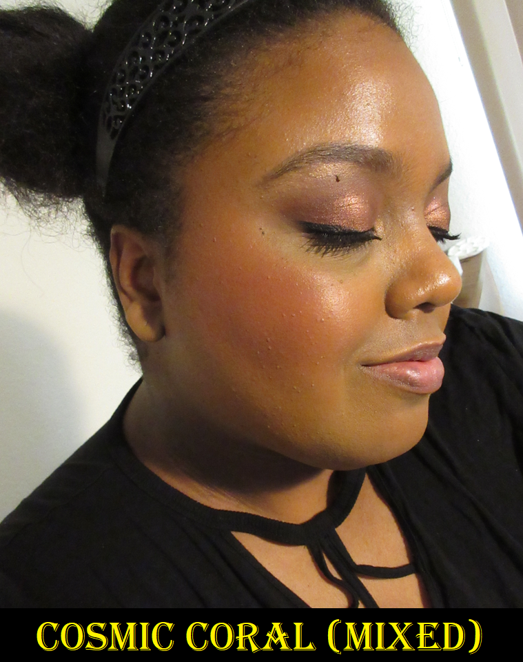
The rays of Cosmic Coral barely show on my face at all, whereas the roses portion is too punchy for my taste. So, I use the rays portion to tone down the roses and that’s what creates a look that I feel is very pretty. But once again, I only enjoy using this duo when the shades are mixed together. Both halves of this are demi-matte, and do look that way normally, but it was particularly hot on the day I took the photo, so that glisten on my skin is the combination of my dewy foundation and sweat. I had not yet set my face with powder.
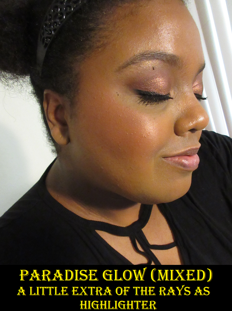
Paradise Glow is the star of the show, but it’s no surprise considering how much I love the color of Paradise Venus! In my review of the individual blushes, I mentioned that I enjoy combining Nude Venus and Paradise Venus, but I often wondered if Desert Orchid would have been a better mixture. So, I am thrilled to have Paradise Glow even if I have conflicting feelings about buying something I essentially already have. Mixing both sides creates a look on the cheeks similar to Faux Sure from MAC, Kiss of Rose from Bare Minerals, and Walk of No Shame by Charlotte Tilbury. This is now my new favorite blush from Pat Mcgrath!
All this being said, I absolutely did not get a three-in-one that I thought I would from these duos since I don’t like wearing each half individually (with Paradise Glow roses as an exception, but we already established it’s the same as Paradise Venus which I already have). With this thought in mind, I don’t think the duos are worth buying for those who already own most of the permanent line. Others have compared Divine Rose II to Cherish, Venusian Sunrise to Fleurtatious, and Aphrodite Amour to Nude Venus. The most unique shade in the limited edition collection is Night Bloom (which some have said gives Lovestruck vibes if mixed extremely lightly), so perhaps that one might be worth collectors buying. Paradise Glow was absolutely worth it for me, but I don’t intend to keep Paradise Venus in my collection for that reason. I could have lived without Divine Rose II and Cosmic Coral, but I do like them enough to keep them. And for those curious, I compared the two lightest PML Blushing Delights blushes to the roses of the duos and Budding Romance is a darker pink with a stronger sheen than either of the two pink blushes.
Swatching them together reminded me that, quite honestly, I prefer the new baked blushes from Pat Mcgrath over the demi-matte formula. I like the shimmer/pearl formula about equal to the baked ones though.
In terms of longevity and performance, the duo blushes are the same as the permanent blushes. They start to fade if applied on bare skin as the day goes on, but they are long lasting if wearing foundation underneath it.
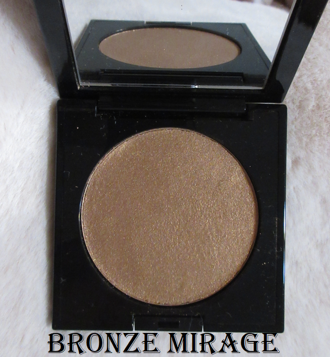
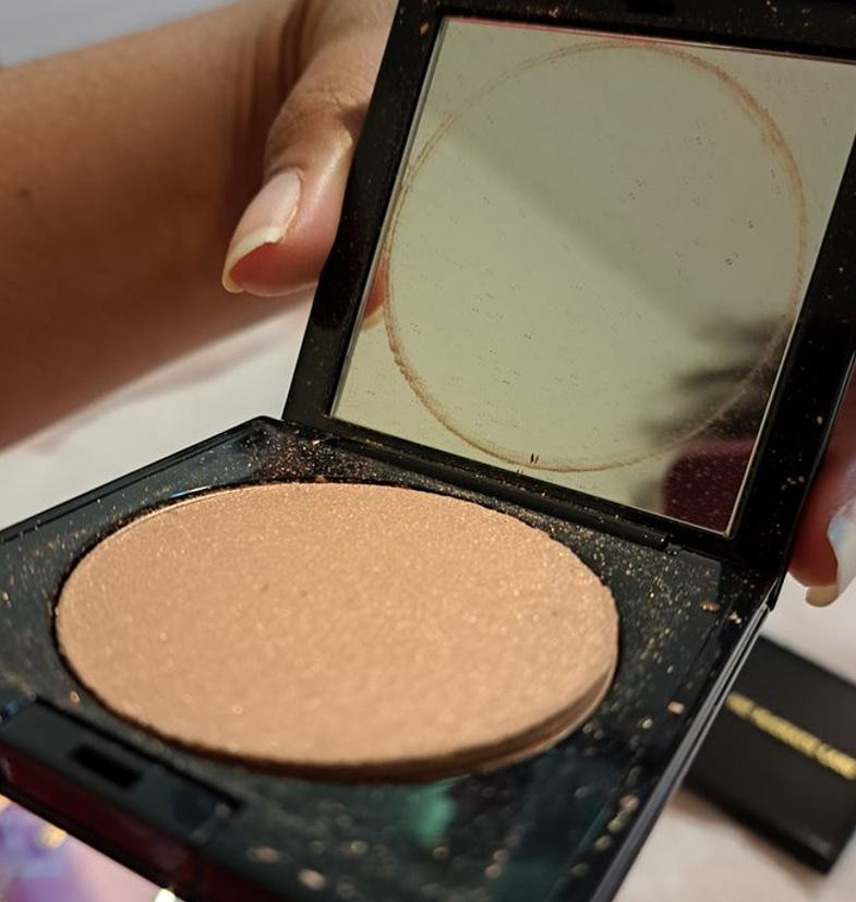
Pat Mcgrath Skin Fetish Divine Glow Highlighter in Bronze Mirage
I feel very fortunate that when my highlighter popped out during the shipping process, it stayed mostly contained in the pan. A gentle push to the left and a firm press with my fingers everywhere was enough to get it to stay in the compact again without breaking into pieces. I’m not confident that I pressed it well enough to keep it together forever, since the edges look a bit questionable, but I’m using it like this for now. If it falls out in the future or fully breaks, I will try to repress it with isopropyl alcohol and hope it doesn’t change the performance or texture. Pat Mcgrath has great customer service when it comes to broken items, so if anyone receives minor damage like mine or worse, I recommend contacting them. Also, I have to give the brand an applaud for shipping out orders in a reasonable amount of time after the launch, unlike their previous collections for the past several years that typically take weeks.
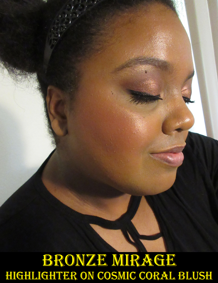
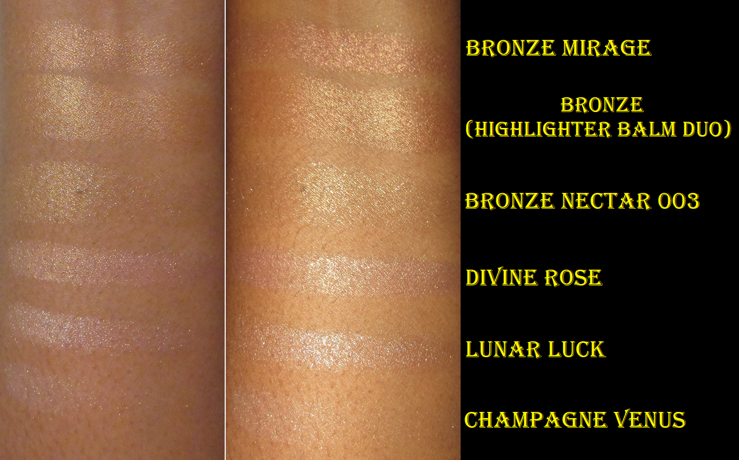
Bronze Mirage does not look deep in the pan, but the color of the shimmer is what shows on the skin, and this shimmer is a darker bronze than I expected. To put it in perspective, I have swatches above showing that “Bronze” from Pat’s highlighter duo is more of a medium-dark golden color and Bronze Nectar 003 from the baked highlighter trio is a light-medium gold. I thought Bronze Mirage would be in that gold vein, but this is actually the first true bronze color the brand has released, to my knowledge. Pat Mcgrath doesn’t have many dark powder highlighters (Bronze is a cream formula), which is why I wanted this one. I figured it would be great to mix with my lighter highlighters, so depth wouldn’t be a problem. I did not take the tone into account, and for that reason, this highlighter isn’t as great of a match on me as I hoped. However, it’s still super beautiful and I can pull it off with a bronze eye look to match and heavy bronzer on the perimeter of my face. If everything else on my face is bronze, then it works.
I love the wet look aspect to this. It’s very shimmery, but not glittery, and the reflect is intense. It lasts on my cheeks all day with perhaps only a small dulling down of the reflective brightness towards the end of the night. I like this formula, but it still doesn’t beat out that gel-powder Ultra Glow Highlighter (Divine Rose Highlighter) in terms of smoothness. I have enough highlighters from this brand, but if PML releases more shades in that formula (preferably a deeper gold), I cannot be held responsible for my actions.
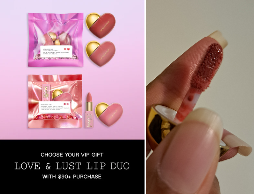
Pat Mcgrath Love & Lust Gloss Duo
This adorable duo gloss set was a free gift with purchase for spending over $90. The shades are Flesh Fantasy (left) and Flesh 6 (right). I hadn’t looked at the shade names written on the back prior to using them. When I applied Flesh 6 to my lips, I immediately realized what shade it was since it’s one of the few PML lip gloss shades I own. I now have three minis of Flesh 6! I won’t be needing a full size of that color anytime soon.
The glosses are the same great formula as I’m used to, but just in a cute but cumbersome packaging with the twist off gold portion of the heart as the top and the tiny applicator that takes some strength to pull out of the even smaller stopper. My nails aren’t at their longest right now, yet I still have some trouble getting the applicator out, so those like me with large fingers and/or very long nails might find this packaging extra bothersome. I’m still very happy to have this set as the cute packaging makes me smile whenever I use it. The glosses are thick, but that helps to keep them lasting longer on the lips.
As a side note, I purchased the shade Secret Lover expecting it to be a different color based on the photos I saw and I was unable to find a look that this shade would pair nicely with. However, I think it looks great with the Divine Rose II Duo Blush, so I’m glad about that!
Divine Rose II Blush mixed together is on the left (the right is Orange Sunny from Oden’s Eye) and Secret Lover is on the lips.
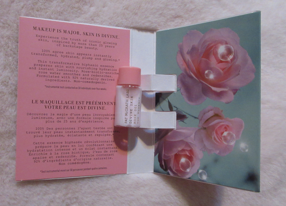
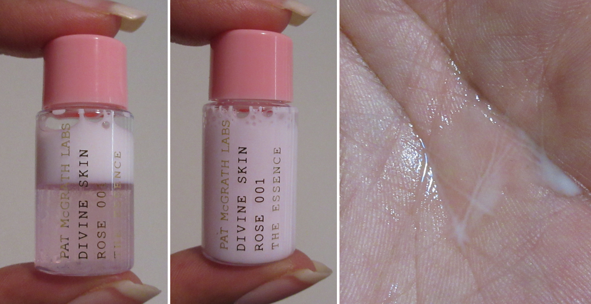
Pat Mcgrath Labs Divine Skin: Rose 001 The Essence (Sample)
This is a sample, so my perspective on this is basically as a fifth impression. When this product is shaken up, it looks and feels extremely similar to the Laneige Cream Skin Toner & Moisturizer/Refiner despite them both having very different ingredients. They both have a milky look to them and make my skin feel softer and quite moisturized even though I apply so little of the product to my skin. The PML Essence contains more oil, which gives it slightly more of an edge in moisturizing the skin and without feeling greasy. The PML also has an obvious, though pleasant, rose and jasmine scent. The biggest difference of all is the $86 price versus $33. I am enjoying this sample and I’m glad the brand added it to my order, but I would never purchase the full size unless it was closer in price to the one from Laneige.
Pat Mcgrath x Bridgerton 2 (Partial) CollectionReview
Completed June 6, 2022
We all know by this point that Pat Mcgrath’s products go on sale for a significant discount eventually, so I really tried hard to resist this collection. I haven’t watched Bridgerton, so I don’t have any attachment to the show, but I do like the aesthetic. I didn’t want to buy this at launch not only because I hoped to get it later for a reduced price, but also because even promo photos showed that the packaging looked like a thin decorative paperboard gift, storage, or hat box. Considering the quality of Pat Mcgrath’s usual packaging, this is the sort of thing most customers would expect to open to find the real palette housed inside it.
Some examples from Hobby Lobby and Amazon of what I mean.
In addition to the packaging quality being less than expected, the blushes and highlighter inside don’t line up perfectly with the cutout holes, so the visible gaps downgrade the overall presentation. For those reasons, I didn’t want to pay full price. Since Pat Mcgrath single blushes are so expensive, but we get four newly formulated products in this palette (however smaller they are in size), I ultimately decided to buy it anyway. As for the lipstick, I fell in love with the shade when I saw those who got early PR wearing it. The little bow is cute, but for once, packaging wasn’t a selling point for me with the lipstick. It was a bonus.
I should mention that if this kind of packaging is what was needed for PML to keep the cost from being $100, then I’m fine with it. It’s still cute and I don’t mind the quality, but I do wish it was half the height. Sure, there’s wasted space in length and width, but the unnecessary height of the product keeps me from being able to store it easier. It doesn’t take much for the lid to lift off, so I have to lay this flat to avoid any accidents, so I’m not sure why it needed to be so tall since it’s not housing anything below it like the similarly shaped packaging for the body shimmer powder.
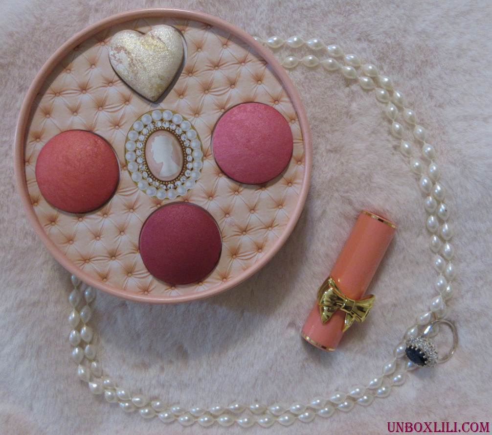
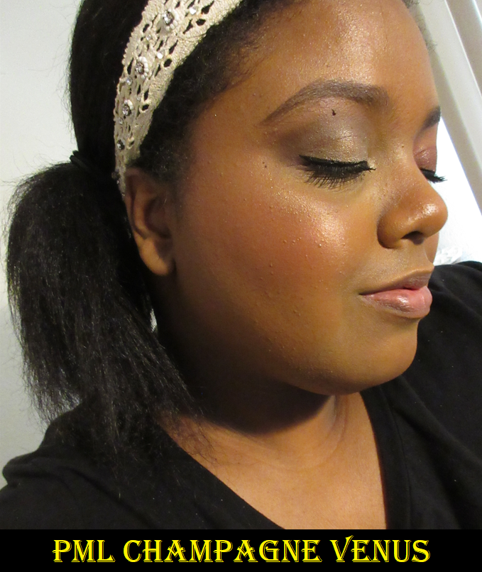
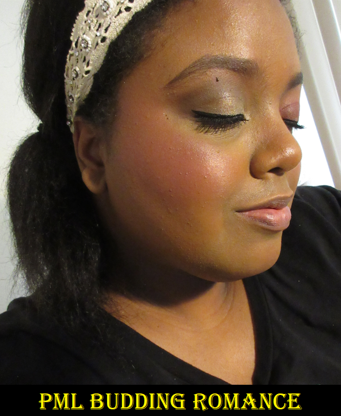
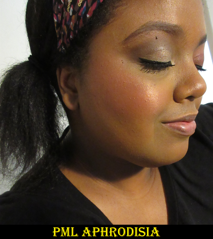
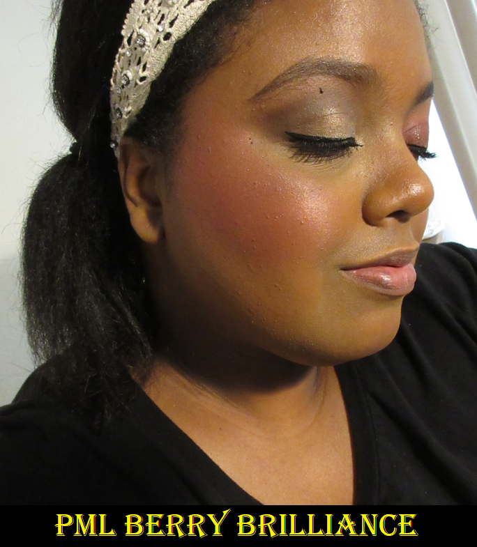
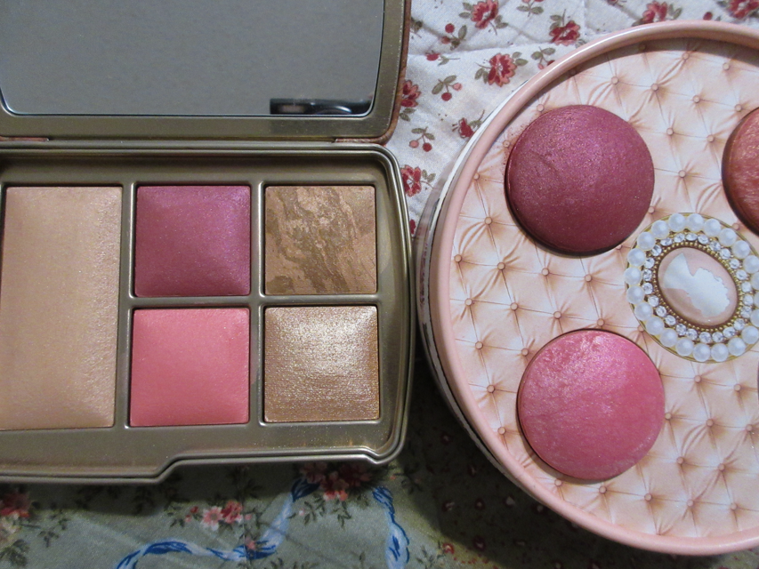
PAT McGRATH LABS x Bridgerton 2 Blushing Delights Blush + Highlighter Palette
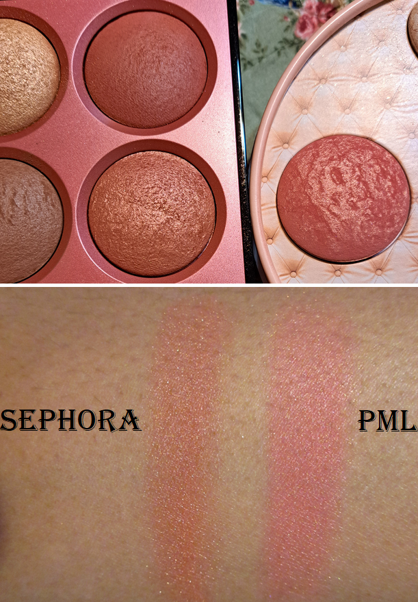
I bought this for Aphrodisia. I absolutely love this color for blush! The shimmery blush shade in the Sephora Microsmooth Multi-Tasking Baked Face Palette from the Captivate version gives a similar look as Aphrodisia, but the one from PML is silkier to the touch and thinner in texture, yet more pigmented. I tested them on each cheek and could see I got more opacity from Aphrodisia when I used the same amount of layers on the cheeks. Aphrodisia surprisingly has a slightly pinker base that I only see when swatched next to the one from Sephora. I actually expected the opposite when I see them next to each other in their compacts.
Champagne Venus is quite the attention grabber without even using it because of the heart shape and multi-colored swirl pattern running through the highlighter. It’s a bit on the light side for me, but if I take that extra time to blend it into my foundation, I can somewhat pull it off. I think it looks fairly smooth in the photo below, but if you don’t like highlighters with noticeable sparkle specks, this product is going to go mostly unused in your collection like it has in mine.
The final two blushes instantly reminded me of the ones from the Hourglass Universe Unlocked palette, which is partly why I held off purchasing the Blushing Delights Palette. Between the pinks, I prefer the one from PML over Hourglass because it’s a little darker. Between the berries, I prefer the one from Hourglass over PML, but that’s because it’s not as deep and intense.
Budding Romance is quite pretty on its own, but I like to wear it together with either Aphrodisia or Berry Brilliance. I definitely don’t wear Berry Brilliance by itself because even with a light hand, it’s a bit deeper than I like in my blushes, so I always use that one with Budding Romance on the apples of the cheek so I can have a brighter pop.
I have no longevity or performance issues with these blushes, so I don’t regret buying this at full price. Well, technically I got the standard 10% off from ordering from Pat’s website.
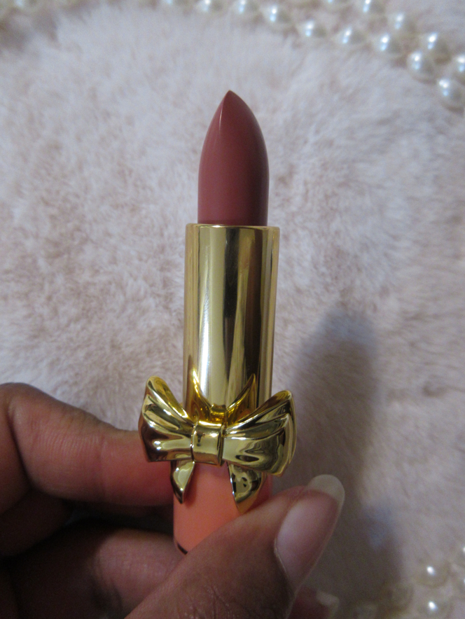
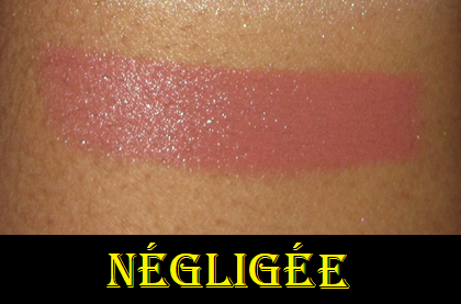
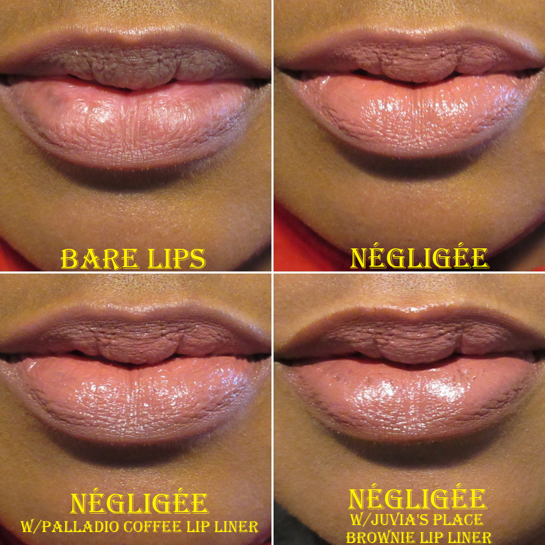
PAT McGRATH LABS x Bridgerton 2 SatinAllure Lipstick in Négligée
Even when I know I can’t look at just anyone’s lips and assume the product is going to look the same way on me as it does for them, I still had hope that this shade would be one that I could love. Although I don’t care for how it looks on my lips by itself, I can pull off this color with a lip liner.
Négligée on the lips with Juvia’s Place Brownie Lip Liner.
This is my first ever Pat Mcgrath lipstick. The formula for the SatinAllures is very comfortable to wear, has a nice shine to it, and isn’t the most opaque, but it can be built up after several layers. It isn’t very long wearing, but that’s to be expected with a lipstick that doesn’t dry down. I’m happy with this product, but I will say it does nothing to hide any dry patches and peeled spots, so I only wear it when my lips are in mostly good condition already.
That’s all I have for today! Thank you for reading!
-Lili ❤
*DISCLOSURE: All products in this post were purchased by me with my own money. There are no affiliate links in this post, only standard links.
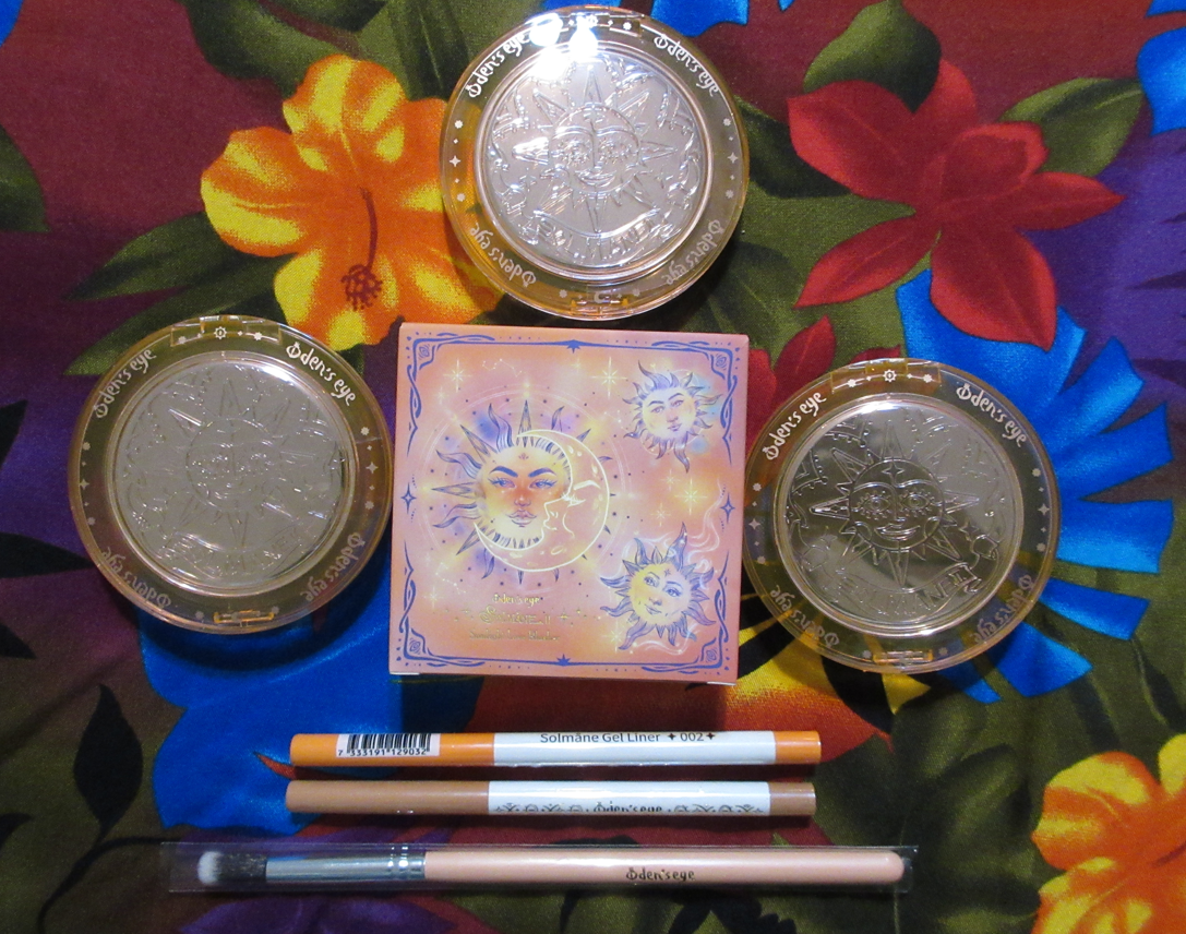
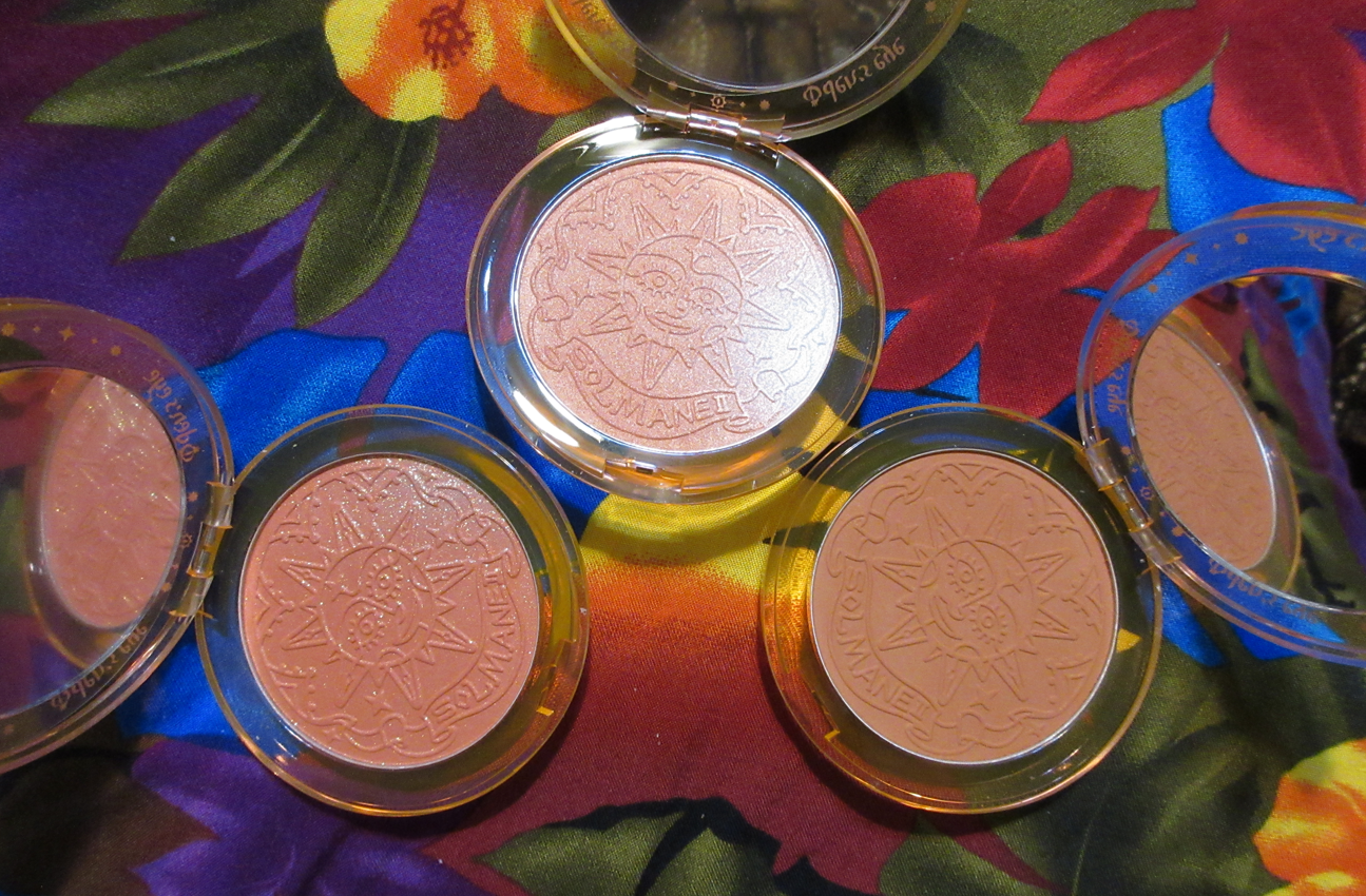
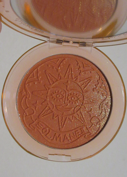
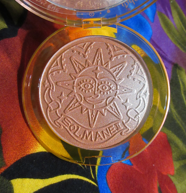
I shocked myself that I “only” bought three blushes and two eyeliners from the Solmane 2 Collection. The palette was quite beautiful, but not unique enough to add something different to my large eyeshadow collection. The highlighters are iridescent, sparkly, and pale, which isn’t flattering on me. However, I noticed that the shade Sienna Lustre in the shimmer blush formula seemed perfect for me to use as a highlighter. So, I feel like I’m still getting to experience a highlighter from Oden’s Eye that just happens to be in orange packaging instead of the purple ones. As for the eyeliners, I only added them to my cart so I could qualify for free shipping after using an influencer code to lower the price total. The brush came free and is one I already have and reviewed before, so I will not be reviewing that one here today.
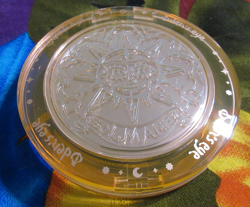
Sunlight Love Blushers in W102 Peach Gleam, W103 Sienna Lustre, and B103 Orange Sunny
Other than the eyeshadows from Oden’s Eye, their blushes have always been my second favorite category of makeup from the brand. I’ve raved about the Alva blushers in the past and always wished they would expand the range, so I am very happy that they have, especially in this updated beautiful packaging.
Because the Alva Flower blushes are among my top favorite shimmer blush formulas, I’m happy to see that the Solmane II shimmer blushes are just as great. The Solmane II mattes are even better than their matte Alva Fruit blushes since they are softer and less powdery.
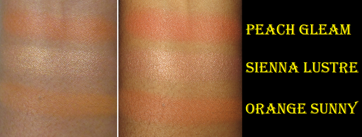
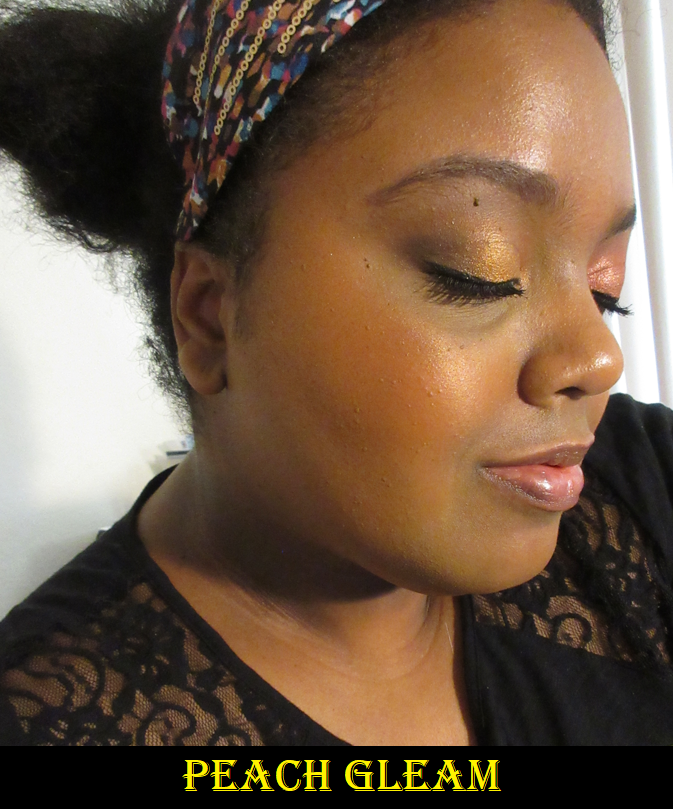
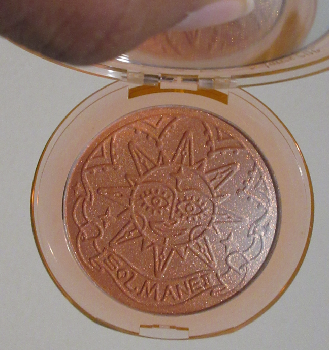
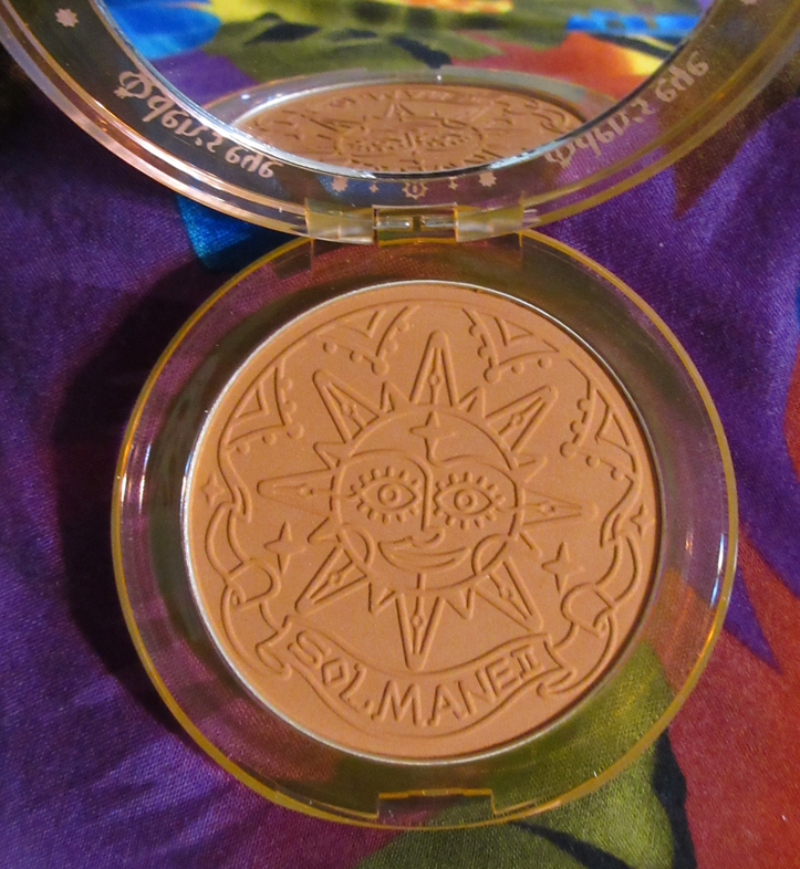
Peach Gleam
Peach Gleamshows more true to color with a white background.
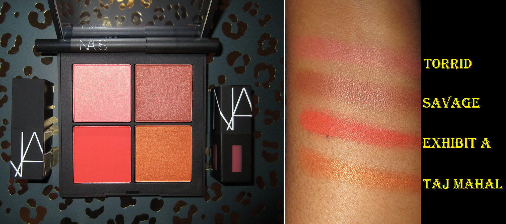
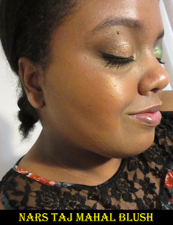
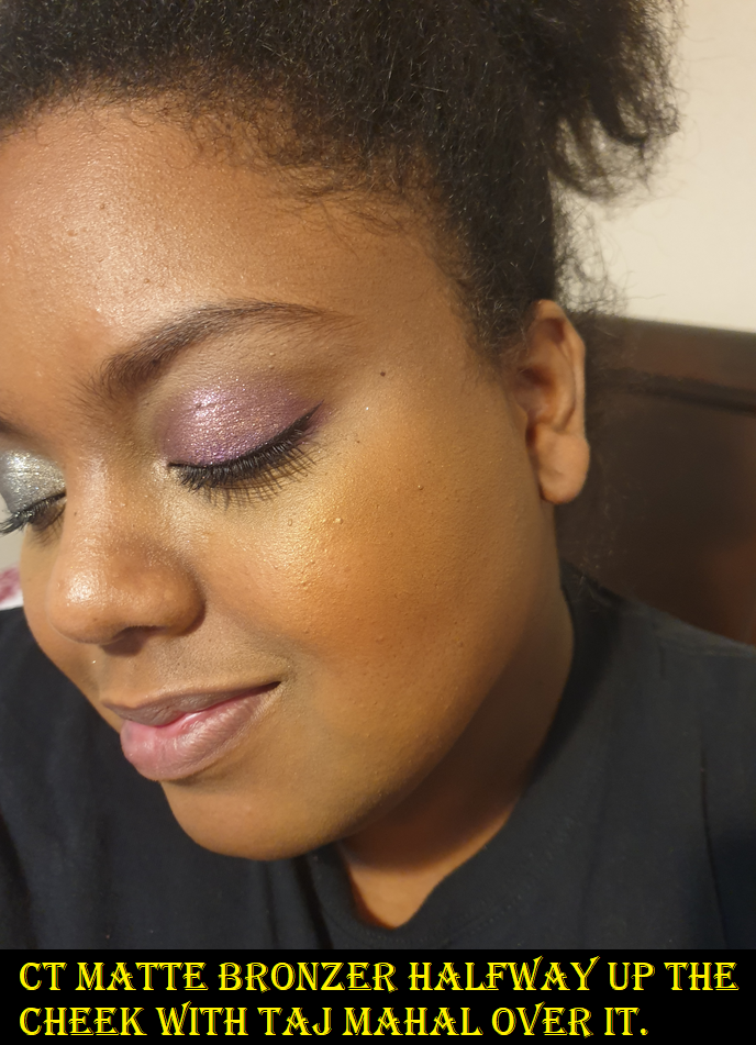
The shimmer in this is ultra refined, to the point that it looks closer to a satin formula with a golden sheen. The larger size glitters on the right side of the pan don’t really stay on the face, which is something I’m grateful for as I love the sheen-like shimmer finish. It looks like a satin head on except where the light directly catches it, giving it such a beautiful gentle radiance rather than a harsh metallic reflect that some brands opt for in their shimmer blushes. Peach Gleam is what I wished Taj Mahal from Nars would be like on my cheeks!
I struggled trying to decide between Peach Gleam and Orange Sunny, which is how I ended up just choosing both. Their finishes aside, the main difference is that Peach Gleam is a red-leaning orange. Because it has that golden shimmer though, it works with both red-warm looks and golden looks. Orange Sunny is a yellow leaning orange and I only liked it when paired with gold, neutral eye, or other eye looks that compliment yellow. When I wore it with a red toned eye look, Orange Sunny didn’t look as pretty to me as Peach Gleam did. So those are some things to consider.
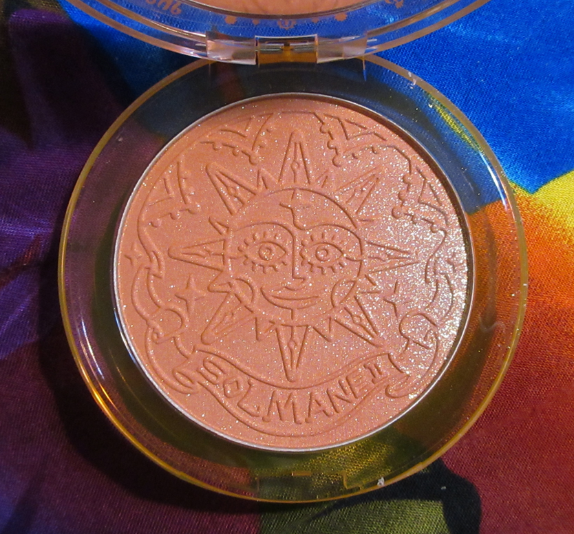
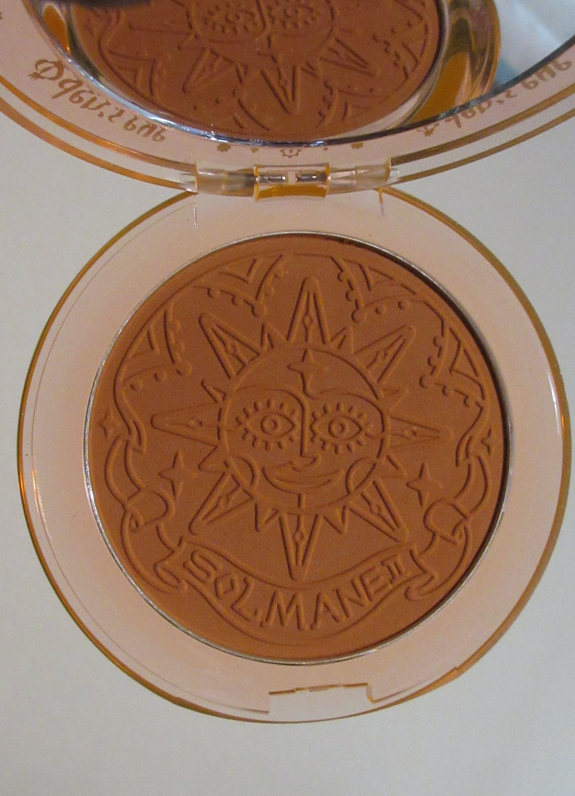
Sienna Lustre
Sienna Lustreshows truer to the pan color with a white background.However, this blush on the skin is a medium tone peach, which looks more similar to the photo with the colorful background.
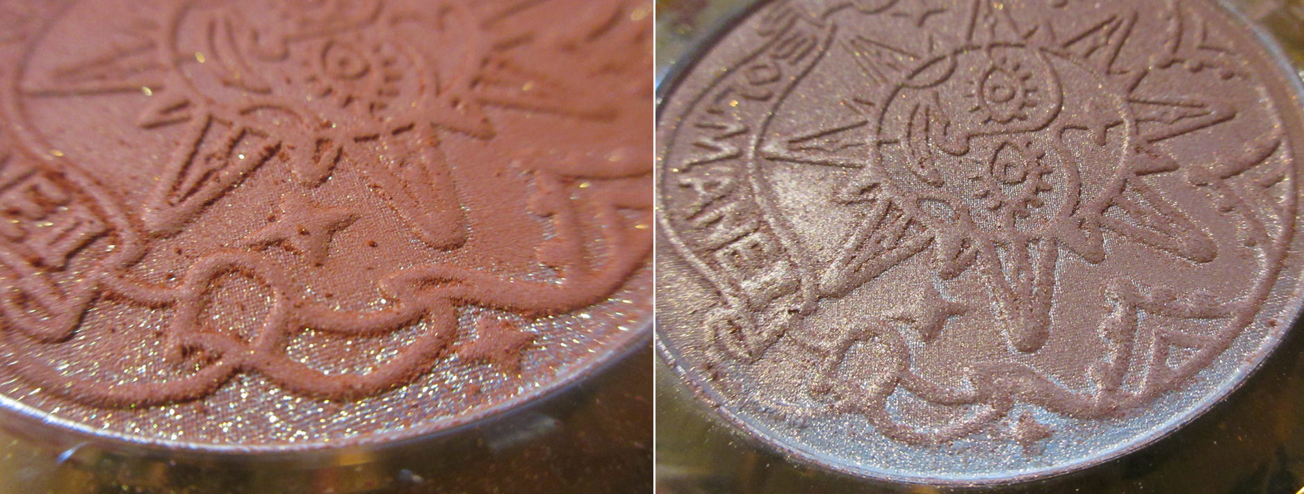
There are simply “shimmer” and “matte” categories for the Oden’s Eye blushes, but I can see a textural difference between Peach Gleam and Sienna Lustre, which are both considered shimmer blushes. Sienna Lustre clearly looks more shimmery in the pan and in swatches, but I can see and feel the extra slip it has to it more than Peach Gleam.
This is a close up of Peach Gleam (left) compared to Sienna Lustre (right).
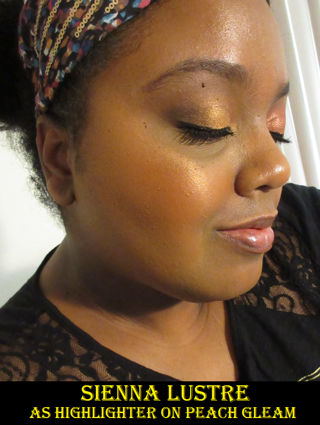
Silver in highlighters rarely look flattering on me, but I am happy to see that Sienna Lustre just takes on a peachy golden look on my skin and all that visible silver sparkle doesn’t show on my cheeks. The silver is basically an overspray, but without impacting the color overall. Admittedly, whenever I use this blush/highlighter, I try to avoid picking up product from the right side of the pan, but I did thoroughly rub my finger on that right side for the swatches and it still didn’t look silvery on my arm.
Because this has visible shimmer particles, I prefer to use Sienna Lustre as a highlight. I also prefer using it on top of Orange Sunny instead of Peach Gleam, since I personally believe the peachy tone looks better as a highlighter over a yellow-orange blush than a red-orange one. It still doesn’t look that bad together, as seen in the face photo above.
One other thing I noticed is that although I have no longevity issues with Peach Gleam and Orange Sunny, Sienna Lustre starts to dull down and disappear from the skin as the day goes on. I still have most of it on by the end of the night, but sometimes I’ve noticed missing sections where I assume I must have touched my face at some point in the day.
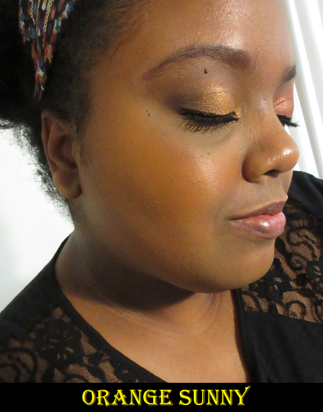
Orange Sunny
Orange Sunnyshows true to the compact color with a white background.However, the photo on the left is still relevant in revealing the yellow-orange tone of this blush as opposed to the terracotta orange-brown I expected.
As I mentioned already, I believe the matte formula in the Solmane line is even better than the Alva blushes because it’s richer in pigmentation, softer, not as powdery, and blends better into the skin. I hope Oden’s Eye continues to expand on their blush line to include even more shades and darker ones as well. The ones I have are as deep as they go. In my photo wearing Orange Sunny, I could have applied a little more product, but it doesn’t get much deeper than what is already shown.
Although I think the matte formula from Oden’s Eye has improved, I am still the most impressed with Peach Gleam. The brand’s shimmer formula continues to rank among the best in my substantially large blush collection with Peach Gleam, Little Jasmine, and Sweet Tulip being the ones I use.
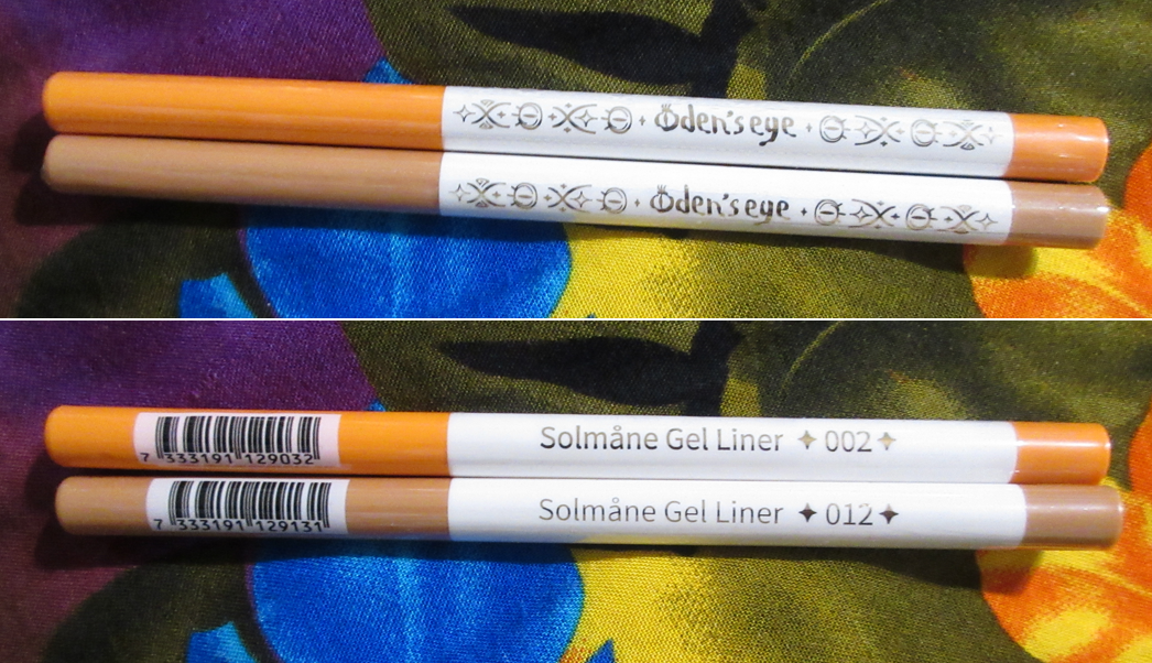
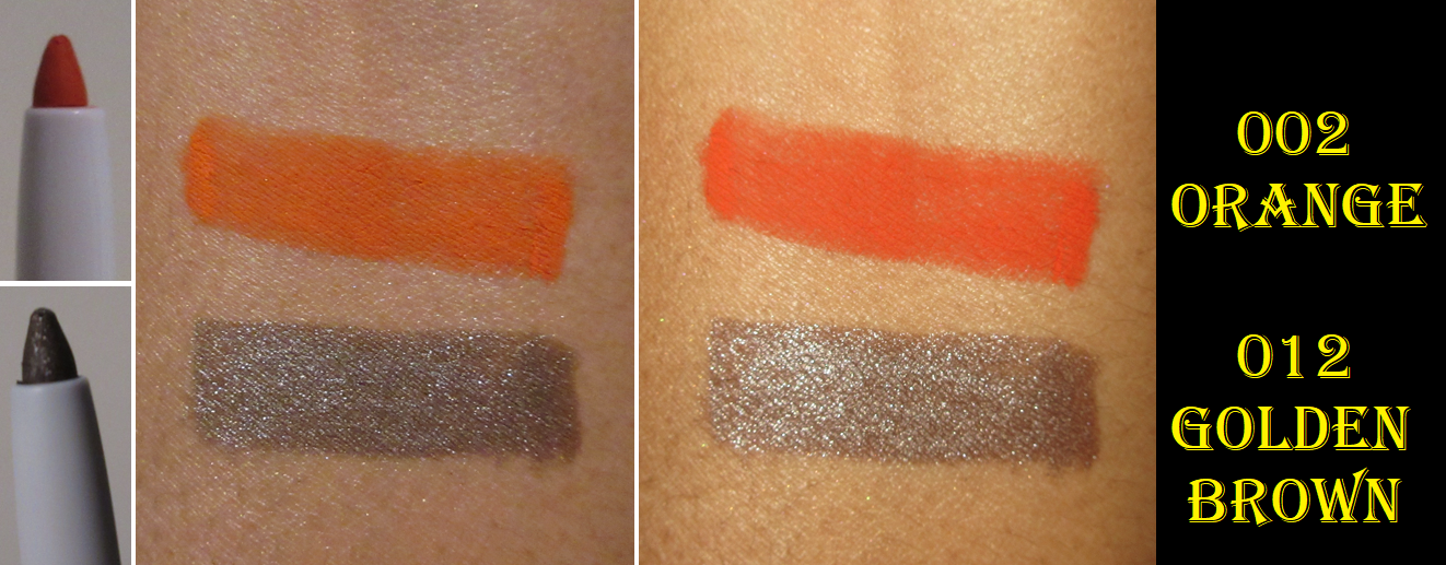
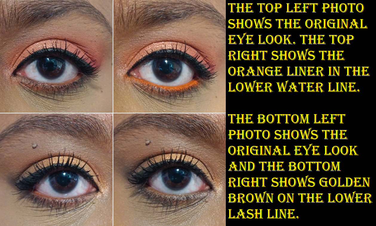
Gel Liner Pencils in 002 Orange and 012 Golden Brown
These pencils are creamy and a bit on the soft side. I accidentally broke off the tip of Golden Brown while trying to swatch it on my arm, and I wasn’t even being rough with it. It’s nice that they included a sharpener at the other end of the pencil. I discovered that as I accidentally tugged off the back.
I’ve tried both of them in my waterline and they don’t last. My eyes are just too watery. They last quite well as liner for my upper lash line, as well as an all over shadow for the lids.
Even though I added these to my cart solely for the free shipping minimum, I’m not upset at getting them. I feel like I would have been more impressed with these if I hadn’t just used the Amor y Mariposas gel liners from Melt Cosmetics, which have phenomenal staying power and remain intense, sparkly, and shiny. There is a huge gap between the retail price of Melt’s liners versus the ones from Oden’s Eye though. I can also say I like these more than the pencil liners I’ve purchased in the past from Colourpop.
That’s everything for this review! I didn’t have a ton to say because there wasn’t much to critique. I really like the products I bought from Oden’s Eye’s newest collection and I definitely recommend them.
*DISCLOSURE: All products in this post were purchased by me with my own money.Links in bold blue font (Example) are standard links. Links in bold black font with a light blue background (Example) are affiliate links. Affiliate links allow me to get a commission if purchases are made directly using my links. The price of the product is not affected by these links, and anyone who uses them would be supporting this blog. Whether you click to shop through them or not, I appreciate you visiting and I hope you find the information I’ve provided helpful!
Suqqu is a Japanese cosmetics brand that I’ve always been curious about, but as is common with most luxury products, the color stories are often not suited for my skin tone and/or don’t match my makeup preferences. For that reason, there hasn’t been much I’ve been able to use until this year, as it appears that Suqqu is now offering more variety in their launches as their product demand continues to increase globally. Today, I’ll be sharing my opinions of the few Suqqu items I added to my collection.
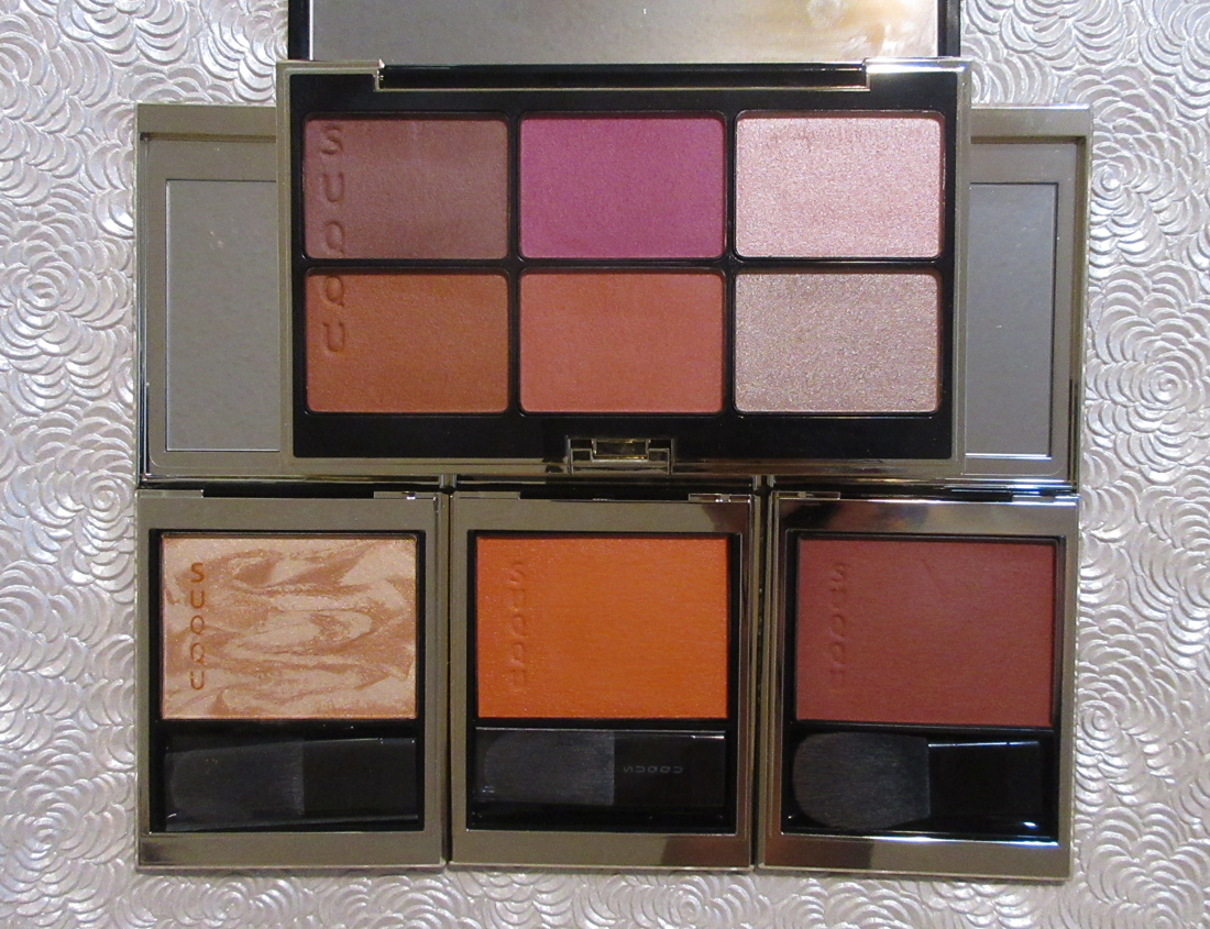
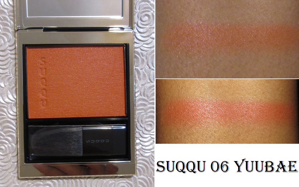
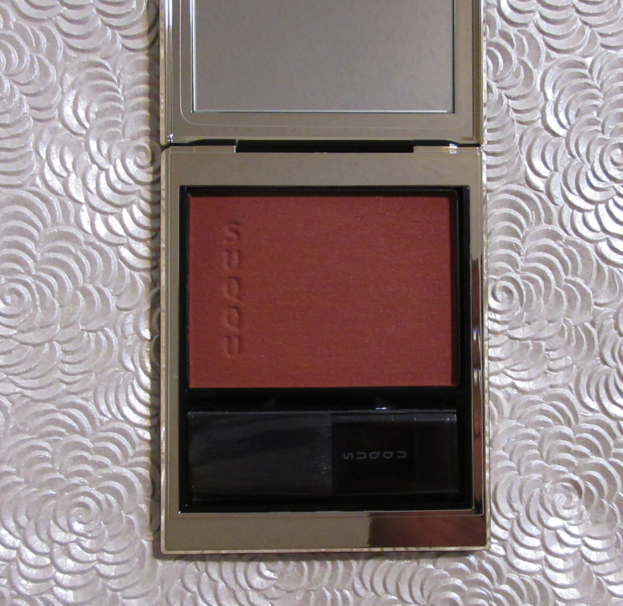
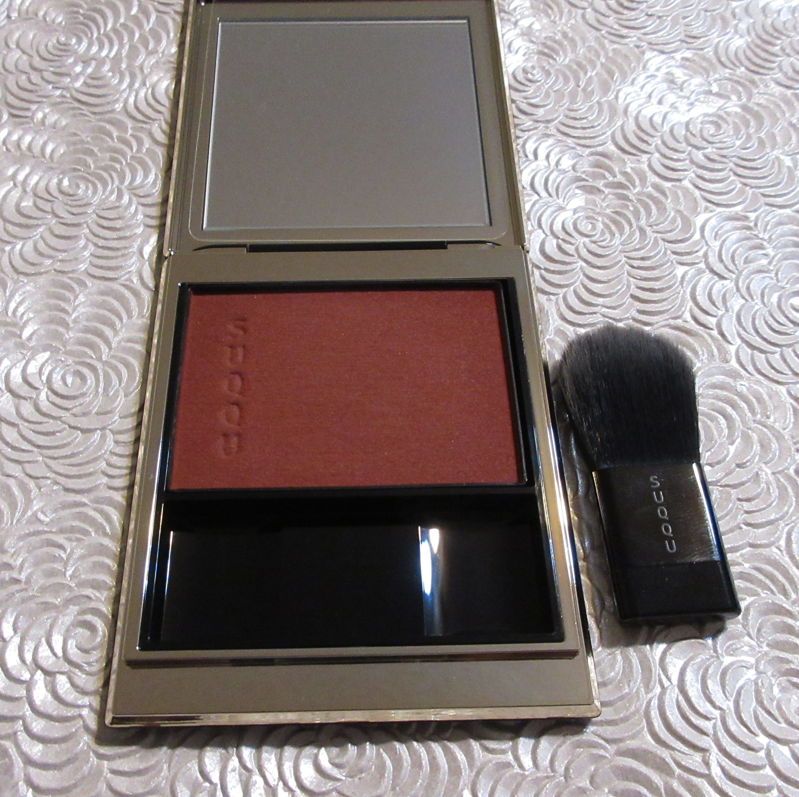
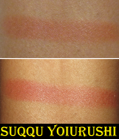
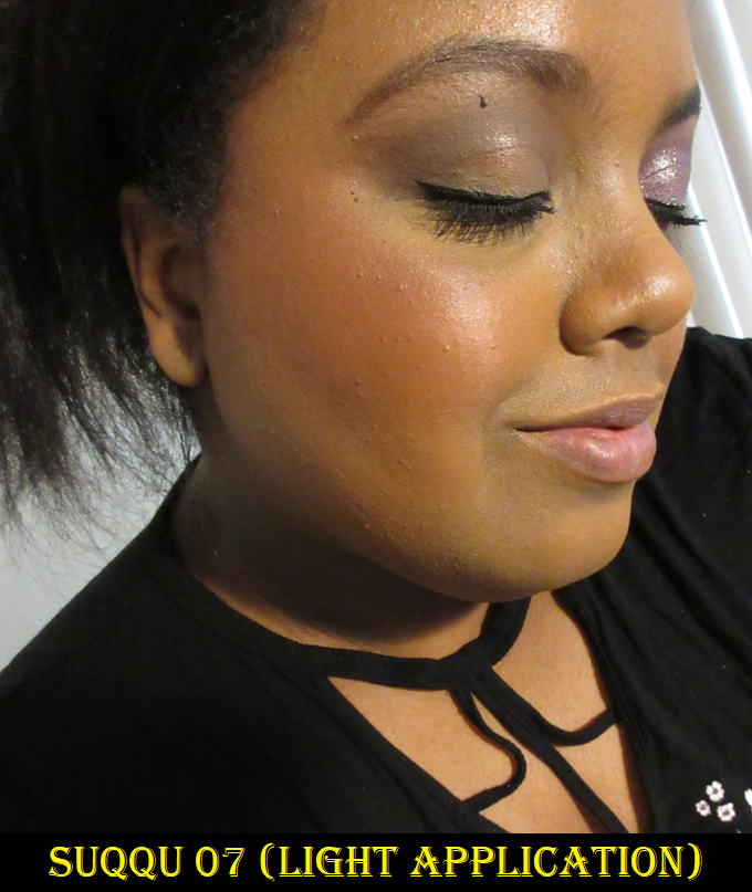
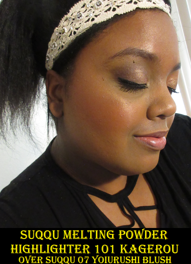
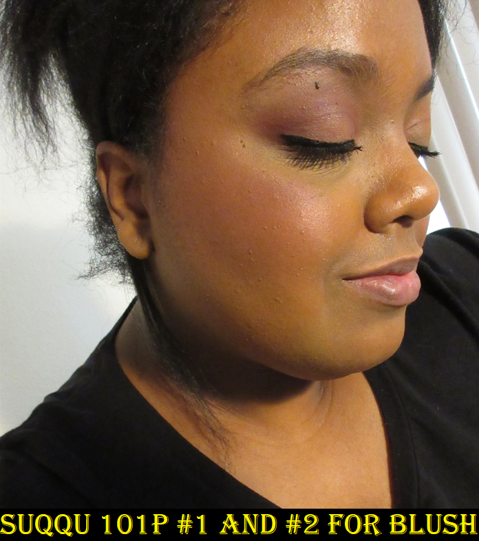
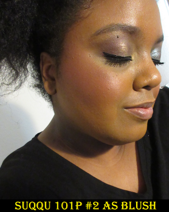
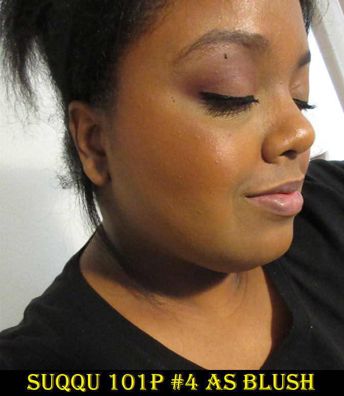
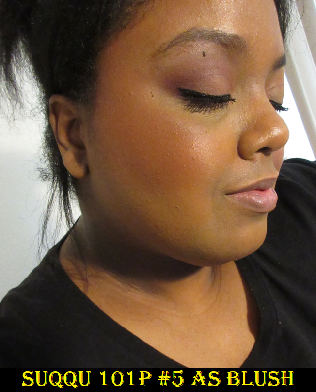
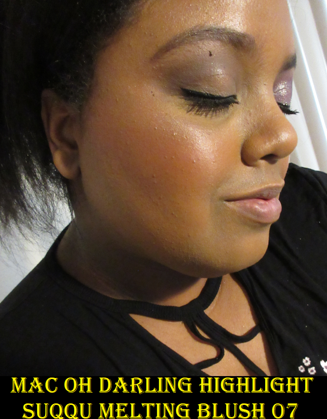
SUQQU Melting Powder Blush in 06 Yuubae and 07 Yoiurushi
The Melting Powder formula is a new one introduced from the brand in 2022. I am extremely pleased with the shade variety, as there are a few that could work for me, but 07 is what I was drawn to the most. It reminds me a bit of Pat Mcgrath’s Paradise Venus, but leaning even more red. That being said, I still ended up purchasing 06 shortly before this review was scheduled to post. It’s incredibly difficult for me to resist buying another blush shade in a formula that I like.
A photo showing #07 applied more heavily is in the highlighter section.
This is a buildable yet pigmented formula that feels smooth to the touch, like a cream, without leaving a tacky feeling to the skin. It sets into place on the cheeks enough to where it won’t transfer/move as easily as when first applied, but it doesn’t dry per say. The formula that is intended to feel and look creamy and satin-like on the skin will continue to have that same quality when the cheek is touched, but it doesn’t feel wet. I do have dry skin though, so I don’t know if setting it with powder would be necessary for those with oily skin.
These blushes remain looking pigmented all day and I love how seamlessly they meld with my skin. It’s like taking the best quality of creams and putting it in a form that those who prefer powder blushes may enjoy too. It’s advertised as becoming, “one with the skin,” which is a claim I believe is true.
It comes with a brush. I normally don’t use the brushes and other types of applicators that come with makeup, but this one actually applies the product nicely. The bristles are synthetic though, which I figured I should mention since the natural hair brushes from Suqqu were quite famous in the fude world (all Suqqu brushes are now synthetic) and I want to make it clear that these aren’t as special as those, but still decent for a free mini brush. However, if given the option, I still prefer using my own full sized brushes with this blush. Also, because of the emollient ingredients contained in the blush, I recommend using the same type of brushes with this as you would a cream product (undyed goat hair and/or other resilient natural bristle brushes and synthetic brushes). I have used 07 once with a lightly damp sponge and it increased the opacity and amount of pigment that was deposited on the cheeks. I can also get a natural flushed look when using my fingers with these blushes, but I still prefer a brush application the most.
I believe that the eight original shades that launched before Spring are part of Suqqu’s permanent line, but they also have two limited edition shades that were released as part of their Summer Collection. Suqqu is not easily accessible in the US without ordering online, though it still has a fairly large following here, especially among fans of luxury makeup. I still have the Selfridges+ shipping subscription active on my account, so I purchased mine from Selfridges. Some really insightful information about the brand, their products over the last seven years, and the different places to purchase Suqqu products is available in this video I found just before posting this review.
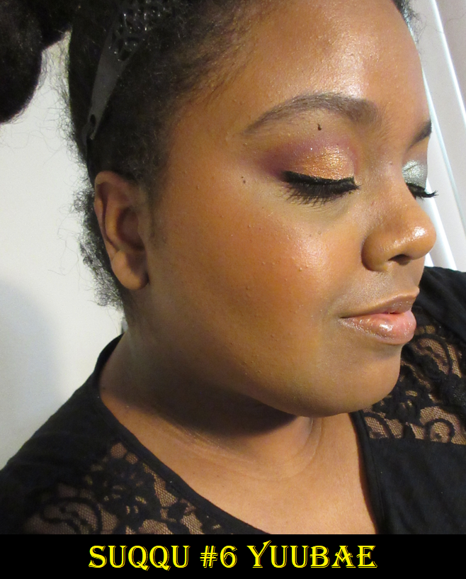
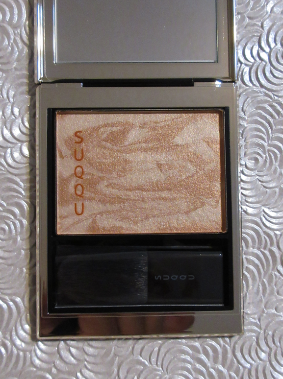
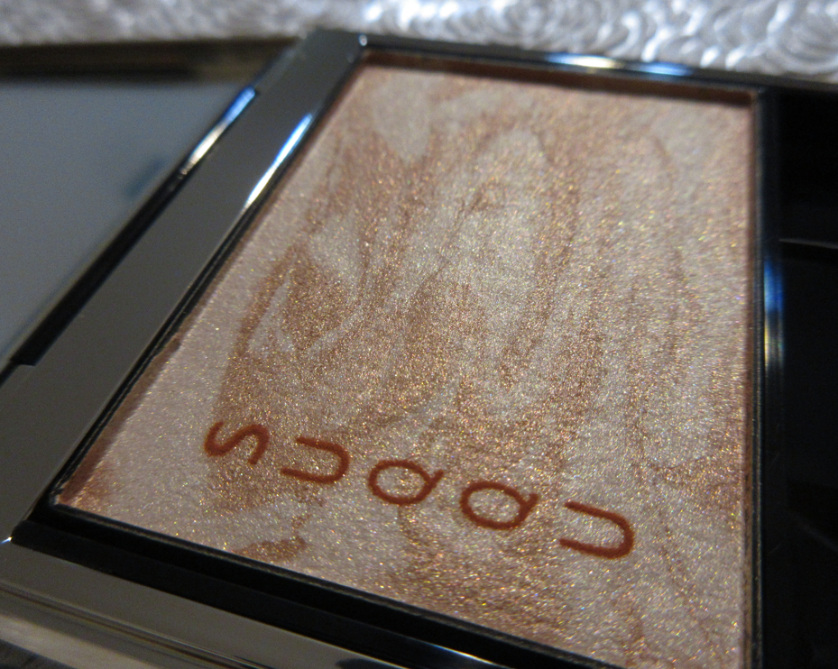
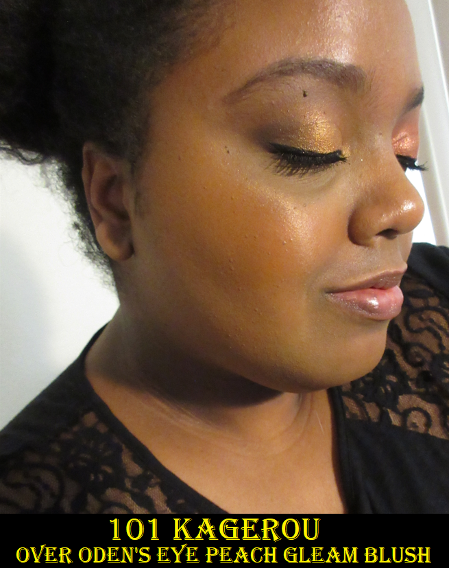
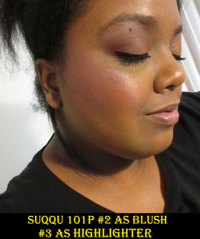
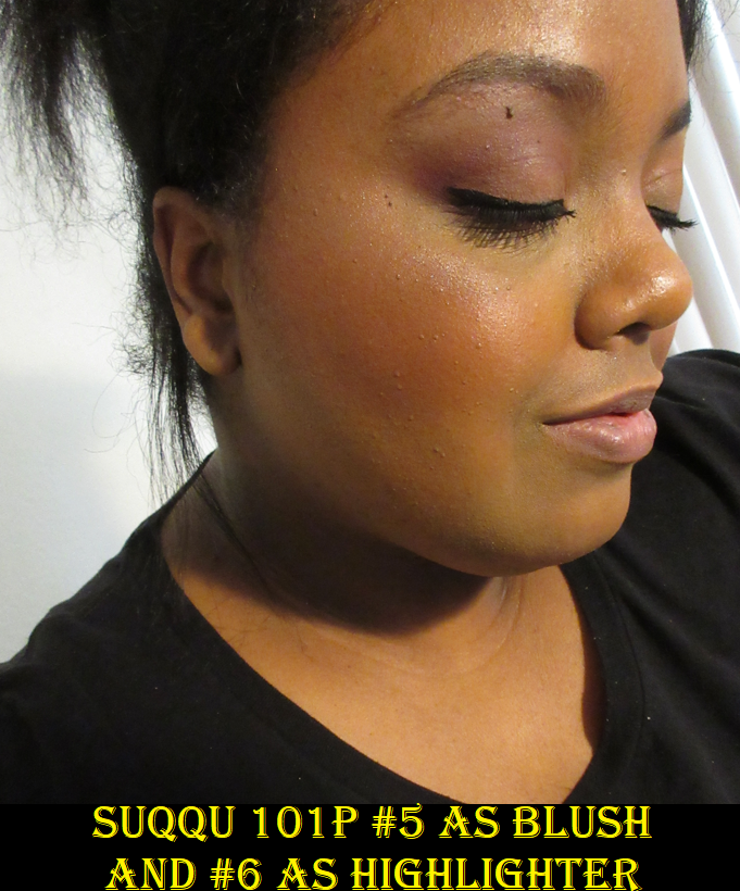
SUQQU Melting Powder Highlighter 101 Kagerou
This particular shade of highlighter is limited edition and part of the Suqqu Summer Collection for 2022, but I can only assume a permanent range will eventually be released. I also assume the permanent line will not have the cake-marble pattern, but I guess we’ll have to wait and see!
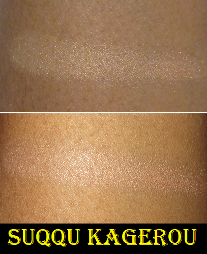
I mentioned before how impressed I was with the color variety from Suqqu this year, and I have to give the brand credit for doing something very few others are willing to do. Any time I’ve seen a brand release a single highlighter, a single blush, single bronzer, etc., it’s intended for those with light skin tones. I wouldn’t even say pale/fair tones or medium tones, but it will almost always work on someone light. Suqqu surprised me by being the first I’ve ever seen to release a single product that is in a medium-tan tone. The color choice is, as stated by Selfridges, “Inspired by the hazy heat of balmy evenings and vibrant colours of spectacular sunsets…[that] complements your hard-earned golden glow.” That sounds like the shade was chosen specifically because it’s a Summer collection, but the end result is that I finally know what it’s like to be able to use a product that only comes in one shade! Granted, I still believe brands should release a minimum of two since it’s still not a great feeling to be left out of a collection, though I have seen people across a wide range of skin tones, including fair, be able to enjoy this product. Some examples of this highlighter on those of different skin tones are: Lexi Jong, Sofia Sees Beauty, Alicia Archer, Charlotte Holdcroft, and daps_makeup.
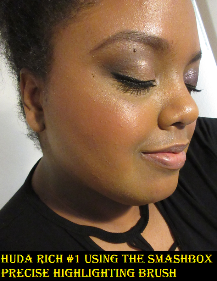
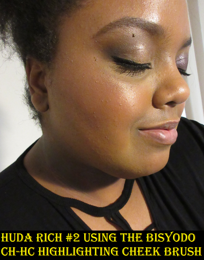
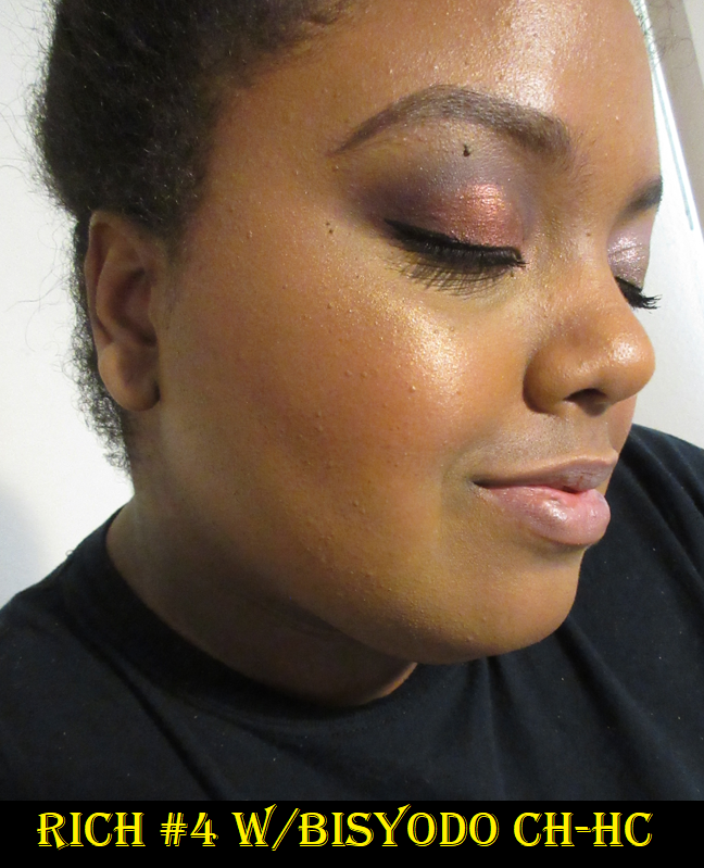
This shade is on the warm side, which is a great fit for me considering my undertone. I thought it would be a little more golden-yellow because of the base color underneath the swirl, but it’s more of a light peach that is mixed with the coppery and bronze colored shimmer marble/swirl. The texture feels exactly like the Melting Powder blushes and blends beautifully onto the skin, but I’ve had different results depending on the brushes used. If I’m wearing foundation, I can use any brush except my Too Faced Diamond Light Highlighter brush to get the kind of application I like. If I’m barefaced and I decide I want to add a little glow to my face without any other makeup, I can only use my absolute favorite highlighter brush (in the past twelve months), the Bisyodo CH-HC Highlight Cheek Brush. With this brush, I can get it to look smooth, but the main issue with it being on my bare face is that it looks super shimmery (especially with the other brushes) and doesn’t melt into my skin the way it does if I’m wearing foundation. The highlighters and blushes, even though they feel the exact same, don’t have the same formula from what I can see on the ingredient lists. This is possibly why it doesn’t perform the same way on my bare skin as the blushes do. This isn’t a big issue for me though, since it’s rare that I wear highlighter in strategic spots and nothing else on my face. 95% of the time that I wear highlighter, it’s going to be with foundation. So, 95% of the time this highlighter is going to look exactly how I want it to, but I thought I should mention it anyway for any makeup minimalists who may be reading this. I hope I explained that clearly enough. The highlighter is smooth and melts into foundation, but looks glittery if I put it on my bare dry skin.
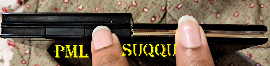
Lastly, I have to comment on the fact that I’m amazed how sleek and luxurious the packaging of the blush and highlighter are despite being so lightweight and compact in size. It’s slightly more than half the thickness of the Pat Mcgrath blushes! I like how thin they are without feeling flimsy. Also, these Melting Powder products attach in one magnetic spot when stacked on top of each other. It’s not enough to be able to stick together if one is lifted, but enough to keep them secure in a drawer.
The highlighter is currently sold out at Selfridges and Fude Japan, was still available at Cult Beauty until a week ago, and I have not seen a product page for it at the Harrods site, so I’m not sure where else it can be purchased.
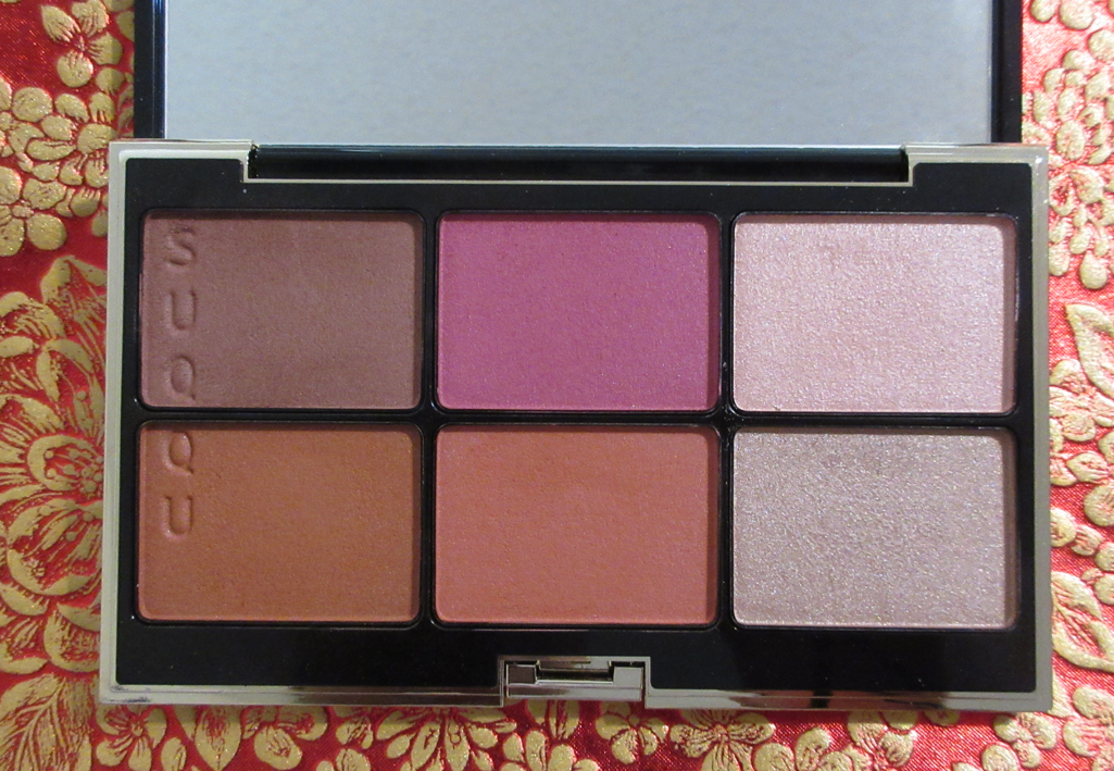
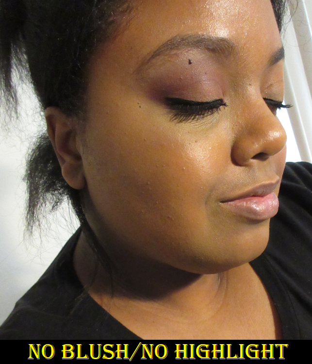
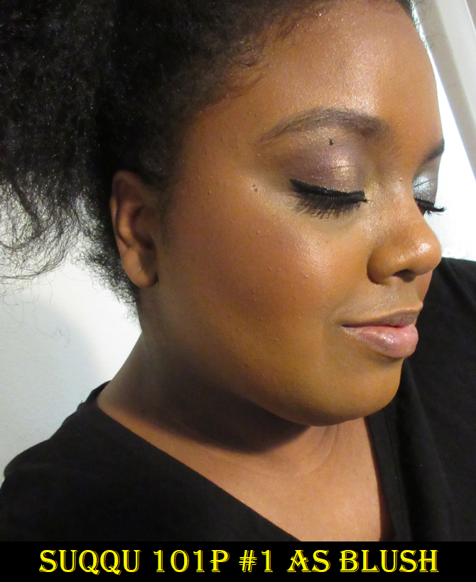
SUQQU Powder Blush Compact 101
This was actually the first Suqqu product I bought and the only one I had for a long time. It was released in the latter half of 2020, but I wasn’t confident that enough of the shades would work for me to be worth the $60 palette price plus $30 shipping. So, I patiently waited for an untouched or barely used one to be put on Mercari, which between a coupon and seller credit I was able to get this for well below retail!
There have been three 6-pan palettes released so far and they are all limited edition, so only the 103 version is still available on retail websites.
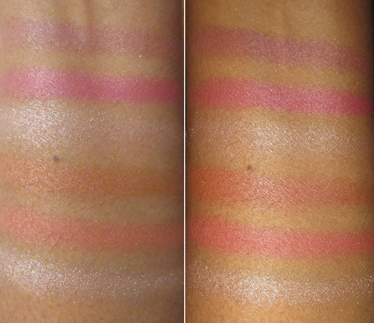
These blushes are in the Pure Color Powder formula, which is still immensely soft, even if it isn’t to the creamy level of the Melting Powder blushes, but they blend well and don’t look powdery on the skin. There are four matte blushes and two highlighters, but the blushes still impart a natural sheen to them that’s not quite satin but not a flat matte either.
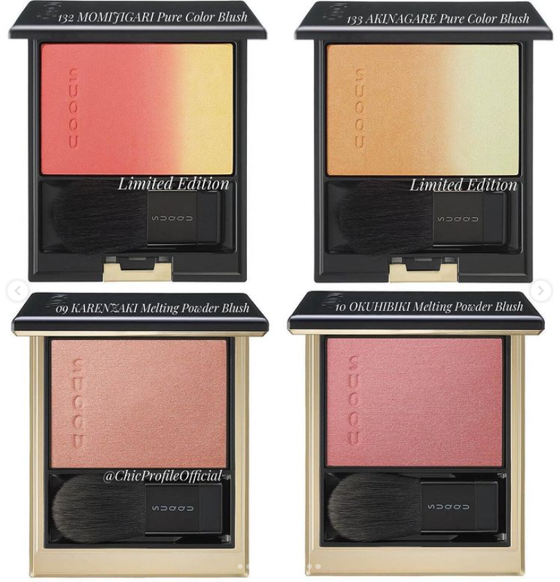
Pan #1 is like a mauve-brown and Pan #2 is magenta. I’m not the biggest fan of those shades used on their own, but I really like the way it looks when I mix the first two of them together on my cheeks. Pan #3 is a pink highlighter with a silver reflect that is unavoidably icy on me. Pan #4 is a subdued terracotta orange-brown that has a little more of a bronzing effect on me and looks less like a blush. Pan #5 is my favorite as a medium toned coral-orange that isn’t very vibrant on my cheeks, though I don’t mind that. Pan #6 is like a taupe-champagne highlighter that again reflects silver. Essentially, I only use this palette three ways: mixing shades 1 and 2 together, using #4 on its own, and using #5 on its own. The highlighters don’t look nice on me, but because I can still use this in three ways, I still reach for this product periodically. I enjoy the Pure Color formula enough that I would be likely to get another version in the future if at least one highlighter and three blushes out of the six pans are my style. I also plan on getting at least one of Suqqu’s ombre patterned Pure Color blush compacts. ChicProfileOfficial on Instagram posted a sneak peek of Suqqu’s upcoming Fall Collection, so I plan on getting #132 if possible.
As for the packaging of the 6-pan cheek compact, it’s still lightweight but it’s a decent size in proportion to the products inside. It’s basically not bigger than it needs to be.
That’s all for today! Thank you for reading and I hope to review more from Suqqu in the future!
This experiment examining my monthly purchases has been fascinating for me to see all grouped together. January was indie and high end. February was indie and drugstore. March has shaped up to be a little of everything! There’s no consistent pattern and that makes me wonder how the rest of the year will be. Will I purchase more things or less things? Will I have an entire month of products solidly within one price range? Is it possible for me to go an entire month without buying a single thing? We will see!
Makeup Geek Empty Magnetic Mega Palettes
It’s quite unfortunate that Makeup Geek Cosmetics is no more. I didn’t add this to my Beauty Resolutions post, but I’m unofficially on an empty magnetic palette no-buy, and have been for years. I have so many unused small ones (25-30 pan ones), or what I refer to as small compared to the Coloured Raine 96 pan palettes. They don’t resell well either, so I try to avoid getting them, but these plastic Mega Vault Palettes from Makeup Geek are such a better and sturdier quality than even Z-palettes (which are already better than other more affordable cardboard packaging alternatives). For this reason, I bought two additional ones at 40% off on Makeup Geek’s website. I suspected prices would be further reduced in April, but I didn’t want to take the chance of these selling out. It’s a good thing I did because they were out of stock within a few weeks.
Wayne Goss The Luxury Eye Palette in Imperial Topaz
Between the Beautylish Lucky Bags and Wayne Goss Lucky Bags, I knew there would be plenty of untouched or only swatched palettes available on Mercari. I’ve wanted to try Wayne Goss’ eye shadows since the beginning, but I couldn’t bring myself to pay full price for six neutral shadows. So, for almost half off, I was finally able to see if playing the long game was worth it.
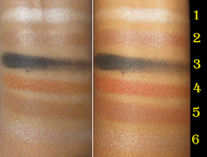
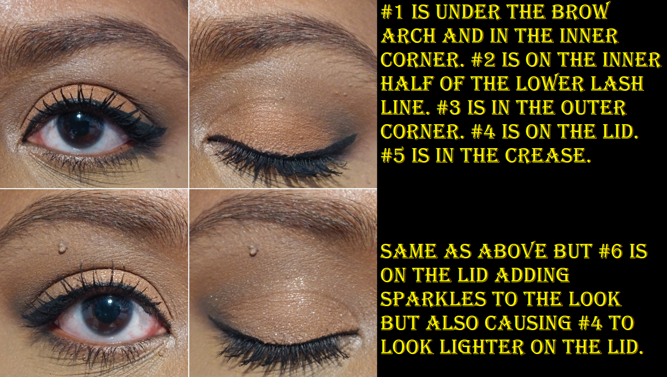
I didn’t have faith that these shadows would be worth full price, and it’s still not unless at least 4 of the 6 colors are someone’s style, but this really is a high quality formula! Well, the black shade is an exception but the rest are fantastic. Shades #1, #2, and #4 are satins, #6 is a topper type of glittery shimmer, shade #5 is a texturally soft matte, #3 is a very dry and stiff matte. What makes the difference between the mattes is the lack of stearates (which can account for the softness of the texture) and zea mays (oil absorbing but silky feel) missing from the black shadow that were included in the medium matte brown.
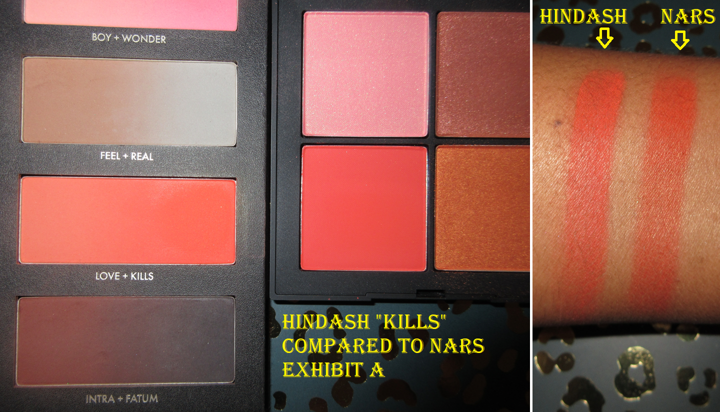
The satin shades can be used in the crease in place of a matte, but I have to be careful using #1 anywhere beyond highlighting spots because it’s so light and #2 is practically my skin tone, so it doesn’t show very much beyond adding a sheen to the area. I also wish #5 was a little deeper. I thought I would be able to mix #5 and #3, but #3 is so stiff that it doesn’t mix well with others. It reminds me of the black shade in the Hindash Beautopsy palette in the sense that it looks like it’s going to give a lot of pigment when it first touches the skin, but it’s a buildable formula that requires multiple layers to get something dark and dramatic. I appreciate that this type of shadow is perfect for smokey eye looks, but I’m able to get that effect from Hindash’s palette twice as fast and I consider that a little slow to use!
These shadows have fantastic longevity with very minimal creasing. I was impressed to discover #1 can cling to my inner corner when a lot of other shadows don’t by the end of the day from all the times my eyes get watery or I rub them. #6 also impressed me because I don’t get glitter specks on my cheeks either throughout the day. The glitter is spaced out when applied to the eye, but I can make it look less like a topper if I apply it wet.
Imperial Topaz is supposed to be that go-to palette for everyday quick and easy looks. However, they aren’t the perfect tones and depths for me, the scattered glitter effect from the nicknamed “celestial” shade isn’t my preference, soft satins are generally not my preference anymore either, and the black shadow takes effort to use. So, it’s not possible for this to be an effortless essential palette for me. I can still make nice looks with it, but it wouldn’t be worth me paying $55 for it, and I say that as someone who is willing to spend more than that on a palette if it’s nearly perfect for me. In my opinion, this palette should be $45.
As for those who love satins, celestial shades, creating soft looks and/or glam looks, is of a different skin tone in which #2 could work as a transition shade and #5 could add dimension, I can completely see how this would be an ideal neutral palette for someone. The perfect palette even. Unfortunately, that isn’t the case for me, but I am still going to continue to stalk Wayne Goss launches in the hopes that one day he’ll release my ideal eyeshadow palette! The Tourmaline palette almost got me, but not quite! This palette takes the third spot in my 24 max goal.
I realize I’ve forgotten to mention something that will only be important to some people, but I will include this note now. Whenever I purchase the first product from someone who is a celebrity, influencer, or public figure, I always disclose my thoughts on them for those who may be worried about whether my review is clouded by personal feelings positively or negatively. When it comes to Wayne Goss, even though I am subscribed to him on YouTube, I only watch 5% of his videos, so I sometimes forget he is technically an influencer. I’ve always put him in the box of Makeup Artist/Industry Professional, which most people typically don’t have parasocial ties to, and therefore wouldn’t need disclosing. So, for full disclosure now, I used to be a big fan of his and that is what got me to first start buying his brushes in 2015. His products were the reason I placed my first Beautylish order. At some point I lost interest in his videos because the reviews are always glowing since he almost never reviews products he doesn’t like, so at that point I stopped thinking of him as an influencer and instead as a brand owner and professional. Certainly, by this point, my opinion of him is neutral.
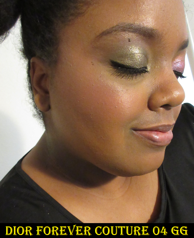
Dior Forever Couture Luminizer in Golden Glow 04
Well, I said I would eventually get a Dior highlighter in my Beauty Resolutions and here it is! All the luxury beauty channels I watch say that Dior makes the best highlighters, so I’ve wanted this since it launched. I was planning to buy it during any retailer’s 20% off sale, but I happened to find an untouched one on Mercari at a significant discount, so I snapped it up! I just did not want to pay full price for a formula I’ve never tried before and that I honestly didn’t think would live up to the hype.
I didn’t think of the implications when Angela van Rose mentioned that the base color doesn’t show very much in this highlighter. There wouldn’t have been an issue for me if the color in the pan was the tone of the shimmer, but since the base is almost transparent on the skin, I’m left with the actual color of the shimmer which is a bit too light for me. I love how the highlighter melts into the skin. I love how fine the shimmer particles are and how it gives a glassy wet-skin glow to my face. However, I can only get away with wearing it if I take my time to really blend it onto my cheekbones and even then, I’m not sure how successfully I pull it off. The best results I can get (pictured above) is with the Smashbox Precise Highlighting Brush which somehow picks up more of the powder and deposits less of the shimmer onto my cheekbones. If I want to continue using this, I could try to pair it with one of my darker highlighters.
In terms of longevity, this lasts all day without the shine dulling down. It’s absolutely beautiful. I just wish it was a little darker. There are six different colors in the range, but I’m not convinced 05 Rosewood would be any better on me and 06 Coral Glow is supposed to be similar to Pat Mcgrath’s Divine Rose, which I already own. So, I don’t plan on purchasing another one. As for the full retail price, I would say it’s not quite worth $48, but I bought PML’s Lunar Nude at the reduced price of $45, and this highlighter is better than that one. So, if Dior did release a similar formula of highlighter with a gold shade that would work better for me (something like Becca’s Topaz), there’s a good chance I would buy it and possibly at full price.
Also, I didn’t realize this had a scent until I was watching other videos to compare the different shades and someone mentioned it. I checked and can confirm mine does have it too, but I had to put it right up to my nose to detect it. It’s the same fragrance as my Dior Powder No Powder, so I guess it’s the brand’s signature scent for powder products.
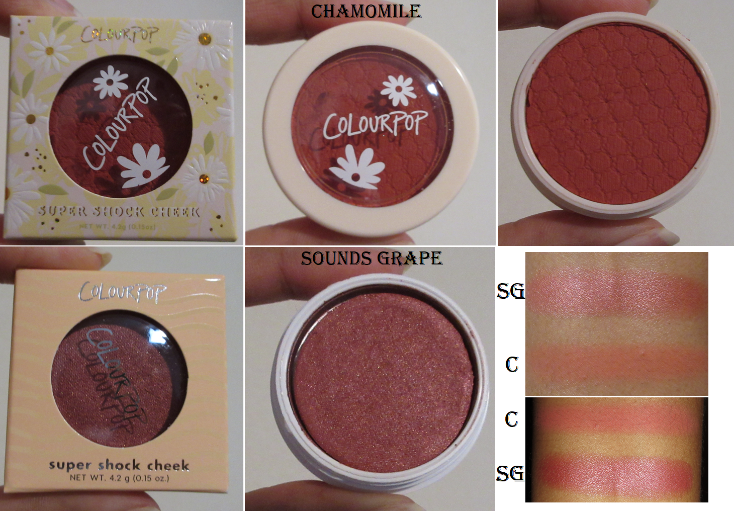
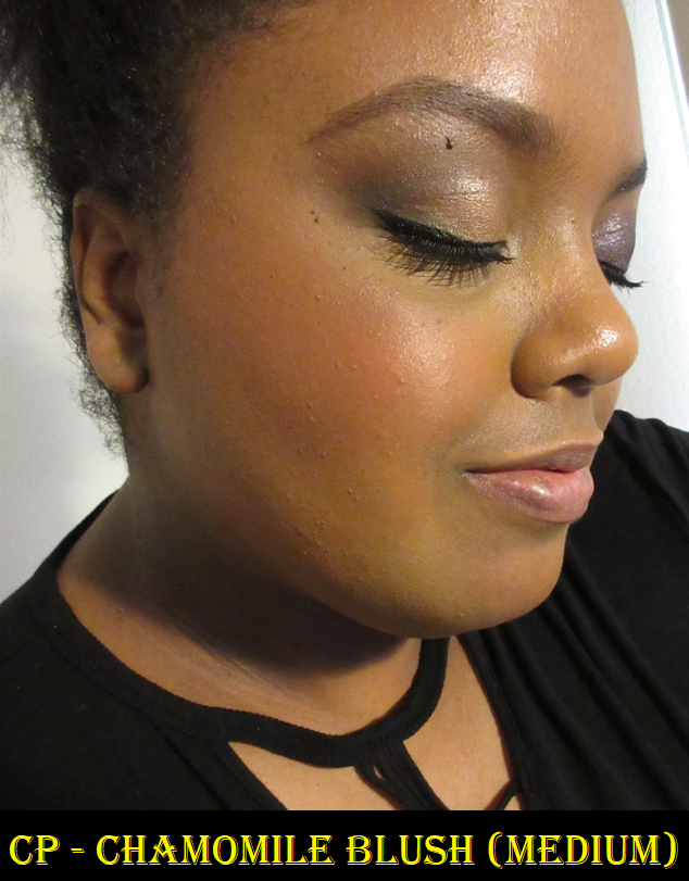
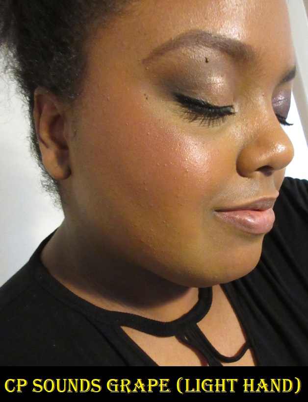
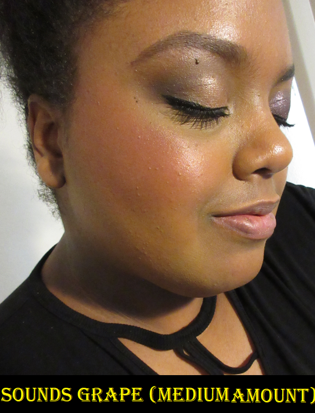
Colourpop Super Shock Blushes in Chamomile and Sounds Grape
These purchases, combined with last month’s heart shaped blush, put a big dent in my goal of ending the year with under 15 blushes. Plus, Colourpop is not even on my blush exceptions list! The review for the Super Shock formula of blushes (with some highlighters snuck in) can be found here.
Chamomile is as pretty of a color in person as it looks online, but Sounds Grape is so much darker than I expected!
If I use a heavy amount, it looks similar to the shade Cheerio, so I have to be careful with this one and apply lightly. If I only use a little bit, the look I get is exactly as I hoped and is beautiful. I have no regrets buying these two blushes!
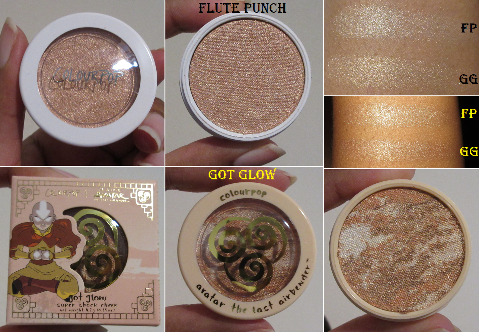
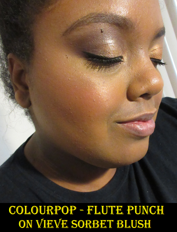
Colourpop Super Shock Highlighters in Flute Punch and Got Glow
Flute Punch was part of my official Colourpop order in March. I bought it so I could have a lighter version of Champagne BB that I enjoyed in February. Both were from the Feelin’ Bubbly Collection, but for some reason, I got Flute Punch in the basic permanent Super Shock packaging and not the special edition one. Colourpop Super Shock Cheeks in the highlighter formula weren’t on my exceptions list because as much as I love them, I wanted to not purchase anymore so I could use up what I have. I caved when I bought these and that was very naughty of me. As for Got Glow, the Colourpop x Avatar the Last Airbender collab, I purchased it from Ulta. I thought the color was beautiful and I wanted to try the tie-dye formula. When the Avatar Collection was released a week after my order, I regretted not waiting for something else I wanted, as this could have been the last item in my official Colourpop order instead of needing a “filler” item. The fact that it was available at Ulta, so I could add it to my order without needing to pay for shipping or meeting the price minimum was why I happily broke my rules and bought it.
The line on my cheek near my ear in the Flute Punch photo is from wearing a mask, not the cheek products.
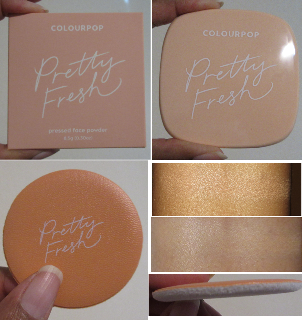
Colourpop Pretty Fresh Face Powder in Dark 18
Because I had a 25% off coupon that would mean the difference between saving a few bucks after having to pay for shipping or spending a few extra dollars after hitting the free shipping minimum, I decided to add this as a “filler” for my order. The only other items that interested me at the time was a hair accessory or additional blushes and highlighters, which I did not want to add to my yearly tally. So, even though I’m on a definite powder no-buy, I decided to try this one as my first complexion product from Colourpop.
According to the website, this powder can be used on its own as a foundation or as a setting powder. I accidentally chose a shade slightly lighter than my skintone, but when I used this with my natural hair brushes, I get such a thin layer of product that it just blends in and may as well be translucent. As to be expected, I get a lot more coverage if I use the extremely thin powder puff that came with it. The slightly off shade still isn’t noticeable with the puff anywhere except the areas of my face where I have darker discoloration. So, this is only a problem if I’m trying to wear this product on a bare face. There are no issues when I’ve used concealer over my hyperpigmentation and then applied the powder afterwards. After looking at a few videos and seeing shades 19 and 20, I don’t believe there is a shade in the line that would suit me for foundation purposes. So, I will not be trying to get an additional shade.
I like the softness of the powder’s texture, how it helps to even out my skin tone, and it sets my makeup in place. It even works as a setting powder for my under eyes and adds a little extra coverage and brightening if I apply it towards the end of the day if my concealer is starting to fade. I’m pretty happy with this product! The result I get with this is like a less expensive version of MAC’s Mineralize Skinfinish Natural.
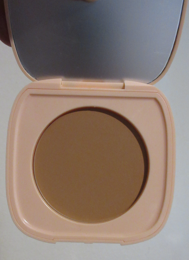
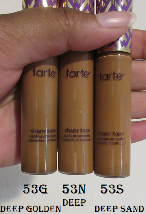
Tarte Shape Tape (Original) in Deep Golden
In my Beauty Resolutions, I mentioned that this was one of the rare times I would allow myself to have a backup product. I got it for 50% off during Ulta’s 21 Days of Beauty. I’ve discussed this concealer in so many different posts on this blog. The only thing special about this one is that it’s yet another shade in the same Deep 53 range, but in a different undertone that looks like it will be better for me than Deep. As I’m trying to use up my other concealers, I don’t plan on opening this one anytime soon in order to keep it fresh until I’m ready for it.
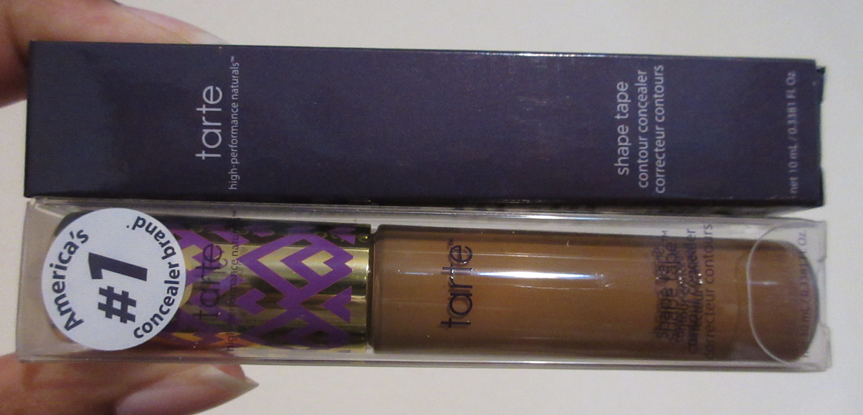
Also, I just wanted to show Tarte’s packaging change between the purple box to a clear plastic one.
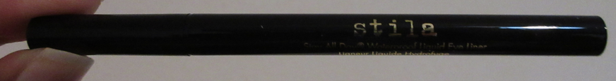
Stila Stay All Day Waterproof Liquid Eyeliner in Intense Black
This was another Ulta 21 Days of Beauty purchase. It’s a backup item, but I mentioned this was a possible purchase in my Beauty Resolutions and Hyped Drugstore Products posts. This is a long time holy grail eyeliner, so I’ve discussed it plenty of times on my blog.
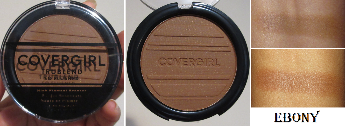
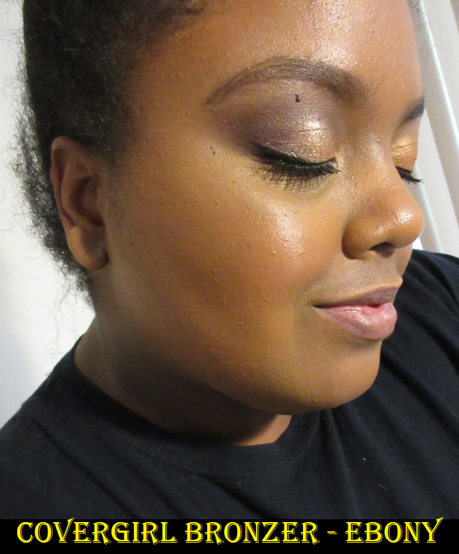
Covergirl TruBlend So Flushed High Pigment Bronzer in Ebony
Since I got free shipping from buying a Beauty Steal (Shape Tape), and I had some funds left on my gift card, I added this to my order. In my post about Drugstore Items Worth The Hype, I discussed how much I enjoyed the Sweet Seductions blush from this range and wanted to try the bronzer. This is still a breach of my beauty resolutions because Covergirl is not on my list of no-buy exceptions, but I have no regrets because this is such a great bronzer! The way that it is similar to the blush is that it’s very blendable, but rather than shimmery, it adds a pretty sheen to the skin.
If I use a dense brush, I don’t have to build it up as much. The Ebony shade is perfect for my skintone as a true bronzer, rather than all the brontours I’ve been using lately. It’s only a few shades darker, so I don’t get a ton of sculpting with it unless I really build it up, but it matches my undertone so well in providing a very natural looking warmth. I highly recommend it and can easily say it’s my favorite bronzer available at the drugstore as it truly rivals some high end formulas.
The partial indent on my cheek is from wearing a mask.
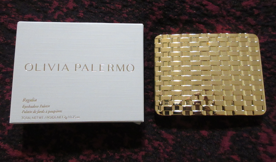
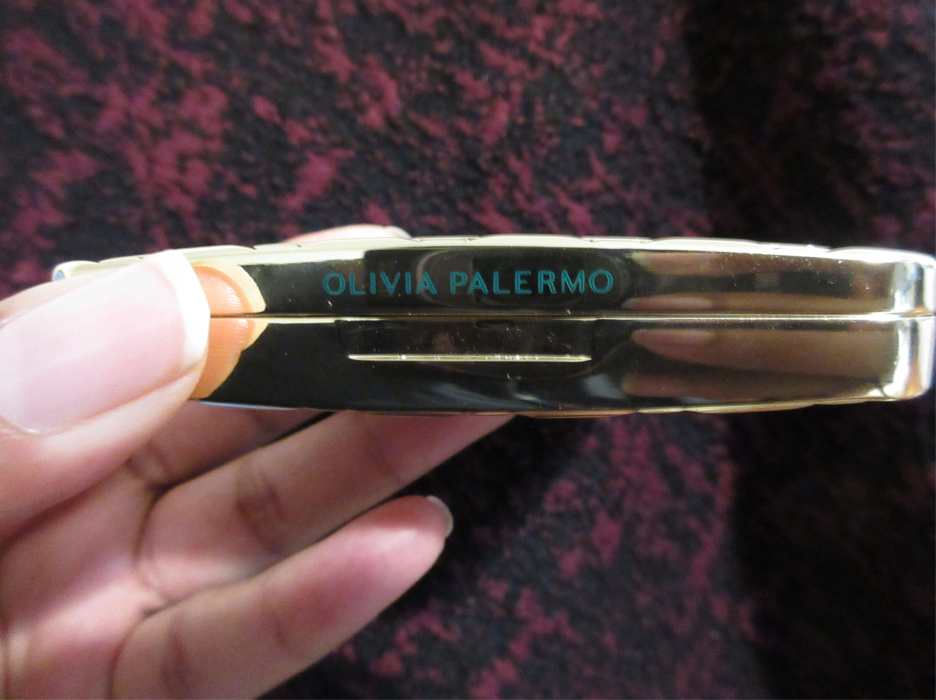
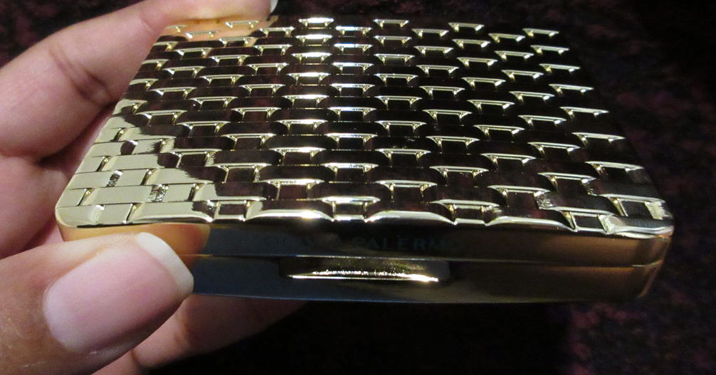
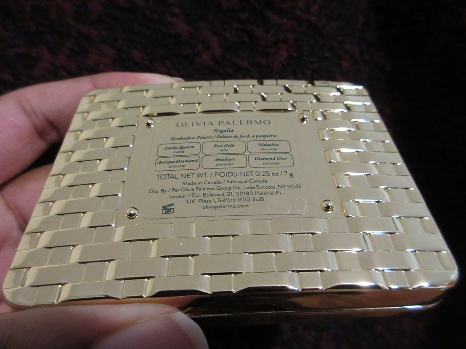
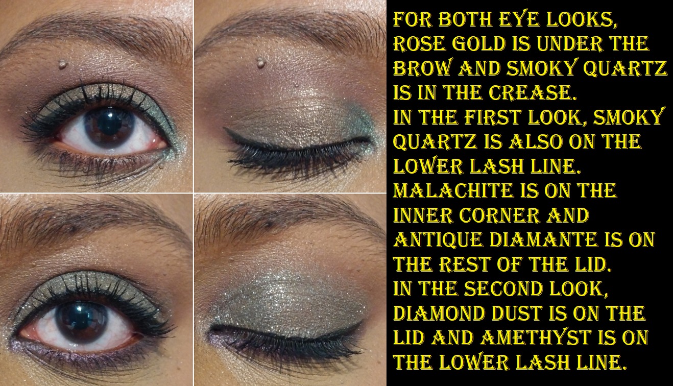
Olivia Palermo Beauty Eyeshadow Palette in Regalia
Mercari to the rescue again! When Olivia Palermo Beauty launched, I wanted a palette solely for the packaging, which I heard was luxurious and weighty. However, I had enough sense not to spend $58 for color story I hated. The Soirée and O’Naturel palettes were all that was available until February 24th when Regalia was released. I was about to order this from the website with the 15% off coupon for signing up for emails, but the shipping price deterred me. There is a free shipping minimum of $60, but a palette plus the cheapest item in the shop (a $29 lip balm) makes that free shipping minimum really $74 after the coupon. So, I decided to play the long game. What a stroke of luck that I found a seller three weeks after the launch willing to part with one of her unused palettes and for just $28! And in the terms of my eyeshadow palette low-buy, this purchase takes the fourth spot in my 24 max goal.
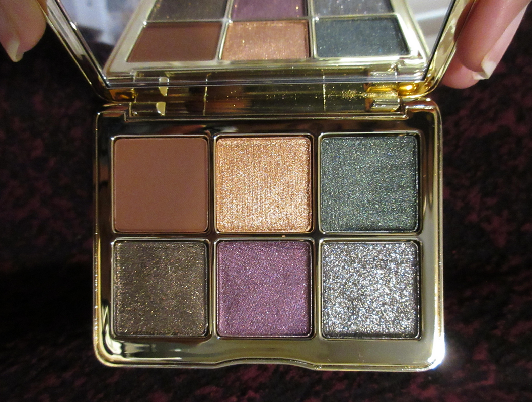
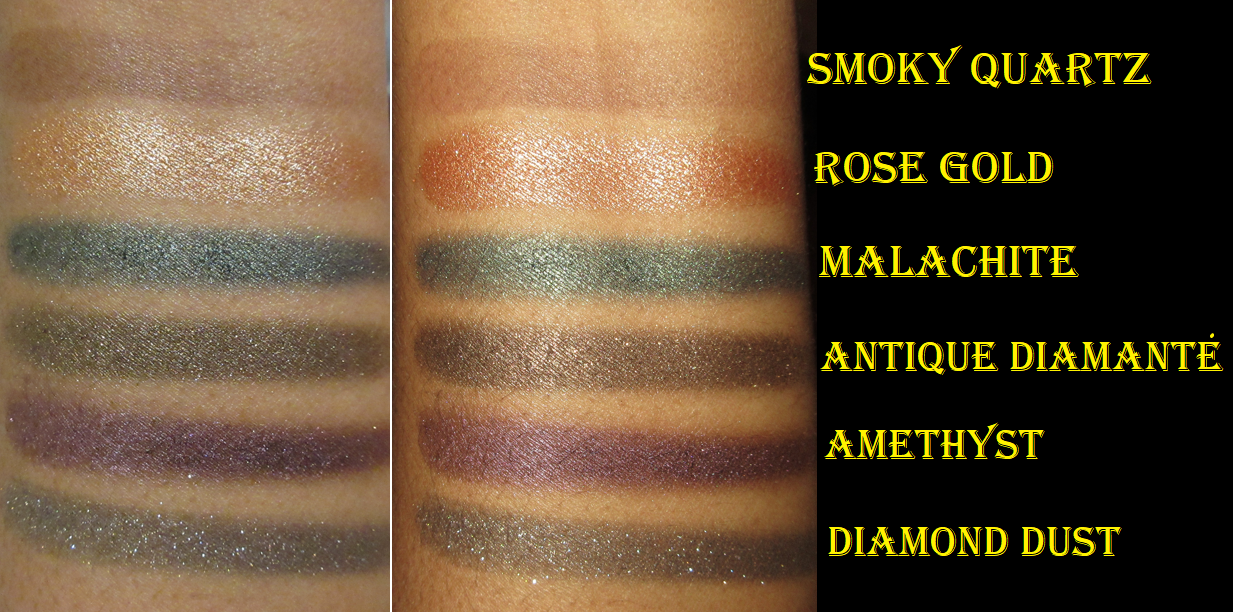
The first time I tried out this palette, I tested it with the MAC Paint Pot on one eye and no primer on the other. The texture of the eyeshadows felt different from what I’m used to, which is why I wanted to test them without a base to make sure it didn’t negatively impact the shadows. My findings was that the matte shade deepened up quite a bit on the primed side, even though the Paint Pot had enough time to set. I used Smoky Quartz in both creases and the shade was not easy to blend on either eye. The performance of the shimmers were much better. I did not wet my brush or use glitter primer, yet I didn’t see any glitter fallout at the end of the day, only the particles that fell from the initial application. This was shocking considering how packed with sparkle Diamond Dust is! Diamond Dust was even applied on the eye without the primer! As for the primed side, Antique Diamante is borderline a glitter-shimmer shade and that didn’t have fallout either.
Rose Gold is labeled a satin, and I agree with that. Malachite, Antique Diamante, Amethyst, and Diamond Dust are all called shimmers, but Malachite and Amethyst are much more satin-like in comparison to Antique Diamante and Diamond Dust. The four shimmers also have a black base to them. I could see the darkness in the smudges they left on my fingers after swatching them. This helps those shimmers to pop and increases the opaque look to them. I don’t need to load on the shadows to make an impact.
I find it interesting how soft the satin and shimmers feel (minus Diamond Dust), how pigmented they are, and how smoothly they apply. A lot of other formulas have slip ingredients like dimethicone in a higher concentration in order to achieve that spreadability and creamy feel, but because this one doesn’t rely as heavily on dimethicone, it barely creased on me. The fallout-free and crease-free aspects alone might make this palette worth full price for some people. That isn’t the case for me, but as someone with a lot of lines on my eyes and oily lids, it’s an aspect that is gaining importance to me as I get older.
“Glittering gems and precious metals,” are the inspiration for the Regalia palette. For my personal preferences, I would have liked a matte black to emphasize the sultry smoky side of the shimmer shades and give me the level of depth I enjoy most, but I appreciate the fact that having the warm brown gives me something to pair with Rose Gold for a daytime option, and so I don’t feel restricted to just use that shade exclusively for highlighting the eyes. Technically, the shimmers are dramatic enough to wear on their own, so having a color like Smoky Quartz offers more variety to the looks and is probably less intimidating for some people than a matte black would be. I just wish it was a more blendable shadow.
I am of course thrilled with my purchase at the reduced price, but I’m not sure how I would have felt if I paid full price for it. In addition to the creasing and fallout being non-factors, and the tones of the shadows looking flattering on my eyes, this has phenomenal packaging that literally weighs half a pound! The outer shell is metal, which makes up for most of the weight. The inner portion surrounding the pans and mirror feel like plastic, but I’m not certain about that. The total weight of the actual shadows is 7g/2.5oz, which means the packaging alone is over 5.45 ounces. I can see how this palette would be a nice luxury purchase for someone and the experience certainly raises its value. However, for those who don’t care about packaging and just want something nice for a lower price point, the Lorac Pro Fairytale Forest palette isn’t a dupe, but it gives a similar vibe for $39.
Lastly, I remember reading Trendmood1’s post on Instagram for people commenting to be nice when she posted about the brand’s launch. This was during the time of back to back announcements of celebrity beauty brand launches, which people were voicing their displeasure over. I hadn’t heard of Olivia Palermo until that post, so my interest in the brand is purely for the products and not the person.
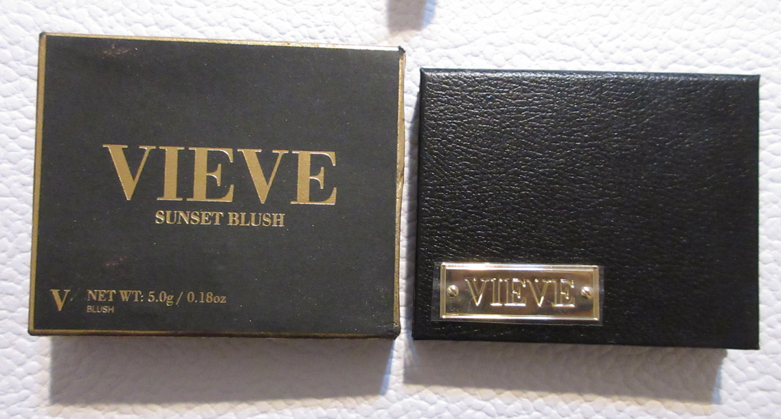
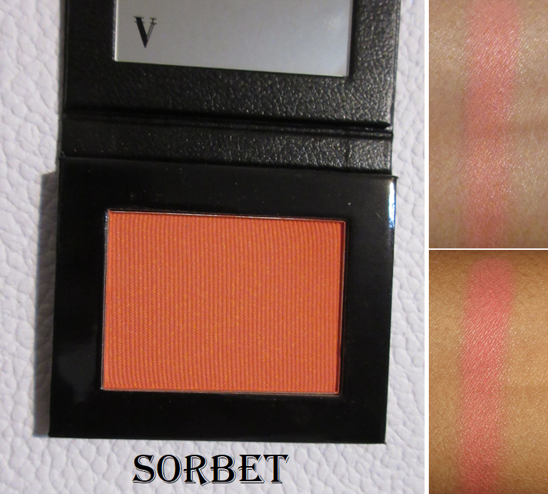
Vieve Sunset Blush in Sorbet
I’ll get this disclosure out of the way now, since this is my first Vieve Product. I am familiar with the name Jamie Genevieve because of other Influencers, but I don’t know anything about her. I wanted to try this brand because Brit Clarke consistently raves about the products and discusses every new launch. Plus, in one of the focus groups I’m part of, I learned that another beauty retailer is interested in knowing people’s thoughts on the brand, which increased my curiosity as to whether the products live up to the hype since they may eventually become easier for me to obtain in the US. So, my interest is in Vieve, not the owner.
I said in my Beauty Resolutions that I would avoid buying products from brands that are new to me, but the discount on someone’s unused backup blush was too good to miss out on. Being able to determine how good the highly praised blushes are would help me decide whether I should look into the bronzer duos since I’ve had my eye on those but wasn’t sure if I should splurge on the duos from Victoria Beckham Beauty instead. A lot was riding on this!
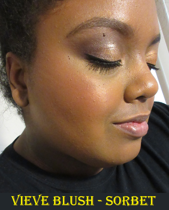
Once again, the partial indent in my cheek is from wearing a mask. It’s not the makeup.
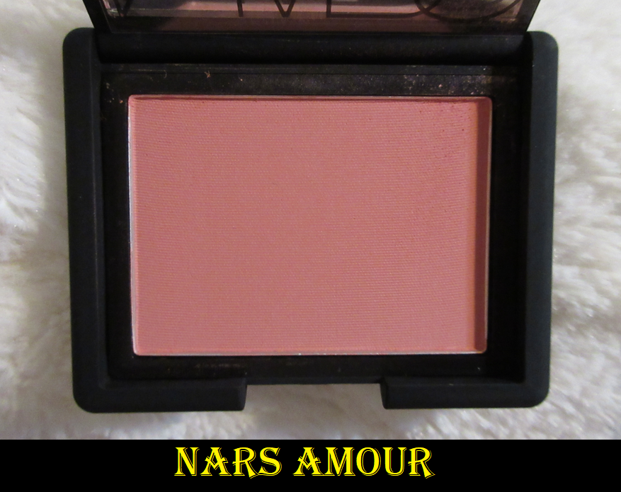
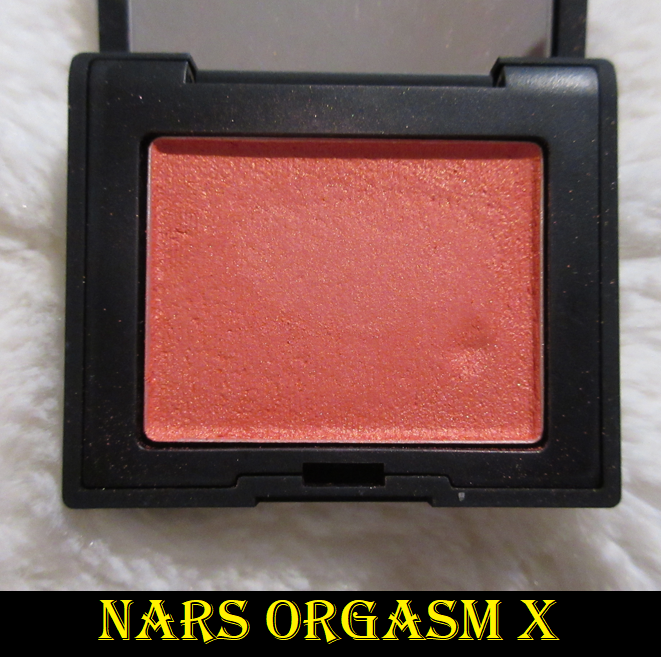
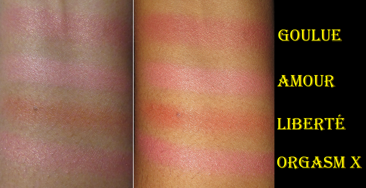
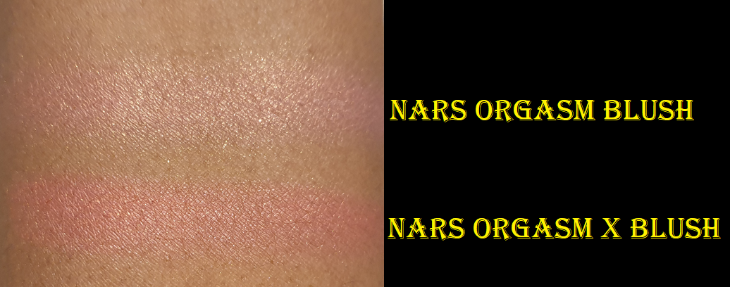
Sorbet is exactly how I wanted Nars Orgasm X to look on me. Although it’s described on some websites as being a peachy shade, I view this as medium to medium-dark coral shade with super fine gold shimmer that gives a satin appearance when looking straightforward, but gives a golden glow when it catches the light. I believe this shade could work for those several shades darker than me in the “deep” category. It’s firmly pressed in the pan to help minimize kickup and also make it easy for those with lighter skin tones to be able to wear a bold color like this without overdoing it. That said, it doesn’t take much effort to build it up on my cheeks. So, it’s pigmented but buildable. I once made the mistake of rubbing my squirrel hair brush roughly back and forth thinking it wouldn’t pick up that much, but as soon as I put the brush to my face, I immediately got more pigment than I bargained for on my cheeks and had to tone it down with foundation. I prefer to slowly build up three layers for the perfect amount for me. It lasts on my cheeks all day without fading. Overall, I think it’s a great quality blush and I would be tempted to purchase the other shade that caught my eye, Piazza, but that is supposed to be similar to Mented’s Clay Too Much and Fenty’s Rose Latte, so I will just stick to this one.
Regarding the full price of $32, I think that’s actually fair considering the performance. I also like the effort to make the packaging look luxurious if you don’t stare at it too long. For instance, the black leather with the gold logo/name plate is reminiscent of a designer handbag, but the product is lightweight in the hand and faux/vegan leather wrapped around cardboard and a shiny thin plastic covering on the inside. And what looks to be a metal tag is plastic. It’s pretty, but I can’t help but compare it to Pat Mcgrath’s blushes which perform the same, plus have that pretty rose embossing, as well as the sleek weighty plastic compact. PML’s blushes are $38 but they’re always on sale and the minimum sale discount would make it the same place as the Vieve blushes, so if they had similar shades I would buy the one from PML instead, unless I was going on a trip. Then the Vieve blush would have the advantage. Vieve also has the PETA bunny on the packaging, which the cruelty-free, vegan, gluten-free, paraben-free, and fragrance-free aspect is important to a lot of people. PML doesn’t advertise having all vegan formulas, but I did not see carmine, fragrance, or parabens in the blushes and they say they do not test on animals. Although I’d prefer to purchase PML blushes, I do recommend the Vieve ones and I’m thrilled to have this Sorbet color.
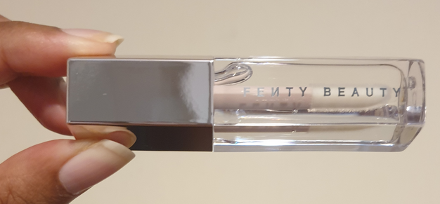
Fenty Beauty Gloss Bomb Universal Lip Luminizer in Glass Slipper
In March, Fenty had their annual Friends and Family sale at 30% off for customers with an account or 25% off for everyone else. This is always the time I get the previous year’s Gloss Bomb holiday set since they tend to always be available beyond Christmas. My two complaints about the Gloss Bombs are that I wish they had more pigment and less visible shimmer. The 2021 Glossy Posse: Fantasy 4Sum Mini Gloss Bomb Collection contained a Cream Color Drip, which is a formula I hate, and even more glittery versions of the gloss bombs. So, I opted out and decided to get Glass Slipper, which is a clear gloss with no shimmer since the original gloss bombs barely change the color of my lips anyway. Although I’m supposed to be on a lip product no-buy, there is an allowance for replacement lippies and things I had to delay purchasing from the previous year (though technically I replaced the replacement option). I have old gloss bombs I need to toss out, so this purchase is allowed, but it’s still subject to my 5 lip product maximum for 2022. This makes number 4. My review of the Gloss Bombs and Cream Color Drip can be found here.
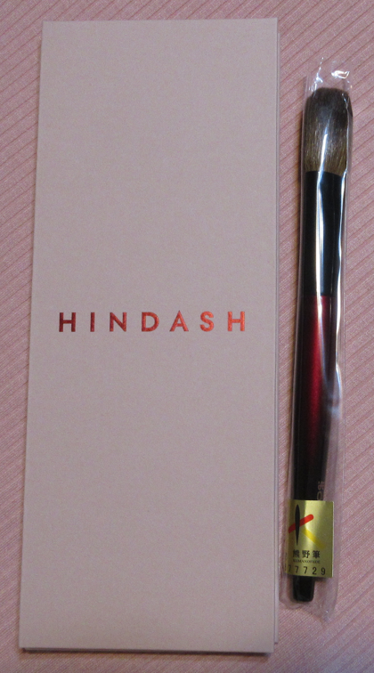
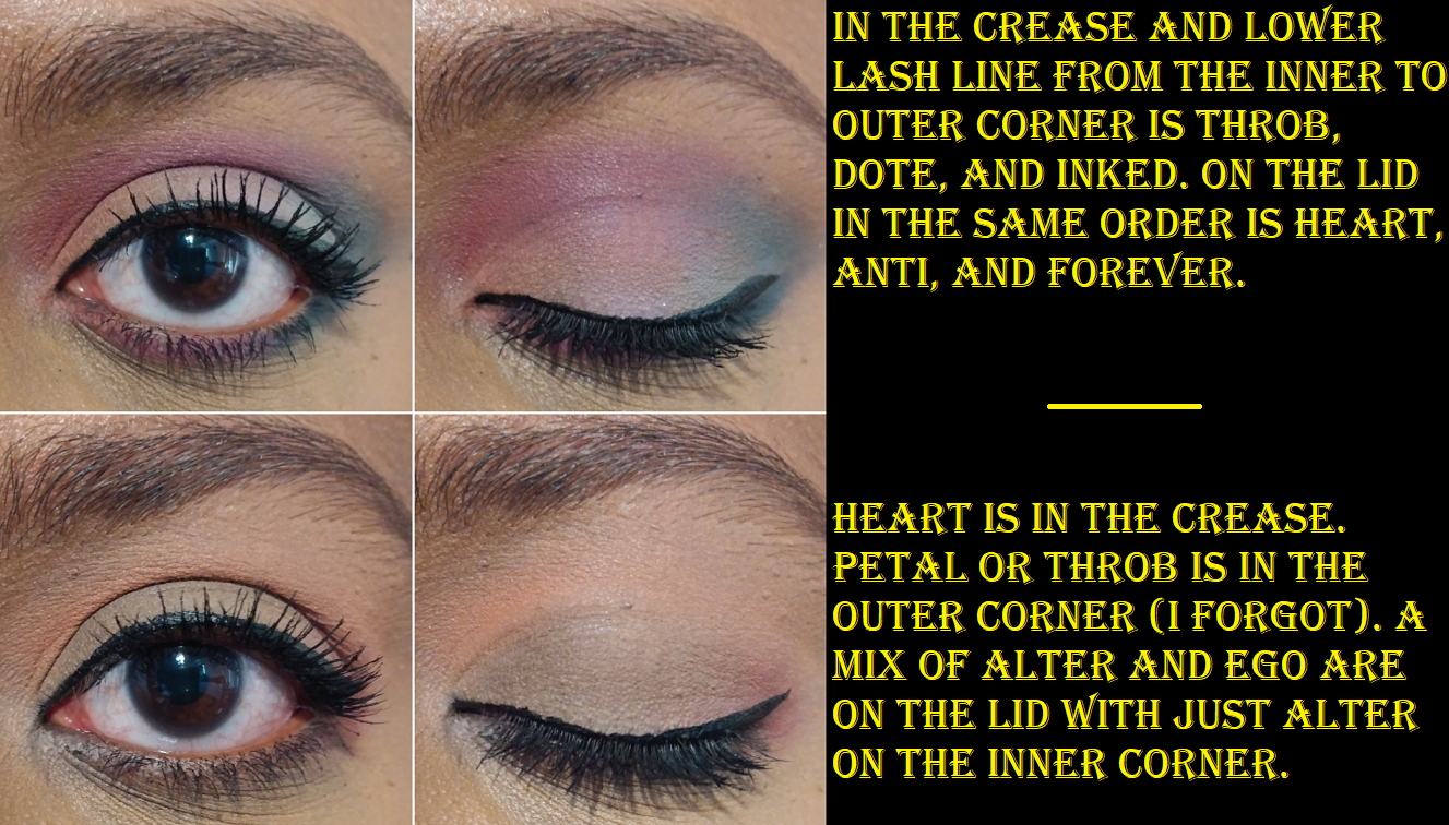
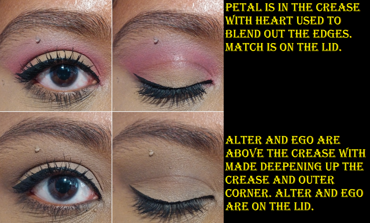
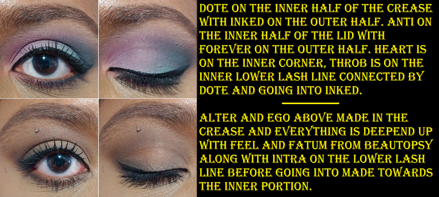
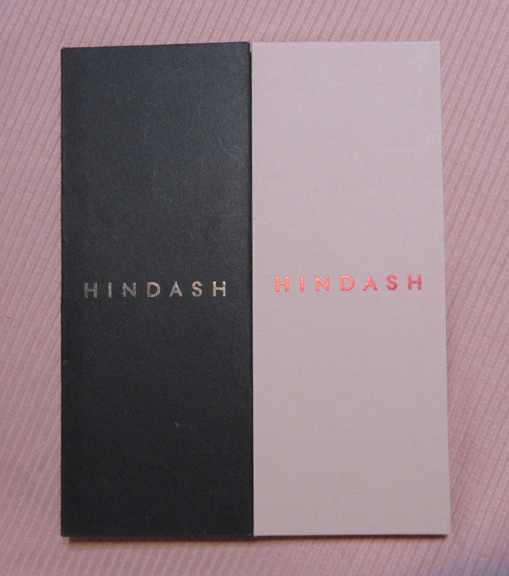
Hindash Monochromance Gradient Palette – I did a dedicated review to this product here. I decided in my Beauty Resolutions that if Hindash released another gradient palette, I wouldn’t count it as part of my eyeshadow tally since I tend to use these more on the face than on my eyes.
Sonia G Cheek Pro – When I bought the Hindash Palette, it was during the Beautylish Gift Card Event where you can get a $20 credit on your account for every $100 spent. This purchase, although it shouldn’t be allowed under the section about not buying repeat products, got me to the $100 threshold. My review for this brush can be found here, though I’ve discussed it multiple times throughout my blog.
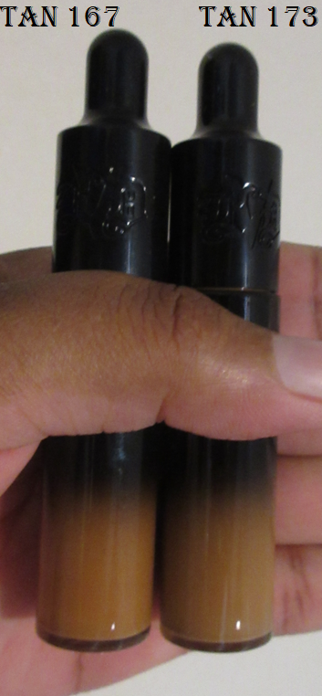
KVD Good Apple Lightweight Full-CoverageConcealer in Tan 173
I’m not supposed to be buying backup products, but here I am again! This is a different shade than I reviewed here previously, but it was on sale for 30% off and I used up so much so quickly that it wasn’t unreasonable to have a replacement in this specific instance. Concealers are one of the few makeup products I go through regularly. It takes me 6-8 months to use up a 0.33 oz tube of Tarte Shape Tape, so the same is probably true of the Good Apple since it has the same amount of product and nearly the same coverage. In fact, comparing the weight of my new bottle to my current one, I used up about a third of the product within two months.
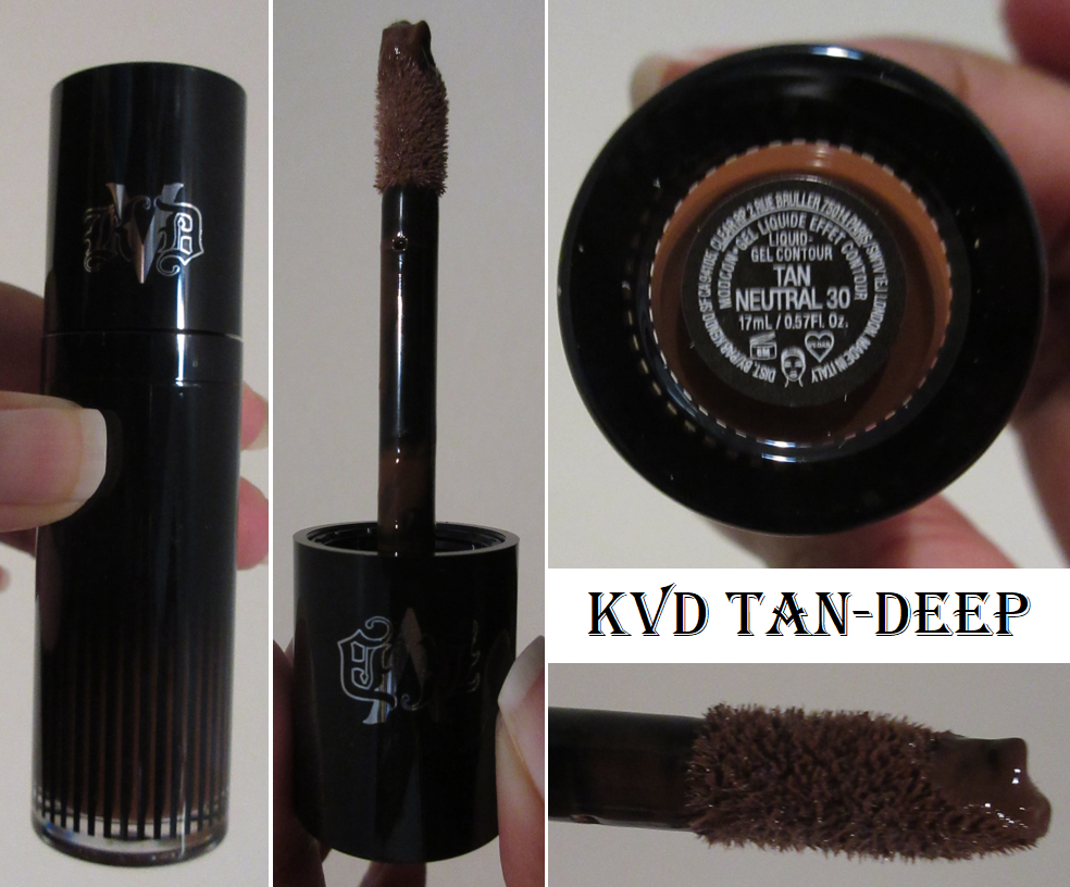
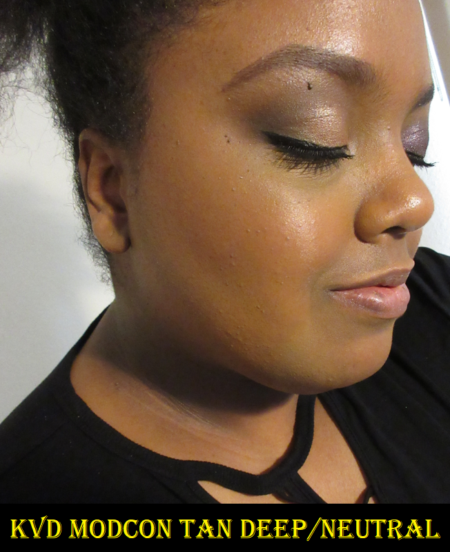
KVD Vegan Beauty ModCon Liquid-Gel Contour in Tan-Deep
I didn’t think this kind of product would work for me until I had such nice results from the Glossier Solar Paint bronzer. Then I started hearing more and more people speak highly about this product, so I was curious about it. This was part of the 30% off sale, so I figured I’d give it a try, even though I’m on a contour No-Buy with only Charlotte Tilbury and Pat Mcgrath as exceptions.
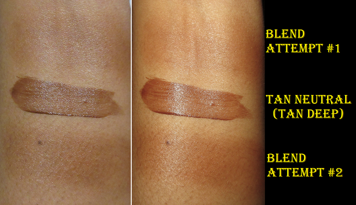
Also, I should address the fact that the labeling and everything says Tan Neutral 30, but names in promo images and on websites refers to this as Tan-Deep. They are the same product.
There is a learning curve to this product, which I wanted to show in my swatch photo how I still didn’t manage to get a smooth opaque blended swatch in the first attempt. Essentially, the issue is that this product doesn’t layer well and dries quickly. To get a pretty result, I have to work in one section at a time (one cheek, the other cheek, then the forehead) and make sure I apply enough product to the area. If I apply the right amount, it just takes about 5-10 stamps or swipes to blend it in seamlessly, depending on the brush. If I overapply the product, and therefore have to spend more time blending, spots will start setting while I’m continuing to manipulate the product and that causes it to become patchy. If I underapply the contour, and therefore have to add an additional layer, spots where there is more product from the first layer will be darker and dry unevenly like some liquid lipsticks do that don’t layer well. The KVD contour essentially has to be smoothed out fully and allowed to dry undisturbed in order to look great. When I nail it…I nail it! It looks amazing and is so quick! But when I mess up, I have to literally remove all my makeup in that spot and reapply my primer, foundation, and then try again. I thought I could get better at it over time, but I find myself just not wanting to reach for it and risk the hassle.
I have tried it with a sponge, which is not my usual go-to method. Because of that gel consistency, a damp sponge really lessens the pigmentation and I had to build up multiple layers. Even though I could add layers without the patchy issue, I lost that ability to be precise, so I ended up spending just as much time fixing it. The other issue is that the contour looks more like it’s sitting on top of my skin after using the sponge, wheres the brushes I’ve used let me really press it in, though I have to admit that I can get an even more skin-like finish with my cream contours and bronzers. I’ve used this KVD contour on top of both matte and dewy foundations and I still get random results that are either stellar or needs to be redone, so it may just be an incompatibility thing with my skin since I didn’t get on with the Colourpop Cheek Dew Serum blushes which were a gel formula too. Then again, a ton of people had a bad time with the original release of those serum blushes.
Some positives about this product is that I don’t have longevity issues with it and the color match is great for me. The neutral aspect gives it a slightly cool tone without looking unnatural against the warm undertone of my skin. The great experiences I have with the contour rank so high that I personally still like the product even though I admittedly seldom use it.
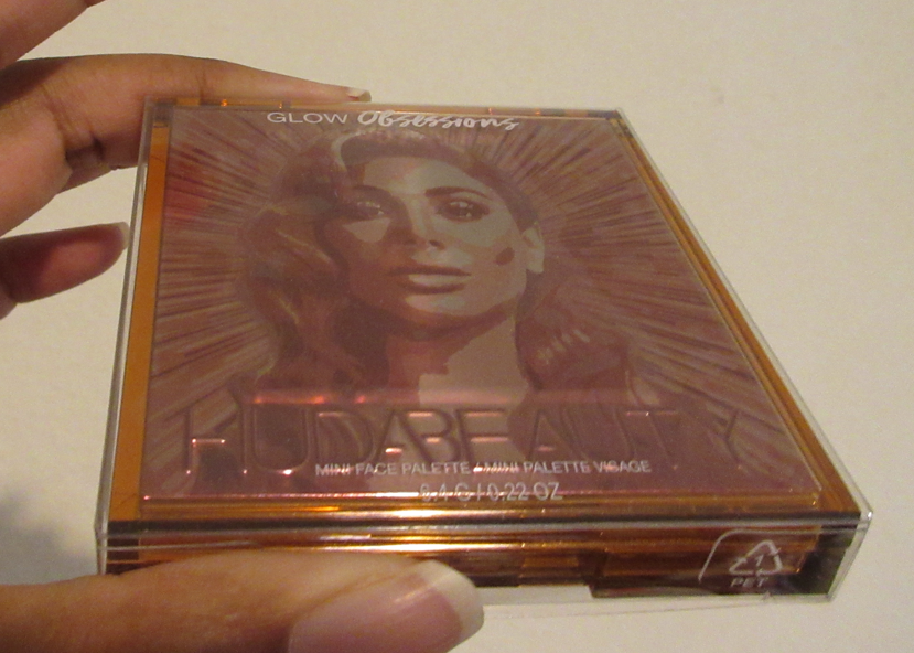
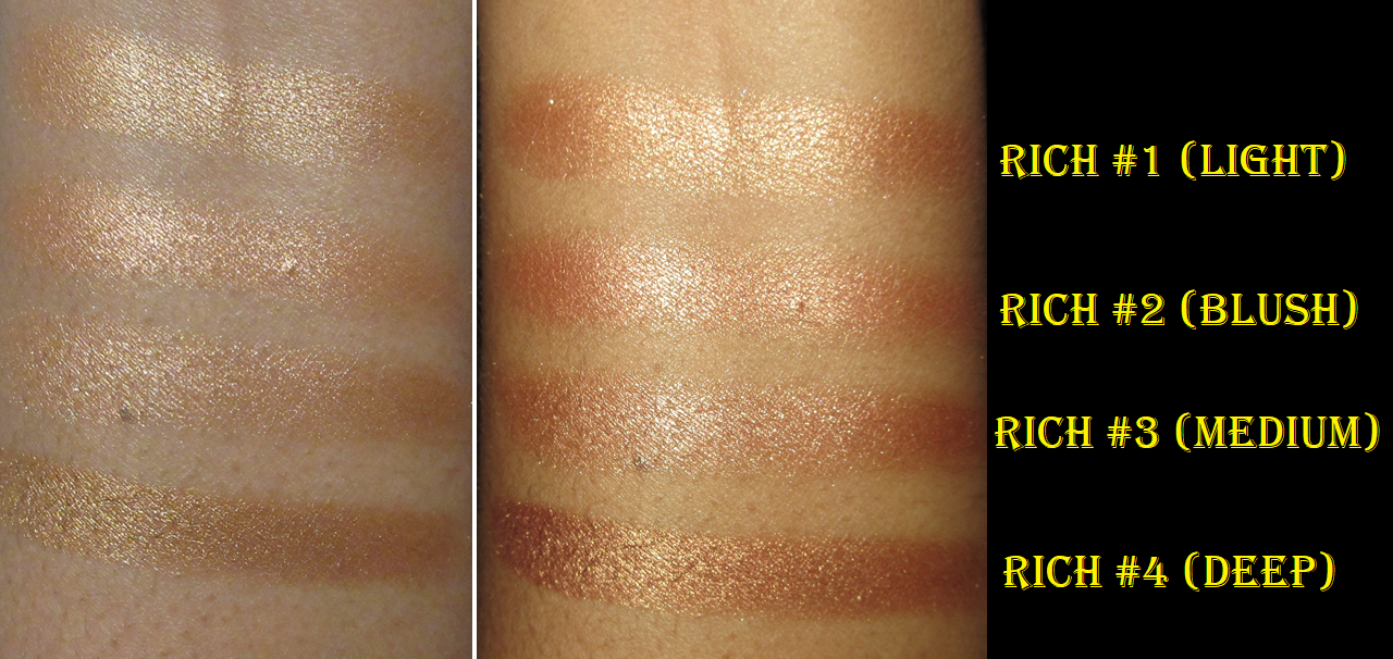
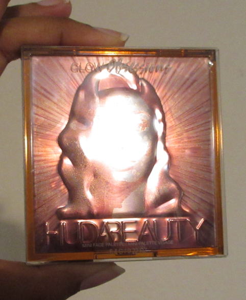
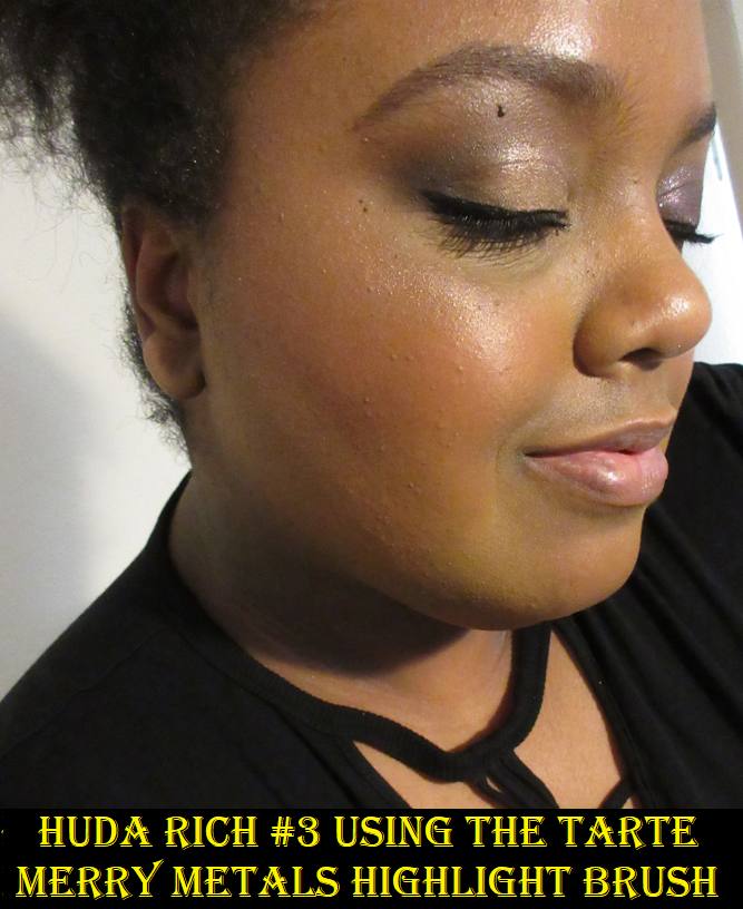
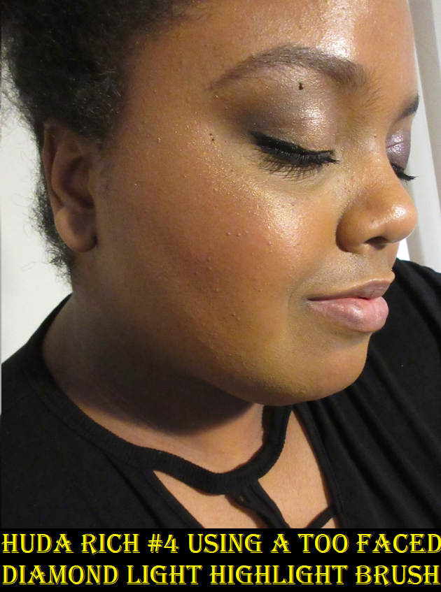
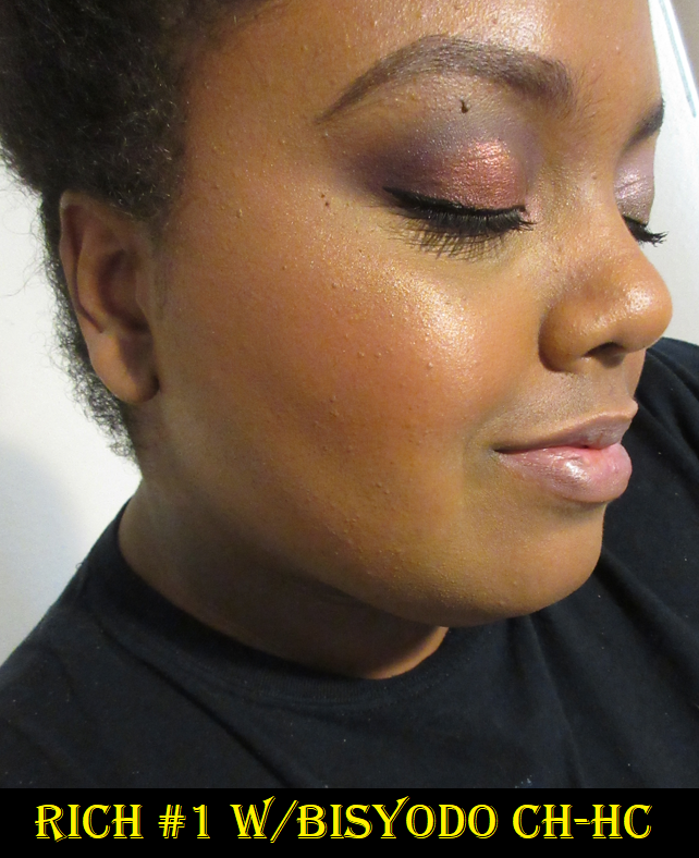
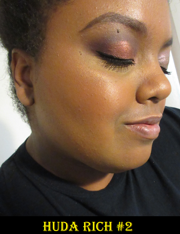
Huda Beauty Mini Glow Obsessions Highlighter Face Palette in Rich
I wanted this last year, but the outer packaging was so off-putting that I couldn’t bring myself to get it. I hoped seeing it in person would change my mind. Spoiler alert: it was even worse, especially after seeing how it looked on my camera from the very first shot I took head on. It’s like one of those internet cursed images!
All three quads went on sale at Sephora for $14 and technically this is a face palette, which is allowed for this brand according to my low-buy rules, so I went for it! I no longer have Rouge status, but with the FREESHIP code I was able to get free shipping, claim some point perks, have some samples, and pay for it with a gift card I redeemed from Swagbucks.
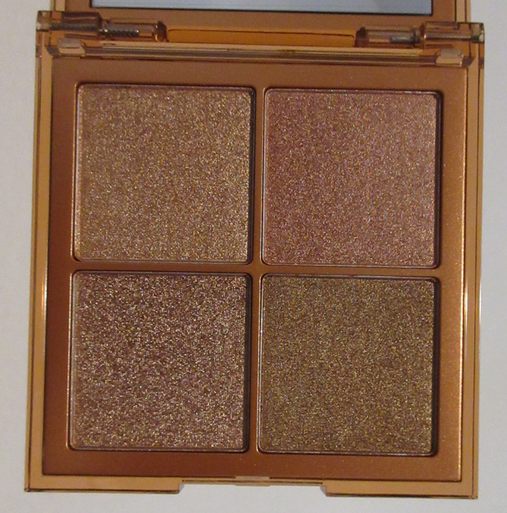
I’m glad I was able to get this for a deal because when swatched, these are pretty much the same shade! I literally started laughing out loud as I was swatching them on my arm because highlighters have the issue already of looking too similar on the face despite the tone differences and this one has the added disadvantage of being all coppers. #1 is a light copper, #2 is a pinkish copper, #3 is copper, and #4 is bronze-copper. They’re pretty but they are all the same, which wouldn’t be as disappointing if I hadn’t really wanted more of a real blush shade out of #2. Then again, I don’t think I would have worn any of these as blush or bronzer because of the metallic shimmer being way too strong for anything but highlighting. I basically look at this as having paid $14 for a single large highlighter, which isn’t a bad price.
The formula is quite thick and a little chunky. It reminds me of an eyeshadow, and a bit like the Glowlighters from Coloured Raine. This kind of highlighter requires a brush that can pick up just enough product to spread evenly, but lightly on the high points of the face if you don’t want a blinding look.
I retook these photos to show how Rich #1 can look more seamless and blended in the skin with the right brush, and how Rich #2 and #4 look in daytime lighting as opposed to nighttime when I took those two last time. In the daytime, it’s easier to see the slight pink tinge to the #2 highlighter.
Other than the similarities in colors and the slightly chunky texture, I think this is a beautiful product and I’m thrilled I bought it for this price. I also did a little craft project to make the packaging a bit more palatable for me.
CDJapan Haul
CDJapan had a points-in-exchange-for-reviews event on Chikuhodo and Koyudo brushes purchased from their website (and not other retailers). I was able to accumulate enough points from reviews, my already existing points, my quarterly bonus points, plus use a coupon, to be able to make another order for a really great deal. Since testing multiple brushes usually takes me several months and I like to review a decent number all at once, my review for them will be coming in a future post.*
*DISCLAIMER: I started working on this post in March. All of the brushes shown and all comments above were made prior to me becoming a CDJapan Affiliate. This particular post does not contain any affiliate links.
*
Whew! That was a lot, but we’ve reached the end! This is the first month that I feel I did very poorly with my low buy, but I’m determined to do better next month. Thank you for taking the time to read! If you like my content, be sure to click the follow button to be notified whenever I post, or you can bookmark this page and return for my weekly posts on Monday 11:30 am EST! If you’re new and would like to see my previous months, January is here and February is here.
I referred to the Beautopsy Palette as my “Star Product of 2021” in my 2021 Favorites post. What made it so special wasn’t just the customization factor of being able to tailor the eyeshadows. I loved that it was essentially a full face palette that I could use for blush, setting powder, contouring, etc. For those looking for an in-depth review on Beautopsy, please click here.
Monochromance has big shoes to fill. Today, I will share all the different ways I’ve tried to utilize this palette to its full potential. There are other items in the full Monochromance Collection, but I just stuck with the palette. Also, I purchased mine from Beautylish as it is no longer a Hindash website exclusive.
Non-Eyeshadow Eye Use
Shade-wise, I can use a mixture of Alter plus the middle spot between Match and Made to set my under eye concealer, but the effects don’t last as long or look as nice as a more traditional setting powder. This is quite the difference considering I get an almost blurred effect when I use Beautopsy’s Tan, Feel, and Paint for that purpose. I don’t have a natural brow shade in this, which I wouldn’t expect considering I only use dark-brown or nearly black shades for my brows. As for eyeliner, Made barely gives me enough depth to deepen the outer corner of my eyes so it would make for a poor eyeliner. My realistic liner options are Petal, Throb, Dote, and Inked.
Blushes
This is the main use I have for this palette. Petal and Throb are easily my favorites. I was surprised to see that Heavy still shows on my skin and doesn’t look ashy in my eyes. Heart is quite subtle but also pretty. I was the most curious to see how I could incorporate Anti, Dote, or some combination of those two with the other shades in order to create a slightly purple blush tone and even a mauve. Sometimes I’m successful at being able to pull off using a mix with the purple, but overall, I find that Dote is not easy to blend. In my experience, pigments using Manganese violet are difficult to formulate so that it blends well and smoothly on the skin. Dote has a tendency to stick in spots and look muddy when mixed with the other shades. It’s still prone to patchiness even when used alone. It’s a bit of a shame because it can look pretty sometimes, but it’s not a deal breaker regarding versatility of blush usage since I wouldn’t rock a purple cheek regularly anyway.
Contour and Bronzer
Hindash mentioned that Beautopsy wasn’t really created with bronzer purposes in mind, though I am able to get a nice reddish-bronze shade with it. When it comes to Monochromance, the overall color story leans cool, which means it’s not intended for bronzing either. I am able to use the shade Made for subtle contouring though. The middle ground between Match and Made actually creates the perfect contour color for me, even better than Feel and Real, but Match and Made aren’t as effortless to blend. They are fine on my eyes and under the cheekbones, but it sticks a bit on my nose which is the only place besides my eyelids that can get a little oily on my face. I wouldn’t even call it oil, rather dew, on my nose. So, if I have the time and patience to be willing to blend my contour, I reach for Monochromance, but most of the time I still dip back into Beautopsy.
Eyeshadows
Using Monochromance on my face is at least decent, but it’s nice at best. It doesn’t quite have the wow-factor, but I do like it. For use on the eyes though, it was incredibly frustrating the first few weeks! I should preface that I thought eyeshadow usage with Beautopsy wasn’t particularly special, so I bought Monochromance with the full intent to use it as mainly a face palette too. However, the performance on my eyes is terrible unless I use a fully dry primer. Using the MAC foundation stick or some kind of face product as primer worked extremely well with Beautopsy. It didn’t blend as well with my tried and true MAC Paint Pot, so I was prepared for that with this new palette. However, with Monochromance, both MAC products gave me creasing issues, issues with the shadows not appearing true to the pan color, patching off, sticking in places, difficulty blending, etc. I have never had an issue of a matte shadow creasing until this palette! Disappearing, sure, but creasing?
These examples are not even the worst of them, just the worst of what was left on my camera by the time I thought to include them in this post.
After trying other primers as well, I realized that I could only get decent results if I used a primer that fully dried down with no tackiness left behind. This means using something like the Anastasia Beverly Hills primer. I can also get away with using the Gerard Cosmetics Clean Canvas. Using a dry primer is the first step, but to get the shadows to apply pigmented on my lids and blend smoothly I have to put a layer of setting powder on top of that eye primer before applying the shadows. The downside is that my eyelids unsurprisingly do look dry, but since I would normally throw a shimmer shade on my lid, it would hide those issues.
As I mentioned before, Dote is the most difficult to work with on the eyes. Other than the lightest shades not showing up very well and my inability to get much depth from Made on my eyes, I don’t have as much of an issue creating eye looks with this palette as long as I use a drying primer that has been powder-set. While it’s true that these palettes from Hindash contain shadows that are hard pressed, it’s not an issue of being unable to get product onto my brushes. My favorite brush to use with this is the Sonia G Builder Pro, and I essentially dig into the palettes as though that brush is a chisel. I see how much product gets on the bristles; it’s just not as pigmented. The shades are softer colors overall, with the exception of Inked.
All the issues I had with Monochromance may be a “me” thing. My lids are oily, so perhaps that doesn’t mesh well with the formulation of these shades. The left halves of the pans lean pastel, which I also am prone to having issues with depending on the formula. What I can say though is that despite the website having both palettes listed as the exact same ingredients, there has to be a reason why Beautopsy still does not perform the same way as Monochromance. In that last eye photo above, I literally used Feel to cover up a bald spot left in the crease an hour after using Made there, and with Feel on top, it then remained covered for the rest of the day. Something is clearly different.
Beautopsy versus Monochromance Shade Comparisons
It’s obvious that Beautopsy has a more neutral color story and Monochromance is more colorful, but Tan Lines and Alter Ego essentially look the same on my eyes. Feel is neutral whereas Made is a more cool tone brown. The pinks in both palettes are essentially the same depth, but Beautopsy’s lean warmer than the Monochromance pinks.
I’ve been testing Monochromance for over a month, and I still can’t decide whether this palette is worth buying and/or worth the price. I like it, but if this left my collection today, I would only really miss the blushes. However, these wouldn’t even crack my top 20 favorite blushes and blush formulas, so it still wasn’t a necessary purchase other than to satisfy my curiosity on the quality and versatility this palette could provide.
If someone wants to know which one is worth getting, I would easily say Beautopsy. When it comes to recommending Monochromance though, I’m not quite sure.
Thank you for reading and I hope at the very least that my swatches, eye looks, and face application looks have been helpful.
I normally post reviews exclusively on Mondays, but this post is more of a show-and-tell. I consider it a bonus!
Clionadh Cosmetics Fruitlighter in Tropico
This highlighter, or fruitlighter as it is cutely called, is part of the collaboration Dragon Fruit Collection between Clionadh Cosmetics and Emily Violet Marie. Although I’m not following Emily on any social media, I have seen some of her videos discussing Clionadh products and I think it’s fantastic that the brand liked the concept she came up with long ago and decided to work with her. The entire collection is fun and summery, but I’m on a low-buy and a bit of a neutral phase, so I decided I would just get the two most unique items: the Fruitlighters. Unfortunately, the shade Pitaya sold out as I was checking out, but I still managed to get Tropico. I don’t think I can pull off duochrome and multichrome highlighters on my face, but I plan to use Tropico exclusively on my eyes.
I am very happy with this purchase and I know I will get some use out of it because I transferred it from the compact to my custom magnetic palette with my other Clionadh multichromes. When I was swatching Tropico, I observed the pan spin around and I figured out that it wasn’t glued in the compact, just stuck there via a magnetic bottom. So, I’m able to lift it out (gently with a thin object) and put it anywhere I want.
Tropico is in the palette on the bottom right.
In terms of longevity, I have no issues using Tropico on my eyes, nor the cheeks. It lasts all day wherever I put it. Clionadh highlighters in general are a bit glittery, which is why I prefer using them as eyeshadows, if it all. Part of why I was drawn to this shade, as can be seen in the swatch video, is that at a sharp angle you can get a partial rainbow colored shift of yellow, green, blue, and purple. I cannot recreate that effect indoors on my eyes, but it’s gorgeous all the same.
Clionadh Cosmetics Britt’s Birthday Trilogy Eyeshadow Trio Set
Leigh (aka Britt) and Maggie are the two Founders of Clionadh, and it was for Leigh’s birthday that this eyeshadow trio was created. I really wanted the green shade, and when I read that Nightmare was similar to Gum Tree (one of my favorite Clionadh shadows), I planned on purchasing the set whenever I had a bigger order to make. Somehow, I missed the part about Nightmare also having a similar vibe to BrittBritt, another shade that I also already own. So, the reason I haven’t swatched it with the others above is because I decided I won’t be keeping this shade.
The main differences between the three is that BrittBritt is a little more on the bronze and plummy side, Gum Tree is closer to a gunmetal dark-grey, and Nightmare is essentially just like Gum Tree but much darker in tone. So, I gave an example below of what Nightmare could potentially look like by combining the shadow Koala as a base, which is a dark grey-black, and putting Gum Tree on top. BrittBritt, Gum Tree, and Koala are all discontinued eyeshadows that were sold to contribute to various charities. If I did not already have all of those, I would have happily kept Nightmare. This Birthday Set is still limited edition, so it won’t be around forever!
It’s very important for me to not just keep makeup for the sake of keeping them. I really want to ensure I get more use out of my products, which is why I made the decision to just keep the Clionadh products I will actually use. I’ve barely made dents in my shadows despite how often I’ve used them because a little goes such a long way and I’ve calculated that even if I used a different shade every day, between the Stained Glass Collection and Clionadh’s standard shadows, I’d only be able to use them 5 times at most per year.
Below are the comparisons to the darkest greens and deepest reds in my collection with the new shades. One thing that really stands out with Mythology is that it has a lot more sparkle to it than the other greens. As for Bratty, it’s different enough from the others to want to keep, but between the reds and pinks I do have, it’s part of the reason I opted out of the Dragon Fruit palette. I do have a lot of those kinds of shades.
Per usual with Clionadh, these shadows remain opaque and pigmented on my eyes all day.
That’s everything! Thank you so much for reading! If you’d like to check out more of my Clionadh reviews and other indie brands, I have several of them categorized alphabetically here.
-Lili ❤
*DISCLOSURE: All products in this post were purchased by me with my own money.Non-highlighted links in bold blue font (Example) are non-affiliate links that will not generate commission. Links marked in bold black font with a light blue background (Example) are affiliate links. Affiliate links allow me to get a commission if purchases are made directly using my links.There are no affiliate links in this post.
When I purchased the Nars Basic Instincts Cheek Quad II at the end of July 2021 and two single blushes on Black Friday, it was because I wanted to get a good sense of what Nars blushes could do. I wanted to experience them for the first time. As I went through my blush drawer to prepare for this post, I realized I had several more blushes from Nars that I completely forgot about (and I bought one more product after I was supposed to be finished with this review)! Despite owning their blushes as far back as 2016, I still had no sense of how I felt about them beyond the experience being positive. It was high time that I analyzed all of these further to officially decide where I rate Nars blushes within my own collection.
Nars Basic Instincts II Cheek Quad
This palette was a limited edition Ulta exclusive (now only available at the Nars website), that came in two different versions comprising of Nars’ bestselling shades. The biggest selling point for me was getting my hands on Taj Mahal, one of the beauty industry’s most famous orange blushes, and Exhibit A which I completely forgot I already owned. Ulta was offering a free 3-piece gift with $30 Nars purchase at the time, and I had a 20% off code as well, so I was able to get everything in the top left photo for just $33 (tax included). I felt this was an amazing deal, considering each pan is nearly the size of a full size blush and Nars blushes cost $30 each. I just needed to like one blush for this purchase to be worth it.
I should preface that I currently like shimmer blushes thanks to formulations from MAC which showed me that they could be done in a way that don’t look like I used a colored highlighter or shimmery eyeshadow as blush on my cheeks. They could add a beautiful luminosity to the skin without making too much of a statement. Prior to this lesson, I hated shimmer blushes. Unfortunately, some of the shades in this quad brought me right back to that feeling of remembering why I steered clear of shimmery blushes for so long.
Taj Mahal is a gorgeous color in the pan, but I don’t think it suits me. It may as well be an orange highlighter, and that was quite disappointing to discover because of how much Charlotte Holdcroft raved about how it’s supposed to look bronze-orange on the skin or “tan skin with a touch of orange.” To be fair, it did look that way on her. On me, whatever brown tones are in this are camouflaged against my skin tone and all I get is the golden orange shimmer on my cheek. It doesn’t matter what brush I use, the photo above depicts the result I get every time.
It looks slightly nicer if I carry my bronzer higher up so that it’s partly on my cheeks as well, and not just in the 3-shape on my face, but the shimmer is still too metallic and reflective when it’s in direct light. Blush has always been something that I want to look natural, like I’m actually blushing, but that type of shimmer is a dead giveaway.
This is my same issue with the shade Savage, although I really like the tones of that one. It’s like a warm brownish red or dark copper similar to Kiss of Rose from bareMinerals. It would be perfect if the shimmer wasn’t so metallic looking. It’s at least not as bad as the blush shades of Coloured Raine’s Glowlighters, but still not my preference. Even when I’ve used this as a blush topper, it’s too much like a highlighter for my taste. If I want to wear a shade like this, I’ll put on Kiss of Rose or Faux Sure from MAC.
Torrid surprised me in the best way. For starters, it’s just like MAC blushes where they look far lighter in the pan, but when they’re applied to the skin it looks deeper and actually works for me. I do have to build Torrid up in order for it to be seen, but the shimmer level in this one is far less than Savage and Taj Mahal. I love how this one looks.
As for Exhibit A, it looks a bit rough in the photo, but that’s because I forgot to reapply my foundation between wiping off the previous shade and applying this new one. It’s very pretty. Although it looks extremely intimidating in the pan, it can be sheered out to give a light flush to the skin. While it’s true that the other Exhibit A in my collection is very old, which should make having this one a good thing, I feel that I already have my go-to statement red blush out of the Hindash Beautopsy Palette. The shade Kills gives me Exhibit A vibes and is very similar, though it’s a slightly stronger red. Exhibit A leans a touch on the orange side, but considering the Love shade from Beautopsy also leans orange, I feel I have my bases covered in being able to absolutely dupe out Exhibit A. So it’s still a redundant shade for me to have in this Nars blush quad.
Had I known then what I know now, even at my great deal, I would have skipped out on getting this quad. Since I have it, I do want to continue using the shade Torrid, but I am notoriously bad at reaching for blushes that are in any form other than singles, so we will see how well that goes. Or, perhaps, I will find a new home for this quad. It’s definitely not a bad product in terms of quality, but one has to like statement blushes as well as this type of shimmer at this level of intensity.
Additionally, part of my biggest issue with the shimmer in Nars blushes is that some of them emphasize texture. Any bumps I have on my skin become a lot more noticeable. I would semi expect that from a highlighter, but I definitely don’t want that quality in my blushes.
Nars Narsissist Unfiltered I Cheek Palette in Watch Me, Me First, Takeover, Out There, Chic, and Exhibit A
This palette, along with the lighter Unfiltered II version, was released at the end of 2016, though it was intended to be a Spring 2017 launch. I recall reading online that some people were able to get the palette before launch if they went in-store and asked for it specifically. It was also around the time that Sephora used to have X amount of dollars off a $50 purchase, so I was lucky enough to have paid after tax like $38 for this (I think it was $25 off for Rouge).
The first three shades on the top row are all highlighter shades for me. At the time, Watch Me was even too light for me to use, or at least I was into more subtle highlighters closer to my skin tone. For that reason, I mostly stuck to using Takeover as a highlighter or mixing it with Watch Me if I didn’t reach for a different highlighter altogether. As for Me First, I didn’t use it more than once.
I admittedly hardly used Chic or Exhibit A. Chic was similar to Out There, which I loved, but it was cooler toned so I never reached for it over Out There. As for Exhibit A, I’m pretty sure I was searching for the right brush to give me a sheer enough application for my tastes back then (which was very much about no-makeup makeup) but I stopped using the palette altogether by the time I eventually got brushes to work with it.
By right, this palette is so old that it should be part of my retired makeup shelf, but I decided to go ahead and demonstrate what Out There looks like on my cheeks. This shade used to be what I considered my perfect and favorite blush color. I wanted to try it again for nostalgia reasons as I wholeheartedly regret that I didn’t get more use out of this palette. As much as I loved that shade, at some point I reorganized my collection and this palette became physically hard to reach, and the outer mirrored lid on top made me not want to move it around as much for fear of breaking it. It eventually got buried under other blushes and forgotten about completely. Part of me still wants to make up for lost time, but I have brand new Nars blushes to dig into, so I won’t.
Nars Blushes in Liberté, Amour, Orgasm X, and Goulue
I have Liberte and Amour in the full sizes, purchased during a $19 per blush Black Friday Deal on Nars’ website. I purchased the mini of Orgasm X in April 2021 during the VIB sale. As for Goulue, the shade was originally released in 2013, but became a Sephora exclusive shade in 2016. This particular mini was the Sephora 2016 Rouge gift, so it’s “only” between five and six years old. I decided to demonstrate this shade as well, since I always assumed it wouldn’t work for me so I didn’t do anything with it other than swatching. It does faintly show up, like the shade Plum Foolery from MAC. I wish I had given it more of a chance in the past, but at least I have a newer dupe, so this will be decluttered.
I owned at least three free gift with purchase minis of the original Orgasm blush, but I always give them away because it’s essentially a highlighter shade for my skin tone. Orgasm X doesn’t show the strongest on me either, but I can at least wear it as a blush if I want. My first few uses with this mini had a very shimmery top layer, so I did not like how it looked on my cheeks. Using it now still shows as shimmery on my cheeks, but it’s on that borderline of me liking it and having it be too much. Despite taking it on my trip with me in order to use it more and figure it out, I still haven’t decided how I feel about it. Not being able to decide is kind of a decision in itself because if it’s not a blush I can quickly say I like, then I know I won’t use it.
And unfortunately, another blush I probably won’t be using is Amour. It looked much deeper in product photos. While it does go on my skin darker than it looks inside the compact, it’s still a touch too light for me. It’s a shame because it’s one of the few matte formulas from Nars that I have, but I’d rather give my attention to Liberte.
Liberte was my saving grace for this post, prior to me buying the High Profile Cheek Palette, because it’s not too old in my collection nor too shimmery. Nars lists this as part of their “Sheer” formula, but I get a decent amount of pigment from this. I do consider it still buildable though. There are visible shimmer particles in the compact, but it does not look shimmery on the skin.
Nars High Profile Cheek Palette
Out of all the blushes that are still usable in my Nars collection, Torrid and Liberte are my favorites. My inner makeup goblin wanted me to look into the other non-shimmer Nars blushes, but as nice as they appear, I still prefer my MAC blushes over these. So, I said to myself that unless Nars releases a palette of some kind that has mostly matte blushes, I should be all set and will be able to stop buying them. Then I saw a deal on Mercari for the High Profile palette which was a limited edition release for Holiday 2021 that had only been swatched and I just couldn’t pass it up. I originally wanted that palette when it was first released, but reviews about the shades being nearly identical on the cheeks deterred me. However, I bought it for only slightly more than the price of a single blush, so I figured that was worth looking into, especially since I wasn’t satisfied with how uncertain I felt about Nars Blushes by the time I thought I had finished this review.
The blushes in this palette are gel-powder, which I was curious to try from Nars, with a satin-luminous finish. This type of sheen is more my style than the shimmer formula. The only issue is that I can’t use most of my favorite blush brushes with this because of this kind of formula which requires a more resilient bristle in order to pick up the product. So, my favorite with this particular formula is the Chikuhodo FO-2 because it fits well with the size dimensions of the pans and picks up a decent amount of product that allows me to still control in building up the color. For instance, Hit It Off is a little more sheer than the others and Showdown is quite light, so I need multiple swirls in the pan to have the opacity level I want of them on my cheeks. However, Just Lust is very pigmented and I just need 1 or 2 taps to get enough product of that per cheek with this brush. So, I can apply these quickly and smoothly enough without feeling the need to swap to a different brush for each different shade.
*DISCLAIMER: Unhighlighted links in bold blue font (Example) are non-affiliate links that will not generate commission. The vast majority of links on this blog are traditional non-affiliate ones. The link marked in bold black font with a light blue background (Example) is an affiliate link, which means I would get a commission if purchases are made directly using that link. I appreciate everyone taking the time to read my blog. To those who choose to make a purchase on CDJapan’s website via my links, thank you for the extra support!Now, back to the review!
The batch of photos I took wearing Spin Off didn’t turn out well and that shade is too subtle for my camera anyway as it’s barely noticeable on my cheeks in person. There’s a bit too much brown in that shade for my skin tone but I’m sure it would look pretty on others.
I could have built up High Demand, Showdown, and Just Lust even more, but I liked their levels in the photo. Despite High Demand looking to be the same depth as the very pigmented Just Lust, it’s not as intense of a blush color. They look similar in swatches, but High Demand is a brown-red whereas Just Lust is more of a berry shade. Showdown is more apparent on the skin in person, but I do like to mix it (mainly on the apples) with Hit it Off (mainly towards the back) to get a little more depth from that deep pink-coral with a brighter coral pop towards the front.
Nude Revue is more sparkly than my taste in highlighter, but the tone fits me so well that I could still picture myself using it occasionally. I’m very pleased that technically all these blushes work for me! Everything I said earlier still holds true though. I prefer MAC’s blush formulas overs Nars’. From within their own brand, I prefer Nars’ mattes over their satins but I like satins more than the shimmers. I’m going to steer clear of the shimmers, but if Nars releases another blush palette of mostly mattes and/or satins, I could be tempted to buy them, especially if the packaging is pretty. However, I would like this to be where my exploration of Nars blushes and highlighters end. I will try my best to get use out of what I currently have, and everything else from Nars I’m still interested in because they usually make products that work really well on my face!
I buy products from MAC fairly often, but I like to review multiple purchases at once, rather than doing them individually. Today’s post is a review of all the latest additions to my ever growing collection of makeup from MAC Cosmetics.
MAC Extra Dimension X4: Surrounded By The Stars Skinfinish Palette
This item is part of MAC’s Magnificent Moon Collection that I purchased online from Selfridges containing an existing Extra Dimension Highlighter (Oh, Darling), two existing Extra Dimension Blushes (Hushed Tone and Hard to Get), and one new Extra Dimension Skinfinish Blush/Highlighter in the shade Surrounded By Stars, which is also the name of this face quad. This release was in celebration of Ramadan and EID, which I admittedly don’t know anything about aside from them being an important time in the Islamic religion. By this point, it seems this collection will not be released in the US. As a lover of celestial imagery and MAC’s Extra Dimension Skinfinish formulas, I couldn’t pass this up like I did with the MAC Mosaic Masterpiece Collection from 2020 that I hoped would come to the US, but it never did.
I already own Hushed Tone, but the other products are new to me. Hushed Tone was my favorite Extra Dimension Blush shade from MAC for a while, but it’s on the lighter side of medium which means it is harder to see on my skin. If I build it up too much, the shimmer particles become too apparent for my taste, which is why I usually reserve this blush for the winter time when I am at my lightest. Faux Sure replaced Hushed Tone as my favorite because it has just as pretty of a sheen but is on the medium-dark spectrum, so it shows better on me. Oh, Darling is a bit light for me and Surrounded by Stars only works for me as a highlighter, so I prefer to combine those two products. Surrounded by Stars can look a bit subtle because of the tone of it, so adding the tiniest amount of Oh Darling gives it that extra pop at the highest points of my face. As for Hard to Get, the only reason I don’t already have a single of that shade is because I knew it was darker than I like to wear for blush. It doesn’t look too dark in my photo since I applied such a sheer layer, but I can literally use it as a shimmery sculpting blush if I want. In fact, when I reach for this palette, I like to put Hard to Get just above where I would contour and have it be a deeper gradient going into Hushed Tone.
I forgot to mention that in the last photo above, Surround By Stars with Oh Darling are both on top of the Suqqu blush.
It was only around six months ago that MAC released a similar product as part of the MAC x Rosalia Aute Cuture collection. Those were more of the highlighter formula whereas these are the softer to the touch blush formula, which I prefer. I’m quite pleased with the fact that I can find a use for all these shades, though I am more lightly to reach for my single products over this full palette. This is especially because I have a difficult time using limited edition products and ruining the embossing on the pans. I am happy to have this anyway.
MAC Wild Cherry Glow Play Blush in Peaches ‘N’ Dreams
I reviewed the HD Cherry Tree Blush previously, but I used my points at Ulta to get this shade. It’s not very pigmented, so it takes a ton of building up to get it to show on my cheeks, though my camera still had a hard time picking it up. It looks quite orange in the compact, but it translates to a true peach on the cheeks. I do like this shade and just like all the other Glow Play blushes, the blend is beautiful and the blush lasts as long as I need it to on my cheeks.
I couldn’t decide which photo shows the blush better so I just put them both here. It may depend on the viewer’s device settings and screen brightness.
MAC Macstack Mascara (Mini with the Superstack Mega Brush)
I bought this with my Ulta Reward Points as well. I purchased the version with the Superstack Mega Brush which is supposed to be better suited for those with longer lashes naturally and/or for everyone to use on the upper lashes. There is also a Superstack Micro Brush for those with naturally shorter lashes or for those who just want a smaller brush to get at the lower lashes.
I applied a thick line for my eyeliner, which makes it difficult to see my eyelashes, but I do have decent length to them. It’s just not as visible without the lift that a good mascara provides. My lower lashes are quite fine though, so I typically have an issue applying mascara there (except with a select few favorites), but I still went for the mini size of the Mega brush mascara.
I cannot deny that I can achieve a false lash effect with this mascara. I don’t have issues with smudging and it’s also fairly easy to remove the mascara. However, the more layers are added the more it’s prone to clump despite being marketed as, “… a continuously buildable mascara that stacks on infinite layers of volume and length.” Even if I keep passing over the lashes repeatedly without dipping back into the tube (so still within the first coat) it will start to clump if I keep at it for too long. After using it a few times, I wondered if it was because it starts trying to dry. The formula is supposed to allow the user to build up multiple coats, even on fully dry lashes, so the dried lashes do soften back up, but then it just builds on top of the clumps rather than smoothing them out. So, the most clump-free tactic I have is to skip wiggling the applicator side to side like I usually do to build up volume with other mascaras. Instead, I try building up the first coat using straight upward strokes for about 30 seconds to a minute before dipping the wand back in the tube (even if there’s still product on the wand) just to get a fresh wet coat and continue building it up, just stopping short of it starting to get that first clump. I then use the tip end of the applicator to smooth that clump back off (since it’s easier to fix one spot rather than multiple spots in multiple sections of the lash) and then leave the mascara alone. Another method is to repeat that step of building up a layer in the first minute, stopping to let it dry, then building up a second later but only in a minimal amount of strokes (5 to 15) in order to stop before the clumping begins.
The only time I had an issue with flaking was in the beginning when I had drier layers and clumped layers. Considering how much I dislike spidery lashes or clumps because it makes my lashes look like they’re suffering from split ends, I’m a little torn on my feelings about this mascara. I love the effect it gives in the end when I get it right, but it’s a little more finicky than my tried and true favorites, so it’s not always worth the effort for how quickly I need to do my makeup sometimes. I do like it, but I will not be buying the full size at full price. I could possibly see myself buying it at half price after my mascara no-buy is over (which I technically already broke for this).
That’s everything for today! Thank you as always for taking the time to read… or if you’re new here, welcome!