
It’s that time of year again! The holiday makeup launches have started rolling out and this is the first of them that I’ve purchased! Let’s get right into the review, and I’ll save my overall thoughts, suggestions, and discuss my ordering experience towards the end.
*DISCLOSURE: Non-highlighted links in bold blue font (Example) are standard non-affiliate links. Links marked in bold black font with a light blue background (Example) are affiliate links. Affiliate links allow me to get a commission if purchases are made directly using my link. The only affiliate links in this post are brush related. I have no ties to Hourglass. All products were purchased by me and my opinions are my own.
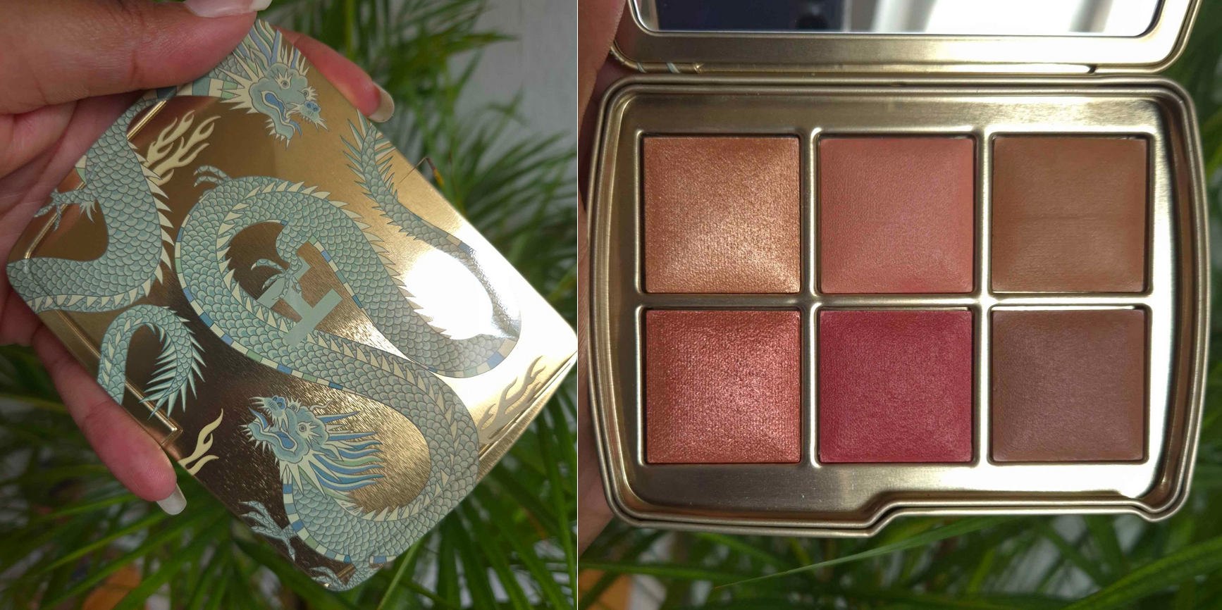
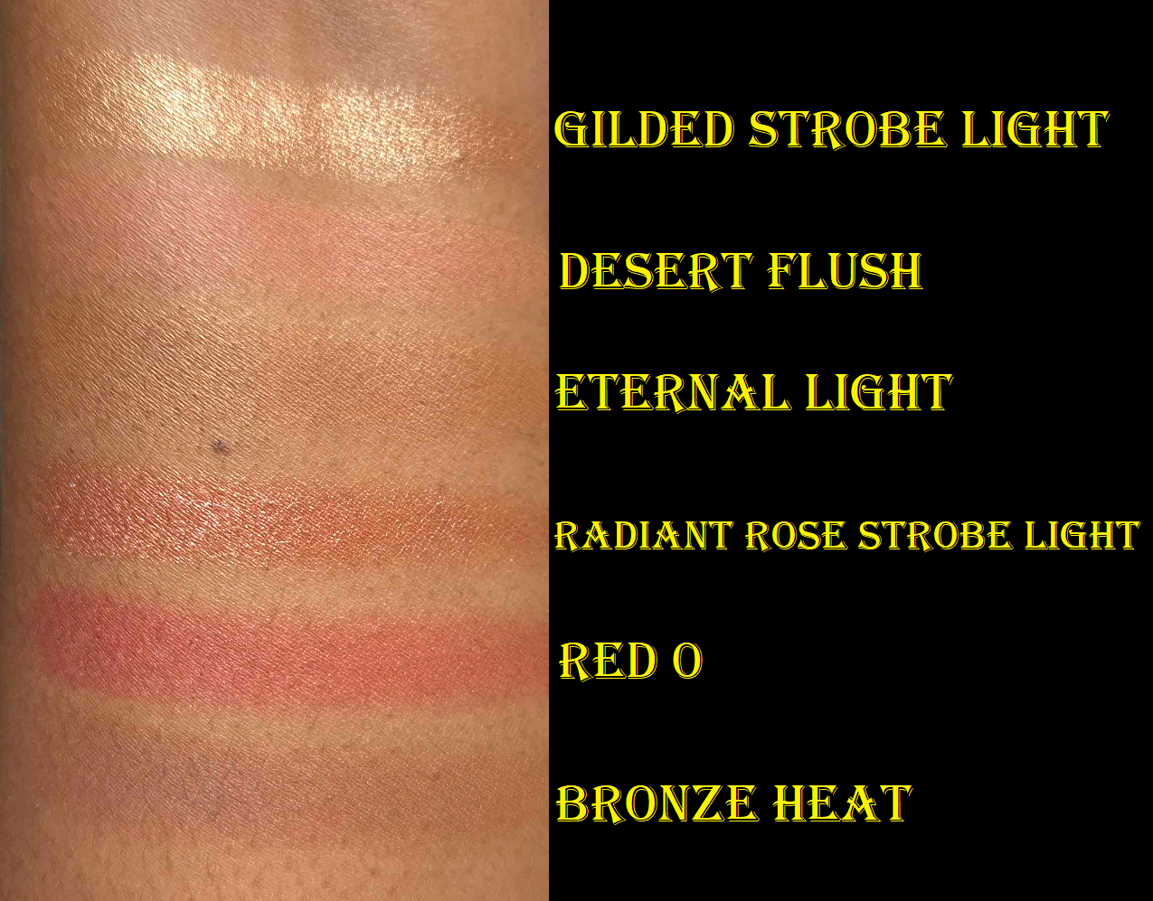
WHAT WE GET
Hourglass Ambient Lighting Edit – Unlocked – Lotus Palette (in Dragon Packaging)
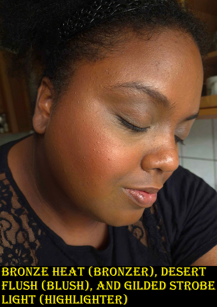
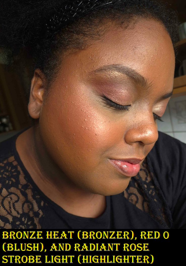
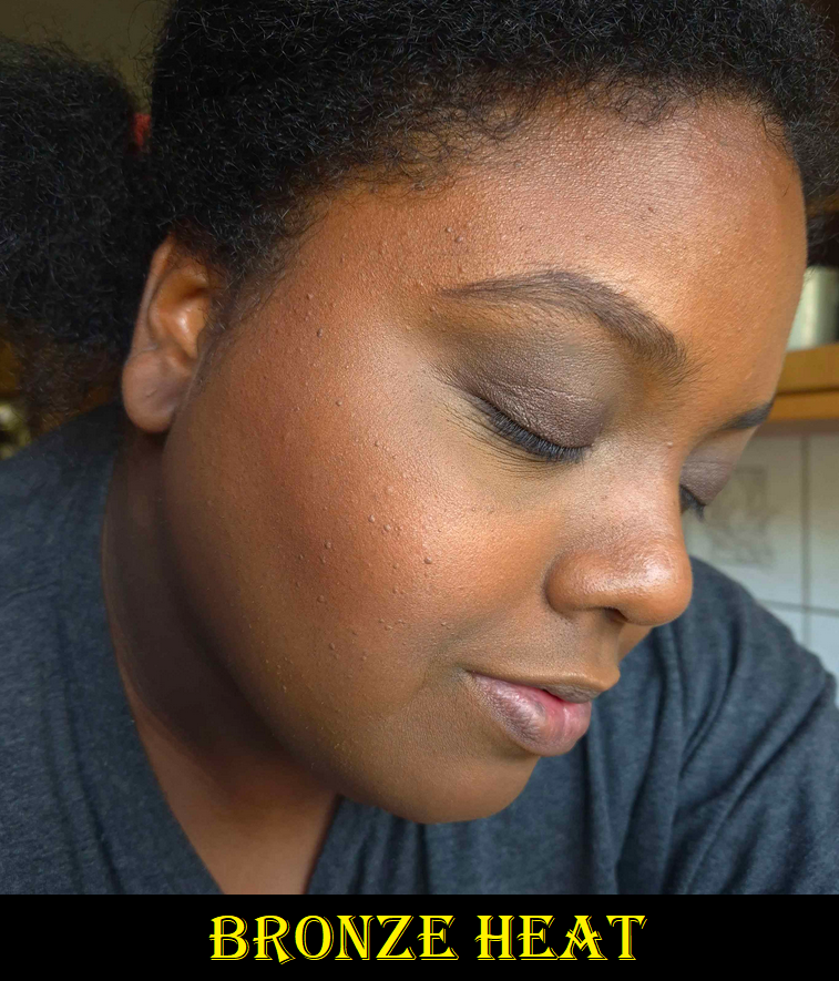
I am including some demonstration photos. In the photos with the black shirt, I’m wearing the Huda Beauty Easy Blur Foundation in shade 440 G Cinnamon. I used Eternal Light to set the concealer under my eyes. In the photos with the dark gray shirt, I’m wearing the Hourglass Ambient Soft Glow Foundation in Shade 14. In these pictures, I’m wearing Eternal Light all over the face, so the pictures with the blush (and no highlighter added) still look a bit highlighted due to the use of that finishing powder.
I’ve gotten a little darker this summer, so I wanted to show how the products look on different foundations and with lighting coming in from different times of the day.
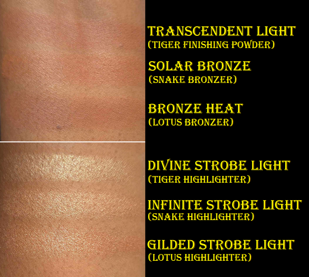
GILDED STROBE LIGHT – Hooray! Hurrah! Finally, the right highlighter color for me from Hourglass! I had said that Divine Strobe Light from the Tiger palette was “perfect,” but I don’t wear that depth of highlighter anymore, and prefer for it to basically be a shimmery version of my skin tone. Prismatic Strobe Light from the Volume III trio was too dark, so I’ve been hoping for the brand to release something in-between. I’m so glad that day is finally here! That being said, this strobe line is beautifully reflective, but it enhances texture more than I’d like. The powder is ultra smooth with fine shimmer, but the shine effect can be a bit much for me if I’m not careful and over apply. However, I’m still happy to have this. I have ways to tone down highlighters and I could always just use it to bump up the intensity of other highlighters if I want.
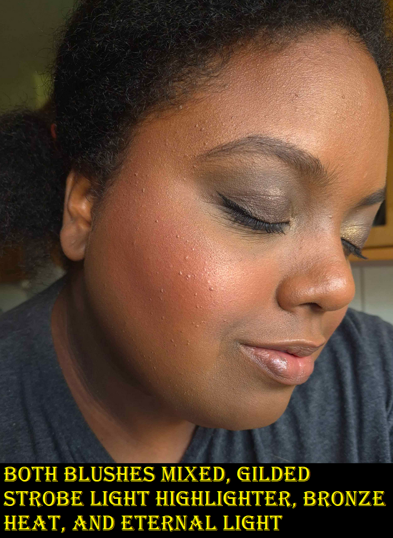
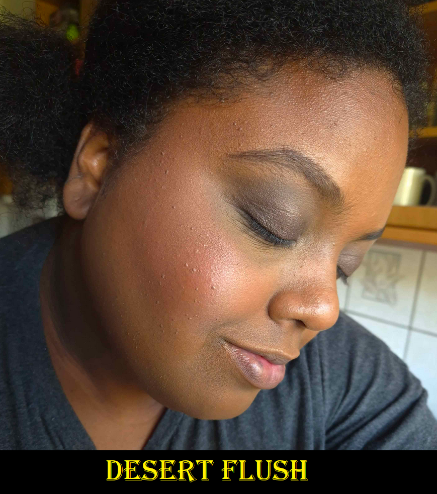
DESERT FLUSH – A dark medium muted option! Hurray! Thank goodness this blush is one solid color combining “deep beige” with “peach”, because this is already on the cusp of what should be included in this palette in terms of depth (not in terms of color because a peach was absolutely needed in the line). It’s a buildable shade that shows up on me, but I have to use my dense brushes to pack on the color so I can wear it on its own. One such brush is the Sonia G Cheek Pro. In winter-spring, this color should be easier to wear. In any case, I find this shade useful to tone down or pair with Red 0. I am sometimes in the mood for a light blush, but this is pushing the limits of what I’d feel comfortable wearing in public by itself. I foresee myself combining this with other blushes from other brands.
ETERNAL LIGHT – I’m going to repeat what I said about Eternal Light from a previous review. This finishing powder is a golden brown color that matches my face perfectly! It gives a subtle luminous sheen, but also has a few flecks of gold glitter throughout. The difference this time, in the Lotus Palette, is that the larger gold specks seem to be way smaller than they are in the Volume III trio palette. In the past, the specks forced me to use it as either a mixer shade with bronzer or as a barely there highlighter. I’m thrilled I can actually use this shade as a setting powder now! I don’t know if it’s just my palette, or if all Eternal Light shades are now made with more refined shimmer.
As mentioned earlier, I set the concealer under my eyes with Eternal Light in the photos with the black lace shirt, and used it all over my face in the photos with the dark grey shirt. The matte blushes can look a bit flat on my dry skin, but using the finishing powder all over imparts some glow and makes them look more flattering.
RADIANT ROSE STROBE LIGHT – I normally don’t like pink highlighters, but this is actually pretty! It pairs so beautifully with the Red 0 blush. When used sparingly, this looks a bit gold too (or at least golden copper). I had to actually build up the color in my face demo photo for the rose tone to be clearly visible, which of course increased the emphasis on texture. Contrary to how it appears in my photos below, the reflectivity of this shade isn’t as strong as Gilded Strobe Light when used in smaller amounts. I like that part about it.
I used all the shades from the palette on my eyes in this photo above.
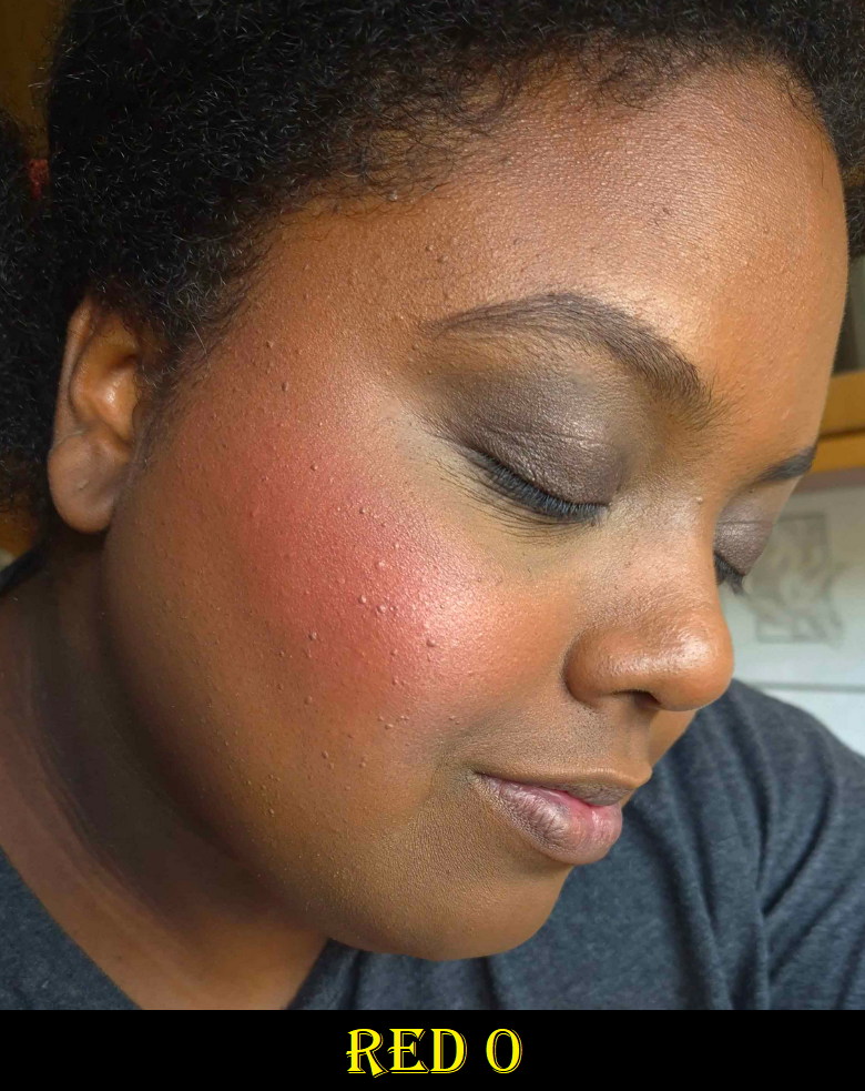
RED 0 – I’m honestly shocked that this shade is in this palette because Red 0 is such a special color for Hourglass. It’s their “exclusive pigment replacement for carmine.” They’d been working on the formulation of this color for years, first introducing it in their lipsticks. I would have expected them to pull the same stunt as Butterfly and put it in Dragon, but they didn’t. I give major kudos for that.
The description calls this a brick red, but I don’t agree. It’s a deep reddish/pink or deep rose. How it appears on my skin can be affected by my undertone, but it doesn’t look brick red in color when eyeballing it in the palette either. This shade is ultra pigmented, and I have to use a light hand and airy brushes to wear it subtly, the way I prefer. For example, with the Chikuhodo REN-7. I also want to note, regarding the color, that this is quite similar to a lot of blushes I’ve gotten recently (Chanel’s Deep Rose from the trio and Guerlain’s Deep Nude), but the tone is the slightest bit different. It makes me like it that tiniest bit more.
Of all the shades in this palette, I think this has the most potential to be added to the permanent blush line. If they do, I’d recommend swatching it in stores because it wouldn’t surprise me if they alter it to make it less pigmented, so that it’s easier for a wider range of people to be able to wear it. It’s already intense on me if I use even an airy goat brush and apply two light layers instead of a single one with squirrel or fox.
BRONZE HEAT – This is the darkest bronzer created by Hourglass thus far. It’s slightly darker than the Transcendent Light finishing powder, but it’s more of an undertone difference than depth difference. Transcendent Light looks deep brown – pink on me. Bronze Heat is neutral brown with a splash of red. Even though I prefer yellow/golden bronzers, I think Bronze Heat still looks good. I’ve gotten some sun this summer though, so the tones in my face have some red to it right now, which is probably helping it to match. I’m curious to see if I’ll still like it when I’m back to my normal skin tone. Solar Bronze, though lighter, is still my favorite bronzer from Hourglass so far. I’d love a deeper version though. In general, I’d still love to see a truly rich bronzer option, but the tweak to this year’s color is enough that people I follow that are a little darker than me that couldn’t wear last year’s bronzer have reported being able to use this year’s. So, even a small change made a difference. I can’t discredit that.
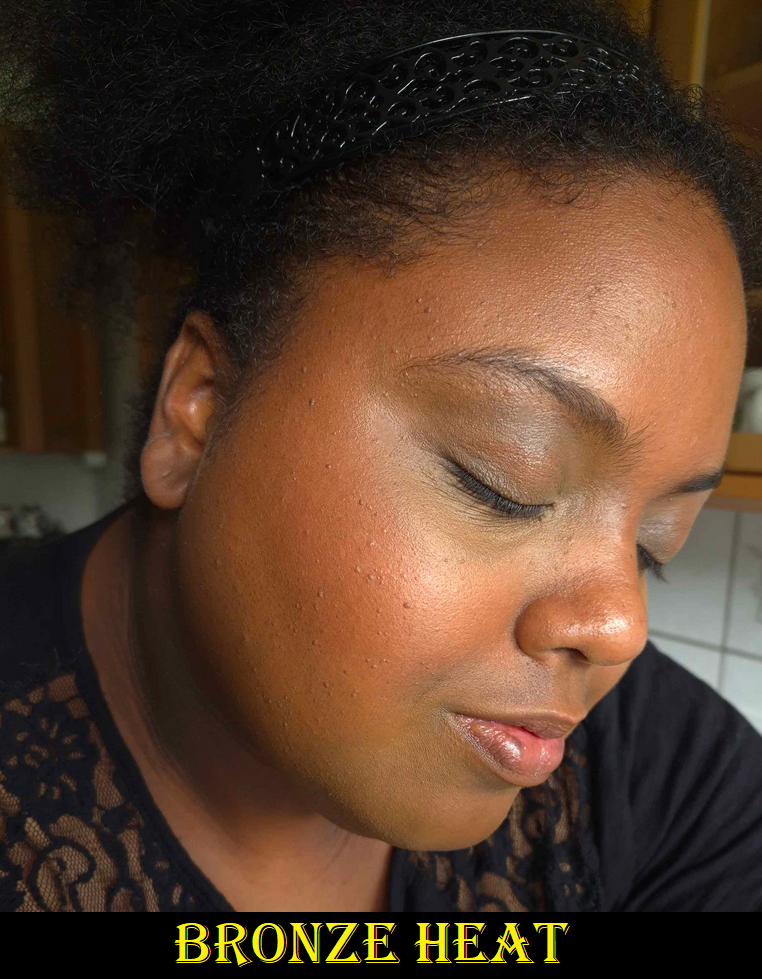
In these photos though, I had to pack on the product to get it to show. My favorite brush to use with these Ambient Lighting Edit Palettes, ever since I got it, is the Eihodo No. 153 which I used in the left picture. For the right picture, I switched to the much more dense Chikuhodo FO-2. They both fit so well into the size of these relatively small face powders.
Overall, I’ve noticed no differences in quality between the powders in these palettes and the ones in the past. The matte ones can look a bit too matte, which is when pairing them with the finishing powder helps. They’re all so smooth with the benefits that come from being a baked powder. I have no longevity issues. These continue to be lovely powder products! The consistent performance of these products year to year is how I’m able to confidently post this review after having used it for barely more than a week, instead of my longer testing process.
COMPARISONS
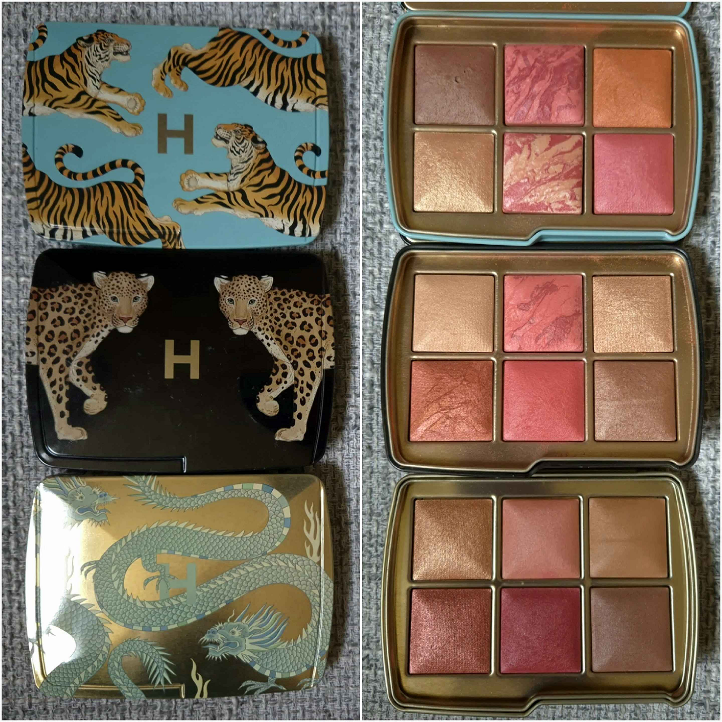
I don’t have access to my full Hourglass collection, so I could only compare things to my Tiger-Butterfly custom hybrid palette, the Snake palette (in Leopard packaging), and Lotus (in Dragon packaging). This year’s deep blushes are finally distinctly different from each other, and previous years. The highlighters and bronzers are super similar though, with just slight undertone differences.
The list of all my previous Hourglass reviews and rants (especially the Holiday palettes), can be found HERE.
HOW DID HOURGLASS DO THIS YEAR?
Before I can begin to answer this question, I wanted to point out some things I mentioned wanting over the years to see how Hourglass answered or ignored feedback from plenty of customers that shared the same thoughts as me.
2021
I hoped for less repeat shades, I believed there should be 3 palettes per year with one of those clearly designated as suitable for tan to deep skin tones (or darker, or for there to be at least a deeper extension of the permanent bronzer range). I also wanted more accurate representation of the shades in promotional images.
2022
I wanted a true bronzer for dark skin tones and not a translucent powder than could be used as bronzer. I didn’t mind if the brand released a mini or repeat of At Night in the deeper palette. I mentioned being willing to spend $100+ instead of $85 to make every shade in the palette customizable. I mentioned that it would be nice if they used their “miscelare technique” to mix two medium or darker colorful shades in a series of blushes instead of pale beige bases with a single color.
2023
I wanted a deeper bronzer option (since so far the depths are similar and the undertone is just changed), a dedicated true Deep/Rich palette option (even if it’s too much for someone like me), and some dark brown blush color options (less pinks and corals with the occasional orange). I hoped they would continue with palette cover customization, though choosing individual shades is still the ultimate dream. I also wished for a rabbit and/or panda cover art which would tie-in with the brand’s collaboration with the Nonhuman Rights Project.
So what did we get in 2024?
- We got almost no repeat shades!
- We have 3 palette options again with better designated colors per category (fair/light, light/medium, and tan-deep). Not being able to choose all 6 shades is okay if presets will continue to be good (ex: not having deep blushes in the fair palette like they did with Butterfly).
- The brand decently represented the accuracy of shades in their website photos.
- Hourglass gave us another dedicated deep bronzer, though it’s barely darker than Transcendent Light, and mostly another tone change.
- They opted out of using the miscelare process, ensuring that every tan-deep palette will work the same for everyone instead of some people, who would normally be able to wear the shade, being unable to because their swirl had too much of the lighter color.
- Hourglass gave everyone a peach and/or nude option. Everyone seems to love that. The Evil Eye colors had the typical Hourglass pinks and were too similar to each other in one palette. The Dragon and Lotus palettes were better at having distinctly different shades.
What are my hopes for 2025?
I would love if the brand would continue with adding more nude blush options (especially a deep skin friendly one with some brown along the lines of Chanel’s Brun Roussi Lumiere, MAC’s Coppertone, Format, and Burnt Pepper). All the reviews and comments I saw were positive regarding having less vibrant options. The only semi-negative part was Desert Flush not being deep enough to use alone for those with deeper skin tones, so ensuring they are at least dark medium in depth would be great.
I am still looking for Hourglass to make an ultra deep bronzer in at least the permanent collection, if not the Ambient Edit Palettes. I’m not that much darker right now, yet the bronzers are close to being too subtle on me, so this still isn’t dark enough for a ton of people.
I’d still be fine with Hourglass making At Night a repeat in the palette or for them to release a mini. Better yet, I would love the two colors within At Night to be mixed into one solid color and with an increase in pigmentation. That would be fantastic!
I would still love a rabbit and panda themed cover art.
That’s it! I really don’t have any major criticisms or requests. I think this is the best the brand has done so far. Back in 2021, I was worried that listening to customers was just performative and that we wouldn’t continue to see much work towards inclusion. I’m happy to say that someone over there seems to be putting in effort regarding this topic. It’s not even about wokeness. It makes financial sense to create products for customers when the demand is clearly there.
LOGISTICS
This was the first year I had to order my palette outside of the US. I’m happy to say it went smoothly. It cost €90 (VAT included). Influencer promo codes were able to be applied to the order. Shipping was free, but I added €5 for expedited shipping. I wanted to buy a gift box and gift bag in Dragon print, but they kept getting taken out of my cart on the payment page, so I assume they aren’t offered outside of the US.
My package was delayed a few days, but that was due to the weather conditions in Germany at the time and not the fault of Hourglass.
If Hourglass continues with this upward trajectory, I will likely purchase next year’s iteration of holiday palettes too. Now that I have to spend even more than usual for these palettes, it’s that much more important for the brand to nail the colors and also offer shades different enough from previous launches.
That’s everything! Thank you for reading! Be sure to click the follow button if you’d love to be updated whenever a new post from me drops!
-Lili ❤
